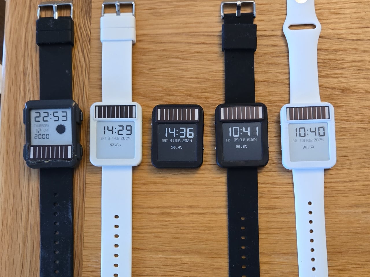
This Solar Smartwatch Ran 9 Months on Battery, Then the Panel Kicked In

The smartwatch category has a battery problem it can’t seem to shake. Despite years of incremental improvements, most wearables still need to be charged every day or two, which is exactly the opposite of what a watch is supposed to be. A watch is supposed to be on your wrist and working, not sitting on a charging pad because you forgot to plug it in before bed.

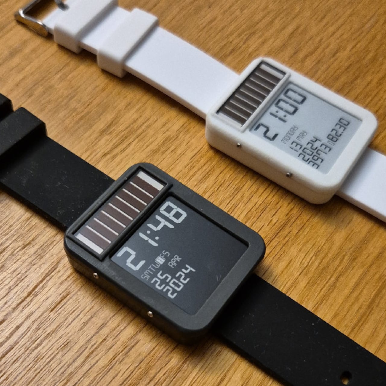
The LightInk is an attempt to solve that problem by going back to a design philosophy that worked decades ago: solar. The concept mimics the 90s solar digital watches that ran more or less indefinitely, but brings it into the present with an E-Ink display, an ESP32 microcontroller, WiFi, Bluetooth, LoRa radio, and a custom power management system built from scratch over several years.

Designer: Daniel Ansorregui
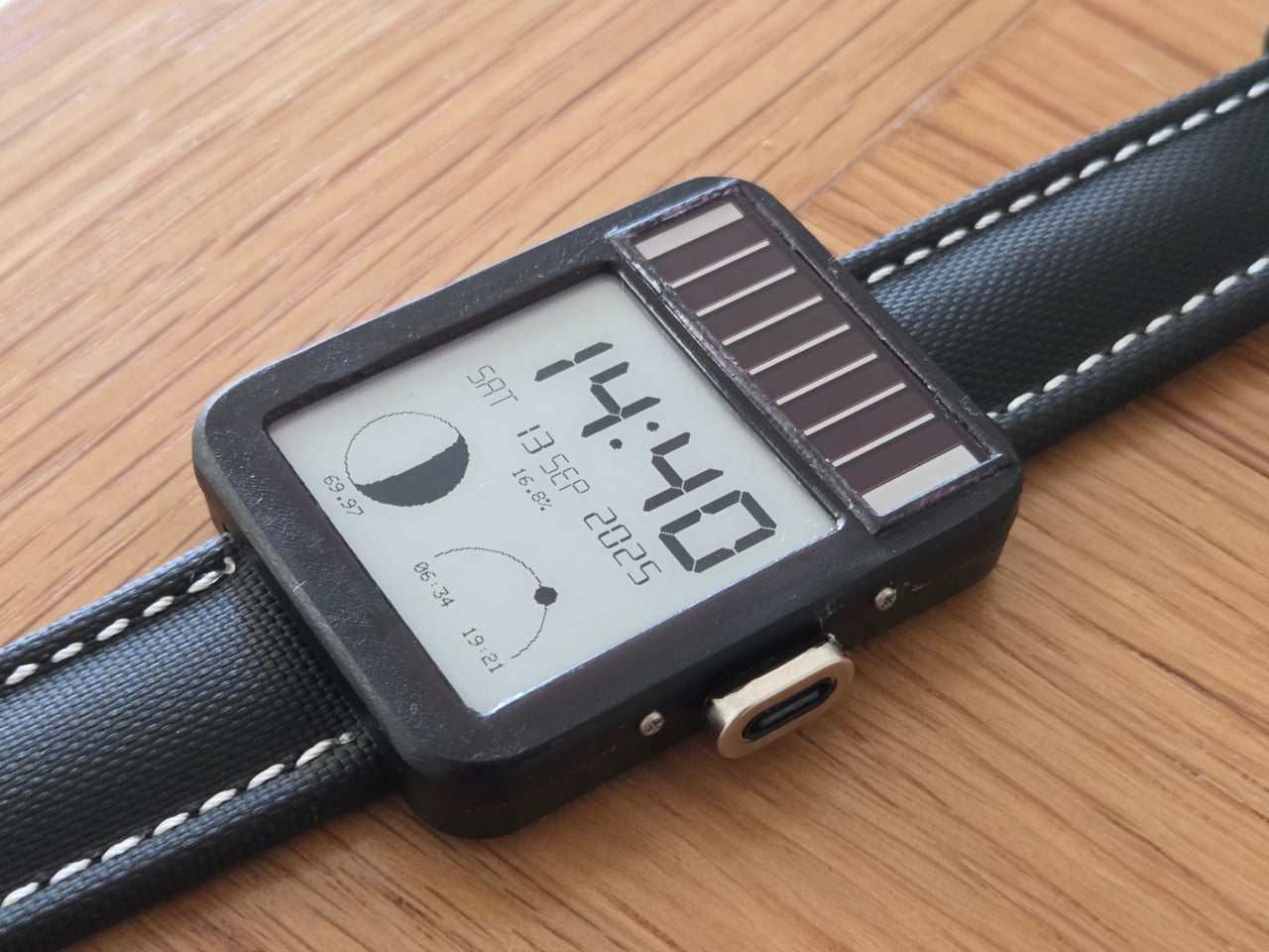
The project started in 2019 with a simple goal: build a solar-powered watch that could send LoRa packets to a receiver at home. After experimenting with early hardware and contributing display optimizations to the open-source Watchy project, the creator hit the limits of what off-the-shelf hardware could manage and built a custom PCB around a TPS63900 buck-boost converter, running the watch at 2.7V.

The biggest technical hurdle turned out to be the microcontroller itself. The ESP32 takes 28ms to boot, consuming around 1mA of current in the process, and that cycle was responsible for about 60% of the watch’s total power draw without contributing anything to the actual display update. The solution was to skip normal boot entirely and run code directly from the ESP32’s RTC memory via a wake stub.
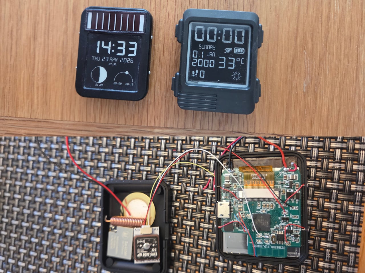
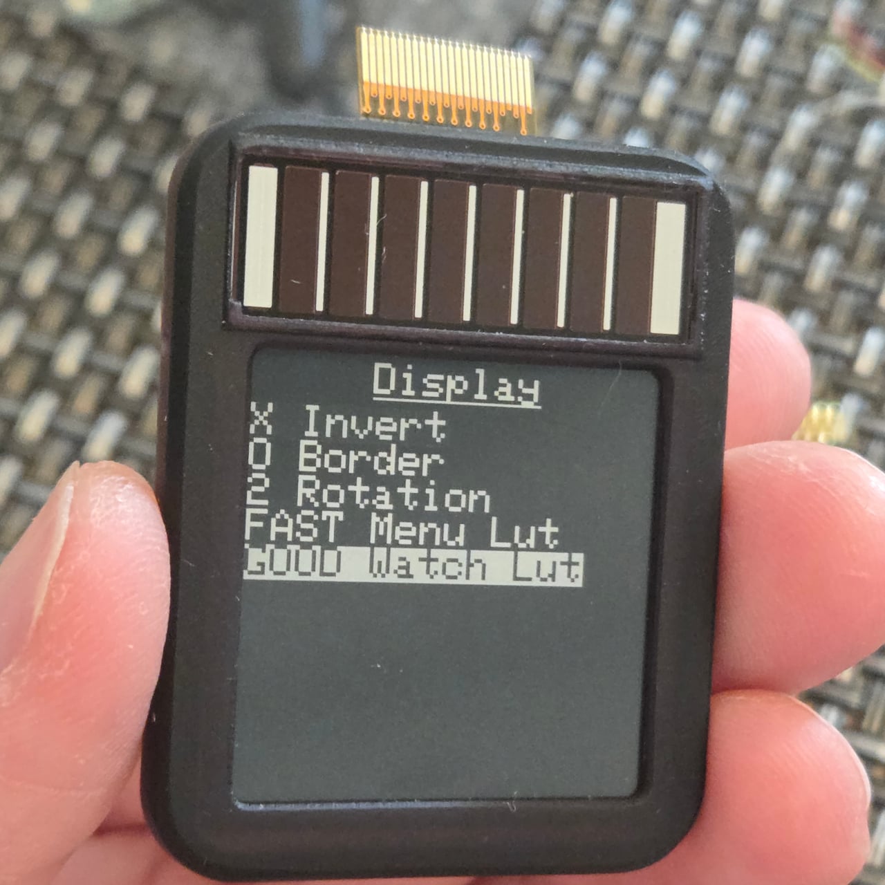
That required reimplementing SPI communication from scratch within the RTC memory constraints, since no code outside that space can run during the stub phase. The payoff was significant: the entire boot, data send, and display update sequence now completes in under 1ms. Once the display is refreshed, the ESP32 immediately returns to deep sleep, saving an additional 1mA that would otherwise be consumed during light sleep.

The result is a watch that runs for six to 10 months on a 100mAh battery, which is already an unusual number for a device this capable. Add the solar panel, similar in type to the kind found on pocket calculators, and the power equation starts to tilt toward indefinite. One hardware revision ran for nine months on battery alone before being retired for a newer build.
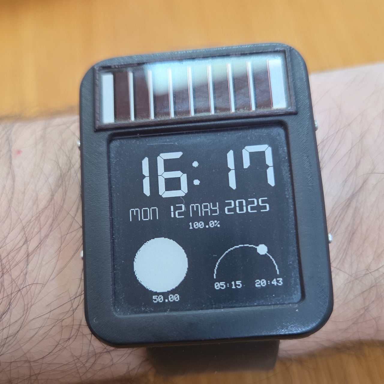
The 1.54-inch E-Ink display helps keep those numbers achievable. Electrophoretic displays only draw power when changing states and hold their image indefinitely without any power at all, which makes them an obvious fit for a watch face that updates once per minute rather than 60 times per second. Touch controls via the ESP32’s built-in capacitive touch capability handle navigation, making physical buttons unnecessary and allowing for a more compact case.

The watch supports WiFi, Bluetooth, and LoRa via a Wio-SX1262 radio module, and GPS can be added as an optional component, though the creator notes it wasn’t a particularly good idea given the space and power it consumes. The case is 3D printed in two pieces and accepts any standard 22mm wristband. Everything, including the firmware, PCB schematics, and case files, is open source and available on GitHub.
The post This Solar Smartwatch Ran 9 Months on Battery, Then the Panel Kicked In first appeared on Yanko Design.

A Designer Just Made a Water Purifier That Skips the Technician Call

Water purifiers are practically mandatory in modern Indian homes, but for a category that handles something as critical as drinking water, they’ve never been particularly pleasant to live with. Most demand frequent service calls that add to their long-term cost, look like they were designed to be hidden under a counter, and turn something as simple as filling a bottle into a minor exercise in patience.

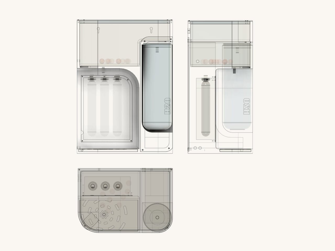
ATHERIA is a smart water purifier concept designed for modern Indian households, and it approaches the problem from multiple angles at once. Rather than improving a single element, it takes aim at several everyday friction points simultaneously, from how the unit looks on a kitchen counter to how easy it is to fill a bottle, replace a cartridge, or check water quality.

Designer: Arnav Ashwin

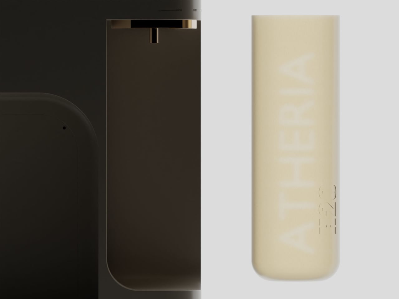
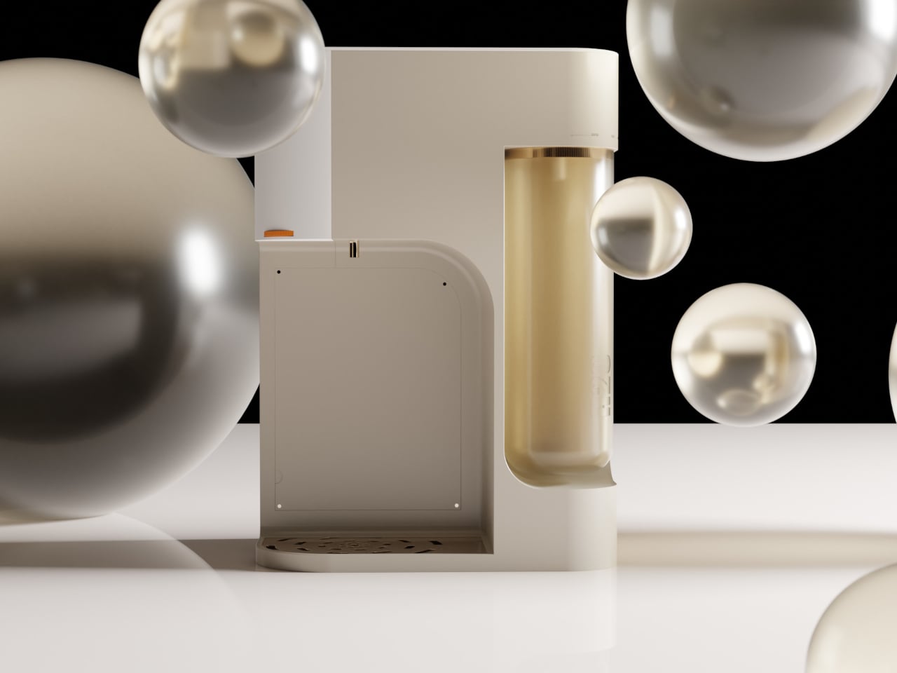
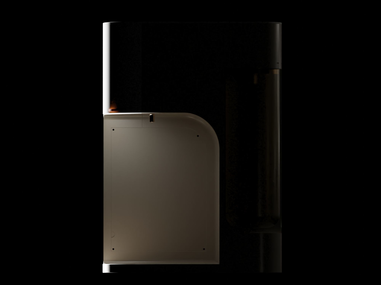
The design draws from Japandi principles, a blend of Japanese minimalism and Scandinavian sensibility focused on warmth, simplicity, and craftsmanship. The result is a compact, rounded purifier with a warm taupe and gold finish that reads more like a considered kitchen appliance than a water treatment machine. It comes in multiple colorways and sits on a countertop without dominating the space around it.

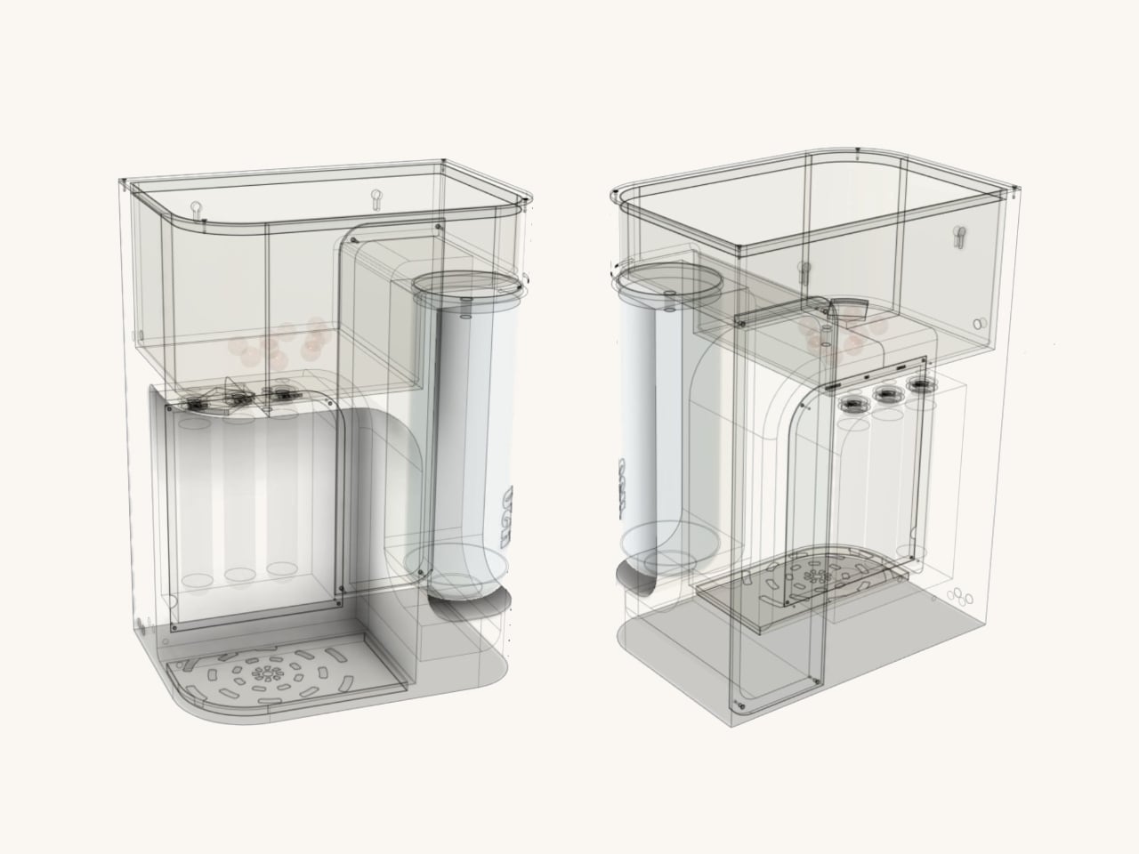
One of the more thoughtful additions is a 2.5-liter secondary detachable container. Filling a bottle or a cooking pot directly from a purifier tap can be slow and awkward, especially mid-cook. The container solves this by letting you pour pre-filled water directly into whatever you need, then reattach it to the purifier, which refills it automatically using analog weight sensors.

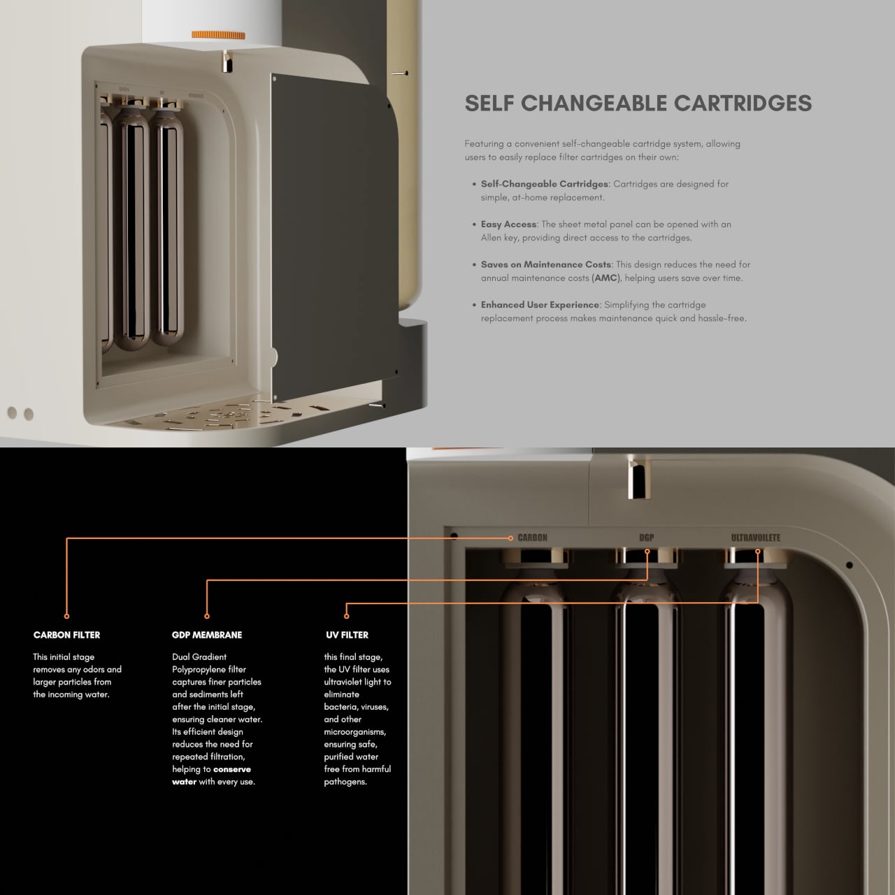
ATHERIA’s three-stage filtration runs water through a carbon filter to remove odors and larger particles, then a dual-gradient polypropylene membrane for finer sediment, and finally a UV filter to eliminate bacteria, viruses, and other microorganisms. The membrane’s efficient design reduces repeated filtration passes, conserving water in the process, which directly addresses a concern shared by 64% of users surveyed during the design research phase.

Maintenance usually drives up the long-term cost of owning a water purifier, mostly because replacing cartridges typically requires a paid technician visit. ATHERIA’s self-changeable cartridge system gets around that. The side panel opens with an Allen key, giving direct access to all three filter cartridges, each of which turns to fit or release. No service call needed, which cuts down on annual maintenance costs considerably.

The companion app displays tap TDS, output TDS, individual cartridge health, and daily water and energy usage. Output TDS is adjustable from the settings, and cartridge change reminders can be set manually. It also links to Google Nest, which can push voice alerts when TDS levels rise above safe standards or when a specific cartridge is approaching the end of its life.

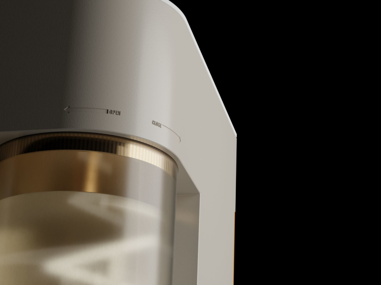
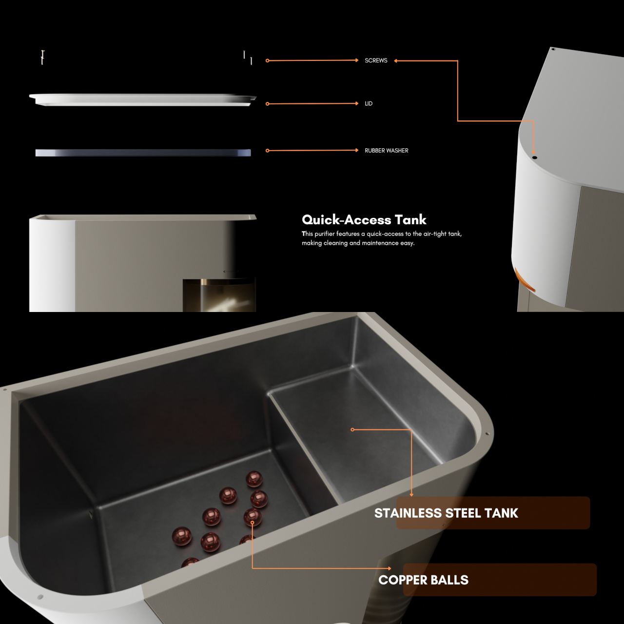
The stainless steel storage tank includes copper balls for natural antimicrobial contact, and the bi-directional ratchet tap controls flow speed by how far it’s turned, with built-in markings to minimize spillage. ATHERIA is still just a concept, but the depth of research behind each decision, from the detachable container to the cartridge access panel, gives every friction point in the experience a concrete answer rather than an afterthought.

The post A Designer Just Made a Water Purifier That Skips the Technician Call first appeared on Yanko Design.
The Piano Key Holder Where Every Press Clicks Out a Hidden Brass Hook

Key hooks by the door are one of those things that somehow manage to be both boring and insufficient. The options range from plain metal rails to the kind of decorative wooden boards that start out charming and quickly fade into background noise. Nobody has really questioned whether a key holder can be interactive, or whether hanging your keys could actually be the best part of coming home.

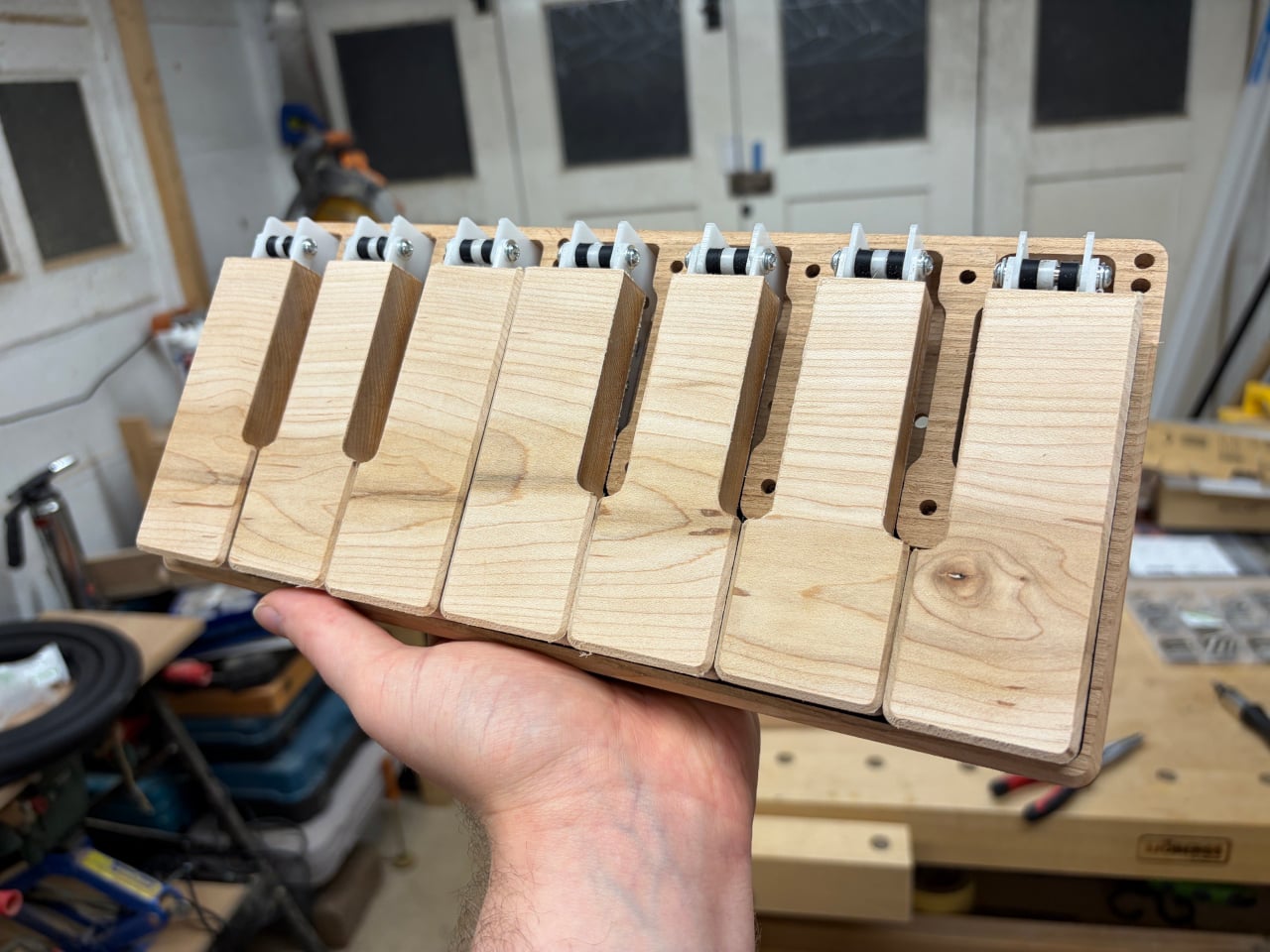
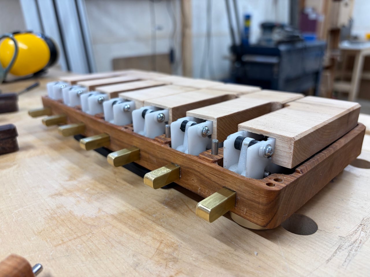
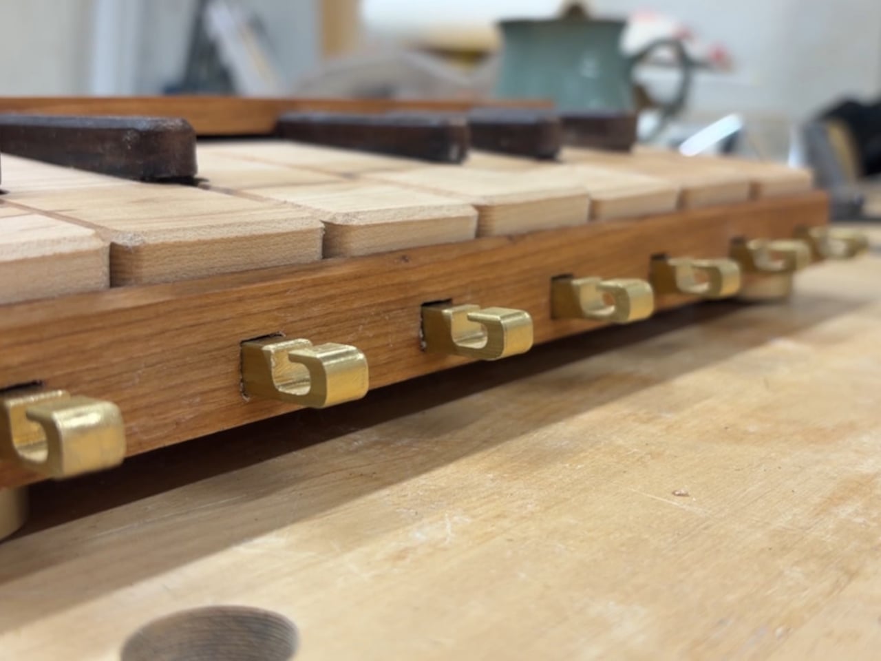
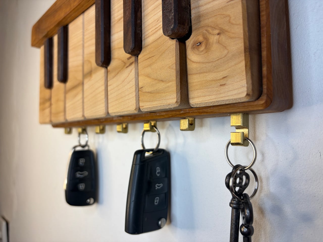
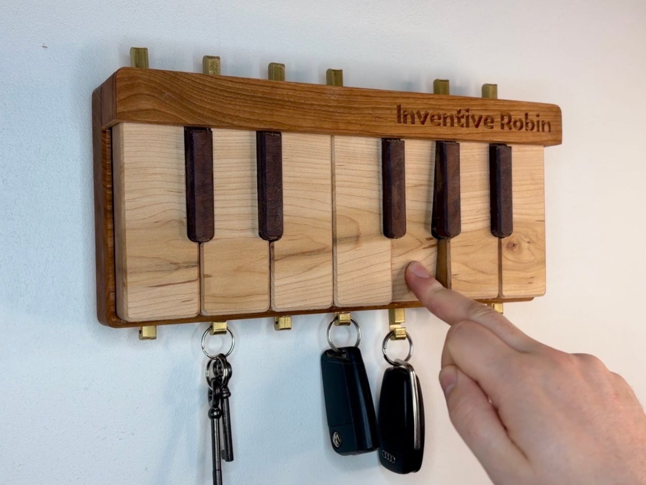
This wooden piano key holder turns that mundane act into something that rewards the hand that does it. Built primarily from solid wood and mounted on the wall, it looks like a short section of a piano keyboard, down to the contrast between pale white keys and raised dark notes. Each white key hides a brass hook inside, and pressing one causes that hook to click out from the bottom.

Designer: Inventive Robin

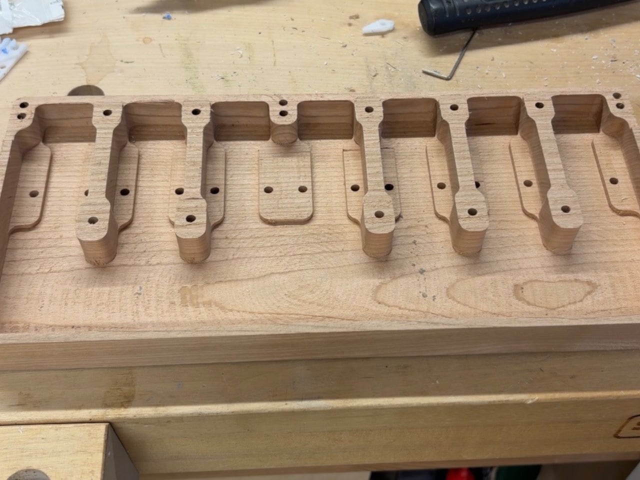
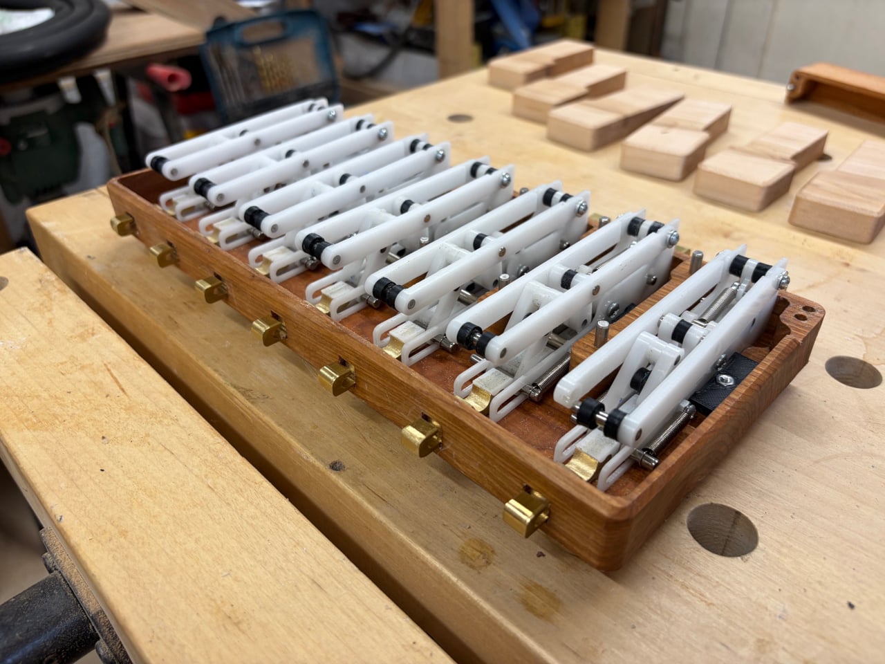
The mechanism inside is the centerpiece. Each latching unit is machined from sheet acetal and assembled with metal dowels and standoffs, translating the vertical press of a piano key into the outward extension of a brass hook. Press the same key again, and the hook retracts with another click. That tactile feedback is what separates this from any peg or rail that simply sits on the wall, doing nothing memorable.

Three materials carry the weight of the aesthetic. The base and outer frame are cherry, machined on a CNC router to house the acetal mechanisms inside. The white keys are individually shaped pieces of maple, and between them sit the raised black notes in a contrasting darker wood. The hooks are small, architectural brass clips, machined separately and fitted to the mechanism that drives them up and down.

The piano keyboard format is a natural fit for a key holder, and not just because of the pun. A row of regularly spaced, independently pressable keys maps almost perfectly onto a row of hooks, and the visual language of a piano is familiar enough that anyone walking past it understands what those keys do, even without being told there’s a mechanism hiding underneath.

What makes it work as wall decor is how cleanly the materials read together. The warm cherry frame, the pale maple keys, and the dark raised notes create a contrast that fits comfortably in a living room entryway without demanding too much attention. The brass hooks, small and architectural in their proportions, don’t look like hardware until you know what to press.

Key holders have always had a quiet design problem. They ask you to form a new habit, redirecting an automatic reach toward something deliberately placed on a wall, and there’s usually nothing to make that effort feel worthwhile. Giving the hook a mechanical click is a small but effective way to make the ritual feel intentional, which is the kind of encouragement that actually makes the habit stick.

The post The Piano Key Holder Where Every Press Clicks Out a Hidden Brass Hook first appeared on Yanko Design.
Noble’s $199 Osprey Earbuds Aim Straight at Sony’s XM6

The $200 true wireless earbud market is crowded, but the brands filling it are mostly consumer electronics companies that tune for mass appeal rather than accuracy. Getting earbuds with any real audiophile pedigree under that threshold has historically meant compromising somewhere meaningful, whether on driver quality, build, or sound character. Most listeners have made their peace with that trade-off and gone with whatever Sony or Sennheiser had on the shelf.

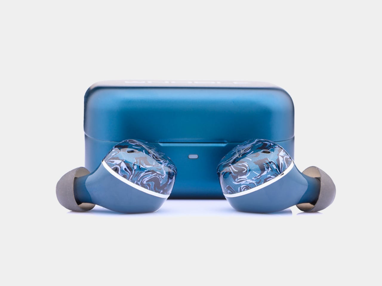
The Noble Audio Osprey debuted at High End Vienna 2026 and starts shipping at the end of June at $199. Noble has spent years building custom in-ear monitors that sell for four figures to listeners who argue about driver counts and cable geometry. Compressing that into a sub-$200 true wireless product is a considerable stretch, and the Osprey’s choices reflect what had to be preserved and what didn’t.

Designer: Noble Audio

The Osprey uses a hybrid dual-driver configuration, pairing a 10mm dynamic driver with a custom balanced armature. The dynamic driver handles low-end weight and warmth, delivering bass that’s smooth and thick rather than just punchy, while the balanced armature supports midrange detail and treble precision. The frequency response spans 20Hz to 40kHz, wider than most consumer earbuds at this price point.

That driver combination pays off most noticeably in the soundstage, which reviewers describe as genuinely expansive, with strong depth and layering that becomes especially clear in music with complex percussion. The signature leans slightly V-shaped, with the low end its most impressive range. Mids are full and anchoring rather than recessed, and highs are crisp and extended without tipping into harshness, a balance that works across most genres.

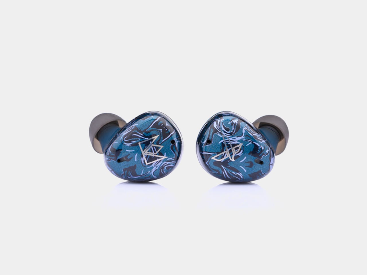
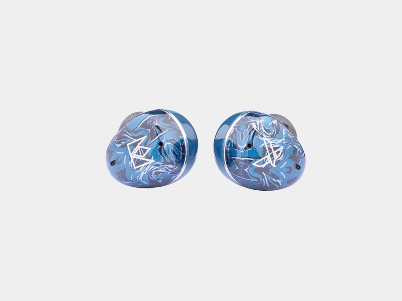
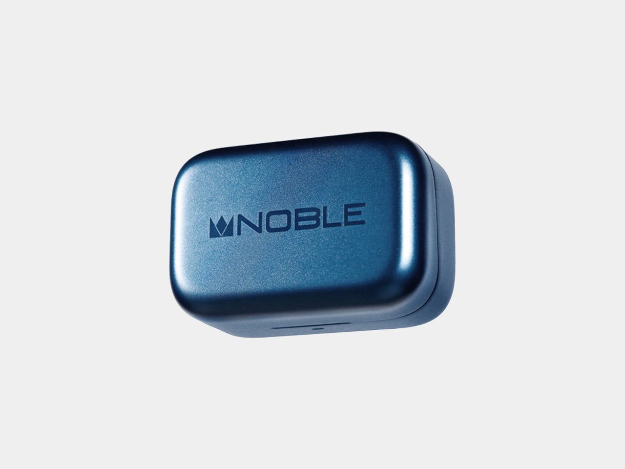
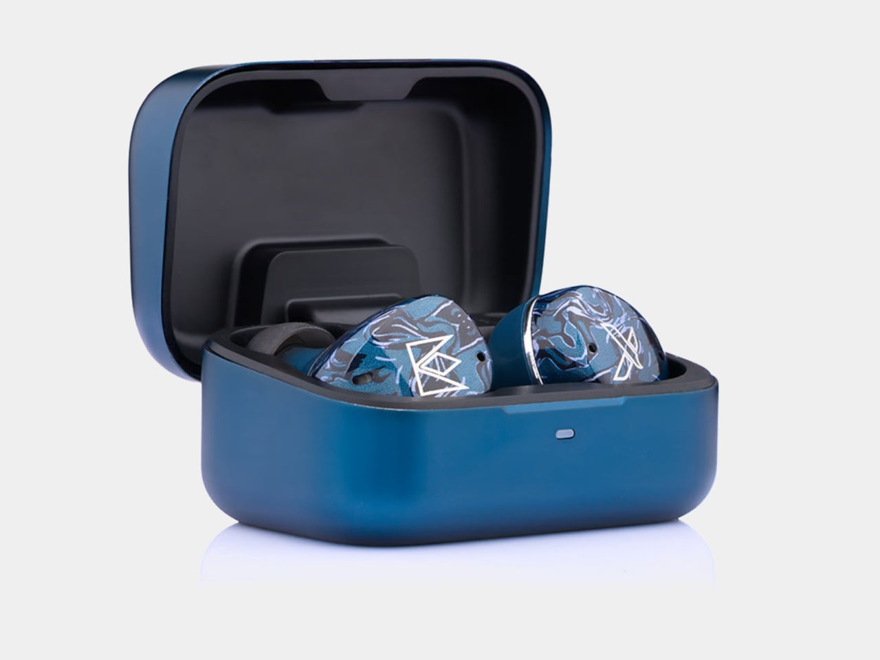
Noble kept most of its visual identity intact. The Osprey carries the marbled acrylic faceplate aesthetic from the FoKus line, with layered blues that read as deliberate rather than generic. The aluminum charging case matches the color and keeps the premium feel without adding bulk.

On the practical side, the Osprey includes hybrid ANC, a Hearing Through mode for ambient awareness, and multipoint connectivity for switching between two devices without re-pairing. ANC handles lower frequencies well, though some higher-pitched background noise still gets through. Dual microphones with cVc noise reduction handle calls, and Bluetooth 6.0 via the Airoha 1571 chipset holds a fast, stable connection even in busier wireless environments.

Battery life sits at seven hours with ANC off and five hours with it on, in line with most competitors. Quick charging is where the Osprey pulls ahead: 10 minutes in the case delivers roughly two hours of listening, a figure that outpaces several earbuds well above this price. The 500mAh aluminum case uses USB-C, and the Noble FoKus app adds a 10-band EQ, touch remapping, and over-the-air updates.

For context, Sony’s WF-1000XM6 retails at $329.95 and the Sennheiser Momentum True Wireless 4 at $299.95, putting the Osprey around $100 to $130 below either. LDAC support separates it further from mainstream earbuds at the same price, most of which cap out at AAC. Noble Audio opened pre-orders on June 4, with units shipping by the end of June, available directly at nobleaudio.com and through select retailers.

The post Noble’s $199 Osprey Earbuds Aim Straight at Sony’s XM6 first appeared on Yanko Design.
The 2.6mm PopSocket That Didn’t Work in 2012 Is Finally Here for $39

Most phone grips stick around because they work, not because they’re easy to live with. The classic PopSocket has spent over a decade as one of the most recognizable phone accessories around, but its accordion-style pop-up design has always carried a trade-off. That bump on the back catches on every tight pocket, and for a certain kind of user, that’s been reason enough to never bother.

The Low-Pro Grip is PopSockets’ answer to that, but it’s also something more personal than a product update. An ultra-thin grip was actually what the brand’s founder envisioned first, before the accordion design ever existed. He taught himself CAD and printed a flat 2.1mm-thick disk as his original prototype, but it never opened up. That failure became the PopSocket. More than a decade later, the thin version finally works.

Designer: PopSockets (Apple Store)

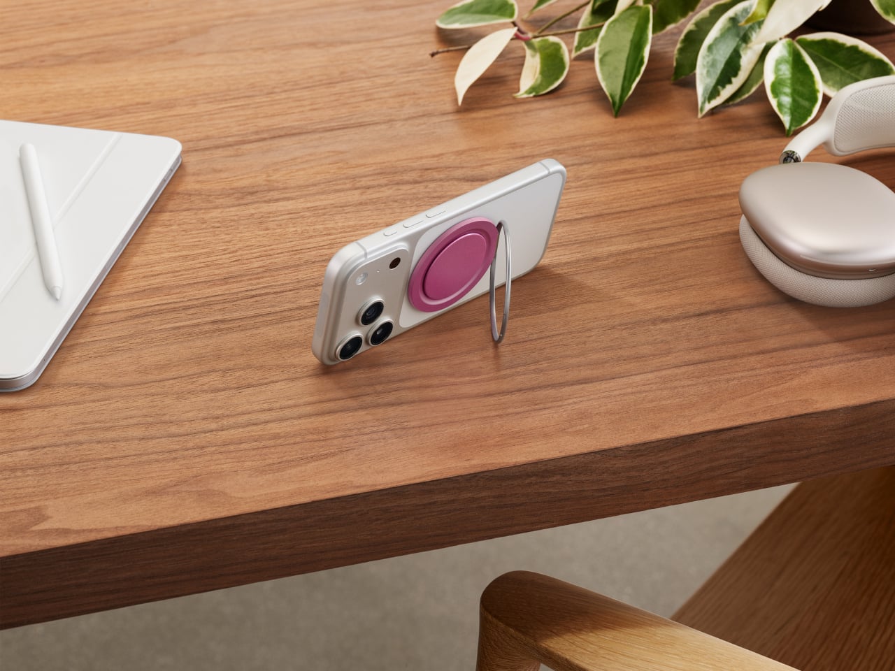
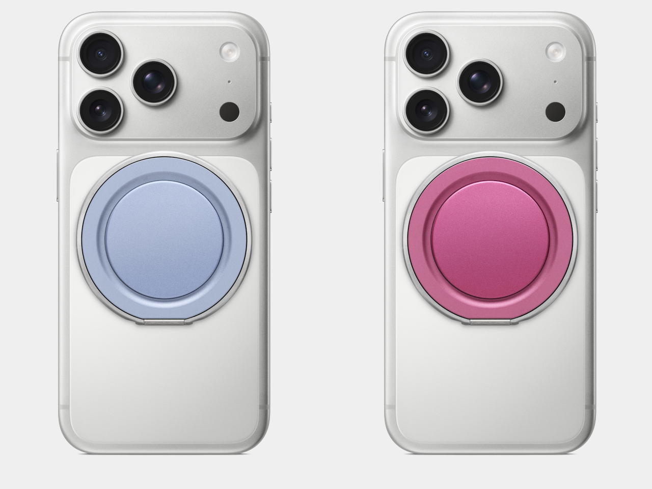
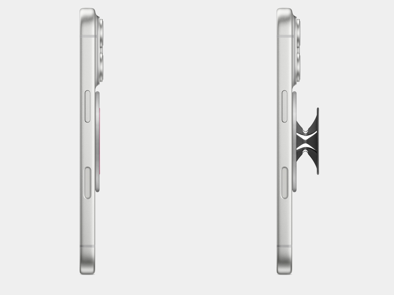
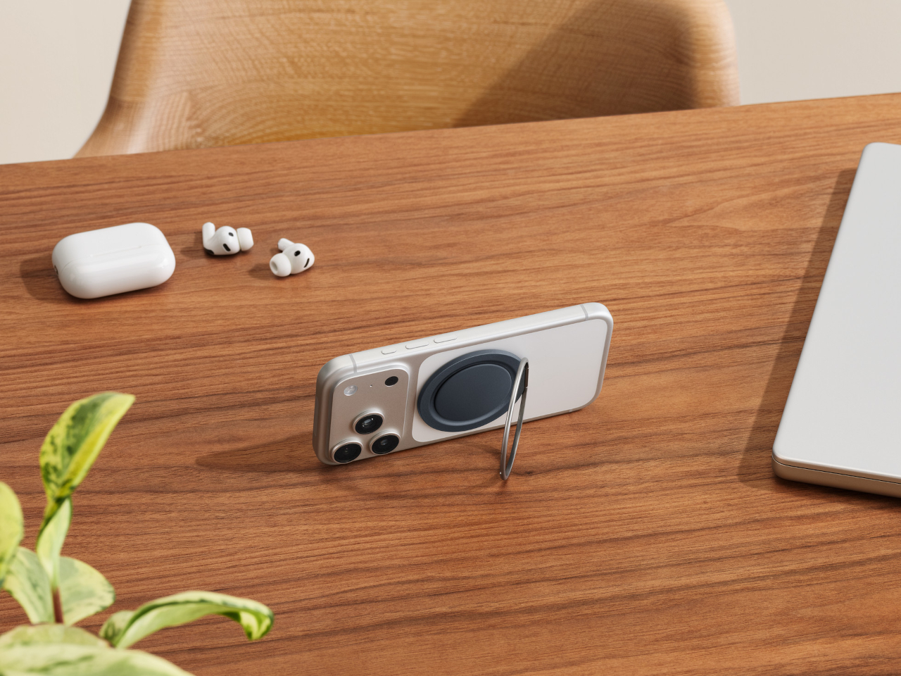
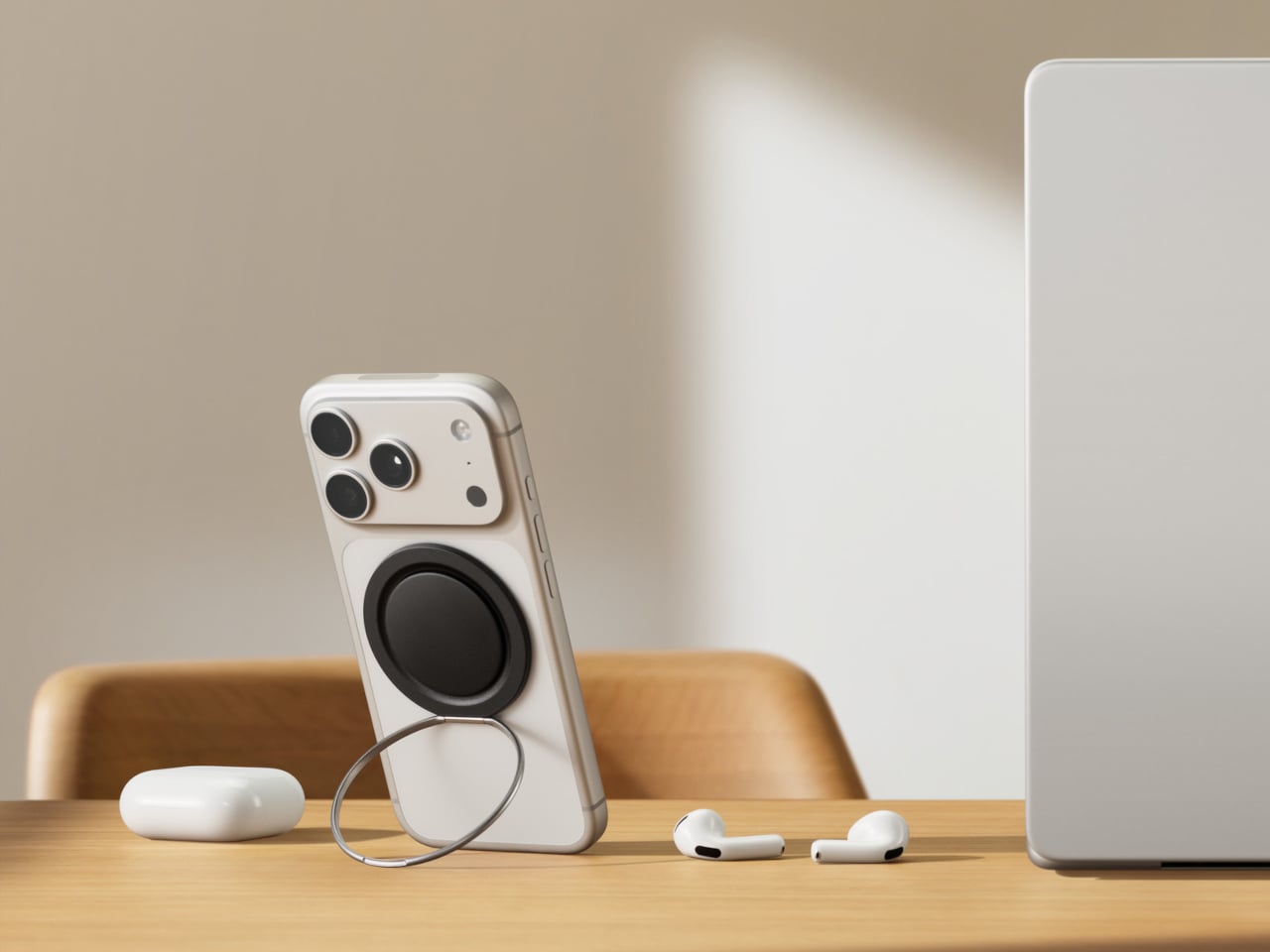
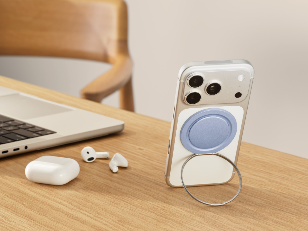
At 2.6mm thick when collapsed, it adds almost nothing to the back of an iPhone and stays below the threshold where most grips start catching on tight pockets. The Low-Pro snaps magnetically onto any MagSafe-compatible iPhone case, so it goes on and comes off without adhesive or any ceremony. The mechanism underneath has also been completely rethought, abandoning the multi-ring accordion of the original entirely.

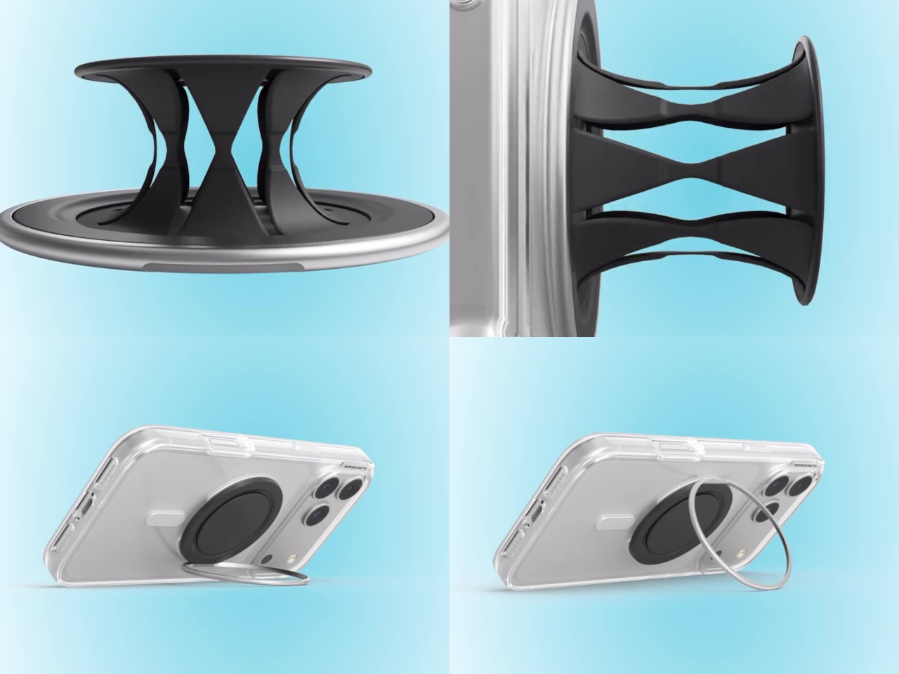
Instead of the familiar two-step expansion, the Low-Pro uses a single piece of flexible polymer that collapses flat and opens with one motion. What feels different about this approach is the texture. Where competitors rely on interlocking rigid arms that can dig into your fingers during long sessions, the softer polymer makes the Low-Pro more comfortable to hold at any angle, something that only becomes obvious after extended use.

The stand function has been redesigned, too. Instead of a button acting as the kickstand, an outer metal ring attached by a hinge folds out at any angle to prop the phone in either portrait or landscape orientation. That’s a meaningful step up from grip designs where the stand only works reliably sideways, and it covers the full range of how people use their phones away from a charging dock.

The magnetic base is strong enough to hold the phone against metal surfaces like a fridge door for hands-free use, and MagSafe wireless charging still works through it, though at reduced speeds. Despite the polymer being tested to withstand 30 lbs of tensile force and cycled open and closed 100,000 times, the Low-Pro is designed to be the PopSocket you can forget is there.

The Low-Pro Grip is priced at $39.99 and is launching exclusively at Apple in six colors, expanding to Best Buy and Target on July 12, and to all other retailers on July 29, when the full lineup of 12 colors will be available. It’s compatible with any MagSafe-compatible iPhone case and works with all existing PopSockets mounts, so it fits into an existing MagSafe setup without needing anything else.

The post The 2.6mm PopSocket That Didn’t Work in 2012 Is Finally Here for $39 first appeared on Yanko Design.

The Urn With 4 Screens Showing Moving Images of the Person You Lost

Cremation urns have existed for thousands of years, but their design language has barely moved. They tend toward the ceremonial and the generic, pottery shapes lifted from antiquity or polished boxes that draw from the visual vocabulary of caskets. The underlying assumption across nearly all of them is the same: that the vessel marks an ending. That what’s inside has arrived, not departed.

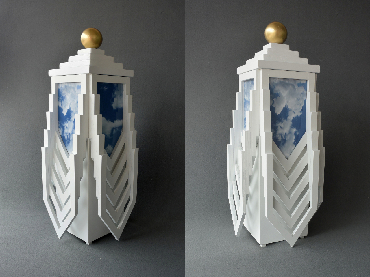
The Transcendence Urn takes a different philosophical position entirely. It belongs to a series of objects conceived as temporary dwellings for the remains of loved ones, held in anticipation of what comes next. The form it takes to express this idea is strikingly futuristic, almost sci-fi in its ambition, built on the premise that the urn theoretically facilitates the occupant’s journey toward a higher state of existence rather than simply containing what was left behind.

Designer: Michael Jantzen

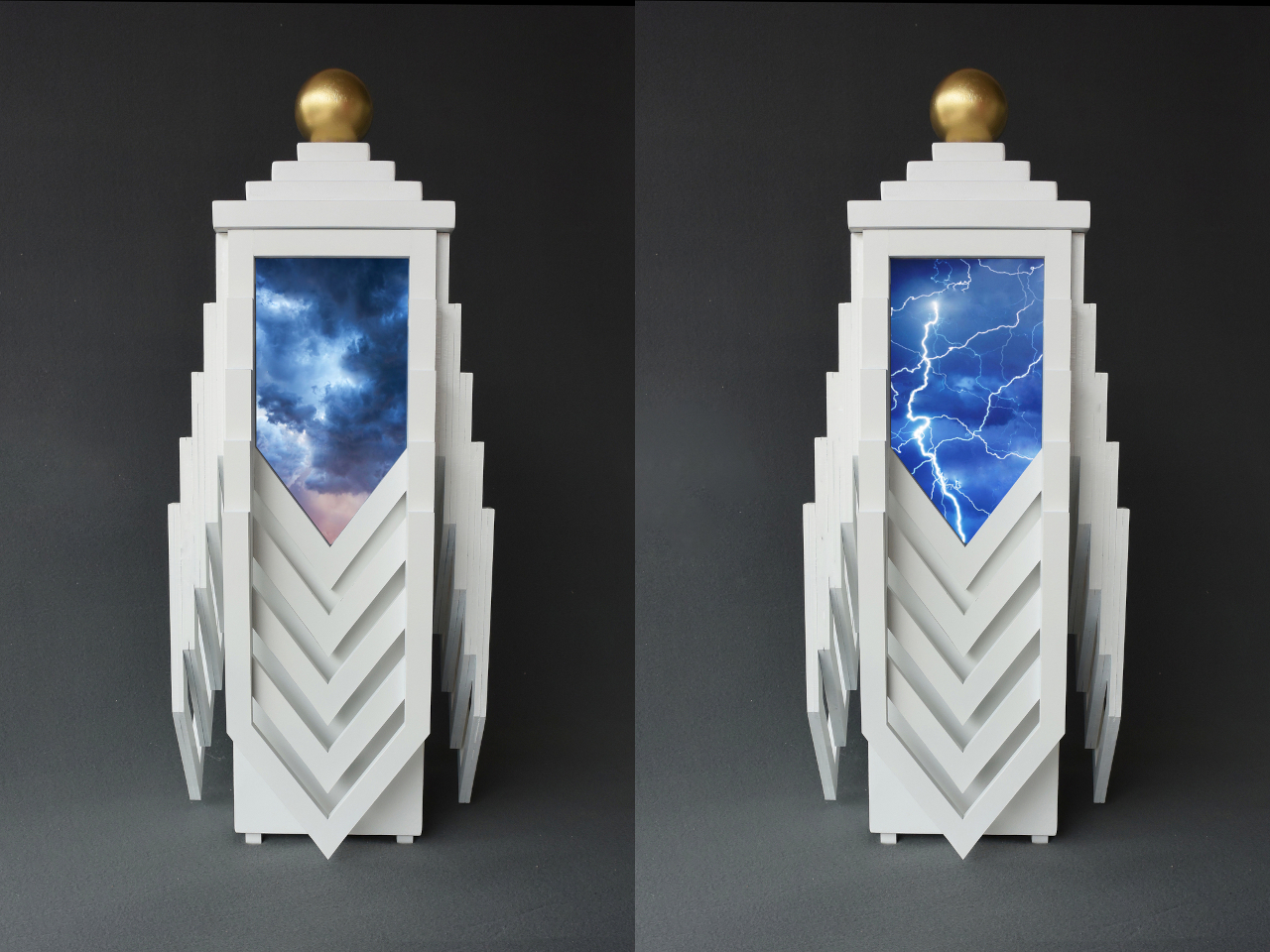
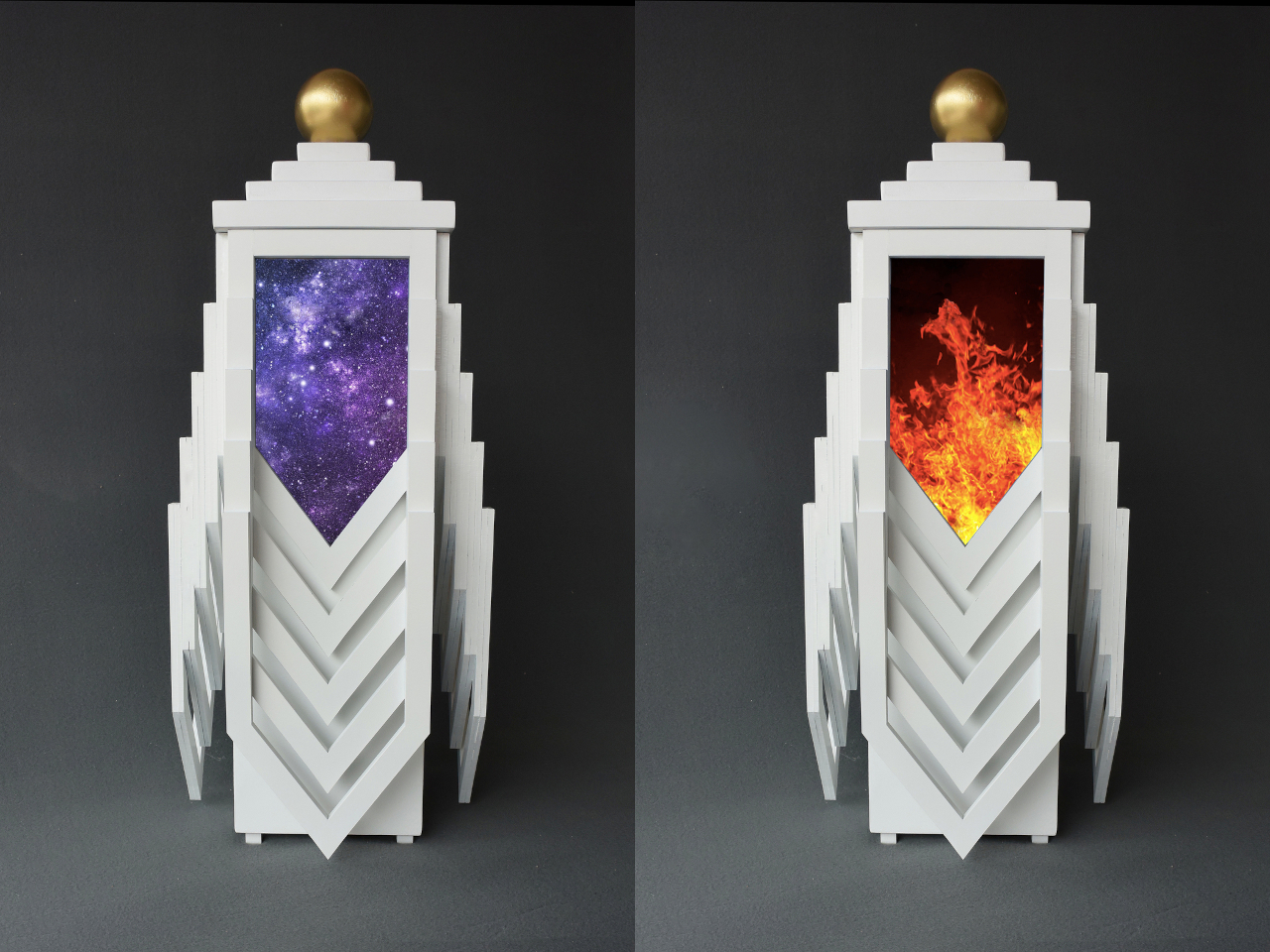
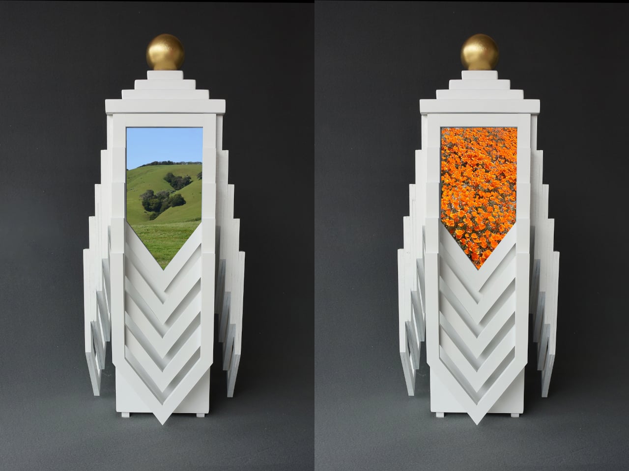
The structure stands 25 inches tall and 12 inches wide, built from painted wood in a form that seems to reach upward. Stepped tiers stack toward the top, followed by a gold sphere that crowns the whole structure and is removable from its own tiered plinth. The lower body radiates outward in layered chevron forms, pointing downward like fins, giving the whole piece a sense of directed energy, as if something inside it is moving rather than resting.

The four panel spaces near the top of the urn are where the personal dimension takes shape. Owners can fill them with photographs selected from a curated series of symbolically resonant images, or with their own. The possibilities run a wide emotional and metaphysical range: images of open sky and drifting clouds, a sunlit hillside, a field of orange flowers, a galaxy, fire, storm, and lightning are all part of the symbolic vocabulary this design draws from. Of course, photos of the actual person can go there, too.

That choice matters more than it might first appear. Most memorial objects leave the bereaved as passive recipients of a fixed form. This one asks them to make decisions about meaning, to assign symbols, and to decide what the person they lost should be surrounded by. It’s a quiet but real kind of agency during a period when very little feels controllable.

A digital variant of the Transcendence Urn replaces the four static panels with four screens displaying moving images and sounds, turning the object from a still memorial into something more like a living one. That version shifts the experience even further, letting the presence of the deceased linger in a more active, dynamic way rather than being fixed to a single still photograph chosen on a single day of grief.

It’s also worth noting what the object looks like on a shelf or a table. It doesn’t look like an urn. It looks like a piece of speculative design, the kind of object that invites questions before anyone knows what it holds. That unfamiliarity carries its own kind of comfort: it doesn’t announce loss the same way a traditional vessel does, and it doesn’t ask the viewer to feel a particular thing on sight.

The post The Urn With 4 Screens Showing Moving Images of the Person You Lost first appeared on Yanko Design.
The $429 Microwave With a Drop-Down Door and No Spinning Turntable

The microwave has been one of the most stubbornly unchanged appliances in the modern kitchen. After decades of the same basic box design, with a spinning turntable, a membrane-covered button pad, and a side-swinging door, most manufacturers have focused their innovation elsewhere. The few that have attempted cosmetic updates have mostly just rearranged the same components into slightly different shapes without addressing the deeper frustrations most people have with them.

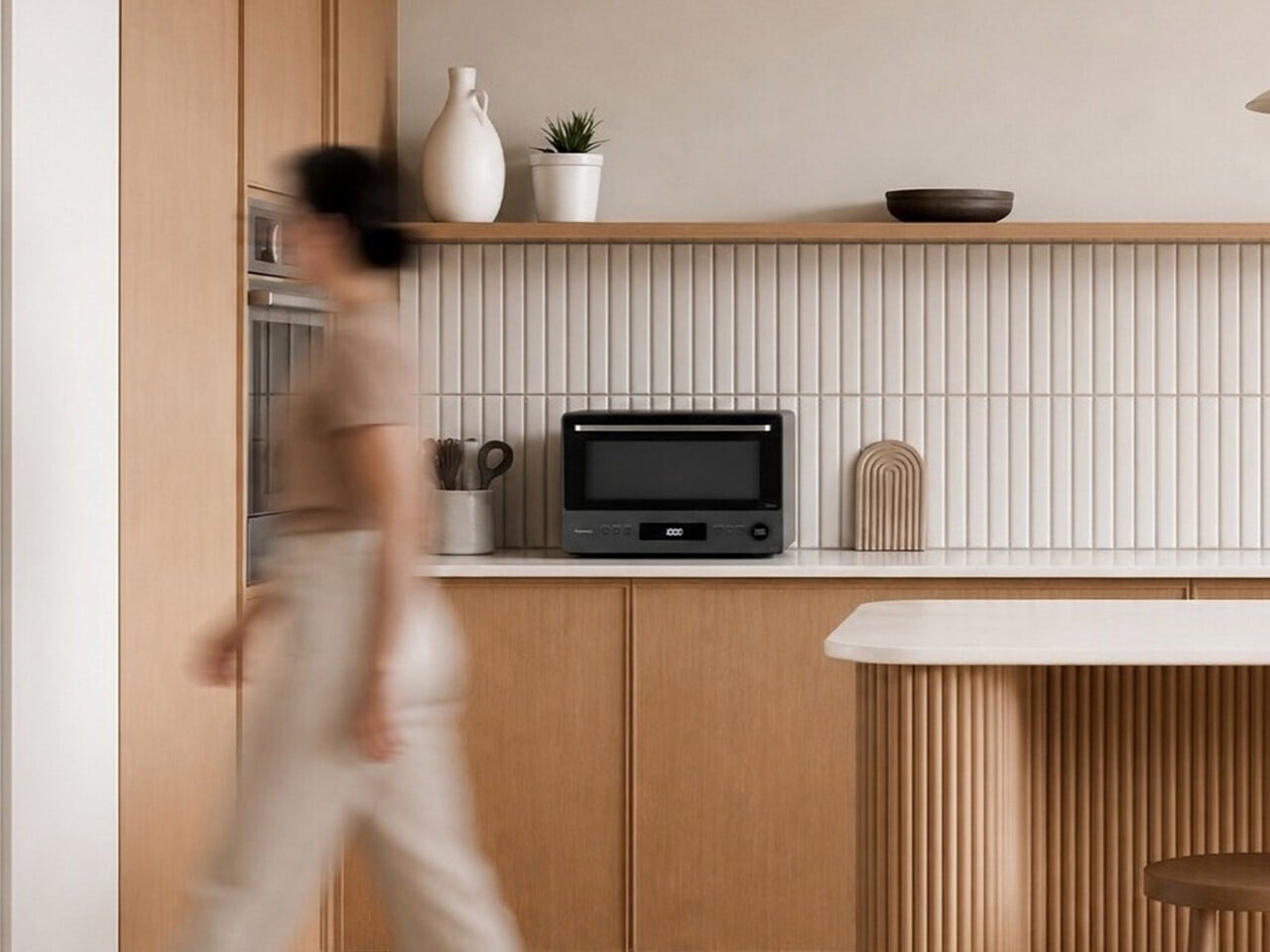
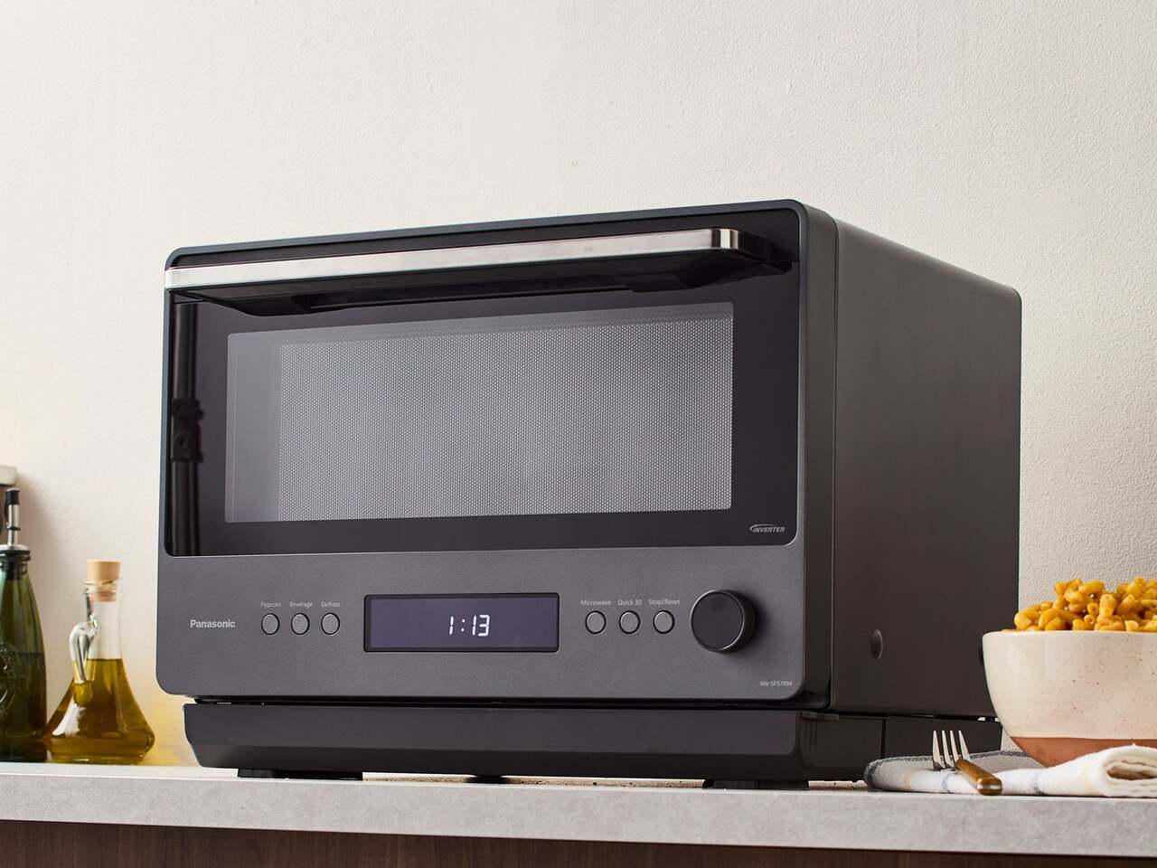
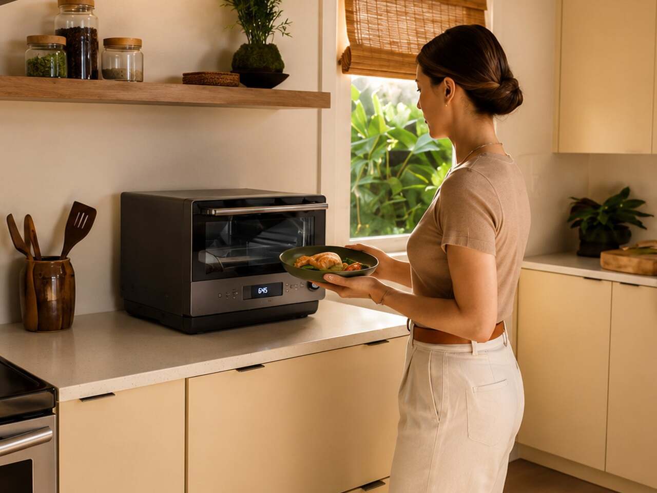
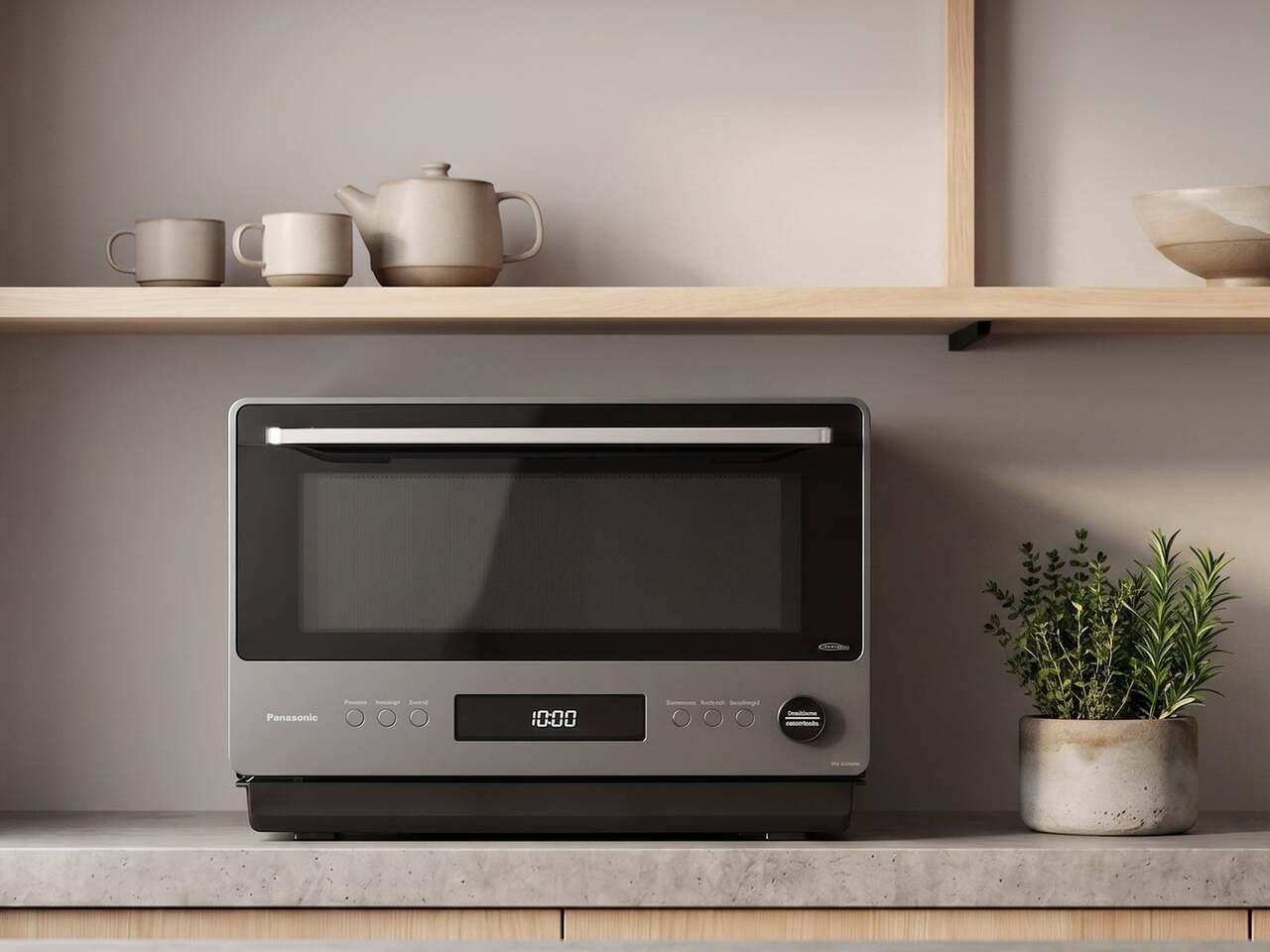
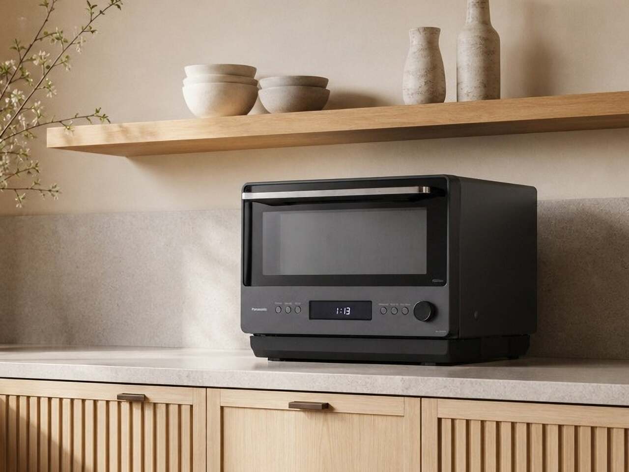
The Panasonic NN-SF57RM tries to address all of that at once. It draws on Japanese design principles to arrive at a countertop microwave that looks more like a compact built-in oven than anything most people would expect to find in a kitchen. Unlike most appliance redesigns that prioritize looks over function, this one makes a strong case that the cooking technology needed rethinking just as much as the exterior.

Designer: Panasonic

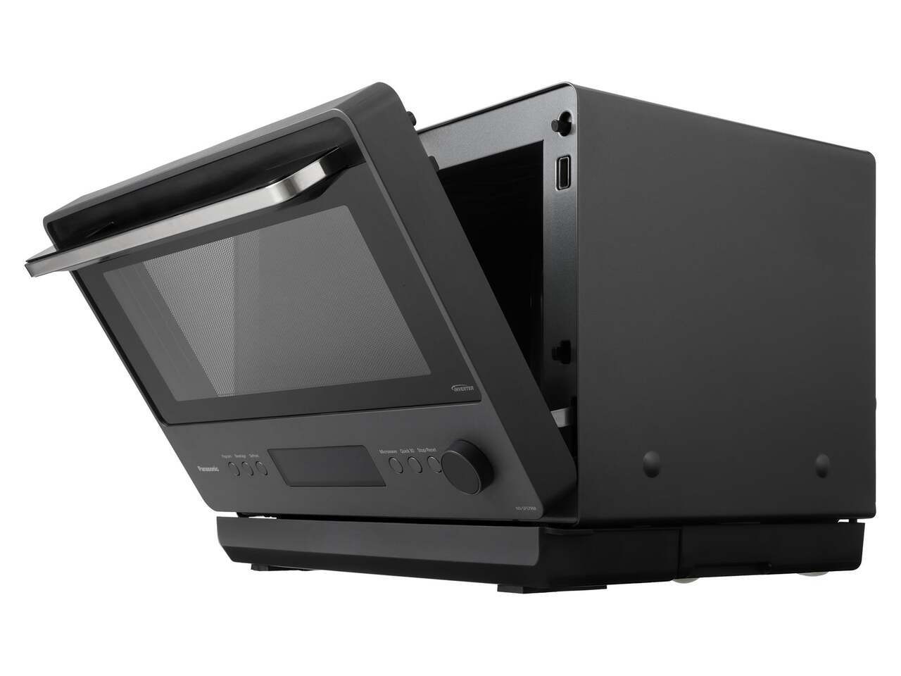
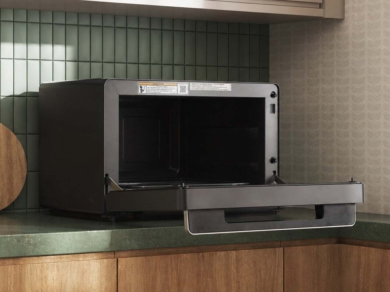
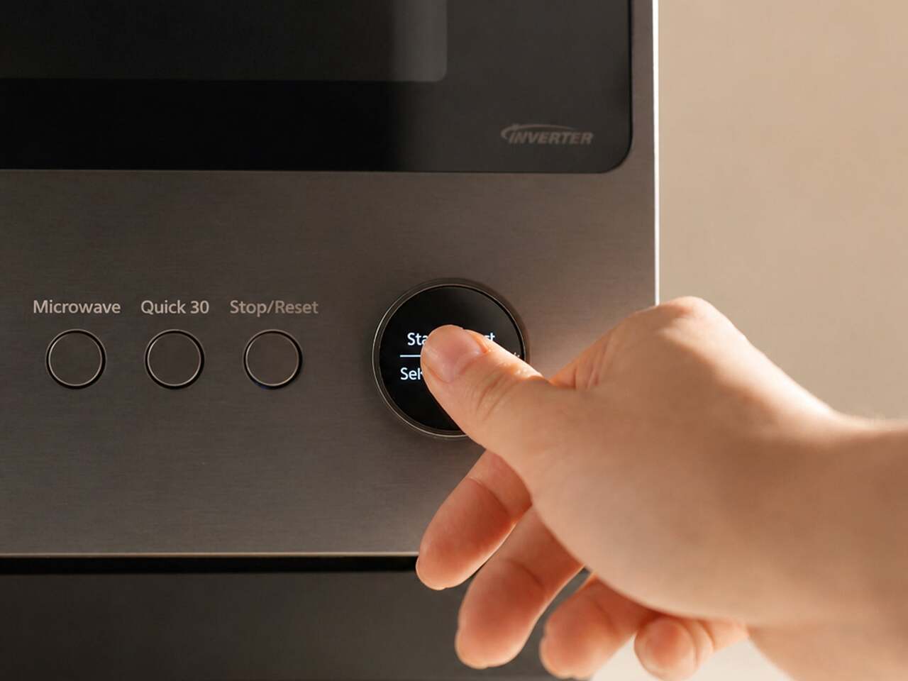
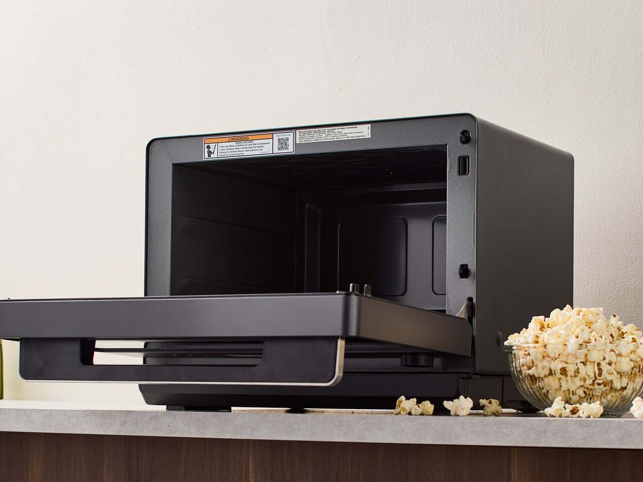
The most immediately noticeable departure from the typical microwave format is the door. Rather than the standard left-to-right hinged swing, it drops downward like a traditional oven door, making it easier to slide dishes in and out without awkward angling. Soft-close hinges slow the door’s descent to a cushioned stop. The muted graphite exterior and minimalist button-and-dial control panel complete a look that sits comfortably next to higher-end kitchen equipment.

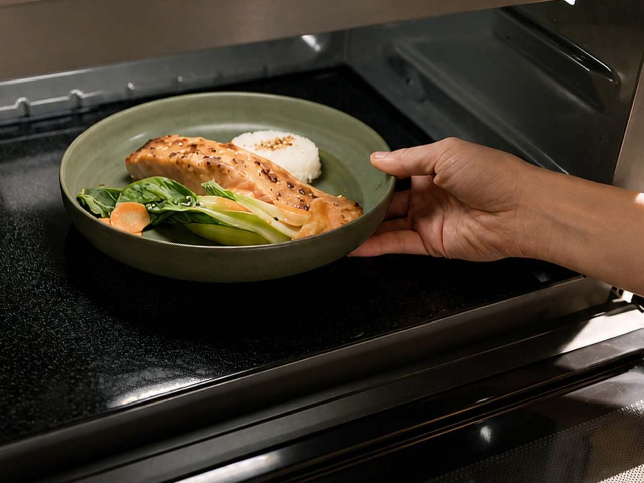
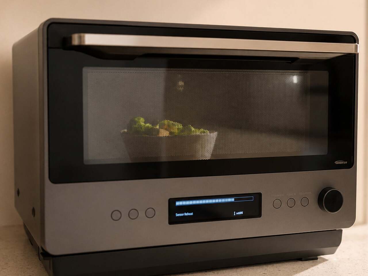
Opening the door reveals a 1.0 cu. ft., turntable-free interior that’s flat and unobstructed. Most microwaves rely on a spinning glass plate to distribute heat, but it eats into usable space and gives food residue plenty of places to hide. A hidden antenna beneath the floor rotates microwave energy around the food, directing heat toward cooler areas while avoiding spots that are already warm, resulting in more even heating.

Traditional microwaves pulse their power on and off during cooking, which explains why reheated leftovers often come out scalding in some spots and still cold in others. Inverter Technology changes this by maintaining a continuous, consistent power output throughout the entire cooking process, delivering the right level of heat at every setting without the on-off cycling that causes uneven results in most conventional models.

The Genius Sensor 2.0 adds another layer of intelligence on top of all that. Earlier versions of the technology read steam released by food to estimate doneness, which can produce inconsistent results when a plate holds multiple food types. The updated system uses thermo sensors positioned at 64 points to read surface temperatures every 0.1 second, adjusting cooking time and power levels automatically to bring everything to the right temperature.

All of this feeds into a one-push operation that removes most of the guesswork from everyday cooking. Place a dish inside, press the Sensor Heat button, and the microwave handles the rest. The same sensor intelligence extends to one-bowl meals, where the user adds ingredients for dishes like pasta carbonara or chili, and the microwave cooks the entire meal through without requiring manual monitoring or adjustments midway.

The NN-SF57RM is currently available exclusively in the US through Panasonic’s online store, priced at $429.95. That’s higher than most countertop microwaves at this size, but the combination of Inverter Technology, a 1,200W output, the turntable-free flatbed interior, and the Genius Sensor 2.0 puts it in a different category from the plain boxes that still dominate most kitchen counters. It’s an appliance that seems to actually want to be noticed.

The post The $429 Microwave With a Drop-Down Door and No Spinning Turntable first appeared on Yanko Design.

Microsoft Just Raised Surface Prices $500: Here’s What Changed

The premium laptop market has spent the last few years in a quiet but intense competition. Apple keeps raising the performance ceiling with each new M-series chip, and Windows-on-Arm devices have been working to close that gap one generation at a time. The question for most buyers has stopped being which platform is faster on paper and started being which one actually earns the asking price when you sit down to use it.

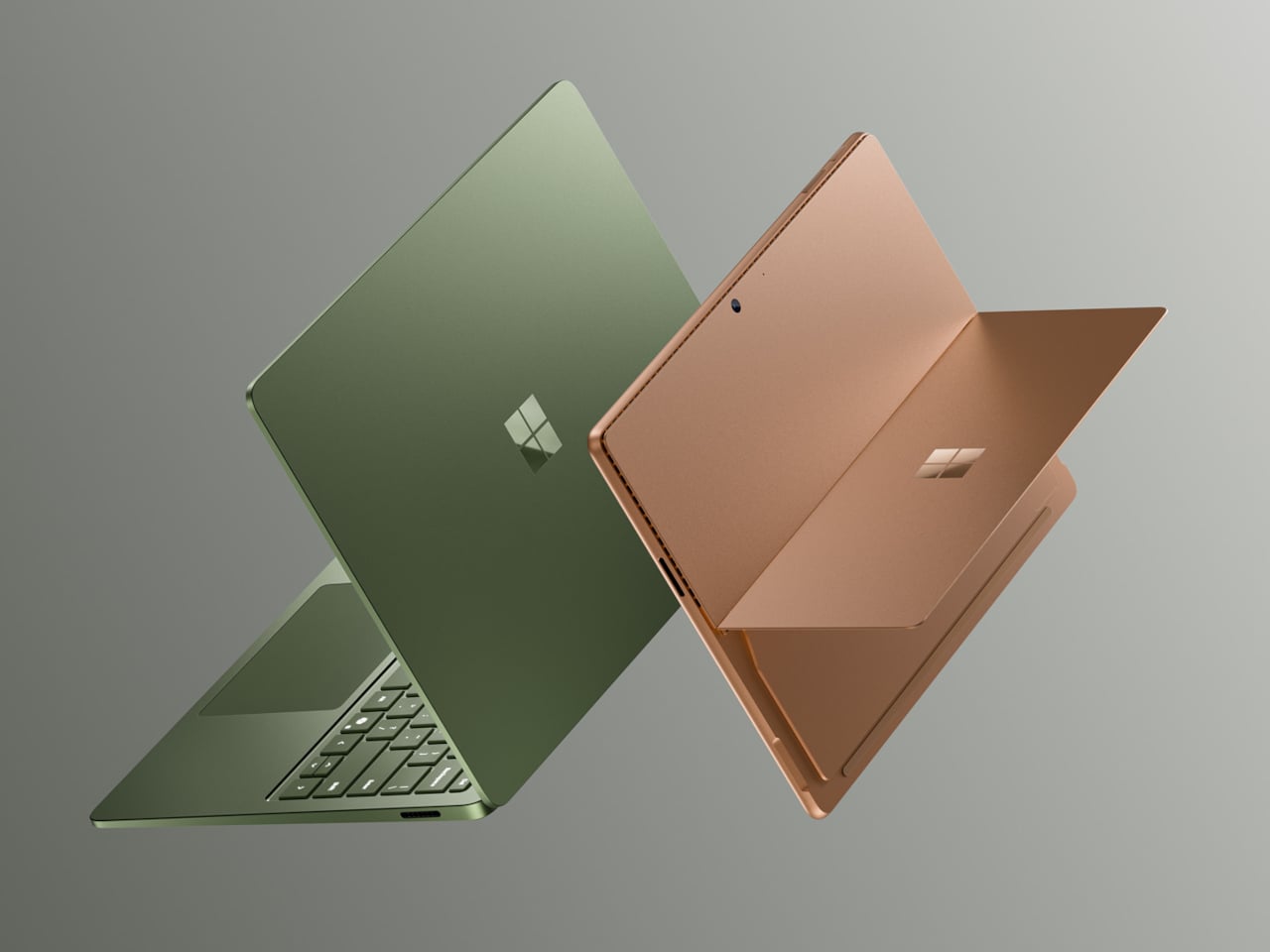
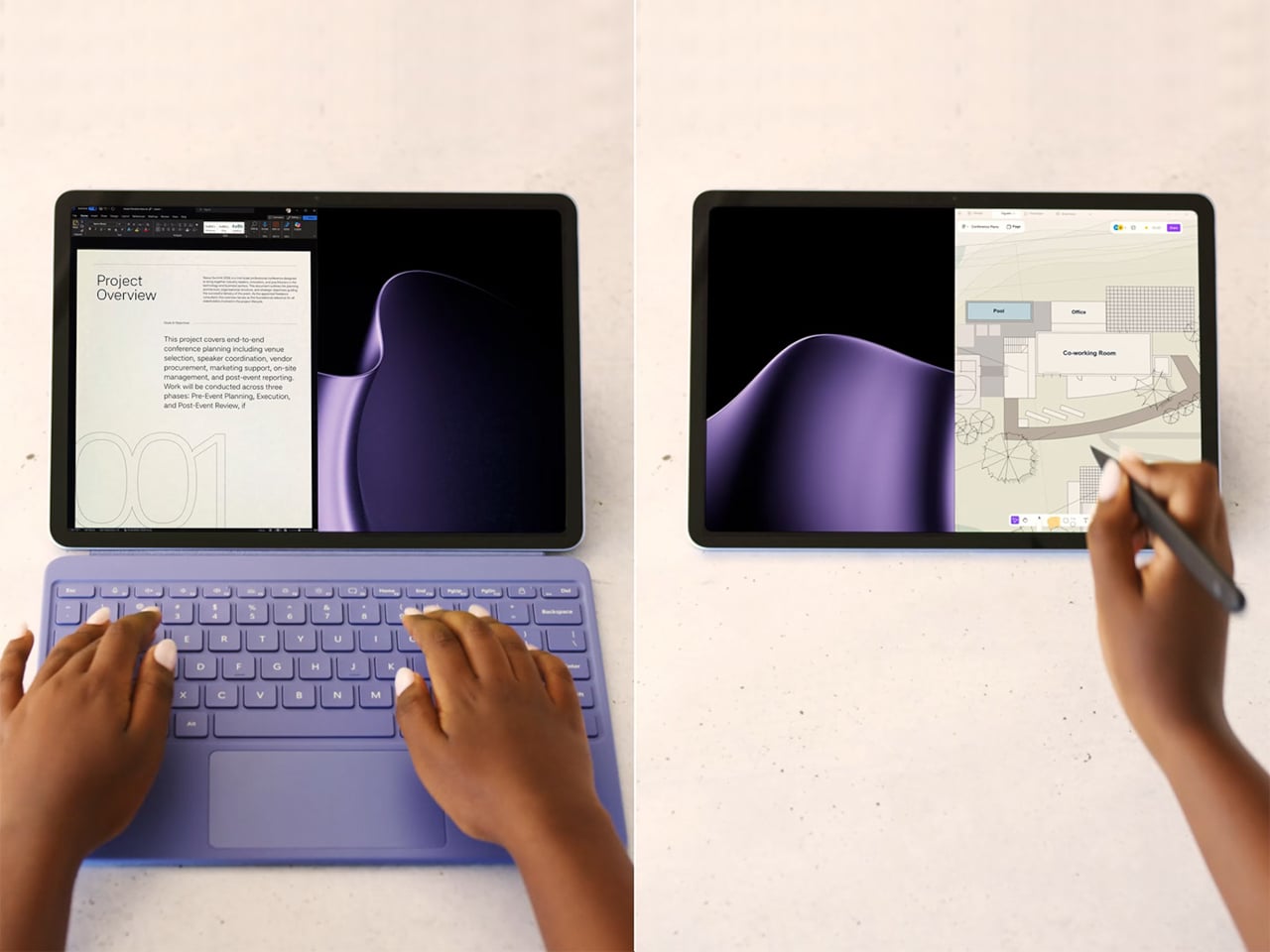
The Surface Pro 12 and Surface Laptop 8 are Microsoft’s answer, both powered by Snapdragon X2 processors and coming with more performance, longer endurance, and more refined hardware than the generation before. They’ve also gone up significantly in price, starting well above where their 2024 predecessors landed, making these among the most expensive consumer Surface devices Microsoft has put out in the lineup’s 13-year history.

Designer: Microsoft

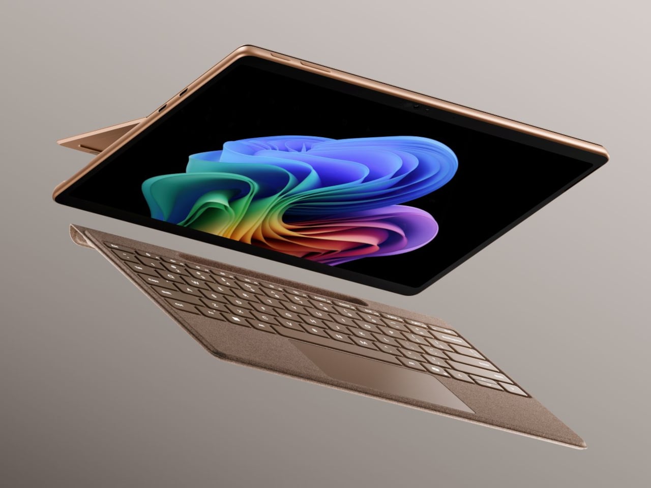
The Surface Pro 12 packs a 13-inch OLED PixelSense Flow display at 2880×1920 resolution, with a 120Hz dynamic refresh rate, 600 nits in SDR, and 900 nits at peak HDR brightness. Dolby Vision IQ is supported, and the panel is individually color-calibrated. It’s configured with either the Snapdragon X2 Plus or the X2 Elite, with up to 64GB of LPDDR5x RAM and a 1TB removable Gen 4 SSD.

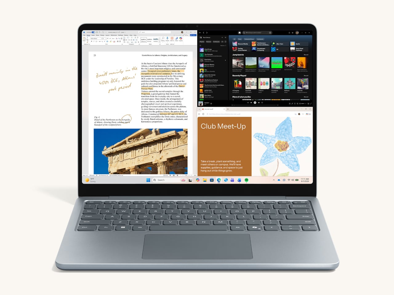
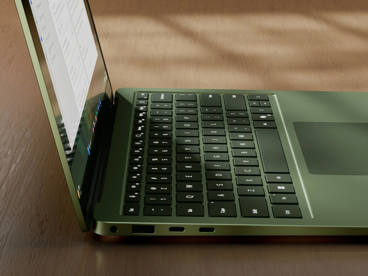
The Surface Laptop 8 comes in 13.8-inch and 15-inch sizes, with the 15-inch getting the more notable display upgrade. That model gains a 262 PPI screen at 3,270×2,180 with Dolby Vision IQ and 600 nits in both SDR and HDR modes. The 13.8-inch arrives in a new Jade colorway and earned the top spot in DXOMARK’s integrated laptop webcam rankings. Both Laptop sizes gain a new haptic trackpad.

Both devices run on Qualcomm’s Snapdragon X2 chip family, delivering 80 TOPS of AI processing through the Hexagon NPU. On the Laptop, graphics performance is up by as much as 58% over the previous generation based on Microsoft’s 3DMark testing. Battery life reaches up to 20 hours on the 13.8-inch Laptop and 19 hours on the 15-inch, while the Surface Pro 12 is rated at 15.5 hours.

The price increases are hard to miss. The Surface Pro 12 starts at $1,499 and the Surface Laptop 8 at $1,599, which are $500 and $600 more, respectively, than what those lineups cost when they launched in 2024. The higher cost is largely tied to rising component prices driven by AI hardware demand, which has pushed up what it takes to build premium Arm-based PCs at this tier.

Both devices now offer a 24GB RAM option that didn’t exist on the previous generation, filling the gap between 16GB and 32GB for users who find the former too limiting but don’t want to jump all the way up. Storage on the Laptop scales up to 2TB, and all drives across both devices are removable PCIe Gen 4 SSDs, which is a meaningful detail at this price point.

To soften the sticker shock a bit, Microsoft is bundling a free Surface Pro Keyboard with Pro purchases made before June 30, while Laptop buyers get a free Arc Mouse and 50% off Microsoft Complete. Trade-in credits of up to $900 are also available for those looking to swap out an older device. Both are on sale now for consumers, with Surface for Business variants shipping on July 14.

The post Microsoft Just Raised Surface Prices $500: Here’s What Changed first appeared on Yanko Design.
The Handheld PC That Becomes a Gamepad, Keyboard, or Knob Panel

The handheld PC market has gotten surprisingly competitive in recent years. Devices like the Steam Deck and ROG Ally have proven that people genuinely want powerful computers in their pockets, but they’ve all settled into roughly the same formula: a fixed gamepad layout and a fixed identity as gaming devices. Getting any serious work done on them usually means plugging in a keyboard and calling it a compromise.

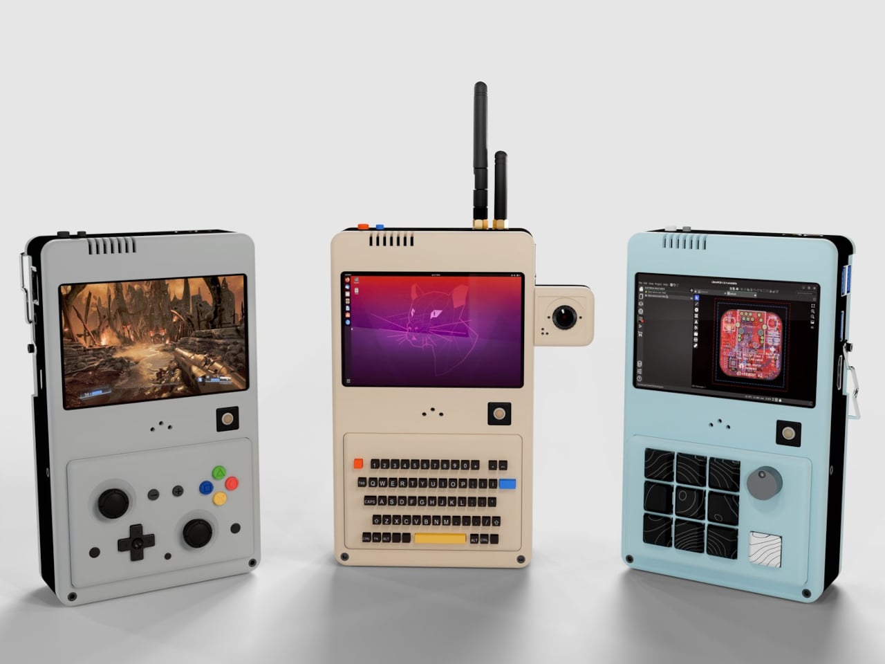
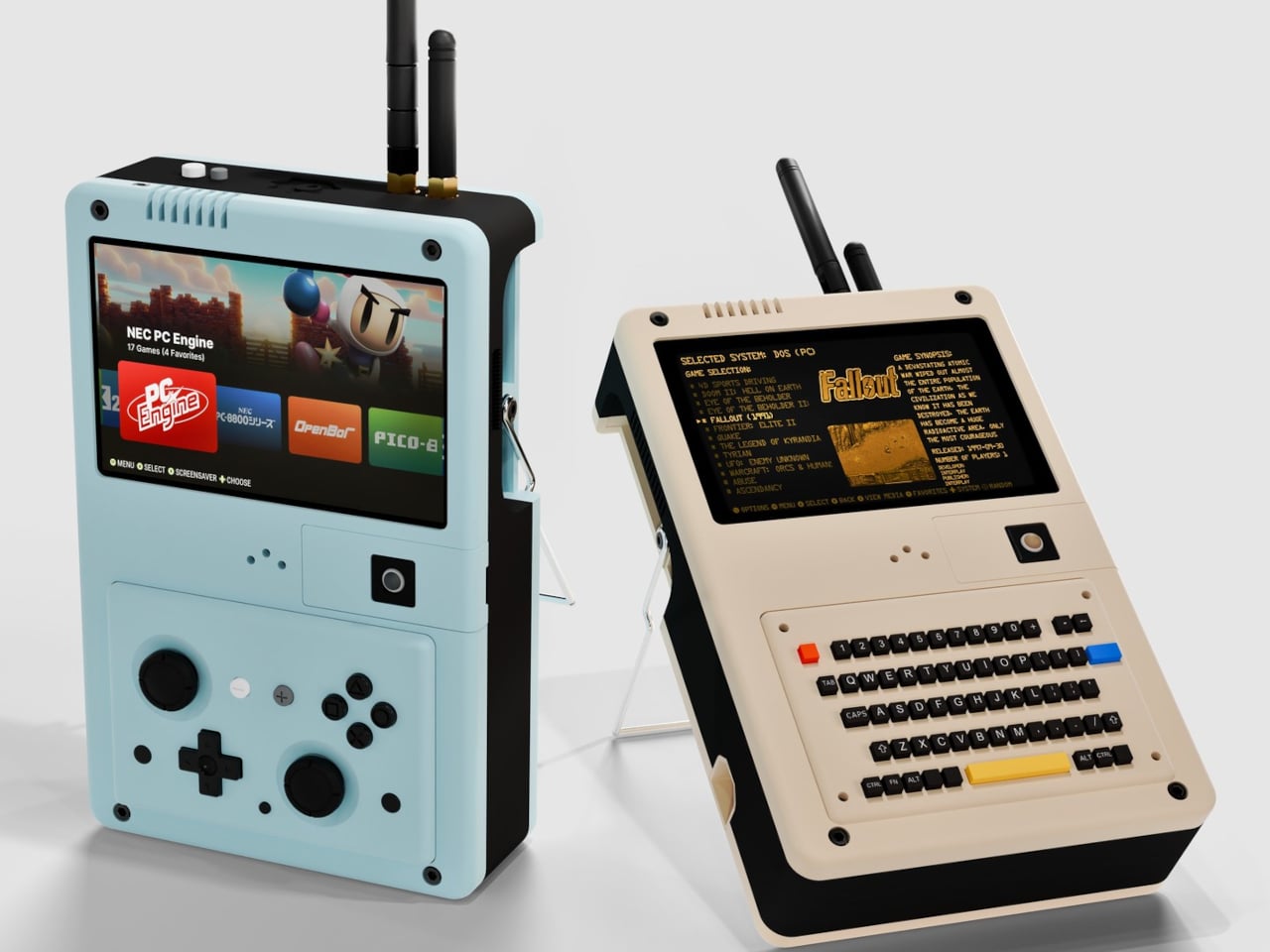
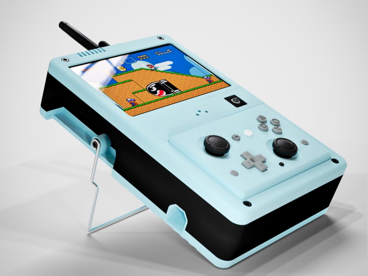
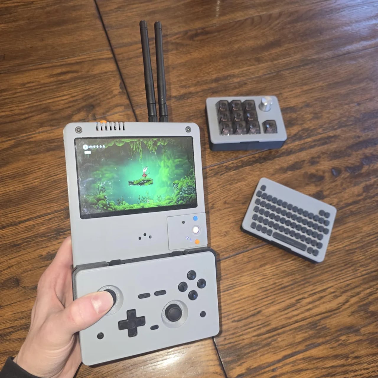
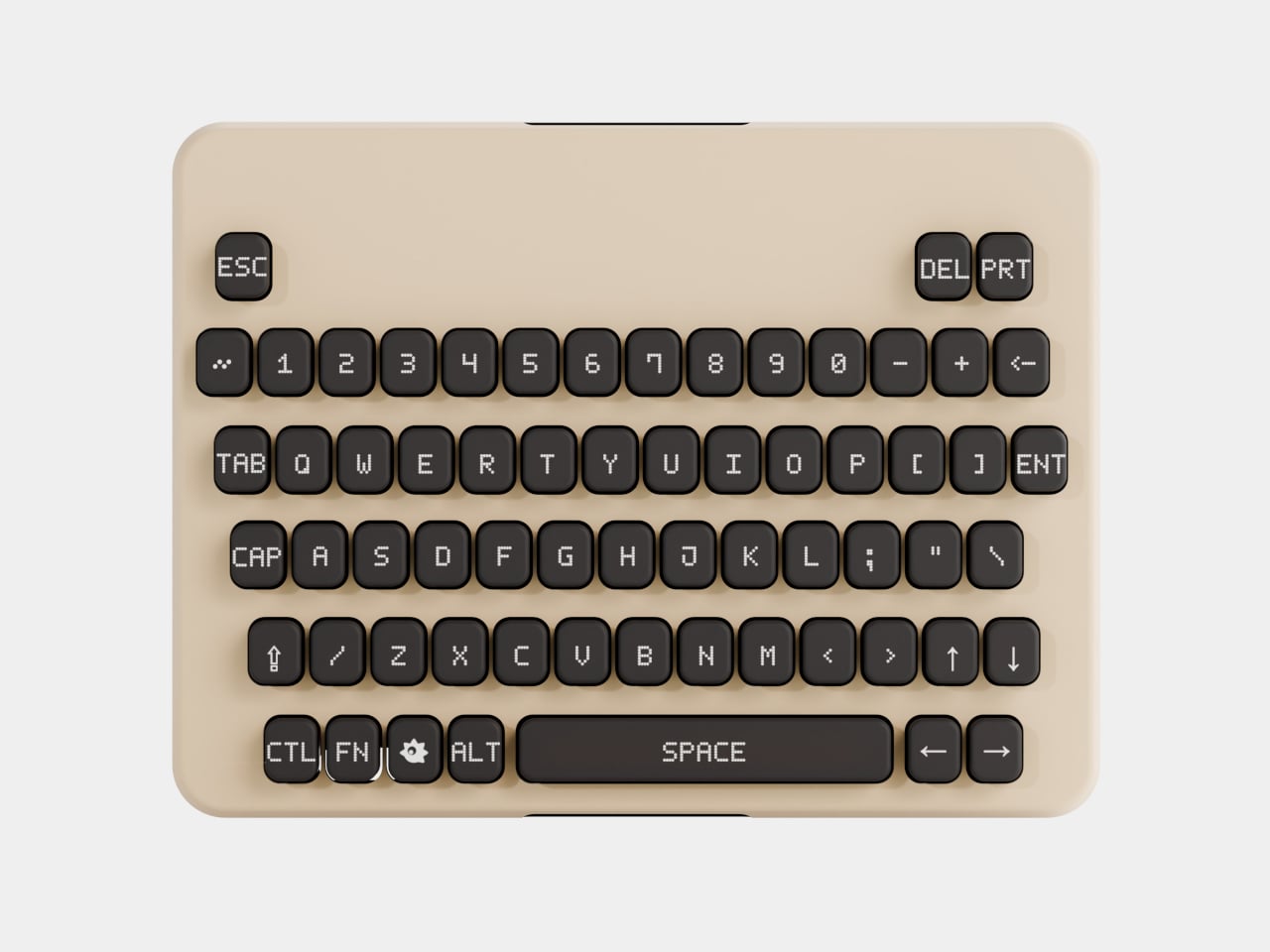
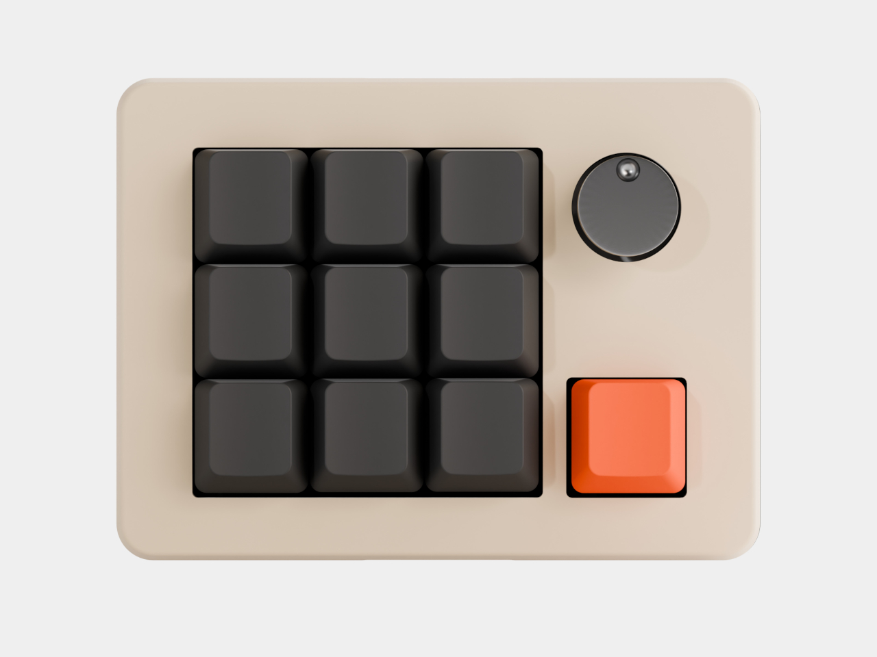
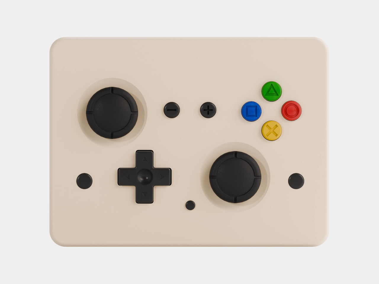
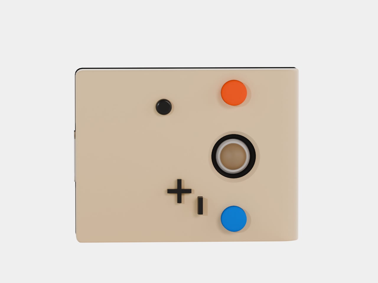
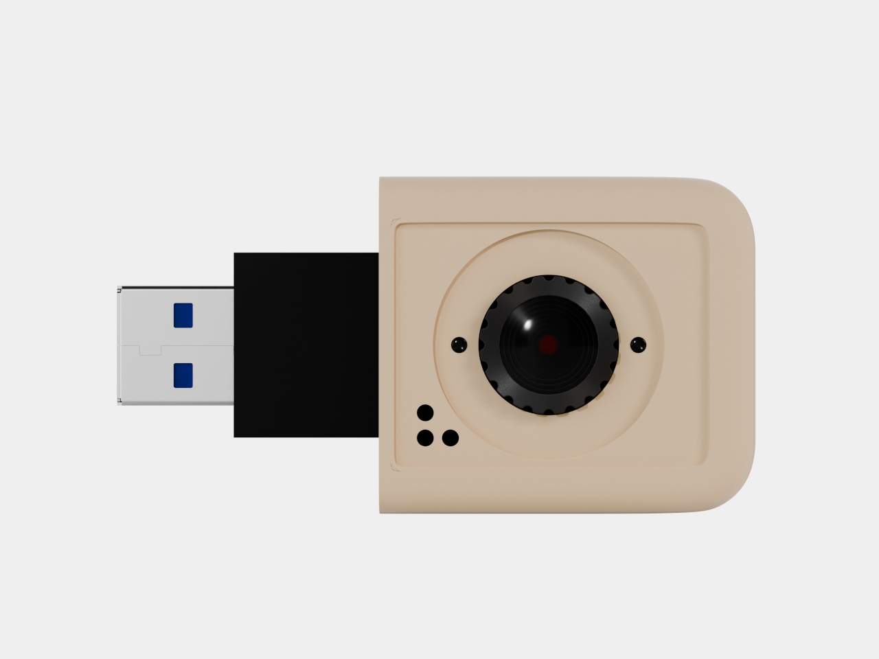
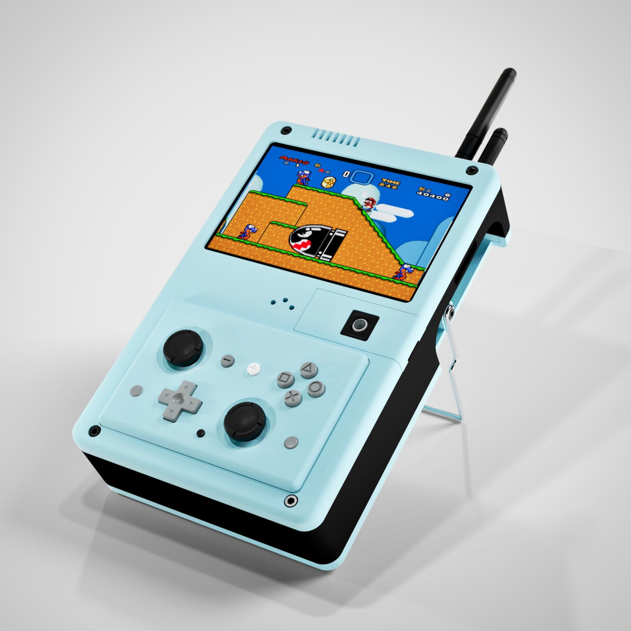
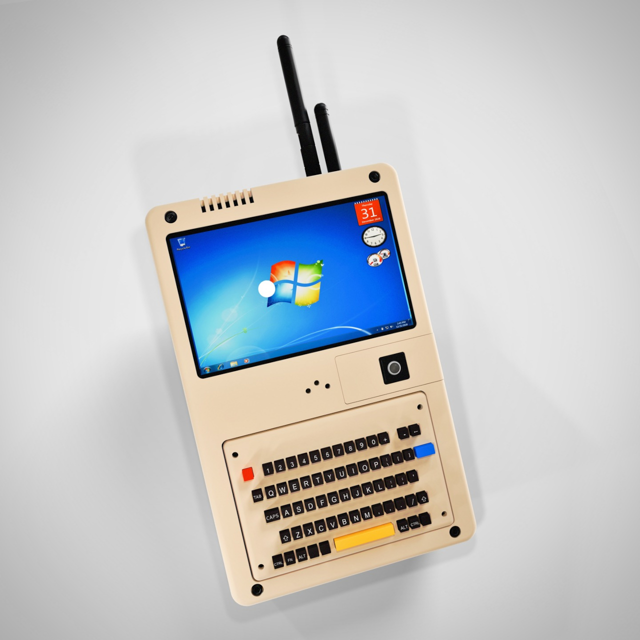
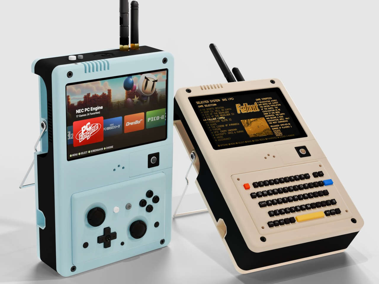
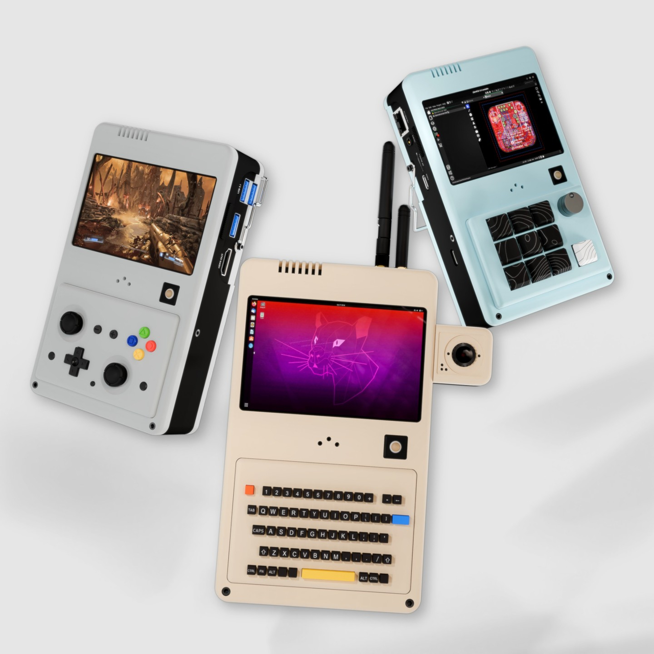
The CG Deck takes a different approach. Rather than locking itself into one form factor, it’s built around swappable input modules that let you physically change what kind of device it is, depending on what you need it to do. Snap on the gamepad for gaming, switch to the 64-key keyboard for writing, or reach for the 11-key rotary knob module when precision matters most.

Designer: Mogozen

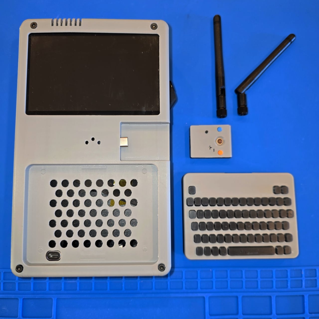
The module system is split into two types of slots, primary and secondary, which accept different kinds of attachments. The primary slot handles the bigger input options, like the gamepad controller, keyboard, or knob module. The secondary slot is where something like a trackball mouse module goes. Over 30 additional modules are already in development, opening the door to configurations nobody has really tried before.

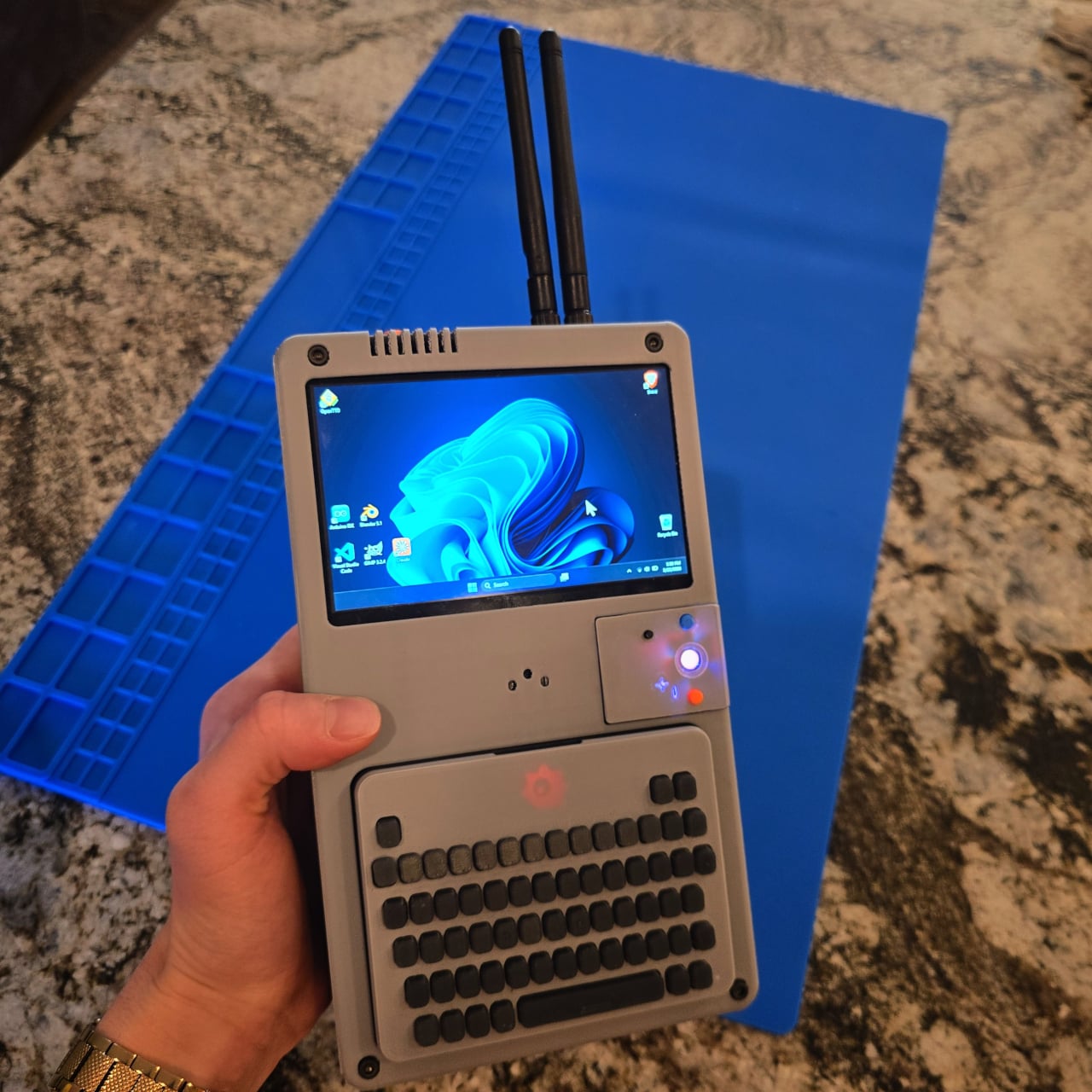
Running the whole thing is an Intel N150 processor paired with up to 16GB of LPDDR5 RAM, which is enough to handle productivity workloads, light creative tasks, and indie gaming without breaking a sweat. The 5-inch IPS touchscreen runs at 1024×600 and peaks at 1,000 nits, which keeps it readable in brighter conditions. It also outputs up to 4K at 60Hz via HDMI 2.1 when a bigger screen is nearby.

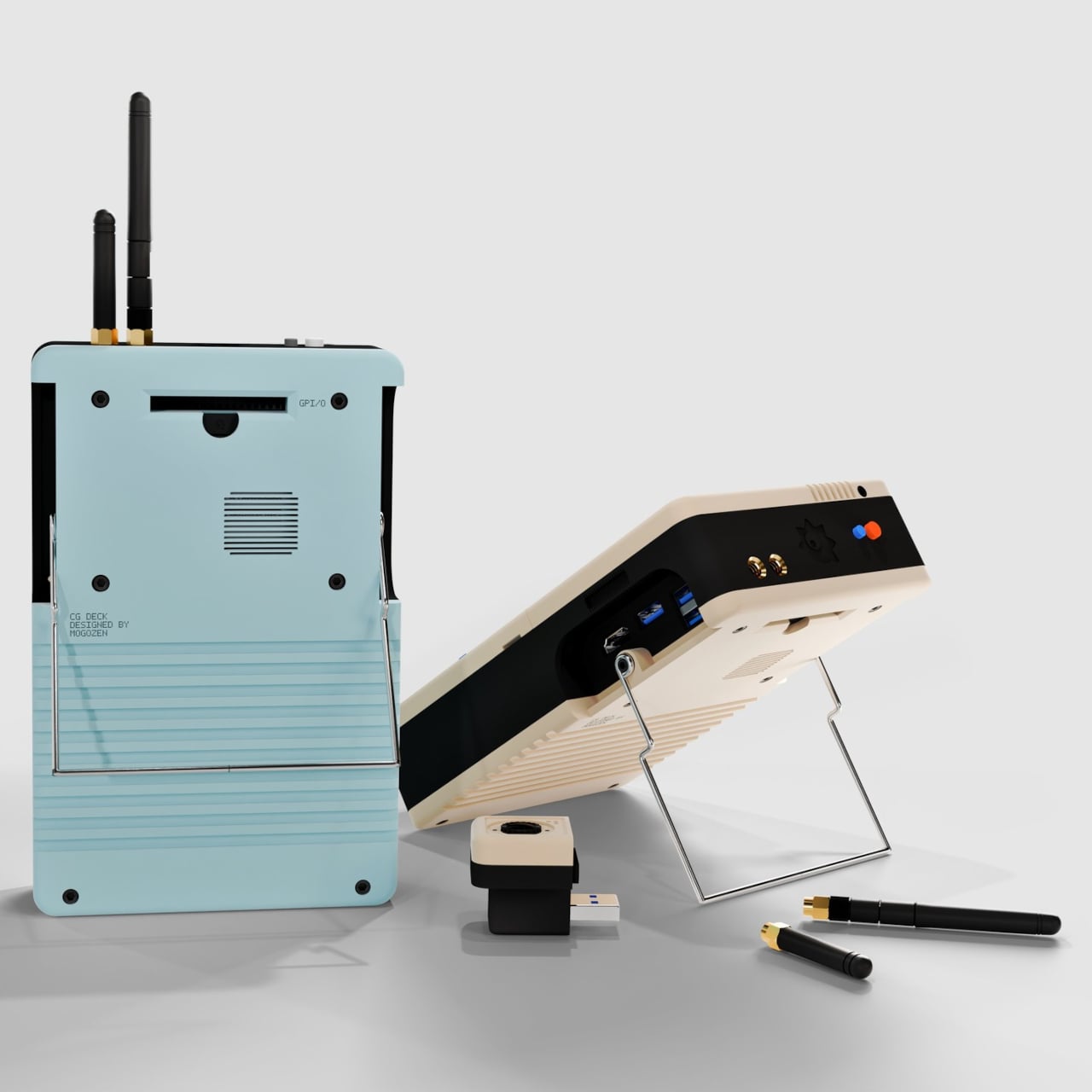
The battery is made up of three 18650 lithium cells totaling 10,500 mAh, good for roughly eight hours of use and charged via USB-C. Connectivity is unusually generous for a handheld of this size, with built-in Wi-Fi 6e, Bluetooth, and a full 1GbE Ethernet port, plus two USB-A 3.0 ports, a USB-C port, and a MicroSD card slot built directly into the chassis.

Beyond swapping the controllers, the internals are expandable, too. An M.2 slot accepts NVMe SSDs in 2230 or 2280 form factors via PCIe 3.0, there’s a module slot for 4G LTE cellular connectivity with a NanoSIM, and a PCIe expansion port opens the door to external GPU attachments for more demanding workloads. x86 architecture means it runs anything, from Windows 10 and 11 to any Linux distribution you prefer.

What makes this even more interesting is that everything about the CG Deck is open source. Schematics, firmware, and design files will all be available on GitHub, so tinkerers can build their own version without waiting for the commercial release. A Kickstarter is currently in the works for those who’d rather not solder their way through it, and a waitlist is already open on the Mogozen website.

The engineering prototype is working, though it’s still being refined before it’s ready for a wider audience. Future shell designs include options with picatinny rails and LEGO-compatible brick plates, suggesting that physical customization goes well beyond the input modules alone. The overall concept is unusual enough to feel genuinely novel in a category that’s started to feel a bit predictable.

The post The Handheld PC That Becomes a Gamepad, Keyboard, or Knob Panel first appeared on Yanko Design.

This $399 Tablet Has 9 JBL Speakers and Works as a Bluetooth Speaker

Entertainment tablets have always been a bit of a compromise. They’re large enough to make video look good, but the speakers are almost universally disappointing, and most people end up propping them against a pillow or a water bottle to get a decent viewing angle. The hardware has gotten better over the years, but the experience still feels like it’s designed around the screen and nothing else.

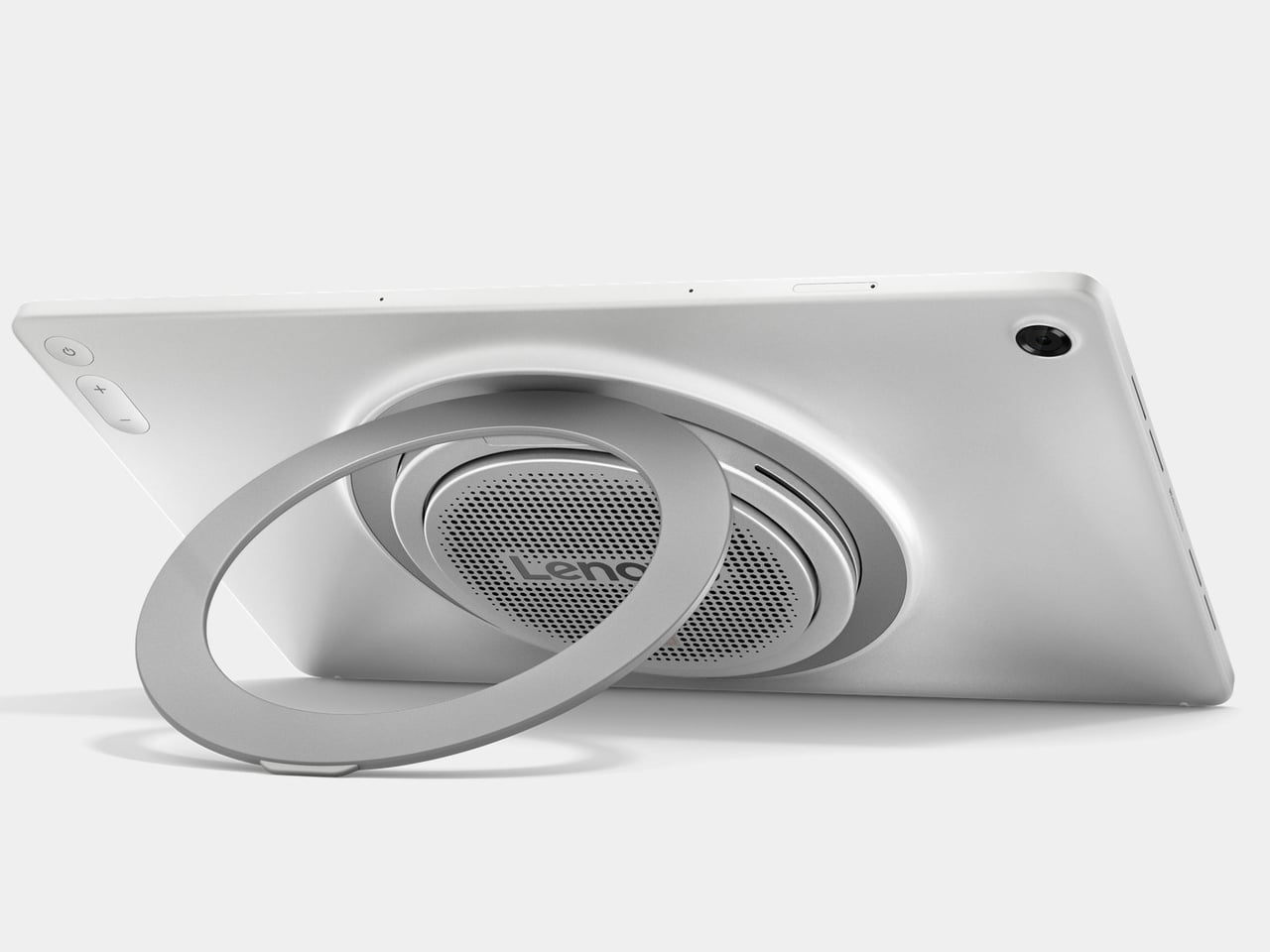
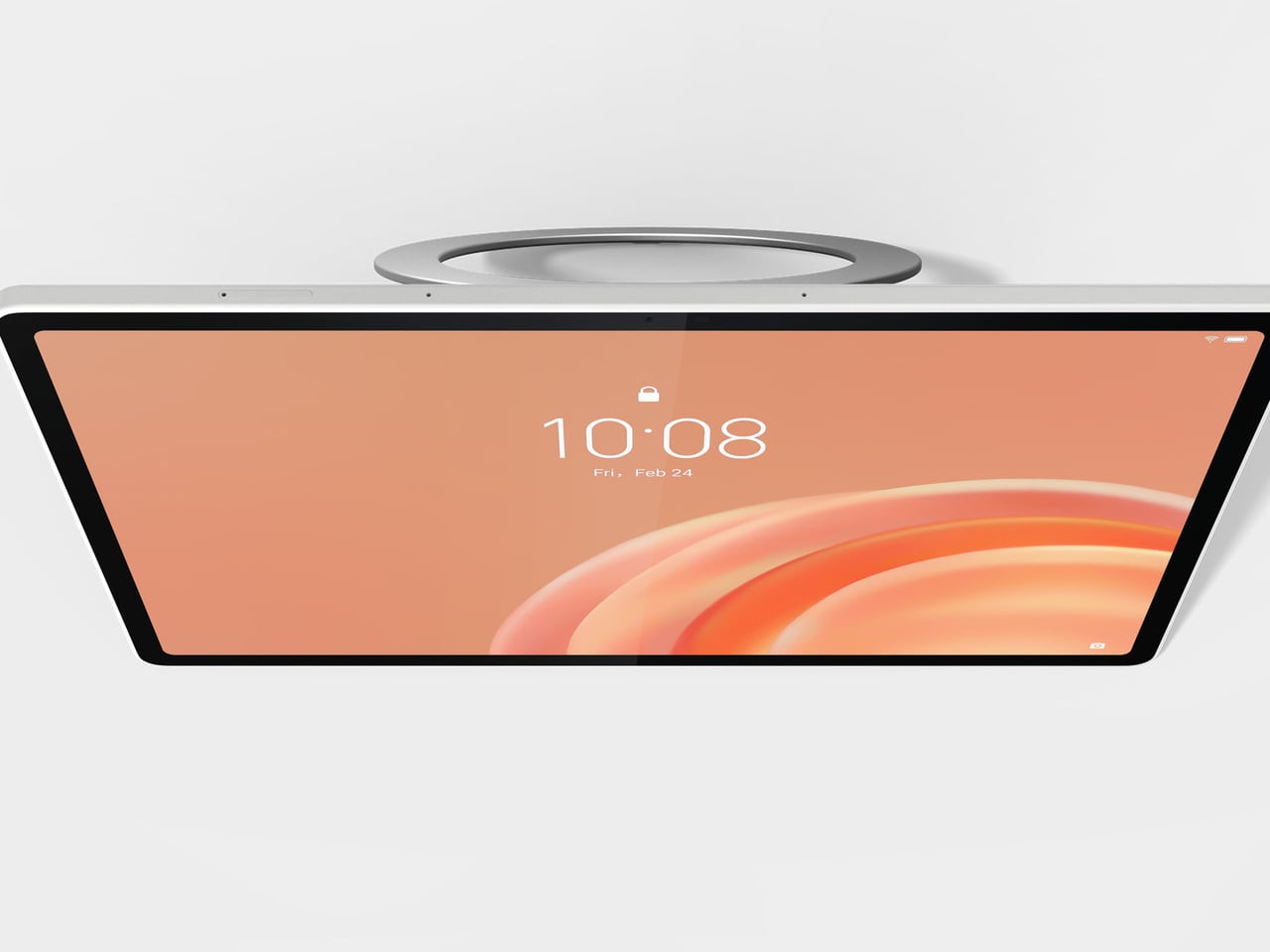
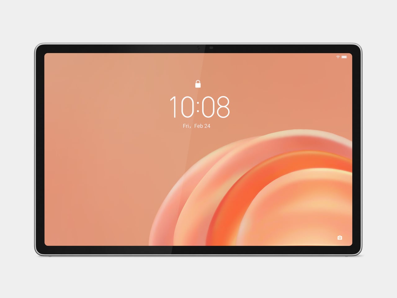
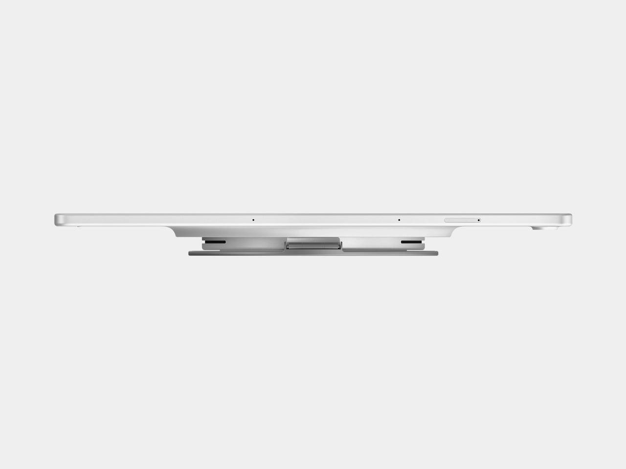
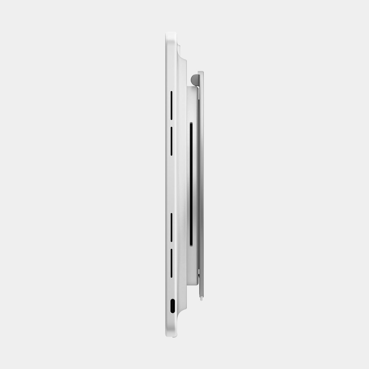
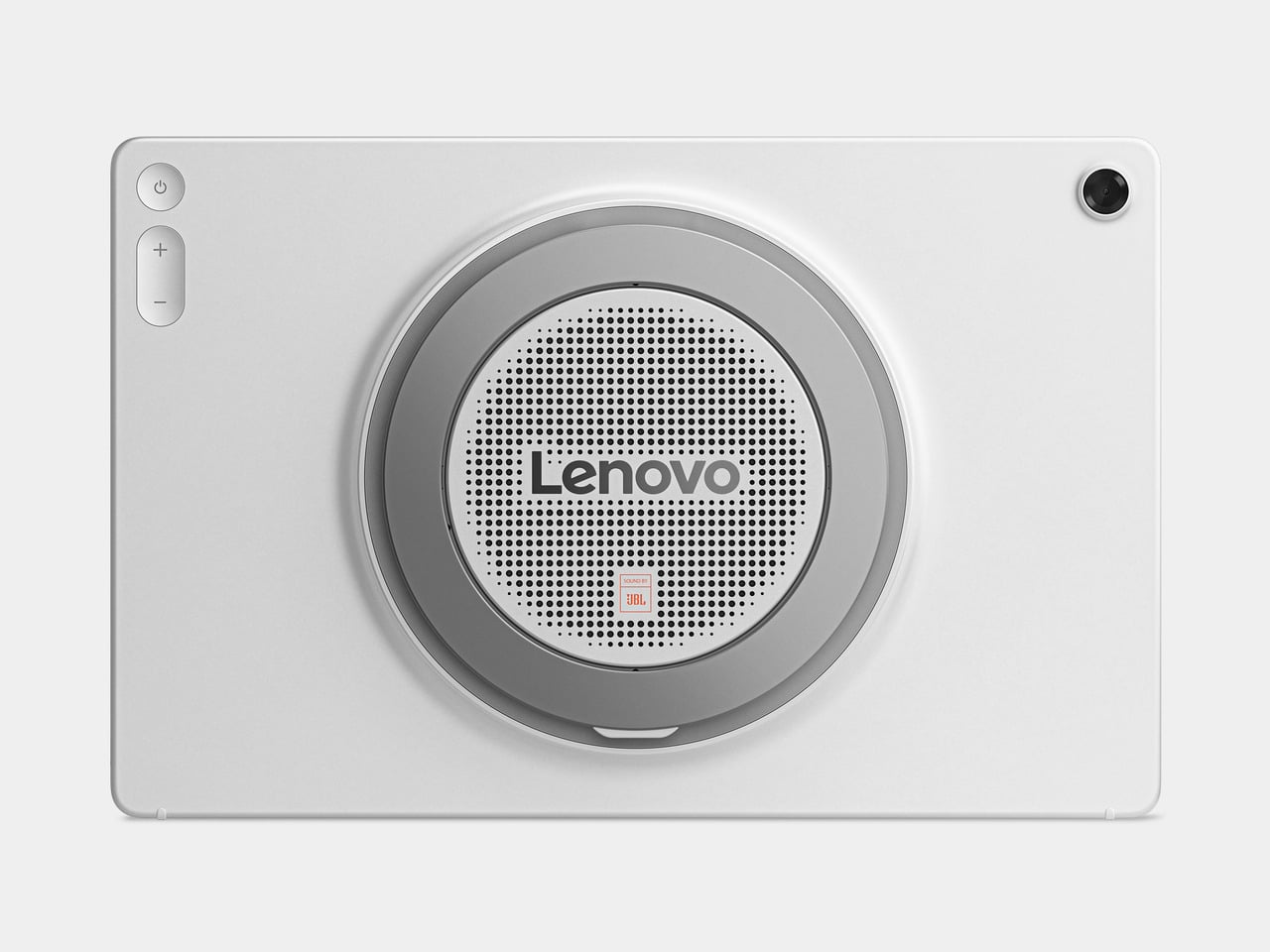
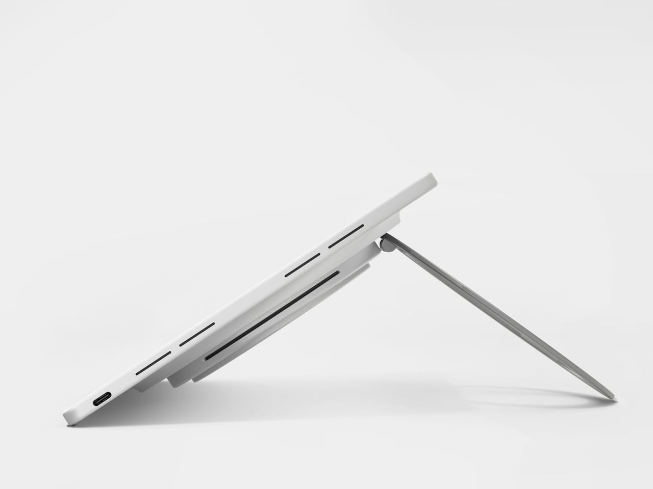
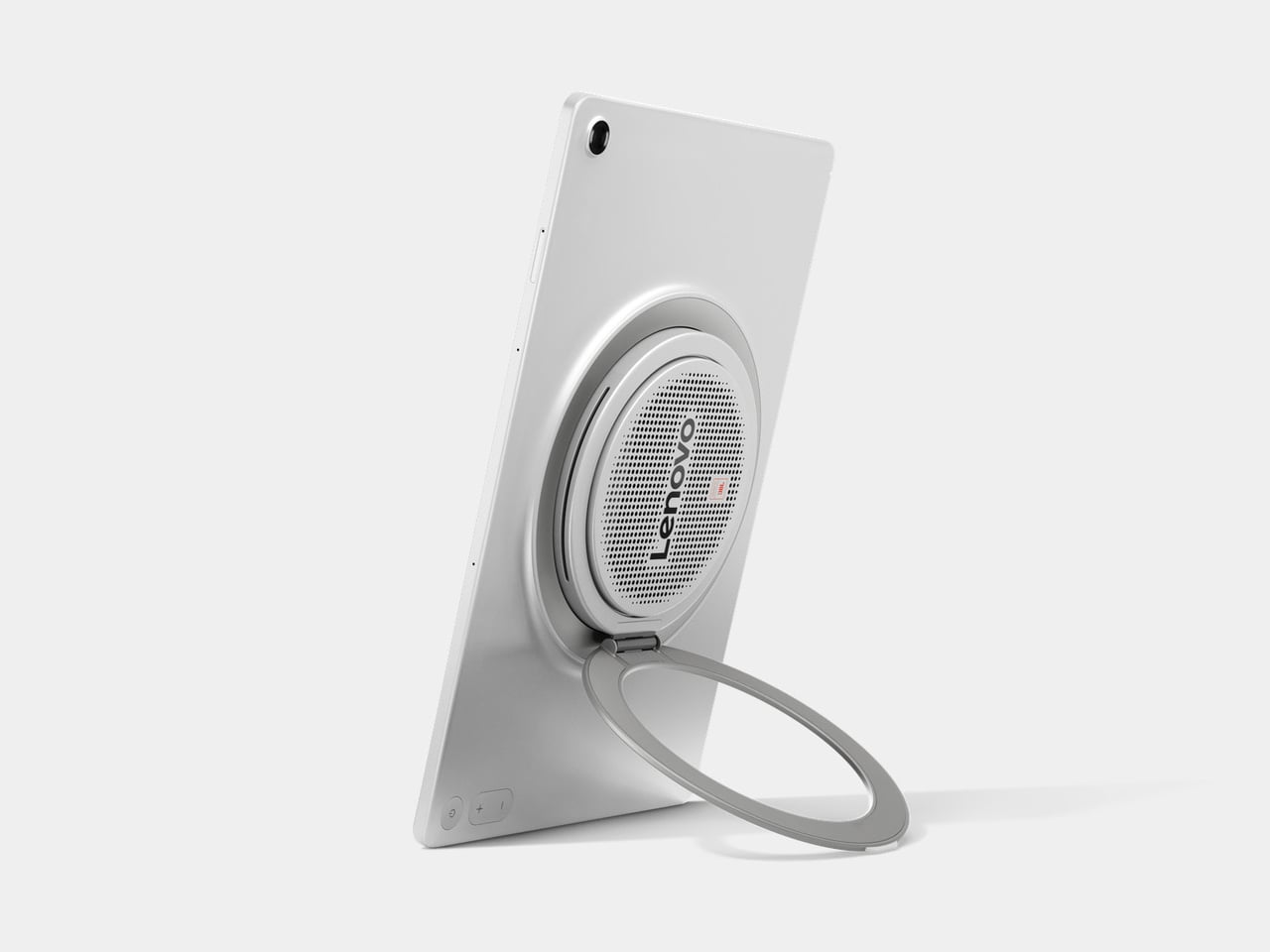
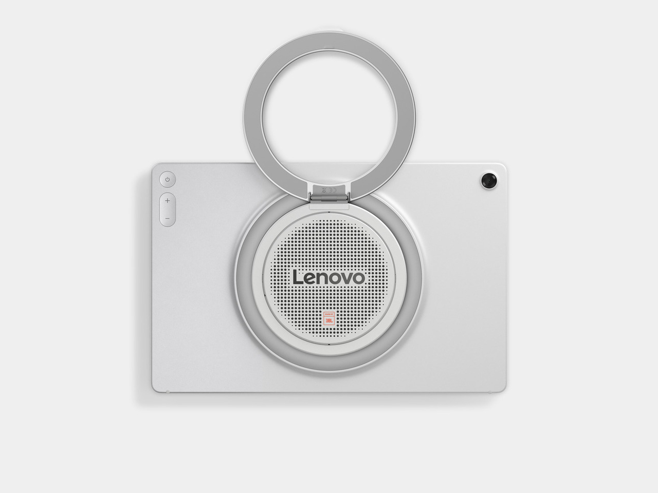
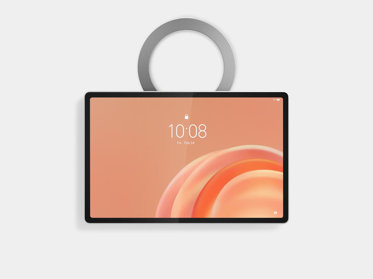
Lenovo’s Tab Plus Gen 2 is built around a different set of priorities. It leads with audio in a way that most Android tablets don’t, pairs that with a display that can actually do the sound justice, and backs both up with a mechanical kickstand that rotates 360 degrees so the tablet can sit, stand, lean, or hang in whatever configuration makes the most sense for the moment.

Designer: Lenovo

The 12.1-inch 2.5K LCD display carries Dolby Vision and HDR10 support, a 120Hz refresh rate, and up to 800 nits in High Brightness Mode for watching in brighter environments. At 249ppi, the pixel density stays sharp at this screen size, which matters when you’re switching between films, reading articles, or navigating something that would look noticeably soft on a lower-resolution panel.

The JBL 9-unit Pro speaker system is tuned with Dolby Atmos and includes dedicated bass units that give the sound a physical weight most tablet audio simply doesn’t have. Dialogue stays clear, bass doesn’t disappear, and the whole thing scales with the content. Dolby Audio processing lets you switch between Dynamic, Movie, and Music modes depending on what you’re watching or listening to.

There’s also a built-in Bluetooth speaker mode that turns the Tab Plus Gen 2 into a standalone speaker you can control from your phone. That means you can set the tablet up in the kitchen, hit play on a playlist from across the room, and use it the same way you’d use a Bluetooth speaker, without needing a separate device sitting on the counter.

The 360-degree rotating kickstand handles four distinct positions: lean, theater, stand, and hanging mode. That covers everything from reclining on a couch to hooking onto a cabinet door in the kitchen, across both portrait and landscape orientations. When the tablet isn’t being actively used, a standby mode turns it into a digital picture frame, which gives it a purpose even when nobody’s watching anything.

AI Live Transcript handles real-time translation across more than 40 languages, which makes foreign-language content far more approachable without having to hunt for subtitles. AI Notes with Lenovo Notepad handles notetaking, and Smarter Reader makes navigating longer articles less of a chore. The 10,200mAh battery is rated for up to 15 hours of YouTube streaming, backed by 45W fast charging.

The Tab Plus Gen 2 starts at $399.99 and is available in Celestial White. It works with the Lenovo Tab Pen Plus and Lenovo Wireless Keyboard, both sold separately, and comes with a Sleeve Suite that includes a carrying sleeve and a shoulder strap for getting the tablet from room to room or out the door without digging around for a bag.

The post This $399 Tablet Has 9 JBL Speakers and Works as a Bluetooth Speaker first appeared on Yanko Design.