This $249 Phone Becomes a Game Console With One $29 Snap-On Tile

Feature phones have been having something of a quiet comeback, driven largely by people who are tired of the attention-capturing machinery baked into modern smartphones. Most of what’s on the market offers a stripped-back feature set with very little room to grow. Calls, texts, maybe a basic camera, and that’s about where the conversation ends, which hasn’t exactly made the category feel like an exciting place to be.

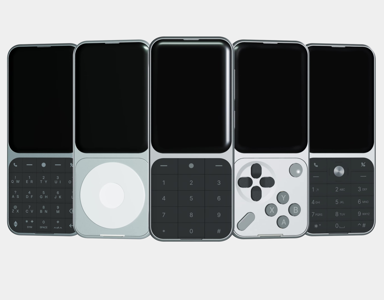
The Sidephone SP-01 has been quietly building a different kind of case for itself since its debut in 2025, not by piling features onto a simple phone but by letting users choose what kind of phone they want through a swappable modular keypad system. The Mini Controller Keypad is the fourth tile to join that family, and it’s the most unexpected one yet.

Designer: Sidephone
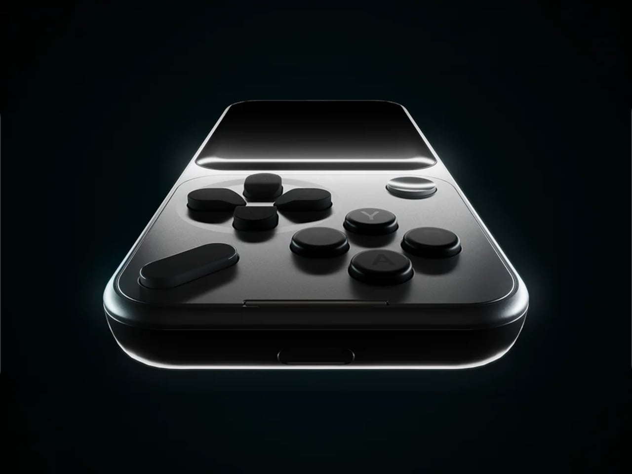
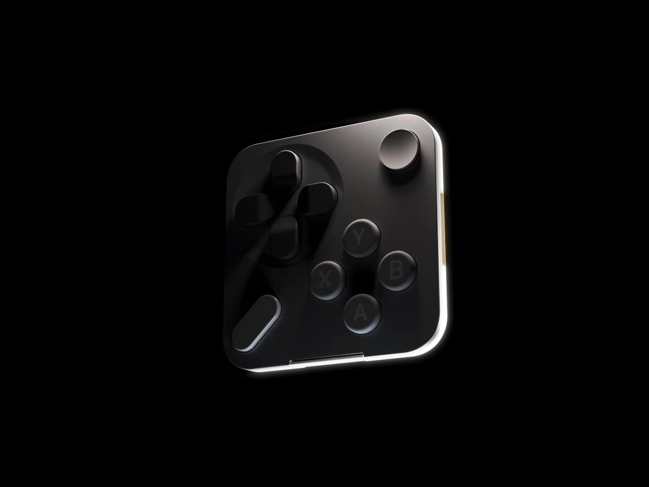
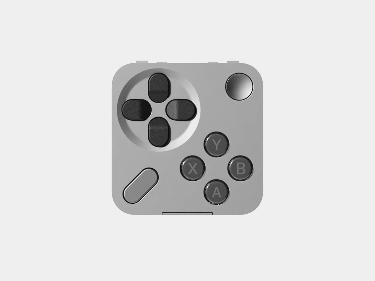
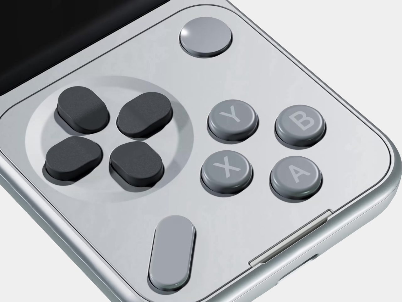
Unlike the T9 pad used for texting or the Sundial’s iPod-wheel-style controls for music, the Mini Controller brings a game controller layout to the front of the phone. It carries a D-pad, A, X, Y, and B action buttons, plus Start and Select, all of which will feel immediately familiar to anyone who has ever held a handheld gaming device. The keypad sells separately for $29, the same price as the other add-on tiles.
To go with the hardware, Sidephone has developed two mini games that ship alongside the keypad: Mini Asteroids and Mini Blocks. They’re clearly starter content rather than the main event, but they establish that this isn’t just a novelty tile. The company has plans to open a community development environment so that third-party developers can build their own games and apps for the platform, which is when things will likely get more interesting.
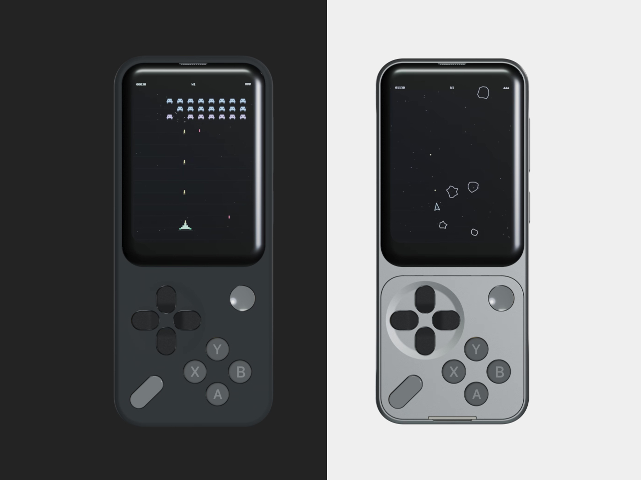
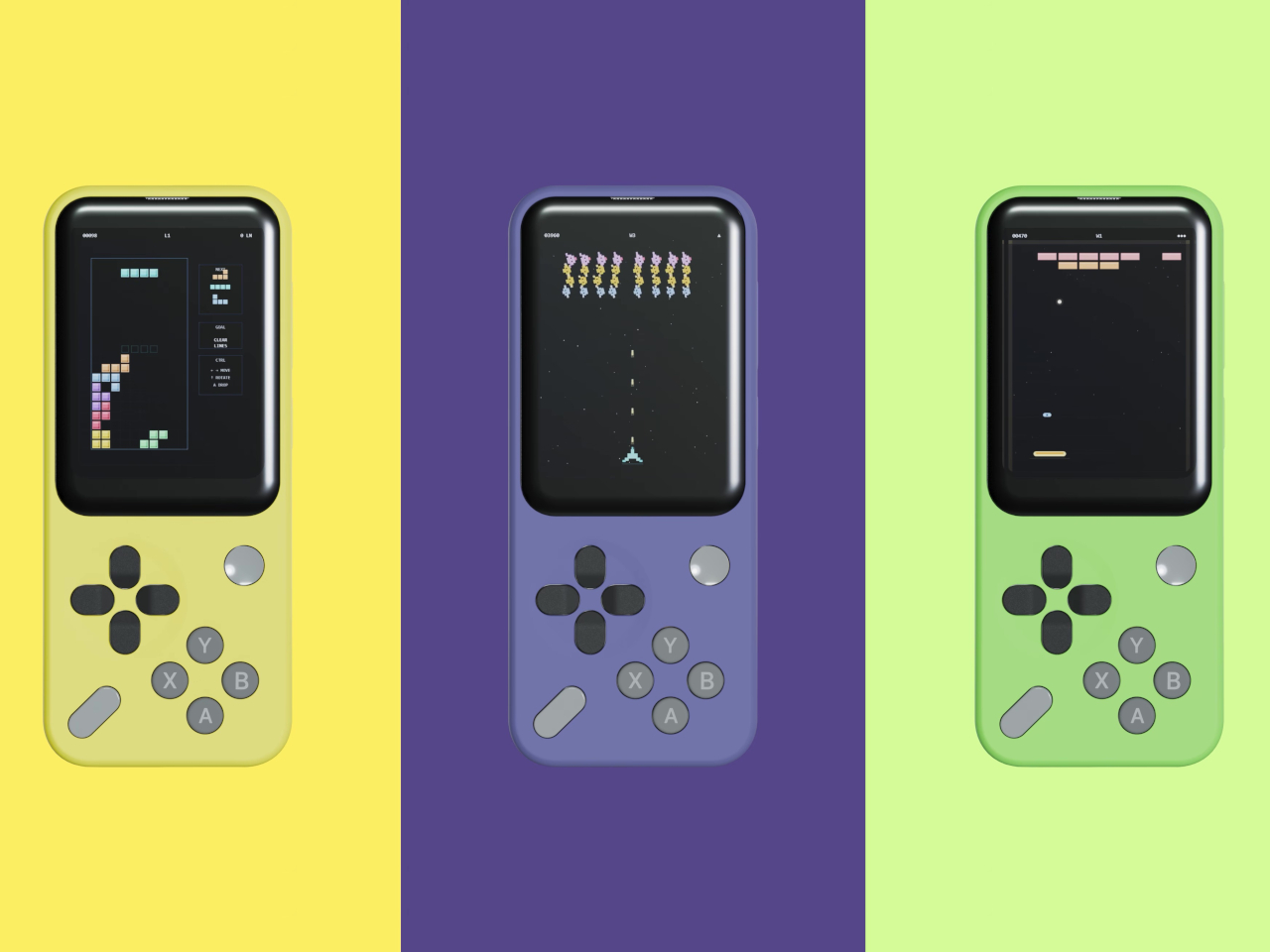
What Sidephone has been sketching out goes considerably further. GBA and arcade emulator support has been floated as a longer-term possibility, alongside universal smart remote functionality. If even a portion of that lands, the Mini Controller starts looking like less of a playful add-on and more of a meaningful expansion of what a deliberately simple phone can do on an idle evening.
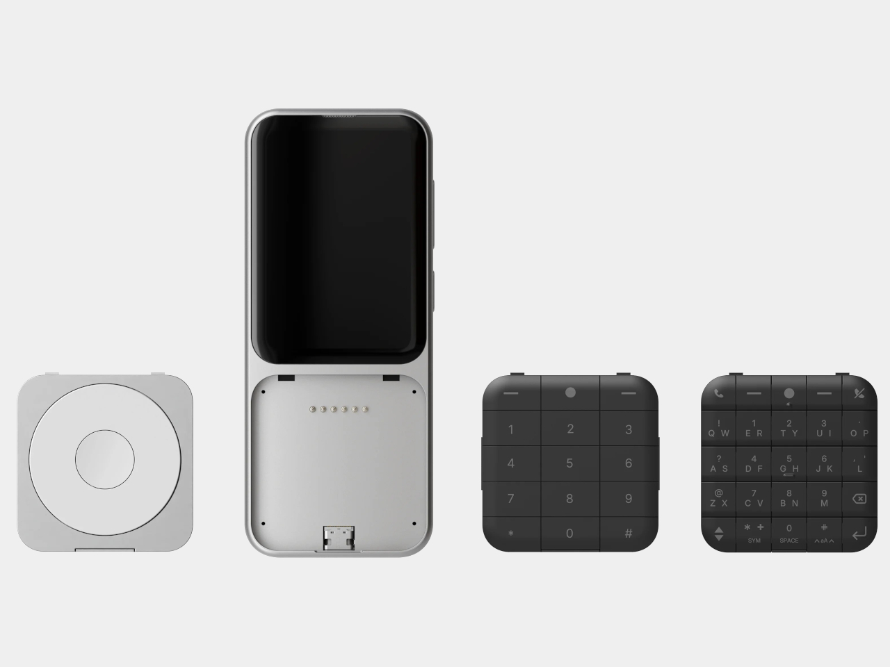
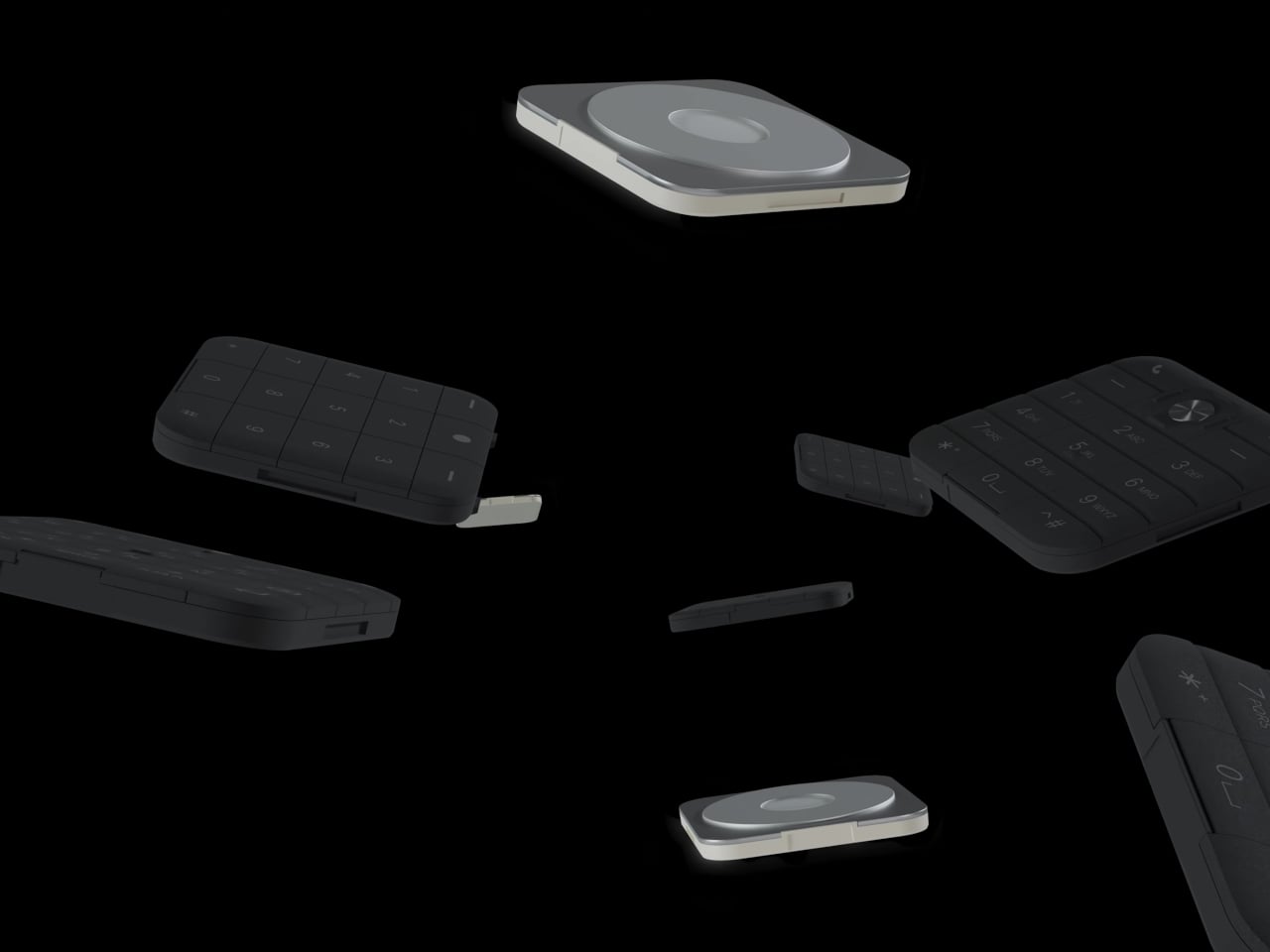
The whole system rests on the premise that a feature phone doesn’t have to be a featureless object. The SP-01 runs a custom Android-based OS, carries a 2.8-inch touchscreen and a 12 MP camera, and supports essential apps without dragging in the full weight of a smartphone’s notification ecosystem. The swappable keypad system, which uses pogo-pin connectors and magnets to click tiles into place, is what allows the device to shift personalities without requiring a hardware upgrade.
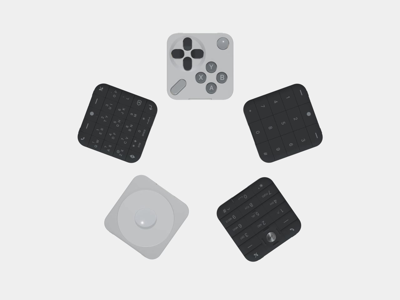
The Mini Controller sits alongside a growing family of tiles that now spans T9 dialing, compact QWERTY typing, scroll-wheel media control, and controller-style gaming. What started as a phone built around the premise of doing less has turned into a modular platform that keeps finding new things to do, each one contained in a $29 tile that snaps onto the same core hardware.
The post This $249 Phone Becomes a Game Console With One $29 Snap-On Tile first appeared on Yanko Design.
This Concept Organizes the First 30 Seconds of Coming Home in the Rain

Home entryway products have a coverage problem. A shoe rack deals with footwear, but not the umbrella. An umbrella stand handles the wet item but does nothing for the dripping floor around it. A small tray catches keys but not the daily chaos that accompanies them. The pieces exist, but they don’t form a coherent system, and the result tends to be a doorway that feels permanently unsettled.

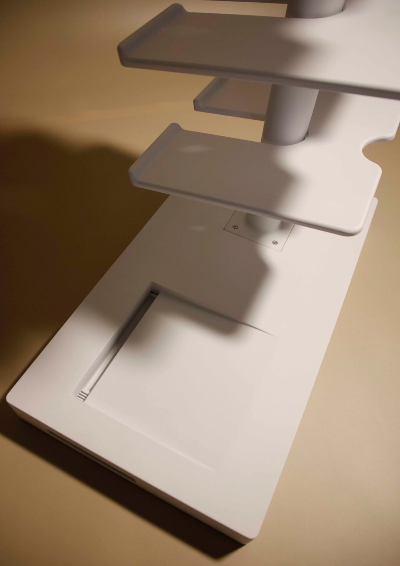
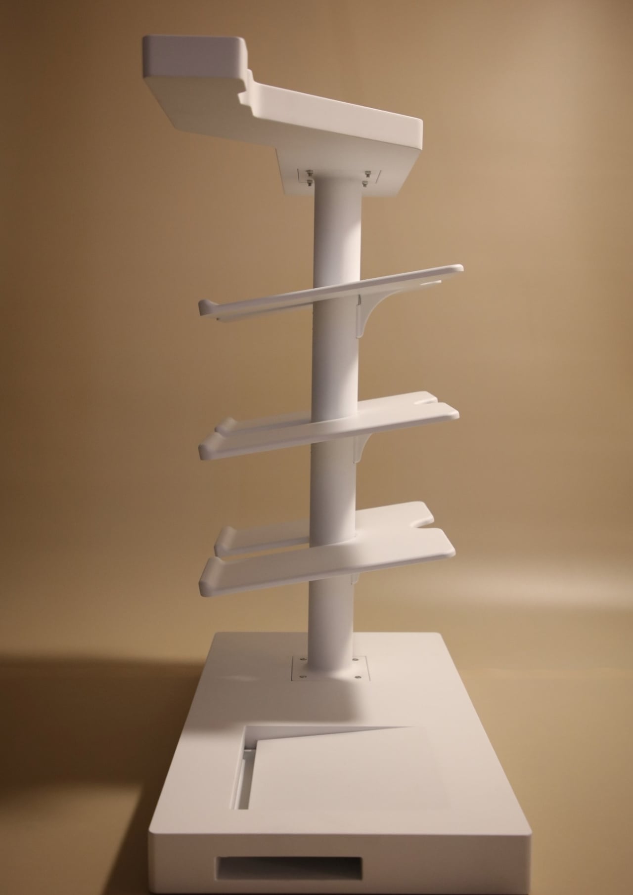
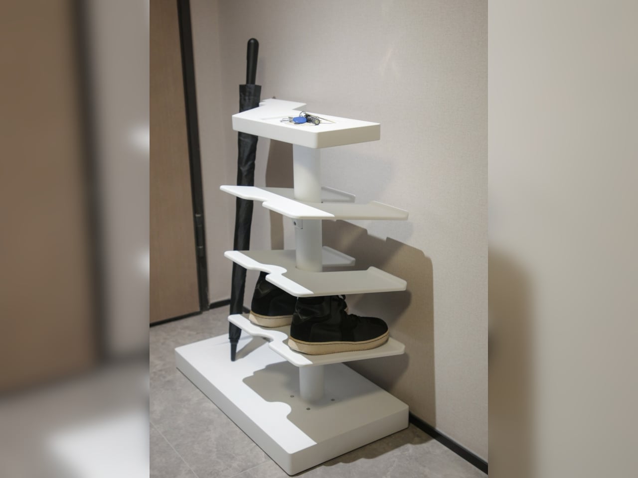
ENTRY is a concept that answers that scatter with one vertical object. It integrates umbrella guidance, water collection, elevated footwear storage, and a top catch-all surface into a single threshold form, described by its designer as something that organizes the first 30 seconds of coming home. Rather than treating the entrance as a storage corner, it reframes that space as a managed wet-dry transition between outside conditions and domestic calm.

Designer: Zhenhua Chen

The design gives the wet umbrella a precise position rather than a vague area to lean against. A vertical spine with controlled side geometry holds the umbrella in a defined relationship to the base, reducing the casual lean that scatters water across walls and floors. It’s structural thinking that locates the wet object deliberately, so that whatever drips off it goes where the design expects it to go.

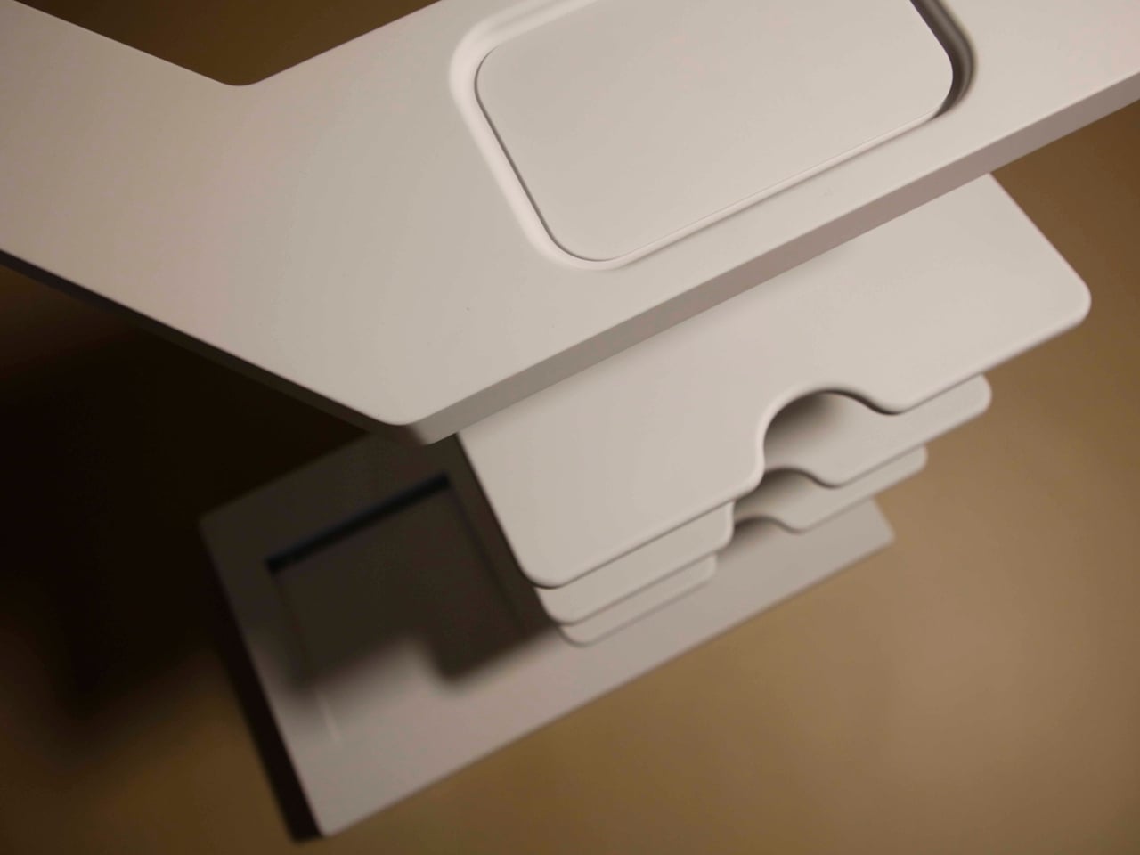
Below the umbrella position, a concealed, removable tray collects water at the base. Rather than allowing drips to pool on the floor or soak into a mat, the design makes water collection part of the object’s own structure. The tray pulls out when it needs emptying, keeping the maintenance cycle as minimal as the design premise itself. Water arrives with the umbrella, gets directed downward, gets caught, and gets removed.

Footwear gets lifted off the floor onto dedicated raised platforms rather than accumulating at the base of the door in the usual loose arrangement. The difference between floor-level disorder and a designated surface is partly visual but also functional: the floor around the entrance stays clear, and the entryway retains the quality of a space someone has thought about rather than one that simply absorbed what was dropped into it.

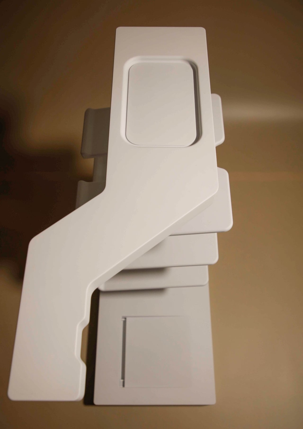
The top surface is a flat catch-all tray for keys, cards, and anything else that comes in at the end of the day. Placing that surface on the same object as the umbrella and shoes means the coming-home ritual resolves at a single point. You don’t split between the entryway table, the kitchen counter, and the shoe mat; everything lands together, and the entrance stays coherent rather than scattered.

The design doesn’t try to decorate the problem. It reframes the entryway as a piece of domestic infrastructure, a small managed object whose job is to absorb the friction of arriving rather than add to it. ENTRY currently exists as a concept prototype that confirms scale, spatial arrangement, and visual language. Drainage performance and load testing are identified as the next steps before the design moves further forward.

The post This Concept Organizes the First 30 Seconds of Coming Home in the Rain first appeared on Yanko Design.

This Free 3D Lamp Has 300 LEDs and Looks Nothing Like a Printed Object

Decorative lighting has become one of the more satisfying corners of the maker movement. Most off-the-shelf lamp designs don’t bring much that’s genuinely distinctive into a space, and the ones that do tend to cost far more than the task deserves. That’s pushed a growing number of people toward building their own, using 3D printing and open-source lighting firmware to create objects that simply wouldn’t exist any other way.

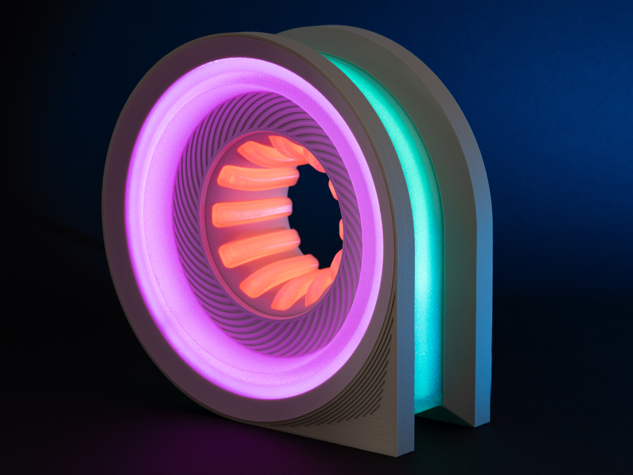
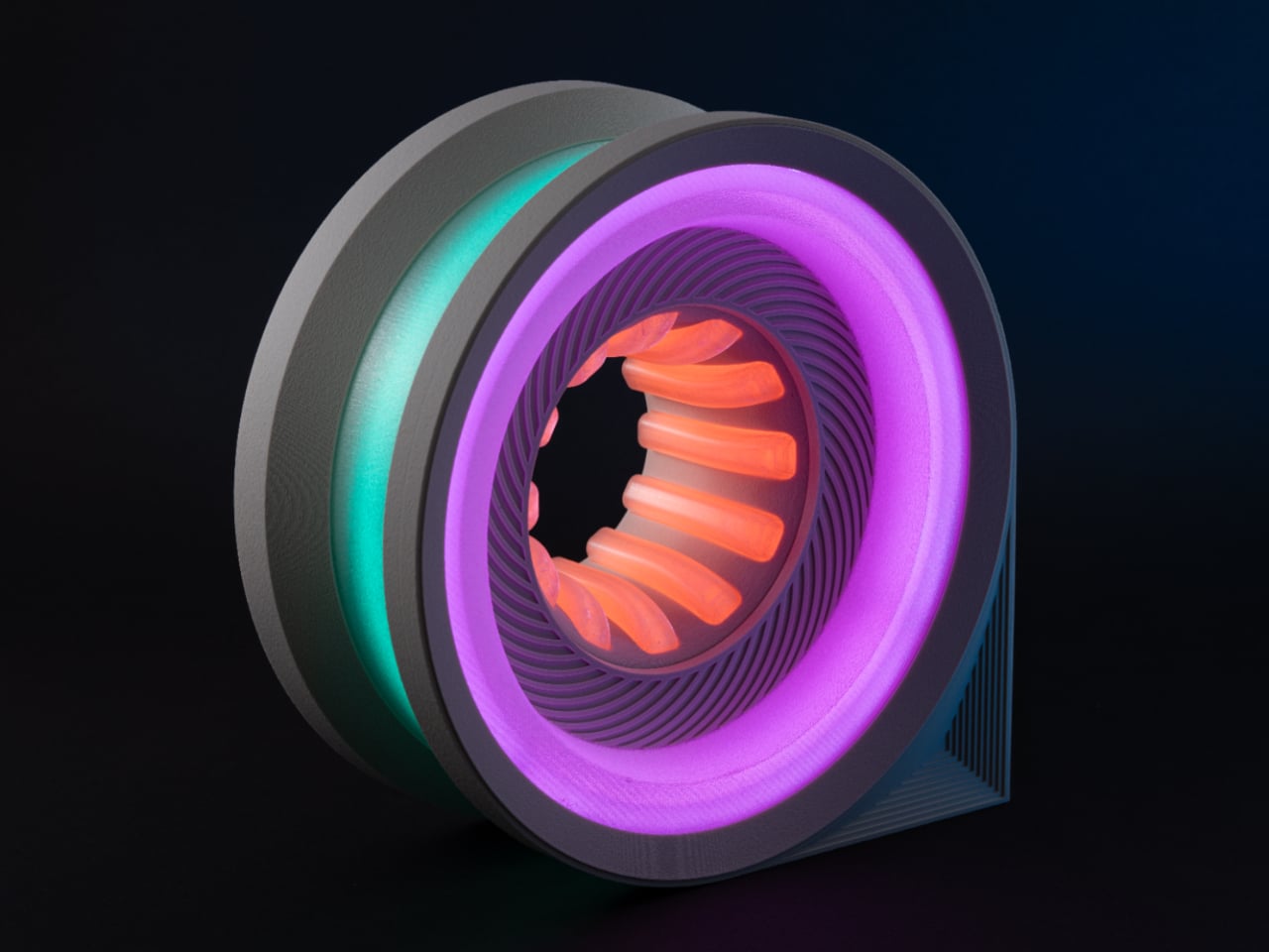
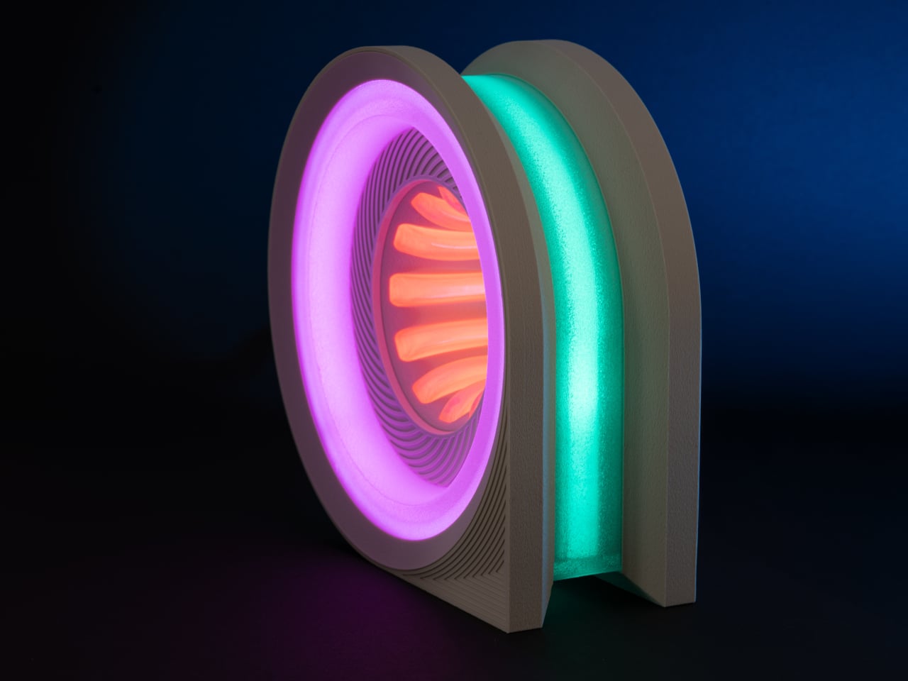
The Cyber Loop Lamp is the kind of result that tends to stop people mid-scroll. It takes the shape of a vertical wheel, somewhere between a car’s rim and a navigation pin laid flat, and wraps that form in a layered lighting system that creates an infinity-like depth effect. The files are available for free on MakerWorld, and building one is a genuinely demanding project.

Designer: LightCore3D

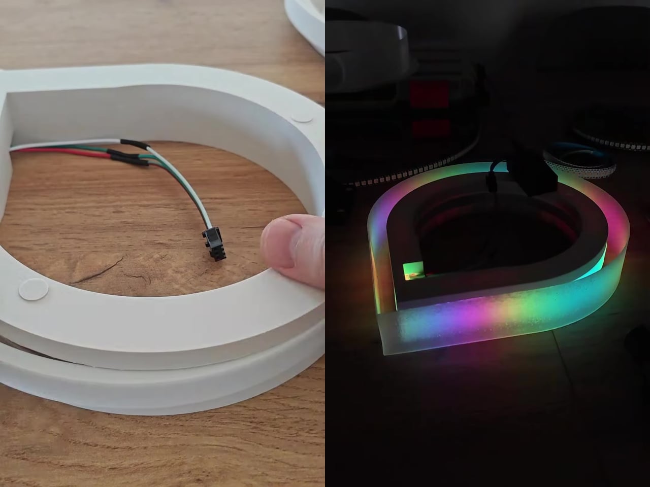
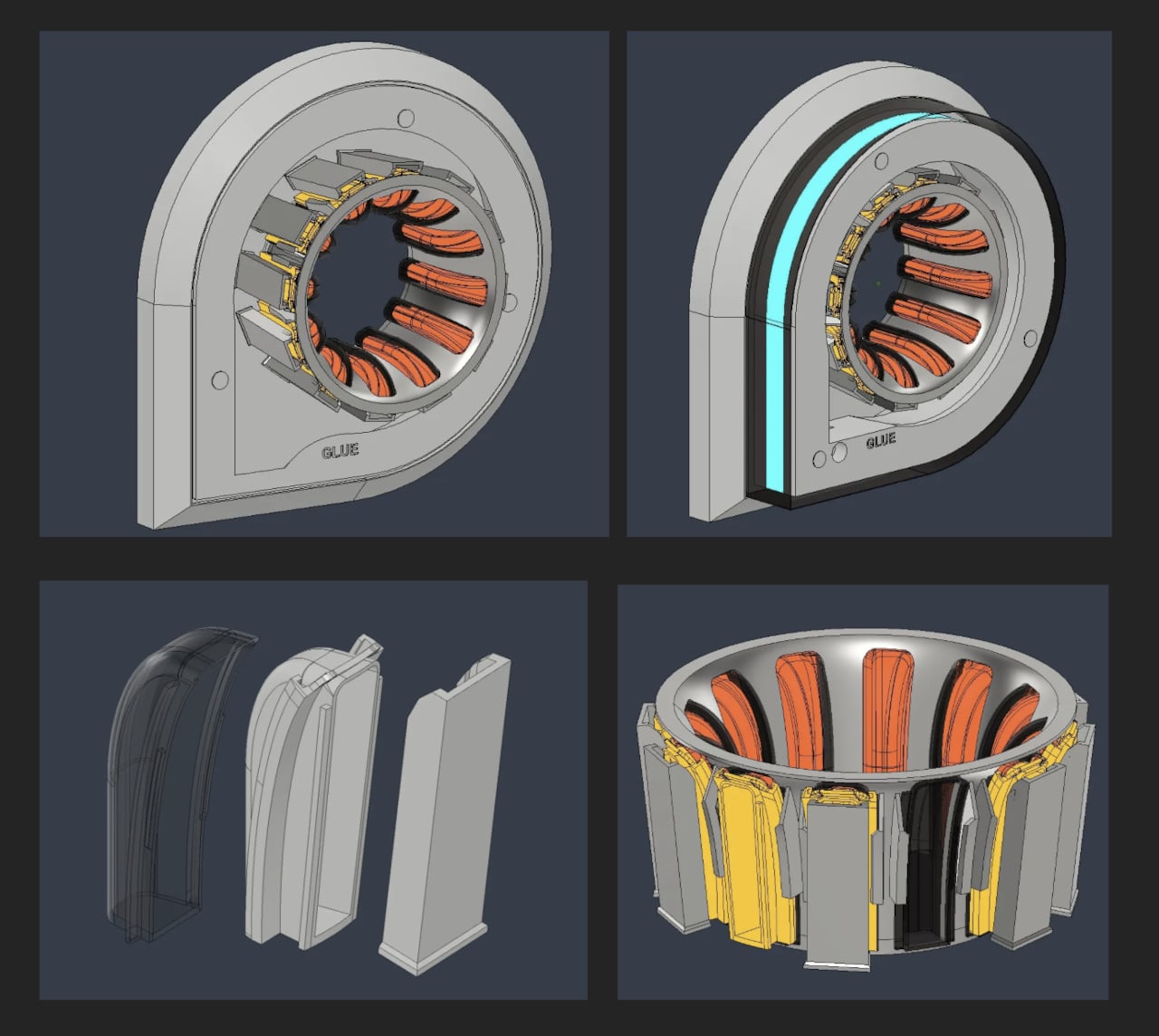
At approximately 25cm tall, the lamp has enough presence to anchor a desk corner without overwhelming it. The design uses colored filament for the outer shell and clear filament for a transparent inner diffuser layer. That separation between the light source and the outer shell produces the glowing, almost holographic depth that makes the lamp look so unlike anything that came off a 3D printer.

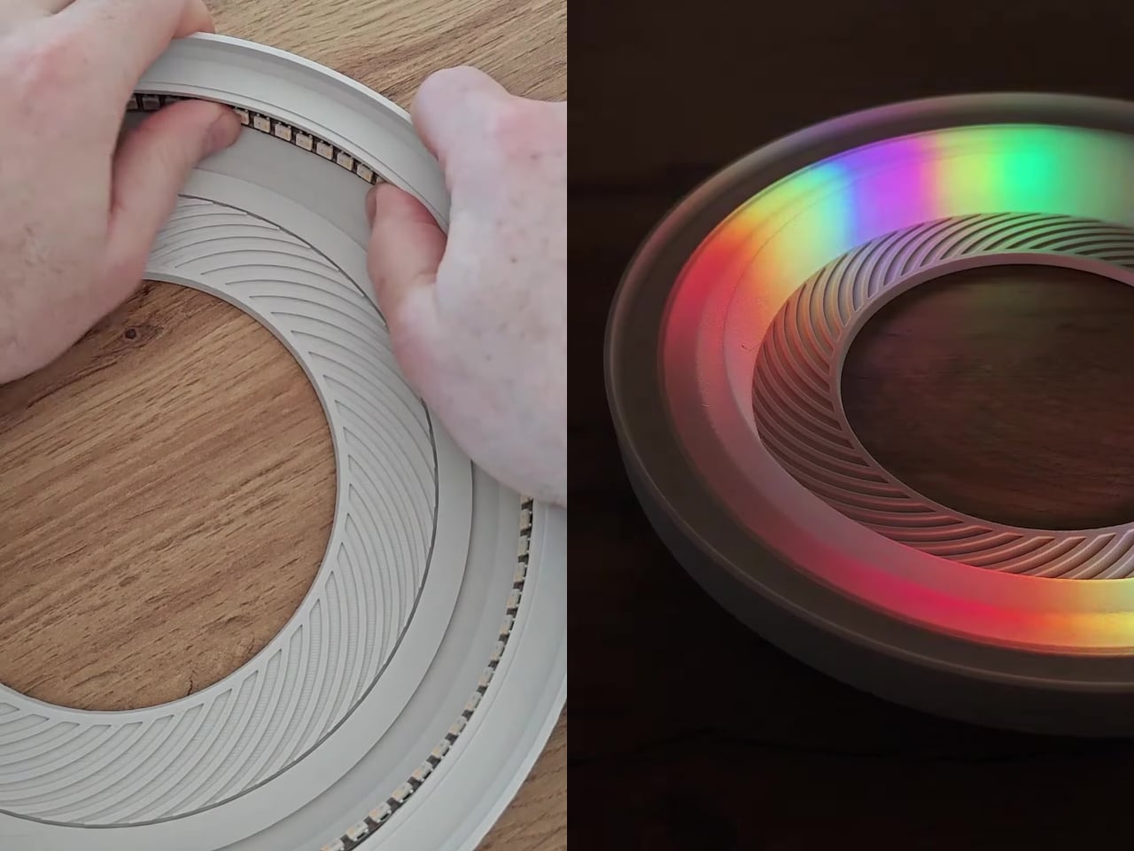
The lighting system draws from nearly 300 individually addressable RGB LEDs, packed into a 2m WS2812B strip running at 144 LEDs per meter. Three distinct zones handle the display: a central funnel, the outer perimeter ring, and roughly a dozen inner spokes. Each zone runs its own color and effect independently, giving the lamp that layered, animated quality that holds attention in a way static ambient lighting usually doesn’t.

Control comes from an ESP32 board running WLED firmware, which lets you map each LED zone to its own effects group and cycle through custom presets. WLED is open-source and widely supported, with a large built-in animation library and enough room to create your own sequences on top. The entire system draws from a 5V, 6A power supply, relatively modest for something delivering this amount of visual output.

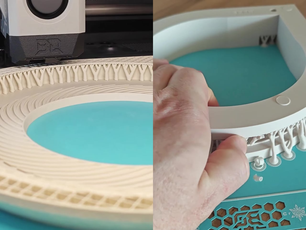
Getting there takes real commitment. The model spans 12 print plates with an estimated print time of roughly 35 hours, and that’s before assembly begins. Soldering is required, and components like resistors and capacitors join the LED strip and controller in the electronics stack. The creator is upfront that the assembly process isn’t fully documented, so some steps will require problem-solving on the fly rather than following a defined guide.

That friction is part of what makes the result feel earned. A lamp that takes 35 hours to print and several more to assemble isn’t something you’d put together casually, which means it carries weight as an object in the room beyond what any store-bought light could. It sits at a desk or shelf and reads as something deliberately built for exactly the space it occupies.

The Cyber Loop Lamp lands in that unusual territory between a functional accent light and something closer to a display piece, the kind of object that draws questions from people in a room before they figure out what it even is. The model is free on MakerWorld, and the full bill of materials is available directly from the project page for anyone ready to commit to the build.

The post This Free 3D Lamp Has 300 LEDs and Looks Nothing Like a Printed Object first appeared on Yanko Design.

Nomad’s Limited $135 Charger Matches Apple’s Boldest iPhone Color

Wireless chargers have largely been designed to disappear. Most of them are flat, black, or white, and perfectly content sitting out of sight somewhere near the outlet. A few have attempted to look more considered by borrowing from minimal Scandinavian design, though the result is often the same exercise in self-effacement. The idea that a charger could actually coordinate with the device it powers hasn’t really been taken seriously until recently.

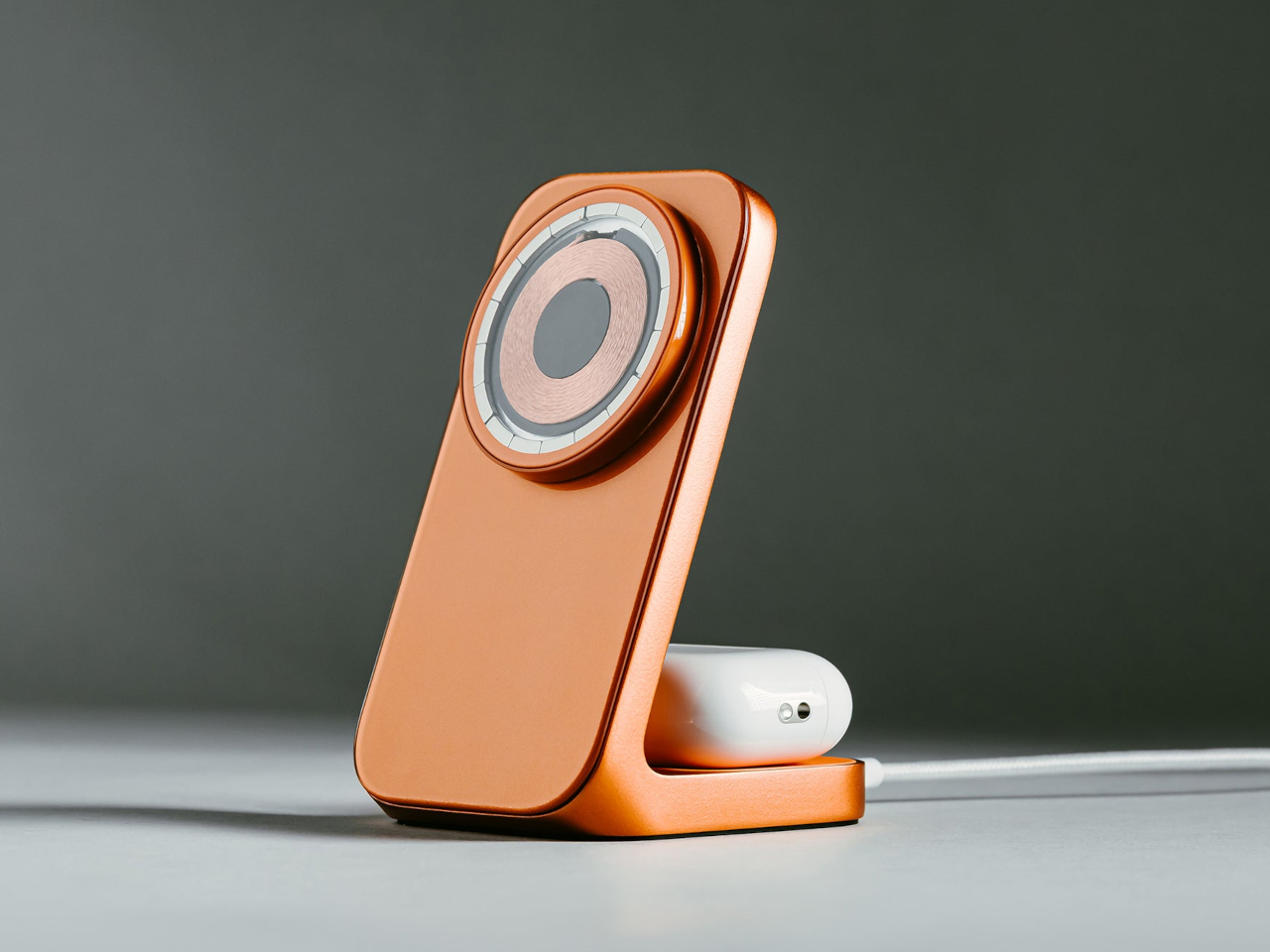
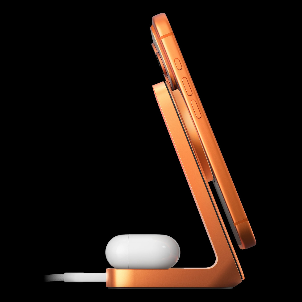
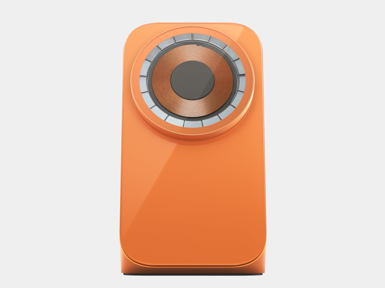
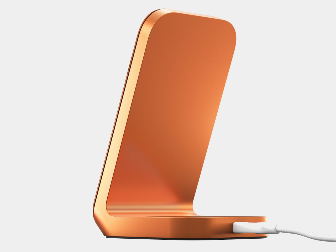
Apple’s Cosmic Orange finish on the iPhone 17 Pro changed that dynamic a little. It’s a vivid, opinionated color that doesn’t blend into the background, and it created an obvious opportunity for accessory makers to follow. Nomad has done exactly that with a limited-edition Stellar Orange version of its Stand One 4th Gen, a 2-in-1 charging hub built to match the iPhone’s finish almost exactly.

Designer: Nomad

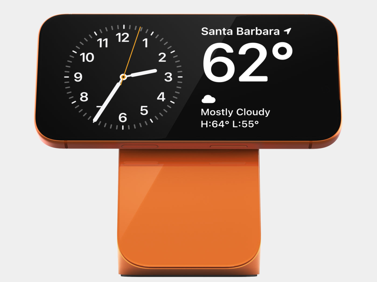
The Stand One itself has been around in more subdued forms, specifically silver and carbide, but the Stellar Orange version makes the charger a deliberate object on the desk rather than a neutral one. Set a Cosmic Orange iPhone 17 Pro on it, and the pairing reads as intentional, the kind of small visual detail that tends to catch people’s attention without demanding an explanation.

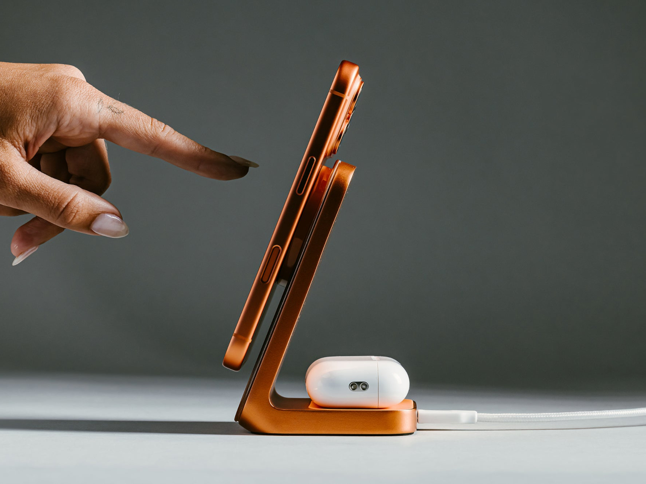
On the functional side, the Stand One 4th Gen charges via Qi2 at up to 25W, which puts it among the faster wireless options currently available for MagSafe-compatible iPhones. An upright MagSafe pad holds the iPhone at the right angle for StandBy mode, turning the desk setup into a live display for time, notifications, and widgets while the phone tops up. A rear Qi pad handles AirPods or any other wireless device at up to 5W.

The charger needs a 40W adapter to hit its peak output, which isn’t included at the $135 price point. That’s a familiar trade-off with premium chargers, and it keeps the base price competitive against similarly positioned alternatives without forcing the adapter cost on people who already own a capable brick. The metal and glass construction carries the build quality Nomad’s chargers are generally known for.

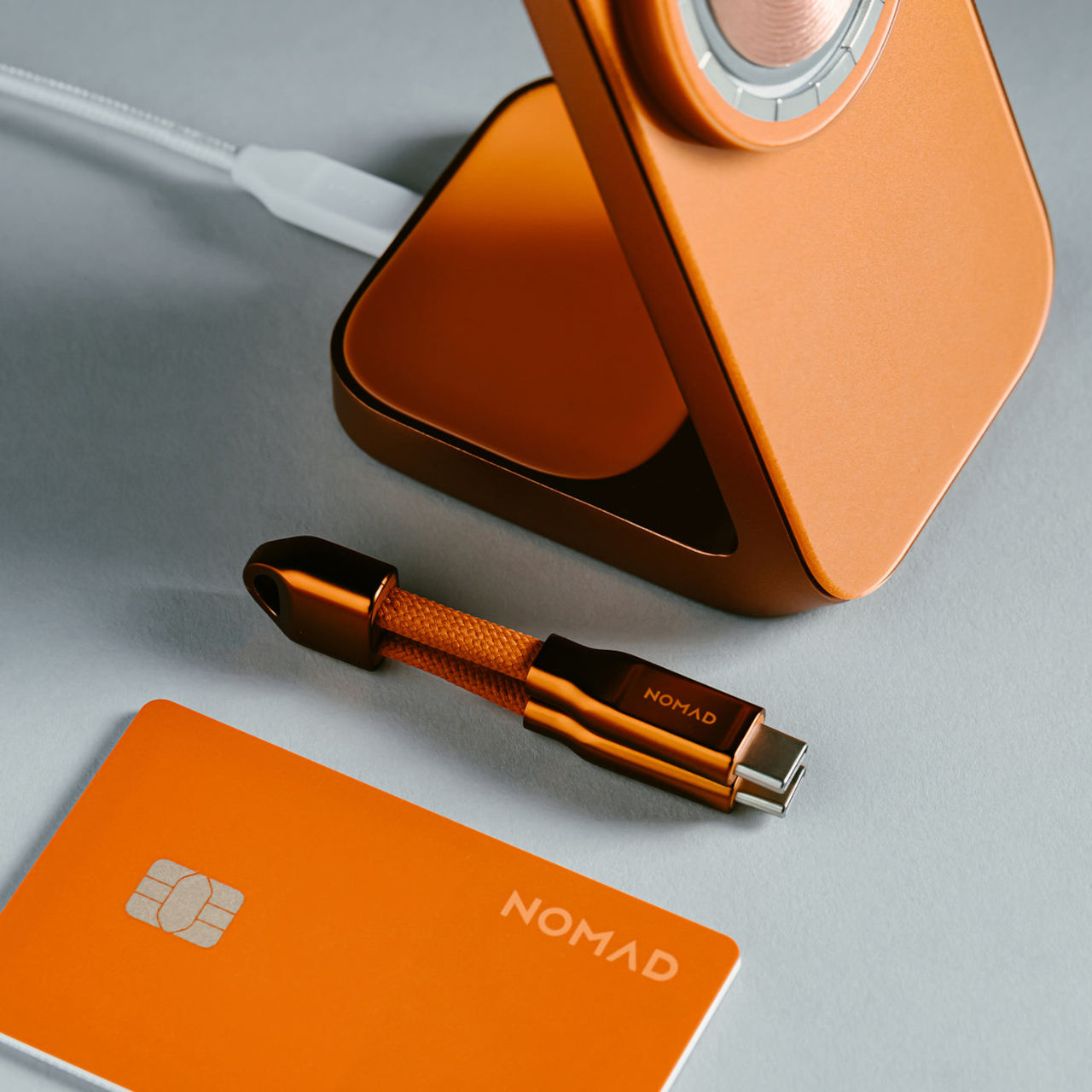
Nomad also launched a $39 Stellar Orange Tracking Card Pro alongside the Stand One, a Find My-compatible card designed to slip into a wallet and match the same orange palette. Together, they suggest an expanding ecosystem built around the Cosmic Orange iPhone 17 Pro, giving owners a way to carry that color decision through the accessories that live alongside the phone every day.

The Stellar Orange colorway doesn’t change what the Stand One does, and it’s fair to ask whether a $135 charger in a specific color justifies the kind of enthusiasm that device launches usually get. But for Cosmic Orange iPhone 17 Pro owners who want a desk setup that feels unified rather than assembled from whatever happened to be available, the Stand One in Stellar Orange makes a reasonable case for paying attention to the color of the cable management.

The post Nomad’s Limited $135 Charger Matches Apple’s Boldest iPhone Color first appeared on Yanko Design.

This Keychain Camera Shares Photos Over Its Own Wi-Fi, No App Needed

Keychain cameras have been enjoying a quiet revival, driven largely by a growing appetite for lo-fi photography and a general fatigue with the algorithmic complexity baked into smartphone cameras. Most of what’s available comes pre-assembled and pre-decided, right down to the app you’re expected to use and whose cloud account your photos end up in. That framing leaves very little room for the person actually taking the pictures.

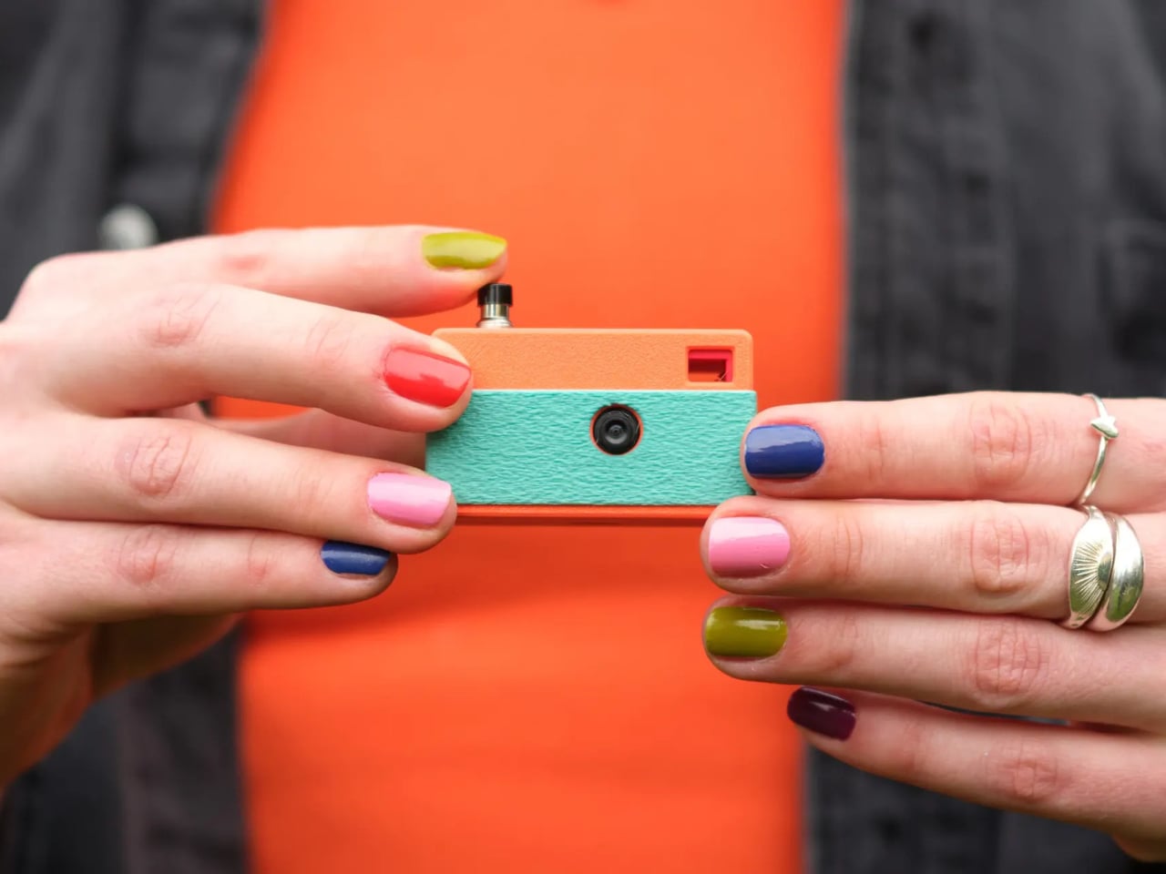
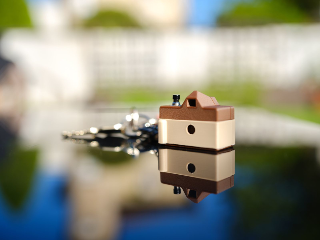
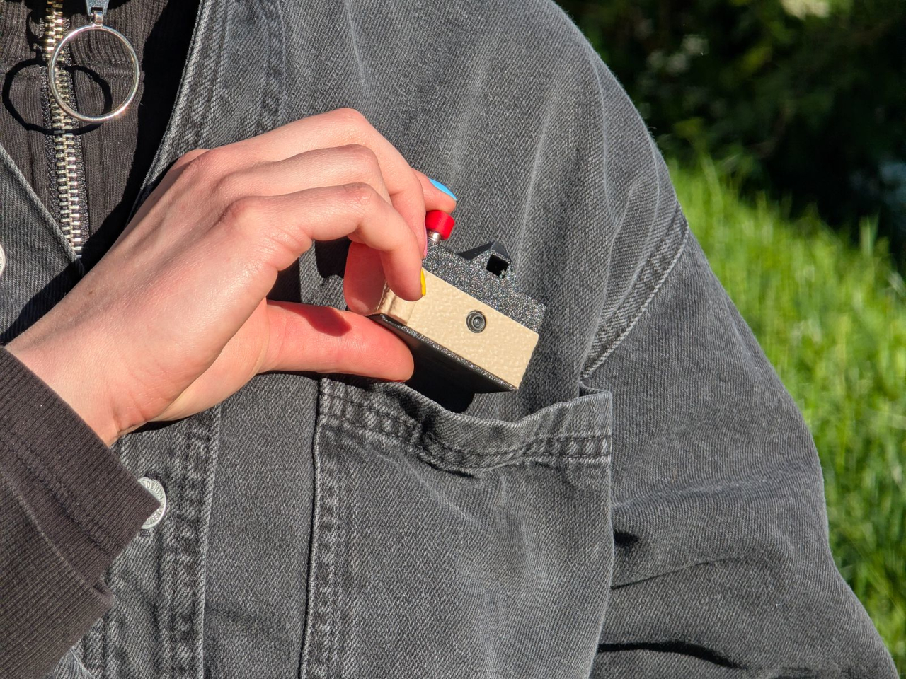
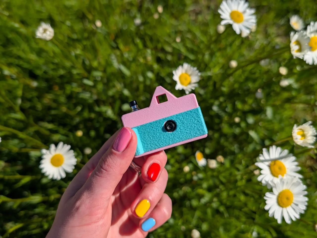
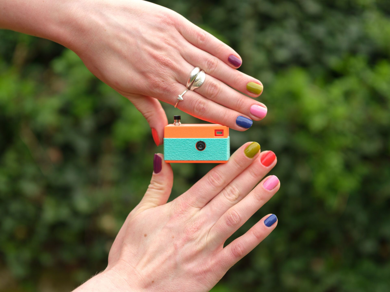
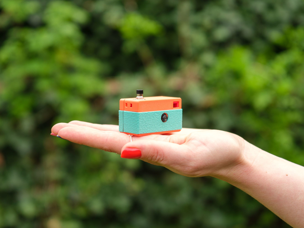
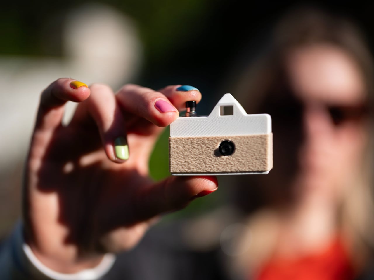
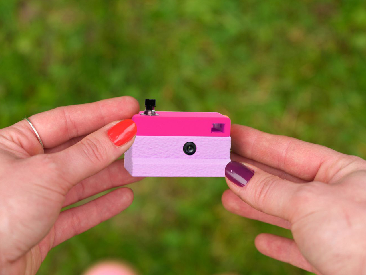
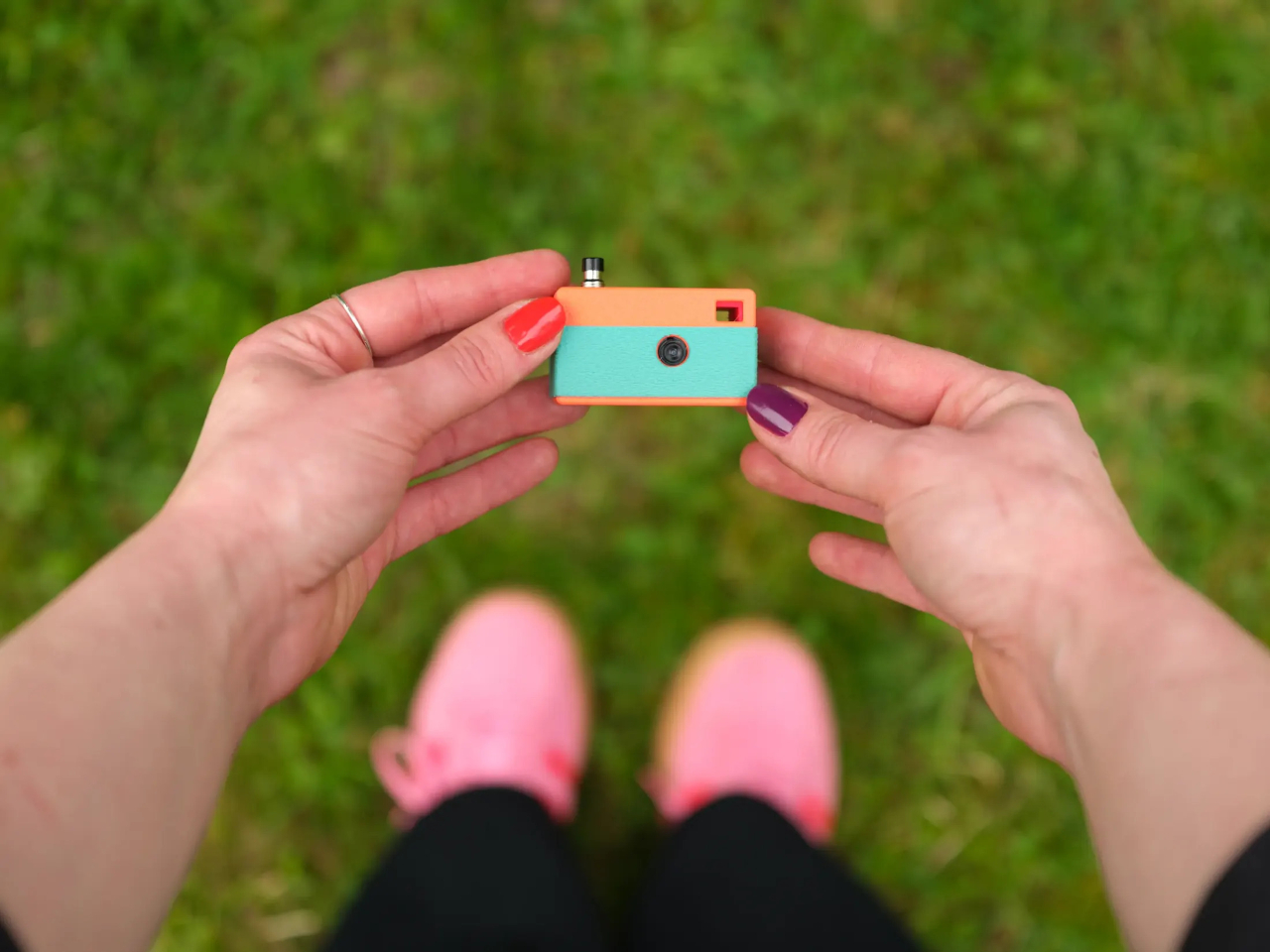
Designer Matej Nahtigal built an answer to that problem, and it’s small enough to hang off your keyring. The Keymera is a fully functional camera that you 3D print and assemble yourself, built around just five printed parts and four electronic components. It takes real 3 MP photos, stores them locally, asks for nothing in return, and fits roughly in the same space as a car key fob.

Designer: Matej Nahtigal

The build is intentionally minimal. The electronics stack consists of a Seeed Studio XIAO ESP32S3 Sense board, a 3 MP OV3660 image sensor, a small LiPo cell, and a single tactile button, connected with four solder joints. Print the shell, wire the components, flash the firmware, and press-fit everything together. No screws, no glue. The whole process takes about an hour to print and another hour to assemble.

Using it is even simpler. A single button does everything. Press it once, and the camera wakes, captures a photo, saves it to a microSD card, blinks an LED to confirm, and goes back to sleep. On standby, it draws roughly 10 µA, which means it can sit on your keyring for weeks between charges without running dry. The logic behind all of it couldn’t be simpler.

Getting your photos off the camera doesn’t require a cable or an app. Hold the button, and the Keymera broadcasts its own Wi-Fi network. Connect any phone or laptop, and a gallery page opens directly in the browser. You can scroll through your shots, view them full-size, and download them from there. That gallery lives entirely on the device. No account required, no metadata harvested, no service to subscribe to.

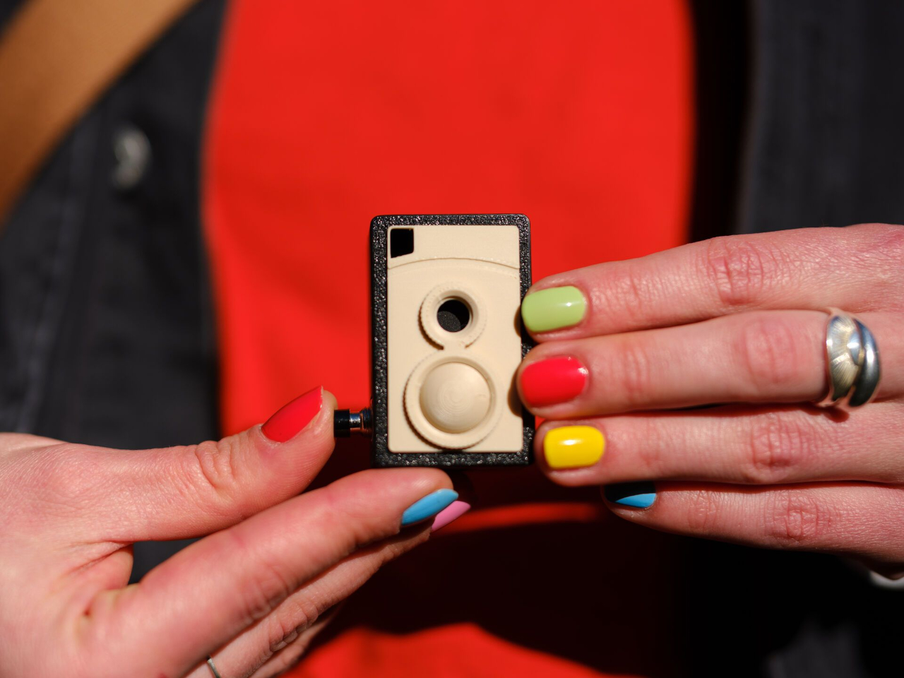
What makes the Keymera a design object rather than just a circuit board in a box is the shell system. One electronics core fits into interchangeable outer shells, each inspired by a different camera era. The original three designs reference a rangefinder, an SLR, and an instant camera, with a twin-lens reflex (TLR) added as a fourth. Any color or filament finish is yours to choose.

That idea, that a camera should fit in your pocket, behave honestly, and let you own the experience from print to final photo, reflects Nahtigal’s deliberate pushback against a moment when phones are adding AI features to everything. There’s no computational processing, no hidden metadata collection, and no account to manage. You clip it to your bag, your belt loop, or your keyring, and it’s simply there when something happens.

The Keymera’s files are sold as licensed digital products, not released as open-source files, which keeps the design controlled and the project financially sustainable for a single maker. The photos it produces are lo-fi and unprocessed, captured on a fixed 3 MP sensor with no computational adjustments applied afterward. For something this small and this honest, that kind of clarity is very much the point.

The post This Keychain Camera Shares Photos Over Its Own Wi-Fi, No App Needed first appeared on Yanko Design.

LiberNovo Maxis Gives Bigger Builds the Chair They Actually Deserve

The ergonomic chair market has grown considerably over the past decade, with brands competing on lumbar support, adjustability, and build quality. For most people, the options are plentiful. For taller and broader users, though, the experience often tells the same uncomfortable story: seats that run out before the knee, backrests that stop short of the shoulders, and headrests that hover just out of reach.

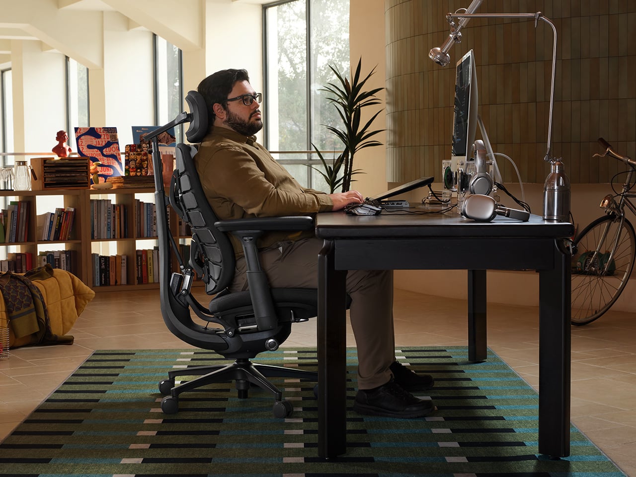
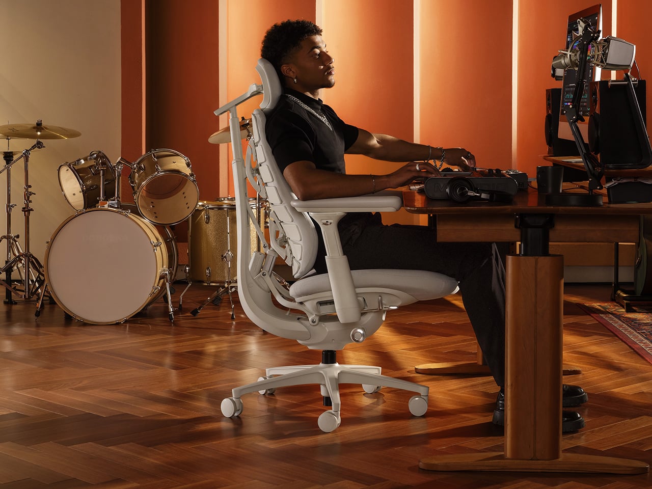
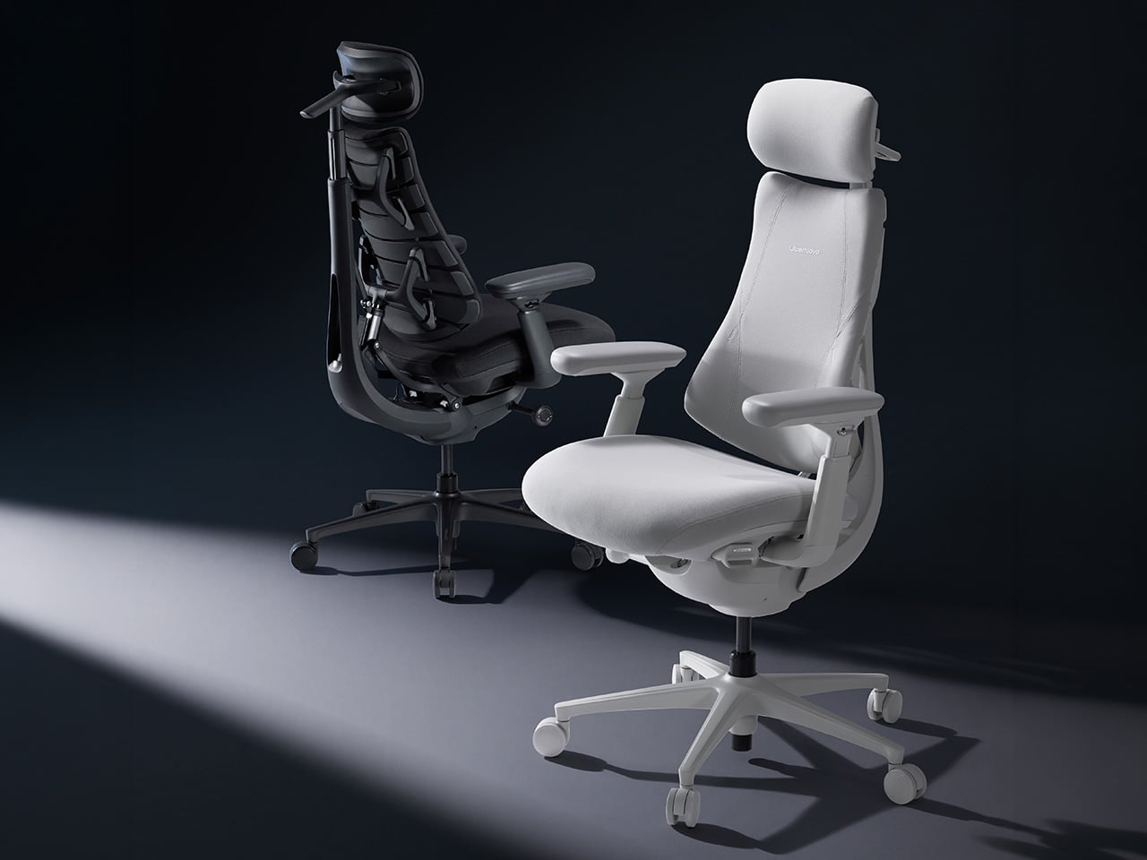
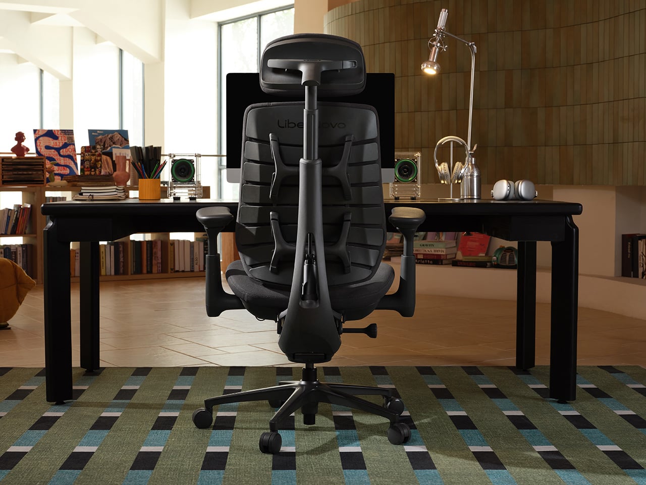
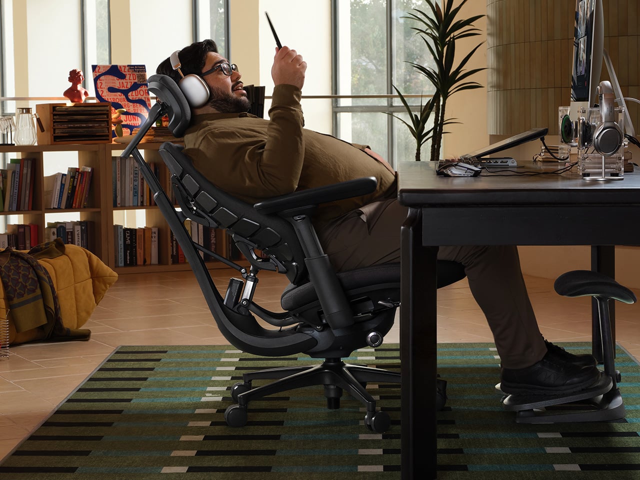
LiberNovo’s answer to that gap is the Maxis, a chair that doesn’t try to stretch an existing design to fit bigger frames. It’s been built from the ground up with larger bodies in mind, carrying the slogan “Built for Bigger Builds” with some conviction. Everything from the seat platform to the backrest geometry has been re-engineered around what someone between 5’10” and 6’7″ needs from a chair.

Designer: LiberNovo

Click Here to Preorder Now: $10 deposit unlocks $30 discount on balance payment. Hurry, deal ends on 16th June.

The most immediate difference is the seat itself. At 52cm deep, it supports the full length of the thigh rather than cutting off too soon. That might seem like a minor detail, but anyone who’s worked long hours on a seat that runs out before it should know exactly how quickly that discomfort compounds. The reinforced frame also supports up to 399lbs.

The fit story continues further up. The neck support covers a wider vertical and horizontal adjustment range, so it can actually reach where taller users need it rather than floating somewhere above. The armrests are custom-sized with more span and travel than standard chairs allow. Their slightly curved shape also helps prevent the waist compression that straight-edged rests tend to cause for bigger frames.

This becomes more concrete in the upper half of the chair. LiberNovo says the Maxis back frame expands to a 430 mm shoulder span and a 520 mm waist width, giving bigger builds fuller contact instead of leaving pressure concentrated in narrower zones. The headrest is just as deliberate, with 140 mm of vertical travel and 120 mm of horizontal adjustment, plus a U-shaped design intended to support the neck more naturally.

What keeps the Maxis from feeling like a bigger version of an ordinary chair is how the backrest actually behaves. The Bionic FlexFit Backrest is designed to move with the body as posture shifts, rather than holding rigidly to one position. That’s the core idea behind LiberNovo’s Dynamic Support System, which maintains alignment through movement without needing constant manual readjustment.

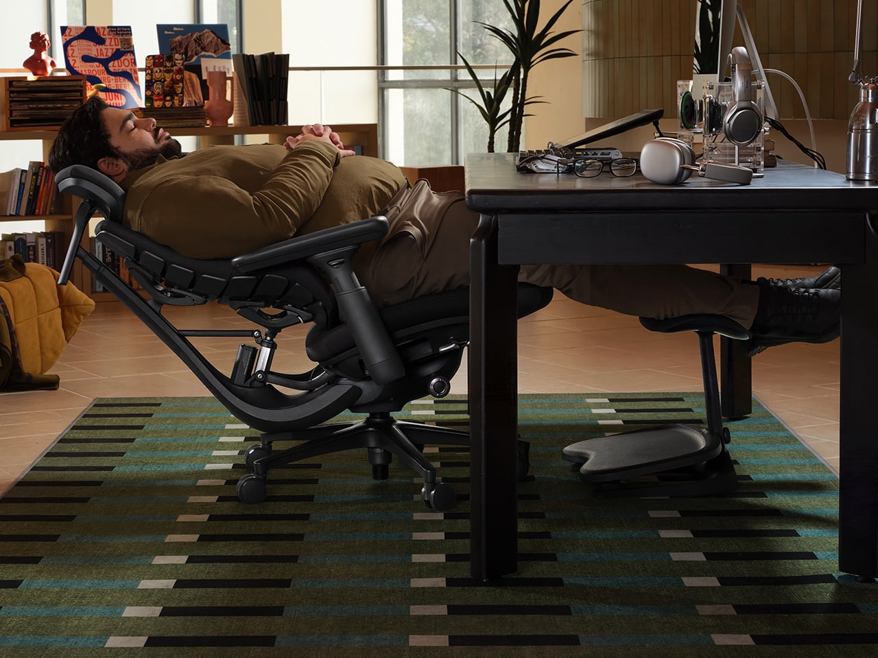
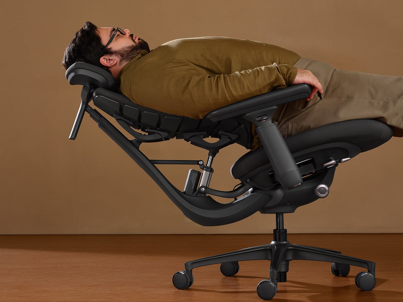
The recline system follows a similar logic. The Maxis locks into five preset positions, from 105 degrees for focused, upright work up to 160 degrees for near-flat recovery. The stops in between cover the varied moments a long day actually involves: a video call, a longer solo session, a quick pause. Having distinct positions makes switching between them quick and intentional rather than endlessly fiddling with them.

The Maxis comes in three versions built on the same reinforced frame. The Manual keeps things simple with a physical dial for lumbar adjustment. The Electric adds motorized lumbar control alongside OmniStretch, a stretch-and-release cycle designed to relieve spinal compression after prolonged sitting. The Airflow builds on that with active seat ventilation, using a centrifugal fan embedded in the cushion to keep things cool and dry.

LiberNovo Omni Pro

OmniStretch and the Airflow ventilation both address the fatigue that builds gradually over long sessions. OmniStretch extends the lumbar support upward and gently releases it, creating a stretch-and-release motion intended to help relieve compression from prolonged seating. The ventilation system addresses heat accumulation in the seat cushion, helping the chair stay more comfortable through longer sessions. Both features treat comfort as something that has to hold up across a full day.

The Maxis launches alongside two new additions to the broader LiberNovo lineup. The Omni Pro brings motorized lumbar support, OmniStretch, and active seat ventilation to the standard-size Omni platform, making it the performance-oriented choice for users who don’t need the larger Maxis frame. The Omni SE takes a more stripped-back approach, pairing the same ergonomic architecture with a manual lumbar mechanism for a simpler, set-and-forget setup.

LiberNovo OmniStretch

LiberNovo opened the Maxis pre-order period in the US on May 12 at 7:00 PM PDT, with the official launch set for June 16 at 9:00 AM PDT and the first release window running through July 31 at 9:00 AM PDT. During that pre-sale stretch, orders qualify for super early bird pricing, with discounts reaching up to 44% in the US. A $10 deposit also unlocks a $30 discount on orders of $1,000 or more, along with a free 1-year extended frame warranty and access to a three-tier premium gift package for qualifying purchases.

What the LiberNovo Maxis gets right is treating a larger body as the actual design brief, rather than an afterthought dealt with by scaling up existing dimensions. Every adjustment range, support angle, and contact point has been calibrated around that focus. For taller and broader professionals who’ve spent years on chairs that never quite fit, that’s a meaningfully different sitting experience.

Click Here to Preorder Now: $10 deposit unlocks $30 discount on balance payment. Hurry, deal ends on 16th June.

The post LiberNovo Maxis Gives Bigger Builds the Chair They Actually Deserve first appeared on Yanko Design.

From Foldable Pilates to Shoe Robots: InnoX GCS 2026’s Best Startups

The consumer tech market has a crowding problem, mostly driven by products that try to do too much for too many people. The most interesting hardware lately has been doing the opposite, building around one specific inconvenience that hasn’t been properly addressed yet. Shenzhen has always had a knack for this, and InnoX Academy has been quietly developing the next generation of builders who make those products happen.

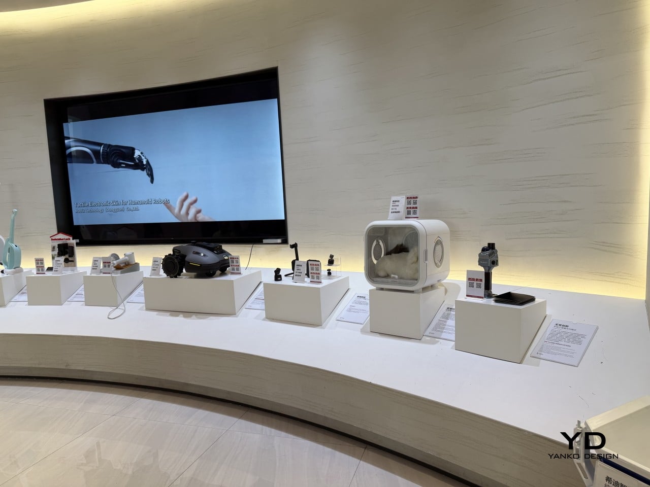
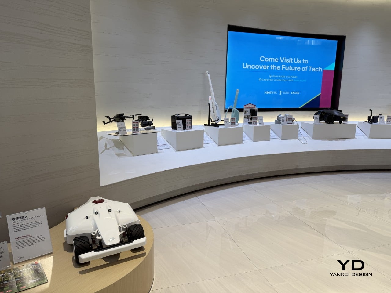
Founded in 2021 by Professor Li Zexiang of Hong Kong University of Science and Technology, Shenzhen InnoX Academy is a structured ecosystem that develops engineers and entrepreneurs into product builders. At the Global Connect Show 2026, it gave the world a look at its latest batch of startups, from home fitness and pet care to ambient design objects, each taking a more considered approach to a specific problem.

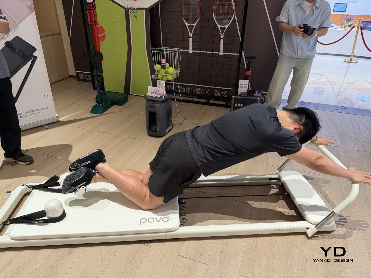
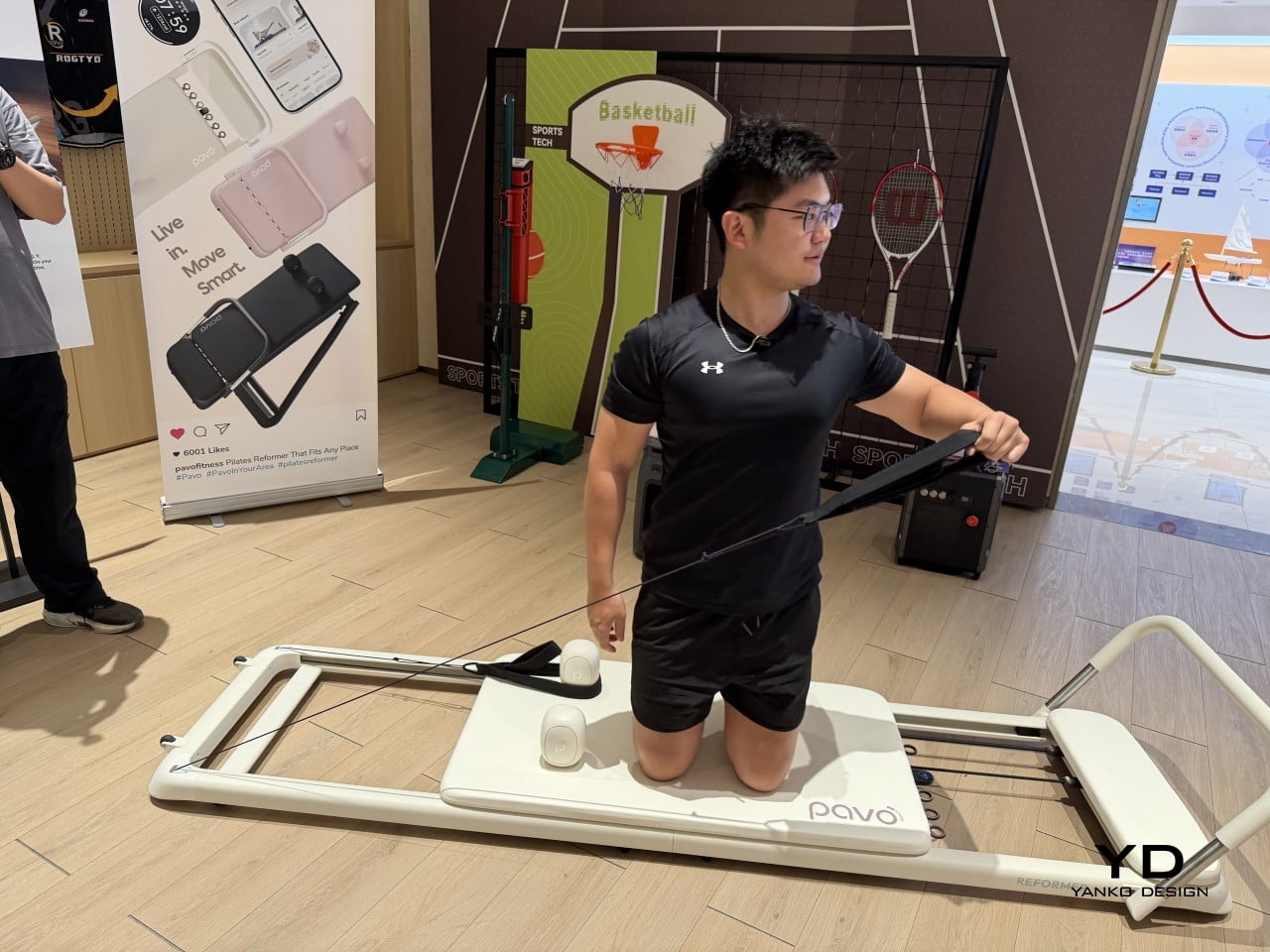
Pilates reformers have always been the kind of equipment you’d only find in a dedicated studio, too large and bulky for most apartments to accommodate. Pavo Fitness, started by a team of architects, industrial designers, and professional Pilates instructors, saw that as a solvable problem. The Pavo Reformer is their answer: a compact, foldable machine designed to bring studio-quality resistance training into a regular home.

Designer: PAVO

Once a session is done, it packs away without being disassembled or moved to a corner, so it doesn’t have to become a permanent fixture in your living space. The onboard smart system keeps tabs on workouts, which matters more in a home setting where there’s no instructor watching your form. It adds a layer of accountability that a conventional reformer simply can’t offer.

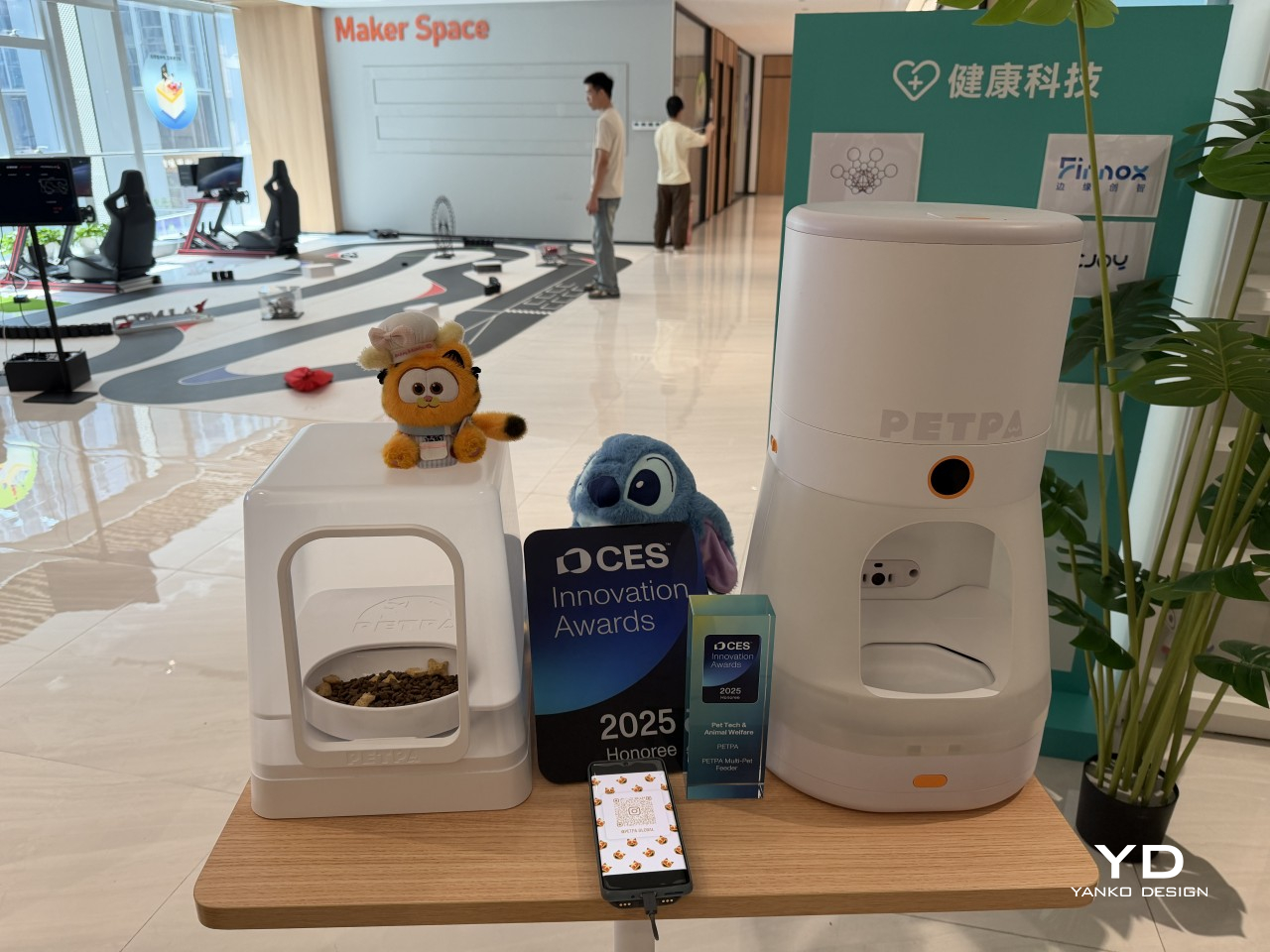
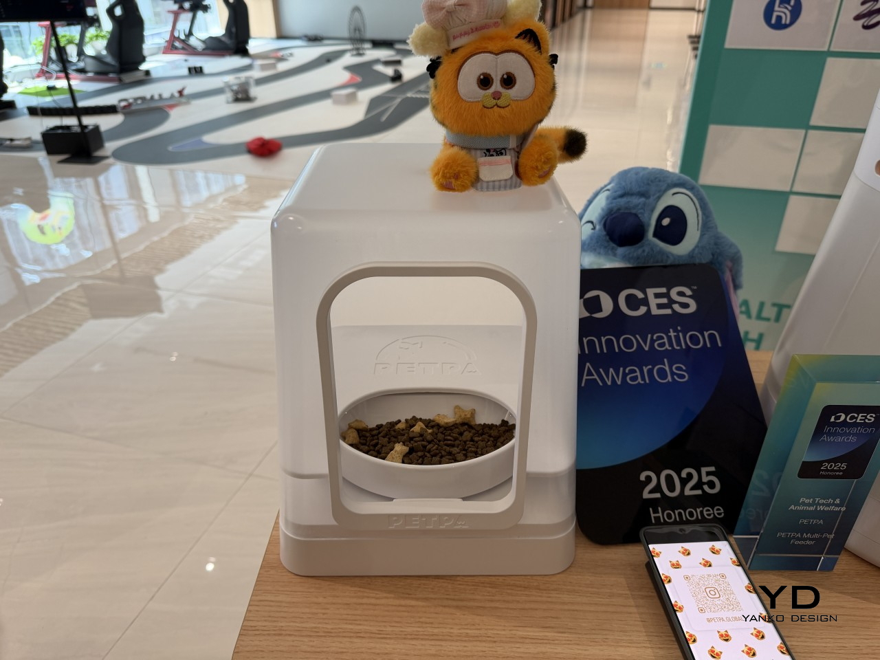
Multi-pet households have a feeding dynamic that most smart feeders don’t actually address. A timed dispenser works for one pet, but when multiple cats have different dietary needs, scheduling meals is only part of the problem; the harder challenge is making sure each cat only gets its own food. That’s what PETPA was built to solve, by a team that previously worked on hardware at DJI, Narwal, and RoboMaster.

Designer: PETPA

The PETPA Multi-pet Feeder uses individual pet recognition to identify each cat and control access to their food, particularly useful in homes where one cat needs to lose weight or follow a prescription diet while the others don’t. It launched at CES 2025 and earned a CES Innovation Award in the Pet Tech and Animal Welfare category, recognizing a product solving a problem most smart feeders still overlook.

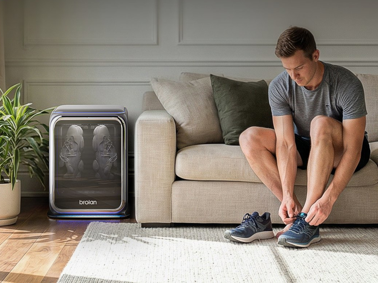
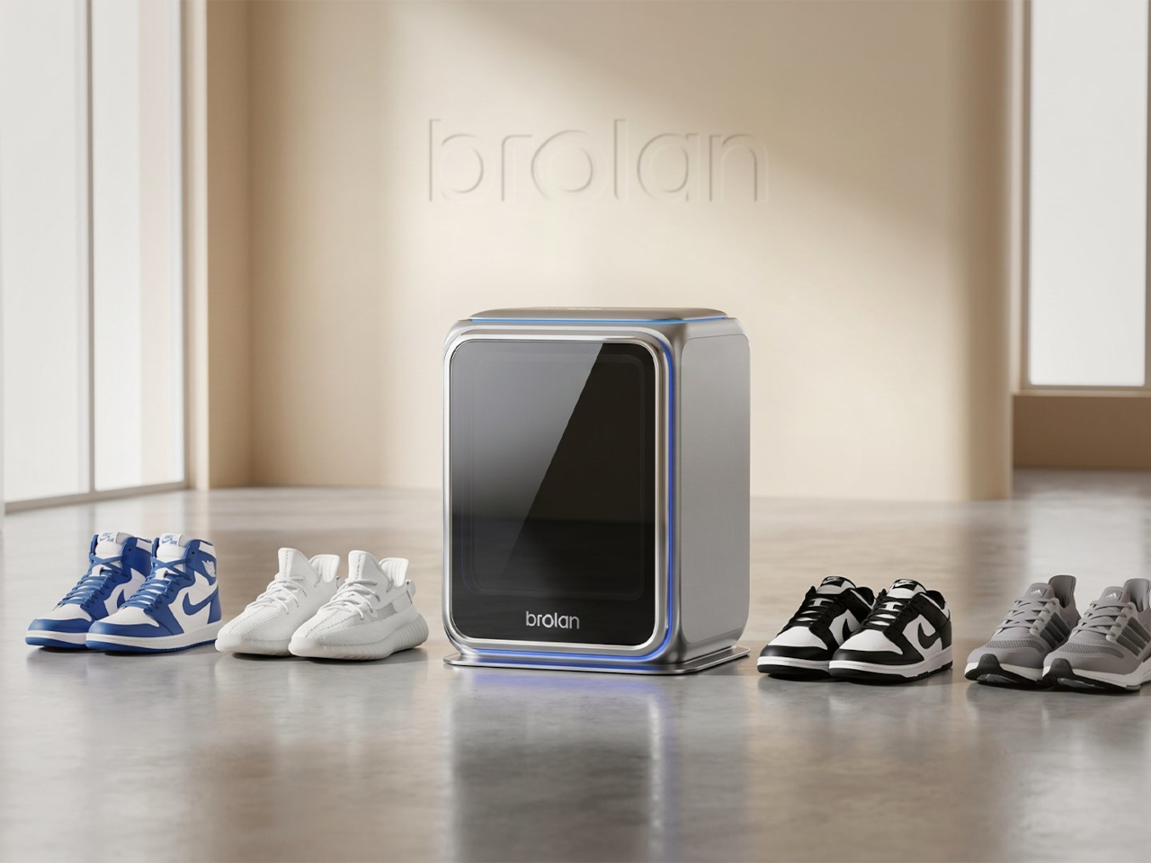
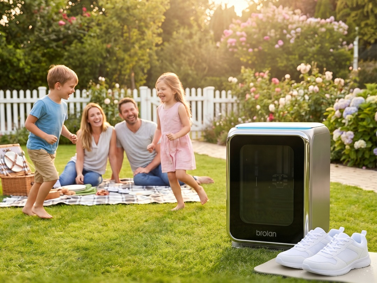
Sneaker care has evolved into its own dedicated ritual for collectors and sports enthusiasts who’d rather not take chances with a stiff brush and soapy water. The typical cleaning routine still carries the risk of fading colors, weakening materials, or warping the structure of more delicate footwear. Brolan’s ClearX is a compact home machine that moves through cleaning, low-temperature drying, and sterilization all in one automated cycle.

Designer: Brolan

Founded in 2025 by a team drawing from Nanyang Technological University, Harbin Institute of Technology, and Tsinghua University, Brolan designed ClearX specifically to clean without the harshness of manual scrubbing. The idea is to get footwear thoroughly clean without putting materials at risk, which matters most for anyone who owns suede, knit, or premium leather shoes that even a careful hand-wash can easily ruin.

Not everything in the InnoX lineup is about automation or performance tracking. REAZENABLE takes a different direction with the REAZE Sandstone Series, a collection that sits somewhere between smart lighting and decorative object, aimed at people who’d rather their home feel calmer than more connected. The brand’s philosophy, technology empowering nature and light reshaping emotion, gives a clear sense of where its priorities are.

Designer: REANZENABLE

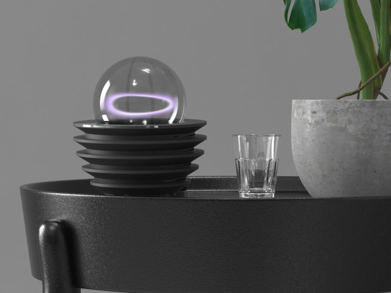
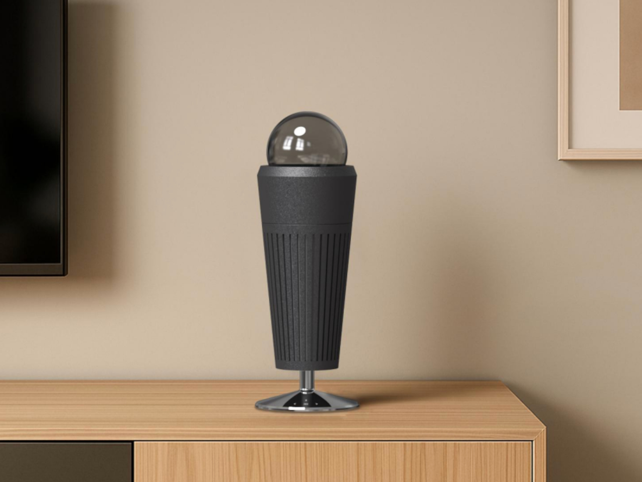
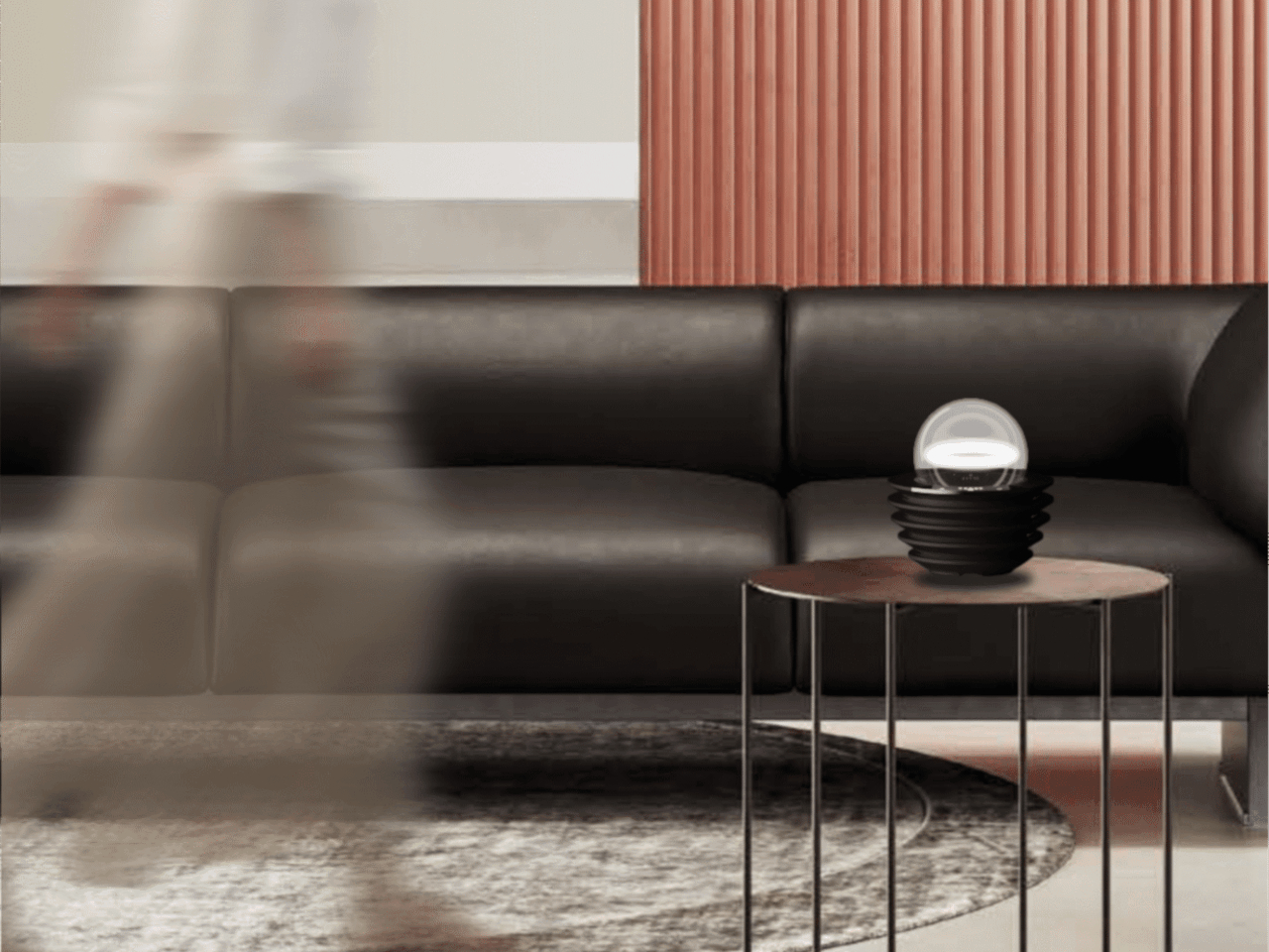
The collection includes the Halo light and three aroma vessels, all made from sand-based materials and shaped with ribbed surfaces that recall an uneven lunar landscape. The technical structure is deliberately concealed within those soft architectural forms, so nothing on the shelf reads as a gadget. Atmospheric light, mineral textures, and scent work together into something that feels more like a ritual object than a piece of hardware.

Several other InnoX startups addressed more personal routines. Rootique brought the DUO, a scalp atomizing applicator using patented DuoTrace and IntelliMist technology for precise serum delivery in about 15 seconds, already validated through an Indiegogo campaign that found backers across 52 countries. OCJOY presented the OCJOY Air, a home micro-air oral cleaning system that brings a water-air-powder cleaning method from dental offices to your own countertop.

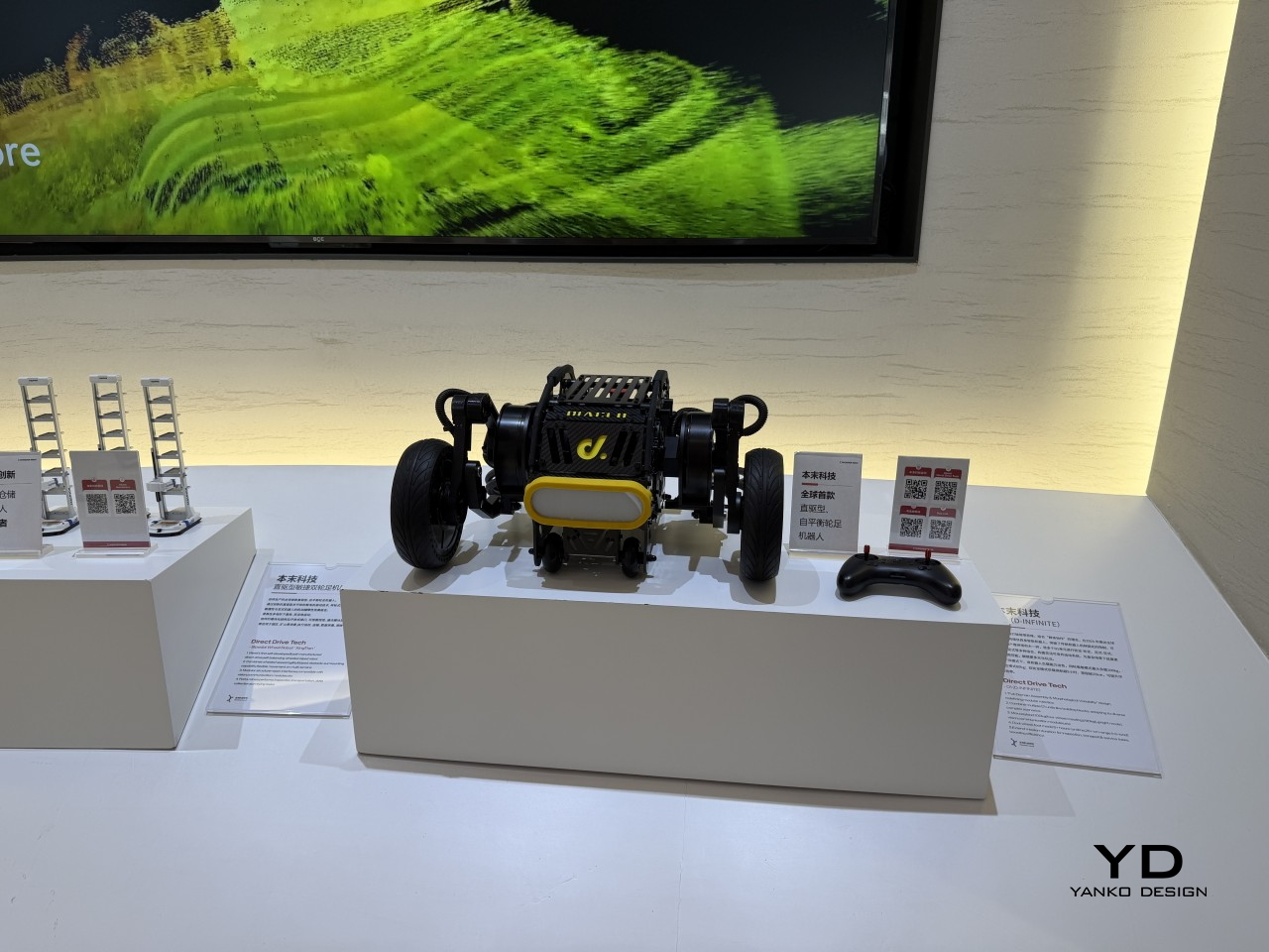
Direct Drive Tech D1

The lineup stretched into less expected territory, too. Blucalm’s StrikeDeck delivers AI-assisted game audio through a desktop controller, while ORULINK’s Watcher-Robot is an open-source desktop AI companion built for everyday interaction. CHEERLUCK brought a sausage vending robot for campuses and public spaces, and both Y-H2O and ANAVI presented electric watercraft, a hydrofoiling vessel, and a smart personal watercraft, each designed to cut the noise and emissions of traditional marine engines.

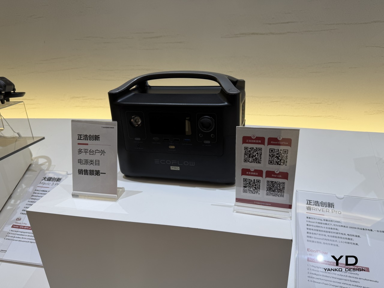
EcoFlow

Narwal

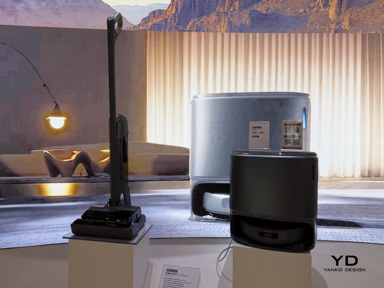
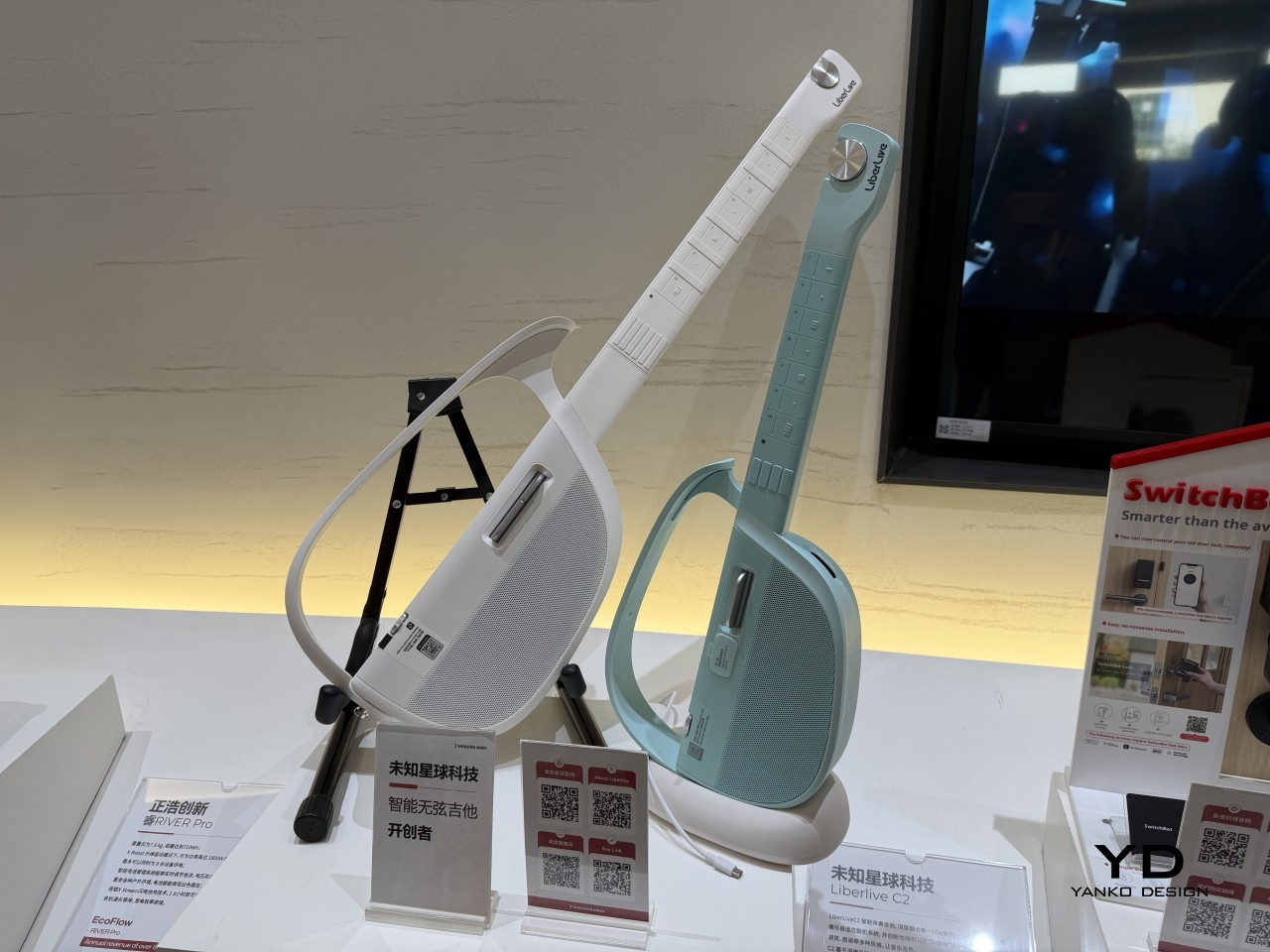
What gives the InnoX lineup credibility beyond the show floor is the academy’s broader history. Brands like Narwal, SwitchBot, DJI, EcoFlow, AgileX, and LiberLive are all part of InnoX’s wider ecosystem, a track record that makes it worth paying attention when the academy’s latest batch of incubated products steps out in front of an international audience for the first time.

LiberLive

DJI

The post From Foldable Pilates to Shoe Robots: InnoX GCS 2026’s Best Startups first appeared on Yanko Design.
What If the Internet Had a Building You Could Actually Walk Inside?

The internet has always been invisible. It moves information at a scale and speed the human mind can’t fully grasp, yet we access it through the most ordinary of interfaces: a flat screen, a pair of earphones, a keyboard. Nothing about how we physically engage with it reflects the enormity of what it represents, or what it means to be connected to the entire world from a single chair.

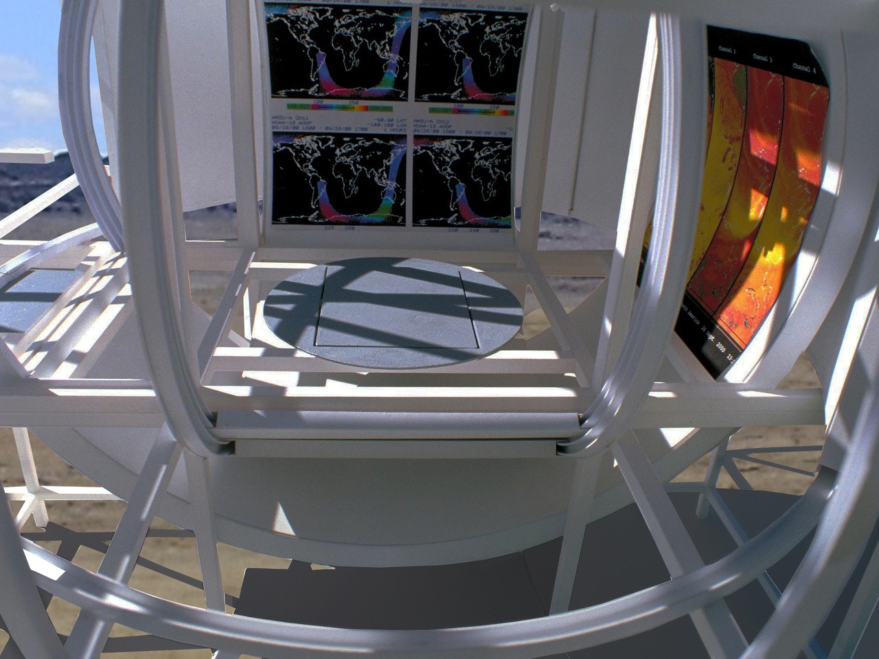
Michael Jantzen’s Internet Observatory concept addresses that disconnect directly by building a physical structure around the idea of internet access. Placed outdoors, the structure uses its architectural form to stand in for the abstract mechanics of the web. The outer support grid frame represents the internet’s matrix, while the curved space it encloses represents where a person enters and engages with the flow of information.

Designer: Michael Jantzen

You reach the interior by climbing a staircase up to an elevated platform and stepping inside the curved shell. At its center sits an interactive workstation that rises through a glass floor and can also rotate along the floor’s surface, letting the person inside face in any direction. It’s a deliberately simple setup that places one person at the physical center of a structure designed to represent the entire internet.

All of the large curved panels that form the enclosing space can be automatically repositioned around the occupant. The core can be fully open, fully closed, or any variation in between, depending on the activity. Some configurations allow for projecting images and sounds from the internet or the main computer onto the surrounding panels, turning the interior into a fully immersive display environment.

Some of those projected images also appear on the exterior faces of the panels, making what happens inside the structure visible to anyone nearby. A private internet session becomes something closer to a public exhibition, with the curved panels acting as screens that anyone outside the grid frame can see. The distinction between the individual’s experience and the community’s visibility gets built directly into the architecture.

Each structure would also have its own website, through which people could visit and interact with it remotely in real time, selecting images and sounds to be projected inside or directing the movement of the panels. Someone seated at the workstation might find the content surrounding them being shaped by a stranger thousands of miles away. The structure becomes a live, physical interface for the collaborative possibilities of the internet.

The design also contemplates many of these structures existing simultaneously around the world, each publicly or privately owned, all communicating with each other as they interact with their respective occupants. What begins as one architectural statement scales into a distributed global network, a physical version of the very internet it represents, built from steel frames and curved panels rather than servers and cables.

Jantzen calls this a “symbolic temple for the computer age,” and there’s something deliberate in that description. Climbing a staircase, entering a curved space, and sitting at the center while content from around the world flows around you is a kind of ritual that a laptop screen doesn’t offer. It’s an architectural argument for what it might feel like if the internet had a home you could walk into.

The post What If the Internet Had a Building You Could Actually Walk Inside? first appeared on Yanko Design.
Your Kindle Can’t Do This: BOOX’s Pocket E-Reader Now Takes a Stylus

Most dedicated e-readers exist at the opposite ends of a familiar spectrum. Closed-ecosystem devices like the Kindle keep things deliberately simple and locked in, while Android-based tablets offer full flexibility but grow too large to carry comfortably in a pocket. The gap between those two has always been somewhat underserved, especially for anyone who wants true portability alongside a genuinely open operating system.

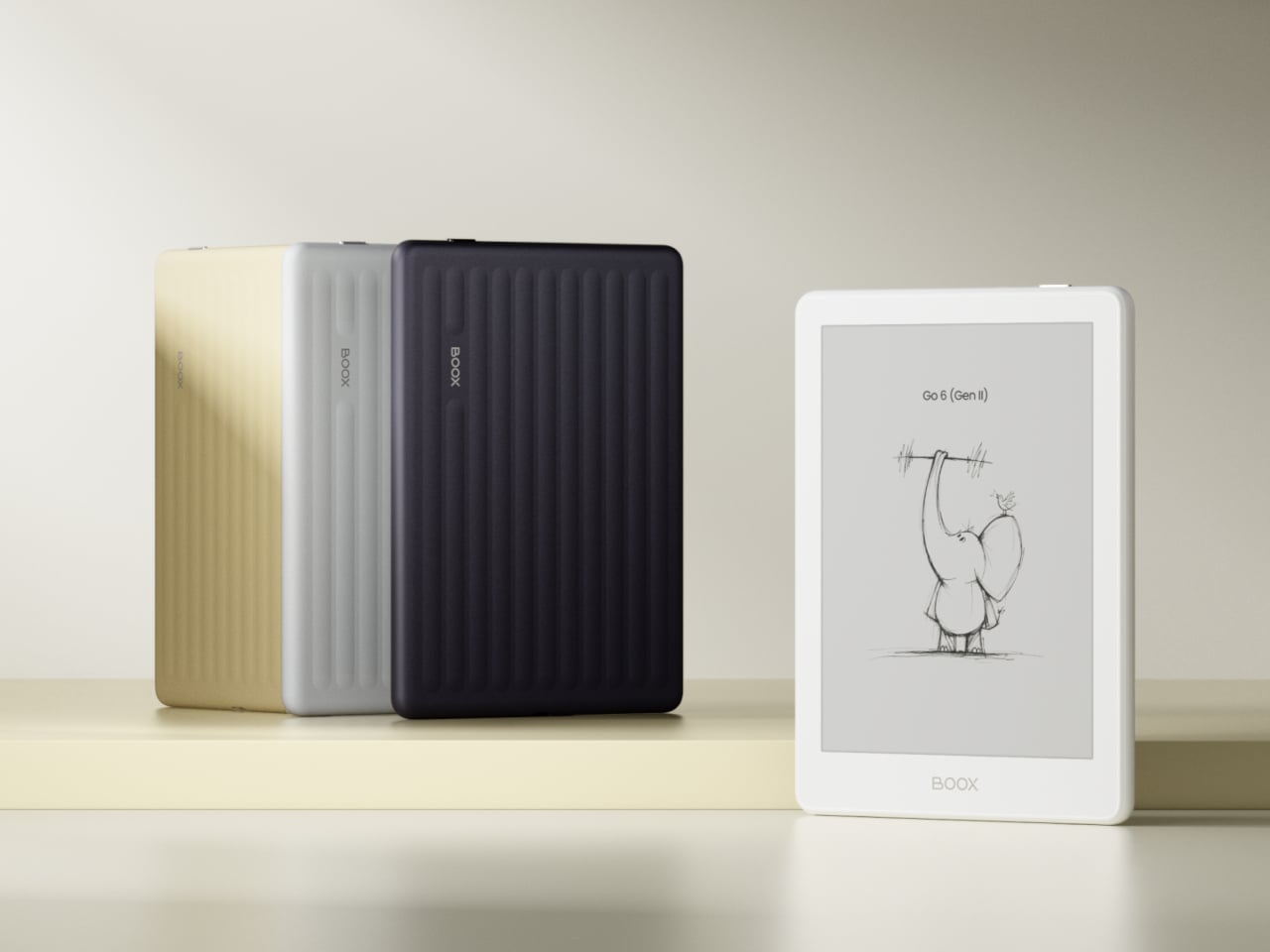
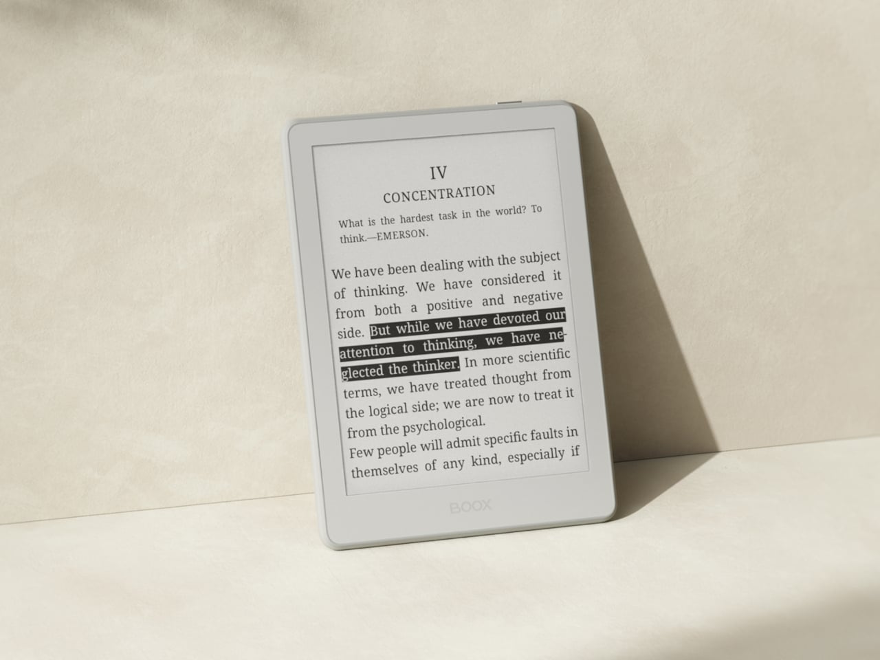
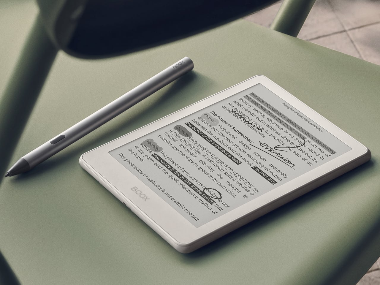
BOOX’s Go 6 (Gen II) is the second generation of its most pocketable e-reader, arriving with upgrades that make that middle ground considerably more appealing. Built around a 6-inch, 300 ppi E Ink display and running Android 11 with full Google Play access, it’s aimed at readers who want their device to be both portable and versatile, without having to choose one over the other.

Designer: BOOX

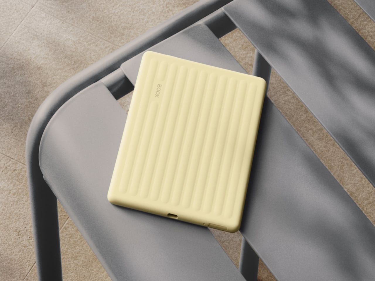
The first thing you’ll notice about the Gen II is that it doesn’t look like a standard e-reader. The redesigned textured rear shell has a suitcase-inspired aesthetic that feels more deliberate than the plain black slab of the first generation. It comes in four muted color options: Plum, Stone, Shell, and Custard, all suggesting a device meant to slip into a bag and come with you wherever you go.

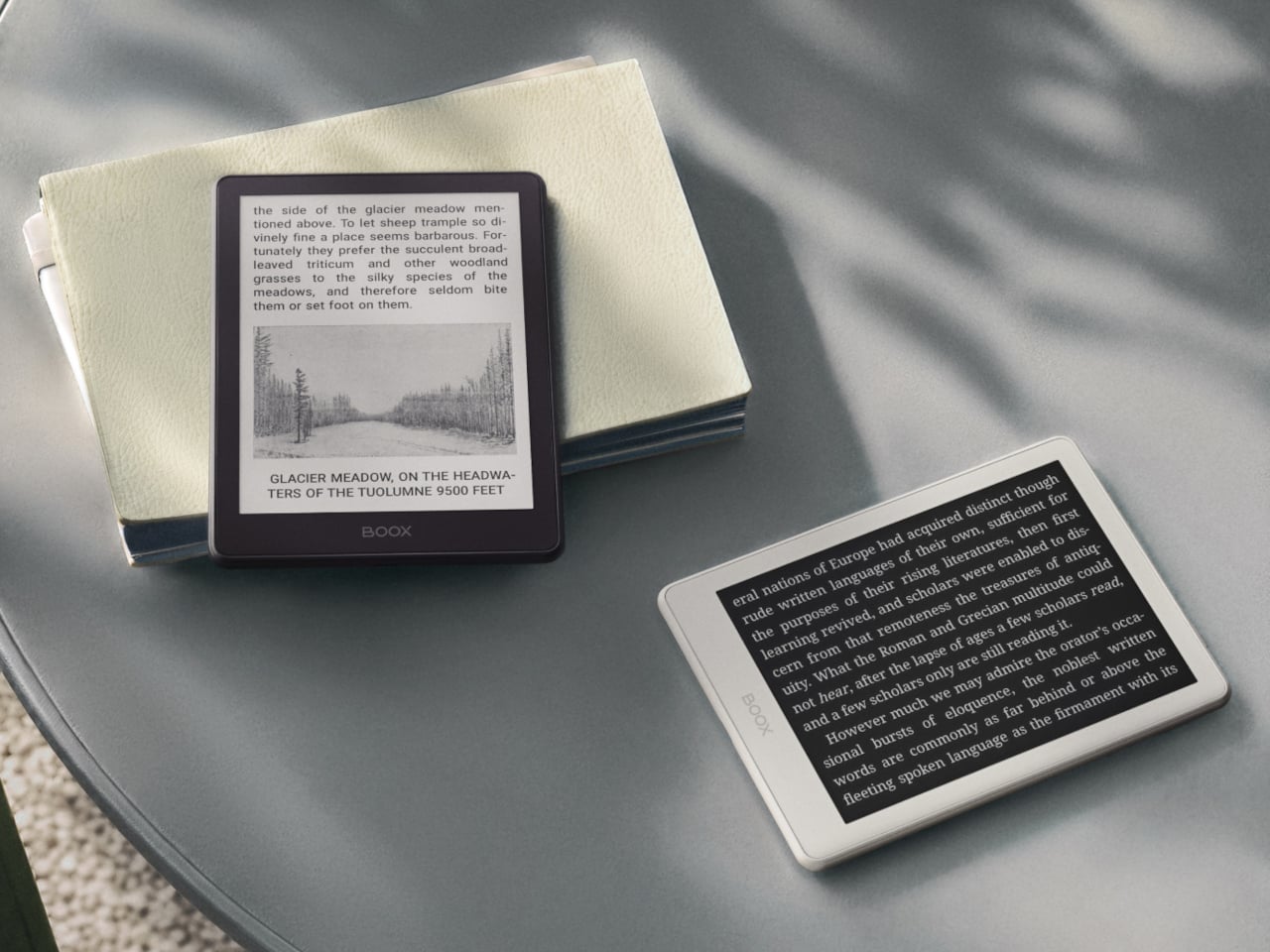
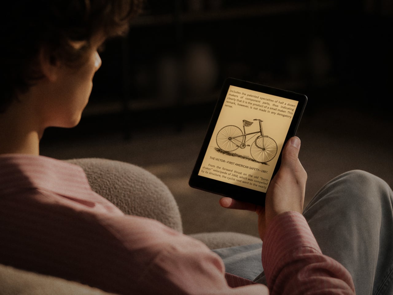
The screen gets a meaningful upgrade with this generation. The Gen II adds anti-glare (AG) glass to its 300 ppi E Ink panel, reducing reflections when you’re reading in direct sunlight on a patio or near a bright window. The adjustable front light handles both warm and cold color temperatures, letting you read comfortably at night without straining your eyes against harsh lighting.

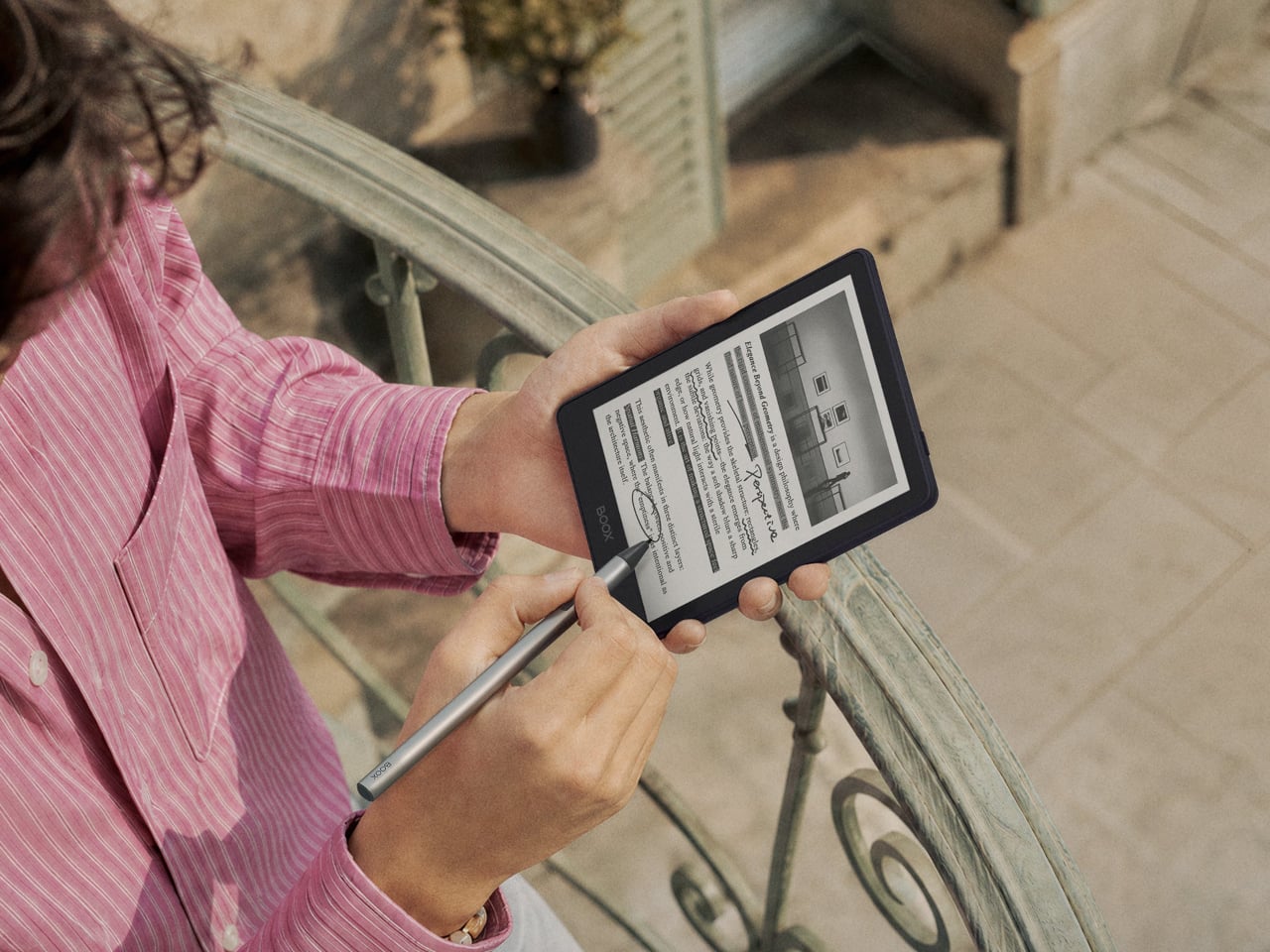
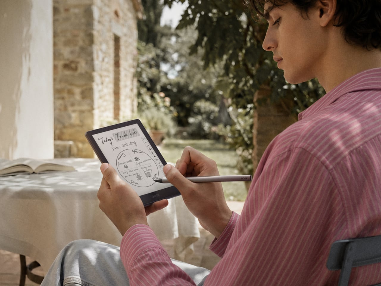
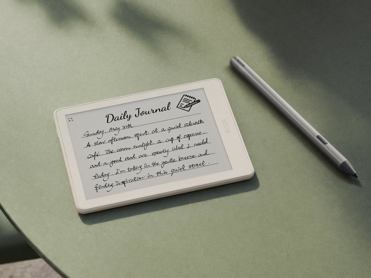
The more surprising addition is stylus support, which is uncommon at this screen size. The Go 6 (Gen II) is compatible with BOOX’s InkSense Plus stylus, an active pen with 4,096 levels of pressure sensitivity that lets you annotate directly in books, mark up PDFs, or take handwritten notes on a screen small enough to fit in a jacket pocket. It connects directly to the device and charges via USB-C.

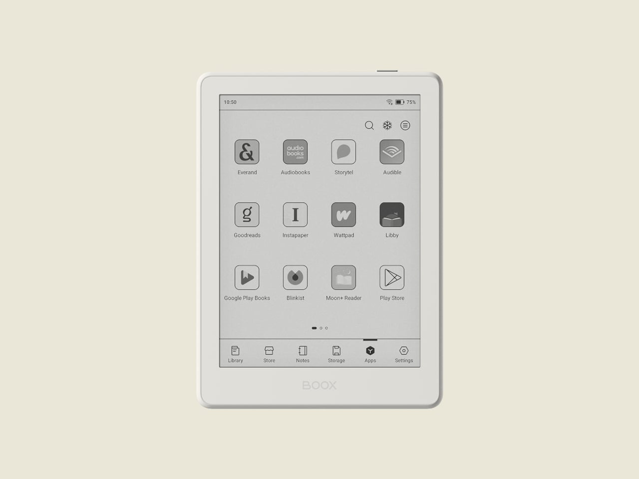
Running open Android 11 with a built-in Google Play Store means you aren’t locked into any one reading platform. BOOX’s NeoReader app handles 20 document formats natively, including PDF, EPUB, MOBI, and DJVU, and supports dark mode for lower-light reading. Install the Kindle app, Kobo, Libby, or anything else you’ve been using, and your existing library follows you without having to start over from scratch.

At 160 grams and 6.8mm thin, the BOOX Go 6 (Gen II) fits in a jacket pocket without making its presence felt. A microSD card slot supplements the 32 GB of built-in storage, and the USB-C port doubles as an audio jack for wired listening. The 1,500 mAh battery holds up well through long reading sessions, largely because E Ink uses so little power compared to a conventional backlit screen.

The BOOX Go 6 (Gen II) is still primarily a reader’s device, but the combination of Android OS, stylus compatibility, and anti-glare glass packed into a pocket-friendly body gives it a range that most devices at this size simply don’t attempt. It’s currently available for pre-order through the official BOOX store, arriving at a moment when the 6-inch e-reader category could use a reminder of what it can still do.

The post Your Kindle Can’t Do This: BOOX’s Pocket E-Reader Now Takes a Stylus first appeared on Yanko Design.
The Personal Cooling Device That Blows Cold Air Rather Than Just Moving It

Handheld fans have been a summer staple for years, but the basic formula hasn’t changed much. You press a button, blades spin, and air moves. That works fine when it’s mildly warm, but as summers grow hotter and more people spend time outdoors, a fan that simply redistributes hot air starts to feel less like relief and more like a polite gesture against a much bigger problem. And yet for years, that has remained the only option most people know and reach for.

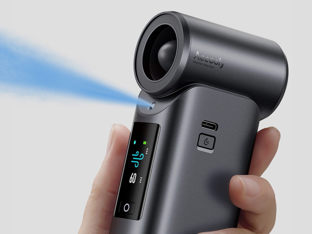
That’s the gap Aecooly is trying to close with the Cold Air Ultra, the brand’s flagship personal cooling device. Rather than simply moving warm air from one side of your face to the other, Aecooly built it around an active cooling system that delivers genuinely cooled airflow, thanks to ultra-fine mist particles that accelerate evaporation to actively draw heat away from the skin. If you’ve ever thought there has to be a fan that actually cools the air, this is that device.
Designer: Aecooly

Click Here to Buy Now: $63.99 $79.99 (20% off, use coupon code “YANKO2026”). Hurry, deal ends in 48 hours!

1

It’s worth noting how the Cold Air Ultra looks, because the design says a lot about what it’s trying to be. The body is compact and upright, with a cylindrical air outlet with a straight, high-pressure duct design, giving it a shape closer to a precision tool than a seasonal gadget and ensuring that the powerful airflow reaches you with zero efficiency loss. Unlike the plastic housing common to most portable fans, the Cold Air Ultra comes in a lightweight body with a premium metallic-inspired finish that’s more resistant to scratches and daily wear, better in hand, and can passively conduct heat away from the motor during extended use.

1

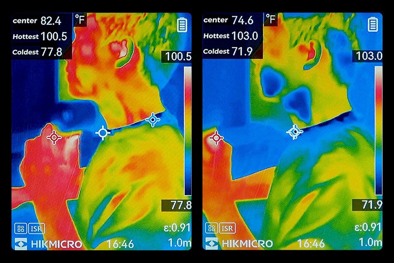
The cooling technology is where the Cold Air Ultra stands apart. An 70,000 RPM brushless motor drives high-speed air that “breaks through” the sticky sweat layer so the mist can evaporate and pull heat away instantly. It’s this dual action of the wind clearing the path for the mist that makes it possible to reduce skin temperature by up to 18°F (10°C) in just 10 seconds, a noticeably different experience from what you’d get with a standard fan.

Two side-by-side thermal camera frames from a HikMicro device showing a person in warm colors; left frame lists center 82.4°F, hottest 100.5°F, coldest 77.8°F, right frame lists center 74.6°F, hottest 103.0°F, coldest 71.9°F, with crosshair markers along a line

What makes the airflow cold rather than simply wet comes down to how the system atomizes water. Rather than using a vibrating membrane to break liquid into droplets, the approach used in most portable evaporative devices, the Cold Air Ultra uses pneumatic atomization: a high-pressure pump forces compressed air through a precision copper nozzle, shearing water into ~20 μm micro-particles at speed. The compression process itself lowers the air temperature before it exits the device, so that what reaches your skin is genuinely cooled airflow, not ambient air with moisture added. The water and air channels are sealed in a patented airtight structure that optimizes flow efficiency and prevents leakage, a design detail that also keeps the electronics fully separated from the water circuit.

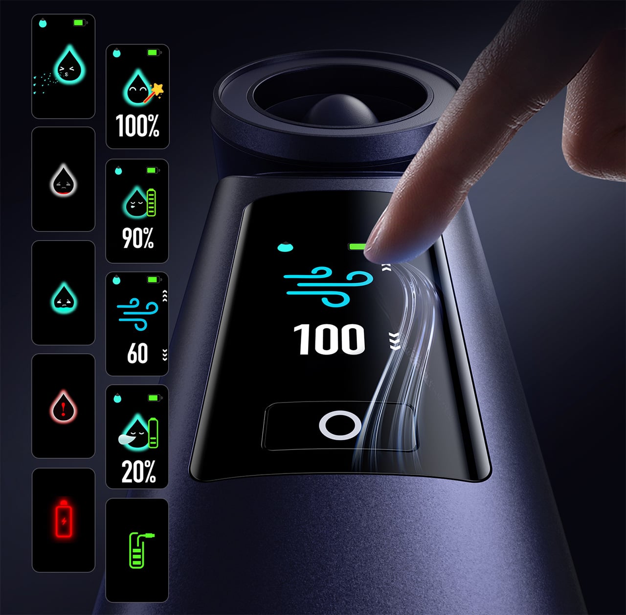
Control is handled through what Aecooly calls the “Little Droplet,” a full-color touchscreen built into the front of the body. This enables fast, intuitive, and precise control, allowing users to swipe through the 100-level settings instantly, which is a much more modern and responsive way to manage airflow compared to traditional fans. And with dynamic icons that display battery level, water level, and mist status in real time, you’re never left guessing what’s left.

1

Picture stopping mid-hike to cool down, or waiting on a sweltering subway platform with no breeze in sight. A standard fan doesn’t do much in either of those moments beyond moving hot air around. The Cold Air Ultra is built for situations like these, where getting your skin temperature down quickly during a break or a commute actually makes a noticeable difference to how you feel.

Smart kettle display showing 100% readiness with air/wind icon and finger tapping the lid; side column shows additional status cards with percent values and icons.

Battery life isn’t a compromise here either. The Cold Air Ultra packs a 7,000 mAh cell for up to 10 hours, charges via USB-C in about 2.5 hours, and doubles as a 20W power bank with Quick Charge and Power Delivery support. The magnetic accessory system includes a pointed nozzle and a round nozzle for directing airflow, plus a brush head, each of which can snap on and off without tools. The included lanyard enables hands-free carry, so the device stays accessible during commutes or outdoor use without needing to be held.

Aecooly says the Cold Air system has received the Red Dot Design Award 2026, a recognition that speaks to its functional engineering as much as its considered form. It’s available in a black and a blue finish, and retails for $79.99. For a device that covers personal cooling, emergency power, and outdoor utility in a single package, the price puts it squarely in premium handheld territory.

The standard Aecooly Cold Air at $31.99 $39.99 (20% off, use coupon code “YANKO2026”) brings the same active cooling concept in a simpler package, with a 4,500 mAh battery and five speed settings. It’s a solid introduction to the concept, but the Cold Air Ultra’s touchscreen, 7,000 mAh battery, 20W power bank output, and magnetic tool system make $79.99 feel less like a premium and more like the smarter spend.

Click Here to Buy Now: $63.99 $79.99 (20% off, use coupon code “YANKO2026”). Hurry, deal ends in 48 hours!

The post The Personal Cooling Device That Blows Cold Air Rather Than Just Moving It first appeared on Yanko Design.