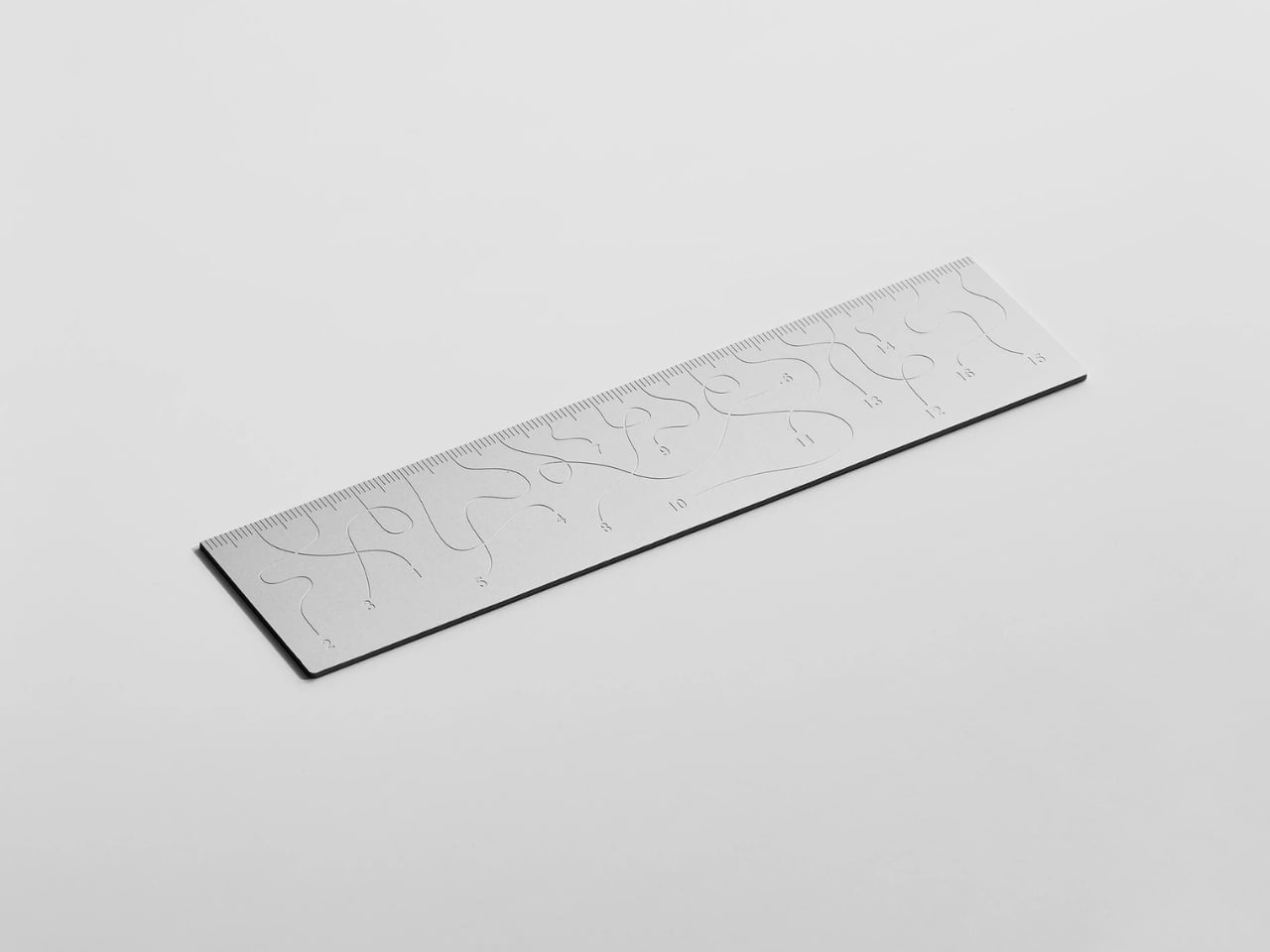
Pick up the WAY ruler and the first thing you notice is that it feels exactly right. It’s small, made from anodized aluminum, and has the kind of weight and finish that signals intention without announcing itself. It’s the sort of object that sits comfortably in a shirt pocket or on the edge of a desk and looks like it belongs in both places. Then you look closer at the markings, and something shifts.
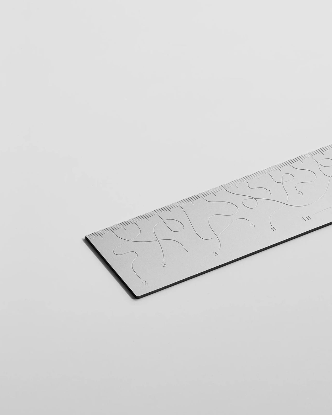
The inscriptions on the WAY don’t run in a clean, predictable line the way ruler markings are supposed to. They wind. They curve and drift across the surface of the aluminum like a path traced through a landscape, referencing, quite literally, the idea of small winding roads and the wandering nature of travel and discovery. The numbers and measurements are there, engraved directly into the material with digital precision, but they’re arranged in a way that asks you to slow down and actually read them rather than glance and move on. It’s legible. Just not immediately.
The engraving itself is worth paying attention to. Kral chose to cut the inscriptions directly into the anodized aluminum rather than printing or applying them as a secondary layer. That decision gives the markings a permanence and a tactility that you don’t get with most production objects at this scale. You can feel the grooves if you run a finger across the surface. The graphic quality of the lettering is considered without being decorative for its own sake. It reads as design that knows exactly what it’s doing, which is what makes the playfulness land rather than feel arbitrary.
The object is small enough to be considered an accessory as much as a tool. Kral has always worked at a scale that pays attention to how things actually live in your hands and in your space, and the WAY is consistent with that. It doesn’t try to be a statement piece in the way that some design objects do, where the visual drama is the whole point. The WAY is quieter than that. The drama is embedded in the detail, in that moment when you realize the markings are doing something unexpected and you have to orient yourself before you can use it.
That slight disorientation is the concept, and it’s a sharp one. There’s a real tension running through modern product design right now, one where the drive to make something visually striking starts to work against the thing it was actually built to do. We’ve all used something that looked incredible but made us work harder than we needed to. Packaging that’s beautiful but impossible to open. Interfaces that prioritize visual elegance over intuitive use. Apps designed to delight that end up frustrating. The WAY ruler doesn’t rail against any of that. It just holds up a small, well-made mirror to it. It’s more of a wink than a manifesto.
The difference between a provocation and a critique matters here. Kral isn’t punishing you for picking up the WAY. The experience of using it is still pleasant. The aluminum feels considered, the engraving is precise, and the object as a whole is genuinely lovely. He’s not making something bad on purpose to prove a point. He’s making something that’s slightly impractical in a very deliberate, very elegant way, and letting you sit with that paradox.
And he followed through on it. The WAY isn’t a prototype or a one-off shown at a design fair and then retired to a shelf. Kral produced a batch and sells them directly through his studio’s website. That matters. It means the object gets to exist in the world the way all good design should, in someone’s hand, on someone’s desk, doing its quiet, considered, slightly inconvenient thing in real life.
At a time when so much product design either chases pure utility or drifts so far toward aesthetics that it forgets what it was originally supposed to do, the WAY ruler manages to be a little bit about both. It’s funny, it’s beautiful, and it makes you think. A ruler, of all things. Leave it to Tomas Kral.
The latest developments in artificial intelligence highlight the ongoing competition among leading AI organizations. DeepSeek is preparing to release its largest and most advanced language model yet, building on its earlier 3.2.2 API model, while OpenAI has finalized the development of GPT-5.5, codenamed “Spud.” Meanwhile, Anthropic has expanded the capabilities of its Claude AI system, […]
The release of iOS 26.4 brings a host of new features, performance upgrades, and critical security enhancements. To ensure your device operates at peak efficiency, it’s important to take specific steps immediately after updating. These actions will help you optimize your device’s functionality, safeguard your personal data, and maintain a seamless user experience. The video […]
It’s been a rough couple of years for Sonos. In mid-2024, the company released a redesigned and thoroughly busted update to its app, which Sonos owners need to set up new products, manage their speaker groups, play music and access a host of other crucial features. The fallout from that was far-reaching — the company replaced its CEO, canceled a few planned products and released no new hardware in 2025.
The Sonos Play, announced earlier this month, is the company’s reset button, a way to remind people what the company does well. The Play is a portable speaker that sits between the $499 Sonos Move 2 (which is large, expensive and extremely loud) and the $179 Roam 2 (the cheapest Sonos speaker and tiny enough to bring anywhere). The $299 Play sits right in the middle of the company’s portable lineup in both size and price — and after spending a few weeks listening to it, I think it’s a very smart addition to the collection. Thanks to its impressive sound quality, versatility and portability, the Play is immediately one of the best speakers Sonos sells. The timing couldn’t be better, either, with warmer weather finally on the way.
Feature set
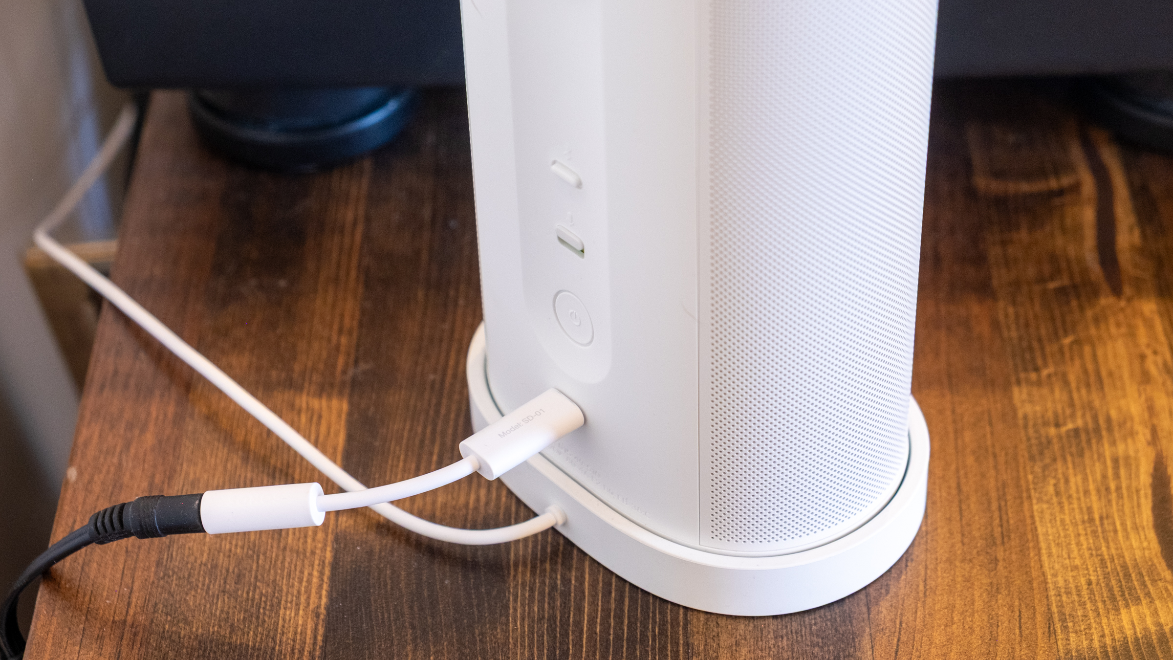
Like all other Sonos speakers, the Play is a Wi-Fi smart speaker that can stream audio from dozens of services; you can also play content on it via AirPlay 2, Spotify Connect and Bluetooth. The USB-C port on the back also lets you connect to turntables, CD players and other audio devices via a line-in dongle, or you can also use that port for an Ethernet connection (again with the corresponding dongle). Finally, you can also control the Play via Amazon Alexa or the Sonos Voice Assistant. And like the Roam, the Play is IP67 rated for water and dust resistance.
That’s all standard fare at this point, but I appreciate that Sonos included Ethernet and line-in capabilities, two things the Roam doesn’t support. It makes the Play a much more versatile option for being a centerpiece of your indoor setup as well as something you can take on the go. And since the Play comes with a wireless charging base, it’s easy to keep it charged up during indoor duty and equally simple to just grab it and go without fussing with cables. (Strangely enough, it does not come with a power adapter, so you’ll need to provide your own USB-C brick.)
The real panel of the Sonos Play.
Nathan Ingraham for Engadget
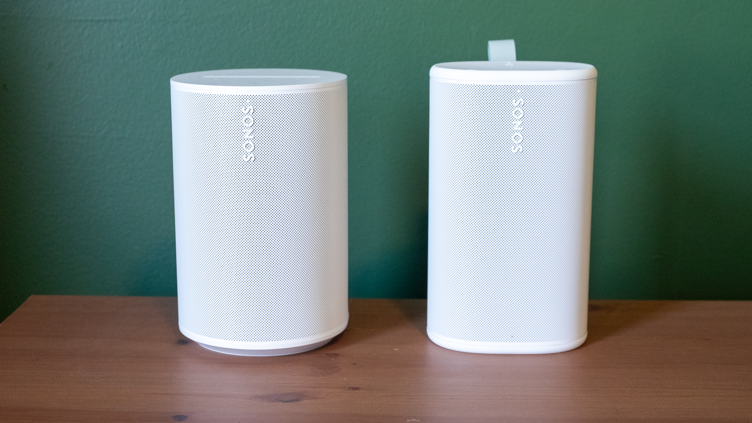
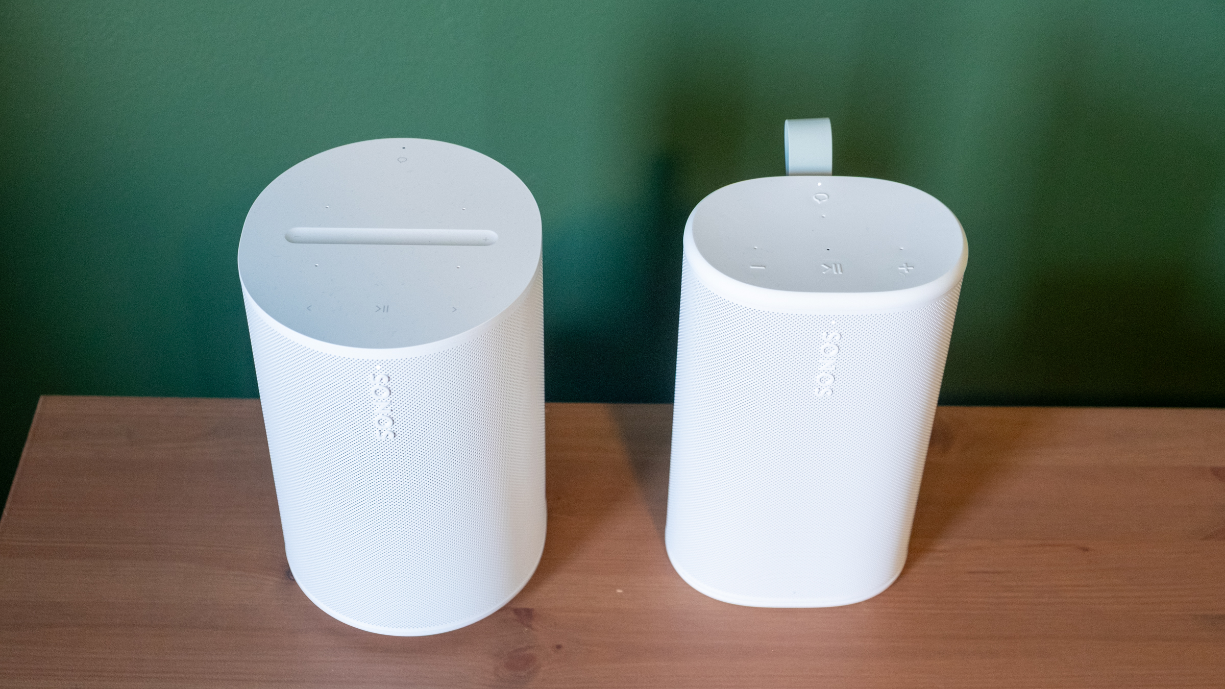
Physically, the Play reminds me of the Sonos Era 100 with its width squished down to make it more portable. Unsurprisingly, it comes in the same white and black color options; I had been hoping for a few more options like the vibrant Roam colors. The one touch of color you’ll see is on the light green grab loop attached to the back; you can remove it if you’re not a fan. At 7.6 inches, it’s slightly taller than the Era 100, but it’s much thinner and lighter. Based on the initial product renders, I expected the Play to be larger than it is in reality, but it feels quite compact and easy to move around. It’s not a “throw in your bag and forget it” speaker like the Roam, but it’s far more portable than the Move. The Move is a speaker I’d really only use in my house or in the backyard, whereas I’d toss the Play into a backpack and take with me — unless I really needed to save space or weight.
The Era 100 (left) and the Play (right).
Nathan Ingraham for Engadget
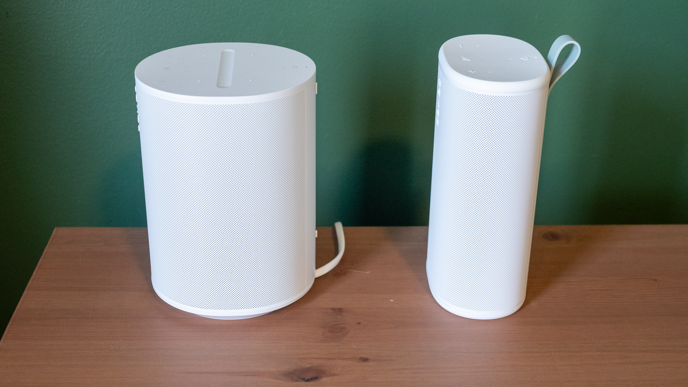
Side view of the Sonos Era 100 and Play.
Nathan Ingraham for Engadget
Its diminutive size is even more impressive when you consider the audio components Sonos packed inside. The Play features a speaker array nearly identical to that of the larger Era 100. It has two tweeters angled at 90 degrees for some stereo separation, along with a mid-woofer and two passive radiators for bass performance. The passive radiators are unique to the Play, specifically included to help bass levels in settings where there aren’t walls for the sound to reflect off of — like anywhere outside you might take a portable speaker.
Two Sonos Play speakers paired in stereo.
Nathan Ingraham for Engadget
Audio quality
The Play’s flexibility only matters if it sounds good. Fortunately, Sonos has never struggled with producing a speaker that’s a pleasure to listen to, and the Play certainly fits the bill. My top-level and unscientific analysis is that the Play sounds nearly as good as the Era 100, an impressive feat considering its comparatively small frame.
I tested a single Play speaker as well as a stereo pair in my small office, where I typically listen to music through a stereo pair of Era 100 speakers. I also used them in stereo on my larger and more open first floor, both streaming music and playing on my turntable via the line-in jack. Finally, I got to test them outside on my deck on a few lovely early Spring days that the Boston area was graced with recently. I used the auto Trueplay tuning feature throughout; it uses the Play’s built-in microphone to optimize audio for whenever you’ve placed the speaker. Sonos has offered various versions of Trueplay for over a decade now and it consistently makes its speakers sound better. And given you don’t have to do the old “wave your phone around the room” method to use Trueplay, there’s really no reason not to have it on.
While in my office, I did a lot of A/B testing of the Era 100 vs. the Play, typically playing Apple Music lossless via the Sonos app, but I also tried AirPlay and Spotify Connect as well as other music services including YouTube Music and Bandcamp. The biggest differences I noticed between the two speakers are the Era 100 is louder and has a more pronounced mid-range. The Play comparatively feels like its EQ is “scooped,” and it just isn’t quite as loud at the same volume level. The Play also doesn’t maintain quality quite as well through the full volume range — I wouldn’t say that it got distorted when I was playing it at 75 percent volume, but it’s not as clear as the Era 100 either.
These differences I mostly only noticed when I was flipping back and forth between the two speakers — when I just sat back and listened, I was extremely happy with the Play’s sound. When listening to a single Play, the angled tweeters did provide a small degree of stereo separation when things were hard-panned to the left or right channels. For example, the backing vocals in the chorus of Soundgarden’s “Black Hole Sun” jump from one channel to the other, and I did pick up on that effect.
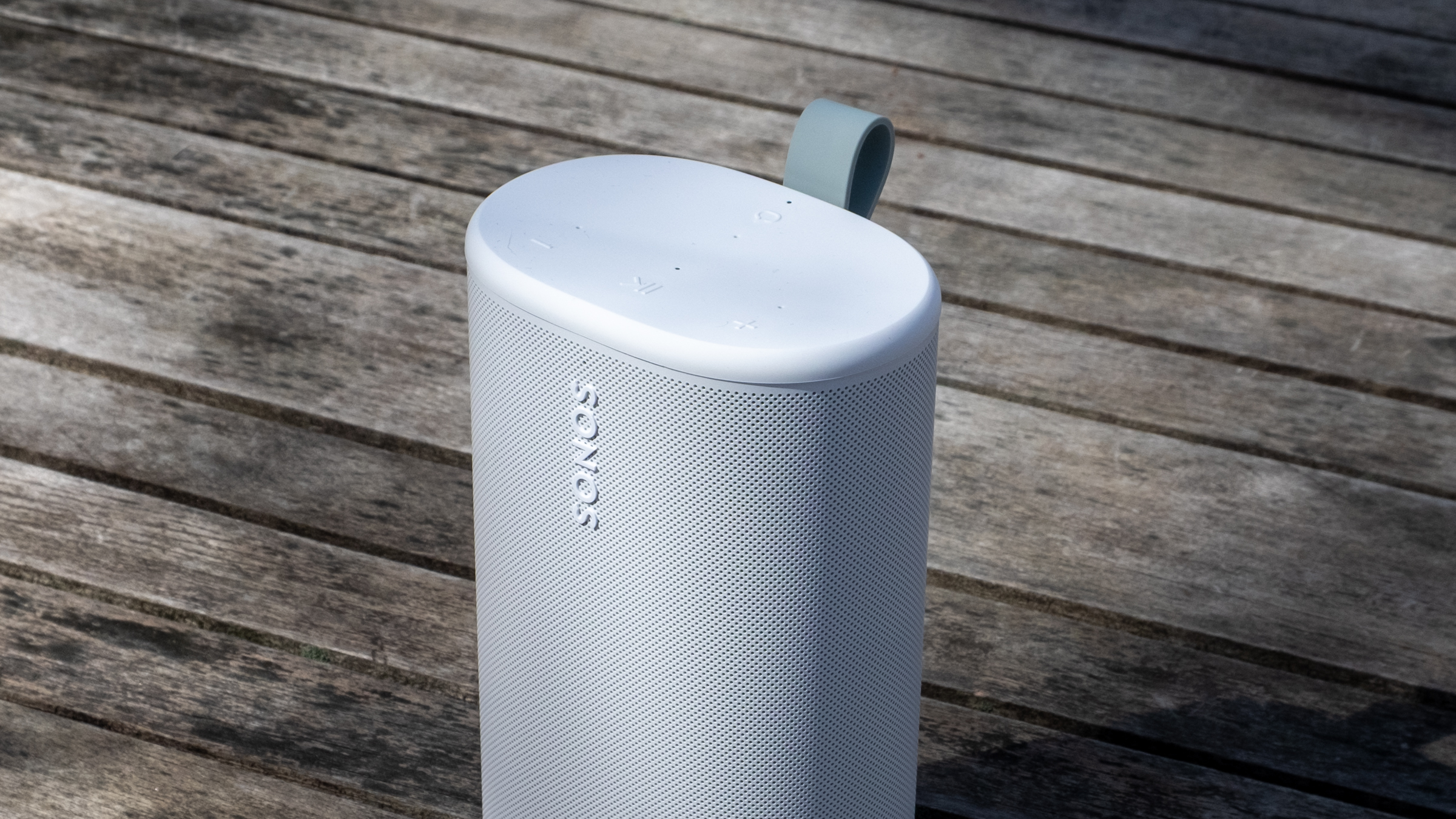
Top controls on the Sonos Play.
Nathan Ingraham for Engadget
The Play sounds very well-balanced and neutral, capable of reproducing songs without over-emphasizing any particular frequency. My usual listening habits include a ton of ‘90s-era alternative and more modern indie rock, plus some modern pop and the occasional film or video game score, and the Play sounded great across the board. Daughter’s “Be On Your Way” is an atmospheric track juggling strings, electronic underpinnings, reverb-drenched guitar and a gorgeous vocal track, and all those elements shined here. The dance-influenced beats of Nine Inch Nails’ “Less Than” had appropriate thump and power behind them, and “Stay Down” by Boygenius sounded great, whether it was the acoustic-tinged intro or the layered, full-band climax. Heavier fare like Metallica’s “Battery” and Tool’s “Fear Inoculum” hit with the appropriate intensity as well, particularly when I was running two Play speakers in stereo.
My go-to film score for these kinds of tests is Howard Shore’s Lord of the Rings: The Two Towers, and it’s often the case that doesn’t sound as majestic on smaller speakers. But the Play did a great job with the intricate orchestral arrangements that jump between delicately intimate moments and full-throated majesty — the first song “Glamdring” has all these elements in less than four minutes, and it sounded excellent. I also love Gustavo Santaolalla’s score for The Last of Us with its tortured strings and host of organic acoustic sounds alongside unsettling electronics, and all its various elements were faithfully conveyed here.
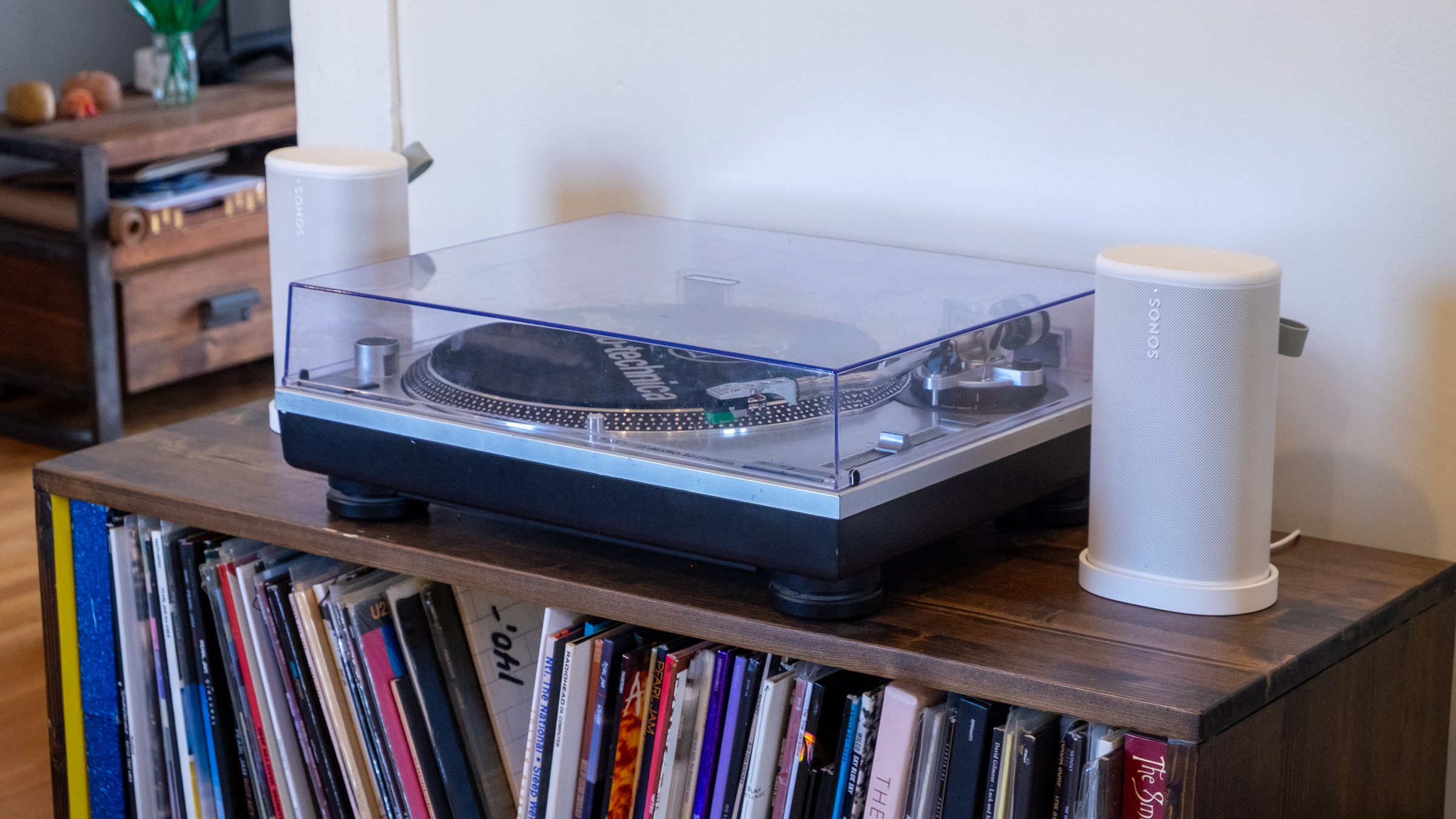
The line-in connection on the Sonos Play.
Nathan Ingraham for Engadget
Using the speaker’s line-in capabilities with a USB-C to 3.5mm audio input worked easily as well. The only real issue I noticed is that my particular turntable’s output meant I had to turn the Play up much louder than I would when streaming music, so its top volume level is much lower. That wasn’t exactly a problem, but if you really want to push a lot of volume from a line-in source, this might not be the speaker for you. I was also worried that I’d switch from line-in to streaming and forget to adjust the volume down, but the speaker is smart enough to re-adjust from the line-in volume down to wherever it was set previously.
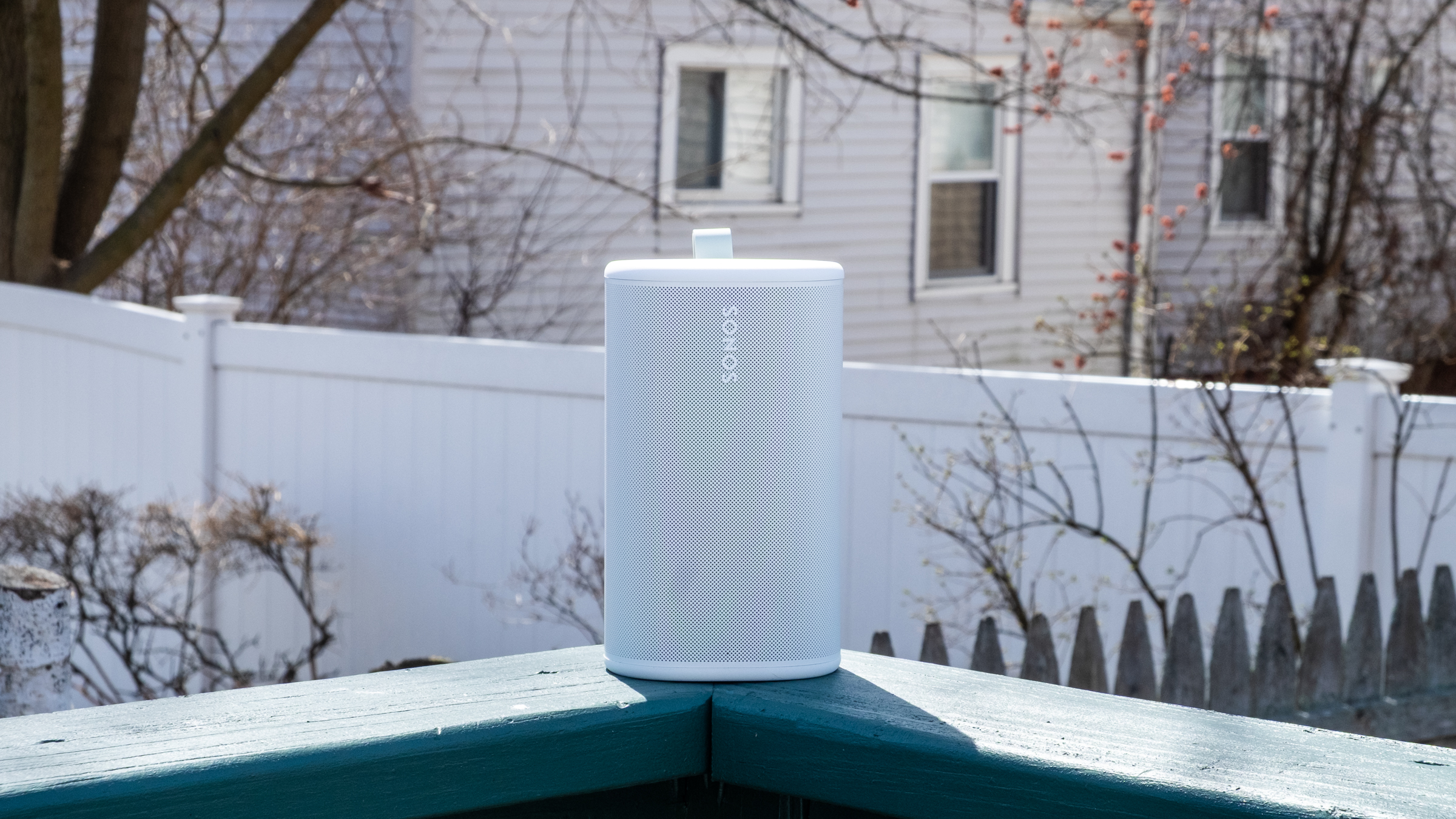
While the Play isn’t the loudest speaker out there, it has plenty of power when outside. I set the volume to around 60 and walked from my porch to the sidewalk and could still faintly hear the music (though not loud enough to be too offensive to passers-by or neighbors). Back up on the deck, the Play maintained its detailed profile despite the lack of surfaces for the sound to reflect off. It feels like a great device to have playing in the background when you’re entertaining outdoors, but something like the Move 2 will do better if you want music to be the centerpiece of a gathering.
The Play’s Wi-Fi connection is strong enough that I didn’t need to switch to Bluetooth when I was outside, but it’s simple to use if you need it. There’s a dedicated Bluetooth button on the back; pressing it turns it on, while holding puts the speaker in pairing mode. Bluetooth is probably the easiest way to give someone else control over your Sonos system. If you start streaming music to it, you can then group other speakers with the Play to get those tunes anywhere in the house without having to give a guest access to your Sonos system.
The Sonos Play and its charging base.
Nathan Ingraham for Engadget
Sonos included a new Bluetooth feature with the Play that they’re also bringing to the Move 2. If you’re away from Wi-Fi and playing audio via Bluetooth, other Play or Move 2 speakers can join a group just by pressing and holding the play/pause button. This works with Play or Move 2 speakers that have previously been set up on the same Sonos system, and it’s as simple as it sounds. I just paired my phone to one speaker, started playing some music and then held the play/pause button on the second speaker to get them in sync.
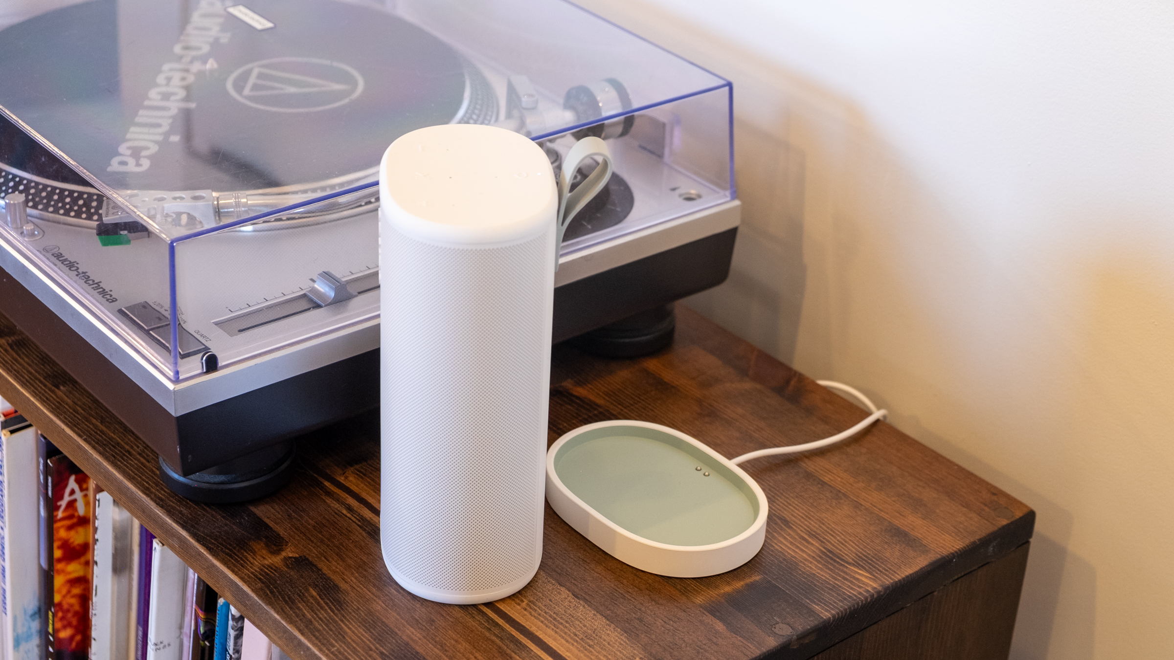
As for battery life, the Play is a huge step up over the Roam’s rather paltry 10-hour estimate. The Play is rated for up to 24 hours of playback, same as the Move 2, and I think Sonos just about hit that mark. I spent several work days playing music for eight-plus hours and the Play’s battery only dropped about 30 percent each time. Your mileage may vary, but I think the Play has plenty of battery life considering its smaller size — and given how easy it is to just drop on a charging base when you’re done, I don’t think most people will run its battery down too often. Sonos also made the battery in the Play user-replaceable, a good option to keep the speaker running for years to come.
Side-by-side comparison of the Sonos Era 100 and Play.
Nathan Ingraham for Engadget
Competition
While there are loads of portable Bluetooth speakers out there, the Play’s position as a Wi-Fi speaker that can group with others in a household as well as be used on-the-go with Bluetooth makes it a rather unique option. The $269 Bose SoundLink Plus sounds great, can be paired in stereo or grouped in “party mode,” and is a similar size as the Play. But its battery doesn’t last as long and, more crucially, it only works via Bluetooth. Some people won’t care, but I prefer the much wider variety of playback options that the Play provides. JBL also has a host of portable Bluetooth speakers, as well as Wi-Fi enabled options meant for home use — but again, the combo of Wi-Fi playback and portability seems to be mainly limited to Sonos right now.
As such, the main competition for the Play comes from Sonos itself, with the Move 2, Roam and Era 100 all offering different pluses and minuses depending on what you’re looking for.
Sonos Play speaker sitting outside.
Nathan Ingraham for Engadget
Wrap-up
If it isn’t obvious, I’m a pretty big fan of the Sonos Play. While it’s not quite as portable as the tiny Sonos Roam, it sounds significantly better than the smallest Sonos speaker while still being easy to carry around. It’s probably the most versatile speaker in the Sonos lineup right now, and a smarter choice than the $499 Move 2 for most people. Unless you really need massive outdoor volume, the Play is the best portable Sonos speaker.
The only catch is its price. $299 is fair when you consider its sound quality and feature set. But it’s also $80 more than the Era 100, or $110 more than the Era 100 SL (which drops the microphone but is otherwise identical to its more expensive counterpart). So you’ll have to decide how much portability is worth to you. For me, the Play is an excellent addition to my existing setup. But if you’re likely to do most of your listening indoors, the Era 100 and its superior sound quality might make more sense.
To be clear, that’s not a knock against the Play. The latest Sonos speaker offers impressive sound quality, flexibility and portability, and it’s the kind of product that can help Sonos rebuild its reputation after its recent difficulties.
This article originally appeared on Engadget at https://www.engadget.com/audio/speakers/sonos-play-review-the-companys-best-portable-speaker-so-far-130000688.html?src=rss
WhatsApp shared multiple quality of life updates coming to its messaging platform starting today. The first is a long awaited option to have two accounts on a single iOS device. The option has been available for years on Android, and iPhone users can now be logged into two separate accounts at once. The profile photo for the account will be visible in the bottom tab to double-check which persona you're messaging as.
The other new features allow for easier movement of chat histories, both between platforms and devices in the same ecosystem. This chat transfer should make it easier to retain messages when upgrading to a new phone, especially if you're switching between iOS and Android. There's also a new option to delete large files directly from a WhatsApp chat to avoid storage clutter. It's available under the Manage Storage option when you tap a chat's name. It includes an option to delete just media files from a conversation.
And of course it wouldn't be a tech news announcement without at least some AI features present. WhatsApp now supports using Meta AI for light photo editing, including removing backgrounds, changing aesthetic styles and deleting elements from the composition. There's also a Writing Help prompt that uses AI to help draft a message, although Meta's blog post states that using this still keeps chats private. The above features should be arriving to all WhatsApp users “soon,” according to the company.
This article originally appeared on Engadget at https://www.engadget.com/social-media/whatsapp-rolls-out-updates-including-multiple-accounts-for-ios-130000252.html?src=rss
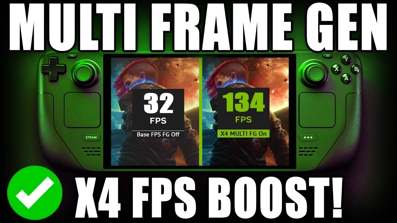
The Steam Deck has taken a significant step forward in portable gaming with the introduction of the DLSS Enabler plug-in, a feature designed to bridge Nvidia-exclusive technologies and AMD hardware. Developed with input from the gaming community, this plug-in enables DLSS4 multi-frame generation, allowing supported games to achieve up to four times the frames per […]
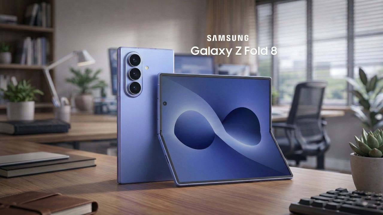
Samsung’s Galaxy Z Fold 8, the latest addition to its foldable smartphone lineup, builds upon the foundation laid by its predecessors with a series of refinements. While the design remains largely consistent with the Z Fold 7, the device introduces notable improvements in durability, performance, and functionality. However, with a projected price of $2,000, the […]
Jay E | RoboNuggets examines how the new Drawbridge plugin enhances AI-driven web design by allowing users to annotate browser elements visually. This free Chrome extension supports screenshots, HTML and comments to create detailed instructions for AI systems, eliminating the reliance on text-based commands. For instance, users can save tasks in a markdown file (`mo_tasks.md`) […]
Apple’s macOS 26.4 introduces a range of updates aimed at enhancing customization, productivity, and the overall user experience. With smarter battery management, refined app interfaces, and improved system settings, this release addresses user feedback while introducing practical new tools. Below is a detailed exploration of the key features and updates, showcasing how they can positively […]
After achieving action camera success, Insta360 invaded DJI’s turf with the first mass-market panoramic drone, the Antigravity A1. It had instant appeal for drone pilots, offering 8K 360 video and features like subject tracking, obstacle detection and FPV flying.
Though beaten to the punch, DJI has responded quickly with the Avata 360, aided by its drone experience and camera tech from the new Osmo 360 action cam. It has a lot in common with its rival, but it’s safer to fly around people and offers single camera 4K footage on top of 8K 360 video.
To find out how the Avata 360 stacks up against the A1, I tested it both indoors and out, around people and even “stunt” horses. The Avata 360 isn’t perfect, but it is far more polished than its rival. As with other DJI drones of late, though, US availability remains unclear.
How the Avata 360 works
The 360 camera makes the Avata 360 different from any other DJI drone. It features two ultrawide cameras with f/1.9 lenses and 1.1-inch 64-megapixel sensors, with one pointing up and the other down for unobstructed 200-degree views. Those are then stitched together by software to create 360 degree video at up to 8K 60 fps.
This setup fundamentally changes the way you pilot a drone and capture video. Since the 360 camera records everything around it, you can focus on flying and reframe shots later in DJI’s Studio app. That 360 view is also handy when piloting in FPV mode. With the head tracking on DJI’s Goggles N3, you can look all around you simply by turning your head.
Unlike the Antigravity A1 that only shoots 360 video, the Avata 360 supports regular single-camera shooting as well. When you switch to that mode, the camera rotates forward and shoots 4K video at up to 60 fps with a 28mm field of view. DJI’s drone also works with a regular controller, which isn’t an option on the A1. You have to use the Insta360’s goggles at all times.
Design
Because of the chunky 360 camera, the Avata 360 is slightly bigger than the Avata 2. It’s also quite a bit heavier at 455 grams (one pound) and so, unlike the 249-gram Antigravity A1, you’ll need a permit to fly one in most regions.
The Avata 360’s propellers are shielded to protect the drone and keep it safe indoors or around people, unlike the open-prop A1. For additional protection it has two omni obstacle sensors on the side, a Lidar sensor up front, landing sensors on the bottom and, of course, a camera that points in all directions. To keep the lenses off of bare ground, it comes with a foldable 18x18-inch landing mat.
DJI’s Goggles N3 (available with the RC Motion 3 controller as an option) are comfortable and allow you to wear eyeglasses. Unlike the Goggles 3, though, there’s no external camera to see outside. If you’d rather pilot conventionally, you can get the Avata 360 bundled with DJI’s RC 2 screen controller in another kit.
Performance and features
As an FPV drone, the Avata 360 is fast and agile. It can hit speeds up to 40 MPH in sport mode (without obstacle avoidance) or 35 MPH in normal mode. When used with the optional FPV Remote Controller 3, you can do flips, rolls and other “cinewhoop” style maneuvers. Once you get used to flying it that way, it’s incredibly fun.
The 38.7Wh batteries have 26 percent more capacity than the Avata 2’s cells, but rated endurance is about the same at 24 minutes. I never got more than about 18 minutes in real-world flying though, so it’s a good idea to buy the Fly More kit with three batteries and a fast charger that can replenish them all in about 100 minutes.
Samuel Dejours for Engadget
Part of my testing of the Avata 360 was capturing “trick riding” horses, so it was important that the drone noise didn’t spook them. At 81db the Avata 360 is louder than the Mini 4 Pro (67 db) and less banshee-like than the Neo 2 due to the larger propellers, so the horses weren’t alarmed.
Video is transmitted to the Goggles N3 and RC Motion 3 controller (or the RC screen controller) at 1080p 60 fps via DJI’s OcuSync 4.0+ system. The maximum flying range is 20 km (12.4 miles), double that of the Avata 2. This is an impressive distance for an FPV drone.
The 45GB of internal storage (42GB usable) can fill up quickly when you’re shooting 8K video, but the drone also has a microSD slot. To get your footage onto a PC or smartphone, you can transfer it via the USB-C port or over Wi-Fi using DJI’s Fly app.
The Avata 360 has DJI’s usual tracking and obstacle detection features, but they’re available only with the RC 2 controller and not the Goggles N3. To follow a subject, simply draw a box around them on the controller to enable Focus Track and its three modes: Spotlight, Point of Interest and ActiveTrack. The latter tracks a subject automatically and lets you control the drone’s position via an on-screen “steering wheel.”
Steve Dent for Engadget
To test that, I biked in a narrow forested lane and walked around a bamboo-covered obstacle course. When using Focus Track, the drone dodged most obstacles and was only confused by small leaves and branches. If it did contact one of those, it sailed right through without crashing thanks to the propeller guards.
Subject tracking works in both 360 and single camera modes, but when using the latter, The Avata 360 can’t see and avoid obstacles behind it. It contacted branches several times during my testing, but fortunately the prop guards prevented crashes. Other automatic features include Dronie, Rocket and Quickshot modes that let you capture clips for social media.
Video
The Avata 360 prioritizes FPV freedom and flexibility over pure video quality. Though the specs promise 8K, that only applies to the full 360 degree video — your final, flat video will actually be 4K or less after processing. And the 360 camera zooms digitally (not optically), which further reduces resolution. On top of that, you can often see a “seam” in the video where stitching occurs, and dewarping (used to output flat video) can create softness at the edges. With all that, video is less sharp than DJI’s regular Mini, Air and Mavic drones.
Because the camera is fixed when shooting 360 video, the Avata 360’s gimbal can’t smooth out jolts or correct for roll. Instead, it uses action cam-style electronic stabilization. What’s more, that type of smoothing causes motion blur and artifacts in low light due to the lower shutter speeds — something I also noticed with the Osmo 360.
Steve Dent for Engadget
With that said, video quality was as sharp and color-accurate as the Osmo 360, and a touch better than the Antigravity A1 when filming in daylight. For tricky, contrasty conditions like a shaded path on a sunny day, the D-LogM option boosted dynamic range, helping me bring out shadow detail and tone down overly-bright highlights. However, the cityscape I shot at night was soft and occasionally blurry due to the aforementioned stabilization issues.
In exchange for this lower video quality, the 360 camera provides incredible flexibility. For a vlog style tracking shot, for instance, I usually need to film twice to show the forward and backward directions. With the Avata 360, though, I was able to get both POVs from the same shot and output an overhead view too for good measure.
DJI Studio is where you go to select your desired framing and output the flat video. It’s not quite as versatile as Insta360’s app, but it allows you to reframe shots and create smooth transitions between camera angles. And to save time, you can use the Intelligent Tracking feature to center your subject. The app also offers color correction and other features, but I found it easier to export the final shots to DaVinci Resolve for any additional work.
Flat video a mixed bag. Sharpness is mildly better than the 360 video, but the lack of a gimbal roll axis means that the camera can’t level itself when the drone banks into the wind. As a result, most of my footage was tilted and often unusable.
Wrap-up
Steve Dent for Engadget
With the Avata 360, DJI has a surprisingly sophisticated drone that offers better video quality and more features than its only rival, Insta360’s Antigravity A1. It can do everything you’d expect from a DJI FPV drone like tracking, obstacle avoidance and acrobatics, while operating safely around people (or horses).
DJI also managed to undercut Insta360 on price, with the Avata 360 starting at 459 euros (approx. $530), or 939 euros ($1,089) in a kit with a screen controller, three batteries and a charger. It’s also available with the extra batteries and charger, DJI’s FPV Goggles N3 and the RC Motion 3 controller for 939 euros ($1,089). As mentioned, there’s no word yet on US pricing, but the Avata 360 has been approved by the FCC so it could appear in the US soon.
Like 360 action cams though, this is a niche product. If you’re a vlogger, extreme action shooter, FPV pilot or solo filmmaker who wants speed and flexibility, the Avata 360 is a great choice. If it’s pixel perfect image quality you want, however, you’re better off with DJI’s Mini 5 Pro, Air 3S or Avata 4 Pro drone.
This article originally appeared on Engadget at https://www.engadget.com/cameras/dji-avata-360-drone-review-360-video-hits-new-highs-120014666.html?src=rss