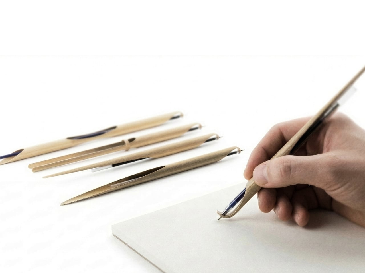
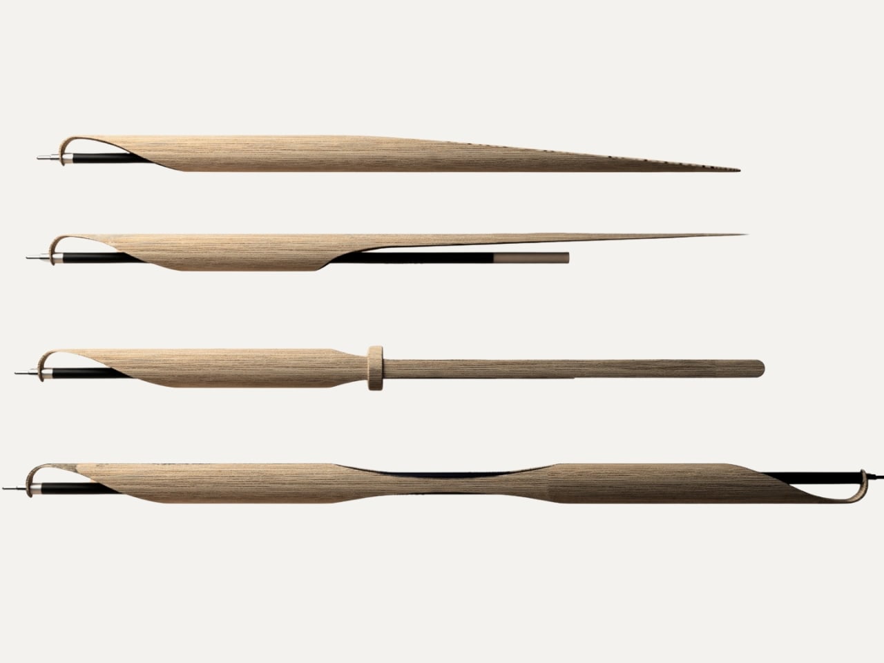
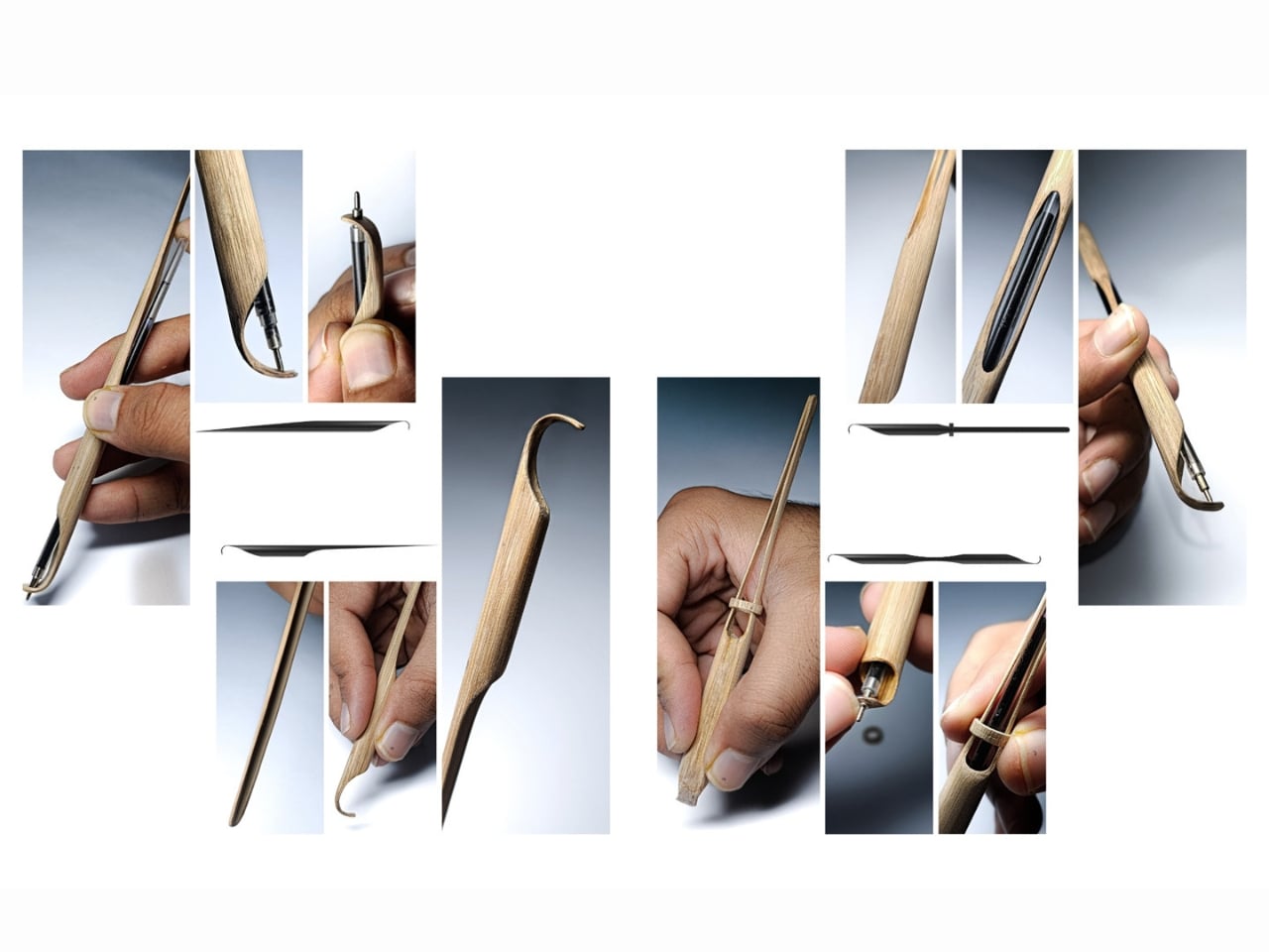
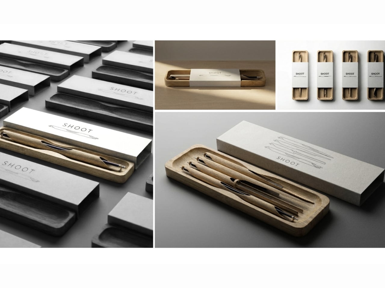
We don’t usually stop to think about pens. They show up in our bags, our drawers, the bottom of every tote we own, and when the ink runs out, they quietly end up in a landfill. That’s the mundane life cycle of the humble ballpoint, and most of us have just accepted it. Which is exactly why Shoot, a bamboo writing instrument designed by Sarthak Prajapati, feels like a quiet rebuke dressed up as a very beautiful object.
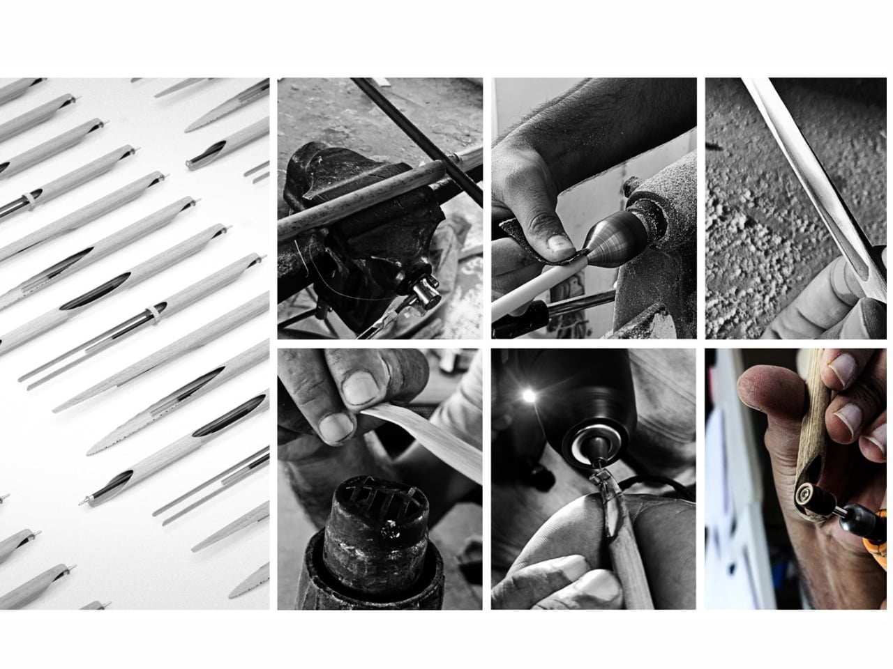
Prajapati is an Industrial Design undergraduate at the National Institute of Design in Assam, India, and Shoot is his entry in the 2026 Green Product Award, currently shortlisted as a finalist in the Consumer Goods category. At first glance, it’s a precision pen carved from a single piece of bamboo. But the more you learn about how it was made and why, the more it becomes a kind of design manifesto condensed into something you can hold in your hand.
Designer: Sarthak Prajapati
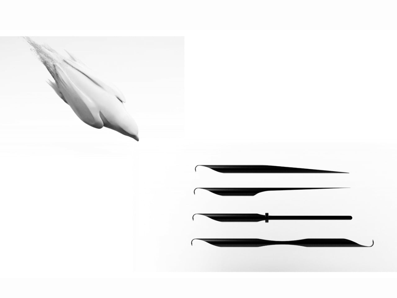
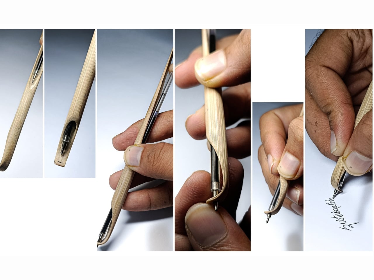
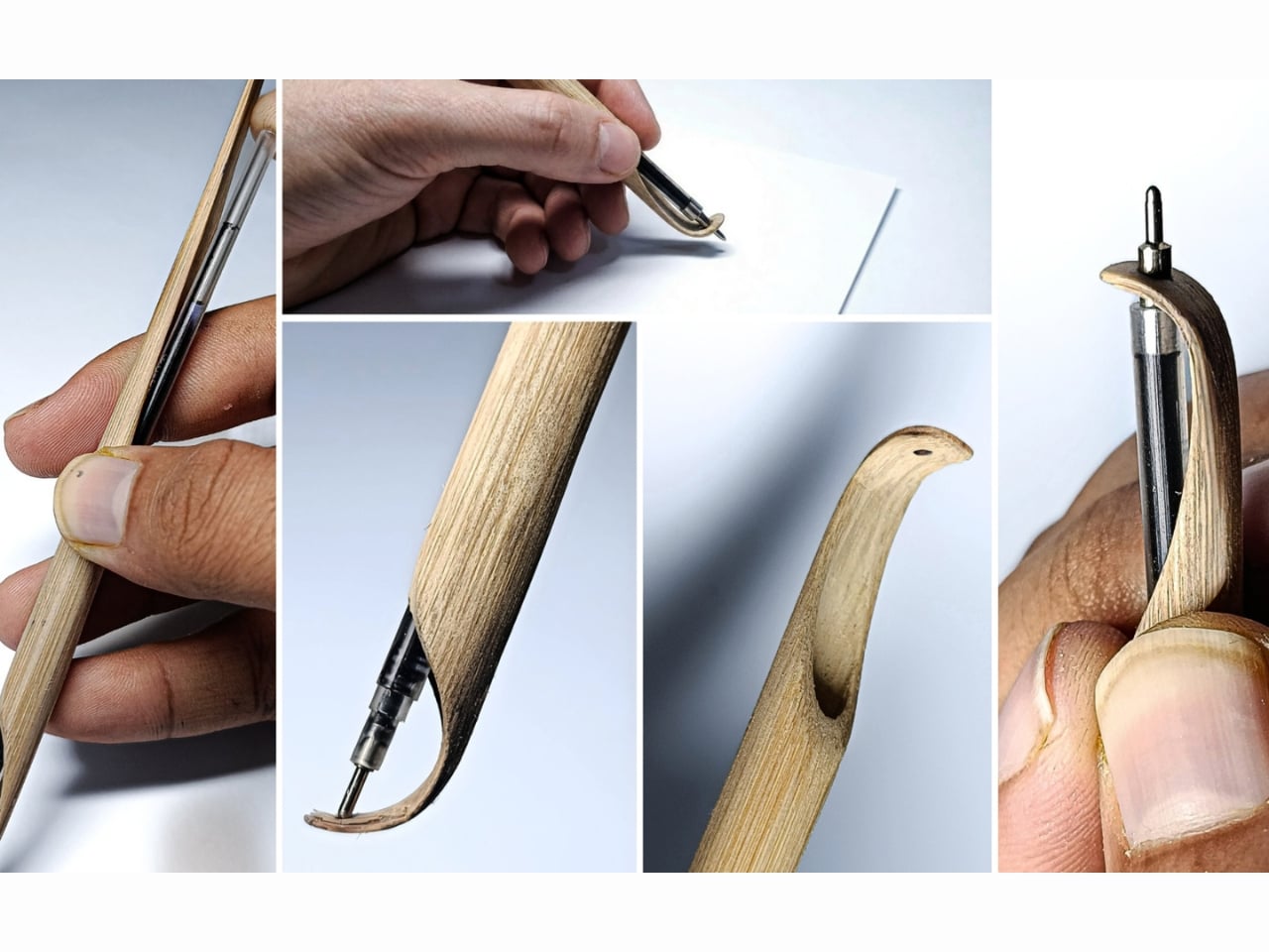
The name itself is a clever one. A “shoot” is the young, fast-growing sprout of a bamboo plant, and that material is the entire premise of the object. Bamboo is one of the fastest-regenerating plants on earth, and Prajapati uses it here not as a trendy green overlay but as a functional, structural choice. The bamboo handles the grip. The bamboo handles the form. The bamboo is the design. There’s no layer of branding on top trying to convince you it’s sustainable. The material speaks for itself.
Shoot’s most compelling quality isn’t even the material. It’s the thinking behind how it was made. No electricity. No factory floor. No complex supply chain. Prajapati built this using low-energy, hands-on craft methods, which aligns with a wider movement in design circles pushing back against the idea that innovation always has to be high-tech to be meaningful. Sometimes innovation looks like stepping back and asking whether the thing we already have, meaning the plant, the material, the traditional skill, was actually good enough all along.
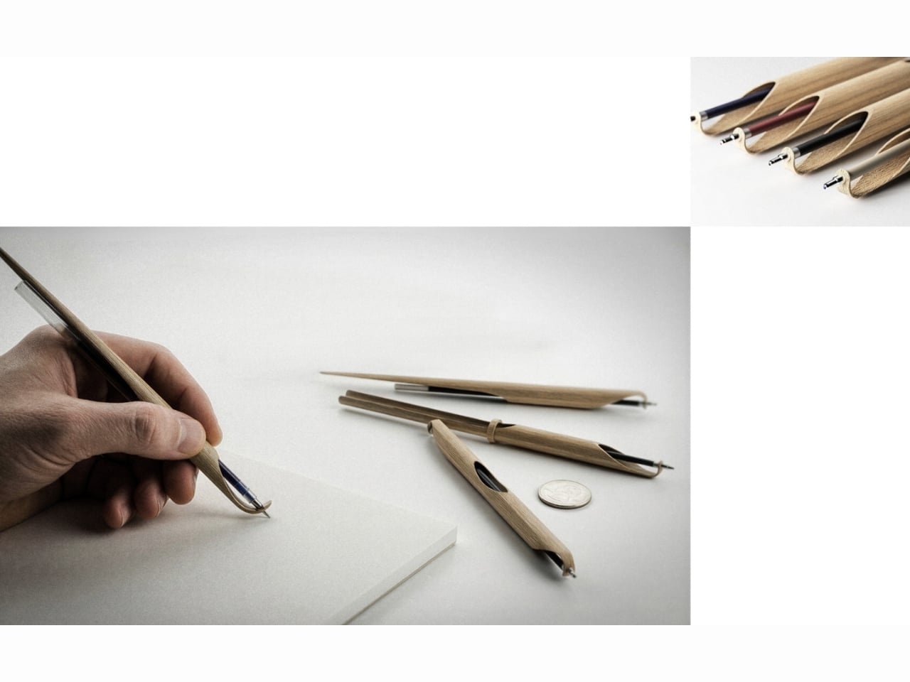
The pen is also refillable, which sounds like a small detail but isn’t. Disposable pens are a genuinely staggering problem. Billions are discarded every year globally, and most of them are made from mixed plastics that can’t be easily recycled. The refillable design of Shoot positions it directly against that culture of single-use convenience, and it does so without requiring the user to sacrifice function. You still get a proper writing instrument. You just don’t throw the whole thing away when it’s done.
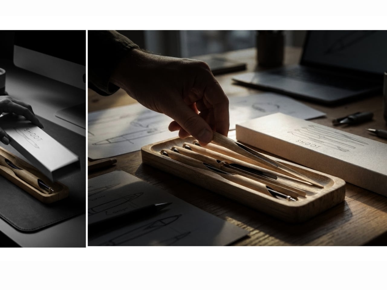
I’ll be honest: I have a soft spot for design that comes from a student context. There’s a kind of fearlessness to it. Prajapati isn’t working within a corporate brief or trying to satisfy a retailer’s margin requirements. He’s solving a real problem the way he actually believes it should be solved, and the result has the clarity that comes with that freedom. The pen looks exactly like what it is. A bamboo stalk. A writing tool. Nothing more, nothing less, and somehow that is enough.
The Green Product Award itself, now in its eleventh year, evaluates submissions on approach, innovation, sustainability, and design. The fact that Shoot made the final shortlist tells you a lot about the kind of thinking that’s being rewarded right now. The jury isn’t looking for products that simply add a bamboo component to something otherwise unchanged. They’re looking for objects where the sustainability logic runs all the way through, from material to manufacturing to end of life.
If Shoot ever goes into production, I’d buy one. Not because I’m trying to make a statement, but because it looks good, it works, and it represents a genuinely more considered way of making things. The design world produces a lot of concepts that never leave the rendering stage, but Shoot has a physicality and simplicity to it that makes it feel ready. It’s a pen. From a bamboo shoot. Made by hand. And right now, that feels surprisingly radical.
Note apps are frictionless. That is supposed to be their advantage. You open one in two taps, type something forgettable, close it, and lose it somewhere between screenshots and grocery lists. The problem is that “frictionless” and “memorable” are not the same thing. Japanese stationery designers figured this out long ago, which is why they keep building analog tools that feel more considered than anything a software update has ever produced.
Every product here solves a specific friction point you have probably accepted as normal: a pen that vanishes when you need it, a clipboard that fights back when you add a sheet, a tape dispenser that looks like it escaped from a supply closet. These five finds fix all of that without an app store, a subscription, or a settings menu.
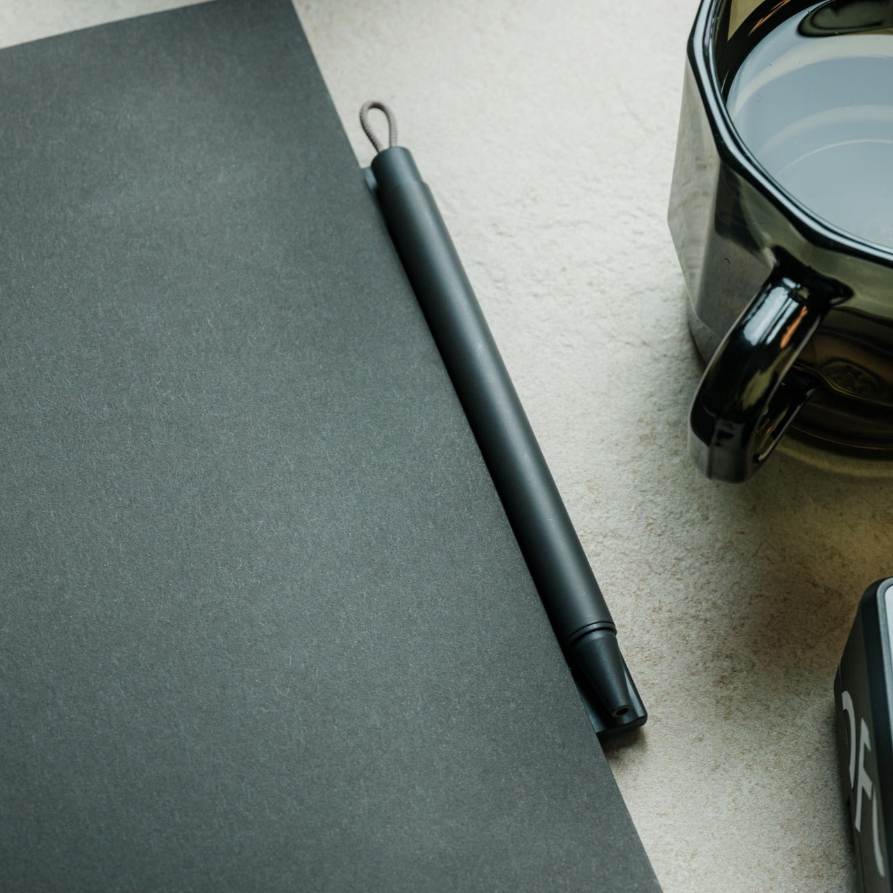
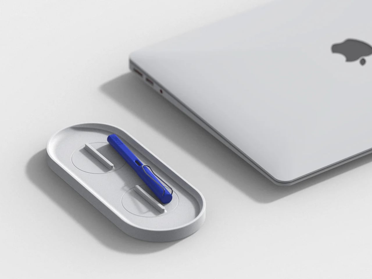
1. Inseparable Notebook Pen
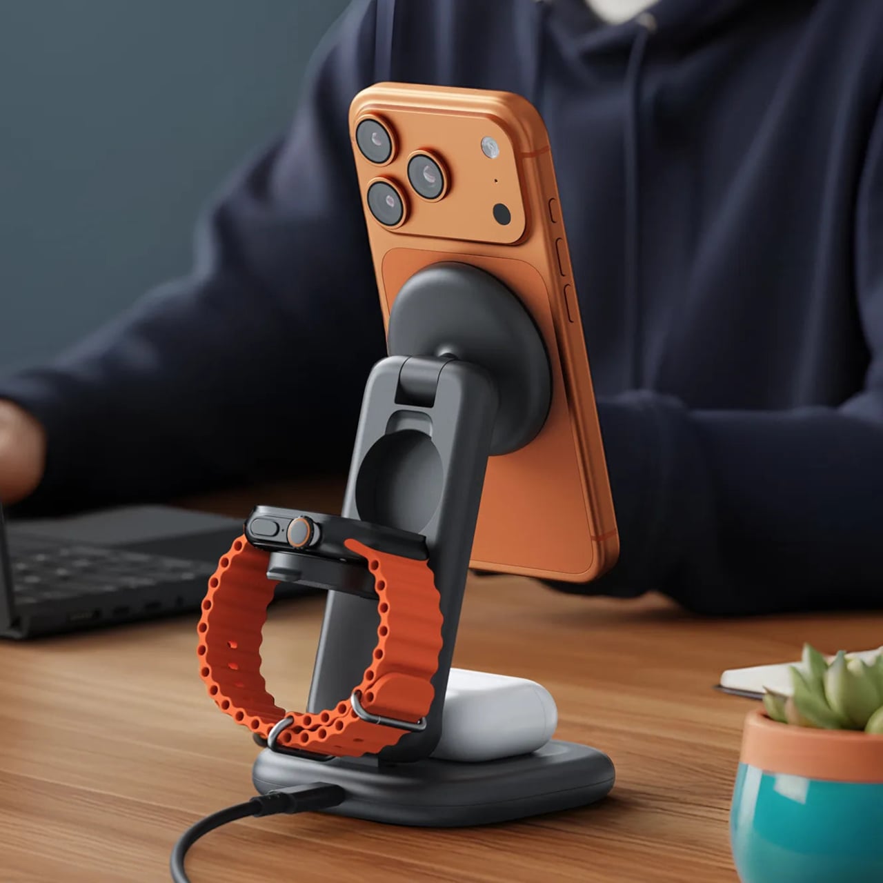
Most pens exist independently of the surface they write on. The Inseparable Notebook Pen rejects that assumption, using a magnetic clip that locks it to your notebook cover every single time. A built-in silencer dampens the attachment so there is no click, no rattle, just a quiet lock into place. The barrel is slim, the gel ink immediate, and the whole system rests on a principle Japan has long understood: the best tools are the ones you eventually stop noticing.
The gap between reaching for a pen and writing is small but real. In a meeting, on a train, mid-thought at a cafe table, that search breaks momentum in a way you feel but rarely name. By attaching itself to the notebook, the Inseparable closes that gap completely. It arrives wherever the notebook goes, leaves when the notebook leaves, and sits almost invisible against the cover. At $19.95, it is a quiet fix for an annoyance most people have long stopped trying to solve.
The magnetic clip holds firm during transit but releases instantly the moment you need it
The built-in silencer makes every attachment feel deliberate rather than mechanical
What we dislike
The slim barrel may feel too narrow for anyone who prefers a wider, more substantial grip
Ink cartridge options are limited, which restricts customization for specific writing preferences
2. Stalogy Editor’s Series 365-Day Notebook (A6)
The Stalogy Editor’s Series 365-Day Notebook packs 368 pages into an A6 form factor that still slides into a coat pocket. Each page carries minimal printed detail: faint dates, a light grid, time indicators running along the margin. Use them or ignore them entirely. The paper is ultra-thin but writes with a smooth resistance that makes ink feel like it belongs on the page rather than sitting on top of it. Gel pens, ballpoints, and lighter fountain pen inks all perform cleanly without feathering.
Most planners assume they know how your day should be structured. The Stalogy steps back. The faint markings give you reference points without enforcing a system, which means the same notebook works for bullet journaling, meeting notes, rough sketching, and daily records without ever feeling like you are working against the page. For anyone who has cycled through five different note apps looking for the one that finally fits their brain, this is what that search was actually about.
Thin paper keeps 368 pages from becoming heavy, maintaining genuine pocketability throughout
Minimal page markings suit both rigid planning systems and completely freeform, unstructured use
What we dislike
Heavy fountain pen inks will ghost through the thin paper, limiting compatibility with certain instruments
Date and time markings are printed very small, making them difficult to read comfortably in low light
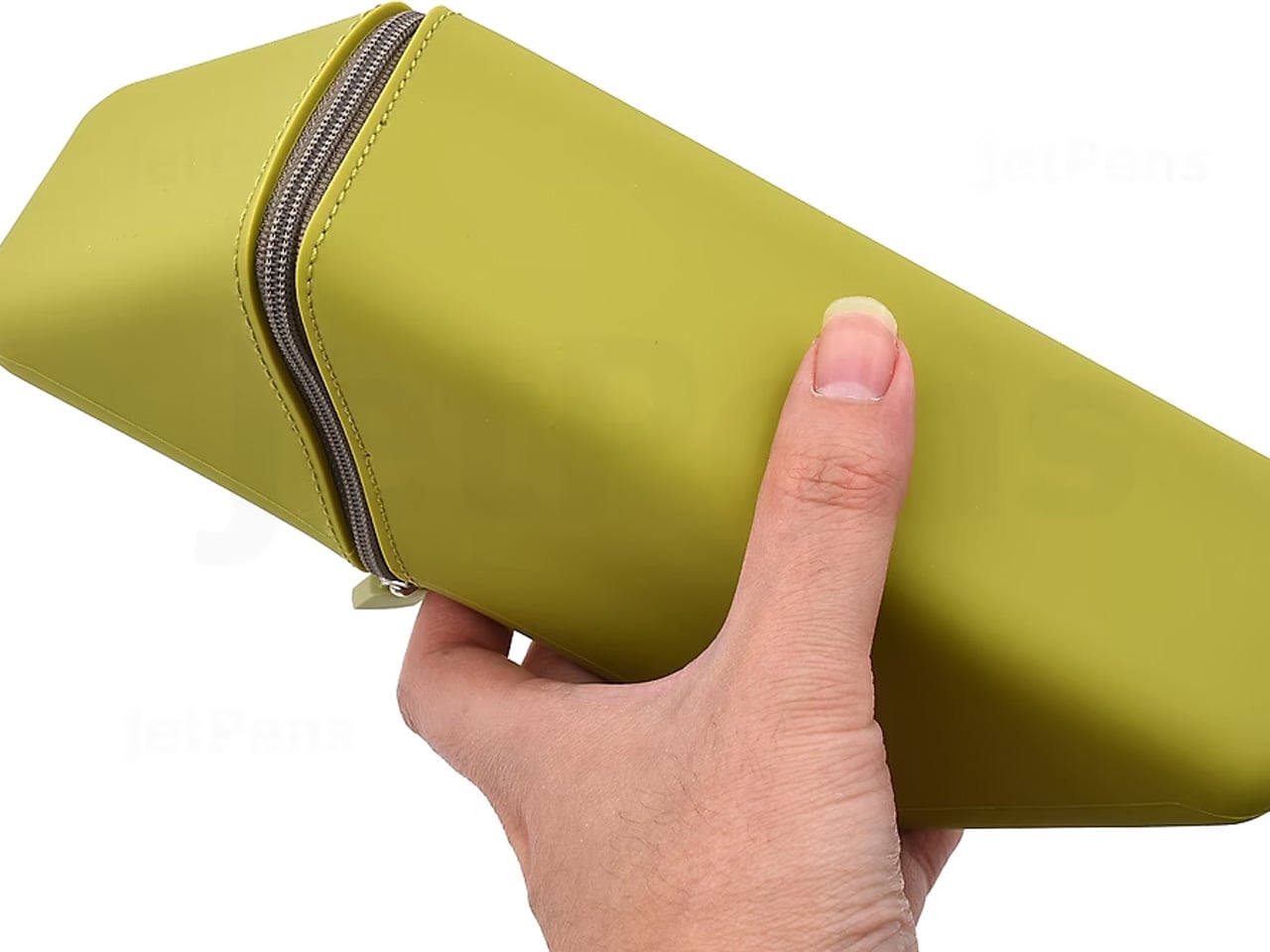
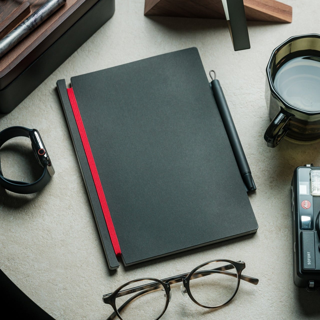
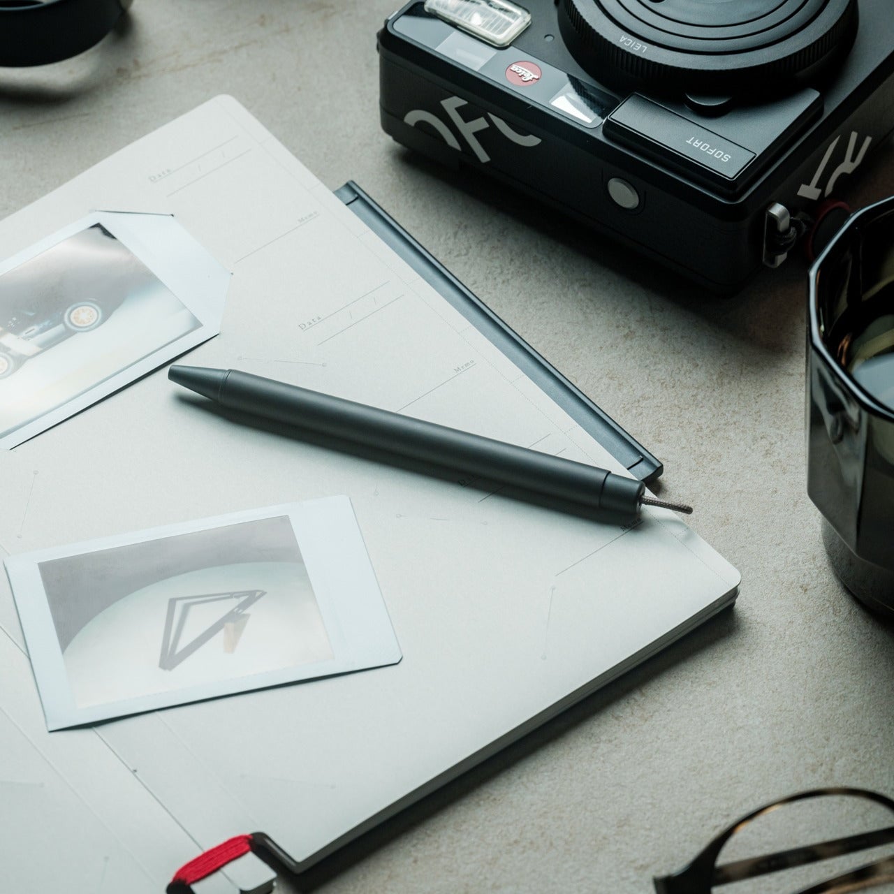
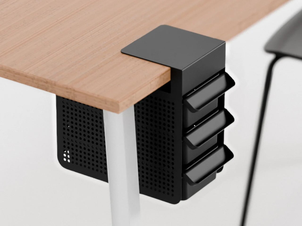
3. MagBoard Clipboard
Most clipboards run on the same tired mechanism: a spring-loaded lever that crushes paper at the top and leaves the rest of the sheet free to shift around below. The MagBoard replaces all of that with a magnetic and lever system that holds up to 30 sheets securely, without the grip marks. The hardcover backing is stiff enough to write on while standing, and the water-resistant surface means it survives bag life in a way paper-covered clipboards rarely manage.
The real advantage is speed. Adding or removing a sheet from most clipboards requires two hands and patience. The MagBoard lets you slide paper in and out cleanly, which changes how you interact with your notes during a meeting or a site walkthrough. It is the kind of improvement that sounds trivial until the first time you need it in a moment where fumbling costs you. At $45, it earns its place on the desk and equally off it.
The magnetic system holds sheets flat without grip marks or any pressure damage to the paper
The water-resistant hardcover handles bag use and outdoor conditions better than standard clipboards
What we dislike
Bulkier than a standard clipboard, which can be a tight fit inside slimmer bags and sleeves
The magnetic hold may feel less secure with very thick paper stocks or layered sheets of card
4. Classiky Wooden Tape Dispenser
The tape dispenser is the most overlooked object on any desk. It sits in a corner, accumulates dust, and looks like it arrived from a supply closet rather than a considered workspace. Classiky’s version, cut from varnished Japanese wood with rounded, sculpted edges, refuses that role entirely. The grain is warm, the weight satisfying in the hand, and the mechanism precise enough to produce a clean tear every time. It quietly raises the standard for everything else sharing the same surface.
Classiky is a Japanese zakka brand that applies the same material thinking to everyday objects that most designers reserve for furniture. The Wooden Tape Dispenser is that philosophy made literal: a utilitarian desk tool reconsidered from the outside in, built from a material that improves with handling. The varnished wood deepens over time, picking up warmth from the room and the hands that reach for it daily. At $42, it makes every other object on your desk look like it is still waiting to be properly replaced.
The varnished wood looks considered at rest and develops a warmer character with regular handling over time
The mechanism produces a clean, controlled tear that most plastic dispensers never consistently manage
What we dislike
Sized for standard tape rolls, so it will not accommodate wider washi tape or specialty roll sizes
The wood surface will mark with use over time, which reads as earned patina to some and damage to others
5. Sonic Kakusta Portable Pen Stand
The Sonic Kakusta starts as a flat soft pen case and folds into a triangular desk stand in a single motion. Open, it props pens at a 60-degree angle: steep enough to show pen caps for quick identification, shallow enough that instruments slide out without tipping the whole case over. A built-in divider splits the interior into two sections, and a second divider in the lid creates a small shelf for erasers or sticky notes. Strong magnets hold the stand shape reliably on any flat surface.
For anyone moving between home, office, library, and studio, this is the object that makes carrying stationery feel considered rather than improvised. The case lies flat in a bag without occupying more space than a notebook. On a desk, it becomes a proper display stand, keeping what you need visible rather than buried at the bottom of a pouch. That transition from flat to functional in one fold is precisely the kind of engineering detail that separates Japanese stationery design from everything else in the category.
The magnetic lid holds the stand shape firmly, even on slightly uneven or textured surfaces
The lid divider creates a genuinely usable small shelf, an extra that most pen cases never think to include
What we dislike
The soft material offers limited protection against crushing when a bag is packed tightly around it
The triangular footprint when open takes up noticeably more desk space than a flat case would
The Best Tools Don’t Get Updated. They Get Better.
These five objects share one quality that note apps cannot replicate: they get better the more you use them. The wood deepens. The magnetic mechanism smooths out. Each session leaves a trace in the material that accumulates into something that is unmistakably yours. That is not sentimentality; it is the material logic of objects built to outlast a software cycle. Japanese stationery design at its best does not chase novelty. It makes the ordinary interaction between a person and a tool feel like it was worth designing in the first place.
The note app on your phone is not going anywhere. But after a week with these on your desk, you might find you reach for it less. Not because analog is inherently better, but because the right physical tool makes thinking feel different from typing. Slower, more deliberate, more yours. That is a harder thing to engineer than an app. Japan has been doing it for a long time.
The phone is always the easy answer. Timer goes off — reach for it. Stuck on a thought — reach for it. Five minutes later, you’ve watched three videos and forgotten what you were working on. The real cost of deep work isn’t effort; it’s attention. And attention is exactly what these five desk objects are designed to protect, each one quietly replacing a digital habit with something more physical and deliberate.
None of these are apps or subscription tools. They’re objects — things you touch, twist, write on, and look at from across the room. Some are already on shelves. Others are still concepts. All of them point in the same direction: toward a desk that improves your focus so your phone can do less. Here are five designs worth making room for.
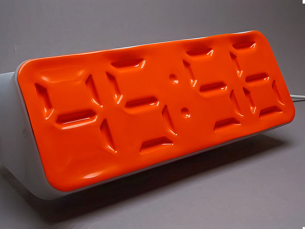
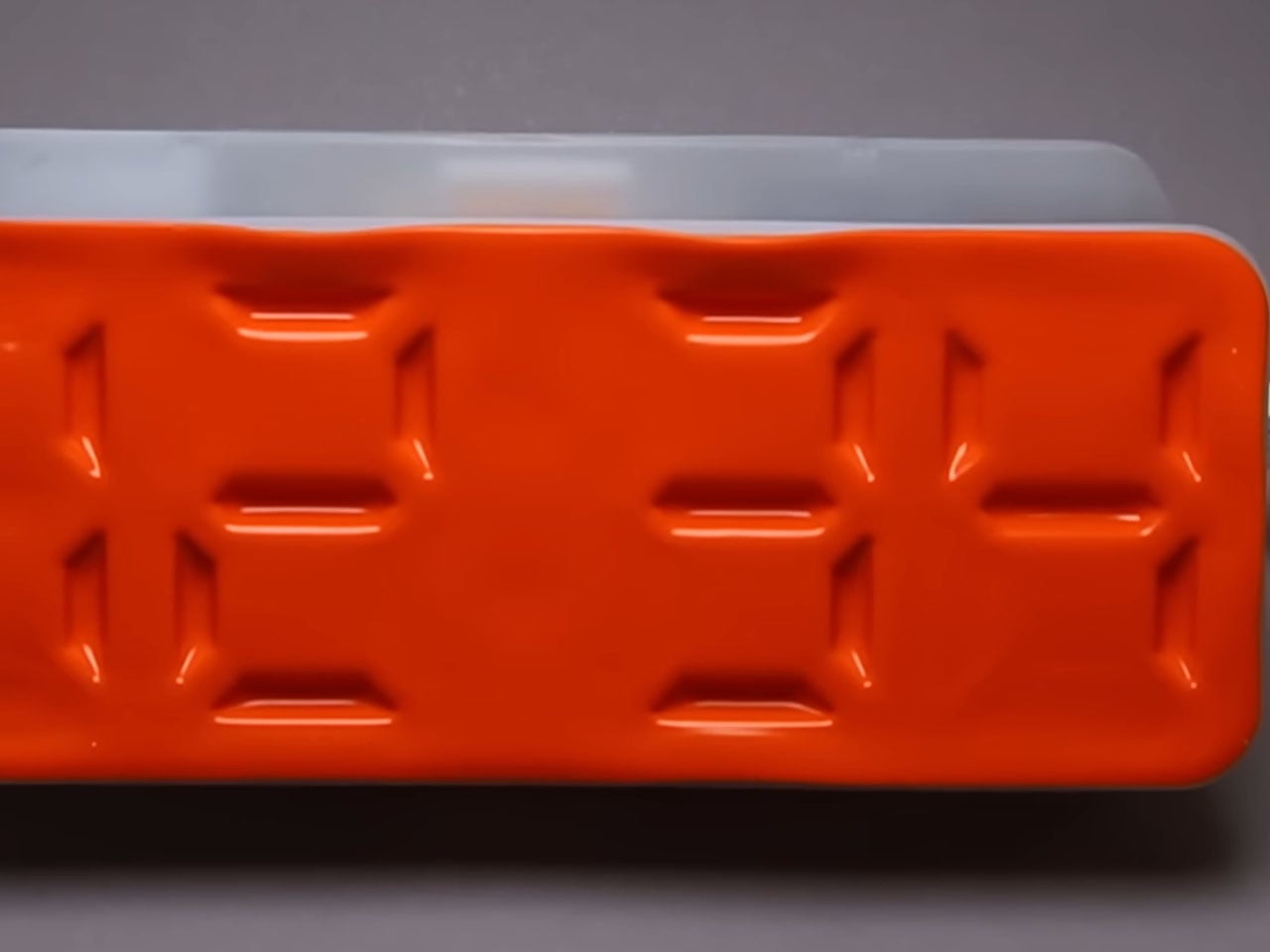
1. Air Powered Segment Clock
Time-checking is one of the most common reasons people pick up their phones — and one of the quickest ways to lose focus. The Air Powered Segment Clock answers that with something genuinely unlike anything else on a desk: a four-digit display that uses no LEDs at all. Instead, vacuum pressure pulls sections of a flexible silicone membrane inward to form each digit, the way a pneumatic system flexes a muscle. It’s mechanical, quiet, and mesmerizing to watch change.
What makes the engineering remarkable is that each segment behaves like a memory cell — holding its shape after pressure is removed, only resetting when the next command arrives. The architecture mirrors how RAM functions. The clock is DIY-built from 3D-printed parts, a small vacuum pump, solenoid valves, and an Arduino, and it includes a stopwatch mode. It lives on your desk to tell you the time, and that’s it — there’s nothing else it can tempt you with.
What we like:
The pneumatic segments hold each digit without continuous power, making it a genuinely low-energy timekeeping system
Watching the silicone membrane shift and settle is a micro-moment of calm between tasks
What we dislike:
As a DIY build, it requires significant technical skill to replicate — this isn’t something you can simply order
The vacuum pump and solenoid system adds mechanical complexity that may require periodic maintenance
2. OrigamiSwift Mouse
A mouse might seem like an unlikely candidate for this list, but the Origami Swift earns its place by making your physical workspace feel intentional. Designed by Horace Lam and inspired by the art of origami, it folds completely flat — just 4.5mm thin and 40 grams — and snaps into full mouse form in under half a second. That small ritual of unfolding and clicking into position is a quiet but real signal to your brain that work is starting now.
Bluetooth 5.2 keeps connectivity fast and reliable, with a wireless range of up to 32.8 feet in open areas, and the USB-C rechargeable battery lasts up to three months on a single charge. Soft-click buttons and a smooth glide keep sessions quiet and distraction-free. Compatible with Mac, Windows, and Android, it performs like a full-sized mouse when open and disappears into a bag without drama when the day is done.
The fold-to-activate gesture creates a physical transition into work mode that a trackpad or standard mouse doesn’t offer
At 40 grams with a three-month battery life, it’s both genuinely portable and technically capable
What we dislike:
The folded form factor requires adjustment for users accustomed to traditional palm-grip mice
Soft-click buttons may feel less satisfying for those who prefer strong tactile feedback
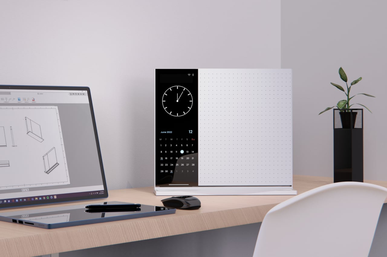
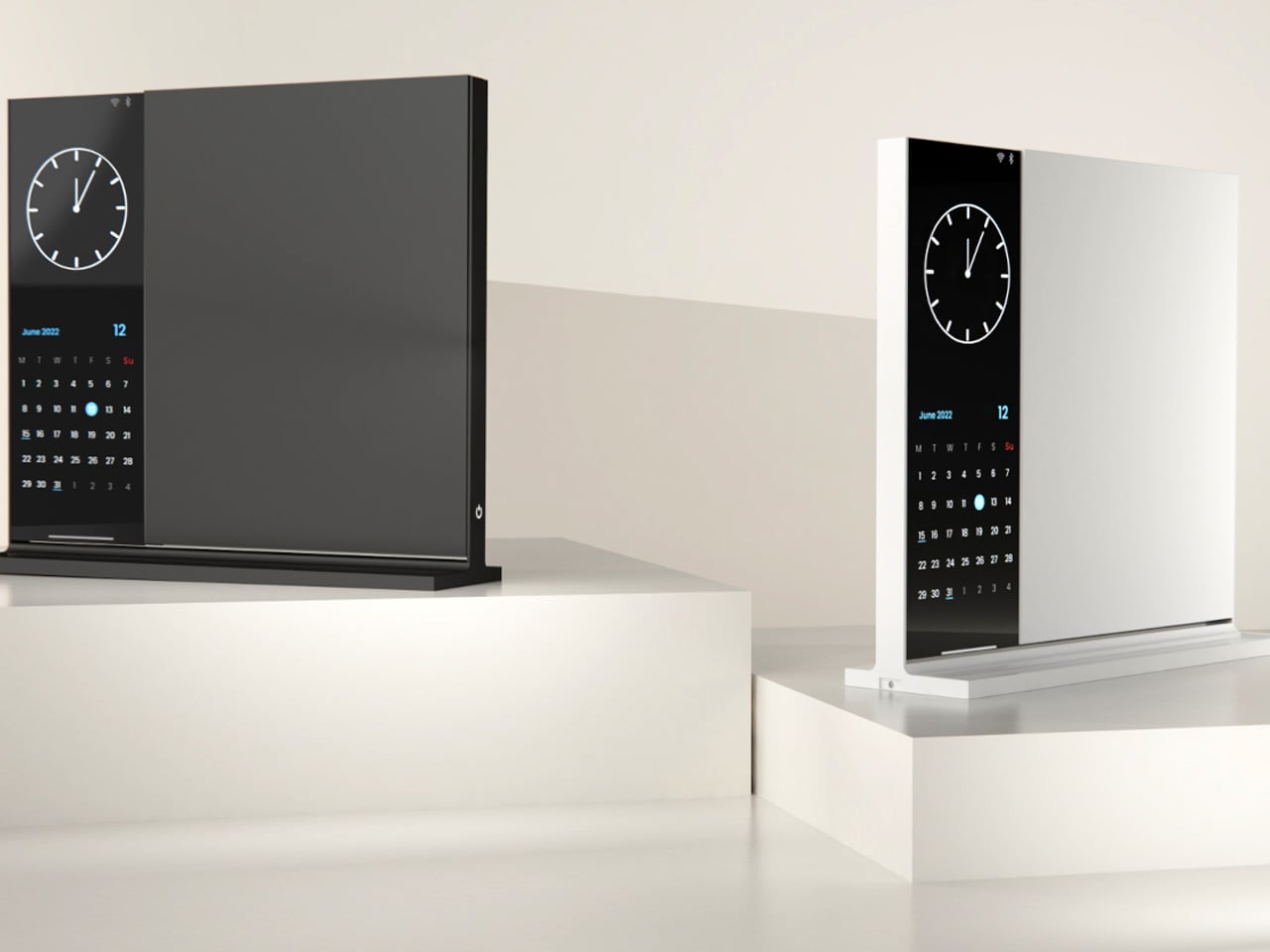
3. Note
The Note is deceptively simple: a desk object that bridges analog note-taking with just enough digital utility to make it genuinely useful. The device pairs a whiteboard surface for jotting ideas with a small built-in display on the left side that shows the time, date, and music controls. Rather than asking you to open an app or unlock a screen, Note keeps that essential information directly in your peripheral vision, fixed and passive.
The design addresses something real: the modern digital workstation is so fully loaded that reaching for anything — a timestamp, a song, a quick note — means crossing through a notification minefield. Note keeps those basic needs on the desk and offline. Sketch an idea on the whiteboard, check the time from the side display, and keep moving. It doesn’t replace your technology. It quarantines the parts of it that constantly pull your attention away from the work directly in front of you.
What we like:
Combining a whiteboard surface with a peripheral display eliminates two of the most common reasons for picking up a phone
The minimal form factor stays present without demanding attention
What we dislike:
Note remains a concept with no confirmed production timeline or retail availability
The side display’s feature range is limited compared to a full smart display, which may frustrate users who want more
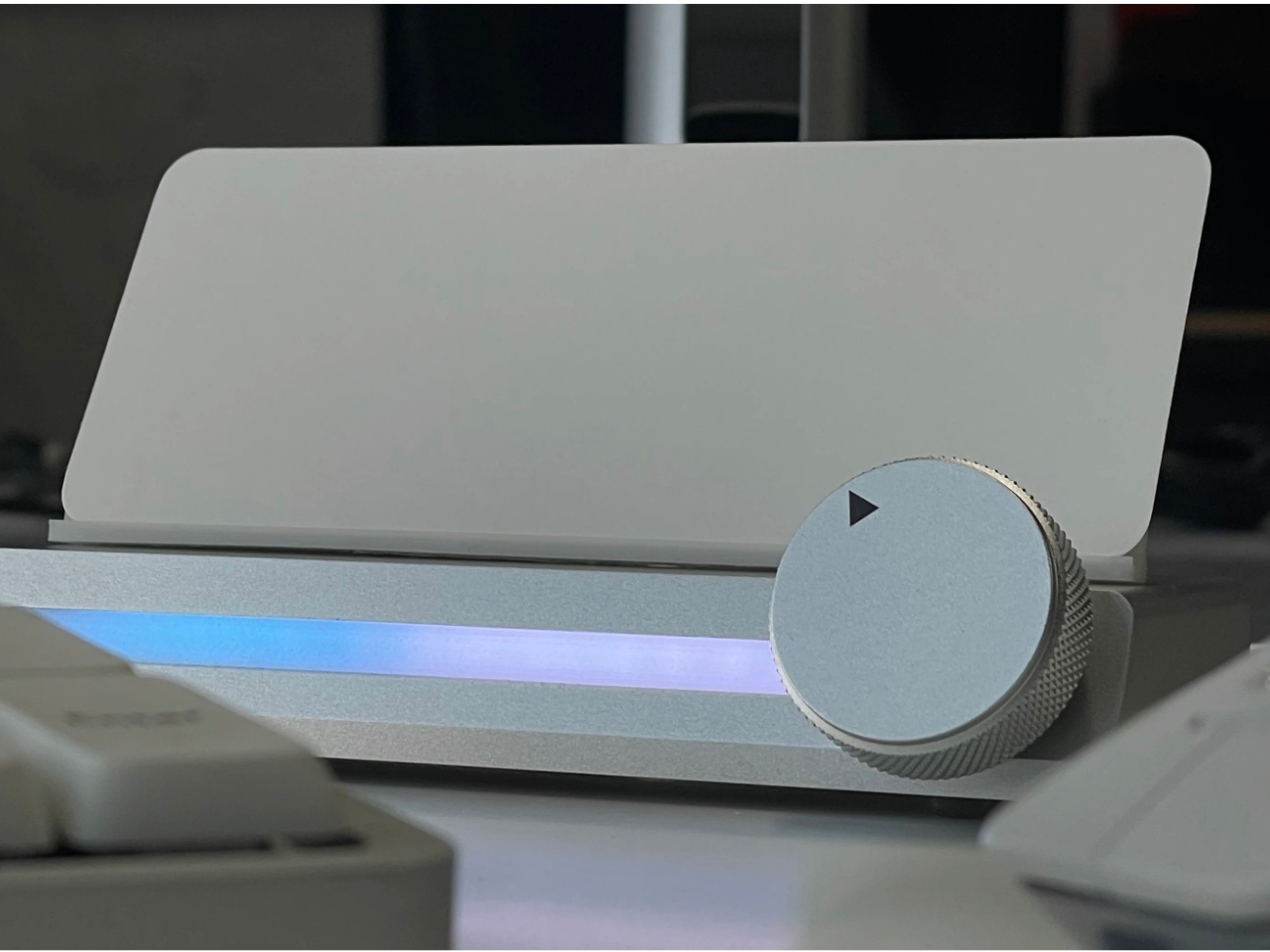
4. Immerge Desk Timer
There’s a reason so many people use the Pomodoro method but can’t stick to it: phone timers live on the same device that breaks focus. The Immerge Desk Timer by Adam Cole Edwards is a concept for a CNC-machined aluminum timer with an anodized finish, designed to sit on your desk as a physical commitment to a work block. A smooth-rotating wheel sets the desired interval. There’s no screen, no app, and no chance of a notification bleeding through from something else.
A built-in note card slot on the front holds a small index card — space to write the day’s top priority, a single task, or a short reflection. That combination of timer and intention-setting turns the Immerge into something more considered than a countdown. The design language is deliberately understated, built to complement any desk without demanding to be noticed. It’s still a concept, but the idea it represents — analog focus as a deliberate cultural choice — feels overdue.
What we like:
The integrated note card slot pairs time management with written intention, reinforcing focus before a session even begins
CNC-machined aluminum with an anodized finish places it firmly in premium desk object territory
What we dislike:
The Immerge remains a concept with no confirmed production timeline or pricing
A purely analog timer offers no connectivity for users who track productivity data or want to log sessions
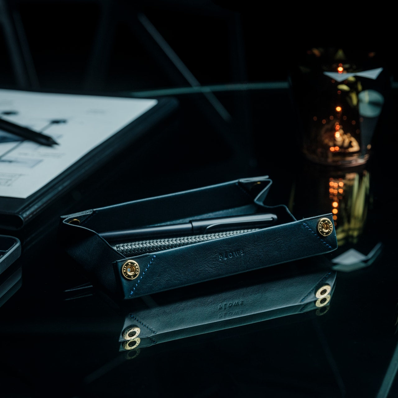
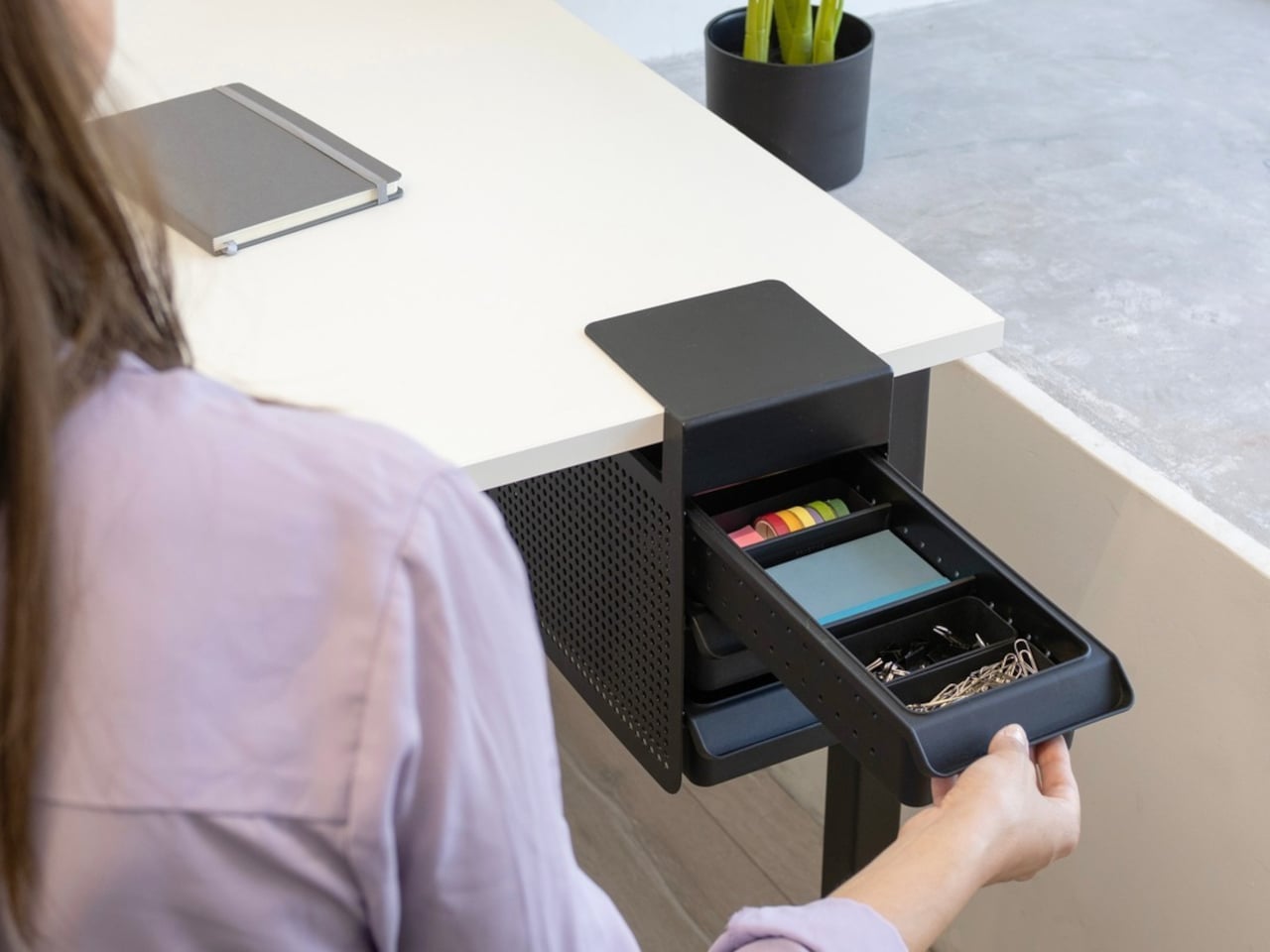
5. MagBoard Clipboard
Paper has a focus advantage that screens don’t: it notifies you of nothing. The MagBoard Clipboard leans into that advantage while solving the one real problem with loose paper — keeping it together. A Magnet x Lever mechanism secures up to 30 sheets without a traditional spring clip, and releasing or adding pages takes nothing more than a light press on the edge. It’s made in Japan, and the material quality reflects that without needing to announce it.
The hardcover design means you can write on it standing up, on a couch, or anywhere a thought shows up. The surface is water-resistant and easy to clean. Available in A4 and A5 sizes, it accepts any paper you choose — blank, grid, dotted, printed, perforated, or mixed. There’s no prescribed format and no app syncing required. You write what you think, in whatever order makes sense, and reorganize whenever the work demands it.
The Magnet x Lever system secures any combination of paper types without marking or damaging sheets
Water-resistant hardcover construction makes it practical well beyond a standard desk setup
What we dislike:
The 30-sheet capacity may feel limiting for users who work through large volumes of material in a single session
Unlike digital tools, there’s no built-in way to search, tag, or retrieve older pages
The Best Tools Are the Ones That Stay Out of the Way
The phone isn’t going anywhere, and none of these objects pretend otherwise. What they offer is friction — the deliberate, productive kind. A clock that reads time through air pressure. A timer shaped from aluminum. A clipboard that holds whatever paper you choose. Each one introduces a small ritual into the day, and rituals are how deep work actually gets done. The setup matters more than most people give it credit for.
Good desk design is quiet. It works without asking to be noticed and keeps your attention where it belongs. These five objects don’t promise a productivity revolution — they just remove one more reason to reach for your phone. Sometimes that’s enough to finish the thing you’ve been putting off. Not because you became more disciplined overnight, but because nothing interrupted you long enough to break the thread.
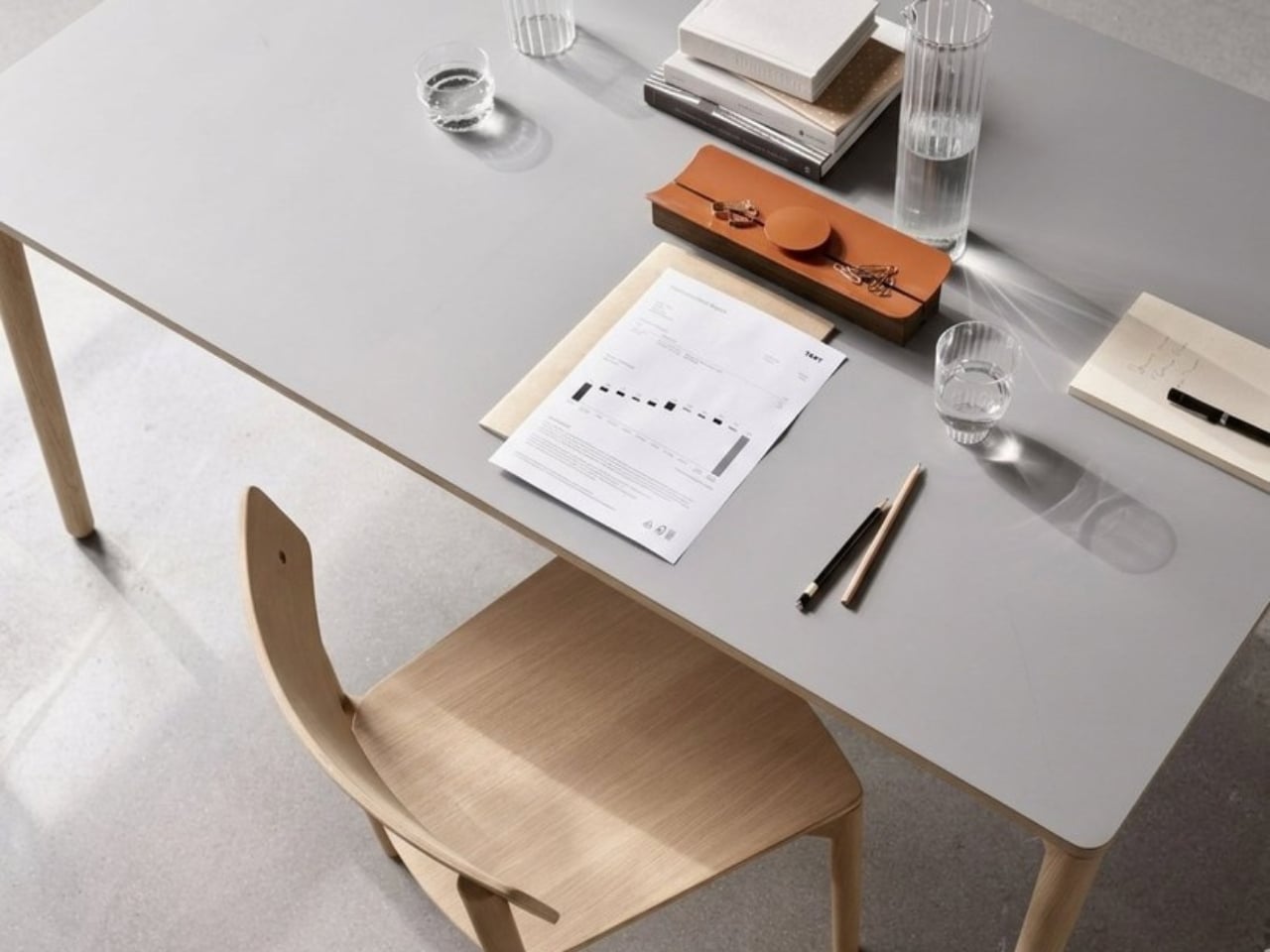
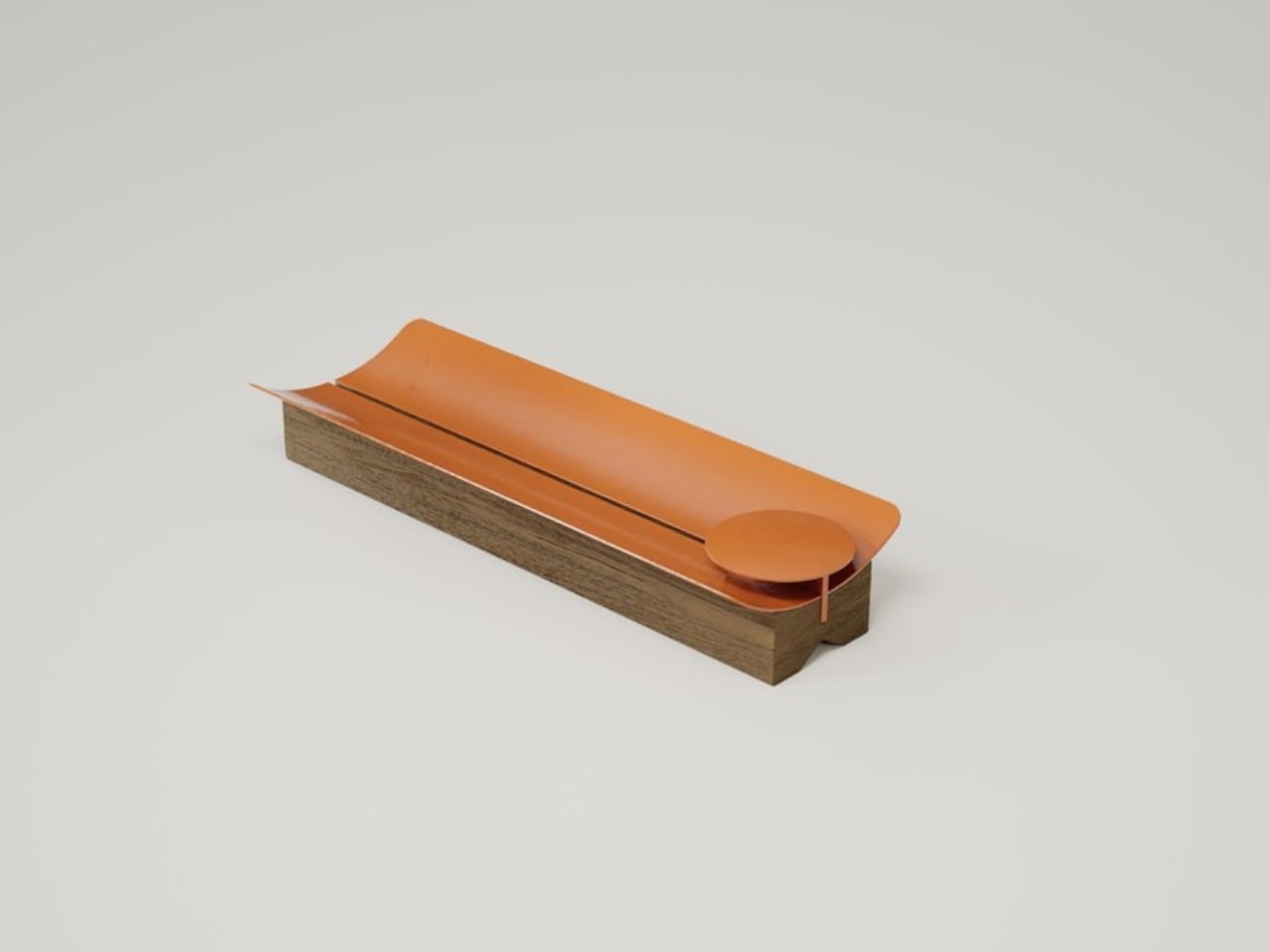
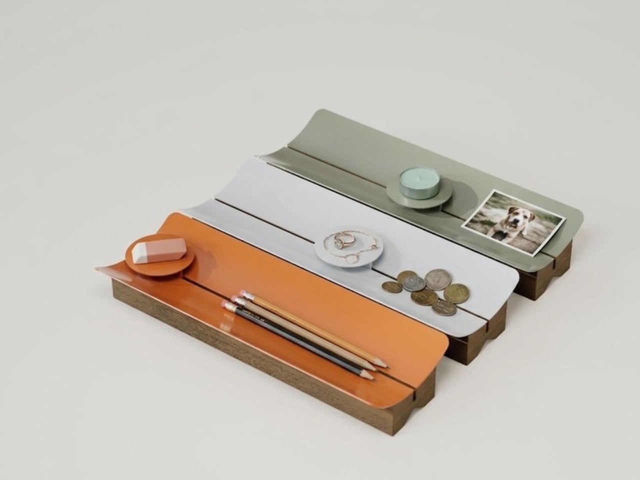
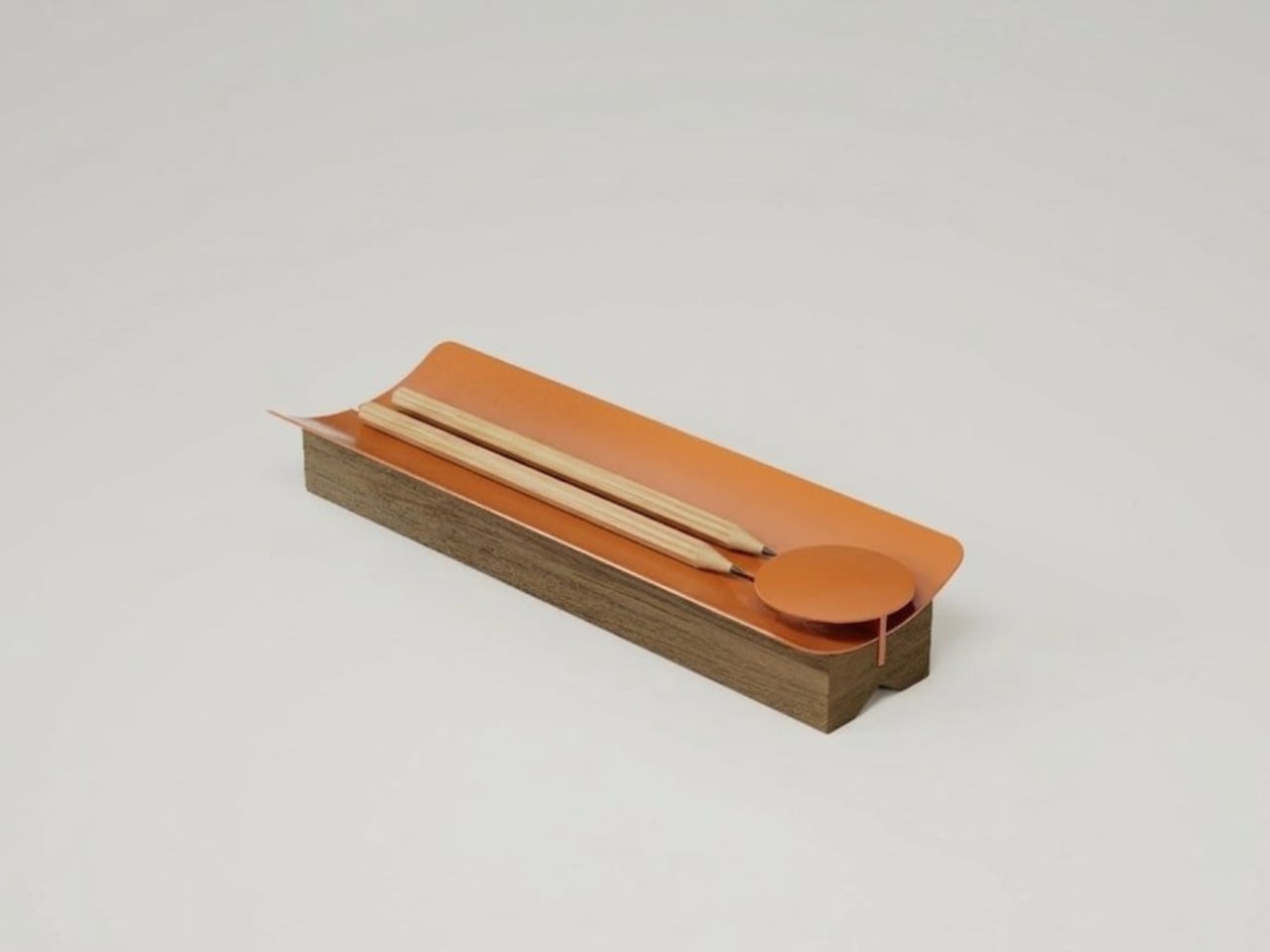
Most desk organizers are purely functional objects. You buy one because you’re tired of your keys ending up under a notebook, or because your earbuds have gone missing again for the third time this week. Utility is the promise, and usually, that’s where the conversation ends. TEJA, designed by Gustavo Rodríguez and Estefanía Agudelo of Estudio Gris in Medellín, Colombia, makes a case that it doesn’t have to.
The name is the Spanish word for a roof tile, and the reference is direct. Traditional clay tiles have shaped the rooflines of Colombian towns for centuries, their curved profiles doing exactly one thing extremely well: shedding water while creating shade. Rodríguez and Agudelo looked at that form and asked a genuinely good design question: what if you kept only what matters? The answer is TEJA. A lacquered steel surface that curves upward at both ends, resting on a solid natural wood base. The curve does the same job here that it does on a rooftop, just on a smaller, quieter scale. It keeps things from rolling away and, in doing so, gathers them.
At the center, a small circular platform rises from the surface. It’s a tiny detail that turns out to do a lot. Rings land there instead of disappearing into a drawer. An earbud case. A coin you keep forgetting to put somewhere intentional. The platform gives these small, easily lost things a designated home, and that specificity is exactly the kind of thoughtfulness that separates well-designed objects from well-marketed ones.
The piece works equally well on a desk or a dresser, which matters more than it sounds. A lot of objects are styled for one context and feel awkward in another. TEJA slides between the two without trying, because its logic is architectural rather than functional in the narrow sense. It organizes by shape, not by category.
The moment that might surprise you most is what happens when you place three of them together. Side by side, they read as a roofscape, a miniature version of the reference they were born from. The designers didn’t plan that effect. It emerged from the object’s own internal rules. That’s the mark of a design that was thought through past the obvious. Most things only reveal their full intention under a single set of conditions. TEJA shows you something new when the context shifts.
It comes in six colors: terracotta, white, calm green, blue, mustard, and beige. The first three are kept in stock; the last three are made to order. All of them are handmade in Medellín. I have a soft spot for the terracotta, partly because it’s the most honest color for an object inspired by clay tiles, and partly because that warm, muted orange reads beautifully against both light and dark surfaces without fighting for attention. The calm green and mustard are equally considered. None of the six feel trendy in the way that becomes awkward in two years.
Estudio Gris won the DesignWanted Award in Italy in 2026 with CLU, their umbrella stand, which suggests that TEJA isn’t a one-time gesture. The studio seems to have a consistent interest in translating familiar forms into objects that hold meaning without being decorative about it. That’s a harder balance to strike than it looks.
The wider question TEJA raises, at least for me, is why we keep settling for objects that only work and never mean anything. We spend a fair amount of time at our desks and dressers. The things that live on those surfaces become part of how the space feels day to day. A desk organizer that carries a genuine reference to Colombian vernacular architecture, made by hand in the city where its designers live and work, is a different kind of object than a generic tray from a home goods store. You don’t have to think about that every time you drop your keys into it. But it’s there if you do.
Most Father’s Day gifts start and end with good intentions. A nice watch, a tool kit, a gift card wrapped in tissue paper. They say “I thought of you” without really saying much else. But some dads notice when something is well-made, keep objects long after they stop being new, and believe the things around them say something about how they live. If that sounds familiar, this list is for you.
The five gifts below aren’t the most expensive things you’ll find this season, and that’s the point. Each one earns its place through material honesty, considered proportions, or a mechanical logic that just feels right. Some are built to last decades. One runs indefinitely without a refill. Another turns a scattered desk into something worth photographing. All five were chosen because they respect the intelligence of the person receiving them.
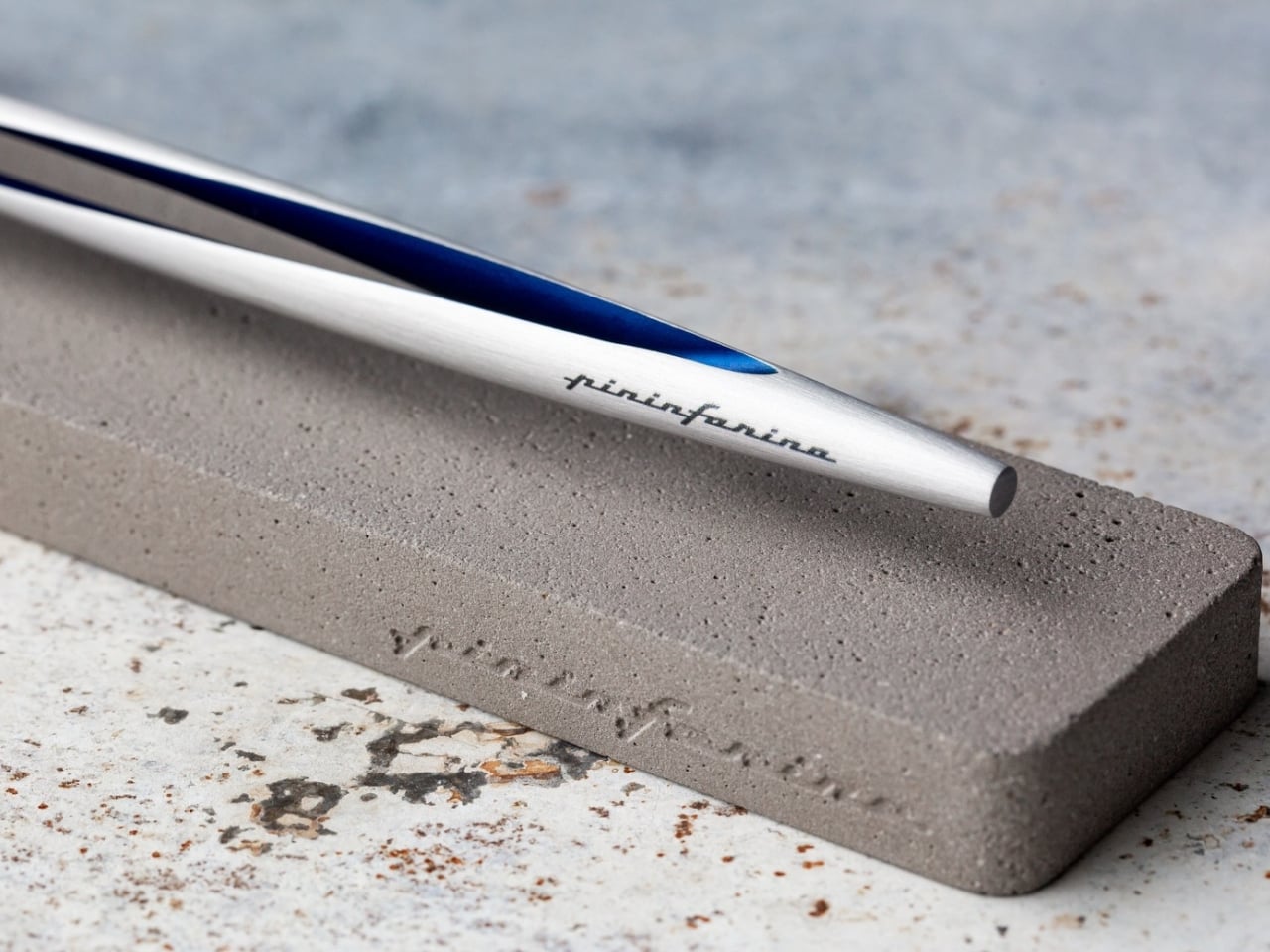
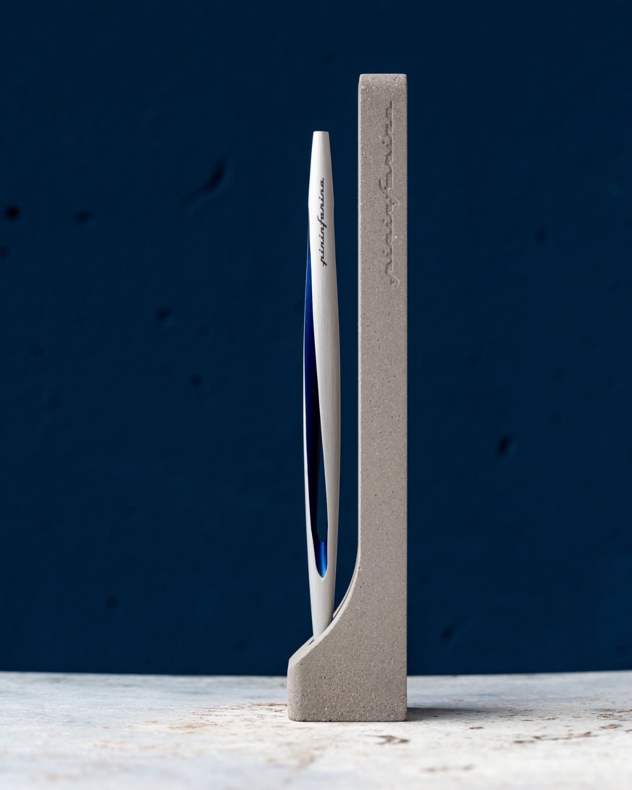
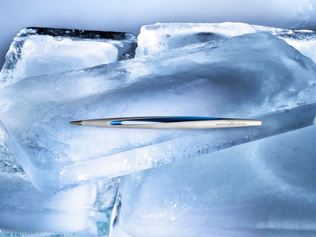
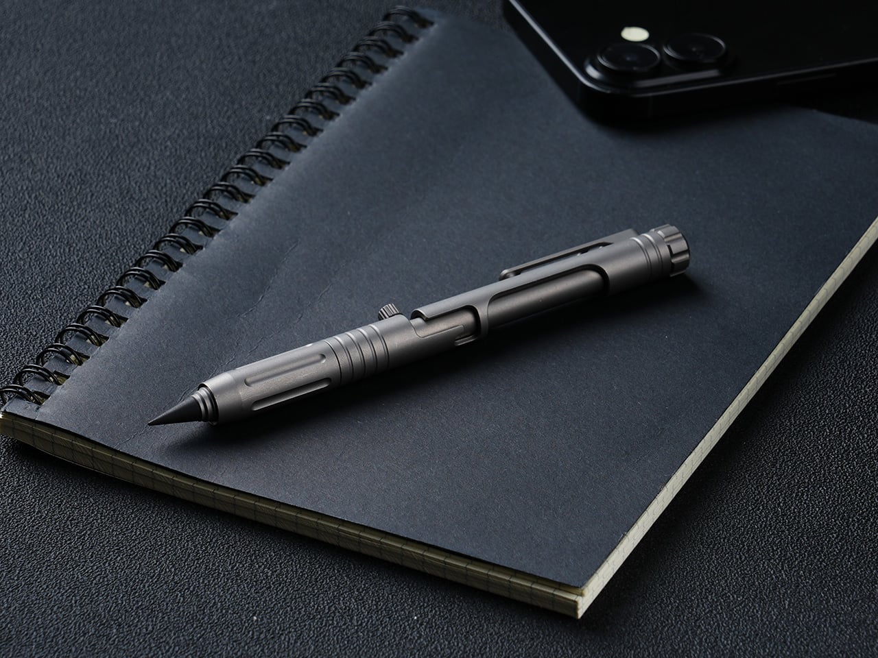
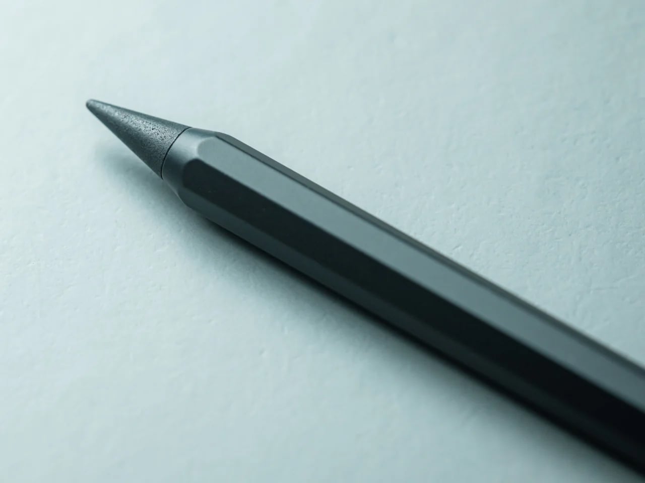
1. Pininfarina Aero Ethergraf — The Forever Pen
Pininfarina built its reputation on some of the most celebrated automotive silhouettes in history, including Ferrari and Maserati bodies that turned heads for decades. The Aero Ethergraf brings that same design philosophy down to the scale of a writing instrument. Crafted from aerospace-grade aluminum, weighing just 17 grams and measuring 160mm in length, it arrives paired with a raw concrete stand that sits beside it on the desk like a quiet still-life. Made in Italy, built to last.
What makes it genuinely unusual is that it contains no ink. The Ethergraf metal alloy tip writes through oxidation, leaving a graphite-like mark on paper without a cartridge, a cap to misplace, or a refill cycle to manage. The line is precise and smudge-resistant. The pen never dries out and never runs out. For someone who has spent years maintaining fountain pens or replacing rollerball inserts, this inverts the entire expectation of what a writing tool asks of you.
What We Like:
The Ethergraf tip writes indefinitely through oxidation, with no ink, no cartridges, and no refills ever needed
Pininfarina’s automotive design DNA reads clearly in the body: aerodynamic, precise, and quietly confident about its own beauty
What We Dislike:
The oxidation-based line runs lighter than a standard ballpoint, which will not suit every writing style or paper type
The raw concrete stand, while a genuinely beautiful pairing, adds considerable volume and weight to the overall package
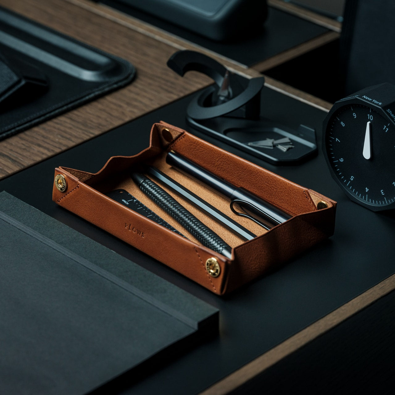
2. Foldline Pen Roll
The FoldLine Pen Roll comes from PLOWS, a Japanese leather goods brand founded by a farming company, which may explain why its objects carry a particular kind of patience. The roll is cut from a single piece of Minerva Box leather sourced from Badalassi Carlo, an Italian tannery known for vegetable-tanned hides enriched with cow leg oil. That combination of material sourcing and hand-formed construction produces something that develops a patina entirely personal to how it is used and who carries it.
Structurally, it unfolds in two steps and under two seconds into a tray that holds pens in place without stitched slots or rattling. The entire form comes from precise folds rather than seams or inserts. A large machined snap from Italy’s PRYM closes the roll with satisfying solidity. The symmetrical design opens cleanly from either side, making it equally usable whether you are left- or right-handed.
A single piece of Minerva Box leather that develops a personal patina over time, making each roll gradually distinct to its owner
No designated top or bottom, no correct side to open from: a small but considered detail that removes daily friction entirely
What We Dislike:
The value is only legible to someone who already appreciates quality leather goods, making it a harder sell as a blind gift
Only a few units remain in stock, so availability is not guaranteed as Father’s Day approaches
3. Orbitkey Grid Desk Organizer
Orbitkey built its name around the idea that small daily frictions deserve serious design attention. The Grid Desk Organizer extends that logic into a broader desktop format. Its perforated tray base accepts snap-in dividers at any position, so the internal layout responds to whatever lives inside it rather than demanding objects conform to fixed compartments. Long dividers run the full tray depth while shorter ones slot in crosswise, and any arrangement can be lifted out and reconfigured in seconds. The system earns the word modular.
A soft-touch rubberized interior lining protects items from scratching and gives the tray a tactile quality that cheaper desk accessories rarely bother with. Silicone feet on the base prevent it from migrating across hard surfaces. The lid doubles as a valet tray on top, and its handle converts into a portrait phone stand when set upright.
The patent-pending snap-divider system adapts to the contents rather than demanding conformity, a structural logic that sounds minor until you experience the alternative
Three colorways (Black, Stone, and Terracotta) land in the space between generic and overdone, making it a natural fit for almost any desk setup
What We Dislike:
The $42 base price covers the standard configuration, but adding the Mini version raises the total cost beyond the initial impression
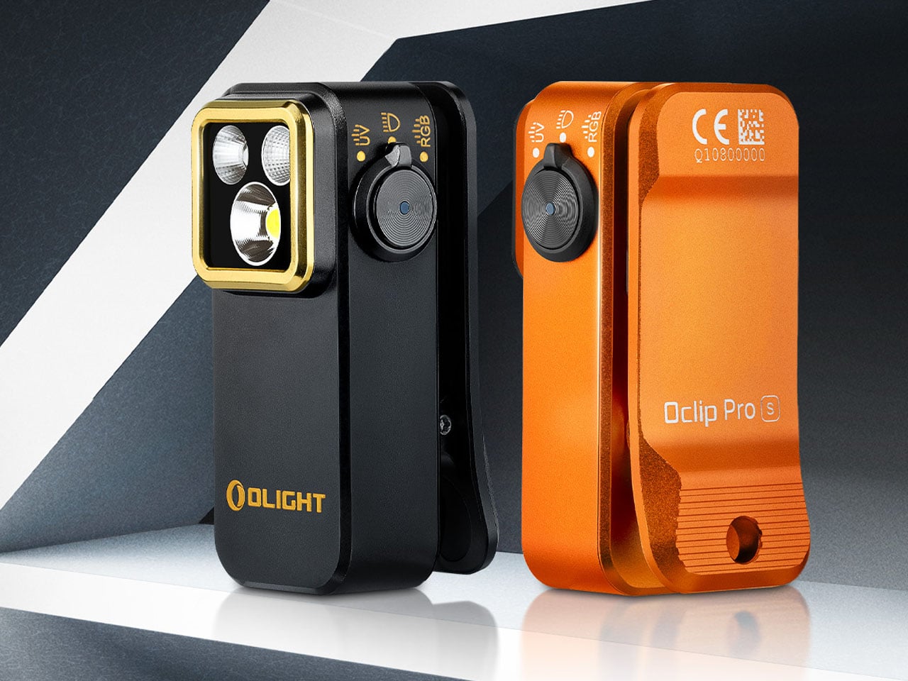
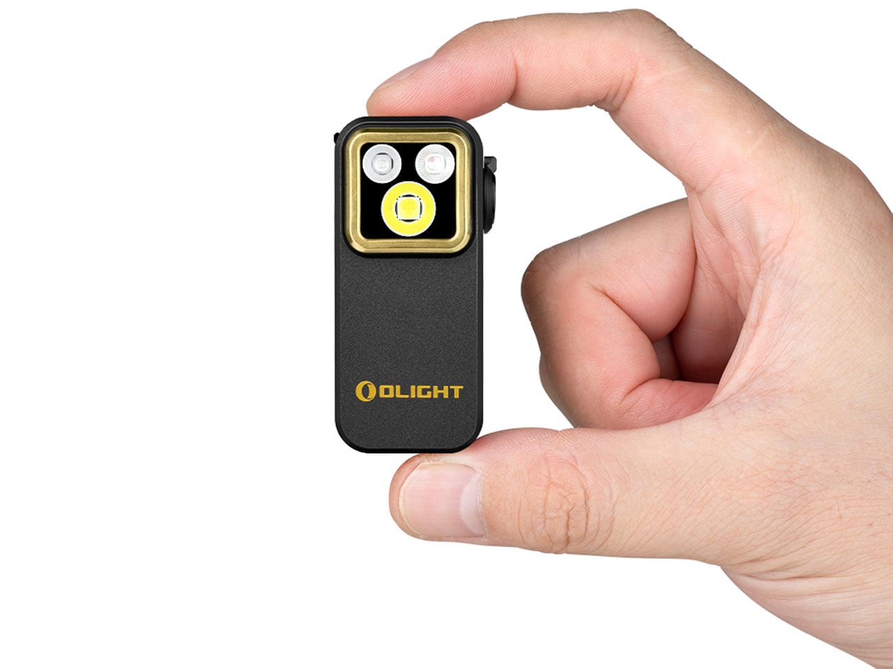
4. Olight Oclip Pro S EDC Flashlight
At 57 × 28 × 27 mm and 53 grams, the Olight Oclip Pro S is the kind of EDC tool that earns its carry weight by doing considerably more than one thing. Its integrated clip handles pockets, bags, and gear straps, while a magnetic attachment option makes it a capable hands-free light for tasks that require both hands. The body is compact enough to disappear in a pocket until it becomes exactly what is needed, which is the best quality a carry tool can have.
The 5-in-1 lighting system is what elevates it beyond a simple flashlight. Primary white LEDs deliver up to 600 lumens with an 80-meter beam distance, switchable between flood and spotlight modes. RGB illumination adds red, green, and blue signaling options. A 365nm UV light extends its usefulness into detecting fluorescent materials and checking cleanliness in specialized situations. A side dial controls the entire system intuitively, and battery life reaches up to 144 hours in low mode with USB-C charging throughout.
What We Like:
Five distinct lighting modes packed into a 53-gram body is a genuine engineering feat, and the UV capability is the kind of quiet surprise that distinguishes thoughtful design from merely competent design
USB-C charging integrates it cleanly into any modern kit without the need for proprietary cables or spare batteries
What We Dislike:
A dad who primarily needs a reliable everyday flashlight may never explore most of what the Oclip Pro S actually offers
At maximum brightness, thermal management limits extended runtime, which is a reasonable engineering trade-off but worth knowing before relying on it in demanding conditions
5. Side A Cassette Speaker
The Side A Cassette Speaker is shaped exactly like a real mixtape: transparent shell, side A label, the whole thing, and it makes no apologies for that. At $49, it is a speaker you would buy for what it looks like before you hear what it sounds like. The design is faithful enough to prompt a genuine double-take. Weighing just 80 grams with the clear storage case that doubles as a display stand, it occupies almost no space on a shelf but immediately defines wherever it sits.
Bluetooth 5.3 handles wireless connection to phones, tablets, and laptops. A microSD card slot supports offline MP3 playback for anyone who still curates music rather than just streaming it. Battery life runs to six hours at full volume, with a two-hour recharge via the included USB-C cable. The sound is tuned to evoke analog warmth rather than clinical accuracy, which is entirely the right call for the character of the object. For a dad who remembers making mixtapes, this does the emotional work before it plays a single note.
The cassette form is executed with enough fidelity to spark a real conversation, not just a brief smile before it gets set aside on a shelf
microSD offline playback is a thoughtful addition for anyone who still curates their own playlists rather than surrendering entirely to an algorithm
What We Dislike:
Audio performance leans toward warmth and character rather than reference quality, which suits the object perfectly but is worth setting expectations for anyone anticipating hi-fi output at this price
Six-hour battery life is modest compared to larger Bluetooth speakers, though the size makes the trade-off obvious and entirely forgivable
Good Design Doesn’t Need a Bow on Top
The best gift for a design-minded dad isn’t the most expensive thing on the shelf. It’s the one that shows you understood something about how he thinks and what he values. A pen that never needs ink. A leather roll shaped by hand in Japan. A flashlight that carries five functions in a 53-gram body. These aren’t objects that need explaining when someone picks them up. They make their case on their own.
Each pick here falls under $135 and spans a range of interests from desk organization to EDC carry to audio nostalgia. What they share is a commitment to material honesty and considered function. Father’s Day doesn’t have to be another gift that gets thanked and quietly forgotten. Give something built to last, and there is a good chance it becomes the thing he mentions to people for years, without quite being able to explain why.
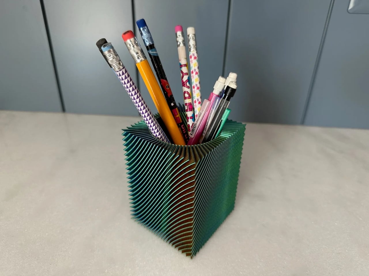
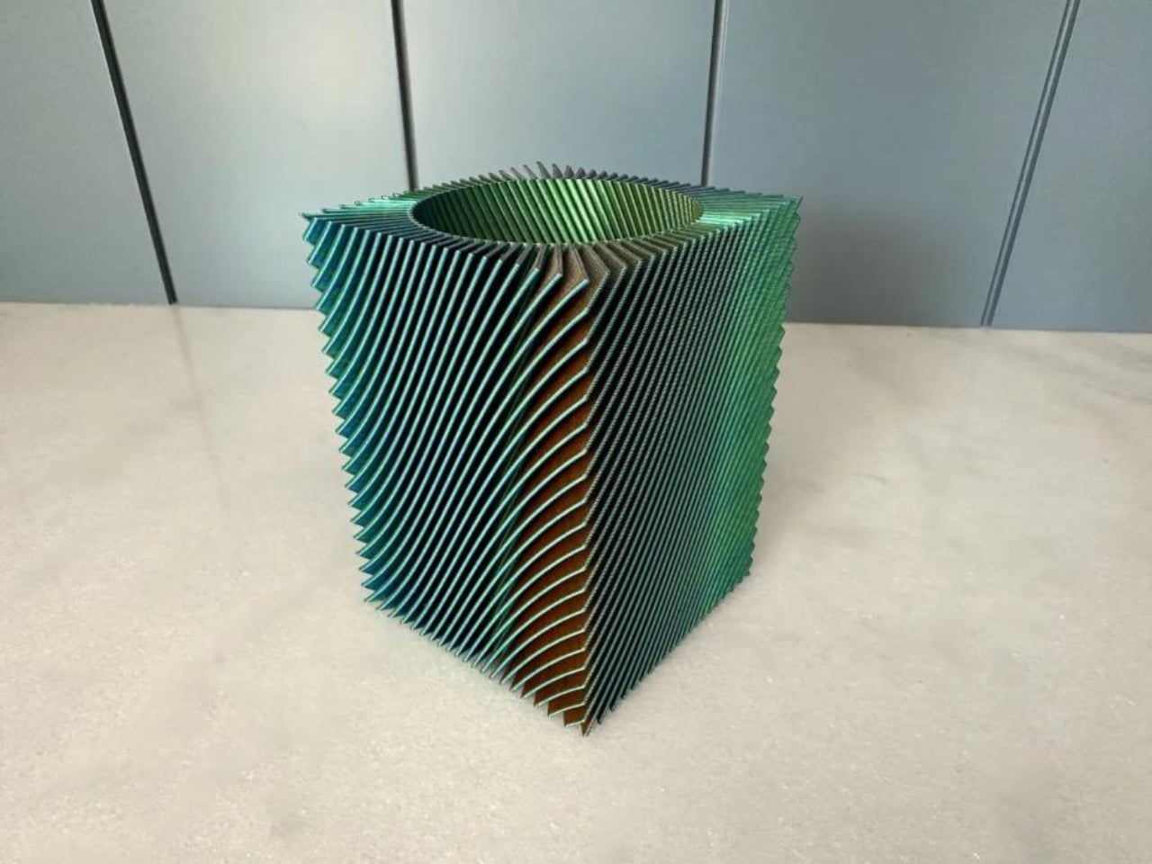
Most of us have a pencil holder we never actually chose. It’s the ceramic mug you retired from coffee duty, or the branded giveaway from a conference two years ago, or the squat plastic cup that came bundled with a stapler. It works. It holds pens. But you have never once looked at it and thought, “I genuinely love that thing.”
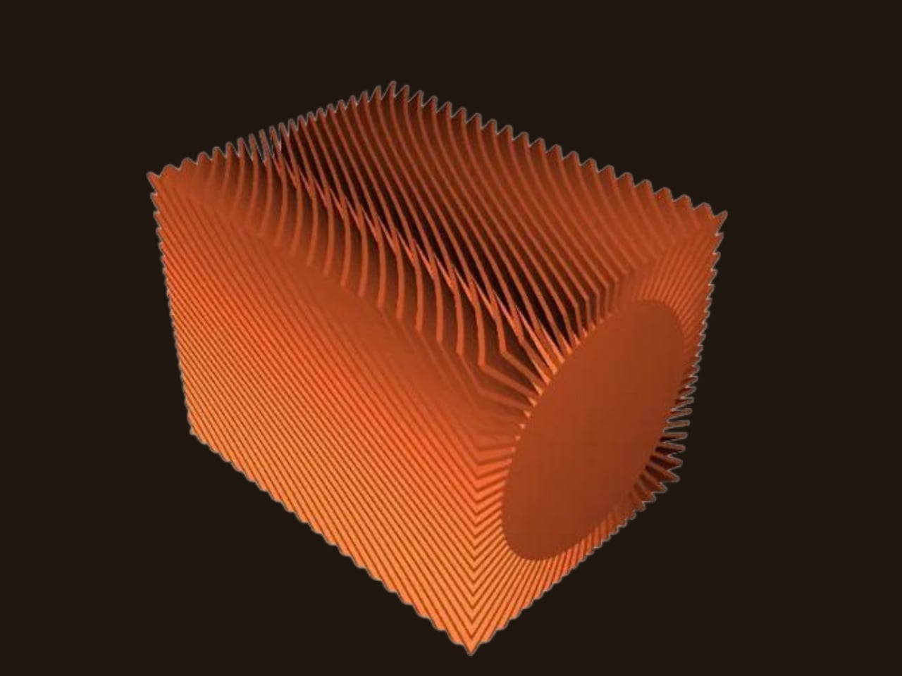
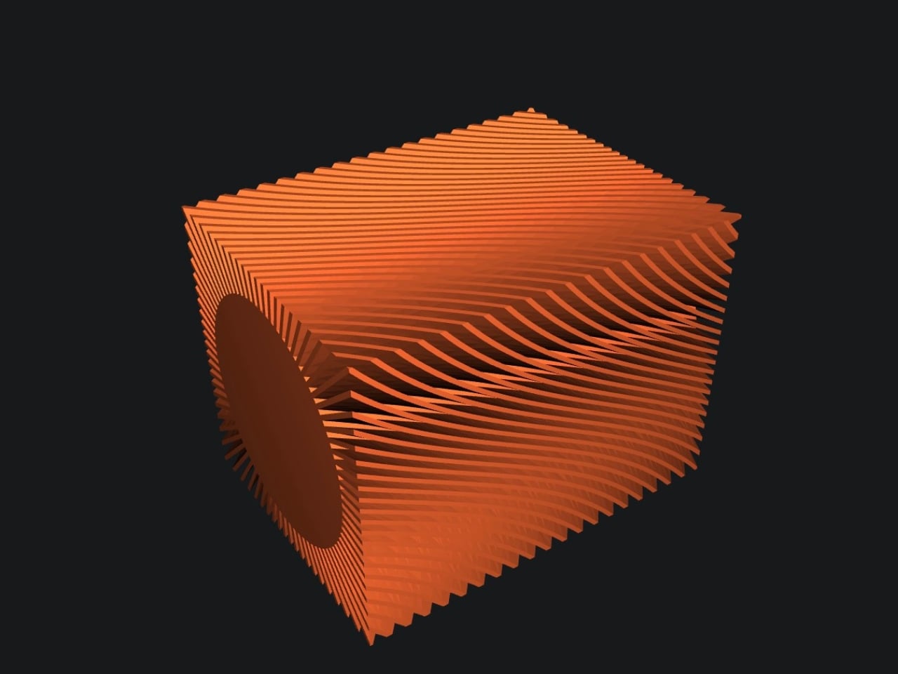
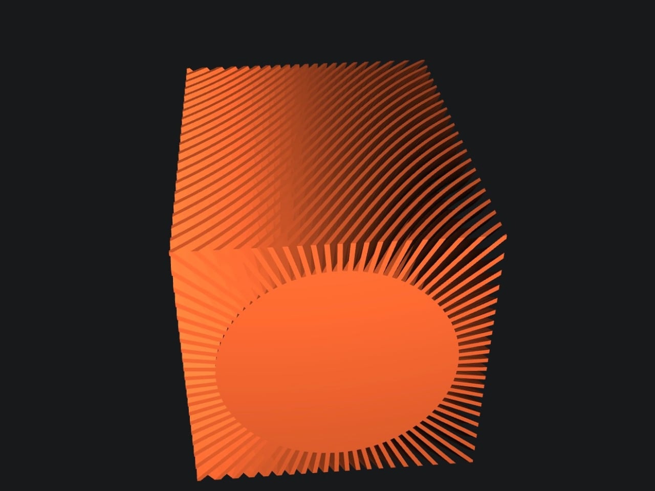
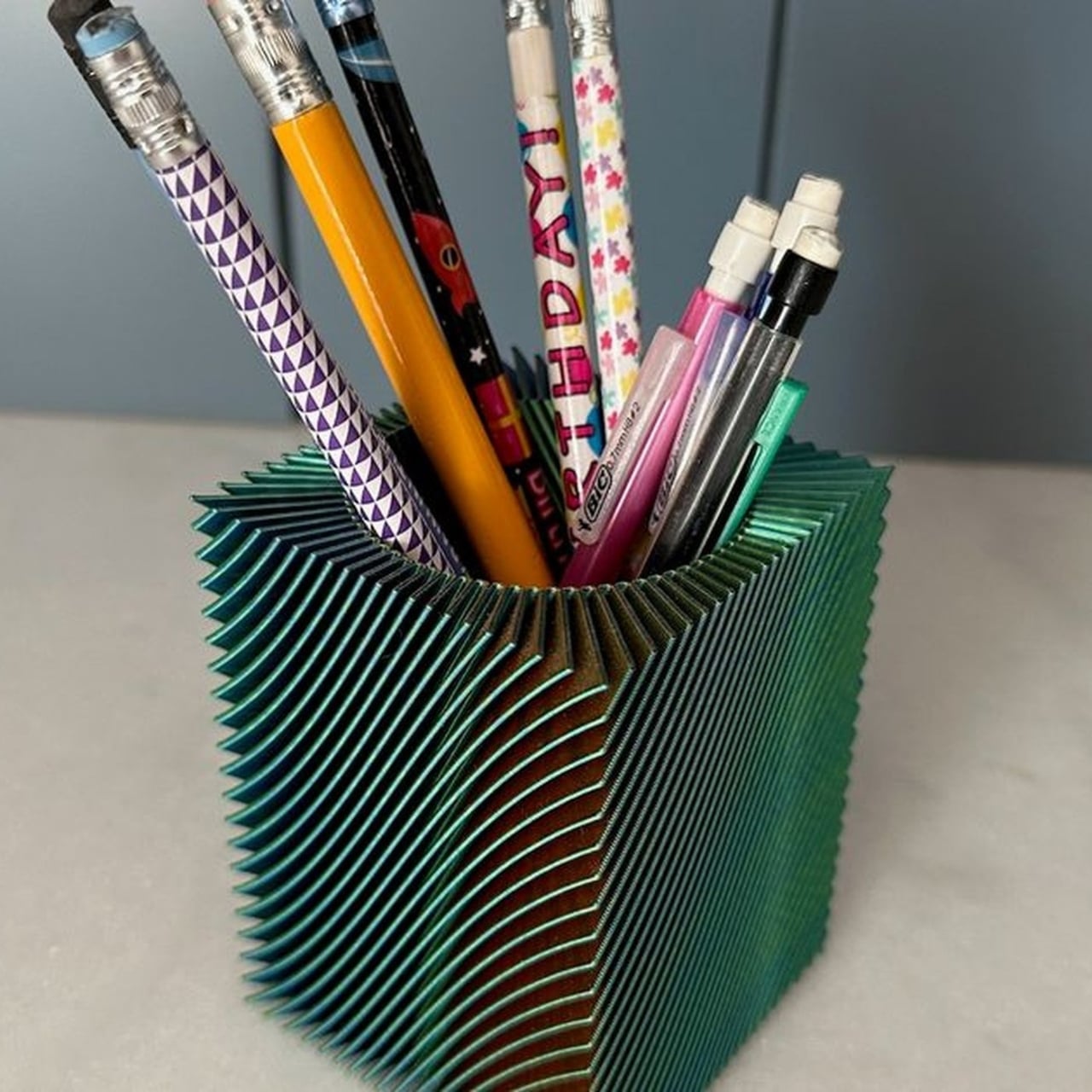
Nechiswa’s spiral vase pencil holder is the kind of object that changes that. It’s a free, downloadable 3D print model shared on Printables, and it’s been quietly making its way through design communities after being featured on Abduzeedo this week. It doesn’t look like a typical 3D print. It doesn’t look like a typical anything. It looks like someone took a mathematical idea, translated it into filament, and set it on a desk.
The design is built around one print technique: spiral vase mode. For those unfamiliar with 3D printing, vase mode is a setting where the nozzle travels in one continuous, uninterrupted path from the base all the way to the top of the object. No seams, no layer starts, no breaks in the extrusion. The printer just keeps going, spiraling upward in a steady, unceasing motion. At 0.6mm line width and 0.2mm layer height, the result is a thin, faceted wall that carries a quality the original feature description calls “drawing-like in detail but rigid enough to hold pens upright.” That is a precise description. It looks delicate but it isn’t.
The tri-color filament element is where it gets especially compelling. Rather than outputting a pencil holder in a single solid color, Nechiswa uses multi-color filament that transitions as the print climbs. The spiral form and the color shift work together in a way that feels deliberate at every level. Color and geometry are cooperating, and neither one is showing off at the expense of the other. The result is an object that reads completely differently depending on where you’re standing and how the light hits it. It has the visual energy of something much more expensive and much harder to make.
What strikes me about this design is that it refuses to perform utility. A lot of desk accessories are burdened with looking useful. They come with dividers, rubberized bases, stackable tiers, and ergonomic profiles. They announce themselves as products solving a problem. Nechiswa’s pencil holder announces itself as an object. The kind you position near a window so the light catches the spiral walls. The kind you instinctively move to the front of your desk, even though, functionally, placement doesn’t matter at all.
The maker community has quietly validated it. The model has been added to over 130 collections on Printables, which is a reliable indicator that something is resonating beyond a casual like or a save. The file is free, the recommended settings are straightforward, and the designer has documented everything needed to print it successfully. Vase mode at 0.6mm line width. That’s really it. No complicated slicer configurations, no support structures to wrestle with. Just a solid printer, the right filament, and some patience.
This is also a good moment to acknowledge what 3D printing continues to do for independent design. There’s a persistent idea that consumer-level 3D printing exists mainly for functional fixes: replacement clips, custom mounts, cable organizers. And it does all of that. But Nechiswa’s pencil holder is the kind of project that gently dismantles that assumption without making any big declarations. It just exists as a beautiful object, designed by someone with a clear sense of form, available for free to anyone with a printer.
If you have a 3D printer, this is worth a spool of good filament and an afternoon. If you don’t, it’s still worth a look, because it illustrates something easy to forget: that good design doesn’t require a big budget, a studio, or a production run. Sometimes it’s just a thoughtful spiral, climbing upward, one continuous line. Your current pencil holder is probably fine. But it isn’t this.
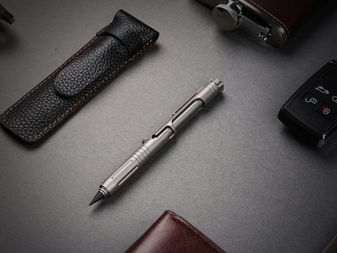
Bolt-action pens command a fanbase that splits neatly into two camps. There are the fidget enthusiasts, the ones who cycle the bolt compulsively mid-conversation and genuinely cannot put the thing down, drawn entirely by the sensory reward of a well-tuned spring mechanism. The satisfying click and return of a well-machined bolt has an almost compulsive quality that most people who have owned one will recognize immediately. Then there are the EDC traditionalists, who carry bolt-action pens with something closer to reverence, appreciating how a mechanism borrowed from military rifles found its way into writing instruments and became a small, tactile piece of mechanical history worth keeping in a pocket. For that second group especially, the bolt-action pen occupies the same mental space as a quality pocket knife or a classic field watch: a precision object that earns its keep through both performance and heritage.
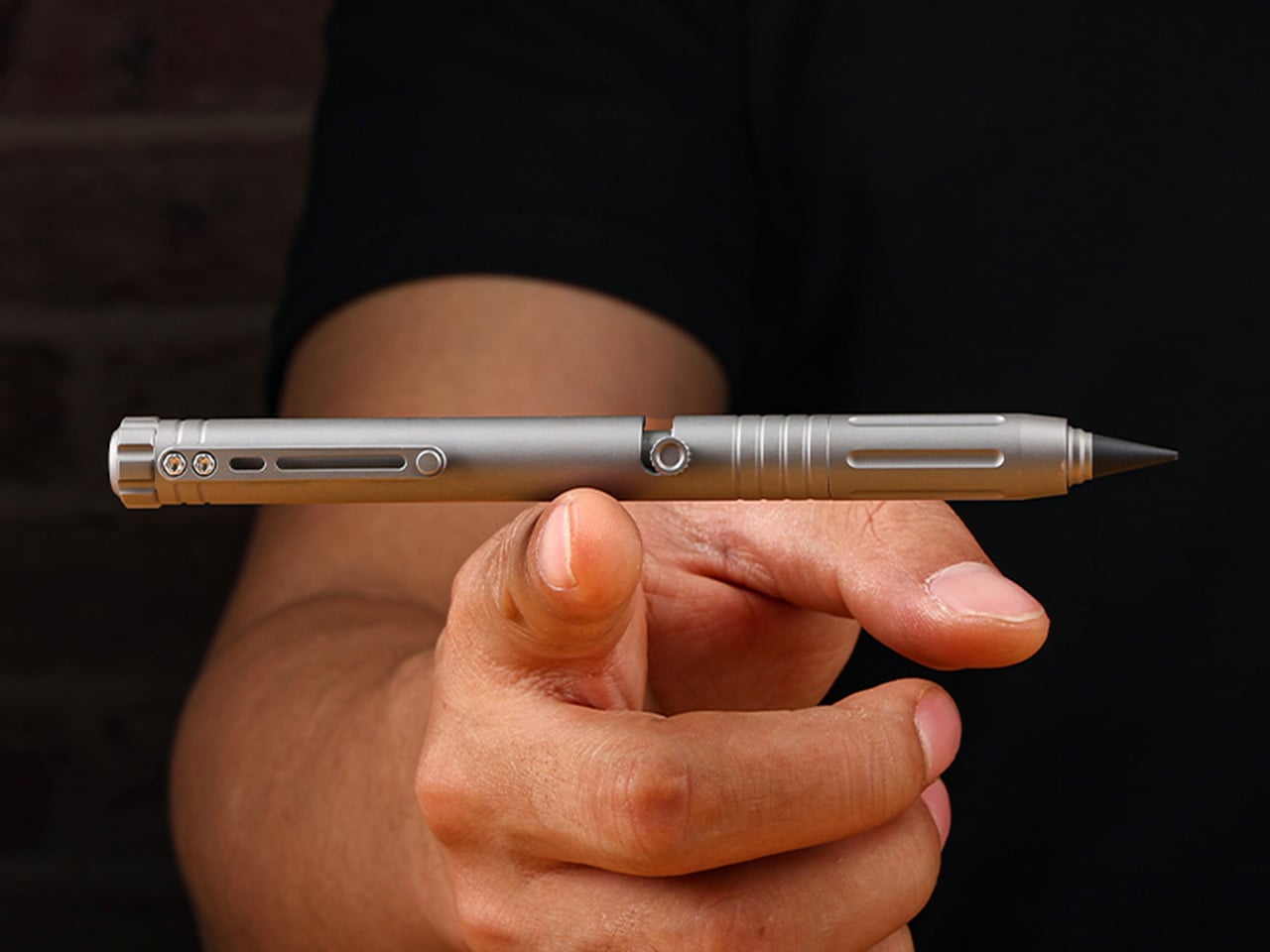
The Bullet Ant 4.0 by MeTool builds on that foundation and loads it with function. The bolt-action mechanism deploys a top-mounted 4mm bit driver the moment the bolt flicks forward. Nested inside the barrel is a magnetic bit garage holding a spare, and a hidden blade sits flush in the lower section, locked by two magnets that hold it against shaking, jostling, or being tossed in a bag. The rear tip swaps between a graphite and metal writing point, with a tungsten glass breaker completing the set. All of that in 32 grams of Grade 5 titanium.
A single forward flick of the bolt deploys the 4mm magnetic bit driver into working position, with no caps to remove and no secondary steps to take. The magnetic mount keeps the bit seated precisely, and the same magnetic logic governs the bit garage inside the barrel, which stores a second 4mm bit as a permanent spare. Losing a bit mid-job is a real-world frustration that MeTool clearly heard from earlier-generation users, and the solution is architectural rather than behavioral: one extra 4mm bit, always with you, no loose parts, no hunting through a bag for the Phillips you dropped. Both the working bit and the stored backup are standard 4mm, keeping compatibility with common interchange systems rather than locking the user into proprietary accessories. The bolt mechanism also carries the distinction that made this whole category worth caring about: positive tactile feedback on both extension and retraction, the kind of mechanical click that turns a tool into something you actually look forward to using.
The blade lives flush inside the lower barrel, producing zero poke, zero rattle, and zero external profile, and when you don’t need it, it simply disappears, leaving a clean, cylindrical pen that looks like nothing but a pen. Two small but powerful magnets keep the bit blade perfectly seated, with no wobble and no creep, meaning you can throw the pen in a bag, run down stairs, or shake it aggressively without the blade budging until a deliberate thumb pull releases it. In practical daily use, it handles the mundane cutting jobs that otherwise require hunting for scissors: tape, packaging, zip ties, rope, plastic clamshells. Slip the blade out in two seconds, make the cut, click it back, and the pocket knife can stay home. The design intent leans firmly toward daily micro-cutter territory rather than survival blade ambition, which keeps the tool honest about its actual scope.
The everlasting pen tip carries no ink and no limits, writing on paper, metal, wood, plastic, or underwater. Two tip configurations are available: the graphite tip delivers smooth, paper-friendly contact suited for notebooks and daily writing, while the metal tip offers rigid marking performance on hard surfaces in outdoor conditions. The new alloy tip survives waist-high drops onto concrete without cracks or flakes, in either metal or graphite form, and swaps between configurations in seconds. The tungsten glass breaker occupies the same interchangeable slot at the rear of the barrel as a third configuration, converting that end into a hardened emergency strike point capable of breaking automotive glass. Concentrating the writing, glass-breaking, and emergency functions at the rear of the barrel is a coherent spatial decision that keeps the bolt-action end clean and dedicated entirely to the driver.
136mm of titanium at just 32 grams, with six precision grooves machined into the grip section that give ultimate hold in any condition, wet, cold, or gloved. Grade 5 titanium, the Ti-6Al-4V aerospace alloy, is the material for the entire body, chosen for its strength-to-weight ratio rather than its premium associations. The all-new ball-detent contact point lets the Bullet Ant 4.0 glide over any fabric, whether pocket, bag, or strap, without snags or scratches. Earlier generations of the pen were known to catch and drag on pocket linings, a small but genuinely irritating daily friction that the redesigned clip eliminates cleanly. Finish options include sandblasted titanium, raw and untouched in the way titanium comes out of the earth, and black, stealth and matte, a finish that disappears in low light.
Anodized blue and purple finishes are available as add-ons, and the distinction MeTool draws is worth noting: anodizing is an electrochemical bond that becomes part of the metal itself, and won’t chip or peel. Regardless of chosen finish, the underlying material is the same Gr5 titanium with identical performance throughout. The Bullet Ant 4.0 is built for a specific kind of person: someone whose environment demands improvised repairs, a cutting edge within reach, and legible notes all within the same hour, whether that person is a hiker tightening gear on a trail, a field technician working a job site, or an outdoors-oriented carry enthusiast who wants glass-breaking capability without a dedicated tool eating up pocket space. The pen cycles between five roles through mechanical reconfiguration rather than physical disassembly, shapeshifting from writing instrument to bit driver to blade to emergency tool without ever requiring a bag dig or a secondary carry item. It manages all of this without looking overtly tactical, which, for a category that sometimes leans too hard into military aesthetics, is a meaningful restraint.
Gen 1 proved the concept, Gen 2 made it tactical, Gen 3 packed in more tools, and MeTool has been running this annual design cycle since 2023. The two complaints every Bullet Ant 3.0 user raised were the same: why unscrew a cap every time a screwdriver is needed, and why does the metal tip crack on a drop. MeTool listened, and rebuilt. Gen 3 hid the blade under a cap that required unscrewing before driving a screw. Gen 4 hides the blade inside the bit itself. Gen 3’s tip could crack on a hard drop. Gen 4’s alloy tip survives waist-high falls onto concrete. That pattern of user-feedback-to-design-decision shows in how purposeful the Gen 4 upgrades feel when set against the earlier versions, each fix traceable directly to a complaint someone actually filed.
Each Bullet Ant 4.0 ships with the pen body in Gr5 titanium, an alloy tip for the everlasting pen system, one magnetic hidden blade, and two 4mm magnetic bits, with worldwide shipping included at no extra cost. That represents a complete functional loadout without any additional purchases required for core use. Anodized blue and anodized purple finishes are available as paid add-ons, with the electrochemical finish applied to the same Gr5 substrate across all color options. The campaign runs through June 17, 2026. Pricing and full reward tier details are live on the Bullet Ant 4.0 Kickstarter page.
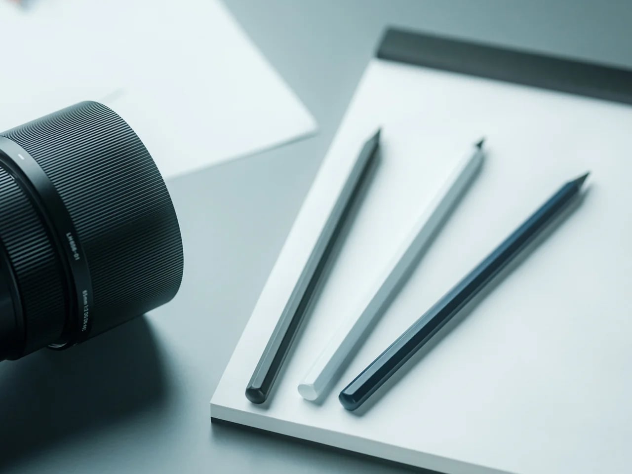
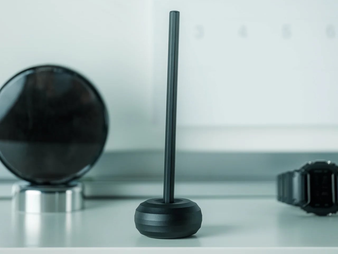
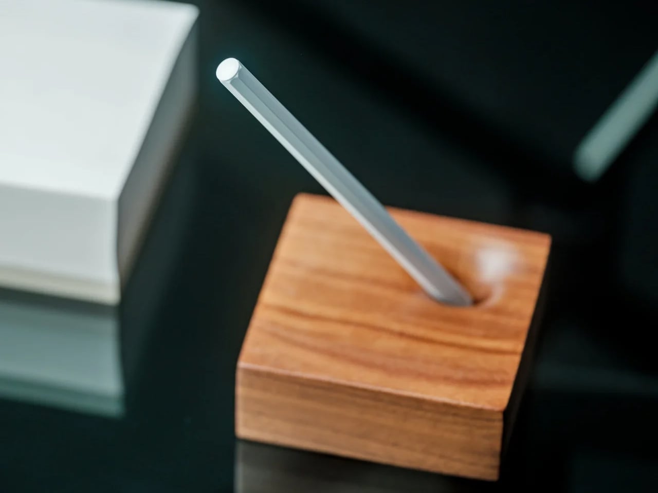
There was a time when pencils felt simple. You picked one up, wrote until the tip dulled, sharpened it, and kept going. But somewhere along the way, even that small ritual started to feel more annoying than satisfying. The point breaks. The lead snaps. The sharpener is missing when you need it. And somehow, it’s always in the one room you’re not in. The tool that’s supposed to help ideas move faster suddenly becomes one more little interruption.
It’s a small frustration, but a familiar one. A sketch paused because the tip gave out. A note-taking session interrupted by a broken point. A mechanical pencil that looks precise until the lead crumbles under the slightest pressure. We tend to think of pencils as simple tools, but most of them come with just enough maintenance to get in the way. That’s what makes the Everlasting All-Metal Pencil so compelling. It takes one of the oldest writing tools around and removes the part that has always been slightly annoying.
The $20 Pencil That Made Me Stop Thinking About Pencils
At first, I thought the Everlasting All-Metal Pencil was mostly a novelty. A sleek aluminum object with a clever hook and a name designed to make you curious. But after using it for a few days, the appeal became much more practical than gimmicky.
I stopped looking for a sharpener.
I stopped dealing with snapped mechanical lead.
I stopped apologising mid-meeting for a tool that couldn’t keep up.
And I stopped thinking about the pencil at all, which is probably the highest compliment you can give a writing tool.
That’s the strange brilliance of it. It writes like a real pencil, erases like a real pencil, and yet the tip barely seems to change. You keep waiting for the usual maintenance cycle to kick in, and it just doesn’t. The result is a writing experience that feels more fluid, more dependable, and oddly calming in its refusal to interrupt you.
“I stopped thinking about the pencil at all – which is probably the highest compliment you can give a writing tool.”
Built for the Long Haul
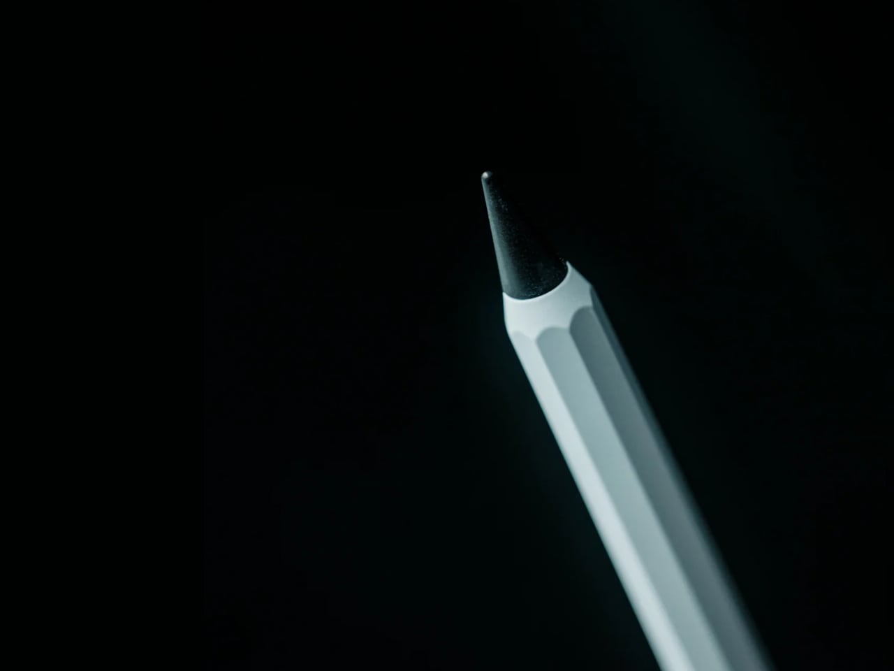
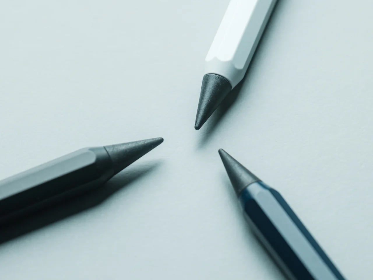
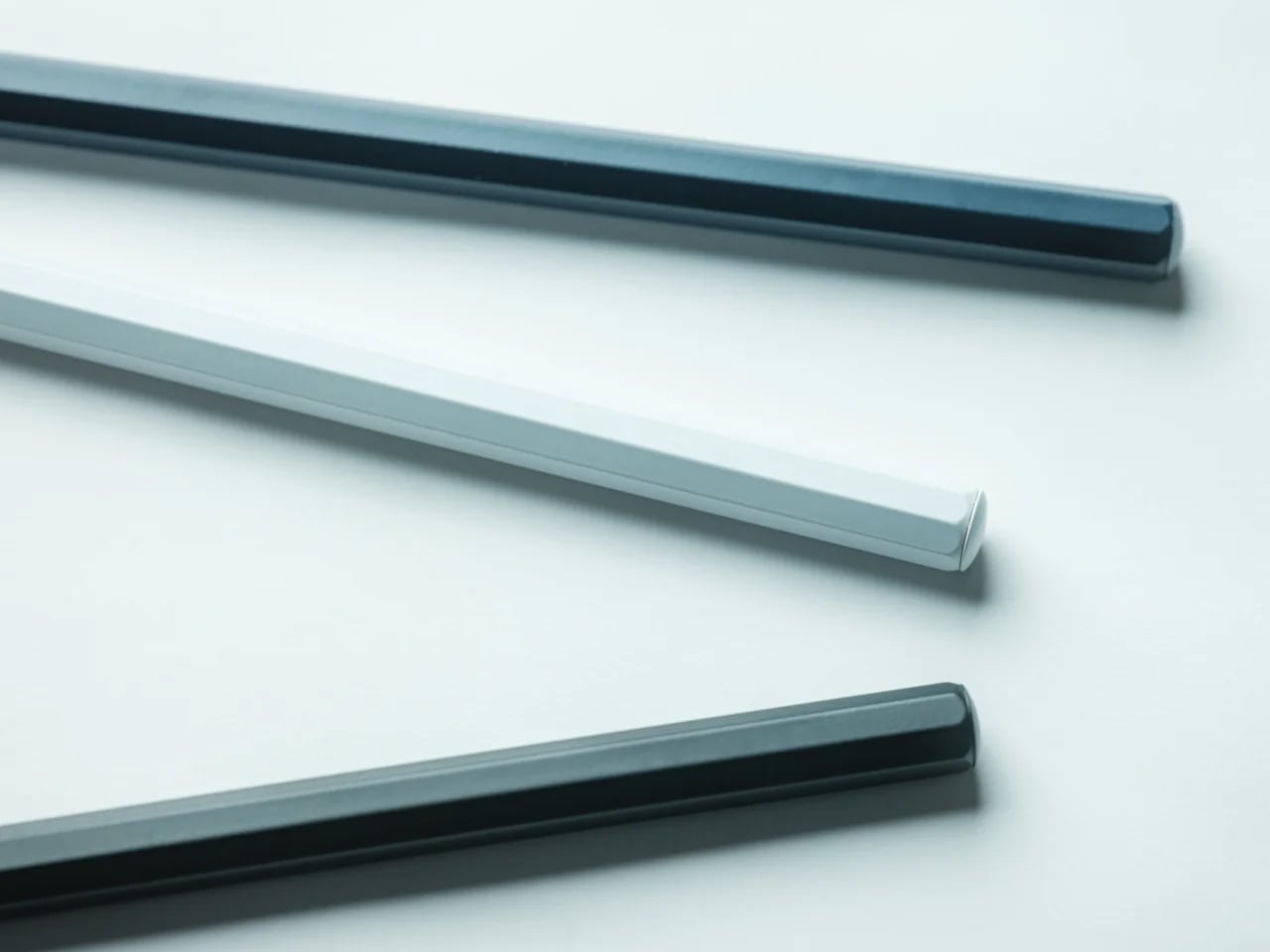
Special alloy core: Leaves graphite-like marks without wearing down the way a traditional pencil tip does.
No sharpening required: Eliminates one of the most persistent little annoyances in writing and sketching.
Aluminum body: Lightweight, durable, and more substantial than a disposable wooden pencil.
Erasable marks: Works with regular erasers, so it keeps the familiar flexibility of graphite.
Watercolor-friendly performance: Doesn’t bleed with watercolor or water-based markers, making it especially useful for sketching and mixed media work.
Pocket-sized option available: Easier to carry when you want something compact but more dependable than a mechanical pencil.
This isn’t about reinventing the pencil. It’s about removing the part that never needed to be there in the first place.
Not for you if: You love the ritual of sharpening or prefer the variability of a traditional graphite line for fine art work.
Why Simpler Tools Still Win
Every few years, a simple tool appears that makes you wonder why you ever accepted the complicated version. We live in a world full of products that promise precision through complexity. Click mechanisms, replaceable lead, backup cartridges, specialized refills. And yet some of the most satisfying tools are still the ones that ask the least from you. A pencil should be immediate. It should be ready the second a thought arrives, not after you fix, refill, or sharpen something.
The Everlasting All-Metal Pencil gets that. It keeps the familiar feel of graphite on paper, but strips away the maintenance that usually comes with it. That makes it feel less like a novelty object and more like a quiet correction to a category we stopped questioning a long time ago.
Design That Reflects Restraint
There’s a clean confidence to the Everlasting All-Metal Pencil that makes sense the longer you use it. The aluminum body gives it just enough weight to feel deliberate, while the octagonal shaft keeps it stable in the hand. Nothing about it feels decorative for the sake of it. The design is simple, compact, and resolved in the way good everyday tools tend to be.
It doesn’t try to romanticize the pencil. It just makes the experience feel more complete. That’s what gives it presence. Not flash, not novelty, just a better answer to a familiar problem.
Who It’s For
Writers and note-takers
A pencil that stays ready without the usual interruptions.
Artists and sketchers Especially useful for watercolor or marker work where smudging can get in the way.
Minimalists One durable writing tool that replaces the need for sharpeners, spare lead, and extra fuss.
Where Writing Stays in Motion
You don’t realize how often small interruptions break your flow until one tool removes them. Most of us don’t need a smarter pencil. We need one that gets out of the way and keeps going. That’s what the Everlasting All-Metal Pencil does so well. It keeps the familiar pleasure of writing with graphite, while quietly removing the maintenance that usually comes with it.
At the end of the day, it’s still a pencil. But sometimes, the right one makes the entire act of writing feel a little less fragile.
The Everlasting All-Metal Pencil is now available for $19.95 – roughly the cost of three decent mechanical pencils that will eventually run out of lead. This one won’t.
The minimalist desk setup has become one of the most documented trends in home office design, particularly as hybrid work continues pushing people to invest more seriously in the spaces where they spend their days. Most products marketed toward that crowd lean hard on the visual side, neutral finishes, restrained forms, nothing that draws attention to itself. What they’re less reliable at is spatial logic.
The ten accessories on this list were chosen with that in mind. Each one has to pass a practical test, not just look calm on a desk, but actually justify the space it occupies. That means hiding clutter, combining functions, freeing surface area, or removing a small friction before it turns into a habit.
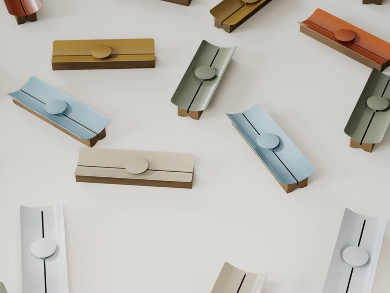
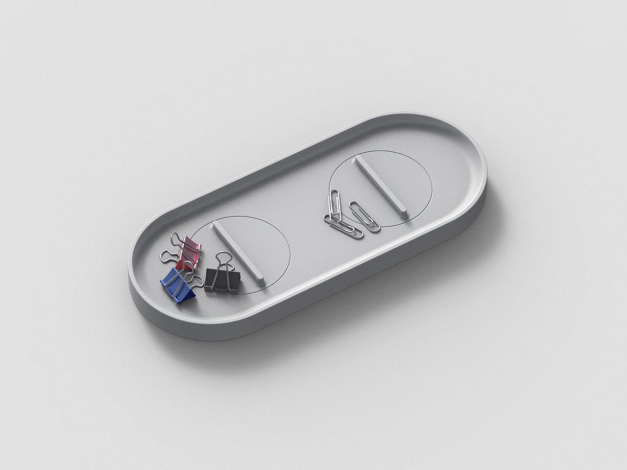
KNOB. Pen Tray
Most pen trays solve a narrow version of the problem. They give you a fixed layout, usually a rectangle divided into two or three compartments, and expect you to work around it forever. That’s fine until your tools change, and they always do. Changho Lee’s KNOB. Pen Tray takes a different approach by making the interior of the tray something you can actually reconfigure.
The dividers are controlled by knobs that take their cues from gas burner controls, a design reference that also gives the tray its name. Turn them and the internal layout shifts, letting you organize pens alongside rulers, adapters, or whatever else needs a place. One tray handles what might otherwise require three, which makes a convincing case for its footprint. The mechanism can feel fiddly if you reorganize often.
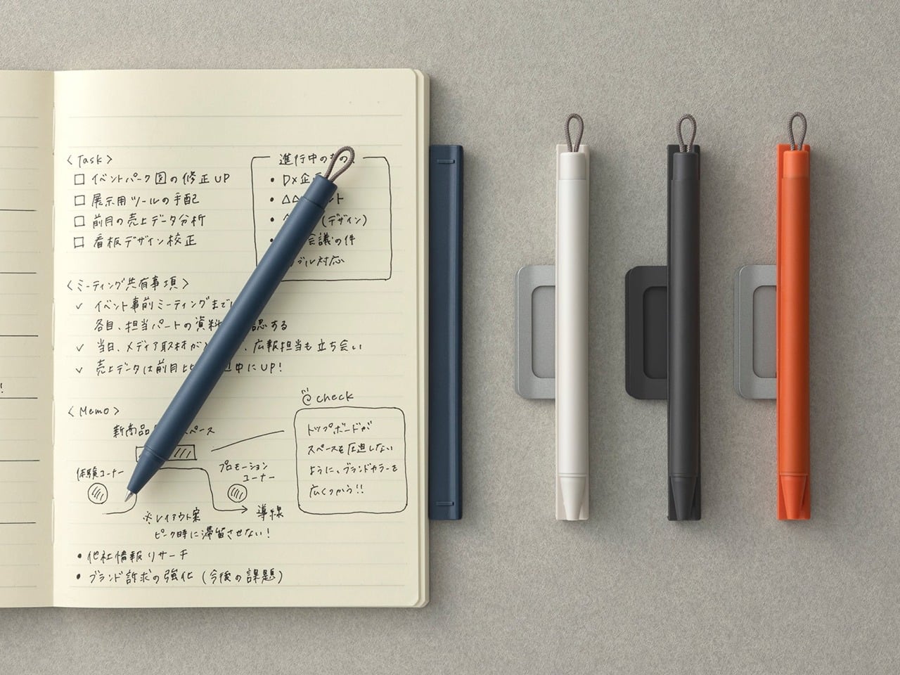
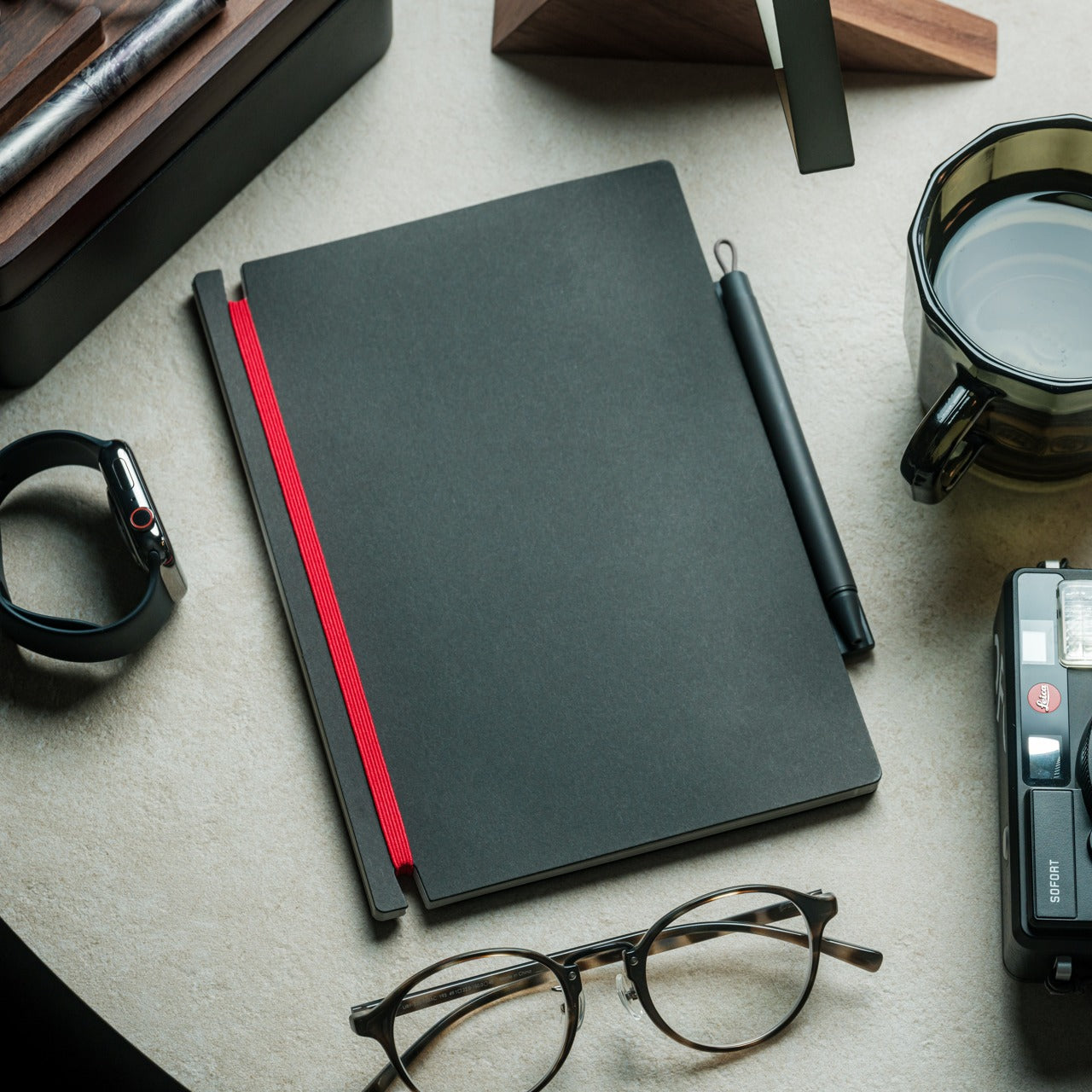
Inseparable Notebook Pen
There’s a particular kind of frustration that comes with reaching for a pen and finding it’s no longer where you left it. It’s small enough to ignore once, but it happens often enough to become a genuine irritant. The Inseparable Notebook Pen doesn’t try to solve desk organization broadly. It solves this one specific problem by keeping the pen attached to the notebook it belongs with.
A magnetic clip secures the pen directly to the notebook cover, so the two travel as a unit and stay that way on the desk. There’s also a built-in silencer that softens the attach-and-release motion, which sounds like a small detail until you use it daily. The pen works best when paired with its intended notebook, so it’s less convincing as a standalone writing instrument.
Orbitkey Desk Mat
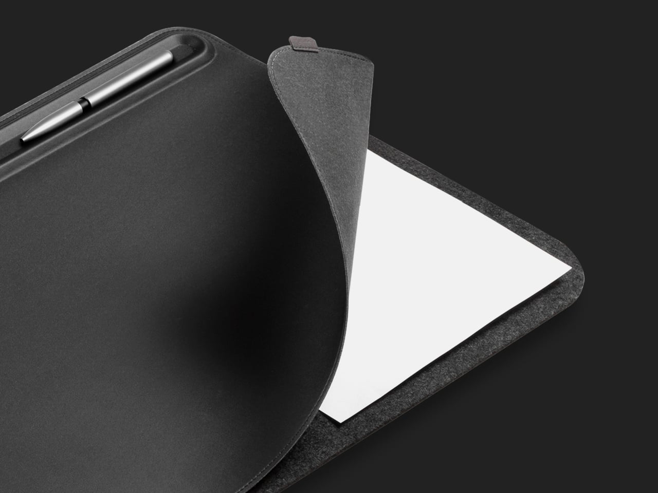
Desk mats often get treated as the last layer of a setup, something you add once everything else is in place to make the whole thing look polished. The Orbitkey Desk Mat earns more than that role. It addresses one of the quieter problems on any active desk, the gradual spread of loose papers, sticky notes, and reference sheets that slowly take over the surface.
A document hideaway built beneath the top layer lets you slip papers out of view without throwing anything away. They stay flat and within reach, invisible until you need them. A toolbar along one edge keeps stationery and smaller tools from drifting. Available in Black and Stone across two sizes, the mat works whether you’re running a compact home setup or a larger studio table.
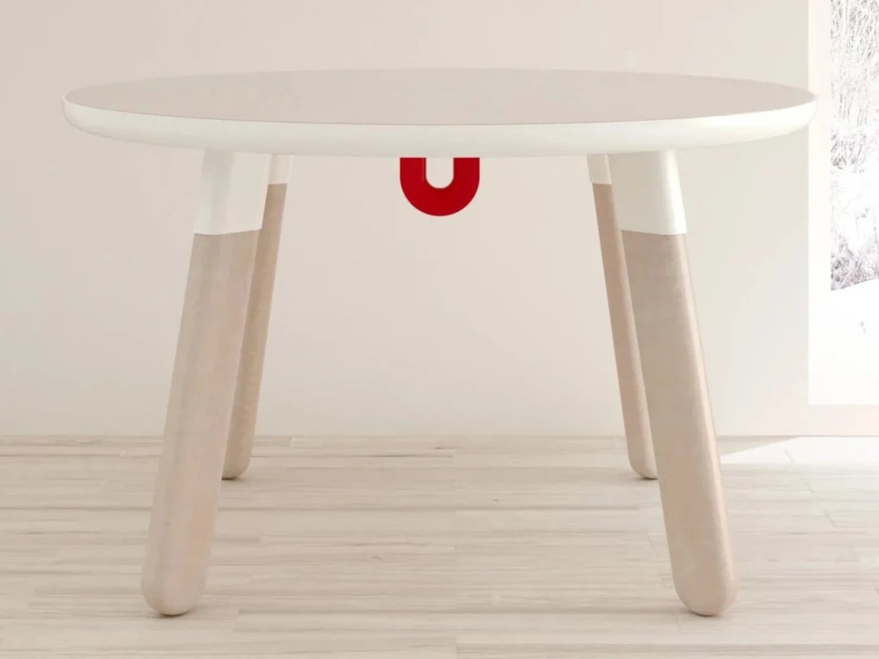
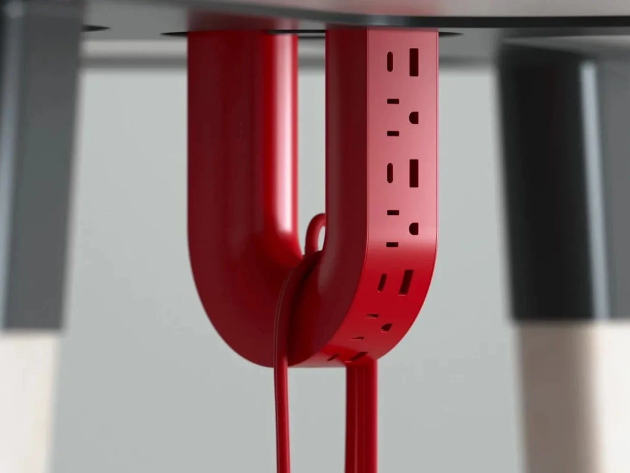
ME-1 U-shaped Power Strip Concept
Cable management is one of those desk problems that most solutions only partially solve. You gather the cords, clip them together, maybe run them through a box, and the result is still visible, still part of the desk’s noise. Michael Kritzer’s ME-1 power strip concept takes a different position, arguing that the power strip itself should hang below the work surface rather than claim space on top of it.
Curved into a U-shape, it can hang under a table or stick to metallic surfaces, while its two legs give you somewhere to wrap cables so they don’t trail freely. There’s also enough spacing between the alternating three-prong sockets and USB ports to fit bulky chargers without blocking each other. It’s still a concept, and questions about how far it protrudes remain, but the logic behind it is sound.
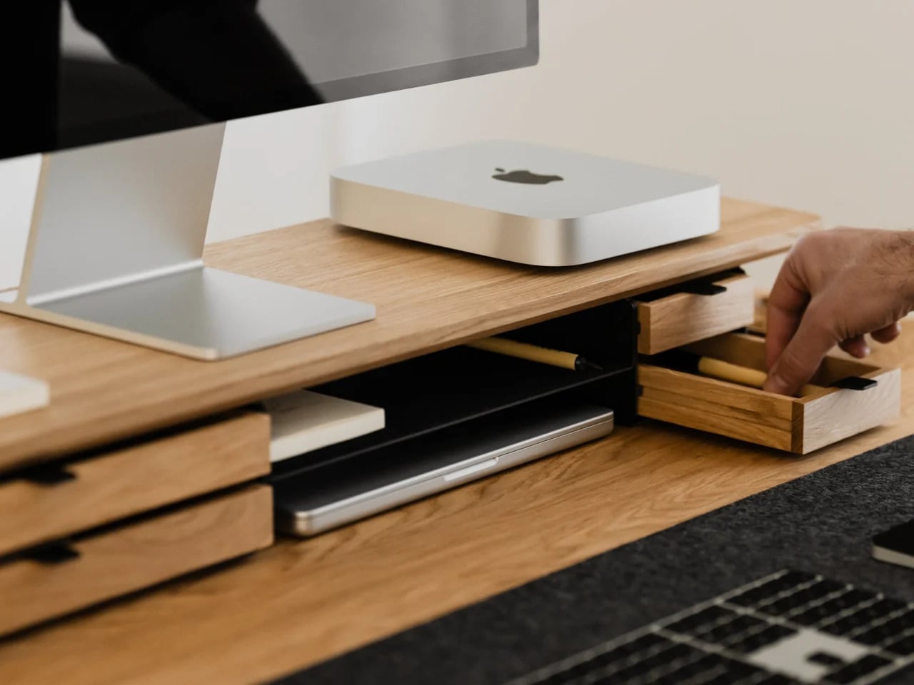
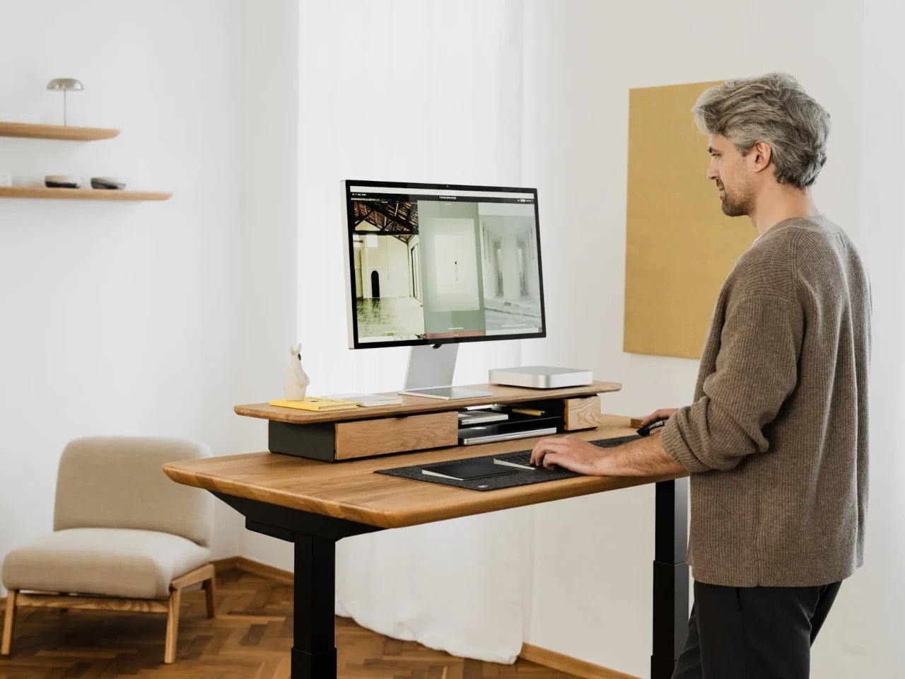
Oakywood Desk Shelf Pro
Monitor risers are supposed to help, and usually they do, but only as far as ergonomics go. The desk surface often ends up just as crowded as before, just with a platform sitting in the middle of it. The Oakywood Desk Shelf Pro approaches the problem differently, treating the riser not as an accessory but as furniture that earns its size by doing more than one job.
The shelf spans desk width, lifting the monitor to eye level while clearing space underneath for a keyboard or laptop, with steel legs at each end creating a floating effect. Built-in drawers tuck away stationery and small tech, and a felt-lined open shelf handles tablets or a closed laptop. It’s built from solid oak or walnut, not MDF with a plastic skin, and can hold up to 100 kg without flexing.
Practiko Otis Hanger 3.0
Minimalist desks look clean partly because many of them don’t come with built-in drawers. That’s a reasonable design choice until the pens, sticky notes, charging cables, and paper clips have nowhere to go and start accumulating on the surface instead. The Practiko Otis Hanger 3.0 adds that missing storage back without a single screw or permanent alteration.
The system clips onto the desk edge and hangs beneath the work surface, giving you three trays and the full top plane back. The 3.0 version features more perforation points for finer divider adjustments, and three nested mini trays handle smaller items like paper clips, thumbtacks, or earbuds. Larger handles on each tray let you pull them out smoothly without looking down, which makes more of a difference in daily use than it sounds.
Nuka Eternal Stationery
There’s a version of minimalism that’s about owning as little as possible. There’s also one that’s about how much the things you do own keep asking of you. Nuka’s Eternal Stationery belongs to the second kind. Built around permanence rather than disposability, it’s a notebook-and-writing-tool system designed to stop demanding replenishment, which is its own quiet argument for staying on a well-edited desk.
The notebook is waterproof and tear-proof, and pairs with a metal alloy tip that writes with the consistency of a traditional pencil but requires no sharpening and never breaks. Pages clear completely with the Nuka Magic Eraser, ready to be written on again. For anyone who writes regularly, the appeal is straightforward, though writers accustomed to ink on paper may need some adjustment time with the metal alloy tip.
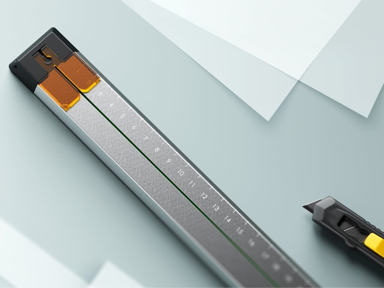
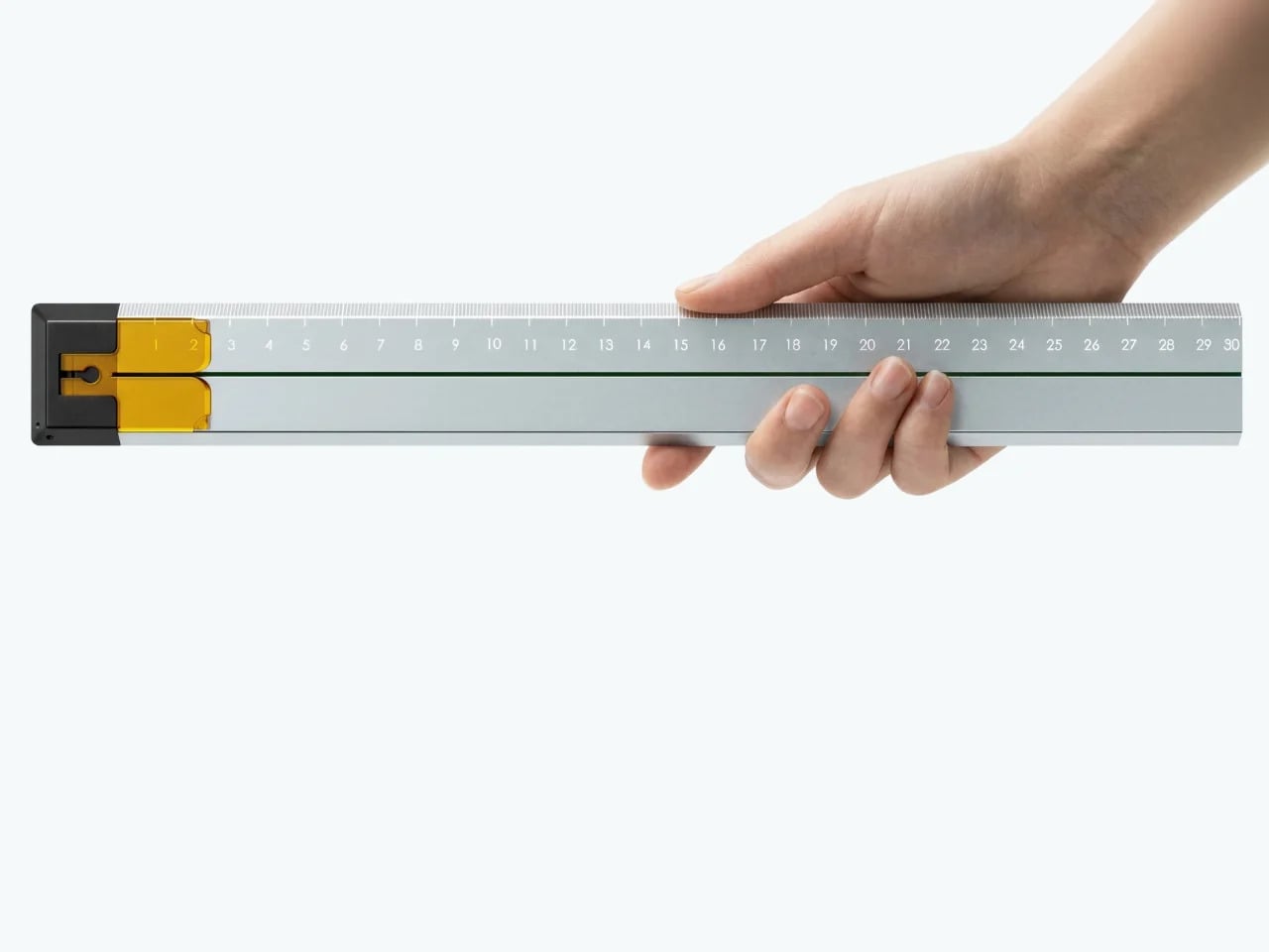
Quiver Ruler
A ruler is one of the few tools that earns a place in a minimalist setup by compressing several small tasks into a single flat form. Tunir Maity’s Quiver does that more thoroughly than most. It’s an anodized aluminum ruler designed primarily for people who actually cut with one, not just measure. It treats shaky hands and imprecise cuts as design problems worth solving, not limitations the user is expected to compensate for.
A clip mechanism holds paper in place, a blade slit guides the cut in a straight line, and the weight distribution favors the cutting end, so you don’t have to press down as hard. It also includes a carabiner attachment for clipping to a bag. Quiver is currently a concept, so availability hasn’t been confirmed, and it’s more specialized than what a casual desk user would reach for day to day.
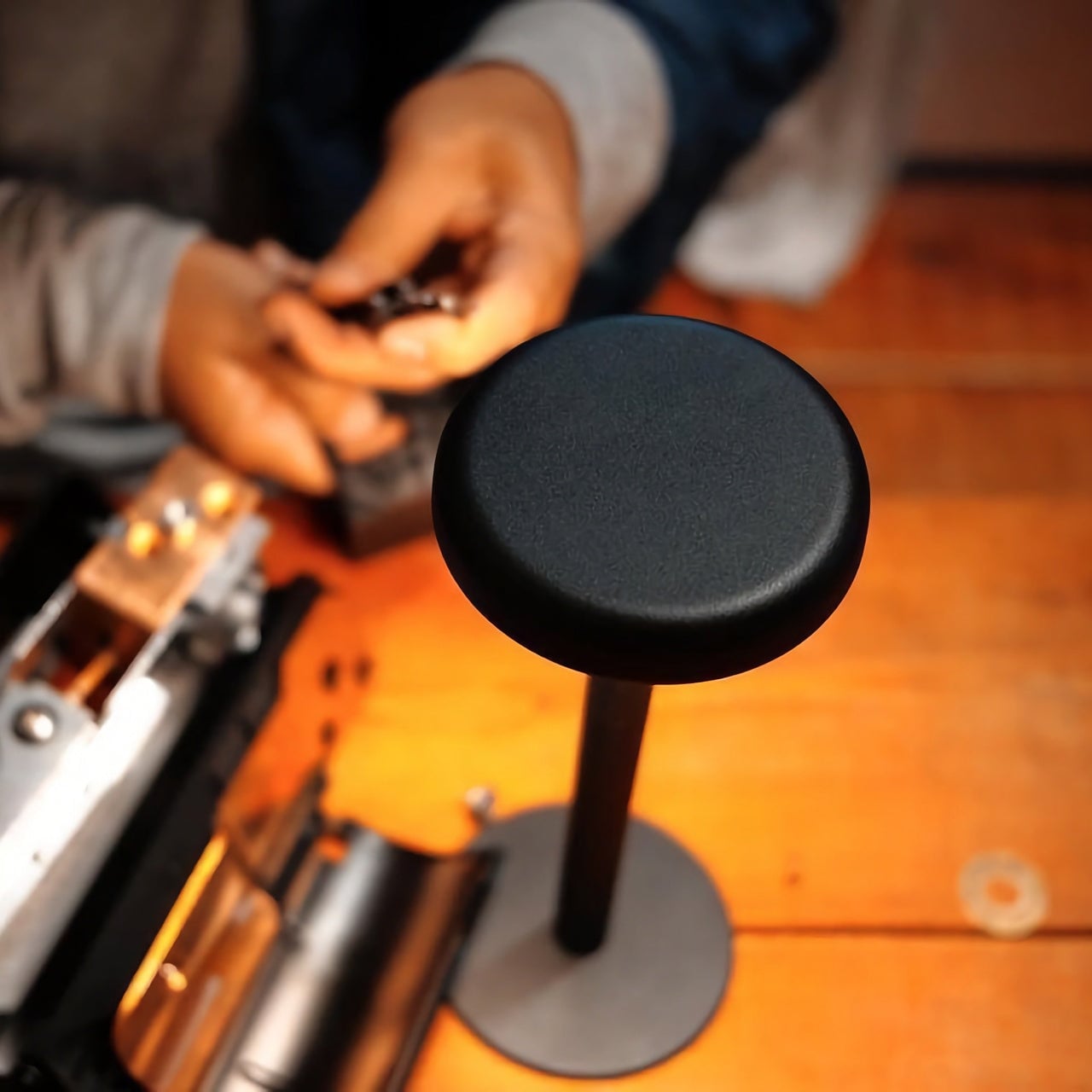
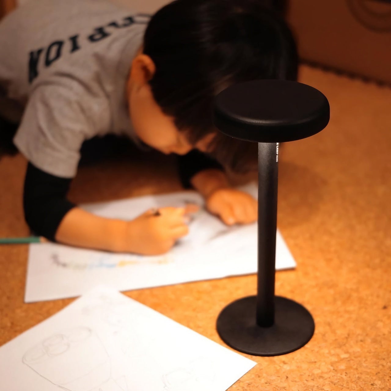
Ichi Portable Lamp
Desk lamps rarely fail in the obvious ways. Most give off enough light and last long enough. What they tend to get wrong is the base, which on wider models claims an entire desk corner, and the cord, which invariably ends up somewhere visible. The Ichi Portable Lamp, born from the collaboration between Fujita Kinzoku and TENT Design, keeps the form slim and goes cordless, addressing both without turning the lamp into a statement piece.
Powered by four standard AA batteries, it runs cordless without the limitations of proprietary chargers. Its warm, high-color-rendering CRI 95 LED creates a soft, radiant glow suitable for task work or winding down. The modular design disassembles into three parts and packs down to a slim 20mm thickness. It’s more portable than a permanent desk fixture, which is worth knowing if you need sustained, high-output lighting for long stretches.
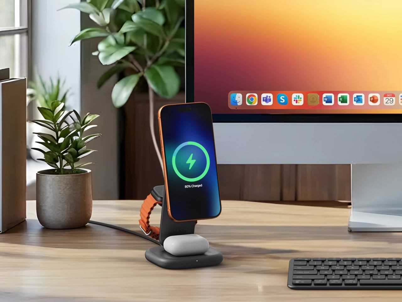
Satechi 3-in-1 Foldable Wireless Charging Stand
Getting a phone stand onto a minimalist desk requires a stronger argument than just holding the phone upright. The Satechi 3-in-1 Foldable Wireless Charging Stand with Qi2 25W makes that argument by doing three jobs at once, replacing the tangle of separate charging pads that Apple users typically accumulate. Wireless charging was supposed to simplify things, but most setups end up with a different kind of mess instead.
Set the iPhone down, and Qi2 snaps it into position, the Apple Watch gets its own fast-charge arm, and the AirPods rest on a pad below, all drawing from a single cable to the wall. The stand folds flat for travel and fits easily in a carry-on. A 45W USB-C adapter with US, EU, and UK plugs ships in the box. It’s most compelling for people already working within the Apple ecosystem.
Building a cleaner desk comes down to the same question applied to every object on it: what is it giving back for the space it takes? Color and material can make things look minimal, but they don’t make them earn their place. That’s a footprint budget, and it’s a much better framework for deciding what stays than any mood board, setup guide, or neutral palette.
Most gift guides for him are boring. A leather wallet, a whiskey set, a watch he already owns in a different color. But if the person you’re buying for genuinely cares about the objects around him, about what something communicates before he even uses it, a pen is an underrated move. Not just any pen. The five below are the kind of pieces that make everything else on the gift table look like an afterthought.
These aren’t novelty pens with logos. Each one makes a deliberate argument about what a writing instrument can be, rethinking the material, the mechanism, or the relationship between the pen and the desk it lives on. Together, they represent how designers are now treating an object that most people have stopped thinking about. Whether you’re shopping for a birthday, an anniversary, or a reason to stop buying the same gift twice, this list delivers.
1. Pininfarina Aero Ethergraf
Pininfarina’s design language has always been about the single confident line that communicates speed and restraint at once. The Aero Ethergraf carries that directly to the desktop. It writes through an Ethergraf metal alloy tip that works via oxidation, leaving a graphite-like mark on paper without any ink. No cartridges, no cap to lose, no refills, ever. For him, this means a writing tool that genuinely never runs out, made in Italy and handcrafted to outlast anything else on his desk.
The aluminum body carries a blue accent that catches light the way a car door does at the right angle, which makes complete sense coming from the studio responsible for decades of Ferrari and Maserati bodies. Sitting in its raw concrete cradle, the Aero Ethergraf reads less like office stationery and more like a considered piece of sculpture. The line it leaves is precise, smudge-proof, and won’t bleed through paper. It’s the kind of object that earns its place on whatever desk it lands on.
What we like:
Writes indefinitely with no ink, cartridges, or maintenance required — the Ethergraf alloy tip is genuinely a forever writing surface
Handcrafted in Italy, the aerospace-grade aluminum body and raw concrete cradle together make a gift that reads as a design object, not an office supply
What we dislike:
The mark left by the Ethergraf tip is lighter than a standard pen line, which may not suit those who prefer a bold, ink-heavy stroke
Very smooth or coated paper surfaces can diminish the writing quality, so it performs best on standard uncoated notebooks or writing pads
2. Inseparable Notebook Pen
The premise is almost frustratingly simple. A pen that attaches magnetically to the side of a notebook — the way an Apple Pencil does on an iPad — so the two are always together and always ready. Designer Yusuke Nagao built it with a three-part construction featuring a plastic protector, a metal clip, and the pen itself. For him, it solves one of the most persistent small frustrations in daily life: a notebook sitting on the table with nothing to write with.
There’s a quiet confidence to the Inseparable’s design that reveals itself the longer it’s used. Nothing feels overworked. The silhouette is clean, the clip is integrated rather than decorative, and the magnetic attachment snaps silently into place in a way most products would never bother to refine. The ink flows smoothly for clear and precise writing on the go.
Magnetic attachment to any notebook eliminates one of the most persistent small frustrations in daily writing habits in the cleanest possible way
The minimal three-part design prioritizes function without visual noise — it looks exactly as useful as it actually is
What we dislike:
The magnetic clip system is built around a single notebook format, so those who move between multiple journals will find the integration more limiting
The compact form and single-ink style serve portability well, but leave little room for those who prefer a heavier body weight or a finer writing point
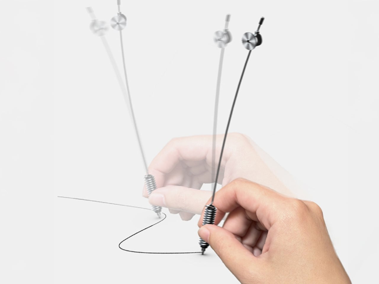
3. Yamaha Swing Scribe
If someone asked you to name a Yamaha product, you’d say piano or motorcycle before you said pen. That gap is exactly what makes the Swing Scribe interesting. Part of Yamaha’s Scribe Tool Design 2024 project, it’s a collaboration between Yamaha Corporation and Yamaha Motor designers in the US. The premise draws from the quill: as a feather naturally wobbles under air resistance while writing, it creates a rhythm. Yamaha made that incidental quality deliberate and physical for him to feel.
A weighted tip is attached to a metal bar, and as he writes, it swings. The small pendulum force feeds a steady beat back into the hand with every stroke. No batteries, no app, just physics. For someone who gets his best thinking done with a pen in hand, the Swing Scribe adds a dimension to the writing experience that no other pen on any other list has thought to offer.
What we like:
The pendulum mechanism delivers a genuinely new physical sensation in writing, drawing directly on the natural rhythm that once made quill writing feel so distinct from any modern tool
The creative pedigree is unlike anything else here — a joint effort between two legendary Yamaha divisions, treating writing as a sensory design challenge worth solving
What we dislike:
The Swing Scribe is a concept from Yamaha’s design research project, meaning it isn’t currently available as a retail product ready to purchase and wrap
The swinging weighted mechanism, while compelling in execution, may require an adjustment period for those accustomed to the predictable feel of a standard pen
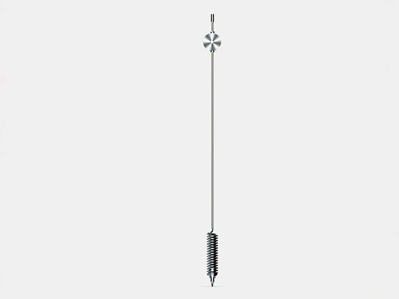
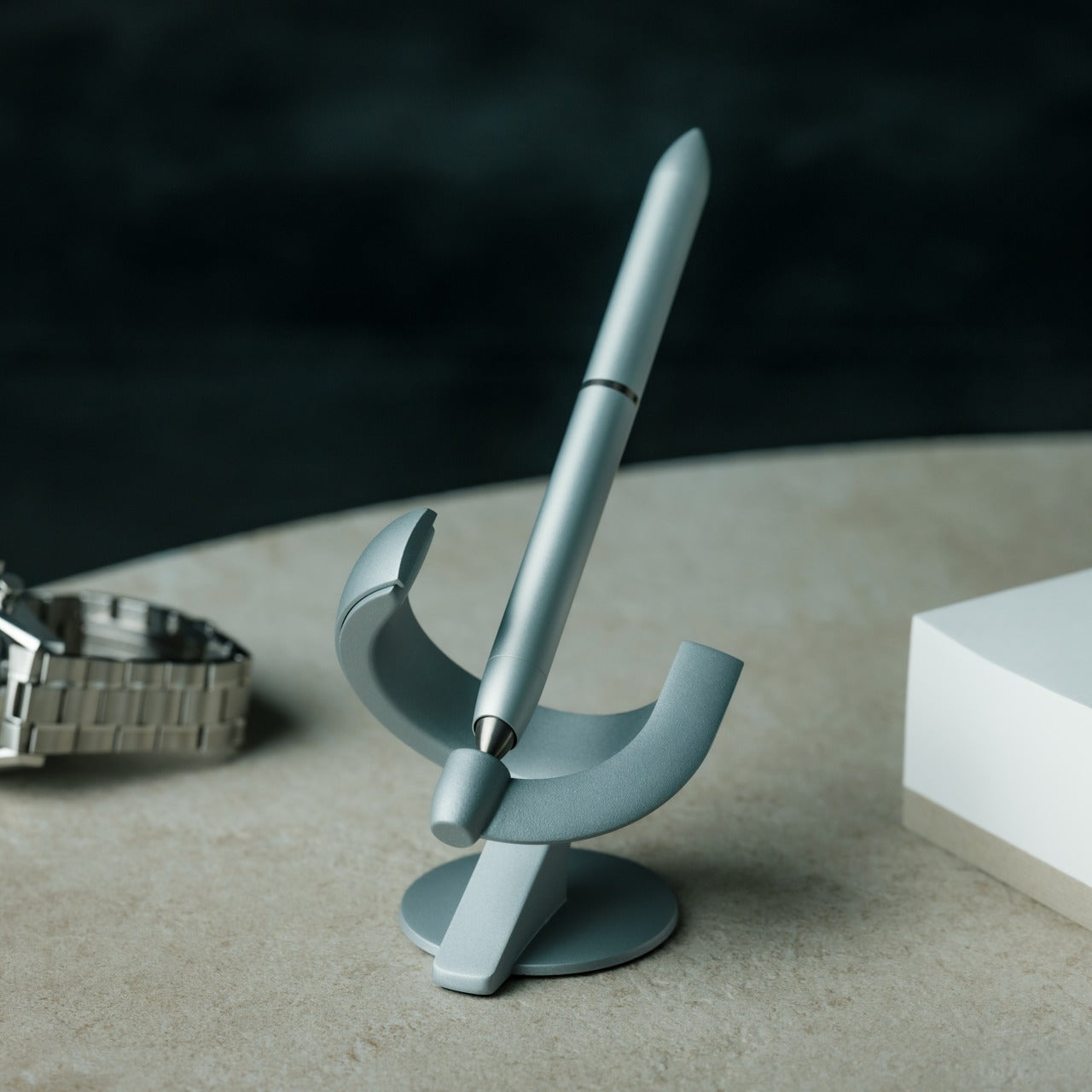
4. Levitating Pen 3.0
The third iteration of a design that has always pushed toward the improbable, the Levitating Pen 3.0 is built from aerospace-grade aluminum and titanium with a zinc alloy base and balances at a 60-degree angle in a charged magnetic field, bobbing gently when it settles into position. For him, this is the desk object that does something no leather-bound pen set ever managed: it makes people stop mid-conversation and ask what that thing is.
Available in silver or anodized black with a satin finish, it ships with a German-engineered Schmidt rollerball cartridge that delivers a silky writing experience to match its appearance. Undocking the pen to write is its own small ritual. Docking it back lets it find its magnetic sweet spot on its own. Spin it against the stand, and it rotates for up to 30 seconds.
The magnetic levitation is genuinely hypnotic, and the Schmidt rollerball cartridge means it writes as well as it performs — form and function earn equal attention
Ships complete in silver or anodized black with a satin finish, making this an immediate desk statement that needs nothing added to impress
What we dislike:
The levitation only functions on a flat, stable surface — this is strictly a stationary desk piece and cannot be stored on its side or carried in its floating position
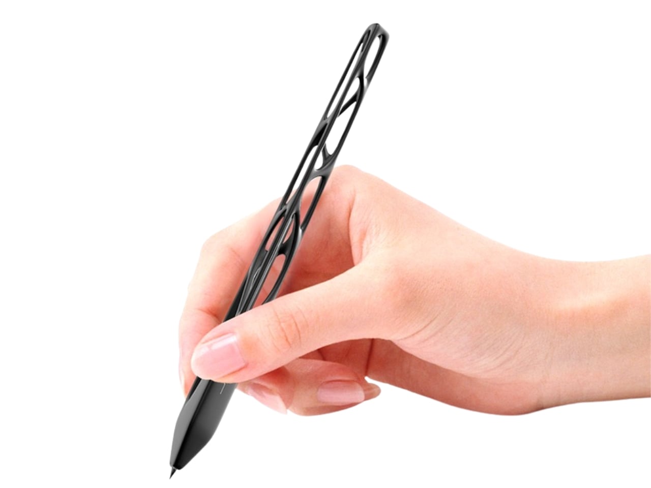
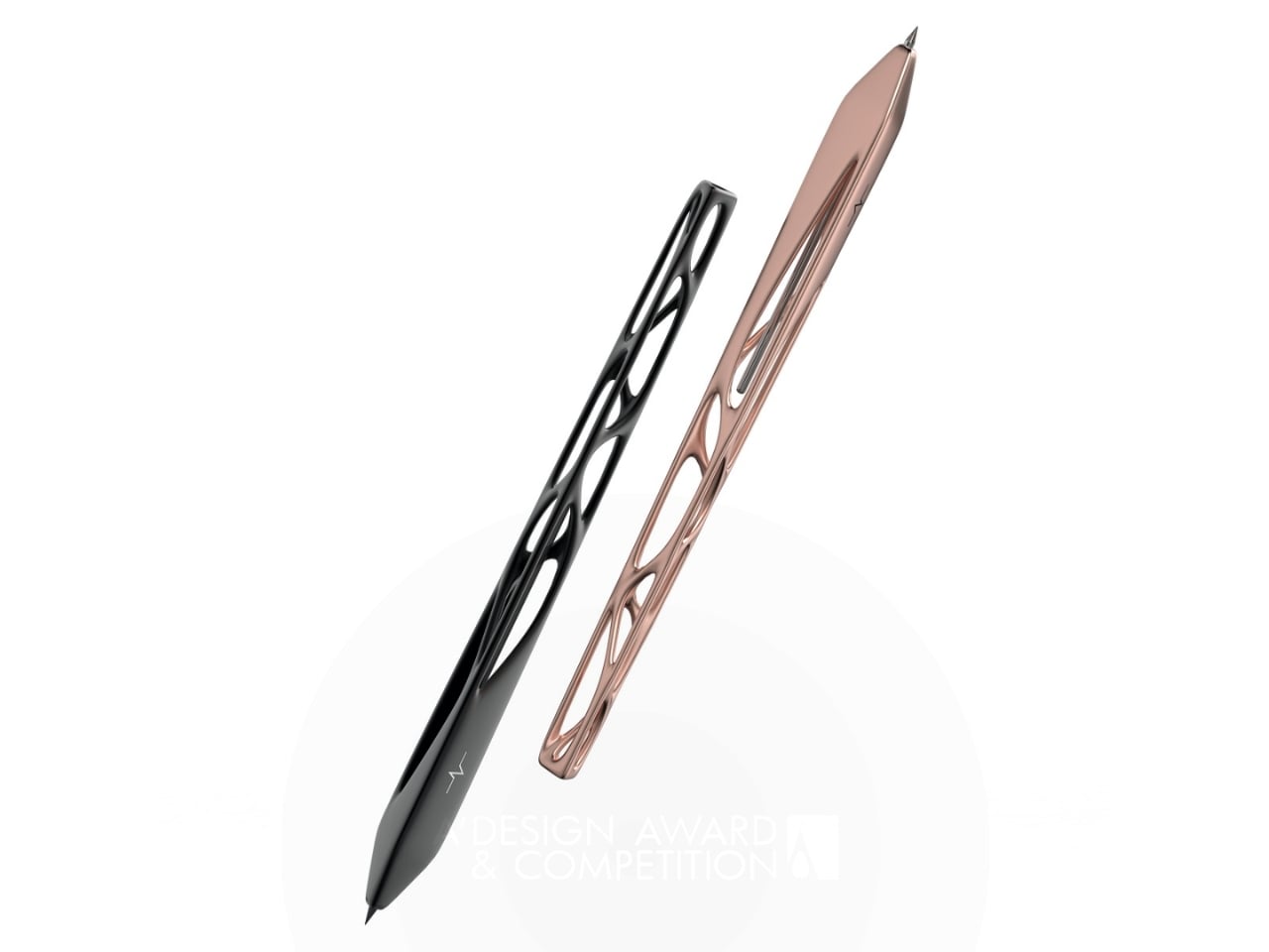
5. Pulse
Leila Ensaniat, an industrial designer with a background at Cisco in consumer electronics, spent over a year developing Pulse, earning the 2025 Golden A’ Design Award for 3D Printed Forms and Products. The pen draws its inspiration from clouds — the quiet drift rather than the dramatic storm — translating that into a skeletal biomorphic form with flowing cutouts that resemble veins in a leaf. For him, it’s the kind of object that changes what he expects from a writing instrument entirely.
The biomorphic patterns are created using lost wax casting in aluminum, silver, bronze, and gold — a centuries-old metalworking technique typically reserved for jewelry and fine art. Ensaniat’s approach centers on how we actually interact with objects rather than how they look in isolation. The negative space is considered the material itself. On the desk, it reads as a sculpture. As a gift, it lands as a statement about what good design actually is.
What we like:
The Golden A’ Design Award and lost wax casting in precious metals make Pulse as legitimate a design object as anything found in a gallery, not a gift shop
The biomorphic skeletal form earns visual attention without demanding it — arresting and considered in equal measure, it rewards a closer look every time
What we dislike:
The open skeletal frame, while visually exceptional, may feel more delicate in hand than the solid-body construction many people expect from a daily writing tool
A Pen Says More Than the Note Written With It
What makes a designer pen worth giving isn’t prestige or price. It’s the decision behind every detail — where the material comes from, how it feels before the first word is written, what it says about the person who chose it. The five pens above span different philosophies and price points, but each makes the same quiet argument: the objects we pick up every day are worth getting exactly right.
If there’s a theme running through this list, it’s that the best writing tools aren’t the ones with the most features. They’re the ones where a specific design problem was solved in a way that hadn’t been tried before. Whether that’s a pen without ink, a pen with a heartbeat, or a pen that floats, each one earns its place on a desk. And that’s exactly what a good gift should do.