There's just something magical about a robot that can convert into a car, tank or plane. It seems that Hollywood agrees as there are several major franchises based around that concept. As someone who grew up in the 80s and 90s, Transformers hold a special place in my heart, despite Michael Bay's best efforts at tarnishing its legacy. I spent countless hours as a kid playing with Hasbro and Takara's plastic figures, but there was one type of toy I always wanted but never got: a robot that could transform on its own just like the ones I watched on TV. That changed a few years ago when Robosen launched its line of officially licensed auto-converting models, and from what I've seen, its latest release featuring Soundwave might be its best yet.
Design: More than meets the eye
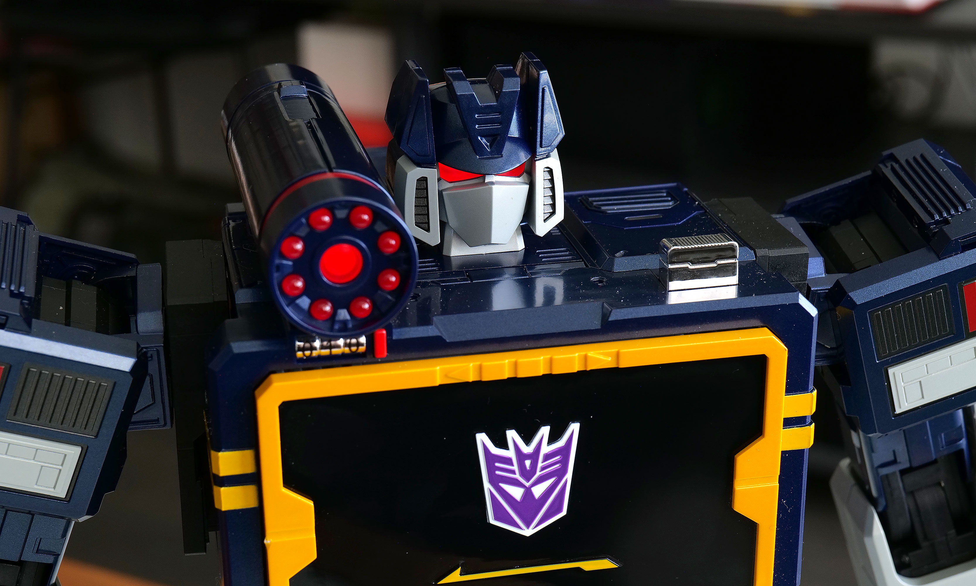
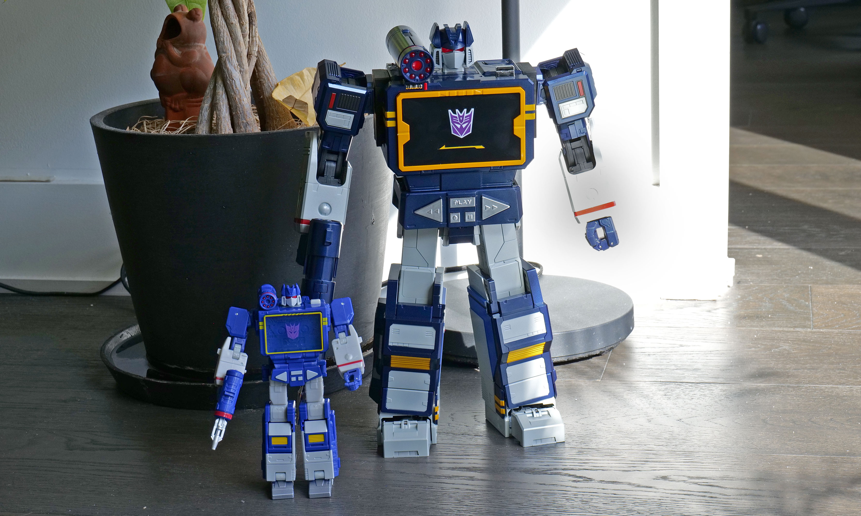
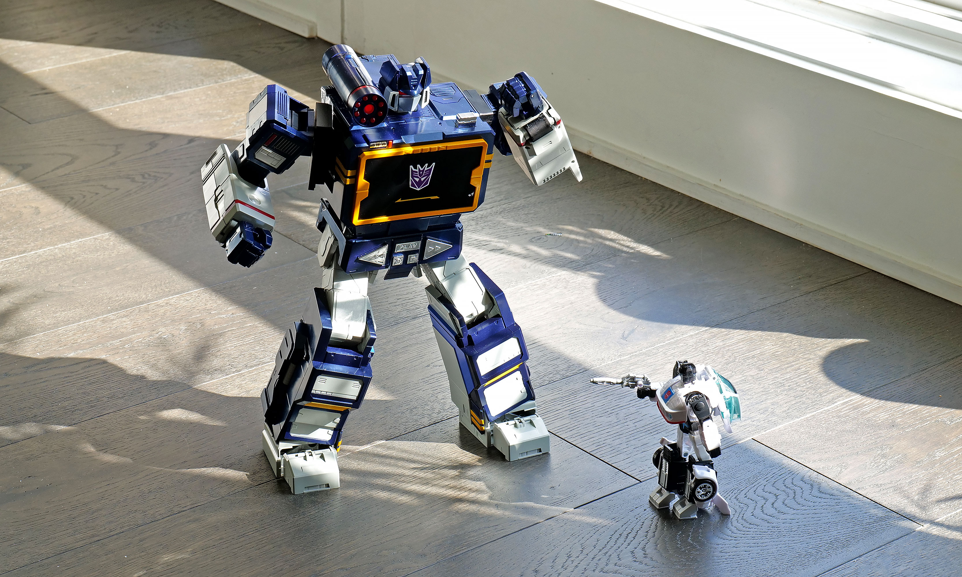
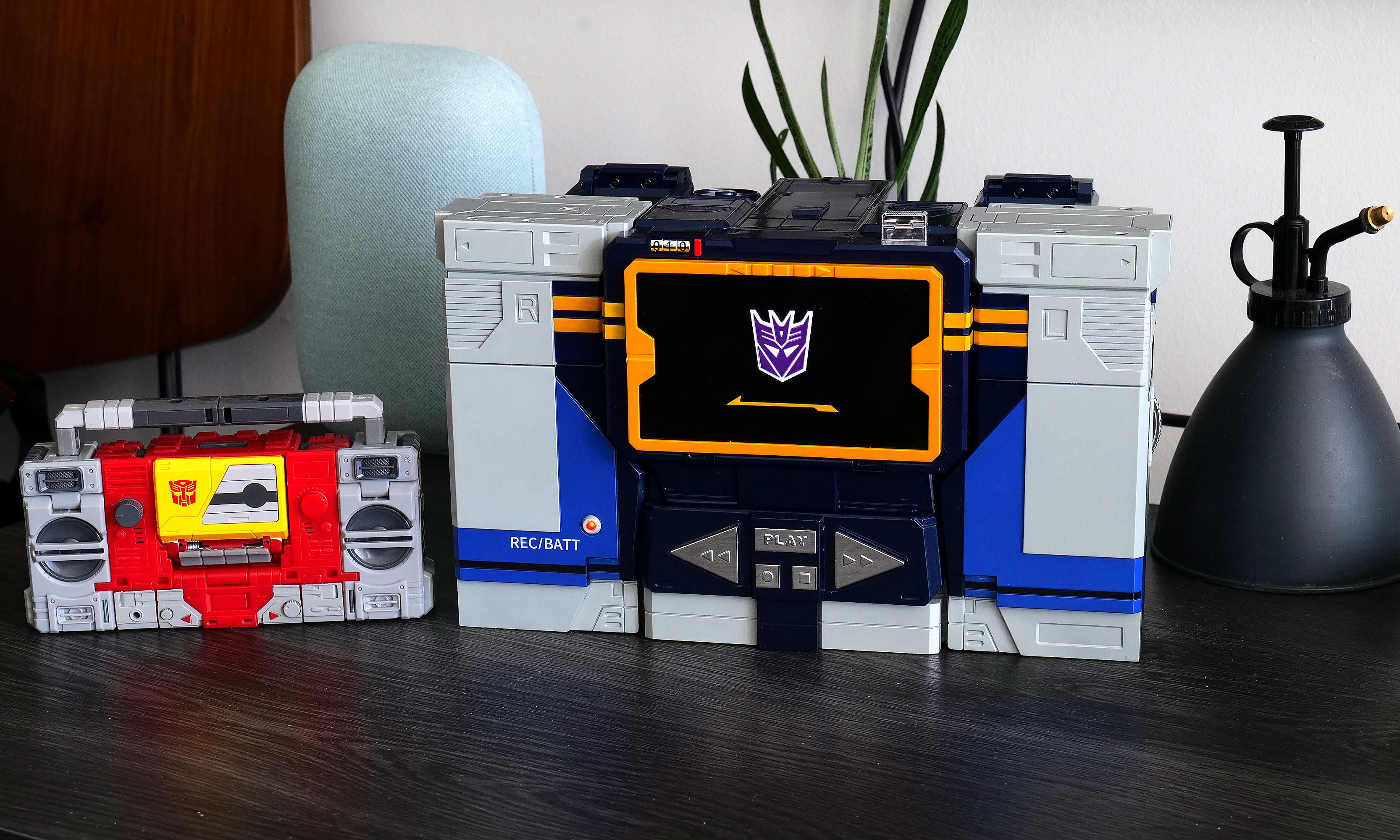
As a follow-up to previous bots featuring Optimus Prime, Megatron, Bumblebee, Grimlock and others, Soundwave was a superior choice, and Robosen has done a more than respectable job of bringing him to life. Not only can he spit out classic lines performed by original voice actor Frank Welker, both his robot and alt modes are a vision straight out of the first-generation (G1) cartoon. Everywhere you look, there are a ton of lovingly crafted details like the working eject button for the cassette slot and all sorts of lights. Robosen's head sculpt is spot on, and it even includes additional LEDs for his eyes and shoulder cannon. Granted, there is a bit of kibble (aka what fans call out of place parts leftover from transformation), like hands that don't properly fold away when Soundwave turns into a boombox, but that's really nitpicking. Between his incredibly accurate design, vocoder-powered vocals and an imposing stature that stands at around 14 inches tall, there's no way you can call this rendition of Soundwave uncharismatic.
However, the real magic happens when you turn him on (there's a little button on his back) and say "Hey, Soundwave." From here, you can use more than 50 different voice commands to boss him around like you're the leader of the Decepticons. This includes asking him to say iconic lines, respond to an Autobot attack or just wishing someone a happy birthday. Naturally, the most impressive request is asking him to transform, at which point 28 high-precision servo motors and multiple motion sensors coordinate. This allows Soundwave to convert from boombox mode to robot and back again, complete with the required sound effects. Even as a jaded adult, there's still something incredibly enchanting about watching a Transformer actually transform on its own. But that pales in comparison to the one-of-a-kind reaction my four-year-old son gave me when I repeated the process for him. There was a joy in his face I'm not sure a grown-up can truly express, as he gets to experience this without knowing this bot costs a cool $1,400.
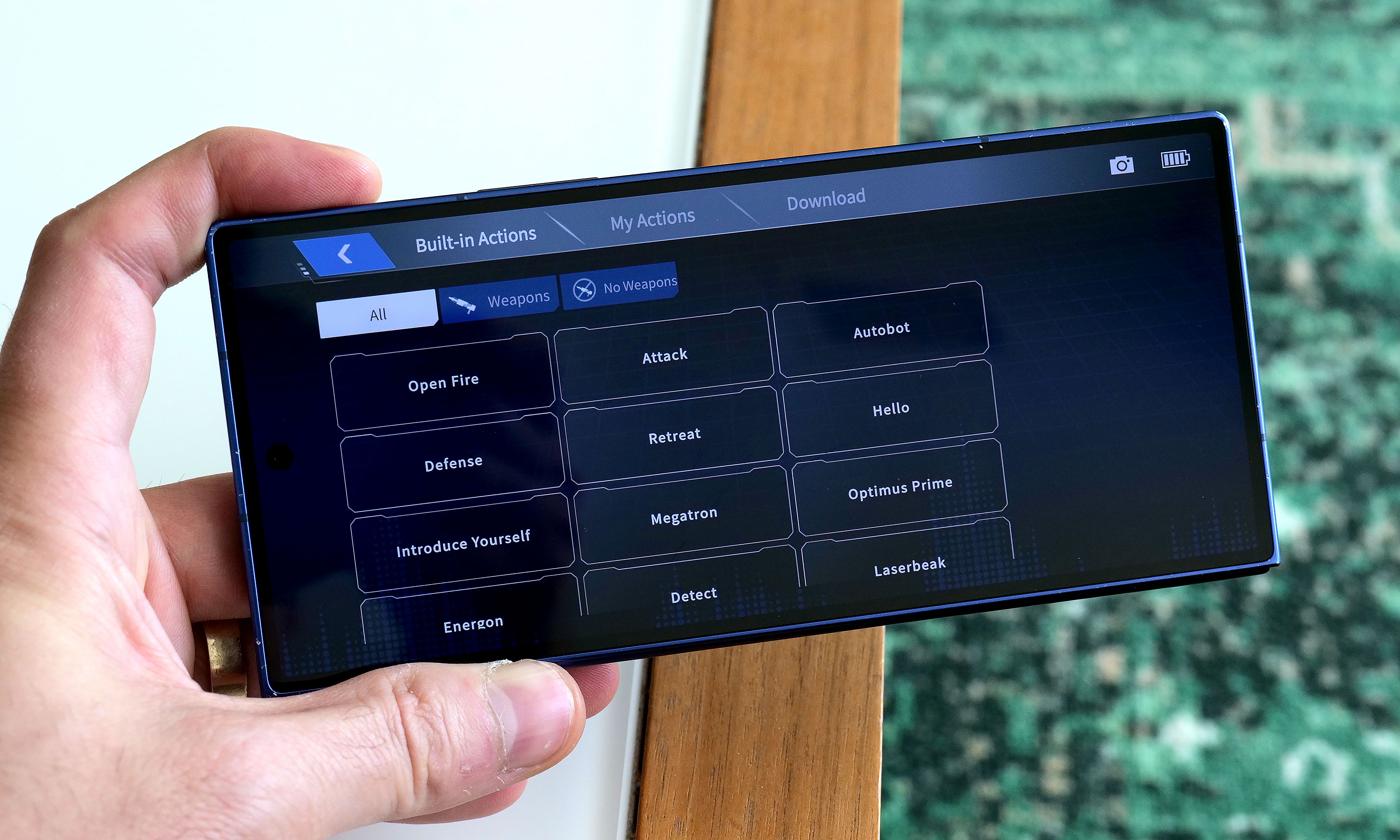
While testing Soundwave's various commands, I did notice that his voice recognition can be somewhat hit or miss. I found that even a little background noise can cause issues. To be consistently heard, you have to speak louder than you think you should. The real key is being very deliberate with a sharp "Hi" or "Hey" to activate Soundwave's wake phrase properly. Alternatively, if you prefer not to yell at your robots, there's also a free companion app that allows you to send commands by simply pressing a button, which was super easy to set up and quickly became my preferred control scheme.
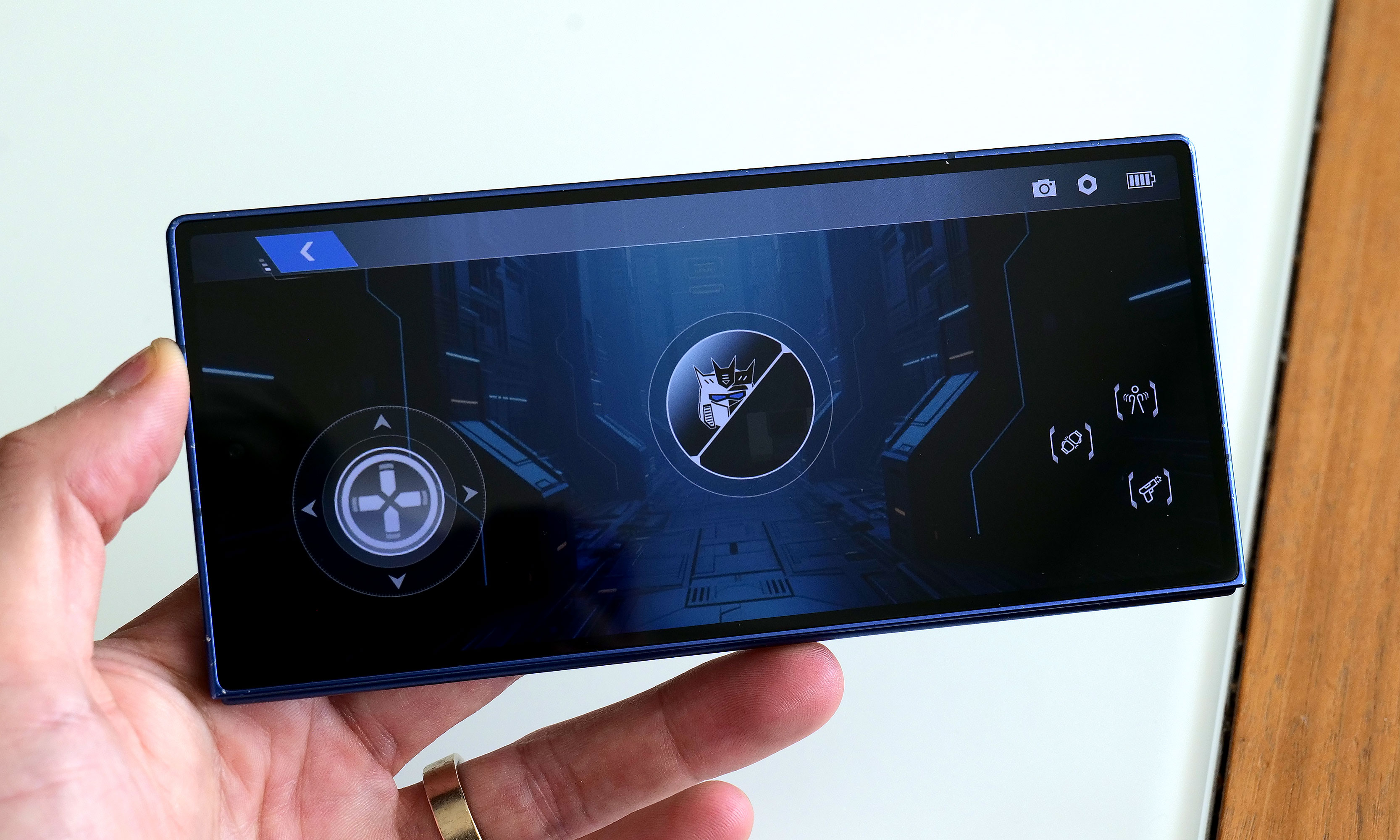
In addition to making it easier to get Soundwave to walk around (it's much more fun to use a virtual D-pad than yell "Walk forward" all the time), the app also provides a more straightforward way of discovering what he can do while reducing the ambiguity of voice commands. There are handy buttons for all his voice lines and poses, plus there’s a toolkit for creating some of your own. You can also download more from the app, though there weren't any for me to test out because Soundwave wasn't officially out yet at the time of writing. There's even a Mini Theatre mode that allows the bot to perform short skits, and if you're lucky enough to own some of Robosen's other Transformers toys, like Megatron, some of these scenes can even be performed in tandem.
One awkward thing about Roboen's more sophisticated approach to toy robots is that Soundwave loses some of his structural integrity when his motors are off. For example, when you power him down in robot mode, he bends over backwards and gets stuck halfway between his humanoid and boombox forms. I assume this is to prevent him from falling over, which is a good thing; it just looks kind of weird. On the flip side, if you pick him up while in stereo mode, his limbs tend to droop. However, perhaps the biggest downside to Soundwave is one inherent to his design. Because his alt mode is a boombox instead of a vehicle like Optimus, Bumblebee and others, he can't pull double duty as a remote control car. But what Soundwave lacks in mobility, he makes up for with his signature acoustic skills.
Audio: Not just a bot, he's a real boombox too
Soundwave turning into a boombox that can't play music just wouldn't make sense. Thankfully, that's not an issue as this bot's buttons aren't just for show. Hitting Play lets you listen to original tracks from the G1 cartoon, complete with the ability to pause or skip to the next track. You can also hold the record button to save a personal message for later, though I found this feature has a bit of a learning curve as Soundwave tends to cut out one or two seconds from the beginning and end of a clip.
Most importantly, if you want Soundwave to play other tunes, you can pair it with your phone or pretty much any other mobile device and use him just like a typical Bluetooth speaker. Now it probably won't be a surprise when I say that Soundwave's audio quality is mediocre at best. With all the various sensors, motors and moving parts, there probably isn't a ton of room for fancy drivers, so things sound tinny and flat. But in a way, that's kind of endearing because the vast majority of portable speakers back in the 80s didn't sound great either. The one thing I wish Robosen had included was a proper cassette player to really capitalize on Soundwave's classic audio capabilities. That said, even though I still have stacks of CDs and DVDs in my house, I don't have any tapes (despite their resurgence), so I get why that feature didn't make it.
Battery life
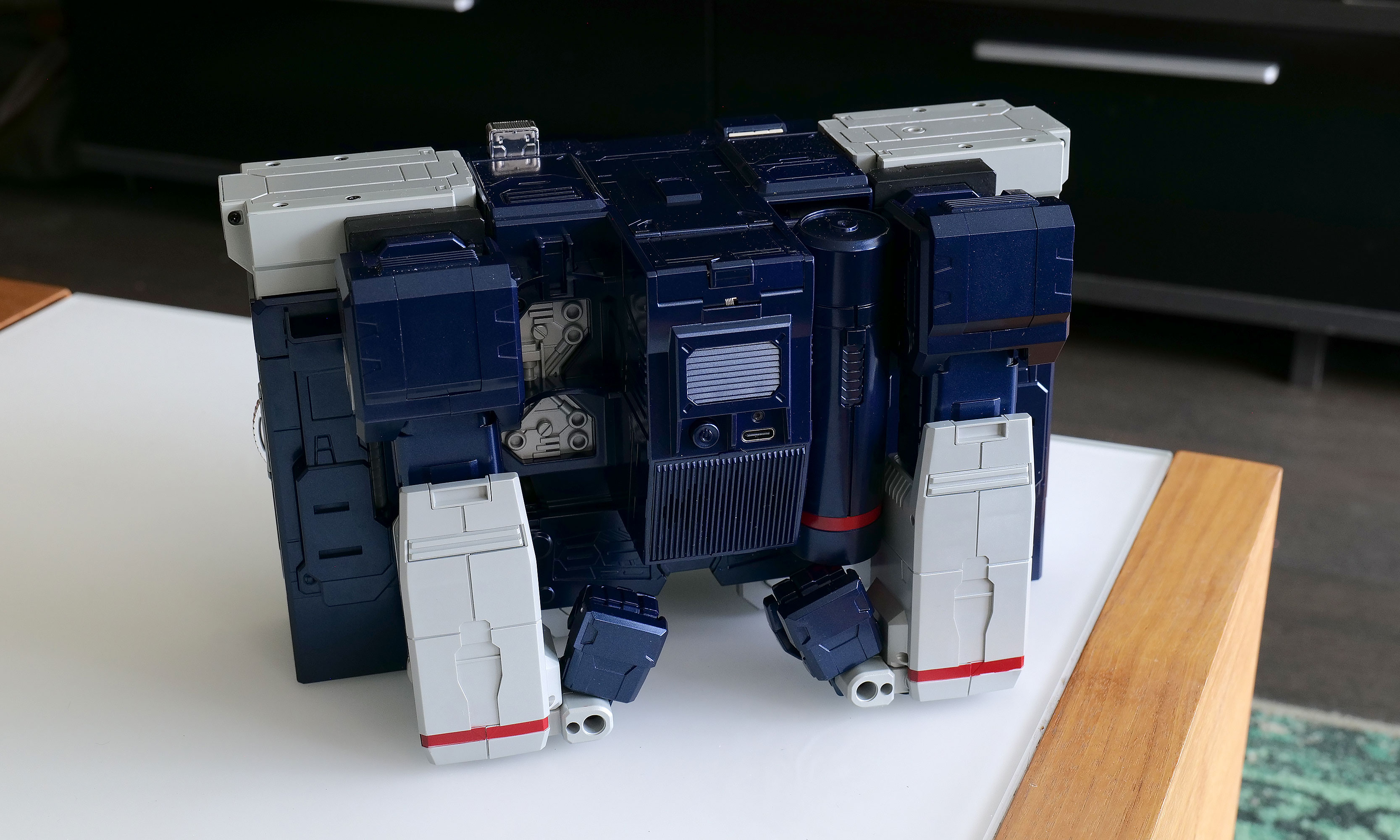
Soundwave comes with a built-in 1,650mAh battery which takes about 120 minutes to charge from dead to full while offering a standby time of around 60 minutes. During my testing, I found you can get a solid 20 to 30 minutes of playtime out of him, which felt like plenty. Of course,that depends a ton on how much moving around you tell him to do. And while it certainly isn't period authentic, I really appreciate the inclusion of a USB-C port for charging.
Wrap-up
The funny thing about Robosen's Soundwave is that a toy like this would have been priceless to me as a child. But now that I'm older and I have to attach a value that goes beyond its basic price, things are a lot trickier.
I love Robosen's attention to detail. The figure looks incredible and getting voice lines from the original actor shows there's more than meets the eye to the robot’s design. But most importantly, seeing Soundwave transform on his own and stomp around like he does in the show will never get old.
On the other hand, $1,400 can buy the whole family a nice three-day vacation or more than two dozen regular Transformers toys. That kind of math makes it difficult to add this Cybertronian to the household register. But for anyone who has a budget similar to a Michael Bay movie, this take on Soundwave really does feel like a dream come true. Aside from some of Robosen's other products, this robot is certainly made of sterner stuff.
This article originally appeared on Engadget at https://www.engadget.com/general/robosen-soundwave-review-a-childhood-dream-made-real-120000804.html?src=rss