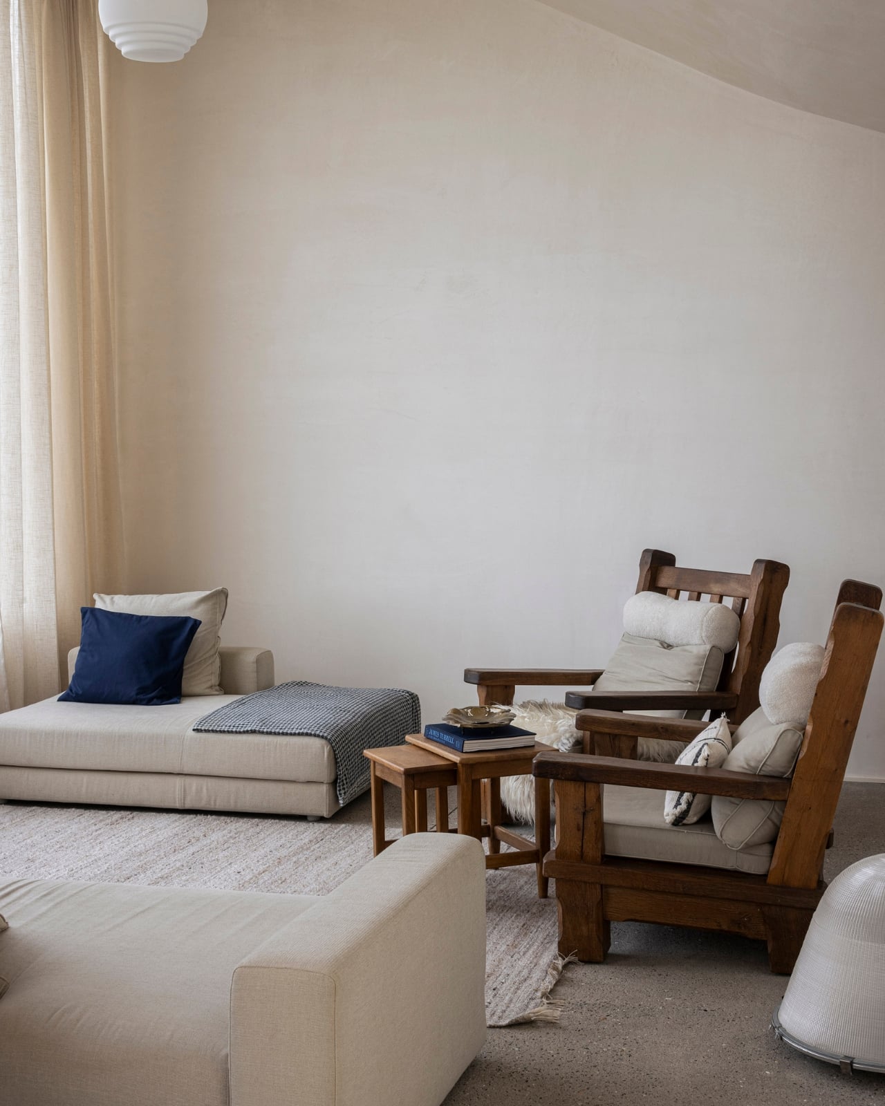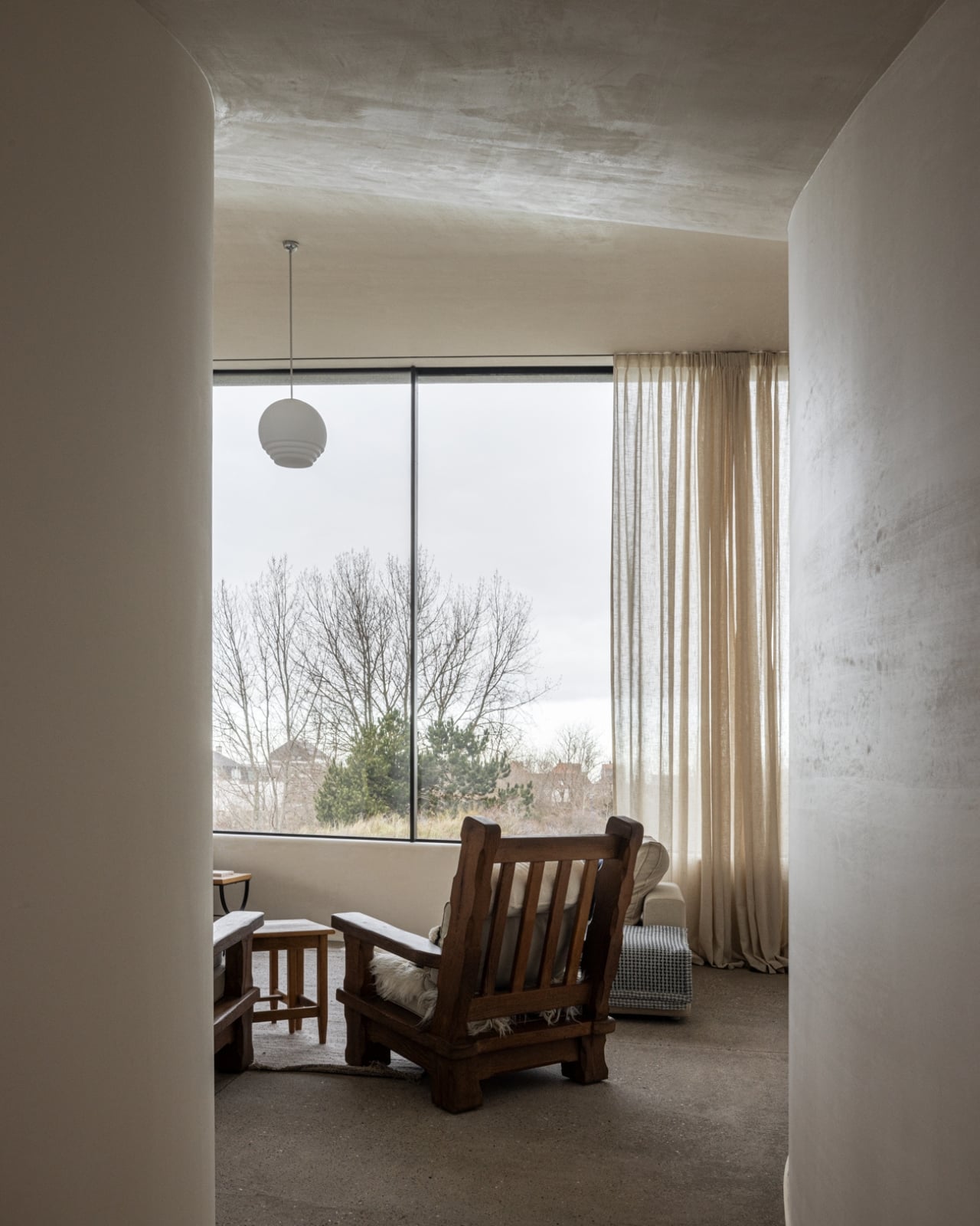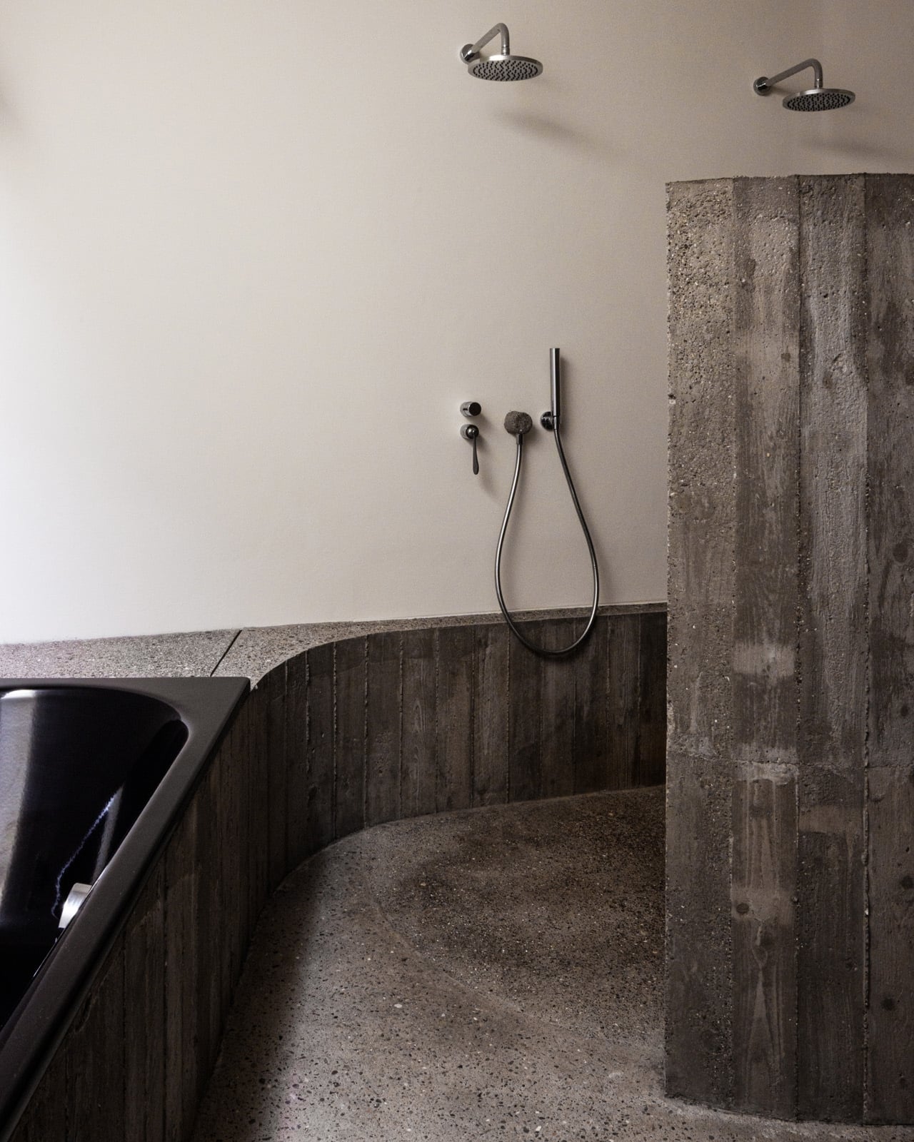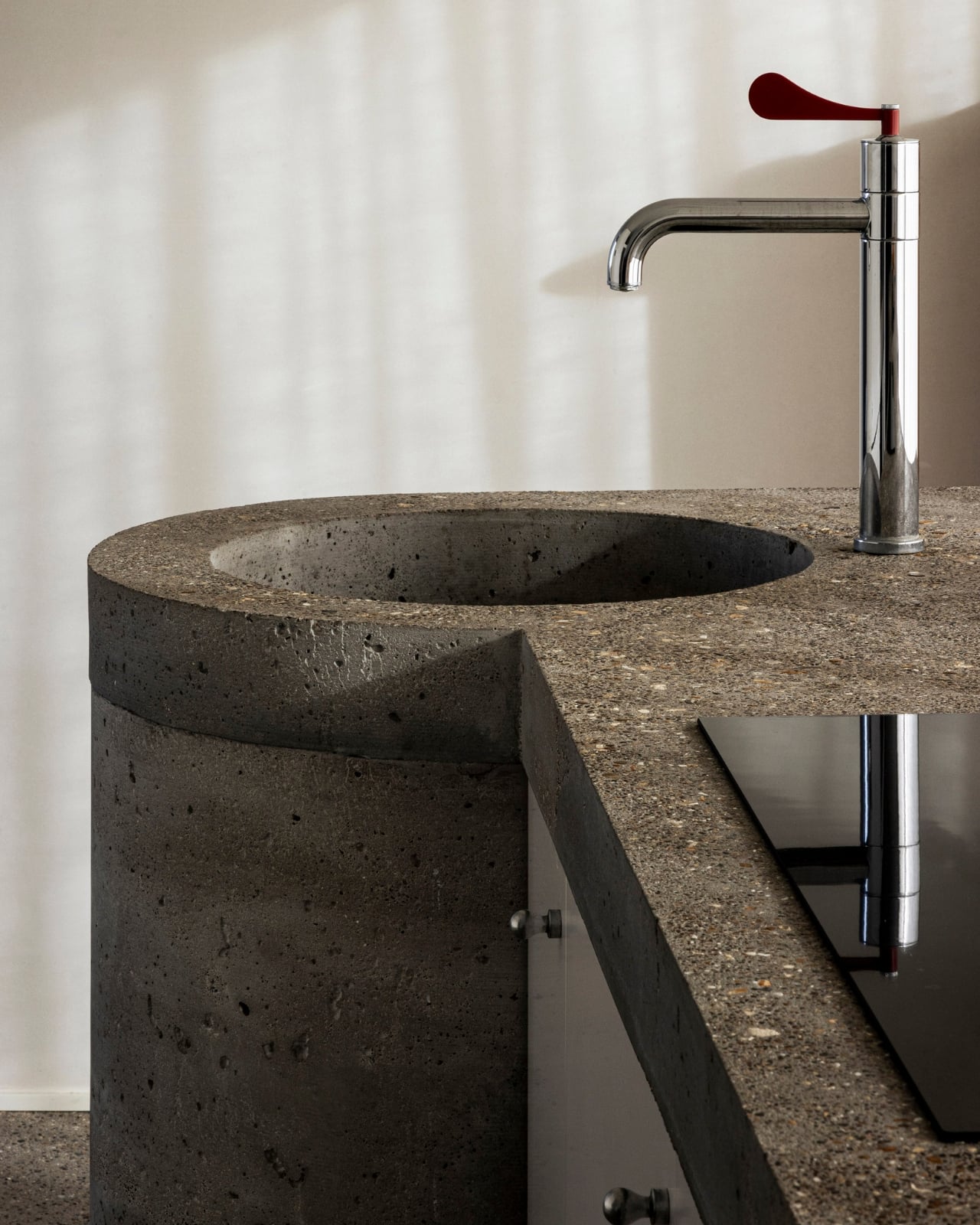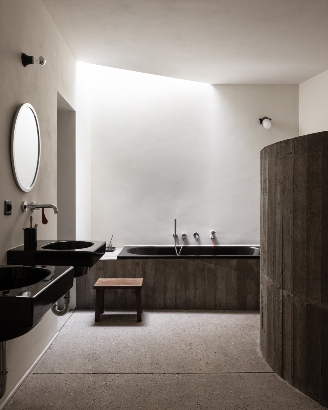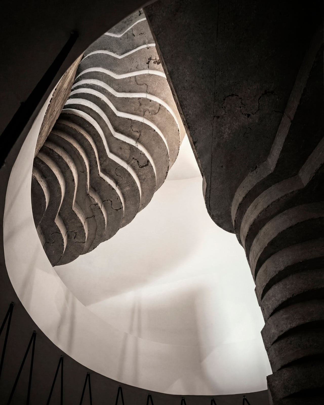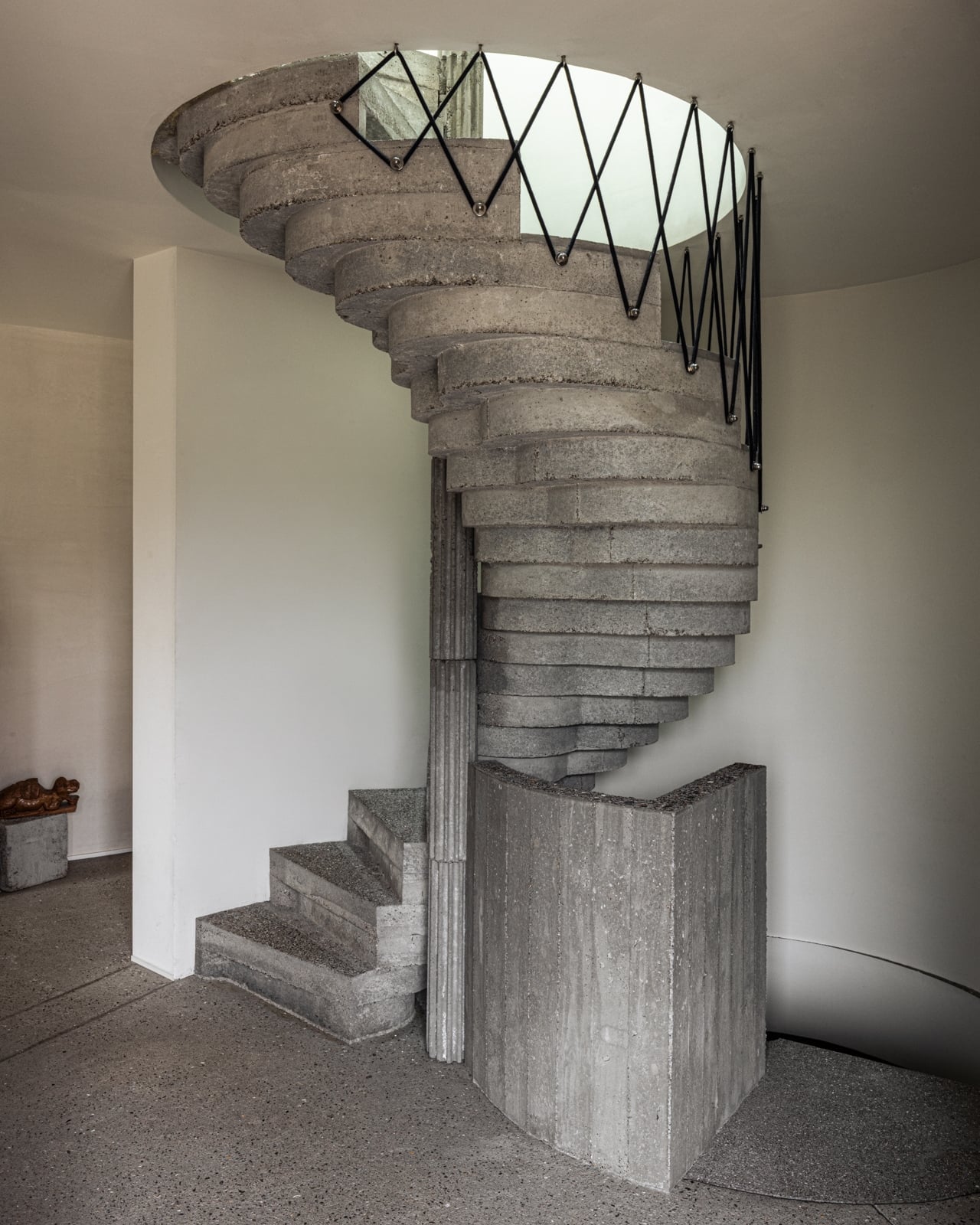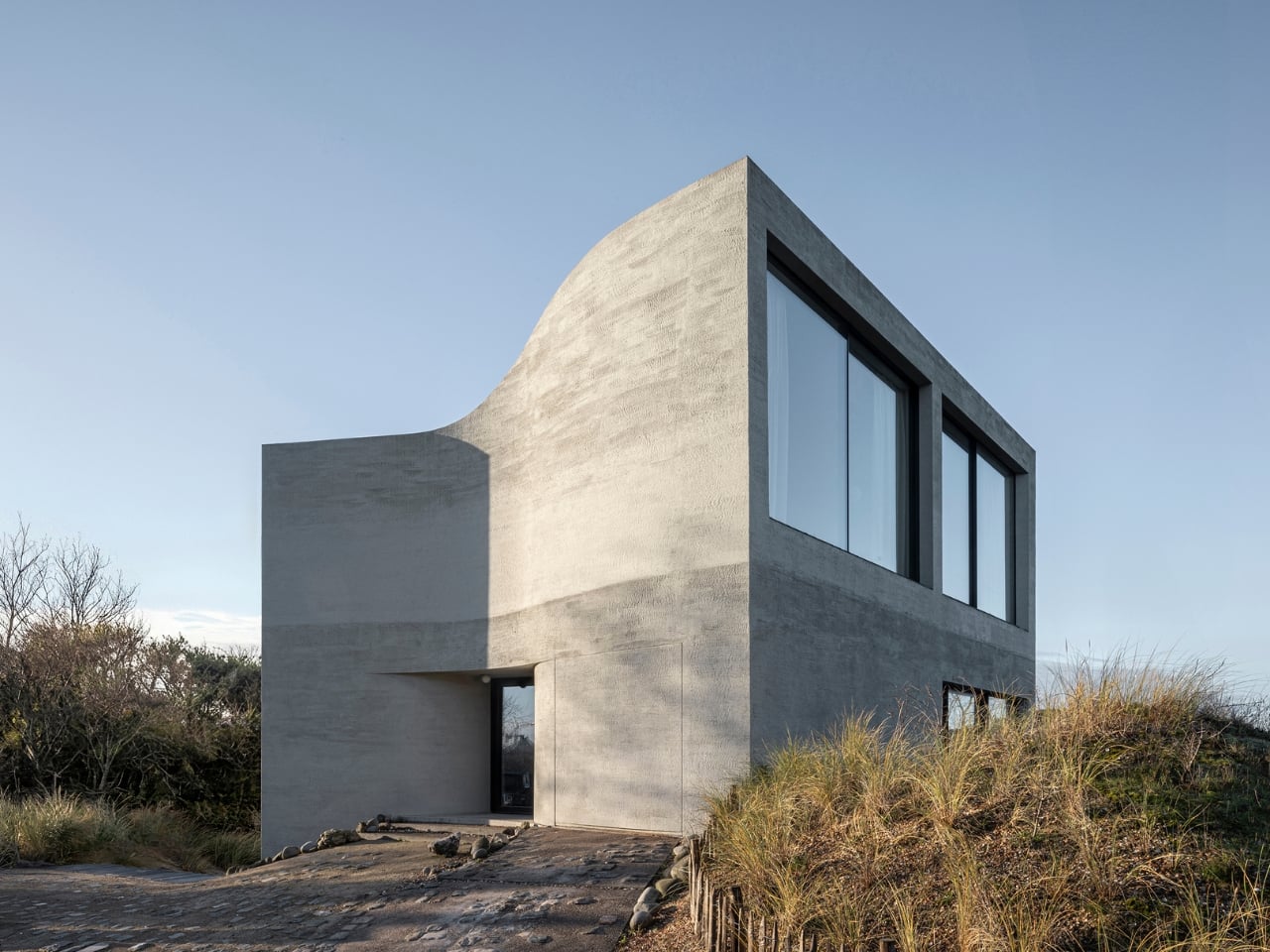
A 35m² Summerhouse Designed Like a Space Habitat

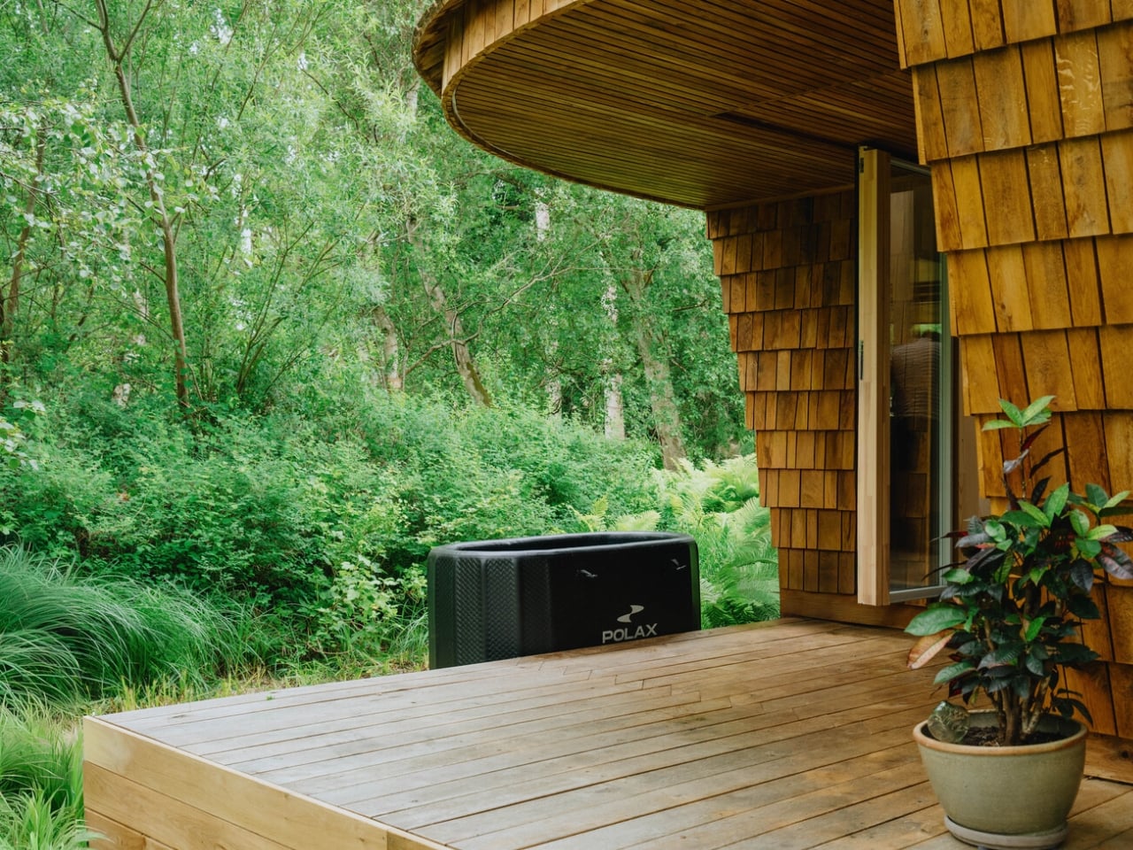
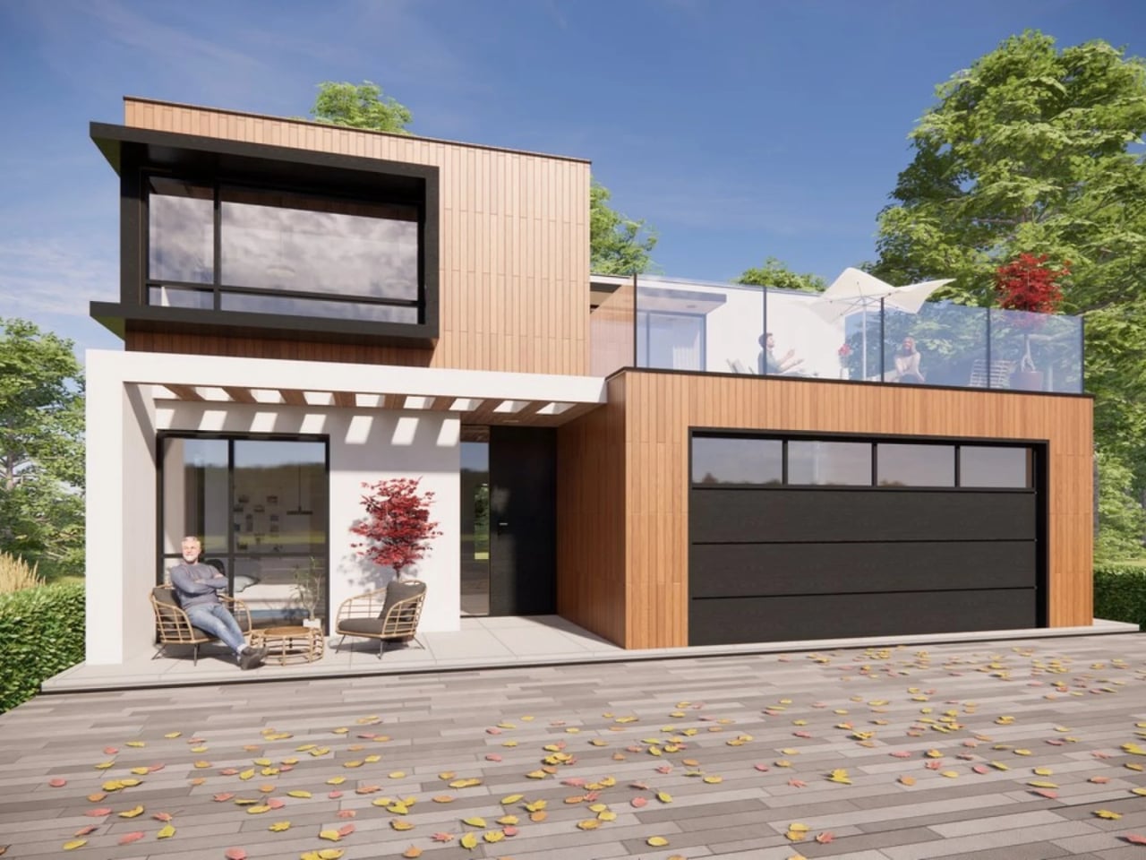
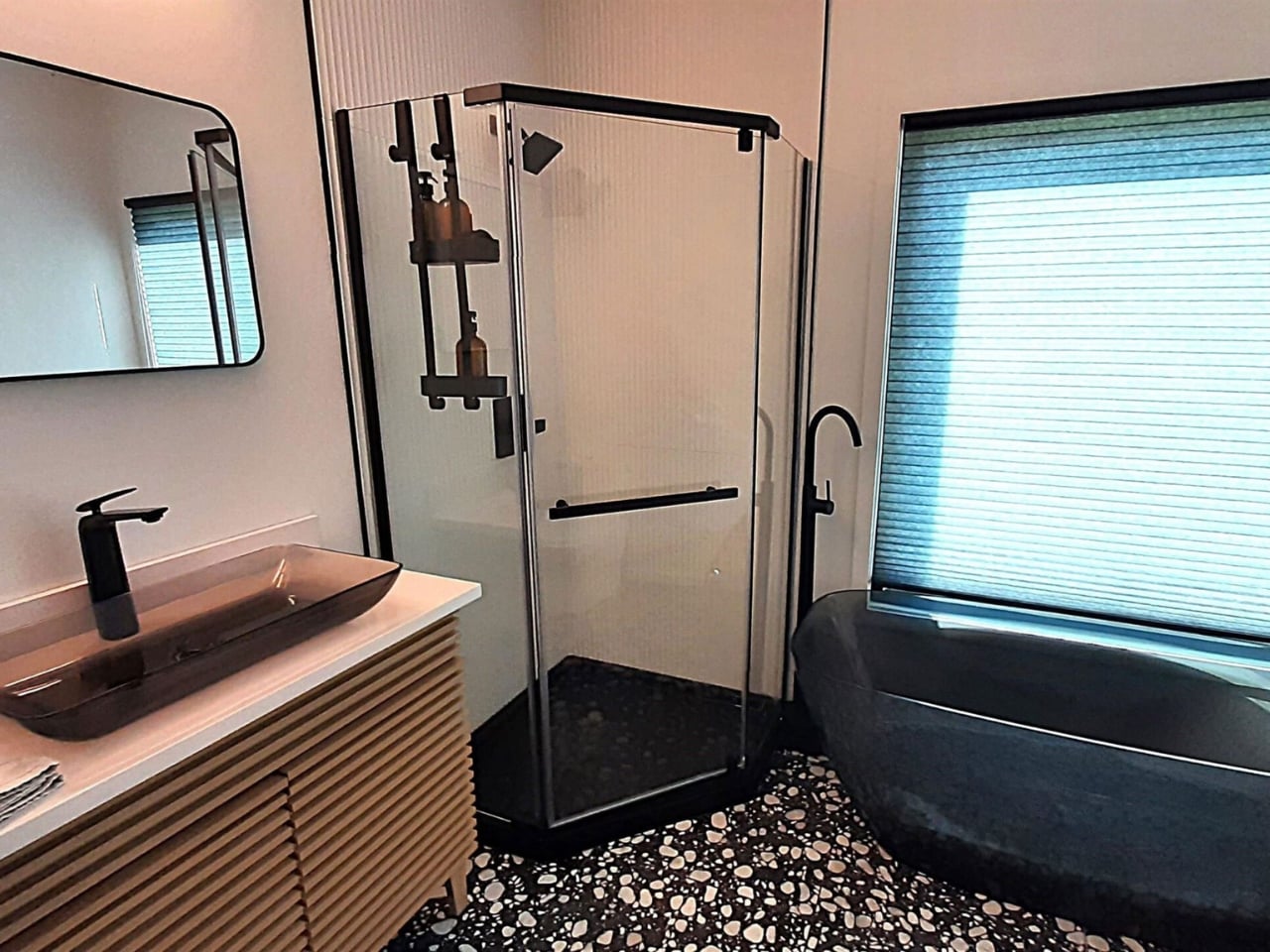
Most summerhouses don’t start as thought experiments about the moon. EcoNeo did. Designed by SAGA Space Architects and sitting quietly in Asnæs on the Danish island of Zealand, it measures just 35 square meters and sleeps a family of six. It also has an indoor sauna. The fact that all of this coexists within a space roughly the size of a large studio apartment says everything about what SAGA is doing differently. This is a house designed by people who take small spaces very, very seriously.

SAGA Space Architects was founded in 2018 by Danish architects Sebastian Aristotelis and Karl-Johan Sørensen, and their portfolio reads nothing like a traditional residential practice. These are the people behind LUNARK, a simulated lunar habitat tested during a 100-day expedition in Greenland. They also developed the Circadian Light system installed on the International Space Station and built FLEXHab, a habitat prototype for the European Space Agency. Their methodology is built around extreme-environment logic, where every centimeter, every kilogram, and every watt is a decision that matters. EcoNeo takes that same discipline and applies it to a Danish holiday home, and the result is genuinely worth paying attention to.

Designer: SAGA Space Architects
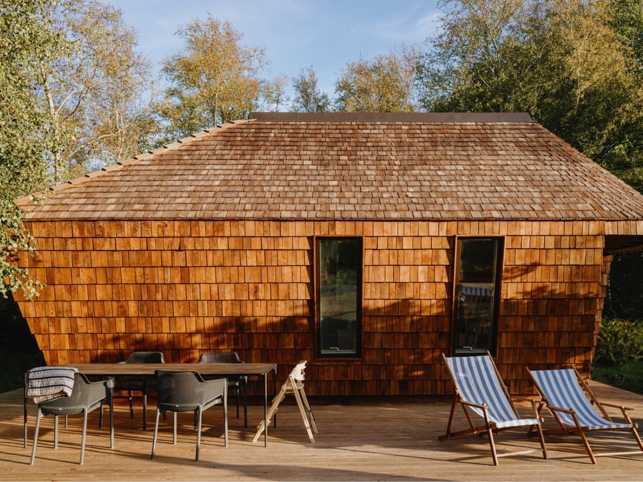
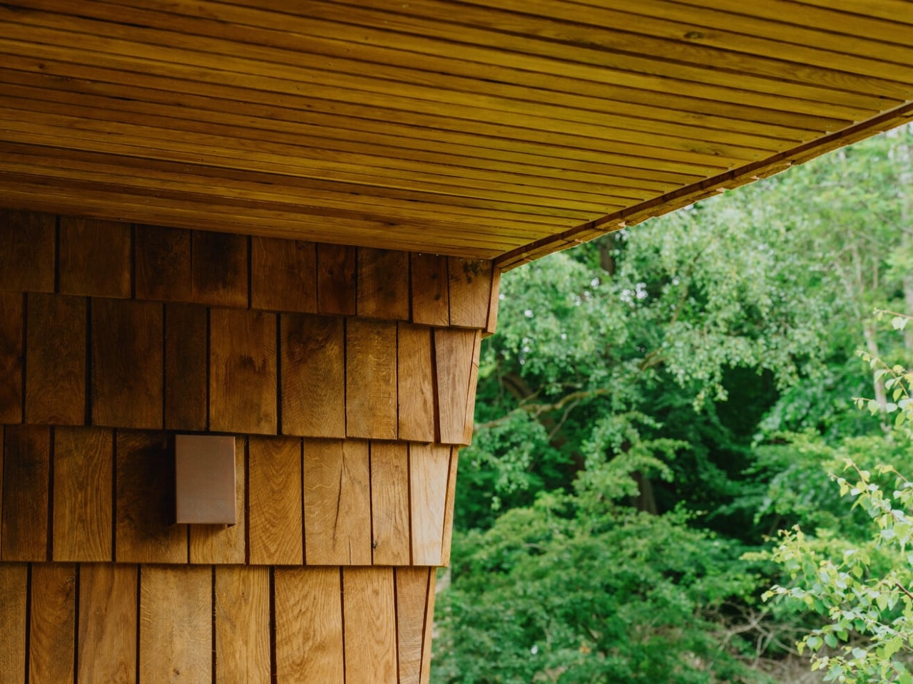
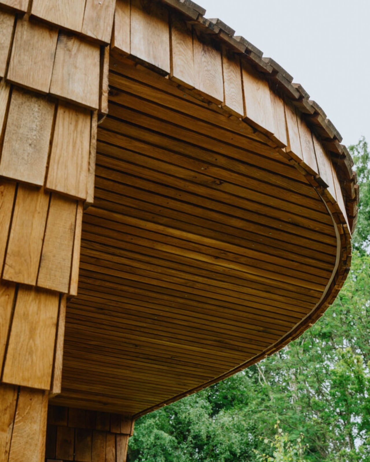
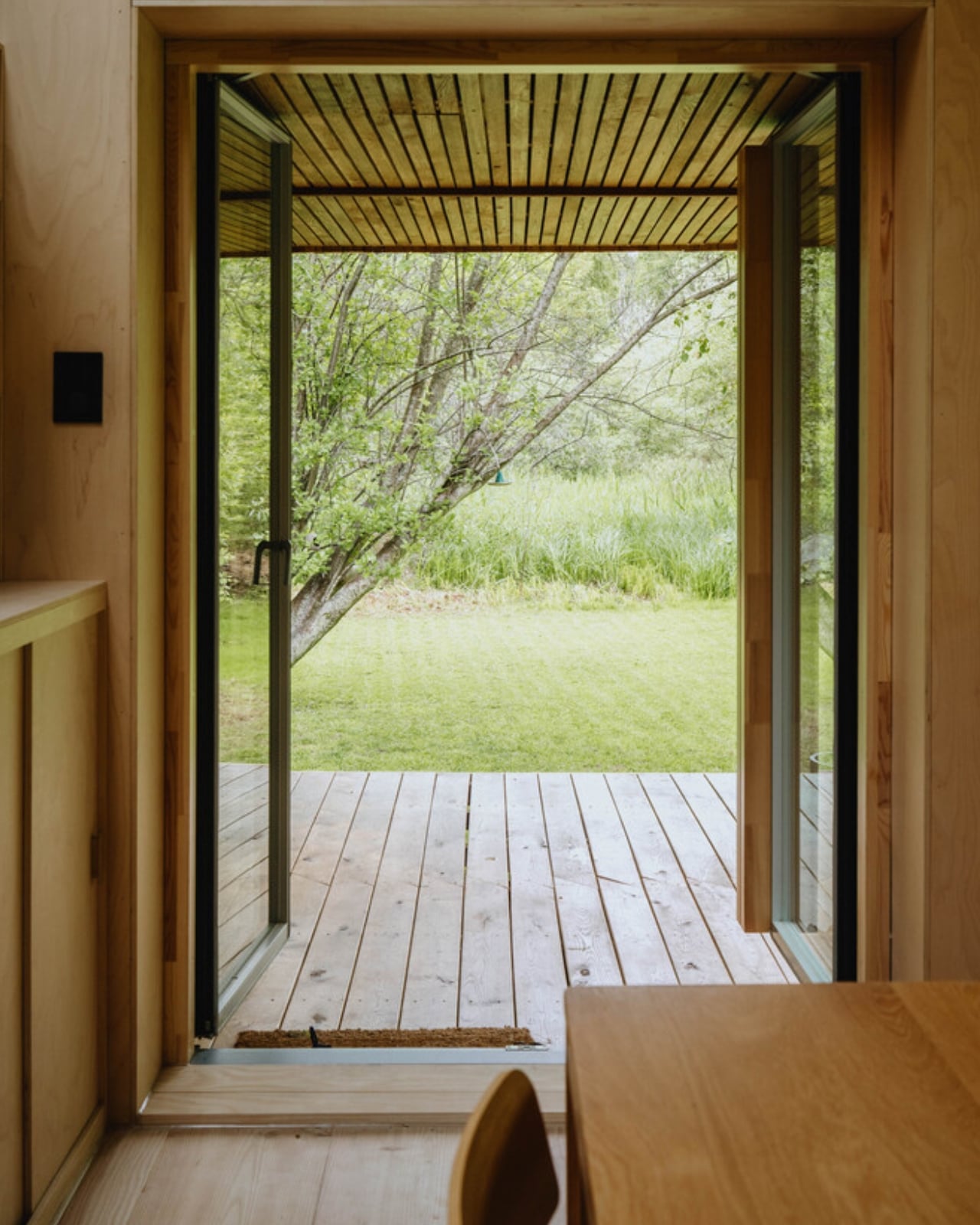
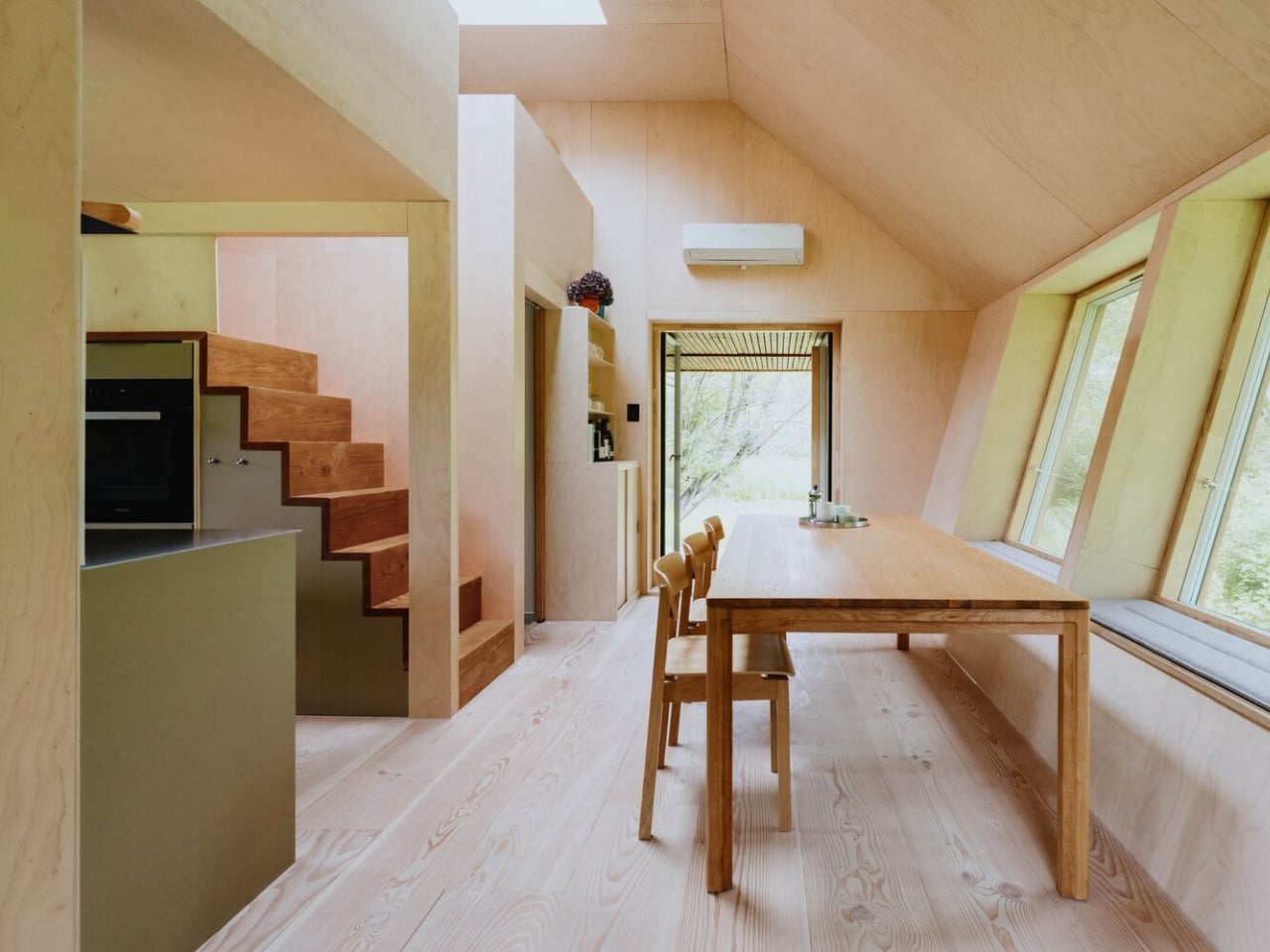
The studio calls its approach “Terra-Tech,” a marriage of technical precision and material awareness that keeps the design grounded in lived experience rather than spectacle. EcoNeo is built from biogenic materials, including OSB panels, wood-fiber insulation, Douglas fir, oak, birch, and plywood, all chosen for their low environmental footprint and warm sensory quality. Digital fabrication shapes the structure with the kind of accuracy you don’t typically associate with a weekend retreat. The architects estimate EcoNeo reduces annual carbon emissions by roughly 80 percent compared to an average new Danish summerhouse. That is not a rounding error. That is a structural rethinking of what holiday architecture can be.
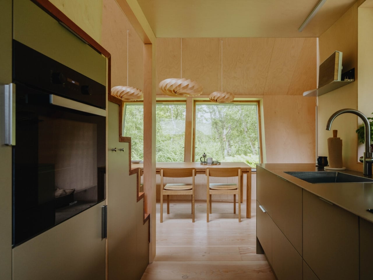
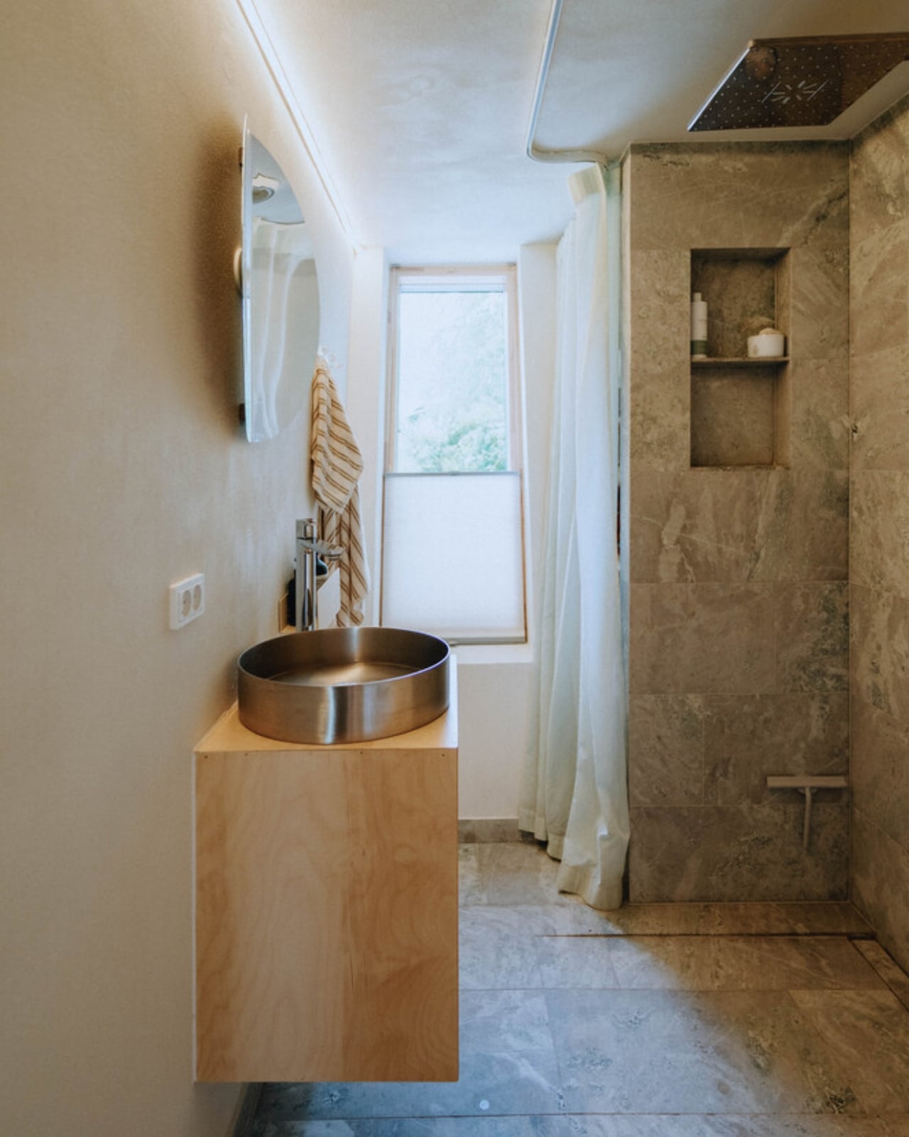
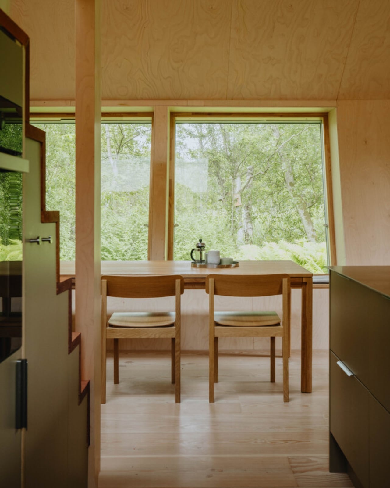
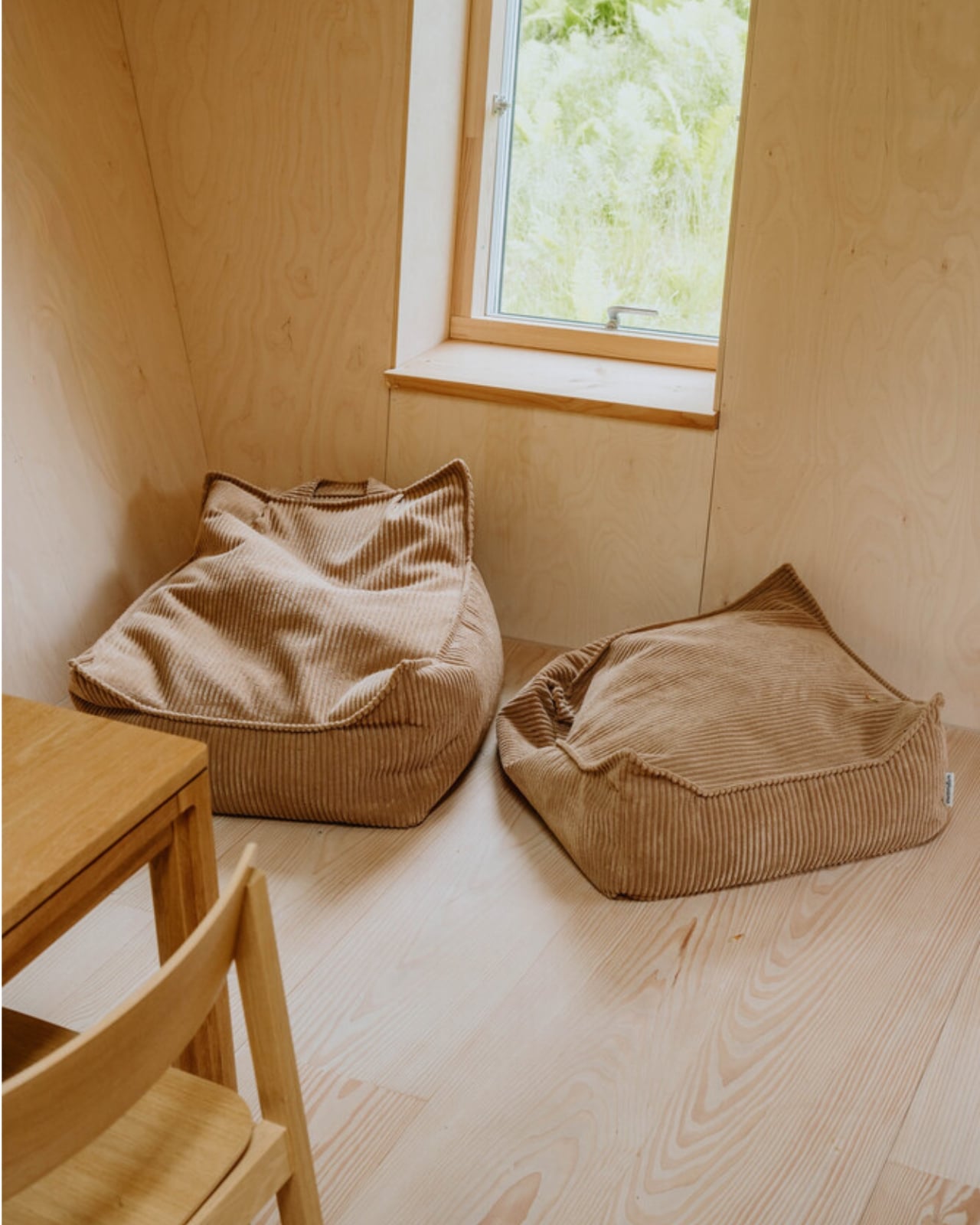
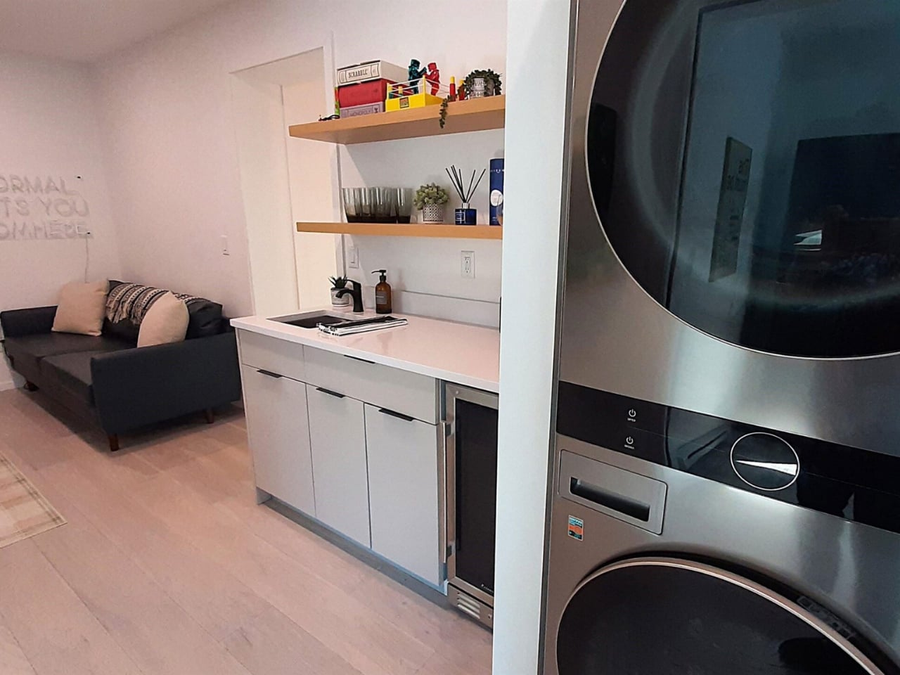
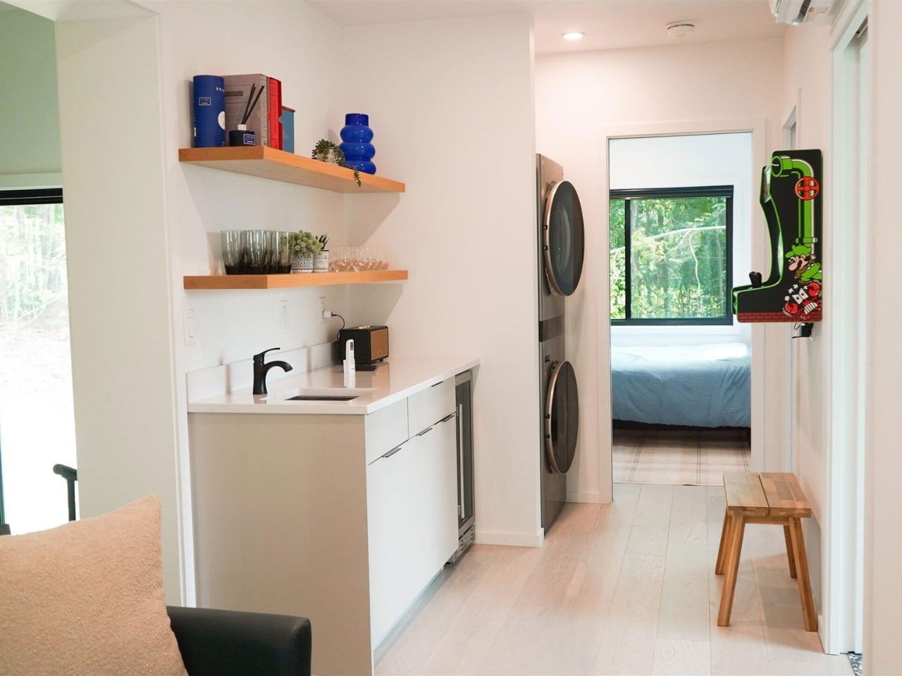
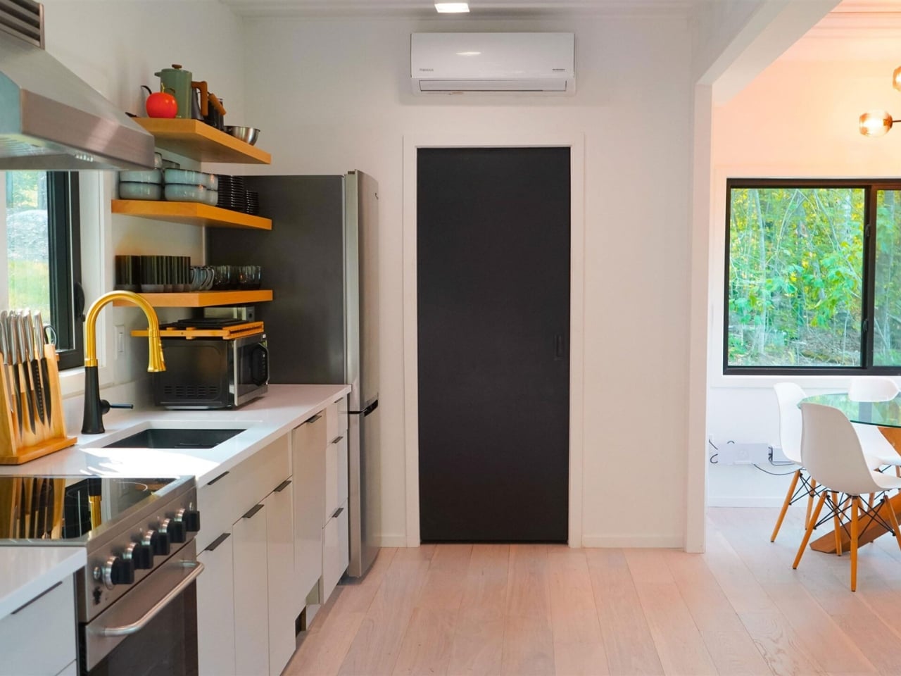
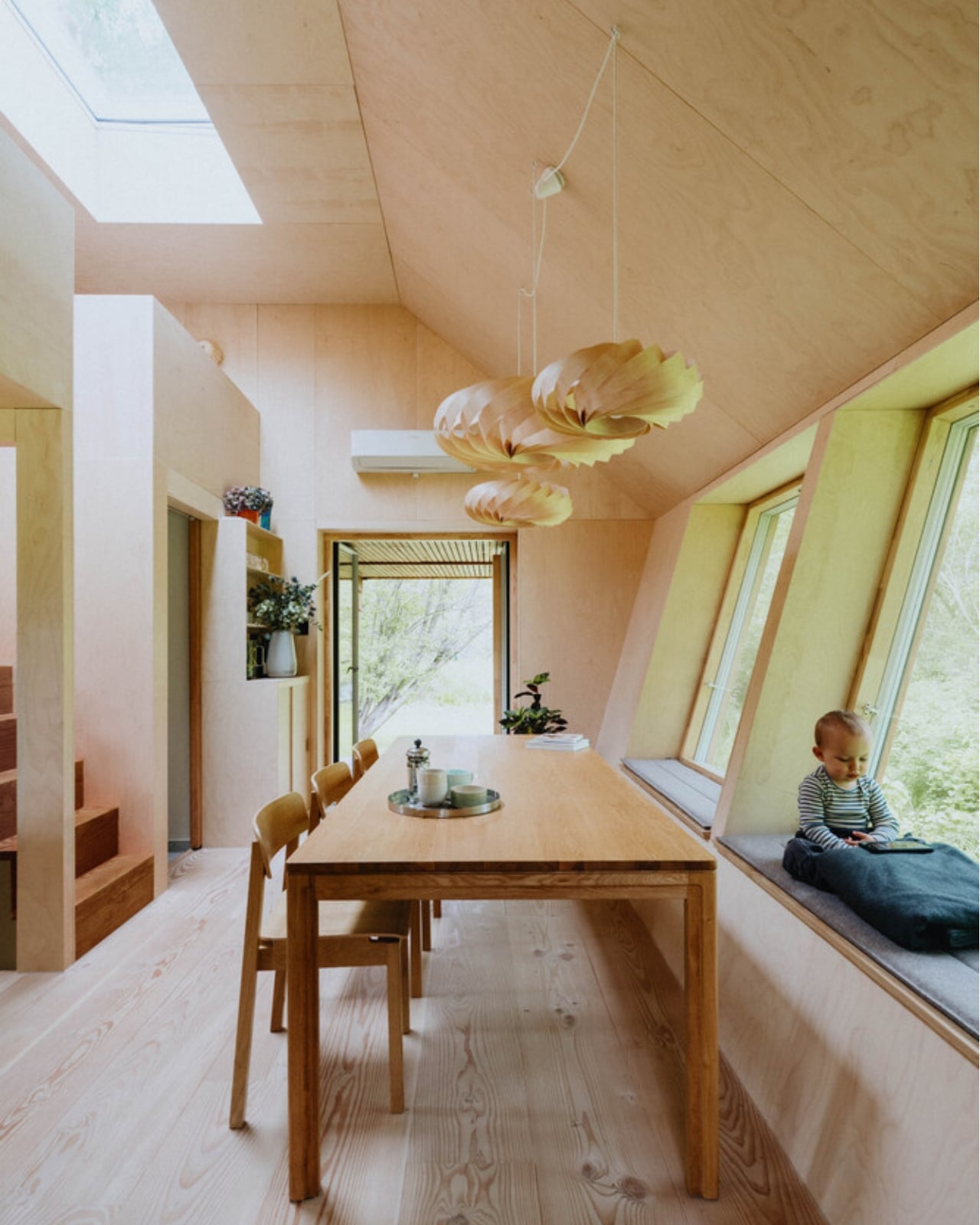
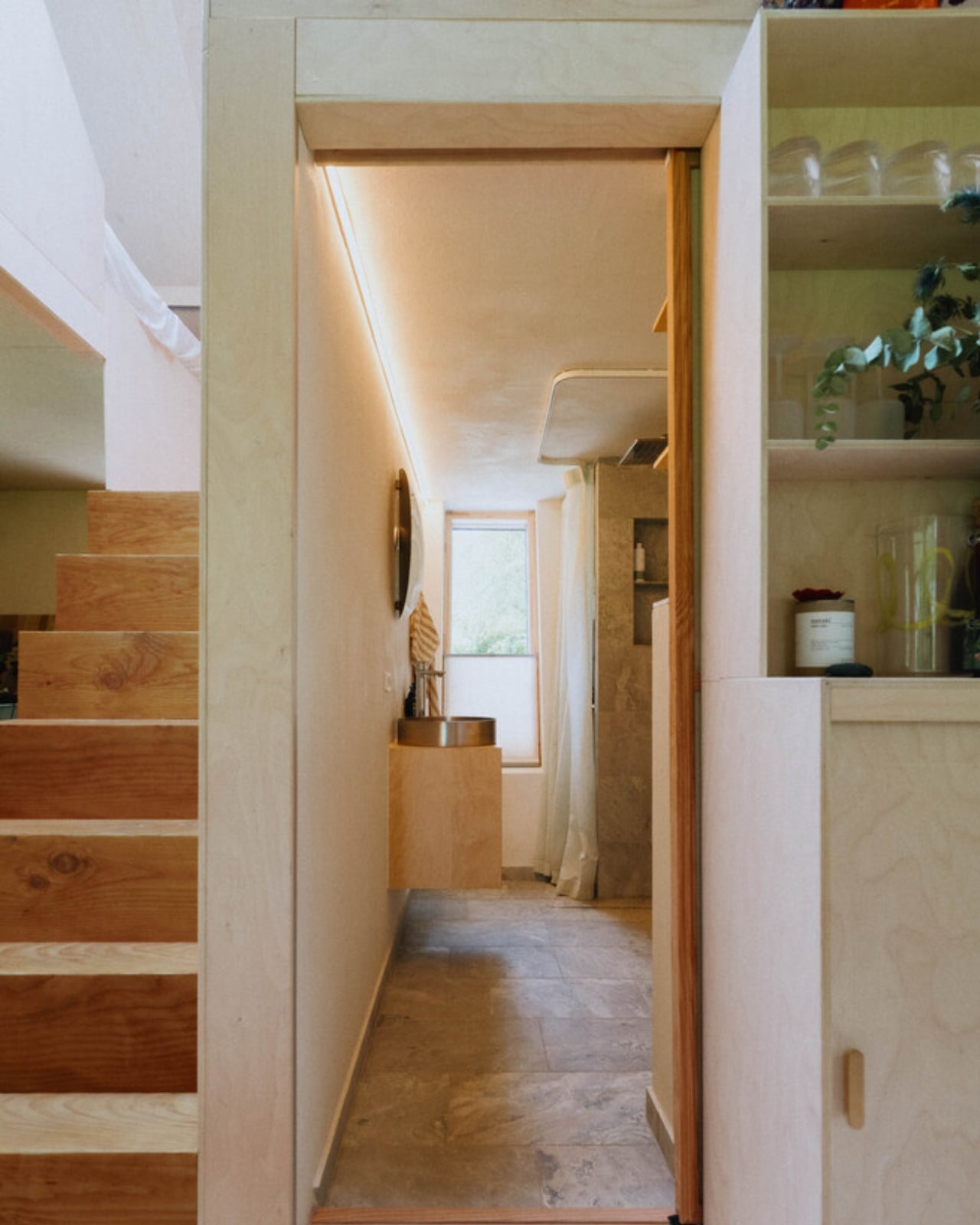
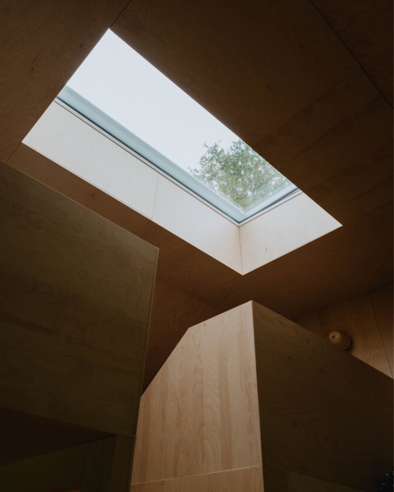
On the inside, the floor plan is organized around a central living space that works harder than most rooms twice its size. The ground floor brings together the kitchen, bathroom, integrated storage, the sauna, and a dining table that can seat the whole family. Upstairs, sleeping space is tucked in a way that feels considered rather than compromised. Every piece of the interior is designed to serve more than one purpose, because SAGA knows from its space habitat work that generosity of experience does not require generosity of space. You feel that difference the moment you look at the photographs. The rooms have a quietness to them, a sense that everything belongs exactly where it is.
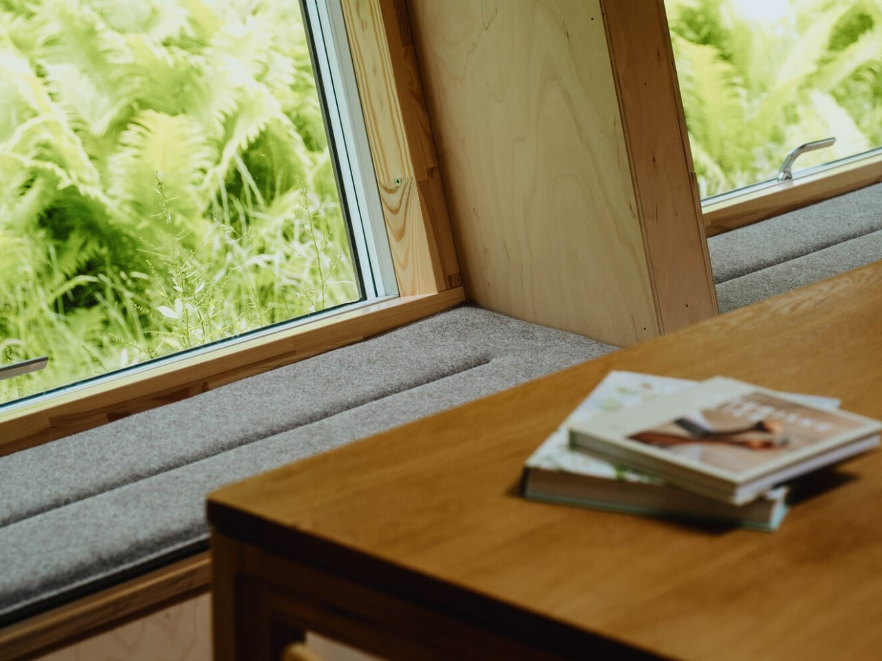
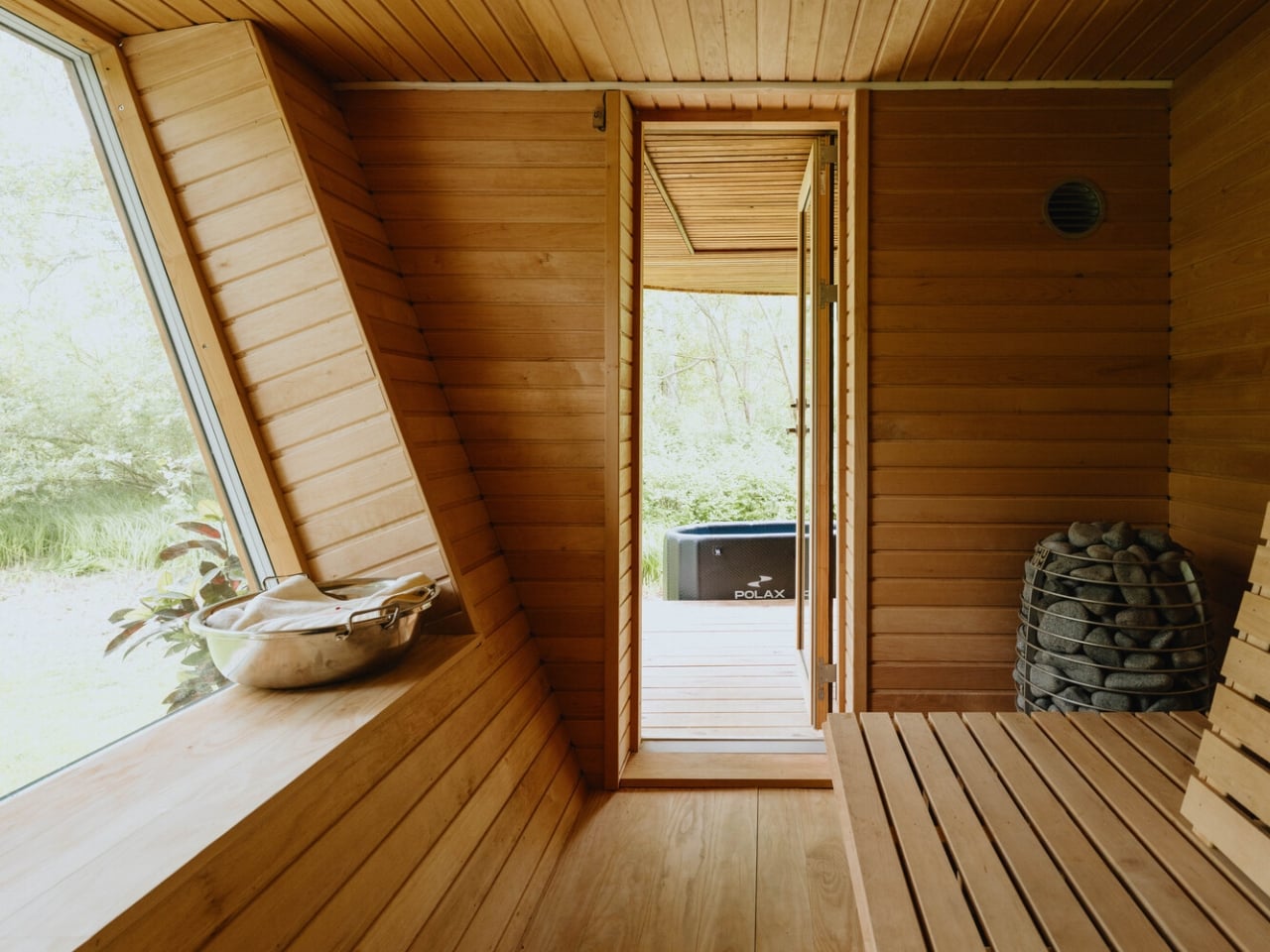
That, to me, is where EcoNeo gets genuinely interesting as a cultural object. The conversation around sustainable housing often leans into austerity, as though living with a lighter footprint requires accepting a diminished quality of life. EcoNeo makes the opposite argument without raising its voice. The house does not look like a sacrifice. It looks like a place people would actually want to spend a summer in, with its warm timber surfaces, considered proportions, and an undeniable calm that reads clearly even in photographs. Sustainability, when done right, does not ask you to give anything up. It asks you to think more carefully about what you actually need.
The collaborators list tells its own story: Velux, Dinesen, GROHE, Svane Køkkenet, Velfac, and ThermoCell, among others. These are not budget-line names. SAGA was not chasing a price point with EcoNeo. They were chasing a standard, and it shows in every decision, from the material palette to the fabrication method.
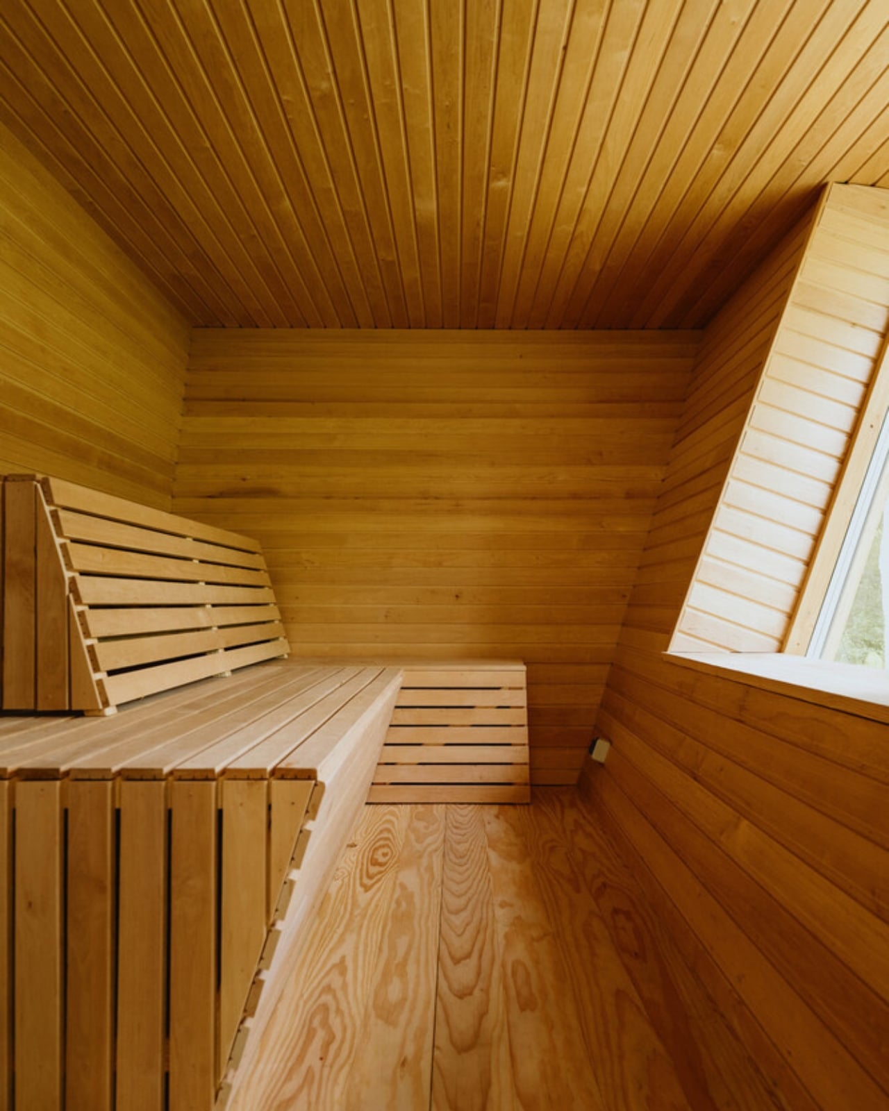
Whether EcoNeo becomes a scalable template for sustainable residential housing or remains a singular prototype is a question worth watching. The studio intends to develop it further for broader residential applications. Given their track record of designing for environments where there is genuinely no margin for error, I would take that intention seriously. EcoNeo is proof that the best ideas about how to live on Earth might just be the ones we developed while thinking about how to live somewhere else entirely.
The post A 35m² Summerhouse Designed Like a Space Habitat first appeared on Yanko Design.
The Floating House Built From Strangers’ Wishes

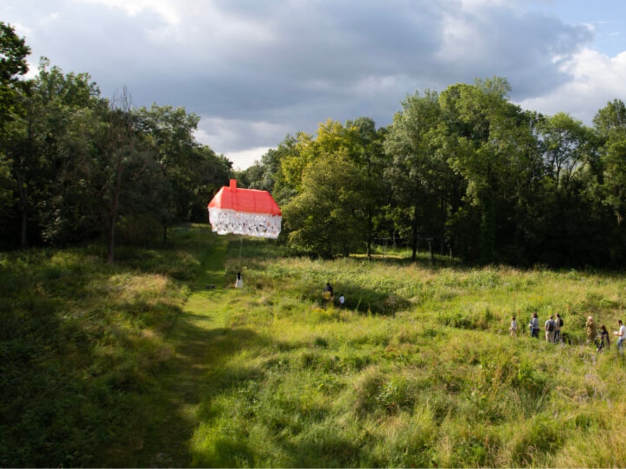
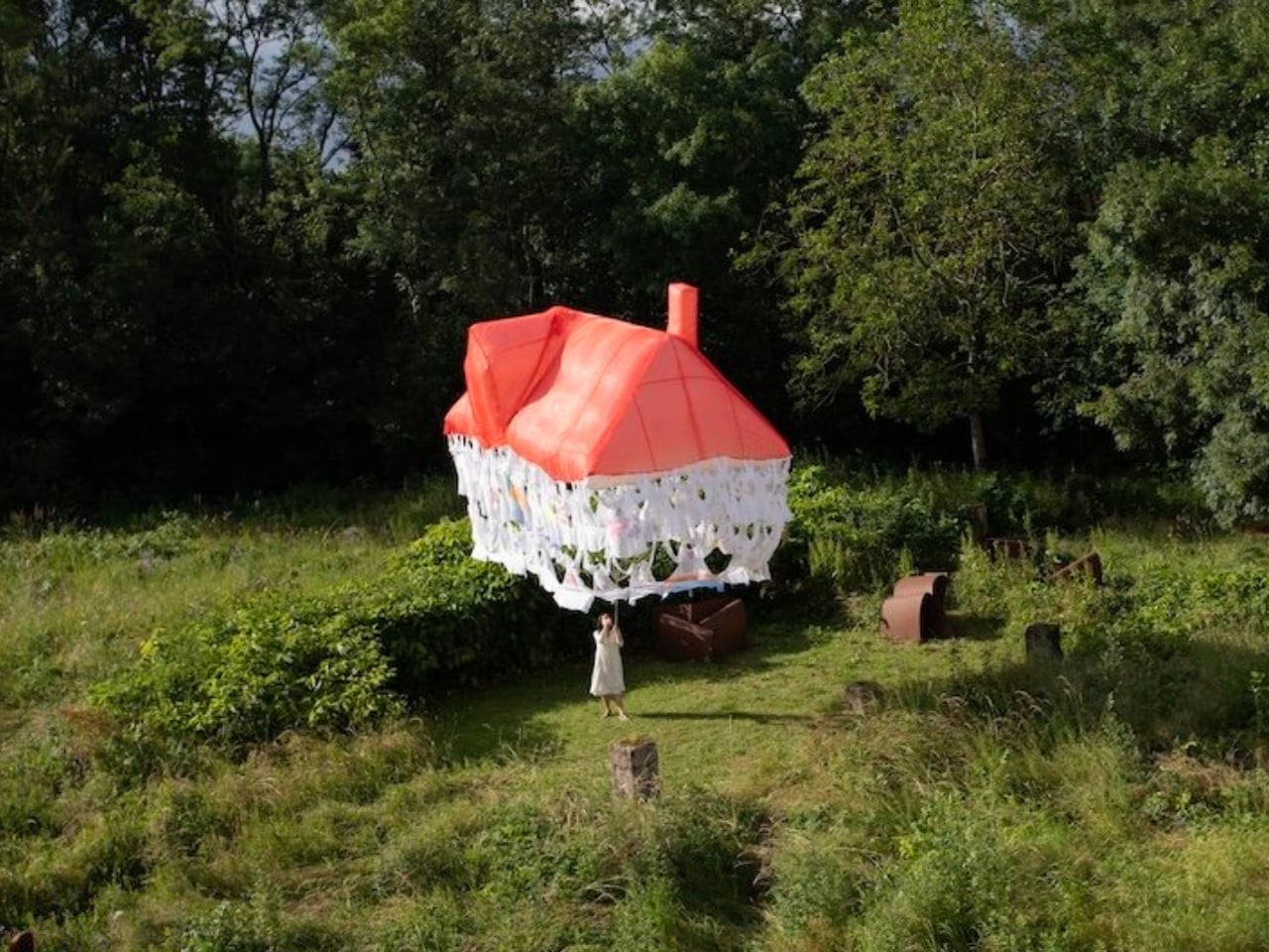
Most houses start with a blueprint. Jisoo Yoo’s Dream House started with a question: how do the dreams and desires we carry shape the landscape of the world we inhabit? The answer, it turns out, is a floating structure made of clothing.

Yoo, a Seoul-born artist who lives and works in France, has been quietly building one of the more compelling bodies of work in contemporary art, one that orbits around the domestic, the ephemeral, and the barely-visible structures that hold our lives together. Dream House, her latest installation presented at (F)ESTIVALES at Les Tanneries, Centre d’art contemporain, is exactly the kind of project that makes you stop and genuinely reconsider what a home actually is.

Designer: Jisoo Yoo

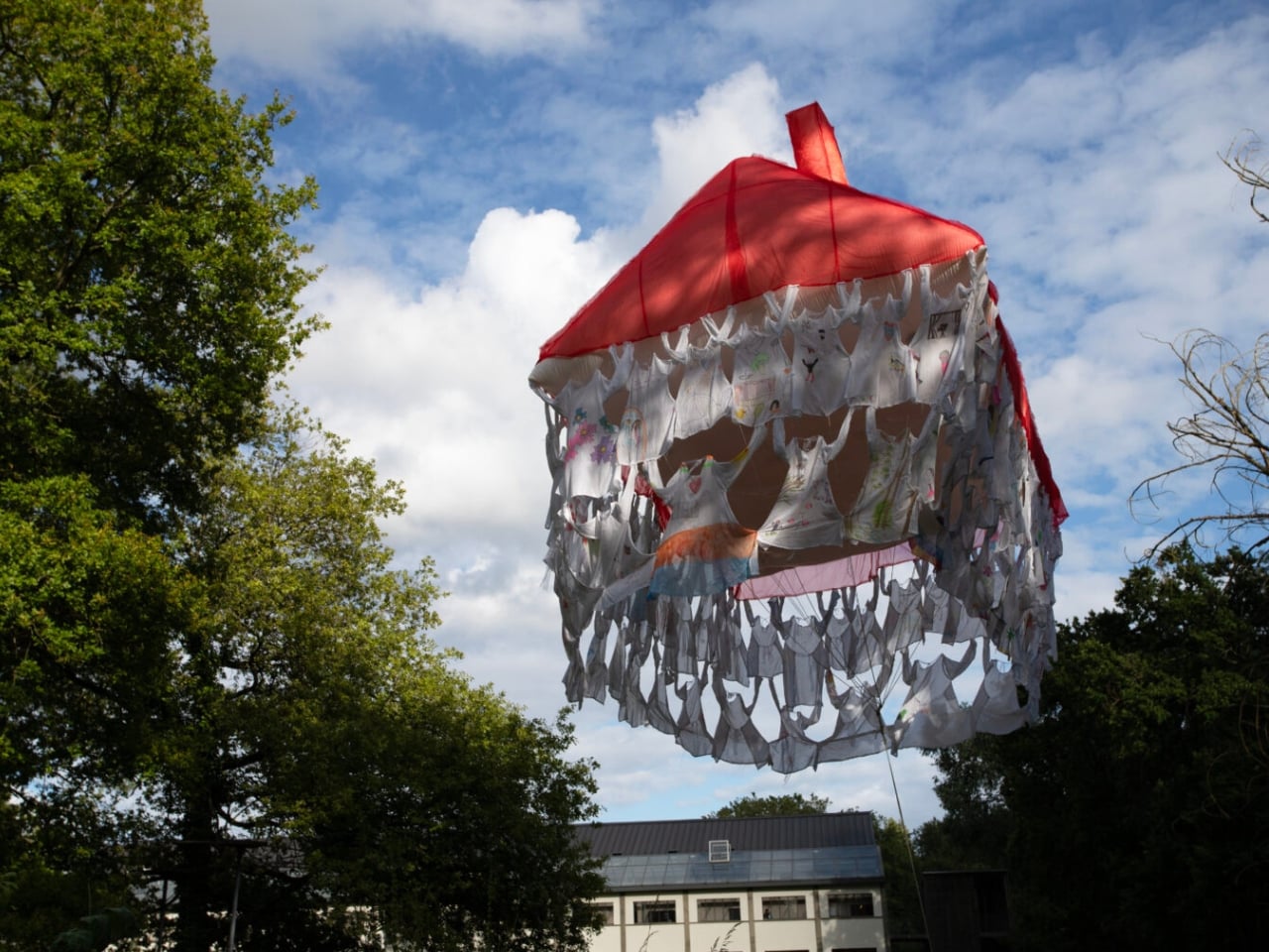
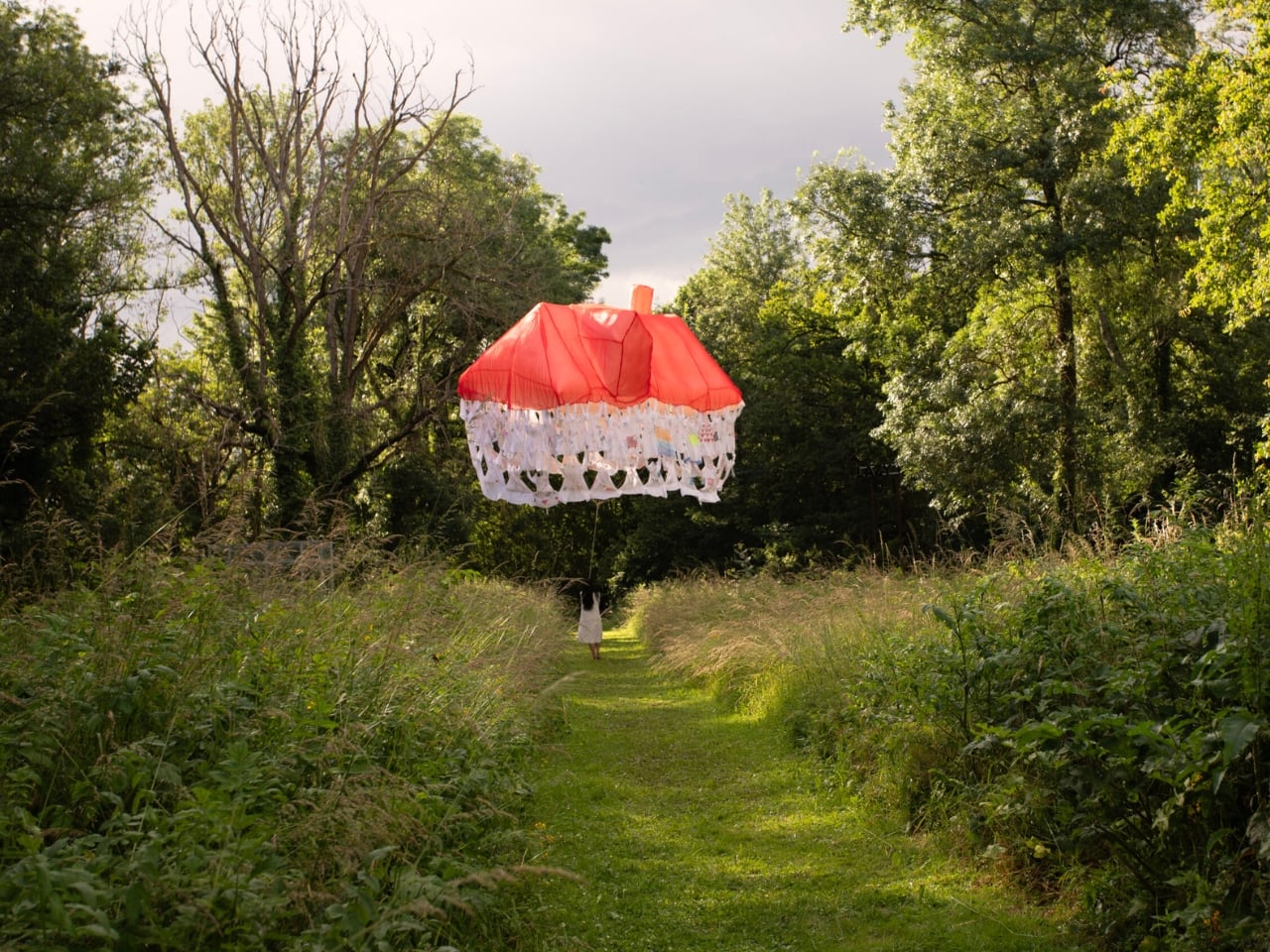
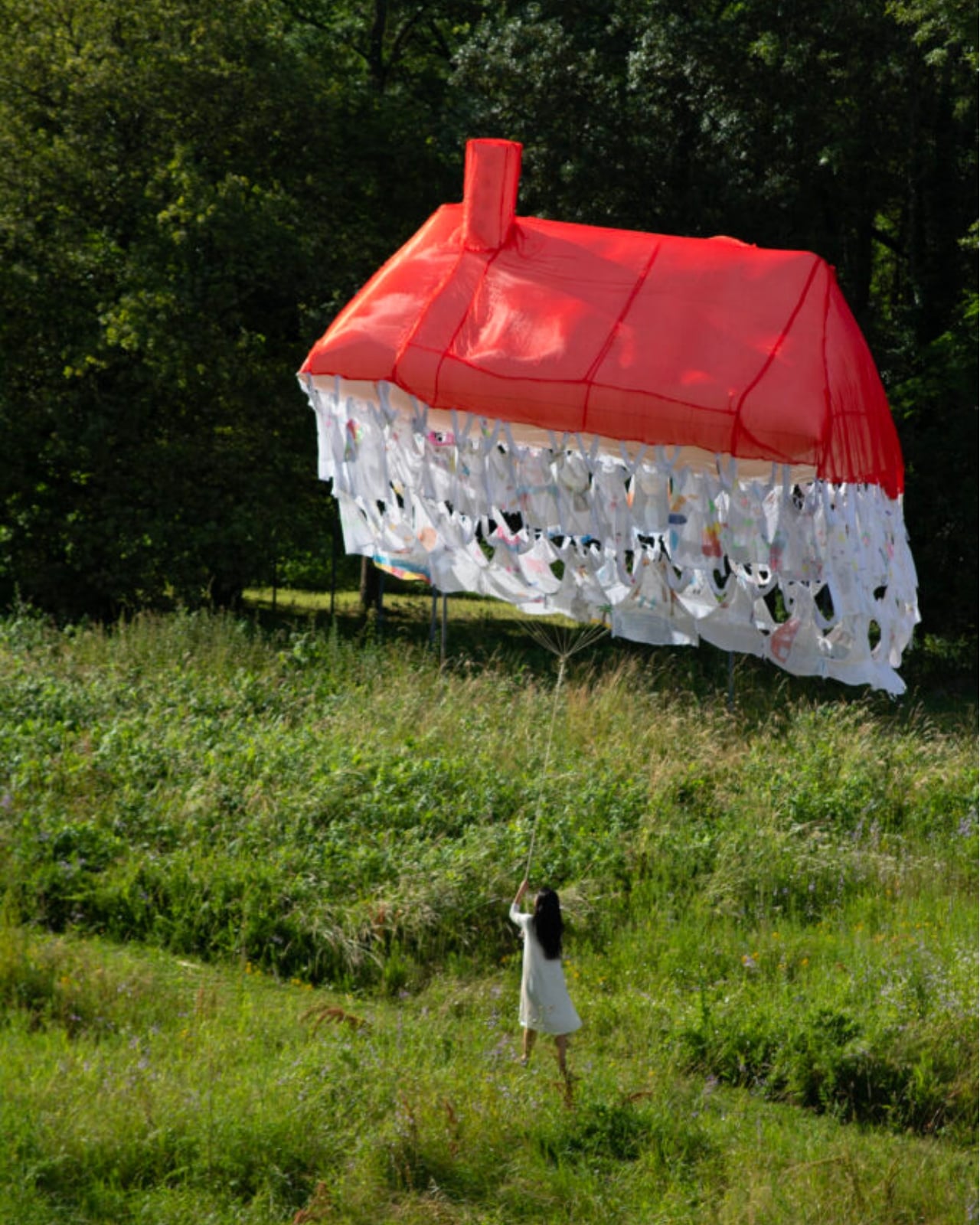
Here’s how it works. Participants are invited to contribute a garment, something personal, something worn, and mark it with handwritten texts and drawings. These pieces of clothing then become the literal building blocks of the structure, each one a personal archive, each one a load-bearing element. The result is a house that floats, literally and conceptually, held aloft not by concrete or steel, but by the private wishes of strangers.

That’s a beautiful idea, and I mean that without a trace of irony. We spend so much time thinking about homes in terms of square footage, property value, and interior aesthetics that we rarely stop to ask what a home is actually made of. Yoo forces the question. Her installation suggests that the answer has less to do with materials and more to do with desire, with the accumulated weight of what people want, need, and imagine for themselves and for each other.

Art that treats the domestic as a lens for examining social and cultural forces is nothing new. But Yoo brings something specific to it. Born in Seoul and trained in France, she operates between two very different cultural frameworks around the idea of home, and her practice reflects that quietly felt tension. Her works often feature spaces that feel familiar but refuse to stay solid. Rooms that waver. Houses that float. Structures that appear and then dissolve. It’s a recurring language across her portfolio, and with Dream House, it feels most fully realized.

Dream House is not trying to comfort you. It’s trying to make you notice something. The garments contributed by participants carry real personal weight: literal handwriting, actual drawings, the residue of real lives. And yet the house they form is temporary. It rises, exists briefly, and then it’s gone. Yoo describes the floating structure as embodying both the creative force of desire and the fleeting nature of existence. The house briefly emerges through people’s dreams, and that, apparently, is enough.

I think that’s the most honest thing any artist has said about housing in a long time. We build our ideas of home from desire, from inherited images of what shelter is supposed to look like, from what we were told to want, and from what we quietly imagine when no one is watching. And all of it is more temporary than we tend to admit. The average person moves multiple times in their life. Neighborhoods change. The house you grew up in gets renovated beyond recognition or torn down entirely. The physical structure of home has always been more fragile than we want it to be.

What Yoo does is make that fragility visible without making it tragic. The floating structure is genuinely striking to look at. The garments create a soft, almost organic texture that reads as intimate rather than architectural, which is exactly the point. You’re not looking at a building. You’re looking at a collective act of imagination, briefly held together by shared hope. Jisoo Yoo is an artist worth paying close attention to. Her work doesn’t announce itself loudly, but it asks questions that stick. Dream House is a reminder that the spaces we live in are not neutral. They are built, always, from something we wanted.

The post The Floating House Built From Strangers’ Wishes first appeared on Yanko Design.

Burying Your House Sounds Extreme. HiberTec Makes It Make Sense.

The first time I saw footage of a neighborhood completely leveled by wildfire, nothing left but chimneys and twisted metal, I had the same thought most people do: why do we keep building the same way? We’ve watched communities in California, Colorado, and beyond get erased in a matter of hours, and the standard response has largely been to rebuild in the same spot with slightly better fire-resistant cladding. It’s determined, in its own way. It’s also starting to feel like wishful thinking.

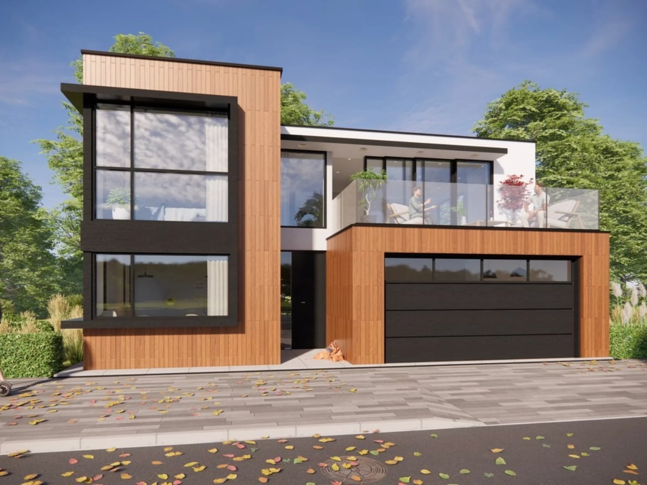
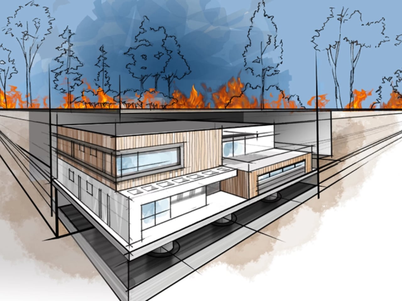
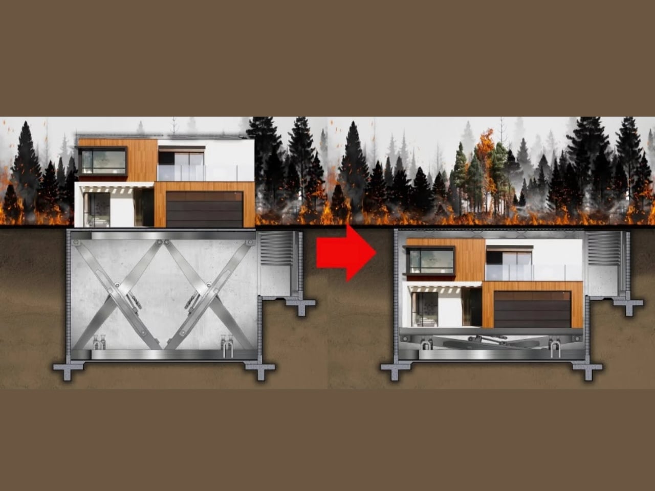
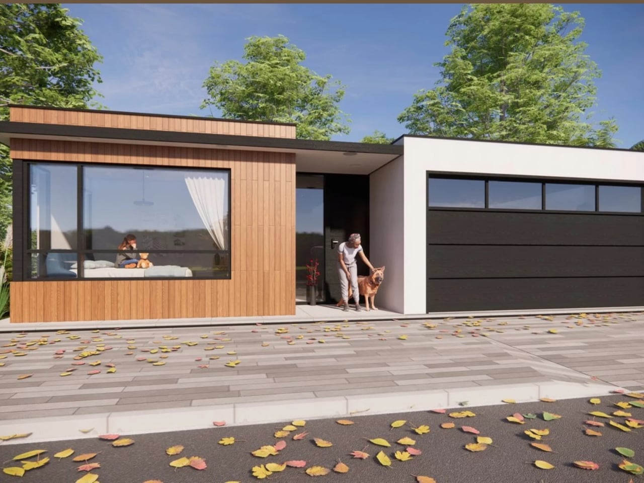
HiberTec Homes is proposing something entirely different. Their fully patented design allows a modular home to automatically lower itself underground when a wildfire or tornado threat is detected, then resurface completely unharmed once the danger has passed. The whole process takes 15 minutes or less. You press a button, the utilities shut off automatically, a fire-retardant system activates, a protective shell seals the structure, and the house descends into a sealed underground vault. Then you wait. Then you come back to a home that’s still standing.

Designer: HiberTec Homes

Founder Holden Forrest first conceived the idea in 2019 and spent several years developing it with a team of engineers specializing in thermal systems and structural design. He self-funded the project to the tune of $500,000 before appearing on Shark Tank Season 17, where he secured a deal with Barbara Corcoran for $1 million at 20% equity, plus a contract to build the first real working model at $1,000 per square foot. That price point is admittedly steep, but HiberTec’s stated goal is to eventually bring costs down to around $400 per square foot, which would put it within reach of a much wider audience.

And the audience that needs it is enormous. Over 300,000 homes are destroyed globally every year. In the U.S. alone, more than 25,000 homes are lost annually to wildfires and high winds. Perhaps the most staggering figure: more than 8 million American homeowners currently cannot obtain property insurance. The economic losses from Southern California wildfires alone have crossed $300 billion. At some point, fire-resistant landscaping and defensible space stop being sufficient answers to what has become a genuine housing crisis.

Beyond the visual drama of a house literally sinking into the earth, what makes HiberTec’s approach feel genuinely smart is its open platform model. Rather than operating as a closed, proprietary system, the company has designed its hydraulic technology to integrate with dozens of existing homebuilders and their modular models, with little to no modification required. That’s a meaningful distinction. It means this isn’t a niche luxury product for a handful of custom home clients. It’s being positioned as infrastructure, something that can scale across the industry instead of living at the edges of it.

The skeptics will have fair points to raise. The technology is still in the prototype phase, and until a real home descends underground and resurfaces in an actual fire event, all of this lives in the realm of engineering promise. Hydraulic systems are complex. Underground environments bring their own challenges around moisture, soil shifting, and structural integrity. These aren’t small details to work out. There’s also the question of what happens to everything around the home. You save the structure, but the neighborhood, the trees, the infrastructure that connects you to the rest of the world, all of that remains vulnerable.

Still, the premise refuses to leave your mind. We’ve spent decades trying to make homes better at withstanding fire. HiberTec’s answer is to simply remove the home from the equation entirely, if only for a few hours. It’s the kind of lateral thinking that sounds absurd right up until you realize the conventional approach keeps failing people at catastrophic scale.

Whether HiberTec becomes the future of housing or a fascinating proof-of-concept that reshapes the conversation, it’s already doing something valuable: forcing the question of whether we need to rethink not just how homes are built, but how they survive. When whole towns can disappear in a single afternoon, that question deserves a serious answer.

The post Burying Your House Sounds Extreme. HiberTec Makes It Make Sense. first appeared on Yanko Design.

Public Art Stands Still, This Steel House Lets You Slide It Apart

Public art installations in parks have a familiar relationship with the people passing through them. They hold a fixed position, a fixed meaning, and a fixed form. You walk around them, read a plaque if there is one, and that’s usually the end of the conversation. The ones designed to provoke a genuine reaction tend to depend on scale or spectacle rather than something the visitor can actually change.

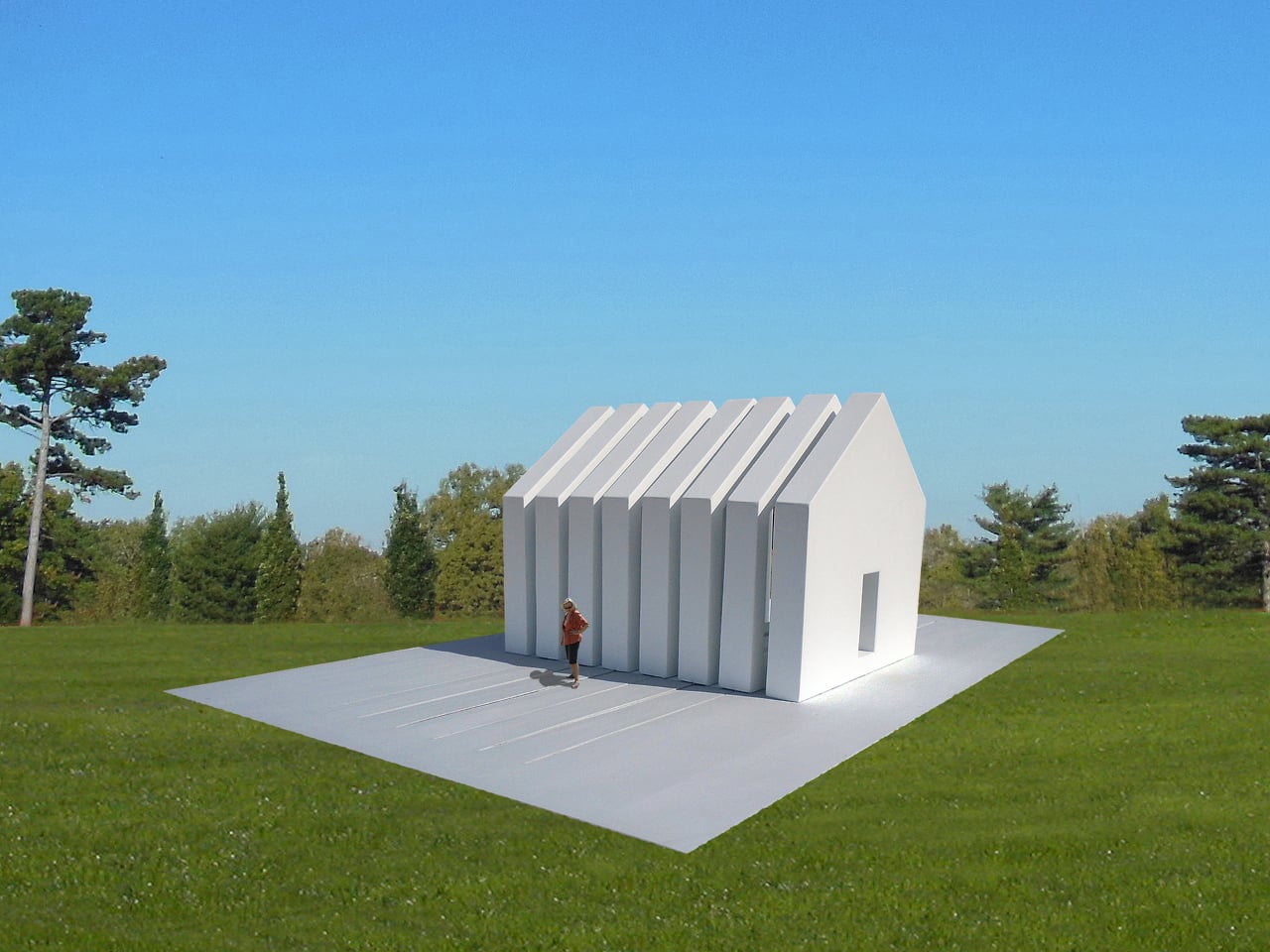
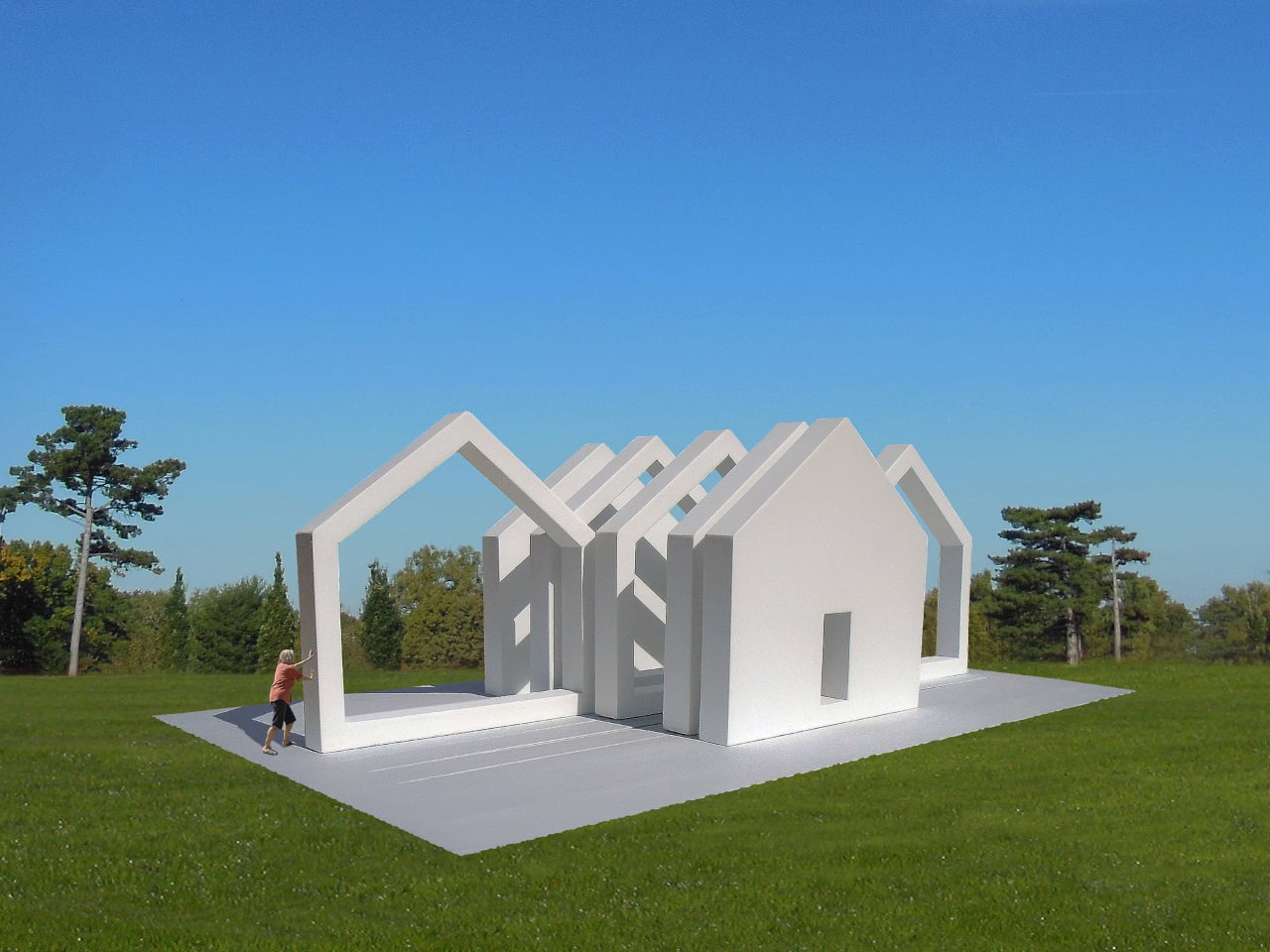
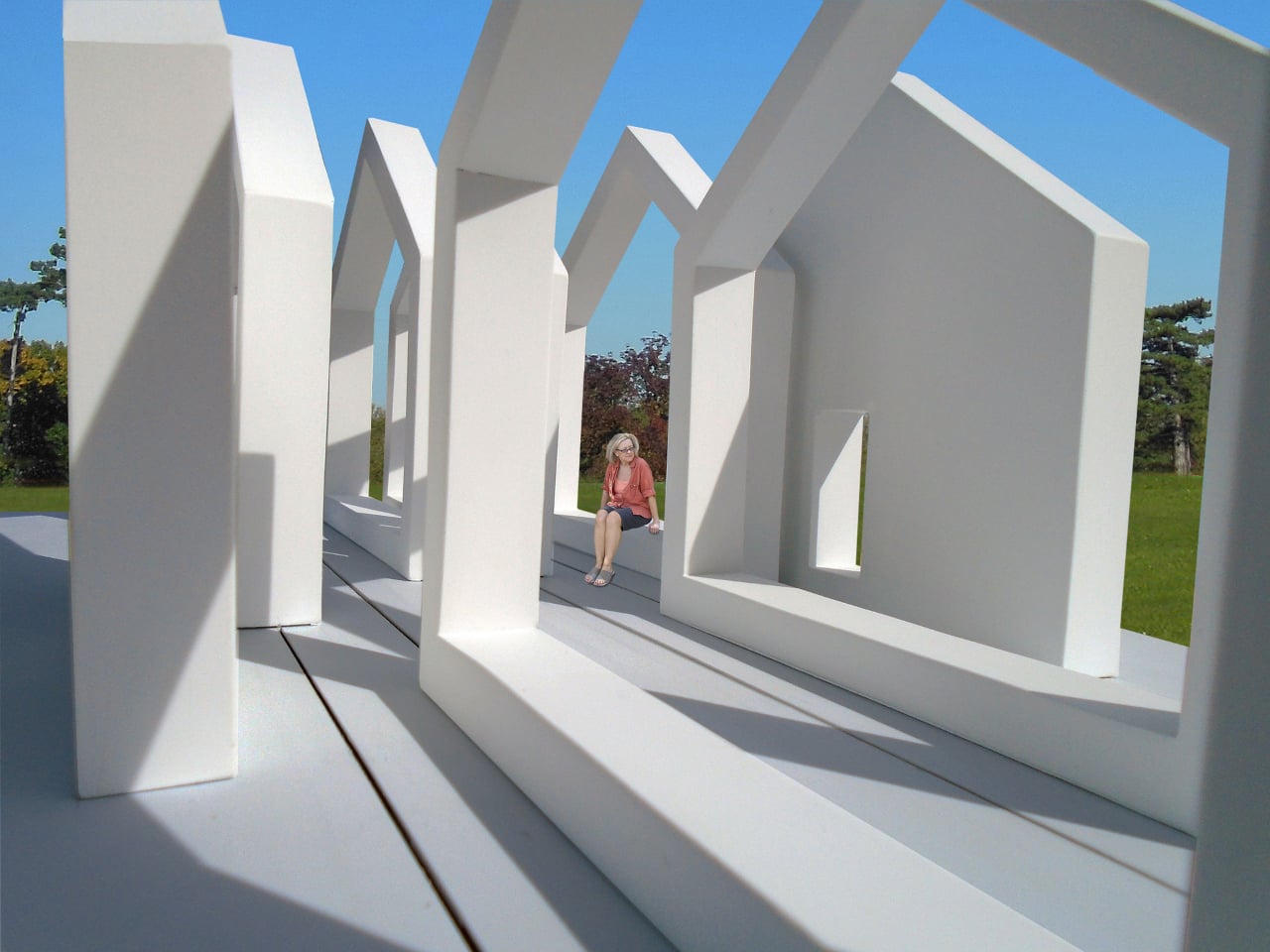
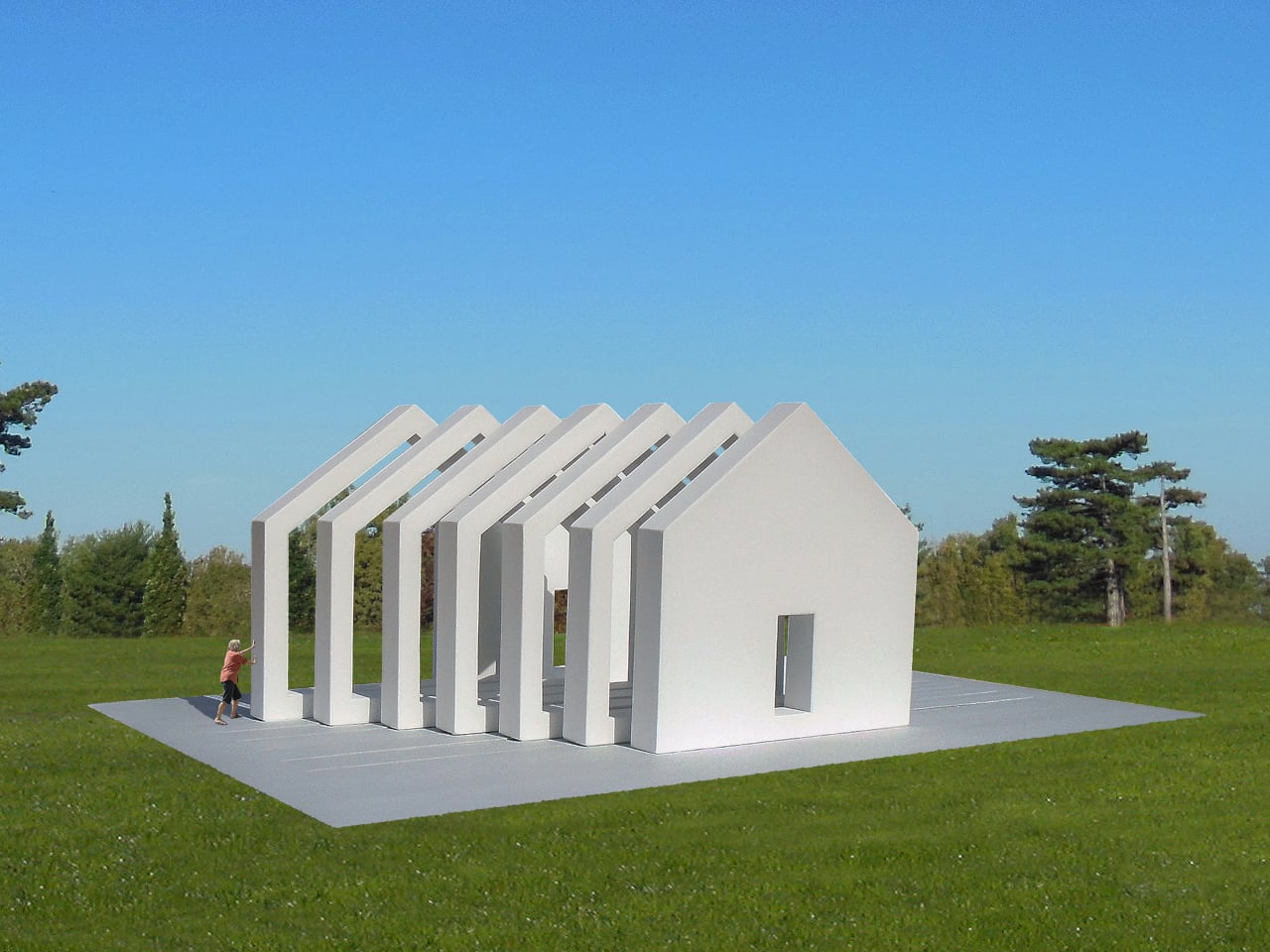
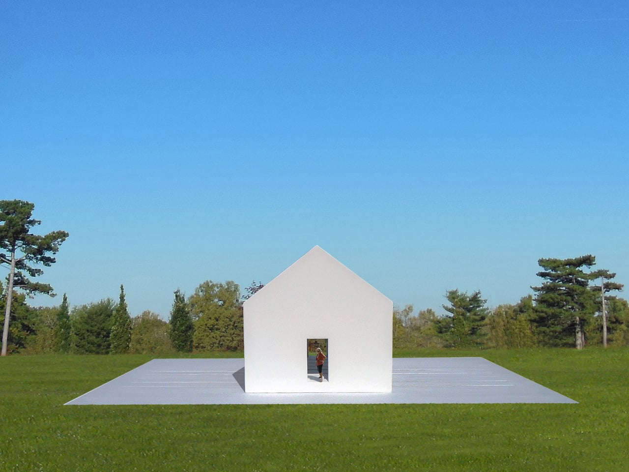
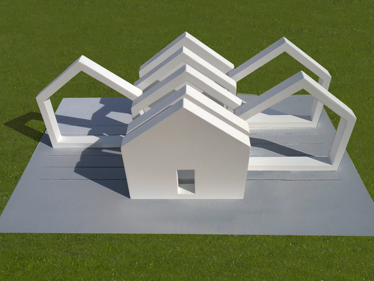
The Interactive Sliced House is part of a series that uses the most recognizable architectural shape there is as raw material. The house silhouette, walls, a pitched roof, and a doorway centered in front, is so deeply familiar that it functions almost like a word. This installation doesn’t just reference that shape. It cuts the whole thing into eight vertical slices and puts visitors in charge of what happens next.

Designer: Michael Jantzen

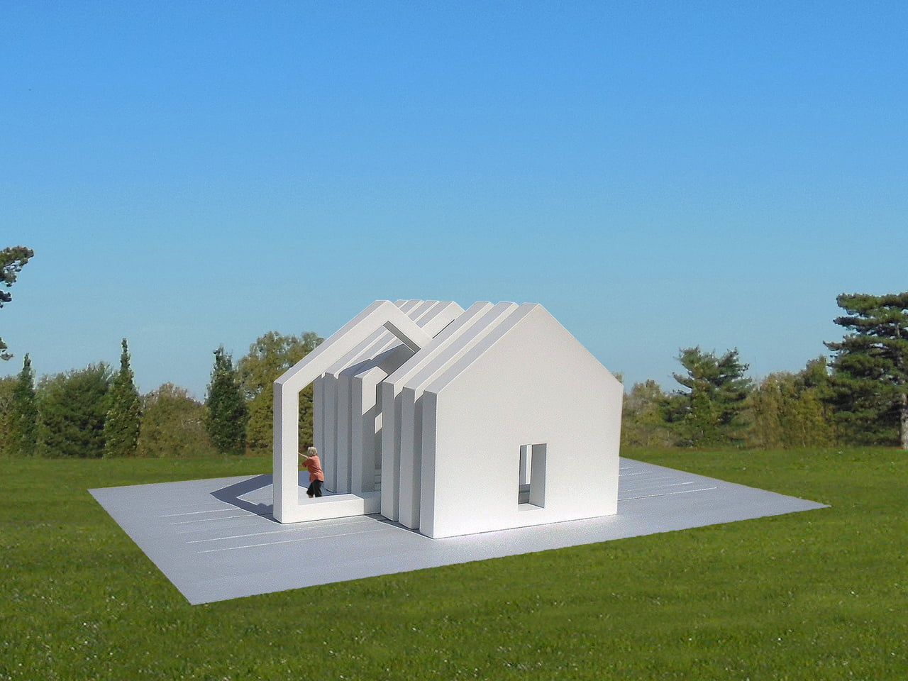
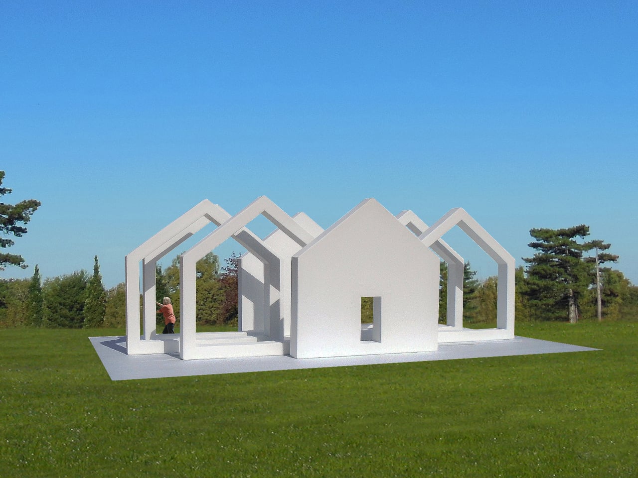
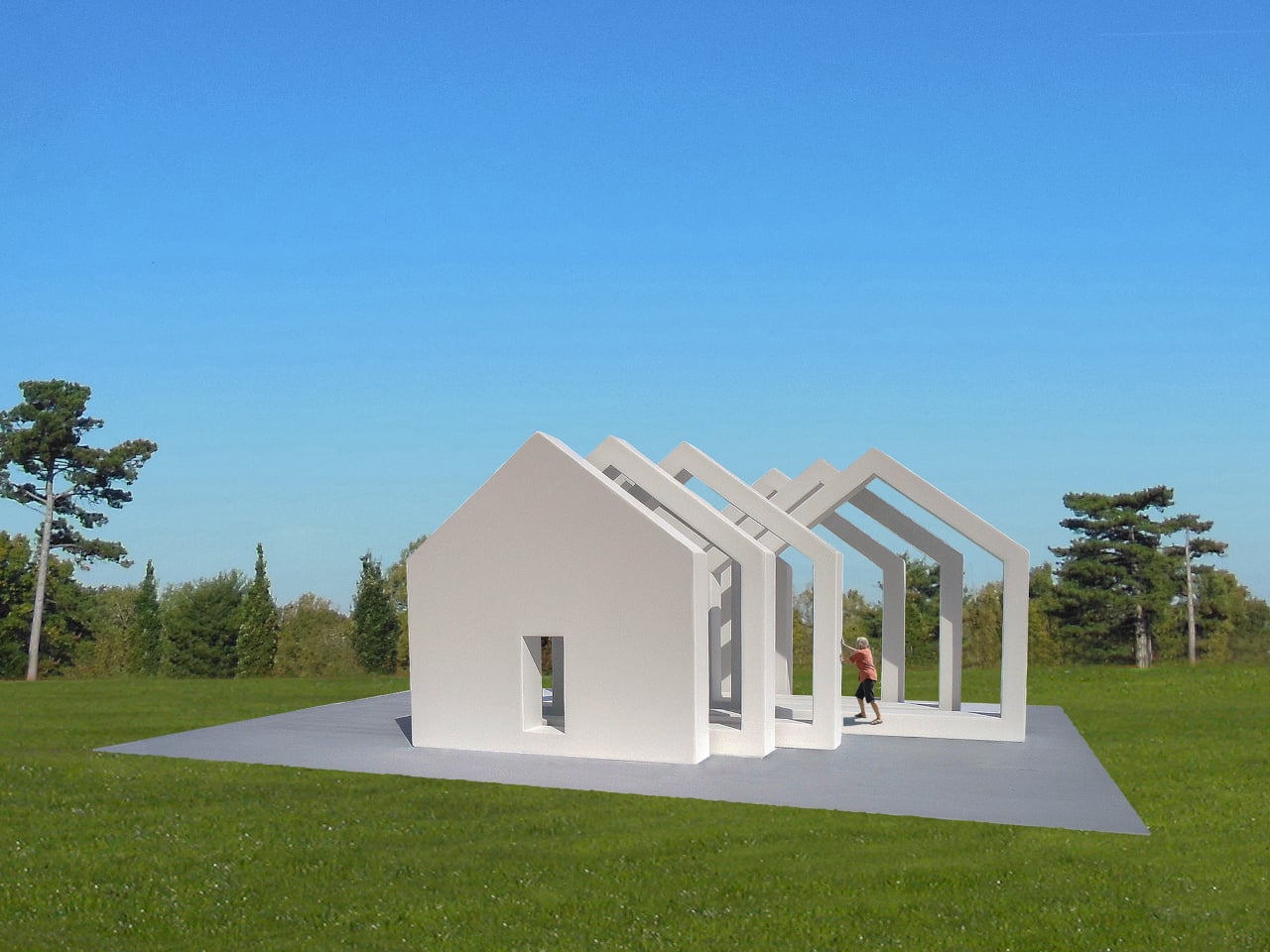
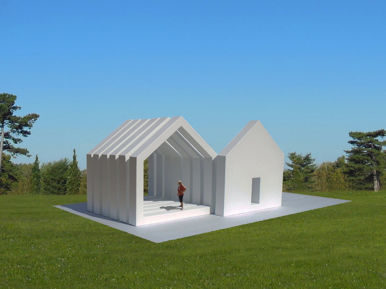
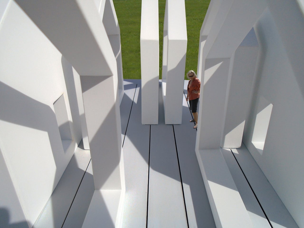
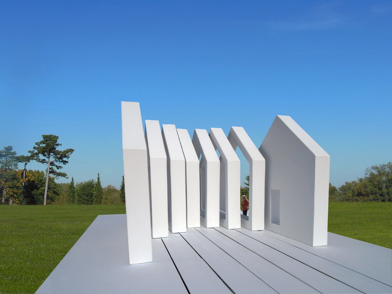
Two of the eight slices are solid white steel panels, one anchoring each end of the structure, both fixed permanently to a concrete pad on the ground. Each solid end has a doorway cut into its center. The six slices between them are open frames, the same house shape rendered as a hollow silhouette, and these slide freely along tracks set into the concrete beneath them.

Slide those six frames to one end, and the house snaps back into something close to its recognizable form, dense and legible from a distance. Pull them apart, and they scatter across the pad, creating a sequence of house-shaped thresholds that repeat across the concrete like the same word written over and over with increasing space between each letter. The structure stays the same; the space it makes changes completely.

Someone walking through the installation when the frames are spread out passes through threshold after threshold, each one framing a slightly different view of the park, the sky, and anyone else nearby. The frames create enclosed corridors between them when pushed together, and open, almost ceremonial passageways when pulled apart. Moving through the structure is different every visit, depending on how previous visitors left it.

The house shape is the installation’s real subject. It’s one of the first symbols children learn to draw, and one of the most loaded in the human symbolic vocabulary: shelter, family, belonging, property. Breaking it apart and handing the fragments to strangers in a public park is a way of asking what it means without having to say the question out loud, and without prescribing the answer.

The white painted steel keeps everything visually consistent regardless of how the slices are arranged, meaning no single configuration reads as more “correct” than another. There isn’t a right answer built into the materials. The installation can also be deployed as multiples, several units placed across a park at once, which would multiply its questions the same way the frames multiply the house shape when pulled apart.

The post Public Art Stands Still, This Steel House Lets You Slide It Apart first appeared on Yanko Design.
KantorGG Just Built a Tropical Home That Faces the Wrong Way

Most tropical homes try to open up. Floor-to-ceiling glass, wraparound terraces, the constant push-pull between inside and outside air. It’s practically a formula at this point. So when a house comes along that deliberately turns away from that instinct, you stop and pay attention.

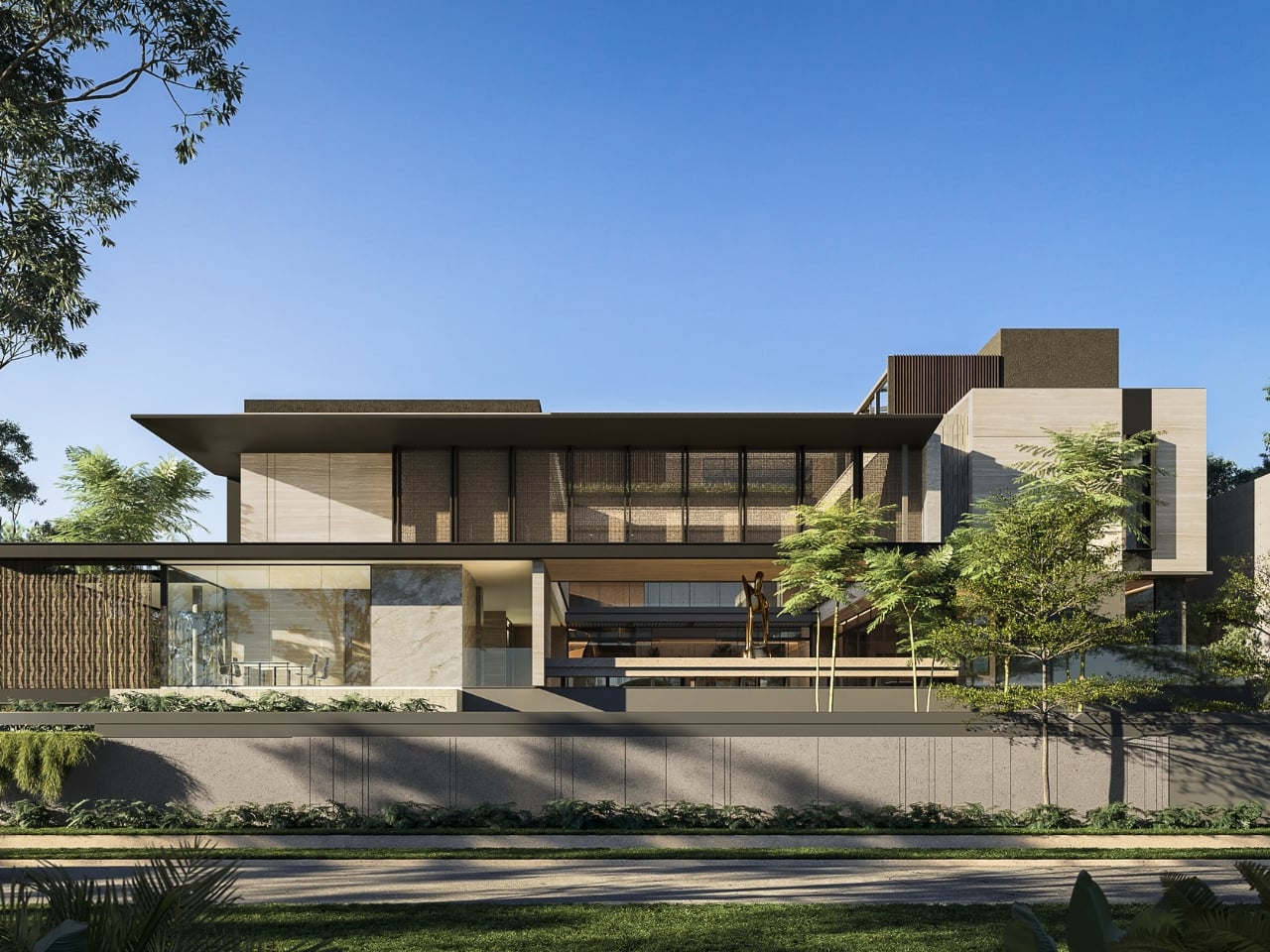
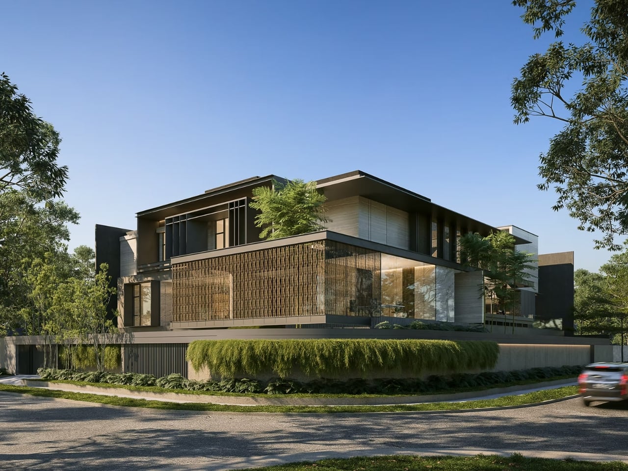
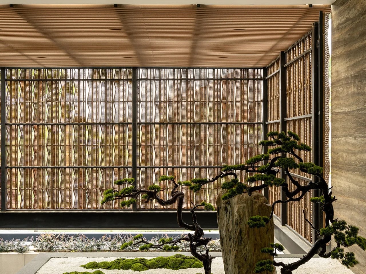
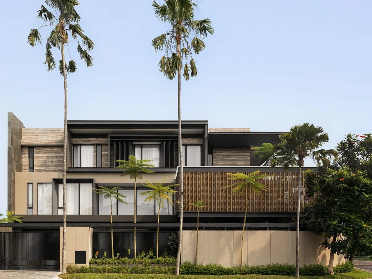
SE House, designed by Giovanni Gunawan of Surabaya-based studio KantorGG, sits at one of the city’s most recognizable residential corners and does something quietly radical: it pulls inward. Not to close off or shut the world out, but to create a kind of depth that most houses spend their entire floor plan actively avoiding.

Designer: Giovanni Gunawan for KantorGG (photos by Tristan Salim)

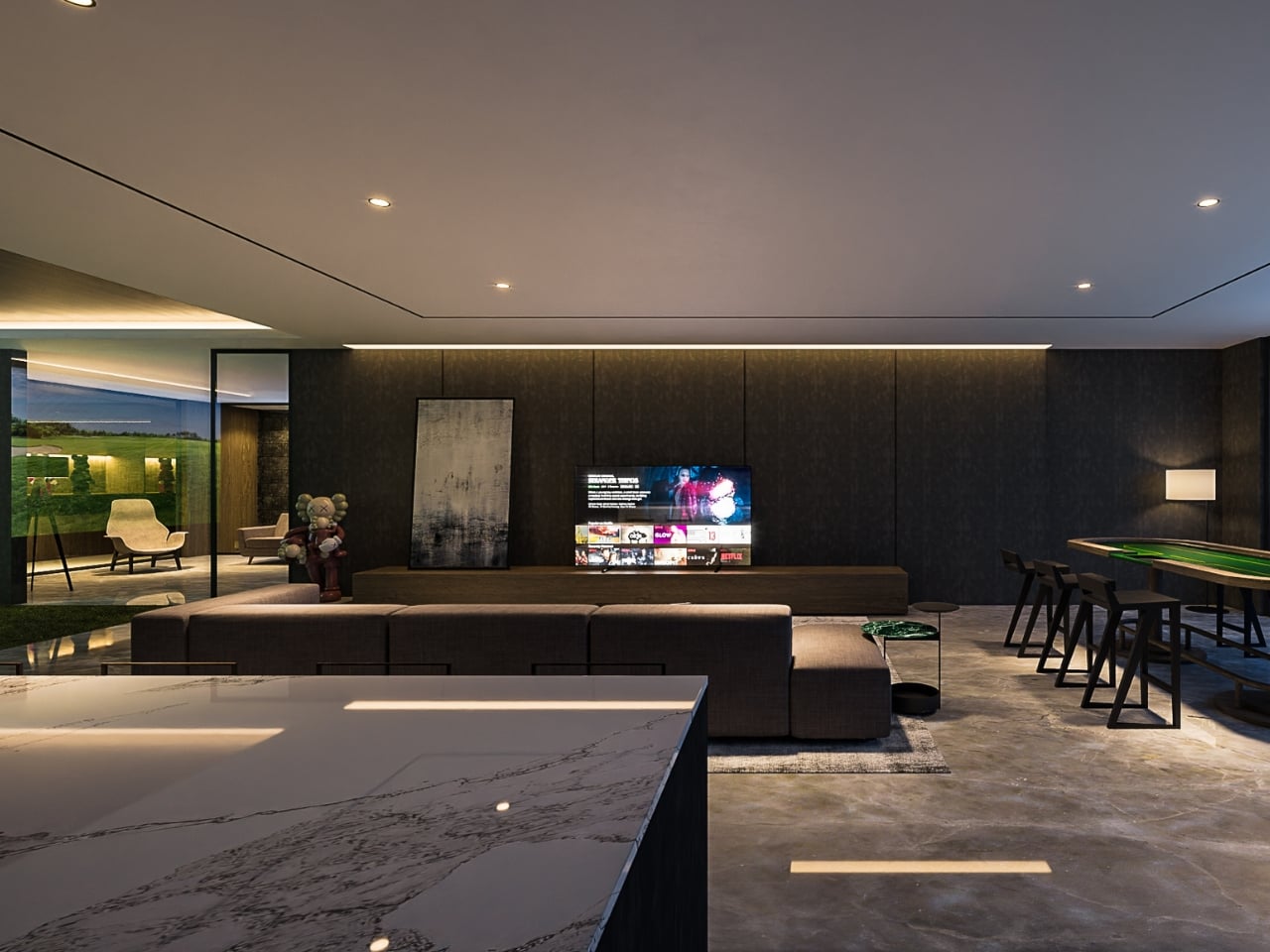
The concept is organized around a central courtyard, natural airflow, dry gardens, and the kind of deliberate voids that make space feel intentional rather than accidental. Gunawan placed dry gardens between the masses and the voids so residents experience the outdoors without sacrificing the comfort of being inside. It sounds simple enough. The execution is anything but. This is Gunawan’s stated interpretation of what tropical living can actually become, and I think he’s asking a question the design world has been skating past for years. We’ve gotten very good at making tropical homes look beautiful in photographs. We are considerably less practiced at making them feel like somewhere genuinely worth inhabiting on an ordinary Tuesday.

KantorGG’s design ethos centers on “living with nature, inside and out,” and SE House is probably the clearest expression of that philosophy yet. The existing mature trees on the site weren’t cleared to make room for clean lines. They were preserved as spatial anchors, the kind of decision that takes real confidence because it limits what you can do architecturally, and then rewards you generously in return. Shaded seating under dappled light, shifting reflections, the particular quality of sitting beneath something old and rooted. That’s not something you can manufacture after the fact.

The Australian-inflected sensibility woven through the design deserves a closer look. Gunawan studied abroad, and that cross-pollination shows up in SE House’s structure without being heavy-handed about it. The house doesn’t read as imported or imitated. It reads as absorbed and reissued through a sensibility that is distinctly Indonesian. That tension between influences, when handled well, produces architecture that belongs nowhere else and everywhere at once.

The 360-degree courtyard layout is worth sitting with on its own terms. It means the house has no single dominant view, no privileged front-row seat. Every room must negotiate with the central space, which keeps the architecture from becoming a spectacle and makes it a place to actually live inside. I find that rare, and more genuinely considered than most high-concept residential projects that pass through design media these days.

SE House has attracted the kind of attention that usually gravitates toward buildings with louder ambition. The buildings that announce themselves as you walk in. This one whispers, and that’s precisely why people are listening. Gunawan described it as a quiet manifesto for tropical living, and the word choice matters. A manifesto doesn’t have to be loud to carry weight.

The broader argument SE House seems to be making is that restraint isn’t the enemy of richness. The absence of visual noise isn’t emptiness. The voids aren’t what’s missing from the design. They are the design, or at least a fundamental part of what makes the rest of it land. That’s an architectural lesson, but it also translates well into how we think about design at every scale, from the objects we choose to live with to the spaces we build up around ourselves over time.

SE House is the kind of project that stays with you not because of one striking image but because of the underlying logic. It makes you want to look at your own spaces differently, and ask whether you’ve been opening up when you should have been pulling inward the whole time.

The post KantorGG Just Built a Tropical Home That Faces the Wrong Way first appeared on Yanko Design.
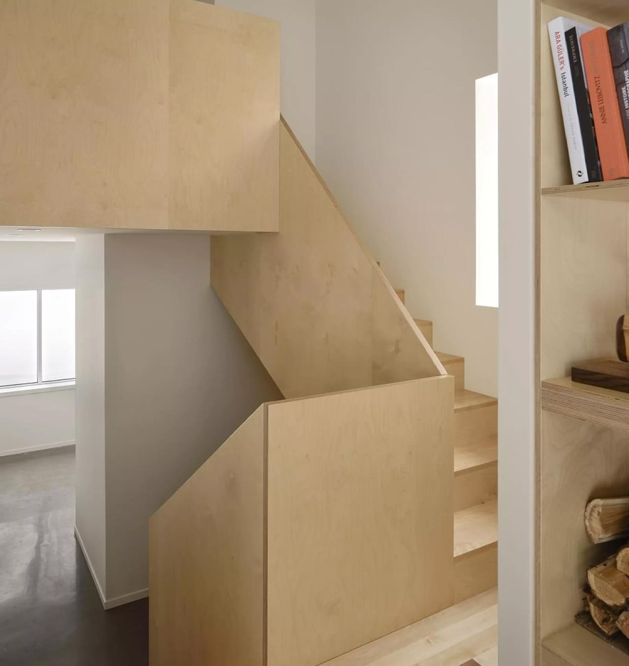
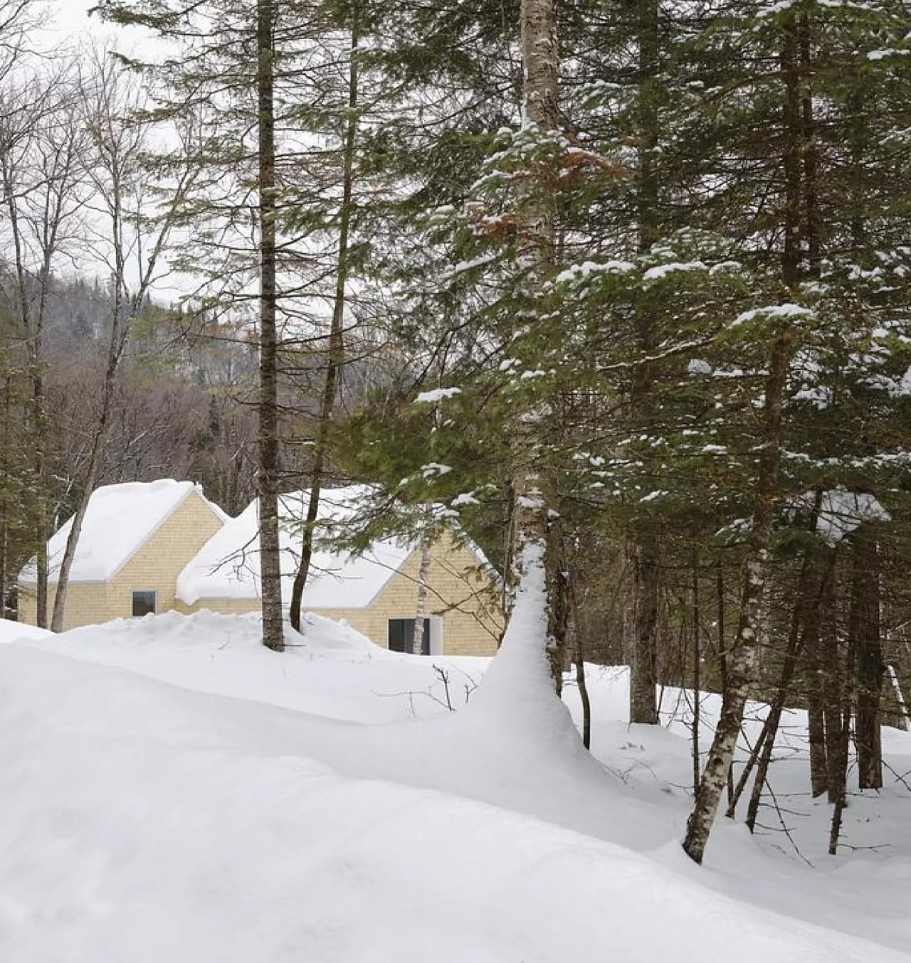
This Quebec Home Doesn’t Fight the Forest – It Disappears Into It

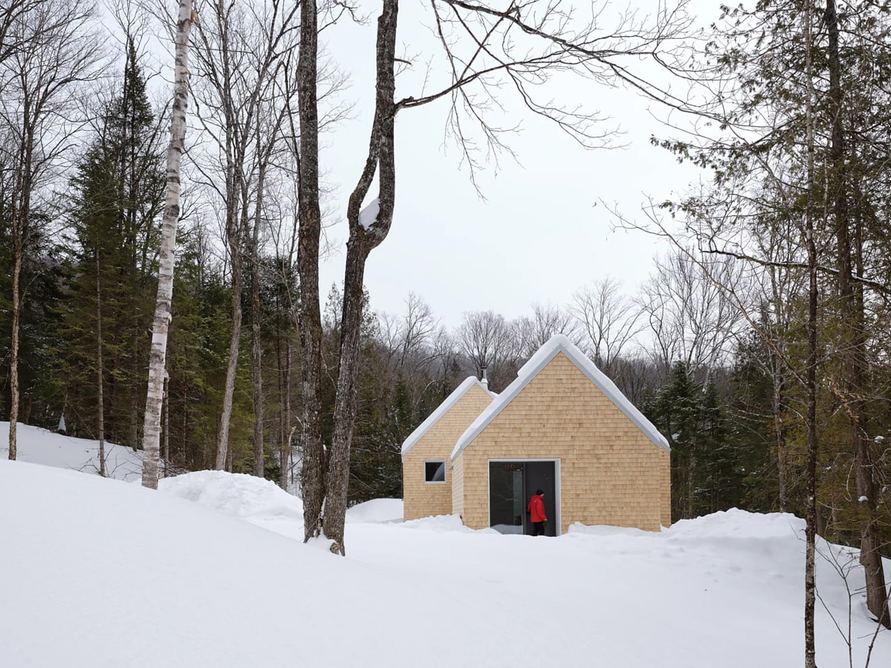
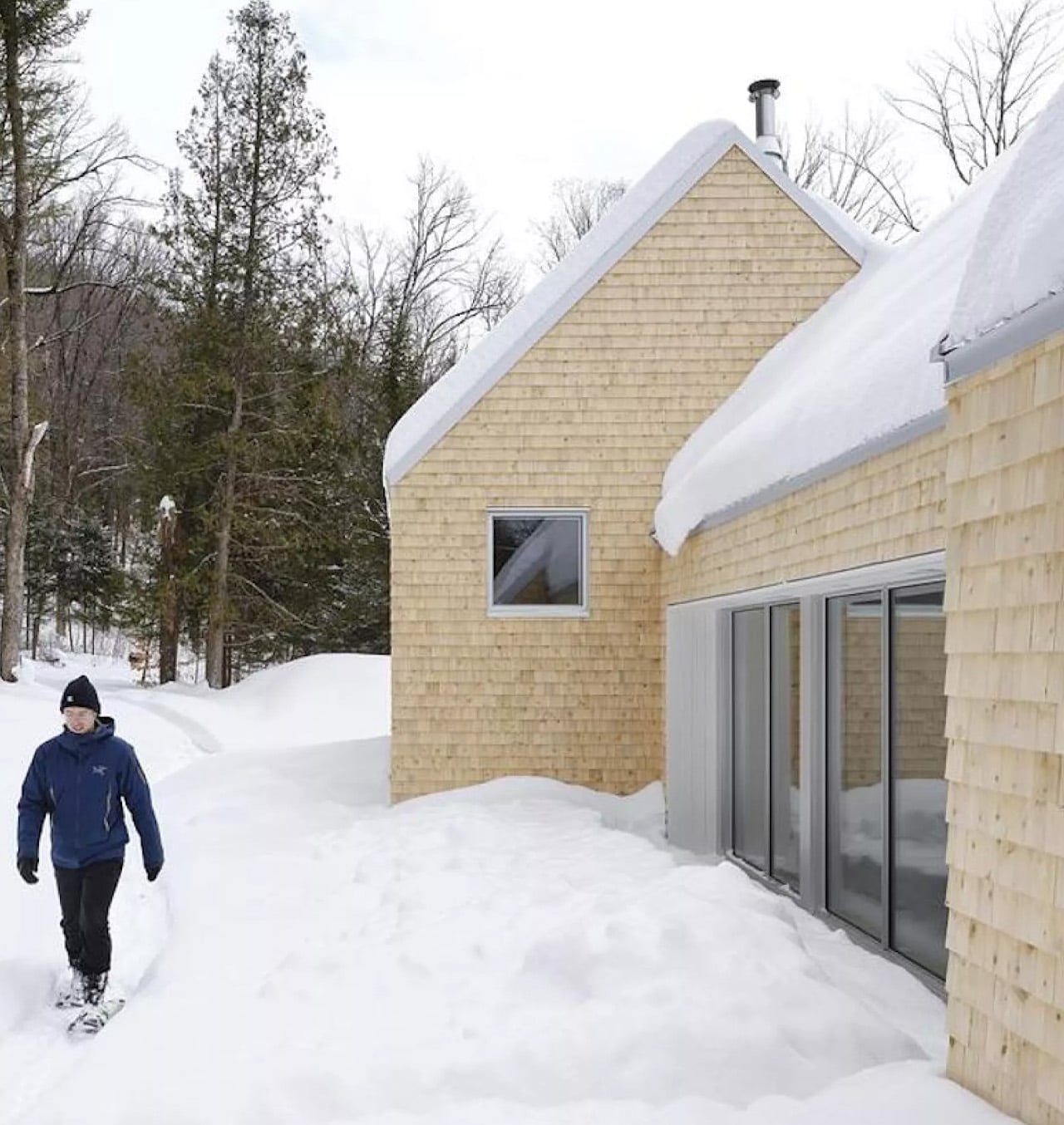
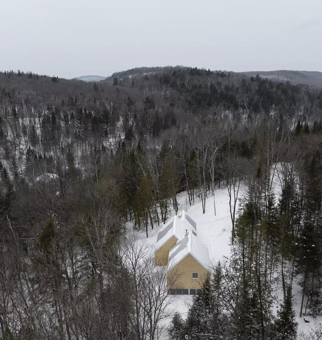
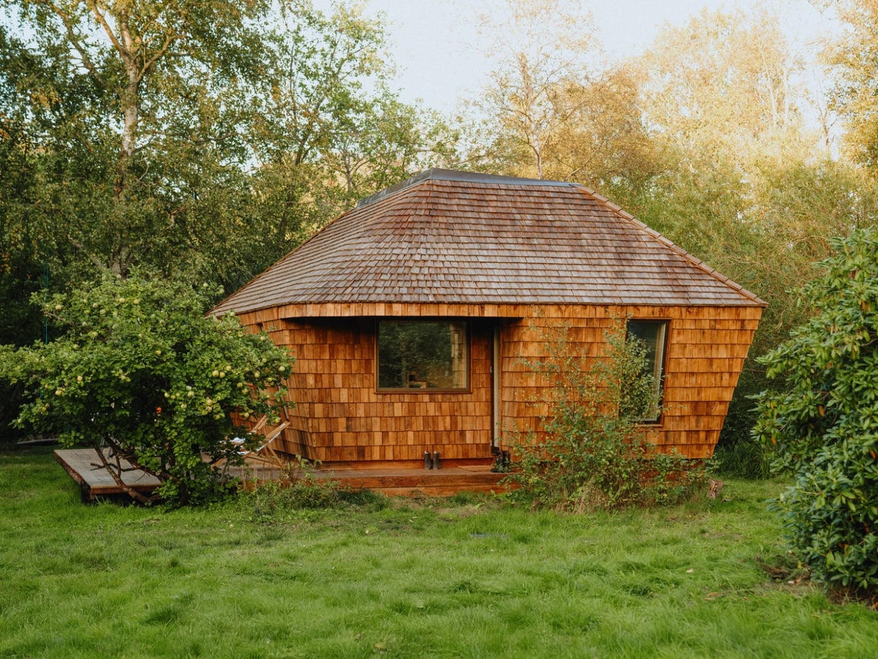
Certain kinds of architecture don’t announce themselves. La Maraude, the latest project by Nathalie Thibodeau Architecte, is exactly that — a compact residential dwelling tucked into the dense woodlands of Boileau, in Quebec’s Outaouais region, that earns its presence through restraint rather than spectacle. Completed in 2024, it’s one of the more quietly compelling houses to come out of Canada in recent memory.

The name itself carries meaning. ‘Maraude’ — to roam, to forage — hints at the relationship the house cultivates with its surroundings. Rather than claiming a dominant position along the river’s edge, the architects deliberately set the home deeper within the treeline, orienting the house’s interior life entirely toward the forest. It’s a gesture that shapes everything else about the project.

Designer: Nathalie Thibodeau Architects

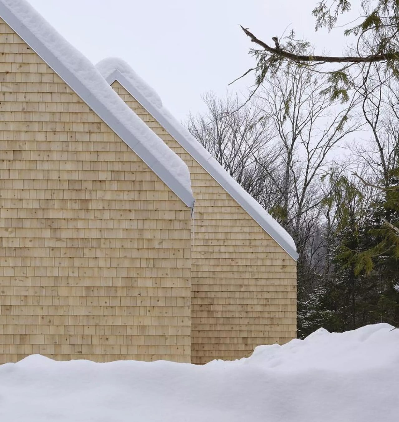
The design draws directly from Quebec’s vernacular architectural tradition — steeply pitched rooflines, grounded proportions, and a material palette that feels native to the region. The exterior is clad in natural cedar shingles and topped with a metal roof, two materials with deep roots in the local building culture. These aren’t nostalgic choices. They’re translated through a contemporary lens, stripped of ornament, reduced to their essential geometry. “Designed with particular attention to simplicity, functionality, and respect for traditional codes, La Maraude embodies a successful dialogue between contemporary architecture and local traditions,” says Nathalie Thibodeau Architecte.

What makes the spatial sequence genuinely interesting is the use of two courtyards as organizing devices. The plan doesn’t simply open to the outdoors — it pulls the forest in, fragmenting the landscape into a series of framed views that shift with the seasons. One courtyard faces north, more sheltered and partly enclosed by the building itself, oriented toward higher ground. The other faces south, brighter and more expansive, drawing the eye down toward the lower terrain. The result is a house that reads differently in every light condition, every month of the year.

The second volume, arranged over two levels in response to the site’s slope, plays a more introverted role. Openings here are smaller and precisely placed to frame specific moments within the tree canopy — quiet apertures rather than panoramic statements.

Photographed by Maxime Brouillet, La Maraude has the look of a project that will age well, both materially and culturally. It’s already being discussed as a potential anchor for a broader ensemble of small retreats on the site — a first building in what could become a considered, evolving conversation between architecture and landscape.

The post This Quebec Home Doesn’t Fight the Forest – It Disappears Into It first appeared on Yanko Design.

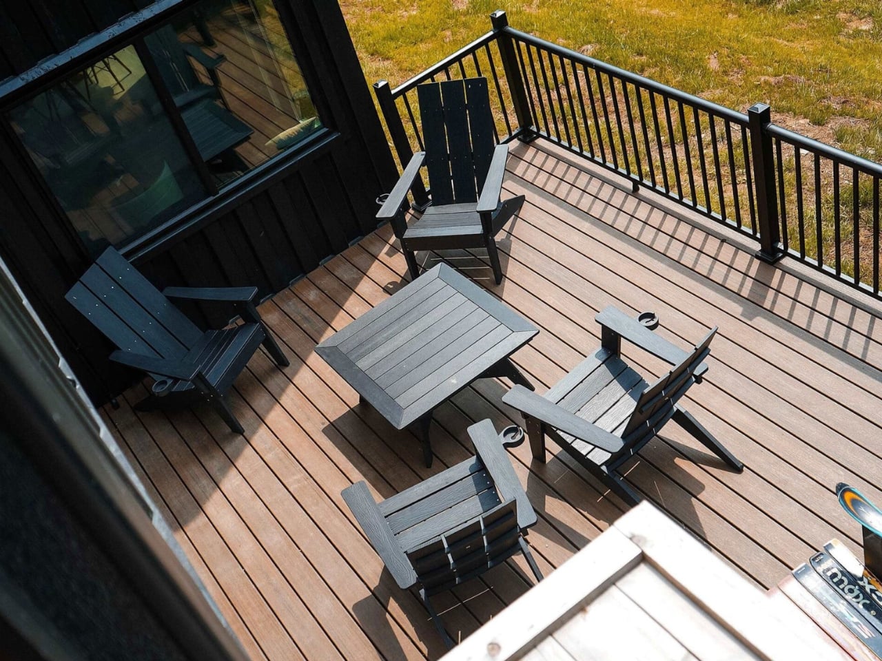
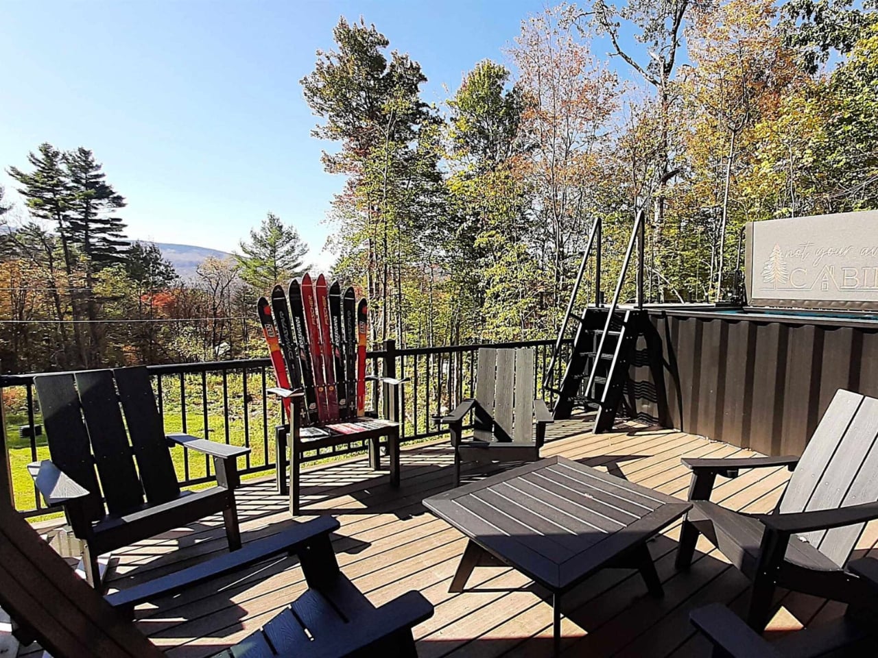
5 Containers, a Sauna, and a Rooftop Deck in Rural Vermont

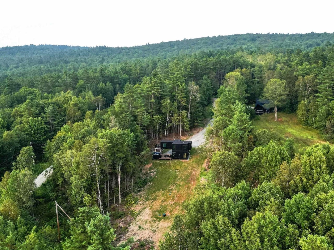
The Vermont Villa by Backcountry Containers is the kind of build that makes you reconsider everything you thought you knew about shipping container homes. Not because it’s shocking, but because it’s genuinely, quietly good.

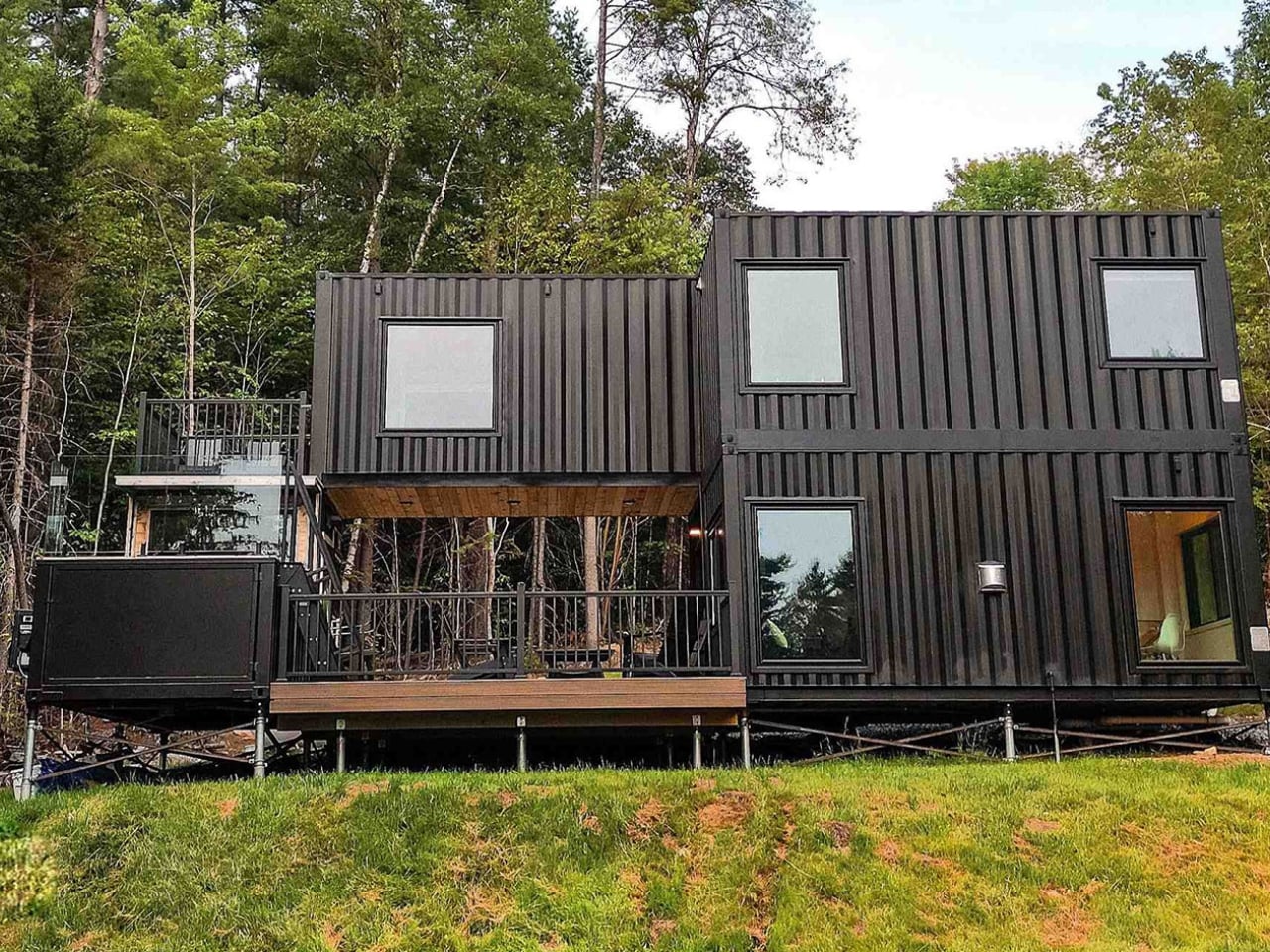
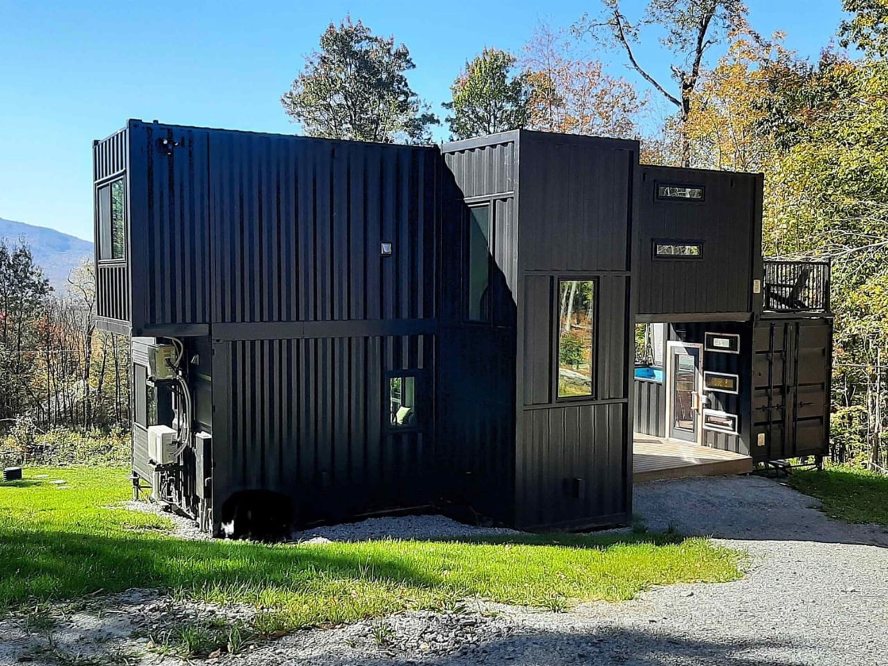
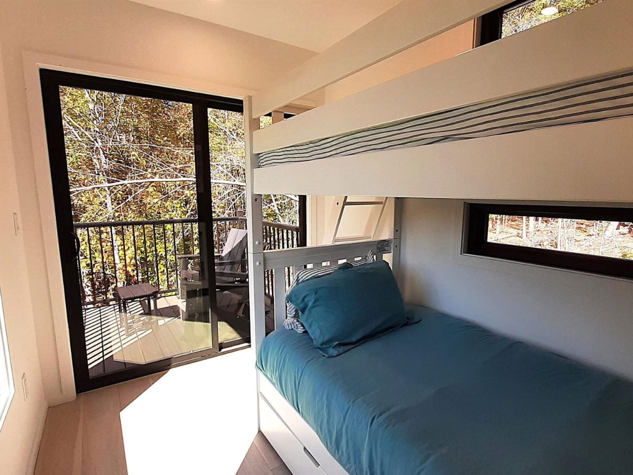
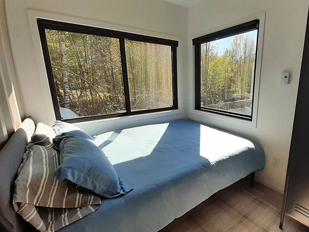
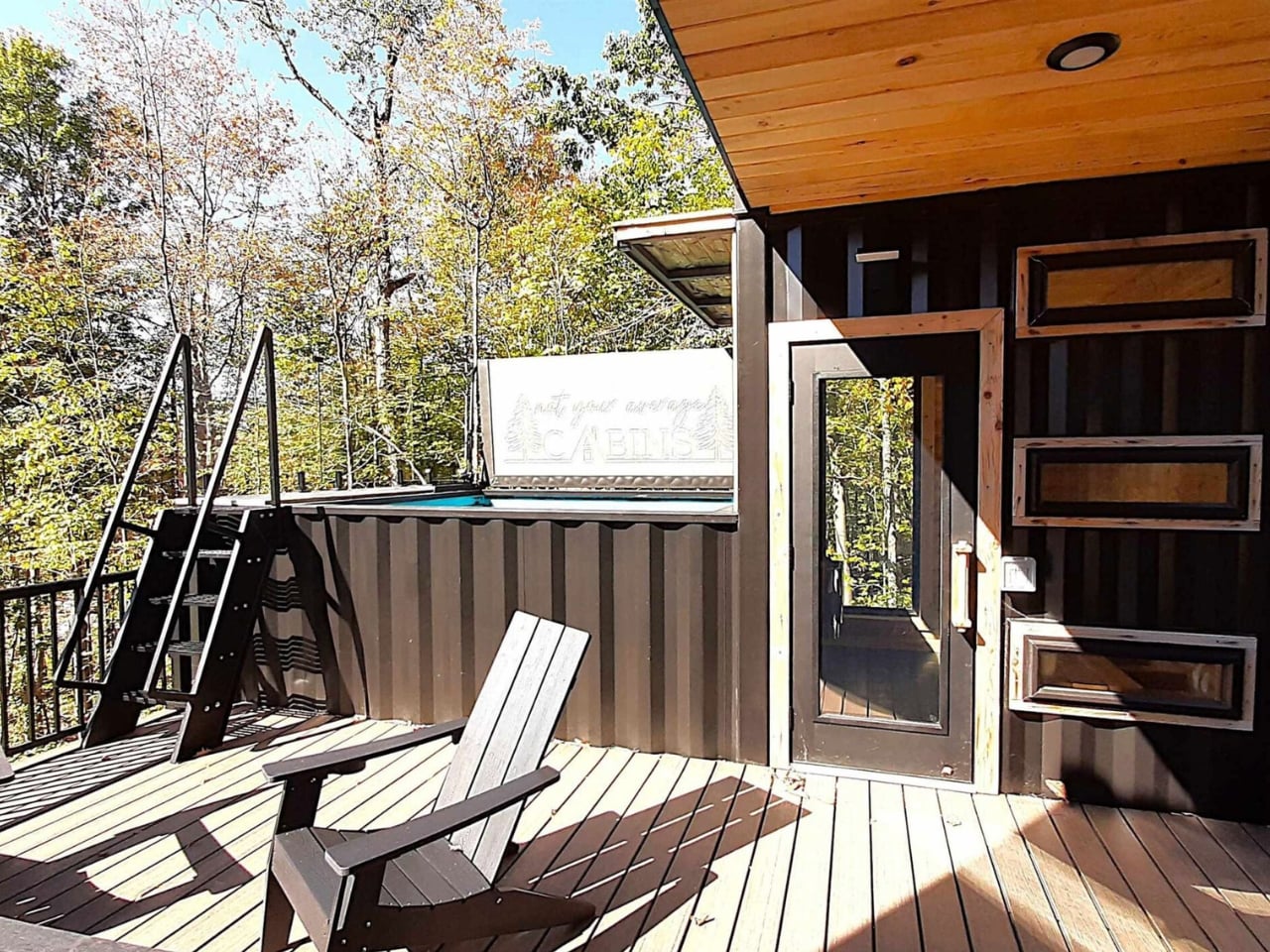
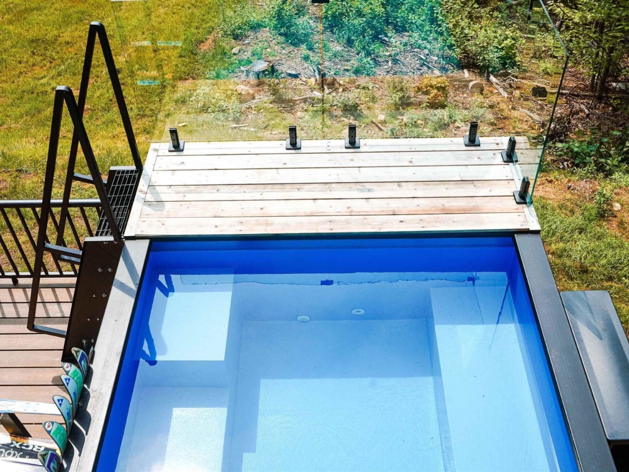
The running joke about container homes has always been that they’re either a clever budget hack or an architect’s ego project that ends up costing twice as much as a conventional house anyway. The Vermont Villa doesn’t entirely escape that conversation, but it does manage to sit on the more convincing side of it. Backcountry Containers, a family-owned U.S. builder, stacked and arranged five shipping containers (three 20-foot units, one 40-foot, and a custom 20-foot SaunaPlunge container) into a two-story, three-bedroom, two-bath home that sits quietly in rural Vermont and looks like it genuinely belongs there.

Designer: Backcountry Containers

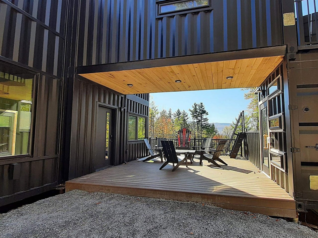
All five containers are painted a uniform matte black, which sounds like it could go very wrong in the middle of the New England countryside, but it actually works. The arrangement is staggered rather than just linear, creating terrace spaces on multiple levels. Against trees and open sky, the structure reads as intentional rather than industrial. The heavy modification helps too: the containers have been cut up and fitted with windows and doors that give the home a proper architectural language, rather than looking like boxes with holes punched in them.

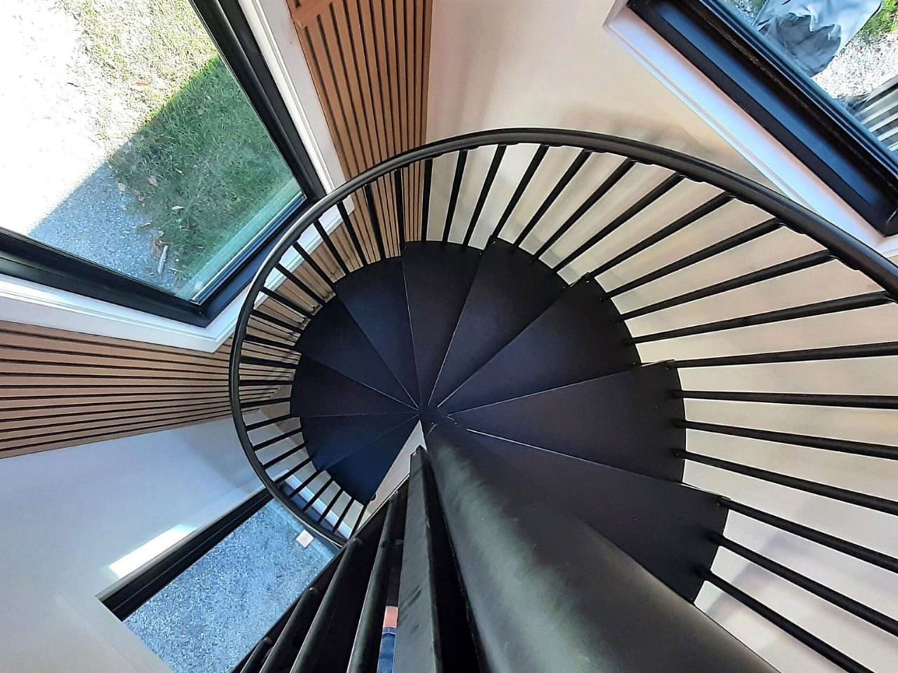
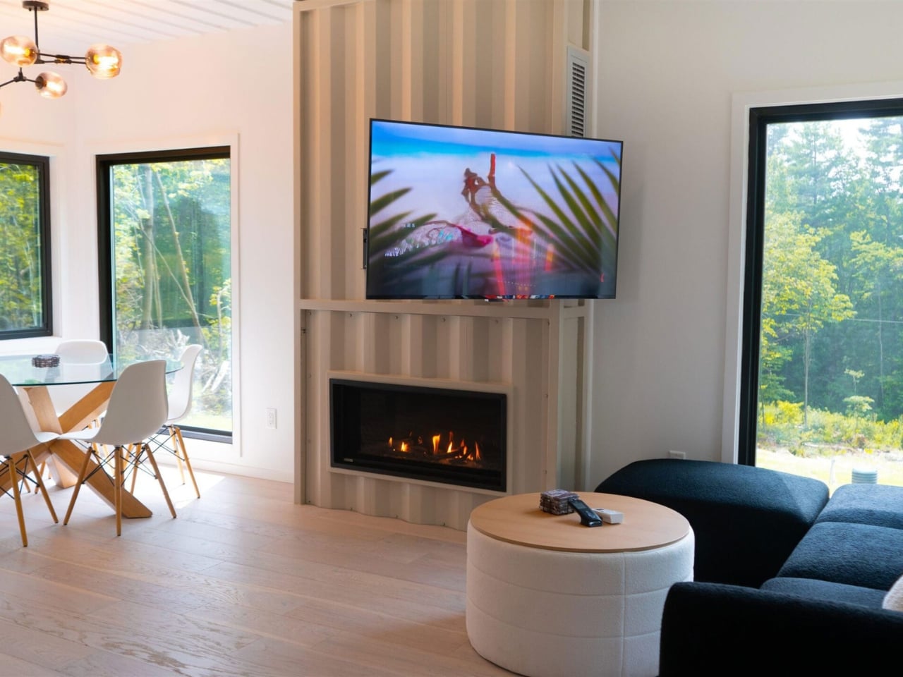
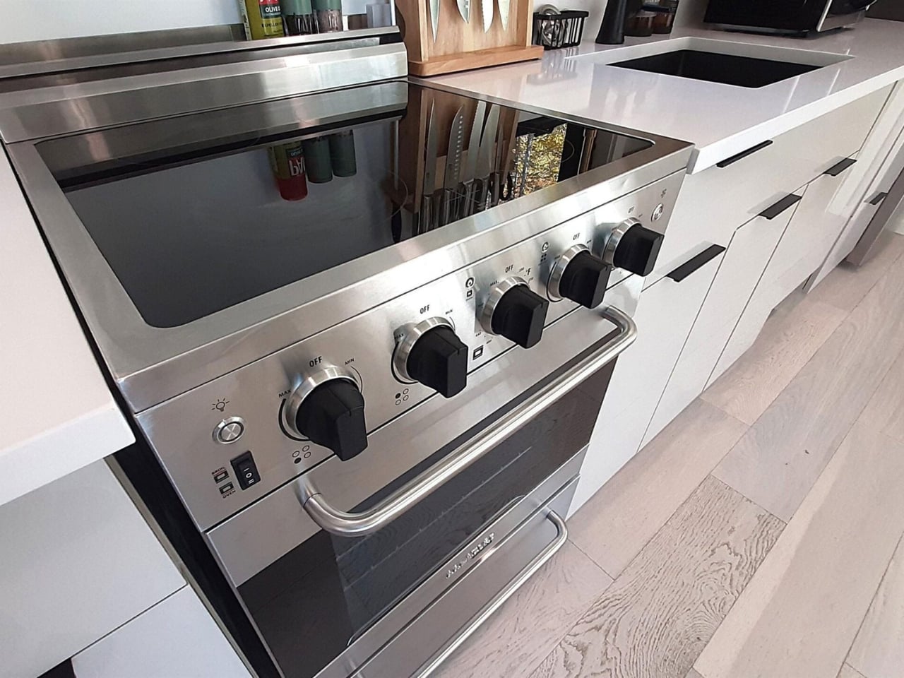
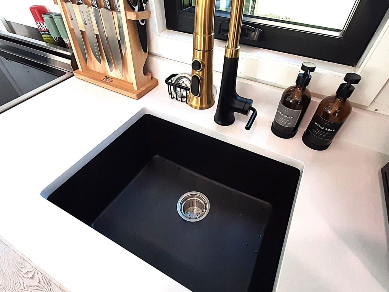
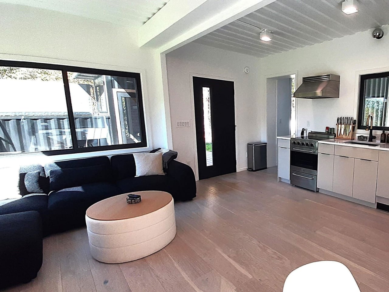
Inside, the layout includes a full kitchen, a wet bar, two separate living areas, and a spiral staircase connecting the two floors. Natural light is the real hero of the interior. Container homes are often criticized for feeling like dim metal tubes, and Backcountry Containers clearly took that criticism to heart. The windows throughout are generous, and the open-plan approach keeps the space from feeling like you’re living inside cargo. The bedrooms and bathrooms are described as “well-appointed,” which is the kind of language designers use when the finishes are actually nice and they’d rather undersell than overpromise.

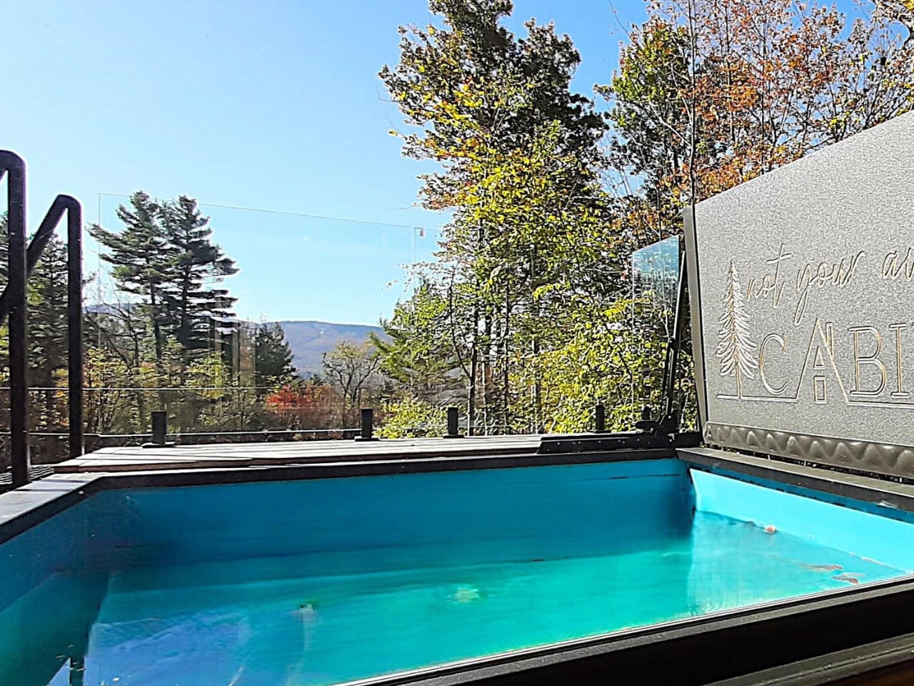
The outdoor situation is where things get genuinely interesting. Two decks, one at ground level and one on the rooftop, anchor the exterior. The views from a rooftop in that corner of the country, at almost any time of year, tend to be worth the climb. But the real conversation piece is the SaunaPlunge container: a custom 20-foot unit that combines a sauna with a three-in-one plunge pool. Cold plunging has had its cultural moment over the past few years, and integrating it directly into the home’s architecture rather than dropping a freestanding tub somewhere near the back porch feels like a legitimately smart call. It treats wellness as infrastructure, not decoration.

Container architecture has been having a sustained moment for over a decade now, and the discourse around it tends to oscillate between two poles. Either it’s framed as some radical act of sustainability (which it is, somewhat, though the modifications and insulation required complicate that story), or it gets dismissed as a design trend that doesn’t actually solve any real housing problem. Both critiques have merit. The Vermont Villa isn’t pretending to fix affordable housing. It’s a well-designed, custom-built home that happens to be made from repurposed industrial materials, and it makes no apology for that.

Backcountry Containers has been building container homes for over a decade, with features on HGTV and the DIY Network to show for it. Every project is handled by their in-house team, from design and metal fabrication to carpentry and plumbing. They know how to deliver a project that doesn’t look like a prototype or a mood board come halfway to life. The Vermont Villa is a finished home with a pool, a sauna, a rooftop deck, and enough interior square footage to feel genuinely livable for a family. That’s the benchmark container homes have been reaching toward for years, and this one clears it comfortably.

The question I keep coming back to isn’t whether container homes are worth it. It’s whether a build like this starts to shift what we consider normal. The Vermont Villa makes a decent case that it should.

The post 5 Containers, a Sauna, and a Rooftop Deck in Rural Vermont first appeared on Yanko Design.
Belgium’s Most Striking Concrete Villa Was Designed by the Dunes

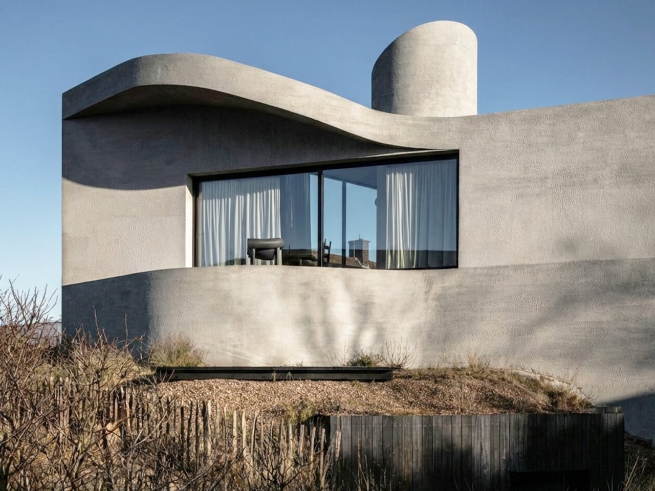
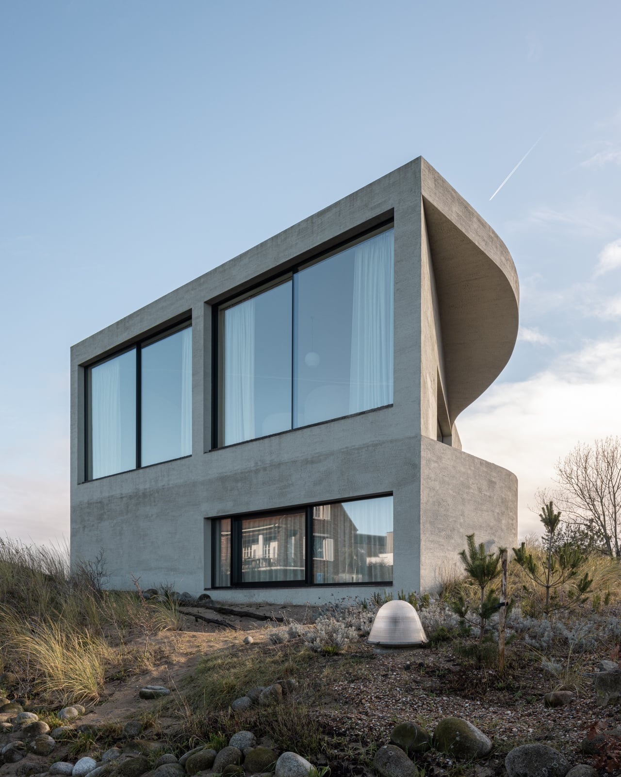
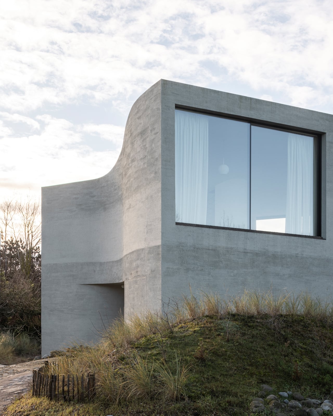
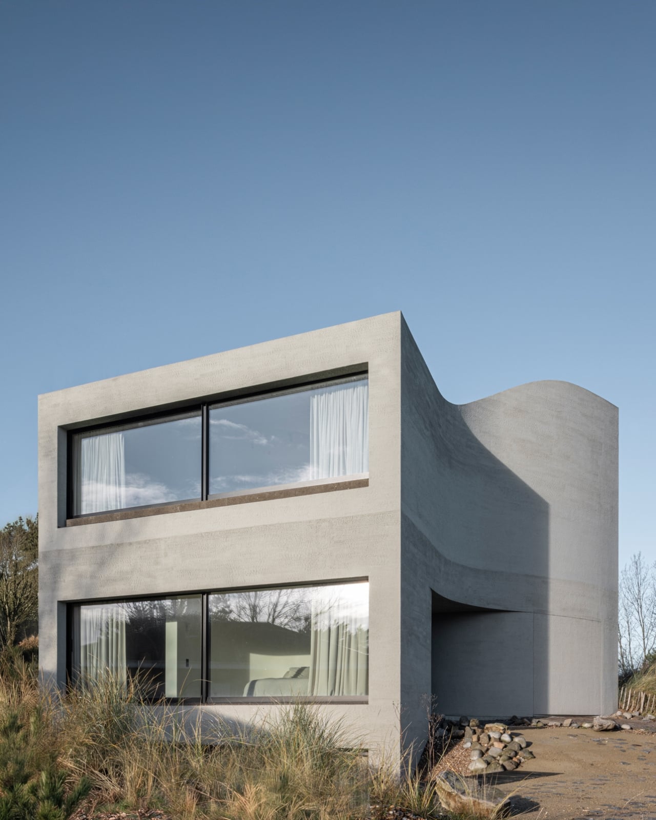
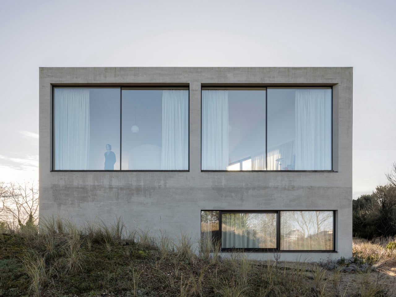
If you’ve ever stood on a beach and watched the tide pull back, you know that moment right before the water retreats completely, when it leaves those delicate horizontal lines etched across wet sand. That’s what the facade of Villa Nouvelle Vague looks like. Not metaphorically. Literally. Belgian architect Magalie Munters designed the concrete surface of this seaside villa in Oostduinkerke with a horizontal grain that mirrors the striations the North Sea leaves behind at low tide. The reference isn’t decorative, it’s structural. And that distinction matters.

The villa sits on a corner plot at the edge of a protected dune reserve in Oostduinkerke, a small coastal town already known for a few wonderfully eccentric things: a ship-shaped restaurant and fishermen who harvest shrimp on horseback. Into this landscape, Munters has introduced something that manages to be arresting without being loud. The form is sculptural and unmistakably modern, but it doesn’t shout. It settles.

Designer: Magalie Munters

The name “Nouvelle Vague” borrows from the French New Wave film movement, and the reference is apt in ways that go beyond the obvious nod to style. The French New Wave was defined by breaking conventional rules while remaining deeply committed to craft. Munters is working in a similar register. For years, her Ghent-based boutique studio has been developing residential architecture with organic geometries, pushing against the idea that construction methods should set the ceiling on what architecture can achieve. “Through that ongoing research, I developed a way of building in which construction and technology no longer act as a limitation to the architecture,” she explains. Villa Nouvelle Vague is where that research cashes out.

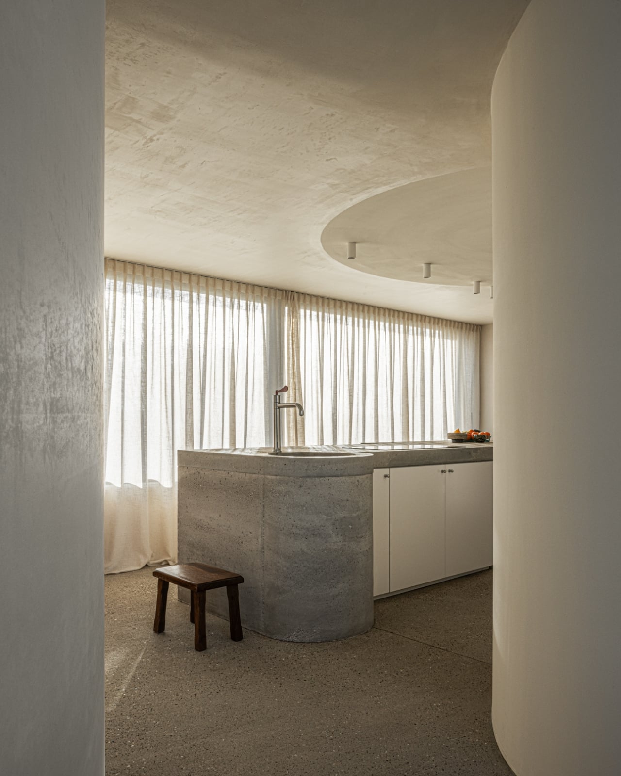
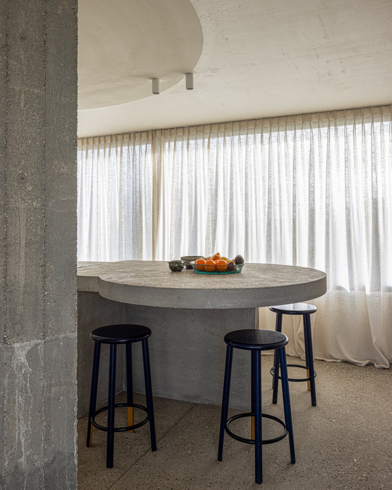
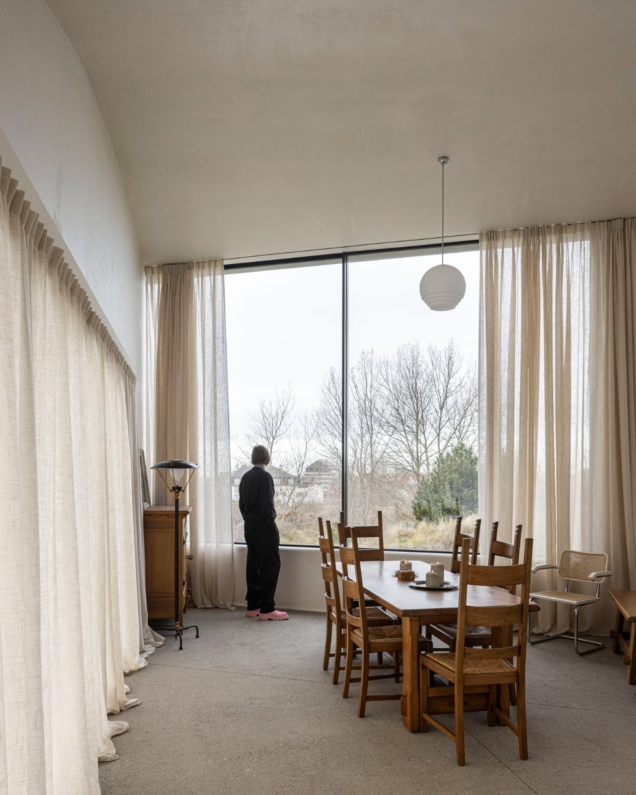
The concrete form is completely curved across the entire volume, not just as a surface treatment but as a governing logic, carried through every detail: the absent roof edges, the curved garage opening, even the way the house integrates into the ground. The bedrooms are half-buried in the dunes, which is both a functional and a conceptual move. The house doesn’t sit on the landscape. It’s anchored into it. Above those buried rooms, the living spaces rise toward the horizon, pulling in light and opening out to views of the dunes in a way that feels earned rather than forced.

The way you move through the house is where Munters’ admiration for Le Corbusier becomes most legible. She’s spoken about his influence, specifically in “the rooftop solarium, in the way spaces expand and contract, and in the vertical shafts that structure movement through the house.” You enter through a vertical shaft that climbs toward the roof before expanding into the main living space. The compression-then-release is theatrical in the best sense. The house is working on your nervous system before you’ve even sat down.

I keep coming back to that word: deliberate. Munters uses it herself: “What might appear as a free form is in fact the result of a very deliberate construction logic.” That’s the tension the villa lives in, and frankly, it’s what makes it interesting. Nothing here is freehand improvisation. The curves look fluid because the logic behind them is airtight. The concrete looks like it grew from the dunes because the architect studied the dunes before she touched a drawing. That’s different from a building that mimics nature for aesthetic points. It’s rarer, and harder.

Belgian architecture doesn’t always get the international visibility it deserves, and Magalie Munters is one of those names worth paying attention to even if residential architecture isn’t usually your thing. Villa Nouvelle Vague is the kind of project that earns its name. It has the confidence of something that knows exactly what it is, and the intelligence not to over-explain itself. Just like the best films of the movement it references.

The post Belgium’s Most Striking Concrete Villa Was Designed by the Dunes first appeared on Yanko Design.
Belgium’s Most Striking Concrete Villa Was Designed by the Dunes

If you’ve ever stood on a beach and watched the tide pull back, you know that moment right before the water retreats completely, when it leaves those delicate horizontal lines etched across wet sand. That’s what the facade of Villa Nouvelle Vague looks like. Not metaphorically. Literally. Belgian architect Magalie Munters designed the concrete surface of this seaside villa in Oostduinkerke with a horizontal grain that mirrors the striations the North Sea leaves behind at low tide. The reference isn’t decorative, it’s structural. And that distinction matters.

The villa sits on a corner plot at the edge of a protected dune reserve in Oostduinkerke, a small coastal town already known for a few wonderfully eccentric things: a ship-shaped restaurant and fishermen who harvest shrimp on horseback. Into this landscape, Munters has introduced something that manages to be arresting without being loud. The form is sculptural and unmistakably modern, but it doesn’t shout. It settles.

Designer: Magalie Munters

The name “Nouvelle Vague” borrows from the French New Wave film movement, and the reference is apt in ways that go beyond the obvious nod to style. The French New Wave was defined by breaking conventional rules while remaining deeply committed to craft. Munters is working in a similar register. For years, her Ghent-based boutique studio has been developing residential architecture with organic geometries, pushing against the idea that construction methods should set the ceiling on what architecture can achieve. “Through that ongoing research, I developed a way of building in which construction and technology no longer act as a limitation to the architecture,” she explains. Villa Nouvelle Vague is where that research cashes out.

The concrete form is completely curved across the entire volume, not just as a surface treatment but as a governing logic, carried through every detail: the absent roof edges, the curved garage opening, even the way the house integrates into the ground. The bedrooms are half-buried in the dunes, which is both a functional and a conceptual move. The house doesn’t sit on the landscape. It’s anchored into it. Above those buried rooms, the living spaces rise toward the horizon, pulling in light and opening out to views of the dunes in a way that feels earned rather than forced.

The way you move through the house is where Munters’ admiration for Le Corbusier becomes most legible. She’s spoken about his influence, specifically in “the rooftop solarium, in the way spaces expand and contract, and in the vertical shafts that structure movement through the house.” You enter through a vertical shaft that climbs toward the roof before expanding into the main living space. The compression-then-release is theatrical in the best sense. The house is working on your nervous system before you’ve even sat down.

I keep coming back to that word: deliberate. Munters uses it herself: “What might appear as a free form is in fact the result of a very deliberate construction logic.” That’s the tension the villa lives in, and frankly, it’s what makes it interesting. Nothing here is freehand improvisation. The curves look fluid because the logic behind them is airtight. The concrete looks like it grew from the dunes because the architect studied the dunes before she touched a drawing. That’s different from a building that mimics nature for aesthetic points. It’s rarer, and harder.

Belgian architecture doesn’t always get the international visibility it deserves, and Magalie Munters is one of those names worth paying attention to even if residential architecture isn’t usually your thing. Villa Nouvelle Vague is the kind of project that earns its name. It has the confidence of something that knows exactly what it is, and the intelligence not to over-explain itself. Just like the best films of the movement it references.

The post Belgium’s Most Striking Concrete Villa Was Designed by the Dunes first appeared on Yanko Design.
A 1930s French Cabin Brought Back the Pit, and It’s the Best Part

If you grew up watching old movies or flipping through your parents’ architecture magazines from the 70s, you probably remember the conversation pit. That sunken, circular seating area built into the floor, ringed with cushions, usually occupied by someone in a turtleneck holding a glass of wine. It felt like the most optimistic design idea of its era: a room within a room, purpose-built for the act of simply talking to each other. Then open-plan living came along and flattened everything, and the pit more or less disappeared.

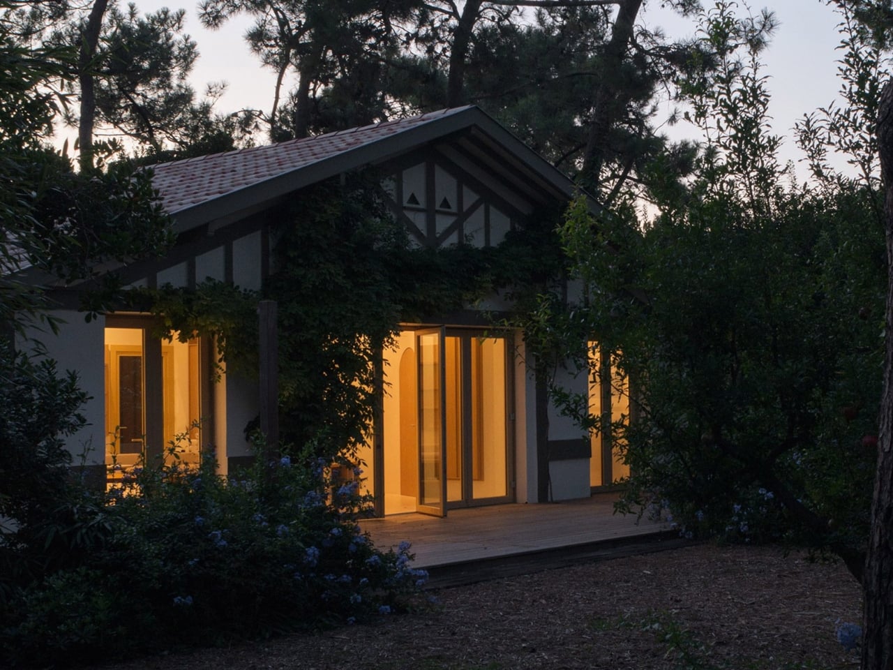
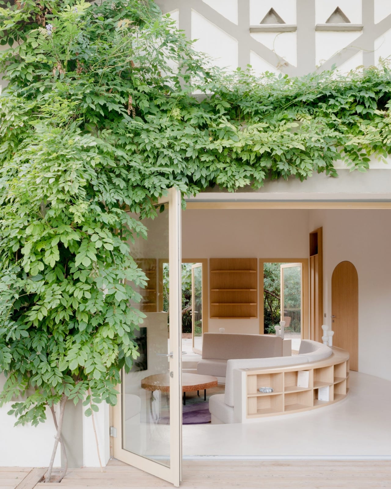
Studio Razavi just brought it back, and they did it in about the best possible setting you could imagine. The Paris, London, and New York-based firm recently completed Seaside House, a renovation of a 1930s coastal cabin at the tip of Cap Ferret, a narrow peninsula near Bordeaux, France. The structure sits nestled among towering pine trees, which is already a lot for any building to live up to. But the interior is where things get quietly radical.

Designer: Studio Razavi

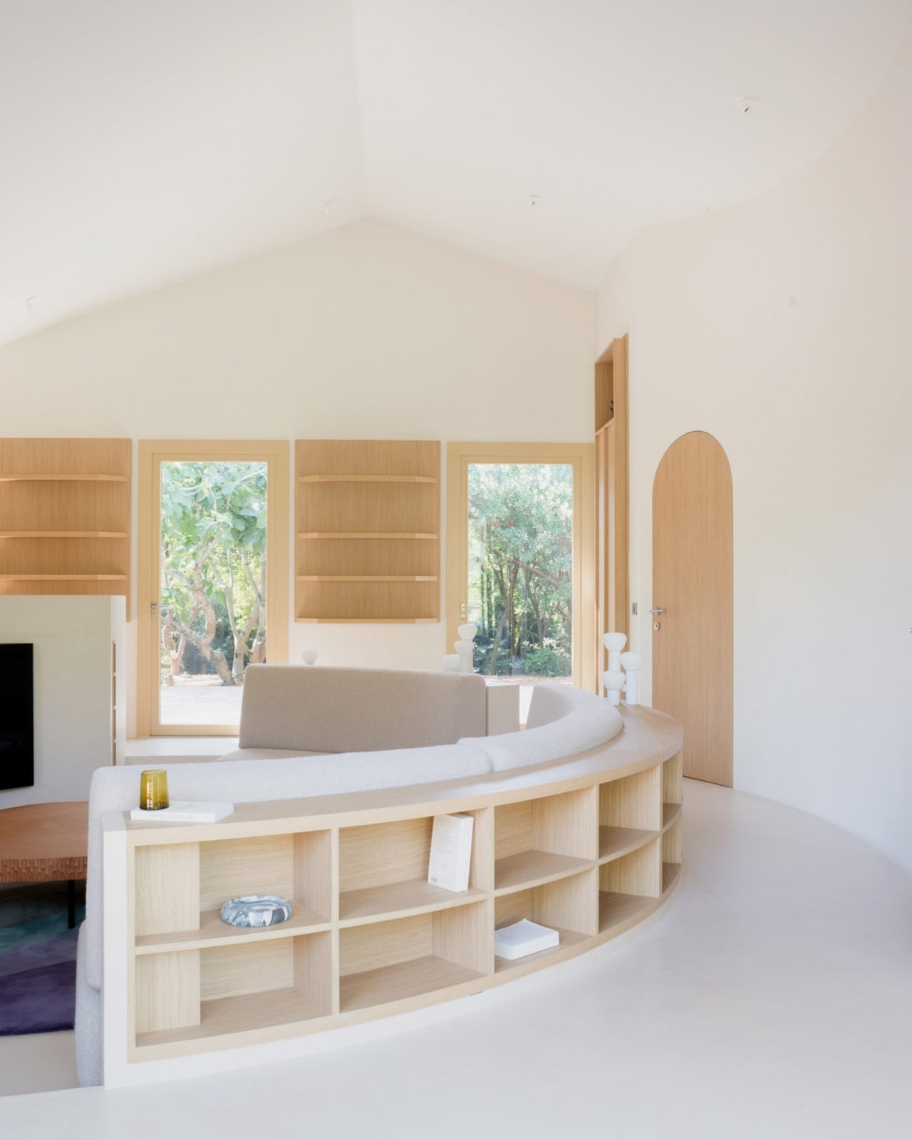
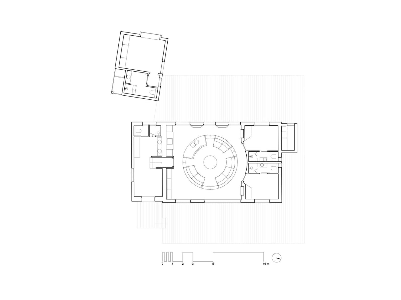
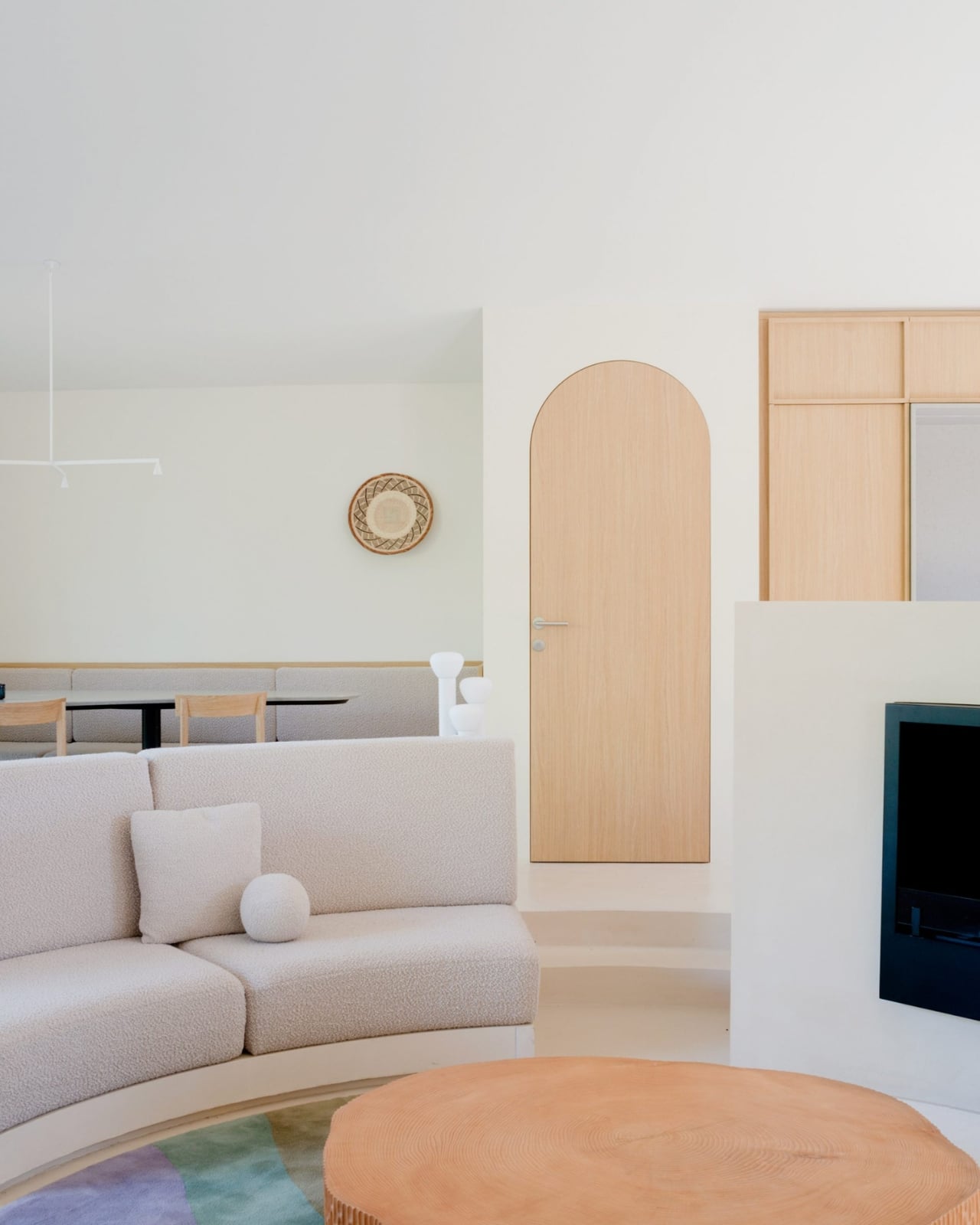
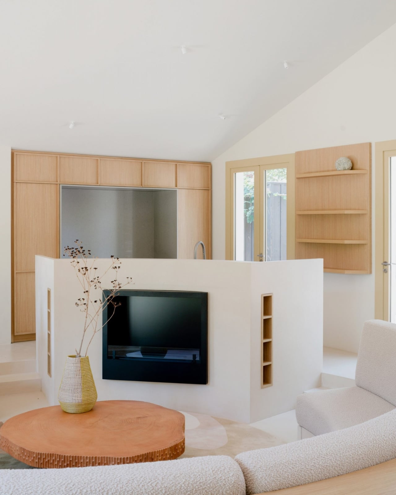
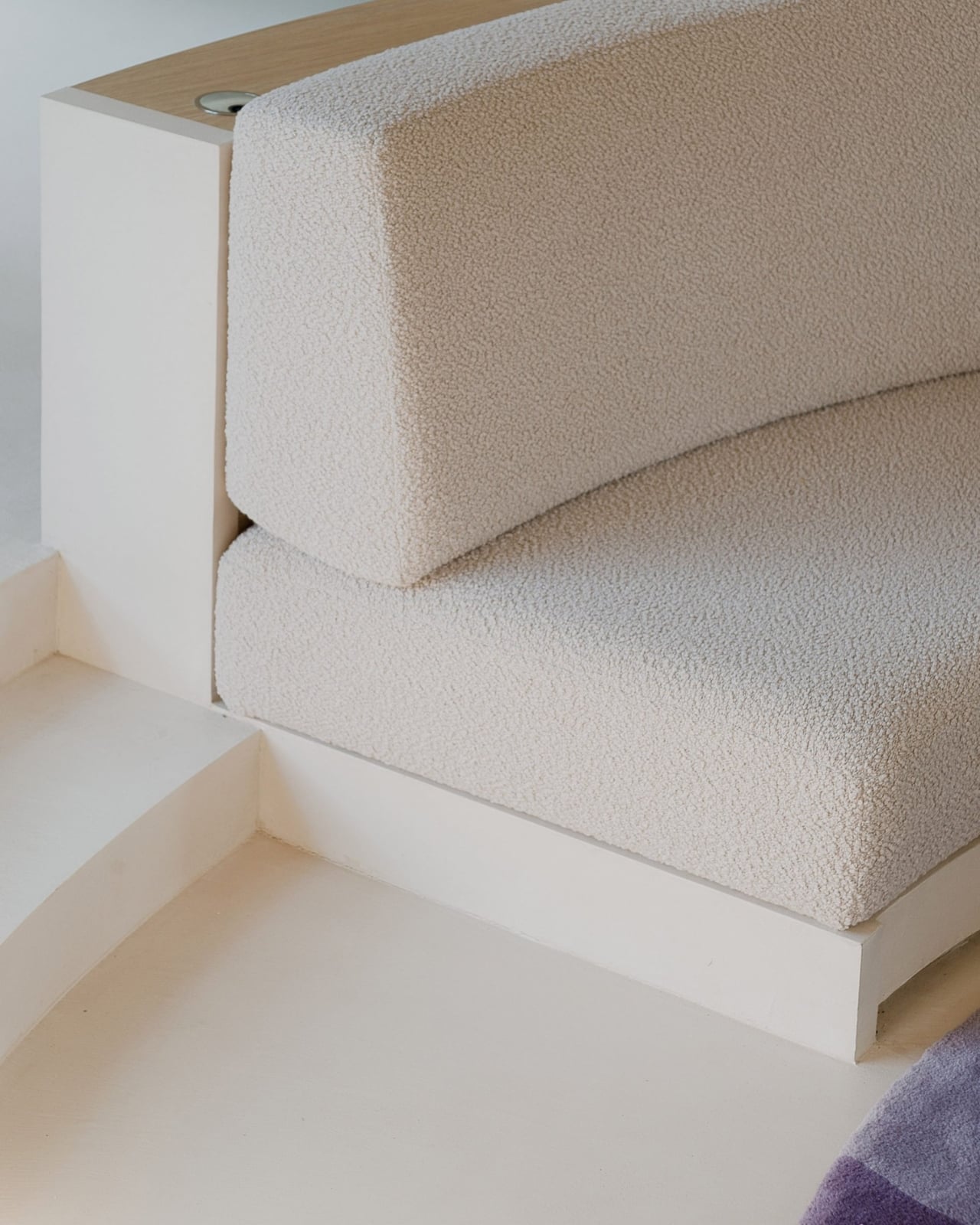
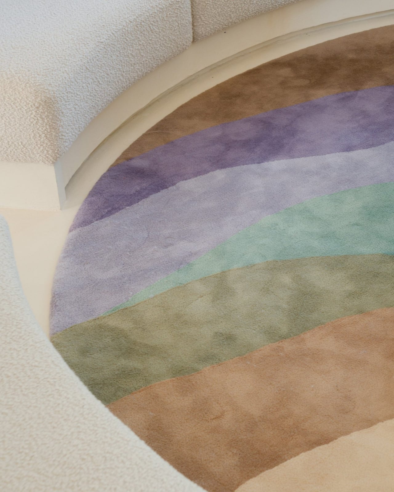
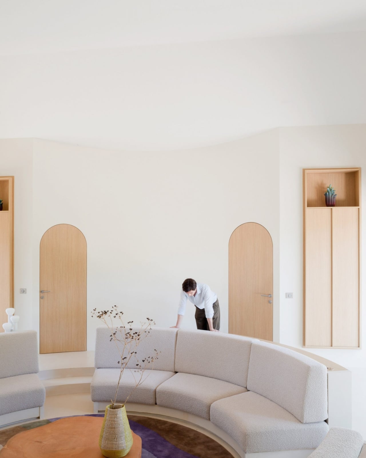
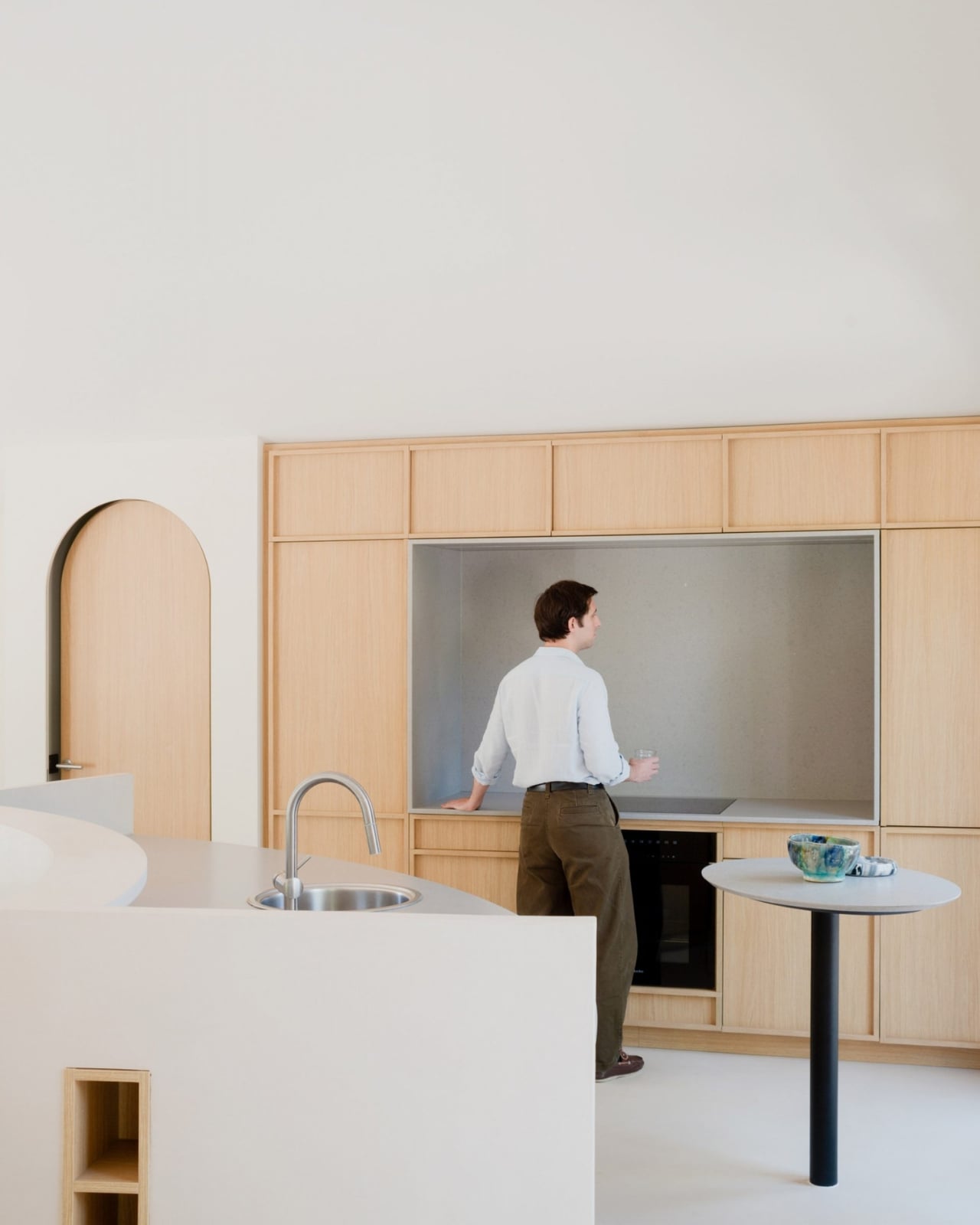
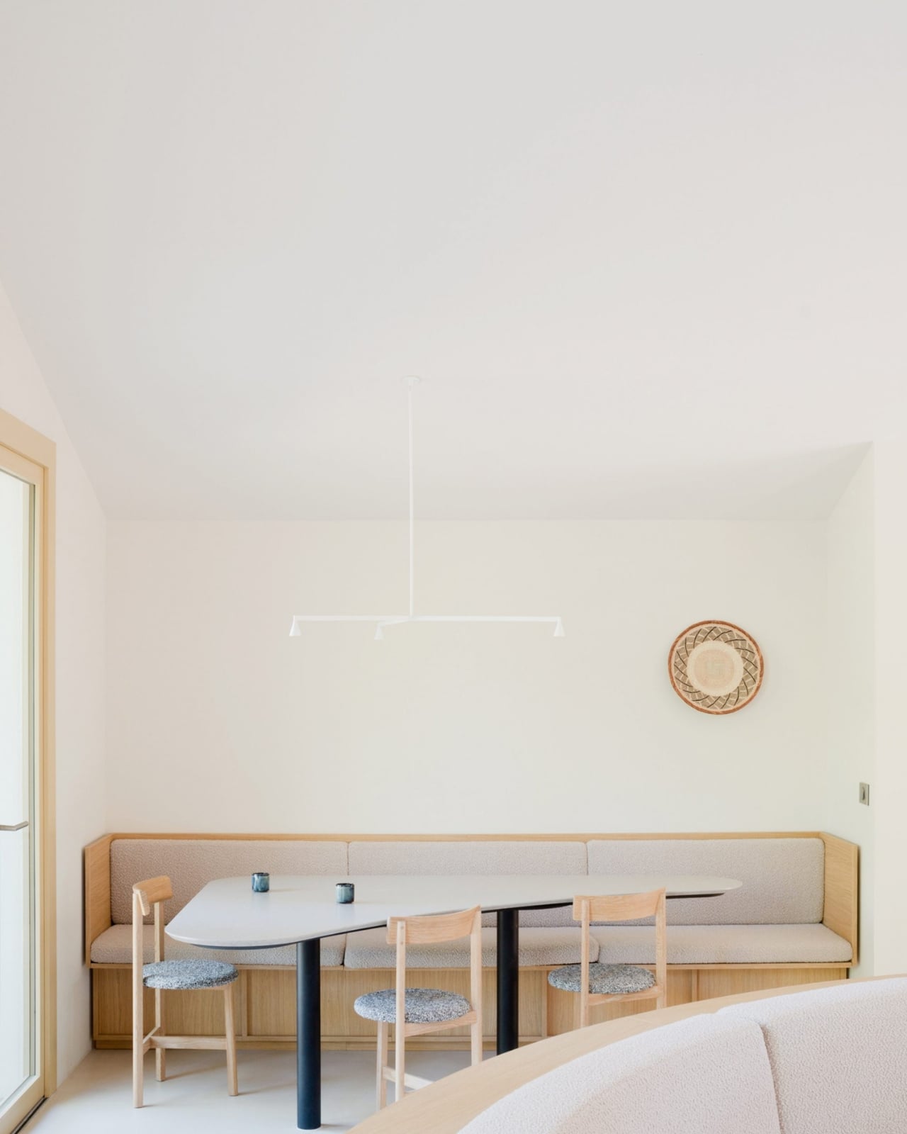
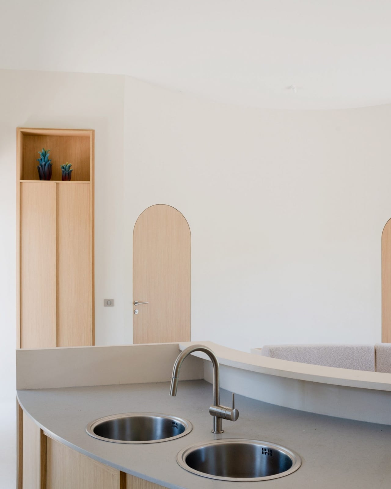
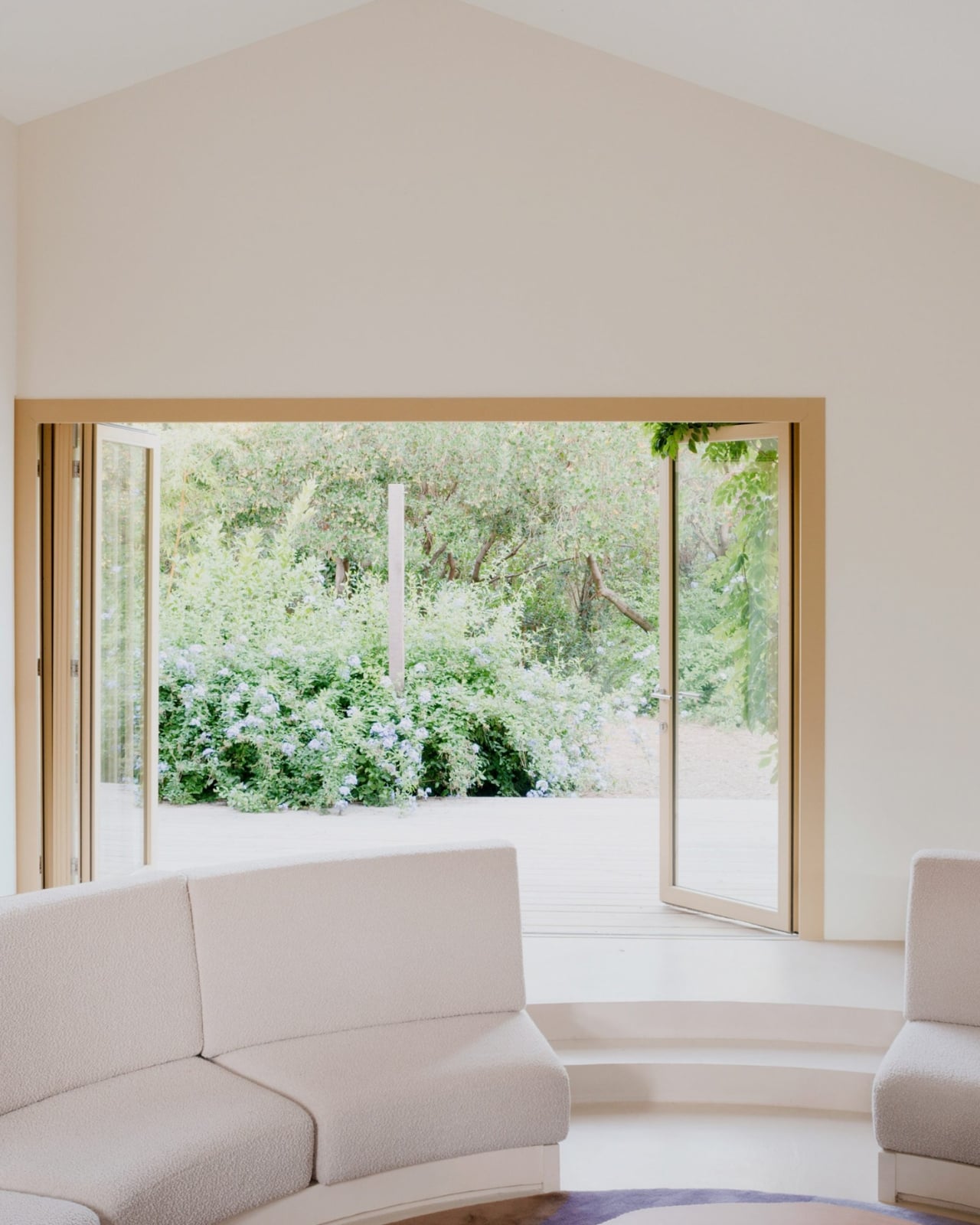
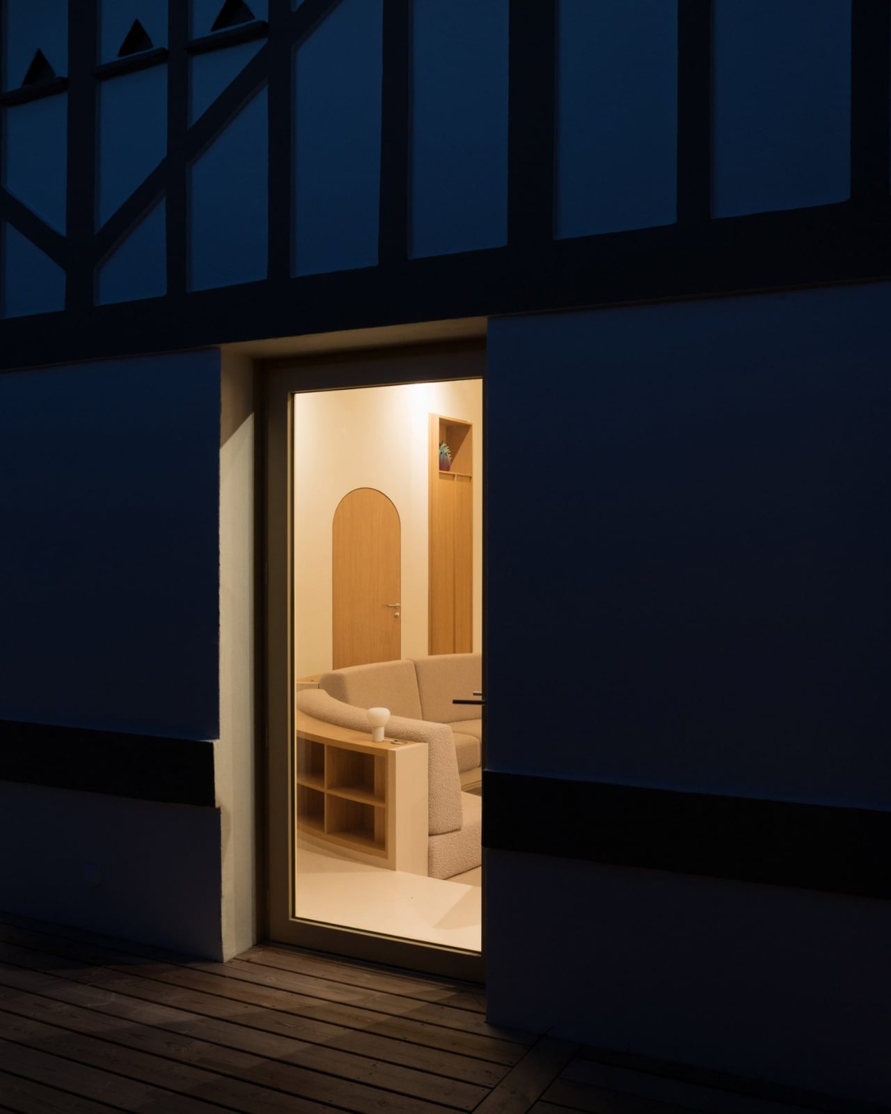
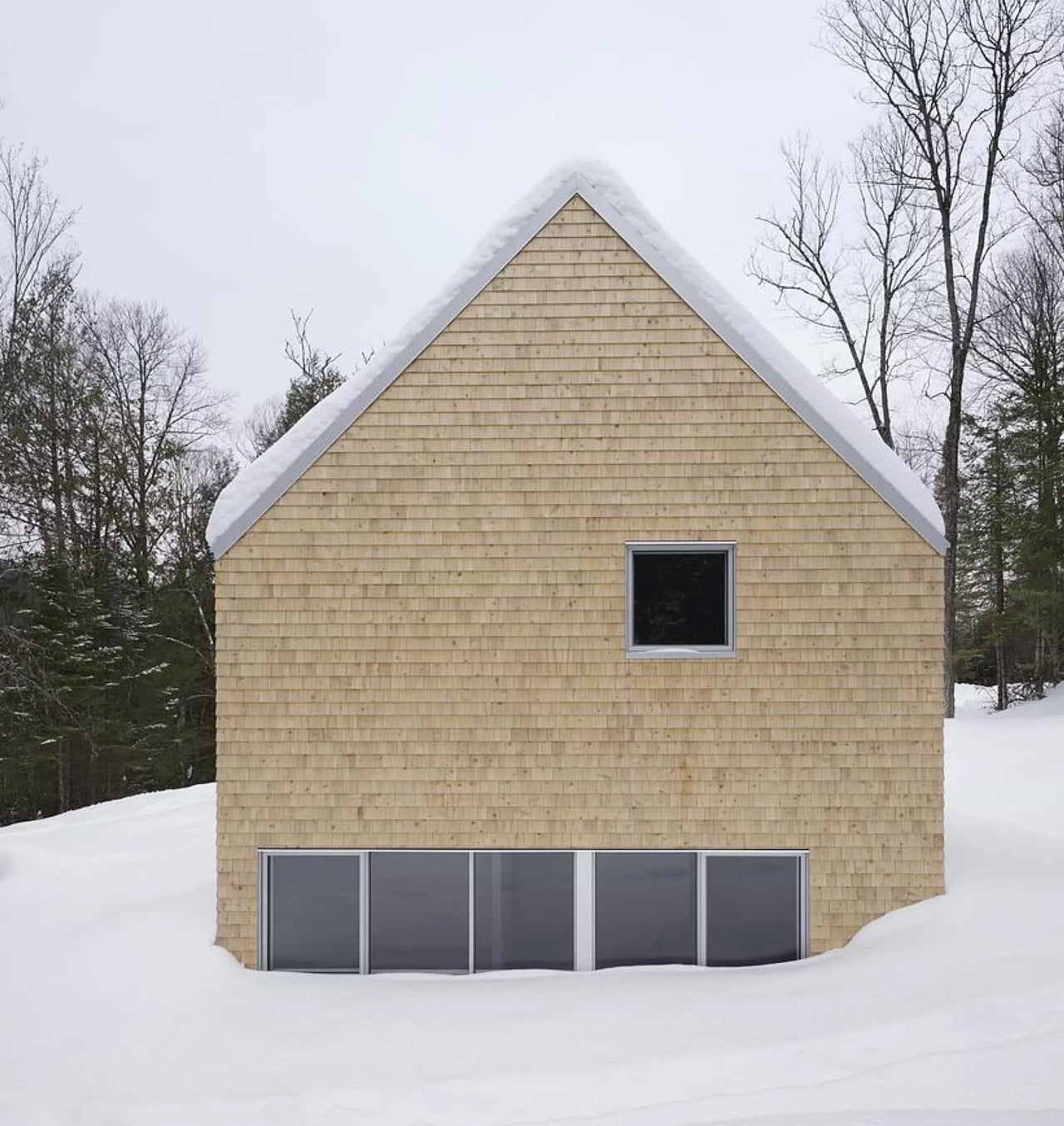
All of the cabin’s original partition walls were stripped out entirely, leaving just the building’s envelope standing. In the center of what became one long, open living space, the architects placed a circle. A sunken circular living room, specifically, with a low perimeter wall that integrates the kitchen sink and storage on one side, and steps leading down into the seating area on the other. Two decked terraces bookend the space, one on each facade of the house.

Project architects Guillen Berniolles and Michele Sacchi described it as a direct response to the local lifestyle around Cap Ferret, where people are constantly moving between indoors and outdoors. “The local lifestyle revolves around constantly moving in and out of houses, which led us to opt for a centrally sunken living room that creates a circulation flow all around,” they told Dezeen. The pit, in other words, isn’t just decorative. It gives the house its entire traffic pattern.
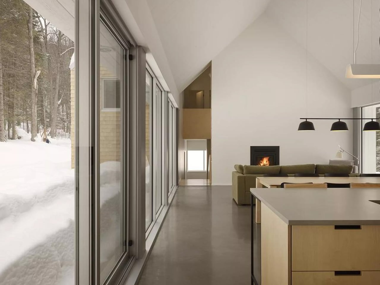
That reasoning matters because it pushes back against the way we usually justify bold design choices. We tend to dress them up in language about “flow” and “intention,” which often means nothing. Here, the logic is actually grounded in how real people use a real place. You come in from the terrace, the circle pulls you in, and then you drift out the other side. It’s a house that choreographs you without you noticing, and that kind of invisible architecture is genuinely hard to pull off.

The material choices are just as considered. Solid wood furniture and veneer are used throughout as a nod to the surrounding Landes forest, which is not only France’s largest but also Europe’s most extensive man-made forest. That context matters. A coastal house in Cap Ferret sits at the intersection of sea and forest, and the design doesn’t pretend otherwise. It leans into both, which gives the whole renovation a rootedness you don’t always see in coastal homes.

A separate guest annexe, clad in dark timber, sits to the west of the main cabin, blending quietly into the tree trunks around it. It’s the kind of restrained detail that separates a thoughtful renovation from a merely stylish one.

The conversation pit feels timely for a reason that goes beyond nostalgia. We spend so much time designing spaces for productivity, for content, for function, that a space designed specifically for conversation feels almost radical now. A sunken circle in a beach house that says, essentially, sit here and talk to each other, is a quiet but pointed statement. I don’t think it’s a coincidence that it lands now.

Studio Razavi has always been good at finding the architectural move that feels both inevitable and completely unexpected once you see it. Seaside House is that in full. The shell stayed. Everything else became about the circle at the center of it, and somehow, that’s more than enough.

The post A 1930s French Cabin Brought Back the Pit, and It’s the Best Part first appeared on Yanko Design.