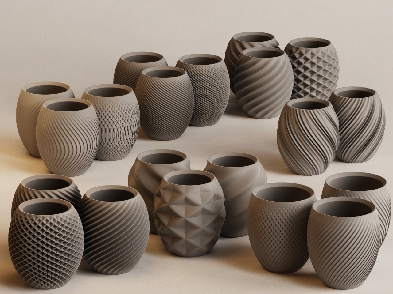
3D printing is redefining the language of future technology and design. Tech peripherals are evolving from standardized, mass-market products into sculpted forms. This transformation signals a tectonic shift – where precision fabrication meets individuality, and performance aligns seamlessly with form.
For designers and conscious consumers alike, 3D printing enables precise ergonomics, material efficiency, and expressive geometry to coexist seamlessly. The result goes beyond customization, fostering a new ecosystem of tools that respect sensory feedback and minimize waste. It transforms everyday technology into a refined, human-centered design experience across industries ranging from consumer electronics and gaming to wearable tech and medical innovation.
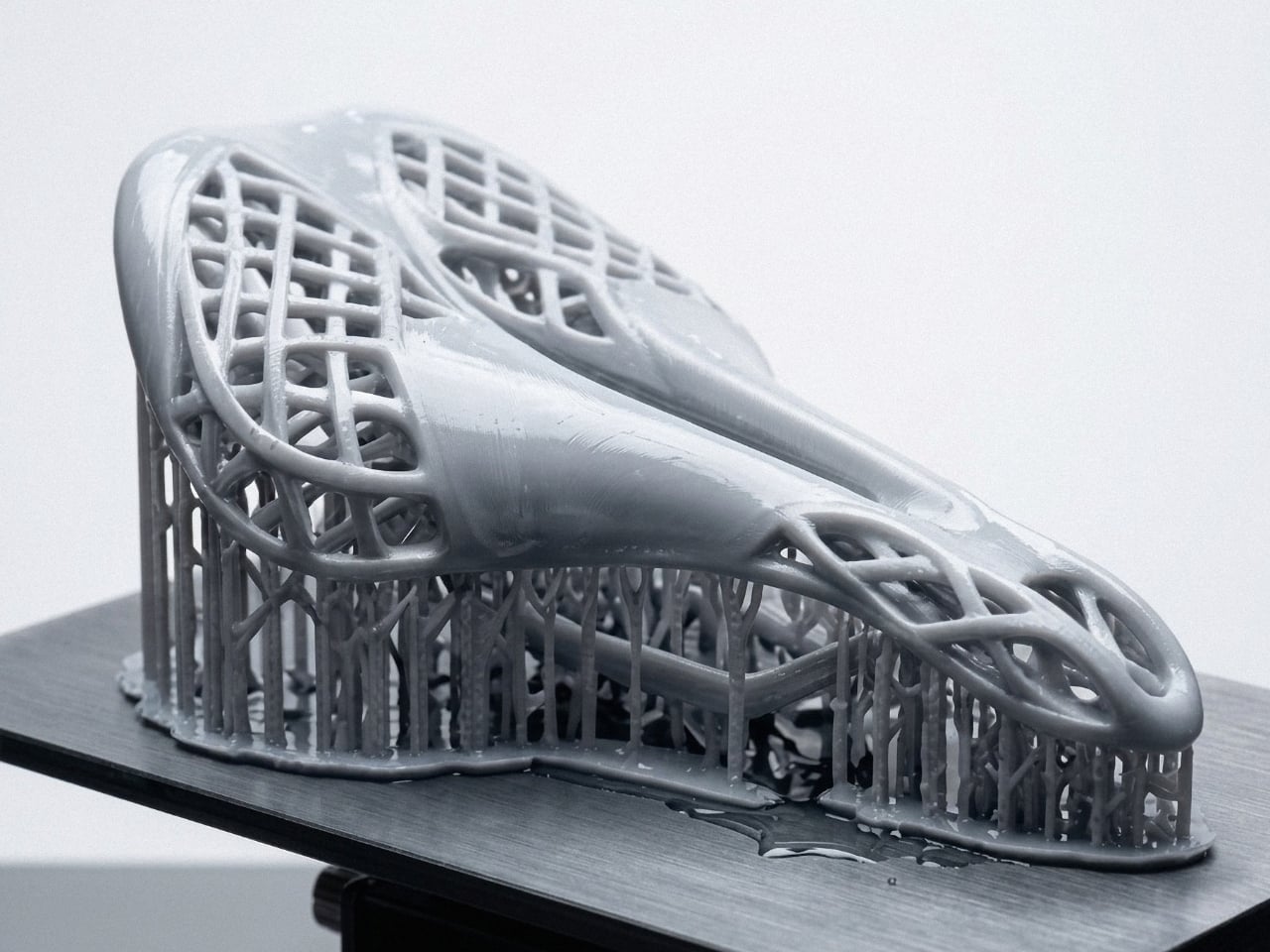
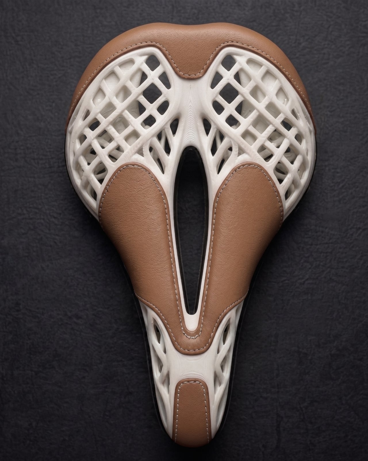
1. Computer Peripheral Tectonics
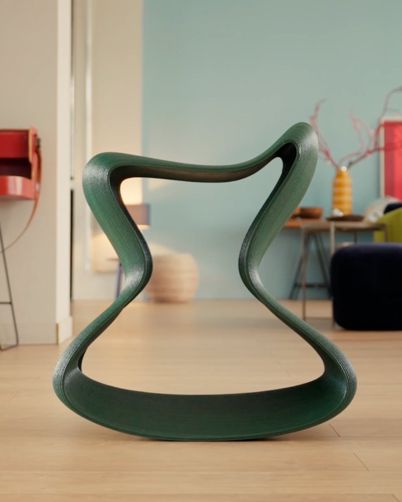
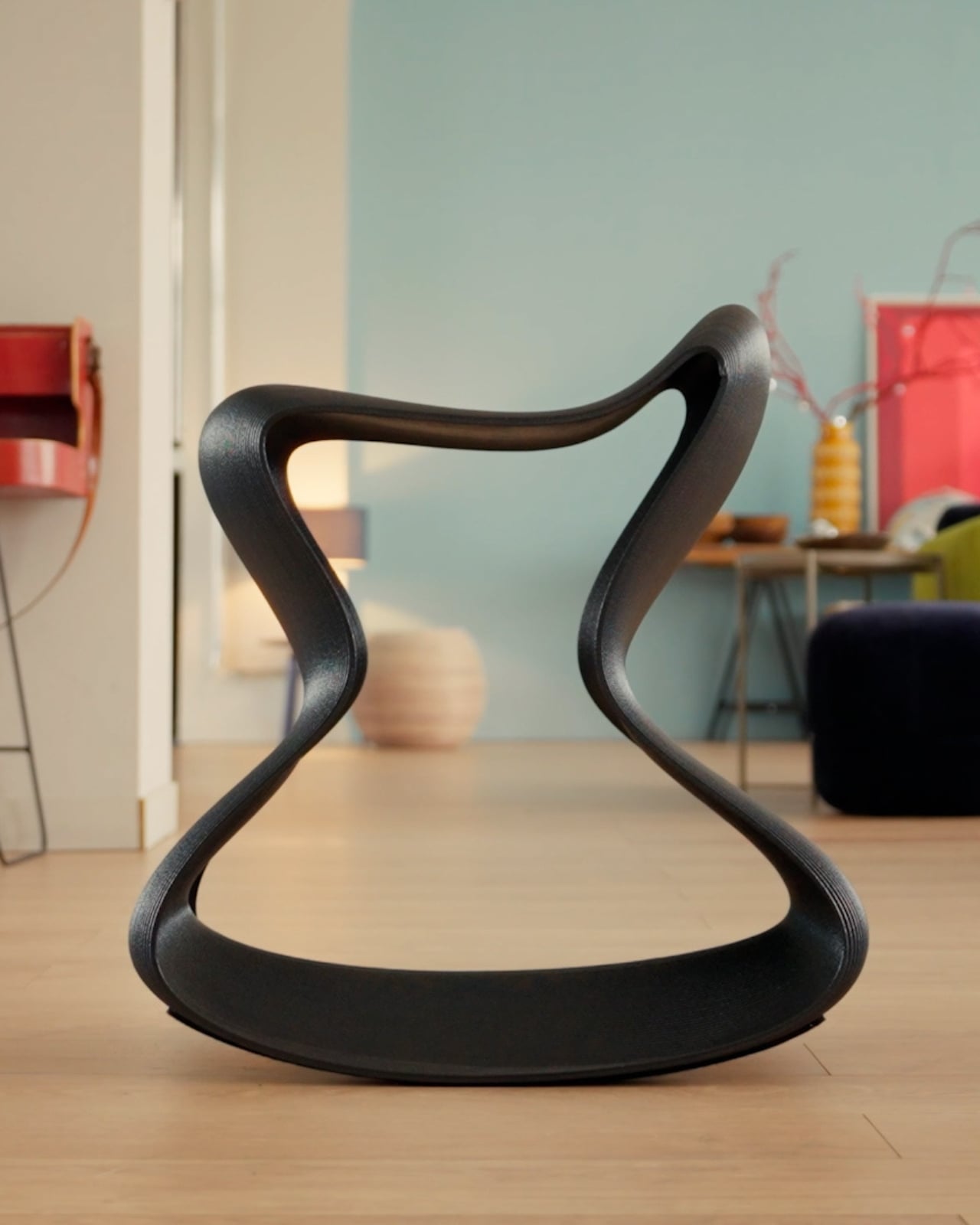
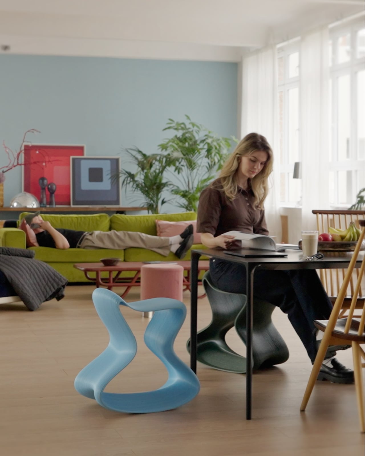
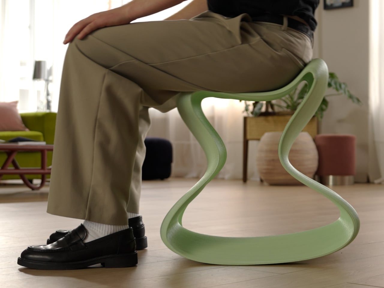
The workstation now operates as a micro-architectural environment where precision, materiality, and human anatomy converge. Through 3D printing, the computer peripheral is redefined from a standardized accessory into a deliberately engineered component. Mice, keyboards, and input tools become tectonic objects that are formed with structural clarity and material authenticity, responding directly to natural hand geometry and movement patterns rather than generic manufacturing molds.
This transformation delivers tangible ergonomic advantages by minimizing repetitive strain through proportionate scaling and calibrated spatial alignment. As design thinking evolves, customized printed interfaces are recognized for enhancing workflow efficiency and sensory engagement. Tactile feedback becomes integrated into the rhythm of work, elevating everyday digital interaction into a more intuitive, refined, and human-centered experience.
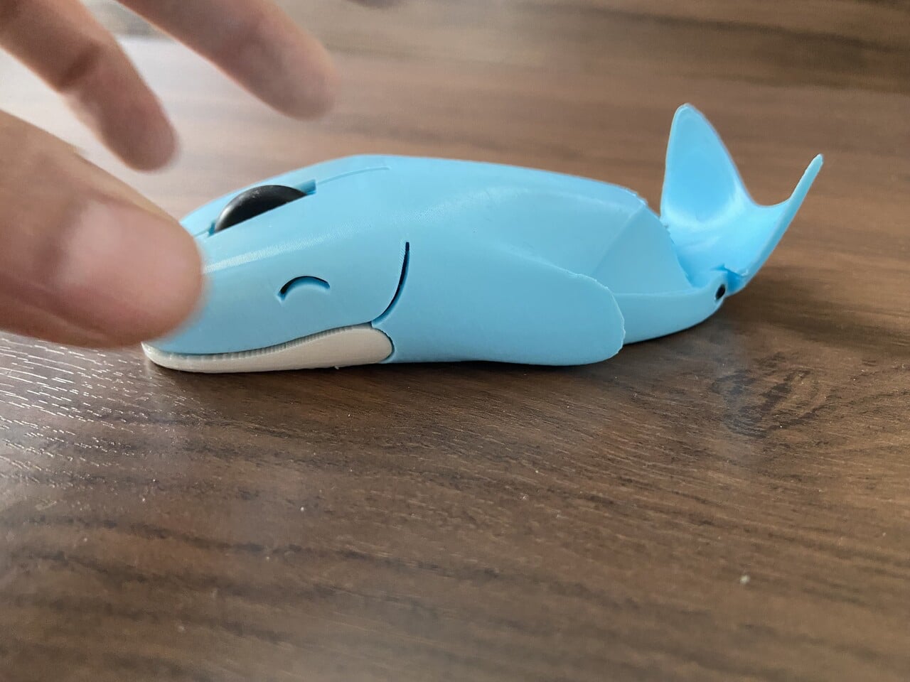
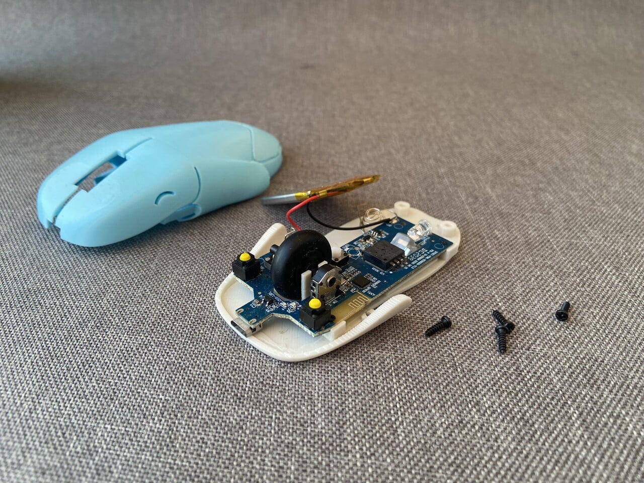
This mouse – Whaley is not just a character but a fully realized product shaped through iteration and hands-on experimentation. What began as a simple whale sketch evolved into a compact wireless mouse designed to balance personality with practicality. The form is sculpted to sit naturally under your palm, with the whale’s rounded back supporting the hand instead of mimicking a generic plastic shell. Its head integrates the left and right click buttons, while the scroll wheel is positioned like a subtle blowhole, blending function seamlessly into form.
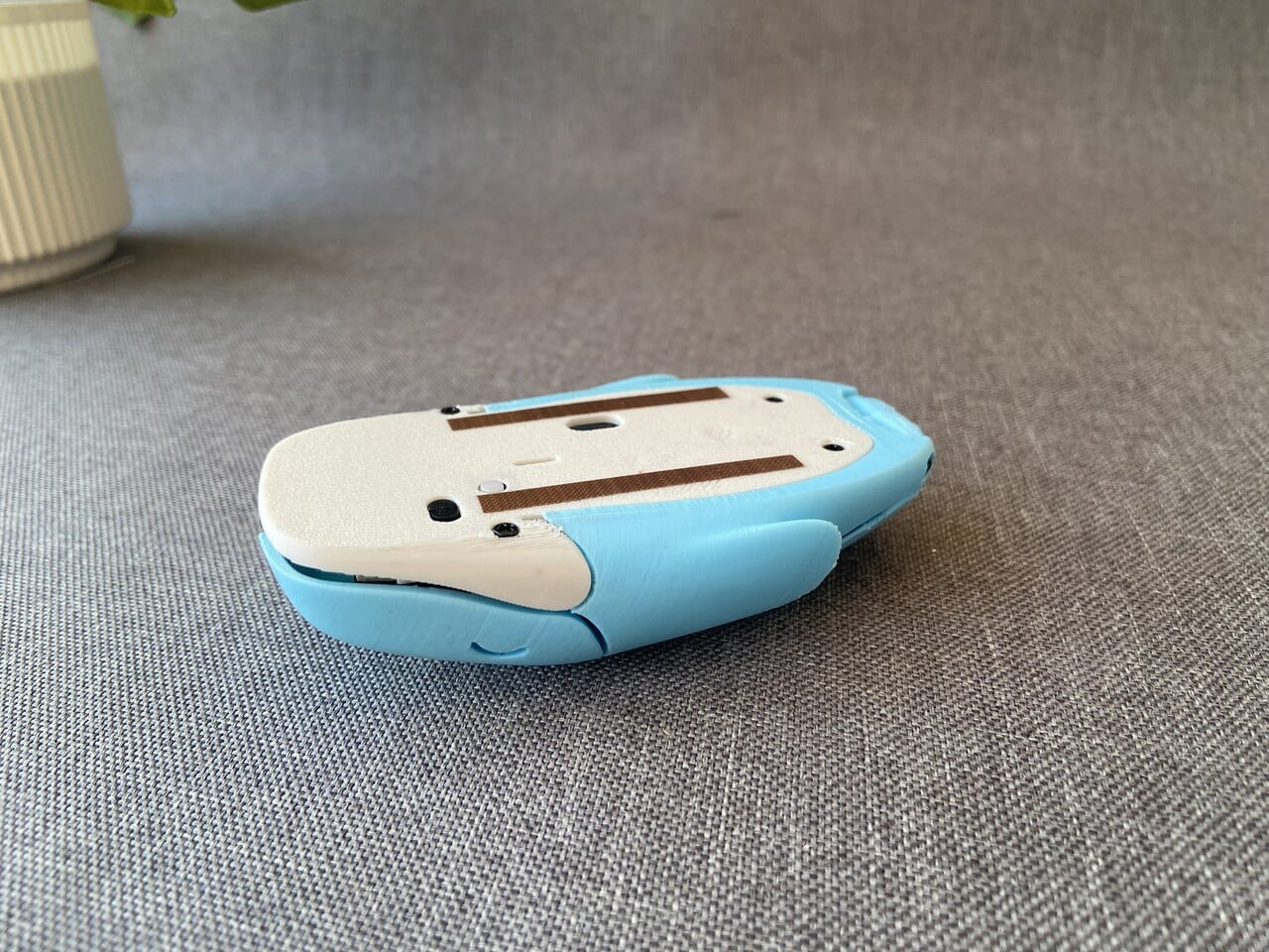

The body went through multiple 3D-printed prototypes, refining the curve of the spine, the flexibility of the click panels, and the fit around the internal components. Electronics from a standard wireless mouse were carefully transplanted into a custom shell, ensuring reliable tracking and smooth scrolling.
2. Sculpted Gaming Interfaces
In the gaming sphere, 3D printing unlocks sculptural freedom that reshapes standard controllers into precision-engineered ergonomic forms. Instead of uniform plastic casings, high-performance shells are built with intricate lattice geometries that reduce weight while maintaining structural rigidity. This layered construction improves airflow, supports thermal regulation during extended sessions, and enhances overall durability.
Beyond function, the aesthetic impact is equally transformative. Integrated LEDs diffused through translucent printed lattices create atmospheric depth and spatial glow. The controller becomes immersive architecture in hand and less of a mechanical device and more a responsive extension of the player’s digital identity, blending sensory engagement with advanced fabrication technology.
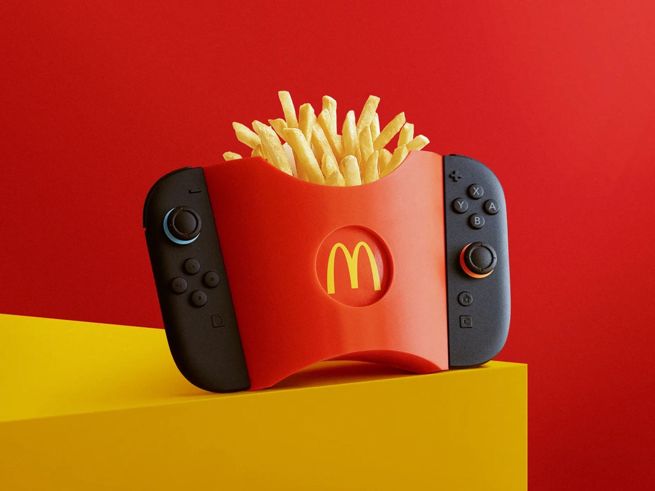
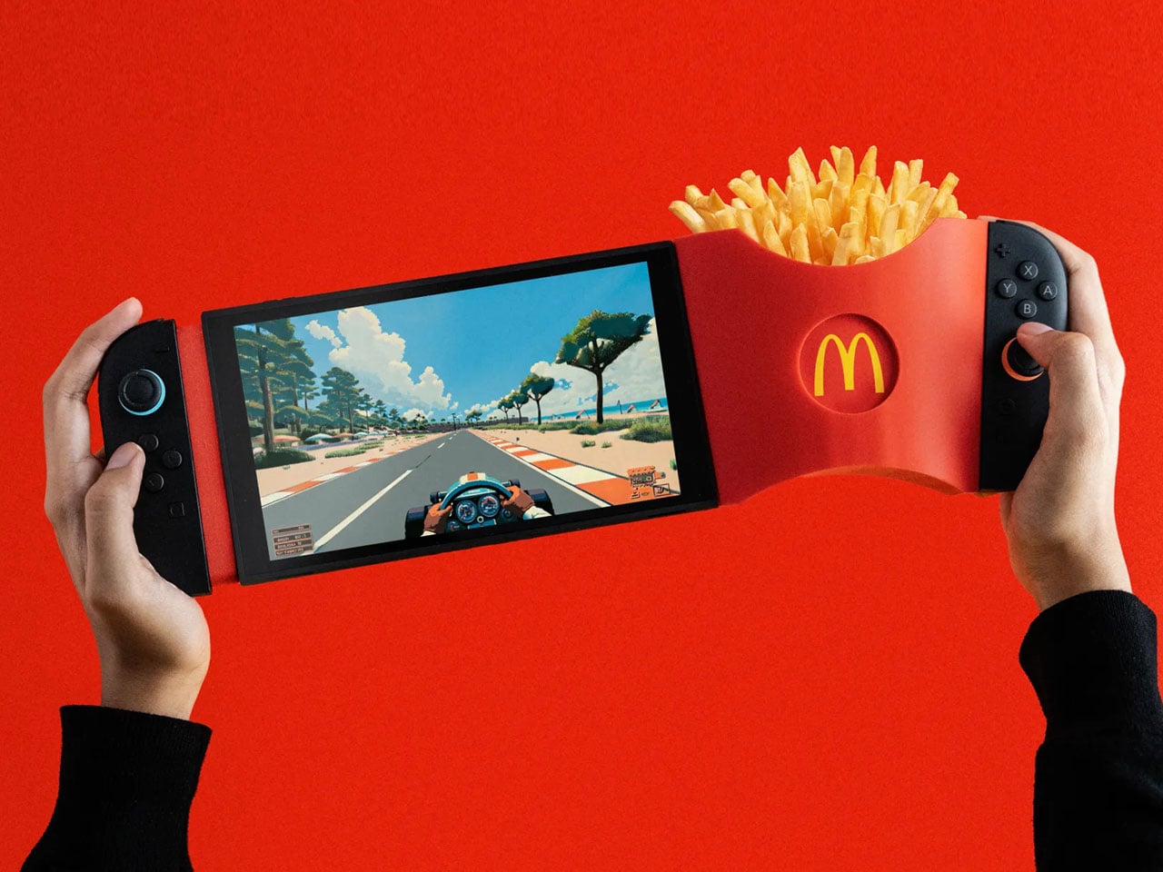
GamiFries is a purpose-built 3D-printed accessory designed exclusively for the Nintendo Switch 2. It functions as a clip-on fries holder that attaches directly to the console using its built-in magnetic system, locking into place with a clean, secure snap. The structure is engineered to remain stable in both handheld and docked modes, ensuring it does not interfere with gameplay, button access, or screen visibility. Its lightweight printed body keeps the added load manageable while maintaining balance during extended play sessions.
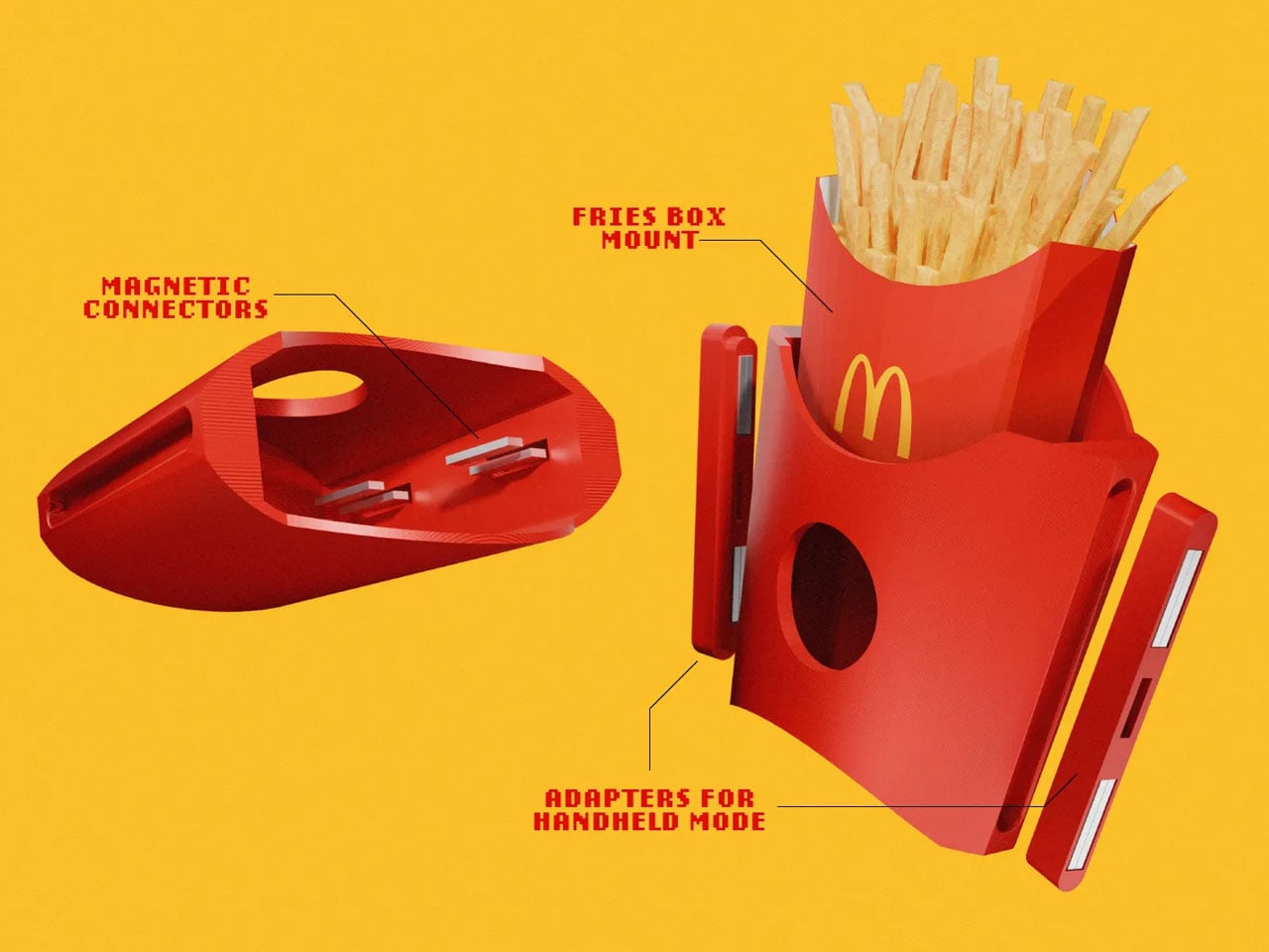
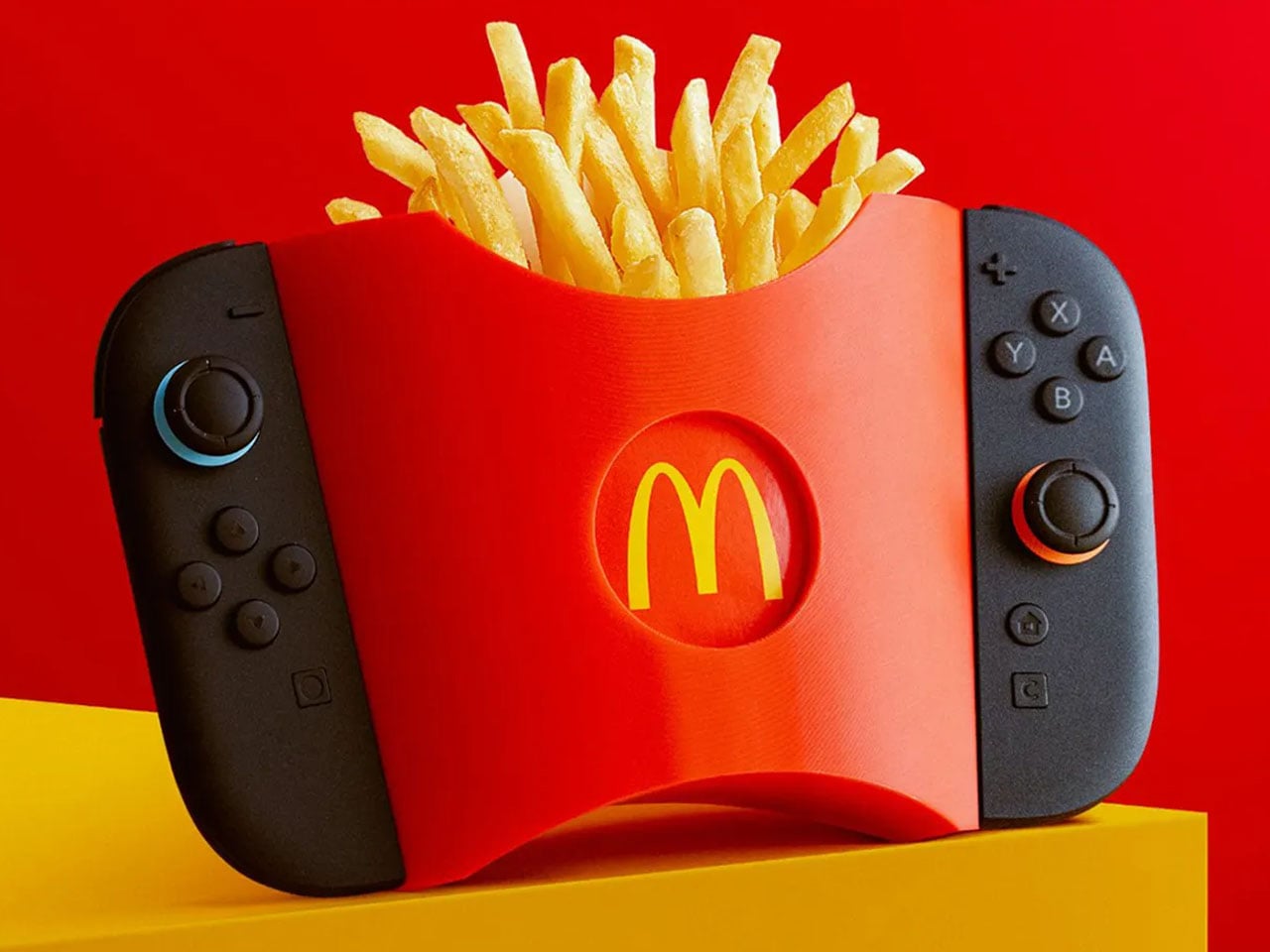
The container replicates the familiar silhouette and ridged texture of a classic McDonald’s fries pack, but its proportions are optimized to sit flush against the console. Fasteners and adapters are integrated into the design for a firm hold, and minor magnetic polarity issues can be corrected through simple recalibration.
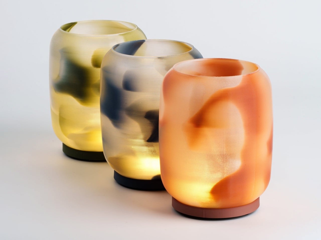
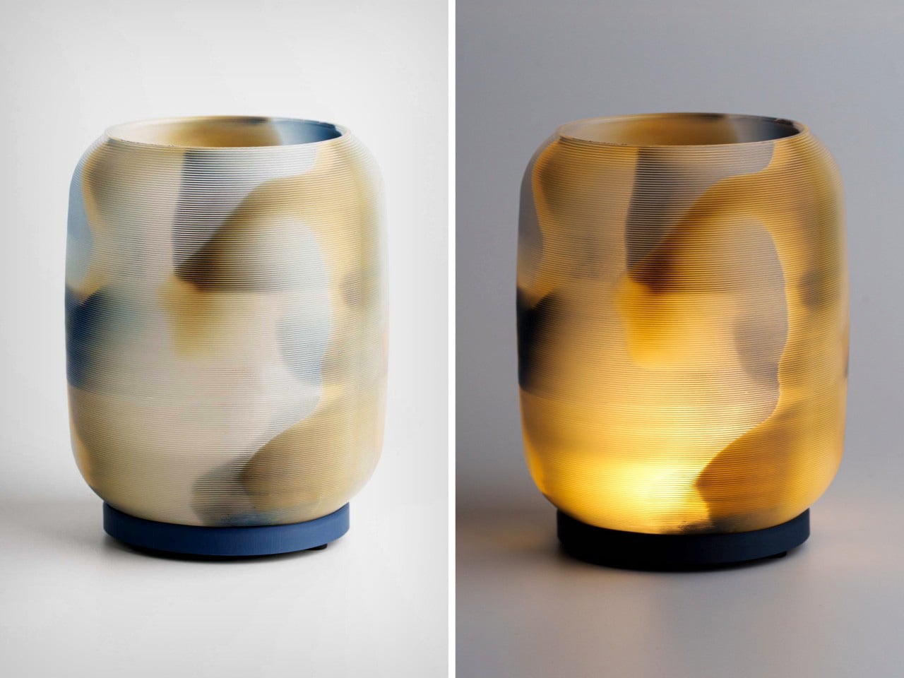
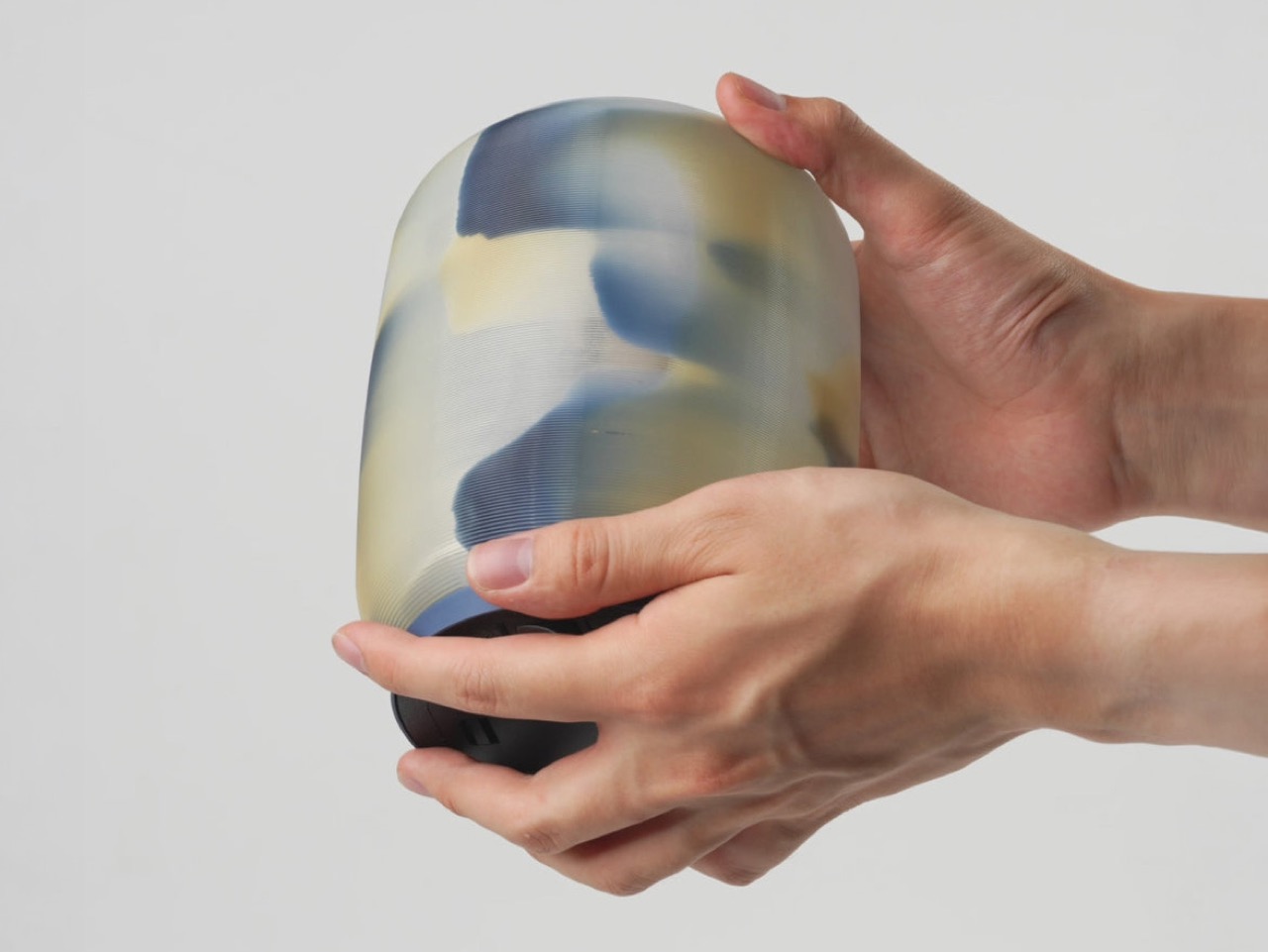
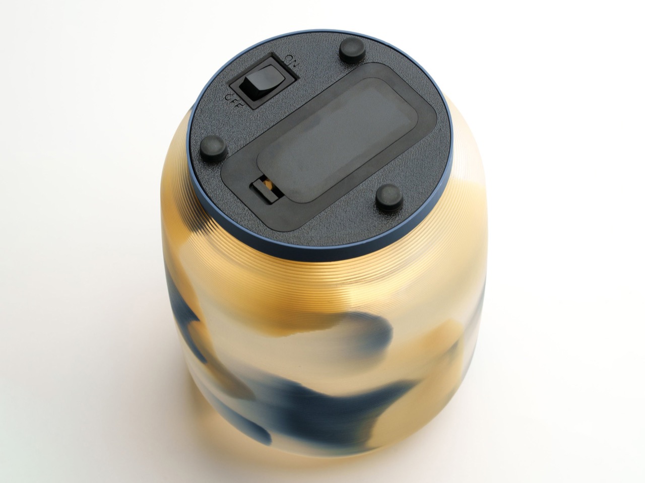
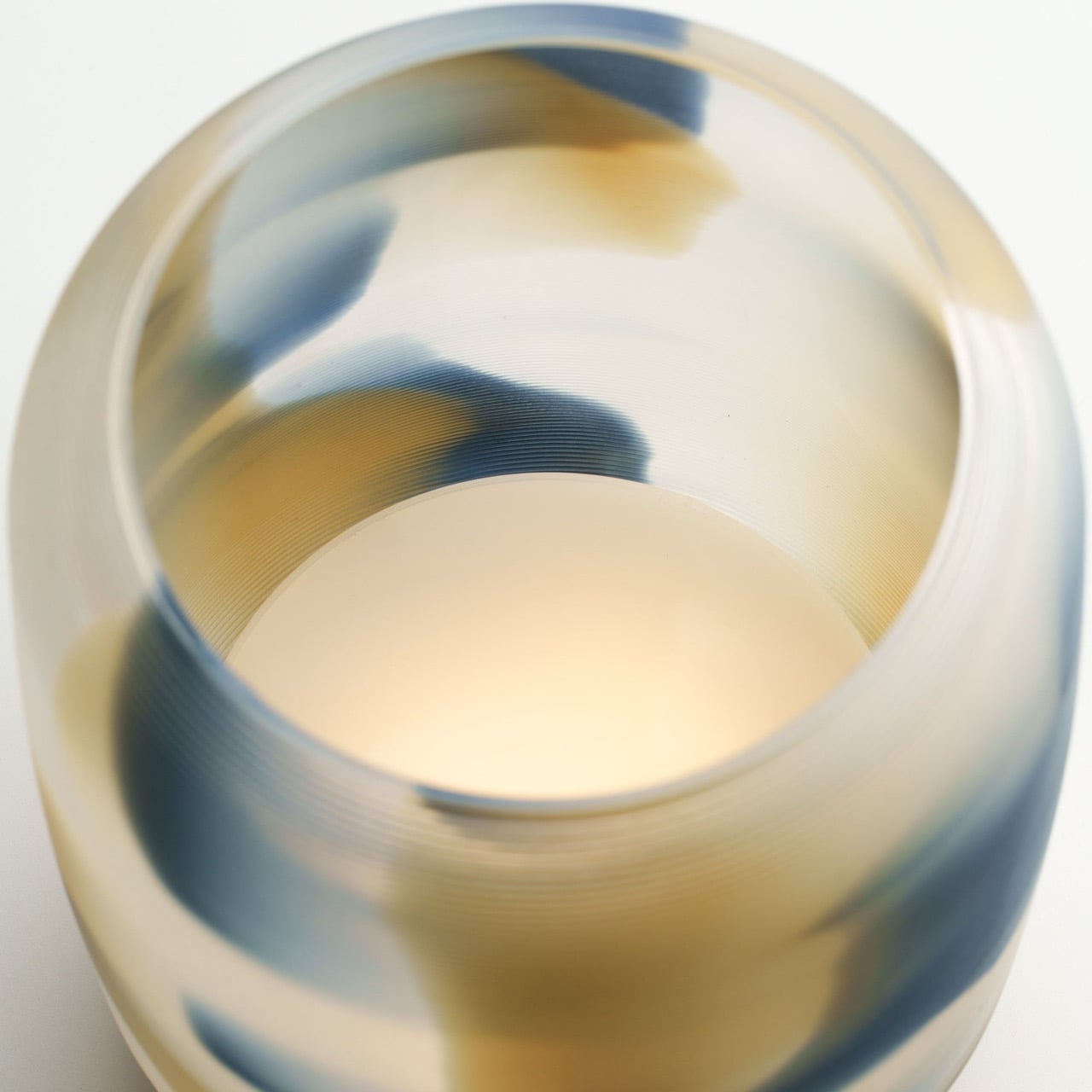
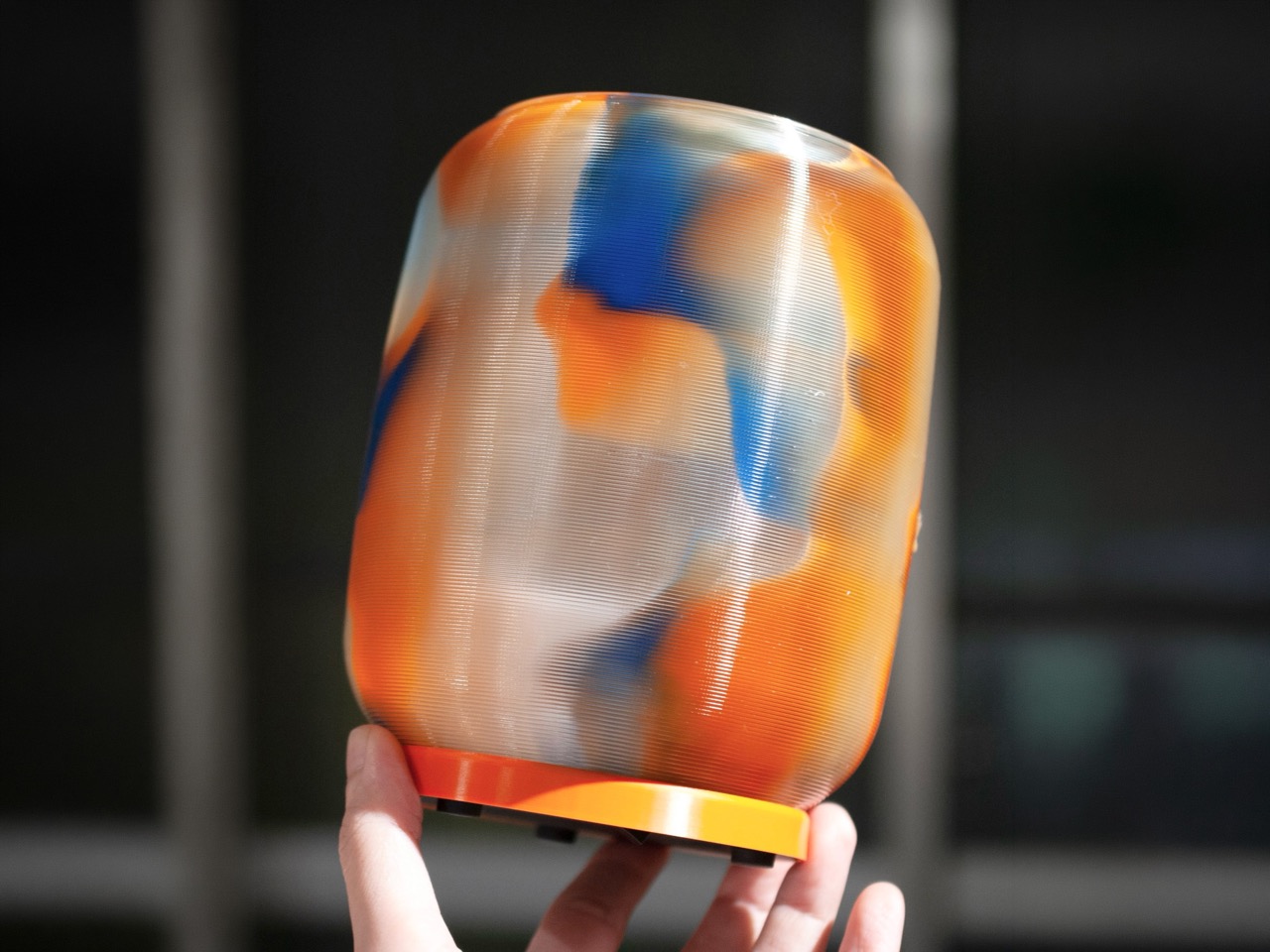
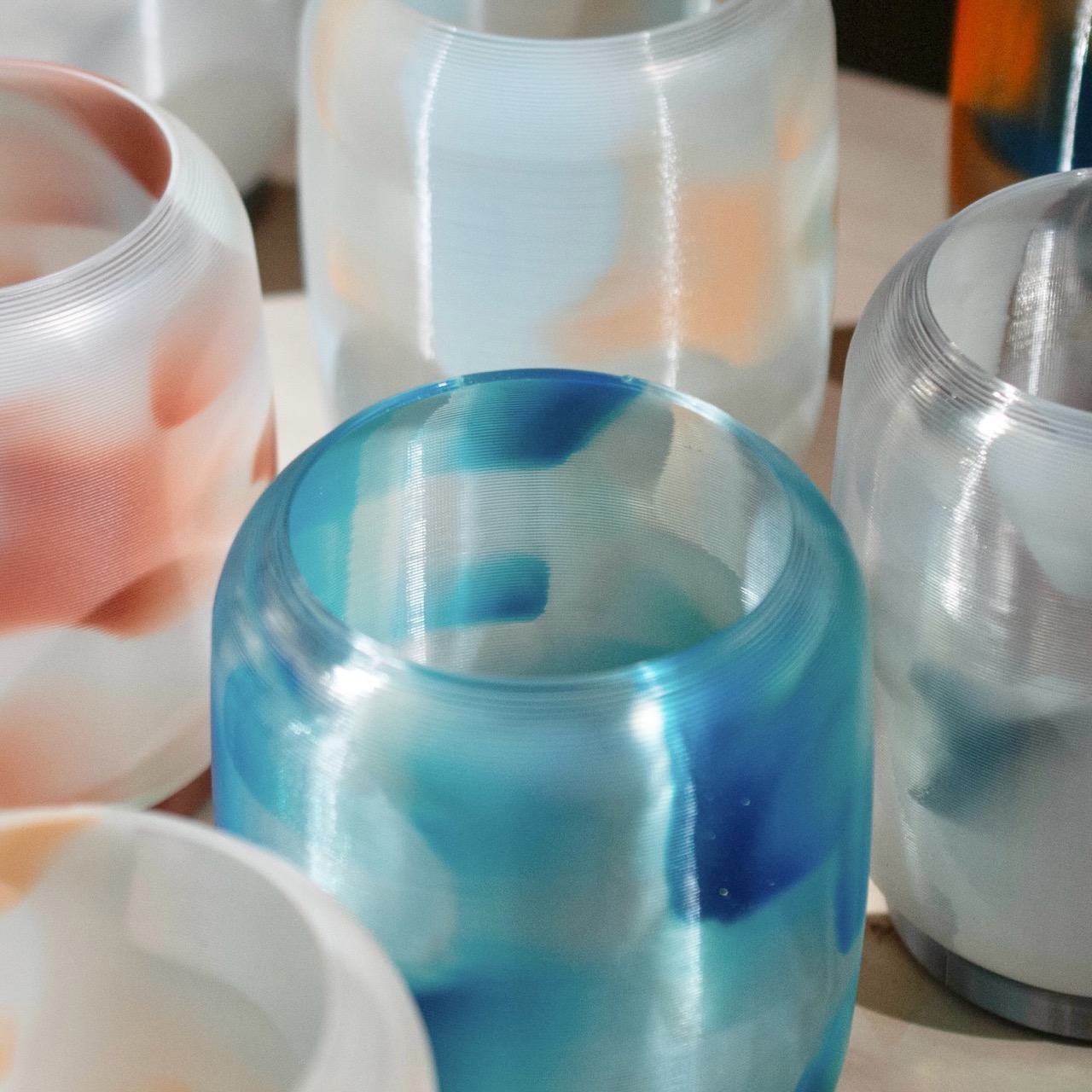
3. High Performance Audio Form
3D printing has transformed high-fidelity audio by enabling complex internal geometries that traditional milling or casting cannot achieve. Speakers can now be fabricated with non-parallel internal walls and intricate chamber structures that reduce standing waves and distortion. This precision engineering refines acoustic clarity, allowing subtle tonal details and dynamic range to emerge with greater authenticity. The enclosure becomes a structurally intentional form where material integrity and acoustic science operate in alignment.
Beyond performance, these printed speakers contribute to a curated sensory environment. Their sculptural exteriors reflect the logic of their internal acoustic architecture, creating harmony between sound, space, and visual form—an immersive experience where engineering meets poetic design.
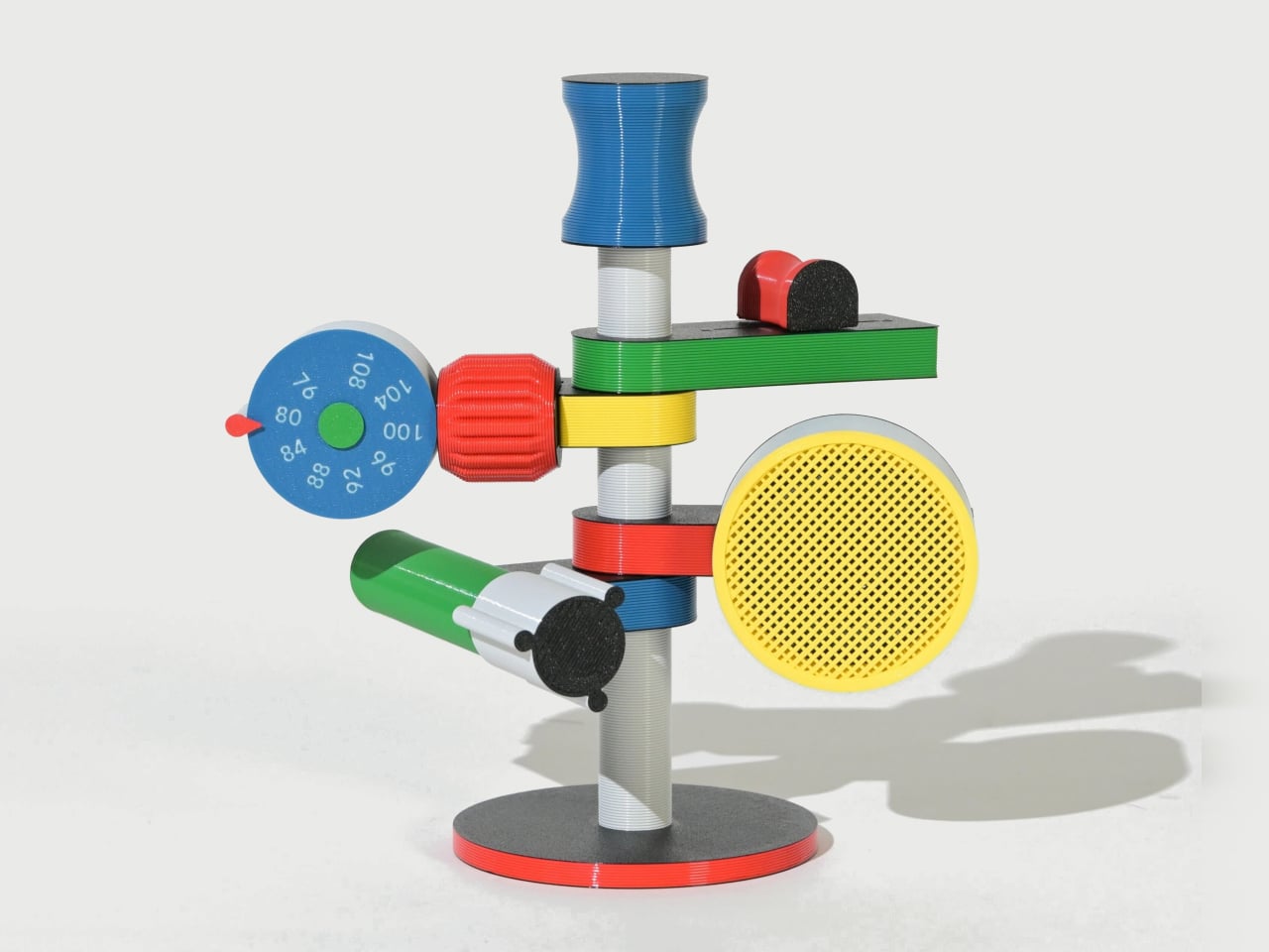
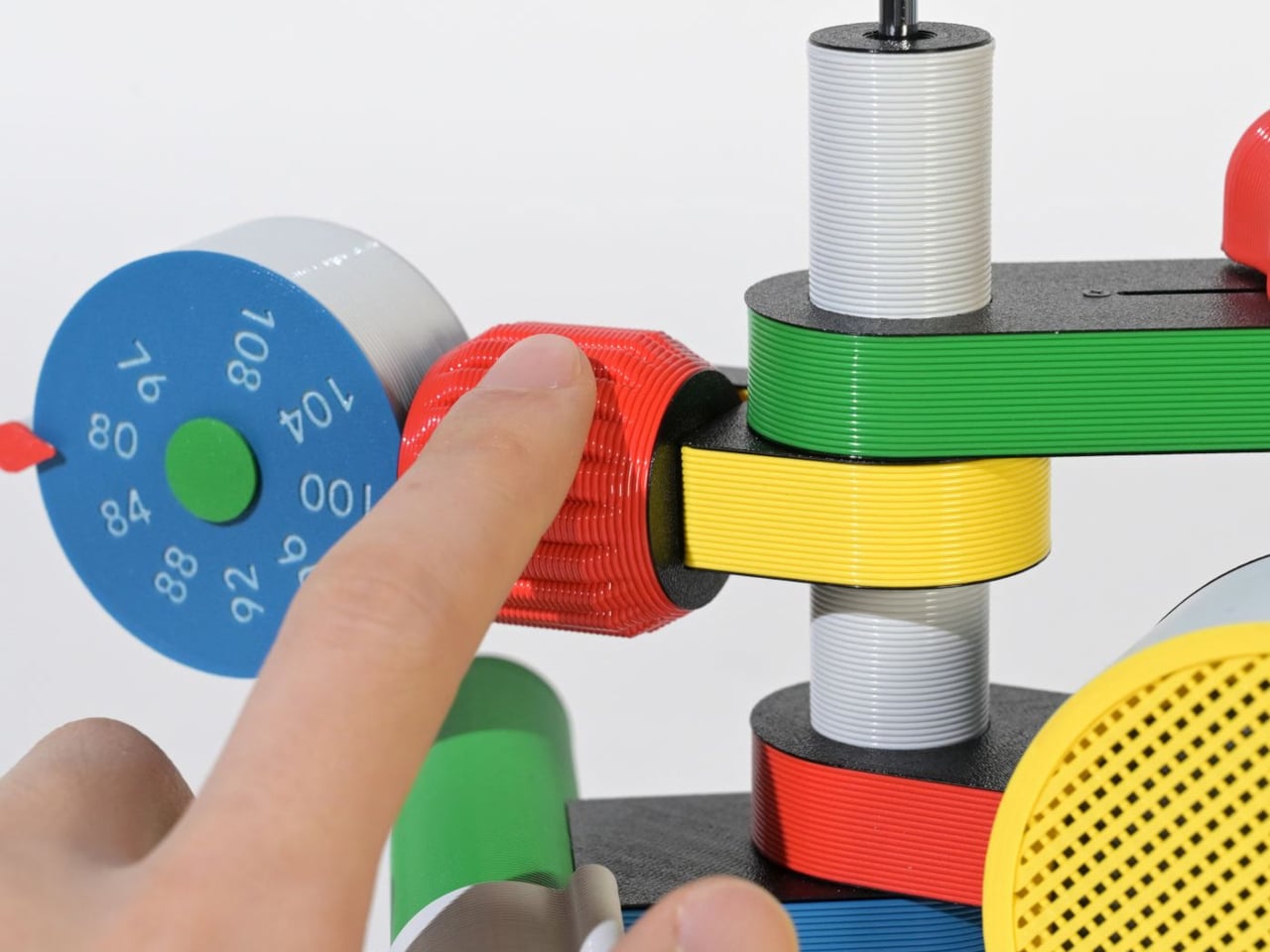
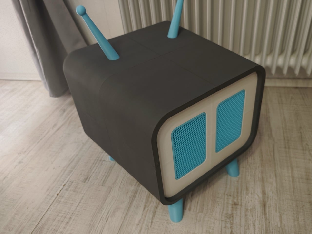
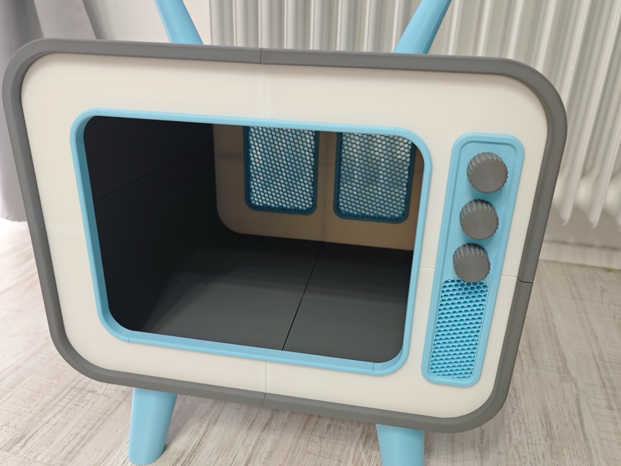
The Anomalo FM Radio by SHINKOGEISHA is designed as a functional object that challenges conventional radio aesthetics. Instead of a compact rectangular body, it features a vertical antenna that acts as the structural spine. From this central axis, multiple colorful limbs extend outward, each assigned a specific function. The form is intentionally exposed, turning mechanical and electronic components into visible design elements rather than concealing them within a casing.
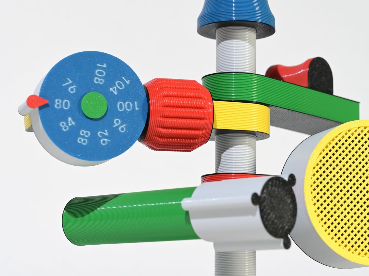
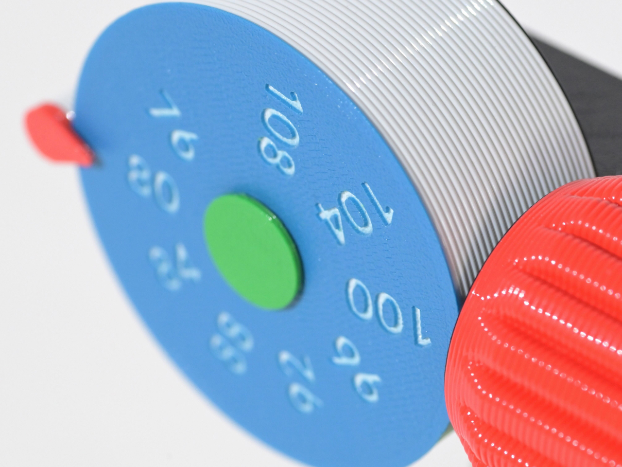
Each protruding branch operates as part of a three-dimensional control system. A roulette-style dial enables station tuning, a cylindrical red knob adjusts volume, and a bold yellow speaker projects sound. Another module houses the batteries, while visible wiring connects the components, reinforcing the radio’s engineered transparency. Manufactured using digital fabrication techniques and PLA material, the device prioritizes structural experimentation and modular assembly.
4. Wearable Organic Interface
Wearable technology represents the most intimate intersection between body and device, and 3D printing refines that relationship with anatomical precision. Through detailed body scanning, smart glasses, health monitors, and adaptive bands are fabricated to align perfectly with individual contours. This tailored construction enhances long-term comfort, reduces material waste, and streamlines production. Instead of standardized sizing, the device responds directly to human geometry, delivering structural clarity and material efficiency in equal measure.
Experientially, these wearables are designed to feel almost imperceptible. Their lightweight calibration and ergonomic balance allow them to integrate naturally into daily movement. Personalization also improves sensor stability and data accuracy, elevating performance outcomes. The result is technology that moves beyond utility, becoming a refined extension of the body rather than an external attachment.
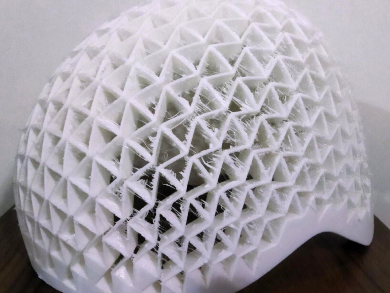
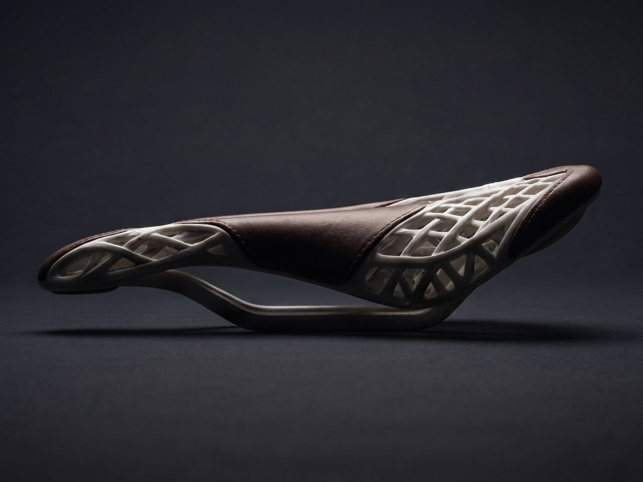
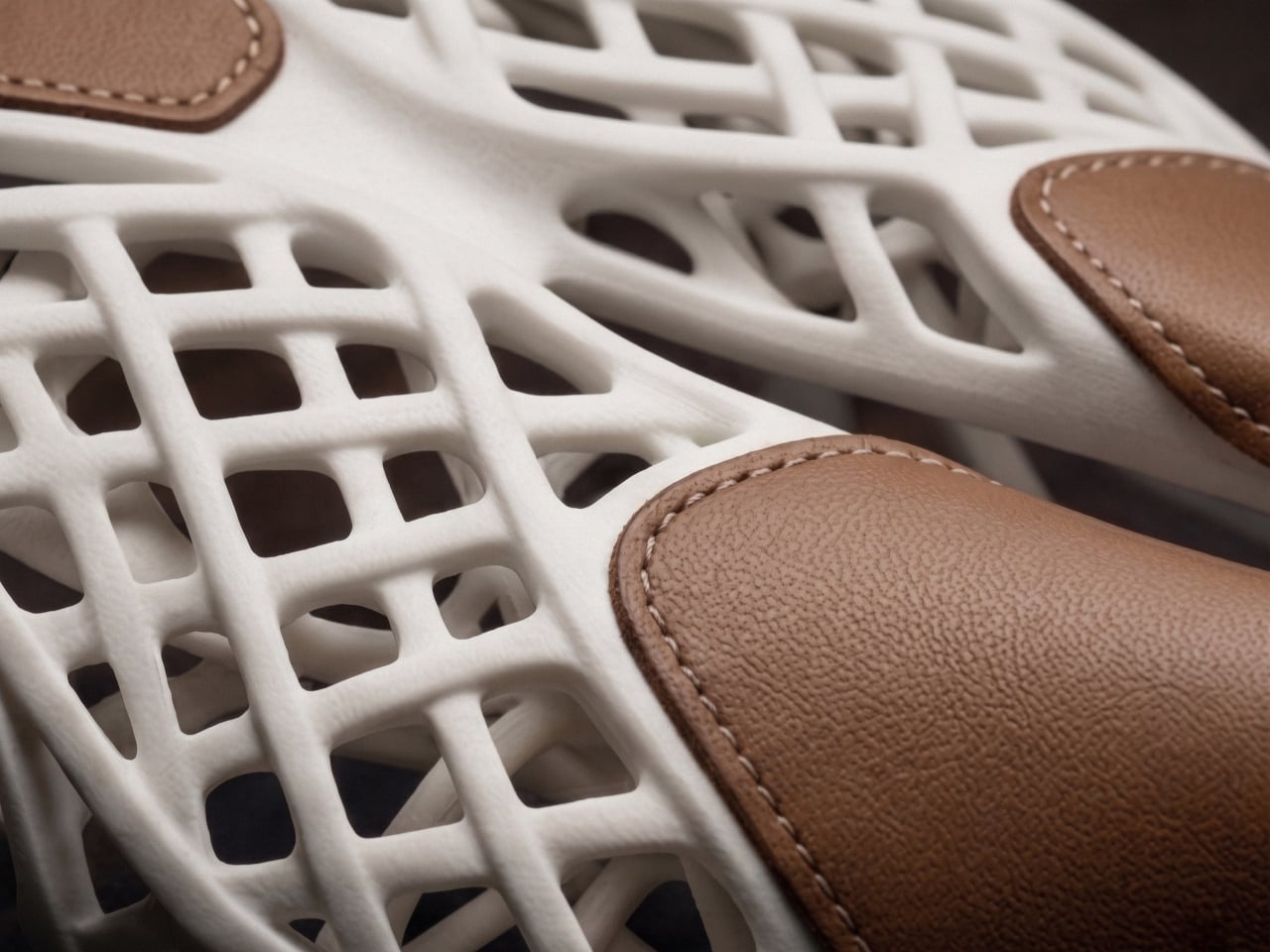
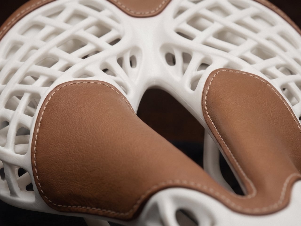
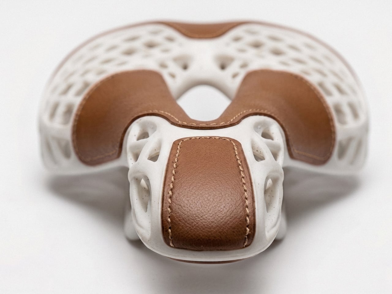
Researchers at the Universities of Gothenburg and Isfahan have developed a revolutionary 3D-printed helmet built with auxetic metastructures that react dynamically to collisions. Unlike traditional foam liners that simply compress, these geometric patterns pull inward on impact, dispersing energy more efficiently. The protective layer is made from a hyperelastic polymer that stretches and returns to its original form, allowing the helmet to maintain performance even after repeated impacts. Standardized crash tests showed significantly improved protection compared to conventional foam designs.
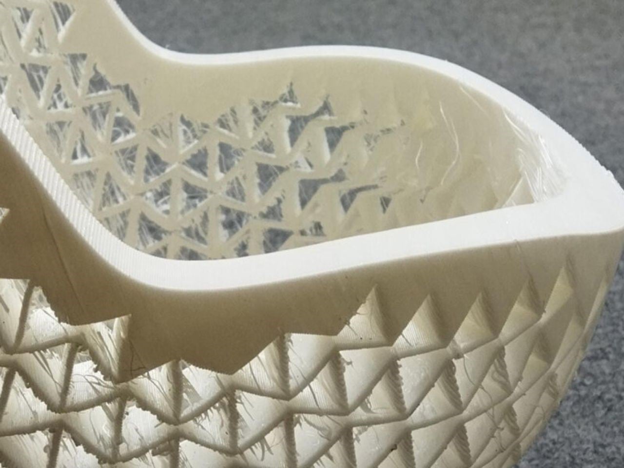
Beyond performance, customization sets this innovation apart. Traditional helmets come in fixed sizes and often fail to match individual head shapes perfectly, reducing both comfort and safety. With 3D printing, the auxetic liner can be tailored precisely to the rider, creating a snug, gap-free fit. Although currently more expensive, advancing technology is expected to lower production costs. This breakthrough could soon redefine not only cycling helmets but protective gear across multiple industries.
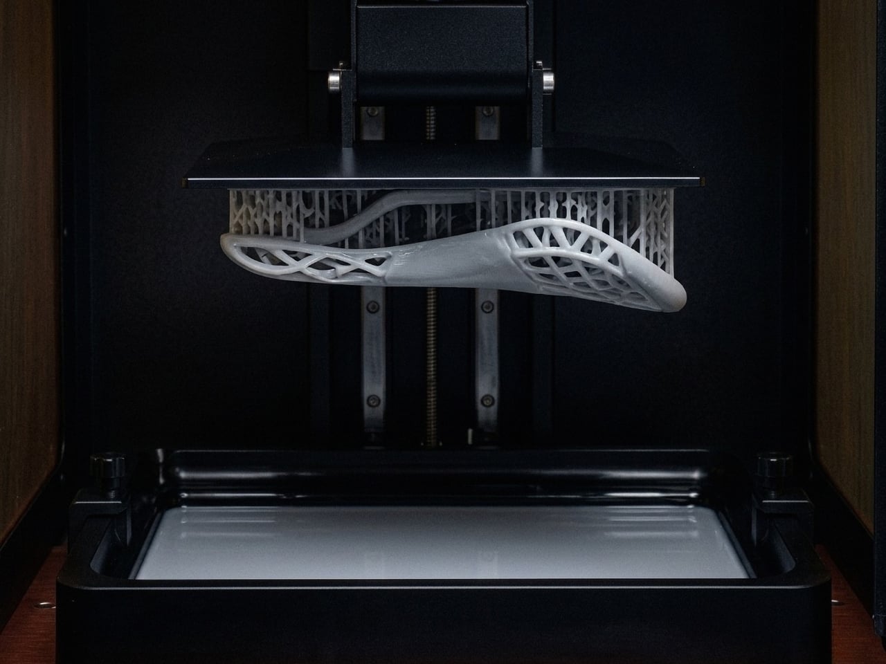
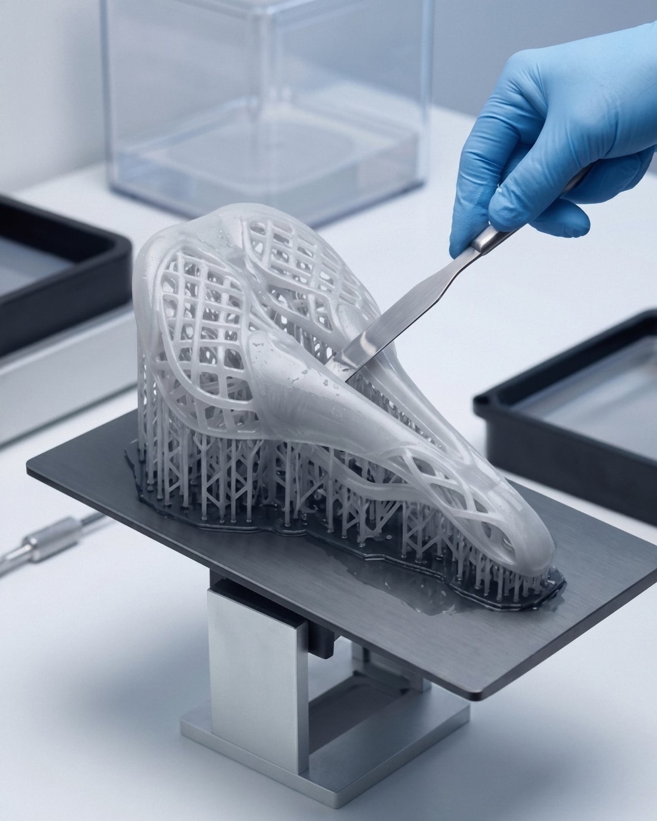
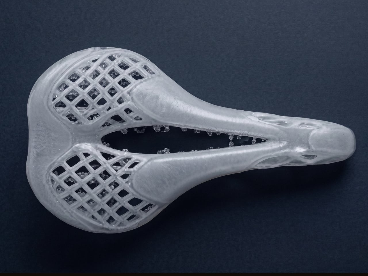
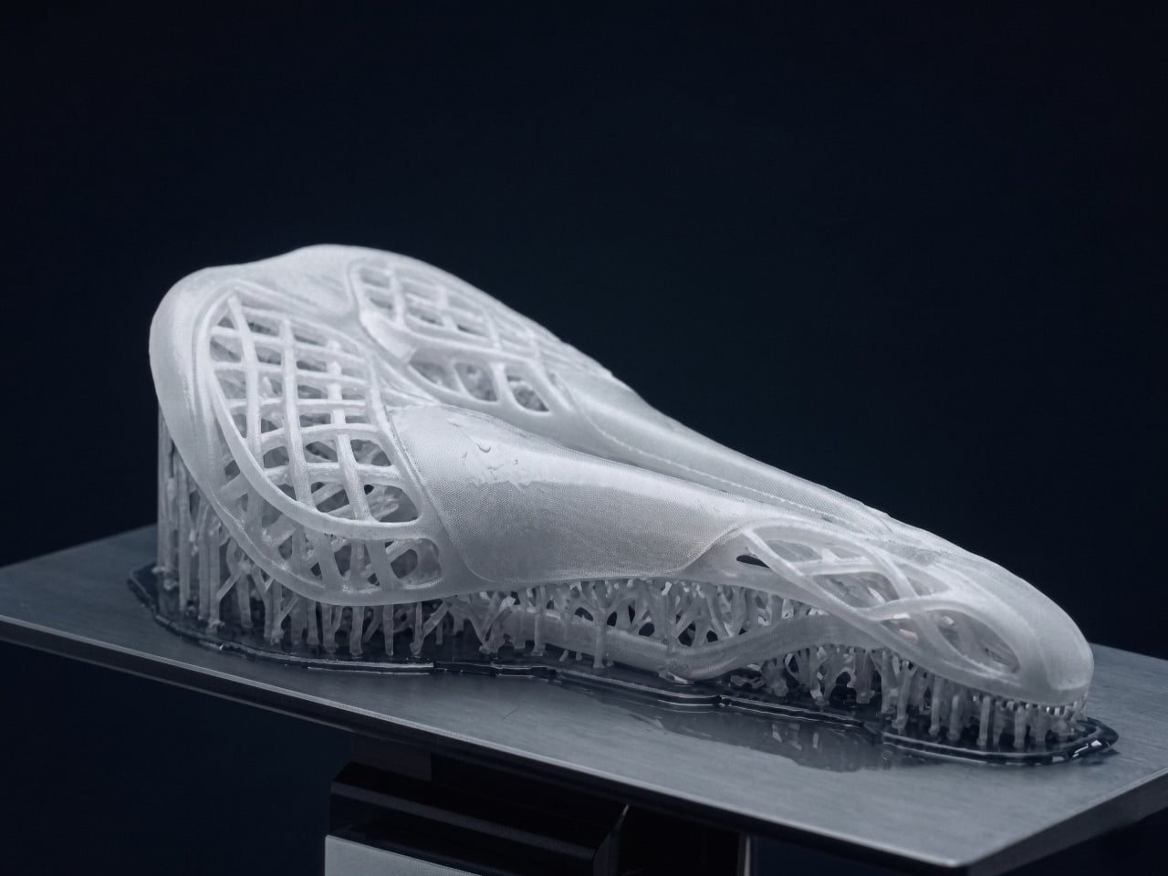
5. Personalized Medical Engineering
In the medical field, 3D printing enables the creation of patient-specific devices that traditional manufacturing cannot achieve. Custom orthotics, prosthetic limbs, and surgical guides are fabricated based on detailed anatomical scans, ensuring exact alignment with the patient’s body. This precision reduces discomfort, improves functionality, and accelerates recovery. Instead of standardized solutions, each piece is engineered as a structurally intentional form that responds directly to individual physiology.
Beyond fit, the technology enhances clinical performance. Lightweight lattice structures improve breathability and reduce material use, while rapid prototyping shortens production timelines. The outcome is a highly responsive healthcare ecosystem where design intelligence, structural clarity, and human well-being converge in measurable and transformative ways.
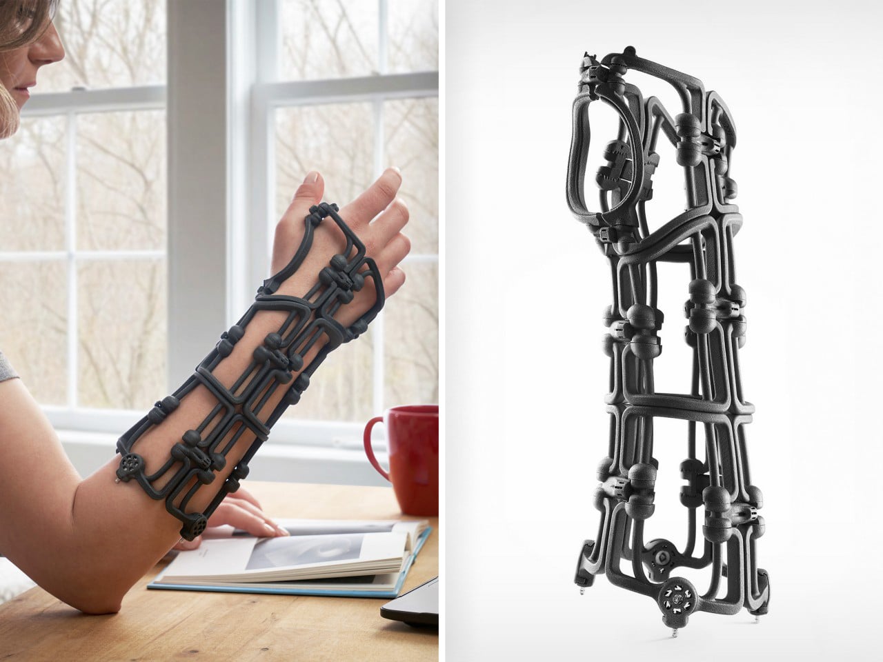
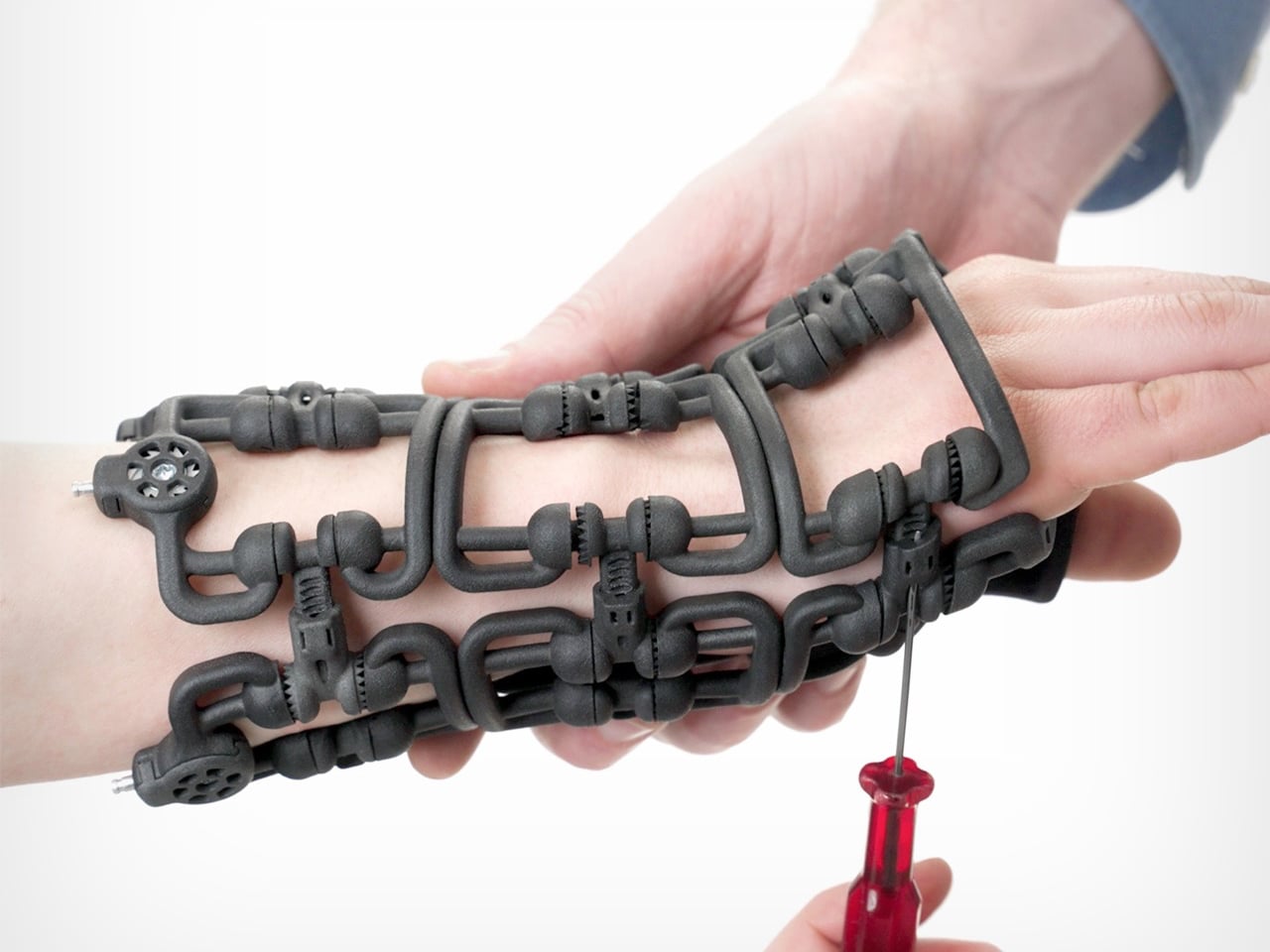
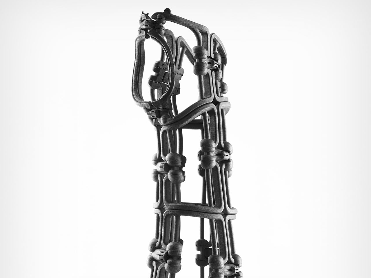
Bracesys by the Osteoid Design Team rethinks fracture immobilization as a precision-engineered, adjustable system rather than a static cast. Instead of plaster or rigid prefab braces, it uses a lightweight segmented framework weighing just 150 grams. The structure folds flat into an envelope for storage, then expands into a rigid wrist support comparable to traditional casting. Articulating connectors and calibrated tension dials allow clinicians to shape the brace directly on the patient’s limb, adjusting fit instantly and refining compression as swelling reduces during recovery.
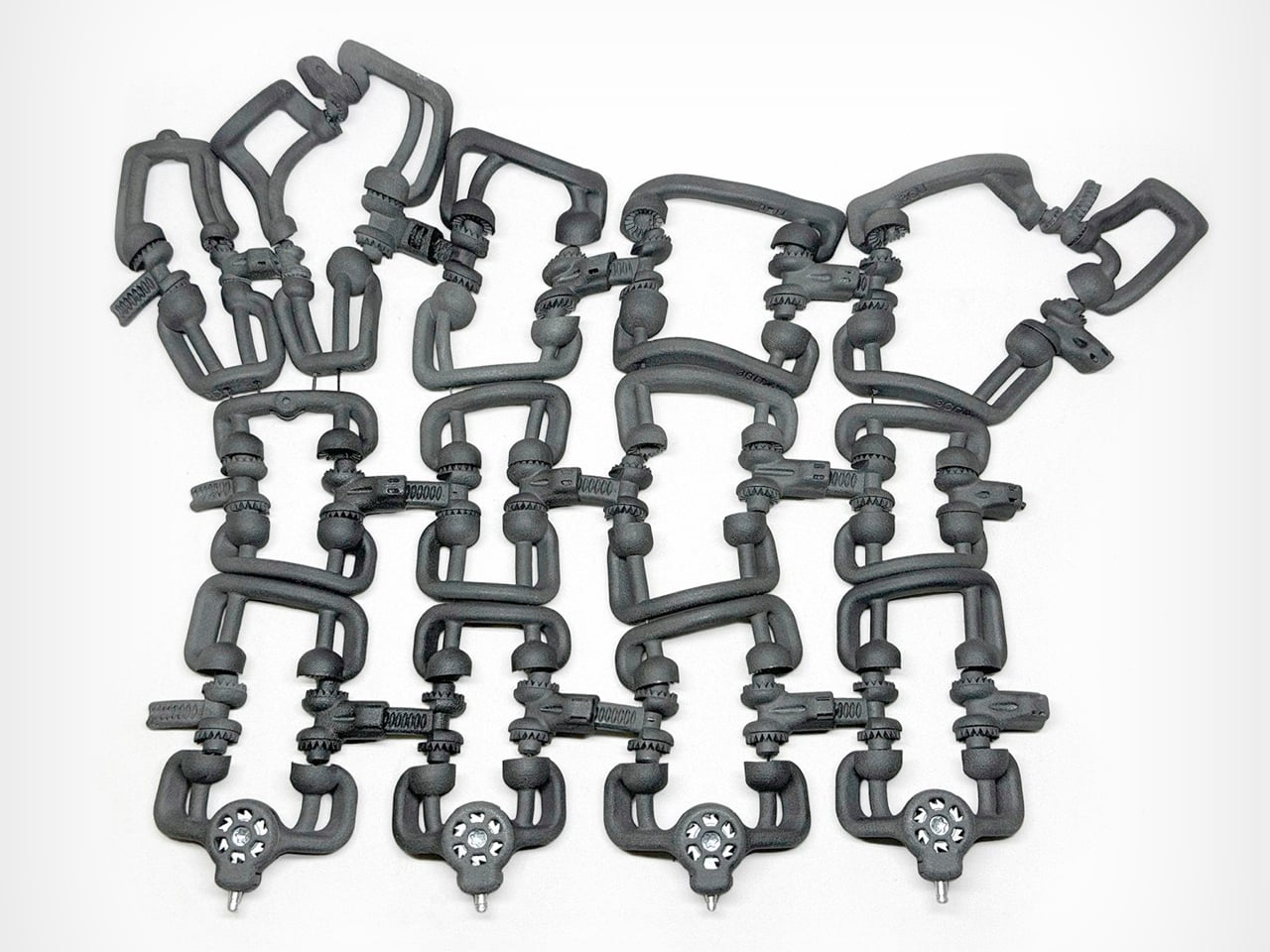
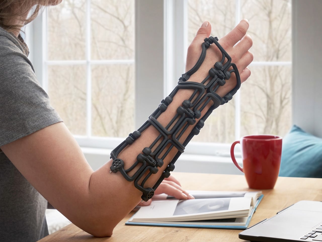
Kevlar cables run through the frame and tighten through integrated dials, distributing force evenly across the structure for controlled stabilization. The body is produced using SLS and MJF 3D printing in medical-grade Nylon 12, reinforced with CNC-machined aluminum and stainless steel at high-stress points. Data from over 600 CT scans informed four optimized sizes that cover most wrist anatomies while maintaining semi-custom adaptability. Spring-loaded quick-release pins simplify adjustments, and individual components can be replaced when needed. Reusable, recyclable, and mechanically precise, Bracesys shifts immobilization from fixed fabrication to real-time clinical customization.
3D printing is steadily transforming the way products are imagined and made. Across industries, it enables smarter structures, efficient material use, and greater design freedom. By allowing form and function to evolve together, this technology supports more adaptable, thoughtful solutions. The future of design is becoming more responsive, refined, and human-centered through additive manufacturing.
The post 5 Brilliantly Weird 3D Printed Designs That Show Exactly Where Industrial Design Is Headed first appeared on Yanko Design.