Most gardening products arrive in a blizzard of plastic. Clamshell trays, foil seed packets, twist ties, instruction cards laminated in polyester. You buy them, use them, then spend 20 minutes figuring out what you can recycle and what you can’t. It’s a frustrating little ritual that, frankly, undercuts the whole point of growing something in the first place.
So when I came across Terra Seeds, a student project by Israeli designer Tom Fosbery from Shenkar College of Engineering, Design and Art, I had to stop and actually sit with it. Not because it’s revolutionary in a loud, tech-forward way. But because it’s quietly, elegantly obvious once you understand it. The kind of obvious that makes you wonder why it took so long.
Designer: Tom Fosbery
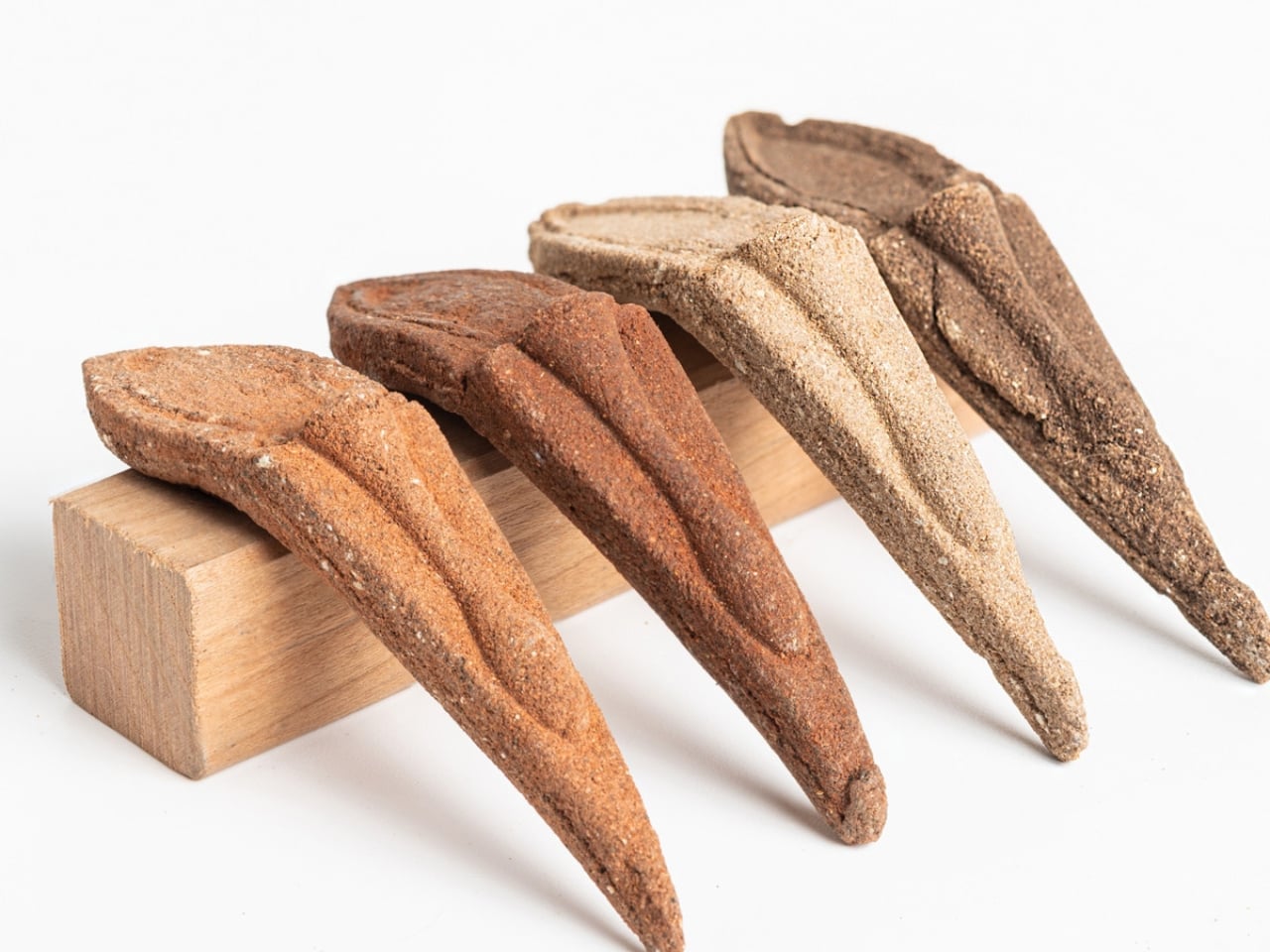
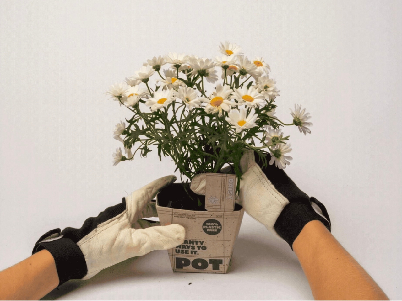
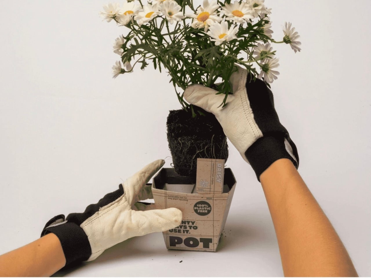
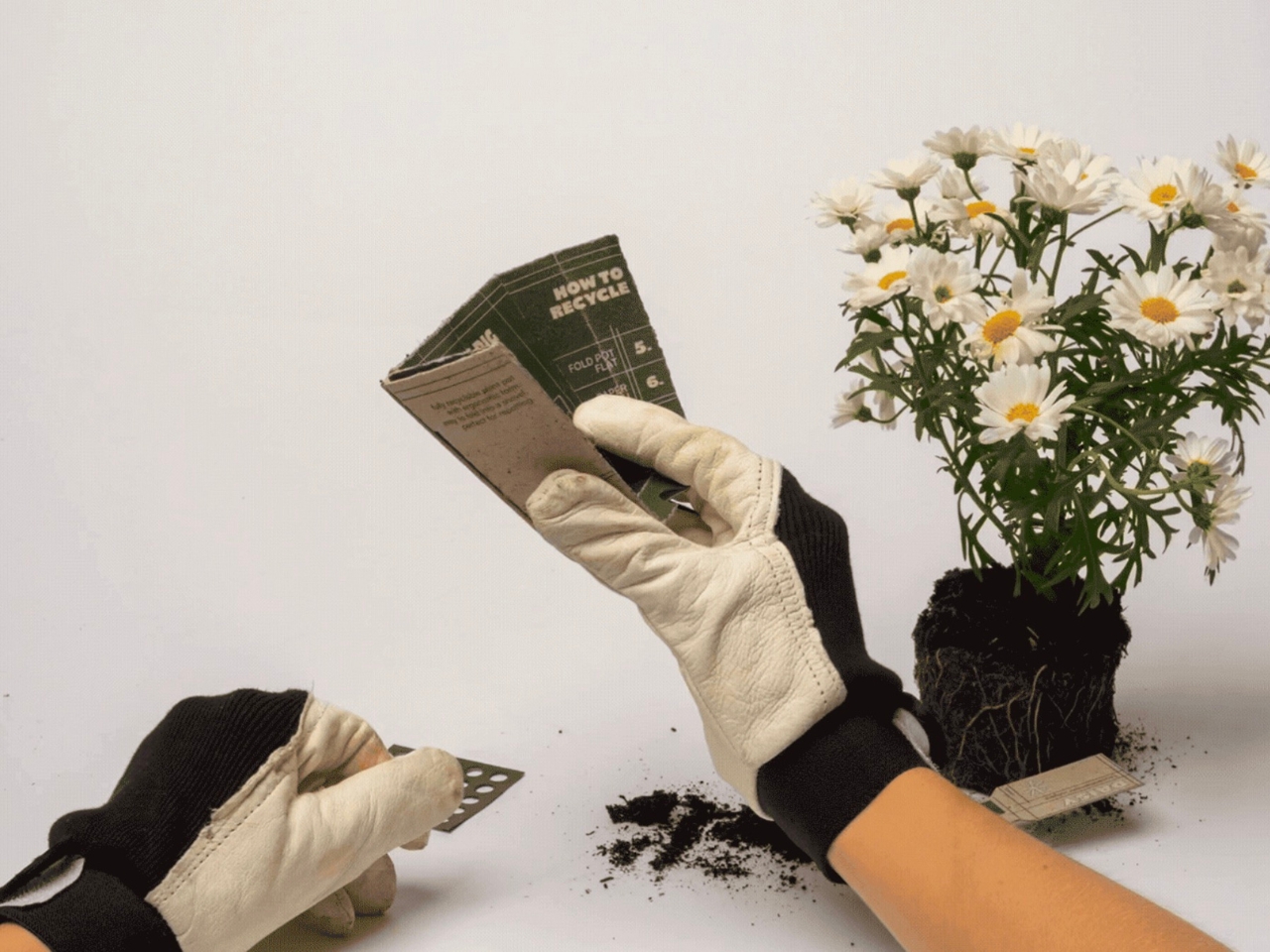
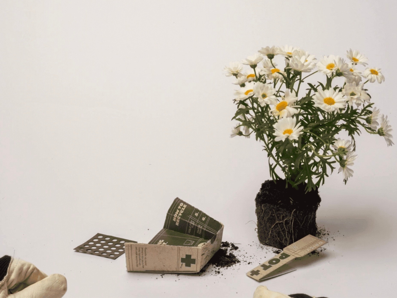
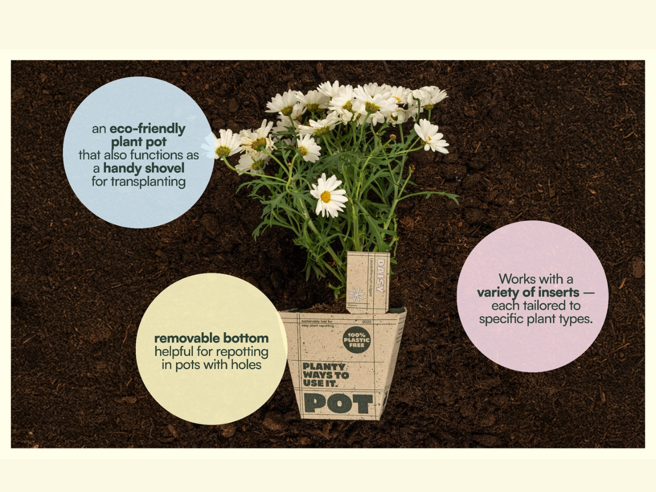
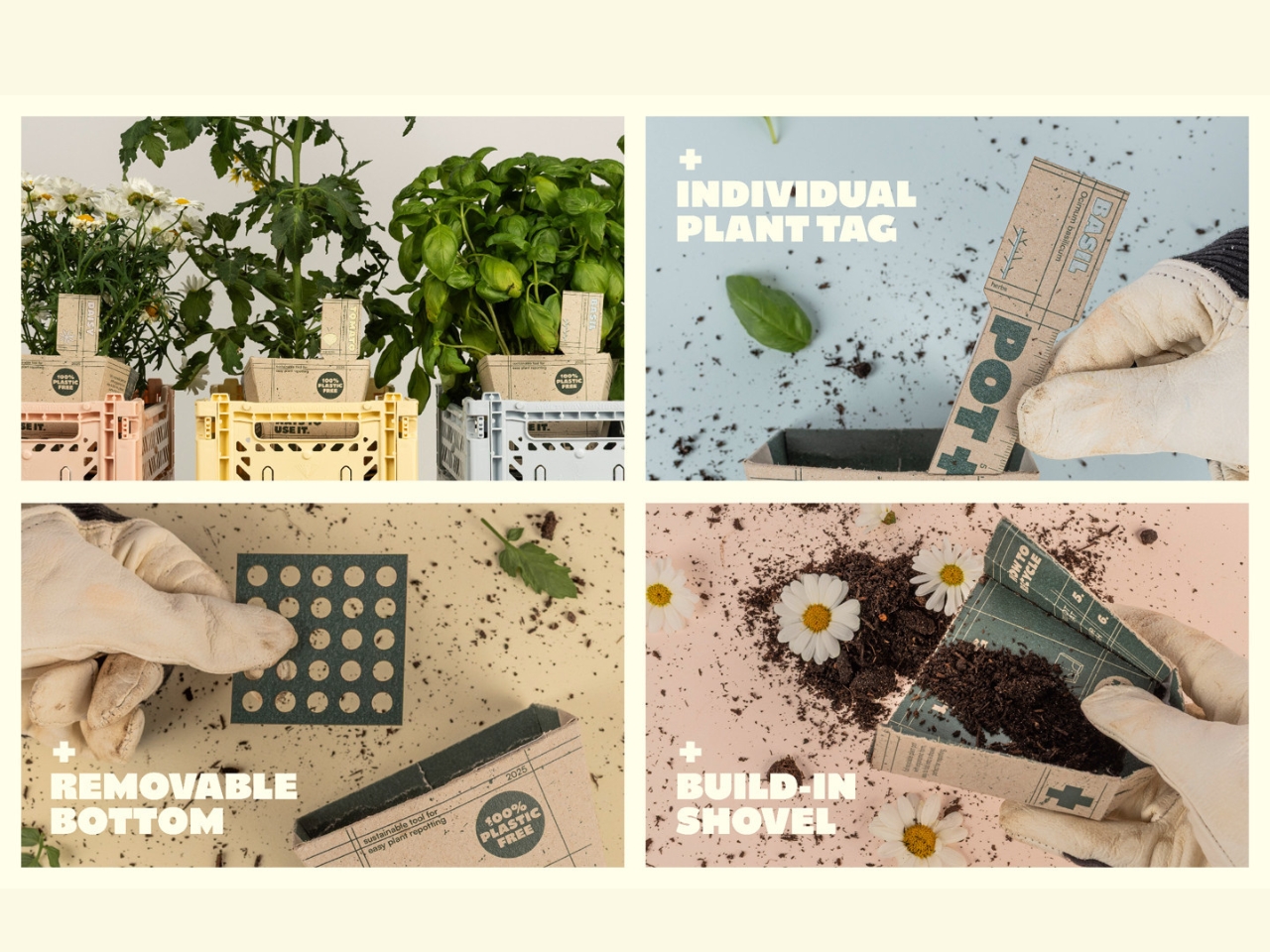
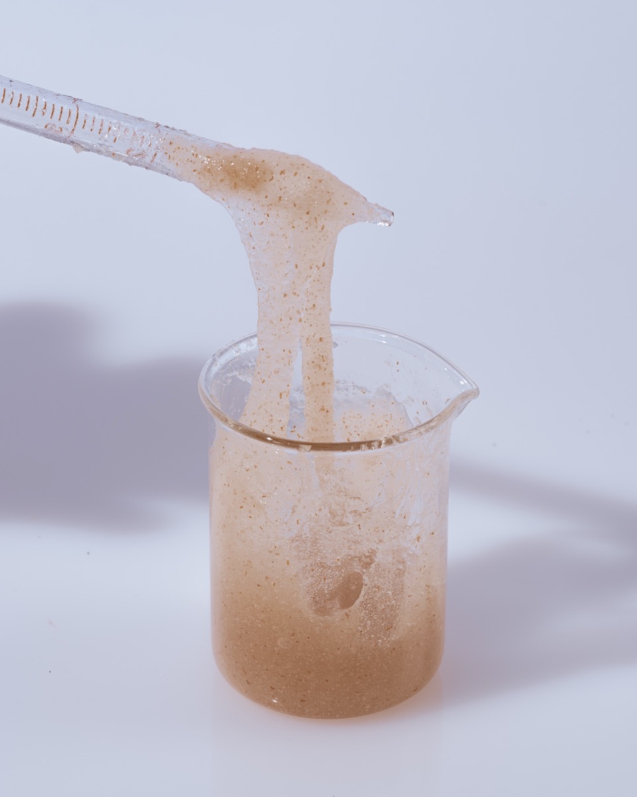
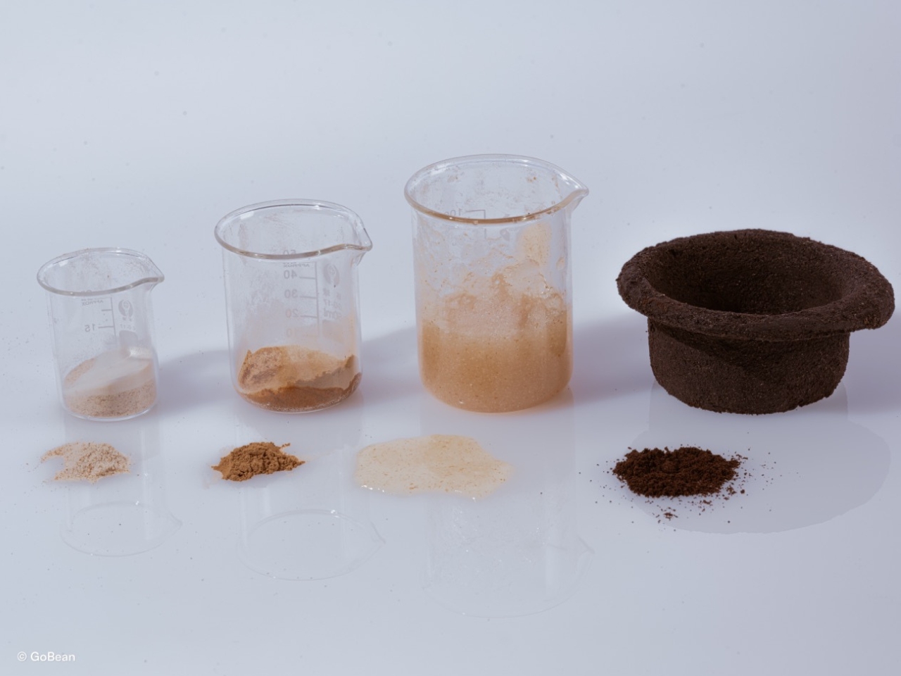
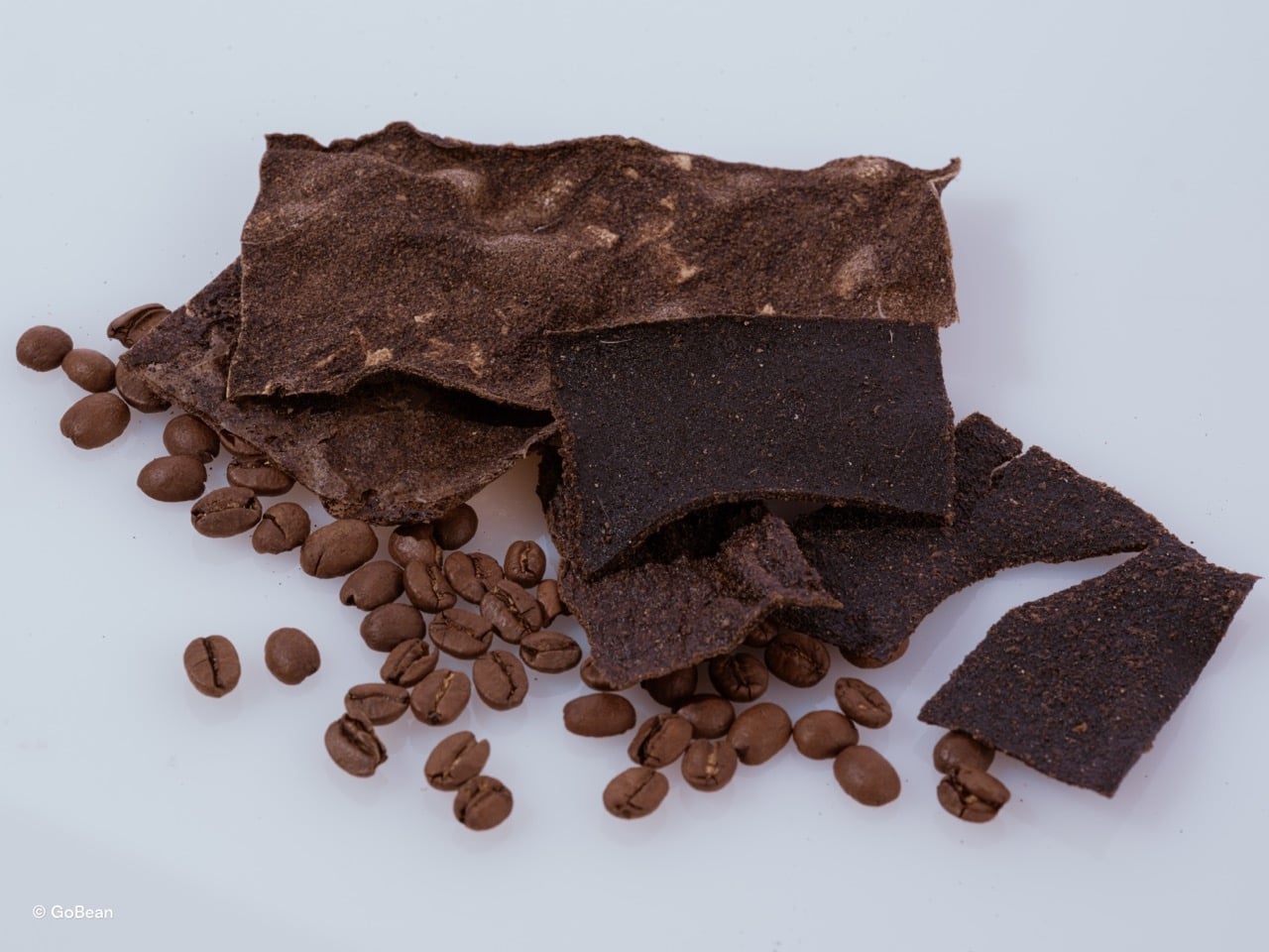
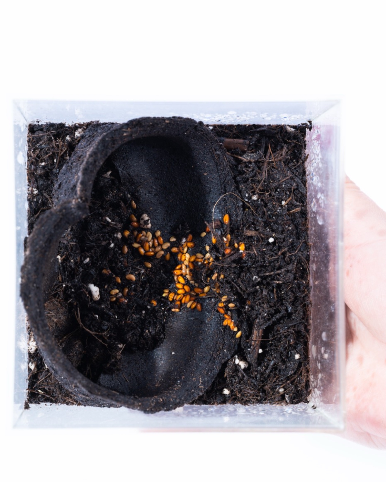
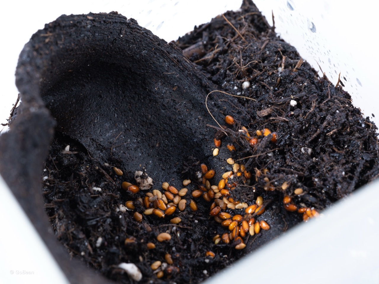
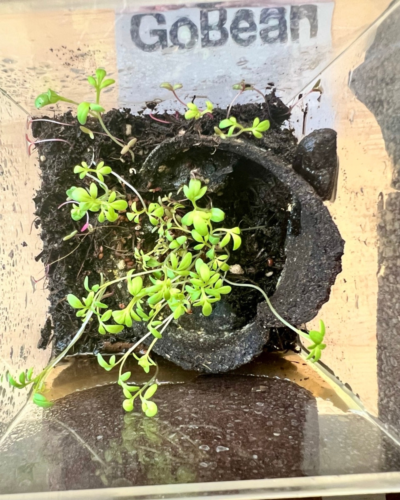
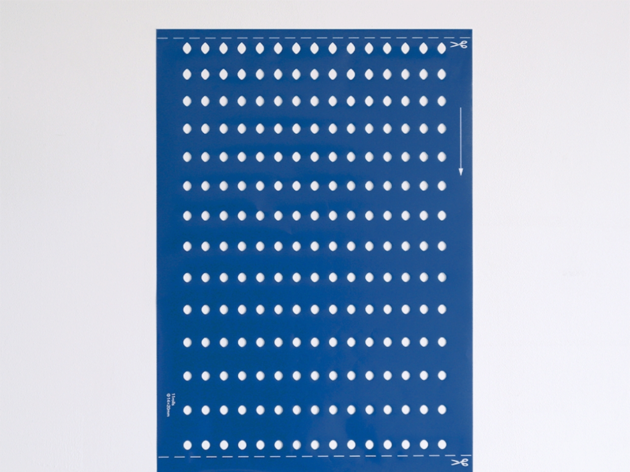
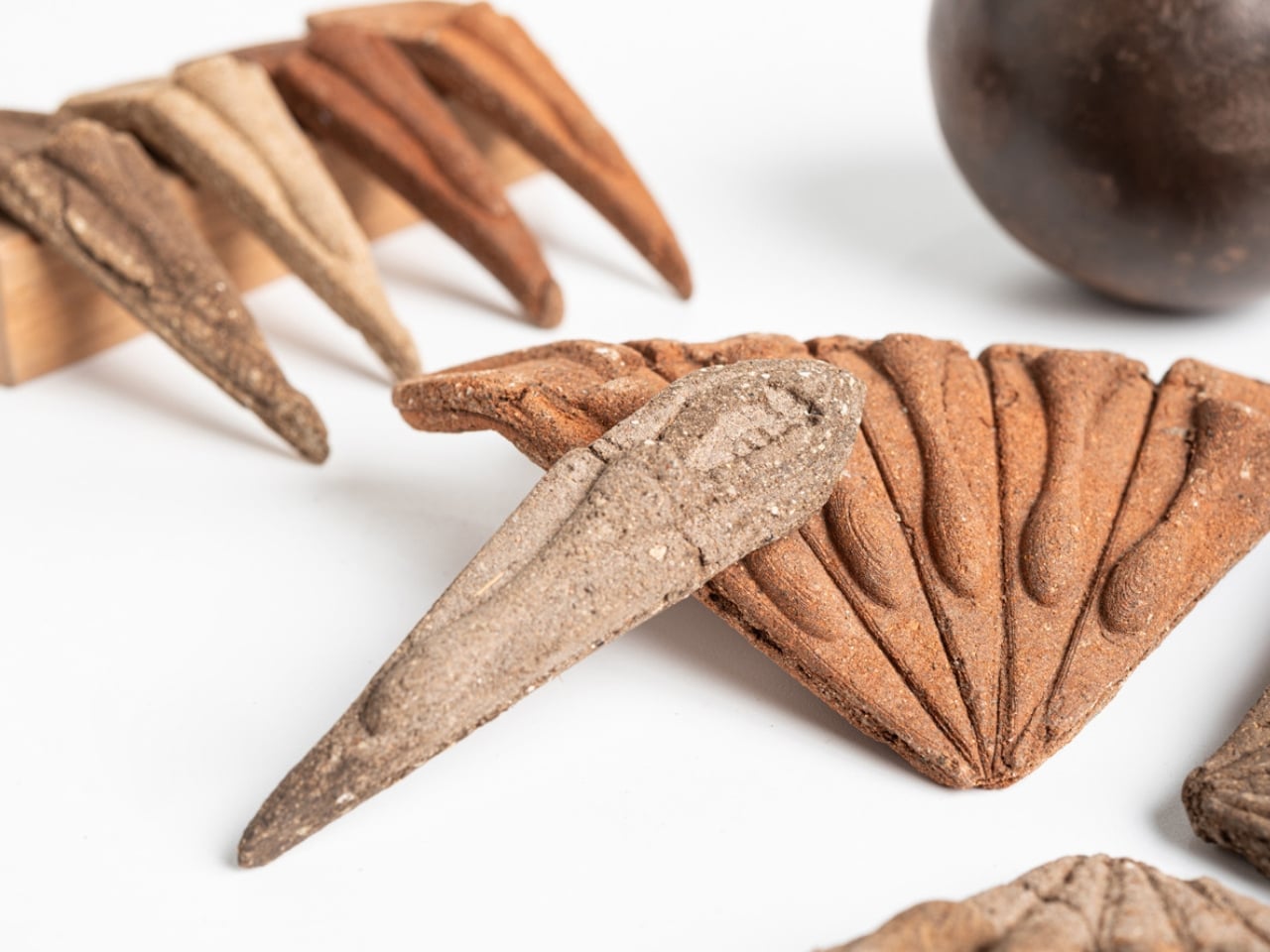
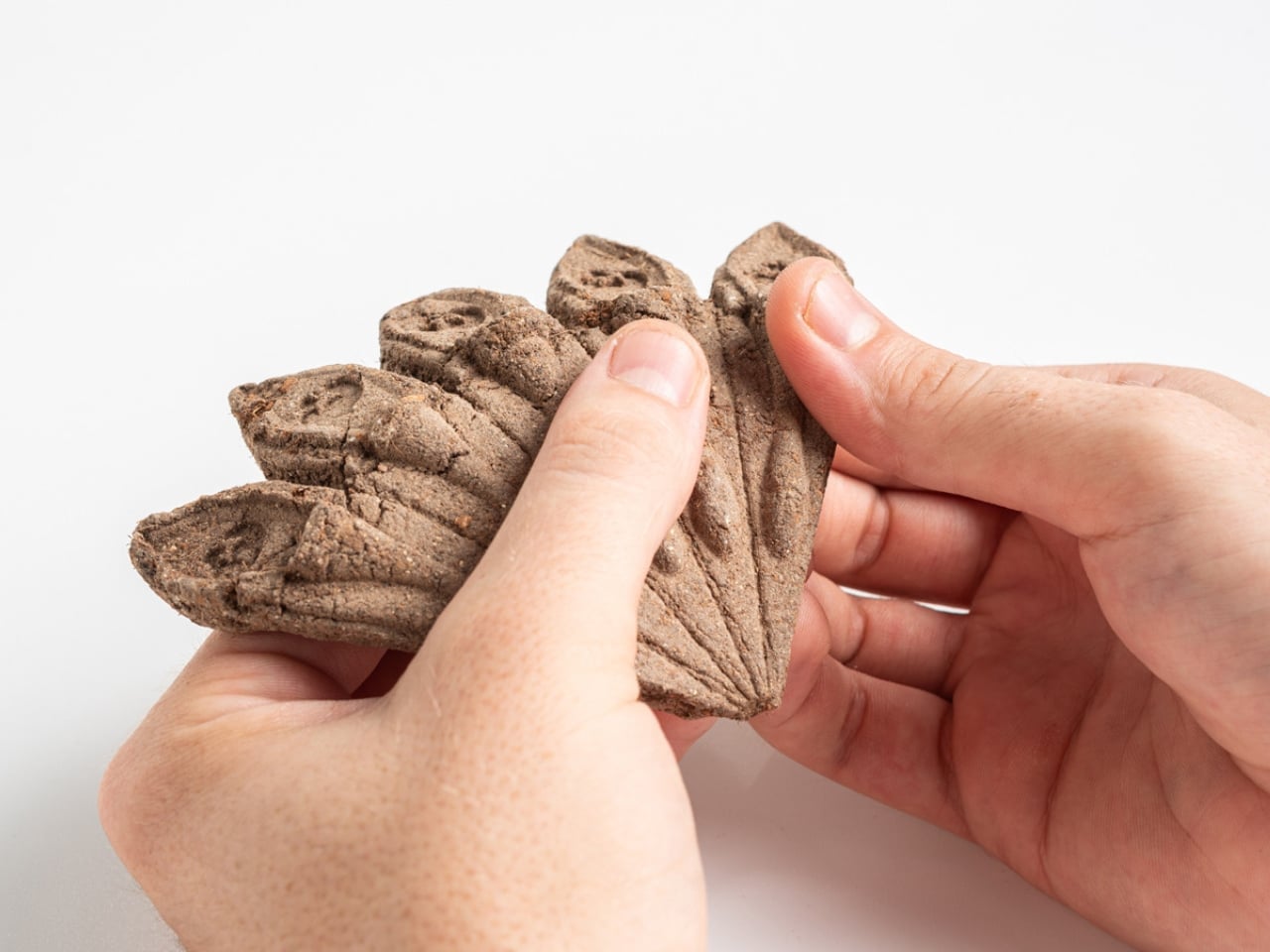
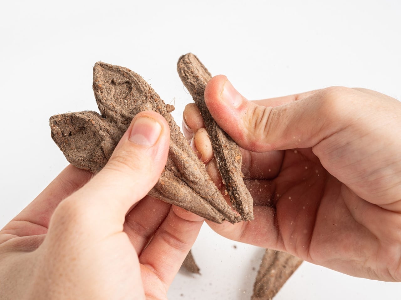
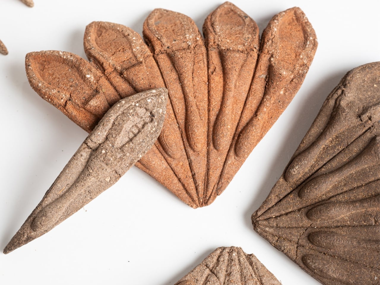
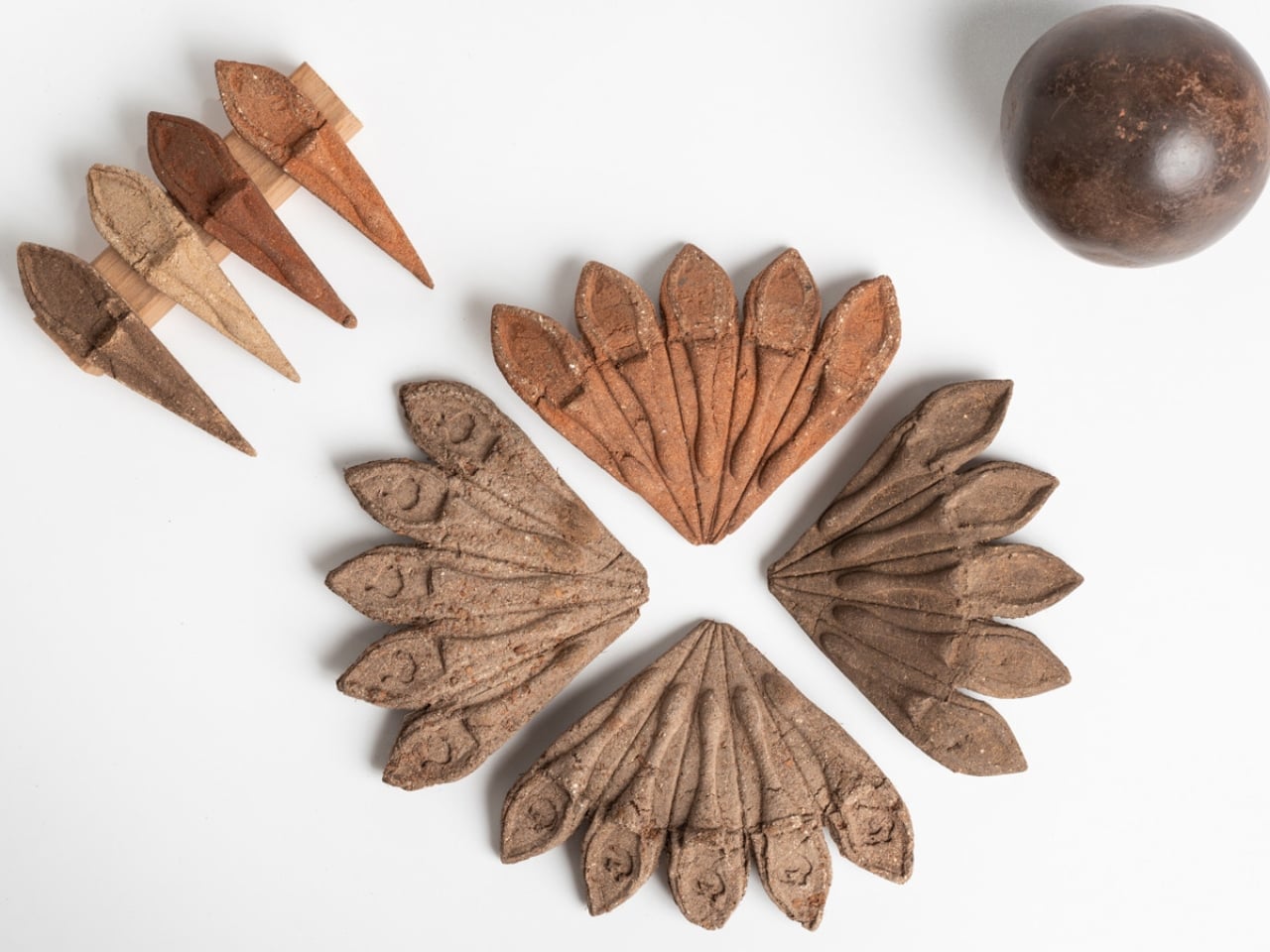
Terra Seeds is a planting kit for hobbyists, families, and urban gardeners. The concept is built around fan-shaped units made of compressed local soil, tapioca starch, nutrients, and seeds. You plant the unit directly into the ground, no tools required. It breaks down completely, feeds the soil, and helps the seeds germinate. There is no packaging to throw away, because the packaging is the product. The product is the garden.
The materials are worth paying attention to. Tapioca starch binds the unit together during handling and transport, then dissolves harmlessly once it meets moisture and soil. Local compressed soil means the unit is literally made from the same ground it’s meant to go into. The nutrients are already mixed in. Everything about the design reduces friction, physical and psychological, so that the act of planting feels as simple as pressing a small disc into the earth and walking away.
Fosbery describes his practice as one rooted in ecological design, in creating products that leave no waste. He’s passionate about exploring unexpected materials and finding their surprising possibilities. That ethos shows clearly in Terra Seeds. The fan shape is both aesthetically considered and functionally smart, giving the compressed unit enough surface area to hold together while fitting naturally into a small planting hole. It feels like a design where thinking about materials came before thinking about aesthetics, and the visual result is stronger for it.
I think about how many times I’ve seen sustainable design that mostly amounts to swapping one material for another. Plastic replaced with paper, foam replaced with cardboard, single-use replaced with slightly less single-use. Those swaps matter, but they’re incremental. Terra Seeds takes a different position. Rather than asking what material should hold the seeds, Fosbery asked what if the packaging itself contributed to growth. That’s a shift in the underlying question, and that shift produces a completely different kind of answer.
The intended audience matters here, too. Fosbery designed it for hobbyists, families, and urban gardeners, not for large-scale agriculture or commercial nurseries. That’s a crowd that often comes to gardening with enthusiasm but not expertise, people who want the satisfaction of growing something without the overhead of figuring out what goes where, how deep, with which tools. Terra Seeds removes those barriers gently, without making the experience feel dumbed down. The form factor does the work of instruction.
I’ll acknowledge the practical questions that a concept like this still has to answer: shelf life, moisture sensitivity before planting, how the units hold up in humid storage conditions. Those are real design challenges that tend to emerge more fully in production than in prototyping. But they don’t undermine the idea. They’re the kind of problems worth solving precisely because the idea is genuinely good.
The Green Product Award recognized Terra Seeds, and the recognition feels deserved. Not because it’s flashy, but because it demonstrates something that good design often does quietly: it makes you wonder why we were doing it the old way at all. The plastic seed packet had a good run. But pressing a fan of compressed earth into the ground and watching something grow from it, with nothing left over, is a more satisfying loop. That’s the whole point, isn’t it?
The post A Student Just Designed a Seed Kit That Dissolves Into Your Garden first appeared on Yanko Design.