5 Geodesic Dome Homes That Prove Curved Living Is the Future

The dome is no longer just an architectural curiosity. It has emerged as one of the most structurally efficient forms ever designed. Leading design firms now recognize that its natural strength and exceptional volume-to-surface ratio provide a powerful foundation for sustainable luxury and long-term performance.

Beyond structure, the dome reshapes how space is experienced. It feels both ancient and forward-looking. Contemporary design increasingly favors spatial sequencing that calms the mind, and curved interiors deliver exactly that. A domed space becomes a biophilic cocoon—capturing soft natural light, enhancing psychological comfort, and offering a strong return on investment through well-being, durability, and timeless appeal.

1. Lightness as Structure

Inflatable domes represent the most refined expression of ephemeral architecture. These pressurized forms enable rapid spatial creation that rigid structures simply cannot achieve. Their value lies in speed, adaptability, and impact—allowing designers to construct immersive, temporary pavilions with a minimal carbon footprint using advanced high-tensile, translucent membranes.

What truly sets inflatable domes apart is their sensory quality. The gentle movement of the pneumatic skin creates a space that feels alive, forming a biophilic cocoon of air and light. Contemporary polymer materials make it possible to sculpt illumination itself, transforming a lightweight structure into a resilient, rhythmic architectural experience that feels both delicate and powerful.

Ark Nova redefined the idea of a concert venue by replacing permanence and grandeur with mobility and sculptural expression. Created through a collaboration between British artist Sir Anish Kapoor and Japanese architect Arata Isozaki, the inflatable hall appeared as a monumental, purple, organic form that challenged traditional architectural expectations. Its soft, self-supporting membrane transformed air into structure, creating a space that felt both futuristic and welcoming. When it arrived in Europe for the first time at Switzerland’s Lucerne Festival, Ark Nova marked a new chapter in its evolving cultural journey.

Originally conceived in 2013 as a response to the Fukushima earthquake and tsunami, Ark Nova was designed to bring music and collective healing to affected communities. Its pneumatic structure required no rigid framework, allowing it to be assembled quickly and adapt to different settings. Inside, light filtered gently through the membrane, shaping an intimate acoustic environment for diverse performances. More than a venue, Ark Nova stood as a symbol of resilience, accessibility, and the power of art to travel where it is needed most.

2. Curated Sculptural Domes

Within sculptural art, the dome becomes a powerful medium for exploring scale and perspective. It is no longer just a form, but a monumental tectonic presence that anchors and defines urban space. Artists are increasingly working with 3D-printed composites, crafting perforated shells that transform sunlight into a carefully choreographed play of shifting shadows.

This evolution lifts the dome from a utilitarian roof to an architectural poem. The cultural value it generates goes beyond aesthetics, creating a strong sense of place and collective memory. Bathed in diffused light, these spaces blur the boundary between art and architecture, merging both into a single, immersive experience.

Circle Dome Square transformed the space outside Louis Poulsen’s Copenhagen showroom into a striking architectural moment. Designed by Henrik Vibskov, the dome appeared like a vivid red form caught mid-bloom, its fabric panels radiating outward from a central core. Referencing the curves and spirit of Verner Panton’s iconic Panthella lamp, the installation translated a lighting object into an immersive structure. From a distance, the dome commanded attention with its explosive geometry, while up close, its layered textile construction revealed depth, movement, and careful spatial composition.

Inside the dome, the atmosphere shifted dramatically. The bold exterior gave way to a calm, enclosed environment where soft red light filtered through the fabric skin, creating a sense of warmth and stillness. The textile walls subtly shaped acoustics and scale, turning the dome into a temporary refuge within the urban setting. More than a visual statement, Circle Dome Square demonstrated how fabric, light, and form could work together to create an experiential space that invited pause, reflection, and quiet engagement.

3. Monolithic Living Domes

Dome housing has evolved from countercultural experimentation into a model of high-performance luxury living. Its inherent geometry delivers exceptional thermal efficiency, reducing air stagnation and heat loss while lowering long-term operational costs. The seamless, monolithic concrete shell reinforces material honesty, combining structural integrity with enduring performance.

Inside, the absence of corners allows space to flow naturally. Movement feels intuitive and unforced. The double-height apex draws the gaze upward, becoming a quiet focal point that connects the interior to the sky above. Living within a dome creates a biophilic cocoon—where light, acoustics, and form work together to produce a deep sense of calm, balance, and grounded serenity.

Rising unexpectedly from the desert landscape of Pioneertown, California, the HATA Dome looked like something straight out of a science-fiction film—but without any extraterrestrial mystery attached. Set against rugged terrain, the dome stood as a bold architectural presence, immediately capturing attention with its smooth, monolithic form. Rather than hinting at conspiracy, it offered something far more tangible: a place designed for human retreat and deep connection with the surrounding environment.

The HATA Dome was designed and built single-handedly by Anastasiya Dudik, guided by a “future primitive” philosophy that blended ancient building logic with contemporary thinking. Constructed using concrete, rebar, and shotcrete, the dome prioritised durability, fire resistance, and seismic safety while naturally regulating temperature through passive thermal mass. Inside, soaring ceilings, soft natural light, and sculpted interiors created a calm, immersive refuge. Both raw and refined, the dome functioned not just as an architectural statement but as a liveable, sustainable shelter or one that could be experienced firsthand as a desert escape.

4. Orchestrating the Ephemeral Glow

Lighting within a dome is less about fixtures and more about control. The curved surface naturally redistributes light, allowing illumination to be indirect, layered, and calm. By keeping sources discreet and concealed, light appears to emerge from the architecture itself rather than from visible hardware.

This method reinforces the purity of the form. Shadows soften, edges dissolve, and the space feels continuous rather than segmented. Light becomes a guiding force, shaping movement and mood without drawing attention to its origin. At night, the dome reads as a quiet, expansive enclosure—intimate, protective, and atmospherically balanced, where illumination supports presence rather than spectacle.

At first glance, the Dome lamp’s domical form draws you in with its quiet strength and sculptural presence. Shaped like a small architectural dome, the design feels grounded and balanced, transforming the lamp from a simple lighting object into a statement piece inspired by structural forms found in buildings.

The curved silhouette is paired with a bent bamboo strap that visually echoes the dome’s softness while adding warmth and contrast. Together, the rounded shade and flowing strap create a harmonious composition, where even the wire follows the curve, reinforcing the lamp’s cohesive, domed design language.

5. Biospheric Urban Farming

Urban agriculture finds a powerful ally in dome design. As cities move toward localized food systems, these biospheric structures offer a highly efficient growing environment. Their inherent thermal performance supports year-round cultivation, while the height-to-width ratio naturally accommodates vertical farming maximizing yield per square meter and reducing the carbon footprint of food production.

Beyond productivity, these agricultural domes act as biophilic anchors within dense urban fabric. They reconnect built form with landscape, reintroducing nature into the city core. Lightweight ETFE panel systems ensure optimal light transmission and climate control, allowing the interior to function as a resilient ecosystem delivering long-term value through food security, education, and improved community health.

At Expo 2025, the Osaka Health Pavilion hosted Inochi no Izumi, or Source of Life, a translucent, 21-foot-high dome that reimagined urban food systems. Inside, aquatic life and plants coexisted in a vertically stacked ecosystem, with fish swimming below and crops growing above. Four water zones including seawater, brackish water, and two freshwater layers supported different species, each paired with hydroponic plants suited to its conditions, forming parallel ecosystems within a single compact structure.

The system operated on a closed-loop aquaponic cycle. Fish waste was naturally converted into nutrients that fed the plants, which in turn returned purified water to the tanks below. Nothing was wasted and nothing left the dome. Enclosed within a lightweight geodesic shell designed to maximise sunlight and maintain a stable microclimate, the structure demonstrated how ecological intelligence and space-efficient design could work together.

Ultimately, the dome endures because it unites logic with feeling. Its geometry delivers resilience, efficiency, and longevity, while its form evokes calm and wonder.

The post 5 Geodesic Dome Homes That Prove Curved Living Is the Future first appeared on Yanko Design.
The Fortune Cookie Redesigned With Braille Is Pure Genius

Fortune cookies are one of those small rituals that carry more weight than they should. You crack it open, fish out the slip of paper, and read whatever odd little prophecy is inside. It’s silly, sure. But it’s also communal. The whole table does it. Everyone compares fortunes, laughs at the vague predictions, and tucks the good ones into their wallets for luck. It’s a shared moment disguised as a throwaway snack. And for visually impaired individuals, that moment stops at the crack of the shell.

Korean designer Hyerim Yoo’s response to that gap is Fortune Dot, a tactile device that lets visually impaired users independently read a daily fortune in Braille. But describing it that way undersells what makes it genuinely remarkable. Because Yoo didn’t just solve the accessibility problem. She solved it beautifully.

Designer: Hyerim Yoo

The object is shaped exactly like a fortune cookie. Same rounded form, same warm beige palette, same satisfying heft. A small translucent tab sticks out from the side, the only visual tell that this isn’t actually food. That tab is the “fortune paper,” a design detail so considered it almost makes you laugh. When you pull the two halves apart, the gesture mirrors breaking a real cookie open, and what you find inside is a refreshable Braille display with raised pin cells arranged in neat rows across a recessed panel. The message is there, waiting to be read with your fingertips, exactly as Yoo’s tagline describes it: today’s luck, felt at your fingertips.

The engineering inside is worth pausing on. The exploded views of the device reveal individual Braille cell modules, each capable of raising and lowering their pins to form different characters. It’s a compact, mechanical system tucked into something that looks like it belongs on a dessert plate. The bottom edge carries a USB-C port for charging, nearly invisible from the outside. The whole thing is small enough to drop into a pouch alongside a pair of AirPods and a lip balm, which is apparently exactly what Yoo intended.

What makes this design stand apart from most inclusive design projects, though, is the color system. Fortune Dot comes in three variants named Soft Bake, Signature Bake, and Dark Bake. The names follow the logic of actual cookie baking, and the colors range from a pale cream to a deep chocolate brown. It’s a playful, smart branding decision that does real work. It removes any clinical association from the product. It makes Fortune Dot feel like something you’d want to own and carry, not something assigned to you by necessity.

The branding extends outward into a full identity system. The Fortune Dot logo uses a dot-based pattern that quietly references Braille without spelling it out. It appears on a branded coffee cup in one of the campaign shots, wrapped in wired earbuds, Fortune Dot perched on top. That image alone communicates something most accessible product design never manages to: that this object belongs in the texture of everyday life, not apart from it.

The packaging holds up the same way. A light blue box lid features Braille text running across the top, the Fortune Dot wordmark sitting below it in clean type, and a cutout that reveals the cookie silhouette inside. When you lift the lid, the device sits nested in a cream interior, the translucent fortune tab pointing upward. It’s the kind of unboxing that feels like it was designed to be experienced by touch as much as by sight, which, of course, it was.

I’ve seen a lot of inclusive design work that gets the intention right but misses in execution, products that function well but feel set apart, designed for a category of user rather than a person. Fortune Dot doesn’t feel like that. It feels like something a designer fell genuinely in love with, in the best possible way, the kind of love that shows up in every detail, from the baking-level color names to the translucent paper tab to the way the hinges split open just so. That level of care is rare. When you see it, you notice.

The post The Fortune Cookie Redesigned With Braille Is Pure Genius first appeared on Yanko Design.

Anbernic RG 55G1 is a Switch Lite inspired handheld powered by the Snapdragon SoC

Anbernic has slowly clawed its way into the Android handheld market with stellar offerings that have excellent build, quality, a nostalgic design language, and powerful guts that can play AAA games without breaking a sweat. The shell options and the freedom to choose from a variety of form factors, right from tiny pocket devices to Nintendo-inspired designs, make their handheld gaming consoles special.

Now the Guangdong-based gaming accessories maker has just revealed the RG 55G1 handheld, which has more of the Nintendo-style layout. There were rumors in the air that the company was working on a couple of handhelds based on the discontinued Nintendo devices, but for now, the maker has announced just one of them. This is the Anbernic RG 55G1 handheld, which gives off the Nintendo Switch Lite vibes. If I compare it to the existing models, the new handheld does look pretty similar to the Retroid Pocket 6.

Designer: Anbernic

While on the superficial level, the handheld is inspired by the Switch Lite, on a closer look, it has some key differences. The device has “double shot” face buttons teased in the video trailer. While I don’t exactly have an idea what that means, it could be the buttons being made out of dual layers of molded plastic – one for the button functionality and the other for text function. Glass on the handheld is gently curved at the edge, and Anbernic calls it the 2.5D glass design. Predictably, the handheld gets the Hall-Effect joysticks and triggers, along with the USB-C port and SD card slot to complete the functionality set.

The horizontal orientation handheld is speculated to have a 5.5-inch display and could most likely be powered by the Snapdragon G1 Gen 2 SoC. If the latter is true, this will be the first time an Anbernic handheld will have a Qualcomm processor, as opposed to the MediaTek or RockChip processors in previous versions. These two speculations stem from the fact that the naming convention usually gives away the device’s specifications, as with the previously released versions. If the handheld has this hardware, playing PlayStation 2 games should be a breeze on this retro-futuristic device.

For now, there is no revelation about the other hardware specs, nor is there any hint of the release date or the pricing. The only thing conclusive is the color options that the RG 55G1 will be released in – Indigo, Retro Gray, and Black. This is the second handheld announcement this week, along with the AYANEO Pocket Micro 2 powered by a Snapdragon chip, on which we’ll have more in the coming days.


The post Anbernic RG 55G1 is a Switch Lite inspired handheld powered by the Snapdragon SoC first appeared on Yanko Design.

Lake Como Has a New Resident, and She Floats

When I first saw images of Lucia floating across the glassy surface of Lake Como, I thought someone had photoshopped a Giorgio Armani showroom onto a boat. The structure is white, impossibly clean, and moves across the water like it belongs there. Which, technically, it does.

Lucia is the brainchild of uau studio, a concept micro-home designed to drift across one of Italy’s most storied lakes. The name, the setting, the whole premise feels almost too cinematic to be real. But the more you look at it, the more you realize this isn’t just a pretty render. It’s a genuine rethinking of what a home can be and where it can go, and it deserves a moment more than the usual scroll-and-double-tap.

Designer: uau studio

The design draws its soul from the batèl, a traditional flat-bottomed fishing vessel that appears in Alessandro Manzoni’s 19th-century novel The Betrothed. For anyone who didn’t have to read it in school, Manzoni’s book is essentially the Italian equivalent of a national literary treasure. That detail alone gives Lucia a kind of cultural weight that most micro-homes simply don’t carry. uau studio isn’t just designing a floating box. They’re threading it into a centuries-old relationship between the people of Lake Como and the water they live beside. That’s a different kind of ambition, and it shows.

The signature feature is a foldable canopy roof that opens and closes depending on how much of the lake you want to let in. Fully open, the interior feels like an extension of the water itself. Closed, it becomes a more private, sheltered space, quieter and more contained. That flexibility matters more than you might think. Living on a lake means negotiating between exposure and enclosure constantly, and Lucia gives you full control over that tension without asking you to compromise on either.

The interior is single-floor, fully accessible, and built around modular, multifunctional furniture that can be reconfigured depending on how you’re using the space. It’s compact by design, not by compromise. uau studio was deliberate about this: nothing is wasted, nothing is redundant, and the materials prioritize reuse over novelty. For a project set against one of the most photographed backdrops in Europe, that kind of restraint is actually a design statement in itself.

Lucia also plugs into what the studio calls Darsena Link, a network of solar-powered docking hubs around the lake that would support the vessel’s movement and keep it charged. The infrastructure isn’t an afterthought. It’s part of the concept. You can wake up anchored at one point on the lake and, by afternoon, quietly motor to another. The house follows you, or you follow it.

I’ll be transparent: Lucia is still a concept, not something you can book or buy today. But I think that’s exactly what makes it worth paying attention to right now. It represents a direction more designers and architects should be exploring. The tiny home movement has largely been a land-based conversation, with the water version mostly limited to houseboats that feel more nautical than architectural. Lucia doesn’t feel like a boat trying to be a house. It feels like a house that happens to float, and that distinction is more meaningful than it sounds.

The project also positions itself as a kind of social connector on the lake, what uau studio calls a “pollinator,” meant to move through different communities, bring people into contact with corners of the lake they might not otherwise reach, and revive its cultural fabric for a younger generation. Whether that vision scales beyond the concept stage or stays beautifully poetic is still an open question. But the intention gives the project a dimension that stretches well beyond aesthetics.

Lake Como already has villas, yachts, and Grand Hotel terraces competing for your attention. Lucia proposes something quieter: a life on the water that is small, considered, and genuinely mobile. Not every home needs to be rooted to the ground. Some of the best ones, apparently, simply drift.

The post Lake Como Has a New Resident, and She Floats first appeared on Yanko Design.

What Samsung’s Secretive Galaxy Z Fold 8 Wide Means for You

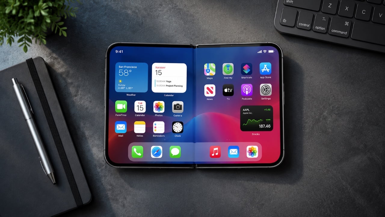
What Samsung’s Secretive Galaxy Z Fold 8 Wide Means for You Comparison of Galaxy Z Fold 8 and Fold 8 Wide screens

Samsung is poised to redefine the foldable smartphone market with its highly anticipated Galaxy Z Fold 8 series. This lineup includes the Galaxy Z Fold 8 Ultra, Galaxy Z Fold 8, Galaxy Z Flip 8, and the standout Galaxy Z Fold 8 Wide. With regulatory approvals secured and a rumored launch at the Galaxy Unpacked […]

The post What Samsung’s Secretive Galaxy Z Fold 8 Wide Means for You appeared first on Geeky Gadgets.

Posted in Uncategorized

The AI Music Device That Finally Asked Artists First

Most of us are passive music listeners now. We scroll, press shuffle, half-hear a song while doing something else entirely, and let algorithms decide what comes next. That’s not really listening, is it? IMAGO, a deep listening device created by designers Domenico Di Paolo and Kieran Feechan at Central Saint Martins, is taking direct issue with that kind of relationship with music and with the AI systems that have quietly normalized it.

The device is designed for a domestic setting, which is already an interesting choice. Home is intimate. Home is where you actually sit with things. By placing IMAGO in that kind of environment, Di Paolo and Feechan are deliberately steering users away from passive consumption and toward something more deliberate, more physical, more present. The design encourages bodily engagement with sound, not just background ambience you forget about before the track even ends.

Designers: Domenico Di Paolo and Kieran Feechan

But the more pressing issue IMAGO raises isn’t about listening habits. It’s about data. Most AI music systems today are trained on enormous datasets of songs scraped from the internet, with little or no compensation to the artists whose work feeds those models. It’s a system that benefits everyone except the people who actually made the music. IMAGO runs differently. It operates locally and uses artist-trained models, meaning the AI at its core was built with consent, not convenience.

That distinction matters more than it might initially seem. The conversation around AI and creative theft has been growing louder for years now, and for good reason. Artists, musicians, writers, and illustrators have spent considerable energy sounding alarms about models trained on their work without permission, without pay, and often without acknowledgment. What Di Paolo and Feechan have done is embed that ethical position directly into the design of an object. Not as a tagline. Not as an ethical framework document buried on a website. As the thing itself.

It’s a quietly bold position to take. Industrial design has always had the ability to make abstract ideas tangible, and IMAGO does exactly that. It takes the ongoing debate about AI ethics and turns it into something you can hold, operate, and sit with in your living room. The choice to run locally rather than in the cloud also carries weight. Local operation means no data is being siphoned off somewhere, no behavior tracked, no listening habits packaged and sold. Just you, the device, and music that an artist knowingly contributed to the model.

Central Saint Martins has consistently produced designers who treat objects as arguments, and this is clearly one of them. IMAGO feels less like a product pitch and more like a provocation, a physical question mark placed in front of an industry that has been moving too fast and asking too little. What if the default model for AI creativity wasn’t extraction? What if consent was the starting point instead of the afterthought?

I won’t pretend these questions are new. But packaging them this clearly, this beautifully, in something that functions as both a design object and a listening experience? That’s genuinely hard to do. Di Paolo and Feechan have managed it.

Whether IMAGO ever reaches mass production is almost beside the point. Its real value lies in what it models: a blueprint for how AI-powered design could look if we collectively decided that the people whose work trains these systems deserve a seat at the table. The device won’t fix the music industry’s complicated relationship with artificial intelligence on its own, but it makes the alternative feel possible and, more importantly, desirable.

The best design objects tend to do that. They don’t solve problems so much as they reframe them, make them feel answerable rather than overwhelming. IMAGO does that well. It asks whether deep listening and ethical AI can occupy the same space, and then it shows you what that space might actually look and feel like. That’s a harder question than most devices bother to ask.

The post The AI Music Device That Finally Asked Artists First first appeared on Yanko Design.

Apple Finally Fixed in the iOS 27 AirPods Menu

Apple Finally Fixed in the iOS 27 AirPods Menu The redesigned AirPods settings menu in iOS 27

Apple’s iOS 27 update delivers a long-awaited overhaul to the AirPods settings menu, addressing usability concerns with a more intuitive design. Phones & Drones highlights how the revamped layout minimizes unnecessary scrolling and organizes features logically, making it easier to access key options like Personalized Spatial Audio and Automatic Ear Detection. These changes aim to […]

The post Apple Finally Fixed in the iOS 27 AirPods Menu appeared first on Geeky Gadgets.

Posted in Uncategorized