Before you disable Google Play Protect, here’s what you need to know
Some Android users find the security feature to be too restrictive. Here's how to disable it and what you risk by doing so.
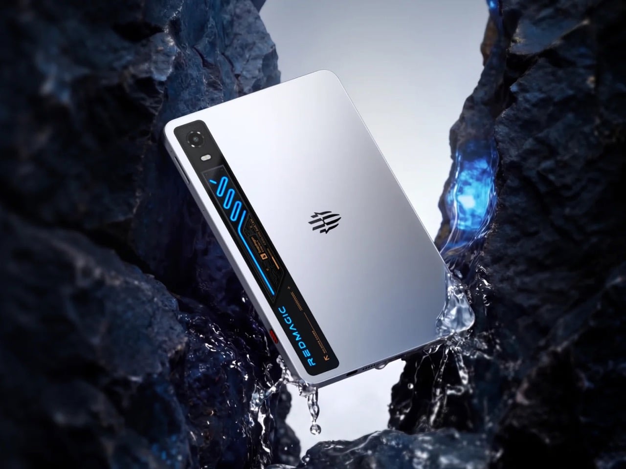
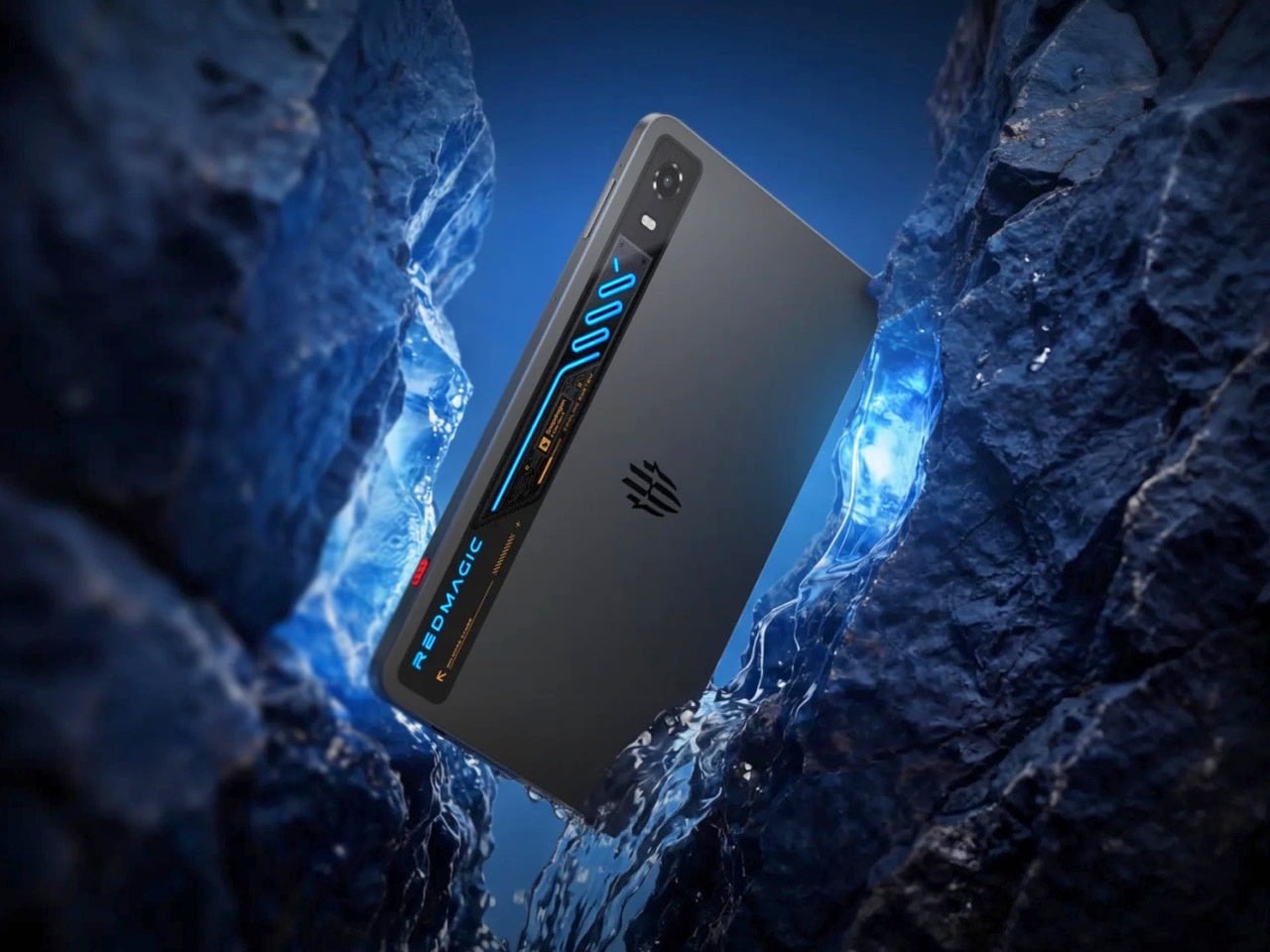
RedMagic built its reputation by shoving desktop grade cooling into devices that had no business needing it, starting with fans strapped onto gaming phones back when that idea still seemed ridiculous. The company’s 11 Pro phone proved a miniaturized liquid cooling loop could fit inside something you carry in a pocket. Now that same engineering obsession has scaled up into the Astra 2, a tablet that treats visible liquid cooling as its main selling point rather than a novelty. Most tablet makers spend their engineering budget on thinner bezels and lighter frames. RedMagic spent its on keeping the thing from overheating under real, sustained gaming load. That choice alone says a lot about who this tablet is actually built for.
The Astra 2 measures 9.06 inches, close enough to an iPad mini that the comparison writes itself, yet it runs hot enough inside to need actual liquid moving through it. RedMagic says the screen refreshes at up to 185Hz and gets bright enough to use comfortably outdoors, numbers most tablets never bother chasing. Battery life gets a boost too, backed by fast charging that promises short waits between long sessions. Pricing in the US starts at $750, climbing higher for more storage and memory. RedMagic already sells this tablet in China under a different name, and a global release is set for August 26.
Designer: RedMagic
RedMagic runs an actual liquid loop through the chassis, moving heat away from the processor the same way a gaming desktop does, just shrunk down to fit a slab you hold with two hands. A large vapor chamber spreads that heat across a wider surface before it ever gets a chance to build up in one spot. Layered on top is something RedMagic calls Liquid Metal 3.0, a thermal compound that conducts heat far better than the paste most devices settle for. None of this needs to work perfectly to feel like a genuine design statement. Just seeing the concept committed to at this scale is the interesting part.
Powering all that heat generation is Qualcomm’s Snapdragon 8 Elite Gen 5, paired with RedMagic’s own RedCore R4 chip built specifically to keep frame rates steady during long sessions. That combination explains why the cooling system needed to grow up in the first place. A 9.06 inch OLED panel adds its own heat on top, running at up to 185Hz with brightness RedMagic rates at 1,600 nits, figures that would turn heads on a laptop, let alone a tablet. An 8,300mAh battery and 75W fast charging round things out, aimed squarely at people who game for hours rather than minutes.
Apple and Samsung have spent years convincing buyers that tablets should stay quiet, sealed, and forgettable on the inside. RedMagic is betting there’s an audience that wants the opposite, a device that shows its work and treats visible engineering as a feature rather than a flaw. Whether that logic holds up once the Astra 2 ships in August remains the real test, but the idea itself is hard to ignore.

The post An iPad-Sized Gaming Tablet With Its Own Liquid Cooling System: RedMagic Astra 2 first appeared on Yanko Design.
Gaming tablets have long chased desktop-class performance, but thermal throttling has always been the real ceiling. The more demanding the session, the more heat builds up, and the more the chip has to dial back to protect itself. Vapor chambers and cooling fans have helped, but none has fundamentally changed the equation. The gap between peak specs and what a device can actually sustain has remained difficult to close.
REDMAGIC’s answer is the Astra 2 Gaming Tablet, which brings liquid cooling to a consumer tablet for the very first time. It pairs that with a 9.06-inch OLED display running at 185Hz and the Snapdragon 8 Elite Gen 5 chipset, all in a design that’s as visually interesting as it is capable. And rather than just a bullet item on a spec list, the Astra 2 makes that defining feature visible for everyone to see. But does it deliver on its promise, or is it just another design gimmick to woo gamers? We take it for a spin to find out.
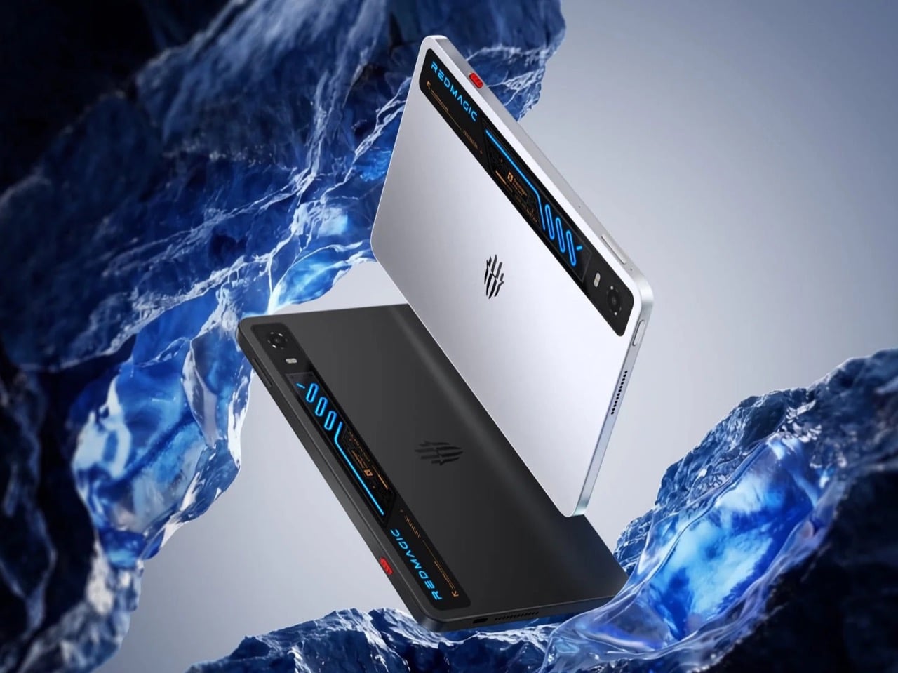
Most gaming tablets announce themselves loudly, with aggressive angles and bold branding that leave little to the imagination. The Astra 2 takes a different approach. Its body is flat matte aluminium in dark charcoal Eclipse or light silver Starfrost, with a subtly embossed REDMAGIC trident at the center of the rear panel. There’s no camera bump, no competing surface details, nothing vying for attention against the one element the design clearly prioritizes.
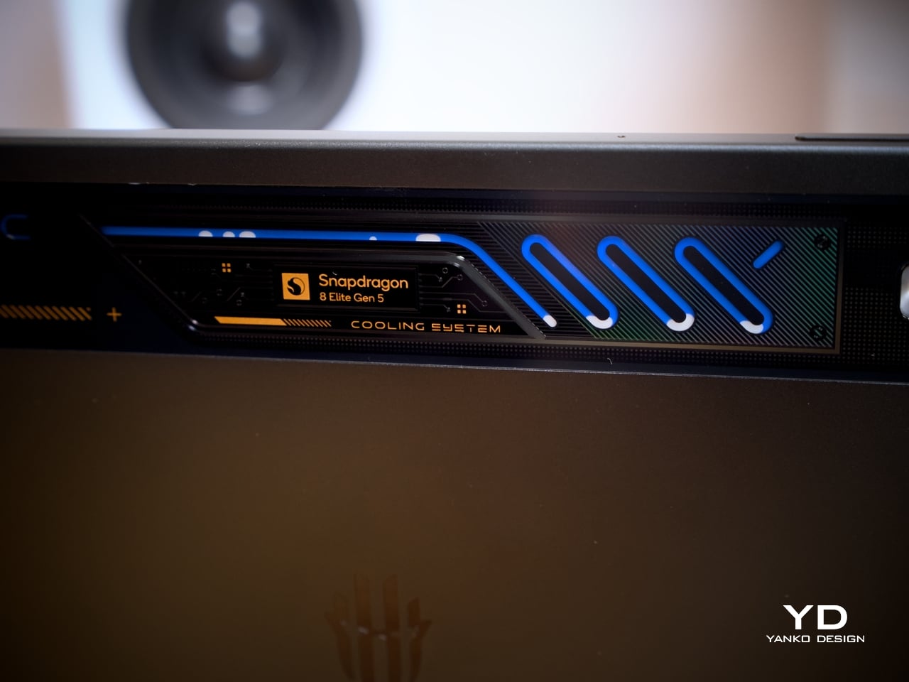
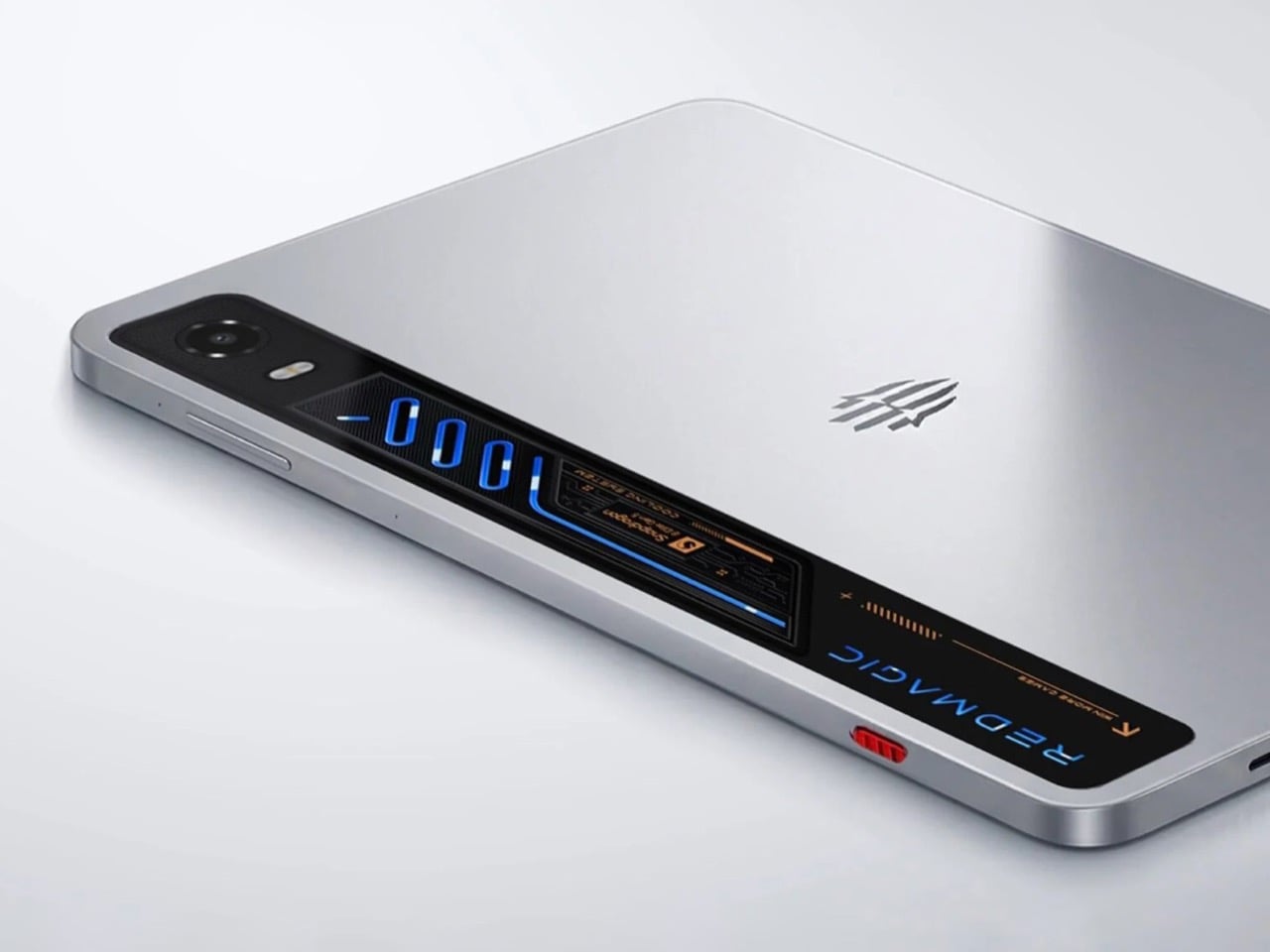
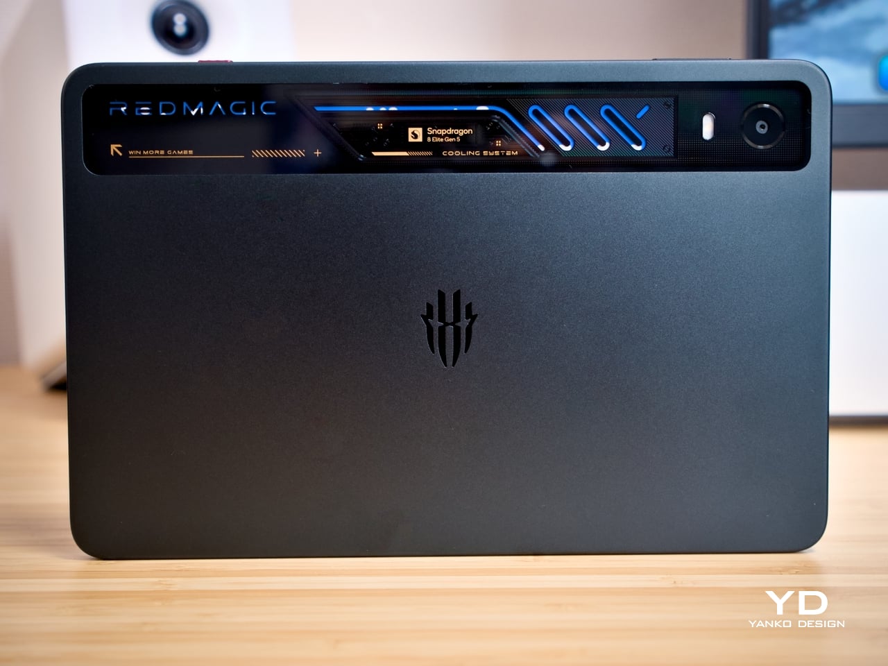
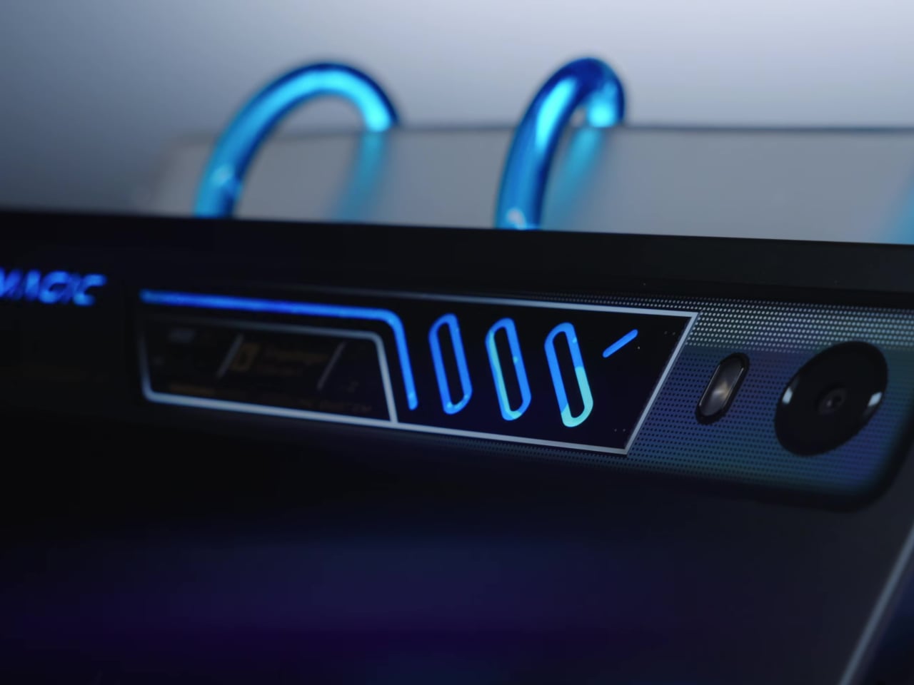
That element is the transparent cooling strip along the top edge of the rear. Beneath it, serpentine liquid cooling channels glow in blue RGB, with the Snapdragon 8 Elite Gen 5 badge and “COOLING SYSTEM” lettering etched into the surround. It reads like a nod to gaming PC culture, where lit, windowed hardware has long been a mark of serious intent. Here, that reference is earned.
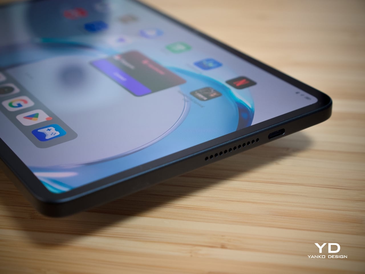
The front face is equally considered. With 4.9mm bezels and a 90.1% screen-to-body ratio, the display fills almost all of the face, and the front camera is practically invisible at 1.9mm in diameter, the smallest on any tablet. A red Magic Key provides the only real color accent, small but deliberately placed. Between colorways, Starfrost makes the blue cooling strip more dramatic, while Eclipse keeps things precisely controlled.
The REDMAGIC Astra 2 offers a tasteful middle ground between loud gaming gear and professional tech gadget. It has a head-turning design that doesn’t distract constantly, letting that first impression last even when you’re no longer paying attention. It has that character of maturity that gamers of this generation are looking for in their gear, especially when they’re out and about.
At 363g and 6.9mm thin, the REDMAGIC Astra 2 is genuinely comfortable to hold through extended sessions. The flat back sits flush on any surface without rocking, which matters more in practice than it sounds. The 9.06-inch size puts on-screen controls within natural thumb reach in landscape mode, and the rounded corners distribute the weight evenly enough that the tablet doesn’t become a burden during a long session.
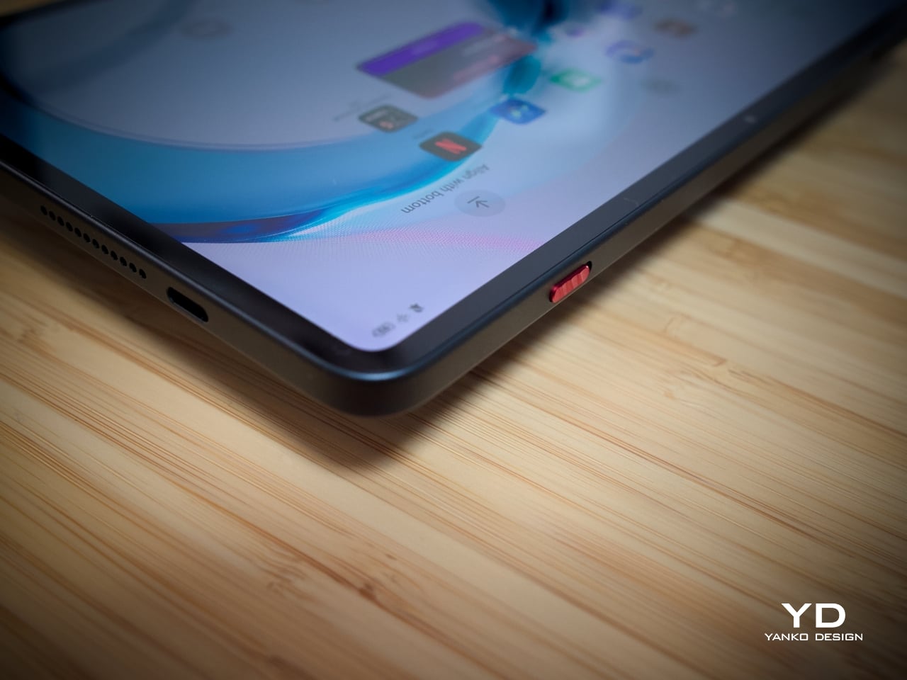
The dual USB-C layout is the real game-changer here, pardon the pun. A USB 3.2 Gen 2 port on the short side and a USB 2.0 on the long edge means a charging cable is always accessible regardless of orientation without blocking your hands, allowing comfortable play while charging. The Magic Key is customizable beyond its default GameSpace launch, and both fingerprint and face unlock work in wet conditions, a practical benefit for a device regularly used during intense gaming sessions.
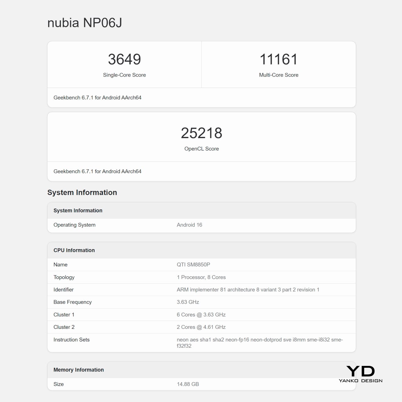
The Snapdragon 8 Elite Gen 5 runs on a 3nm architecture with a peak clock speed of 4.6 GHz and notably lower power consumption than its predecessor. Alongside it sits REDMAGIC’s RedCore R4 co-processor, which dynamically allocates CPU, GPU, memory, cooling, and touch resources in real time based on what each game demands. You also get 12GB or 16GB of RAM, depending on your configuration, which is plenty not only for games but for some heavy-duty multitasking.
The AquaCore Cooling System 2.0 is what makes extended performance possible, with REDMAGIC being the first mass-produced tablet brand to pioneer liquid cooling. A piezoelectric micropump circulates fluorinated liquid through micron-laser-cut channels inside the device body. Liquid Metal 3.0 transfers chip heat rapidly to a large vapor chamber, which distributes it across the entire device. Together, these three components maintain stable performance during prolonged gaming sessions in a way conventional cooling simply can’t match.
What all these mean in practice is that you get higher FPS stability and faster responsiveness with lower power draw and less heat. Performance is stable and optimized, whether you’re gaming, enjoying a video binge, or, on rare occasions, being productive thanks to the plethora of apps available on Android 16. As with gaming PCs, good gaming hardware tends to result in good performance across the board, and the REDMAGIC Astra 2 proves it.
The 9.06-inch H5 OLED panel runs at 185Hz, currently the highest refresh rate on any OLED gaming tablet. Resolution sits at 2.4K, or 2400×1504, and peak brightness reaches 1,600 nits. These deliver a screen that is bright, vibrant, and a joy to look at, both for gaming and other visual content. The next-gen custom Synaptics touch controller delivers 300Hz average and up to 2,000Hz instantaneous touch sampling, making the screen feel immediately precise and responsive even with sweaty hands.

The battery is rated at 8,500mAh and supports fast 75W charging, though it eschews wireless charging for that feat. On regular tablets, that’s definitely enough to last for a day or two, but gamers know how fast you can burn through that in just a few hours of gaming, especially at max settings. Thankfully, the Astra 2’s dual USB-C design and safeguards not only allow but even encourage you to charge while playing, minimizing downtime as long as you’re near a wall socket.
While the REDMAGIC Astra 2 excels in most cases, it doesn’t have much to show when it comes to mobile photography. The single 13MP camera is, for the most part, decent, while the 9MP front camera is clearly intended for video calls and live streaming more than taking selfies. None of these is surprising, of course, as this is a tablet that’s laser-focused on delivering a super gaming experience first and foremost.
The Astra 2 is built to handle daily wear without fuss. The aviation-grade aluminium frame resists flexing, Corning Gorilla Glass 3 protects the display against scratches and impacts, and an IP54 rating covers dust protection and water splashes from any direction. That’s the appropriate level for a device that lives on desks, in bags, and in hands, covering the real conditions a gaming tablet encounters day to day. That said, it’s not exactly what you would expect from a device at this price point.

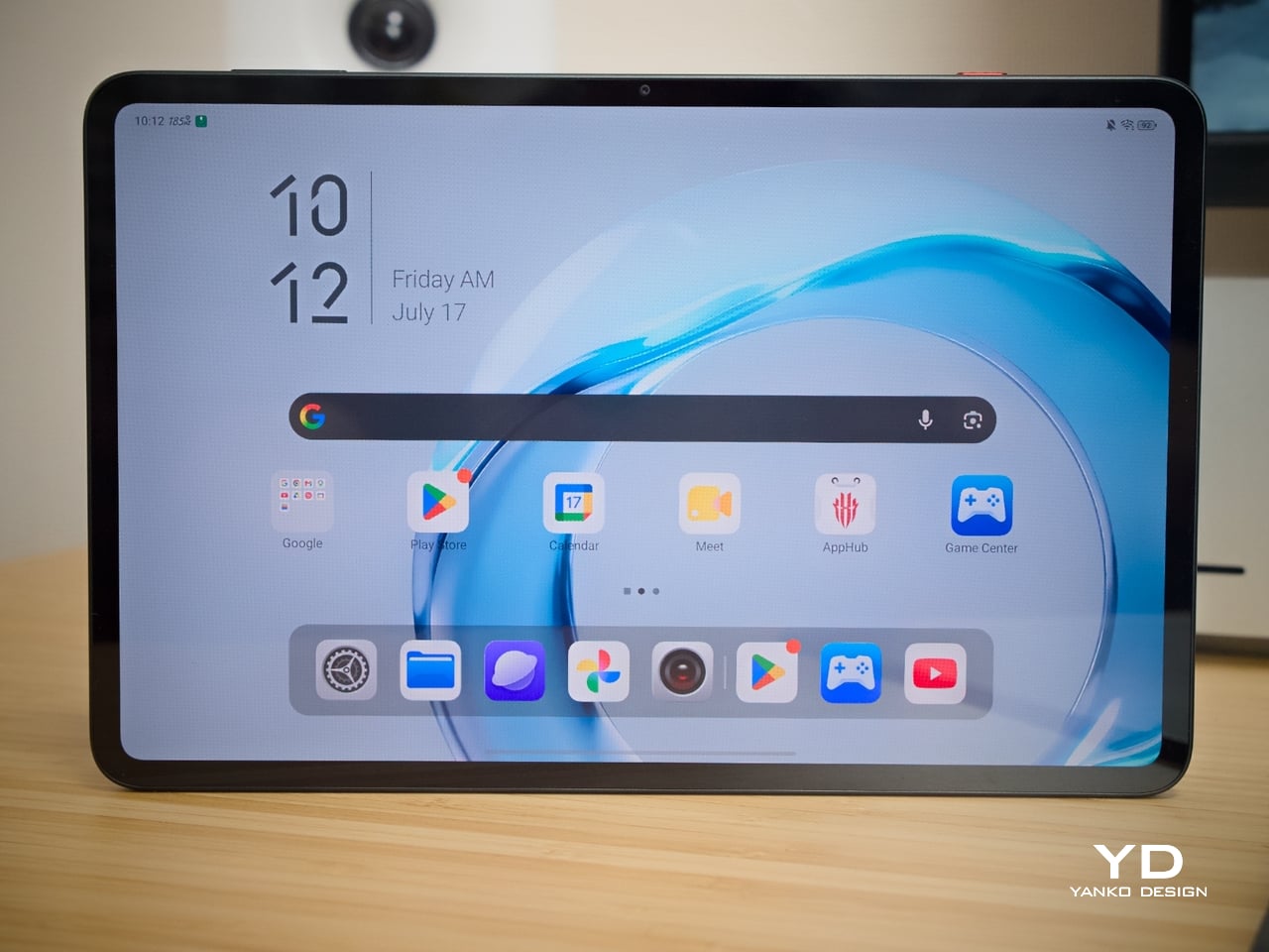
The Astra 2 ships on REDMAGIC OS 11.5 running Android 16, starting on the current version of the OS rather than entering the market already a software generation behind. Unfortunately, the brand has not made any commitment to future software updates, which does raise some concerns about its longevity in that department.
The 12GB/256GB Astra 2 starts at $749 in North America and €699 in Europe. At that price, it’s the only tablet available with both a 185Hz OLED display and liquid cooling. Comparable gaming tablets in this range use LCD panels at lower refresh rates with conventional cooling, making the REDMAGIC Astra 2 the clear leader in terms of specifications that define sustained gaming performance.
The 16GB/512GB tier goes up to $849, and the software platform adds real value to both configurations. Frame Rate Boost uses interpolation to smooth gameplay on titles that cap their native frame rate, intelligently inserting extra frames for more fluid motion, while the system upscales games to 2K resolution for a visually impressive experience. The Astra 2 is Wi-Fi only, which is standard for gaming tablets at this level and accurately reflects where serious mobile gaming actually takes place.

USB On-The-Go support means keyboards, mice, and external drives connect directly without needing a computer as a host. DisplayPort output supports external displays at up to 8K resolution at 60FPS, and the Gravity X desktop mode enables full keyboard-and-mouse PC-style play directly from the tablet. It may not have a Switch-like modular design, but the capabilities allow the Astra 2 to meet gamers where they are, be it while waiting in line, in the comfort of their bed, or on an extended session on their desk.
What makes the REDMAGIC Astra 2 interesting as a design object isn’t any single specification but how well the decisions relate to each other. The dual USB-C ports, the 185Hz OLED, the flat profile, and the vapor chamber geometry all feel purposeful rather than assembled from a spec sheet. There’s a coherence here that suggests these components were conceived together, not independently justified and bolted on.
The cooling strip is worth one final note, particularly for design-minded readers. Most consumer electronics go to considerable effort to hide their internal complexity behind smooth, opaque surfaces. The REDMAGIC Astra 2 puts a window in the back panel and lets the working hardware be the visual centerpiece, a straightforward and honest position, and one that’s genuinely satisfying to see in a product at this level.
The post REDMAGIC Astra 2 Review: The Gaming Tablet That Finally Keeps Its Cool first appeared on Yanko Design.


E Ink tablets have become a solid alternative for people who read and write for a living. Devices like the reMarkable 2 and Kindle Scribe do a good job of making digital note-taking feel closer to paper, but they all share the same fundamental limitation. You get one screen, which means you’re either reading or you’re writing, but not both, and that’s a workflow problem that hasn’t really been addressed.
The Inkleaf is a foldable dual-screen E Ink tablet designed specifically for that gap. It opens up to two full 10.3-inch Carta E Ink panels side by side, which lets you keep your source material on one screen while your notes stay on the other. It’s the kind of setup that researchers, students, and writers have been piecing together awkwardly with a tablet and a separate notebook for years.
Designer: Kameron Yu

Think about the last time you had to annotate a PDF while also drafting a response, or work through a textbook while keeping running notes. Most tablets force you to switch between apps constantly, losing your place and breaking focus. With the Inkleaf, you can read on the left and write on the right, and even flick a page from one screen to the other with the stylus.
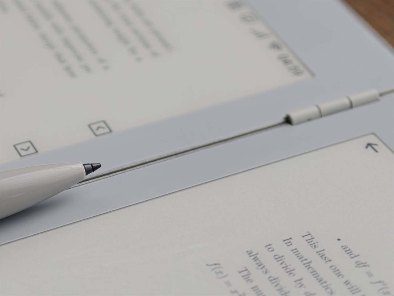
What makes the form factor just as interesting as the screens themselves is how the Inkleaf handles both. It folds shut like a hardcover with a 180-degree hinge that lays perfectly flat when open. Closed, it’s thinner than a standard paperback at 8.4mm and barely heavier at 480 grams. The body is cast aluminum with a precision-machined hinge barrel and tactile page-turn buttons right where your thumb expects them.

To put the thinness in perspective, each open panel measures just 4.2mm, which is thinner than the reMarkable 2 at 4.7mm, the Kindle Scribe at 5.4mm, and the Boox Note Air4 C at 5.8mm. None of those fold, either. It’s a notable feat given that the Inkleaf is essentially two tablets in one, and it’s the only foldable E Ink tablet currently available on the market.

The software runs on Android and supports open file formats, including PDFs, EPUBs, MOBI, and TXT files, with no subscription required to access your own content. An AI-powered handwriting search can surface any phrase across every notebook you’ve written. And because it folds to the size of a hardcover, it doubles as a portable secondary display at a coffee shop, a hotel room, or wherever else you end up working.
The Inkleaf is reportedly priced at around $450, with the first units expected to reach founders in August 2026. It ships with the pressure-sensitive stylus, a USB-C cable, and no subscription fees tied to reading your own files. For people who spend long hours moving between books and notebooks, it’s one of the more thoughtful attempts at genuinely rethinking what a digital writing and reading device can look like.

The post Inkleaf’s foldable dual-screen E Ink notebook lets you read and write at the same time first appeared on Yanko Design.
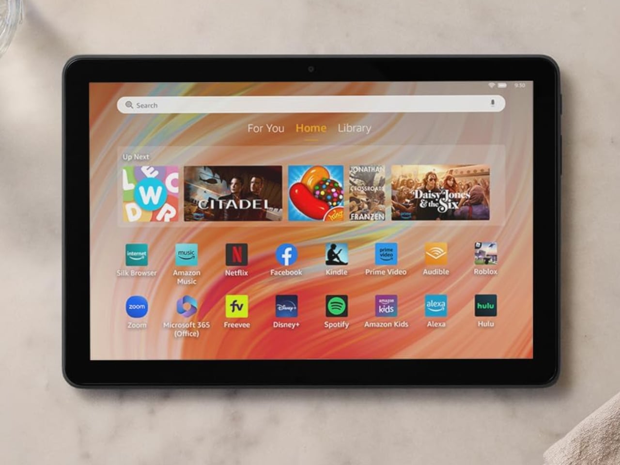
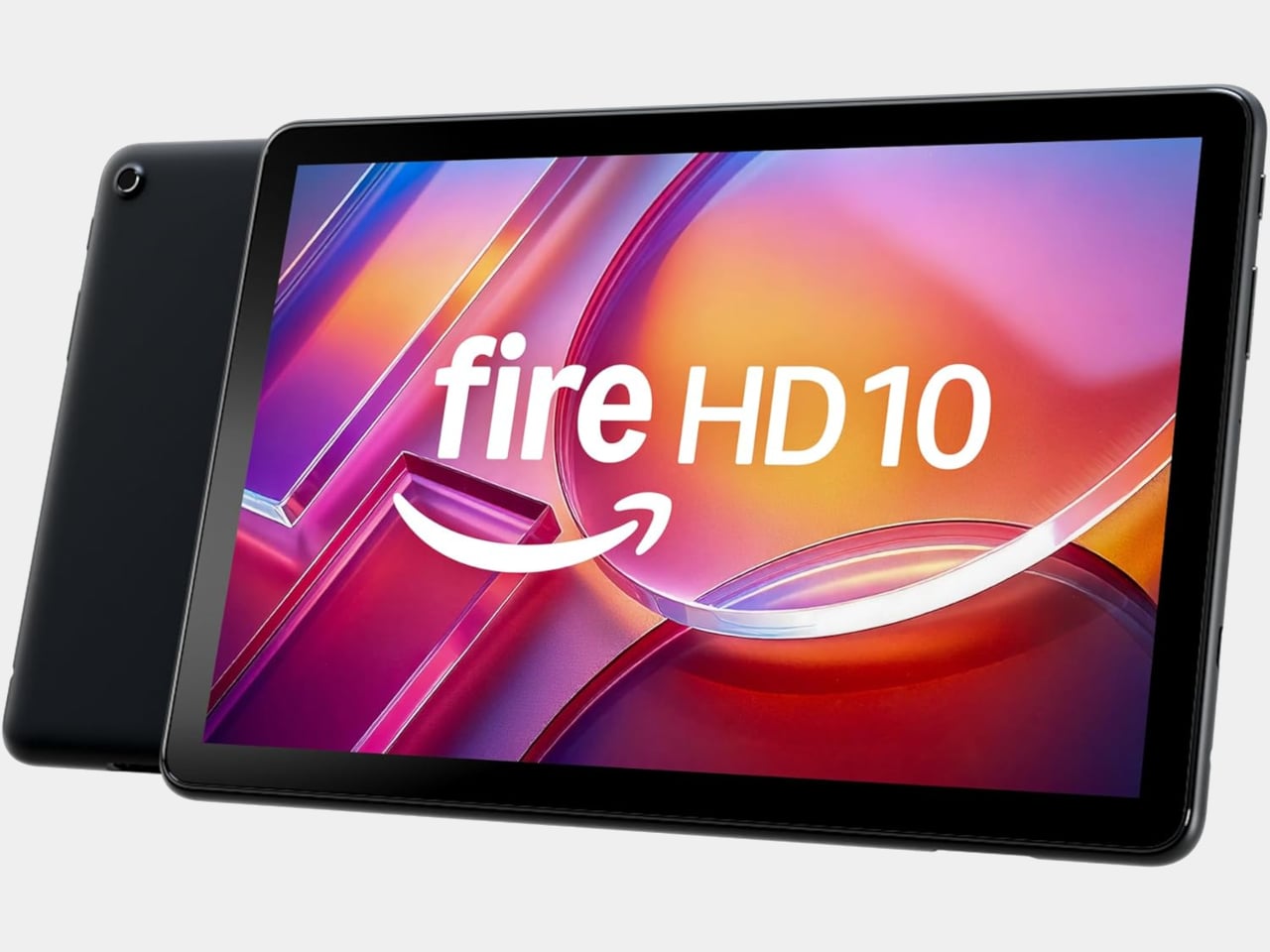
Budget tablets have always played a peculiar role in consumer electronics. They aren’t meant to be powerful; they’re meant to be just capable enough to get through a streaming queue, a few Kindle chapters, or a morning of casual browsing. Amazon’s Fire lineup has mastered that balance for years, finding a loyal audience among people who want a large enough screen that doesn’t hurt to drop.
The Fire HD 10 has been Amazon’s flagship Fire tablet for a few years now, and it hasn’t seen new hardware since 2023. That’s unusual for a company that used to refresh its lineup almost every year. Rather than launch a new generation, Amazon quietly added 1GB more RAM to one specific configuration of the existing tablet and made no formal announcement about it.
Designer: Amazon

What makes this update slightly overdue is that the cheaper Fire HD 8 had already been available with 4GB of RAM, while the more expensive Fire HD 10 was still capped at 3GB. That’s a strange hierarchy for a product line, where the lower-tier model offers more memory than the flagship. The new 4GB variant fixes that imbalance, at least for buyers who land on the right configuration.

The extra gigabyte makes a real difference for a tablet you use this casually. Jumping between Prime Video and a browser tab without one of them reloading, or keeping music playing while you scroll through a shopping cart, are the kinds of small interruptions that 3GB quietly introduced. It’s the sort of upgrade you only notice once the problem it fixed stops happening.
There is a catch worth knowing before getting excited. The 4GB version is only available in one specific setup: 32GB of storage, Black, with lock screen ads. Anyone who wants 64GB of storage, a different color, or an ad-free tablet is still working with 3GB. It’s a narrower window than most buyers might expect, particularly given how long this model has gone without any changes at all.

Everything else about the tablet stays the same as the 2023 model. The 10.1-inch 1080p Full HD display, the octa-core processor running at 2GHz, the 13-hour battery life, and the USB-C charging port are all unchanged. The microSD card slot still accepts up to 1TB of additional storage, and Fire OS keeps the usual Amazon ecosystem running front and center.

Amazon has priced the 4GB variant at $154.99, up $15 from the previous $139.99 that the 32GB, 3GB model carried. For a tablet that hasn’t had new hardware in three years, it’s a modest increase tied entirely to the memory upgrade, especially considering the rising costs of RAM. The extra cost is easy to justify if the RAM difference affects how smoothly the device runs for your typical day.
The post Amazon Gave the Fire HD 10 4GB of RAM Without Telling Anyone first appeared on Yanko Design.