Lexus LS Concept First-Look: The Six-Wheel Flagship Turning Heads at Milan Design Week 2026

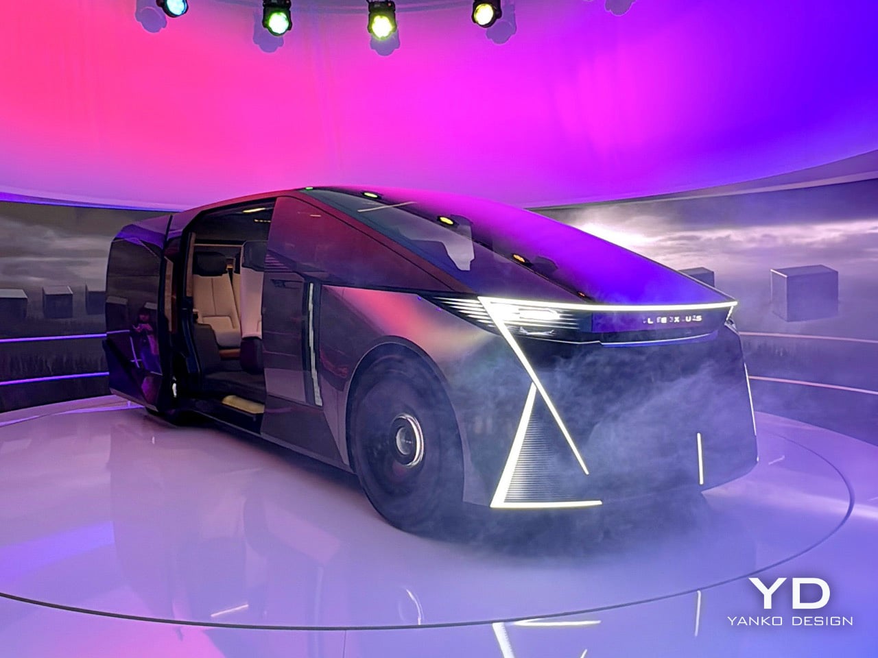
Six wheels on a Lexus, at a furniture fair in Milan, sounds like either a provocation or a punchline. At this year’s Milan Design Week, Lexus is betting it’s the former. The brand rolled into Superstudio Più in the Tortona district with its LS Concept, a long-body, flat-roofed, twin rear-axle machine that first appeared at the Japan Mobility Show in 2025. It’s a chauffeur-driven vehicle built entirely around the passenger, and it’s Lexus’s clearest statement yet about where its flagships are going. In fact, Chief Branding Officer Simon Humphries said it plainly: the “S” in LS no longer stands for Sedan. It stands for Space.

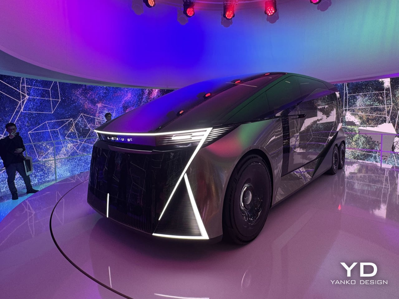
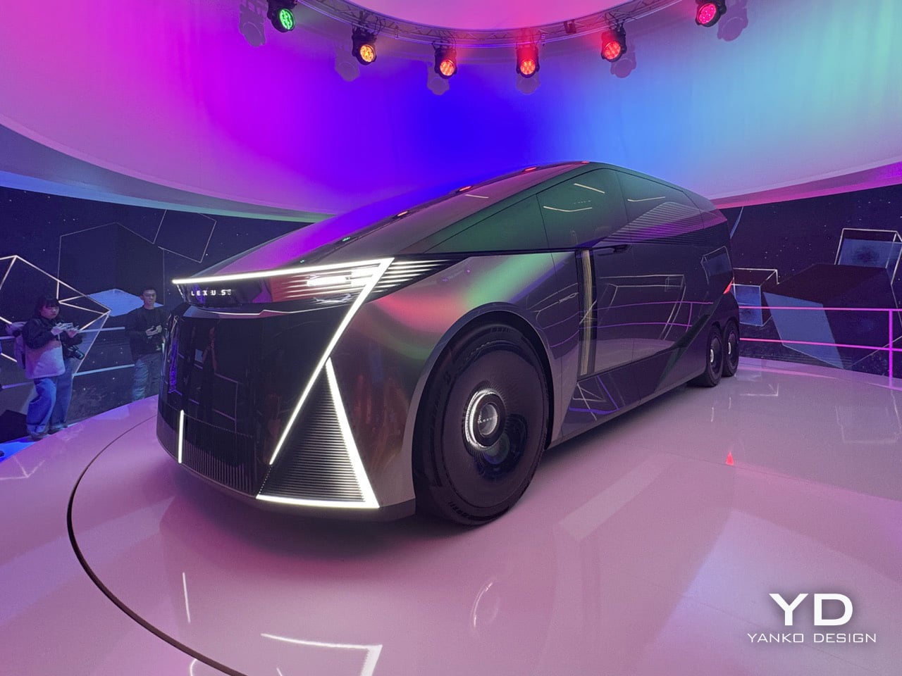
The car sits inside an installation called SPACE, a fittingly simple name for a big idea. The LS Concept is wrapped in a cylindrical LED screen that’s always moving, cycling through textures and color palettes that wash over the car’s matte metallic finish. The whole thing sits on a low turntable, rotating slowly so you can take in every angle while the screen behind it blurs the line between the vehicle and its environment. From the back, the body is dark and geometric, with red light cleanly tracing the corners and the LEXUS wordmark centered like a final statement. The front has no grille at all, just a wide bar of white light, a dark glassy face, and some sharp diagonal cuts at the lower corners. The side profile is what really sells the scale of it all; the greenhouse is so long and flat it forces you to rethink what a luxury car is supposed to look like.

Designer: Lexus

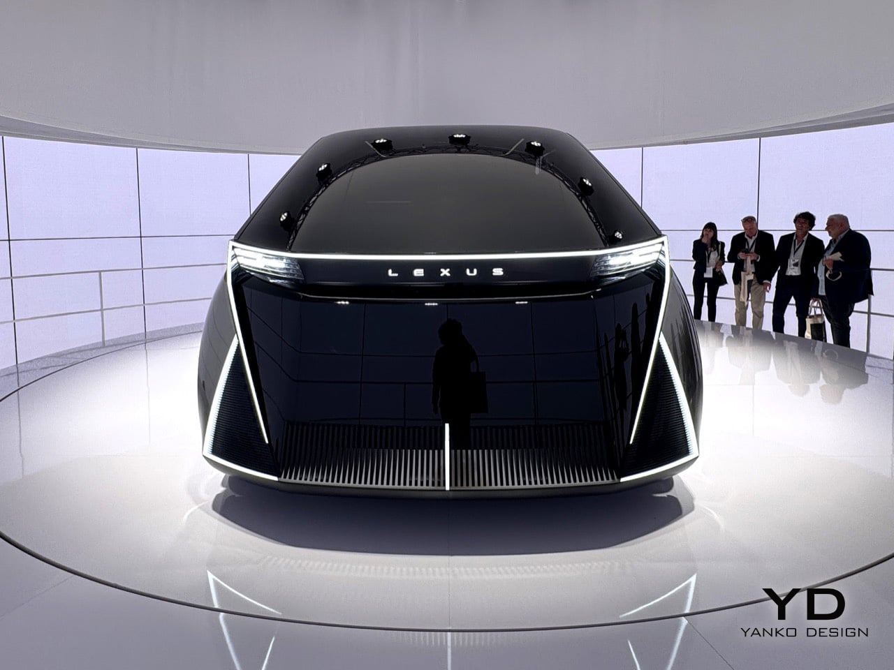
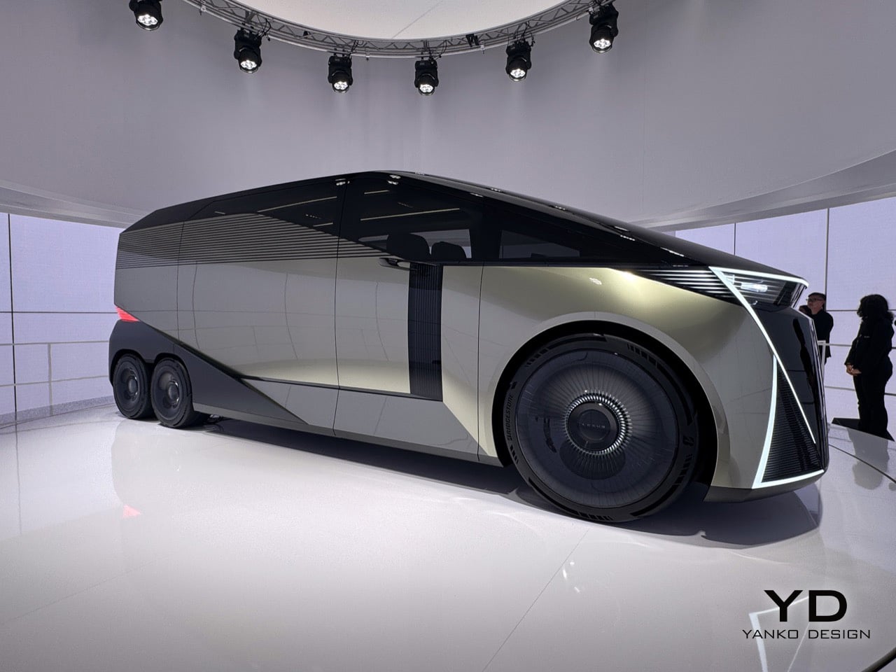
You’ll notice those sharp diagonal white light signatures at the corners of both the front and back, and they do a great job of anchoring your eye so you don’t get lost in all that surface area. The front is an exercise in restraint, especially for Lexus. There are no intakes, no heritage cues, and definitely no spindle grille, which defined the brand’s look for fifteen years. Instead, a single, clean bar of white light carries the Lexus name across the top, and below it, dark glass sweeps down like a theater curtain. The back is just as clean, with black geometric planes and red light tracing the corners so precisely it feels more like sculpture than taillights. There’s also a louvered panel on the rear quarter that looks both cool and functional, the kind of detail you have to go back and look at a second time.

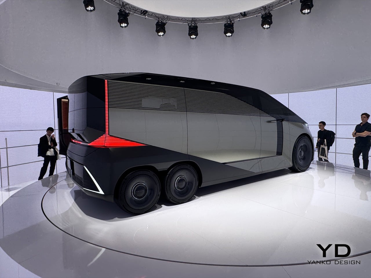
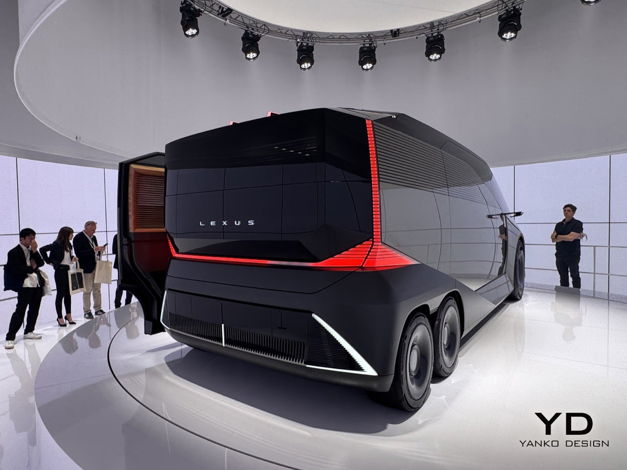
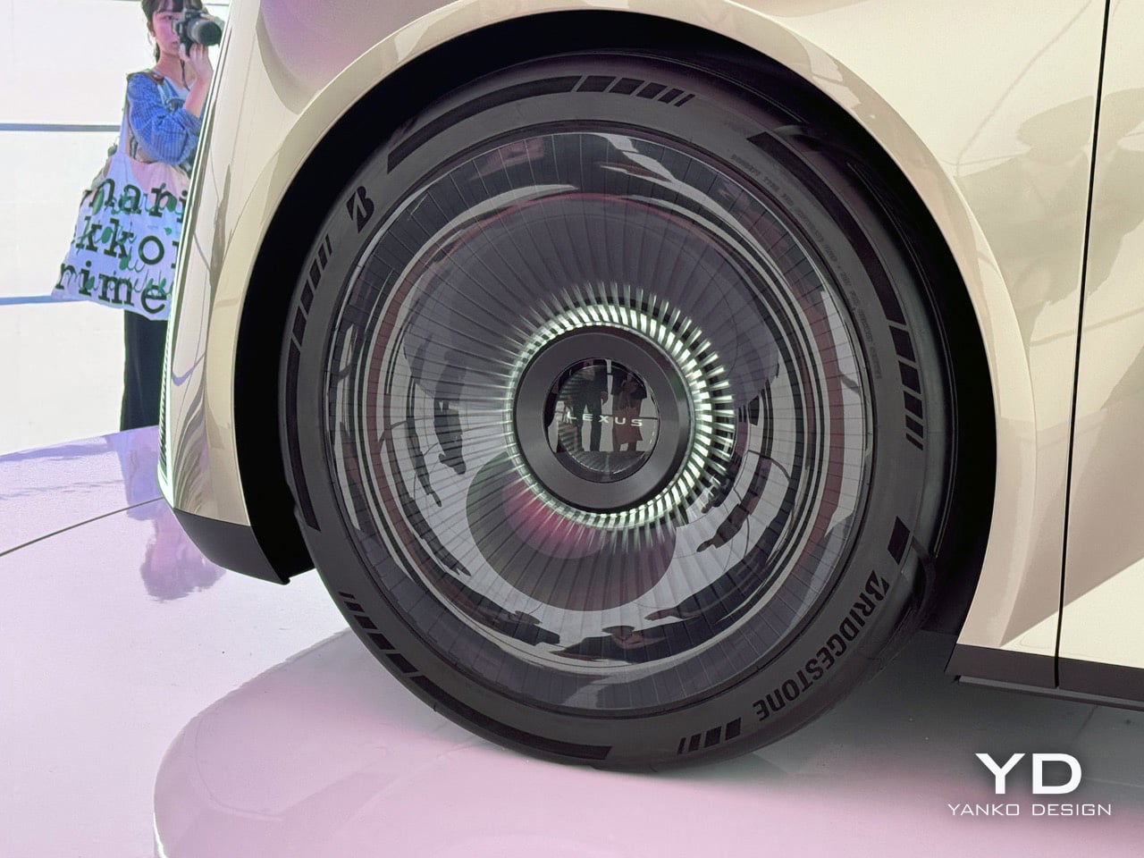
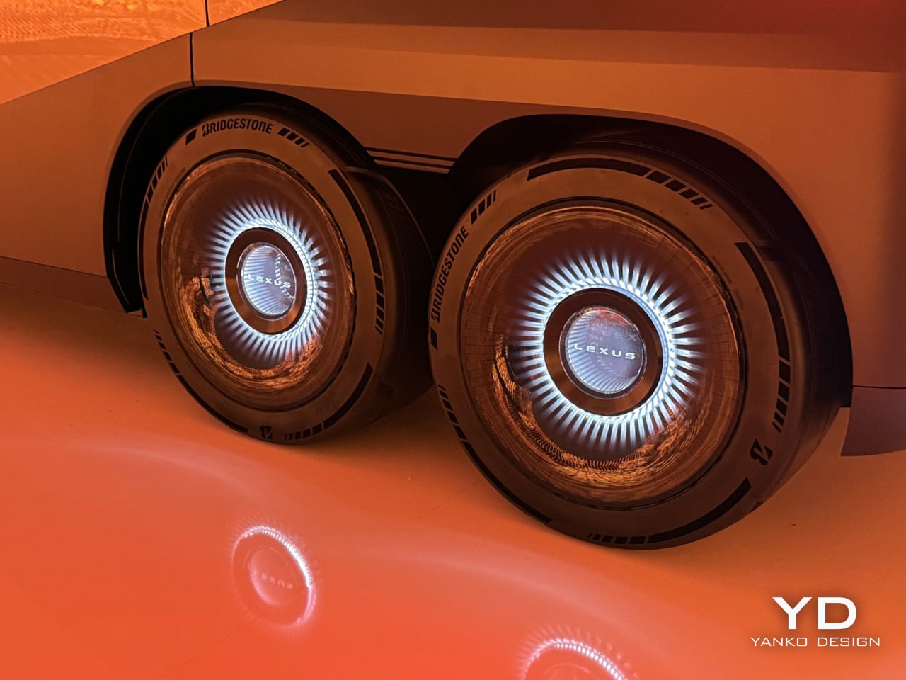
The twin rear wheels are probably the first thing that throws you off, but the more you look at them, the more they make sense. A six-wheel layout, something you usually see on overland vehicles or high-end coaches, lets Lexus pack in a huge amount of interior volume without the big wheel arches that eat up space in most long cars. The turbine-style wheel covers keep the look clean, where normal spokes would have ruined the effect. When you see it from the side, the lower body looks like a single sculpted piece, and the way it tucks under itself makes the whole thing feel like it’s floating. Lexus is basically saying that a vehicle with the footprint of a small bus can be the next word in luxury, and after a few minutes, you start to believe them.

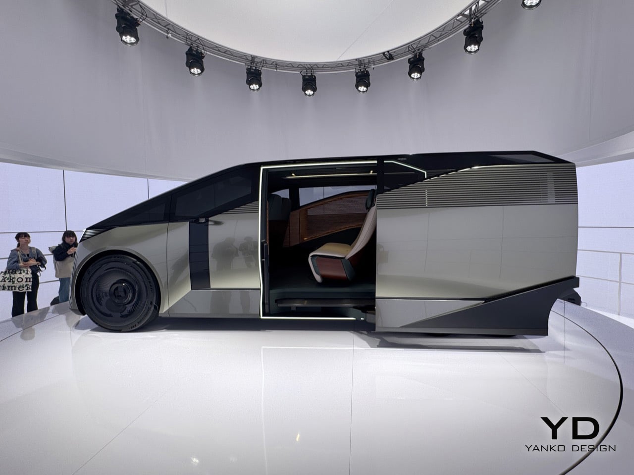
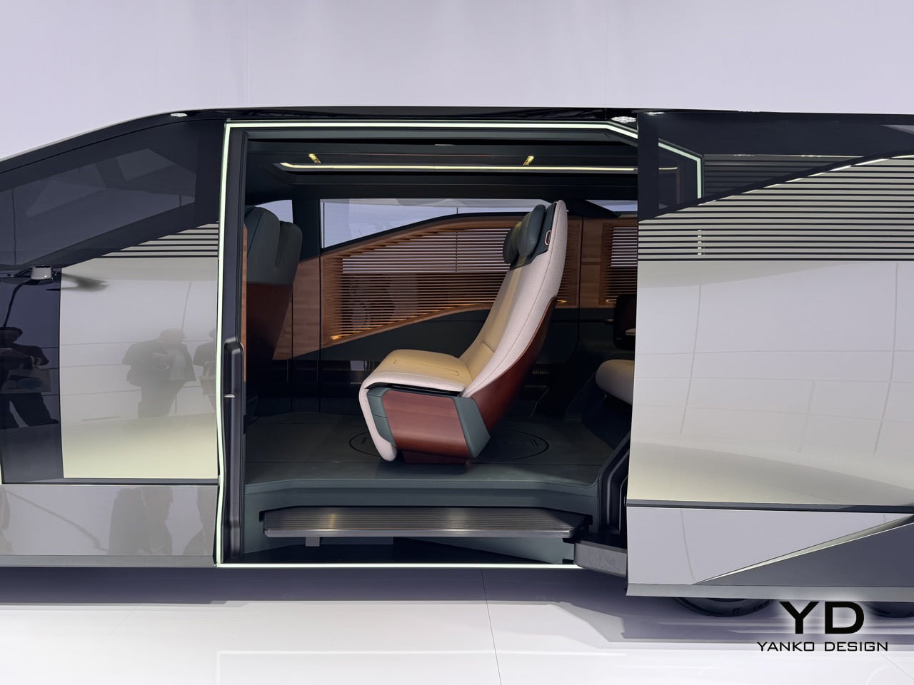
Step through the door, framed in a bright white light, and you see what they mean by hospitality. A slatted wood panel runs up the entire wall of the cabin, a single rear seat is finished in cream and burgundy leather, and the floor is so open you get the sense it was designed for standing as much as sitting. The real achievement here is how Lexus managed to package so much genuine room inside; it feels more like a small, well-designed living space than a stretched-out car. Whether any of this makes it to production is anyone’s guess, and Lexus seems happy to leave that question hanging in the air.

What Lexus is showing here is a clear signal of where its design thinking is headed, and that alone makes it one of the most interesting things you can see in Milan this year. If you want to see it for yourself, you can experience the SPACE installation and the Lexus LS Concept at the Daylight Hall in Superstudio Più, located in the Tortona district, from April 21st to the 26th.

The post Lexus LS Concept First-Look: The Six-Wheel Flagship Turning Heads at Milan Design Week 2026 first appeared on Yanko Design.

Yamaha Just Made a Pen That Writes With a Beat

If you asked most people to name a Yamaha product, you’d probably get piano, guitar, or motorcycle long before anyone said pen. And yet here we are, talking about a writing instrument from one of the most iconic music and motor companies in the world. The Swing Scribe is not a gimmick. It’s a genuinely fascinating piece of design thinking, and it deserves far more attention than it’s been getting.

Part of Yamaha’s Scribe Tool Design 2024 project, the Swing Scribe is a collaboration between Yamaha Corporation and Yamaha Motor designers based in the US. The project’s premise is simple but surprisingly profound: in an age saturated with digital tools, what happens when you return to something as primitive as writing? And more importantly, what can you add to it, not to make it smarter or faster, but to make it more felt?

Designer: Yamaha

The Swing Scribe answers that question with a pen that behaves like a metronome. The design draws its inspiration from the quill, one of the oldest writing instruments in history. As you write, the natural wobble of the feather gives the pen rhythm through a small amount of air resistance. Yamaha took that phenomenon and made it intentional. A weighted tip is attached to a metal bar, and as you write, it swings. The small pendulum force produced by the weight and the movement gives a rhythm to the pen and the way it flows, feeding that beat back into your hand.

What’s particularly clever is the degree of control built into it. You can slide the weight along the bar to change the arc of the swing, adjusting resistance and tempo to match how you’re feeling at any given moment. Slow and contemplative? Let it swing wide. Fast and focused? Pull the weight closer. It sounds like a small, quiet thing, but it genuinely reframes the act of writing as something that has a beat, a pace, its own kind of mood.

This is deeply Yamaha. The company has a long-standing design philosophy rooted in the Japanese concept of Kando, which translates roughly to emotional excitement or deep resonance. The goal isn’t just functionality. It’s feeling. It’s the reason a Yamaha piano doesn’t only produce notes but creates a whole physical experience for the player, something that connects the body to the sound. The Swing Scribe takes that same philosophy and applies it to a writing tool.

I’ll admit my first reaction was skepticism. A pen that swings on a metal arm sounds like something you’d appreciate in a design exhibit and then immediately set down. But the more I thought about it, the more it made sense. We’ve spent years optimizing handwriting out of our lives. Keyboards are faster. Voice memos are easier. Dictation tools have gotten good enough to be genuinely useful. And yet journaling, sketching, hand-lettering, and analog note-taking are having a real cultural moment right now. People aren’t returning to pen and paper purely out of nostalgia. They’re returning because it feels different from every other thing they do. Because it slows them down in a way that makes room for actual thinking.

The Swing Scribe leans into that completely. It doesn’t try to make handwriting more efficient. It makes it more deliberate, more sensory, more present. And it does all of this with a mechanism that is elegant in its simplicity. No batteries, no Bluetooth, no companion app. Just physics. Not everything needs to be optimized. Some things are better when they resist you slightly, when they swing a little off-center, when they remind you that creating something by hand is its own reward. Yamaha, of all companies, probably understood that long before the rest of us caught up.

The post Yamaha Just Made a Pen That Writes With a Beat first appeared on Yanko Design.

Cash App now supports accounts for kids 6-12

Cash App, the banking and payments app run by Block, has added support for parent-managed kids accounts. The new accounts include key benefits from the service's normal account, with an eye towards teaching financial literacy to younger users ages 6 to 12. Cash App first allowed teenage users on its platform in 2021.

As part of the "expanded Cash App Families experience," eligible legal guardians and parents can create managed accounts that offer "a dedicated place on the platform to send allowances, set aside savings, and track spending for their child, kickstarting their path to financial independence," Cash App says. Adults managing these accounts will be able to set up recurring transfers, see how their child is spending and do things like lock their child's account to prevent transactions. Kids will get a custom debit card and the ability to receive payments from up to five trusted accounts, though notably they won't be able to access Cash App itself.

Cash App says managed accounts are designed for kids 6 through 12. Once those kids turn 13, Cash App says parents will be able to choose to convert their account to a "sponsored account" to unlock more features, like the ability to send and receive payments, invest in stocks or trade crypto. Those sponsored accounts are technically still monitored and controlled by a parent or legal guardian, but they do give 13-year-olds more control over how they use their money.

A parent-managed account for kids is not a new idea in the fintech space, though Cash App is trying to reach a younger audience than some of its competitors. Venmo rolled out access to its payment platform to teens between the ages of 13 to 17 in 2023. Separately, both Apple and Google also offer their own kids accounts in Google Wallet and Apple Cash Family.

This article originally appeared on Engadget at https://www.engadget.com/apps/cash-app-now-supports-accounts-for-kids-6-12-210651025.html?src=rss

YouTube is muting push notifications from channels you don’t watch

YouTube notifications can get messy fast, particularly if you’re subscribed to a lot of different channels. To address that, today the company will begin muting push notifications from creators that you haven’t engaged with in the last month.

The change to YouTube notifications began as a small trial the company tested out earlier this year. The idea behind it is that if a viewer continually receives notifications about content they don't engage with, this may eventually cause the user to disable YouTube notifications altogether. Now obviously, this is bad for YouTube. Turning off notifications means people will use the platform less, thereby resulting in lower revenue. However, it's also bad for content creators, especially the ones you do like, who will have one fewer avenue to keep you updated about new and upcoming videos. 

So starting today, for channels that you have subscribed to and have notifications set to "all," YouTube will no longer send out push notifications to mobile devices from creators that you haven't interacted with for one month. That said, these notifications will continue to be available inside the YouTube app in your inbox (the little bell icon in the top right). 

Notably, for those who are clicking on notifications and watching related videos, nothing will change. Additionally, based on info from the test earlier this year, YouTube said "channels that upload infrequently will not have their notifications affected." This is a good thing, especially for creators who post long-form content that takes extra time to make, as people probably don't want notifications to go away in case they happen to miss a once-a-month upload. 

The one thing that's unclear is if you start watching a channel again that you have not interacted with in a while, is if YouTube will automatically restart related push notifications. However, as a way to prevent too many alerts from clogging up your phone, YouTube's new protocol seems like a good way to cut down on the clutter.

This article originally appeared on Engadget at https://www.engadget.com/entertainment/youtube/youtube-is-muting-push-notifications-from-channels-you-dont-watch-205119228.html?src=rss

Chopard’s Beehive Table Clock is a masterpiece of horological art with L’Épée 1839

Brilliance usually comes in limited quantities. In fact, it is embodied by the new limited edition Chopard Table Clock, which stands apart from anything the horologist has created in the past three decades. To celebrate the 30th anniversary of the Chopard Manufacture in Fleurier, the company has teamed up with L’Épée 1839 – the masters of complex watches – to create the Beehive Table Clock.

After reimaging a legendary car and a colorful hand grenade as clocks, L’Épée 1839 is now giving a new horological dimension to the desk clock. Easily, one of the most complex and finely decorated Objet d’Art – spare a thought for the MB&F – the clock revives Chopard’s own iconic beehive motive originally used by the founder Louis-Ulysse Chopard in the 19th century. The bee was later adopted as the emblem of the Manufacture in Fleurier by Karl-Friedrich Scheufele back in 1996 to represent “labor, precision, and collective skill.”

Designer: Chopard

Chopard timepieces are generally an embodiment of precision and strength highlighted by timeless style. Each of its creations reflects Swiss mastery with the use of dancing gems, fine artworks, and sustainable innovation. All of this is presented well in the Beehive Table Clock, which is made of steel and brass in 18K ethical yellow gold to mimic the color of an original beehive.

The clock, measuring 25.8 cm high and with a diameter of 16.5 cm, features three jeweled bees made in Chopard’s jewelry atelier in Geneva. The bees feature a body made using 18-carat ethical yellow gold, which is studded with gemstones, yellow sapphires, and black diamonds, and have rock crystal for wings. While the bees may feel like the most distinctive part of the clock, which comprises seven rounded tiers of borosilicate glass, two of which have the hour and minute numerals. It’s the chime mechanism of the Chopard Beehive Table Clock that’s, in fact, its best highlight.

The clock’s movement plate is brass, and the base is steel, but both are finished in gold to match the beehive theme. Its chime mechanism is located at the top, where the glass dome is used as the bell struck by a small gold hammer to announce the time. There are three – Active, Silent, and On-Demand – chime modes to choose from, which can be changed by rotating the top part. In the active mode, the clock sounds the time automatically, in Silent mode, it doesn’t chime at all, and in On-Demand mode, you can manually set the clock to sound the current time.

The Beehive Clock is powered by a twin-barreled, hand-wound movement, which can be conveniently wound with a crown located at the bottom. When full-wound, the clock has a power reserve of up to 8 days. With its impressive shape, sophisticated chiming mechanism, and a legacy to live up to, the Chopard Beehive Table Clock is limited to just 10 pieces worldwide. The elusive timepiece will be sold exclusively at Chopard boutiques for an estimated $330,000.

The post Chopard’s Beehive Table Clock is a masterpiece of horological art with L’Épée 1839 first appeared on Yanko Design.

Browser Gaming Is Heading Toward $3 Billion. Here Is Why It Is Being Taken Seriously

Browser Gaming Is Heading Toward $3 Billion. Here Is Why It Is Being Taken Seriously Browser Gaming

Browser gaming is on track to triple in market value by 2028, and the audience driving that growth is not who most people would expect. New research from Kantar, partnered with Google, puts the global HTML5 gaming market at $1 billion in 2021 and projects it will exceed $3 billion by 2028, driven by frictionless […]

The post Browser Gaming Is Heading Toward $3 Billion. Here Is Why It Is Being Taken Seriously appeared first on Geeky Gadgets.

Posted in Uncategorized

AI company deletes the 3 million OKCupid photos it used for facial recognition training

When online platforms violate their own privacy policies to sell your photos, have no fear: They just might have to pay an undisclosed settlement fee 12 years later. (Who says justice is dead?) According to Reuters, AI company Clarifai says it has deleted 3 million profile photos taken from dating site OkCupid in 2014. It follows a settlement reached last month between the FTC and Match Group, OkCupid's owner.

The Delaware-based Clarifai reportedly certified the data deletion to the FTC on April 7. The company also confirmed to US Representative Lori Trahan (D-MA) that it deleted any models that trained on the data. Clarifai told the representative's office that it hadn't shared the data with third parties.

The FTC opened the investigation in 2019, after The New York Times reported that Clarifai had built a training database using OkCupid dating profile photos. The behavior was a direct violation of OkCupid’s privacy policy. Court documents reviewed by Reuters reveal that Clarifai asked OkCupid executives for the data in 2014. Apparently, they obliged.

Five people sitting on stairs. Creepy boxes surround their faces, estimating age, race and gender.
<p>Clarifai uses this creepy facial profiling example to sell its services.</p>
Clarifai

"We're ⁠collecting data now and just realized that OkCupid must have a HUGE amount of awesome data for this," Clarifai founder Matthew Zeiler wrote in an email to OkCupid co-founder Maxwell Krohn. The AI startup used the dating site's images to build a facial recognition service that can identify a person's age, gender and race. (Another brilliant and totally ethical idea from Clarifai, tapping into unsecured city surveillance cameras without authorization, was reportedly shuttered.)

Zeiller suggested to The New York Times in 2019 that people needed to, well, get over it. "There has to be some level of trust with tech companies like Clarifai to put powerful technology to good use, and get comfortable with that," the AI founder declared. Some of OkCupid's founders were reportedly investors in Clarifai.

As part of the settlement, the FTC "permanently prohibited" OkCupid from misrepresenting its data collection and privacy controls. TechCrunch notes how strange it is to use that as a penalty, given that FTC rules already bar that behavior.

This article originally appeared on Engadget at https://www.engadget.com/ai/ai-company-deletes-the-3-million-okcupid-photos-it-used-for-facial-recognition-training-195223996.html?src=rss

Meta has misled users about scam ads on Facebook and Instagram, lawsuit says

Meta is facing a new lawsuit over its advertising practices. The nonprofit group Consumer Federation of America (CFA) has filed a proposed class-action suit against Meta for "failing to protect users" from scam ads on Facebook and Instagram. 

The lawsuit, which was first reported by Wired, alleges that Meta has run afoul of consumer protection laws in Washington D.C. for misleading Facebook and Instagram users about scams on its apps and that the company has "chased profits rather than protecting its users." The filing includes numerous examples of alleged scam ads that CFA says it found in Meta's ad library. These include ads promoting a "free government iPhone," as well as those claiming to offer $1,400 checks to people born in certain years. Many of the ads use AI videos, according to CFA.  

Some of examples of alleged scam ads CFA includes in its lawsuit.
CFA

Meta's advertising practices have been in the spotlight since last year when Reuters reported on internal documents that indicated the company was making billions of dollars from ads promoting scams and banned goods. The report also highlighted how Meta's own processes have at times made it harder for its own employees to fight malicious advertisers.

"Meta claims it is doing all it can to crack down on scam advertising on its platforms," CFA's lawsuit states. "But in reality, Meta has knowingly taken steps and adopted policies that pad its bottom line at the expense of its users’ safety and well-being. In fact, rather than prohibiting advertisers who the company itself has determined pose a higher risk to its users (as other tech companies like Google have), Meta just charges these advertisers more. The perverse result is that the riskier the advertiser, the more money Meta makes."

CFA's allegations "misrepresent the reality of our work and we will fight them," a Meta spokesperson said in a statement. "We aggressively combat scams across our platforms to protect people and businesses — last year alone, we removed over 159 million scam ads, 92% of which we took down before anyone reported them, and took down 10.9 million accounts on Facebook and Instagram associated with criminal scam centers. We fight scams because they are bad for business — people don't want them, advertisers don't want them, and we don't want them either.”

This article originally appeared on Engadget at https://www.engadget.com/social-media/meta-has-misled-users-about-scam-ads-on-facebook-and-instagram-lawsuit-says-193220235.html?src=rss

New York Attorney General sues two prediction markets on illegal gambling allegations

New York is the latest state to take a stand against prediction markets. Attorney General Letitia James has sued Coinbase Financial Markets and Gemini Titan on charges that both are illegally running unlicensed gambling operations. The suit also claims that these prediction markets violate state laws that prevent betting on games involving New York college sports teams. 

"Gambling by another name is still gambling, and it is not exempt from regulation under our state laws and Constitution," James said. "Gemini and Coinbase’s so-called prediction markets are just illegal gambling operations, exposing young people to addictive platforms that lack the necessary guardrails."

Multiple states have taken similar actions over the proliferation of prediction markets, but they may face a new roadblock at the federal level. Earlier this month, the US Commodity Futures Trading Commission sued three of the states that have charged prediction markets with running unlicensed gambling. The CFTC claimed that it should be the sole regulator for prediction markets and called the efforts by Arizona, Connecticut and Illinois an overreach of authority.

This article originally appeared on Engadget at https://www.engadget.com/big-tech/new-york-attorney-general-sues-two-prediction-markets-on-illegal-gambling-allegations-192012225.html?src=rss

Three Bedrooms, Two Bathrooms, and a Tiny Home Layout Nobody Thought to Try Until Now

Most tiny homes follow the same predictable playbook: squeeze a loft bed above, cram the kitchen below, repeat. The Onda by Australian builder Removed Tiny Homes throws that rulebook out entirely. Part of the brand’s new Tiny Mansions lineup — a series of oversized, premium tiny homes built for people who love the concept of small-scale living but refuse to sacrifice comfort — the Onda is the first of its kind to introduce a true upside-down layout.

The concept is disarmingly simple, yet nobody has really done it before. All three bedrooms sit on the ground floor, while the kitchen, living room, and bathroom occupy the elevated upper level. It’s a reverse loft plan, and once you see it, the logic is undeniable. Private spaces below, communal life above, all wrapped in a design that moves with natural fluency between the two.

Designer: Removed Tiny Homes

Built on a double-axle trailer, the Onda is finished in steel with warm wooden accents that keep it from reading too industrial. It measures 10 meters long, 3.4 meters wide, and 4.5 meters tall, dimensions that push it squarely into apartment territory rather than anything you’d call a cabin. An optional deck extends the footprint further, spilling the living area outdoors when the weather calls for it.

Upstairs is where the design really earns its Tiny Mansion billing. The kitchen is a proper one with stone benchtops, full cabinetry, and no compromises. The living room opens beside it, lit by a trio of skylights that flood the space with natural light. The bathroom is equally considered: a central vanity, a glass-enclosed shower positioned directly beneath a skylight, a toilet, a closet, and a stacked laundry setup all within a space that somehow feels spa-like.

The three downstairs bedrooms give a growing family actual breathing room, not a ladder-accessed loft shared with luggage, but real rooms with doors. That shift alone repositions the Onda from novelty to a genuine alternative for families navigating an increasingly impossible housing market.

Early buyers are rewarded with a Luxury Living Upgrade Pack that includes the fully tiled bathroom, the skylight trio, and the stone benchtops at no extra cost. Customization options ranging from strategic window placement to full off-grid capability mean the Onda can be tailored to wherever life needs to land next. Pricing starts at around USD $161,700, with delivery available across Australia. For a home that carries three bedrooms, two bathrooms, and an entirely new way of thinking about space, that number is harder to argue with than it looks.

The post Three Bedrooms, Two Bathrooms, and a Tiny Home Layout Nobody Thought to Try Until Now first appeared on Yanko Design.