This Polish Cabin Design Has Survived 50 Years by Refusing to Change

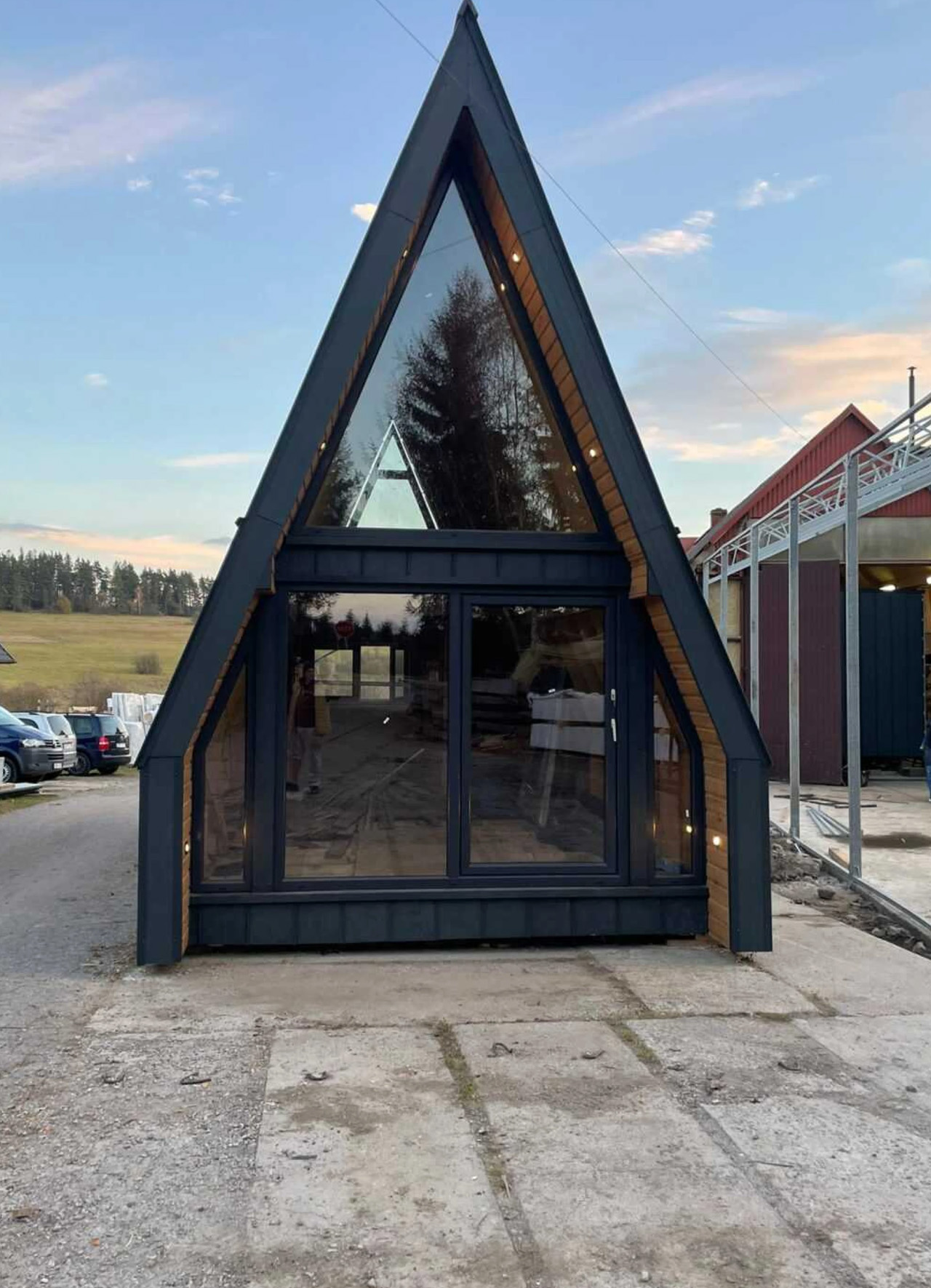
The Brda has been a fixture of Polish leisure culture since the 1970s, when prefabricated A-frame homes were mass-produced at a carpentry factory in Bydgoszcz — a city sitting on the river that gave the design its name. The silhouette spread across lakesides and mountain plots with the kind of quiet persistence that only happens when a design genuinely fits the landscape it lands in. Mini Domy’s version doesn’t reinvent that history. It sharpens it.

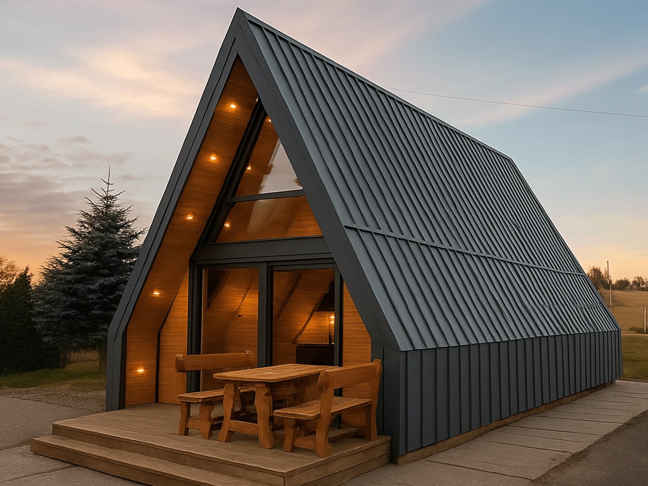
This isn’t a nostalgia trip. It’s a studied, confident revival that takes the triangular geometry of the original and fits it out for a generation that wants off-grid capability without sacrificing the feel of a proper home. The steep roofline does what A-frames do best — sheds snow cleanly, reads beautifully against a tree line, and creates an interior volume that feels far more generous than the footprint suggests.

Designer: Mini Domy
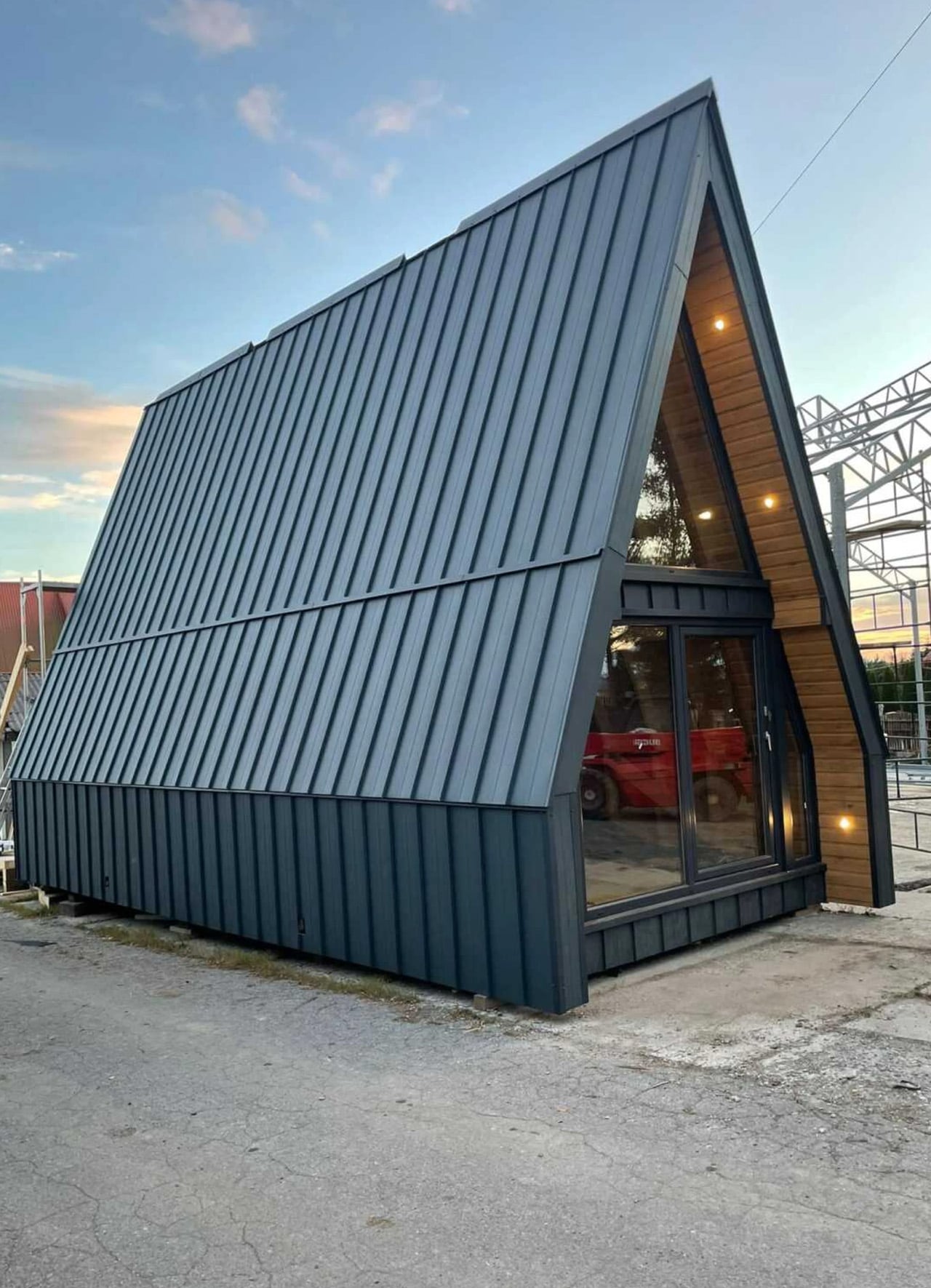
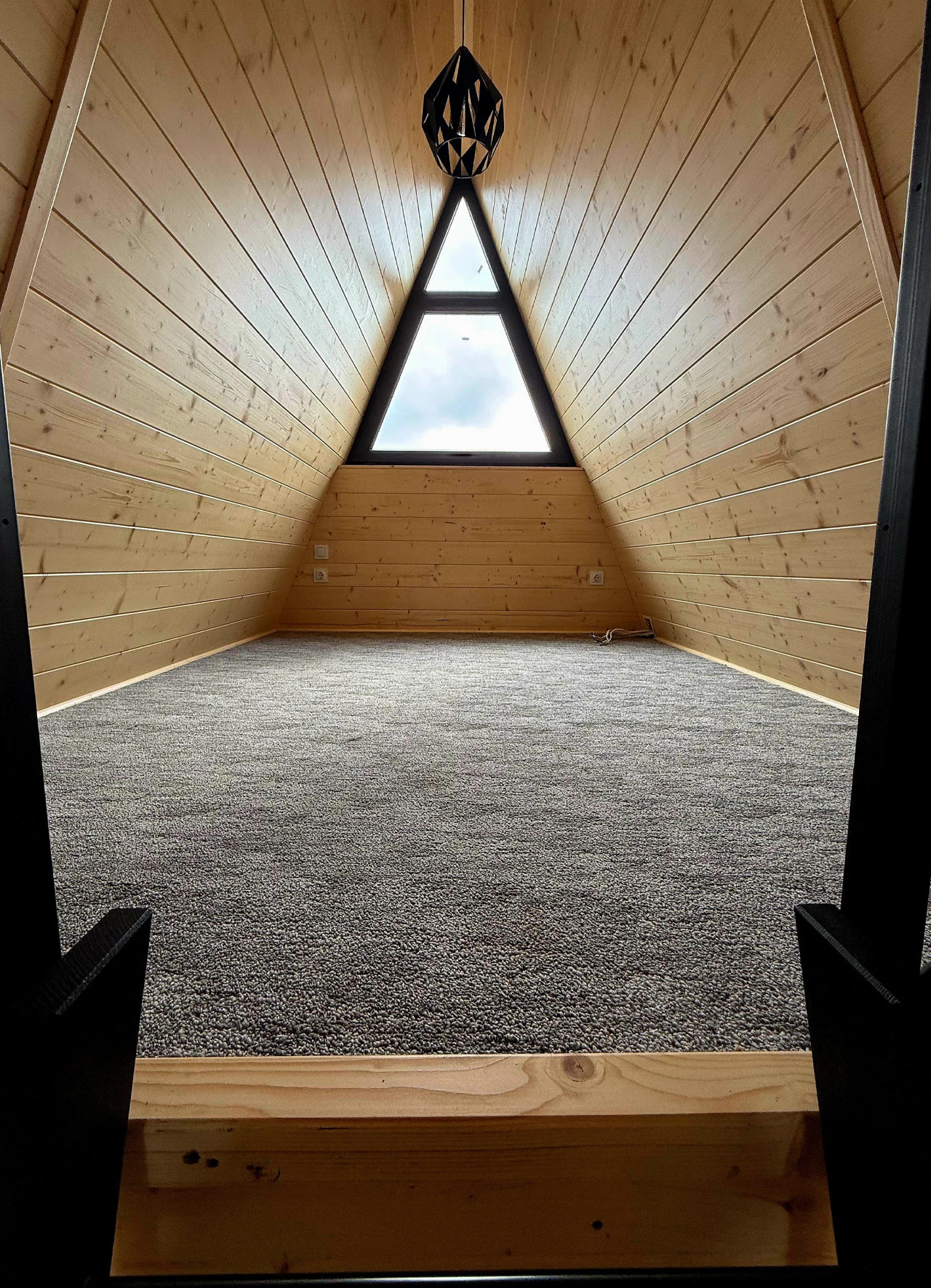
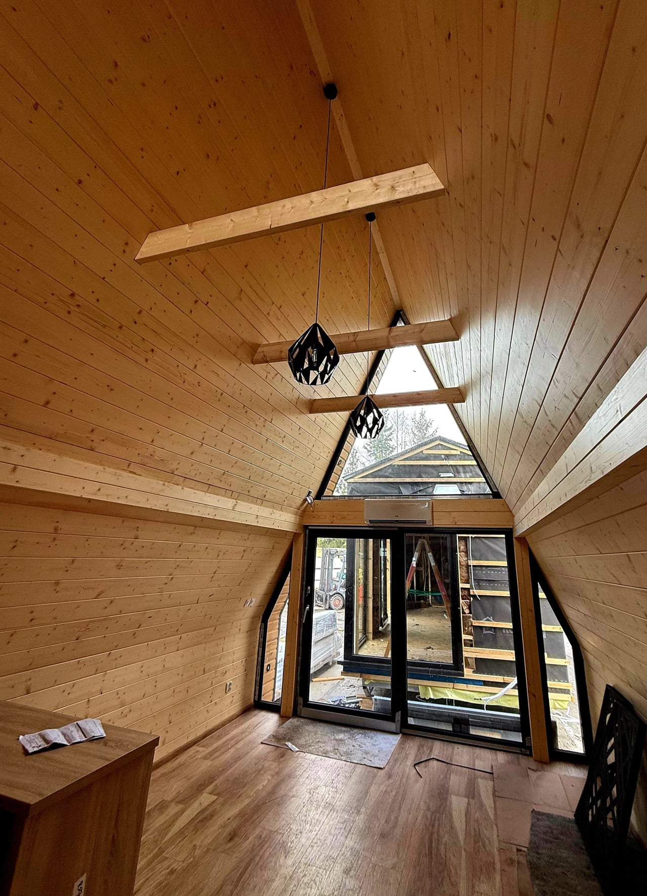
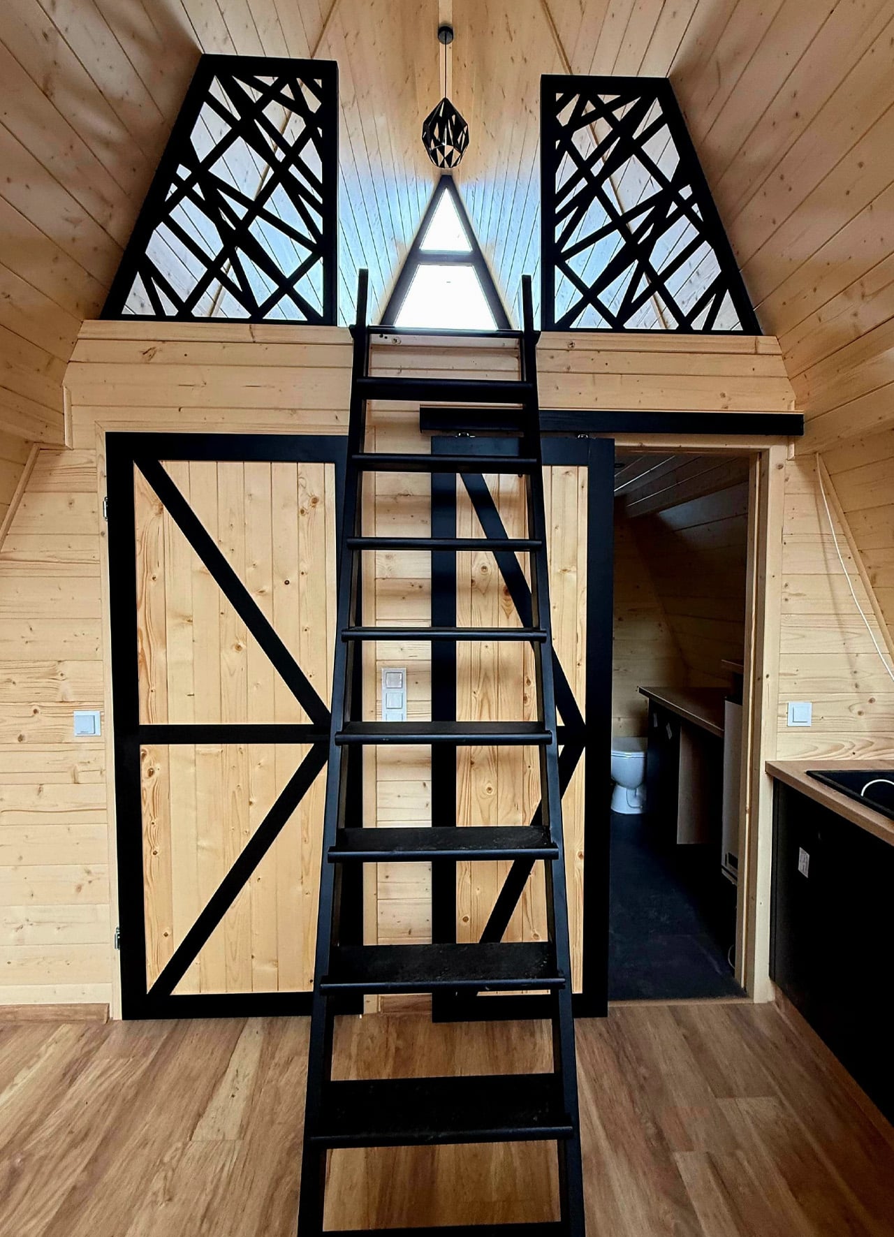
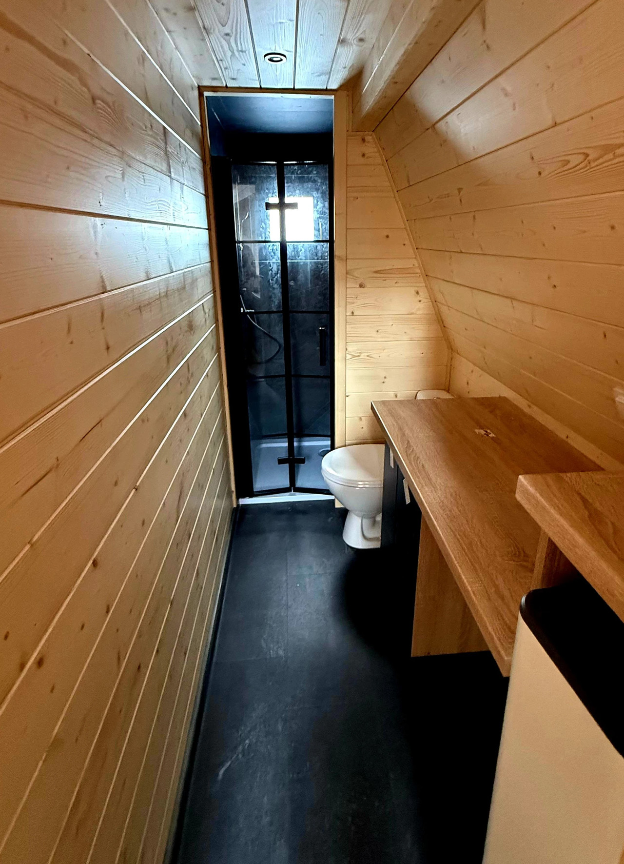
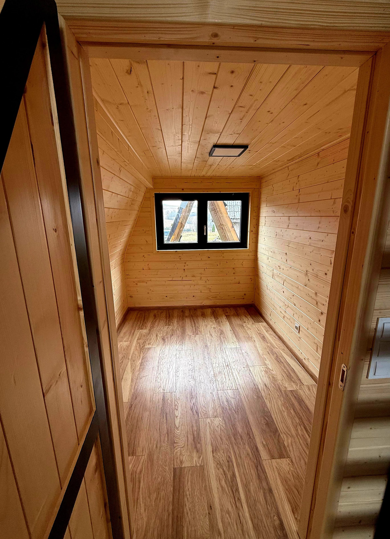
At 35 square meters (376 square feet), the Brda packs in two bedrooms, a kitchen with an induction cooktop and sink, and a full bathroom with a shower, flushing toilet, and sink. The interior is finished almost entirely in wood, which gives the space a warmth that renders and floor plans rarely capture. Wood ceilings and walls in an A-frame tend to bounce light in ways that feel organic rather than staged — it reads like a cabin that was designed to be lived in, not photographed.

The A-frame form is doing real structural work here too. The steep pitch means the upper sleeping area tucks naturally under the ridge without requiring a separate floor addition, keeping the profile low and construction cost proportionally manageable. Mini Domy positions the Brda as a year-round option — not just a summer retreat — making it viable for recreational plots, lakeside land, and mountain terrain where seasonal occupancy often defines how people think about small builds.
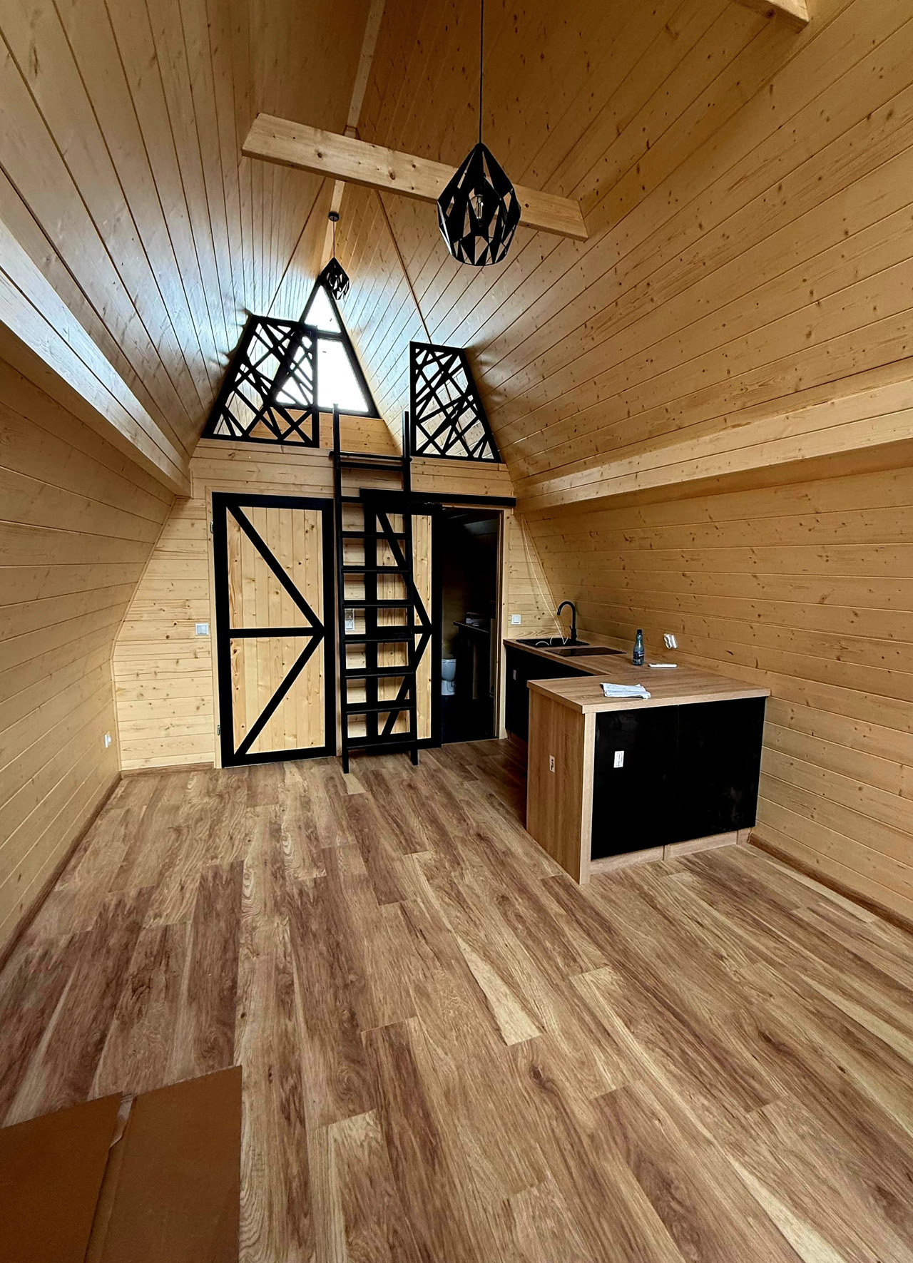
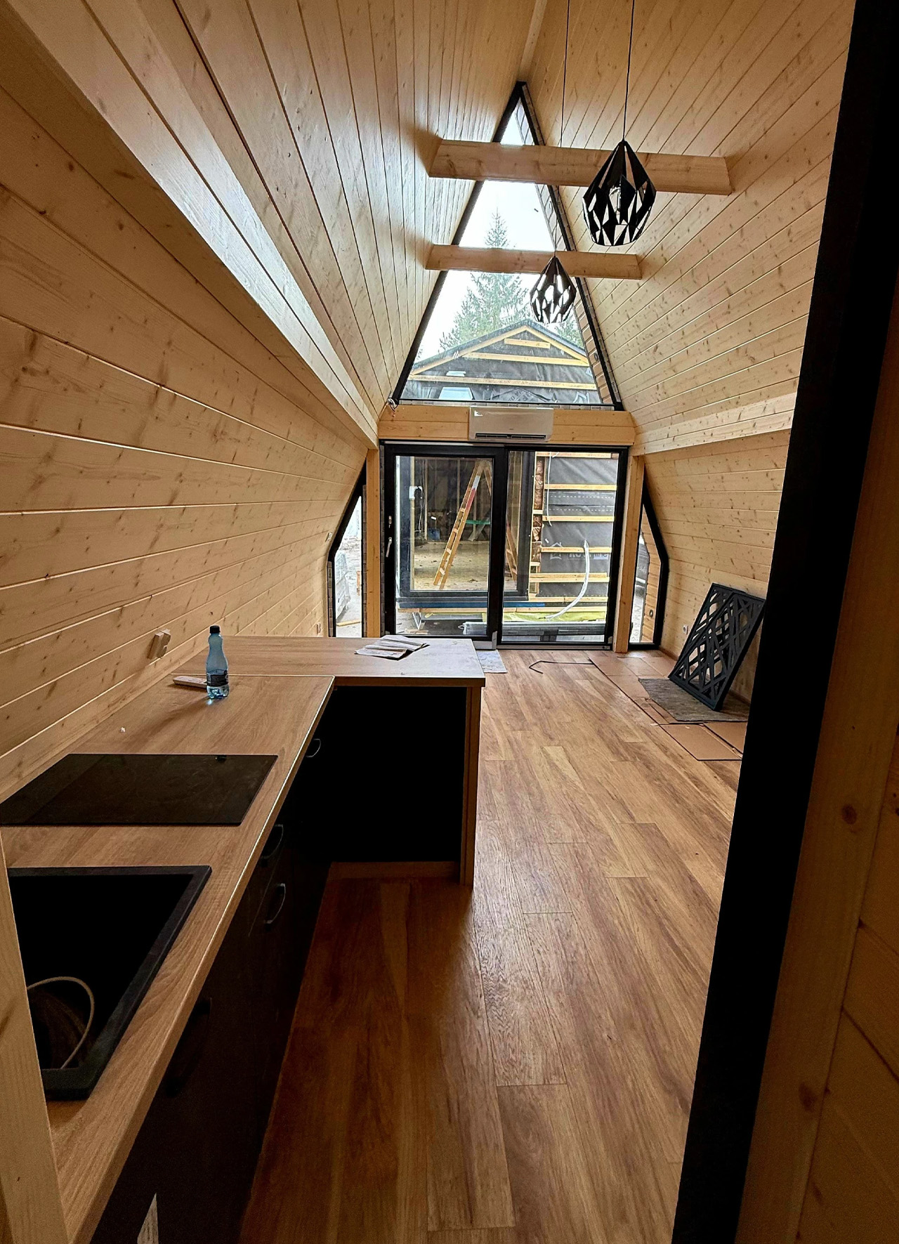
What makes the Brda genuinely interesting from a design standpoint is how it handles the tension between archetype and update. The A-frame silhouette is one of the most recognizable shapes in residential architecture globally, popularized simultaneously in mid-century America and across Europe. Mini Domy doesn’t try to subvert it. The proportions are clean, the material palette is restrained, and the window placement — particularly the gable glazing — frames views like an intentional edit rather than an afterthought.

In a market crowded with tiny homes competing on novelty, the Brda competes on something quieter: conviction. It knows exactly what it is, and it delivers without overreach. That kind of clarity is harder to design than it looks.
The post This Polish Cabin Design Has Survived 50 Years by Refusing to Change first appeared on Yanko Design.
LEGO’s 1:1 PlayStation replica lets you put the iconic ’90s console on your desk

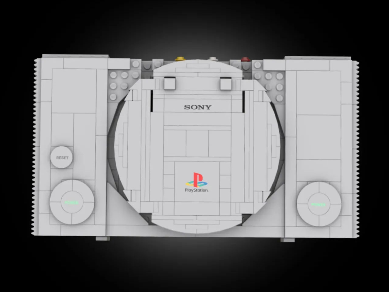
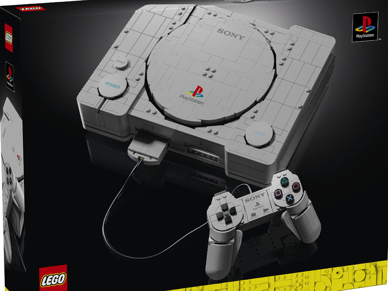
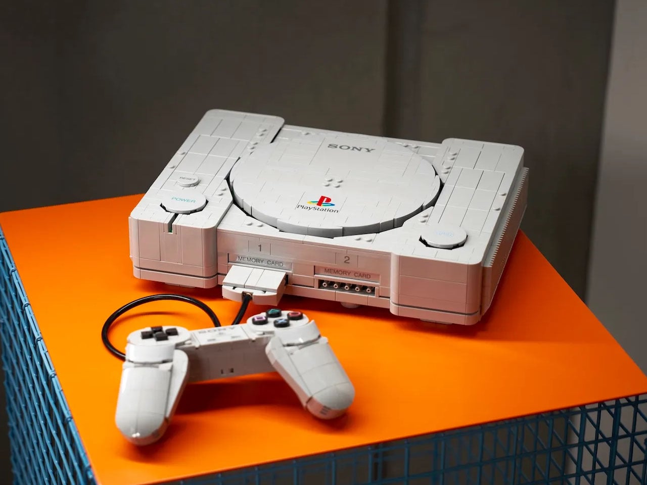
PlayStation 1 changed the complexion of gaming when it first came out in the mid 1990s, and the rest is history. The graphics on the machine were unlike anything anyone had seen before – pushing the gaming industry into overdrive. It was only time before the cult classic console got a LEGO avatar, even though it came way after the official release of the Atari 2600 and Mini SEGA Genisis sets.

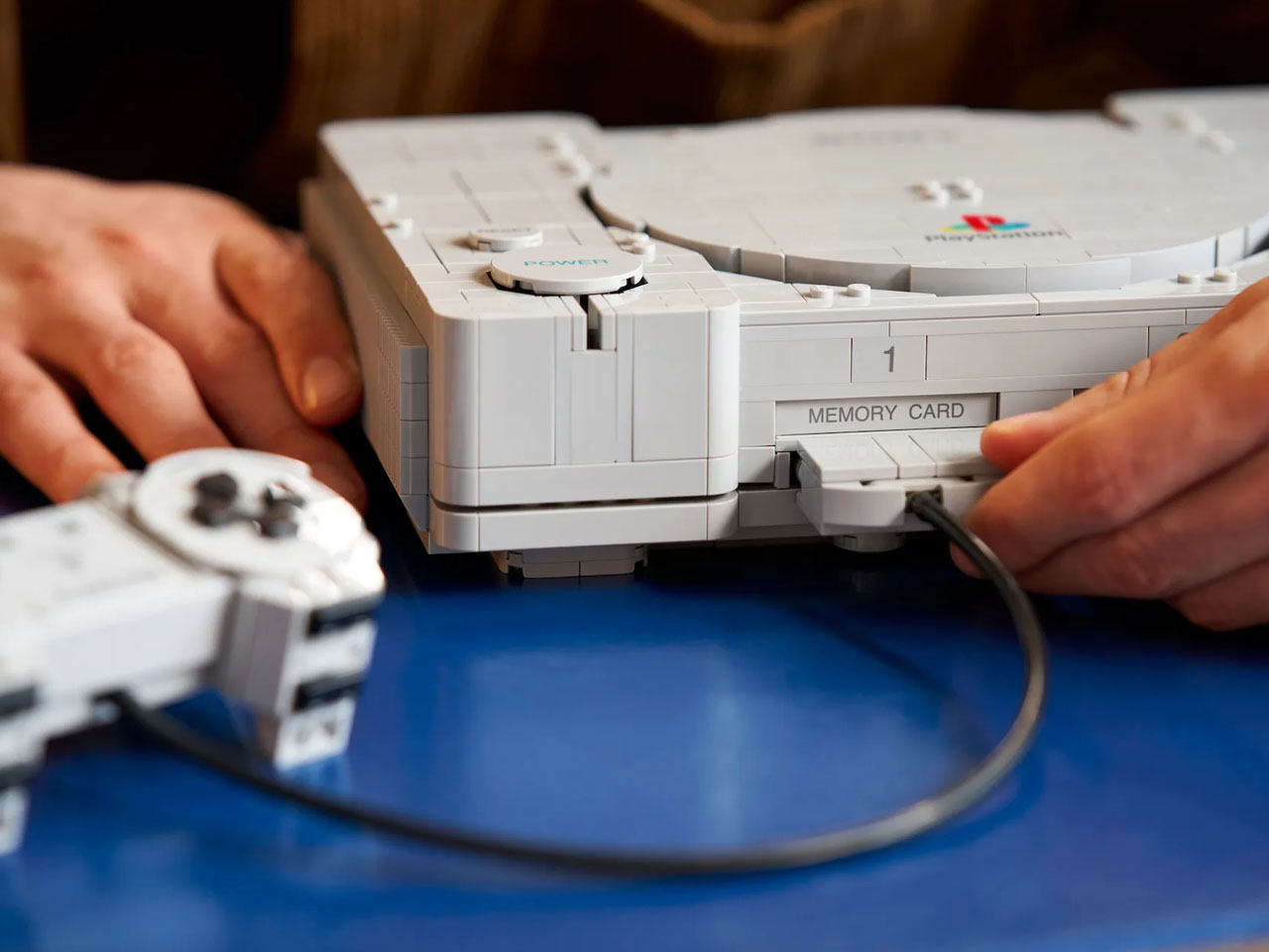
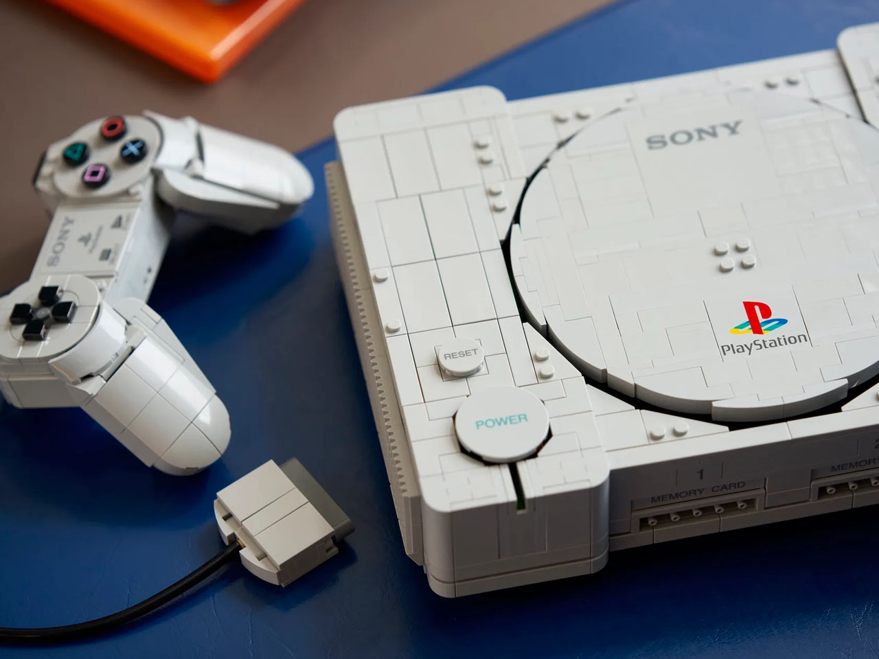
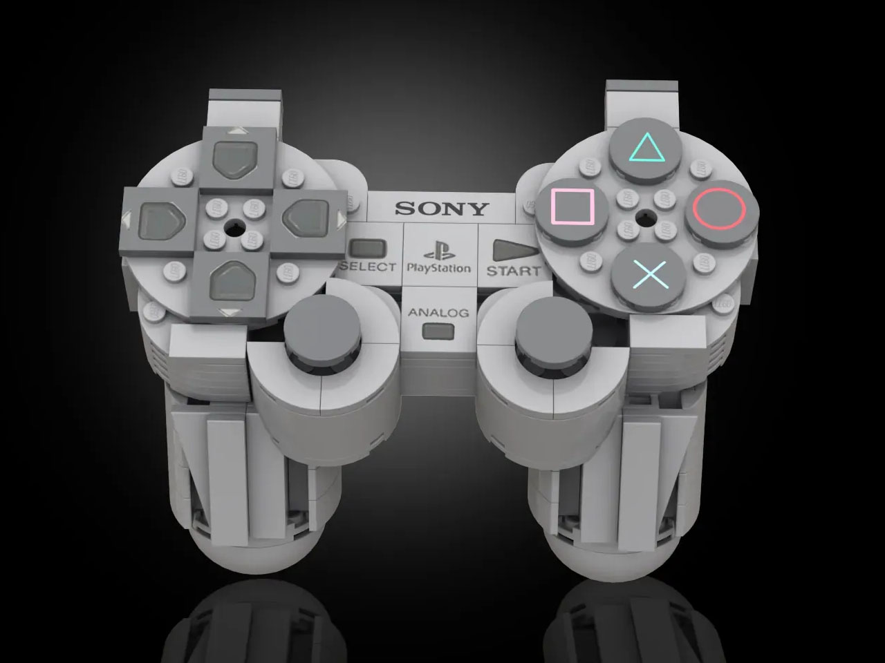
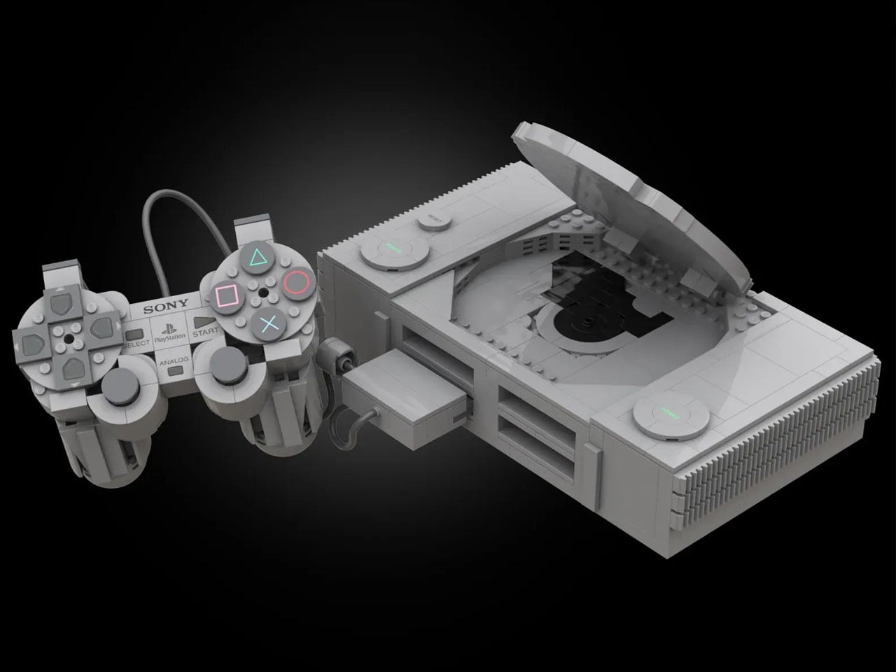
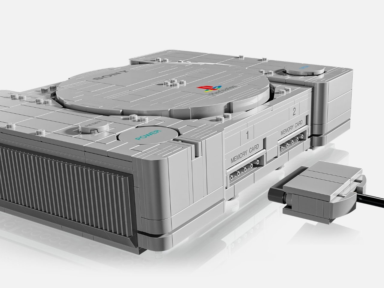
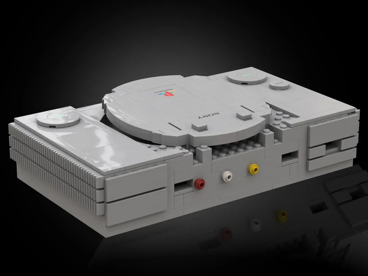
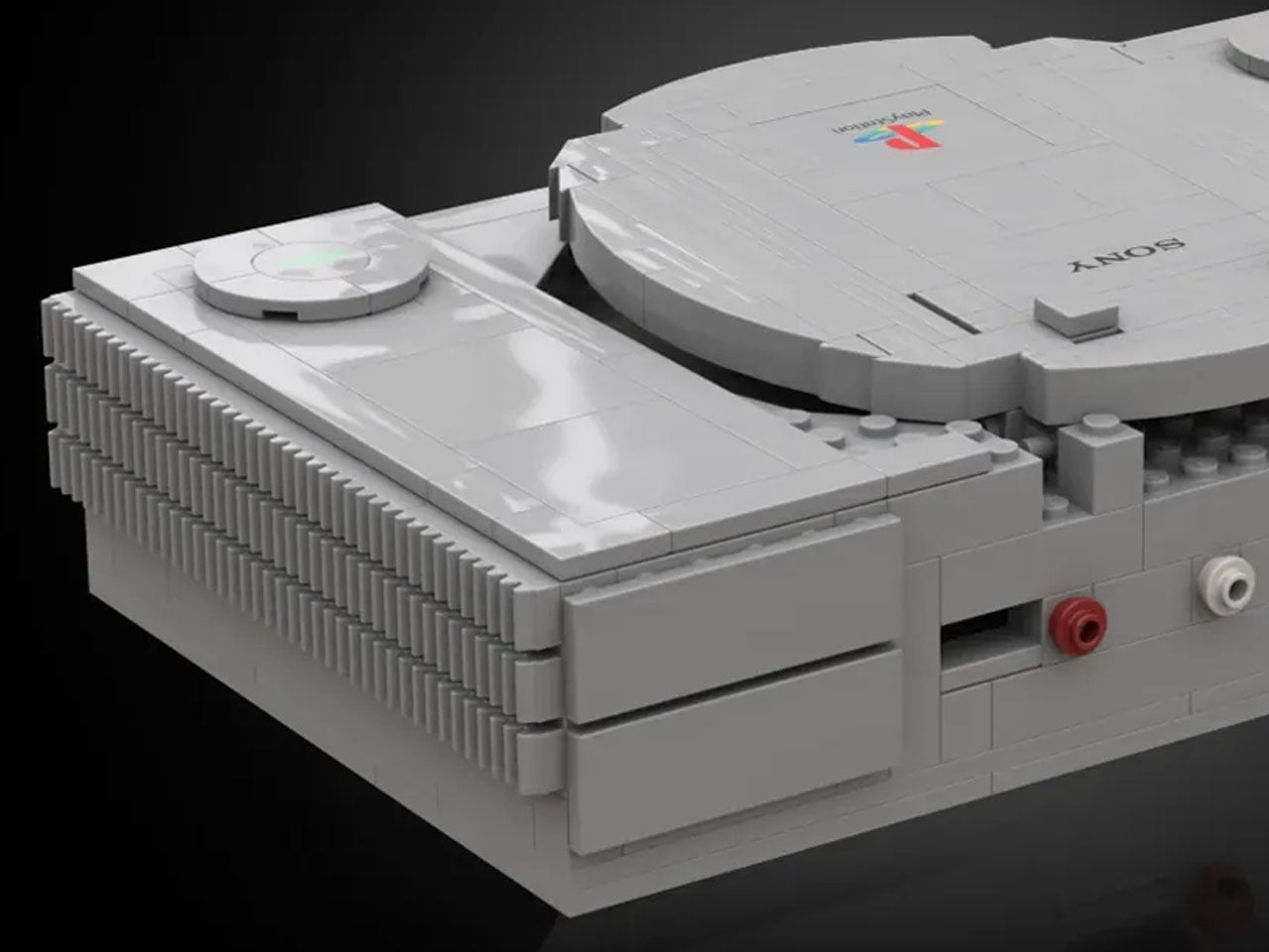
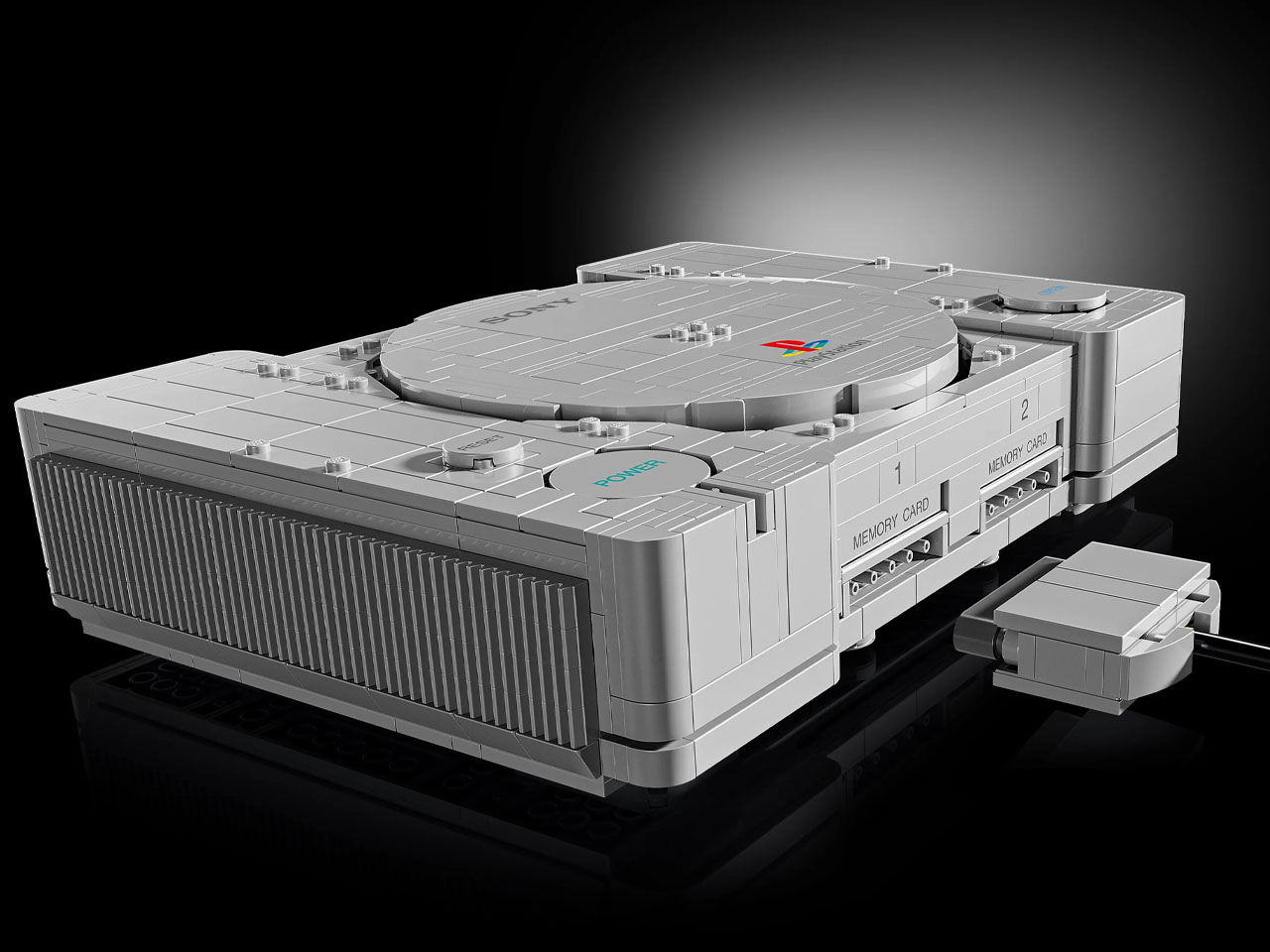
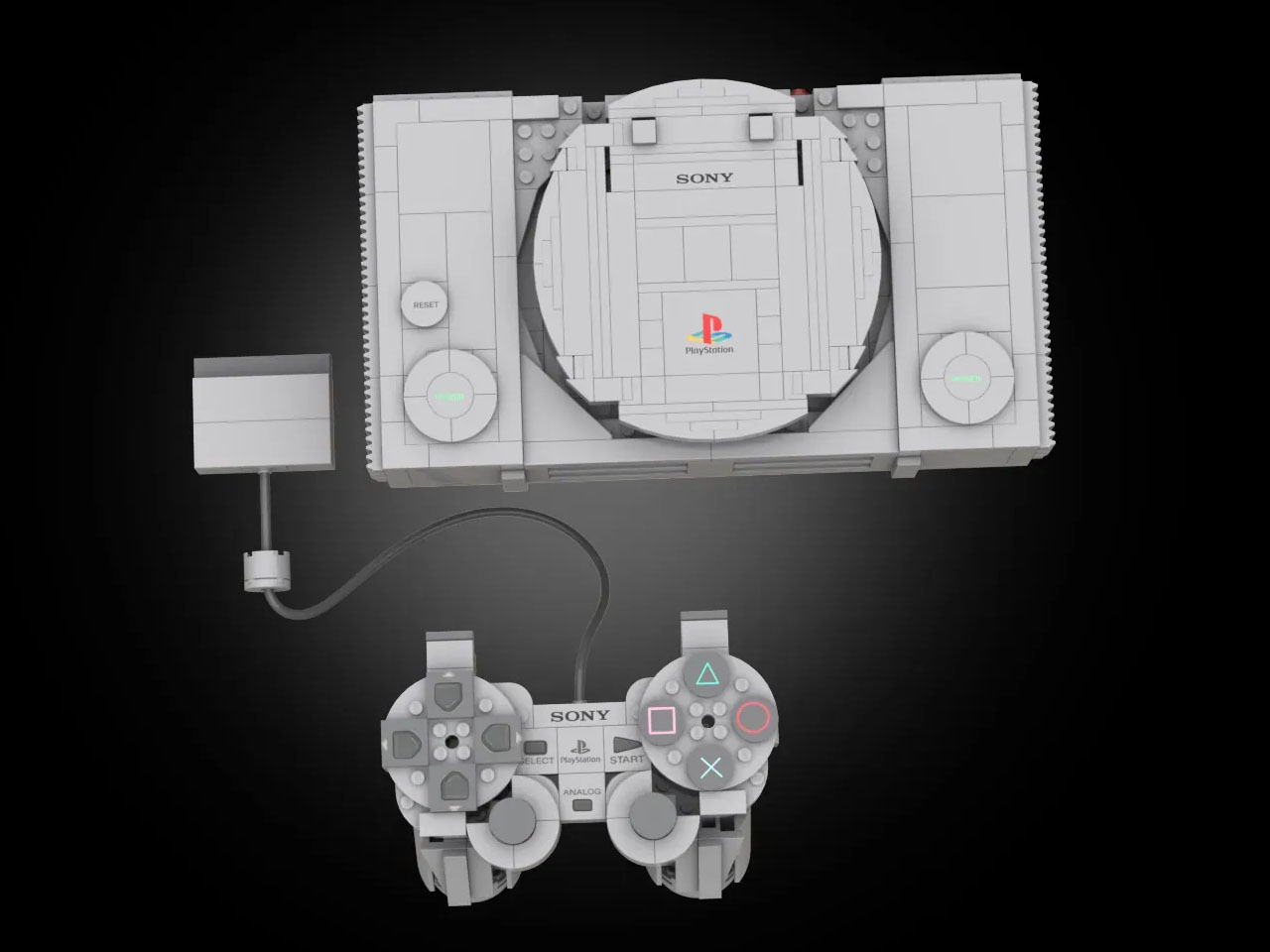
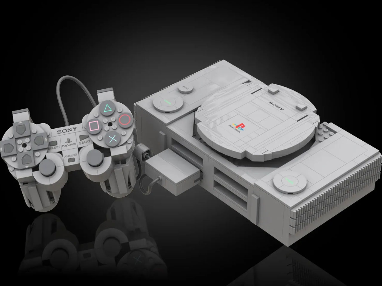
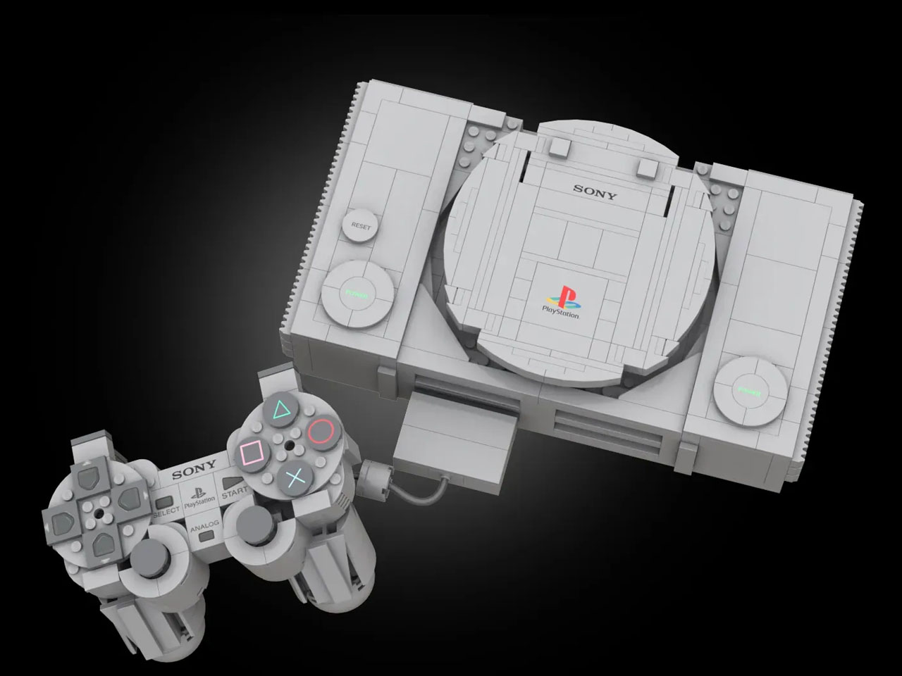
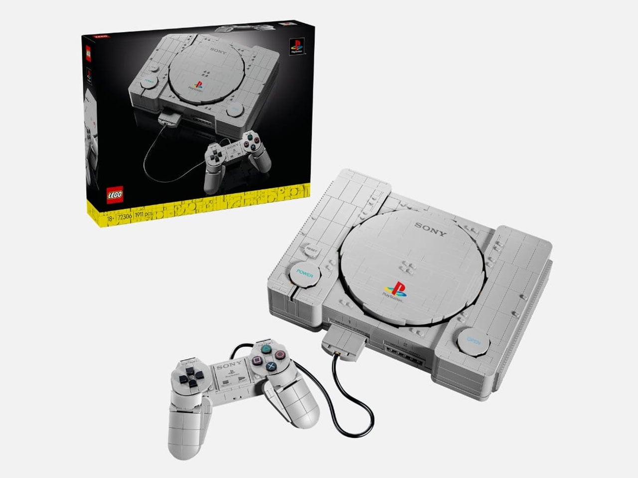
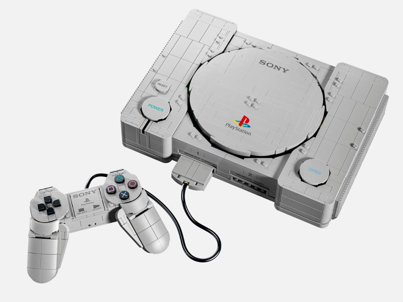
Created in collaboration with Sony Interactive Entertainment, the PlayStation set is a nostalgic remake of the gadget that defined the video gaming era of yesteryear. The 1911 piece set is a 1:1 replica of the real thing, and the details are worth appreciating. Right from the tactile feel of connecting the brick controller to the functional Open button, LEGO has gone to considerable lengths to make the model feel like the console people remember.

Designer: LEGO Ideas and PlayStation

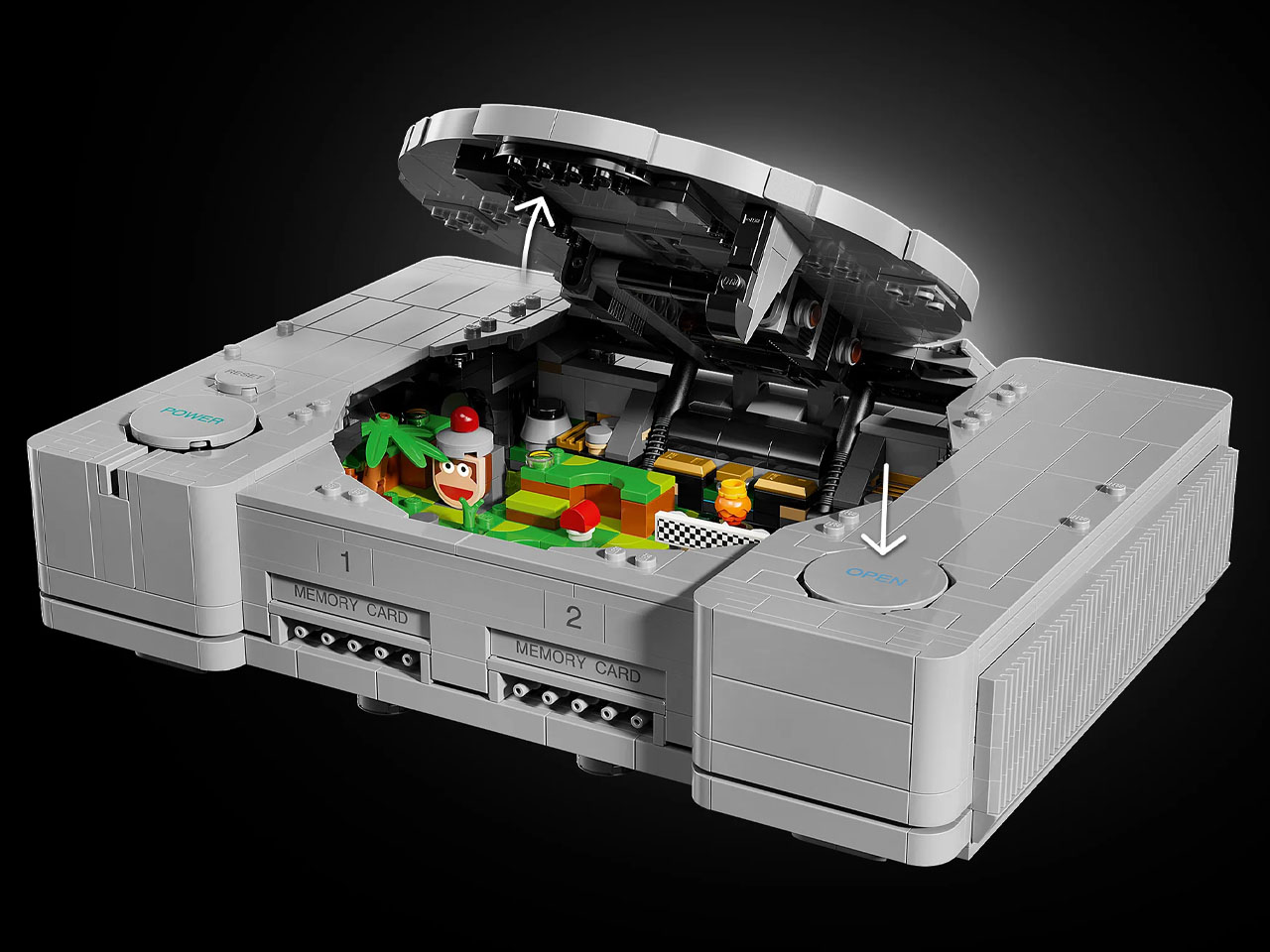
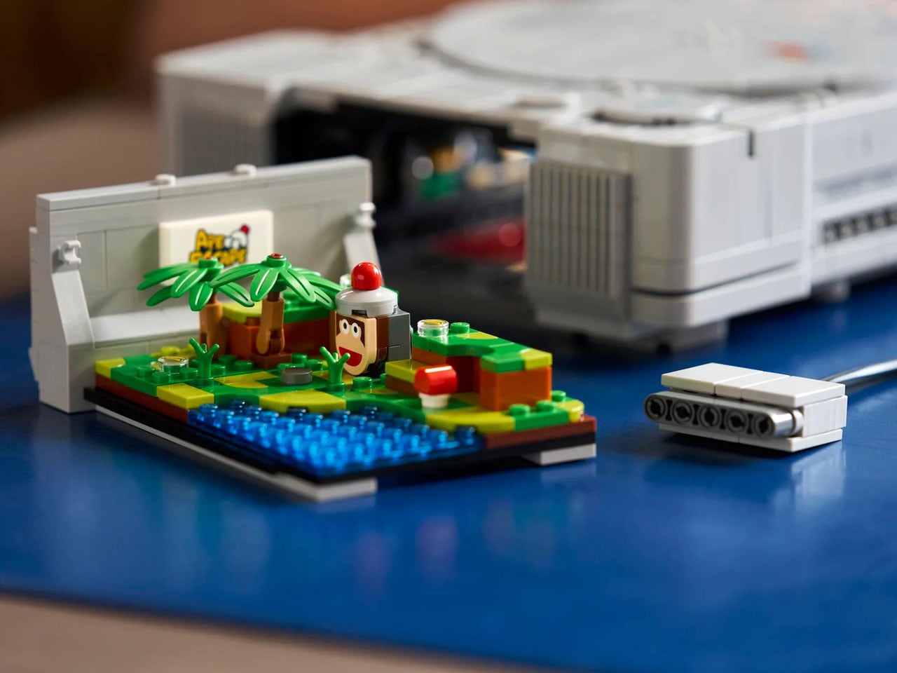
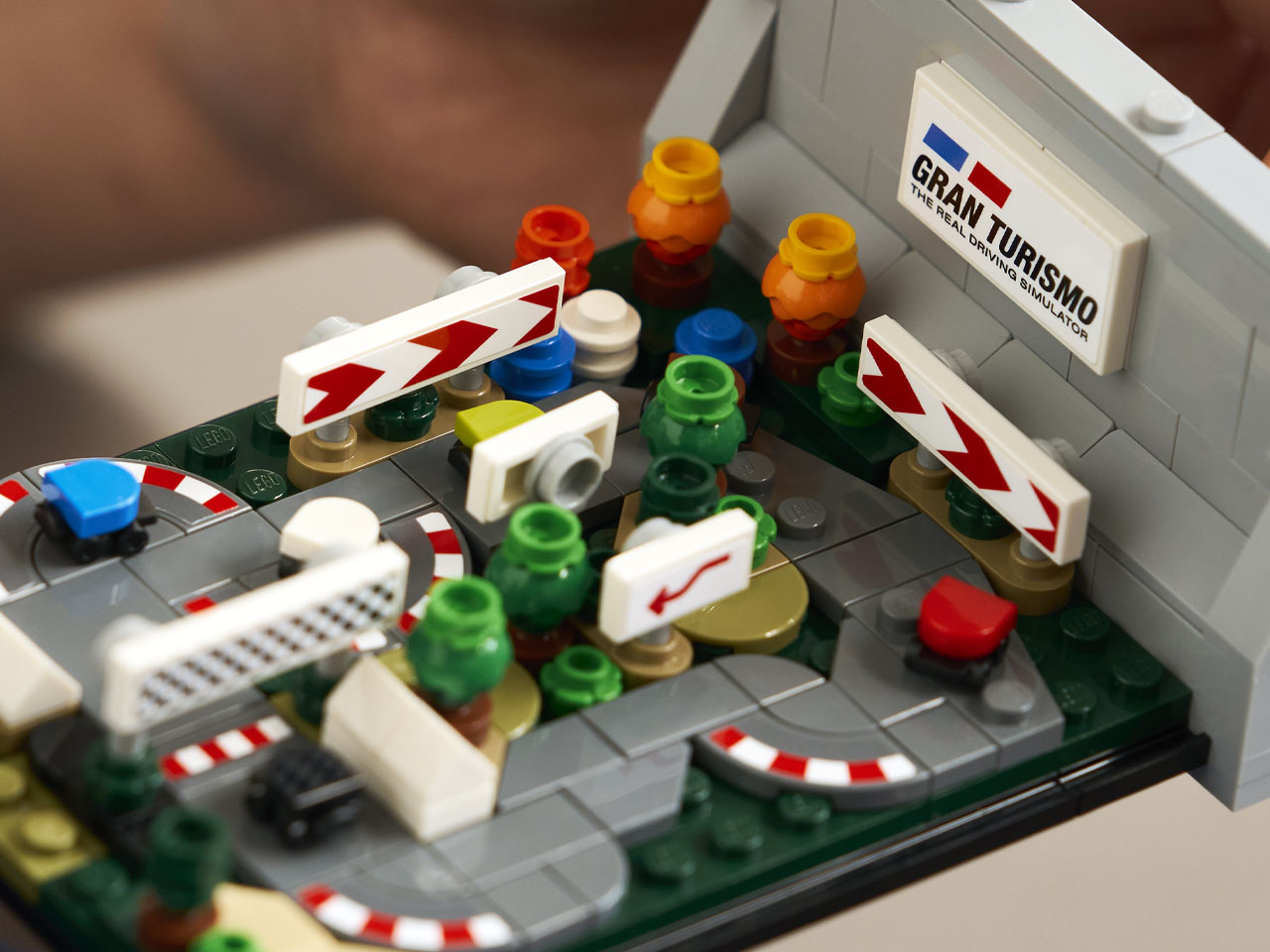
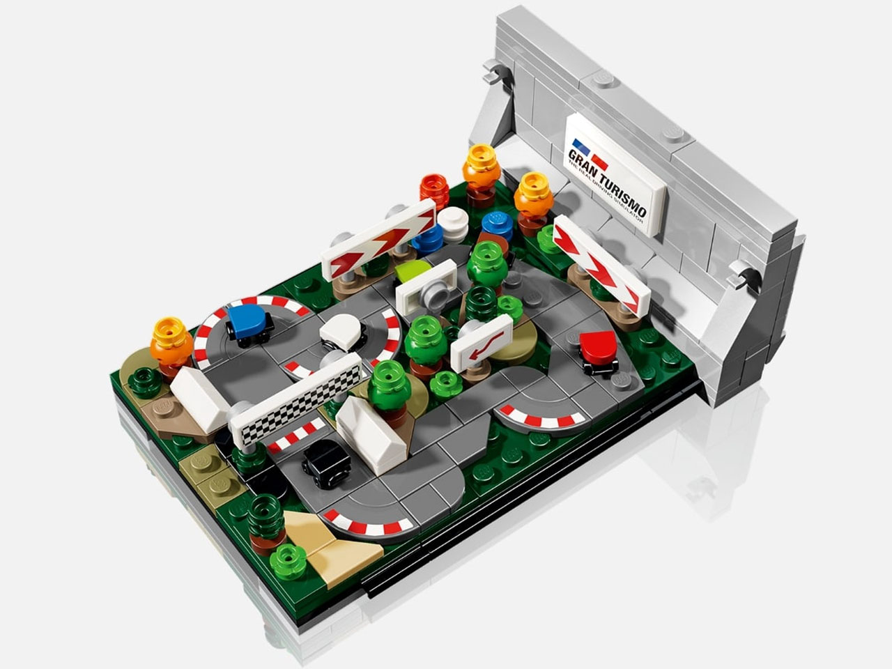
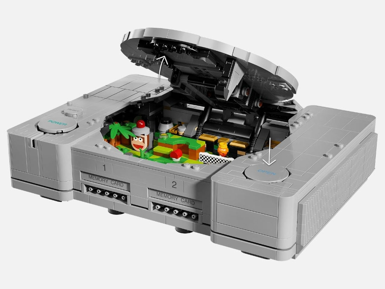
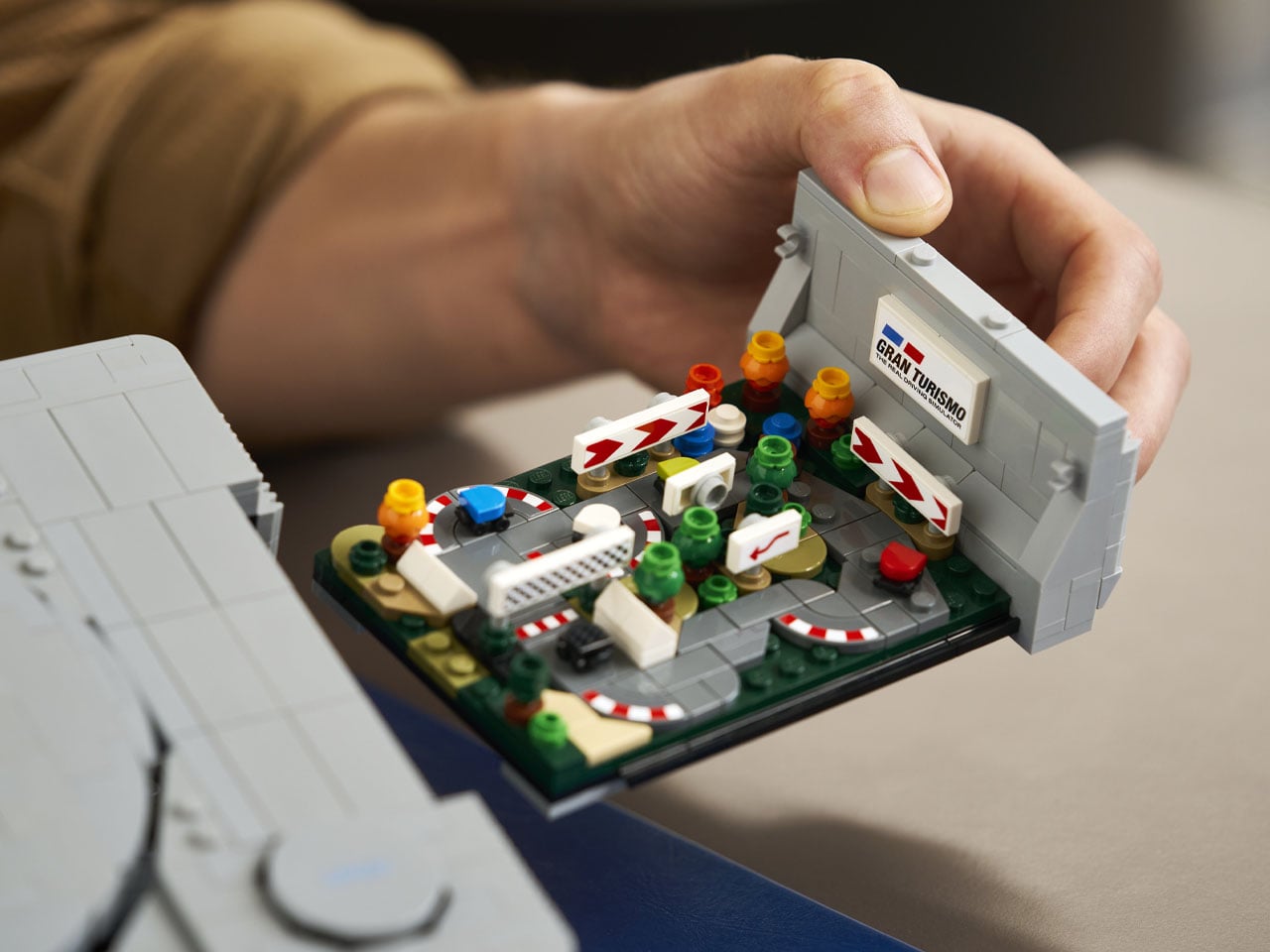
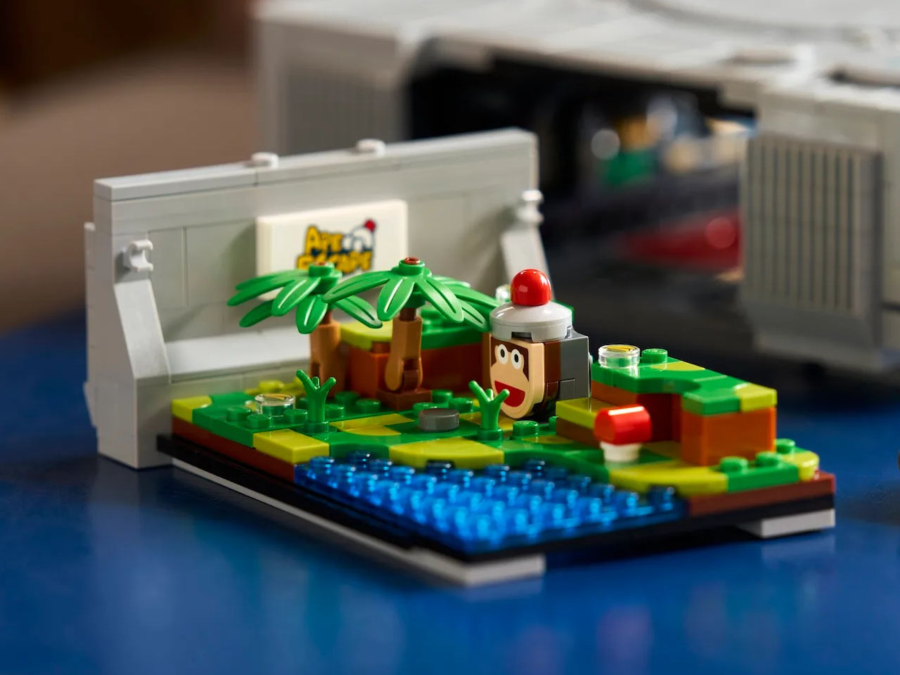
Since we are talking LEGO, there had to be a buildable diorama element to it, further building the nostalgia. There’s a mini GT track that can be assembled when the Open button is pushed. It has mini racing cars, and a scene from Ape Escape. Officially named LEGO PlayStation 72306, the model closely follows the proportions of the original console, measuring over 2.5 inches high, 10.5 inches wide, and 7.5 inches deep. The original PlayStation measured approximately 10.6 inches wide, 2.4 inches high, and 7.4 inches deep, making the LEGO version remarkably close in scale.

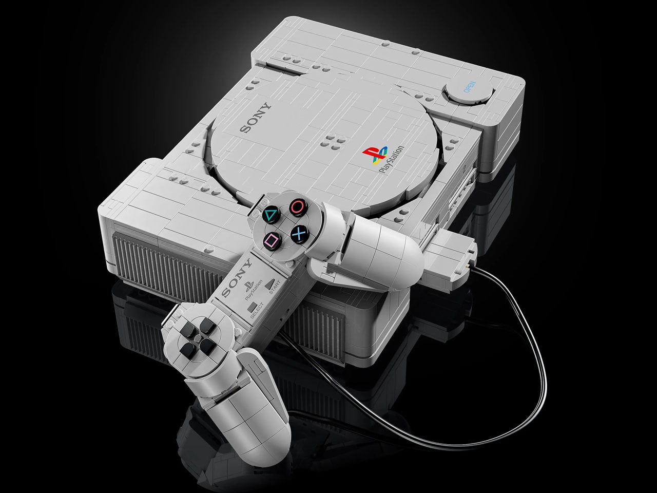
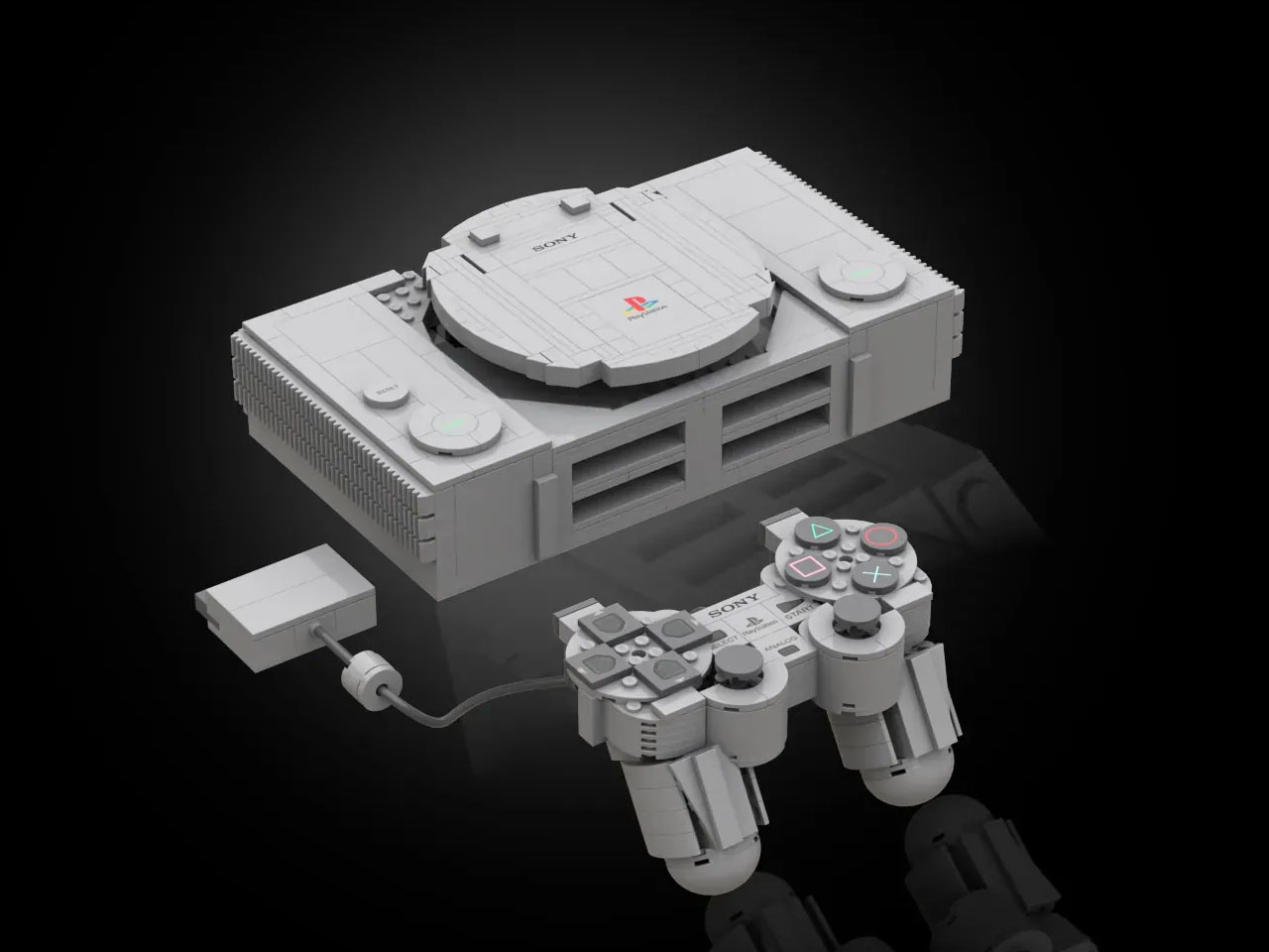
The grey console also comes with Sony’s first PlayStation controller, complete with its familiar D-pad and the iconic Triangle, Circle, Cross and Square buttons. There are no analogue sticks or DualShock functionality here, staying true to the earliest PlayStation hardware. The attention to detail extends beyond simply getting the shape right. The controller plugs directly into the front of the console, while both the Power and Open buttons have working mechanisms. Pressing Open lifts the circular disc lid, recreating one of those small physical interactions that made the original hardware so memorable.

It is still a display model and cannot actually power on, but the level of detail makes it surprisingly easy to mistake for the real machine at a glance. The hidden elements give the otherwise familiar-looking console another layer of personality. The two game-inspired builds can remain tucked inside the console or be pulled out and displayed alongside it, allowing the model to shift from a convincing piece of retro hardware into a small gaming diorama. The Ape Escape reference also nods to the later evolution of PlayStation hardware, as the game introduced the need for Sony’s DualShock controller and its twin analogue sticks. Designed for builders aged 18 and above, the set combines 1,911 pieces with a form factor that should fit comfortably on a shelf or desk. LEGO also recommends its Builder app, which offers 3D instructions with options to zoom and rotate the model, track progress and save sets.

The LEGO PlayStation is priced at $179.99 and will be available to LEGO Insiders from October 1, 2026, ahead of its general release on October 4, 2026. For anyone who remembers the original grey console as more than just a piece of hardware, this is a chance to bring that era back—without needing to find an old CRT television to complete the setup.

The post LEGO’s 1:1 PlayStation replica lets you put the iconic ’90s console on your desk first appeared on Yanko Design.

Coffee Grounds and Tea Leaves Finally Become Art

Think about how many cups of coffee or tea you go through in a week. Now multiply that by every coffee shop, office kitchen, and bubble tea counter in a single city. All those spent grounds and soggy leaves go somewhere after the last sip, and that somewhere is almost always a bin, then a landfill, where they sit doing nothing useful at all.

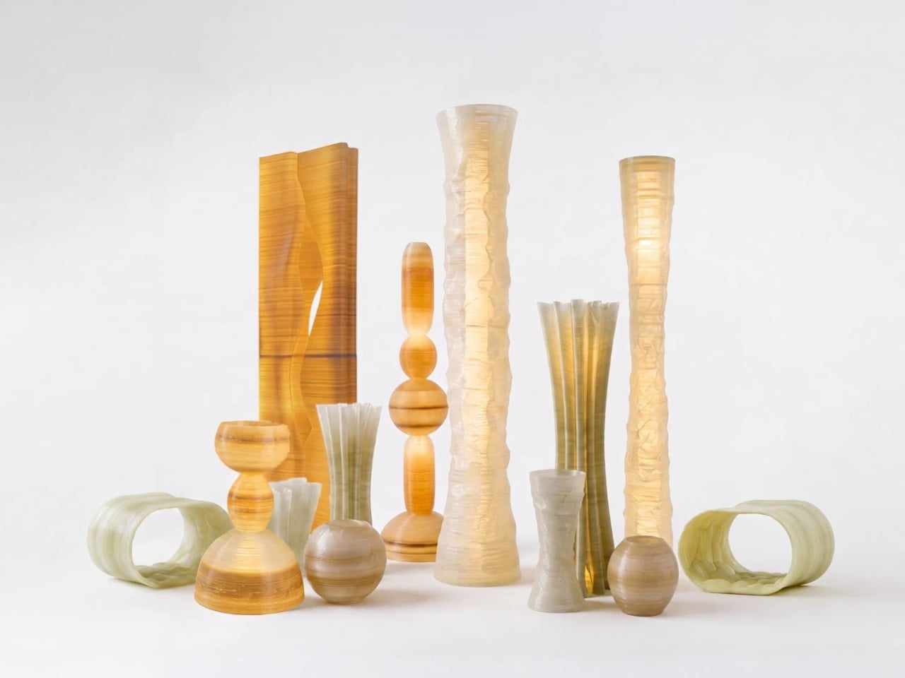
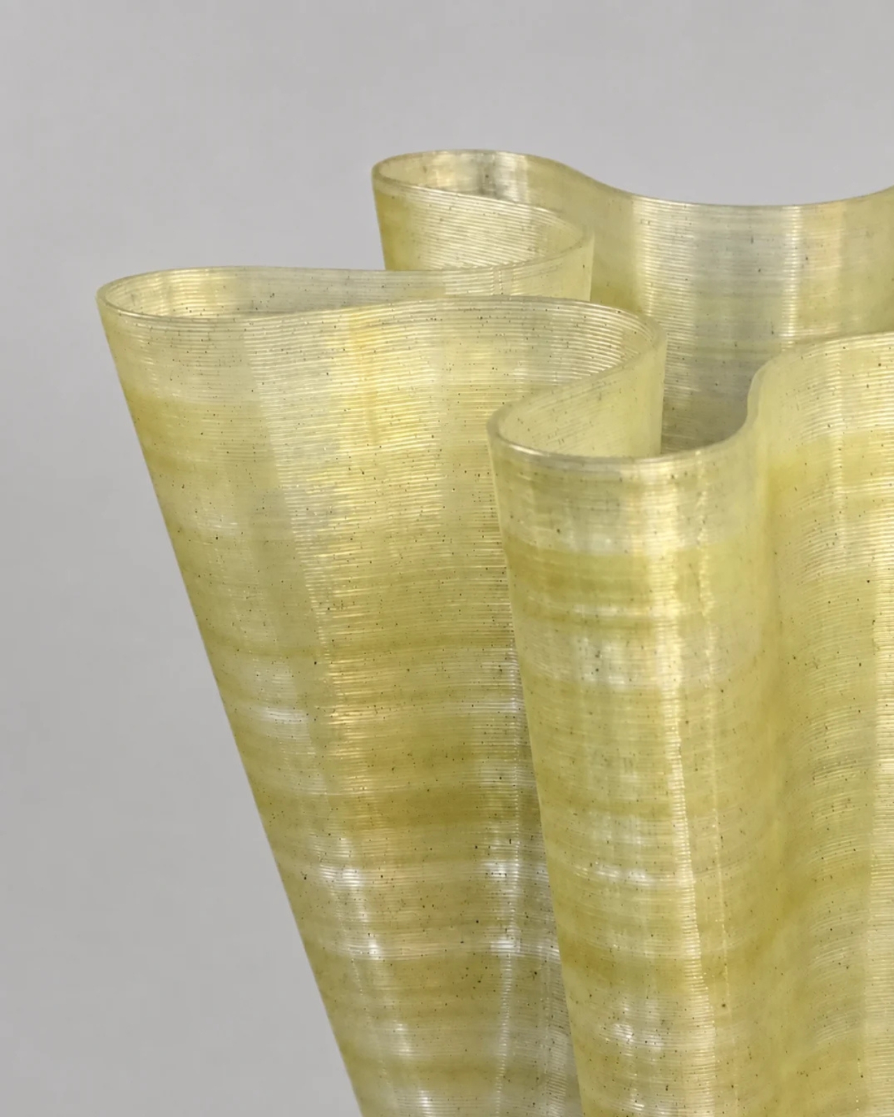
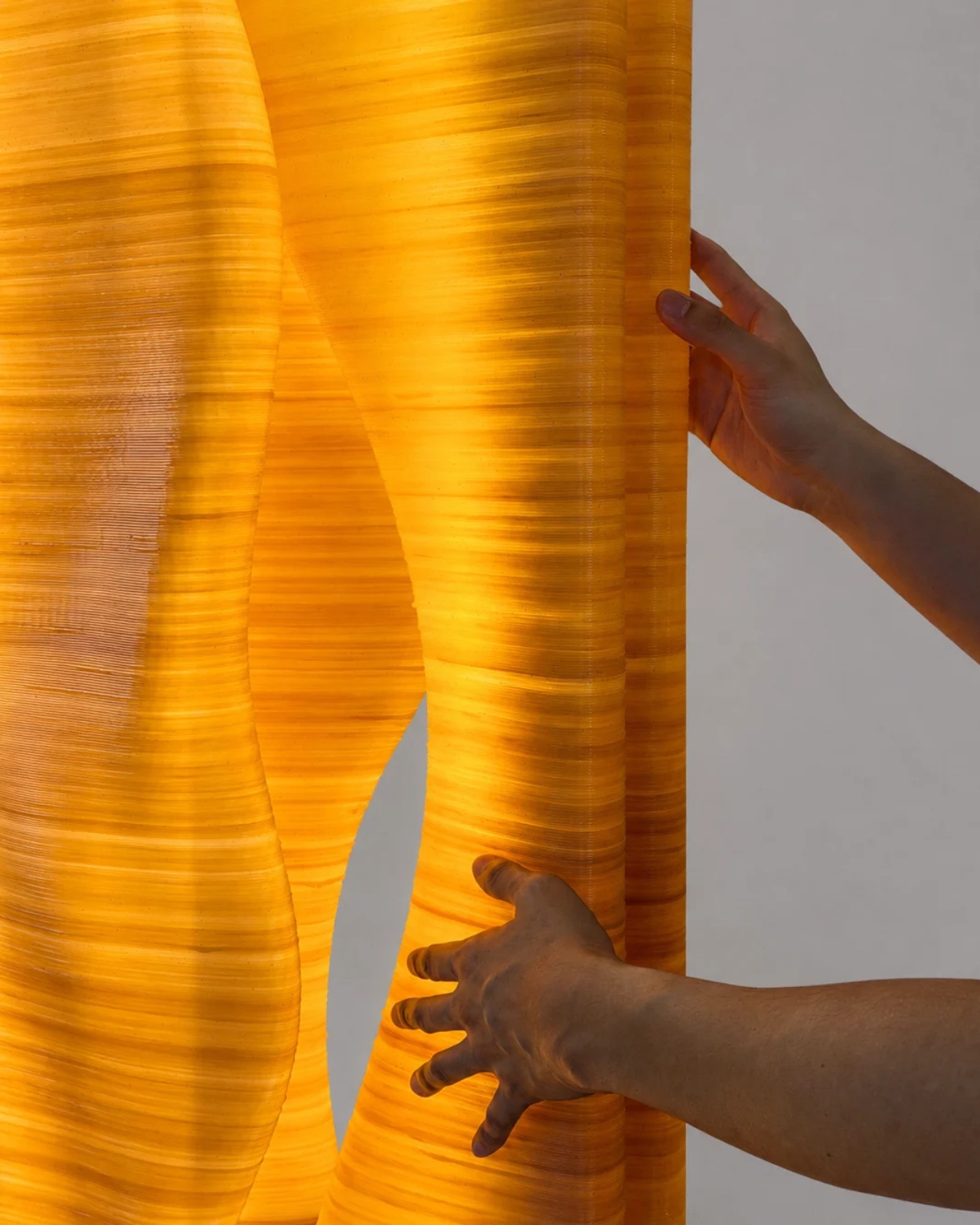
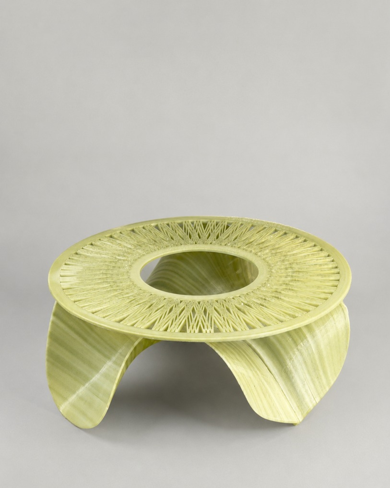
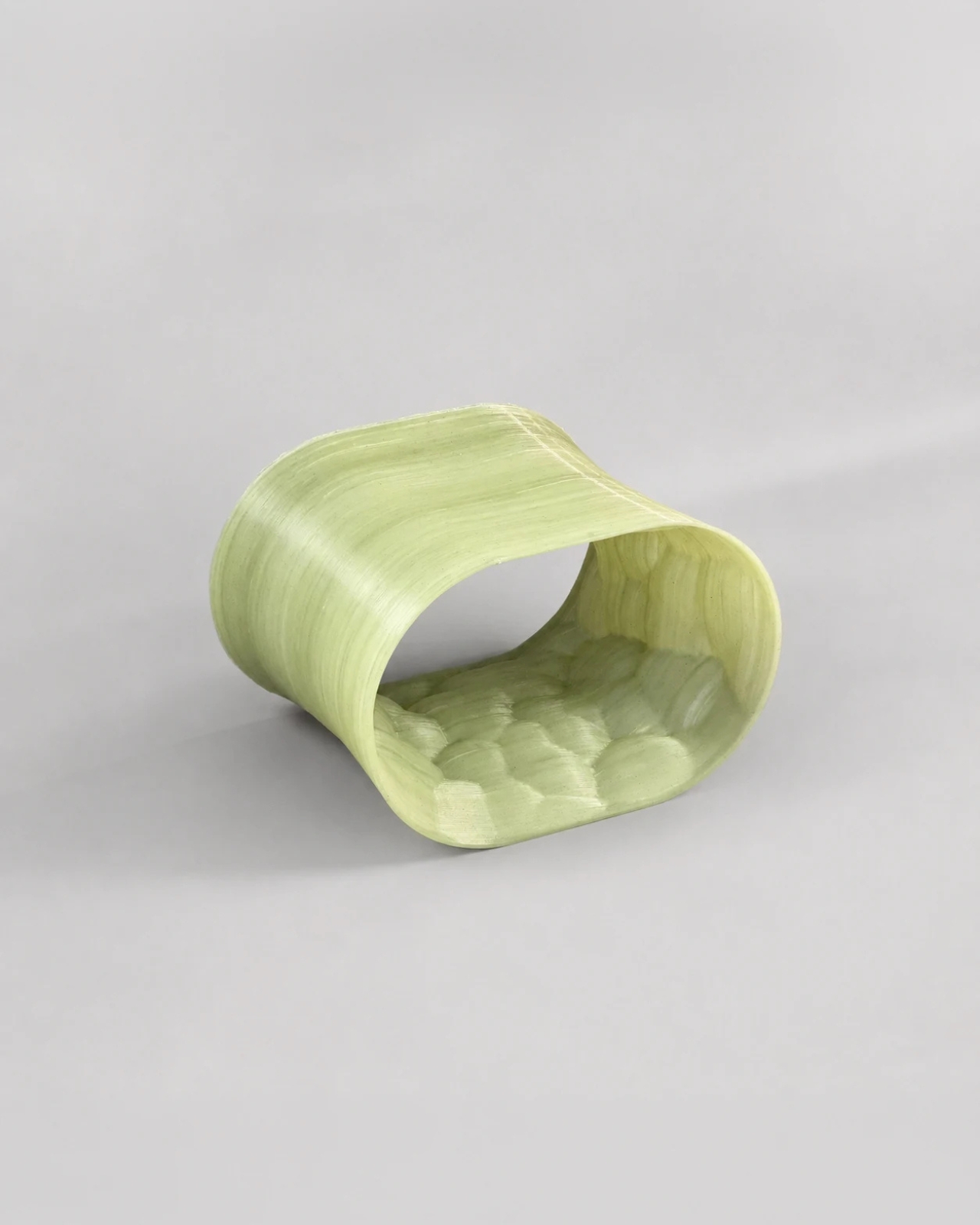
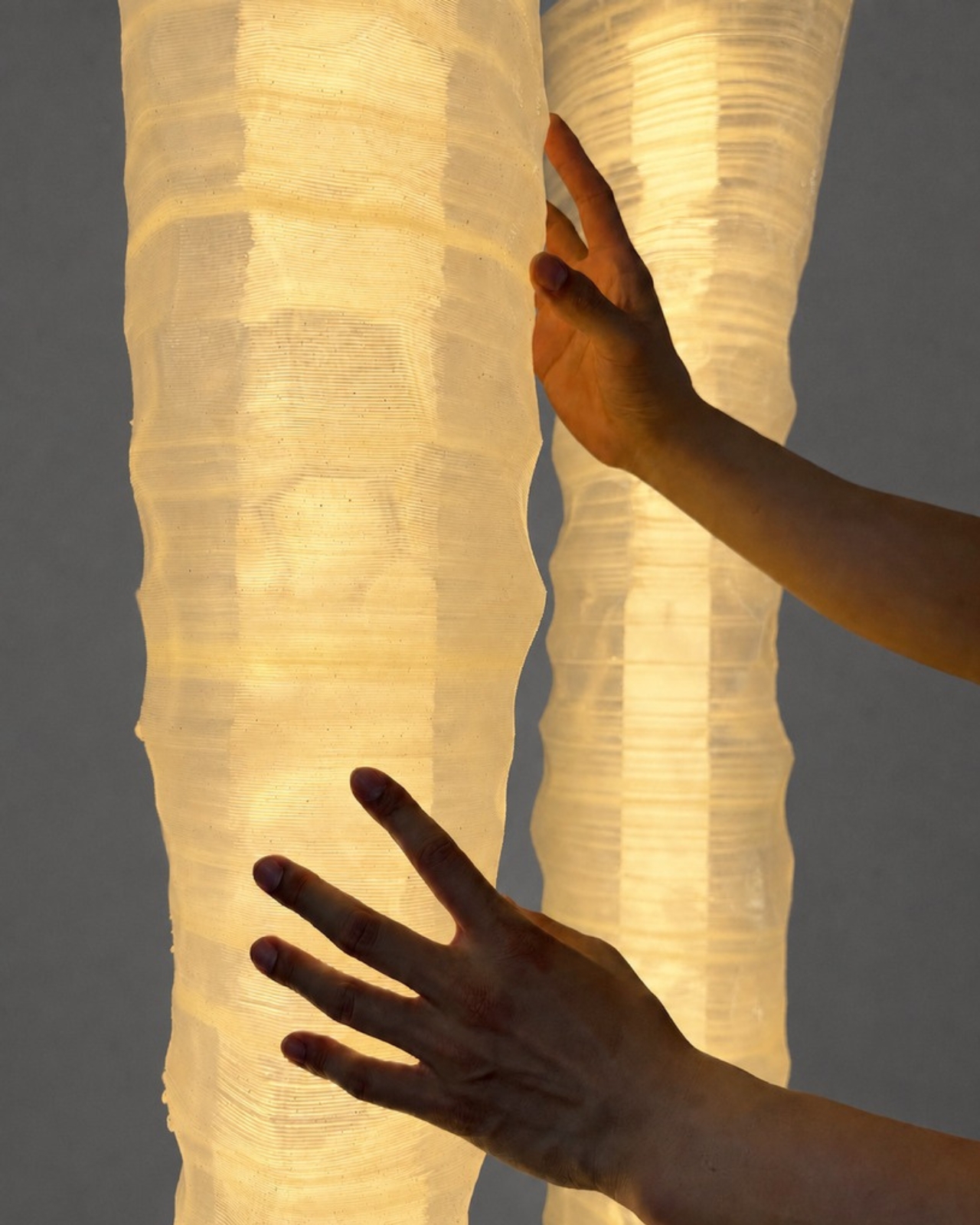
That’s the quiet waste problem three Taiwanese designers decided to tackle, and their answer isn’t a compost bin or a recycling app. It’s furniture, lighting, and sculpture made from the very stuff most of us scrape into the trash without a second thought. The project is called After the Last Sip, and it turns discarded tea leaves from London’s bubble tea shops and used coffee grounds from local cafés into large-scale 3D-printed objects.

Designers: Chao-Chun Kung, Ching-Yu Lin and Chen-Yang
Chang

The team behind it, Chao-Chun Kung, Ching-Yu Lin, and Chen-Yang Chang, worked out of Fab.Pub in East London, where they dried and ground the collected residues, then mixed them with PLA, a biodegradable polymer, to create a printable composite. From there, robotic 3D printers built the material into shapes designed through parametric systems, meaning the geometry itself grows out of code as much as it does out of leftover tea and coffee. The whole thing shows during the London Design Festival, running September 12 through 18.

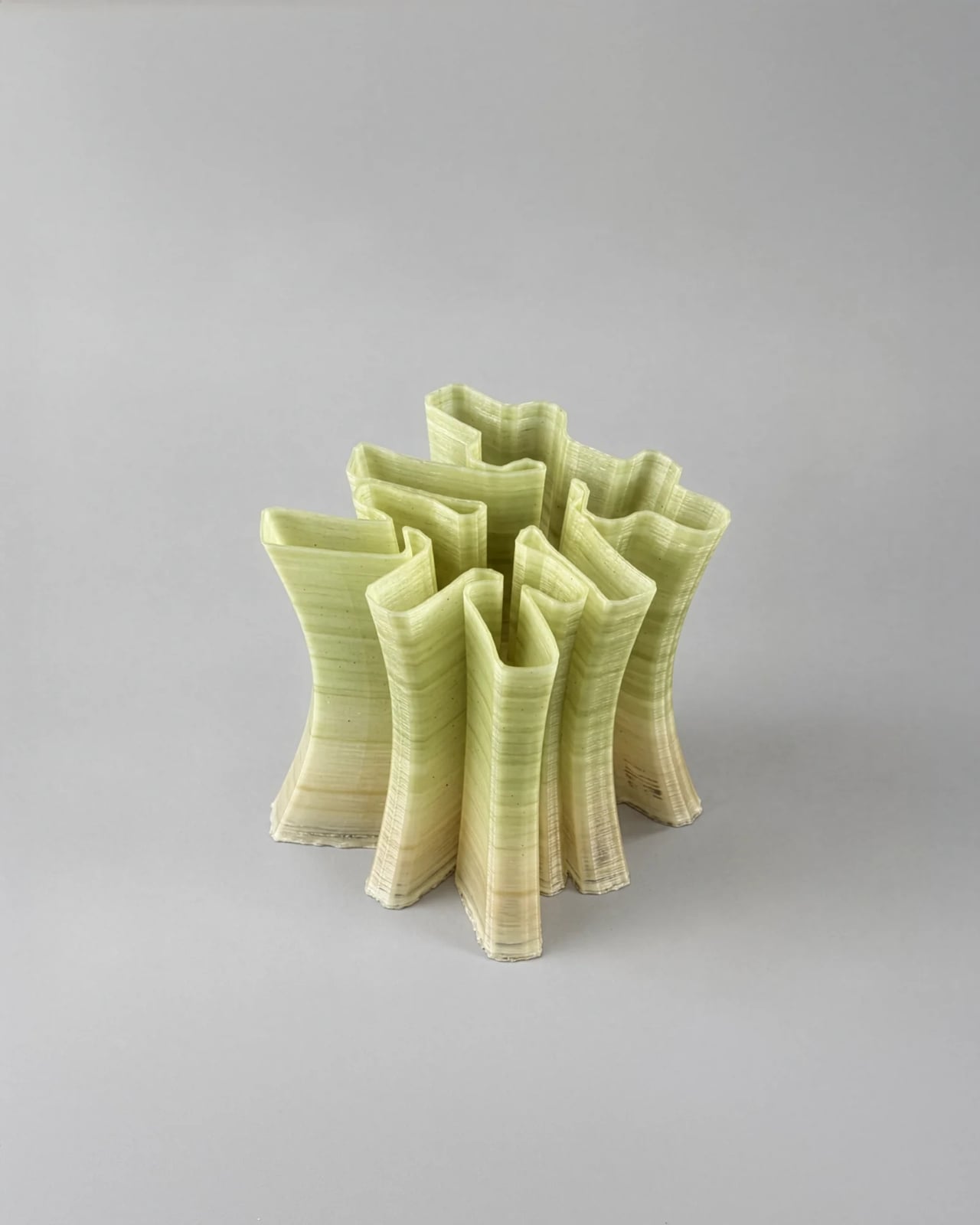
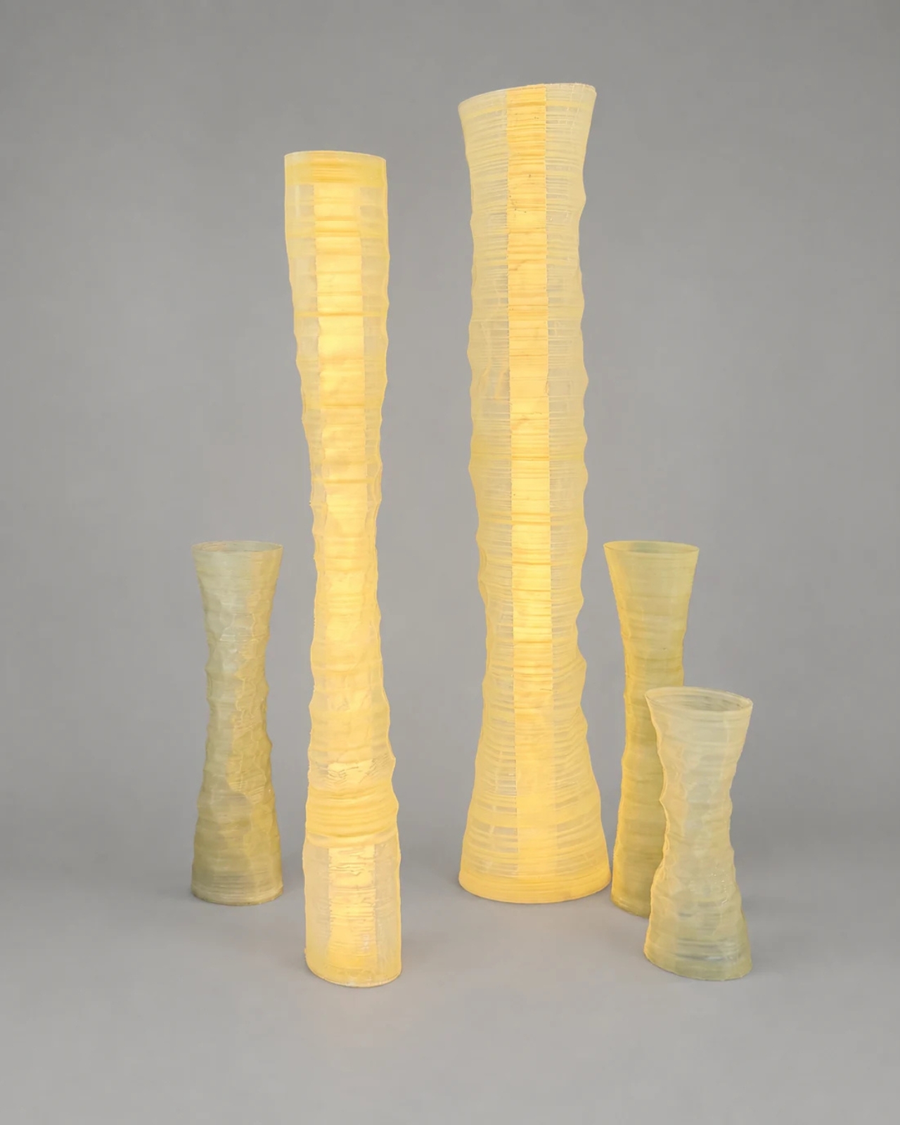
What I like about this project is that each designer treated the same basic waste stream as a completely different kind of material. Kung’s piece, CHA, leans into Taiwan’s tea culture directly, building its form around a parametric system derived from the Chinese character for tea itself. Lin’s Undetermined Shore uses coffee-ground composites to create layered, sediment-like surfaces that echo Taiwan’s shifting coastline, which is a clever way to make a cup of coffee feel geological. Chang’s Nexus Bloom pushes the tea-waste composite into continuous, flowing parametric forms that feel closer to something grown than something printed.

None of these pieces try to hide what they’re made of. That’s the part that actually sold me on the whole idea. So much sustainable design ends up disguising its origins, smoothing away anything that might remind you it used to be trash. After the Last Sip does the opposite. The printed layers stay visible, the particles show through, the surfaces stay irregular and a little rough in places. You can see the tea leaves and coffee grounds sitting right there in the material, not hidden under a coat of paint or a clever finish.

I think that honesty is actually the point. A lot of us drink our coffee and tea on autopilot, never really registering that we’re generating a small pile of organic waste every single day, forever, without thinking twice about where it lands. Seeing that same waste reappear as a sculptural object or a light fixture forces a tiny recalibration. It’s the same material, just given a second job instead of a one-way trip to landfill.

I won’t pretend every object here looks effortless. Some of the surfaces are clearly still experimental, and you can tell the designers are working through what this composite can and can’t do at scale. But that rough edge is part of what makes the project feel real rather than staged for a trend piece. It reads like genuine material research, not a marketing stunt dressed up as sustainability.

Design festivals produce a lot of noise every year, plenty of it forgettable within a week. This one has staying power because it doesn’t ask you to buy anything or change your habits overnight. It just asks you to look at your empty coffee cup differently for a second, and that’s a small shift I can get behind.

The post Coffee Grounds and Tea Leaves Finally Become Art first appeared on Yanko Design.

36 Apartments, Six Clusters, One Printer: Denmark Just Built Europe’s Largest 3D-Printed Village

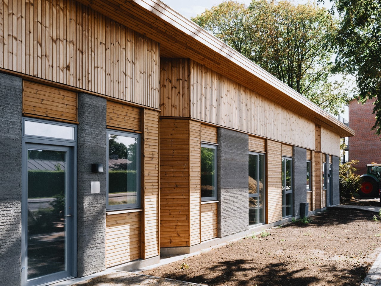
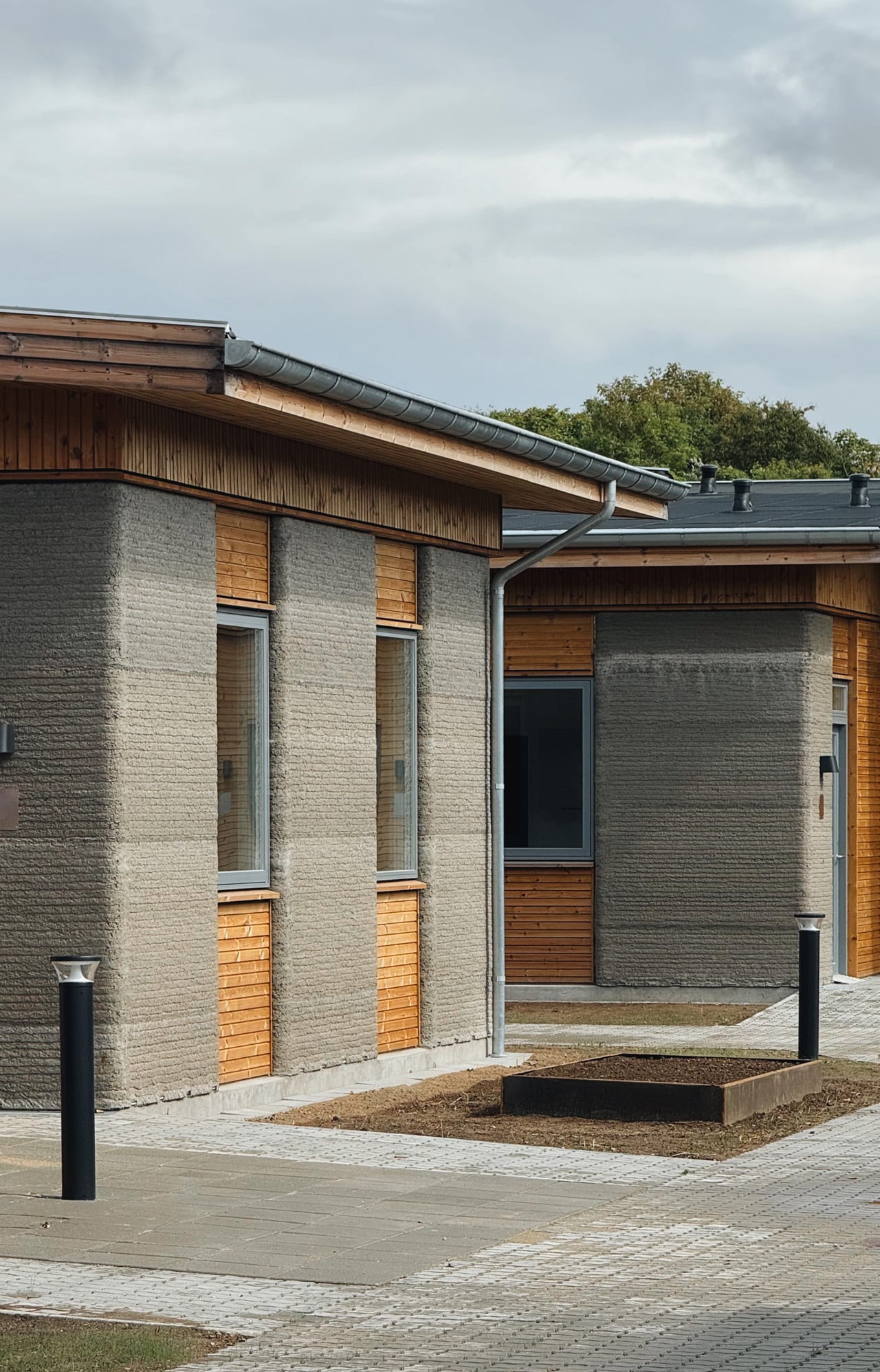
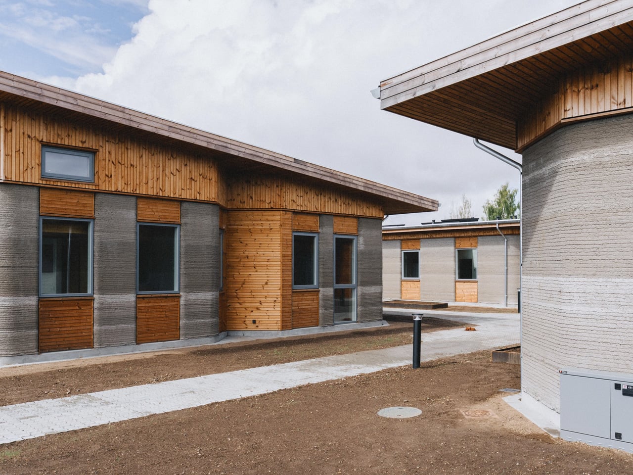
There’s a moment when a technology stops being a proof of concept and starts being someone’s home. That moment arrived in Holstebro, Denmark, with the completion of Skovsporet — 36 student apartments built almost entirely by a robotic printer, making it one of the largest 3D-printed housing projects in the world.

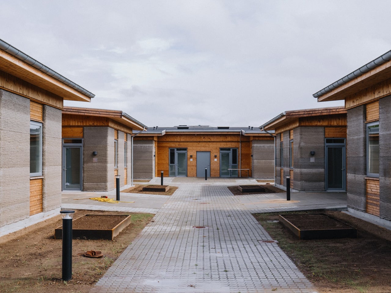
The project was commissioned by NordVestBO and delivered by 3DCP Group, with architecture from SAGA Space Architects and MS+. It sits close to VIA University College, which makes the location feel intentional rather than incidental — a student village that grew from the ground up, literally. The name Skovsporet translates loosely to “forest track,” and the design leans into that softness. Six low-rise clusters, each holding six apartments, wrap around shared courtyards and landscaped gardens. Walking paths and bicycle parking thread through the site, creating the kind of everyday rhythm that makes a place feel lived-in rather than installed.

Designer: 3DCP Group, SAGA Space Architects & MS+

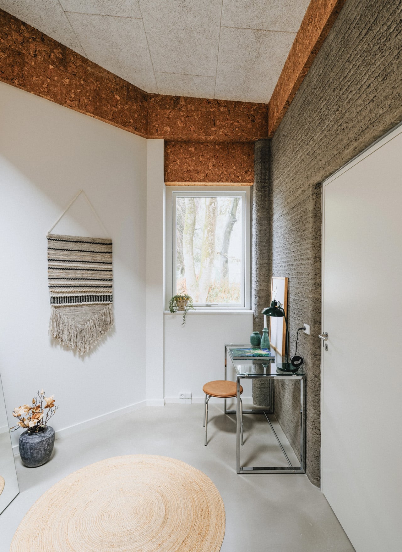
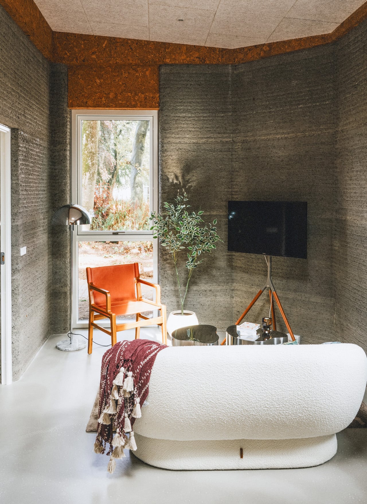
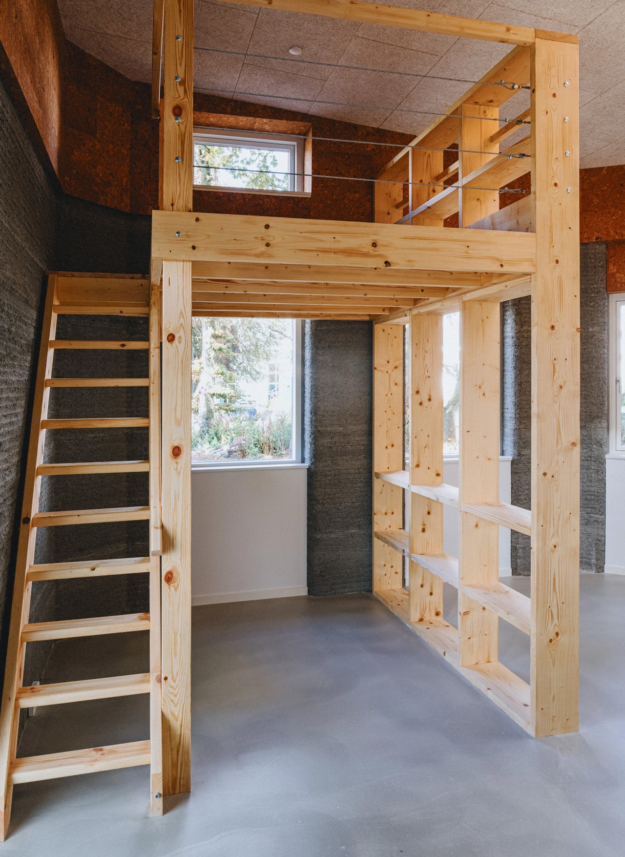
At 1,650 square meters across 36 units ranging from 39 to 50 square meters, the scale is modest by development standards. But that restraint is the point. Each apartment is self-contained — full kitchen, study area, sofa lounge, bathroom with shower, and a proper double bed. It’s everything a student actually needs, without excess. The architecture doesn’t perform ambition; it delivers it quietly.

The structural walls were printed on-site using a COBOD BOD3 printer operated by a three-person team, achieving millimeter-level accuracy across the entire build. The concrete mix, D.fab, contains FUTURECEM — a lower-carbon cement developed by Aalborg Portland — reducing the environmental footprint without compromising structural integrity. The bicycle shed pushed things further, using 3D-printed elements containing zero cement, achieving an 84% reduction in CO₂ emissions compared to traditional concrete. That’s not a marketing footnote. That’s a material shift.

“We have gone from printing small prototypes to creating 36 real homes and an entire community. That is the scale where technology starts to matter as a serious tool for architecture,” – Sebastian Aristotelis, Co-Founder and Lead Architect of SAGA Space Architects, said it plainly. The technical breakthrough wasn’t a single successful print. It was repeating that success 36 times over 12 months without losing control of the outcome.

Construction is now complete, with students set to move in. 3DCP Group and SAGA are already researching new material configurations for future projects, treating Skovsporet not as a destination but as a baseline. That’s the right instinct. When a neighborhood built by robots starts to feel normal, you know the technology has finally grown up.

The post 36 Apartments, Six Clusters, One Printer: Denmark Just Built Europe’s Largest 3D-Printed Village first appeared on Yanko Design.
The Price Tag Secretly Built to Outlive the Item It Priced

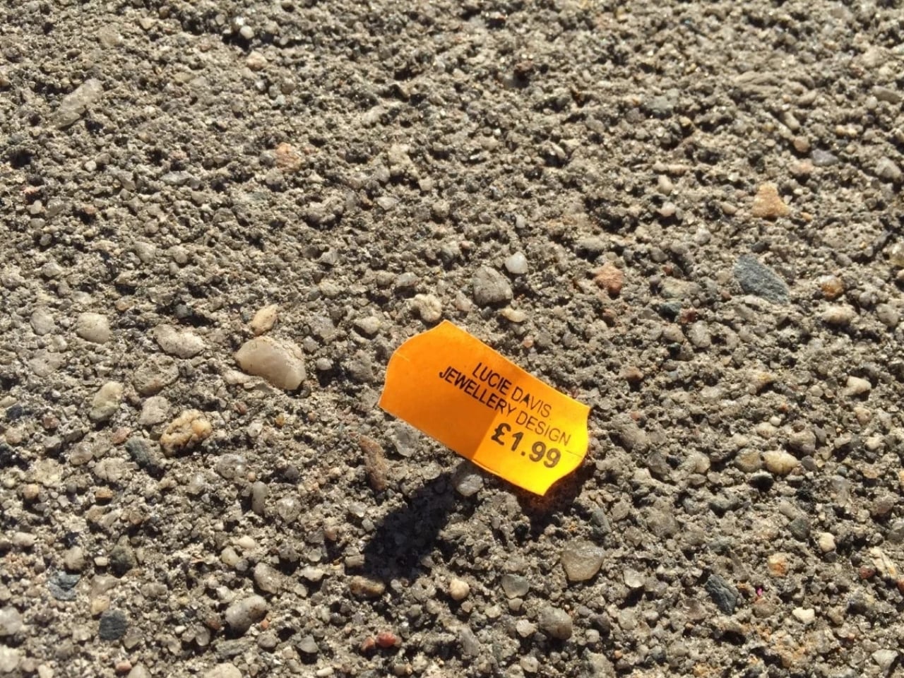
When you buy something new, the first thing you probably do before you start using it is remove the price tag. Unless you’re a pack rat or a junk journaler, it’s something you’ll most likely toss in the trash without a second thought. But what if the price tag itself was the design object, crafted with enough intention that you’d actually want to keep it, or even wear it?

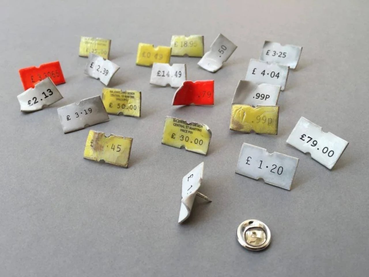
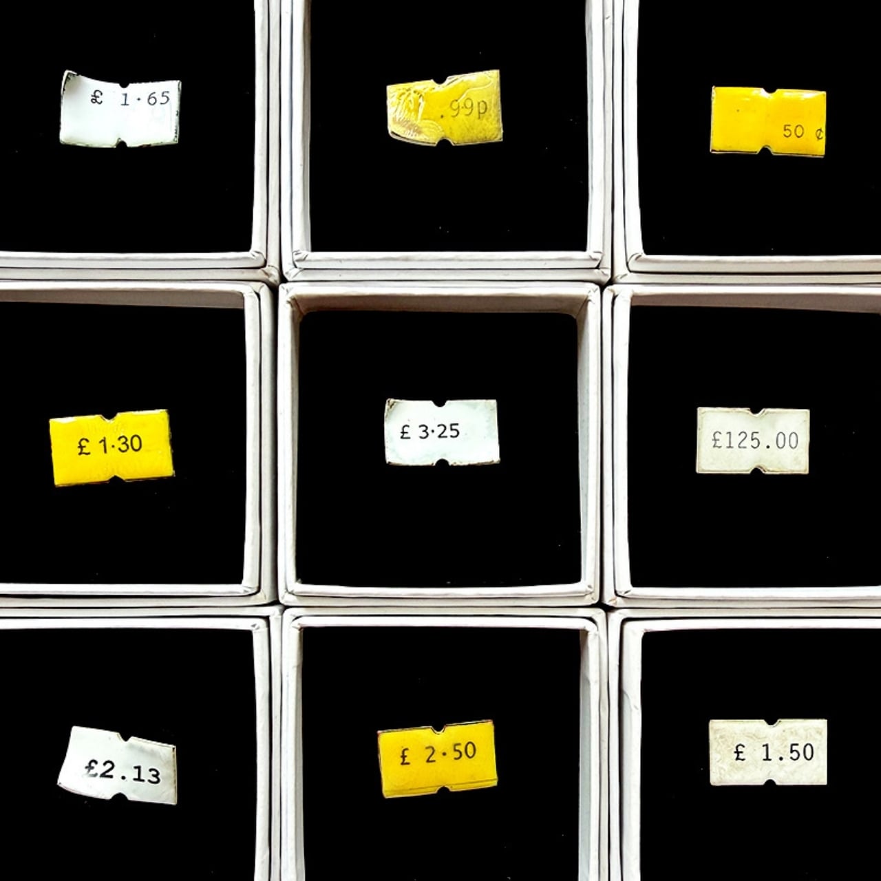
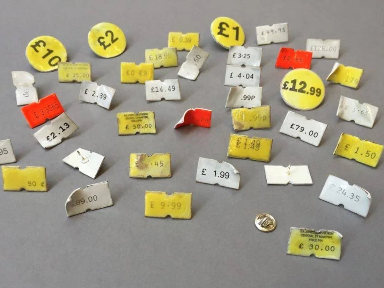
That’s exactly what Precious Price Tag Pins brings to your jewelry box or your shirt collar. It’s a collection of hand-crafted wearable art that mimics the ordinary price tags we’re used to seeing on books, clothing, accessories, and just about everything else we buy. Each piece is a cute, unique bit of jewelry and approachable wearable art that’s guaranteed to spark conversation with friends and strangers alike.

Designer: Lucie Davis

Working at a womenswear shop during her university days is what inspired this collection from London-based jewelry artist Lucie Davis. The design brief she set for herself was deceptively simple: take the most disposable object in retail and rebuild it using techniques usually reserved for fine jewelry.

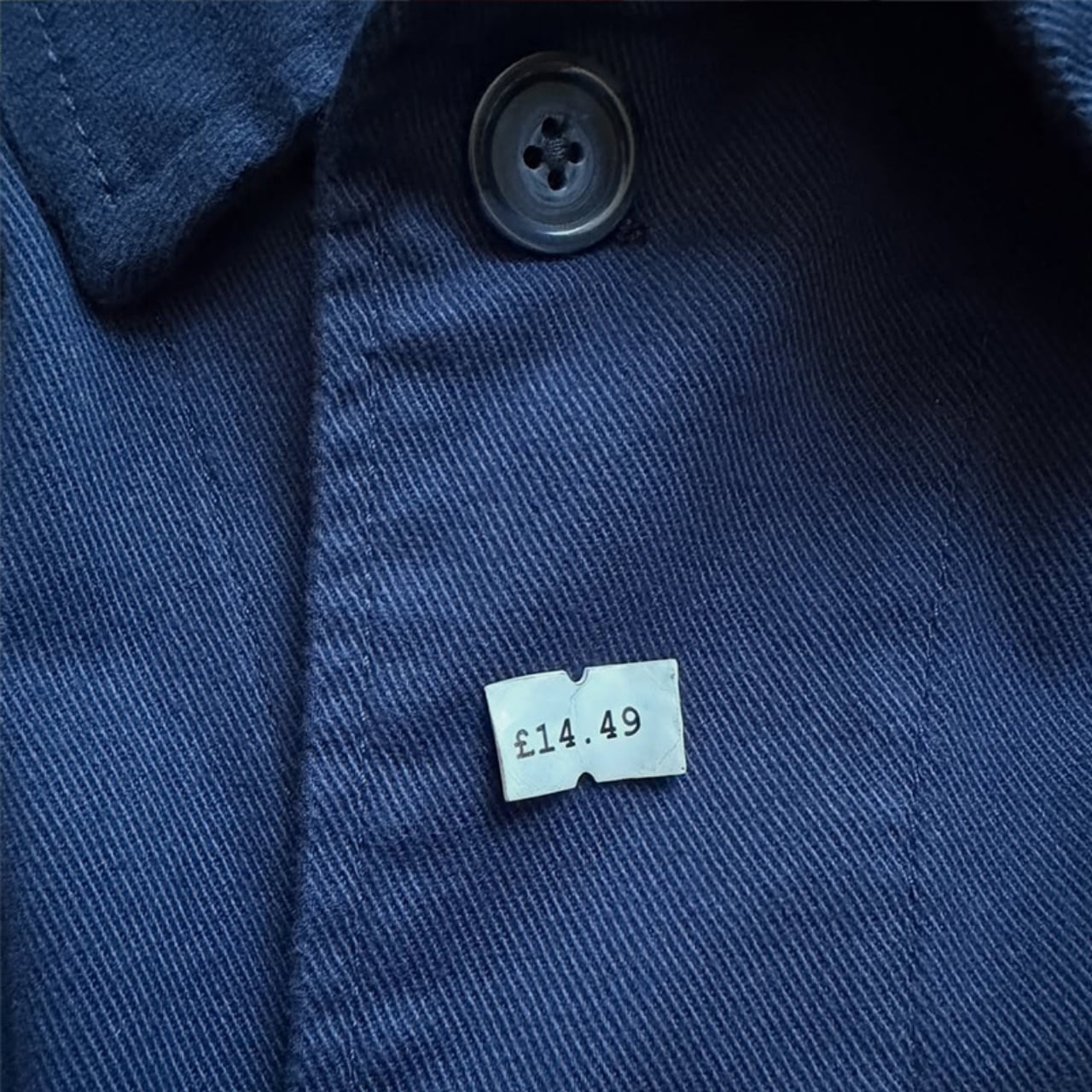
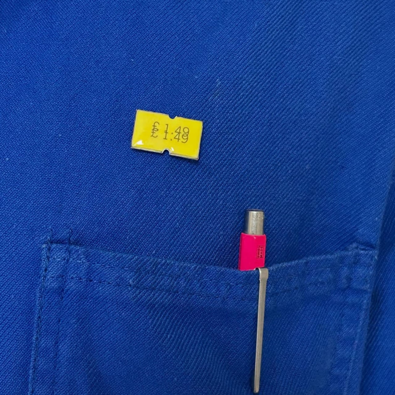
Each pin measures about 21.5mm x 12mm, small enough to sit unassumingly on a lapel yet substantial enough to hold real presence up close. The construction pairs two very different processes. First, the numbers and text are laser-engraved with crisp, precise lines that replicate the printed look of a real price sticker. Then that engraving is layered with kiln-fired porcelain enamel and cold enamel, giving the surface a glossy, almost glassy depth that flat paper or vinyl could never achieve. The base metal body is finished with a tie-pin back and clutch fastening, the same sturdy hardware you’d expect from a well-made brooch, not a sticker. That contrast between old and new methods is really the heart of the design. Laser engraving is fast, exacting, and thoroughly modern. Hand-enameling is slow, meticulous, and centuries old. Davis fuses both into a single small object, and the result reads like a miniature study in how craftsmanship and technology can work together instead of competing.
The visual trick is what makes the design so satisfying. At first glance, these pins really do look like paper price tags about to be tossed in the trash, right down to the typeface and the slightly curled corner detail some versions include. But once you pick one up and hold it in your palm, you feel the weight and the smooth, cool enamel surface, and the illusion breaks in the best possible way. It’s a sturdy little pin you can attach to your shirt, bag, or cork board, built to last decades rather than seconds.

Because every pin is hand-finished, no two are ever perfectly identical, which gives each piece a slightly different personality even within the same design family. There’s also a bespoke engraving option, so you can decide exactly what number and text the “price” displays. Some collectors choose meaningful figures, like a birth year or a favorite number, while others simply pick something absurd for the humor of it. Either way, that customization turns the design from a fixed product into something closer to a small collaborative art piece between the wearer and the artist.

What ties the whole design together is restraint. Davis didn’t try to disguise the price tag reference or dress it up with excess ornamentation. She kept the proportions, the layout, and the plain honesty of a real tag, then simply swapped the materials for ones built to endure. That’s a much harder design challenge than it looks, since the object has to stay instantly recognizable while feeling completely reinvented in the hand. Wear a price tag on your person, and people will do a double take, maybe even strike up a conversation about the design itself, the materials, or why you’re sporting a price on your chest in the first place. It’s a small object, but it carries a genuinely thoughtful piece of design thinking, and that’s exactly what makes it worth a second look.

The post The Price Tag Secretly Built to Outlive the Item It Priced first appeared on Yanko Design.