Apple Turns 50, and Its Most Ambitious Phone Hasn’t Even Launched Yet — 5 iPhone Fold Concepts

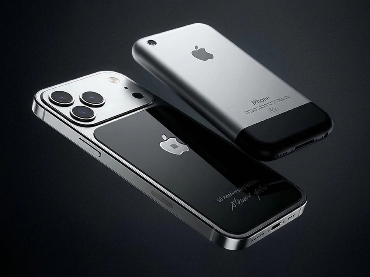
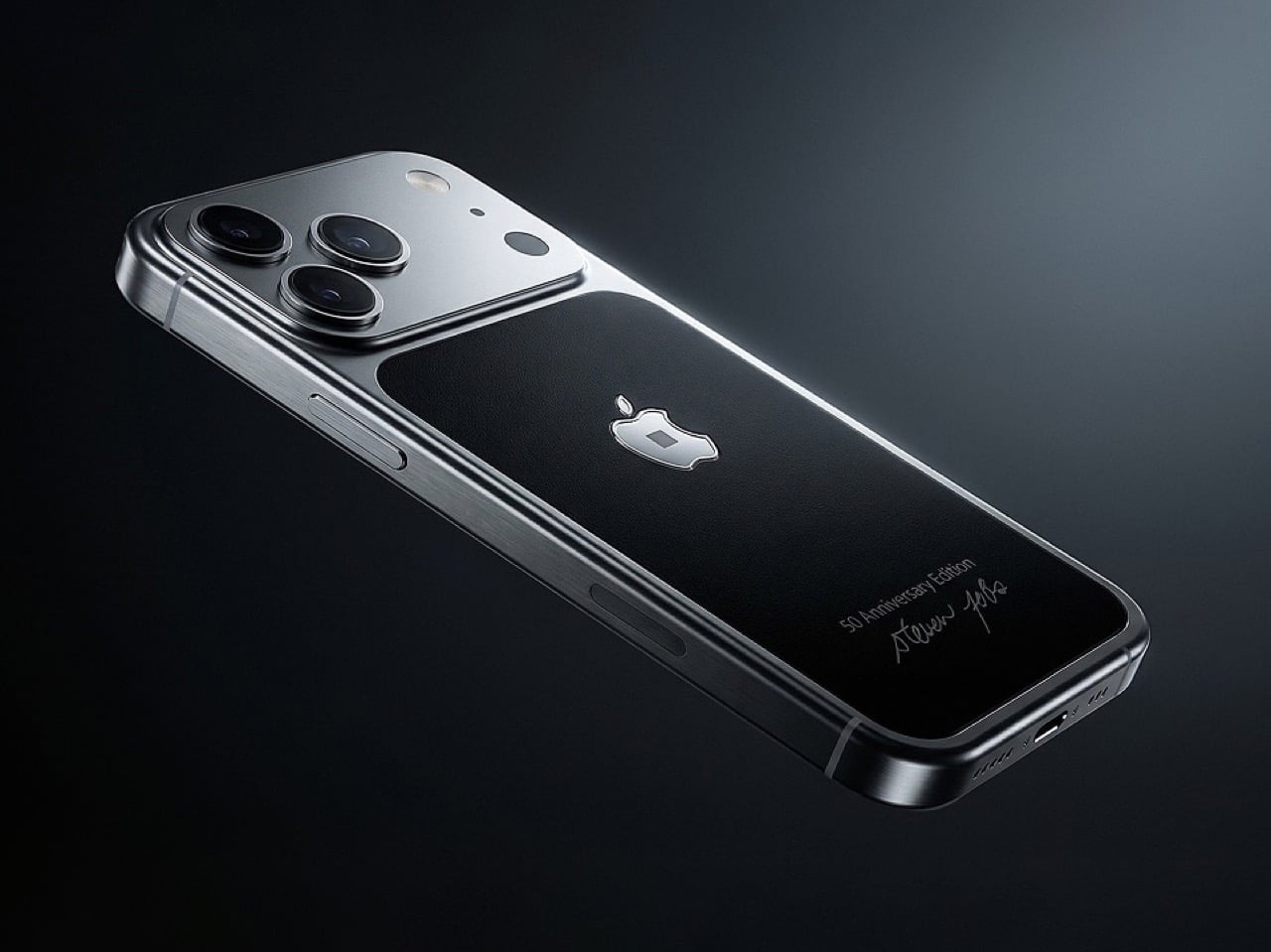
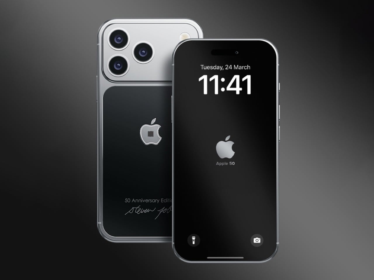
On April 1st, 2026, Apple turns 50. For a company that has spent half a century rewriting the rules of consumer technology, the milestone deserves something genuinely transformative. The Macintosh redefined personal computing. The iPod gave an entire generation a new relationship with music. The original iPhone, unveiled in 2007, combined a phone, a music player, and the internet into a single glass rectangle and made every competitor look outdated overnight. The iPhone Fold is real, and it’s coming.

Leaks from early 2026 paint a detailed picture: a book-style foldable powered by the A20 Pro chip on a 2nm process, backed by a 5,500mAh battery, with a 7.8-inch creaseless OLED inner display and a 5.5-inch outer screen. Pricing is expected to start around $2,400, and while a September announcement seems likely, most analysts believe shipments may not begin until December. Designers, modders, and concept artists have spent years filling the void with their own visions of a folding iPhone, each carrying a distinct theory about what Apple should prioritize. These five concepts map the full range of that imagination and capture exactly how much is riding on the real thing.

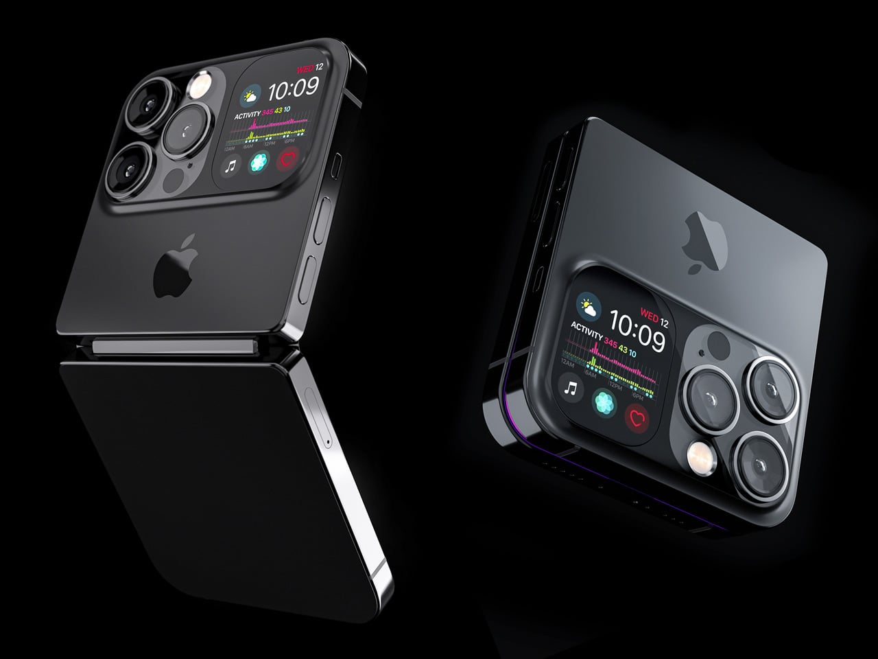
1. iPhone iFold by Michal Dufka — The Clamshell That Makes Sense

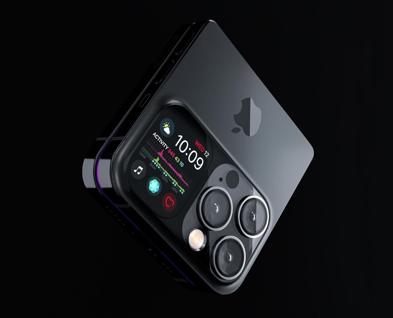
Designer Michal Dufka’s iPhone iFold is built on restraint. Rather than reinventing the iPhone’s entire identity, it applies a clamshell fold to the form factor people already love, drawing direct inspiration from the MotoRAZR and Samsung Galaxy Z Flip. The phone closes into a compact, pocketable square and opens into a full iPhone experience with a generously large display. For anyone who has quietly missed a phone that actually fits in a jeans pocket, this concept speaks to that feeling.

What sets the iFold apart is the secondary display placed beside the camera bump. When the phone is closed, that smaller screen surfaces notifications, time, and essential stats without requiring you to open the device at all. It functions almost like an Apple Watch built into the back of the phone. With Apple’s always-on display technology mature enough for this kind of ambient use, the dual-display setup feels less like speculation and more like a logical next step.

What We Like

  • The secondary display mirrors Apple Watch notification behavior, making glanceable information genuinely useful without ever opening the phone
  • The clamshell format makes the iPhone pocket-friendly for the first time in years without sacrificing screen size when it matters

What We Dislike

  • The clamshell form limits overall screen real estate compared to the expanded tablet surface that a book-style foldable provides
  • Hinge durability over sustained daily use is entirely unexplored here, and it remains the most critical engineering question for any clamshell design

2. iPhone Fold Ultra by 4RMD — When the Specs Match the Ambition

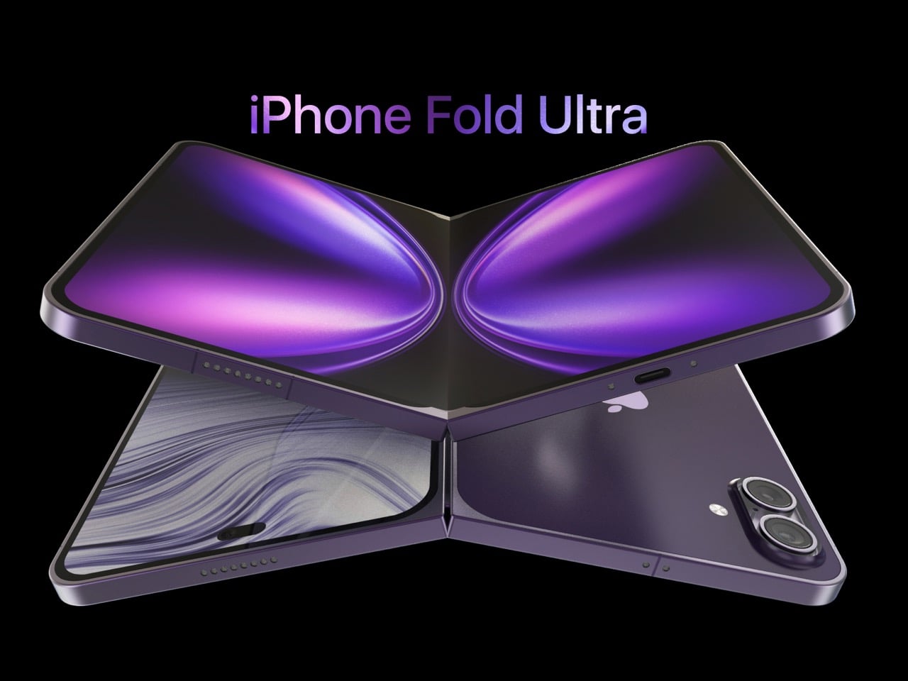
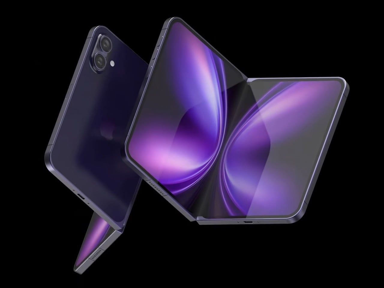
Design studio 4RMD’s iPhone Fold Ultra is grounded in credibility. Built directly from reported leaks rather than pure creative license, the concept presents a book-style foldable with dual 48MP rear cameras, a 24MP ultra-wide front camera, and the A20 Pro chip running on a 2nm process. Three color options appear across the renders: White, Black, and Deep Purple. At an estimated $2,299, this concept sits at the very top of Apple’s lineup with total conviction.

That Deep Purple colorway deserves its own moment. It is a deliberate callback to the iPhone 14 Pro’s most celebrated finish, and it lands differently on a book-style foldable. Something about that color on a device this ambitious reads as genuinely luxurious, the kind of finish that reframes a $2,299 price tag from a shock into a statement. 4RMD clearly understands Apple’s visual grammar, and this concept shows what happens when research and aesthetics share the same design space.

What We Like

  • Specs pulled from verified leaks give this concept real credibility, making it feel like a preview of what is actually coming rather than pure speculation
  • The Deep Purple colorway is a smart, crowd-pleasing callback to one of Apple’s most recognized and beloved finishes

What We Dislike

  • The “Ultra” label sets an expectation that demands exceptional build quality, and no concept can fully address whether the real device will deliver on that promise
  • Crease visibility across the inner display remains unaddressed, which continues to be the most persistent criticism of every book-style foldable on the market

3. iPhone Fold by Svyatoslav Alexandrov — The One That Replaces Two Devices

Svyatoslav Alexandrov’s iPhone Fold concept, created for the YouTube channel ConceptsiPhone, thinks in bigger terms than anything else on this list. Starting as a standard smartphone with a 6.3-inch outer display, it unfolds into a squarish 8-inch tablet that sits clearly in iPad Mini territory. This is not a phone with a bonus screen bolted on. It is a device designed to make carrying both an iPhone and an iPad feel genuinely redundant.

Alexandrov replaces Face ID with a full-display Touch ID fingerprint sensor, keeping the front notch minimal and clean. The rear carries the iPhone 12 Pro’s complete camera array: wide, ultra-wide, telephoto lenses, a LiDAR scanner, and flash. MagSafe compatibility and 5G readiness are already confirmed in the concept, adding meaningful weight to its productivity pitch. Whether the device supports the Apple Pencil is left open, but given an 8-inch inner display, its absence would feel like a missed opportunity.

What We Like

  • The full-display Touch ID is a clean and creative solution that keeps the front uncluttered while solving Face ID’s known complications on foldable form factors
  • The iPad Mini-sized inner screen makes a practical, real-world case for consolidating two devices into one without any meaningful compromise

What We Dislike

  • Removing Face ID eliminates one of the iPhone’s most seamless and trusted authentication features, which most users rely on dozens of times every day
  • Leaving Apple Pencil support unconfirmed weakens what should naturally be this concept’s strongest argument for productivity

4. iPhone Fold by Mechanical Pixel — The Foldable That Doesn’t Actually Fold

Mechanical Pixel’s concept takes the most unconventional approach on this list, and the reasoning is worth understanding. Rather than bending the iPhone itself, the design keeps the main body completely rigid and attaches a separate foldable display to the rear panel instead. The core phone experience remains exactly as people know it, maintaining the familiar dimensions and feel that iPhone users already rely on. That additional screen only enters the picture when a larger surface is specifically needed.

That rear foldable panel sits raised on a platform above the phone’s back, unfolding outward into a larger, squarish tablet surface when required. The layered profile is clearly visible from the side, giving the device a deliberately experimental and modular quality. The camera module remains in its standard position, completely unaffected by the additional display layer. The logic is unconventional, but the core argument of preserving the primary iPhone experience from any foldable compromise is genuinely hard to dismiss.

What We Like

  • Keeping the main body rigid entirely sidesteps the crease and long-term hinge durability problems that define every conventional foldable on the market today
  • The modular approach means the everyday iPhone experience is never degraded or compromised by the mechanics of the foldable element

What We Dislike

  • The raised rear platform creates an unrefined, layered side profile that sits well outside anything Apple’s design language has ever produced or endorsed
  • The prototype-like aesthetic makes it very difficult to imagine this direction surviving Apple’s notoriously demanding and detail-oriented product design process

5. iPhone V — The One Someone Actually Built

Every concept on this list exists as a digital render. The iPhone V is different. A YouTuber modder physically dismantled an iPhone X, extracted its internal components, and rebuilt the entire device inside a Motorola Razr chassis. The result is a working, folding iPhone that runs real iOS, carries a Retina-quality display, and folds in half like a classic flip phone. As a proof of concept, it is extraordinary. As a finished product, every question comes flooding in.

What makes the iPhone V genuinely compelling is not fit, finish, or polish, because it has none in any conventional sense. It is the straightforward fact that someone cared enough to prove the idea could actually work using parts that already exist. The folding mechanism and device thickness still need serious refinement. A working clamshell iPhone running authentic iOS is, in the end, a more persuasive argument for this form factor than any polished render has managed to be.

What We Like

  • The iPhone V is the only entry on this list that is fully functional, running real iOS inside an actual working clamshell device
  • Its physical existence proves the clamshell iPhone concept is viable using genuine Apple hardware, well beyond anything a render can demonstrate

What We Dislike

  • The repurposed Motorola Razr chassis produces a build that falls far short of consumer-grade fit, finish, and structural refinement
  • Hinge mechanism quality and overall device thickness remain significant engineering challenges that the mod cannot resolve, and they are exactly what Apple needs to solve

The Concepts That Made the Wait Worthwhile

Fifty years in, Apple is still the company that makes you wait. The iPhone Fold concepts here are not just exercises in creative imagination — they are a record of what designers and makers have been asking for, year after year. Some nailed the form factor. Others got the specs exactly right. A few did both. Together, they have shaped the entire conversation around a device that already feels utterly inevitable.

When the real iPhone Fold arrives, it will be measured against each of these visions. That is the power of concept design — it sets the bar before the product ships. Apple turning 50 while holding back its most ambitious device is pure theater. The design community has been writing this script for years. The only question is whether the real thing can live up to what the imagination has already built.

The post Apple Turns 50, and Its Most Ambitious Phone Hasn’t Even Launched Yet — 5 iPhone Fold Concepts first appeared on Yanko Design.

Leaked iPhone 18 Pro Screen Protector Shows A 35% Smaller Dynamic Island

Four years is a long time in smartphone design, long enough for entire product categories to rise, peak, and fade. Samsung has cycled through multiple foldable generations. Google has rebooted its Pixel lineup twice. Nothing has gone from startup curiosity to legitimate contender. Apple, meanwhile, has kept the Dynamic Island exactly where it was when it debuted with the iPhone 14 Pro, same width, same height, same visual footprint. Leaked screen protectors for the iPhone 18 Pro, sourced from Weibo, suggest that Apple has finally decided four years is long enough.

According to the leak, the infrared flood illuminator that powers Face ID is moving under the display on the iPhone 18 Pro, leaving only the infrared camera requiring a physical cutout alongside the front-facing lens. The result is a Dynamic Island roughly 35% smaller than what ships on the iPhone 17 Pro today. Apple is also expected to pair this with its first 2nm chip, the A20 Pro, along with a variable aperture system on the main camera. The 20th anniversary iPhone in 2027 is widely expected to go further with a fully clean display, but the 18 Pro represents the clearest signal yet that Apple is working its way there on a deliberate schedule.

Image Credits: Weibo

The size reduction is more significant than the percentage suggests when you look at the two side by side. The iPhone 17 Pro’s Island is a wide, commanding presence even at rest. The 18 Pro’s leaked cutout reads almost delicate by comparison, a narrow pill sitting unobtrusively at the top of the screen. Apple will still need to revisit four years of Live Activities design and the entire interaction vocabulary built around the existing Island’s dimensions, which is a reasonable explanation for why this transition is taking as long as it is.

Android manufacturers have shipped under-display cameras for years, with visible quality tradeoffs that Apple’s user base simply would not accept on a thousand-dollar phone. Holding the line until the technology meets the standard, rather than shipping it to win a spec sheet argument, is the kind of call that frustrates people in the short term and builds loyalty over time. The iPhone 18 Pro may read as a modest update on paper. That smaller pill tells a different story.

The post Leaked iPhone 18 Pro Screen Protector Shows A 35% Smaller Dynamic Island first appeared on Yanko Design.

You’re Not a Real Apple Fan Until You Own These 7 Accessories

April 1st, 2026, marks fifty years since Steve Jobs, Steve Wozniak, and Ronald Wayne signed the papers that would quietly reshape everything: how we listen to music, how we communicate, how we take photographs, and how we think about the relationship between technology and beauty. Apple was founded on April 1, 1976, and fifty years later, it stands as one of the most influential companies in human history. That kind of milestone deserves more than a software update or a casual scroll through the App Store. It deserves a proper celebration, one that reflects the same values Apple has championed since the beginning: precision, intentionality, and the conviction that design is never just decoration.

For true Apple fans, the way you celebrate is in the details. Owning an iPhone, a MacBook, or an Apple Watch is the baseline — everyone has one. The real devotees are the ones who care about how their setup looks, what story it tells, and whether the accessories surrounding their devices feel worthy of the ecosystem. With Apple turning 50 this April, there’s never been a better time to take stock of your setup and fill in the gaps. From a retro watch case that pays tribute to the device that put a thousand songs in your pocket, to a Leica-built camera grip that transforms your iPhone into something you’d actually want to carry into the field, these seven accessories are the ones worth owning.

1. Pod Case

When a design can make you feel genuinely nostalgic the first time you see it, it’s doing something right. The Pod Case wraps your Apple Watch in the silhouette of a classic iPod Nano, arguably one of the most emotionally resonant gadgets Apple ever made. Crafted from silicone, it slides directly over the watch body without obstructing any of its core functions, giving your wrist a retro identity that’s unique and, honestly, a little bit joyful every time you glance down.

What makes the Pod Case especially clever is how it honors Apple’s past without making your watch feel dated. The dummy jog wheel on the front is a warm nod to the scroll wheel that once defined a generation of music listeners, while the watch’s touchscreen remains fully accessible underneath the case. The watch’s screen roughly matches the display size found in classic iPod Nanos, making the illusion feel remarkably convincing. With Apple’s 50th birthday just around the corner, there’s no more fitting way to wear that history on your wrist.

What we like:

  • The silicone build slides on and off cleanly, so you can commit to the retro look when the moment calls for it without any permanence
  • It taps into Apple’s most beloved design legacy in a way that feels celebratory rather than costume-y

What we dislike:

  • The jog wheel is non-functional, which feels like a genuinely missed opportunity for Bluetooth-enabled scroll control
  • The added thickness may feel noticeable against Apple Watch’s characteristically slim and precise silhouette

2. NightWatch

Some accessories solve problems you didn’t know you had until they’re solved, and the NightWatch is exactly that product. Shaped like a generous, luminous orb made entirely from lucite, this dock does three things beautifully: it charges your Apple Watch, magnifies the watch face into a clearly legible bedside display, and amplifies the watch’s alarm through acoustically engineered channels routed beneath the speaker. There are no hidden electronics, no batteries, no inner mechanisms. Just thoughtful geometry working in complete silence.

The NightWatch’s touch-sensitive surface is its most quietly brilliant detail. A single tap on the lucite orb wakes your Apple Watch screen instantly, meaning no fumbling in the dark and no squinting across a dim room at a tiny display. For anyone using their Watch as a sleep tracker and morning alarm, this dock transforms the entire overnight routine. It’s the kind of product that earns its space on your nightstand not through novelty but through genuine, repeatable usefulness that compounds every single morning.

What we like:

  • The all-lucite, zero-electronics construction is beautifully minimal and requires no power source of its own
  • The touch-to-wake surface interaction is intuitive and immediately feels like something Apple itself should have shipped

What we dislike:

  • The orb’s sculptural shape is confident and bold, which may not suit more minimal or tightly curated bedside setups
  • Passive sound amplification through acoustic channels means volume results will vary slightly depending on which Apple Watch model you’re using

3. AirTag Carabiner

The AirTag Carabiner might be the most practical Apple accessory on this list, and that practicality is housed inside a build quality that punches well above its category. Machined from Duralumin composite alloy, the same material used in aircraft, spacecraft, and high-performance watercraft, it’s designed to handle the kind of daily wear and environmental abuse that standard carabiners can’t sustain. Snap one onto your bag, bike frame, or umbrella, and Apple’s Find My network handles everything else without any additional configuration on your end.

What separates this from the flood of plastic AirTag holders on the market is the craft behind it. Each carabiner is individually hand-finished, and the Duralumin composite holds up equally well in water and at altitude, making it genuinely suited to real-world conditions. It’s available in untreated brass and stainless steel as well, for users who prefer warmer or more industrial finishes. For an Apple fan who wants every piece of their setup to feel considered and intentional, this is the kind of detail that quietly elevates the whole picture. The AirTag itself is sold separately.

Click Here to Buy Now: $149.00

What we like:

  • Duralumin composite construction brings authentic aerospace-grade durability to a carry item most people treat as disposable
  • The choice of brass, stainless steel, and treated alloy finishes makes personalization genuinely easy and meaningful

What we dislike:

  • The AirTag is sold separately, which adds a layer of additional cost for users who are new to Apple’s tracking ecosystem
  • The premium build quality may feel like overkill when attached to lower-stakes items like an umbrella or a gym bag

4. Magic Bar

Apple’s Touch Bar had a short and controversial run, but the idea underneath it, a programmable, context-aware strip that adapts to whatever you’re working on, was always more interesting than its execution. The Magic Bar takes that concept and frees it from the MacBook Pro entirely, reimagining it as a standalone, portable accessory that pairs with any Apple peripheral. Built from aluminum to match the existing Magic Keyboard and trackpad lineup, it sits in the setup as naturally as if Apple had always intended it to ship this way.

The proposition is clean and direct: a plug-and-play toolbar that clips horizontally alongside the Magic Keyboard and keeps your most-used shortcuts, smart home automations, and app-specific functions at constant reach. Combined with the iPhone, the use case expands meaningfully, with media controls, quick-launch tools, and home shortcuts all living in a single strip without requiring any window switching. For the Apple power user who lives inside their setup all day, the Magic Bar is the kind of accessory that changes the way you work once you’ve had even a single session with it.

What we like:

  • The aluminum construction and horizontal layout integrate seamlessly into Apple’s existing peripheral design language without any visual friction
  • Plug-and-play setup eliminates configuration headaches, making it immediately useful from the moment it lands on your desk

What we dislike:

  • As a concept design, the final feature set and commercial availability are yet to be officially confirmed by any manufacturer
  • Compatibility appears optimized for Apple peripherals specifically, which limits the appeal for anyone running a mixed operating system setup

5. Spigen Classic LS AirPods Pro 3 Case

Spigen’s retro-Mac collection is one of the more quietly delightful things to emerge from the Apple accessory market in recent years, and the Classic LS AirPods Pro 3 case is its most charming entry yet. Modeled directly after the original Apple mouse, the flat, single-button input device that debuted with the first Macintosh, it borrows the mouse’s warm, stone-colored plastic, its compact proportions, and most importantly, its most satisfying tactile feature. It’s the kind of object that makes you want to pull it out and show someone immediately.

The “Push to Unlock” mechanism built into the front is the detail that takes this from novelty to genuinely considered product design. Placed exactly where the original mouse button sat, pressing it releases the hinged lid with a deliberate, mechanical click that makes the gesture feel purposeful rather than accidental. It joins a phone strap and a MagFit floppy disk wallet in a cohesive four-piece retro set. With Apple celebrating fifty years this April, carrying this case is one of the most eloquent tributes any fan can make to the design language that started everything.

What we like:

  • The “Push to Unlock” button is a genuinely tactile, mechanically satisfying feature that pays direct homage to the original mouse button in the most intuitive way possible
  • Being part of a four-piece retro collection means fans can build a fully coordinated Apple heritage accessory set that tells a coherent visual story

What we dislike:

  • The warm beige colorway, while historically faithful and correct, may feel too vintage for users who prefer accessories that match Apple’s current aesthetic language
  • The case is specific to AirPods Pro 3, meaning it offers no crossover value outside that particular model

6. Battery-Free Amplifying iSpeaker

There’s something deeply satisfying about a product that works entirely without power, and the iSpeaker earns that satisfaction honestly. Made from Duralumin metal, the same aerospace-grade alloy that appears throughout the best entries on this list, it uses pure acoustic physics to amplify your iPhone’s audio without drawing a single watt of electricity. Designed using the golden ratio, it doubles as a piece of desk sculpture that holds its own even when your phone isn’t sitting inside it. Function and form, neither compromising the other.

This is the kind of accessory built for a very specific Apple user: one who values craft over convenience, and objects that reward close attention over ones that simply check a box. The Duralumin construction resonates with your music rather than dampening it, producing a warmer, more enveloping sound than plastic or silicone alternatives can manage. It’s also portable enough to take to a hotel room, a client’s office, or a weekend away without any packing anxiety. No cables, no setup, no charging required. Just place your phone inside and let the material do its work.

Click Here to Buy Now: $179.00

What we like:

  • Zero power required makes it genuinely portable and one of the more eco-conscious accessories in any Apple setup
  • The Duralumin body produces a noticeably richer, warmer acoustic resonance than plastic and silicone competitors at this price tier

What we dislike:

  • Output, while impressively improved for a passive speaker, will never match the volume or bass of a powered Bluetooth speaker in the same price range
  • The +Bloom and +Jet directional sound mods that extend its capabilities are sold separately, meaning full functionality requires an additional purchase

7. Leica Lux Grip

Leica doesn’t make many mistakes when it comes to product design, and the Lux Grip is a strong argument for that reputation. Built for iPhone photographers who want DSLR-level ergonomics without abandoning the convenience of a smartphone, it attaches via MagSafe and works with every iPhone from the 12 onward. Machined from high-grade aluminum with a matte black finish, it adds a reassuring heft to the setup that transforms how the whole device sits and moves in your hands: purposeful, balanced, and undeniably premium.

The cylindrical grip along the left side creates a natural resting point for the fingers that you only realize you’ve been missing once you’ve shot without it. Paired with the Leica Lux app, the mechanical controls provide genuine shutter, aperture, and zoom inputs that touchscreen photography will never replicate in feel or reliability. For the Apple fan who takes mobile photography seriously, the Lux Grip doesn’t just improve how you shoot. It changes how you think about the iPhone as a camera, and that’s the kind of shift that earns its place in any serious setup.

What we like:

  • MagSafe attachment is secure and broadly compatible, working cleanly across multiple iPhone generations without any adapters or compromises
  • The mechanical shutter and physical controls provide tactile shooting feedback that touchscreen photography categorically lacks, making sessions feel more considered

What we dislike:

  • The premium aluminum build and Leica branding command a price point that will be a genuine barrier for casual iPhone photographers on a tighter budget
  • The added weight and bulk, while ergonomically intentional, may not appeal to users who prioritize a slim, pocketable iPhone profile above all else

Fifty Years In, the Details Still Matter

Apple turning 50 on April 1st is the kind of milestone that asks you to pause, look around your setup, and ask whether the things surrounding your devices actually reflect the standard Apple itself has set. The best anniversary gift you can give yourself isn’t necessarily the newest device on the shelf. It’s the accessories that turn what you already own into something that feels curated, intentional, and worth coming back to every day. That’s always been the Apple promise.

These seven picks honor that promise in different ways: some through heritage, some through clever engineering, and some through the kind of craft that simply makes an ordinary moment feel better. Whether you’re celebrating five decades of Apple with a retro-inspired AirPods case or finally shooting iPhone photos with a grip worthy of the camera you’re already carrying, each one earns its place. Here’s to fifty more years of thinking differently, and the accessories that help you live up to it.

The post You’re Not a Real Apple Fan Until You Own These 7 Accessories first appeared on Yanko Design.

DIY Water-Cooled MacBook Neo Just Got A 23% Performance Bump. Here’s How…

The MacBook Neo’s entire premise rests on one audacious question: can a smartphone chip carry a laptop? Apple’s answer was to drop the A18 Pro from the iPhone 16 into a fanless aluminum chassis and ship it. For everyday tasks, the answer is largely yes. For gaming under sustained load, the answer hits a wall at 105°C, where the chip pulls back its clocks to avoid cooking itself inside a case with no fan and no active cooling to speak of. The MacBook Neo is a genuinely compelling machine, repairability included since Apple ditched adhesive entirely and built the whole thing around screws, but that thermal ceiling is a real and measurable constraint.

ETA Prime ran the experiment that every thermally curious engineer has probably daydreamed about: what happens when you actually cool this thing properly? First, a custom copper heat sink bridging the chip to the aluminum shell. Then a liquid-cooled thermoelectric Peltier unit clamped magnetically to the outside. Gaming framerates climbed from 30 to 80 FPS. Cinebench single-core jumped 23.5% over stock. The A18 Pro was never the bottleneck. The cooling was.

Designer: ETA PRIME

The copper heat sink is the more elegant of the two mods, and honestly the more important one. ETA Prime removed the stock graphene pad using a heat gun, cleaned the A18 Pro die with isopropyl alcohol, and applied Noctua thermal paste directly to the chip. A sheet of copper, cut to cover the full mainboard, sits on top. An Arctic TP3 thermal pad on the upper face of the copper makes contact with the MacBook Neo’s aluminum bottom shell when the screws are tightened back down, turning the entire chassis into a proper heat spreader. The graphene pad was cut in half and kept over the surrounding components for protection, but the CPU die itself is now in a real thermal pathway for the first time. With just this mod in place, No Man’s Sky jumped from 30-31 FPS to 58 FPS, average CPU temps dropped to around 83-84°C, and Geekbench 6 multi-core climbed 9.7% while single-core gained 15.2%. A sheet of copper and a tube of paste did what Apple’s entire thermal design could not.

The Peltier cooler is the wilder addition, and it is admittedly overkill in the best possible way. The unit ETA Prime used was originally designed as a phone cooler, a liquid-cooled thermoelectric device with three power settings topping out at 50 watts. One side extracts heat, the other reaches below-freezing temperatures, and ice visibly forms on the cold plate within about a minute of operation. It attaches magnetically to the bottom of the Neo, aligning with the copper heat sink beneath the shell, and pulls the chip’s average idle temp down to 23°C. Under gaming load in No Man’s Sky, the CPU sat at roughly 74°C, and framerates held at 58-59 FPS with VSync engaged. Over a 30-minute sustained session, the machine averaged around 80 FPS at 1408×881 on enhanced settings with Metal scaling set to balanced, compared to the low 30s it would have delivered in stock form.

The benchmark gains with the full liquid cooling setup are worth spelling out. Geekbench 6 multi-core reached 9,394, an 18.6% improvement over the stock 7,921. Single-core hit 3,636, up 17.52%. Cinebench multi-core landed at 1,741 against a stock score of 1,462, a 19% gain, while single-core climbed from 502 to 620, a 23.51% improvement. ETA Prime also tested Fallout 4 running through Crossover, the compatibility layer that lets non-Mac titles run on Apple silicon, and the Neo held a consistent 60 FPS despite relying on SSD swap for additional memory beyond its 8GB ceiling.

The 8GB cap remains the machine’s most stubborn limitation, and no amount of copper or Peltier magic changes that. When the unified memory fills, the Neo starts leaning on SSD swap, which is slower and adds latency that thermal improvements cannot compensate for. It is a real constraint for anyone expecting to run memory-hungry titles at length. That said, the performance ETA Prime extracted here from a chip that costs less than many gaming peripherals is genuinely impressive, and the copper mod in particular requires no permanent modifications and costs almost nothing.

The Peltier is obviously not a portable solution. It draws significant power, runs a liquid loop, and magnetically attaches to the outside of the machine like a barnacle. But the copper mod absolutely is portable, costs next to nothing in materials, and on its own delivers close to double the sustained gaming performance. ETA Prime also tested Fallout 4 running through Crossover on the liquid-cooled setup, hitting a continuous 60 FPS despite the Neo’s 8GB RAM ceiling forcing the system to lean on SSD swap for additional memory. The A18 Pro has more headroom than Apple’s thermal design ever lets it show, and a sheet of copper is apparently all it takes to prove it.

The post DIY Water-Cooled MacBook Neo Just Got A 23% Performance Bump. Here’s How… first appeared on Yanko Design.

Only 9 People in the World Will Own This iPhone 17 Pro With A Piece of Steve Jobs’ Turtleneck On the Back

Caviar has built its reputation on a specific kind of excess. An actual Rolex embedded into the back of an iPhone 14 Pro, retailing at $133,000. A custom iPhone 13 Pro cast from aluminum salvaged from a melted Tesla Model 3. A John Wick-themed iPhone 16 Pro so aggressively styled it looked like it belonged in an armory, not a pocket. The Russian luxury house has spent years treating Apple’s hardware the way a coachbuilder treats a car chassis, something to be reimagined rather than accepted off the shelf.

For Apple’s 50th anniversary, Caviar has produced something that sits in different territory altogether. The “Steve Jobs” iPhone 17 Pro contains an authenticated fragment of Jobs’ original black turtleneck, sealed inside the chassis beneath a raised titanium logo, on a body deliberately styled to reference the 2007 iPhone that started everything. Nine units. A certificate of authenticity. A “50 Anniversary Edition” engraving and Jobs’ own signature etched into the frame.

Designer: Caviar

The fabric comes from the same Issey Miyake turtlenecks Jobs wore religiously for decades, the ones he ordered in bulk because he wanted clothing to be one less decision in his day. Caviar has positioned the fragment at the center of the phone’s back panel, directly beneath a raised titanium Apple logo that functions as both a seal and a focal point. The black-and-silver color scheme mirrors the original iPhone’s visual language, right down to the slightly offset logo placement and minimalist engraving style. The overall effect reads less like a luxury phone and more like a museum piece that happens to run iOS.

With only nine units produced worldwide, the Steve Jobs edition enters the same rarefied air as limited-run watches or gallery-edition art prints, objects valued as much for their exclusivity as their craftsmanship. The authentication certificate that ships with each phone attempts to legitimize the provenance, offering buyers proof that the fabric fragment is genuine rather than theatre. Whether embedding a piece of clothing into a smartphone chassis constitutes meaningful homage or expensive novelty depends entirely on how much weight you assign to physical artifacts versus digital legacy. Caviar has clearly made its bet on the former, banking on collectors who want to hold a piece of Apple history rather than simply read about it.

Caviar framed the release with the kind of language luxury brands deploy when they want you to believe you’re buying meaning rather than materials. “We wanted to create a device that would serve as a true time capsule,” representatives stated, “by combining the aesthetics of the very first and the most current iPhone, and adding an authentic fragment of Steve Jobs’ clothing, we offer collectors and devoted fans of the brand a chance to feel a physical connection to the visionary who changed the world.” The phones are available now on Caviar’s official website, authenticated certificates included.

The post Only 9 People in the World Will Own This iPhone 17 Pro With A Piece of Steve Jobs’ Turtleneck On the Back first appeared on Yanko Design.

Nike x Powerbeats Pro 2 earbuds promise great design, super secure fit, and impressive audio

Earbuds are a holy grail accessory for fitness freaks who want to get in the groove to focus on their goals without outside distractions or losing out on ambient awareness when needed. Shokz OpenFit Pro and Beats Powerbeats Pro 2 have already proven their mettle in this space, with Nothing Ear (Open) and Anker Soundcore V20i also proving to be good value for money.

Apple has growing confidence in their fitness earbuds, and that’s the reason they’ve teamed up with Nike to release the Nike x Powerbeats Pro 2 Special Edition. Looping in LeBron James, the Los Angeles Lakers Forward, the American sports apparel brand has a valid reason to go with Beats for a set of fitness-focused wireless earbuds. These special edition buds come with tailored health tracking capabilities targeted towards athletes and heart rate monitoring integrated with the Nike Run Club app.

Designer: Beats by Dre and Nike

As one can see, the design is the major focus with these earbuds. They have a dual-tone finish in matte black and Volt splatter design. One earbud has the Beats branding while the other sports the Nike logo in black, lending the pair a distinct style appeal. The charging case carries the same theme and Nike’s “Just Do It” tagline on the inside. According to Beats CMI Chris Thorne, the earbuds are a result of the two brands’ “performance, culture and sports — the attributes of today’s athlete.”

The IPX4-rated earbuds come with a redesigned nickel-titanium ear hook, making them lighter while retaining the promise of a secure fit, even with the most rigorous activity. Battery life on these is rated at up to 45 hours with the charging case, and 10 hours on the standalone earbuds. You can expect the same level of ANC, transparency, and passive isolation as the original Powerbeats Pro 2. Of course, voice-calling performance, audio listening quality, and the heart rate sensing features are all what make these a bang for the buck.

Apart from all these features, they can also be wirelessly charged for convenience. Without doubt, they are the prime candidates for your everyday needs. Powerbeats Pro 2 Nike Special Edition was initially available through an early access lottery via SNKRS. For eager buyers, the global launch will be on March 20 via Nike and Apple’s official websites for $250. In-store availability is limited to locations including the United Kingdom, China, the United States, and Singapore.

The post Nike x Powerbeats Pro 2 earbuds promise great design, super secure fit, and impressive audio first appeared on Yanko Design.

Spigen Turned Apple’s Iconic Beige Mouse Into an AirPods Pro 3 Case

There’s something quietly odd about the era when Apple products were beige. Not bad, just odd. The Macintosh 128K, the boxy rectangular mouse, the Apple Lisa; they were made from a warm off-white plastic that aged into something stranger, a color that collectors now call “Pantone 453 approximately.” Spigen, a brand that usually channels its energy into clear polycarbonate shells, has decided this particular slice of computing history deserves a second life on your keychain.

The Classic LS AirPods Pro 3 case is the latest piece of Spigen’s retro-Mac collection, which launched in January 2026 with an iPhone 17 case modeled after the Macintosh 128K and Apple Lisa. The AirPods case takes a narrower reference: the original Apple mouse, that flat, single-button input device that became an icon despite being spectacularly simple. It joins a phone strap and a MagFit wallet styled as a floppy disk reader, completing a four-piece set.

Designer: Spigen

The case borrows the mouse’s proportions, its warm stone-colored plastic, and its most tactile feature. Spigen built a “Push to Unlock” locking mechanism into the front, positioned where the mouse button would have been. Press it and the hinged lid releases; snap it shut, and it clicks back into place. It’s a small mechanical gesture, but it makes opening and closing feel deliberate rather than accidental.

That security matters more than it sounds. For anyone who has found a lidless AirPods case rattling loose at the bottom of a bag, the locking mechanism is a genuine practical improvement over standard cases. The AirPods don’t pop out unexpectedly, and the lid doesn’t spring open on its own. An adhesive strip inside connects the lid to the top of the AirPods case, so the whole assembly opens cleanly as one unit.

The shell itself is polycarbonate, reinforced with what Spigen calls Air Cushion Technology, an internal structure designed to absorb impact at the corners and edges. The case wraps the AirPods Pro 3 charging case completely, with a cutout at the bottom for USB-C wired charging and a clear path through the back for wireless charging. Both work without removing the case.

A braided lanyard comes included, threading through a loop on the side. This isn’t just a piece of decoration, as small charging cases have a remarkable talent for disappearing into coat pockets and bags, and a physical tether is a more reliable retrieval system than searching by feel. The Classic LS case retails for $44.99, which places it comfortably in the broader collection alongside the $40 MagFit wallet and well below the $60 iPhone case that started it all.

The post Spigen Turned Apple’s Iconic Beige Mouse Into an AirPods Pro 3 Case first appeared on Yanko Design.

Apple Gave AirPods Max a Brain Transplant After 5 Years (Same Design, New Chipset)

Apple just gave the AirPods Max a brain transplant, and after five years on H1 silicon that was already a generation behind when the AirPods Pro 2 launched in 2022, it was due. The H2 is the real story here, because everything else on this headphone is identical to what shipped in December 2020. Same aluminum frame, same stainless steel headband, same mesh knit ear cushions, same 385-gram weight, same $549 price. ANC is rated at 1.5x more effective than the previous gen, and the full H2 feature set, Adaptive Audio, Conversation Awareness, Voice Isolation, and Live Translation, all land here for the first time. What changed is everything running underneath a design that was already doing its job.

Adaptive Audio is what AirPods Max owners have been watching from the sidelines since AirPods Pro 2 launched in 2022. The mode dynamically blends active noise cancellation and transparency based on your environment, dialing back the ANC when someone speaks nearby and re-engaging it when you’re back on a loud street. It sounds incremental until you’ve used it for a full commute, at which point going without it feels like a step backward. H2 also brings lossless audio at 24-bit, 48 kHz, though only over a wired USB-C connection, so wireless listening stays capped at AAC. That’s a real ceiling to live with at this price, but the original AirPods Max never offered lossless in any configuration, so it’s at least movement.

Designer: Apple

Five years, and Apple didn’t touch the design, which makes sense once you understand what the design is doing. The aluminum ear cups and stainless steel headband aren’t decorative choices, they’re structural, and they’re why this thing still looks and feels like a premium object after years of use, while equivalent plastic-and-fabric builds from Sony and Bose at lower prices tend to show wear sooner. The AirPods Max weighs 385 grams, heavier than anything in the over-ear category at this tier, and it still doesn’t fold flat for travel. Sony’s WH-1000XM6 and Bose’s QuietComfort Ultra are both lighter, foldable, and notably cheaper. Apple’s bet was that material quality carries the argument, and for desk or commute use, it mostly does. The Digital Crown for volume and track control is still here, and it remains one of the better physical inputs on any over-ear headphone.

The Smart Case is still a pouch, not a case in any conventional sense. It’s a silicone sleeve that covers the ear cups and nothing else, leaving the headband fully exposed to whatever else is in your bag. It doesn’t fold the headphones flat, it adds no meaningful drop protection, and it looks like a small clutch that wandered in from a different product category. For $549, the carry solution should be better than this, and the fact that it’s unchanged after five years suggests Apple either rationalized it or decided the complaint volume wasn’t loud enough to act on. It’s the one part of the AirPods Max story that feels genuinely unfinished, and at this price, that friction sticks out more than it should.

Battery life holds at 20 hours, which is fine but trails the Bose QuietComfort Ultra’s 24-hour rating and Sony’s 30-hour claim on the XM6. What AirPods Max 2 actually has now is alignment with the rest of Apple’s audio lineup, a chip-level catch-up that makes this headphone feel current for the first time since launch. The ANC improvement is real, the H2 feature parity with AirPods Pro 3 is real, and lossless audio over USB-C gives the product a use case it never had before. If you own the original and spent three years watching Adaptive Audio and Conversation Awareness roll out to cheaper AirPods, the upgrade argument is now solid. First-time buyers are getting the version of this headphone the original was always pointing toward.

The post Apple Gave AirPods Max a Brain Transplant After 5 Years (Same Design, New Chipset) first appeared on Yanko Design.

Mac Neo Concept Imagines a Cheaper, A18 Pro-powered Apple Desktop Built for the OpenClaw Era

Apple’s MacBook Neo opened the door to a new kind of Mac, one that trades raw power for accessibility, color, and mass appeal. The A18 Pro chip powering it has already proven capable enough for a full laptop experience, which makes the logical next question an obvious one: what happens when that same formula moves to the desktop? The timing couldn’t be sharper. OpenClaw’s rise as a locally-run AI agent has sent Mac Mini demand into a frenzy, with high-memory units backordered for up to six weeks and stock selling out across multiple markets. People clearly want affordable Apple silicon desktops, and supply simply hasn’t caught up.

That gap is exactly where a Mac Neo would land. Sitting below the Mac Mini in price while carrying the same cheerful color identity as the MacBook Neo, it fills a slot in Apple’s lineup that currently doesn’t exist but arguably should. Students, first-time Mac buyers, and anyone running lightweight local AI workloads would have a natural home in the Mac Neo. Apple already has the MacBook Neo pulling switchers in from the laptop side, and a matching desktop completes the picture. It carries the MacBook Neo’s spirit forward into the living room, the dorm room, and the home office, completing a product family that right now feels one piece short.

Designer: Apple
Images Created Using AI

That Mac Mini silhouette in blush pink or citrus yellow feels like the iMac G3’s spiritual successor. The color makes it feel personal rather than utilitarian, which is exactly what Jobs and Ive were aiming for with the iMacs back in the pre-aluminium days. The color-matched aluminum shell mirrors the same four-finish palette as the MacBook Neo, which means Apple could market these as a set to schools and first-time buyers with minimal effort. What’s visually notable is the slim profile, noticeably thinner than the current Mac Mini, which tracks given the A18 Pro runs completely fanless in laptop form. A desktop chassis with even modest passive cooling could push that chip harder and longer than any laptop allows.

The A18 Pro ships with a 6-core CPU, 5-core GPU, and a 16-core Neural Engine on TSMC’s second-generation 3nm process. In the MacBook Neo, it runs completely fanless through photo editing, streaming, and light AI inference. Drop it into a desktop with a real power brick and passive cooling, and the chip gains the thermal headroom to sustain performance a laptop chassis simply cannot hold. Apple’s own benchmarks show the A18 Pro outperforming Intel Core Ultra 5 PCs in the same class, and a desktop form factor with better cooling only reinforces that. Configure it with 16GB of unified memory and you have something that runs local model inference comfortably and covers the full Apple Intelligence feature set.


Apple’s current Mac lineup has no desktop entry below $599, leaving the budget switcher market completely unaddressed. A Mac Neo at $399 puts macOS in the same price bracket as Chromebooks, which have dominated education for over a decade largely because Apple never showed up at that price with a desktop. The OpenClaw surge sharpens the argument: Mac Mini shortages stretching six weeks on high-memory units confirm massive pent-up demand for affordable Apple silicon desktops. These buyers want local AI on hardware they own, and the Mac Mini’s $599 floor prices many of them out. A Mac Neo with 16GB unified memory, Apple Intelligence support, and a $399 starting price addresses all of that and does it in a package that actually looks like it belongs on a desk.


The post Mac Neo Concept Imagines a Cheaper, A18 Pro-powered Apple Desktop Built for the OpenClaw Era first appeared on Yanko Design.

The $599 MacBook Neo is Shaking Up the PC Industry: 6 Best Alternatives

Apple has never really done “affordable.” For decades, the cheapest way into the Mac ecosystem meant spending at least $999, and that was considered a deal. So when the company announced the MacBook Neo at $599, or $499 for students and educators, the reaction wasn’t just surprise. It was something closer to disbelief. This is the same Apple that charges $19 for a polishing cloth, and it just put a laptop on the shelf for less than most people’s monthly rent.

It’s not an accident or a moment of generosity. The MacBook Neo is a deliberate move into a market segment Apple has ignored for years: the budget laptop buyer. Students, first-time Mac users, families on tighter budgets. These are the people who’ve been defaulting to Chromebooks and cheap Windows machines, not because they preferred them, but because a Mac was simply out of reach. Apple just changed that math, and the PC industry is already scrambling to respond.

Designer: Apple

More Than a Fresh Coat of Paint

The Neo comes in four colors: blush, indigo, silver, and a sharp citrus yellow. The colors even extend to the Magic Keyboard in lighter shades and matching wallpapers, which is a level of cohesion you genuinely don’t see at this price point in Windows hardware. The aluminum enclosure weighs 2.7 pounds, and the 13-inch Liquid Retina display runs at 2408-by-1506 resolution with 500 nits of brightness, outpacing most competing devices in this segment by a considerable margin. Combine that with up to 16 hours of battery life, and the headline specs read like a mid-range laptop, not an entry-level one.

The chip underneath all of that is the A18 Pro, the same processor that powered the iPhone 16 Pro in 2024. That’s where the picture gets a bit more nuanced. It’s definitely more than enough for web browsing, document editing, streaming, casual photo editing, and AI tasks. What it isn’t is a creative workstation. This machine is fanless, silent, and cool-running, but it isn’t going to replace even a MacBook Air for serious video work or sustained heavy computation. Apple has been honest about that positioning, and the spec sheet backs it up.

There are also a few caveats beyond the silicon. There’s no backlit keyboard on the base $599 model, which feels like an odd omission in 2026. Fast charging isn’t supported either, with only a 20W USB-C adapter in the box. The connectivity is minimal: one USB 3 port (USB-C) and one USB 2 port (USB-C), the latter topping out at 480Mb/s, which is slow enough to matter if you regularly move large files. No Thunderbolt. No MagSafe. Touch ID is exclusive to the $699 model. These are deliberate subtractions, not oversights, designed to protect the MacBook Air’s value proposition while keeping the Neo’s cost down.

Road Once Traveled: Windows RT

Before getting too swept up in the novelty of the MacBook Neo, it’s worth remembering that the idea of an affordable, ARM-based portable computer aimed at everyday users isn’t new. Microsoft tried exactly this in 2012 with Windows RT, a version of Windows designed to run on ARM chips and released alongside the original Surface tablet. The pitch was appealing: a sleek, efficient, battery-friendly device that could handle the basics and connect to the broader Windows world.

The fact that it failed is pretty much part of history by now. The core problem wasn’t the hardware or even the concept: it was the software. Windows RT looked and felt like Windows but couldn’t run traditional Windows desktop applications. It was a watered-down experience wearing a familiar face, and users who expected full Windows compatibility found themselves stranded. The app ecosystem didn’t materialize fast enough, either, and Microsoft eventually abandoned the platform. Windows on ARM has continued in various forms since then, but it’s never fully shaken the baggage of that first failed attempt.

Apple, by contrast, spent years laying groundwork before making its ARM leap. When the company transitioned the entire Mac lineup to Apple Silicon starting in 2020, it didn’t ask developers to build for a new platform overnight. The Rosetta 2 translation layer handled legacy Intel apps smoothly from day one, and Apple had spent over a decade pushing developers toward modern APIs and frameworks through iOS. By the time the A18 Pro landed inside a $599 laptop, the software ecosystem was already there waiting for it. The MacBook Neo doesn’t run a restricted version of macOS. It runs full macOS Tahoe, with access to the same App Store and the same apps as any other Mac, and that is the fundamental difference that Microsoft was never able to bridge with Windows RT.

The best alternatives if the MacBook Neo isn’t for you

The MacBook Neo sets a new standard for what a $600 laptop can look and feel like. That said, it’s not the right machine for everyone. If you’re committed to Windows, need more RAM, prefer a larger display, or simply aren’t ready to switch ecosystems, there are some solid alternatives worth considering in the same price range.

Acer Swift Go 14 (SFG14-73)

The Acer Swift Go 14 is one of the more compelling Windows options at this price point, running on an Intel Core Ultra 5 processor with integrated Intel Arc graphics, 8GB of RAM, and a 512GB SSD. That’s double the storage of the base Neo for roughly the same $600 price. The bigger draw is the display: a 14-inch OLED panel at 2880×1800 resolution, which is genuinely excellent for a laptop in this category and makes the Swift Go a strong pick for anyone who consumes a lot of media.

Designer: Acer

The trade-offs can’t be ignored, though. Battery life comes in around 8.5 hours, which is significantly shorter than the Neo’s 16-hour rating, and it weighs about 2.87 pounds in a larger chassis. It’s also a somewhat older-gen model, and that sweet price tag is only available in select retailers. If you want a bigger, sharper screen and don’t mind carrying a charger more often, the Swift Go earns a serious look.

Lenovo IdeaPad Slim 3 (15″, AMD)

Lenovo’s IdeaPad Slim 5 punches above its price with a more generous hardware loadout than the Neo: an AMD Ryzen 5 8540 processor, 8GB of RAM, and 512GB of storage, all available around the $500 price point. Lenovo also tends to make the best keyboards in the budget Windows space, and this one continues that tradition.

Designer: Lenovo

Where it falls short is predictable. The display is a 15-inch 1920×1200 IPS panel, which is perfectly functional but a noticeable step down from the Neo’s Liquid Retina screen in terms of sharpness and color. The battery life is what you’d expect from a Windows laptop. It won’t make you smile when you pull it out of a bag the way the Neo will, but if raw specs-per-dollar is the priority, the IdeaPad Slim 3 is a difficult machine to argue against.

HP OmniBook 5 (BA1056NR)

HP’s OmniBook 5 positions itself as an entry-level everyday laptop with pricing that frequently dips below $650, giving it a clear edge over the Neo in pure cost. It runs on modest Intel hardware, comes with a generous serving of 16GB of RAM, and is built primarily for email, web browsing, document editing, and video calls, the exact workload profile Apple says the Neo is designed for. Battery life is rated respectably, and the keyboard and trackpad are comfortable enough for extended daily use.

Designer: HP

The honest version of this recommendation comes with a caveat: the OmniBook 5 doesn’t compete with the Neo on display quality, build materials, or software longevity. The screen is a standard 16-inch 1080p IPS panel in a plastic chassis, and it runs Windows on Intel Core 5 silicon, which is a much older generation than today’s selection. It makes sense as a pure budget play if the price tag is still a stretch, but going in with eyes open about what those savings cost you is important.

Acer Chromebook Plus Spin 714 (CP714-1H-54UB)

The Acer Chromebook Plus Spin 714 is one of the more capable Chromebooks available around the $530 mark with a discount ($699 in full), and it brings a feature the Neo completely lacks: a touchscreen. Running on an Intel Core Ultra 5 with 8GB of RAM and 256GB of storage, it matches the Neo’s base memory and storage configuration while adding 2-in-1 convertibility and a 14-inch IPS display at 1920×1200. For students, especially, the tent and tablet modes open up use cases that a standard clamshell laptop can’t cover.

Designer: Acer

The limitations are ChromeOS itself, which has narrowed the gap with full desktop operating systems considerably but still trails macOS and Windows for professional app compatibility. Battery life is advertised to be around 10 hours, shorter than the Neo but solid for a school day. At 3.21 lbs, it’s heavier and physically larger, and the display is a step behind the Neo in resolution and color quality. For someone already in the Google ecosystem, though, this is the sharpest Chromebook rival to the Neo in this price window.

Lenovo Chromebook Plus 14 (ChromeOS)

Lenovo’s Chromebook Plus 14 is the premium option in the ChromeOS space, and its headline feature is the display: a 14-inch 1920×1200 OLED panel with touchscreen support at a price of $749. For a Chromebook, that’s genuinely unusual hardware, and the screen quality puts it ahead of most of the Windows competition in this tier. It also supports Wi-Fi 7, runs on an Arm-based MediaTek Kompanio Ultra 910 chip with 16GB of RAM, and offers a build quality noticeably above the typical Chromebook standard.

Designer: Lenovo

The case for it over the Neo comes down to ecosystem preference. If Google Docs, YouTube, and Android apps cover your workflow, the Chromebook Plus 14 delivers a premium screen and a refined experience for less money than a MacBook Air. If you need desktop-class software, the ceiling becomes apparent quickly. ChromeOS has matured, but it still hits walls that macOS doesn’t. This is the Chromebook that makes you reconsider the category, not the one that makes you forget its limitations entirely.

Refurbished MacBook Air M1

It feels slightly odd to list an older Mac as an alternative to a newer Mac, but the refurbished MacBook Air M1 is worth the mention. Available through Apple’s certified refurbished store, third-party retailers, and resellers, the M1 Air frequently surfaces in the $600 to $700 range and represents a considerable step up from the Neo in several areas. The M1 chip is more capable than the A18 Pro for sustained workloads, it has MagSafe-era USB-C with Thunderbolt support, and it comes with 8 to 16GB of unified memory in the base configuration with a more mature, battle-tested macOS optimization story.

The catch is that you’re buying hardware from 2020, and Apple’s software support timeline means the M1 will eventually age out of macOS updates before a Neo purchased today will. For someone who wants macOS and a bit more headroom without stepping up to the $1,099 MacBook Air M5, the refurbished M1 is a pragmatic option rather than an inspired one. It gets the job done, but it doesn’t have the new colors, and the MacBook Neo, despite its compromises, is the more forward-looking machine.

Wake-up call

Affordable Windows laptops and Chromebooks have never been in short supply. The problem has always been that most of them require accepting significant compromises: dim displays, plastic chassis that creak, battery life that barely lasts a workday, or chips so underpowered that the experience degrades within a year of purchase. Many of the more appealing options in this segment come from lesser-known manufacturers, which brings its own concerns around software support and build reliability over time.

What the MacBook Neo does is reframe the question the PC industry has been comfortable not asking. ARM-based Windows laptops have existed for years, and the Snapdragon X series has made genuine progress, but Windows on ARM still hasn’t found the cultural moment that would turn it into a mainstream category. The Neo’s arrival and the reaction to it suggest that the market for a well-made, genuinely affordable computer aimed at students and everyday users is larger than the industry has been willing to address seriously. Apple just walked in and asked whether cheap and simple was enough, or whether those buyers might actually want something better.

The post The $599 MacBook Neo is Shaking Up the PC Industry: 6 Best Alternatives first appeared on Yanko Design.