There is a specific kind of frustration that comes with building a carry kit piece by piece over months, selecting each object for a reason, and then clipping on an AirTag that looks like it came in a party favor bag. The titanium pen, the slim card wallet, the knife with the stonewashed blade that earns its spot every single day – and then that silicone loop. The coherence collapses, and we know it the moment it happens.
In 2026, the AirTag accessory market has split at a visible fault line. On one side: the standard silicone loop Apple sells for $29, the Spigen Rugged Armor case, and a range of injection-molded plastic clips that treat the tracker as a packaging problem rather than a design opportunity. On the other: a smaller group of manufacturers asking what kind of object an AirTag deserves to travel inside. That question is driving a genuine shift in carry culture right now, separating the kits assembled with intention from the ones that stopped one decision short.
After handling and carrying all three material variants across several weeks of daily use – commute conditions, trail carry, and air travel – the AirTag Carabiner is the most considered tracker carrier we have tested in this category.
Three Materials, Three Different Arguments
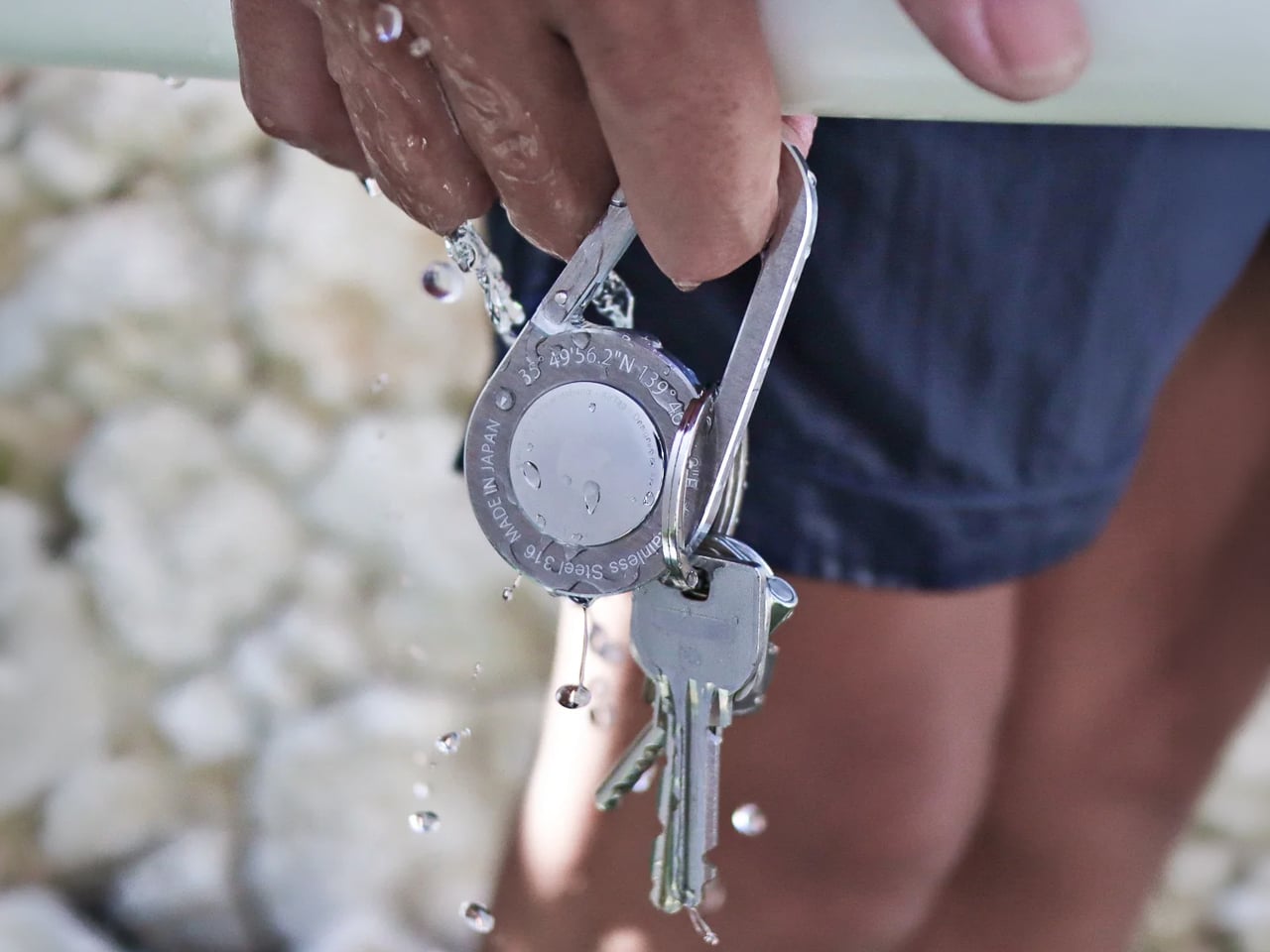
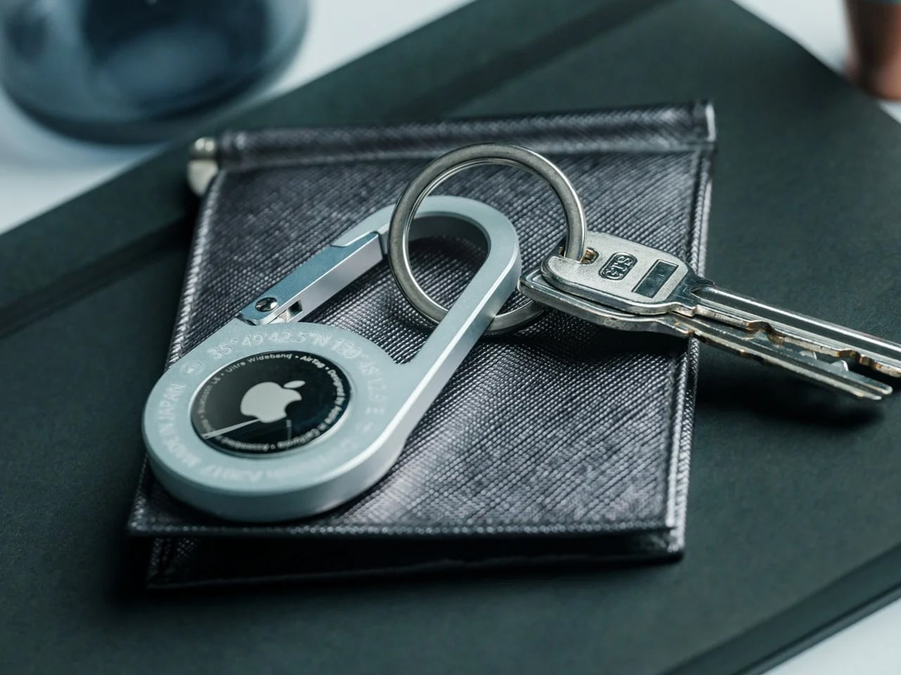
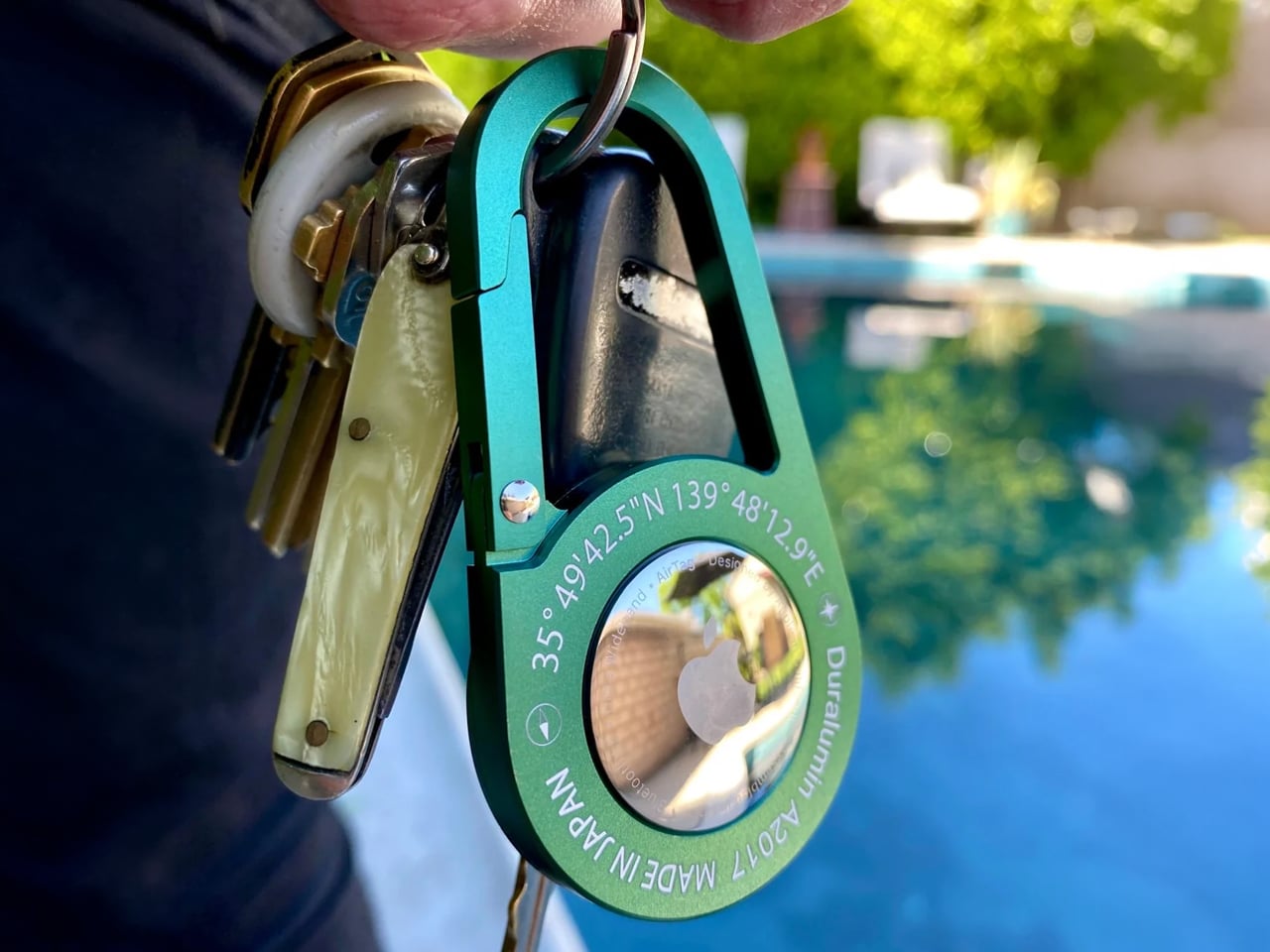
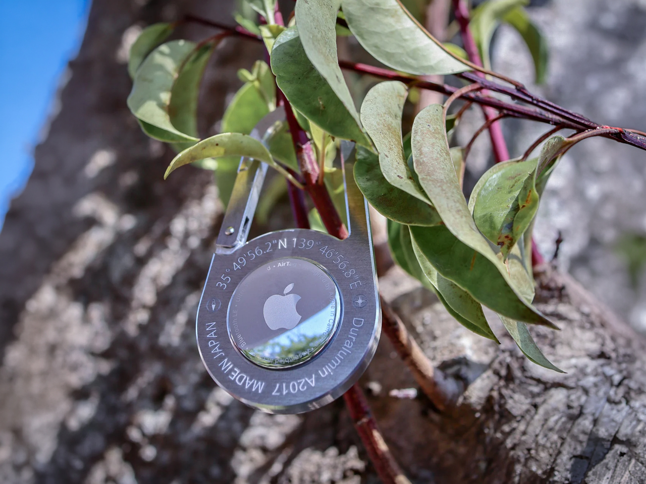
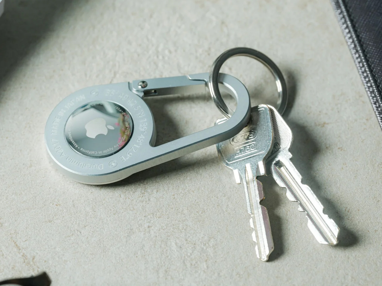
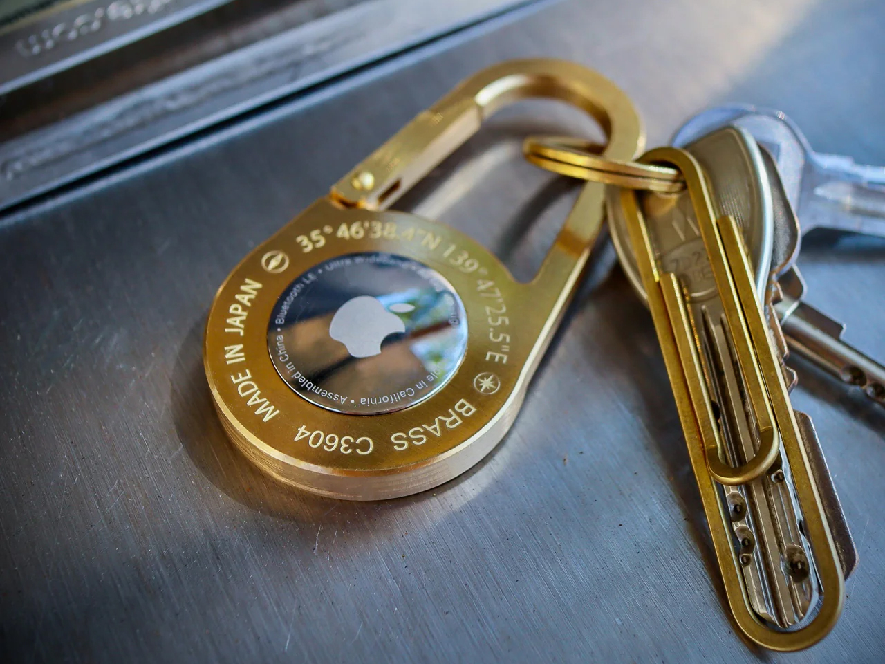
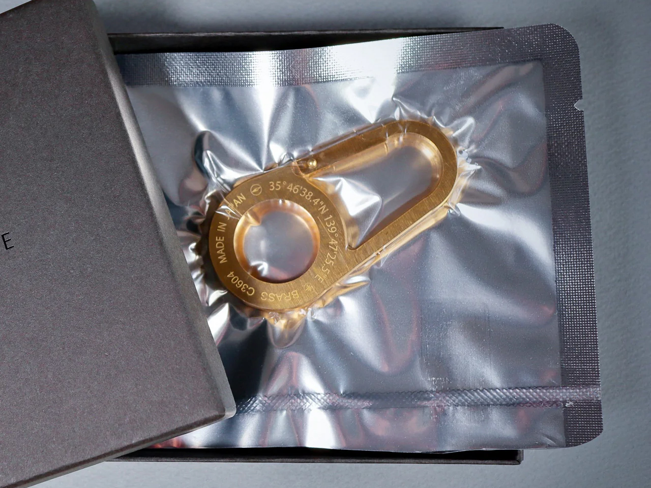
The AirTag Carabiner is made in Japan and individually hand-crafted. It comes in three materials: Duralumin composite alloy, untreated Brass, and Stainless Steel, and each variant makes a different argument for itself.
- The Duralumin at 0.59 ounces – roughly the weight of a standard coin – is for those who account for every gram in a cycling kit or trail pack. It is, practically speaking, weightless in use.
- The Brass at 1.7 ounces develops surface character over time that neither alternative will.
- The Stainless Steel at 2 ounces carries its weight as a tactile signal of permanence.
The Brass variant arrives with a warm matte surface that shifts toward a richer patina at contact points within the first few weeks of carry. The Stainless Steel reads as deliberately neutral – a finish that recedes into a bag’s existing hardware rather than competing with it. The Duralumin sits between them: a cool, slightly satin surface that holds its character rather than developing one. Each variant is visually distinct enough that the choice of material is also a choice about what the rest of the kit communicates.

Sized for Motion, Not the Display Case
At 3.1 inches by 1.6 inches, the carabiner is sized for function without excess. The 0.2-inch profile means it sits flat against a zipper pull or bag strap rather than protruding outward to snag on jacket fabric, handlebar bags, or adjacent gear in a pack. For cyclists on a commute or a weekend ride, that profile matters in motion.
For travelers moving through terminals with carry-on luggage, it is one fewer point of friction in a sequence of movements that accumulates quickly across a long travel day.
Why the Alloy Choice Actually Matters
The Duralumin alloy deserves specific attention because it is not a decorative material reference. It belongs to the same alloy class used in aircraft, spacecraft, and marine applications – a pairing of low mass and high tensile strength that explains why the carabiner weighs 0.59 ounces without sacrificing structural integrity.
Applied here, it produces a carrier suited for the conditions an active kit already operates in: salt air, rain, altitude, and the sustained mechanical stress of a clip opened and closed hundreds of times a year. This is not a material chosen for its name. It is a material chosen because its properties match the job.
What Hand Production Means at This Scale
Hand production in Japan means finishing tolerances are set by a maker, not a mold. Carrying the AirTag Carabiner’s Duralumin variant daily for three weeks made that difference concrete: the gate action is consistent across hundreds of openings, the edge quality where the alloy meets at its joins has no rough transition point, and the surface shows none of the micro-scoring that injection-molded carriers typically develop within the first month of use.
These are details that do not appear in a spec sheet and do not become visible in product photography. They register in the hand, and they compound over time. At six months of daily carry, an object built to a specification and one built to a price have separated completely.
Where It Delivers
For the weight-optimized active carry: At 0.59oz – roughly a coin’s worth of mass – the Duralumin variant adds nothing measurable to a cycling pack, trail kit, or camera bag. It is the only tracker carrier in this category that does not undo the weight discipline a considered kit has already established.
For outdoor and travel conditions: The alloy’s documented suitability for water and high-altitude environments means this carabiner performs alongside the gear it clips onto – from a salt-air coastal commute to a pressurized cabin – without corrosion or gate fatigue.
For carry coherence: The hand-finished construction and material quality place this carabiner alongside machined pens and precision wallets without asking the rest of the kit to lower its standard.
What to Factor In
The Apple AirTag is not included. At $119 starting for the AirTag Carabiner alone, the full system investment clears $150 once the tracker is added. That is the honest cost of entry and should be weighed against a kit where every other object has been selected at a comparable standard.
The weight spread across variants is significant: 0.59oz for Duralumin versus 2oz for Stainless Steel – a 3.4x difference across identical dimensions. Users attaching this to a keychain or wrist lanyard will feel that gap in daily carry and should choose their variant before ordering rather than after.
The standard for AirTag carry has been a $29 silicone loop. The AirTag Carabiner sets a different standard: machined-quality construction, aircraft-grade material, and hand finishing that holds up to daily inspection after a year of use. Whether that standard becomes the category norm depends on whether the rest of the market decides the AirTag deserves to be treated as a permanent part of the kit rather than a temporary addition to it.
The AirTag Carabiner is available now starting from $119 at Yanko Design.
The post The Ugliest Thing in Your EDC Kit is your AirTag. This Japanese Carabiner Finally Fixes That first appeared on Yanko Design.