Most desk organizers are an afterthought. You buy one because your pens are rolling off the edge or your sticky notes have formed some kind of autonomous colony, and you just need something, anything, to contain the chaos. The result is usually a sad plastic tray that technically does the job but adds nothing to the room. That’s what makes Mirko Romanelli’s KOMBO concept genuinely worth paying attention to. It’s a desk organizer that actually looks like it was designed.
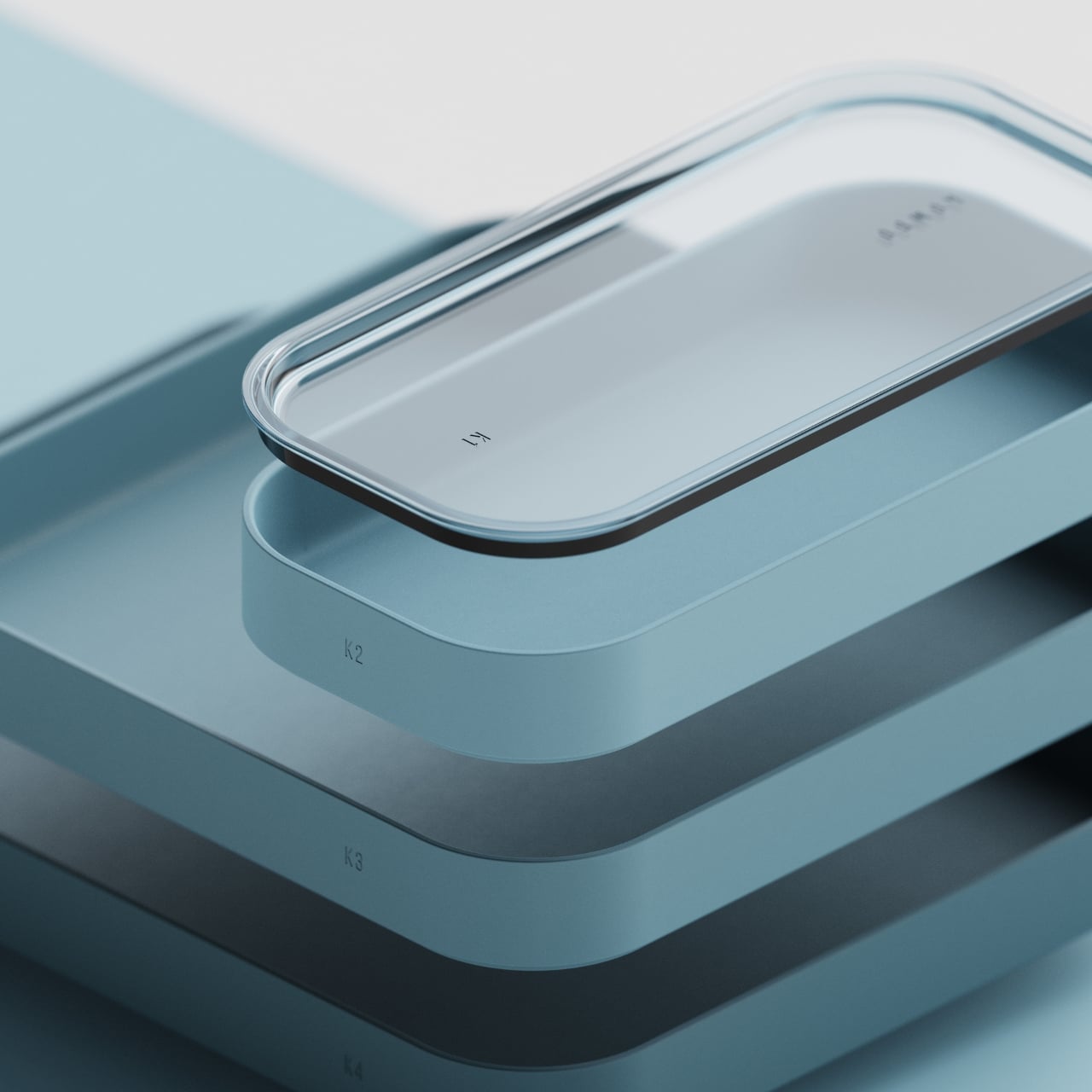
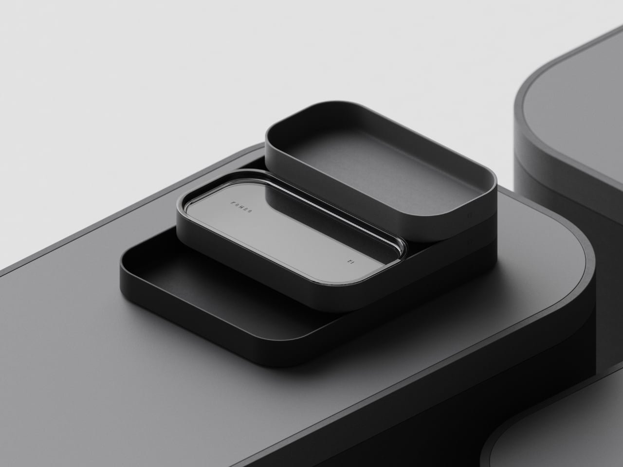
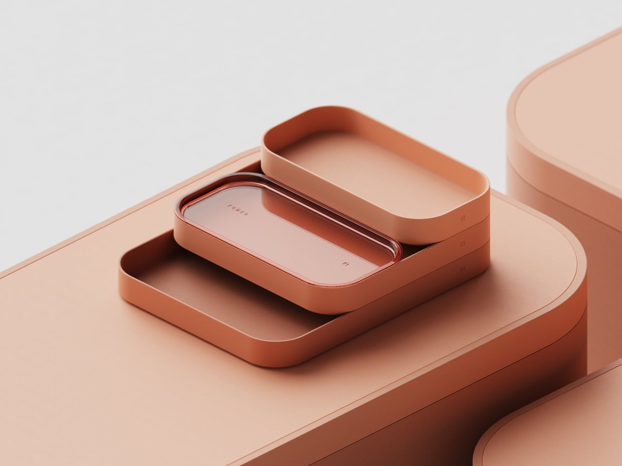
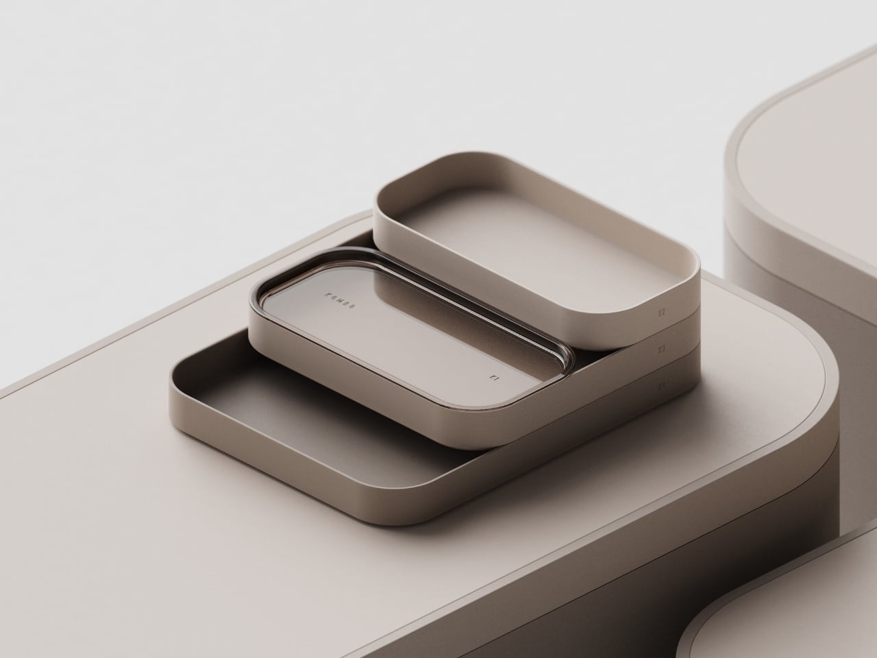
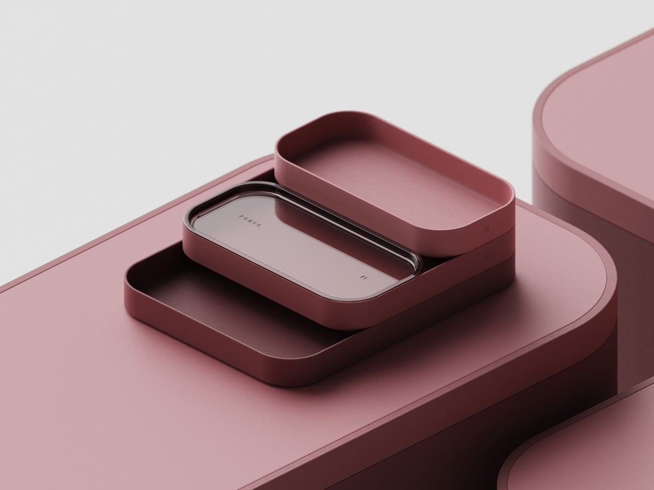
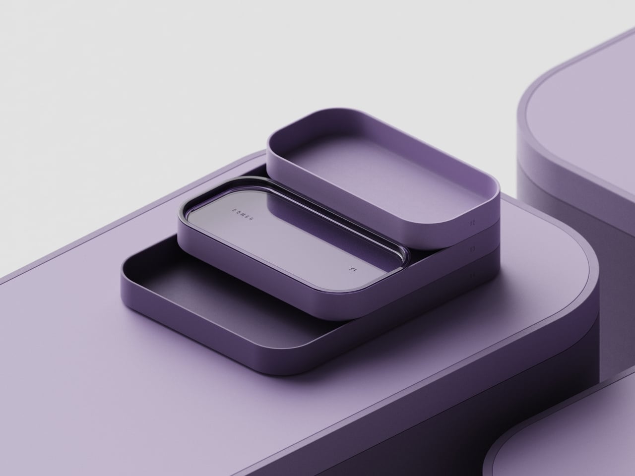
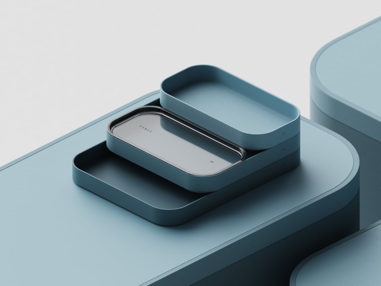
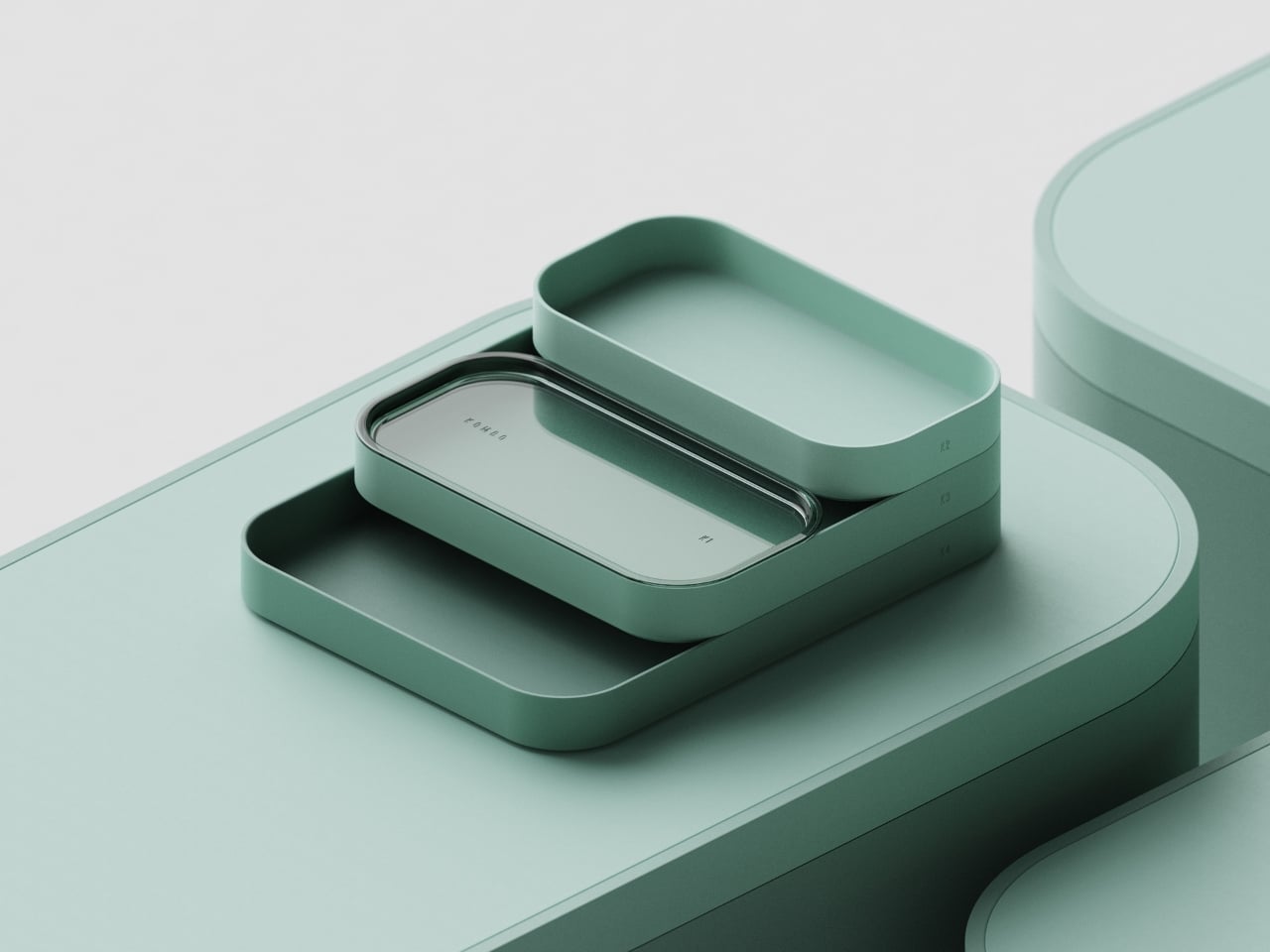
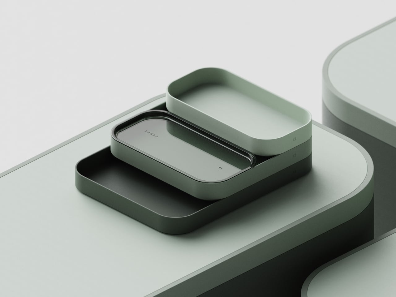
KOMBO is a concept by Florence-based product and industrial designer Mirko Romanelli, and the first thing that strikes you when you see it is the shape language. Every single piece in the system uses the same deeply rounded rectangle form. Not slightly rounded corners, but corners so soft and generous that the pieces read almost like smooth stones. The silhouette has that superellipse quality that makes you want to pick it up just to feel the edge in your hand. Sharp angles are entirely absent, and the effect is immediately calming in a way that most workspace products never manage.
Designer: Mirko Romanelli
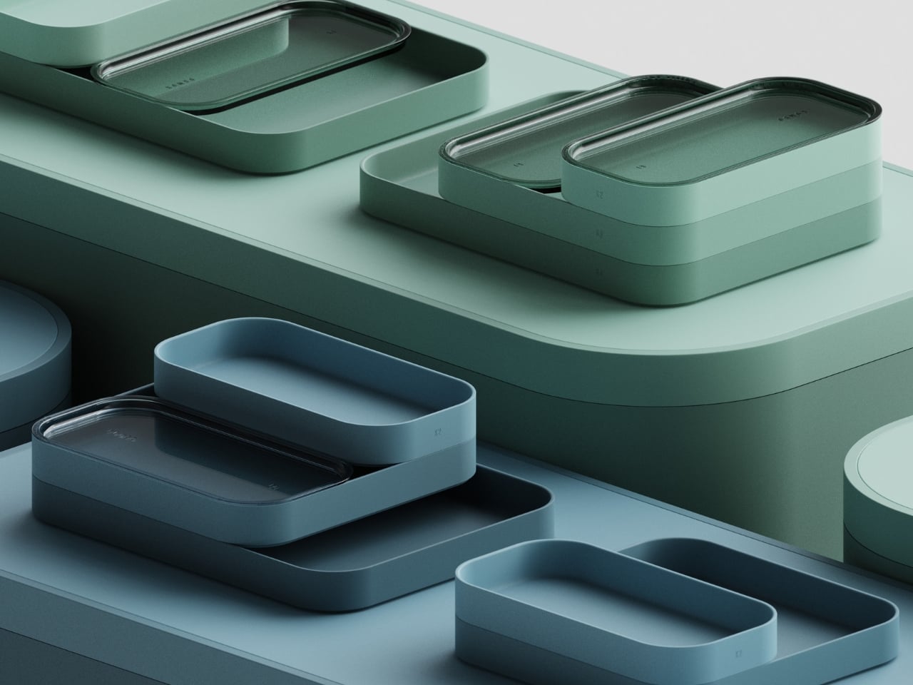
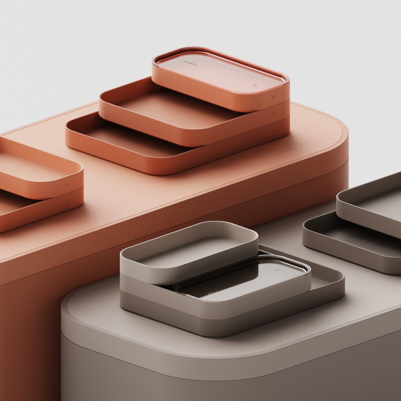
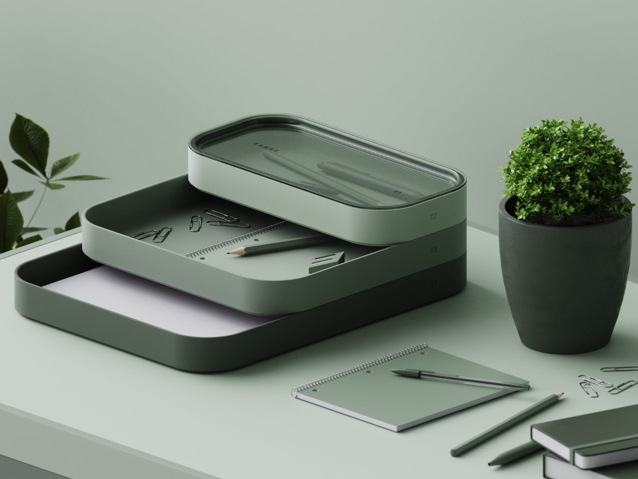
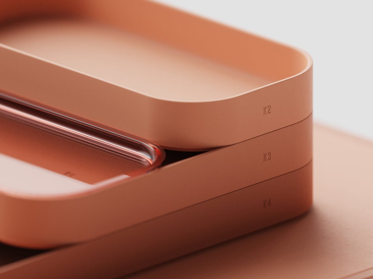
The system is made up of modular trays that stack into a tiered structure, labeled K1 through K4. Each layer is a different depth, creating a step-like formation when assembled that unmistakably echoes the terraced rice fields of China’s Yuanyang and Yunhe regions that inspired the concept. Romanelli wasn’t being abstract with that reference. You can see it plainly: the way the pieces descend in size from a wide, flat base mat up to the smallest top compartment mimics exactly how those agricultural terraces look when viewed from above. The poetry of that connection is that it works even if you’ve never heard the backstory.
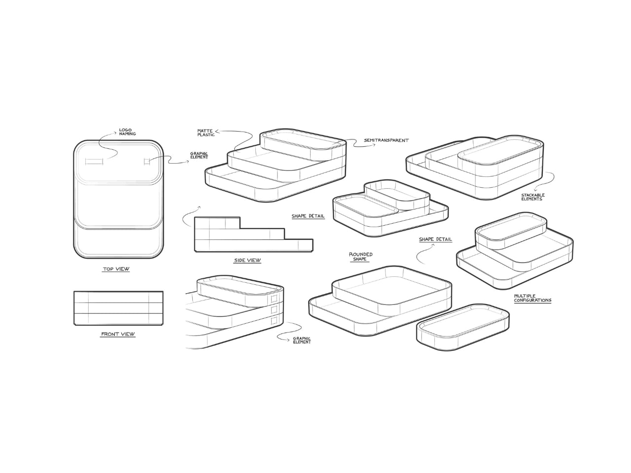
The base layer is notably generous, a large flat mat with that same softly rounded edge running all the way around. It grounds the whole composition and gives the stacked pieces above it a stage to sit on. The trays above vary in height, allowing different categories of items to nest within different depths. A slim tray for paper and documents. A deeper one for pens and clips. The hierarchy makes sense without needing instructions.
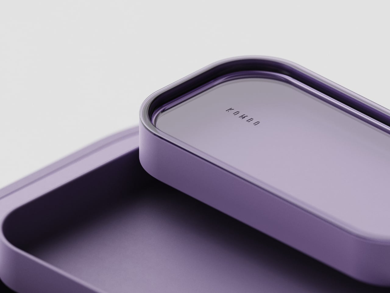
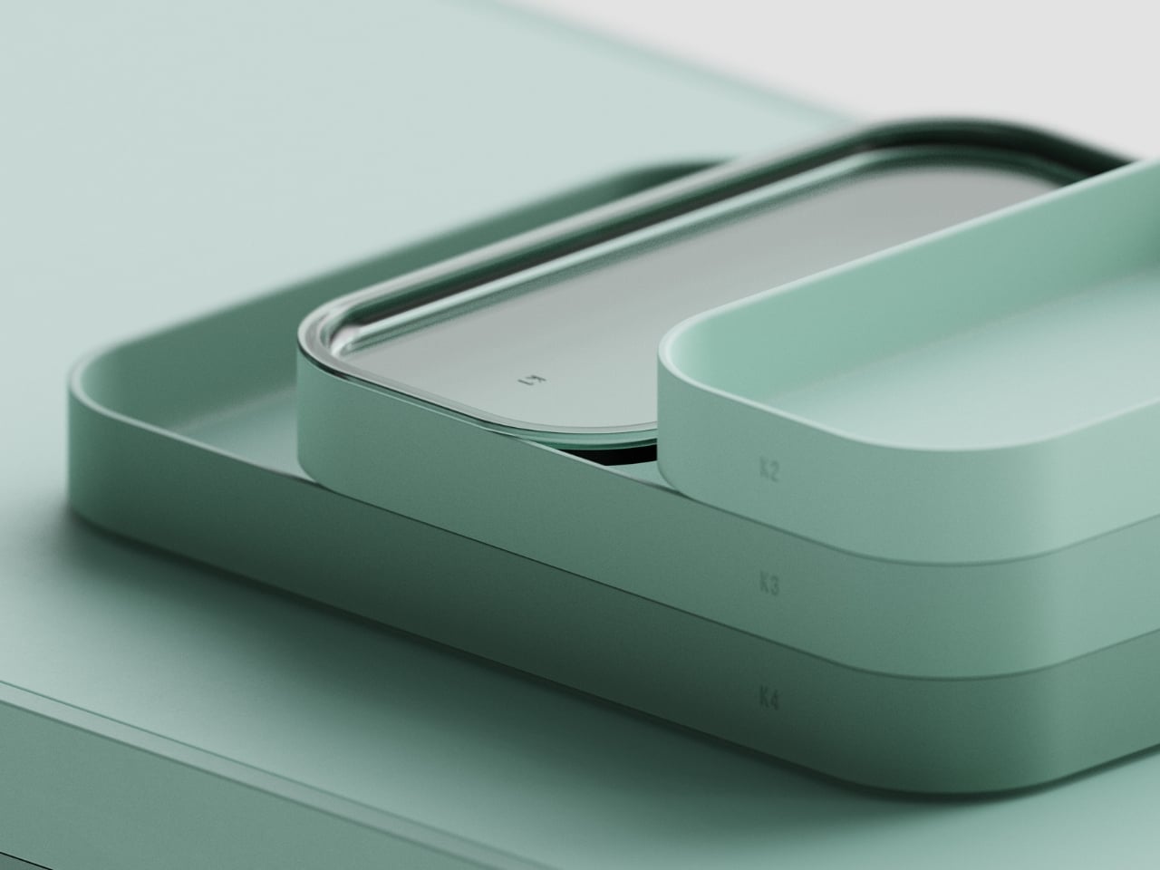
The standout detail in the system is the K1 module: a small compartment topped with a clear, transparent lid. It’s a subtle material contrast that breaks the otherwise monochromatic look in the most restrained way possible. The transparency lets you see what’s inside without opening it, and it also catches light differently from the matte surfaces below it. Small decisions like that are where considered design separates itself from generic product design.
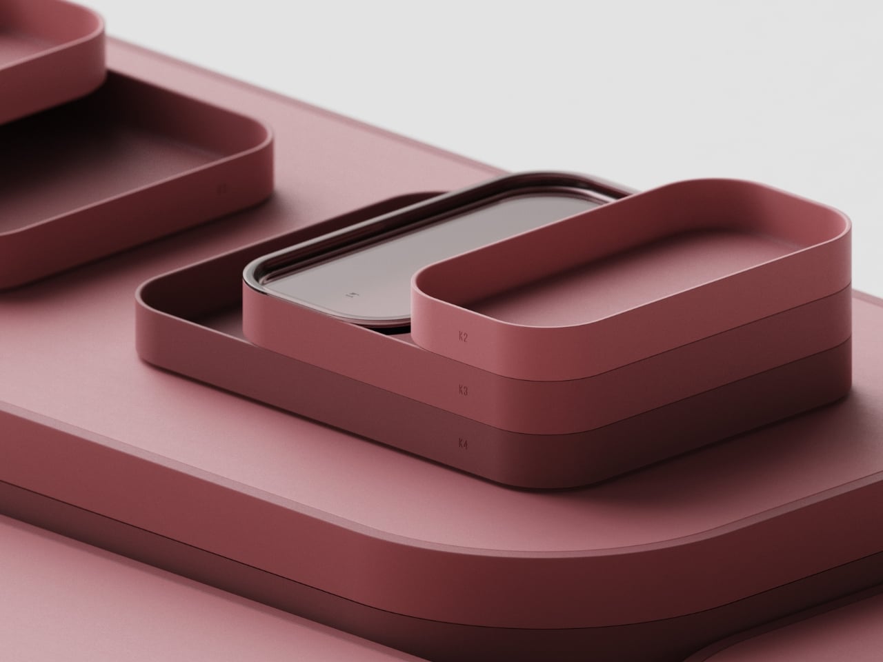
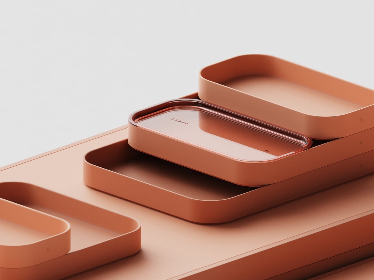
And those matte surfaces deserve their own mention. The finish across all pieces is smooth and consistent, almost velvety in the renders, with no visual noise or texture competing for attention. The whole thing operates in a single color per colorway, which is a bold choice that pays off. Romanelli presents KOMBO in a set of tonal palettes: a dusty slate blue, a warm terracotta, a deep mauve, and a soft sage green. Each one feels considered rather than arbitrary. The blue reads as cool and focused. The terracotta feels warm and lived-in. The sage is the obvious crowd-pleaser, and you can see why. Every version reads as the kind of object that belongs on a desk you’re proud of, not just a desk you tolerate.
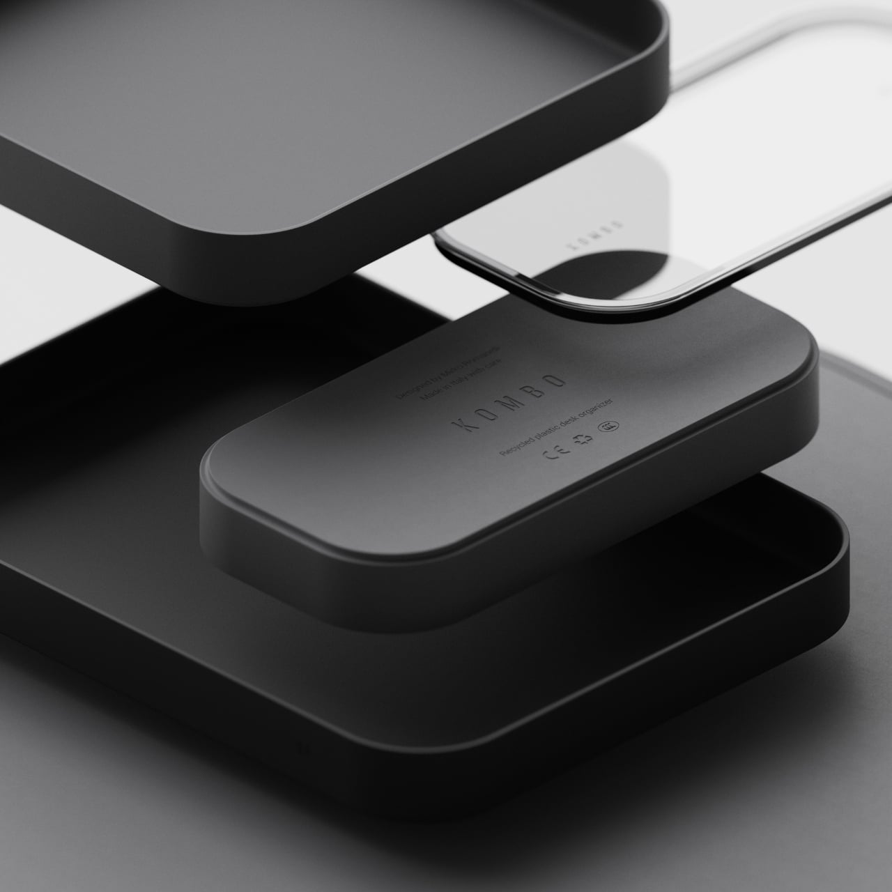
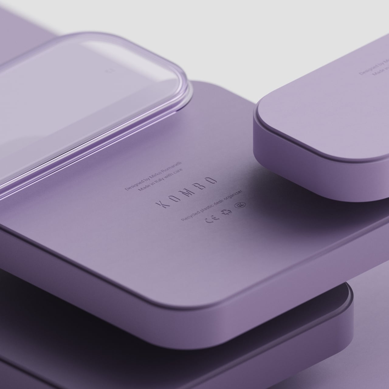
The material is recycled plastic throughout, and it’s worth saying that you wouldn’t know from looking at it. The construction doesn’t announce its sustainability credentials in any visual way. It’s just a well-made thing that happens to be made responsibly.
KOMBO is still a concept, which is one of the more frustrating things about covering design at this level. You see something that clearly has a market, clearly has the craft, and clearly has the visual coherence to succeed on shelves, and it simply isn’t there yet. Romanelli has built something that understands a simple truth: the objects you put on your desk shape how you feel about the hours you spend there. That’s not a small thing to get right.
The post The Desk Organizer That Looks Like a Rice Field first appeared on Yanko Design.