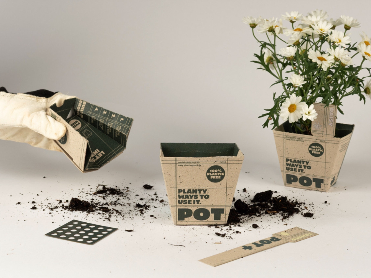
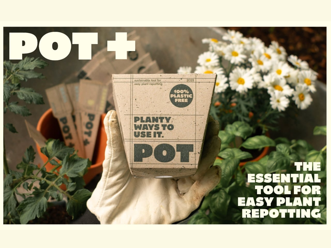
The plant pot is not a product most people think about reinventing. It holds soil, it sits on a shelf, and eventually you wrestle it off the root ball and toss it in a bin. End of story. But three design students from Münster School of Design looked at that ordinary object and saw something worth fixing, and the result is POT+, a 3-in-1 recyclable cardboard plant pot that manages to be both surprisingly clever and genuinely necessary.
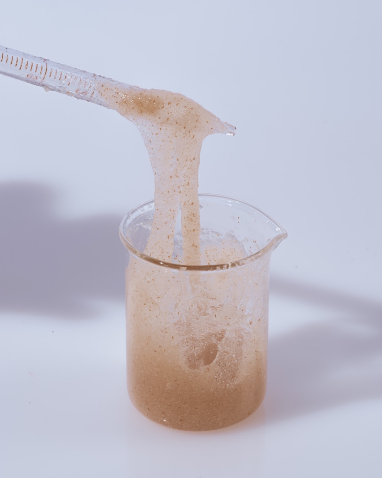
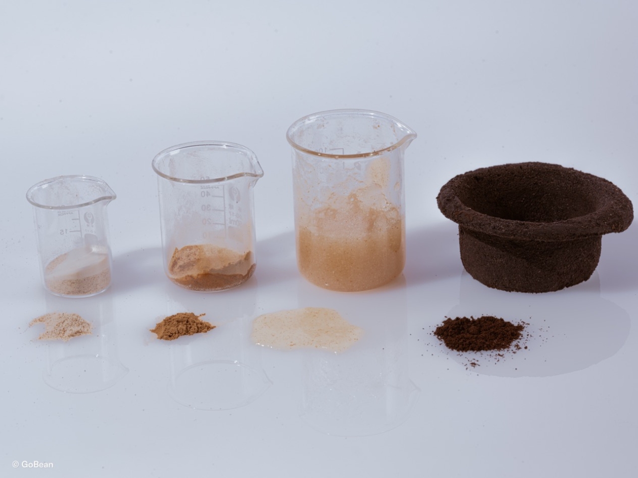
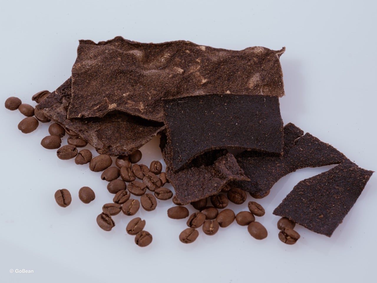
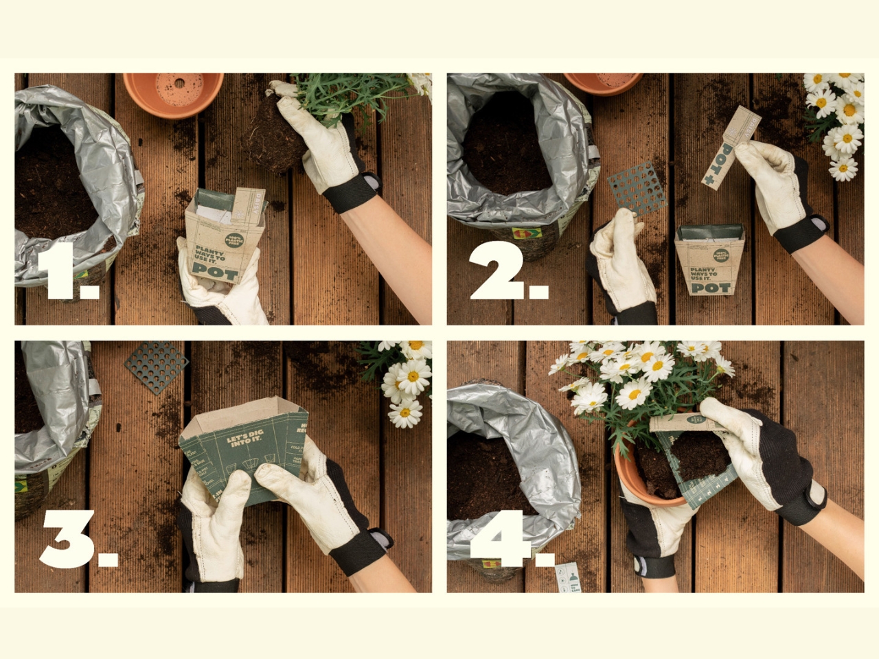
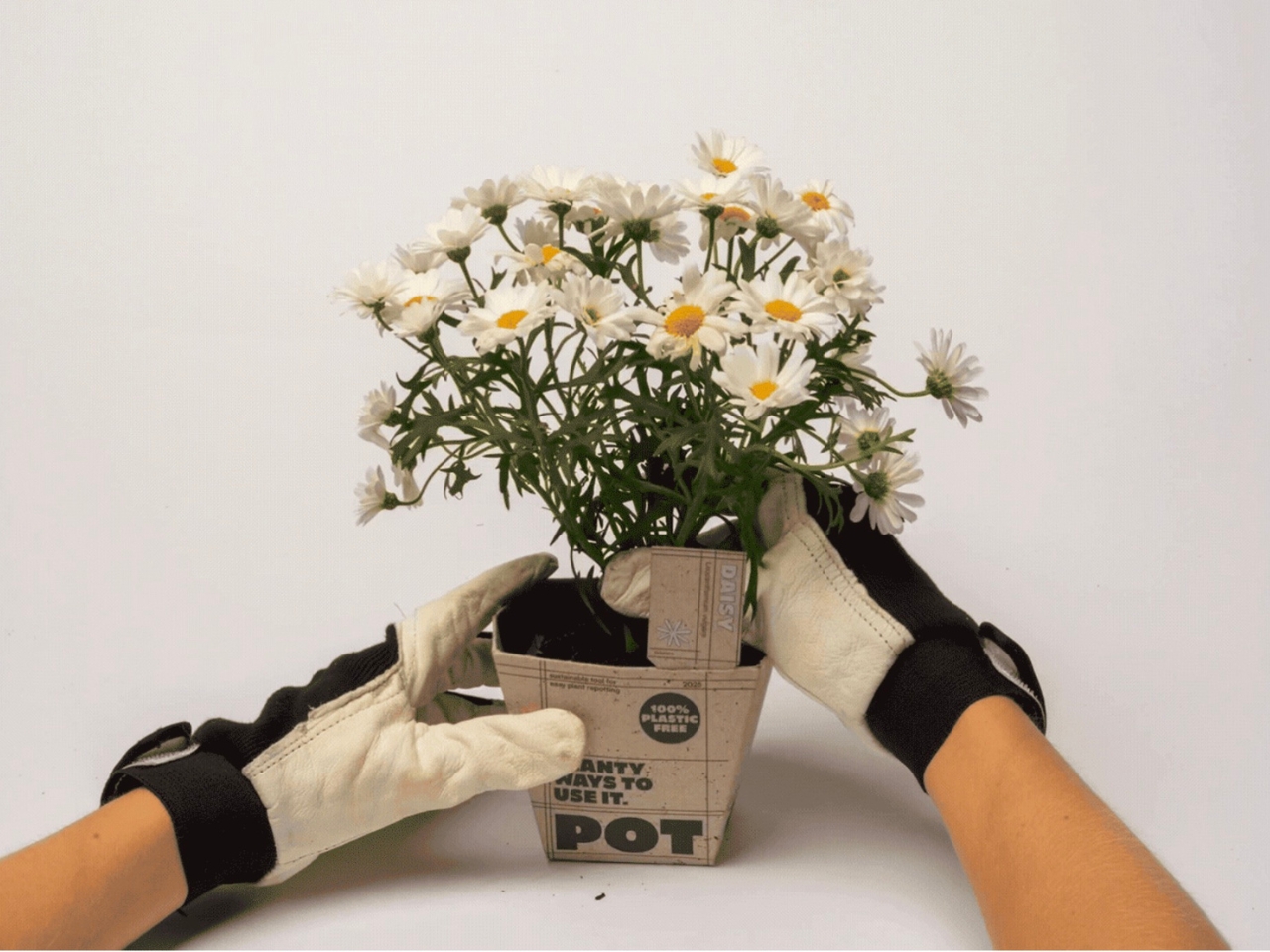
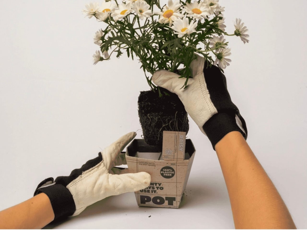
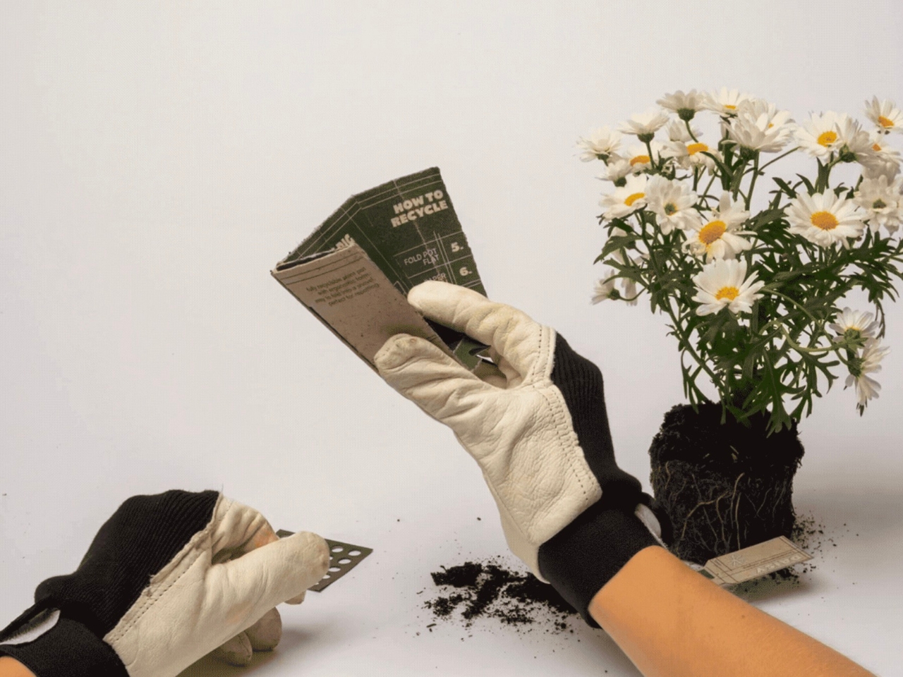
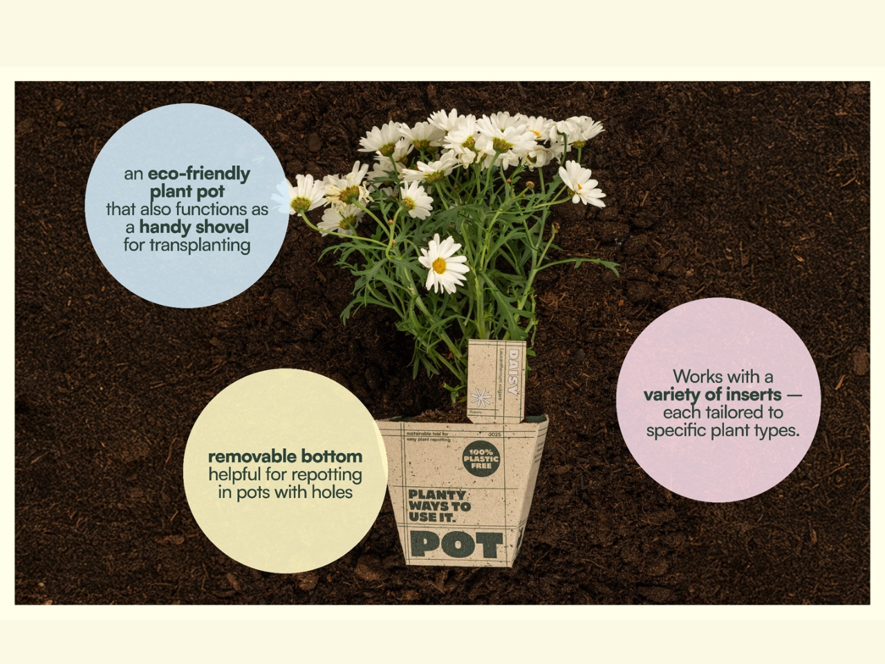
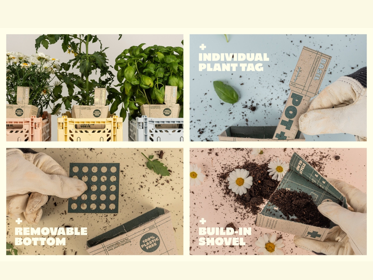
Sophie Greif, Paul Sommerfeld, and Paula Storm developed POT+ over just eight weeks as part of a course on sustainable cardboard packaging. Eight weeks is not a lot of time. It barely covers a single design iteration at most studios, which makes what they produced even more impressive. The concept is straightforward: a biodegradable, glue-free cardboard pot that doubles as a scoop and includes a built-in plant tag. Three tools, one object, zero plastic.
Designers: Sophie Greif, Paul Sommerfeld and Paula Storm
The plastic plant pot problem is bigger than most of us realize. Most of those thin, flimsy pots that come with supermarket herbs or garden centre annuals are not recyclable. They fall into a category of plastics too contaminated with soil and organic material to process properly, so they end up in landfill. Billions of them, every year. Environmental groups have flagged this as one of the garden industry’s most persistent and overlooked waste problems, and yet the plastic pot has remained almost entirely unchanged for decades. We have essentially built a throwaway infrastructure around plants, which is a genuinely bizarre thing to do for products sold in the name of nature.
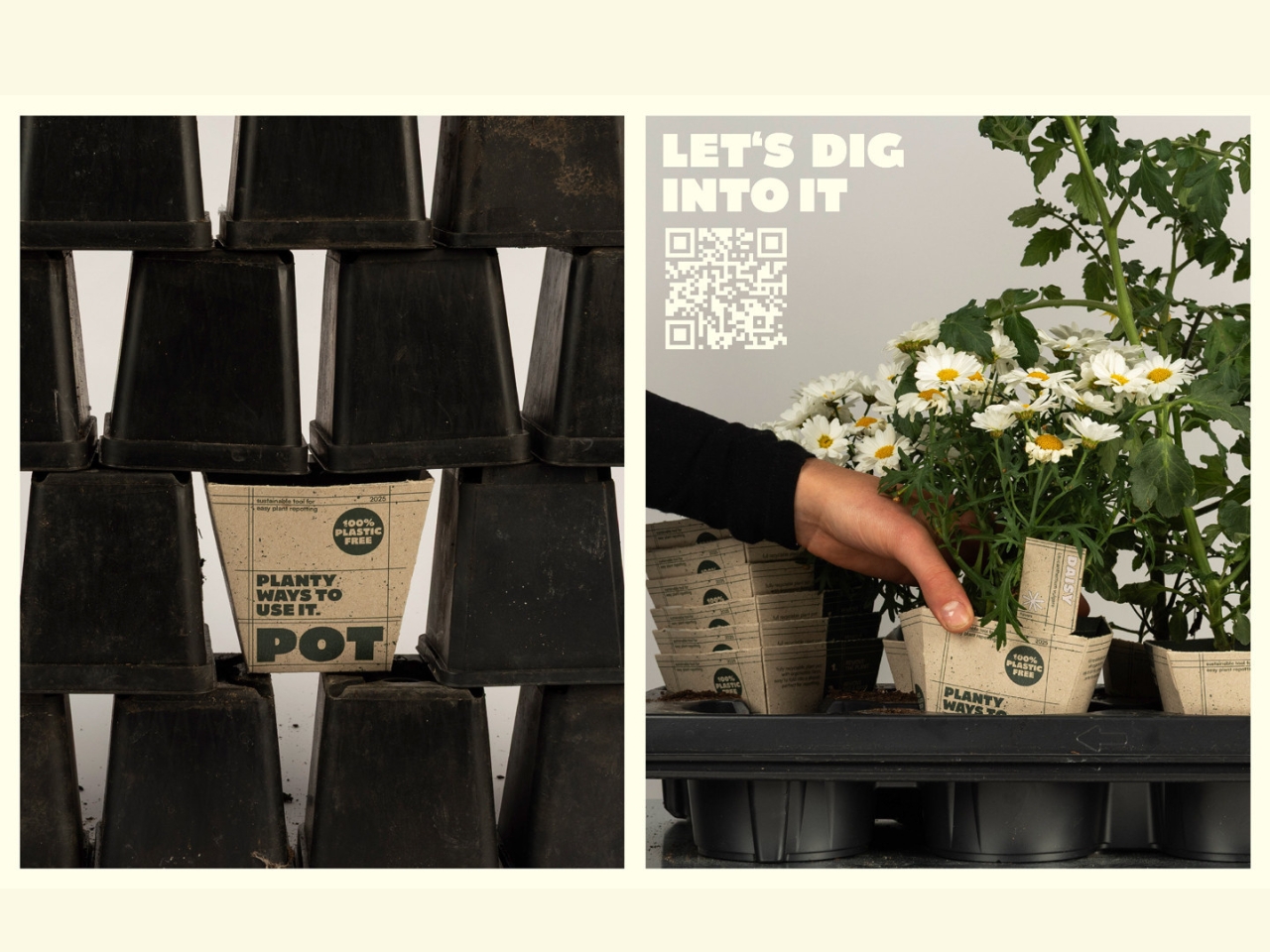
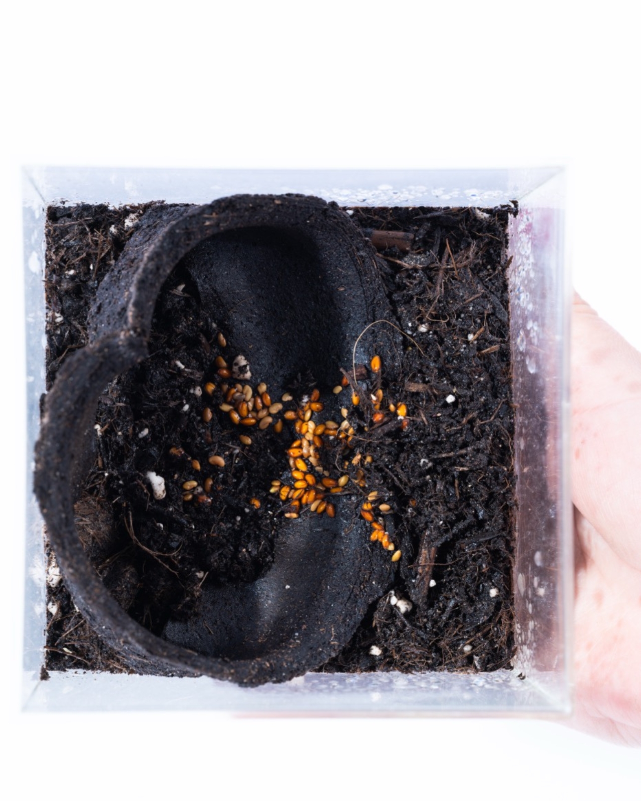
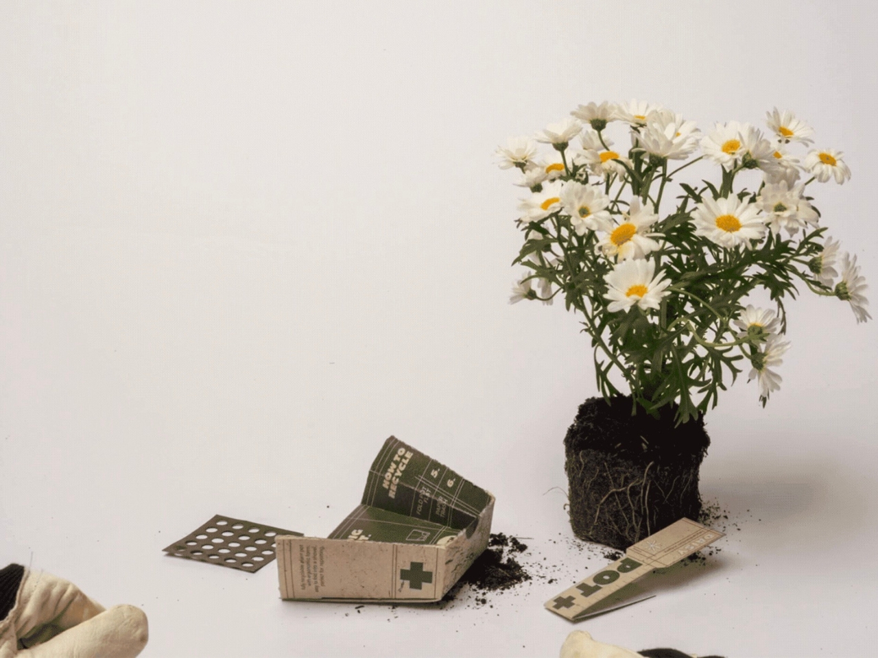
POT+ addresses this directly and without fanfare. Made from 100% recyclable cardboard, it can be tossed straight into the paper recycling bin after use. It is water-resistant and stable for up to two weeks, which covers the window between purchase and repotting for most plants. Beyond that, the ergonomic design and integrated scoop make the actual task of repotting cleaner and easier. And the built-in plant tag is one of those small details that makes you wonder why it was not always part of the package. Anyone who has scratched a plant name on a popsicle stick and promptly lost it will know exactly what I mean.
What strikes me about POT+ is how it reframes the idea of sustainable design. So much green design falls into the trap of asking people to change their behavior significantly in exchange for a smaller environmental footprint. POT+ does not do that. The user experience is genuinely better: fewer tools to fumble with, a biodegradable pot that sidesteps the recycling bin debate, and a plant tag already built in. The sustainability is incidental from the user’s perspective, even though it is clearly the central intention from the designers’.
That alignment between good design and ethical design is harder to achieve than it looks. Students are often praised for one or the other, but rarely both. Sophie, Paul, and Paula merged perspectives from Communication & Product Design and Media & Product Design, which likely accounts for the final product feeling as considered in its branding as it is in its function. POT+ has a clear identity. It looks intentional, not experimental.
The Green Product Award recognized it for good reason. But the more interesting conversation is about what POT+ signals for design education. Eight weeks, three students, three different disciplines, and a finished concept that could genuinely replace a product category. That is not a student project in the diminutive sense of the phrase. It is the kind of outcome that most professional design teams would be proud to put their name on.
The plastic plant pot has been a quiet environmental problem for decades, hiding in plain sight because it is so mundane, so ubiquitous, so easy to overlook. POT+ does not try to be remarkable. It just quietly gets the job done better. And right now, that might be the most useful kind of design there is.
The post 3-in-1 Cardboard Pot Just Made Plastic Pots Obsolete first appeared on Yanko Design.