Water purifiers are practically mandatory in modern Indian homes, but for a category that handles something as critical as drinking water, they’ve never been particularly pleasant to live with. Most demand frequent service calls that add to their long-term cost, look like they were designed to be hidden under a counter, and turn something as simple as filling a bottle into a minor exercise in patience.
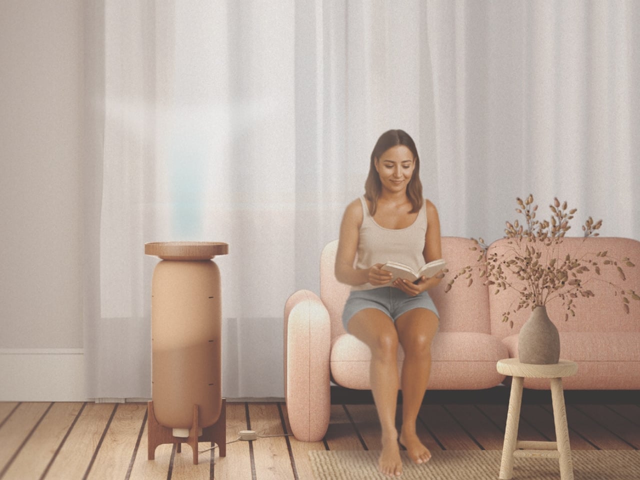
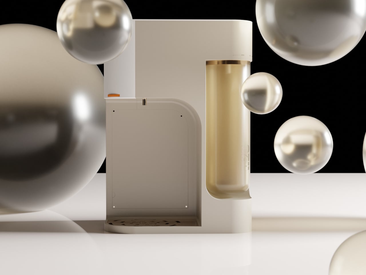
ATHERIA is a smart water purifier concept designed for modern Indian households, and it approaches the problem from multiple angles at once. Rather than improving a single element, it takes aim at several everyday friction points simultaneously, from how the unit looks on a kitchen counter to how easy it is to fill a bottle, replace a cartridge, or check water quality.
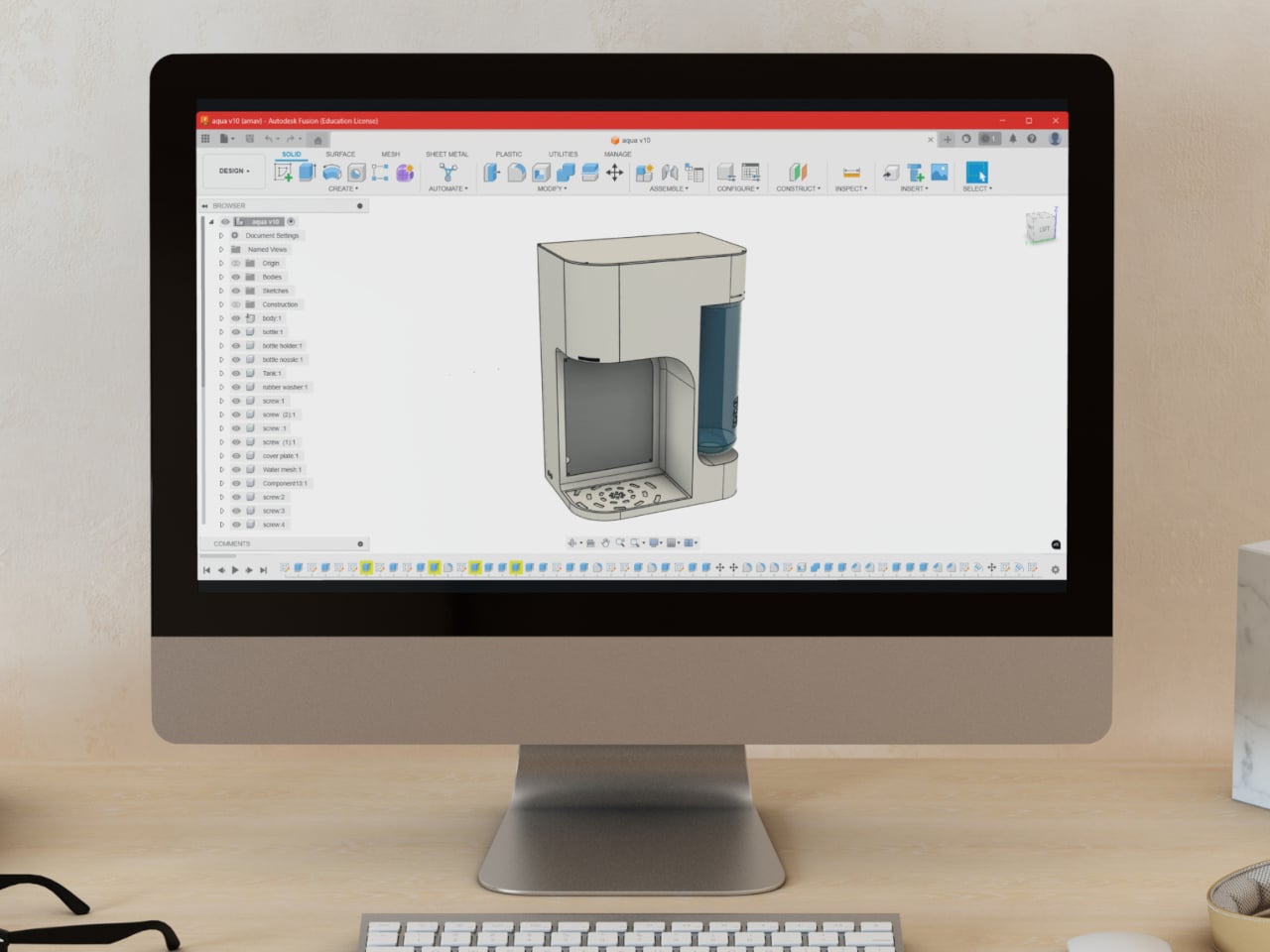
Designer: Arnav Ashwin


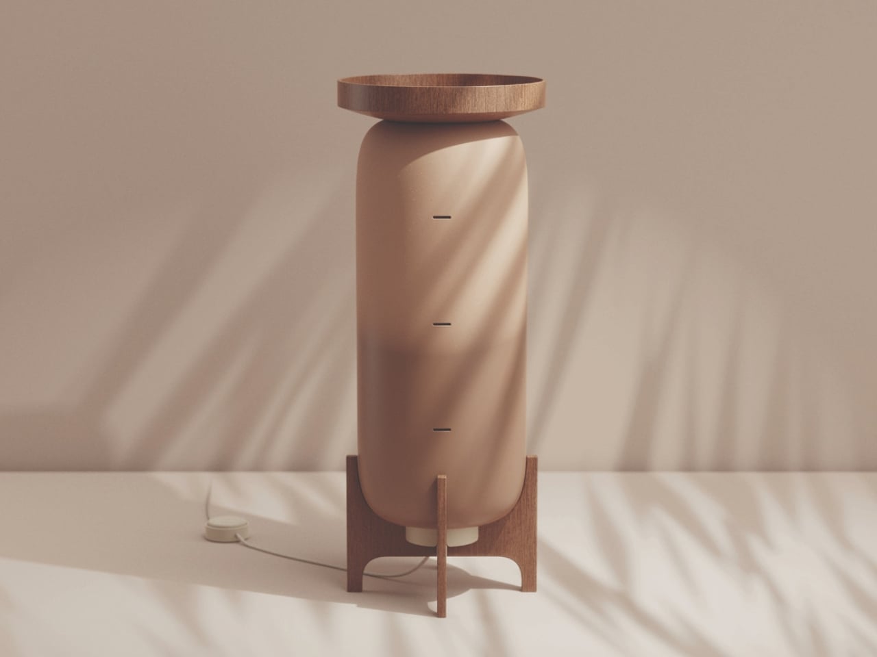
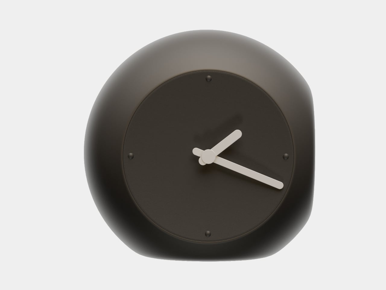
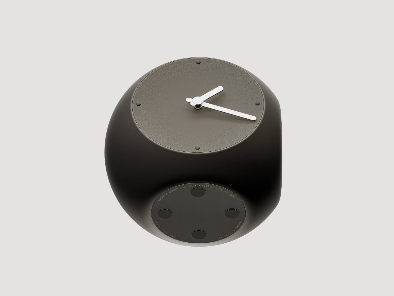
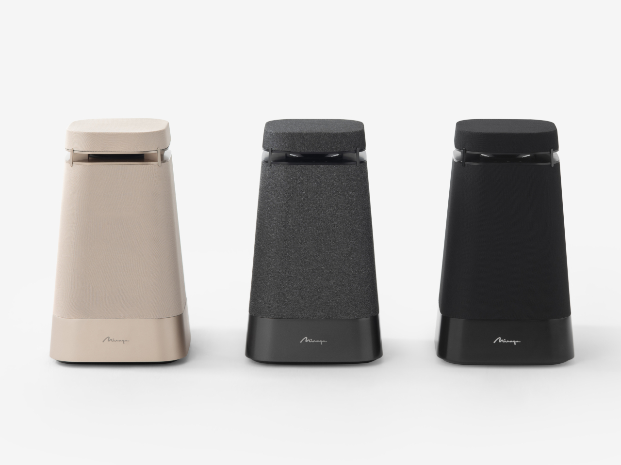
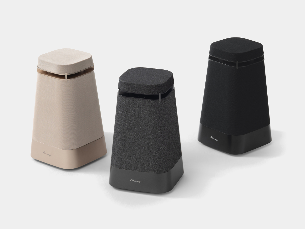
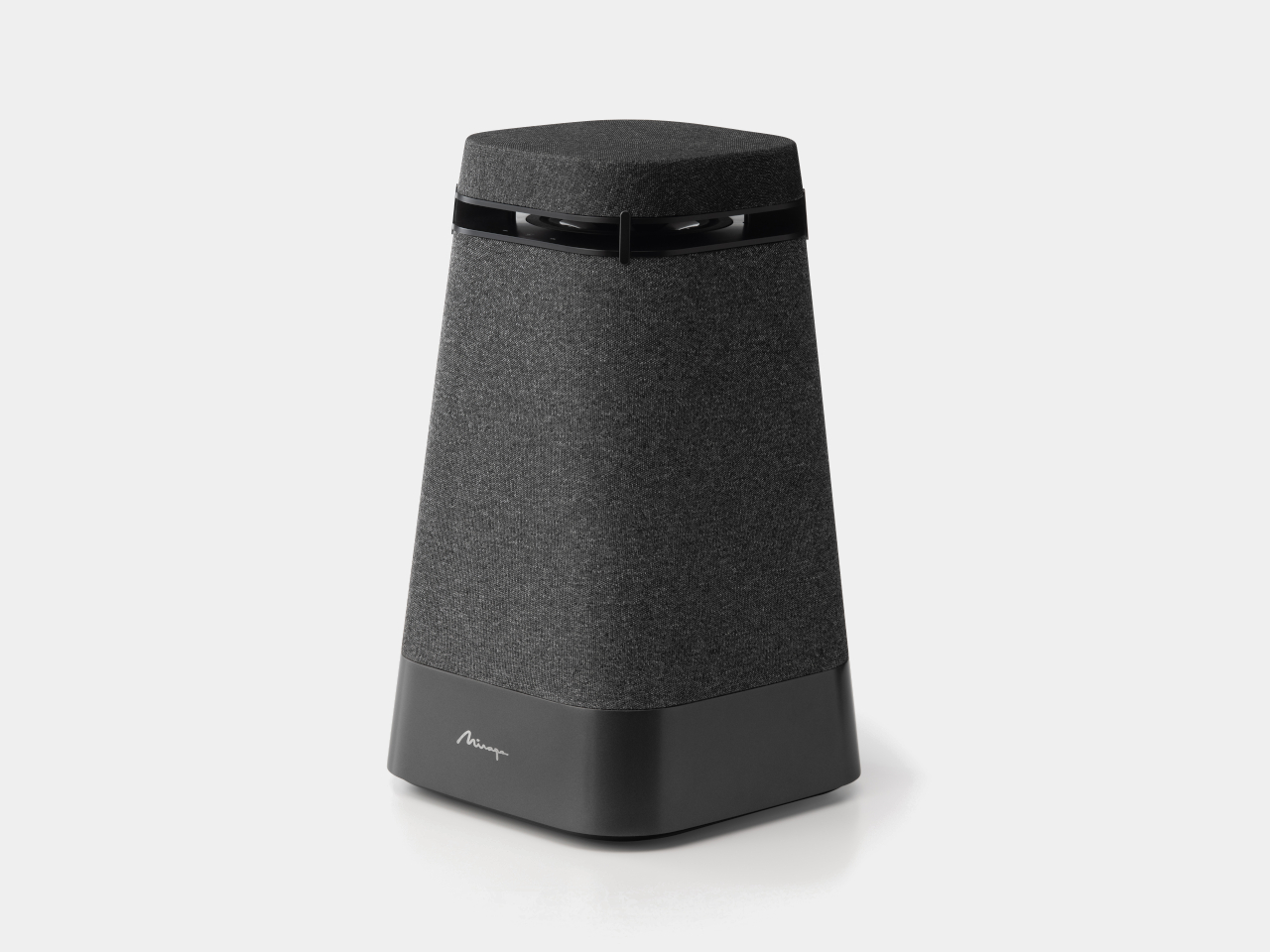
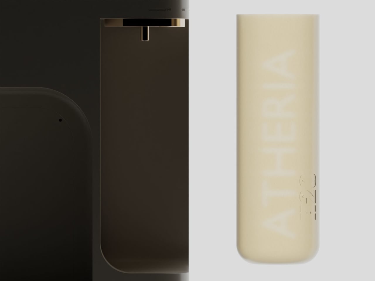
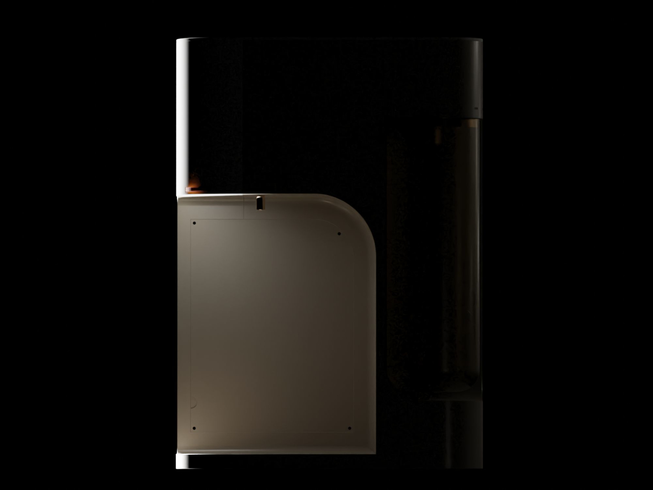
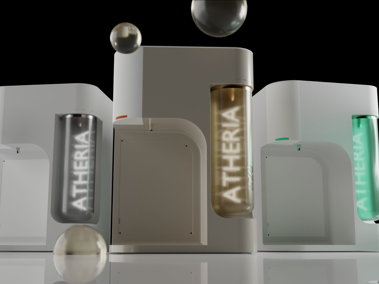
The design draws from Japandi principles, a blend of Japanese minimalism and Scandinavian sensibility focused on warmth, simplicity, and craftsmanship. The result is a compact, rounded purifier with a warm taupe and gold finish that reads more like a considered kitchen appliance than a water treatment machine. It comes in multiple colorways and sits on a countertop without dominating the space around it.
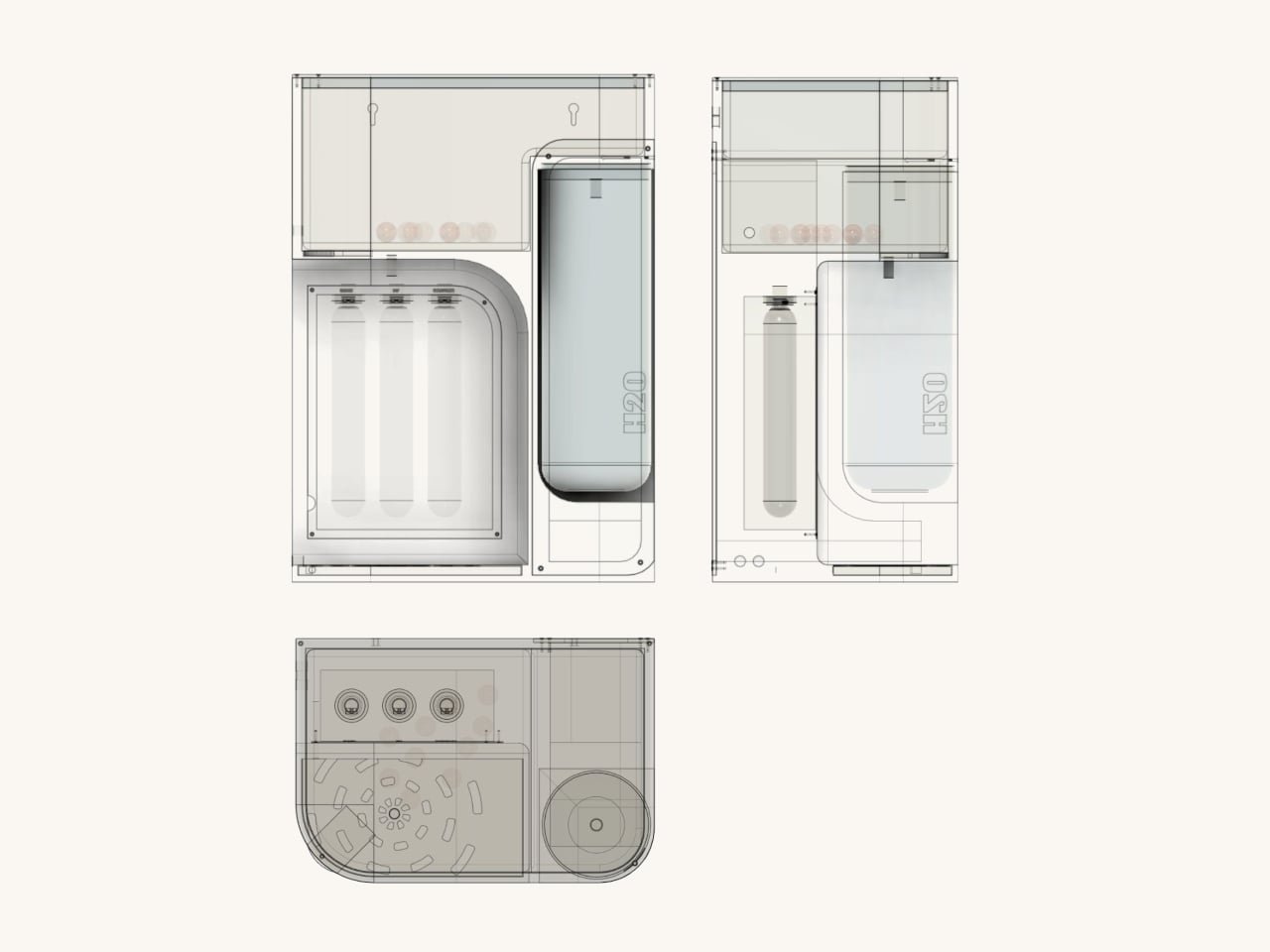
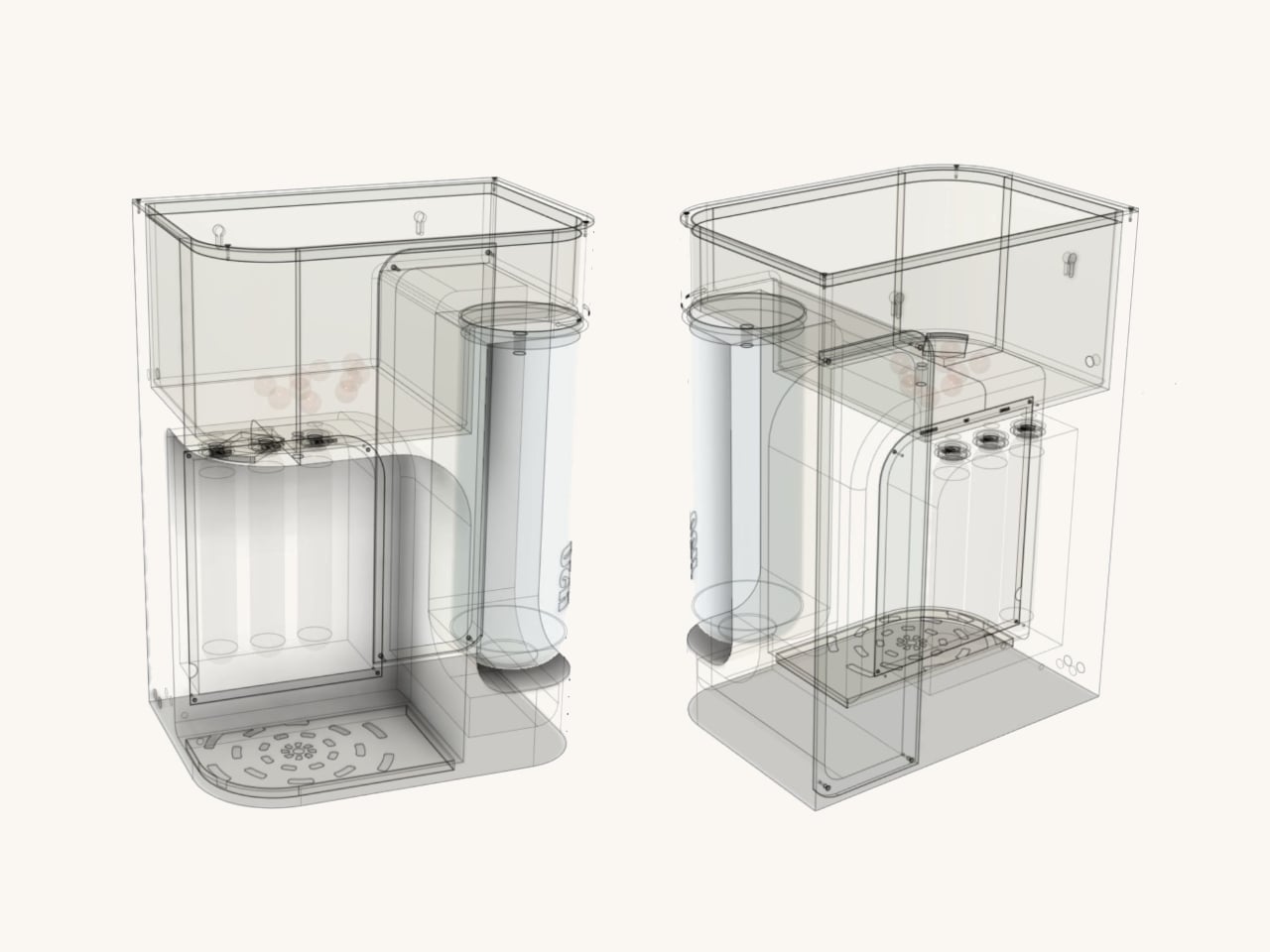
One of the more thoughtful additions is a 2.5-liter secondary detachable container. Filling a bottle or a cooking pot directly from a purifier tap can be slow and awkward, especially mid-cook. The container solves this by letting you pour pre-filled water directly into whatever you need, then reattach it to the purifier, which refills it automatically using analog weight sensors.
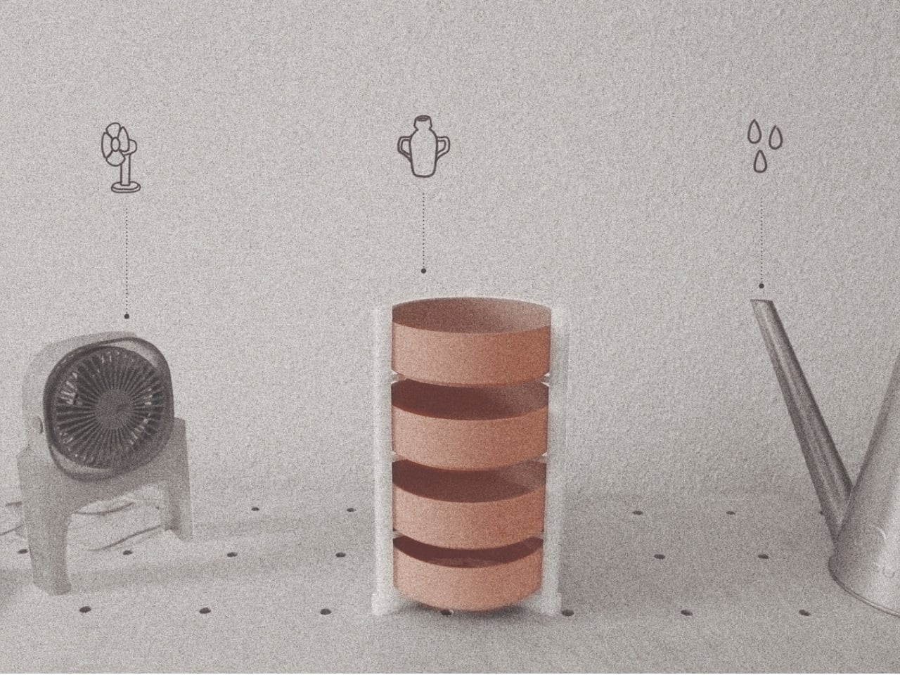
ATHERIA’s three-stage filtration runs water through a carbon filter to remove odors and larger particles, then a dual-gradient polypropylene membrane for finer sediment, and finally a UV filter to eliminate bacteria, viruses, and other microorganisms. The membrane’s efficient design reduces repeated filtration passes, conserving water in the process, which directly addresses a concern shared by 64% of users surveyed during the design research phase.
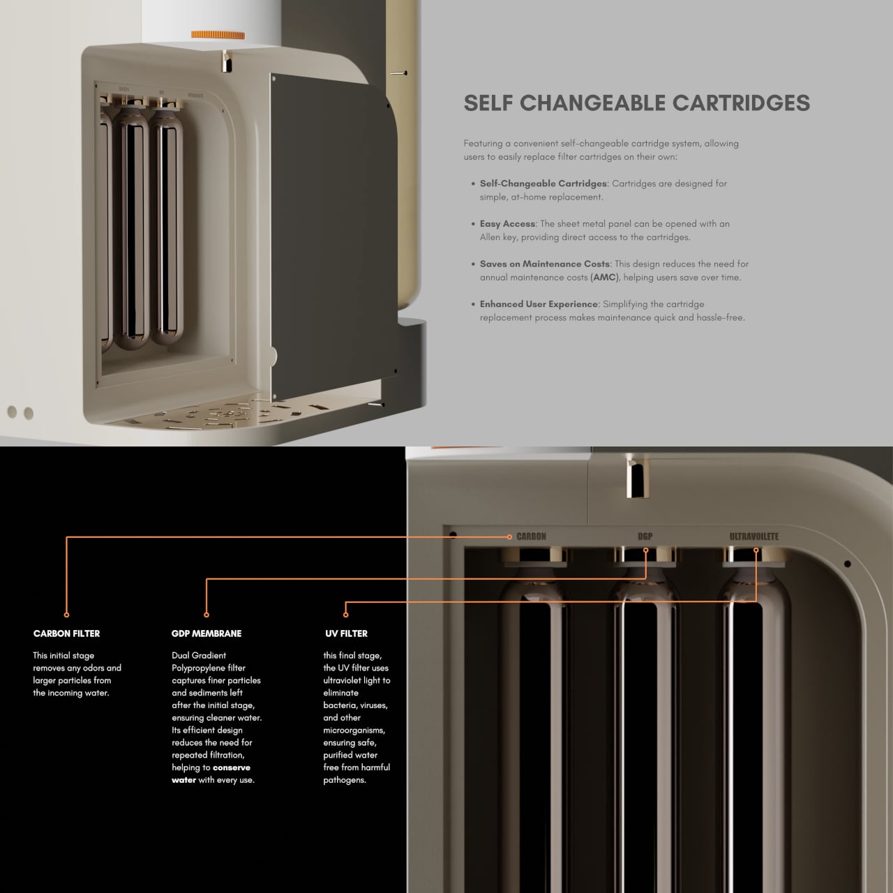
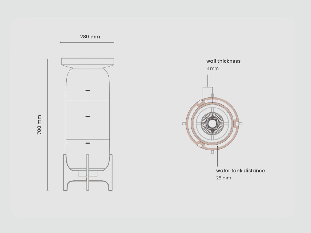
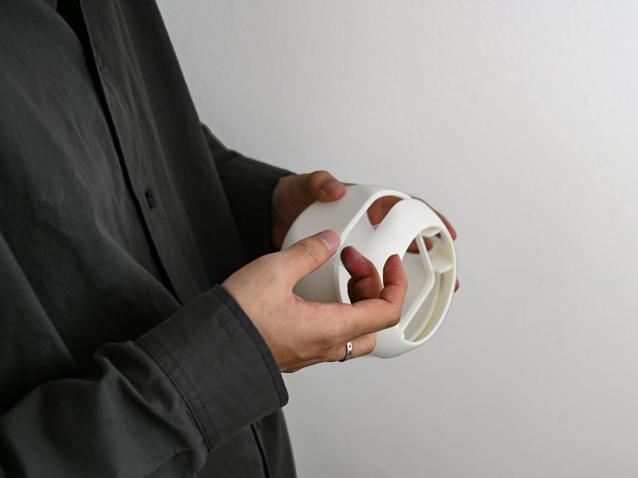
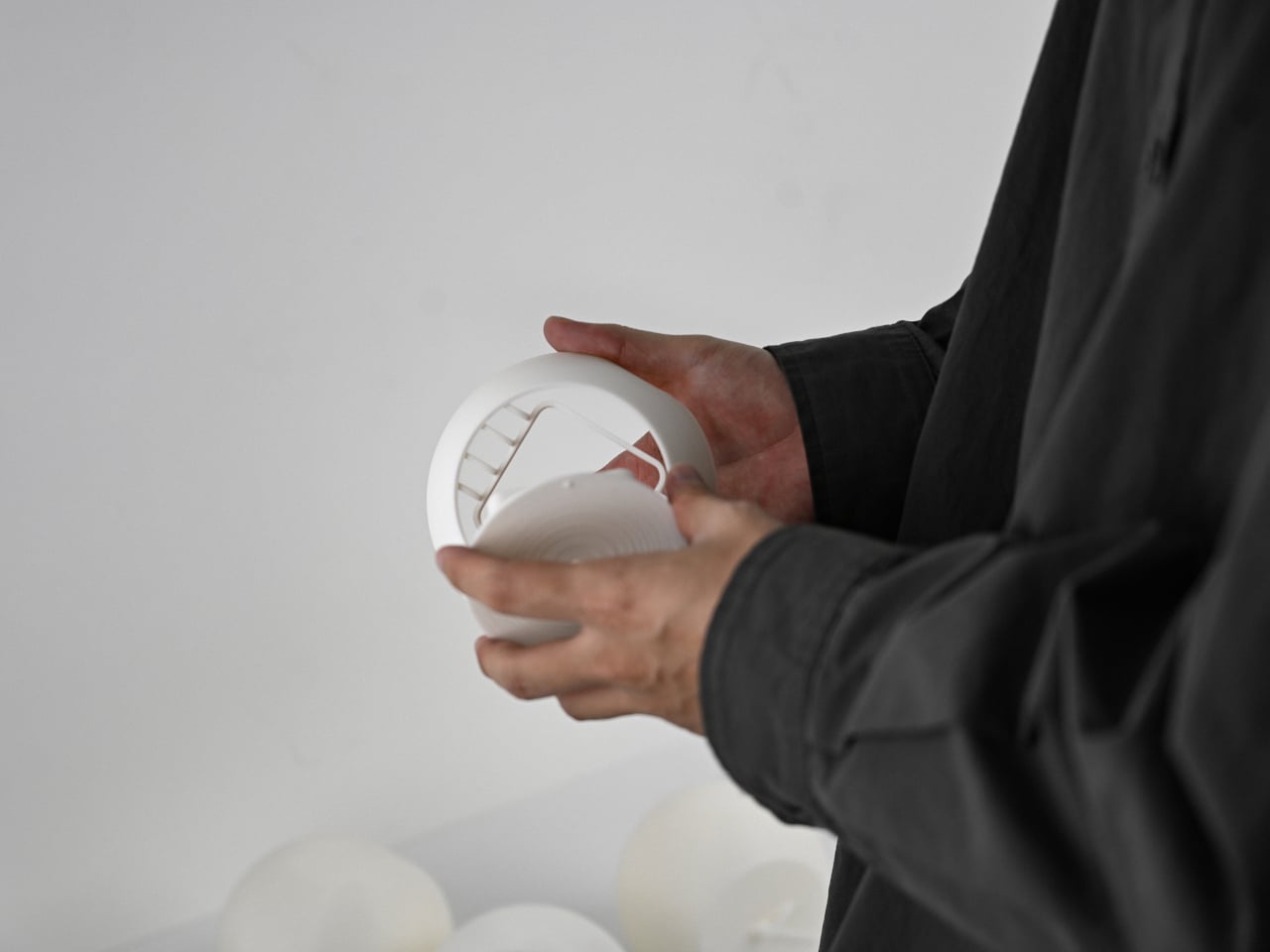
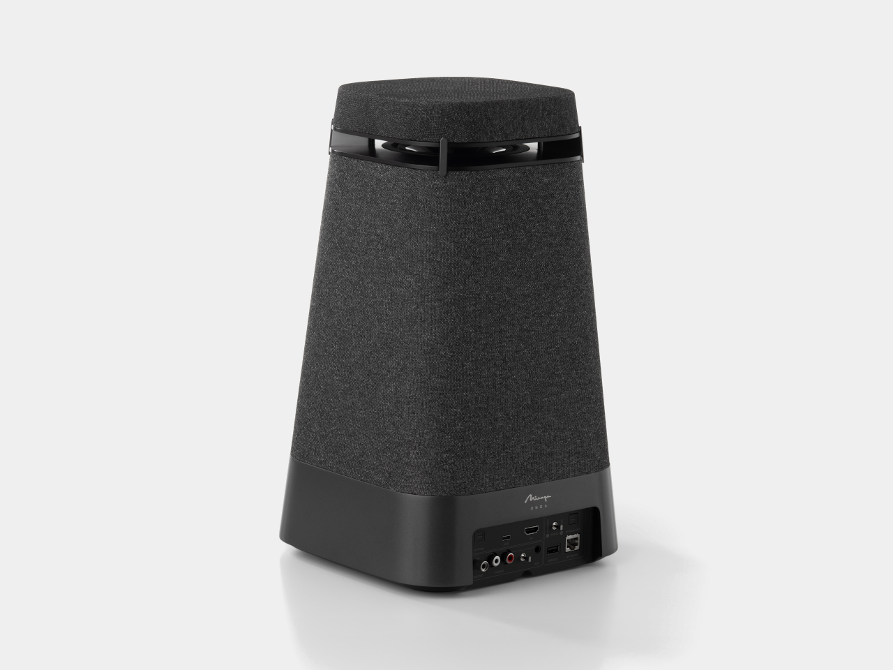
Maintenance usually drives up the long-term cost of owning a water purifier, mostly because replacing cartridges typically requires a paid technician visit. ATHERIA’s self-changeable cartridge system gets around that. The side panel opens with an Allen key, giving direct access to all three filter cartridges, each of which turns to fit or release. No service call needed, which cuts down on annual maintenance costs considerably.
The companion app displays tap TDS, output TDS, individual cartridge health, and daily water and energy usage. Output TDS is adjustable from the settings, and cartridge change reminders can be set manually. It also links to Google Nest, which can push voice alerts when TDS levels rise above safe standards or when a specific cartridge is approaching the end of its life.
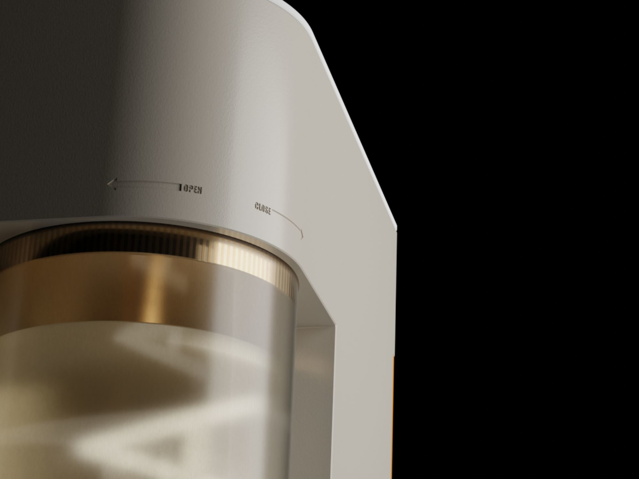
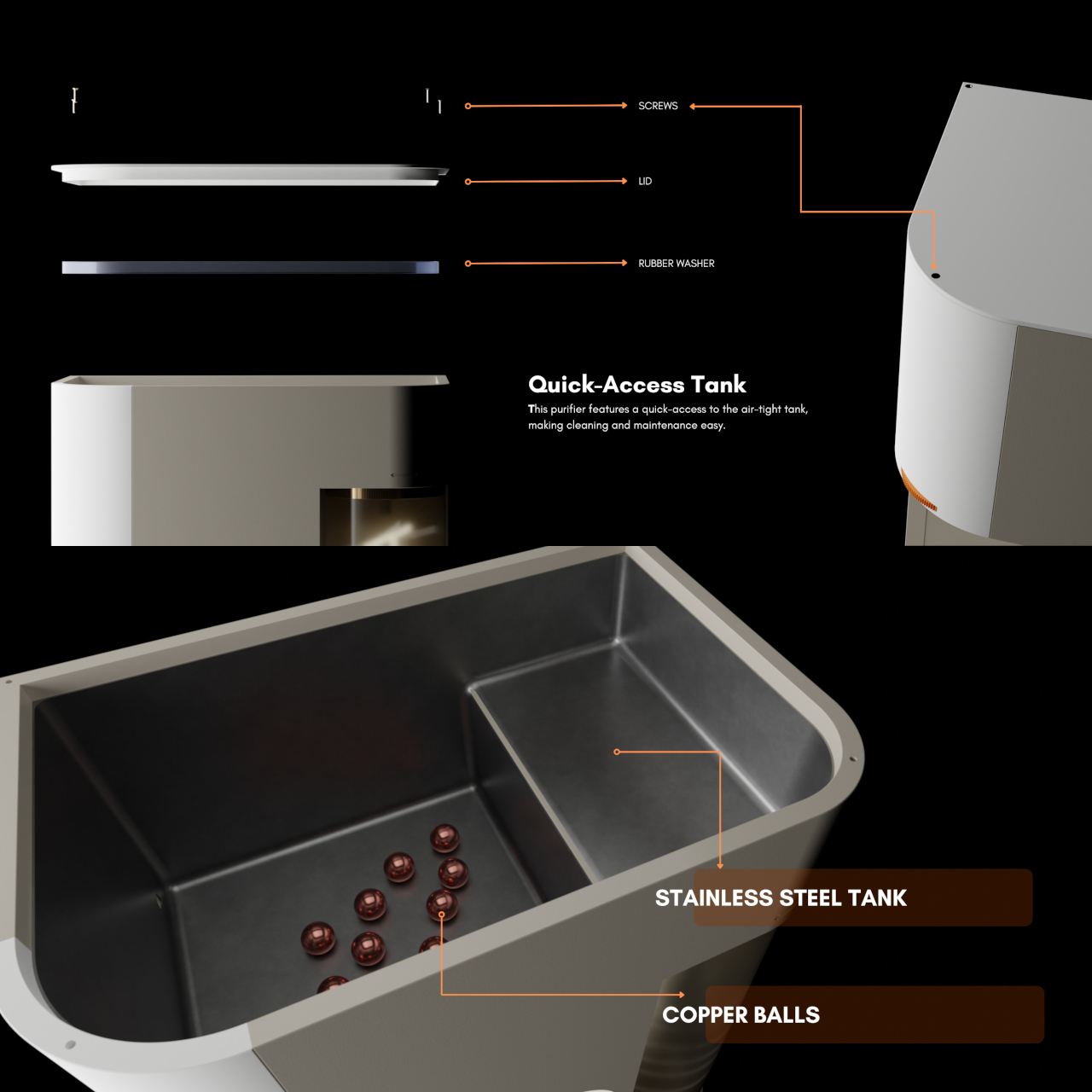
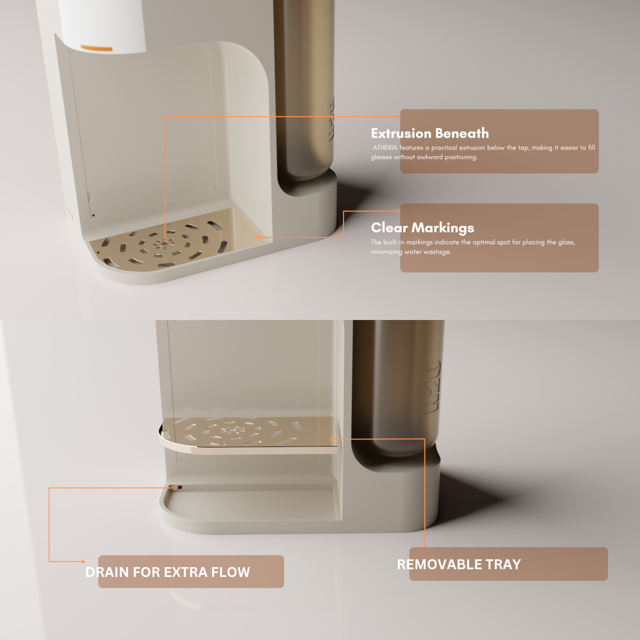
The stainless steel storage tank includes copper balls for natural antimicrobial contact, and the bi-directional ratchet tap controls flow speed by how far it’s turned, with built-in markings to minimize spillage. ATHERIA is still just a concept, but the depth of research behind each decision, from the detachable container to the cartridge access panel, gives every friction point in the experience a concrete answer rather than an afterthought.
The post A Designer Just Made a Water Purifier That Skips the Technician Call first appeared on Yanko Design.