The Colombian Roof Tile That Became a Desk Organizer

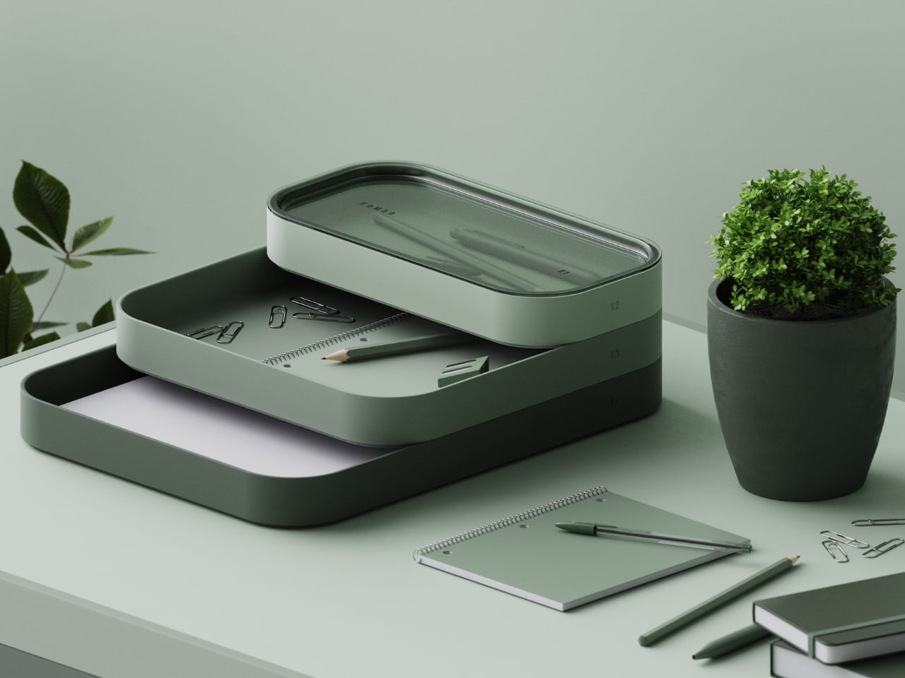
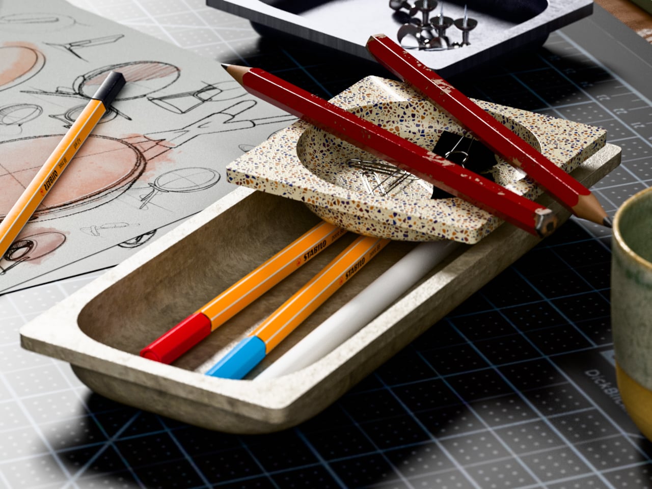
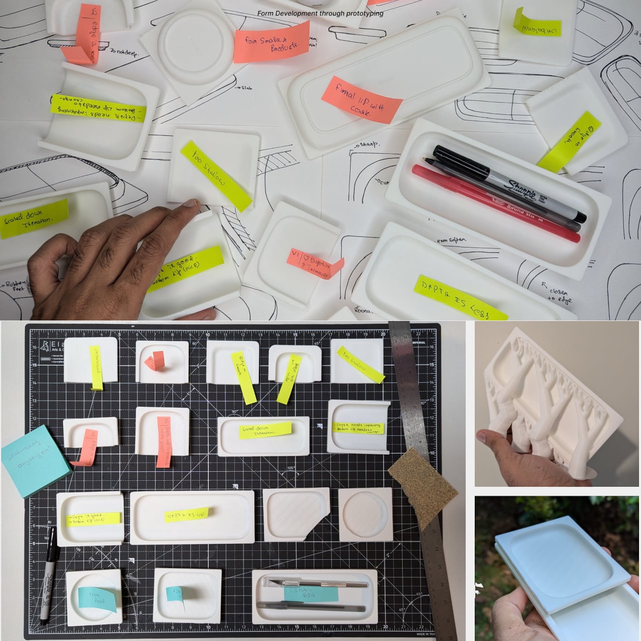
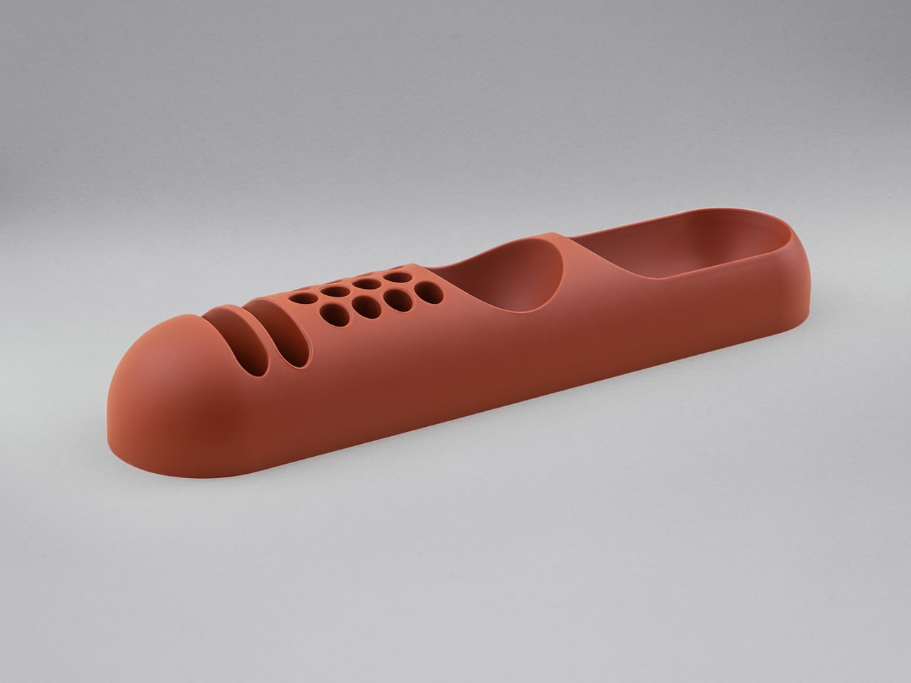
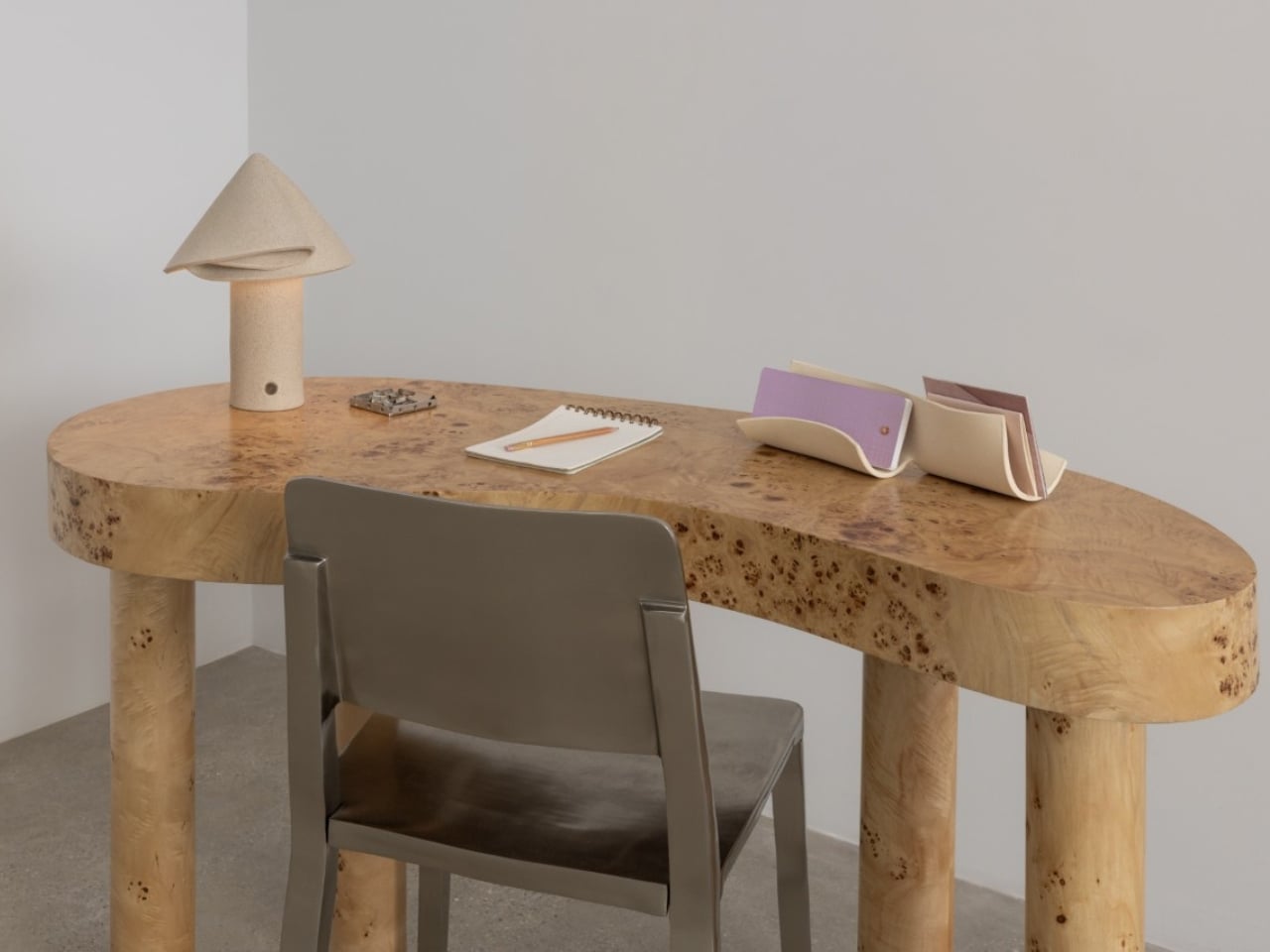
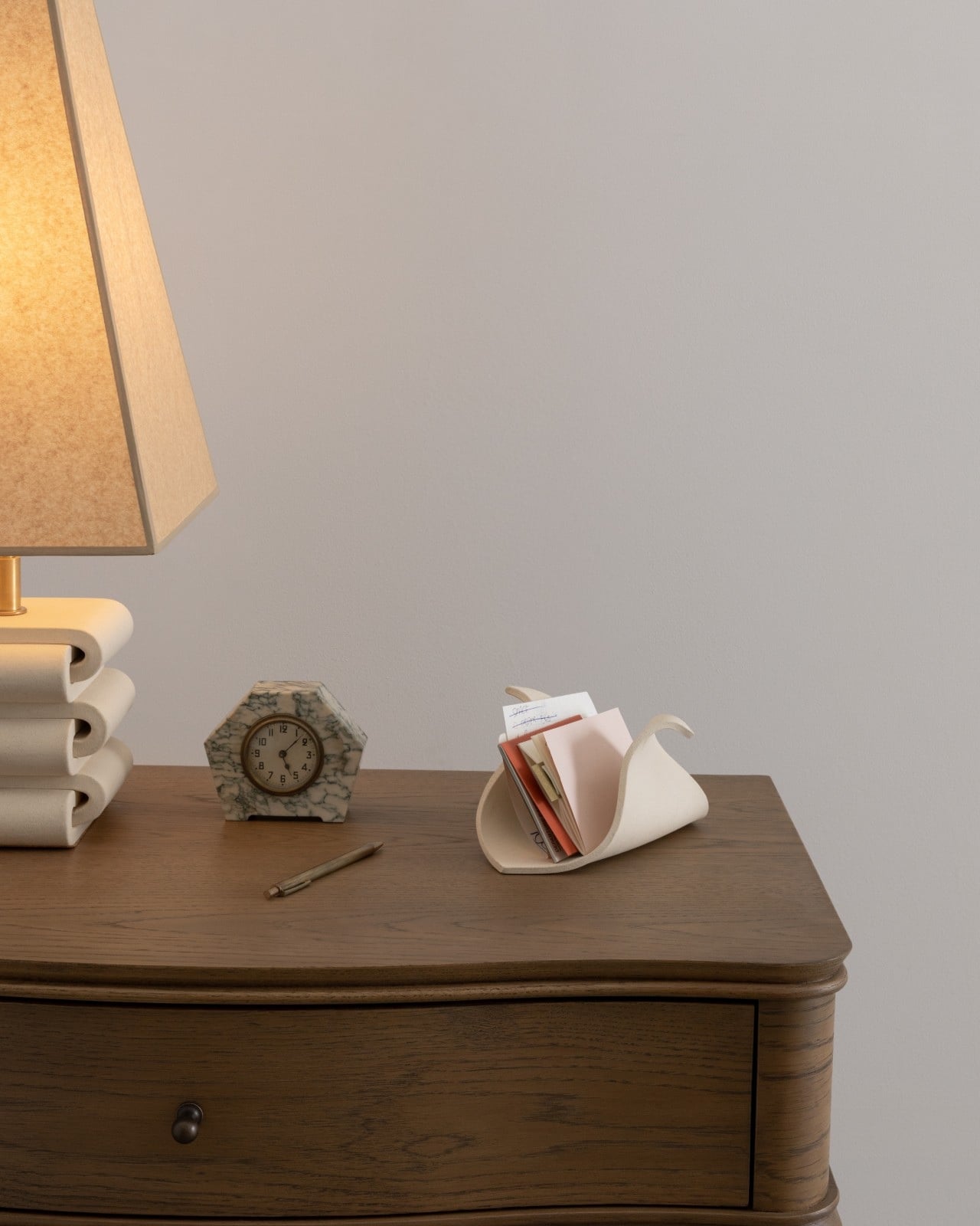
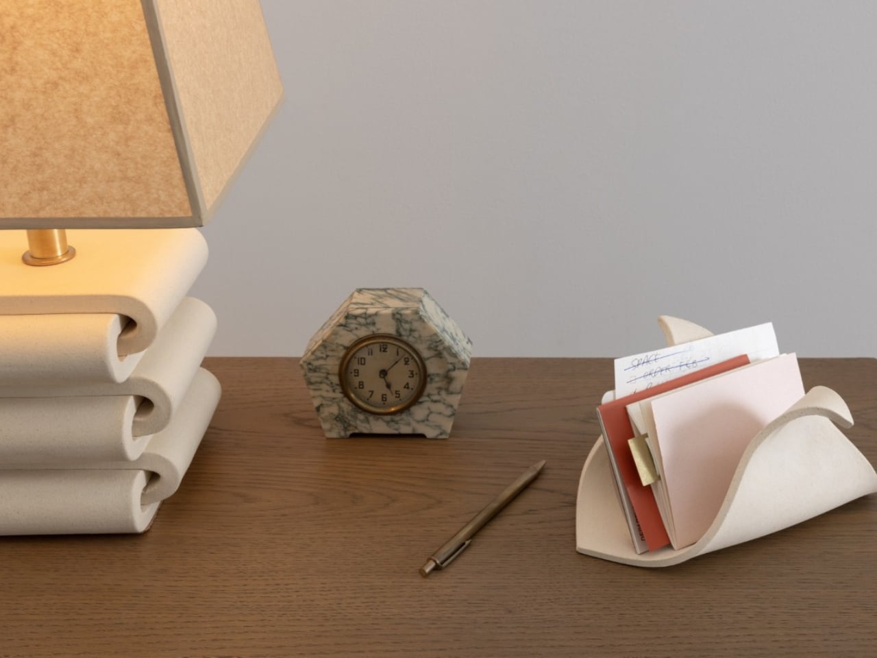
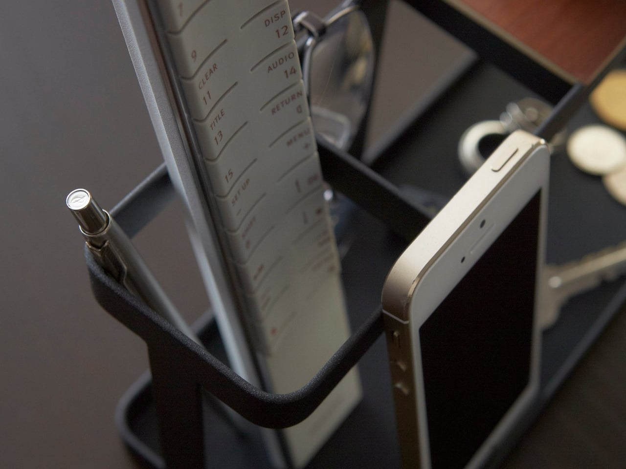
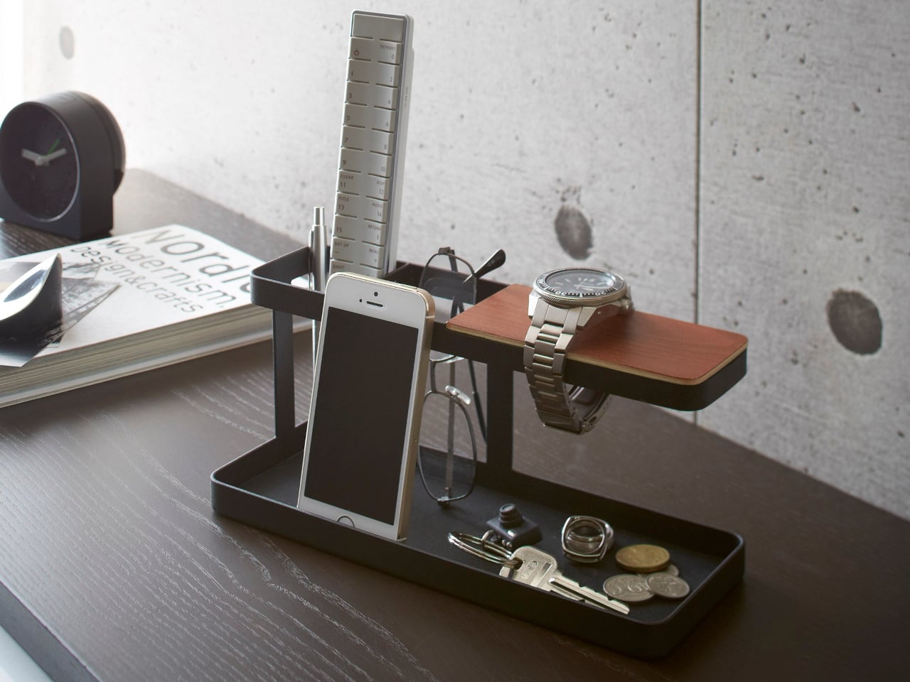
Most desk organizers are purely functional objects. You buy one because you’re tired of your keys ending up under a notebook, or because your earbuds have gone missing again for the third time this week. Utility is the promise, and usually, that’s where the conversation ends. TEJA, designed by Gustavo Rodríguez and Estefanía Agudelo of Estudio Gris in Medellín, Colombia, makes a case that it doesn’t have to.

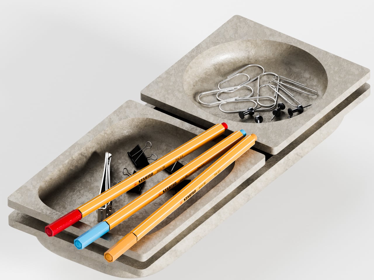
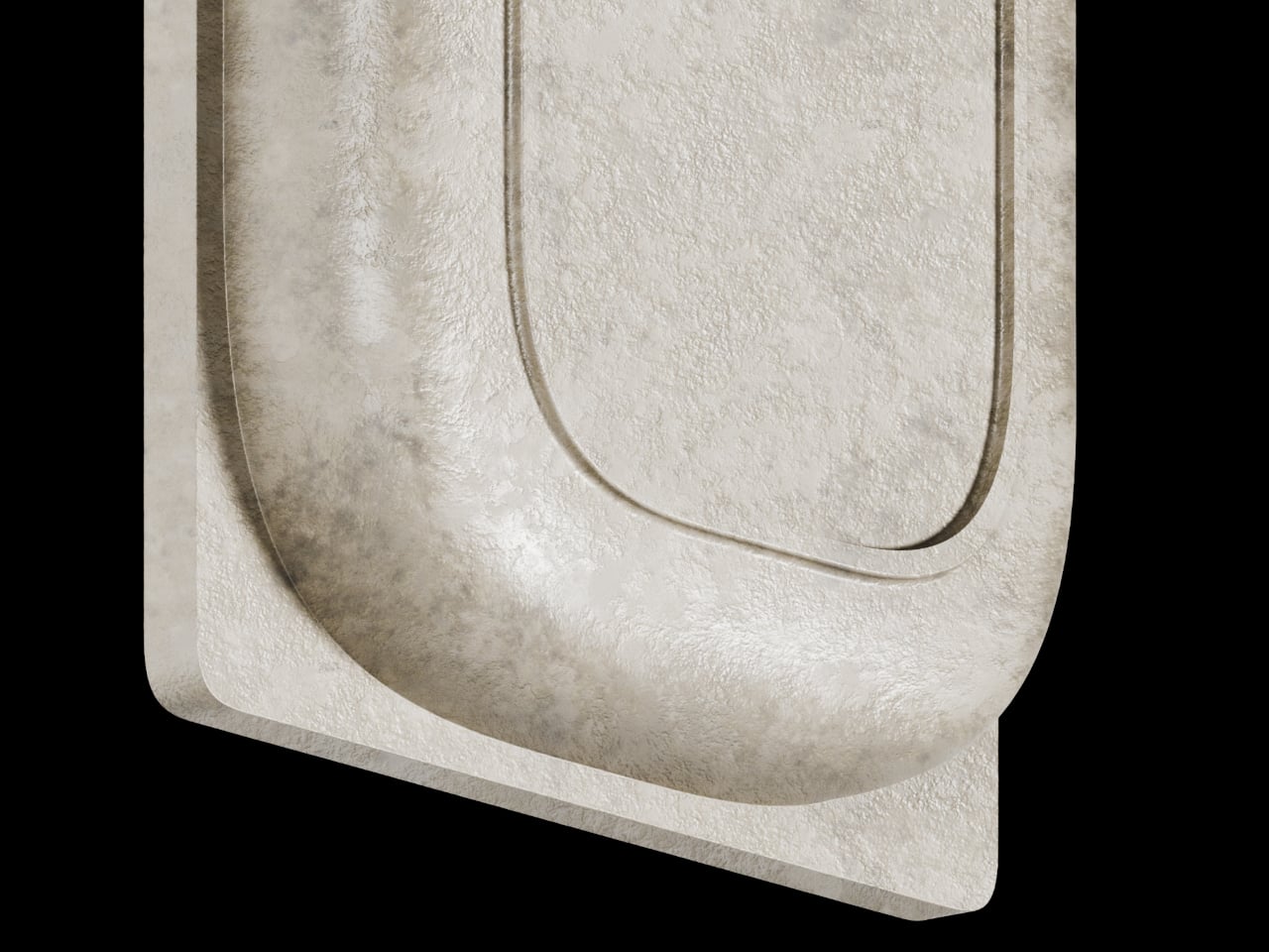
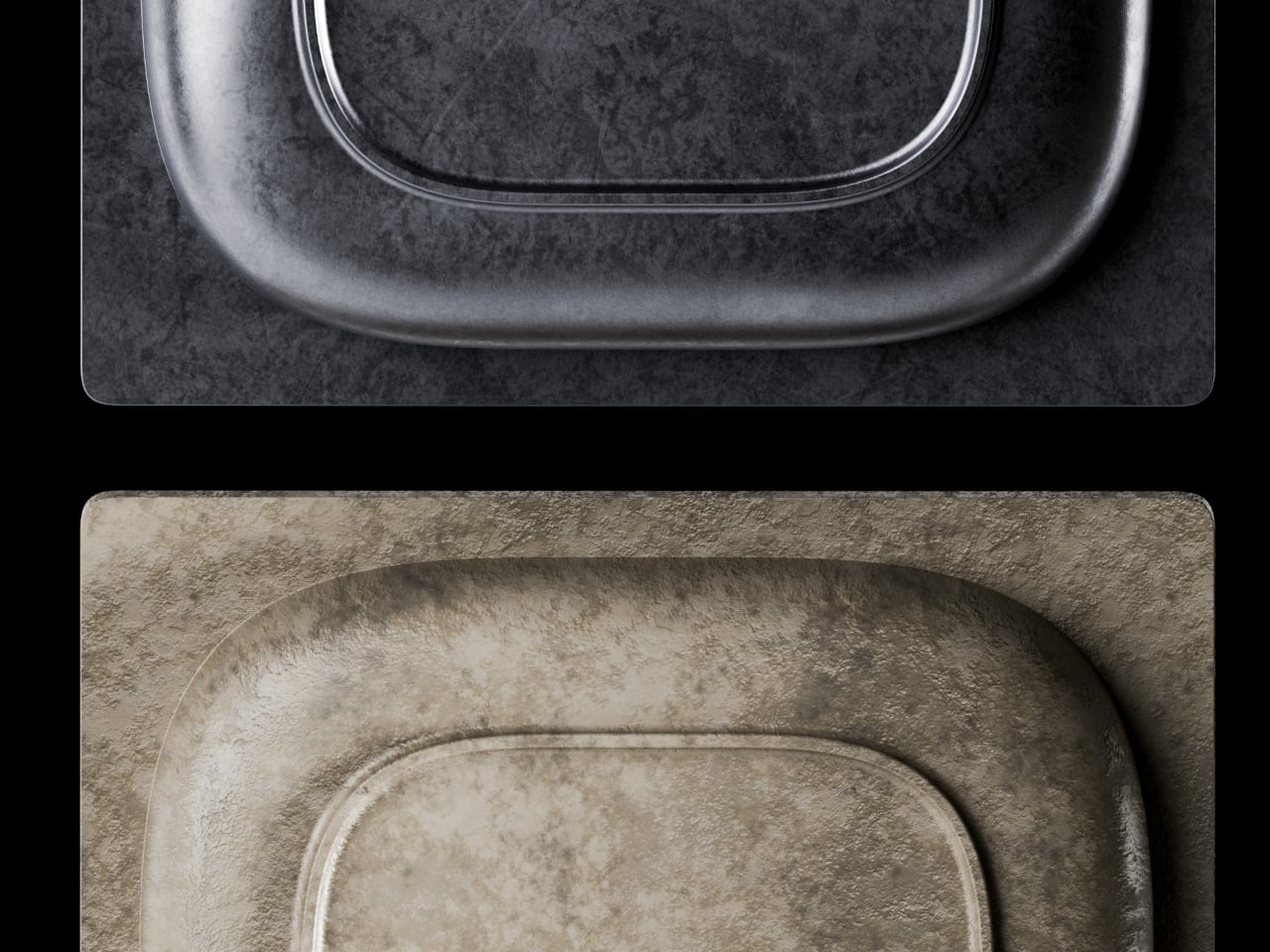
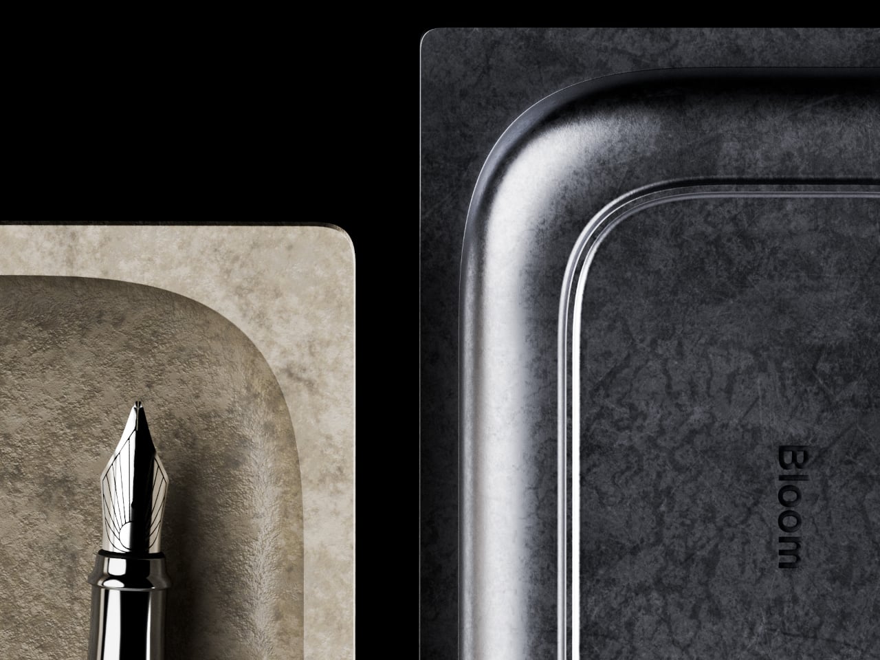
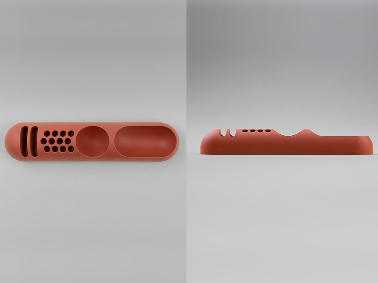
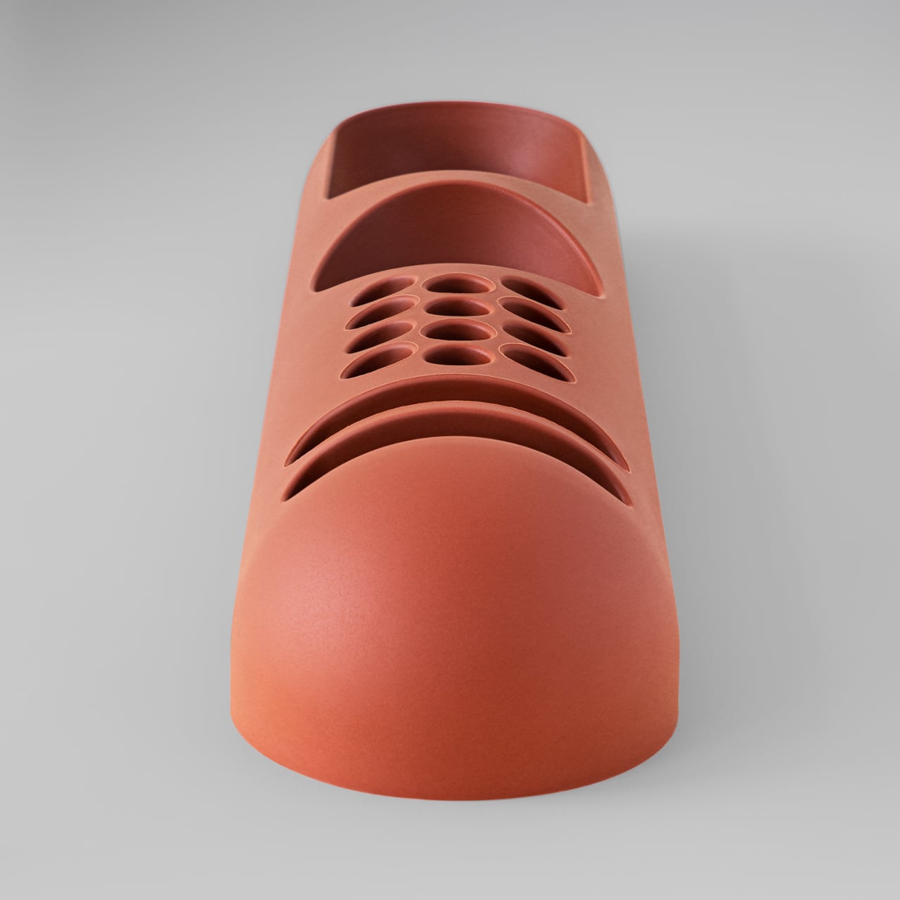
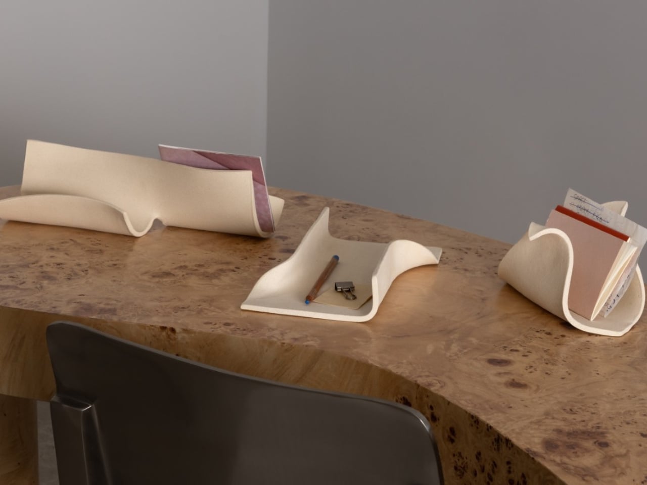
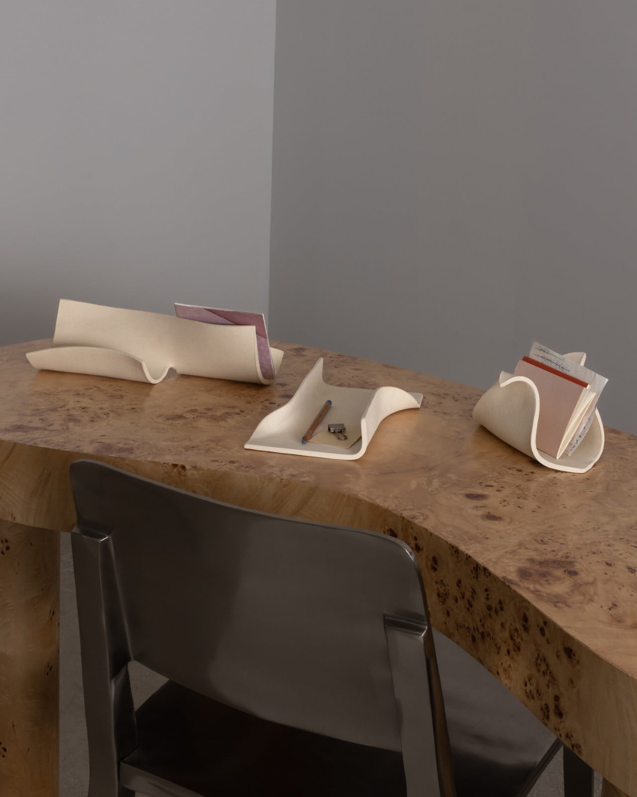
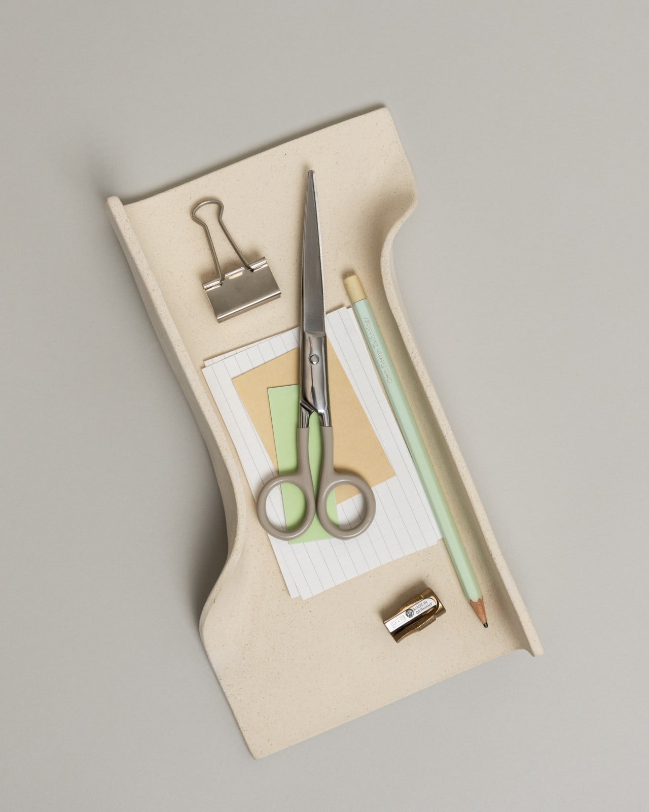
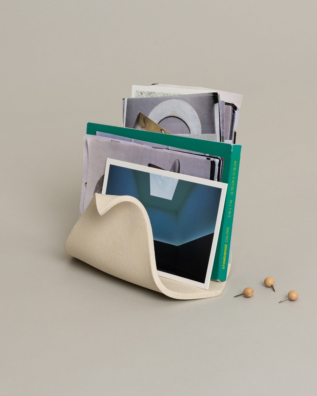
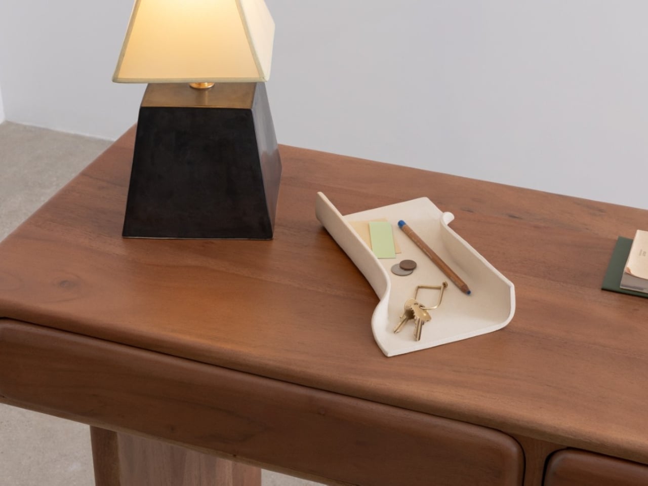
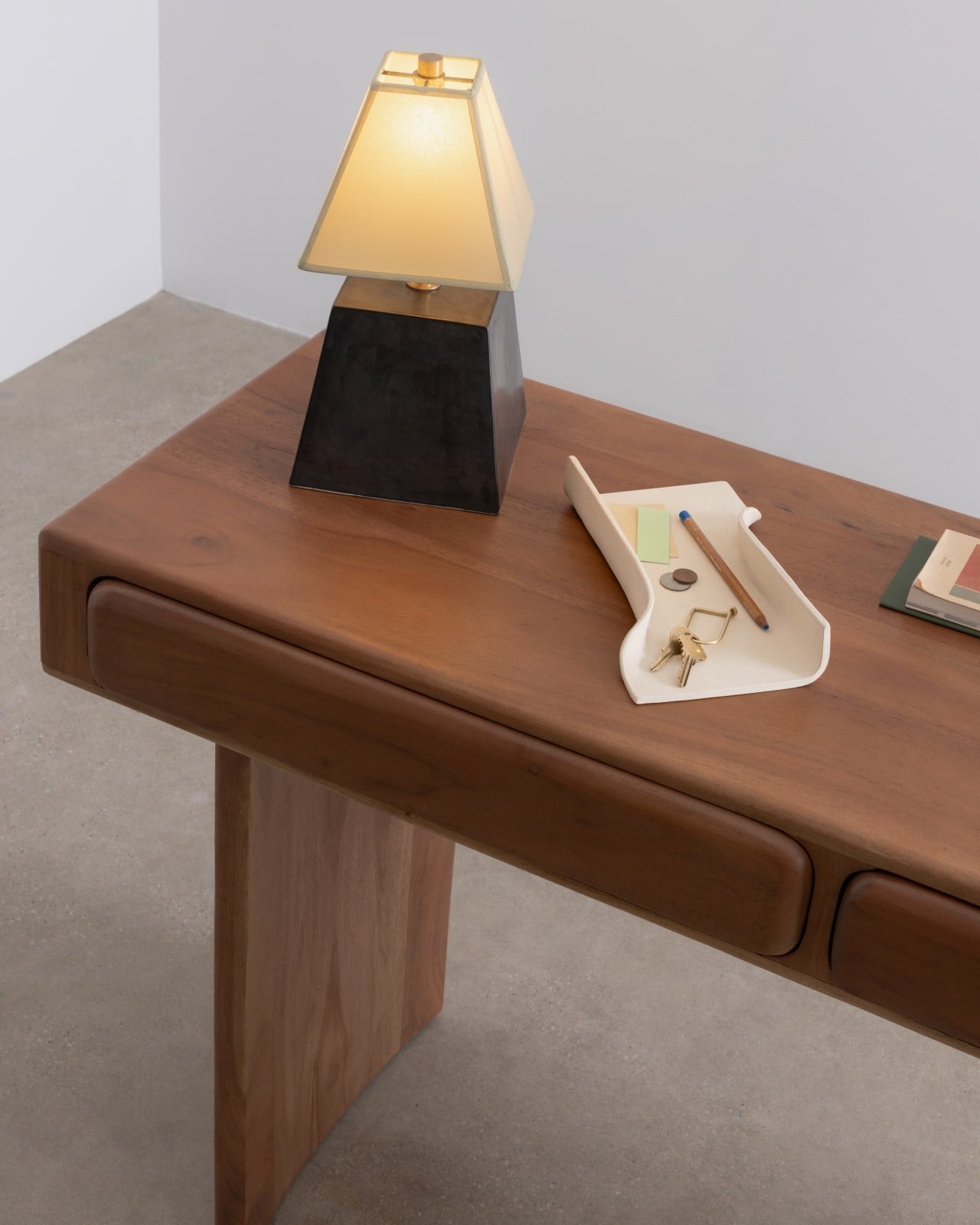
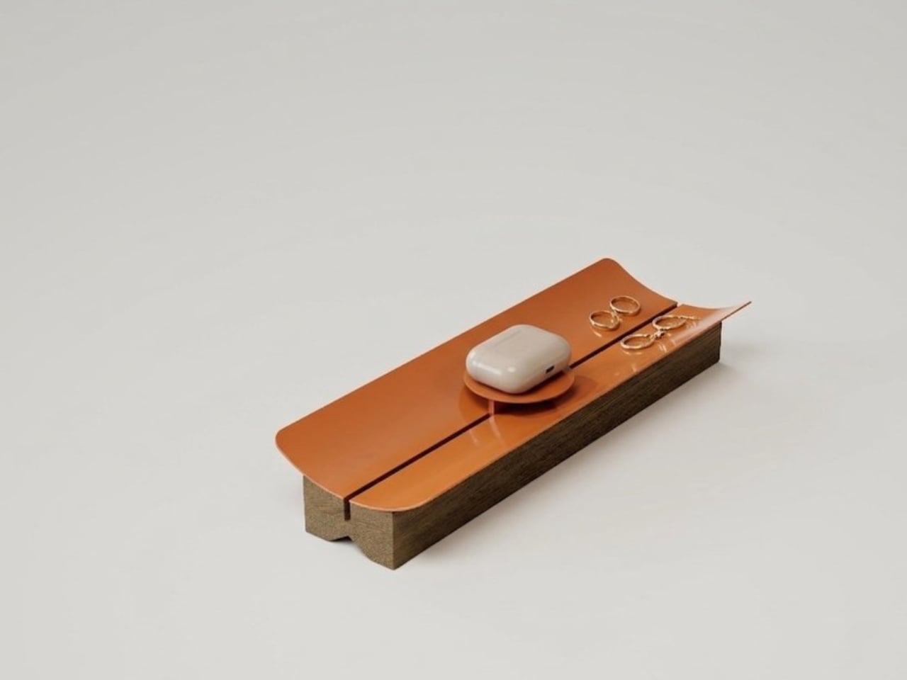
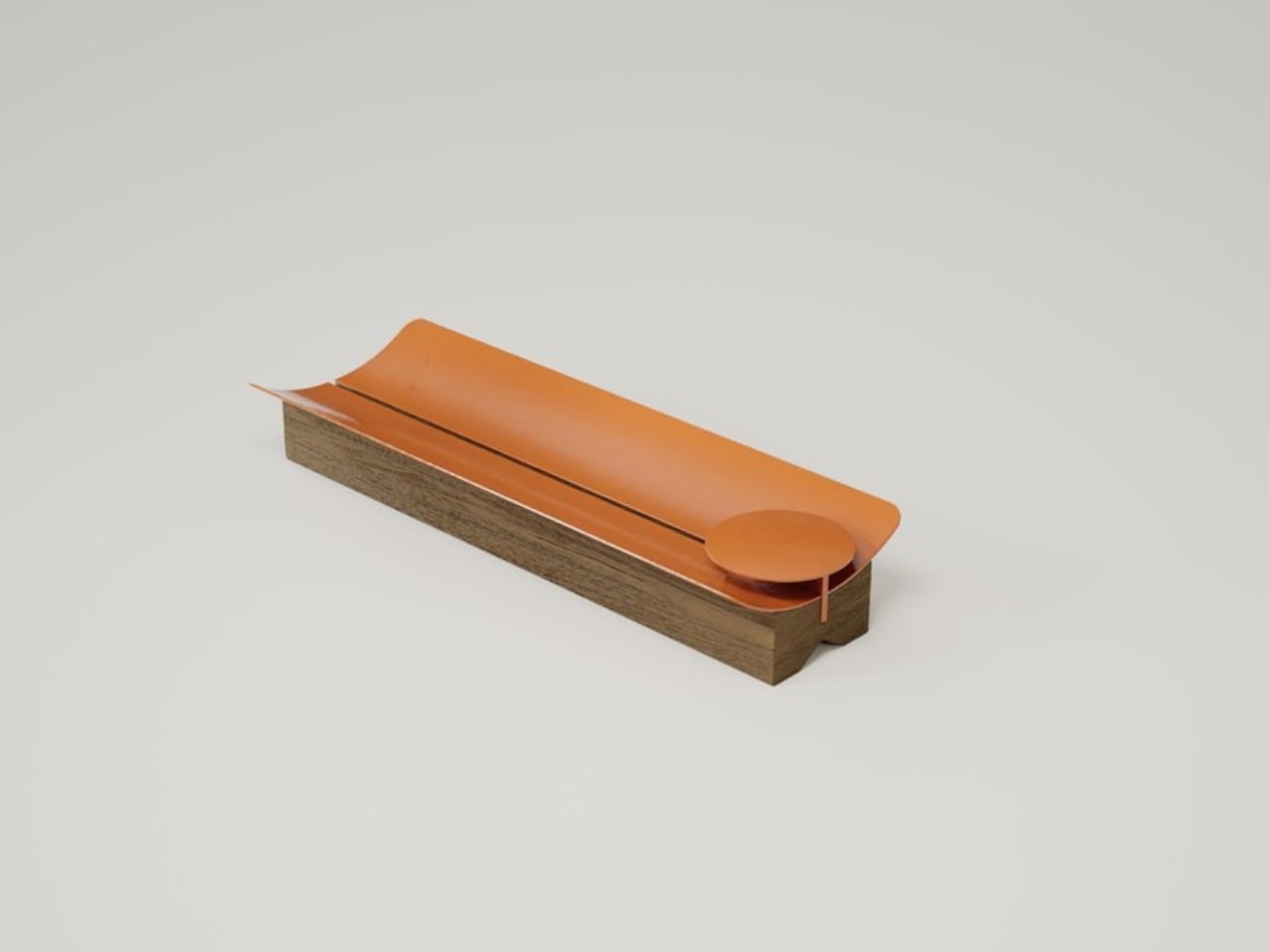
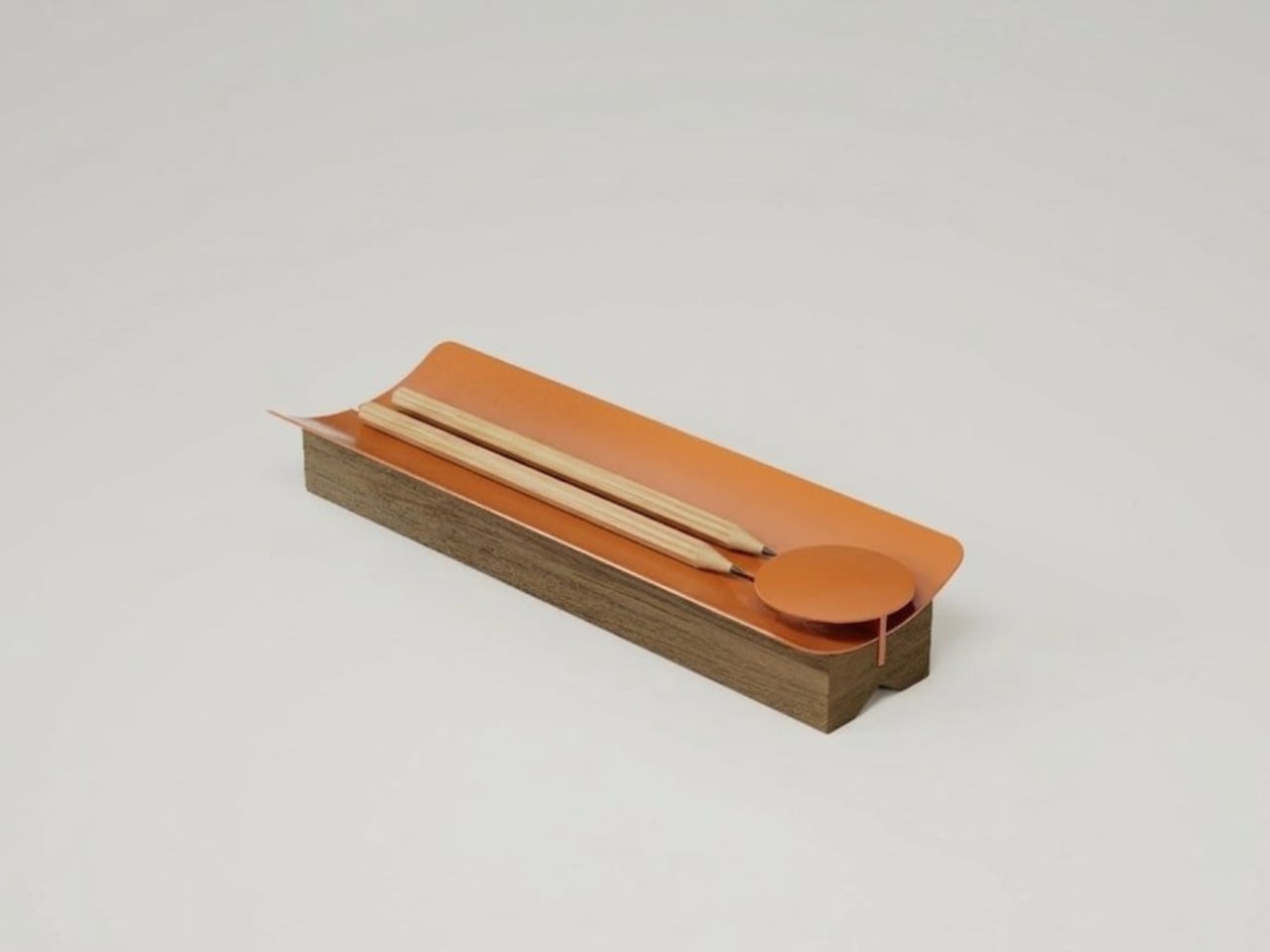
The name is the Spanish word for a roof tile, and the reference is direct. Traditional clay tiles have shaped the rooflines of Colombian towns for centuries, their curved profiles doing exactly one thing extremely well: shedding water while creating shade. Rodríguez and Agudelo looked at that form and asked a genuinely good design question: what if you kept only what matters? The answer is TEJA. A lacquered steel surface that curves upward at both ends, resting on a solid natural wood base. The curve does the same job here that it does on a rooftop, just on a smaller, quieter scale. It keeps things from rolling away and, in doing so, gathers them.

Designers: Gustavo Rodríguez & Estefanía Agudelo (Estudio Gris)

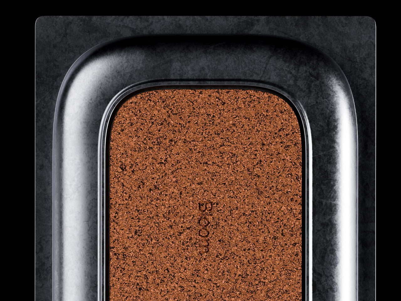
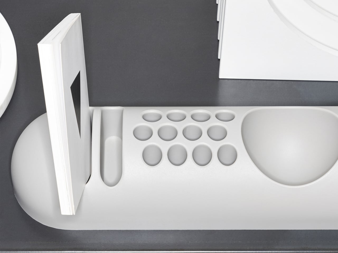
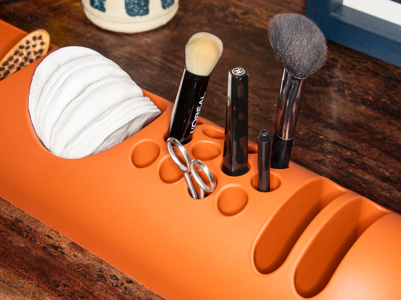
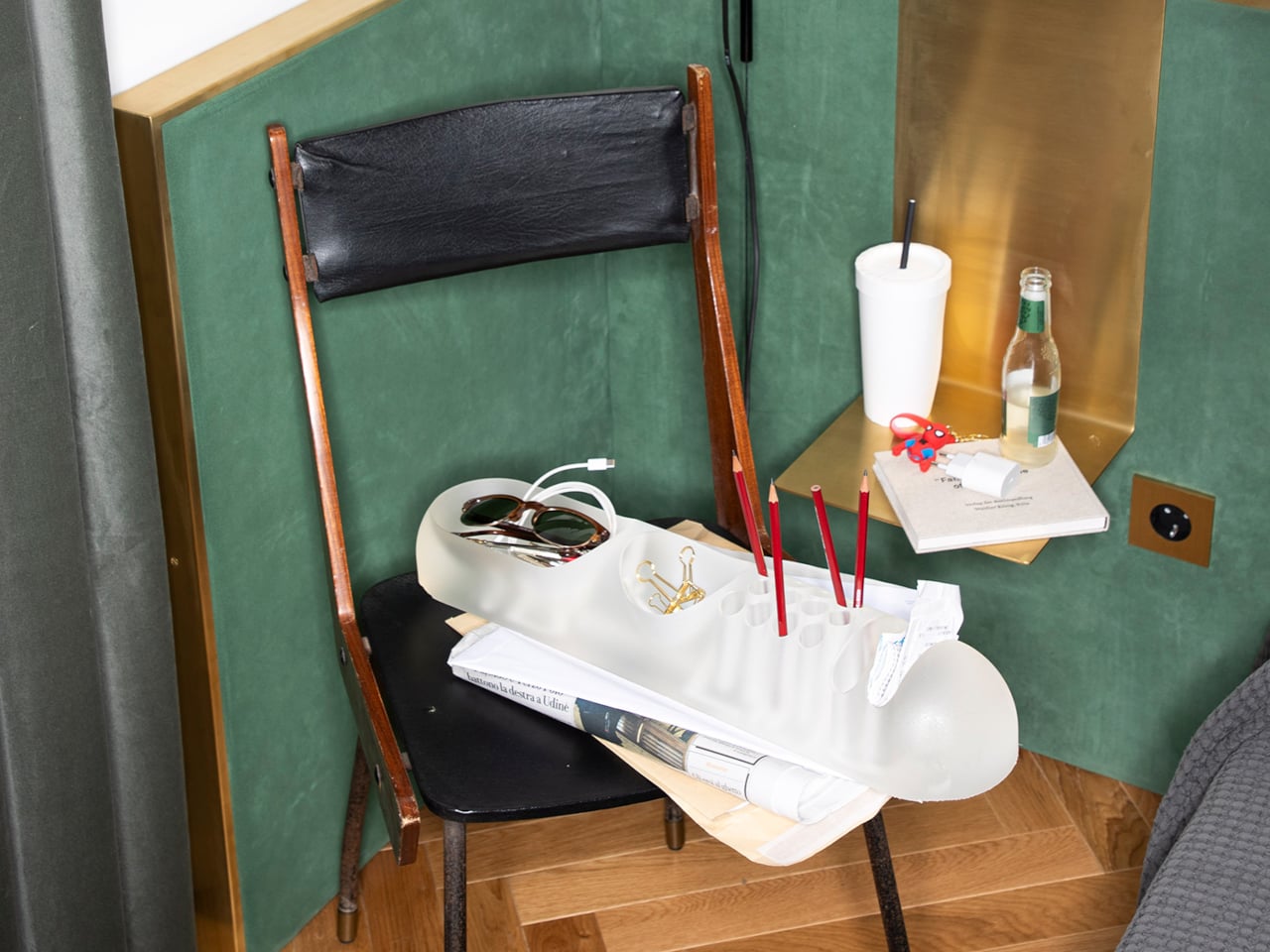
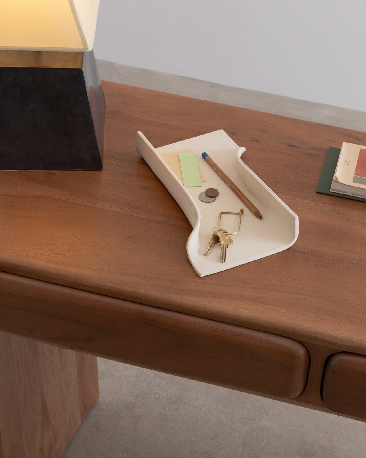
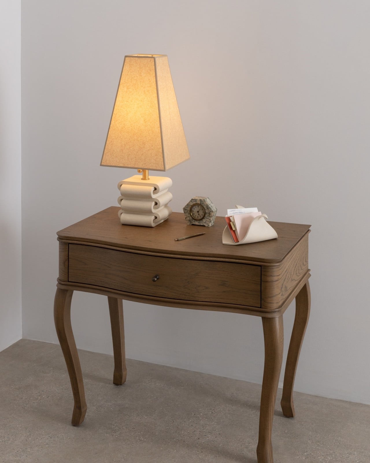
At the center, a small circular platform rises from the surface. It’s a tiny detail that turns out to do a lot. Rings land there instead of disappearing into a drawer. An earbud case. A coin you keep forgetting to put somewhere intentional. The platform gives these small, easily lost things a designated home, and that specificity is exactly the kind of thoughtfulness that separates well-designed objects from well-marketed ones.

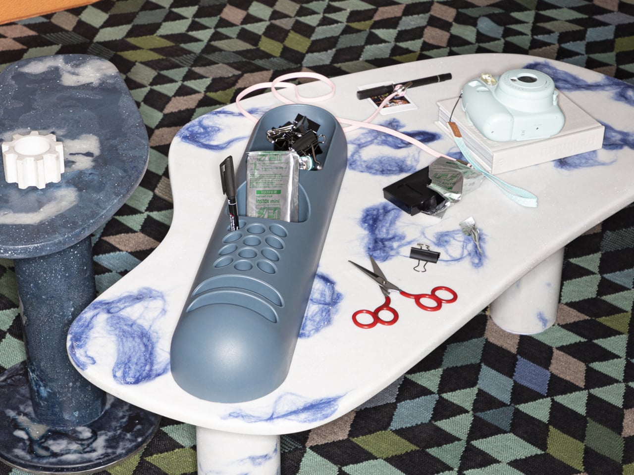
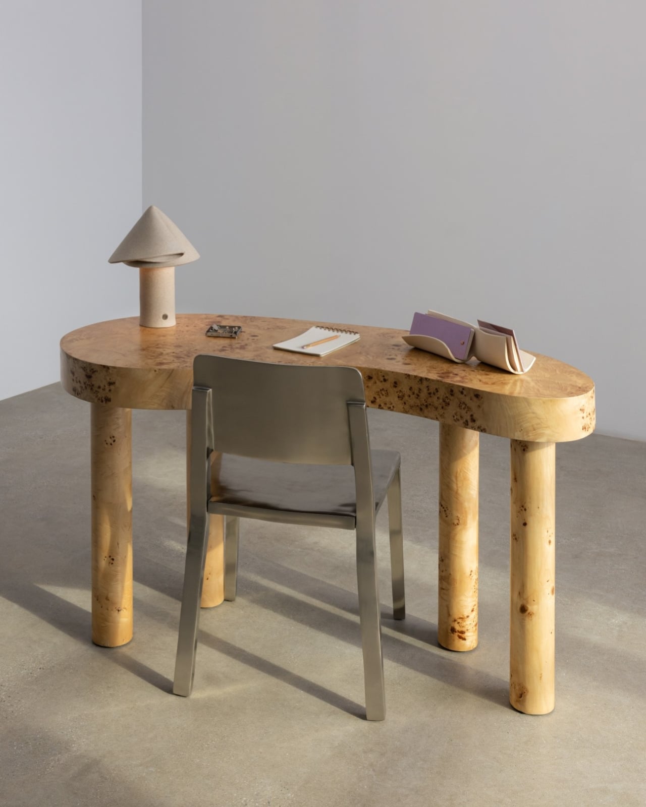
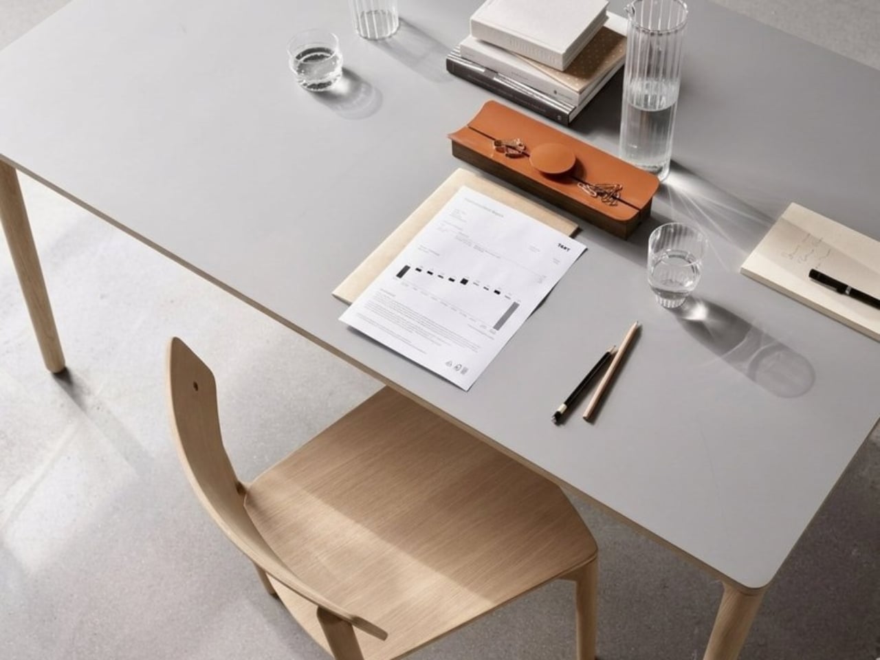
The piece works equally well on a desk or a dresser, which matters more than it sounds. A lot of objects are styled for one context and feel awkward in another. TEJA slides between the two without trying, because its logic is architectural rather than functional in the narrow sense. It organizes by shape, not by category.

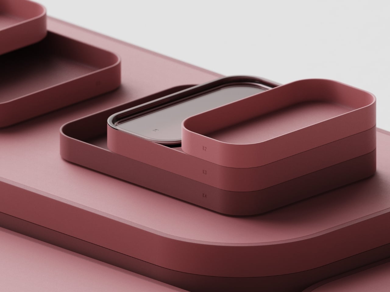
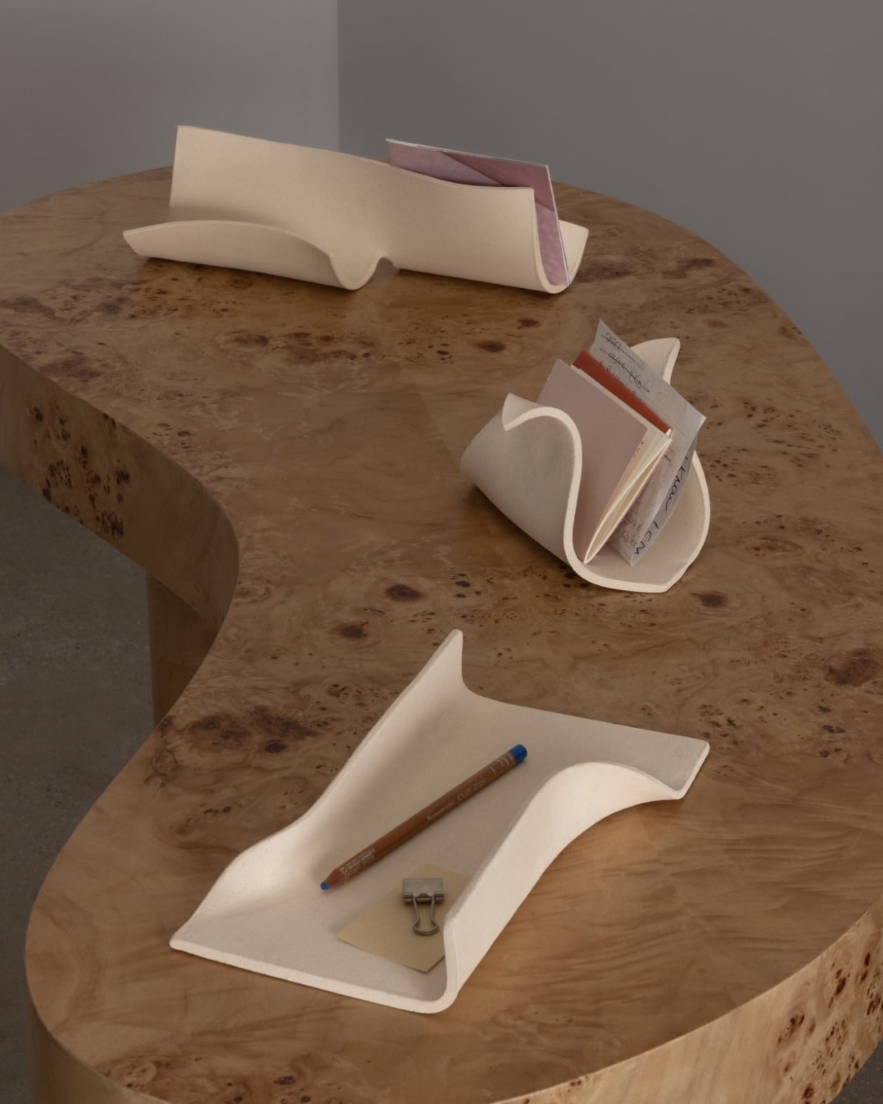
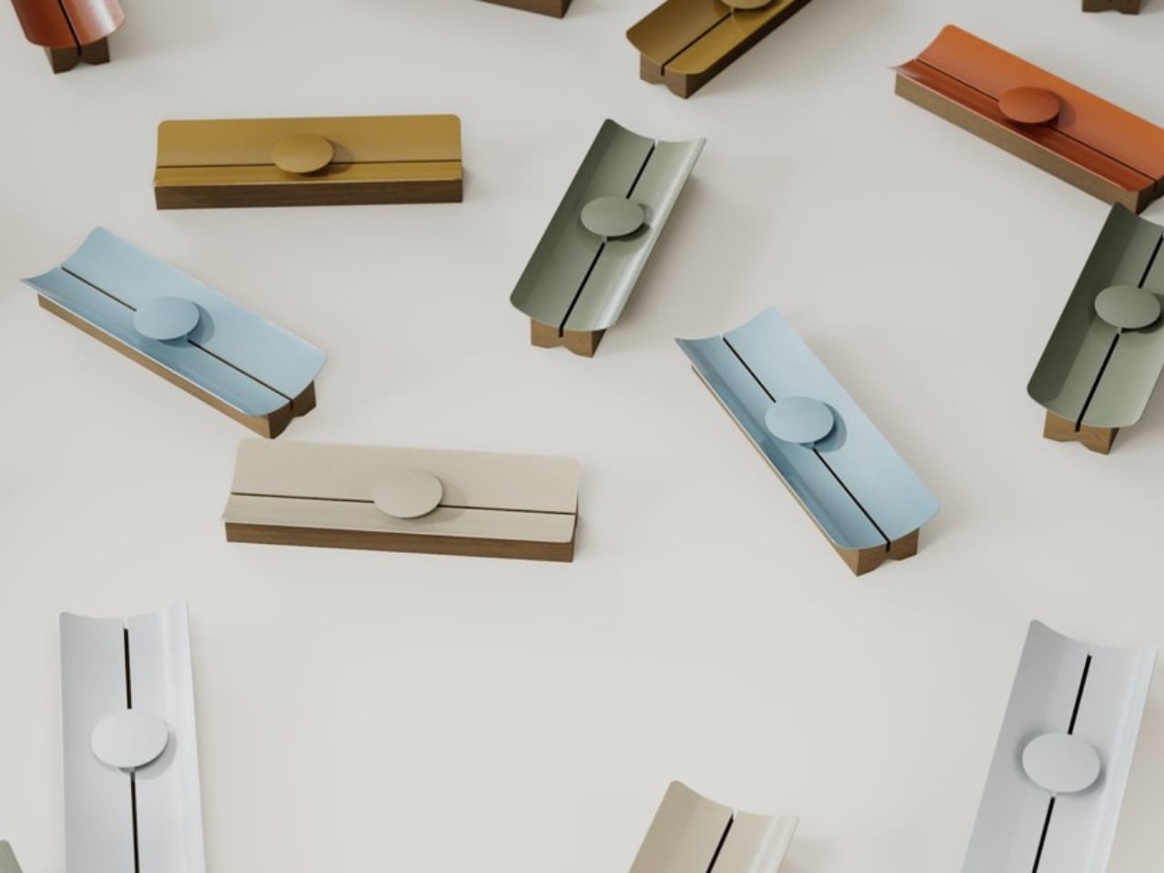
The moment that might surprise you most is what happens when you place three of them together. Side by side, they read as a roofscape, a miniature version of the reference they were born from. The designers didn’t plan that effect. It emerged from the object’s own internal rules. That’s the mark of a design that was thought through past the obvious. Most things only reveal their full intention under a single set of conditions. TEJA shows you something new when the context shifts.

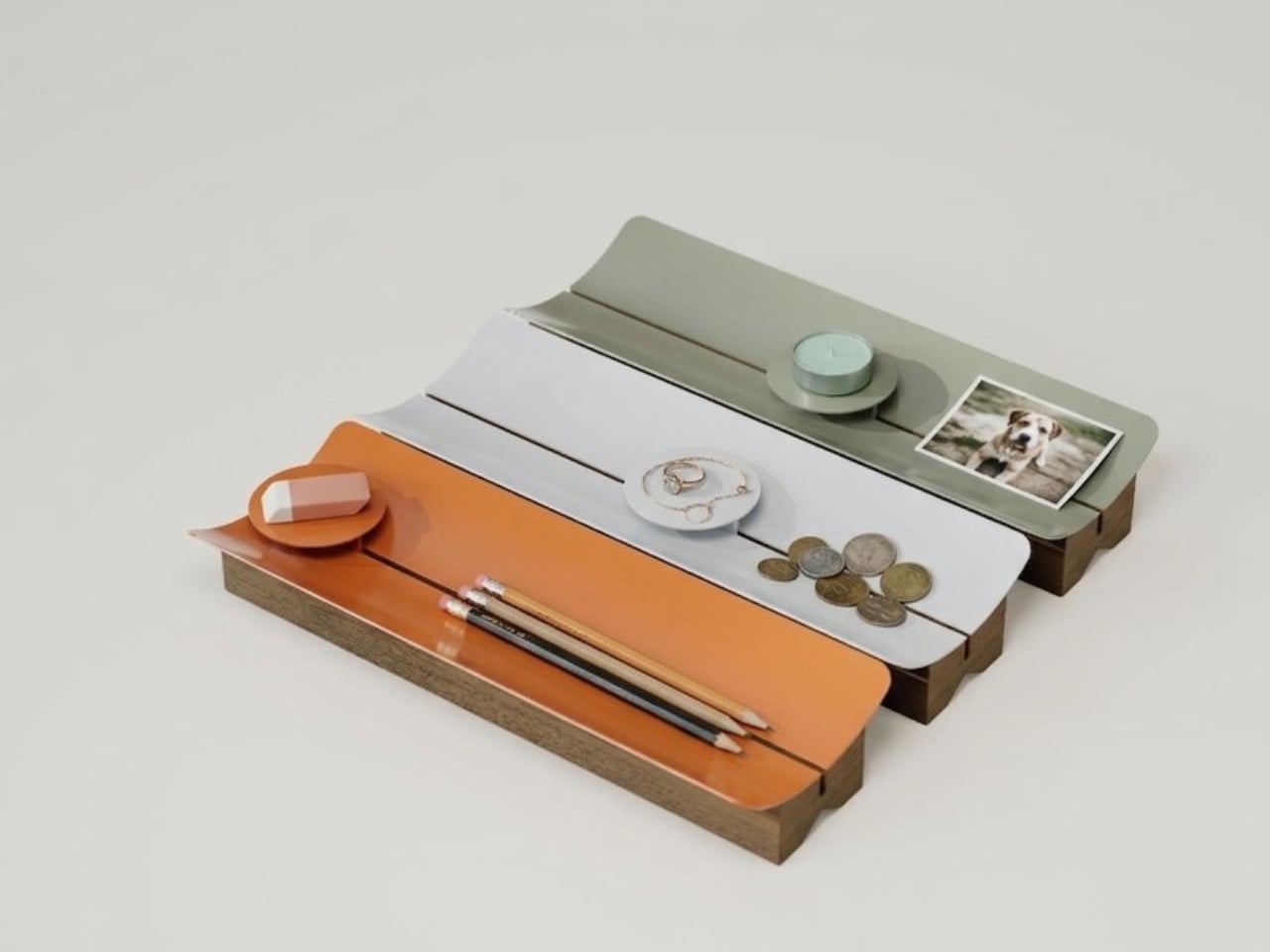
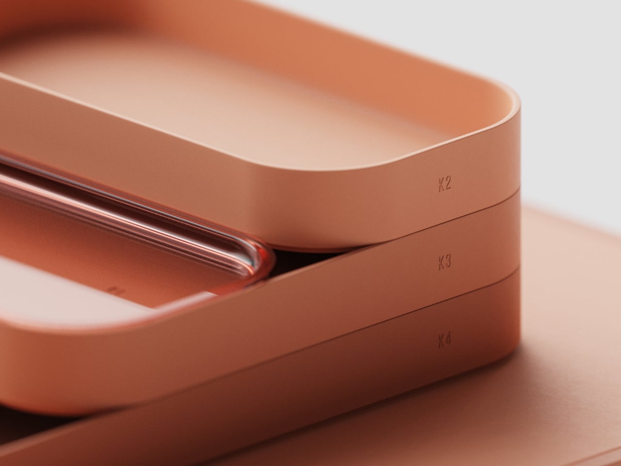
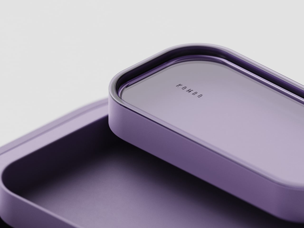
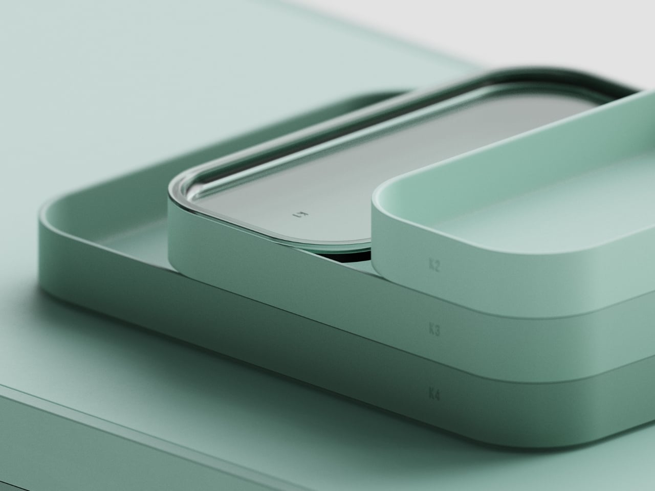
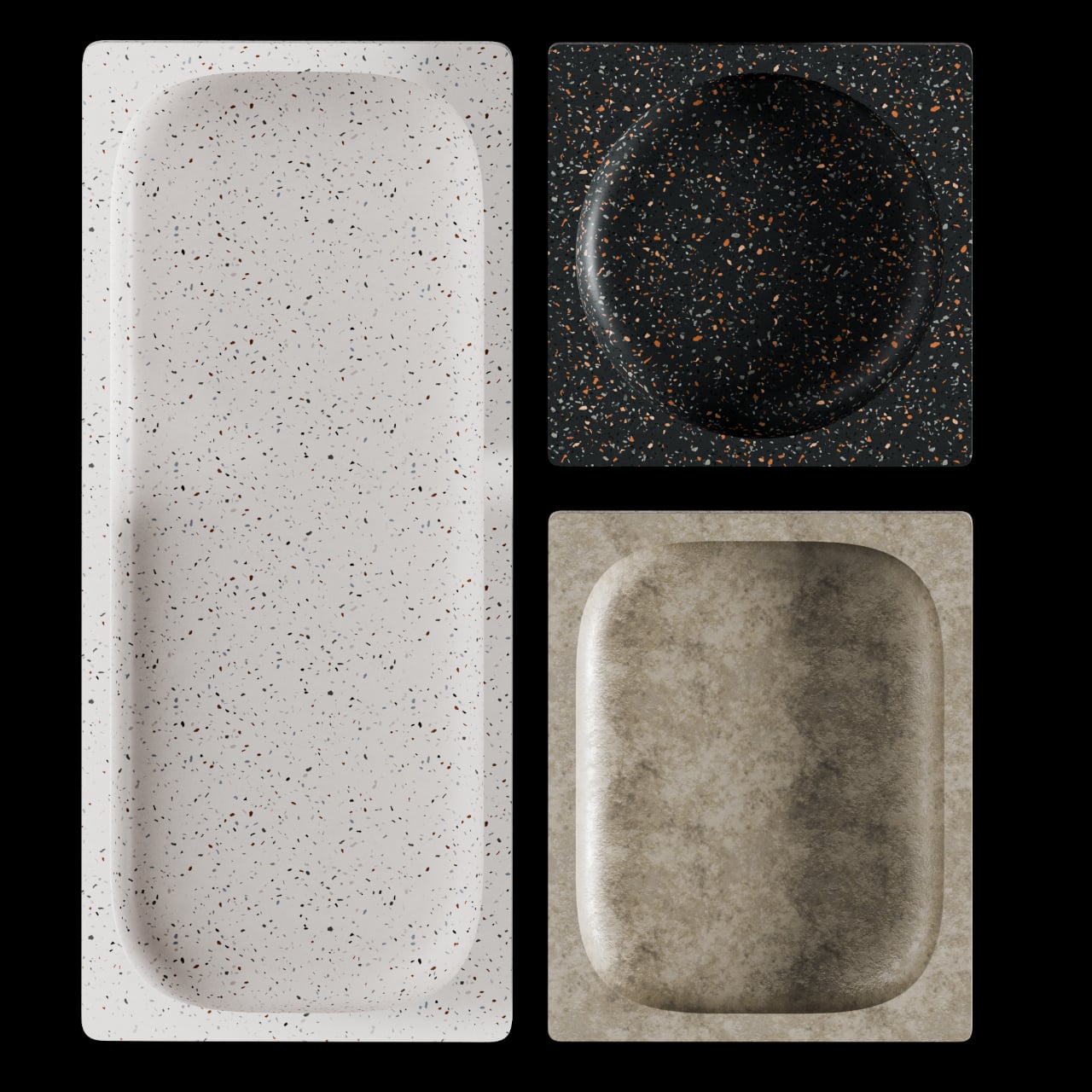
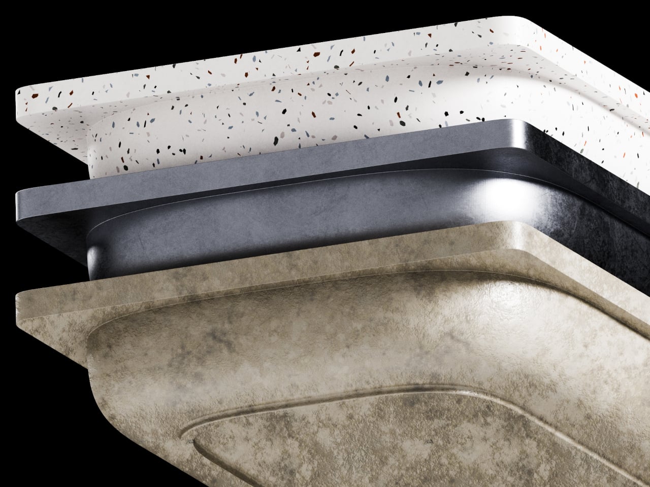
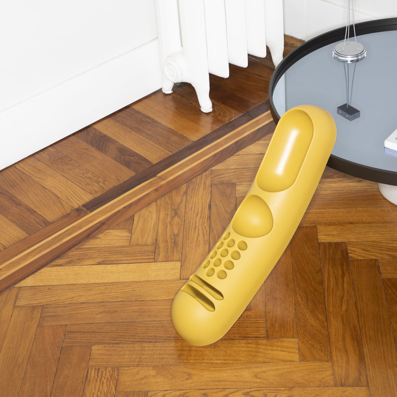
It comes in six colors: terracotta, white, calm green, blue, mustard, and beige. The first three are kept in stock; the last three are made to order. All of them are handmade in Medellín. I have a soft spot for the terracotta, partly because it’s the most honest color for an object inspired by clay tiles, and partly because that warm, muted orange reads beautifully against both light and dark surfaces without fighting for attention. The calm green and mustard are equally considered. None of the six feel trendy in the way that becomes awkward in two years.

Estudio Gris won the DesignWanted Award in Italy in 2026 with CLU, their umbrella stand, which suggests that TEJA isn’t a one-time gesture. The studio seems to have a consistent interest in translating familiar forms into objects that hold meaning without being decorative about it. That’s a harder balance to strike than it looks.

The wider question TEJA raises, at least for me, is why we keep settling for objects that only work and never mean anything. We spend a fair amount of time at our desks and dressers. The things that live on those surfaces become part of how the space feels day to day. A desk organizer that carries a genuine reference to Colombian vernacular architecture, made by hand in the city where its designers live and work, is a different kind of object than a generic tray from a home goods store. You don’t have to think about that every time you drop your keys into it. But it’s there if you do.

The post The Colombian Roof Tile That Became a Desk Organizer first appeared on Yanko Design.

AI Finally Solved the Desk Organizer Nobody Actually Uses

Most desk organizers ask you to adapt to them. You get a tray with fixed compartments, you shove your stuff in, and either it fits or it doesn’t. Then you give up, and everything ends up in a pile again. Seoul-based industrial designer Youngbin Kwon decided that the tray should be the one doing the adapting, and the result is Mosaic, a concept that’s quietly one of the more genuinely smart ideas to come out of the AI-meets-product-design conversation this year.

Mosaic is an AI tray that transforms its shape depending on what you place on it. The idea, at its simplest: put your things down, and the tray reconfigures around them. The modular structure shifts and reorganizes to accommodate whatever you’re dropping in: your phone, your keys, a charging cable, a stray lip balm. It reads the objects and makes room for them. What the concept proposes is essentially the end of the one-size-fits-all desk organizer, and I think that’s a very good thing.

Designer Name: Youngbin Kwon

The design is the work of Kwon, an industrial design student from Chung-Ang University in Seoul, published this May on Behance, where it’s been pulling in appreciations at a rate that suggests the design community noticed. Built in Rhinoceros and rendered in Keyshot, the concept is visually clean and grounded, with a restraint that keeps the focus on the idea rather than the spectacle. This isn’t speculative design that lives only in dreamland. It feels like something that could exist with the right engineering team behind it.

1

But the part of the concept that deserves more attention than the mechanics is the philosophy behind it. Kwon describes the act of placing objects with AI assistance as being “as if playing,” and the idea is that this playfulness is exactly what leads people to actually develop organizational habits over time. Not guilt. Not a beautiful, aspirational flat-lay that makes you feel bad about your desk. Just play. That distinction is easy to underestimate.

That reframing matters more than it might seem at first. The market for organization products is enormous, and so is the gap between things people buy to get organized and how long they actually stay organized. That gap usually comes down to friction. The system is too rigid, or too much effort to maintain. Mosaic proposes that if the system flexes with you instead of demanding you flex with it, you’re far more likely to stick with it. Gamification applied to the most mundane domestic task. It’s clever.

I’ll admit that the name Mosaic might be the most elegant thing about it. A mosaic is a picture made of small, individually unremarkable pieces that together create something intentional and whole. That’s exactly what the tray does. The modular components rearrange into a layout that looks curated, even when you’ve just dropped everything in at the end of a long day. The name does real conceptual work, and that’s rarer than you’d expect from a student project.

There are real questions left unanswered, as there always are at the concept stage. How exactly the AI identifies objects, whether it uses cameras, weight sensors, or something else, isn’t detailed in the project. The durability of moving parts in a daily-use context is worth thinking about. Whether the transformation happens visibly and slowly, like something mechanical, or snaps quickly into place, would change the entire experience of using it. These are the things that turn a concept into a product, and Kwon’s Mosaic is still very much a concept.

But good concepts don’t need to be finished products to be worth paying attention to. What Mosaic does well is identify a real and relatable failure mode, the organizational system that doesn’t survive contact with actual human behavior, and propose a solution that works with people rather than against them. The tray that meets you where you are. That’s not a small idea dressed up in a sleek render. That’s a fundamental rethink of what we expect everyday objects to do, and it’s worth watching where it goes.

The post AI Finally Solved the Desk Organizer Nobody Actually Uses first appeared on Yanko Design.

A “Modular Bento Box” for Your Desk Gear: Meet Orbitkey’s $42 Grid Organizer

Orbitkey’s design story has always revolved around everyday friction, the loose keys in a pocket, the tangled cable in a bag, the small desktop essentials that somehow scatter across every available surface. Its early key organizers turned a familiar pocket annoyance into a cleaner, quieter carry experience, while the Orbitkey Nest translated that same philosophy into a lidded tray for modern EDC, complete with customizable dividers and a top surface made for quick access. Products like the Desk Mat pushed further into the workspace, showing how Orbitkey likes to treat organization as part utility, part atmosphere.

The Grid Desk Organizer brings that philosophy into a broader desktop format, creating a modular home for the loose objects that gather around work and living spaces. Its perforated tray base works with snap-in dividers that can be adjusted any number of ways to suit different layouts, whether the setup leans toward tech accessories, stationery, EDC, bedside essentials, or any items required close at hand. Stackable construction allows the system to grow over time, while soft-touch lining, quiet feet, and a lid that doubles as a phone stand sharpen the day-to-day experience. Offered in Black, Stone, and Terracotta, and available in both standard and mini versions, the Grid starts at $42 with shipping expected in September 2026.

Designer: Orbitkey (Charles Ng, Maneet Singh)

Click Here to Buy Now: $42 $49.90 (16% off). Hurry, only a few left! Raised over $428,000.

The Nest earning both an iF Design Award and a Red Dot Award in 2021 said something specific about what Orbitkey prioritizes: functional performance through material restraint rather than formal complexity. Forms across the lineup stay compact and geometric, surfaces carry a soft tactile quality, and color palettes lean deliberately toward the understated. These choices reflect a brand that understands organization products share space with other carefully chosen objects, and that the best-designed ones tend to recede rather than announce themselves. The Grid carries that same sensibility, favoring clean geometry and muted tones over anything decorative or loud. It is built to improve a space rather than compete with what is already in it.

The patent-pending snap-on divider design is the mechanical core of the Grid, a perforated tray floor that accepts snap-in dividers at any position along its grid, like a pegboard, but horizontal. Long dividers run the full depth of the tray while shorter ones slot in crosswise, and the entire arrangement can be lifted out and reconfigured whenever the contents are changed. Most desk organizers impose a fixed spatial logic, demanding objects conform to pre-cut compartments regardless of whether they actually fit. This inverts that relationship entirely, letting each divider position respond to the specific objects beside it rather than the other way around. The practical difference between those two approaches is significant enough that once you experience the latter, returning to the former feels immediately wrong.

While the main tray forms the operational base, a translucent accessories tray nested inside manages the smaller objects that vanish at the bottom of any open container. Above that, the lid serves as a valet surface for quick-drop essentials, with its handle engineered to double as a portrait phone stand when set upright. Accessing a lower layer takes only a forward slide of the top tray, fast enough to register as a gesture rather than an interruption. The structure maps to how a desk gets used through a day: high-frequency items on the surface, everything else one movement away. Each layer feels less like an added feature and more like part of a cohesive system shaped around everyday use.

The interior is lined with a soft-touch rubberized coating that protects items from scratching and gives the tray a tactile quality that cheaper desk accessories rarely bother with. Silicone feet on the base keep it from migrating across hard surfaces and cut out the sharp click that plagues most rigid desk objects when bumped or brushed. Exterior walls carry a clean matte finish that holds up well against fingerprints and reads easily alongside wood, concrete, or painted surfaces. Corners are gently curved and proportions sit deliberately low and wide, qualities that let the Grid disappear into a desk setup rather than dominating it. The three colorways, warm Terracotta, muted Stone, and near-universal Black, cover the major interior design directions without forcing a choice between personality and practicality.

Units stack both horizontally and vertically, so the Mini can sit beside or beneath the standard tray depending on the surface available. Future accessory inserts are planned as the system develops, echoing how the best modular product lines grow: incrementally, in response to real use patterns rather than speculative feature lists. For anyone already running a Nest for travel, the Grid functions as its natural stationary counterpart, the surface the Nest gets unpacked onto. Orbitkey has consistently built products as long-term investments rather than seasonal releases, and the Grid’s emphasis on future compatibility carries that same commitment.

Open black camera/tech case on a wooden desk, revealing small items: memory cards, coins, a USB drive, a fountain pen, and a small bottle with a green label in a clear tray.

The standard Grid Desk Organizer ships with one lid, one standard tray, one accessories tray, three long dividers, and four short dividers, priced at $42. The Mini, which includes a lid, mini tray, one long divider, and three short dividers, is available as a $26 add-on or bundled with the standard for $64. An Ultimate Bundle covering two standard units and two minis comes in at $110. All three colorways are available across both sizes, with color selection finalized at the close of the campaign. Shipping is expected in September 2026, and the Grid Desk Organizer is live now on Kickstarter.

Click Here to Buy Now: $42 $49.90 (16% off). Hurry, only a few left! Raised over $428,000.

The post A “Modular Bento Box” for Your Desk Gear: Meet Orbitkey’s $42 Grid Organizer first appeared on Yanko Design.

Aya & Sfera Started as Planters. Now They’re Taking Over Desks.

Most desk organizers solve a problem and stop there. They hold your pens, keep your paper clips from migrating, and that’s the entire story. Ikigaiform’s Aya & Sfera collection has a different agenda entirely. These small, 3D-printed cups manage to hold your belongings while looking like they were pulled from a gallery shelf, and the story behind how they got there is just as interesting as the objects themselves.

Ikigaiform describes their work as “Japanese minimalism meets parametric design,” and that phrase does a lot of heavy lifting. The studio creates objects that feel simultaneously ancient and futuristic, with a restraint to the forms, a quietness, but also a kind of visual complexity that rewards closer attention. Wabi-sabi aesthetics and Japandi sensibility run through everything they make, and Aya & Sfera is no exception. These are objects designed for calm spaces, and you can feel that intention even in the photographs.

Designer: Ikigaiform

What makes this collection particularly clever is where it came from. Aya and Sfera didn’t start as desk organizers. They began as full-size self-watering planters, part of Ikigaiform’s celebrated collection of organic-form pots with intricate surface patterns. The demand was apparently loud enough that the studio took those same exact geometries and scaled them down into compact cups, sized just right for a desk or bathroom shelf. The result is that your pen holder and your planter can share the same DNA, the same design language, the same almost-living quality.

The Aya series draws its form from the twisting structure of Banisteriopsis caapi, a vine with a natural spiral growth pattern that creates a sense of continuous motion. The left and right twist variants in the Yagé pattern look like they’re caught mid-rotation, as if the object is slowly unwinding if you watch it long enough. The Sfera series takes a different route, with Ondula wave patterns and a Pinecone texture that plays beautifully with light along its ridged surface. Both series also introduce Meandro, a brand-new S-curve surface pattern making its debut here. Ikigaiform mentioned it had been in development for a while and they waited for the right moment. I think the timing works.

What I appreciate about this collection is that it refuses the idea of a hierarchy between decor and function. A pen holder has always felt like the kind of object you apologize for, something utilitarian and forgettable stuck in a corner of your desk that you only notice when it tips over. But these cups occupy the same visual space as a ceramic vase or a sculptural piece you’d actually seek out. They make you want to rearrange your entire workspace around them.

The fact that all files are free on MakerWorld is worth pausing on. Ikigaiform offers everything in both STL and 3MF formats, with print settings already baked into the file. No supports are required, and while the profiles are pre-configured for Bambu Lab printers, any FDM machine handles these geometries without issue. Each plate includes three cups so you can print the full set in one go, or individual plates if you only want one. At approximately 100mm by 110mm, they’re compact without feeling small.

The maker community’s response says a lot. Since dropping on MakerWorld in March, the collection has racked up thousands of boosts and prints, with people using them for exactly what you’d expect: pens, toothbrushes, markers, random desk things. But plenty of people are also printing them purely as decorative objects, with no functional intention at all. I find that telling. When someone prints something they don’t functionally need and displays it anyway because it looks good, the design has absolutely done its job.

The broader 3D printing world is still shaking off its reputation for producing chunky, plasticky objects that shout “I made this at home.” Aya & Sfera quietly push back on that. They’re proof that parametric design, handled with restraint and a clear aesthetic point of view, can produce objects that belong on any shelf, printed or otherwise.

The post Aya & Sfera Started as Planters. Now They’re Taking Over Desks. first appeared on Yanko Design.

The Desk Organizer That Looks Like a Rice Field

Most desk organizers are an afterthought. You buy one because your pens are rolling off the edge or your sticky notes have formed some kind of autonomous colony, and you just need something, anything, to contain the chaos. The result is usually a sad plastic tray that technically does the job but adds nothing to the room. That’s what makes Mirko Romanelli’s KOMBO concept genuinely worth paying attention to. It’s a desk organizer that actually looks like it was designed.

KOMBO is a concept by Florence-based product and industrial designer Mirko Romanelli, and the first thing that strikes you when you see it is the shape language. Every single piece in the system uses the same deeply rounded rectangle form. Not slightly rounded corners, but corners so soft and generous that the pieces read almost like smooth stones. The silhouette has that superellipse quality that makes you want to pick it up just to feel the edge in your hand. Sharp angles are entirely absent, and the effect is immediately calming in a way that most workspace products never manage.

Designer: Mirko Romanelli

The system is made up of modular trays that stack into a tiered structure, labeled K1 through K4. Each layer is a different depth, creating a step-like formation when assembled that unmistakably echoes the terraced rice fields of China’s Yuanyang and Yunhe regions that inspired the concept. Romanelli wasn’t being abstract with that reference. You can see it plainly: the way the pieces descend in size from a wide, flat base mat up to the smallest top compartment mimics exactly how those agricultural terraces look when viewed from above. The poetry of that connection is that it works even if you’ve never heard the backstory.

The base layer is notably generous, a large flat mat with that same softly rounded edge running all the way around. It grounds the whole composition and gives the stacked pieces above it a stage to sit on. The trays above vary in height, allowing different categories of items to nest within different depths. A slim tray for paper and documents. A deeper one for pens and clips. The hierarchy makes sense without needing instructions.

The standout detail in the system is the K1 module: a small compartment topped with a clear, transparent lid. It’s a subtle material contrast that breaks the otherwise monochromatic look in the most restrained way possible. The transparency lets you see what’s inside without opening it, and it also catches light differently from the matte surfaces below it. Small decisions like that are where considered design separates itself from generic product design.

And those matte surfaces deserve their own mention. The finish across all pieces is smooth and consistent, almost velvety in the renders, with no visual noise or texture competing for attention. The whole thing operates in a single color per colorway, which is a bold choice that pays off. Romanelli presents KOMBO in a set of tonal palettes: a dusty slate blue, a warm terracotta, a deep mauve, and a soft sage green. Each one feels considered rather than arbitrary. The blue reads as cool and focused. The terracotta feels warm and lived-in. The sage is the obvious crowd-pleaser, and you can see why. Every version reads as the kind of object that belongs on a desk you’re proud of, not just a desk you tolerate.

The material is recycled plastic throughout, and it’s worth saying that you wouldn’t know from looking at it. The construction doesn’t announce its sustainability credentials in any visual way. It’s just a well-made thing that happens to be made responsibly.

KOMBO is still a concept, which is one of the more frustrating things about covering design at this level. You see something that clearly has a market, clearly has the craft, and clearly has the visual coherence to succeed on shelves, and it simply isn’t there yet. Romanelli has built something that understands a simple truth: the objects you put on your desk shape how you feel about the hours you spend there. That’s not a small thing to get right.

The post The Desk Organizer That Looks Like a Rice Field first appeared on Yanko Design.

This Concrete Desk Organizer Snaps Together as Your Workspace Grows

A messy desk is one of those problems that feels minor right up until it isn’t. You reach for a pen, knock over a cup, lose a paperclip into some void between your keyboard and monitor, and suddenly, five minutes are gone. Most organizers solve this with dividers and compartments, which is fine, but they tend to sit on your desk like afterthoughts, plastic trays that slide around and rarely match anything else in the room.

BloomCase approaches the problem from a different angle. Made from concrete, metal, and stone, it is heavy enough to stay put without any grip pads or rubber feet, and that weight is load-bearing in a more literal sense, too. The concrete body gives it a raw, architectural presence that feels deliberate rather than decorative, the kind of object that reads as intentional rather than incidental on a desk that already has some thought behind it.

Designer: Somya Chowdhary

The form itself is where things get interesting. Circular basins sit alongside parallel rectangular bays, each with a specific job. The basins are contoured to cradle small loose items, thumbtacks, paperclips, and the miscellaneous hardware that scatters across every flat surface it touches. The bays run parallel and are angled to hold pens and pencils upright and accessible, so what you reach for most is what you find fastest. There is a satisfying logic to that division, one that needs no instructions to grasp.

What separates BloomCase from a standard tray is the interlocking system. Two or more units snap together so that separate pieces merge into a single continuous footprint. The connection is designed to feel secure and repositionable, which matters when your desk layout shifts with a project, or when you realize three months in that you needed more pen space all along. The name comes from this behavior, units blooming outward across the workspace as organizational needs grow.

The aesthetic sits at an interesting intersection. Concrete and geometric curves do not usually share a design brief, but the combination here avoids the coldness that brutalist objects can carry in domestic or office settings. The raw material quality of the concrete against the softer basin profiles creates enough contrast to hold visual interest without tipping into decorative territory. It looks like a tool that was designed carefully, which is a harder thing to pull off than it sounds.

The modular logic is a genuinely smart idea, but it only makes practical sense if you actually need more than one unit. A desk covered in connected concrete trays starts to raise honest questions about how much surface you are willing to trade for organization. There is also the matter of audience: heavy raw materials appeal most to designers and architects who already have a taste for that kind of object on their desks, which is a narrower group than the broader market for desk tidiness.

The post This Concrete Desk Organizer Snaps Together as Your Workspace Grows first appeared on Yanko Design.

This 1970s Desk Organizer Works in Every Room But Your Office

Desk organizers have a reputation problem. Most are either forgettable plastic trays that could have come from any office supply aisle, or overdesigned contraptions that look busier than the mess they’re meant to fix. Joe Colombo, the Milanese designer who died at just 41, had a very different take on this problem back in 1970, and it looked like nothing else on a desk then or now.

That design was BOB, a compact object holder made from polyurethane gel that Colombo shaped into something unmistakably organic. The form is elongated and low-profile, almost pill-shaped from above, with one end rising into a soft dome and the other tapering nearly flat. B-Line, an Italian label dedicated to acquiring original molds from discontinued Italian design objects, reissued it in 2023 in five colors: terracotta, slate blue, mustard yellow, warm white, and a translucent frosted version called “ice.”

Designer: Joe Colombo

The top surface divides into three zones with no visible partition between them. The dome end opens into a large oval scoop for bulkier items; the center holds a 3-by-4 grid of individual circular holes, each sized for a single pen or brush; the tapered tail has two horizontal slot grooves that hold flat objects like rulers or small notebooks upright. None of this reads as a spec sheet in person. It reads as a single continuous gesture that happens to organize things.

Colombo was working at a moment when Italian design was treating plastic not as a cheap substitute for better materials, but as a medium with its own formal possibilities. Polyurethane gel has a tactile quality most rigid desk accessories never attempt: it gives slightly under pressure, has a matte surface that’s almost skin-like, and its flexibility is what makes the low, curved profile structurally possible in the first place. A stiffer material would have needed walls. This one doesn’t.

B-Line’s campaign photography makes a quiet argument for where BOB actually belongs. It appears on a marble coffee table holding binder clips and scissors, on a chair seat catching pencils and sunglasses, and on a bathroom vanity with makeup brushes in the pen holes and cotton pads in the scoop. One image places the ice-colored version inside a freezer, either a dry joke about the colorway name or a genuine hint that the flexible polyurethane handles cold fine. Probably both.

That flexibility is worth taking seriously. BOB lies nearly flat on any surface, which means it doesn’t create visual clutter the way upright organizers do. It also means the pen holes require implements long enough to stay upright on their own, which is a quiet limitation Colombo’s grid doesn’t advertise. Short lipstick caps, small erasers, and anything under roughly 10 centimeters will just rattle around rather than stand.

The price reflects provenance more than function. B-Line sells through retail partners, not directly to consumers, and those partners have set their own figures: Design Public at $190, Bauhaus 2 Your House at $427. Colombo’s other B-Line reissue, the Boby trolley, is in MoMA’s permanent collection. BOB is the quieter object from the same designer and the same era, and it raises a question the images don’t quite answer: how many rooms does a well-made desk organizer need to conquer before that price starts to feel reasonable?

The post This 1970s Desk Organizer Works in Every Room But Your Office first appeared on Yanko Design.

Virginia Sin’s KEEP Collection Makes Order Look Like Art

There’s a certain satisfaction in putting things exactly where they belong. Keys on the hook. Jewelry in a tray. Pens in their place. It sounds mundane, but anyone who’s experienced it knows it’s anything but. I am not the most organized person in the world but whenever I see well-designed stationery or office supplies, I feel the need to get them just to have something interesting looking in my workspace.

Virginia Sin, the Brooklyn-based ceramics designer and founder of SIN, built her latest collection around that very feeling. The KEEP Collection is three pieces: the FORMARA Organizer, the ARCHIVA Tray, and the CACHE Organizer. That’s it. No sprawling lineup, no unnecessary additions. Just three carefully considered ceramic objects designed to hold the small things that tend to scatter across your desk, dresser, or entryway table.

Designer: Virginia Sin

What makes KEEP different from your average catchall tray is how it treats visibility as a feature, not an oversight. The pieces are shaped to encourage intentional placement rather than concealed storage, so your objects remain visible and accessible at all times. The soft curves and contained volumes aren’t just pretty to look at; they’re doing quiet, practical work. Sin described the collection as “a meditation on how form holds space: for objects, for order.” She’s not just making storage. She’s making something you’d want to look at even when it’s empty.

Each piece has its own personality. The FORMARA Organizer ($148) is the most organic of the three. With two gentle compartments flowing side by side, it recalls the shape of a bamboo shoot split open or water running through carved channels. It’s the one you’d reach for when you want your jewelry or hair accessories somewhere beautiful, not just somewhere reachable. It’s perfect to also place some notebooks or paper materials in it since it’s high enough.

The ARCHIVA Tray ($120) takes the opposite approach. Its clean edges and angular planes recall the structure of an architectural model, sharp, balanced, and quietly commanding. At 10.5 inches long, it’s the workhorse of the collection, perfect for corralling pens, notes, or the rotating cast of small objects that always end up on a desk. It looks like something you’d find in a very well-edited design studio, which is exactly the point.

Then there’s the CACHE Organizer ($120), and it might be the most quietly clever of all. Its triangular form transforms what is essentially an everyday fold into something that feels like a gesture. The depth makes it practical for taller items like markers, scissors, or rolled-up sketches, but the shape gives it enough visual presence to hold its own as a sculptural object. At 8.5 inches long and 4 inches tall, it fits comfortably on a nightstand or shelf without demanding attention.

All three pieces are handmade in stoneware at SIN’s Brooklyn studio and finished in a warm bone colorway that sits somewhere between cream and natural clay. The matte finish keeps the focus on form rather than surface, which is the right call. These pieces are about shape doing the heavy lifting.

SIN is no small name in the design world. Virginia Sin’s work has been featured in Architectural Digest, The New York Times, and Goop, and her porcelain paper plates were used at Eleven Madison Park. The KEEP Collection is the latest chapter in a body of work that consistently asks what everyday objects can look like when someone genuinely thinks them through.

The collection lands at exactly the right cultural moment. There’s a growing appetite for owning fewer, better things. Pieces that earn their spot on a shelf. Design that doesn’t shout. KEEP fits that conversation without feeling like it was made for it. The forms feel too considered, too quiet, too genuinely useful to be trend-driven. That’s the mark of design built to last. The KEEP Collection is available now at virginiasin.com.

The post Virginia Sin’s KEEP Collection Makes Order Look Like Art first appeared on Yanko Design.

3D-Printed Guitar Amp Desk Organizer Brings Concert Energy to Your Boring Monday Morning

The contrast between Sunday night at a concert and Monday morning at your desk is brutal. One moment you’re lost in the music, feeling every guitar riff vibrate through your chest. The next, you’re answering emails and pretending last night’s euphoria wasn’t real. The transition back to routine work feels especially cruel when the weekend gave you a taste of something electric.

That’s where a little whimsy helps. These 3D-printed guitar amp pen holders from LionsPrint bring a fragment of that musical energy to your workspace. They’re compact at 3.5 inches per side, but the details are spot-on: authentic speaker grilles, control panels, and designs inspired by the amplifiers that power actual rock shows. You can personalize them with custom text in silver or gold. They won’t replace the thrill of live music, but they’re a small reminder that the mundane is just temporary.

Designer: LionsPrint

The thing about good desk accessories is they need to justify their existence beyond pure function. A pen holder is essentially a container with holes. You could use a coffee mug. But LionsPrint clearly understood that musicians and music fans have a specific relationship with amplifiers that goes beyond their utility. These aren’t random music references slapped onto office supplies. They’re recognizable silhouettes: Marshall stacks with their iconic script logo, Fender’s clean lines, Yamaha’s distinctive branding. The 3D printing allows for texture work that would be impossible with traditional manufacturing. Those speaker grilles have depth and pattern variation that catches light differently depending on angle.

At 3.5 x 3.5 x 3.5 inches, the dimensions work perfectly for standard desk real estate. Small enough that they don’t dominate your workspace, large enough that they actually hold a functional amount of pens, scissors, and whatever other tools accumulate throughout a workday. The cube format keeps them stable. No tipping over when you’re fishing for a specific marker at 2 AM during a deadline crunch.

The customization option elevates these beyond typical musician merch. You can add text in metallic silver or gold finishes, which means your studio name, your band’s logo, or even an inside joke with your bandmates can live on your desk. Most “gifts for guitarists” feel like afterthoughts, designed by people who think all musicians are the same. This actually lets you claim ownership of the aesthetic instead of just passively receiving someone else’s idea of what music fans want.

LionsPrint sells these through Etsy starting at $19.98 USD before shipping. The price sits in that sweet spot where it’s low enough to impulse buy after a particularly soul-crushing Monday, but high enough that the 3D printing quality actually delivers on the details. You pick your amp style, add your custom text if you want it, and suddenly your desk has at least one object that doesn’t make you question your life choices. Small victories count when you’re counting down to the weekend.

The post 3D-Printed Guitar Amp Desk Organizer Brings Concert Energy to Your Boring Monday Morning first appeared on Yanko Design.

Tower Desk Organizer Turns a Strip of Desk into a Calm Landing Zone

Desks and side tables collect phones, glasses, remotes, pens, keys, and watches by the end of the day. The half-hearted attempts to corral them in a bowl or let them drift into a loose pile never quite work, and by the next morning, you are hunting for your phone under a stack of papers or fishing keys out from behind the lamp. What is missing is not more storage, but a small, clear structure that tells each thing where to go.

Yamazaki’s Tower Desk Organizer is a compact steel and wood bar that behaves more like a miniature piece of furniture than a generic tray. It has a slim base tray divided into two zones, a vertical post, and a raised wooden rest for watches or bracelets, all within a footprint that fits between a keyboard and monitor or next to a sofa arm.

Designer: Yamazaki Home

Sitting down at a desk in the morning, you drop your phone into one side of the tray, slide a pen and small notebook into the other, and hang a watch on the wooden bar while you type. The silicone mat keeps the phone from sliding when notifications buzz, and the low walls of the tray stop things from drifting under papers or behind the laptop. It becomes a predictable spot instead of another improvised pile.

By evening, the same organizer moves to a living room table, where it now holds a couple of remotes, reading glasses, and a phone while you watch something or read. The two compartments make it easy to separate tech from analog items, so you are not fishing for a remote under a pile of keys. The watch bar doubles as a small display for a bracelet or everyday watch when you are off the clock.

The powder-coated steel body with its textured matte finish, available in white or black, and the plywood top plate that adds a warm accent, feel more like a quiet architectural element than a gadget. The combination lets it blend into both minimal workspaces and softer living-room setups without drawing attention to itself, staying useful while staying calm.

The organizer is designed for smartphones, not tablets, and the watch bar comfortably holds two large watches rather than an entire collection. It is a home for a curated set of essentials, not a dumping ground. That constraint is part of what keeps it from turning into another overstuffed catch-all that defeats its own purpose and ends up just as messy as the pile it replaced.

The Tower Desk Organizer treats everyday clutter as something worth designing for at a structural level. By giving phones, glasses, remotes, and watches a simple base, post, and beam to relate to, it turns a messy corner of the room into a small, legible landscape. Sometimes the most effective organizing tools are not big systems with a dozen compartments, but a single, well-drawn line on the desk that quietly suggests where things belong.

The post Tower Desk Organizer Turns a Strip of Desk into a Calm Landing Zone first appeared on Yanko Design.