This Lighthouse Calendar Turns Your Desk Into a Coastal Escape

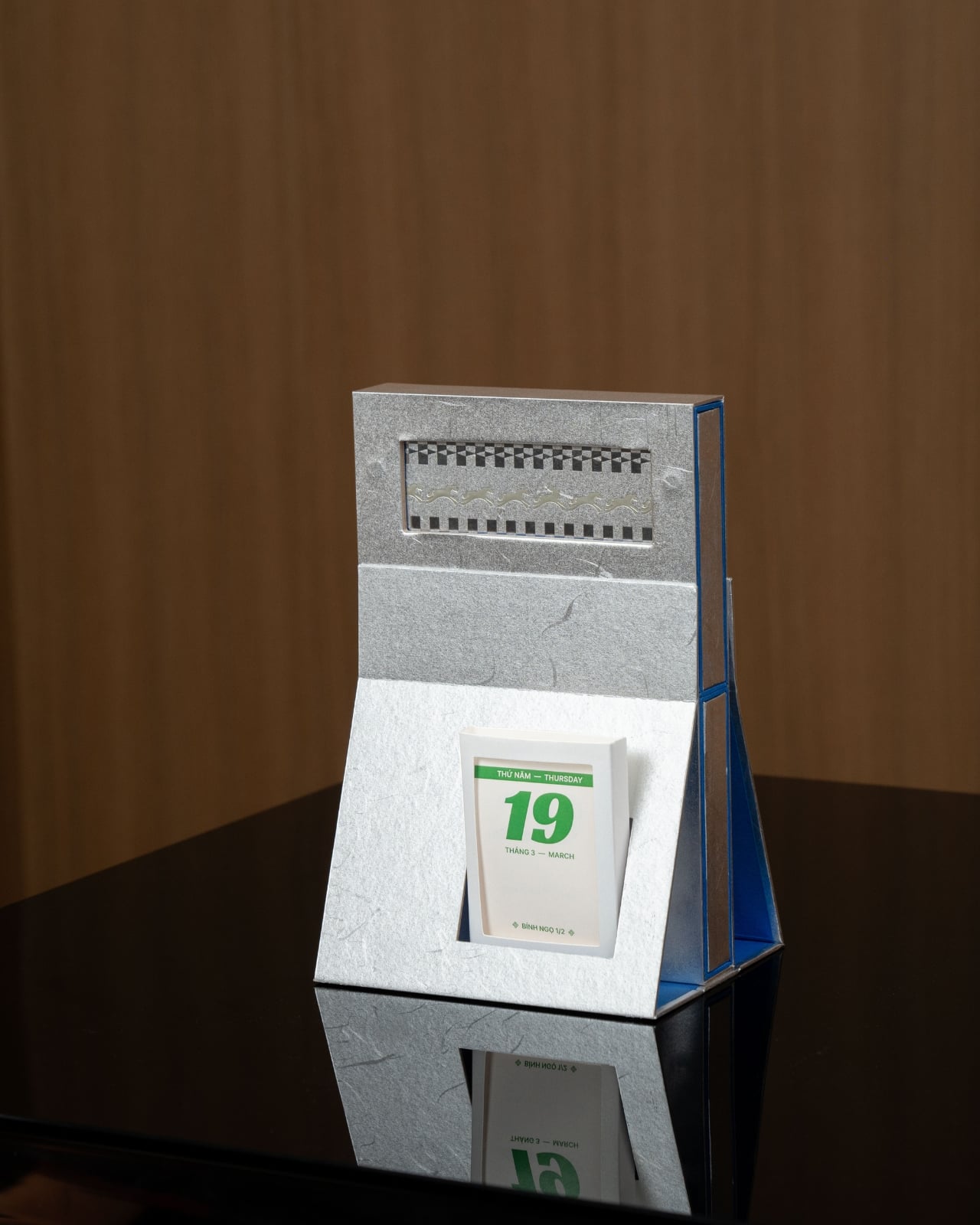
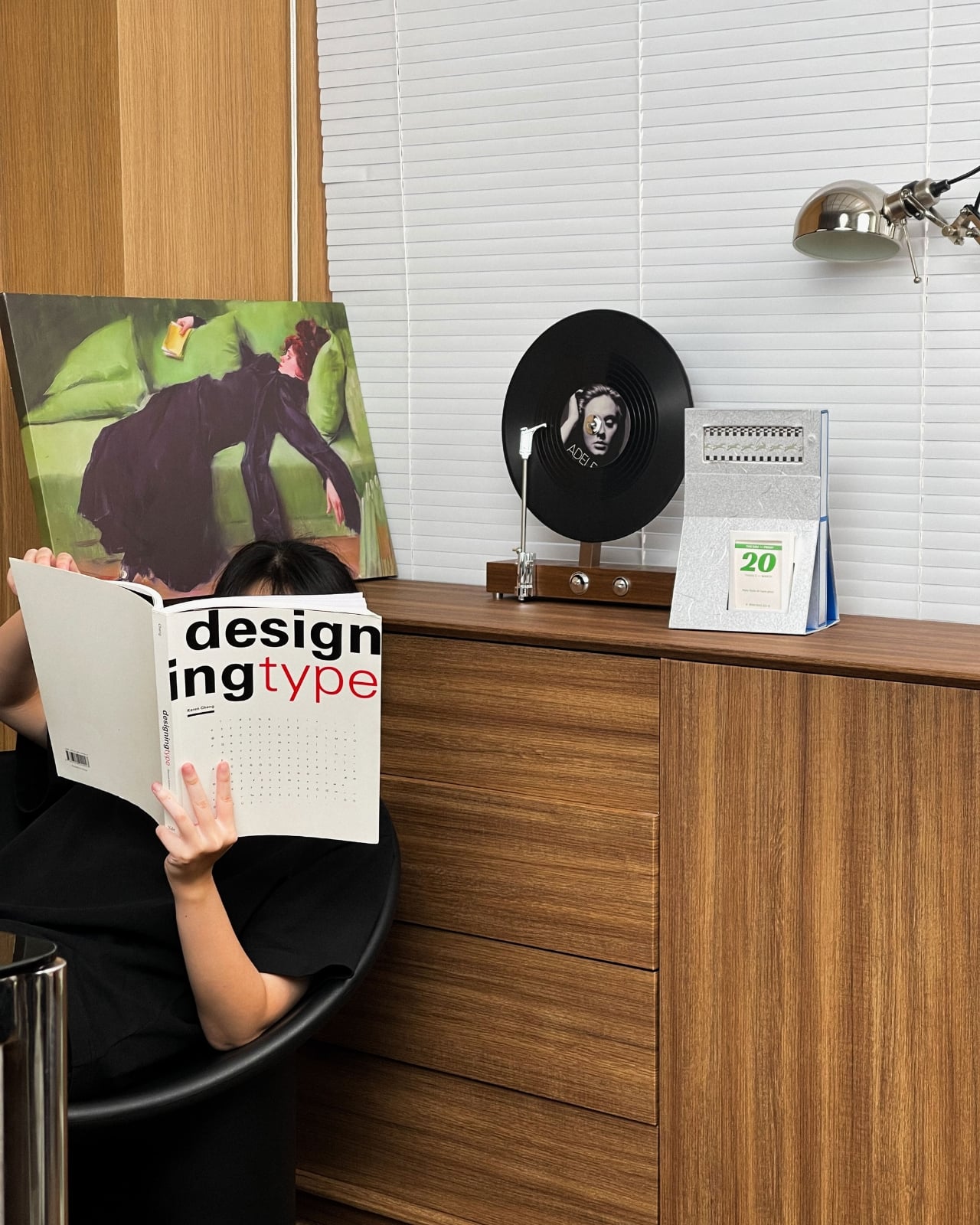
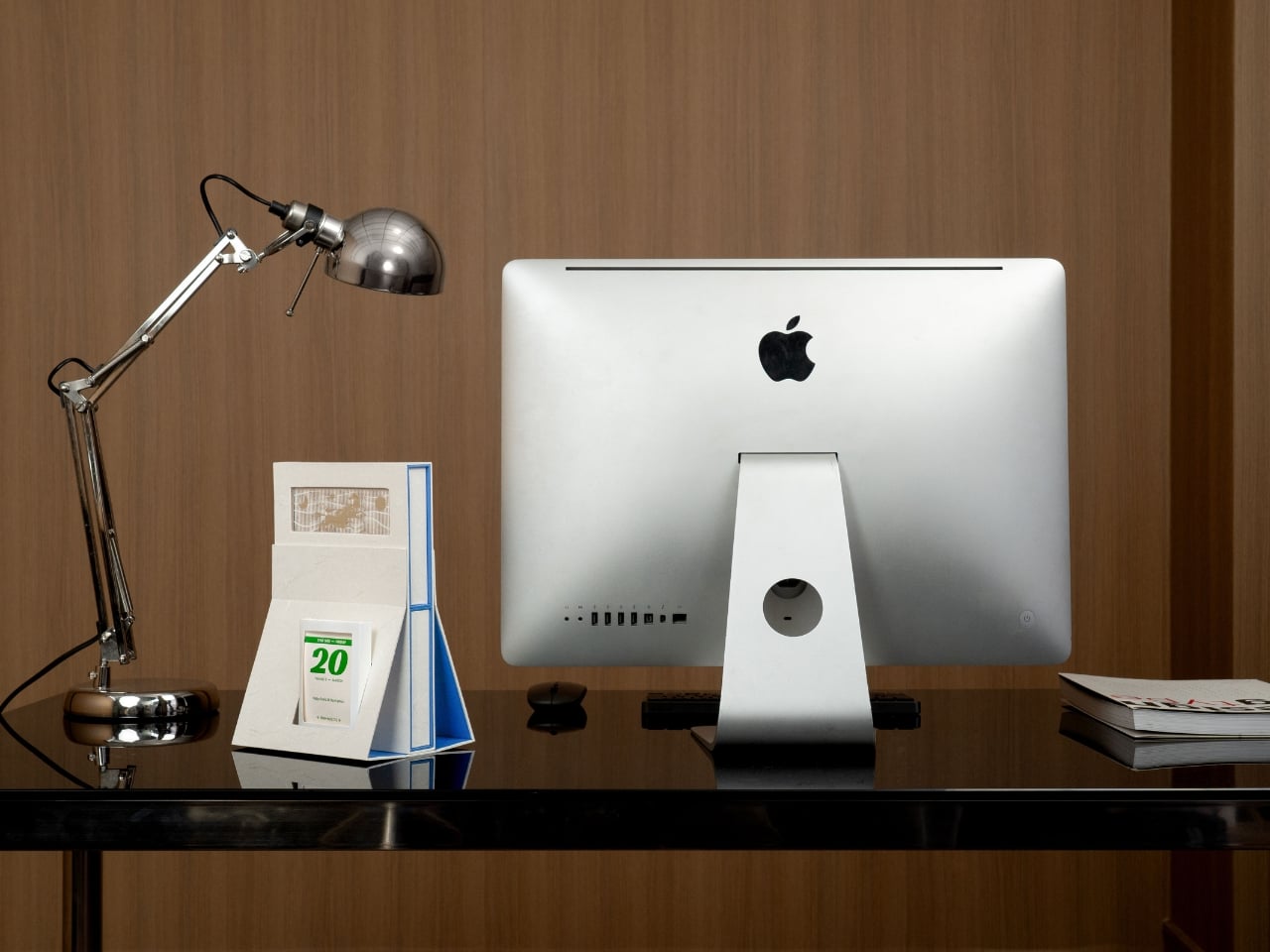
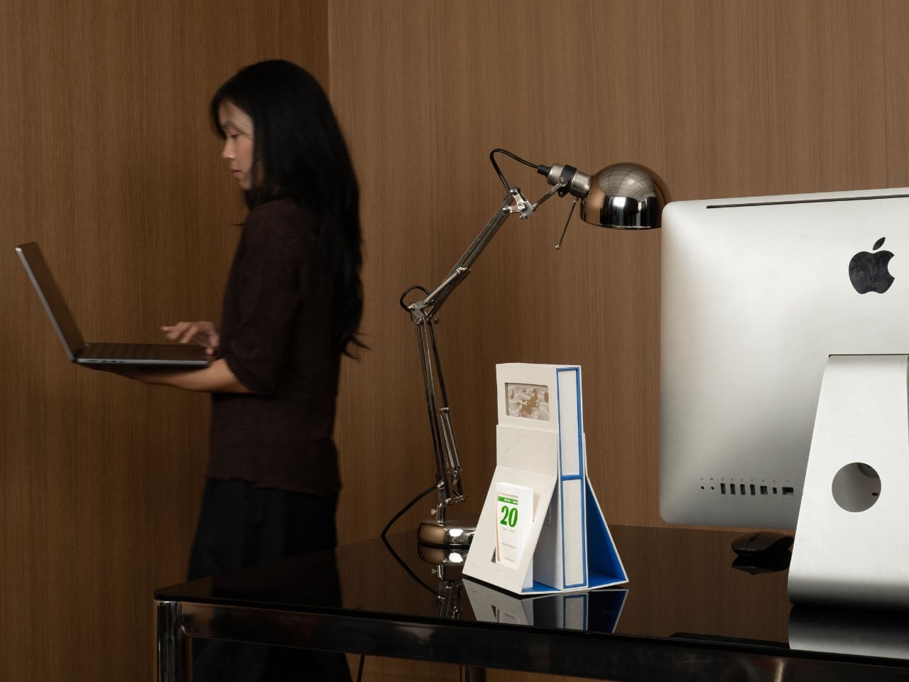
There’s something wonderfully audacious about a desk calendar that refuses to be just a desk calendar. Cillgold Agency’s “By the Lighthouse” for 2026 is exactly that kind of design rebel. Instead of being a forgettable square of paper you flip through mindlessly, it’s a miniature architectural statement that happens to tell you what day it is.

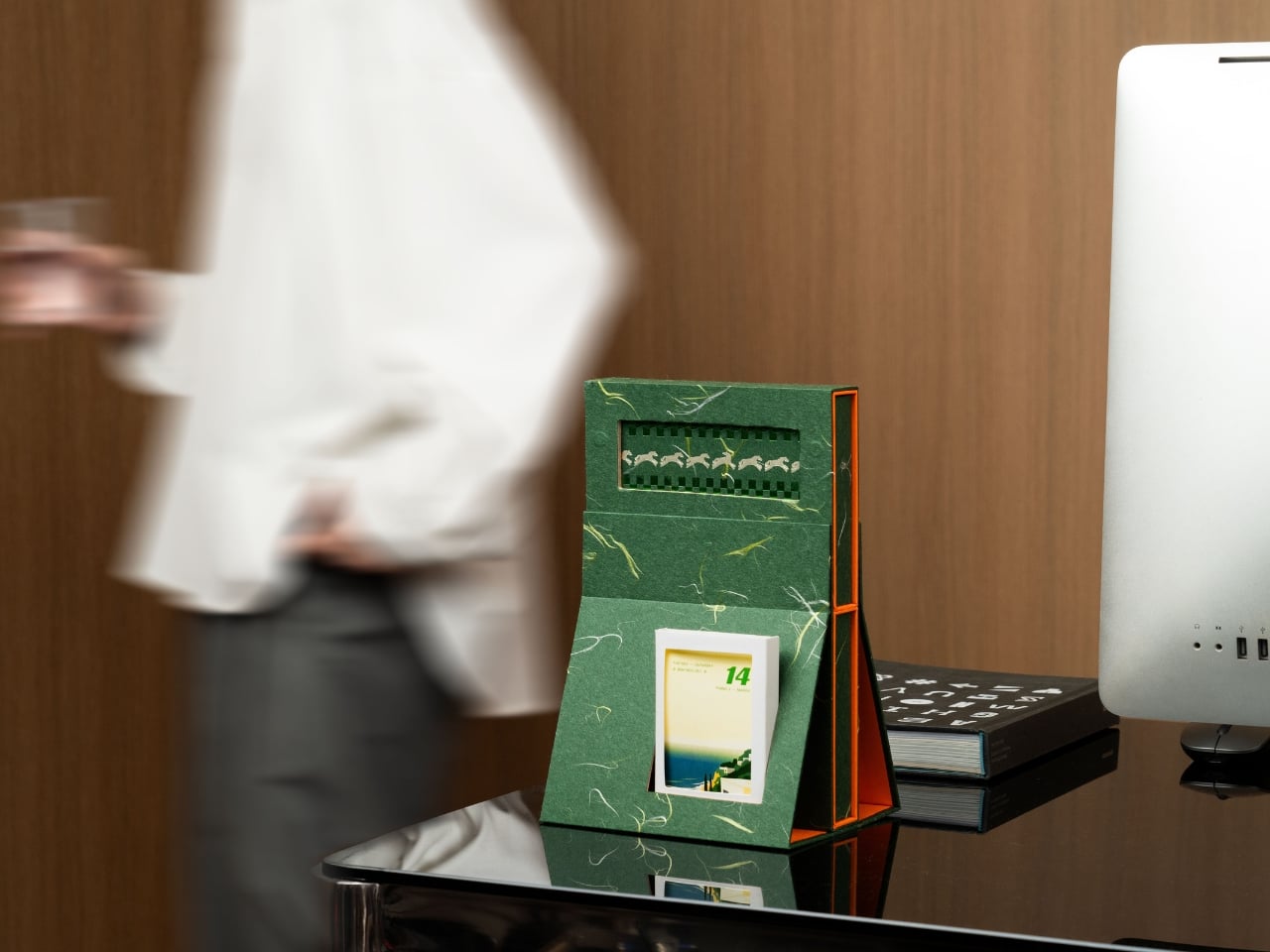
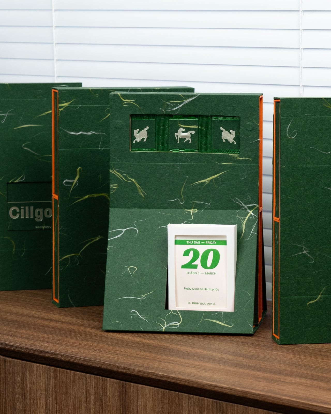
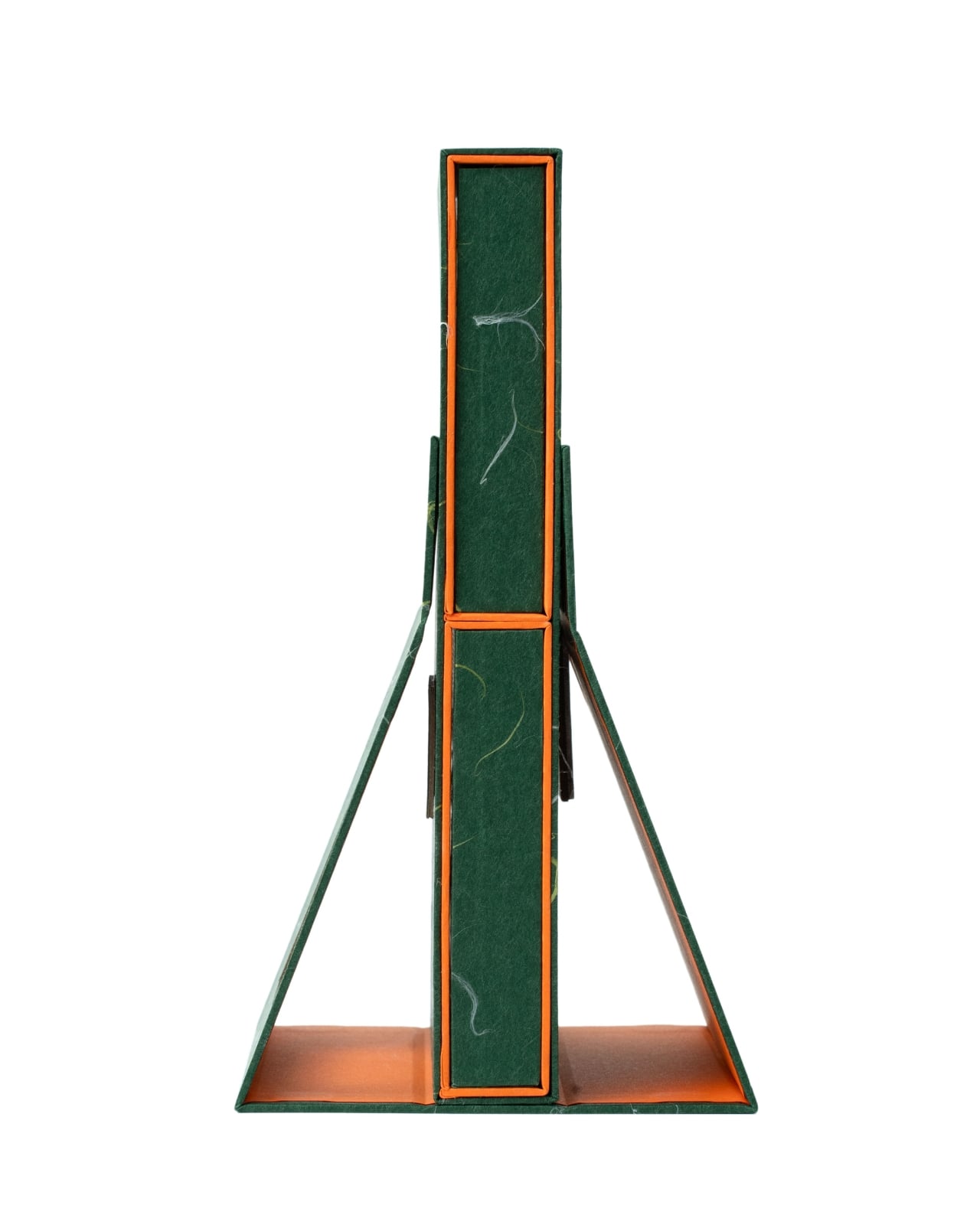
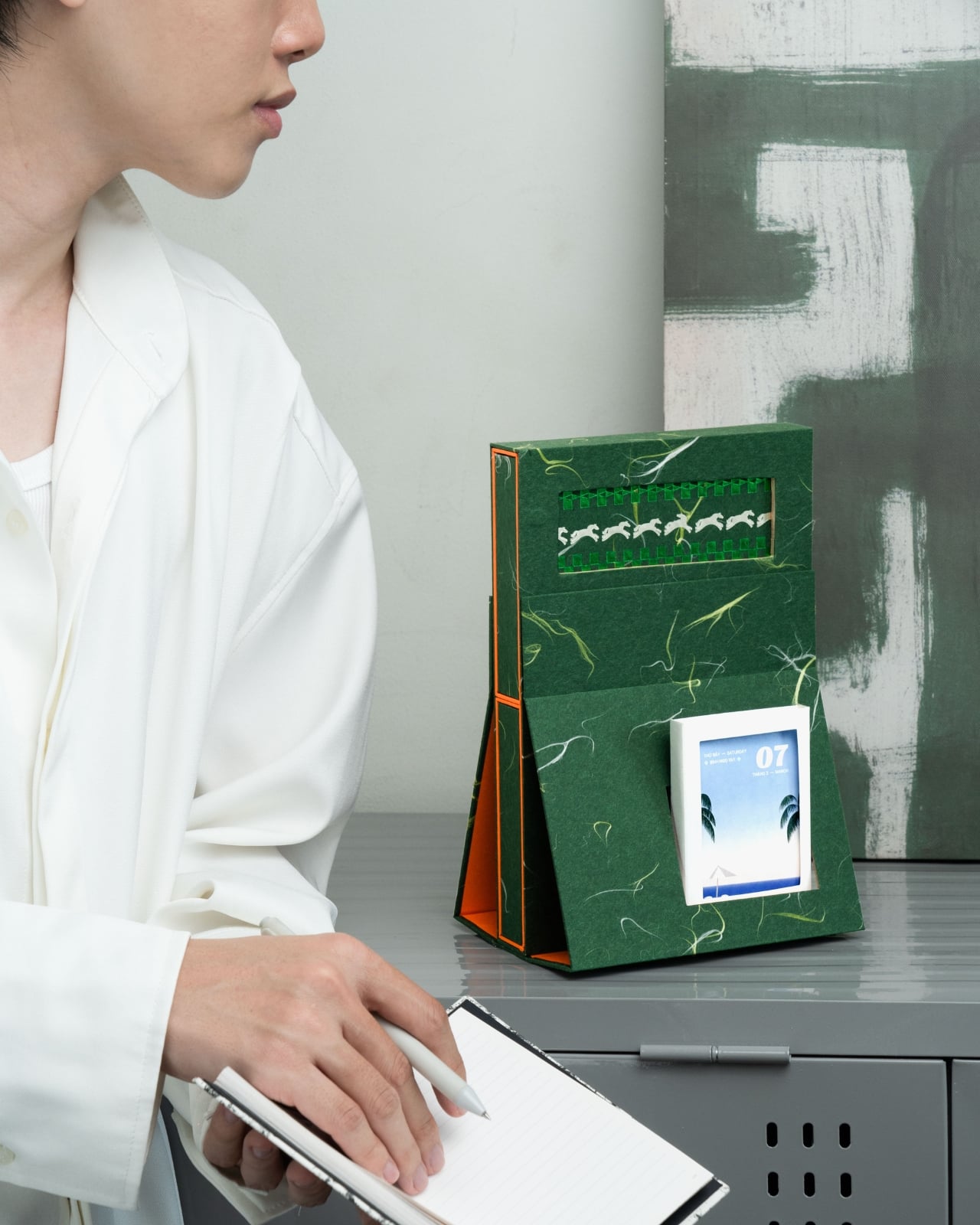
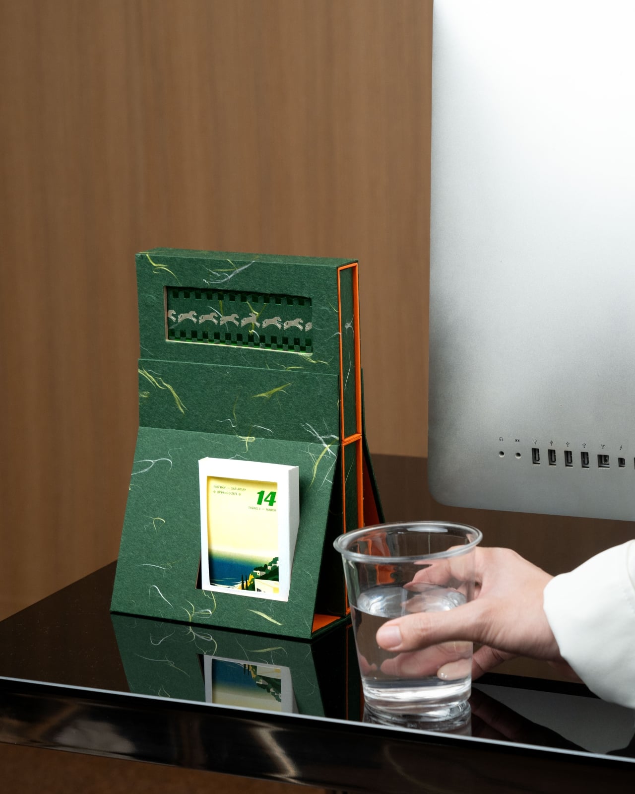
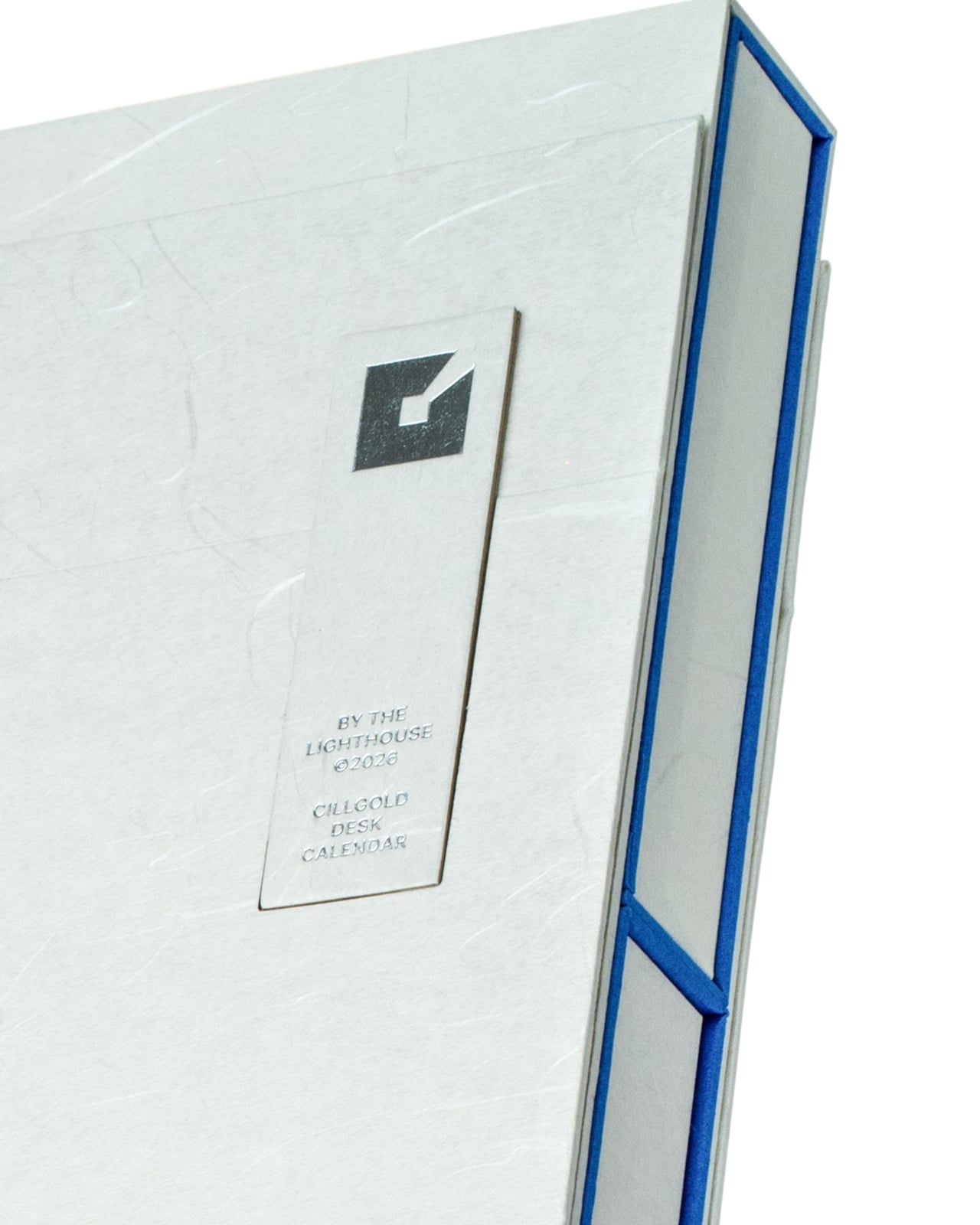
The piece stands tall on your desk like a proud beacon, mimicking the silhouette of an actual lighthouse with surprising accuracy. The structure tapers as it rises, supported by angular legs that give it a sense of purpose and stability. This isn’t some flimsy cardboard that’ll topple over when someone walks by too quickly. The design feels deliberate, substantial, like it’s actually guiding you through the year ahead.

Designer: Cillgold Agency

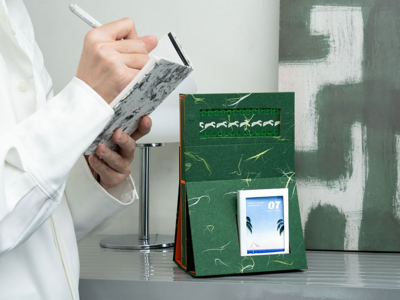
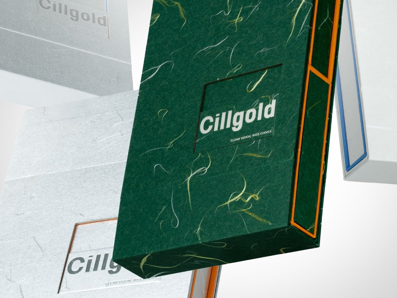
What really catches your eye is the material choice. The entire exterior is wrapped in this gorgeous deep green marbled paper with veins of gold running through it like captured lightning. It’s the kind of surface that makes you want to reach out and touch it, to trace those organic patterns with your fingertips. The marbling has a luxurious, almost geological quality, as if each calendar was carved from a block of precious stone rather than assembled from paper and cardboard.

Then there’s that pop of coral orange along the edges. It’s unexpected and bold, creating this beautiful contrast against the moody green. The orange trim follows the contours of the structure, outlining the lighthouse shape and drawing your eye upward. It’s a small detail that completely transforms the piece, adding warmth and energy to what could have been a somber color palette.

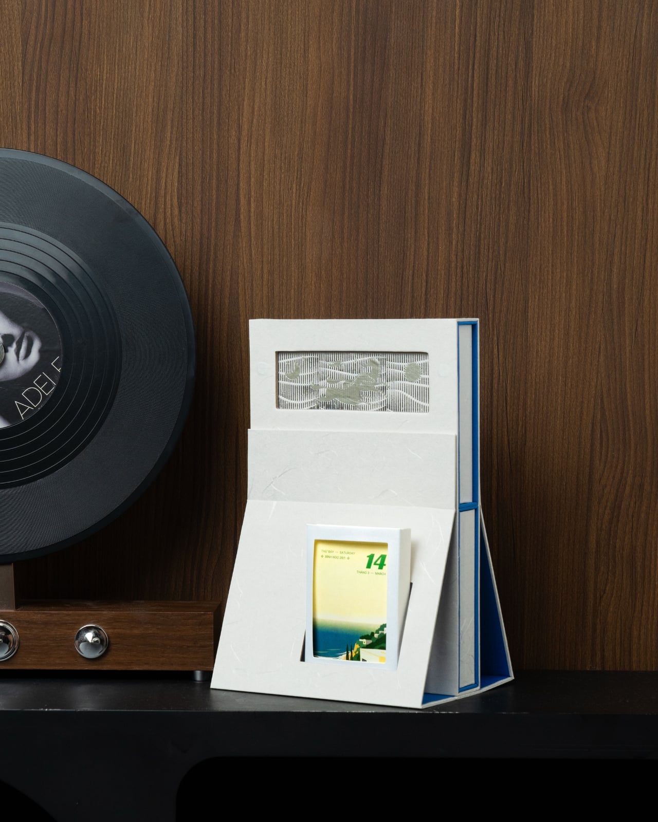
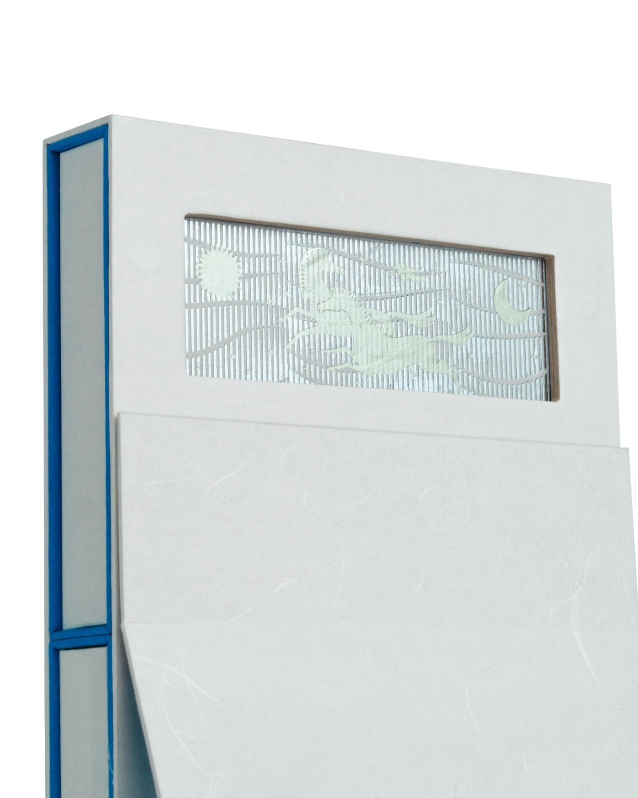
Near the top of the structure, there’s a rectangular cutout that reveals a row of white seagulls in flight, set against a ribbed green background. This little window is pure charm. It’s like peering through a lens into a coastal scene, a reminder of the lighthouse’s maritime purpose. The birds are simplified, almost pixelated in their rendering, which gives them a playful, graphic quality that bridges vintage and contemporary design sensibilities.

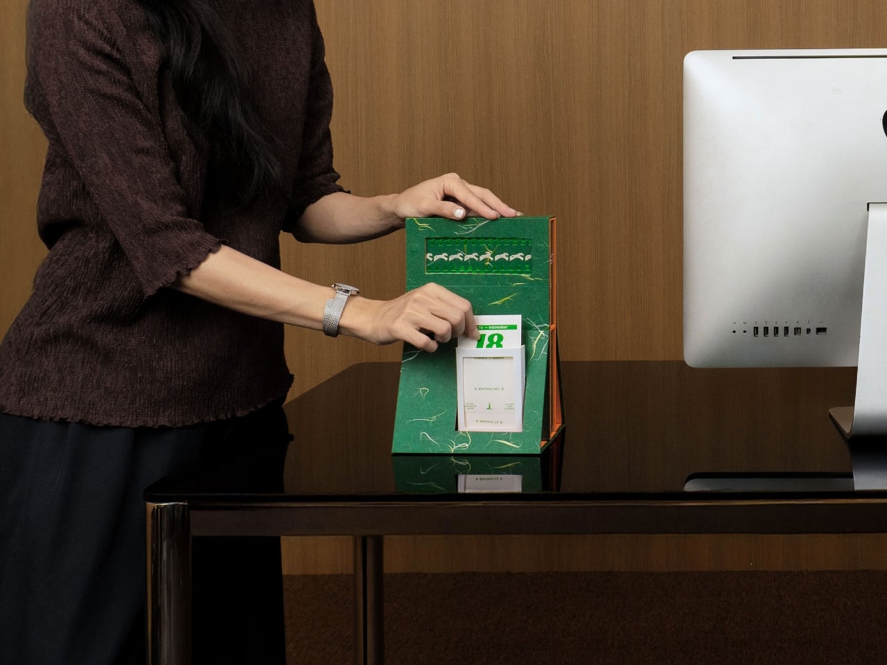
The actual calendar component sits in the lower portion of the structure, displaying date cards that feature their own coastal imagery. Each card shows serene beach scenes, lighthouses in the distance, palm trees swaying in ocean breezes. The photography has that dreamy, gradient quality that makes you want to book a seaside vacation immediately. Flipping through the days becomes a small daily ritual, revealing new vistas as the year unfolds.

What Cillgold Agency has really accomplished here is creating an object that lives in multiple categories at once. Yes, it’s functional. You can absolutely use it to track dates and plan your schedule. But it’s also decorative, sculptural, collectible. It’s the kind of thing that sparks conversations when people enter your workspace. “What is that?” they’ll ask, and you’ll get to explain that it’s a calendar, watching their faces light up with surprise and delight.

The design speaks to a larger trend in stationery and desk accessories where form and function merge into something more meaningful. We’re moving away from purely utilitarian objects and embracing pieces that bring joy, personality, and artistry to our everyday environments. Our workspaces shouldn’t be sterile or boring. They should reflect who we are and what we value.

From a collector’s perspective, this is absolutely a keeper. Once the year ends, you don’t toss it in the recycling bin. You might repurpose it, display it on a shelf, or store it carefully as an example of excellent paper craft and product design. Limited edition calendars like this often appreciate in value among design enthusiasts, but more importantly, they become personal artifacts, markers of a particular year and aesthetic moment.

The post This Lighthouse Calendar Turns Your Desk Into a Coastal Escape first appeared on Yanko Design.

27-Inch Digital Wall Calendar Shows Schedules, Then Switches to Photos

Shared calendars scatter across phones, sticky notes live on the fridge, and whiteboards never quite get updated. Most attempts to centralize family logistics involve smart displays that look like tablets or small TVs bolted to the wall, clashing with the rest of the room. A shared calendar deserves to be visible, but not at the cost of turning your kitchen into a control room with glowing screens and exposed cables.

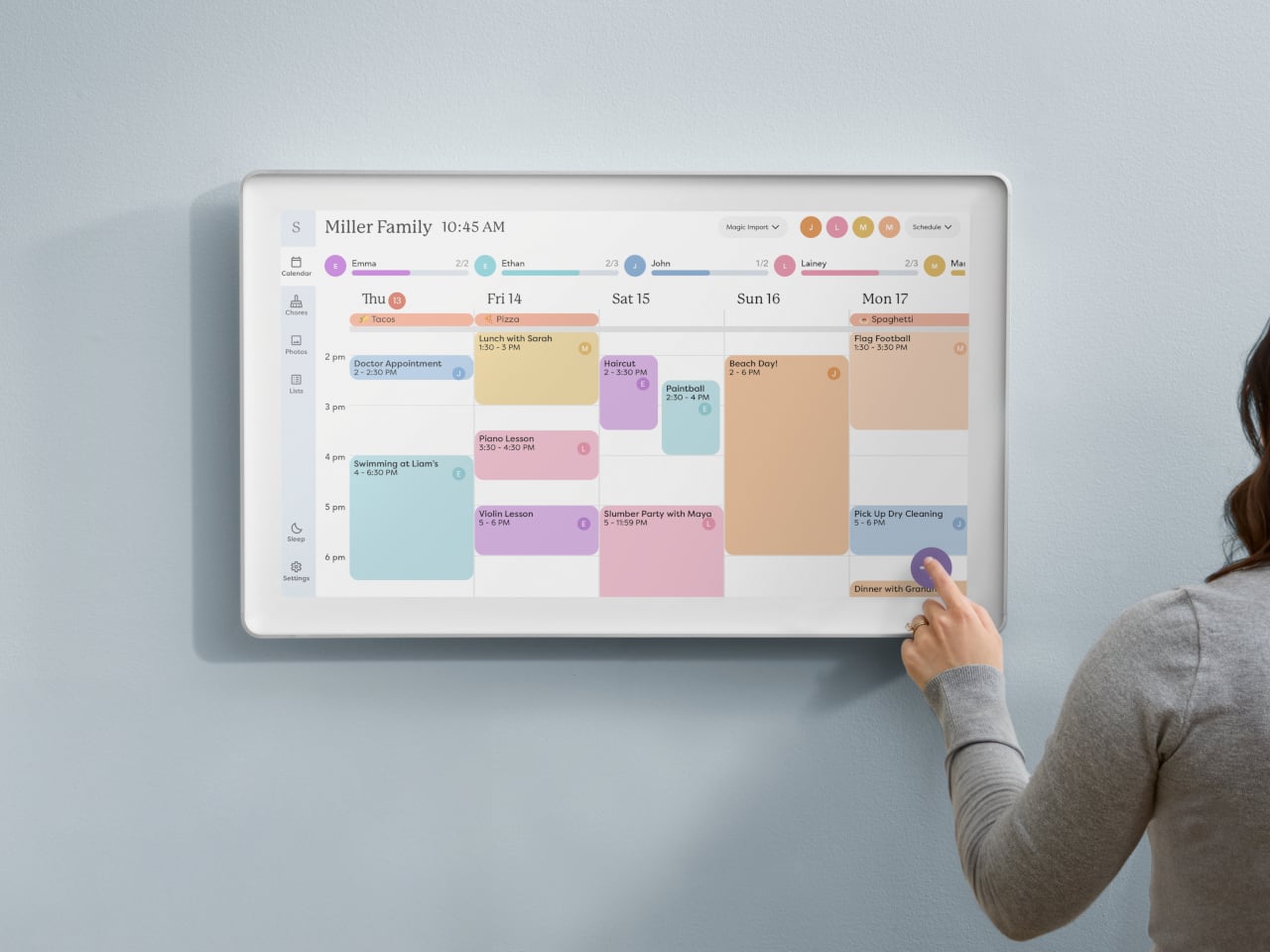
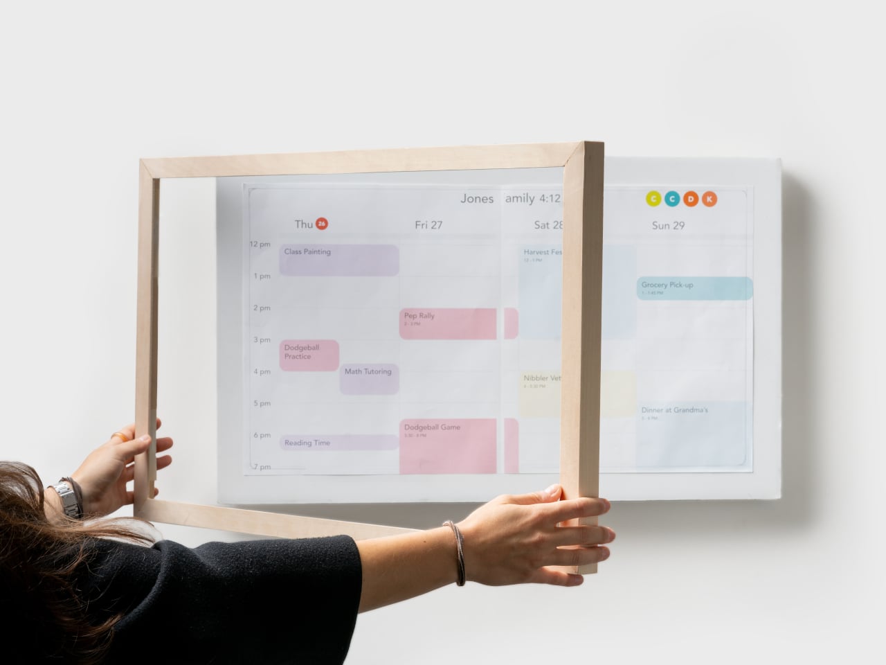
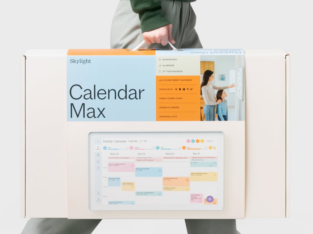
Skylight’s 27-inch Calendar Max is a digital calendar that starts from the wall, not the app. It is a large wall-mounted touchscreen designed to be a central family hub, but the industrial design leans toward a floating frame rather than a black rectangle. The goal is to feel like part of the decor while still being big and clear enough to see from across the room.

Designer: Box Clever for Skylight

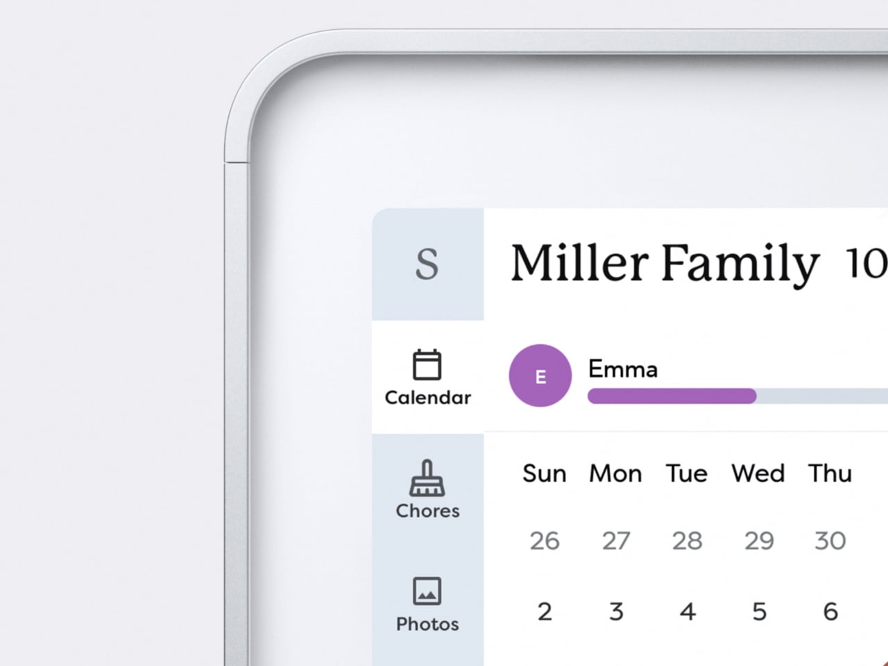
A typical morning means everyone glances at the calendar on the way to coffee. Color-coded events show who is doing what, lists and meal plans sit alongside the schedule, and everything syncs with the digital calendars people already use on their phones. Instead of hunting through apps or checking multiple sources, the day’s plan is just there, big enough that no one can pretend they missed soccer practice.

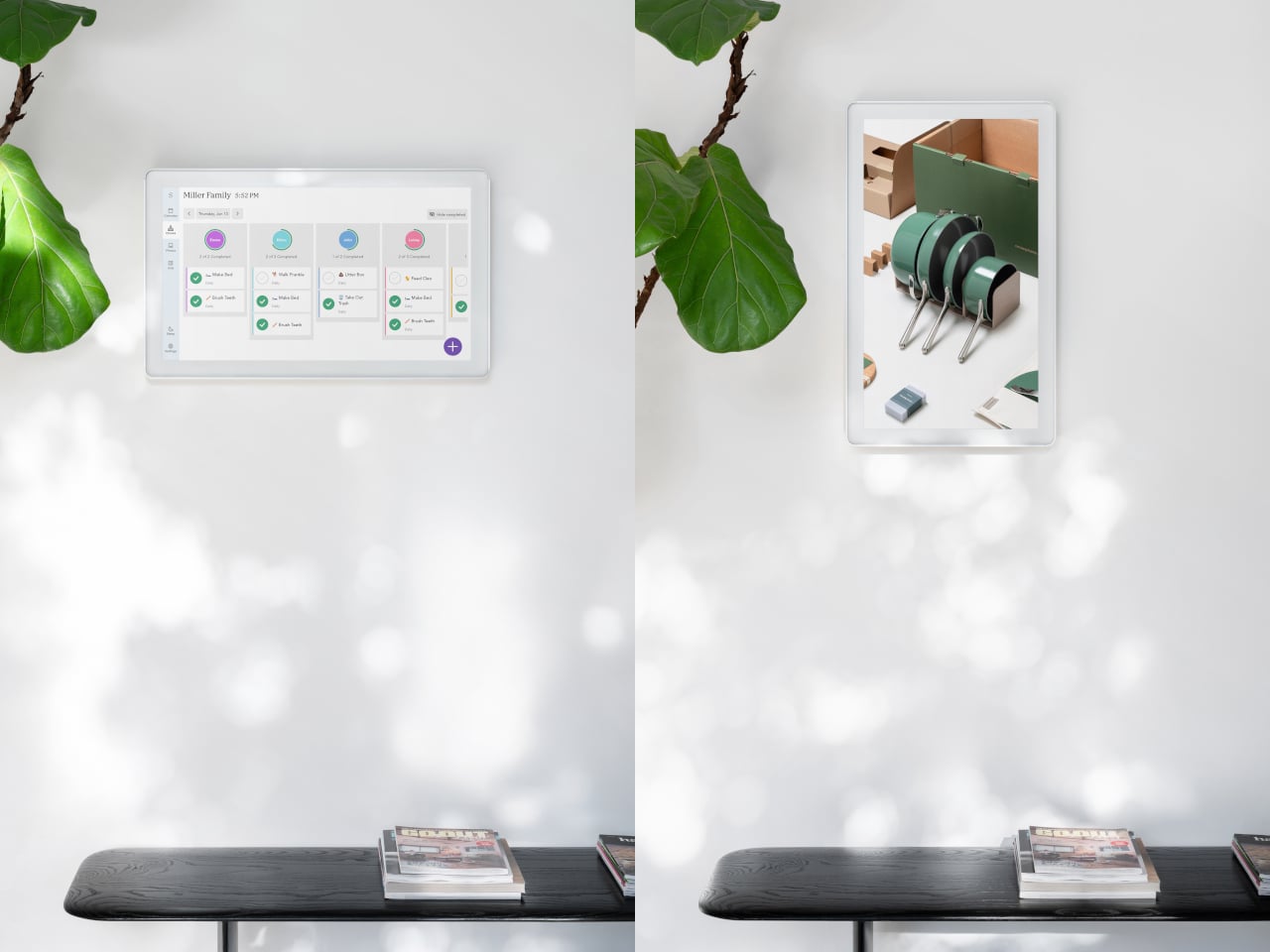
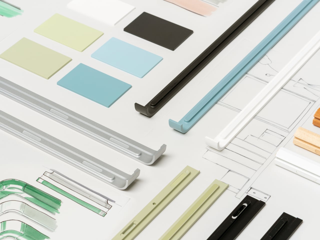
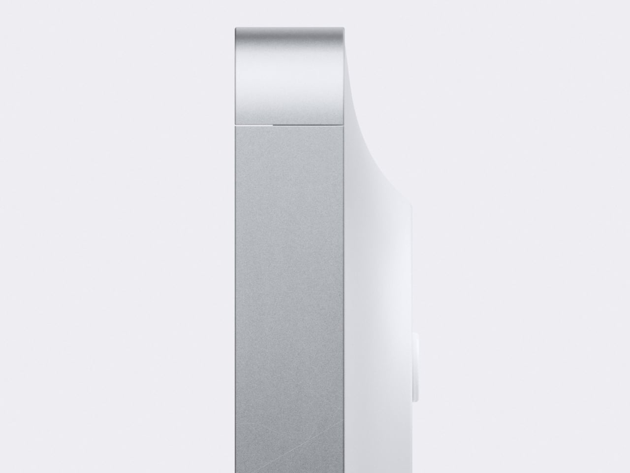
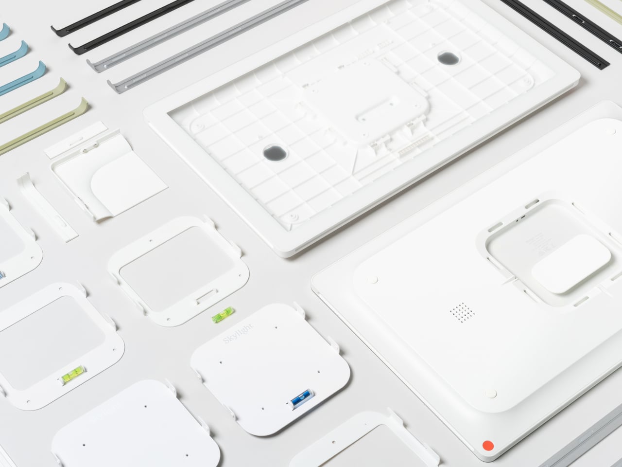
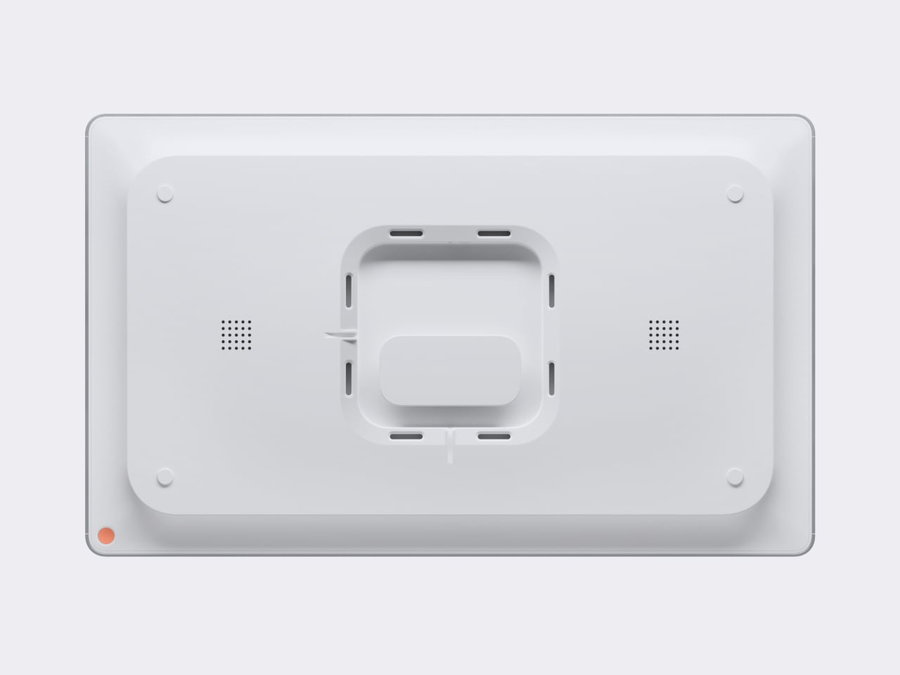
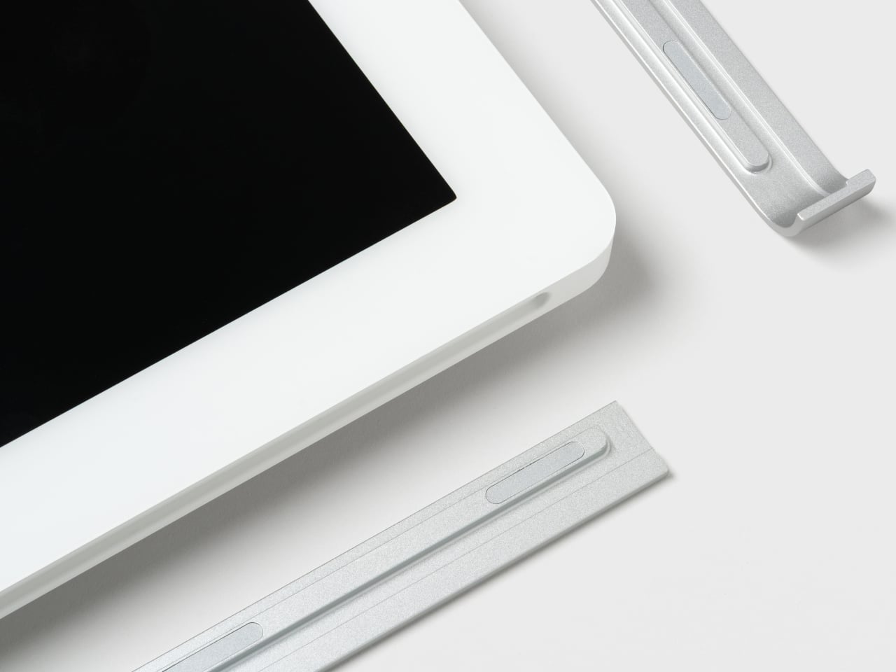
The display sits slightly off the wall, casting a soft shadow that changes with the light, so it reads more like a floating object than a mounted monitor. Magnetically attached frames in aluminum, wood, or plastic let you pick a look that matches your space and swap them later if the room changes, without replacing the hardware. It mostly just means the calendar feels deliberate instead of tacked on.

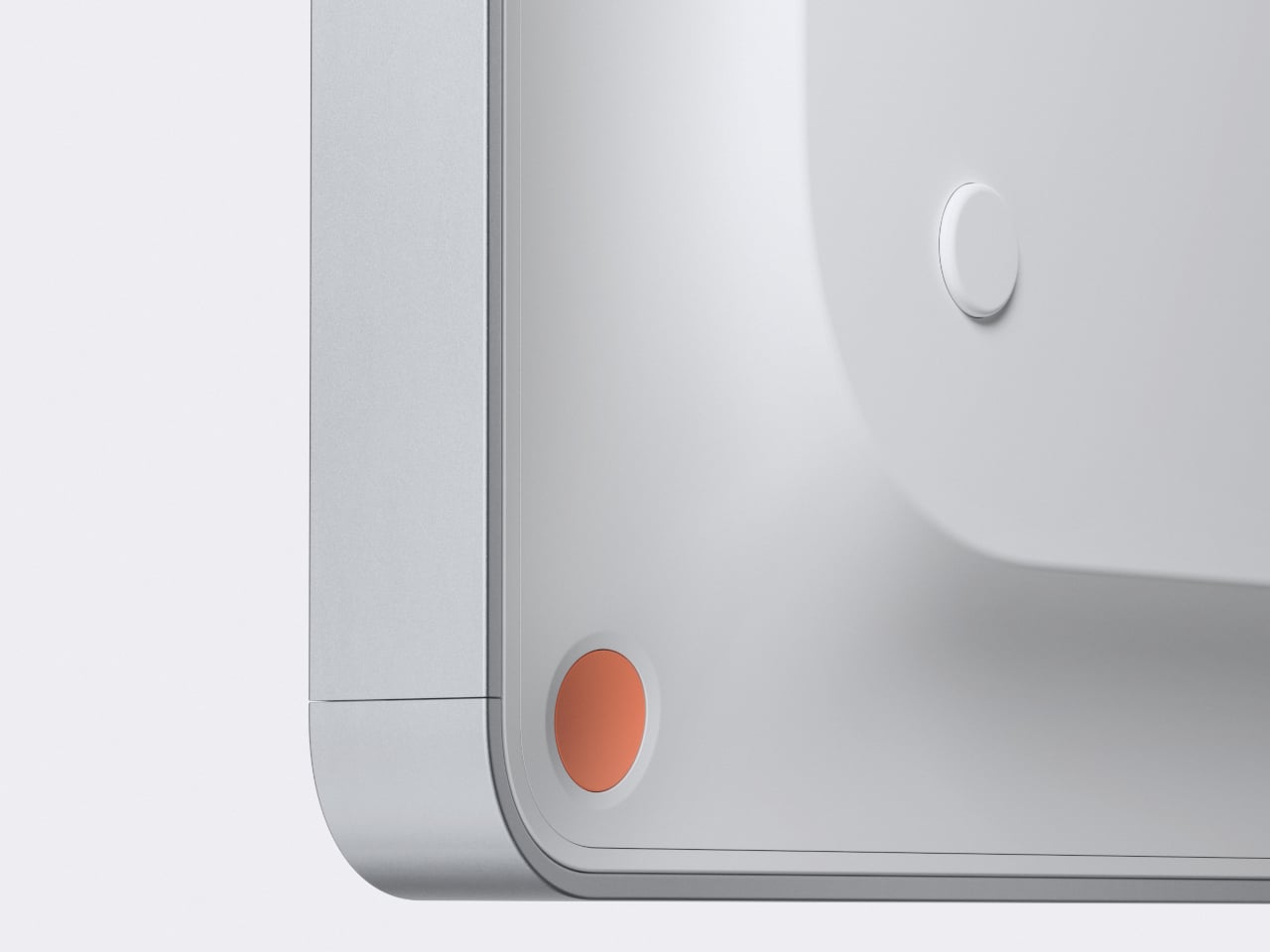
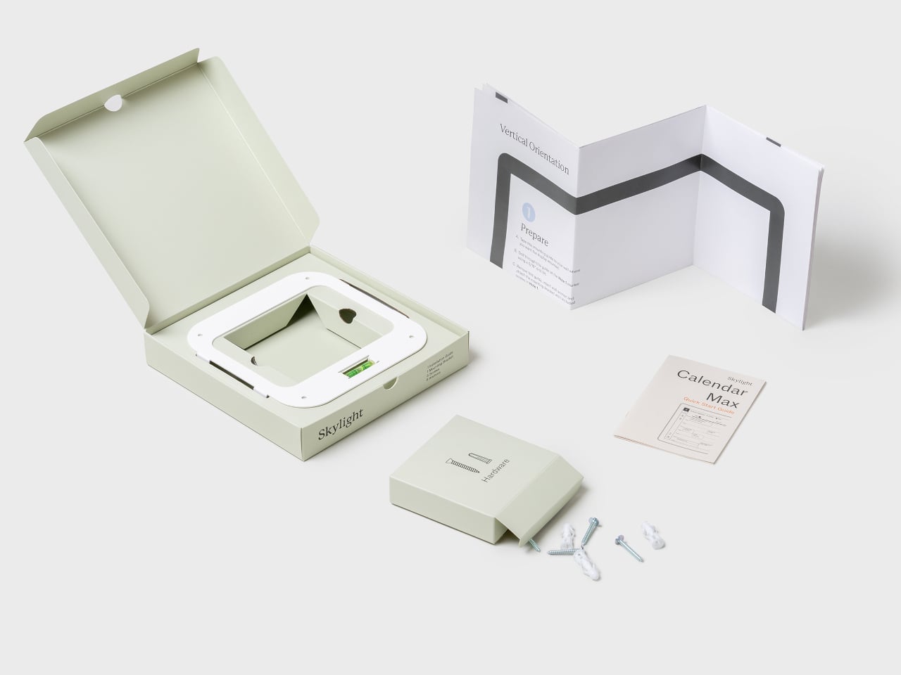
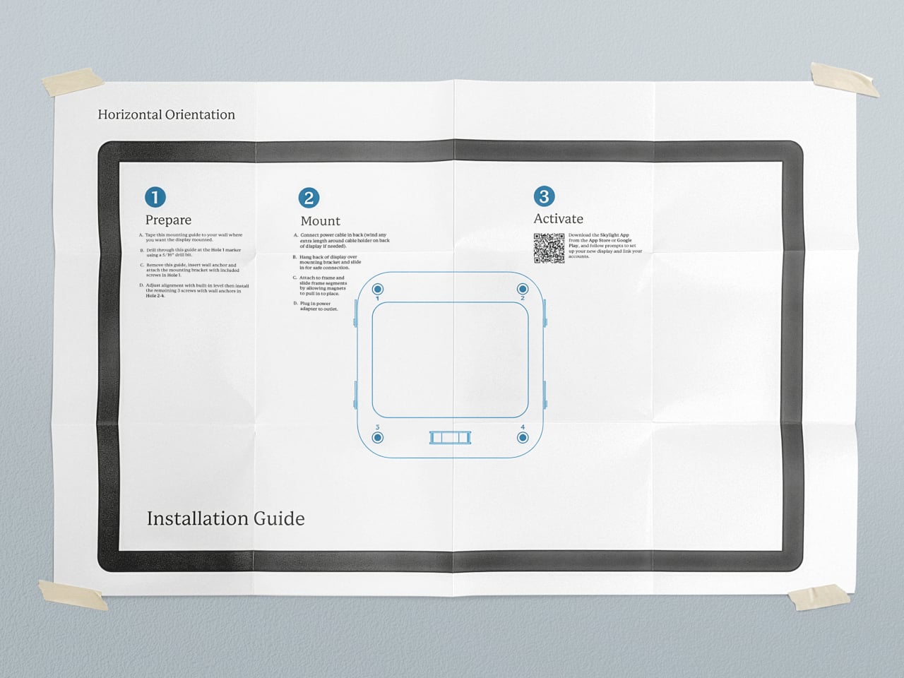
The mounting system uses a dedicated wall plate with cable routing, so once it is up, the calendar sits cleanly with minimal visible wiring. The packaging and installation guide are designed to make the process approachable, more like hanging a large frame than installing AV equipment. That matters when the person putting it up is more interested in family logistics than tech tinkering.

During busy hours, it behaves like a bright, legible planner. When things slow down, it can switch to a photo gallery, turning into a large digital frame that shows family pictures instead of to-dos. That shift helps it feel less like a dashboard that never sleeps and more like a living part of the wall that changes mood with the house.

Calendar Max treats shared schedules, lists, and memories as part of the architecture of daily life, not just data on screens. By paying attention to silhouette, depth, frames, and mounting, it turns a functional object into something you do not mind giving prime wall space. Smart calendars that actually look like they belong in a living room turn out to be surprisingly rare, which makes one that does feel like a meaningful shift.

The post 27-Inch Digital Wall Calendar Shows Schedules, Then Switches to Photos first appeared on Yanko Design.
Clover Emotion Tracker Turns Small Happy Moments into a Daily Desk Ritual

People are more stressed than ever, yet still find it hard to talk honestly about how they feel, even with therapists or friends. Most mental health tools live inside apps that want you to rate your mood on a slider or fill out forms about your day, which can feel clinical or like homework you forgot to do. Clover is a concept that tries to make emotional check-ins gentler and more tangible, focusing on collecting small moments that went right instead of cataloging everything that went wrong.

Clover is a small ecosystem built around three pieces: a pocketable voice recorder, a desk-calendar device, and a companion app. Instead of logging stress or symptoms, you press a button and record short voice notes whenever something makes you genuinely happy. Those moments are then visualized on the calendar and analyzed in the app, turning your week into a kind of happiness log that quietly reframes how you see your days.

Designers: Seyeon Park, Bhin Son, Yu Jin Song, Jiwon Park, Jinya Kim

The recorder is a small, circular object with a single orange button and a loop strap, designed to be grabbed and pressed quickly. It is meant for capturing tiny, specific moments, sunlight on your desk, a good cup of tea, a joke from a friend, in your own voice. The goal is to lower the friction so much that recording a positive moment feels as easy as taking a photo, no unlocking, no tapping through screens, just press and speak.

1

The desk calendar is a tilted white slab with a large circular dial labeled with days of the week and a small screen that displays words like “Sunlight” or “Spring.” It plays back or summarizes your voice recordings by day, and turning the dial lets you move between Day mode, Q&A mode, and long-term overview modes. Checking your emotional log becomes a physical ritual, more like flipping through a calendar than scrolling a feed or staring at another glowing interface.

1

The app brings everything together, with daily cards asking “What is your today?”, weekly and monthly views full of dots and bars, and simple text insights that highlight recurring themes. You can tag entries by time, category, or keywords, and later see which people, places, or activities show up most often in your happiest moments. The analysis stays gentle, showing patterns without drowning you in numbers or making you feel like you failed when a week looks sparse.

1

Clover’s visual language, white and grey surfaces with orange accents, soft typography, and a clover icon that appears on hardware and UI, keeps the system from feeling like medical equipment. The core values, self-honesty, emotional balance, and everyday positivity, are baked into how it looks and behaves. It frames itself as a friendly desk object and app you would not mind seeing every day, not a reminder that something is broken.

Clover quietly flips the usual tracking script. Instead of asking you to monitor symptoms or productivity, it asks you to notice and collect small good things, then shows you that they happen more often than you think. For people who are tired of mood sliders and habit streaks, the idea of a physical recorder and calendar that simply help you remember what felt right might be the most calming part of the concept.

The post Clover Emotion Tracker Turns Small Happy Moments into a Daily Desk Ritual first appeared on Yanko Design.
Discover Your Poetic Journey Through Time With Calen-bar

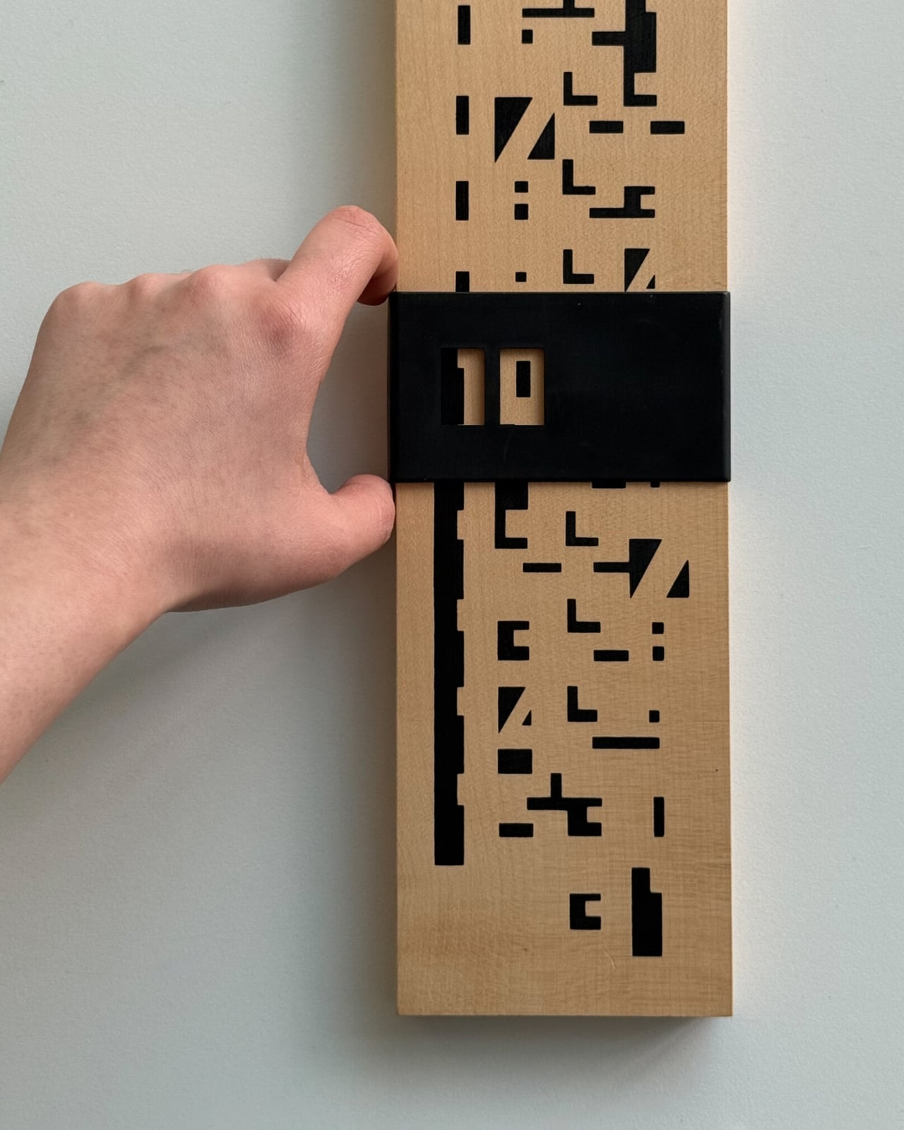
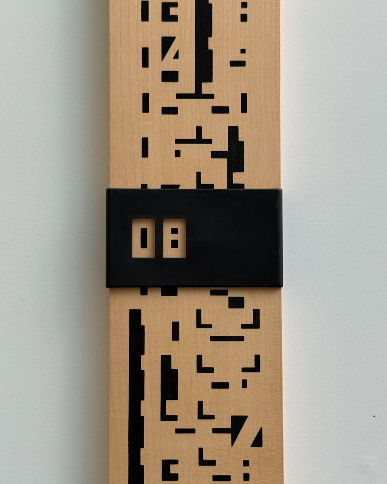
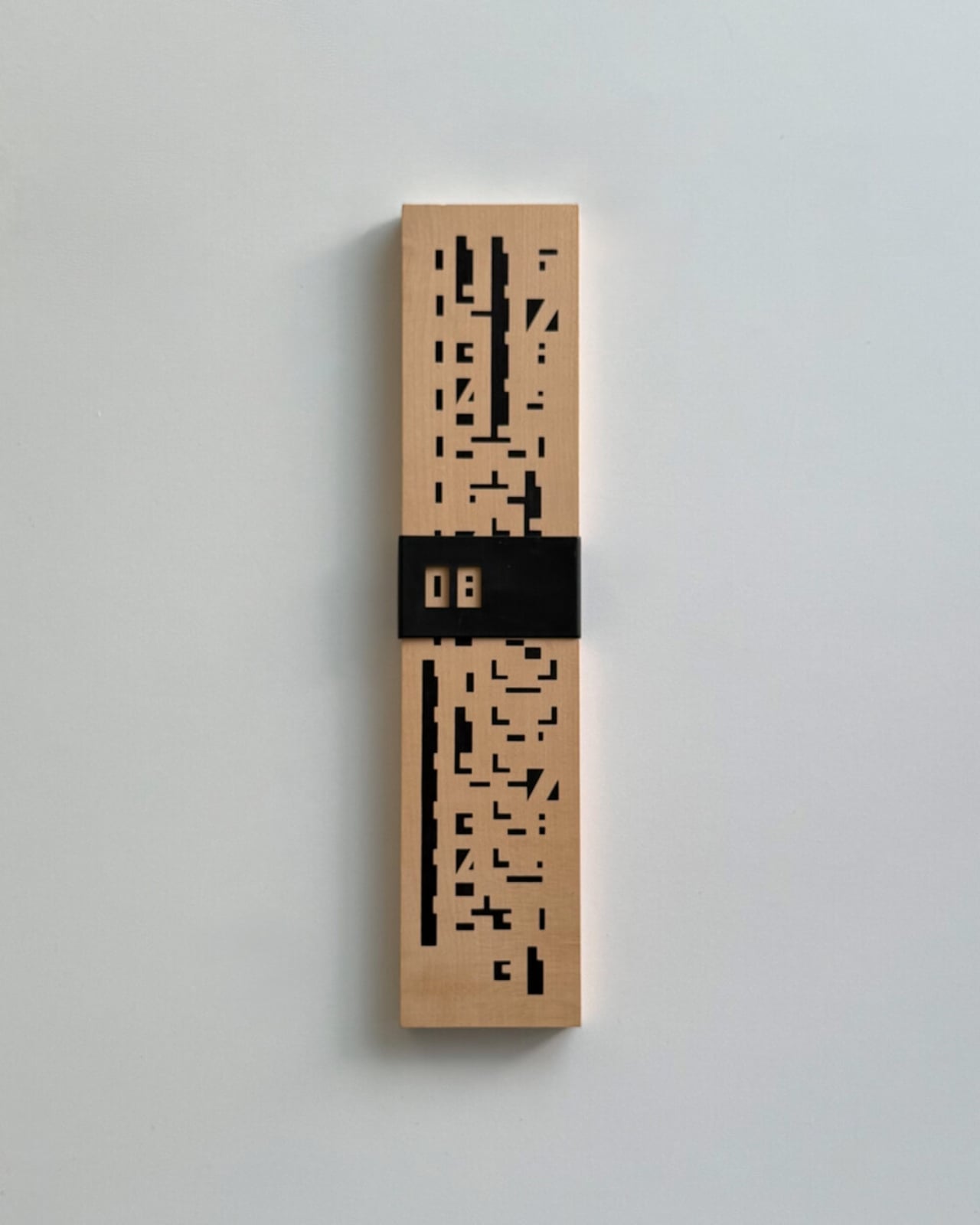
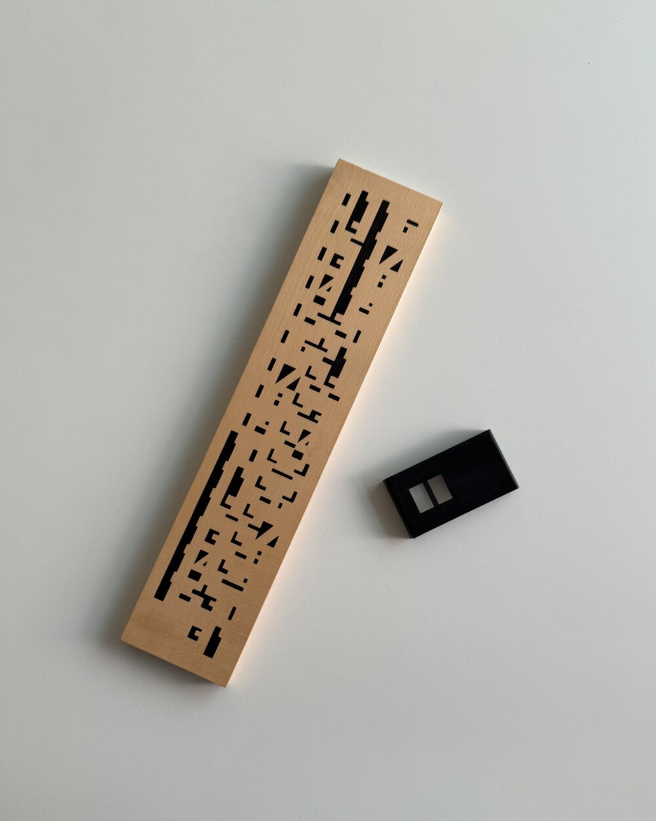
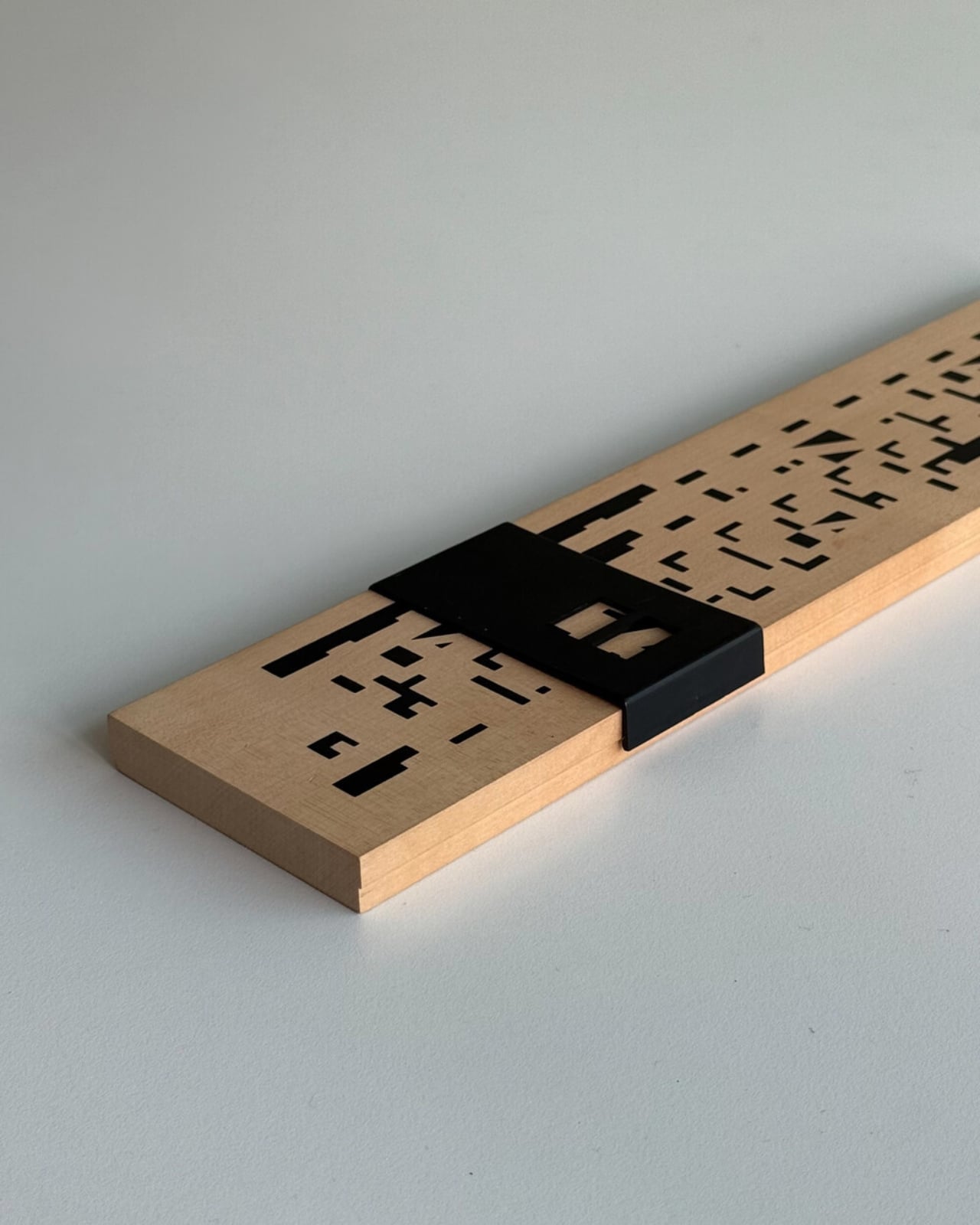
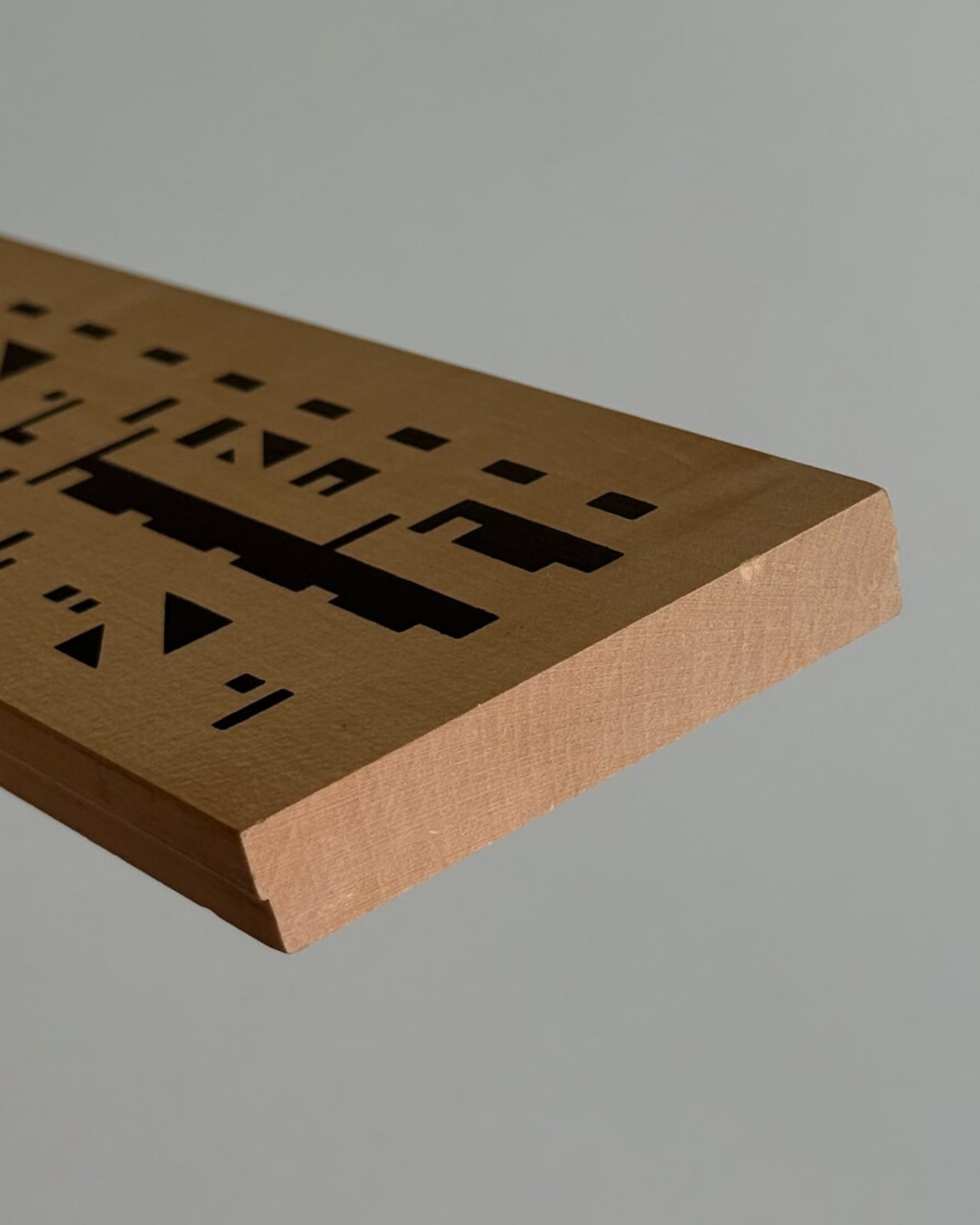
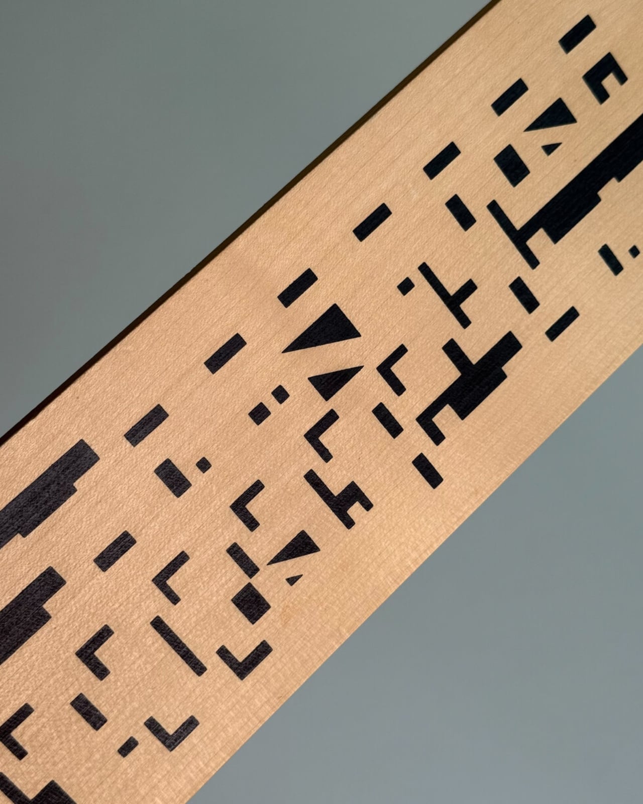
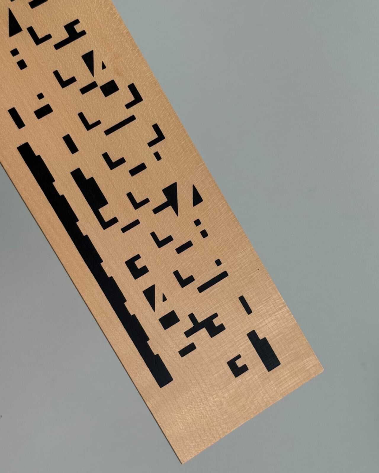
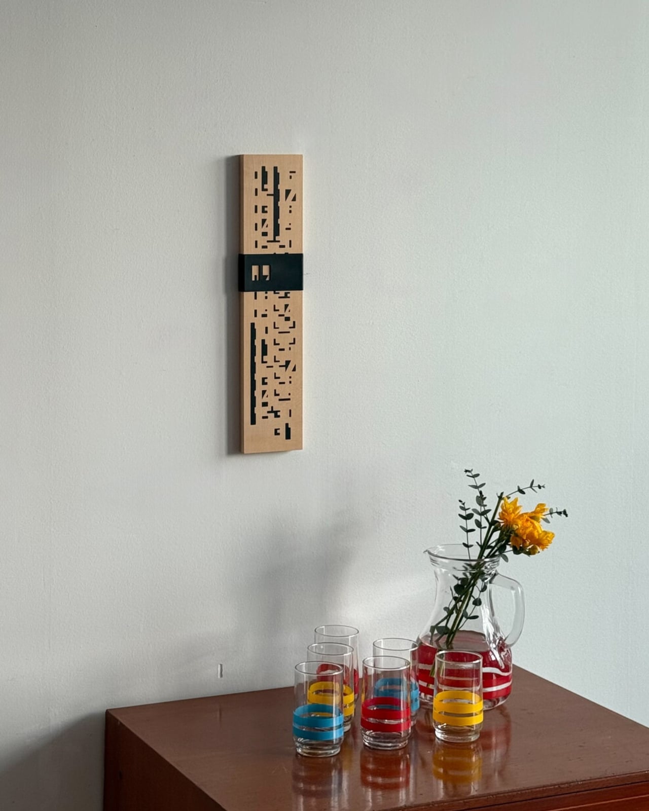
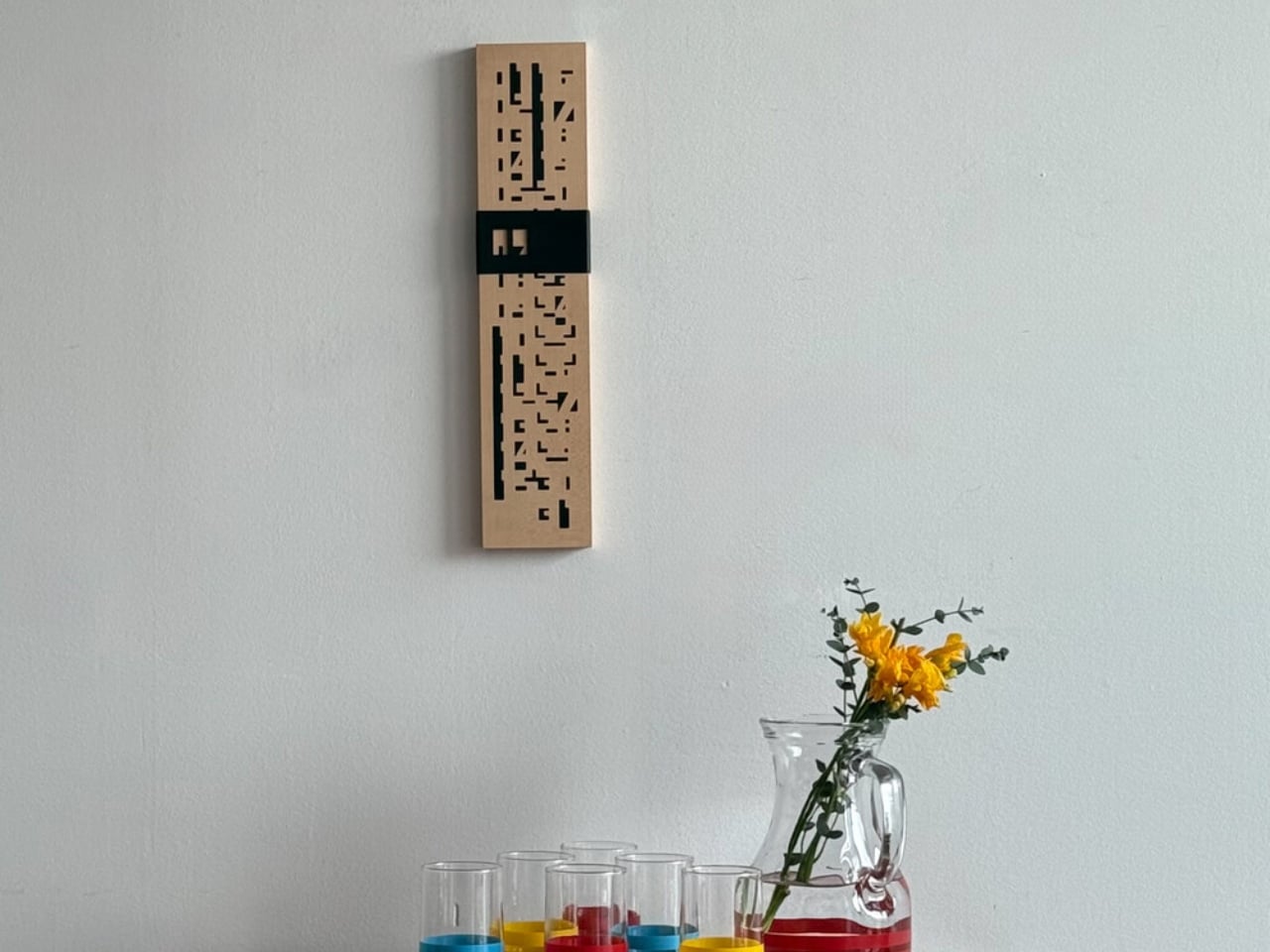
In a world characterized by the ceaseless march of technology, the Calen-Bar emerges as a distinctive and poetic tribute to time, seamlessly blending aesthetics, mindfulness, and sustainability. This perpetual calendar transcends the conventional, inviting users into a realm where the manual meets the meaningful, where every little act becomes a marker of eternal days.

Designer: Yukimasa Hirota

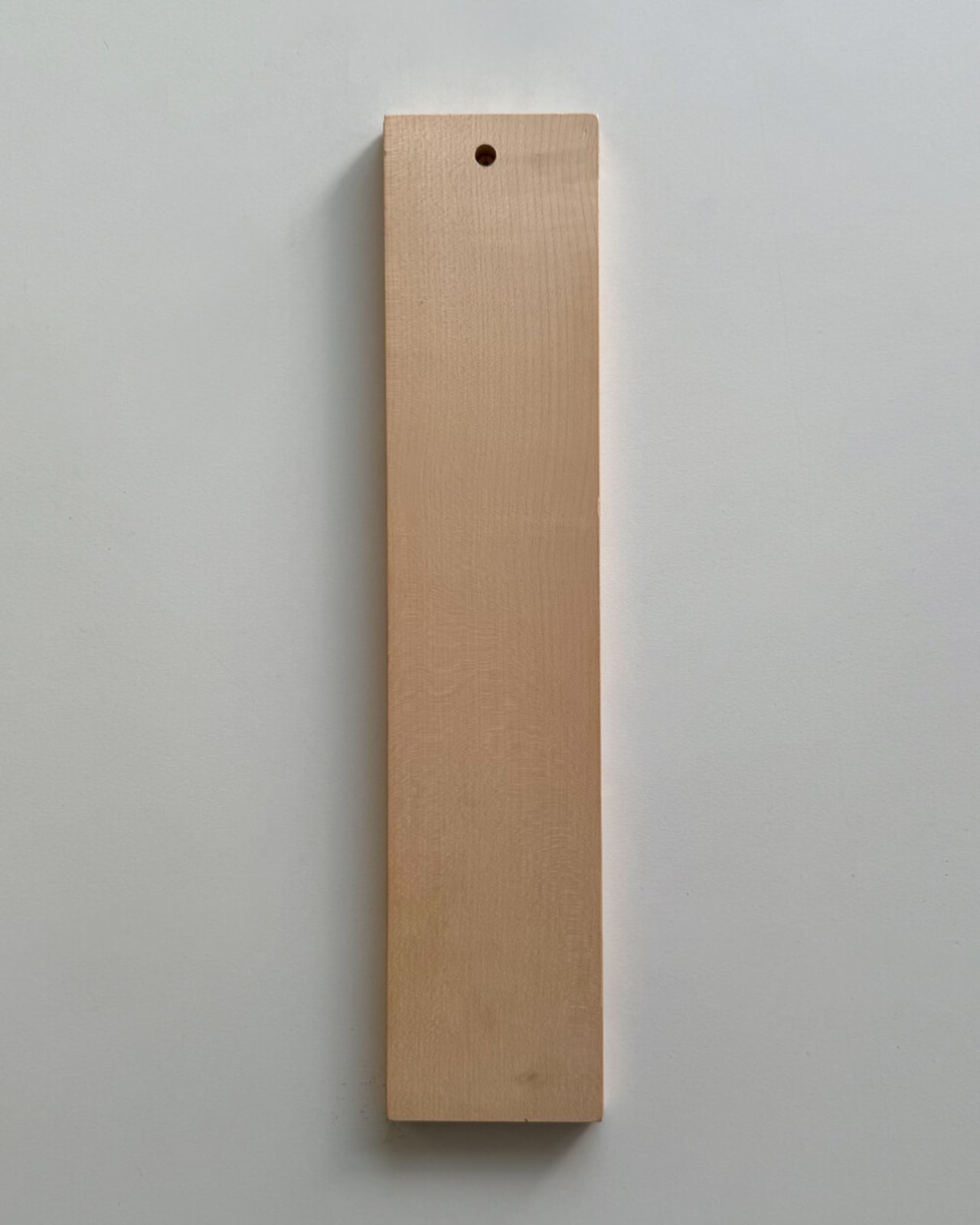
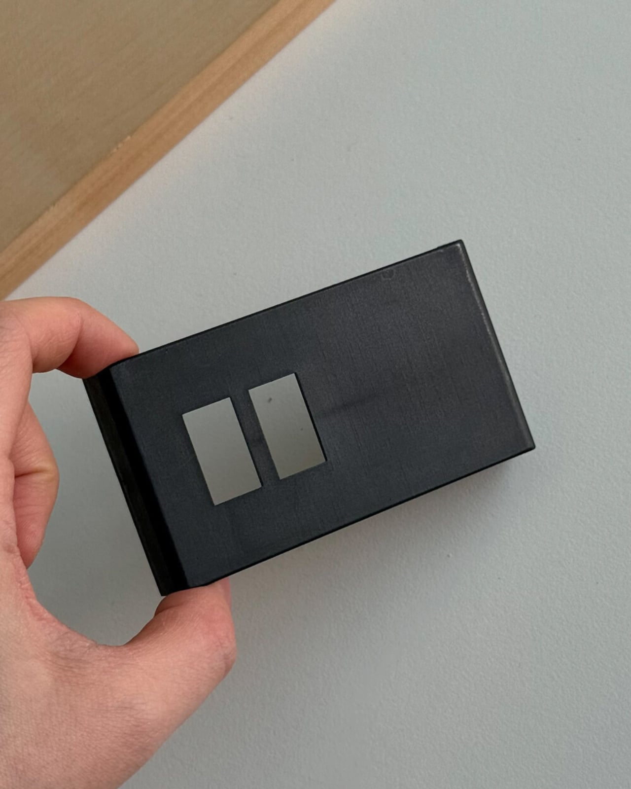
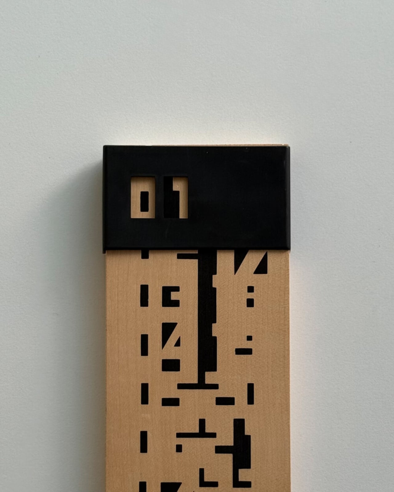
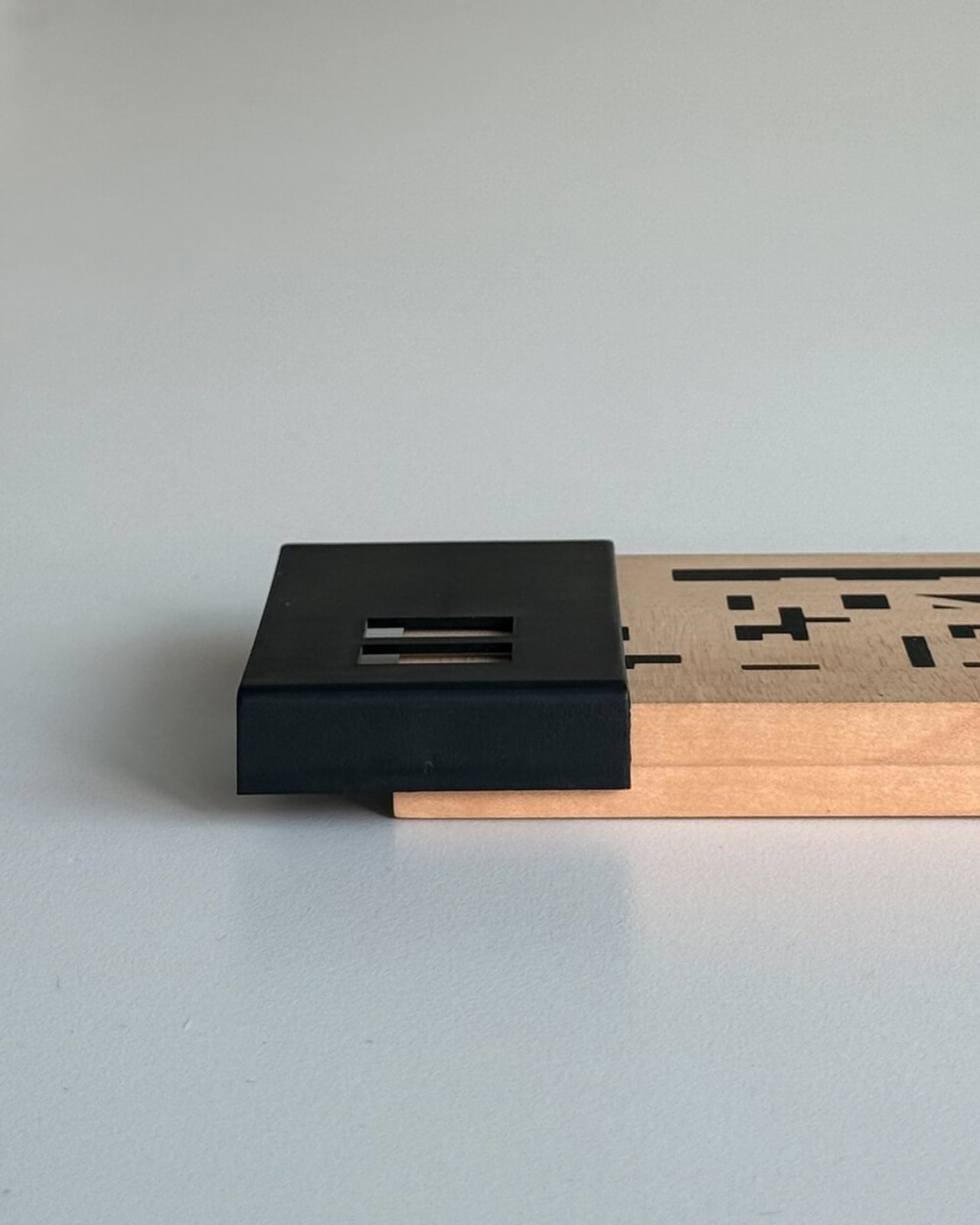
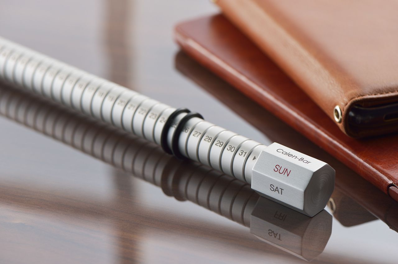
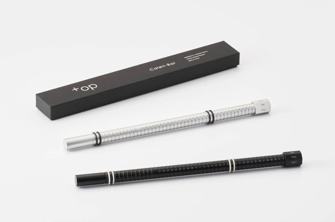
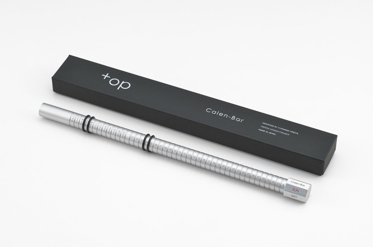
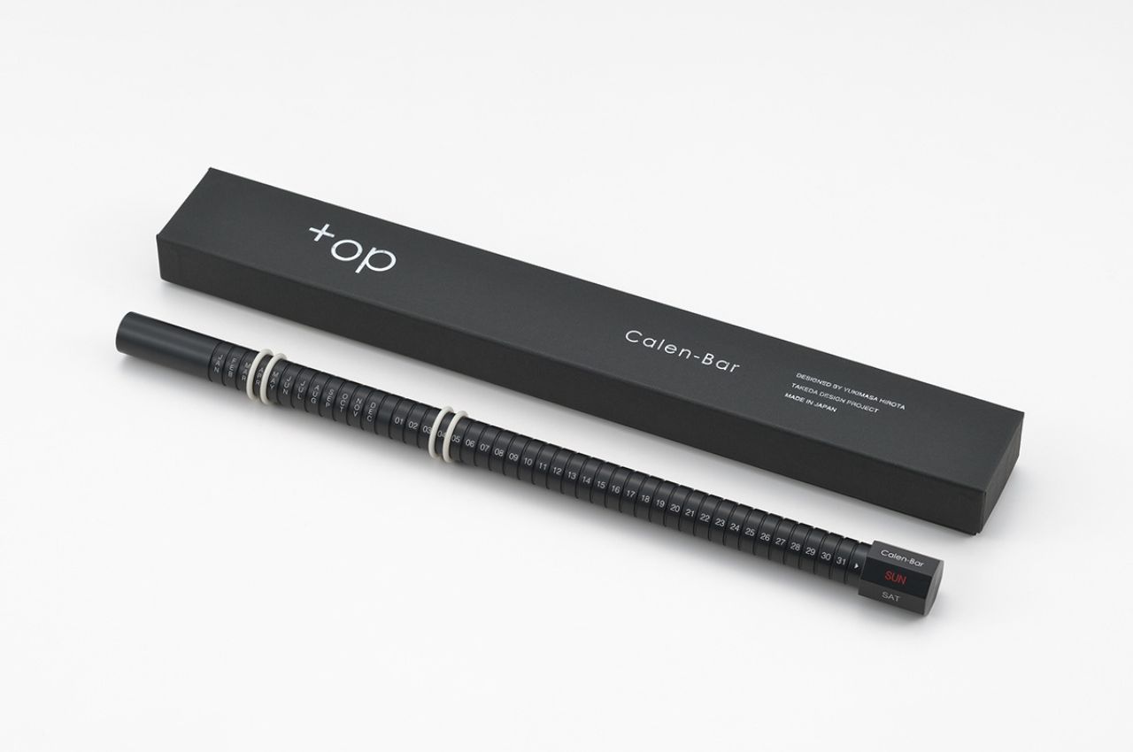
Crafted with precision and an eye for detail, the Calen-Bar is more than a tool; it is an experience. The inclusion of a metal weight introduces a tactile elegance, grounding the calendar in substance and texture. As fingers delicately adjust the rubber band to align with the current date, a connection is forged with the tangible passage of time. This manual engagement elevates the daily routine of checking dates into a ritual of reflection, ensuring that each day is not just observed but remembered, retrospectively embraced, and seized.

Positioned thoughtfully at the right end of the material rotation, the day of the week becomes a subtle but integral part of Calen-Bar’s design. As the material gracefully turns, it serves as a visual reminder that time, like the calendar itself, is in perpetual motion. This dynamic element adds a layer of continuity, urging users to appreciate the cyclical nature of days and the interconnected dance of weeks and months.
In a society racing against the clock, the Calen-Bar offers a respite from the relentless pace of technology. It is not a mere tool for making remarks or planning; rather, it is a sanctuary of poetic and aesthetic value. By embracing the manual nature of this calendar, users are prompted to engage in the deliberate act of adjusting dates, fostering a connection with time that transcends the digital coldness of screens and alarms.

Beyond its aesthetic charm, the Calen-Bar boasts a commendable sustainable aspect in its design. In a world inundated with disposable calendars, this perpetual masterpiece breaks the cycle. By omitting the mention of the year, it becomes a timeless companion, allowing users to reuse it year after year. The absence of a predefined year, while potentially leaving room for miscalculations, is a deliberate compromise in the pursuit of sustainability. In an age where ecological considerations are paramount, the Calen-Bar offers a meaningful alternative, prompting users to embrace the beauty of imperfection and intentional living.
While the manual adjustment may invite occasional errors, the Calen-Bar gracefully acknowledges the digital age, leaving room for users to cross-verify dates with their devices. This harmonious integration of analog charm and digital precision ensures that the Calen-Bar is not just a relic of the past but a versatile companion for the present and future.

In essence, the Calen-Bar is a testament to the enduring allure of simplicity, mindfulness, and sustainability. As we navigate the fast-paced currents of modern life, this perpetual calendar stands as a reminder to savor the little moments, to mark the eternal days not just in our lives but in the products that accompany us on this journey. It is a celebration of time, a fusion of elegance and purpose that invites us to comprehend the lost moments, appreciate the present, and embrace the time that is yet to come.

The post Discover Your Poetic Journey Through Time With Calen-bar first appeared on Yanko Design.