Pat McGrath’s New Pandora Charms Never Need Reapplying

I sometimes have to reapply the same lipstick four times in one afternoon and still walked out looking like I hadn’t worn any at all. That’s the quiet tax of makeup: the color is gorgeous for exactly as long as you remember to maintain it, and the second you forget, the whole effect disappears with your coffee cup. Pandora and Pat McGrath just designed around that problem entirely, and the fix is almost embarrassingly simple. Turn the lipstick into metal. Turn the gloss into a stone. Stop asking anyone to touch it up.

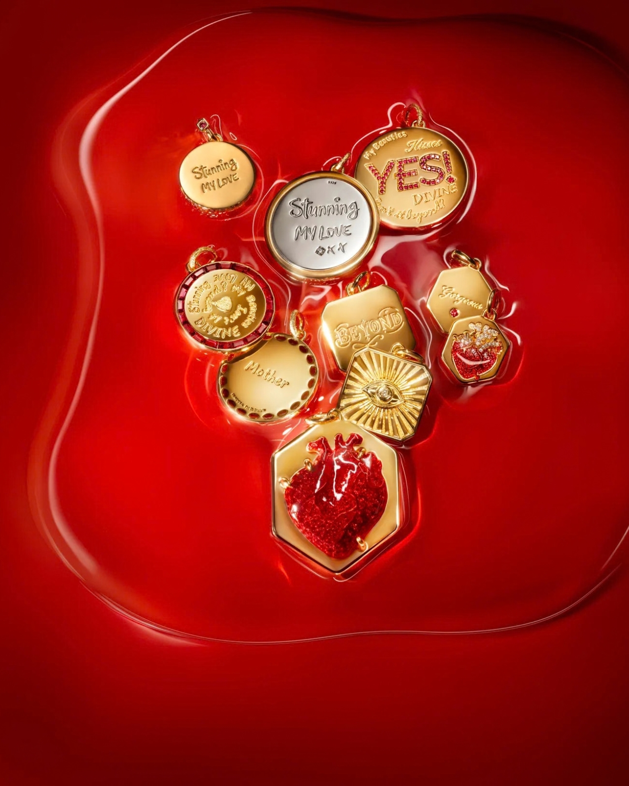
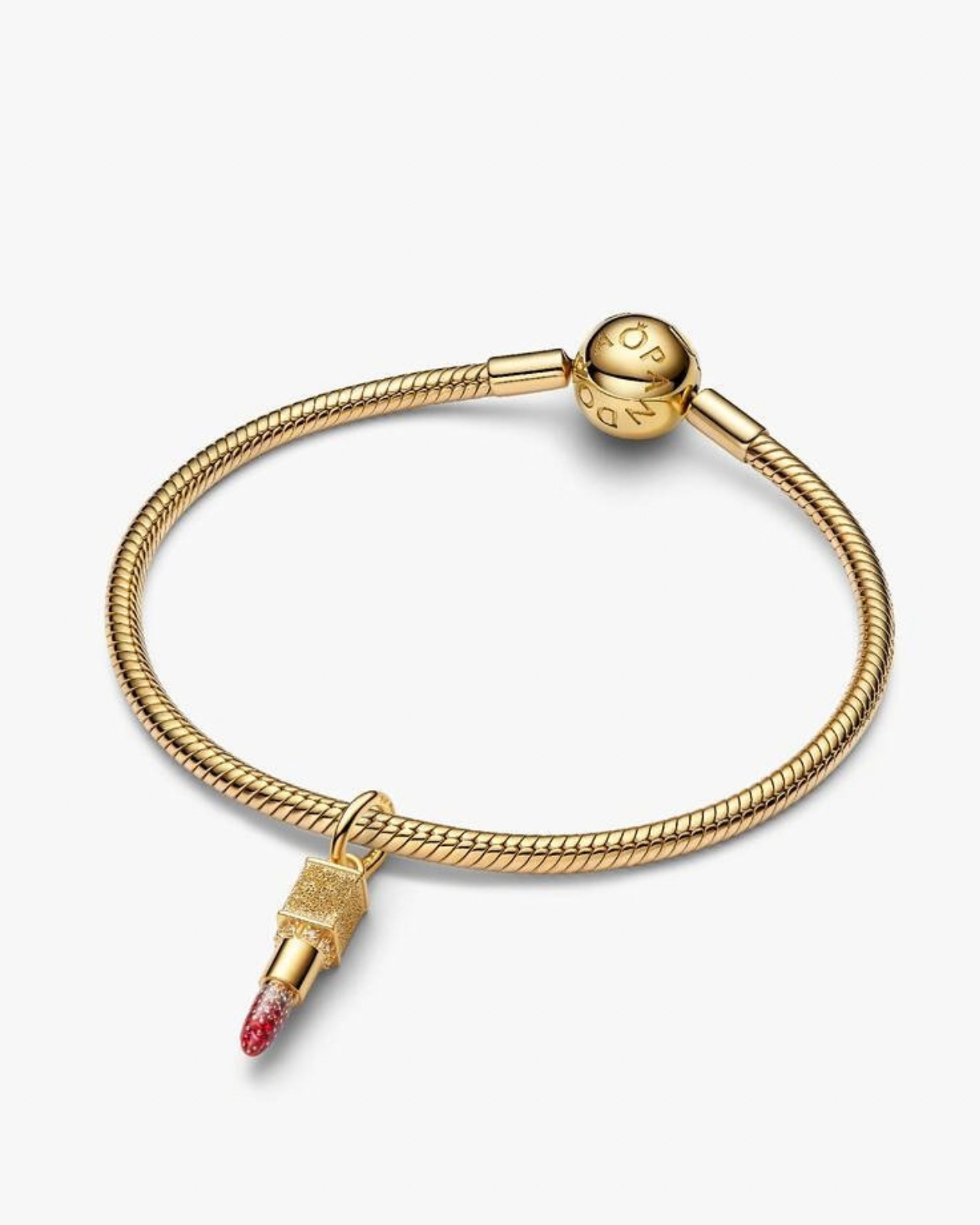
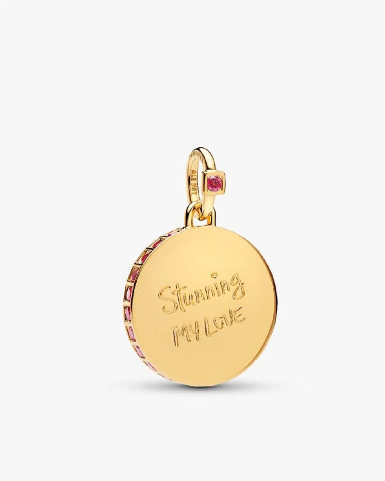
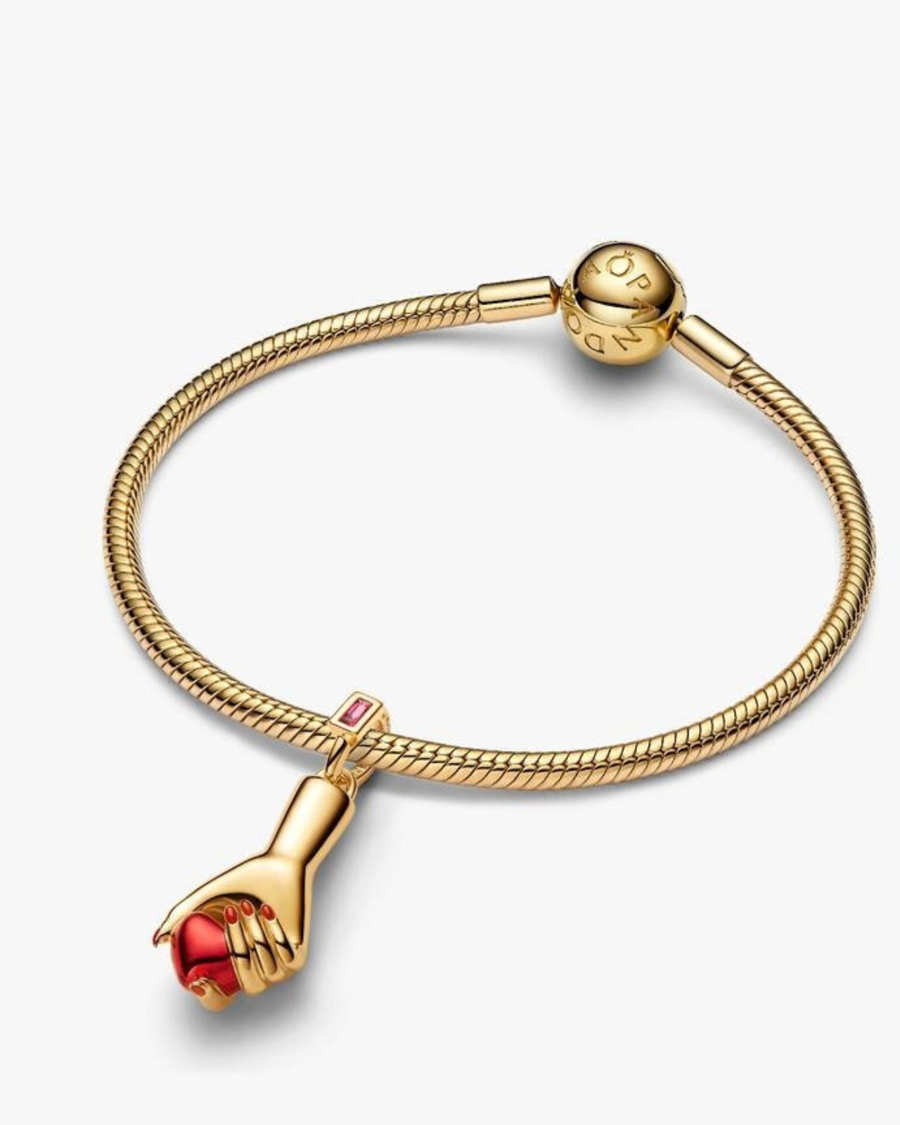
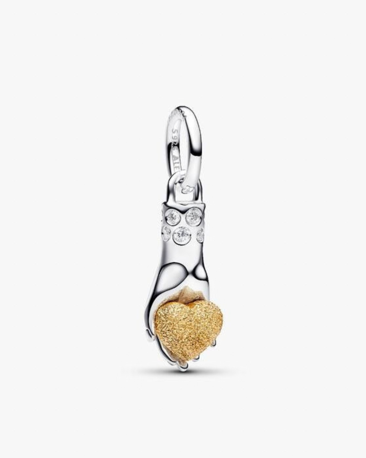
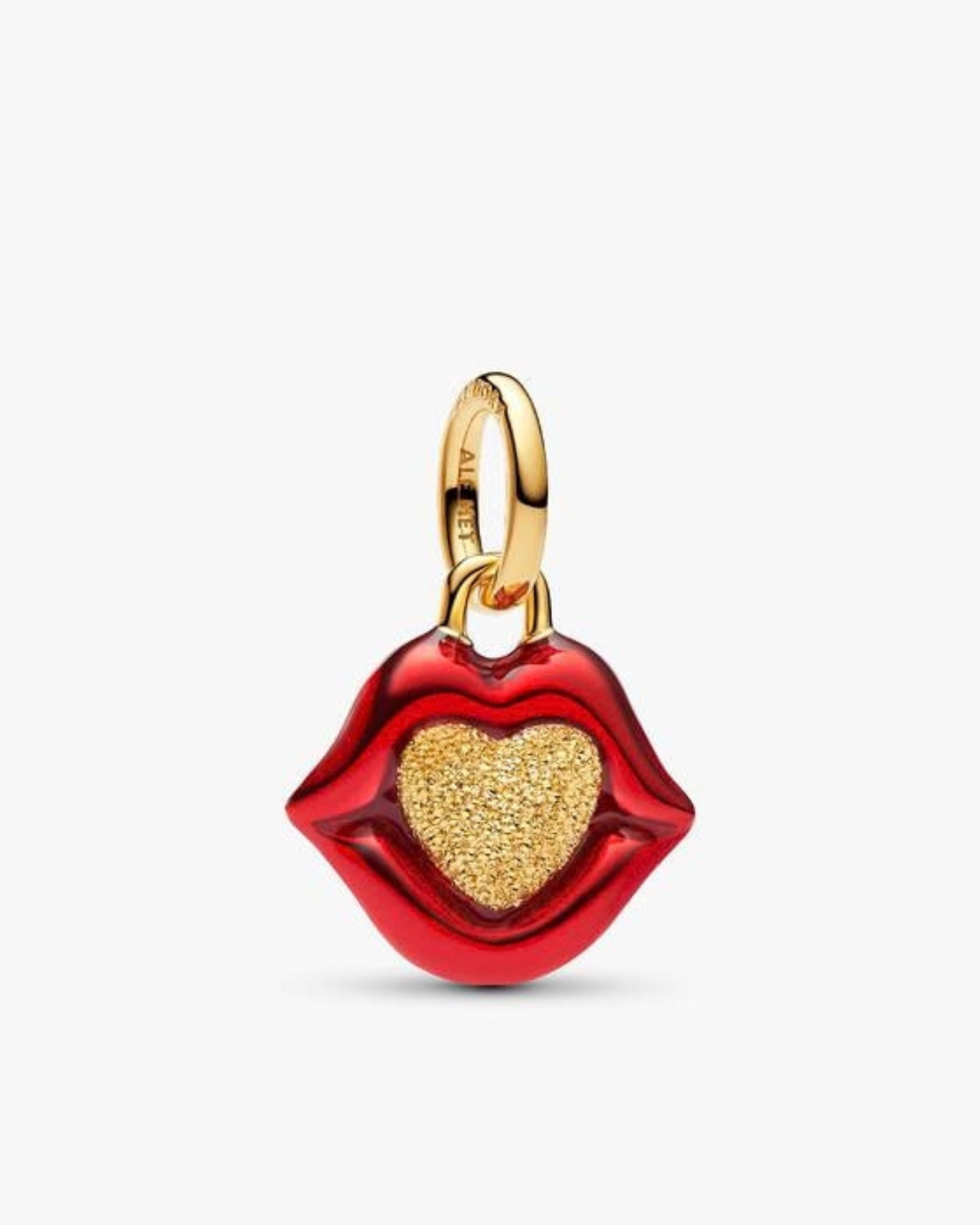
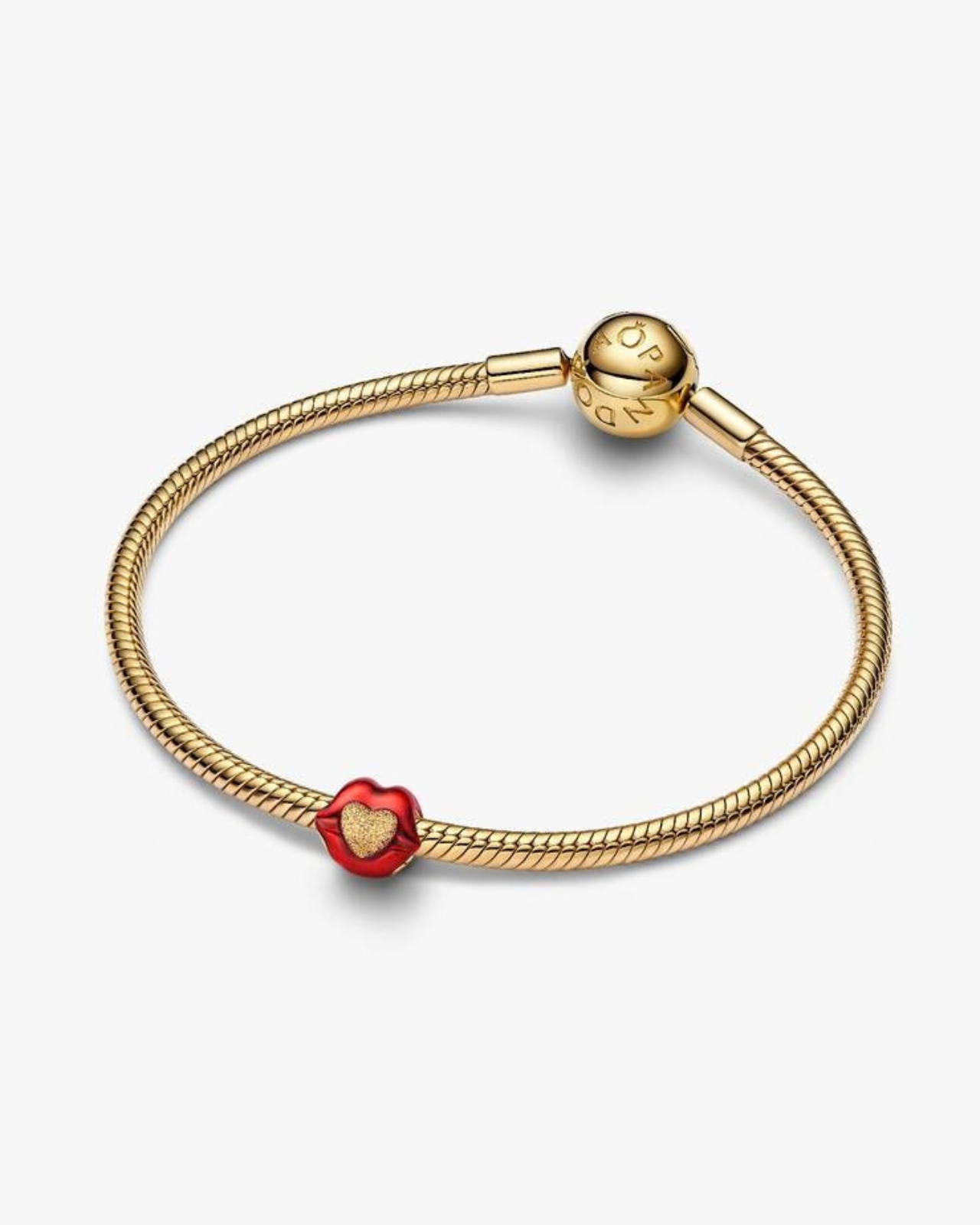
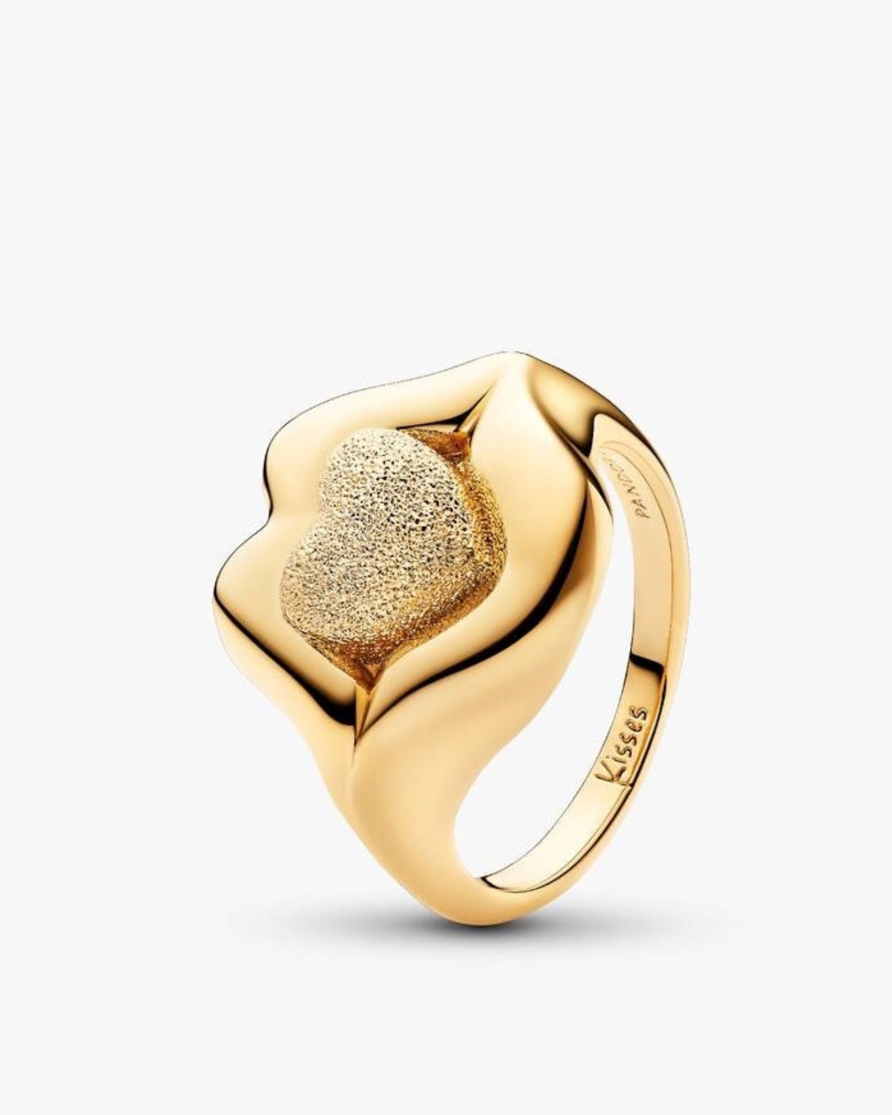
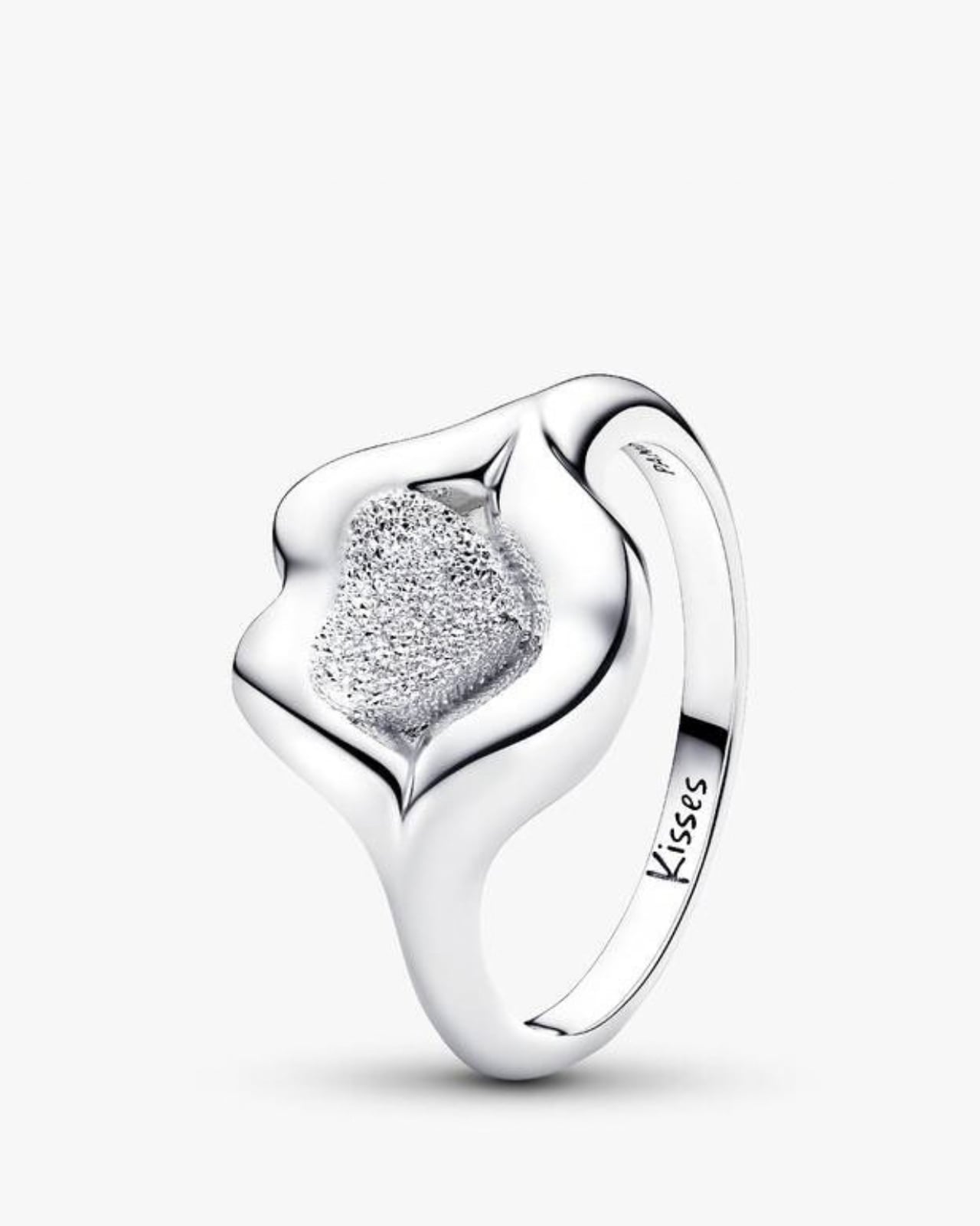
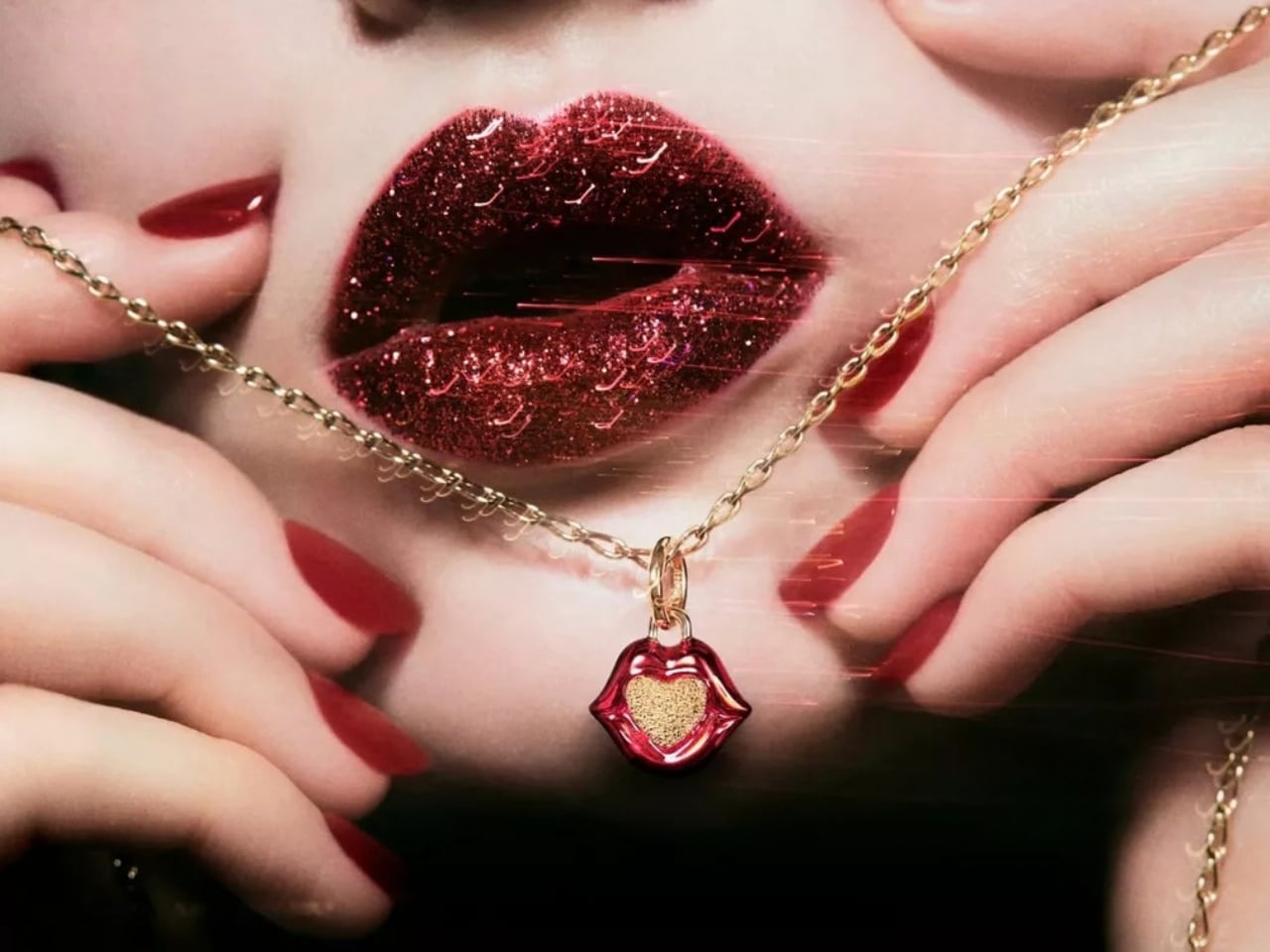
The collaboration launching October 8 is a 17-piece capsule of charms, rings, earrings, and pendants, and it reads less like a jewelry line and more like McGrath’s makeup kit got cast in gold. There’s a lips motif rendered as a signet ring, a beating heart charm, tiny lipstick tubes dangling with crystal detail, medallions stamped with what basically amount to beauty mantras. Prices land between $58 and $200, which keeps it in Pandora’s usual lane of reachable luxury rather than pushing into fine jewelry territory. Sølve Sundsbø shot the campaign, and the imagery has that glossy, high-pigment feel you’d expect from anything with McGrath’s name on it.

Designer: Pat McGrath for Pandora
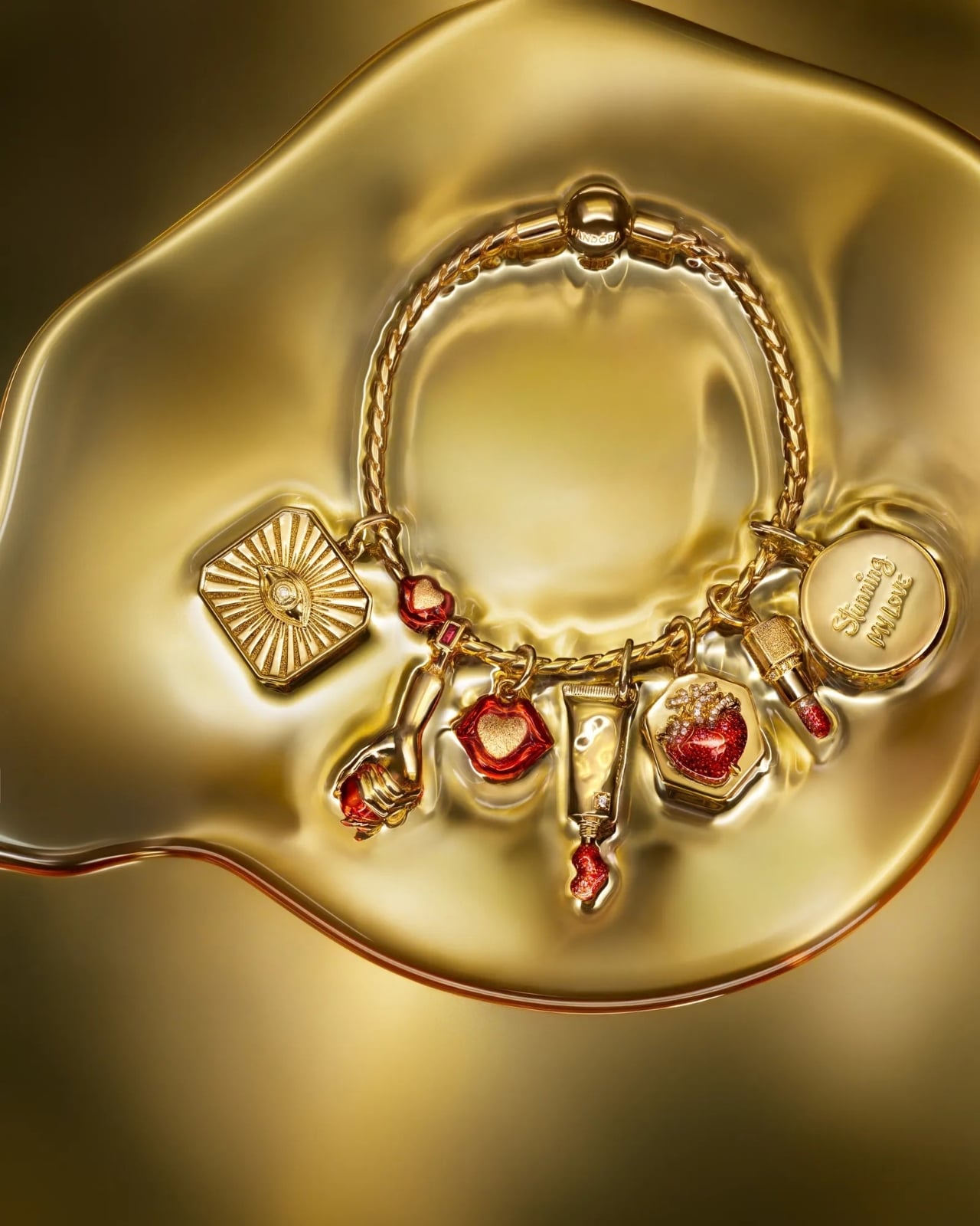
What actually makes this interesting to me isn’t the charm shapes themselves, it’s the design logic underneath them. McGrath told ELLE the process started with color, the same way her makeup work always does, and that she wanted “the visual language of beauty: pure pigment, gloss, crystal, texture and light” to become something wearable rather than something you reapply every three hours. That’s a genuinely different starting point than most jewelry design, which usually begins with a metal or a stone and works backward. Here, the inspiration was a lipstick bullet, a mascara wand, a swipe of gloss, and the challenge was translating something inherently temporary into something that survives a dishwasher, a shower, a decade.
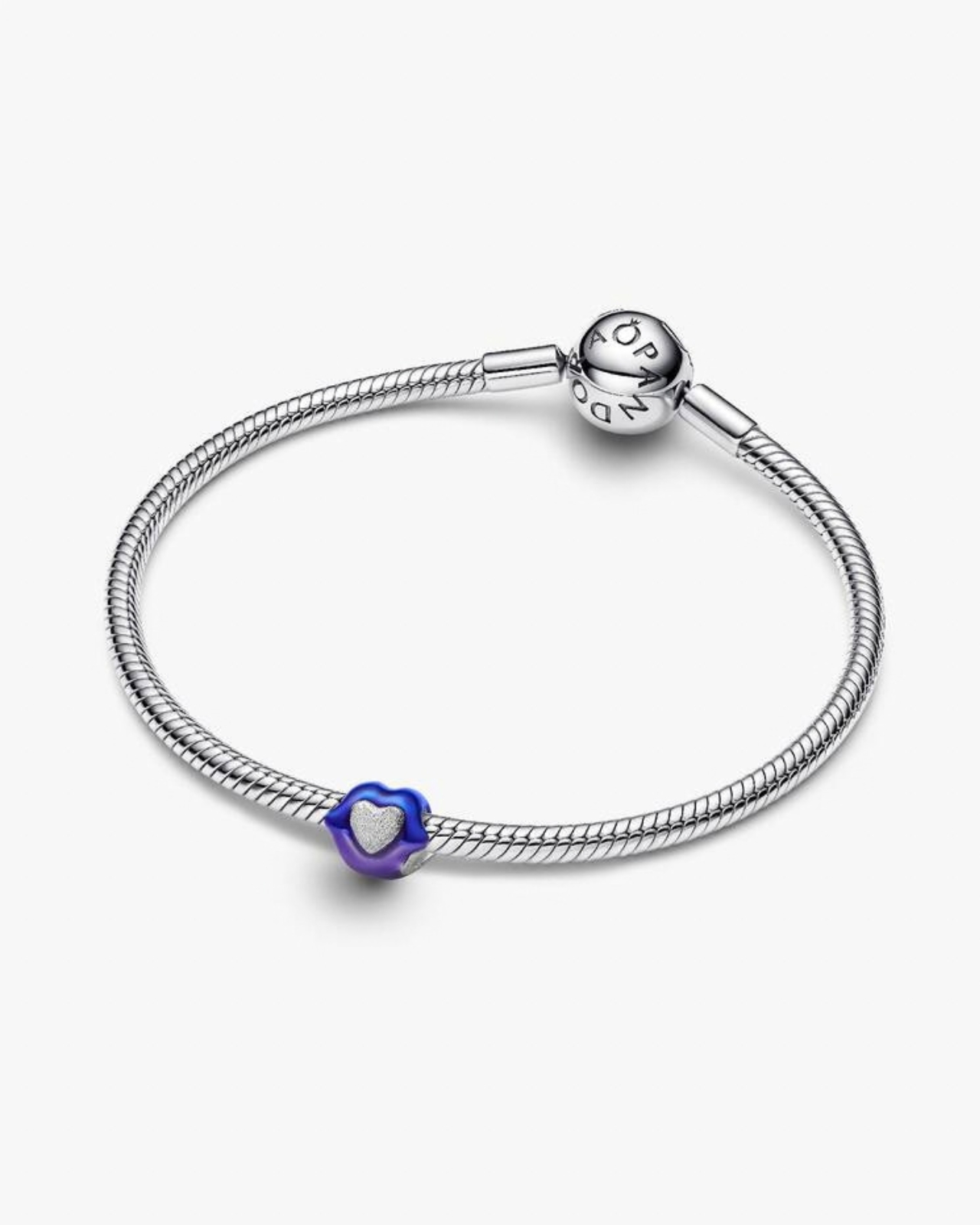
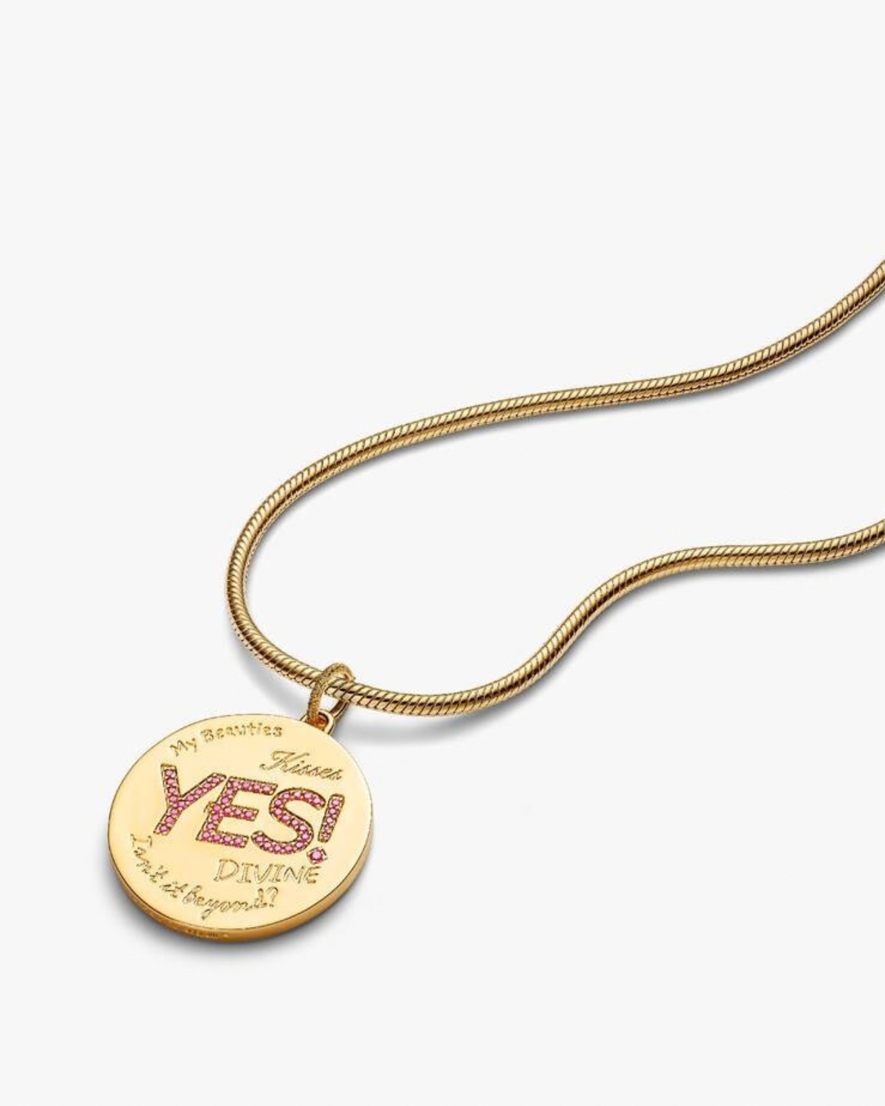
I’ve always thought the actual genius of Pandora’s charm bracelet model was never the charms, it was the permission structure. You build the thing yourself, one piece at a time, and it becomes a low-stakes way to commit to an aesthetic without fully committing to it. Beauty products work on the opposite logic entirely. You buy the palette, you experiment for a week, and then it sits in a drawer because reapplying a full look every morning is, frankly, a lot of effort for most people. This collection quietly splits the difference. You get McGrath’s color instincts and her theatrical, maximalist sensibility, but instead of a fifteen-step routine, you clip on a charm and you’re done until you decide to take it off.
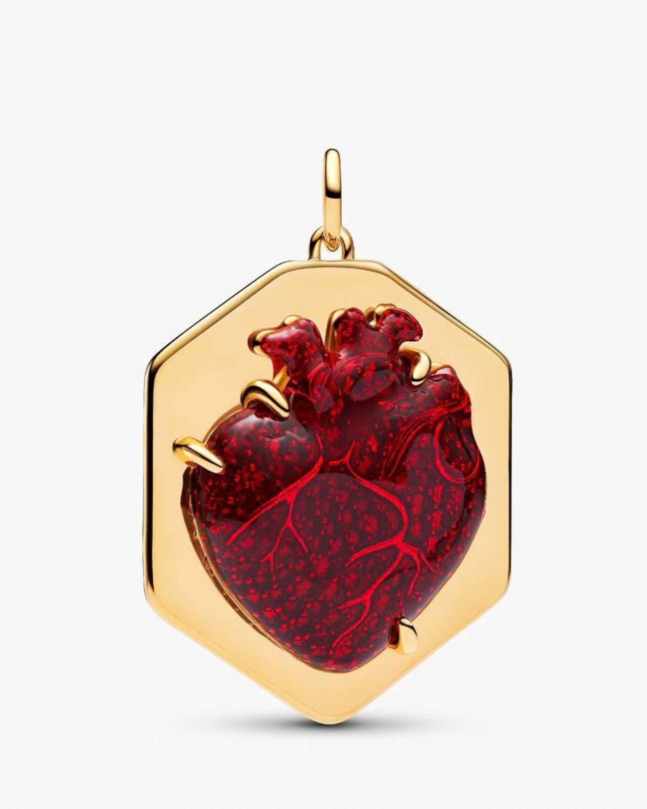
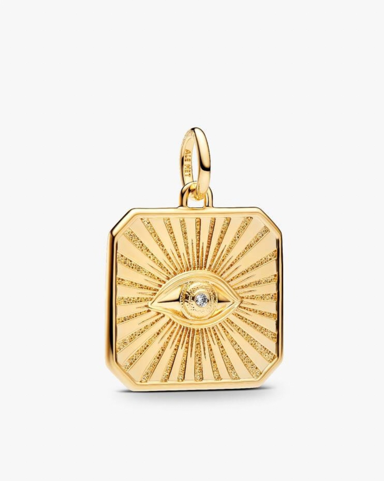
There’s also something honest happening in how McGrath talks about the crossover. She’s described makeup and jewelry as coming from the exact same instinct, the desire to adorn yourself and shift how you feel without changing who you actually are. I don’t think that’s marketing language, I think it’s just true. Nobody puts on a bold lip or a statement ring because they need to. People do it because it changes the story they’re telling that day, and both objects disappear the second you stop wanting to tell that story. The difference is one requires a mirror and five minutes you don’t always have, and the other survives an entire flight, a gym session, a full workday, without a single touch-up.
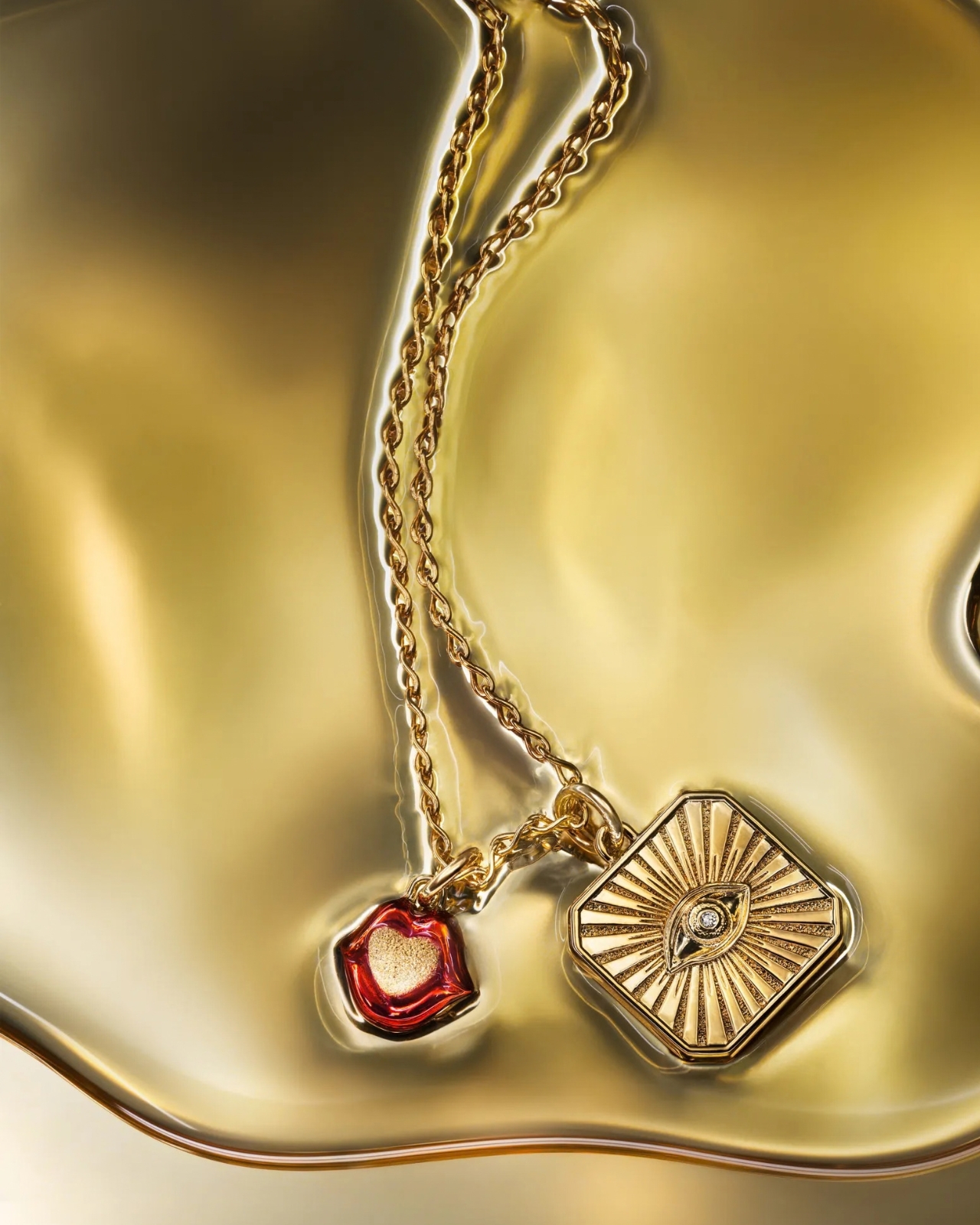
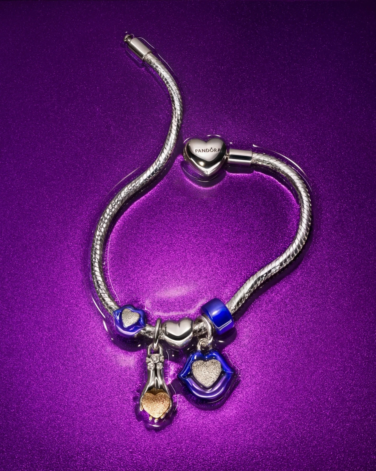
The gifting angle here is obvious and Pandora clearly knows it, timing this for the run into holiday shopping season. But I think the sharper read is what it says about where beauty and jewelry are heading as categories. Cosmetics brands have spent years chasing permanence, tattoo-style brows, semi-permanent lip stains, anything that survives past a single wear. Pandora and McGrath just skipped the science project entirely and went straight to metal. It’s a strange kind of solution, solving a beauty problem with a jewelry answer, and it works precisely because nobody tried it quite like this before.
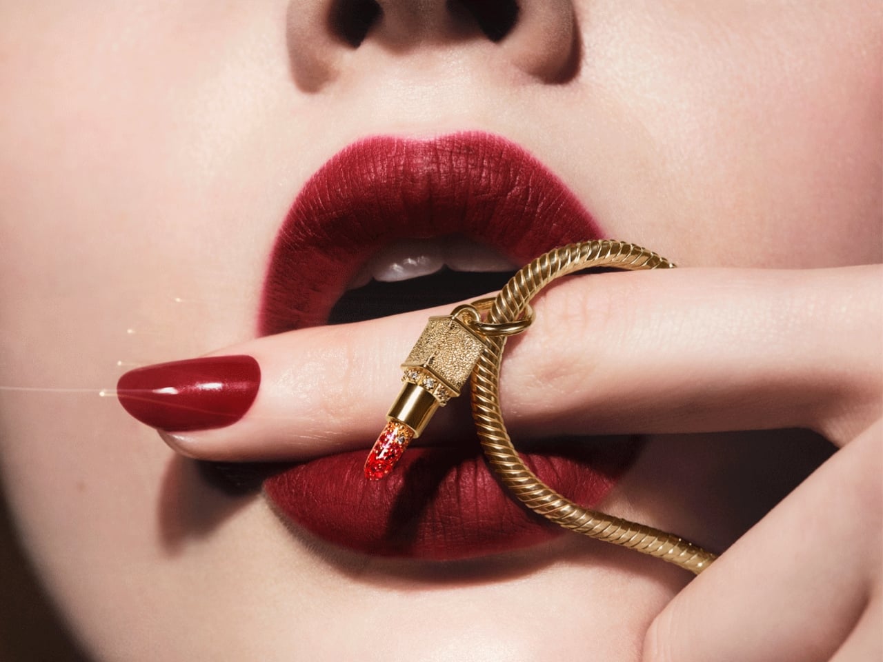
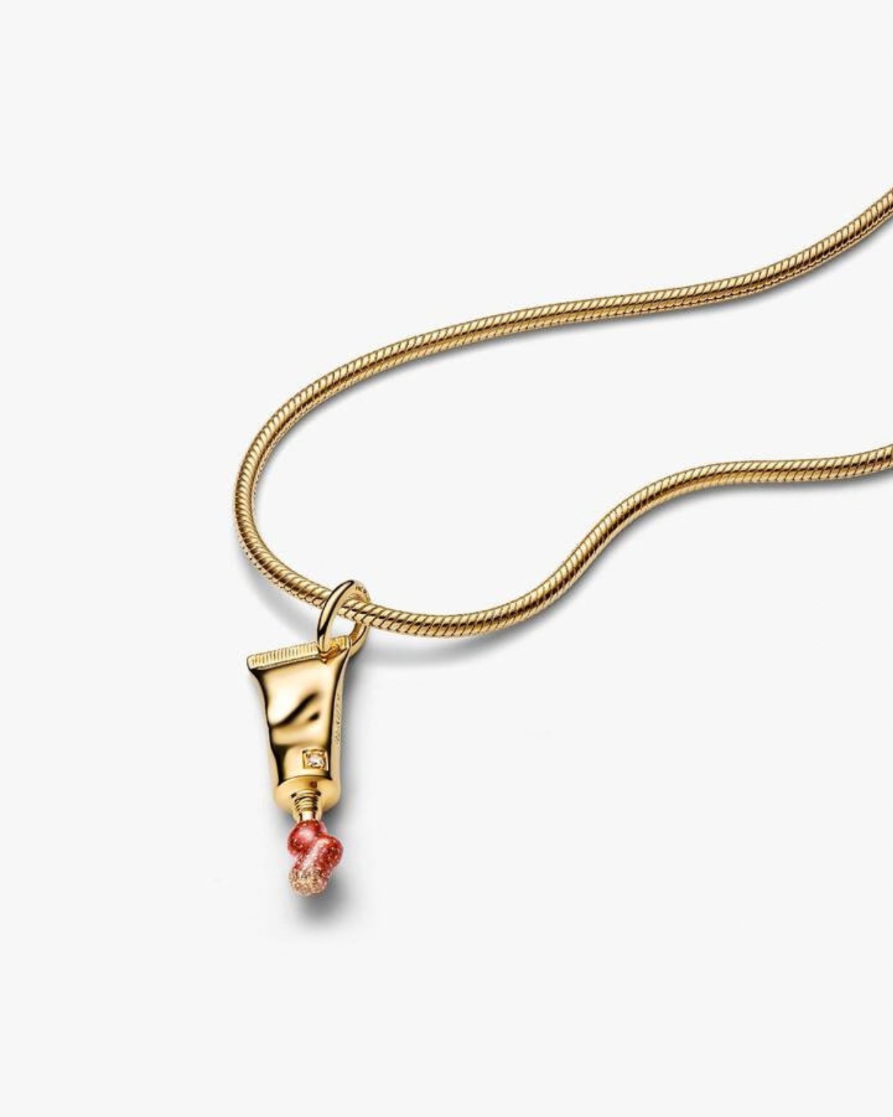
The post Pat McGrath’s New Pandora Charms Never Need Reapplying first appeared on Yanko Design.
A Designer Just Fixed Foundation’s Biggest Waste Problem

Most sustainable beauty products come with a visual apology. You know the look: matte recycled paper, utilitarian shapes, a general aesthetic that signals good intentions while quietly penalizing you for having taste. Designer Sanya Jain’s unsolicited concept for a Tata Harper foundation system refuses that trade-off entirely, and the result is one of those rare design exercises that feels more polished than half the things sitting on Sephora shelves right now.

Tata Harper, for anyone who hasn’t fallen into that particular rabbit hole, is the brand that built its entire identity on the idea that luxury and purity don’t have to be in conflict. Founded in 2010 and formulated on an organic farm in Vermont, the brand made its name in skincare with 100% natural, high-performance formulas free of synthetic chemicals, toxins, and fillers. It’s a rigorous philosophy, and one that its existing packaging already respects to a degree. But the color cosmetics side of things has always felt like an unfilled gap. Jain spotted that gap independently, and used it as the brief for something worth paying attention to.

Designer: Sanya Jain

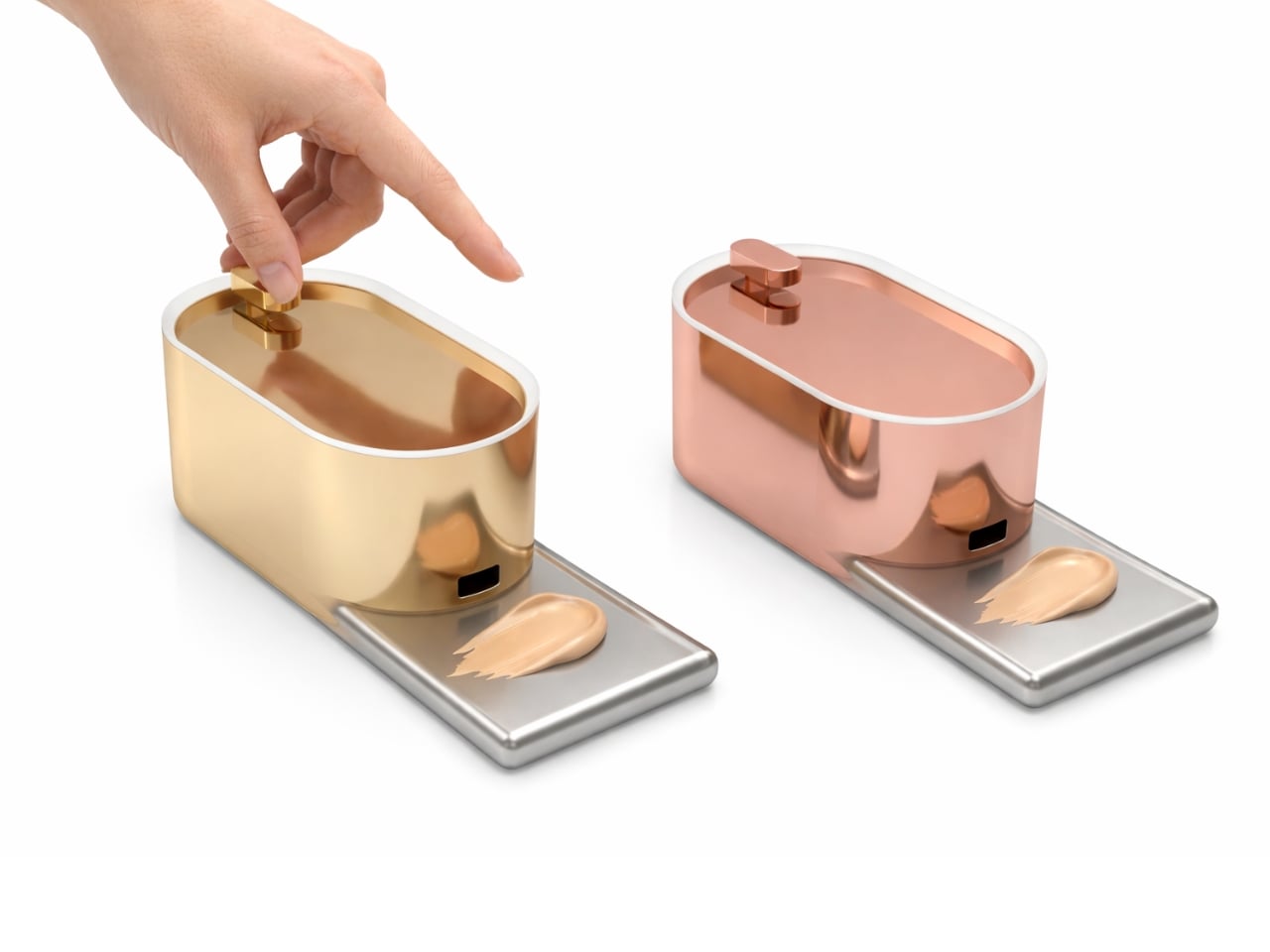
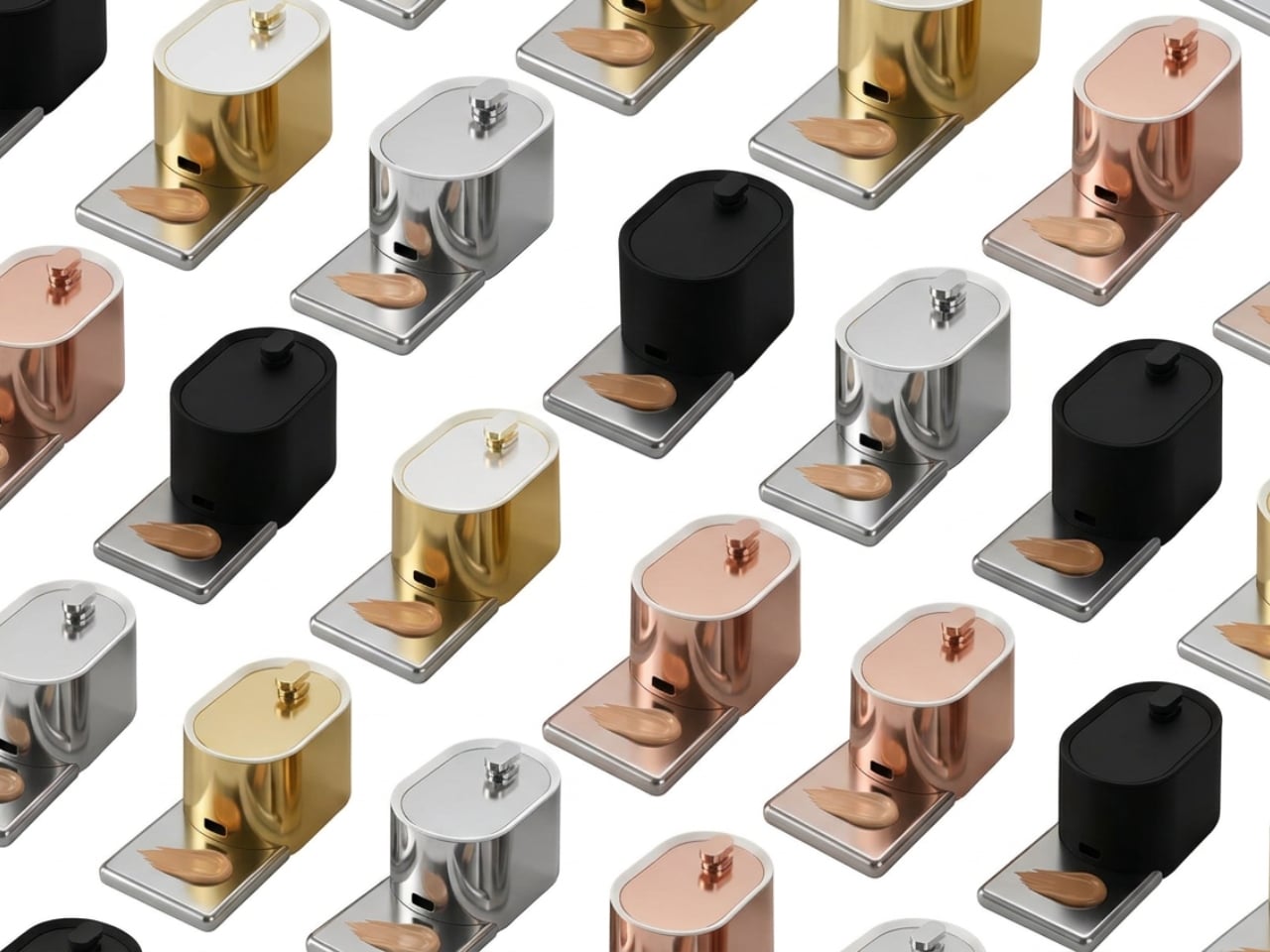
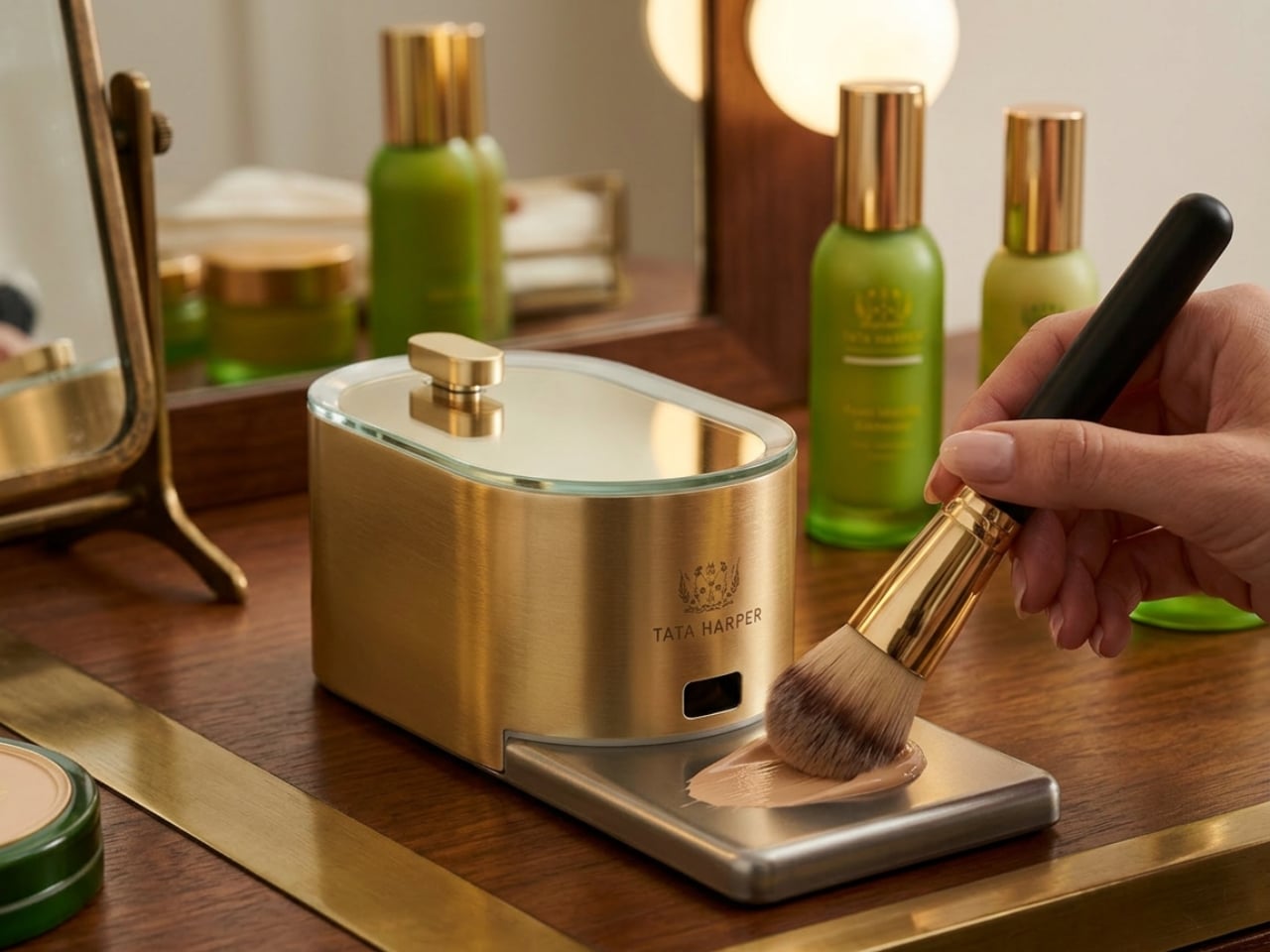
The concept, which she calls PureDose Foundation, centers on a refillable, modular system. The product lives inside a Viomer pod, a material valued for being lightweight, durable, and designed for circular reuse. That pod slots cleanly into a polished, gold-toned dispenser that looks less like something from a drugstore and more like a small piece of modernist sculpture you’d display on purpose. Press the top button once, and the foundation dispenses in a controlled drop directly onto a detachable metal slate positioned at the base. You load your brush from there and go. No squeezing, no guesswork, no wasted product sitting in the cap.

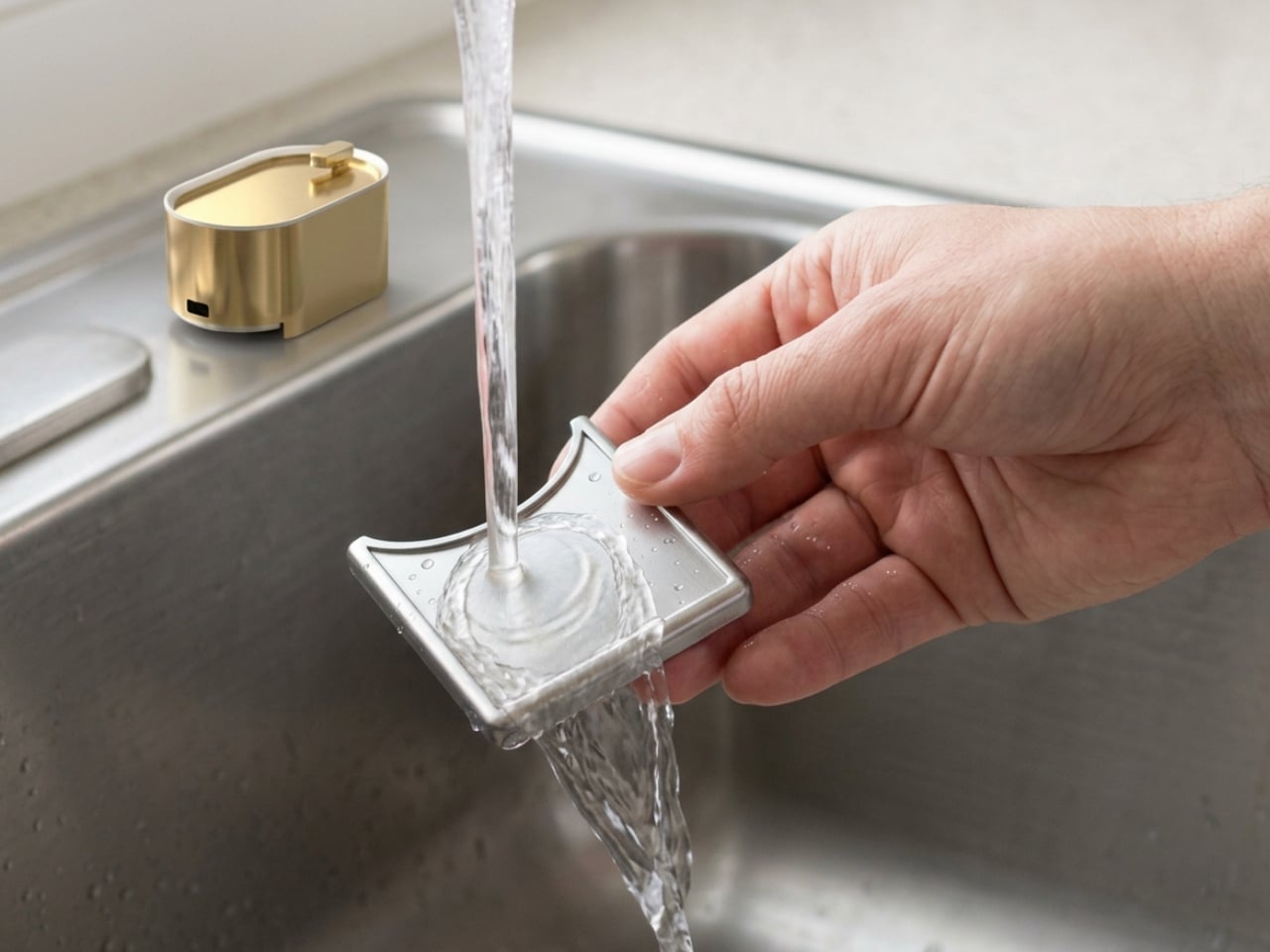
That last part matters more than it sounds. Foundation is one of the more quietly wasteful categories in makeup. Products get dispensed in excess, oxidize before you can blend them, or sit in bottles that are technically not empty but practically impossible to finish. The PureDose concept sidesteps most of that friction by making the application point clean, controlled, and hygienic. The metal slate rinses under the tap. The pod refills. The dispenser stays on your vanity indefinitely. It’s a smarter loop, and the fact that it manages to look this refined while doing it is not accidental.

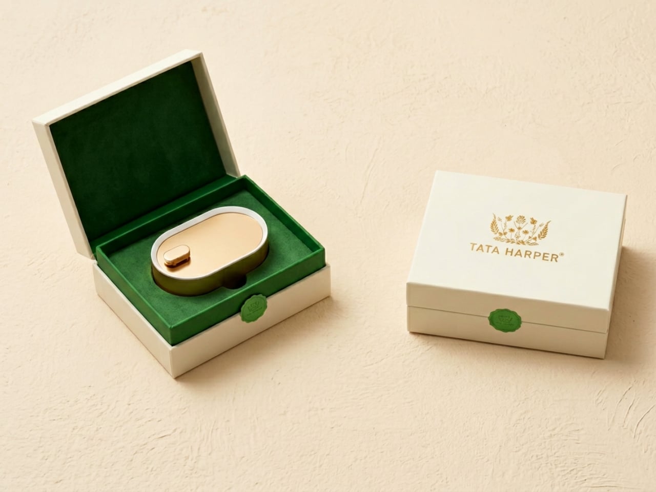
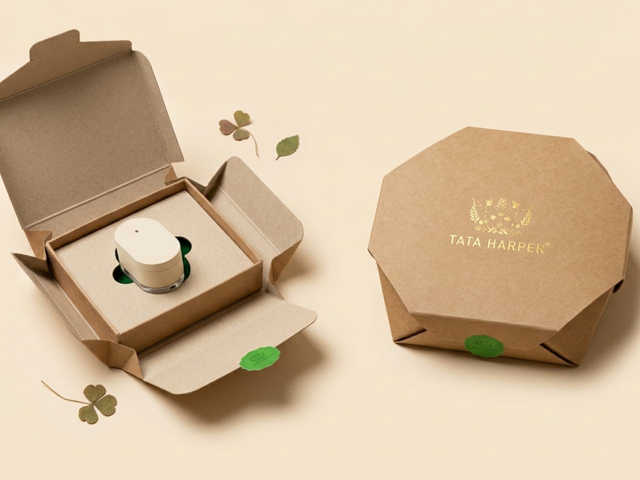
Jain pulled from biomimicry and clean geometry throughout the design. The rounded, organic silhouettes of both the pod and the dispenser echo the natural world that Tata Harper draws from as a brand, and that kind of visual consistency is harder to achieve than it appears. The colorway options, gold, rose gold, silver, and matte black, give the system range without diluting the identity. And the unboxing experience is worth noting: a velvet-lined jewelry box for the dispenser and a kraft-paper octagonal carton for refill pods. It’s one of the more layered packaging stories I’ve come across in concept work. It understands that luxury is at least partly emotional, and that the ritual of opening something should feel like it belongs to the rest of the experience.

What makes this project compelling beyond the aesthetics is how faithfully it mirrors the brand’s existing values without any official mandate to do so. Tata Harper already commits to FSC-certified paper, transparent ingredient sourcing, and eco-conscious material choices. Jain’s concept simply asks the next question: what would a color cosmetics line look like if it operated with the same level of rigor? The answer is something that sits on your vanity like a design object, performs with precision, and leaves significantly less behind when it’s done.

Concept work in industrial design usually lands in one of two places. It either solves a real problem with no aesthetic investment, or it produces something visually stunning that would fall apart after a week of actual use. This one manages to hold both ends of that tension together, which is the harder achievement. Jain didn’t find a way to make sustainability bearable. She found a way to make it worth wanting. Whether or not Tata Harper ever sees this, the question it raises is one the beauty industry should be sitting with.

The post A Designer Just Fixed Foundation’s Biggest Waste Problem first appeared on Yanko Design.