5 Steel Furniture Designs That Look Nothing Like Steel Furniture

For years, steel furniture carried a predictable identity, purely functional and unapologetically utilitarian. It belonged to offices, factories, and workshops, valued more for endurance than aesthetics. That perception has quietly transformed. Steel now commands attention in refined living spaces, boutique hotels, and architect-designed homes.

Designers are reshaping steel’s image, balancing raw structural honesty with elegance, craftsmanship, and emotion. Let’s understand why steel furniture is not just chosen for durability, but for character, for its ability to anchor a space while making a distinct visual and artistic statement.

1. The Elegance of Slim Steel Profiles

Steel’s defining advantage lies in its exceptional structural strength, allowing designers to create remarkably slender forms without compromising stability. Where wood often demands thickness for support, steel can bear substantial weight through refined, delicate frames. The result is furniture that appears lighter, sharper, and visually precise.

This slimness transforms how a space feels. Thin steel legs, narrow frames, and minimal lines reduce visual heaviness, making rooms appear more open and breathable. In compact urban interiors, especially, steel furniture introduces a sense of airiness and subtle sophistication. Pieces seem to float rather than occupy, delivering both physical durability and a sensitive, almost effortless aesthetic presence.
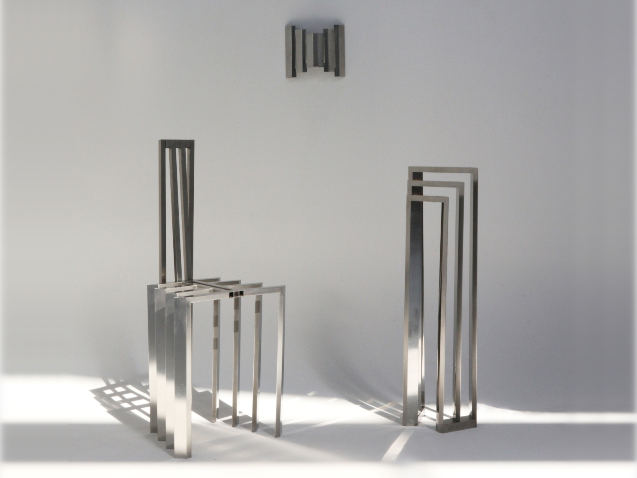
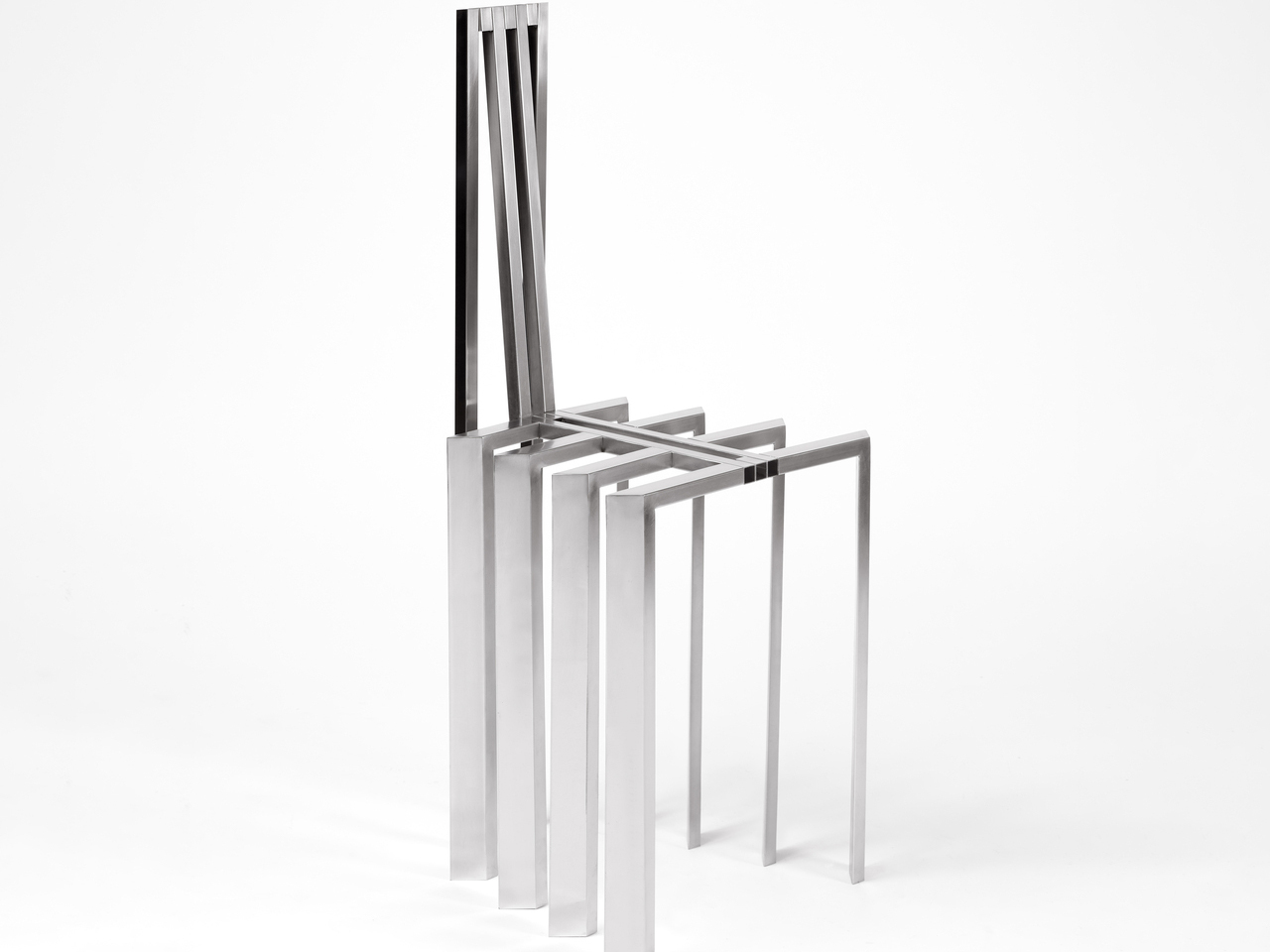
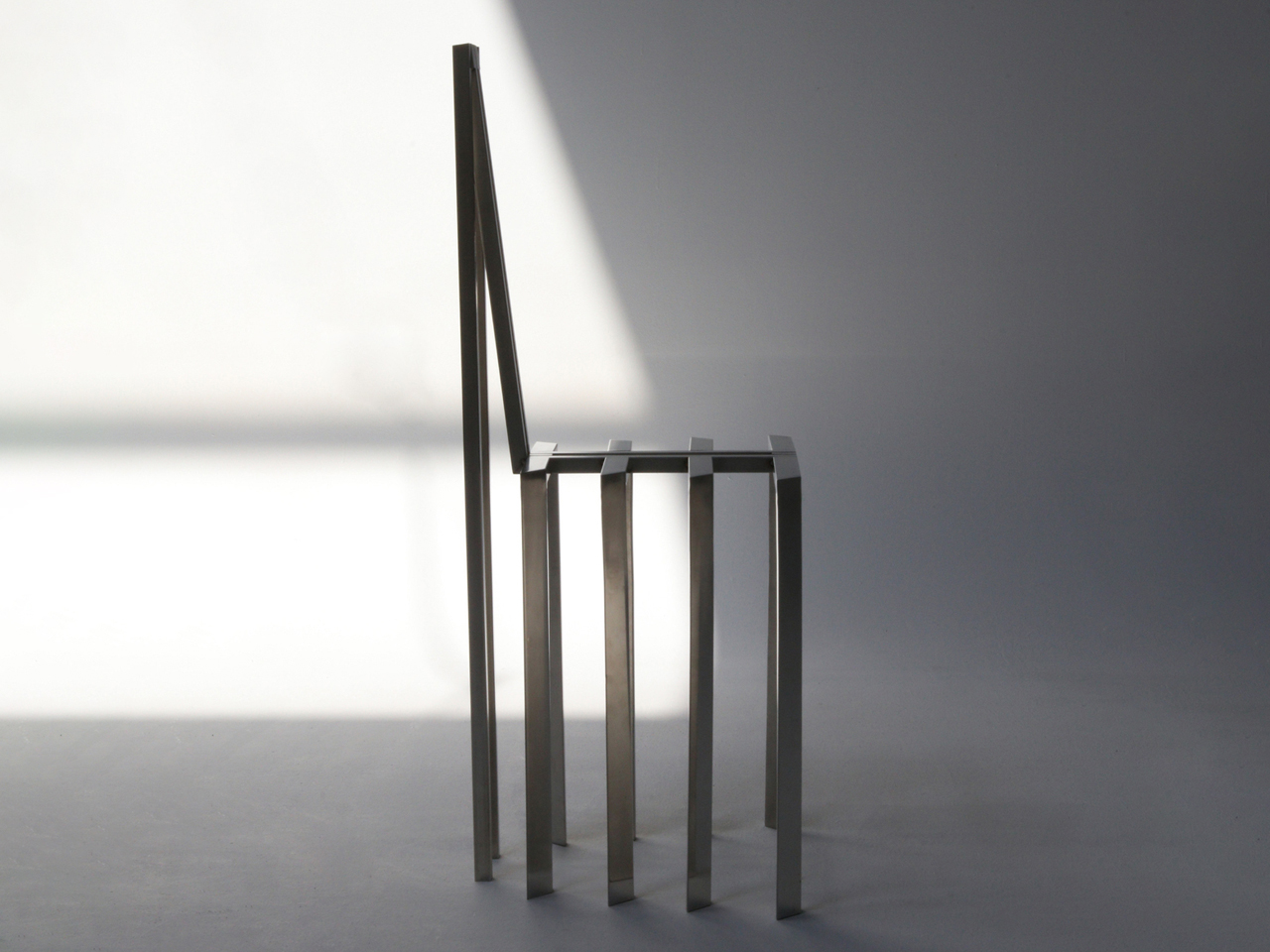
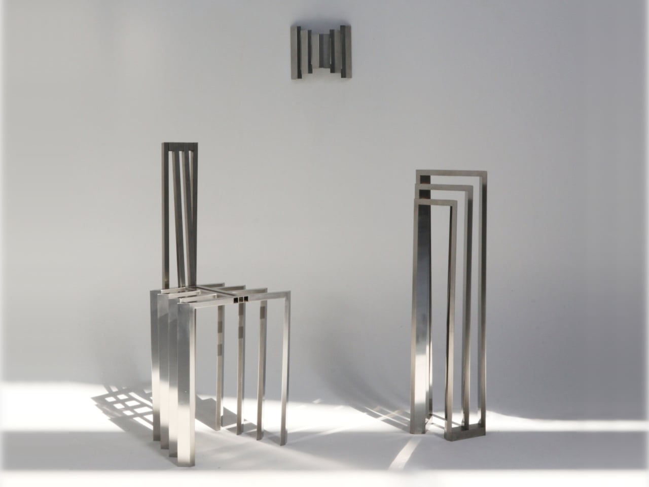
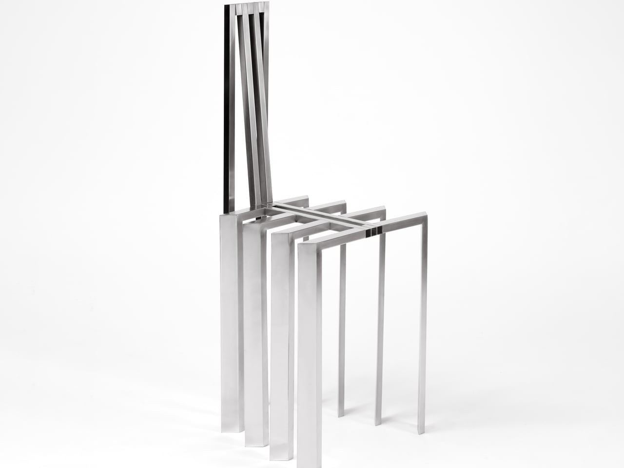
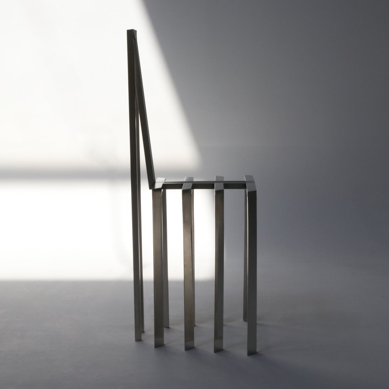
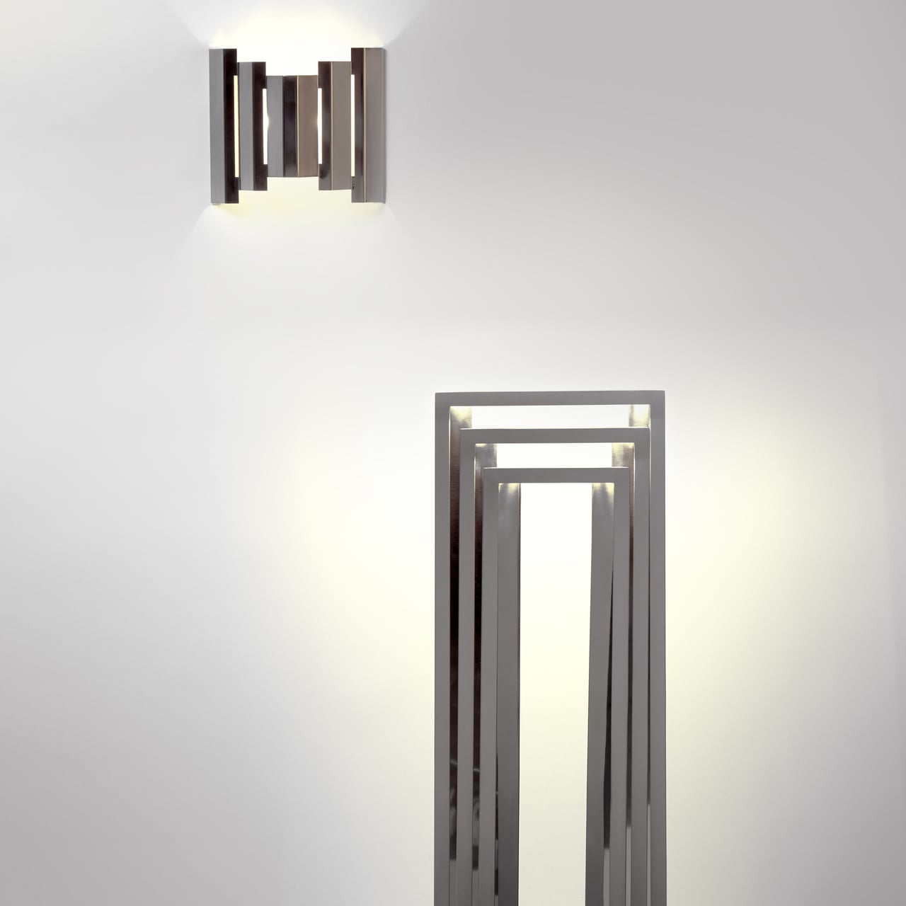
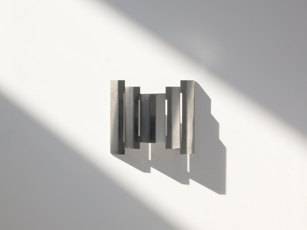
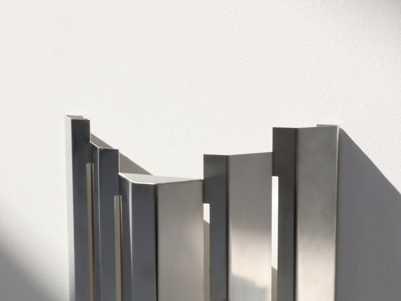
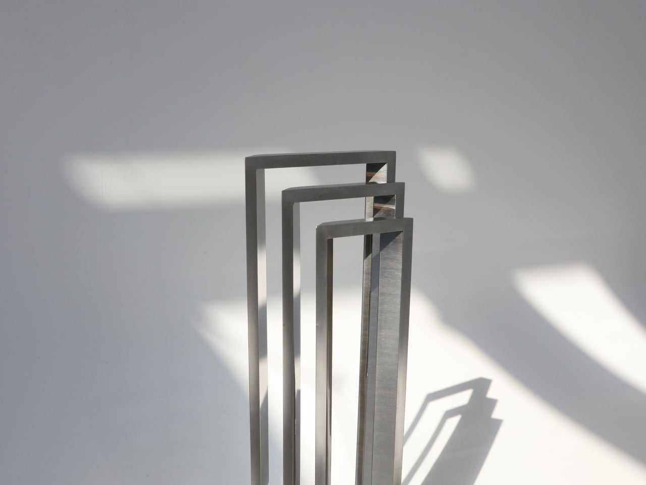
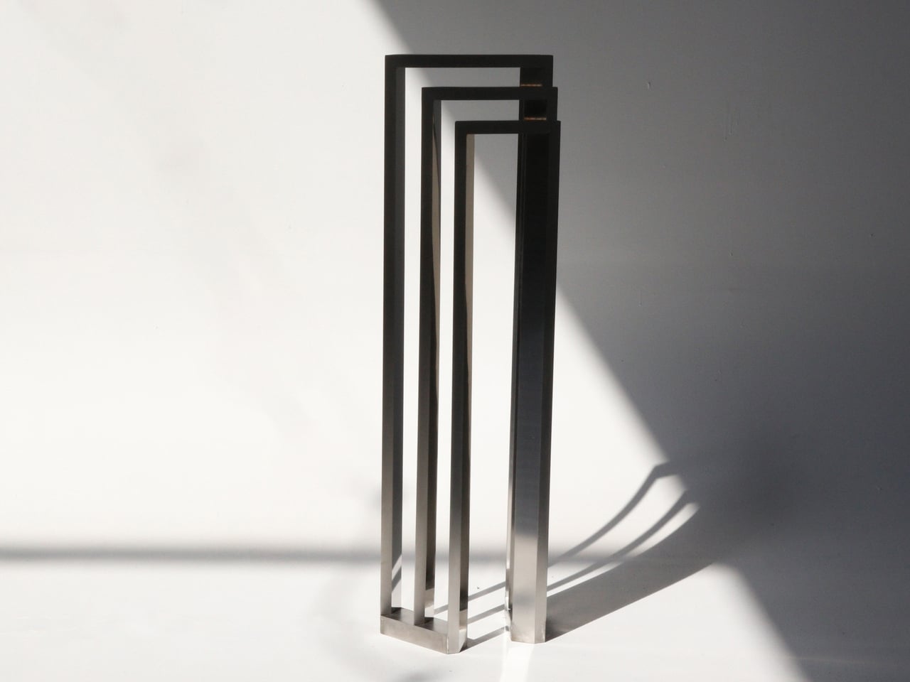
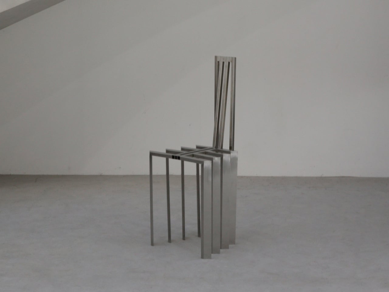
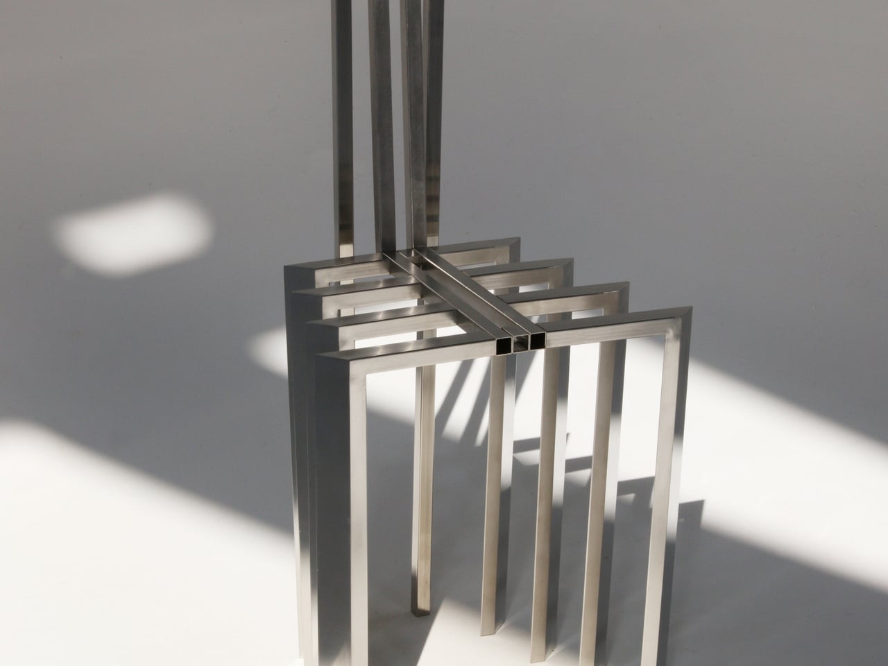
Jiyun Lee’s Foln series consists of three stainless steel pieces: the Linear Chair, a floor lamp and a wall lamp, each constructed from precisely folded metal lines. Defined by slender proportions and a vertical emphasis, the designs read as lightweight frameworks rather than solid volumes. The Linear Chair is composed of repeated uprights and crossbars that form both seat and backrest, creating a clear geometric rhythm while maintaining structural integrity. Its polished steel surface enhances the clarity of each line, allowing the form to stand out without added ornamentation.
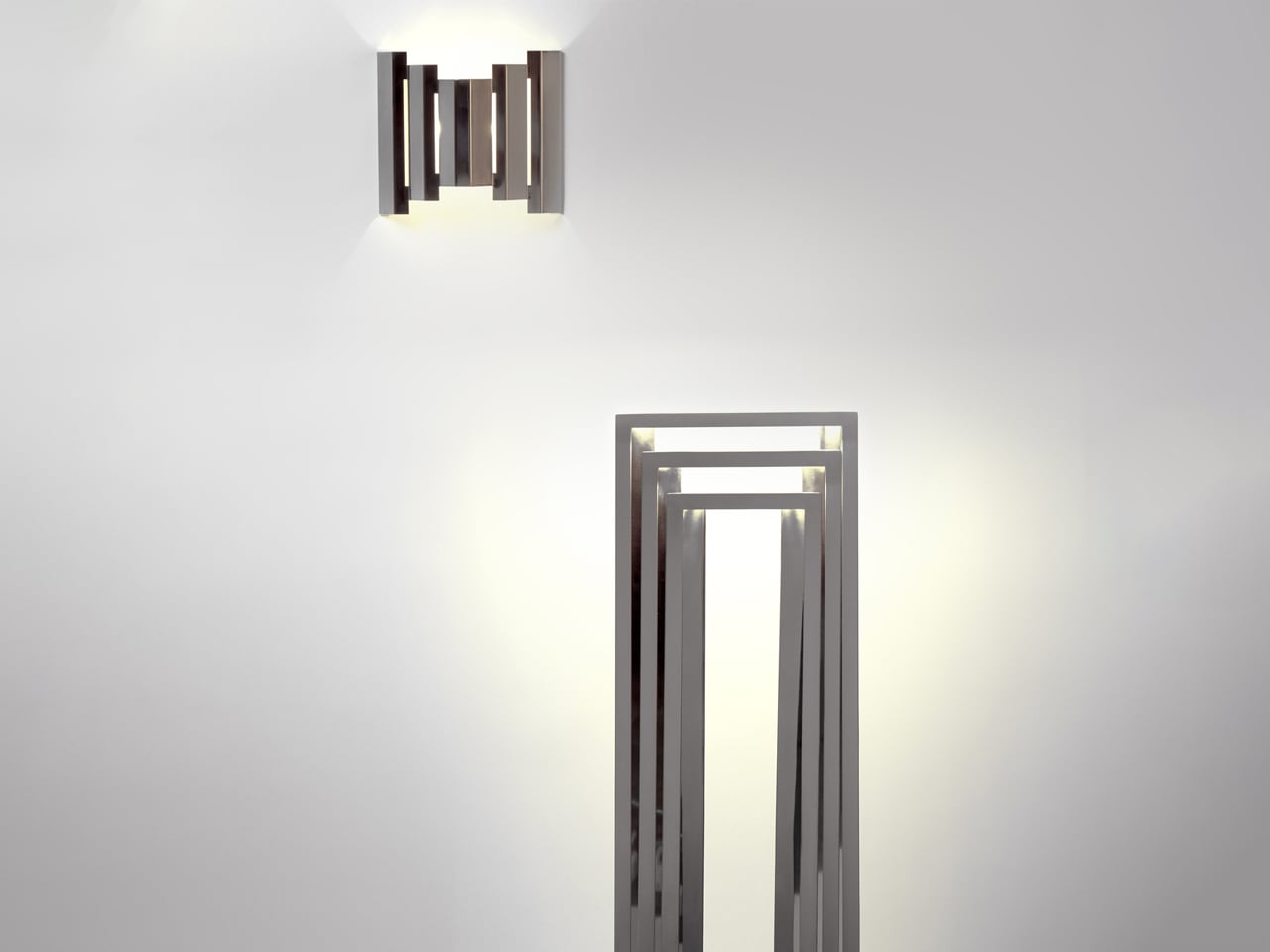
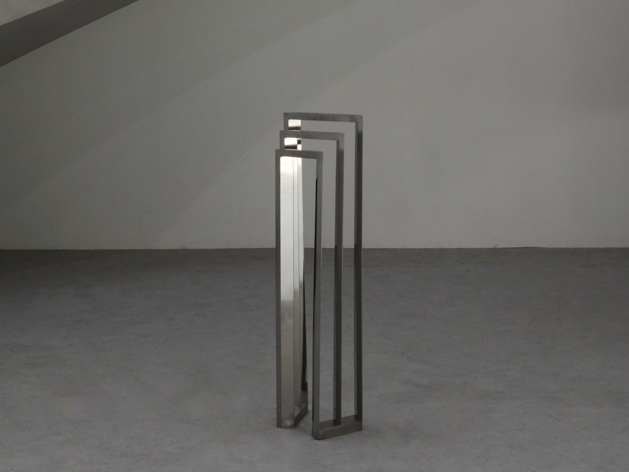
The floor and wall lamps translate the same linear language into lighting. Nested metal frames guide illumination so that it moves between bars before spilling onto adjacent surfaces. Instead of concealing the structure, the design highlights it, allowing light to interact directly with the steel geometry. Firm, minimal and sharply defined, each piece prioritises architectural presence and material clarity, positioning the collection closer to sculptural, collectible furniture than conventional everyday seating or task lighting.

2. Cool Steel Meets Warm Texture

Steel inevitably carries a sensory contradiction. Cool to the touch and visually crisp, it has long been associated with hardness and emotional distance. Its surface reflects light with precision, yet rarely conveys the immediate warmth of wood or fabric.

Contemporary design reframes this tension as an opportunity rather than a flaw. By pairing steel with tactile, human-centered materials like supple leather, textured wool, or natural timber, designers create a layered sensory experience. The contrast softens steel’s severity while amplifying its elegance. What emerges is a balanced dialogue between strength and comfort, where the metal’s cool composure enhances, rather than diminishes, the inviting warmth of the surrounding elements.
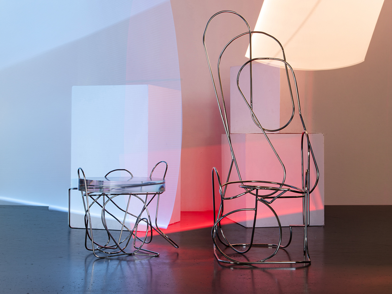
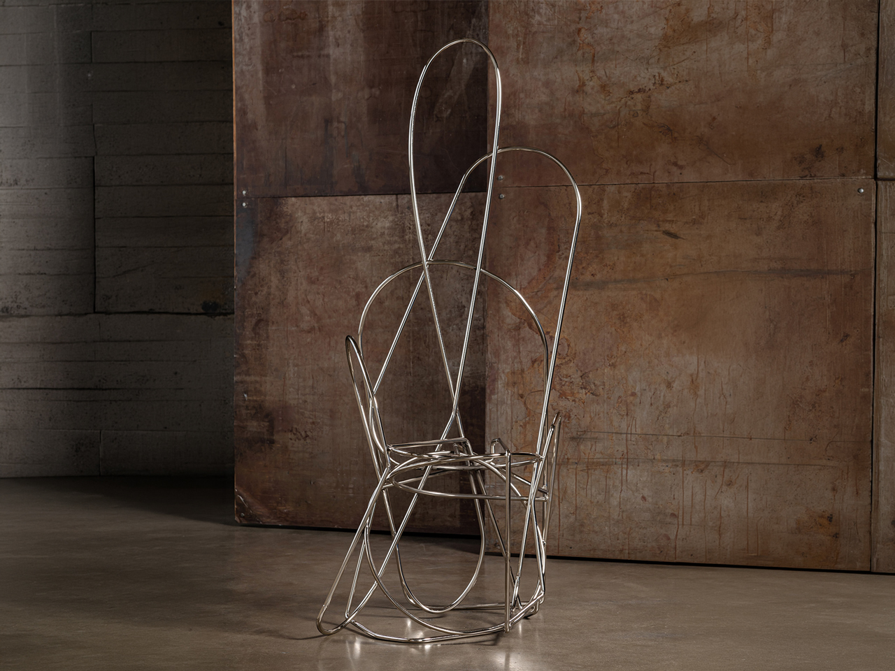
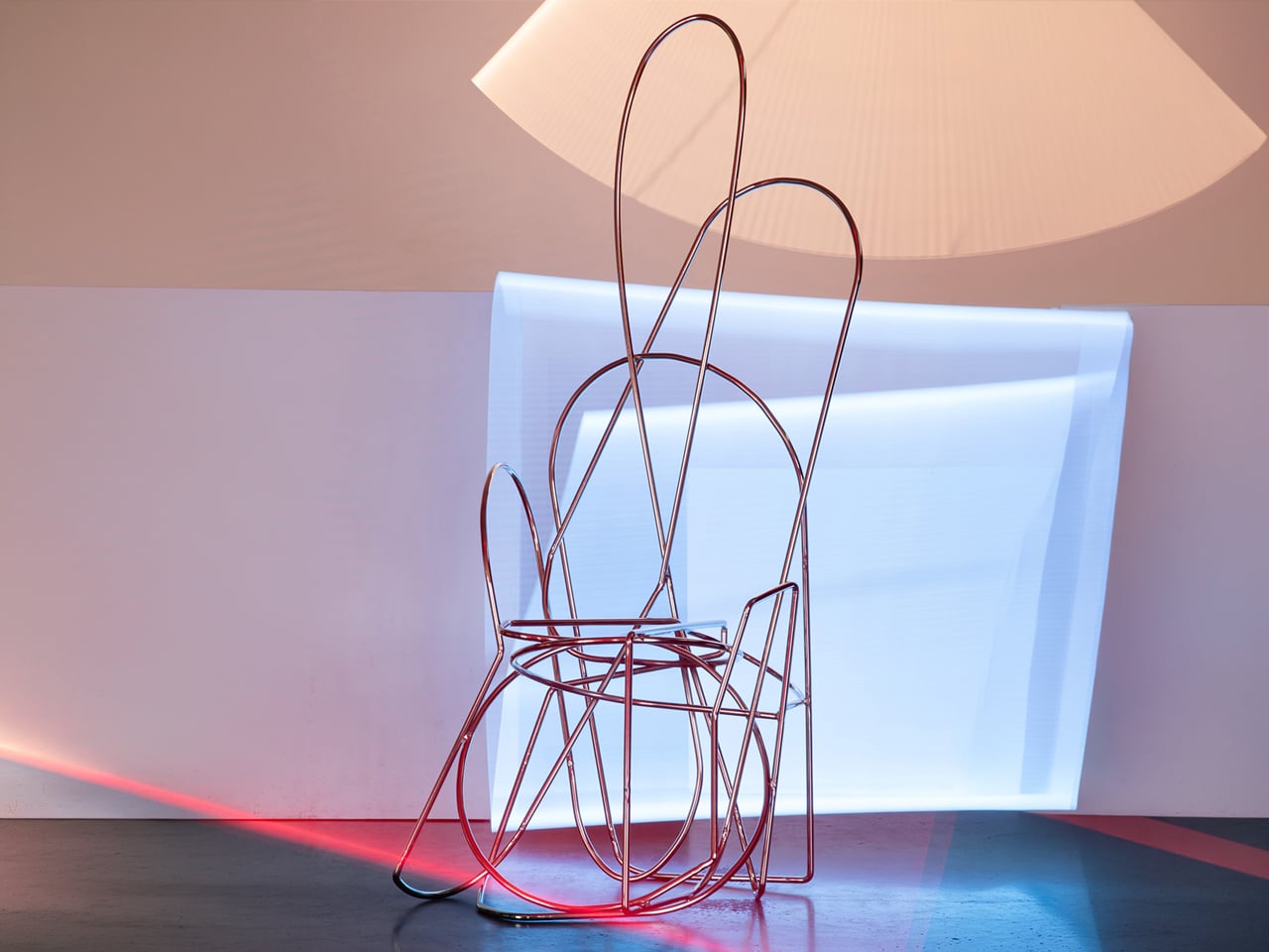
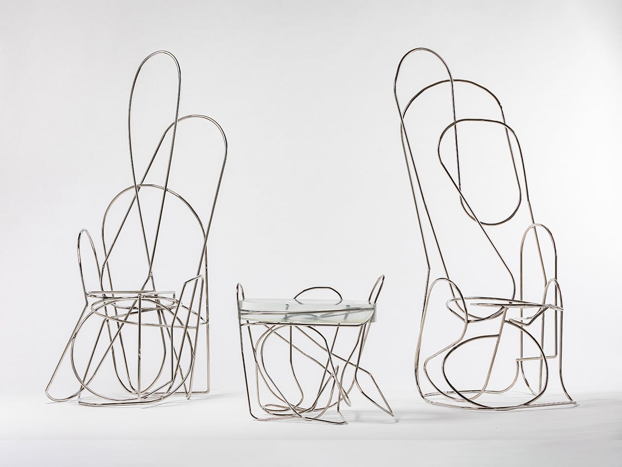
The Doodle collection by Another Human, led by Leah Ring, is a bold exploration of sculptural steel furniture. At its core are nickel-plated steel rods, meticulously hand-bent into looping, spontaneous forms that resemble freehand sketches translated into space. Each curve is shaped and welded with precision, resulting in fluid frameworks that feel dynamic and expressive rather than rigid or industrial. Subtle variations ensure that every piece remains one of a kind, reinforcing the handcrafted integrity of the metalwork.
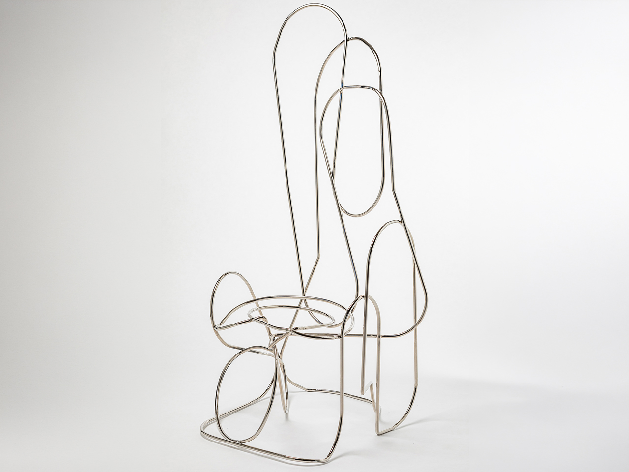
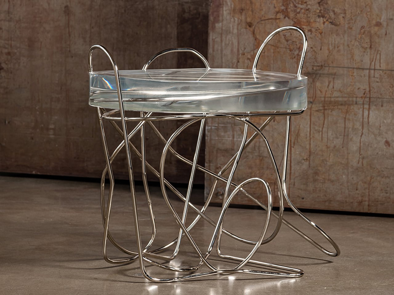
The table and chairs appear almost gravity-defying, as though drawn in mid-air, yet the welded steel armature provides structural stability and durability. The polished nickel surface reflects light across the sweeping lines, amplifying the sense of movement within the design. By leaving the steel exposed and unapologetically visible, the collection celebrates material honesty, transforming utilitarian furniture into striking, sculptural statements defined entirely by the strength and rhythm of metal.

3. Sustainability and Steel’s Immortal Lifecycle

Steel presents an intriguing environmental paradox. Its production demands significant energy, yet its long-term sustainability lies in unmatched circularity. Unlike many materials that degrade with reuse, steel can be recycled repeatedly without losing strength or quality, preserving both performance and value.

In an era dominated by fast furniture and disposable design, steel stands as a deliberate counterpoint. A steel chair is rarely a temporary purchase; it is an investment in longevity. Its durability reduces replacement cycles, waste, and resource consumption over time. Beyond physical resilience, steel embodies a mindset shift from short-term convenience to enduring responsibility and conscious ownership.
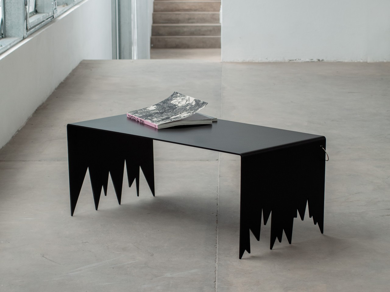
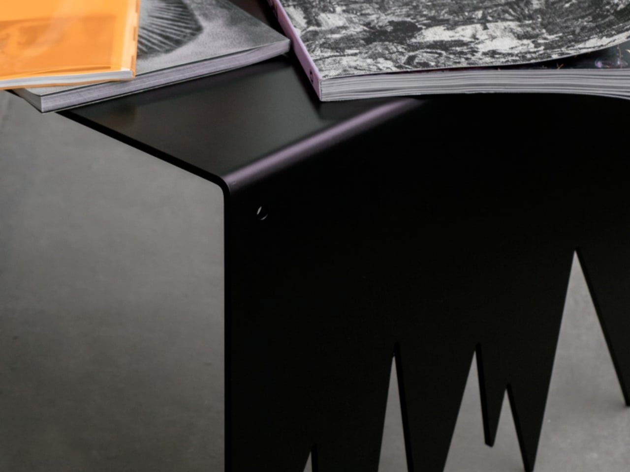
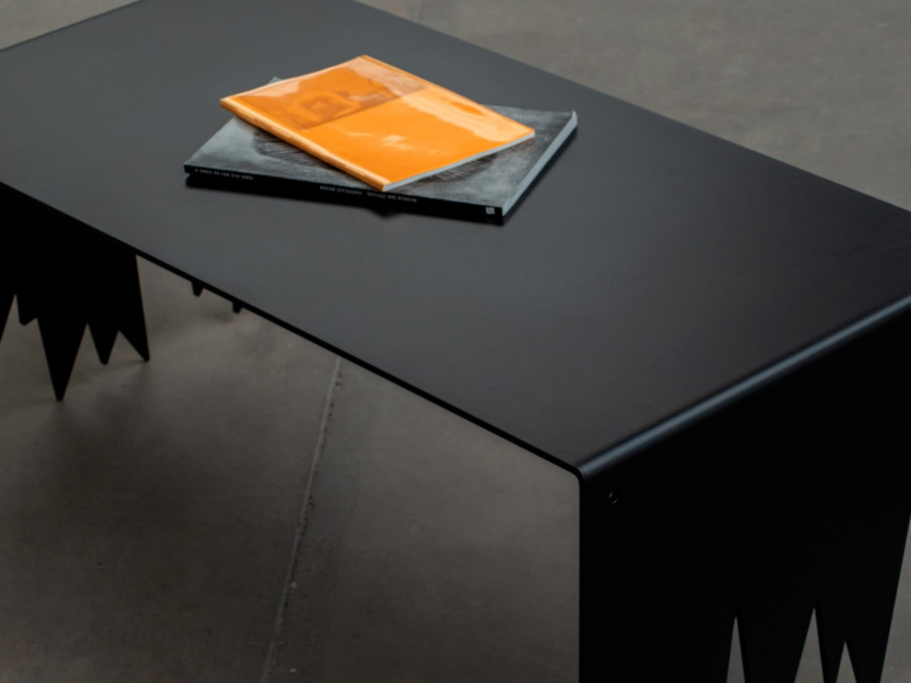
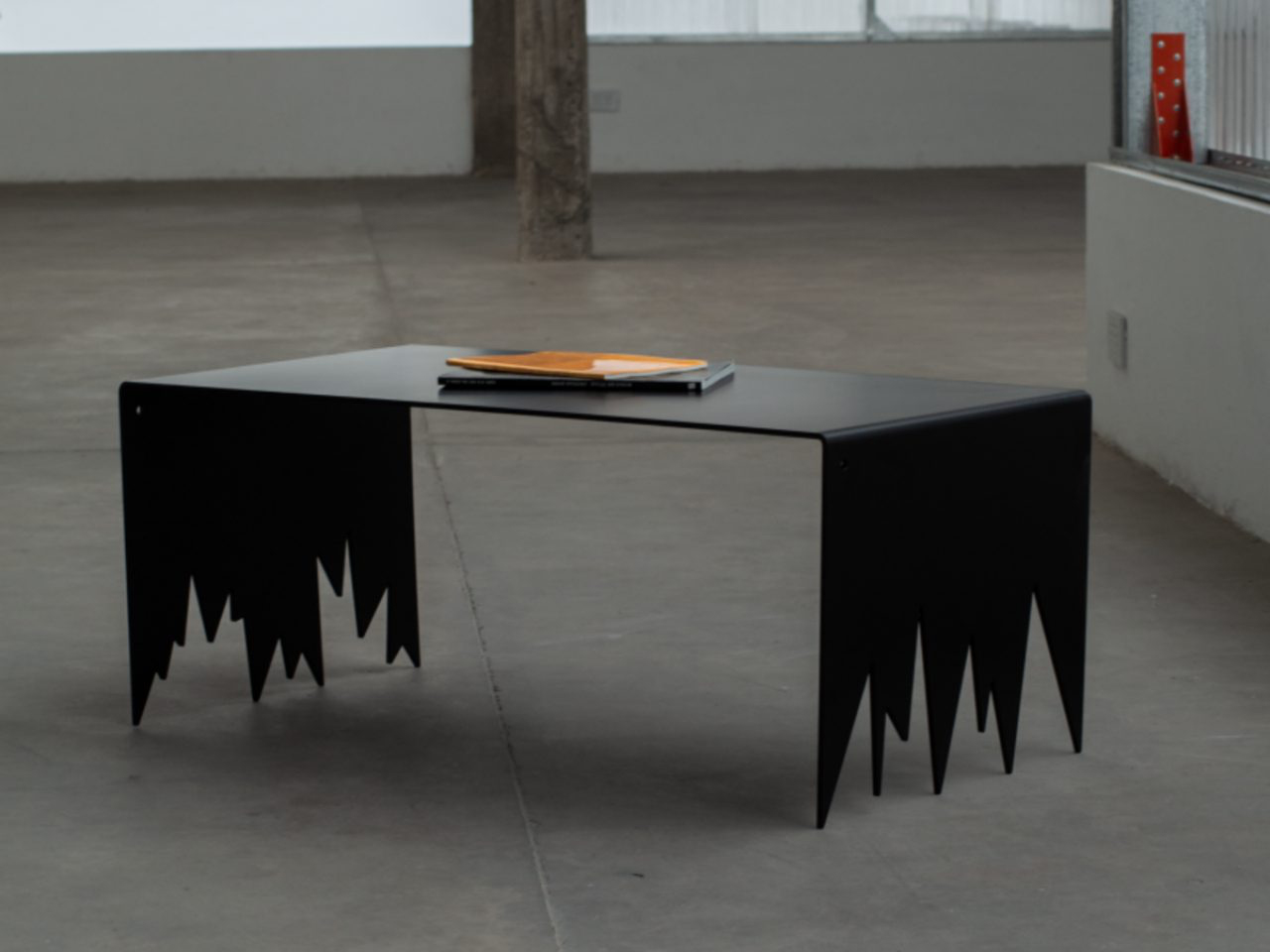
The Sharp coffee table stands as a commanding study in steel and geometry. Constructed entirely from industrial-grade steel and finished in deep black, the table is defined by its stark lines and uncompromising angles. Its surface appears clean and restrained, yet the structure beneath introduces a deliberate sense of tension. Narrow planes intersect with precision, forming a composition that feels architectural rather than decorative. The table does not rely on embellishment; instead, its impact comes from proportion, silhouette and the confident use of raw material.
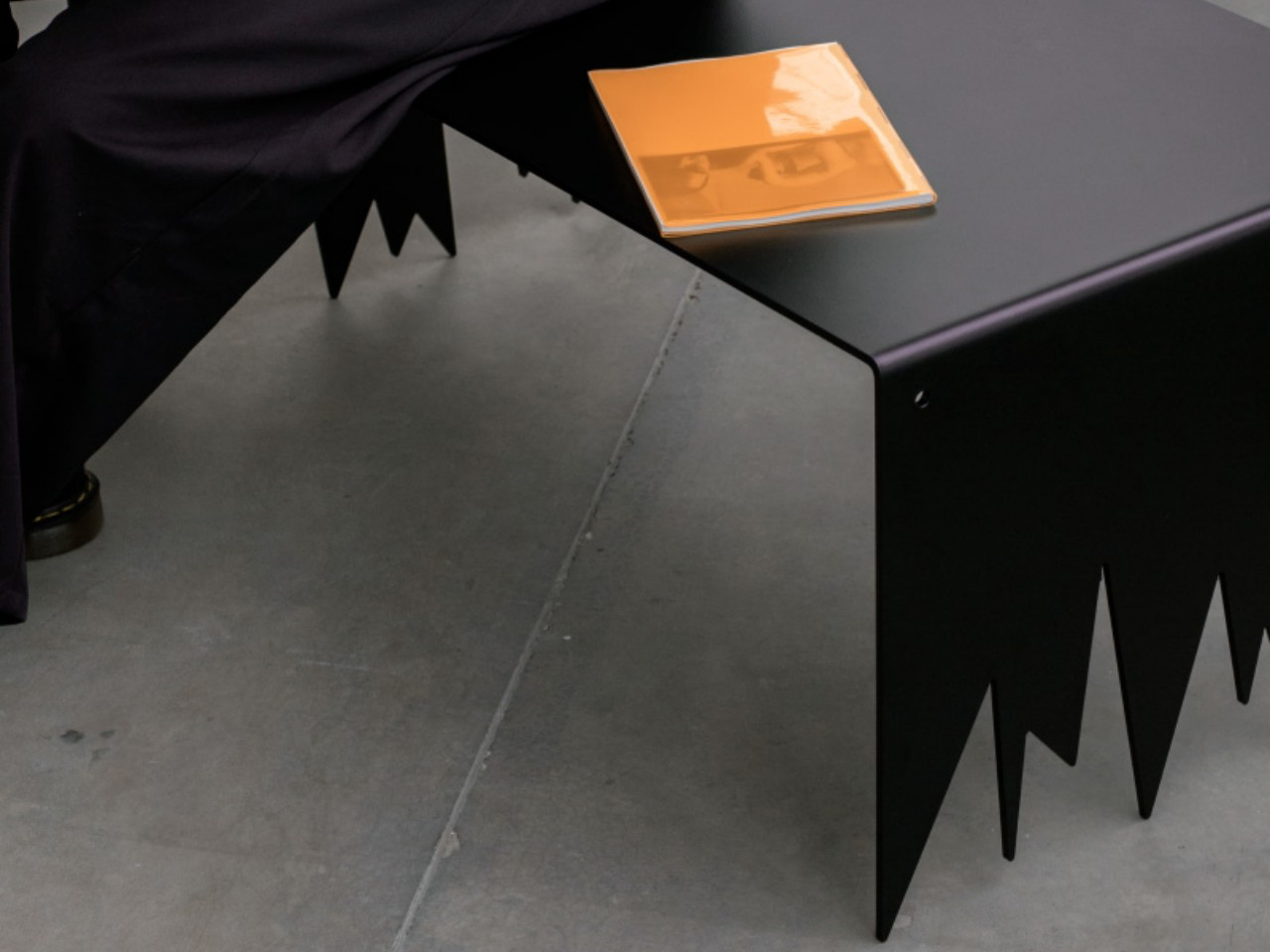
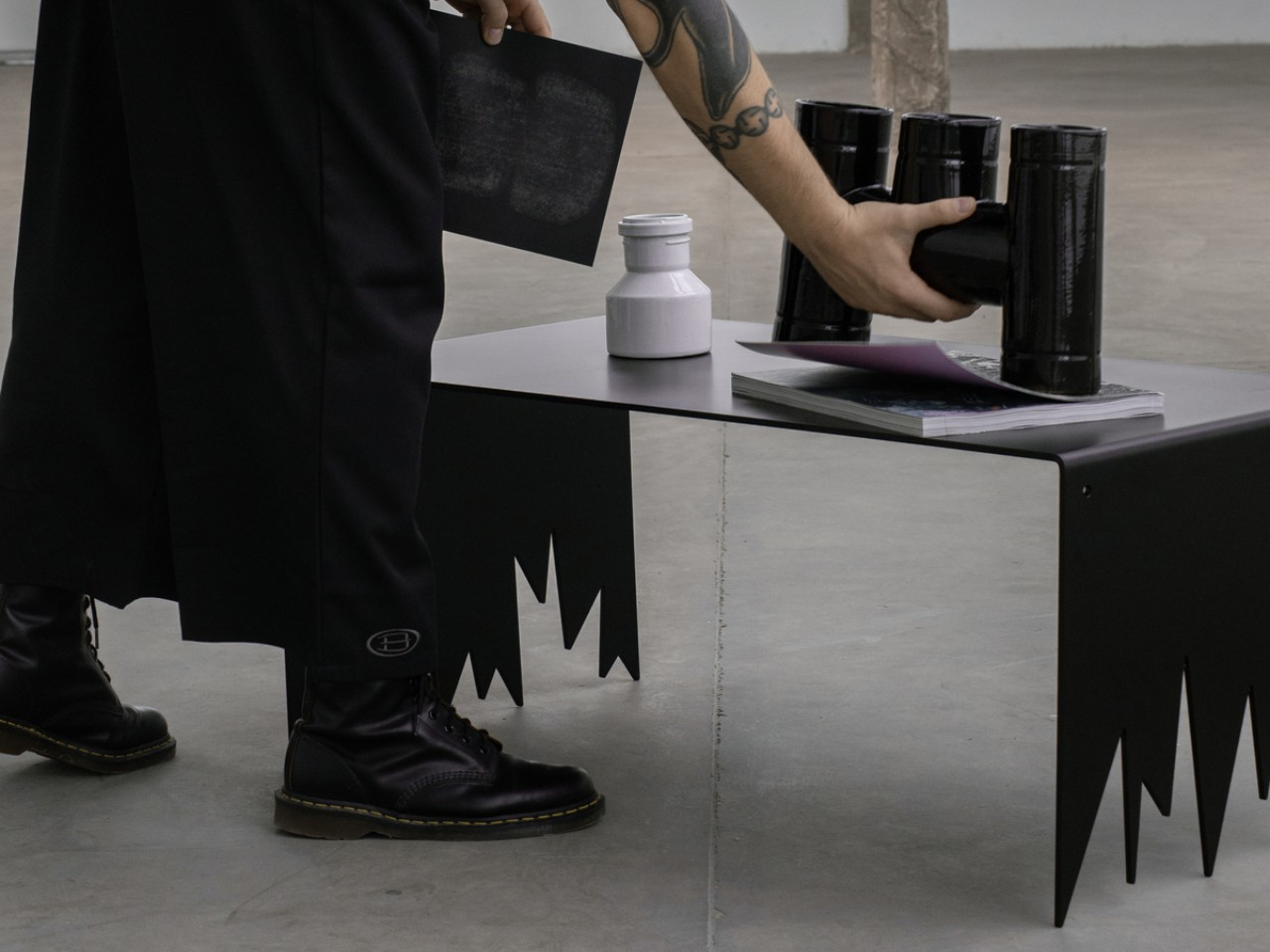
What sets the Sharp table apart are its jagged, tooth-like legs, which give the piece an imposing and almost sculptural presence. Despite their aggressive appearance, these sharply pointed supports provide remarkable stability, demonstrating careful engineering and balance. The black finish enhances the monolithic quality of the steel, amplifying its visual weight while maintaining a refined edge. Handcrafted and subtly unique in form, the table transforms steel into a bold centrepiece that redefines the expectations of a contemporary coffee table.

4. Designed to Last, Designed to Age

Steel carries a unique duality in the way it ages. On one hand, precision finishes like powder coating offer remarkable resistance to scratches, corrosion, and fading, preserving a crisp, immaculate appearance for years. The surface remains controlled, consistent, almost untouched by daily life.

On the other hand, raw or waxed steel embraces change. It records fingerprints, subtle oxidation, and the gentle evidence of use. What might once be seen as imperfection becomes narrative. The material evolves with its environment, gaining depth and individuality. This contrast allows steel furniture to satisfy the desire for flawless permanence and the appreciation of character shaped by time.
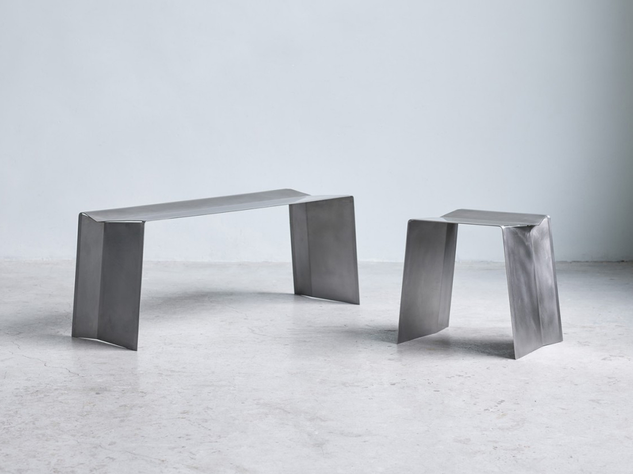
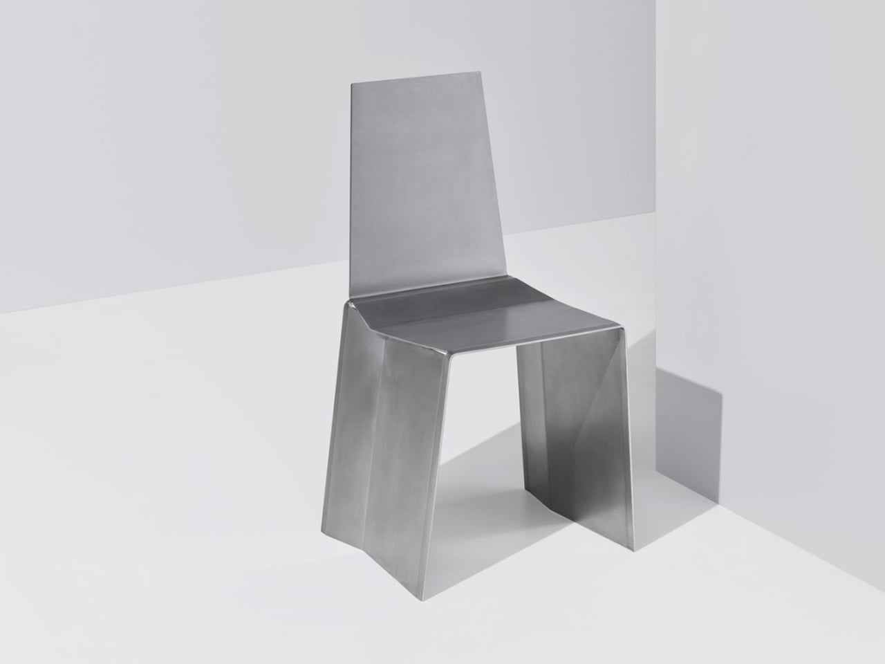
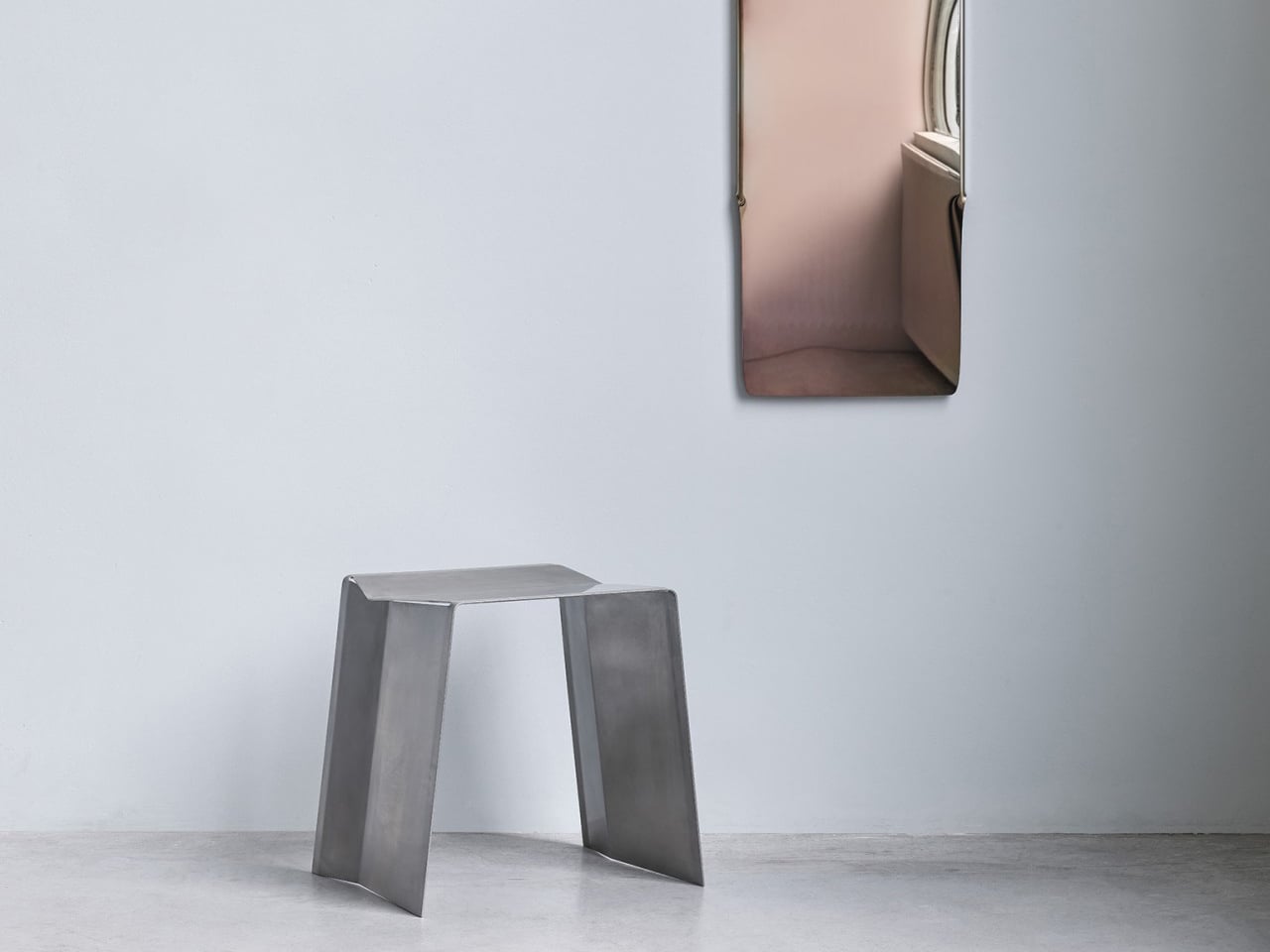
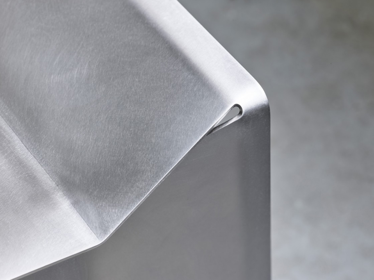
Camber is formed from a single sheet of stainless steel, precisely cut and bent to create a seamless seat and support structure. Rather than assembling multiple components, the design relies on strategic angular cuts at the fold points, allowing the metal to bend downward into stable legs. This method produces a continuous form with clean, uninterrupted lines. The geometry feels deliberate and architectural, giving the bench or stool a restrained yet confident presence. Every curve and edge emerges directly from the original sheet, reinforcing the clarity of its construction.
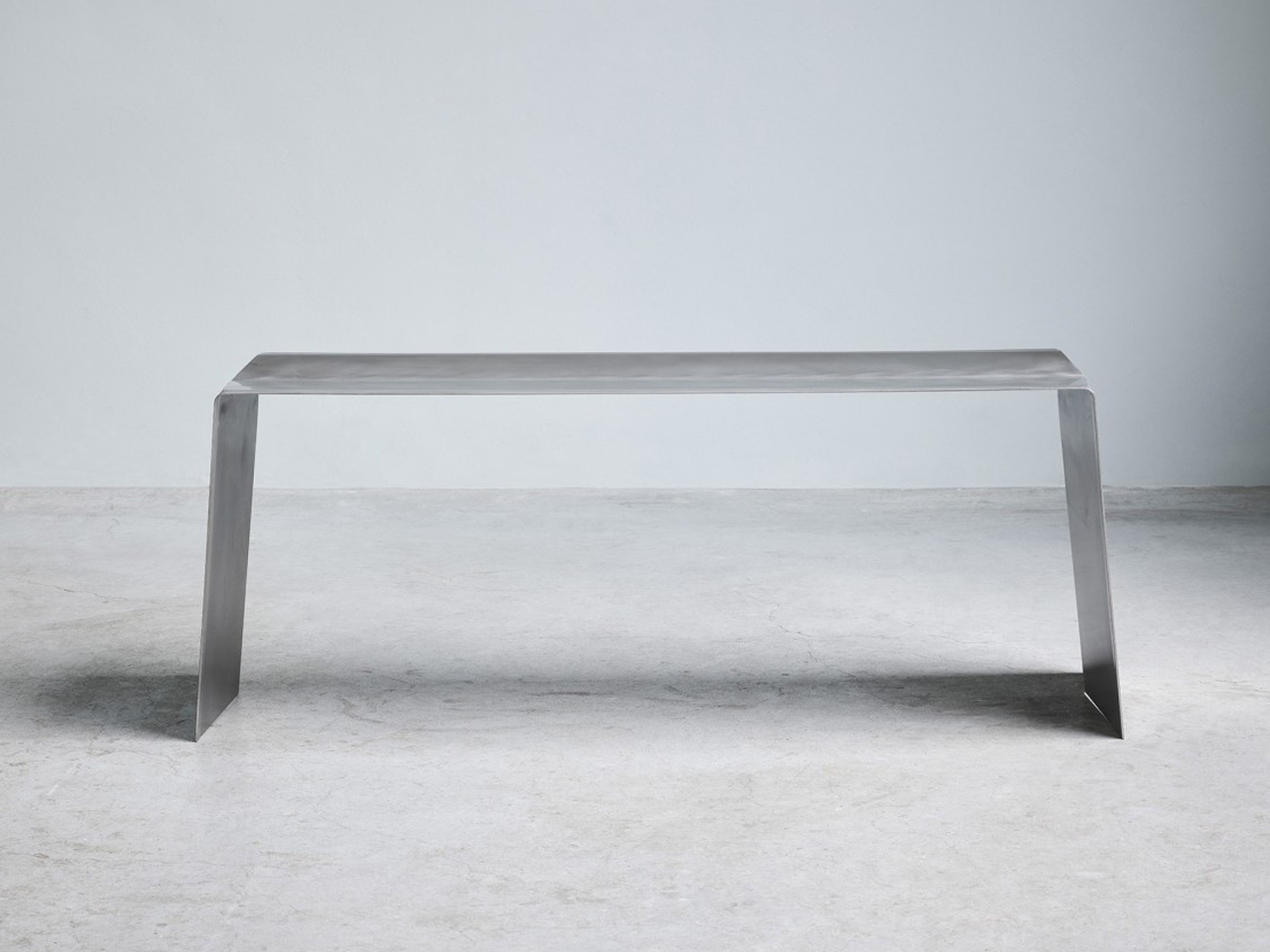
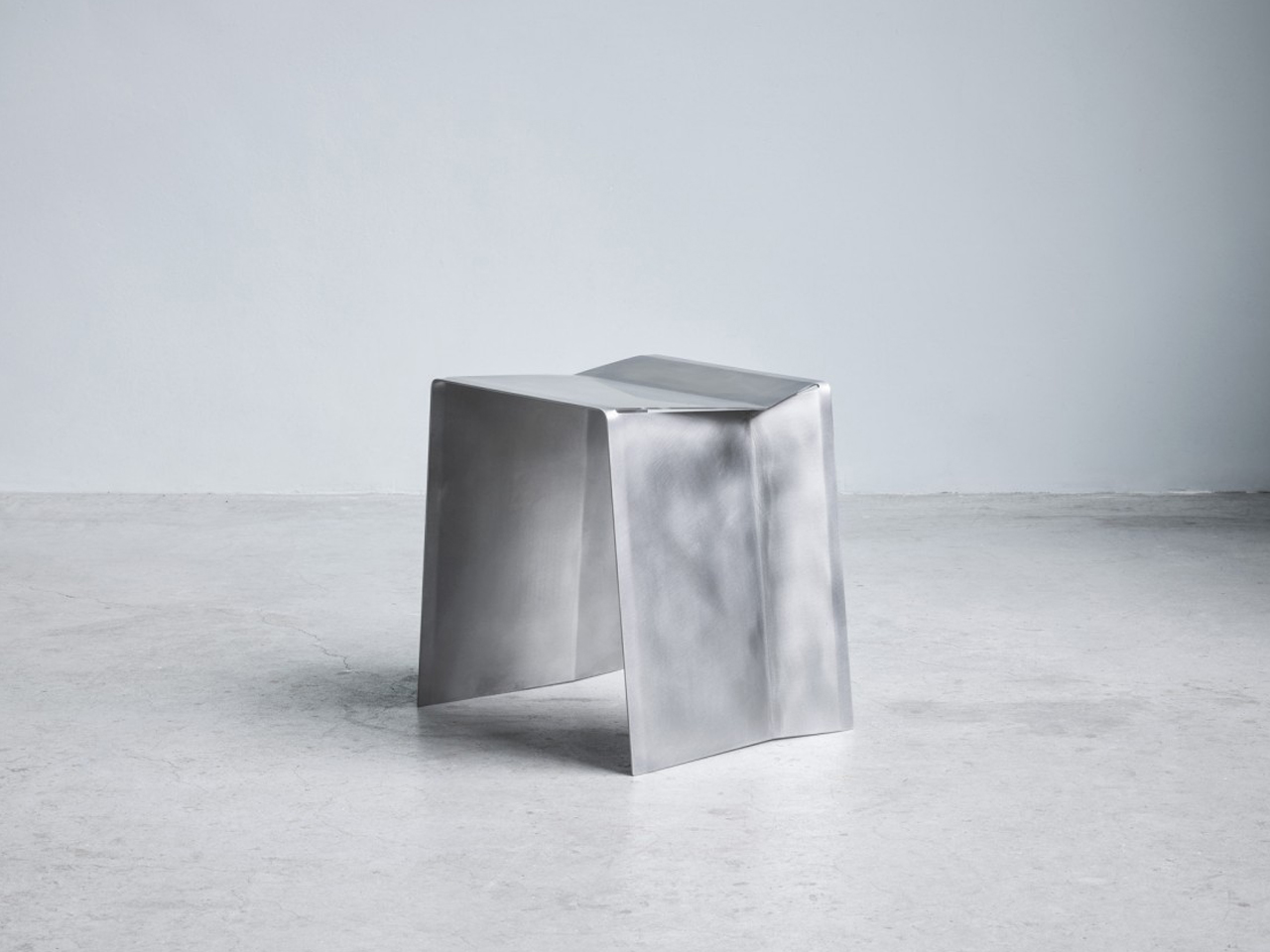
The surface is carefully sanded to achieve a soft, matte reflectivity that enhances the steel’s natural character without the need for additional coatings. Subtle light play across the planes highlights the crisp folds and sharp contours. Durable and resilient, the stainless-steel body ensures longevity while maintaining a minimal aesthetic. Camber’s strength lies in its simplicity, transforming a single industrial sheet into a refined, sculptural seating piece defined by precision and material honesty.

5. Adaptability and Modular Intelligence

Steel’s strength is not only about load-bearing capacity but also about flexibility in design. Its precision fabrication allows components to be cut, bent, welded, and reconfigured with remarkable accuracy. This makes steel inherently suited for modular systems, adjustable structures, and multifunctional furniture that evolves with changing needs.

In contemporary interiors where space must work harder, steel enables intelligent adaptability. Shelving expands, partitions shift, tables extend, and frames support interchangeable elements. The material’s dimensional stability ensures that moving parts remain aligned and reliable over time.
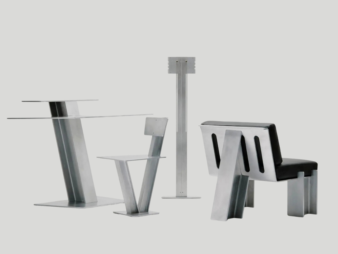
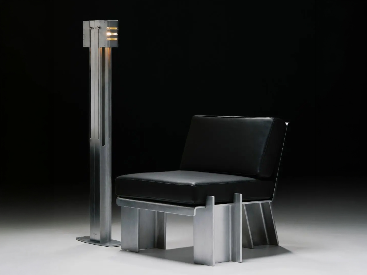
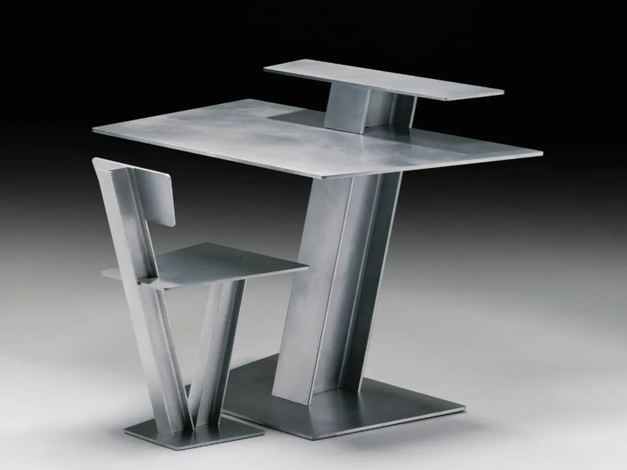
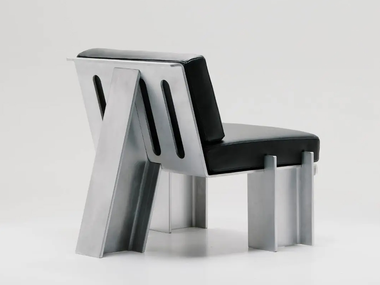
The Beams collection by Marquel Williams reimagines modular steel furniture through the disciplined use of a single structural element: the I-beam. Typically concealed within architecture, this industrial component becomes the visible backbone of chairs, desks, lounge seating and lighting. Each piece is constructed from standardised steel beams combined with metal sheets and leather upholstery, forming a cohesive system rooted in repetition and variation. By committing to one modular profile, the collection achieves structural clarity while allowing each design to express a distinct function and proportion.
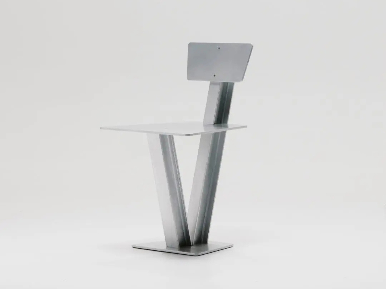
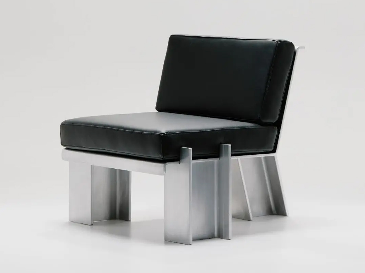
The Beam Chair emphasises sharp geometry and exposed steel, while the Chaise Longue introduces upholstered surfaces that soften the framework without concealing it. The Floor Lamp integrates adjustable shades within the beam’s linear body, even incorporating the electrical cord into the visible structure. Handcrafted in limited quantities by Caliper, the series balances industrial rawness with refined fabrication. Through modular repetition, the I-beam shifts from hidden support to expressive design language, defining a bold and unified steel furniture system.

Steel furniture captures the balance between resilience and refinement. No longer confined to pure function, it now expresses elegance, versatility, and tactile awareness. By uniting structural strength with nuanced design, steel moves beyond its industrial past. It demonstrates that durability and sensitivity can coexist, shaping interiors that feel grounded, expressive, and timeless.

The post 5 Steel Furniture Designs That Look Nothing Like Steel Furniture first appeared on Yanko Design.
Varydes Built a Steel Pen Named After Rain That Never Falls

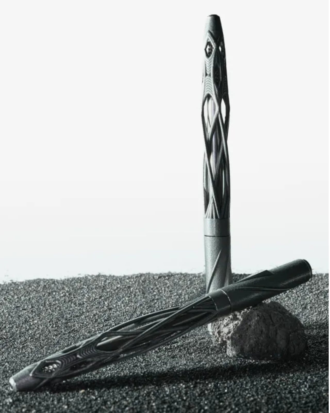
Pens have been essentially the same for decades. You pick one up, you write, you lose it in the bottom of your bag, and you move on. Nobody really thinks about what a pen looks like anymore because, for the most part, they all look the same. That’s exactly why Virga by Varydes stops you cold.

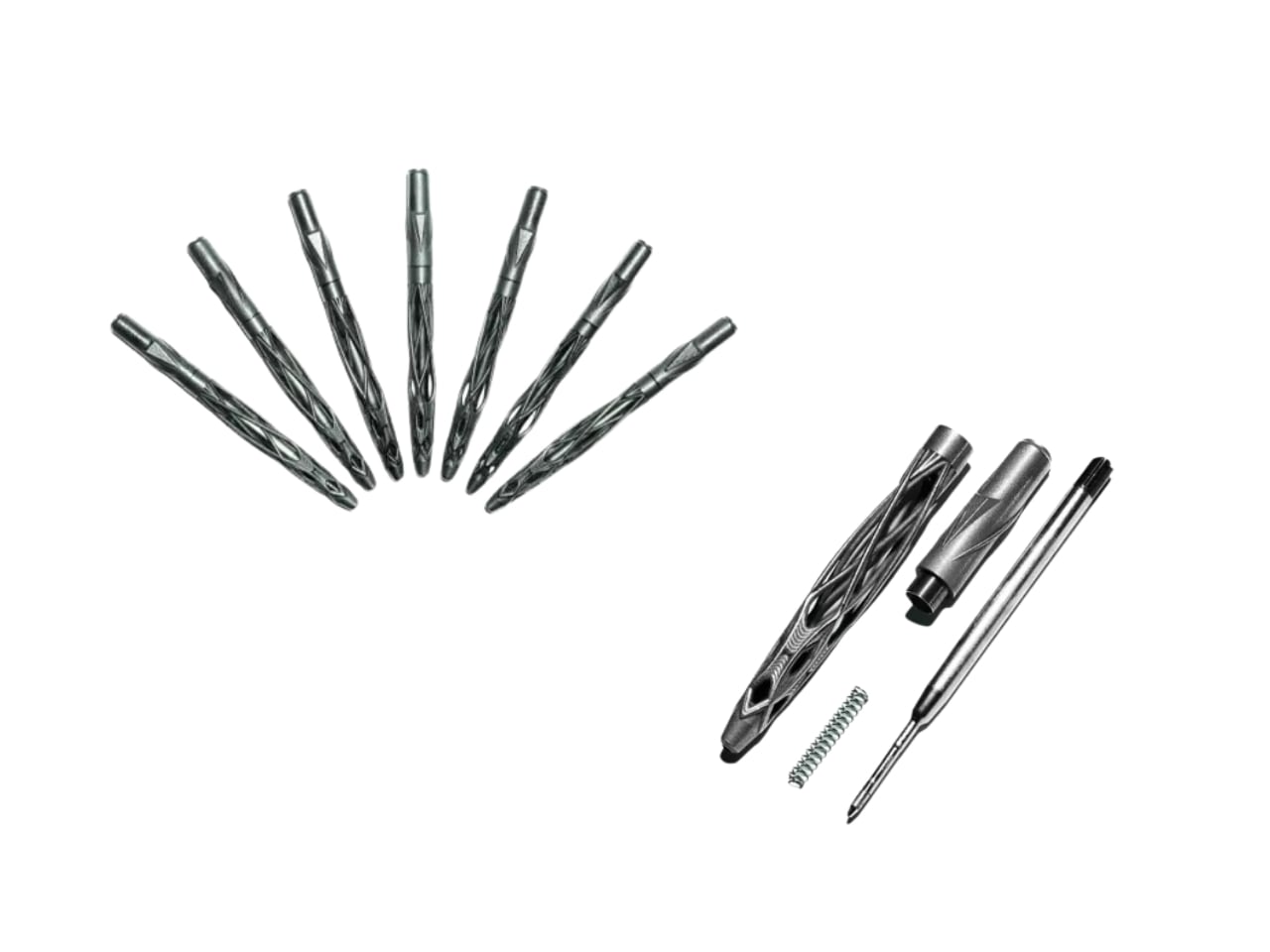
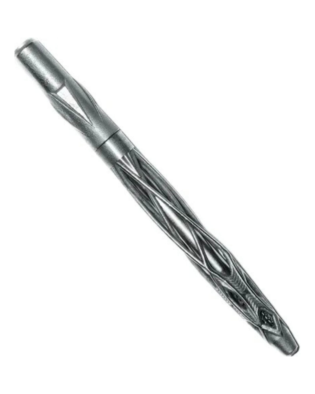
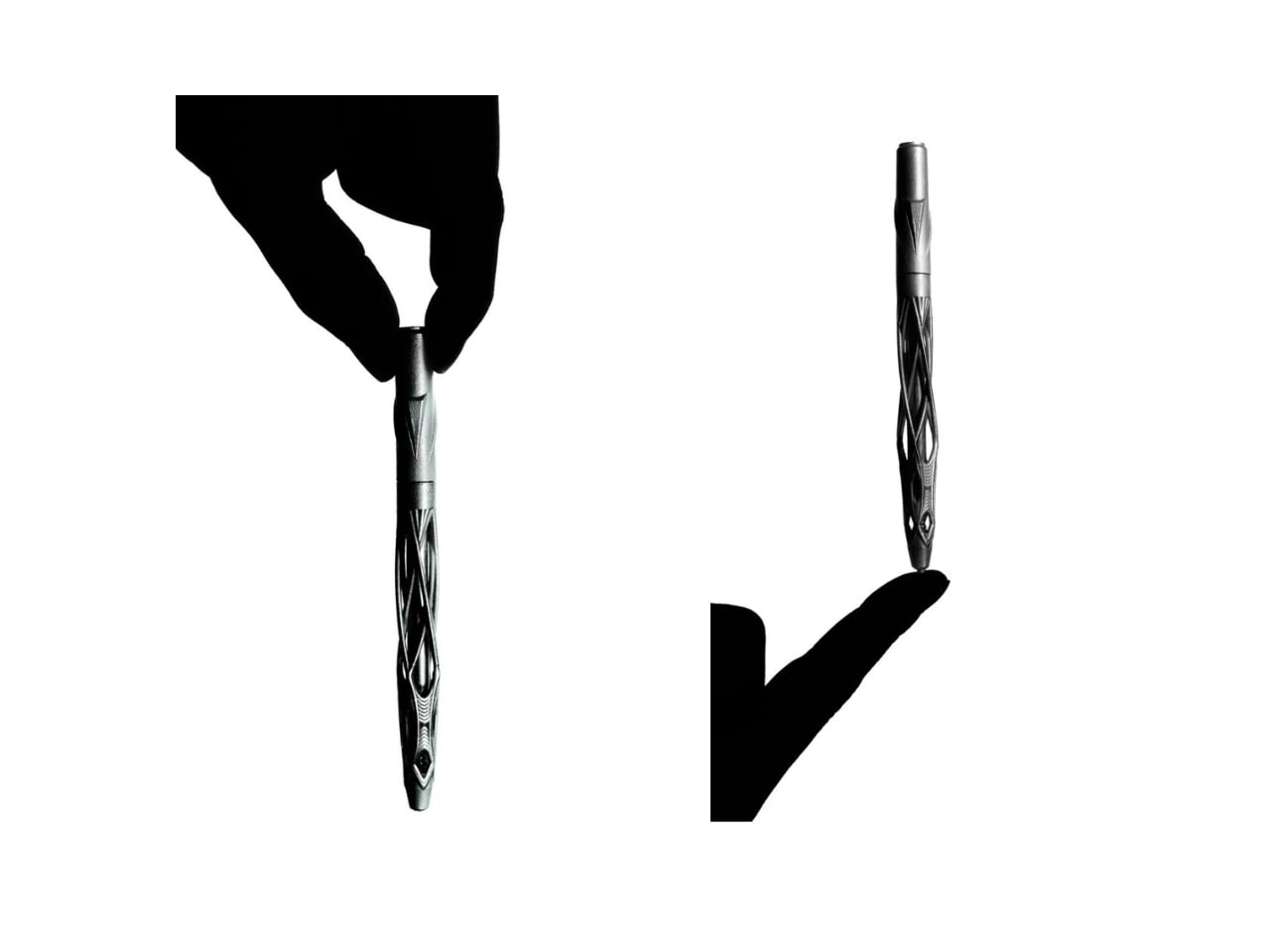
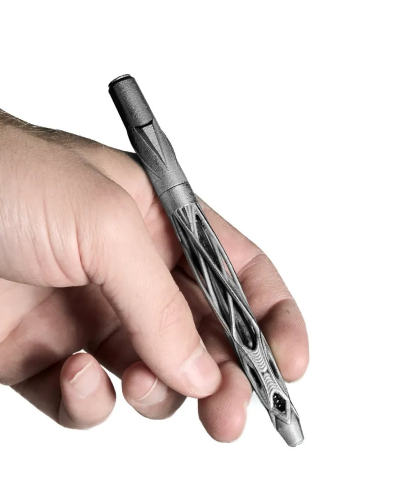
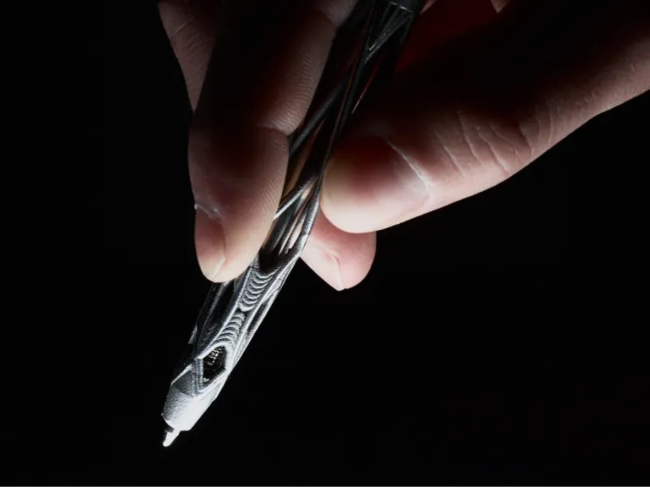
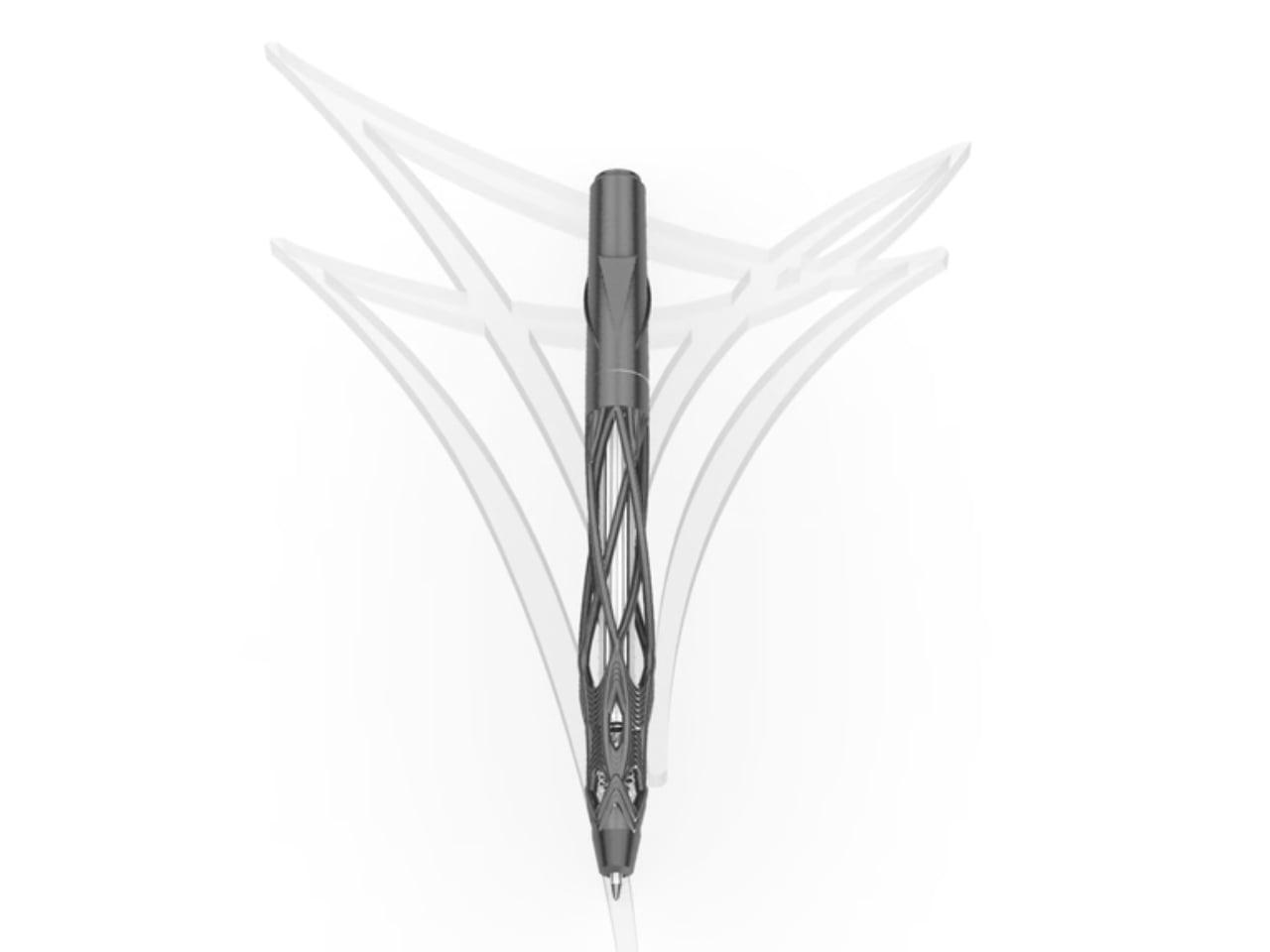
Designed by Kjell Semmer out of a Berlin studio, Virga is a ballpoint pen built from solid 316L stainless steel, shaped into an open lattice structure that looks less like it was engineered and more like it simply grew. The studio describes it as “grown, not manufactured,” and that’s not marketing language. When you look at the photographs, you genuinely see it. Fine steel strands weave together, pull apart, dense in some sections and open and airy in others. Rotate it even slightly in the light, and it shifts. You never quite see the same pen twice.

Designer: Kjell Semmer

The name, Virga, is borrowed from meteorology. It refers to precipitation that falls from clouds but evaporates before ever reaching the ground. Rain that exists but never lands. It’s a strange, beautiful thing to name a writing tool after, but it works. Like the weather phenomenon, Virga the pen exists somewhere between two states of form. It looks almost organic yet undeniably industrial. Precise, but it reads as wild. A piece of steel that somehow feels alive.

Functionally, Virga is straightforward and, in my opinion, that’s a smart choice. A smooth twist mechanism, a standard G2 refill, 12.7 centimeters long, and 39 grams of solid steel in your hand. It won’t disappear in your bag. You’ll know it’s there. The weight alone makes it feel like an object that matters, not a disposable instrument you swipe from a hotel reception desk.

Every piece is individually examined, assembled, and hand-polished in the Berlin studio before it ships. Varydes deliberately leaves the surface raw, honest about the metal it came from. That kind of intentional restraint is worth paying attention to. It would have been easy to buff the thing to a mirror shine and call it luxury. Instead, they stopped at the point where the steel still feels like steel. That’s a different kind of confidence.

The design falls into a category that I think deserves more attention: objects made to be owned, not just used. A G2 refill means you can use it indefinitely. Stainless steel means it won’t crack, warp, or age poorly. The 3D printing process allows the open lattice structure to exist in the first place, creating geometry that traditional machining simply couldn’t produce. So while Virga looks like sculpture, it’s also engineered to be a daily companion. Those two things usually don’t share the same sentence, and yet here we are.

It’s also worth saying that the pen space has quietly become one of the most interesting corners of design. Collectors, writers, designers, and everyday people who just like beautiful objects have built a real market around thoughtful writing instruments. Virga fits into that world comfortably, but it doesn’t look like anything else in it. Most premium pens signal luxury through traditional craftsmanship, fine materials, brand heritage. Virga arrives from a completely different angle. It signals thinking. It looks like someone asked a genuinely different question about what a pen could be and then had the ability to actually answer it.

Whether you’re the kind of person who collects objects, cares about design, or just wants to stop using pens that feel like they were never meant to last, Virga is worth watching. The name is more fitting than it might first appear. Virga is precipitation that never touches down, suspended between sky and earth. This pen lives somewhere between sculpture and tool, between wild nature and precise engineering. It occupies that space permanently, and it looks extraordinary doing it.

The post Varydes Built a Steel Pen Named After Rain That Never Falls first appeared on Yanko Design.
Sydney Just Opened a 42-Metre Steel Lookout Over a Former Quarry

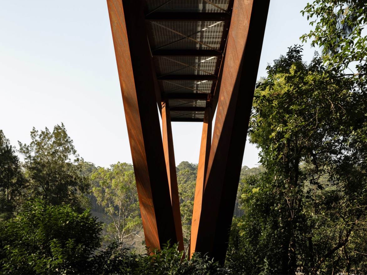
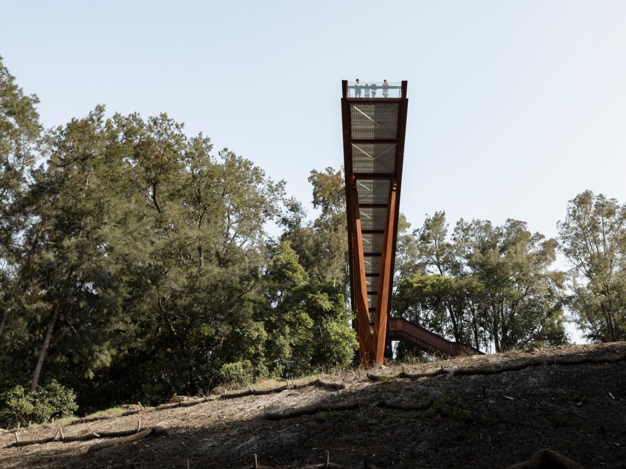
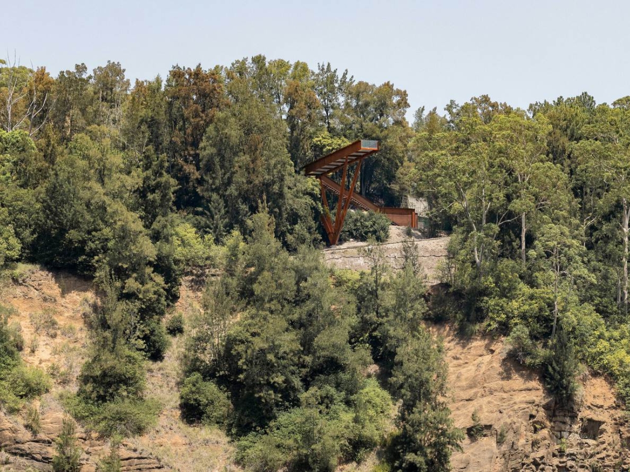
If you told me a 42-metre platform made of weathering steel, suspended over a former rock quarry, would be one of the most compelling pieces of public architecture right now, I’d say I believe you completely. The Southern Lookout at Hornsby Park in Sydney is exactly that. And it is worth every bit of attention it’s getting.

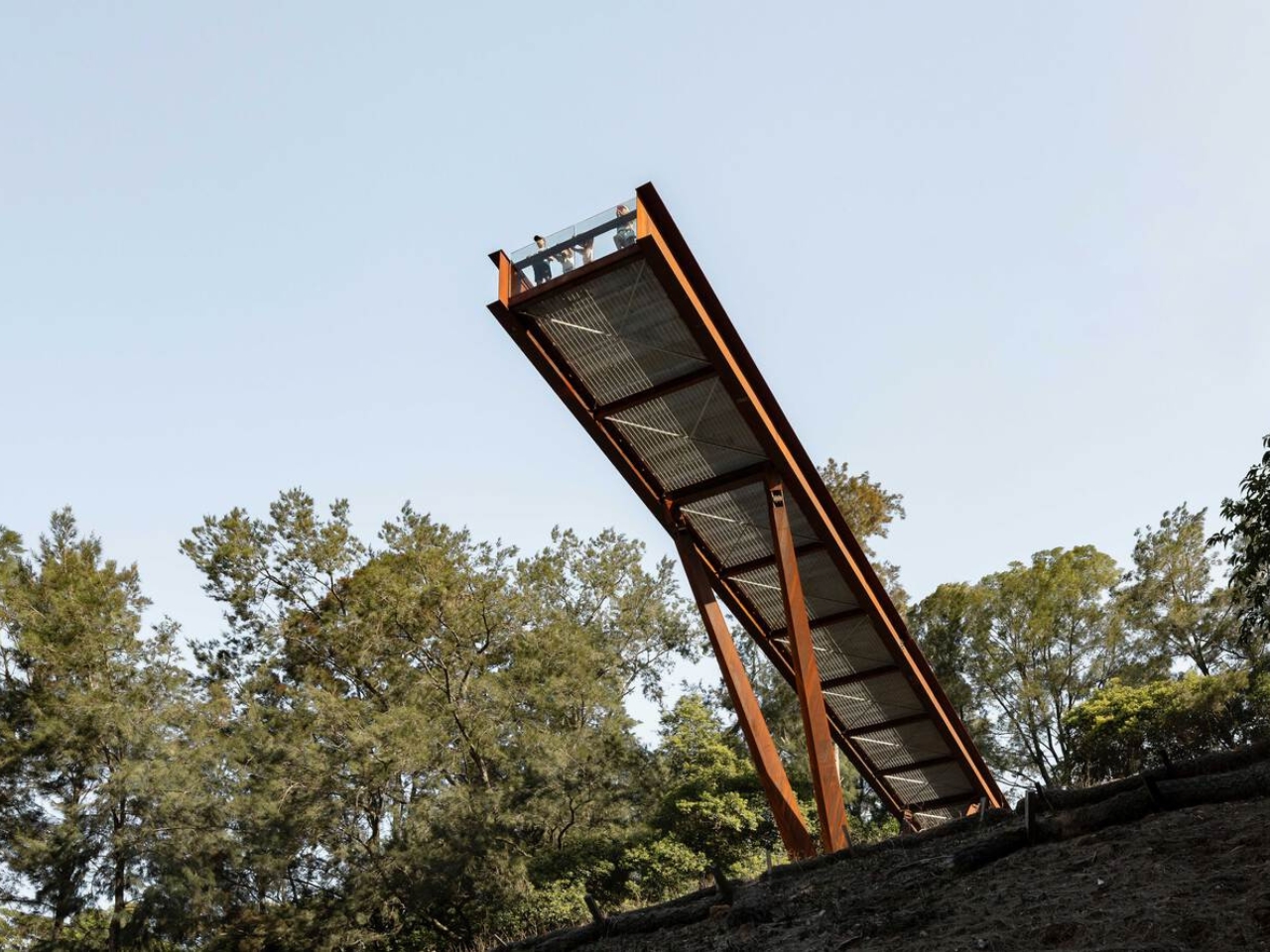
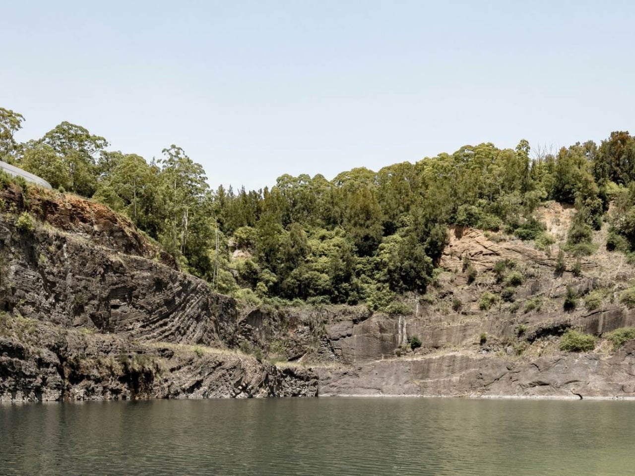
Designed by AJC Architects in collaboration with Clouston Associates, the structure sits on the northern edge of Sydney, overlooking the dramatic topography of Hornsby Quarry. The site itself has a remarkable backstory. For over a century, the quarry was completely inaccessible to the public. A place that had been carved out and worked, left to become something between ruin and wilderness, invisible to the city that had grown up around it. The Southern Lookout is the first completed architectural piece of a much larger 60-hectare landscape masterplan. It is, in the most literal sense, an opening.

Designer: AJC Architects

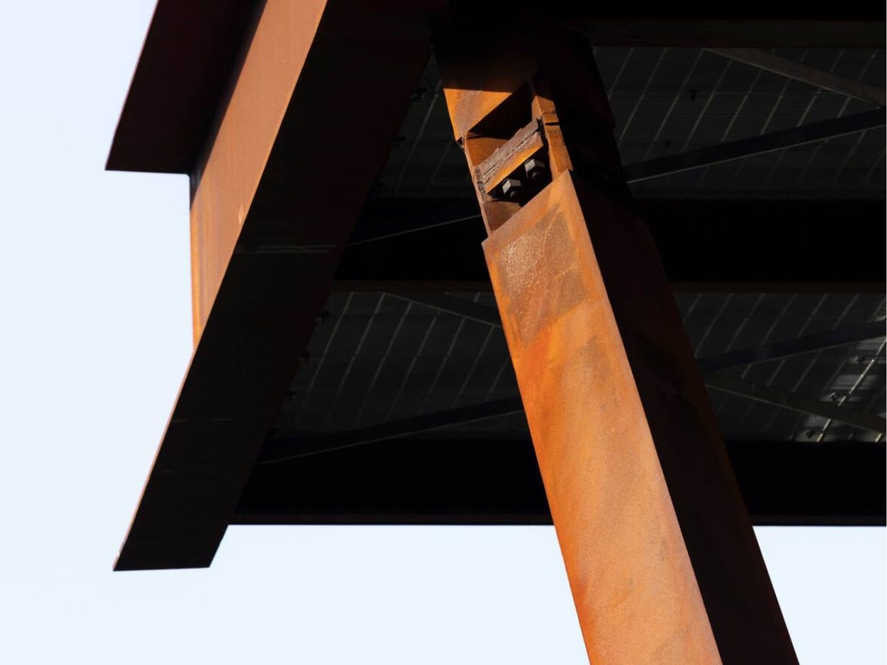
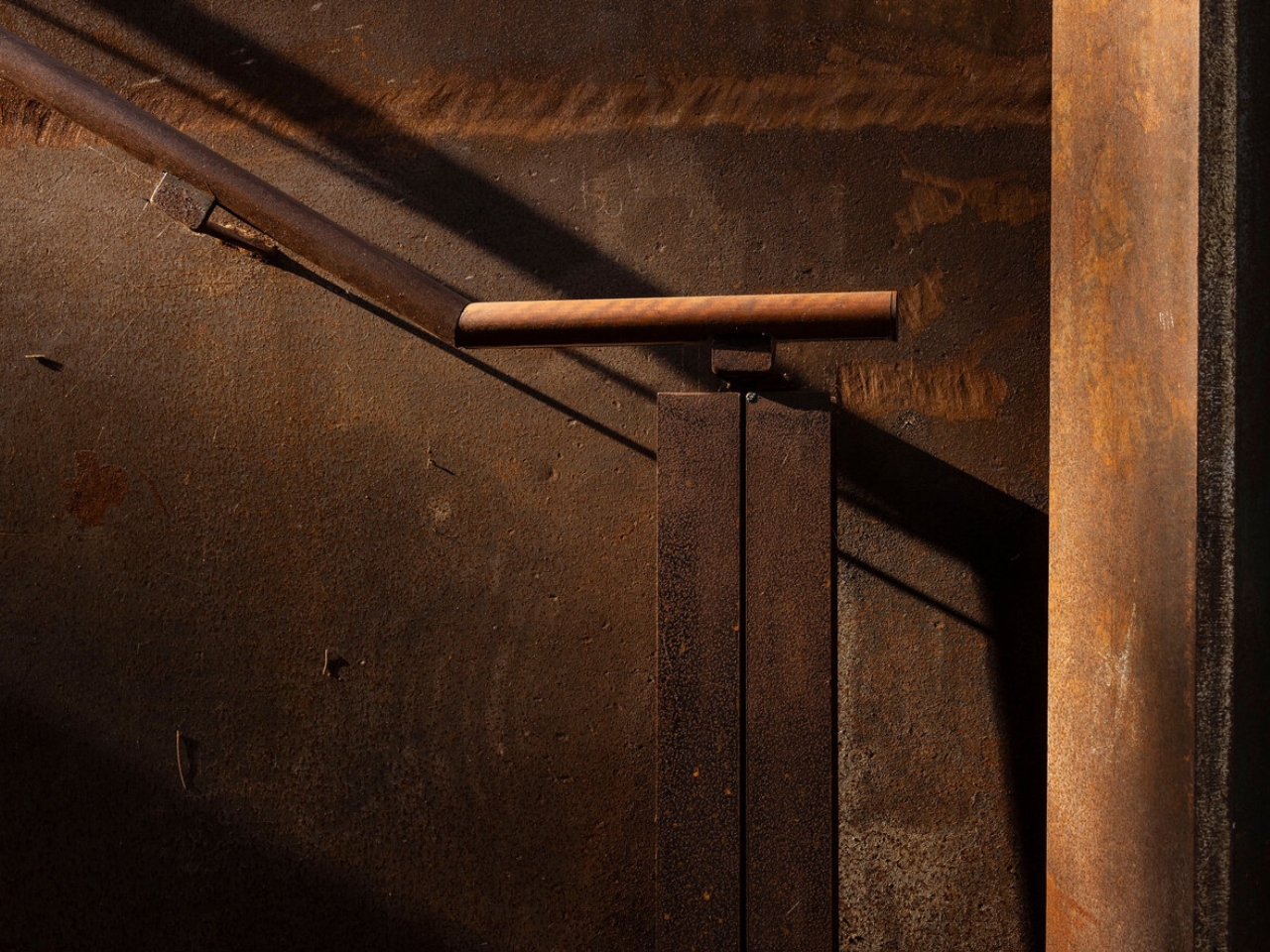
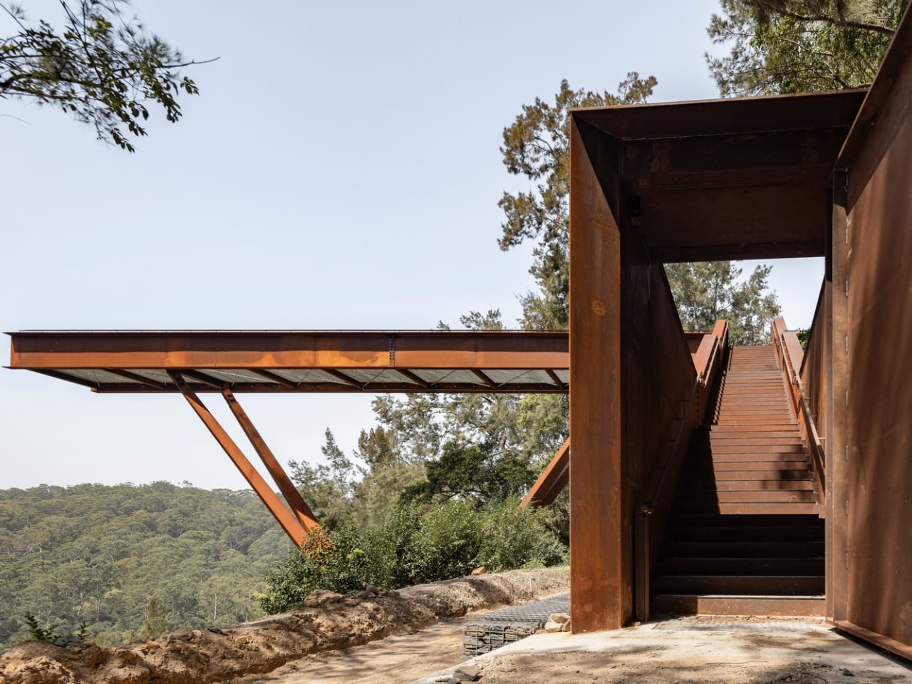
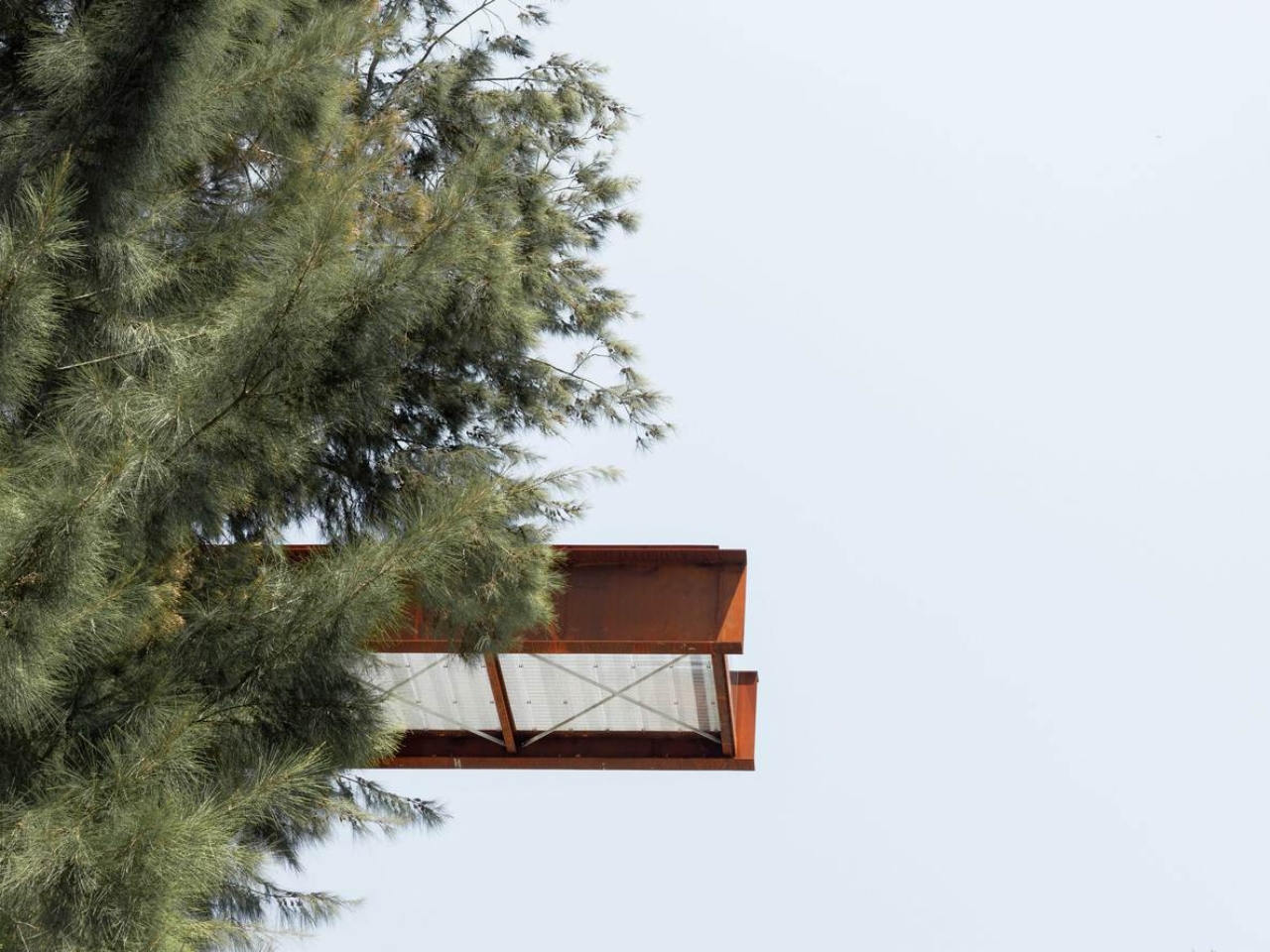
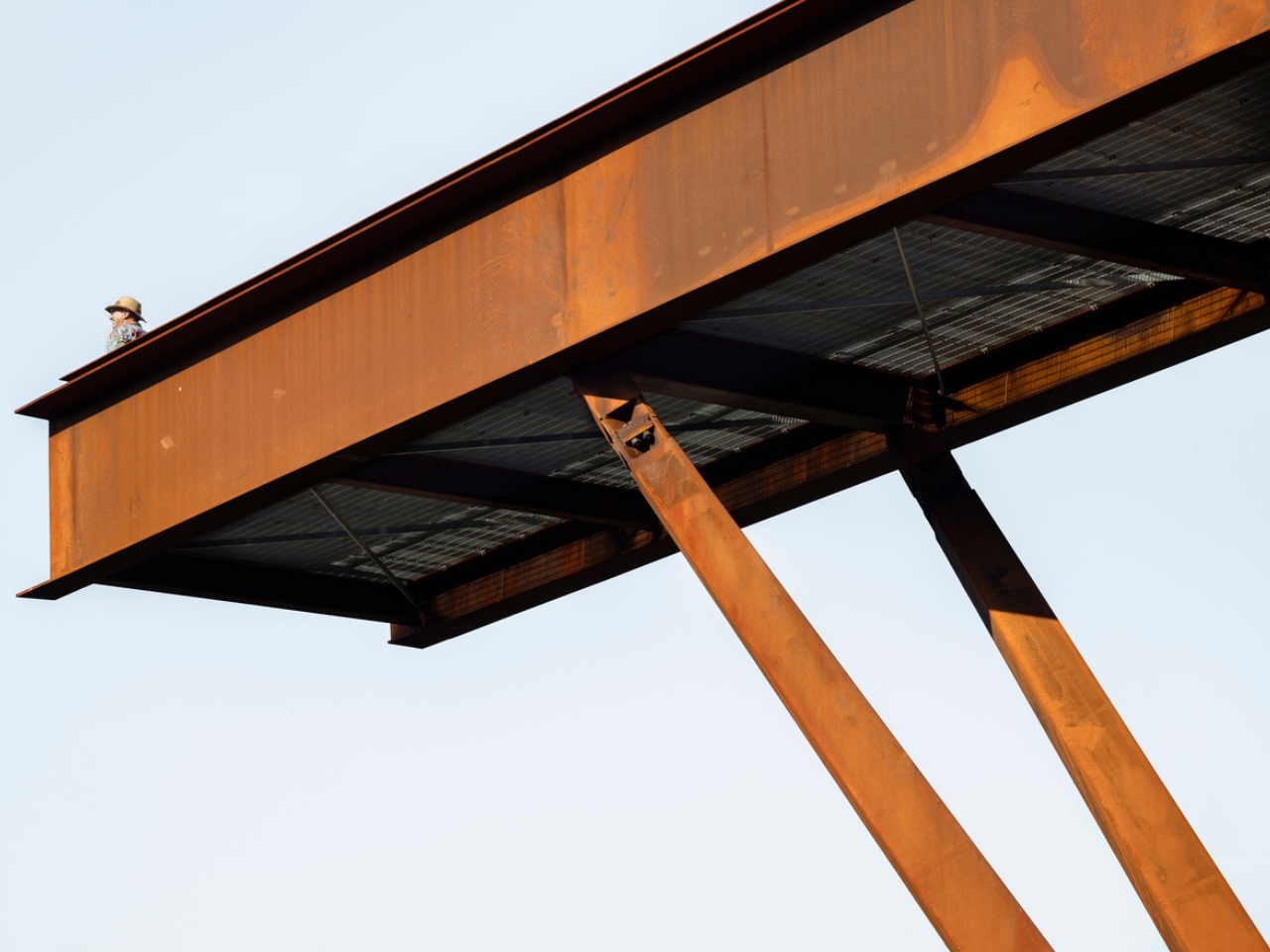
The choice of weathering steel is the first thing that makes you stop and think. Cor-Ten, as it’s commonly known, is a material that rusts deliberately. It forms a stable oxidized layer on its surface that protects the steel beneath while giving it that signature warm, amber-brown tone. It is a material that ages visibly and honestly, and for a project like this one, placed on the edge of a quarry whose story is entirely about time and transformation, it feels less like a design decision and more like a point of view.

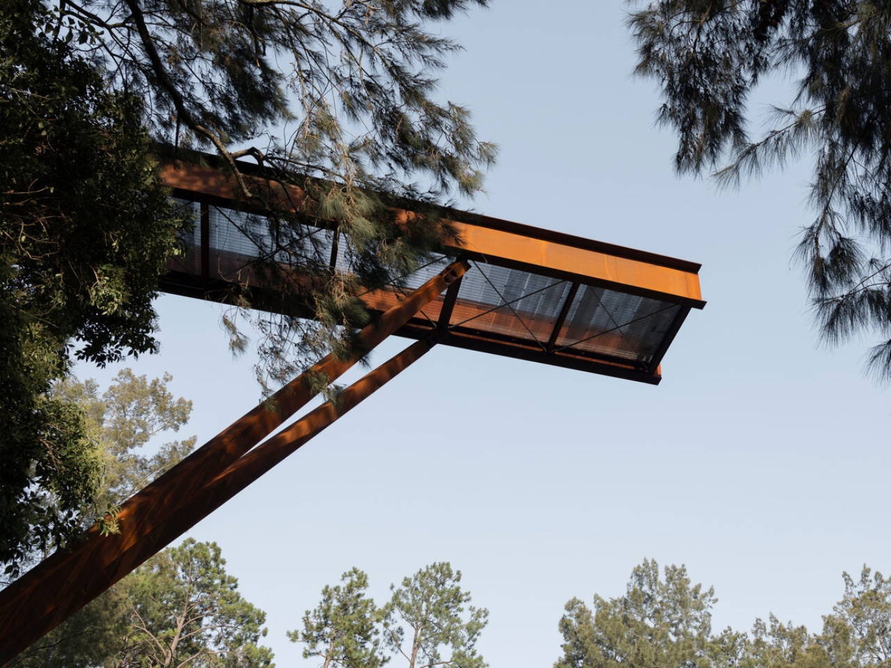
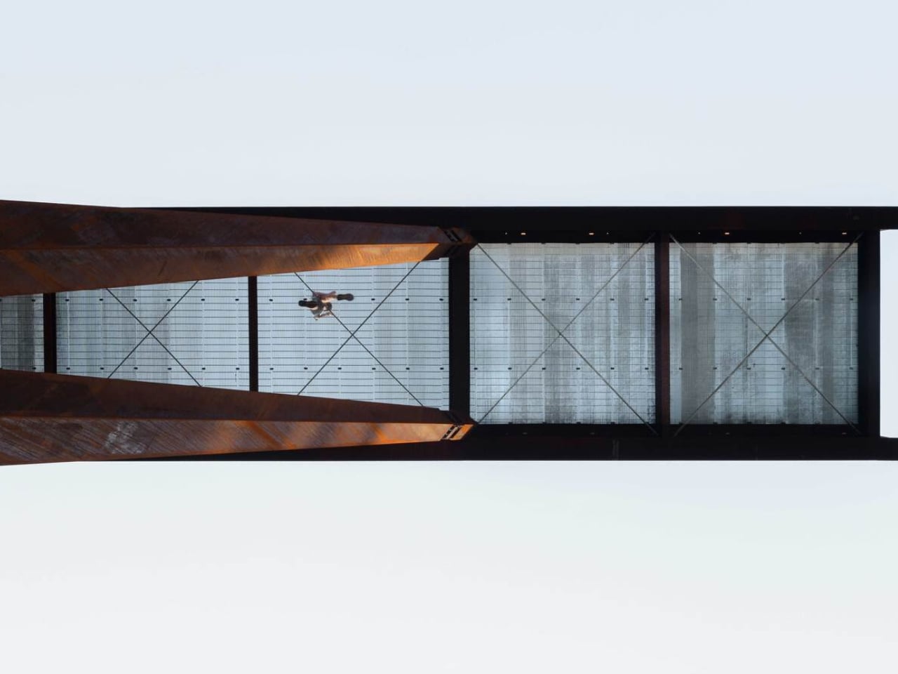
The platform runs 42 metres through the forest canopy, anchored into the embankment and balanced on four angled columns that converge on a single central footing below. That minimalism is intentional. The architects worked specifically to keep ground disturbance on the sensitive slope to a minimum. The result is a structure that feels both bold and careful, which is a hard balance to get right, and one AJC Architects manages convincingly.

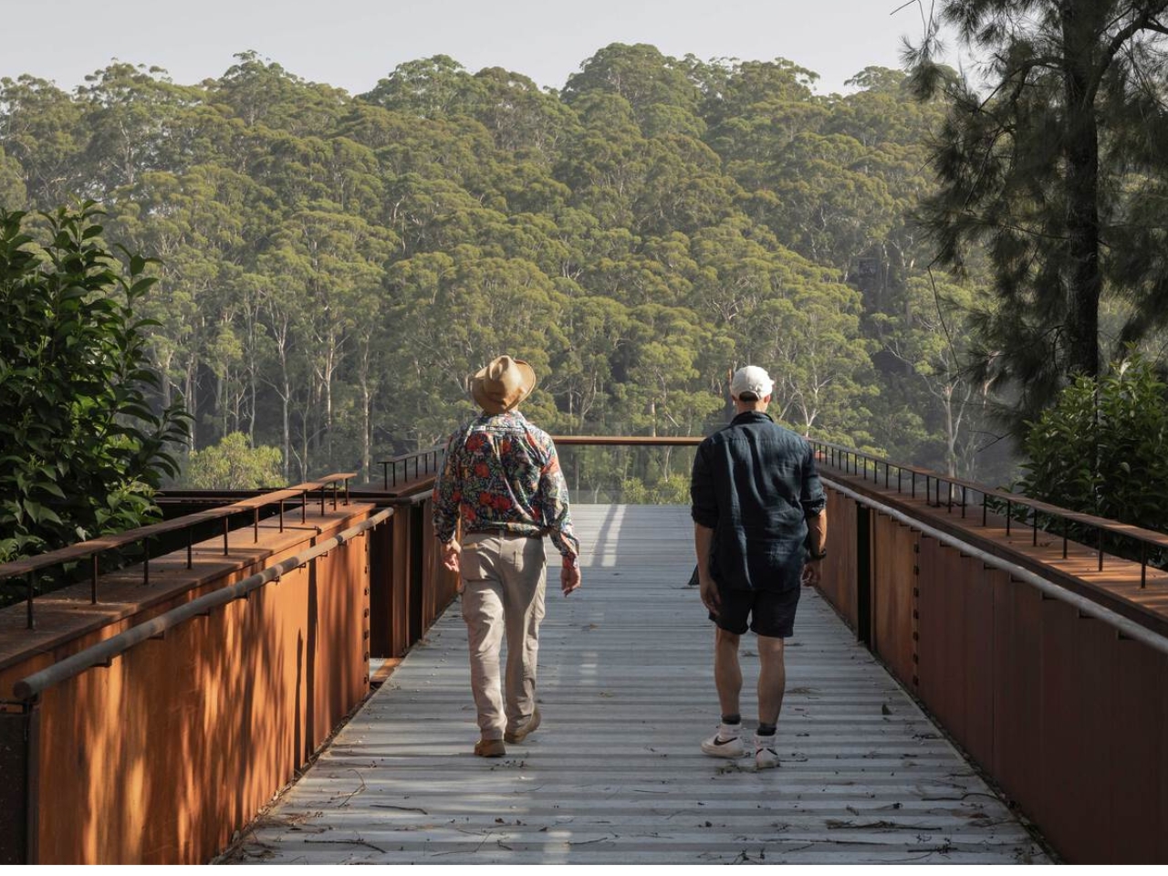
Walking it is designed to be as much of an experience as looking at it. The rhythmic sound of footsteps on the metal, the glimpses of the falling topography beneath one’s feet, the steady build of height as you move further along the platform create a physical connection to the sheer scale of the man-made canyon. Every design choice is oriented toward making you feel exactly where you are. That kind of sensory engagement is something the best public infrastructure delivers and so rarely does. Most walkways just take you somewhere. This one makes you reckon with the place itself.

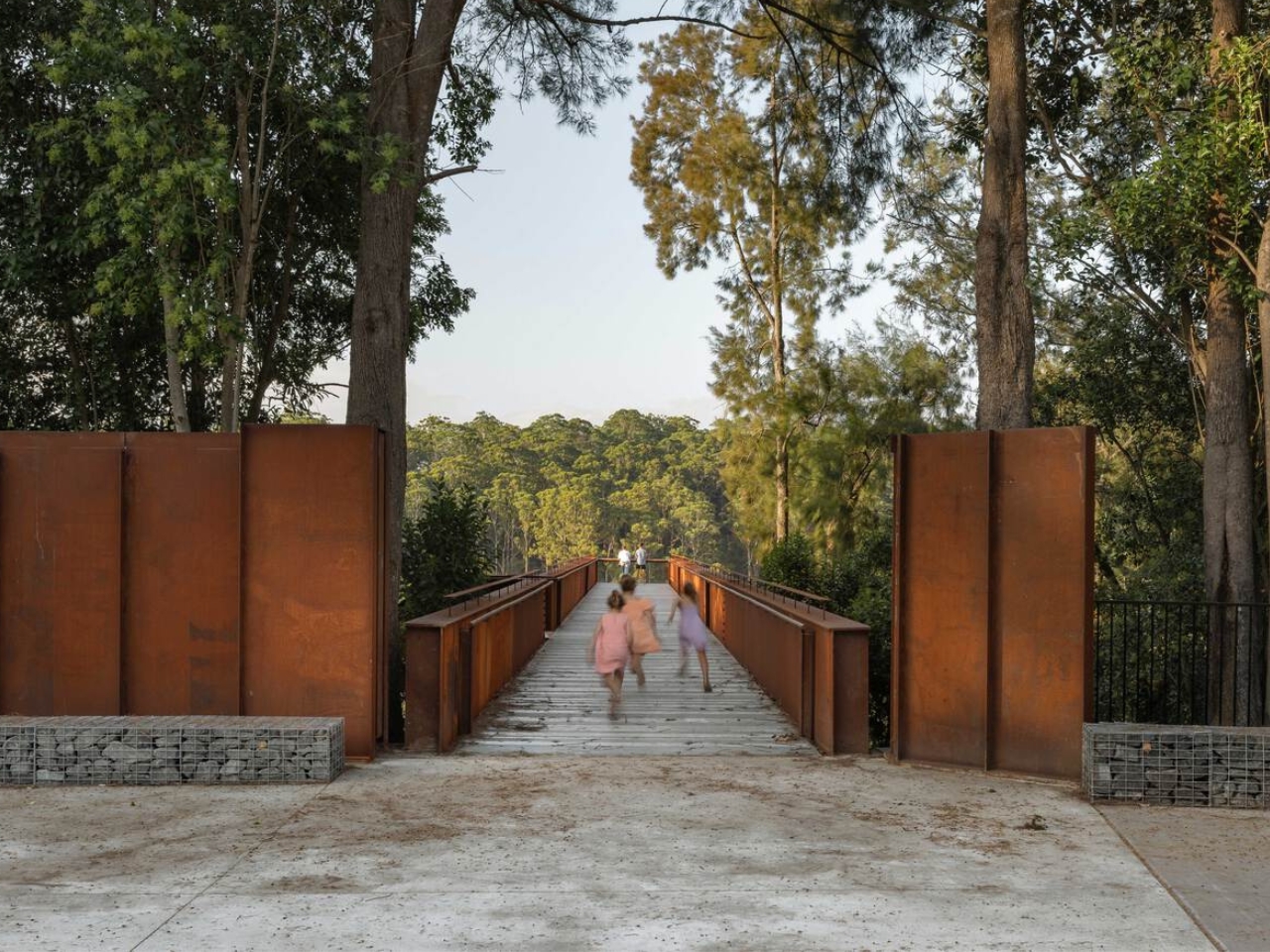
The entrance is framed by steel portals and gabion stone walls, the kind of raw structural language that references the quarry’s industrial character without cosplaying it. It doesn’t try to look cute or approachable. It looks like something that belongs to the site. That restraint is refreshing at a time when so many public design projects err on the side of spectacle for its own sake.

The broader context matters here too. The Southern Lookout is the inaugural phase of an ambitious plan to open Hornsby Quarry up as a 60-hectare public park. That kind of urban regeneration project usually moves at a pace that frustrates everyone involved, so the fact that this lookout is already open, already drawing visitors, already giving people a reason to show up, feels like a meaningful start rather than a placeholder.

AJC Architects, working in collaboration with Hornsby Shire Council, has delivered something that respects the complexity of the site without over-explaining it. The architecture doesn’t lecture you about the quarry’s history. It simply places you inside it. It gives you the height, the steel, the sound, the view, and leaves you to do the thinking.

Public architecture at its best creates a relationship between a person and a place they might not have noticed otherwise. The Southern Lookout does exactly that. Sydney has always had dramatic natural geography. Now, at the edge of a former quarry, it has something that finally lets you see it.

The post Sydney Just Opened a 42-Metre Steel Lookout Over a Former Quarry first appeared on Yanko Design.
These Steel Chairs and Lamps Look Like Sitting Inside a Pergola

Walking under a pergola or slatted canopy, sunlight breaks into stripes, and the structure feels more like a drawing in space than a solid roof. That rhythm of beams and shadows is both architectural and strangely calming, turning overhead shelter into something closer to a pattern you move through. Foln takes that outdoor language and shrinks it down into objects you can live with indoors.

Jiyun Lee’s Foln series is a family of three stainless-steel pieces: the Linear Chair, a floor lamp, and a wall lamp, all built from folded metal lines. Each element is made entirely of stainless steel, with dimensions that keep it slender and vertical. The project is less about adding another chair or lamp to the world and more about importing a structural idea into a domestic scale, treating furniture and lighting as small frameworks you inhabit or move around.

Designer: Jiyun Lee

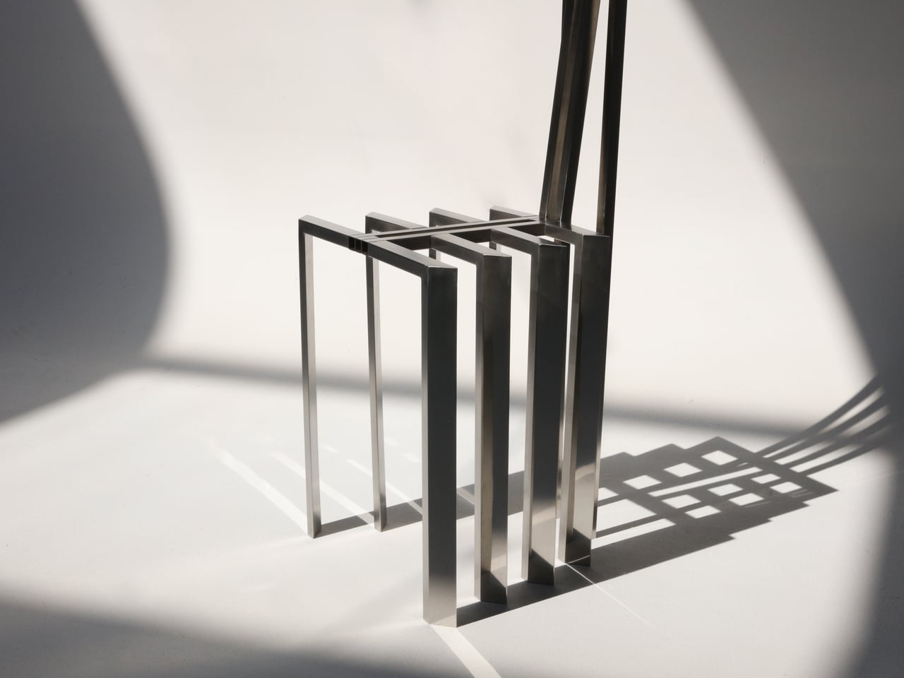
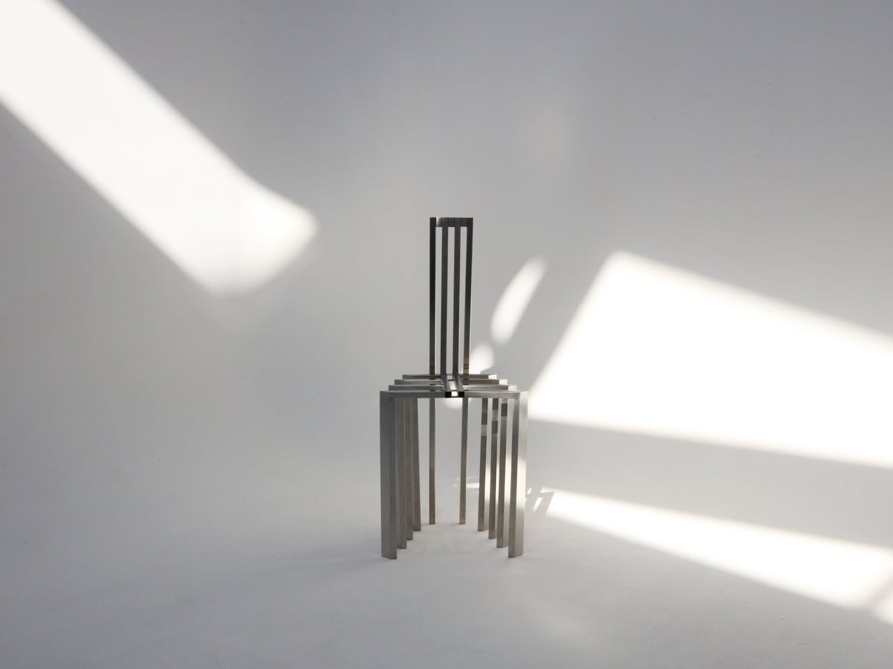
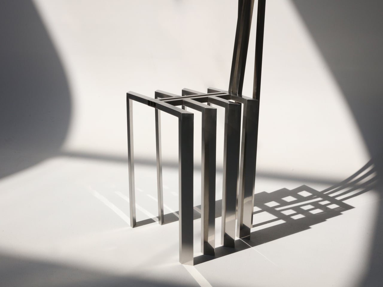
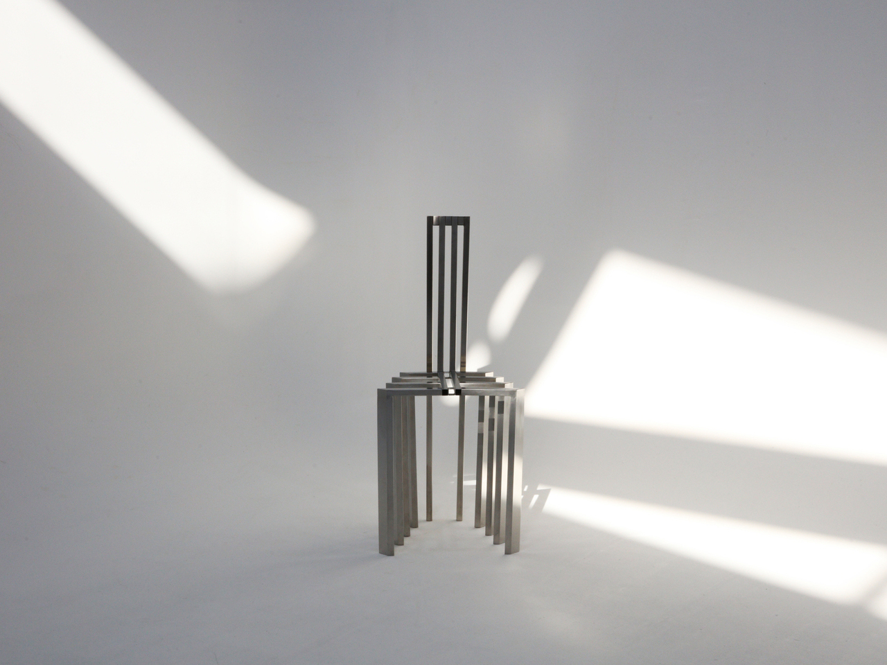
Encountering the Linear Chair, you see a small framework first, a set of repeated uprights and crossbars that read like a fragment of pergola. Only when you get closer does the seat reveal itself as a crossing of beams, with the back continuing the same rhythm upward. It is clearly functional, but it also feels like sitting inside a drawing, surrounded by lines and the shadows they cast on the floor and wall behind you.

The floor and wall lamps extend the same language into light. The floor lamp becomes a vertical corridor where illumination travels up and down between nested frames, while the wall lamp compresses that idea into a compact cluster that hovers off the surface. In both cases, lighting is less about a glowing bulb and more about how brightness slips between the metal and onto nearby surfaces, treating the surrounding wall as part of the composition.

Foln changes as you move around it. From one angle, the lines stack and the pieces look dense, almost solid; from another, they open up and nearly disappear. The designer’s statement that shadows become architectural elements in their own right comes through when you realize the real composition includes the dark stripes on the floor and wall as much as the polished steel itself, rewriting the room with every shift in daylight.

Stainless steel, sharp geometry, and unpadded surfaces mean Foln is not chasing ergonomic softness or maximum light output. The chair will feel firm, and the lamps will behave more like ambient or accent pieces than task lights. That trade-off is intentional, prioritizing a contemplative, spatial experience over conventional comfort and placing the series closer to collectible design than everyday contract furniture you buy in bulk.

Foln reframes interiors as places where structure, light, and emptiness can be as present as color or texture. By borrowing the pergola’s rhythm and translating it into folded metal, the series turns a familiar outdoor gesture into a quiet indoor ritual. Rhythm is not only seen in the lines of steel but felt in the way light and shadow keep rewriting the room around them, turning simple objects into small, inhabitable frameworks that change how you read the space they sit in.

The post These Steel Chairs and Lamps Look Like Sitting Inside a Pergola first appeared on Yanko Design.
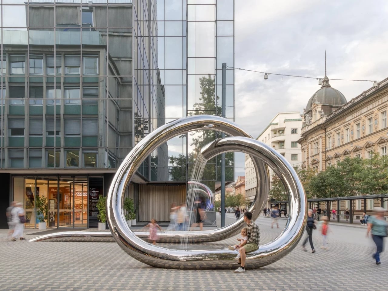
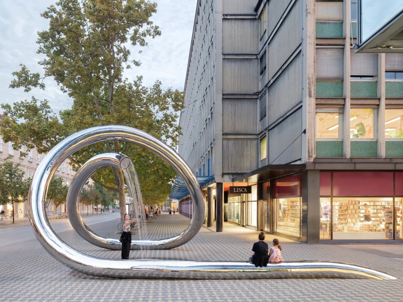
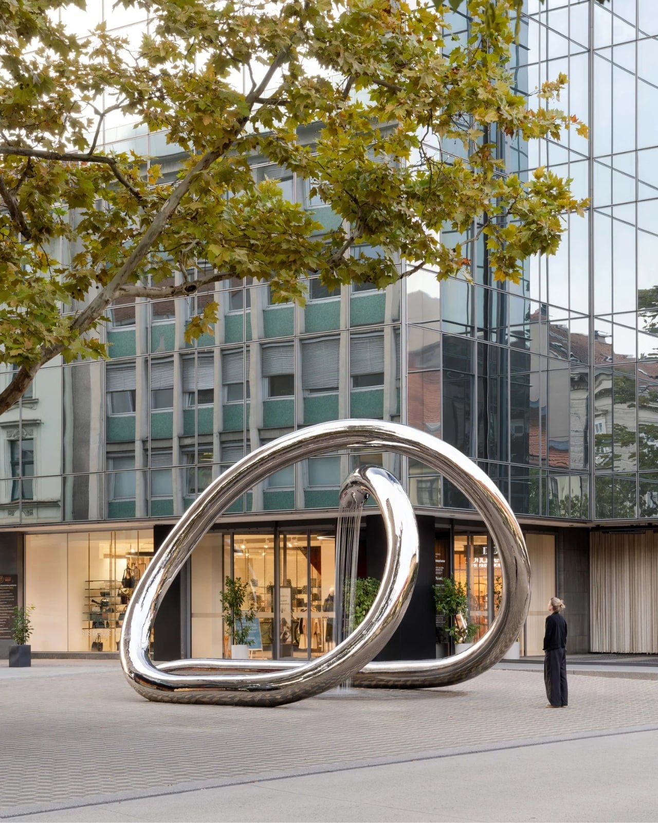
This Steel Loop Took 9 Years to Finally Flow in Ljubljana

Sometimes the best things in life are worth waiting for, and in Ljubljana’s case, that meant nine years. The Water Sculpture LJ just opened in the heart of Slovenia’s capital, and honestly, it’s the kind of public art that makes you stop scrolling and actually want to see it in person.

The project was realized nine years after winning a public design competition, which gives you some perspective on how long it takes to turn a brilliant idea into something real and tangible in the middle of a bustling city. Architects Mojca Kocbek and Primož Boršič from M.KOCBEK architects and P PLUS arhitekti respectively won that competition back in 2016, and now, finally, their vision is something you can walk around, touch, and experience.

Designers: M.KOCBEK architects and P PLUS arhitekti

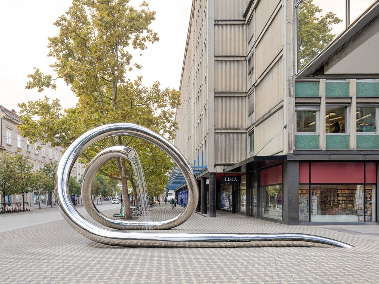
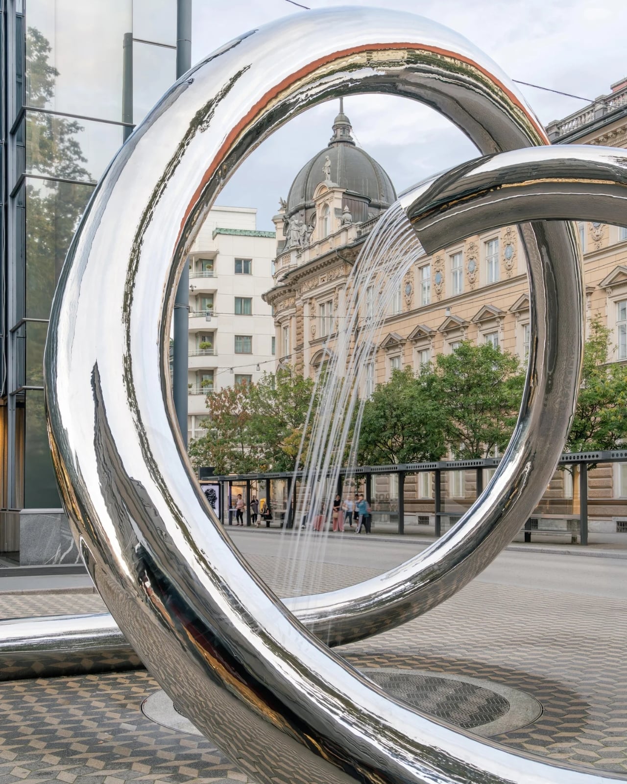
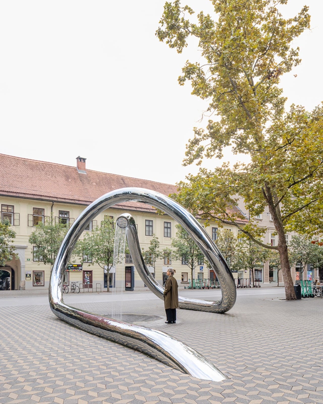
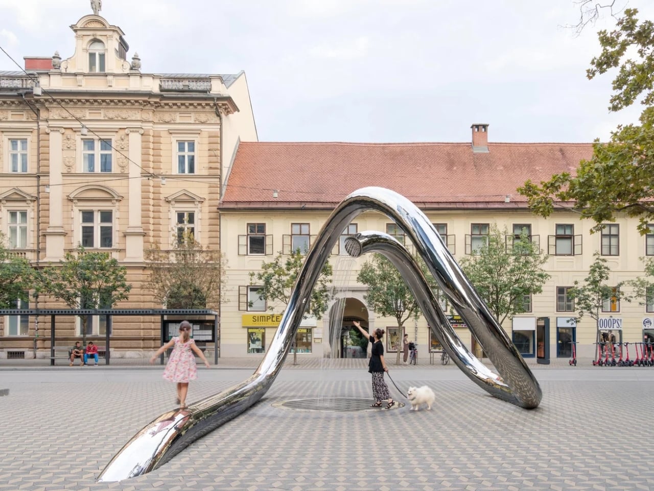
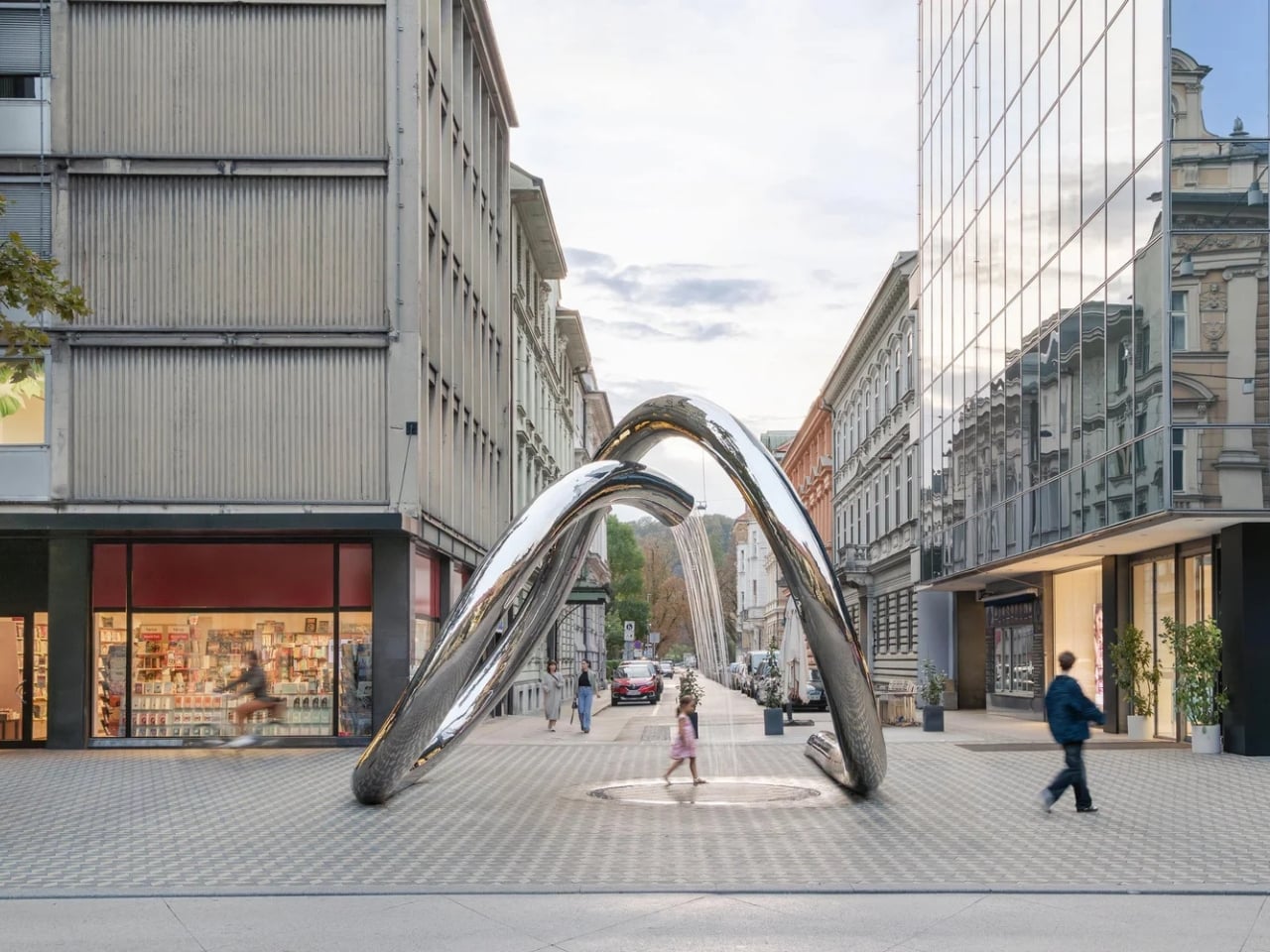
The sculpture itself is basically a continuous loop made from stainless steel. Think of it like a ribbon that’s been carefully twisted and bent into this organic, flowing shape. It creates a small urban “platform” whose continuous, rounded form establishes a separate, almost intimate space amid the city’s bustle. In a dense urban environment where everything feels fast and crowded, this piece carves out a little breathing room. A place where you can sit, walk through, or just pause for a minute.

What makes it really special is how it interacts with its surroundings. The architects chose stainless steel deliberately because of how it behaves in different conditions. The continuous, rounded form establishes a separate, almost intimate space amid the city’s bustle, but it’s also constantly changing based on what’s happening around it. When it’s sunny, the sculpture becomes almost mirror-like, reflecting the buildings and people passing by. On a cloudy day, it might blend into the gray sky a bit more, creating this subtle presence that feels almost meditative.

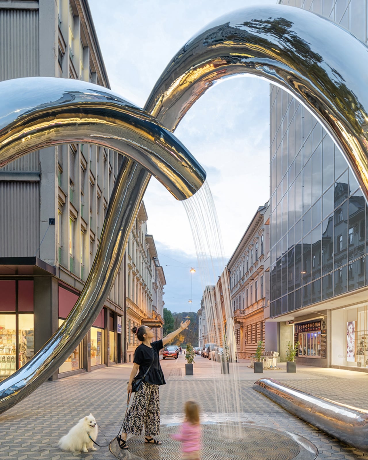
The designers weren’t just thinking about creating something pretty to look at from a distance. This is interactive public art in the truest sense. You’re meant to engage with it, whether that means walking through the loops, sitting on parts of it, or just getting close enough to see your reflection distorted in the polished steel. It’s functional and beautiful at the same time, which is harder to pull off than you might think.

What I love about projects like this is how they transform public space into something memorable. Ljubljana already has a reputation for being one of Europe’s more charming, walkable capitals, and adding thoughtful contemporary art like this just reinforces that identity. It’s not trying to shock you or make some grand statement. Instead, it’s offering a moment of calm and reflection in a busy city center. The fact that it took nine years to complete speaks to the complexity of public art projects. There’s the design phase, sure, but then you’ve got approvals, funding, engineering challenges, and coordinating with city infrastructure. Every delay probably felt frustrating for the architects, but looking at the finished piece, you can see why it was worth the wait.

If you’re planning a trip to Ljubljana or you’re already there, this is definitely worth adding to your list. It’s the kind of thing that photographs well but is genuinely better in person. You’ll want to see how the steel catches the light at different times of day, how it frames views of the surrounding architecture, and how other people interact with it. Public art is always more interesting when it’s not just a static object but something that becomes part of the daily rhythm of a place.

And for anyone working on their own creative projects, whether it’s design, architecture, or something else entirely, this sculpture is a good reminder that great work takes time. Nine years might seem like forever, but when you create something that will be part of a city’s landscape for decades to come, patience is part of the process.

The post This Steel Loop Took 9 Years to Finally Flow in Ljubljana first appeared on Yanko Design.
Minimal bent tape dispenser is made from a single piece of steel

There’s a meme that says one of the things that you’ll never find when you need it is the tape dispenser. You may own one (or maybe even several) but the moment you actually need it, it disappears. So maybe you need something that’s permanently attached to your work space or also something that’s not so difficult to use since I’ve “destroyed” several out of frustration.

Designer: CW&T

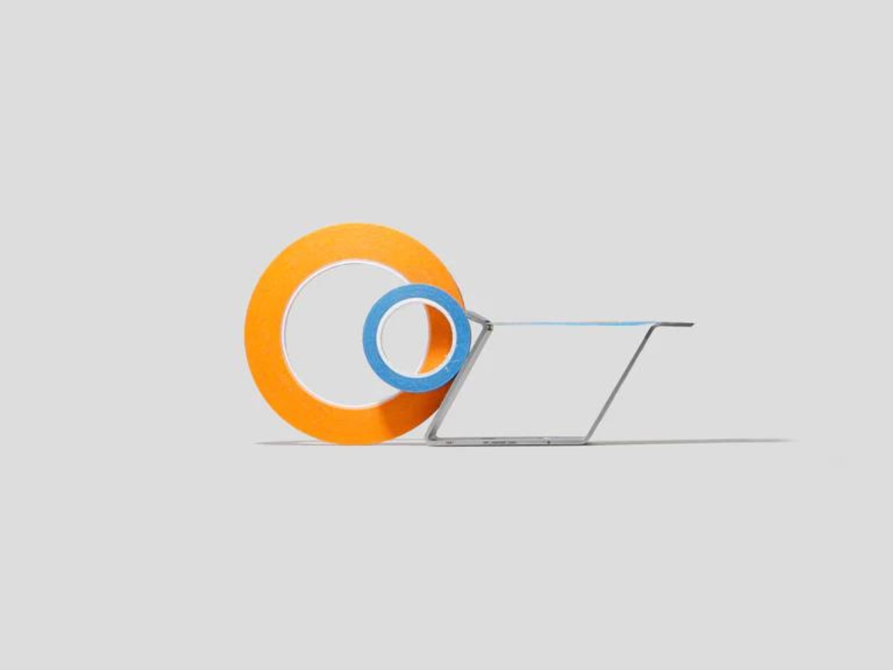
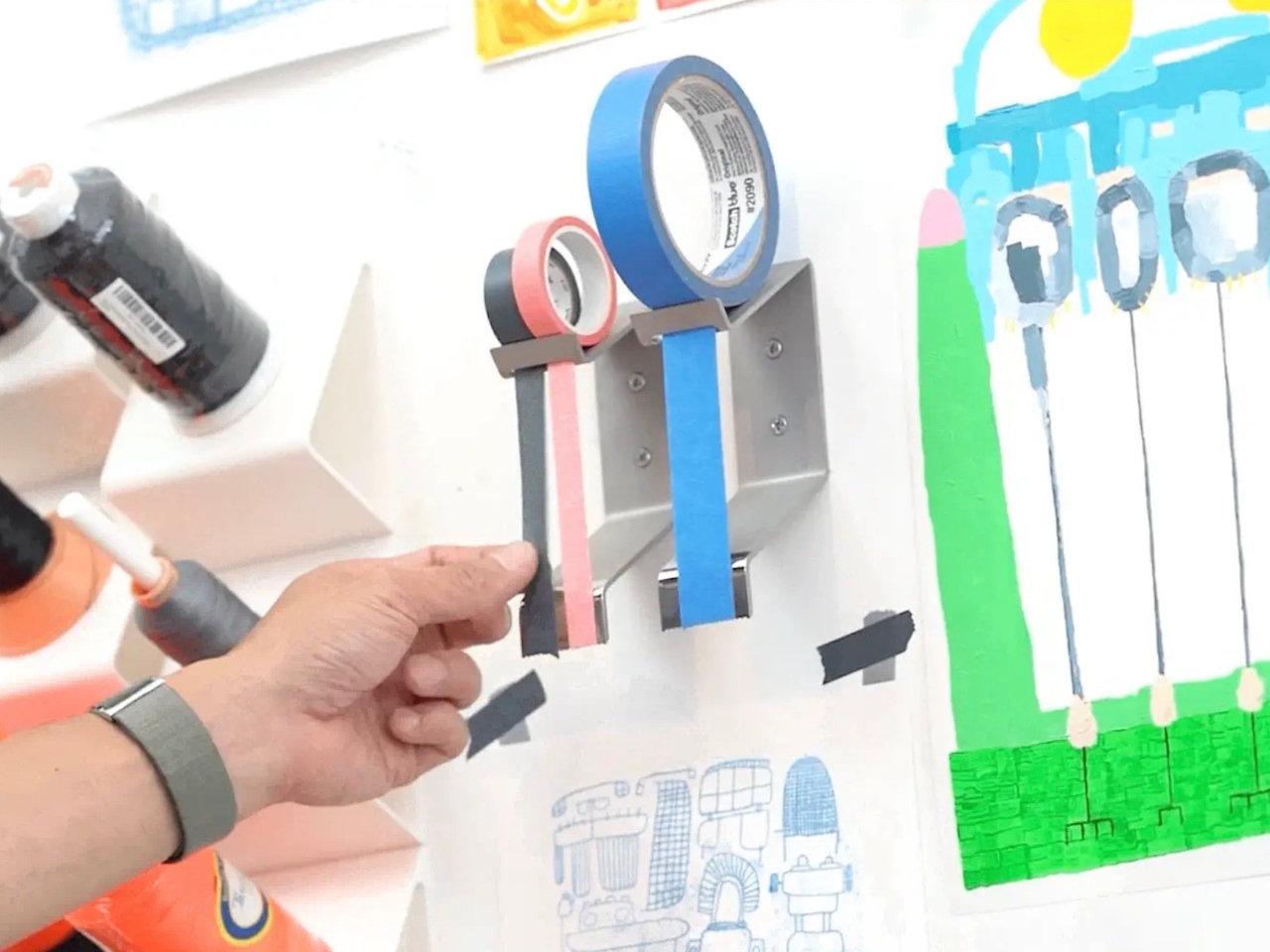
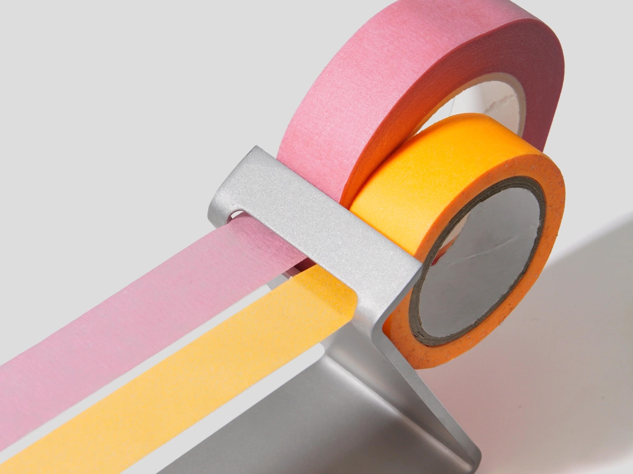
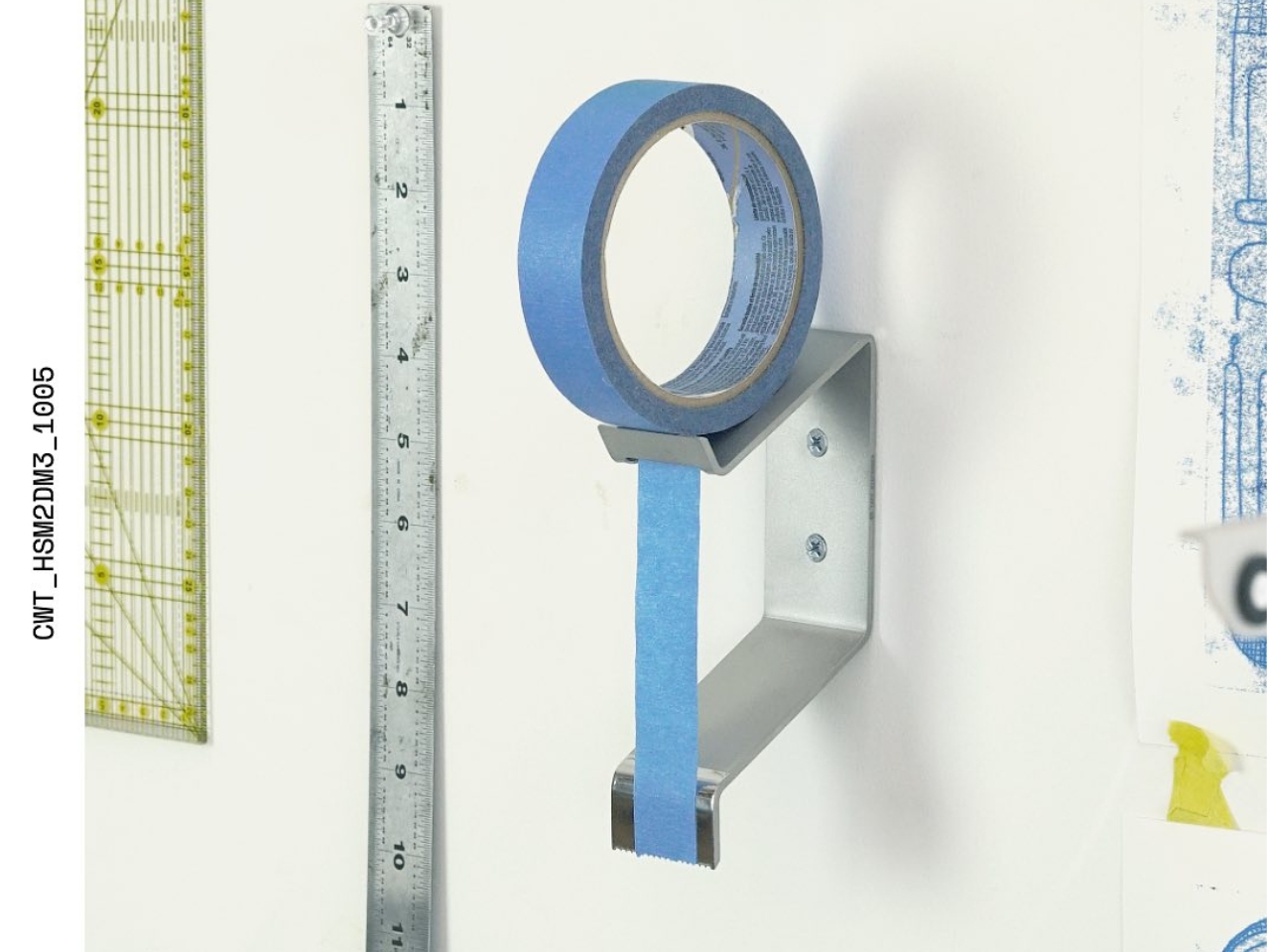
As a stationery lover, I like those simple and minimalist items that are both highly functional but also but also well-designed pieces. The M.R Tape Dispenser is one such item that I’ll welcome on my desk. It is a multi-radius tape dispenser that can hold one or multiple rolls of tapes of different sizes. It uses tension to hold and dispense these pieces of tapes.

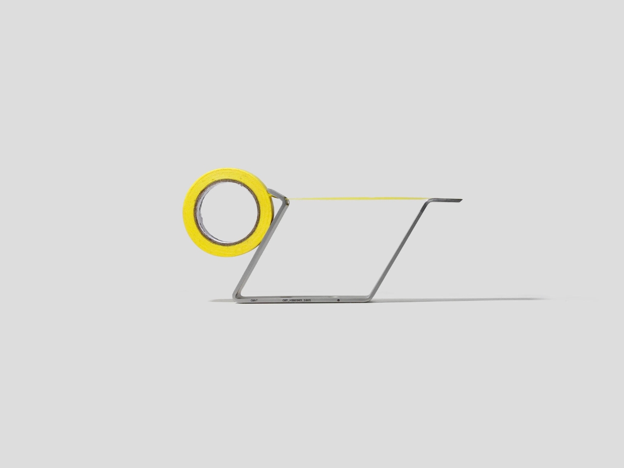
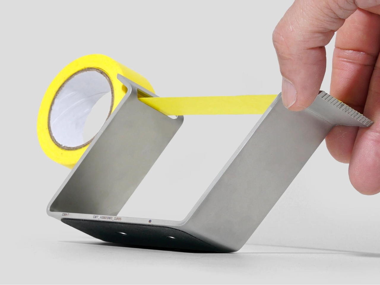
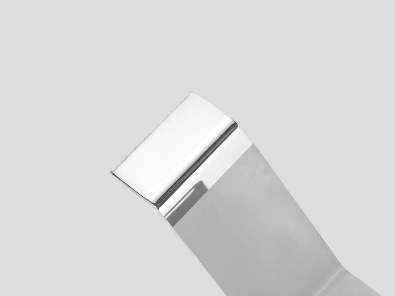
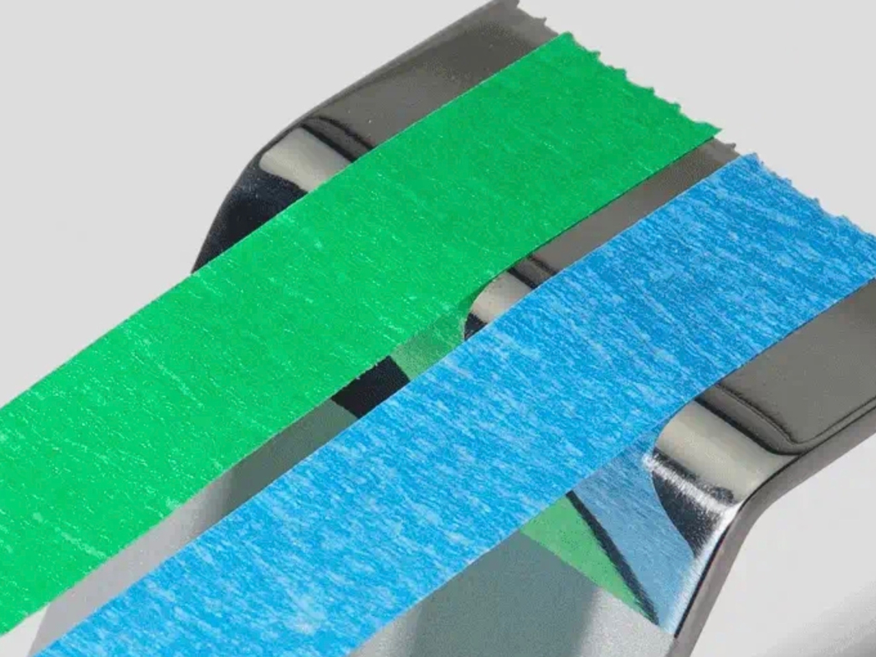
The dispenser is made out of just one piece of machined and bent stainless steel. The tape is then fed through an opening and then cut into a polished surface. In order to get maximum adhesion, the space where the tape is held and teared off has a mirror polished finish. The dispenser itself has a rubber bump-on pad on its base so it can grip on to your surface. You can attach it to your wall or to your desk.

It’s a pretty simple piece of stationery but because the designers thought long and hard about it, you get something that’s pretty functional. Hopefully you don’t lose it since it’s a pretty expensive piece of tape dispenser.

The post Minimal bent tape dispenser is made from a single piece of steel first appeared on Yanko Design.
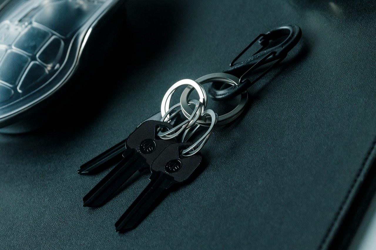
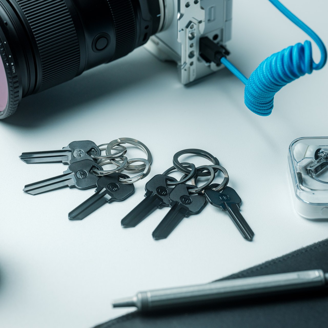
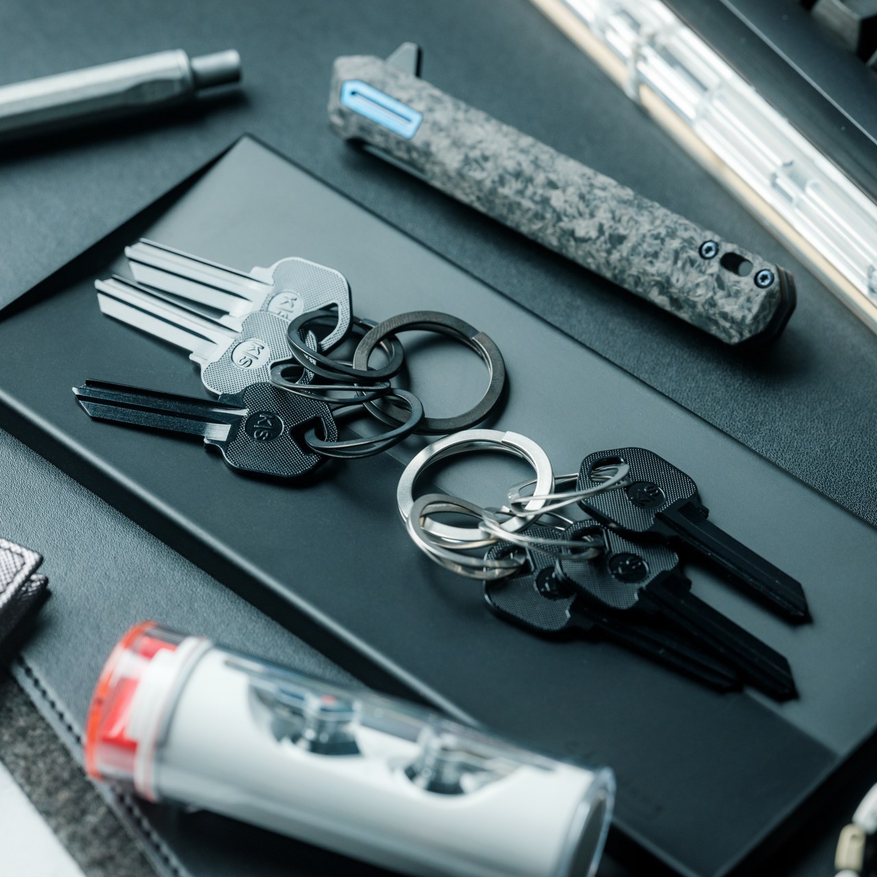
Save your nails and beat the stress with this innovative wave spring key ring

We all know that it’s a good idea to keep keys together in one place, but no one talks about how painful that can actually be. Key rings are basically a single piece of metal bent to coil in a circle, and that design hasn’t changed one bit in decades. It’s a simple design that’s meant to keep your keys secure to the point that you’ll break a sweat or break a nail when actually trying to add a key to the ring. Worse, the rings that do try to be more flexible and easy on the nails end up being less reliable instead because of their softness. Fortunately, the solution isn’t as complicated as you might think, as demonstrated by this distinctive key ring that takes its smarts from the design of aerospace equipment and cars.
Designer: MAENI

Click Here to Buy Now: $25

The common key ring is really just a flattened coil of metal, the most practical shape not just for holding a bunch of keys but also for securing them in place. In order to prevent those keys from accidentally getting loose, that coil provides no gap in between and is often quite rigid, requiring you to exert a lot of force to open one end for a key to get through, which often ends up with broken nails. Conversely, there are rings that are so thin and pliable that they get easily deformed the moment you deal with thicker keys and objects.

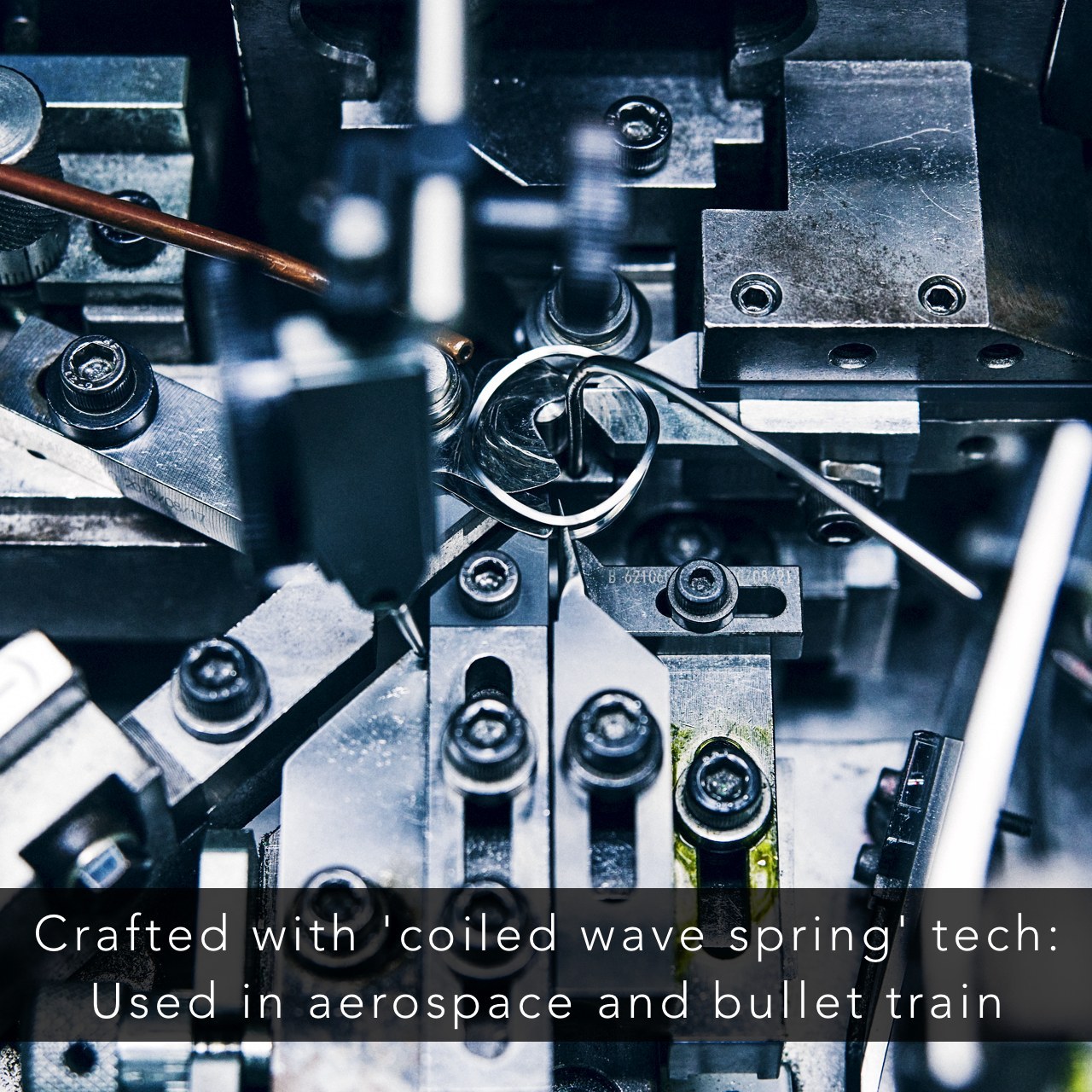
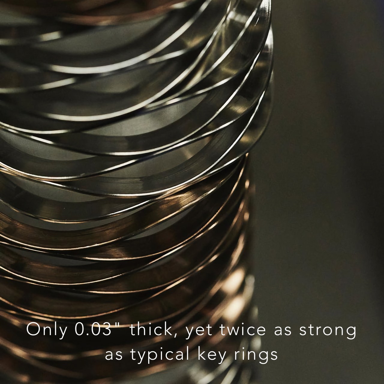
The simple answer to this decades-old probably is apparently to change the kind of structure used. Instead of that traditional coil spring, this key ring employs a “coiled wave spring” shape instead. This kind of spring is heavily used in heavy-duty vehicles and equipment, from aerospace to automobiles. Turns out that this same wavy shape is perfect for a more user-friendly key ring that won’t break nails or test your patience.

With this wave spring design, inserting a key is as easy as sliding it into the ring through the natural gaps made by the waves. To remove a ring, simply lift the tip without worrying about damaging your nail. The key ring is designed to be as stress-free to use as possible, removing any hurdle to keeping your keys organized and safe in a single place.

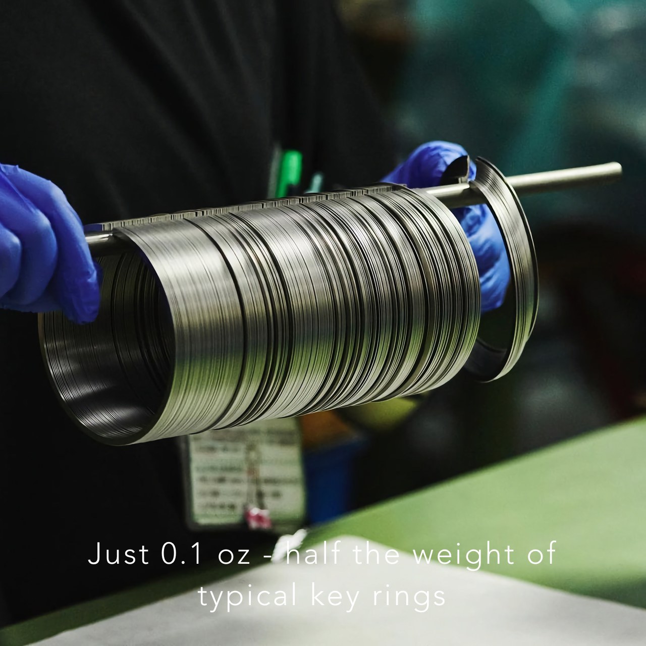
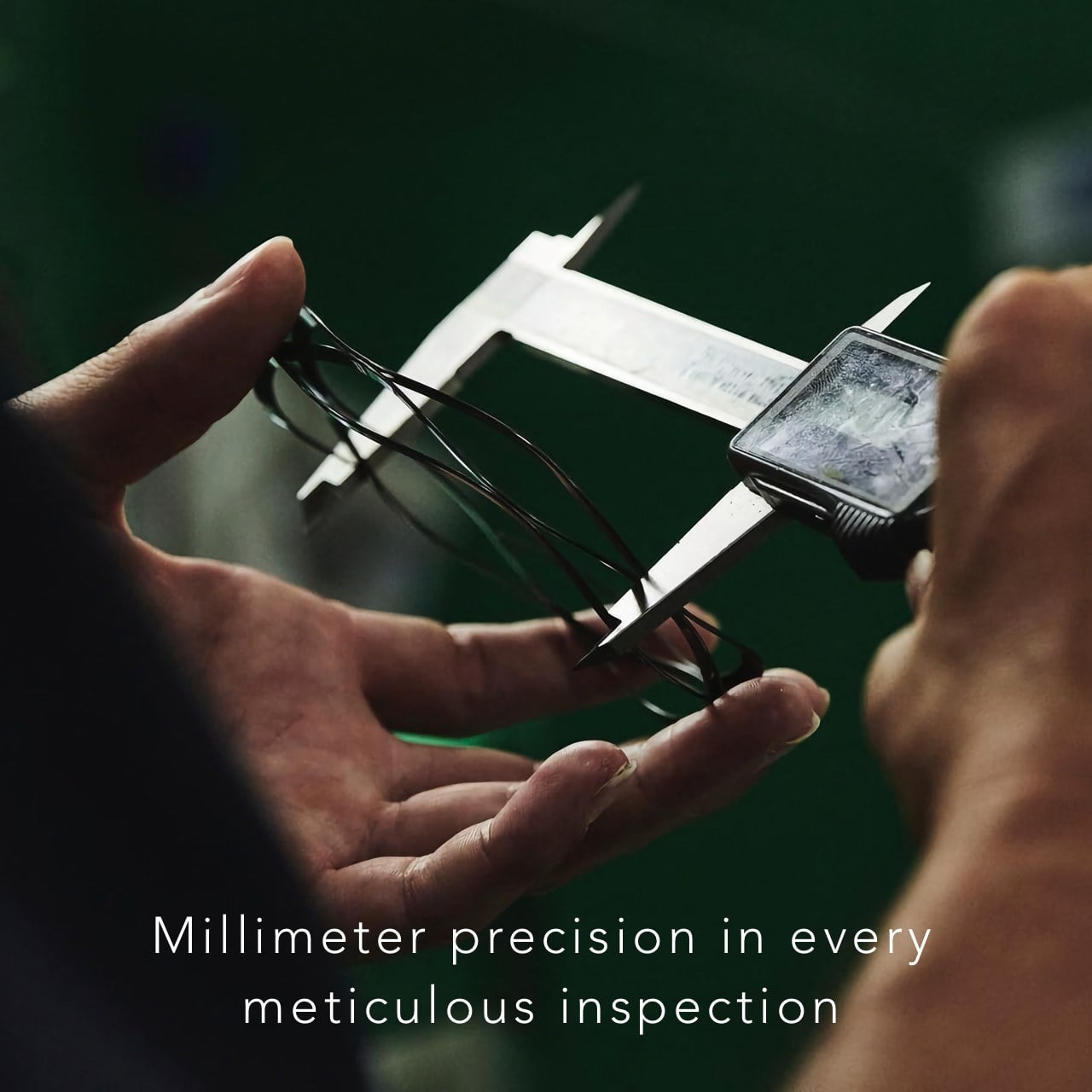
Despite its uncommon appearance, this stress-free key ring is actually lighter than a typical keyring at only 3 grams. That’s thanks to a thinner material, only 0.8mm thin, and its beautiful waveform shape. At the same time, it’s actually twice as strong with a high-tension stainless steel SUS304 body so it won’t get bent out of shape even if you insert a thick key. Whether it’s to protect your nails or to protect your sanity, this one-of-a-kind key ring will give you peace of mind knowing all your keys are in one place and that you can add or remove them easily as often as you want.

Click Here to Buy Now: $25

The post Save your nails and beat the stress with this innovative wave spring key ring first appeared on Yanko Design.