A Tower That Finally Builds Around Its Forest Instead of Over It

Most residential towers in America solve one problem and create three more. They stack people vertically, sell the view as the amenity, and call it a day. What gets lost is everything that used to make a neighborhood feel like one: the corner bodega, the shade tree you actually stop under, the sense that your building belongs to the land instead of just occupying it. Walk through most new luxury developments in Miami, Austin, or Denver and you’ll notice the same pattern. The site gets cleared first, then the glass box goes up, then a landscaper is hired to fake back some greenery for the marketing renders.

There’s a second, quieter problem underneath that one. Architecture awards, and honestly most architecture headlines, tend to celebrate the towers rich people buy, not the housing most people actually need. Middle-income buyers get squeezed out of both the conversation and the design attention. So when a project comes along that’s built specifically for that gap, and wins on merit rather than price tag, it’s worth paying attention to.

Designer: Carazo Arquitectura
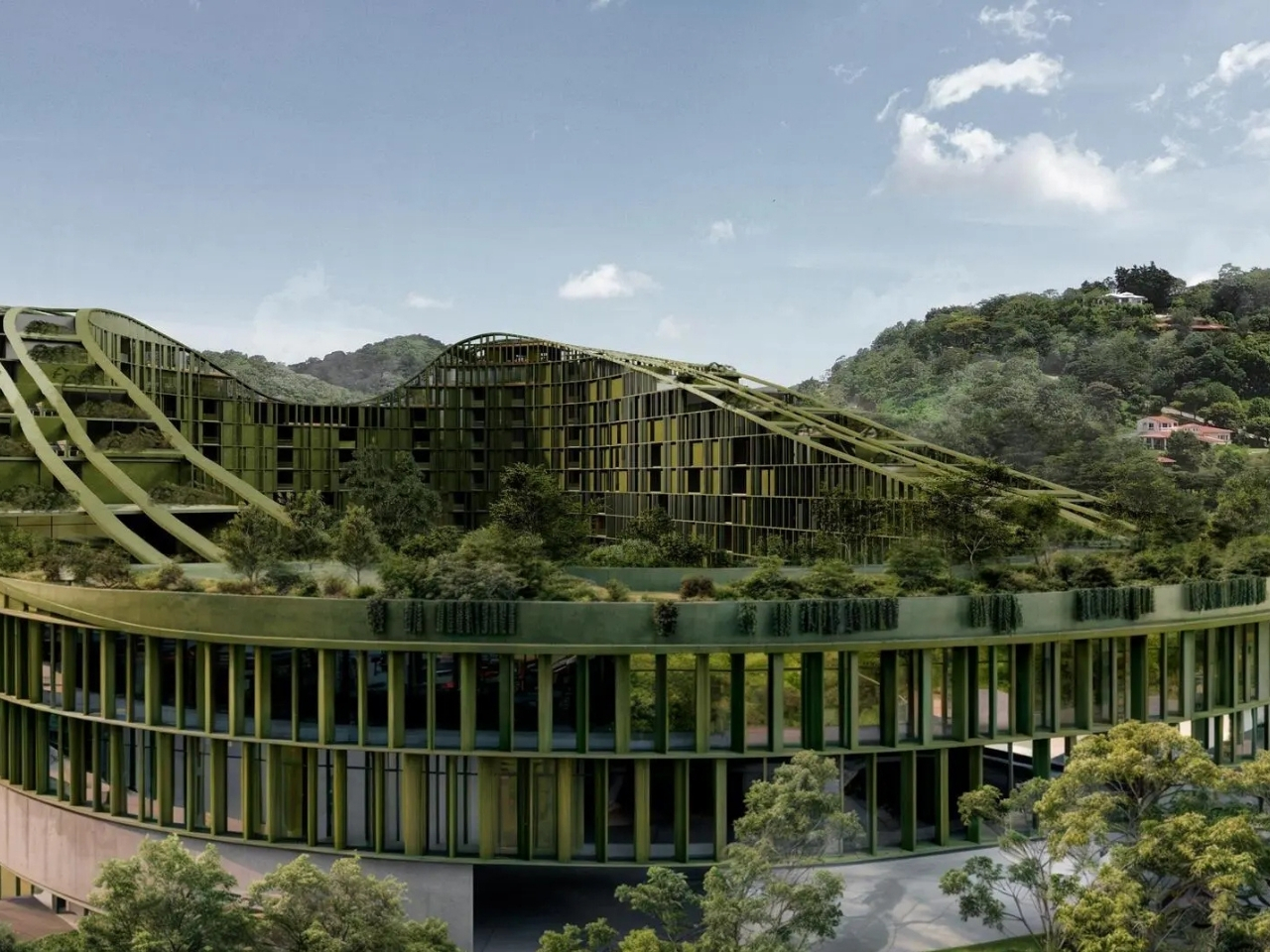
That’s what makes LTR1 interesting. Designed by Carazo Arquitectura, a Costa Rica-based studio working across Latin America, the project sits in Nuevo Cuscatlán, in the metropolitan area of San Salvador, El Salvador. It’s a 60,265-square-meter mixed-use development with more than 400 middle-income homes, and it just won both the Jury Winner and Popular Choice Winner titles at the 14th Annual Architizer A+Awards, in the Unbuilt Multi-Unit Housing category for buildings over ten floors. Winning both isn’t common. It means the critics and the public actually agreed on something for once.
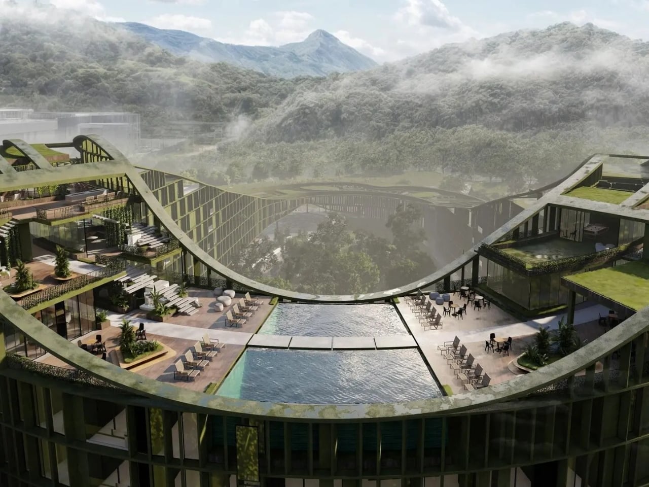
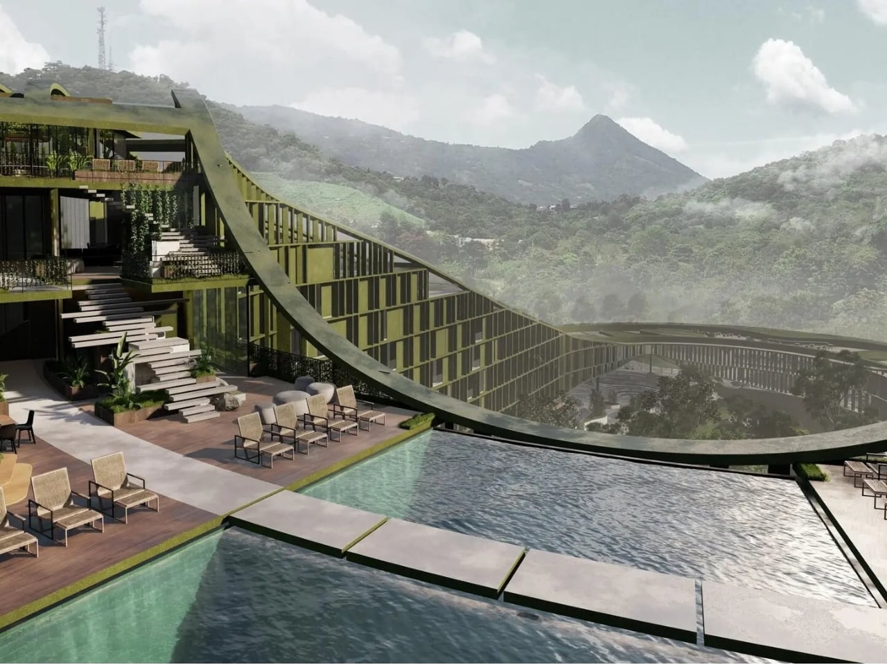
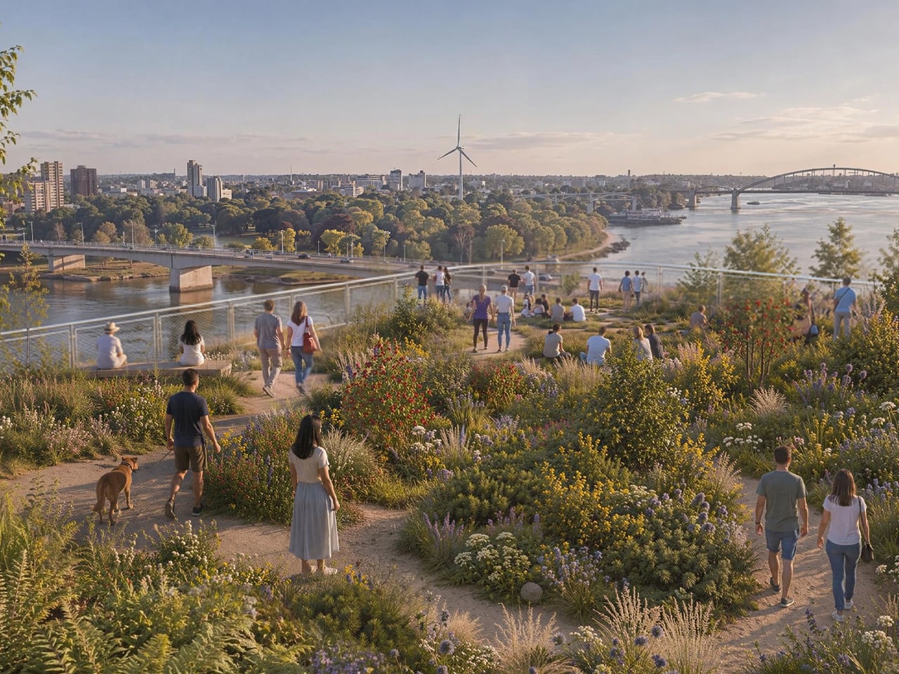
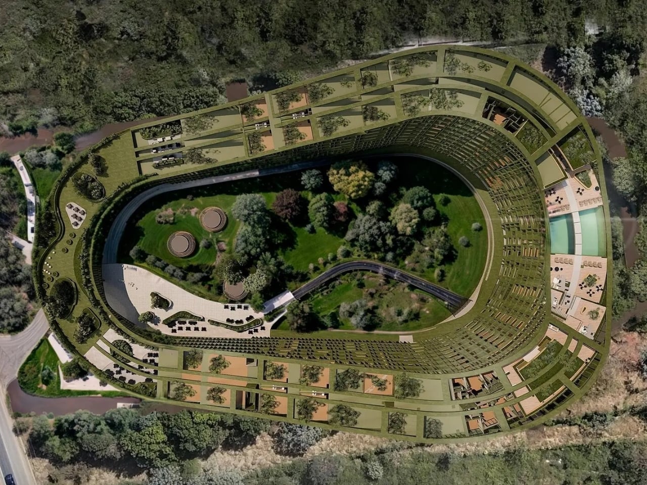
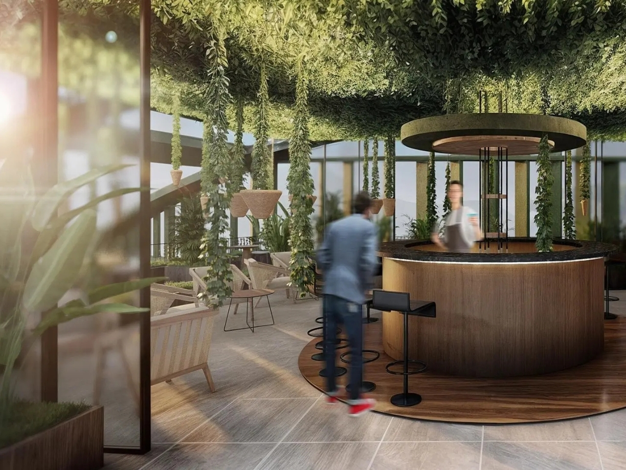
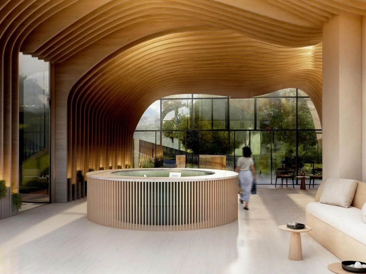
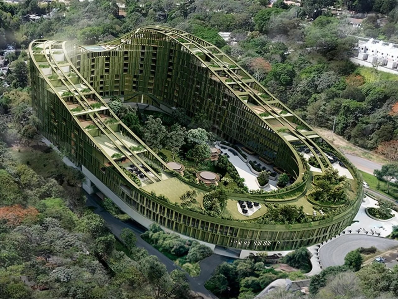
The reason they agreed is right there in the plan. Instead of clearing the site, Carazo Arquitectura designed a curved tower that wraps around an existing forest, letting the preserved landscape organize the whole building rather than sitting beside it as decoration. Housing, retail, restaurants, coworking space, wellness facilities, and public gardens are folded into the same structure, stacked and threaded around the trees instead of over them. It reads less like a building with a view and more like a neighborhood that happens to be vertical.
I’ll admit I’m a sucker for a building that pays attention to where it’s standing. The roofline isn’t arbitrary either. The architects photographed the profiles of El Picacho peak and the San Salvador Volcano from the site and translated those silhouettes into the building’s geometry, so the tower is quite literally shaped by the mountains around it. Carazo calls this research framework Tropical Vertical Urbanism, which is a mouthful, but the idea underneath it is simple: dense vertical living doesn’t have to mean cutting a place off from its own climate and terrain.
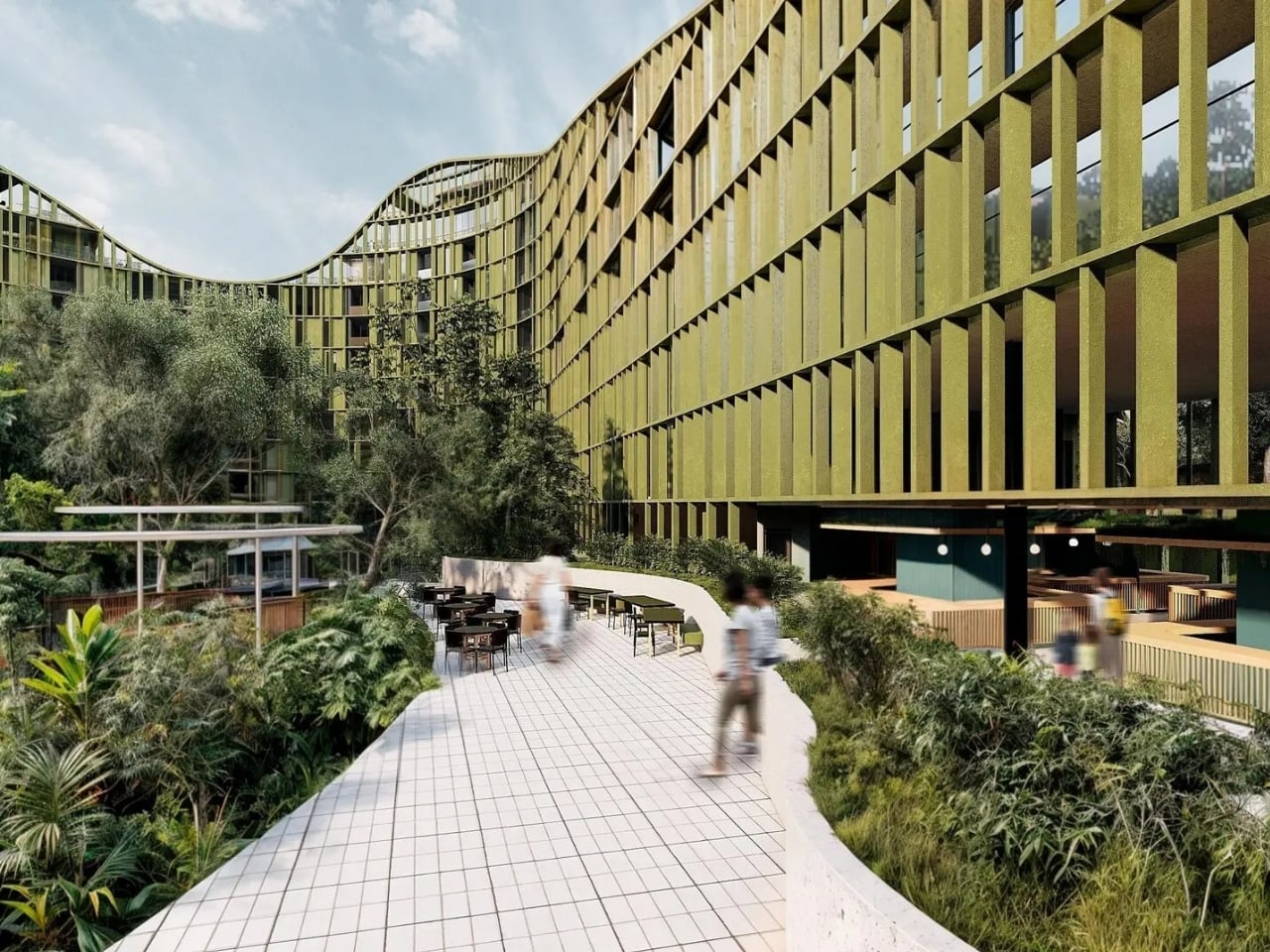
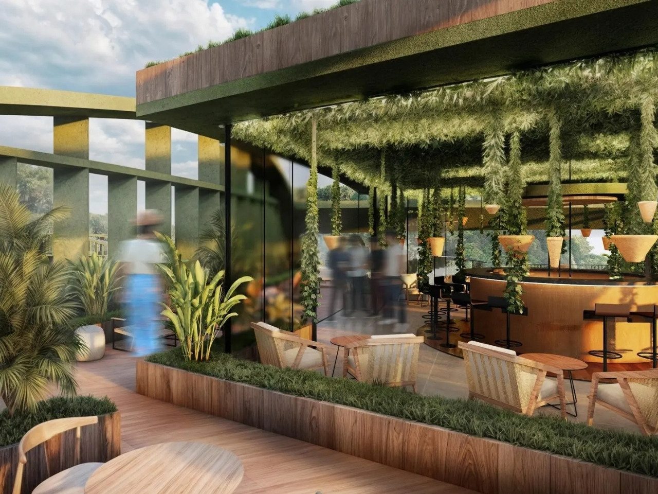
None of this should feel foreign to an American audience. We’re having the exact same argument here, about missing middle housing, about whether density has to mean sterility, about whether remote work and wellness culture deserve real architectural space instead of a gym in the basement. LTR1 answers all three at once without turning into a manifesto. It just builds coworking and wellness into the tower the same way it builds in the forest, as infrastructure, not amenity.
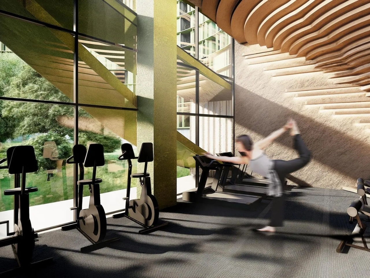
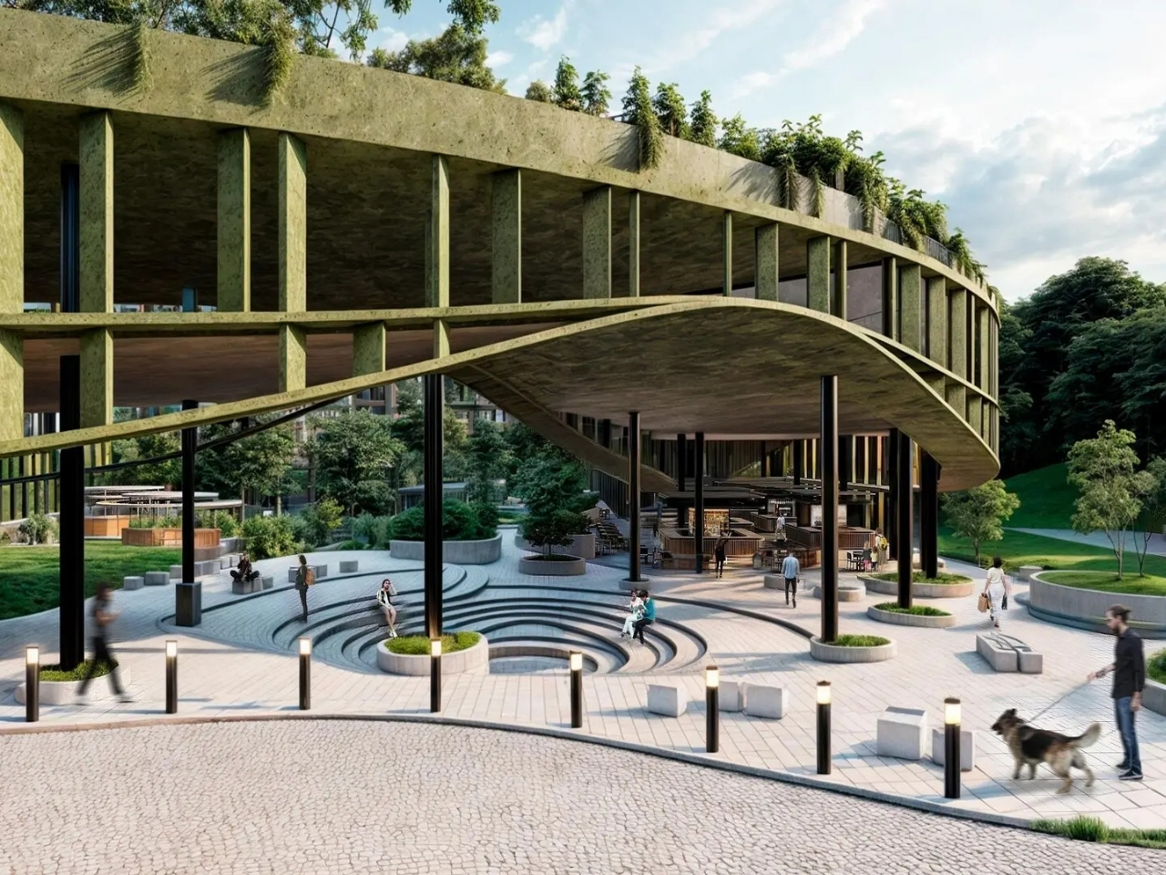
The project hasn’t broken ground yet, and I won’t pretend an unbuilt tower changes housing policy. But juries and the public rarely agree on the same building unless it’s touching something real. What LTR1 gets right is refusing the trade-off everyone assumes is necessary, that you either get density or you get nature, that you either build for the middle class or you build for awards. A forest that survives the construction of four hundred homes around it is a small, specific kind of promise. It’s the kind worth watching to see if it actually gets kept.
The post A Tower That Finally Builds Around Its Forest Instead of Over It first appeared on Yanko Design.
A 20-Meter Double Helix Tower Just Rose Over a Chinese Wetland

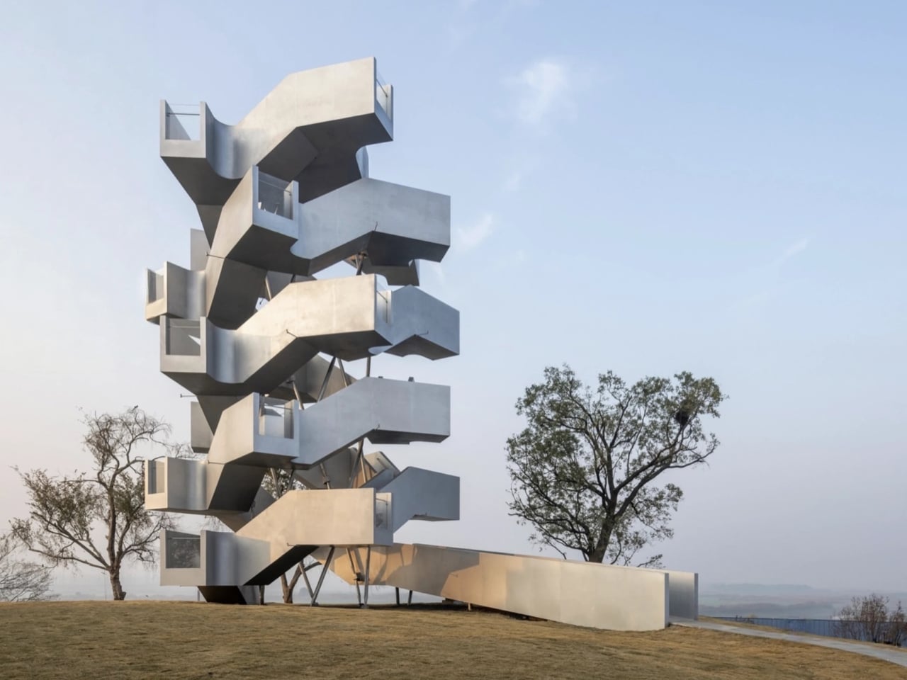
Most observation towers share the same quiet philosophy: get people up high, give them a view, and then get out of the way. The architecture fades into background noise, and the landscape takes all the credit. Xiang Architects clearly had other ideas when they designed the Chenhu Migratory Bird Observation Tower, and I think they made exactly the right call.

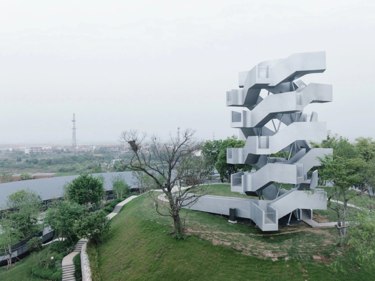
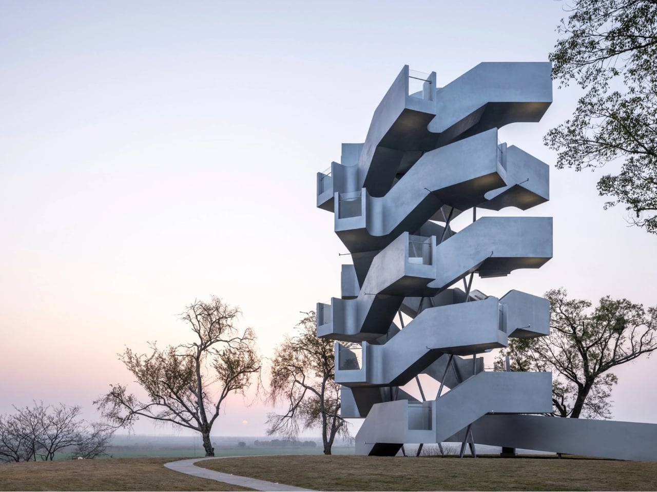
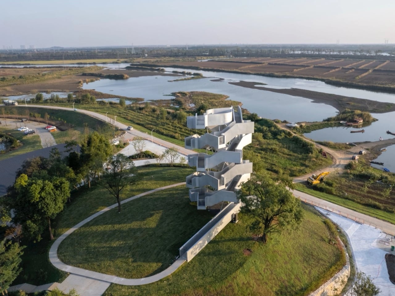
Perched on a natural promontory called Xianglushan within Wuhan’s Chenhu Wetland, the tower rises nearly 20 meters above a marshland that hosts over 100,000 migratory birds every winter. That’s not a typo. One hundred thousand birds descend on this sanctuary between October and March, turning the wetland into one of China’s most vital ecological stopover points. The site itself is already extraordinary. The Shanghai-based studio could have played it safe, delivered something modest and functional, and no one would have complained. Instead, they built a steel double helix that rises above the reeds like something from a different century entirely.

Designer: Xiang Architects

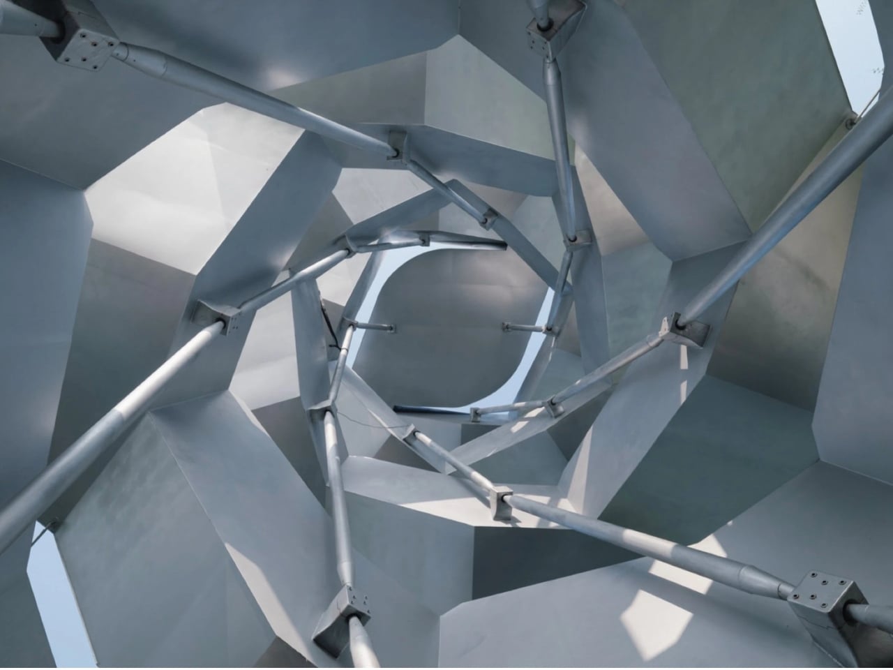
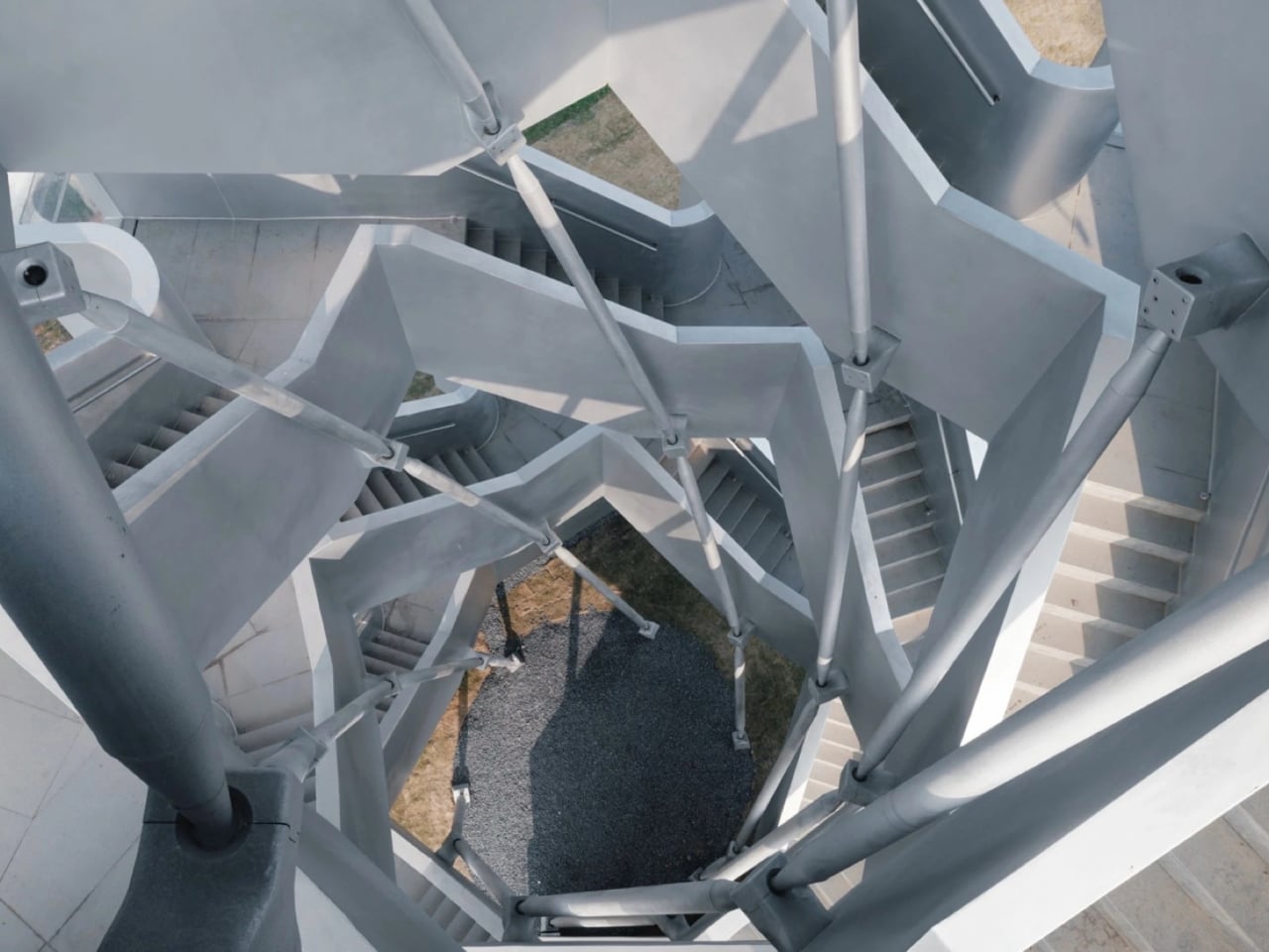
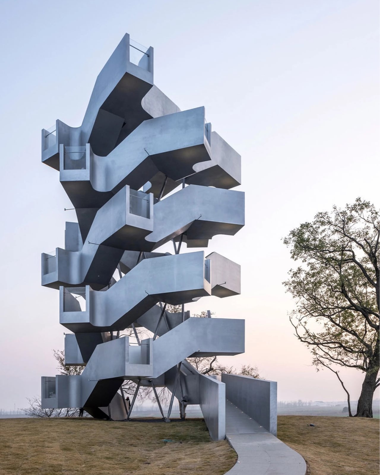
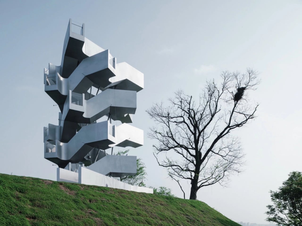
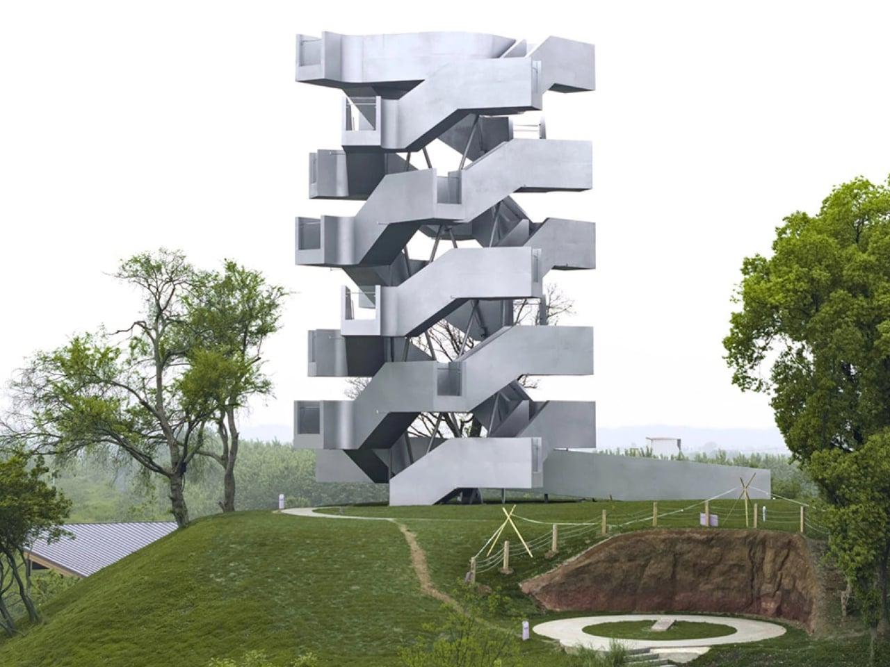
The structure is constructed from 24 prefabricated steel sections, with counter-rotating staircases wound around each other to form two completely independent routes up and down the tower. There is no central column. The staircases themselves carry the structural load. That’s a quietly radical engineering decision, and it tends to get overshadowed by how striking the exterior looks. Calling the Chenhu tower polarizing is accurate, and I say that as a genuine compliment. Architecture that makes you stop and argue with yourself about what you’re looking at is doing its job.

Twenty-four glazed viewing platforms are staggered along the climb, each offering a slightly different angle on the wetland below. Xiang Architects describes the experience as one where “the stairs establish a steady physical rhythm, while the platforms provide moments of pause and reflection.” That’s architectural language, but it’s actually true to what the design achieves. You’re not just going up to look at birds. You’re moving through a choreographed sequence of perspectives, with the landscape rearranging itself around you as you ascend.

The steel exterior was a deliberate decision, and it’s the one I keep turning over. The tower makes no attempt to camouflage itself among the reeds and waterways. It gleams. It angles. It reflects light in ways that feel almost confrontational against the soft horizontality of the wetland. Some people will read that as arrogance, a manmade object insisting on its own importance in a space that belongs to birds. I see it differently. The boldness of the form draws attention to the landscape it inhabits rather than competing with it. A structure that tried to disappear would, paradoxically, give people less reason to make the journey in the first place.

The double-helix form also deserves more attention than it sometimes receives. DNA-inspired shapes have appeared in architecture before, sometimes elegantly, sometimes as pure novelty with no structural logic to back them up. Here, the choice is functional. The counter-rotating staircases mean ascending and descending visitors never have to negotiate the same narrow passage at the same time. It’s a practical fix, but it carries a more interesting implication: two people climbing the same tower simultaneously could have entirely different experiences depending on which staircase they choose. That’s the kind of embedded design thinking that photographs don’t always capture but lands immediately when you’re actually moving through a space.

Observation towers occupy a curious position between utility and spectacle, and the best ones understand that the climb itself is part of what they’re offering. People don’t go to platforms like this purely to look at birds. They go to step outside the pace they’ve been living at, to be reminded that the natural world runs on a completely different schedule than anything with a notification badge. The Chenhu tower understands that. It just also happens to look extraordinary while doing it.

The post A 20-Meter Double Helix Tower Just Rose Over a Chinese Wetland first appeared on Yanko Design.

MVRDV Built a Mountain in the Middle of Rotterdam

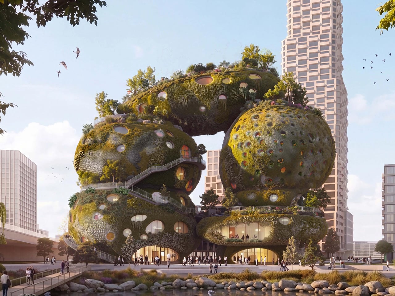
What does a building look like when it’s designed for birds, insects, and plants just as much as people? According to MVRDV, it looks like a mountain that grew out of the Maas riverbank — rough, porous, and unapologetically massive.

Rotterdam ROCKS! is MVRDV’s winning entry in Shift’s international design competition, which called for proposals for a “new world wonder” capable of motivating people to act on the climate and biodiversity crises. The €240 million project beat out a formidable shortlist that included Heatherwick Studio, Mecanoo, Office for Political Innovation, and Ecosistema Urbano. The jury — which included Zaha Hadid Foundation director Aric Chen and UNS founder Ben van Berkel — called the proposal “remarkably bold.”

Designer: MVRDV

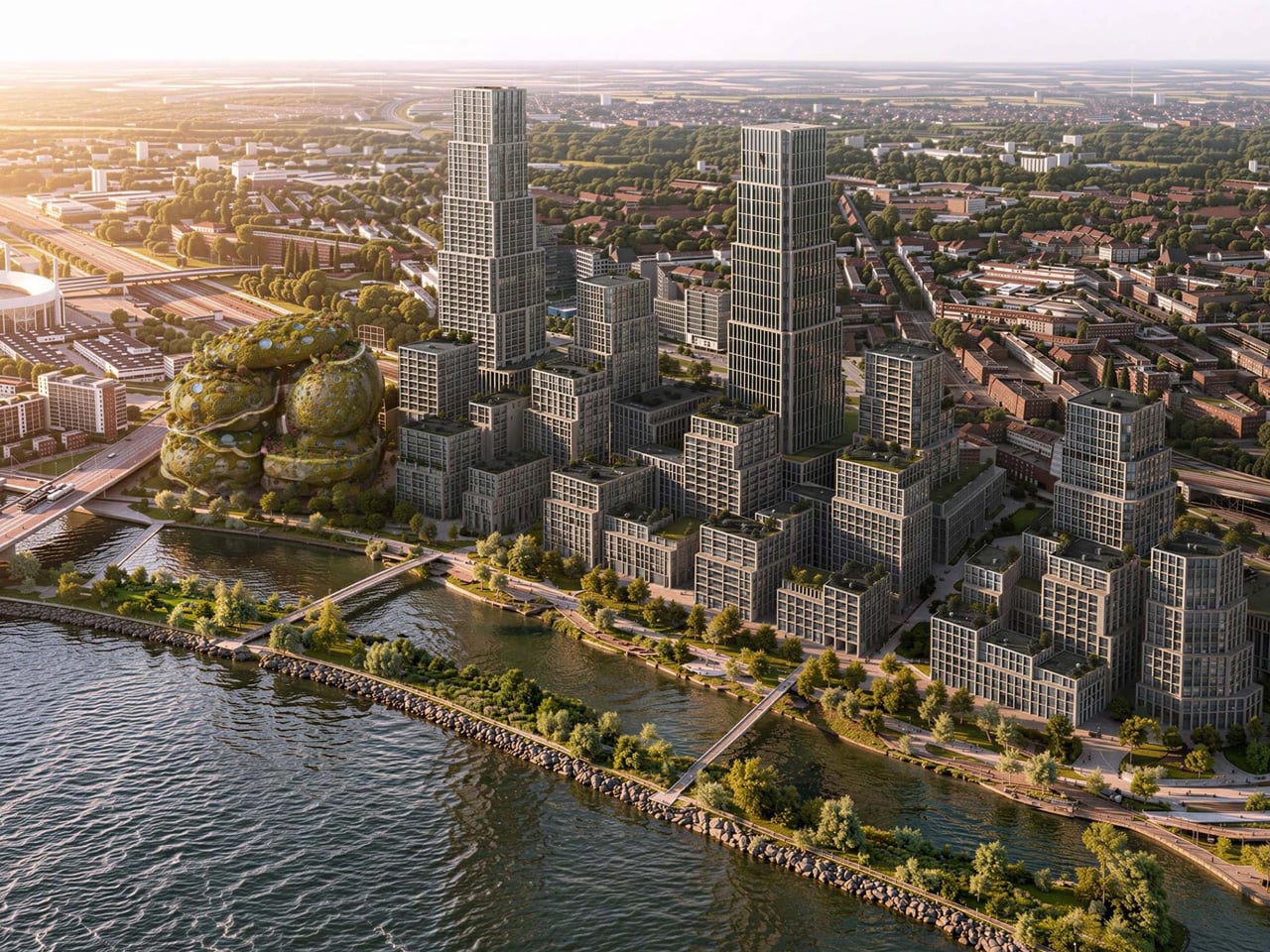
That’s an understatement. The design takes the form of seven giant stacked rocks arranged into two towers on the south bank of the Maas, in Rotterdam’s emerging Waterkant district. The district itself is slated to deliver over 3,500 homes alongside schools, offices, and a new train station — Rotterdam ROCKS! is meant to be its cultural heartbeat.

At 30,000 square metres, the building is organized around two internal circulation routes and a series of cave-like exhibition spaces carved into the rock forms. A third route wraps the exterior of the structure, leading visitors through an immersive area called The Elysium before arriving at a viewing terrace overlooking the city. Below that, the program includes a 200-room hotel, a conference centre, a food court, and event spaces — essentially a vertical neighborhood compressed into a geological fiction.

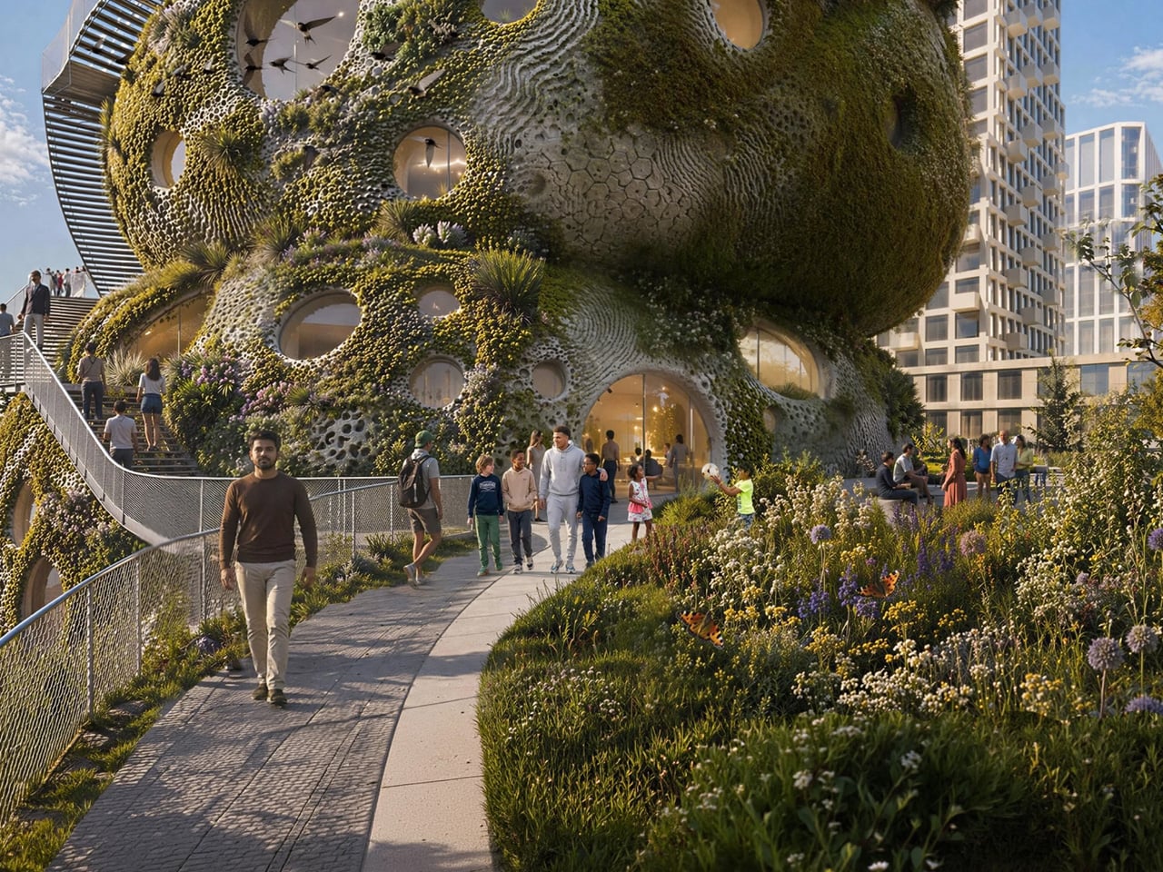
The facade is designed to be genuinely alive. Pockets built into the exterior hold soil, water, plants, and nesting habitats for birds and urban wildlife. MVRDV has said the building will “showcase the latest innovations in low-carbon construction,” though specific materials have yet to be disclosed. Founding partner Winy Maas described the design logic directly: “We need to reduce carbon dioxide emissions and to create inclusive spaces for people, trees, plants, for water, air, and for animal habitats, balancing the need for new built space with new landscapes to compensate our ecological impact.”

The project is the first-ever Shift Embassy — a new typology conceived by the social enterprise as a permanent physical institution for ecological and societal change. Shift is targeting a 2032 launch, which gives the design time to move through further development and public consultation. Rotterdam already has the Markthal, De Rotterdam, and the Cube Houses. It’s building a reputation for architecture that refuses to be quiet. Rotterdam ROCKS! might be its loudest statement yet.

The post MVRDV Built a Mountain in the Middle of Rotterdam first appeared on Yanko Design.

MVRDV Built a Mountain in the Middle of Rotterdam

What does a building look like when it’s designed for birds, insects, and plants just as much as people? According to MVRDV, it looks like a mountain that grew out of the Maas riverbank — rough, porous, and unapologetically massive.

Rotterdam ROCKS! is MVRDV’s winning entry in Shift’s international design competition, which called for proposals for a “new world wonder” capable of motivating people to act on the climate and biodiversity crises. The €240 million project beat out a formidable shortlist that included Heatherwick Studio, Mecanoo, Office for Political Innovation, and Ecosistema Urbano. The jury — which included Zaha Hadid Foundation director Aric Chen and UNS founder Ben van Berkel — called the proposal “remarkably bold.”

Designer: MVRDV

That’s an understatement. The design takes the form of seven giant stacked rocks arranged into two towers on the south bank of the Maas, in Rotterdam’s emerging Waterkant district. The district itself is slated to deliver over 3,500 homes alongside schools, offices, and a new train station — Rotterdam ROCKS! is meant to be its cultural heartbeat.

At 30,000 square metres, the building is organized around two internal circulation routes and a series of cave-like exhibition spaces carved into the rock forms. A third route wraps the exterior of the structure, leading visitors through an immersive area called The Elysium before arriving at a viewing terrace overlooking the city. Below that, the program includes a 200-room hotel, a conference centre, a food court, and event spaces — essentially a vertical neighborhood compressed into a geological fiction.

The facade is designed to be genuinely alive. Pockets built into the exterior hold soil, water, plants, and nesting habitats for birds and urban wildlife. MVRDV has said the building will “showcase the latest innovations in low-carbon construction,” though specific materials have yet to be disclosed. Founding partner Winy Maas described the design logic directly: “We need to reduce carbon dioxide emissions and to create inclusive spaces for people, trees, plants, for water, air, and for animal habitats, balancing the need for new built space with new landscapes to compensate our ecological impact.”

The project is the first-ever Shift Embassy — a new typology conceived by the social enterprise as a permanent physical institution for ecological and societal change. Shift is targeting a 2032 launch, which gives the design time to move through further development and public consultation. Rotterdam already has the Markthal, De Rotterdam, and the Cube Houses. It’s building a reputation for architecture that refuses to be quiet. Rotterdam ROCKS! might be its loudest statement yet.

The post MVRDV Built a Mountain in the Middle of Rotterdam first appeared on Yanko Design.

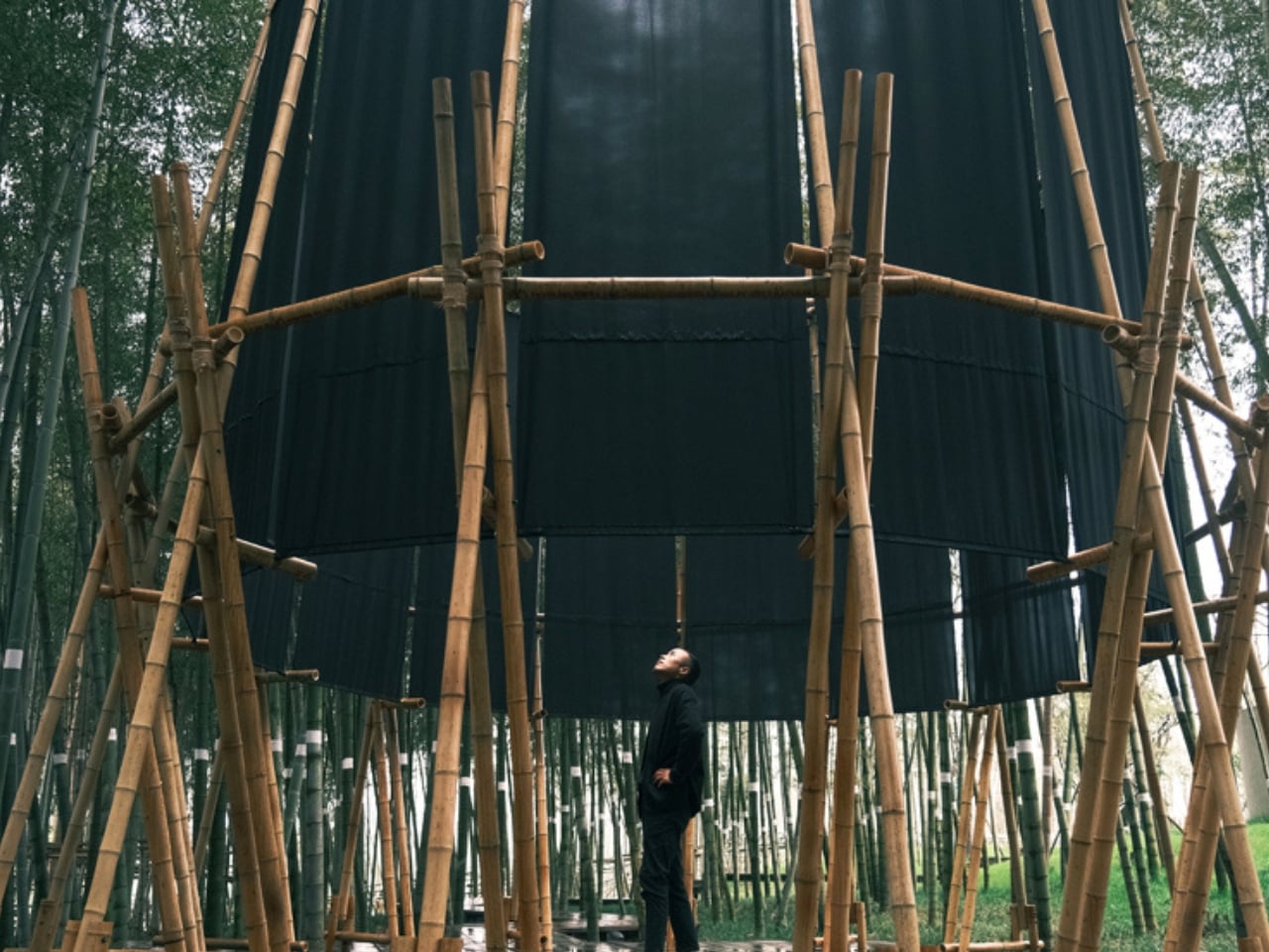
A 28m² Bamboo Tower in China Makes You Bow to Get In

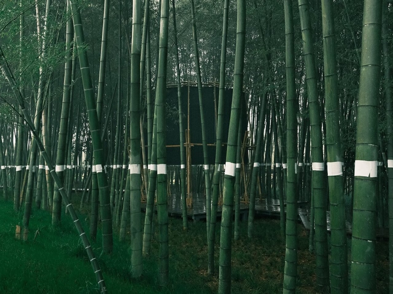
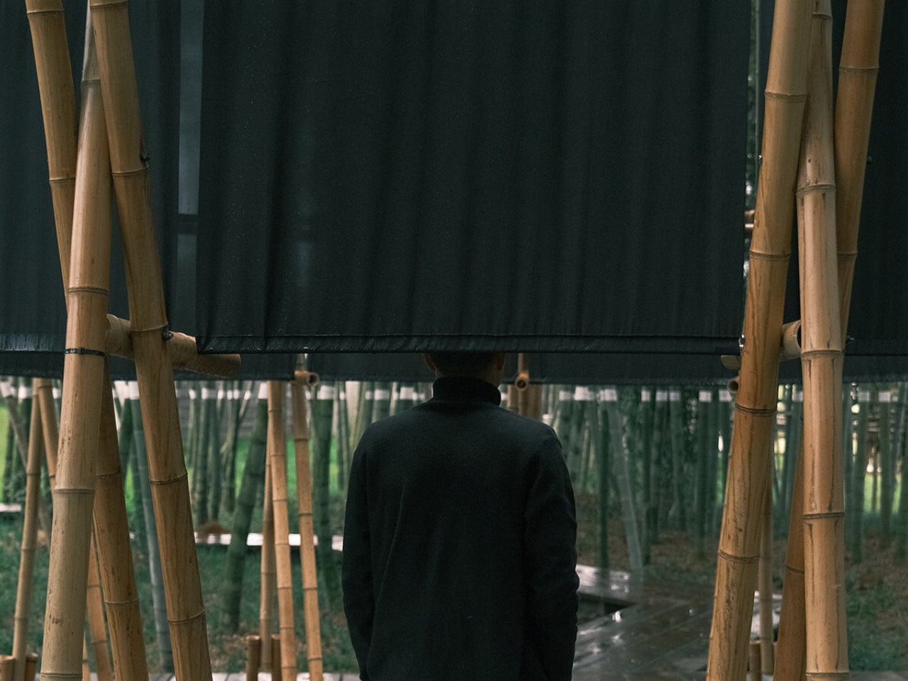
Not every piece of architecture asks something of you before you step inside. Most buildings are passive that way. You walk through a door, and that’s that. But the Veil Tower, a temporary bamboo pavilion tucked into a moso bamboo grove in Xianning, Hubei, opens with a demand: lower your head and bow your body to cross the threshold. It’s a small, deliberate act, and it sets the tone for everything that follows.

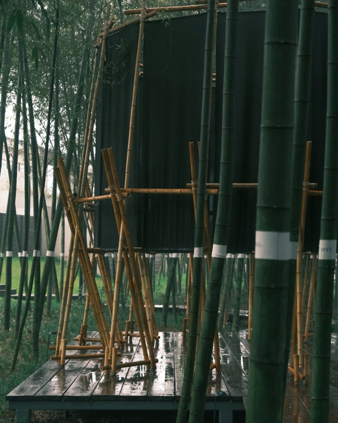
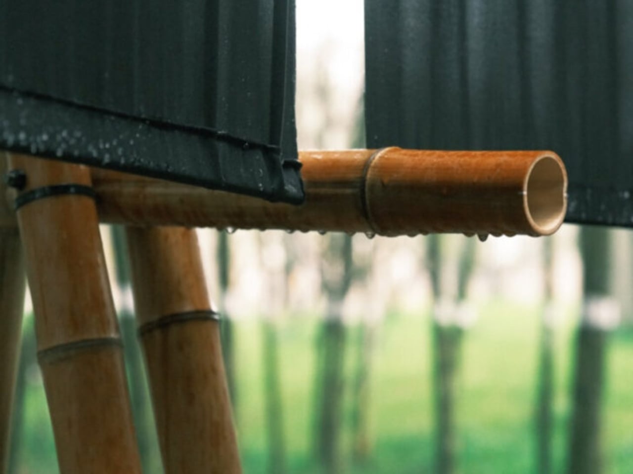
Designed by gèngjin Architecture Office and completed in March 2026, the Veil Tower is a 28.3-square-meter ephemeral structure built from local raw bamboo, black cotton-linen fabric, coarse hemp rope, and steel components. The materials are humble by any measure. The result is anything but.

Designer: gèngjin Architecture Office

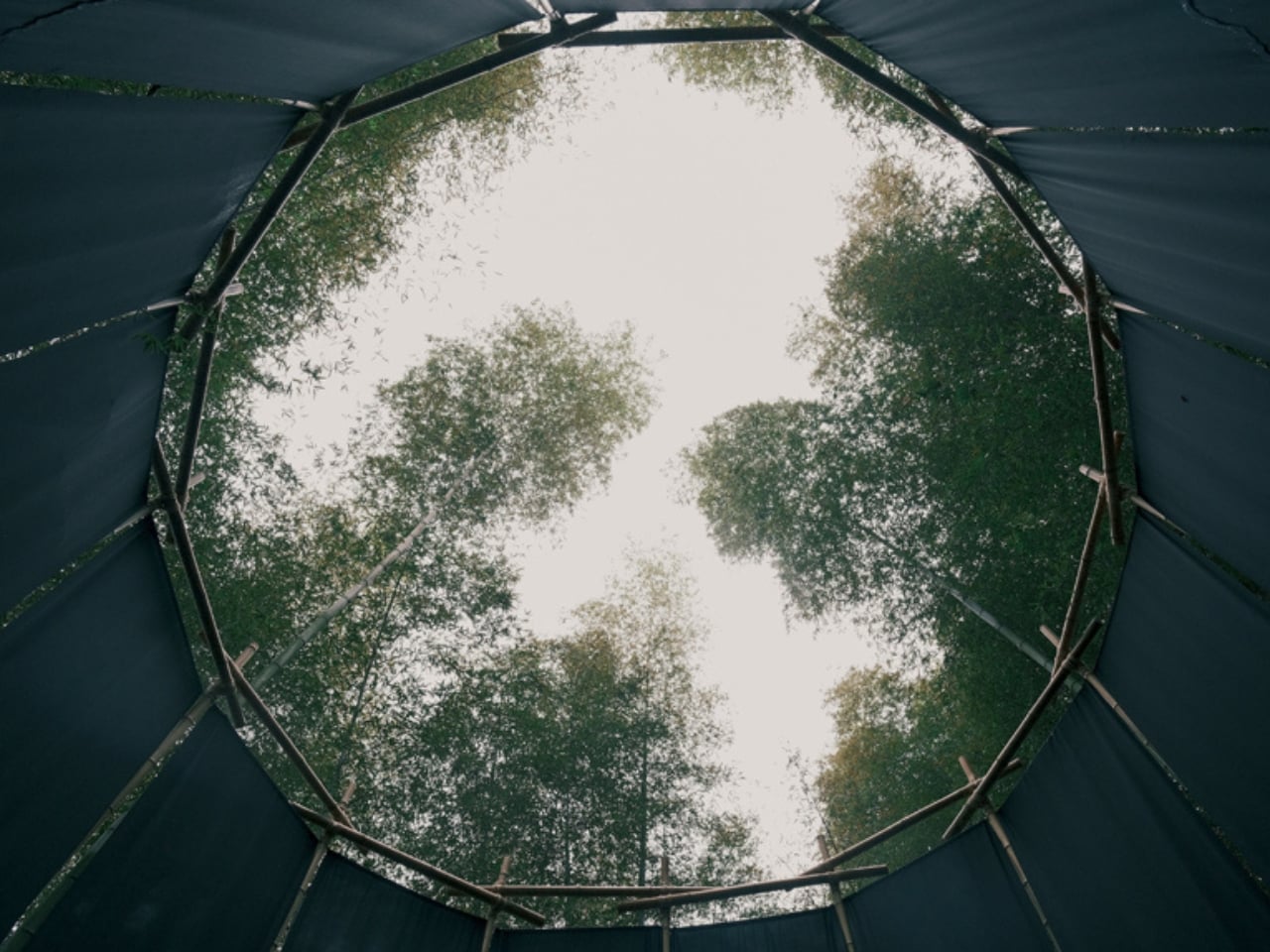
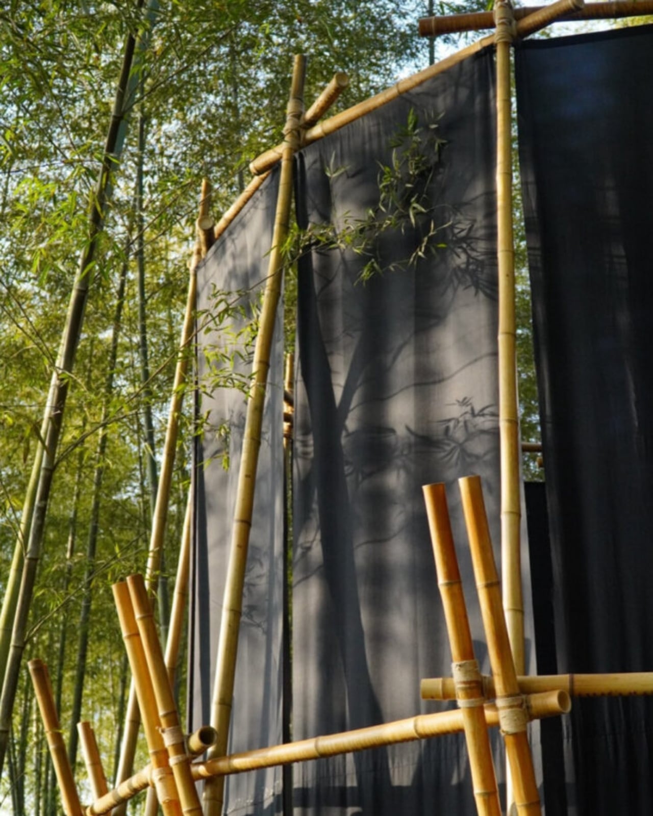
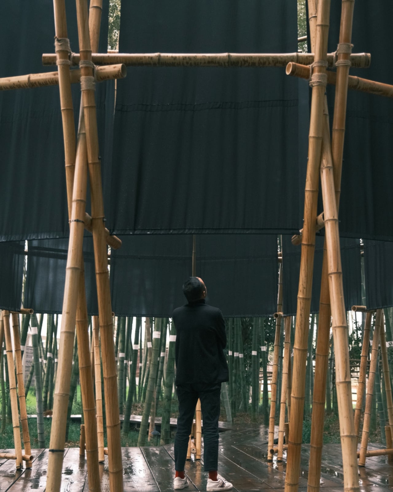
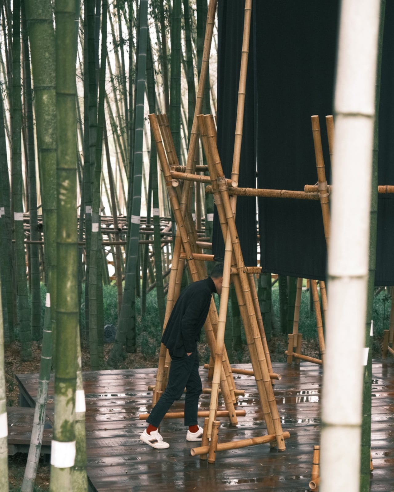
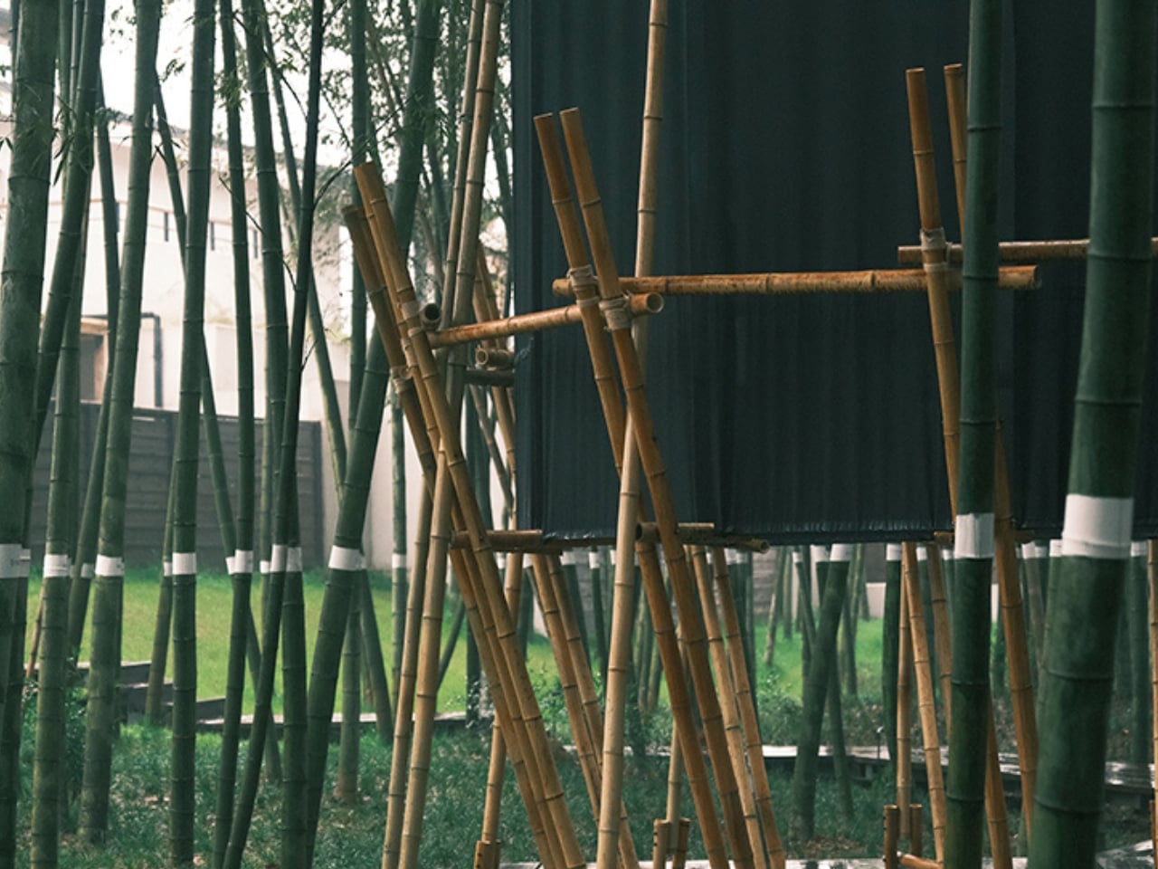
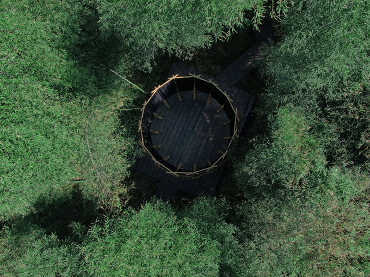
The concept originated from an imagined gesture: peeling bamboo to reveal its inner skin. That idea became the structural and poetic foundation of the whole project. Fifteen bamboo frames were assembled into a pentadecagonal (15-sided) matrix, and from that frame, 15 panels of black fabric were suspended to form what the designers call the “Bamboo Inner Pith Membrane.” The fabric sits at roughly 60 percent light transmittance, which is a technical way of saying that under dappled sunlight, it produces something that looks like an ink-wash painting in motion.

The design draws from the ceremonial spatial archetypes of Chu culture, one of the ancient civilizations of southern China, particularly its collective ritual platforms. You feel that centripetal pull the moment you’re inside. The black curtain cuts off horizontal sightlines to the rest of the forest, so the only direction left to look is up. At the top, the structure’s open crown frames the sky, the clouds, and the swaying bamboo canopy above. Wind moves the fabric. Light shifts. The effect is contemplative in a way that feels earned rather than forced.

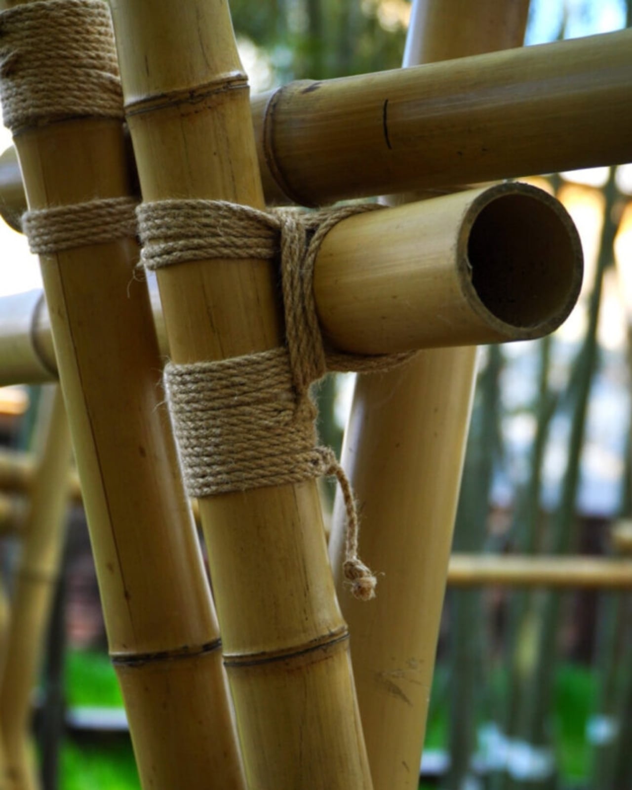
Architecture that demands quiet from you is increasingly rare. Most contemporary public installations seem designed for the five-second photo and nothing more. The Veil Tower doesn’t court the camera. Or rather, it doesn’t need to. The photographs you’ll find of it are genuinely striking, but they’re a byproduct of good design thinking rather than its purpose. The designers built something meant to be experienced physically, built collaboratively with local volunteers using traditional cross-lashing hemp rope and reversible joints, and built to leave no permanent mark on the land once it comes down. Every bamboo pole and every length of fabric is fully recoverable.

That last point matters more than it might sound. The conversation around sustainable architecture often gets bogged down in grand claims and complex certification systems. What gèngjin did here is quieter and more convincing: they used materials that were already there, built with methods that can be undone, and created something that asks nothing from the earth it stands on. The Veil Tower is part of a larger series called “Calibrations within the Bamboo Grove,” alongside two other site-specific installations at the same location. The name alone tells you a lot about the mindset. Not impositions within the bamboo grove. Calibrations.

Xianning is known across China as the “Land of Moso Bamboo,” and the bamboo grove at ANNSO, a boutique hotel on the site, is the kind of place where dense canopies filter sunlight into fragmented patches and the vertical repetition of culms creates a slight, disorienting sense of being enclosed by nature itself. The designers describe it as a place you can see through but never fully penetrate. The Veil Tower takes that sensation and deepens it intentionally. Inside the structure, the enclosure is complete, until you look up and the whole sky opens.

Temporary architecture often carries an apologetic quality, as if impermanence is a limitation to be explained away. The Veil Tower flips that entirely. The fact that it will eventually come down, leaving no trace, is part of what makes it feel significant. It doesn’t try to outlast its moment. It just asks you to bow at the door, step inside, and look up.

The post A 28m² Bamboo Tower in China Makes You Bow to Get In first appeared on Yanko Design.

Herzog & de Meuron Just Made a 1980s Antenna Tower the Most Exciting Building in the Alps

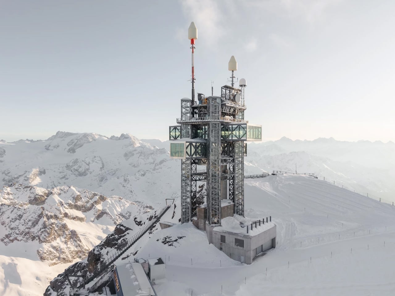
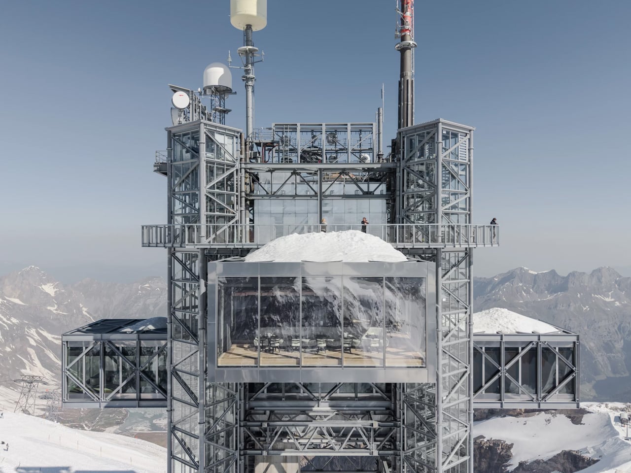
The Titlis Tower was never meant to be beautiful. That’s what makes what Herzog & de Meuron have done with it so compelling — a project that says more with restraint than most buildings say at full volume. The 56-meter-high antenna tower was built in the mid-1980s by the Swiss postal service, originally serving as a functional node in the country’s telecom network.

It sat largely ignored above the resort town of Engelberg, visible but inaccessible, a steel remnant of an analog era. Mount Titlis, the peak it crowns, draws approximately 1.1 million visitors per year — yet the tower itself offered nothing to any of them. That tension between presence and uselessness is what the commission set out to resolve.

Designer: Herzog & de Meuron

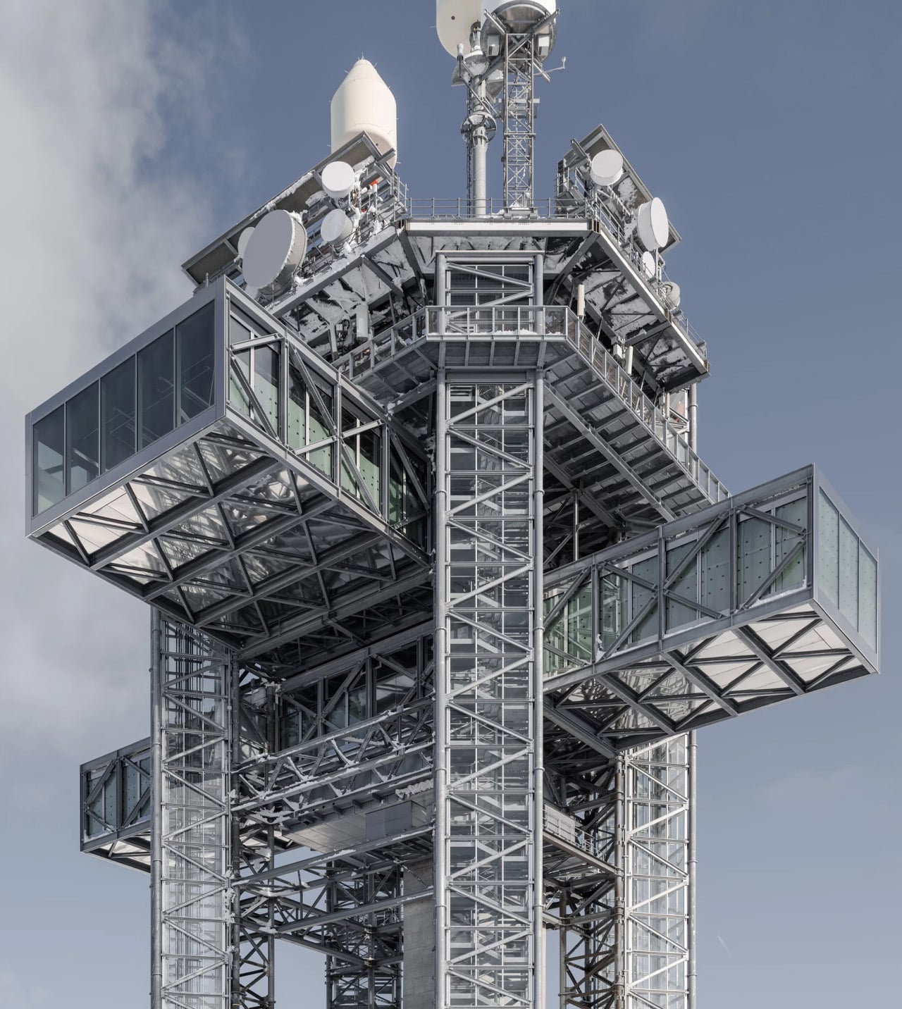
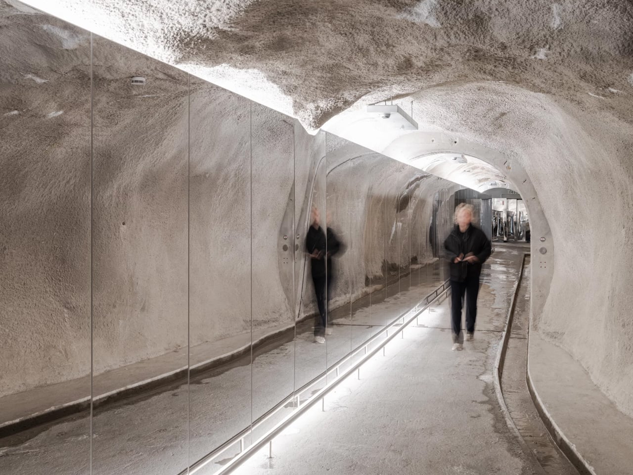
In 2017, Herzog & de Meuron was brought in to renew the mountain station and transform the tower into part of the tourist offering — a brief that sat within a broader masterplan for the entire summit, including a redesigned cable car station. Co-founder Pierre de Meuron framed the approach around “resource-conscious development of the existing infrastructure,” which in practice meant keeping what was already there and building only what was necessary. No demolition. No tabula rasa. Just a sharp architectural gesture inserted into a structure that already belonged to the mountain.

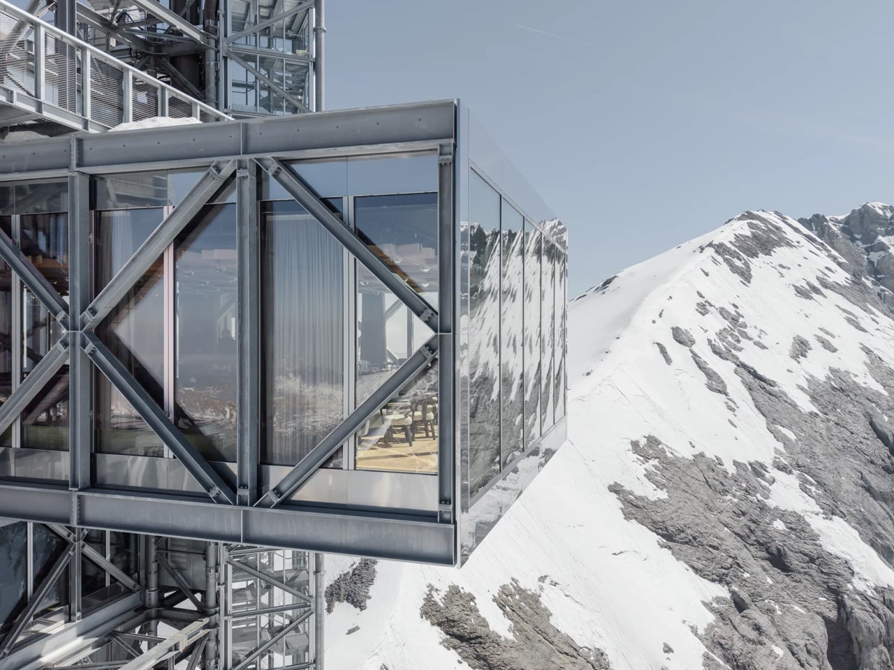
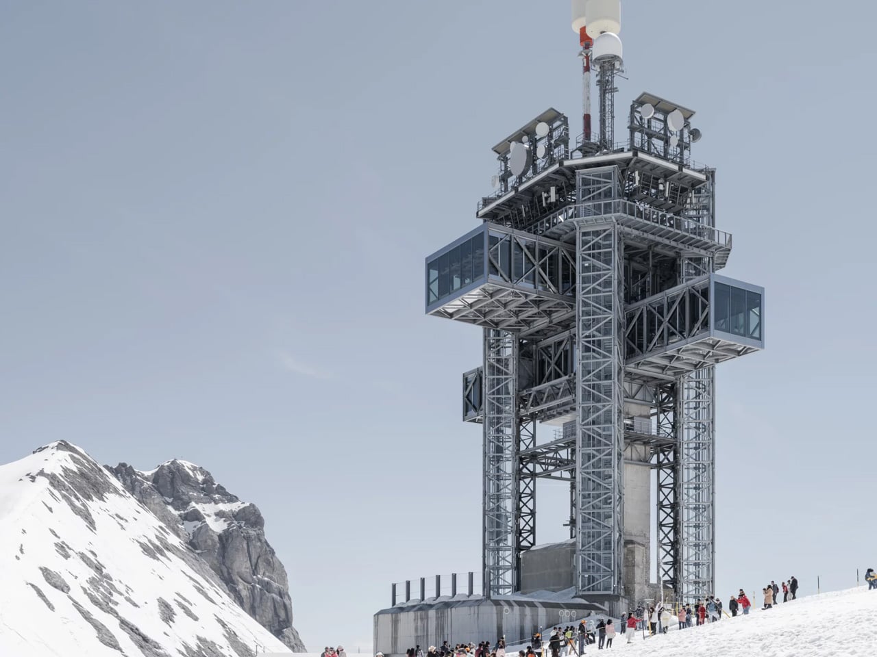
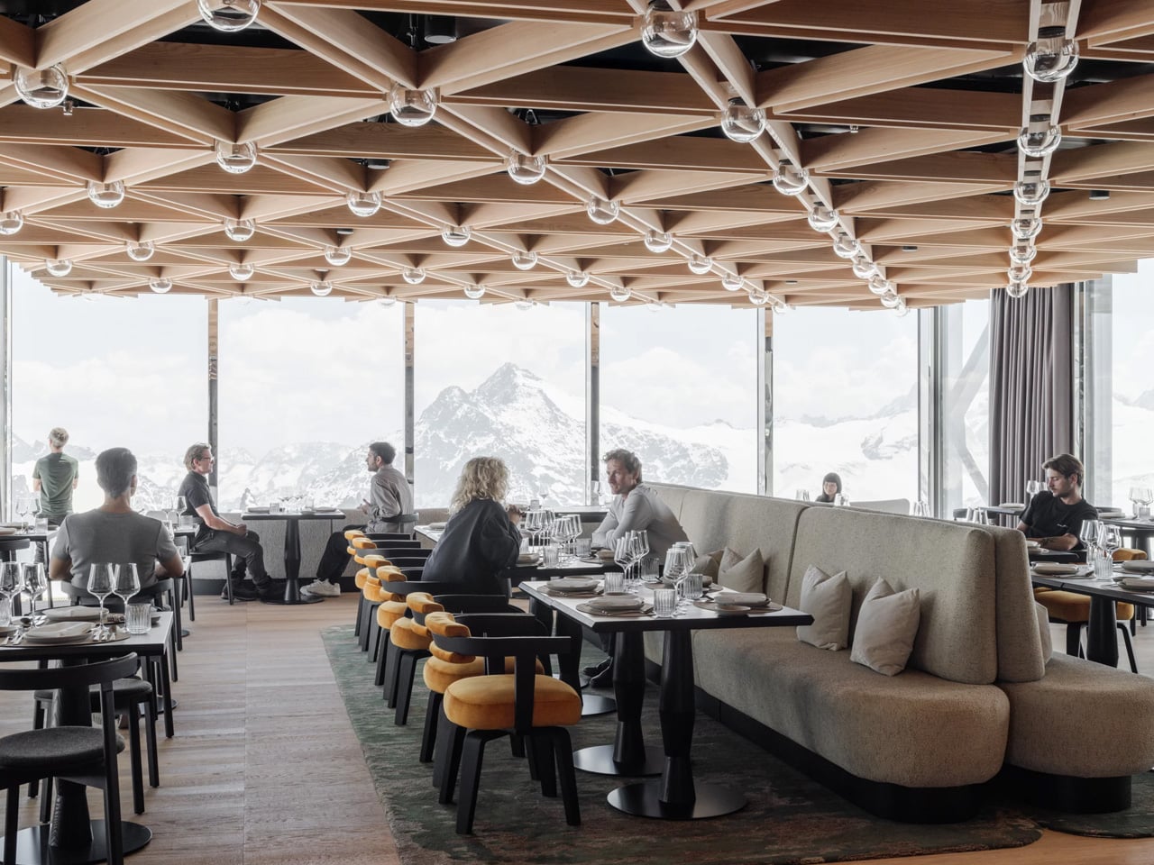
The transformation sees two cantilevered glass-and-steel volumes inserted crosswise into the existing antenna mast, creating the tower’s now-iconic cross-shaped silhouette. Four vertical circulation volumes handle movement through the structure. The result is a form that feels both ancient and entirely new — a cross, yes, but also a compass, a landmark, a thing that seems to orient itself against the horizon. Inside, the two horizontal bodies house a restaurant, a bar, and exhibition space, all of it delivered at over 3,000 meters above sea level, with glacier views on every axis.

Completed in 2026, the tower is the first element of the wider TITLIS Project to be realized, and it sets a high bar for everything that follows. What makes it land is the discipline behind the concept. Herzog & de Meuron didn’t try to compete with the Alps — they let the existing structure carry the weight and introduced just enough to make it habitable, legible, and genuinely spectacular. The tower was already a landmark. Now it finally knows it.

The post Herzog & de Meuron Just Made a 1980s Antenna Tower the Most Exciting Building in the Alps first appeared on Yanko Design.

The Hive Tower That Could Change How Cities Build Tall

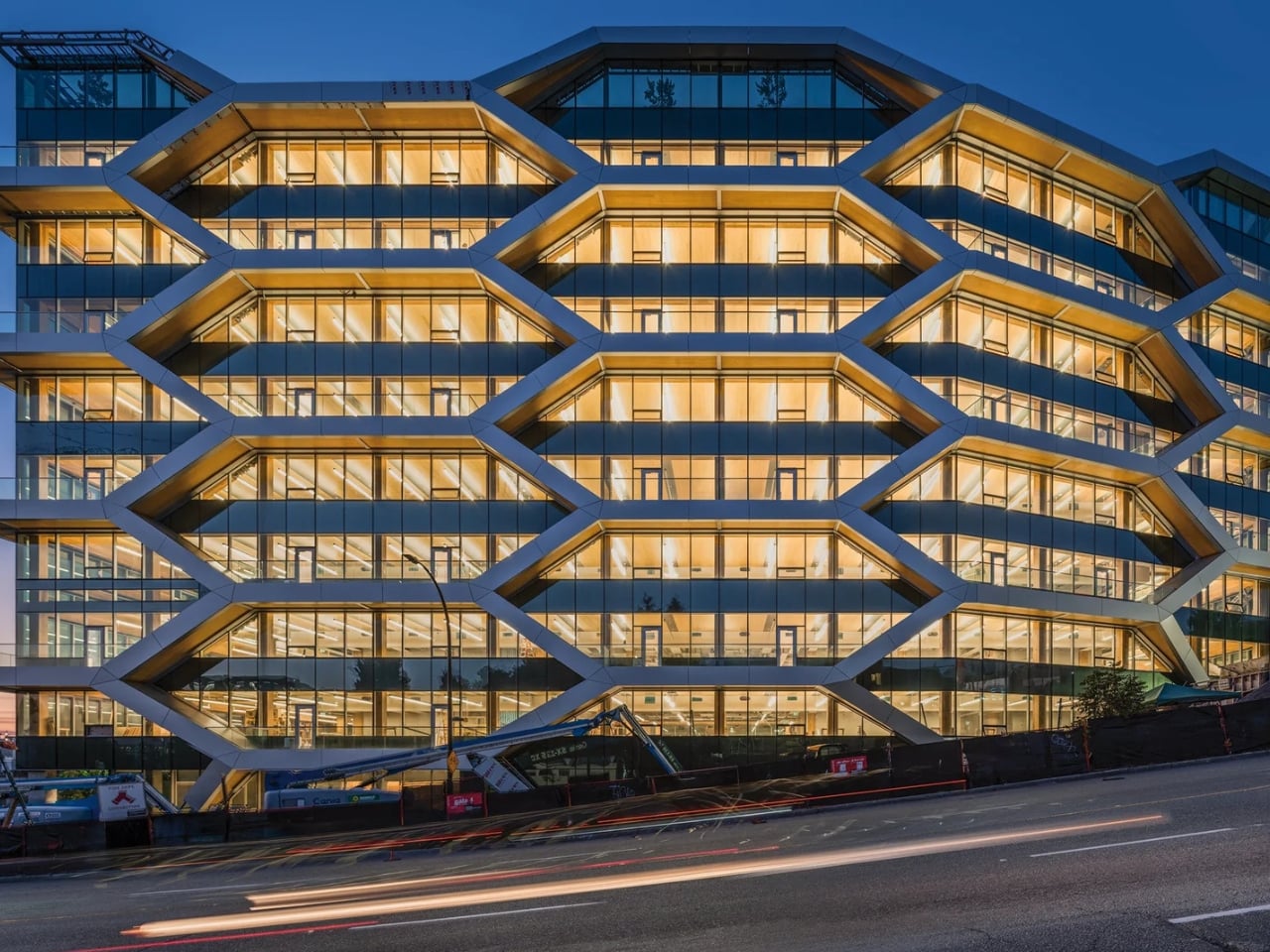
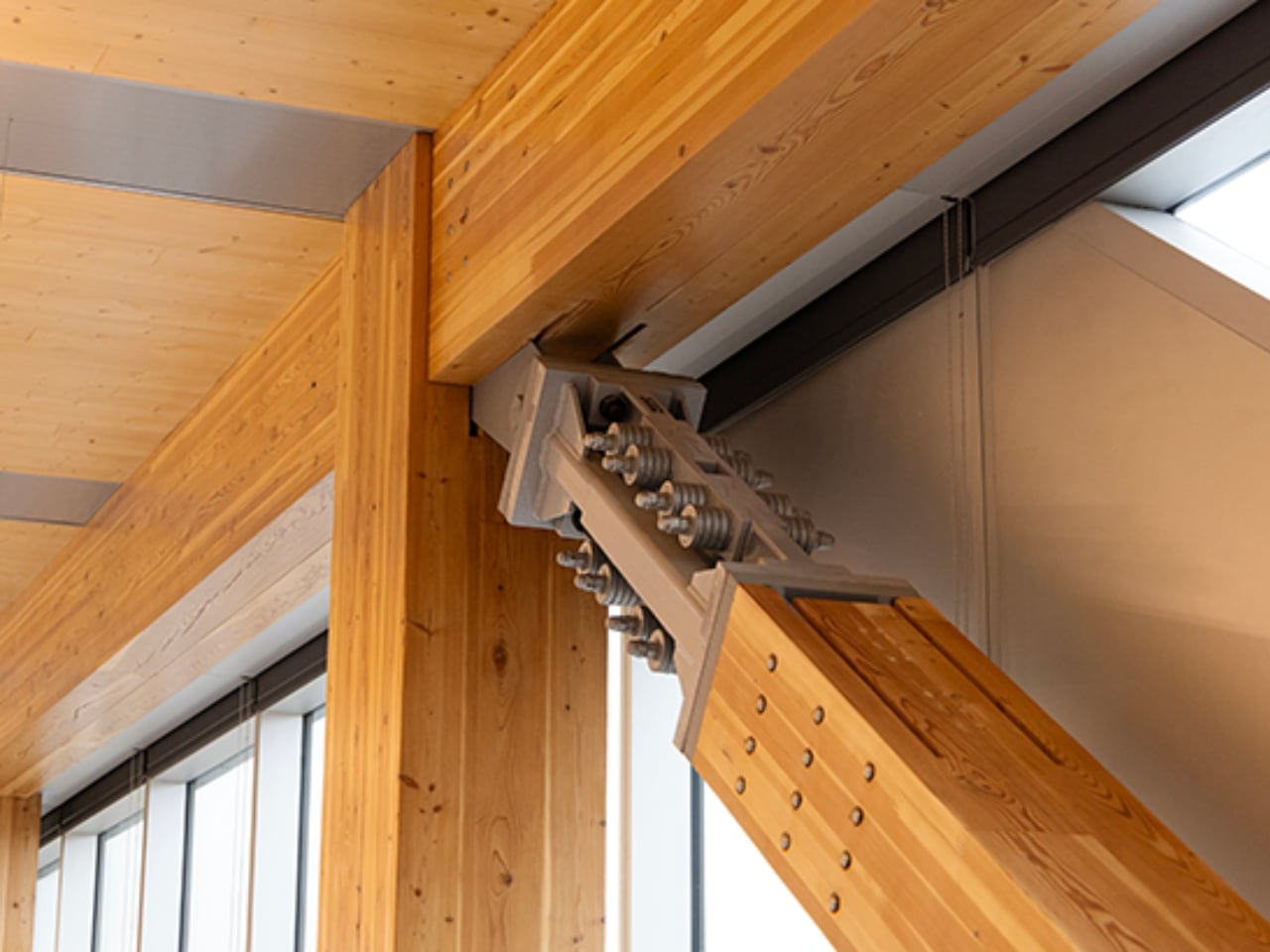
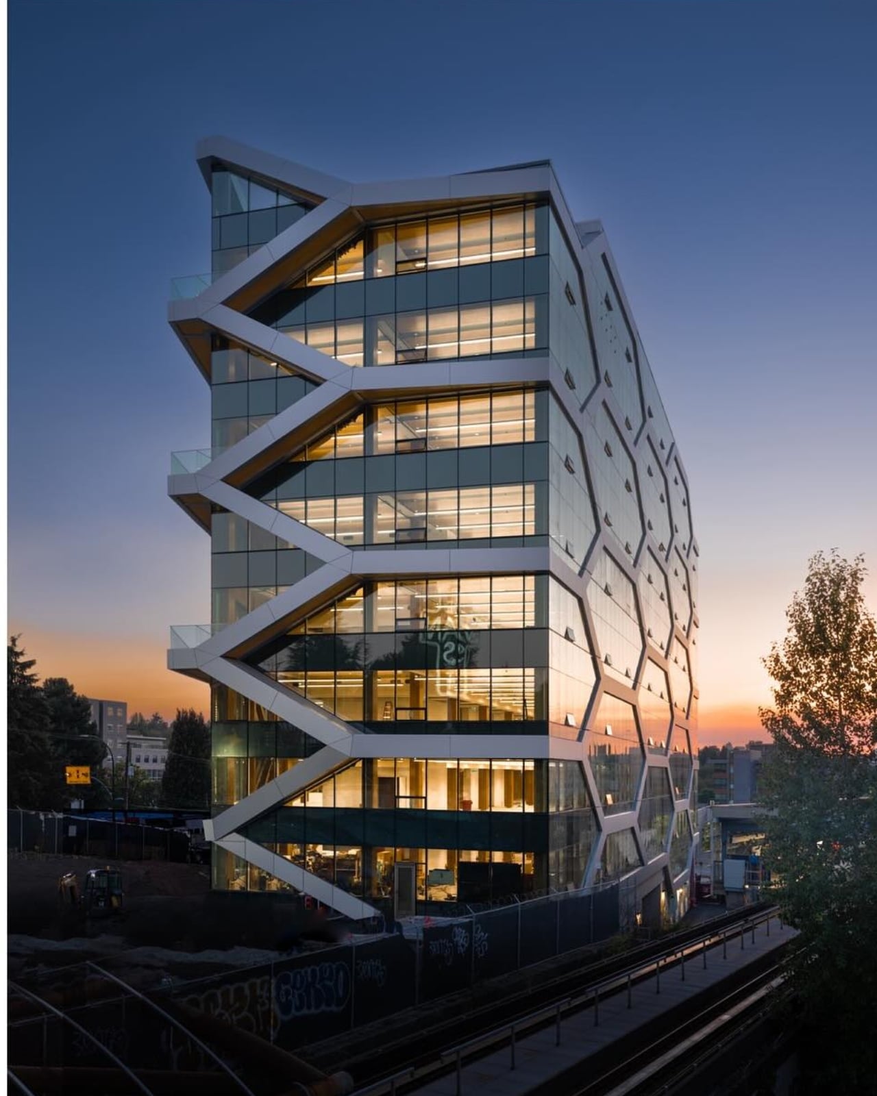
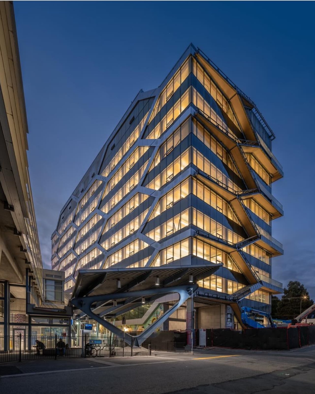
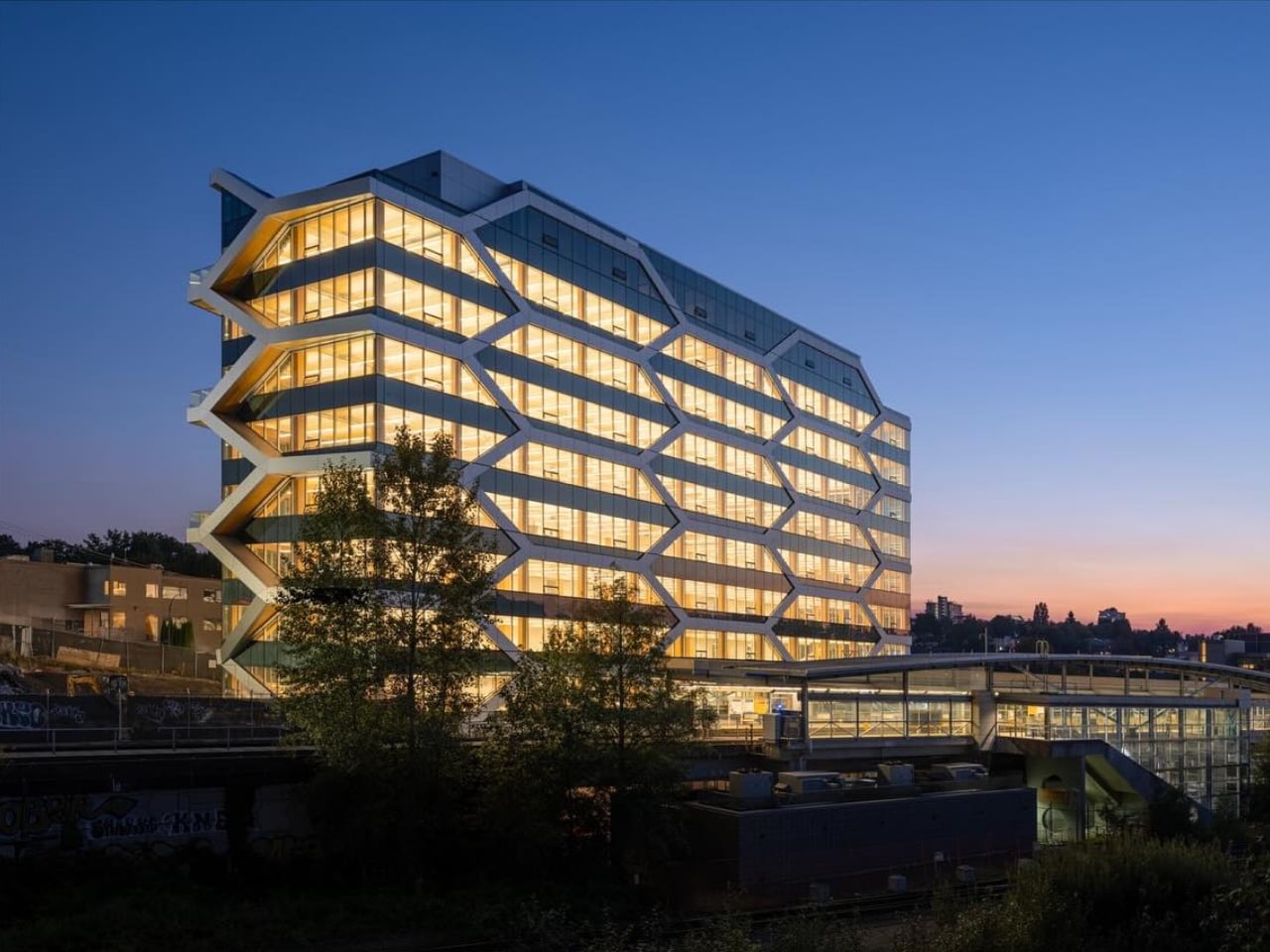
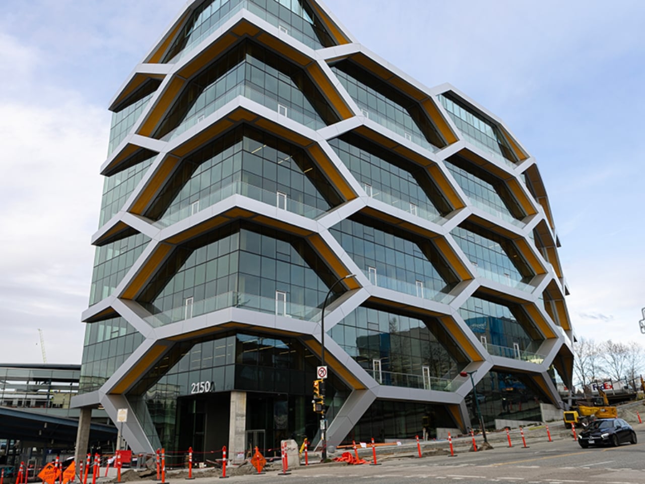
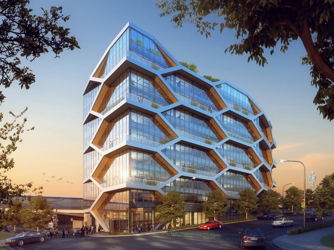
Vancouver just opened a building that looks like it was sketched from a bee’s imagination. Ten stories of glulam diagonal bracing arranged in a cellular honeycomb pattern, climbing above the False Creek Flats neighborhood at 2150 Keith Drive. No concrete core. No steel skeleton hiding inside. Just engineered wood, a very smart structural idea, and 106 seismic dampers quietly doing something extraordinary.

The Hive, designed by Dialog in collaboration with structural engineers Fast+Epp, is officially the tallest seismic-force-resisting mass timber building in North America. Nature’s Path Foods was an early believer in the project. The Insurance Corporation of British Columbia (ICBC) just signed on as anchor tenant, which matters more than it sounds. When an insurance company chooses to occupy a timber building designed for earthquake territory, it’s a signal about confidence, not just aesthetics.

Designer: Dialog Design (photos from Michael Elkan)

The structural decision at the center of this building is worth pausing on. Most architects building in seismic zones lean on a concrete core to handle lateral loads, then wrap wood or steel around it. Dialog chose not to do that here. Instead, the glulam diagonal braces run along the building’s perimeter, forming that honeycomb grid that reads immediately as a design statement but is actually the load-bearing logic made visible. The structure isn’t decorating the facade. The facade is the structure.

Paired with those diagonal glulam braces are 106 Tectonus damper connections, a system borrowed conceptually from how tectonic plates behave during seismic events. Rather than resisting an earthquake by brute force, the building is designed to move with it, absorbing energy through the dampers and then self-centering once the shaking stops. Testing was carried out at the University of Alberta using large physical mockups to prove the system would hold. That kind of pre-construction stress testing is not a given, and it reflects the level of scrutiny this project had to pass to exist at all.

The reason that scrutiny was so high comes down to code. Canada updated its National Building Code in 2020 to permit mass timber buildings up to 12 stories, with changes taking effect in 2022. Vancouver sits in a high-seismic zone, which added requirements beyond the base code. Getting a tall timber building approved here required not just meeting those new standards but helping to write the engineering case for them. The team received $4 million in research funding from federal and provincial governments to do exactly that, covering destructive testing, fire testing, and constructability analysis. The Hive didn’t just benefit from the regulatory shift. It helped earn it.

The comparison to other celebrated mass timber towers is instructive. Milwaukee’s Ascent is remarkable at 25 stories, and buildings like Neutral Edison have made compelling arguments for timber in dense urban settings. But neither sits in a high-seismic zone. The Hive isn’t the tallest timber building; it’s the most structurally tested in the conditions most buildings actually fear. Seismic credibility is the specific gap it fills, and filling it in a major North American city with a government-insurer anchor tenant is a different kind of proof than any design award.

The honeycomb wasn’t chosen to be pretty. It was chosen because the diagonal brace geometry at the perimeter is the most efficient seismic solution for a building this size without a concrete core. And yet the result is one of the most graphically immediate buildings to open anywhere this year. When the structural diagram and the brand identity are the same thing, something has gone right at a foundational level in the design process.

Mass timber has been in a years-long tug-of-war between its admirers and its skeptics. The admirers point to carbon storage, warmth, biophilic benefits. The skeptics point to fire risk, insurance costs, and seismic uncertainty. The Hive answers the hardest skeptic argument directly, in one of the most seismically demanding cities in Canada. Whether it fully tips the debate probably depends on what gets permitted and built next. But as an opening move, it’s a strong one.

The post The Hive Tower That Could Change How Cities Build Tall first appeared on Yanko Design.

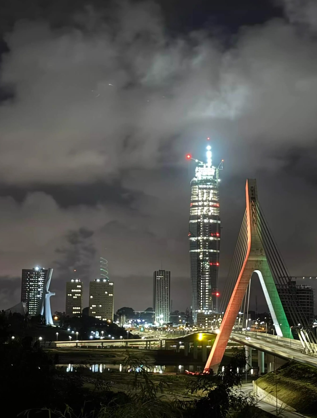
Africa’s Tallest Tower Was Worth the 40-Year Wait

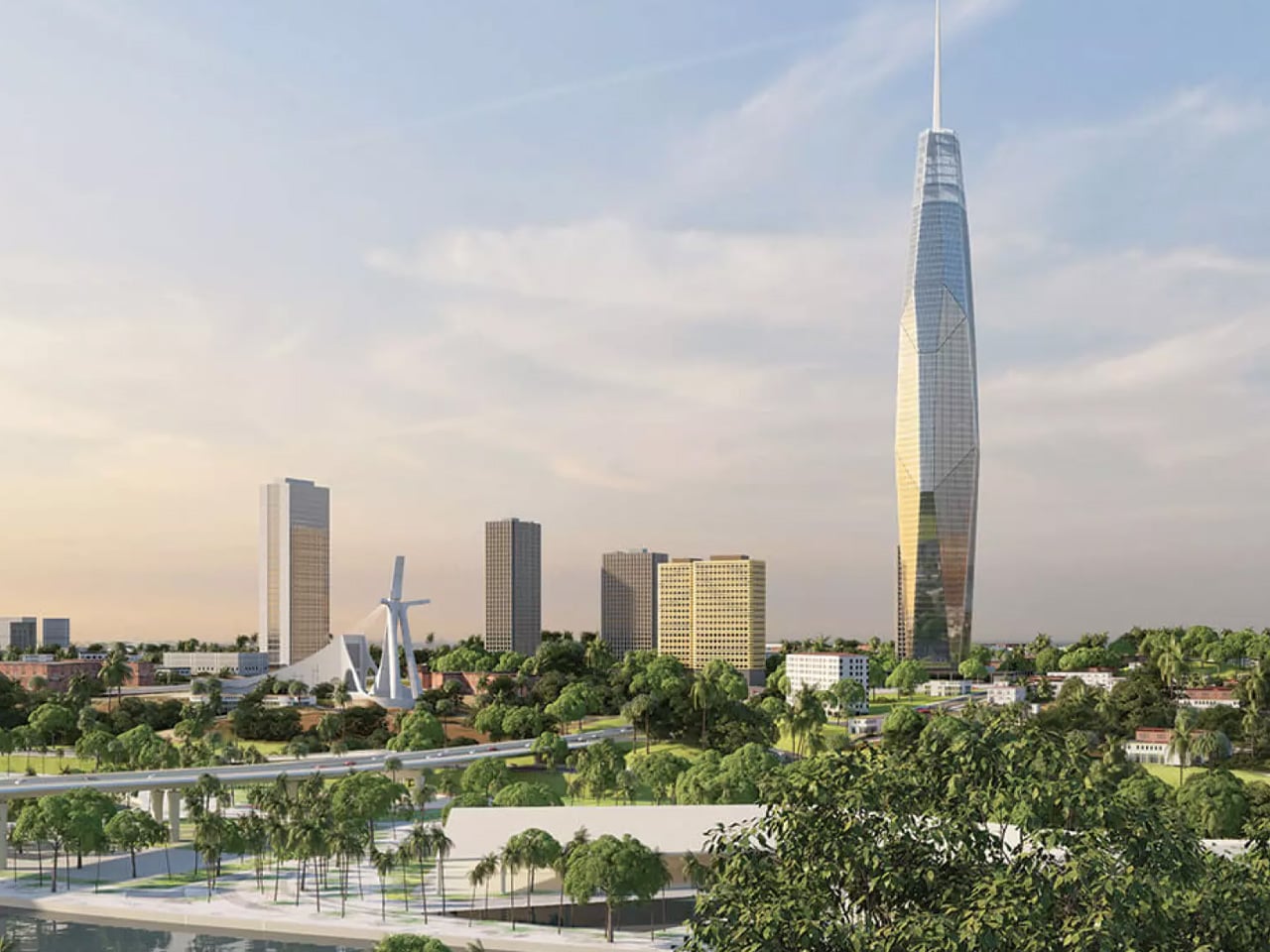
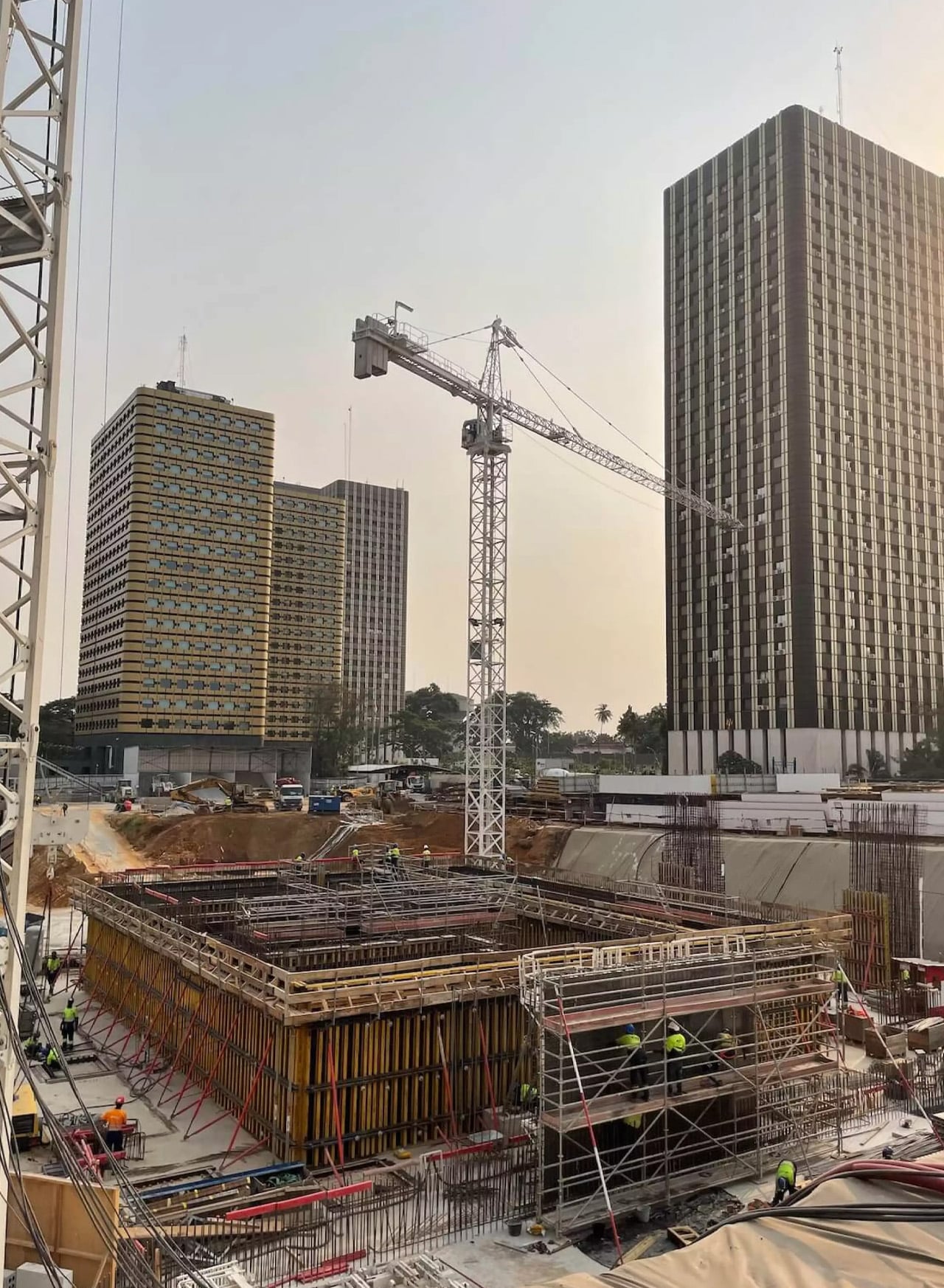
Forty years is a long time to wait for a building. But when you see what’s rising in Abidjan, the delay starts to feel almost intentional — like the city was simply holding its breath for the right moment. Tour F, the supertall skyscraper currently piercing the skyline of Ivory Coast’s economic capital, was first imagined in the 1970s as part of a sweeping urban development plan for Abidjan’s Plateau district. The idea was straightforward: complement the existing administrative towers — A through E — with a sixth.

What wasn’t straightforward was actually building it. The project stalled for decades, a vision suspended in bureaucratic and economic uncertainty. Construction finally broke ground in 2021, with BESIX Group drilling 70 foundation bars and 62-meter-deep diaphragm wall panels to anchor the structure.

Designer: Pierre Fakhoury

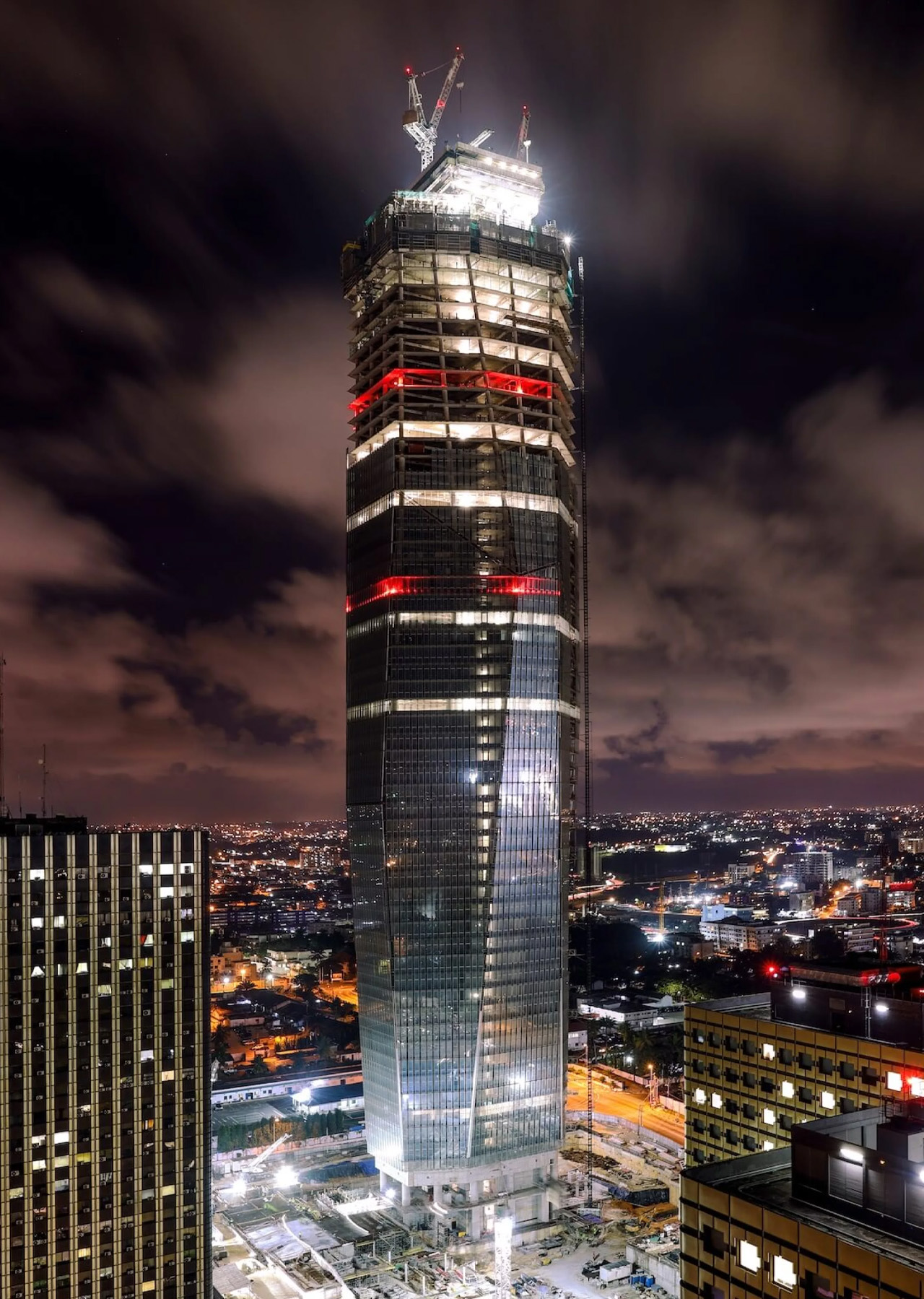
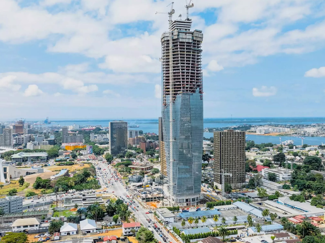
Designed by Lebanese-Ivorian architect Pierre Fakhoury — the same mind behind the breathtaking Notre-Dame de la Paix Basilica in Yamoussoukro — Tower F is not trying to be a generic glass box. It has something to say. The form is sculptural: a slender volume whose facade is carved into trapezoidal inclined glass planes, each facet tilting inward toward the earth or reaching toward the sky. The top is cleanly truncated, then crowned with a dramatic extension of the glass facade that dissolves into open air. It’s restrained and bold at the same time — a difficult balance that Fakhoury pulls off with architectural confidence.

What makes the design genuinely compelling is its embedded cultural logic. When viewed from a certain angle, the play of facets reads as a stylized African mask — a nod to West African artistic tradition embedded quietly into a 21st-century supertall. The building is symmetrical along its east-west axis, grounding the sculptural gesture in structural clarity. At street level, a simple rectangular podium houses the main entrance hall and support services, keeping the base honest and approachable despite the tower’s imposing scale.

At 421 meters, Tower F is set to claim the title of Africa’s tallest building, surpassing The Leonardo in Johannesburg. The gross floor area reaches approximately 140,000 square meters, consolidating government ministries and administrative units currently scattered across the city — a practical ambition wrapped in an extraordinary shell.

Construction costs are estimated at approximately €450 million, developed through a collaboration between the Ivorian Ministry of Construction and local firm PFO Africa. Completion is expected in 2026. For a continent whose architectural ambitions are accelerating fast, Tower F is exactly the kind of project that reframes the conversation — not just about African skylines, but about what it means to design a building that carries cultural memory into the future.

The post Africa’s Tallest Tower Was Worth the 40-Year Wait first appeared on Yanko Design.
TRÆ Is the Timber Tower That Turns Waste Into Architecture

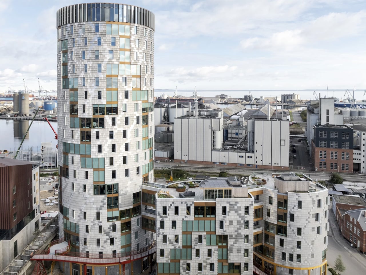
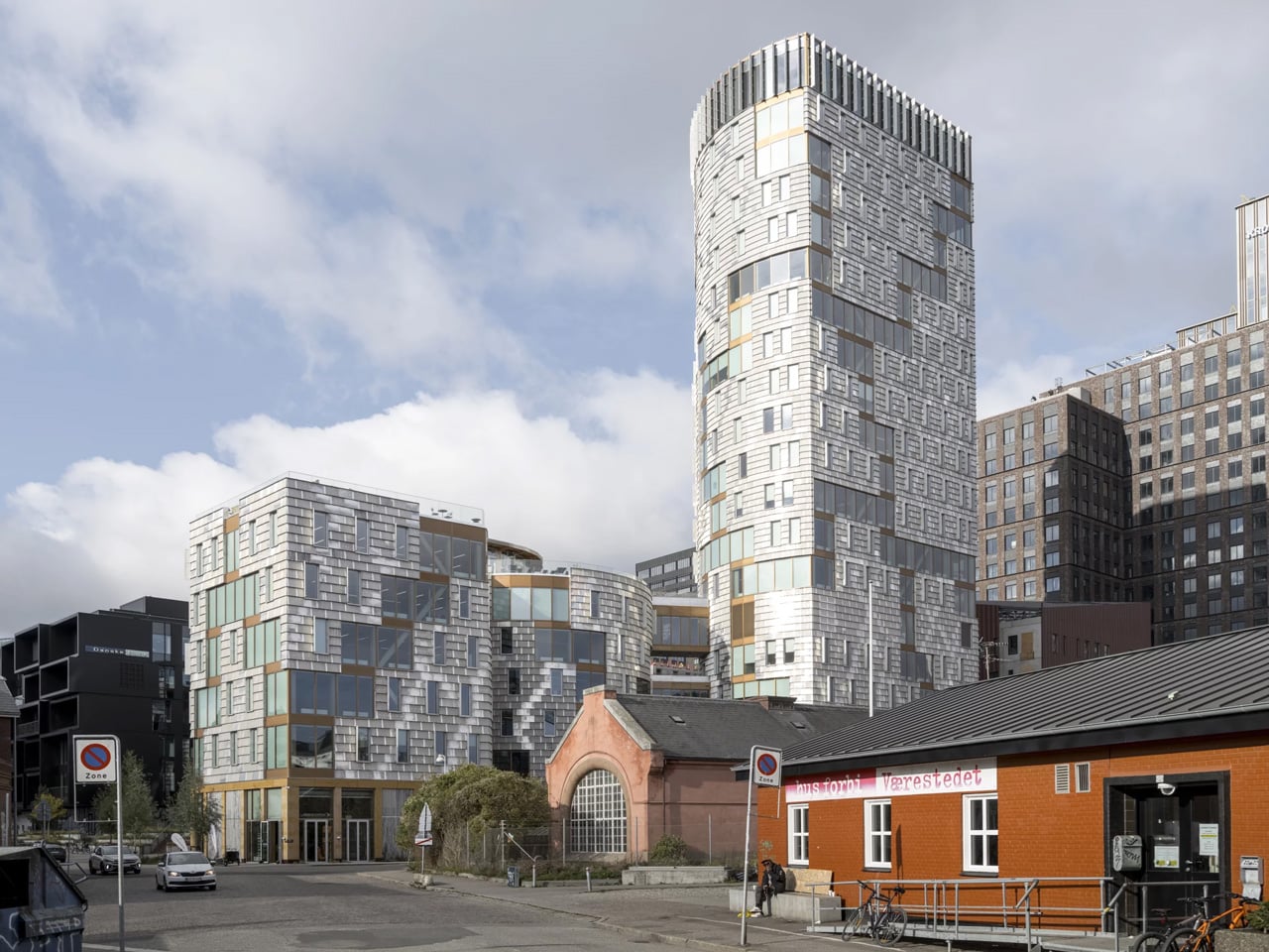
There’s a word in Danish, ‘træ’, that means three things at once: tree, timber, and three. It’s a fitting name for a building that refuses to be just one thing. Designed by Lendager and completed in Aarhus’ former industrial South Harbour, TRÆ stands 78 meters tall across three interconnected volumes, earning its place as Denmark’s tallest timber tower and the world’s first upcycle timber tower.

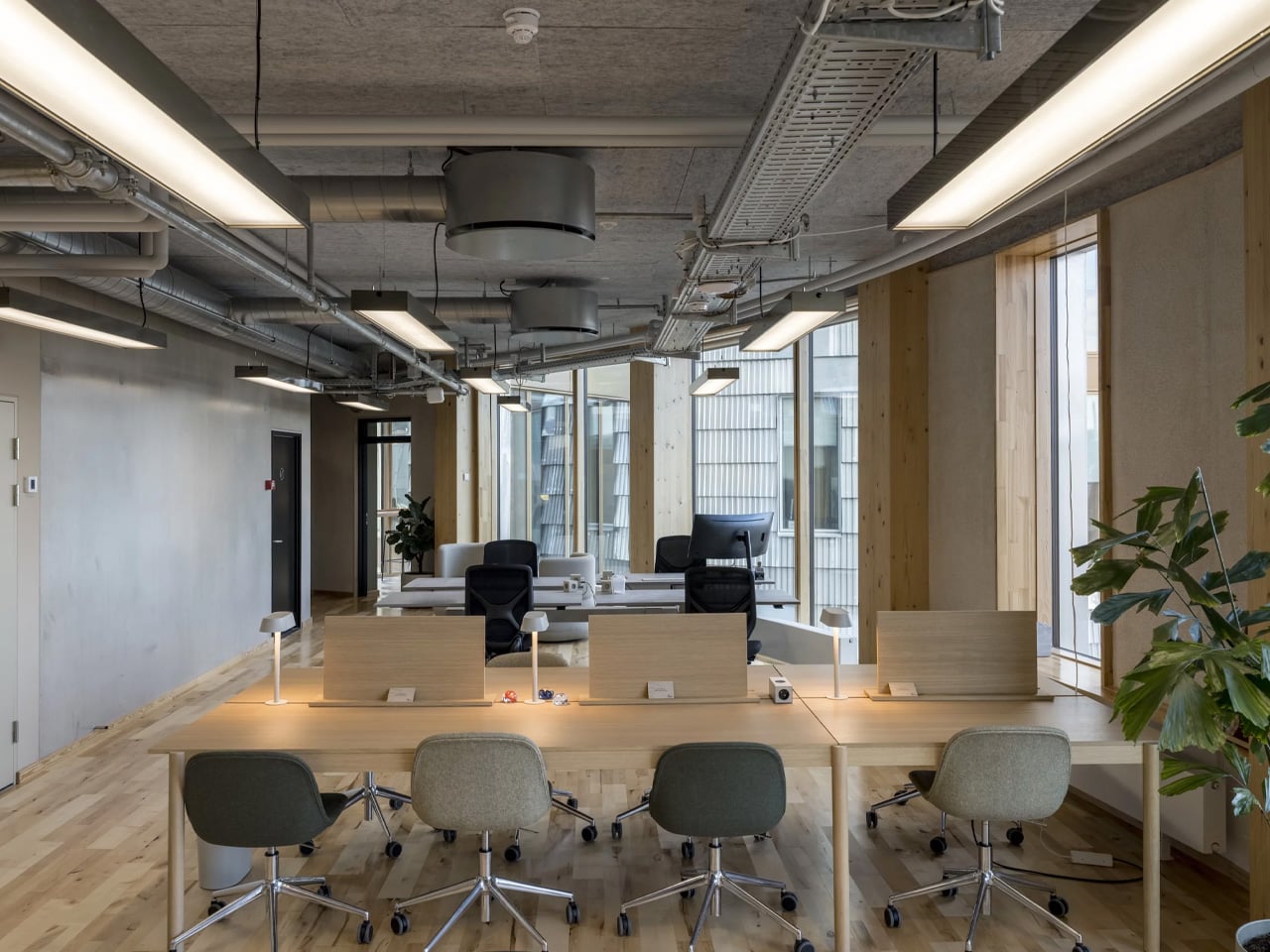
The ambition behind it is disarmingly simple: prove that a tower can be built from waste and wood without sacrificing safety, economy, or quality. What makes TRÆ remarkable isn’t just the height, it’s the conviction. The building operates within two material ecosystems simultaneously: the biogenic and the circular. Mass timber columns, cross bracing, and CLT floor slabs form the primary structure, with low-carbon concrete used only in the cores for fire safety and stability. Everything else is drawn from what already exists.

Designer: Lendager

The façades are the project’s most striking argument. Salvaged aluminium sheets, arranged to evoke the texture of birch bark, mottled, imperfect, alive, clad the exterior in industrial leftovers that feel entirely intentional. Retired wind turbine blades, repurposed as solar shading, line the building’s south-facing elevations. A comparative analysis showed their estimated carbon footprint to be 27 times lower than conventional aluminium solar screens. The math is compelling. The aesthetic is better.

Measured against a conventional concrete benchmark, TRÆ achieved a 26 percent reduction in CO₂ emissions, 21 percent from the timber-led design and 5 percent from integrated reused materials. It’s a number that reshapes the conversation around tower construction, a typology long associated with emissions-heavy concrete and steel. The project doesn’t chase certification checklists. Instead, it follows a value-driven framework that prioritises measurable outcomes from the ground up.

The social dimension is just as deliberate. TRÆ houses a volunteer initiative providing daily meals to families in need, and involves homeless people in the building’s upkeep, folding existing social realities directly into the life of the building. An undulating pedestrian bridge, starting at street level, snakes upward to connect TRÆ to Aarhus’ new highline, threading the tower into the city rather than above it.

The Aarhus Architecture Awards jury awarded TRÆ Best Building in 2025, noting that it “does not necessarily adhere to a classic architectural or beauty ideal” but stands as “an energetic reckoning with well-tested solutions and zero-error culture.” That’s exactly the point. TRÆ isn’t trying to be perfect. It’s trying to be right.

The post TRÆ Is the Timber Tower That Turns Waste Into Architecture first appeared on Yanko Design.
Four Meters by Four Meters: How Tadao Ando Made Constraint Beautiful

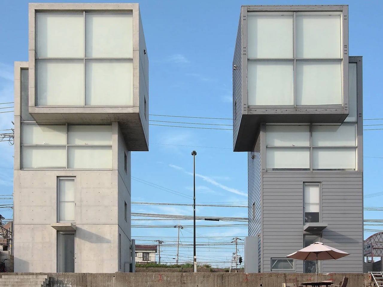
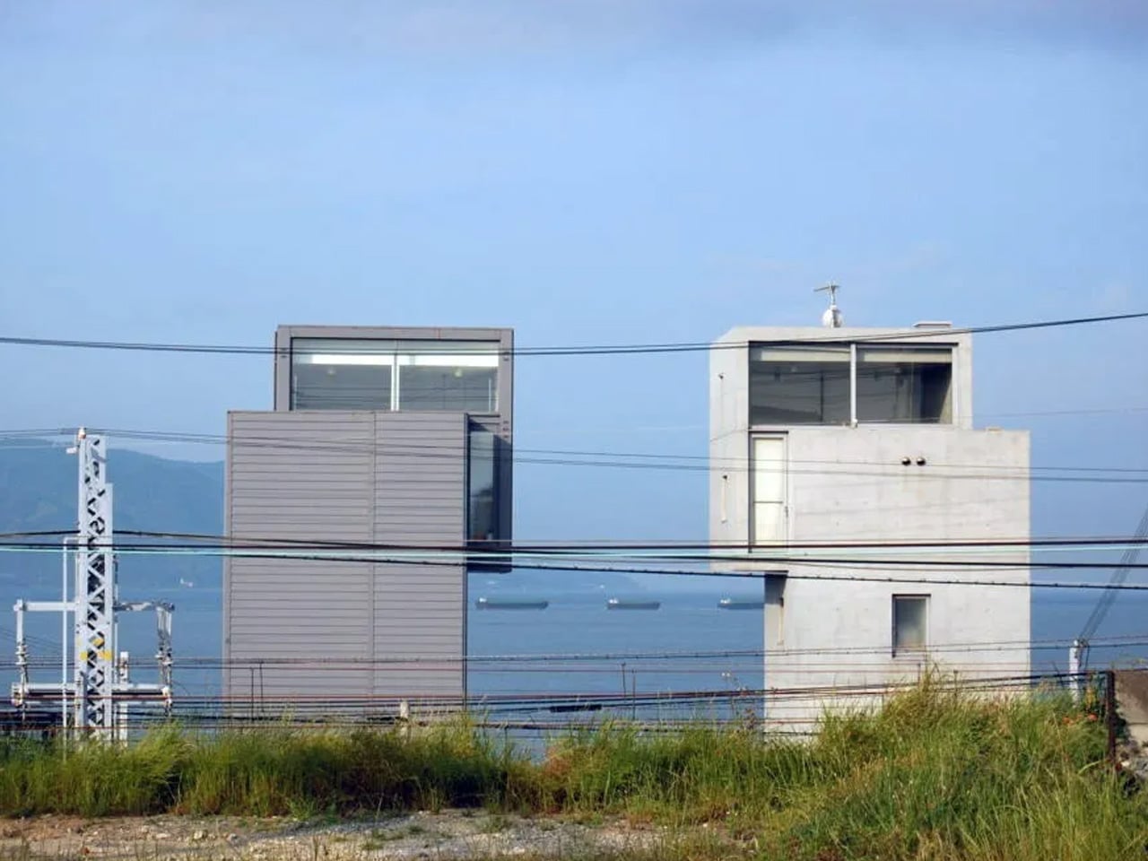
Perched on the coast of the Seto Inland Sea in Tarumi-ku, Kobe, the 4×4 House by Tadao Ando occupies a narrow coastal strip that Japanese authorities had not even considered constructible. That is exactly why Ando built there. Completed in 2003, the house rose in the shadow of the Great Hanshin earthquake, a catastrophe that reshaped the region and the consciousness of everyone who lived through it. Ando’s response was not to build bigger or safer in the conventional sense.

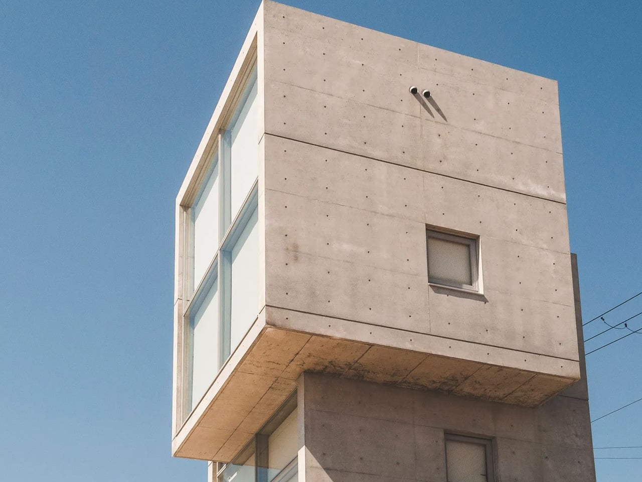
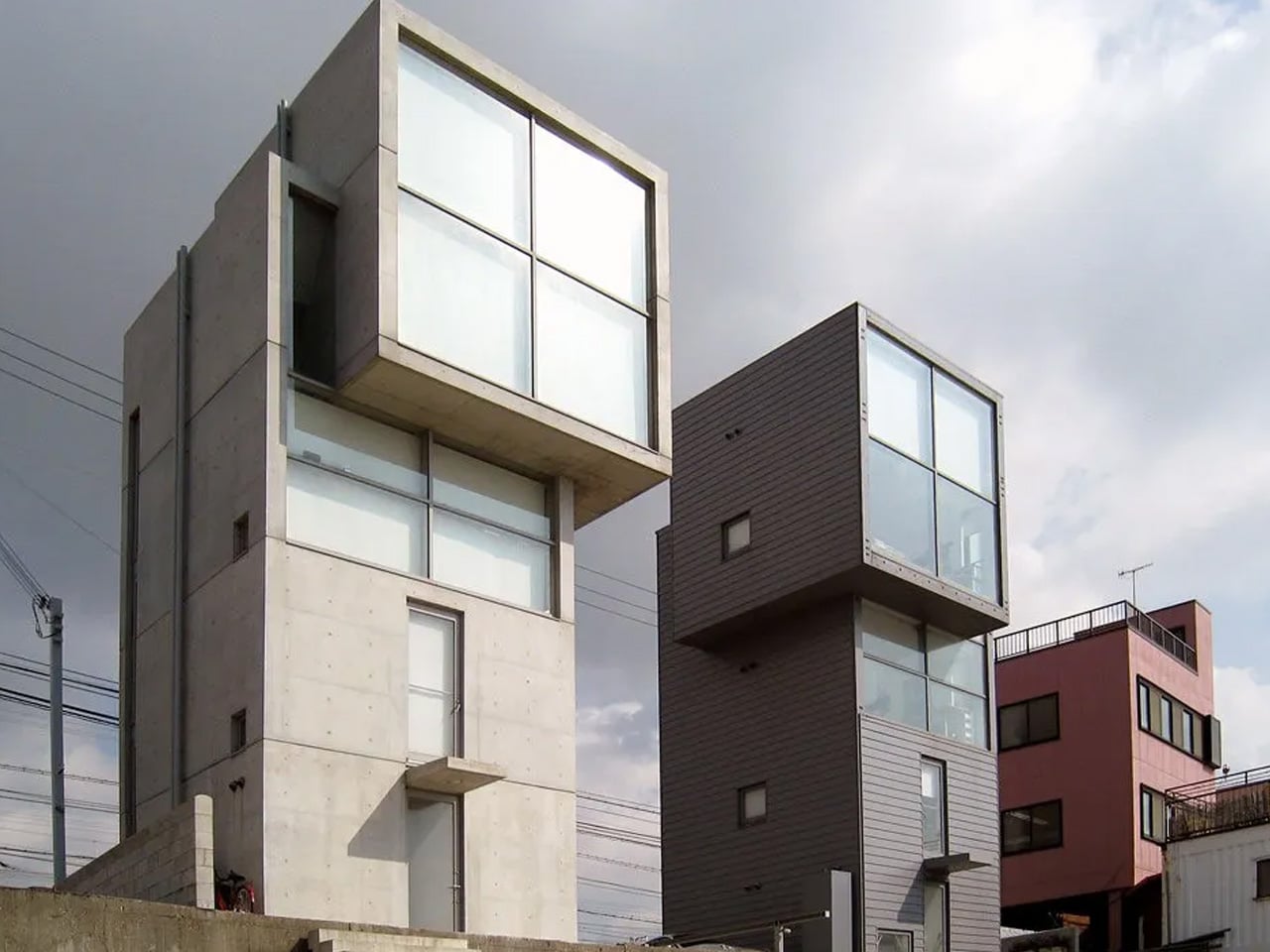
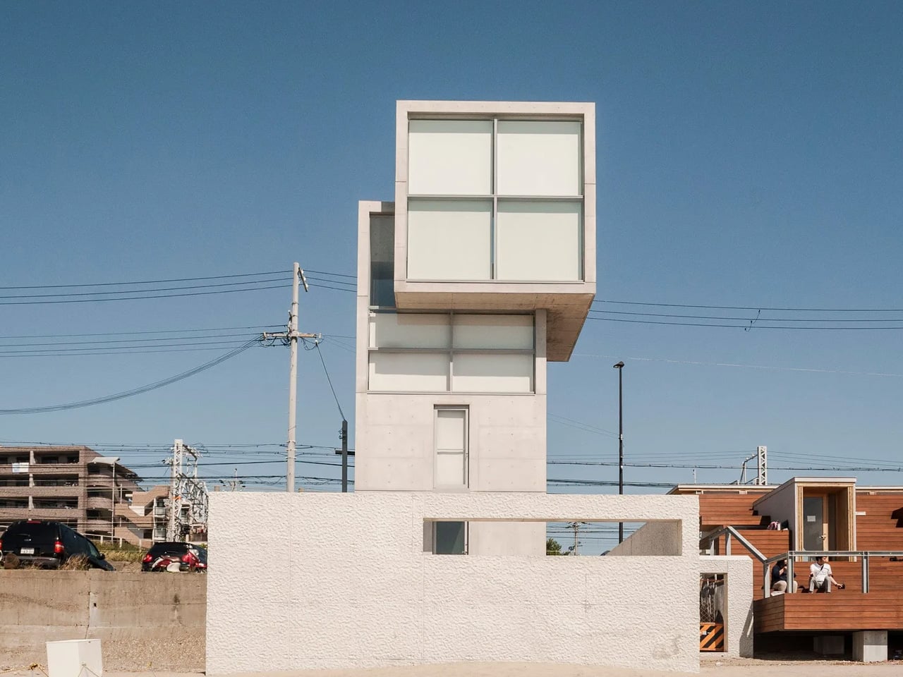
It was to build with precision — a four-story reinforced concrete tower with a footprint of just four meters by four meters. Sixteen square meters of floor area, multiplied upward toward the sky. The name is the blueprint.

Designer: Tadao Ando

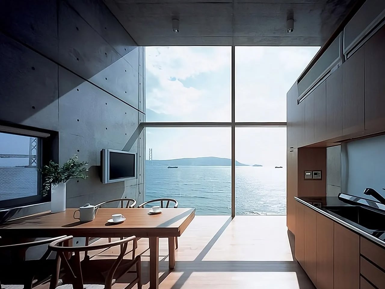
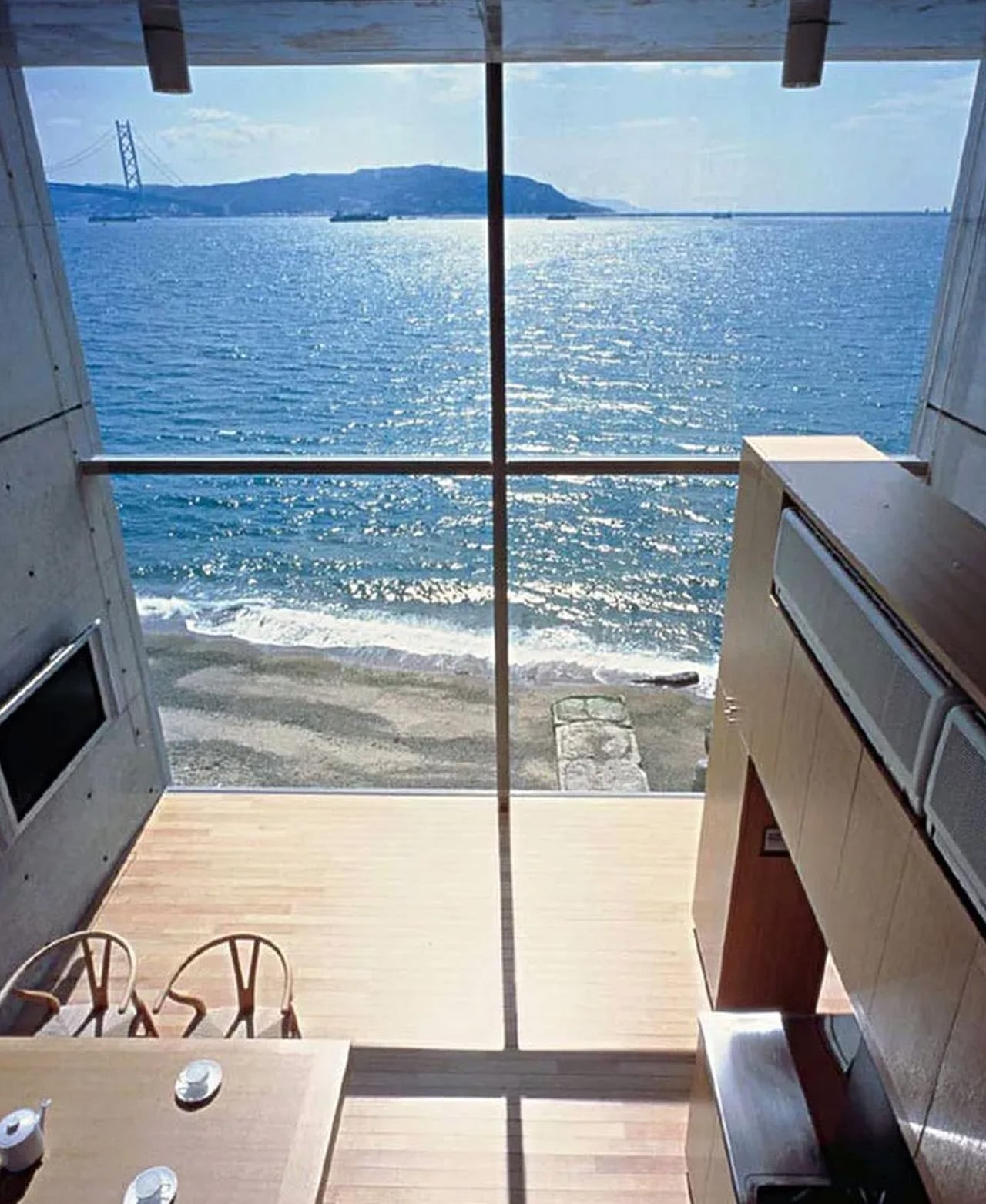
At 13.4 meters tall, the structure reads less like a residence and more like a sentinel. Its silhouette evokes a watchtower — upright, deliberate, scanning the horizon. Ando sank the foundations deep into the ground to resist lateral forces, and at the base, a square concrete patio disappears beneath the waterline when the tide comes in. The boundary between architecture and ocean is intentionally blurred. Living here means accepting the sea as a roommate.
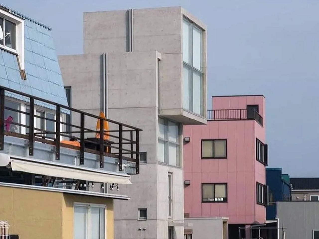
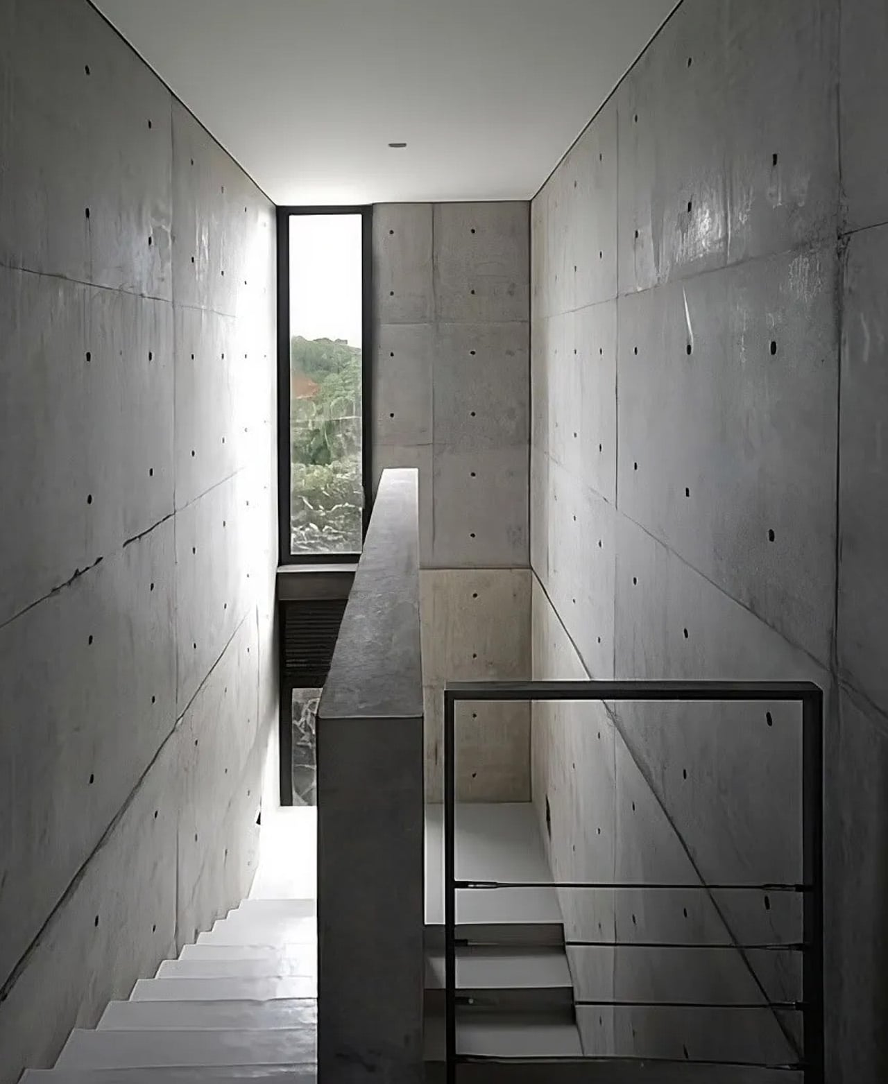
The interior climbs through a vertical sequence of rooms, each floor stacked with the discipline of a column. What makes the composition unusual is the top floor — a cube shifted slightly off-axis from the floors below, a geometric move that feels almost offhand but transforms the entire silhouette. Light enters in controlled bursts. Views are framed like paintings. Nothing is accidental.

Not long after the first house was finished, a second client commissioned Ando to build an identical tower on the neighboring plot. The result is a pair of concrete twins standing side by side on the coastline, same in form but different in material — a duality Ando had quietly envisioned from the beginning. The two buildings share no physical connection. They stand together, facing the sea, as if in silent conversation.

The 4×4 House is not a comfortable building in the traditional sense. It is a provocation — a proof that constraint, when embraced fully, becomes its own kind of freedom. Ando took a strip of coastline that the city had written off and turned it into one of the most discussed residential structures of the 21st century. Sixteen square meters at a time.

The post Four Meters by Four Meters: How Tadao Ando Made Constraint Beautiful first appeared on Yanko Design.