It’s been 18 years since the last Metroid Prime game, but I felt right at home in Metroid Prime 4: Beyond. Almost too at home. Whether fighting my way through a volcano, exploring a research base in a frozen tundra or getting lost in a vast desert, I couldn’t shake the feeling I’d done this before. As the fourth game in a series, that’s not a huge surprise, but it was my main disappointment in Metroid Prime 4: Beyond. Think about the leap Nintendo took going from 2011’s The Legend of Zelda: Skyward Sword and 2017’s Breath of the Wild. They were both recognizably Zelda games, but Nintendo redefined what that means between those two games.
No such reinvention has happened with Metroid Prime 4: Beyond. But that doesn’t mean it isn’t a great time — it executes the template for a Metroid Prime game extremely well. It’s thrilling to see the series finally make the jump to HD, iconic bounty hunter Samus Aran has some intriguing new powers, there’s a badass motorcycle to shuttle her around the game’s open world hub and the game’s design and art direction show Nintendo at its best. It's everything you’d expect from a Metroid Prime game — no more, no less. Whether that’s a good thing is up to you to decide.
If you haven’t played the previous Metroid Prime games before, fear not. There isn’t anything story-wise that you need to know before you jump into this adventure. As with all Metroid games, you take control of acclaimed bounty hunter Samus Aran, an ultra-powerful warrior with a mechanized suit full of fun tricks. The vast majority of the game takes place in first-person view where you can lock on to the many creatures trying to kill you and blast away with an ever-expanding arsenal. The other main interface is your scan visor, where you can learn about your surroundings and enemies to find weaknesses and figure out what you need to do to advance.
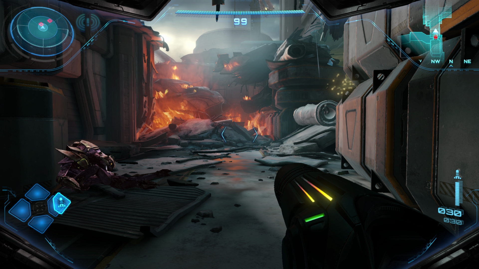
Beyond throws you right into a firefight that serves as a solid tutorial for the game's varied control schemes. A Galactic Federation outpost is under attack, and Samus flies in to help defend the troops and keep a secret artifact safe. This somewhat bombastic intro is a great way to show off the Switch 2's power. Sure, we're not talking about a PS5 Pro here, but this is perhaps the most visually-advanced game Nintendo has released. With a Switch 2 docked to a TV, you can play it at either 4K / 60fps or 1080p / 120fps (in handheld mode, that drops to 1080p or 720p with the same frame rates). I don’t have a huge TV, so I mostly went with “performance mode,” but in either case the game felt extremely fluid with no frame rate drops and looked outstanding.
The game starts as Samus Aran flies in to help the Galactic Federation fight off an invasion, and that opening cut scene shows off with some HDR-enhanced explosions and a detailed environment of a space base in chaos. There are little fires and explosions everywhere; it's visually busy but in a good way that serves the setting, and it all looks vibrant and life-like. As with basically all Nintendo games, Metroid Prime 4: Beyond isn't aiming for realism, but it's closer to a game like Horizon Forbidden West or Cyberpunk 2077 than any other Nintendo titles I can think of. Things like the textures of metal installations, the leaves on alien trees or Samus' gloves all have a level of textural detail you don't usually see in Nintendo's games. Often, that's due to a conscious art direction choice to go in a more cartoonish direction, but the Switch 2's hardware is helping make the game as lifelike as possible.
(Note that Metroid Prime 4: Beyond is also available on the original Switch. I didn’t play it there so I can’t comment on how things like frame rates and textures hold up on that much older console. If you’re thinking about trying this game on the first Switch, it’s probably a good idea to see how other reviewers find that experience before shelling out $60.)
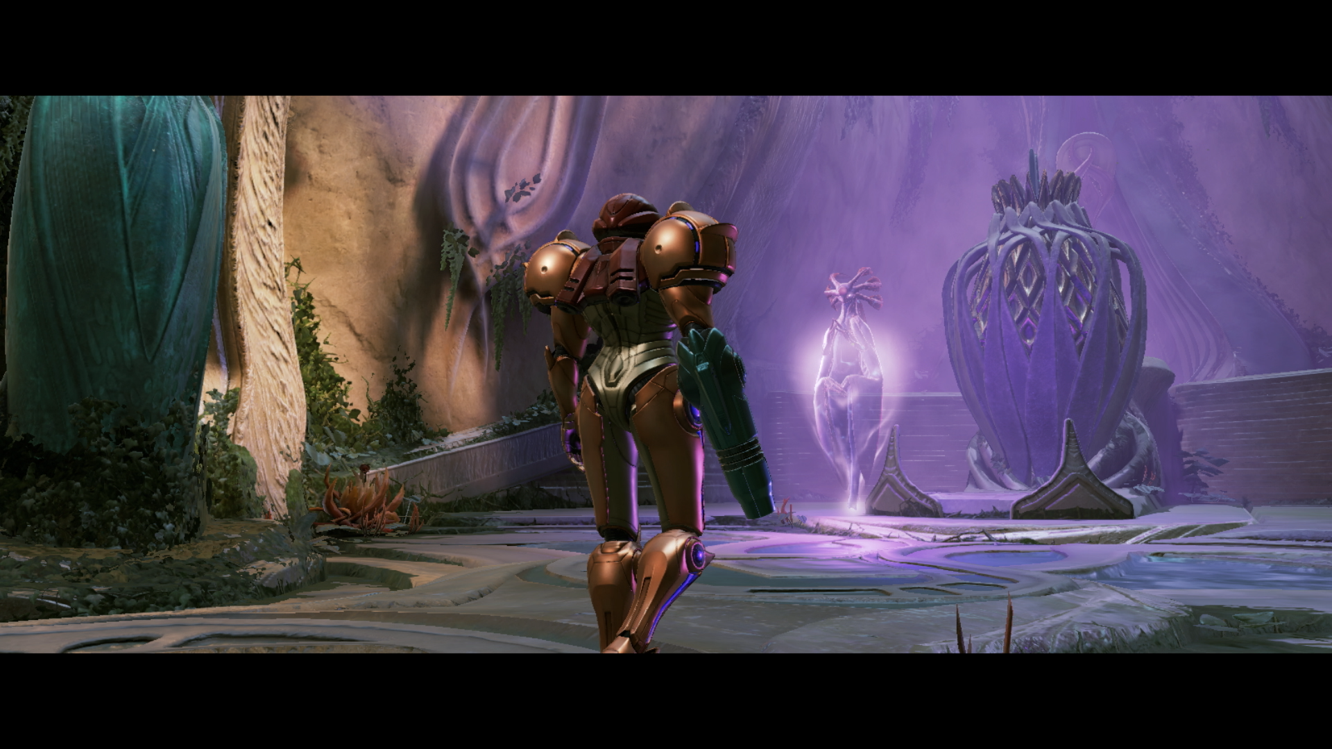
The aforementioned intro sets up the big conflict in Beyond. As Samus comes in to try and help the troops defend a mysterious artifact, the game’s big bad Sylux shows up and everything hits the fan. Samus and some other Galactic Federation forces are mysteriously transported to the planet Viewros, where Samus comes into contact with a near-excinct society called the Lamorn. A Lamorn elder telepathically pleads with Samus to try and save the society from being totally forgotten — indeed, she may be able to bring them back from the brink of extinction if all goes well. They’ve been waiting for a “chosen one,” you see, and Samus is naturally it.
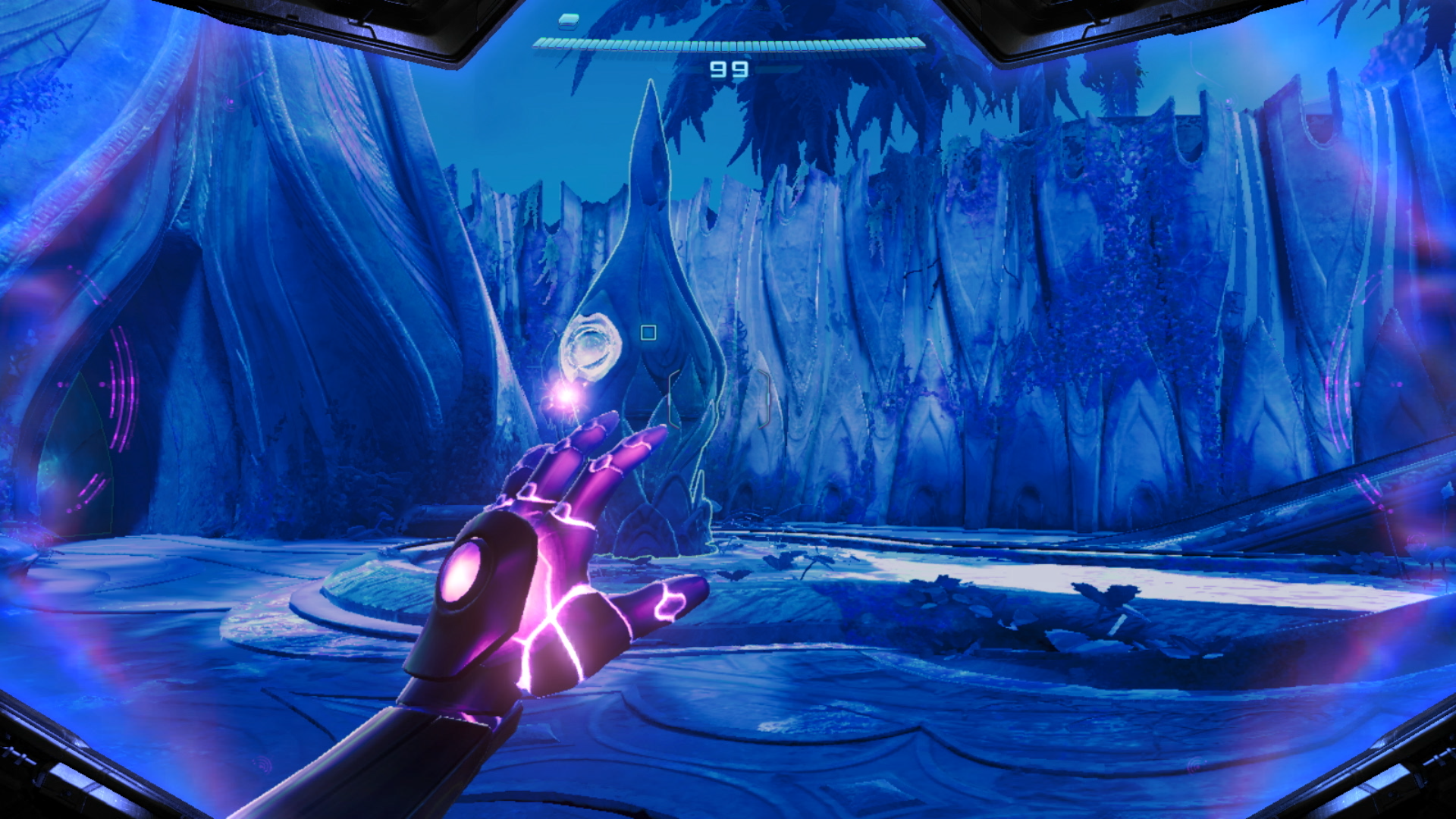
As part of this intro, Samus gains her signature new physic powers in Beyond. These allow her to interact with otherwise-hidden parts of the environment to solve puzzles. The most significant is the Control Beam. When you charge your arm cannon while in the psychic scan visor mode (a slight tweak on the environmental scanning feature that has been a major part of all Metroid Prime games), you can fire a beam that slows time down and can be controlled with the right joystick. That means you can pass the Control Beam through multiple targets, something you’ll need to do periodically to weaken enemies or unlock the way forward.
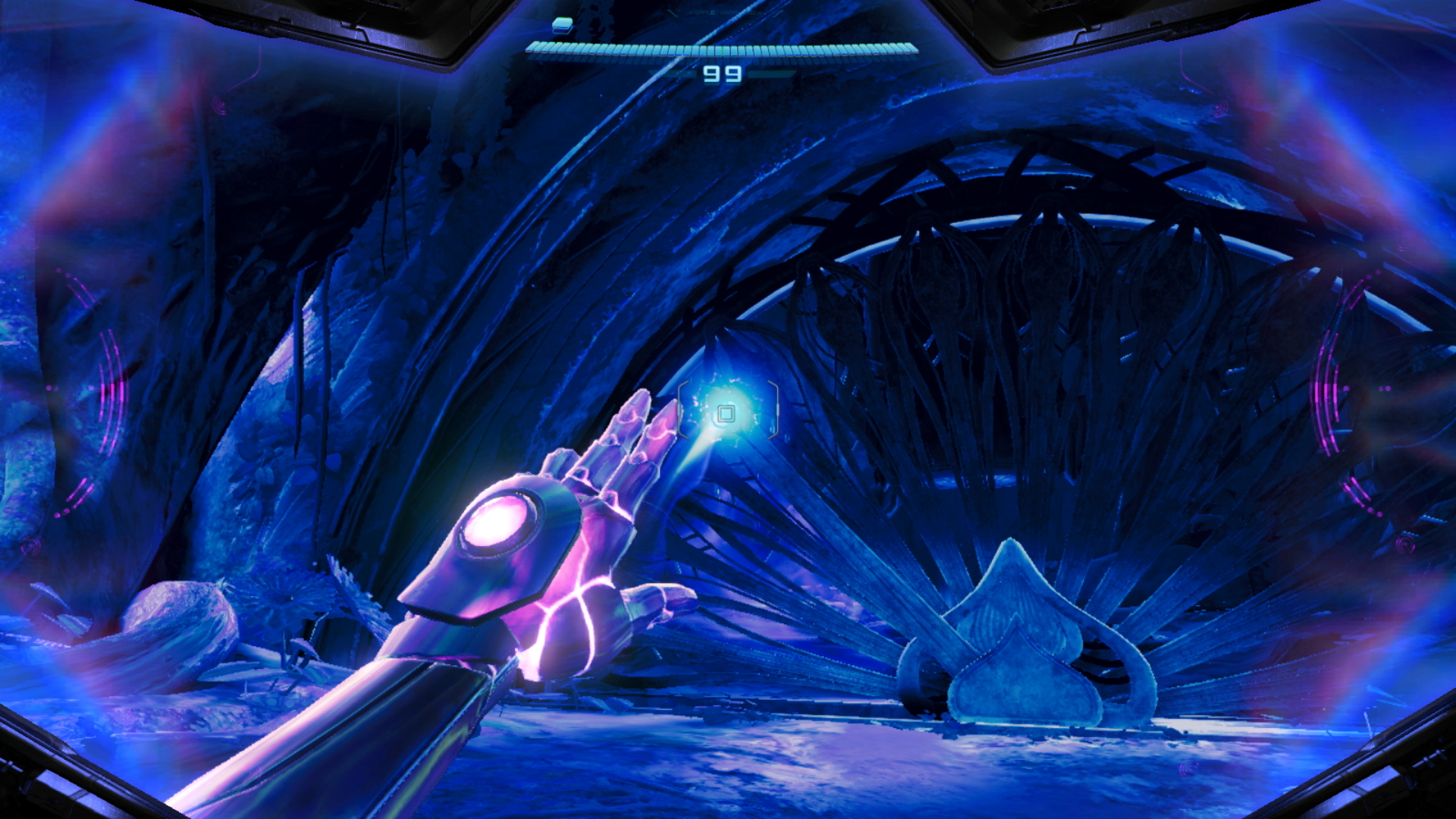
For the most part, though, the psychic powers besides the beam are just repackaging of already-familiar tools. Metroid veterans will be familiar with the Spider Ball, an upgrade to the Morph Ball that lets Samus magnetically attach to tracks that help her get to out-of-reach areas. In Beyond, you instead get the “Psychic” Spider Ball — that does essentially the same thing. Occasionally, you’ll find Psychic Ball Tracks that you have to scan to reveal; they’ll then blast Samus into a secret area that usually has a weapon upgrade or energy tank. Even Samus’ main weapon gets a fancy “Psychic Beam” name — but the description of it in the inventory admits that it’s the same weapon. “The Psychic Beam’s strength and performance are equal to the standard Power Beam.” While the Control Beam adds a fun wrinkle to the gameplay, the psychic abilities don’t otherwise change the Metroid Prime formula in any significant way.
The main task Samus faces is collecting five Teleporter Keys that can get her off the planet. Those keys are hidden in various environments around Viewros that are all connected by Sol Valley, a large desert that holds lots of upgrades and side quests that you’ll need to clear to advance in the game. The desert is more of a hub than an open world — there are small areas to explore dotted around it, but the main action happens in places like Ice Belt, Volt Forge, Flare Pool and several others you’ll find your way to as you collect those teleporter keys.
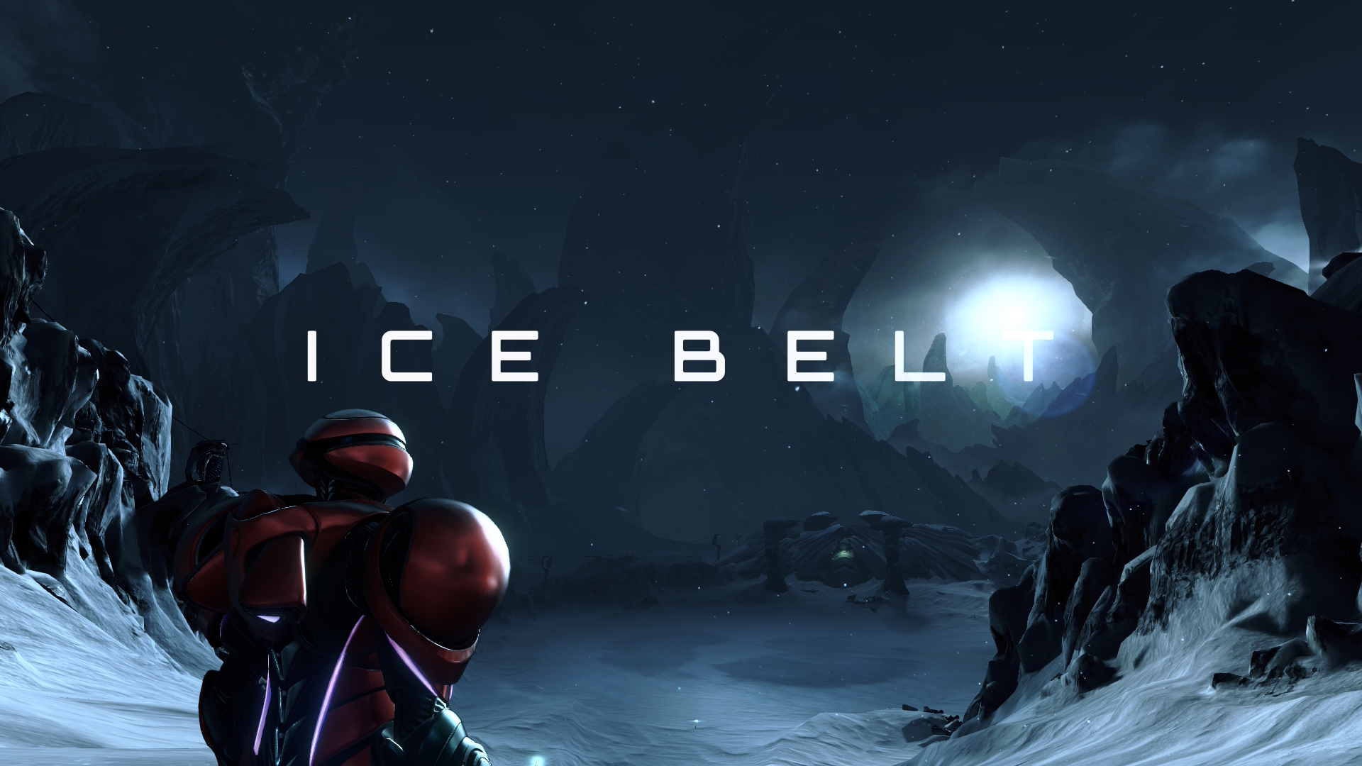
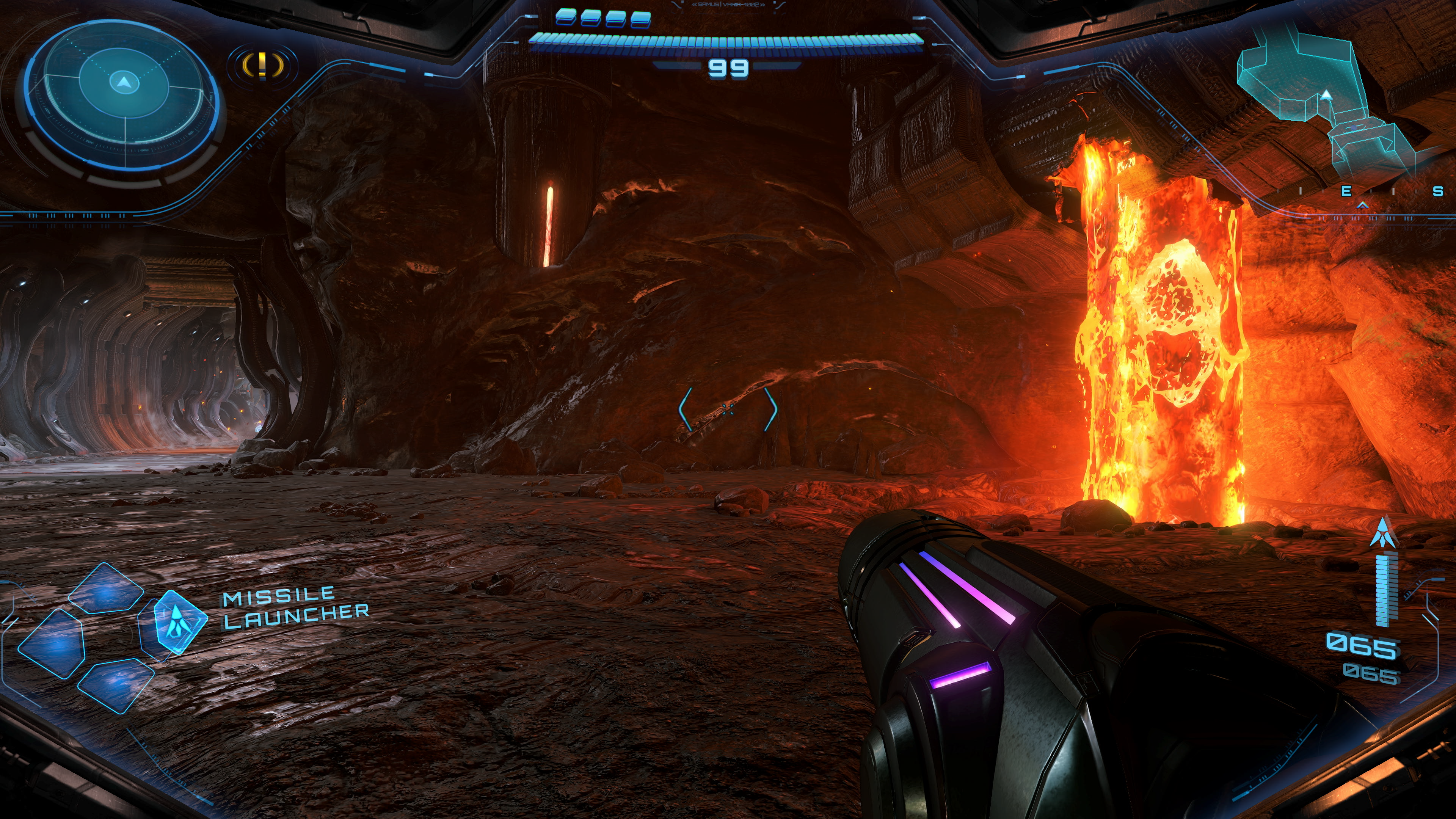
As those names suggest, Ice Belt is a frozen area where you explore an abandoned research facility, while Flare Pool is inside of a volcano. And, as you might expect, you’ll need certain weapons to advance in those areas. In addition to her standard beam and missile weapons, Samus collects the obligatory freeze ray and fire blaster sort of weapons. This is where the game really started to remind me of the original Metroid Prime — the three elemental weapons she collects are essentially the same as those in the first game, and environments like a frozen wasteland or a fiery volcano are nearly identical to ones you’ll find in that game. The Lamorn, meanwhile, reminded me a lot of the departed Chozo tribe you’ll find on Tallon IV in the first Metroid Prime. Of course, that game came out all the way back in 2002, and Metroid Prime 4: Beyond will likely be the first game of the series many play. A little recycling of classic elements is forgivable.
That said, I was a bit disappointed that the game has a tightly-scripted flow. After the intro and the first mission on Viewros, you hit the desert with multiple locations where Teleporter Keys are believed to be hidden. But you can’t tackle them in any order you choose. This is a Metroid game, after all, and that means exploring to find powers that let you explore a new area that was previously closed off. Part of me was hoping for the freedom of a game like Breath of the Wild where you could tackle areas in any order you choose. But after playing through nearly the entire game, I appreciate the excellent execution of the familiar formula.
Another thing that’ll be familiar to those who’ve played the older Metroid Prime games is the control scheme. For the most part, you can pick up the controller and get right to it, as the main control layout employs a two-joystick first-person view that should be pretty easy to get the hang of. But there are definitely times where I found myself wishing for more precision. You can lock onto enemies and targets with the ZL button and start blasting away with your chosen weapon, but many of the boss battles require you to lock on to a large creature and then use the right stick to adjust your aim to hit very specific targets. This took some getting used to, because I was used to the lock-on target vulnerable areas. Doing it with a Switch Pro Controller made things much easier, but using the standard Joy-Cons could get frustrating in a hurry. If I was playing in handheld mode, I would often pause before a big battle and wait until I could hook up to my TV and use a proper controller. I’d recommend you do the same — it’ll make for a much more enjoyable experience.
Beyond also offers the option of using one Joy-Con in “mouse” mode for aiming while using the other for moving around. For me, this isn’t a viable option. I tried it a few times and immediately felt completely disoriented and far worse at aiming than I was with the right stick. I can appreciate the idea behind offering mouse-like controls for a first-person FPS game, but it just did not feel well executed. That said, this might be on me. I haven’t played a game with a keyboard and mouse in years; nearly all of my gaming is on a twin-stick controller, so I’m just more comfortable with that setup. I’m thinking about starting from the beginning and seeing how I adapt to mouse mode and will update this review if my opinion changes.
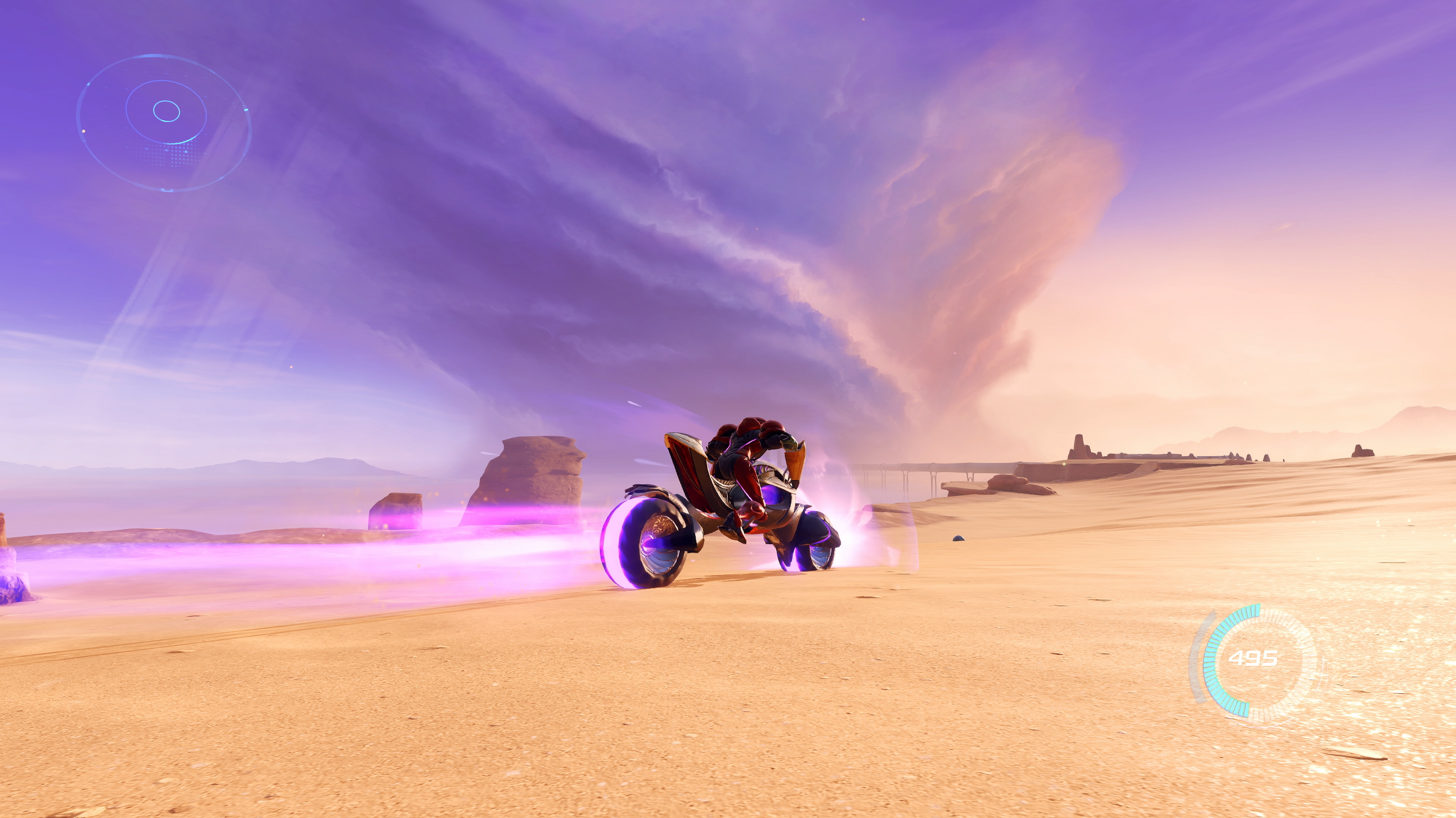
There are a few things that Beyond does that are completely new to the series. The most obvious one is Vi-O-La, the wild robotic motorcycle that Samus rides. You’ll unlock that early in the game, and its primary utility is to get around Sol Valley. For anyone worried that the game is overly focused on an element that admittedly feels a bit anachronistic to the usual Metroid vibe, fear not. You’ll use it a bunch, but it’s more about fast transportation and exploration than something that has detailed mechanics you need to master. There are a few segments where it’s a major part of the mission, but for the most part it’s just another tool in your arsenal rather than something that steals the focus of the game.
The same can be said for the motley crew of adventures you assemble. One of the loudest bits of feedback that came out of the preview Nintendo offered the press a few weeks ago was “what’s the deal with Myles MacKenzie?” You see, in the first hours of the game you come across MacKenzie, a bumbling engineer type who you rescue in the jungles of Viewros shortly after landing on the planet. You then have to escort him around a bit, during which he makes some pretty bad and occasionally obnoxious jokes. This led many who played the preview to worry about MacKenzie shattering the quiet and lonely solitude the Metroid series is known for.
Don’t worry — Samus is on her own for the vast majority of the game. You’ll encounter a few more stranded Galactic Federation soldiers throughout the game, but they usually only stick around for short segments before returning to the home base you establish with Myles. And as for Myles himself, he’ll help upgrade your weapons and is available on the radio to give you hints on where you need to go, something that I honestly didn’t mind. I’d rather have hints at hand than spend all my time wandering lost throughout the vast world of Beyond. But I can also see that the hint system is occasionally too aggressive in dropping details on where to go next.
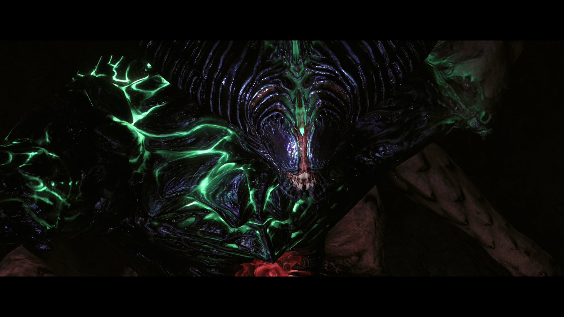
As a seasoned player, Beyond mostly felt challenging but fair. Games in the Metroid Prime series are notorious for moments of serious difficulty, but this one feels a little more forgiving. When battling bosses, there were plenty of ammo and energy drops that helped me even the score. I usually died a handful of times while figuring out my strategy or getting a feel for their attacks, but it wasn’t overly frustrating or tedious. That said, there were two bosses near the end (including the final boss) where the difficult curve spiked in a way that felt completely unreasonable.
There were also a few times when I felt wildly lost, with no useful information about my next step to be found anywhere on the map. Myles told me to find a member of the crew “out in the desert.” And while Sol Valley isn’t the same open-world scale of some bigger games, it’s still a pretty big space to explore without any other indication of where to go. I wasted far too much time riding my motorcycle across dunes aimlessly figuring out where to go. It wouldn’t be a Metroid game if you didn’t get hopelessly stuck at some point, though.
For the most part, I enjoyed the addition of some people helping Samus along her way. It helps flesh out the world of the game in small ways, giving some perspectives on everything going on from people who aren’t ultra-powerful, silent bounty hunters. It did make Samus’ never-ending silence feel a bit awkward, but it also fits with her otherworldly, not-quite-human presence.
In some ways, it’s easy to sum up Metroid Prime 4: Beyond. It’s the Metroid Prime experience, modernized. The graphics are better, the world is bigger, experiences like Vi-O-La and Samus’ psychic abilities offer a greater variety of gameplay experiences. But it’s also very much a Metroid Prime game at its core, with the familiar but effective mix of biomes to exploration, giant enemies to dispatch and weapon upgrades to find. And, of course, there were moments of immense frustration when things just got too difficult, another hallmark of the series. Seriously, the final battle is wildly frustrating. Maybe I just need to get good, but it felt so far out of sync with the entire rest of the game that it almost ruined the fun that came before.
That intense moment of frustration aside, anyone who played earlier games in the series will find a lot to love here. But, they also might be disappointed that Nintendo didn’t push the series further. However, there are also a lot of people who’ve never played a Metroid Prime game in the last two decades or so — those people will find that the formula Nintendo engineered in the 2000s still holds up here. Metroid Prime 4: Beyond is far more unique than your average first-person shooter, it was worth the long wait, and it’s a must-play for anyone who is up for the challenge.