5 EV Charging Designs So Beautiful You’d Actually Want to Stop There

EV charging infrastructure has grown considerably in recent years, but the experience of actually using it rarely gives people much to think about. Most stations are indistinguishable from the utilities they resemble, built for function with little thought for the space they occupy. That’s a missed opportunity in a technology that already asks drivers to rethink a habit as ingrained as stopping for gas.

A series of five conceptual EV charging station designs takes a different view of what that infrastructure could look like. Rather than treating the wait as dead time to get through, they propose something closer to a destination, structures that generate solar and wind energy while also giving people a reason to look twice, and maybe start a conversation about why they’re there.

Designer: Michael Jantzen

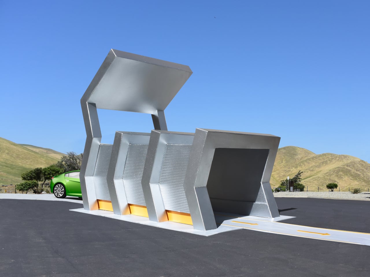
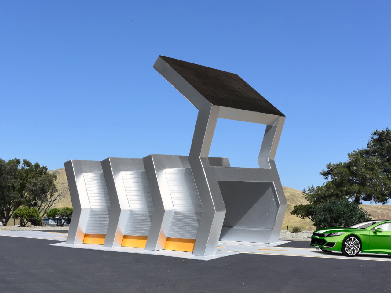
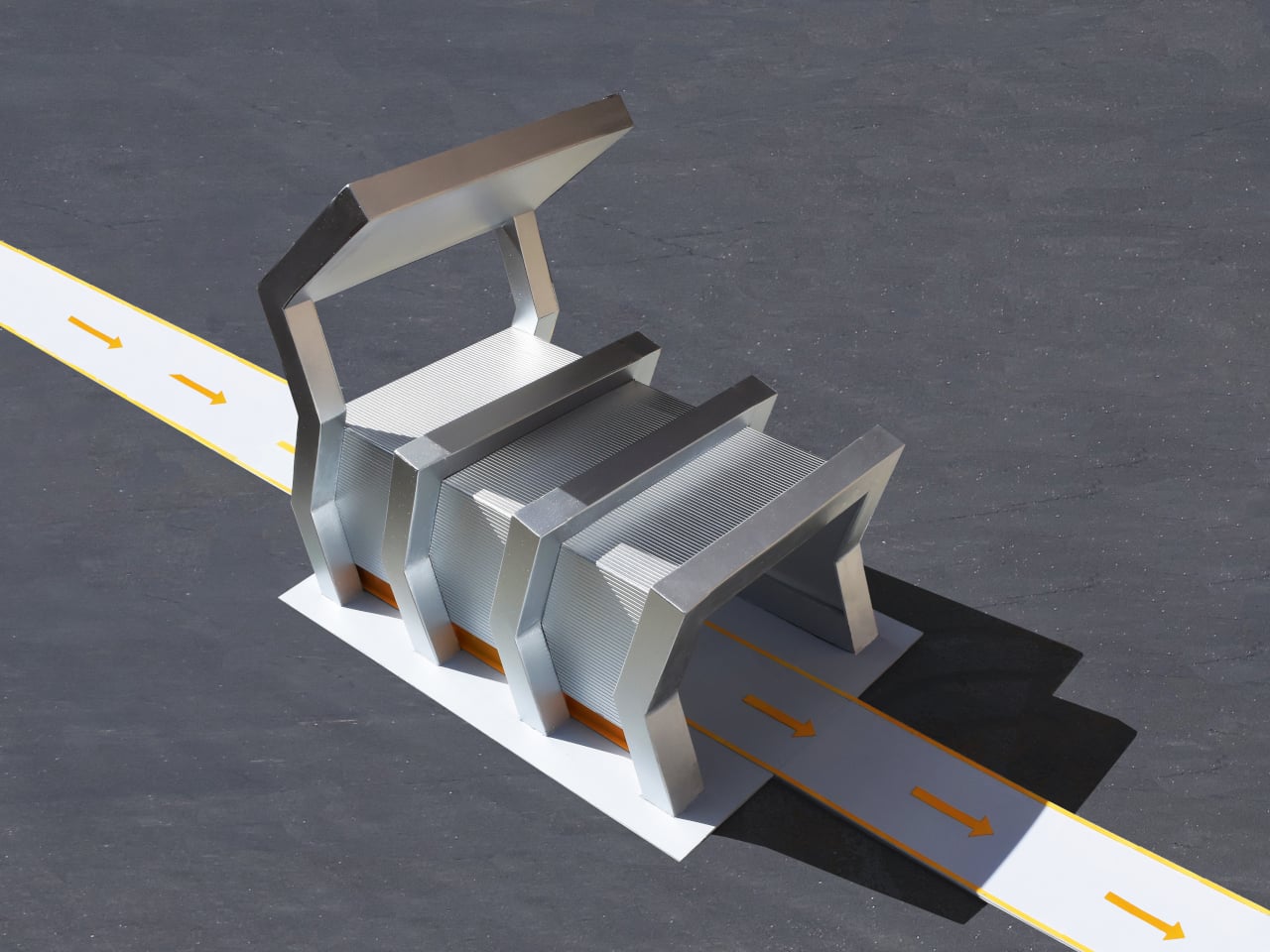
The Silver Solar Charging Station rises as a steel structure with a large photovoltaic panel angled overhead on a tall vertical arm. Drivers pull inside to access the charging connections, sheltered from the weather while the panel converts sunlight into electricity stored directly in connected batteries. The charging bay is practical, though the frame around it looks nothing like anything built with that purpose in mind.

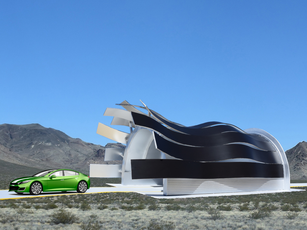
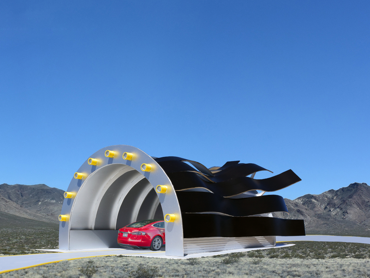
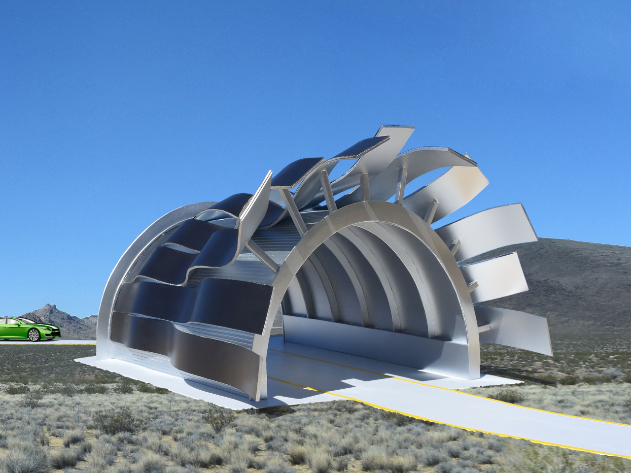
The Black Waves Solar Charging Station shares the drive-in shelter principle but trades angular geometry for something far more fluid. Ribbon-like steel sections curve and undulate overhead, each covered in photovoltaic panels. The design functions exactly like the others, but the wave-like form overhead gives drivers something to look at while they wait, the kind of structure that prompts questions before it answers them.

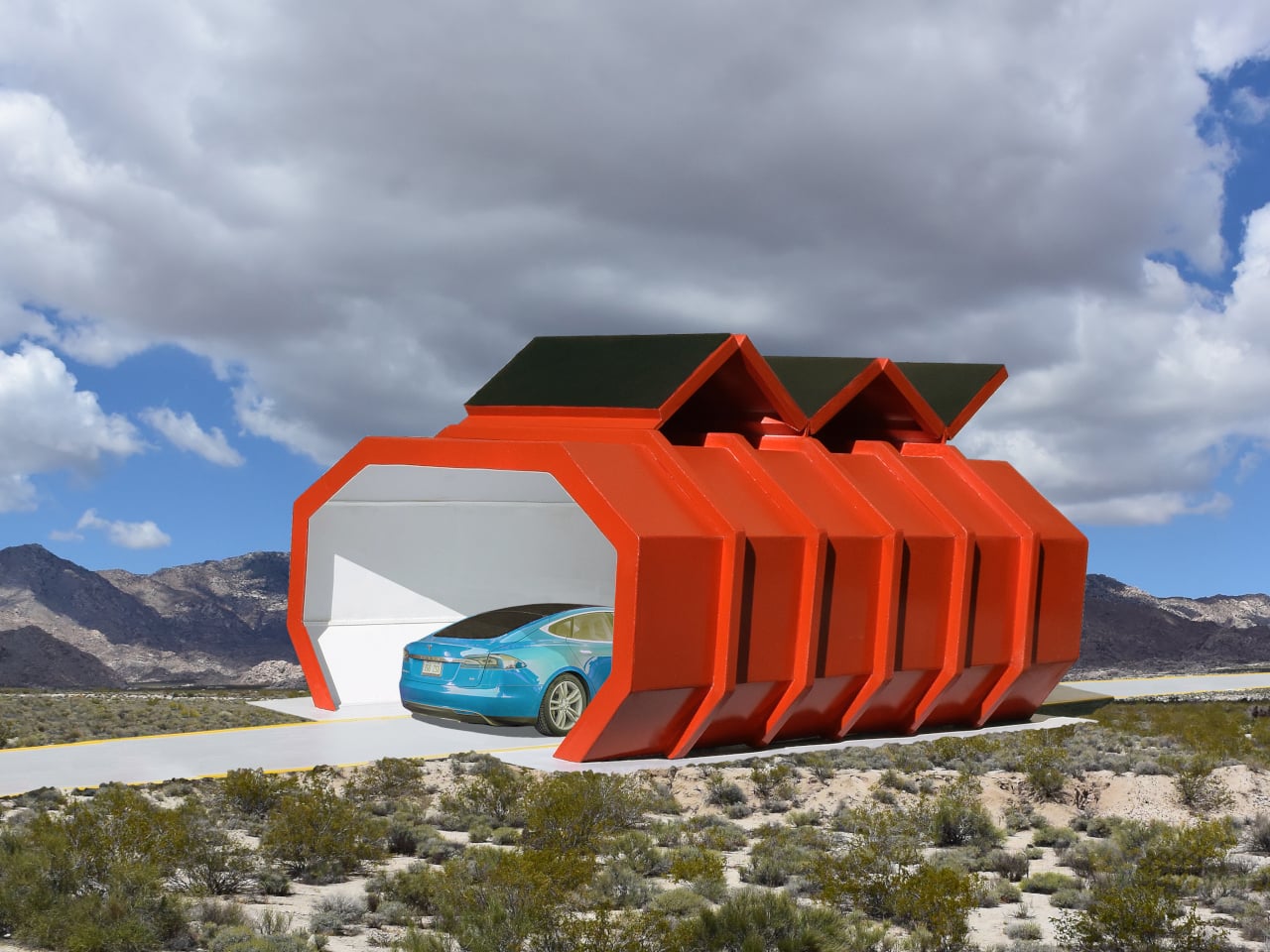
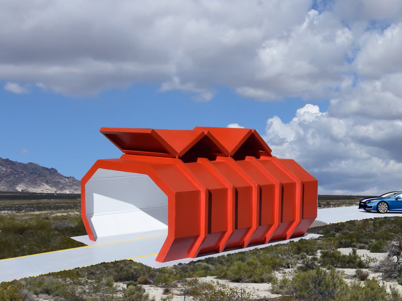
The Red Solar Charging Station doesn’t try to blend in. Its vivid color marks it on the horizon well before you reach it, and the zig-zag arrangement of solar panels on top gives the structure a jagged, almost aggressive silhouette that contrasts with the smooth drive-through tunnel below. The photovoltaic cells are fully functional, drawing power from sunlight to feed the charging points inside.

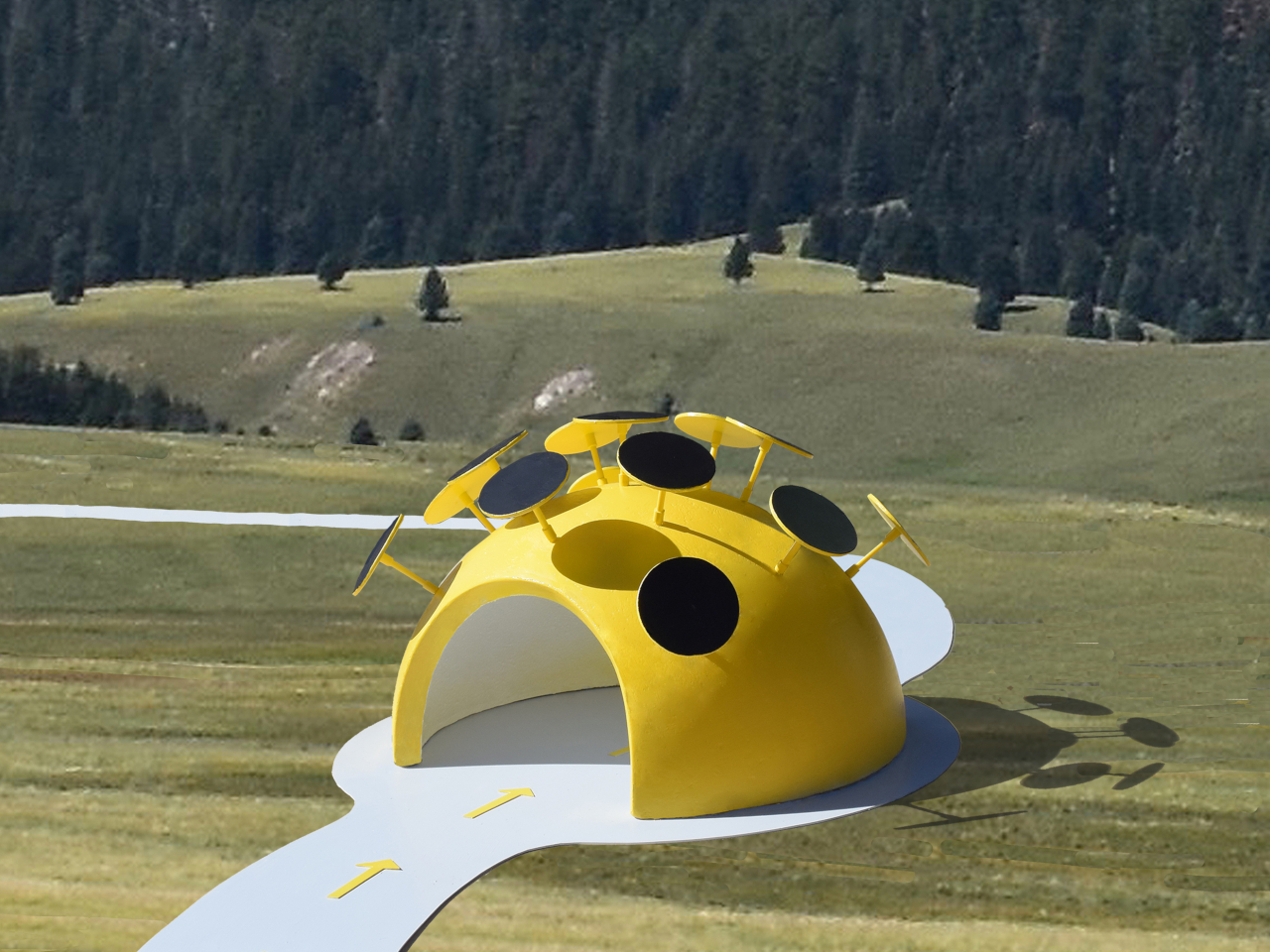
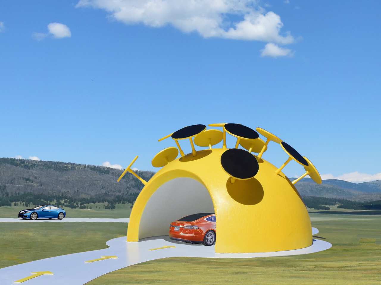
The Yellow Solar Charging Station takes a completely different approach to form. An arched dome made from eco-friendly concrete composite curves over the charging bay, painted in the kind of yellow that reads clearly from across an open field. Circular disc-shaped photovoltaic panels are mounted in a ring around the crown of the dome, turning the roof into something that looks as deliberate as the structure below.

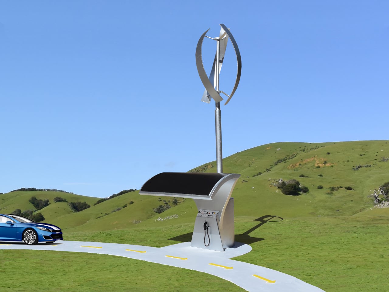
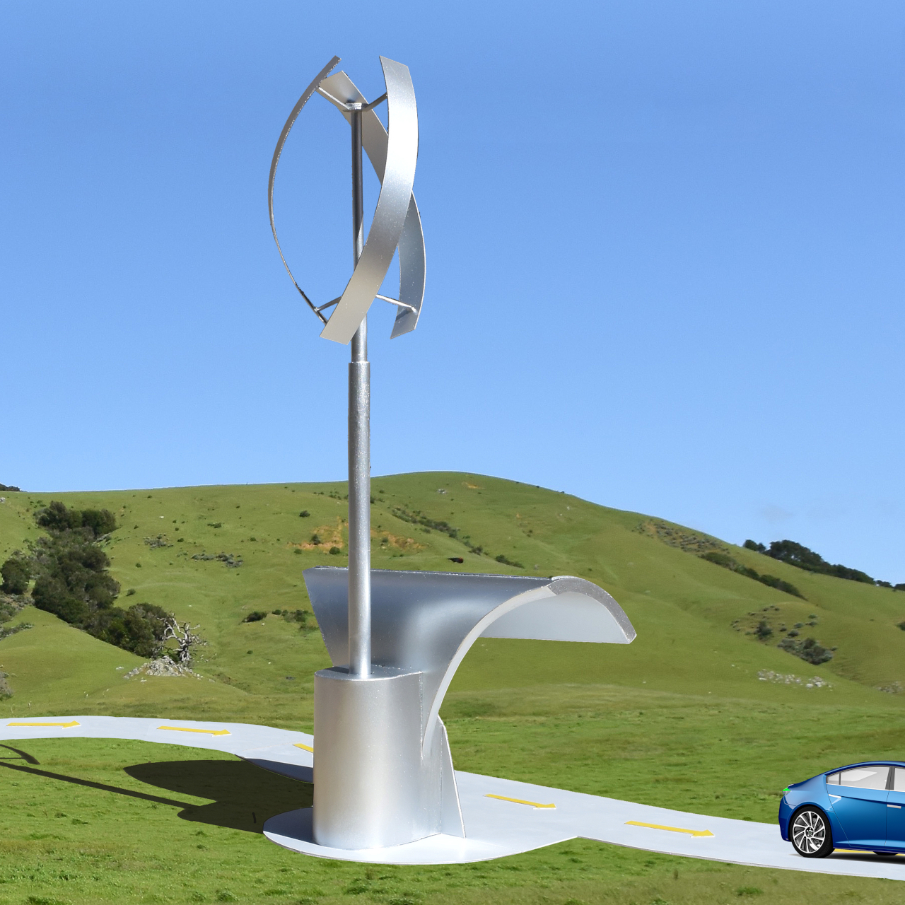
The Solar Wind Charging Station breaks from the others in one important way: it isn’t designed to be driven into. Cars pull alongside it to access the charging points while the station itself stands as a tall sculptural object, a curved photovoltaic panel at its base and a vertical-axis wind turbine rising above. It draws from both sun and wind, storing electricity in batteries for continuous output.

All five sit somewhere between infrastructure concept and large-scale sculpture. The thinking behind them is that a charging station people actually stop to look at can do something a plain utility box never could. It places the shift from gasoline to electric into visible, physical form, turning an ordinarily forgettable errand into a small but deliberate presence in public space.

The post 5 EV Charging Designs So Beautiful You’d Actually Want to Stop There first appeared on Yanko Design.

Most Homes Are Built to Last 10 Years. These 5 Designs Are Built for 100

Slow architecture asks a simple but powerful question: should buildings be designed for short-term trends or for the next hundred years?
At a time when much of construction is driven by speed, cost-cutting, and fast-changing aesthetics, this approach brings the focus back to durability, function, and long-term value. True luxury today is not excess, but the ability of a space to remain useful, relevant, and well-crafted over time.

Designing for a 100-year lifespan means making smarter choices from the start, from honest materials and adaptable layouts to lower environmental impact and easier maintenance. It turns architecture into a lasting asset and not just a temporary product. The five principles ahead explore how thoughtful, future-ready design can create buildings that perform better, age beautifully, and continue to support everyday life for generations.

1. Build with Materials That Last

A long-lasting building starts with materials that can handle time, weather, and daily use without losing their value. Stone, solid wood, brick, and other durable natural materials often perform better over decades than finishes chosen only for appearance. They need fewer replacements, age more gracefully, and usually reduce long-term maintenance costs. Instead of designing for quick upgrades, this approach creates a stronger, more reliable building envelope that can stay relevant for generations.

These materials also improve how a space feels in everyday life. The texture of timber, the weight of stone, and the character that develops over time add warmth and authenticity that synthetic finishes often cannot match. They create interiors that feel grounded, calm, and connected to nature. Choosing fewer artificial materials can also lower environmental impact while helping the building remain practical, beautiful, and honest for years to come.
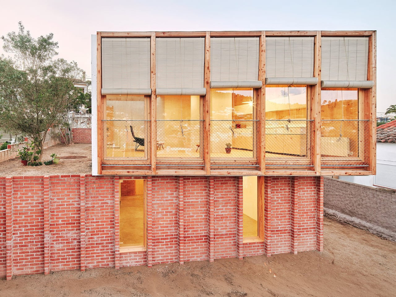
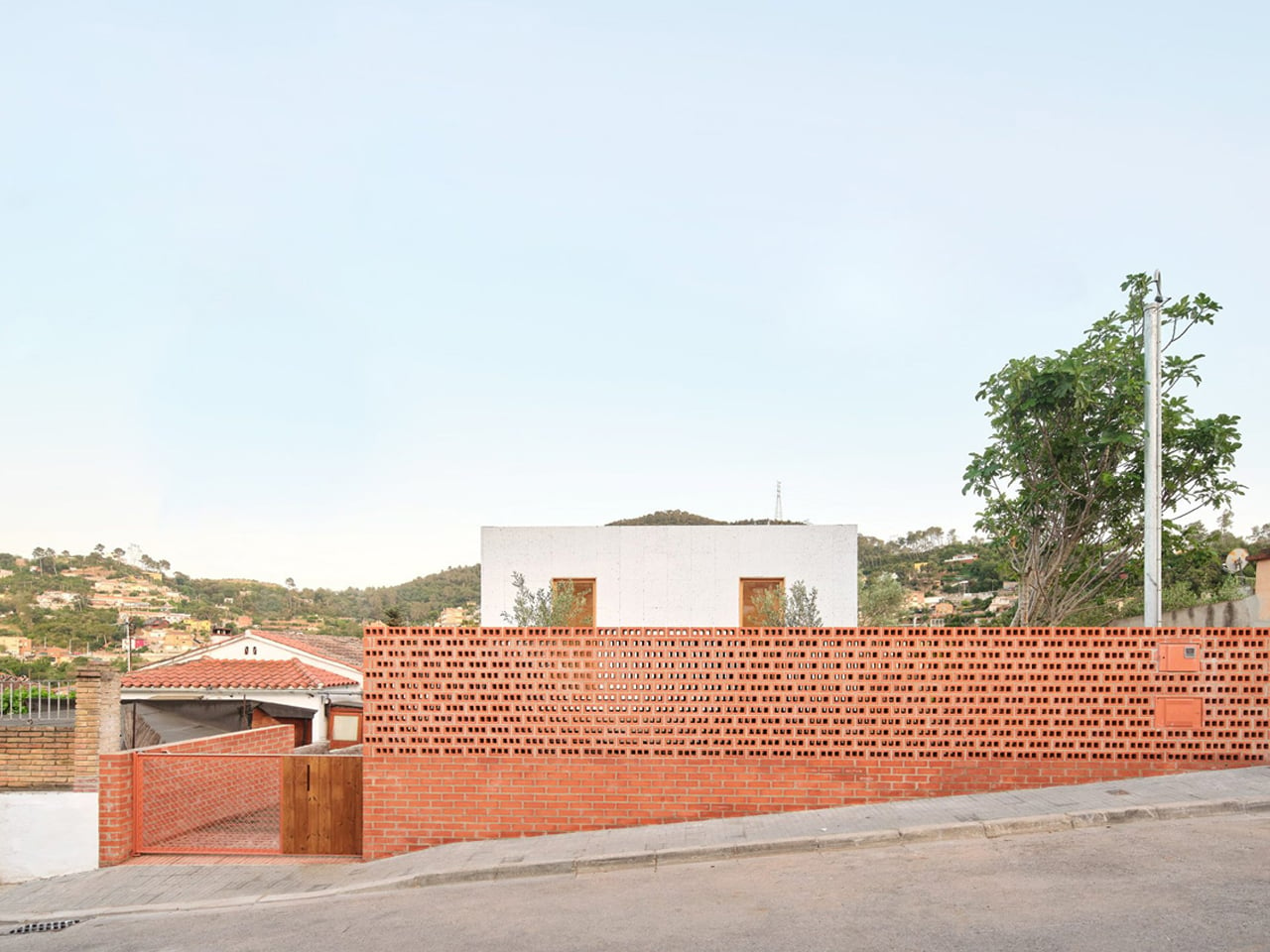
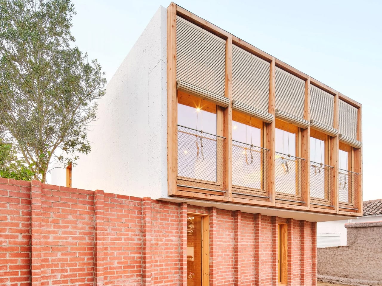
Spanish studio Agora Arquitectura redesigned a neglected agricultural site on the outskirts of Barcelona by transforming a ruined red-brick structure into the foundation for a contemporary raised home. Named House on a Brick Base, the project preserves the character of the original building while introducing a new layer of living above it. Instead of demolishing what was already there, the architects restored the old brick shell and extended its presence across the site, turning a forgotten structure into a meaningful architectural anchor.
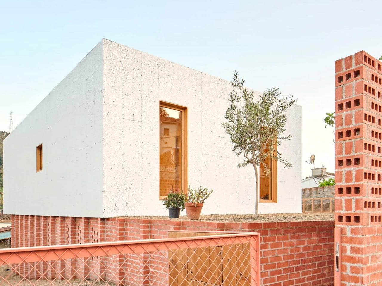
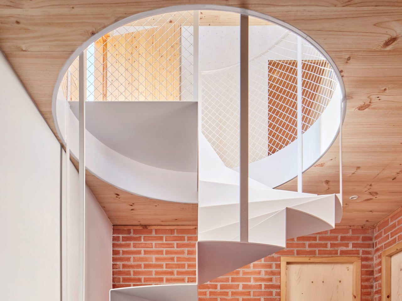
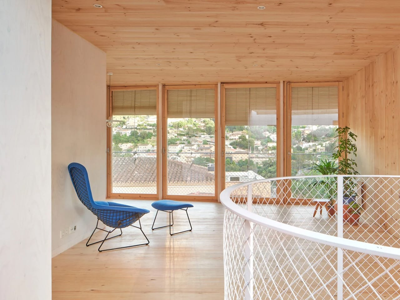
The lower brick volume is organized by two perpendicular walls that divide the interior and structurally support the timber addition above. A perforated brick boundary wall, outdoor staircases, and a sloped access route create a carefully choreographed arrival, leading visitors past a century-old olive tree before entering the home. Above, the new volume is built from prefabricated cross-laminated timber and clad in whitewashed cork, combining warmth with sustainability. Large windows, a steel spiral staircase, and a generous skylight bring daylight deep into both levels, creating a strong visual dialogue between old masonry and new timber.

2. Design Spaces That Can Change Over Time

A home built to last 100 years should not be locked into one lifestyle or one stage of life. Flexible planning makes it easier for spaces to adapt as needs change, whether that means creating a home office, adding privacy for older family members, or reworking rooms for future use. Features like non-load-bearing walls, practical room sizes, and good ceiling heights make these changes easier without major structural work. This keeps the home useful and relevant for much longer.

Adaptable design also improves everyday comfort. When the layout is planned well, rooms can shift in function without feeling awkward or disconnected. Good natural light, smart circulation, and strong core services like plumbing and electrical systems help the home work smoothly even as it evolves. Instead of becoming outdated, the house stays functional, resilient, and ready to support different ways of living over time.
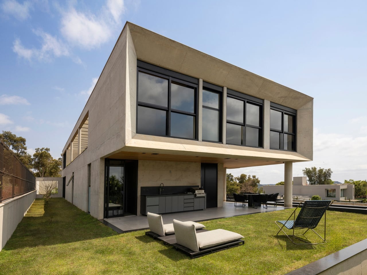
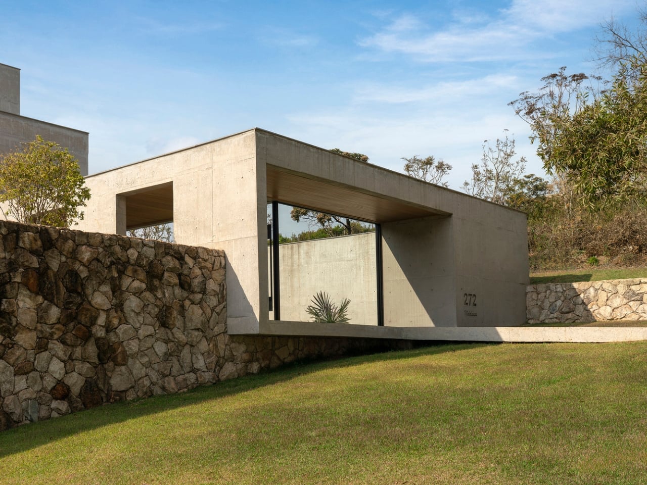
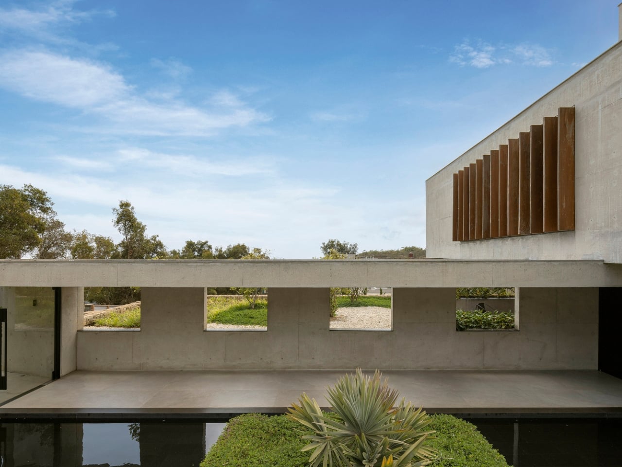
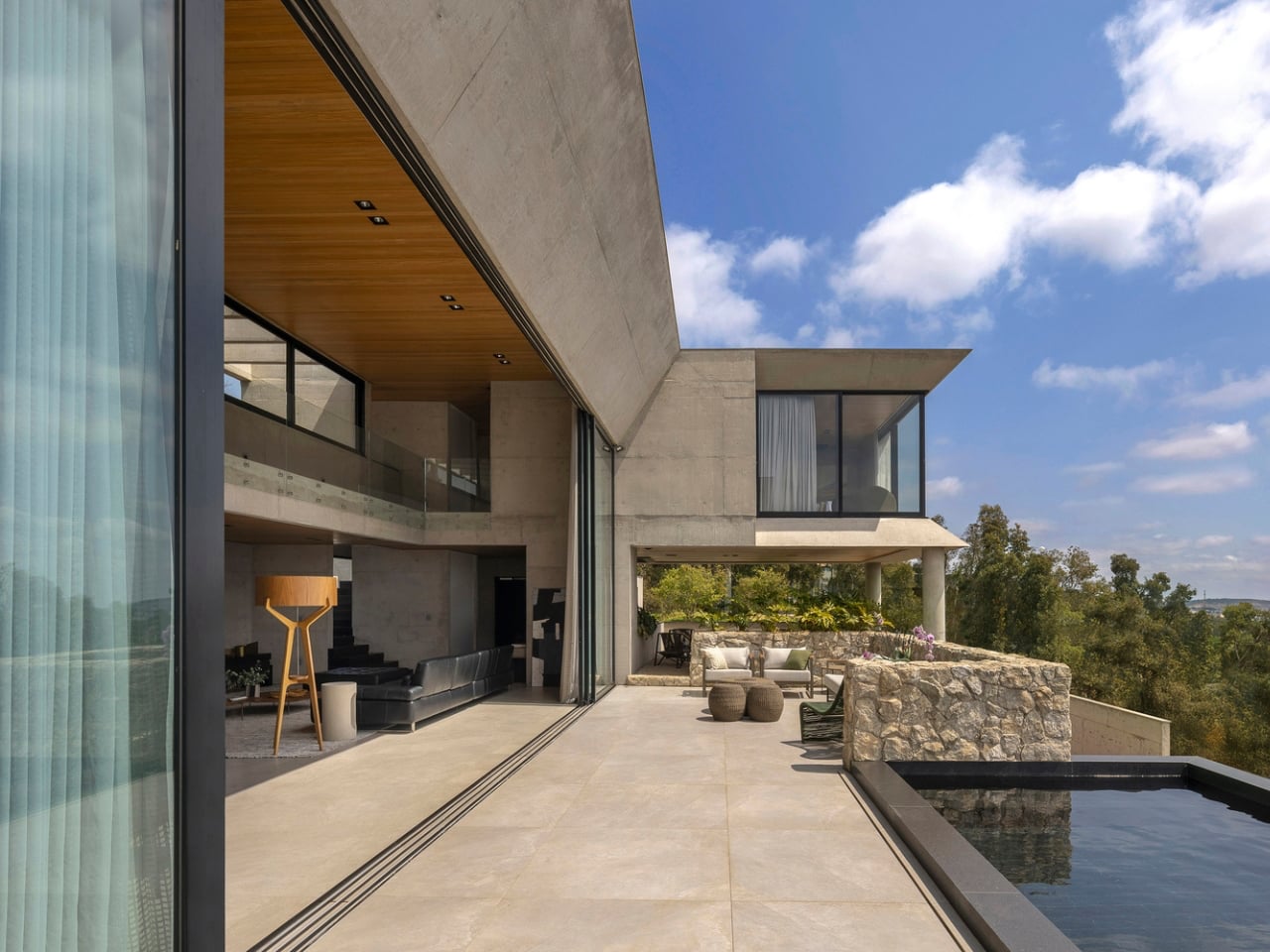
GM House by Frederico Bicalho Arquitetura shows how a flexible layout can be naturally shaped by the land itself. Set on a steep site in Minas Gerais, the home follows a long, linear plan that allows each zone to respond differently to views, sunlight, privacy, and circulation. Instead of forcing the house into a fixed or compact arrangement, the architects used the slope to create a more open and adaptable sequence of spaces that feels practical, balanced, and deeply connected to the site.
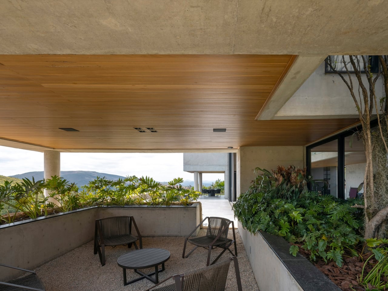
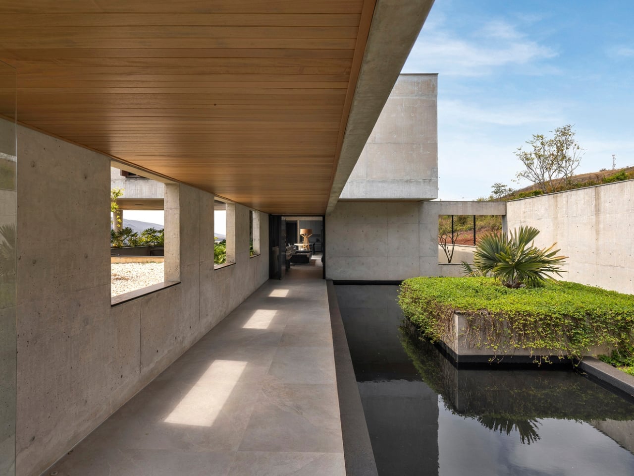
This adaptability is reflected in how the home organizes everyday living. The social areas open directly onto the veranda and pool, creating a seamless indoor-outdoor environment that can support different activities with ease. On the upper level, the bedrooms are divided into two separate volumes connected by a walkway, allowing for both privacy and connection within the same home. This thoughtful spatial arrangement gives the residence a more dynamic rhythm and shows how flexible layout planning can make architecture feel both highly functional and effortlessly livable.

3. Prioritize Comfort Through Passive Design

A home designed for the long term should stay comfortable without depending too heavily on mechanical systems. Passive design helps achieve this through better orientation, cross ventilation, shading, insulation, and materials that can naturally regulate indoor temperature. These decisions reduce energy use, lower utility costs, and make the home more resilient in the face of rising energy prices or unreliable power supply. Over time, this creates a building that performs better with less effort and fewer resources.

Passive resilience also improves the daily experience of living in a space. Rooms feel cooler in summer, warmer in winter, and more stable throughout the day without constant adjustments. Good airflow, balanced daylight, and thermal comfort create interiors that feel calm and easy to live in.
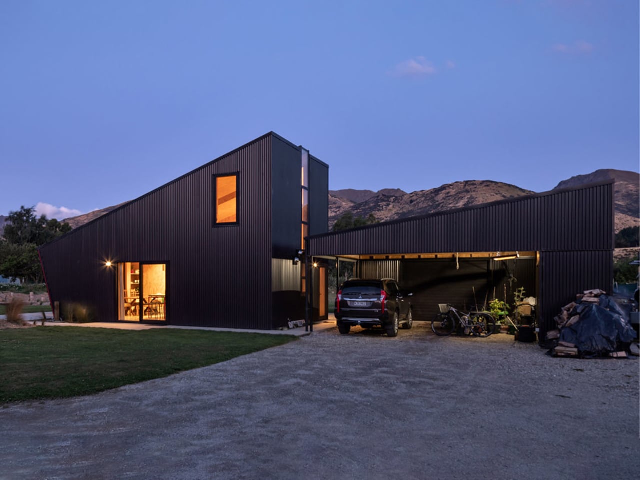
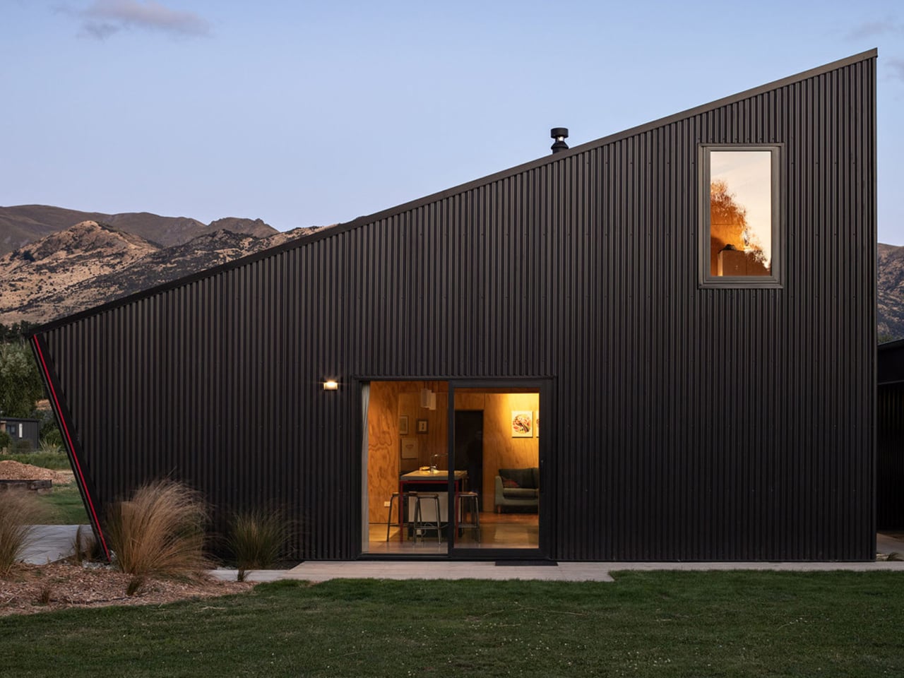
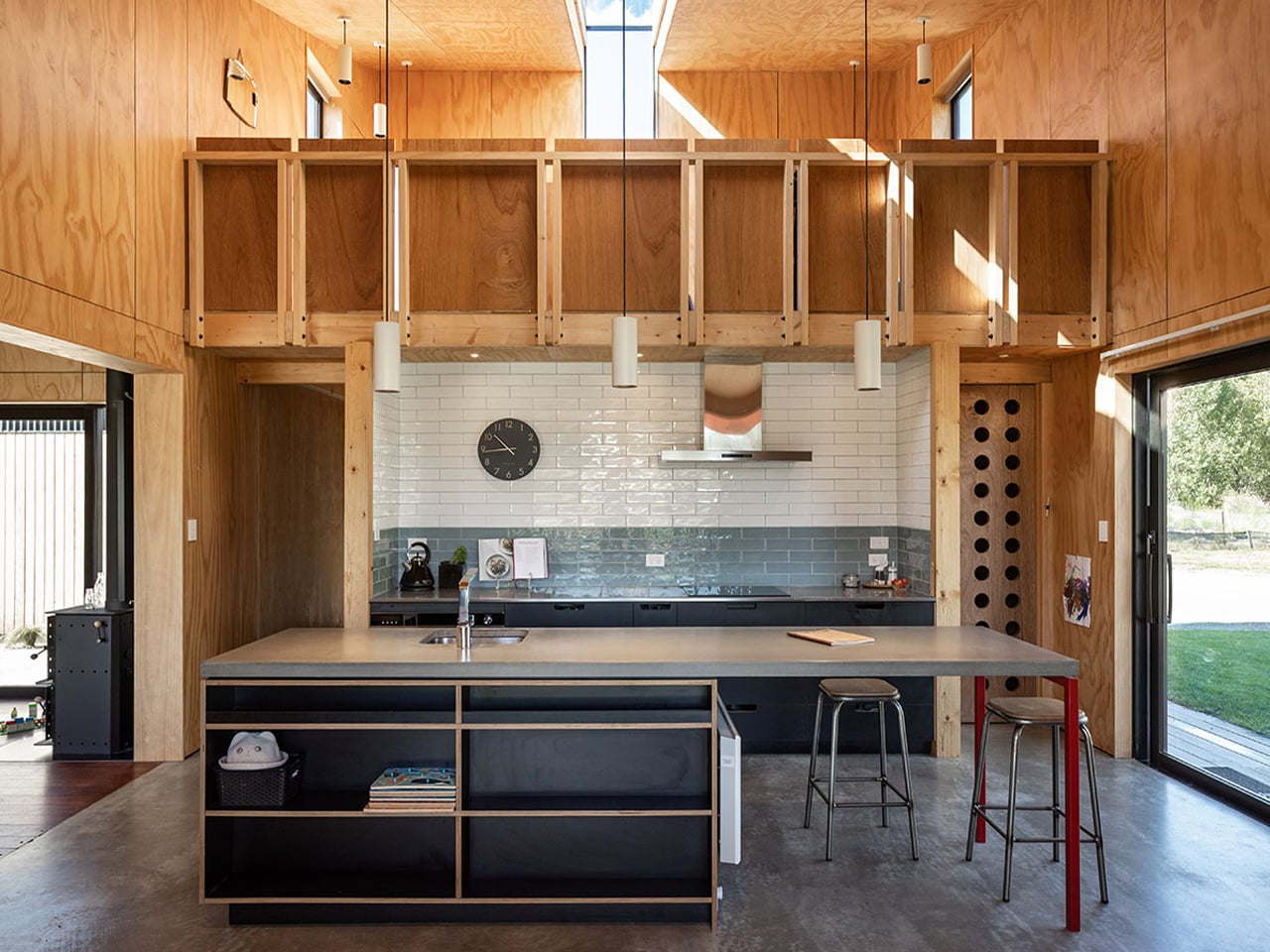
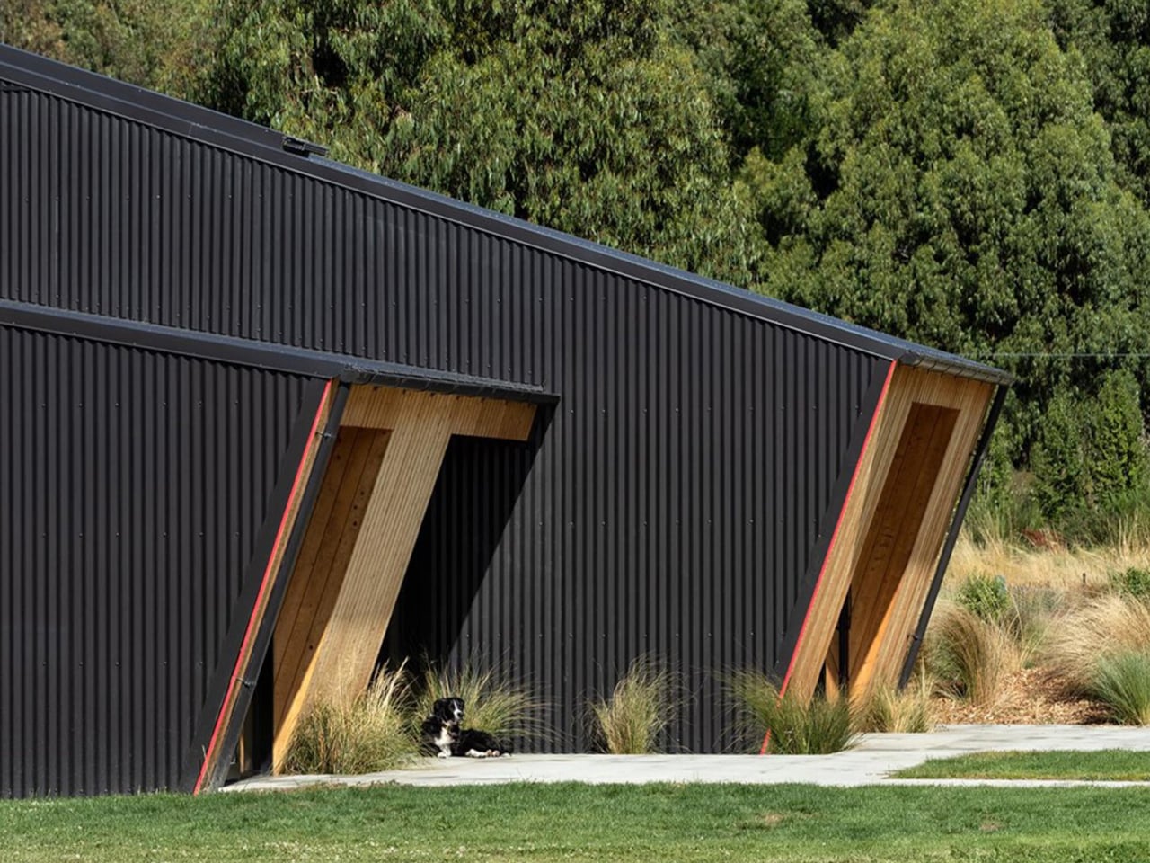
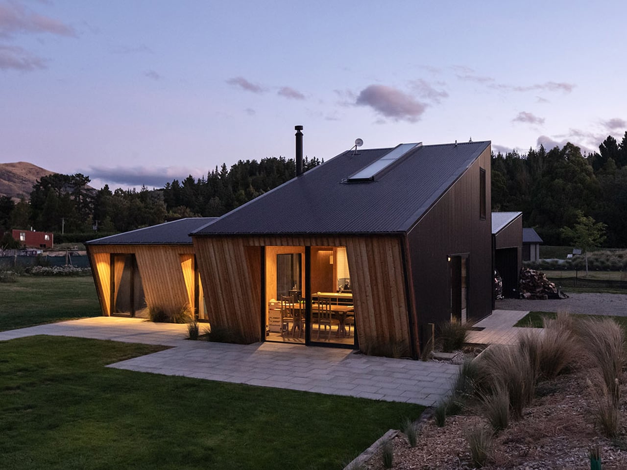
Long Grass House in New Zealand shows how a flexible layout and passive design can come together in a home that feels both practical and uplifting. Recognized by the New Zealand Institute of Architects, the house balances affordability, sustainability, and everyday comfort without sacrificing character. Its compact form helps reduce energy demand, while the angled rooflines and carefully placed overhangs improve shading and thermal performance. Designed to feel relaxed and open, the home creates a holiday-like atmosphere while still functioning as a durable, year-round family residence.
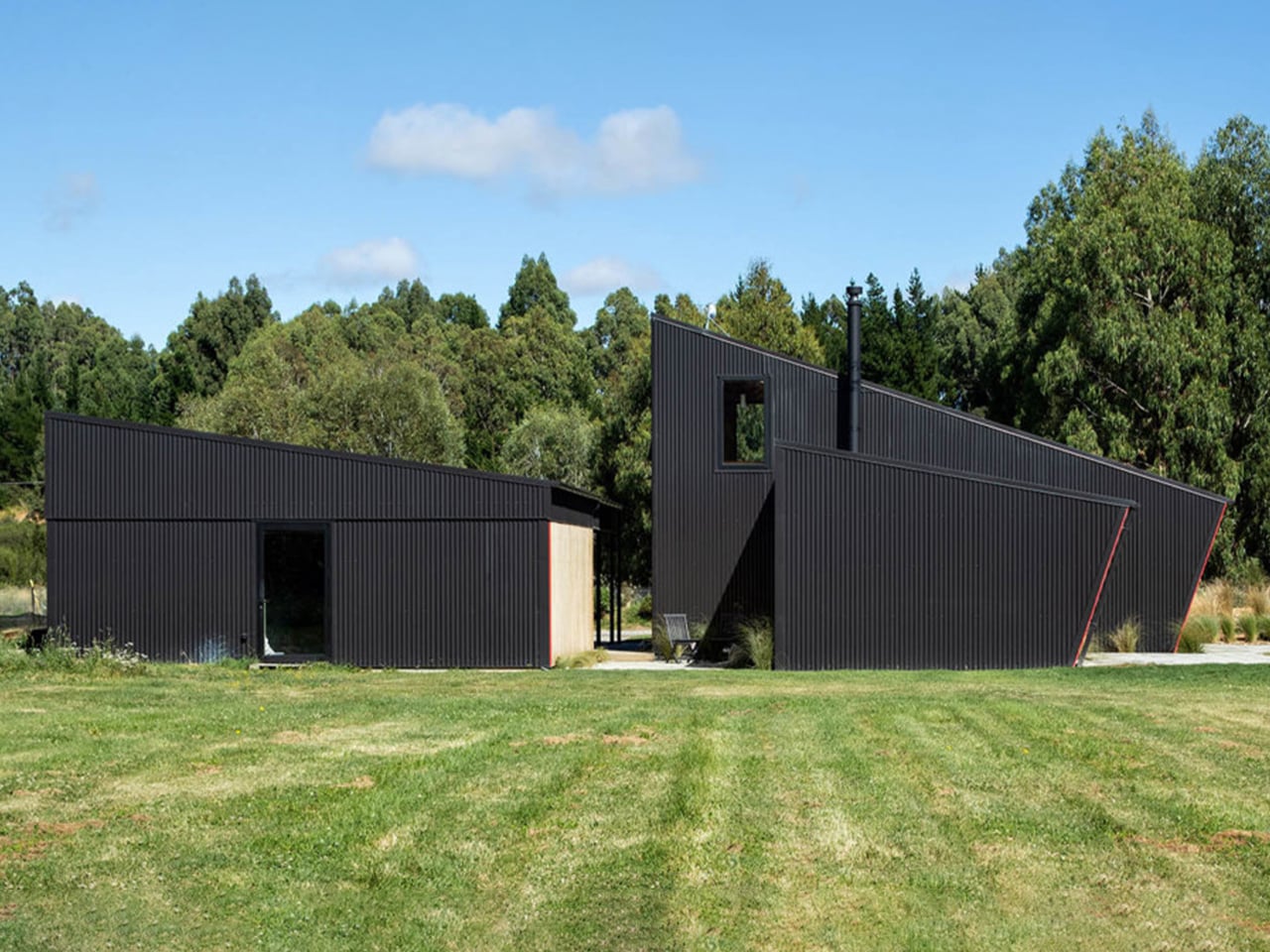
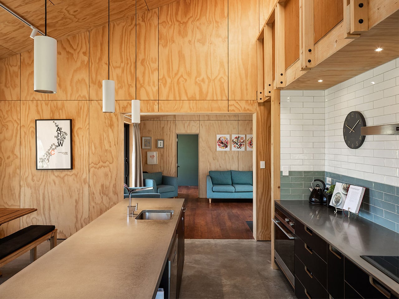
Inside, the layout is simple yet highly efficient, with spaces arranged to support changing needs over time. The bathroom, laundry, entrance, and loft are organized in a way that makes the plan feel dynamic without becoming complicated. A long skylight and vertical window bring daylight deep into the interior, while plywood finishes add warmth and visual continuity. Combined with durable steel cladding outside, the material palette keeps the house low-maintenance, cost-effective, and built to adapt gracefully to family life over the years.

4. Create a Design That Will Not Date Quickly

A 100-year home should not be built around short-lived trends that feel outdated within a decade. Lasting design comes from strong proportions, balanced layouts, quality finishes, and details that remain relevant over time. Instead of chasing what is popular for the moment, the focus should be on choices that continue to look good and function well across changing tastes. This helps protect the long-term value of the property and reduces the need for frequent cosmetic updates or renovations.

Timeless spaces also feel more comfortable to live in every day. Natural light, simple forms, and carefully chosen materials create interiors that stay calm, elegant, and adaptable rather than overly styled or visually exhausting. When a home is designed with restraint and clarity, it remains easier to maintain, update subtly, and is far more likely to be appreciated by future generations without needing to be completely redesigned.
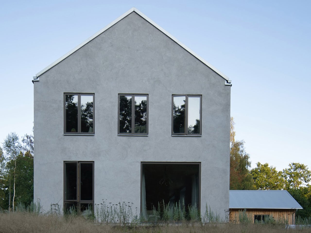
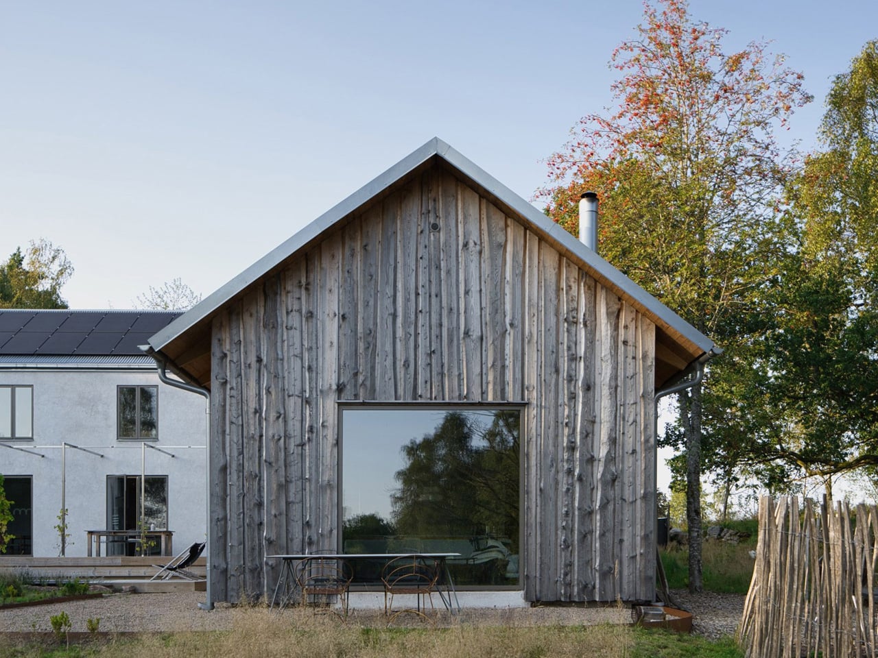
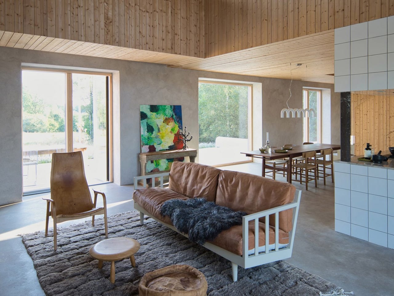
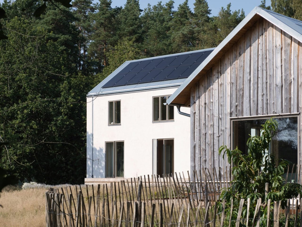
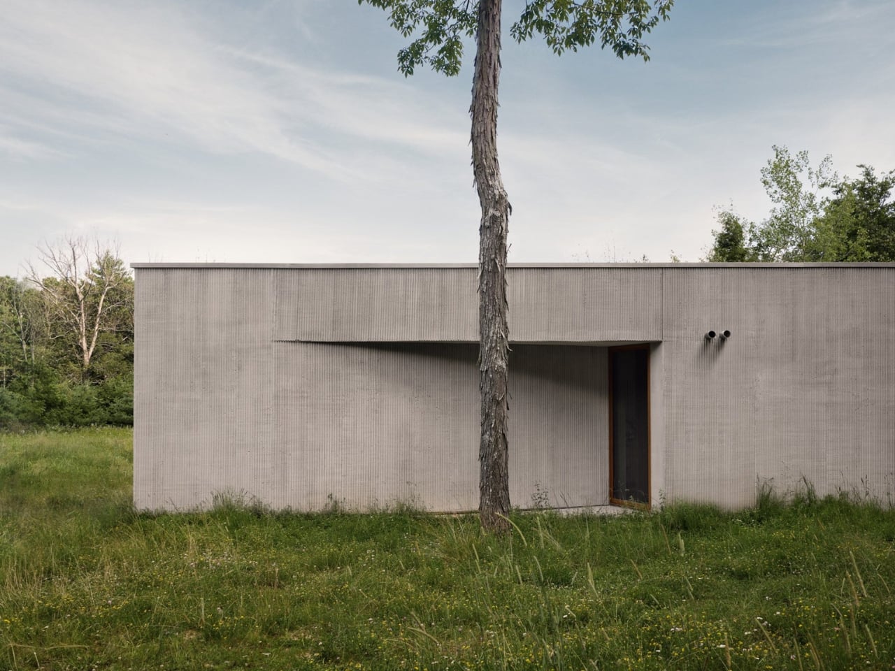
House Hökarn by Per Bornstein is a strong example of timeless design, where simplicity, proportion, and material honesty take priority over visual trends. Set within a meadow in Floda, the home feels calm, restrained, and deeply connected to its landscape. Its minimalist expression does not aim to impress through excess, but through balance and permanence. By avoiding unnecessary gestures and focusing on enduring architectural fundamentals, the house achieves a quiet character that is more likely to remain relevant and beautiful over time.
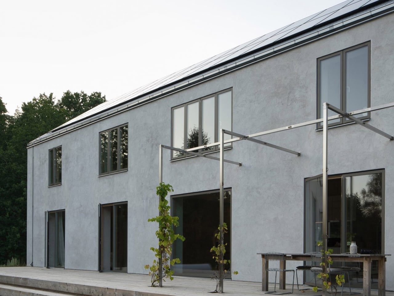
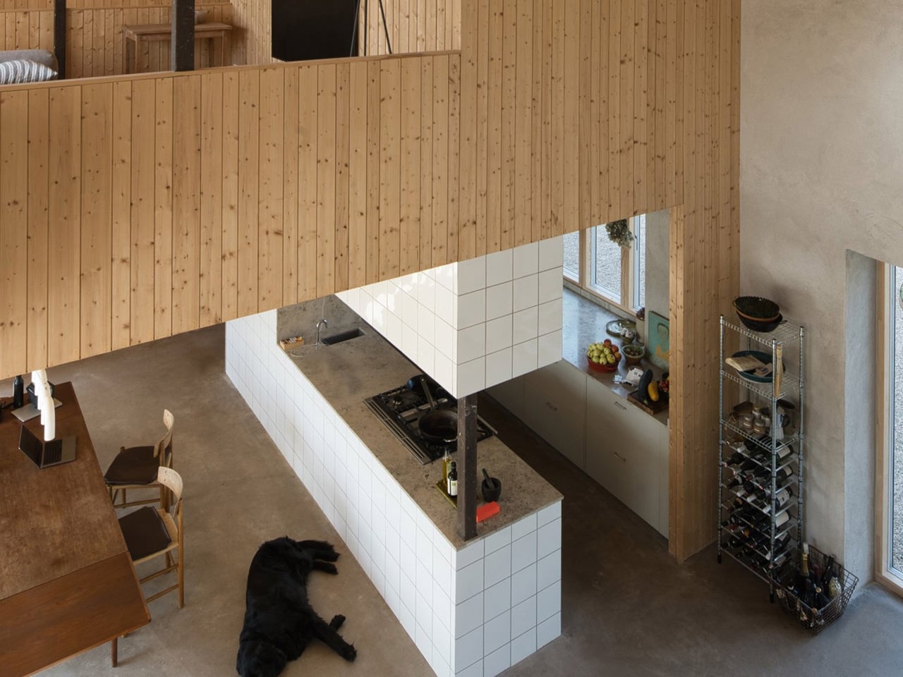
This sense of longevity is reinforced through a carefully considered material palette and clear spatial planning. Lime-plastered walls, pine timber interiors, and precisely integrated concrete and steel create a home that feels contemporary and lasting. Natural light, framed forest views, and seamless room transitions further support an atmosphere that is serene rather than overstated. Together, these elements show how timeless design can create architecture that feels deeply livable today while still holding its value and appeal well into the future.

5. Plan the Landscape to Mature with the Home

A home designed for 100 years should include a landscape strategy that improves with time, not just at handover. Trees, native planting, shaded outdoor areas, water-sensitive planning, and healthy soil can all strengthen the long-term performance of the property. As the landscape matures, it can provide natural cooling, privacy, wind protection, and better biodiversity. This makes the site more resilient while also increasing the everyday usability and long-term value of the home.

A well-planned landscape also changes how the home is experienced. Views from inside become more meaningful, outdoor spaces feel more comfortable, and the property develops character year after year. Instead of treating the garden as decoration, this approach sees it as part of the architecture itself. When the built form and landscape are planned together, the result is a home that feels more grounded, more livable, and more connected to its environment over time.
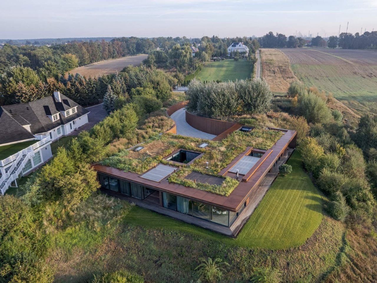
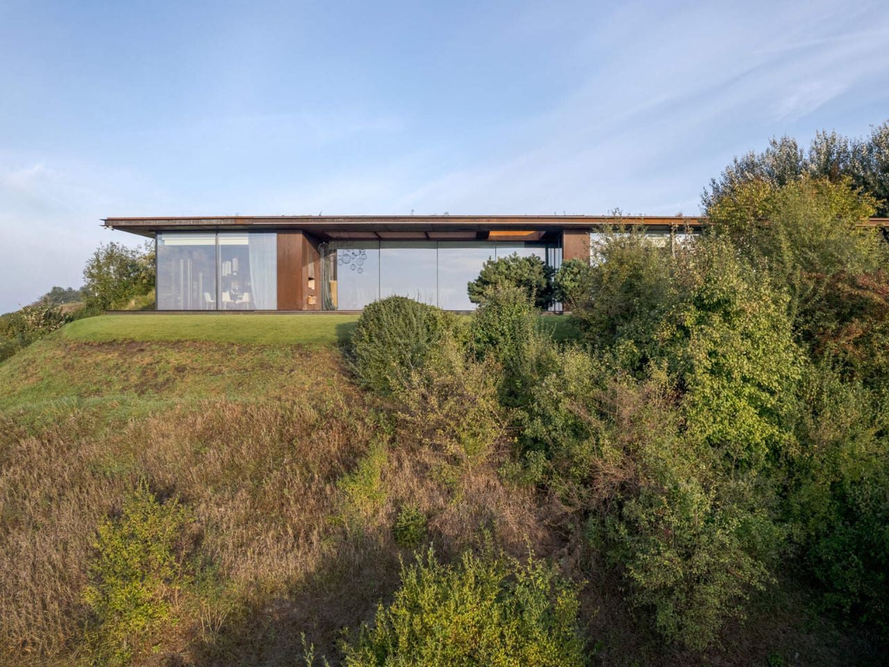
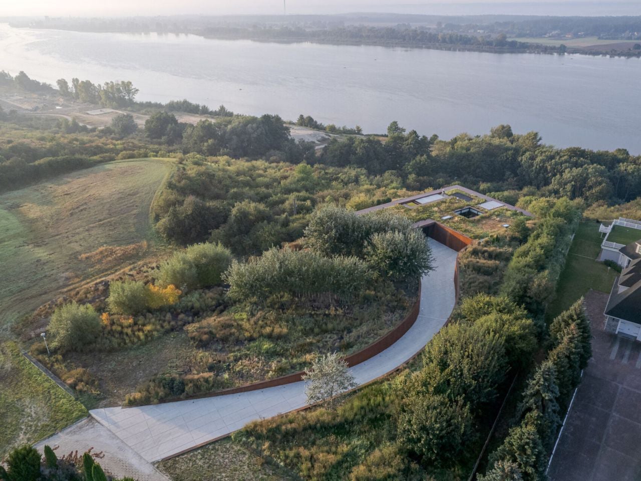
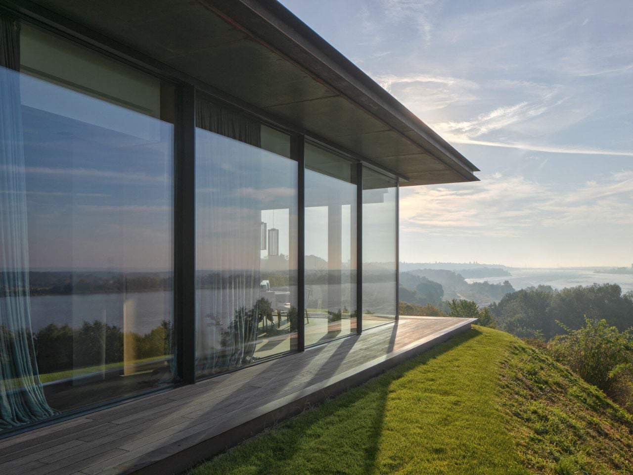
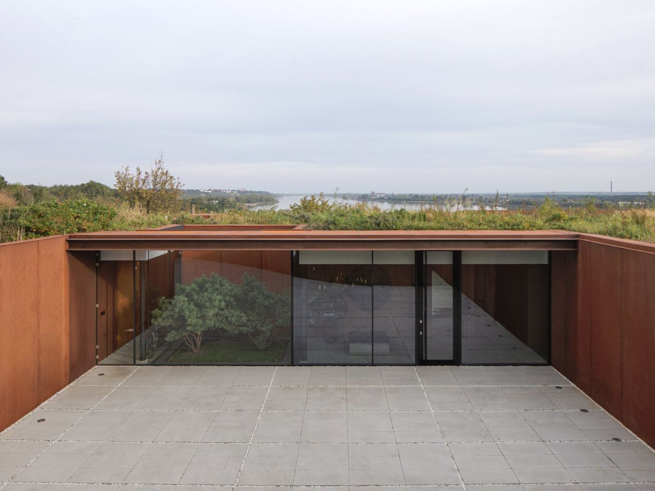
Set along the winding edge of Poland’s Vistula River, 77 Studio’s House in the Slope feels less like a building and more like part of a living garden. Embedded into the riverside embankment, the home is surrounded by layered greenery, wild grasses, native planting, and a restored meadow that softens its presence. A planted green roof helps the house disappear into the landscape, while preserving the site’s natural contours and strengthening its bond with the riverbank ecosystem. The design allows vegetation, open views, and quiet privacy to define the experience.
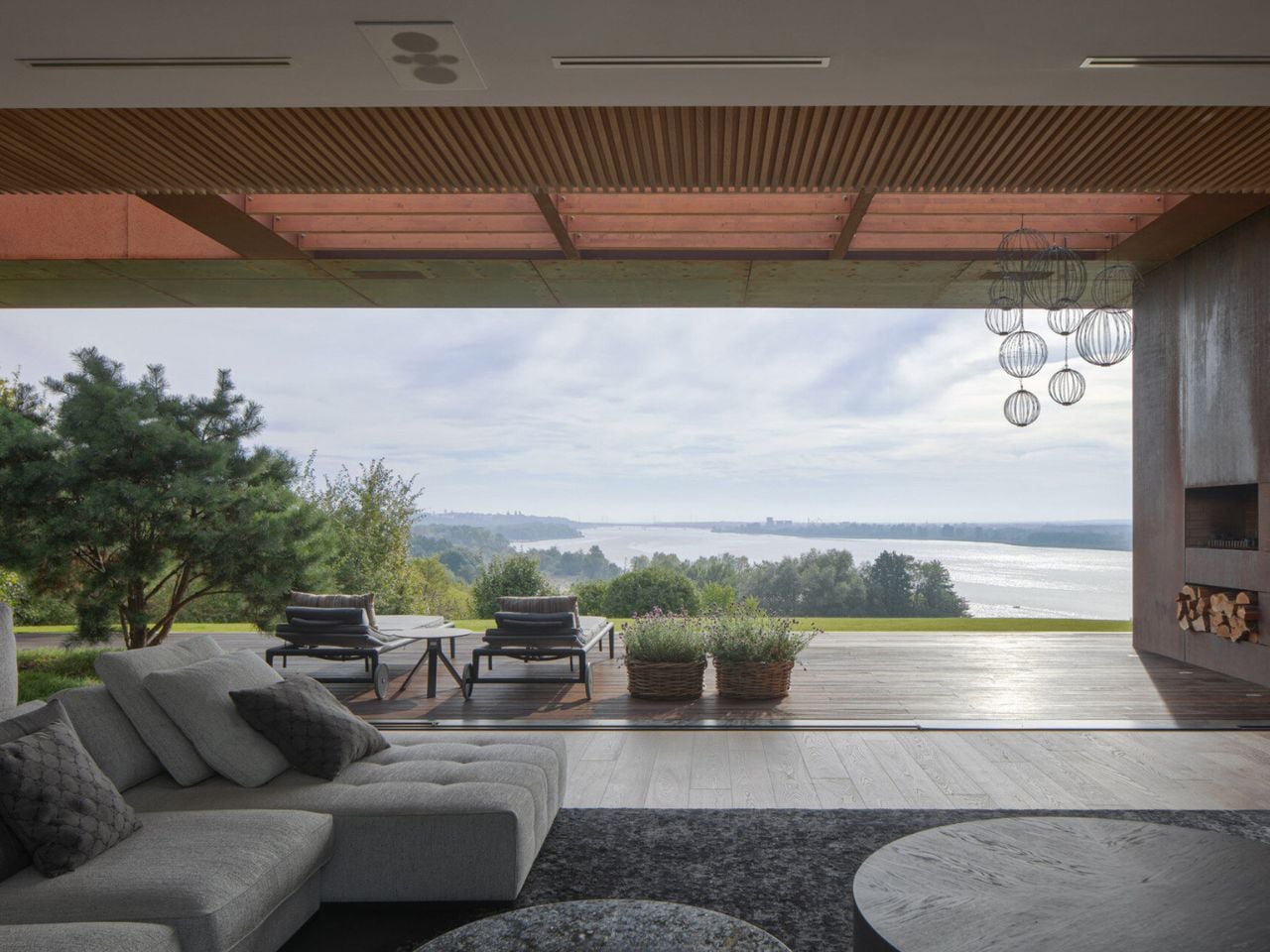
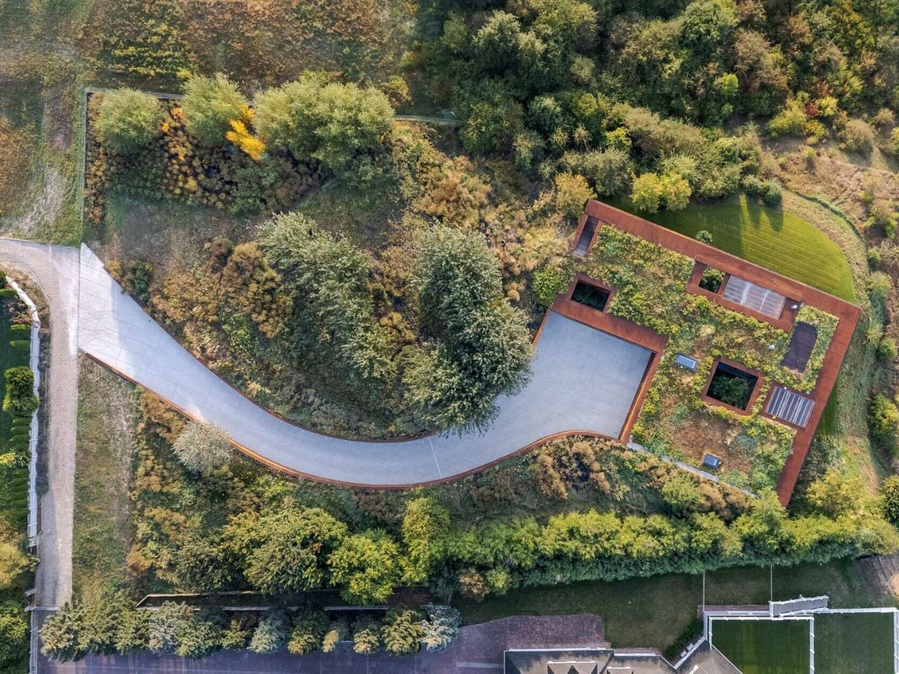
The home’s orientation was carefully shaped around its most beautiful outlooks, where garden-like riverside planting unfolds toward the water and distant skyline. Terraces, courtyards, and recessed outdoor spaces extend the feeling of living within greenery, while a rooftop meadow adds another immersive layer of nature. Every move in the design celebrates the surrounding landscape, turning the house into a calm architectural frame for the site’s abundant natural beauty.

Slow Architecture offers a more lasting kind of luxury, rooted in the confidence that a home is built to endure. Through durable materials, adaptable planning, and passive performance, it creates spaces that remain resilient, comfortable, and valuable while continuing to serve present needs and future generations.

The post Most Homes Are Built to Last 10 Years. These 5 Designs Are Built for 100 first appeared on Yanko Design.
MVRDV Planted a Secret Valley in the Middle of a Housing Block

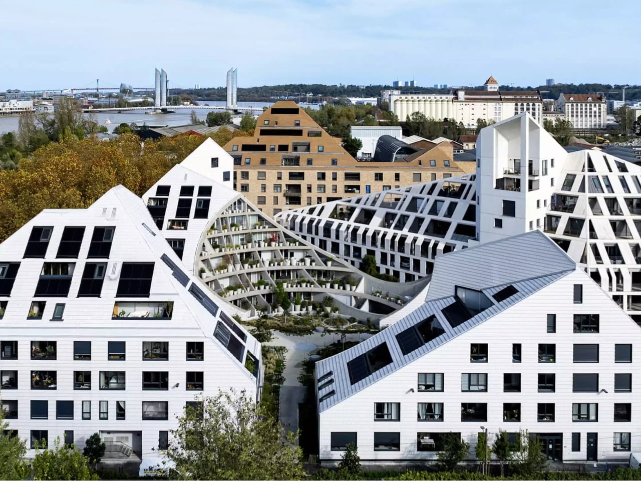
Most apartment buildings do their best work from the outside. A striking facade, a bold roofline, some smart use of glass and steel, and the job is considered done. La Vallée Verte, MVRDV’s recently completed residential project in Bordeaux, operates on a completely different logic. From the street, it is almost deliberately restrained. The real show is what you find when you step inside.

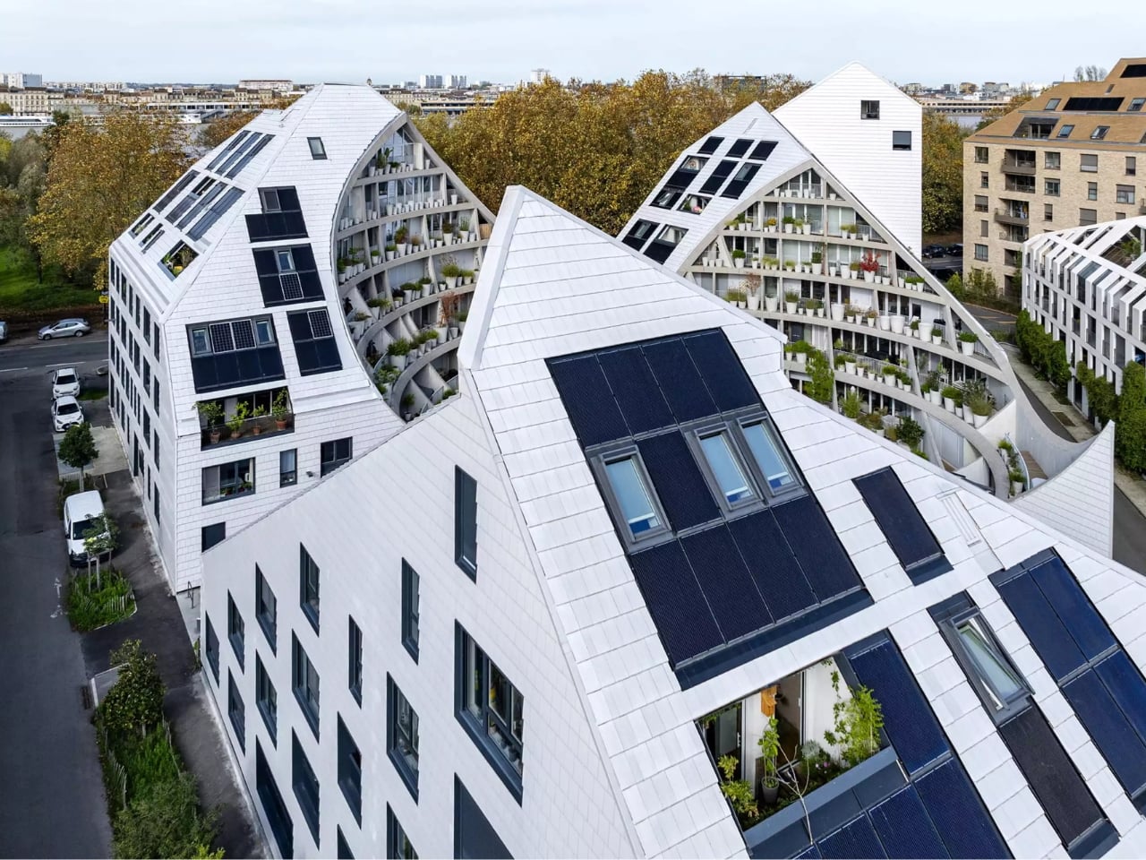
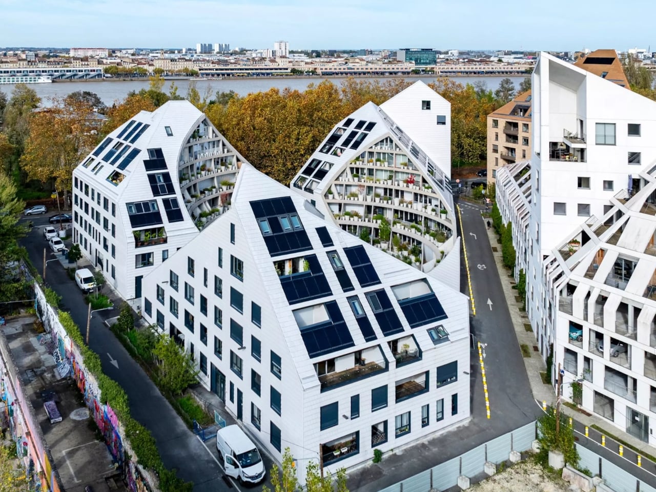
Tucked into the Bastide-Niel district on the right bank of the Garonne River, La Vallée Verte is three angled white buildings arranged on a triangular plot. It sits at the district’s north-western edge, along the Quai des Queyries. MVRDV authored the entire Bastide-Niel masterplan, coordinating 144 different architecture offices to transform a former industrial and military area into a dense, liveable urban district. La Vallée Verte is their own interpretation of the rules they set, which makes it both a residential building and a demonstration project in one.

Designer: MVRDV

The masterplan’s key principle is “suncuts,” a parametric design method where each building’s massing is carved and angled to maximise sunlight access and prevent neighbouring structures from being overshadowed. MVRDV founding partner Winy Maas describes the resulting roofscape as “like icebergs” echoing the geometry of the old city. It’s a compelling visual concept and a genuinely useful one, a combination that doesn’t come around as often as it should.

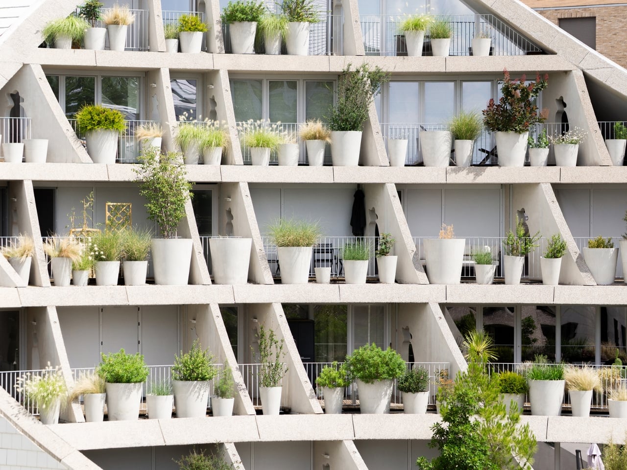
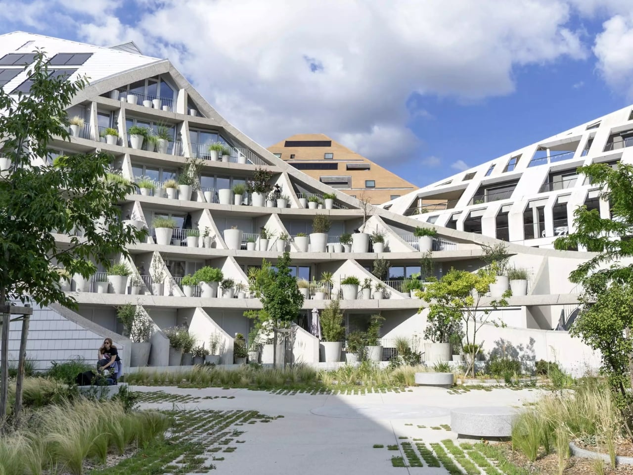
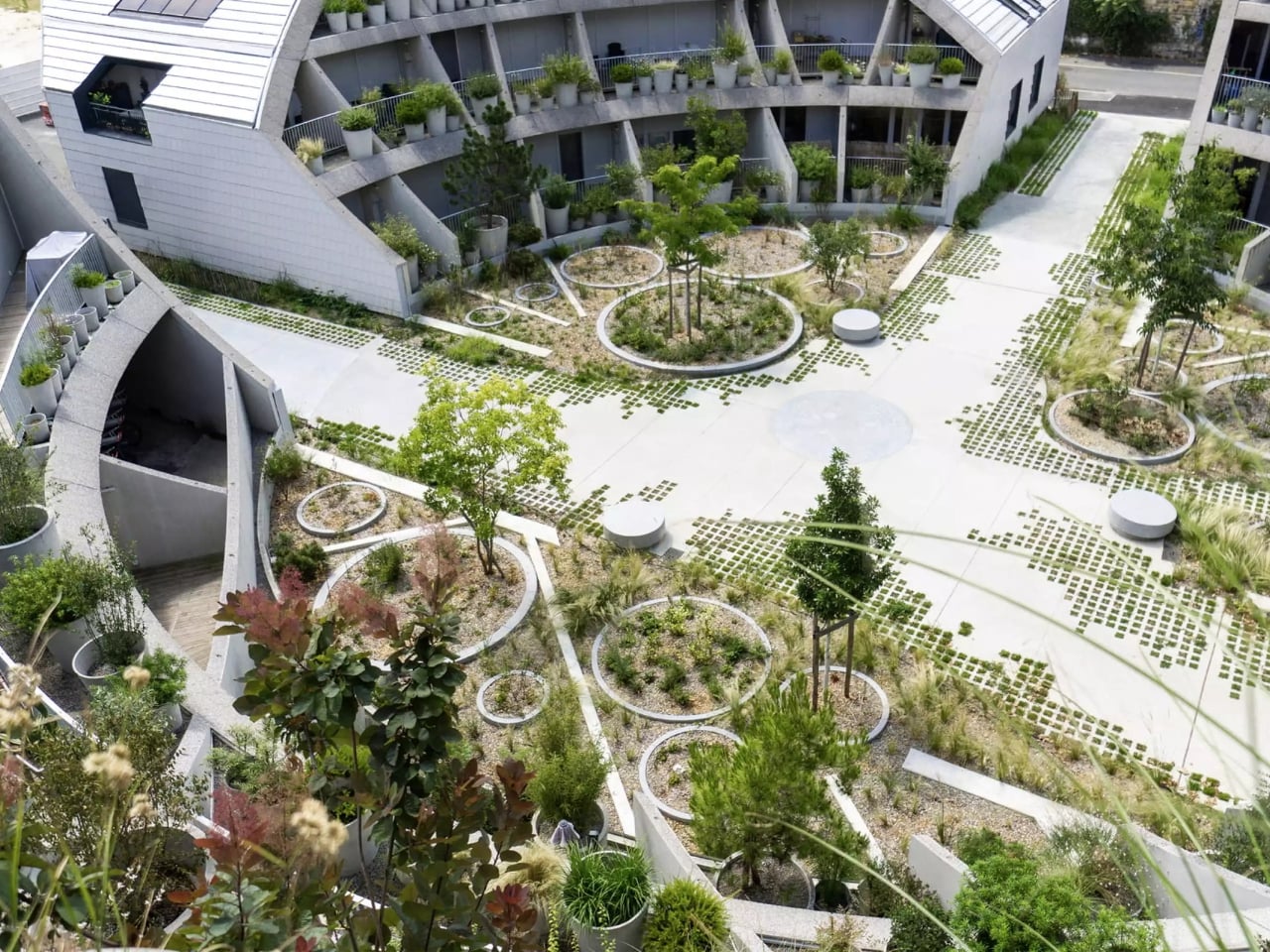
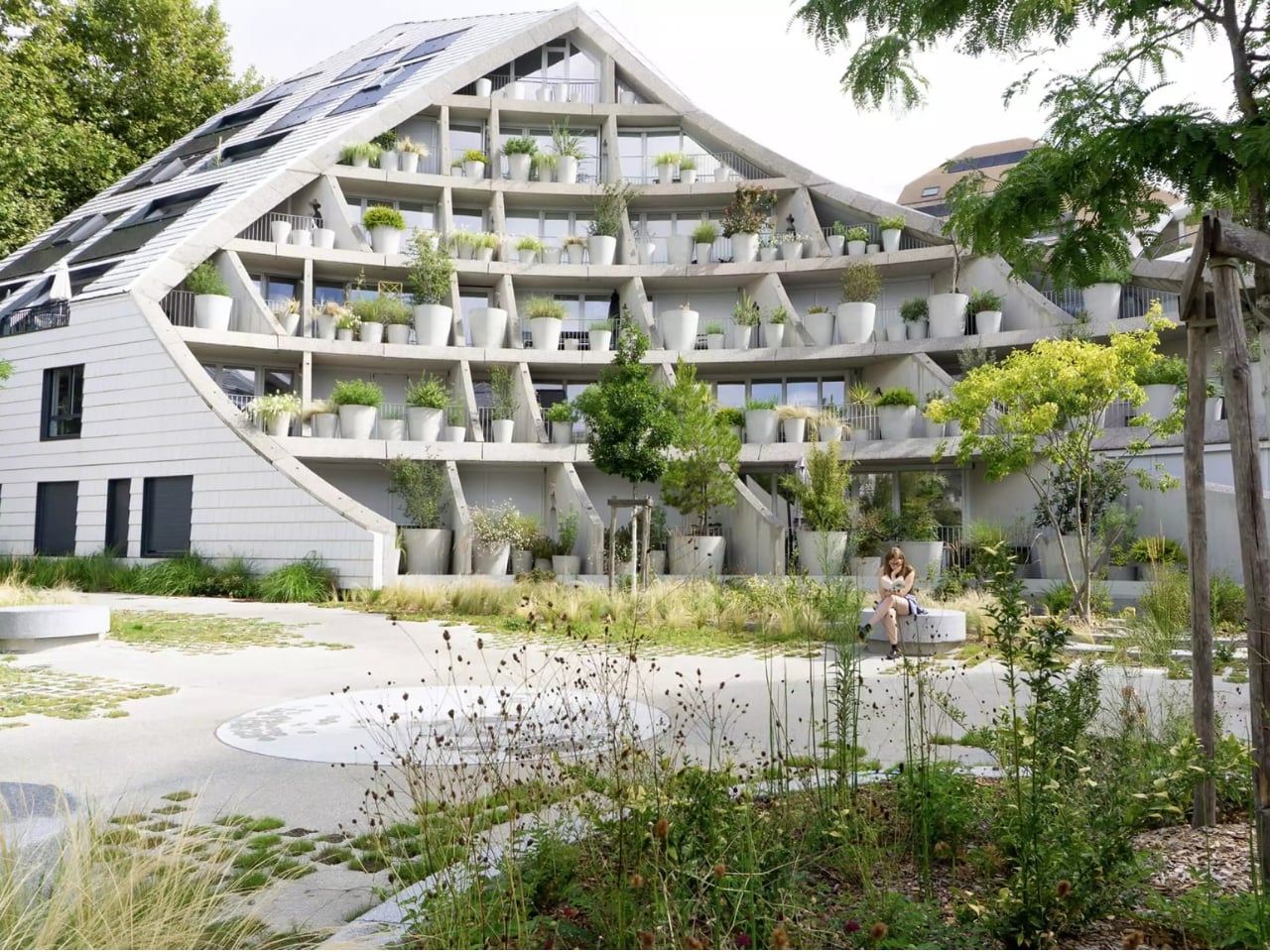
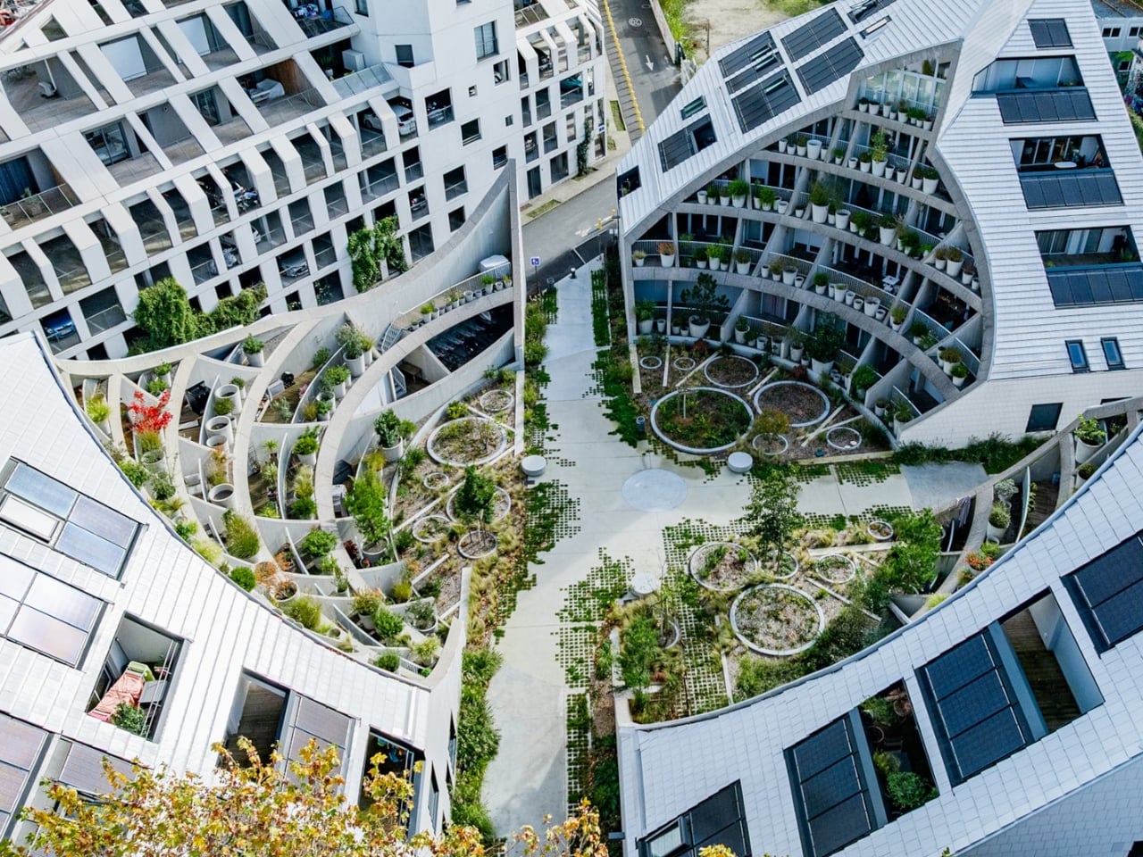
The suncuts define the exterior. But the interior is the actual idea. The three buildings encircle a circular courtyard that MVRDV calls a “crater,” a lush park-like space with plants covering every level of the inward-facing facades. Terraces cascade downward, each loaded with pots ranging from flowering shrubs to small trees, with evergreen and deciduous species mixed together to replicate a natural valley landscape at a building scale. The varying plant types at different heights support biodiversity, which at this point feels less like a bonus feature and more like a baseline expectation we should be holding all new housing to.

Seventy apartments of varying sizes are spread across the three buildings, intended to attract a genuine mix of residents: single first-time buyers, families, and older people. The idea is a building that ages well with the people inside it. A day-care centre occupies the ground floor of one block, opening directly onto the courtyard. That programming decision alone says something. Shared green space tends to feel incidental in most housing developments, an amenity tacked on after the real decisions are made. Here, it’s genuinely central to how the building functions.

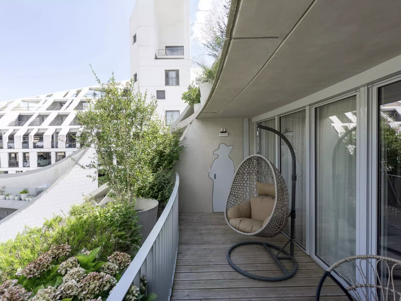
One detail stands out above everything else. Professional gardeners need access to those tiered terraces, so MVRDV cut openings through the structural walls and added steel doors between neighbouring balconies to create a maintenance route. Practical, necessary. What makes it quietly wonderful is that those doorways are shaped like the silhouette of a person wearing a wide-brimmed hat. It’s a small gesture, but it tells you something: the architects were thinking about the gardeners too, not just the residents. The people who will keep that valley alive are written into the architecture itself.

The environmental considerations are thorough throughout. La Vallée Verte sits in the Garonne River floodplain, so ground-floor apartments are raised to allow water to move through the site during flood events. The streetscape is porous to absorb rainwater. Parking is placed in an above-ground structure rather than underground, reducing both flood exposure and embodied carbon. District heating and photovoltaic panels round out the energy strategy. The broader Bastide-Niel district holds France’s EcoQuartier certification, and La Vallée Verte earns its place within it.

The courtyard is the image that will travel, the shot that gets shared, the thing people point to as the concept. But what makes La Vallée Verte worth paying attention to is how methodically everything else was thought through to support it. The suncut geometry, the flood adaptations, the gardener’s route, the mix of apartment sizes. Good design usually has one clear idea at its centre. Great design makes sure everything around that idea is working just as hard.

The post MVRDV Planted a Secret Valley in the Middle of a Housing Block first appeared on Yanko Design.
Vipp’s New Catskills Pavilion Is a Sculpture You Can Sleep In

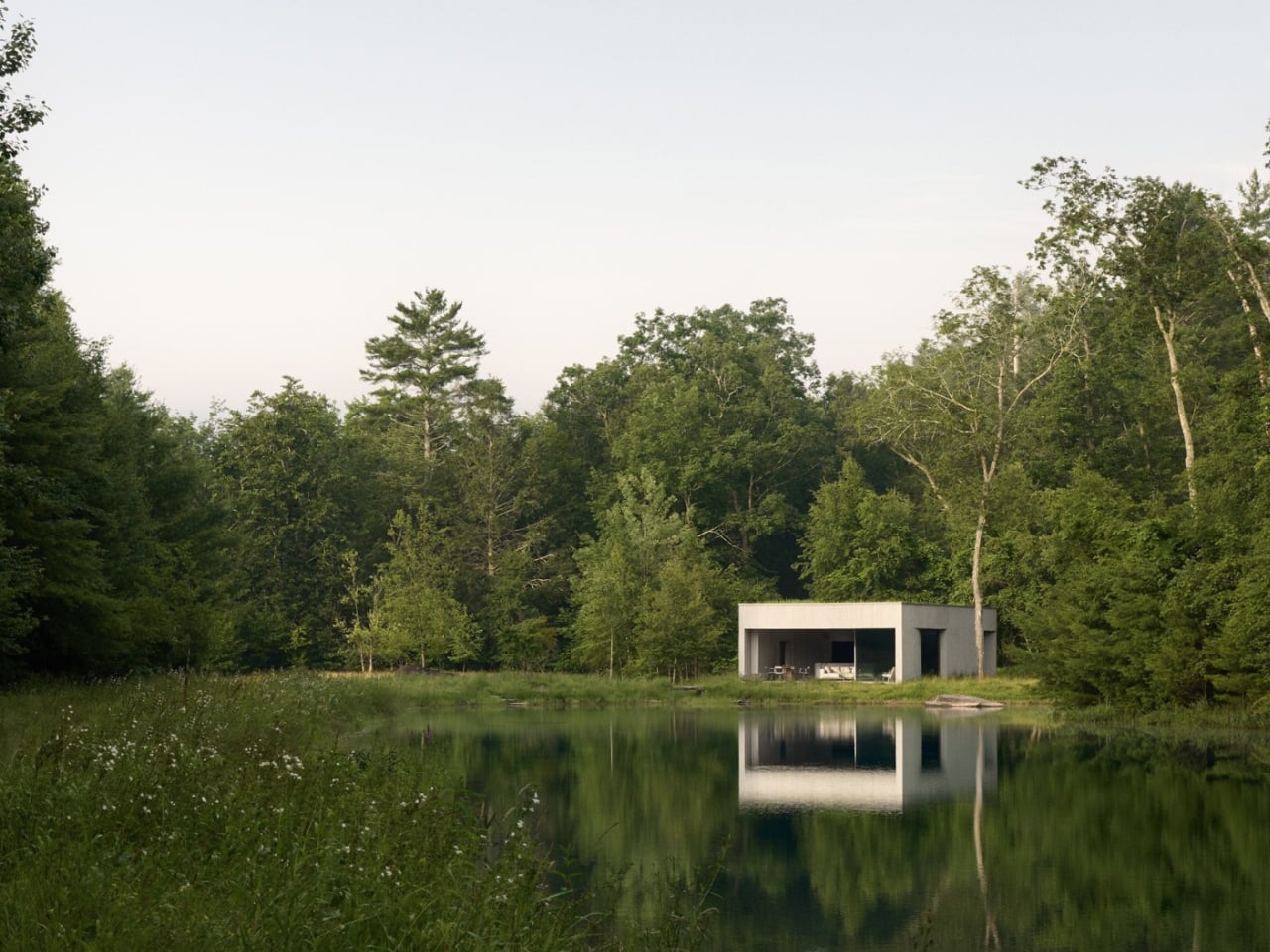
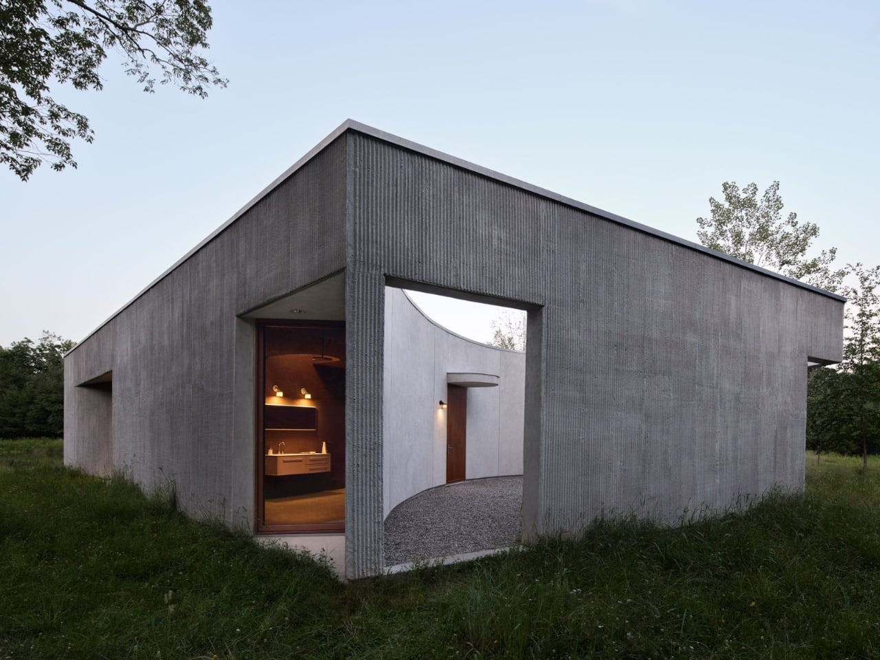
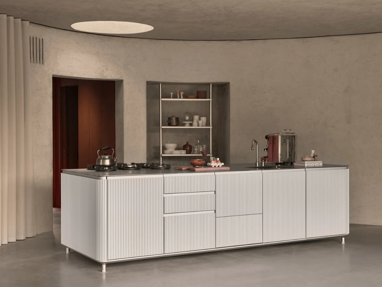
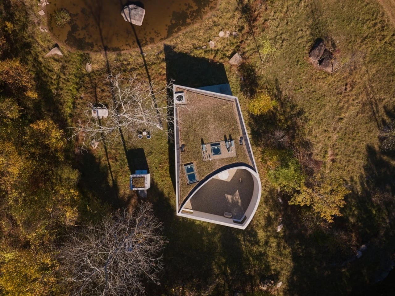
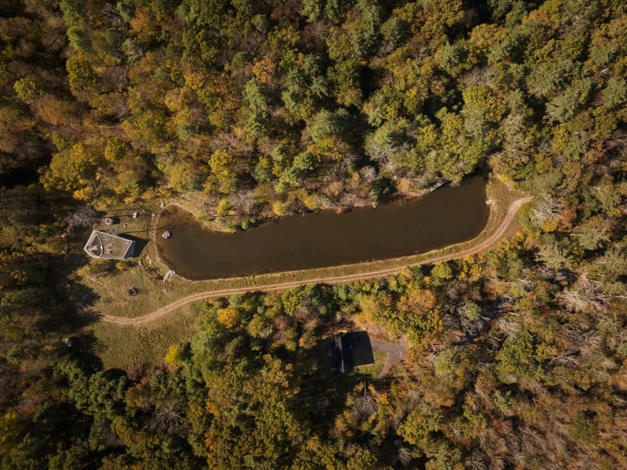
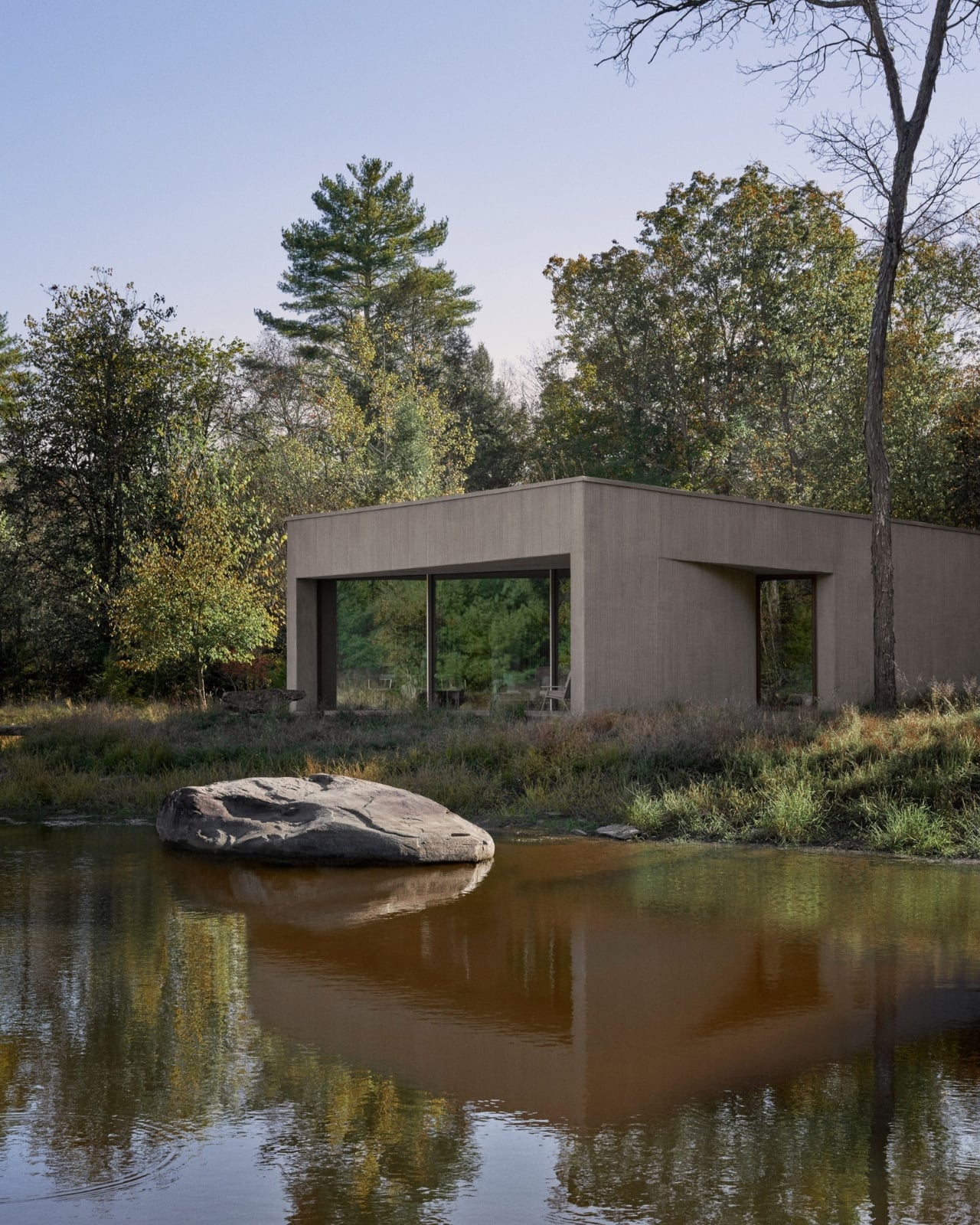
Not every building earns the word “sculptural” without some heavy editorial lifting, but the Vipp Pavilion in Upstate New York is the rare case where that description actually holds up. Completed earlier this year, the project is Vipp’s first ground-up build in the United States and their fifteenth bookable guesthouse globally. It sits on sixteen acres of meadow in Lumberland, New York, two hours outside of the city, on the edge of a reflective pond. And from the outside, it looks less like a place you’d stay in and more like a deliberate act.

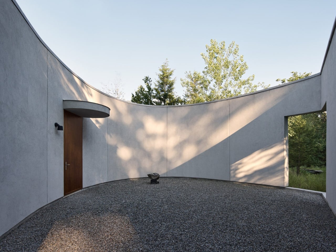
The structure was designed by Johnston Marklee, the Los Angeles-based firm behind some of the more quietly radical architecture of the past two decades. Their work has always been about geometry as experience rather than spectacle, and the Vipp Pavilion is exactly that. The form is based on two tangent ellipses that mirror the curve of the adjacent pond. Built with a combination of smooth and ribbed stucco, it’s rectangular in envelope but sculpted in feeling, with semi-circular cutouts that carve into the exterior and draw the eye inward. Sharon Johnston described the approach as designing something that “masks a sense of scale, form, or function,” which is a beautifully honest way of saying the building refuses to be immediately read.

Designer: Johnston Marklee

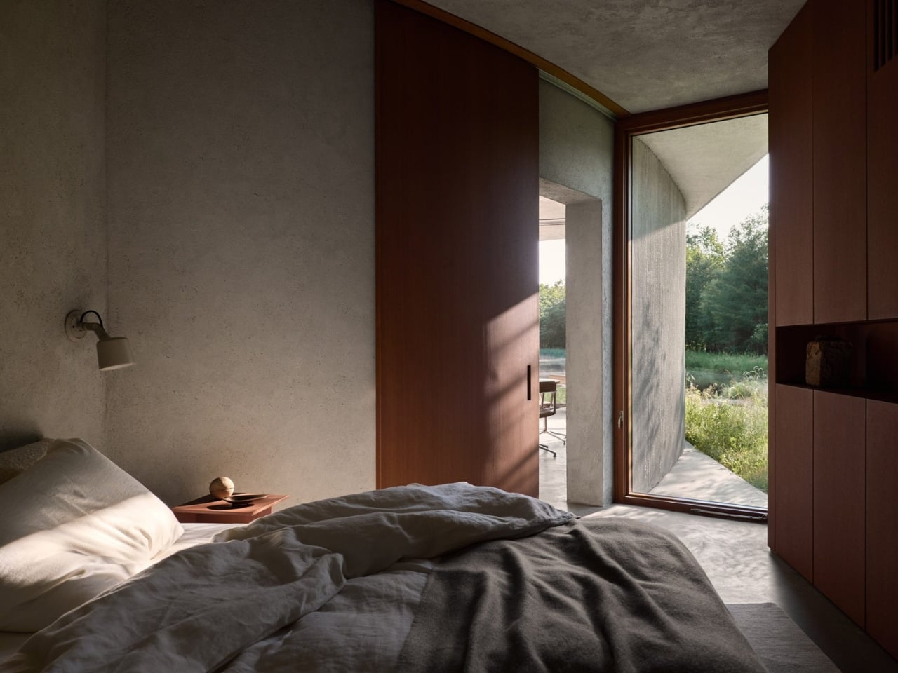
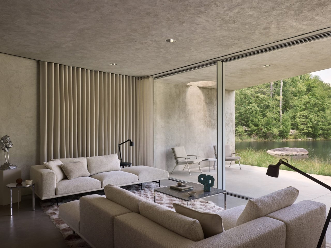
Four years went into getting this right, and you can tell. This isn’t the kind of project that was rushed to fill a destination travel gap or capitalize on a trend cycle. The care shows in the details: the green roof planted by landscape firm Larry Weaner Landscape Associates, which connects the meadow to the architecture itself rather than interrupting it. The interior courtyard slows your arrival down and redirects your gaze upward before you even enter the main space. The floor-to-ceiling window wall lines up perfectly with the water, creating what the architects call a telescopic effect.

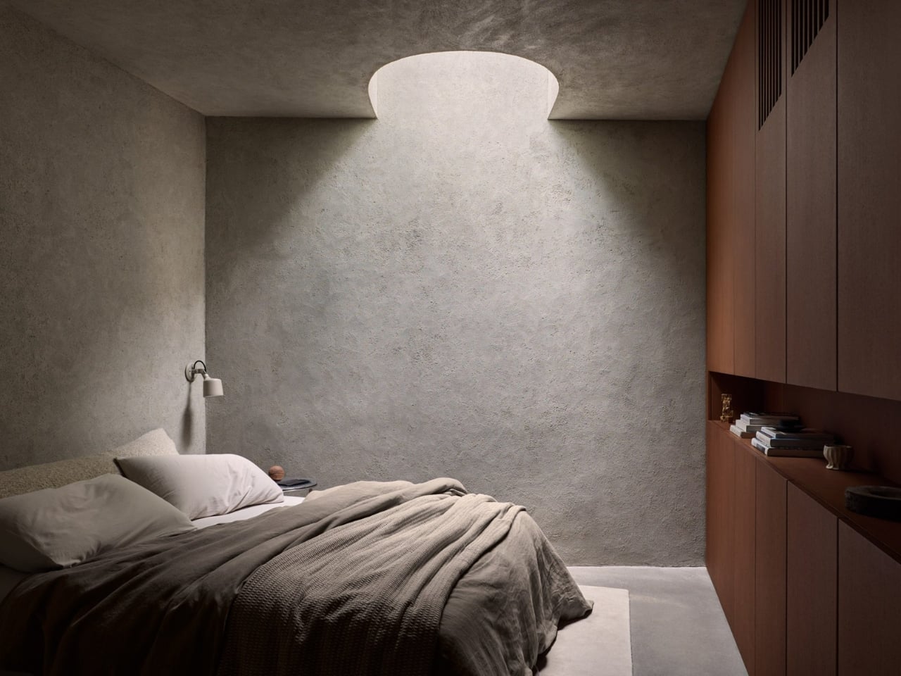
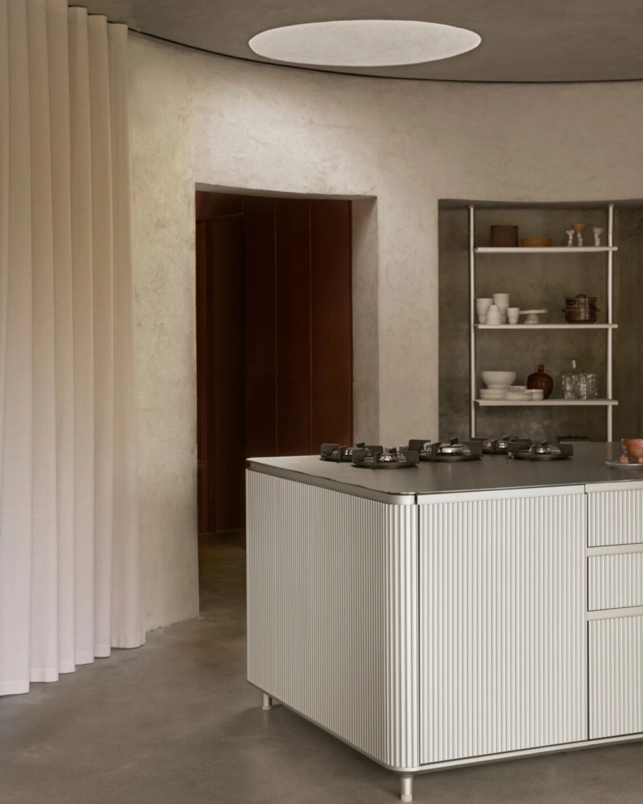
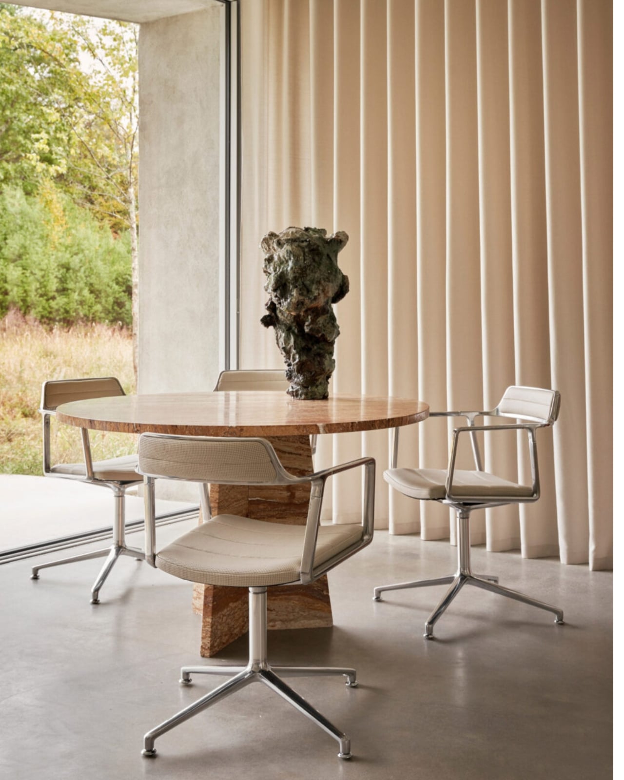
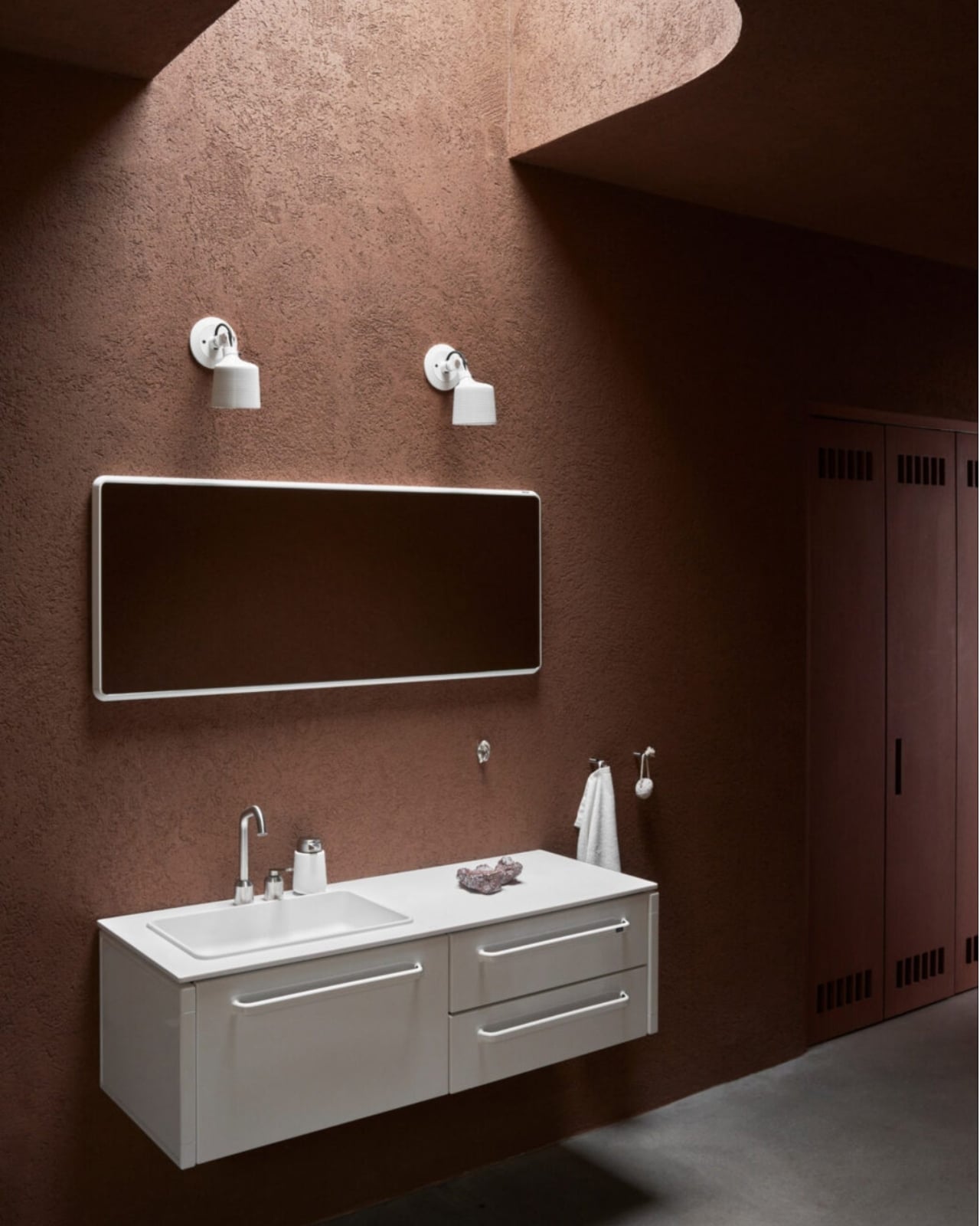
Inside, Vipp outfitted the 1,200-square-foot space with their own furniture, and the choices feel considered rather than commercial. There’s a travertine table surrounded by swivel chairs, a sectional sofa in cream positioned to catch the view, and the V3 kitchen, whose polished aluminum ribs subtly echo the ribbed stucco on the exterior walls. It’s the kind of interior that doesn’t announce itself, which is exactly the right call in a space where the architecture is already doing a lot of talking.

The two bedrooms, one bathroom, covered porch, and exterior courtyard layout keeps the program deliberately simple. That restraint reads as confidence, not limitation. When you’re offering sixteen acres of Catskills landscape and a building that looks like a smooth stone half-emerged from a pond, you don’t need to fill every corner. The landscape does what interior design cannot.

I think Vipp has been building something genuinely interesting with this guesthouse series, one that most people overlook precisely because the brand started with trash cans. But this pavilion, maybe more than any of their previous projects, makes the case that design continuity is a real thing. The same rigor that goes into their hardware goes into the architecture they commission. That’s not a given in the design world. A lot of brands treat objects and spaces as separate categories, and the work suffers for it.

The Pavilion is bookable, meaning you can actually stay there, which is one of those pieces of information that shifts the whole conversation. This is not just a concept project or an awards-season submission. It exists, it functions, and it sits two hours from Manhattan in a landscape that will do most of the work of making you feel genuinely away.

Whether or not you ever book a night there, the Vipp Pavilion is worth paying attention to. It’s a well-argued case for how geometry, landscape, and material can coexist without any one of them shouting over the others. And frankly, that kind of restraint is harder to pull off than it looks.

The post Vipp’s New Catskills Pavilion Is a Sculpture You Can Sleep In first appeared on Yanko Design.
India’s Anthill House Has No AC and Stays Cool Anyway

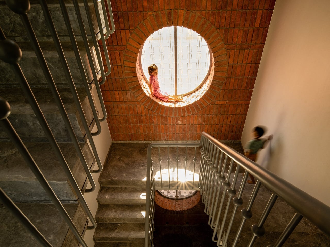
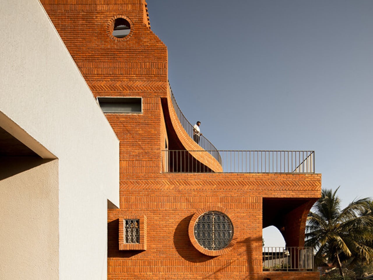
We’ve been building houses wrong. Not structurally, not legally, and not in any way that’s easy to name. But somewhere along the line, the conversation around home design shifted away from how does this building breathe toward what does this building look like on a feed. That’s why The Anthill, a new brick residence in Ahilyanagar, Maharashtra by Kaushal Tatiya Architects, feels like such a pointed correction. Not a provocation. A correction.

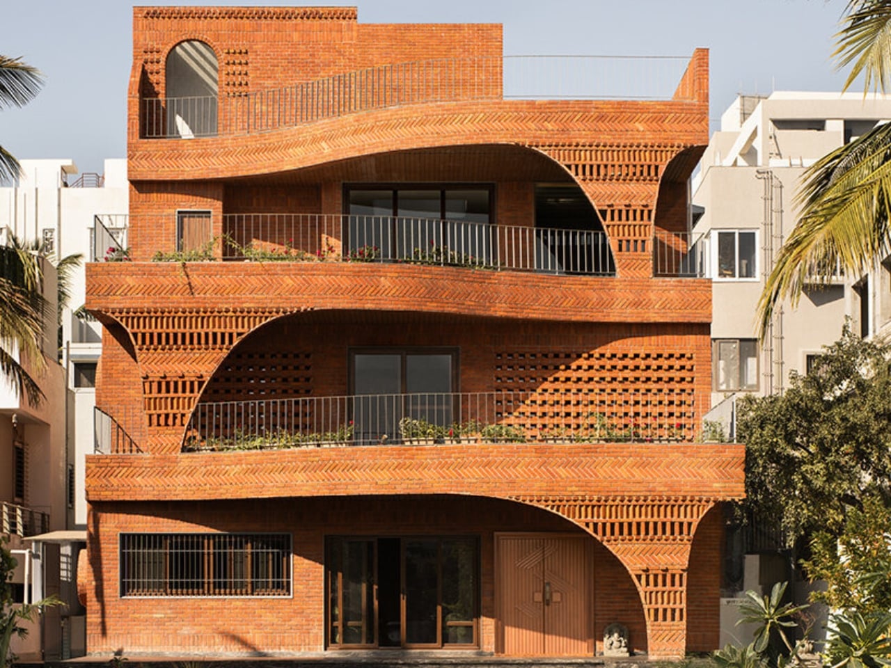
The premise sounds deceptively simple: a house modeled after an ant mound. Not the insect itself, but the engineering intelligence of what it builds. Ants have been solving thermal regulation, cross-ventilation, and spatial hierarchy problems for millions of years, with no blueprint, no software, and no electricity required. Kaushal Tatiya, the firm’s founder, described the anthill not as a literal form but as “an intelligent climatic organism,” one able to “regulate temperature, create ventilation through voids, and function through a network of interconnected chambers without any imposed geometry.” That single observation is what the entire project is built on, and it shows.

Designer: Kaushal Tatiya Architects (Photos by Avesh Gaur)

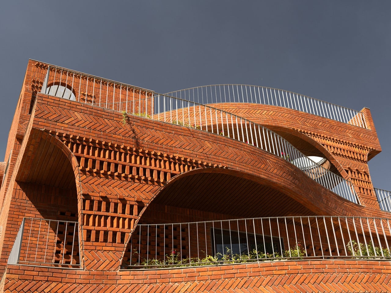
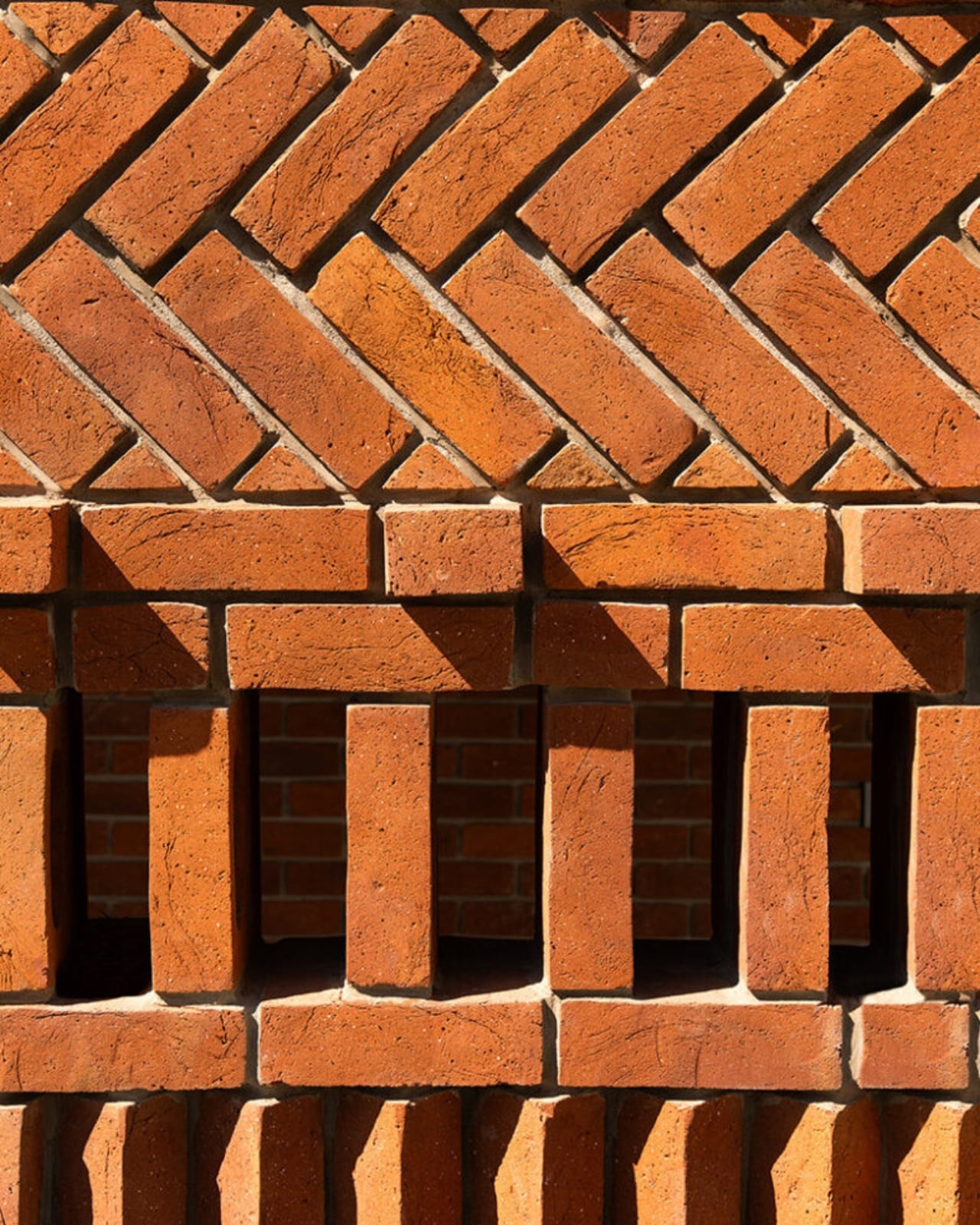
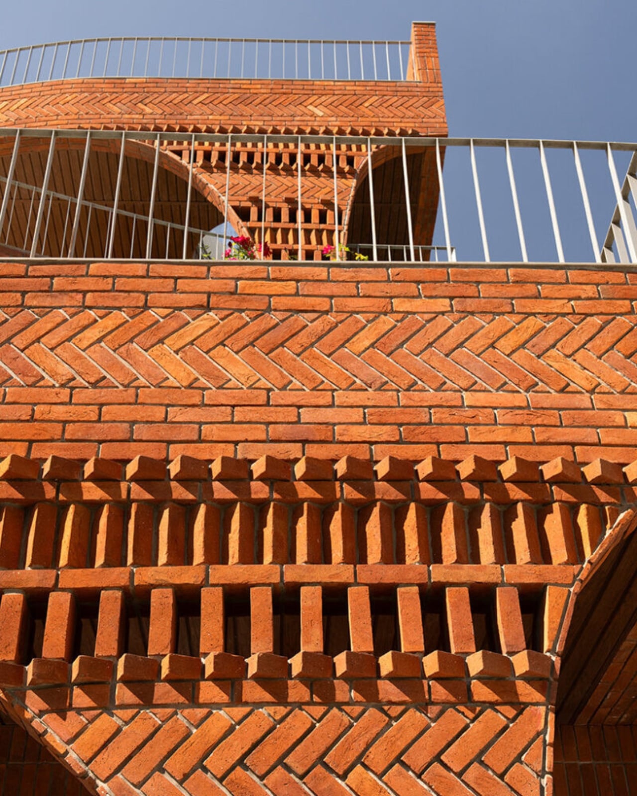
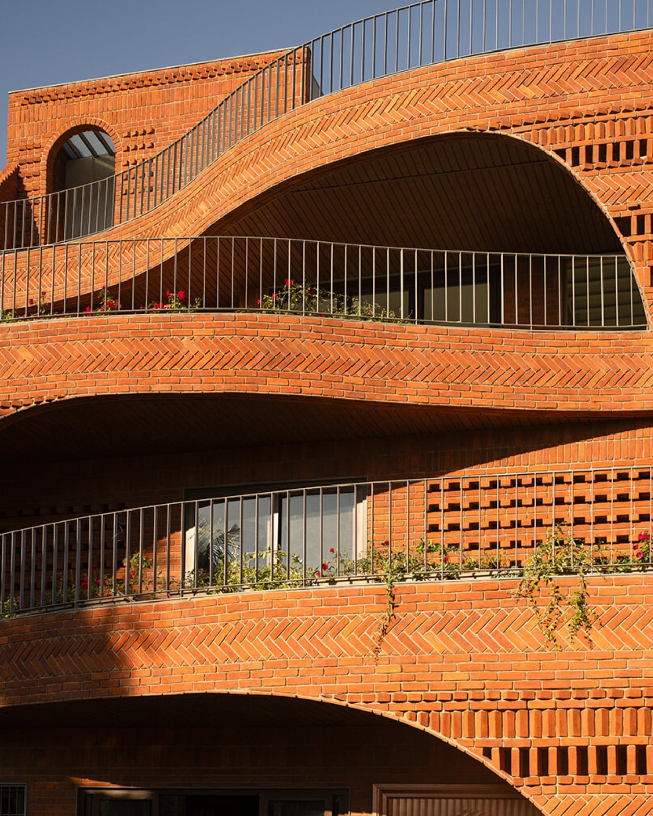
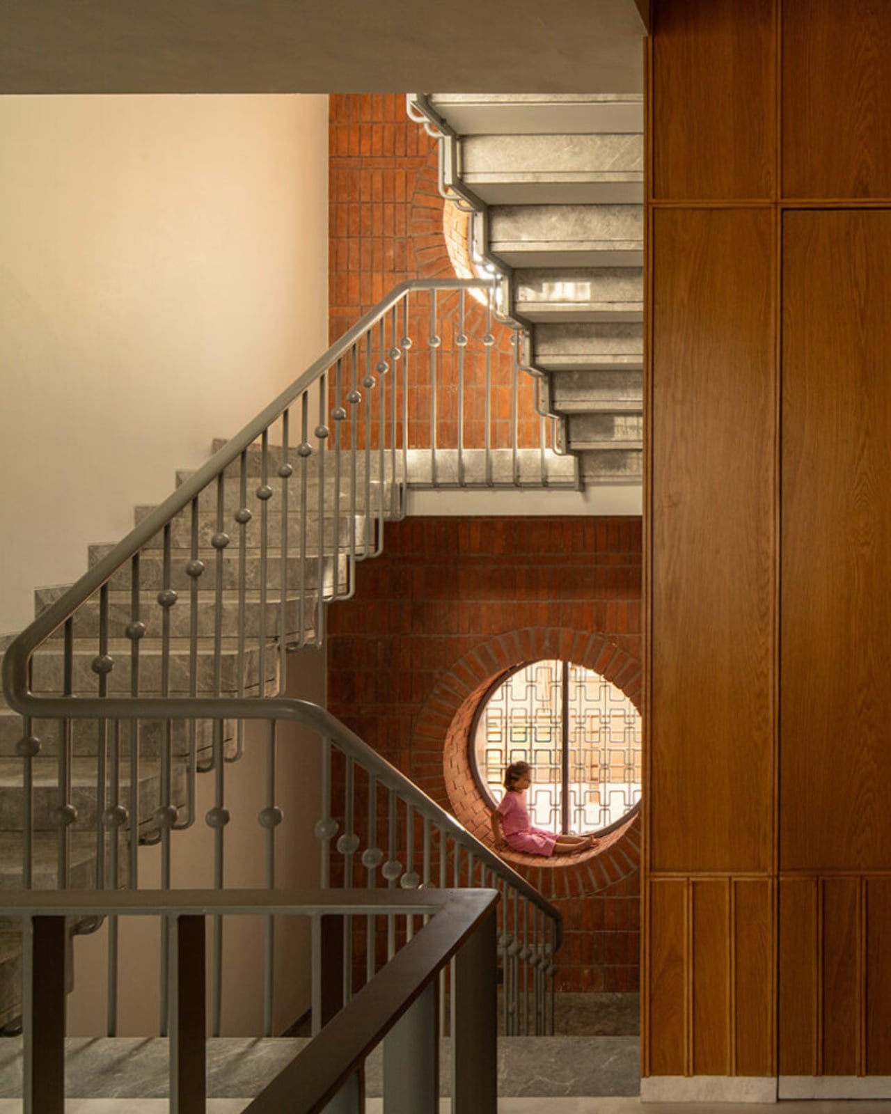
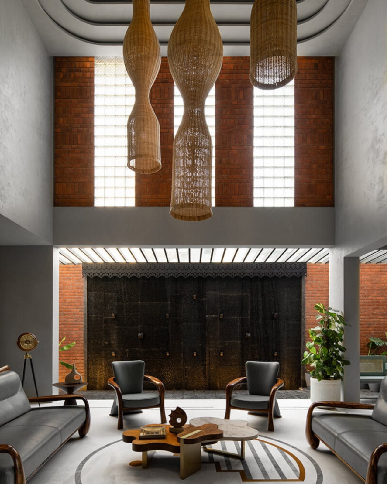
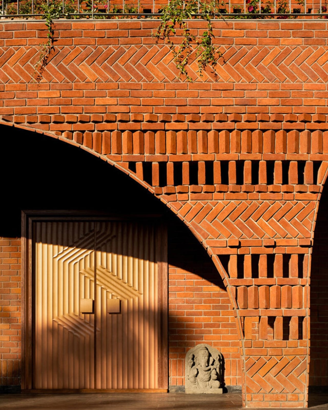
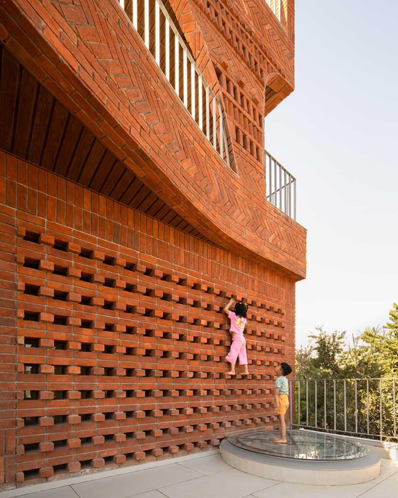
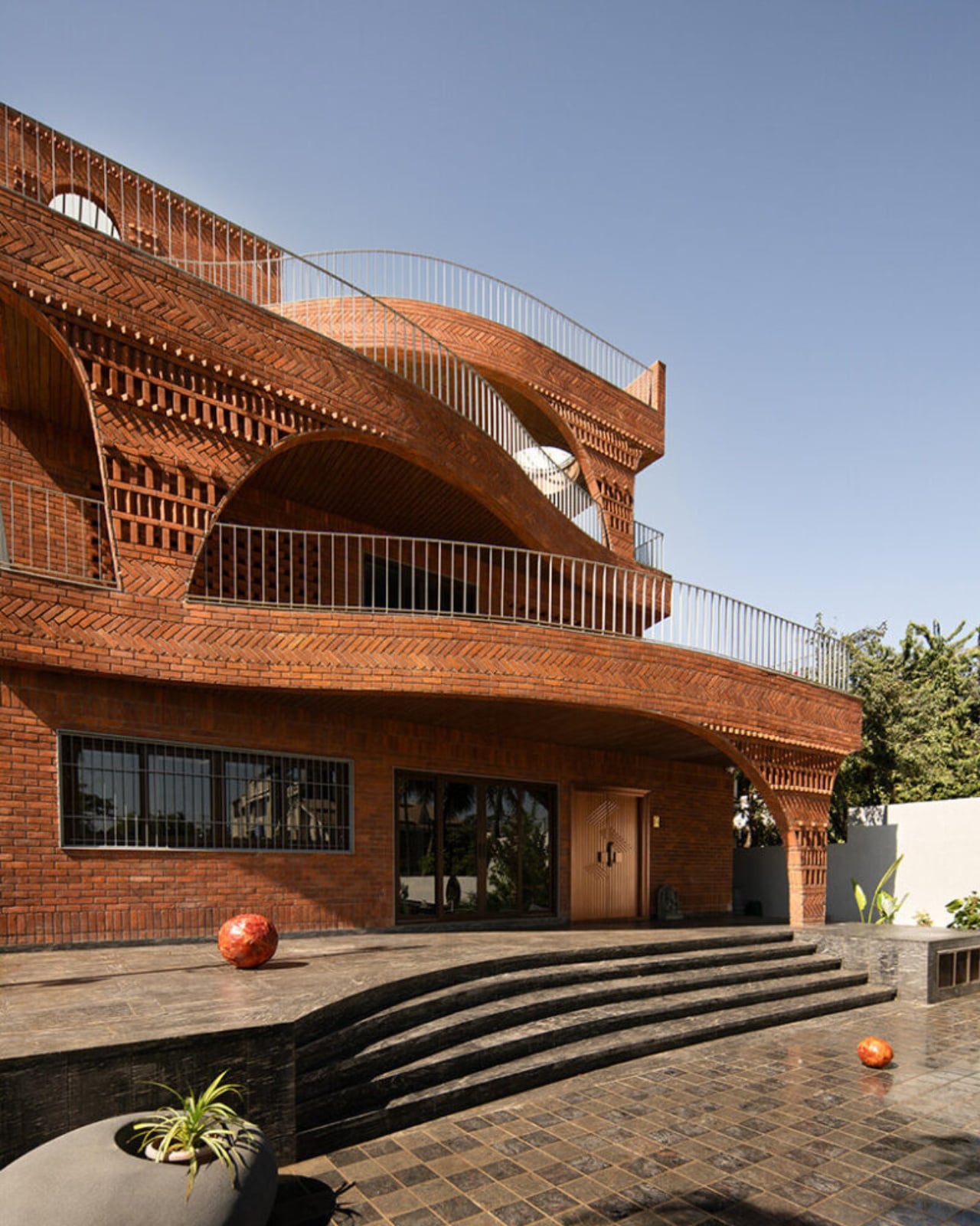
The house sits low in the landscape, almost terrain-like, its exposed brick facade functioning as much as an environmental filter as it does a structural shell. From the outside, it reads as deliberately introverted: solid walls and perforated surfaces that hold back the glare before it ever reaches the living spaces inside. The real architecture begins once you start moving through it. Rooms branch off from larger communal volumes, ceiling heights shift unexpectedly, and natural light arrives filtered and softened rather than harsh. The passage between spaces becomes the experience, not just a means of getting from one room to another.

This is a design principle modernism largely traded away in favor of open-plan everything and maximum sight lines. The Anthill doesn’t make that trade. Its stepped terraces and alternating balconies recall the traditional Indian rooftop concept of the chhat, creating layered, shaded thresholds that do the cooling work before the sun reaches the interior. A 12-foot cantilevered slab, supported through brick in compression, adds a more deliberate architectural gesture to the otherwise organic composition.

It’s worth pausing on the sustainability side of this project, because it earns more than a passing mention. The Anthill operates entirely on passive systems: cross ventilation, thermal mass, and shaded courtyards. No mechanical ventilation. In a region defined by extreme heat and intense sunlight, that isn’t a compromise. It’s a design strategy that trusts the building’s own intelligence. The idea that architecture should outlast any power grid it’s connected to feels increasingly important, and The Anthill makes that case without saying a word about it.

I think what gets undersold in conversations about sustainable design is how genuinely radical simplicity is. We’ve normalized a model where buildings are essentially sealed boxes, then mechanically conditioned to be habitable. That approach is energy-intensive, expensive, and fragile in ways we rarely acknowledge. The Anthill argues the opposite: that a building designed with enough spatial intelligence doesn’t need to fight its climate. It learns to negotiate with it instead.

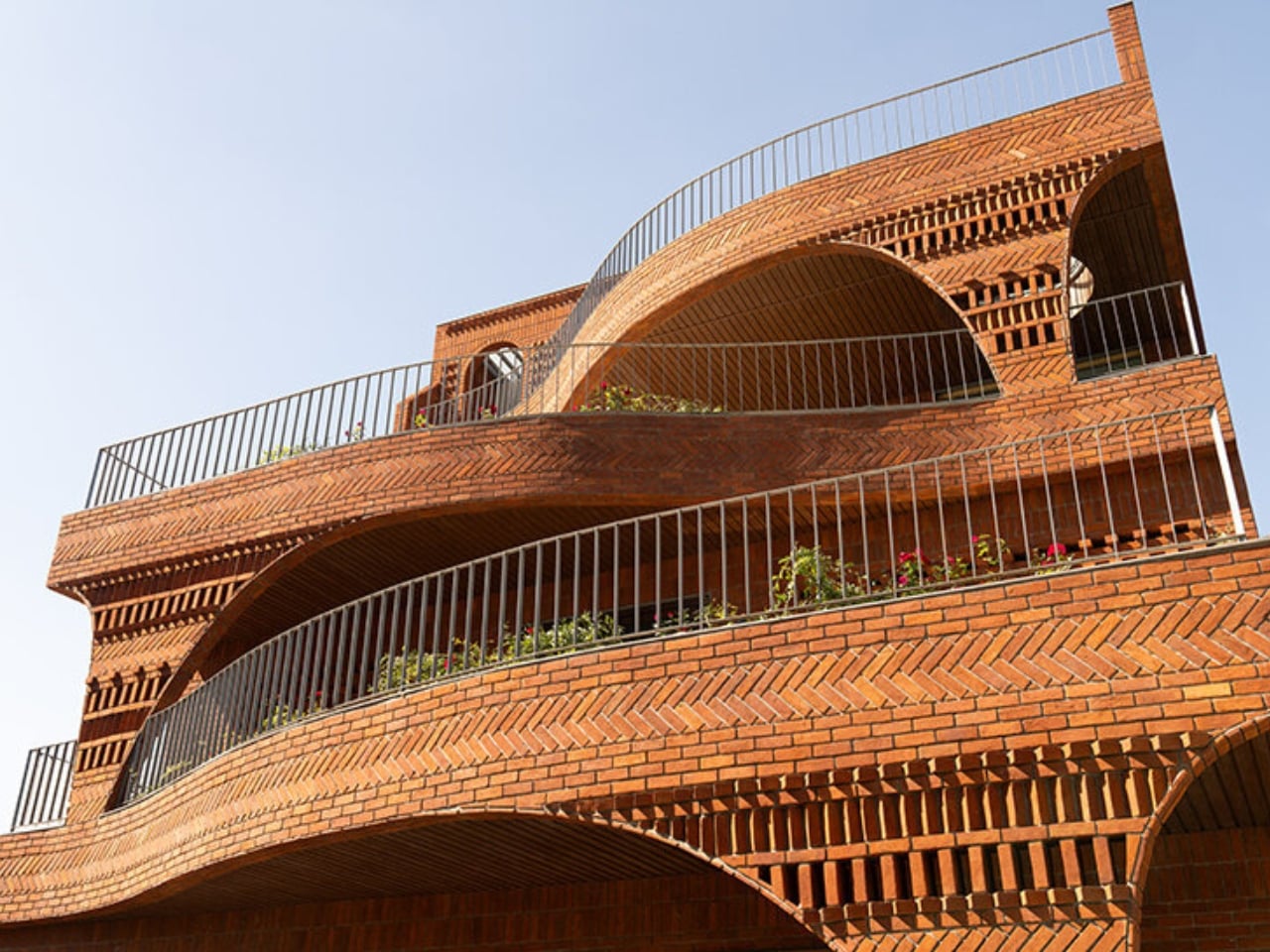
The visual language of the project carries all of this without being heavy-handed. The brick is warm and earthy, the curves are organic without being theatrical, and the overall effect is of a building that looks like it belongs to the land rather than placed on top of it. Photography by Avesh Gaur shows a house that reads differently from every angle, which is always a sign that the architecture is meant to be inhabited rather than just photographed.

What The Anthill ultimately puts on the table is a question worth sitting with: what if the most intelligent design move isn’t to add more technology, but to study what natural systems already perfected? The answers, in this case, are sophisticated enough to build a house around. We talk a lot about future-proofing design. The Anthill is a case where the most forward-looking move was to look at something ancient.

The post India’s Anthill House Has No AC and Stays Cool Anyway first appeared on Yanko Design.
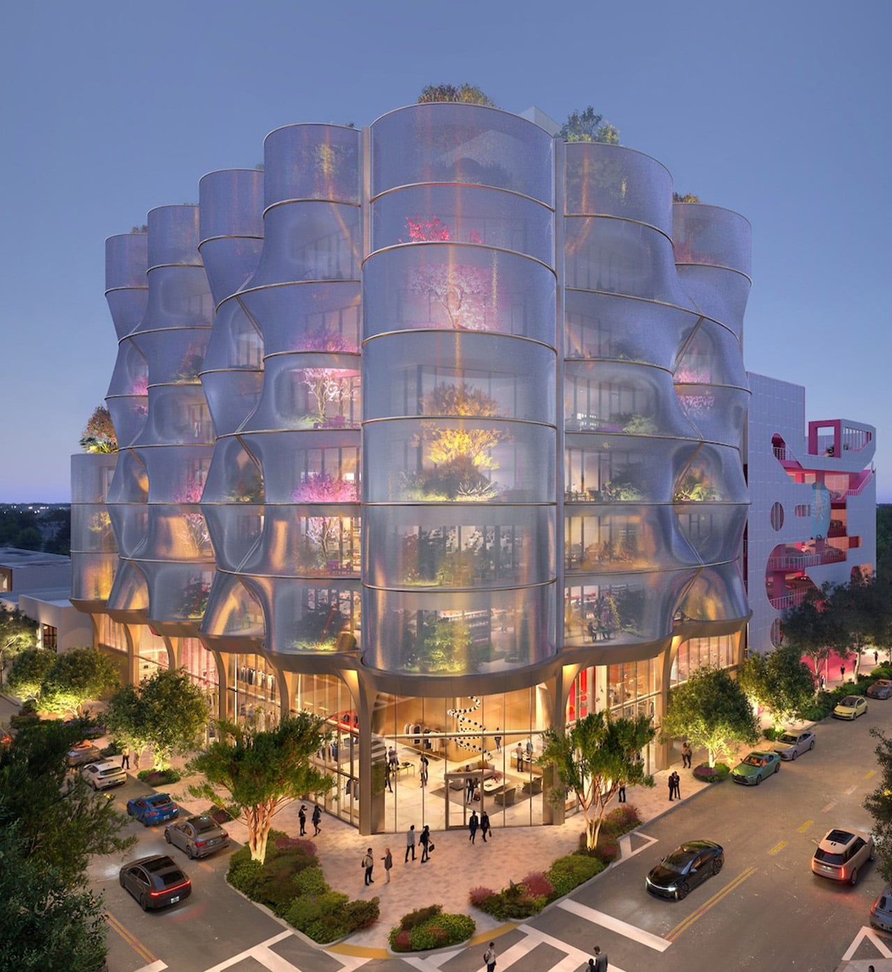
Snøhetta Wraps a New Miami Design District Office Building in a Stainless Mesh Sunscreen

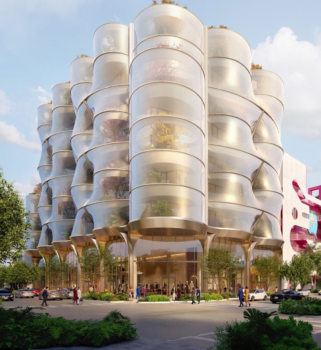
Miami’s Design District has quietly become one of the most architecturally charged neighborhoods in the United States, and Snøhetta’s latest project only deepens that case. The Oslo and New York-based studio has unveiled designs for Sweetbird North, an eight-storey mixed-use building developed by Raycliff Capital, positioned next to the neighborhood’s iconic Museum Garage. It is one of the more visually inventive additions to a district already thick with bold architectural statements.

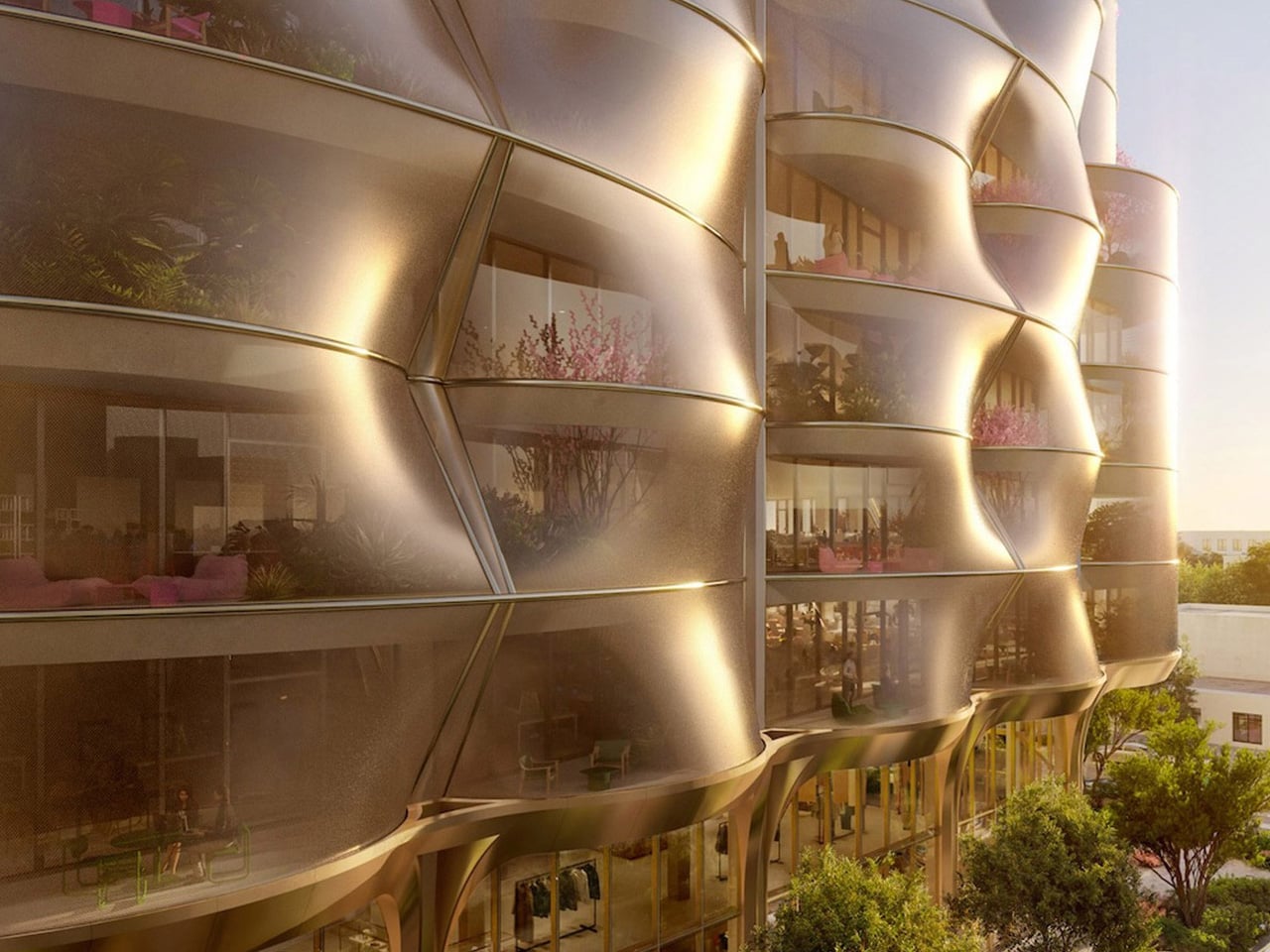
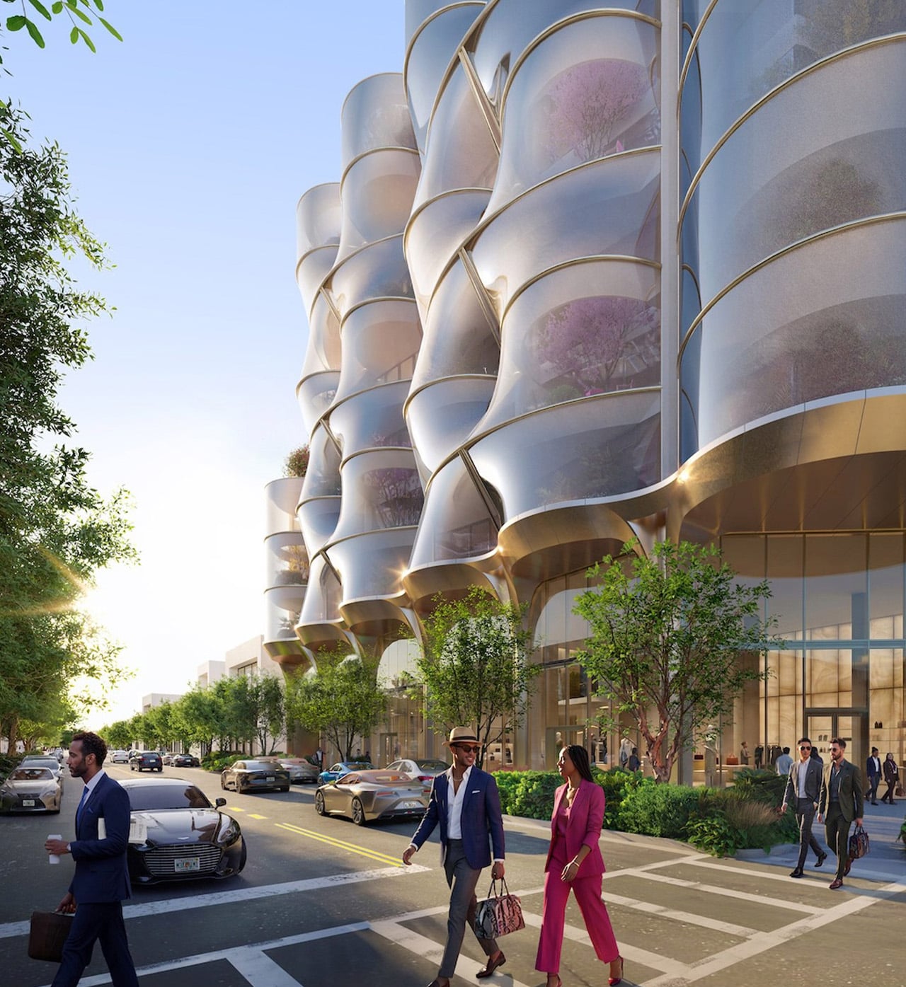
The building’s defining feature is its double-skin facade. A glass curtain wall sits closest to the structure, and then a second layer of stainless steel mesh wraps the entire building from base to roof, forming a series of columns that rise continuously upward from a metal-plated ground-level base. Large dimples punctuate the mesh at intervals, pushing the surface in and out to create an undulating, almost organic silhouette. The effect shifts depending on where the sun sits. At certain hours, the skin reads as a dense, reflective shell; at others it dissolves into near-transparency, revealing the planted terraces and occupied floors behind it.

Designer: Snøhetta

Snøhetta director Nathan McRae described the mesh as a “veil to the planting and occupied terraces of the offices beyond, providing a depth that varies with the sun and time of day, at times opaque and reflective, dissolving to the transparent.” It is a rare piece of facade design that rewards both a glance from the street and a longer study from across the block.

Programmatically, Sweetbird North is organized around a clean split. The first and second floors are given over to retail, while floors three through eight are dedicated to office space, designed with flexible floorplates to accommodate a range of configurations. The building is intended for tenants in the creative, luxury, and cultural industries — a natural fit for a neighborhood that has drawn names like Cartier, Bulgari, and a roster of significant cultural institutions in recent years. Planted terraces are woven throughout the office floors, designed to introduce what the team calls “permeability and calm” into what is otherwise a dense urban environment.

Construction is scheduled to begin in August 2026, with completion expected in 2028. Sweetbird North is part of a continuing westward expansion of the Miami Design District that also includes David Chipperfield Architects’ first residential building in the neighborhood and a sculptural retail block currently underway from Kengo Kuma and Associates. For a city that has seen its fair share of glass towers, a building that genuinely changes with the light is worth watching.

The post Snøhetta Wraps a New Miami Design District Office Building in a Stainless Mesh Sunscreen first appeared on Yanko Design.
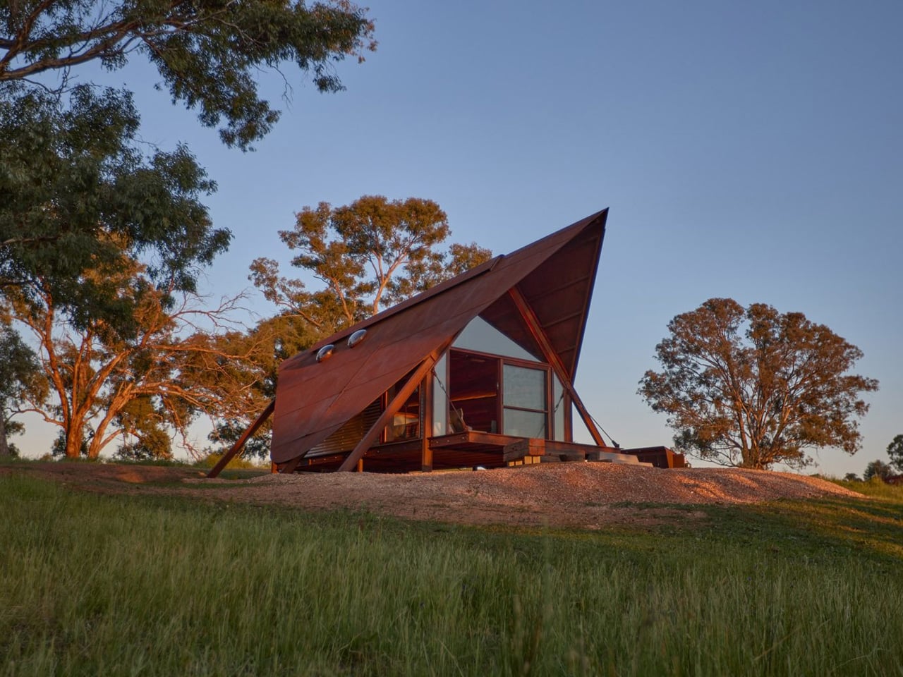
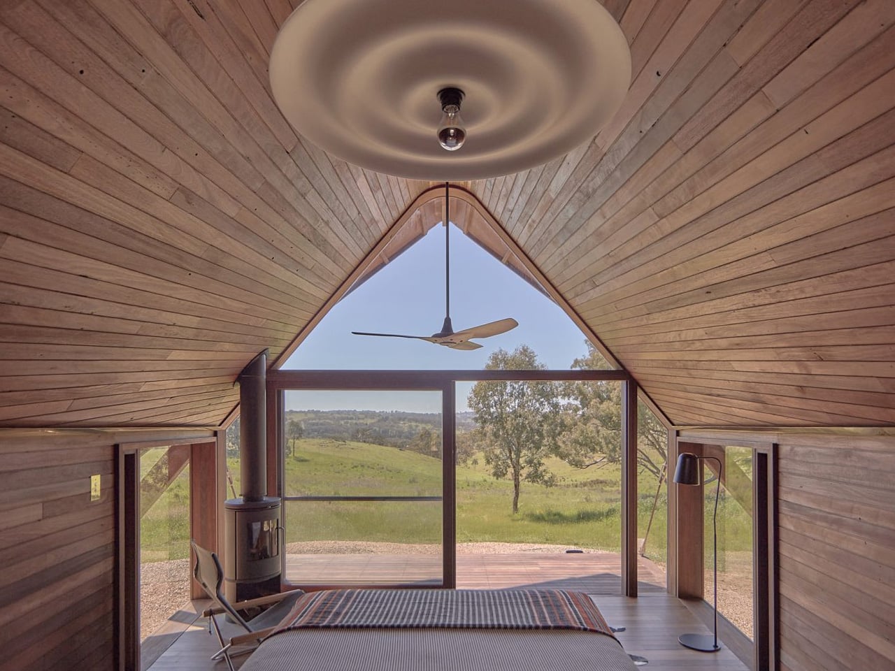
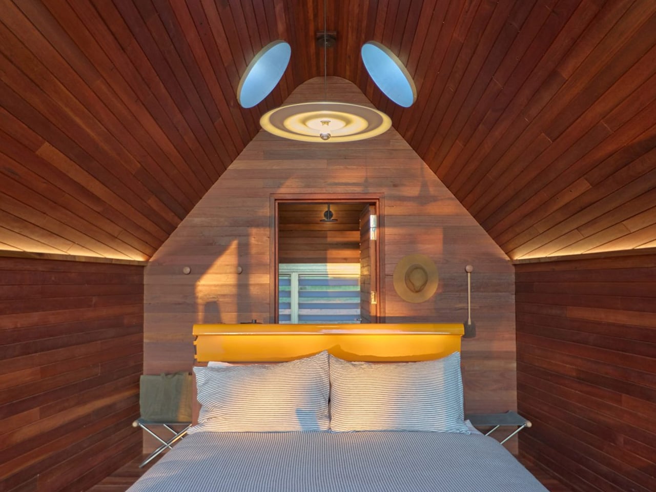
Two Cor-Ten A-Frames Lined in Oiled Ironbark and Brass Are NSW’s Most Compelling Retreat

Most architects talk about restraint. Casey Brown Architecture actually practices it — and with Permanent Camping III (PC3), the Sydney-based firm delivers its most resolved chapter yet in an ongoing series rooted in the idea that shelter, stripped bare, is its own form of luxury.

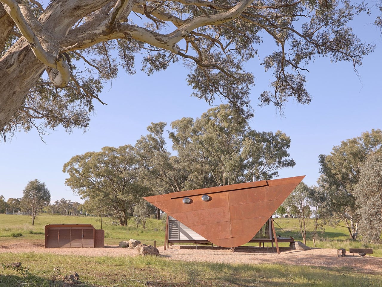
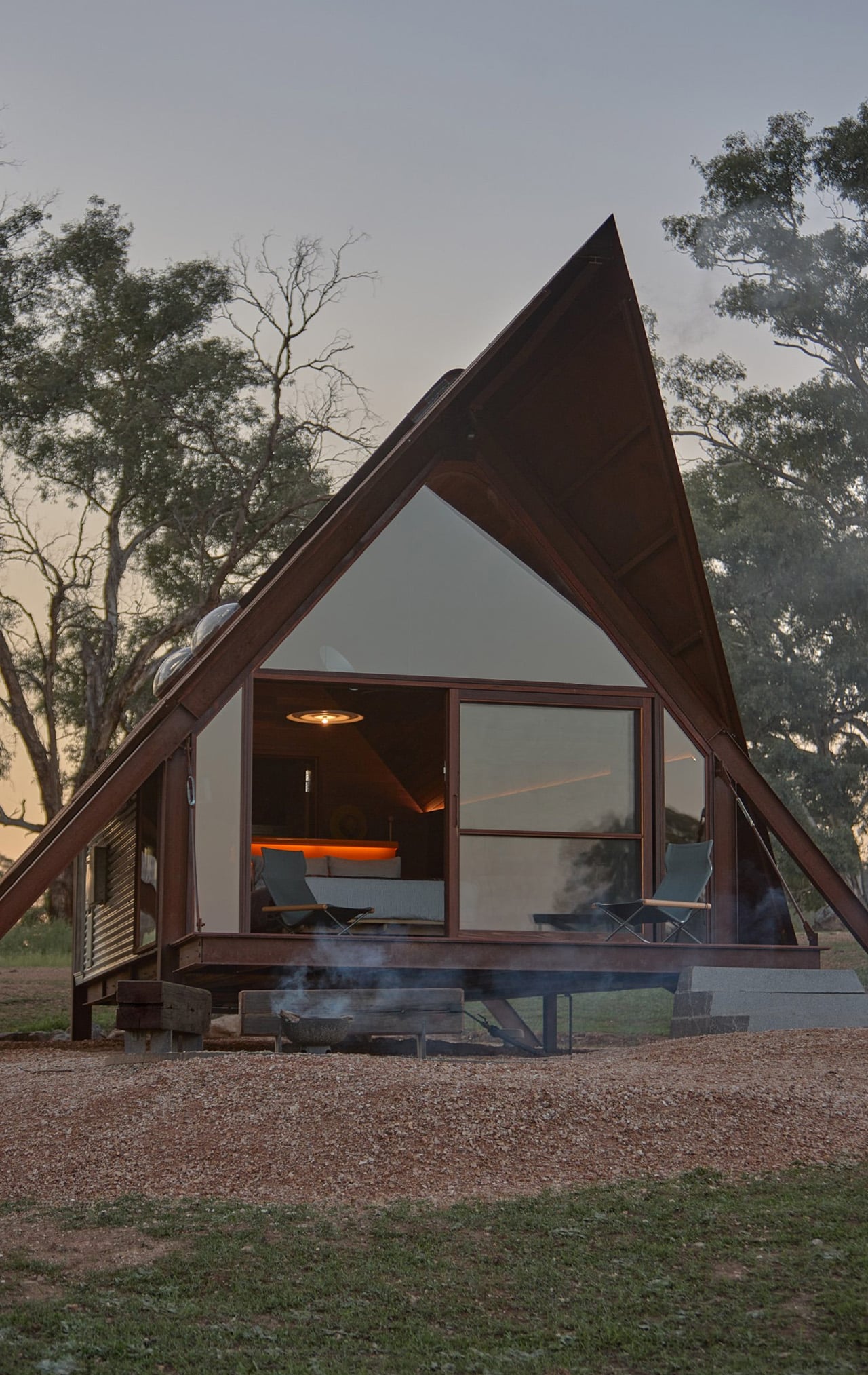
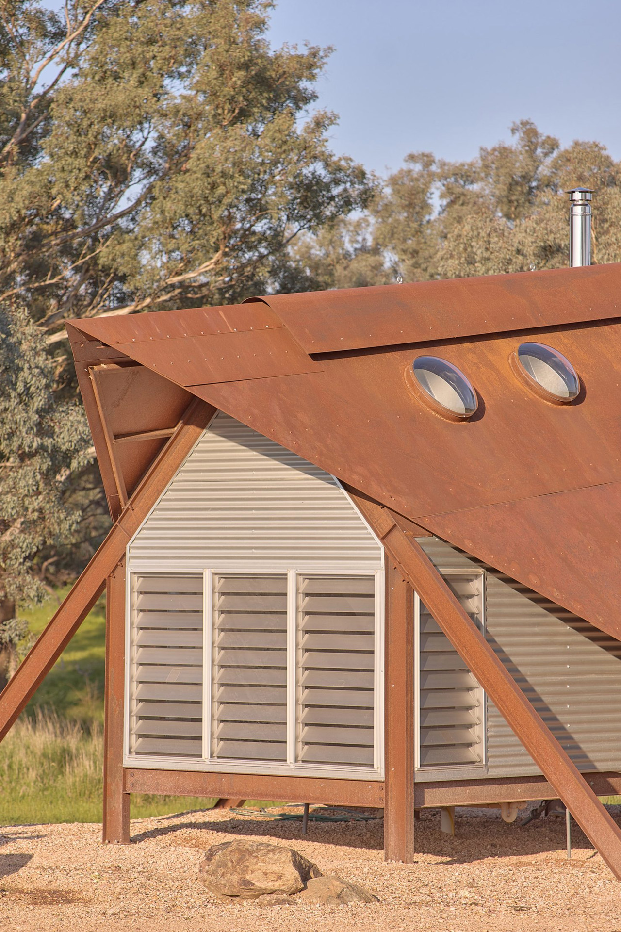
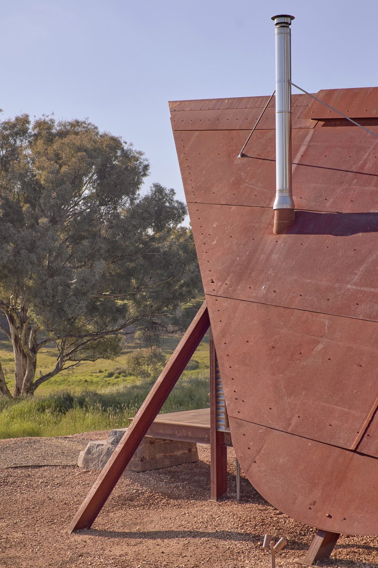
PC3 sits on a working sheep farm roughly ten minutes outside the NSW regional centre of Orange. It continues a lineage that began with PC1 in Mudgee and PC2 in Berry, yet stands as its own distinctive response to place, climate, and the evolving ethos of minimal living. Each iteration has pushed further into the question of what a dwelling truly needs to be — and PC3 answers with two sharply profiled A-frame steel cabins that rest lightly on the undulating terrain, their silhouette unmistakably reminiscent of a tent pitched against the open sky.

Designer: Casey Brown Architecture

The form is both utilitarian and sculptural. Shaped by economy and climate, the cabins were designed specifically as short-stay boutique accommodation, built for reflection and direct engagement with the environment. From the outside, the structures read as hardworking — almost agricultural — with their angular steel profiles echoing the farm’s own no-fuss pragmatism. But step inside and the experience shifts entirely.

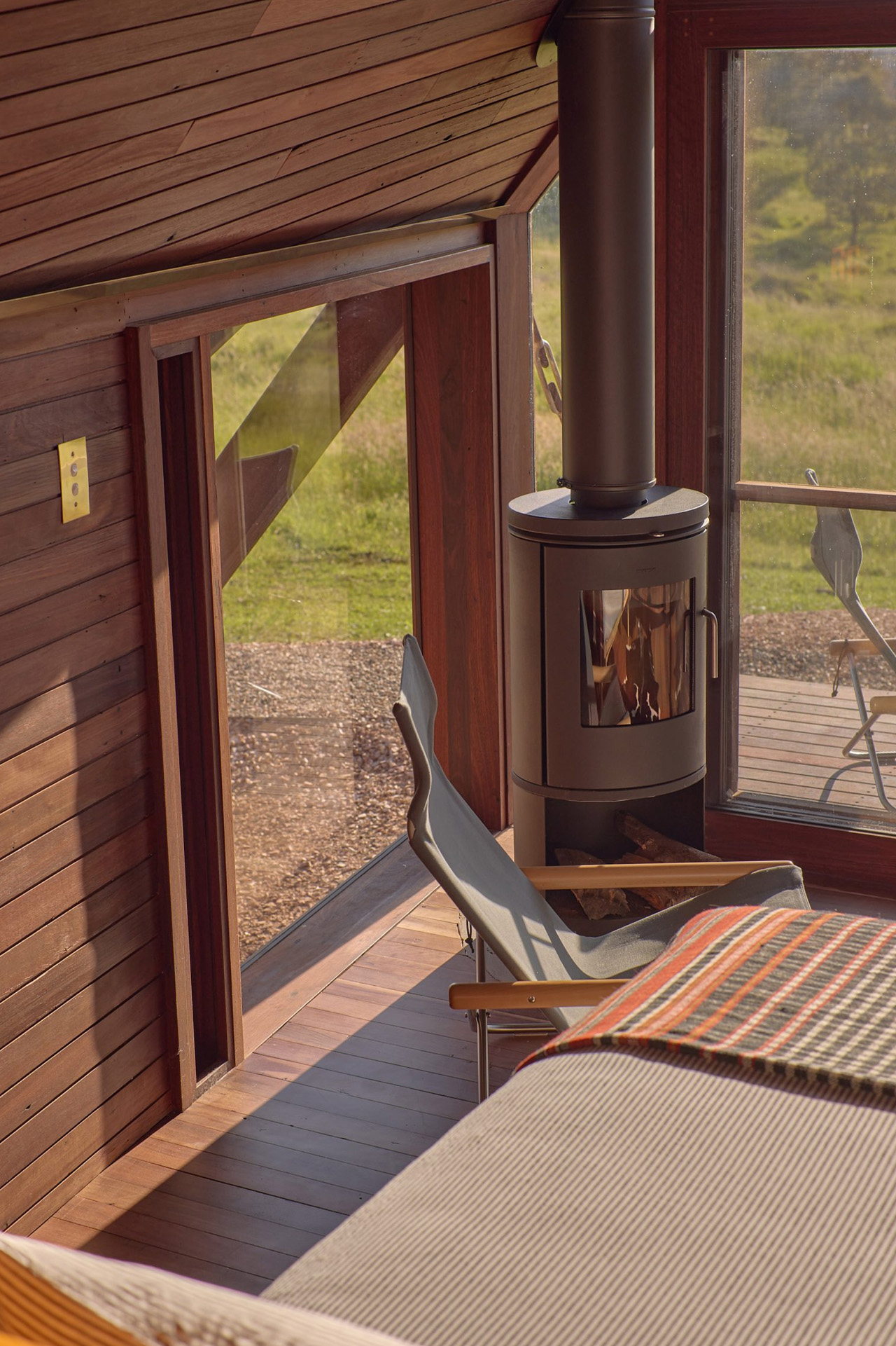
In contrast to the rustic exterior, the cabins are lined with warm boards of oiled recycled ironbark, bespoke brass lighting, and custom steel detailing — a considered interior palette that feels earned rather than decorative. It’s the tension between outside and inside, between roughness and warmth, that gives PC3 its emotional resonance. Casey Brown Architecture has always understood that the best retreats don’t shield you from the landscape — they frame it.

The project is described as a distilled version of habitation, providing only what is essential for comfort, with the two cabins designed to encourage reflection and allow direct engagement with the surroundings. That philosophy isn’t new to this practice, but PC3 refines it with a maturity that comes from having done this before — and asking harder questions each time.

What makes PC3 significant isn’t novelty. It’s conviction. In an era of maximalist rural retreats competing for attention, these two A-frames on an Orange sheep farm quietly insist that architecture doesn’t need to perform. It needs to be present — grounded, purposeful, and honest about the land it sits on. Casey Brown Architecture has spent decades making that argument. With PC3, they make it again, and more convincingly than ever.

The post Two Cor-Ten A-Frames Lined in Oiled Ironbark and Brass Are NSW’s Most Compelling Retreat first appeared on Yanko Design.
This Scandinavian Tiny Home Has a Dedicated Office & Trades Wheels For 39 Square Meters of Smarter Living

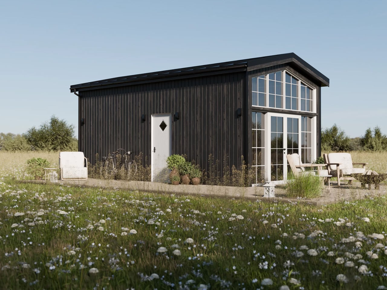
Tiny living has never looked this composed. Vagabond Haven, the Scandinavian tiny home builder known for architect-designed structures built to withstand year-round Nordic conditions, taps directly into that feeling with their latest modular offering: the Lucia. The Lucia sits in Vagabond Haven’s modular homes lineup, meaning it’s fixed to a steel frame on a permanent foundation rather than road-towable — a deliberate trade-off that unlocks noticeably more interior breathing room.

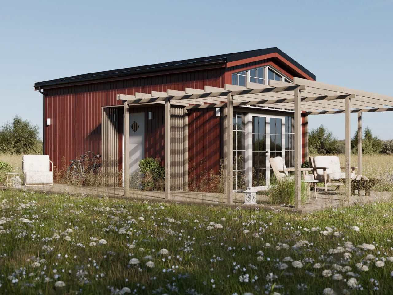
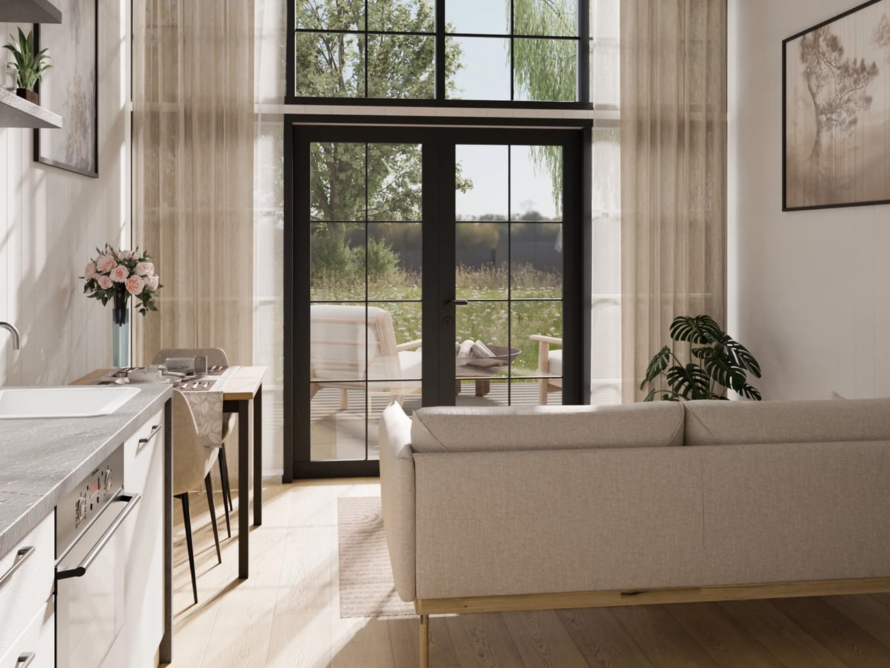
At 39 square meters across a 7.5-meter frame, it’s one of the more generously proportioned models in the lineup, and it reads that way from the moment you step inside. From the outside, the Lucia earns its cottage comparison immediately. It’s clad in either spruce or engineered wood siding, finished with a clean metal roof, and offered in a range of color options — the deep black exterior and the natural wood tone being the most visually striking. A large glass façade opens up the front face of the home, pulling light deep into the ground floor and creating a visual connection to the landscape that most small structures simply can’t achieve.

Designer: Vagabond Haven

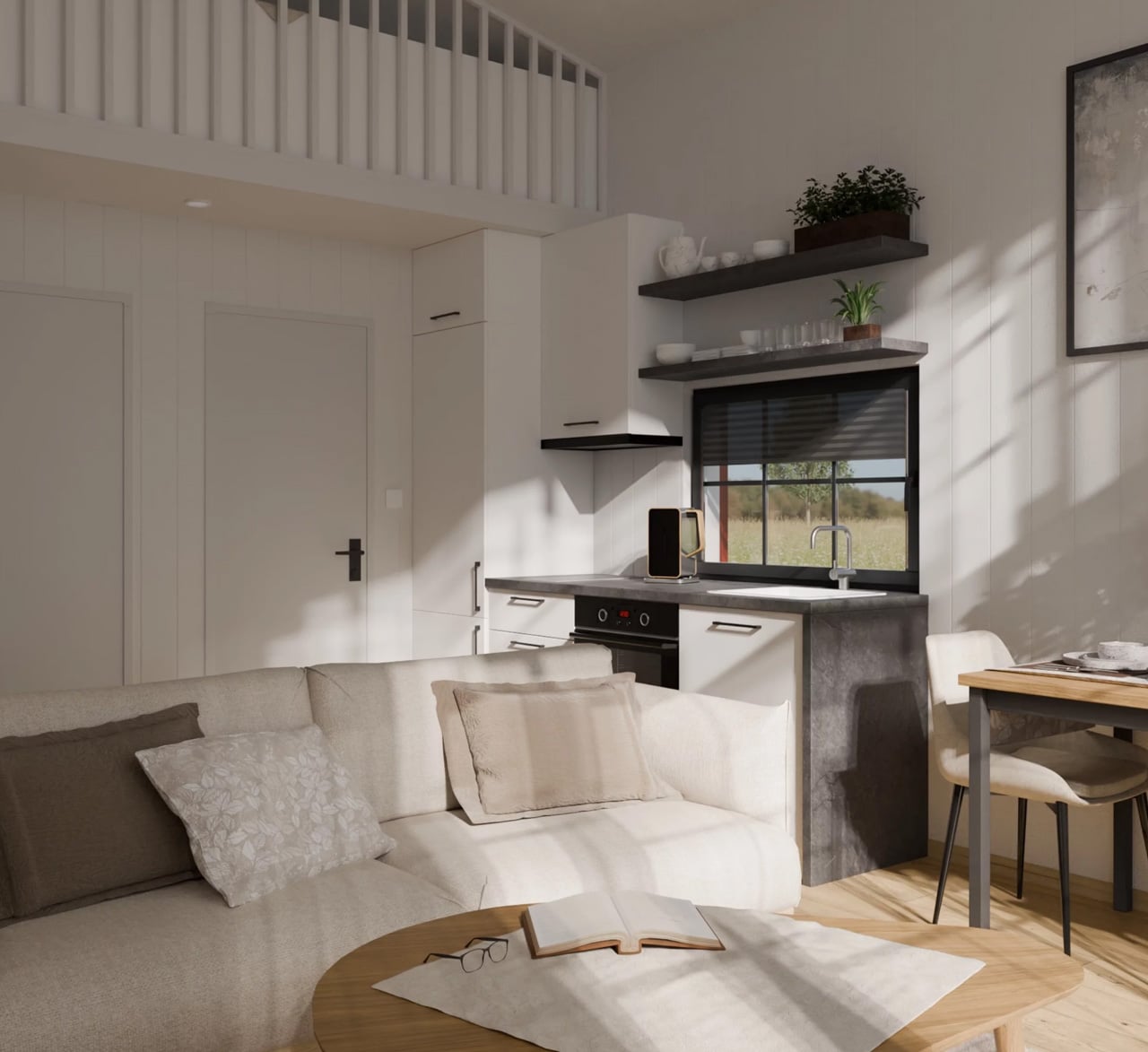
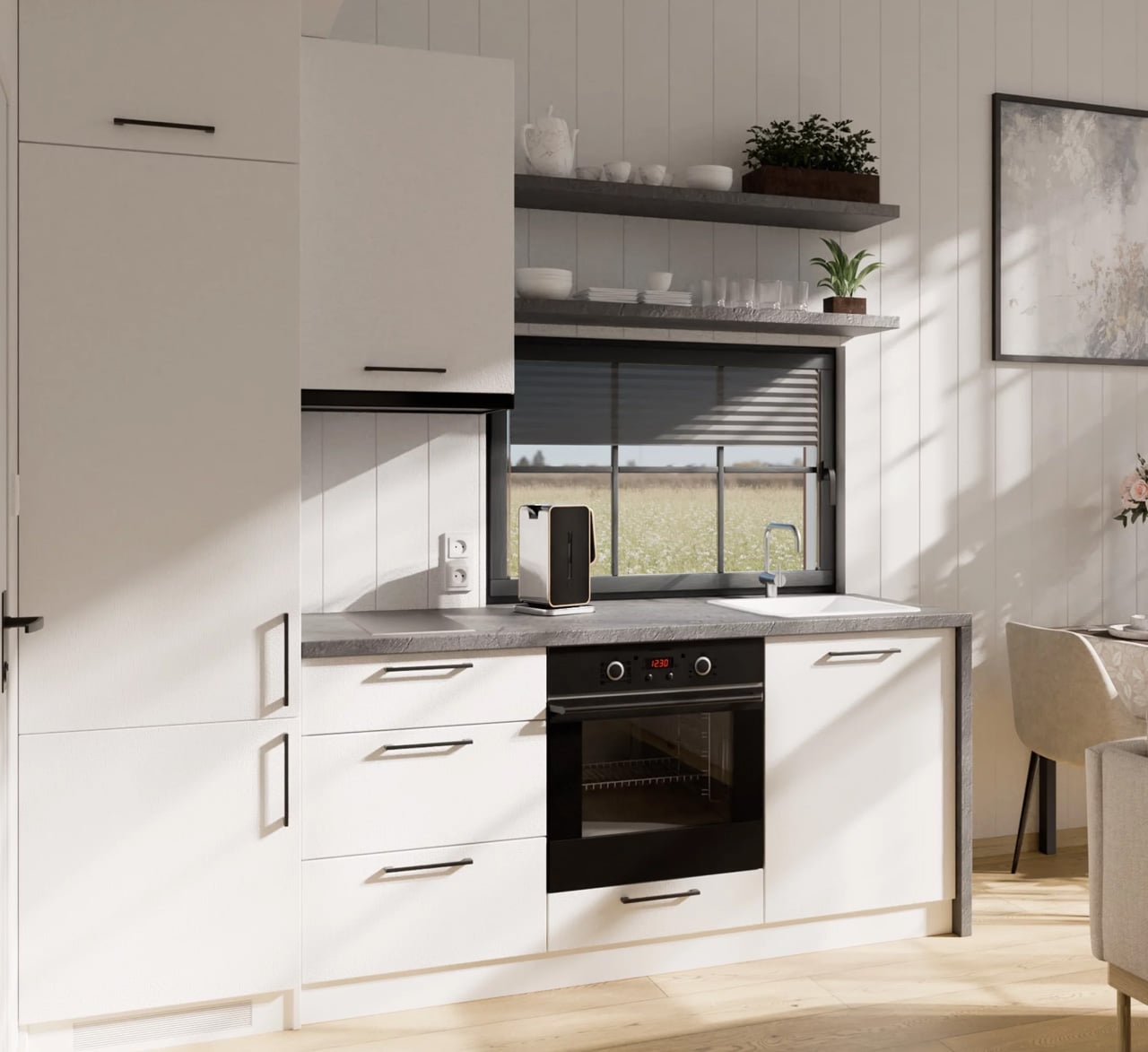
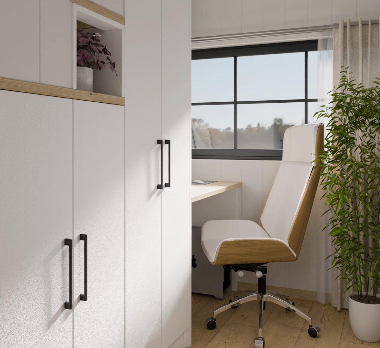
Inside, the layout is smarter than its square footage suggests. The ground floor holds a full kitchen, a living area, and — the detail that really sets the Lucia apart — a dedicated home office with a built-in desk and integrated storage. In a moment when remote work has become a non-negotiable consideration for homebuyers at every scale, this is a meaningful design decision rather than a gesture. The space feels intentional, not squeezed in.

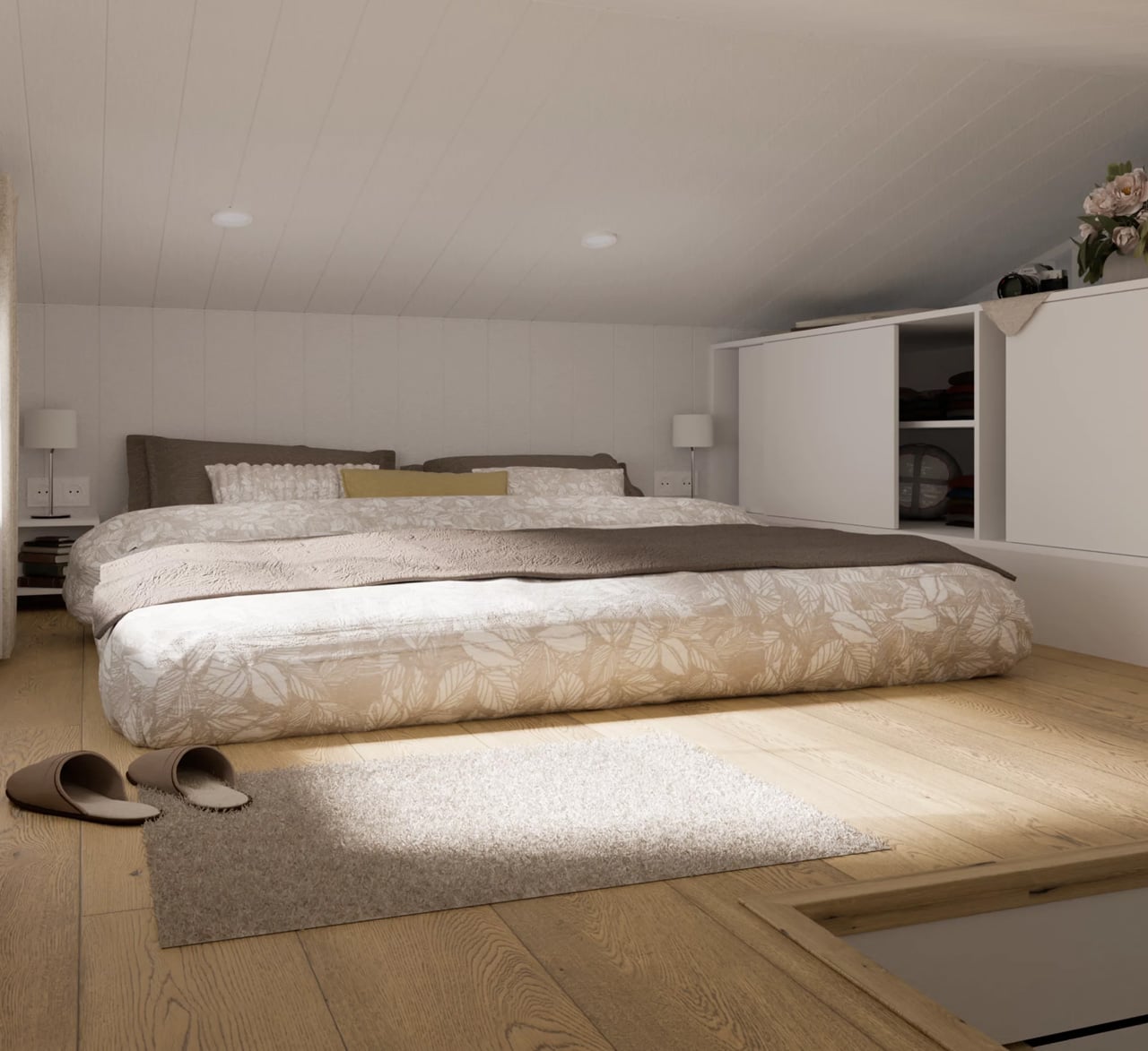
The bedroom lives in the loft, accessed by a staircase that earns its keep twice over — each step doubles as a storage nook or cupboard. The ceiling runs low up there, as loft ceilings do, but the double bed fits comfortably alongside additional built-in storage, and the proportions feel cozy rather than cramped.

The Lucia starts at $97,000, with the final number climbing depending on customization choices — a terrace and pergola add-on, furnishing packages, and color selections among them. For a modular home built to Scandinavian standards, using eco-friendly materials and designed by architects rather than assembled from a catalog, that entry price is competitive. What the Lucia ultimately offers isn’t a compromise on living — it’s an argument that thoughtful design at 39 square meters can outperform thoughtless design at twice the size.

The post This Scandinavian Tiny Home Has a Dedicated Office & Trades Wheels For 39 Square Meters of Smarter Living first appeared on Yanko Design.
This Architect Built a Chess Set Where the Hardware Is the Design

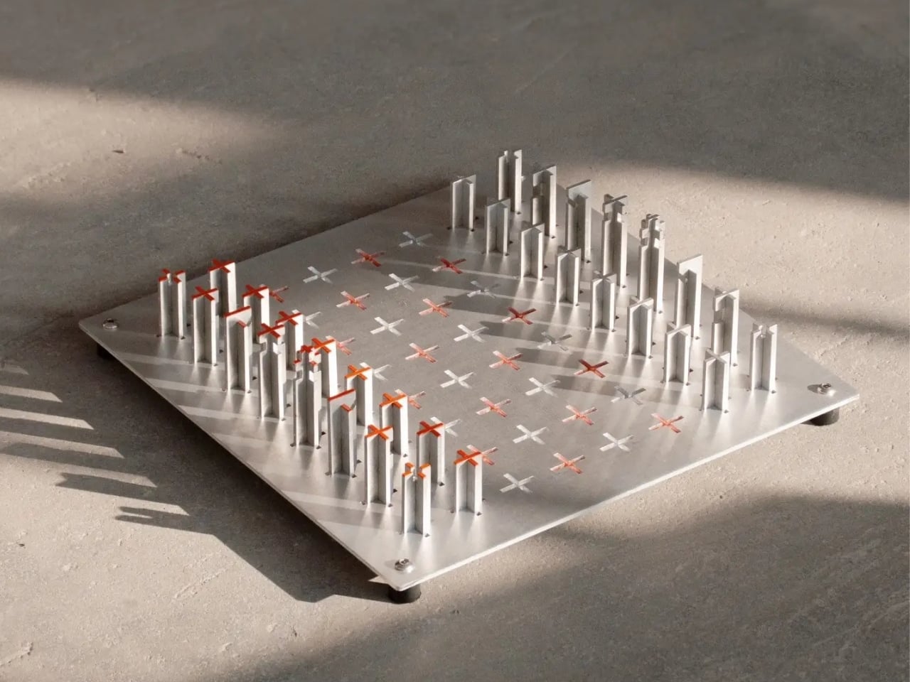
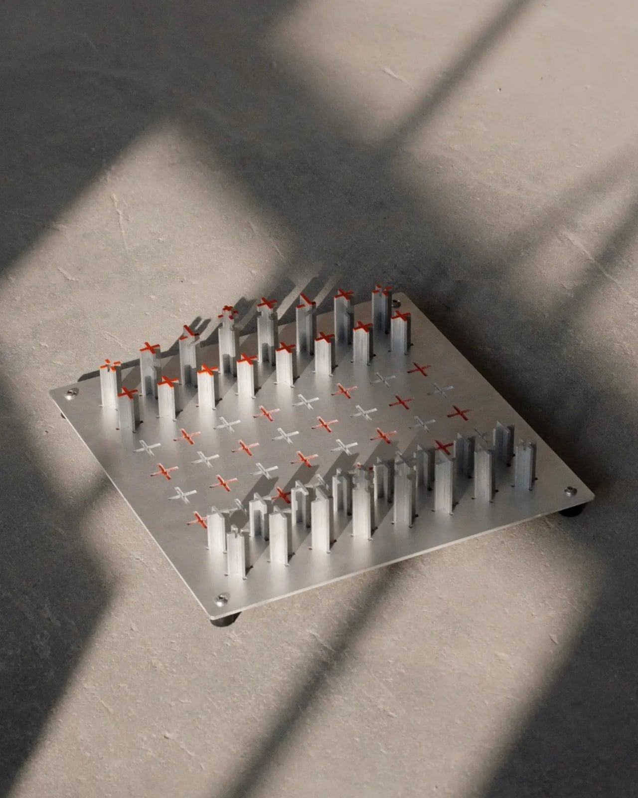
Chess has been around for roughly 1,500 years, and in that time, the chess set has been reimagined in almost every conceivable way. You’ve seen the hand-carved wooden sets passed down through generations, the marble ones that live on coffee tables as decor, the kitschy themed sets with medieval knights and castle towers. Every few years, someone tries to reinvent the most iconic board game in history, and most of those reinventions end up looking like a design school project that got a little too excited. Christian Borger’s CS-01 is different, and I think it matters that it’s different in the quietest possible way.

Borger, an architect and industrial designer based in New York, approaches furniture and objects the way an engineer approaches a problem: with an obsession over materials, weight, and structural honesty. His portfolio, if you haven’t gone through it yet, is worth a slow afternoon. It’s full of lightweight furniture experiments, chairs built from tensioned fabric and skeletal frames, tables that look like they’re barely touching the ground. CS-01 follows that same design instinct, just compressed into a 14 x 14 x 5-inch object that you play chess on.

Designer: Christian Borger

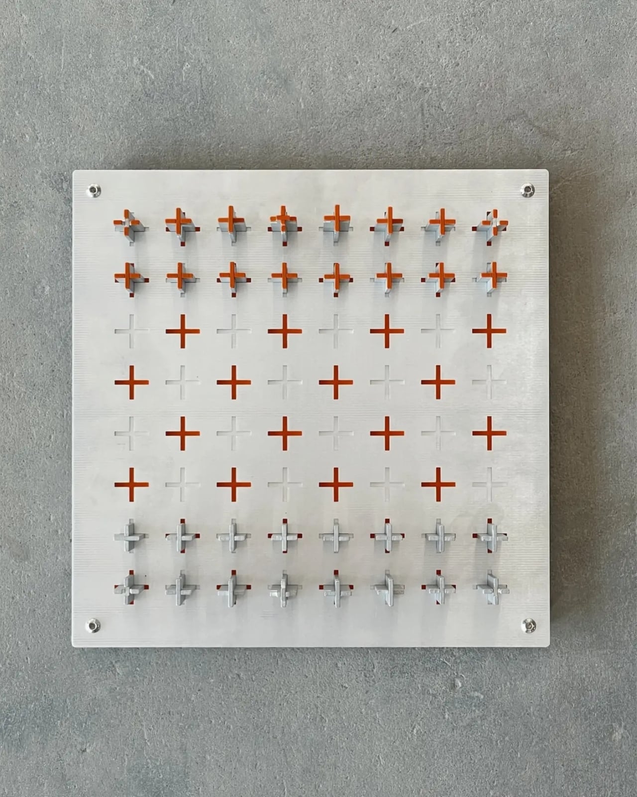
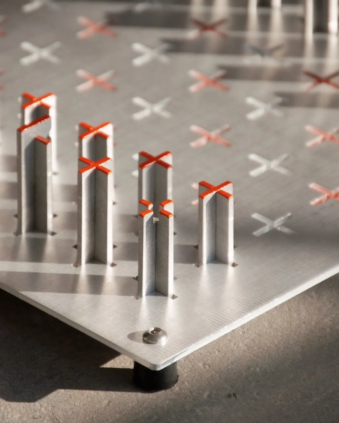
The set is built from aluminum, stainless steel hardware, rubber bumpers, and enamel paint. Powder-coated aluminum surfaces contrast against exposed stainless steel, and that word “exposed” matters here. Nothing about the assembly hides from view. The hardware isn’t tucked away or finished into invisibility. It’s right there, part of the aesthetic, because Borger seems to believe that a well-made object shouldn’t have to be embarrassed about how it’s put together. That kind of structural honesty doesn’t show up in chess sets often enough, and it’s genuinely refreshing to see it applied somewhere so unexpected.

The pieces sit at five inches tall, which keeps the whole set compact enough to live on a desk, a shelf, or a credenza without demanding too much space or attention. It integrates into a room rather than dominating one. That restraint is intentional. The design privileges clarity and permanence over decoration, which is a principle worth sitting with. Not because it’s some kind of grand manifesto, but because it’s a genuinely difficult thing to execute. Decoration is the easy default. Clarity requires real decisions.

I’ll be upfront: there’s a legitimate conversation to be had about whether chess sets even need to be redesigned. The traditional Staunton set, which has been the global standard since the 1800s, is already a near-perfect solution. It’s legible, tactile, and elegant in its conventionality. Reinventing it for the sake of reinventing it usually results in something beautiful but unplayable, or worse, something that’s more display piece than game. CS-01 seems fully aware of that tension. It doesn’t abandon functionality to make a statement. The pieces are still readable by proportion and hierarchy. The board is still a board.

Where it distinguishes itself is in how it asks you to notice the object itself, not just the game being played on it. The cold touch of powder-coated aluminum. The small, deliberate weight of a piece lifted and placed. The hardware that catches light at the corner of your vision while you’re thinking three moves ahead. It turns the physical act of playing into something worth paying attention to, which is a pretty ambitious ask from a chess set, and one that CS-01 quietly delivers on.

Borger describes it as a prototype, and it still carries that energy of something being actively worked out rather than finished and packaged. That’s part of what makes it compelling. It reads less like a product and more like a point of view, one that argues you shouldn’t have to choose between an object that performs well and one that rewards close attention. That’s a harder case to make than it sounds. The most interesting design objects are the ones that make you rethink something you assumed was already solved. A chess set, of all things. Here we are.

The post This Architect Built a Chess Set Where the Hardware Is the Design first appeared on Yanko Design.
Mini House 300 x 600 Is the Back-to-Basics Tiny Home Built for Two

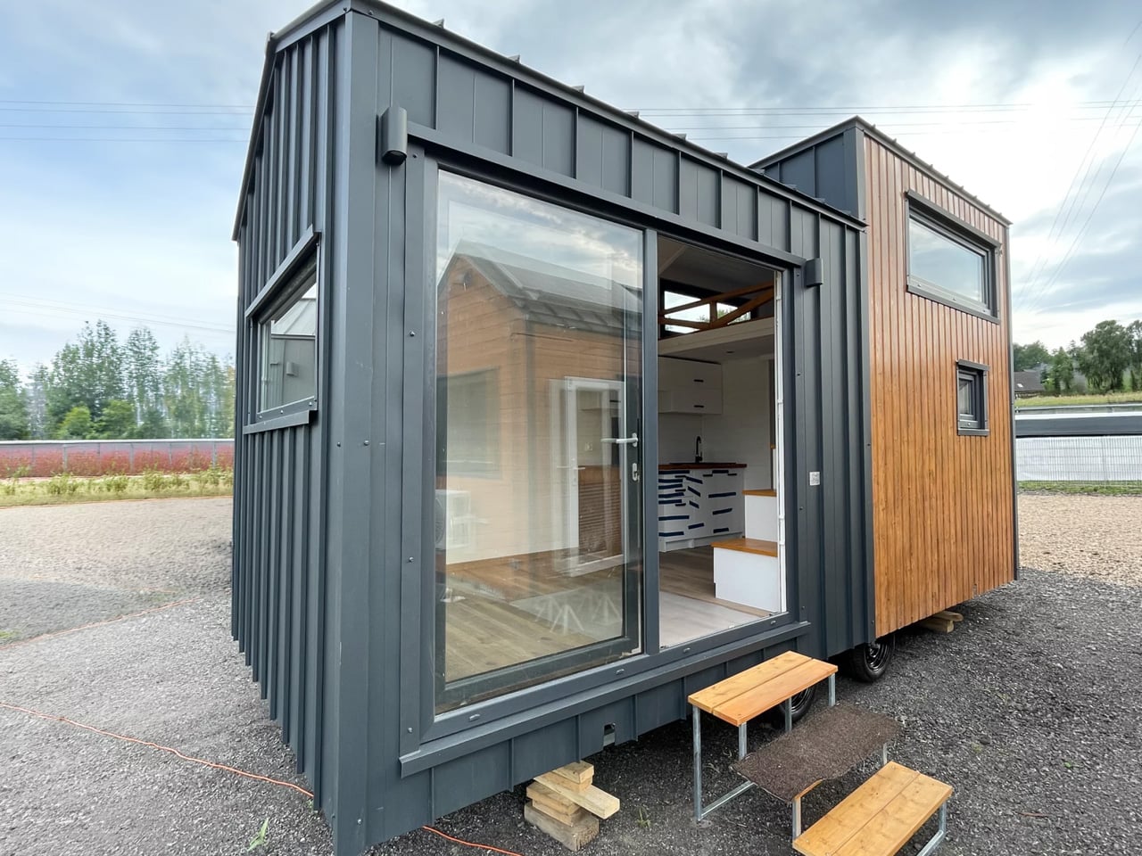
Poland’s Mini Domy has been quietly refining the tiny home formula across several designs, and the Mini House 300 x 600 might be their most focused yet. It doesn’t try to do everything. It tries to do the essentials well, and that clarity of intent is exactly what makes it compelling. At 247.5 square feet, it’s built for a couple who want to downsize without making every day feel like an exercise in spatial compromise.

The home rides on a double-axle trailer, measuring 20 feet long and 9.8 feet wide. That extra width is the defining design choice here. Most tiny homes are corridor-thin by necessity, and while that works for solo living, it creates a kind of perpetual negotiation of space when two people call it home. The 300 x 600 sidesteps that problem entirely. The 9.8-foot width means a towing permit is required on public roads, but the interior breathing room that results from it makes the trade-off easy to rationalize.

Designer: Mini Domy

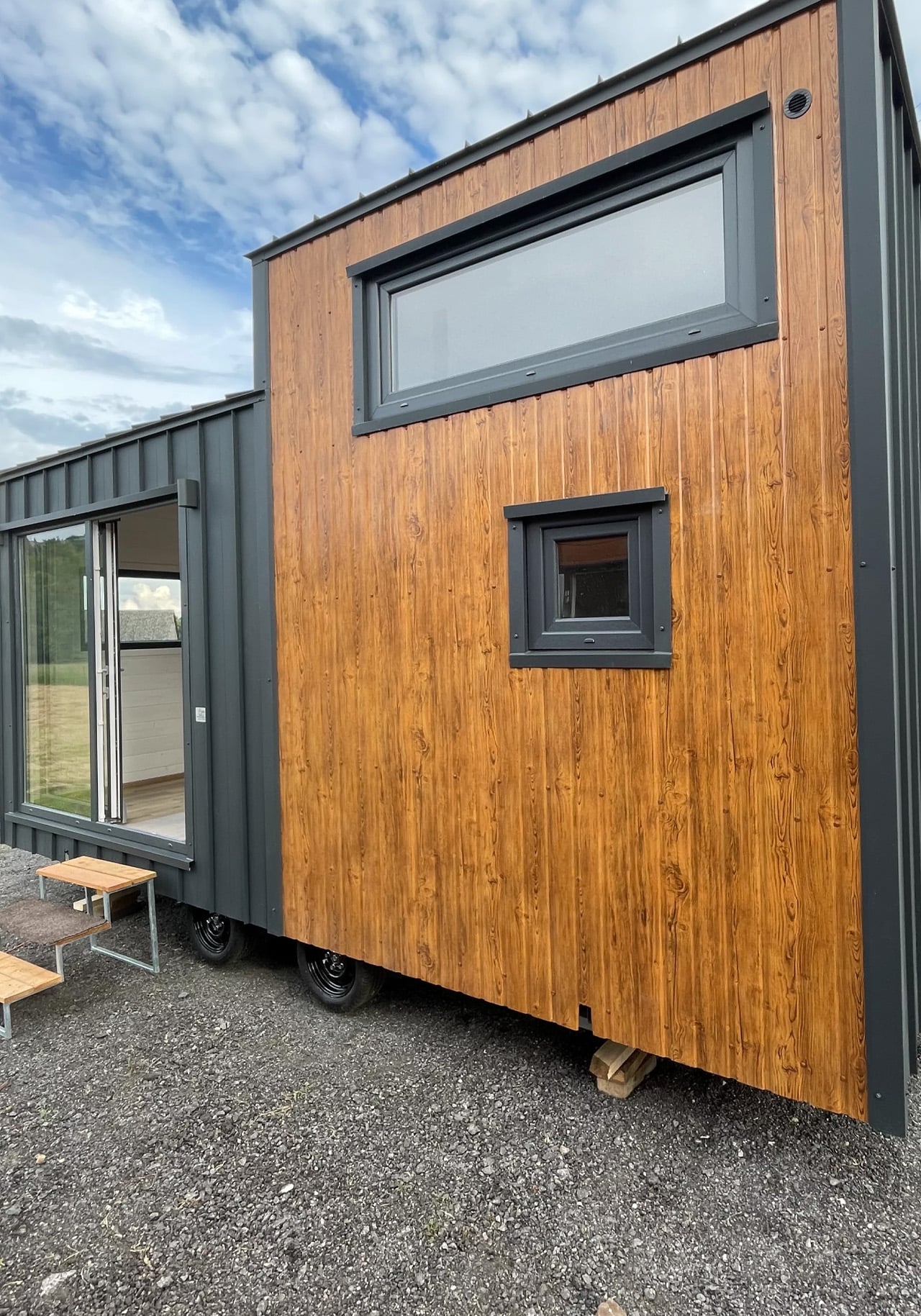
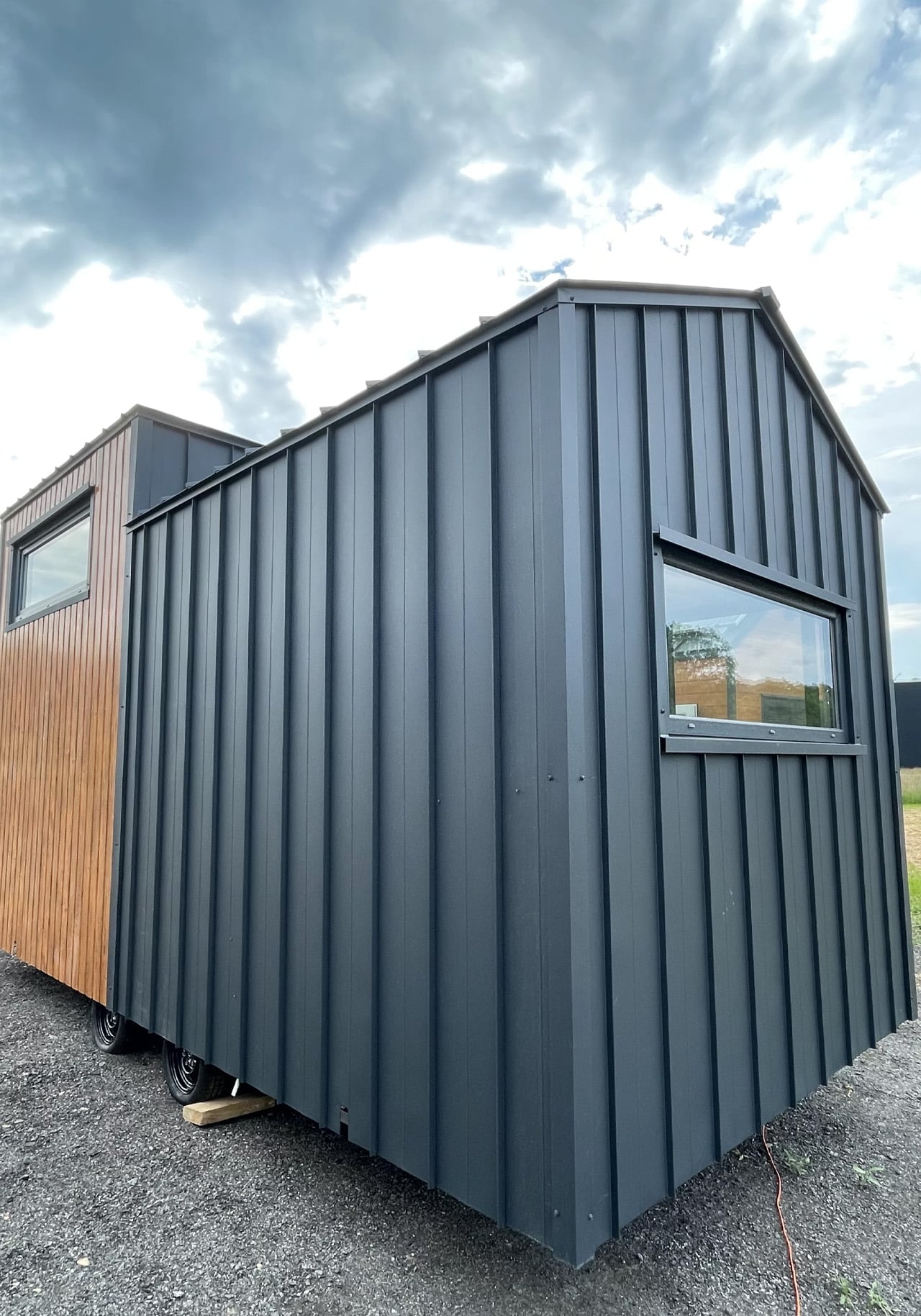
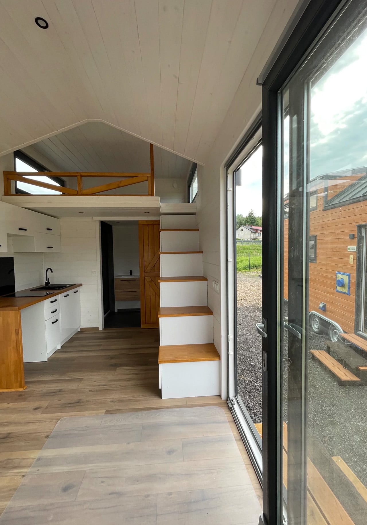
The exterior pairs metal cladding with timber accents, a restrained combination that reads more European cabin than American trailer, and sits comfortably against a forest clearing or a field edge. Large glass sliding doors provide the main entry point, drawing in natural light and forging a strong visual connection between the interior and the outdoors. Inside, walls finished in white-painted tongue-and-groove paneling keep the space feeling light and warm without relying on tricks.

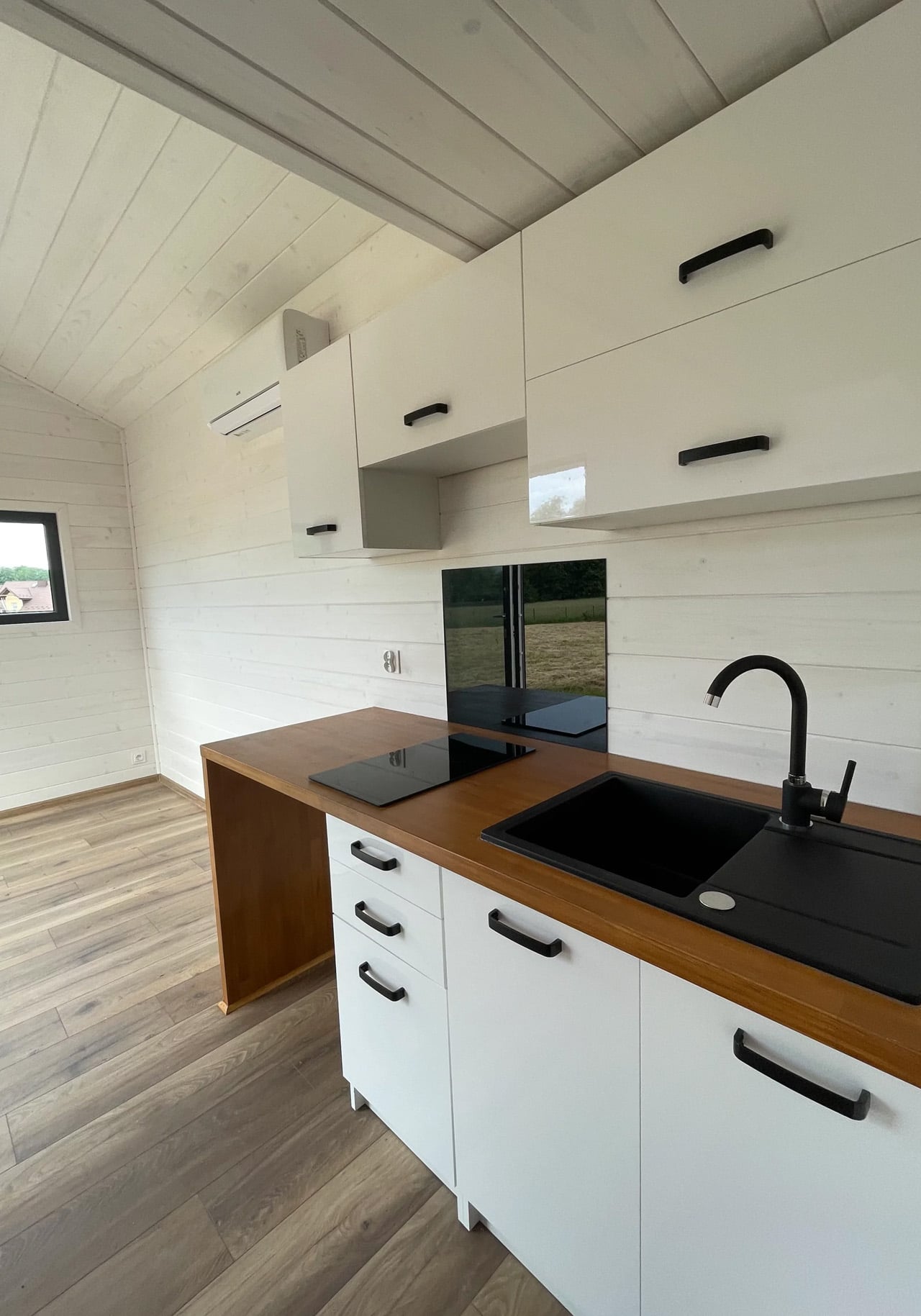
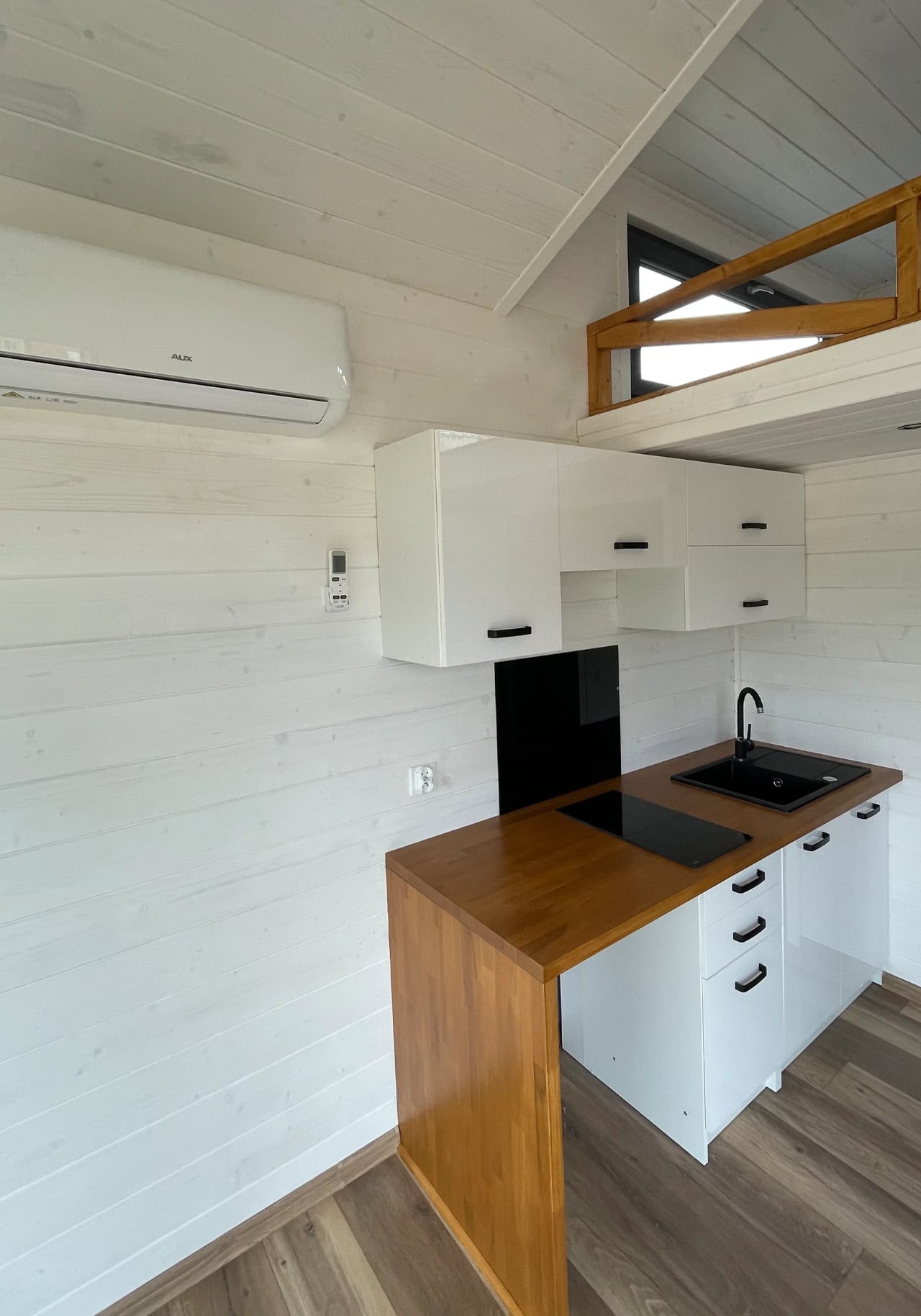
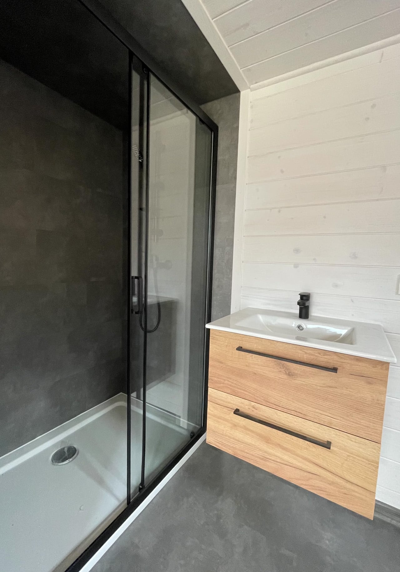
The open plan arranges the living area and kitchen side by side. The living room comes unfurnished, but there’s clearly room for a sofa and a media unit, along with a wall-mounted mini-split air conditioning unit already in place. The kitchen is deliberately uncomplicated: an induction cooktop, a sink, upper and lower cabinetry, and flex space for additional appliances. A wooden barn-style sliding door leads from the kitchen to the bathroom, which contains a glass-enclosed shower, a sink, and a flushing toilet. Small, but resolved.

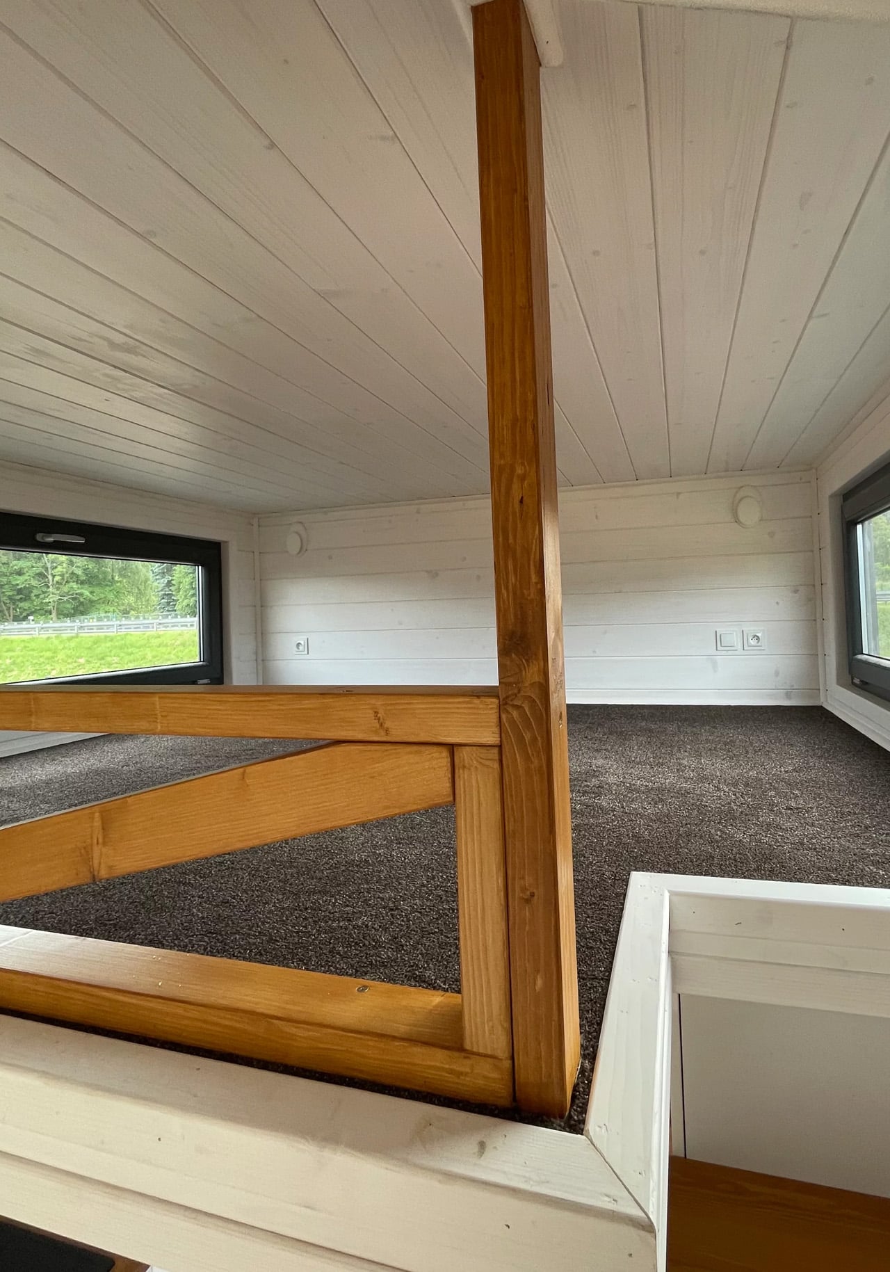
A storage-integrated staircase leads up to the loft bedroom, and it’s one of the more considered details in the whole design. In a home this size, every structural element should carry more than one purpose, and the staircase earns its footprint. The bedroom itself is carpeted, fits a double bed comfortably, and includes built-in cabinetry along both sides for storage, keeping the space genuinely usable rather than merely sleepable.
Pricing isn’t publicly listed, and Mini Domy asks prospective buyers to contact them directly for a quote. That’s standard practice for a manufacturer working across custom specifications and varying delivery requirements. For a couple who’ve spent any amount of time sketching out a simpler life, the 300 x 600 seems like it’s worth the conversation.
The post Mini House 300 x 600 Is the Back-to-Basics Tiny Home Built for Two first appeared on Yanko Design.