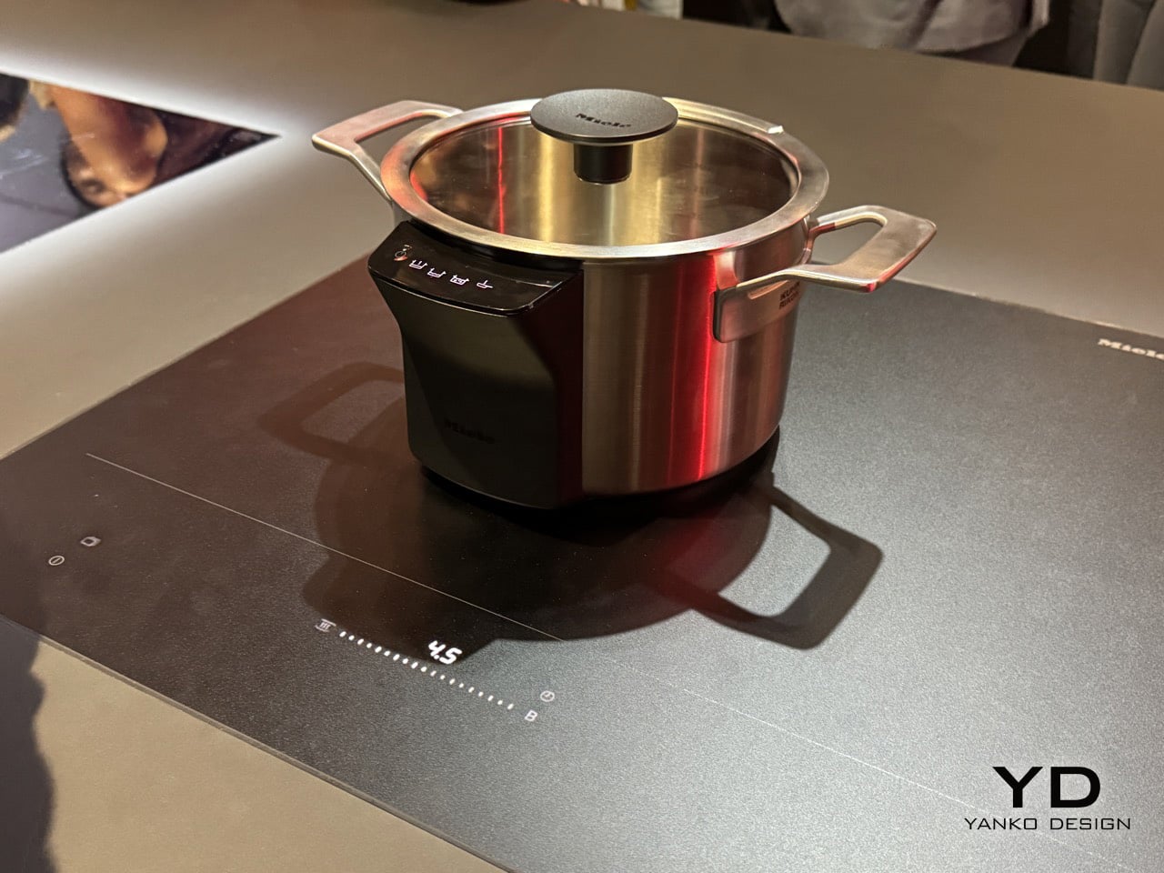
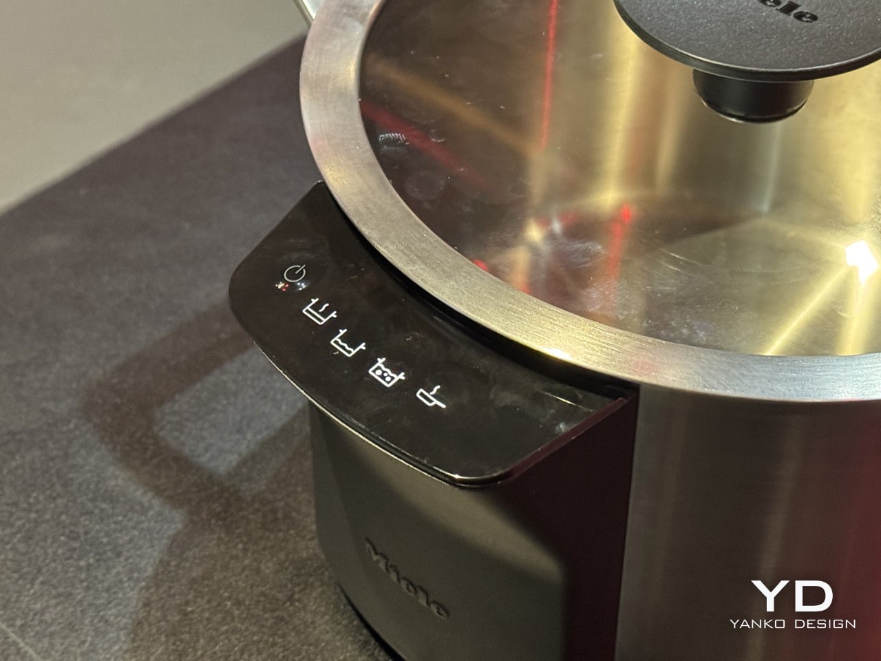
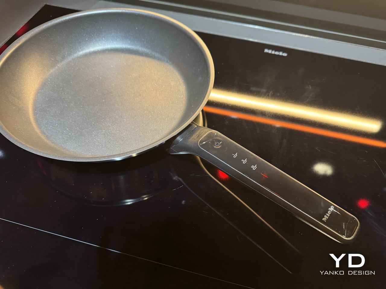
Black has always carried weight in design. Authority, restraint, a quiet elegance that needs no announcement. In 2026, the all-black kitchen has shifted from a bold statement to a genuine design movement. What once felt too dramatic for the most-used room in the home now feels precisely considered. Designers and homeowners alike are gravitating toward the palette for its ability to make a space feel curated, intentional, and deeply sophisticated when executed well.
The shift runs deeper than cabinetry and countertops. It lives in the tools, the cookware, the lighting, every touchpoint that shapes how a kitchen performs and how it looks doing it. Finding pieces that commit to the aesthetic without sacrificing function is the real challenge. These eight products do exactly that, from carbon graphite cookware rooted in Japanese craft to a precision pour-over kettle engineered for serious brewing.
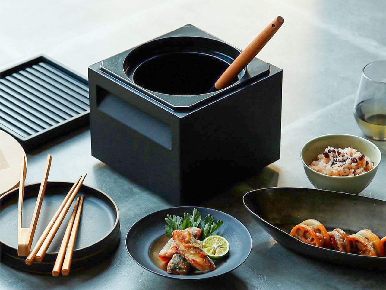
1. ANAORI Kakugama
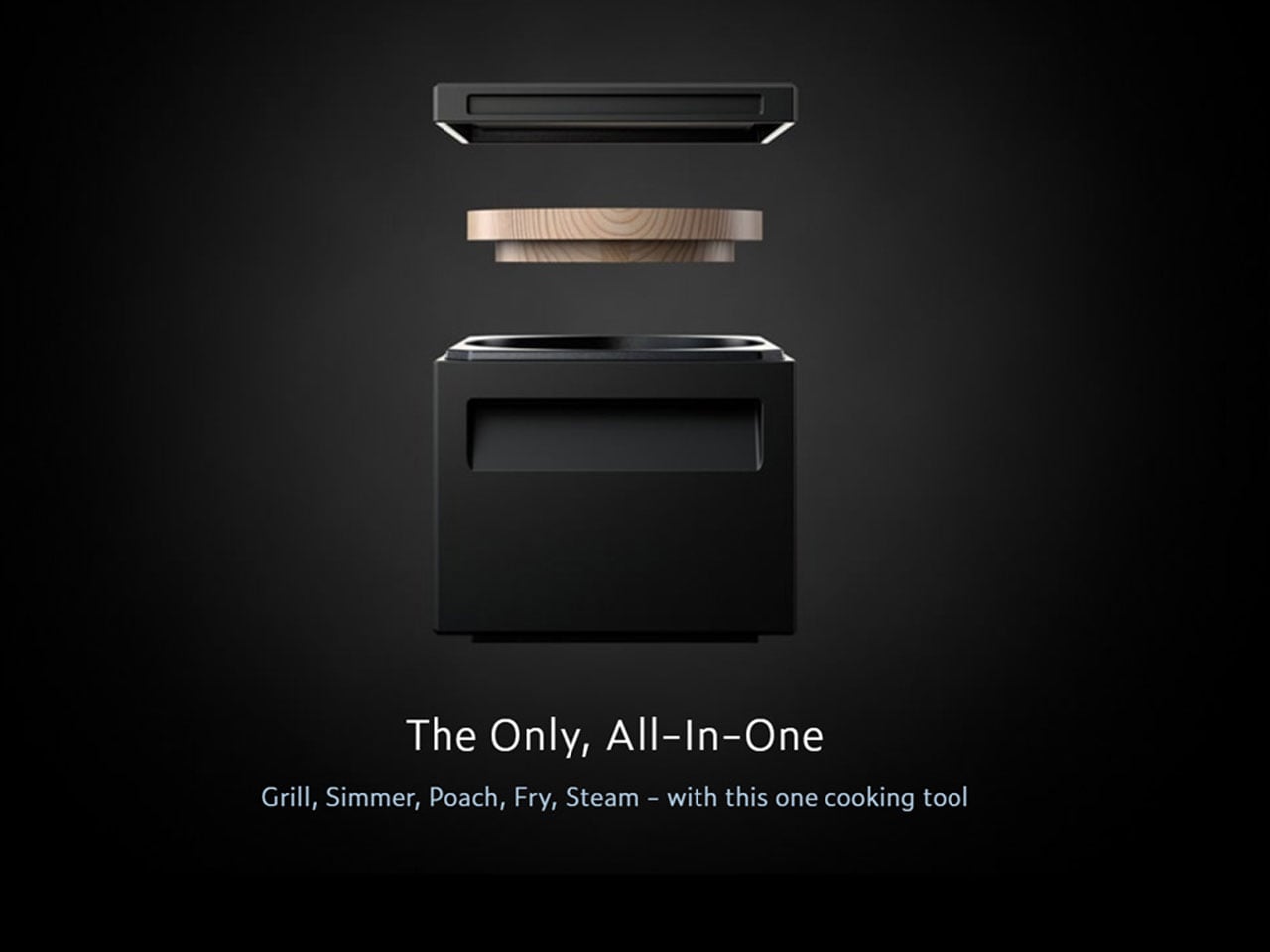
Carbon graphite isn’t a material you encounter in the kitchen, which is precisely what makes the ANAORI Kakugama so compelling. Crafted from solid carbon graphite, this Japanese cooking vessel carries a physical and conceptual weight that coated pans simply can’t match. Its matte black surface distributes heat with uncommon efficiency, significantly reducing the risk of scorching while preserving the natural flavors and nutrients of whatever is being prepared. This is cookware that approaches food with genuine respect.
The kakugama’s range is quietly impressive. Designed to steam, poach, simmer, grill, and fry, it handles each technique without compromise, making it the kind of piece that earns a permanent position in the kitchen. The fragrant Japanese cypress lid adds something unexpected: as it heats, it releases a subtle, earthy aroma that transforms an ordinary cooking session into something closer to ritual. For the design-conscious cook who values craft as much as performance, this vessel is essentially irreplaceable.
What We Like
- Carbon graphite construction delivers exceptional, even heat retention across every cooking method
- The Japanese cypress lid adds a rare aromatic quality to cooking that no synthetic material can replicate
What We Dislike
- The premium material and craftsmanship place this vessel at a significant price point above conventional cookware
- Carbon graphite requires more attentive handling and care than standard kitchen materials
2. Obsidian Black Precision Chopstick Tongs
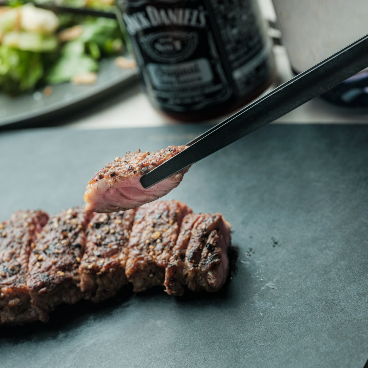
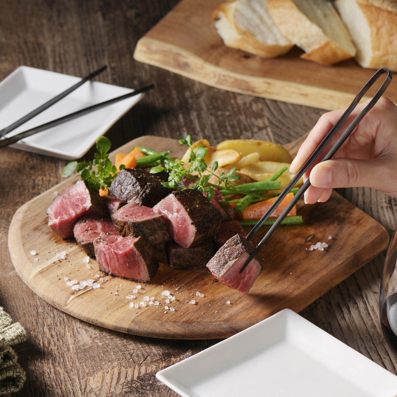
There’s a particular satisfaction in a kitchen tool that commits fully to its concept. Part of the Obsidian Black Kitchen Collection, the Precision Chopstick Tongs take their form directly from traditional Japanese chopsticks and engineer it for the demands of a modern kitchen. Made from SUS821L1 stainless steel, they’re light enough to handle delicate pieces of sushi yet durable enough for daily stovetop use. The result is a utensil that genuinely bridges the line between cooking instrument and tableware.
What sets these tongs apart from anything else in the drawer is the finish. A special metal processing technique ensures the obsidian’s black color resists scratching and peeling, maintaining its appearance through repeated use and washing. They work just as confidently plating sashimi at the table as they do flipping proteins in a pan. That dual-purpose quality is rare, and it’s exactly what earns a piece a permanent place in a kitchen where aesthetics and performance are equally weighted.
Click Here to Buy Now: $25.00
What We Like
- The obsidian black finish is scratch and peel-resistant, holding its appearance through sustained daily use
- Designed to function as both a cooking utensil and tableware, bridging the kitchen and dining with a single tool
What We Dislike
- The chopstick form may require a brief adjustment period for those accustomed to conventional tong grips
- The precision-focused design is less suited to tasks requiring wide or bulky gripping
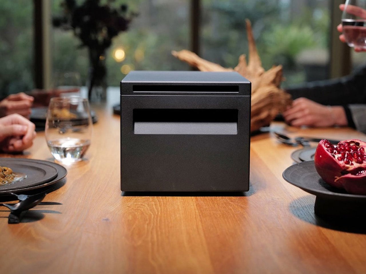
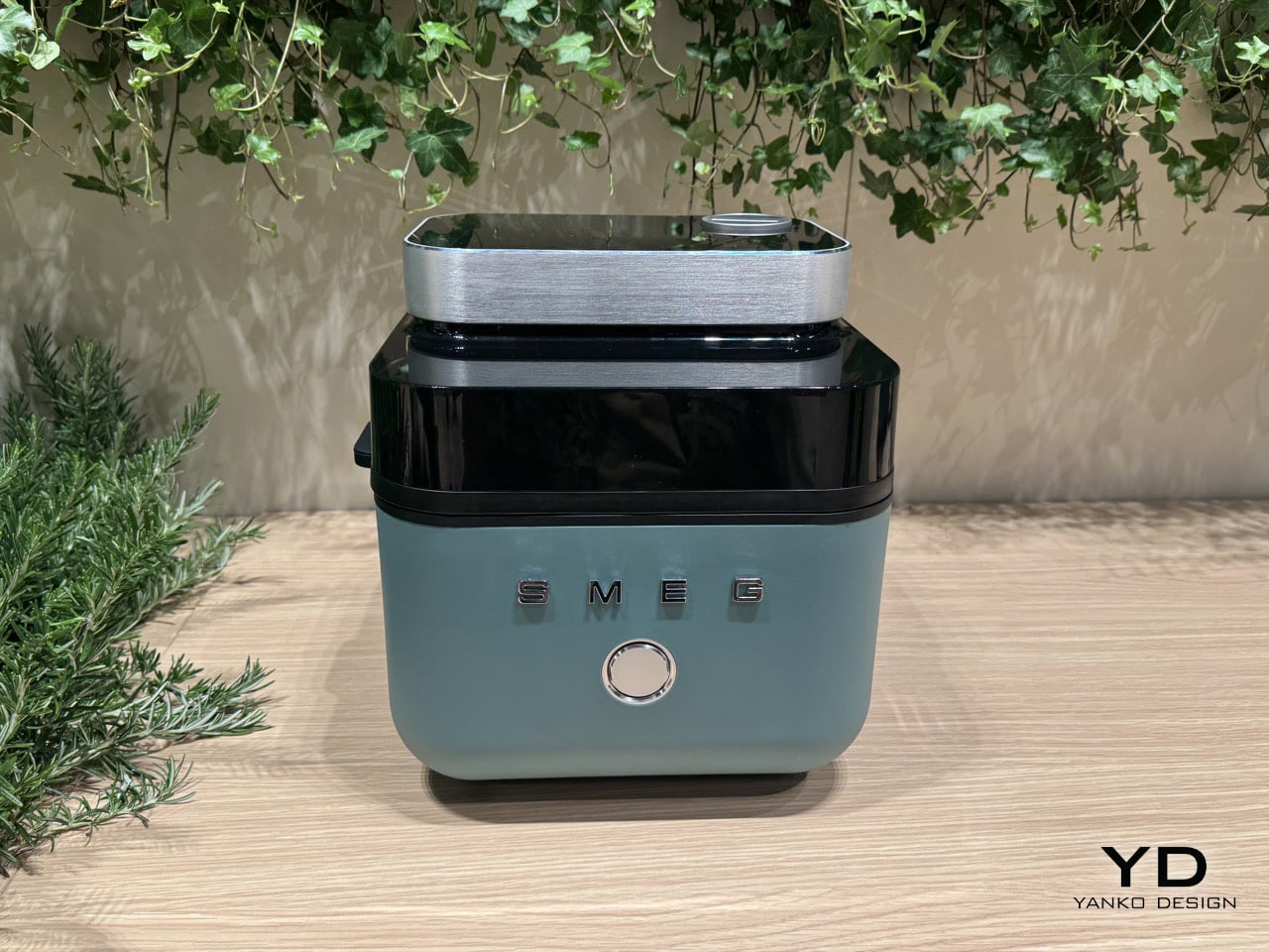
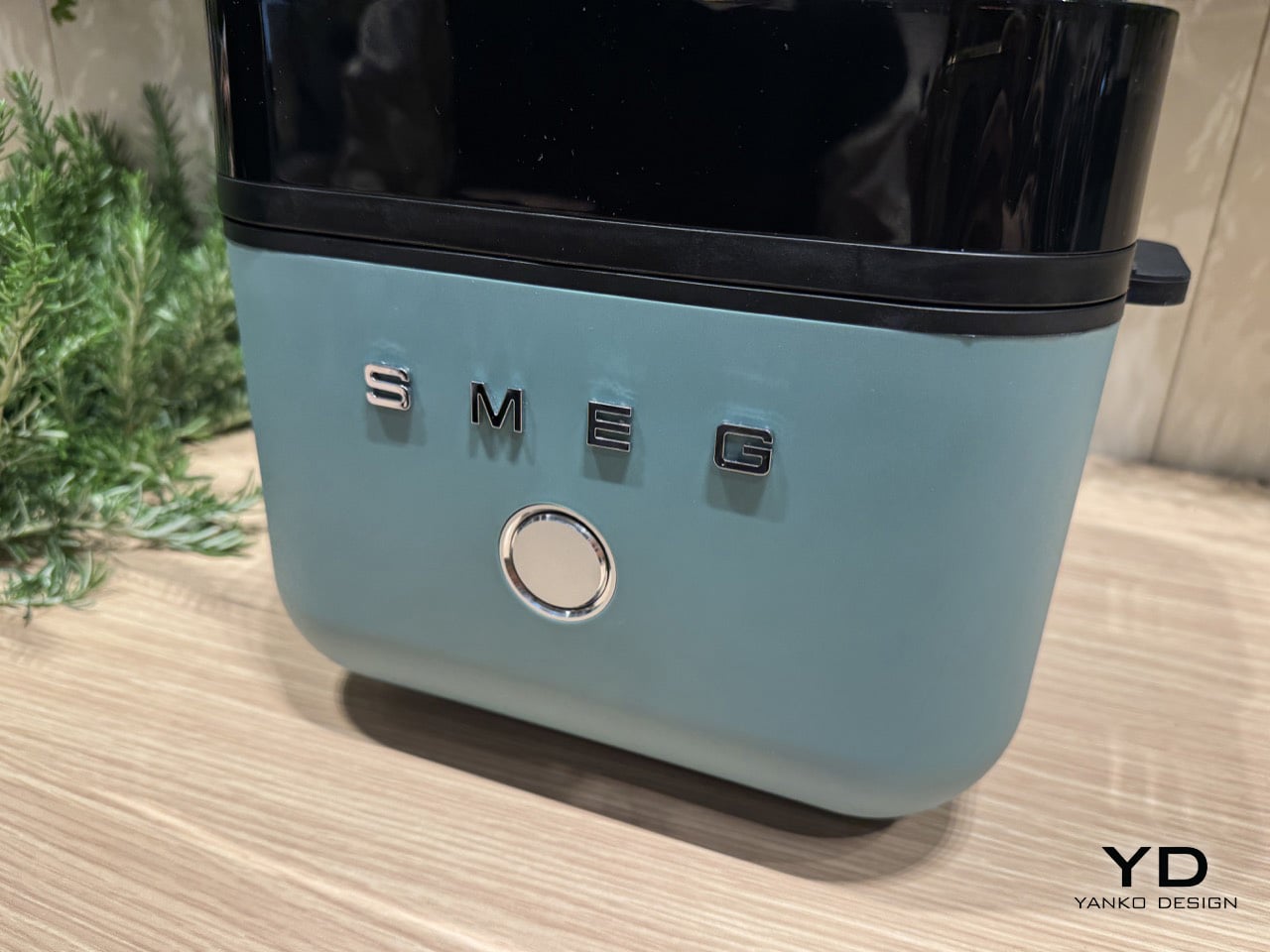
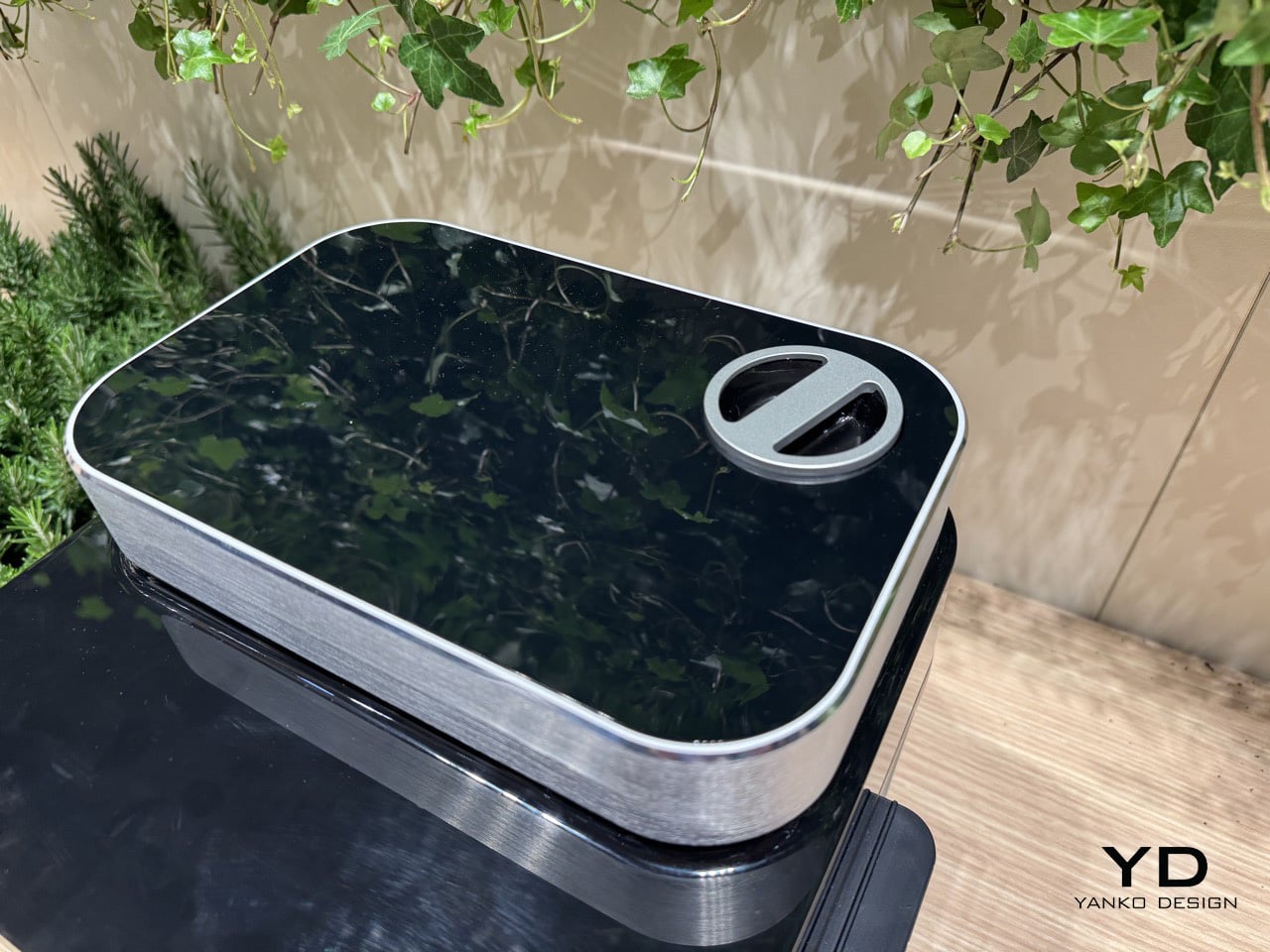
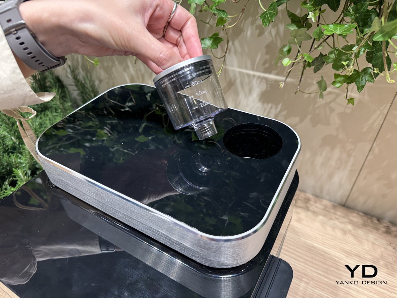
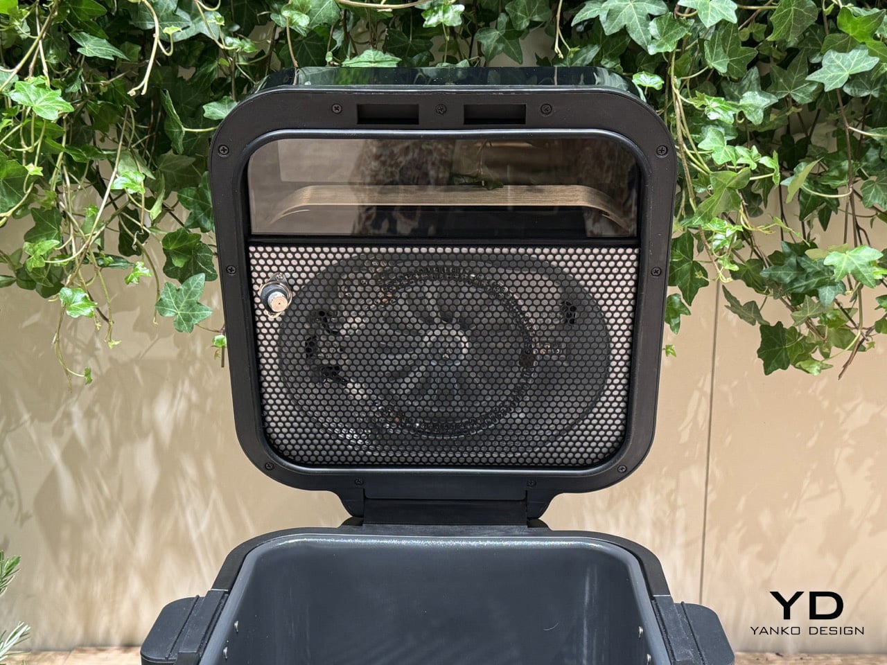
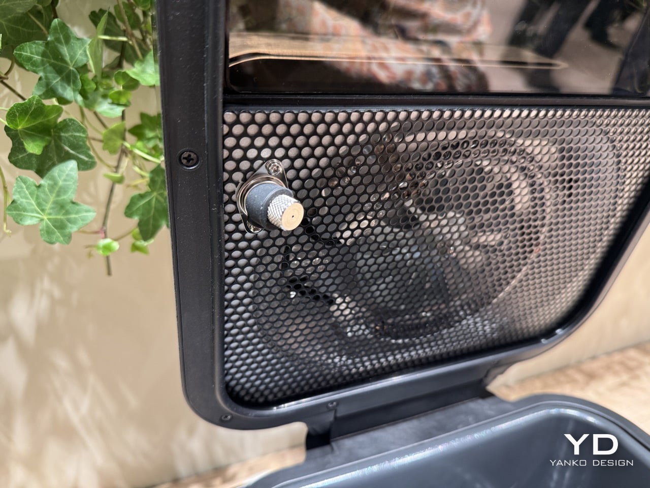
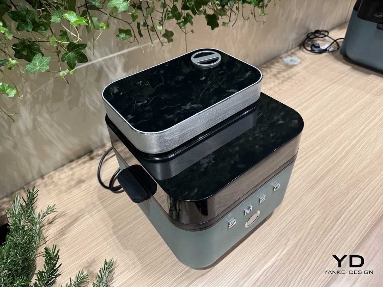
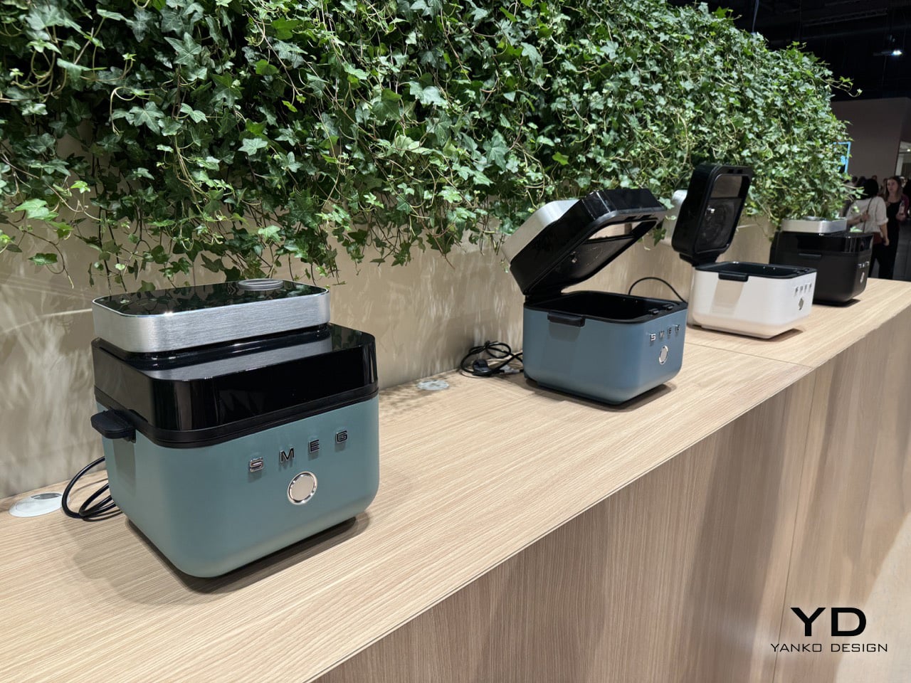
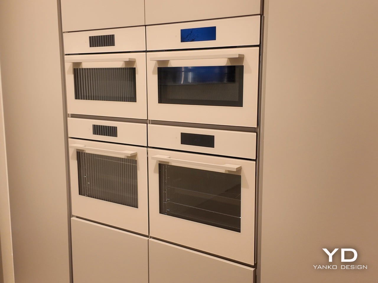
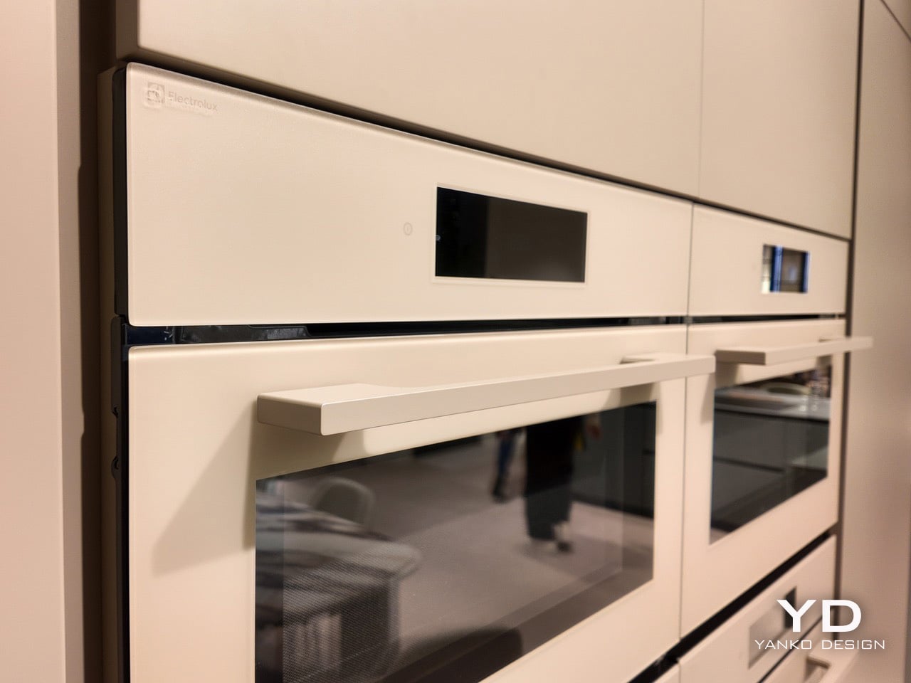
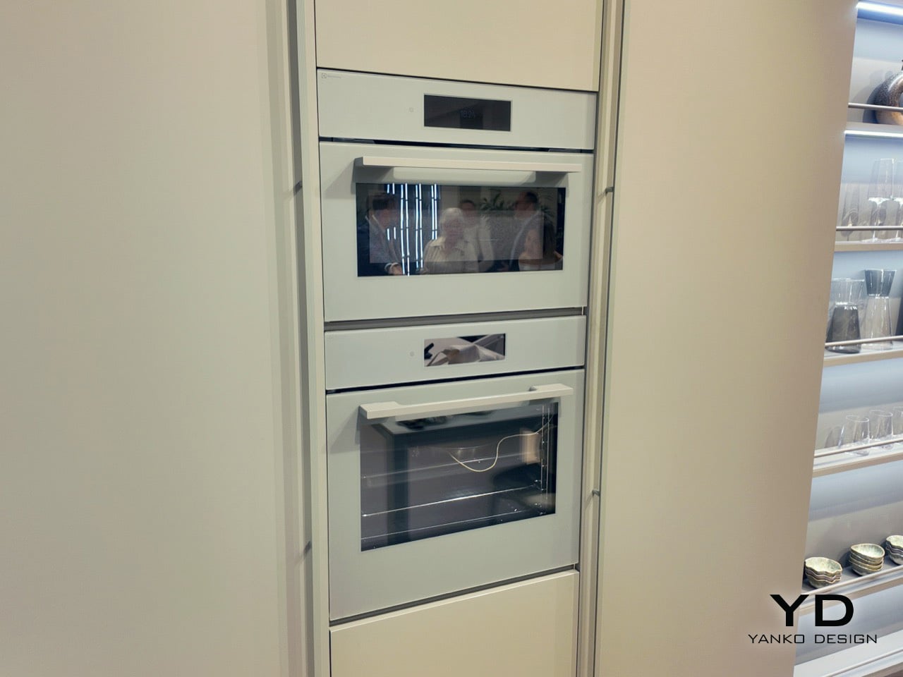
3. Samsung Bake Ultra Concept
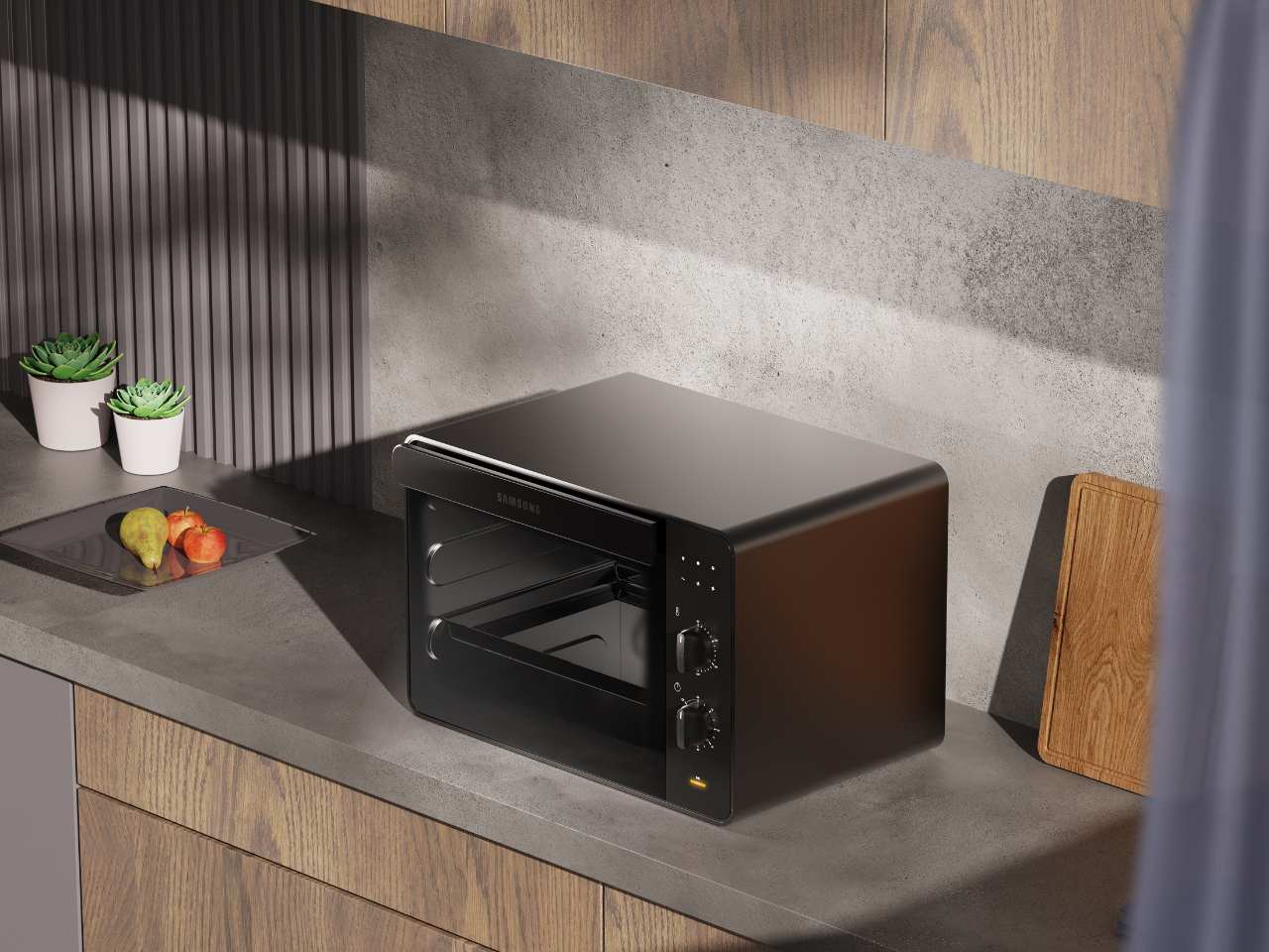
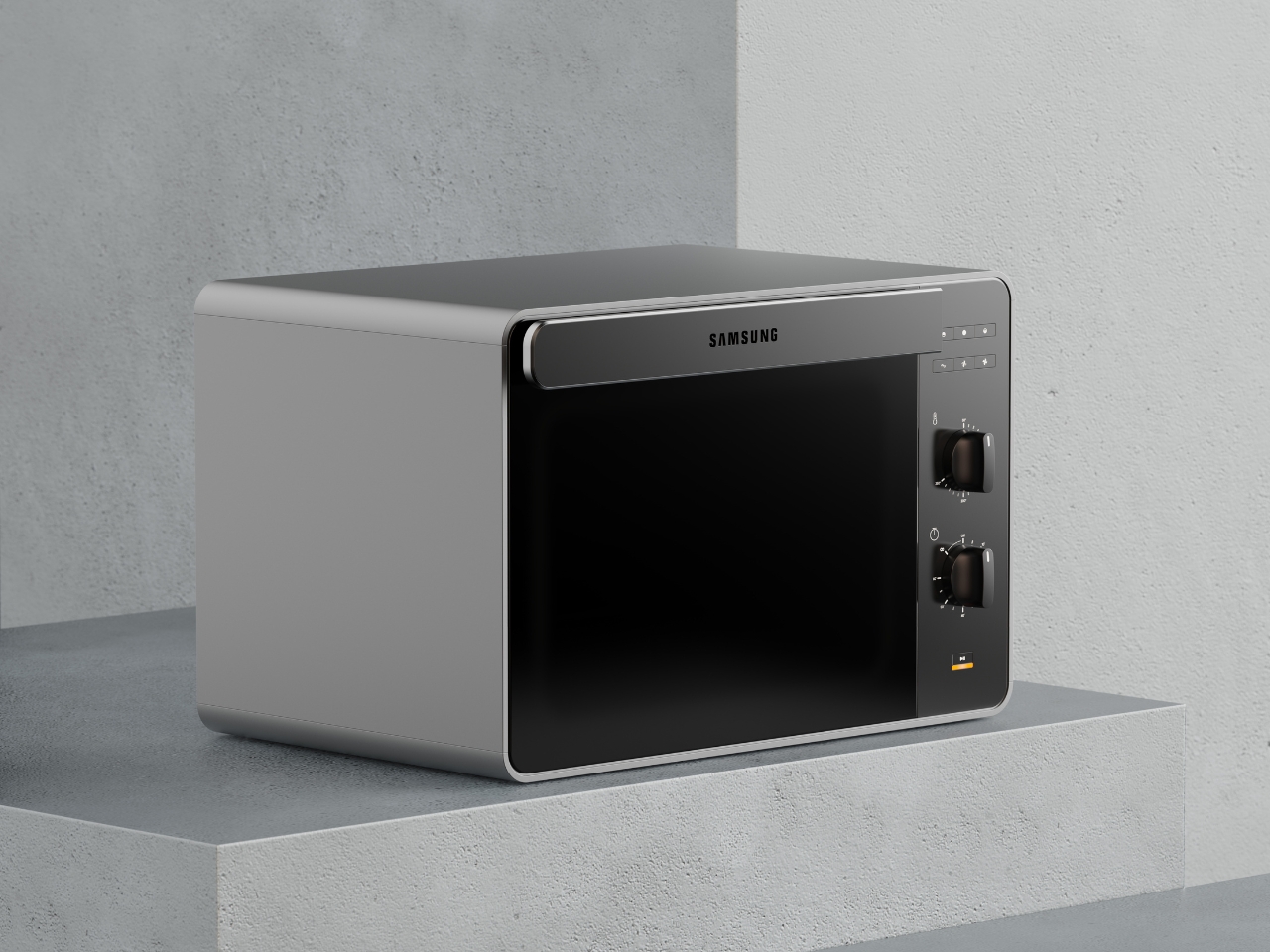
Concept appliances rarely look this resolved. Designed by Octavio Leon Villareal, the Samsung Bake Ultra approaches the compact electric oven with a formal discipline that separates considered design from merely clever design. Its two-tone composition, a soft gray body anchored by a black glass front, achieves a visual balance that reads as both contemporary and enduring. This isn’t minimalism for its own sake. It’s a deliberate formal decision that allows the Bake Ultra to feel entirely at home in kitchens ranging from industrial-chic to warm and considered.
The rounded edges are doing significant work. By softening what could easily have read as an overly boxy silhouette, Villareal gives the Bake Ultra an approachability that most compact ovens lack entirely. It doesn’t demand attention, but it consistently earns it. In an all-black kitchen where every object contributes to the room’s visual tone, an appliance this compositionally assured is genuinely valuable. The Bake Ultra wasn’t designed just to function. It was designed to belong.
What We Like
- The two-tone design with black glass front integrates cleanly into an all-black kitchen without disrupting the visual flow
- Rounded edges give the compact form an approachability that’s rarely achieved in kitchen appliance design
What We Dislike
- As a concept design, the Bake Ultra is not yet available for consumer purchase
- The soft gray body, while elegant, slightly departs from a fully committed all-black aesthetic
4. Iron Frying Plate
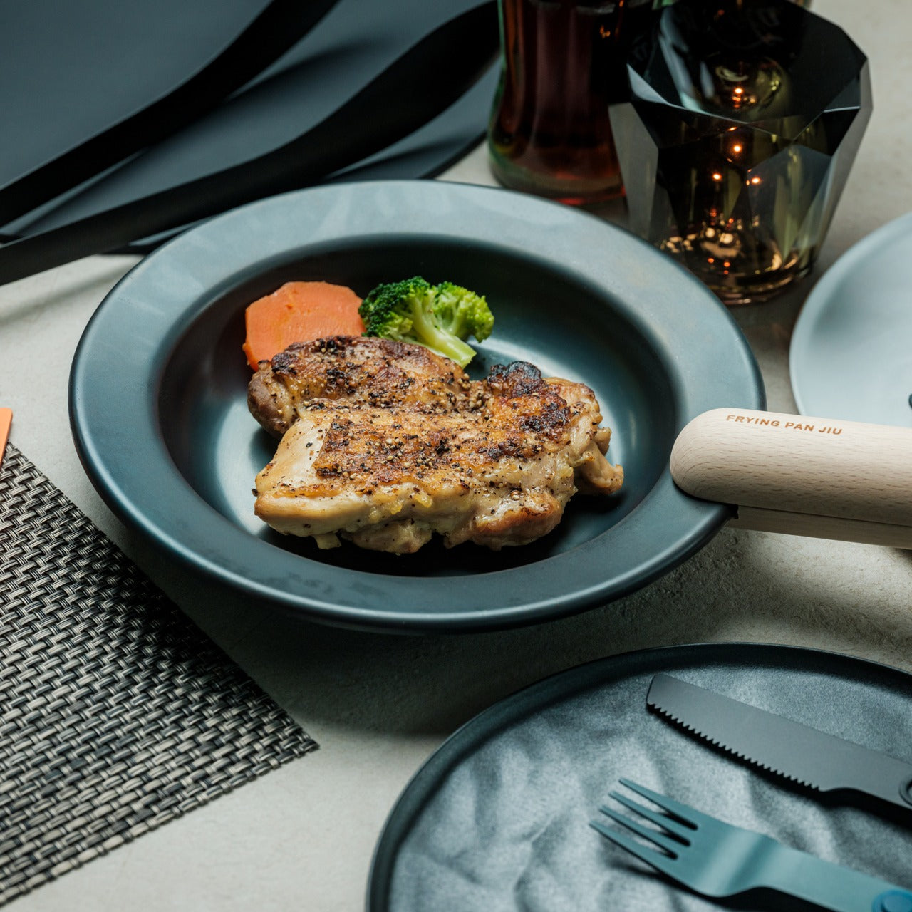
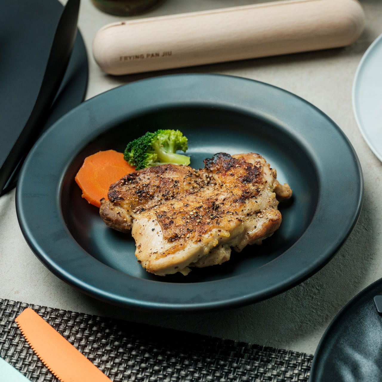
The Iron Frying Plate operates on a beautifully simple premise: eliminate the plate. Made from 1.6mm-thick mill scale steel, this uncoated, rust-resistant piece of cookware is designed to go from stove to table without interruption. There’s no ceramic coating to chip, no synthetic surface to question, just raw, well-engineered steel that builds character and natural seasoning with every use. The matte black mill scale finish slots into an all-black kitchen without any deliberate effort at all.
Its detachable wooden handle is one of those small design decisions that reveal serious thought about every moment of use. Attach it for cooking, remove it for serving, one-handed, no tools required. That seamless transition from cooking vessel to serving piece is exactly the kind of dual-function thinking that earns a product permanent space in a curated kitchen. JIU doesn’t try to be more than it is. It’s a frying plate, and it’s an excellent one.
Click Here to Buy Now: $69.00
What We Like
- The uncoated mill scale steel surface develops natural seasoning over time, building flavor with every use
- The one-handed detachable wooden handle enables a smooth transition from stovetop cooking directly to table service
What We Dislike
- An uncoated steel surface requires regular seasoning and more attentive care than nonstick alternatives
- The minimal form is best suited to simple preparations rather than sauce-heavy or complex dishes
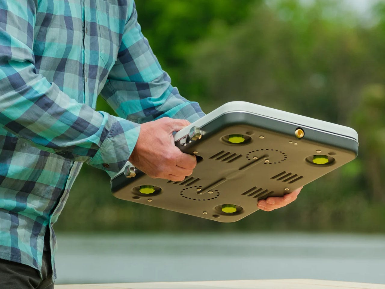
5. HA1 Expert Hard Anodized Nonstick 10-Piece Set
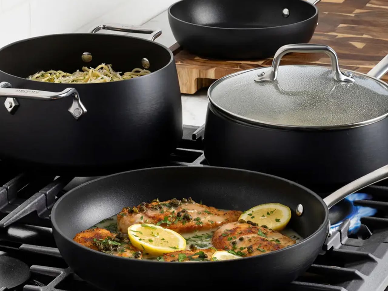
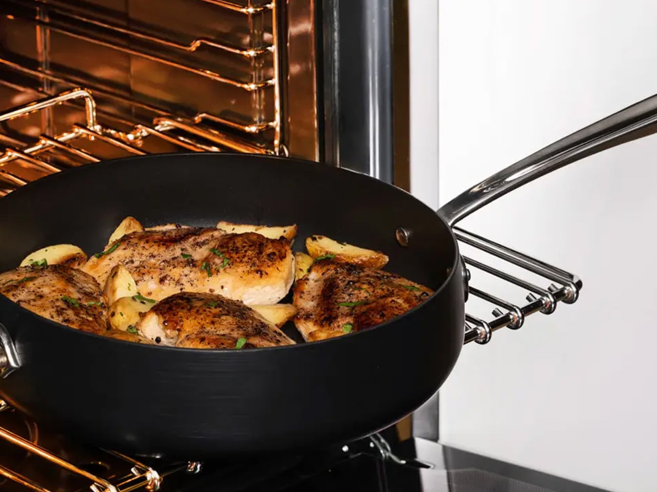
If the all-black kitchen needs a workhorse, the All-Clad HA1 Expert set fills that role without compromise. Ten pieces of hard anodized, scratch-resistant nonstick cookware finished in a deep, uniform black that holds up to both heavy daily use and visual scrutiny. The anodized aluminum construction is reinforced with a stainless-steel base, delivering warp resistance and the kind of even, consistent heat distribution that makes routine cooking genuinely more reliable. This is a set built for people who cook seriously and care deeply about how their kitchen looks.
The range covers everything a fully functioning kitchen demands: two fry pans, two saucepans, a sauté pan, and a stockpot, each paired with a matching lid. Oven-safe to 500°F and induction-compatible, very little is left unaddressed. Double-riveted stainless steel handles hold securely through extended use, while tempered glass lids allow for monitoring without lifting. As a complete, coherent system in black, this set reads less like a collection of pots and more like an intentional design decision.
What We Like
- Hard-anodized, scratch-resistant construction paired with long-lasting PTFE nonstick delivers durable, professional-grade performance
- Fully induction compatible and oven safe to 500°F, covering virtually every cooking scenario without exception
What We Dislike
- Glass lids are only oven safe to 350°F, considerably lower than the pans themselves
- PTFE nonstick requires careful utensil choice and hand washing to preserve its surface longevity
6. Precision Chef Kitchen Scissors
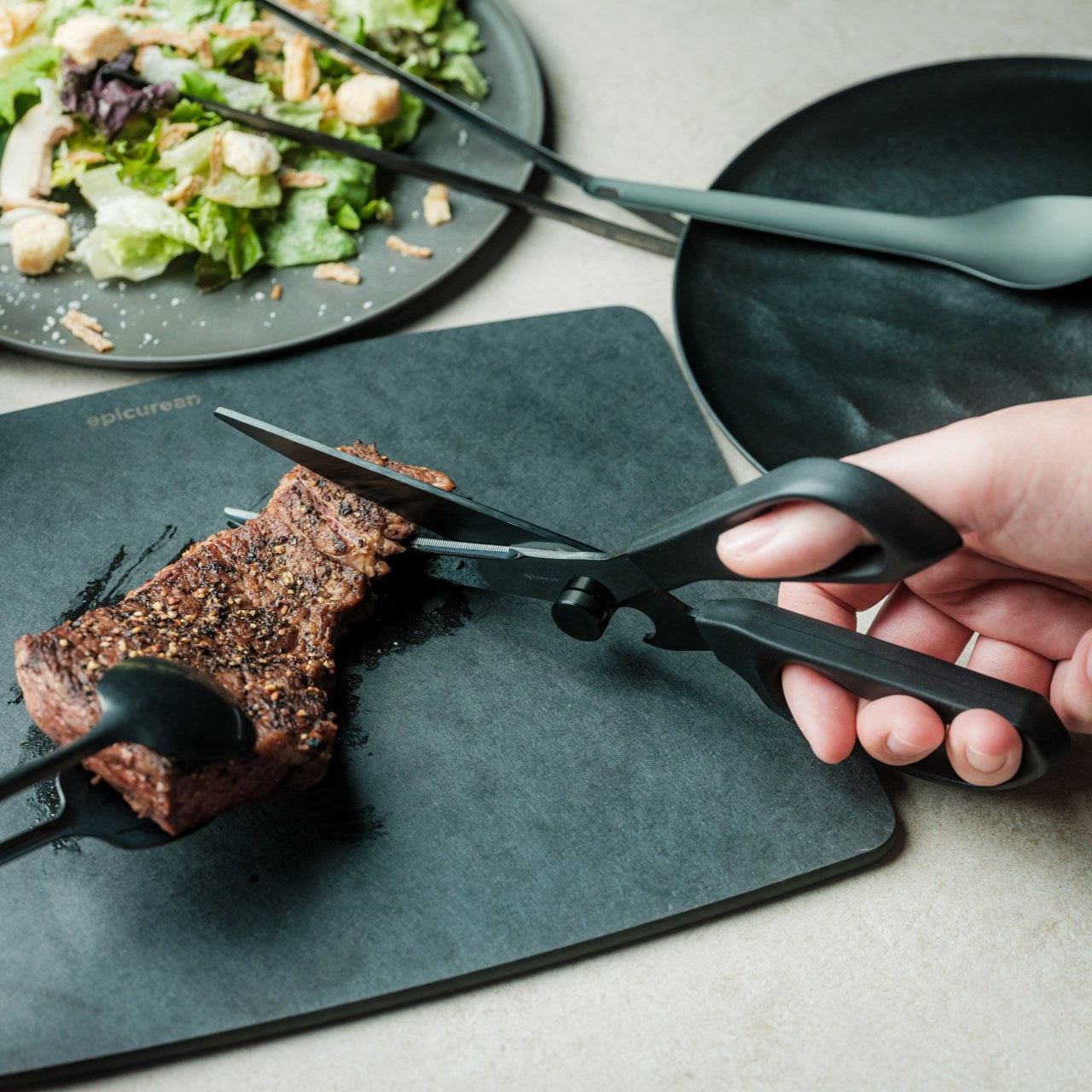
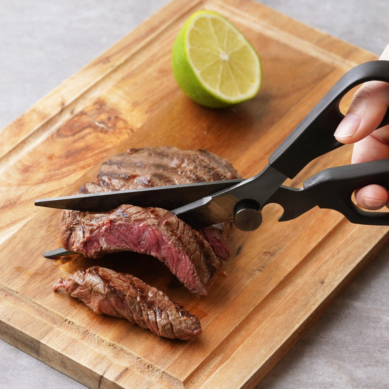
Kitchen scissors rarely receive the design attention they deserve. The Precision Chef Kitchen Scissors are a deliberate exception. The oxidation-colored black finish isn’t cosmetic; it’s a durable surface treatment that resists deterioration, holding its appearance through years of regular use. The curved serrated blade is engineered specifically for cutting meat, reducing effort while improving both control and safety. In a kitchen where every object is chosen with intention, a pair of scissors is considered a meaningful detail that most kitchens quietly overlook.
The ergonomic structure goes beyond grip comfort. When laid flat, the blade is designed to avoid contact with the counter surface, a small but precise detail that speaks to the level of thought invested in this tool. Cutting through steaks, portioning pizza, or trimming vegetables, these scissors approach each task with the same quiet authority that an all-black kitchen demands. They are scissors genuinely designed to be seen as well as used, and they meet that standard on both counts.
Click Here to Buy Now: $95.00
What We Like
- Oxidation coloring creates a durable black finish that resists fading and surface deterioration through sustained use
- The curved serrated blade is purpose-engineered for meat cutting, improving control and reducing the effort required
What We Dislike
- The specialized curved blade may feel less versatile for tasks that go beyond protein and general food prep
- Ergonomic scissors with complex geometry can be more difficult to sharpen at home than straight-bladed alternatives
7. Melrose Pendant Light
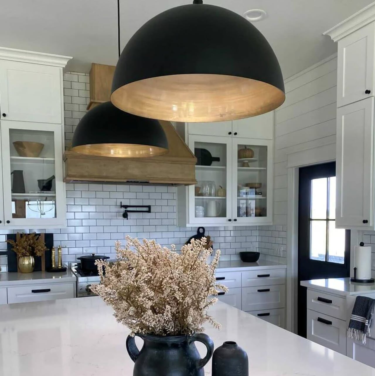
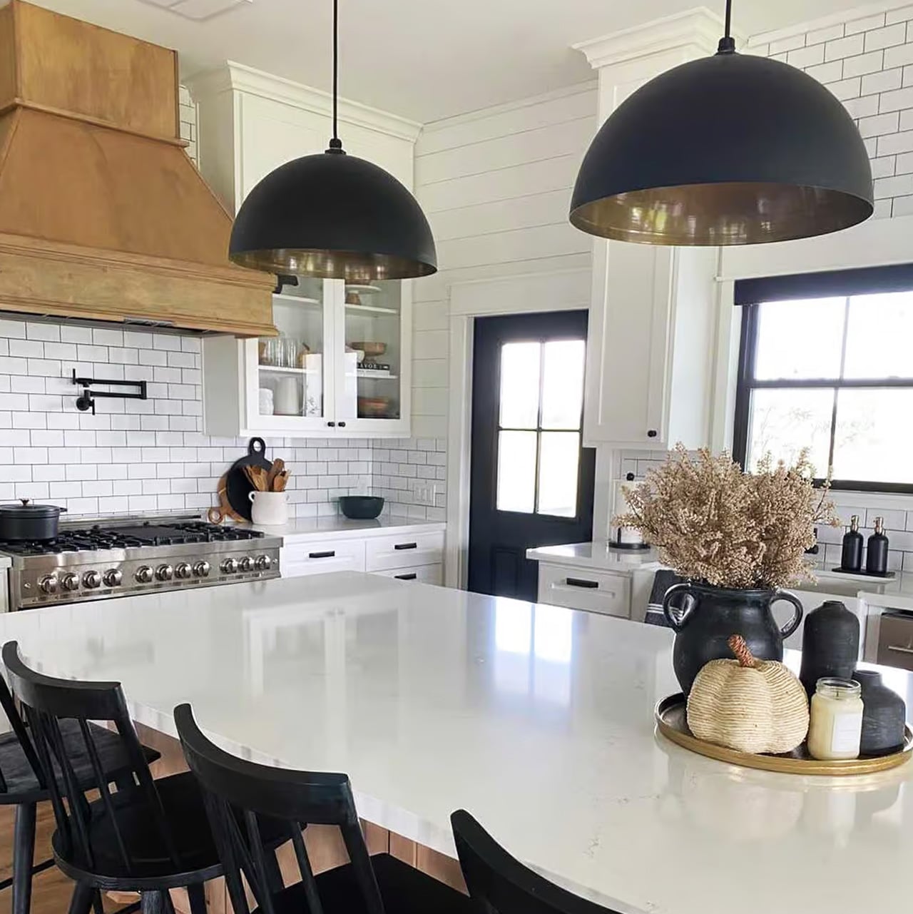
Lighting in an all-black kitchen isn’t merely functional; it’s structural. The Steel Lighting Co. Melrose pendant operates as both. The 18-inch industrial dome in matte black is proportioned specifically for kitchen island use, casting a wide, even wash of light across the work surface below. American-made and UL-approved for both indoor and outdoor installation, this is a pendant built to perform as well as it looks. At 300 watts, it carries the capacity to anchor a kitchen island with genuine visual authority.
What makes the Melrose particularly thoughtful is its configurable interior. Available in white, matte black, or brass, the interior color shapes both the quality of reflected light and the overall tone of the fixture without altering its profile. In a black kitchen, a brass interior introduces a warm, considered counterpoint that prevents the space from reading as flat or one-dimensional. The matte black exterior remains constant throughout: commanding, clean, and entirely at home in a kitchen built around the same commitment to the color.
What We Like
- Configurable interior color options in white, matte black, or brass allow for subtle tonal customization within a consistent exterior
- American-made with indoor and outdoor UL approval, signaling a meaningful commitment to build quality and longevity
What We Dislike
- At 12 pounds, installation may require additional structural consideration, depending on the ceiling construction
- The industrial farmhouse silhouette may not suit kitchens with a strictly contemporary or ultra-minimal design direction
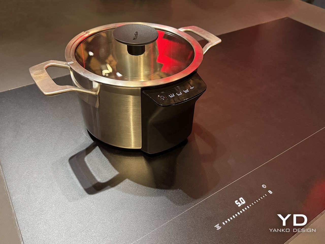
8. Fellow Stagg EKG Pro Electric Pour-Over Kettle
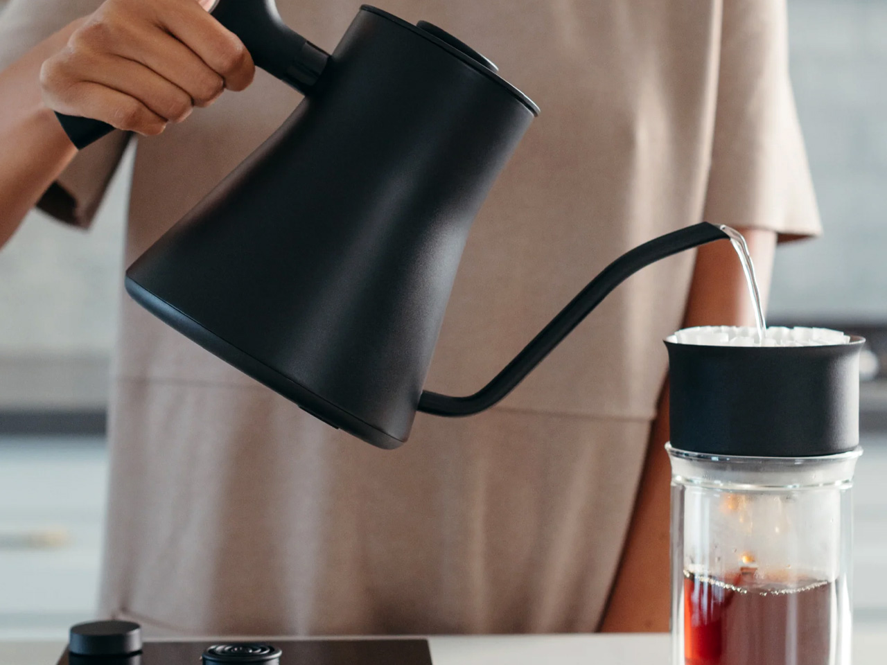
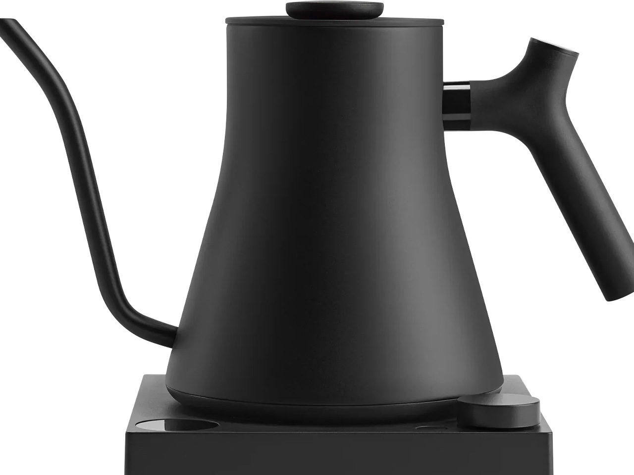
The Fellow Stagg EKG Pro is the kind of object that reframes where coffee fits in the morning. Its signature gooseneck spout delivers precise control over flow rate and stream consistency, the kind of control that produces a measurable difference in pour-over extraction. To the degree, temperature control heats and holds water exactly as programmed, while a high-resolution color display allows complete customization of brewing schedules, altitude adjustments, and temperature units. This is a kettle engineered with the seriousness typically reserved for professional brewing equipment.
The EKG Pro’s WiFi connectivity and scheduling capabilities are where it shifts from impressive to genuinely integrated into daily life. Program brewing schedules that adapt to your routine so the kettle is ready precisely when you are, no preheating, no guesswork. The sleek industrial design holds its own on a countertop alongside thoughtfully chosen cookware and tools. The hold function maintains brewing temperature for extended periods without wasting energy. In an all-black kitchen, this kettle earns its visible place every single morning.
What We Like
- To-the-degree temperature control, combined with a gooseneck spout, delivers precision that measurably improves pour-over coffee quality
- WiFi connectivity and programmable scheduling mean the kettle is ready exactly when needed, without any manual preheating
What We Dislike
- Advanced features like WiFi and the color display come at a price point that significantly exceeds basic kettle alternatives
- The gooseneck form is optimized for pour-over brewing and is less suited to general-purpose boiling tasks
The Kitchen Finally Got the Design Treatment It Deserved
The all-black kitchen doesn’t ask for compromise. Every product here demonstrates that designing in black means choosing objects with a strong point of view, ones crafted carefully, finished deliberately, and considered at every stage. The color is what makes the curation visible. It’s a shared language between objects that have little else in common except that they were each made to last, made to perform, and made to matter in the space they occupy.
What’s striking about 2026’s black kitchen movement is how completely it spans every category. Cookware, utensils, lighting, kettles: the commitment runs through the entire room. When each element carries the same visual weight, a kitchen stops being a collection of appliances and tools and becomes a genuinely designed space. That’s the standard these eight products are held to, and without exception, it’s the standard each one meets.
The post The All-Black Kitchen Is 2026’s Hottest Design Trend — Here Are 8 Products That Nail It first appeared on Yanko Design.


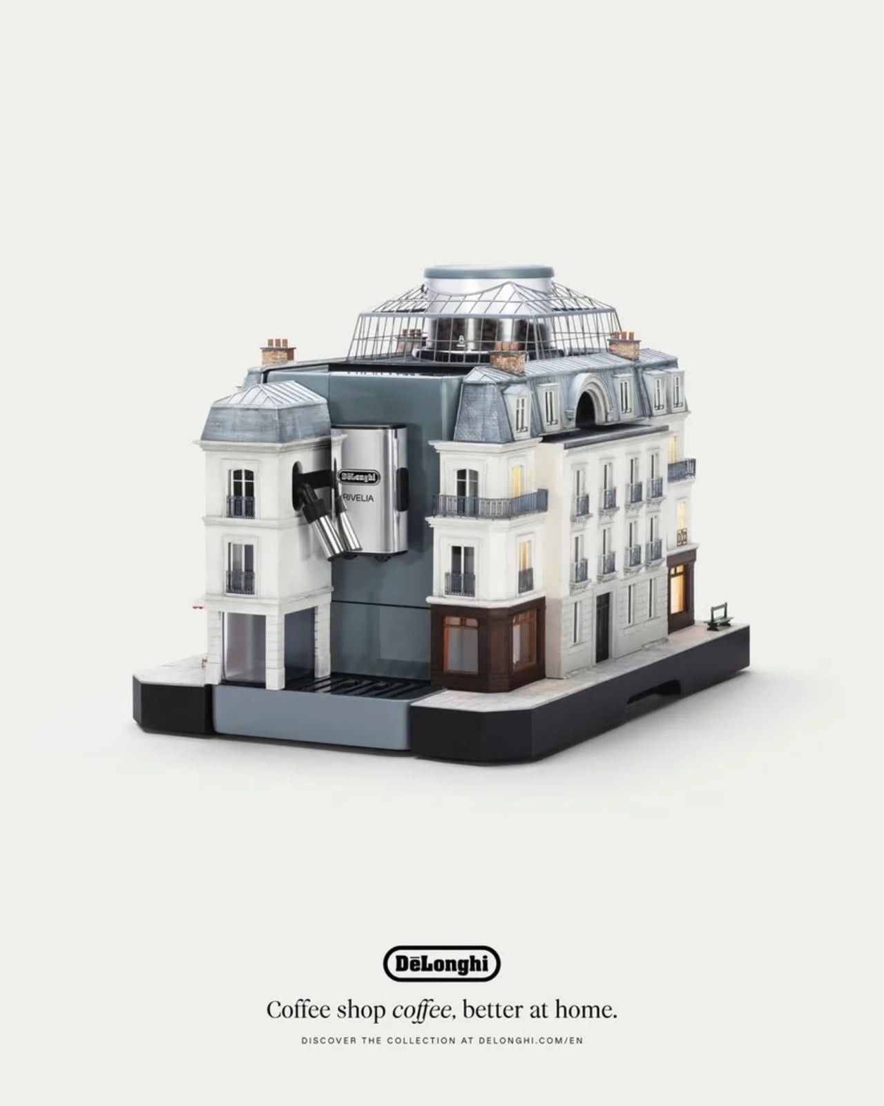
 Paris mounted on the Rivelia
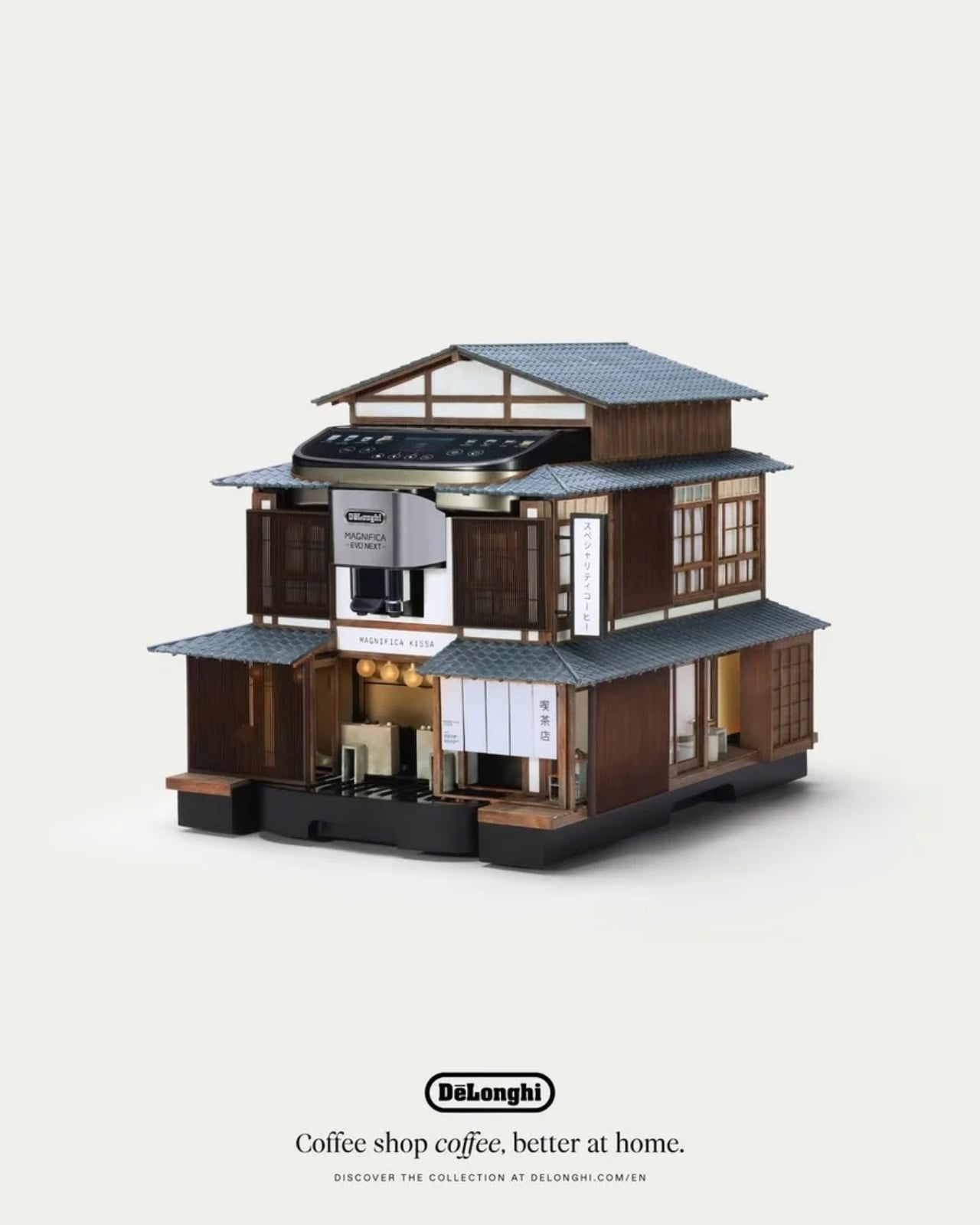
 Tokyo mounted on the Magnifica Evo Next
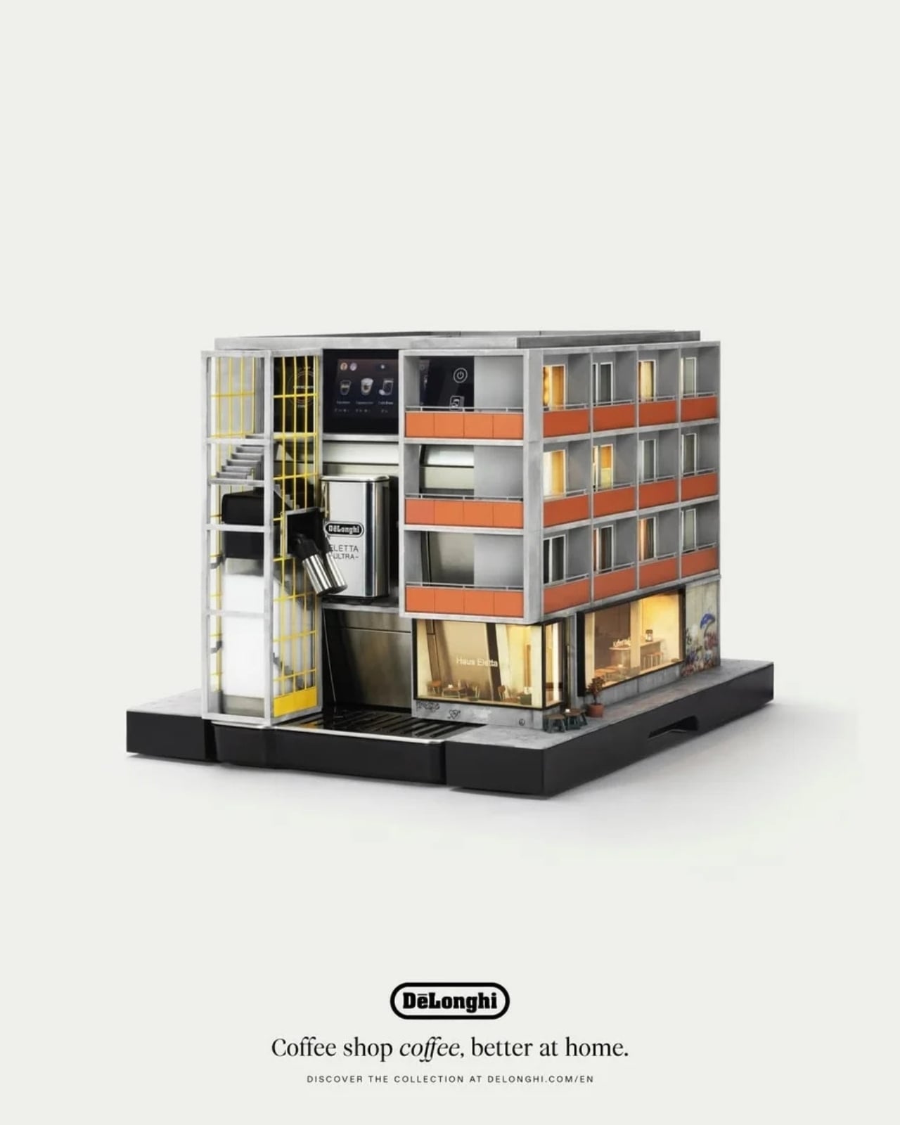
 Milan mounted on the Eletta Ultra
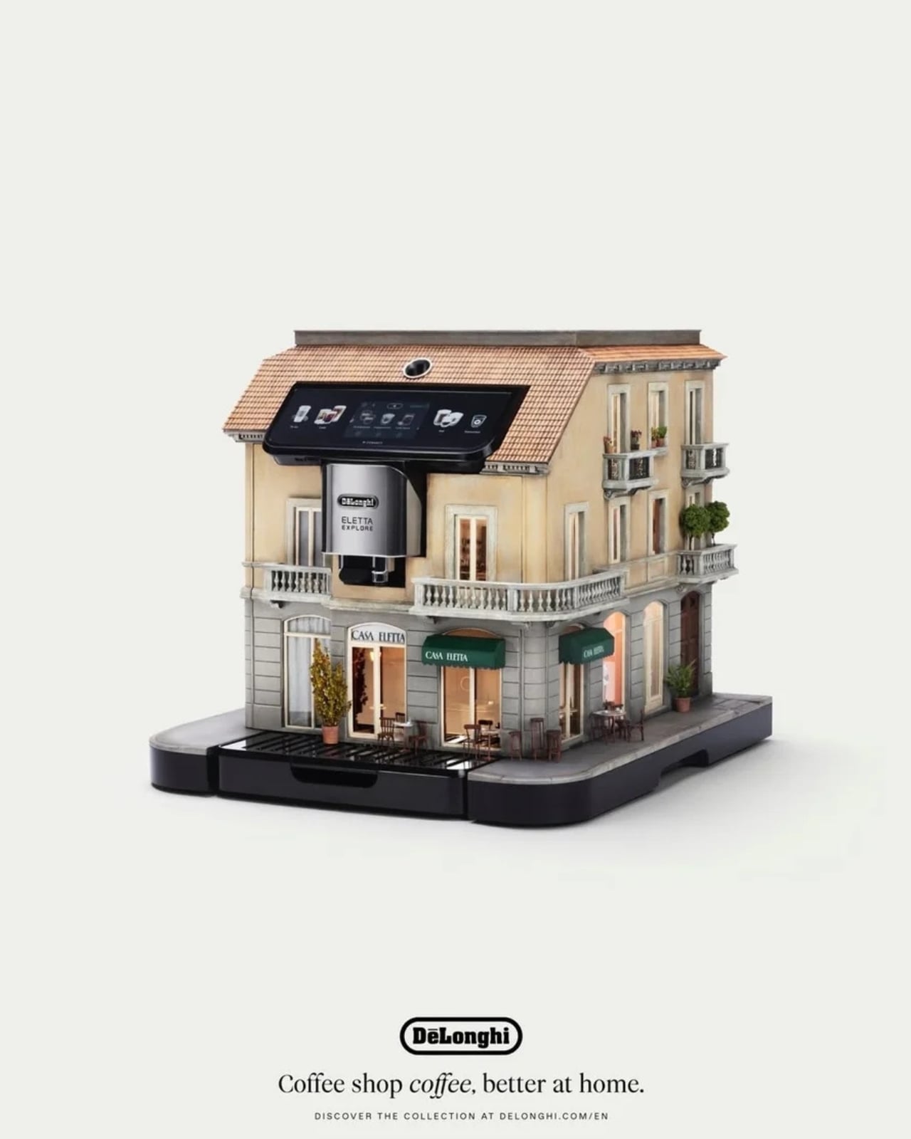
 Copenhagen mounted on the Eletta Explore
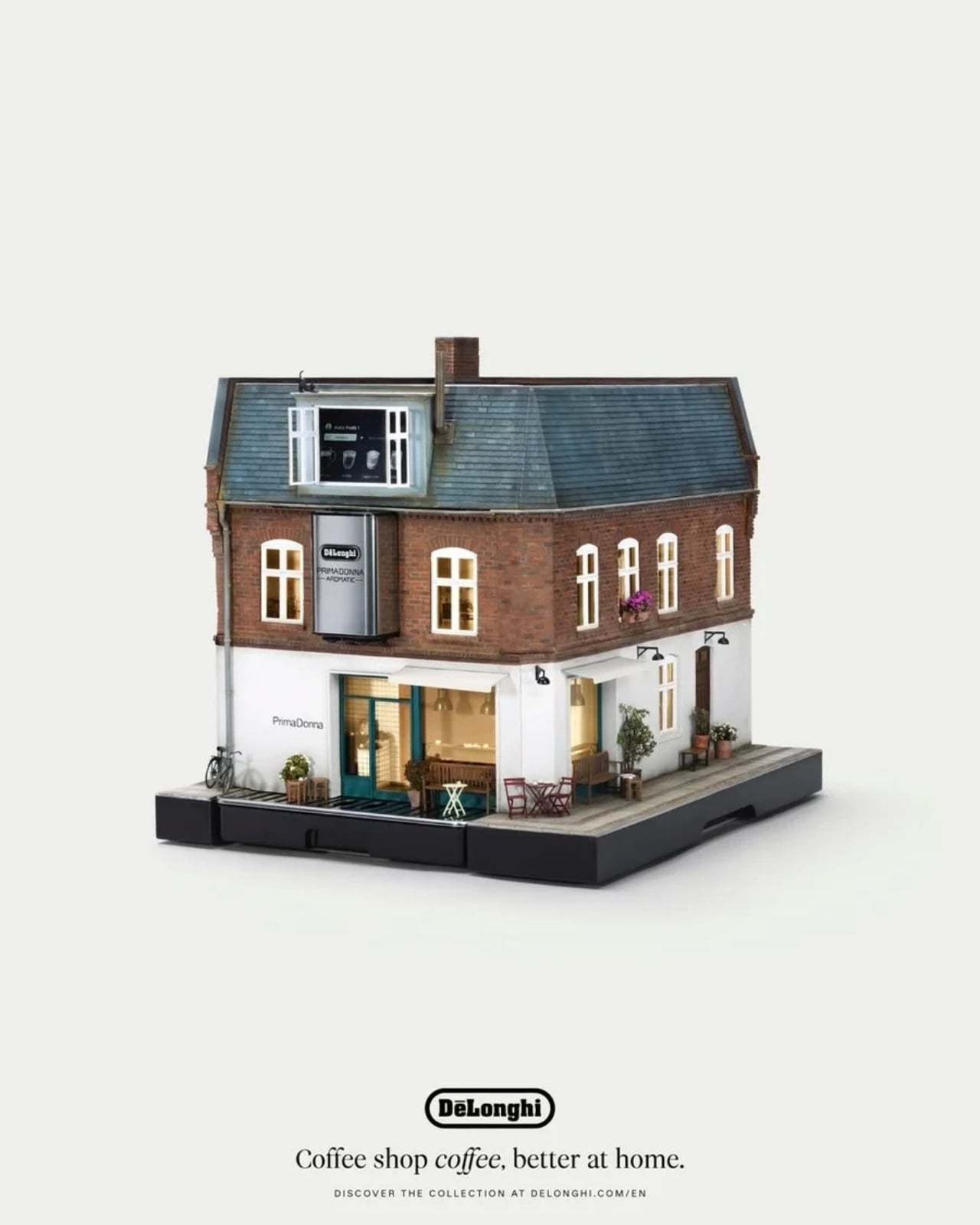
 Berlin mounted on the Primadonna Aromatic