Four Robot Arms Just Built a Farm House That Prints Its Future

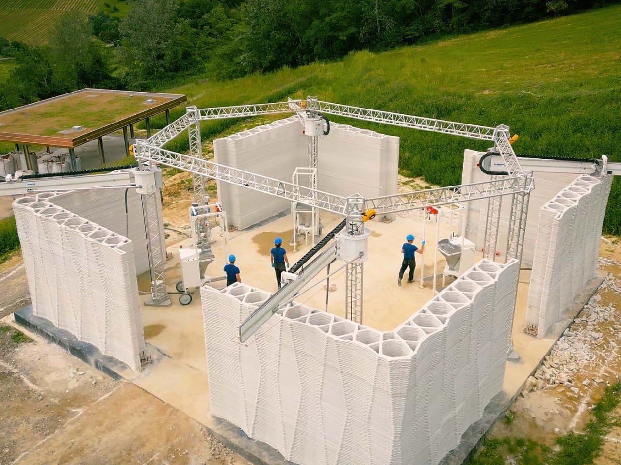
Picture this: four robotic arms working in perfect harmony, tracing circular patterns like some kind of futuristic dance performance. But instead of creating art, they’re printing the walls of an actual farm. Welcome to Itaca, a project that just wrapped up its construction in the hills of Northern Italy, and it’s changing how we think about building homes.

WASP, the Italian company behind this audacious venture, just finished printing the walls of what they’re calling the first certified 3D-printed construction in Italy. Located in their Shamballa open-air laboratory, Itaca isn’t just a quirky experiment. It’s a fully functional, self-sufficient farm designed to house a family of four while producing its own food and energy.

Designer: WASP
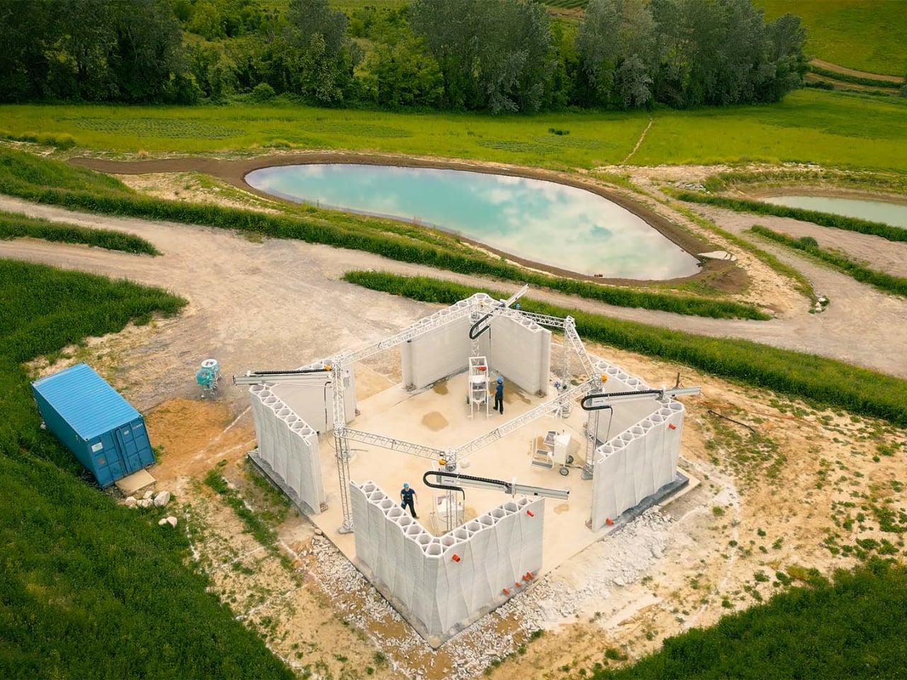
The whole concept sounds like something from a sci-fi novel, but the execution is surprisingly grounded in ancient wisdom. The farm’s design takes inspiration from mandala geometry, with four robotic arms positioned at the vertices of a hexagonal structure. These machines use a lime-based printing material that allows the facades to regulate their temperature naturally, breathing like a living organism. No air conditioning required.
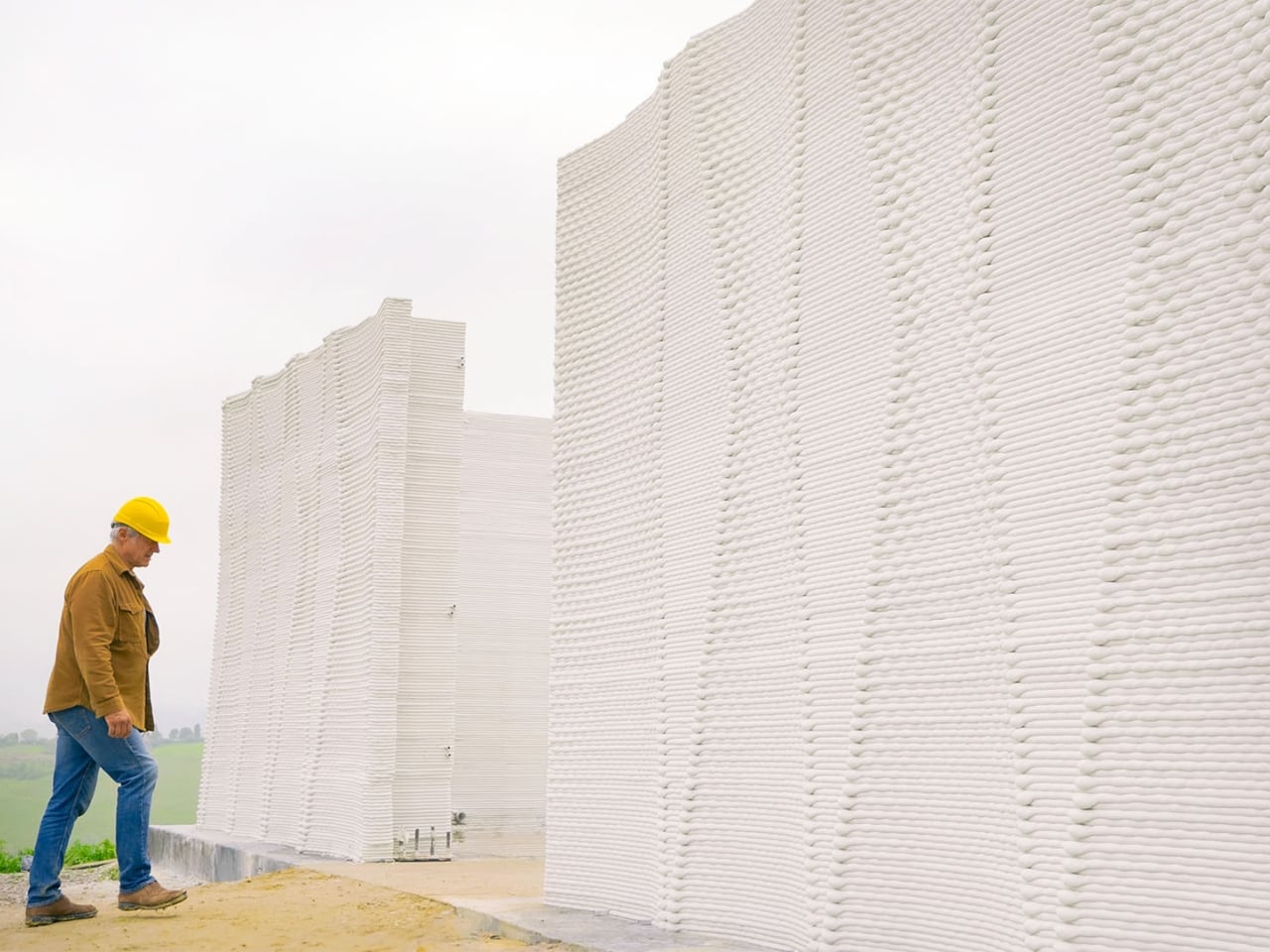
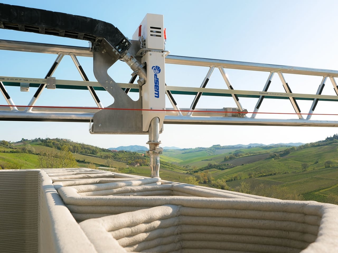
What makes Itaca genuinely fascinating is how it challenges our assumptions about both technology and sustainability. The walls aren’t just printed and left hollow. They’re packed with rice husks sourced from agricultural waste, creating natural insulation that keeps the interior comfortable year-round. The radiant heating systems and electrical installations are embedded directly during the printing process, which means less construction time and fewer workers needed on site.
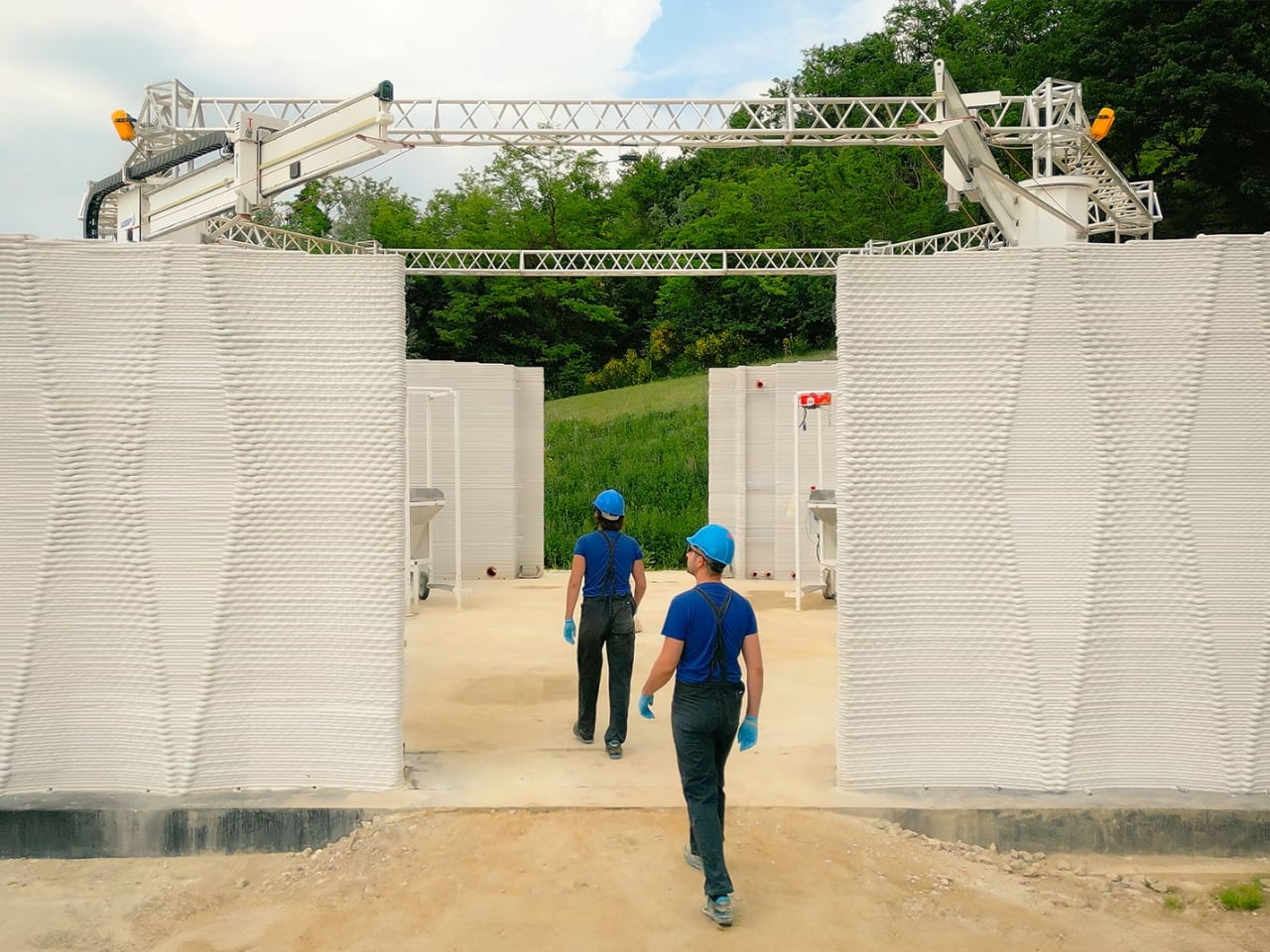
But WASP didn’t stop at the structure itself. They’ve integrated 3D-printed vertical hydroponic systems that ensure fresh vegetables all year round using minimal water. The entire setup operates on a circular micro-economy model, where waste from one system becomes fuel for another. It’s the kind of closed-loop thinking that environmentalists have been advocating for decades, finally made tangible through advanced manufacturing.
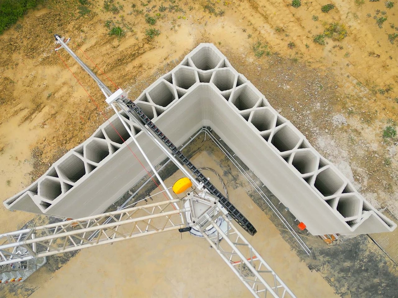
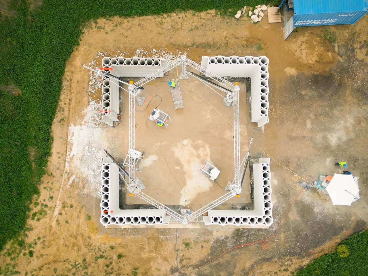
Massimo Moretti, WASP’s founder, first unveiled Itaca at Italian Tech Week in Turin as part of the company’s broader vision to democratize sustainable housing. The real genius here is accessibility. The Crane WASP system used to build Itaca is designed to operate even in remote areas, making it possible to replicate this model worldwide. You don’t need massive infrastructure or armies of specialized construction workers. Just the machine, locally sourced materials, and the digital blueprints.
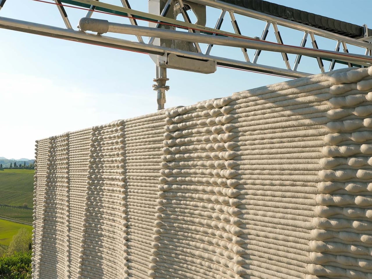
This approach to construction could be transformative for communities dealing with housing shortages or natural disasters. Traditional building methods require extensive supply chains, skilled labor, and months of work. With 3D printing, the timeline compresses dramatically, and the environmental footprint shrinks considerably. Using local materials means less transportation, fewer emissions, and buildings that are naturally suited to their climate. The ventilation system deserves special attention too. It’s designed to allow air to flow through the interior spaces continuously, transforming Itaca into what WASP calls a living house. This isn’t just clever branding. The structure literally responds to environmental conditions, adjusting naturally without mechanical systems that consume energy and break down over time.
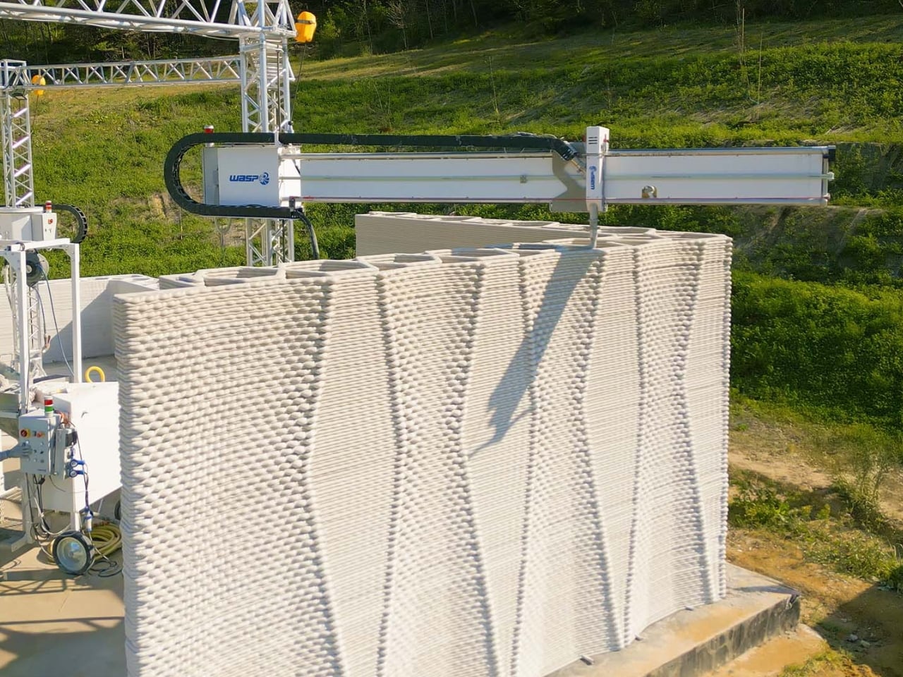
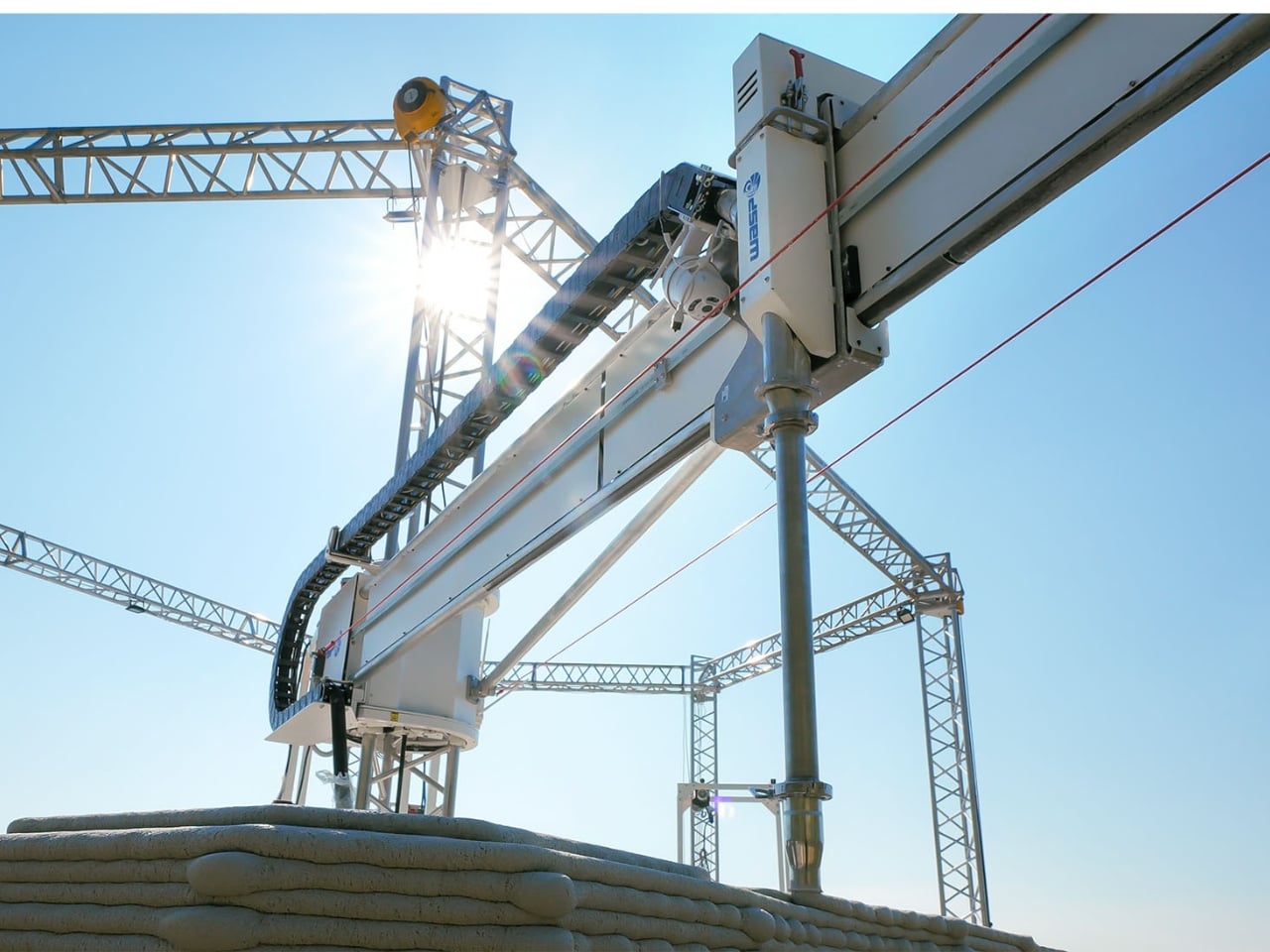
What’s striking about Itaca is how it sidesteps the typical debate between high-tech solutions and traditional wisdom. It’s both. The robotic arms and digital design tools represent cutting-edge technology, while the materials and principles draw from centuries of vernacular architecture. Rice husks and lime have been used in construction for millennia because they work. WASP 3D Build, the startup within WASP dedicated to printed construction, executed the project using technology that’s already proven and available. This isn’t a prototype languishing in a research lab. It’s a real building that people will actually live in and farm around. That’s the difference between innovation theater and genuine progress.
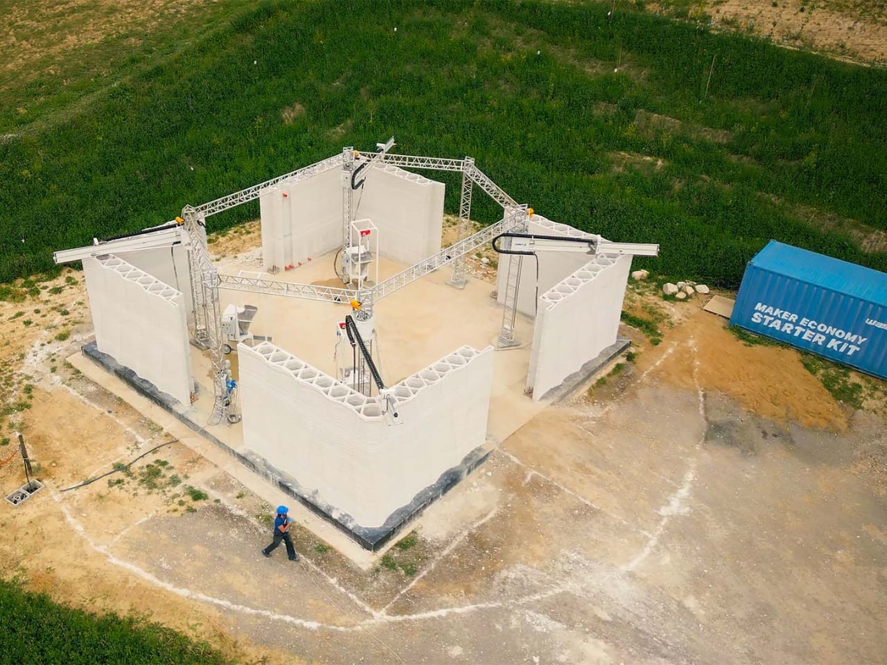
The implications extend beyond individual homes. If this model scales, it could reshape how we approach rural development, affordable housing, and disaster relief. Instead of shipping prefabricated structures across continents, communities could print buildings on demand using materials from their own backyards. The rapid transmission of information through digital files means a successful design in Italy could be adapted and printed in Peru or Indonesia within weeks. Itaca represents something rare in architecture: a project that’s simultaneously visionary and practical, high-tech and humble. It proves that sustainability doesn’t require sacrifice or compromise. Sometimes it just requires thinking differently about the tools we have and the wisdom we’ve inherited.
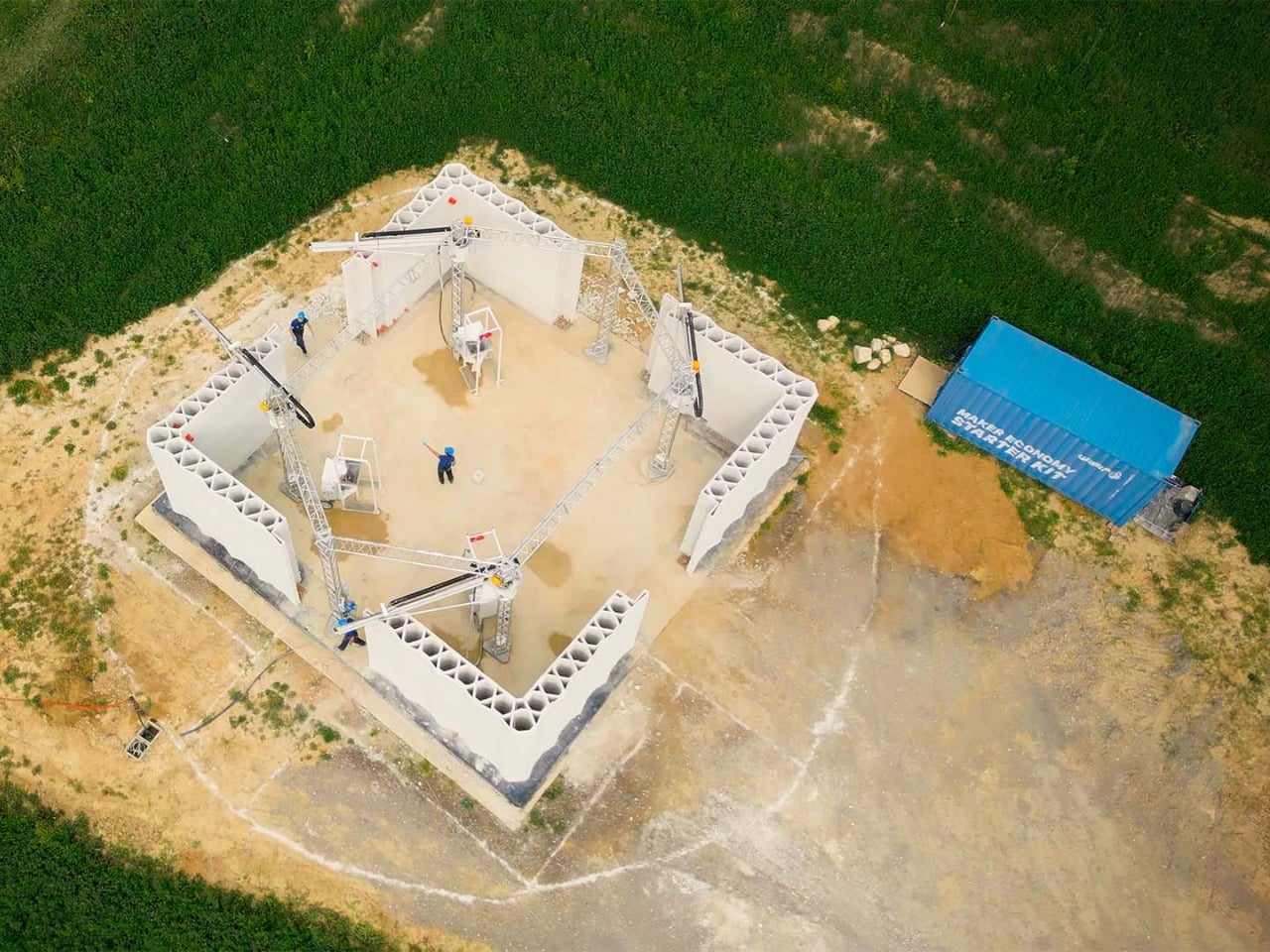
The post Four Robot Arms Just Built a Farm House That Prints Its Future first appeared on Yanko Design.
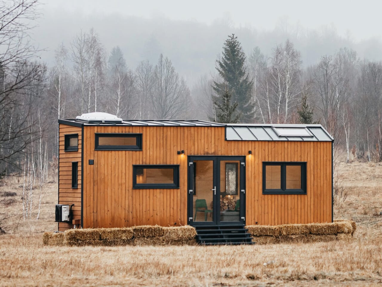
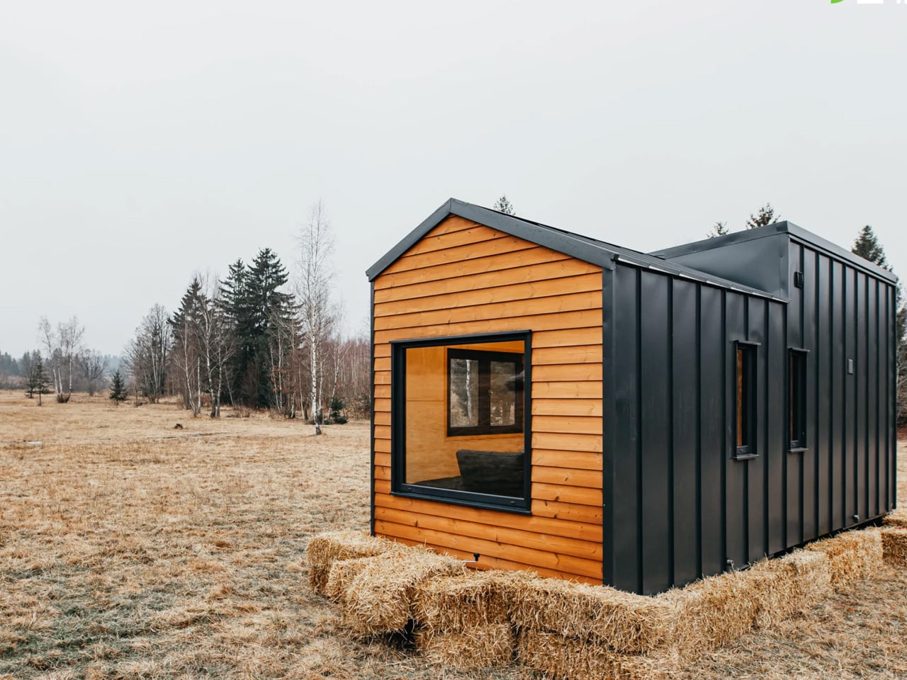
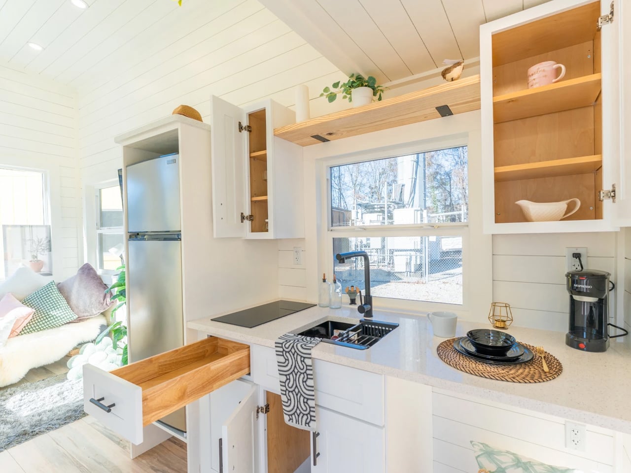
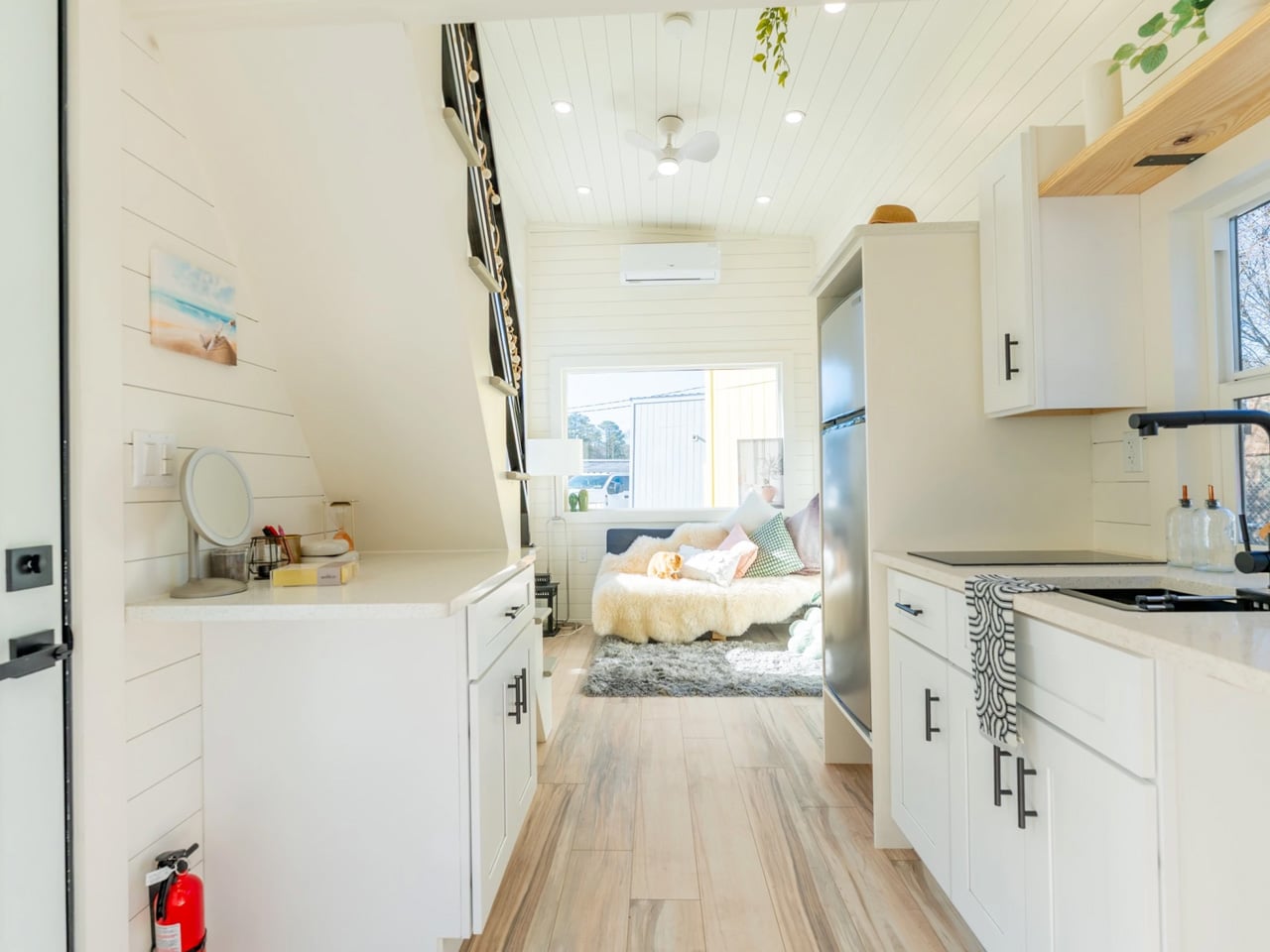
Tiny Houses Can’t Sleep Four? This 26-Footer Just Proved That Wrong

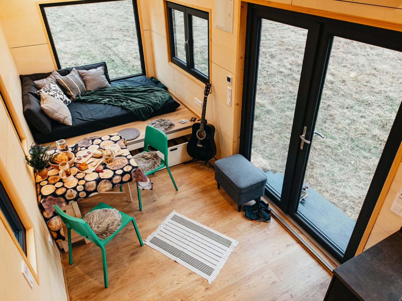
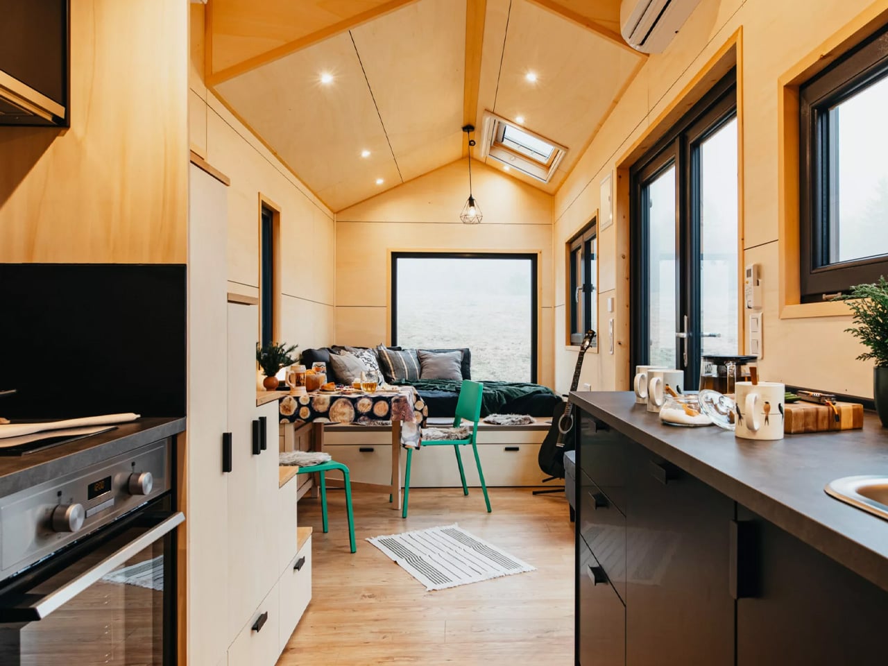
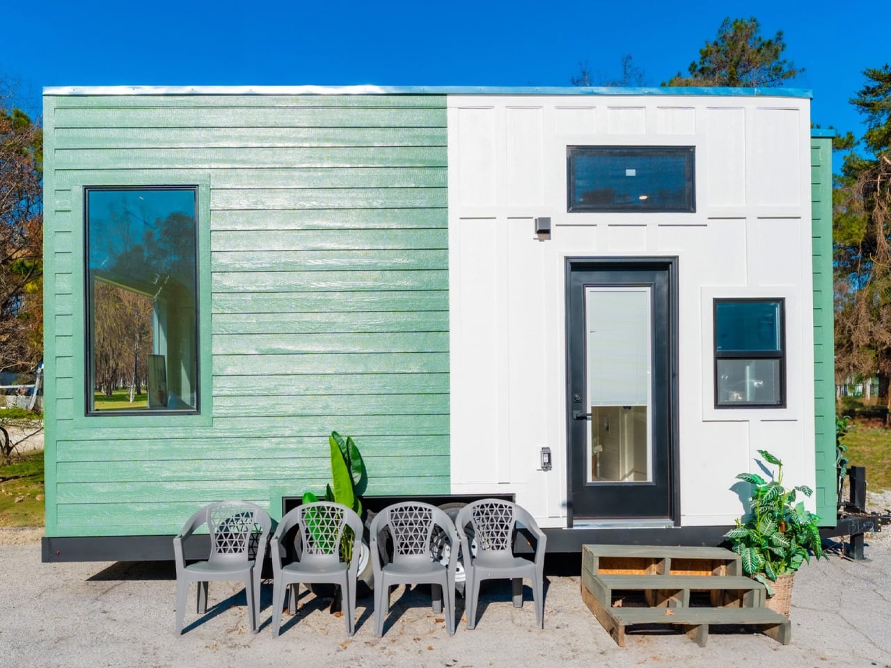
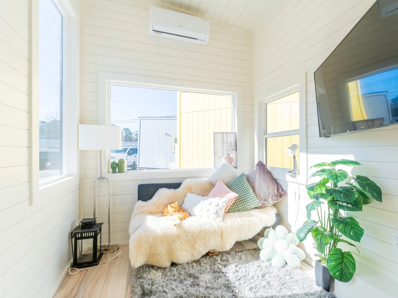
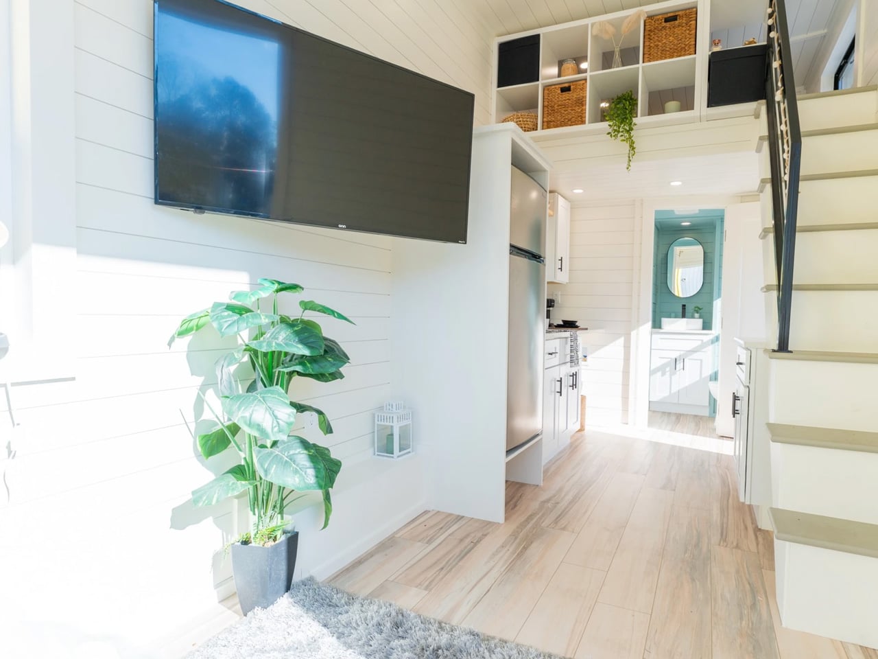
Romania’s Eco Tiny House has crafted something special with their Tiny Hogwarts model, a compact dwelling that challenges everything you think you know about space limitations. Measuring just 8 meters (26 feet) in length and offering 18.7 square meters of living space, this tiny house on wheels manages to sleep up to four people while maintaining an airy, comfortable atmosphere that feels anything but cramped. The magic lies in the thoughtful design choices that transform a modest footprint into a fully functional home.

Built on a double-axle trailer, the home features spruce timber construction with engineered wood and steel accents, topped with a metal roof that weathers beautifully. Rockwool insulation keeps the interior cozy year-round, while laminate flooring adds warmth underfoot. What sets this model apart is its flexible layout that transforms from an intimate retreat for two into guest-ready accommodation for four without feeling cluttered. Every design decision serves multiple purposes, proving that smart planning beats square footage.

Designer: Eco Tiny House

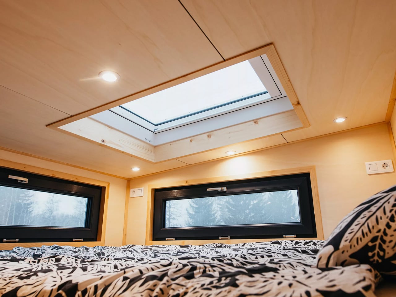
Natural light floods the interior through strategically placed windows, including roof skylights above both sleeping areas. There’s something almost meditative about lying in bed and gazing at the stars through these windows, a feature that brings the outdoors inside in the most peaceful way possible. The connection to nature extends beyond just views. Eco Tiny House designed this model for people seeking slower, more intentional living away from urban chaos, where being bathed in light becomes part of the daily experience.

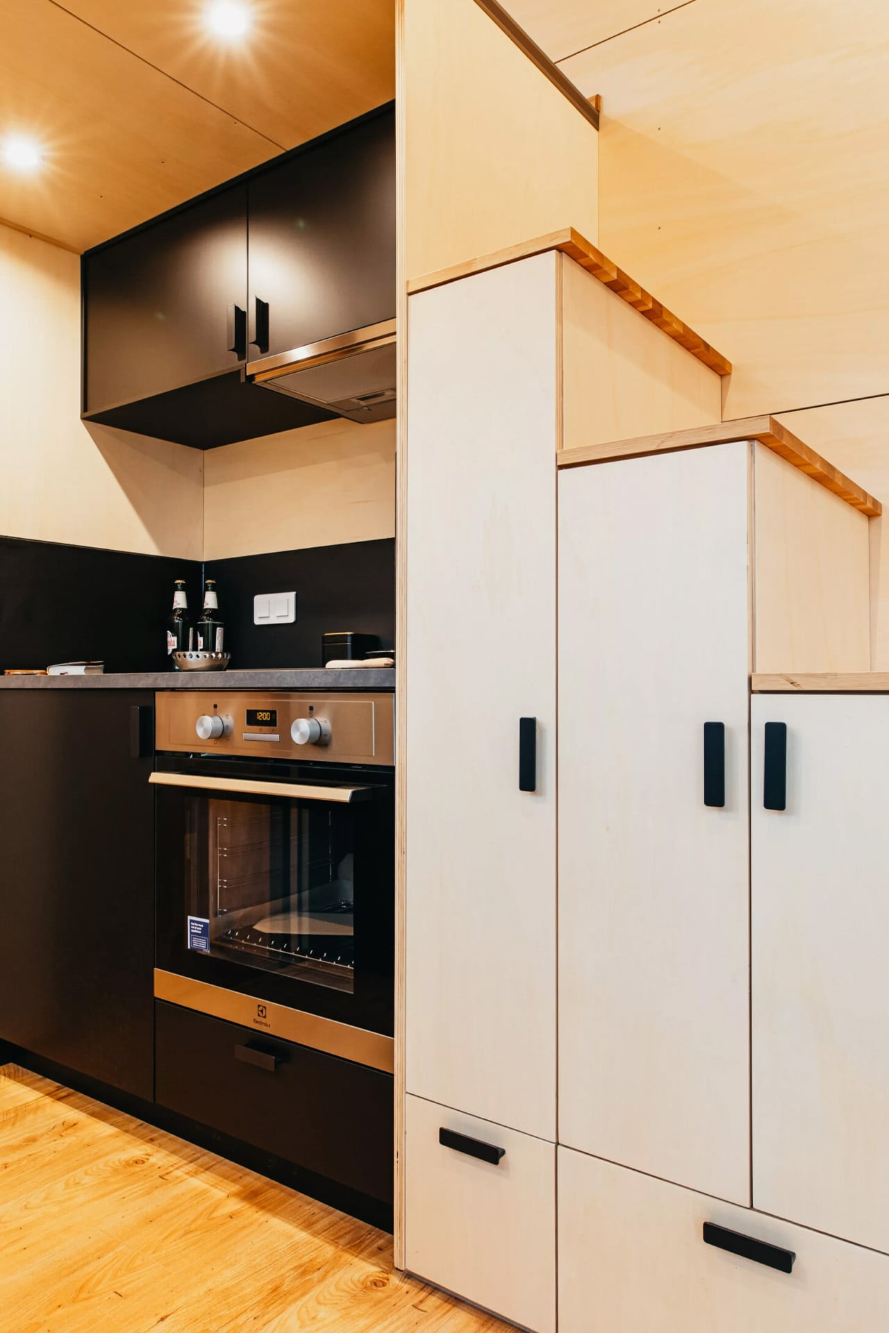
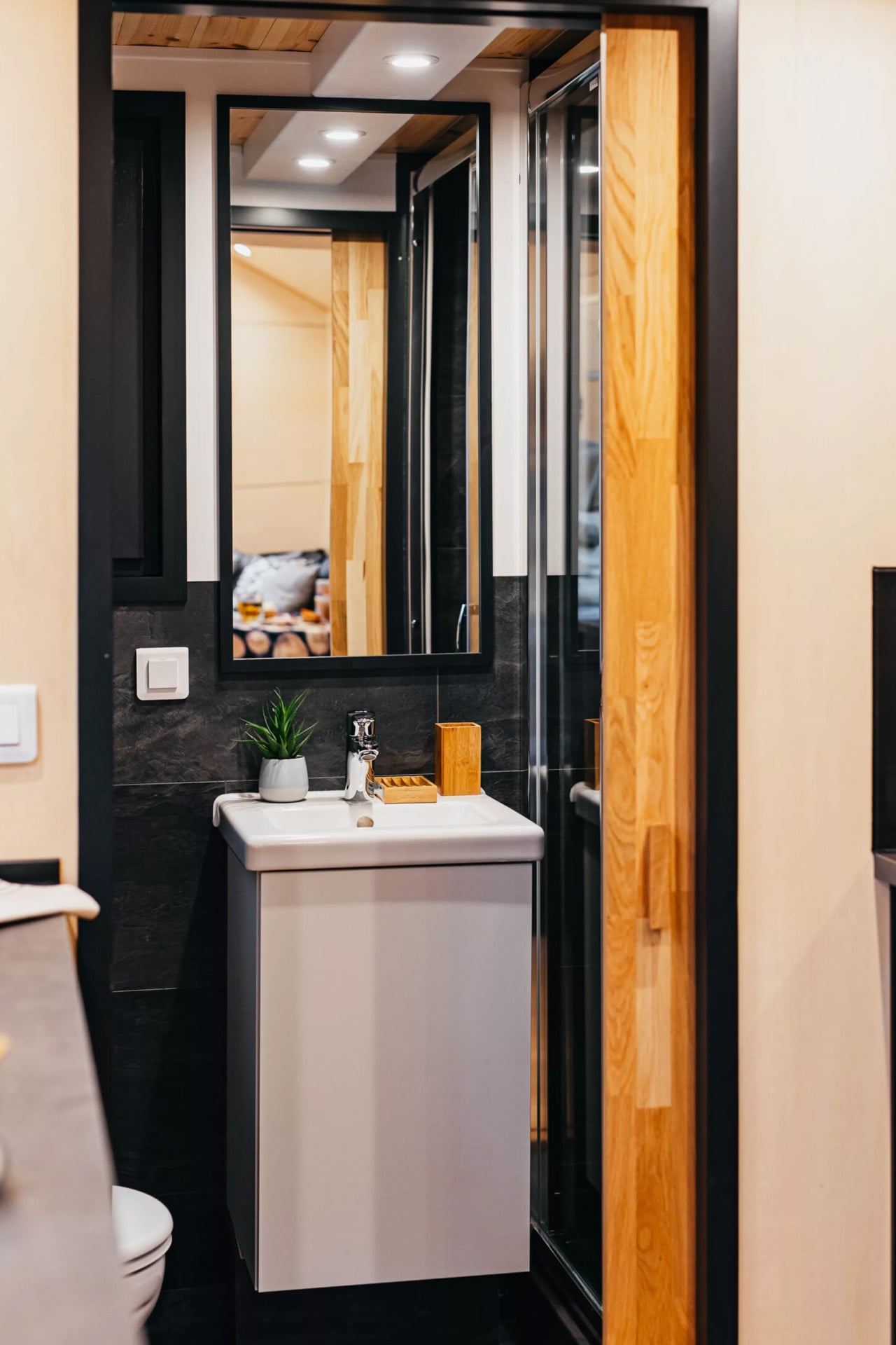
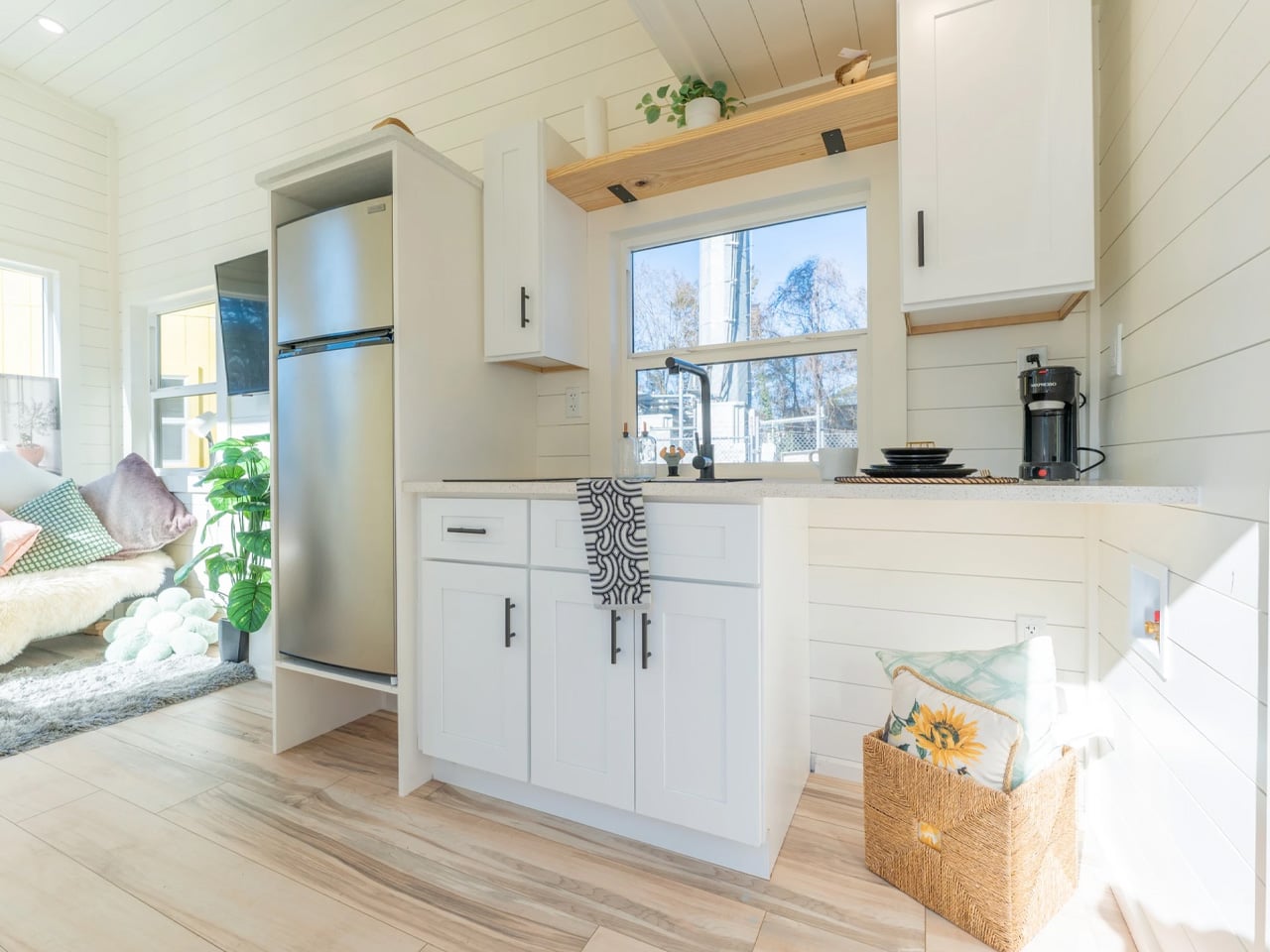
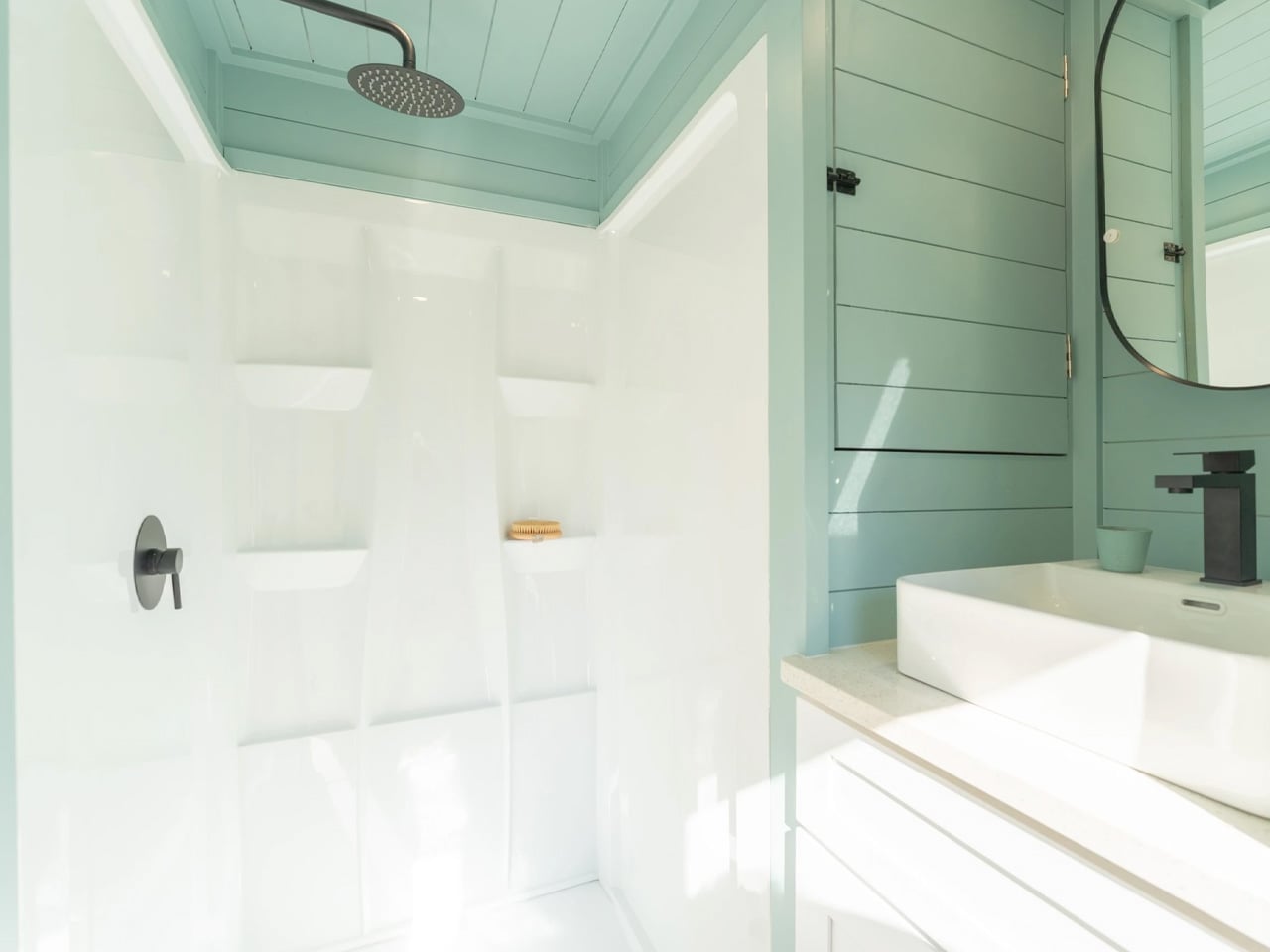
The kitchen comes fully equipped with modern appliances, paired with a mix of IKEA and custom-built furnishings that maximize every inch. Smart storage solutions hide throughout the space, ensuring belongings stay organized without sacrificing aesthetics. The bathroom fits seamlessly into the layout, proving you don’t need to compromise on comfort when downsizing. Underfloor heating and an AC unit handle temperature control, while optional off-grid systems appeal to those wanting complete energy independence.

What makes Tiny Hogwarts particularly appealing is its practicality. This isn’t just a novelty or weekend getaway spot. The home works perfectly for couples ready to embrace minimalist living full-time, with enough flexibility to host visiting friends or family. The sustainable approach extends beyond size. The materials, energy systems, and overall philosophy encourage residents to live lighter on the land while enjoying modern conveniences that make daily life comfortable and stylish.

At a time when housing costs continue climbing and environmental concerns grow more pressing, models like Tiny Hogwarts offer a genuine alternative. The home proves you can have modern amenities, stylish design, and comfortable living space without the burden of a traditional mortgage or oversized footprint. For those ready to simplify life and strengthen their connection with nature, this charming tiny house delivers on both counts while looking beautiful doing it.

The post Tiny Houses Can’t Sleep Four? This 26-Footer Just Proved That Wrong first appeared on Yanko Design.

A Hand-Built Stone Sphere Just Landed in Rural Portugal

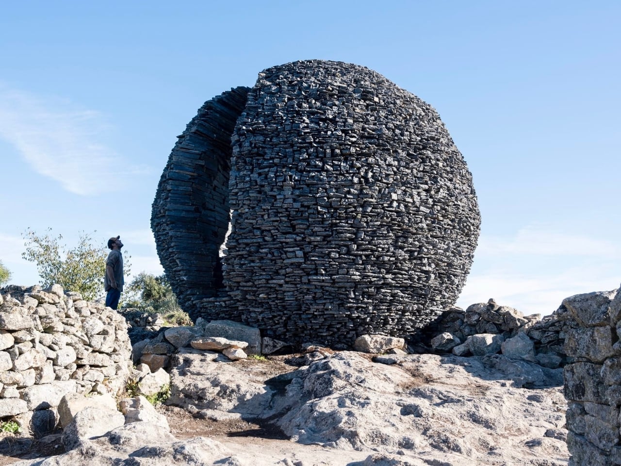
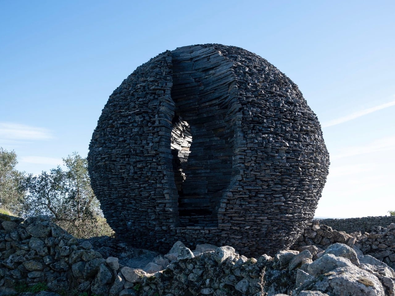
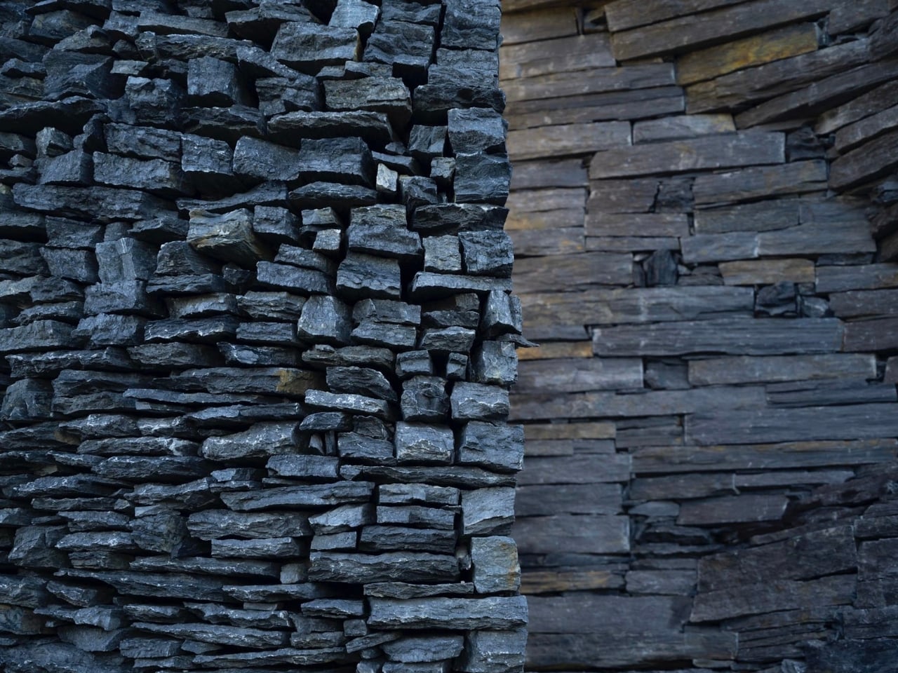
There’s something profoundly strange about seeing a perfect sphere sitting in the middle of nowhere. It doesn’t belong there in the way a building or a bridge would, yet somehow it looks like it’s been there forever. That’s the magic of Ninho Globo, a monumental stone installation by Paris-based studio Atelier Yokyok that just landed in the windswept landscape of eastern Portugal.

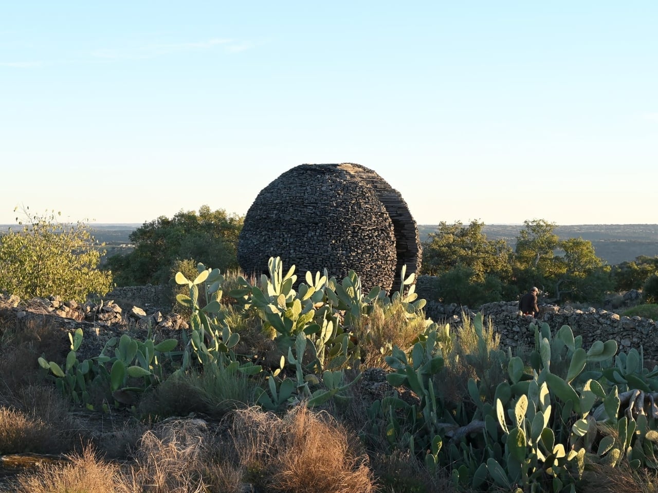
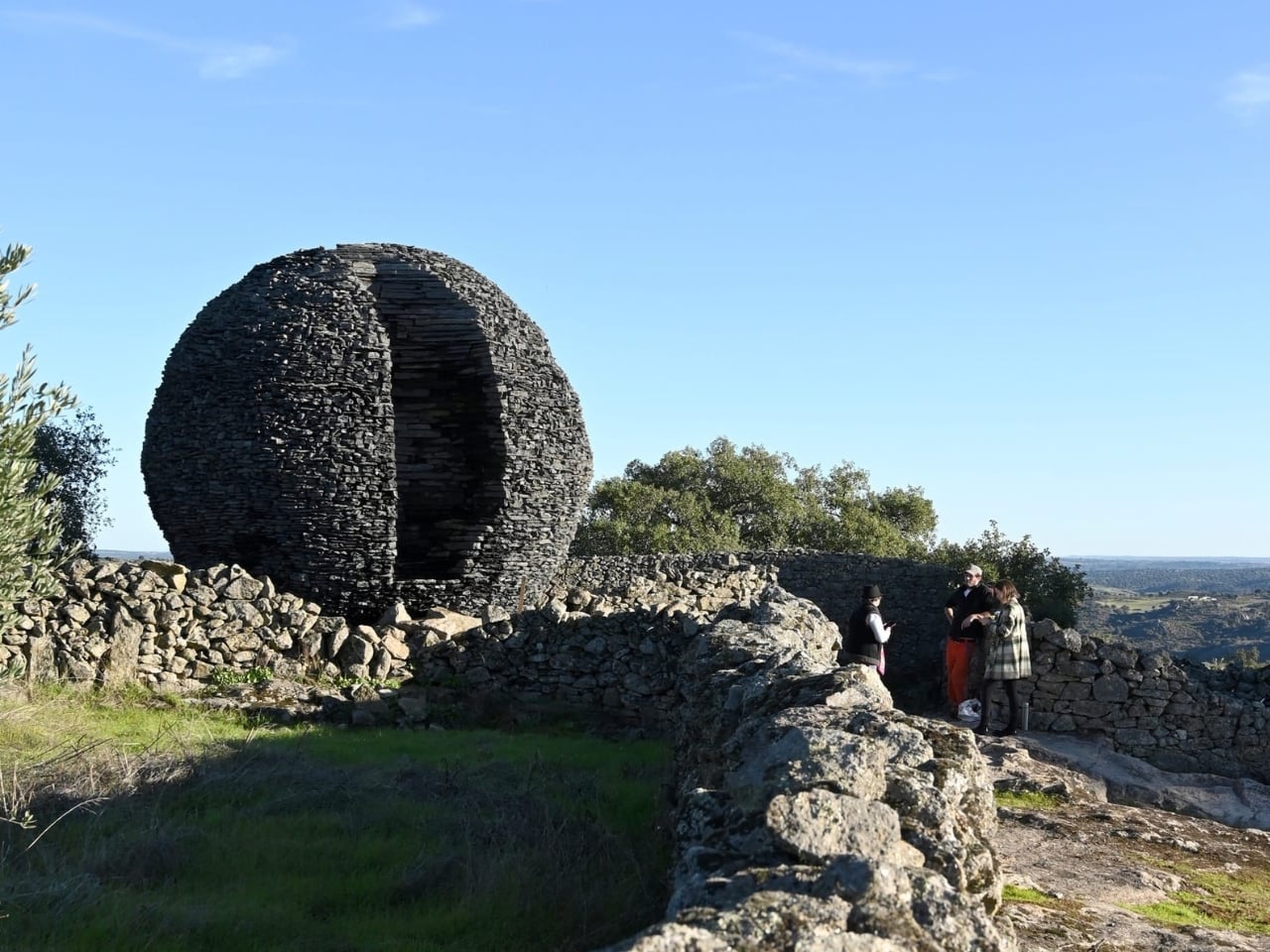
Picture this: you’re standing on a rocky plateau in Salvaterra do Extremo, a small border town where Portugal meets Spain. The terrain is rough, dotted with old dry stone walls and scrubby vegetation. And right there, perched on what used to be a farm, sits this five-meter sphere made entirely of local black schist, a rock that splits into beautiful flat layers. Against the sky, it looks like something that either fell from space or grew from the earth itself. Maybe both.

Designer: Atelier Yokyok

Atelier Yokyok, a four-person team founded by architects Samson Lacoste and Luc Pinsard (later joined by Laure Qaremy and Pauline Lazareff), built this sphere by hand with the local community. This wasn’t a case of a design team parachuting in with prefab materials and machines. They used the schist that’s native to this region, honoring the geological identity of the place while creating something that feels both ancient and futuristic.

What really gets you is how the piece plays with your sense of scale. From far away, Ninho Globo looks planetary, like a dark moon that’s settled into the landscape. The name itself means “Global Nest” in Portuguese, and that double meaning is intentional. Is it a celestial body? A giant nest? A seed pod waiting to crack open? It refuses to be just one thing, and that ambiguity is part of its power.

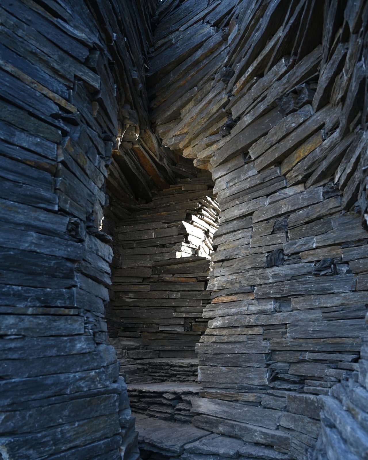
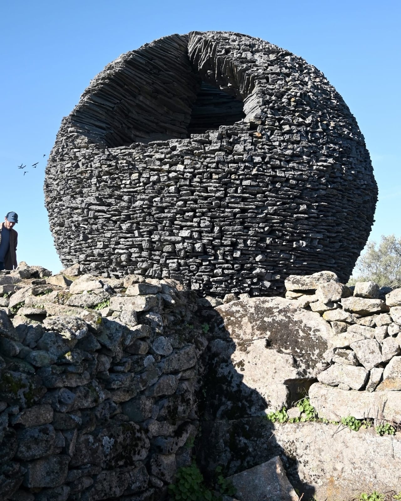
Then you get closer and notice the fissure. There’s a deliberate crack called the “Canyon” that cuts through the sphere, inviting you inside. Step through, and suddenly you’re in a hollowed-out chamber where the scale flips completely. Now you’re not looking at something massive. You’re inside it, cradled by layers of stacked stone, experiencing the weight and texture of the schist up close. The space is cool and shadowy, a shelter carved from geometry. It makes you think about what it means to inhabit a space, to be protected by it.

This kind of visceral, physical experience is what Atelier Yokyok does best. The studio has spent years exploring how our bodies interact with space, often using lightweight materials like textiles in their earlier work. But with Ninho Globo, they’ve shifted toward mineral permanence, something that will weather and age with the landscape rather than disappear. It’s a move that speaks to bigger questions about what we build, why we build it, and what we leave behind.

The project was part of Landscape Together, a program co-funded by the European Union’s Creative Europe initiative that brings artists, institutions, and local communities together to breathe new life into rural areas. Ninho Globo is now part of the permanent collection at Museu Experimenta Paisagem, an open-air museum dedicated to site-specific art. The work embodies something we’re seeing more of in contemporary art and architecture right now: a turn toward low-tech, community-driven projects rooted in place. In an era obsessed with speed and novelty, building something slowly, collectively, and with local materials feels almost radical.

There’s also something to be said about the location. This is a border territory, a place that exists in the margins between two countries. It’s not a tourist destination. It’s remote, rugged, and deeply connected to the rhythms of the land. Water is scarce here, and the hollowed interior of Ninho Globo speaks to that absence, turning it into a meditative space where geological memory becomes tangible.

What Atelier Yokyok has created isn’t just a sculpture. It’s a conversation starter about habitat, shared resources, and how we relate to the places we live. It’s about time, both geological and human. And it’s a reminder that sometimes the simplest shape, a sphere, can hold the most complex meanings.

The post A Hand-Built Stone Sphere Just Landed in Rural Portugal first appeared on Yanko Design.

This $12.5B Cross-Shaped Airport Will Become Africa’s Largest by 2030

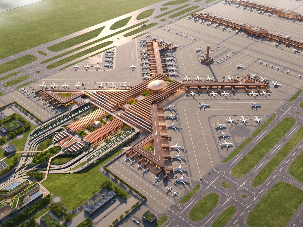
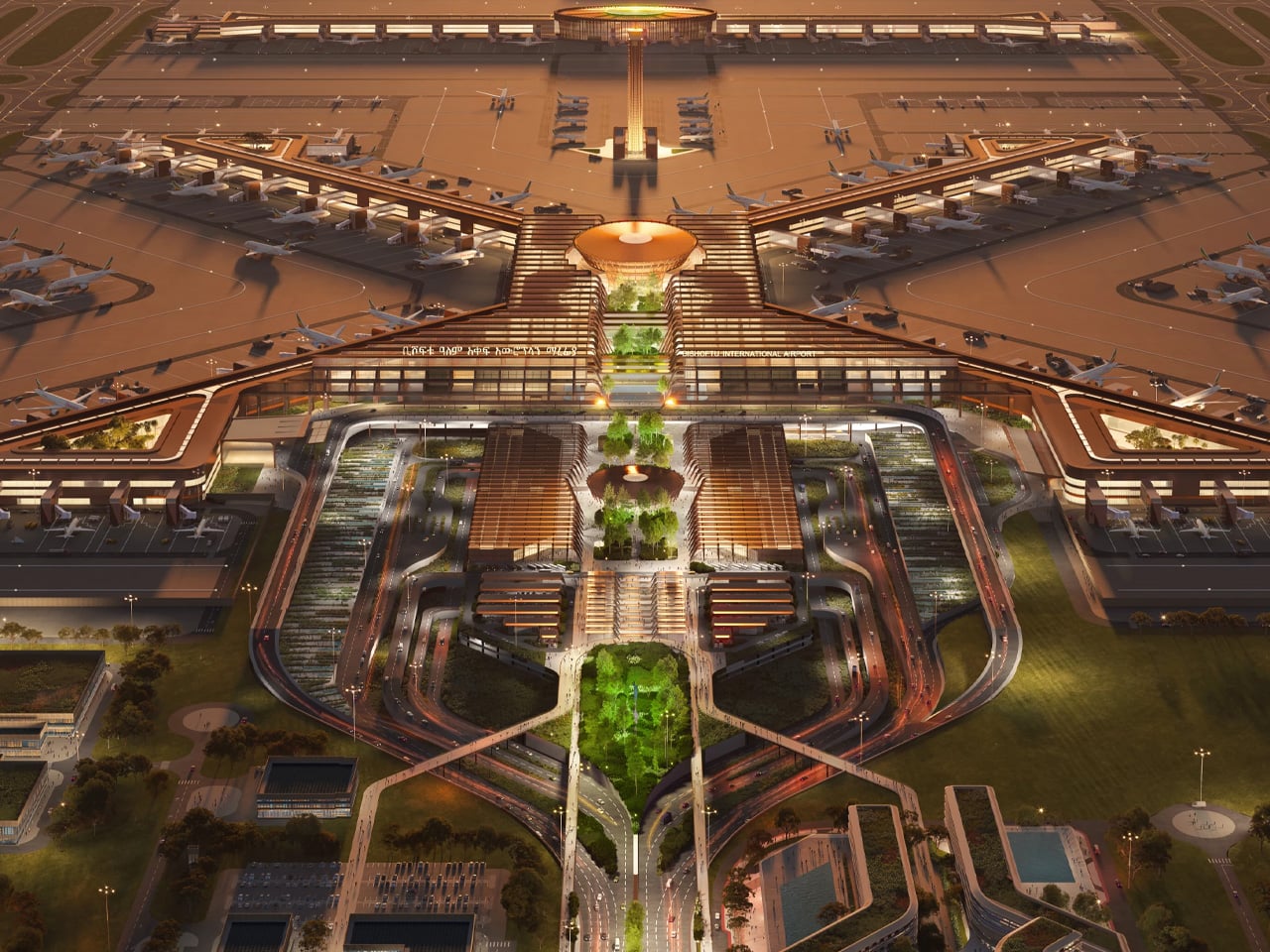
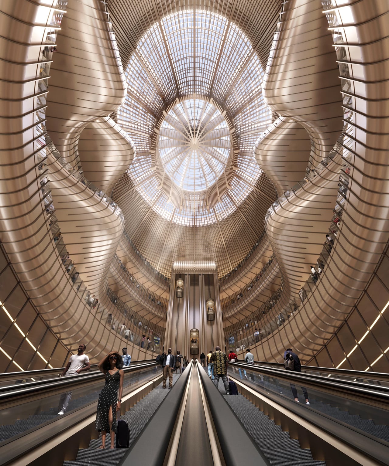
Ethiopia has embarked on a transformative journey with the groundbreaking of Bishoftu International Airport, a $12.5 billion megaproject designed by Zaha Hadid Architects that will redefine the continent’s aviation landscape. Prime Minister Abiy Ahmed Ali laid the cornerstone on January 10, 2026, marking the official start of what officials describe as the largest aviation infrastructure project in Africa’s history. Located 40 kilometers south of Addis Ababa, the airport will eventually boast a capacity four times greater than Ethiopia’s current main airport, which is projected to reach its operational limits within the next two to three years. The ambitious development positions Ethiopia as Africa’s premier aviation gateway, connecting the continent to global destinations through Ethiopian Airlines, Africa’s largest carrier.

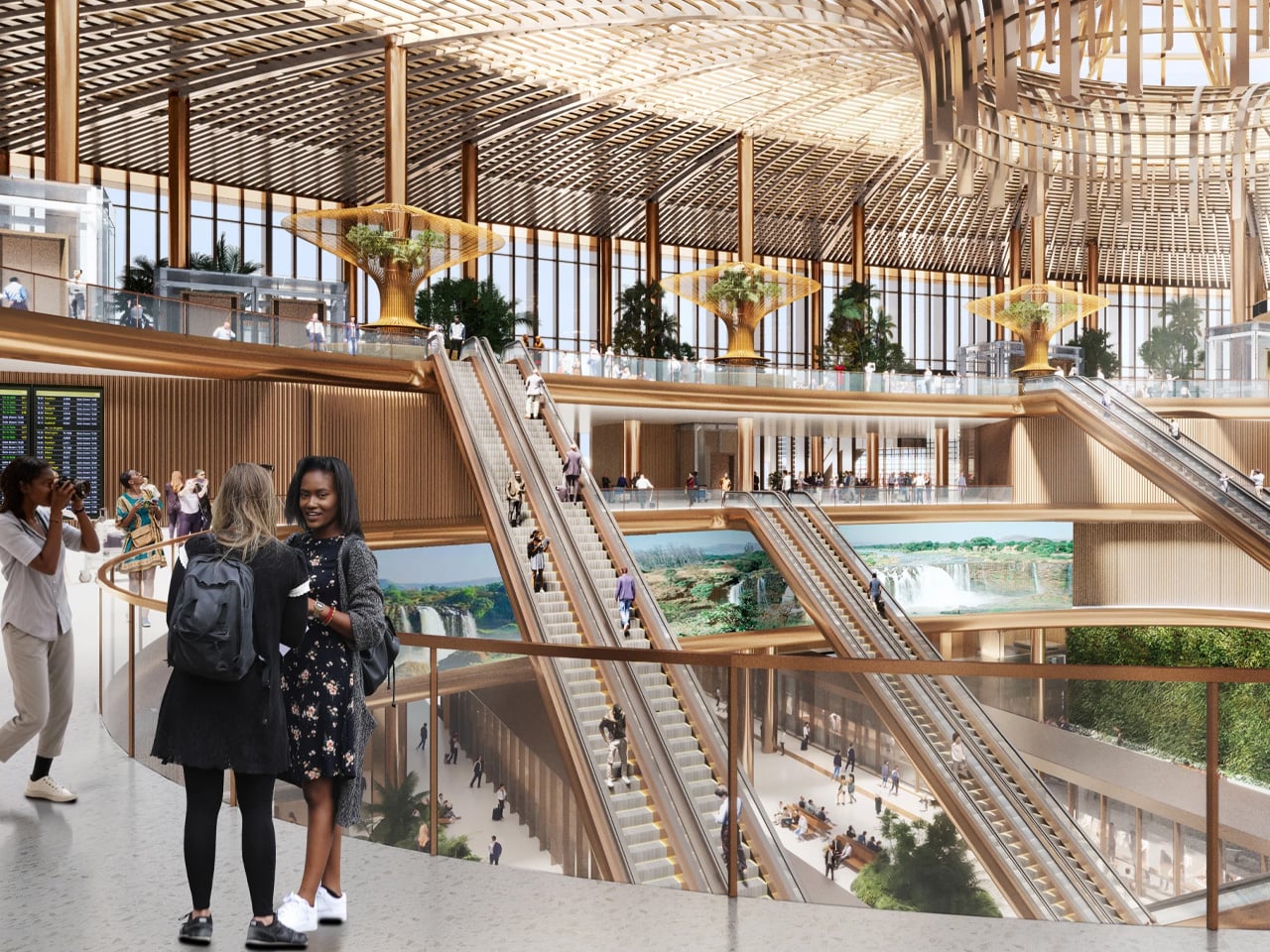
The architectural design draws profound inspiration from Ethiopia’s geological wonder, the Great Rift Valley, which passes near Bishoftu as it traverses through the country. A single central spine organizes the terminal’s facilities and aircraft piers, creating an intuitive flow that minimizes transfer distances for the estimated 80 percent of passengers who will transit through without leaving the airport. The terminal features a distinctive cross-shaped form spanning 660,000 square meters, with each pier showcasing unique interior materials and color palettes inspired by Ethiopia’s diverse environments, from its highlands to lowlands and valleys. This thoughtful integration of regional identity into functional design reflects Zaha Hadid Architects’ signature parametric approach, transforming natural landscapes into architectural expression.

Designer: Zaha Hadid Architects

Construction will proceed in multiple phases, with the initial opening targeted for 2030. Phase One includes two independently operating Code 4E parallel runways and a terminal designed to accommodate 60 million passengers annually. Subsequent phases will expand capacity to 110 million passengers per year, supported by four runways and parking facilities for 270 aircraft. This phased approach allows Ethiopian Airlines to incrementally meet rising demand, responding to International Air Transport Association forecasts predicting over 200 percent growth in East African air travel demand over the coming decade. The strategic expansion plan demonstrates careful consideration of both immediate needs and long-term growth trajectories.

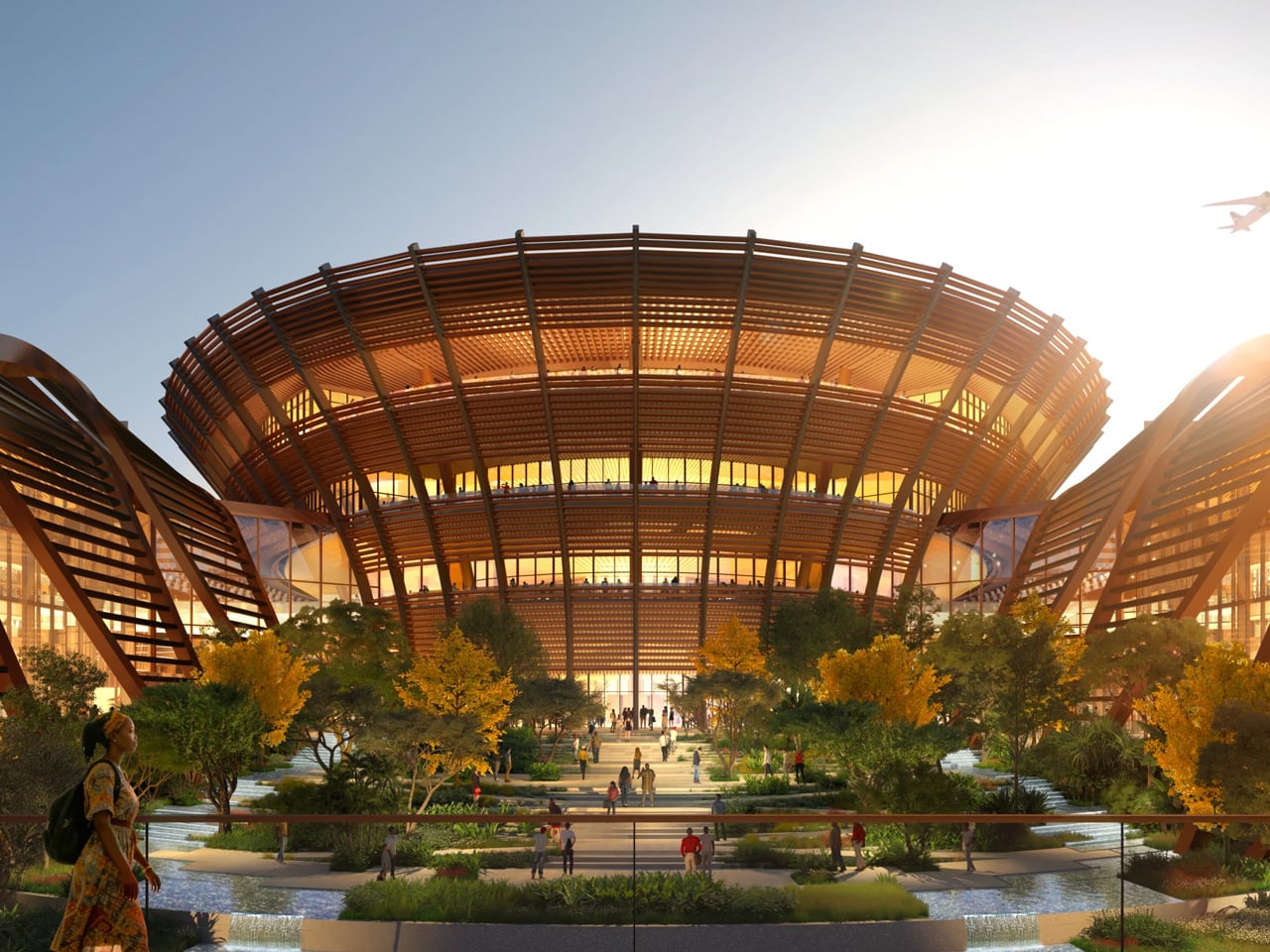
The airport prioritizes the transit passenger experience with extensive amenities, including a 350-room airside hotel, diverse dining and entertainment facilities, plus outdoor courtyards landscaped with native drought-resistant plants. Natural ventilation and effective solar shading take advantage of the Oromia region’s temperate subtropical highland climate, creating semi-enclosed spaces where passengers can enjoy warm summers and mild winters. The design targets LEED Gold certification, incorporating locally sourced concrete and steel to reduce carbon footprint while supporting regional economic development. Photovoltaic arrays throughout the campus will enable on-site energy production, while stormwater management systems channel runoff into new wetlands and bioswales.

Bishoftu’s location delivers significant operational advantages, situated nearly 400 meters lower in elevation than the existing Bole Airport. Combined with longer runways, this enables aircraft to operate at higher maximum take-off weights while consuming less fuel, optimizing Ethiopian Airlines’ modern fleet for longer non-stop routes. A planned high-speed rail link will connect Bishoftu with central Addis Ababa and Bole Airport, forming the cornerstone of an integrated regional transport network. The surrounding Airport City, featuring mixed-use buildings, will serve approximately 80,000 residents and operate 24 hours without curfew restrictions, establishing a vibrant new urban district.

The post This $12.5B Cross-Shaped Airport Will Become Africa’s Largest by 2030 first appeared on Yanko Design.

This Invasive Weed Now Builds What It Once Destroyed

There’s something poetic about turning your worst problem into your best solution. That’s exactly what’s happening at Delhi’s Sunder Nursery, where a stunning new pavilion is literally made from one of India’s most hated plants.

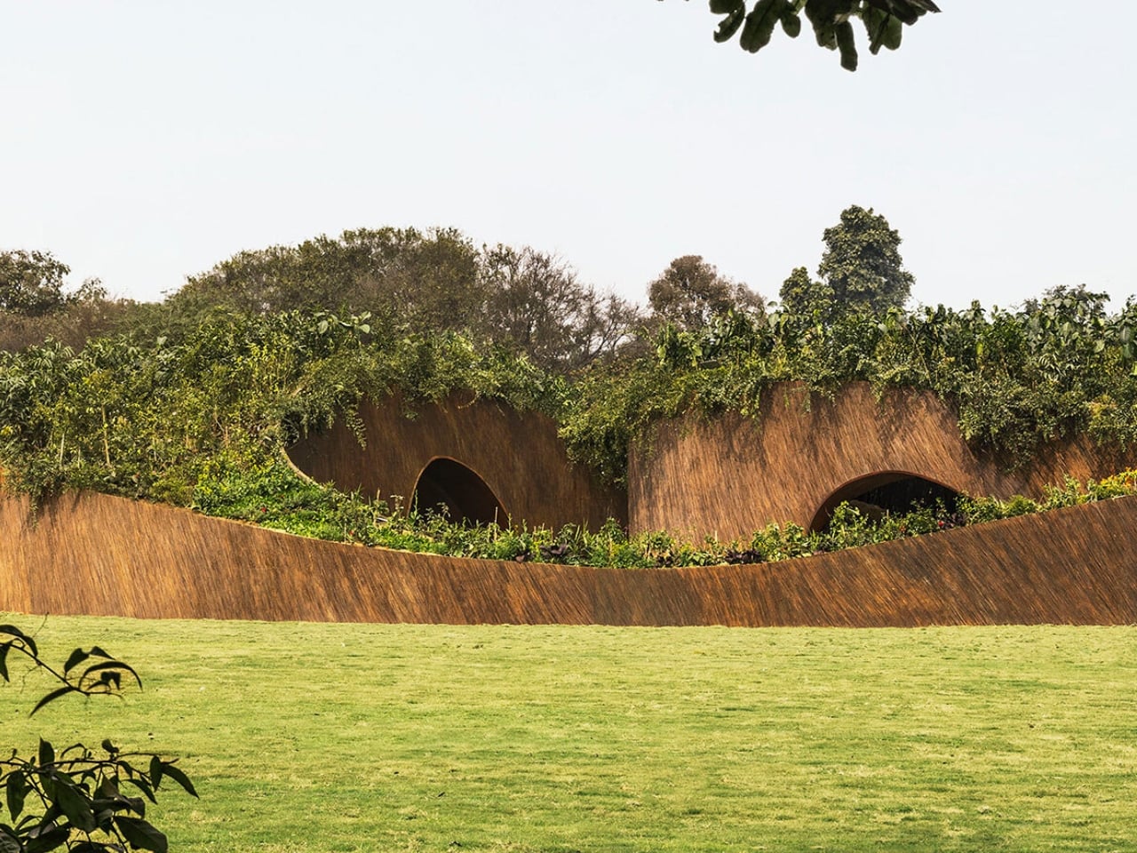
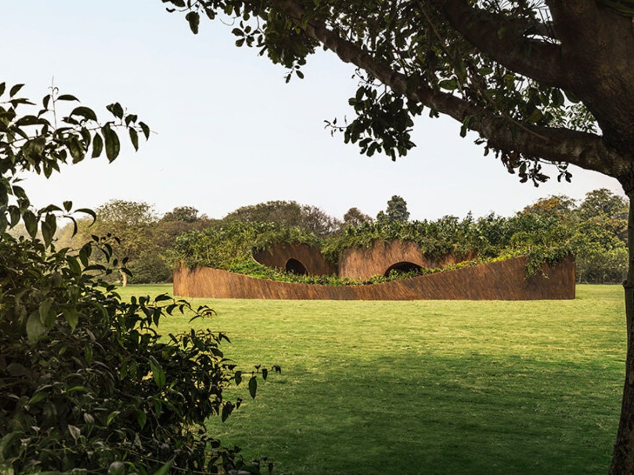
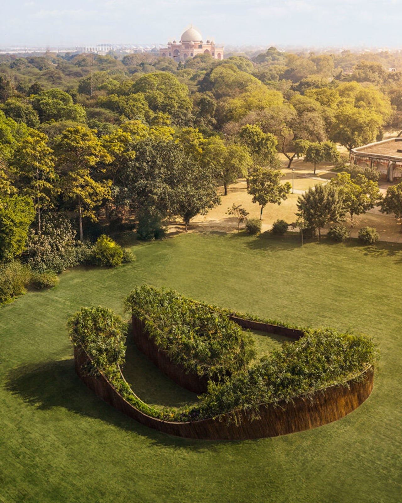
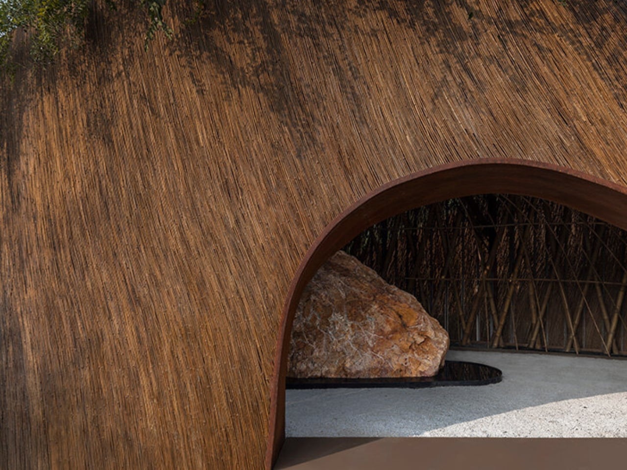
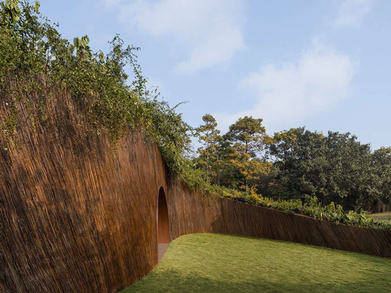
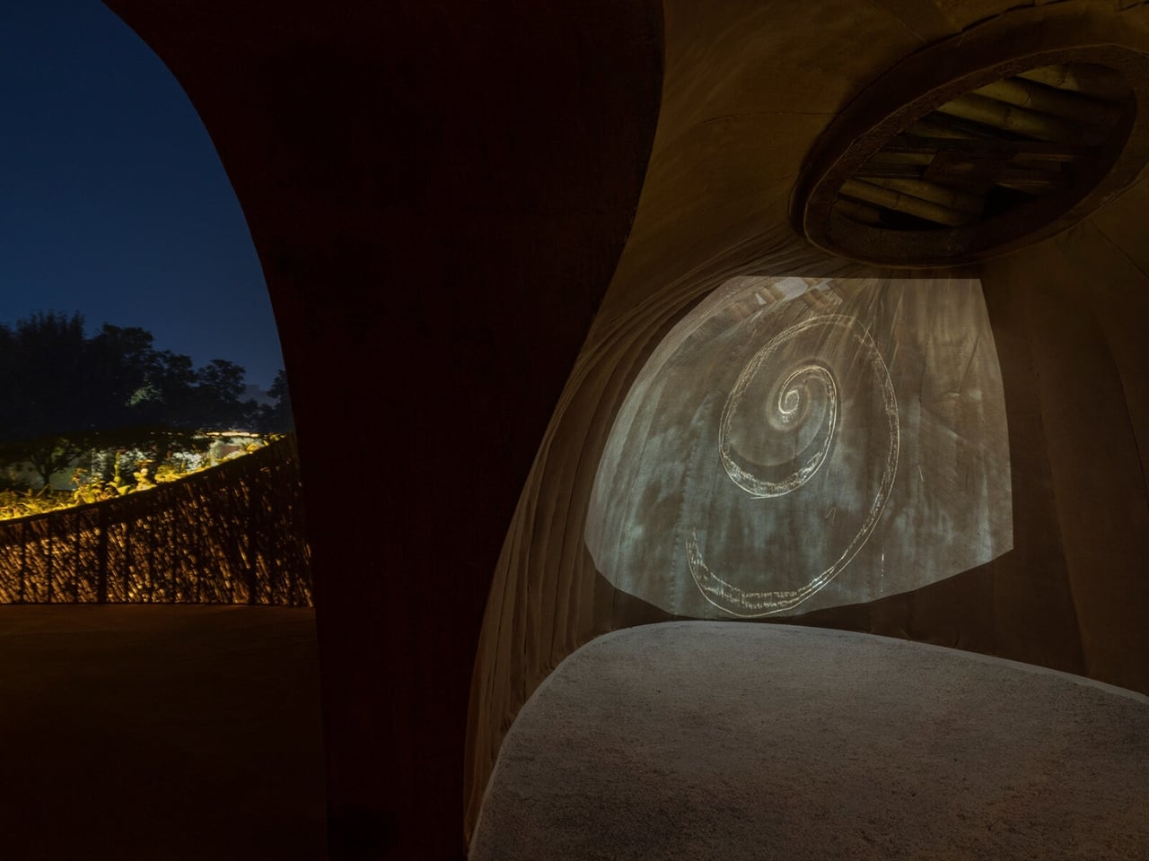
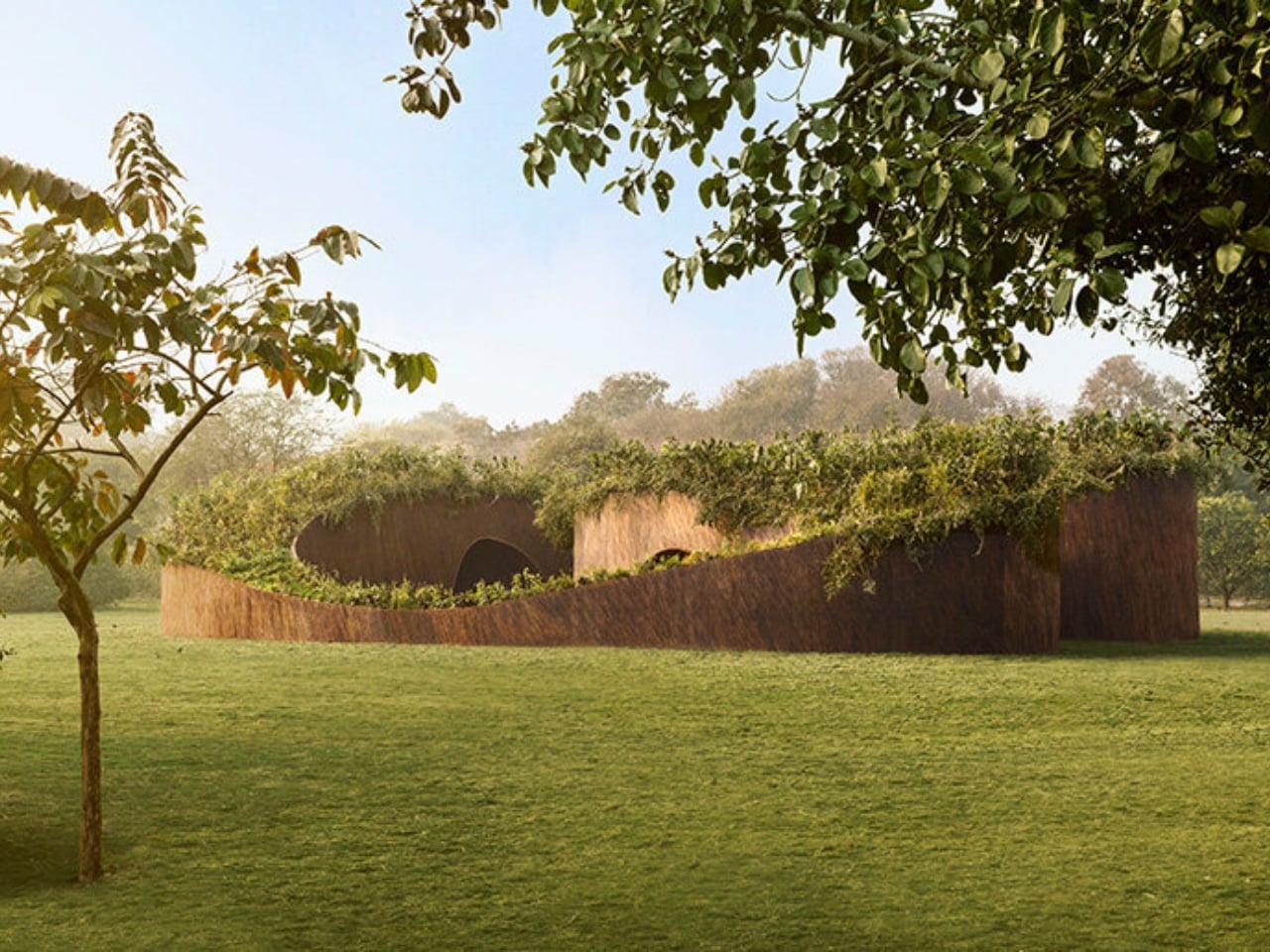
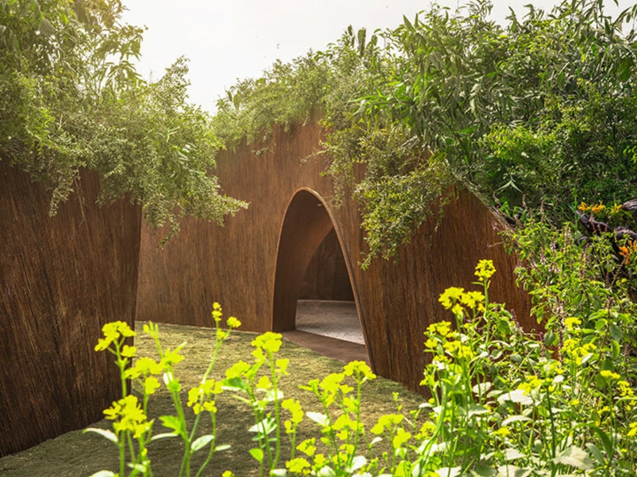
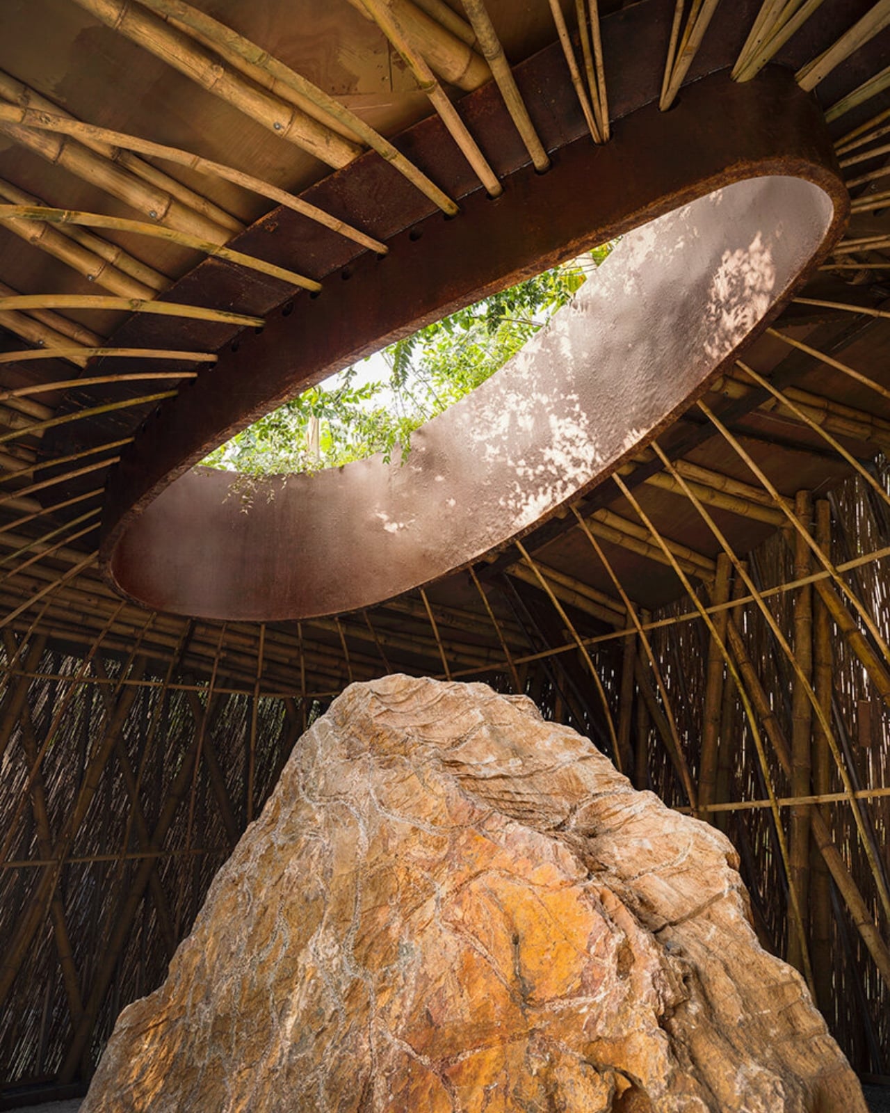
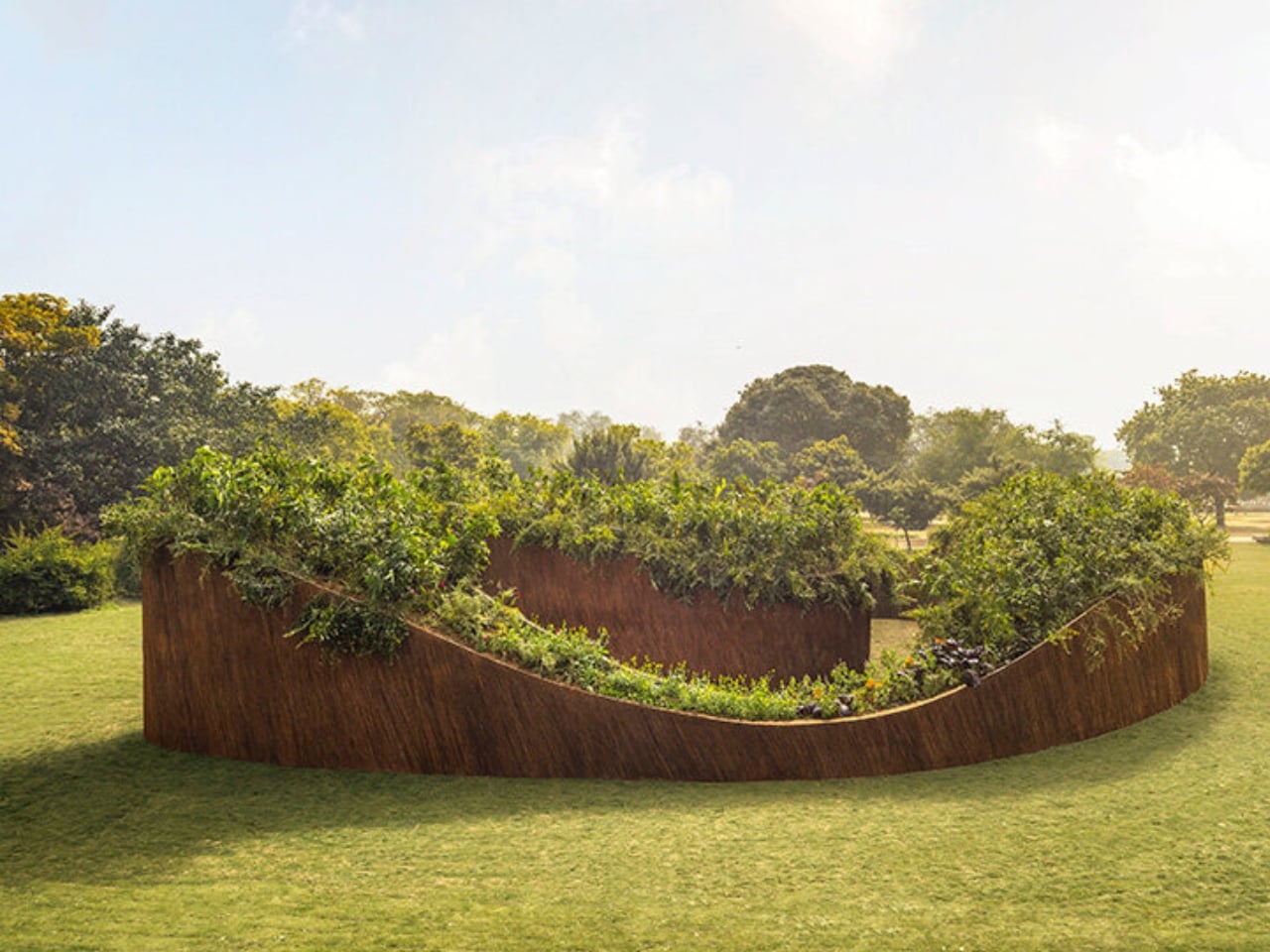
The Aranyani Pavilion looks like a small spiral rising from the lawns, but get closer and you’ll realize its walls are woven from lantana, a plant that’s basically the uninvited guest that took over the whole house. Brought to India centuries ago as an ornamental plant, lantana camara has spread like wildfire across the country. Today, it covers over 13 million hectares and has invaded 44 percent of India’s forest cover, choking native species and creating dense, impenetrable barriers that prevent new growth. But here’s where it gets interesting. Instead of just cursing this invasive species, conservation scientist Tara Lal and Colombian-Cypriot design firm T__M.space decided to do something radical: build with it.

Designers: Aranyani and T__M.space (photos by Lokesh Dang)

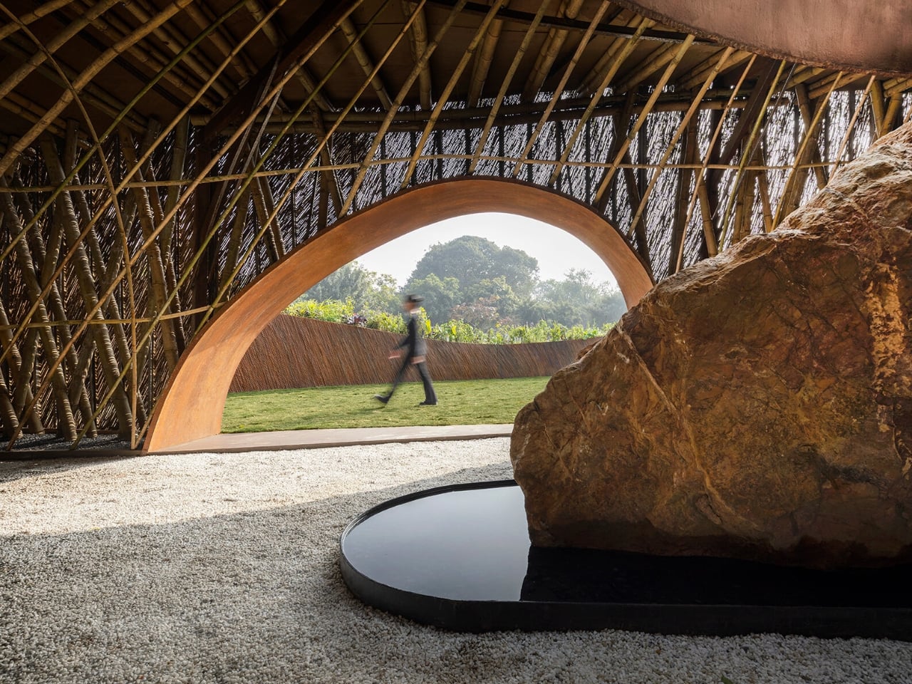
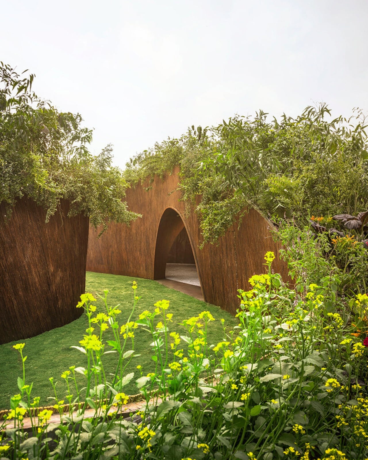
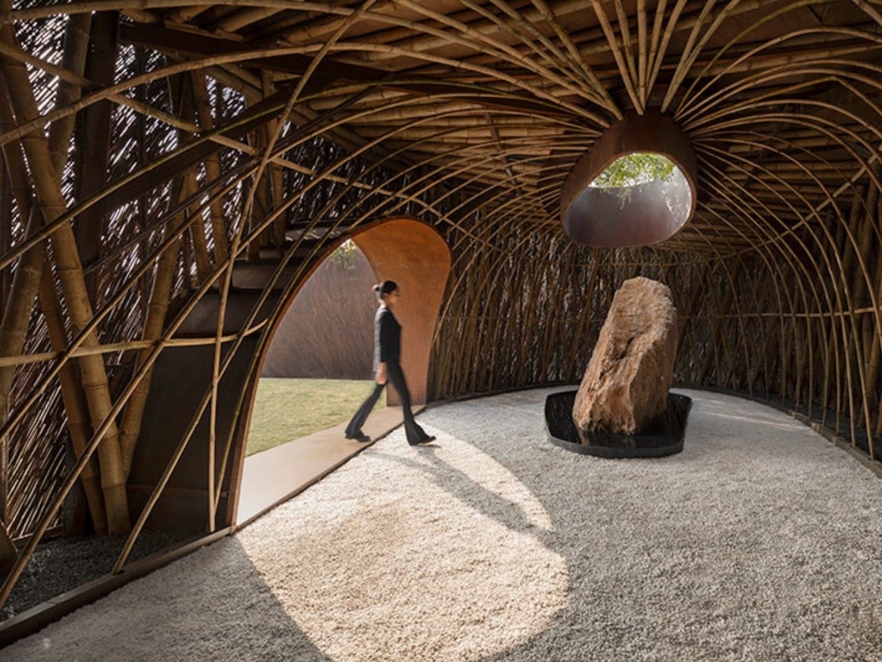
The pavilion occupies a 200-square-meter footprint and features a bamboo skeleton that holds up walls crafted entirely from upcycled lantana stems. The structure spirals inward, creating a rib-like cage that guides visitors toward the center, where a nine-ton rock that was once mining waste sits in a shallow, reflective pool. Above it all, a living canopy of jasmine, neem, tulsi, and bakul plants creates a roof that breathes and grows.

What makes this project so compelling isn’t just the clever upcycling angle. It’s the entire philosophy behind it. The pavilion is inspired by India’s tradition of sacred groves, those ancient forest sanctuaries where communities protected nature as a spiritual act. By using the very plant that destroys these ecosystems and transforming it into something that honors them, the designers have created a kind of architectural karma.

Guillaume Lecacheux of The Works, who led the fabrication, captured it perfectly: “Aranyani captures the dialogue between structure and spirit, a pavilion that stands without grounding, held together by the tensile intelligence of bamboo and the quiet strength of nature.”

The project arrives during India Art Fair as part of a 10-day event curated by Lal’s ecological restoration initiative, also called Aranyani after the Hindu goddess of forests and wild animals. The timing couldn’t be better. As cities like Delhi grapple with pollution, urban sprawl, and disconnection from nature, projects like this offer a different model, one where design doesn’t just create beauty but actively participates in healing.

What’s particularly smart about this approach is that it tackles a real environmental problem while creating something culturally resonant. Lantana removal is already part of forest restoration work across India. Rather than letting those harvested stems become waste, they become building material. It’s a circular solution that makes both practical and symbolic sense. The living canopy above the structure reinforces this regeneration narrative. Those indigenous plants, tulsi, neem, jasmine, and bakul, aren’t just decorative. They’re rooted in India’s ecological and cultural memory, species that have meaning beyond aesthetics. They represent what should be growing in these landscapes, what lantana has pushed out.

This kind of project feels important right now because it pushes back against the idea that sustainability has to look rough or unfinished. The Aranyani Pavilion is gorgeous. It proves you can create something elegant and thought-provoking while still being environmentally responsible. The spiral pathway, the play of light through the woven walls, the reflection in the water, these aren’t compromises. They’re integral to the design.

There’s also something refreshing about seeing international collaboration on a project so deeply rooted in local context. T__M.space brought architectural rigor and conceptual clarity, while Lal’s conservation background ensured the ecological narrative remained authentic. This wasn’t just slapping some green elements onto a pretty structure. It was a genuine integration of environmental science and spatial design.

Maybe the most powerful thing about the Aranyani Pavilion is what it suggests about how we might approach other environmental challenges. What if we stopped seeing invasive species, mining waste, and other ecological problems as things to simply dispose of and started seeing them as materials with potential? What if design became a tool for transformation rather than just decoration The pavilion offers a literal and metaphorical space to pause and reconsider our relationship with the natural world. It’s architecture that asks questions as much as it provides answers.

The post This Invasive Weed Now Builds What It Once Destroyed first appeared on Yanko Design.

PERLA Freezes a Breaking Wave into a Sculpted Hillside Home

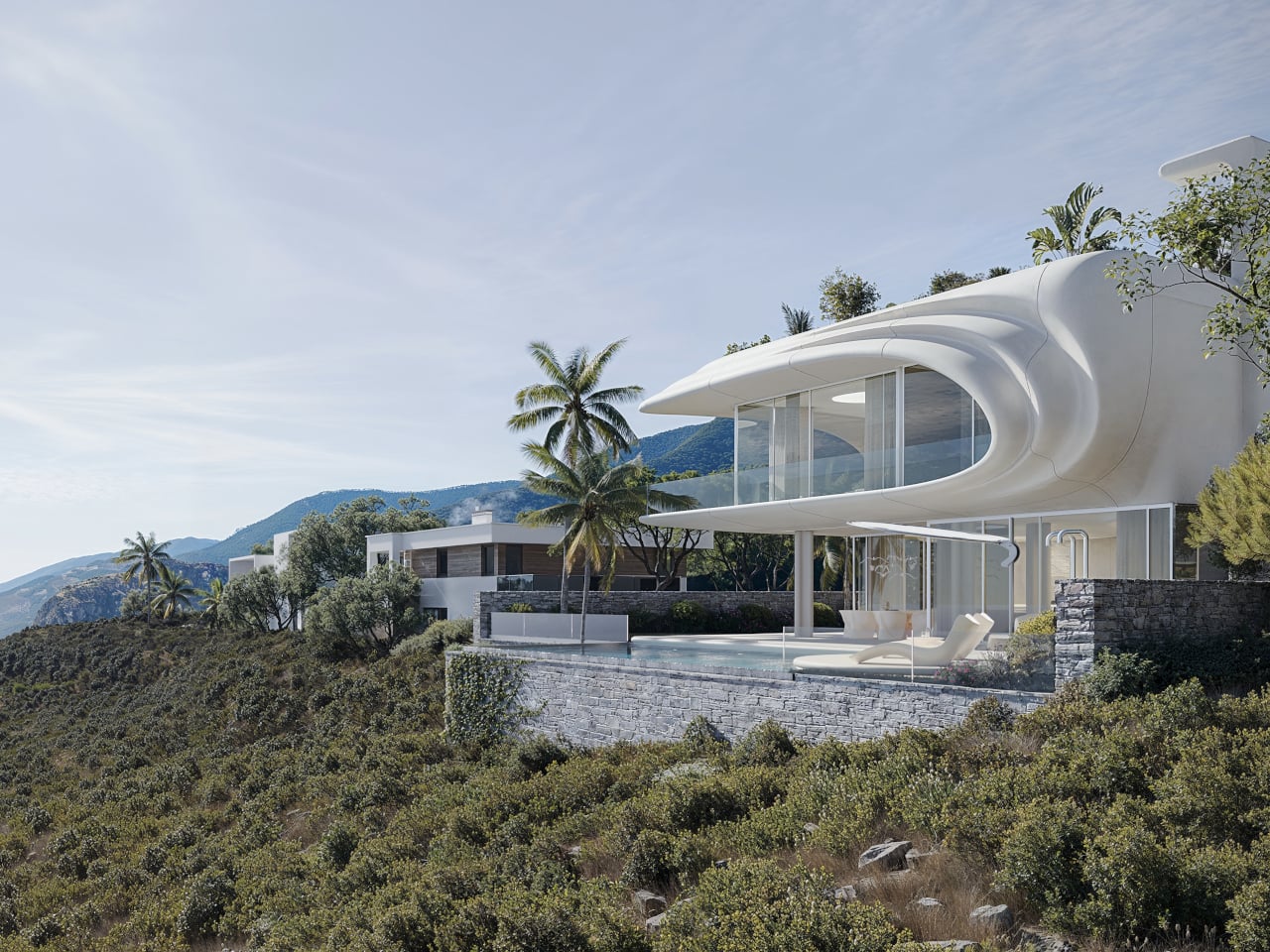
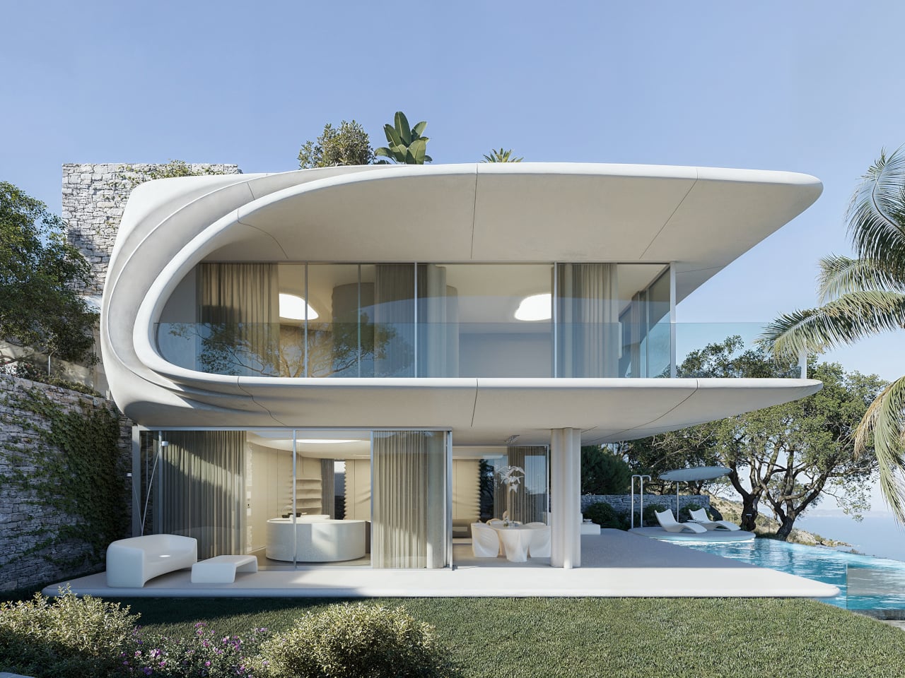
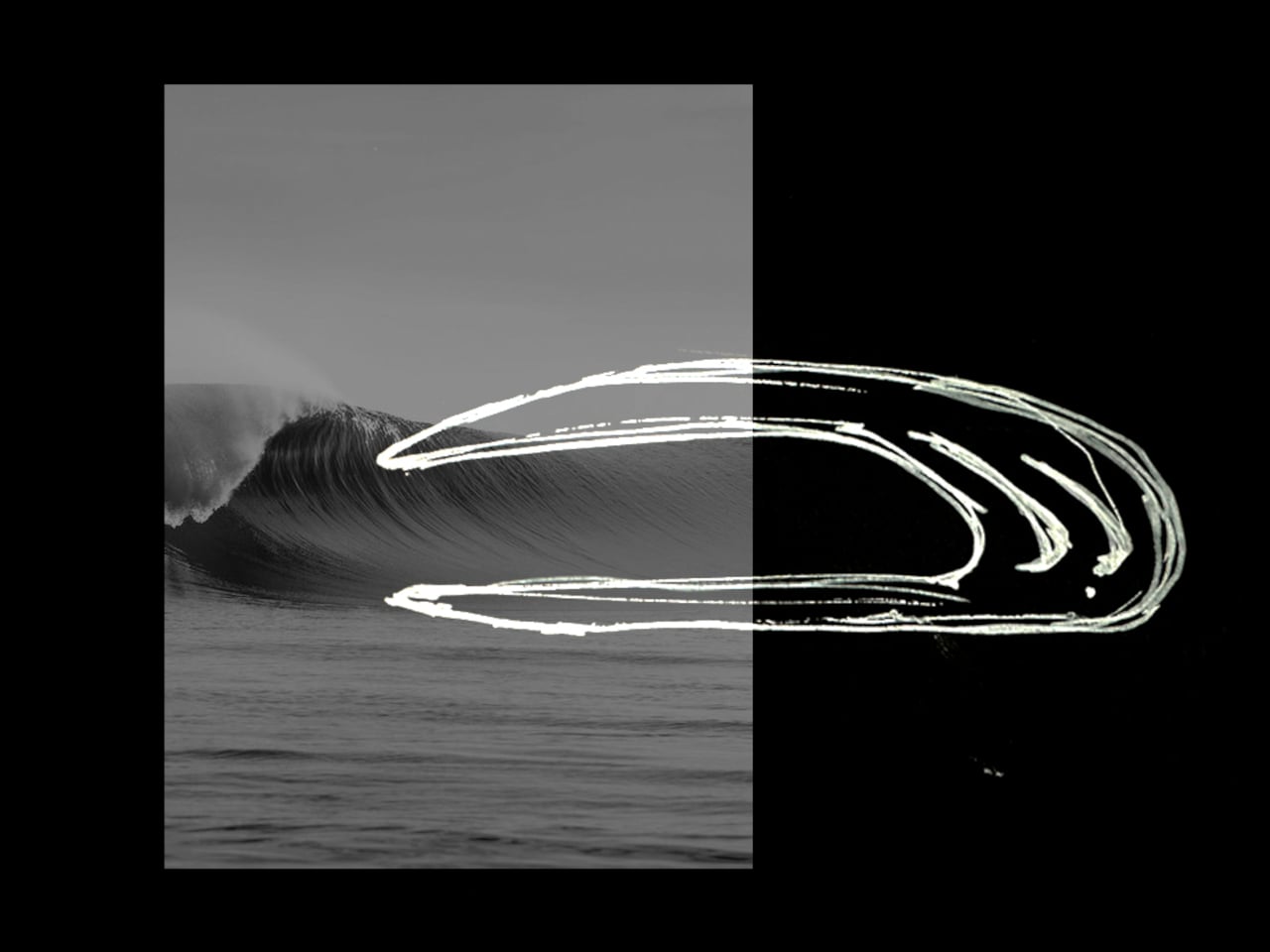
White villas step down the hills above Marbella, all glass balustrades and flat roofs, watching the Mediterranean below. The view is usually the star while the houses blur together, polite boxes that stay out of the way. PERLA flips that script slightly, treating the house itself as a single breaking wave pulled out of the water and pinned to the slope, a sculptural gesture that refuses to stay neutral or disappear into the hillside.

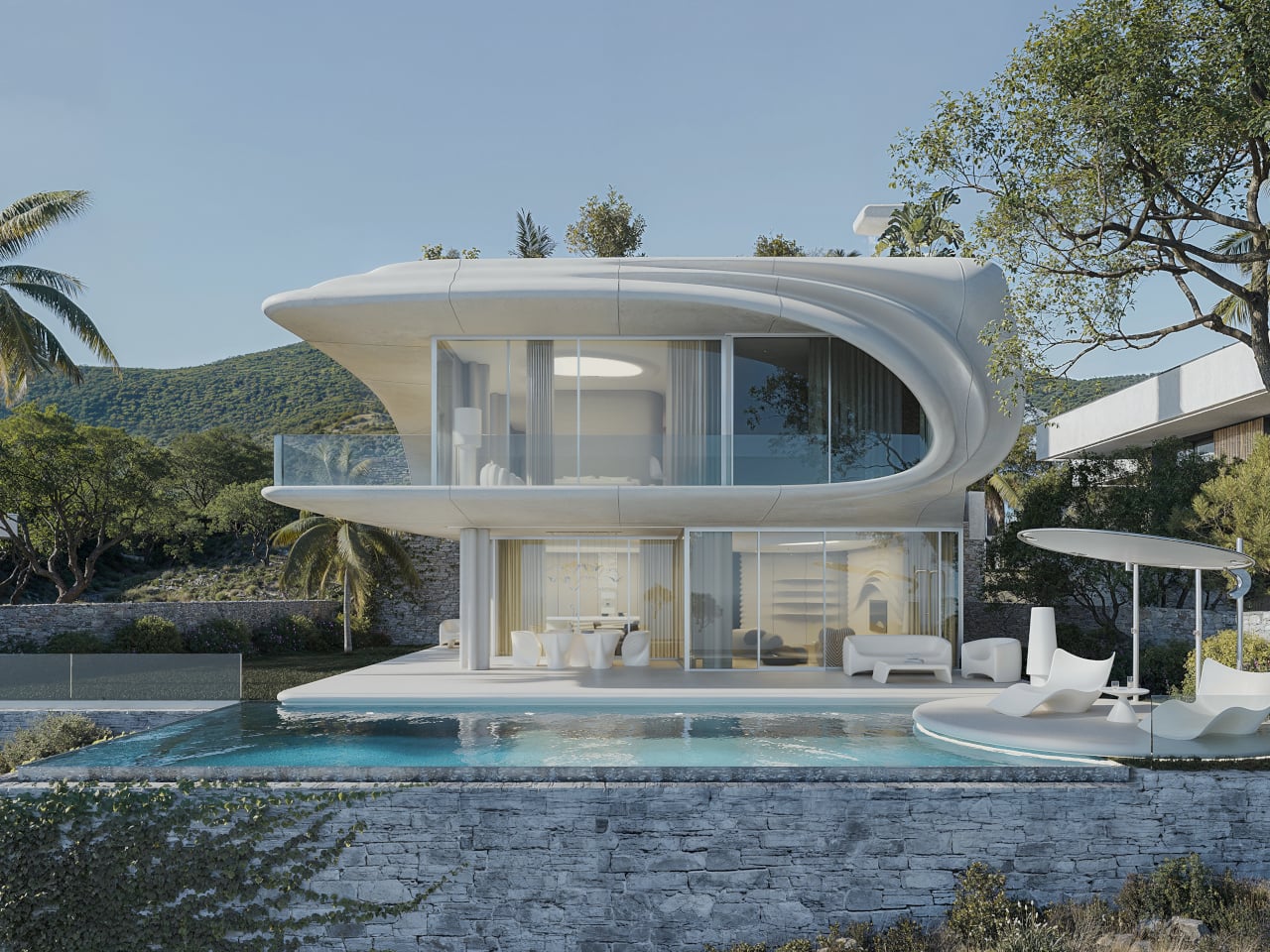
The client bought an existing project already under submission, which meant STIPFOLD could not redraw the whole building from scratch. Instead, the transformation became conceptual rather than structural, which the studio calls “an act of sculpting energy into stillness.” PERLA reinterprets the existing volumes as a frozen moment of a breaking wave, using a new fiber concrete shell and natural stone base to recast the house without rebuilding it.

Designer: STIPFOLD

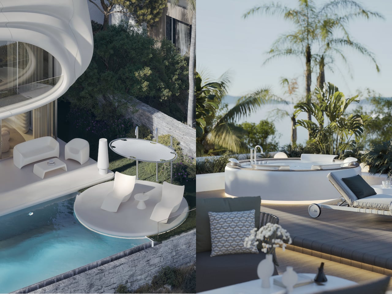
Arriving from below, you see the upper floor curl forward like surf over rock, creating a deep overhang that shades the terrace and glass façade. The white fiber concrete shell reads as a suspended ripple, while the natural stone plinth grounds it in the hillside. The house feels less like a box placed on a plot and more like a fragment of the sea that decided to stop moving halfway through a crash.

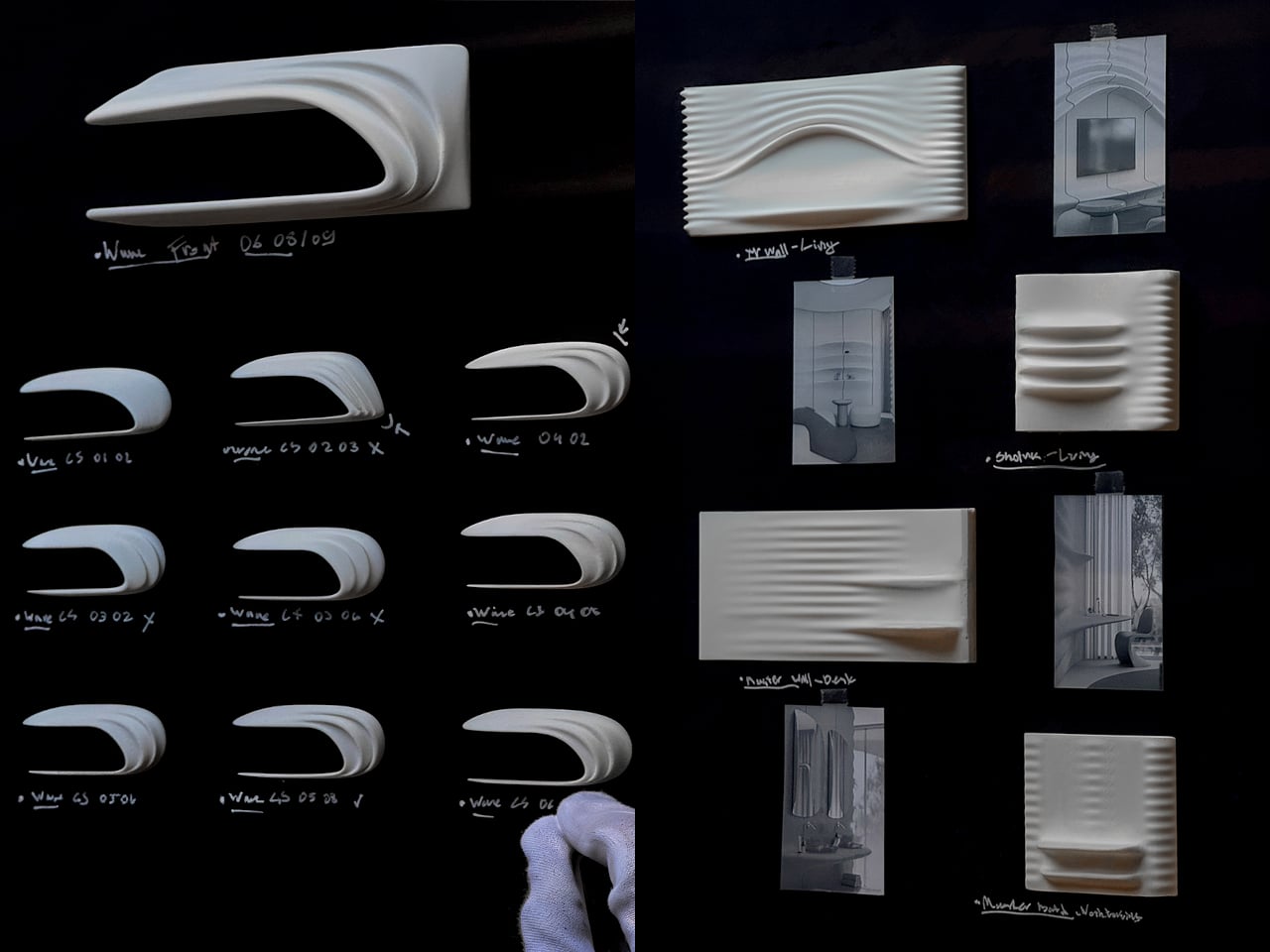
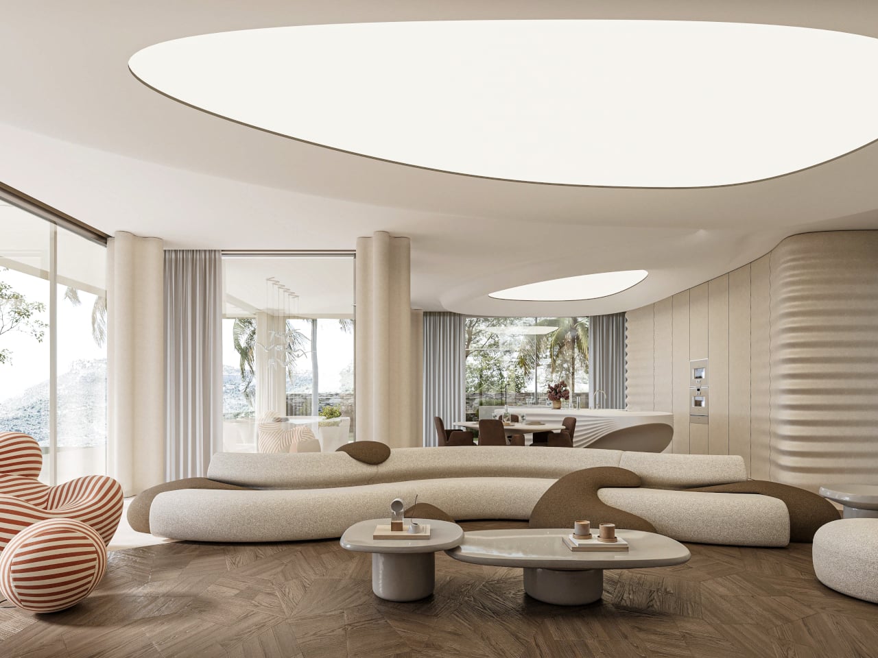
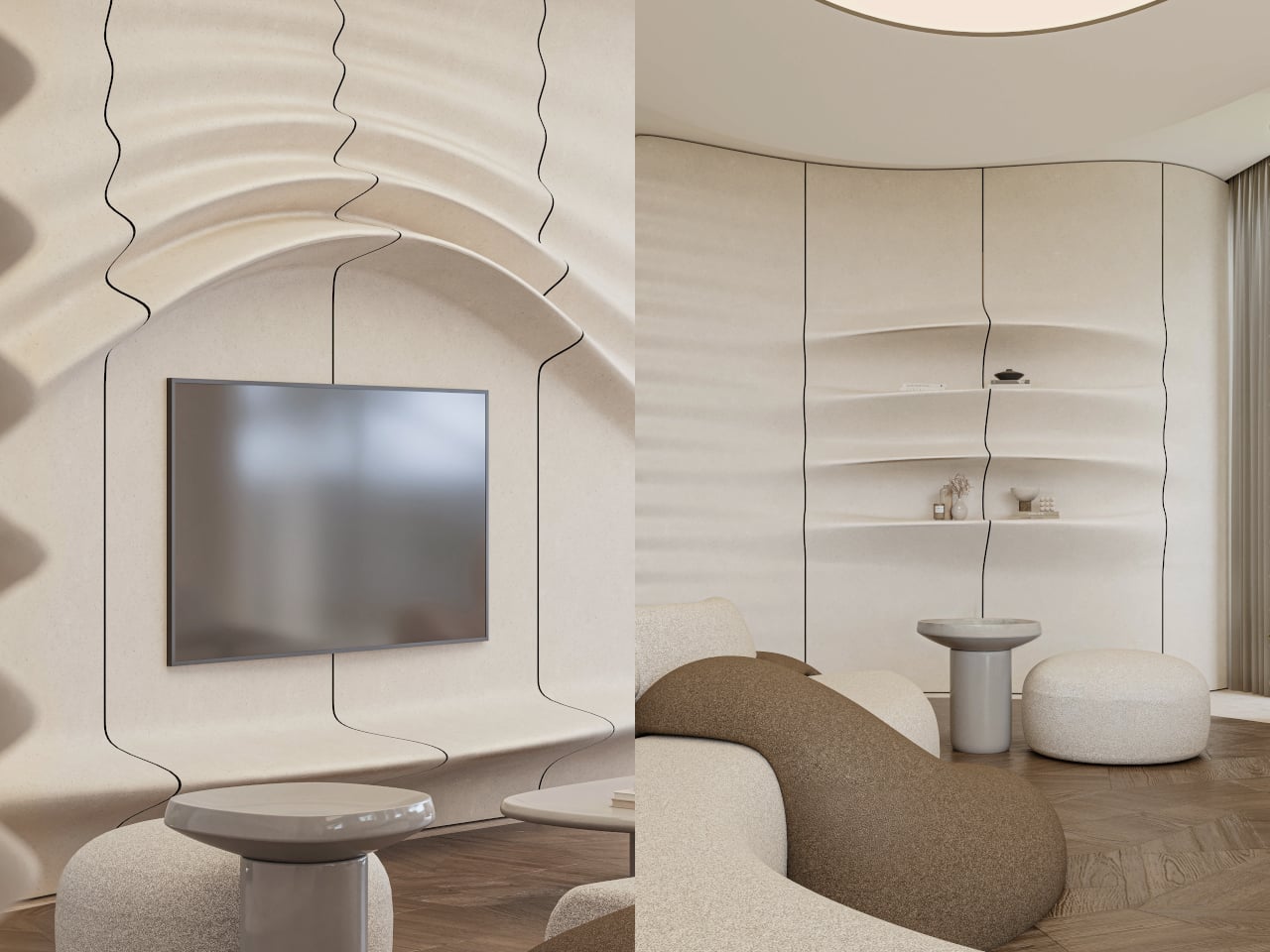
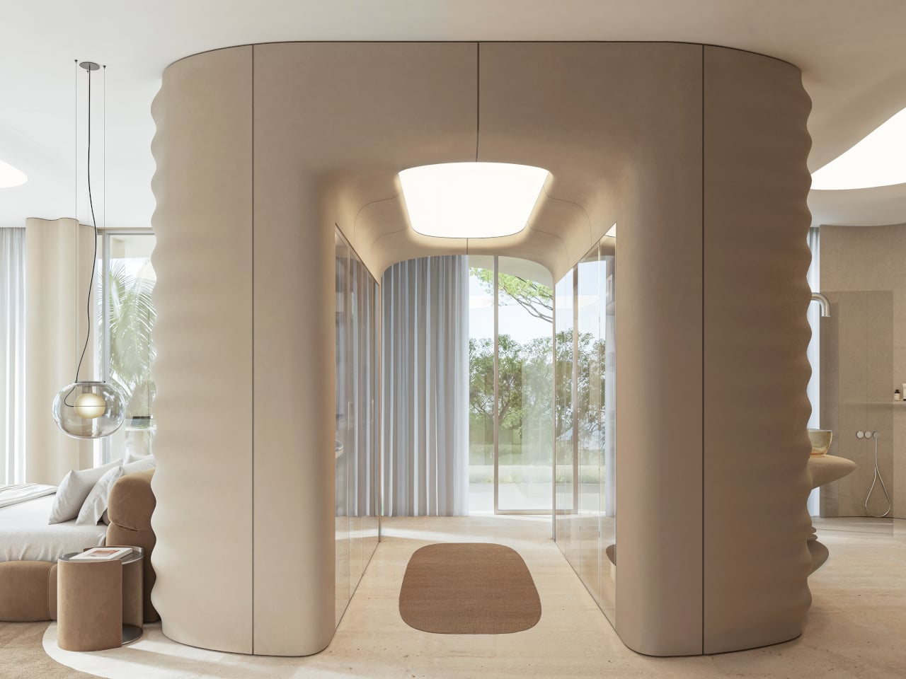
Inside, beige fiber concrete walls pick up the wave metaphor in a quieter way. Flowing parametric lines ripple across surfaces, echoing the exterior geometry without shouting about it. A restrained palette of white, sand, and pale wood keeps visual noise low, letting natural light slide along the curves. Rooms feel connected by a continuous rhythm, more like a tide moving through space than a series of separate boxes.

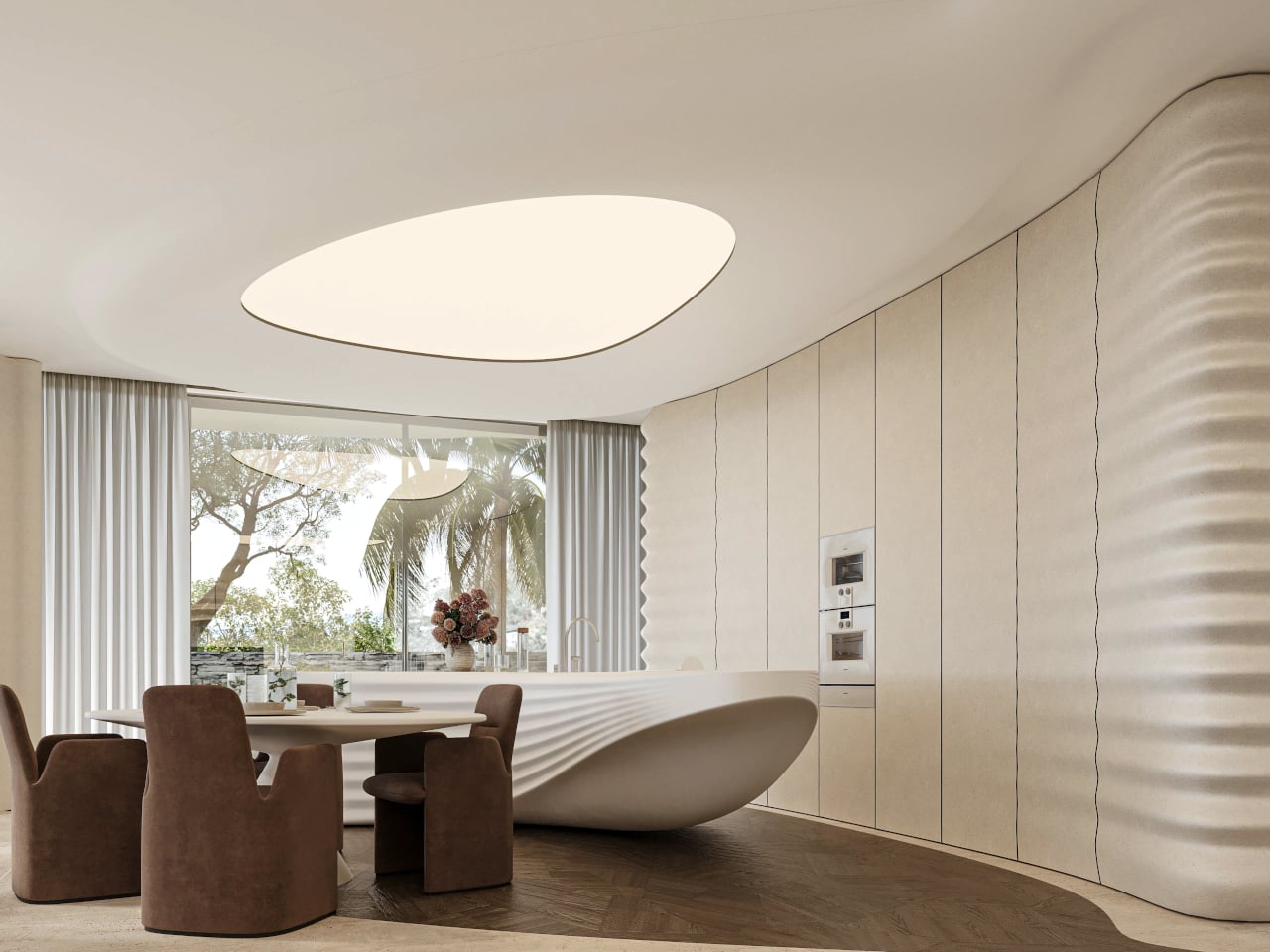
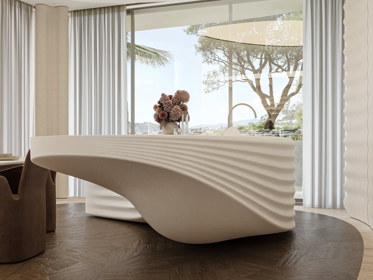
Custom elements, from the sculpted kitchen island to soft, rounded seating and a large ovoid ceiling recess, all follow the same language. Walking from the living area to the dining space, you feel the ceiling dip and rise, the walls tighten and relax, as if the house is breathing slowly. Function stays straightforward, but the form insists on being felt with every step you take through the 400 m² interior.

STIPFOLD describes PERLA as a reflection of its identity “beyond borders,” introducing its sculptural minimalism to the Mediterranean. This is not a neutral white box trying to disappear. It is architecture that “resists neutrality” and aims to evoke emotion through precision. The studio says it is not designed to please everyone, but to make everyone feel something, even if that something is not always comfortable or easy to pin down.

Living inside a frozen wave means the main structural moves were inherited, but the surfaces and spaces have been tuned to a single metaphor. PERLA suggests that even within tight planning constraints, you can still carve out a strong narrative and tactile experience. Perched on a hillside full of polite villas watching the sea, a house that feels like the sea watching back probably stands out more than the architects originally intended.

The post PERLA Freezes a Breaking Wave into a Sculpted Hillside Home first appeared on Yanko Design.
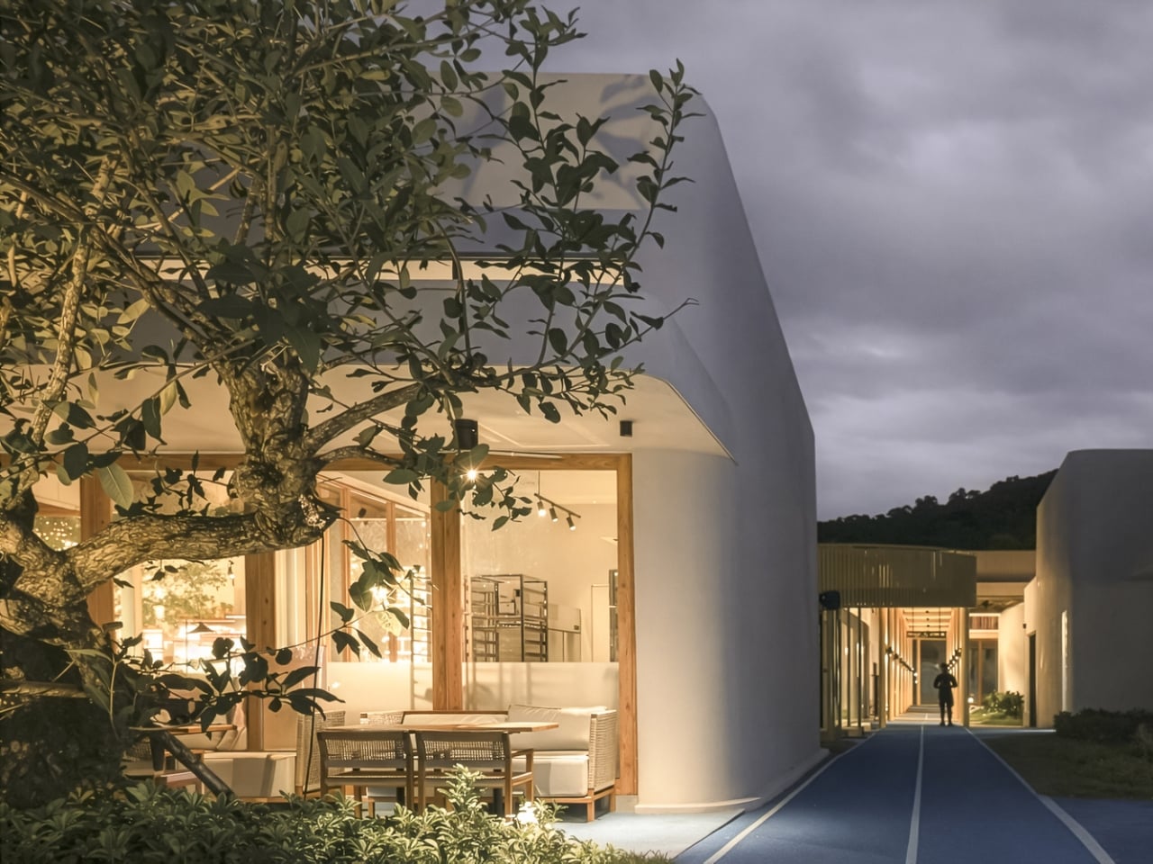
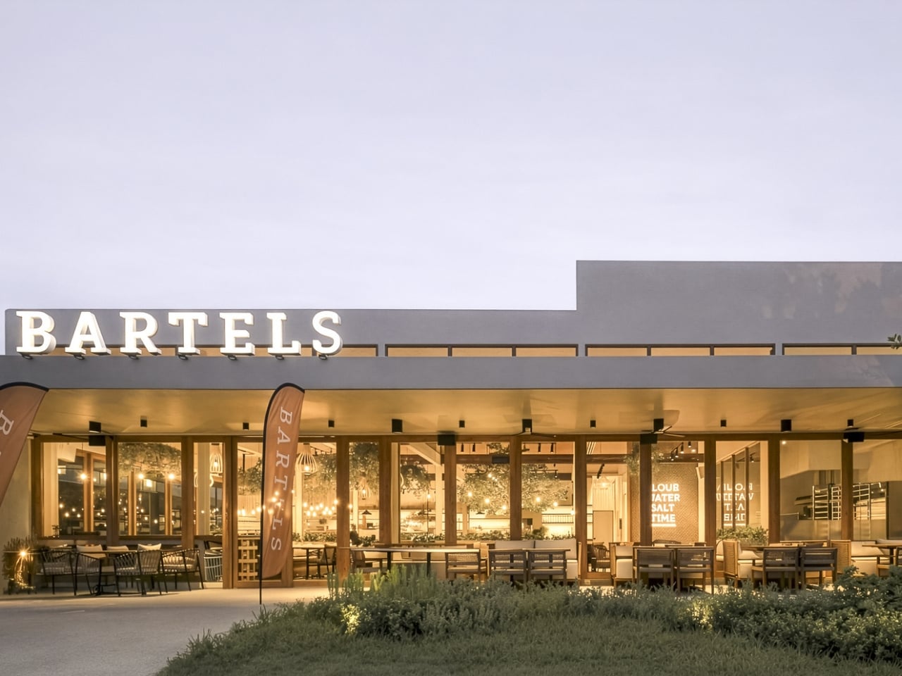
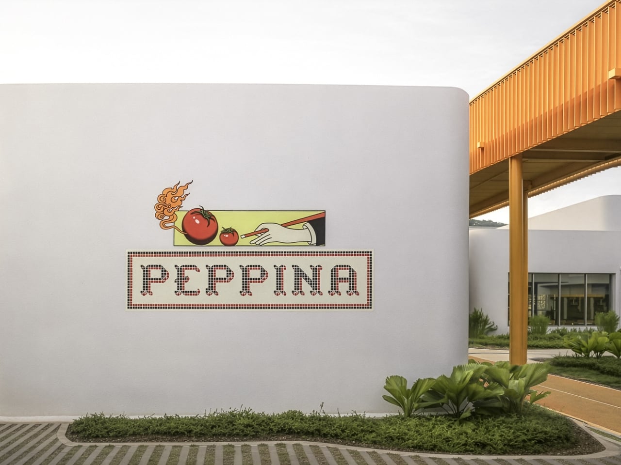
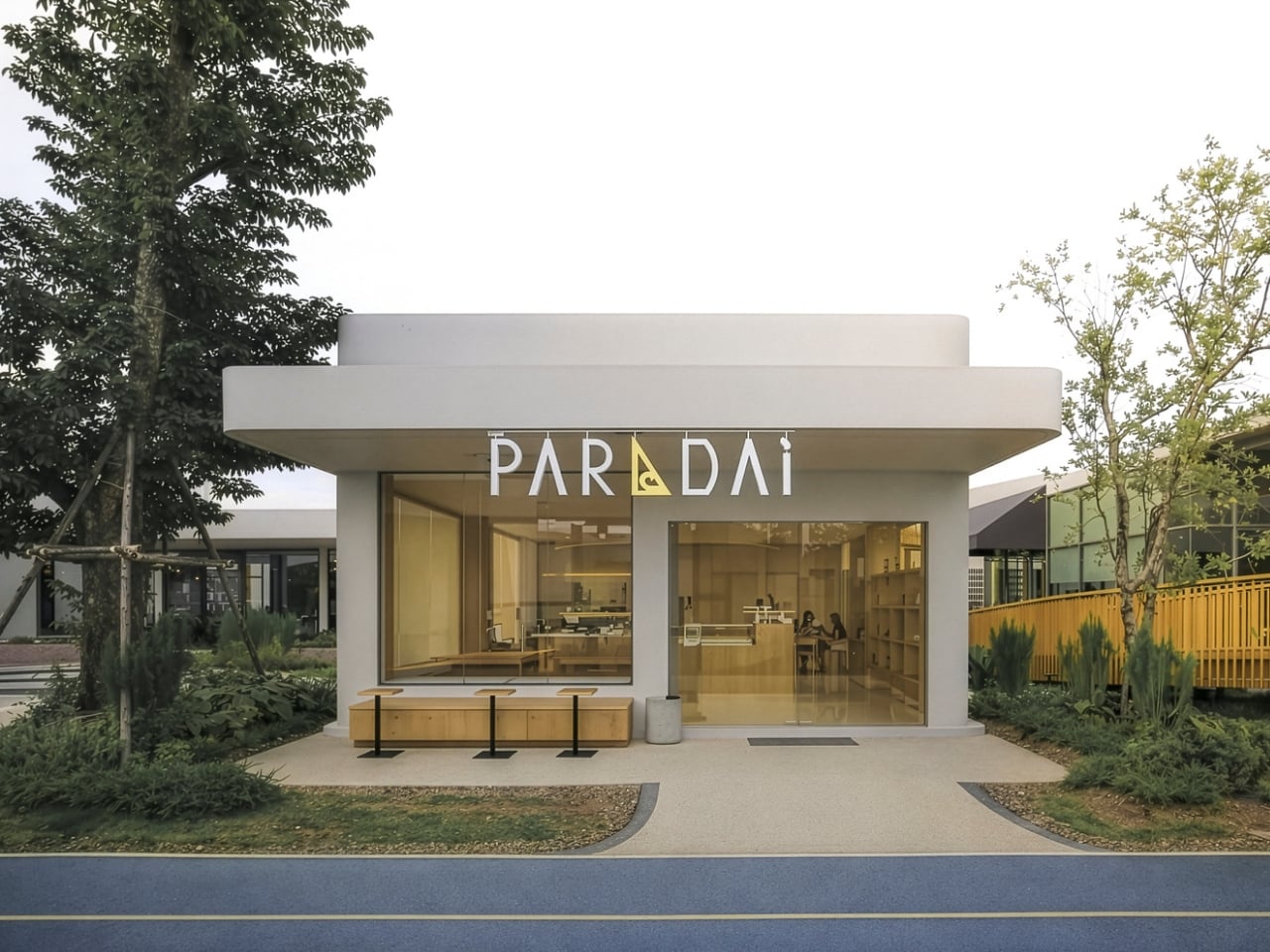
When Shopping Feels Like Coming Home: My Front Yard in Phuket

You know that feeling when you stumble upon a neighborhood that just gets it right? Where every corner feels designed for actual humans instead of maximizing square footage? That’s exactly what Architectkidd has created with My Front Yard in Phuket, and it’s making me rethink everything I thought I knew about retail spaces.

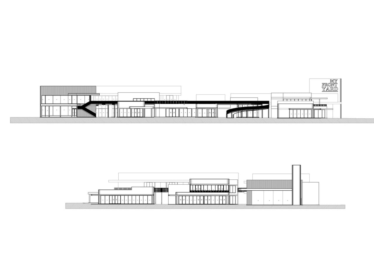
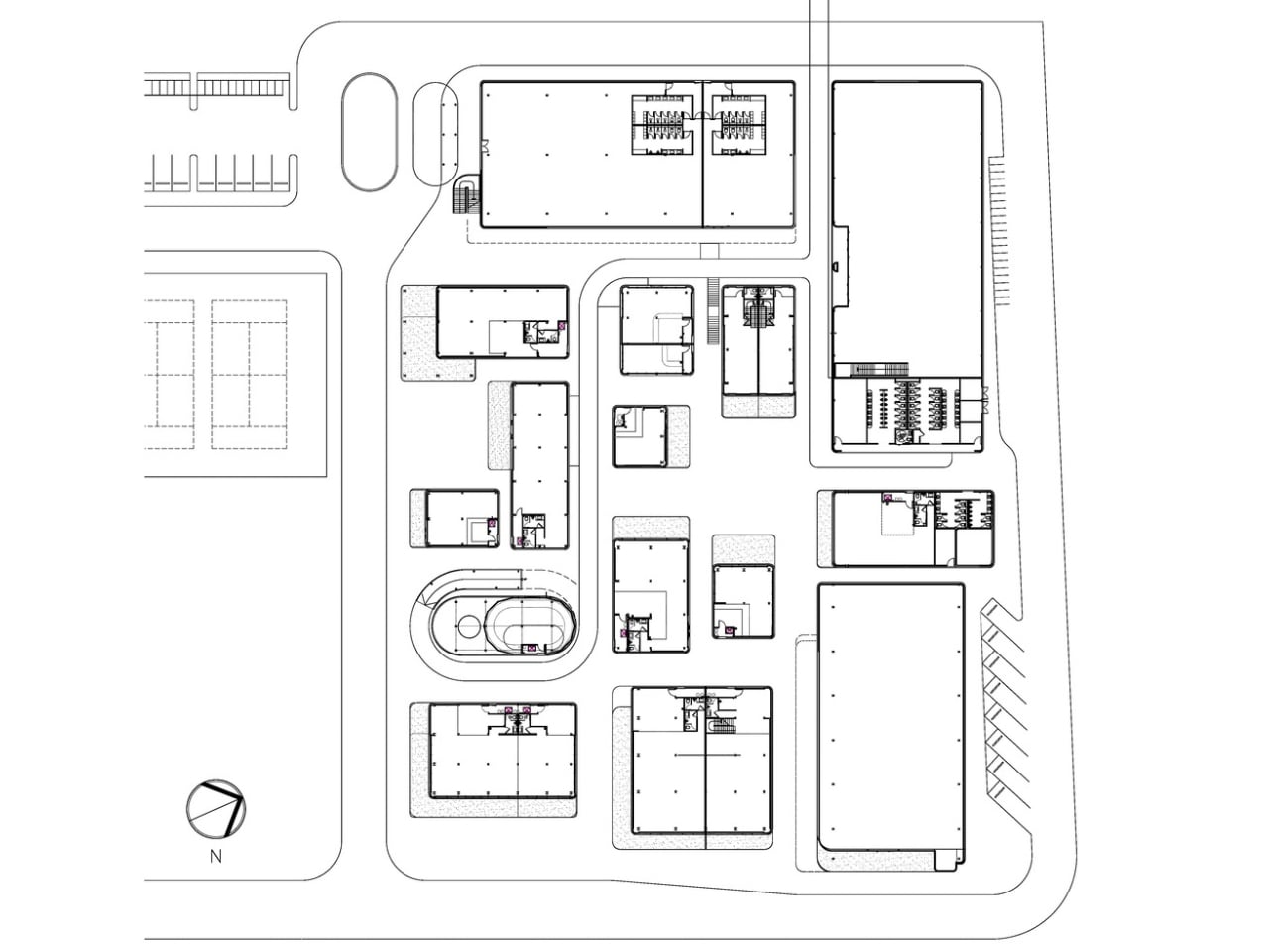
Here’s the thing: most shopping centers feel like they were designed by people who have never actually enjoyed walking through one. You get those massive, soul-sucking boxes where the only outdoor space is the parking lot. But My Front Yard flips that script entirely. Located against a hillside in Phuket, this project ditches the big box approach for something that feels more like wandering through a well-planned village than a commercial development.

Designer Name: Architectkidd

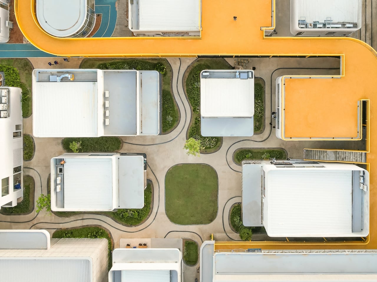
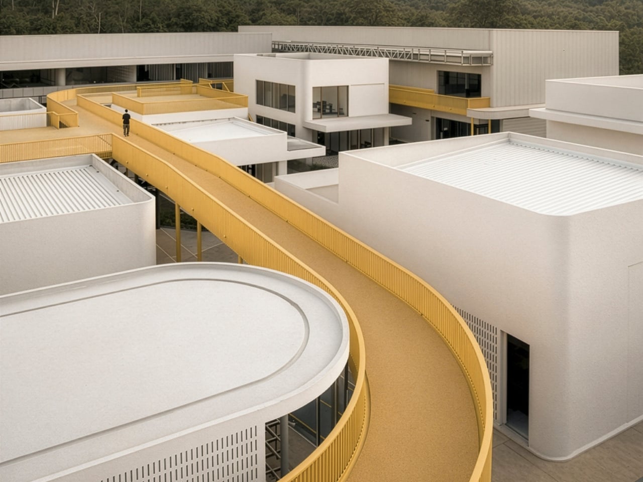
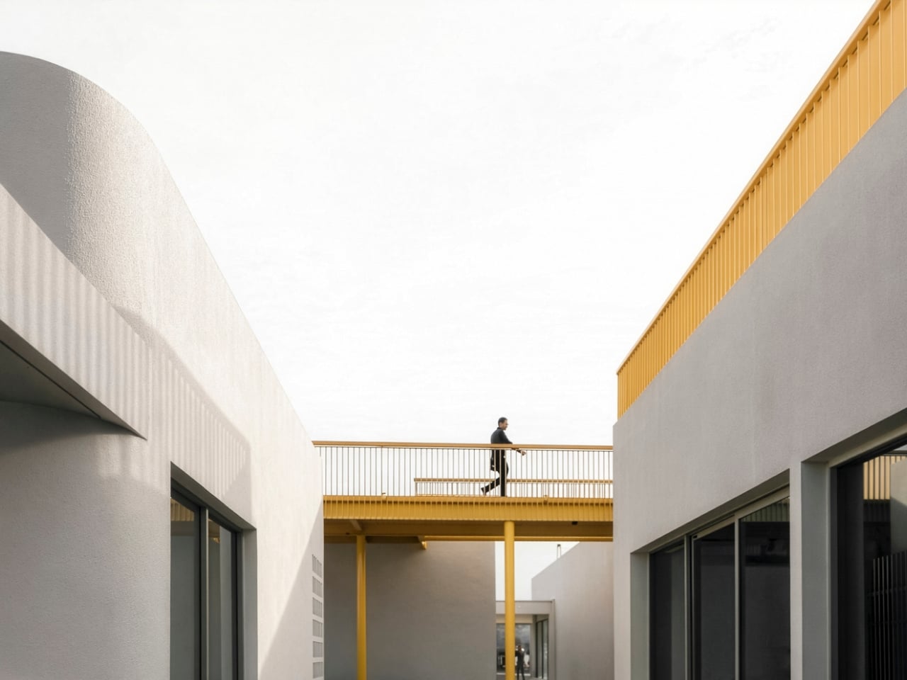
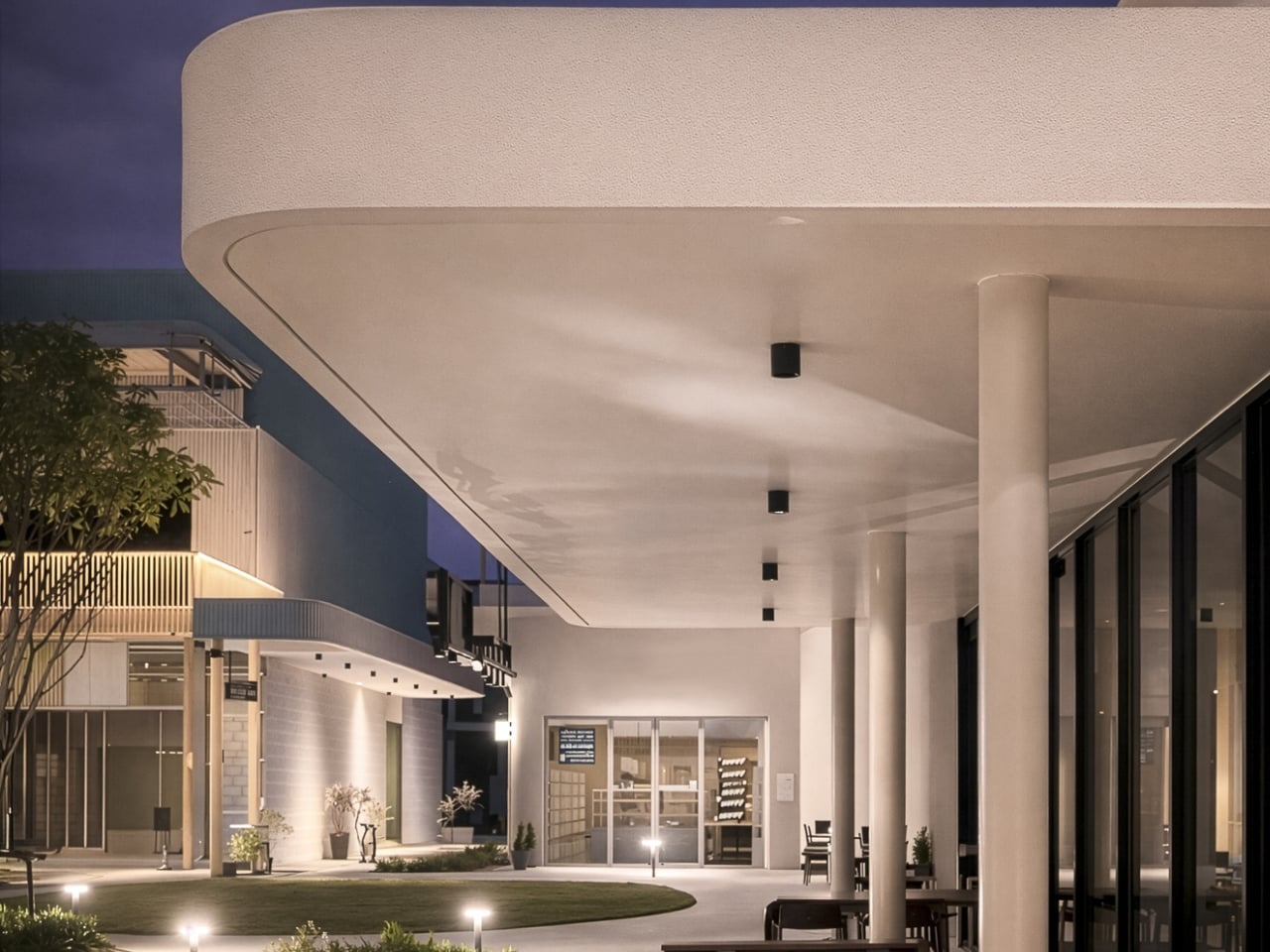
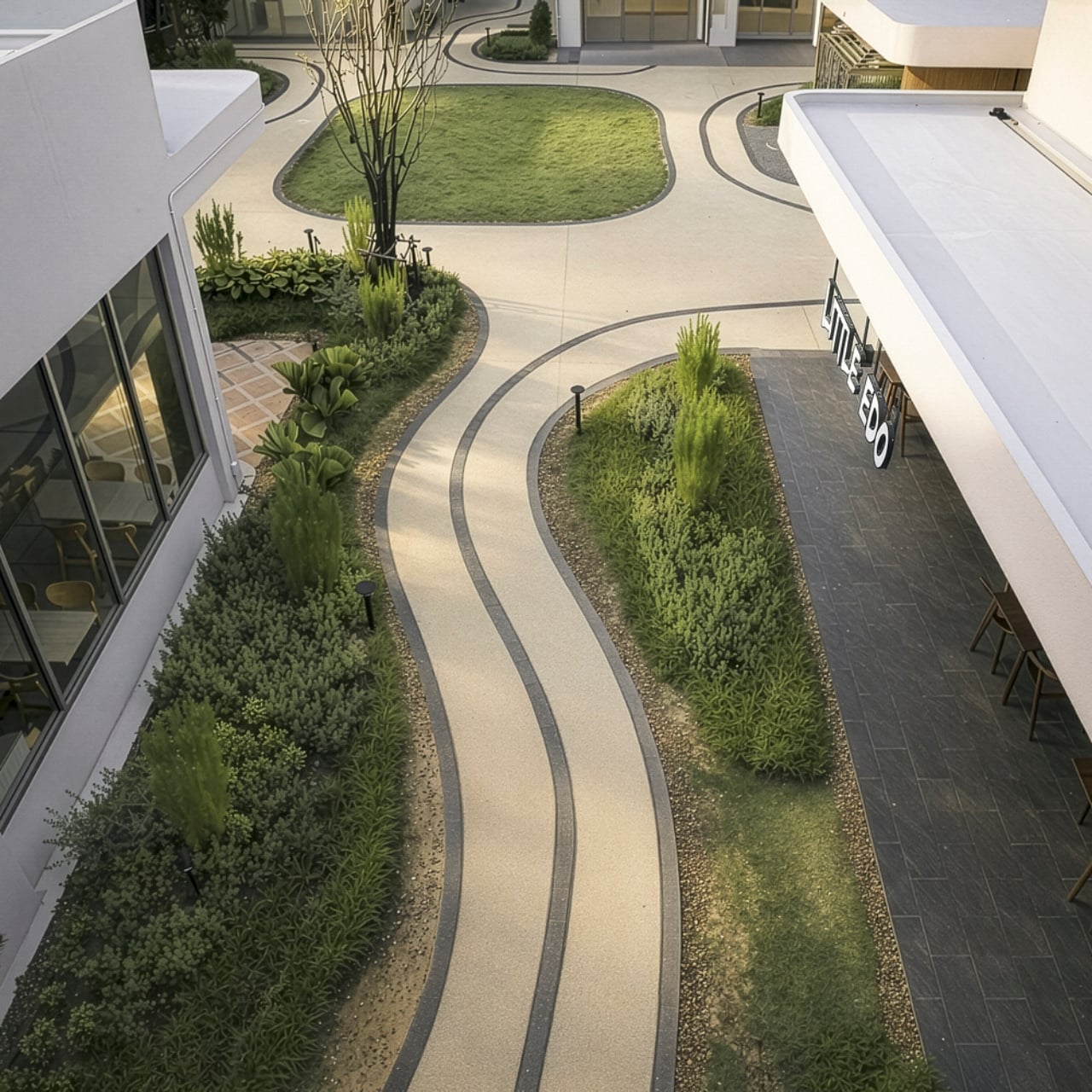
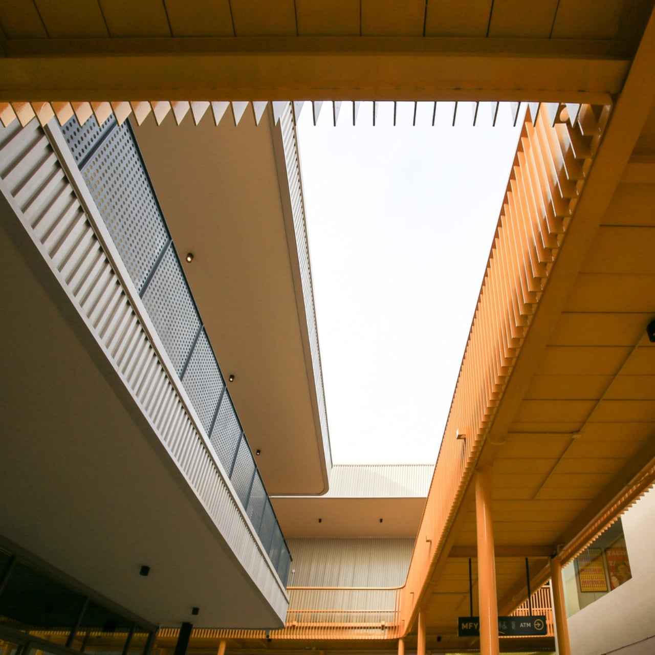
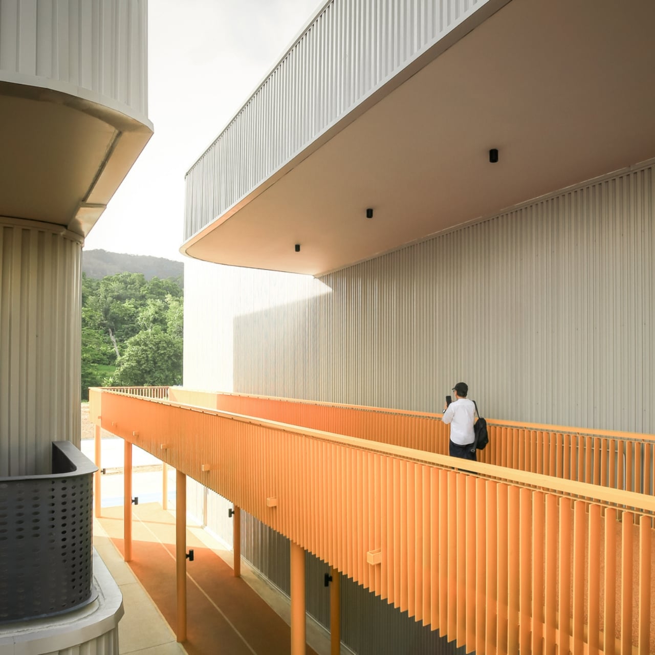
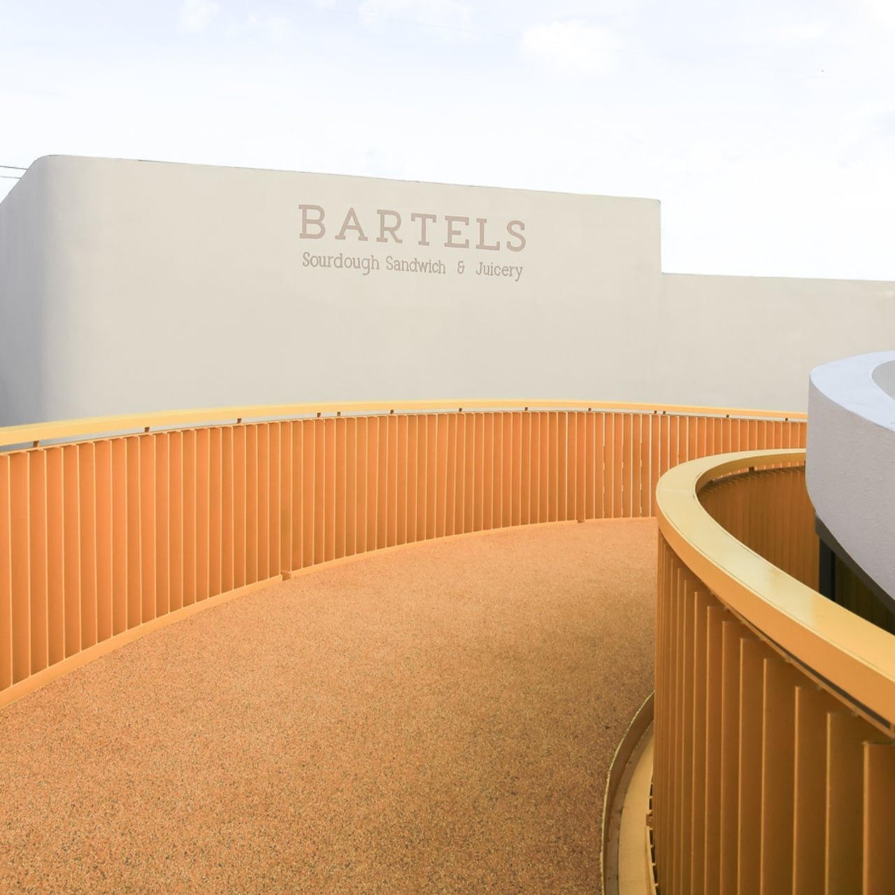
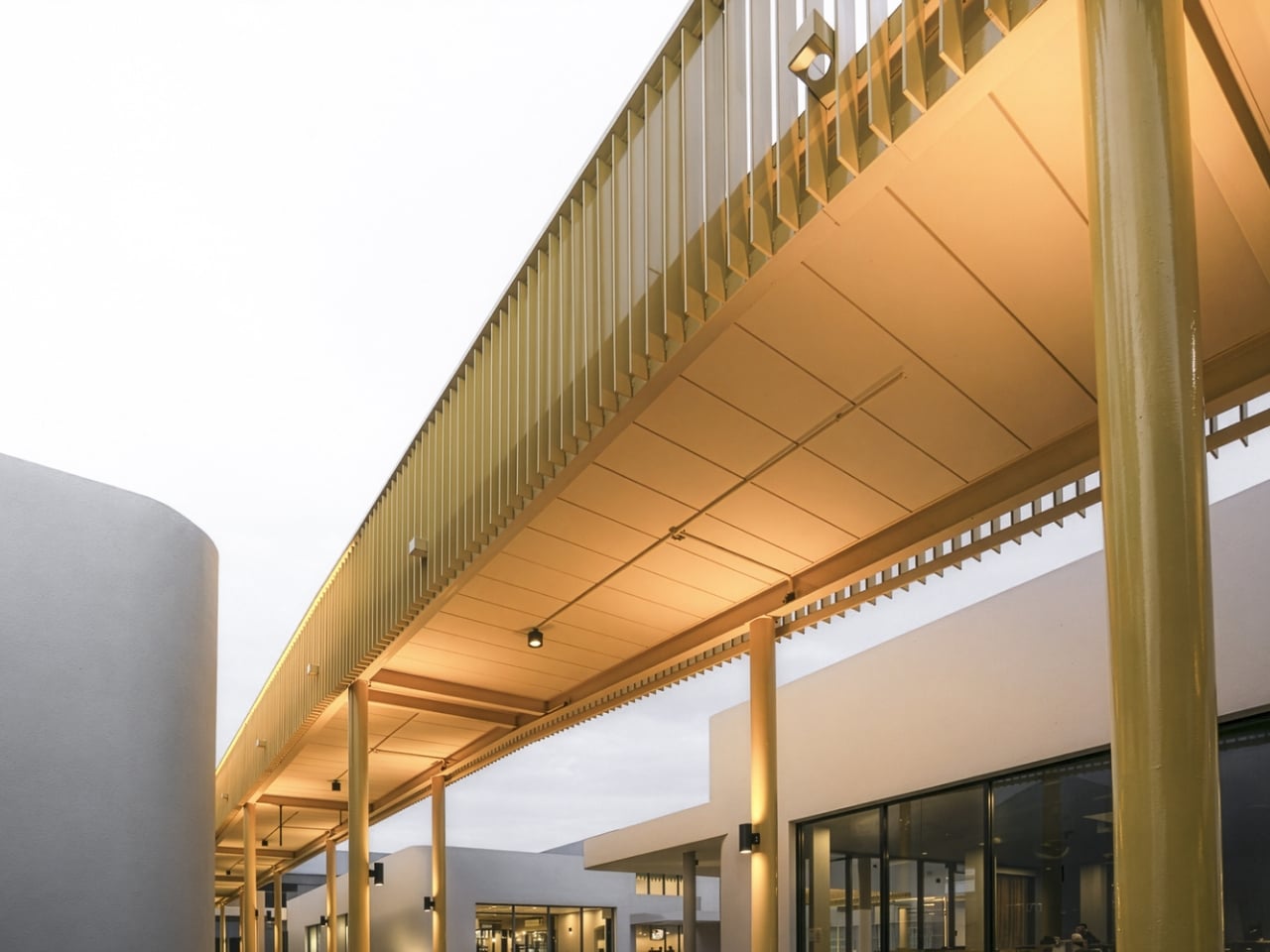
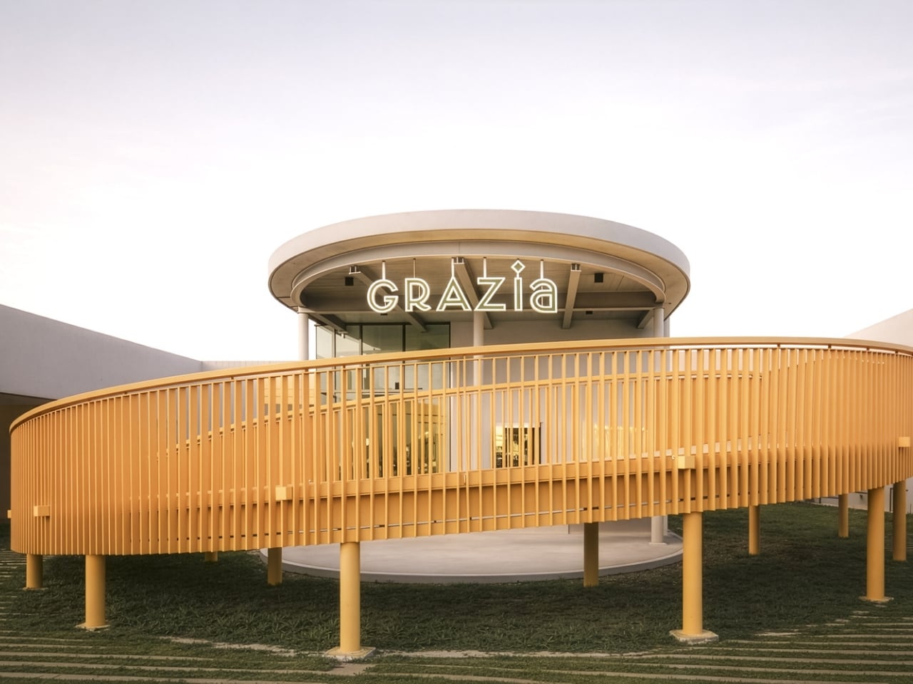
The concept is refreshingly simple yet radical in today’s retail landscape. Instead of cramming everything under one massive roof, Architectkidd broke the space into a cluster of low-rise pavilions scattered across the site. These aren’t just random buildings, they’re connected by open-air walkways and communal spaces that actually make you want to slow down and explore. It’s retail therapy in the most literal sense.

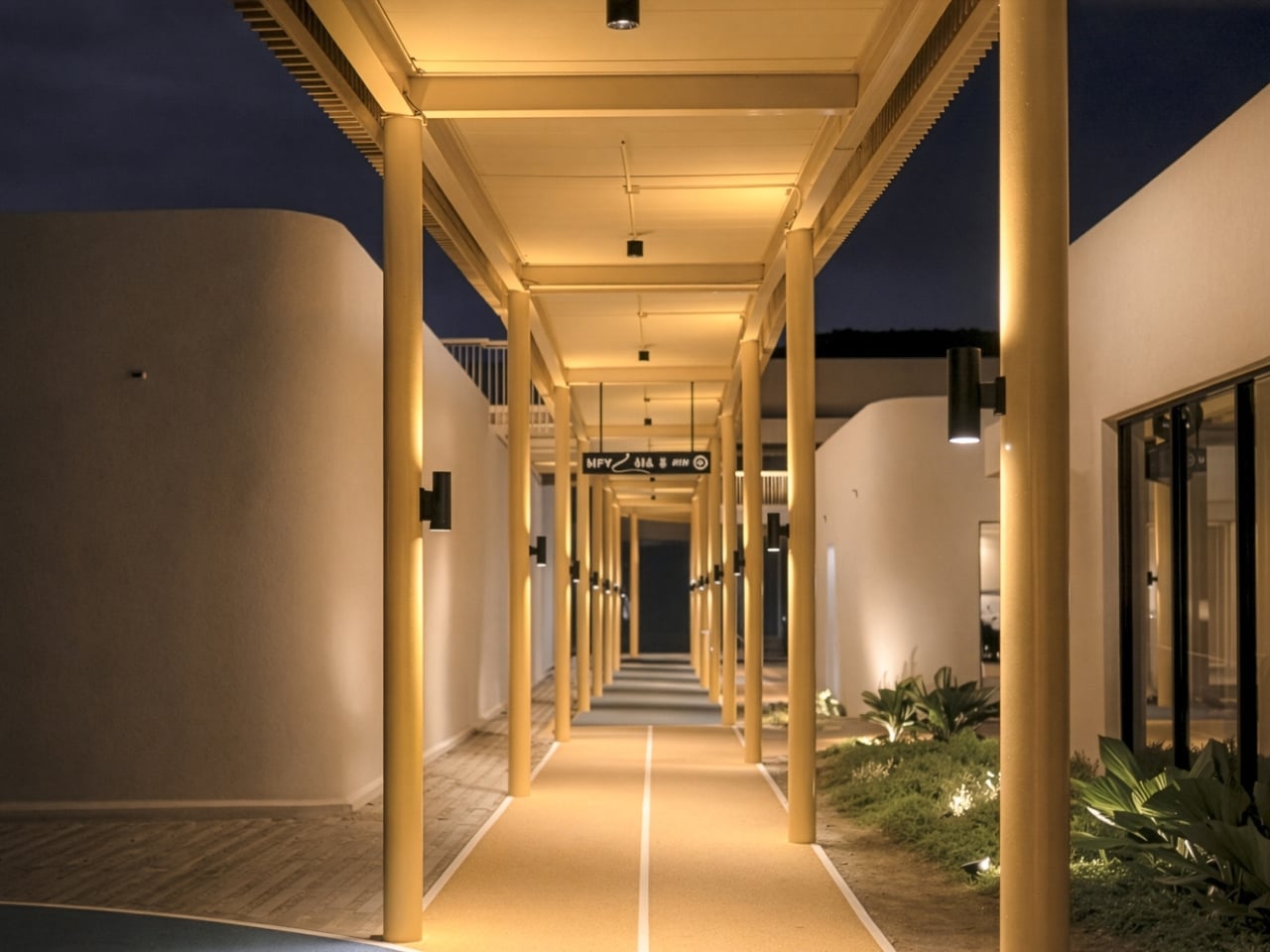
What makes this design so clever is how it taps into the rhythms of everyday life. The outdoor pathways aren’t just pretty, they’re designed for morning walks, exercise stops, daily jogs, and yes, even bringing your pet along. The space becomes part of your routine rather than a destination you have to psychologically prepare for. It’s the kind of place where grabbing coffee or browsing shops becomes a pleasant addition to your day instead of a task to endure.

The architectural language ties everything together without feeling monotonous. Each pavilion maintains its own identity while contributing to a cohesive whole, creating what Architectkidd calls “micro-communities” within the larger development. It’s a subtle but important distinction. You’re not navigating a monolith, you’re discovering pockets of activity that each have their own character and purpose.

This approach represents a fundamental shift in how we think about commercial spaces. The goal wasn’t just to create another place to shop, it was to build a landscape where community happens organically. Success here isn’t measured in transactions per square foot but in how naturally people integrate the space into their lives. Can you pop by for a quick errand? Absolutely. But you can also spend an afternoon wandering, meeting friends, or just enjoying being outside in a thoughtfully designed environment.

The timing of this project feels particularly relevant. We’ve spent years watching retail struggle to compete with online shopping, and the answer often seemed to be making physical stores more experiential. But My Front Yard suggests a different solution: make the entire environment worth experiencing. When the journey between shops is as pleasant as what’s inside them, you’re creating value that Amazon can’t replicate.

Phuket’s climate makes this open-air concept especially practical, but the philosophy behind it could translate to countless other contexts. We’re seeing a broader movement in architecture and urban planning that prioritizes human-scale development, pedestrian-friendly design, and spaces that encourage spontaneous interaction. My Front Yard isn’t just riding that wave, it’s showing how those principles can work in a commercial setting without sacrificing functionality.

There’s also something refreshing about design that doesn’t shout for attention. The pavilions and walkways create an experience without overwhelming you. It’s confident enough to be understated, trusting that good bones and thoughtful planning will be their own draw. In an era of Instagram-bait architecture, that restraint feels almost rebellious.

Looking at projects like My Front Yard makes me hopeful about the future of retail and public space generally. We don’t have to choose between commercial viability and human-centered design. We can create places that serve both purposes, spaces that support businesses while genuinely improving daily life for the people who use them. Sometimes the most innovative thing you can do is remember what made neighborhoods work in the first place, then apply that wisdom with contemporary tools and fresh eyes.

The post When Shopping Feels Like Coming Home: My Front Yard in Phuket first appeared on Yanko Design.
This $61K Tiny Home Finally Gives Remote Workers Room to Breathe

Dragon Tiny Homes has unveiled the Sora 20′, an expanded version of their popular compact dwelling that responds directly to customer feedback. This spacious tiny home marks a significant evolution from the original 16-foot Sora model, offering more room while maintaining the bright, practical design philosophy that made its predecessor a success. The Sora 20′ represents a thoughtful approach to full-time tiny living, balancing increased square footage with the efficiency that defines the tiny house movement.

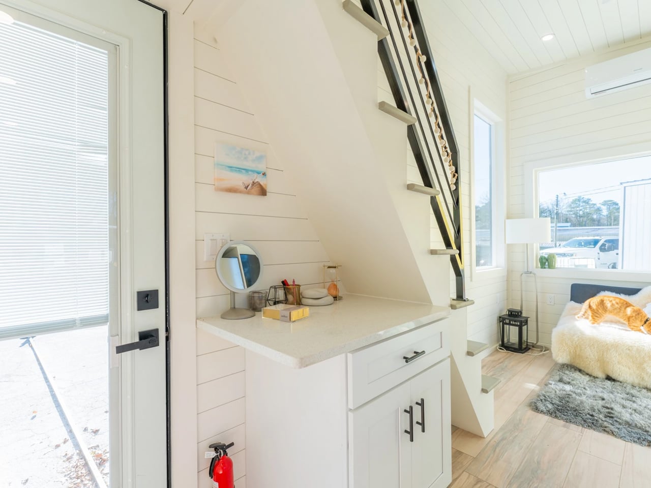
The design prioritizes natural light and openness, featuring large windows that flood the interior with brightness throughout the day. The layout flows seamlessly from one area to the next, creating a sense of spaciousness that belies the home’s compact footprint. Dragon Tiny Homes has crafted a well-balanced interior where every element serves a purpose, from the strategically placed windows to the carefully considered traffic patterns that make daily routines feel effortless and intuitive.

Designer: Dragon Tiny Homes

At 20 feet in length, the Sora 20′ offers significantly more living space than the original 16-foot model. This extra footage translates into practical improvements throughout the home, allowing for more comfortable accommodations without sacrificing the cozy feel that draws people to tiny living. The additional space has been thoughtfully distributed to enhance functionality in key areas, making the home suitable for extended stays or permanent residence rather than just weekend getaways.

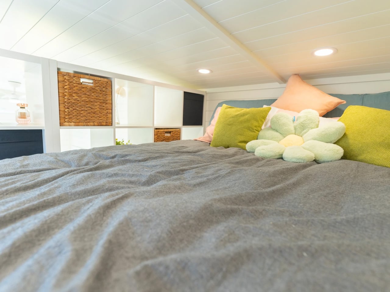
The Sora 20′ includes purpose-built features that acknowledge modern living realities. A built-in floating desk provides a dedicated workspace for remote workers, reflecting the growing need for home offices in compact spaces. The design incorporates a sleeping loft that maximizes vertical space while keeping the main floor open for living and working. Each feature demonstrates a function-forward approach, where comfort meets practicality in ways that support contemporary lifestyles.

The base price for the Sora 20′ is typically set at $61,030, positioning it as an accessible entry point into quality tiny home living. Dragon Tiny Homes occasionally offers inventory homes at discounted rates, with some units available for $52,950, representing savings of $8,070. These move-in-ready options provide an opportunity for buyers to skip the wait time associated with custom builds and transition into tiny living more quickly.

The Sora 20′ suits solo dwellers seeking a minimalist lifestyle or couples ready to embrace downsizing without compromising on comfort. Its design accommodates full-time living with amenities that support daily routines, from cooking to working to relaxing. Dragon Tiny Homes has created a model that proves tiny living can be spacious, practical, and genuinely livable for the long term, making it a compelling option for anyone reconsidering traditional housing.

The post This $61K Tiny Home Finally Gives Remote Workers Room to Breathe first appeared on Yanko Design.
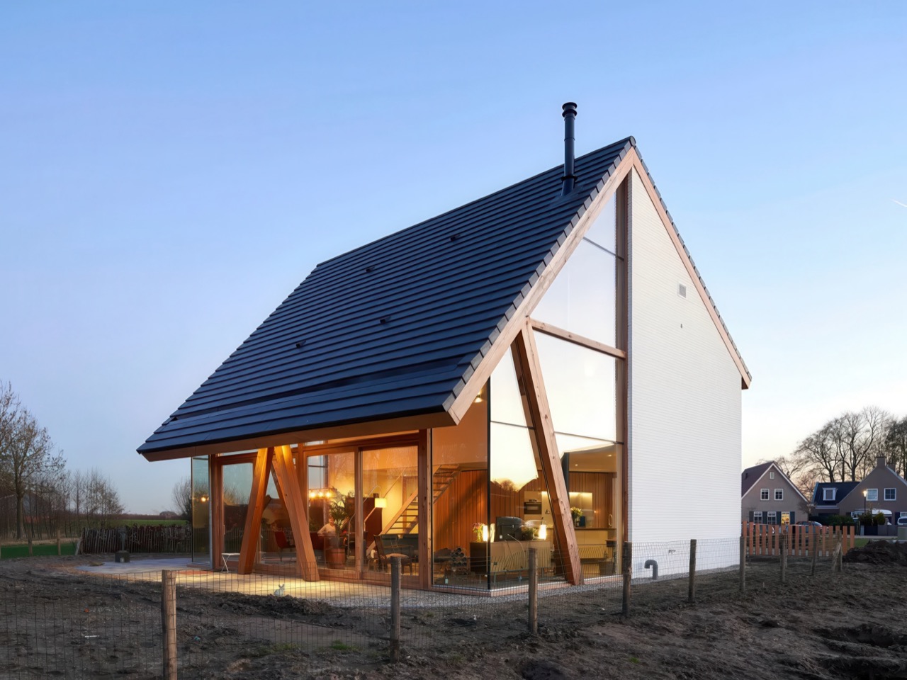
This Dutch Barnhouse Breaks Every Suburban Design Rule on Purpose

The Netherlands has mastered the art of the catalogue home, a residential model where architectural types are as standardized as automobile makes. Buyers browse familiar options, and the barnhouse, with its sweeping gable roof and prominent timber structure, consistently tops the list. It promises the romance of rural living packaged for suburban plots. But what happens when site conditions refuse to cooperate with this template?

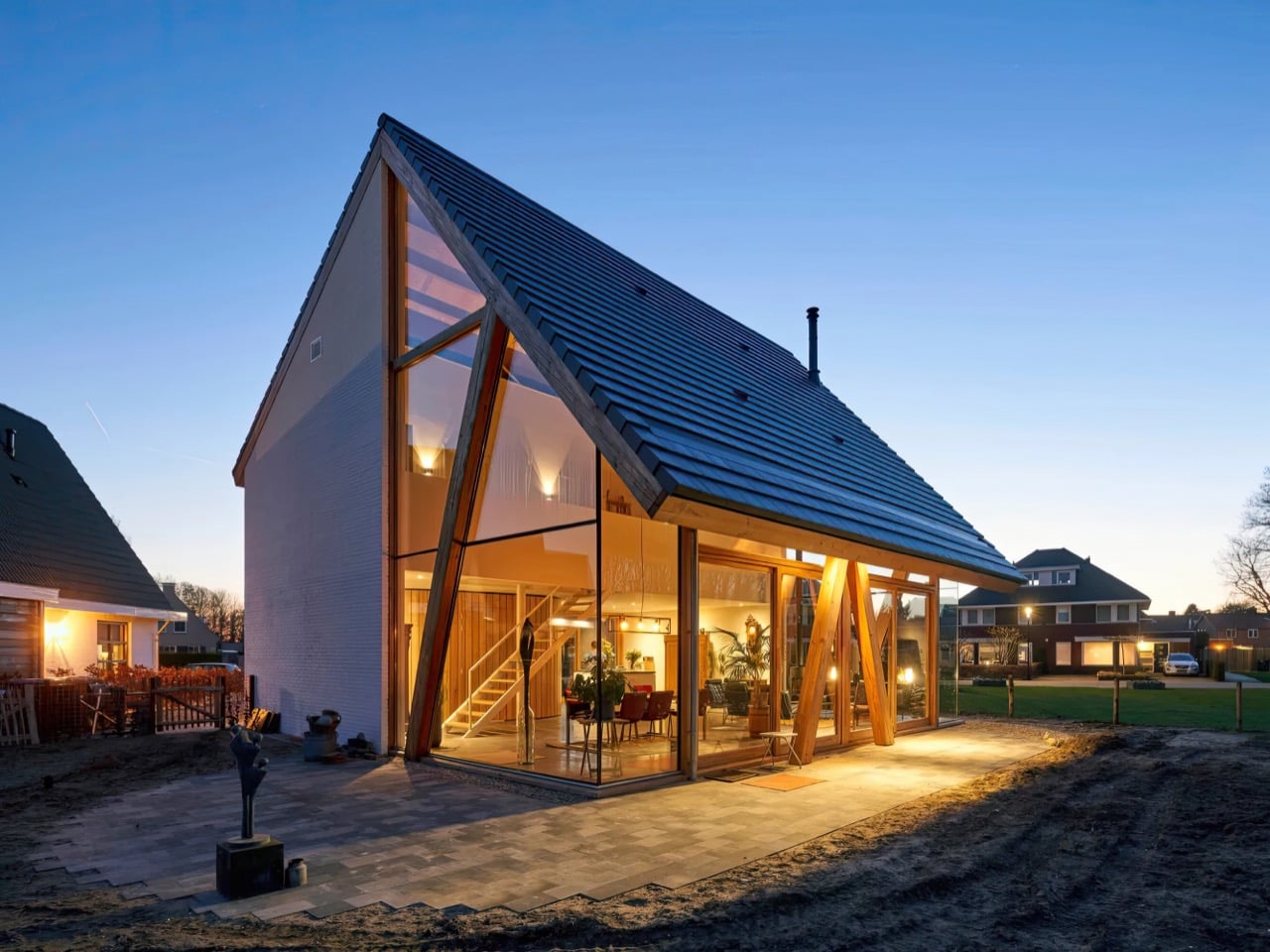
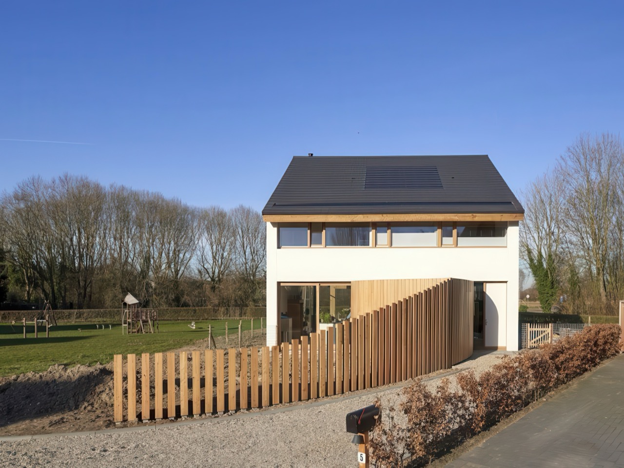
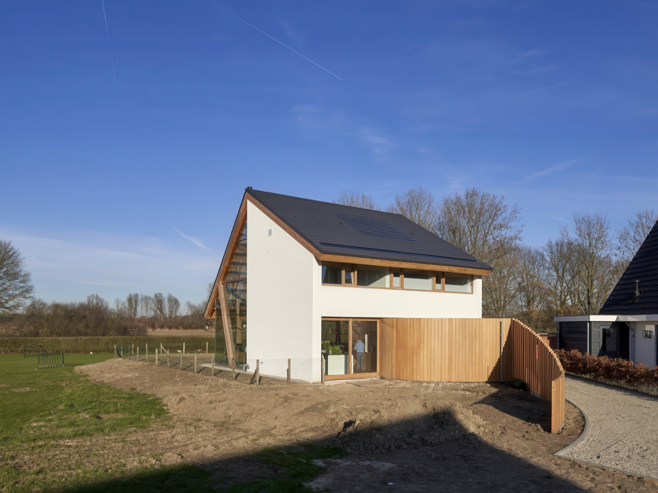
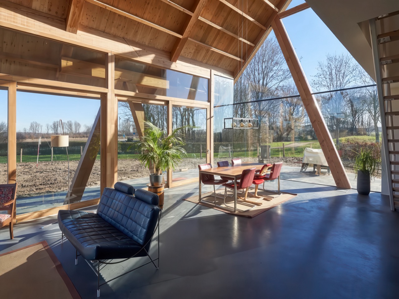
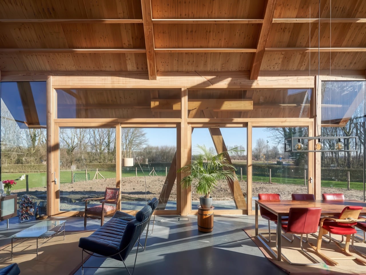
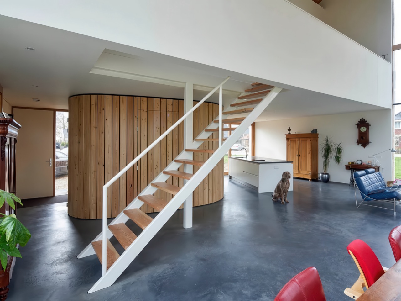
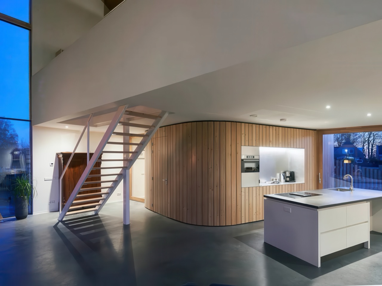
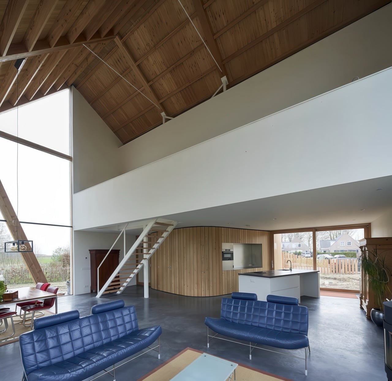
In Werkhoven, RV Architecture proved that starting with a recognizable type need not end with a predictable house. The architects faced a triangular plot that defied conventional positioning, so they embraced the irregularity. The barnhouse angles across its lot, turning its glazed facades toward an expansive backyard rather than the street. Inside, the soaring gable height floods the open plan with daylight, while three sculptural wooden columns support the roof and frame carefully composed views. A curved wall conceals service spaces and guides movement from entry to kitchen. Standard catalogue, custom execution.

Designers: Ruud Visser and Fumi Hoshino

Most architects would look at that triangular plot and either complain about constraints or try to force a rectangular box onto it anyway. Ruud Visser and Fumi Hoshino did the opposite. They rotated the entire house to prioritize the view, which sounds simple until you realize how rare that move actually is in suburban contexts. The front of most houses faces the street because that’s what we do. Convention masquerading as inevitability. This project says forget the street, the good stuff is in the back, and commits fully to that logic with floor-to-ceiling glazing on three sides.

Four primary wooden beams sit on top of the side walls and the internal walls between bedrooms. Smaller purlins span between these beams to stiffen the roof plane. Standard timber frame logic so far. Then in the open living area, where you can’t have walls interrupting the space, three angled wooden columns rise up to support the roof structure. These aren’t decorative. They’re load-bearing elements positioned specifically to frame views while maintaining structural integrity. The angle aligns with the roof pitch and creates a visual rhythm that reinforces the gable geometry. You can see exactly how the building stands up, which is increasingly rare in residential work where structure usually hides behind drywall.

That curved wooden wall running from entrance to kitchen conceals the laundry room, toilet, cloakroom, and storage. All the unglamorous necessities that usually get shoved into awkward corners or announced with clunky door frames. Instead, this single sculptural gesture handles circulation and service spaces while adding warmth to what could otherwise read as a cold modernist box. Vertical wood cladding wrapping around itself, creating both physical separation and spatial continuity. You move through the house following this element, which is exactly what good circulation design should do without announcing itself. It’s the kind of detail that separates competent projects from memorable ones.

Dark roof tiles, white horizontal wood siding, natural timber for structural elements, polished concrete floors, and glass. That’s essentially the entire material vocabulary. This kind of limitation forces clarity because every element has to justify its presence. There’s nowhere to hide behind decorative excess. The concrete floors make practical sense for Dutch climate conditions too. Thermal mass for passive heating, durability for high-traffic areas, and a neutral base that lets the wood structure read clearly against it. Material choices that work on multiple levels simultaneously, which is always a sign that someone actually thought through the consequences of their decisions.

Catalogue barnhouses typically give you a recognizable formal language that buyers and builders understand, which has real value when you’re trying to get something built and financed. Visser and Hoshino used that familiarity as permission to experiment with everything else: siting, structure, circulation, materiality. The result reads as both familiar and unexpected, which is a difficult balance to strike. You recognize it as a barnhouse immediately, but the spatial experience inside bears little resemblance to the typical catalogue version with its subdivided rooms and predictable layouts. Standardized building types can serve as starting points rather than endpoints, and this project proves it without being precious about the concept.

The post This Dutch Barnhouse Breaks Every Suburban Design Rule on Purpose first appeared on Yanko Design.
This 48-Square-Meter Tiny House Feels Much Larger Than It Should

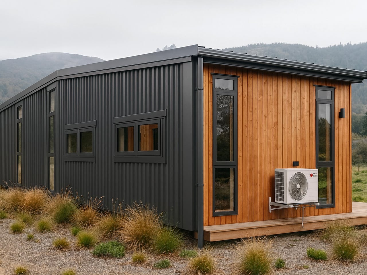
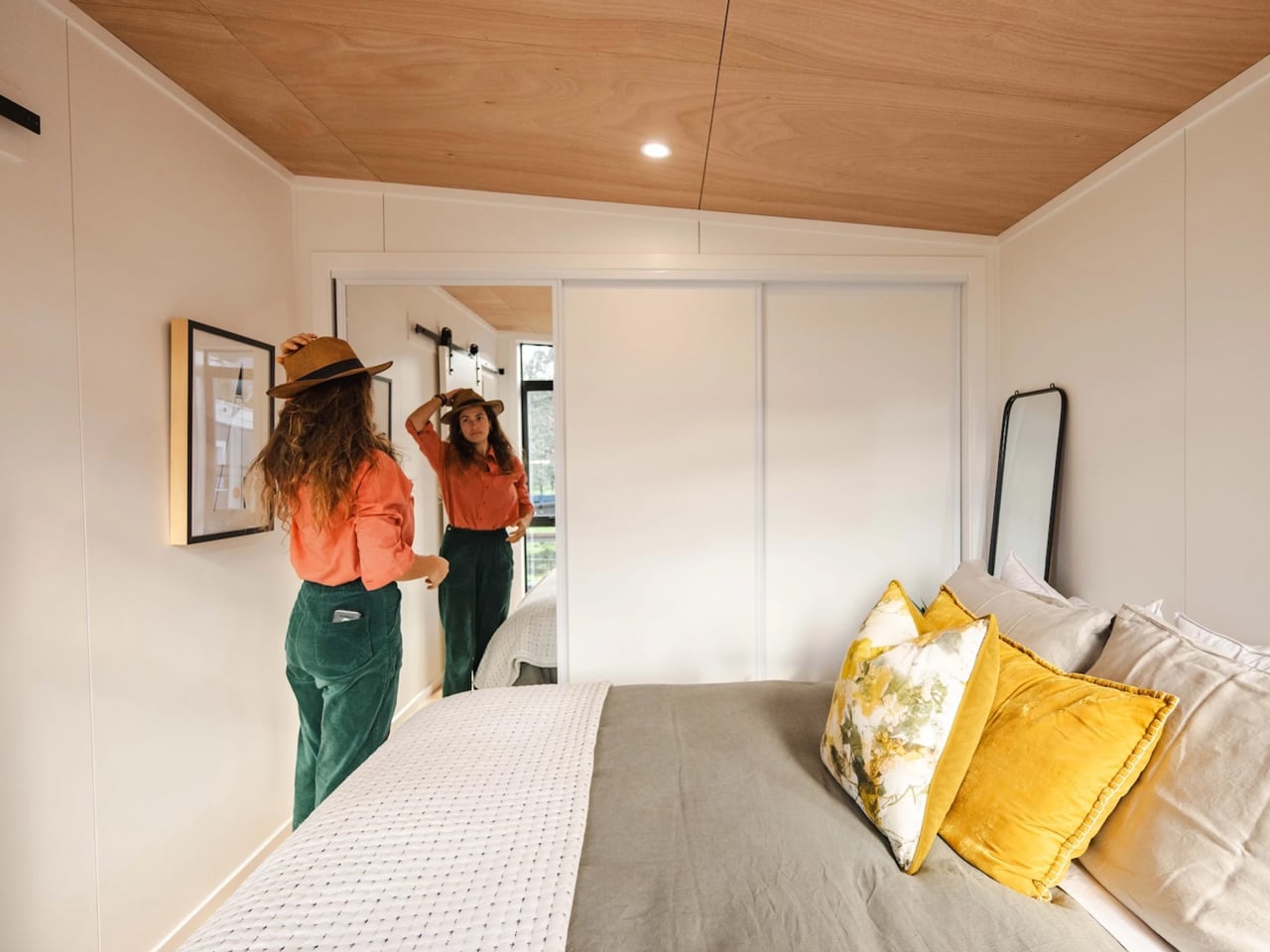
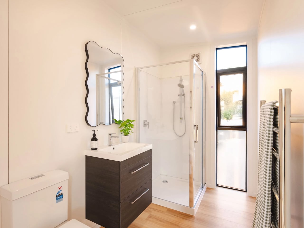
Going tiny doesn’t have to mean compromising on comfort, and the Natural Luxe by South Base Homes proves this philosophy beautifully. This single-story tiny house offers a remarkably open and spacious layout that defies its compact 48-square-meter footprint, creating a living experience that feels much larger than its dimensions suggest. Designed by New Zealand’s South Base Homes, the Natural Luxe is based on the company’s Abel model and serves as their brand new show home.
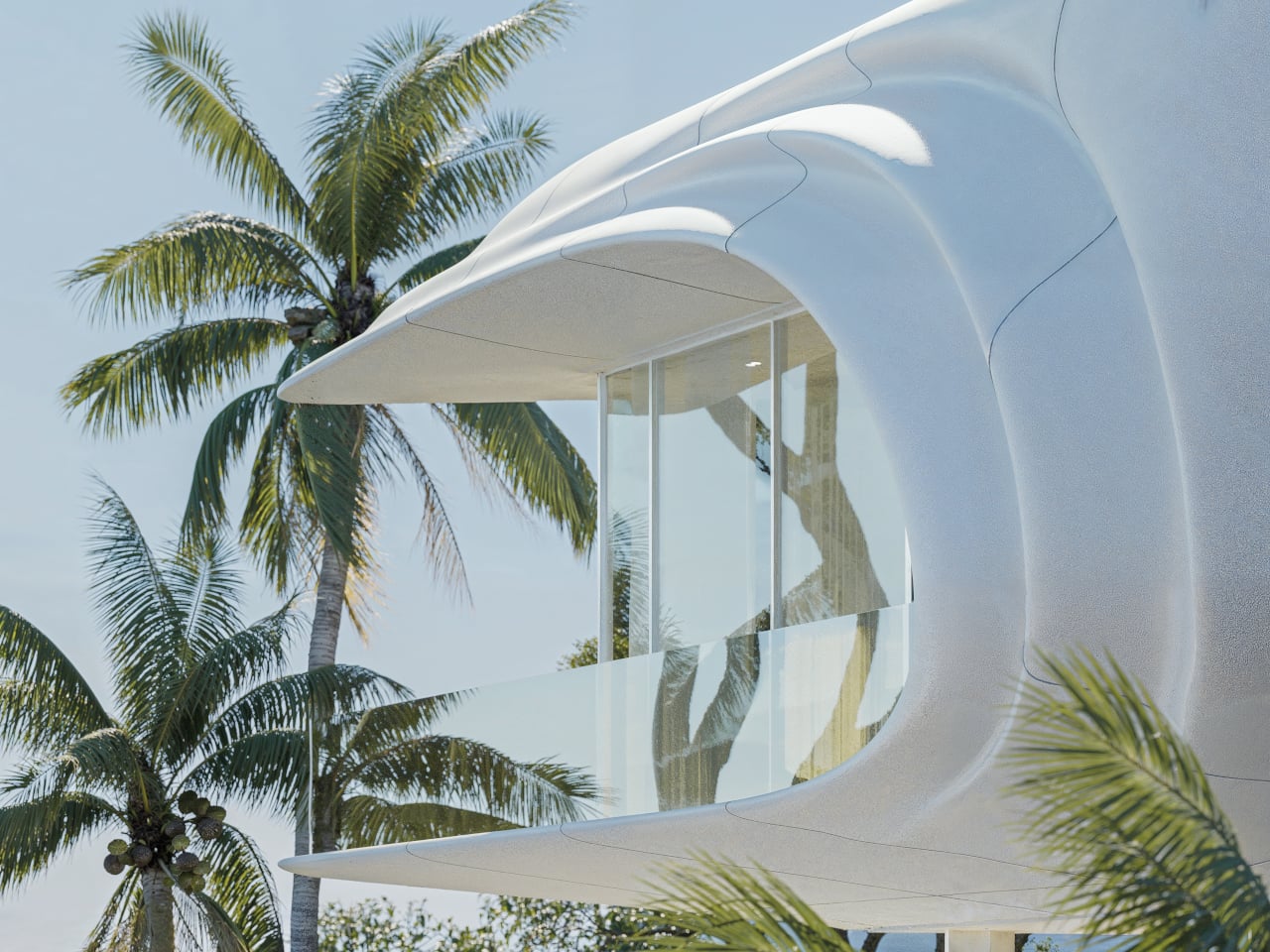
Measuring 516 square feet with a length of 12 meters and a width of 4 meters, this non-towable tiny house requires permanent installation but delivers an impressively generous living environment. The home’s exterior showcases a thoughtful combination of engineered wood and steel, complemented by a timber deck that extends the living space outdoors. This design choice creates seamless indoor-outdoor flow, enhanced by marble-look finishes that add a touch of sophistication to the compact dwelling.

Designer: South Base Homes

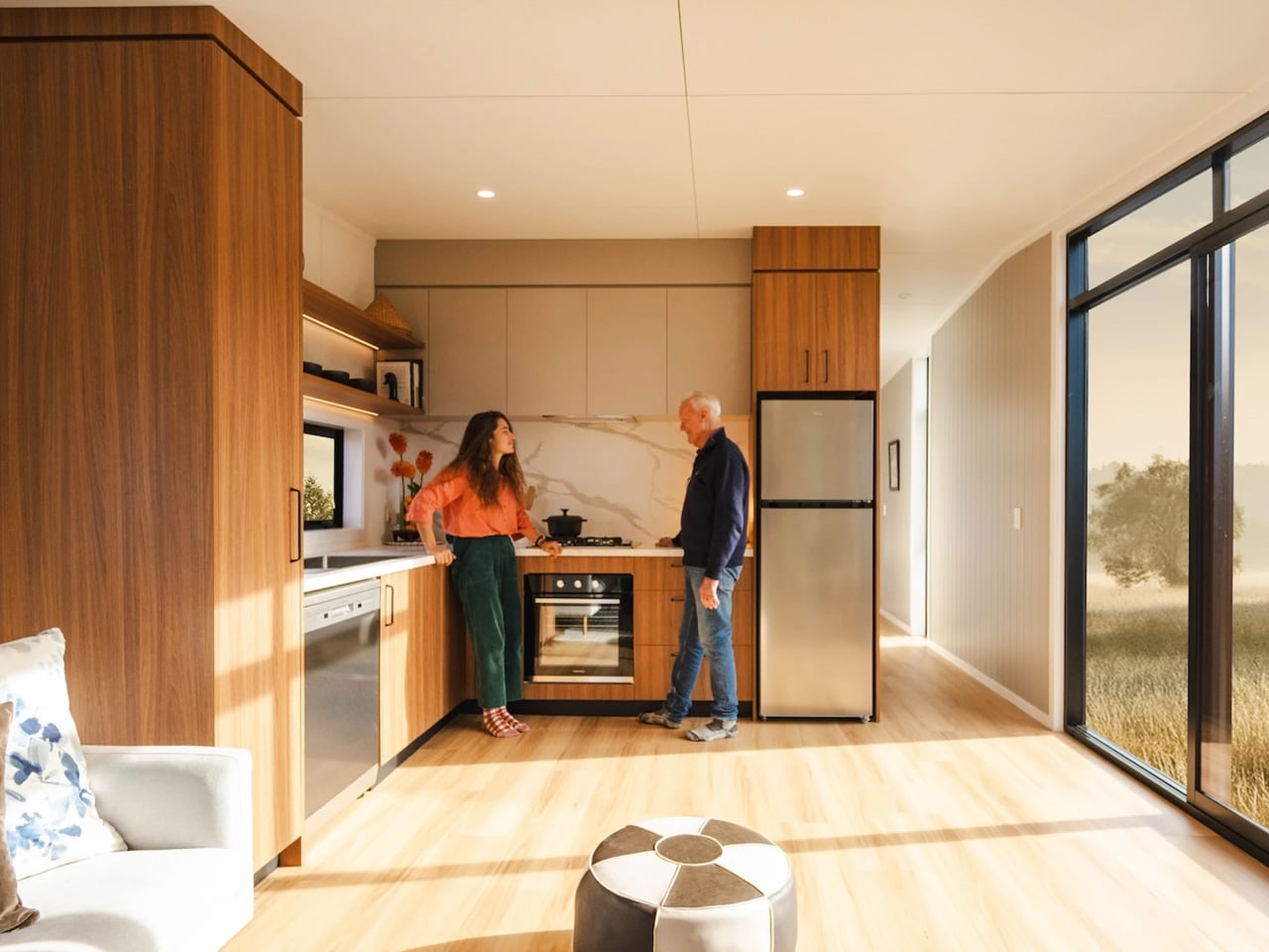
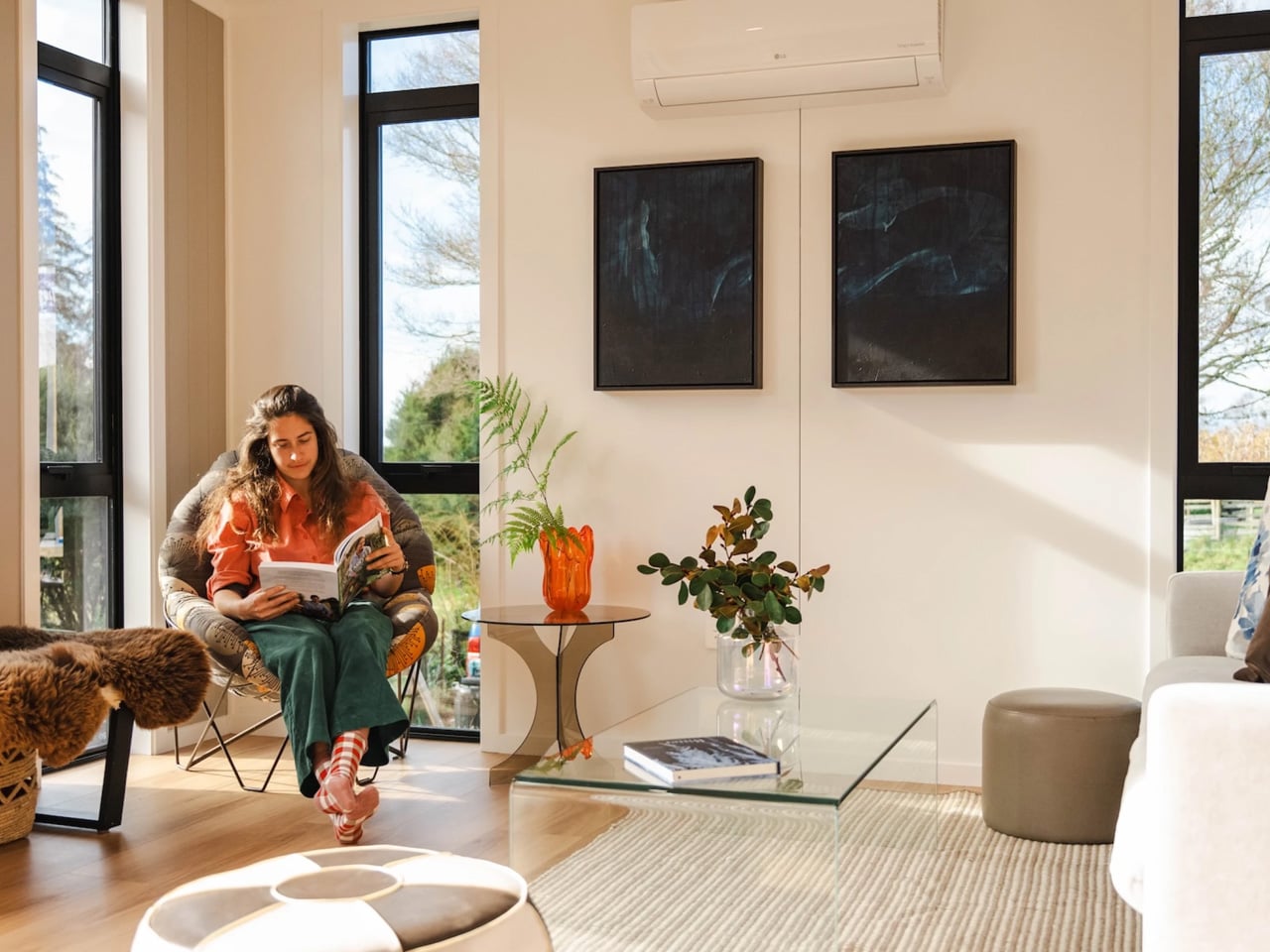
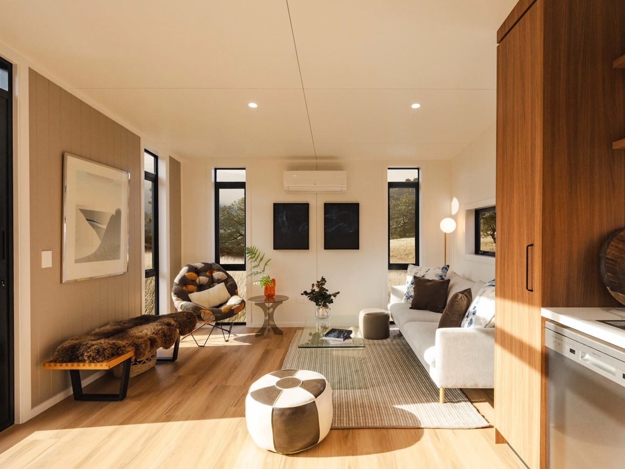
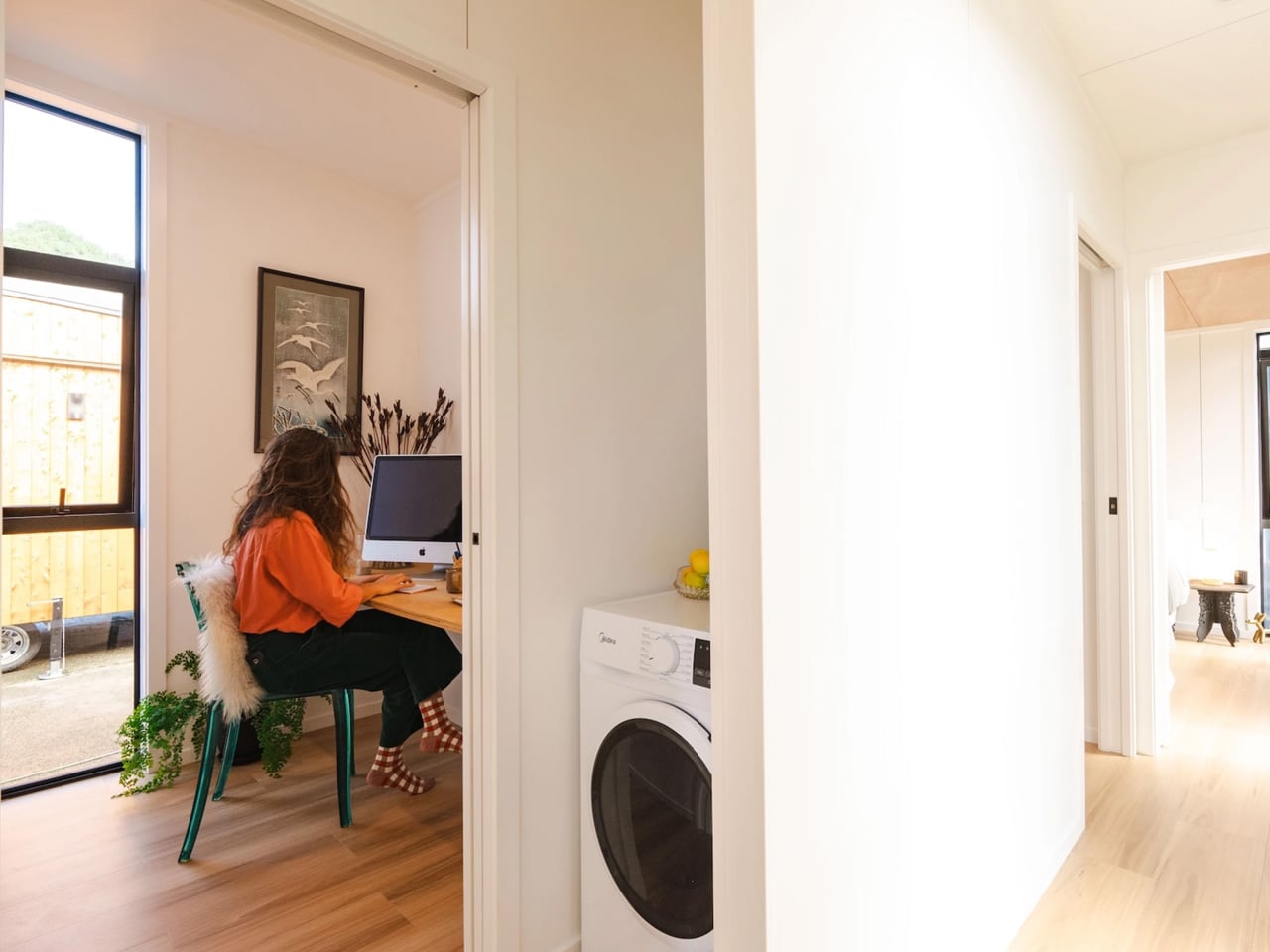
Step inside, and the Natural Luxe reveals its true genius. The open-plan layout features a large kitchen area that feels remarkably spacious for a tiny house. Every inch has been thoughtfully designed, from inbuilt kitchen shelving with soft-touch close mechanisms to a discreet laundry setup that maximizes efficiency without cluttering the space. The living room is equally well-proportioned, accommodating a sofa and several chairs without feeling cramped.

Perhaps most impressive is the inclusion of a dedicated home office, a feature that addresses the growing need for work-from-home spaces without sacrificing comfort or functionality. This thoughtful addition sets the Natural Luxe apart from many tiny house designs, recognizing that modern living often requires a dedicated workspace that doesn’t compromise the overall flow and feel of the home.

Natural light plays a starring role throughout the Natural Luxe. Floor-to-ceiling architectural-grade windows flood the space with sunshine during the day, while recessed LED strip lighting and Bluetooth-operable downlights allow residents to tailor the ambiance to their mood at night. Full-height storage solutions ensure that belongings stay organized without encroaching on the living areas, maintaining the home’s open and airy atmosphere.

South Base Homes describes the Natural Luxe as “the perfect balance of sophisticated design and practical living within 48 square metres”. Built with pride in New Zealand and engineered to meet the country’s Building Code standards, the home features top-tier insulation and comes with a five-year warranty. The Abel model, on which the Natural Luxe is based, starts at approximately $137,000 USD, with the final price varying depending on selected options and customizations. This show home demonstrates how smart architectural choices and attention to detail can create a tiny house that requires fewer sacrifices than one might expect, offering a viable solution for those seeking to live big in a smaller footprint.

The post This 48-Square-Meter Tiny House Feels Much Larger Than It Should first appeared on Yanko Design.