The Seiko Prospex LX GMT SNR058 Turns Cosmic Dust Into Wrist Candy

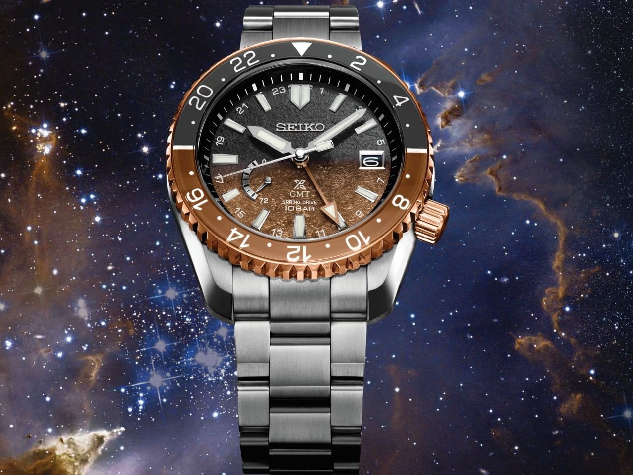
There is something deeply satisfying about a watch that refuses to explain itself through spec sheets alone. The Seiko Prospex LX GMT U.S. Special Edition SNR058 lands somewhere between tool watch and wearable sculpture, borrowing its visual language from a nebula floating 2,000 light-years away while keeping both feet planted in the lineage of purpose-built diving instruments. The result feels less like a product and more like an argument for what happens when a heritage brand decides to get a little weird with color.

The Dial Tells a Story Without Words

Look at that gradient. Brown bleeds into black across the textured surface, creating depth that shifts depending on how light catches it. This is not the flat, predictable sunburst you find on watches twice this price from European competitors. Seiko calls the inspiration the North America Nebula, and while that sounds like marketing poetry, the execution earns the reference. The pattern across the dial surface mimics the diffuse, particulate quality of cosmic matter fading into void. It feels alive in a way that polished monochromes cannot replicate.
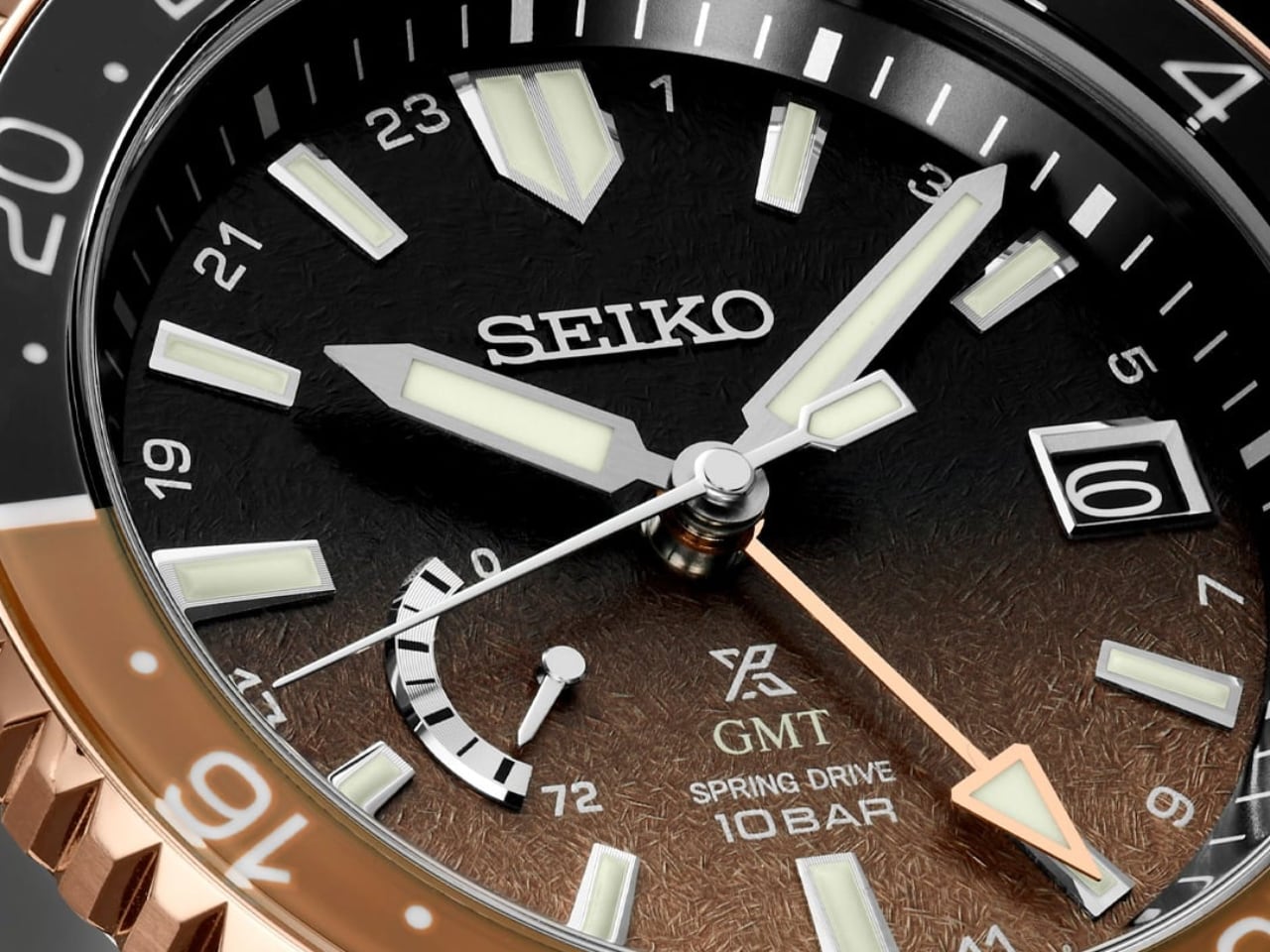
The applied hour markers sit proud against this backdrop, their polished facets catching light like small architectural details on a miniature building. There is generous lume here, but it does not dominate the aesthetic. The markers feel integrated rather than functional afterthoughts bolted onto a pretty face. A rose gold GMT hand threads through the composition, picking up the warm tones of the outer bezel ring and tying the entire color story together.

Titanium Done Right

Most titanium watches feel like they are apologizing for their material. They scratch easily, show wear quickly, and carry a dull grey pallor that screams aerospace reject. Seiko sidesteps all of this with their Diashield coating and Zaratsu polishing technique. The case arrives with crisp planes and distortion-free surfaces that catch reflections cleanly. This is the same polishing technique used on Grand Seiko cases, though executed here with a more utilitarian Prospex focus rather than the obsessive refinement of full Grand Seiko casework.
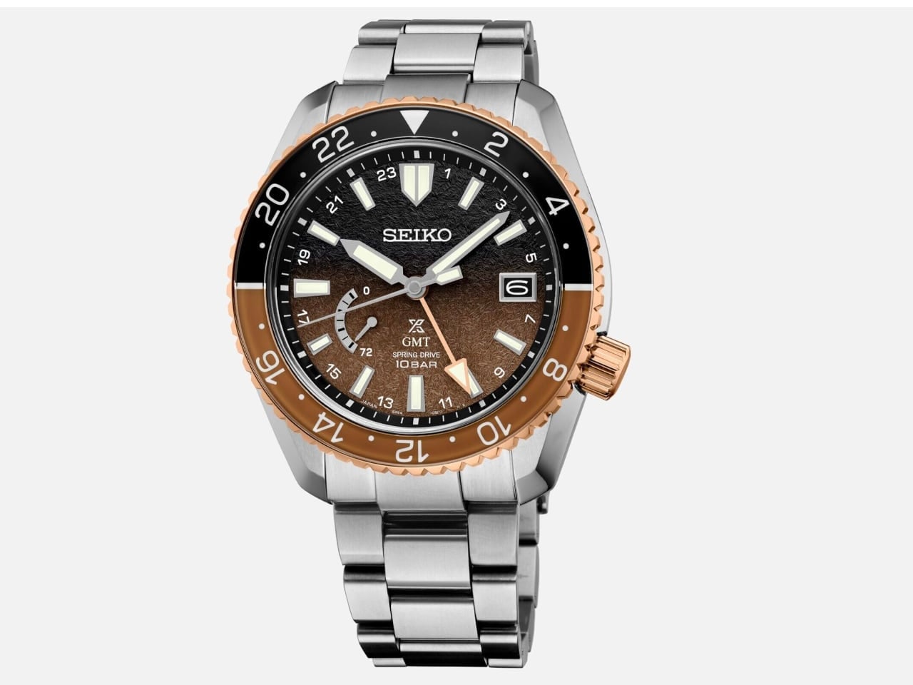
Zaratsu polishing requires a specific angle of contact between the metal and the polishing wheel, a technique that leaves no distortion in reflections across flat surfaces. The skill involved is considerable: one degree off and the mirror effect breaks. Seiko’s decision to apply this level of craft to a Prospex model rather than reserve it exclusively for Grand Seiko signals something about where they see this line heading.
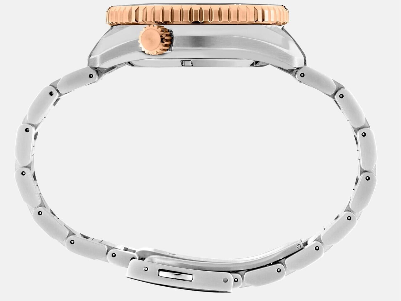
The dimensions read large on paper: 44.8mm across, 14.7mm thick, nearly 51mm from lug to lug. In practice, the titanium construction keeps weight manageable, and the integrated bracelet flows naturally from the case architecture. The three-row link design references classic sports watch vocabulary without copying any single competitor. It feels distinctly Seiko, which is rarer than it should be in a market flooded with homage pieces.

That Bezel Deserves Its Own Paragraph

Bi-directional rotation with a sapphire insert carrying glossy black and brown tones, framed by a rose gold outer ring. This combination should feel busy. It should clash. Instead, it works precisely because the warm metal accents ground the cosmic dial treatment in something familiar. The 24-hour markings wear lume for low-light legibility, turning a decorative element into genuine travel functionality.
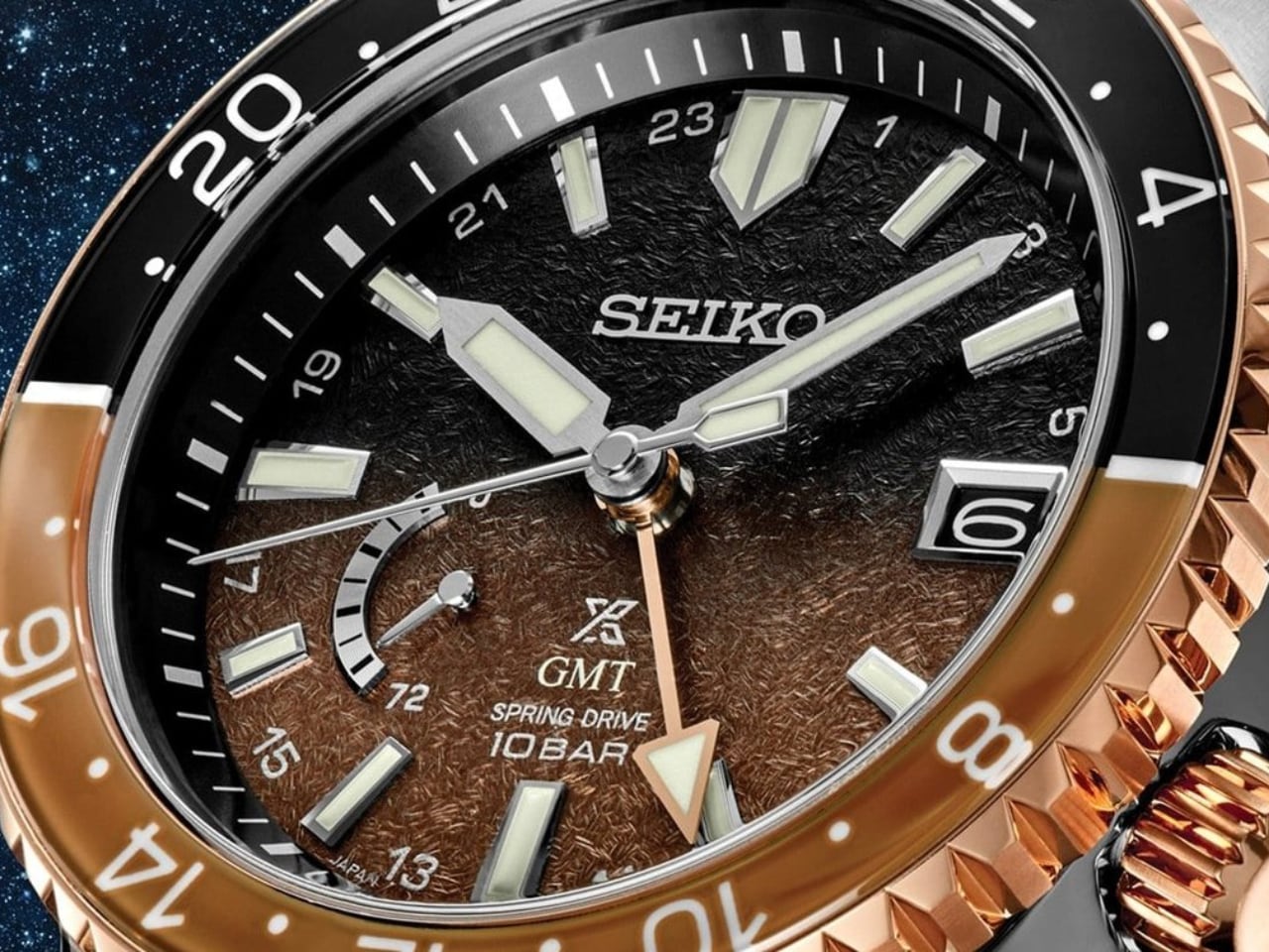
The smooth bezel action invites fidgeting. Rotation carries just enough resistance to feel intentional without demanding effort, and the clicks land with a muted precision that suggests quality machining beneath the surface. This is a watch designed for hands that cannot stay still, for moments spent rotating that bezel during meetings or flights simply because the tactile feedback rewards the interaction.

Spring Drive Changes the Conversation

Buried beneath this design showcase sits the 5R66 caliber, a Spring Drive movement that operates nothing like either a quartz or mechanical watch. The glide-motion sweep of the seconds hand moves without ticking, creating visual calm that matches the nebula dial’s contemplative quality. Accuracy hovers around one second per day, which places this GMT watch in a different reliability category than most mechanical travel pieces.

The independent hour hand adjusts in one-hour jumps without stopping the movement, a genuine traveler’s feature wrapped in what initially appears to be a design exercise. The power reserve indicator at eight o’clock adds functional information without disrupting the dial’s compositional balance.

Why This Watch Works

Seiko built something here that rewards both quick glances and extended examination. The surface-level appeal comes from bold color choices and unusual material combinations. Spend time with it, and the finishing quality, movement sophistication, and ergonomic thoughtfulness reveal themselves gradually. This is not a watch designed to photograph well for Instagram then disappoint in person. The opposite dynamic applies: images undersell what the physical object delivers.
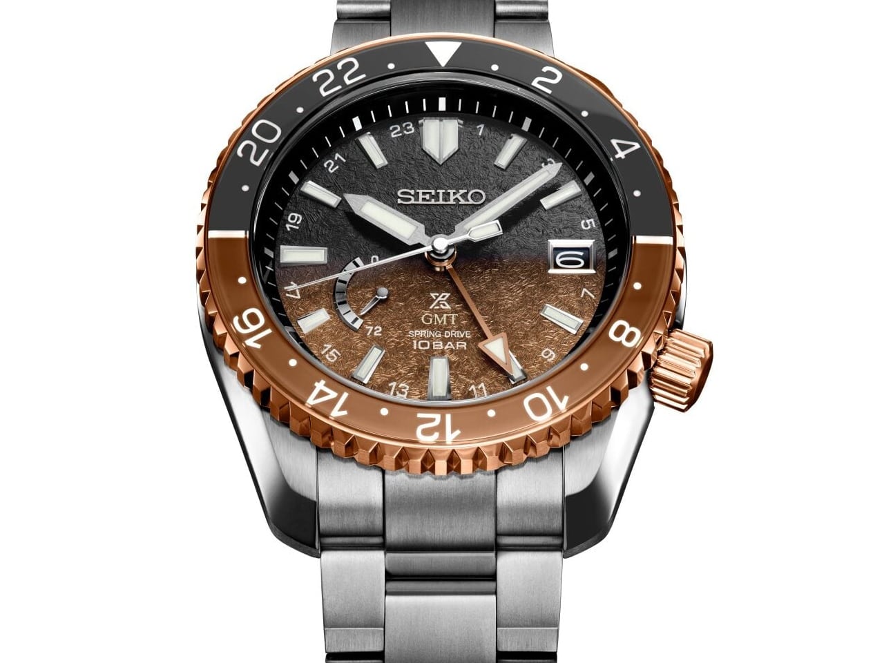
At roughly $6,500, this piece enters conversation with entry-level Grand Seiko and mid-tier Swiss sport watches. The competition offers polished execution and brand recognition. The SNR058 offers personality. For collectors who have already acquired the expected pieces, this watch represents a detour into territory where heritage craftsmanship serves aesthetic risk-taking rather than conservative refinement.

The nebula inspiration could have been a gimmick. Instead, it became a design framework that informed every decision from dial texture to bezel material to hand color. Coherence at this level, across this many design elements, is genuinely difficult to achieve. Seiko achieved it.

The post The Seiko Prospex LX GMT SNR058 Turns Cosmic Dust Into Wrist Candy first appeared on Yanko Design.
Forget Minute Hands: This Watch Only Tells Time in Half-Hours

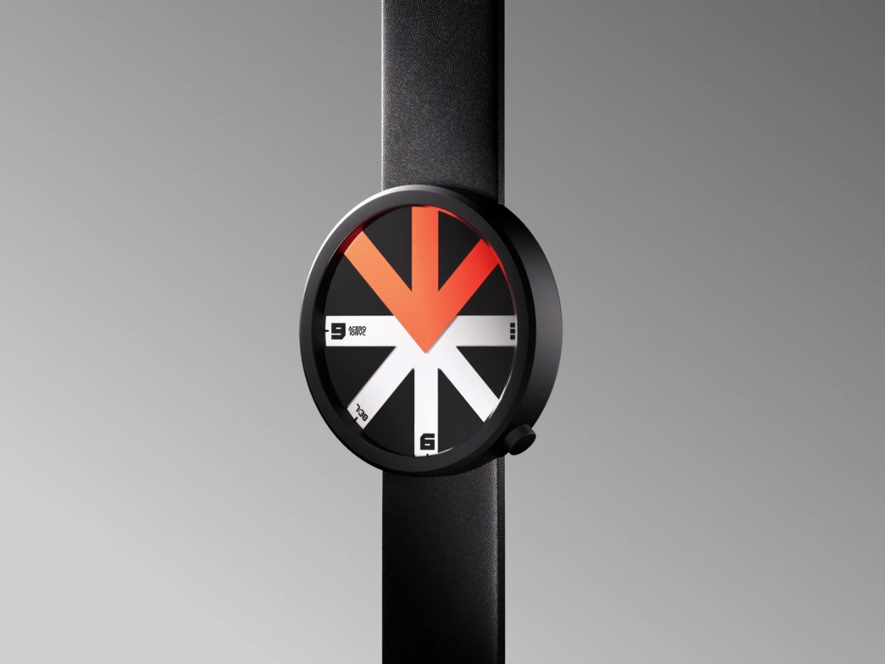
When was the last time a watch made you do a double-take? If you’re like most of us, probably never. We’ve seen countless variations of circles with numbers, hands pointing at things, and digital displays that all basically do the same job. But Ion Lucin’s ARROWatch isn’t just another pretty timepiece. It’s a design that fundamentally rethinks what a watch actually does.

Here’s the thing: we’ve been telling time for centuries, and watches have evolved from ornate pocket pieces to sleek smartwatches. So when a designer sits down to create something genuinely new, they’re facing a pretty daunting challenge. How do you innovate on an object that’s been perfected over hundreds of years?

Designer: Ion Lucin

Lucin, tackling his first watch design, didn’t try to reinvent the wheel (or the circle, as it were). Instead, he went back to basics and asked a deceptively simple question: what does a watch actually do? Strip away all the aesthetics, the luxury materials, the complications, and what you’re left with is this: a watch tells us where to look at a specific moment in time. That insight is brilliant in its simplicity. Sure, we can dress up that information with different colors, shapes, and forms. We can make it digital or analog, minimalist or maximalist. But what if, instead of just changing how the information looks, you changed how people interact with it? What if you could create an unexpected way of directing someone’s gaze?

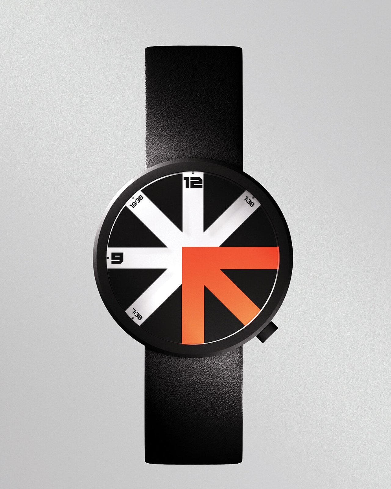
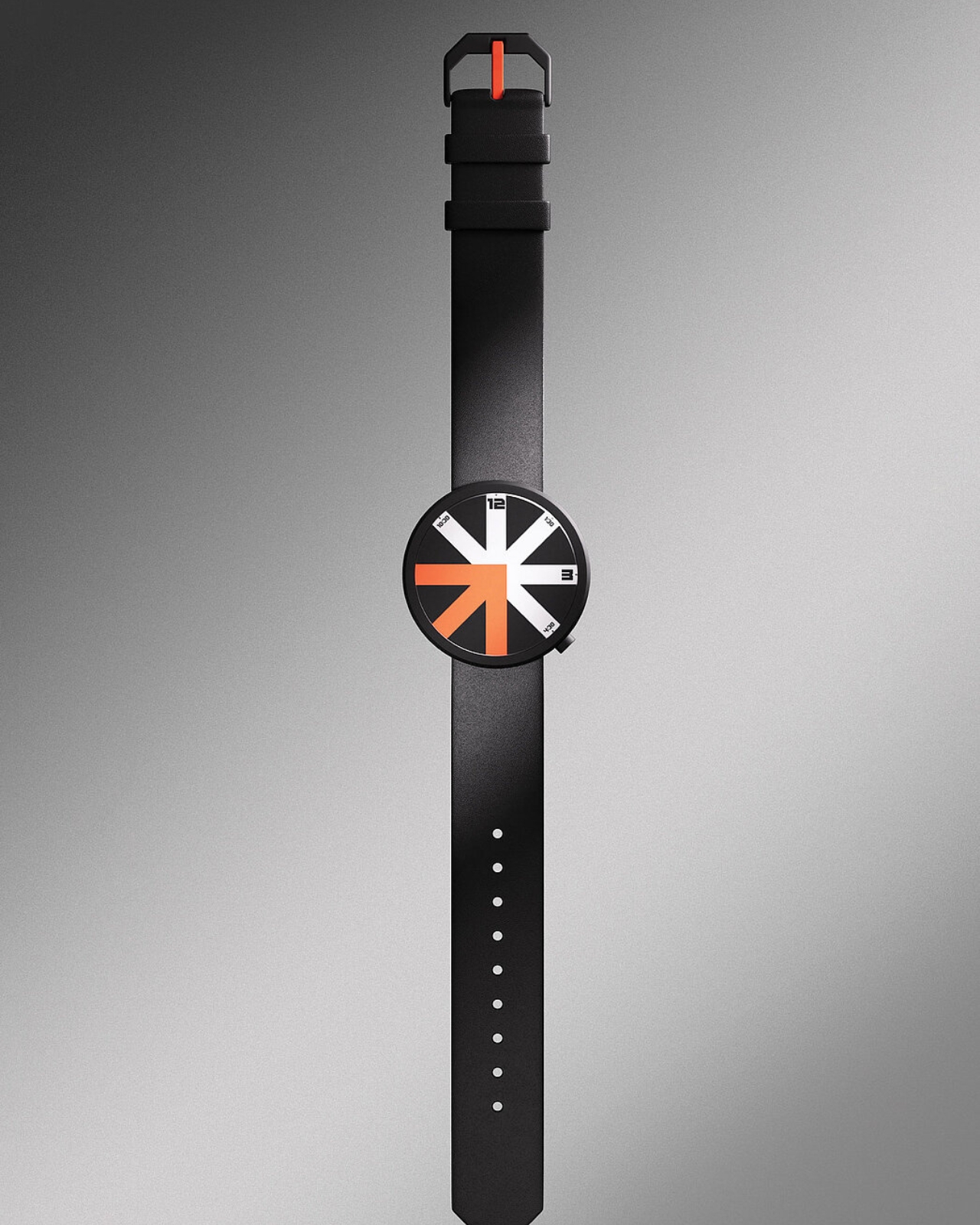
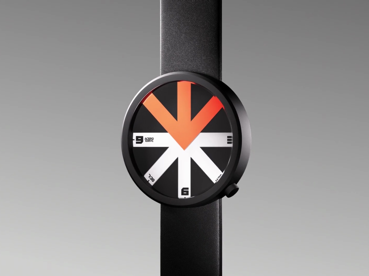
Enter the arrow. It’s possibly the most universal symbol we have for directing attention. You see arrows everywhere, from road signs to user interfaces, all doing the same basic job: pointing you somewhere. Lucin took this ubiquitous symbol and made it the entire concept of his watch. The ARROWatch face is divided into eight segments. Three of those segments are colored in a striking orange-red, forming an arrow shape. Five segments are left transparent. The rest of the watch face is black. This creates a kind of window effect where only certain portions of the time dial are visible at any given moment. The colored arrow literally guides your eye to the information you need.

What makes this particularly bold is what Lucin left out. The ARROWatch only displays hours and half-hours. No minute hand, no second hand, no fussy complications. We’re living in a time where we’re obsessed with precision (down to the millisecond on our smartphones) but this watch is telling you to chill out a bit. Do you really need to know it’s 3:47 and 32 seconds? Or is “about 3:30” good enough? This minimalist approach feels almost rebellious. We’re so accustomed to information overload that a watch that gives you less feels like a statement. It’s pushing back against the idea that more data equals better design. Sometimes, clarity comes from subtraction, not addition.

The aesthetic is unapologetically graphic. The black circle with its bold arrow in white and orange looks more like a wayfinding sign or a piece of modern art than a traditional timepiece. Paired with a sleek black leather strap, it’s the kind of thing that works equally well in a gallery, a coffee shop, or a design studio. It’s a conversation starter, which is exactly what good design should be. What’s particularly impressive is that this is Lucin’s debut watch design. There’s a fearlessness here that you don’t always see from first-time designers. He could have played it safe, creating something conventionally beautiful that would appeal to traditional watch collectors. Instead, he took a risk and created something that challenges our expectations.

Will everyone want to wear a watch that only tells time in half-hour increments? Probably not. But that’s not really the point. The ARROWatch exists to make us question our assumptions about everyday objects. It reminds us that innovation doesn’t always mean adding more features or making things more complex. Sometimes, the most radical thing you can do is simplify, focus, and ask people to look at something familiar in an entirely new way. And honestly? That’s exactly what good design is supposed to do.

The post Forget Minute Hands: This Watch Only Tells Time in Half-Hours first appeared on Yanko Design.
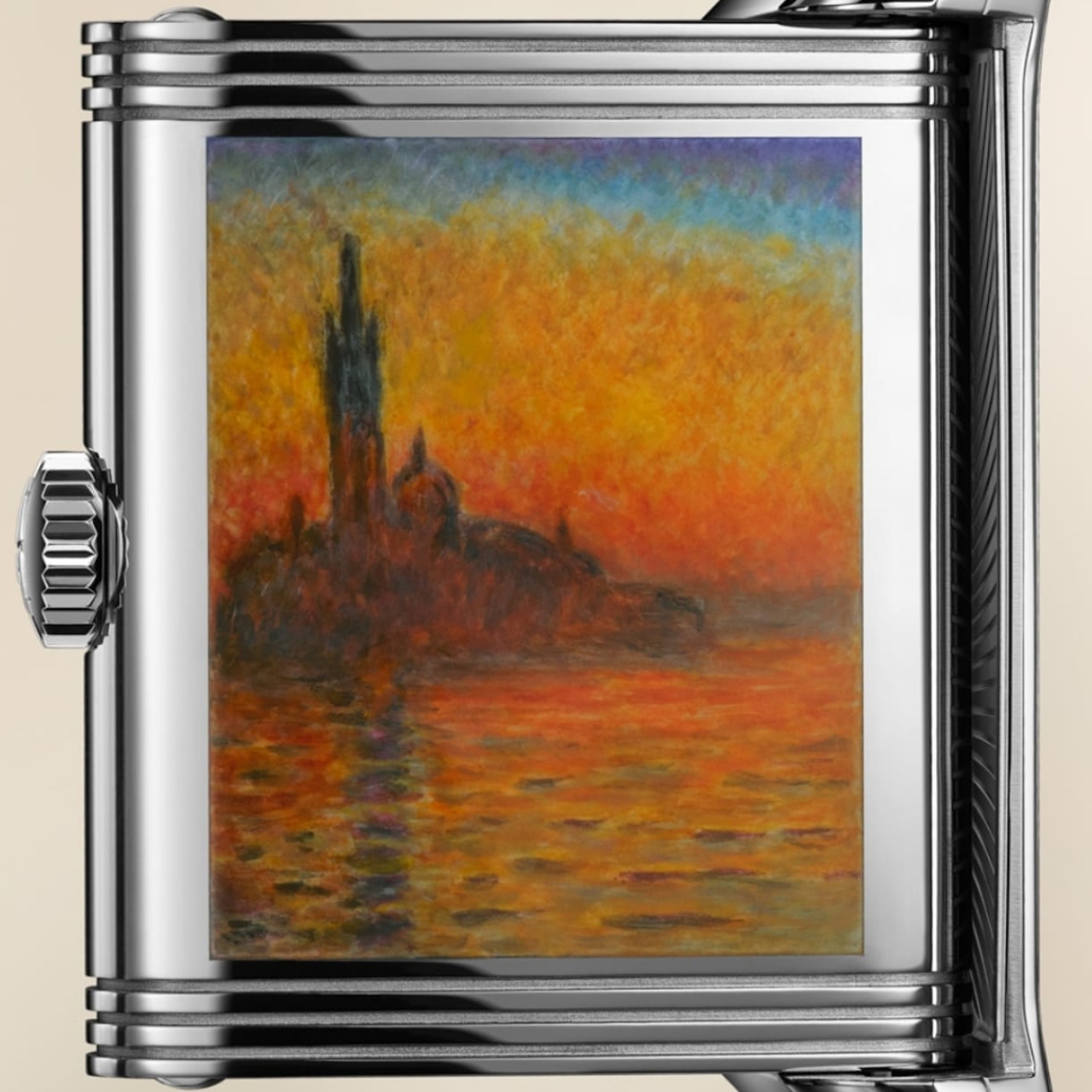
Jaeger-LeCoultre intricately replicates Monet’s Venice pieces on case-back

One of my most memorable visits to a museum (so far) is the first time I saw a Monet painting in person at the National Gallery Singapore a few years back. Seeing something in real life that you only previously saw in books and online is a always a magical experience for art lovers. Now imagine being able to carry a replica of this painting on your wrist every day. Well, that is, if you can afford it.

Designer: Jaeger-LeCoultre

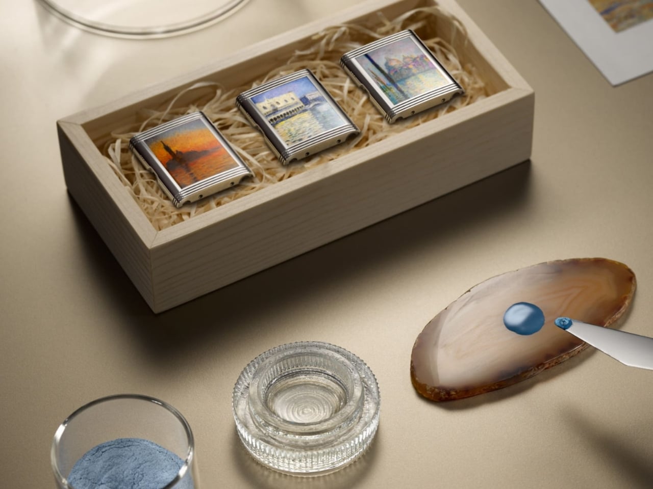
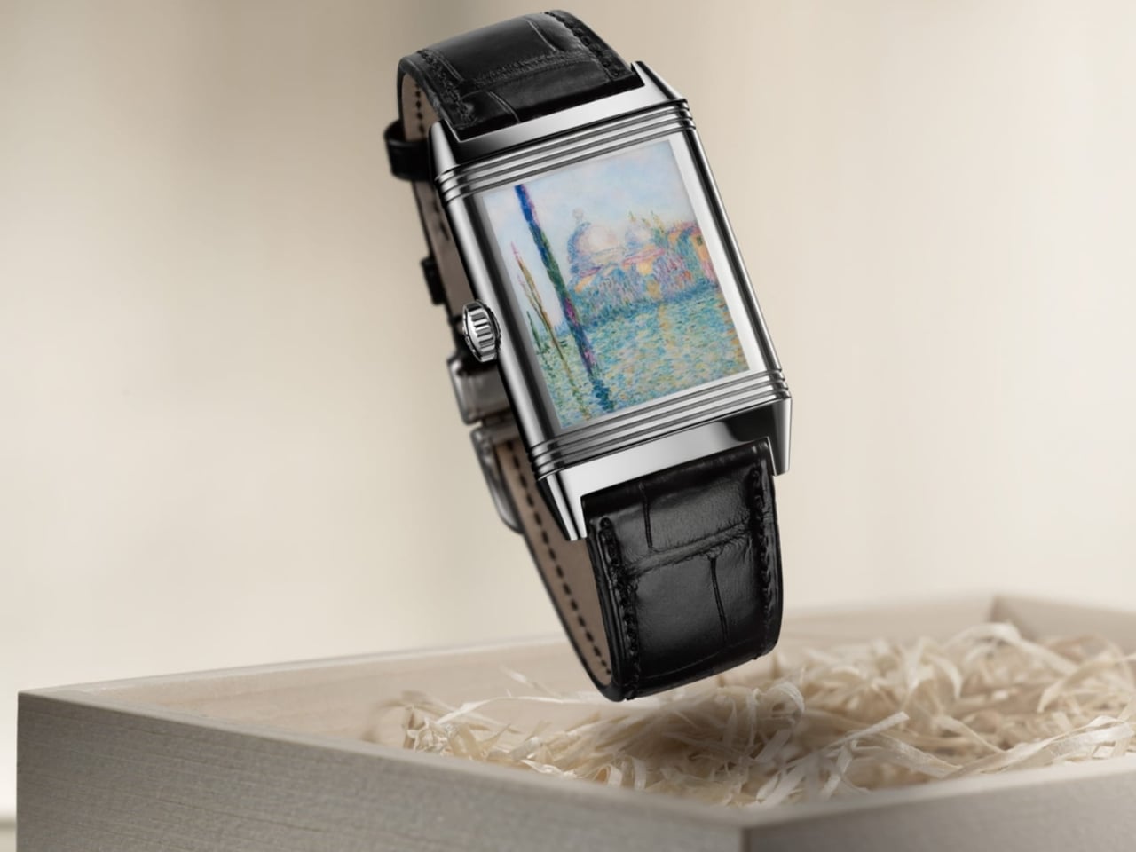
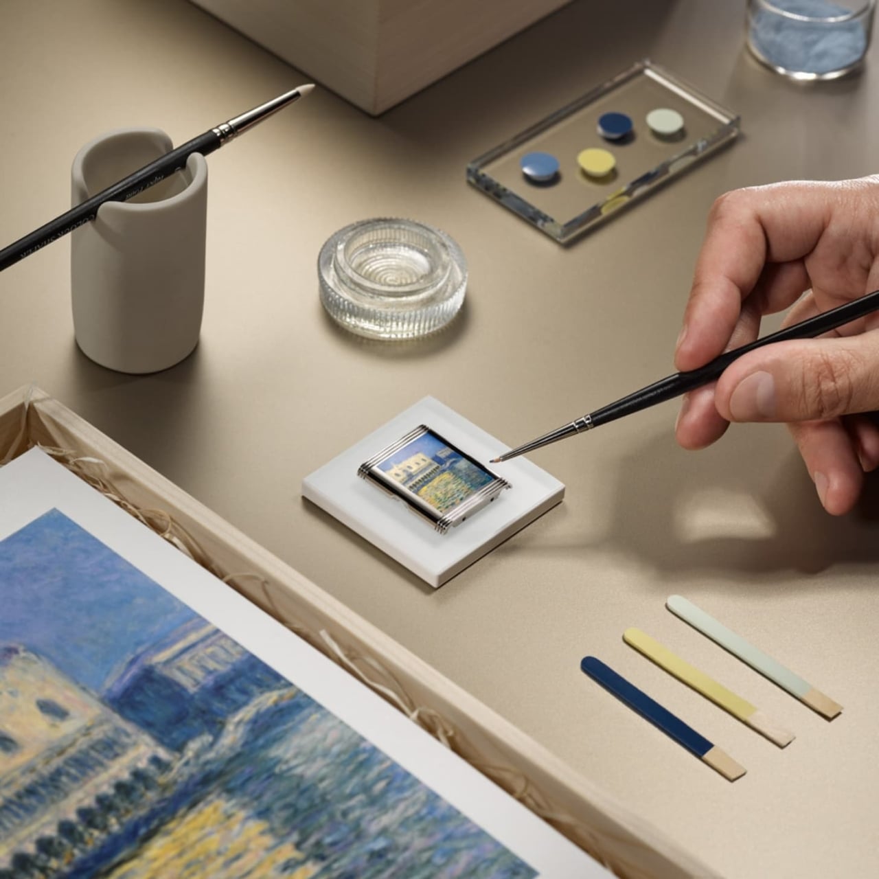
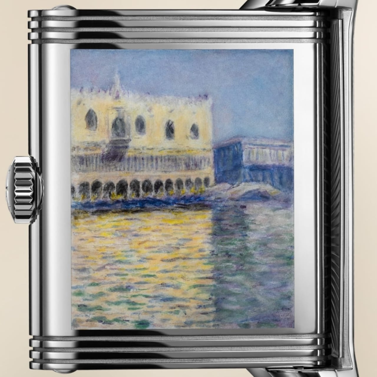
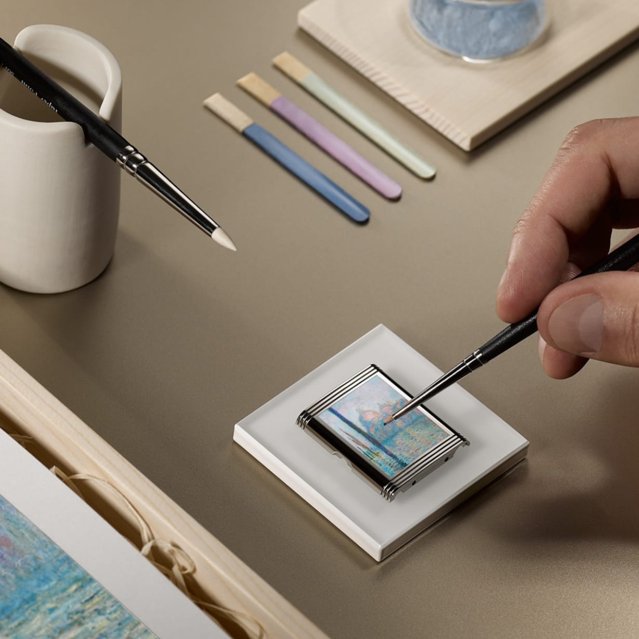
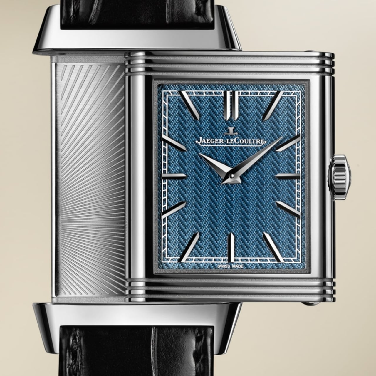
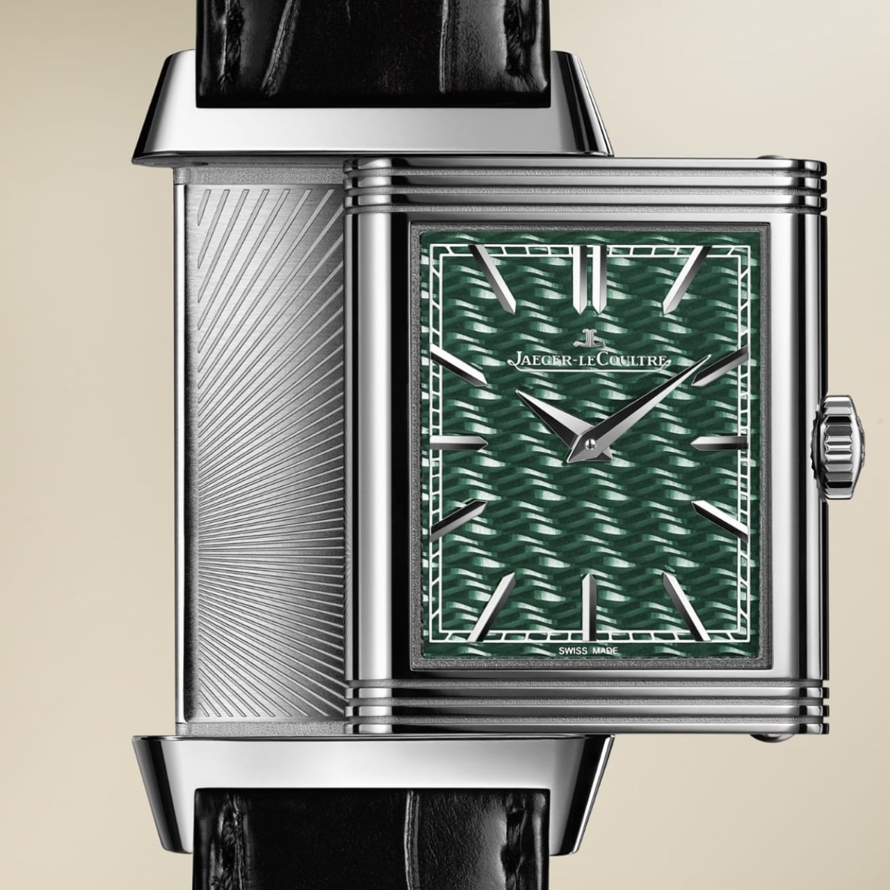
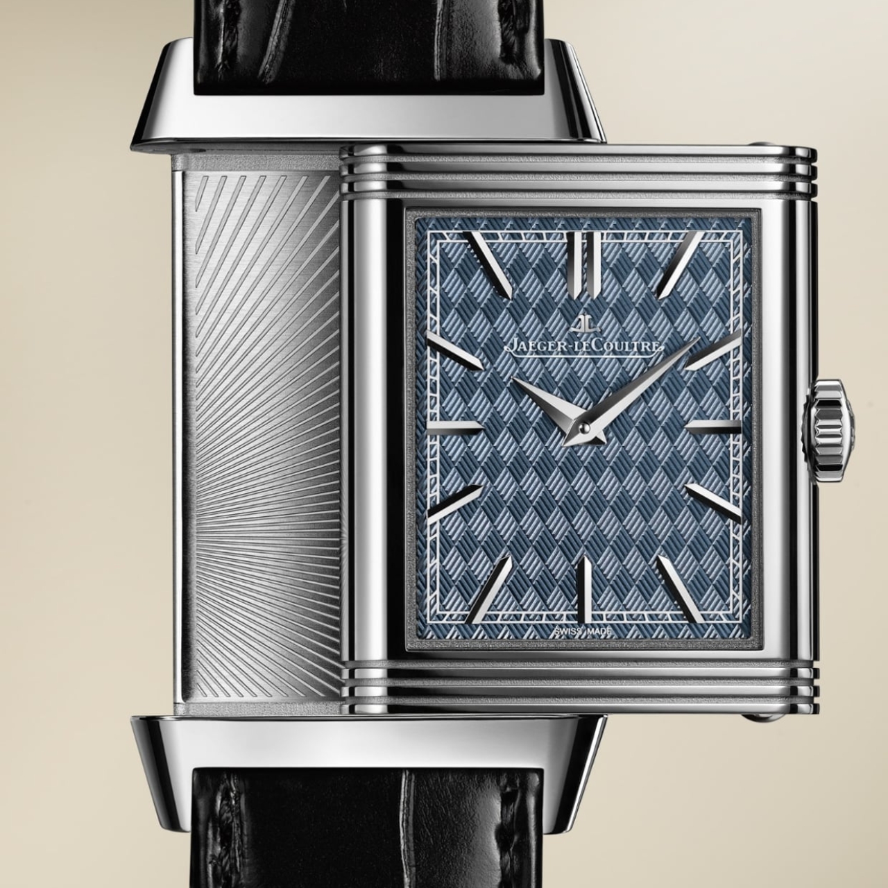
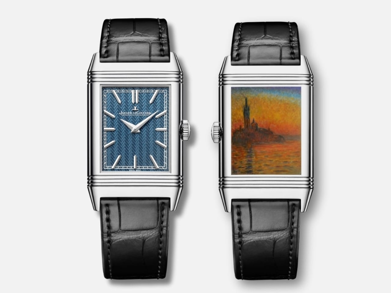
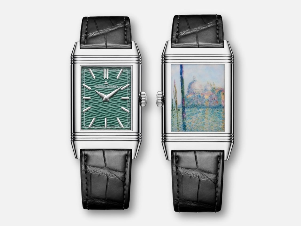
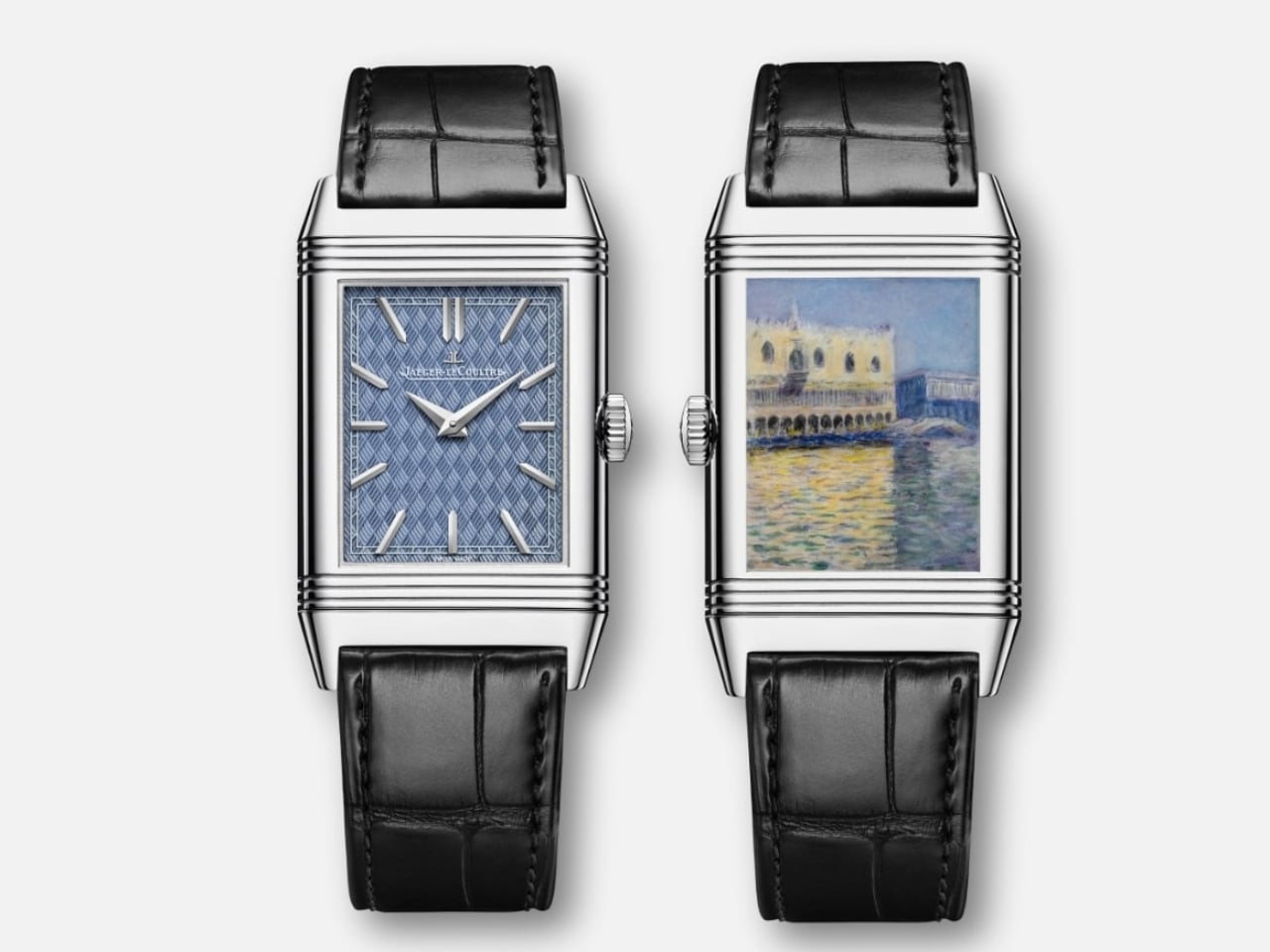
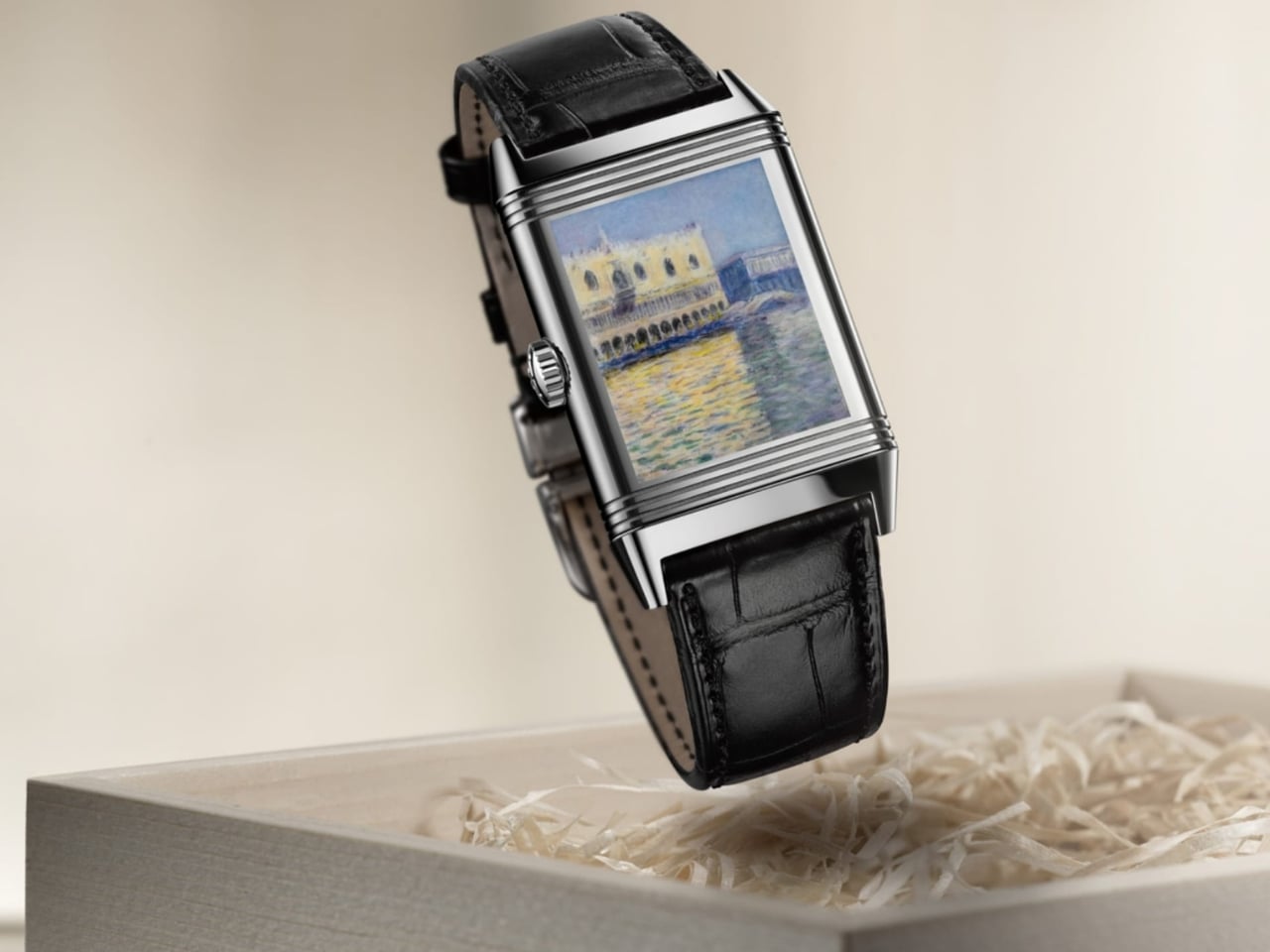
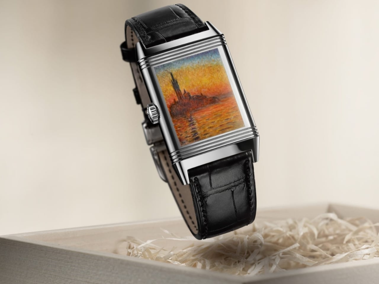
Jaeger-LeCoultre is releasing a very limited edition collection called the Reverso Tribute Enamel Monet “Venice” series. These luxury watches have three of Oscar-Claude Monet’s most famous paintings, the Venice series, hand-painted on the case-back of each watch. The three models – “San Giorgio Maggiore”, “The Doge’s Palace”, and “The Grand Canal” – are reproduced paintstakingly on the 2 centimeters squared case-backs by these master enamellers. They also had to recreate these using the impasto technique to retain the dream-like and ethereal quality of the original paintings.

To make things even more intricate, the three dials are decorated with hand-guilloché distinctive patterns underneath the translucent coloured enamel. Enameling takes nine hours work for each dial since it has up to five layers of enamel and seven separate firings. Each of the models have separate, distinct colors with “San Giorgio Maggiore” and “The Doge’s Palace” sporting two shades of blue while the “The Grand Canal” has a green finish. All three sport the brand’s distinct appliqued hour markers and dauphine hands.

Since the creation of these watches call for extensive man hours and a certain level of intricacy, only 10 pieces for each model will be produced. And if you want to know how much it costs, you’ll have to inquire directly with them, which probably means us mere mortals will not be able to afford this.

The post Jaeger-LeCoultre intricately replicates Monet’s Venice pieces on case-back first appeared on Yanko Design.
Sō Labs’s Layer 2 collection boasts 217 color combinations with day/date complications

For those of us who grew up in the age of analog watches, it’s quite unfathomable that there are kids now who have a hard time, or worse, don’t know how to actually read time. They’re so used to looking at their smartphones to tell time that reading the short hand and long hand of is pretty difficult and at times even impossible. But analog watches are still a big thing for those who want to own classic or funky timepieces on their wrists. And there are brands that keep churning out great designs for those of us who still prefer telling time the “old school” way.

Designer: Sō Labs

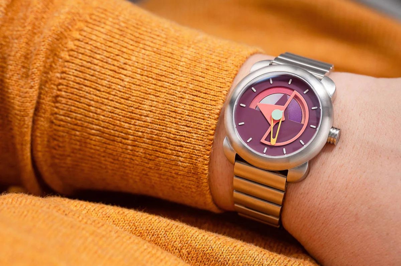
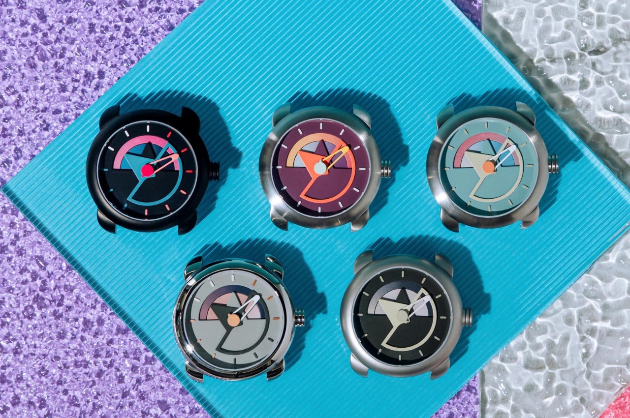
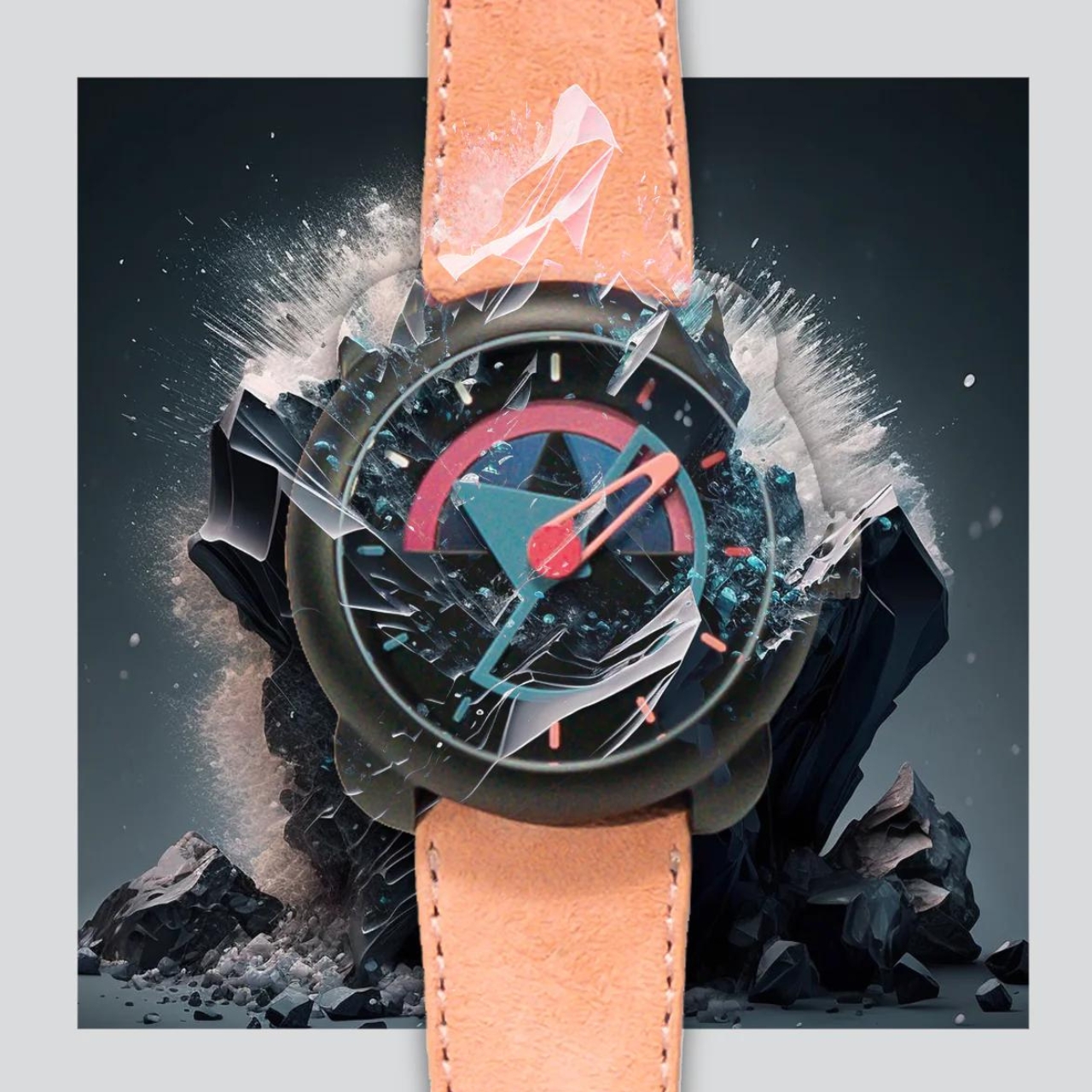
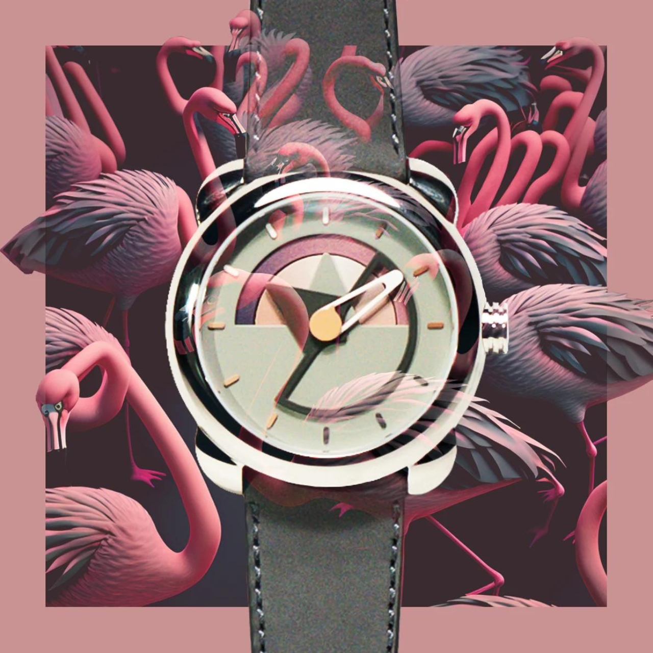
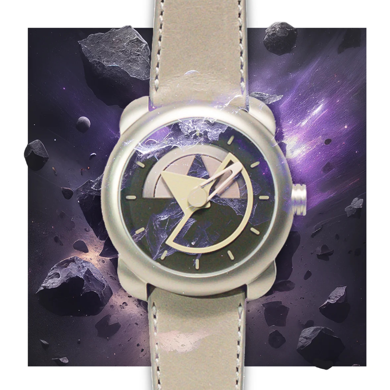
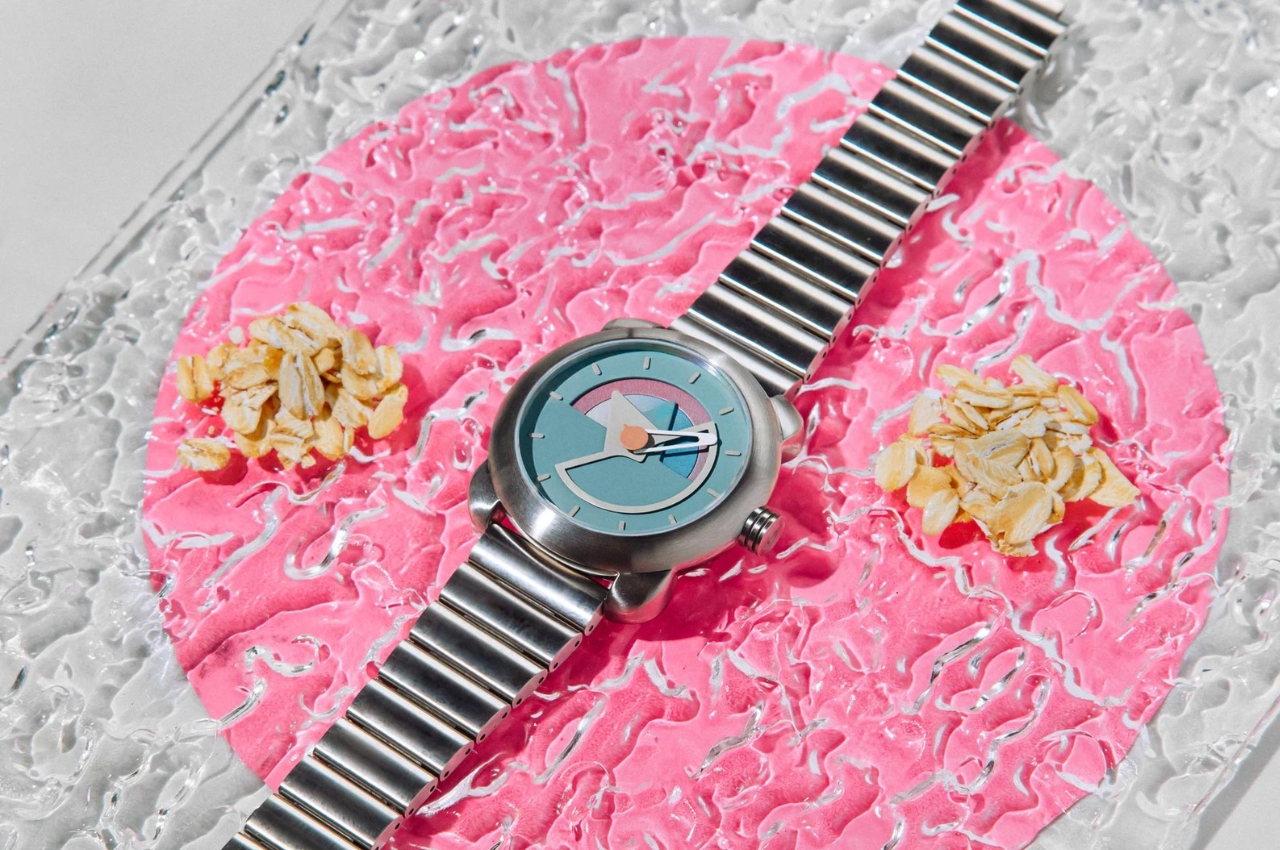
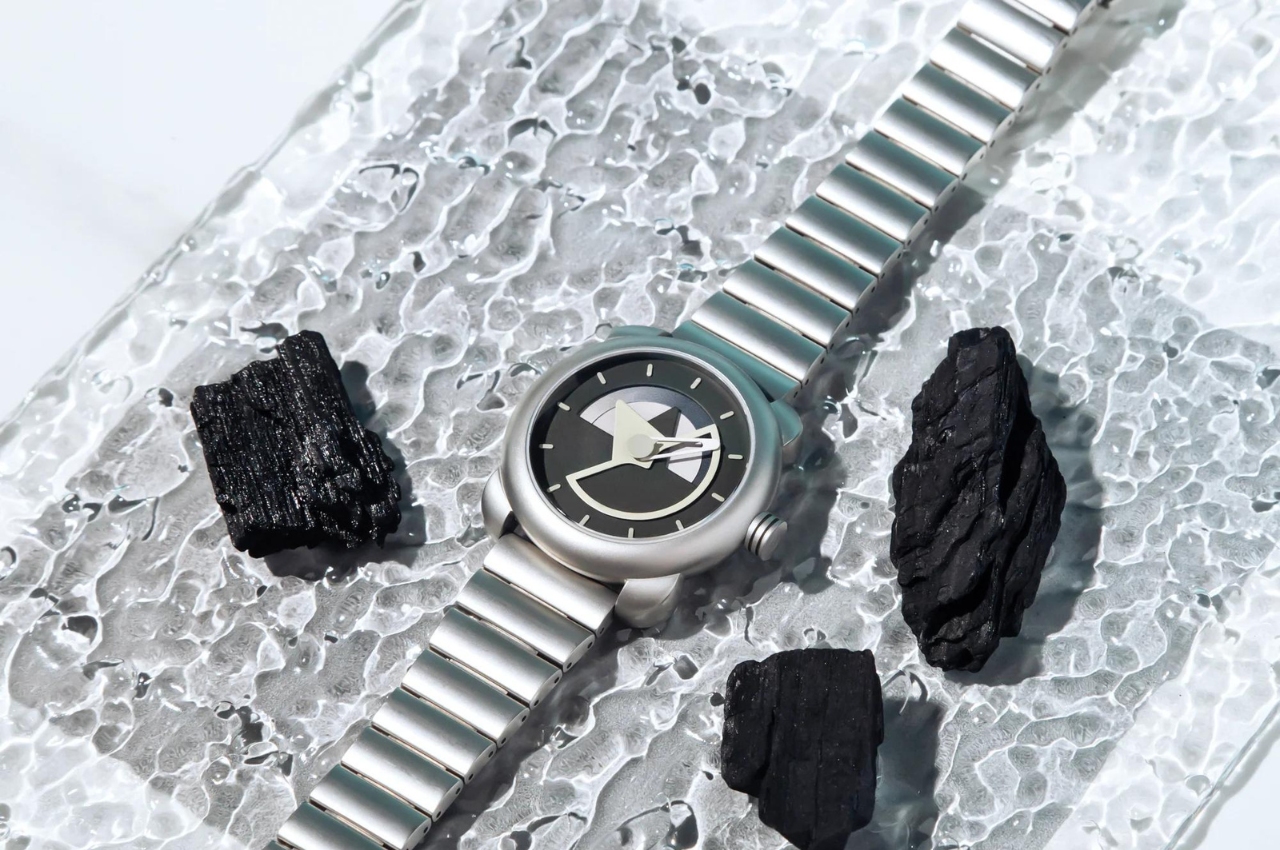
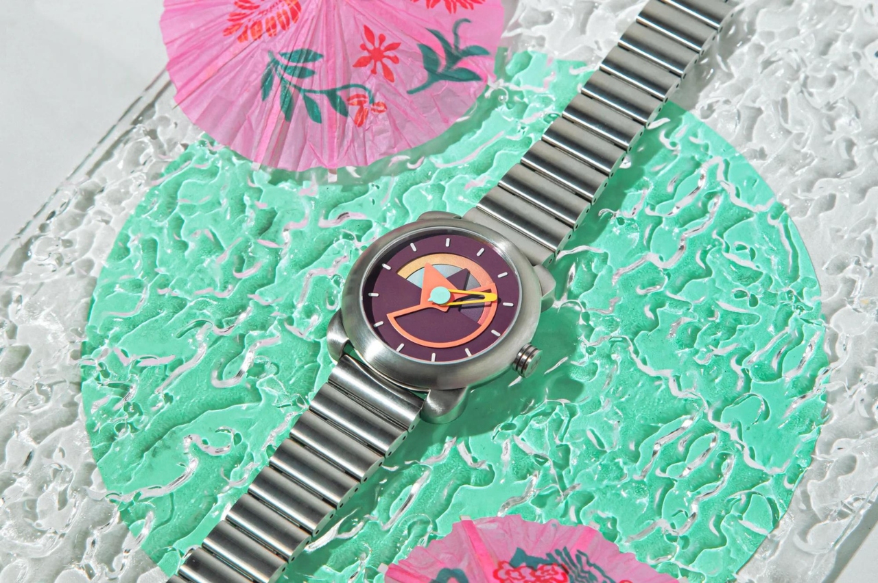
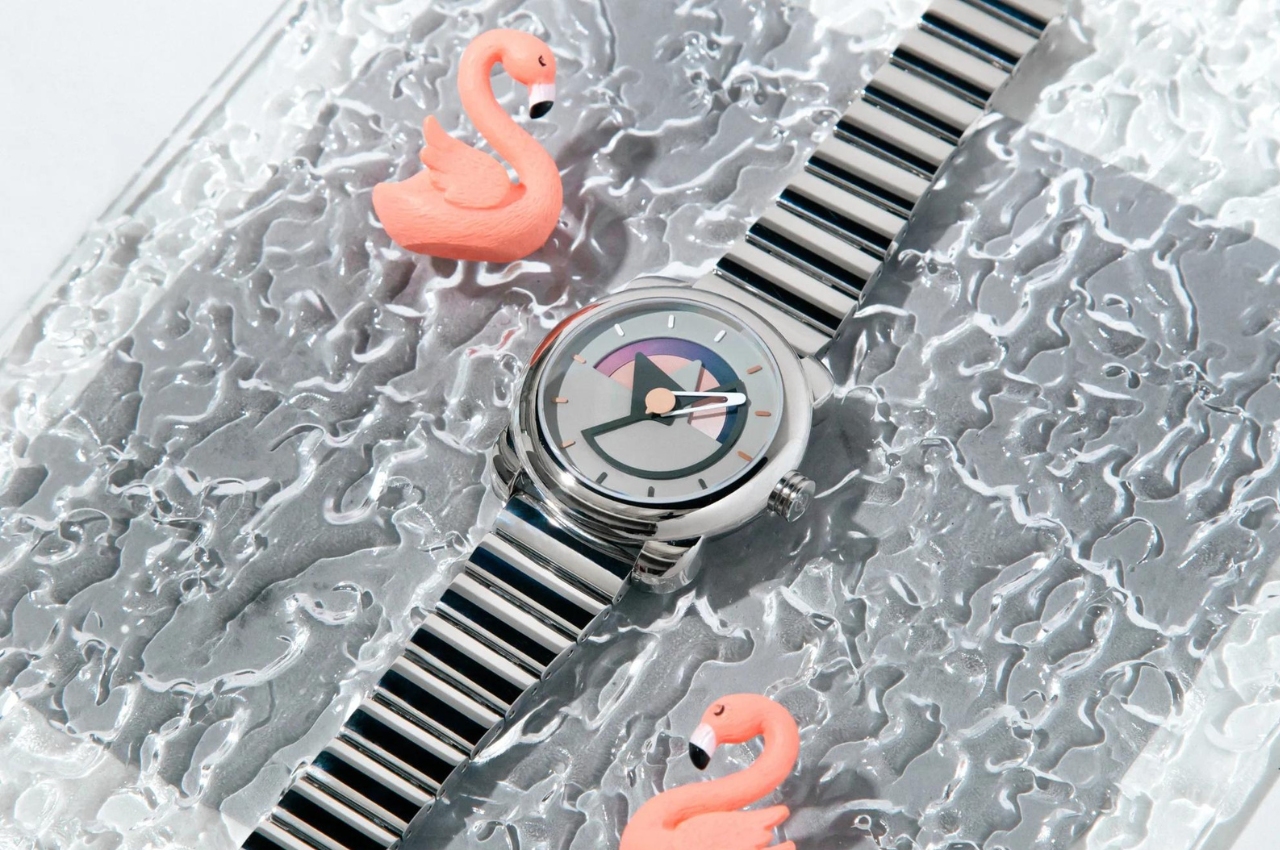
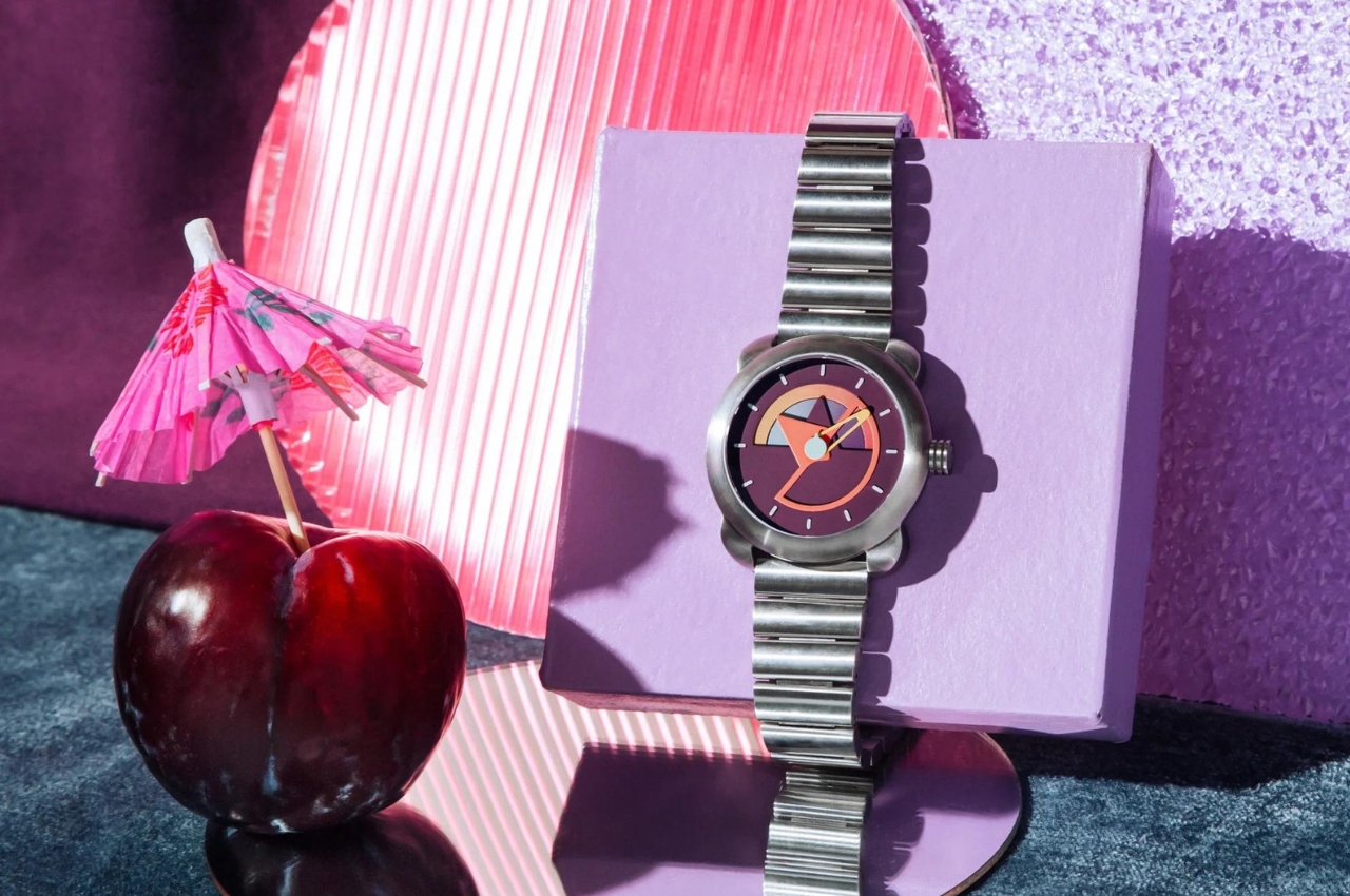
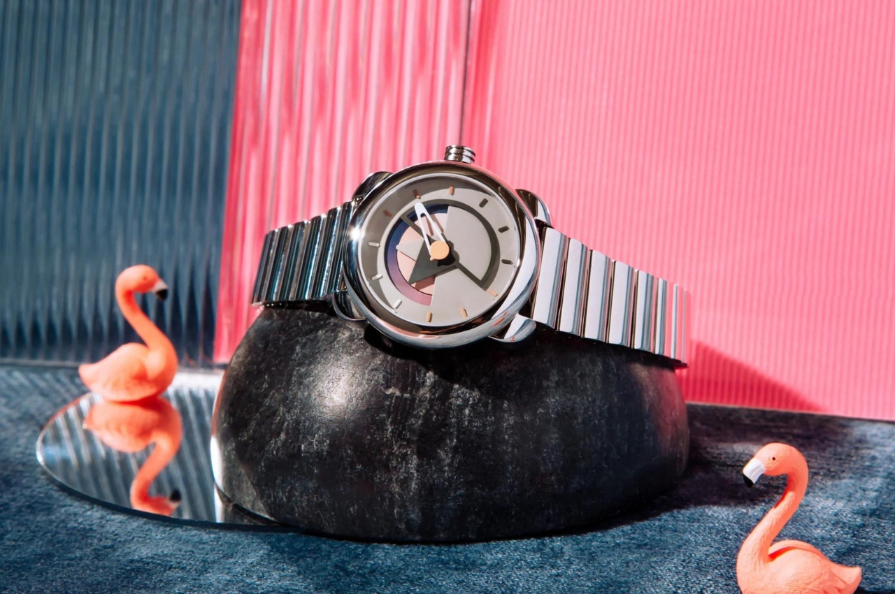
Sō Labs is one such brand that is creating watches that are distinct, colorful, and dynamic. They previously released their limited edition Layer 1 collection that has since then sold out so now it’s time to unveil Layer 2. The collection features the signature triangular and circular shapes from the brand but this time bringing a different twist to the design. The day and date complications are now both functional and an aesthetic feature. Each day and date corresponds to a different color so you get 217 color combinations since each wheel has a gradient pattern.
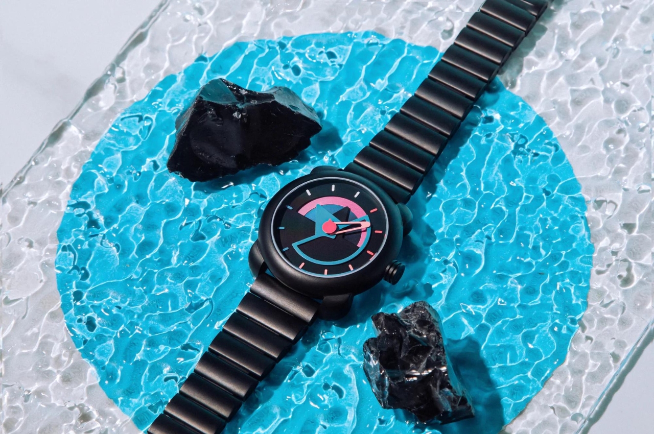
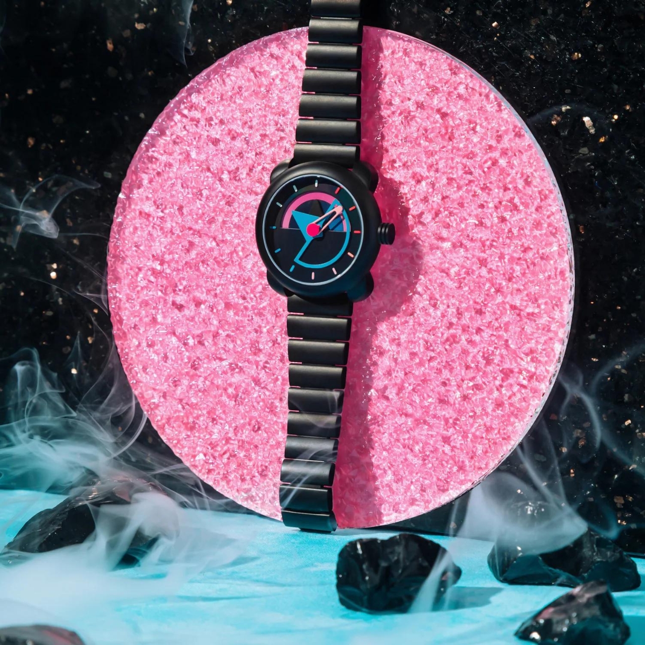
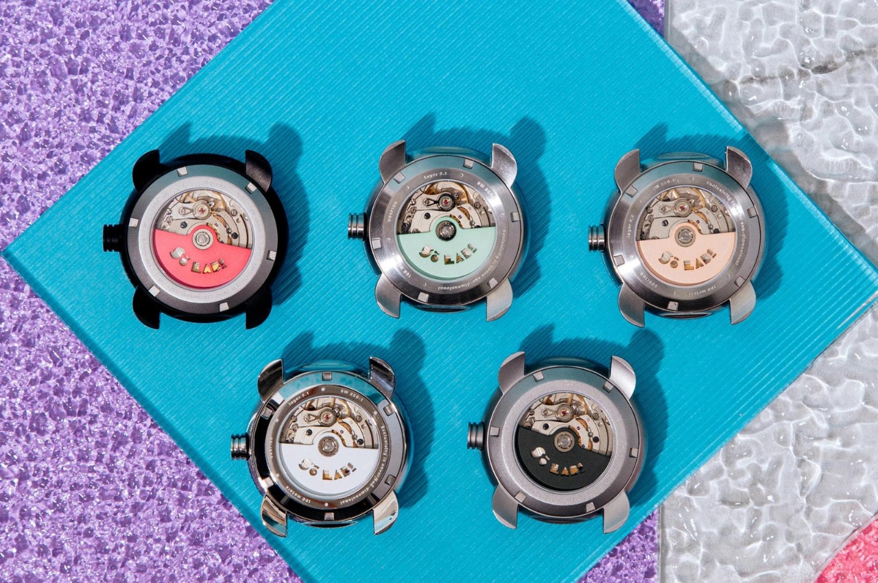
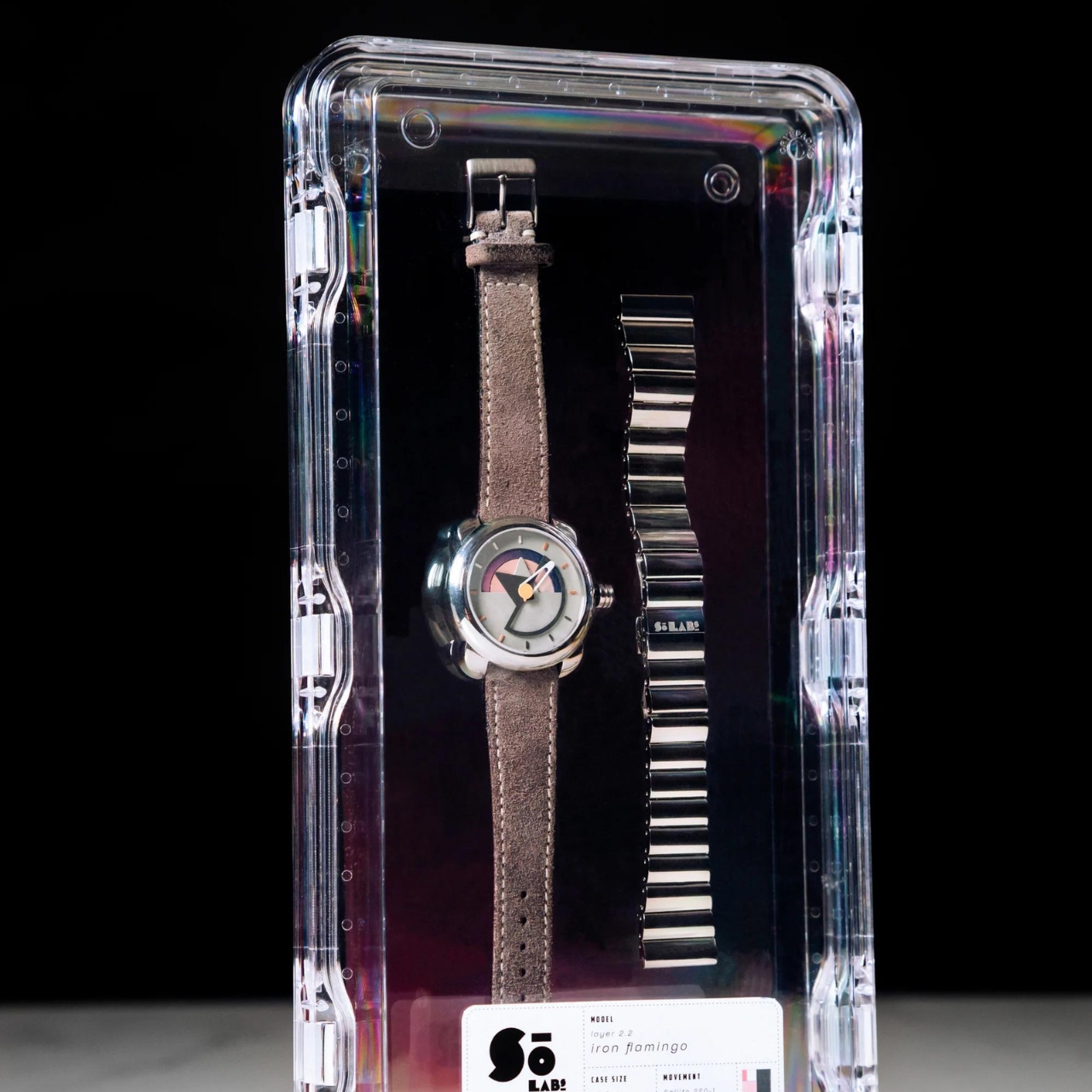
Each of the watches in the Layer 2 collection have 40mm cases and a Swiss SW220-1 automatic movement. They also have a domed sapphire crystal transparent caseback, 20mm lugs, and a 10ATM. You also have the option to switch between the suede and stainless steel strap that comes with each watch. The colors in this collection are more muted compared to Layer 1 but the dials and layers are still pretty interesting.
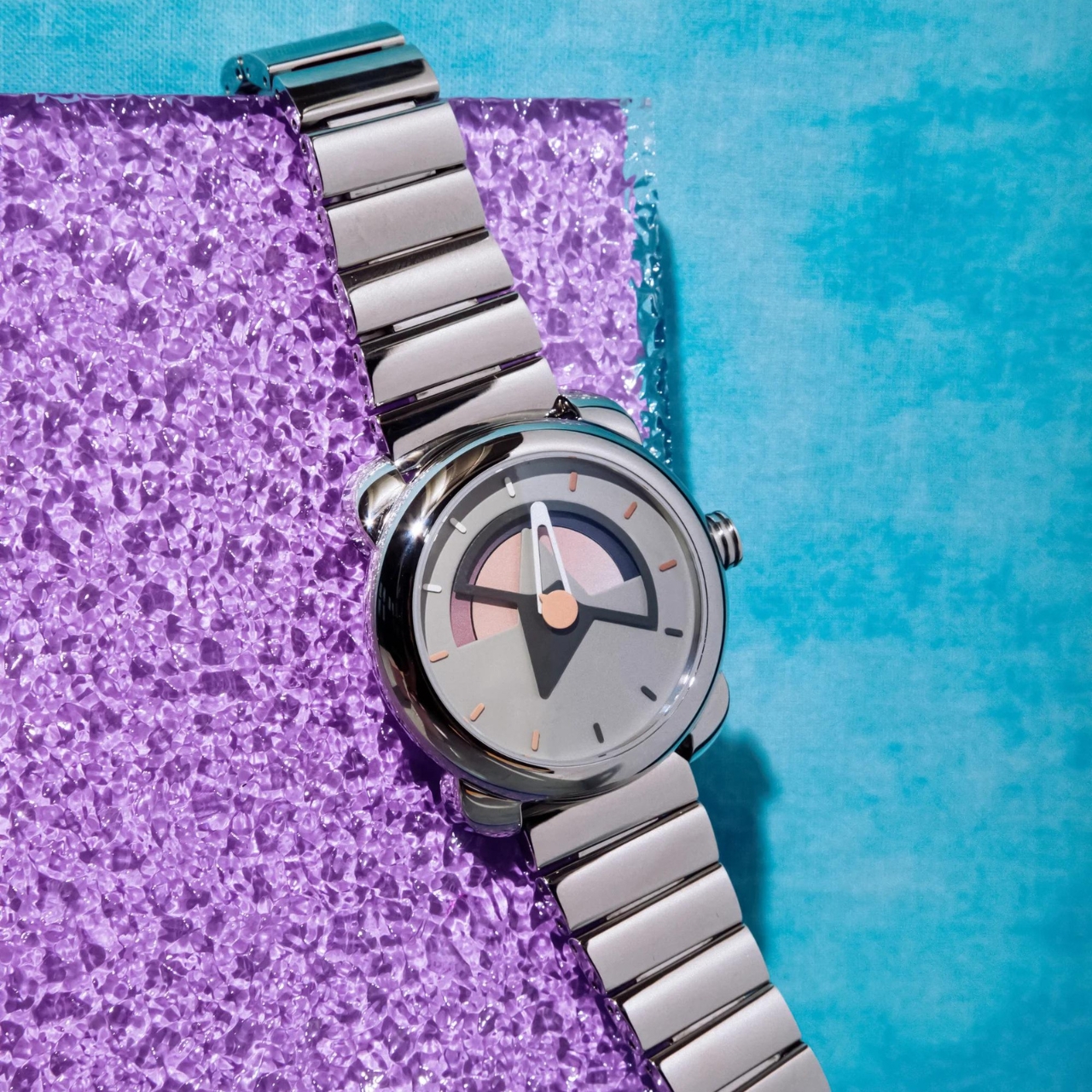
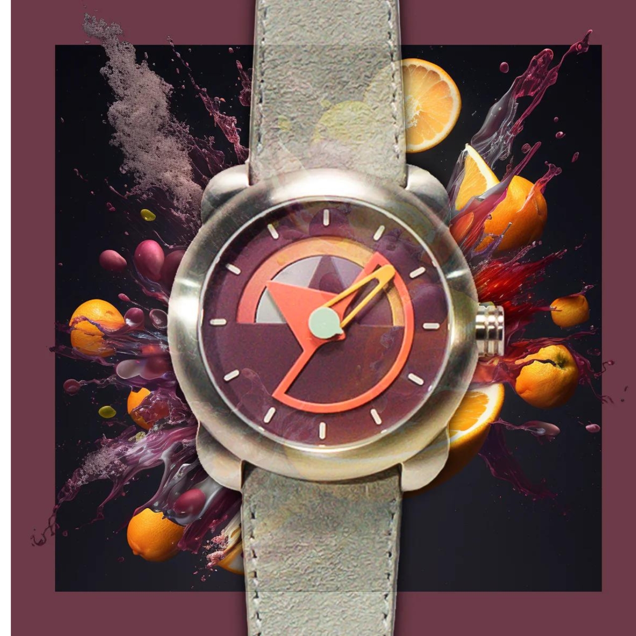
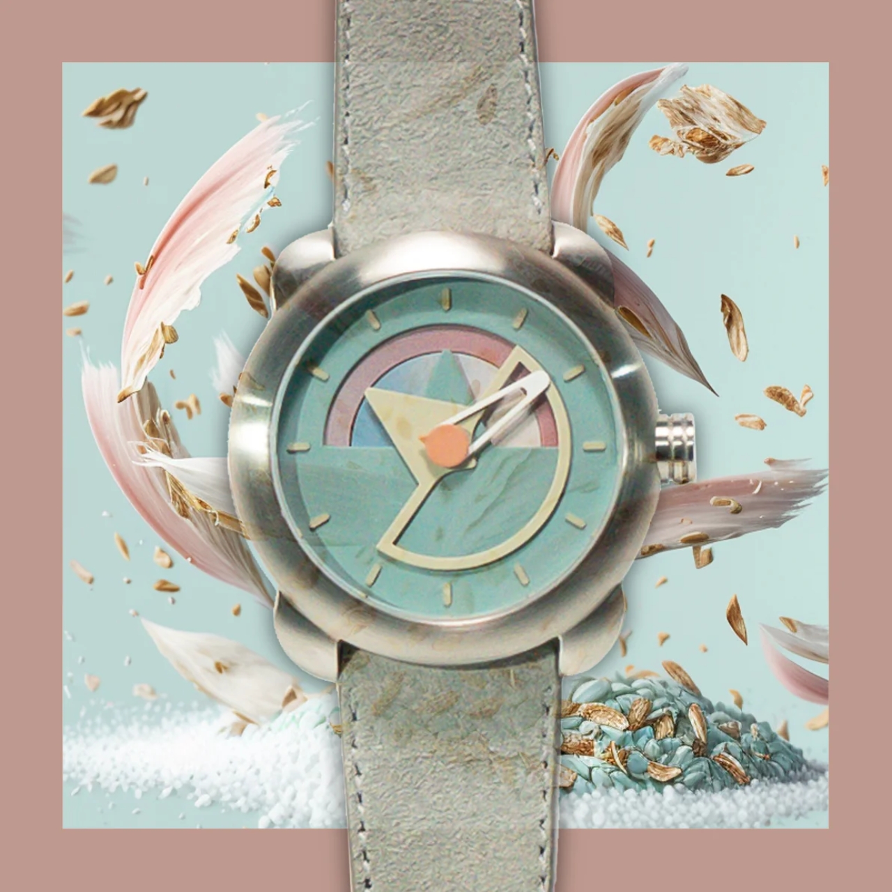
There are five models in the Layer 2 collection: Obsidian Frost, Iron Flamingo, Plum Punch, Charcoal Fog, and Iced Oatmeal. Each of the watches are uniquely numbered so you can also guess that the price tag is pretty hefty compared to other funky designed analog watches. If you’re a collector though, you already expect that limited edition watches are pretty expensive (but maybe worth it as well?)

The post Sō Labs’s Layer 2 collection boasts 217 color combinations with day/date complications first appeared on Yanko Design.