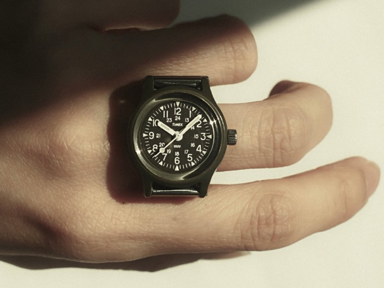
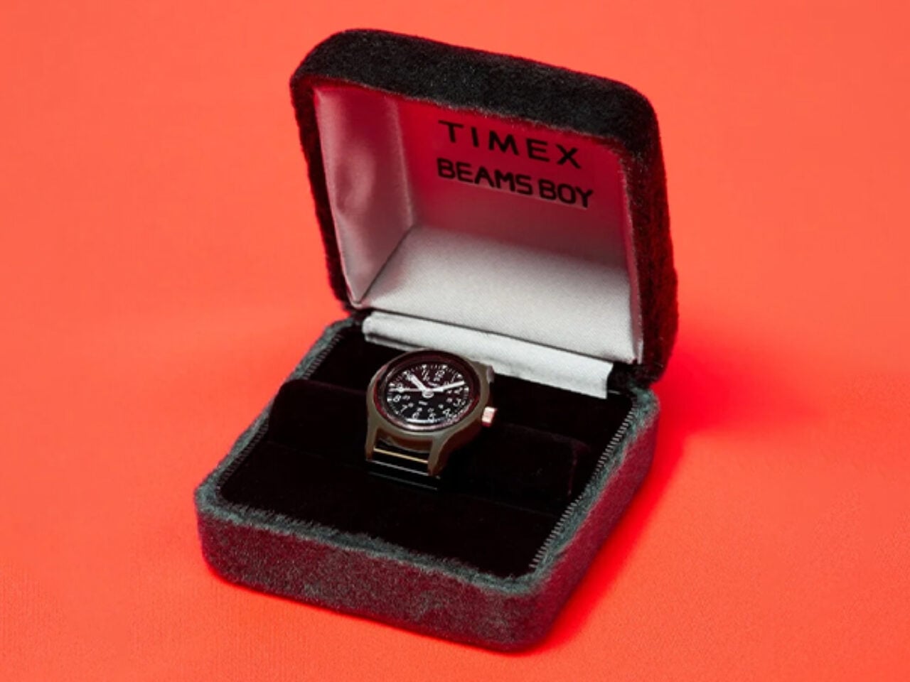
The Timex Camper has been around for decades, earning its reputation as one of those no-nonsense, reliable watches that quietly became a cult item. It’s not flashy. It doesn’t scream at you. It just sits on your wrist doing its job in that honest, military-practical kind of way that a certain type of person finds deeply appealing. So when I first heard that Beams Boy was turning it into a ring, my reaction was somewhere between “wait, really?” and “actually, that makes complete sense.”
Beams, the Japanese retailer that started as a tiny 21-square-meter Americana shop in Harajuku back in 1976, is celebrating its 50th anniversary this year. With nearly 160 locations across Japan today, they’ve spent half a century proving they understand how culture and fashion intersect in ways most brands only dream about. For their anniversary, they didn’t release a standard commemorative watch with a logo on the dial or a velvet box. They took the Timex Camper and redesigned it from a wristwatch into a fully functional ring. It’s a bold, witty, and genuinely surprising idea, and it feels very Beams to pull it off.
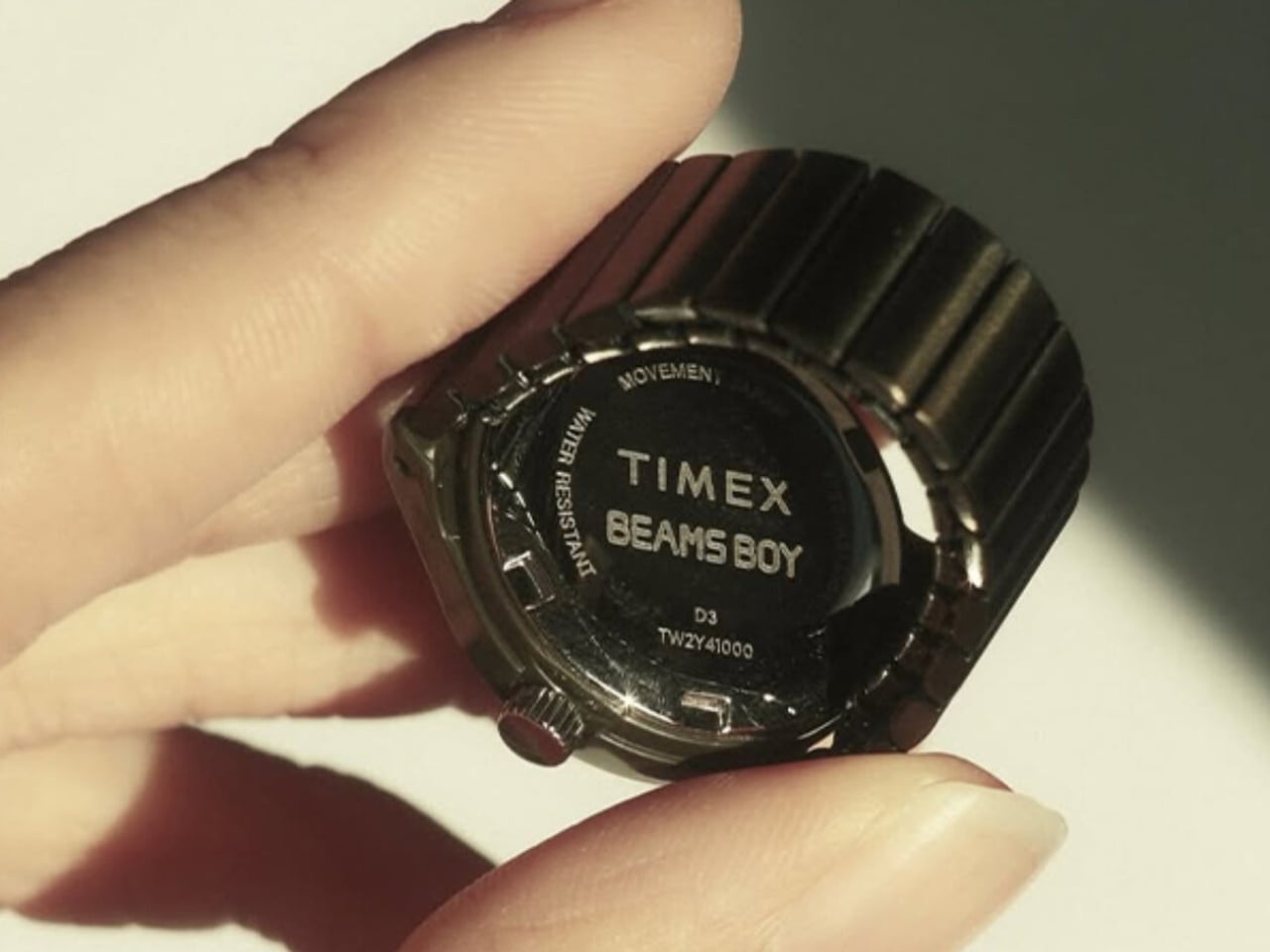
Designers: Timex x Beams
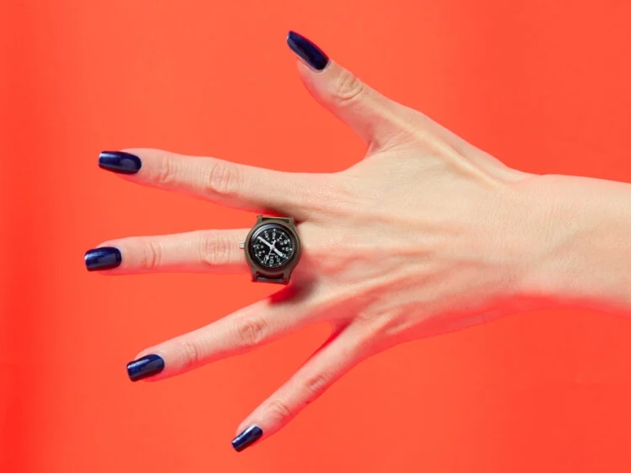
The Beams Boy x Timex Original Camper Ring Watch draws its lineage from two points in history: the 1920s tradition of converting women’s timepieces into jewelry, and the 1990s ring watch trend that briefly made a cult appearance before fading out again. What makes this release feel fresh rather than nostalgic is how it leans into function, not just form. This isn’t a decorative piece masquerading as a watch. It runs on a Japanese quartz three-hand movement, with a crown at the three o’clock position to adjust the time. It is, technically, a fully working watch. Just one you wear on your finger.
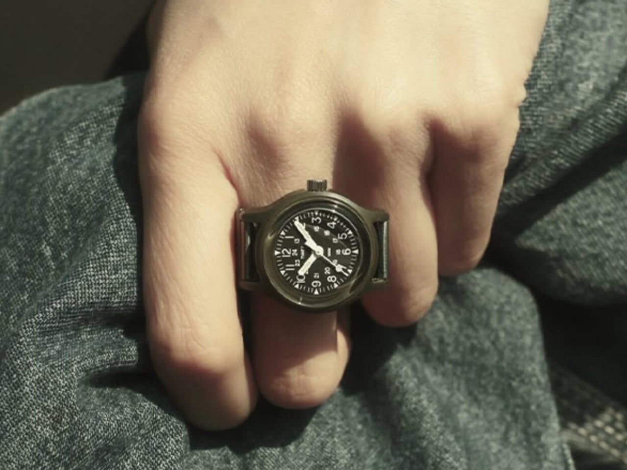
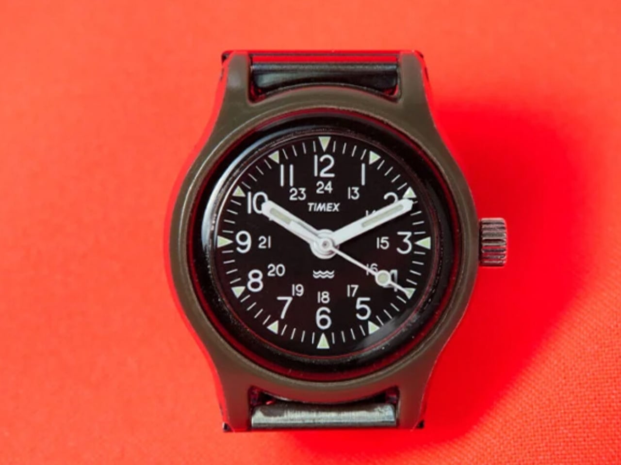
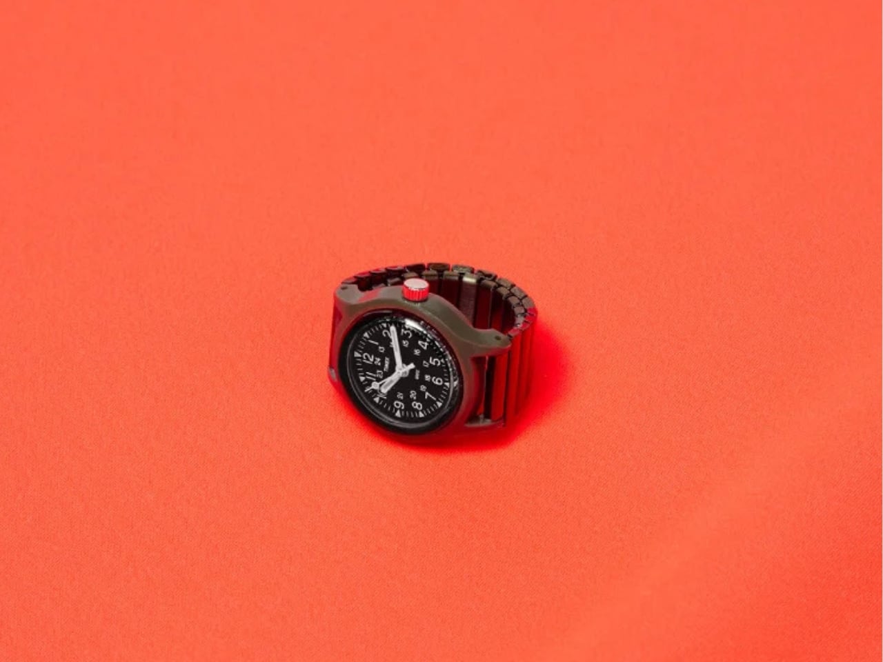
The construction is straightforward and smart. The case is lightweight resin, the crystal is acrylic, and the band is a stainless steel expansion piece that stretches to fit ring sizes 9 through 15. Because the links aren’t removable or adjustable, the flexibility does the work instead, which is practical and eliminates the fussiness of traditional ring sizing. The whole thing comes in a single olive colorway, keeping it in line with the Camper’s military DNA. I’d be lying if I said I didn’t wish for a couple of color options, but the restraint is kind of the point. It’s the Camper. Olive green is the answer.
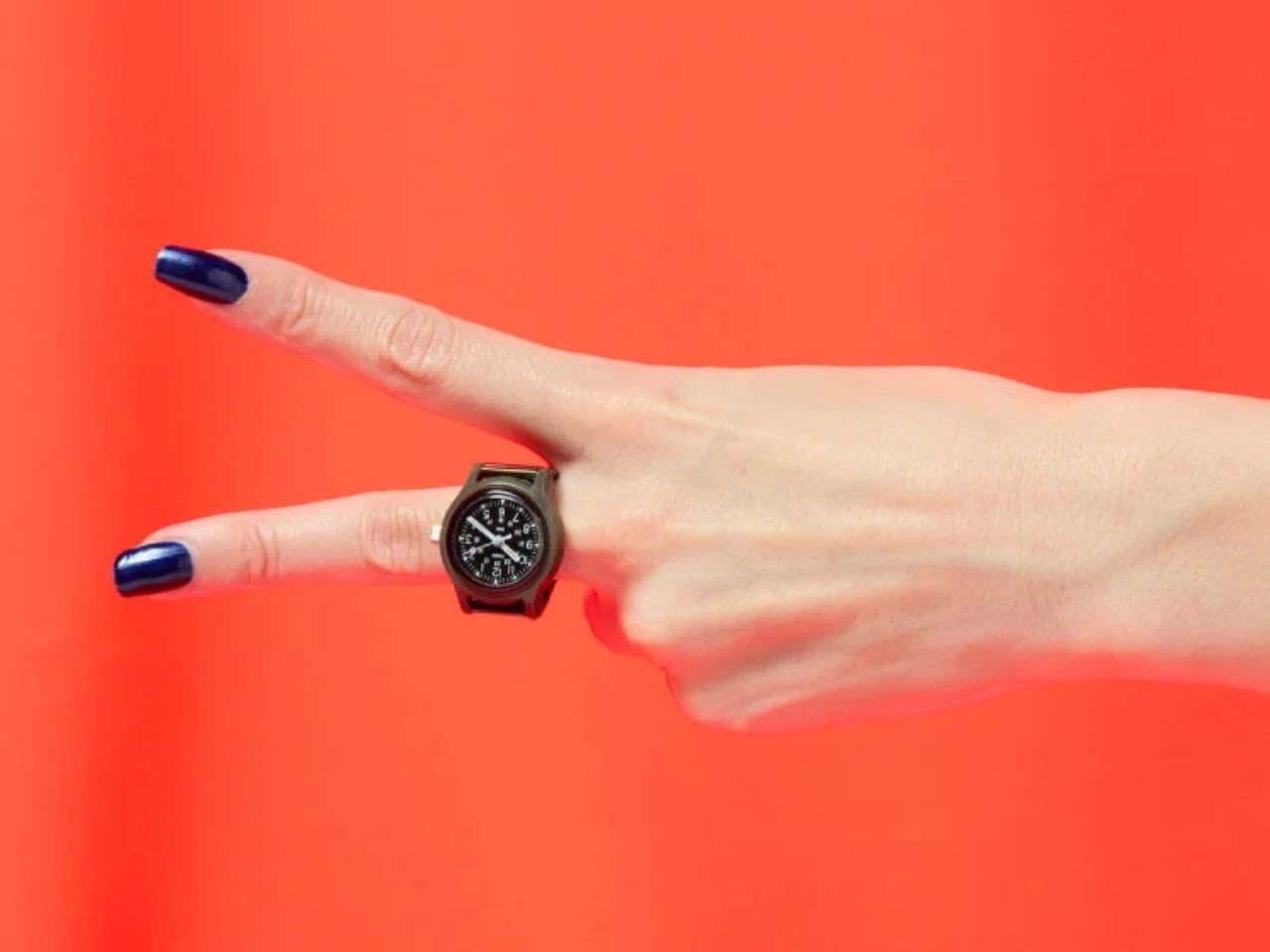
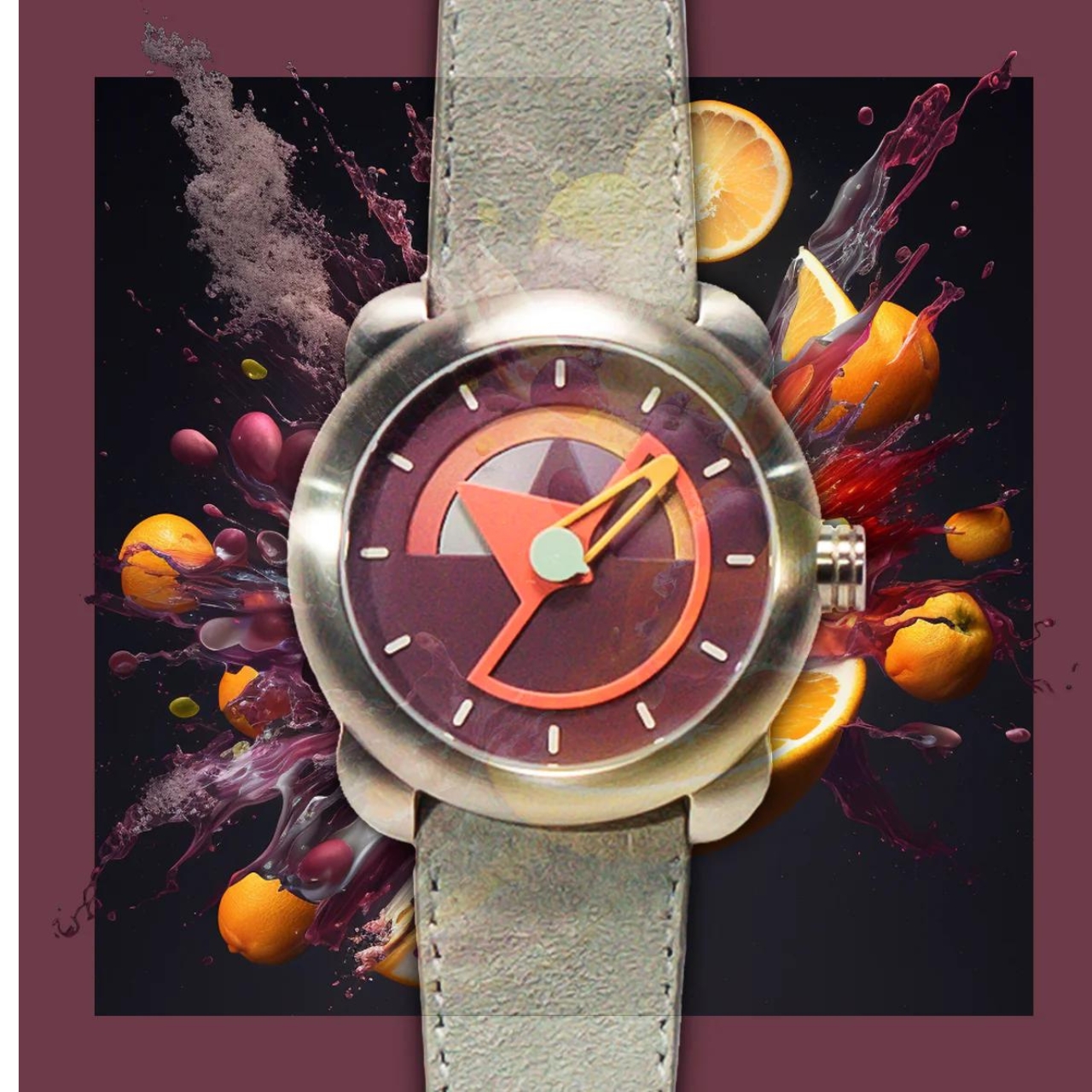
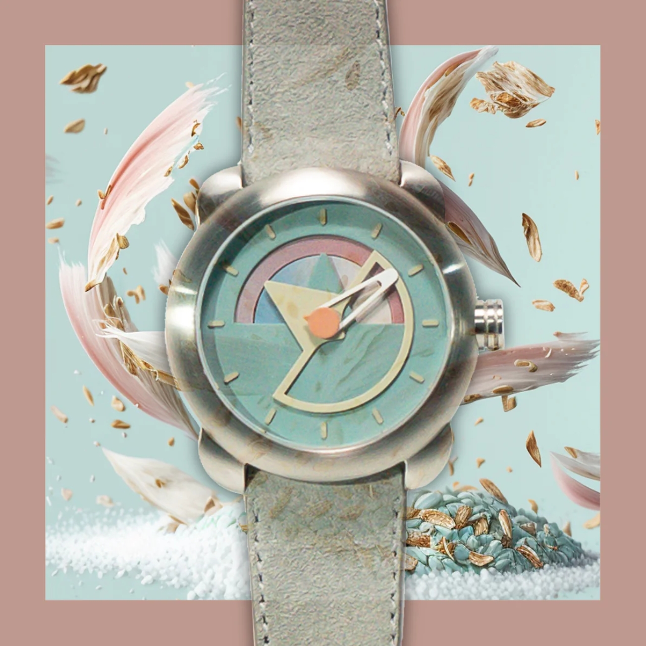
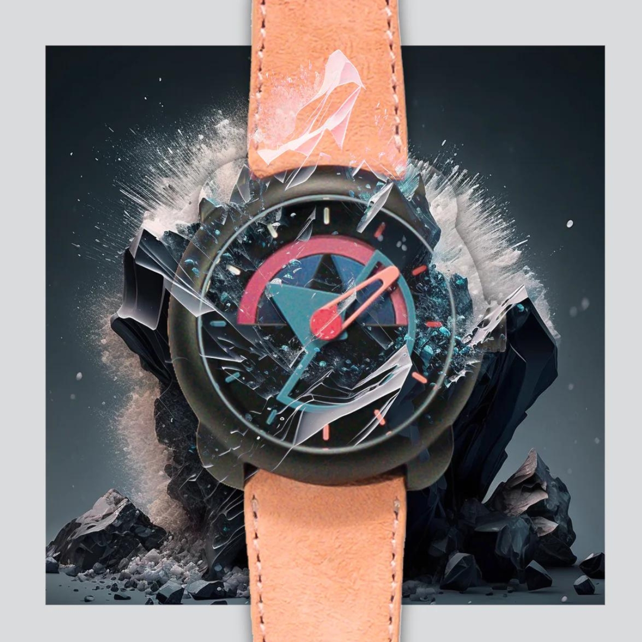
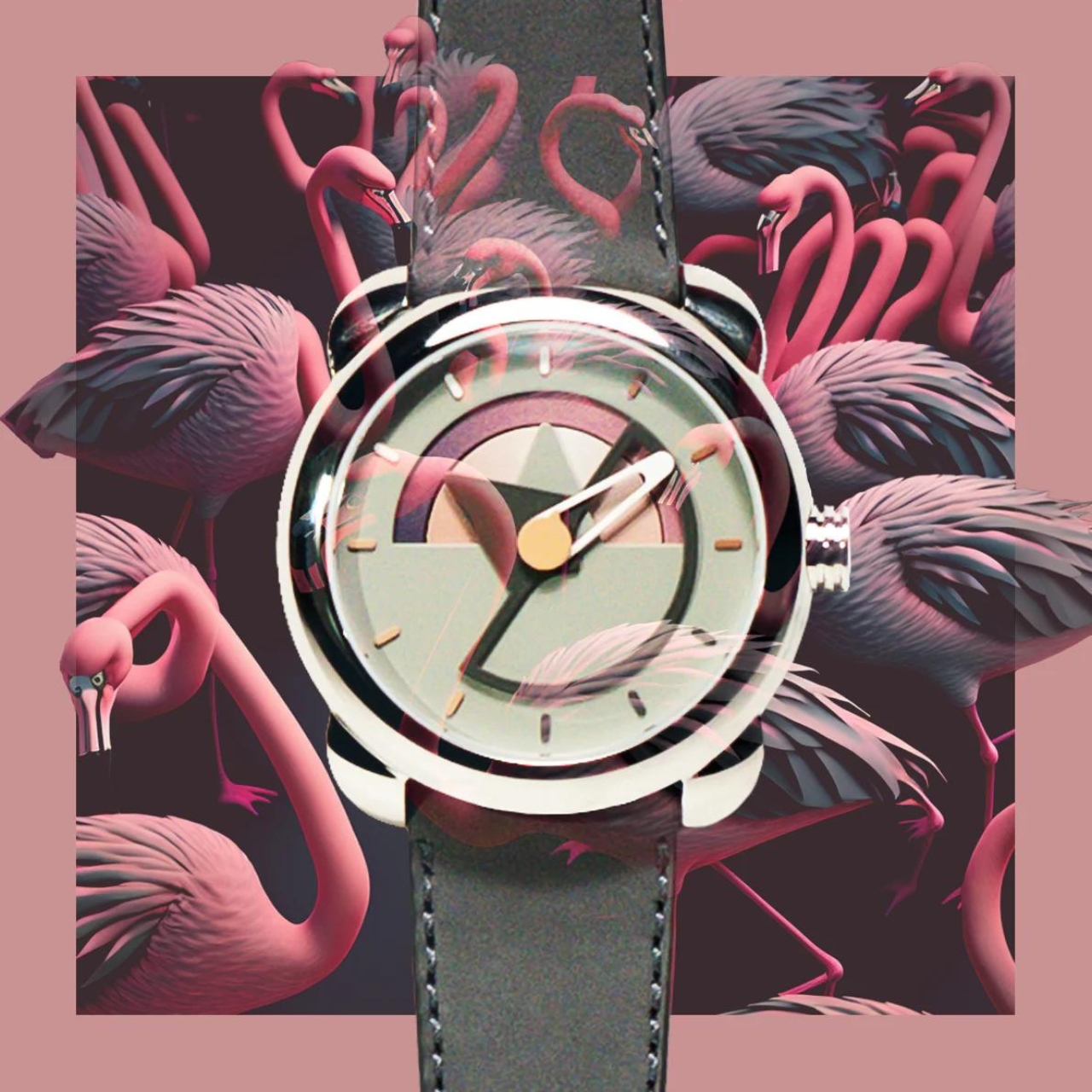
The dial stays true to what made the Camper worth caring about in the first place. Bold numerals, minimal clutter, the kind of face that tells you the time without asking for your attention. Shrinking that down to ring scale could have easily turned it into something illegible or toy-like, but it holds together visually in a way that feels considered rather than cute. The olive resin case doesn’t try to be refined or precious. It’s matte, slightly utilitarian, and completely on-brand for a watch that was never designed to impress anyone at a dinner table.
What I find genuinely interesting is how the expansion band was handled. A nylon strap would have been the more authentic choice given the Camper’s history, but it would have been impractical on a finger. The stainless steel expansion band solves the sizing problem without introducing the kind of visual heaviness that a chunky metal bracelet would have brought. It sits quietly beneath the case, doing its structural job while keeping the focus on the watch face itself. The proportions feel right. Small enough to be a ring, substantial enough to still read as a watch.
Ring watches are quietly gaining traction again, with a few other brands testing the format recently. The format suits a culture that’s increasingly interested in accessories that carry a story and a specific point of view, where what you wear on your hand says something intentional about who you are. A functioning military watch miniaturized into a ring does that in a way that a statement ring or a charm bracelet simply can’t.
The Beams Boy x Timex Camper Ring Watch drops on April 3, 2026, exclusively through Beams, priced at ¥19,140, roughly $120 USD. Whether it makes it outside Japan is still up in the air, which will make the hunt part of the appeal for a lot of people. For a 50th anniversary piece, this is the right kind of creative risk. Not safe, not predictable, but grounded in enough history and craft to earn its existence. That’s exactly the kind of thing worth paying attention to.
The post Beams Just Turned the $120 Timex Camper Into a Ring Watch first appeared on Yanko Design.


 , brushed and polished