
How to use AirPods to control your iPhone camera
You can use your AirPods as a remote control for your iPhone's camera. Here's how.


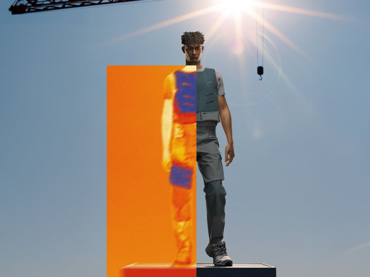
The numbers are hard to ignore. More than 2.4 billion workers are exposed to excessive heat globally, and according to the WHO and WMO, worker productivity drops by 2 to 3 percent for every degree above 20°C. In 2023 alone, high temperatures contributed to an estimated 28,000 workplace injuries in the United States. Yet very little of this conversation gets directed at the people who feel it most: those working outdoors, in the sun, in gear that was never designed to help them stay cool.
That’s what makes Teron°, a cooling workwear concept by German design graduate Jorin Frenzel, feel so refreshingly grounded. Frenzel, who completed his Bachelor of Arts in Product Design at Hochschule Hannover in early 2025, didn’t reach for a tech-heavy solution. No battery packs, no wearable air conditioning units, no app to pair it with. He went back to basics: evaporation.
Designer: Jorin Frenzel
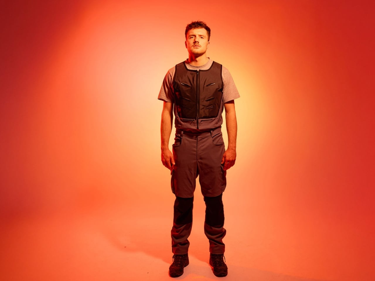
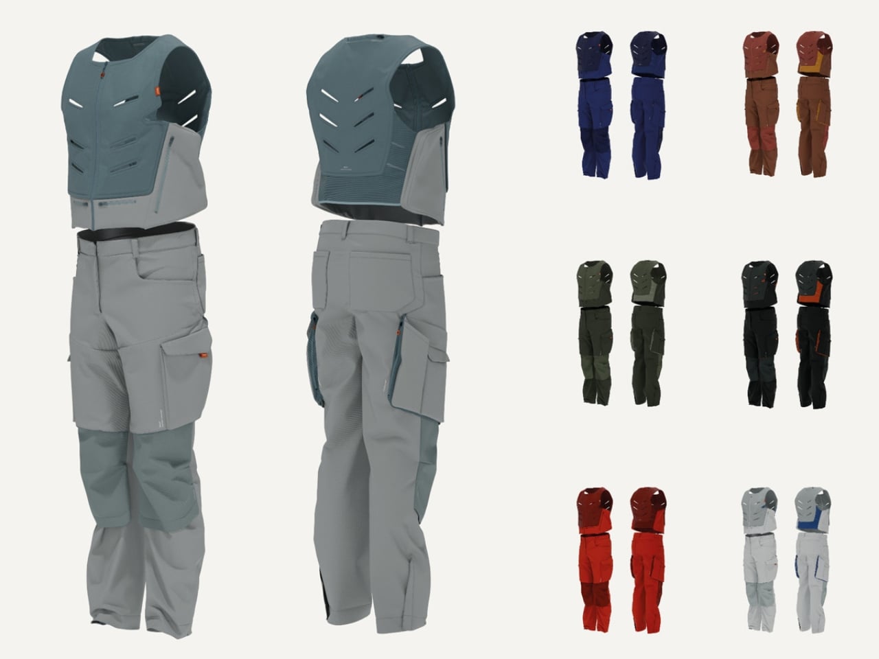
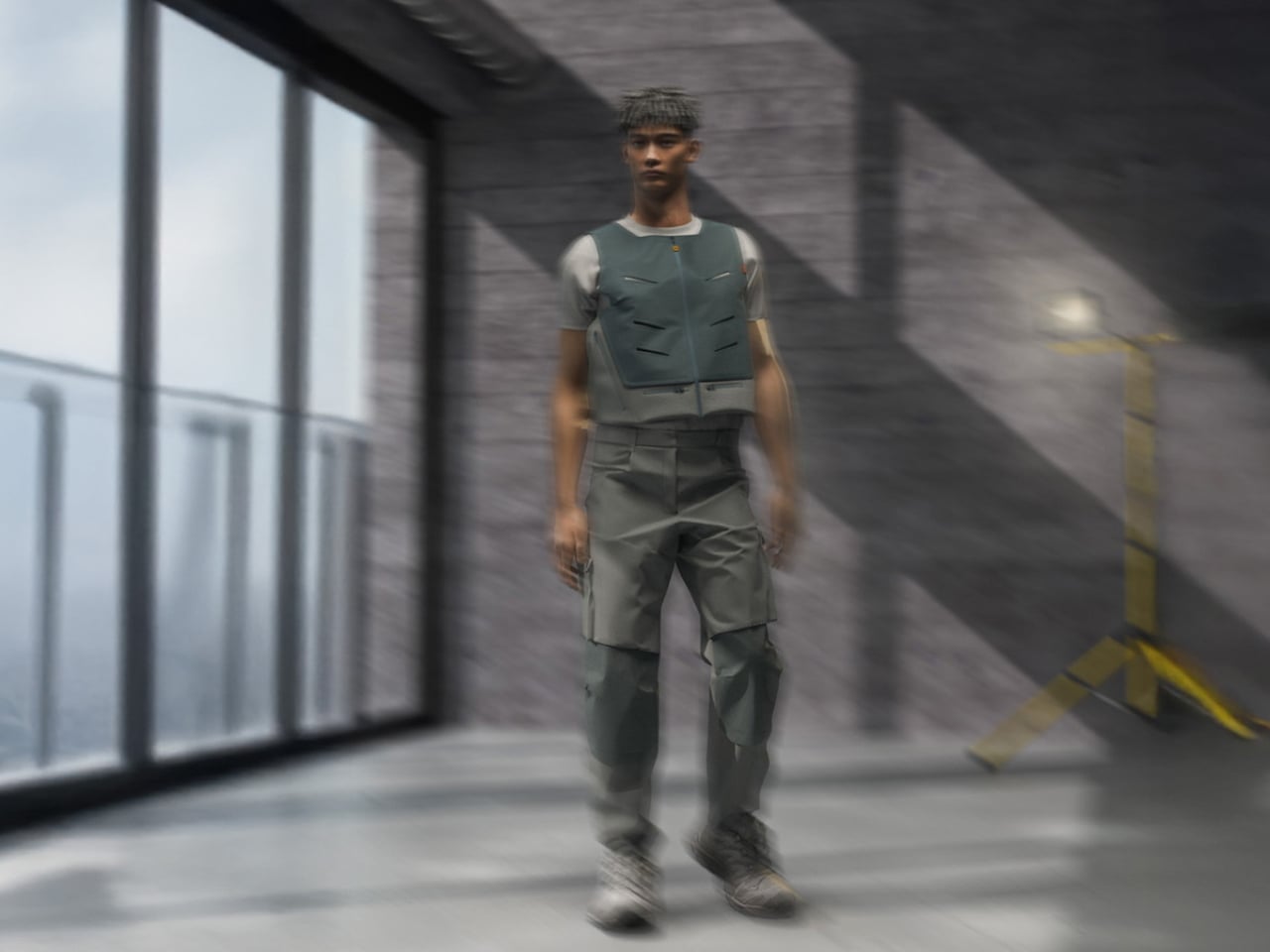
Teron° is built around the principle of natural evaporative cooling, using breathable fabrics, hidden ventilation layers, and targeted cooling zones to keep workers comfortable without introducing direct moisture to the skin. The vest, which handles upper body cooling, uses integrated elements that activate through water evaporation while keeping the wearer completely dry. The trousers take a different approach, using an overlapping cut to enhance air circulation, with additional cooling elements at the thighs to address heat where it tends to build most. The whole system prioritizes freedom of movement, which matters a lot when you’re on a construction site and actually need to get things done.

There’s a quiet intelligence to the design. Frenzel didn’t try to reinvent the trades. He listened to what craftspeople actually deal with on the job and responded with a garment that slots into existing routines rather than disrupting them. Cleverly integrated storage, breathable materials, and a sporty silhouette that communicates confidence and function without looking like a science experiment. The design conveys strength, which turns out to matter quite a bit when you’re asking tradespeople to adopt something new. That’s a layer of thinking most student projects simply don’t get to.
The timing of Teron° is not incidental. The WHO and WMO issued a joint report in August 2025 calling out occupational heat stress as a growing global health crisis, one no longer confined to equatorial regions. Europe has been having its own reckoning with this. Earlier in 2025, the death of a Spanish street cleaner from acute heat stress became a rallying point in conversations about how poorly equipped many outdoor workers still are. Design alone can’t solve climate change, but it can help close the gap between the conditions people work in and the gear they’re given to do it.

What elevates Teron° beyond a clever school project is its commitment to longevity. The garment uses durable, repairable textiles that extend its useful life and reduce waste over time. That puts it squarely in conversation with what responsible design looks like right now: not just functional and attractive, but genuinely built to last. It isn’t about making something sleek and disposable. It’s about making something that earns its place in a worker’s daily kit, season after season.

Teron° was recognized by the Green Product Award and featured among the German Design Graduates class of 2025, which is meaningful recognition for a debut project. But more than any award, what strikes me about Frenzel’s work is the clarity of its intent. He identified a real, pressing problem affecting millions of people and answered it with a solution rooted in material intelligence and plain human dignity.
The design world has a habit of celebrating the spectacular, the provocative, and the conceptually avant-garde. Projects like Teron° remind us that the most pressing problems don’t always need the most theatrical answers. Sometimes the most meaningful thing a designer can do is pay attention to who’s struggling and ask one simple, serious question: what would actually help? Frenzel asked it. The answer is worth wearing.
The post No Battery, No Tech: A Grad Just Solved Outdoor Worker Heat Stress first appeared on Yanko Design.
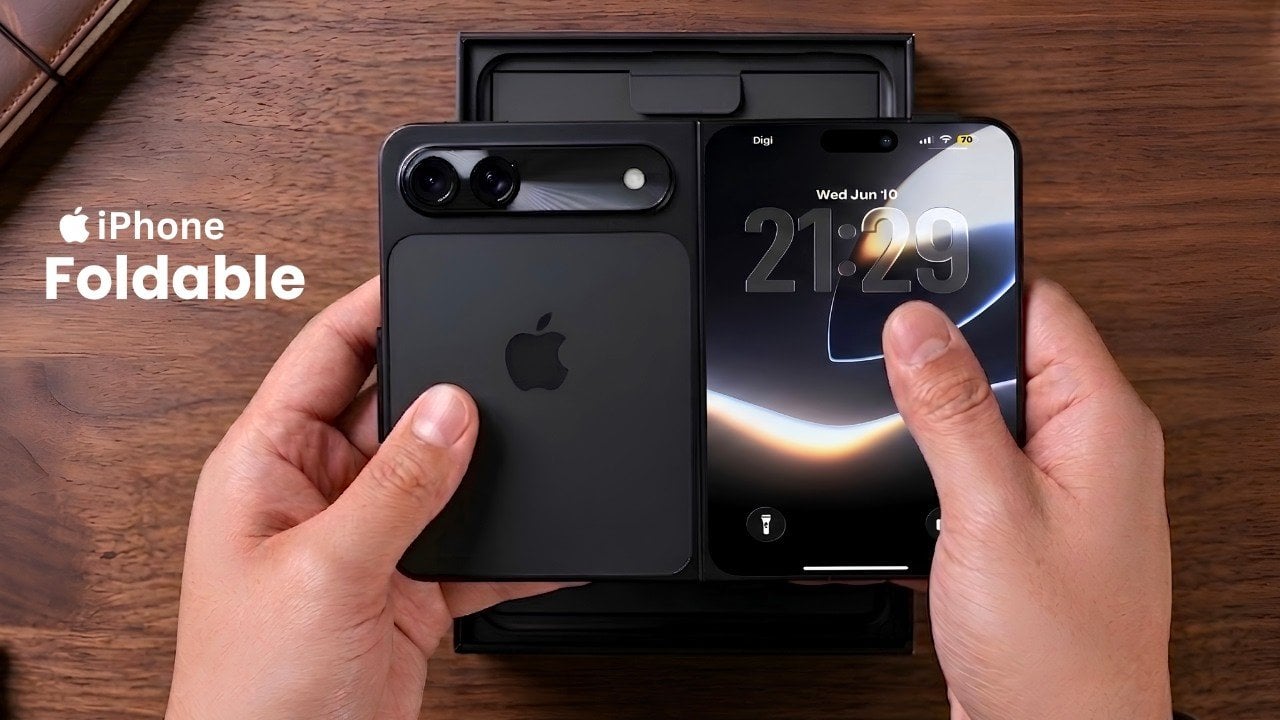
Apple’s long-awaited entry into the foldable smartphone market is generating significant buzz, with leaked images and dummy models of the rumored iPhone Fold Ultra offering a glimpse into what could be a new device. Expected to launch alongside the iPhone 18 series, this foldable iPhone is poised to combine Apple’s hallmark design philosophy with innovative […]
The post See the First Hands-on Video of the iPhone Fold Ultra appeared first on Geeky Gadgets.


When details leaked about Samsung’s rumored Galaxy Z Roll 5G, the mobile world focused on the jaw-dropping numbers: a massive 12.4-inch expandable screen, a 324-megapixel camera, and a cutting-edge Snapdragon 8 Elite Gen 6 Pro chipset. It promises to solve the single biggest complaint of the foldable era—the persistent screen crease—by using a motorized scrolling […]
The post Beyond the Crease: The Real Engineering Hurdles Facing The Samsung Galaxy Z Roll 5G appeared first on Geeky Gadgets.
The RingConn Gen 3 smart ring has positioned itself as a standout wearable in 2026, offering a blend of advanced health tracking and user-friendly design. Tinker Forward’s detailed review highlights features like vascular monitoring, which provides insights into cardiovascular health by analyzing blood circulation trends over time. This focus on long-term health patterns, rather than […]
The post Everything You Need to Know About the RingConn Gen 3 Smart Ring appeared first on Geeky Gadgets.
The car industry rarely slows down, but every so often a stretch of weeks produces designs so distinct from each other that you wonder if the brief was simply “surprise us.” That’s exactly what’s been happening this season. From a retro-coded open-air speedster to an arcade-themed Rolls-Royce, the range on display right now is genuinely startling. Five designs in particular have made the strongest case for why automotive design still matters.
These aren’t trade show fillers or routine refreshes. They represent five different philosophies about what a car can be, and each one challenges something the industry has taken for granted. One reimagines the pit stop entirely. Another builds an off-roader with 37-inch tires and zero touchscreens. One is a rolling fortress with 850 horsepower. Together, they map a season of car design that swings between pure spectacle and serious intent.
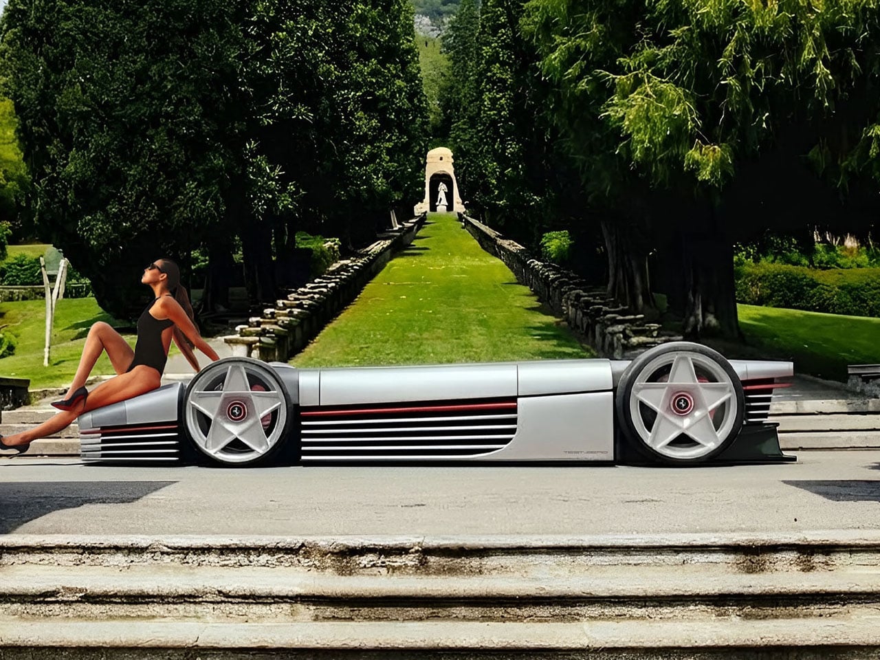
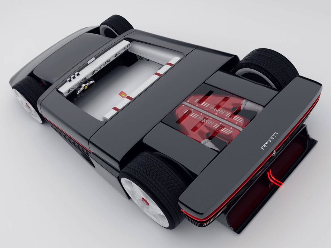
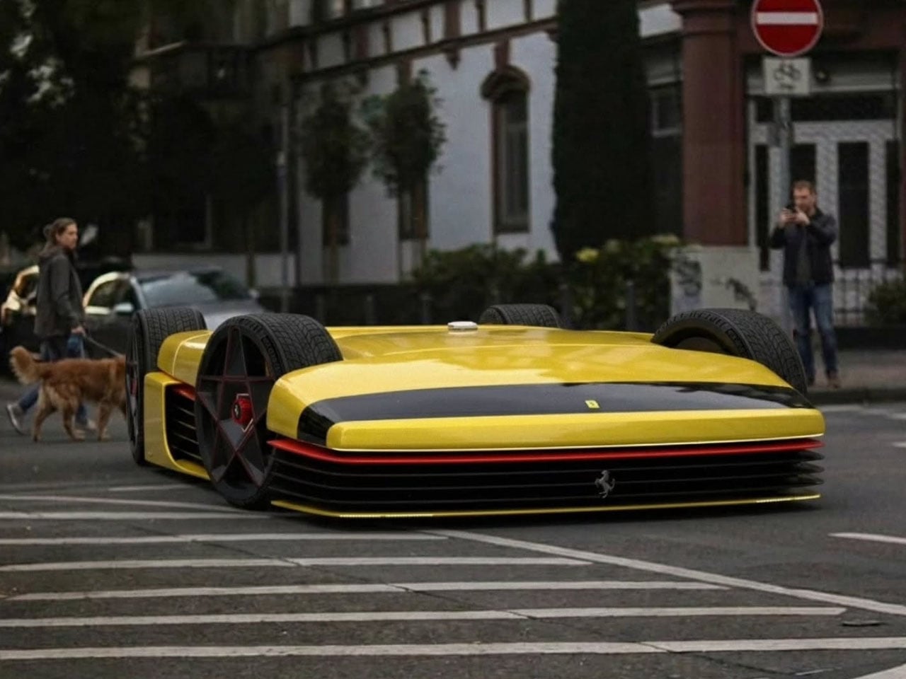
The TESTaZERO is a Ferrari-inspired concept that strips the formula down to something dangerously pure. Designed as an open-air speedster with retro Maranello cues baked into every panel, it draws a direct line back to the raw, unbothered spirit of Ferrari’s classic roadsters. Wide haunches, a minimal cabin, and a deliberate absence of the usual visual clutter give it a presence that feels earned rather than engineered. Ferrari’s own all-electric Luce — the brand’s first fully electric production car — now has something worth worrying about in the concept conversation.
What makes the TESTaZERO so compelling is precisely what it removes. Bulky body panels are gone, leaving a taut, exposed silhouette that reads closer to a concept sketch than a production vehicle. The driving position sits low, the windscreen barely there, and the entire philosophy points toward wind, noise, and sensation rather than comfort or insulation. It’s a design that asks a pointed question about the EV era: does a Ferrari-coded electric speedster need to be grand and imposing, or can it be small, immediate, and entirely its own thing?
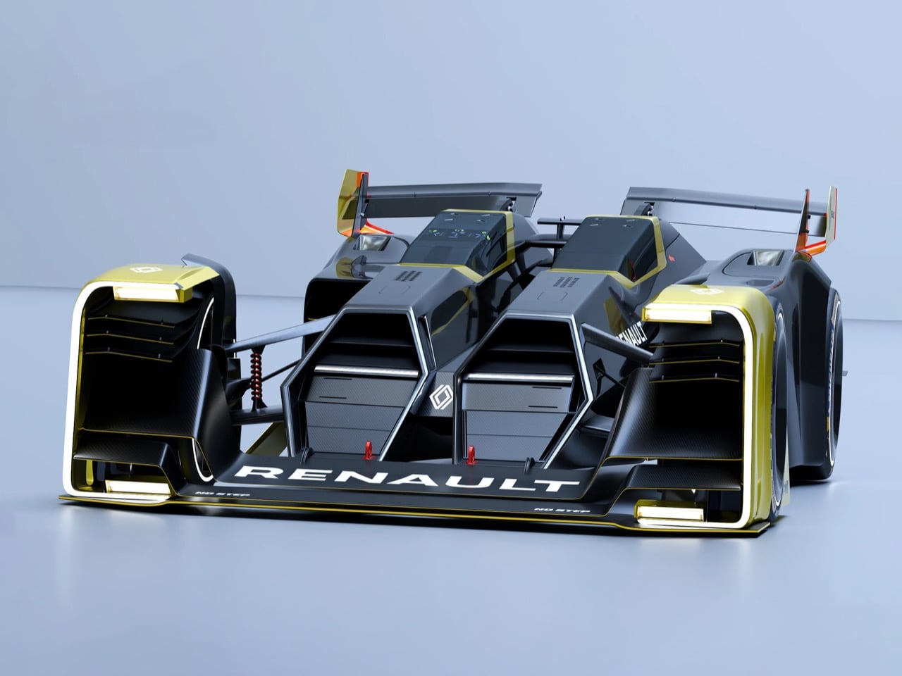
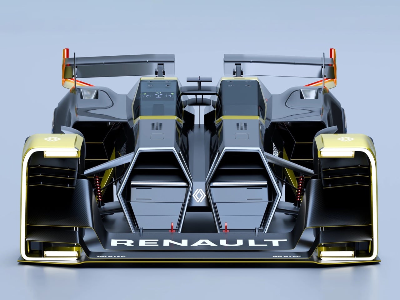
The Double Barrel is the work of designer Taejung Kim, and it treats the 2040 Le Mans pit stop as a design problem rather than a race strategy issue. The core idea is genuinely radical: instead of refueling or swapping tires, the car hot-swaps its entire driver cockpit and hydrogen powertrain as two completely self-contained pods. A central carbon monocoque spine connects them, handling structural loads and aerodynamic surfaces simultaneously. The result is a twin-fuselage racer that looks like nothing else currently operating in the hypercar conversation.
Inspired by the mechanics of a double-barrel shotgun and the 1955 Nardi Giannini, Kim’s rendering projects endurance racing firmly into a zero-emission future. Every surface, vent, and wing exists purely to serve track performance, entirely free from road regulation compromise. What makes it memorable beyond the swap-pod logic is that the twin-fuselage form justifies itself visually without needing any explanation. It doesn’t read as a thought experiment dressed up in render form. It reads like something that could genuinely appear on a Le Mans starting grid in fourteen years and win.
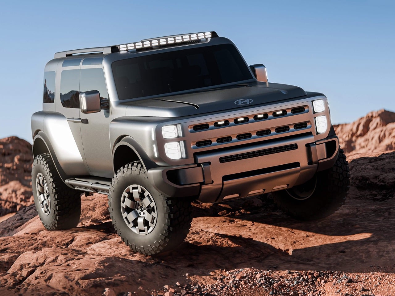
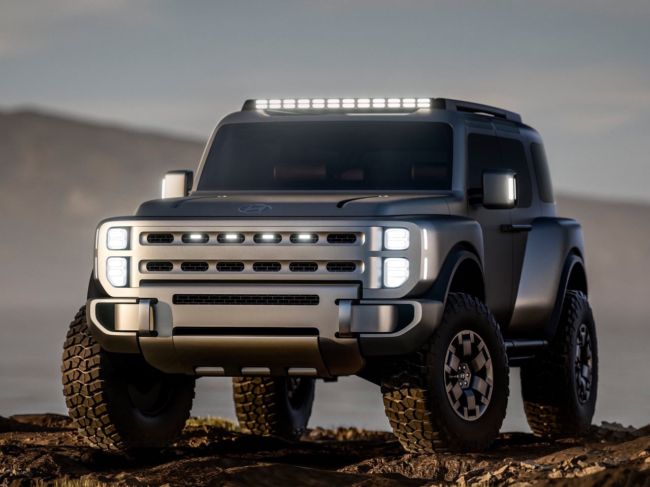
The Boulder is the concept Hyundai needed to make. Body-on-frame construction, 37-inch mud-terrain tires, coach-style rear doors, dual safari windows, a double-hinged tailgate that opens from either side, and a Liquid Titanium finish: every decision signals a genuine off-roader built on Hyundai’s “Art of Steel” design philosophy rather than a crossover with lifted suspension. The machined, sculptural quality of the exterior communicates real capability without resorting to theatrical add-ons. This isn’t Hyundai imitating Jeep or Land Cruiser. It’s Hyundai arriving in the off-road segment with its own considered language.
Debuted at the New York International Auto Show and designed, developed, and set to be assembled in America, the Boulder is more than a design study. It previews Hyundai’s first body-on-frame pickup truck, due by 2029, and confirms the brand’s intent to compete directly with Jeep and Toyota for buyers who take their vehicles well beyond the pavement. Stripping back digital touch interfaces in favor of mechanical clarity is a deliberate and confident design statement, and one that should resonate with the off-road community’s increasingly analog-minded values.
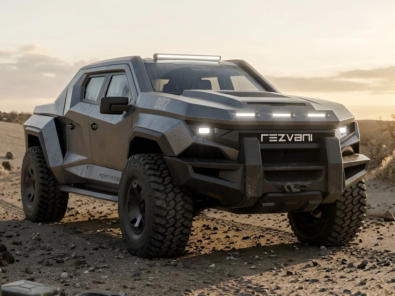
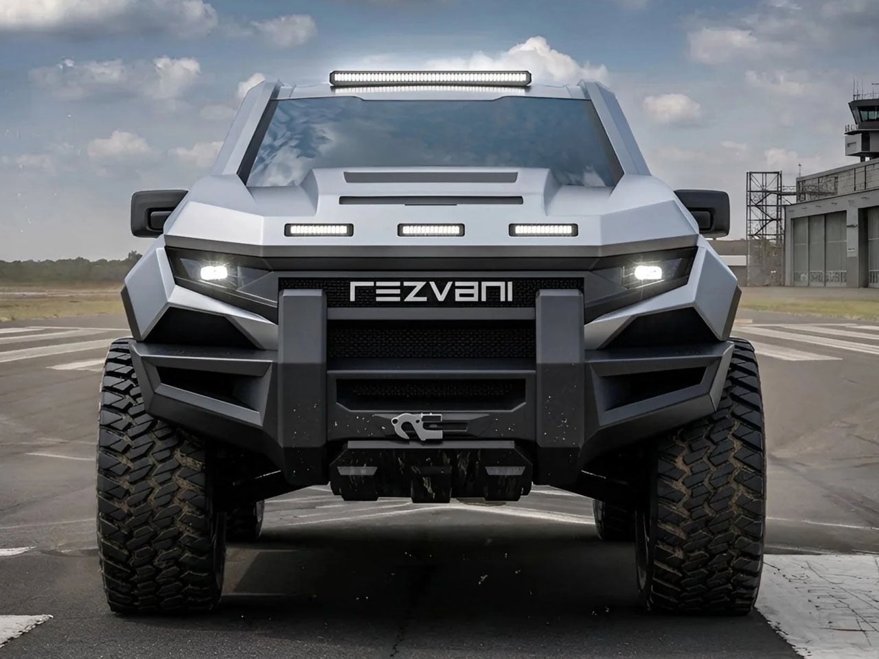
The Rezvani Fortress starts where the Ford F-150 Raptor finishes and proceeds in an entirely different direction. Reinforced steel bumpers, wide-body fender extensions, hood heat extractors, roof-mounted auxiliary lighting, and bulletproof glass come standard. The optional Security Survival Pack goes further still: military-grade gas masks, a hypothermia kit, a pepper spray dispenser mounted on the exterior, and an EMP protector. Power goes up to a 5.2-liter V8 producing 850 horsepower, with Fox suspension and four-wheel drive standard across the entire range.
Limited to 100 units and priced from $285,000 with a $500 refundable deposit to secure a build slot, the Fortress is Rezvani at its most committed. The exterior transformation is total: none of the original F-150 Raptor’s styling survives, replaced by a tank-like body that sits closer to a military convoy than any civilian road truck. Ten seat styles and color options give the interior some unexpected latitude. The result, as Rezvani puts it, is a tactical off-road truck that can handle city streets and terrain no other truck would even attempt.
![]()
The Black Badge Ghost Gamer is a one-off Bespoke commission built for a tech entrepreneur with a deep passion for early arcade culture. Rolls-Royce finished the car in a two-tone of Salamanca Blue and Crystal over Diamond Black, a pairing that deliberately echoes the neon-lit, super-metallic hardware of classic arcade cabinets. The exterior carries a hand-painted ‘Cheeky Alien’ 8-bit coachline motif designed exclusively for this commission. The overall effect is restrained provocation: a luxury car that has decided, with complete sincerity, that it no longer needs to take itself seriously.
Inside, every surface rewards closer inspection. The ‘Pixel Blaster’ Starlight Headliner is custom-programmed to simulate laser fire, each seat carries embroidery from ‘Player One’ through ‘Player Four,’ and illuminated tread plates display Press Start, Insert Coin, and Level Up in 8-bit lettering. Hidden Easter eggs are scattered throughout the entire cabin, and discovering each one functions, as intended, as a game in itself. The Ghost Gamer is the first Bespoke Rolls-Royce commission ever inspired by gaming culture, signaling just how seriously ultra-luxury clientele now collect the history of play.
What ties these five designs together is that none of them are playing it safe. Whether it’s a stripped-back speedster challenging Ferrari’s own electric flagship, a hydrogen hypercar that rethinks the Le Mans pit stop, or an arcade-coded Rolls-Royce that treats its cabin as an immersive game, each one commits fully to its own logic. That kind of conviction, uncompromised and unhurried, is what makes automotive design worth paying attention to.
Not all of them will reach a showroom. The TESTaZERO and the Double Barrel exist as arguments rather than products, and the Ghost Gamer will live in one garage for the rest of its life. The Boulder and the Fortress are real, in different ways, but the conversation each one starts is the same: what should a car actually stand for? In 2026, the most interesting designers are asking that question louder than ever.
The post The 5 Best Automotive Designs of June 2026 first appeared on Yanko Design.