Forget bulky Leathermans, this minimalist Pockitrod multitool pen is built for modern EDC

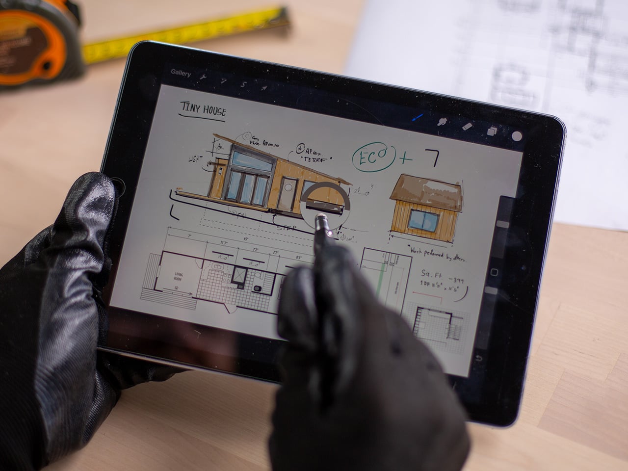
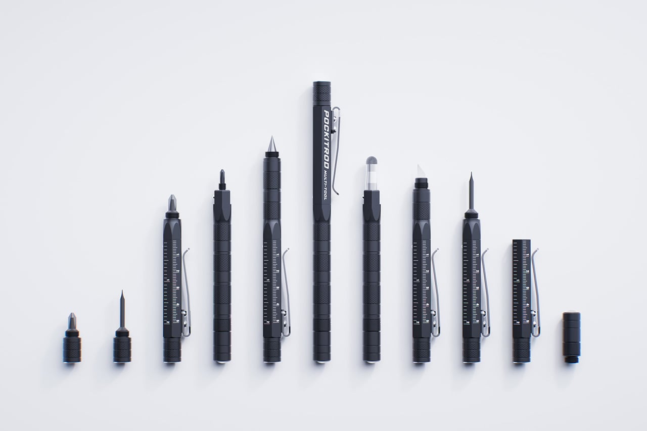
The Pockitrod multitool is a compelling take on this idea, using its pen-like form as the foundation for a deeply modular system. Its main body, machined from 6061-T4 aluminum, has a hex shape for better grip when used as a driver, a subtle but practical detail. The tool is organized around a central driver assembly housed within the handle, while additional modules such as , a box opener with interchangeable 20CV steel tips, an inkless writing implement and a magnetic-base LED flashlight can be threaded on as extensions. In doing so, it respects the classic pen form factor while fundamentally expanding its purpose. Subtle etched measurement markings along the body function as a built-in ruler, with a zero-reference aligned to the edge for more practical, real-world measuring.

What really makes this system work is the execution of the modular connections. Each component threads together, secured by precision-fitted O-rings that provide a smooth, friction-based fit. This is a critical detail because it prevents the tool from feeling like a wobbly collection of parts in use, maintaining a cohesive and solid feel in hand.. The anodized finish on the aluminum body adds wear and corrosion resistance, so it should hold up to being tossed in a pocket with keys. At 170mm long and weighing just 50 grams, it maintains that pen-like portability while feeling substantial enough for actual work.

Designer: Clinton Brassington (Converge Multi-Tools)

Click Here to Buy Now: $99 $133 (26% off). Hurry, only 107/120 left!
What really makes this system work is the execution of the modular connections. Each component threads together, secured by precision-fitted O-rings that provide a smooth, friction-based fit. This is a critical detail because it prevents the tool from feeling like a wobbly collection of parts in use, maintaining a cohesive and solid feel in hand.. The anodized finish on the aluminum body adds wear and corrosion resistance, so it should hold up to being tossed in a pocket with keys. At 170mm long and weighing just 50 grams, it maintains that pen-like portability while feeling substantial enough for actual work.

At its core, the Pockitrod is built around a solid driver system, with an integrated stylus and a concealed precision screwdriver tip for working with small fasteners. The main 1/4″ hex driver features a spring-loaded locking mechanism to keep the bit holder firmly engaged with the handle, eliminating the play that plagues many compact multitools, and comes fitted with a 6150 CRV PH2 bit. The Pockitrod also includes a mini 1/4″ driver for reaching into tight spaces. Both drivers accept standard ¼” bits, with the mini driver housing an internal spare, a long-shank SL3 bit for accessing deep recessed or hard-to-reach fasteners. It’s a thoughtful detail for anyone who frequently switches between tasks without wanting to carry extra loose bits.
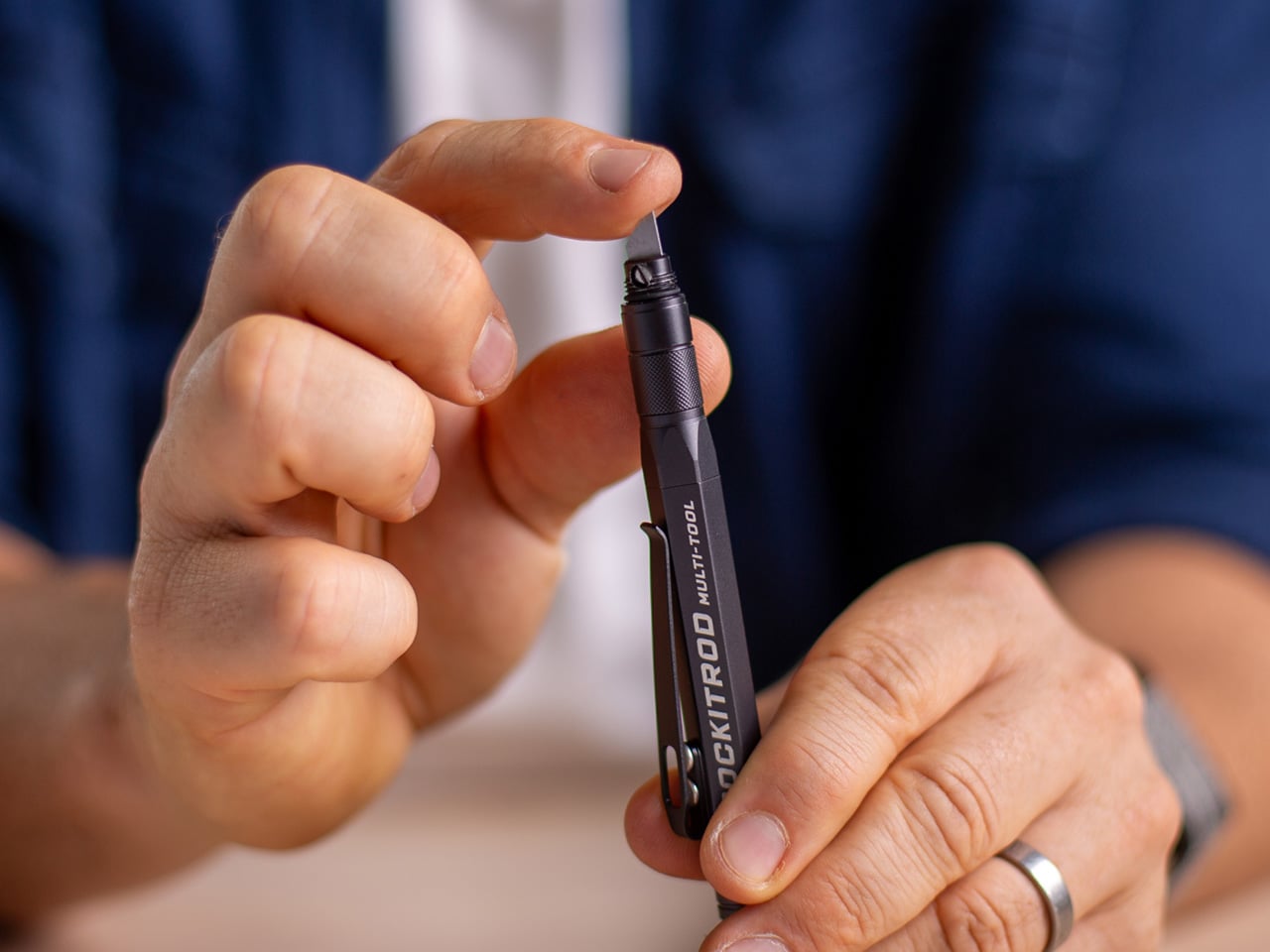
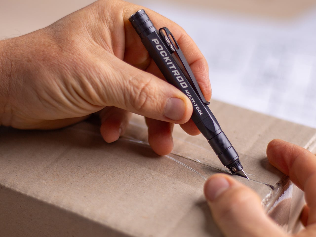
Beyond the drivers, the tool selection is pure EDC perfection. The inkless writing tip, made from a graphite compound, is a practical choice that will never dry out or leak, and it’s paired with a conductive fiber stylus tip for touchscreen use. For cutting tasks, the box opener module uses replaceable tips made from 20CV steel, a high-end choice known for excellent edge retention. Converge offers several tip styles, including a bladeless version for safety, a standard utility tip, and a scraper, which adds a layer of compliance for different workplace regulations.

The utility is further expanded by a detachable LED flashlight module. It’s a compact LED light intended for close-range task lighting, ideal for quick inspections or low-light work. The clever part is its magnetic base, which allows it to be used independently as a small work light. It can also be mounted to the main tool’s pocket clip for a 90-degree beam or attached to the magnetic tip and clipped to a hat brim for a makeshift headlamp. This kind of multi-use design shows a deep understanding of how people actually use their tools in the field.

Speaking of magnetism, the N52 grade magnetic tip is surprisingly strong, with a lift capacity of up to 1kg under ideal conditions. That’s more than enough to retrieve a dropped set of keys or hold a handful of screws at the ready while you work. The whole system is designed to be reconfigured on the fly. Modules can be rearranged, swapped, or left behind depending on the task or environment, with shared compatibility across the main tool and the included Keychain Companion. This companion is a compact, threaded extension of the system, featuring a quick-disconnect loop and allowing select components to be carried, combined, or repurposed independently for more minimalist setups.
This entire package comes from Converge Multi-Tools, an outfit based in Australia.Launch pricing is expected to start around $99 USD for a complete system, which includes the main tool, the keychain companion, and a set of alternative tips. Worldwide shipping is included, starting around June 2026.

Click Here to Buy Now: $99 $133 (26% off). Hurry, only a few left!

The post Forget bulky Leathermans, this minimalist Pockitrod multitool pen is built for modern EDC first appeared on Yanko Design.
Bring The Touch Bar Back… And Maybe Put An Intelligent Siri Or Gemini On It

Sounds radical, doesn’t it? The Touch Bar was such a waste of space on the MacBook Pro when it was first introduced exactly a decade ago in 2016. It shipped with a lot of potential but barely any real-world use, and Apple even considered swapping it out for a slot that housed the Apple Pencil back in 2021. While that feature never really came to pass, something else happened in 2021 that blew everyone’s minds – OpenAI’s Dall-E. For a lot of people, this was the first time you could just ‘tell’ an AI to make an image for you and it would. It was the birth of generative AI, and only a year later, OpenAI would break the internet with ChatGPT.

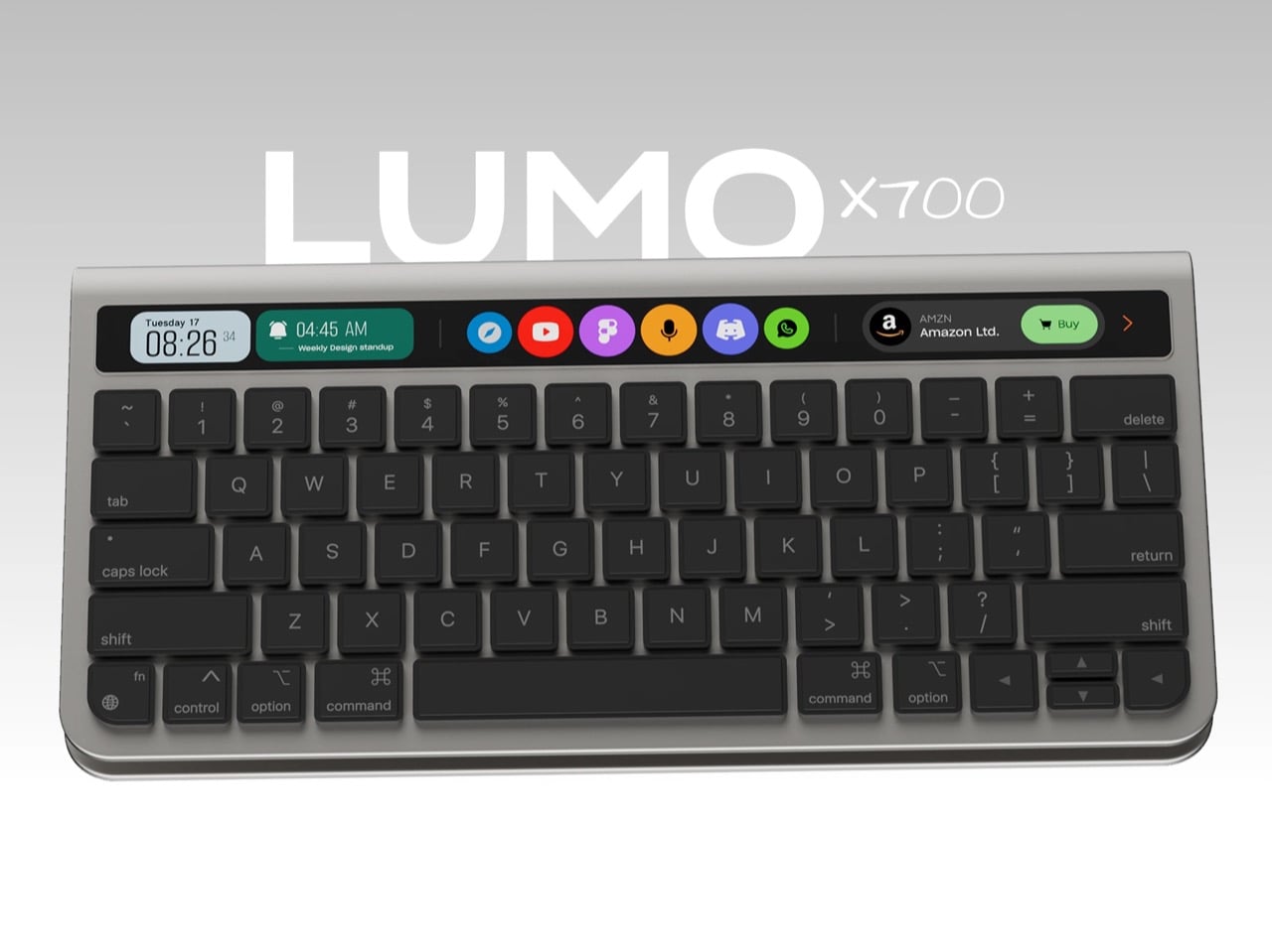
This is also around the time that Apple quietly killed the Touch Bar, but here’s my opinion… bring it back. Maybe not on the MacBook, but the Touch Bar definitely deserves a place on any independent wireless keyboard. With AI LLMs, progressive web apps, widgets, and vibe-coding going mainstream, a Touch Bar on a keyboard finally makes sense. It’s a place for your AI agent to live, alongside tasks, shortcuts, toolbars, and widgets. Apple pioneered the Touch Bar, but one could argue they were way too early to realize its potential. Now, a concept keyboard by Eslam Mohammed and Ahmed Yassen shows how the Touch Bar should be resurrected.

Designers: Eslam Mohammed & Ahmed Yassen

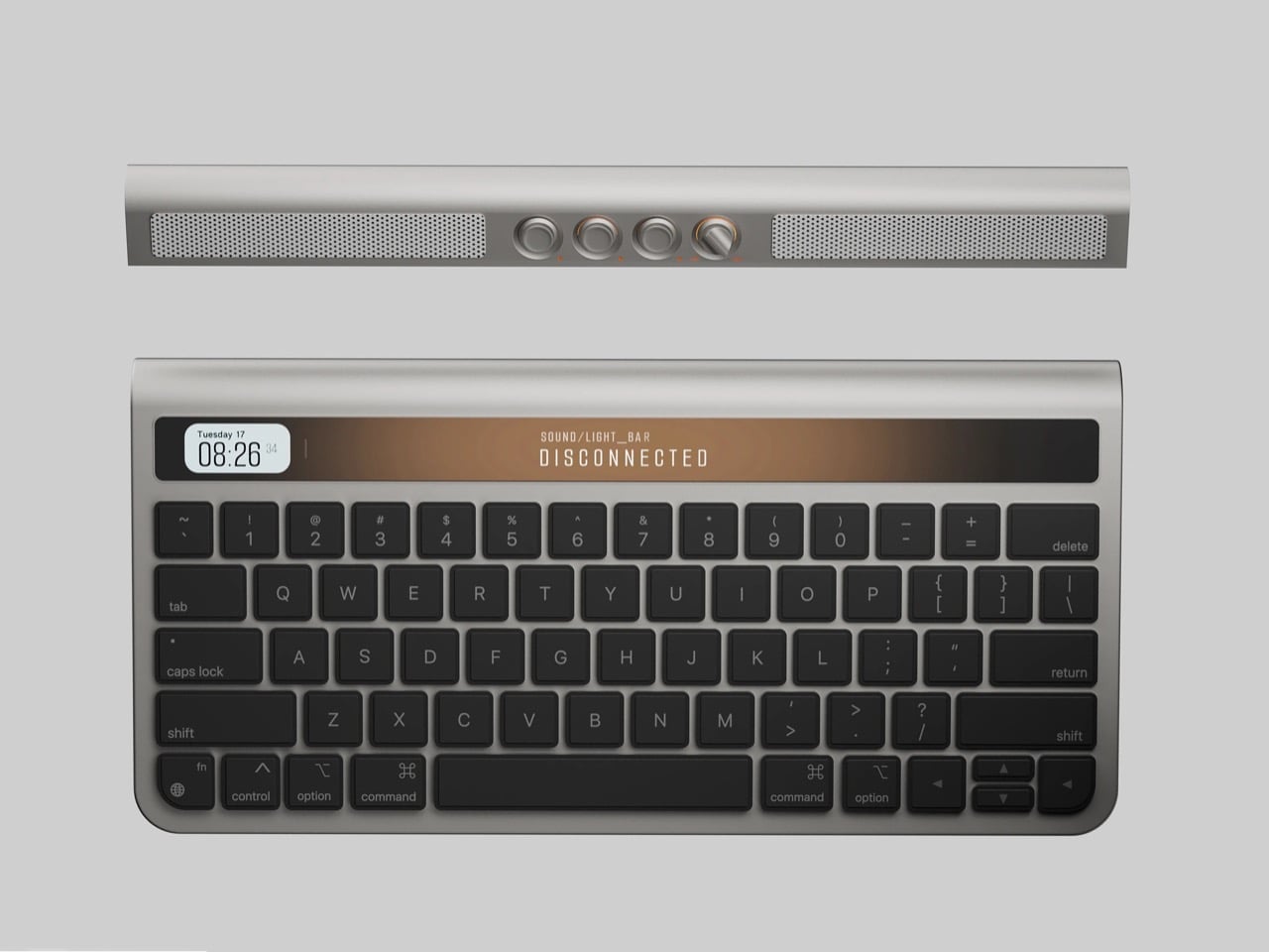
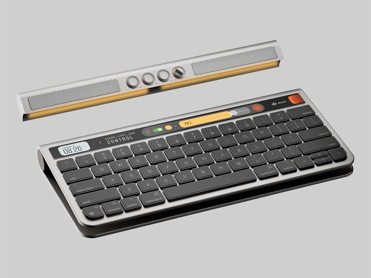
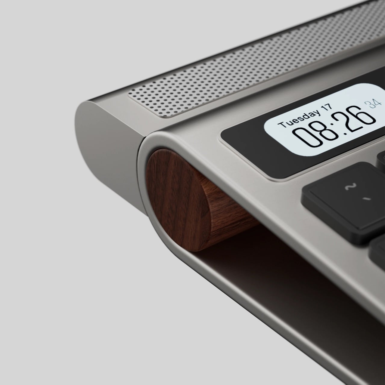
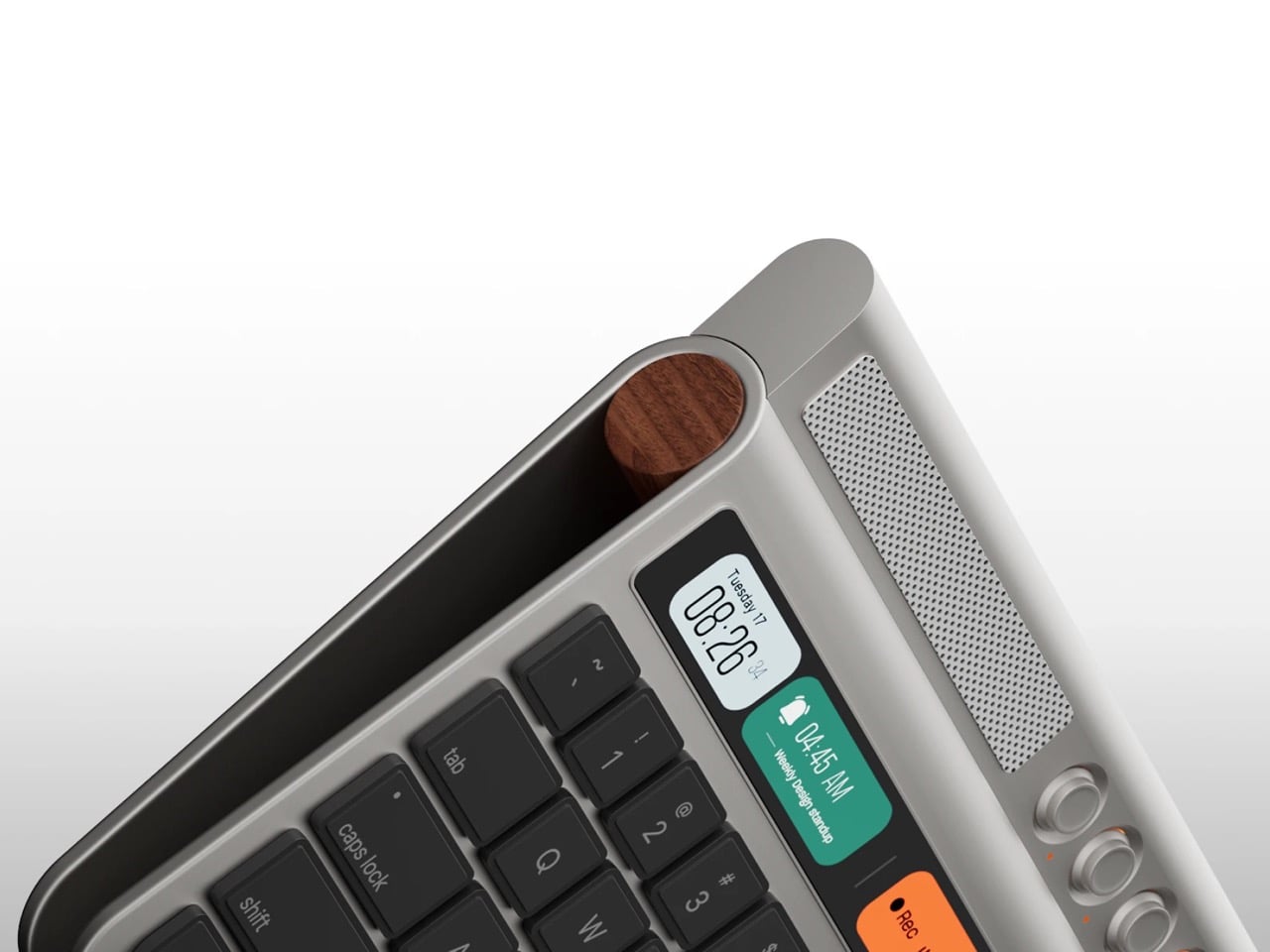
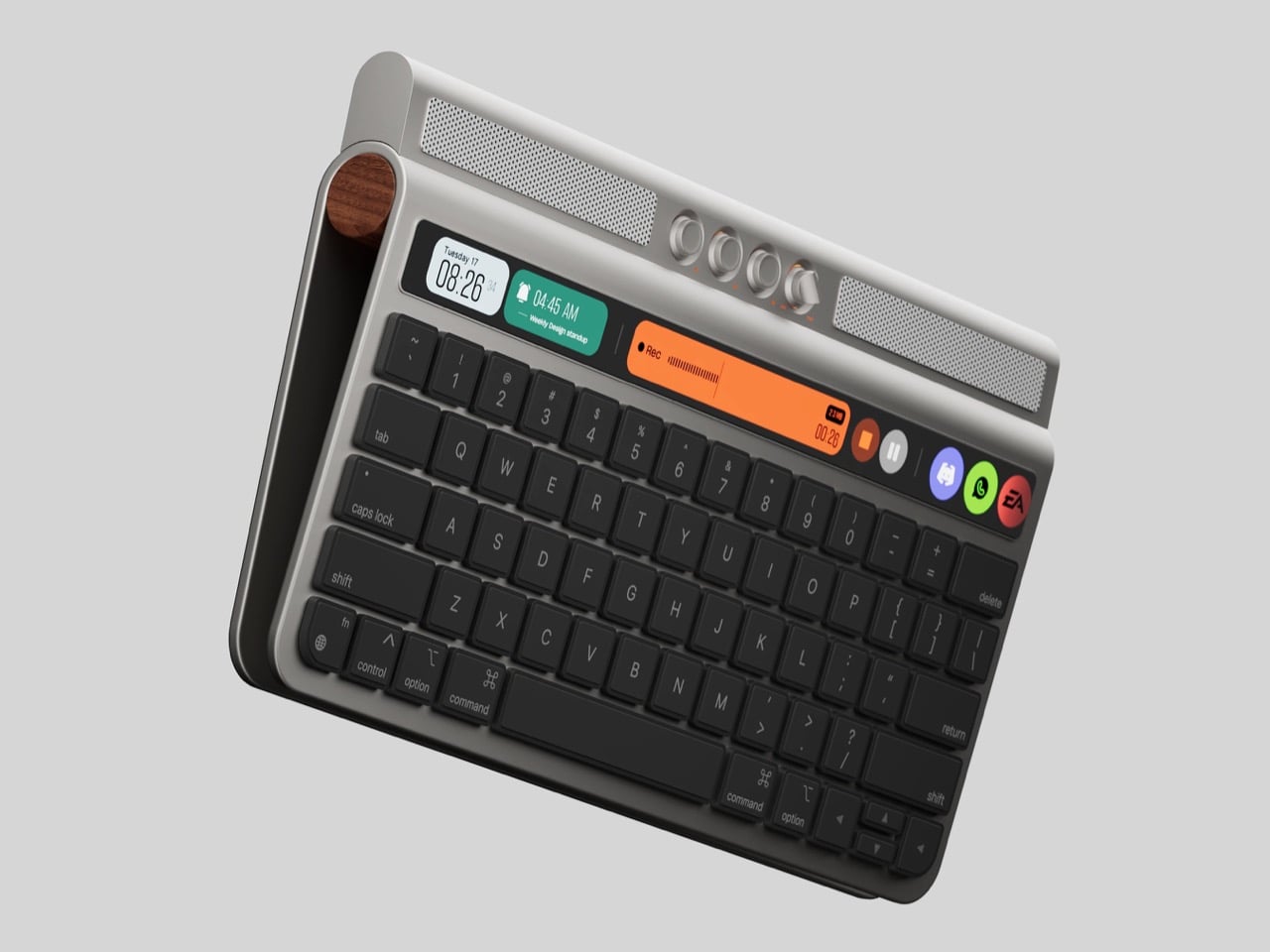
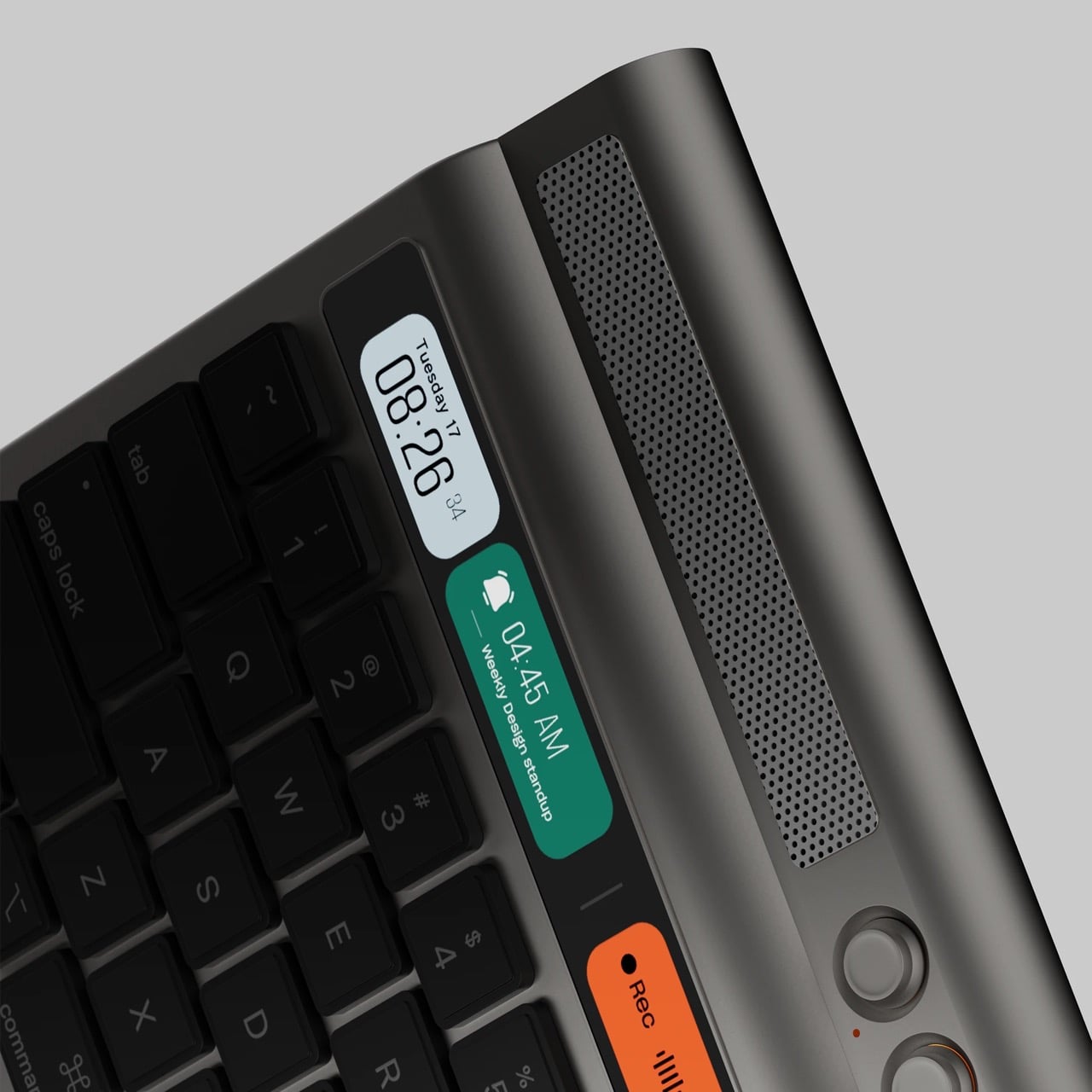
Mohammed and Yassen’s LUMO x700 keyboard comes with a few tricks up its sleeve. Sure, it sports a sleek, metal-forward Magic Keyboard-inspired design, but the thing also packs an end-to-end Touch Bar that’s about as tall as your standard key, making it a lot more usable than the actual Touch Bar, which was just as slim as the function key row. However, that isn’t all there is to this. A snap-on module turns the keyboard into a music player so you aren’t listening to tunes on your iMac or laptop’s fairly tinny speakers. All in all, this turns your keyboard into something a little more versatile than just ‘something you type on’. It now has an identity of its own, and can channel a level of productivity you’d only get with an Elgato-style accessory.

But wait! That modular soundbar isn’t just keyboard-dependent! It works independently too, allowing you to place it underneath the monitor or anywhere else on your desk for a wireless sound experience. The dual speakers fire stereo audio, buttons and a knob help tweak volume and playback, and the part that attaches to the LUMO x700 keyboard, well, there’s a hidden light-bar there to give your desk some ambient lighting. It’s all cleverly designed to ensure the module isn’t useless on its own. However, that Touch Bar is my predominant focus.

Why does a Touch Bar matter now more than ever? Well, we’re all multitasking, we’re all looking for extra real estate for displays, and almost all of us are running agents of some kind to automate tasks. That’s what this Touch Bar is for. Shortcuts to apps live in the center, widgets on the left, and maybe an AI chatbot on the right that you can deploy to talk to, ask questions to, or delegate tasks to. Claude just debuted a desktop-controlling agent called Claude Cowork that can run tasks and perform duties on your desktop on your command, and the infamous OpenClaw’s been taking the internet by storm for doing pretty much the same thing too. Obviously, such an AI will need to be vetted, and probably contained by a set of restrictions so it doesn’t go around leaking your data on a ‘Reddit for AI Agents’ or spending your cash (as OpenClaw has done in a few instances).

The rest of the Touch Bar experience goes on as originally intended. Active programs can reside within the bar, like a recorder interface, the player for music or video apps, allowing you to seek to different parts of a song/video, or even the emoji keyboard that lets you easily cycle through emojis before pasting them. The potential is endless, and while independent Touch Bars like this one exist, we need to design one for an era of AI agents, applets, shortcuts, and widgets. It really is about time.

The post Bring The Touch Bar Back… And Maybe Put An Intelligent Siri Or Gemini On It first appeared on Yanko Design.
This Dutch Barnhouse Breaks Every Suburban Design Rule on Purpose

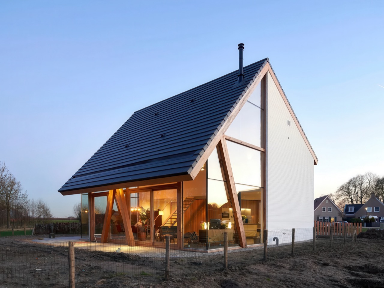
The Netherlands has mastered the art of the catalogue home, a residential model where architectural types are as standardized as automobile makes. Buyers browse familiar options, and the barnhouse, with its sweeping gable roof and prominent timber structure, consistently tops the list. It promises the romance of rural living packaged for suburban plots. But what happens when site conditions refuse to cooperate with this template?

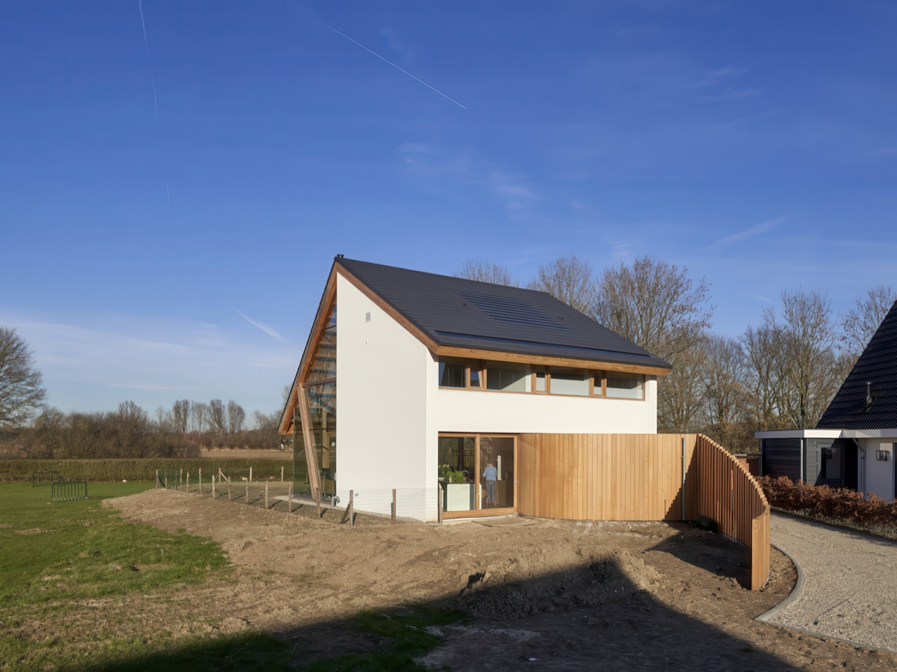
In Werkhoven, RV Architecture proved that starting with a recognizable type need not end with a predictable house. The architects faced a triangular plot that defied conventional positioning, so they embraced the irregularity. The barnhouse angles across its lot, turning its glazed facades toward an expansive backyard rather than the street. Inside, the soaring gable height floods the open plan with daylight, while three sculptural wooden columns support the roof and frame carefully composed views. A curved wall conceals service spaces and guides movement from entry to kitchen. Standard catalogue, custom execution.

Designers: Ruud Visser and Fumi Hoshino

Most architects would look at that triangular plot and either complain about constraints or try to force a rectangular box onto it anyway. Ruud Visser and Fumi Hoshino did the opposite. They rotated the entire house to prioritize the view, which sounds simple until you realize how rare that move actually is in suburban contexts. The front of most houses faces the street because that’s what we do. Convention masquerading as inevitability. This project says forget the street, the good stuff is in the back, and commits fully to that logic with floor-to-ceiling glazing on three sides.

Four primary wooden beams sit on top of the side walls and the internal walls between bedrooms. Smaller purlins span between these beams to stiffen the roof plane. Standard timber frame logic so far. Then in the open living area, where you can’t have walls interrupting the space, three angled wooden columns rise up to support the roof structure. These aren’t decorative. They’re load-bearing elements positioned specifically to frame views while maintaining structural integrity. The angle aligns with the roof pitch and creates a visual rhythm that reinforces the gable geometry. You can see exactly how the building stands up, which is increasingly rare in residential work where structure usually hides behind drywall.

That curved wooden wall running from entrance to kitchen conceals the laundry room, toilet, cloakroom, and storage. All the unglamorous necessities that usually get shoved into awkward corners or announced with clunky door frames. Instead, this single sculptural gesture handles circulation and service spaces while adding warmth to what could otherwise read as a cold modernist box. Vertical wood cladding wrapping around itself, creating both physical separation and spatial continuity. You move through the house following this element, which is exactly what good circulation design should do without announcing itself. It’s the kind of detail that separates competent projects from memorable ones.

Dark roof tiles, white horizontal wood siding, natural timber for structural elements, polished concrete floors, and glass. That’s essentially the entire material vocabulary. This kind of limitation forces clarity because every element has to justify its presence. There’s nowhere to hide behind decorative excess. The concrete floors make practical sense for Dutch climate conditions too. Thermal mass for passive heating, durability for high-traffic areas, and a neutral base that lets the wood structure read clearly against it. Material choices that work on multiple levels simultaneously, which is always a sign that someone actually thought through the consequences of their decisions.

Catalogue barnhouses typically give you a recognizable formal language that buyers and builders understand, which has real value when you’re trying to get something built and financed. Visser and Hoshino used that familiarity as permission to experiment with everything else: siting, structure, circulation, materiality. The result reads as both familiar and unexpected, which is a difficult balance to strike. You recognize it as a barnhouse immediately, but the spatial experience inside bears little resemblance to the typical catalogue version with its subdivided rooms and predictable layouts. Standardized building types can serve as starting points rather than endpoints, and this project proves it without being precious about the concept.

The post This Dutch Barnhouse Breaks Every Suburban Design Rule on Purpose first appeared on Yanko Design.

This Stealth Fighter-Inspired Buggy Makes Modern Supercars Look Too Polite

Someone decided the Lamborghini Countach needed to mate with a dune buggy and maybe a stealth fighter. Looking at Alex Casabo’s buggy concept, that’s not hyperbole or some lazy automotive journalism comparison. This thing genuinely looks like it crawled out of the wedge-era supercar playbook, did some thinking about what parts of “street legal” actually mattered, and concluded the answer was “none of them.”

Most supercars maintain this pretense that yes, technically, you could drive this to the grocery store. Casabo’s design skips that entire conversation. The suspension geometry isn’t hidden behind sexy bodywork, it’s showcased like mechanical jewelry. Those bronze-finish wheels and exposed A-arms aren’t apologizing for being visible. This is a track toy that knows exactly what it is, and there’s something refreshing about a design that doesn’t hedge its bets.

Designer: Alex Casabo

The design language pulls directly from that late ’70s and early ’80s moment when Marcello Gandini was drawing supercars with a protractor and an apparent vendetta against curved lines. Every surface on this buggy looks like it was folded from sheet metal by someone who studied origami and decided subtlety was optional. The wedge profile, the angular body panels, the way the whole thing seems to be made of intersecting planes rather than flowing shapes. These are all callbacks to an era when automotive design was less about wind tunnel optimization and more about making something that looked impossibly fast while sitting still.

The AC Buggy, as Casabo calls it, combines the supercar aesthetic with the mechanical transparency of something like an Ariel Atom or a radical Group B rally car. Those exposed A-arms and coilovers aren’t there because the budget ran out before they could design proper body panels – they’re deliberate, turning functional components into visual elements. The bronze-finished wheels and visible hardware give the whole thing a motorsport-meets-military-prototype vibe that somehow works with the stealth fighter angles of the body. You can see the engineering, and that visibility becomes part of the appeal rather than something to hide.

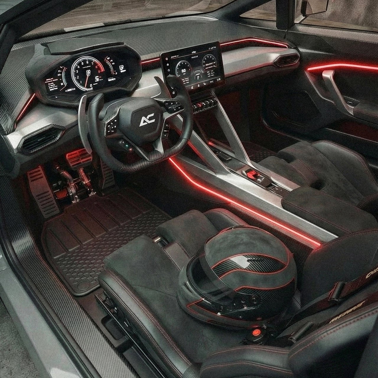
The interior follows the same path of aggressive minimalism wrapped in carbon fiber. Red accent lighting traces the cabin architecture, highlighting the angular dashboard and center console. There’s a center-mounted touchscreen flanked by what looks like a traditional instrument cluster on the driver’s side, creating this hybrid of digital and analog that mirrors the exterior’s blend of supercar drama and track-focused functionality. Toggle switches populate the lower console, the kind of tactile controls that suggest actual mechanical connections rather than electronic intermediaries. The seats are heavily bolstered with quilted inserts, held in place by a competition-style harness setup. Even the steering wheel gets the carbon treatment, with a squared-off bottom and integrated controls that keep your hands on the wheel rather than reaching for stalks or buttons.

The rear suspension setup shows off machined aluminum control arms and what look like properly specced coilovers with remote reservoirs. The drilled brake rotors are substantial, and the whole assembly sits exposed behind those distinctive geometric body panels with their triangular lighting elements. The taillights themselves use a honeycomb mesh pattern behind red-tinted lenses, continuing that angular aesthetic even in the smallest details. There’s an air intake vent on each rear quarter panel with horizontal slats, feeding what we can assume is some kind of powertrain tucked into that compact rear section.

The car was crafted entirely using a combination of design and AI tools as a part of Casabo’s explorations of integrating AI into the design workflow. Casabo lists his tools as Midjourney and Vizcom for the AI-enhanced ideation and CAD, along with Photoshop as a finisher to create the set of images. Whether this car is practical or not becomes irrelevant at this point, because Casabo’s vision is just to see how effectively AI can help enhance the creative process. Visually, it looks great on paper, although just seeing the output, I don’t think we’re too far from having an actual AI-generated concept car prototyped to life.

The post This Stealth Fighter-Inspired Buggy Makes Modern Supercars Look Too Polite first appeared on Yanko Design.
Upgrade Your Victorinox 58mm Army Knife Into a Fully Modular, Snap‑On Multitool Ecosystem in 10 Seconds

The 58mm Swiss Army Knife has occupied pockets for over a century with the same basic formula: red plastic scales, a handful of tools, and a design language that never needed to change. Victorinox perfected compact utility decades ago, and the format became so synonymous with everyday carry that entire generations never questioned whether it could evolve. But that permanence also created a constraint. Once you chose your tool configuration, you were locked in. Swapping scales meant glue, risk, or permanent modification.

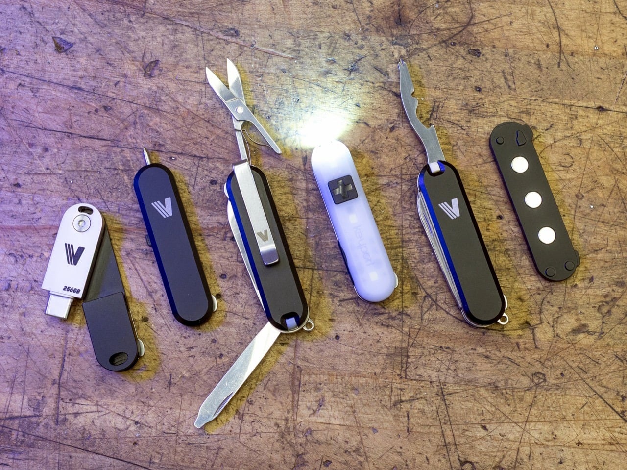
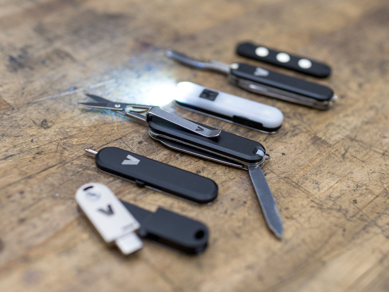
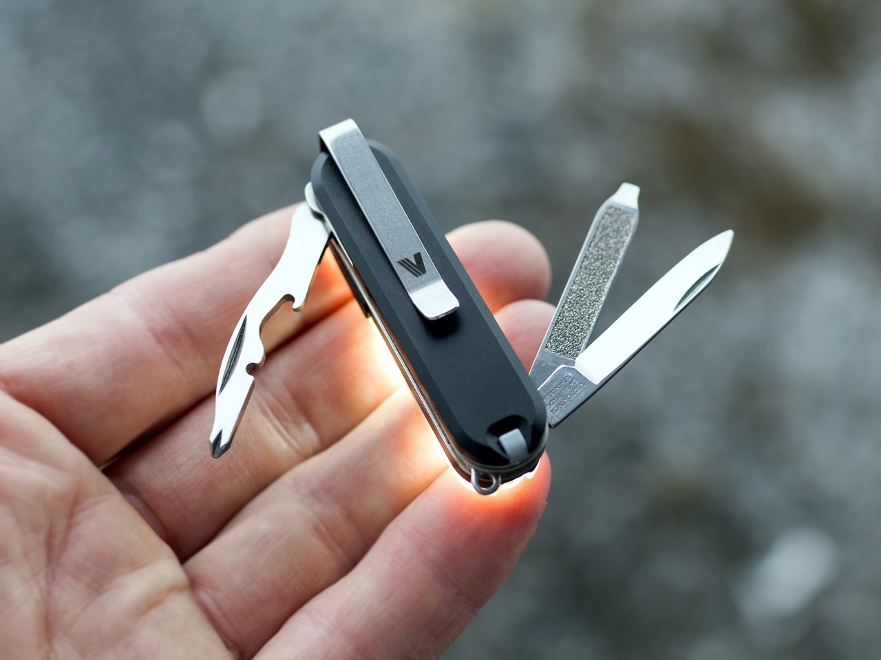
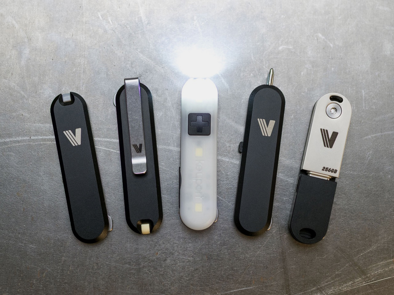
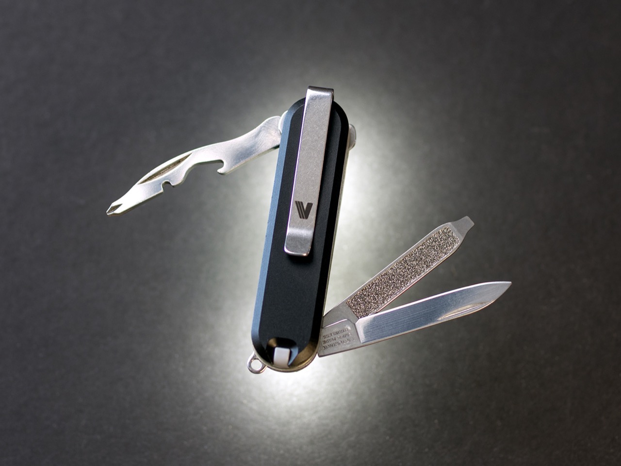
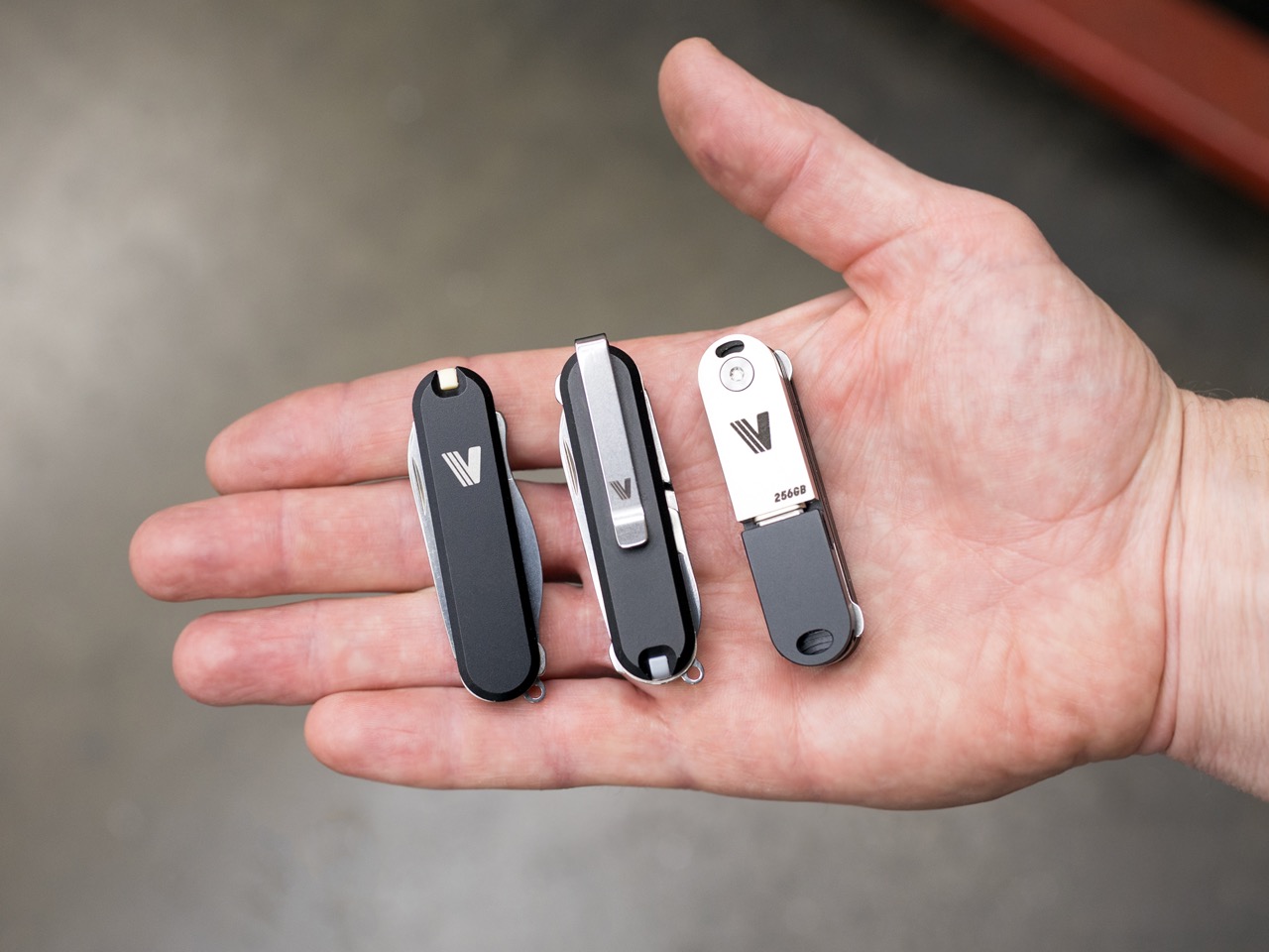
Keyport’s Versa58 system breaks that constraint without breaking the knife. The platform introduces a snap-on interface that attaches to any 58mm SAK’s existing rivets, transforming fixed scales into swappable modules. Add a rechargeable LED light, a mini pen, a USB-C flash drive, or a deep-carry pocket clip in seconds. Remove them just as fast. The knife stays intact, the heritage remains untouched, but the capabilities expand in ways the original designers never imagined. It’s modularity meeting tradition, and somehow both sides win.

Designer: Keyport, Inc.

Click Here to Buy Now: $39 $60 (35% off). Hurry! Only 2 left of 75.

The core of this entire system is a deceptively simple piece of spring steel. This patent-pending interface plate is the result of a full year of development and seven complete revisions, a process that speaks to the engineering challenge involved. The plate is engineered to flex just enough to click securely onto the mushroom-shaped rivets that hold a standard SAK together, the same ones hidden beneath the factory scales. The design had to be robust enough to handle repeated attachment cycles without loosening, yet gentle enough to avoid damaging the knife’s frame. It’s a tool-free, glue-free, and completely reversible process that takes seconds. This single component unlocks the entire platform.

Versa58 operates in two distinct universes. The first is as a direct upgrade to your existing Victorinox. You pop off the original scales and snap on the Versa58 modules you need for the day. The second universe is completely independent of the knife. Using a magnetic connector system called MagMount, any two modules can be attached to each other to create standalone tools. This dual functionality means you can either enhance the classic SAK you already own or build an entirely new, minimalist multi-tool from scratch. The system offers a level of flexibility that the 58mm format has never seen before.

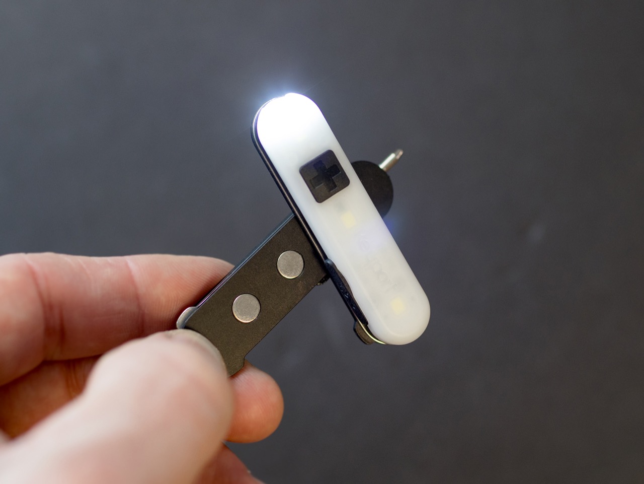
The MagMount system is absolute genius, using three tuned neodymium magnets to create a crisp, satisfying connection. This allows for the quick assembly of pocketable rigs or keychain tools. You could, for instance, snap the flashlight module to the pen module for a compact, non-knife tool perfect for travel or restrictive environments. The magnetic pull is tuned for a secure hold while still allowing for smooth rotation and easy reconfiguration. It also introduces an addictive fidget factor, turning the act of customizing your carry into something tactile and engaging. It’s a smart design that expands the ecosystem beyond the knife itself.

Among the first wave of modules, the Clip Scale is likely to be the most celebrated. Machined from either 6061 aluminum or Grade 5 titanium, it finally adds a clean, low-profile pocket clip to the 58mm SAK. This has been a common request in the EDC community for years. Crucially, the clip is designed to be reversible and does not interfere with the knife’s keyring, a flaw seen in some aftermarket solutions. It’s paired with a V Scale for the front, which includes a multi-use slot designed to hold the original SAK’s toothpick or tweezers, ensuring you don’t lose core functionality.

The Pocket Flare module brings modern illumination to the platform. It’s a compact, USB-C rechargeable light with a beam tuned for close-range tasks. It offers three modes: a 3-lumen low beam with a 12-hour runtime, a 43-lumen high beam that runs for two hours, and a 45-lumen side light that acts as a lamp to brighten a small area. Because it uses the MagMount interface, you can also snap it onto any metal surface for hands-free lighting, which is incredibly useful for repairs or finding something in a dark tent.

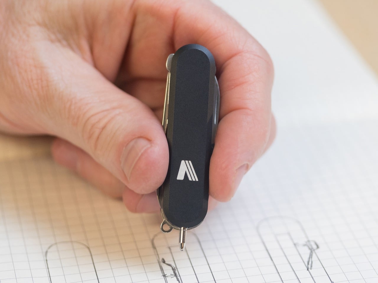
Keyport also developed modules that bridge the analog and digital worlds. The Pen Module features a precision mini pen with a premium German Troika refill, offering a smooth writing experience without any rattle. For digital needs, there is a streamlined USB-C 3.0 flash drive module available in 64GB and 256GB capacities. This flip-out drive seamlessly integrates secure, portable storage into your pocket setup for documents, media, or backups. These additions transform the classic pocket knife into a tool that feels much more relevant to modern daily life.

Perhaps the most forward-thinking aspect of the Versa58 platform is its openness. Keyport will be selling standalone interface plates, inviting makers, modders, and machinists to design their own compatible modules. This opens the door for a community-driven ecosystem of custom tools built on the Versa58 standard. It’s a canvas for creativity, allowing anyone with an idea to contribute to the platform. This move could give the system incredible longevity and a range of options far beyond what Keyport could develop on its own.

Keyport has already outlined a roadmap for future modules, showing a long-term commitment to the system. Upcoming additions being explored include a Bluetooth locator, an NFC module for digital access or automation, a craft blade for precision cuts, and even a minimalist carrier for a Bic lighter. The plan is to build Versa58 into a comprehensive platform, not just a single product release. Backer feedback from the initial campaign will help shape which of these new tools get prioritized, making early adopters part of the development process.

The Versa58 system is available for backing on Kickstarter, with special pricing tiers for early supporters. The campaign offers several bundles, including the foundational Origin Bundle with the core scales starting at $39 and the more comprehensive Apex Bundle that adds the Pocket Flare module starting at $77. All modules and scales are available in either machined 6061 aluminum or the more premium Grade 5 titanium. The Versa58 ships globally starting August 2026.

Click Here to Buy Now: $39 $60 (35% off). Hurry! Only 2 left of 75.

The post Upgrade Your Victorinox 58mm Army Knife Into a Fully Modular, Snap‑On Multitool Ecosystem in 10 Seconds first appeared on Yanko Design.

World’s Slimmest AC Power Bank Can Run Appliances And Charge Your Laptop At Just 0.6 Inches Thick

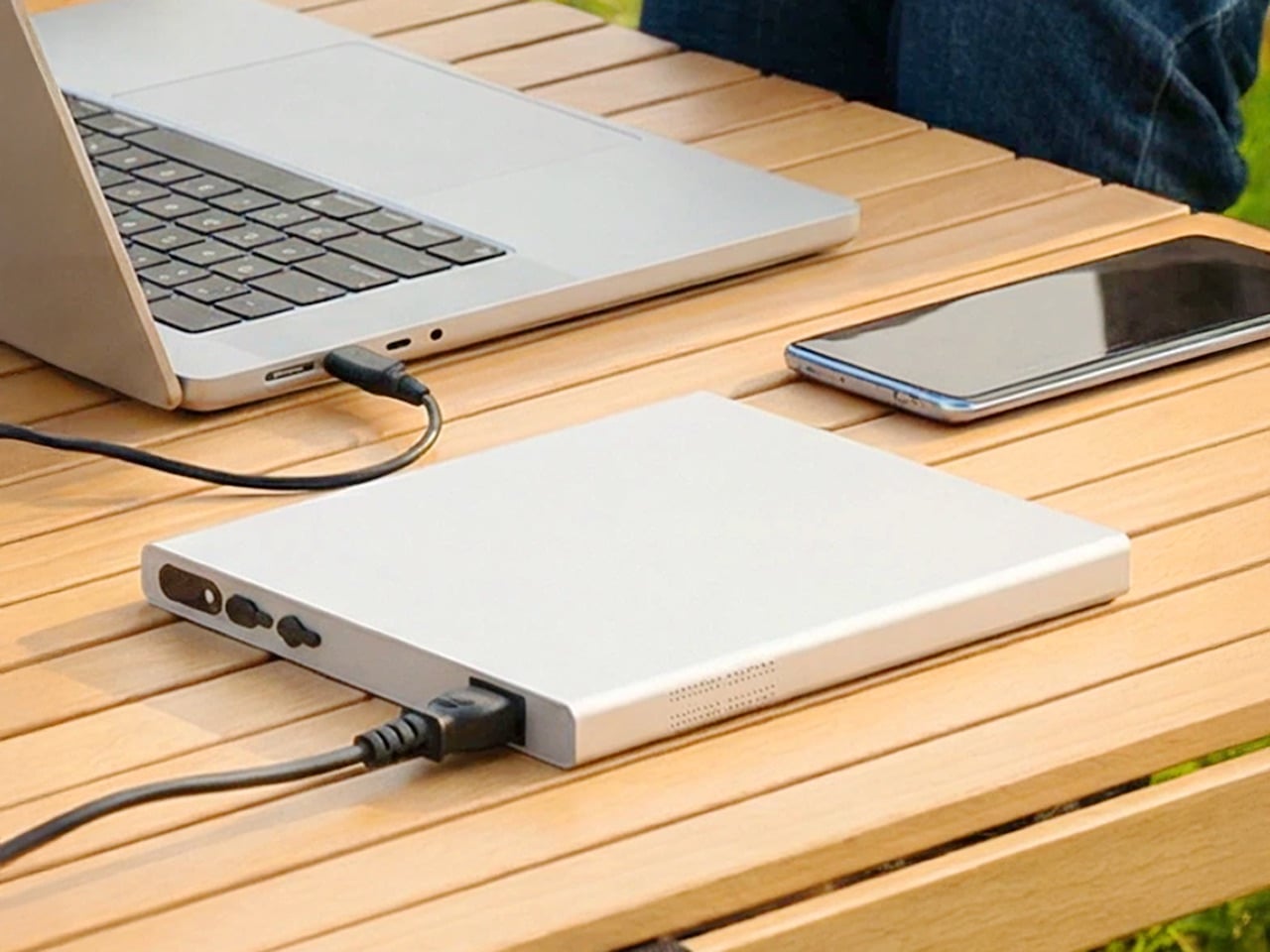
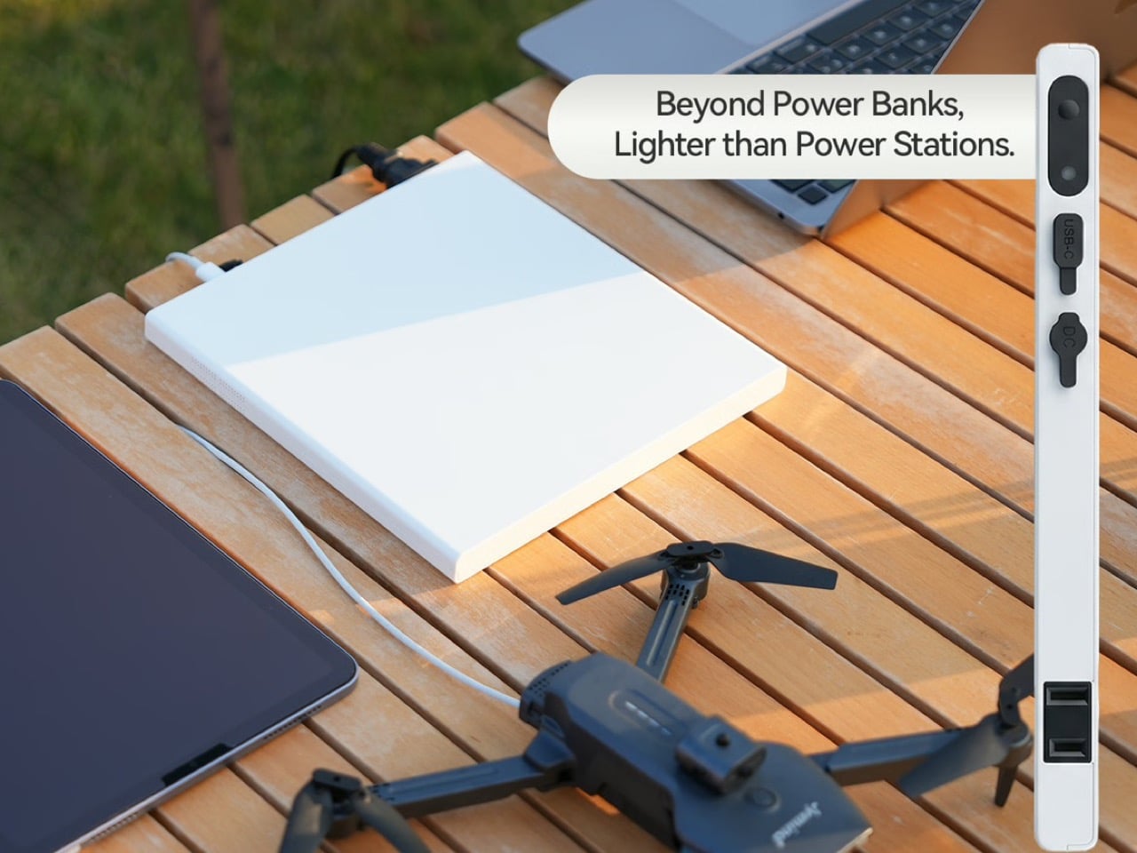
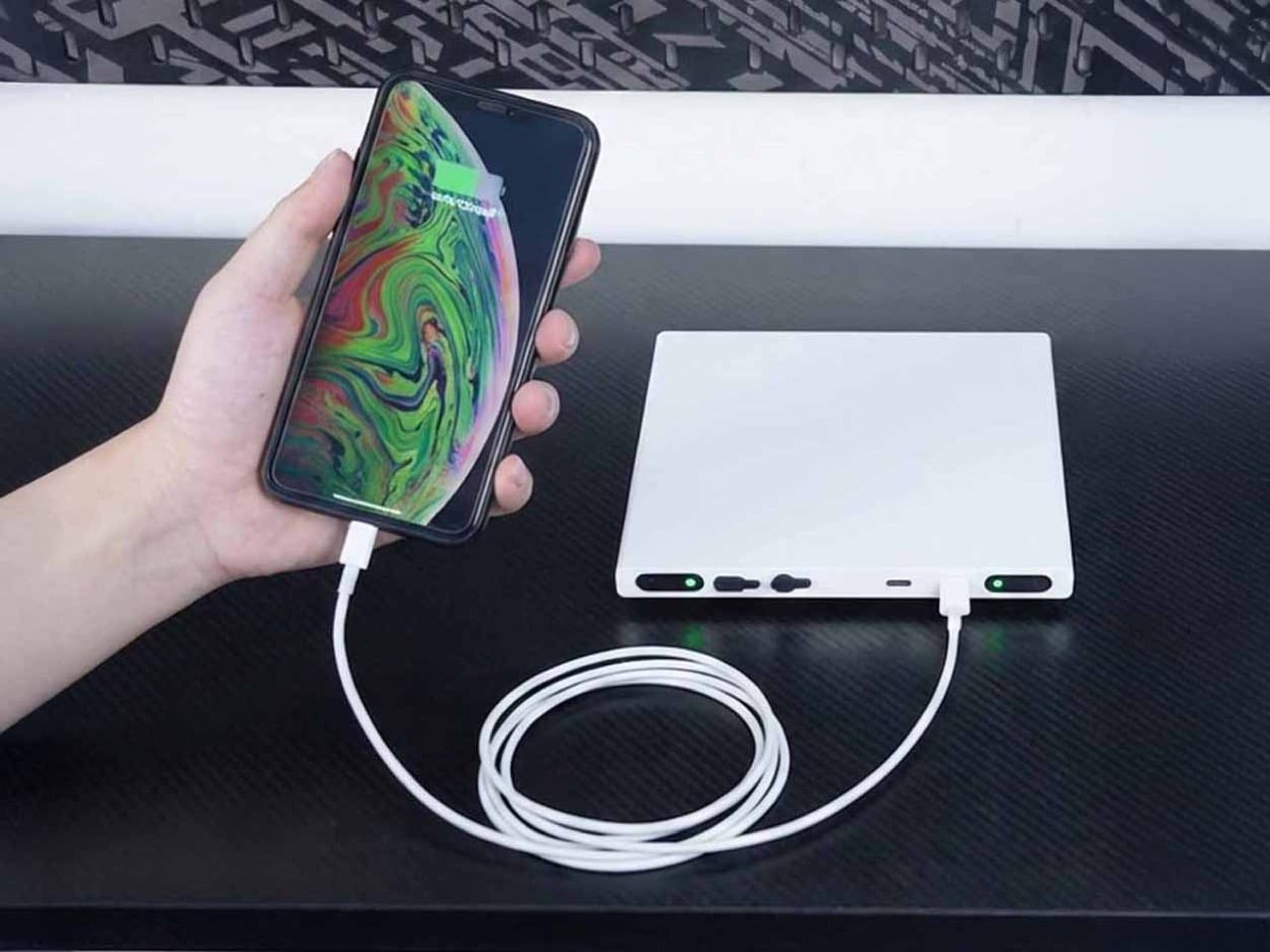
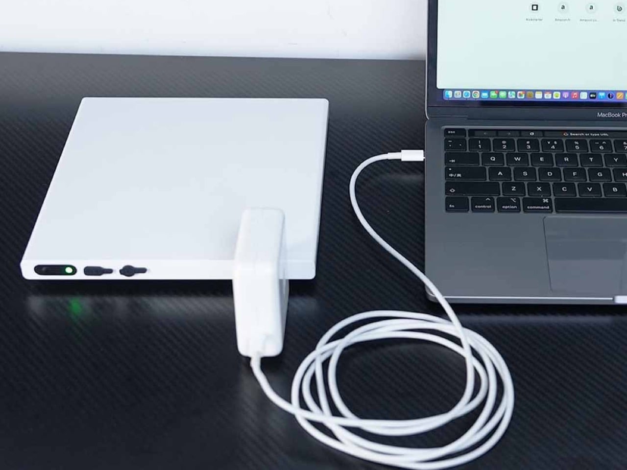
Digital nomads, field photographers, and mobile creatives share a common frustration: needing wall outlet power in places that don’t have walls. USB power banks handle phones and tablets, but cameras, projectors, and portable monitors still demand actual AC power. The world’s slimmest AC power bank exists because someone finally asked the right question: why do portable power stations look like car batteries instead of something you’d actually pack? The Noomdot N1 brings 70W of pure sine wave AC output to a device thin enough to slip into the laptop sleeve of a standard backpack.

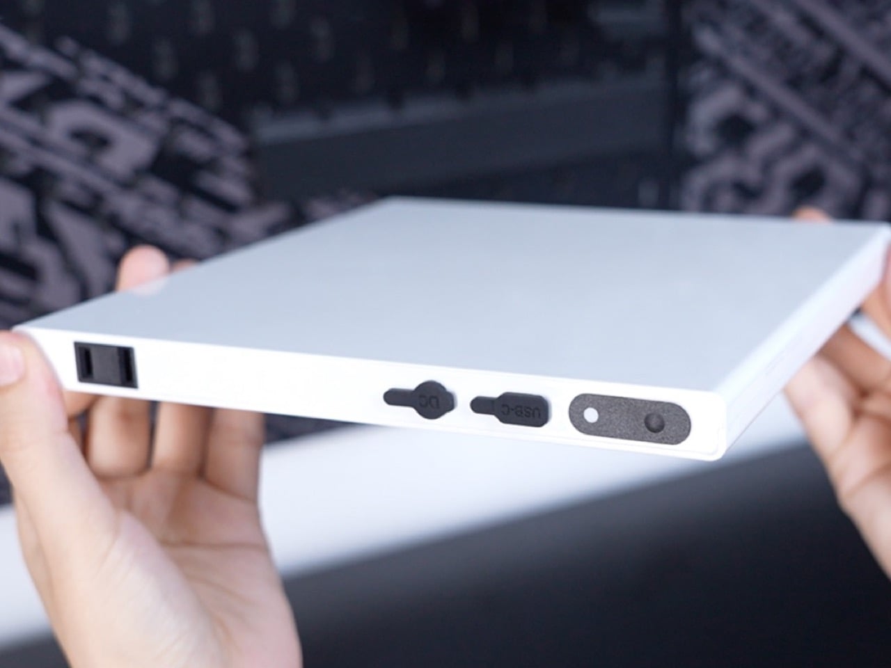
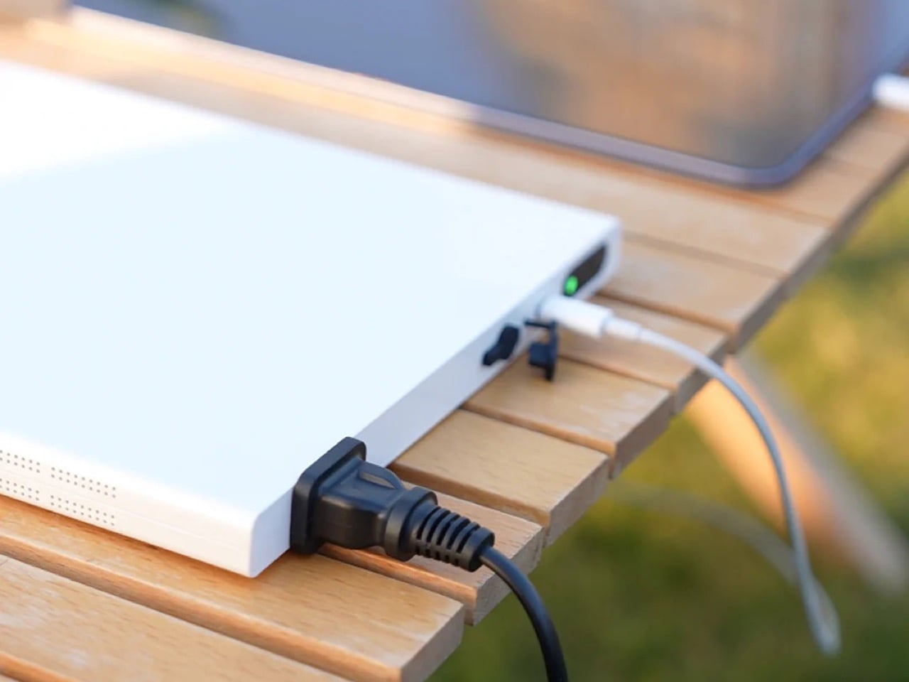
At 16mm thick, it’s built around portability rather than maximum runtime. The semi-solid-state battery delivers approximately 40 minutes of continuous output at full 70W load, or several hours for lower-draw devices like LED lights or camera batteries. That’s not camping-weekend capacity, it’s designed for day trips, flights, and situations where outlets exist but aren’t convenient. The unit stays flight-safe under 100Wh limits, recharges in 90 minutes, and includes both USB-C PD output and pass-through charging. It’s live on Kickstarter at early pricing before the $259 retail launch.

Designer: PB-ELE

Click Here to Buy Now: $169 $259 ($90 off) Hurry! Only 17 of 200 left.

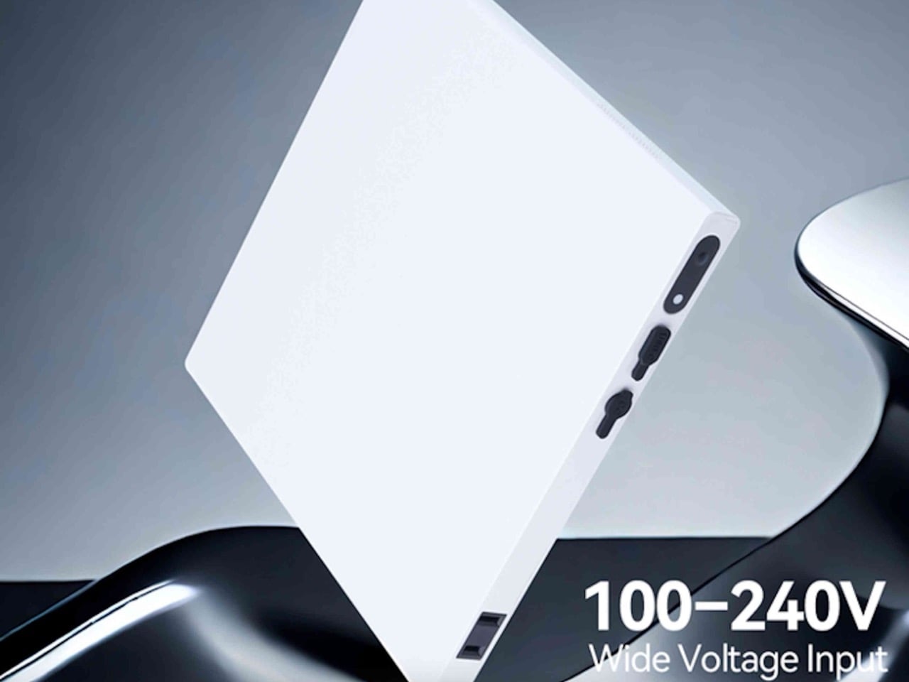
Years ago, a company called Memobottle had a brilliant, simple idea: since our bags are full of flat things like books and laptops, why are our water bottles round? The Noomdot N1 is the Memobottle of portable power, born from that same flash of spatial intelligence. It abandons the dense, pocket-bulging brick in favor of a slim slab of milled aluminum designed to slide into the forgotten spaces of a laptop sleeve or document pouch. This design is not an aesthetic choice; it is a fundamental understanding of the modern carry ecosystem. The N1 is engineered to be a good citizen in a world of flat devices, integrating seamlessly rather than demanding you build your bag around its awkward shape.

The use of a semi-solid-state battery is what enables this form factor without compromising on safety or longevity. While not a true solid-state cell, this hybrid chemistry significantly reduces the amount of volatile liquid electrolyte, leading to better thermal stability and a much slower rate of degradation. The claim of retaining 99% capacity after 100 full charge cycles is a direct benefit of this technology. For anyone who has felt the disappointment of a lithium-ion pack that barely holds a charge after a year, this focus on durability is a welcome and practical innovation. It reframes the device as a lasting piece of essential kit.

The main event is, of course, the 70W AC outlet. Its pure sine wave inverter is the kind of detail that professionals appreciate, ensuring clean, stable power that will not harm sensitive electronics. This is what separates it from cheaper, modified sine wave alternatives that can introduce electrical noise or even damage delicate circuits in cameras and audio gear. The inclusion of a 60W USB-C PD port is a nod to modern workflows, allowing it to charge a laptop directly or be slowly recharged itself. For a quick turnaround, the dedicated DC input remains king, refueling the entire 20,000mAh capacity in a scant 90 minutes.

Packing an inverter into a 16mm-thin chassis is a thermal challenge, and the N1 addresses this with a feature I’ve never seen in a power bank: an active cooling fan. An internal 6000 RPM fan kicks in during AC output to pull heat away from the core components, ensuring the device can sustain its peak performance without overheating. It is a pragmatic, if slightly brute-force, solution. The tradeoff is acoustics. While the fan is likely tuned to be as quiet as possible, it will not be silent… but that’s honestly a tiny price to pay for running a bunch of appliances or charging gadgets off a ‘wall-less power outlet’.

The N1 is a tool for a very specific mission: bridging the gap when AC power is needed for a short, critical period. It is for the wedding photographer who needs to juice up strobe batteries between the ceremony and reception. It is for the consultant who needs to run a projector for a 30-minute pitch in a conference room with no available outlets. Its 40-minute runtime at maximum load defines its purpose clearly. This is not an off-grid power solution for a weekend in the woods; it is a mobile professional’s get-out-of-jail-free card, ensuring a dead battery never becomes a single point of failure.

An IPX4 rating means it can shrug off a sudden rain shower, and passing a 1-meter drop test suggests it can survive being fumbled out of a backpack. These are not features one typically finds on power banks, and they speak to an understanding of the chaotic nature of travel and fieldwork. Combined with its TSA-friendly sub-100Wh capacity, the N1 is one of the few AC power sources truly designed from the ground up to leave the house and see the world, legally and safely.

You get to choose between two variants – 110V and 220V (depending on the country you live in and the rated voltage its appliances operate on). The Noomdot N1 ships along with a DC adapter for charging it, at a fairly discounted price of $169 ($90 less than its MSRP of $259). The device ships globally starting May 2026.

Click Here to Buy Now: $169 $259 ($90 off) Hurry! Only 17 of 200 left.

The post World’s Slimmest AC Power Bank Can Run Appliances And Charge Your Laptop At Just 0.6 Inches Thick first appeared on Yanko Design.
The Case for Heirloom Furniture in an Era Obsessed With Biodegradable Everything

Joe Doucet has always been good at saying uncomfortable things politely. His latest provocation, delivered via Columns, a furniture collection with Bulgarian studio Oublier, is that the design industry’s obsession with biodegradable materials might be missing the point entirely. Furniture made from mycelium or algae can decompose in five years, sure, but a well-made antique armoire outlives empires because no one throws it away. Columns takes that logic seriously. Handcrafted in solid oak, natural leather, and horsehair, the pieces are built to last a thousand years, which sounds like marketing hyperbole until you look at the joinery, the hand stitching, and the material choices. This is furniture designed to be inherited, repaired, and remembered.

Oublier, a studio that typically explores forgetting as a cultural and creative act, seems like an odd partner for a project about permanence. But the contradiction makes sense once you see the work. The collection’s name refers to its columnar bases, two cylinders of oak laid horizontally and bridged by a continuous leather top. There are no fashionable details to anchor it to a specific decade, no finishes that will look dated in ten years. The form is so spare it borders on austere, which may be the entire strategy. If sustainability is about what we keep rather than what we compost, then the object has to earn its place across generations. Columns bets on clarity, craft, and a very patient understanding of time.

Designers: Joe Doucet X Oublier

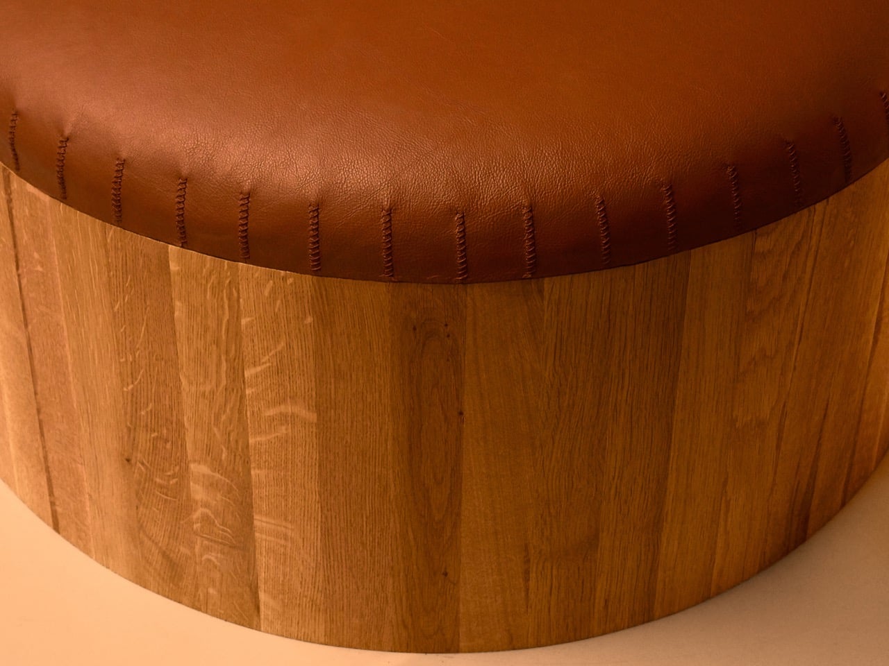
Looking at the piece itself, the argument becomes tangible. The form is elemental, almost architectural, with the two solid oak drums giving it a grounded, permanent presence. The leather top is stretched over this base with a continuous curve, and the hand stitching along the perimeter is left visible. This small detail is a critical part of the story, acting as a quiet signal of human labor and future repairability. It suggests the piece can be opened, its horsehair padding refreshed, and its leather resewn a century from now. There is a thoughtful honesty in showing the construction, which reinforces the idea that this is a working object, not a sealed artifact. It feels built to withstand use, not just admiration.

The choice of materials is a direct commitment to graceful aging. The solid oak is not a uniform, characterless surface; it has grain and life that will deepen over the decades. Similarly, the natural leather is intended to absorb the evidence of its existence, developing a rich patina from sunlight, touch, and time. This philosophy is the complete opposite of designing for pristine, showroom condition. Instead, Columns proposes that wear is a form of beauty, that an object’s value increases as it accumulates a history. This approach redefines luxury away from novelty and toward endurance, suggesting that the ultimate premium is an object that improves with you.


What Doucet and Oublier have created is a subtle but firm critique of disposability. The project opines that true innovation might lie in looking backward, applying traditional techniques and durable materials to a clean, contemporary form. It challenges the prevailing notion that sustainability requires constant material invention and complex recycling systems. Instead, it offers a simpler, more profound solution: make things that last, and are simultaneously too good to throw away. Columns proposes that the most responsible act of consumption is to buy something once and keep it for a lifetime, passing it on as a functional heirloom rather than a problem for a landfill.

The post The Case for Heirloom Furniture in an Era Obsessed With Biodegradable Everything first appeared on Yanko Design.

This LEGO Furby 30th Anniversary Build Comes With Working Eyes and a Secret Agent Hidden in Its Head

The Furby didn’t just sell 40 million units in its first three years. It created genuine paranoia. Parents whispered about hidden microphones. The NSA had to issue actual statements denying that these fuzzy toys were surveillance devices. Kids would wake up to unprompted Furbish babbling at 3 AM and wonder if their electronic pet had become sentient. Twenty-eight years later, those kids are adults, and one of them just submitted a 1,700-piece LEGO version to Ideas that’s already earned a Staff Pick designation.

Rancor1138’s Furby 30th Anniversary build stands nearly 19 inches tall in classic black and white, complete with working eyelids, articulated ears, and a movable mouth. The back panel opens to reveal the interior, where two Easter eggs wait. One is a brick-built heart, representing what Furbys were supposed to be. The other is a man in black hiding in the head, recording device in hand, representing what everyone feared they actually were. Both are perfect.

Designer: Rancor1138

The build uses helmet pieces from the buildable Buzz Lightyear sets for those opening eyelids, which captures the curved geometry needed even though they’re not available in black yet. Technic ball joints handle the ear articulation, giving them the full range of motion that made Furbys so expressive. The movable mouth works without gearing or complex mechanisms, keeping the design producible. At 46.6 centimeters tall with ears extended and 22.1 centimeters wide, this thing commands shelf space the way the original commanded attention in toy aisles. The 1,700-piece count puts it in the same territory as LEGO’s typewriter or piano, the kind of weekend project that adult collectors actually want to spend time on rather than snap together in an evening.

Tiger Electronics owns the Furby trademark, but this color scheme reads as “generic Furby” in a way that could survive legal review. You see those colors and ear shapes from across a room and your brain fills in the rest without needing specific commercial variants. The decision to include both the heart and the surveillance agent creates tension that reflects how people actually experienced these toys. They were supposed to be companions. They became sources of low-grade technological anxiety. Both truths exist simultaneously, and hiding them inside the build where you have to open the back panel to see them turns the discovery into a reveal rather than a punchline.

Rancor1138’s child developed an obsession with Y2K electronic toys despite being born decades after they mattered, which prompted the designer to build a LEGO version of the toy as a gift for their kid. The build went through three or four versions before landing to what we see now, and LEGO does have a tendency to tweak MOCs (My Own Creations) further before officially launching them, but this one absolutely needs no changing.

So why make a LEGO Furby in 2026 beyond just the fact that your child loves them? Well, Furby’s 30th anniversary hits in 2028, giving LEGO a marketing angle if this clears the Ideas review process. At 1,700 pieces, the probable price point lands somewhere between $170 and $220 based on how LEGO has priced recent Ideas sets. That positions it as a serious display piece for collectors who remember the original phenomenon and want something substantial to build, not an impulse grab for casual fans.

The man in black sitting inside the Furby’s head with recording equipment directly references conspiracy theories that required actual NSA clarification in 1999. These toys couldn’t record speech despite widespread belief otherwise, which feels simultaneously ridiculous and prescient given the smart speaker landscape two decades later. The heart in the chest cavity provides counterweight, acknowledging that underneath the paranoia these were designed to be loved. Both elements work because they’re physically integrated rather than existing as external commentary. Open the back panel and there they are, permanent features that reward closer inspection.

LEGO Ideas runs on a voting system where submissions need 10,000 supporters to enter review for possible production. This Furby currently sits at 2,622 votes with 563 days left to hit the next 5,000 milestone. The platform has produced genuinely strong sets over the years, proving community-driven design can match LEGO’s internal development when the right projects get traction. Anyone wanting to see this become an actual purchasable set needs to head over to the LEGO Ideas website and vote. The Furby deserves to exist as more than a digital render and some studio photos, if only because that man in black Easter egg is too good to stay conceptual.

The post This LEGO Furby 30th Anniversary Build Comes With Working Eyes and a Secret Agent Hidden in Its Head first appeared on Yanko Design.

Realme 16: 7,000mAh battery, iPhone Air ‘inspired’ design, 3-lens camera and a rear selfie mirror

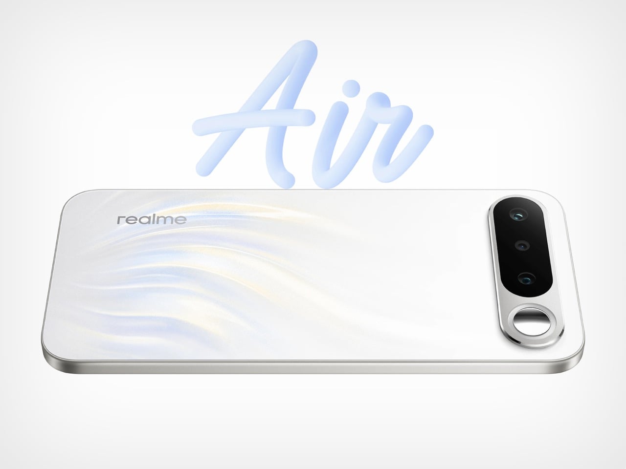
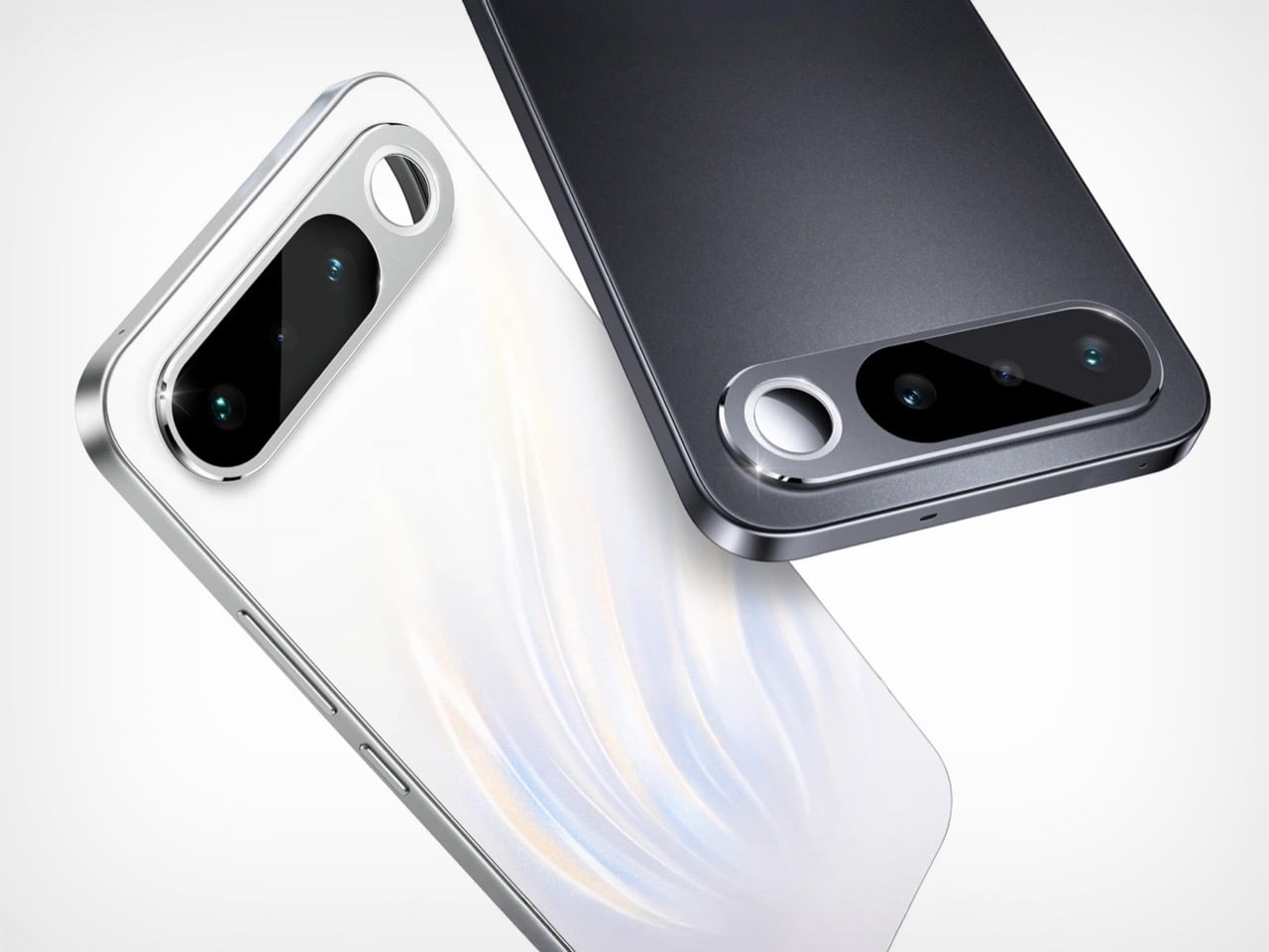
The horizontal camera bar has officially become the design language of 2025-2026, and Realme just joined the party with the Realme 16. Five months after Apple’s iPhone Air established the aesthetic last September, here comes a mid-range contender wearing the same silhouette like a fashion trend that jumped from runway to high street. The visor-style execution skews closer to Honor’s Magic8 Pro Air, complete with that clean horizontal sweep across the top of the phone. But Realme threw in a wild card: a circular selfie mirror embedded right in the camera module, encircled by a halo flash that adds theatrical flair to an otherwise familiar design.

Calling this phone “Air” anything requires some creative interpretation. The iPhone Air sits at 5.6mm thin, Honor’s version checks in at 6.1mm, and the Realme 16 lands at 8.1mm. That’s practically chunky by comparison, though the 7,000mAh battery inside explains the extra millimeters. At 183 grams, it still feels reasonable in hand despite housing enough power to outlast most flagships by a full day. The mirror feature positions itself as functional, giving you a way to frame selfies using the superior 50MP rear camera instead of the standard front sensor. Whether anyone actually uses it beyond the first Instagram story is the real test.

Designer: Realme

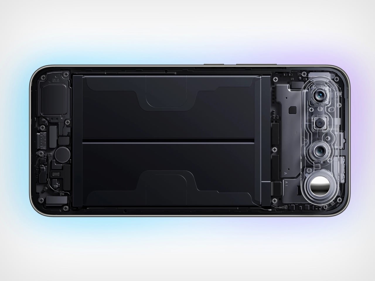
What’s more interesting than the mirror is the engineering required to make it all work. Squeezing a 7,000mAh battery into a body this manageable is no small feat, and it points to some clever internal packaging, what Realme calls an “Aircraft Structure layout” using high-density graphite battery tech. This is the kind of practical innovation that matters in the mid-range space, where two-day battery life is a legitimate killer feature. They even managed to secure an IP66, IP68, and IP69K rating, which means it’s protected against everything from dust to high-pressure water jets. That’s a level of durability you just don’t expect to see on a phone that isn’t a ruggedized brick.

The rest of the package is solidly mid-range. It’s running on a MediaTek Dimensity 6400 Turbo chipset, which is more than capable of keeping things running smoothly on the 6.57-inch AMOLED display. That screen, by the way, boasts a 120Hz refresh rate and an incredibly bright 4,500-nit peak brightness, so it should be perfectly visible even in direct sunlight. The camera system is led by that 50MP Sony IMX852 sensor with OIS, a very respectable piece of hardware for this segment, and it’s paired with a simple 2MP monochrome lens.

So, was the “Air” moniker really necessary? It feels like a stretch when the phone is 1.5x as thick as the devices it’s mimicking. And you have to wonder how much actual design work went into the chassis itself. The silhouette is pure iPhone Air, the camera plateau is straight from Honor’s playbook. Did Realme’s team just slap a mirror on a composite of last season’s hits and call it a day? Maybe. But for a mid-range phone with this much battery, maybe that’s all it needs to be. At its price tag, perhaps nobody minds a design that feels ‘inspired’ as long as it looks the part and lasts for two days.

The post Realme 16: 7,000mAh battery, iPhone Air ‘inspired’ design, 3-lens camera and a rear selfie mirror first appeared on Yanko Design.

This 5-Inch “Video Business Card” Wants To Replace Your Stack Of Paper Cards

Televisions used to be heavy boxes that dominated a room. Now, the latest LG and Samsung prototypes at CES 2026 look more like posters than TVs, with panels so slim they almost blend into the wall and bezels that seem to disappear when the screen lights up. These displays are no longer just appliances in the corner of a living room. They are becoming design elements that can live almost anywhere you might put a sheet of paper.

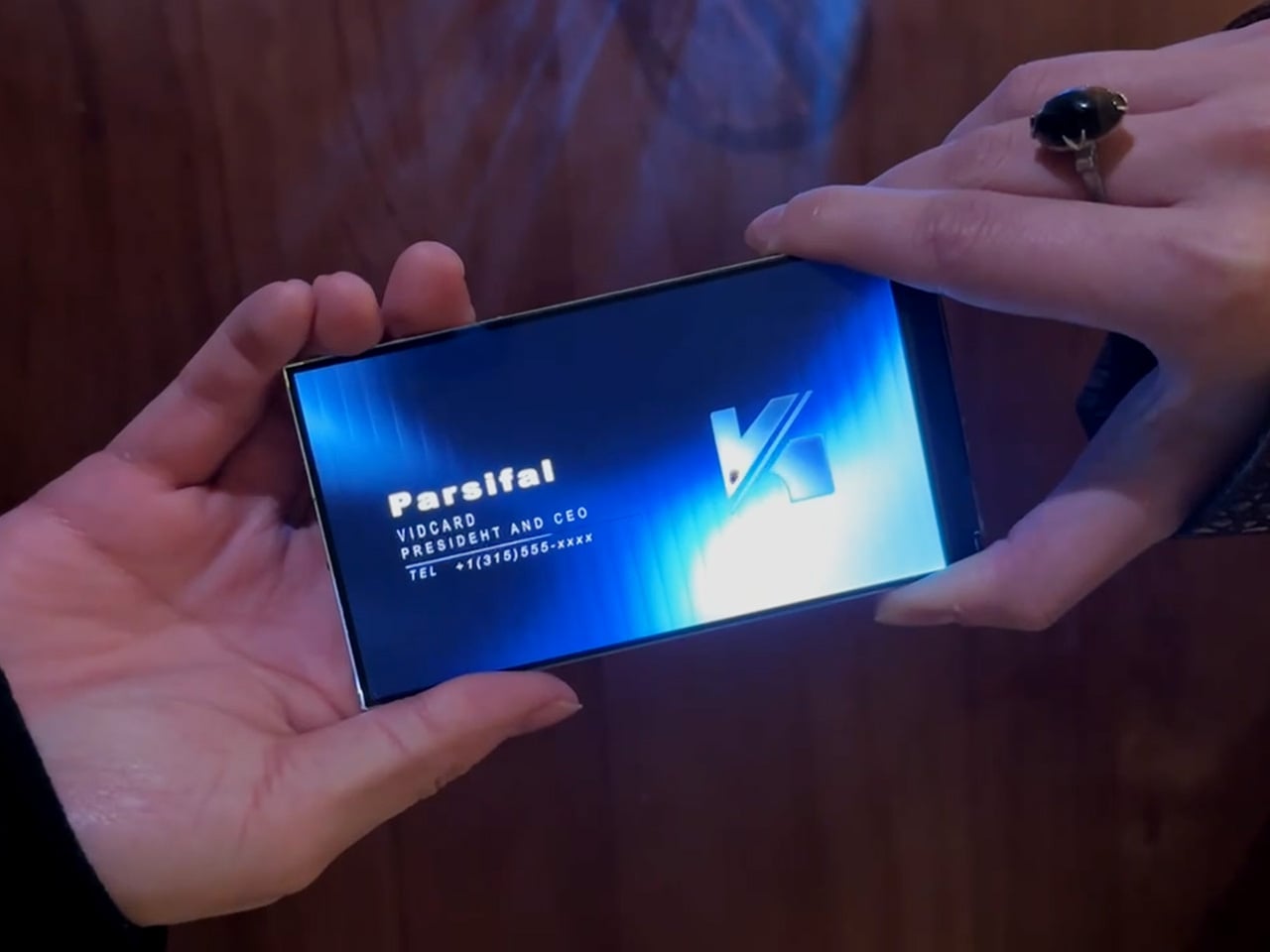
That shift makes it feel natural to ask a simple question: if screens can be this thin, why not put them where we have always relied on print? Business cards are a perfect example. They carry introductions, identity, and a first impression in a tiny rectangle. VidCard takes that same footprint and turns it into a living surface, transforming the familiar business card into a personal video introduction that plays in the palm of your hand.

Designer: Parsifal

Click Here to Buy Now: $59 $99 (40% off). Hurry, only a few left! Raised over $66,000.

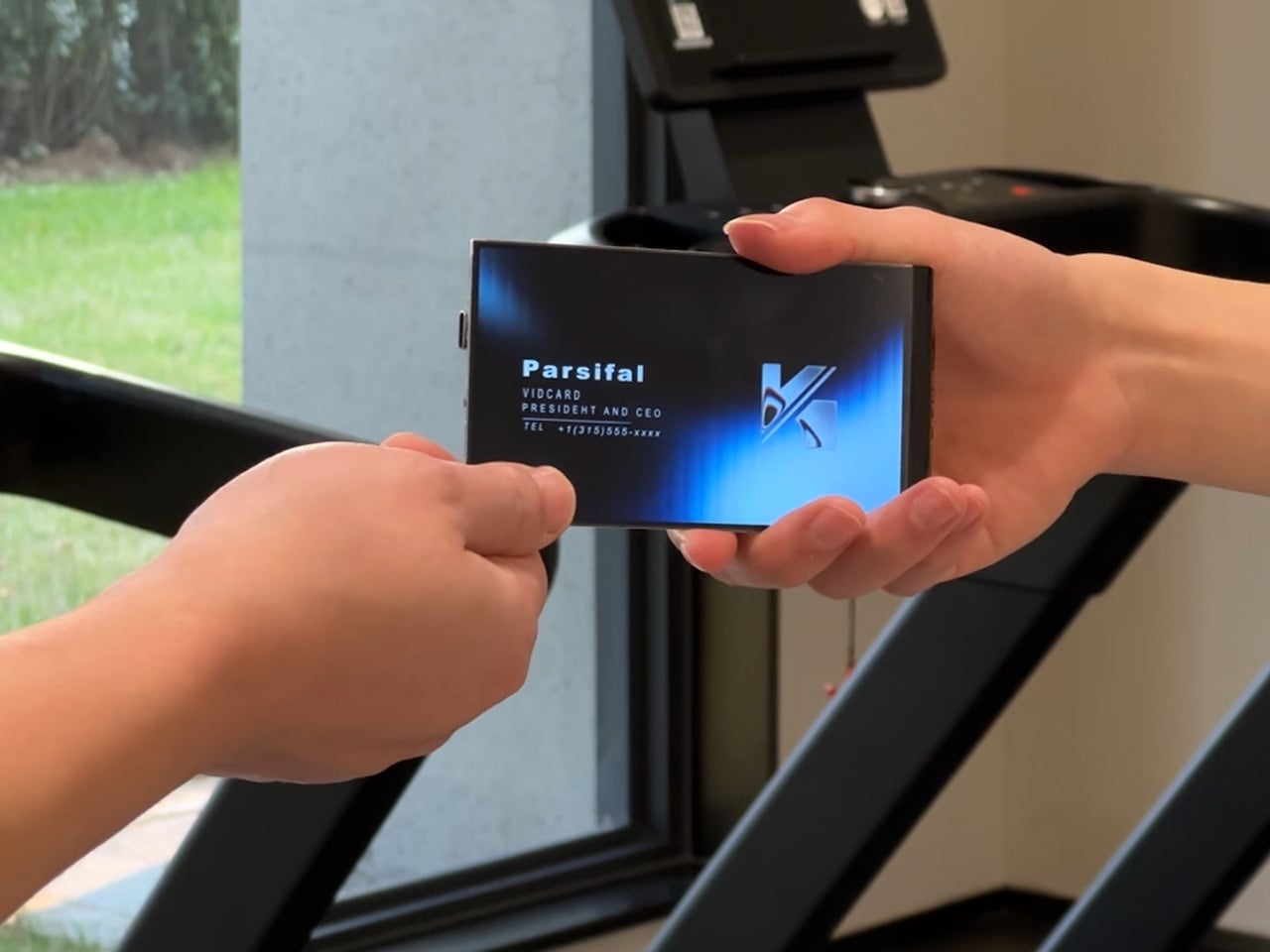
VidCard is basically what it sounds like: a rigid card with a 5 inch, 1280×720 IPS LCD screen built in, playing a looping video of you introducing yourself or your brand motion graphic. The whole thing measures 120.05mm by 86.4mm, which puts it somewhere between a credit card and a small phone, and it’s under 5mm thick. That’s genuinely impressive when you remember there’s a battery, NFC chip, display controller, and 256MB of onboard storage packed inside. The card charges via contact pins, lasts about an hour of continuous playback (roughly 120 to 240 interactions per charge), and syncs content through a companion app on iOS or Android. You upload your intro video, it pushes to the card, and you’re set. The screen itself looks clean in the campaign photos and bright enough for indoor use.

The NFC feature sidesteps the whole “how do I actually save your contact info” problem. You tap the card against someone’s phone, and it pulls up your mobile optimized landing page with your video, company profile, documents, and whatever else you want to link. No app download required on their end, which makes sense because nobody wants to install something just to see your business card. Real time analytics track who viewed your profile, when they watched, how long they engaged, and if they came back for a second look. There’s a slightly dystopian charm to getting a notification at 11pm that someone just rewatched your intro for 87 seconds, but it does give you actual data to inform follow ups instead of wondering if your card got tossed in a drawer.

Here’s the thing, though. You know what else has a high resolution screen, NFC, internet connectivity, and can play video? The phone in your pocket. You could theoretically just show someone your intro video on your phone, tap for NFC sharing, and achieve most of the same result for zero additional hardware. VidCard’s counter to that is the physical artifact itself. Handing someone a glowing screen feels different than showing them your phone (besides, unlocking a phone, opening your gallery, and finding the right video can take painful minutes), and if you leave the card behind with a high value contact, it becomes a keepsake that lives on their desk instead of disappearing into a contacts list. That’s either brilliant or unnecessary depending on how much you value the showmanship in networking, although I genuinely can’t decide which camp I’m in.

The founders claim inspiration from Call of Duty: Advanced Warfare, where a character hands over a video business card inviting you to join a fictional military contractor. That’s a deeply nerdy origin story, and I respect it. VidCard works best in situations where you need to stand out in a sea of forgettable interactions: trade shows, high stakes sales meetings, investor pitches, creative industry networking where showing your work matters more than listing credentials. It’s overkill for casual meetups or industries where a LinkedIn connection does the job, but if you’re trying to leave an impression on someone who sees 50 people a day, a card that talks and moves will get you remembered. The real test is whether that memory translates to actual follow through, which the analytics dashboard is designed to help with by showing you who’s genuinely interested versus who just thought the card was neat.
VidCard is live on Kickstarter through February 5, 2026, with early bird pricing starting at $59 USD for a single unit, $162 USD for a three pack, and scaling up to $599 USD for a 10 unit business pack with bulk branding options. Estimated delivery is June 2026 for early backers, with standard shipments following through June 20. The campaign has already cleared its funding goal by a wide margin, which suggests the concept resonates with enough people that we may just end up seeing video or even holographic business cards in the not-so-distant future.

Click Here to Buy Now: $59 $99 (40% off). Hurry, only a few left! Raised over $66,000.

The post This 5-Inch “Video Business Card” Wants To Replace Your Stack Of Paper Cards first appeared on Yanko Design.