Late last year, Samsung launched its newest generation of affordable A-series phones, starting with the entry-level A17. Following the arrival of the flagship Galaxy S26 line, the company has returned to flesh out the rest of its midrange portfolio. The more affordable Galaxy A37 and Galaxy A57 sport some interesting upgrades, even when compared to some of their pricier siblings.
Core specs and features
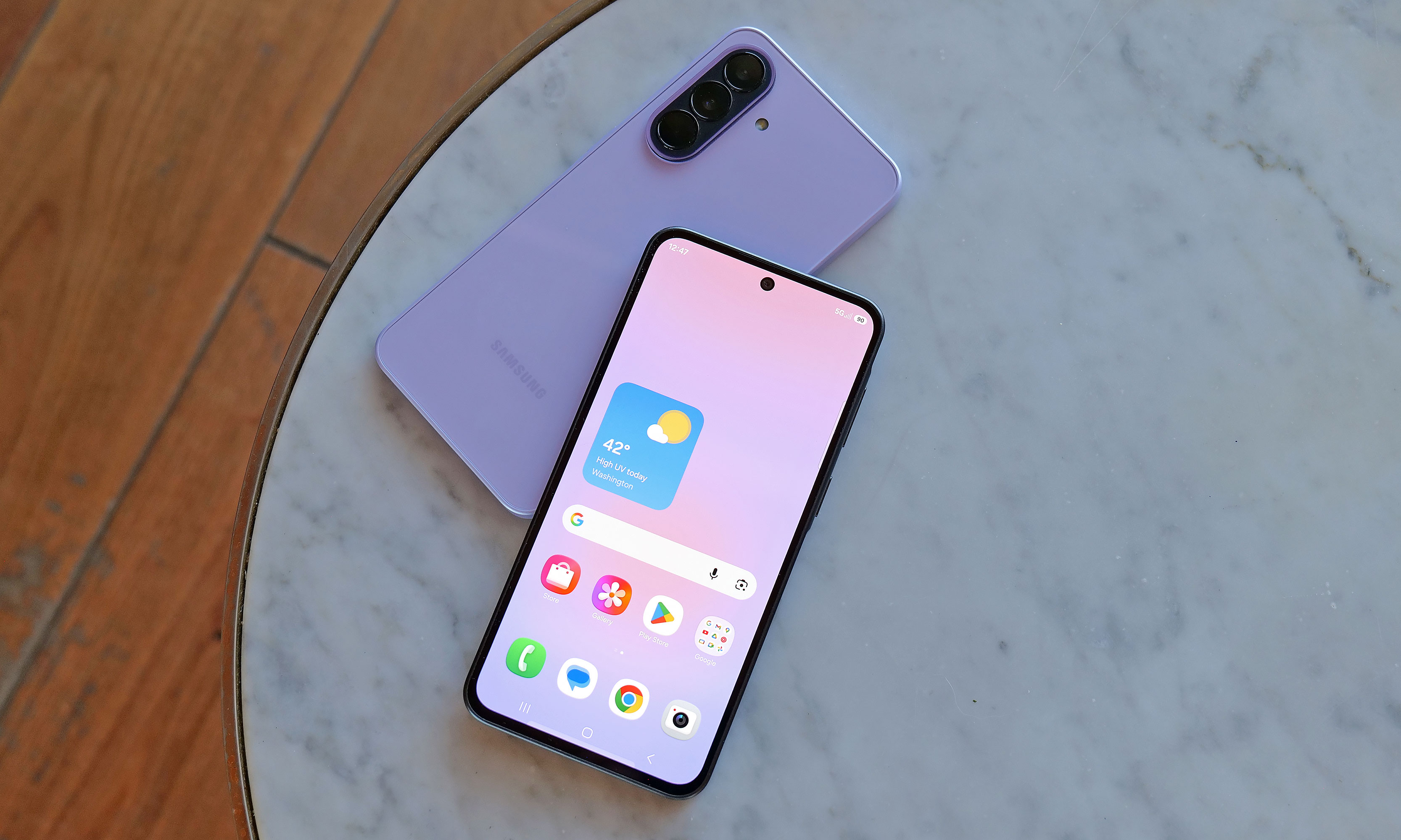
Before we dive into my hands-on impressions, I want to do a quick rundown of each phone's specs as that should help set up (or temper) expectations. As you'd expect based on their numbering, the A37 is the more affordable of the two with a base price of $450 for 6GB of RAM and 128GB of storage. You can also choose 8GB RAM and 256GB of storage for $540. Notably, when compared to the A17, the A37 features a much more recent and more powerful Exynos 1480 chip that brings a big jump in NPU performance and helps unlock much of the phone's newfound AI capabilities. It also comes with a large 6.7-inch AMOLED display, a 5,000mAh battery and three rear cameras. However, two of those will likely get more use than the other as the A37 packs a 50-megapixel main camera and an 8MP ultra-wide, along with a 5MP macro shooter.
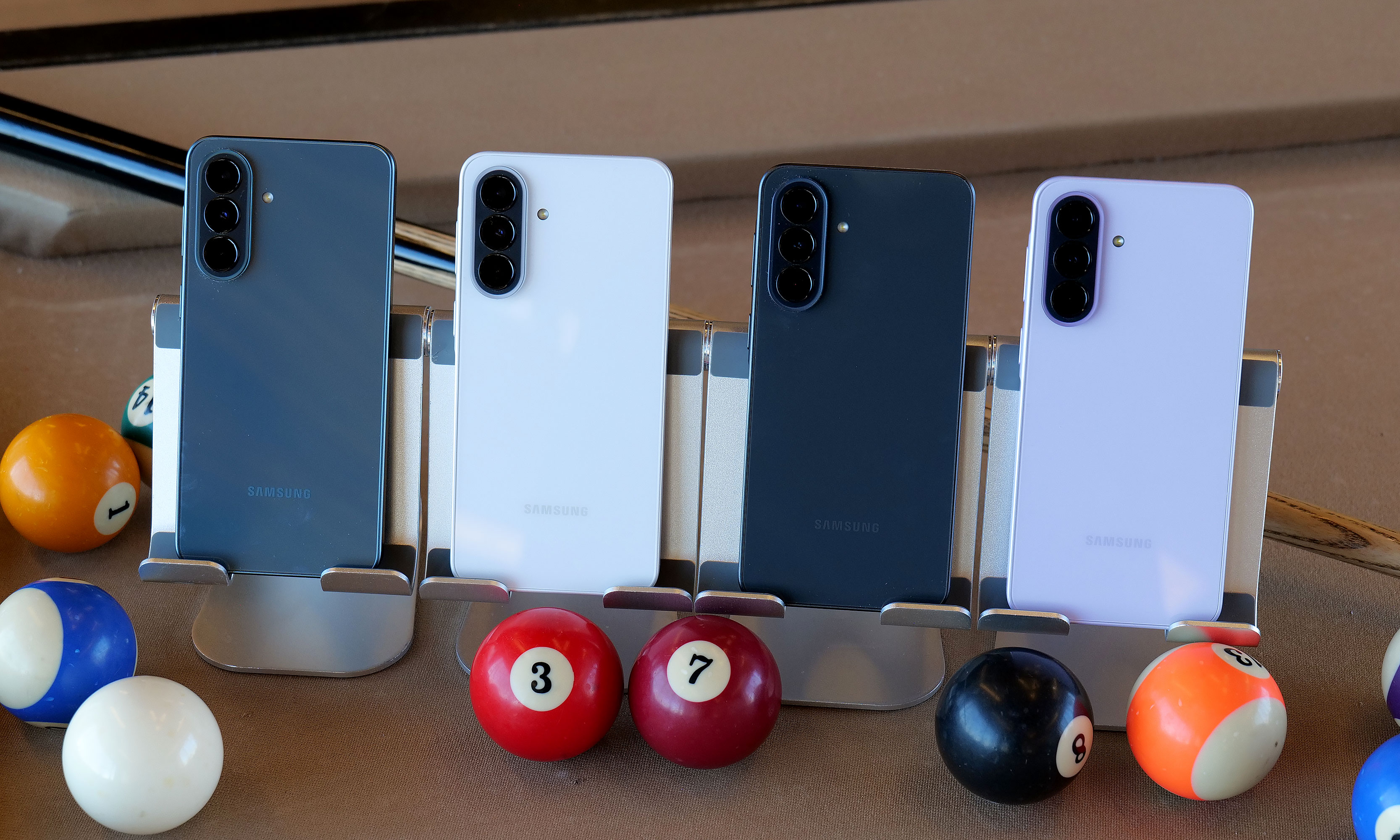
The Galaxy A37 will be available in four colors: charcoal, white, lavender and graygreen. However, the middle two are Samsung.com exclusives and the last one is only available from Best Buy.
Sam Rutherford for Engadget
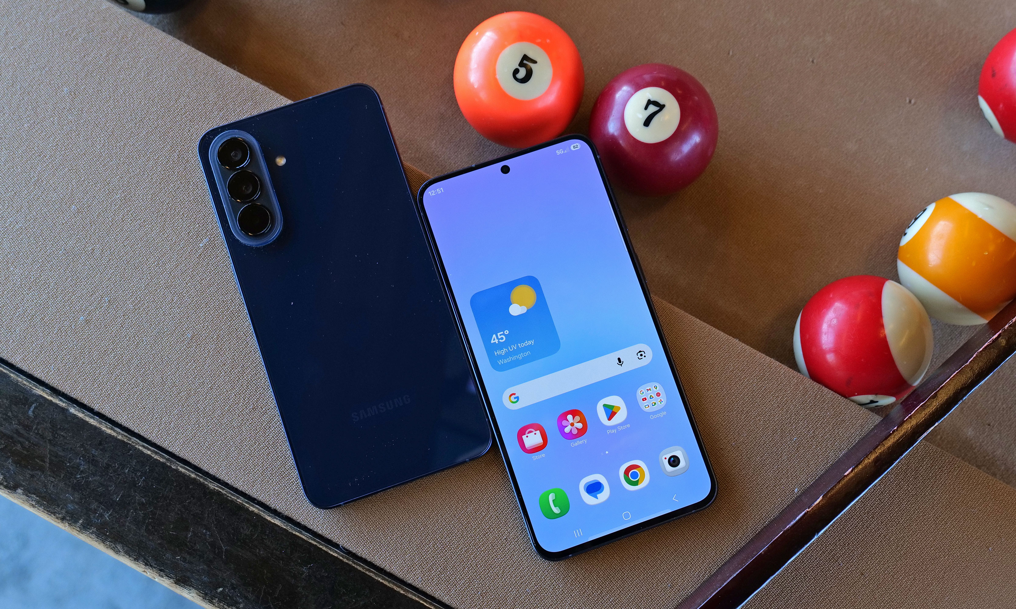
Meanwhile, the Galaxy A57 is a bit more expensive, starting at $550 for 8GB of RAM and 128GB of storage, or $610 for the 8GB/256GB version. It also features a slightly more powerful Exynos 1680 processor and a higher-res 12MP sensor for its ultra-wide lens, but aside from that, it has the same general camera setup as A37 and the same size battery. One small difference is that the A57 has Bluetooth 6 connectivity and Wi-Fi 6E, but the A37 is still stuck with BT 5.3 and basic Wi-Fi 6.
For some reason, the A57 is only available in one color: navy.
Sam Rutherford for Engadget
Both phones come with IP68 ratings for dust and water resistance (which is an upgrade from IP67 on the A36) and 120Hz refresh rates. However, the most important shared trait is that while neither supports wireless charging, they can both take wired power at up to 45 watts, which is actually faster than a base Galaxy S26's limit of just 25 watts. Finally, in addition to six years of OS and security updates, the A37 and A57 are getting some trickle-down AI features from its flagship siblings. Those include improved support for Google's Circle to Search, Object Eraser and better transcription and translation capabilities in the Samsung Voice Recorder app.
Galaxy A37 impressions
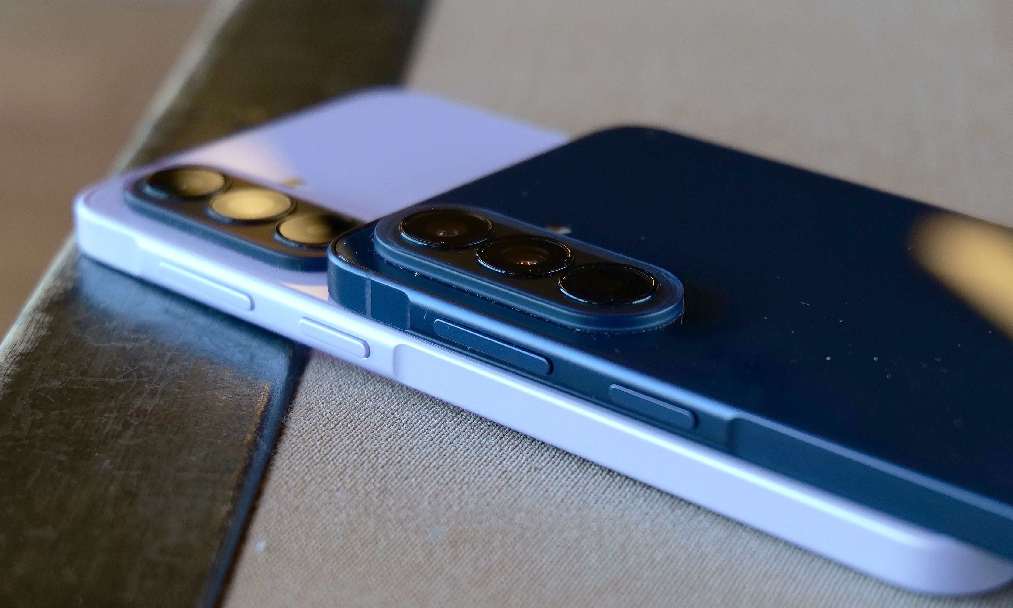
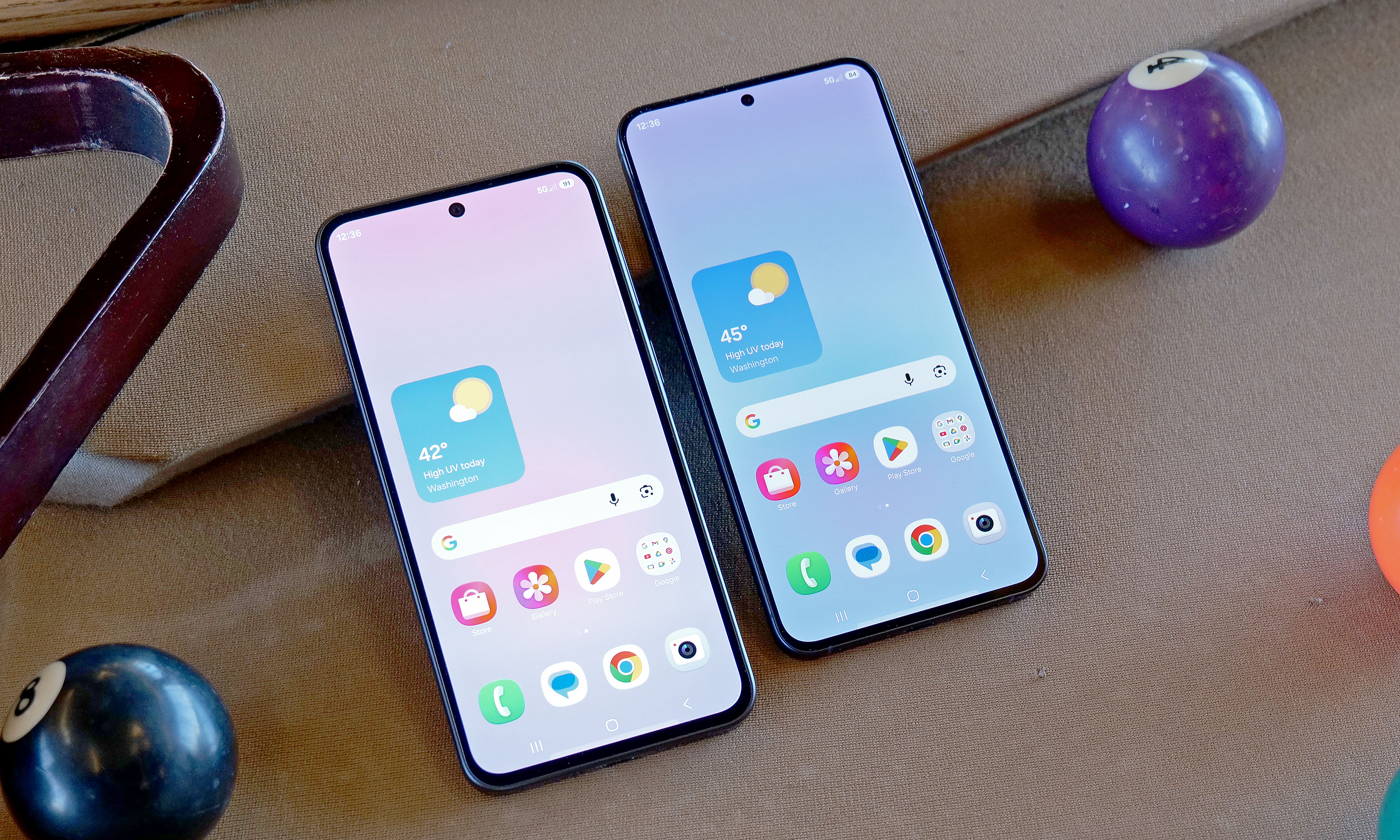
Both phones have nearly identical designs, right down to the same screen size and number of cameras. That said, one area where Samsung cut corners on A37 is that it features a plastic frame instead of the A57’s aluminum. But even when you hold them side by side, it's rather difficult to discern between the two. There's no obvious difference in appearance or button layout, so the main way to tell the two apart is by feeling for the cooler touch you typically get from a metal chassis. Alternatively, if you look closely, you'll notice that the A37 has slightly thicker bezels around the outside of its screen.
Here's a closer look at the A37's color options.
Sam Rutherford for Engadget
Compared to the Galaxy A17, the A37's Exynos 1480 felt significantly snappier and much better equipped for multitasking or AI-based tasks like removing unwanted objects from photos. Regardless, as the less expensive of Samsung's new midrange phone options, the company did a really good job disguising the major differences between the two new models.
Galaxy A57 impressions
To be honest, the A57 wasn't quite as appealing as the A37 due to its higher price and no additional features. The main tool it has that isn't available on its more affordable sibling is Samsung's Best Face camera tool, which allows the phone to analyze people's expressions so you can select your favorite reaction and put it in the photo you want. On paper, its Exynos 1680 chip should be a bit faster, but in normal use, it's really hard to tell. And unlike the A37, which comes in four colors (white, charcoal, lavender and gray/green, depending on the retailer), the A57 is only available in navy.
Early thoughts
While they look the same, the A57 features an aluminum chassis instead of plastic like on the A37, which should be better for long term durability.
Sam Rutherford for Engadget
As a more powerful and more premium alternative to the $200 A17, the A37 feels like a worthy upgrade for the money. It offers noticeably smoother performance along with a more elegant hole-punch selfie cam (instead of a waterdrop) and stereo speakers (instead of mono). Starting at $450, the A37 can also undercut the Pixel 10a while offering a larger 6.7-inch AMOLED display (versus 6.3 inches for the Pixel) and a smattering of equivalent AI features. And in some ways, the wider selection of colors just reinforces that Samsung is probably placing bigger bets on the A37's market prospects. If I were looking for an affordable Android phone with a big screen, I'd give more consideration to this new middle child in Samsung's A-series lineup.
Aside from bezels that are a tiny bit bigger, the Galaxy A37 (left) looks almost exactly the same as the more expensive Galaxy A57 (right).
Sam Rutherford for Engadget
As for the A57, it's certainly not a bad phone, but starting at $550, it suffers from being in a much more competitive price bracket. For those who prefer smaller devices, the $500 Pixel 10a is cheaper while offering even better AI tools, a cleaner UI, wireless charging, a slightly larger battery and unmatched photo quality. However, the A57's biggest rival is arguably another Samsung phone: the Galaxy S25 FE. Aside from slower wired charging, it has an even nicer design, an extra year of software and security updates (seven total) and a proper telephoto camera instead of a macro lens. And while its MSRP is a bit higher at $650, it's regularly on sale for under $600 (or less), which effectively sidesteps the A57's biggest advantage.
That said, no matter which one you prefer, more options for affordable gadgets are always welcome — especially with the price of smartphones and PCs increasing due to the global RAM shortage.
The Galaxy A37 and A57 will officially go on sale April 9.
This article originally appeared on Engadget at https://www.engadget.com/mobile/smartphones/samsung-galaxy-a37-and-a57-hands-on-the-cheaper-phone-might-be-a-winner-120000965.html?src=rss
Last year, Belkin released a couple of cases for the Nintendo Switch 2 just in time for launch, including one that came with a handy battery pack. That one was simple and effective, but it felt a bit crude because it wasn't much more than a basic travel pouch with a generic power cell tossed inside. Now, Belkin is back with a Pro version of its Charging Case for the Nintendo Switch 2, featuring a more sophisticated battery pack along with a higher price tag ($100 vs. $70). So here’s the question for any Switch 2 owners still looking for a way to protect their console while keeping it topped off: Is a more elegant charging solution really worth the extra money?
Case design
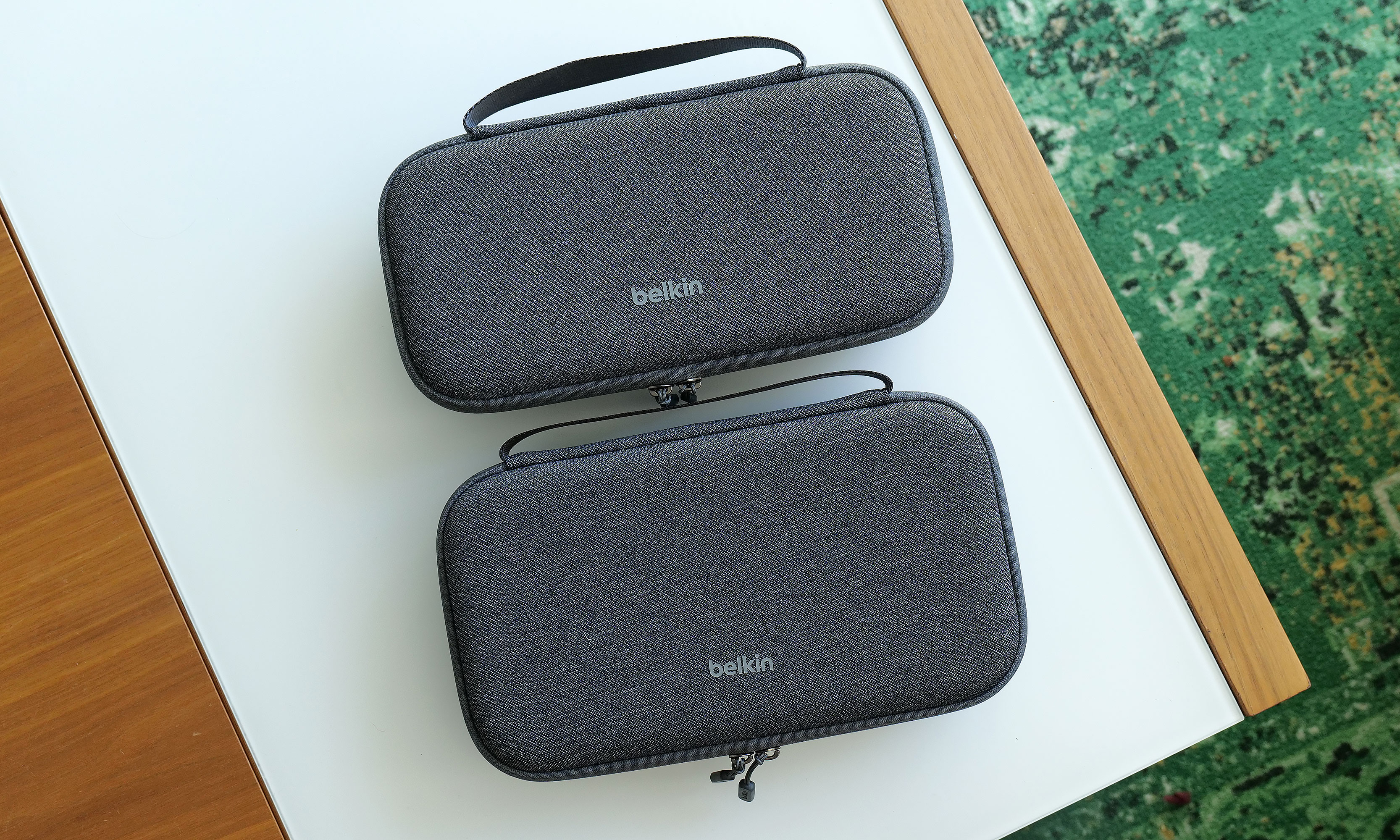
At 11.7 x 6.1 x 2.5 inches and weighing 1 pound 12 ounces, the Pro Charging Case is a touch larger and heavier than its non-pro sibling. It also features a very similar design with the same color options and materials, including a tough polyester outer shell that’s balanced by a softer, velvet-like material and cutouts for your Switch 2 on the inside.
The Pro Charging Case (bottom) is a touch bigger and heavier than the previous model, but aside from that its sports a nearly identical design.
Sam Rutherford for Engadget
Once again, Belkin has done a good job of providing a snug cabin to store your console while still making it easy to take it in and out. That said, if your system also has an extra-thick protector or hardshell case like the Killswitch from Dbrand, it may not fit. There's also a padded flap that swings down to protect your Switch 2's screen that also pulls double duty as a place to stash up to 12 game cartridges, which is a very thoughtful touch.
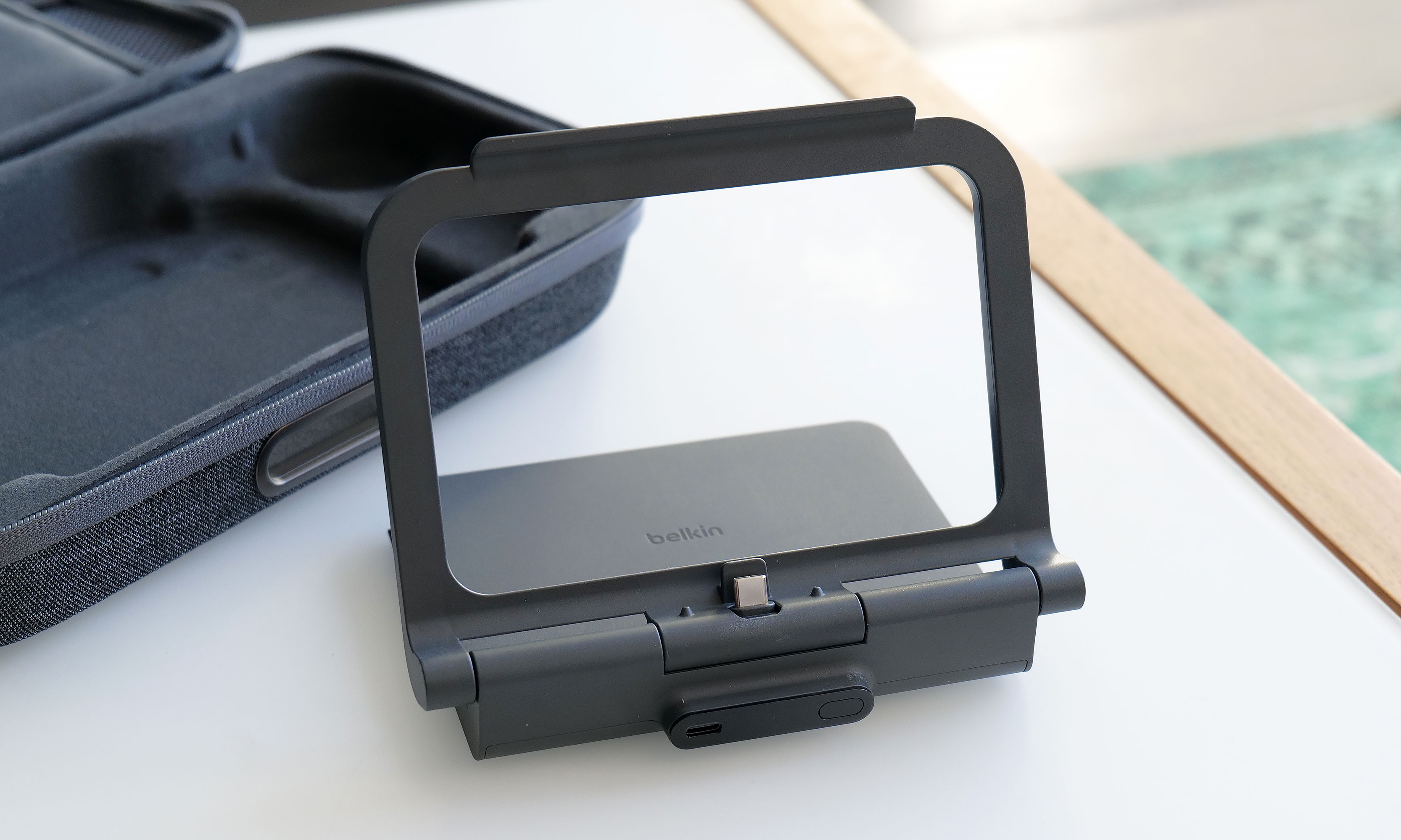
However, the biggest change to the Pro Charging Case's exterior design is a new cutout on the front edge, which allows you to top off other gadgets (or a Switch) by plugging a USB-C cable into Belkin's included battery pack. Unfortunately, the case doesn't come with a cord, which seems a bit odd until you take a closer look at the power pack's layout. That’s because once you open up the case, you’ll see a second port designed to fit right into the bottom power jack on the Switch 2 without the need for a cable.
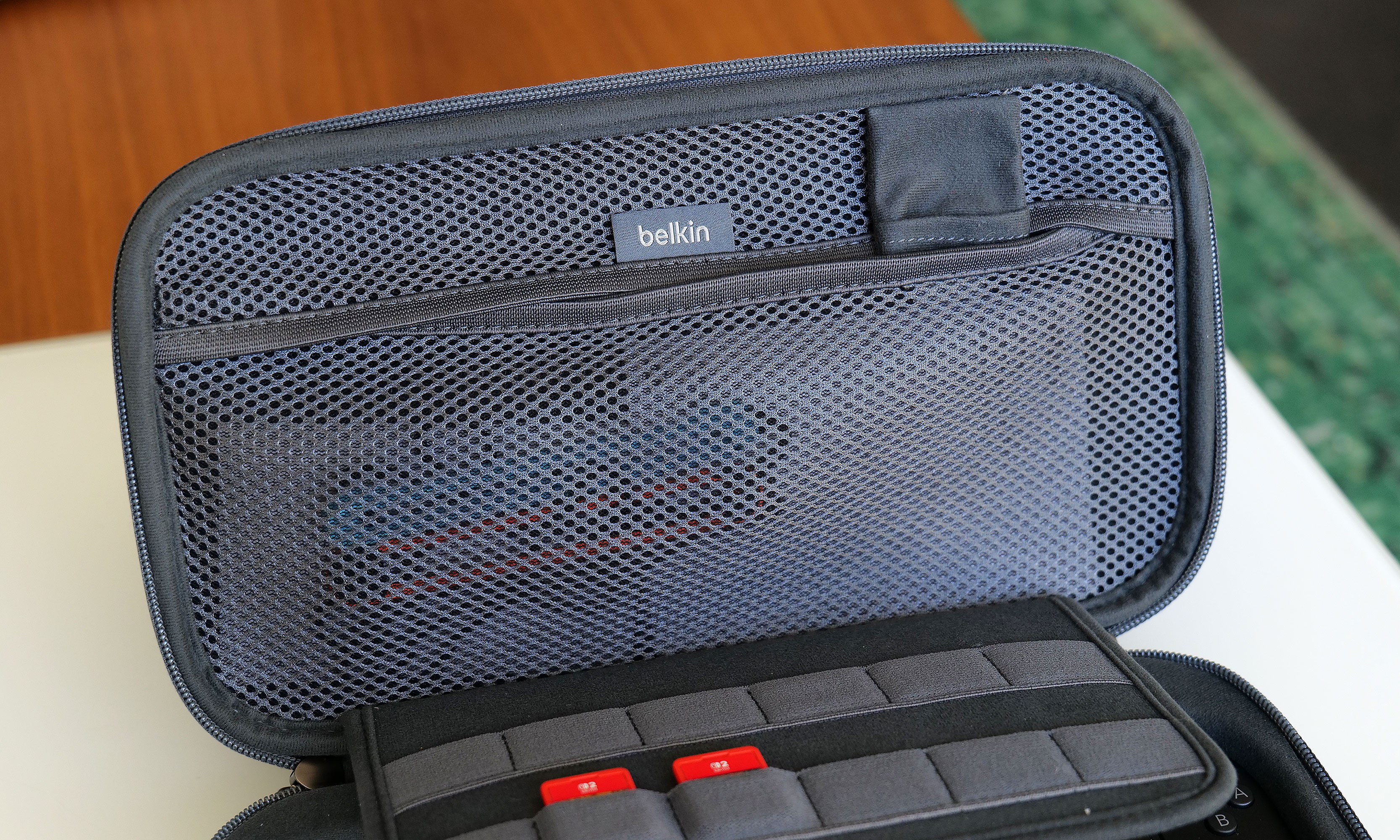
The inside of the Pro Charging Case features a handy mesh pocket, 12 slots for game carts and a hidden AirTag pouch.
Sam Rutherford for Engadget
Other small touches on Belkin's Pro Charging Case include a mesh pocket for storing things like cables, Joy-Con straps or cleaning cloths, which is very handy. However, my favorite thing might be the AirTag pouch that's also hidden inside that pocket, which could give you a fighting chance of recovering your system if it's ever lost or stolen (though I wouldn't count on it).
Battery pack
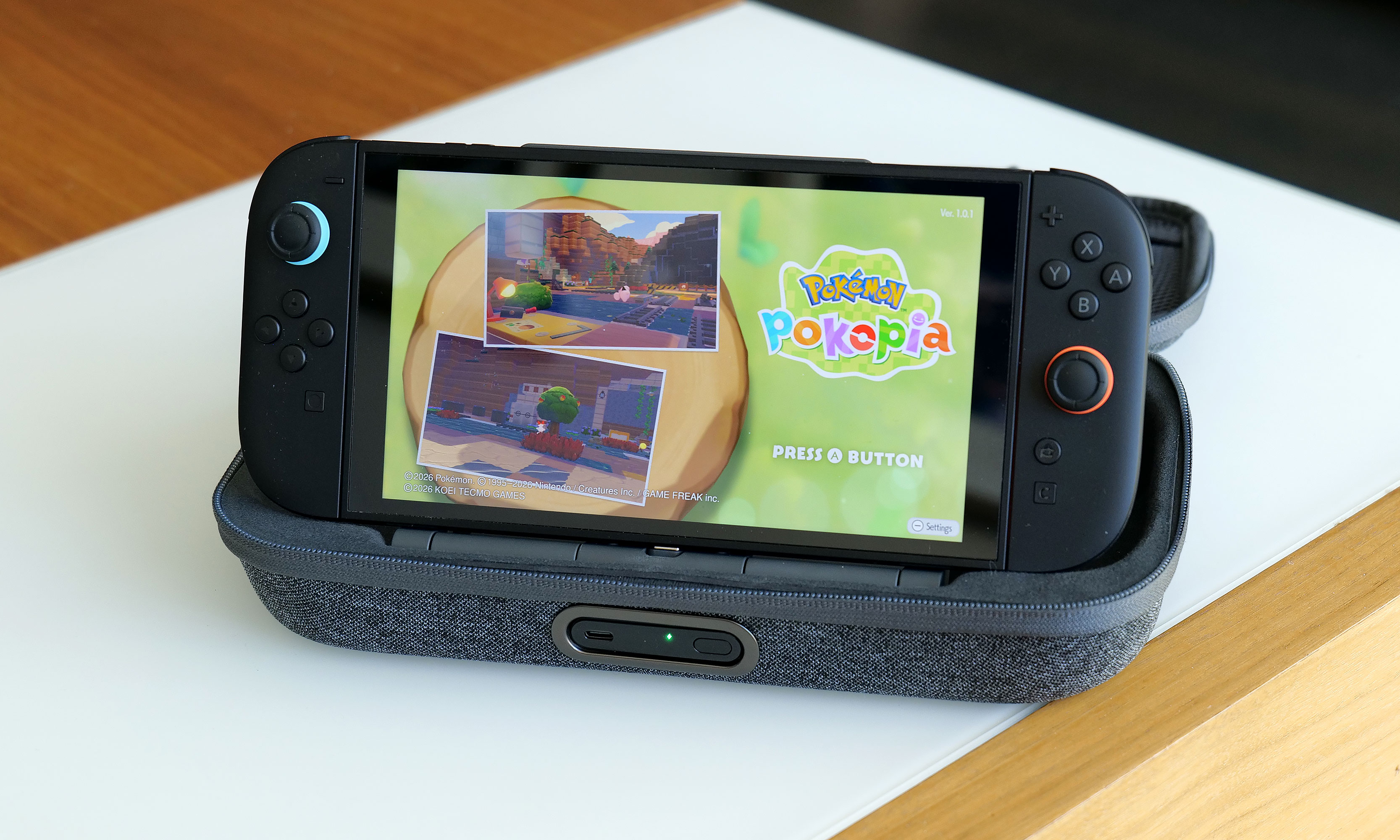
The arrangement of the included 10,000mAh battery pack and the placement of its internal USB-C port makes it a cinch to recharge your Switch 2 every time you put it in the case.
Sam Rutherford for Engadget
Despite the increased size of the Pro Charging Case's included battery, it has the same 10,000mAh capacity as what you get from its less expensive sibling. That means you'll typically have enough juice for a little more than 1.5 recharges for your Switch 2 and its onboard 5,220mAh cell. Instead of relying on a simple external power pack like before, Belkin's bundled battery comes with a second USB-C port and a kickstand. This makes it super easy to plug in your Switch 2 every time you put it in the case. This way, you know the next time you turn it on, it'll be at 100 percent.
Here's what the battery pack looks like when you take it out of the case. As you can see, its size and shape means it's not a great standalone external power pack any more.
Sam Rutherford for Engadget
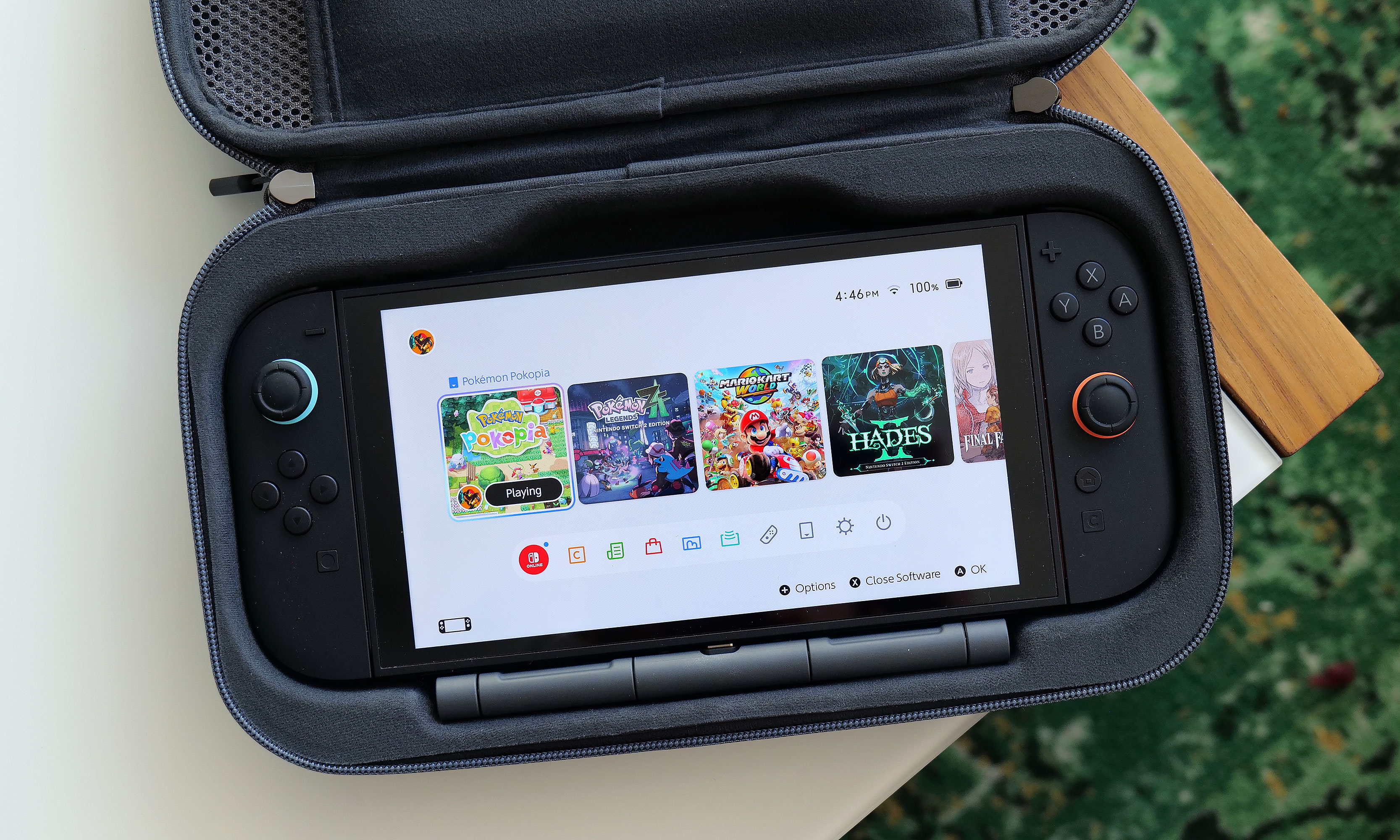
Alternatively, you can raise the kickstand to prop up the Switch 2 and game on it while it stays nestled inside the case. This might seem a bit redundant as Nintendo's console already has its own kickstand, but Belkin’s allows you to continue charging the system while you're playing without needing a cord. There's even a handy display on the side of the battery, so it's super easy to see how much juice is left, even when the case is closed. Furthermore, when you need to recharge the power pack, you can do so without removing it from the case or disconnecting your Switch thanks to that bonus USB-C port on the outside. Compared to the previous model, this is certainly a more elegant solution that provides some subtle quality of life improvements. The one downside is that the battery pack is somewhat awkwardly shaped, so you won't really want to use it on its own.
Wrap-up
There's no doubt the Pro Charging Case's new battery pack is a more premium solution that's easier to use and manage. When you need to recharge it, you can do so from the outside without opening the pouch. It also lets you charge a Switch 2 without ever needing a cable. The built-in kickstand is another bonus that helps elevate the whole kit from a simple case to something closer to a tiny all-in-one gaming booth.
One of the neat things about giving the battery a kickstand is that it turns the case into a mini all-in-one. This makes me wish Belkin gave the included power pack some sort of docking functionality for connecting the Switch 2 to an external display.
Sam Rutherford for Engadget
That said, after using it for a couple of weeks, I'm still not sure the added convenience is worth an extra $30 over the original. Due to the battery packs' new shape, it's less useful as a standalone power cell, and the rest of the case's design is largely unchanged. Of course, it's always nice to have options, and if you're the kind of person who doesn't mind spending a little extra for a more streamlined and convenient kit, Belkin's Pro Charging Case for the Switch 2 is still very much worth consideration.
This article originally appeared on Engadget at https://www.engadget.com/gaming/nintendo/belkin-charging-case-pro-for-switch-2-review-a-more-elegant-solution-144820809.html?src=rss
Ever since making the jump to the Nintendo Switch, there's something that's bugged me about practically every modern Pokémon game, a feeling that has only intensified after spending countless hours in Pokopia. For titles based in big, open worlds and filled with adorable polygonal characters and lovely music, why is nearly every pokémon still saddled with a call that sounds like a dial-up internet connection?
As someone who played Pokémon Red and Blue at launch, I'm very aware that the origin of these sounds is tied directly back to those original titles on Game Boy, which was powered by an 8-bit SM83 processor from Sharp. Back then, it was a herculean challenge to fit the entire game into a single 512KB cartridge. So as a way to save space, the voice (or cry as they are more commonly known) of each of the original 151 Pokémon came from just 38 base cries, which then had their pitch or duration modified to create more unique sounds.
Naturally, this tradition of lo-fi cries continued throughout Pokémon's run on the Game Boy and Game Boy Advance and onto the Nintendo DS and 3DS. And despite the higher-res graphics we got in subsequent titles, the use of sprite-based icons and other nostalgic touches made those bitcrushed calls sound right at home. However, when the series moved to the Switch and Switch 2 and embraced larger 3D worlds, those cries began to feel disconnected, especially for newer players without years of nostalgia to draw from.
The first issue is one of identifiability. They all kind of sound the same, especially in earlier titles like Red and Blue or Gold and Silver, where around one hundred new Pokémon are represented by just 30 base cries. Ideally, a monster's voice would be just as recognizable as its silhouette. Unfortunately, the current lo-fi cries just don't fit the bill.
The second problem is that the continued use of the old-school cries feels out of place in the grand scheme of Pokémon. When you watch the Pokémon anime, monsters don't use the same crunchy screams. Same goes for the movies, including big theatrical releases like Detective Pikachu. At this point, pretty much every new piece of Pokémon media except the games (and the TCG for obvious reasons) features proper voice acting, which sort of brings us to the biggest reasons to ditch the audio clips from the Game Boy era: Pokémon that actually say their name is just super fun and easy to understand.
Sure, it's a bit of a gimmick, but it works. Plus, it kind of resonates with the philosophy that many vexillologists hold that says flags should be simple enough for a child to draw. Kids can say "Charmander," "Greninja" and even "Alomolola." But there ain't no way they are pronouncing this. For a game that's intended to be played by younger audiences, having the reinforcement of hearing a pokémon say its name while also seeing it written out in text isn't just easier to comprehend, it can also be a learning exercise. Also, just ask yourself, when you think of Squirtle, what do you hear in your head: this or this?
Now, there are several reasons why Game Freak hasn't made this leap already. The first is obviously money. Granted, localization costs only make up a fraction of the budget for a Pokémon game, but it's still a lot of work to translate things for various regions across the world, especially with modern titles available in at least nine different languages. This includes adjusting the names of specific monsters to better suit a specific market. For example, in Japanese, Hitmonchan and Hitmonlee are named Ebiwalar and Sawamular as a tribute to some of the country's most famous boxers. So when you consider the need to get different voice actors across the world to perform all of these variations, things get expensive.
Furthermore, there's an argument that creating a canonical voice for a main character like Victor or Gloria from Sword and Shieldtakes away from players' ability to imagine their own. Pokémon is an RPG after all. However, I don't think that reasoning flies when it comes to each monster's individual cry, even though many of them have been upgraded or refined in recent years. Same goes for the idea that a Pokémon that says its name sounds less natural than whatever this is. At the end of the day, these monster calls are iconic, and the Pokémon devs know this, because they've given proper cries to characters like Pikachu and Eevee in certain situations.
Regardless, for a franchise that's one of, if not the most valuable media property on the planet, I really hope that one day we can get proper vocal performances in Pokémon games, even if it costs Game Freak and Nintendo a little extra money. To be clear, I don't hate the old 8-bit cries and I don't think Game Freak needs to delete them entirely. They can simply be an alternate choice for anyone who prefers them over their actual voices. I just feel like after recently celebrating its 30th birthday, it's time for Pokémon to move on and celebrate some of the voice acting that helped make the franchise so popular in the first place.
This article originally appeared on Engadget at https://www.engadget.com/gaming/nintendo/its-time-for-game-freak-to-finally-give-pokemon-some-proper-voice-acting-130000851.html?src=rss
Last year, Dell came this close to abdicating its throne as the maker of the best premium Windows laptops when it announced it was killing off the XPS brand. Thankfully, the company regained its wits, admitted its mistake and doubled down on its flagship notebook line by revealing a full redesign for 2026 with super sleek builds, improved performance and helpful tweaks to nearly everything else we loved about its predecessors. The one blemish to Dell's crown jewel is some keyboard issues on early units. But make no mistake, the king of laptops is back.
Design and display
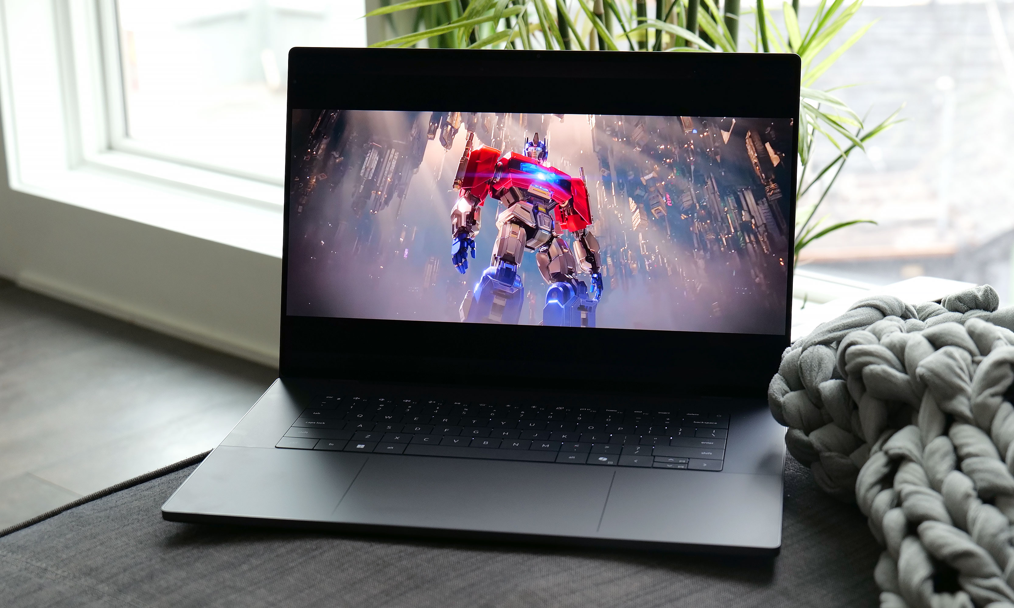
For this revamp, Dell didn't stray away from the XPS line's typical mix of glass and aluminum. However, this time around, the company streamlined pretty much everything. The XPS 16 now weighs just 3.65 pounds (or 3.85 if you opt for the heavier LCD display), which is almost a full pound lighter than its predecessor (4.56 pounds). That's a massive drop and it makes this system closer in heft to a 15-inch MacBook Air (3.3 pounds) than a 16-inch MacBook Pro (4.7 pounds), despite the latter being XPS's usual rival. It's also noticeably thinner at 0.58 to 0.6 inches (depending on the exact configuration), which is once again a sizable decrease from the previous model (0.75 inches). Honestly, this laptop needs to be held to be truly appreciated. Even after using it for a while, it still feels impossibly sleek every time I pick it up.
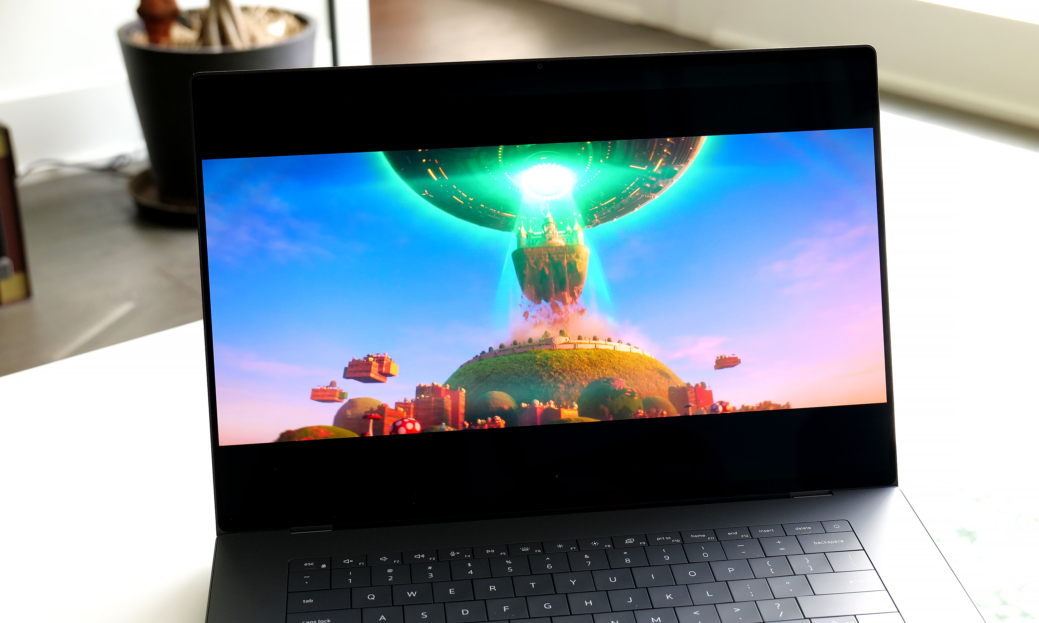
The optional 3.2K OLED display available on the XPS 16 is simply gorgeous.
Sam Rutherford for Engadget
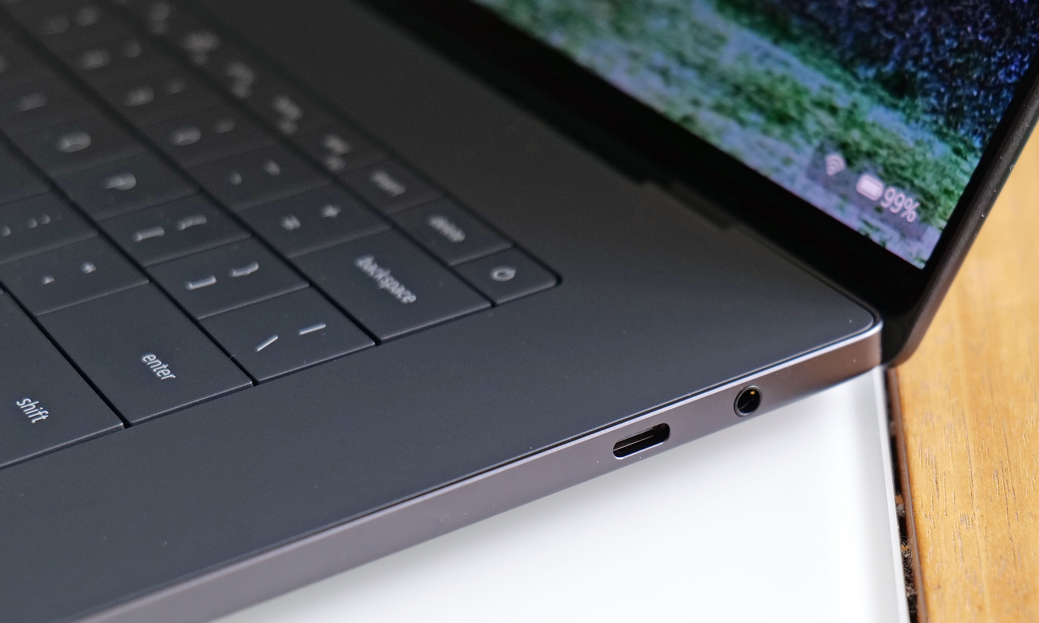
Elsewhere, Dell kept important features like the XPS line's up-firing stereo speakers (which sound great), along with a decent mix of ports, including three USB-C jacks that support Thunderbolt 4, DisplayPort 2.1 and power delivery. The one thing I wish Dell had included though, is some sort of SD card reader. With the XPS 16 being the largest member of the family, it's often a prime option for people who like to edit photos and videos on the go, so having an easy way to transfer media from a camera to the laptop would be really nice.
As for its display, Dell's optional 3.2K tandem OLED panel like the one on our review unit reinforces the laptop's role as a mobile editing platform. It produces vibrant hues and features a variable refresh rate that can go between 20 and 120Hz depending on what's on the screen. Despite having a nominal peak brightness of 400 nits, it looks much brighter in person, so you're getting an excellent viewing experience.
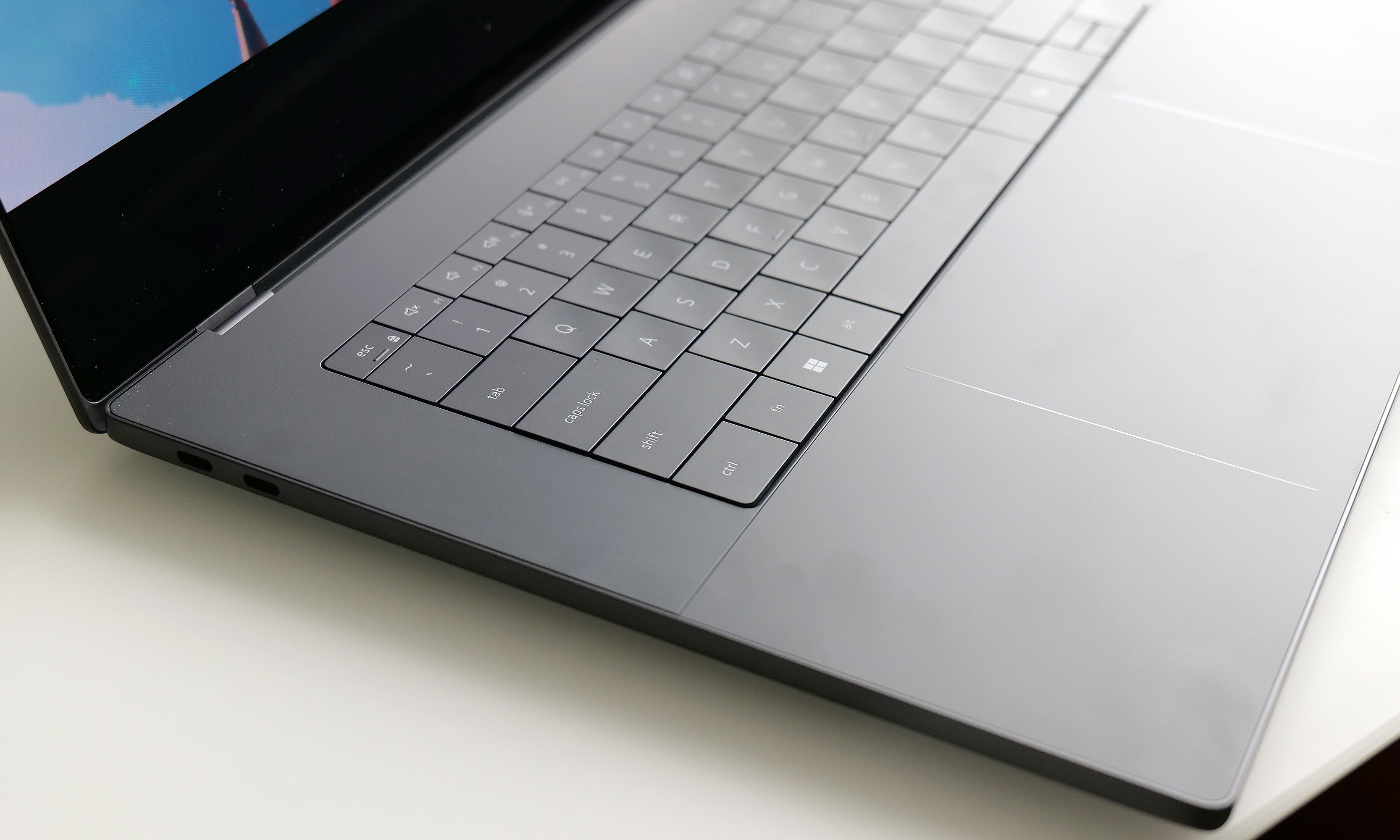
Keyboard and touchpad
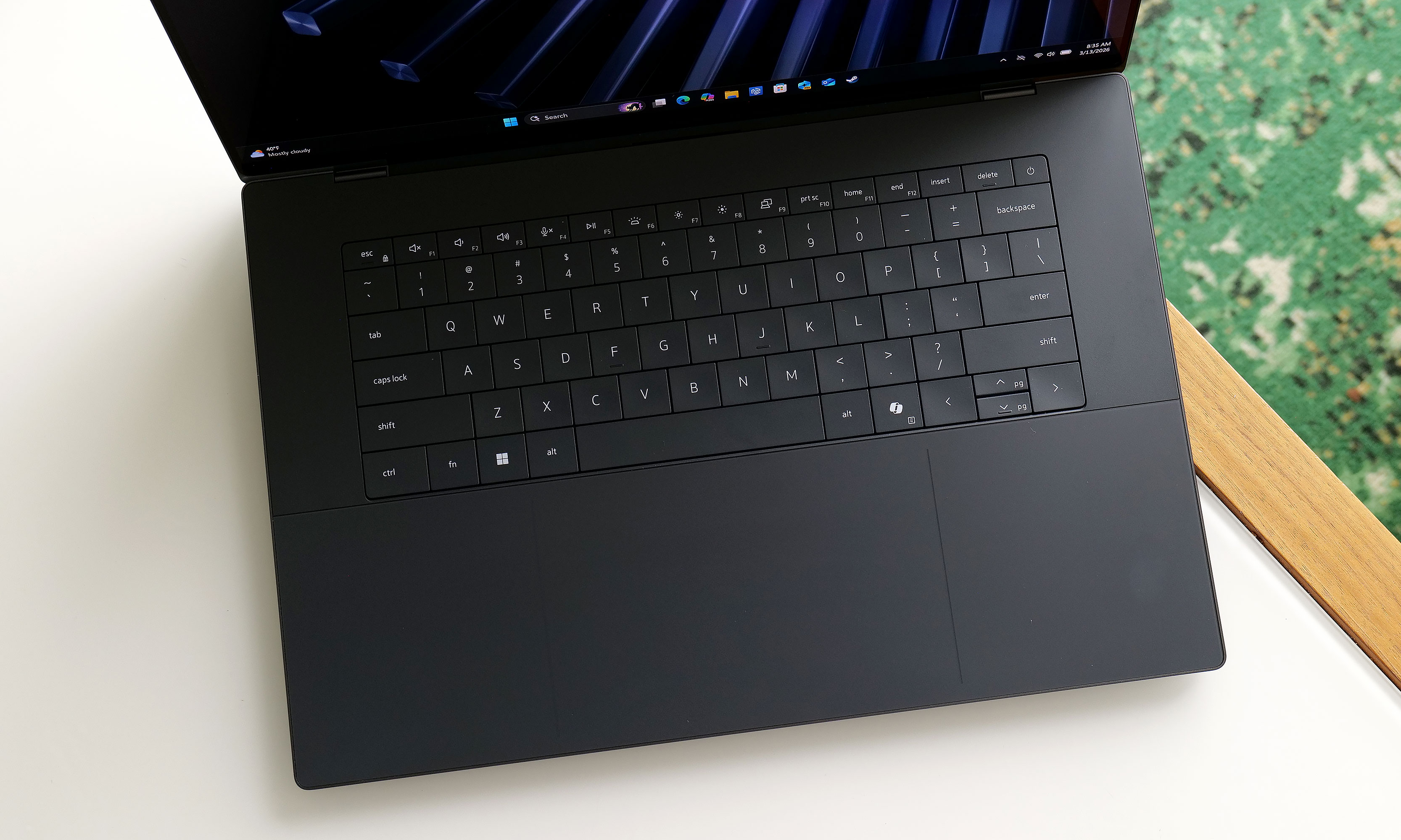
The XPS 16's keyboard looks great, but the lack of an anti-ghosting feature and somewhat shallow key travel aren't ideal.
Sam Rutherford for Engadget
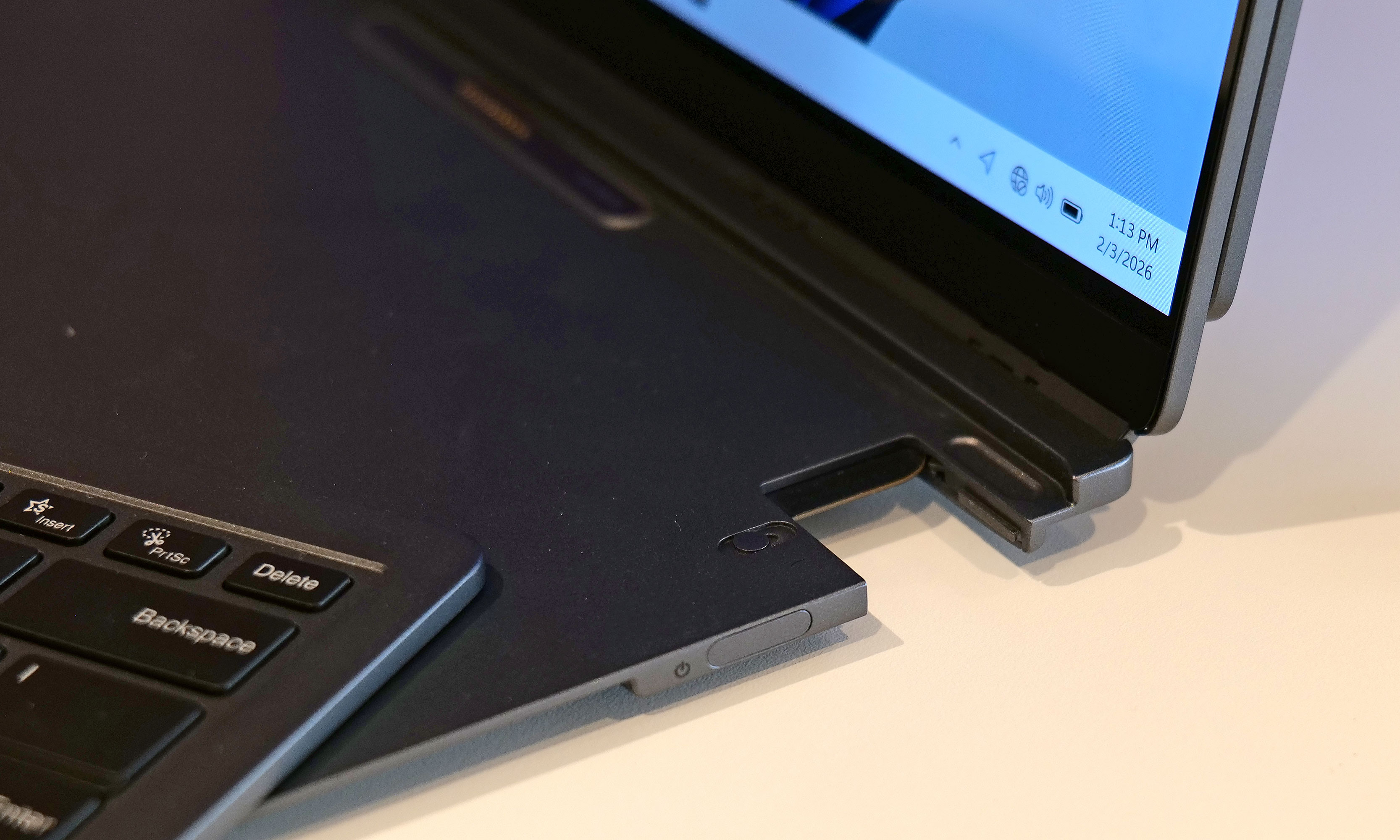
Perhaps the biggest change to the XPS line is its reworked keyboard and touchpad, which brings some ups and downs. Dell kept the glass deck and seamless touchpad used on previous models, except now there's a faint line going around its perimeter, so you never have to guess where it is. The company also replaced the row of capacitive touch function and media controls from its predecessor with regular keys. As a fan of physical buttons, this is just great.
The issue is that for discerning typists, the keyboard seems to be missing anti-ghosting or N-key rollover tech. This means that if you press two keys very quickly one after another, the second press actually gets registered first, which can result in erroneous inputs. We ran into the same problem when testing the XPS 14. Dell claims this issue only impacts the first batch of systems off the line and that units on sale today have had this issue patched already. Furthermore, the company says it will release an update to address the issue on the remaining units, which should be out sometime in March. Though at the time of publication, I haven't received anything yet.
The XPS 16 also features punchy up-firing stereo speakers that don't leave much to complain about.
Sam Rutherford for Engadget
There is another nitpick about the keyboard. While I don't mind that Dell retained its zero-gap layout instead of going with a more traditional chiclet-style design, the more I type on it the more I wish Dell would offer something with a bit more key travel and heavier actuation. For reasons out of my control, my company-assigned work machine is a Dell Precision 5680 from 2023. I don't like it very much aside from its keyboard, which is significantly bouncier and just generally nicer to use than the one on the XPS 16.
Performance
A big reason why Dell was able to make the XPS 16 so thin and light is that the company didn't leave room for discrete graphics. That means you can only choose between a handful of Intel's latest Series 3 Core Ultra chips, ranging from the Ultra 5 325 to the Ultra X7 358H, with the latter being the one I tested here. That's not a bad thing though, as the laptop easily handled all the various productivity tasks I threw at it. And even without a proper GPU, the XPS 16 still pumped out 62 fps in Cyberpunk 2077 at 1920 x 1080, using Ultra settings and Intel's XeSS set to Quality. Those kinds of numbers aren't going to make anyone toss out their dedicated gaming rig, but once again, that's not too shabby for a notebook this easy to carry around.
Battery life
The XPS 16 comes with three USB-C port with Thunderbolt 4 which is nice, but sadly it lacks an SD card reader for quickly transferring media from a camera.
Sam Rutherford for Engadget
Thanks to a larger 99.5Whr battery, the XPS 16 fared better on our rundown test than its smaller sibling. This could be a deciding factor for anyone trying to choose between the two. In PCMark 10's Modern Office battery benchmark, the XPS 16 lasted just shy of 12 hours (11:53), which is more than an hour and a half longer than what we got from the XPS 14 (10:21). As long as you're not going to be gone for more than a day or you're really pushing it, you should be able to leave its power brick at home.
Wrap-up
Instead of killing the XPS name for good, Dell wisely reconsidered and then doubled down. The result is fantastic new version of the XPS 16.
Sam Rutherford for Engadget
When Dell decided to bring back the XPS name, COO Jeff Clake said the company was going to get back to its roots. That's the kind of messaging that's easy to stay on a stage, but after testing out the reborn XPS 16, I can confirm it isn't just flimsy rhetoric.
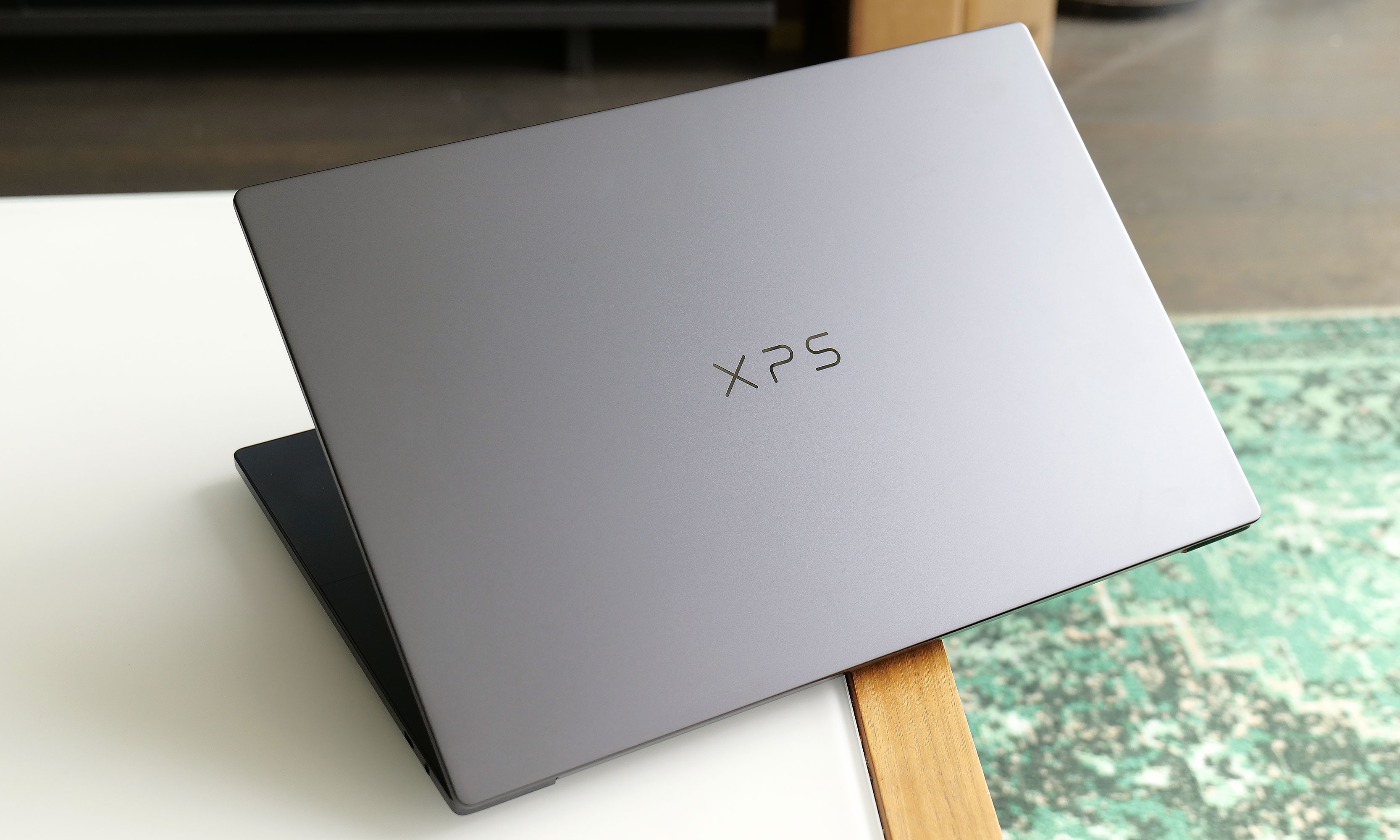
This laptop is a shining example of a premium ultraportable Windows laptop done well. It features a super sleek aluminum chassis, strong performance, solid battery life and an excellent display, particularly if you upgrade to the 3.2K OLED option. The connection to the iconic award-winning systems isn't just skin deep. This thing is just as much an XPS as the ones we loved a decade ago and Dell is driving that point home by letting the XPS logo sit front and center on its lid instead of the company's usual branding.
At just 3.65 pounds, the 2026 XPS 16 is basically a full pound lighter than its predecessor.
Sam Rutherford for Engadget
My one complaint is that I wish Dell would bring back the chiclet-style keyboards we got on models from the early 2020s. Though as long as the company can release updated software to fix the ghosting issues I've encountered, what's on there now is more than good enough. Granted, at $2,349 for our review unit, the XPS 16 is a bit pricey, but that's the going rate for a high-end notebook these days. If you snag a discount similar to the one Dell is currently running , suddenly, you're looking at an even more enticing package at $1,900.
The biggest reason someone might want to hold off for now is if you do need more powerful graphics, as I'm expecting Dell to release an alternate version of the XPS 16 with room for a discrete GPU (and hopefully an SD card reader) sometime before the end of the year. Despite Dell nearly tossing decades of pedigree in the trash just months ago, the XPS 16 has returned to reclaim its spot at the top.
This article originally appeared on Engadget at https://www.engadget.com/computing/laptops/dell-xps-16-2026-review-return-of-the-king-130000906.html?src=rss
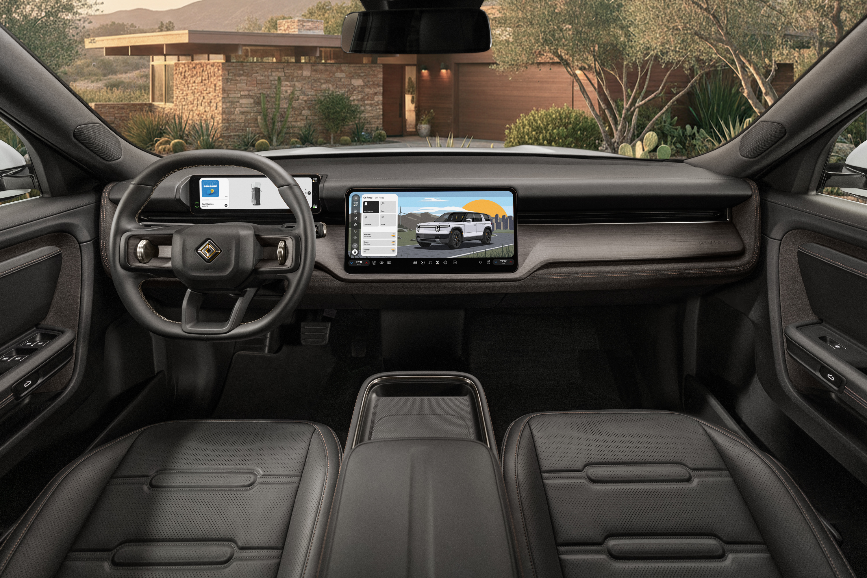
Ahead of its official release later this spring, today Rivan is announcing full pricing and trim levels for its long-awaited R2 electric SUV.
The rollout for the company's first mid-size (two-row) offering will be similar to its previous vehicles, with more expensive premium models hitting the road first this spring, followed by more affordable configurations becoming available later this year and into 2027. This timeline is especially important for anyone hoping to snag the $45,000 base model of the R2, which isn't expected to go on sale until sometime in late 2027. The R2 Performance with Launch Package and R2 Premium trims will arrive initially as model year 2027 vehicles, followed by the R2 Standard (MY 2028) next year.
The new R2 with Rivian's Black Crater interior
Rivian
Some features that will be standard on every R2 are a native NACS charging port and Autonomy+ hardware. However, for the latter, while new vehicles will come with a free 60-day trial of Autonomy+, once that expires, owners will need to choose between a one-time fee or a monthly subscription to continue using Rivian's enhanced hands-free driving tech.
Regardless of which trim or performance package you prefer, the arrival of the R2 is a huge deal for Rivian as it represents the company's first true mass-market vehicle that looks to bring a lot of the tech and engineering used in the R1T and R1S to a more affordable price point.
For a closer look at the R2's trim levels and pricing, see the breakdown below.
R2 Performance with Launch Package
Available Spring 2026 starting at $57,990
Features a dual-motor AWD setup with 656 horsepower and 609 lb-ft of torque
EPA-estimated range of up to 330 miles
0 to 60 time of up to 3.6 seconds
Notably, the Launch Package will include a free lifetime subscription to Autonomy+, along with 20-inch Black Sand all-terrain wheels, a limited Rivian Green anodized key fob, exclusive Launch Green exterior paint option (which will be a paid upgrade) and a tow package that supports up to 4,440 pounds of towing capacity.
Other inclusions on the Performance trim include an Esker Silver exterior, semi-active suspension, Compass Yellow brake calipers and rear drop glass. This config also features Rivian's Matrix LED headlights with adaptive high beams, integrated tow hooks, a flashlight that can be stowed inside the driver door and 21-inch tungsten all-season wheels.
The interior features birch wood accents with a Black Crater color scheme along with heated and ventilated front readers, heated steering wheel, heated rear outboard seats and 12-way adjustment with lumbar support for the driver and front passenger.
R2 Premium
Available late 2026 starting at $53,990
Features a dual-motor AWD setup with 450 horsepower and 537 lb-ft of torque
EPA-estimated range of up to 330 miles
0 to 60 time of up to 4.6 seconds
The premium trim includes many of the same features as the Performance model, but with smaller 20-inch bicolor carbon all-season wheels and fewer drive modes (there's no option for rally, soft sand and launch).
R2 Standard (aka the RWD Long Range configuration)
Available first half of 2027 starting at $48,490
Features a single motor RWD setup with 350 horsepower and 355 lb-ft of torque
Rivian-estimated range of up to 345 miles
0 to 60 time of 5.9 seconds
Finally, the R2 Standard variant features a slightly more spartan kit consisting of heated front seats, a heated steering wheel, 12-way seats (but only for the driver) and 19-inch machine graphite wheels.
R2 Standard (aka the base model)
Available late 2027 starting at $45,000
Rivian-estimated range of 265+ miles
More detailed info will be released closer to launch
This article originally appeared on Engadget at https://www.engadget.com/transportation/evs/rivians-r2-ev-arrives-this-spring-with-a-58000-price-tag-150000363.html?src=rss
One of the biggest issues with mainline Pokémon games is that you're often so focused on catching, battling and trying to be the very best that you don't have time to stop and smell the flowers. But in Pokémon Pokopia, you're rewarded for doing just that while building a loving community of friendly monsters. The game is one part Animal Crossing and one part Dragon Quest Builders sprinkled with a touch of Minecraft and Stardew Valley. he result might be one of the coziest, most wholesome life sims on the market.
Setup and gameplay
In Pokopia, you play as a Ditto, who has awakened to a world where all the other humans and Pokémon have mysteriously disappeared. Naturally, the loss of your trainer has inspired you to take the form of a person (well, as best as a Ditto can). You work together with the only other soul around, Professor Tangrowth, to figure out how to revitalize this once thriving town. As you explore, you learn to create habitats from a mix of shrubs, trees and anything else you can scavenge. You can also create new homes for the missing Pokémon and lure them back, slowly converting the wasteland into a bustling place full of life and excitement. It's a simple but extremely rewarding gameplay loop, and as you make friends with the returning monsters, they help you on your quest by teaching you skills that allow you to continue shaping and manipulating the environment. They also provide handy items and building materials.
Some Pokémon like Squirtle can even teach you new moves that you can use to manipulate your environment.
Nintendo / Engadget
This is where the other main gameplay cycle comes in, as the entire world is made up of blocks that you can excavate or rework to your heart's content. Not only does this let you customize your environment, it also serves as a way to traverse the world. See a shiny treasure on the other side of a river but you can't swim there? You can simply build a bridge instead. And just like in Minecraft, you can use raw materials to create all sorts of fancy blocks and furniture so your homes look exactly how you want. When compared to games like Animal Crossing, I found I actually prefer Pokopia's flavor of world-building a touch more, as it relies slightly more on building and exploring and less on decorating.
In order to lure Pokémon to your town, first you need to build a home they'll want to live in.
Nintendo / Engadget
My one small issue with the game is that while I like the real-time building mechanic that lets Pokémon work on stuff while you're not playing, having to wait a full day for bigger projects to be completed can bog down your progress a bit. With a game that easily provides more than 50 hours of content just for its main story (and that's not counting all the time you'll spend customizing and tweaking your town), sometimes things become a slower burn than they ought to be.
The magic of Pokopia
As befitting a Pokémon game, each monster has skills befitting their type like Charmander being able to light fires.
Sam Rutherford for Engadget
While the success of Pokopia's core mechanics can be largely attributed to co-developer Bandai Namco borrowing the game's basic template from the Dragon Quest Builders series, the real magic of the game comes from the Pokémon themselves. When I load into the world and the first thing that happens is one of my townsfolk running up to me to say thanks or give me a present, it just makes me happy. And unlike most other Pokémon games, you can actually have proper conversations with them, instead of just hearing them do their 8-bit cries. Speaking of that, I really think it's time for Game Freak to archive those Game Boy-inspired sound bites in favor of proper voice acting. We've had thirty years of crunchy, low-fi yells, and in an open-world game with adorable polygonal graphics, I think we can finally let the 'mons say their names like they do in the anime.
Pokopia's roster of characters is also bigger than expected. That's because in addition to new faces like Peakychu and Mosslax, there are well over 100 different Pokémon to befriend. And while the game leans a bit more heavily on characters from Kanto and the original 151, there's solid representation from other generations, including cameos from legendaries. Furthermore, each monster has its own unique habitat, preferences and abilities. I appreciate little details like water-type Pokémon who ask you to make their home a bit more humid or fighting-type monsters who ask for exercise equipment to spruce up theirs. Similarly, when it comes to building out your town, I like that the game makes you turn towards plant-types if you want help with your crops or a fire-type if you need help smelting some iron.
Teamwork makes the dream work.
Nintendo / Engadget
However, the most heartwarming thing about Pokopia might not even be how you interact with the other Pokémon, but how they socialize with themselves. Sometimes you'll run into two mons chasing each other around, working out together or cuddling up for a nap. And thanks to the game's photo mode, you can capture all these moments when they happen.
Exploring the world is also quite satisfying, particularly for anyone who has played any of the Pokémon games from gen one. There are a ton of references to memorable people and places from Kanto. Plus, when you're just out and about or spelunking, you'll sometimes run into other adventurous mons who need a little help before you can convince them to move into town. It feels like there are fun secrets hiding around every other corner, and even for those that are a bit less obvious, Pokopia drops just enough hints to point you in the right direction.
Wrap-up
Just look how happy everyone is when we all work together.
Nintendo / Engadget
There's so much to do in Pokopia that I wouldn't be surprised if dedicated players could tide themselves over with this game until Pokémon Winds and Wavescomes out next year. But more importantly, Bandai Namco and Game Freak have found a perfect balance between the title's open-world building mechanics and homages to the underlying franchise. Pokopia isn't just a half-hearted life-sim clone with a thin veneer of monster catching (or in this case, monster community outreach) draped on top; it's a good game in its own right that just gets better with the addition of neighborly Pokémon.
This article originally appeared on Engadget at https://www.engadget.com/gaming/nintendo/pokemon-pokopia-review-possibly-the-most-charming-pokemon-game-yet-183000812.html?src=rss
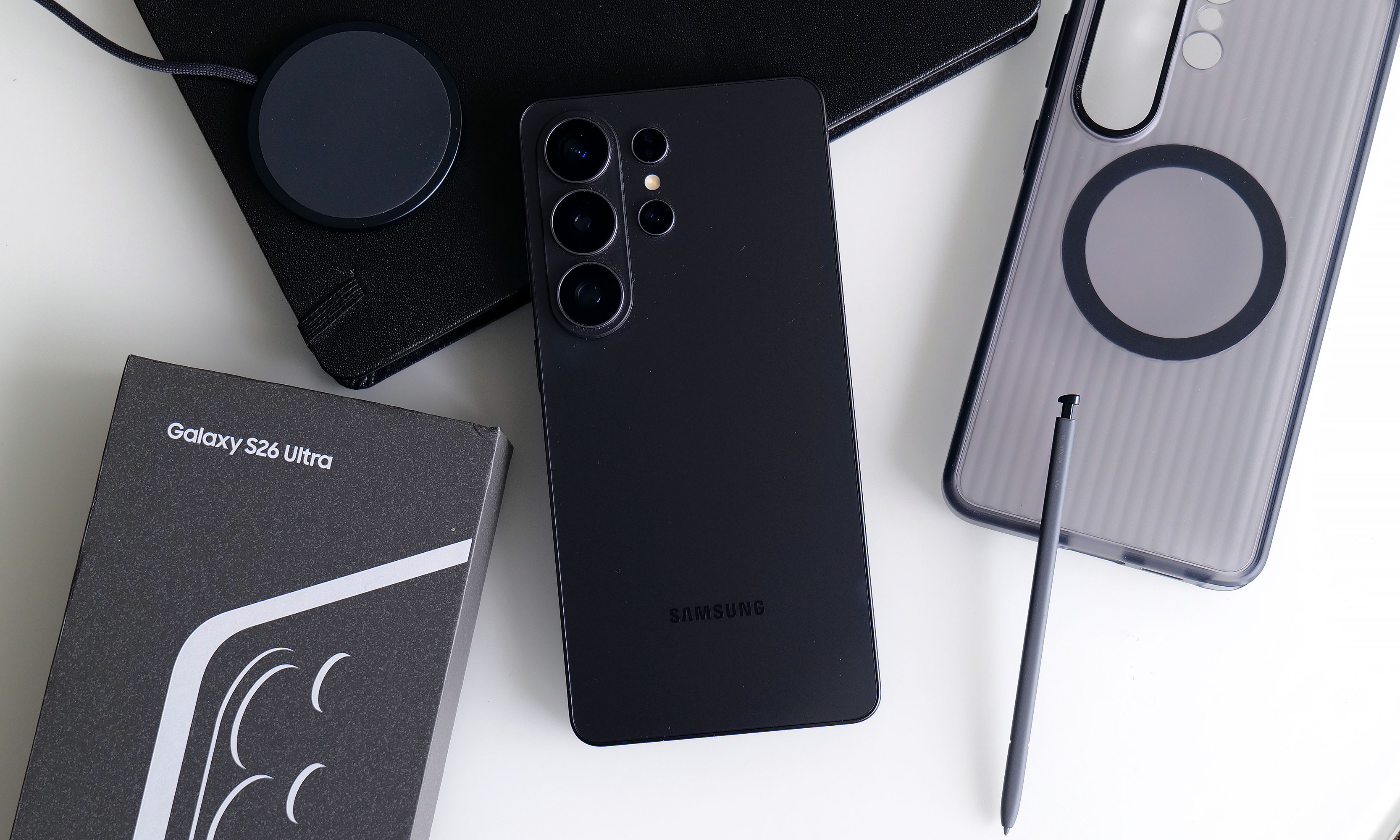
You'd be forgiven for thinking that the Samsung Galaxy S26 Ultra looks a lot like the last four models. That's because it does, right down to its general design and rear camera layout. But on Samsung's latest flagship phone, some stealthy upgrades are hidden beneath its classic blocky silhouette that might go unnoticed by the casual observer. Those help make this year's release feel like a better deal than its most recent predecessor. It remains rather expensive, starting at the same $1,300 as before, but considering the price of RAM these days, that almost feels like a blessing. So while it won't hit you over the head with monumental changes year over year, it's subtly one of the best Ultras we've gotten in the past half-decade.
Design: Back to aluminum
After dabbling with titanium frames on the last two Ultras, Samsung returned to aluminum for 2026. The company says this makes it easier to color-match the phone's chassis to the Corning Gorilla Armor 2 panels on the front and back, though it's incredibly difficult to see the impact on my black review unit. Elsewhere, the company shaved a few grams off its total weight and a few millimeters off its thickness (7.9mm and 214 grams), but even when directly comparing the new model to last year's S25 Ultra (8.2mm and 218 grams), that difference is basically imperceptible. I almost think the S26 Ultra's extra sleekness was just so that people would stop saying the Z Fold 7 is lighter than Samsung's most premium traditional candybar-style handset.
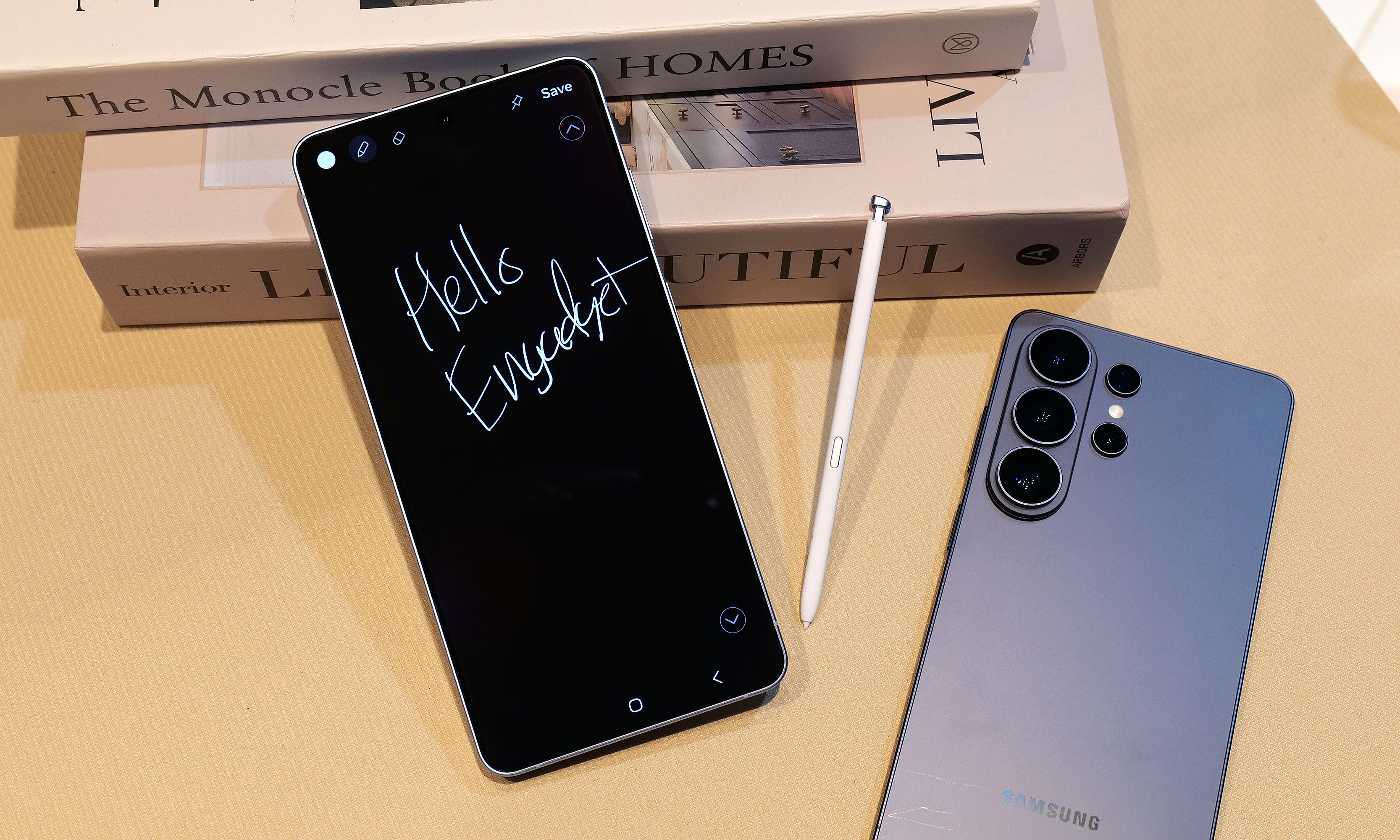
As always, there's a built-in storage slot for Samsung's S-Pen, which is essentially a carbon copy of what we got last year without any functional changes. However, because the phone's corners are more rounded than ever, one small peculiarity is that now there's a right and wrong way to insert it. No matter what you do, the stylus will stay put, but if you don't align the curve on the end of the S-Pen with the shape of the phone's corner, it just doesn't look right.
Display: Now with more privacy
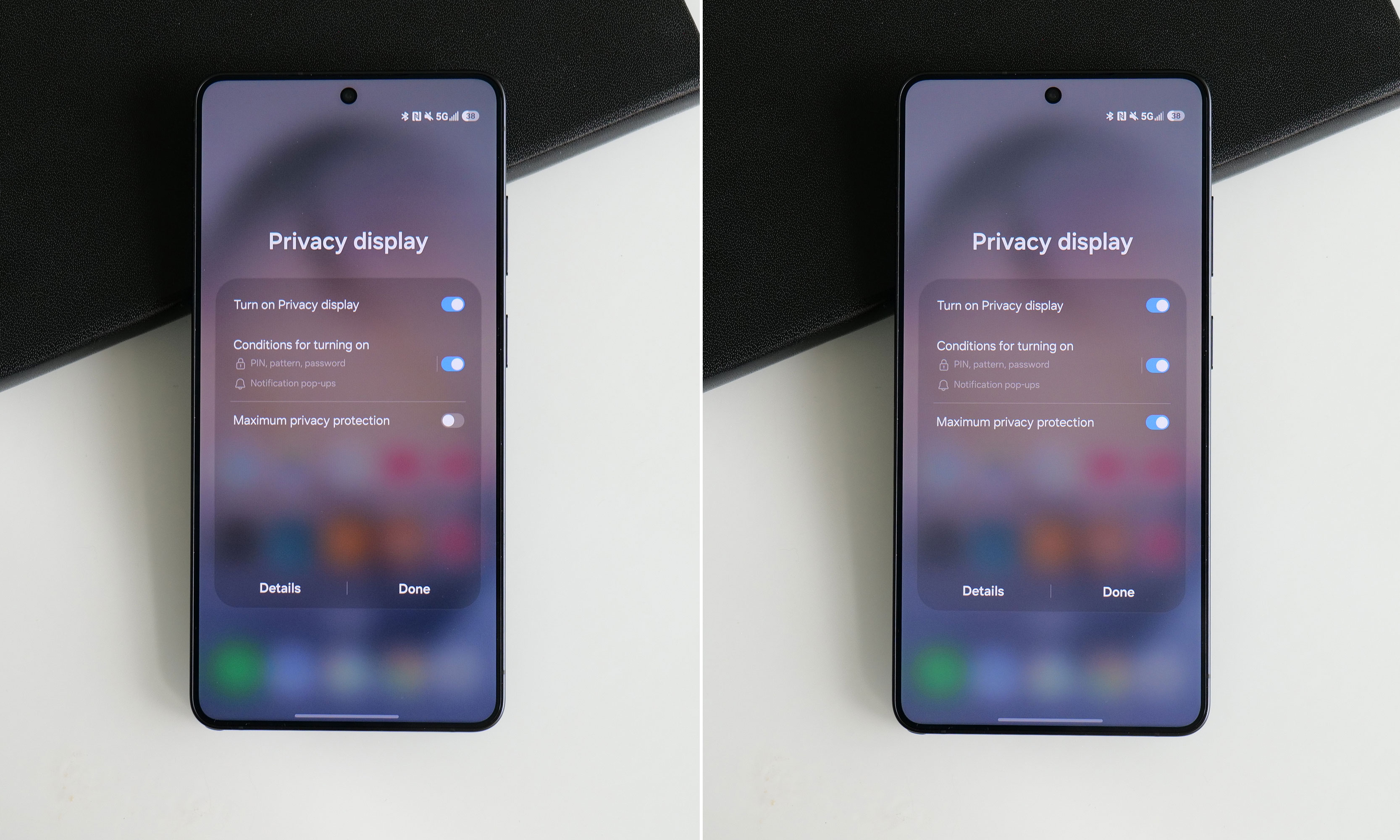
The Galaxy S26 Ultra's display has the same specs as the previous model, except now it comes with a built-in Privacy Display.
Sam Rutherford for Engadget
The S26 Ultra's 6.9-inch screen is easily its most undercover upgrade because it sports essentially the same specs as last year. You still get 2,600 nits of peak brightness with a variable 120Hz refresh rate and a max resolution of 3,120 x 1,440. The secret is that with the touch of a button, you can activate Samsung's Privacy Display, which effectively stops others from spying on your screen when viewed from acute angles (both from the side and up and down).
When you turn the Privacy Display on and look at the phone less than head-on, everything sort of fades to black. Depending on the angle, you may still see an outline of UI elements and some bright spots depending on your content, but the wider you go, the fainter things get. The way it works is that the phone has two sets of subpixels, narrow and wide, the latter of which get turned off when the feature is active. And if you're really concerned about people snooping on you, there's an extra level called Maximum Privacy Protection that makes almost everything completely go gray, though there are trade-offs for this.
Even on maximum protection, you can still make out some faint details. But good luck to anyone trying to glean any usable info while the Galaxy S26 Ultra's Privacy Display is on.
Sam Rutherford for Engadget
When using the standard Privacy Display mode, there's very little impact on image quality and brightness, so it's not that big of a deal to leave it on all the time. If you look closely, you may notice what appears to be a small drop in resolution, though this requires some serious pixel peeping and good eyesight. But with maximum protection on, there's a noticeable drop in contrast and luminance that, for me, isn't worth the increased privacy.
The effect is more pronounced in person, but in this side-by-side comparison, you can still see how Maximum Protection mode has an impact on the S26 Ultra's contrast and color saturation.
Sam Rutherford for Engadget
Thankfully, there's a third option, which is to have the phone selectively activate Privacy Display under certain conditions. You can have it automatically turn on when you get notifications or open selected apps (like for banking or authenticators), which is what I prefer. The phone can also enable the feature when you need to enter a PIN, pattern or password. The caveat is that this only applies to system-level prompts like your lock screen. Theoretically, there's no reason the S26 Ultra can't do this anytime you're presented with a password or PIN prompt, but every app needs to be optimized properly, so that isn't a thing just yet. Regardless, it's a powerful tool that can prevent people from gleaning sensitive info while you're and about and I really hope it becomes standard inclusion on all premium phones going forward.
Performance and software: More speed and AI
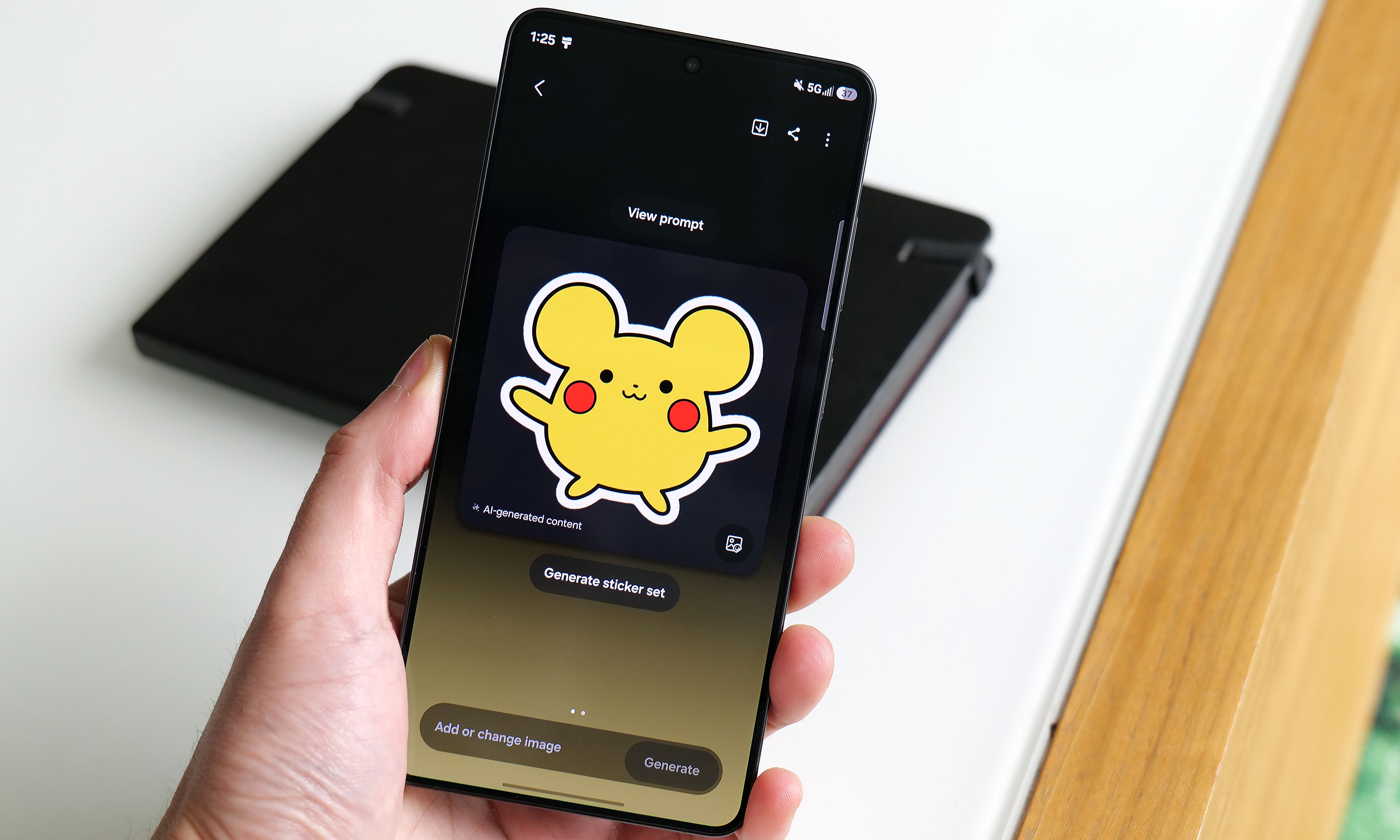
Apparently this is what Samsung's AI thinks a Pikachu sticker should look should look like.
Sam Rutherford for Engadget
The main engine powering the S26 Ultra is Qualcomm's Snapdragon 8 Elite Gen 5 chip for Galaxy along with 12GB or 16GB of RAM and up to 1TB of storage. Its biggest strength lies in its improved NPU, which is 39 percent more powerful than the previous generation, paving the way for improved AI-based features. That said, the rest of the processor provides some nice but not especially impressive gains in processing speed. Its CPU boasted 19 percent better performance while its GPU is around 24 percent beefier. In Geekbench 6, this translated to a multi-core score of 11,240 for its CPU (up from 9,828 on the S25 Ultra) and a GPU score of 25,403 (up from 19,863). Granted, it's not like its predecessor ever struggled with performance, but it's still worth noting that this is essentially as fast as an Android phone can get right now.
Of course, as we progress deeper into the AI era, Samsung has come up with a boatload of new and improved AI-powered tools as well. The most useful of these is Photo Assist, which serves as a one-stop shop for all your editing and content creation needs. In addition to fixing things like reflections or deleting objects in an image, you can use natural language text prompts to generate completely new elements like hats for your pets or pretty much anything else you can think of. And if that's not enough, there's also Samsung's Creative Studio, which is a playground for making all sorts of fun digital art like wallpapers, stickers and greeting cards.
The S26 Ultra's Now Nudge feature uses AI to find and suggest relevant photos when you use the Samsung Keyboard.
Sam Rutherford for Engadget
Elsewhere, there's also an improved document scanner and a call screener that's better at blocking spam and robocalls. All told, they're welcome upgrades and they work rather well. Samsung even borrowed an idea from Google's Magic Cue with its Now Nudge feature, which can surface relevant photos based on context anytime you’re using the Samsung keyboard. Unfortunately, what’s arguably the S26 Ultra's coolest new feature, Automated App Actions, isn't available for another week. But the bigger issue is that almost all of these features are things we've seen before on rival devices like the Pixel 10 Pro. While they're nice to have, it's gotten to the point where these tools are more like table stakes for high-end phones nowadays instead of being reasons you might want to upgrade.
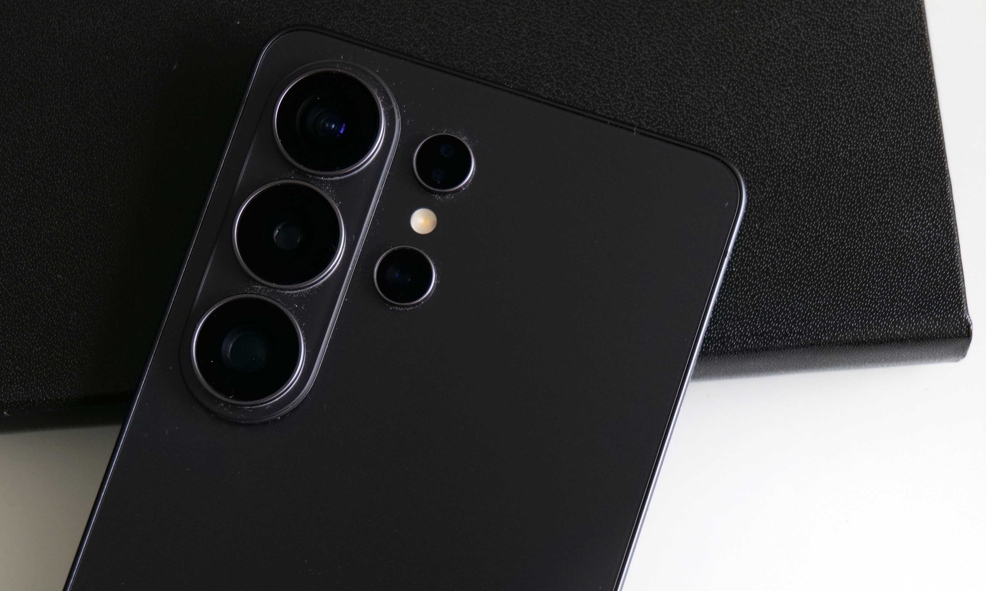
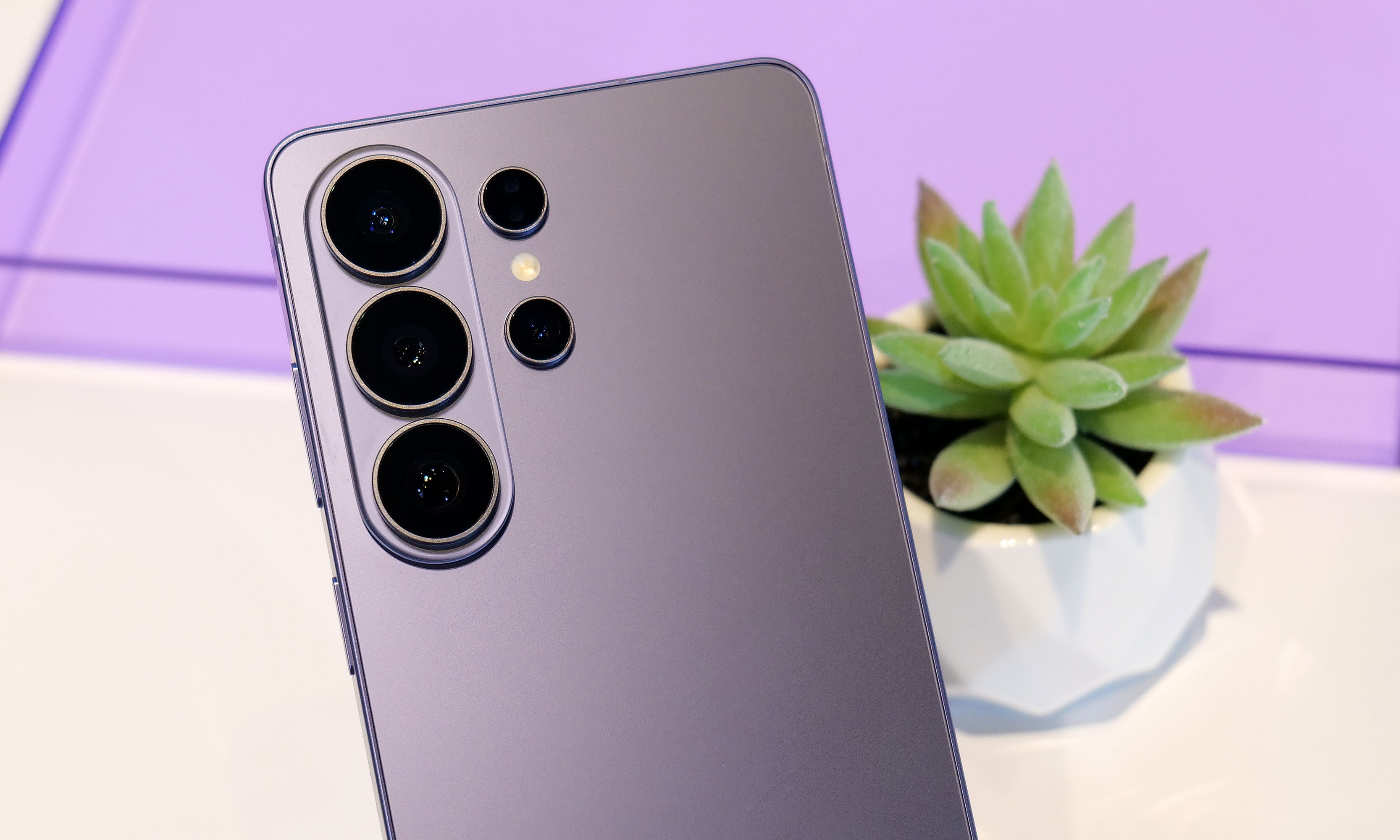
Cameras: The same sensors with some larger apertures
While the S26 Ultra has the same sensors as before, Samsung gave it wider apertures for its main and 5x telephoto cameras.
Sam Rutherford for Engadget
While the sensors on the S26 Ultra haven't changed since the previous model, Samsung didn't completely forget about photo upgrades. Alongside its 10-megapixel 3x telephoto, 50MP ultra-wide and 12MP selfie cam, its 200MP main cam and 50MP 5x telephoto camera have larger apertures at f/1.4 and f/2.9, respectively (up from f/1.7 and f/3.4). So on top of already being able to take excellent photos during the day, the UItra's primary shooter is noticeably better at night.
In a shot of some Transformers in a dimmed room, the S26 Ultra basically matched what I shot with a Pixel 10 Pro — aside from some minor differences in white balance. Details were sharp and Samsung's photo was less noisy, which is due in part to a change in the phone's image processing. But the most impressive example of the Ultra's improved picture quality was when I took a very challenging backlit shot of a Grogu doll, in which the S26 did a better job of exposing Baby Yoda's face compared to the P10 Pro. So even without new sensors, Samsung has managed to make an already great main camera just a bit better.
Battery life
The Galaxy S26 Ultra features a 5,000mAh battery, just like what we got on the previous model. That means it's largely relying on power efficiency gains from its new chip for improved longevity, which it delivers, but it's not a major leap. On our local video rundown test, the S26 Ultra lasted 30 hours and three minutes, which is only about half an hour longer than before. That said, considering the only phones that have fared better were the OnePlus 15 and 15R, it's hard to be upset about its overall runtime.
As for charging, the Ultra has gotten a big leap in speed (assuming you have compatible power adapters) compared to its less expensive siblings. When using a cable, it now supports up to 60 watts versus 45 watts for the S26+ or just 25 watts for the base S26. And it's a similar story when charging wirelessly, with the Ultra now capable of hitting 25 watts when plopped on a pad compared to 20 watts for the S26+ and 15 watts for the S26.
The S26 Ultra has significantly faster wired and wireless charging than its less expensive siblings. Though sadly, it still doesn't have a built-in ring for magnetic accessories.
Sam Rutherford for Engadget
The major annoyance is that Samsung still hasn't given any members of the S26 family a built-in magnetic ring for Qi2 charging or other magnetic accessories. The company claims this was done to help keep the phone as thin as possible, but honestly, I thought we had gotten over the desire for needless sleekness long ago. Sure, you can add that functionality back in by choosing the right case, but that's not a very premium experience and I sincerely hope this is the last time Samsung makes this omission on its flagship phone line.
Wrap-up
There's a strange feeling I often get when testing phones. After I got everything updated and set up the way I like, I noticed it even more with the S26 Ultra. The issue is that despite using a brand new device with shiny hardware, better performance and a more refined design, I'm still largely doing the same things and using the same apps as I was before (like Google Maps, Gmail and whatever my go-to mobile games are at the moment). This means my daily flow is basically unchanged from device to device.
This better be the last time Samsung skips putting a magnetic ring inside the Galaxy S line.
Sam Rutherford for Engadget
However, if you're paying attention, you'll notice things like higher framerates while gaming, sharper and more well-exposed photos at night and helpful suggestions like when the phone surfaces relevant photos in the middle of a text conversation. This goes double for the S26 Ultra, whose biggest upgrade — the Privacy Display — is something meant to stop other people from snooping at what you're doing. When it's on, you probably won't even be able to tell, which is kind of the point.
There’s no doubt that the S26 Ultra is an improvement over last year’s phone. It’s faster, it takes better low-light photos and thanks to all of its new AI features, the handset feels smarter too. But it takes a discerning eye to spot and feel all these differences, particularly if you’re upgrading from a device that’s only a year or two old. So while the S26 Ultra remains the top pick as a phone that can do pretty much everything really well, in the grand scheme of things, it’s more of a stealthy, undercover update than an eye-catching new crown jewel.
This article originally appeared on Engadget at https://www.engadget.com/mobile/smartphones/samsung-galaxy-s26-ultra-review-the-stealth-upgrade-140000629.html?src=rss
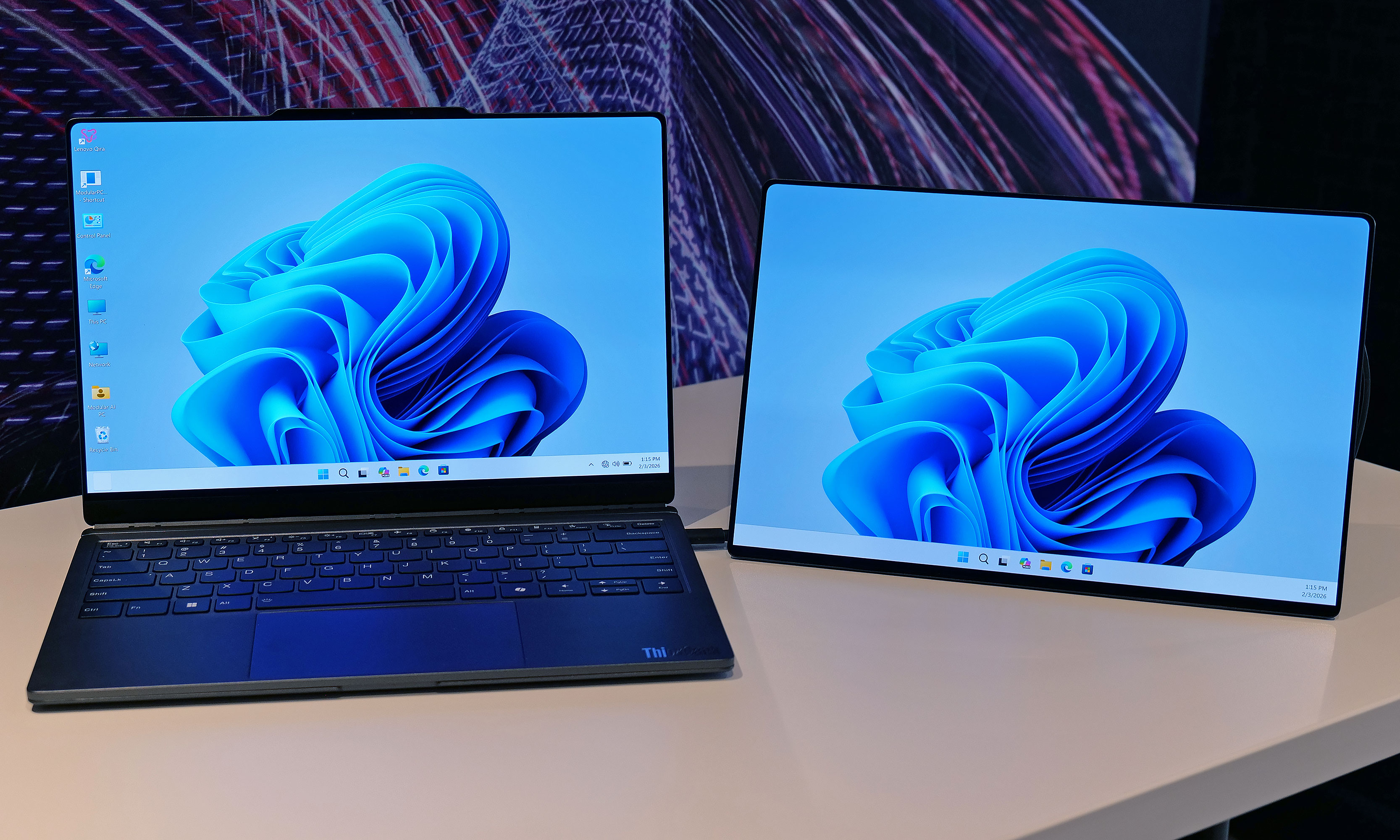
The potential of modular laptops has never fully translated to the real world. While companies like Framework have made major strides in recent years, there's still quite a bit of room for improvement. At MWC, Lenovo is looking to address that with its Modular AI PC concept. It features not one but two displays and a detachable keyboard to create something that strains the definition of a laptop, thanks to an innovative and very adaptable design.
Compared to Framework's gadgets, which primarily use modularity to make upgrading the system and extending its lifespan easier, Lenovo's concept is based around a 14-inch chassis with hot swappable components. This allows you to move its keyboard and secondary display around at will, so the system can better adjust to its environment or workload. By default, its bonus screen is mounted on its lid, allowing you to do easy face-to-face sharing with someone sitting opposite you. However, without even needing to turn the system off, you can yank away the notebook's keyboard and put the display in its place to provide additional real estate.
The Lenovo Modular AI PC concept's second screen can be attached to its lid or moved off to the side like a traditional dual monitor setup.
Sam Rutherford for Engadget
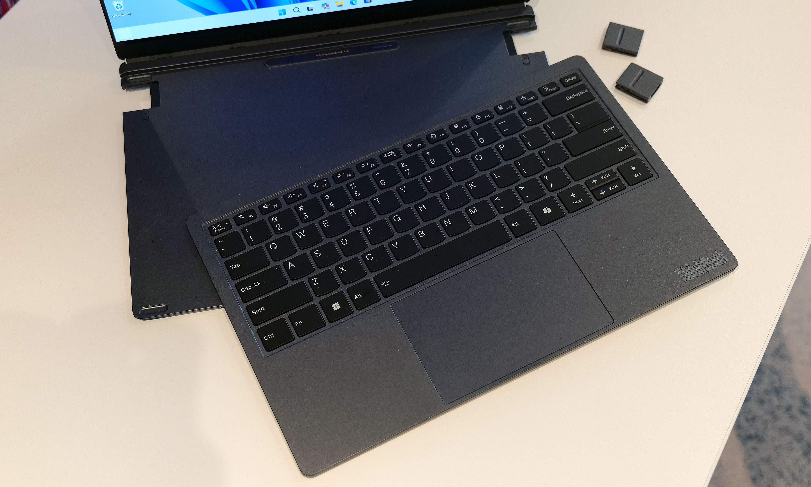
Or if you prefer a more traditional dual-screen setup, you can move it off to the side, prop it up via a built-in kickstand and connect to the laptop over USB-C. You even get the flexibility to arrange the display in vertical or landscape orientation, which is nice if you're doing stuff like coding or writing in a word doc (I feel targeted, but in a good way). And because the keyboard can connect to the notebook using pogo pins or Bluetooth, you have the freedom to position it practically anywhere you want.
Meanwhile, Lenovo borrowed one aspect of Framework's modularity by including the ability to swap ports on the fly. During my demo, the company showed off modules featuring USB-C, USB-A and HDMI connectors, though I was told there are a ton of additional possibilities for those who might need things like a proper Ethernet jack or additional ports for audio.
The Lenovo Modular AI PC concept's keyboard and be completely removed at a moment's notice and positioned anywhere you like thanks to its Bluetooth connectivity.
Sam Rutherford for Engadget
But what impressed me the most was that despite being a concept device, the whole setup felt quite polished. That almost suggests that this thing might be closer to becoming an actual retail product than some of the company's other demo gadgets. Build quality felt really sturdy and I had no issues changing out ports or moving the secondary display around without needing to troubleshoot or reboot the system. Everything just kind of worked. And while Lenovo isn't sharing details about what processor it's running or how much memory it has, its performance felt snappy too.
My only question is that I'm not quite sure where AI fits into all of this. I was able to break down and reconfigure the system without any help from machine learning or a digital assistant. That said, I'm not complaining, because even with a lot of moving parts, its modular design is very approachable and easy to use.
Ports on the Lenovo Modular AI PC concept can be hot swapped between to add USB-C, USB-A and HDMI connectors as needed.
Sam Rutherford for Engadget
Unfortunately, Lenovo isn't planning on turning this concept into a true retail device. But even so, I hope the company will at least consider bringing some of the modular laptop's features like its hot swappable ports to future products.
This article originally appeared on Engadget at https://www.engadget.com/computing/laptops/the-lenovo-modular-ai-pc-concept-is-a-remixed-dual-screen-laptop-with-hot-swappable-ports-230000158.html?src=rss
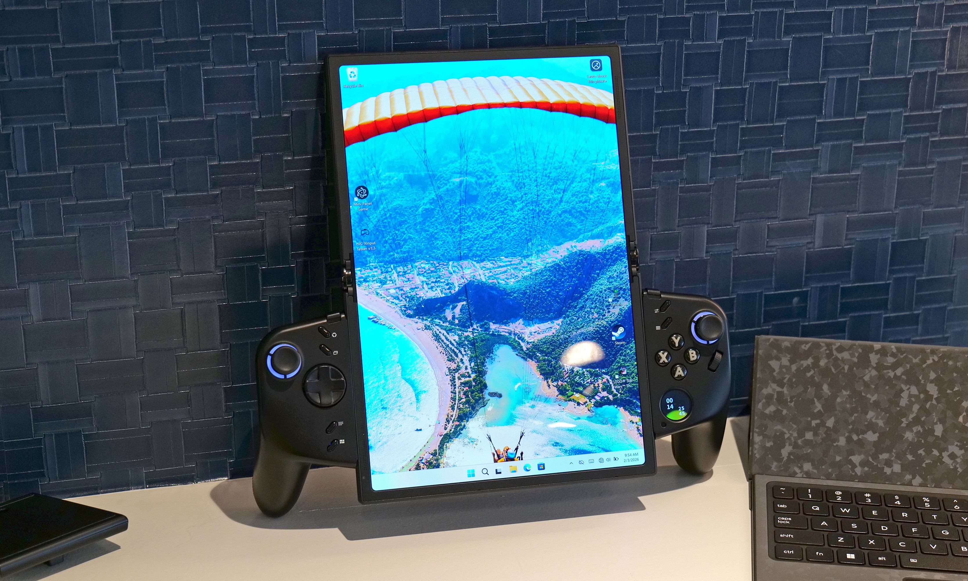
Lenovo already has a large roster of gaminghandhelds. However, it seems there's always room for another because at MWC the company showed off an ambitious concept device based around a flexible OLED display. And while the whole setup looks ungainly, after getting my hands on it, I'm very intrigued by its adaptability.
Now I'll be the first to admit that an 11.6-inch display feels oversized on a handheld that, in theory, is meant to be somewhat portable. That said, the beauty of the Legion Go Fold's screen is that it can be bent in half to create a more appropriately-sized 7.7-inch panel. In this configuration, the system feels a lot less cumbersome while also sporting a more traditional aspect ratio. Then, at a moment's notice, you can extend the display to provide extra room when you need it.
How silly does this look when its flexible display is fully extended in portrait mode?
Sam Rutherford for Engadget
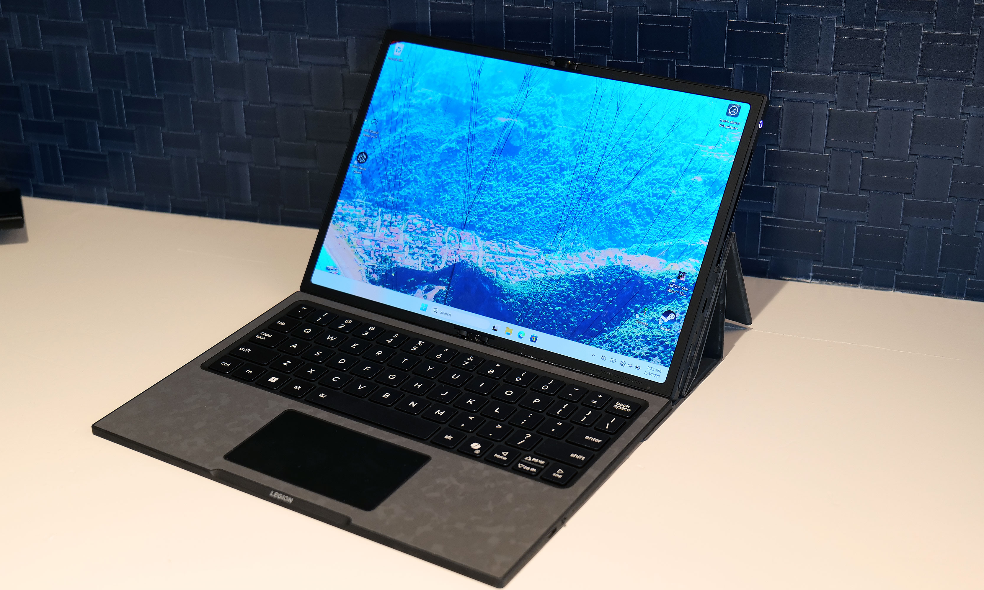
However, the thing I like most about the Legion Go Fold is that its controllers are detachable and that the tablet has several different mounting points. This means if you have the space, you can remove the controllers, rotate the display into landscape mode and then reattach them to get an immersive widescreen experience. Alternatively, you can connect the gamepads together using one of Lenovo's accessories (which is similar to Nintendo's Joy-Con Grip) and then prop the system up using the Go Fold's folio cover, which doubles as a kickstand.
But wait, there's more: The handheld also features a strip of pogo pins for connecting a wireless keyboard, effectively transforming the whole setup into a miniature gaming laptop. Depending on how you're counting, that's at least four different modes you're getting from the Legion Fold, which is really quite impressive and speaks to the versatility of Lenovo's design.
Another feature I really like is the small 1-inch OLED display on the right gamepad. It supports a handful of widgets that can display the time, performance settings and more. It also doubles as a small touchpad, which can be really handy when playing PC titles that were originally developed for mouse and keyboard. And just like on the Legion Go and Legion Go 2, the Fold's right gamepad has a small scroll wheel and a hidden sensor, so it can also turn into a vertical mouse for playing FPS titles.
At this point, it's important to mention that Lenovo doesn't have concrete plans to put this thing into production, so its specs don't really matter. That said, the Legion Go Fold I tried featured an Intel Core Ultra 7 258V chip with 32GB of RAM and a 48WHr battery, which is more than respectable. Though if this thing does become an actual retail device, I would like to see a power cell with a bit more capacity.
I really love how the Legion Go Fold can turn into a miniature laptop just by moving some of its accessories around.
Sam Rutherford for Engadget
But as a concept gadget, I think the Legion Go Fold is a great showcase of how new technology (in this case, a flexible display) can bring new capabilities and greater flexibility to existing categories. And who knows, if a lot of people like the idea, it might encourage Lenovo to refine it and put it on sale for real. I would just be a bit worried about pricing, because all these components won't come cheap.
This article originally appeared on Engadget at https://www.engadget.com/gaming/pc/the-lenovo-legion-go-fold-gaming-handheld-concept-looks-awkward-but-its-versatility-is-endless-230000816.html?src=rss
Last year, it felt like Samsung relied a bit too much on AI when trying to convince people to upgrade to its flagship phone. And while there’s no shortage of features that utilize machine learning on the new Galaxy S26 Ultra, it feels like Samsung has done a much better job of filling out the rest of the phone’s kit with fresh hardware, faster charging and a more cohesive design. It’s still rather expensive, but its price has stayed flat year-over-year at $1,300, which when combined with everything else makes it a much more attractive package than its predecessor.
Design and display
Samsung’s Ultra phones are always going to be somewhat boxy and that’s OK. However, for the Galaxy S26 Ultra, the company’s top-of-the-line handset is getting a slightly curvier appearance thanks to rounder corners. There’s also a very (and I do mean very) small reduction in size that technically makes this version the thinnest and lightest Ultra to date (214 grams and 7.9mm thick). That said, considering the previous model weighed 218 grams and measured 8.2mm, it’s incredibly hard to feel a difference even when you know what you’re looking for.
The two biggest changes to the S26 Ultra's exterior design are more rounded corners and an aluminum chassis instead of titanium like we got on the S25U.
Sam Rutherford for Engadget
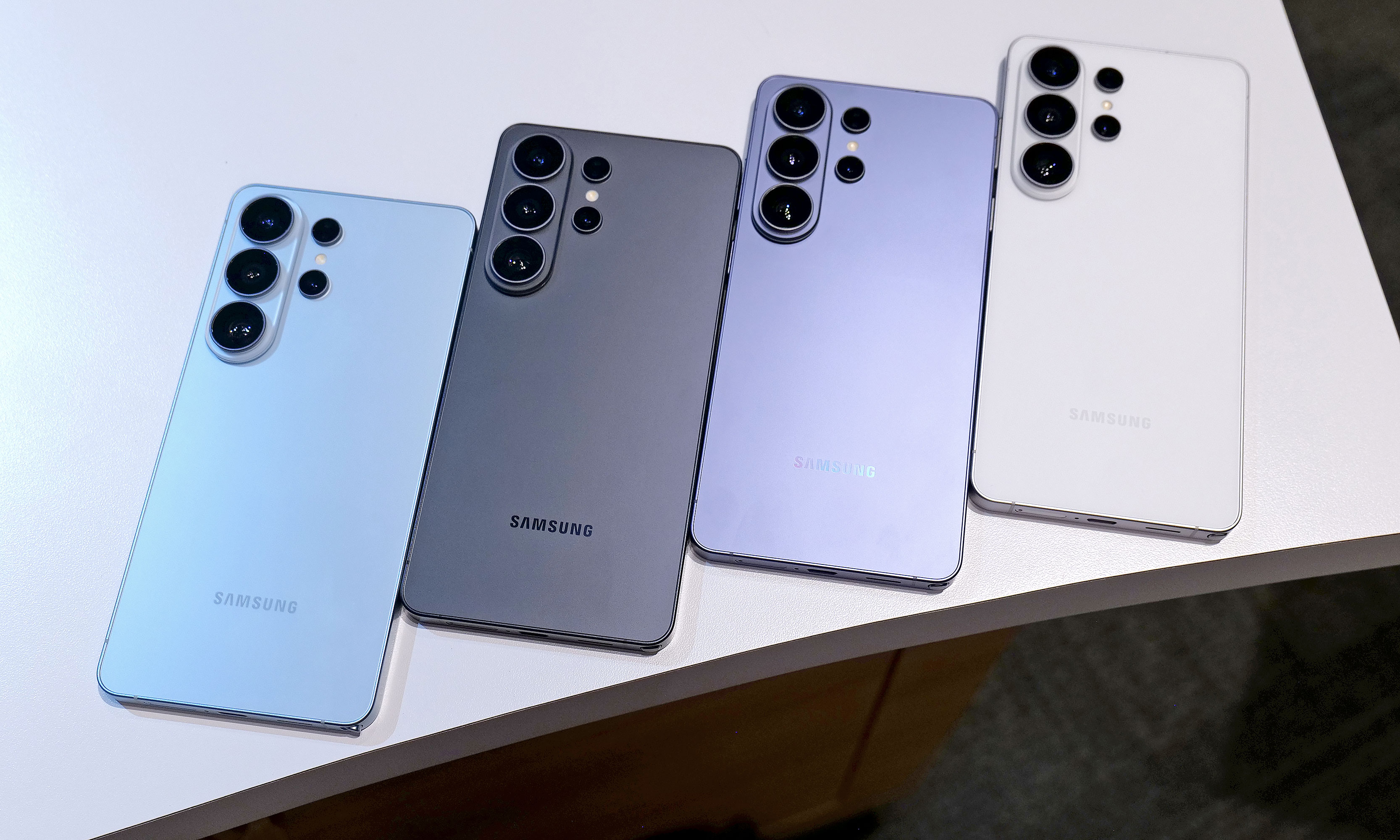
In reality, the biggest exterior change is that Samsung has ditched the titanium frame from last year’s phone in favor of an Armor Aluminum chassis with Corning Gorilla Armor 2 panels in front and back. Samsung says this new design is meant to make the Ultra fit in better with its less expensive siblings while also making it easier to do things like color match the phone’s body to the rest of the device. Also, for anyone who keeps track of Samsung’s palette, the hero color for the S26 Ultra is a rather fetching shade of purple called cobalt violet, with sky blue, white and black available as well (plus silver shadow and pink gold being Samsung’s online exclusive hues).
If you look closely at the top of the phone, you can see where a notification has been blacked out by the S26 Ultra's Privacy Display.
Sam Rutherford for Engadget
However, my favorite new thing on the S26 Ultra is its Privacy Display. When activated, it functions a lot like HP’s Sure View tech, which prevents people from peeking at your screen from acute angles. It works both when viewed from the side or up and down and has a surprising amount of customization. Not only can you set it to turn on automatically when the phone asks you for a password or PIN, it can also be triggered by specific apps or whenever you receive a notification. But perhaps the most impressive thing is that there’s almost no impact on image quality. When Privacy Display is active, there is a minor reduction in overall brightness, but aside from that, it’s really hard to tell when it’s on (at least from the front). Furthermore, the S26 Ultra’s 6.9-inch AMOLED screen has the same underlying specs as last year, including its 120Hz variable refresh rate and 2,600 nit peak brightness, so there are pretty much no trade-offs for the added functionality.
Performance and charging
The S26 Ultra still comes with an included S-Pen and a built-in storage slot, but it still doesn't have Bluetooth connectivity like on some of Samsung's older models.
Sam Rutherford for Engadget
Inside, the S26 Ultra features a Qualcomm Snapdragon 8 Elite Gen 5 for Galaxy chip along with either 12GB or 16GB of RAM and up to 1TB of storage. Compared to its predecessor, Samsung claims the NPU’s performance has made the biggest leap with it being 39 percent more powerful year-over-year with respectable increases for its CPU (19 percent faster) and GPU (24 percent faster) as well.
As for charging, both wired and wireless speeds have gotten a big boost with the former now rated at up to 60 watts (up from 45 watts) or 25 watts (up from 15) for the latter when using compatible Qi2 pads. Samsung says buyers will even get a three amp cable in the box, so all you need to do to get those peak wired speeds is to hook it up to the right adapter.
A small quirk with the S26 Ultra's S-Pen is that because the end of the stylus is curved to match the corner of the phone, if you put it in "wrong," it'll stick out a bit.
Sam Rutherford for Engadget
Unfortunately, we’re still not getting a magnetic ring inside the phone, which means if you want to use the S26 Ultra with magnetic accessories, you’ll need to pair the phone with a case that supports that functionality. This is super frustrating because Samsung says this decision was made in part to keep the handset as thin as possible, but when you consider the difference between the S26 Ultra and the S25 Ultra is 0.3mm, that choice feels rather misguided.
Cameras
One of my biggest complaints about last year’s S25 Ultra is that the only new hardware was an updated 50MP sensor for its ultra-wide lens, which is the camera I (and probably most people) use the least. Thankfully, it seems Samsung took note of that because while the resolution of its 200MP main cam, 10MP 3x telephoto and 50MP 5X telephoto are the same as before, the S26 Ultra’s main and 5x zoom lenses now have significantly wider apertures (from f/1.7 to f/1.4 and f/3.4 to f/2.9, respectively). This results in as much as 47 percent more light reaching the phone’s primary sensor (or 37 percent for the 5x telephoto), which should result in some major gains in photo quality and low light sensitivity. That said, I wasn’t able to properly test this during my hands-on session, so I’m going to reserve final judgement for a proper review.
The S26 Ultra's 200MP main and 50MP 5x zoon lenses feature significantly larger apertures, which should deliver much improved image quality in low light conditions.
Sam Rutherford for Engadget
Meanwhile, for video capture, Samsung is adding support for the APV codec at up to 8K/30 fps to the S26 Ultra along with a new horizon lock feature that will keep your footage level no matter how much you rotate the phone. Now I will admit that the latter didn’t impress me much when I first heard about it, but after testing it out and spinning the phone a full 360-degrees while recording a clip, I was shocked when the resulting video showed no hint of being whirled around. Samsung also says the handset’s improved Nightography processing uses AI to recognize noise patterns in low light to improve image quality. But similar to the wider apertures bringing in more light, I’ll believe it when I see it.
Finally, there’s a new AI-powered Photo Assist tool that lets you edit or adjust images using natural language prompts. From what I experienced, it’s effective and works as you’d expect. However, with the proliferation of services and devices offering similar functionality over the past year, this feature feels more like Samsung’s attempt to keep up with the Joneses.
AI features
When it comes to AI, the S26 Ultra is getting the same batch of new and improved features as the rest of the S26 family. So if you’re big into machine learning, there’s no need to pay extra for this model. Furthermore, many of the updates for 2026 are tweaks or refinements of existing things like the Gallery app, which now uses AI to automatically sort screenshots into eight different categories so they’re easier to find later. There’s also what Samsung is calling Now Nudge, which functions a lot like Google’s Magic Cue. It’s built into the Samsung keyboard and it can do things like suggest relevant photos based on your conversations.
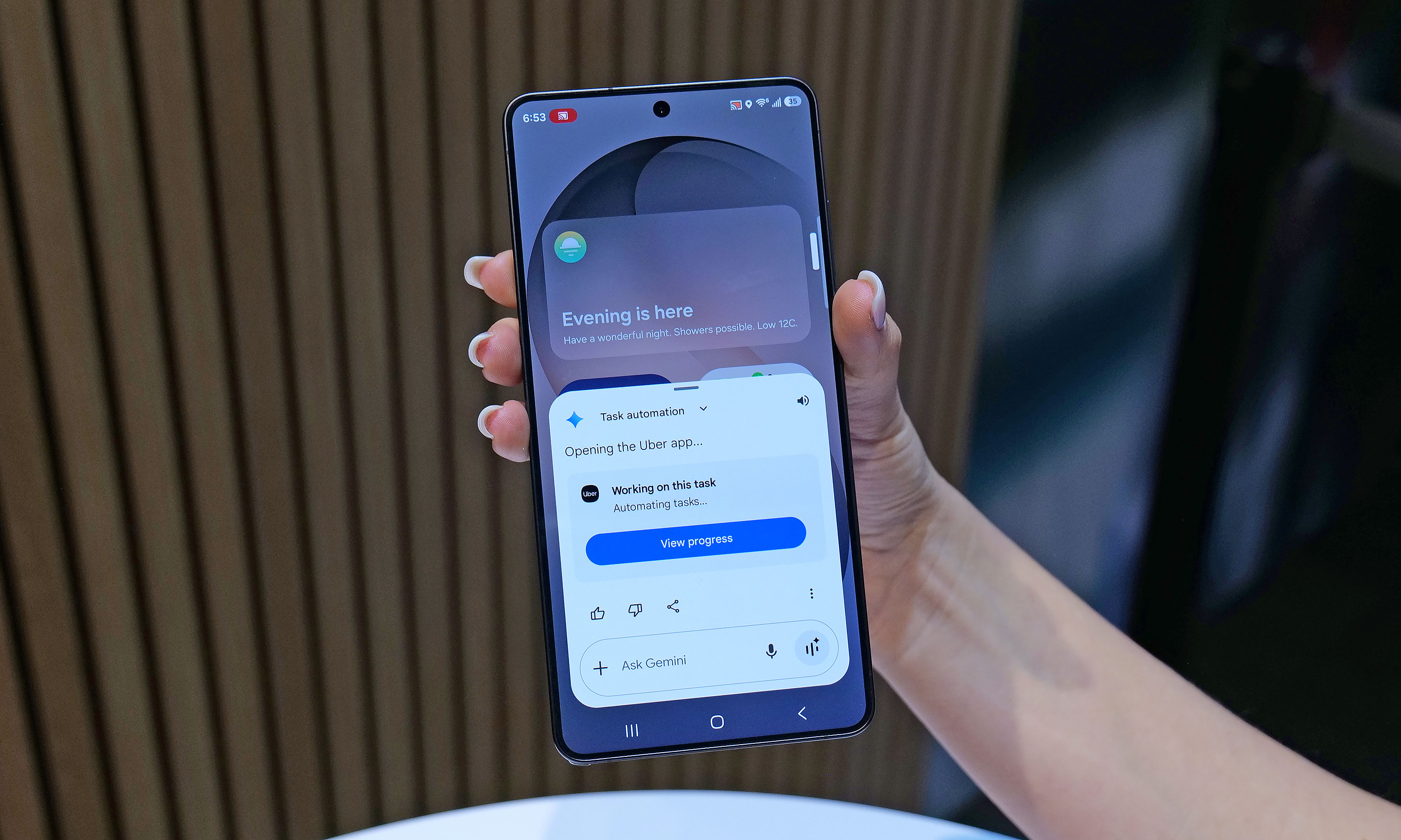
One of the S26's most powerful new AI features is Automated App Actions, which allows the phone to do things like book a car ride via Uber while you continue to use other apps in the foreground.
Sam Rutherford for Engadget
To me, the most impressive of the bunch is the S26’s Automated App Actions, which allow you to ask the phone to do slightly more complicated tasks like ordering an Uber to a specific location. After your initial prompt, Gemini can even complete the task in the background while you go back to doomscrolling or watching videos. When it’s done, you’ll get a notification so you can manually review and confirm the command. Unfortunately, Uber will be the only supported app at launch, though Samsung says it’s working on expanding the feature to others like Instacart.
Early thoughts
The Galaxy S26 Ultra will be available in four main colors: sky blue, black, cobalt violet and white, along with two more online exclusive hues in silver shadow and pink gold.
Sam Rutherford for Engadget
Look, there’s no getting around it: $1,300 is a lot to spend on a phone. That said, considering the RAM shortage that’s going on right now, keeping the S26 Ultra’s price the same as last year’s phone feels like a small blessing. And when you get that on a handset with a more refined design, a beefier chip, a fancy Privacy Display, faster charging and an updated generation of AI-powered tools, Samsung’s latest flagship feels like a much better deal than its predecessor. Really, the only thing that hasn’t been improved is the Ultra’s S-Pen, which as time goes on, is starting to feel more and more like a consolation prize for people who are still nostalgic about the Note line than a true tentpole feature.
Now this doesn’t mean that people with an S25 Ultra or even an S24 Ultra should run out and upgrade. But for anyone with something older than that who’s in the market for a true do-everything phone, the S26 Ultra has quite a bit to offer.
This article originally appeared on Engadget at https://www.engadget.com/mobile/smartphones/samsung-galaxy-s26-ultra-hands-on-meaningful-tweaks-plus-a-slick-new-privacy-display-180000057.html?src=rss