This CNC Titanium Screwdriver Has a Spinner Top You Can’t Stop Touching

Most screwdrivers and multi-tools do their job but feel generic, with rubbery handles, loud colors, stamped metal, and no reason to carry them unless you have to. Modern life involves low-level tension, loose screws on glasses, small repairs, idle hands in long meetings, and the constant search for something to occupy fingers without annoying everyone nearby. MAGICDRIVE is aimed at people who want a tool that matches their EDC mindset rather than just filling a slot in a toolbox they rarely open.

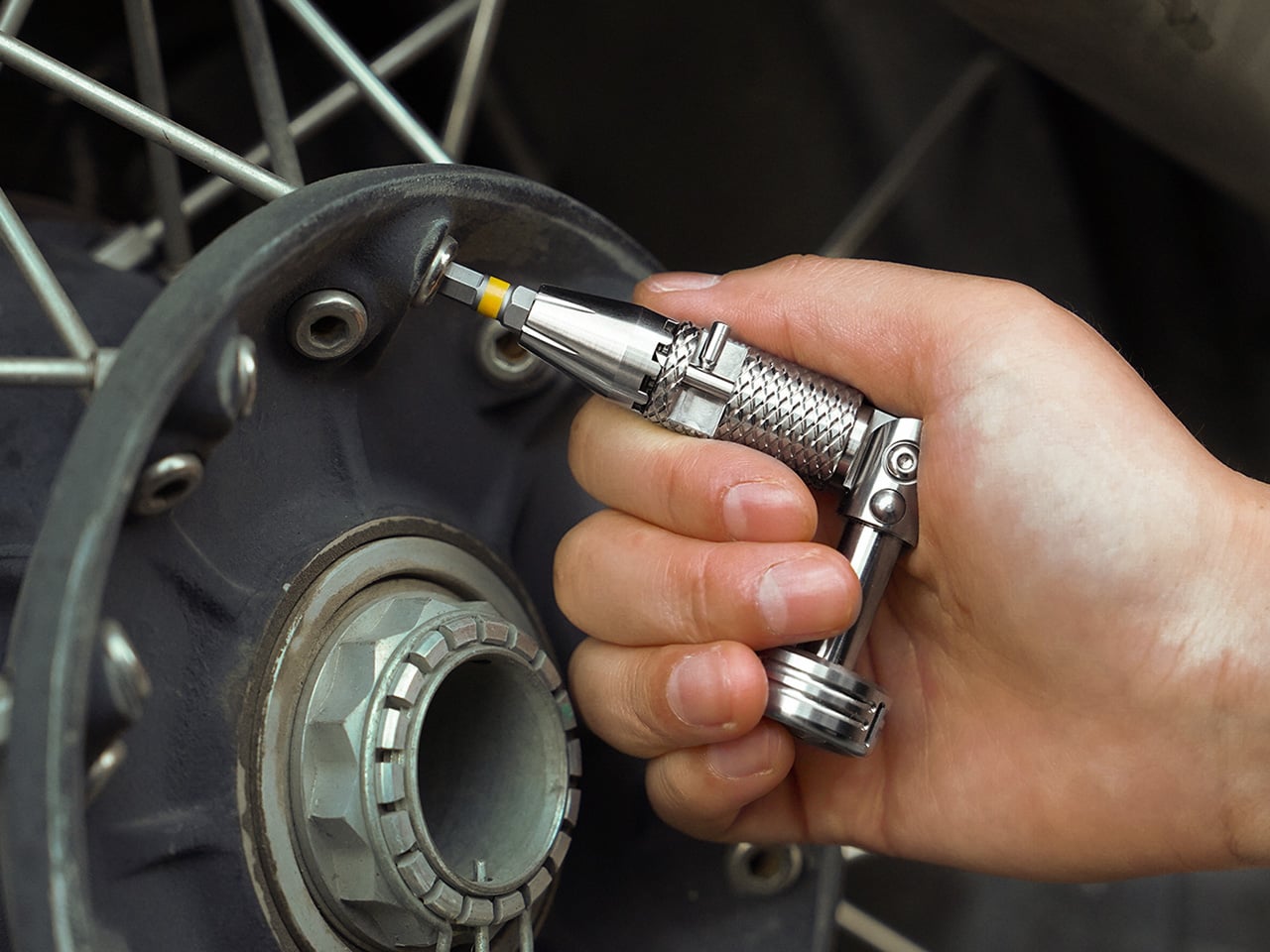
MAGICDRIVE is a precision-machined titanium ratchet screwdriver that tries to be a tool, a toy, and a small piece of mechanical art in one body. It is engineered for real performance, with a CNC-machined ratchet, foldable angles, and modular bit holders, but also designed for lifelong delight, something you might leave on a desk or carry in a pocket organizer because you enjoy using it, not just because you need it when something breaks.

Designer: Thomas Lee

Click Here to Buy Now: $149 $199 (25% off). Hurry, only 48/100 left! Raised over $128,000.

The ratchet mechanism is a fully CNC-machined assembly in titanium, brass, and ceramic bearings, with no injection-molded or stamped parts, built around a classic mechanical design. Every component is individually machined and mechanically interlocked, delivering smooth, solid clicks, strong torque transfer, and the promise of zero wobble and long-term reliability. The knurling is also CNC-machined, grooves cut rather than pressed, giving a confident grip that feels secure without being abrasive during longer sessions or repeated use.

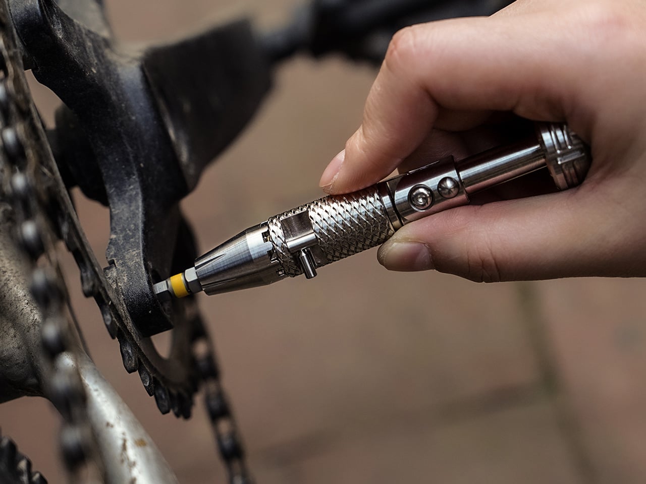
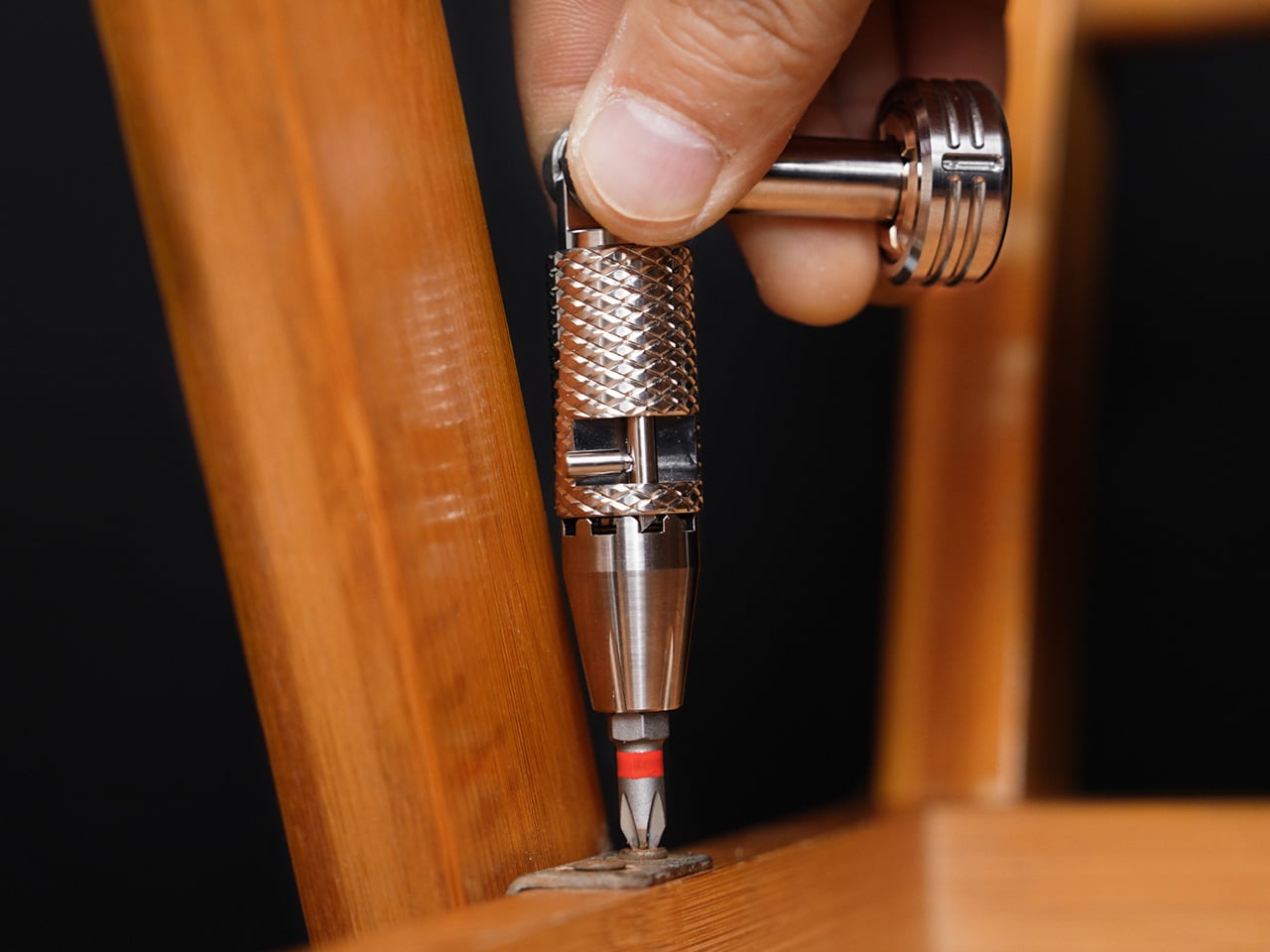
The foldable body locks into 0°, 45°, and 90° positions with a push-button system. Straight-line mode is for rapid spinning and quick turns, 45° mode adds control and comfort, and 90° mode turns the compact driver into a small lever for stubborn screws and awkward angles. Torque testing measured up to 7.9 N·m in 90-degree mode with the 1/4-inch holder installed, which is more than most screws can take before they strip or fail.

The modular bit system lets you swap between a standard 6.35mm (1/4-inch) bit holder and a 4mm precision bit holder using a magnetic quick-swap interface. The 1/4-inch mode is the workhorse, fully compatible with common bits, extension bars, and socket adapters, likely the configuration you use most for everyday screws, small repairs, and workshop tasks where full ratchet engagement and smooth mechanical feedback matter during tightening or loosening.

The 4mm module is for micro jobs and delicate hardware, eyeglasses, small electronics, cameras, watches, keyboards, and calibration tasks where control is more important than torque. This mode intentionally skips the ratchet to give fingertip finesse, and MAGICDRIVE’s compact form makes it feel closer to a surgical instrument than a bulky driver when you are working on tiny fasteners that need gentle, precise turns without stripping delicate threads.

The quick-swap bit holder is held by a strong magnetic interface designed to avoid accidental separation or rattling during carry. The magnets are mechanically sealed by CNC-machined caps instead of just glued, preventing glue fatigue and loose parts over time. This reinforces the theme that the tool is built for long-term reliability, not just initial impressions or the first few months of use before parts start failing.

The balanced spinner top with a brass core is designed for silent, satisfying spins when there is nothing to fix. It offers a moment of focus without clicks or noise, and three tritium slots in the top make the driver easy to find in low light while adding a subtle glow when it spins. It is a small piece of kinetic art that turns idle moments into something more intentional, quieter than clicking a pen and more deliberate than scrolling through a phone.

The Grade 5 titanium body, brass spinner core, and N56 magnets avoid coatings pretending to be metal. Three finishes are available: satin silver, beadblast matte grey, and PVD black, and the brass develops patina over time. The hex-based modular ecosystem includes pen and knife modules and an aluminum bit-holder magazine with a ruler and storage, framing MAGICDRIVE as a platform that can grow with an EDC setup rather than a single-purpose tool that sits in a drawer.

MAGICDRIVE is meant to live beside a favorite knife, pen, or watch, not buried in a drawer. Sometimes you pick it up to fix something, sometimes just to feel the machining under your thumb or spin the top during a long call. It is a screwdriver that treats function and feeling as equally important, turning small interruptions and small repairs into chances to enjoy a beautifully made object. For people who care about the tools they carry and the rituals that fill the gaps between bigger tasks, MAGICDRIVE reads less like a gadget and more like a small, well-resolved piece of everyday gear that earns its place in a pocket or on a desk.

Click Here to Buy Now: $149 $199 (25% off). Hurry, only 48/100 left! Raised over $128,000.

The post This CNC Titanium Screwdriver Has a Spinner Top You Can’t Stop Touching first appeared on Yanko Design.

Minimalist Phone Takes On Teenage Engineering-inspired Design To Offer Hyper-Functionality

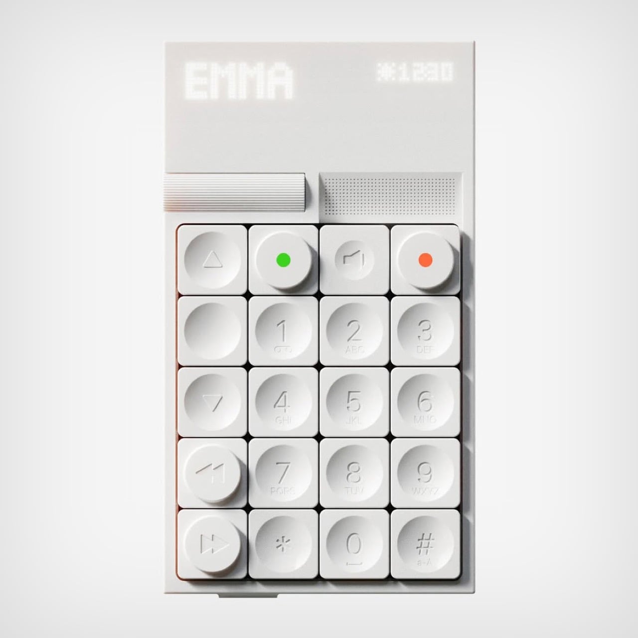
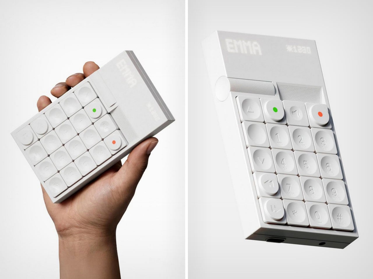
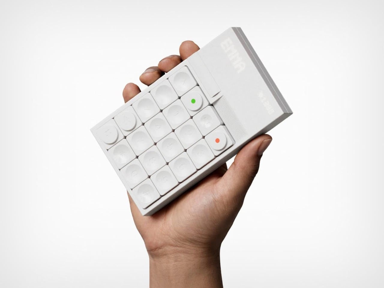
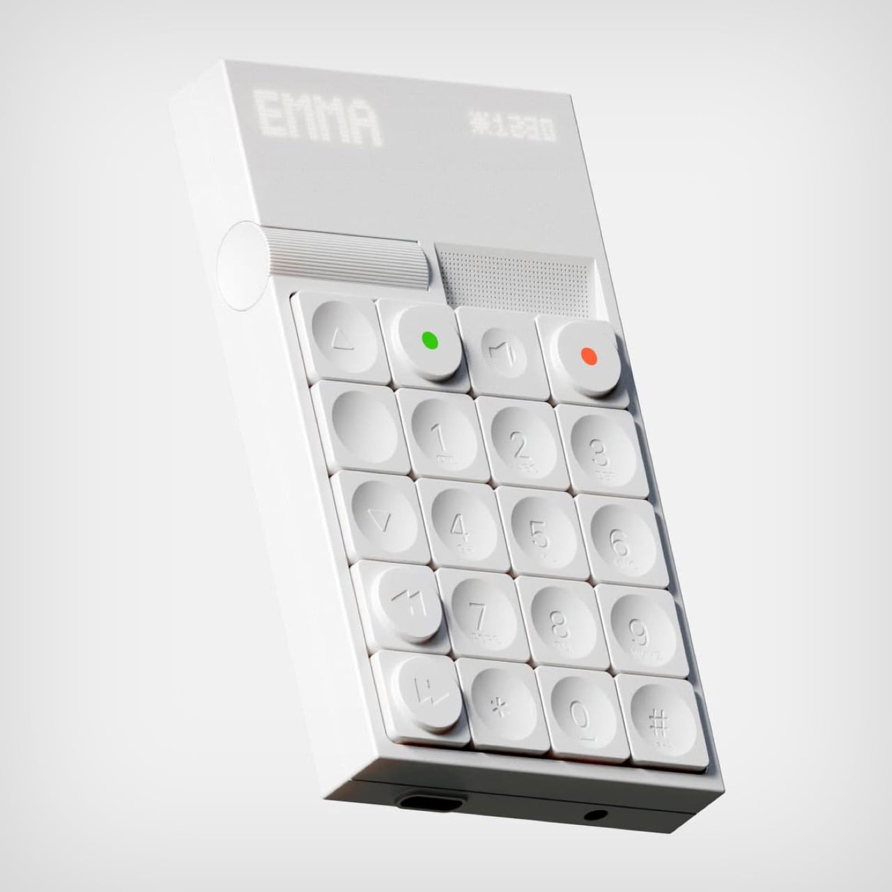
This phone is so minimal it doesn’t even have a name. This brick-ish beauty comes from the mind of Keziah Mendjisky, an industrial design student out of Paris. The idea is simple, how much can you take away from current phones to give you something that feels like a phone and performs like a phone, but doesn’t have any of the distractions? Mendjisky’s attempt at re-envisioning a connectivity device is gorgeously risqué, resulting in something that you’d first think was a calculator.

Grab it, however, and you’ll realize it doesn’t have your calculator’s layout. The numbers are laid out like a phone, starting from the top unlike a calculator (which starts from the bottom), there are volume and playback keys, and two conspicuous buttons marked green and red, which become obvious once you realize they’re for answering or rejecting calls. Everything gets packaged in a design format that would make folks at Braun or Teenage Engineering very happy – the use of white, the employment of tactile surfaces, and just the right amount of fun without making the device look like an unserious toy.

Designer: Keziah Mendjisky

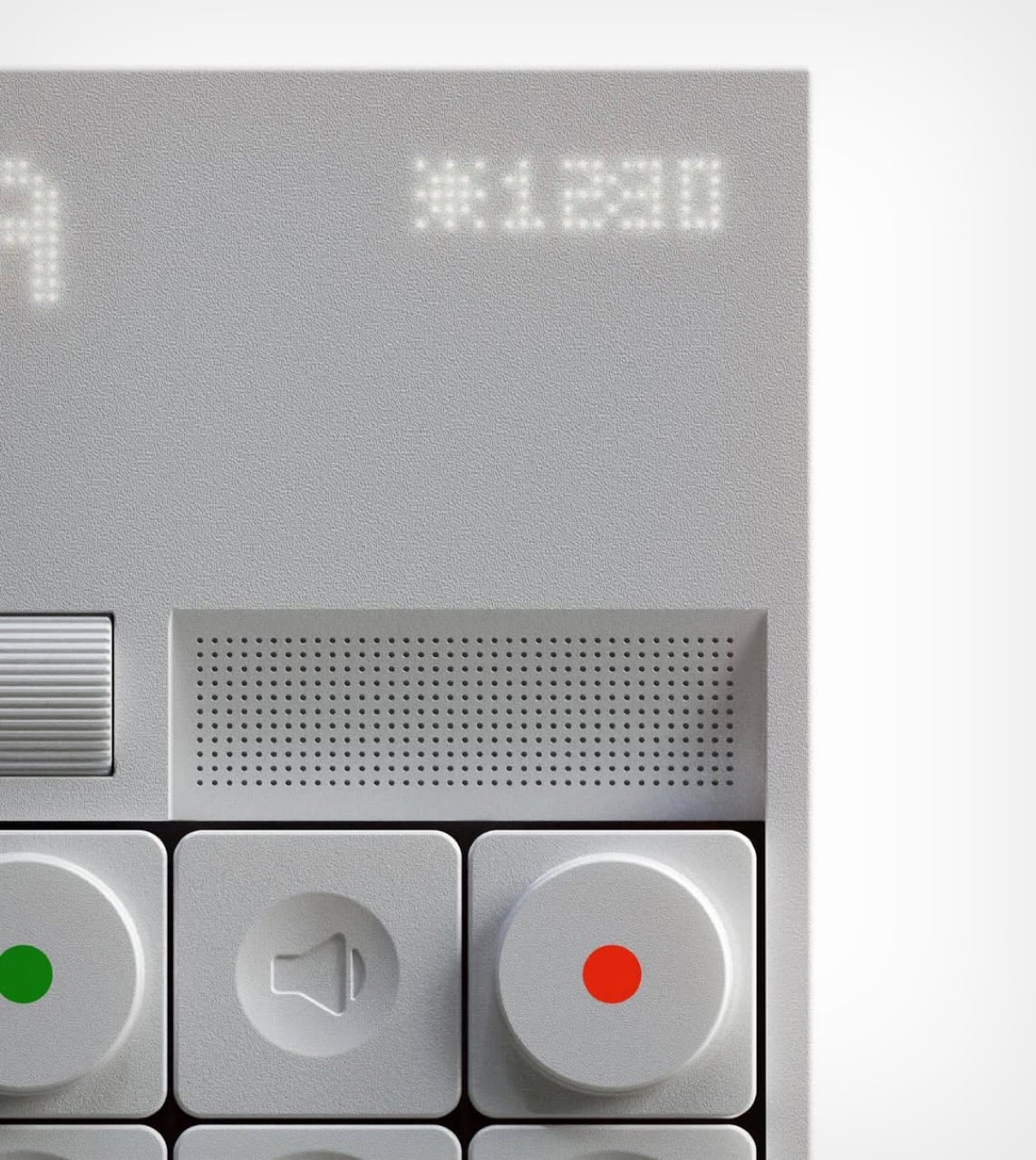
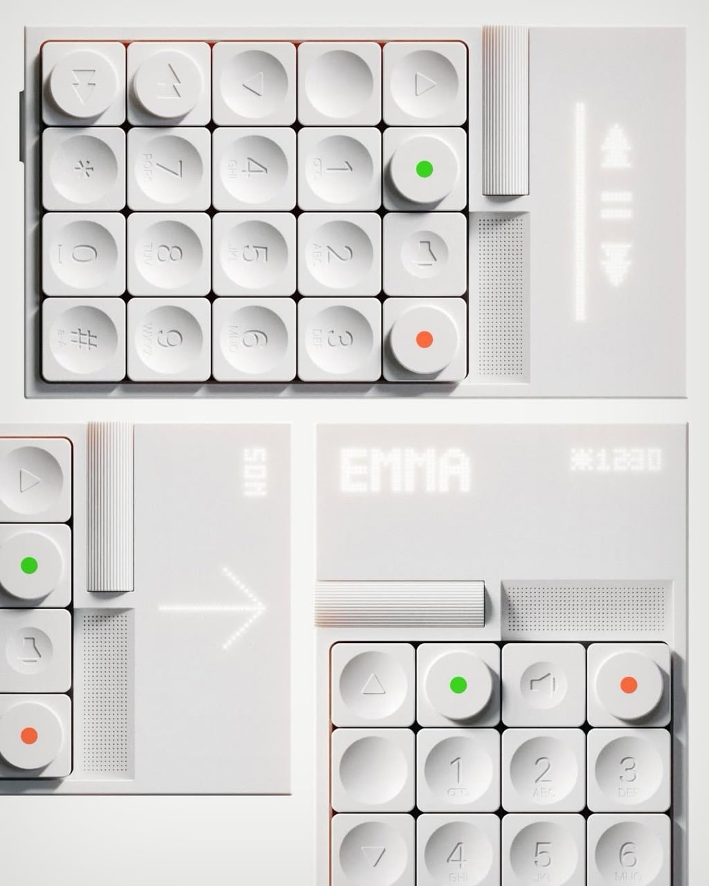
“This concept rethinks what a phone should be in a world of constant distraction. No glass screen. No endless scrolling,” says Mendjisky. One could argue that ‘no glass screen’ might be pushing things a little too far, but the minimal phone he designed with this very constraint still feels ‘cool’. The screen is replaced by a backlit plastic panel with a dot-matrix light-up display – think screen on your Ember thermos or the Mui Board Gen 2.

The top right corner of the display is dedicated to the time and weather. The left, however, is where the main elements are visible, A very tactile scroll wheel lets you quickly jump through functions or contacts, while a green or red button lets you call or disconnect. In the middle, a speaker key lets you activate the loudspeaker mode while on calls, with the speaker unit itself right above the button array.

The rest of the buttons lack a concrete explanation, but it’s easy to infer what they could be for. Numbers dial numbers, obviously, but there’s a T9 keyboard underneath too, presumably for searching contacts or texting. Forward and rewind buttons could possibly hint at voicemail playback, although the phone apparently handles media too. Most buttons are concave, making them reliable to press, although a few critical buttons have an embossed/extruded design, probably hinting at more core functionality.

Phoning is arguably the most important aspect to this minimalist gadget, although Mendjisky’s visuals hint at a few core tools like music playback, navigation, and maybe even an alarm. Plus, given its calculator-esque aesthetic, I’d probably expect a calculator function to be built-in too, but the lack of addition/subtraction/etc buttons does tend to worry me!

The post Minimalist Phone Takes On Teenage Engineering-inspired Design To Offer Hyper-Functionality first appeared on Yanko Design.

Six-Legged LEGO Technic Walker Moves Like a Real Creature Thanks To Pure Mechanical Engineering

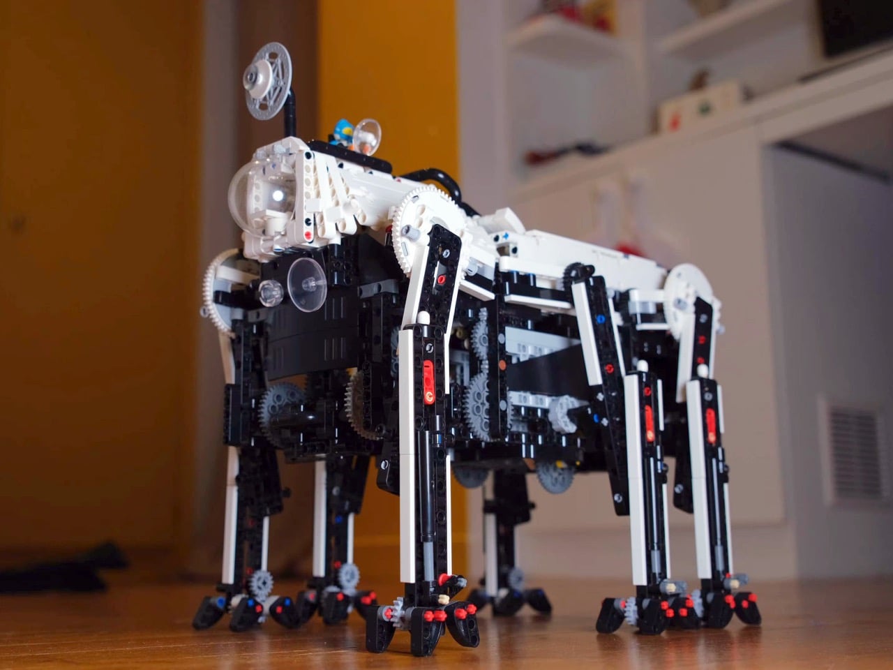
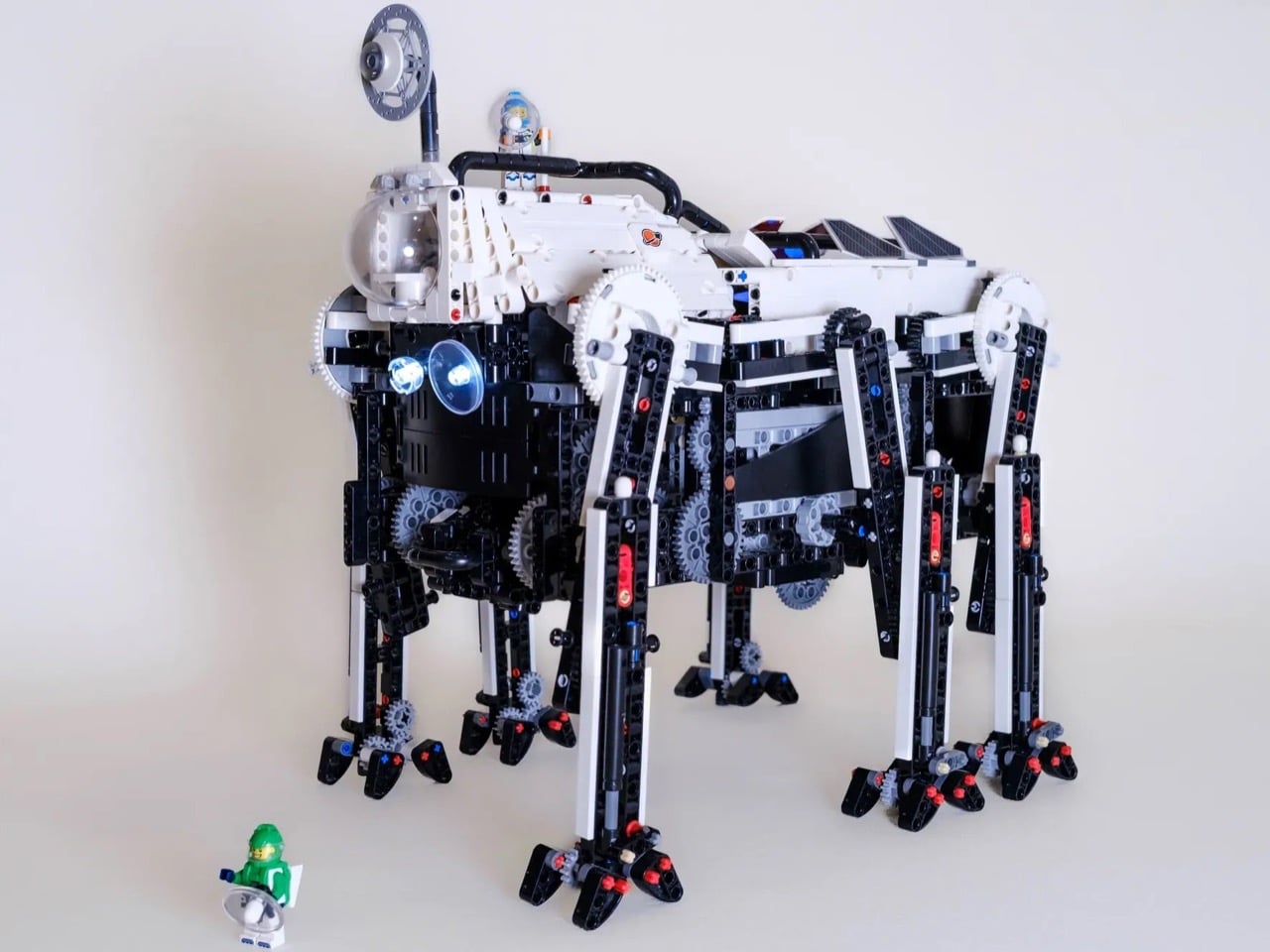
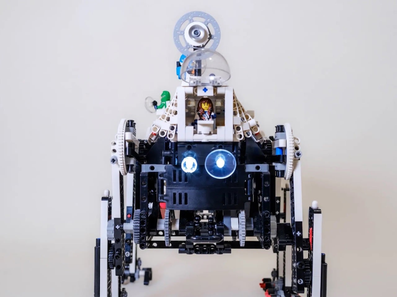
Walking machines are hard. Really hard. Which is why most LEGO motorized builds stick to wheels or treads, and the ones that do attempt legs usually end up with something that shuffles more than it strides. But every so often someone figures out the mechanical magic trick that makes it work, and this six-legged walker currently on LEGO Ideas is one of those builds that actually delivers on the promise. The creator has managed to build something that moves with genuine fluidity, the kind where you can see the weight transfer from leg to leg.

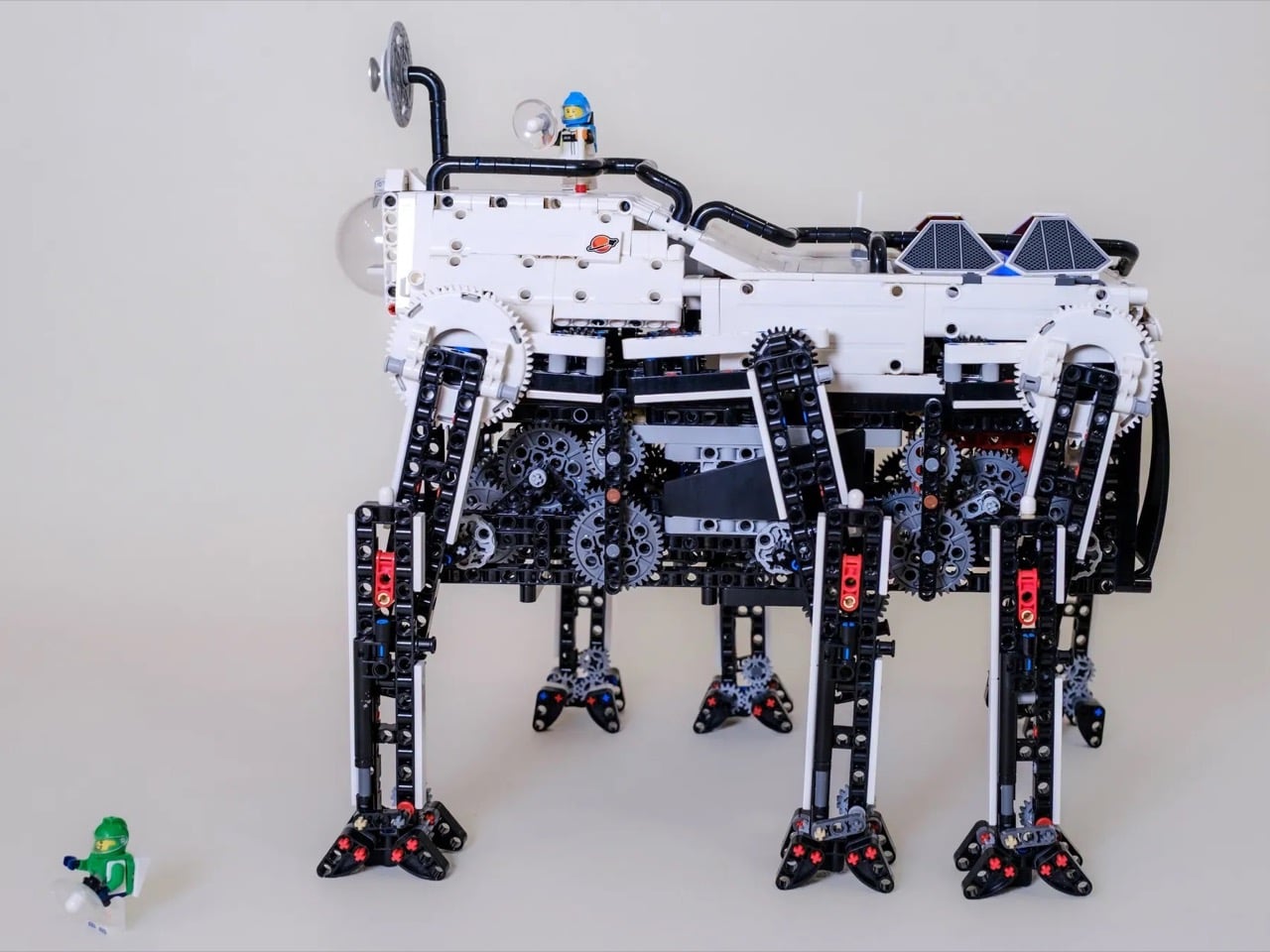
The secret is in the gearing system. Rather than trying to program each leg’s movement independently, the build uses variable-speed gears that automatically adjust leg velocity based on where it is in the stride cycle. Slow and deliberate when the foot is planted, quick when it swings through the air. Combined with a vertical stabilization mechanism and shock-absorbing feet, you get something that can handle real terrain rather than just demonstration videos on smooth surfaces. It’s styled as a space exploration rover complete with a crew cabin and solar panels, leaning into that AT-AT aesthetic without directly copying it.

Designer: Alexis_MOCs_FR

Here’s the thing about making LEGO walk. You can throw servos at the problem and program every joint independently, which is how Boston Dynamics does it and why their robots cost more than a house. Or you can do what Theo Jansen did with his Strandbeest sculptures and let the mechanism itself figure out the gait. Jansen’s beach creatures run on wind power and pure geometry, converting constant rotation into this weirdly organic walking motion that makes you forget you’re watching PVC pipe and zip ties. That’s the approach Alexis_MOCs_FR took here, using two L motors and a gear train that does all the thinking mechanically. No Arduino, no sensor feedback loops, just smart engineering that exploits the physics of rotating linkages.

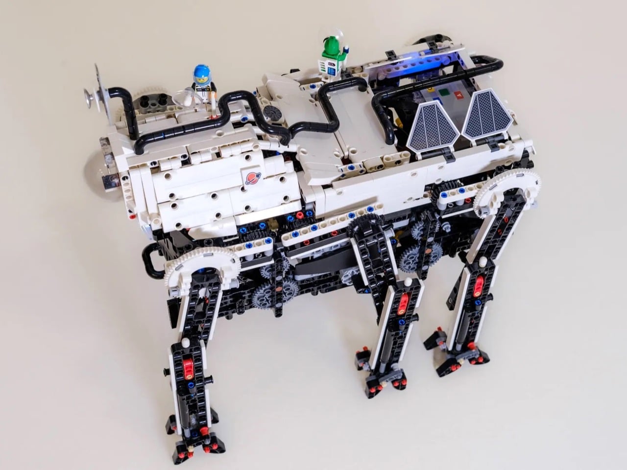
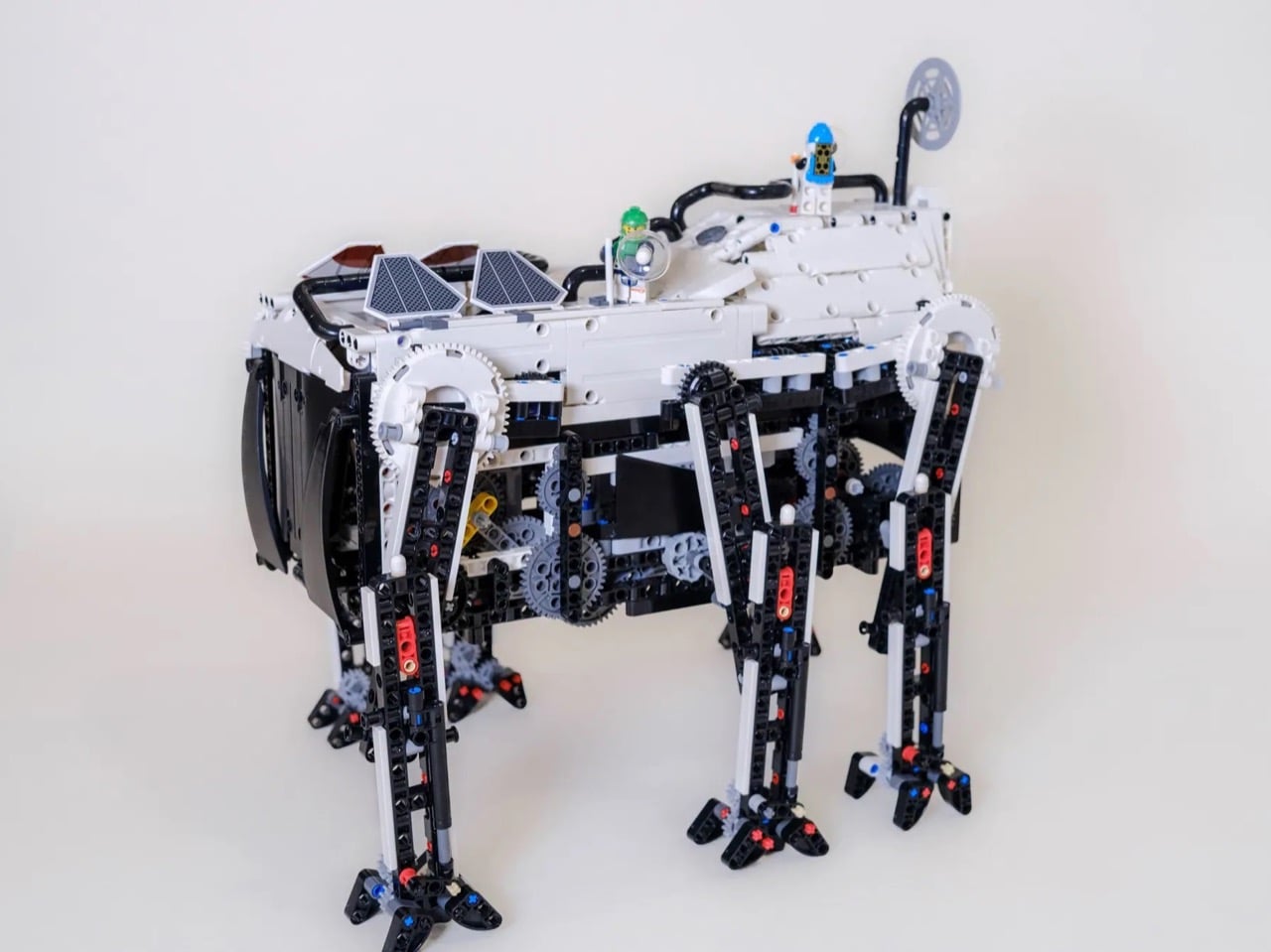
The look is peak 1970s futurism. White body panels, black structural framework, blue solar arrays, elevated cockpit with room for two astronaut minifigs. There’s a satellite dish up top because of course there is. The whole thing sits maybe 12 to 16 inches tall based on minifig scale, and all that gearing is completely visible. Some builds try to hide the mechanism under cosmetic panels, but here the exposed gear trains are the entire point. Watching the motion transfer from motors down through the variable-speed system and into the legs is genuinely mesmerizing, like those transparent mechanical watch movements that cost absurd money because people will pay to see the machinery work.

The vertical stabilization bit is where you can tell someone really understood the assignment. When your upper leg is swinging through a 60 or 70 degree arc, keeping the foot flat on the ground becomes this annoying trigonometry problem. Most people either accept some wobble or add complexity with extra actuators. This build has a sliding element in the lower leg that compensates for the angle automatically. Upper leg tilts, slider adjusts, foot stays vertical. It’s passive, it’s reliable, and it’s the kind of solution that only works because someone actually prototyped this thing instead of just CAD modeling it and calling it a day.

High-stepping gaits hit hard. You’re lifting legs way off the ground and slamming them back down at whatever speed your motors can manage. Without damping, every impact rattles through the structure and either knocks gears out of alignment or turns the whole thing into a vibrating mess. Custom shock absorbers at each foot solve this, which is why the creator can apparently run it over rumpled blankets and piles of Kapla blocks without it face-planting. The build is allegedly both lightweight and robust, which sounds like marketing speak until you consider that you need enough mass for stability but not so much that momentum tears the gear teeth apart during direction changes.

The project is currently in its very early stages, with 424 more days to gather votes and hit the next milestone. If it gets to the coveted 10,000 mark, LEGO actually reviews it for production. The Technic lineup has been pretty safe lately, lots of supercars and construction equipment but not much that pushes mechanical boundaries. This thing demonstrates actual engineering innovation, the kind where someone solved hard problems with clever solutions instead of just adding more motors. If you want to see it become a real set, go cast your vote on the LEGO Ideas website!

The post Six-Legged LEGO Technic Walker Moves Like a Real Creature Thanks To Pure Mechanical Engineering first appeared on Yanko Design.

Someone Built a Biodegradable 8GB Hard Drive Out of Mushrooms

So here’s a sentence I never thought I’d write: someone made a USB drive out of mushrooms. Well, technically mycelium, the sprawling fungal network that lives underground and occasionally pops up as the mushrooms we eat. But still. We’re talking about storing your family photos, tax documents, and embarrassing early-2000s selfies inside what is essentially cultivated fungus. And somehow, this makes perfect sense.

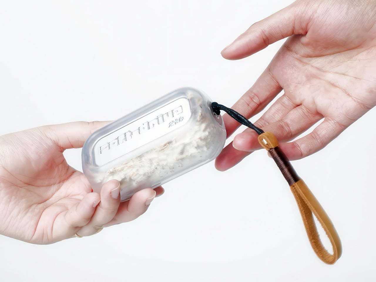
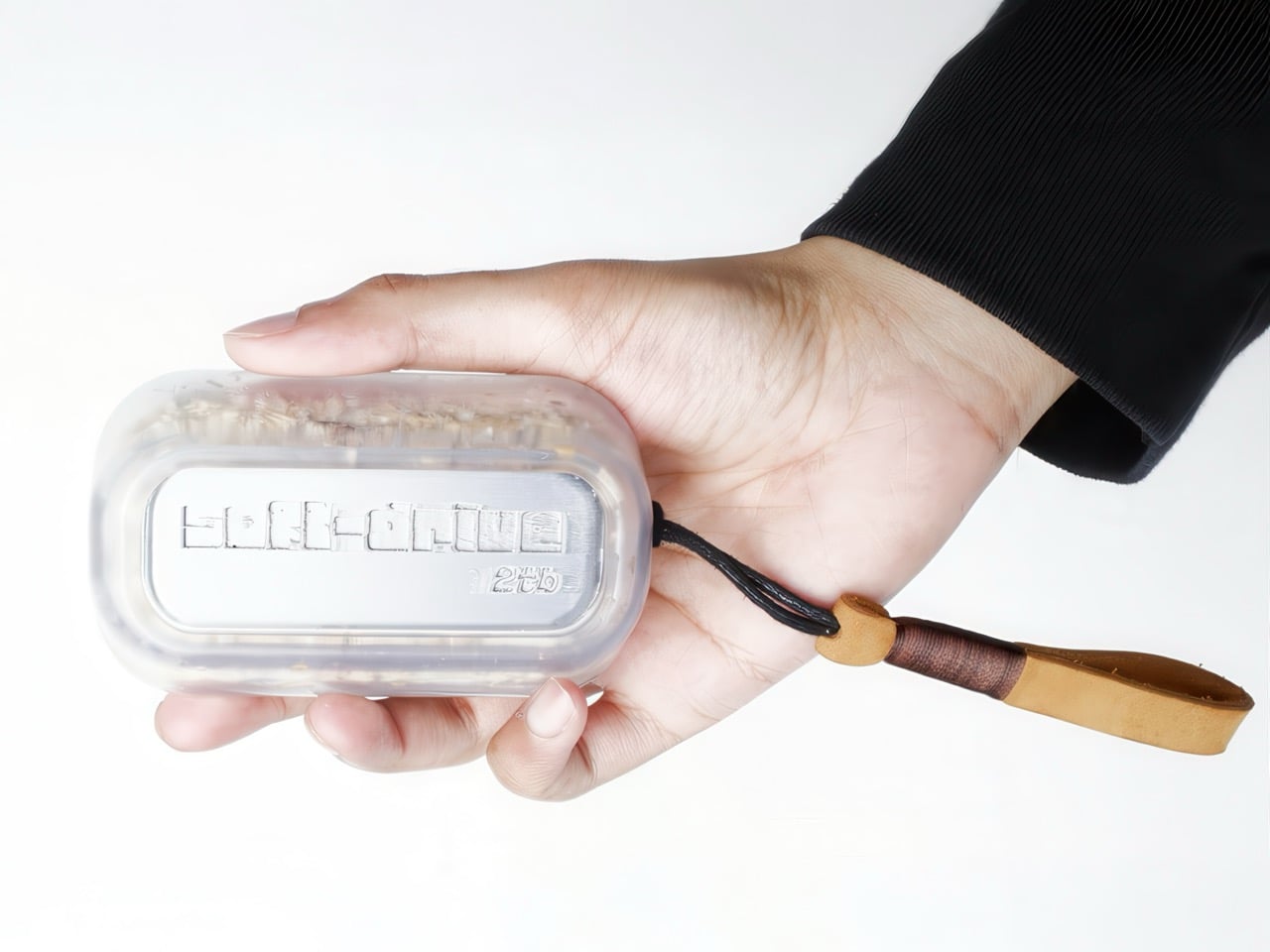
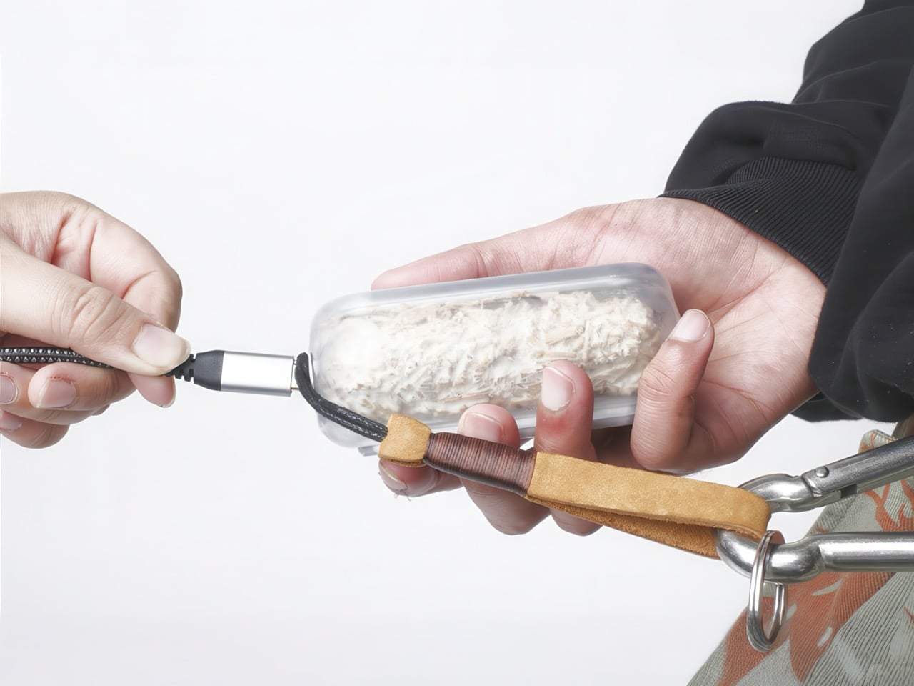
Enter the Soft Drive, which looks less like a tech product and more like something grown in a lab that studies alien artifacts. Designer Sree Krishna Pillarisetti built this portable drive with a shell made from mycelium, the root-like structure of fungi, combined with hemp and bioplastics from waste materials. You can see the fungal fibers through the translucent case, all wispy and organic, protecting the electronics inside. It’s strange and beautiful and deliberately so. The whole thing is designed to make you feel the weight of your data again, to make storage physical and local and weird in a way that makes you reconsider why we ever outsourced our digital memories to faceless corporations in the first place.

Designer: Sree Krishna Pillarisetti

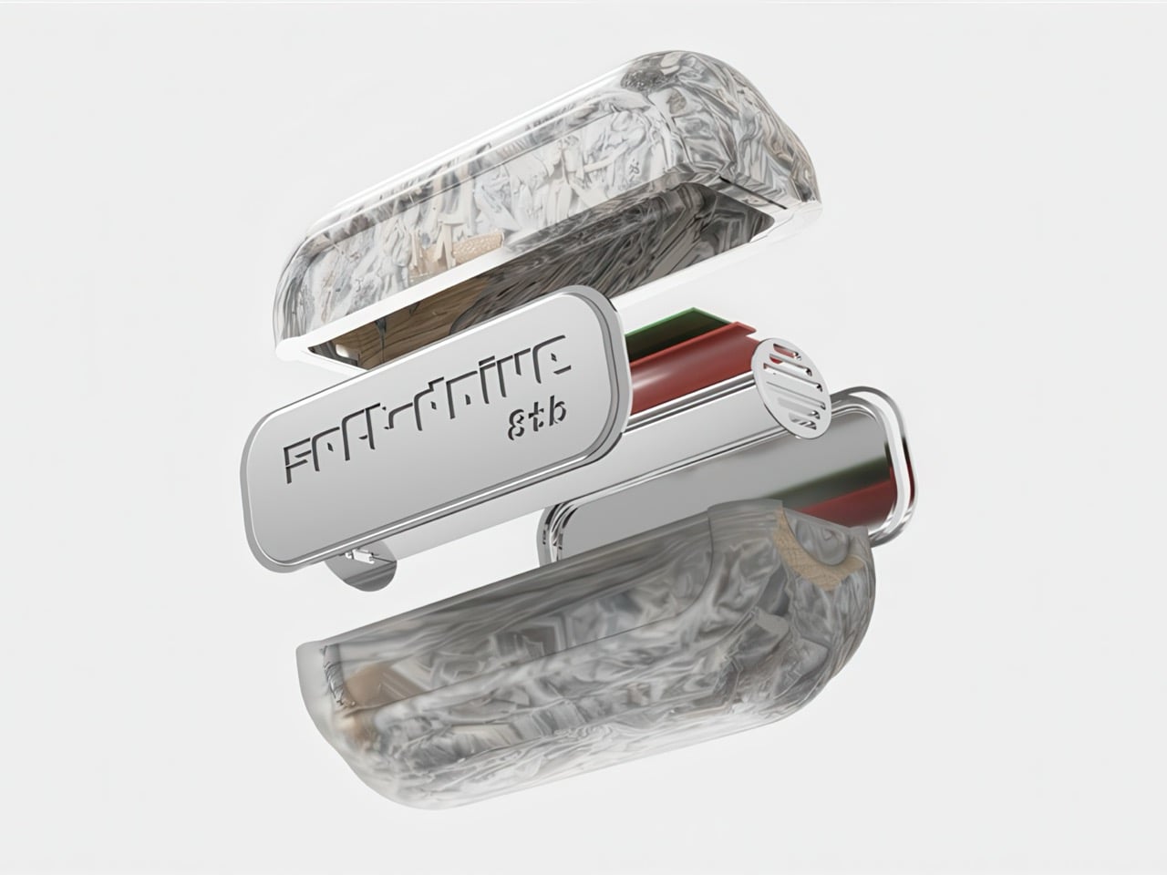
The translucent casing shows off the wispy, organic texture of mycelium mixed with hemp, wrapped around a standard memory card and heat sink. There’s a woven lanyard attached like it’s a charm you’d wear. It holds 8GB, which sounds quaint until you realize that’s exactly the point. This isn’t about competing with cloud storage. It’s about asking why we ever thought it was a good idea to hand over our entire digital lives to massive, energy-guzzling server farms we’ll never see or control.

The name is doing a lot of heavy lifting here, and I’m here for it. “Soft Drive” as the inverse of “hard drive” is chef’s kiss levels of nomenclature. Pillarisetti, who completed this as his MFA thesis at Parsons, built the entire shell from materials sourced from waste streams: mycelium, hemp fibers, and polylactic acid (PLA). The mycelium acts as natural shock absorption, which is clever because dropping your drive has historically been a nightmare scenario. Fungi don’t crack the way plastic does. They compress, absorb impact, and generally behave like they evolved for this, which, in a roundabout way, they kind of did.

And I personally love how deliberately weird this thing looks. Consumer electronics have spent decades trying to disappear, to become these frictionless black mirrors we barely notice. The Soft Drive does the opposite. It foregrounds its materials, makes you aware you’re holding something that grew, that came from a living process. The translucent case means you see everything: the fibrous mycelium texture, the metallic components inside, the fact that this object has layers and history. It’s the anti-iPhone, and I mean that as a compliment. Pillarisetti calls it a “regenerative memory storage device,” which is a fancy way of saying it can eventually break down and return to the earth instead of sitting in a landfill for the next thousand years. The whole concept pushes toward decentralized local networks, physical sharing, data you can hand someone instead of emailing a Dropbox link. It’s romantic in a way tech hasn’t been in years.

The post Someone Built a Biodegradable 8GB Hard Drive Out of Mushrooms first appeared on Yanko Design.

Huawei Mate X7 Review: When a Foldable Finally Feels Finished

PROS:


  • Exceptionally thin foldable design that feels resolved and comfortable daily

  • Matched dual displays deliver consistent quality folded or unfolded

  • Camera system prioritizes realism, balance, and dependable everyday results

  • Strong battery life with fast wired and genuinely usable wireless charging

  • Thoughtful ergonomics make it feel like a phone first, foldable second

CONS:


  • HarmonyOS requires ecosystem flexibility and willingness to adjust workflows

  • Telephoto zoom range favors balance over extreme long distance reach

RATINGS:

AESTHETICS
ERGONOMICS
PERFORMANCE
SUSTAINABILITY / REPAIRABILITY
VALUE FOR MONEY

EDITOR'S QUOTE:

A foldable that finally disappears into daily life instead of demanding attention.
award-icon

The best foldables are the ones that stop asking for permission. After years of watching the form factor fight against itself, the Mate X7 arrives as something quieter: a device where restraint replaces spectacle, and compromise fades into the background. What makes it notable isn’t ambition. It’s resolution. The proportions feel considered. The materials feel deliberate. The hinge feels invisible in the way all good engineering eventually should. This is not a phone that announces itself as a foldable. It simply behaves like a flagship that opens when you need more space.

What makes the Mate X7 feel distinct is not how much it can do, but how deliberately its form has been resolved. From the first day, the Mate X7 felt less like a concept I needed to accommodate and more like a tool that quietly folded itself into my routine. That’s a subtle distinction, but it’s the one that matters most. This isn’t about novelty anymore. It’s about maturity.

Design and Ergonomics

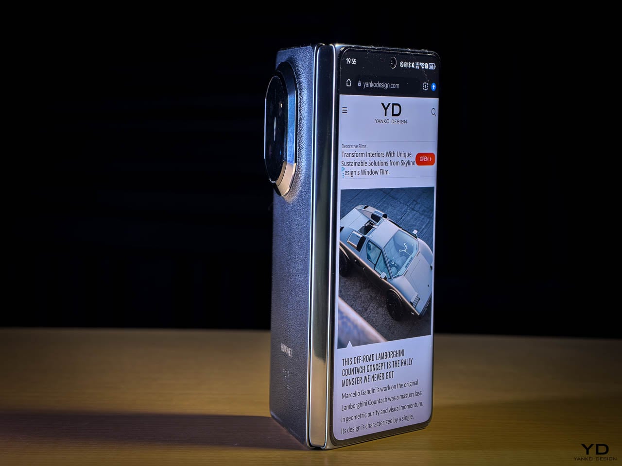
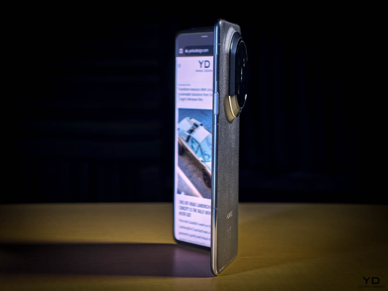
Folded, the Mate X7 feels surprisingly ordinary in the best way possible. The thickness stays under ten millimeters, which means it slips into pockets without that familiar resistance most book style foldables still have. Unfolded, it measures approximately 4.5 millimeters. Both displays run at 2.4K resolution on LTPO OLED panels with adaptive refresh from 1 to 120 Hz, the outer screen peaking at 3,000 nits and the inner at 2,500 nits. The curved edges soften the contact points in your hand, and the weight feels evenly distributed rather than top heavy. I never found myself adjusting my grip to compensate for the hinge or camera module.
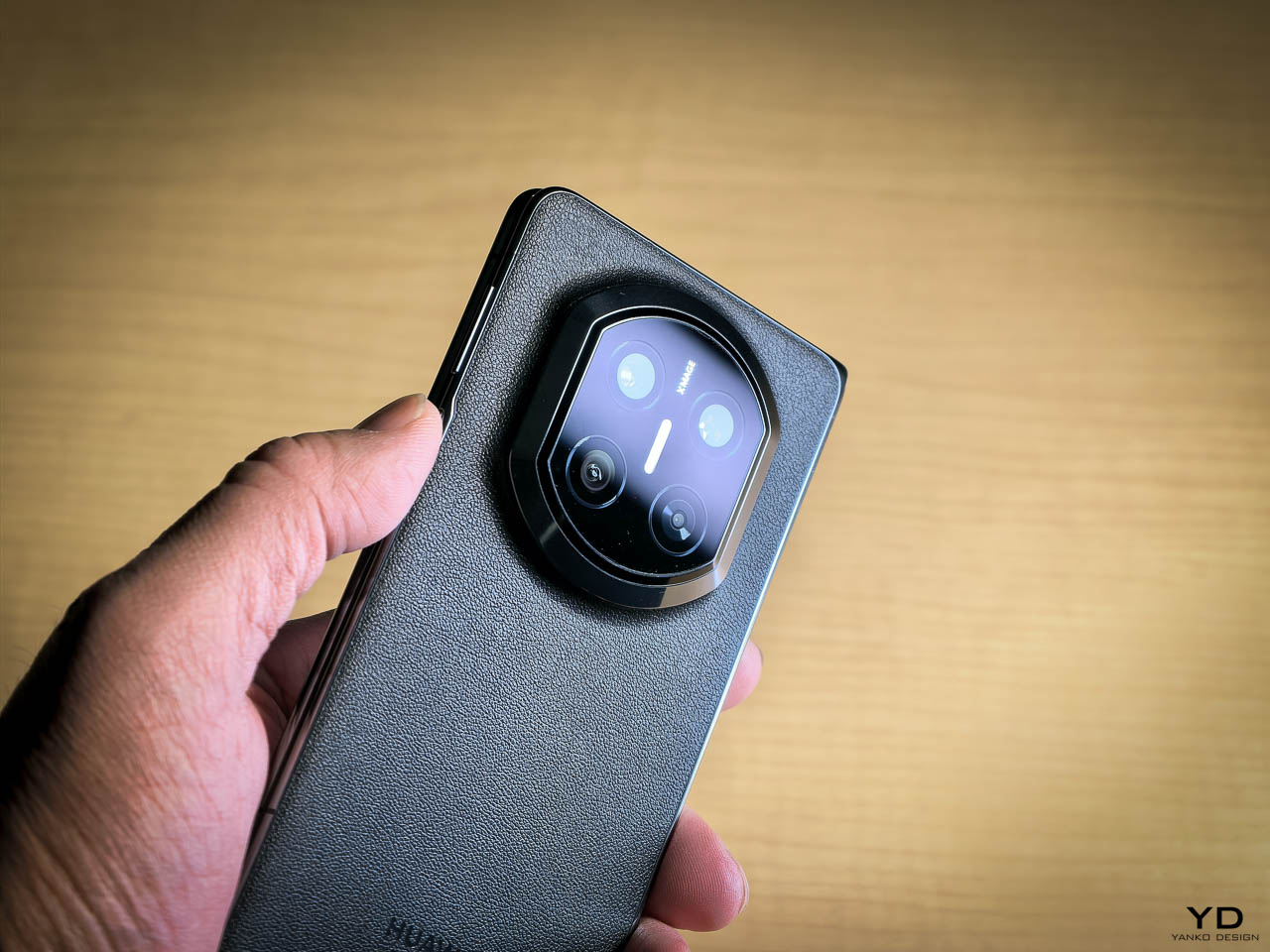
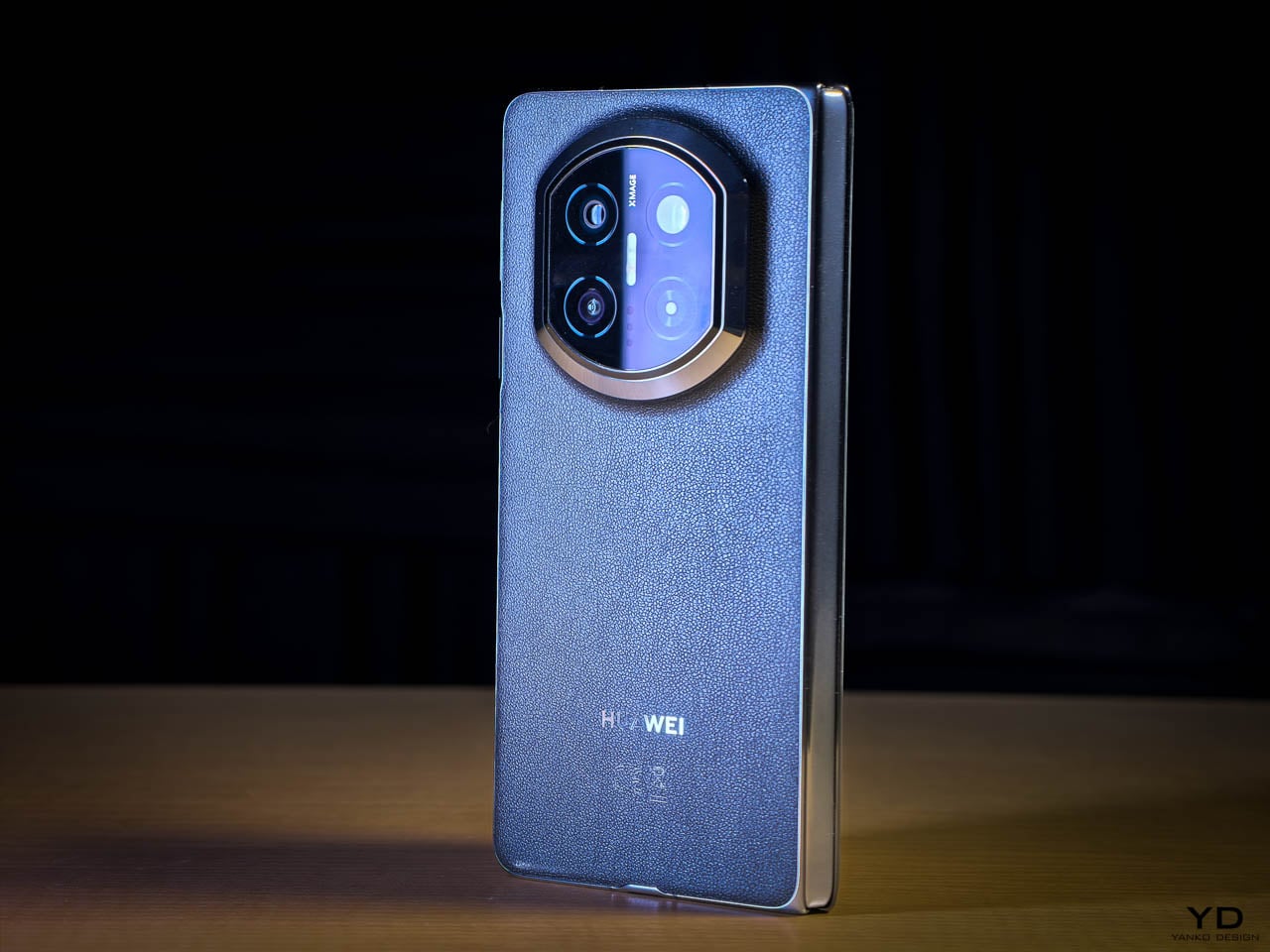
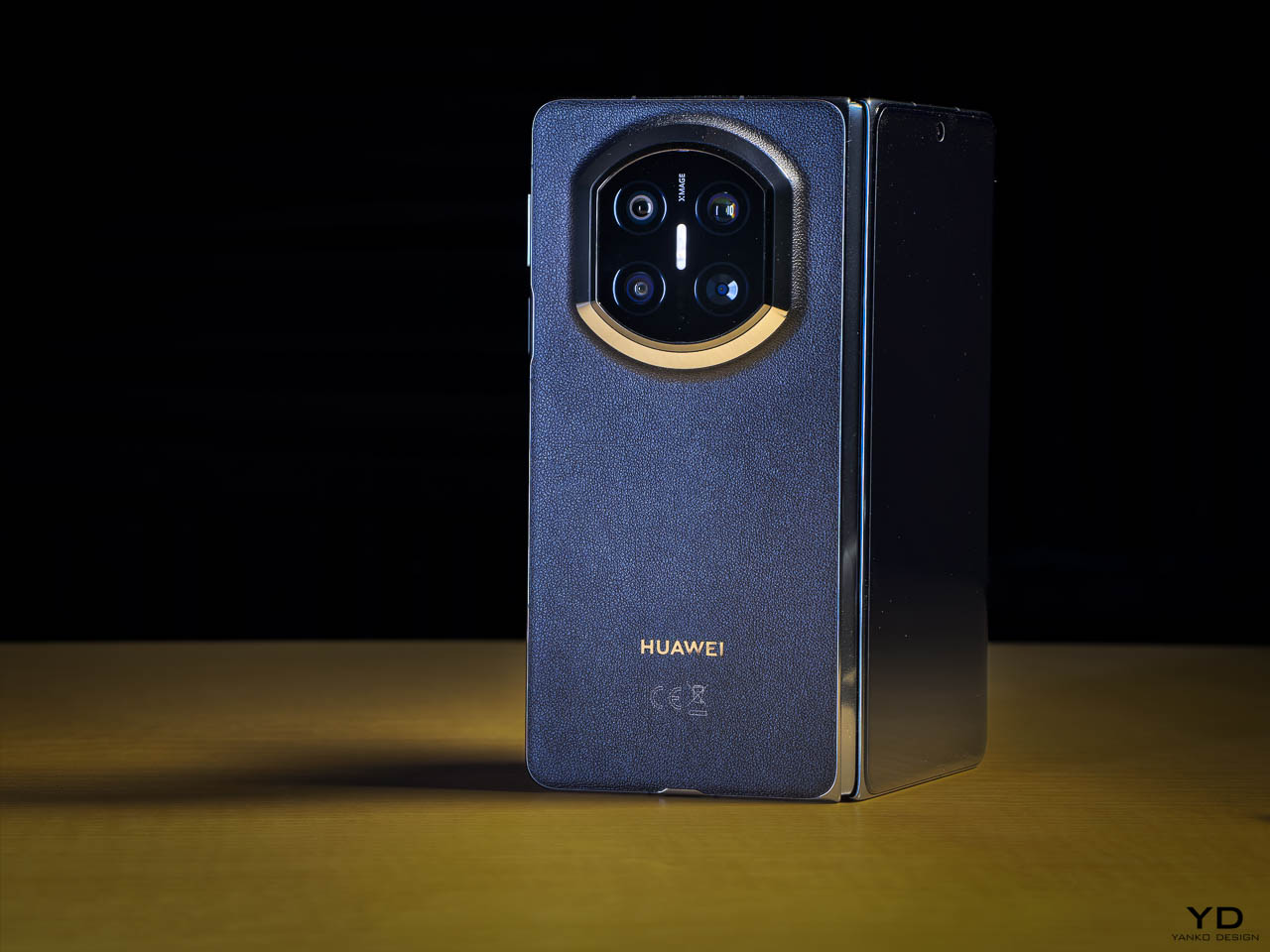
The black vegan leather rear panel changes how the phone sits in the hand. It’s softer than glass, warmer than metal, and far less prone to slipping during one handed use. Fingerprints don’t cling to it the way they would on a glossy surface. Over time, the leather develops a subtle patina rather than showing wear, which frames aging as character rather than damage. It feels like a material choice made for daily comfort, not display.

The redesigned camera module warrants more attention than it usually gets in foldable reviews because it does more than house optics. This shift away from the circular camera island feels less like a styling decision and more like a correction to how foldables have been carrying visual mass. The Time Space Portal design stretches vertically, which aligns with the natural proportions of a folded device instead of fighting them. It also spreads mass along the back rather than concentrating it near the top, which helps explain why the Mate X7 never feels top heavy in the hand. This design only works because Huawei re-engineered the camera system to fit within the physical constraints of a thinner foldable body, allowing it to read as a surface element rather than a mechanical bulge. What you end up with is a camera module that feels integrated into the body instead of attached to it. Paired with the leather rear panel, the camera module reads less like a hardware interruption and more like part of a continuous material composition.
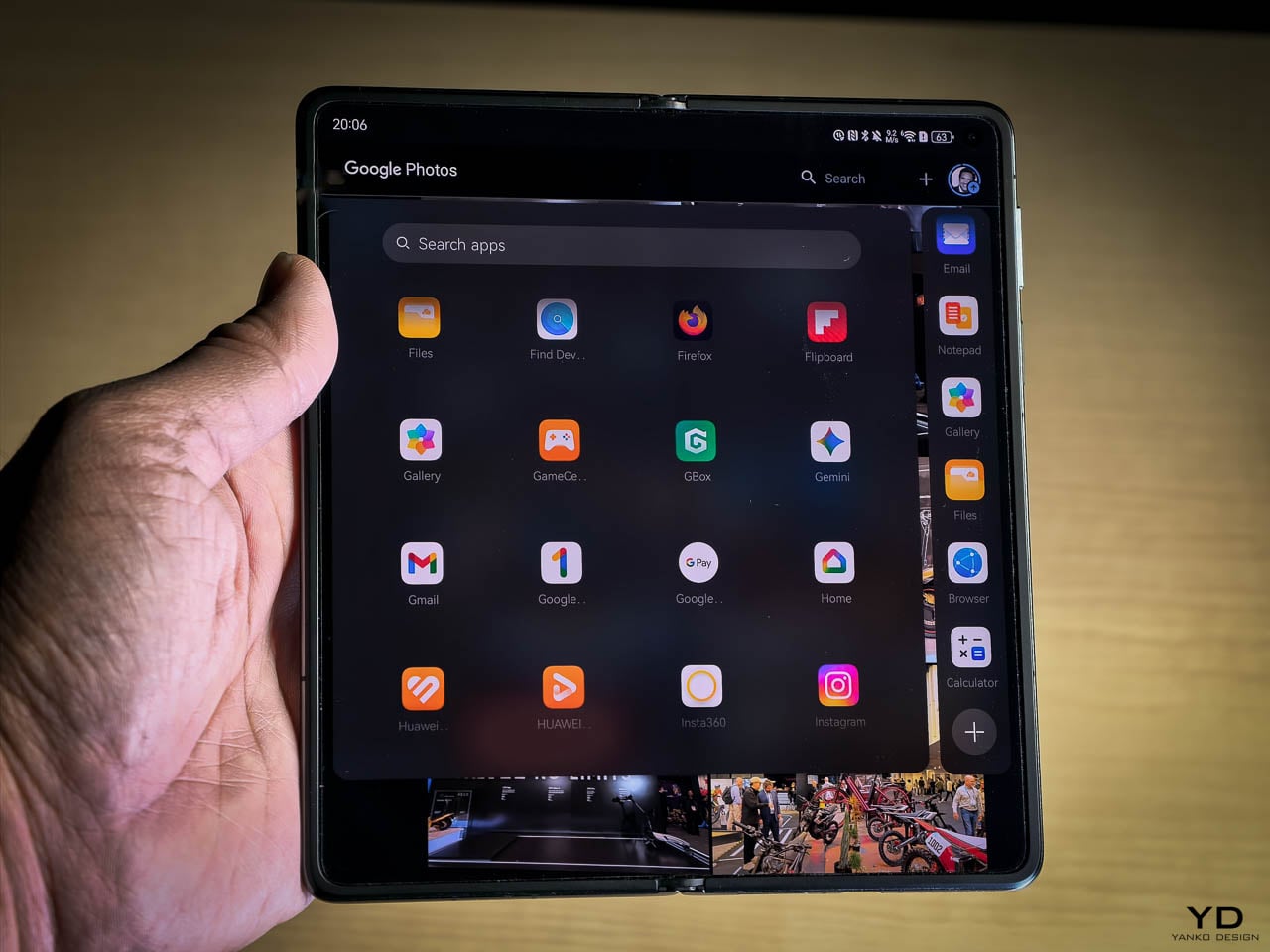
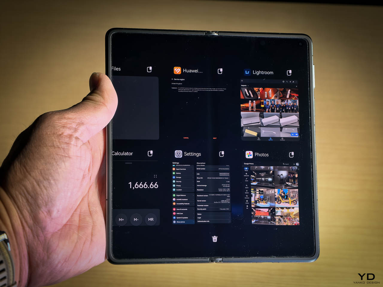
The interface plays a quiet but important role in how the Mate X7 feels to live with. When the phone is folded, core interactions stay comfortably within thumb reach instead of drifting upward or outward. Unfolding the device doesn’t feel like switching modes so much as expanding the same workspace. Apps reflow predictably rather than rearranging themselves in ways that break muscle memory. That predictability matters because it reinforces the physical design choices. You unfold when you want more space, not because the interface forces you to. The software respects the hardware’s proportions, which is why the Mate X7 feels cohesive rather than clever.
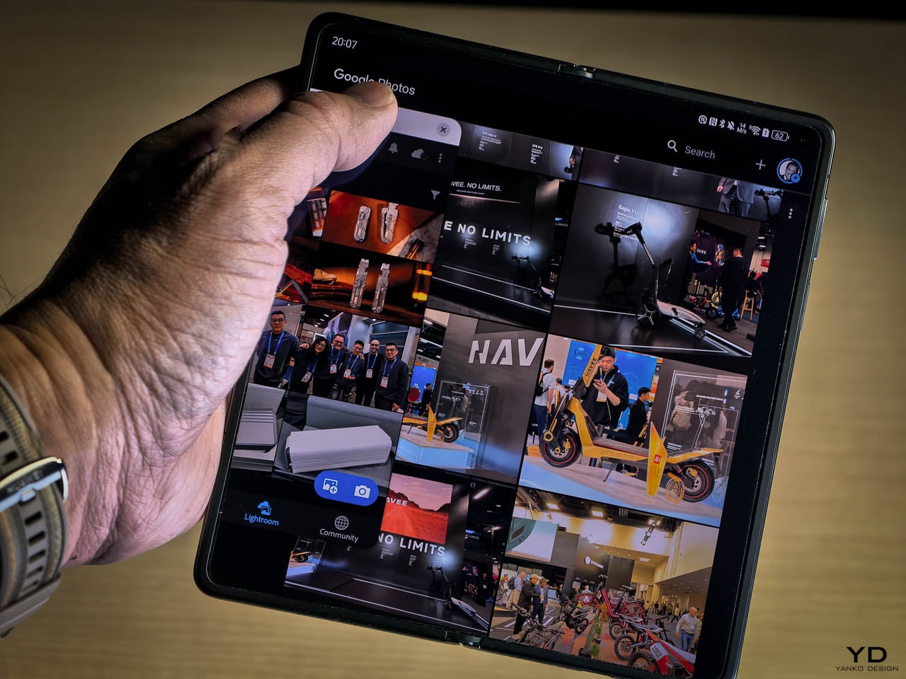
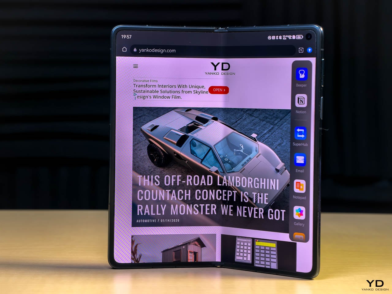
Unfolded, the eight inch inner display changes posture more than behavior. You don’t suddenly use the phone differently. You simply see more of what you were already doing. Email triage feels less cramped. Reading long articles feels natural instead of compressed. The crease fades into the background quickly, and because both displays share the same resolution class, refresh rate range, and color tuning, the transition between folded and unfolded never feels like a downgrade or upgrade. It feels consistent.

That consistency is what makes the design work. The Mate X7 doesn’t force you to choose between screens. It lets you forget about the distinction.

Hinge and Durability

Foldables still live or die by trust. The Mate X7 builds that trust quietly. The hinge opens with steady resistance and closes with a controlled final movement. There’s no snap. No wobble. No audible feedback that makes you hesitate. After days of frequent folding and unfolding, it never felt looser or stiffer than it did out of the box.
Knowing there is a layered structure under the inner display changes how you interact with it. You stop hovering your fingers. You stop being overly careful. The screen responds like a screen, not like something you’re afraid to touch. That psychological shift is important, and it’s something many foldables still fail to achieve.

Water resistance doesn’t turn this into a rugged phone, but it removes anxiety from daily life. Light rain, splashes near a sink, condensation from a cold bottle. These moments no longer feel like threats. You don’t think about them. You keep using the phone.

Performance and Thermal Behavior

The Mate X7 uses a Huawei-designed chipset paired with an updated internal cooling system built specifically for the thermal constraints of a foldable chassis. Rather than emphasizing raw performance numbers, the focus here is sustained responsiveness and thermal stability during extended use. That design intent shows up immediately in daily operation.

Performance on the Mate X7 never called attention to itself, which is exactly what I want from a device in this category. Swiping, scrolling, and switching between apps felt effortless. I never found myself waiting for a transition or wondering if the system would keep up. Rather than chasing benchmark headlines, the platform here prioritizes consistency, keeping animations fluid, app launches quick, and daily use free from friction or compromise.
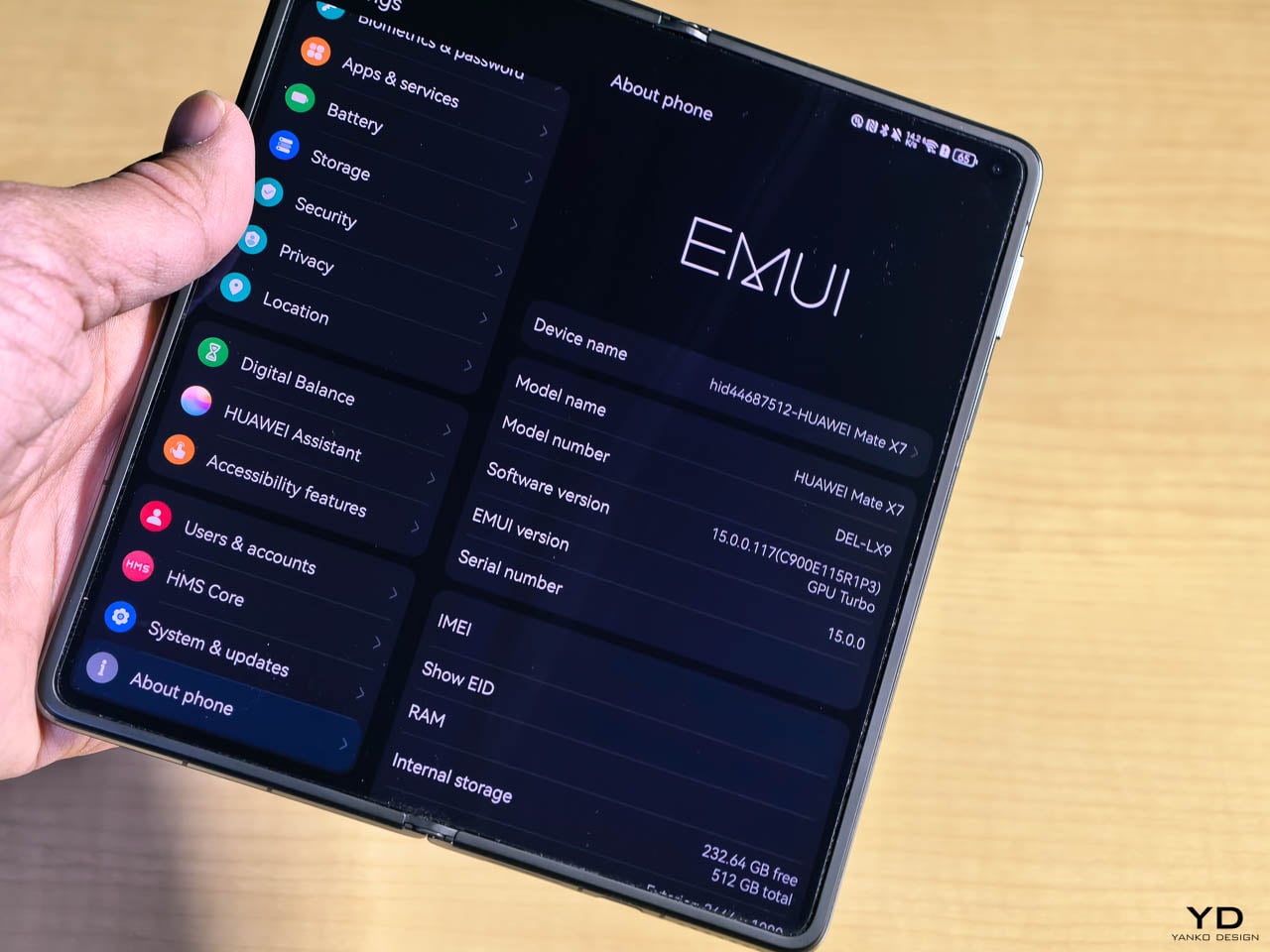
It’s clear that HarmonyOS isn’t just running on this hardware. It’s tuned for it. The software and silicon work together in a way that feels quiet rather than flashy. Menus respond the moment you touch them. Transitions between folded and unfolded states don’t stutter. High refresh rates stay smooth without feeling like the system is straining to maintain them. That kind of optimization is easy to overlook until you use a device where it’s missing.

When I put the Mate X7 through longer stretches of use, the thermal behavior became the real story. Video calls, heavy browsing, photography, and frequent multitasking ran together without noticeable heat buildup. The vapor chamber cooling system does its work invisibly. The phone stayed comfortable in my hand even during more demanding sessions, and I never found myself shifting my grip to avoid a warm spot. That matters more on a foldable because heat has fewer places to go. The Mate X7 handles that constraint well.
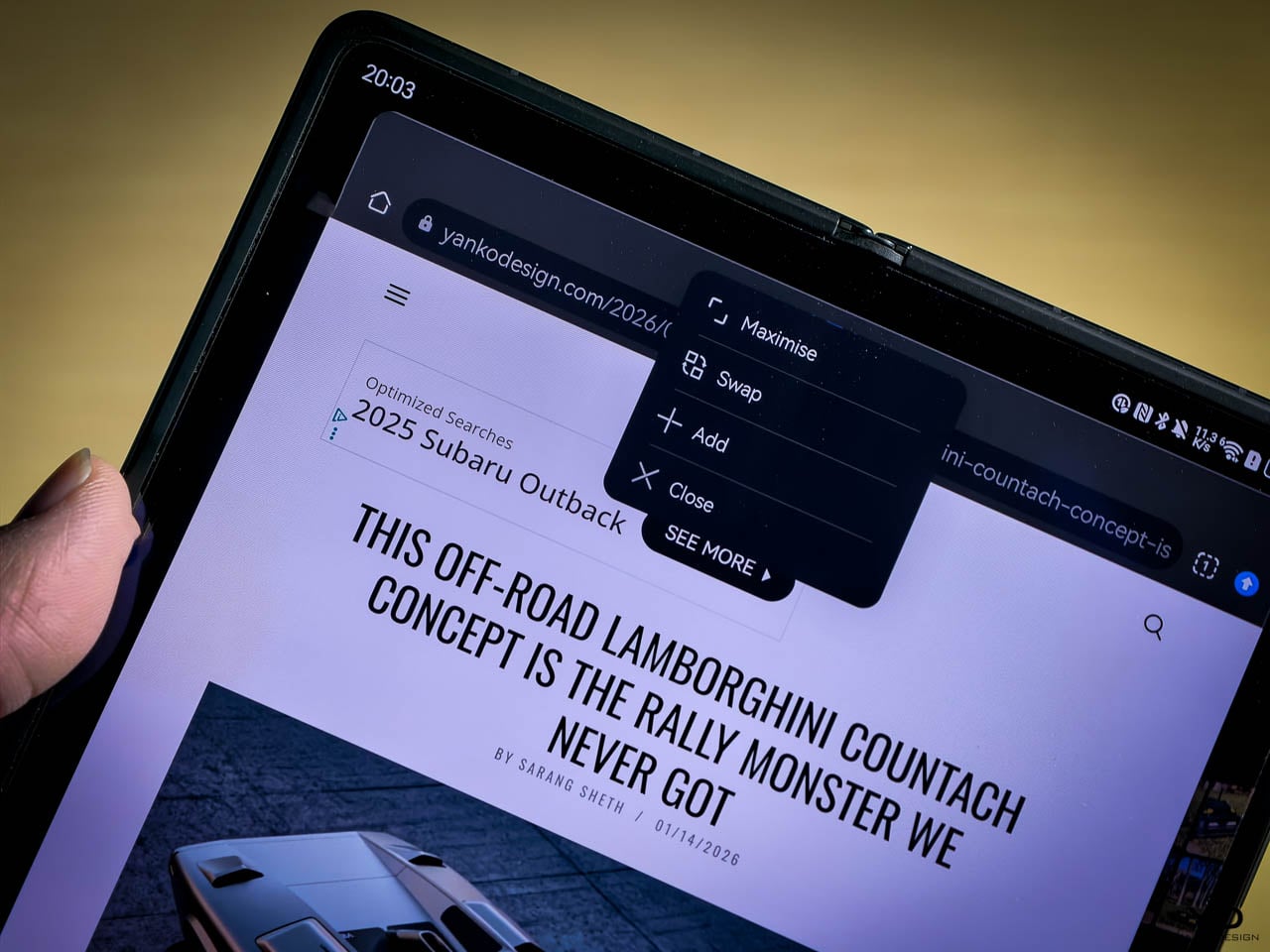
The result is a device that feels steady rather than startling. Performance here isn’t about peak numbers. It’s about consistency across hours of use, which is exactly what allows a foldable to function as a primary phone instead of something you second-guess.

Battery Life and Charging

The Mate X7 carries a 5,300 mAh silicon anode battery, with 66 W wired charging and 50 W wireless. In practice, that capacity translates to a full day of mixed use with time split between the outer and inner displays without feeling like a gamble. Even on heavier days, I wasn’t watching the percentage with concern by evening.

Charging reinforces that confidence. Wired charging is fast enough that short top ups meaningfully extend the day. Wireless charging is practical rather than symbolic. Together, they change how you plan your usage. You stop budgeting power. You start trusting the device to keep up.

That confidence is what allows a foldable to function as a primary phone instead of something you plan around.

Camera Experience

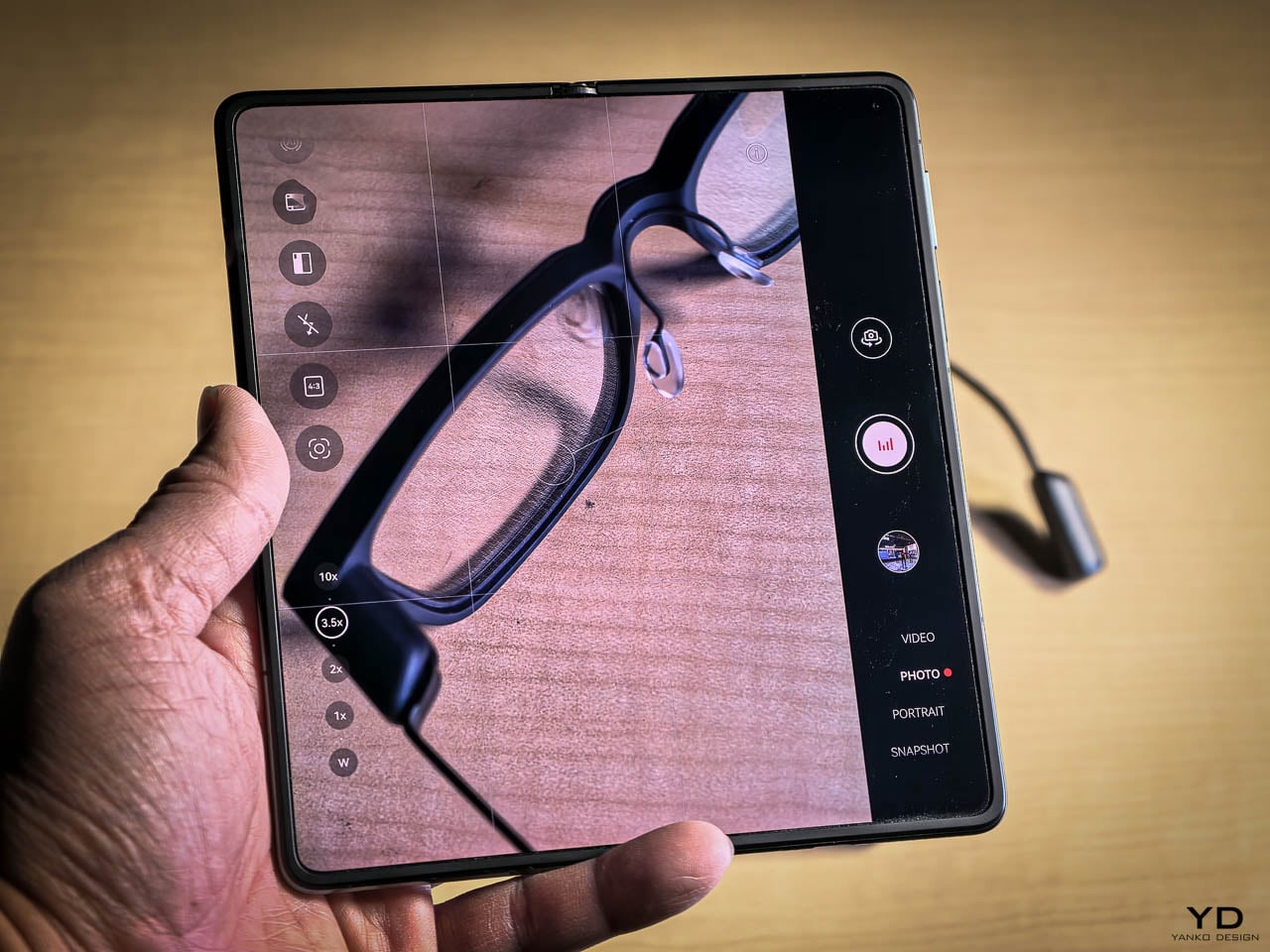
The camera system consists of a 50 megapixel main sensor with a variable physical aperture that opens to f/1.49, a 50 megapixel telephoto with 3.5x optical zoom housed in a vertical periscope structure, and a 40 megapixel ultrawide at f/2.2. Video captures at 4K.
The camera on the Mate X7 doesn’t ask you to think about it. You raise the phone, frame the shot, and trust the result. That trust builds quickly because the camera behaves the same way whether you’re indoors, outdoors, or somewhere in between. It doesn’t surprise you. It doesn’t overprocess. It just works, and that consistency is what allows photography to feel like a natural extension of using the phone rather than a separate task you have to manage.
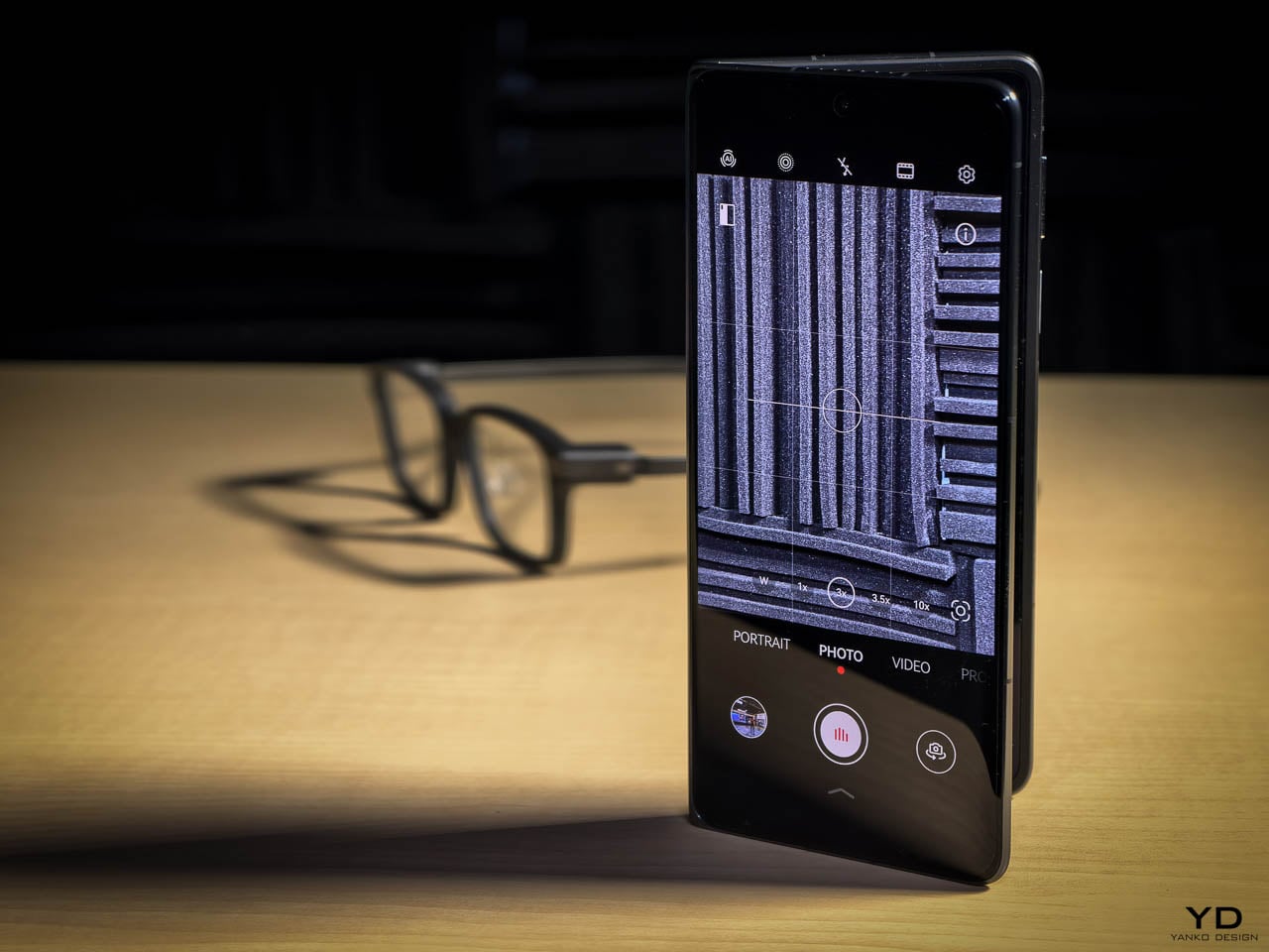
The 50 megapixel main sensor handles light with a kind of patience you notice over time. In bright conditions, it holds back instead of pushing saturation or sharpening edges artificially. In low light, the variable physical aperture opens wider, which means the sensor gathers more light without relying entirely on software to compensate. The result is images that retain structure in shadows and control in highlights. Colors stay grounded. Skin tones stay believable. The camera doesn’t chase drama. It preserves what’s actually there.

The 50 megapixel telephoto uses a vertical periscope design, which is what allows it to exist inside a body this thin. At 3.5x optical zoom, the range feels deliberately restrained. It’s not trying to reach the moon. It’s trying to be useful at the distances where you actually want more detail. In practice, details hold together. Color stays consistent with the main sensor. Macro capability follows the same logic. You move closer and the lens responds without hunting or losing sharpness. It feels considered, not novelty driven.

Video capture at 4K benefits from the same restraint. The processing pipeline stays out of the way. High contrast scenes remain readable. Motion stays controlled without aggressive smoothing. Skin tones don’t drift toward artificial warmth or coolness. HDR processing handles mixed lighting without making the image feel overworked. The result is footage that looks balanced, not corrected. You notice this most when reviewing clips later. They look like what you saw, not like what the software decided you should see.

What ties all of this together is the vertical camera module. Because Huawei engineered the optics to fit a constrained space, the camera system doesn’t dominate the device. It doesn’t create a top heavy grip. It doesn’t force a thicker body. Instead, it sits inside the form as a functional element rather than a visual statement. That’s what allows the Mate X7 to feel like a phone that happens to take excellent photos, rather than a camera that happens to fold.

Software and Daily Use

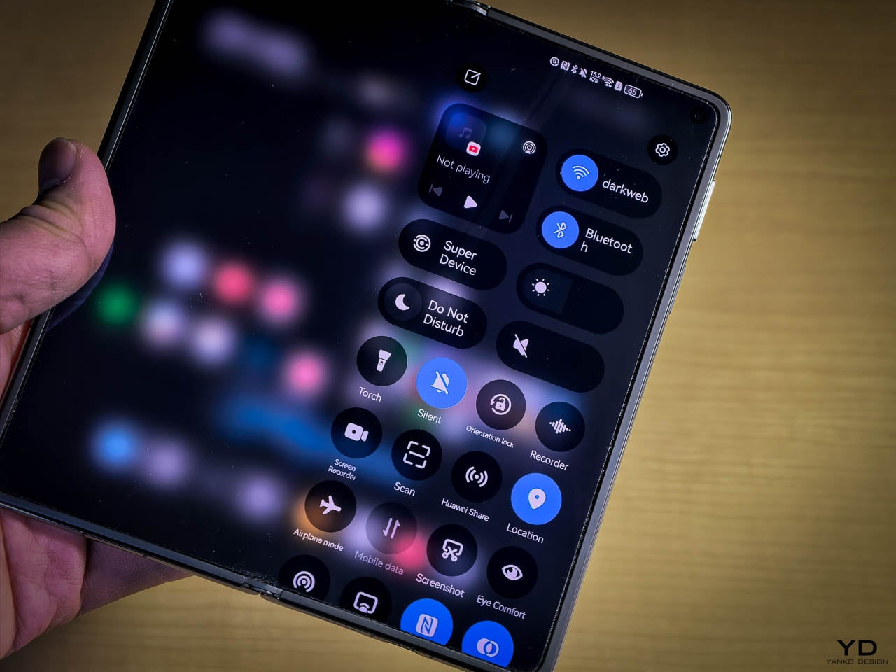
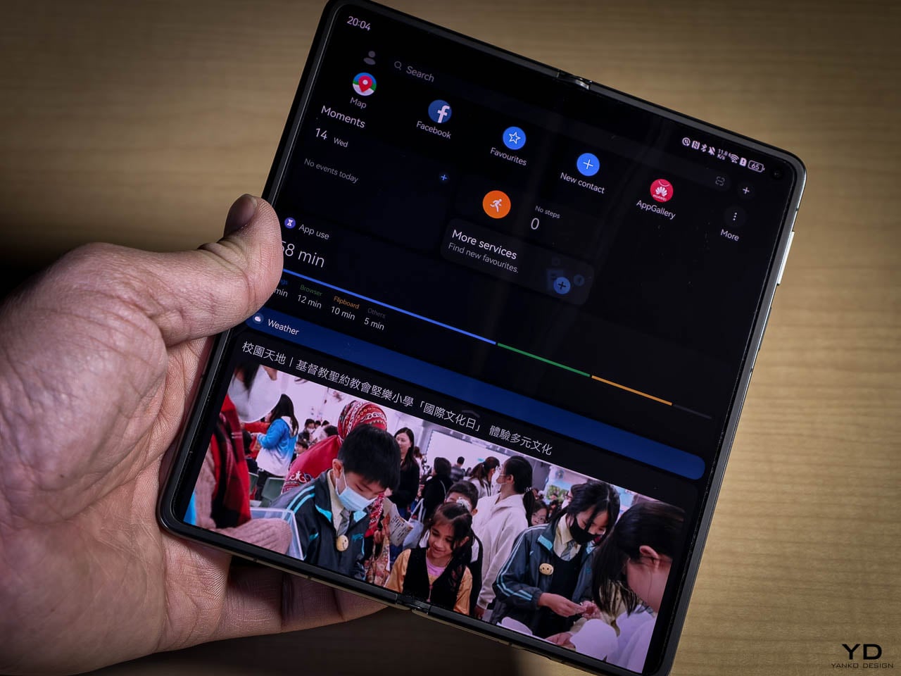
The Mate X7 runs HarmonyOS, optimized specifically for foldable layout behavior and dual display continuity. Transitions between folded and unfolded states happen without disruption. Apps reflow logically. Multitasking feels natural rather than forced.

The absence of Google services remains a practical consideration, but it’s no longer the hard stop it once was for many users. Workarounds exist, and in daily use, most essentials are accessible. Whether that trade off is acceptable depends on your ecosystem priorities, but it no longer overshadows the hardware itself.
Sustainability and Longevity

Sustainability on the Mate X7 is less about messaging and more about what happens when a device is designed to survive years of repetition. A device that lasts longer is inherently more responsible. The Mate X7 feels built to survive years of daily use rather than a single upgrade cycle, largely because it avoids unnecessary complexity. Materials are chosen for strength. The hinge is engineered for repetition. The screens are designed to be used, not protected from the user.

That longevity changes the ownership equation. This doesn’t feel like a phone you replace quickly. It feels like one you settle into.

Value and Perspective

The Mate X7 sits firmly in premium territory, but its value comes from reduction rather than addition. Fewer compromises. Fewer warnings. Fewer behavioral adjustments. You’re not paying for spectacle. You’re paying for cohesion.

It feels less like a statement piece and more like a refined tool. For users willing to step outside familiar software ecosystems, the hardware experience justifies that decision.

Considerations

Living with the Mate X7 asks you to be intentional about your software habits. HarmonyOS is capable and well optimized for this hardware, but it operates outside the ecosystems most people have built their workflows around. That requires awareness, not compromise. Whether it fits depends on how tied you are to specific services and how willing you are to adjust.
This is not a device chasing peak numbers. The performance tuning here prioritizes stability over raw output, and that balance holds up well in daily use. In sustained, heavy scenarios, the ceiling does become visible, but it rarely surfaces during normal workflows. For users who push hardware constantly, it is worth understanding upfront. For everyone else, the experience remains smooth and dependable.

The 3.5x optical zoom is a deliberate choice, not a limitation hidden by marketing. It exists because a longer reach would have required a thicker body or a heavier module. If long range photography defines how you shoot, this restraint matters. If it doesn’t, the telephoto performs exactly as it should.
This is still a foldable. The engineering has matured, the materials have improved, and the confidence I felt using it was real. But a device that folds will always ask for a different kind of respect than one that doesn’t. This invites normal use, not careless use.

Final Thoughts

Living with the Huawei Mate X7 feels less like adapting to the future and more like finally arriving there. The device doesn’t ask for patience. It doesn’t demand care. It doesn’t rely on novelty to justify itself. It works.

That may be the most meaningful evolution in foldable design so far. It earns trust by disappearing into daily life and only reminding you it’s special when you need more space, more light, or more time.

That’s what a finished product feels like. In that sense, the Mate X7 feels less like the next foldable and more like the first one that understands what it’s supposed to be.

The post Huawei Mate X7 Review: When a Foldable Finally Feels Finished first appeared on Yanko Design.
Someone Made a Flat-Pack Stool from Glass That Loops Like Frozen Water

Flat-pack furniture is usually shorthand for budget compromises, cardboard boxes stuffed with dowels, and Allen keys that disappear the moment you need them. It is something you tolerate for convenience rather than admire, defined by getting furniture to your door cheaply rather than making you excited about assembly. The tension between wanting sculptural pieces and needing things that can actually ship and fit through narrow stairwells rarely gets resolved gracefully.

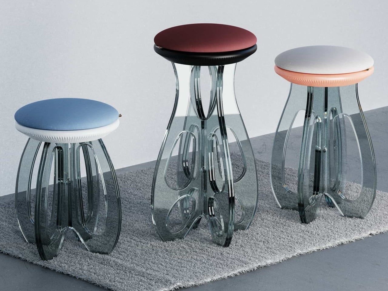
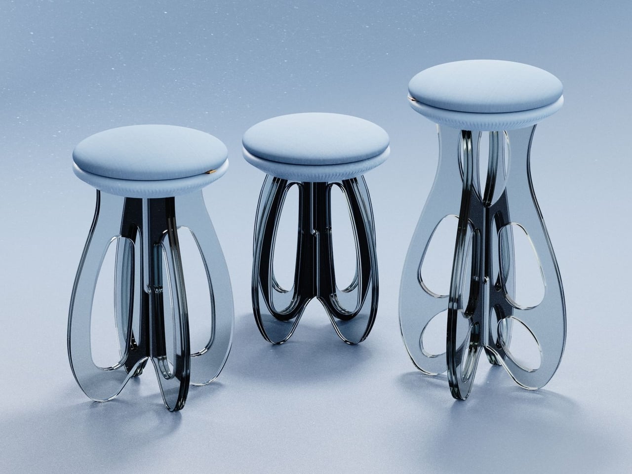
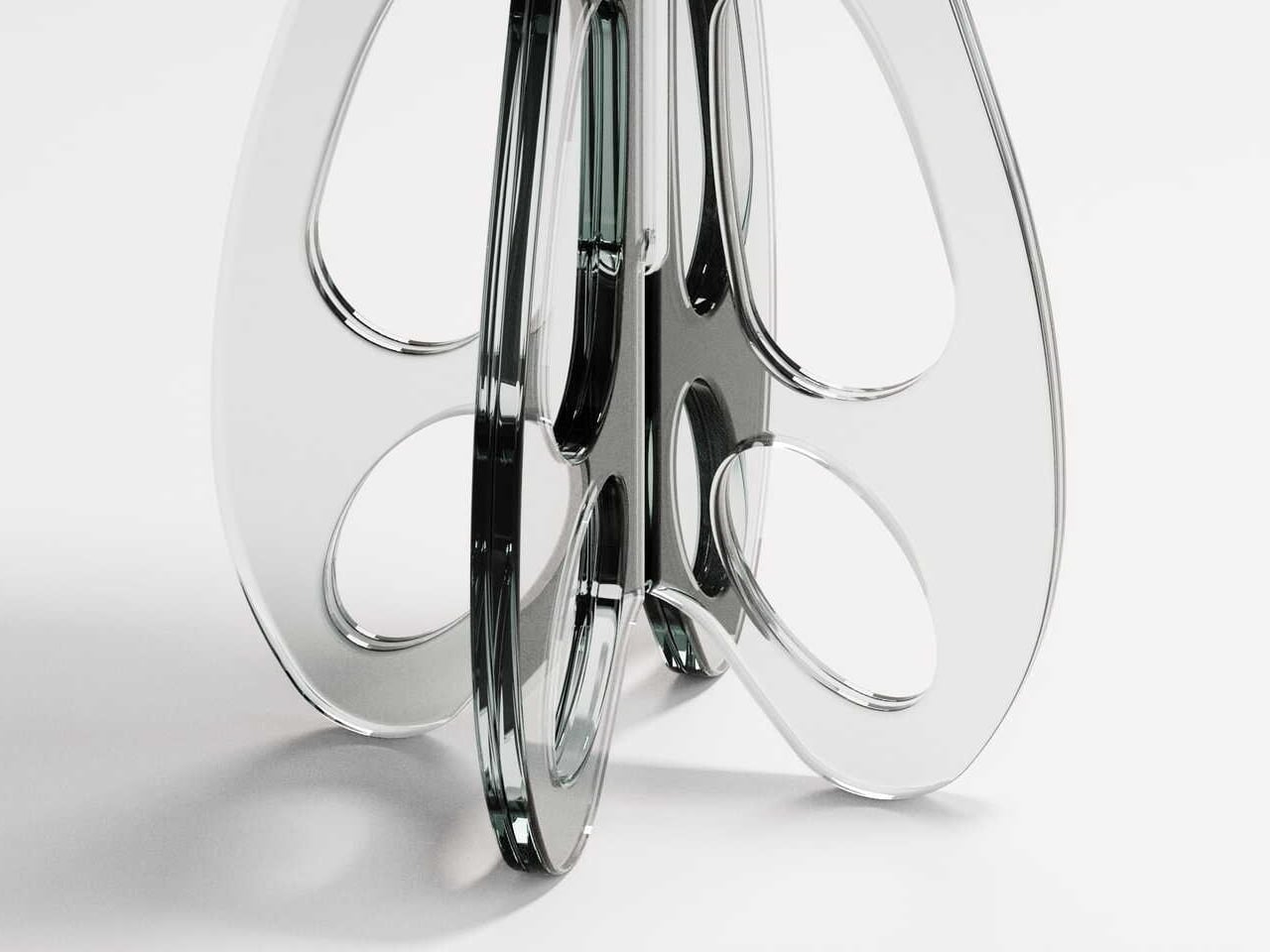
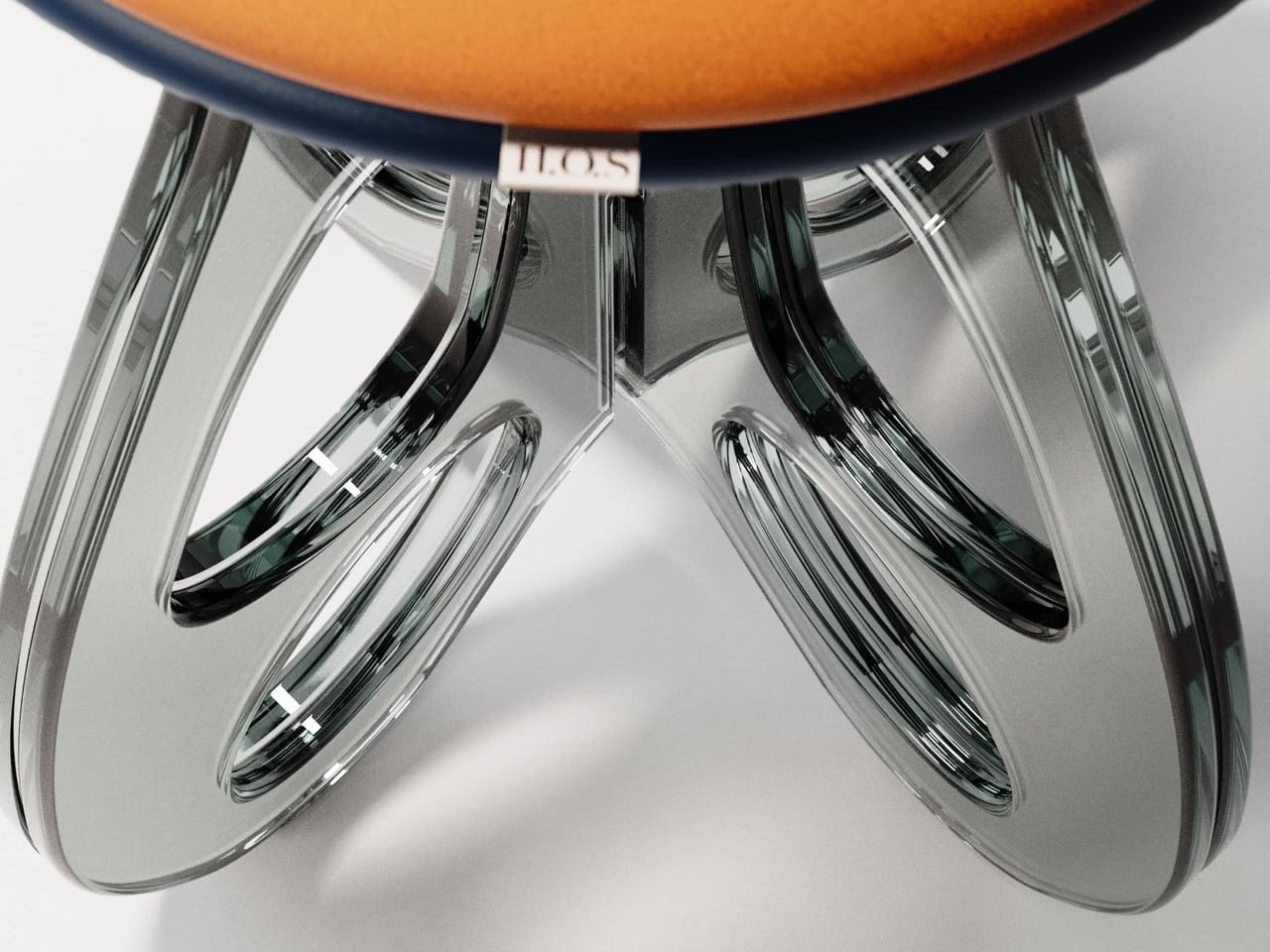
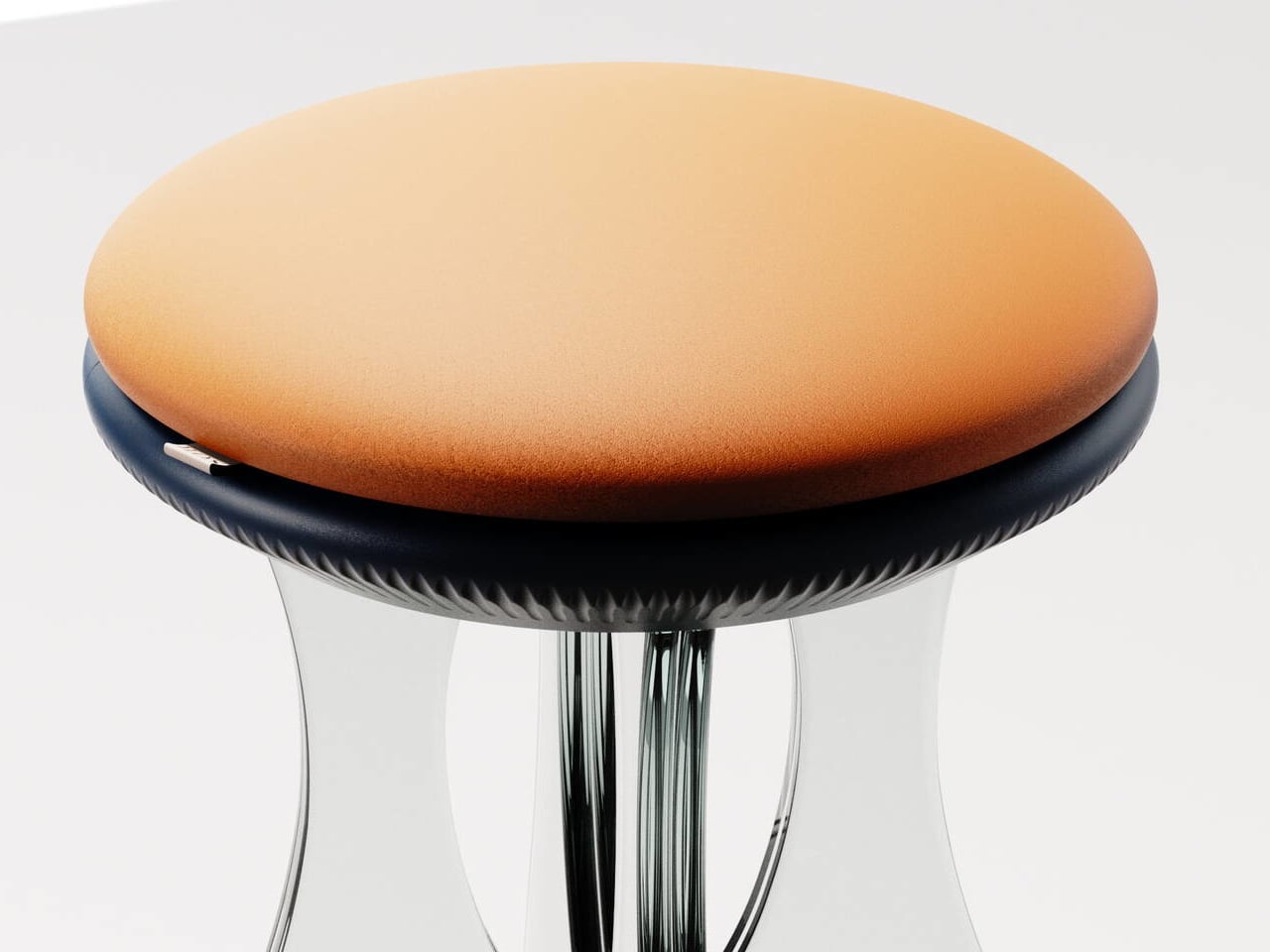
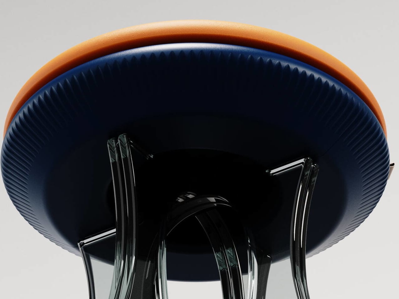
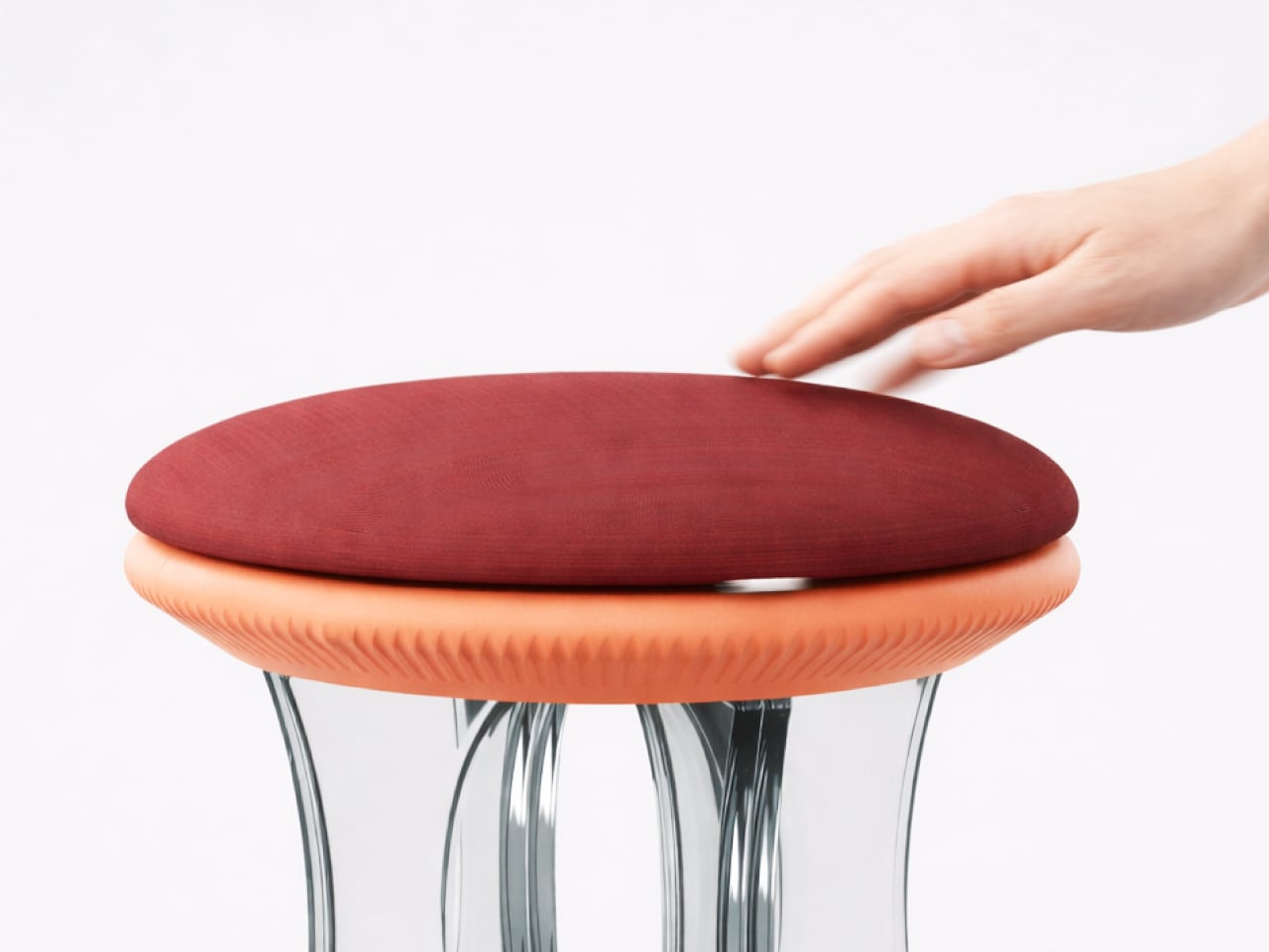
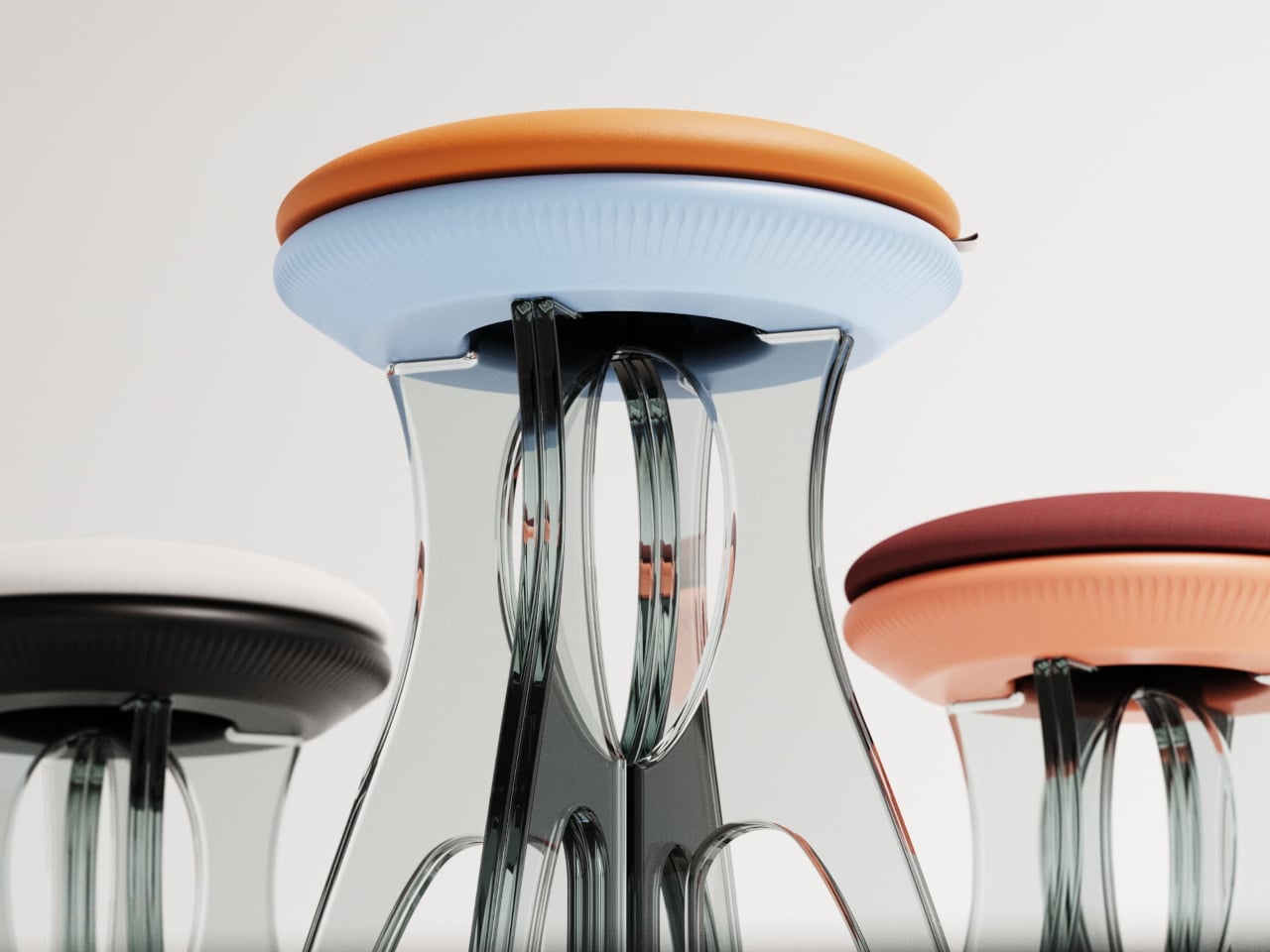
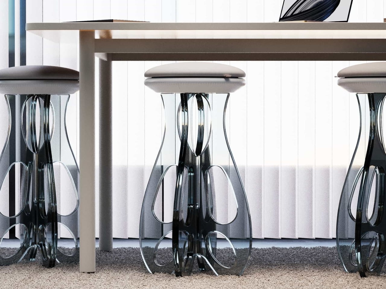
Tide Stool treats flat-pack as a starting point for luxury instead of a constraint. Designed by Vinayak Syam for DreamDeadline Works and produced by House of Sach, it is built from toughened glass legs, precision 3D-printed joinery, and hand-finished upholstery. The structure rises from a flat kit into a flowing form, shaped by curves and loops rather than brute-force mass, with the name being very much intentional.

Designer: Vinayak Syam

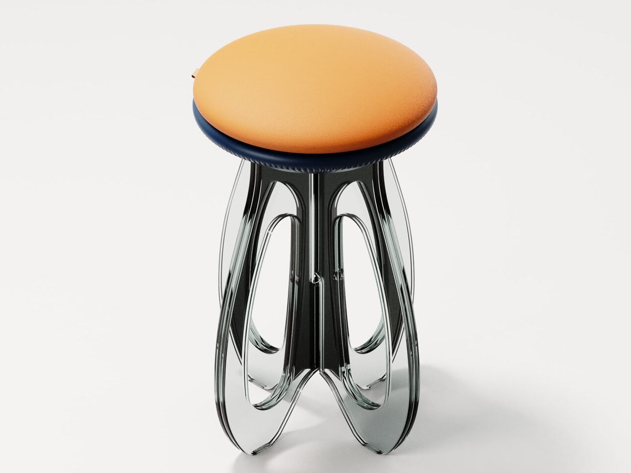
Instead of chunky wooden legs, Tide uses transparent glass fins that fold and loop around a central axis, carrying load through geometry. The panels curve out and back in, sharing weight across their profiles, so strength comes from the path the glass takes rather than thickness. It flips the usual hierarchy where glass is treated as fragile skin and heavier materials are trusted with structural work.

Receiving Tide as a flat set of glass pieces and joinery turns assembly into a building ritual rather than a chore. Slotting the fins into 3D-printed nodes lets you watch the structure emerge from motion, where overlapping curves and visible joints become part of the composition. The design makes those connections part of the visual language, so engineering reads as an aesthetic feature rather than something to hide.

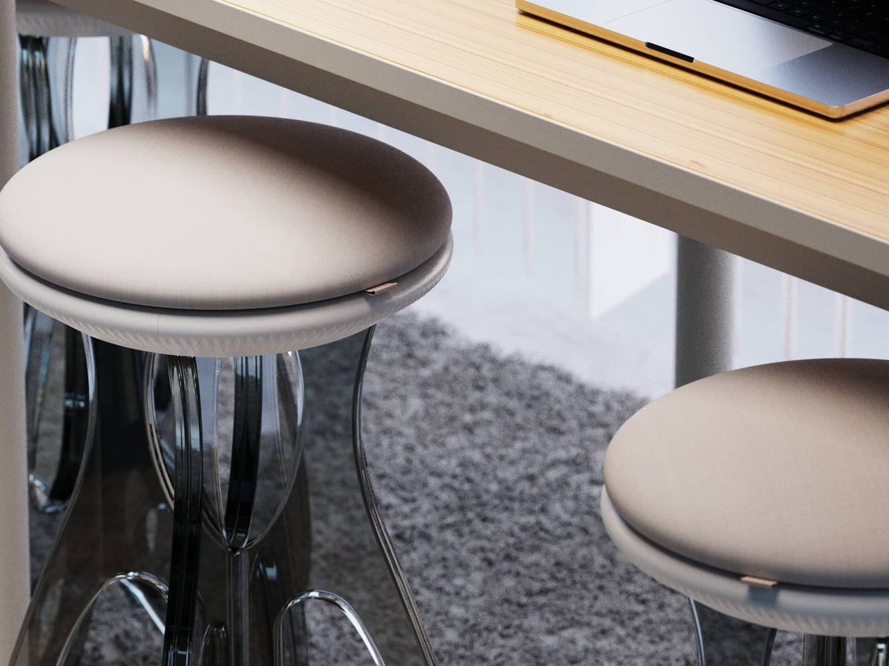
The upholstered top sits above the glass base as a soft disc that comes in more than thirty colour finishes. Upholstery is offered in fabric and vegan leather, with Deep Sienna being the leather option and the rest using elevated textiles. That palette lets the same glass base feel quiet and monochrome in one space or warm and expressive in another, without losing its sculptural identity.

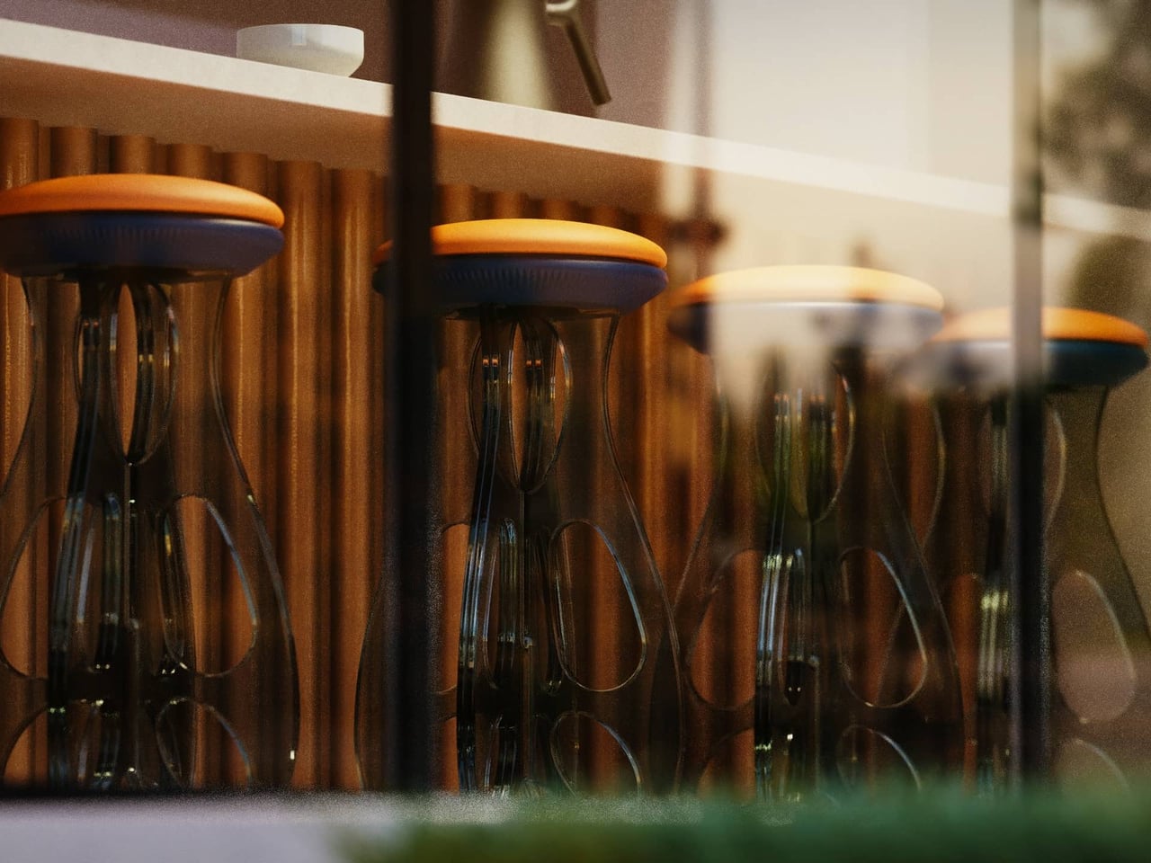
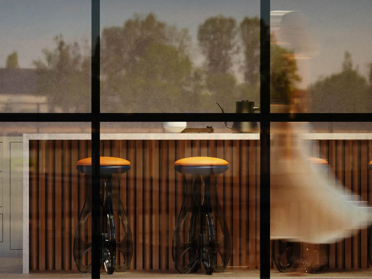
Flat-pack construction makes shipping and moving easier, especially for people who rearrange or relocate often, yet once assembled, the stool reads as a single object rather than a kit. The toughened glass and looping geometry give real load-bearing confidence while keeping the footprint visually light. It is the rare piece that respects both logistics and living rooms without asking you to choose between practicality and presence.

Tide turns apparent fragility into a quiet expression of resilience. The transparent legs, visible joinery, and soft seat work together to make strength feel like a product of balance and flow rather than heaviness. For anyone tired of choosing between sculptural furniture and flat-pack practicality, a glass stool that arrives as parts and stands like a tide frozen mid-rise feels like a surprisingly thoughtful middle ground.

The post Someone Made a Flat-Pack Stool from Glass That Loops Like Frozen Water first appeared on Yanko Design.
5 Best Desk Accessories to Reset Your Work-From-Home Setup in January 2026

January arrives with its familiar promise of renewal, and your work-from-home setup deserves the same attention as your fitness goals or morning routines. The desk where you spend eight hours daily becomes more than furniture—it transforms into the command center of your productivity, creativity, and professional presence. After months of accumulated cable chaos, scattered pens, and makeshift arrangements, the new year offers the perfect excuse to reimagine your workspace with intention.

The right desk accessories don’t just organize; they elevate your entire work experience through thoughtful design and purposeful engineering. These five pieces represent the intersection of form and function, where premium materials meet clever problem-solving. From levitating pens that spark creative breaks to monitor stands that finally solve the Mac mini placement puzzle, each accessory addresses a specific pain point while adding visual sophistication to your desk landscape.

1. Alogic Aspekt Omni Fold Stand

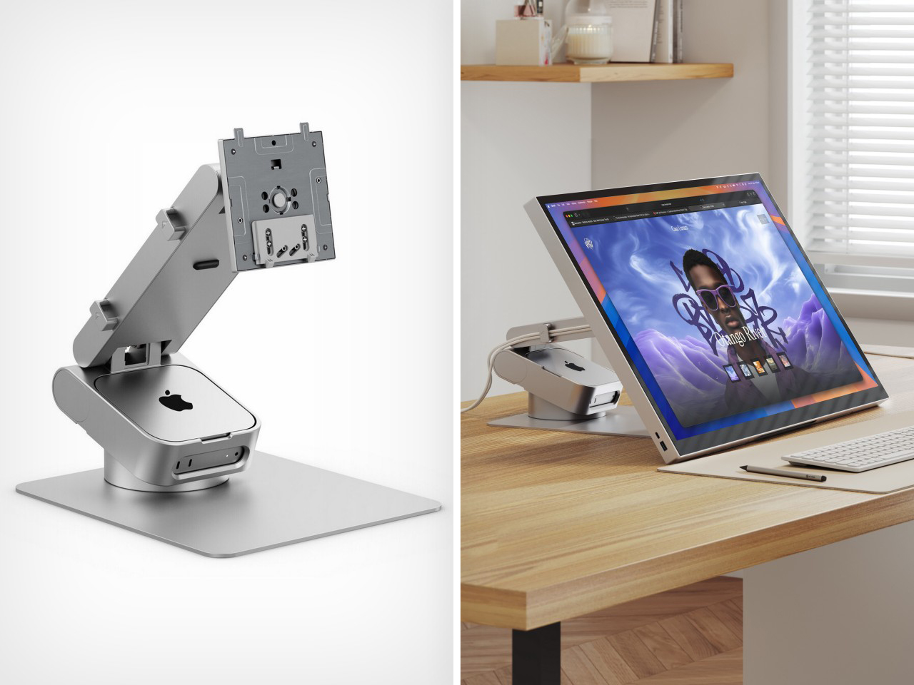
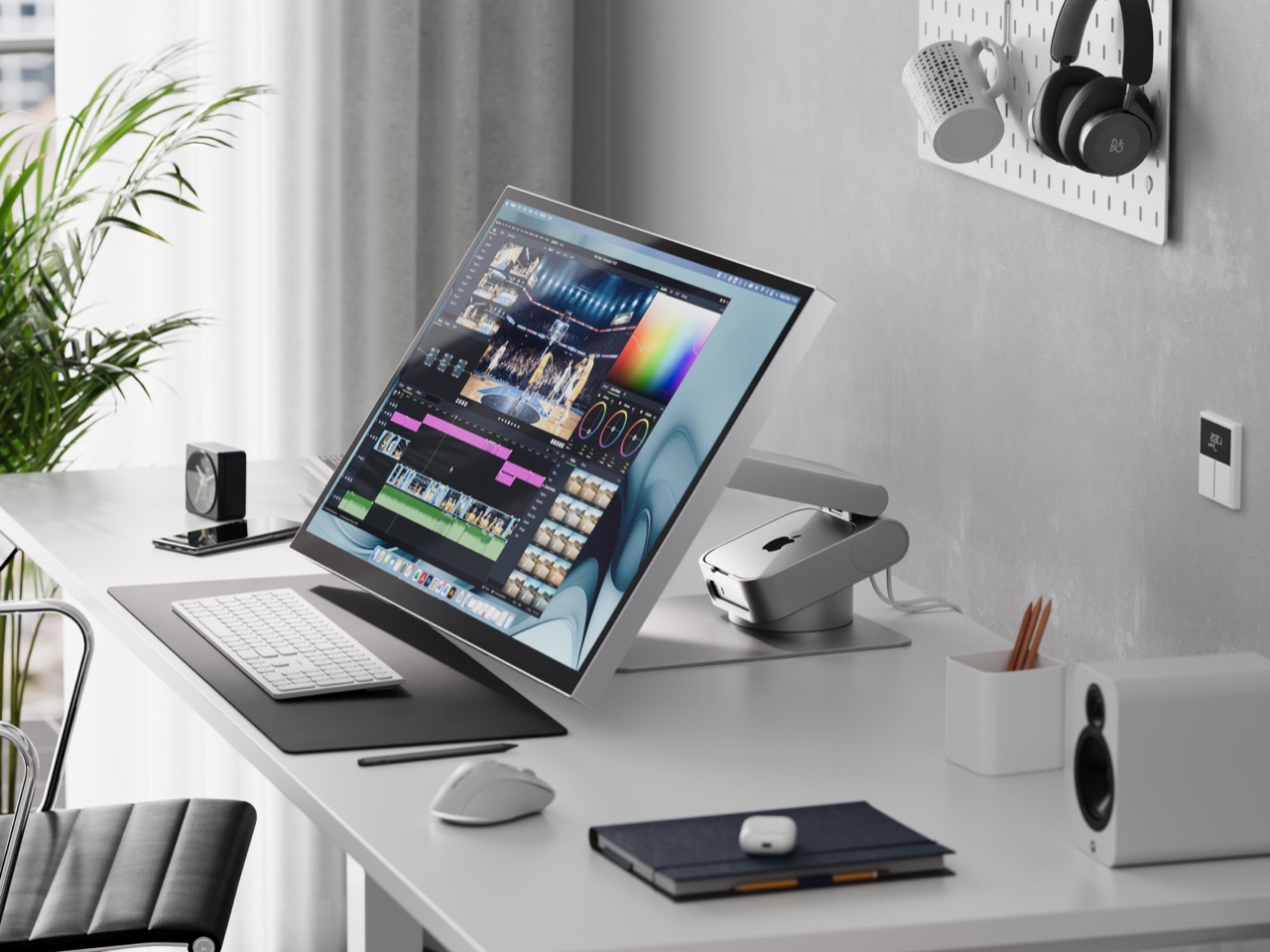
Apple’s Mac mini has always been a spatial enigma—too beautiful to hide away, yet too awkward to display properly. The little computing powerhouse typically ends up pushed to the side with cables sprawling in every direction, never quite integrating into your desk aesthetic. Alogic spotted this design gap and responded with the Aspekt Omni Fold Stand, a monitor stand that elegantly solves the Mac mini placement problem by building its home directly into the base.

The engineering here feels revelatory in its simplicity. Rather than creating another shelf or separate mount, Alogic carved a precision groove into their premium monitor stand specifically calibrated for the M4 Mac mini. This transforms your setup into a modular iMac where computer and display unite visually while remaining independently upgradeable. The stand eliminates cable clutter by centralizing your hub, while the aluminum construction matches Apple’s design language perfectly. Starting your year with this level of spatial organization creates a foundation for everything else on your desk.

What We Like

  • Transforms the Mac mini and monitor into a cohesive all-in-one aesthetic.
  • Precision-engineered groove prevents the computer from sliding or shifting.
  • Centralizes cables and ports for a cleaner desk appearance.
  • Premium aluminum construction matches Apple product quality.

What We Dislike

  • Specifically designed for the Mac mini limits universal appeal.
  • Premium materials result in a higher price point than basic stands.

2. FoldLine Pen Roll

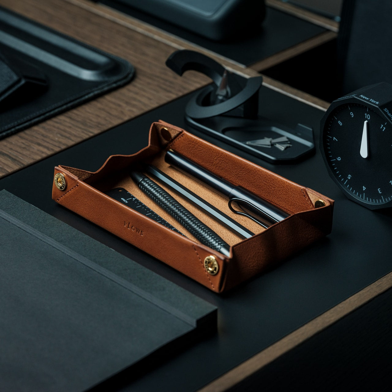
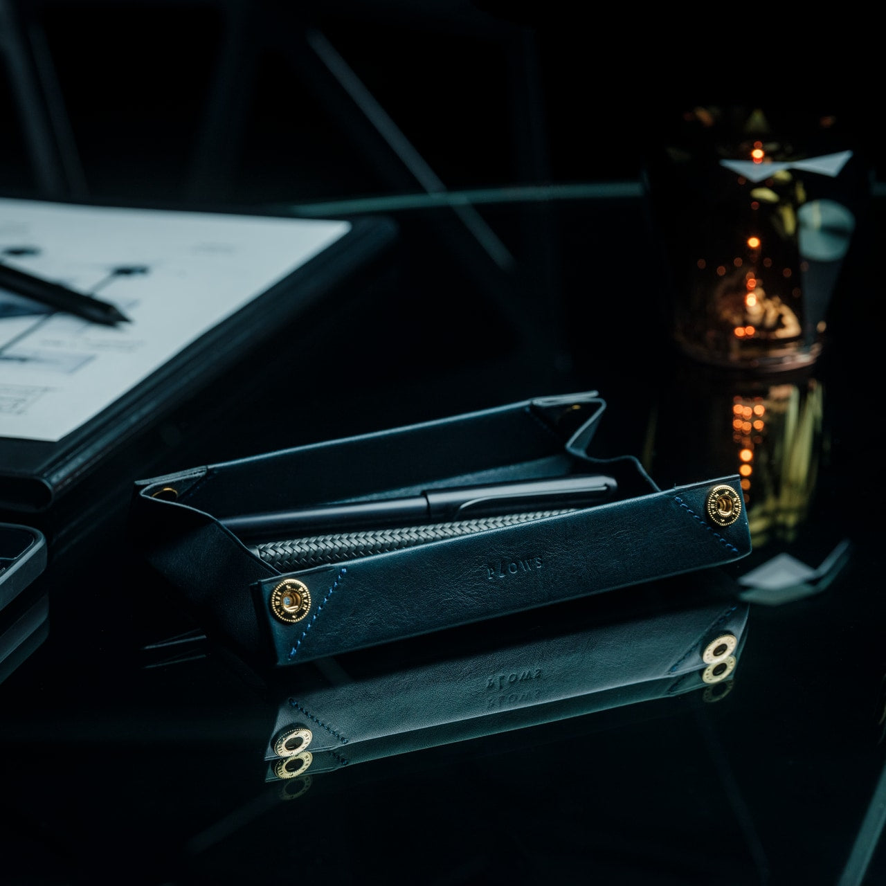
Digital tools dominate our workflows, yet the ritual of putting pen to paper remains irreplaceable for sketching ideas, signing documents, or journaling thoughts. The FoldLine Pen Roll recognizes this enduring need and transforms pen storage from utilitarian afterthought into an intentional design object. Crafted from a single piece of Italian leather, this isn’t merely a case—it’s a portable writing station that unfolds into a defined work surface wherever you land.

The origami-inspired geometry creates natural compartments without stitching or partitions. Your pens nestle into folded leather channels that prevent rattling and scratching; even metal-bodied instruments remain separated and protected. Opening the roll becomes a small ceremony that signals transition into focused work mode, whether you’re at a café table or hotel desk. The leather develops character through use, aging beautifully while maintaining structure. Resetting your desk for January means honoring analog tools with the same design consideration you’d give your laptop or monitor.

Click Here to Buy Now: $135.00

What We Like

  • Single-piece Italian leather construction ensures durability and elegance.
  • Unfolds into a stable tray that defines a workspace on any surface.
  • Natural folding system protects pens without scratches or noise.
  • Compact form travels easily in bags without adding bulk.

What We Dislike

  • Leather requires occasional conditioning to maintain suppleness.
  • Limited capacity suits curated pen collections rather than large inventories.

3. ClearMind Kendama

Desk accessories typically focus on productivity optimization, but sustained focus requires deliberate breaks that refresh your mind without derailing concentration. The ClearMind Kendama from Tokyo Kendama introduces a physical skill toy to your workspace, offering three-minute mental resets between video calls or during creative blocks. This traditional Japanese toy—a wooden handle connected to a ball—challenges hand-eye coordination while providing satisfying tactile feedback that screens simply cannot deliver.

Tokyo Kendama recalibrated the classic design specifically for modern desk use. Larger cups make landing tricks more achievable, building confidence rather than frustration during brief breaks. The bearing system minimizes string twists, maintaining smooth operation throughout the day. The balanced weight distribution creates precise movements that feel meditative rather than chaotic. Keeping the ClearMind Kendama within reach establishes a healthier relationship with breaks, replacing endless phone scrolling with intentional physical engagement that genuinely refreshes your attention span for the next task.

Click Here to Buy Now: $59.00

What We Like

  • Physical skill development provides genuine mental breaks from screens.
  • Larger cups and recalibrated balance increase success rates for beginners.
  • The bearing system prevents string tangles during extended use.
  • Compact desktop footprint requires minimal space when not in use.

What We Dislike

  • The initial learning curve may frustrate users seeking immediate gratification.
  • Wooden construction shows wear marks from repeated trick attempts.

4. OrigamiSwift Folding Mouse

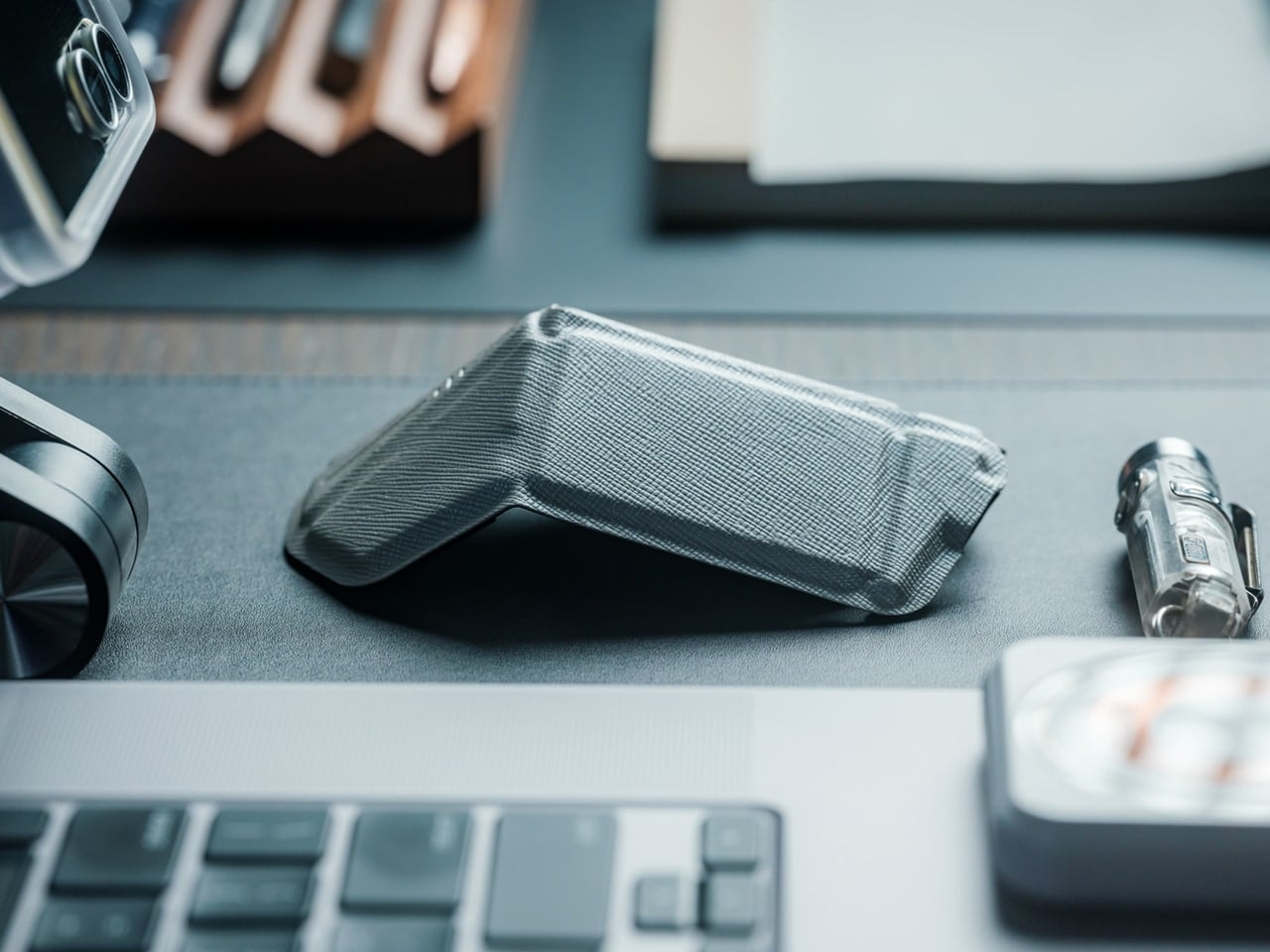
Laptop trackpads serve their purpose, but precision work demands a proper mouse—a truth that becomes problematic when your workspace shifts between home office, coffee shops, and coworking spaces. The OrigamiSwift Folding Mouse solves this portability paradox by delivering full-size comfort and control in a device that collapses completely flat. Inspired by origami’s transformation principles, this Bluetooth mouse adapts to your location rather than forcing workspace compromises.

The folding mechanism activates in under half a second with a simple flip, springing the mouse to life immediately. At just 40 grams, it disappears into your bag or pocket until needed, yet the ergonomic shape feels substantial and natural during extended work sessions. The design acknowledges that January resolutions often include workspace flexibility—maybe you’re committing to working from different environments or finally embracing that digital nomad dream. OrigamiSwift ensures your tools match your ambitions, providing desktop precision regardless of where you unfold your laptop.

Click Here to Buy Now: $79.00

What We Like

  • Folds completely flat for effortless transport in any bag.
  • Full-size ergonomic comfort prevents hand fatigue during long sessions.
  • Instant 0.5-second activation from folded to functional state.
  • Ultra-lightweight 40-gram construction adds negligible travel weight.

What We Dislike

  • The folding mechanism represents a potential long-term durability concern.
  • Bluetooth connectivity requires occasional battery recharging.

5. Levitating Pen

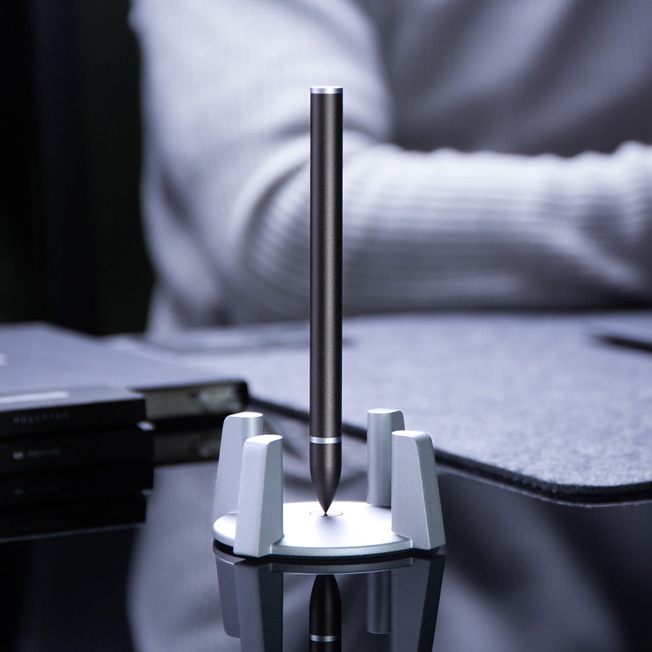
Every desk needs a conversation piece that transcends pure utility, an object that sparks curiosity and provides momentary wonder during grinding workdays. The Levitating Pen achieves this through magnetic engineering that suspends the pen vertically in mid-air without batteries or electronics. The precision-machined pedestal creates a magnetic field perfectly calibrated to balance the pen, transforming a writing instrument into a kinetic sculpture that commands attention on any desk surface.

Manufactured using CNC machining with tolerances under 0.1mm—the same facility producing Apple products—this pen demonstrates obsessive attention to detail. The Swiss-made ballpoint cartridge ensures writing performance matches the engineering spectacle. Beyond aesthetics, the levitating mechanism serves a practical purpose: taking brief mental breaks by spinning the pen, watching its hypnotic wobble for thirty seconds before returning refreshed to your task. Starting January with this level of design consideration signals your commitment to a workspace that inspires rather than merely functions.

Click Here to Buy  Now: $79.00

What We Like

  • Magnetic levitation creates a mesmerizing desk centerpiece without power requirements.
  • High-precision CNC manufacturing ensures reliable hovering performance.
  • Swiss ballpoint cartridge delivers a smooth, professional writing experience.
  • Spinning motion provides meditative micro-breaks during intensive work.

What We Dislike

  • The pedestal requires permanent desk space that cannot be repurposed.
  • Premium manufacturing process results in significant investment cost.

Resetting Your Workspace Intentionally

The desk accessories you choose reveal your priorities and shape your daily experience more than most people realize. These five pieces represent different facets of the modern work-from-home reality: spatial organization, analog appreciation, mental refreshment, location flexibility, and design inspiration. Each addresses specific pain points while elevating your workspace beyond pure function into something that genuinely sparks joy during those long January afternoons.

Resetting your desk for the new year isn’t about buying everything at once—it’s about identifying which aspect of your current setup drains energy rather than creating it. Maybe you’re drowning in cable chaos around your Mac mini, or perhaps you’re scrolling through your phone during breaks when your mind needs actual engagement. Start with the accessory that solves your most persistent frustration, then build from there as your workspace evolves throughout the year.

The post 5 Best Desk Accessories to Reset Your Work-From-Home Setup in January 2026 first appeared on Yanko Design.
Heinz Dipper Finally Gives Fries Their Own Little Ketchup Pocket

Eating fries away from a table means improvising a ketchup situation that usually goes wrong. Packets balance on dashboards, sauce gets smeared onto napkins, or you squeeze tiny dollops directly onto individual fries like you are frosting cupcakes. It is ridiculous that we perfected crinkle cuts and waffle fries but still treat the ketchup part like an afterthought whenever we leave the safety of a tray.

Heinz Dipper is what happens when someone finally looks at a fry box and asks, “What if this thing helped?” It is a patent-pending container with a built-in condiment compartment on the front, engineered for dipping on the go. The box holds fries like usual, but also carries a small pool of ketchup or mayo right where your thumb expects it to be.

Designer: Heinz

Picture a drive-thru run or a couch session. Instead of tearing packets and hunting for a flat surface, you grab the Dipper with one hand, dip with the other, and never wonder where the ketchup went. The fry box becomes a self-contained meal kit, making it harder to justify those ketchup stains on jeans, car seats, or suspiciously sticky armrests that no one wants to talk about.

The design is basically a standard fry box with a foldable pocket on the front acting as a condiment well. That small structural change stabilizes the sauce, keeps it from sliding around, and puts it within the same footprint as the fries. No extra cups, no balancing acts, just a single object that understands fries and ketchup are a package deal, not two separate quests requiring three hands.

Heinz leans into its keystone icon here, turning the familiar label shape into both branding and a visual cue that says “dip here.” It is packaging as an interface, not just decoration. The Dipper teaches you how to use it without instructions, which is what good packaging should do when your other hand is busy steering, cheering, or trying to find the napkins you forgot to grab.

The brand cites research showing that most people have spilled ketchup while dipping on the go, and many have considered skipping sauce entirely because the packaging is so annoying. Those numbers validate that this is not a niche complaint; it is a shared embarrassment. The Dipper’s simple structure is less about reinventing fries and more about admitting we have been eating them awkwardly for years.

Heinz Dipper will not save the world, but it might save a few car interiors and shirts. It is a reminder that thoughtful design can live in cardboard geometry as much as in expensive gadgets, and that sometimes the most satisfying innovations are the ones that fix a tiny, greasy annoyance you did not realize everyone else was quietly suffering through as well.

The post Heinz Dipper Finally Gives Fries Their Own Little Ketchup Pocket first appeared on Yanko Design.
This Silicone Pen Has No Seams, No Clip, and Twists Like Konjac

Most pens announce themselves with metal clips, visible joints, clickers, and branding competing for attention. There’s usually a textured grip zone, a separate barrel, and some kind of mechanism you can see or feel when you deploy the tip. Japanese minimalist objects go the opposite direction, hiding complexity under calm surfaces and letting the act of using them take center stage rather than the object itself announcing its presence.

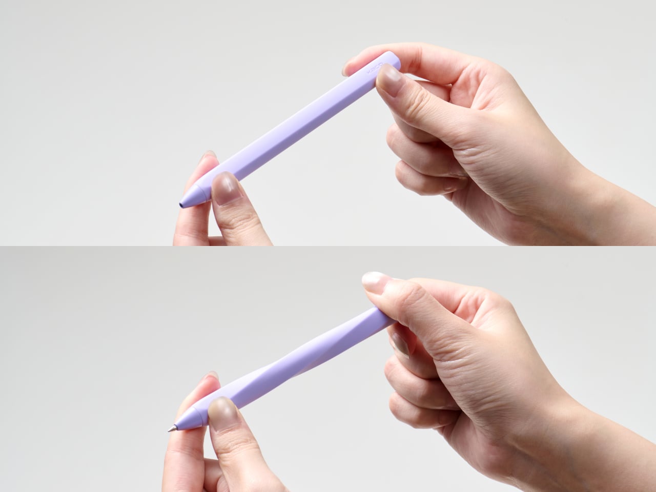
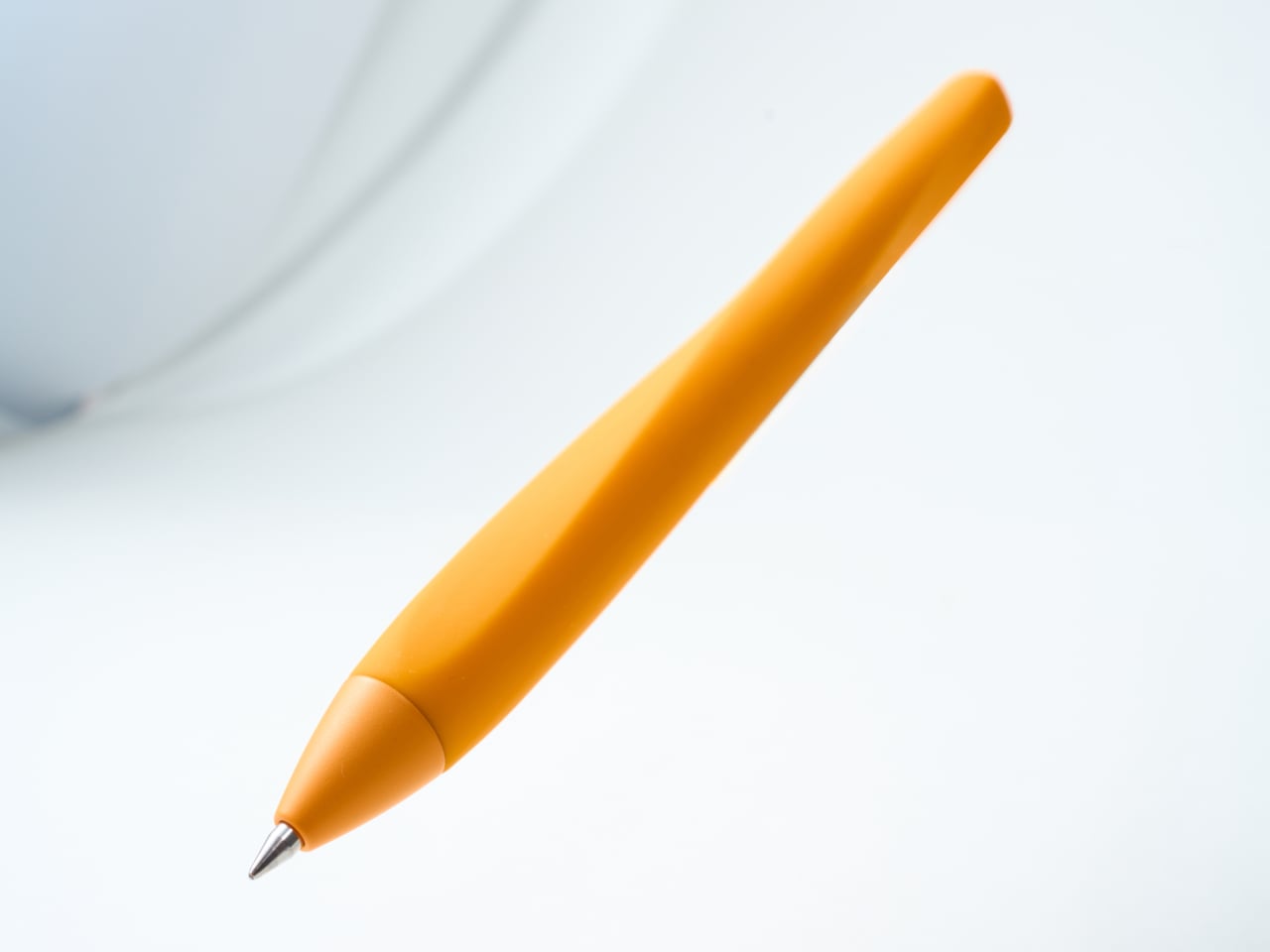
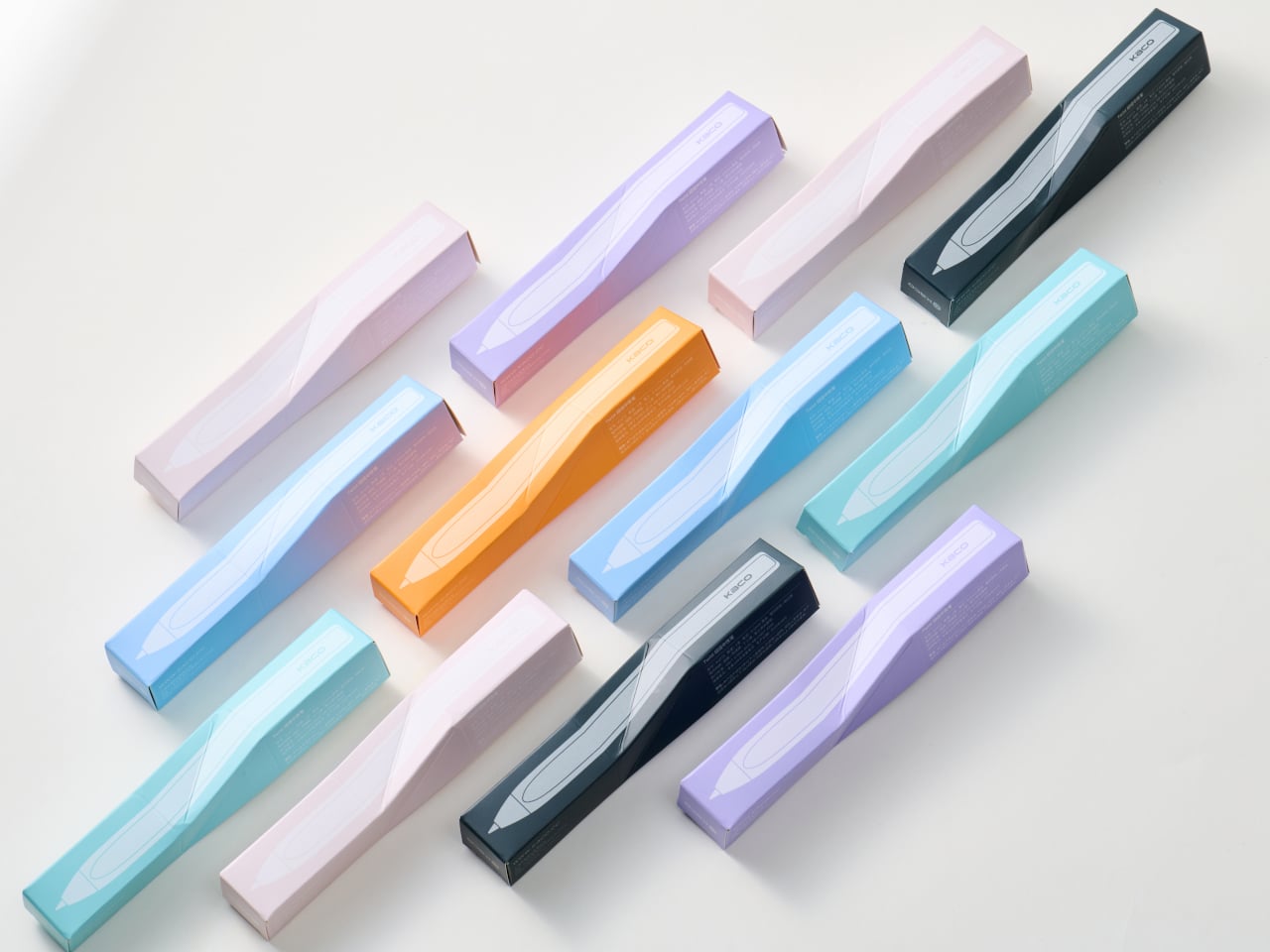
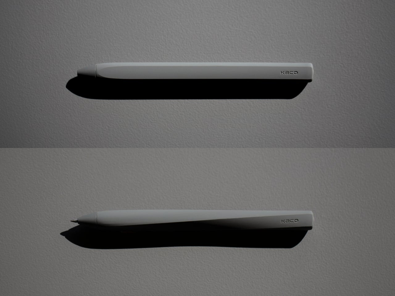
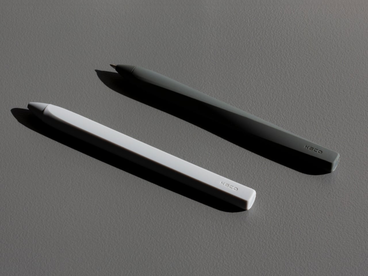
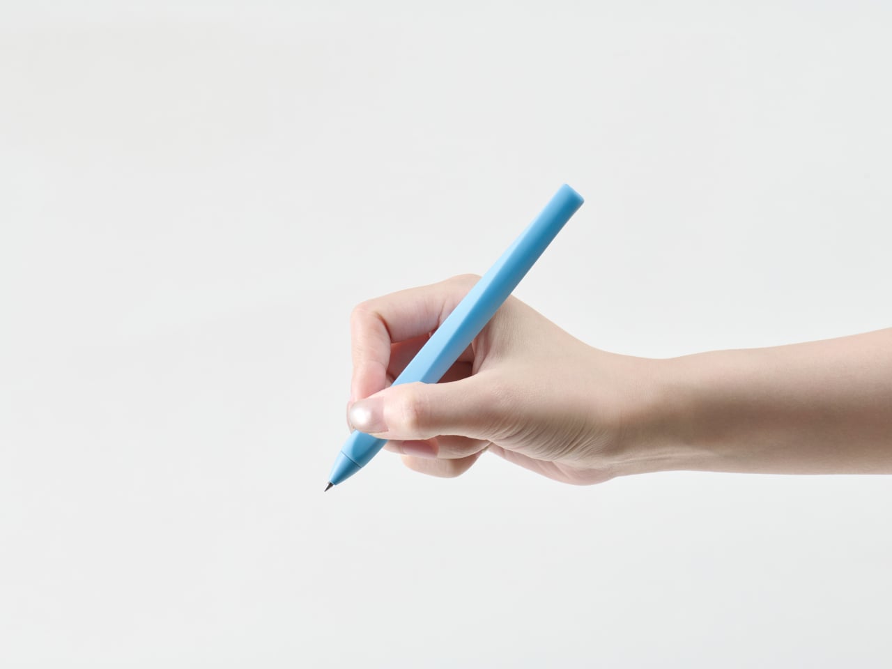
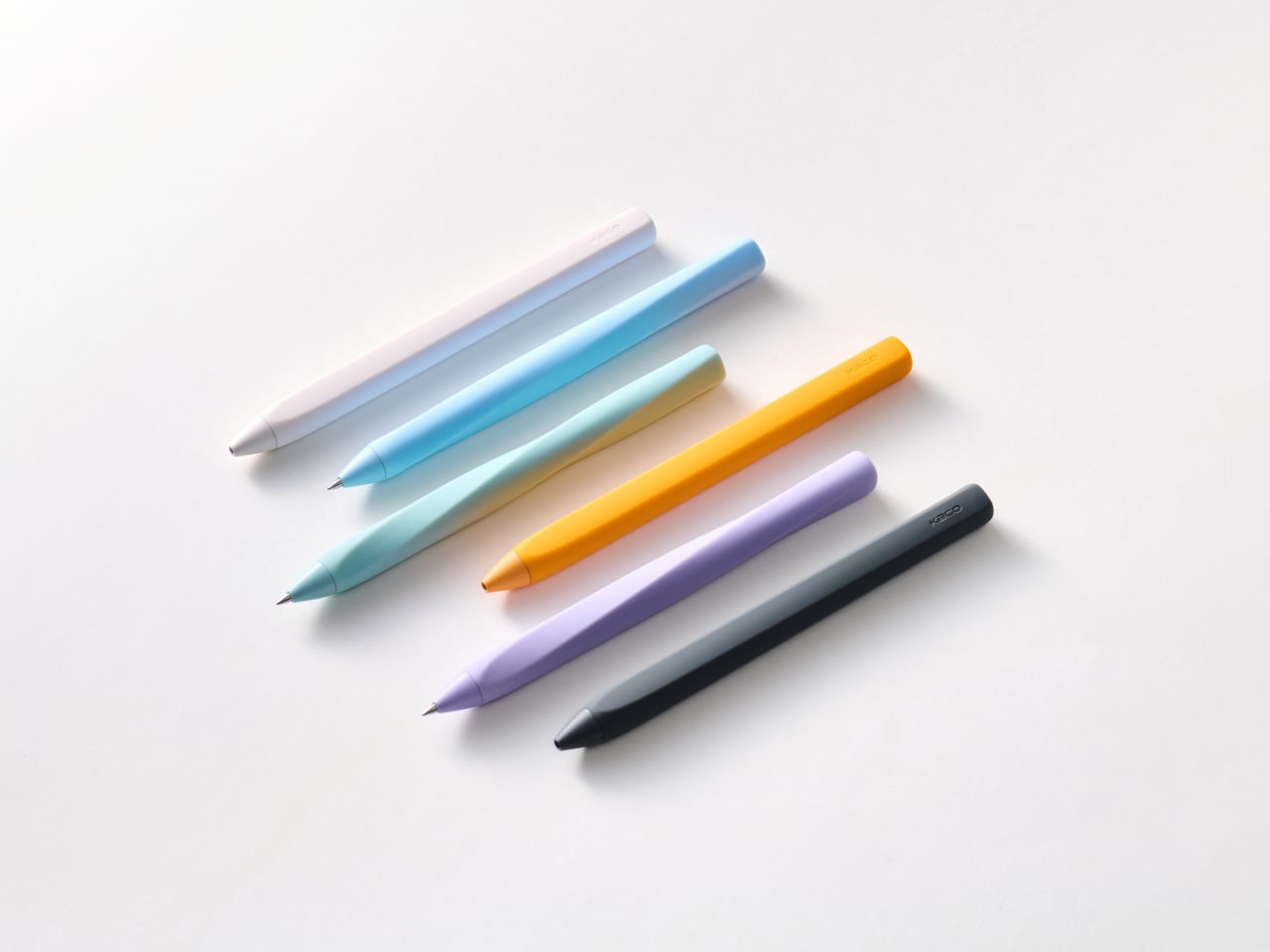
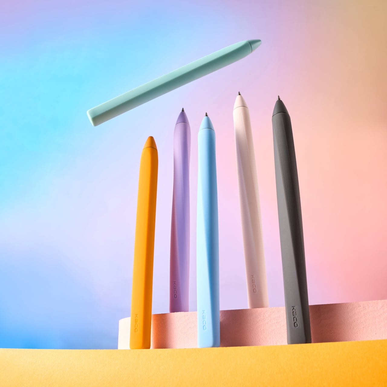
Twist is a ballpoint pen designed by UO for KACO that hides its mechanism inside a single sleeve of soft silicone. Instead of a separate grip, clip, and twist ring, the body is one continuous mass you hold like chalk. When you twist to extend the tip, the silicone flexes and follows the motion, so the whole form breathes rather than simply exposing a joint or clicking a part.

Designer: Yu Matsuda (UO)

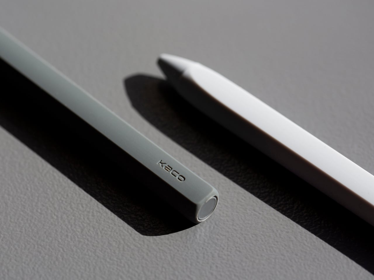
Conventional pens assign jobs to different components, a non-slip clip, a shaped knob for twisting, a hard plastic barrel for structure. Twist folds all of that into the silicone itself, so material, components, and function dissolve into one volume. There is no obvious boundary between grip and body, in line with Japanese minimalism’s habit of hiding seams and making objects feel like they came from a single mold.

The interaction feels quieter than expected. You twist the body and the silicone gives slightly as the inner core rotates, a motion the designers compare to twisting konjac. There is no sharp click or exposed threading, just a smooth, resistant turn and then a tip that quietly appears. It turns a mundane action into a tiny tactile moment without shouting about mechanics or exposing any hardware underneath the skin.

The design team aimed for the directness of holding chalk, where there are no moving parts, only your hand and the line. With Twist, the uniform silicone surface means your fingers do not travel over seams or texture changes, so your brain pays less attention to the object and more to the writing. It becomes the kind of pen you forget you are holding until you notice how unintrusive it has been all afternoon.

Under the silicone is a real mechanism engineered by KACO, a twist-to-extend core driving a 0.5mm gel refill that writes smoothly. The lack of a clip makes it feel more like a desk pen than a pocket tool, but the soft body and light weight mean it slides into bags without catching on anything or scratching objects nearby, which matters when you keep three pens loose in a pouch.

Twist treats minimalism as a reduction of visual and tactile noise, not just an aesthetic of thin lines. It takes a familiar object and strips away every cue that says “mechanism here,” leaving a single silicone stick that quietly transforms when twisted. Most stationery leans on knurls, clips, and cutouts to feel engineered, so that kind of restraint feels surprisingly fresh, like getting a pen that understands the difference between presence and performance.

The post This Silicone Pen Has No Seams, No Clip, and Twists Like Konjac first appeared on Yanko Design.
DVX Night Storm Releases Latest X3: Unparalleled 4K Full Color Night Vision in Pitch Darkness

The usual night-vision experience involves green haze, grainy silhouettes, limited reach, and a red IR glow that gives you away the moment you turn on the illuminator. Most systems force you to choose between contrast and color, or between seeing far and staying invisible. The trade-offs are familiar enough that people who work or roam in the dark have learned to accept them, settling for monochrome when they need range or giving up clarity when they need stealth.

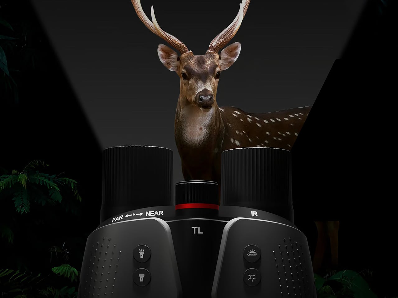
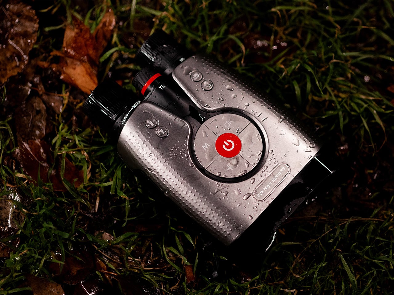
Night Storm X3 is aimed at people who move through the dark for work or passion and need more than a toy flashlight for their eyes. It is a binocular-style night-vision system that promises native 4K full-color imaging down to 0.0001 lux (10 times better than the previously industry-leading SONY Starvis), visibility out to 1,500m, and an invisible 950nm IR beam, all fused by a 20 TOPS AI engine in a rugged IP65 housing designed for long nights.

Designer: DVX Night Vision

Click Here to Buy Now: $249 $429 ($180 off). Hurry, only 4/295 left! Raised over $2.1 million.
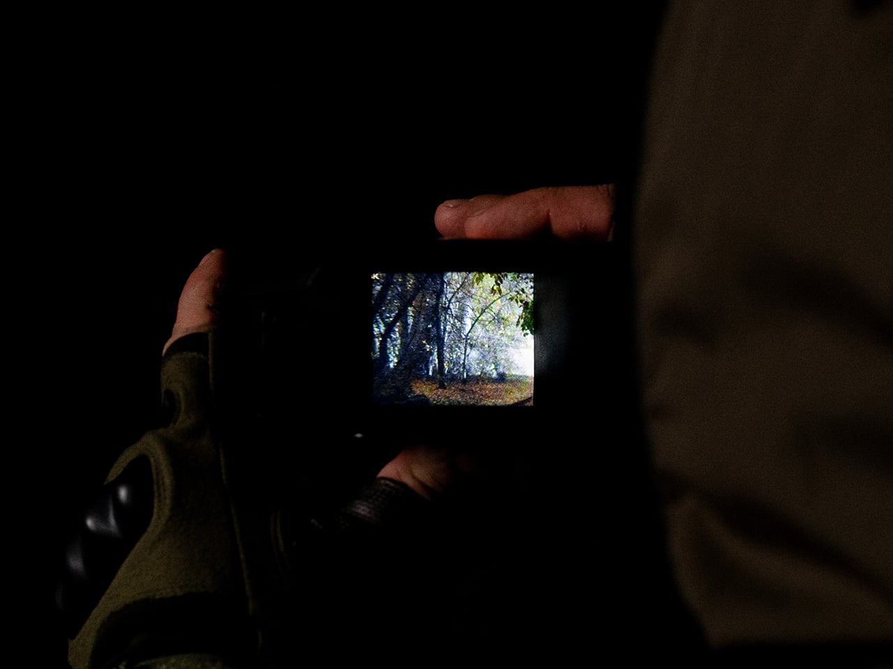
The Night Storm X3 is built around a ground-breaking architecture of not just one, but two proprietary 1-inch night vision CMOS sensors branded Luma-X and Chroma-X. One is a monochrome sensor that locks onto structure and edges in near-zero light, the other is a color sensor that pulls real color from light levels lower than starlight. The AI Neural Brain fuses them at the sub-pixel level, so you get both sharp contrast and natural color in a single 4K stream.
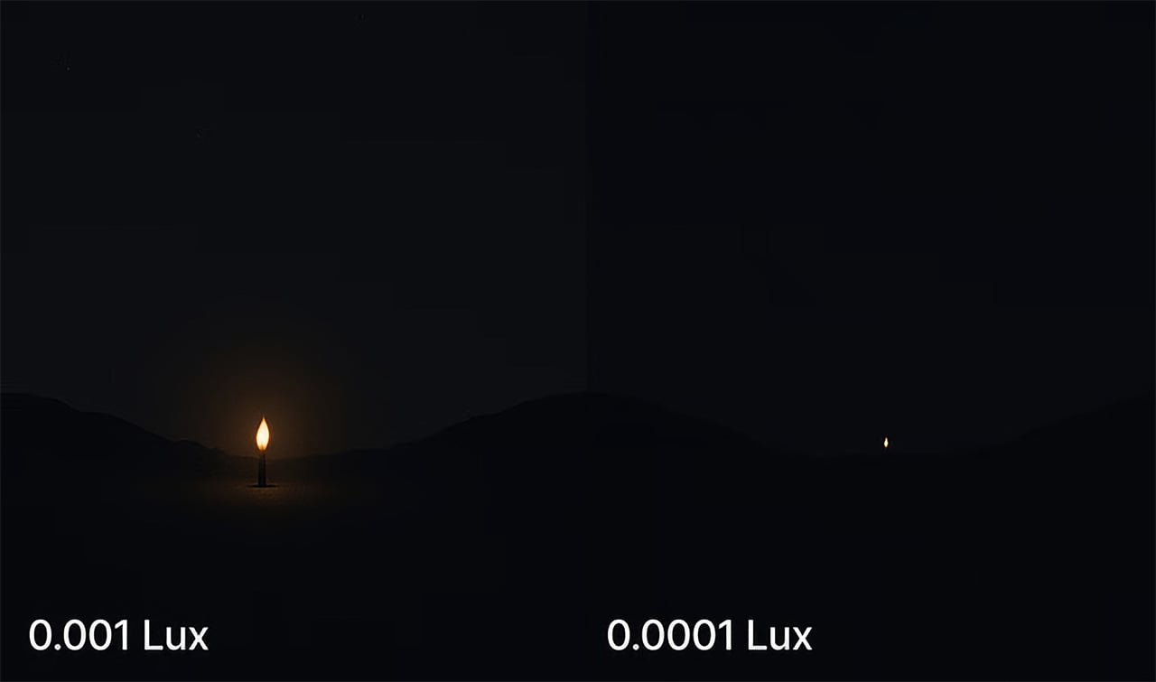
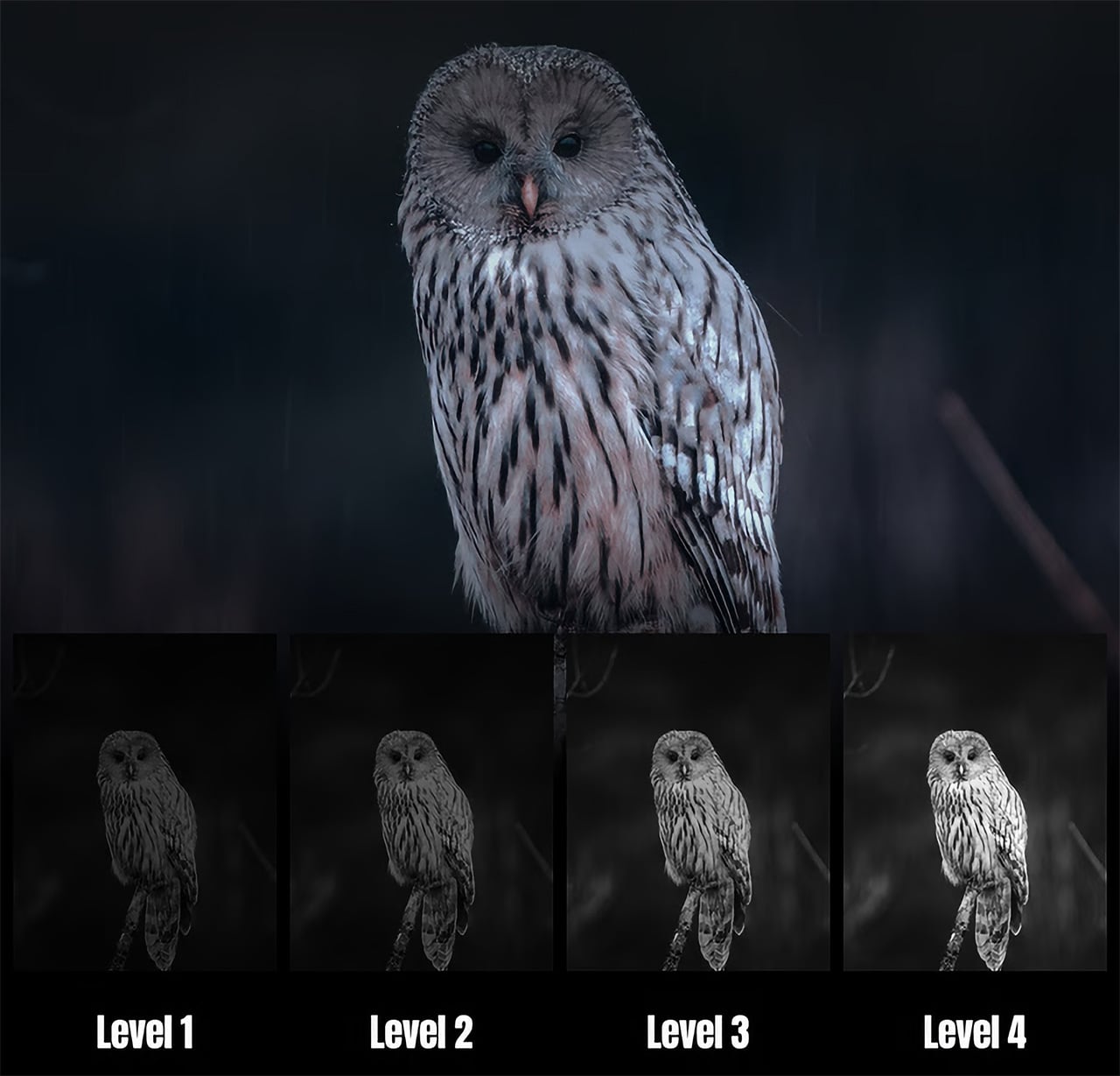
To understand what 0.0001 lux actually means, consider that a single candle at one meter is roughly one lux. By 0.001 lux, that glow is barely visible from 100m, and at 0.0001 lux it disappears to the naked eye. The Night Storm X3 still pulls full-color detail at that level, paired with optics tuned for a 13-degree field of view and 8x digital zoom, with minimal noise and interference thanks to its powerful AI imaging processing.

That optical system lets you scan valleys, fence lines, or shorelines up to 1,500m away. The narrow field of view, f/1.4 aperture, and 42mm focal length give you reach and detail rather than a wide panorama, which makes sense for tracking distant subjects or monitoring large open areas where you cannot physically move closer without being noticed or disturbing the scene.

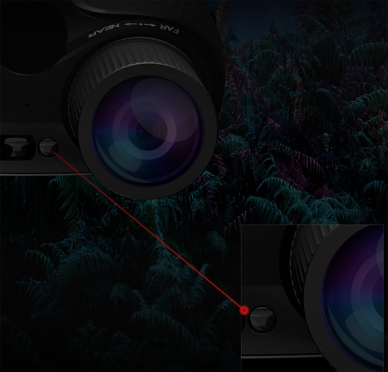
Older 850nm IR systems throw a visible red glow that is easy to spot and can spook animals or reveal your position. The Night Storm X3 uses a boosted 950 nm infrared system that stays invisible to humans and nearly undetectable to most animals. It provides powerful monochrome visibility up to 1,500m in 0-lux conditions, with four adjustable brightness levels to tune illumination and stay hidden.

The Pro model adds a built-in laser range finder that measures distance, angle, and drop up to 1,500m with a digital crosshair. Pair that with true 4K video and 52 MP stills, saved straight to a TF card at full resolution, and the X3 becomes a documentation tool. For professional night photographerx and animal observers, the built in LRF helps pin point distance of the objects down to the accuracy of centimetres, greatly enhance the overall performance and situation awareness. You can track animal patterns, log security incidents, or review what happened in a search corridor after the fact.

The 5,100 mAh battery and efficient NPU give you up to 24 hours of operation with IR off, enough to cover an entire night without swapping cells. The close-to-eye viewfinder feels more like binoculars than a screen at arm’s length, reducing fatigue during long sessions. The IP65 rating and -20 to 50 degree operation keep it running when you are out in harsh conditions for hours.

Built-in Wi-Fi and the DVX app let you stream, capture, and review footage from a phone, and TF card support up to 512GB gives you room for long sessions. Illuminated controls, audible alerts, a tripod mount, and a tactical light with constant and strobe modes slot into existing workflows without forcing you to reinvent how you work or carry extra accessories.

Night Storm X3 brings together dual sensors, AI fusion, stealth IR, and industrial design into something that feels like a serious tool rather than a gadget. It is built around the needs of people who spend long stretches in the dark and need color, range, and confidence. For anyone who has run out of battery mid-watch, squinted at grainy green footage, or been given away by a glowing IR emitter, the Night Storm X3 reads less like an incremental upgrade and more like the kind of gear that quietly changes what you can do when the sun goes down.

Click Here to Buy Now: $249 $429 ($180 off). Hurry, only 3/295 left! Raised over $2.1 million.

The post DVX Night Storm Releases Latest X3: Unparalleled 4K Full Color Night Vision in Pitch Darkness first appeared on Yanko Design.