Finally, a Bench Design That Never Wastes a Seat

Anyone who has ever sprinted through a train station with a rolling suitcase in one hand and a coffee sloppily balanced in the other knows the particular despair of scanning a row of seats and finding every single one occupied by someone’s backpack. Not a person. A bag. Sitting there like it paid for the ticket too.

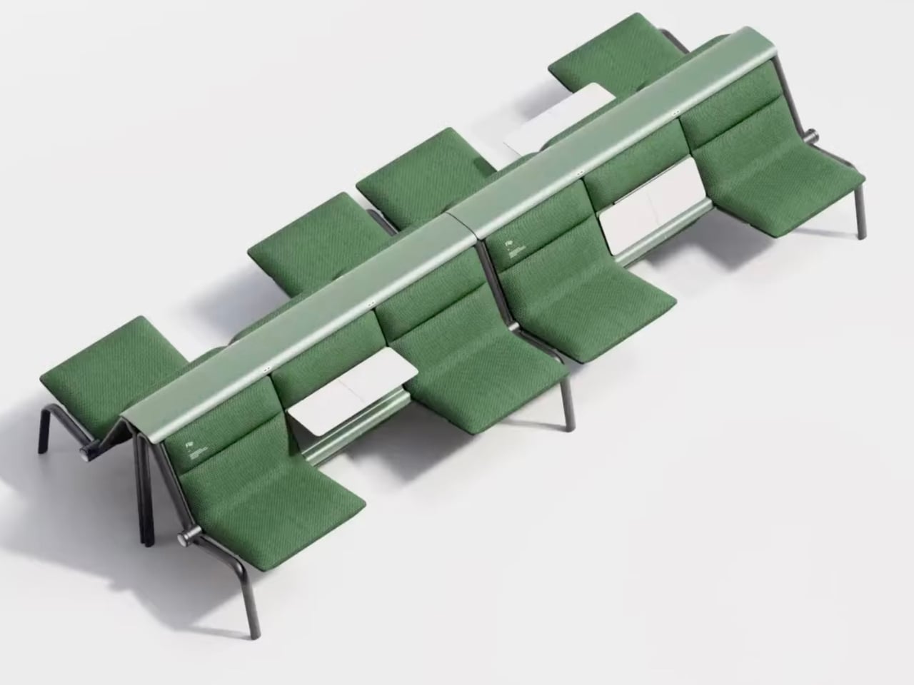
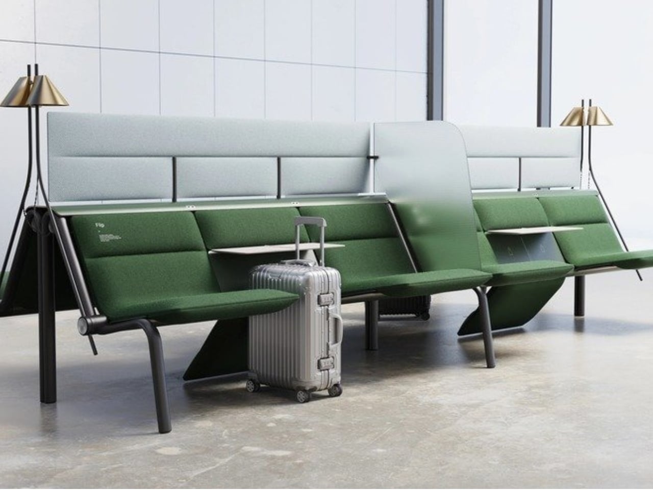
That small, maddening moment is basically the whole reason a London studio called Of My Imagination designed something called Flip, a modular public seating system where each individual seat can rotate out of the way on command. Instead of a bench being a fixed slab of “sit here or don’t,” Flip treats every seat as its own hinge point. Flip it down, it’s a chair. Flip it up and out, it becomes open space for luggage, a stroller, or just more room to breathe when a platform gets crowded. It sounds almost too simple to be clever, which is usually the sign of a genuinely good idea.

Designer: Of My Imagination
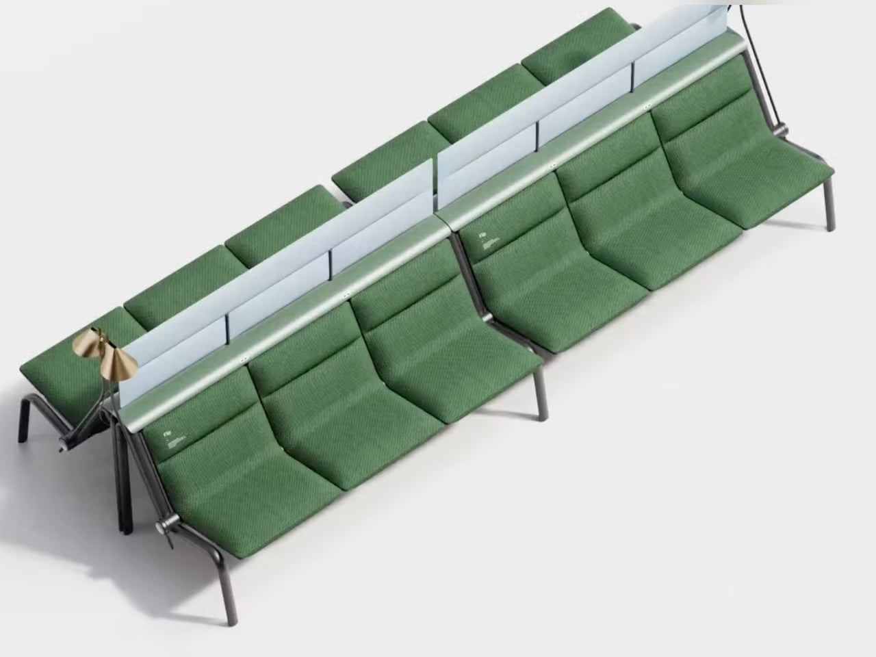
I’ve been thinking about public seating a lot lately, mostly because so much of it seems designed for an idealized version of how people move through the world rather than the messy, unpredictable reality of it. Airports, bus terminals, hospital waiting rooms. These spaces swing between dead quiet and total chaos within the same hour, and yet the furniture almost never adjusts with them. A bench built for a slow Tuesday afternoon becomes a liability during a holiday rush, when every inch of floor space suddenly matters and immovable seating just gets in the way.
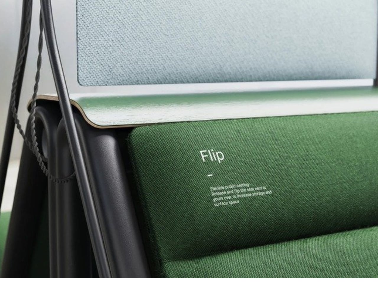
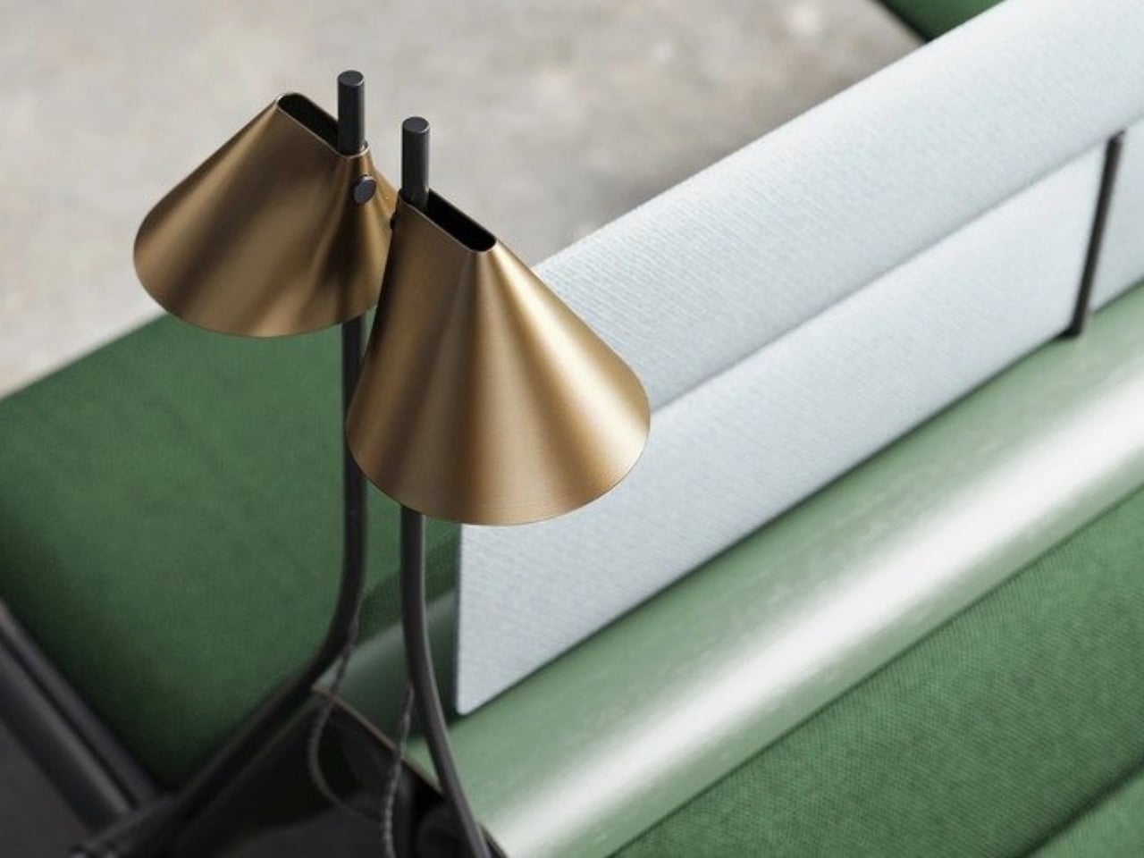
Flip’s answer isn’t flashy. There’s no app, no motor, no sensor deciding when a seat should move. It’s a mechanical latch and a rotating joint, the kind of low-tech solution that feels almost old-fashioned in a moment when everything gets pitched as “smart.” I actually like that restraint. Public infrastructure breaks down constantly not because the technology is too simple, but because it’s too complicated, too fragile, too dependent on software updates and maintenance contracts nobody budgeted for. A seat that flips because a person physically flips it is a seat that still works during a power outage, a system failure, or just a Tuesday when the maintenance crew is short-staffed.
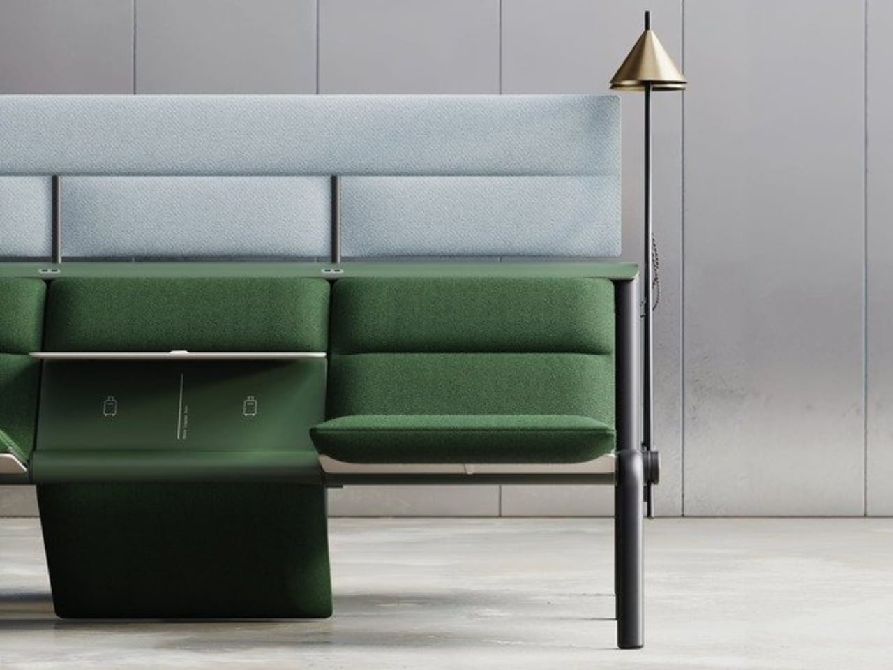
The pandemic-era spacing rules get a mention in OMI’s own description of the project, and it’s worth sitting with that for a second. Remember all those benches wrapped in caution tape or marked with awkward stickers telling you where not to sit? Most of that signage disappeared once the emergency did, but the underlying problem never really left. Public seating still needs to flex between “pack people in tightly” and “spread them out,” whether that’s for health reasons, accessibility needs, or just the reality of rush hour versus a quiet Sunday morning.
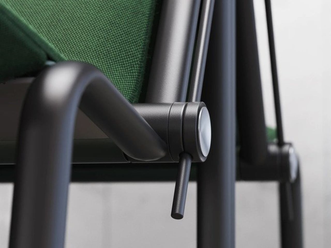
What strikes me most is how much this design respects the intelligence of the people using it. Flip doesn’t try to predict what a traveler needs. It just gives them the option and gets out of the way. That’s a surprisingly rare quality in public design, where the instinct is often to over-engineer a solution that anticipates every scenario instead of trusting a commuter to make a simple physical adjustment themselves.


Is it going to replace every bench in every transit hub across the country? Probably not right away, and cost, durability testing, and vandalism resistance are the unglamorous hurdles any concept like this has to clear before it shows up somewhere you’d actually sit down. But as a proof of concept, it’s a refreshing reminder that flexibility doesn’t require a screen or a subscription. Sometimes it just requires a hinge and a little humility about how unpredictable public spaces actually are.
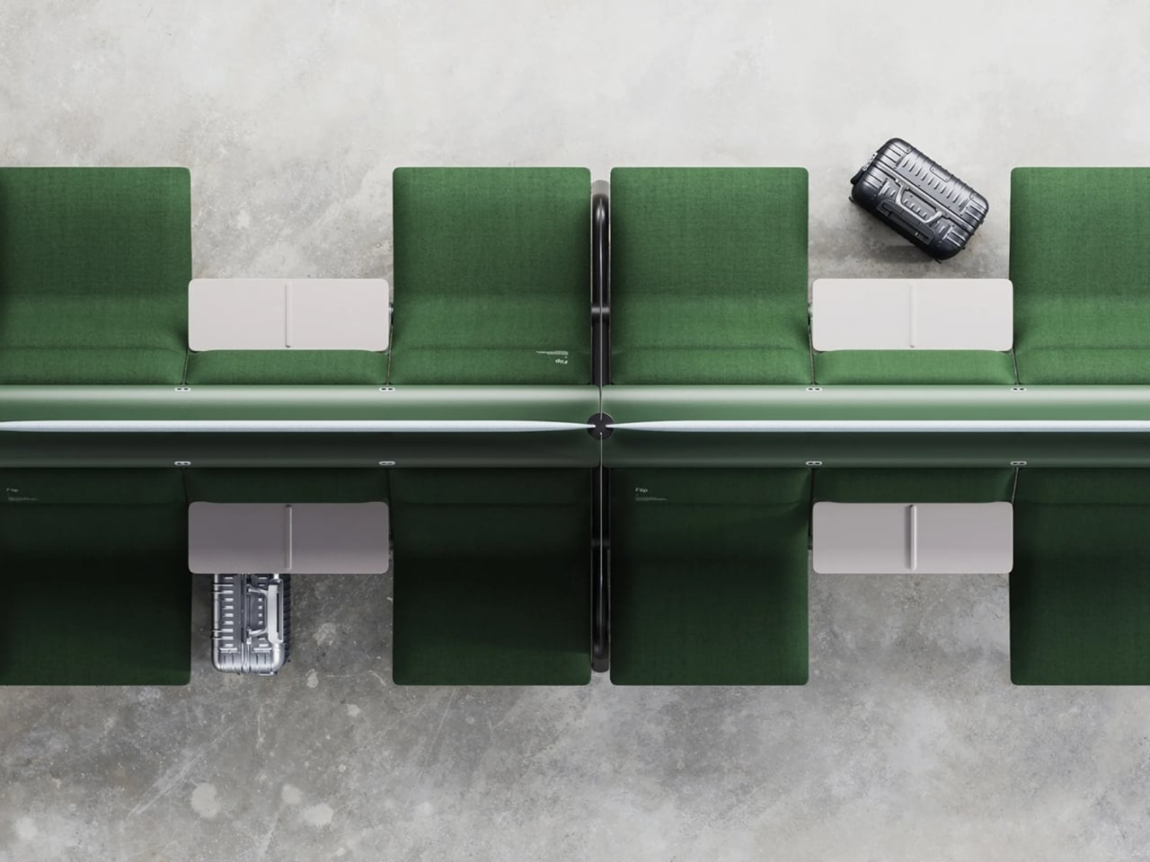
The next time I’m standing in a crowded terminal, silently negotiating personal space with a stranger’s overstuffed duffel bag, I’ll probably think about Flip. Not because it solves everything, but because it solves the one thing that’s been sitting there, unaddressed, for as long as public benches have existed.
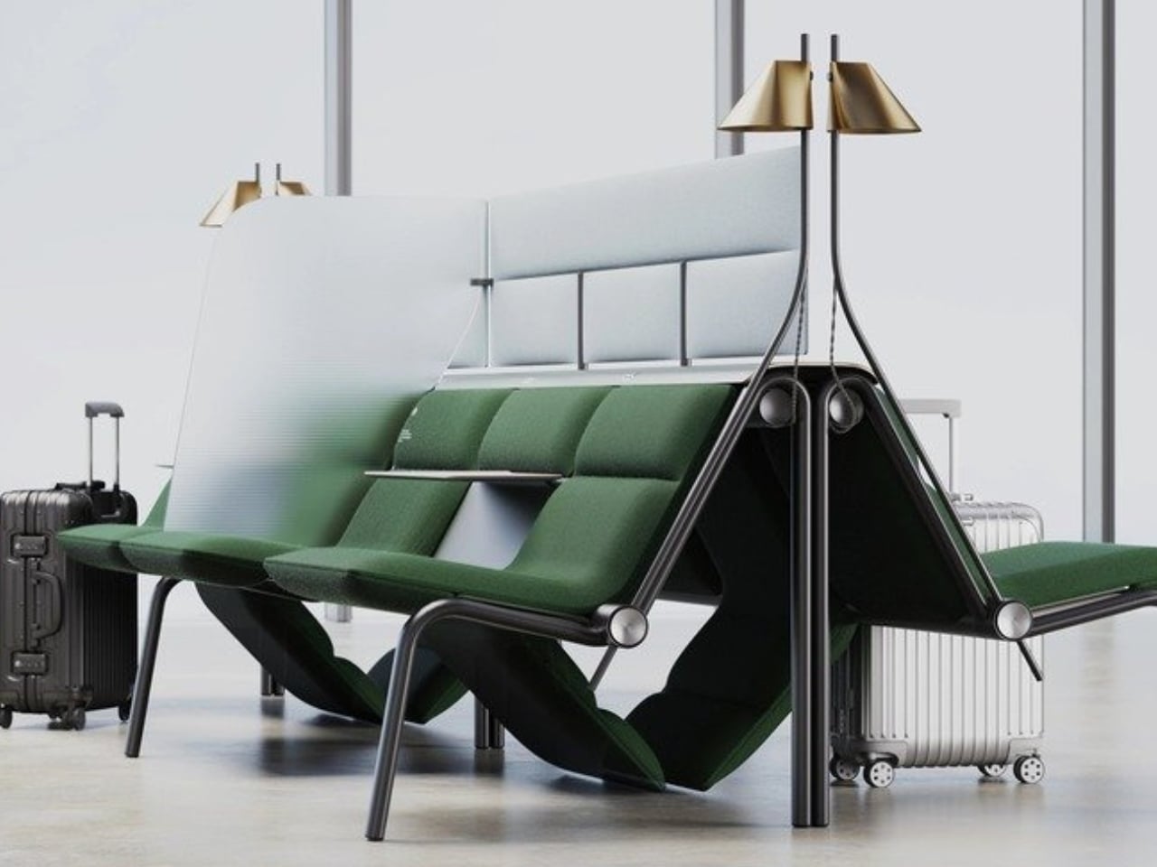
The post Finally, a Bench Design That Never Wastes a Seat first appeared on Yanko Design.


This Indonesian House Turns Its Sloping Roof Into a Garden, a Staircase, & a Rooftop Pool

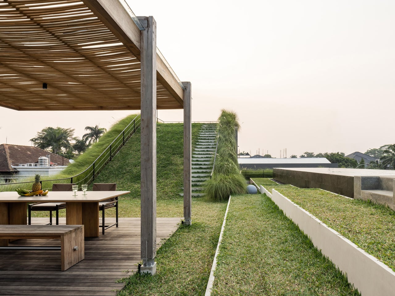
Some houses are designed to be looked at. Split Mass Residence, completed in 2026 by K-Thengono Design Studio, is designed to be moved through — a 712-square-metre home in BSD, South Tangerang, Indonesia, where every architectural decision is in service of movement, togetherness, and the slow pull of the outdoors.

Founder Kelvin Thengono built the project around a single, quietly radical idea: “The main design goal was to allow a seamless sequence of spaces that keeps the family connected, while also staying closely aligned with the surrounding landscape.” The house sits on a corner — what architects call a hook site condition — and rather than treat that exposure as a problem, the studio used it as the engine for the entire massing strategy. Volumes are split, pulled apart, and repositioned so that no single path through the house feels accidental.

Designer: K-Thengono Design Studio

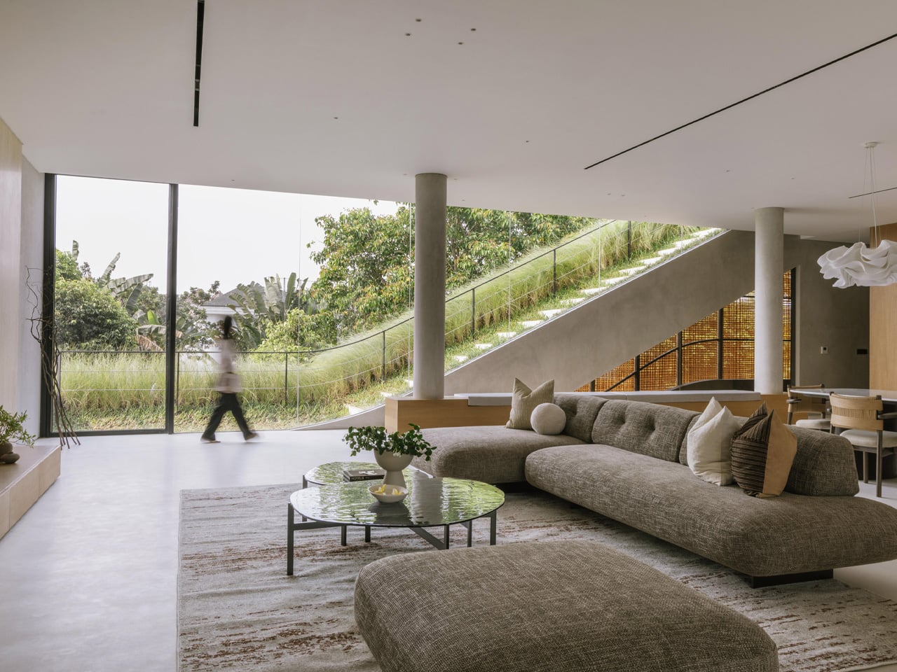
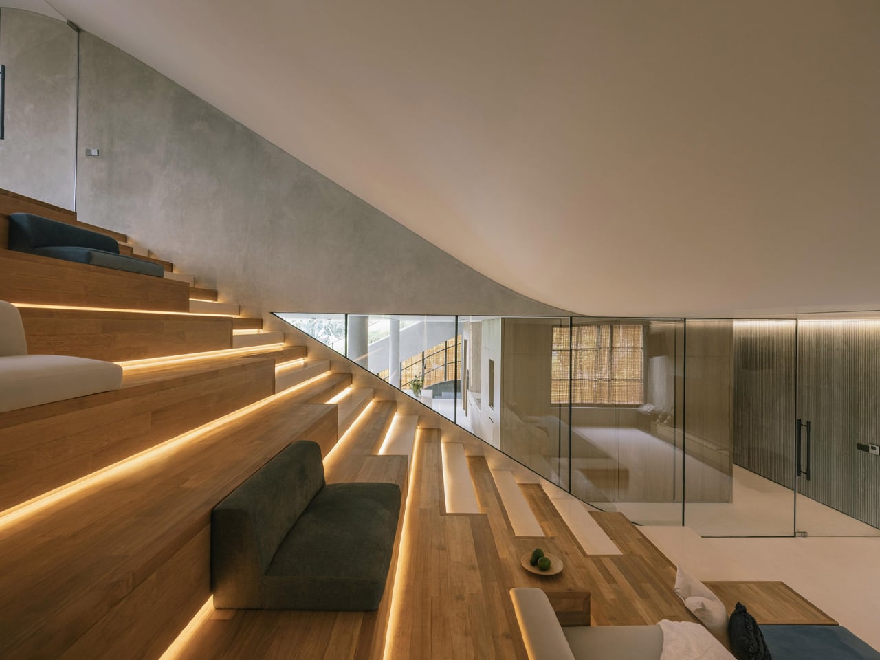
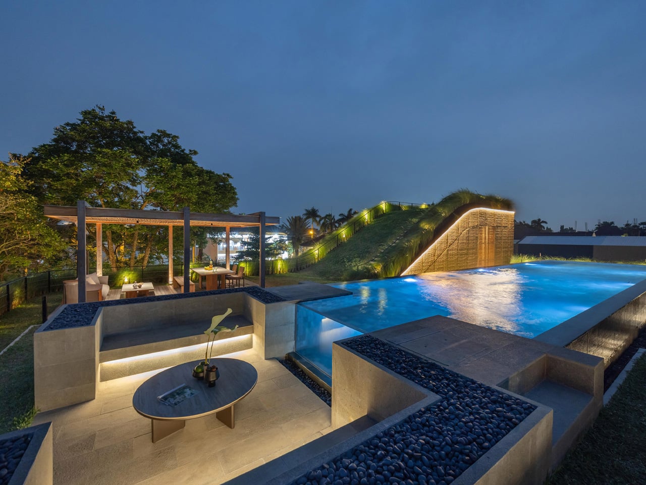
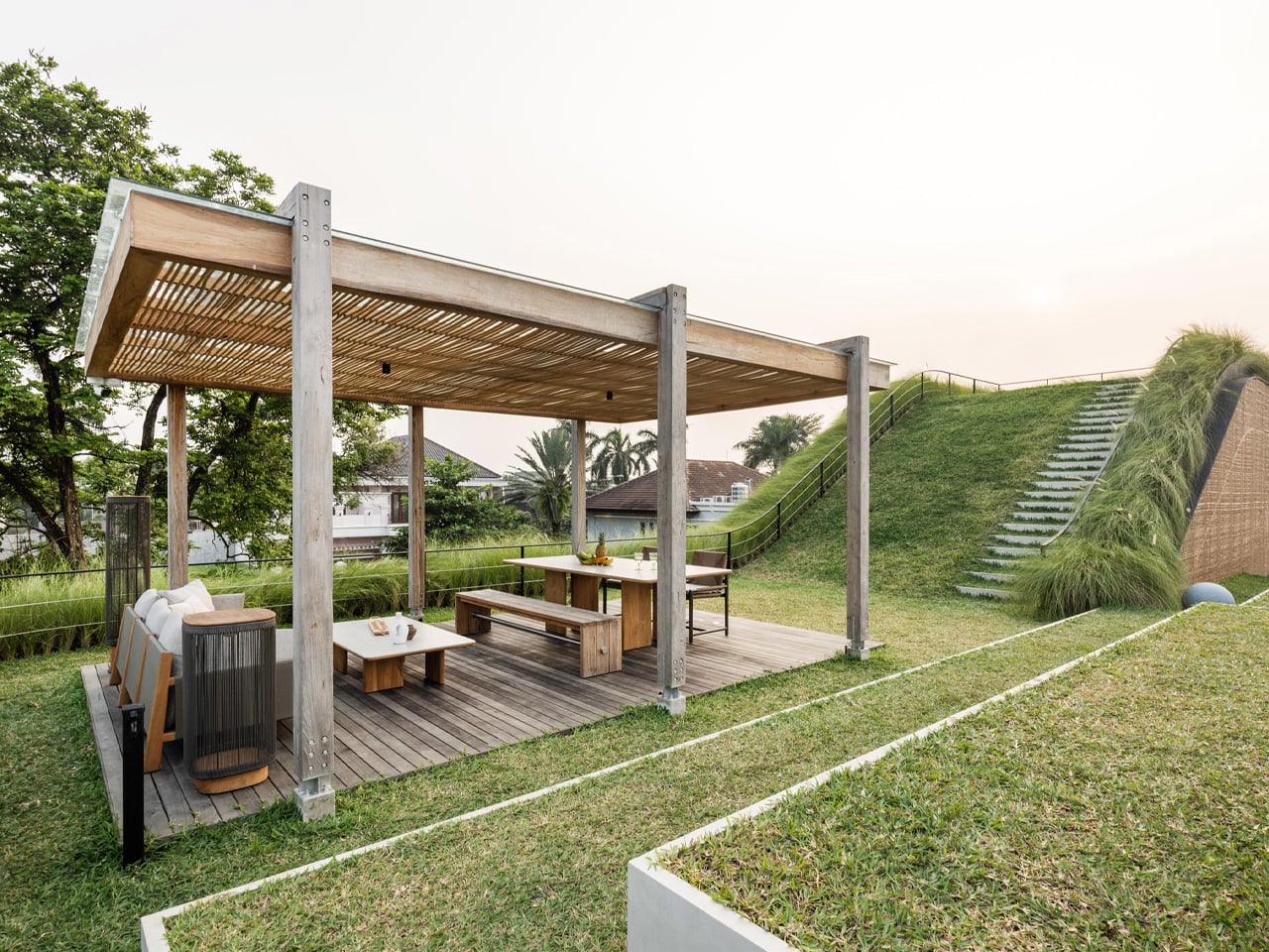
That split is where the project gets interesting. Tiered, sloping garden roofs connect indoor living spaces directly to the planted outdoor setting, blurring the line between ceiling and garden in a way that feels more organic than architectural. From the open-plan kitchen, living, and dining area on the first floor, a glass door opens straight onto a grassy rooftop slope. An outdoor staircase continues upward to a swimming pool and barbecue area — the roof isn’t just a lid; it’s the social core of the house.

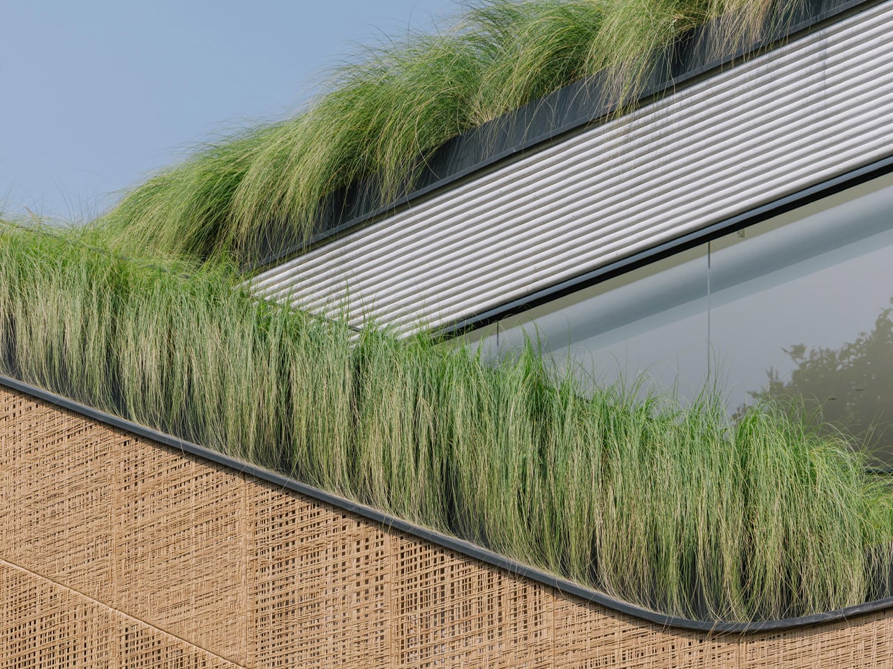
On the exterior, two materials do the heavy lifting. Concrete anchors the structure, giving it weight and presence on the streetscape. PE rattan panels wrap across the facade in woven screens that soften everything — filtering light, adding texture, and offering just enough visual privacy without closing the house off from its surroundings. The contrast is deliberate: one material says permanence, the other says warmth. Together they give the house a character that’s grounded and tactile rather than slick.

What Thengono has built here isn’t really a house in the traditional sense — it’s a system of encounters. Divided volumes, green roofs, and internal and external staircases create different scenarios for family interaction, so the architecture itself nudges people toward each other without ever forcing it. The rooftop garden crowning the whole composition reinforces that layered approach — landscape as architecture, architecture as landscape.

In a region where residential design often defaults to gated grandeur or tight minimalism, Split Mass Residence lands somewhere more considered. It’s a house that knows exactly where it wants you to be — and makes getting there feel like the whole point.

The post This Indonesian House Turns Its Sloping Roof Into a Garden, a Staircase, & a Rooftop Pool first appeared on Yanko Design.
The Lamp That Actually Looks Better With the Lights Off

Most lighting has a dirty secret: it only works half the day. Flip the switch and a pendant or sconce can look spectacular, all warm glow and dramatic shadow. Flip it off, and you’re left staring at what is often just a glorified fixture, a thing bolted to a ceiling that has nothing to say for itself once the bulb goes dark. That gap between “on” and “off” is where a lot of home lighting quietly fails us, and it’s a problem most people never think to name because they’ve simply accepted it.

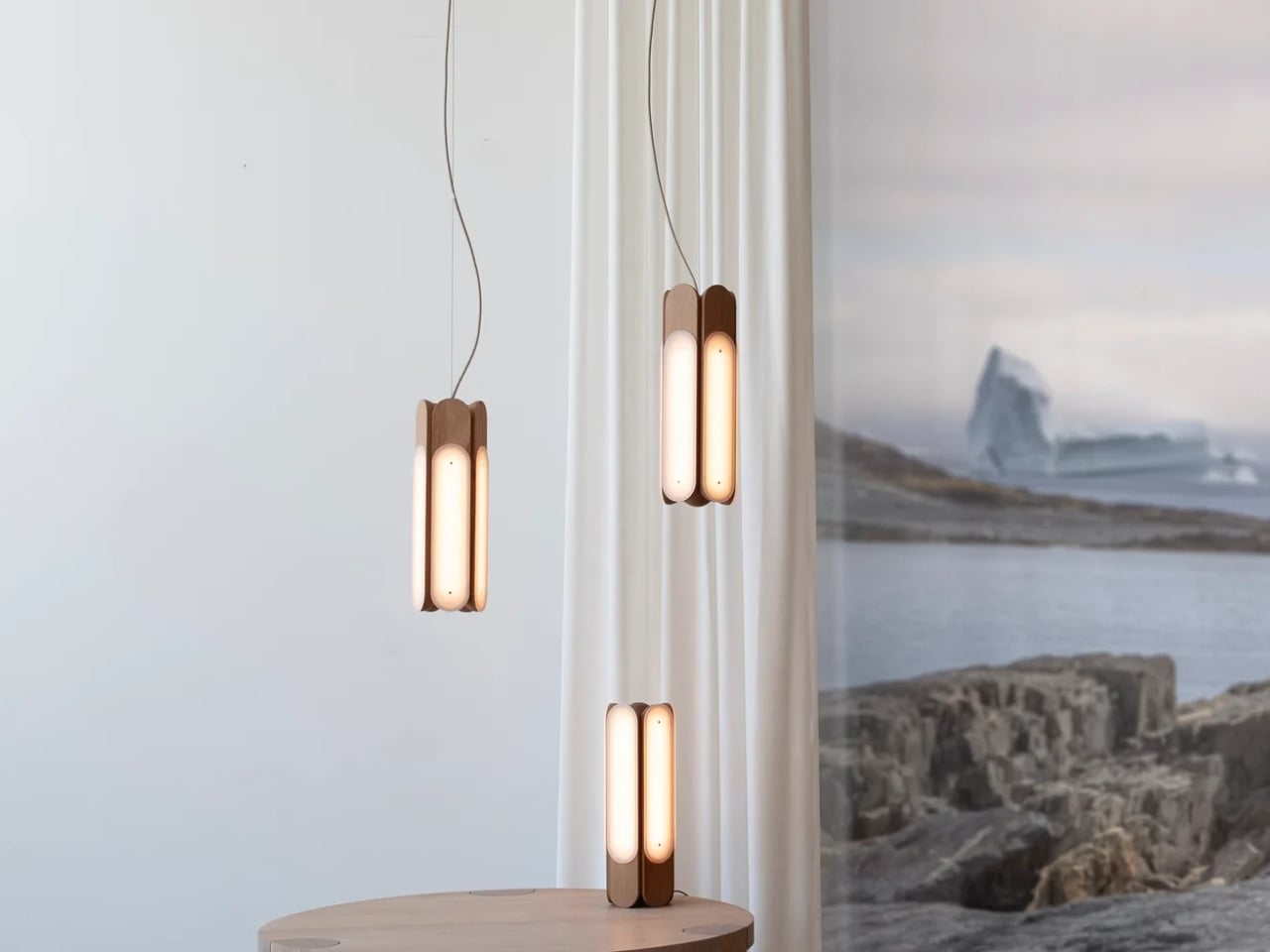
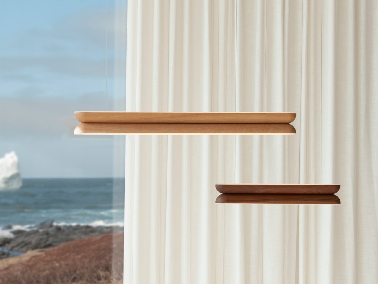
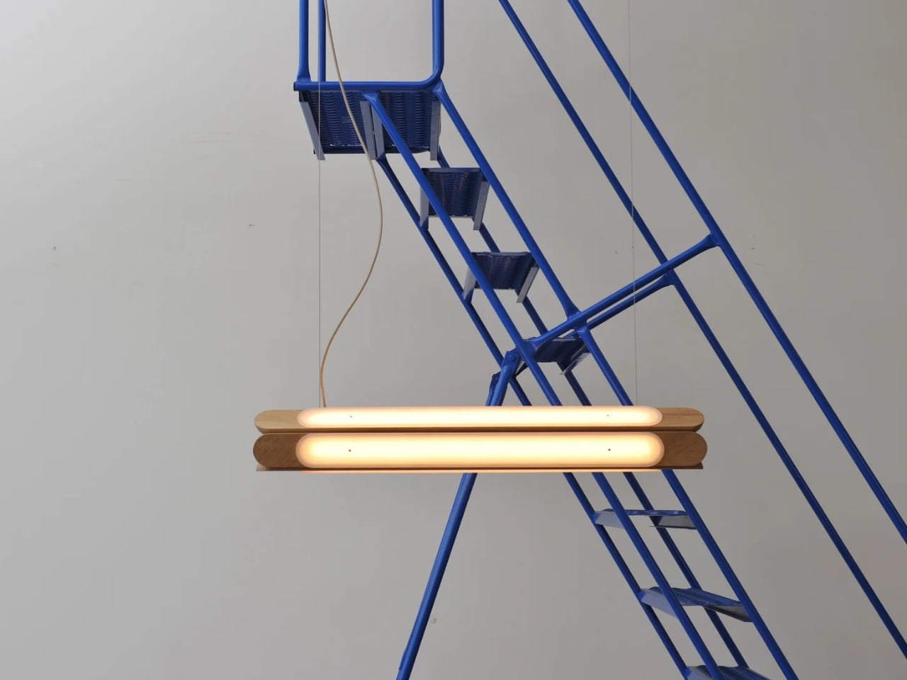
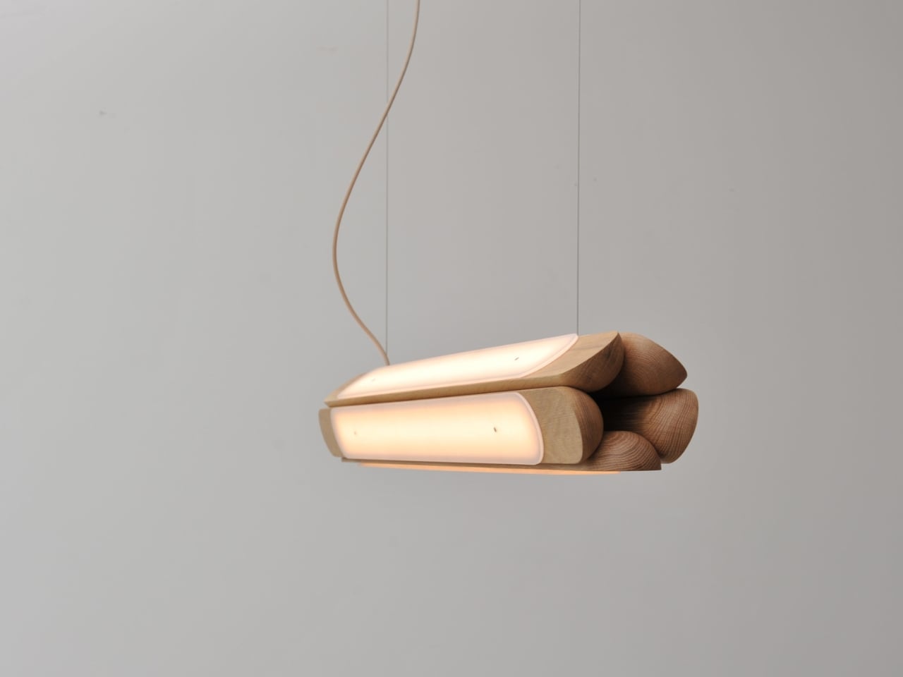
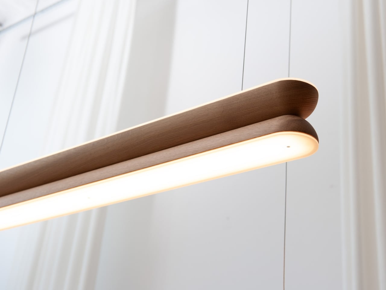
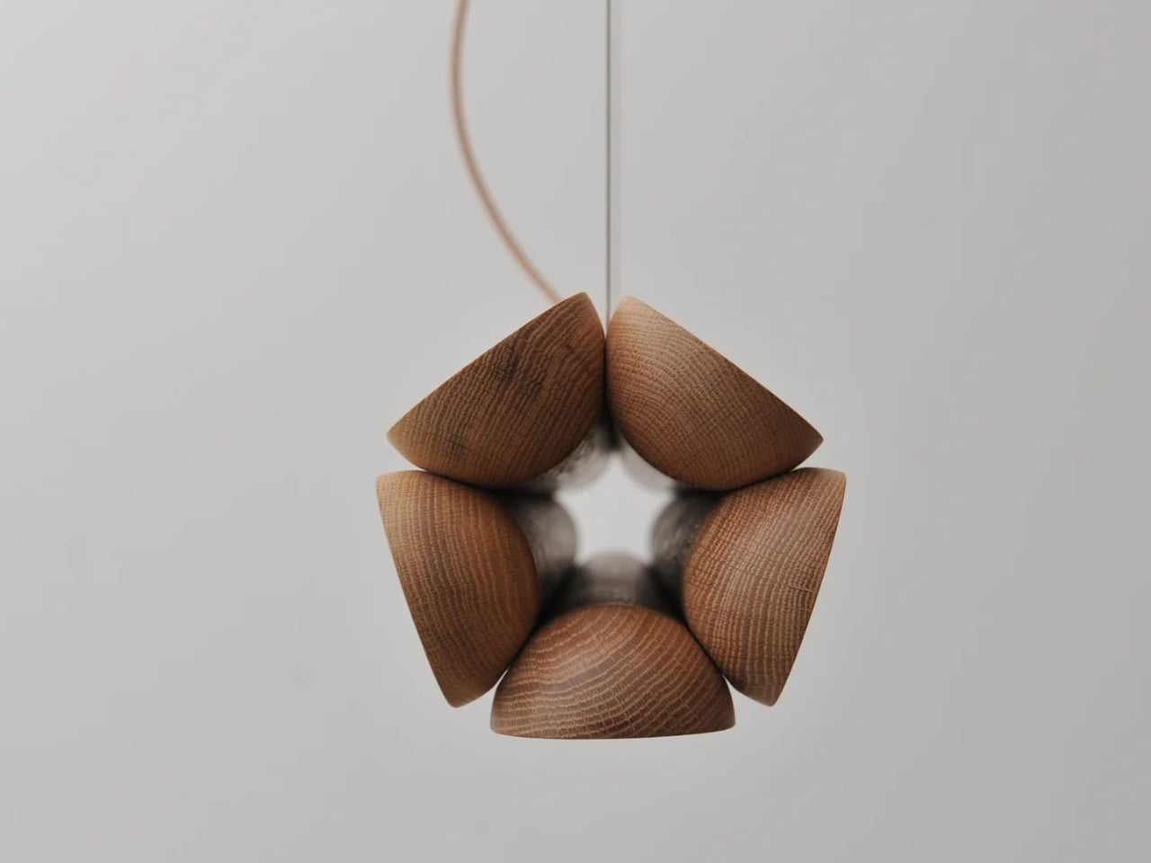
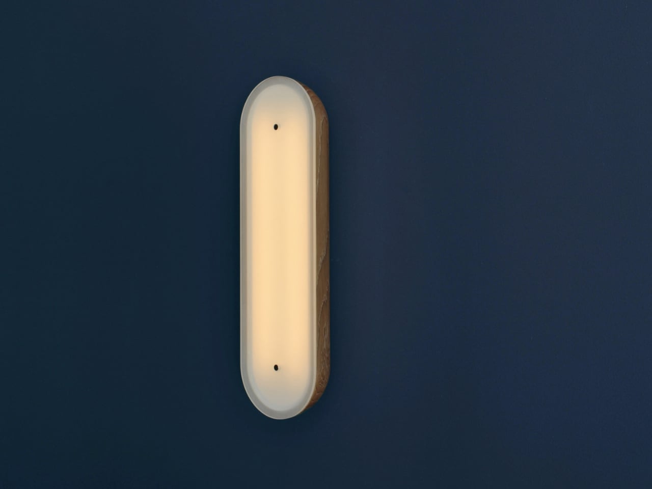
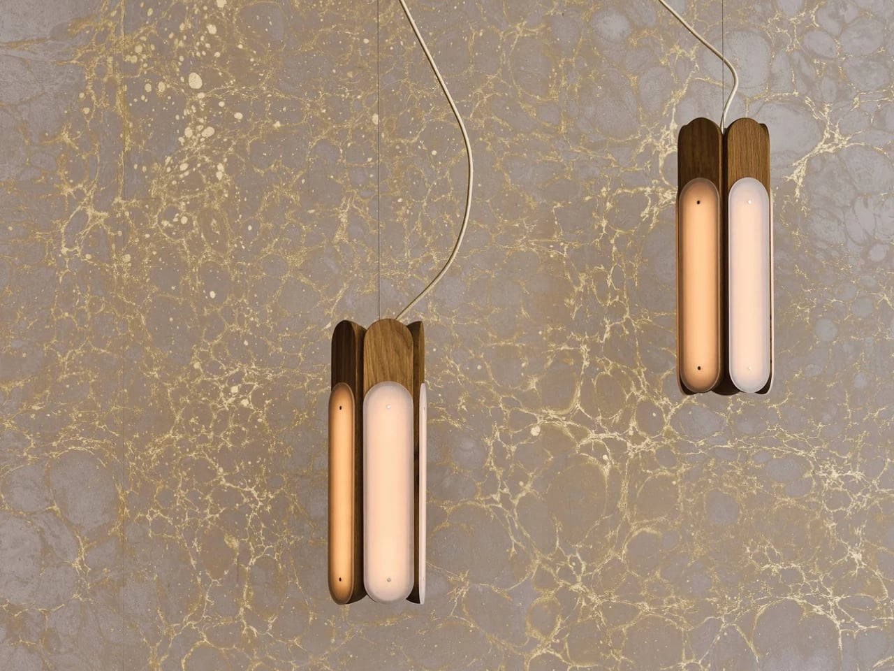
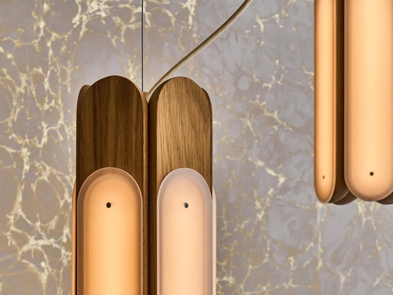
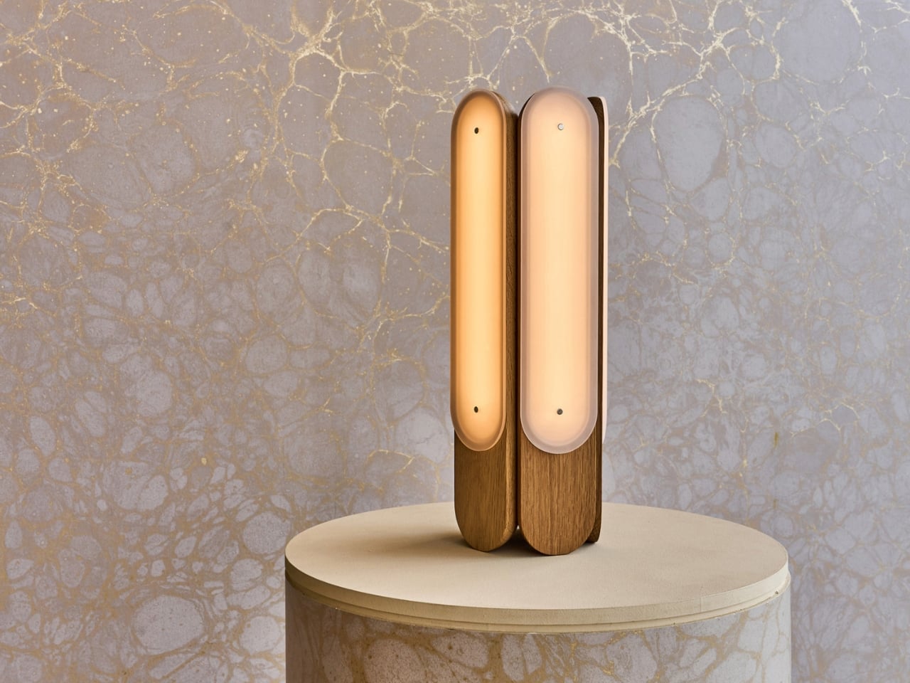
Hollis+Morris, the Toronto studio behind the new Beaufort collection, clearly has thought about it. Their solution isn’t a smarter bulb or a clever dimmer app. It’s a rethinking of what a light fixture is supposed to do when it’s doing nothing at all. Beaufort is built from sculpted solid wood paired with sandblasted acrylic, and the acrylic is cut and finished so it holds a kind of frozen depth, layered, translucent, a little mysterious, whether or not there’s current running through it. Turn it on and light diffuses through those layers in soft gradients. Turn it off and you still have an object worth walking past twice.

Designer: Hollis+Morris

The origin story is the kind of thing that sounds almost too tidy, except it happens to be true. Mischa Couvrette, the studio’s founder and lead designer, was flying home from Copenhagen’s 3daysofdesign when a conversation about ice, and about climate change, turned into sketches on a cocktail napkin somewhere over the Atlantic. By the time the plane landed, the collection basically existed in his head. The name comes from the Beaufort Sea, that remote stretch of Arctic water above Alaska and Canada’s Northwest Territories, which is a fitting reference for a studio that has built its identity on restraint rather than spectacle.

I appreciate that the collection doesn’t try to literally recreate an iceberg hanging from your ceiling. Instead it borrows the logic of ice: how light moves through something dense and layered, how clarity shifts depending on where you’re standing. The studio achieves that through repetition, mirroring, and rotation of a small set of core components, which is a fancy way of saying they’ve built one coherent visual language and then let it flex across a sconce, a mirrored horizontal pendant, a lantern-like vertical pendant, and a table lamp. Nothing in the lineup feels like an afterthought tacked onto a single hero piece just to pad out a catalog.

Jonathan Mandeville of Hollis+Morris put it plainly when he said the collection sits in a lineage of Scandinavian and Canadian design that values material honesty and quiet restraint, the idea that an object should earn its keep even when it isn’t doing anything. That’s a bit of a jab, gentle as it is, at a design moment that has leaned hard into maximalism and novelty for novelty’s sake. I don’t think Beaufort is arguing that bold, loud design is wrong. Plenty of homes need a little chaos. But there’s real value in a piece that doesn’t ask for your attention so much as reward it once you’ve already given it, and that’s a harder trick to pull off than another oversized statement chandelier.

It also matters, at least to me, that these pieces are made in Canada by a B Corp certified studio that treats that fact as a working value rather than a sticker on the box. Knowing who made a light and how isn’t a small thing anymore, especially with home goods, where supply chains can be murky at best.

Beaufort isn’t cheap. The R5 horizontal pendant runs $3,800 and the M2 horizontal starts around $1,900, so this is squarely in investment-piece territory, not an impulse buy from a big box store. But for anyone who has ever bought a light fixture, loved it while it was on, and felt a little let down by it during the day, Beaufort makes a fairly convincing case that the two states shouldn’t have to be so different.

The post The Lamp That Actually Looks Better With the Lights Off first appeared on Yanko Design.