Right off the back of the iPhone 17e, new iPads and MacBook Airs, Apple also announced a keenly priced new laptop. The MacBook Neo is a multi-colored low-cost Mac ($599), running on an iPhone chipset with most but not all of the hardware features you find on the MacBook Air and Pro. All models of the MacBook Neo ship with an extremely scant 8GB of RAM, which might be the main productivity bottleneck for demanding tasks.
The Neo has a 13-inch Retina display, a 1080p webcam, two USB-C ports, a headphone jack and optional Touch ID, if you're willing to pay a little more. A lot has been said about whether this is Apple marching to the beat of its own drum again, in a year of RAM shortages and AI obsessions. This is a direct attack on cheap Windows laptops and underperforming Chromebooks. Tempted? Check out our initial impressions from Apple's event earlier this week, right here. Oh, and for everything Apple announced – we've pulled all the news together here.
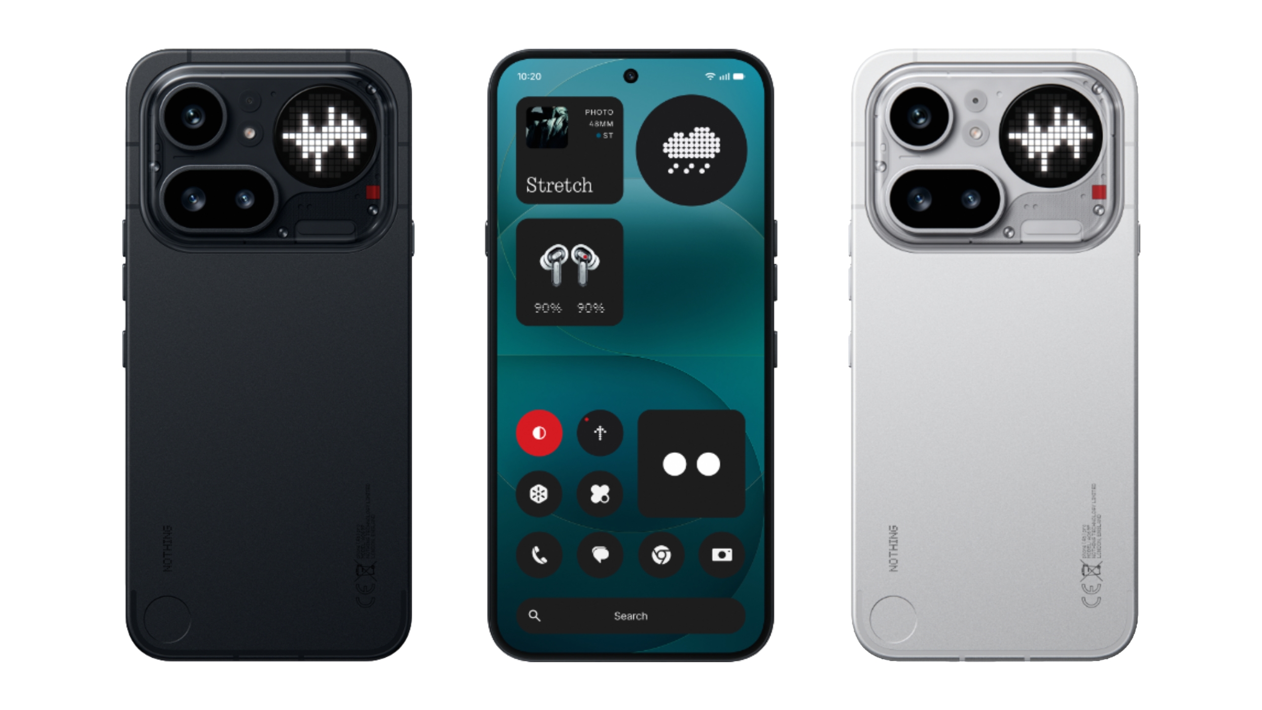
There's no flagship Nothing Phone 4 this year, but the company has put a lot of effort into making its A-series almost flagship, including a notable design pivot with the Phone 4a Pro. The transparent back is now aluminum, and the trademark Nothing aesthetic has been boxed into the camera unit. It looks more grown-up, perhaps, but a little less fun? That said, the egregious camera bump on the Nothing 3a Pro last year is no more. Both 4a phones are sleek slabs of smartphones. The company has also substantially upgraded the devices, with better cameras, more batteryand improved screens. Only the 4a Pro will be coming to the US later this month.
While MWC 2026 offered us plenty of Chinese smartphones ready to wow us, established player Samsung managed to surprise us with its S26 Ultra the week before. Sure, it doesn't have a ton of major improvements, but it brings subtle upgrades across the board, along with a standout new display for anyone who cares about privacy.
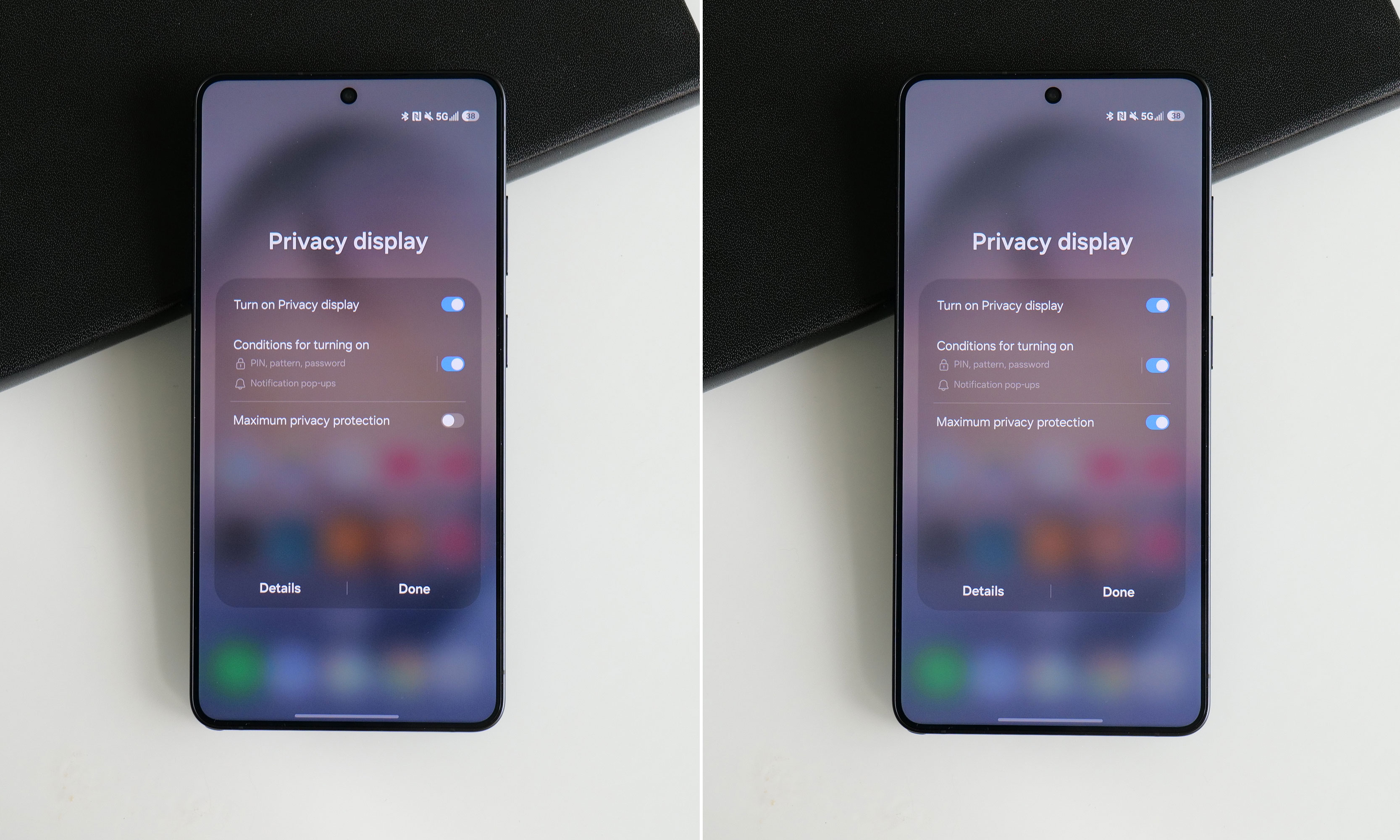
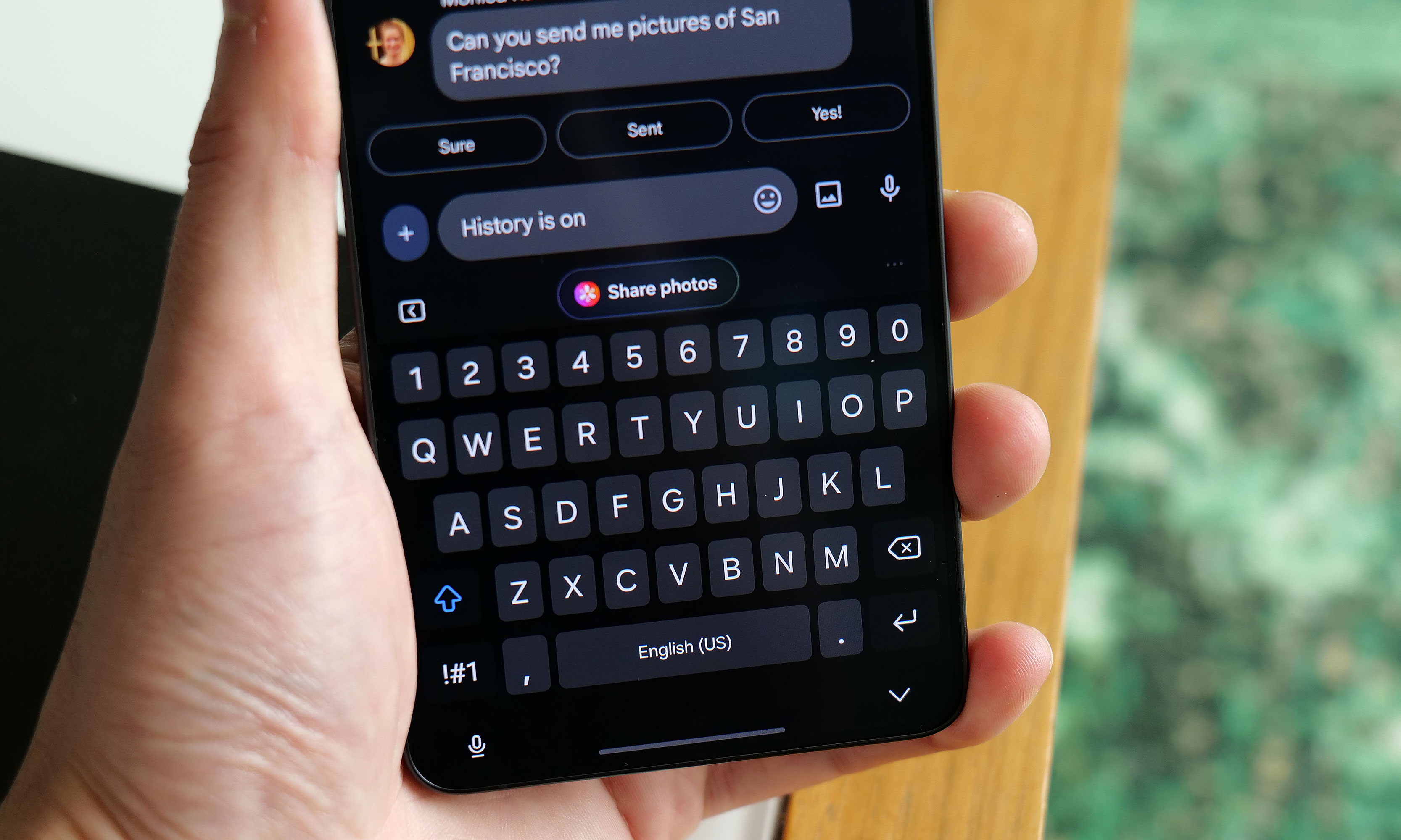
The Privacy Display is the standout new feature – one we've never seen before on a smartphone. When you turn the Privacy Display on and view the phone from less than head-on, everything fades to black, like those privacy-sticker screen protectors, but at the hardware level.
The S26 ultra can even selectively activate Privacy Display under specific situations, turning on when you get notifications or open certain apps (like for banking or authenticators). The phone can also enable the feature when you need to enter a PIN, pattern, or password, though this is only for system-level prompts, such as your lock screen.
You'd be forgiven for thinking that the Samsung Galaxy S26 Ultra looks a lot like the last four models. That's because it does, right down to its general design and rear camera layout. But on Samsung's latest flagship phone, some stealthy upgrades are hidden beneath its classic blocky silhouette that might go unnoticed by the casual observer. Those help make this year's release feel like a better deal than its most recent predecessor. It remains rather expensive, starting at the same $1,300 as before, but considering the price of RAM these days, that almost feels like a blessing. So while it won't hit you over the head with monumental changes year over year, it's subtly one of the best Ultras we've gotten in the past half-decade.
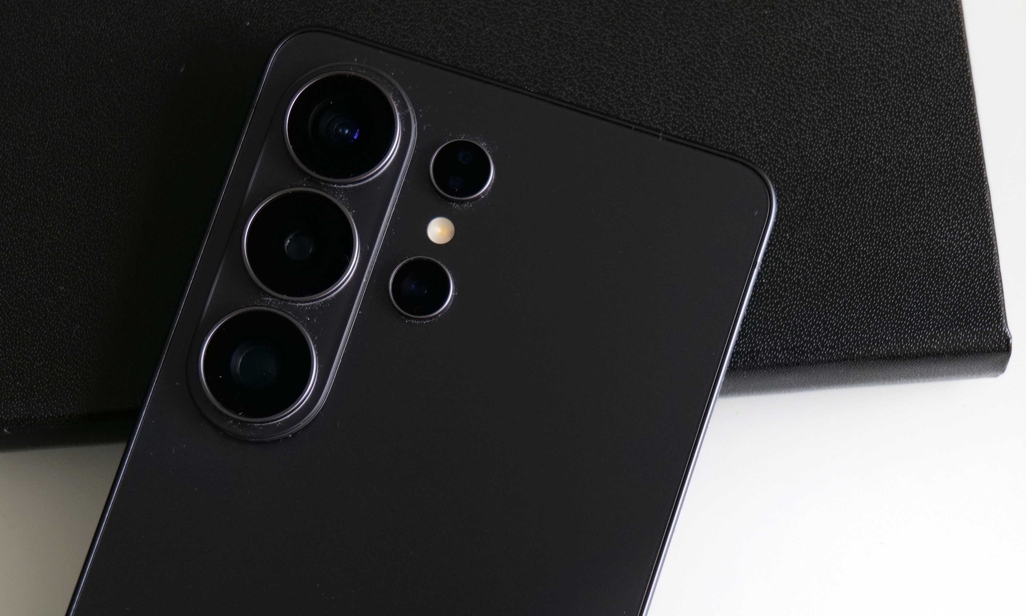
Design: Back to aluminum
After dabbling with titanium frames on the last two Ultras, Samsung returned to aluminum for 2026. The company says this makes it easier to color-match the phone's chassis to the Corning Gorilla Armor 2 panels on the front and back, though it's incredibly difficult to see the impact on my black review unit. Elsewhere, the company shaved a few grams off its total weight and a few millimeters off its thickness (7.9mm and 214 grams), but even when directly comparing the new model to last year's S25 Ultra (8.2mm and 218 grams), that difference is basically imperceptible. I almost think the S26 Ultra's extra sleekness was just so that people would stop saying the Z Fold 7 is lighter than Samsung's most premium traditional candybar-style handset.
As always, there's a built-in storage slot for Samsung's S-Pen, which is essentially a carbon copy of what we got last year without any functional changes. However, because the phone's corners are more rounded than ever, one small peculiarity is that now there's a right and wrong way to insert it. No matter what you do, the stylus will stay put, but if you don't align the curve on the end of the S-Pen with the shape of the phone's corner, it just doesn't look right.
Display: Now with more privacy
The Galaxy S26 Ultra's display has the same specs as the previous model, except now it comes with a built-in Privacy Display.
Sam Rutherford for Engadget
The S26 Ultra's 6.9-inch screen is easily its most undercover upgrade because it sports essentially the same specs as last year. You still get 2,600 nits of peak brightness with a variable 120Hz refresh rate and a max resolution of 3,120 x 1,440. The secret is that with the touch of a button, you can activate Samsung's Privacy Display, which effectively stops others from spying on your screen when viewed from acute angles (both from the side and up and down).
When you turn the Privacy Display on and look at the phone less than head-on, everything sort of fades to black. Depending on the angle, you may still see an outline of UI elements and some bright spots depending on your content, but the wider you go, the fainter things get. The way it works is that the phone has two sets of subpixels, narrow and wide, the latter of which get turned off when the feature is active. And if you're really concerned about people snooping on you, there's an extra level called Maximum Privacy Protection that makes almost everything completely go gray, though there are trade-offs for this.
Even on maximum protection, you can still make out some faint details. But good luck to anyone trying to glean any usable info while the Galaxy S26 Ultra's Privacy Display is on.
Sam Rutherford for Engadget
When using the standard Privacy Display mode, there's very little impact on image quality and brightness, so it's not that big of a deal to leave it on all the time. If you look closely, you may notice what appears to be a small drop in resolution, though this requires some serious pixel peeping and good eyesight. But with maximum protection on, there's a noticeable drop in contrast and luminance that, for me, isn't worth the increased privacy.
The effect is more pronounced in person, but in this side-by-side comparison, you can still see how Maximum Protection mode has an impact on the S26 Ultra's contrast and color saturation.
Sam Rutherford for Engadget
Thankfully, there's a third option, which is to have the phone selectively activate Privacy Display under certain conditions. You can have it automatically turn on when you get notifications or open selected apps (like for banking or authenticators), which is what I prefer. The phone can also enable the feature when you need to enter a PIN, pattern or password. The caveat is that this only applies to system-level prompts like your lock screen. Theoretically, there's no reason the S26 Ultra can't do this anytime you're presented with a password or PIN prompt, but every app needs to be optimized properly, so that isn't a thing just yet. Regardless, it's a powerful tool that can prevent people from gleaning sensitive info while you're and about and I really hope it becomes standard inclusion on all premium phones going forward.
Performance and software: More speed and AI
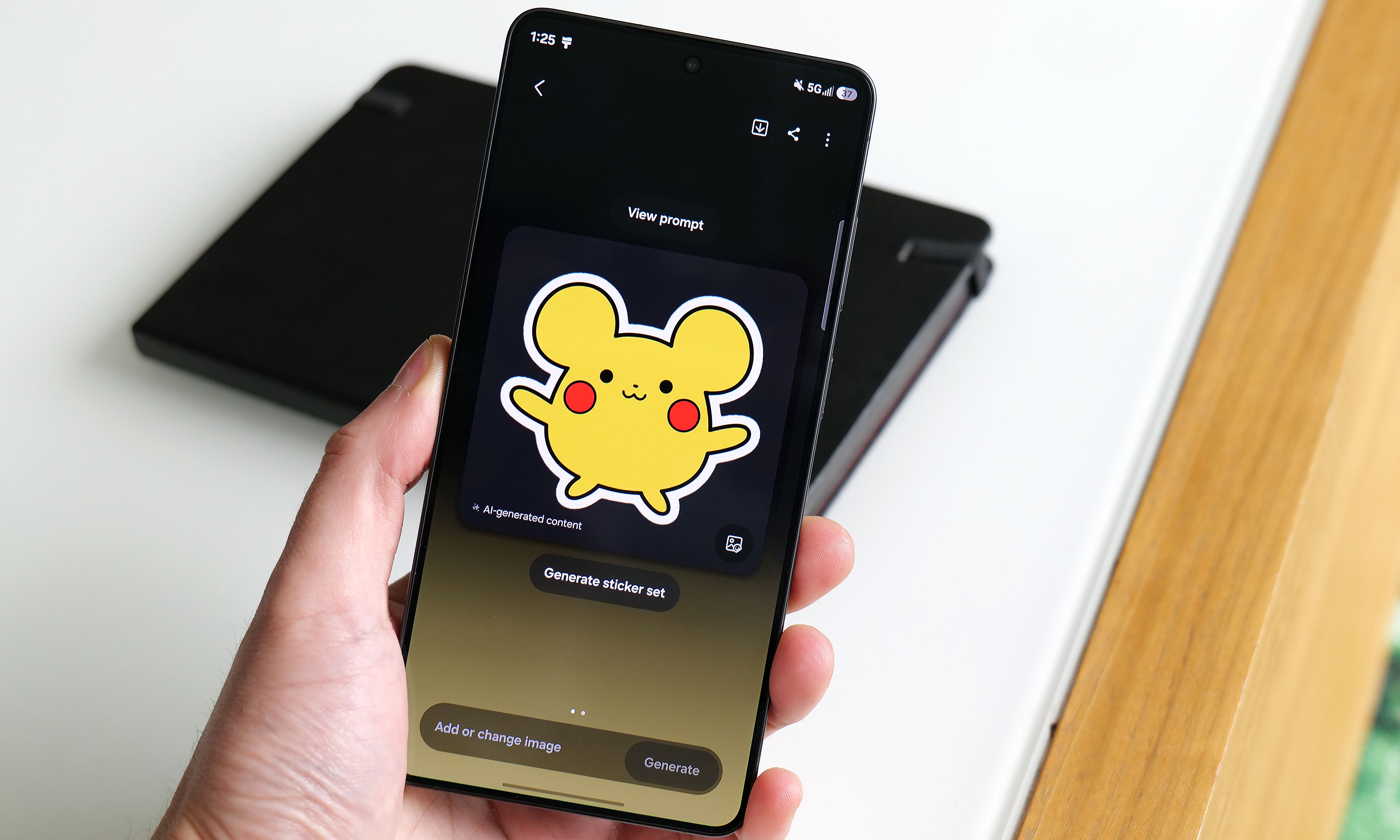
Apparently this is what Samsung's AI thinks a Pikachu sticker should look should look like.
Sam Rutherford for Engadget
The main engine powering the S26 Ultra is Qualcomm's Snapdragon 8 Elite Gen 5 chip for Galaxy along with 12GB or 16GB of RAM and up to 1TB of storage. Its biggest strength lies in its improved NPU, which is 39 percent more powerful than the previous generation, paving the way for improved AI-based features. That said, the rest of the processor provides some nice but not especially impressive gains in processing speed. Its CPU boasted 19 percent better performance while its GPU is around 24 percent beefier. In Geekbench 6, this translated to a multi-core score of 11,240 for its CPU (up from 9,828 on the S25 Ultra) and a GPU score of 25,403 (up from 19,863). Granted, it's not like its predecessor ever struggled with performance, but it's still worth noting that this is essentially as fast as an Android phone can get right now.
Of course, as we progress deeper into the AI era, Samsung has come up with a boatload of new and improved AI-powered tools as well. The most useful of these is Photo Assist, which serves as a one-stop shop for all your editing and content creation needs. In addition to fixing things like reflections or deleting objects in an image, you can use natural language text prompts to generate completely new elements like hats for your pets or pretty much anything else you can think of. And if that's not enough, there's also Samsung's Creative Studio, which is a playground for making all sorts of fun digital art like wallpapers, stickers and greeting cards.
The S26 Ultra's Now Nudge feature uses AI to find and suggest relevant photos when you use the Samsung Keyboard.
Sam Rutherford for Engadget
Elsewhere, there's also an improved document scanner and a call screener that's better at blocking spam and robocalls. All told, they're welcome upgrades and they work rather well. Samsung even borrowed an idea from Google's Magic Cue with its Now Nudge feature, which can surface relevant photos based on context anytime you’re using the Samsung keyboard. Unfortunately, what’s arguably the S26 Ultra's coolest new feature, Automated App Actions, isn't available for another week. But the bigger issue is that almost all of these features are things we've seen before on rival devices like the Pixel 10 Pro. While they're nice to have, it's gotten to the point where these tools are more like table stakes for high-end phones nowadays instead of being reasons you might want to upgrade.
Cameras: The same sensors with some larger apertures
While the S26 Ultra has the same sensors as before, Samsung gave it wider apertures for its main and 5x telephoto cameras.
Sam Rutherford for Engadget
While the sensors on the S26 Ultra haven't changed since the previous model, Samsung didn't completely forget about photo upgrades. Alongside its 10-megapixel 3x telephoto, 50MP ultra-wide and 12MP selfie cam, its 200MP main cam and 50MP 5x telephoto camera have larger apertures at f/1.4 and f/2.9, respectively (up from f/1.7 and f/3.4). So on top of already being able to take excellent photos during the day, the UItra's primary shooter is noticeably better at night.
In a shot of some Transformers in a dimmed room, the S26 Ultra basically matched what I shot with a Pixel 10 Pro — aside from some minor differences in white balance. Details were sharp and Samsung's photo was less noisy, which is due in part to a change in the phone's image processing. But the most impressive example of the Ultra's improved picture quality was when I took a very challenging backlit shot of a Grogu doll, in which the S26 did a better job of exposing Baby Yoda's face compared to the P10 Pro. So even without new sensors, Samsung has managed to make an already great main camera just a bit better.
Battery life
The Galaxy S26 Ultra features a 5,000mAh battery, just like what we got on the previous model. That means it's largely relying on power efficiency gains from its new chip for improved longevity, which it delivers, but it's not a major leap. On our local video rundown test, the S26 Ultra lasted 30 hours and three minutes, which is only about half an hour longer than before. That said, considering the only phones that have fared better were the OnePlus 15 and 15R, it's hard to be upset about its overall runtime.
As for charging, the Ultra has gotten a big leap in speed (assuming you have compatible power adapters) compared to its less expensive siblings. When using a cable, it now supports up to 60 watts versus 45 watts for the S26+ or just 25 watts for the base S26. And it's a similar story when charging wirelessly, with the Ultra now capable of hitting 25 watts when plopped on a pad compared to 20 watts for the S26+ and 15 watts for the S26.
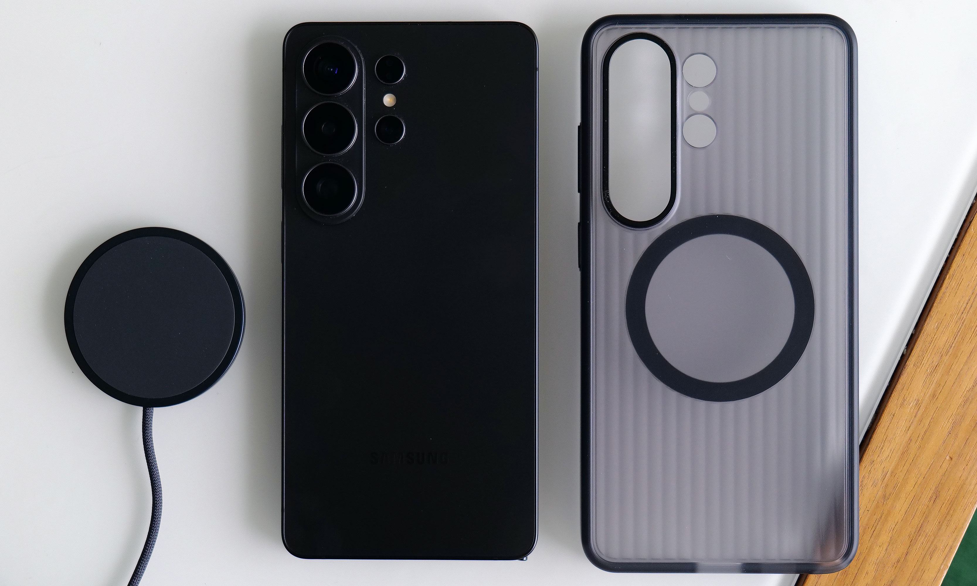
The S26 Ultra has significantly faster wired and wireless charging than its less expensive siblings. Though sadly, it still doesn't have a built-in ring for magnetic accessories.
Sam Rutherford for Engadget
The major annoyance is that Samsung still hasn't given any members of the S26 family a built-in magnetic ring for Qi2 charging or other magnetic accessories. The company claims this was done to help keep the phone as thin as possible, but honestly, I thought we had gotten over the desire for needless sleekness long ago. Sure, you can add that functionality back in by choosing the right case, but that's not a very premium experience and I sincerely hope this is the last time Samsung makes this omission on its flagship phone line.
Wrap-up
There's a strange feeling I often get when testing phones. After I got everything updated and set up the way I like, I noticed it even more with the S26 Ultra. The issue is that despite using a brand new device with shiny hardware, better performance and a more refined design, I'm still largely doing the same things and using the same apps as I was before (like Google Maps, Gmail and whatever my go-to mobile games are at the moment). This means my daily flow is basically unchanged from device to device.
This better be the last time Samsung skips putting a magnetic ring inside the Galaxy S line.
Sam Rutherford for Engadget
However, if you're paying attention, you'll notice things like higher framerates while gaming, sharper and more well-exposed photos at night and helpful suggestions like when the phone surfaces relevant photos in the middle of a text conversation. This goes double for the S26 Ultra, whose biggest upgrade — the Privacy Display — is something meant to stop other people from snooping at what you're doing. When it's on, you probably won't even be able to tell, which is kind of the point.
There’s no doubt that the S26 Ultra is an improvement over last year’s phone. It’s faster, it takes better low-light photos and thanks to all of its new AI features, the handset feels smarter too. But it takes a discerning eye to spot and feel all these differences, particularly if you’re upgrading from a device that’s only a year or two old. So while the S26 Ultra remains the top pick as a phone that can do pretty much everything really well, in the grand scheme of things, it’s more of a stealthy, undercover update than an eye-catching new crown jewel.
This article originally appeared on Engadget at https://www.engadget.com/mobile/smartphones/samsung-galaxy-s26-ultra-review-the-stealth-upgrade-140000629.html?src=rss
Nothing has announced its latest premium midrange device, the Phone 4a Pro. The company says it's the thinnest full-metal phone on the market, measuring in at 7.95mm. It also looks notably different from the prior A-series phones – and pretty much any of the company's phones to date.
It features an aluminum unibody while retaining Nothing’s retro-clear hardware design touches, with a clear, redesigned camera unit. Yes, the aggressively protruding circular camera unit of the Phone 3a Pro is gone, replaced with an oblong housing that houses the triple-camera array and a tweaked Glyph Matrix, similar to what debuted on last year’s Nothing Phone 3. It also feels incredibly premium – more so than even the company’s flagship phones.
Despite that, Nothing seems to be strikeinga balance between affordability and wow factor with the Phone 4a Pro. It has a slightly higher price tag ($499) than the 4a and alongside a major hardware redesign, a lot of the improvements here make this phone feel “pro” compared to its smaller sibling. This new premium vibe comes at a cost of design excitement, though.
It also looks a little like another certain smartphone or two. Don’t call it a camera plateau.
Image by Mat Smith for Engadget
The Phone 4a Pro has its own take on the Glyph Matrix, composed of 137 mini-LEDs. That’s fewer LEDs than the Nothing Phone 3, but they are 100 percent brighter at around 3000 nits. It supports pretty much all the Glyph toys we enjoyed on last year’s Nothing flagship, although the 4a Pro lacks a dedicated Glyph Button, which is a shame. This means in order to hop between toys and modes, you’ll have to dig into Glyph settings inside the settings menu – not the existing Glyph menu – in order to flit between them. Honestly, may make me less likely to play around with the Glyph, but I’ll have to see after further testing. It’s a little odd when there’s a circular metal detail on the lower left corner that looks like it could have been a Glyph button. Ah well.
The Phone 4a Pro will land in three different colors: silver, black and pink. The pink hue is tastefully subtle. So subtle, in fact, that you'd think it was the silver option. I like the black version.
The gigantic camera unit seen on the Phone 3a Pro is no more.
Image by Mat Smith for Engadget
The Phone 4a Pro has a slightly bigger screen than both its predecessor and the 4a, but the real news isn’t just the extra fraction of an inch. The 6.83-inch display can now reach 144Hz refresh rates, while it can also top out at 5,000 nits of brightness with HDR content. That makes it up to 66 percent brighter than its predecessor, and it was noticeably easier to read in Nothing’s harsh spotlights and daylight.
Nothing has further refined the cameras, and the 4a Pro uses the same telephoto sensor as the flagship Phone 3. That’s paired with a new 50-megapixel Sony LYT-700C camera sensor that’s 24 percent bigger than the 50MP sensor inside the 3a Pro. It’s also faster at auto-focus than its predecessor, and seems to more easily lock onto subjects without having to tap on what you want in focus.
There’s also a new triple 12-bit Image Signal Processor (ISP), which enables up to 140x ultra zoom, like we’ve seen on Galaxy phones for the last few years. Don’t expect to be blown away by those zoom extremes: it seems to work well on the easy-to-guess structures of buildings and patterns, but a 70x zoom range and higher aren't settings I'm going to lean into much.
I haven’t had time yet to fully scrutinize the 4a Pro’s camera, but there’s a lot of feature parity with pricier phones. It can capture super-slow 120fps video at full HD, while Action Mode is built directly into the camera app to shoot up to 30 Ultra XDR images in a row. Codeveloped with Google, Ultra XDR images are high-dynamic-range images that capture 13 RAW frames at different exposures and combine them into a single image. In practice, this should offer another way to pull usable shots from challenging low-light or harsh-light environments.
Power users may also like new presets, alongside Nothing’s own collection of camera filters. There are seven new editing options, letting you tweak (and save) contrast levels or even apply a vignette effect. I’m a fan of the built-in presets, but it’s nice to have access to the same camera settings to make and save my own B&W filter.
Nothing says you can expect 30 percent improved graphics performance and 27 percent faster CPU speeds, with “flagship” LPDDR5X memory, which makes it 100 percent faster than last year’s 3a Pro. Improvements to the chipset and memory speed weren’t immediately noticeable during my time seeing the device.
Image by Mat Smith for Engadget
Nothing continues to refine its own OS skin, but it’s still a refreshing, different take on the Android interface you’re used to. And if you’re not a fan, you can turn it back to a more stock look. Based on user feedback, there are new size options for the home screen widgets and a new custom lock screen. It may be due to the more powerful processor, but both the 4a Pro and the base 4a seem to have smoother animation flourishes when opening and switching between apps or swiping across content.
New AI software includes a formal launch of Essential Search, able to scour the entire device for information, images, documents, apps and more. The 4a series include the first Nothing devices to include cloud access for the still useful Essential Space app, housing your voice notes, screengrabs, text notes, and more. This means, hopefully, I can transition everything across from my Nothing Phone 3. (Or even between the Phone 4a and 4a Pro.)
Image by Mat Smith for Engadget
It’s a different look for Nothing, and the 4a Pro’s price (and timing) will pit it against both the Pixel 10a (priced the same) and base flagship devices from Samsung. The Phone 4a series pre-orders are open now at nothing.tech and other retailers, with sales of the Phone 4a Pro starting March 27. Expect our full review in the coming weeks.
This article originally appeared on Engadget at https://www.engadget.com/mobile/smartphones/nothing-phone-4a-pro-hands-on-price-launch-date-123053485.html?src=rss
Nothing is back with two new smartphones, the entry-level Phone 4a and the mid-range Phone 4a Pro. With the base 4a in particular, there’s no shortage of substantial hardware upgrades since the 3a, even if the design doesn’t quite stand out as much. This year, that’s apparently the role of the Nothing Phone 4a Pro. That said, the base 4a’s two new color options (blue and pink) are gorgeous additions to the usual monochrome duo of white and black.
There have been many upgrades since 2025’s Phone 3a. It comes with IP64 dust and water resistance, and is also physically tougher: Nothing says it has increased bend resistance by 34 percent, but I always considered all of the company’s phones pretty solid. The display also gets Gorilla Glass 7i, something I’ve wanted to see Nothing improve on its cheapest phones. My Phone 2a’s screen got pretty messed up when I tussled with my keys a few years ago. The 6.78-inch display is also 23 percent brighter than its predecessor, reaching 1,600 nits during outdoor viewing.
The main upgrades are centered around the cameras, marking a major improvement over what the Phone 3a last year. A new tetraprism periscope telephoto camera extends to up to 3.5x optical zoom, further than the base Phone 3a.
Image by Mat Smith for Engadget
Nothing says the main camera, with a new Samsung GN9 50-megapixel sensor, captures up to 64 percent more light than similarly sized camera sensors. The company has also upgraded its computational photography and tone mapping, which help it deliver on a new 70x ultra zoom mode, which beefs up your images with AI smarts. While it’s unlikely to be a regular feature for me, it’s still an option. It works well with straight lines and architecture, but don’t expect faces and nuanced detail at 70x zoom. But hey, sometimes you want that up-close picture of an iconic landmark. Fortunately, you’ll get up to a 7x lossless zoom by combining the 3.5x optical zoom with sensor cropping, which works well.
I’ve been testing the Phone 4a for a few days – because I can’t get enough phones – and noticed that photo image quality is noticeably better compared to the Phone 3a. Images have less noise and more detail, with the Phone 4a being far more capable in poor lighting conditions.
Image by Mat Smith for Engadget
The Phone 4a has a 1.5K (1,224 × 2,720) display, up from the full HD display (1,920 × 1,080) on last generation’s phone. It supports up to 120Hz refresh rates and has a peak brightness of 4,500 nits for HDR content. That resolution boost means Nothing’s meticulously designed UI and icons look sharper and everything is easier to see when using the 4a in the bright spring sunlight.
Nothing says the new Snapdragon 7s Gen 4 processor offers 10 percent better power efficiency, but what will make the Phone 4a go the distance is more likely the 5,080mAh battery – the biggest yet in Nothing’s midrange phones. Even the storage has been upgraded, with 47 percent faster read and 380 percent faster write speeds. I almost immediately clocked the improvement while attempting some light video editing and installing a few games.
This year’s Glyph system has turned into a Glyph Bar. It’s made up of 63 mini-LEDs in seven square lights in a row. These top out at 3500 nits, which is 40 percent brighter than the Phone 3a’s Glyph Interface. Over the years, I go through waves of loving Nothing’s take on notifications through to forgetting they’re there. Nothing is gradually adding more utility each year, and it’ll double as a notification tracker for a few select apps, like Uber, indicating how far away your ride is. The Glyph Bar can apparently double up as a fill light, although I couldn’t get that to work on my pre-release sample. I’ll update this story when I can test it out. Likewise, Nothing’s Playground of fan-made widgets and mini-apps isn’t entirely compatible with the 4a — at least not yet.
Image by Mat Smith for Engadget
The Nothing Phone 4a is an upgrade over its predecessor in every way – and the improvements are tangible, and I noticed them almost immediately – something that can be challenging with other phone refreshes. The display is crisper, as are the photos and video it can capture.
Like previous Nothing phones, despite the “global launch,” this phone won’t be headed to the US. However, in the UK, starting at £349 (roughly $467), it’s only marginally more expensive than its predecessor and you get a lot more bang for your buck. It’s also a good chunk of change cheaper than the $500 Pixel 10a. For those looking for an eye-catching, capable phone at a similar price, the Phone 4a’s biggest competition may be its bigger brother, the $499 Phone 4a Pro. Expect our hands-on for Nothing’s other phone very soon. The Phone 4a is open for preorders now at nothing.tech, going on sale starting March 13 next week.
This article originally appeared on Engadget at https://www.engadget.com/mobile/smartphones/nothing-phone-4a-hands-on-price-launch-date-111533547.html?src=rss
Back in January, Nothing shared that it wouldn't be releasing its flagship Nothing Phone 4 in 2026, and instead focusing on follow-ups to its midrange Phone 3a and Phone 3a Pro. After some expected teasing, those sequels have arrived: the Phone 4a Pro and Phone 4a. And like Nothing's previous devices, they seem like meaningful departures from what the company has tried in the past.
The Nothing 4a Pro represents the biggest change. Gone is the translucent back meant to offer a pseudo-glimpse into the internals of the phone, and in its place is a metal unibody design in black, silver or pink, and Nothing's Glyph Matrix interface, now even larger and brighter than it was on the Phone 3. Nothing describes the Phone 4a Pro as its slimmest phone ever, and on some level its reminiscent of the iPhone 17 Pro, but the changes in design and materials also support improvements to durability (the phone is rated for IP65 water resistance) and cooling.
Nothing
In terms of components, the Phone 4a Pro includes a 6.83-inch AMOLED display with 144Hz refresh rate, and a peak brightness of 5000 nits, and a 5,080mAh battery Nothing says should offer up to 17 hours of use. Like the Phone 3a Pro, the phone also includes four cameras, in this case a 50-megapixel wide lens, a 32-megapixel selfie camera, an ultra-wide and 50-megapixel periscope telephoto lens that's capable of 140x zoom, twice as much as the Phone 4a. While the phone doesn't include Qualcomm's flagship Snapdragon 8 Elite Gen 5 chip, Nothing opted to use the Snapdragon 7s Gen 4, which isn't as powerful, but should be capable of running Nothing's growing list of AI-powered features.
The Nothing Phone 4a was more heavily teased leading up to today's announcement, but still includes plenty of nice upgrades over the Phone 3a. The midrange smartphone evolves Nothing's trademark translucent design with new colors (white, pink, black and blue), IP64 dust and water resistance and an updated "Glyph Bar" that's brighter and now runs in a straight line next to the 4a's cameras. The Phone 4a has four cameras, a 50-megapixel wide that takes in 64 percent more light, a 32-megapixel selfie camera, an ultra-wide and a new 50-megapixel tetraprism periscope telephoto lens that's capable of a 3.5x optical zoom, 7x lossless zoom and up to a 70x ultra zoom.
Nothing
Like its more premium sibling, the Phone 4a includes an AMOLED display, though in a smaller 6.78-inch size, with a 120Hz refresh rate and a peak brightness of 4,500 nits. The display is covered with Gorilla Glass 7i, which is supposed to be twice as scratch-resistant as the previous generation, and even better for placing the phone face down. Internally, the Pro's Snapdragon 7s Gen 4 chip and 5,080mAh battery also make the jump to the cheaper phone.
Nothing says both phones will ship with Nothing OS 4.1, which includes Essential Search for looking up information across apps, personalized results based on your saved "Memories" in Essential Space and Nothing Playground, an app for using AI to create custom widgets. Nothing OS 4.1 is based on Android 16, and Nothing says Phone 4a and Phone 4a Pro owners are guaranteed three years of Android updates and six years of security patches.
Global pre-orders for the Phone 4a begin today, and the phone is available in three different configurations depending on your region and the amount of RAM and storage you want. The Phone 4a starts at €349 for 8GB and 12GB and can cost as much as €429 for 12GB of RAM and 256GB of storage.
While the Phone 4a Pro will be available globally, the fancier of Nothing’s two new phones is the only one coming to the US. The Phone 4a Pro will be available to pre-order starting March 13, and will either cost $499 for 8GB of RAM and 128GB of storage or $599 for 12GB of RAM and 256GB of storage.
This article originally appeared on Engadget at https://www.engadget.com/mobile/smartphones/nothings-phone-4a-pro-picks-up-flagship-features-and-an-even-brighter-display-for-499-111500926.html?src=rss
Over the past few years, Google's A-series Pixel phones have consistently been some of the best midrange phones you can buy. But with the AI boom causing memory shortages and the price of consumer electronics to rise, including smartphones, affordable devices like the Pixel 10a are more important than ever. Thankfully, Google's new phone still represents great value, even if it doesn't come with many upgrades.
Design and display
As before, the Pixel 10a has a 6.3-inch 120Hz P-OLED display.
Igor Bonifacic for Engadget
The story of the Pixel 10a is one of small changes, so let’s start with the outside. The phone is available in four colors: lavender (pictured), berry, fog and obsidian. Photos don't do the lavender color justice. In person, the light refracts beautifully off the surface of the aluminum frame and composite back. The back of the phone also has a pleasing matte finish that made the 10a feel secure in my hand. Another nice touch is that Google shaved down the camera module further, so that the 10a can now lie completely flat. As before, the entire phone is rated IP68-certified against dust and water. For DIY enthusiasts, Google has said it redesigned the 10a's internals to make it easier to repair. Hooray for that.
Beyond those changes, the 10a has a brighter 120Hz P-OLED screen that offers up to 3,000 nits of brightness, up from 2,700 on the 9a. The display also offers better protection against scratches and drops thanks to Google's decision to switch to Gorilla Glass 7i for the screen coating. Despite the minimal changes, there's not much to complain about here. The 10a's screen is fast, responsive and vibrant. The on-screen fingerprint sensor is also in an easy-to-reach spot toward the middle of the phone. After reviewing severalbigphones in recent months, it was also nice to go back to a handset with a sensible 6.3-inch footprint.
Performance and battery
The speakers on the Pixel 10a could be stronger and more defined.
Igor Bonifacic for Engadget
I've been spoiled recently by phones like the OnePlus 15R, which offers a 7,400mAh battery and 55 watt charging out of the box. By that metric, the Pixel 10a, with its 5,100mAh battery, leaves something to be desired. Putting the phone through Engadget's video rundown test, it ran for 28 hours before the battery died, which is exactly where the Pixel 9a landed last year. However, that score means the 10a is thoroughly middle of the pack when it comes to battery life. I can also see battery life becoming a concern as the phone ages. While that's true of every phone, the 10a's smaller battery makes that more of a pressing concern since you'll be charging the phone more often and therefore degrading the battery faster.
Google has improved wired charging speeds, with the new phone capable of charging at 30 watts, up from 23-watts with the 9a. You'll need to provide a compatible power adapter though; the Pixel 10a doesn't come with one inside the box. With a 30 watt charger, the 10a's battery went from dead to about 50 percent in under 45 minutes. A full charge takes approximately an hour and 45 minutes. Again, not great, but serviceable.
Another disappointment is that the Pixel 10a doesn't support Google's new Pixelsnap standard. Wireless charging is faster on the new phone (it's now rated at 10 watts, up from five), but without a compatible third-party case, a charging puck won't magnetically align with the back of the 10a. It's not a dealbreaker, but Pixelsnap would have been a great addition.
The 10a has the same chipset Google used on the Pixel 9a, the Tensor G4, and the company has once again gone with 8GB of RAM. Other midrange phones like Samsung Galaxy S25 FE offer faster chips, but they also cost more. Moreover, I didn't feel like the 10a was worse for running on old silicon. The new 120Hz display does a lot to make the new phone feel snappy, and Google's in-house Android skin feels responsive as ever.
The 10a also does a commendable job of keeping heat in check. I sat down to play Diablo Immortaland even after an hour of playtime, the phone was still cool to the touch despite running the game at high settings and 60 frames per second.
Cameras
This time around, the Pixel 10a has a camera module that's flush with its body.
Igor Bonifacic for Engadget
The 10a comes with the same camera package as its predecessor. On the back, you get a 48-megapixel main camera with an f/1.7 lens that offers optical image stabilization and phase detection autofocus. Complementing it is a 13MP ultrawide with a 120-degree field of view. For selfies, you get a 13MP camera with an f/2.2 lens. As ever, Google's software is doing most of the heavy lifting here. That includes a pair of new features, Camera Coach and Auto Best Take, that debuted with the Pixel 10 series.
Camera Coach, like the name suggests, uses AI to analyze the scene you're about to capture, and offers tips on how to best compose and light the shot. It will also suggest the best camera mode for the job. While I can see how this tool could be useful, I found the fact it relies on a cloud model made it too slow for some situations. For example, when I used Camera Coach to help me snap a photo of my cat, a sassy tortoiseshell, she walked away by the time the 10a got a response from Google's servers. In more static scenes, Camera Coach is more useful, but much of photography is about capturing a fleeting moment in time, so its utility is limited.
Auto Best Take solves a problem I'm sure we've all experienced. You go to take a group portrait, and snap multiple frames to ensure everyone looks good, only to end up without a single usable shot. With Auto Best Take, Google promises to combine similar group photos so that everyone looks their best. This feature works as advertised.
Outside of those features, the 10a offers a predictably great camera experience. The phone consistently produces photos that are sharp with great natural colors. That said, I did miss having a telephoto camera, as you can see from the photos I shot during a recent Cat Power concert in Toronto. Given the 10a only costs $500, it's hard to fault Google for not including one.
Software
The Pixel 10a's side button can both activate Gemini and the phone's camera.
Igor Bonifacic for Engadget
Out of the box, the 10a comes with Android 16. Like all of Google's recent Pixel devices, the company has promised to support the 10a for an industry-leading seven years with software updates and security patches. The company's pledge includes Pixel Drops, which often bring new software features. One feature Google has brought over from the more expensive Pixel 10 line is Satellite SOS, which allows you to call for help during emergencies, even when your phone can't connect to a cellular network. Outside of a demo designed to make users aware of the feature, I wasn't able to test Satellite SOS (thankfully).
Notably, the 10a is still missing Google's Screenshots app. That's unfortunate since it's one of the more useful Pixel exclusives, making it easier to organize all your online clippings. Other AI features such as Gemini Live and Circle to Search are accounted for, and as useful ever.
Wrap-up
Overall, the Pixel 10a is a great phone, though I would have loved to see more year-over-year upgrades.
Igor Bonifacic for Engadget
The Pixel 10a is a tricky phone to grade. On the one hand, part of me wants to dock points because Google has added so few updates. On the other, the 10a is still a great phone for $500, and at a time when consumer electronics are becoming more expensive by the day, the fact it hasn't gone up in price is a small miracle. Even if Google is partly responsible for the current memory crunch, the company's hardware division has delivered an affordable device that’s still worth recommending. The Pixel 10a is still the phone to beat in the $500 range.
This article originally appeared on Engadget at https://www.engadget.com/mobile/smartphones/google-pixel-10a-review-small-changes-but-still-great-value-173026779.html?src=rss
Apple just announced the MacBook Neo, a 13-inch laptop offering the full macOS experience for just $599. It is the machine, I’m sure, plenty of the company’s fans have been clamoring for since the dawn of the netbook. I’m equally sure its specs have enough drawbacks to ensure there are still plenty of customers for the more expensive Macbooks; the same cannot be said of the iPad Air.
If you’re looking for a machine that you can actually use meaningfully, the Neo has the Air beat. It has two USB-C ports, 16-hour battery life, a real keyboard, trackpad and the ability to run macOS with proper multitasking. $599 won’t even get you an iPad Air with a keyboard and trackpad, which costs you an extra $270.
Of course, the MacBook Neo is sandbagged in all of the ways Apple will always sandbag a cheaper product. But I do think the company has been smart enough to ensure the base model, which I’m sure will sell a crazy amount, is enough of a computer to matter. The A18 Pro chip will run a lot slower than Apple’s M-Series silicon but raw performance isn’t the big issue. After all, if you're buying this machine as Apple's version of a Chromebook, you’re not going to be compressing 55GB Final Cut Pro files here. This is a machine for light work, the sort of stuff the iPad was always meant to enable, but has never quite been able to.
Apple knows how its A-series chip stack up against low-end laptop CPUs. Given the differences in OS, it’s impossible to make a real comparison yet, but in synthetic benchmarks the A18 Pro outperformed the Intel Core i3-1315U found in plenty of low-end laptops, including the Framework 12. And the A18 Pro only needs 8W to run, compared to the 15W Intel requires, which helps maintain that lovely long battery life. Even with just 8GB RAM, if it can run macOS and its applications at an acceptable level, then you know it’ll go down beautifully with its intended audience.
As an aside, it’s worth saying the Neo’s intended audience is decidedly not the sort of folks who will quibble about the limited USB bandwidth the machine offers. As Devindra Hardawar said last week, the target market for this machine is the same people who bought Walmart’s MacBook Air M1. He also made the point — rightly — that macOS remains unburdened with all of the awful AI features which are making Windows use an increasingly less enjoyable experience. Even so, if you are quibbling about such specs, it’s not as if the iPad Air, with its one USB-C port, offers a meaningful improvement.
I've always hoped and wished the iPad would mature enough to bridge the gap between the tablet and the laptop, but it never did. What Apple did to solve the issue in the end was to just make a laptop as affordable as a tablet.
This article originally appeared on Engadget at https://www.engadget.com/computing/laptops/well-there-goes-any-reason-to-buy-an-ipad-air-165754581.html?src=rss
The iPhone 17e was announced on Monday through a press release, so there was no real chance to immediately get a hands-on with it. But at Apple’s event in New York today, the phone was on display alongside the new MacBook Neo, iPad Air M4, MacBook Pro M5 and Studio Display XDR. I managed to take it for a quick spin to see if it is truly as similar to the iPhone 16e as it appeared from pictures. Spoiler: It mostly is.
One of the most noteworthy changes to the iPhone 17e is the addition of MagSafe support, and aside from confirming whether that works, I don’t really have any impressions to add. I also can’t tell you at the moment whether the increased wireless charging speed makes a difference, although mathematically I have to imagine it would.
I did get a chance to try out the new Portrait photography here. I brought my iPhone 16e and tried taking portraits with both devices. I could immediately see that the iPhone 17e allowed me to apply an artificial background blur to pictures I was framing up of the new MacBook Air M5, whereas my iPhone 16e just said “No person detected.” In the Photos app, I was able to adjust the level of blur and adjust the focal point to bring a different group of flowers in focus, too.
The other thing I can tell from seeing the iPhone 17e in person is that this new pink color option is absolutely delightful. I won’t go as far as to call it stunning or vibrant — it’s too subtle to be either of those things. It’s almost the same shade of pink as the Pixel 3, except a bit rosier. I do really like this color, it’s understated and elegant.
Other changes include the stronger Ceramic Shield 2 covering the iPhone 17e’s screen, which is a step up from the Ceramic Shield on the iPhone 16e. Obviously I didn’t attempt to throw the new phone around at this event, and would not have been allowed to, so we’ll have to wait till I spend more time with a unit in the real world to better gauge its durability.
I’ll also work on testing things like battery life, charge time and performance improvements with the A19 chip in my full review. For now, my early look at the iPhone 17e tells me everything I expected is largely true, and that pink is a surprising scene stealer. The iPhone 17e retails for $599 and is available for pre-order now, with in-store and shipping arrivals slated for March 11.
This article originally appeared on Engadget at https://www.engadget.com/mobile/smartphones/iphone-17e-hands-on-pretty-in-pink-with-portraits-enabled-163946647.html?src=rss
Google unveiled its new features coming both to the Pixel line of devices and to the broader Android ecosystem this spring. Two of the more exciting additions for all Android devices are coming through the Find Hub. This can now be used to share real-time locations within Google Messages conversations or to send tracking information to airlines in instances of lost luggage.
With both of those features, users can turn off their sharing any time. Specific to the luggage issue, Google has partnered with 10 airlines to integrate Find Hub locations as part of their baggage recovery process. Using the luggage recovery does require the missing item to have a Find Hub-compatible tag or network accessory.
Another aesthetic update coming to Android is the ability to create a personalized Calling Card. You can choose a photo, font and color for your information that will be displayed to friends within Phone by Google. The short-form video trend is also coming to Google Play. The app storefront will now have a feed of Google Play shorts. It’s being positioned as a discovery tool for seeing different programs in action.
Google (modified)
The March Pixel Drop will bring improvements to the Circle to Search feature on smartphones. Going forward, it should be easier to use Circle to Search either to virtually try items on yourself or to shop for fashion from videos or social media posts. Magic Cue, an AI feature that debuted on the Pixel 10, can now also deliver restaurant recommendations. Pixel smartphones will also get some new personalized looks. Users can create AI-generated custom icons on the home screen with six different styles.
On the smartwatch side, Pixel devices will have new alerts if your phone is lost or left behind, as well as access to Express Pay. Pixel watches will also be getting some new safety alerts for earthquakes, and Satellite SOS is rolling out to more users across Europe, Canada, Hawaii and Alaska.
This article originally appeared on Engadget at https://www.engadget.com/mobile/smartphones/google-introduces-find-hub-updates-and-more-ai-tools-in-the-march-pixel-drop-190000773.html?src=rss
We’re at the start of another one of those weeks where Apple announces one or two of its lesser products each day. The first pair to break cover is the iPhone 17e and iPad Air M4, with more due to drop as the calendar rolls forward. The iPhone 17e is by far the more interesting gadget, especially as the price remained the same as for the iPhone 16e. Apple is charging $599 for the 17e, even though the base model storage has doubled to a very welcome 256GB.
The 17e also gains several features that were held back from the equivalent budget handset last year. The most notable is perhaps the addition of MagSafe at Qi2 speeds, enabling users to wirelessly charge their device at 15W. Keen-eyed spec-list nerds will also spot Apple’s C1X proprietary wireless chip, which offers comparable speed to the Qualcomm models it will eventually replace, but with far better power efficiency.
The iPad Air, by comparison, is the very model of a modern major iterative spec revision to keep it up to date. The M3 has been upgraded to an M4, and it’ll get the same home grown wireless chips (N1 and C1X), blessing it with Wi-Fi 7 compatibility. Apple is also adding some more RAM to the iPad Air, boosting it from 8GB to 12GB, but without adding any more digits to the price.
As someone who’s still clinging on to an iPhone 14, the generous storage and low cost of the iPhone 17e is intriguing. And it’s a far more attractive package than whatever Apple was trying to offer with the iPhone Air.
Lenovo rocked up to MWC to show off a concept laptop with hot-swappable components, letting users push around their keyboard and displays at will. The company says you can set up the hardware on your desk to suit your needs at any given time. So, if you need a standard laptop, you can do that, or you can put a second display where your keyboard should go and use your keyboard wirelessly. Sadly, it’s a concept, so while you can purr at Lenovo’s engineering prowess you can’t hand it any of your cash to properly own this thing.
Honor made its usual full-court press at MWC, but the star of its own show was the Robot Phone, due to launch later this year. It’s a smartphone with its own articulating camera gimbal which can move around in response to its user’s commands. The Morning After’s own Mat Smith says it’s able to shake and nod its, uh, “head,” and can even dance along to music. And that’s before you get to its real function to, you know, take photos and stuff.
The combined ParaSkyWarDisco would serve 200 million subscribers.
Paramount Sky CEO David Ellison has outlined his vision for his latest toy, Warner Brothers Discovery. He told investors both companies would merge their streaming services, giving it a global audience of around 200 million subscribers. Ellison also pledged to give HBO operational independence, hopefully meaning it won’t be staffed entirely by patronage appointees.
MWC is such a big show it would be impossible to cover everything we’ve reported on in a single newsletter. But, thankfully, we’ve built a roundup of the most important things for you to peruse, especially all of the biggest phones that you aren’t as likely to see on store shelves in the US.