OpenAI introduces the Codex Micro, a compact keyboard designed to support productivity for Codex users. Developed in partnership with Work Louder, it features a customizable control system that allows users to assign specific actions, such as debugging or reviewing pull requests, to dedicated keys. This reduces repetitive navigation and simplifies task execution. Additional features, like […]
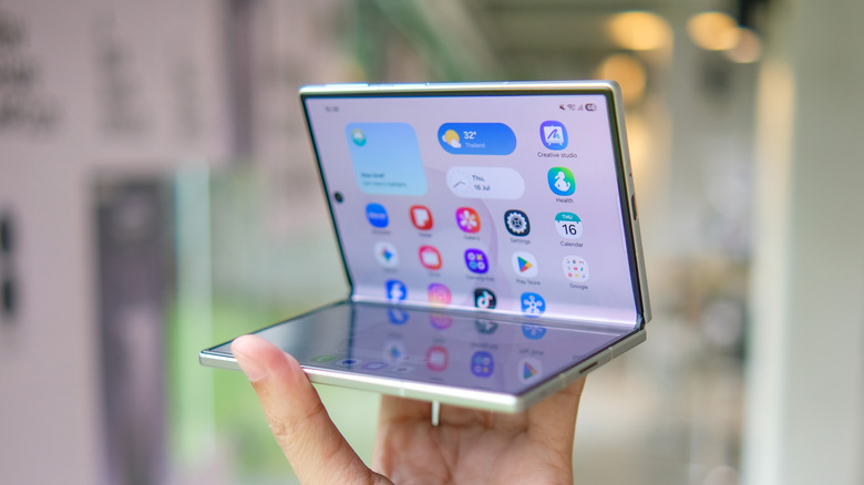
Samsung is poised to make a bold statement in the foldable smartphone market with the highly anticipated Galaxy Z Fold 8 and Z Fold 8 Ultra. Scheduled to debut at the Galaxy Unpacked event on July 22, 2024, these devices promise to elevate the foldable experience with innovative design, enhanced performance, and innovative features. With […]
Every new parent knows which household sounds can end a nap. The dishwasher at the wrong moment. A phone notification set too loud. Or the low mechanical hum of a cleaning robot that has no awareness of the three-month-old who just fell asleep six feet away. The usual workaround has always been the same: pause the schedule, rezone the map, or carry the robot somewhere farther from the nursery before the nap timer starts. Robot vacuums have become impressively good at reading floors. Reading the life happening above those floors has been a much rarer skill.
That is part of what makes Narwal’s Flow 2 White interesting. Yes, this is the brand’s 2026 flagship in a new pure white colorway built for modern, light-toned interiors. Yes, the industrial design has been carefully tuned around a quieter, more architectural presence in the home. But one of the clearest expressions of that thinking is Baby Care Mode, which supports quieter cleaning around nursery areas while toy recognition logs misplaced items on the map after each run. In other words, the design story here goes deeper than color. It is about a robot vacuum that has started adapting itself to the rhythms of the room.
The robot vacuum category spent most of the 2020s competing on suction numbers. 10,000 Pa became 20,000, then 31,000, and somewhere in that escalation the floors got clean enough that raw power stopped being an interesting conversation. The smarter brands pivoted toward perception: cameras, obstacle recognition, map intelligence, multi-floor awareness. That shift produced genuinely useful improvements. But the household as a social environment, full of schedules, sleeping infants, anxious pets, and the particular chaos of family life, has remained something the machine cleans around rather than one it genuinely accounts for. Most robot vacuums know how to move through a home. Far fewer seem designed around how a home actually feels.
Flow 2 White leans into that missing layer from the moment you look at it. Narwal’s new colorway is framed around what the brand calls a quiet luxury approach, and the visual cues back that up. The base station uses a frosted glass-textured front panel that catches and softens light rather than bouncing it harshly back into the room. A slim ambient status light bar communicates the robot’s state with a low-key visual rhythm. The semi-enclosed silhouette gives the dock and robot a more unified presence, so the whole system feels composed rather than pieced together. In homes shaped by pale wood, cream textiles, soft daylight, and open-plan layouts, that kind of approach shows how much Narwal sees their tech as functional decor built around their ‘quiet luxury’ ethos.
It also helps that the softer aesthetic is tied to behavior, not only appearance. Baby Care Mode returns the conversation from styling to use, because it shows how Narwal is thinking about domestic context in practical terms. A quieter cleaning mode around nursery areas is the sort of feature that immediately makes sense to anyone who has rearranged an entire evening around a sleeping child. Toy recognition adds another layer of household awareness, turning the robot’s mapping system into something slightly more useful than a floor plan with room labels. It starts to feel like a machine designed with family life in mind, rather than one designed in isolation and later dropped into it.
Underneath that calmer exterior, Narwal has kept the flagship hardware story intact. The proprietary FlowWash Mopping System uses a high-speed track mop that rotates at over 100 times per minute and delivers 140 degree Fahrenheit heated water to keep the mop clean throughout each cycle. On paper that reads like another premium cleaning spec. In practice, it addresses one of the category’s most persistent weak points: robot mops that push grime around after the first serious spill. Narwal’s treadmill-style self-cleaning approach feels aimed at that exact frustration, especially in kitchens, entryways, and pet-heavy homes where the mess changes texture by the hour. The Flow 2 White also carries 31,000 Pa suction, CarpetFocus technology, a certified detangling system for 0 percent hair tangling, and a self-emptying base station with up to 120 days of maintenance-free use. The visual language may be quieter now, but the performance story has not been dialed down with it.
The same goes for intelligence. Flow 2 White runs on the NarMind Pro Autonomous System, which combines an onboard AI processor with a cloud-based VLM Omni Model for broader object recognition and more adaptive obstacle handling. Plenty of brands now promise smarter navigation, but the difference increasingly comes down to how that intelligence is applied. Here, the system adjusts cleaning strategies based on what it detects, improves edge coverage, boosts overall efficiency, and reduces the amount of babysitting the robot needs from the user. Pet Mode detects pet-active areas for deeper cleaning and can help locate pets remotely with Find My Pet, while AI Floor Tag identifies valuable objects and sends alerts through the app. The result sounds technical, but the real appeal is simple: fewer interruptions, fewer rescues, and fewer moments where the robot behaves like it understands the map but not the home.
That may be the strongest case for Flow 2 White as a whole. It arrives at a moment when premium robot vacuums are all converging toward similar checklists of suction, mapping, self-cleaning docks, and AI-assisted navigation. Narwal’s opportunity here lies in pushing the conversation somewhere slightly more mature. The white colorway and quiet luxury detailing make the product easier to live with visually. Features like Baby Care Mode and toy recognition make it easier to live with behaviorally. Together, they point toward a category that is finally thinking beyond floor care alone.
The Narwal Flow 2 White will be available starting July 16 with a launch price of $1,099.99, discounted from its $1,499.99 MSRP through July 31. That places it firmly in flagship territory, where buyers expect strong cleaning performance, meaningful automation, and design that justifies the footprint such a device takes up in the home. For people living in bright, modern interiors, the visual refresh alone will have obvious appeal. For parents, pet owners, and anyone who has grown tired of appliances that treat the home like a test lab instead of a lived space, the more interesting story is the one underneath: a robot vacuum that seems increasingly shaped by the habits, moods, and messes of the people around it.
Power banks have progressed from mere portable battery backups to devices with many other practical features. To spice the market further, consumer tech company Belkin has launched the BoostCharge Pro Power Bank 10K in China, which includes a pop-up motion-sensing light.
The power bank from Belkin is now available for 329 yuan (approximately $49), but there is no word on whether or when it will be available outside of the mainland. If you can somehow get it from China, there are interesting features you will want to know. It comes with a 10,000 mAh battery and delivers 45W of fast charging. But that’s not all, the highlight is its built-in motion-sensing light, which can have multiple applications.
Whether you like to share your power bank or show it off, there is one for either need. Now, with the Belkin power bank, if you wake up in the middle of the night, sitting on the nightstand, it can light up and show you the way. The pop-up LED light onboard, can also light up dark hallways and illuminate your tent or camper when it detects movement.
The built-in light can be essentially helpful if you know the struggle of trying to slot a cable into the charging port in the dark. I struggle almost every day when my wife is asleep, and the battery’s dying on my phone after doomscrolling. The Belkin BoostCharge Pro Power Bank 10K can be a convenient addition at the bedside, illuminating my struggle and retracting back when the mission is accomplished.
Belkin is offering the power bank with a motion-sensing lamp in two vibrant colors: orange and blue. The 257g device measures 118 x 60 x 32mm in dimension and is powered by an airline-safe battery. Made with practicality in mind, Belkin has designed its power bank to be very versatile, with the light placed on the back. It’s circular and retracts into the power bank when unused. Even though the light is versatile, it lets users adjust its brightness using touch controls, whereas the motion sensor allows it to light up without fumbling for the switch in the dark.
In addition to the light and its versatility, the Belkin BoostCharge Pro Power Bank 10K features a small digital screen to display the remaining battery percentage. For connectivity, it has a braided USB-C cable that retracts neatly into the side. A second USB-C port can be used with a separate cable when you want. The device can deliver up to 45W when charging a single device. When you are using it to power two devices simultaneously, the output is divided between 30W and 15W. The power bank also supports USB Power Delivery and PPS.
Every speaker you own needs something. The Bluetooth speaker needs charging – and the charging case, and the cable for the case. The wireless earbuds need their own ritual before the music starts. The smart speaker needs a wall outlet, a WiFi password, and a company’s servers staying online on a Tuesday. The Battery-free Amplifying iSpeakers from Yanko Design need none of it. They need your iPhone and the physics of a sound wave moving through precision-machined metal, and that is the complete technical brief.
No battery. No Bluetooth. No electricity. No app. No pairing. No charging. Just your phone, a slot in a piece of metal, and the same acoustic principle that made the phonograph work before Edison’s power grid reached the average American home.
The Battery-free Amplifying iSpeakers use acoustic resonance – the same principle that powered phonographs before electricity reached the average home – to make your iPhone louder without touching a single cable or draining a single milliamp.
One Slot, A Louder Room
The amplification here is acoustic, not electronic. A phonograph built in 1877 used the same governing principle – a horn-shaped resonance chamber that directed and amplified sound waves using geometry rather than power. The iSpeakers apply that same physics, precision-machined into a metal chassis designed specifically to receive a modern iPhone. The phone’s speaker fires into the chamber. The chamber’s interior geometry redirects, focuses, and amplifies the sound wave. Music comes out measurably louder on the other side – with no battery depleting silently in the background, no Bluetooth connection to drop at the moment the song hits its best part, and no firmware to update before any of it works.
We placed a phone into the iSpeakers and left it there for a week on the desk. The first thing that registers is not the volume, it is the silence around the process. No pairing animation. No connection sound. No status LED cycling through colours. Phone in, music louder. Phone out, music stops. There is no standby mode because there is nothing to stand by. The speaker is a shaped piece of metal that does one thing through pure acoustic engineering, and it does it every single time without being asked twice.
The second thing that registers is the material. Metal sounds different from wood. The passive amplifier market is dominated almost entirely by handcrafted wooden alternatives – walnut, maple, bamboo, each with their own warmth and grain character. Metal amplifies differently: crisper, more present, with a clarity that wood’s natural porosity softens. Whether that is better or worse is a matter of what you are listening to and what you are listening for. As a desk object in a considered setup, it is audibly distinct from every wooden alternative in the category and visually distinct from all of them.
Built for the Desk That Has Everything Except One More Cable
The iSpeakers are available in Silver in two configurations: Speaker Only at $179 and a modified configuration at $299 for extended iPhone compatibility. The price is unambiguously at the premium end of a market, and it deserves the scrutiny that premium pricing invites.
What the $179 buys over the Etsy wooden alternatives – which start at $15 and top out around $60 for handcrafted versions – is precision-machined metal construction, iPhone-specific acoustic tuning, and a design that belongs on the same surface as a considered desk setup rather than looking like a craft project that migrated indoors. The gap between a $25 3D-printed passive speaker and this one is not a matter of degree. It is a matter of what category the object belongs to.
For the remote worker, the minimalist desk builder, or anyone who has spent real money getting every wire off the surface and every device intentional – a speaker that contributes zero cables, zero charging cycles, and zero connectivity requirements to that arrangement is not a convenience. It is the only version of a speaker that is actually consistent with that philosophy.
What We Like
Zero power required of any kind – no battery, no USB, no wall outlet, no Bluetooth radio, no WiFi; the amplification is entirely acoustic, which means it works at 3am in a power cut and never needs to be charged before a trip
Precision-machined metal construction delivers a distinctly different acoustic character than the wooden alternatives that dominate this category – crisper and more present, with a clarity that reflects the material’s acoustic properties rather than softening them
iPhone-specific acoustic geometry means the channel dimensions and chamber angles are tuned to the iPhone’s speaker placement rather than being universal and therefore approximate – specificity in passive amplifier design is not a minor variable
Instant-on, always-ready operation – phone in the slot, music plays louder; no pairing sequence, no app, no startup delay, no connection to lose; this is the simplest possible interaction model because there is no interaction model
Zero cable contribution to the desk – in a setup where cable management is the work, a speaker that adds nothing to that count is a different category of object than one that adds even one
What We Dislike
For this design the buyer has already decided that acoustic amplification, cable-free operation, and metal construction are the priorities – anyone arriving at this product from a Bluetooth speaker mindset will not find the value immediately obvious
iPhone-specific design is a strength acoustically but a limitation categorically – Android users, regardless of budget or intent, are not the audience for this product, and that is not stated prominently enough before purchase
The Speaker That Remembered How Sound Works
The Battery-free Amplifying iSpeakers do not fix a problem most people knew they had. They reveal one. Once your music plays louder through a piece of metal that asked nothing of your power bank, your charging cable, or your WiFi router – the Bluetooth speaker on the desk feels exactly like what it is: a device that solved a problem by adding four more problems underneath it.
For the audio-minded, it is a precision-machined object applying one hundred and fifty years of acoustic physics to a twenty-first century pocket computer, with the restraint to leave electricity entirely out of the conversation. For everyone else, the Battery-free Amplifying iSpeakers is a $179 answer to the question of why a speaker needs a battery in the first place.
Either way, once it earns its place on the desk, a charging cable will not be going back.
Frank Lloyd Wright hung a house over a waterfall back in the 1930s, and architects have been trying to one up that flex for nearly a century now. Most of them cop out with one dramatic overhang, snap the hero shot for the brochure, and call it a day. DeForest Architects wasn’t interested in that shortcut when they took on a one acre bluff above Puget Sound in Burien, Washington. Instead of picking a single showpiece moment, they let the whole house negotiate its steep, forested site room by room. Some volumes tuck into the hillside, others push out past the tree line, and the living room goes furthest of all, floating above the forest floor like a treehouse that happens to have a structural engineer on payroll. It’s a bold move, and somehow it never tips into spectacle.
Ore Studios handled interiors alongside DeForest’s architecture, and you can tell the two teams never stopped talking to each other, because the shell and the furniture never feel like separate decisions. Floor to ceiling windows framed in thick black steel wrap the living room, turning the surrounding pines into part of the interior instead of scenery you glimpse through glass. Decks stretch off both sides of that suspended room, one facing a woodland meadow, the other facing open water, so the house pulls off two completely different outdoor relationships without moving a single wall. A fireplace anchors the room dead center, and against an otherwise calm, dark palette, a red rug and a blue lounge chair do basically all the emotional heavy lifting. Toth Construction built it, and photographer Haris Kenjar’s shots make it obvious just how restrained the material story stays everywhere else the color doesn’t show up.
Designers: DeForest Architects (John DeForest, Michael Knowles), interiors by Ore Studios
Surrounded by trees on three sides, that living room earns the treehouse comparison honestly rather than just leaning on it as marketing language. The owners wanted something peaceful with room left over for surprise, which sounds like a contradiction until you see how DeForest solved it. Instead of piling on decorative flourishes, they varied elevation and let the forest do most of the visual work through all that glass. A red sofa cushion here, a cobalt lounge chair there, and the room reads as calm and lived in rather than staged for a shoot. It helps that the steel framing is thick enough to feel structural rather than decorative, which keeps the whole glass box from feeling fragile despite hanging in midair above the slope.
That same color language keeps traveling once you leave the living room, which is where a lot of ambitious houses start to lose their nerve. Blue dining chairs with slim metal frames pick up where the lounge chair left off, adding personality without competing with the water views outside. The kitchen sits just beyond, wrapped in walnut cabinetry that swaps the cool palette for something warmer and more tactile. Red accent panels show up again here, a quiet callback to the rug two rooms over, proof that DeForest and Ore Studios were working from the same script rather than improvising room by room. Nothing about the furniture distracts from the forest outside, which seems to be the entire design brief in a nutshell.
The most theatrical detail in the whole house doesn’t come from the glass at all, it comes from a staircase. DeForest based its red steel structure on the fire lookout towers that used to dot ridgelines across the Pacific Northwest, spare utilitarian buildings meant for spotting smoke before anyone else could. As it climbs through the house, the staircase echoes the actual climb up the hillside outside, turning a purely functional element into the closest thing the home has to a sculpture. It’s a small footprint, structurally speaking, but it carries an outsized share of the house’s personality. Painted a saturated red against white walls, it reads less like circulation and more like a piece the owners could have commissioned separately.
Upstairs, the bedroom dials the energy back down without abandoning the color story that runs through the rest of the house. Deep blues show up in the cushions and bedding, playing against grey and black finishes for something that feels genuinely restful rather than sparse. It’s the same restrained material palette found everywhere else in the home, just recalibrated for a room where the goal is sleep rather than entertaining. Large windows keep the forest close even here, so the connection to the site never fully disappears even in the most private room of the house. It’s a quieter moment, but it fits the same internal logic as everything that came before it.
Cantilevered houses tend to live or die by whether the drama feels earned or bolted on as an afterthought, and this one earns it. DeForest Architects and Ore Studios didn’t settle for one showpiece room and call the rest of the house filler, they built an entire structure that keeps renegotiating its relationship to a genuinely difficult site. The fire lookout staircase and the suspended living room could have each carried a project on their own, and here they exist in the same house without stepping on each other. Toth Construction gets credit too, since none of this works if the execution doesn’t match the ambition on paper. Burien, Washington isn’t exactly known as an architecture destination, but this house makes a decent case that it should be.
The convenience store has always been a place of small joys. A late-night hot dog, a 44-ounce Slurpee, a scratch card bought on impulse. But 7-Eleven just added something to that list that no one saw coming: a 1:64 scale 2017 Nissan GT-R (R35), draped in white livery, wearing the brand’s iconic green-and-orange logo like it was born into it.
Hot Wheels and 7-Eleven have teamed up before, and every time they do, the internet loses its mind a little. This year’s exclusive is the 2017 Nissan GT-R R35, a choice so specifically right that it almost feels too good to be a corporate decision. The GT-R isn’t just a car. It’s a cultural artifact, the vehicle that made an entire generation of gamers, gearheads, and anime fans fall in love with Japanese engineering. Choosing it for a convenience store exclusive feels less like a marketing move and more like someone in a boardroom finally got the reference.
Designer: Hot Wheels x 7-11
The design itself is clean and confident. Hot white, 7-Eleven branding running along the sides, and a set of 6-spoke rims that manage to look sharp even at this scale. Mattel has always been good at translating a car’s personality into miniature form, and this one lands well. The GT-R’s aggressive stance and wide haunches come through even when the whole thing fits in your palm. It doesn’t feel like a rushed licensing deal. It feels like a collectible that was taken seriously, proportioned carefully, and dressed with some actual intention.
The price is where the real cleverness lives. Retailing at $7.11, it’s a number that doubles as a receipt and a punchline, and I mean that entirely as a compliment. Pricing something at the exact numerical name of the store selling it is the kind of detail that makes you wonder why more brands don’t do it. It’s small, intentional, and memorable, the kind of thing you notice and file away simply because it made you smile.
Of course, the moment word got out, collectors mobilized. People were hunting these in-store at 2AM. Social media filled up with unboxing videos and “found it” posts. eBay listings appeared almost immediately, some going for double or triple retail. That pattern is exhausting and exciting in equal measure. It speaks to how deeply this kind of collaboration hits for a specific audience, and how quickly that enthusiasm can tip into a secondary market that shuts casual fans out before they even know the drop happened.
A chase variant is reportedly circulating as well, appearing roughly once in every hundred shippers. Finding the standard is already a small adventure. Finding the chase turns the whole thing into something approaching a ritual.
What makes this collaboration work, beyond the obvious nostalgia hit, is that it respects the cultures it’s drawing from. The GT-R carries genuine weight in car culture. Hot Wheels has decades of credibility as a collector’s brand, not just a toy. And 7-Eleven, despite being a global convenience chain, has cultivated a surprisingly earnest identity around moments of everyday delight. When those three things collide, you get something that doesn’t feel forced or cynical. It feels like three separate worlds sitting down together and actually enjoying the conversation.
I’ll be direct about this: limited retail exclusives are one of the most interesting design distribution strategies happening right now. Taking a well-made object and anchoring it to a specific physical space, a store, a moment in time, gives it meaning that an online drop simply can’t replicate. You had to be there. You had to walk into a 7-Eleven, scan the displays, and spot it. That friction is the point. It makes the object feel earned in a way that clicking “add to cart” never quite does.
Whether you’re a Hot Wheels collector, a GT-R devotee, or someone who just appreciates when design makes a weird, wonderful detour into your everyday life, this one deserves a second look. Or at the very least, it’s worth a late-night convenience store run.