The creator economy reshaped who makes content, and then quietly reshaped what tools are worth building. When millions of people are shooting, editing, scanning, and streaming from wherever they happen to be, the market for professional-grade hardware that works without a full production crew gets very real, very fast. That’s the underlying logic behind a lot of what’s in this roundup, running from portable LiDAR scanners and robotic camera arms all the way to ambient AI screens that sit on your desk and quietly keep track of everything.
Companionship, it turns out, is harder to engineer than most consumer tech companies have been willing to admit. Hengbot’s Sirius is a robot dog that owners can train like a real one, using a Creator Studio that requires no coding. Takway AI’s Sweekar hatches from an egg and grows through four life stages, shaped entirely by how its owner treats it. Mind with Heart Robotics built AnAn, a panda-shaped companion that has been piloted in eldercare and dementia care settings in Hong Kong and Shanghai. These are serious attempts at a genuinely hard question: what does it look like when AI lives with you, rather than just working for you? Here’s a look at some such brands and their innovative products at the Global Connect Show at IFA 2026.
INMO GO3: When Your Glasses Speak 98 Languages So You Don’t Have To
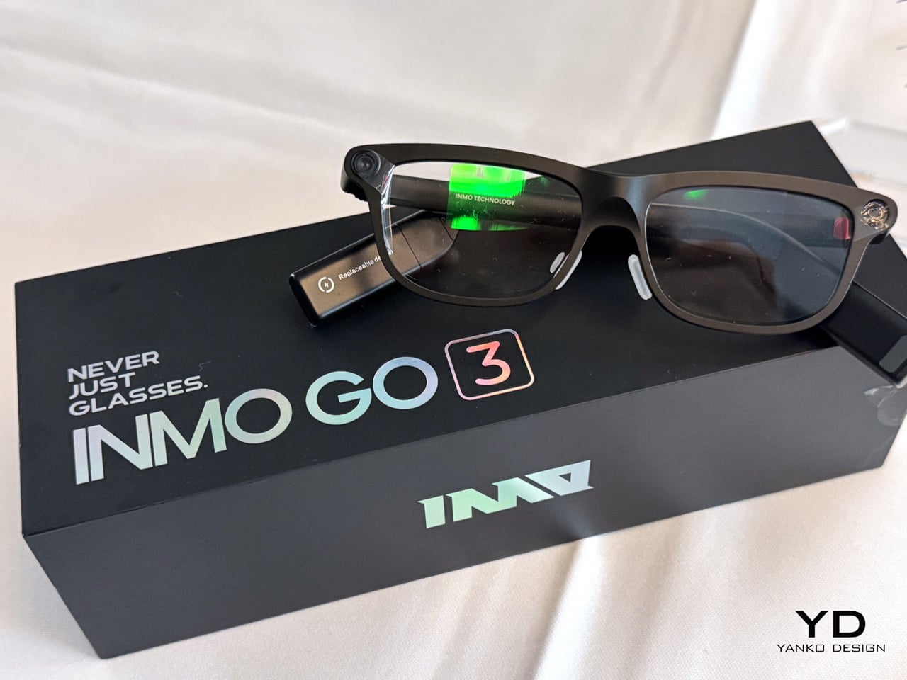
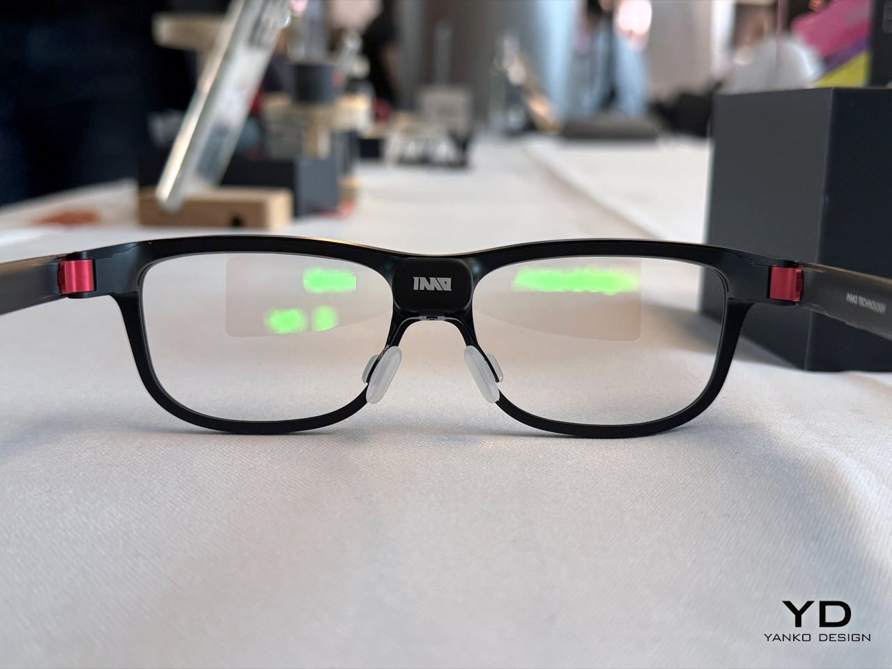
Smart glasses have had a rough decade of almost. Google Glass made everyone nervous at restaurants. The Ray-Ban Metas got people excited again, but a camera and a speaker do not a smart display make (not to mention the PR disaster they’ve been having this past year). INMO has been quietly chipping away at the real version of this category for a while now, with the Air series handling light office and audio-visual entertainment, and the GO series zeroing in on translation. The GO3 is that third iteration, and the brief is tighter and more useful than anything the brand has shipped before: a lightweight pair of glasses combining a discreet monochrome display with real-time AI assistance, in a form factor that resembles regular eyewear.
The translation engine handles 77 source languages and 98 target languages, with offline support for nine of them when you’re somewhere the internet has opinions about itself. The engineering detail that deserves more attention, though, is the battery system. Magnetic battery replacement takes approximately five seconds, and removed batteries automatically recharge in the case, enabling uninterrupted use throughout the day. The dual-eye green Micro-LED display with diffractive waveguide optics hits up to 1,500 nits at 640×480 resolution, staying visually discreet enough that nobody beside you would know you’re reading meeting notes. A built-in camera privacy cover physically shields the camera for more comfortable use in public or social settings, which is one of those small decisions that says a lot about how seriously a company has thought through the real-world context its product actually lives in.
Hengbot Sirius: The Robot Dog That Actually Learns New Tricks
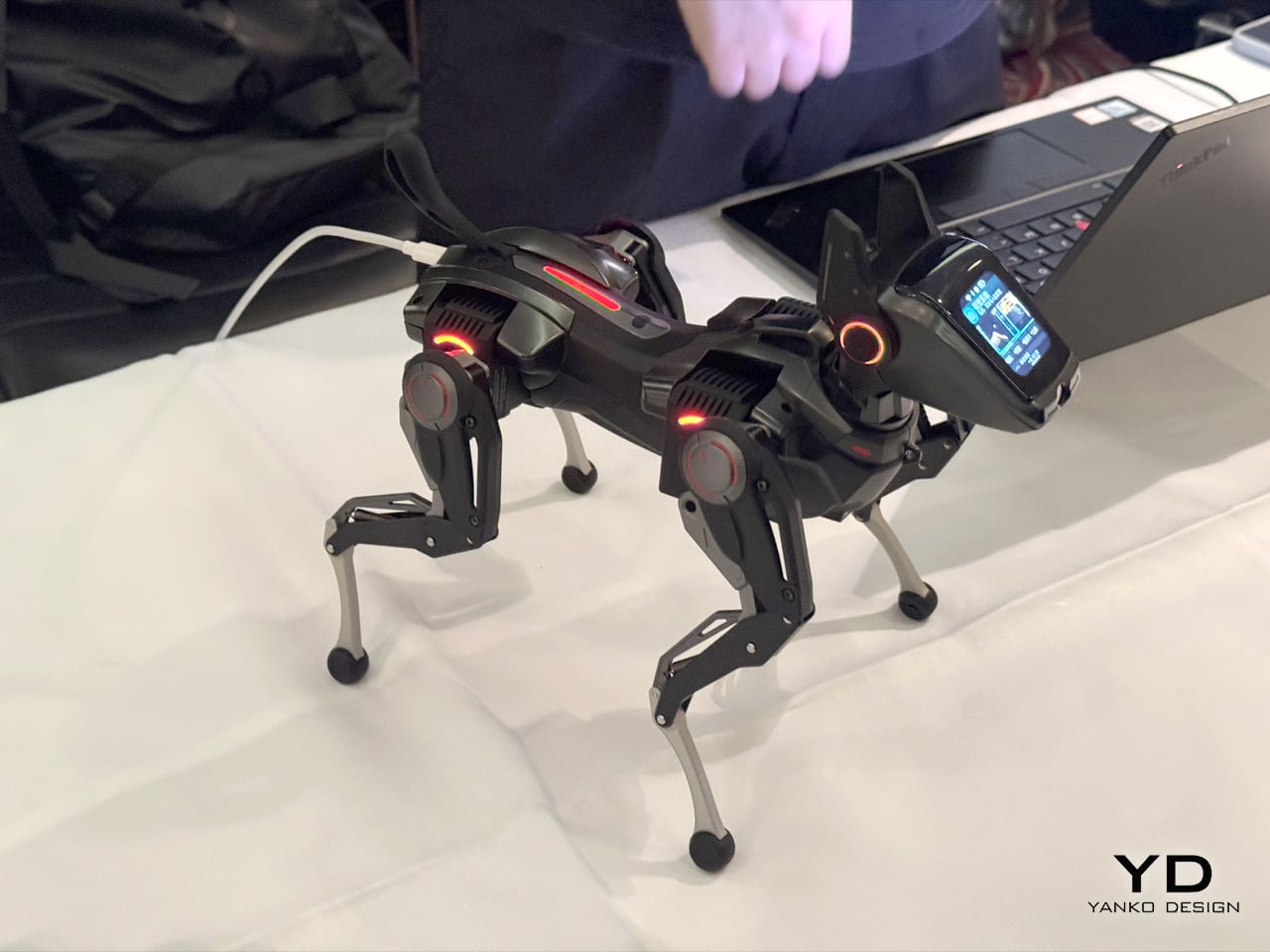
When we covered Sirius on Yanko Design last year, we noted that it sat in a gap the robot dog market had left frustratingly empty for years, somewhere between Boston Dynamics-level industrial machines that cost more than a car and toy-grade STEM kits that shuffled around like arthritic spiders. Hengbot filled that gap, and the Kickstarter campaign backed that read up with over $308,000 raised. At IFA, the story moves forward: the focus is on how continued development in voice interaction and motion control is making Sirius easier to communicate with and more capable in physical movement. You tell it to sit, move forward, or shake hands, and Sirius translates these instructions into physical actions, letting people interact with the robot without relying entirely on conventional controls.
The motion engineering is where it gets genuinely interesting. Rather than releasing physical force abruptly, Sirius can reduce it progressively, which allows certain movements and physical responses to feel smoother and less rigid while reducing sudden loads on the mechanical system. If it falls over, it can perform a recovery sequence and return to a standing position, recovering from common physical interruptions without requiring the user to reposition it manually. Packed into a body weighing just over a kilogram, with a removable 2,250 mAh battery, 30W PD charging, and developer support spanning Python, C, C++, and ROS 2 interfaces, Sirius is targeting consumers and creators in equal measure, which is a harder pitch to land than it sounds, and one Hengbot is getting noticeably better at making.
Rokid Glasses: The AI Glasses That Let You Choose Your AI
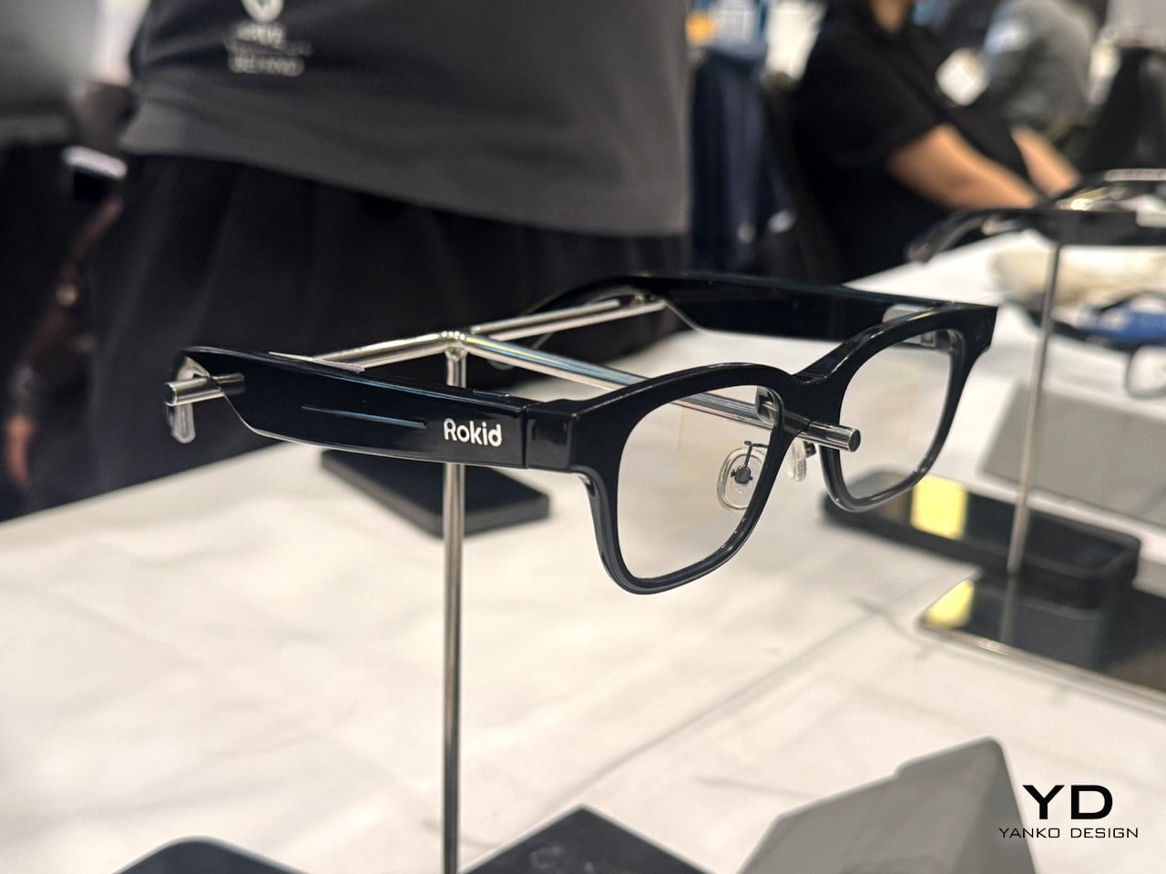
If the INMO GO3 is purpose-built around translation and teleprompters, the Rokid Glasses are playing a broader game entirely. Rokid has been in this space since 2014, long before smart glasses were a mainstream conversation, and we’ve covered the brand’s journey on Yanko Design from its early AR gaming hardware all the way through to a full profile on how it’s building the glasses that Google couldn’t. The Rokid Ai Glasses Style Pack, announced at CES 2026 and covered here in March, brings that decade-plus of development into what is comfortably the most ambitious feature set in the display-less glasses category. At just 38.5 grams, in a TR90 frame with titanium alloy hinges and a 12MP Sony IMX681 camera with electronic image stabilization, the hardware alone makes a strong case. The Power Capsule that comes bundled in the Style Pack delivers 6+ charges and gets the glasses back to 80% in 20 minutes, so battery anxiety largely exits the conversation.
Rokid is the world’s first manufacturer to natively support Google’s Gemini on a pair of AI smart glasses, with the Ai Glasses Style integrating both OpenAI’s ChatGPT and Google Gemini to answer almost any question. That’s not just a spec flex, it’s a genuine design philosophy – the glasses function as an open platform rather than a locked ecosystem, which is exactly the kind of thinking that will matter as AI models continue to evolve fast. The Agent Store, a centralized platform where developers can create and share AI apps for Rokid’s smart glasses, has already attracted more than 3,000 submissions for new agent workflows, with more than 400 agents published and available to users. Real-time translation in 89 languages, object and scene recognition, live transcription, and posture monitoring round out a feature set that makes these feel less like a gadget and more like a platform you happen to wear on your face.
Mind With Heart Robotics AnAn: The Companion Robot That Sits With You, Not For You
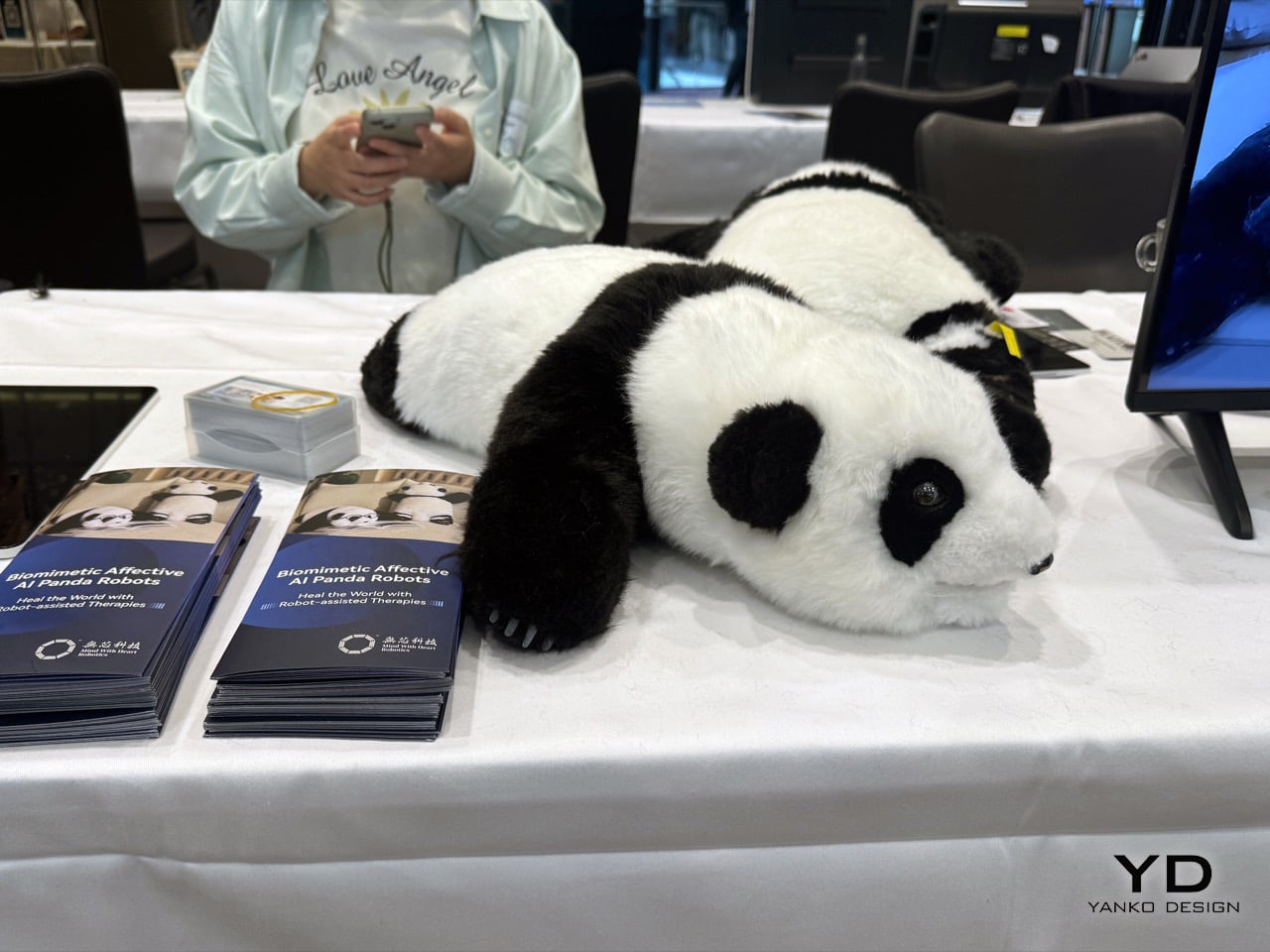
The conversation around companion robots has been building for a while on Yanko Design, from Sony’s Aibo to Hengbot’s Sirius to Sweekar, and a pattern is becoming clear: the more a robot is designed to perform, the less it feels like company. Mind With Heart Robotics took a different path entirely, and AnAn is the result. A panda-shaped companion robot built from soft, lifelike materials with full-body tactile sensing, AnAn is designed for companionship and elderly support first, and everything else second. The live demonstrations at IFA show AnAn’s full-body tactile sensing system responding to touch through gentle movements and emotional feedback, along with proactive interaction, gentle reminder functions, and its ability to learn a user’s interaction habits over time through long-term memory. That last part matters more than the spec sheet: a companion that actually remembers you is a fundamentally different product from one that resets. Mind With Heart Robotics develops emotionally intelligent companion robots across multiple form factors designed for emotional support, elderly companionship, children’s well-being, and institutional care, guided by its mission to Heal The World, backed by a patent portfolio of more than 30 filings and 18 patents granted to date.
IFA Berlin marks AnAn’s European debut, appearing at IFA’s official Robots on the Runway showcase, following its recognition as a CES 2026 Innovation Awards Honoree in the Artificial Intelligence category. The company is also debuting its Duncan Series companion robots in Europe, which are designed for neurodivergent children as well as typically developing children in early education. So the product family spans elderly care on one end and early childhood development on the other, which is a more considered and humane product brief than most robotics companies have attempted. AnAn goes on sale in Europe in September 2026 at retail pricing between $1,000 and $1,500, with distributor agreements already signed in Germany and Belgium, a completed production run of 100 units with samples available for immediate shipment, and a dedicated European repair and after-sales center in Belgium supporting customers across the region. The B2B version includes secure dashboards tracking behavioral trends and interaction patterns for care providers, meaning the product has been thought through at the institutional level too, for care homes, therapy settings, and clinical environments where the robot needs to report back as well as show up. Soft on the outside, seriously engineered on the inside.
XGrids Lixel CyberColor + PortalCam: The World Isn’t Flat, and Now Your Camera Knows It
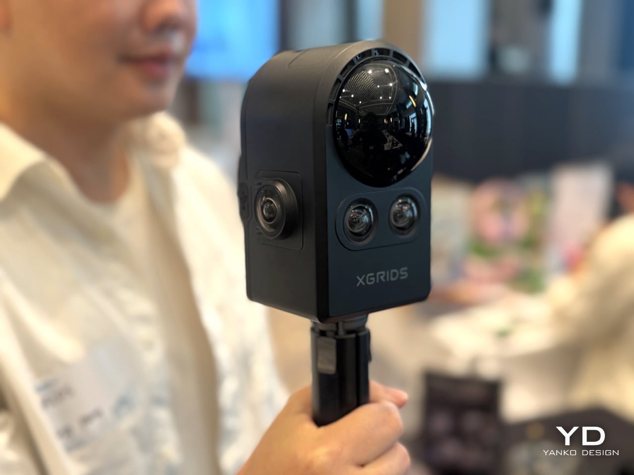
3D Gaussian Splatting sounds like something a physics PhD invented to win an argument at a dinner party, but it has quietly become one of the most consequential breakthroughs in spatial computing in years. The short version: rather than building a 3D scene out of polygons the way traditional CGI does, 3DGS represents a space using millions of tiny colored blobs, or “gaussians,” that together produce photo-realistic environments you can actually navigate through in real time. XGrids has been building its entire product stack around this technology, and the two products at IFA represent opposite ends of the same pipeline. The PortalCam is billed as the first handheld device that captures reality as interactive 3D environments using 3DGS technology, combining LiDAR, a four-camera array, and automated processing to create photorealistic spatial models you can walk through, edit, and share across platforms. At under 900 grams, it can scan 100 square metres in 10 minutes at walking speed. The LiDAR system fires 856,000 points per second across a 180-degree azimuth by 180-degree elevation field of view, while the four-camera array pairs two fisheye lenses with two front-facing cameras, each fisheye covering 200 degrees. That’s a lot of spatial data coming in very fast, from a device you can carry in a backpack.
The Lixel CyberColor platform, or LCC, is where all that captured data becomes something usable. It combines Multi-SLAM precision with optimized 3D Gaussian Splatting to create measurement-grade, photorealistic, lightweight 3D models, bridging the gap between technical accuracy and immersive visualization for professionals across industries. The compression story is particularly worth noting: a breakthrough 90% compression technology dramatically reduces file sizes without compromising quality, enabling smooth playback on cloud, edge, and mobile. That solves the problem that has always made spatial content impractical outside of specialized production environments, the files are simply too large to move around and too heavy to stream. Ready-made integration with Unity, Unreal Engine, WebGL via Cesium and Three.js, mobile apps, and XR applications means the output plugs directly into workflows that architects, game developers, and filmmakers are already using. And then there’s the surprise announcement at the show: LCC Scan, a new iOS application that enables users to transform ordinary photos and videos into detailed 3DGS models directly on their iPhones. The professional pipeline and the consumer entry point, both at IFA, in the same week. That’s a confident move.
Sweekar: You Don’t Train This Robot… You Nurture It.
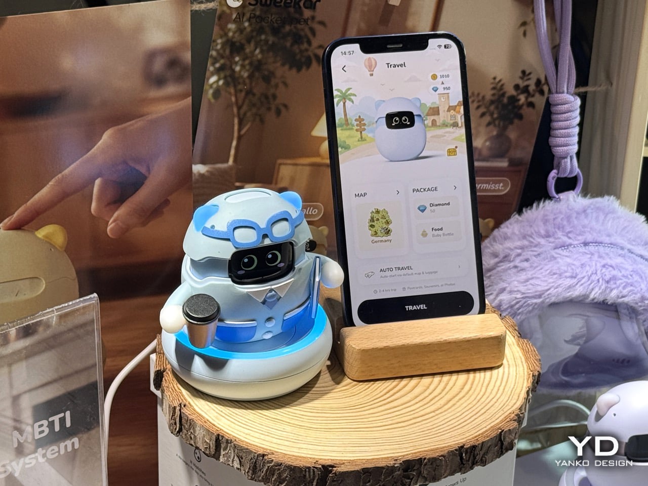
Hengbot’s Sirius is a genuinely impressive piece of engineering, a robot you put through its paces, teach tricks, and watch execute a controlled landing from an elevated surface. It rewards the tinkerer. Sweekar, from Takway AI, is asking a completely different question: what if the robot didn’t perform for you, but grew because of you? Not every AI companion needs to be a workhorse. Sometimes the whole point is that it just shows up, and keeps showing up. Sweekar is an AI pocket pet inspired by the iconic Tamagotchi, but rebuilt as a living, evolving AI companion. It hatches from a physical egg, grows through four life stages, and develops a personality shaped by the relationship you build with it. The growth mechanic has real engineering behind it: every interaction, feeding, talking, cleaning, picking it up, generates XP, and when Sweekar levels up, it physically grows a few millimetres taller, driven by a precision stepper motor, plays a special evolution animation, and unlocks new behaviors, new language, and new personality dimensions. That’s a stepper motor doing emotional labor, which is a sentence that shouldn’t work but somehow absolutely does.
The part that actually separates Sweekar from everything else in this category is the memory system. Most AI companions have the same gap: sessions reset, context vanishes, and the relationship never actually deepens. Users report the same frustration: it feels like starting over with a friendly stranger every single time. Sweekar’s long-term emotional memory retains the owner’s voice, daily habits, shared stories, favorite things, and small victories, and surfaces them naturally in future conversations. The longer you raise it, the more it sounds like it genuinely knows you. Voice recognition is trained specifically to the primary owner, and the personality develops through an MBTI-inspired behavioral framework, meaning two people who buy the same unit on the same day will have fundamentally different companions very soon, because every person raises things differently. At 89 grams it fits in a pocket, runs on a phone hotspot so it travels with you, and from Level 30 onward, Sweekar cannot die. The emotional investment compounds for years. What you build together is yours and it keeps going. That last detail is the one that sticks. Someone actually engineered emotional longevity into the product brief, and that’s worth paying attention to.
Navimow H5 Pro: The Robotic Mower That Finally Does the Edges
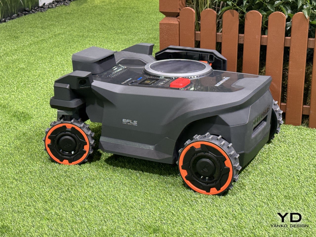
Robotic lawn mowers have gotten remarkably good at the easy 80% of the job and left everyone dealing with the same annoying leftover, the trim along fences, flower beds, and hedgerows that no autonomous mower could quite reach. Segway Navimow, the world’s No. 1 wire-free robotic lawn mower brand by retail sales volume for two consecutive years, built the H5 Pro specifically to close that gap, using a breakthrough EdgeMaestro extendable robotic arm for true zero-edge mowing. The arm pushes the cutting system out 7.7cm beyond the mower’s body, letting it trim flush against borders and obstacles instead of leaving that familiar uncut strip that sends homeowners out with a separate trimmer every weekend. It’s a genuinely clever mechanical solution to a problem that’s been treated as an acceptable limitation for years, mostly because nobody had bothered to engineer around it properly.
What makes the H5 Pro worth watching at IFA specifically is that this is Navimow’s first appearance at the show, after building its reputation almost entirely on the gardening and outdoor living expo circuit. That’s a notable shift in venue for a brand whose audience has traditionally been landscapers and homeowners rather than gadget crowds, and it says something about how robotic garden tech is increasingly being read as consumer tech rather than a niche horticultural category. The H5 Pro also carries a thermal sensor that protects hedgehogs and other small animals even in low-light conditions, a detail that fits Segway’s stated push toward mowing technology that’s thoughtful about the wildlife sharing the same lawn, not just efficient at cutting grass. Alongside the existing X4, H2, i2, and Terranox lines, the H5 Pro rounds out a lineup built for gardens of every size and complexity, and its arrival at a tech show rather than a gardening fair suggests Navimow is angling for a bigger, more design-conscious audience going forward.
QIVIKA Smart Scope: Photograph Saturn’s Rings, From Your Pocket
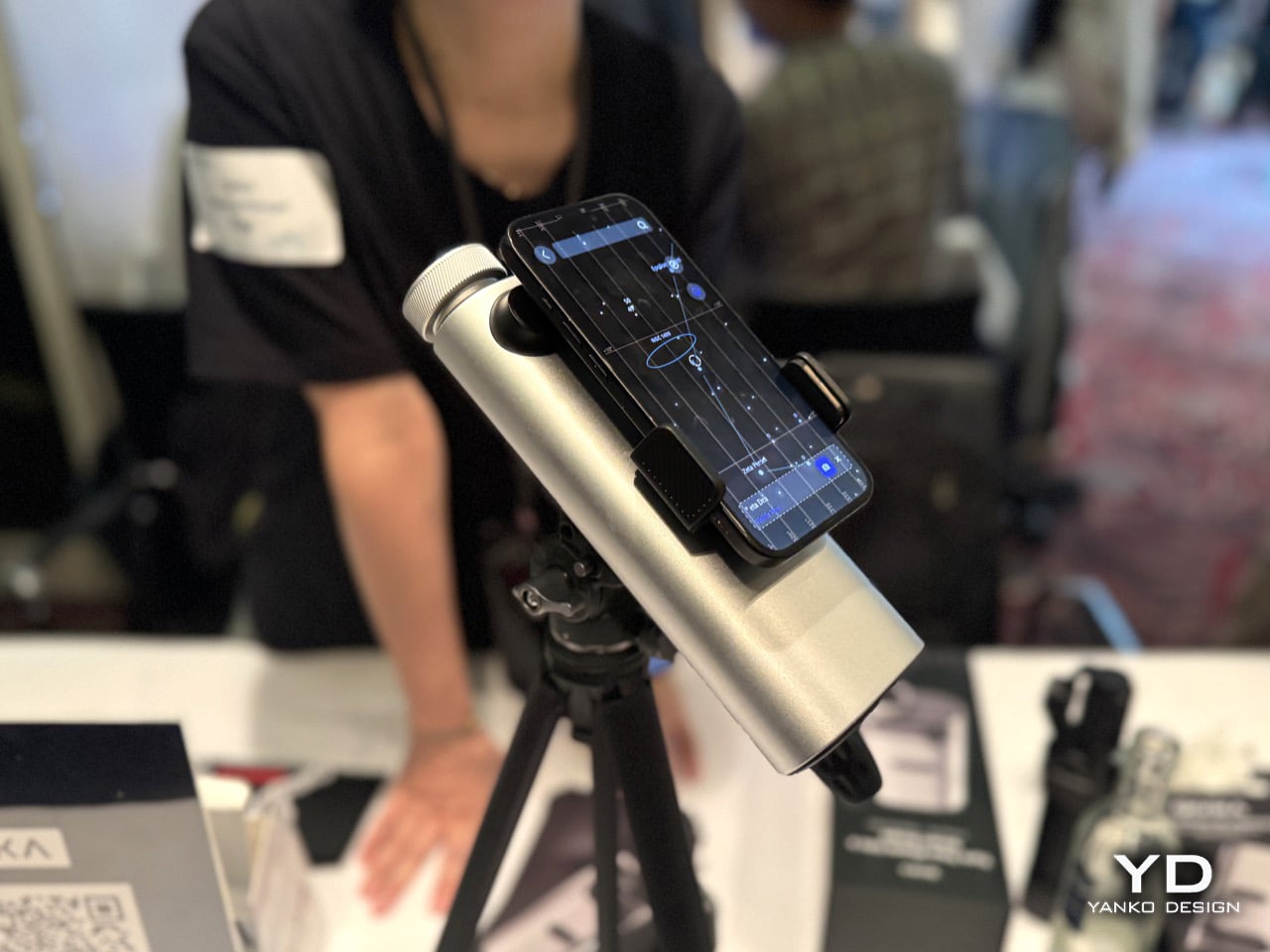
Smartphone camera hardware has had a wild few years. Periscope lenses pushed optical zoom past 5x, then 10x, then further, and the gap between a phone and a dedicated camera narrowed considerably. But there’s a ceiling, and the people who actually want to see lunar craters in detail, or pick out a bird species from 200 metres away, still had to choose between carrying dedicated optics that require setup and expertise, or making do with a phone camera that simply couldn’t bridge the distance. QIVIKA’s Smart Scope is a direct answer to that gap. Using a precision periscope optical architecture to fold the optical path into a compact form factor, it delivers 25x optical magnification and up to 3000mm equivalent focal length at approximately 300g, bringing high-performance long-range optics into a genuinely portable smartphone-based system. ED low-dispersion glass and multi-coated optics help preserve clarity and contrast, bringing distant subjects from lunar details to birds and wildlife within reach of a smartphone. That’s a meaningful spec for the price point, and the form factor is the real story: it clips onto your smartphone.
The hardware is only half the pitch. QIVIKA combines long-range optics with on-device AI composition. The AI analyzes the live view directly on the device and provides real-time framing assistance, helping users capture distant subjects more effectively, without cloud processing or an internet connection. This brings computational intelligence directly into the long-range imaging experience. The app splits into three intelligent shooting modes covering solar, explore, and deep sky use, with a Smart Sky Guide that overlays constellation lines and guides users to celestial targets with on-screen directional arrows, functioning essentially as GPS for the night sky. The birding side of the app is equally considered: AI identification supports 10,000+ bird species, while Life Lists, personal birding maps, community-shared locations, and observation records turn individual sightings into a growing personal exploration history. The whole experience is built around the loop of observe, capture, identify, remember, and explore, which means the product gets more valuable the more you use it, rather than plateauing once the novelty of the optics wears off. At $359 with a Kickstarter launch coinciding with IFA, it’s targeting exactly the kind of curious outdoor person who wants to look further without becoming an astronomer.
Yanhe Technology: The Solar Cell That Fits Inside Your Smart Glasses
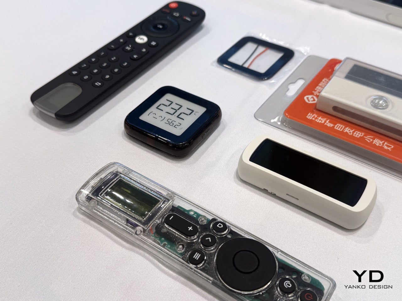
Most of the products in this roundup are end products, things you hold, wear, scan with, or talk to. Yanhe Technology is something different. It’s the infrastructure layer that makes the whole category more interesting. The pitch is elegantly simple: perovskite solar cells thin and efficient enough to build directly into everyday devices, so the smartwatch on your wrist, the AI glasses on your face, or the smart lock on your front door can top itself up from whatever light happens to be in the room. The indoor low-light power solution activates at an illuminance below 20 lux, achieves power conversion efficiency of more than 30% under low-light conditions, and carries an indoor service life exceeding 10 years, supporting devices such as keyboards, mice, smart locks, remote controls, AIoT sensors, and electronic shelf labels while reducing reliance on batteries or power cables. The component thickness sits below 0.5mm with an areal density below 0.15g per square centimetre, which means it conforms to curved and arbitrary freeform surfaces, including smart wearables and automotive aerodynamic contours. A module with a 1.7 square centimetre aperture can initiate power generation at just 20 lux, which is dimmer than most indoor spaces ever get.
The manufacturing story is what separates Yanhe from a university lab with a press release. The company has built the world’s first 100MW fully automated production line for consumer-grade perovskite modules, supporting 24-hour lights-out manufacturing, consistent product quality, and volume delivery. Yanhe is among the world’s first perovskite companies to receive TÜV Rheinland certification in accordance with IEC 63163. Its products are now available in more than 50 countries and integrated into the supply chains of over 100 brands, with collaborations established with Lenovo, Samsung, and Xiaomi. Founded in 2024 by a team out of Peking University and Columbia, that’s a remarkable amount of ground covered in a very short time. The bonus detail that makes this feel genuinely sci-fi: alongside its consumer business, Yanhe is developing perovskite photovoltaic solutions for space applications, has completed an engineering prototype of a flexible roll-out solar wing, and has begun ground-based engineering validation, with a satellite model and a space photovoltaic module also on display at IFA. So yes, they’re powering your keyboard from room light and also building solar wings for satellites. Just a Tuesday for Yanhe, apparently.
ACEMAGIC F9A Series: When the Server Room Fits on Your Desk
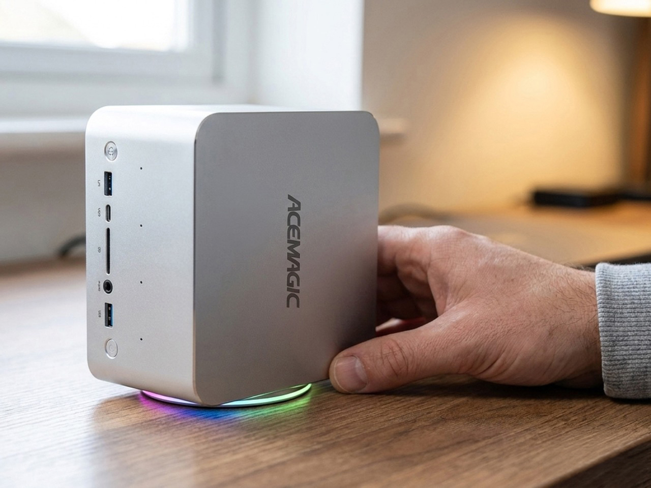
Running a local LLM at 200-billion-parameter scale on a 1.3-kilogram box that sits next to your monitor sounds like a footnote in a spec sheet, but the ACEMAGIC F9A Mini Workstation makes it the headline. The chassis comes in two configurations: the F9A-395 powered by AMD Ryzen AI Max+ 395 with 128GB of max memory at 8000MT/s, and the F9A-PRO 495 with AMD Ryzen AI Max+ PRO 495 scaling up to 192GB at 8533MT/s. On the AI inference side, the 395 supports up to 96GB of shared memory on Windows for MoE models up to 200B parameters, while the PRO 495 pushes that to 160GB of shared memory and models up to 300B parameters. Both variants share the same aerospace-grade aluminum unibody with a fingerprint-resistant finish, a hidden bottom air intake for improved airflow, and 3,000-plus ventilation holes across both sides for sustained full-power CPU performance. Keeping that thermal headroom intact is a five-heat-pipe turbo fan with a 3D air duct, sustaining 140W peak and 120W TDP without throttling during long-running AI workloads. OCuLink via PCIe 4.0×4 adds flexible expansion for external GPUs, compute cards, data acquisition cards, and industry-specific devices through an expansion dock.
The connectivity list punches well above the 2-liter form factor. Dual 2.5GbE ports handle high-speed wired data transfer for cloud computing and external services, while Wi-Fi 7 delivers twice the bandwidth of Wi-Fi 6 with support for 4096-QAM, Multi-RU, and Multi-Link Operation. HDMI 2.1, dual USB4, and DP2.1 combine to support four simultaneous 8K@60Hz displays for multi-screen creative setups. A quad-DMIC microphone array provides 360-degree far-field voice recognition with a built-in noise-canceling mic chip and 2W x 2 DTS speakers, making it viable for meeting rooms and home AI hubs. Dual M.2 NVMe slots on PCIe 4.0×4 support up to 8TB with RAID 0 and RAID 1 configurations, and both SSDs get thermal pads and aluminum plates for cooling. The broader pitch ACEMAGIC is making is a clean one: plug-and-play from a standard outlet, no server room, quiet and energy-efficient, a one-time investment with no recurring costs, and local processing for data security.
GEEKOM Mini PCs: The Mini PC That Makes Your Tower Look Embarrassed
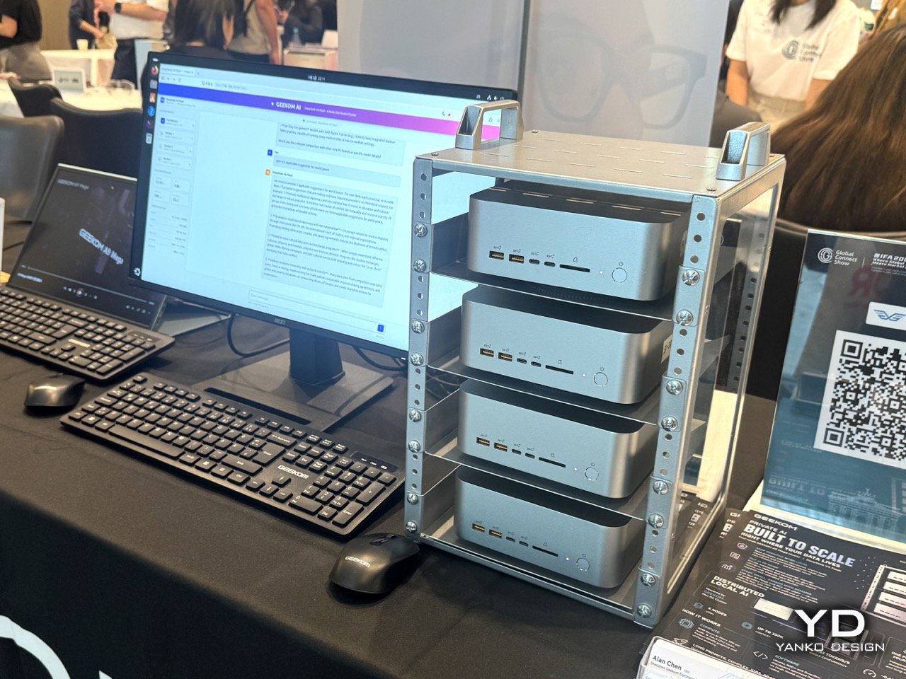
Mini PCs have had a quiet decade of steady credibility-building. What started as underpowered boxes for digital signage and light home-theater use has, thanks largely to AMD’s Ryzen and Intel’s latest mobile silicon, turned into a genuine alternative to full desktop builds for a surprising range of workloads. GEEKOM has been one of the more consistent players in that space, and we’ve covered the brand on Yanko Design before, noting that the case for a palm-sized PC has never been more compelling than right now, when the chips inside them have stopped making excuses. At IFA, GEEKOM is showing two products that sit at very different points on the performance spectrum, and together they make a pretty complete argument for the category. The A9 Mega is the AMD flagship, built around the Ryzen AI 9 HX 370 with its 12-core, 24-thread architecture, 50 TOPS of NPU performance, and up to 64GB of DDR5-5600 RAM. That NPU figure puts it squarely in Microsoft’s Copilot+ PC certification territory, meaning this is hardware built for the current wave of on-device AI workloads, local large language models, real-time transcription, and AI-assisted creative workflows, running entirely without a cloud connection.
The IT13 Max is the Intel counterpart, and it plays a slightly different game. Built on the Intel Core i9-13980HX, a 24-core, 32-thread processor with a 5.6GHz peak boost clock, it supports up to 96GB of DDR5 RAM and up to 4TB of NVMe storage across two M.2 slots. That memory ceiling is unusual for a device this size, and it’s what makes the IT13 Max interesting for professionals running virtual machines, large datasets, or memory-intensive creative applications who genuinely cannot justify a full tower but also cannot afford to compromise. Both units support triple 4K display output, meaning a three-monitor productivity setup from a box smaller than most external hard drives, which remains one of those specs that sounds made up until you’re actually looking at the back panel. GEEKOM backs both products with a three-year warranty, which is the unsexy detail that actually closes the deal for anyone considering replacing a desktop. The whole pitch across both machines is that raw performance and physical footprint stopped being a trade-off a while ago, and these are the receipts.
The post Smart Glasses, Robot Dogs, AI Tamagotchis, and Desk-Sized Supercomputers: How IFA 2026 Redefined Robots first appeared on Yanko Design.