Nomad’s Limited $135 Charger Matches Apple’s Boldest iPhone Color

Wireless chargers have largely been designed to disappear. Most of them are flat, black, or white, and perfectly content sitting out of sight somewhere near the outlet. A few have attempted to look more considered by borrowing from minimal Scandinavian design, though the result is often the same exercise in self-effacement. The idea that a charger could actually coordinate with the device it powers hasn’t really been taken seriously until recently.

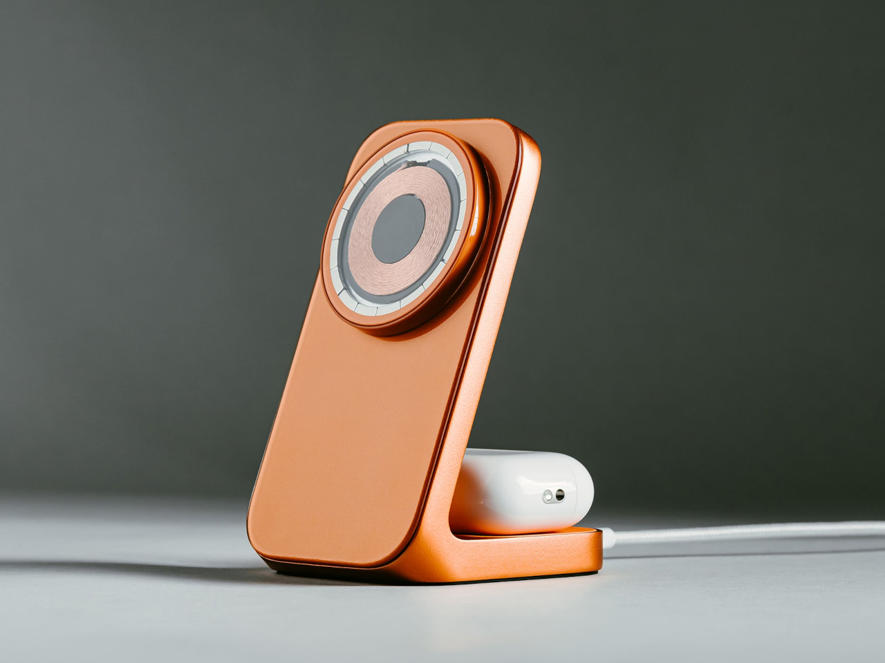
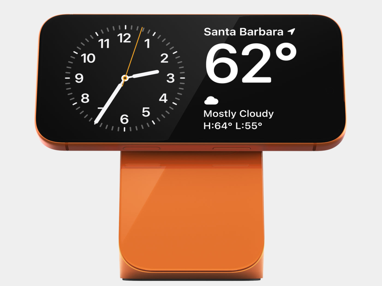
Apple’s Cosmic Orange finish on the iPhone 17 Pro changed that dynamic a little. It’s a vivid, opinionated color that doesn’t blend into the background, and it created an obvious opportunity for accessory makers to follow. Nomad has done exactly that with a limited-edition Stellar Orange version of its Stand One 4th Gen, a 2-in-1 charging hub built to match the iPhone’s finish almost exactly.

Designer: Nomad

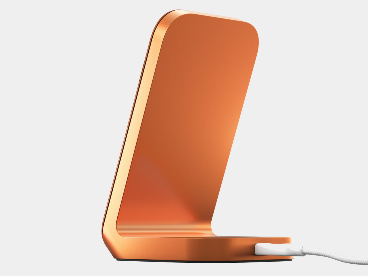
The Stand One itself has been around in more subdued forms, specifically silver and carbide, but the Stellar Orange version makes the charger a deliberate object on the desk rather than a neutral one. Set a Cosmic Orange iPhone 17 Pro on it, and the pairing reads as intentional, the kind of small visual detail that tends to catch people’s attention without demanding an explanation.

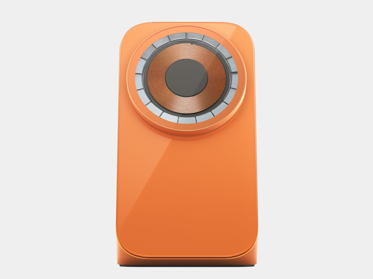
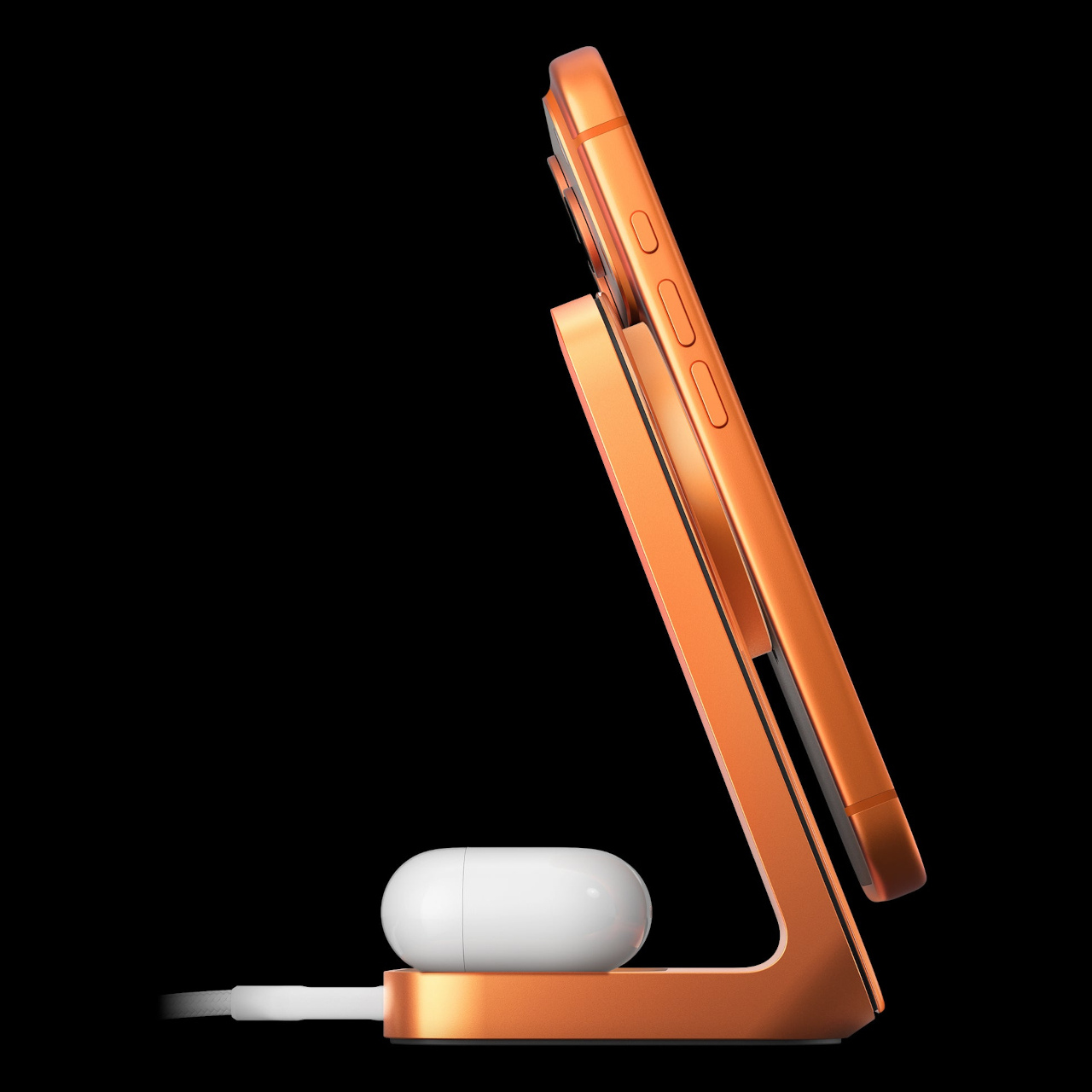
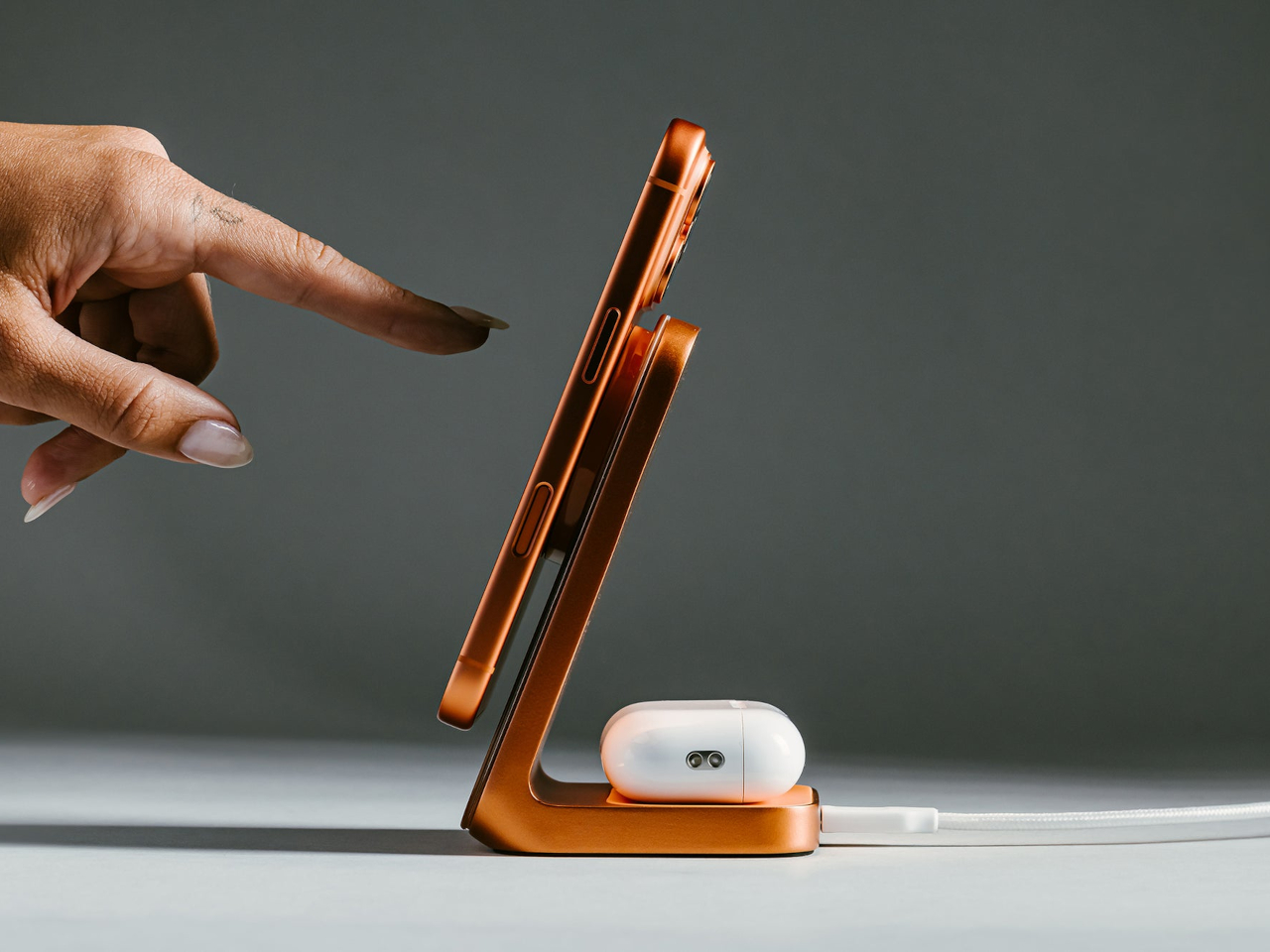
On the functional side, the Stand One 4th Gen charges via Qi2 at up to 25W, which puts it among the faster wireless options currently available for MagSafe-compatible iPhones. An upright MagSafe pad holds the iPhone at the right angle for StandBy mode, turning the desk setup into a live display for time, notifications, and widgets while the phone tops up. A rear Qi pad handles AirPods or any other wireless device at up to 5W.

The charger needs a 40W adapter to hit its peak output, which isn’t included at the $135 price point. That’s a familiar trade-off with premium chargers, and it keeps the base price competitive against similarly positioned alternatives without forcing the adapter cost on people who already own a capable brick. The metal and glass construction carries the build quality Nomad’s chargers are generally known for.

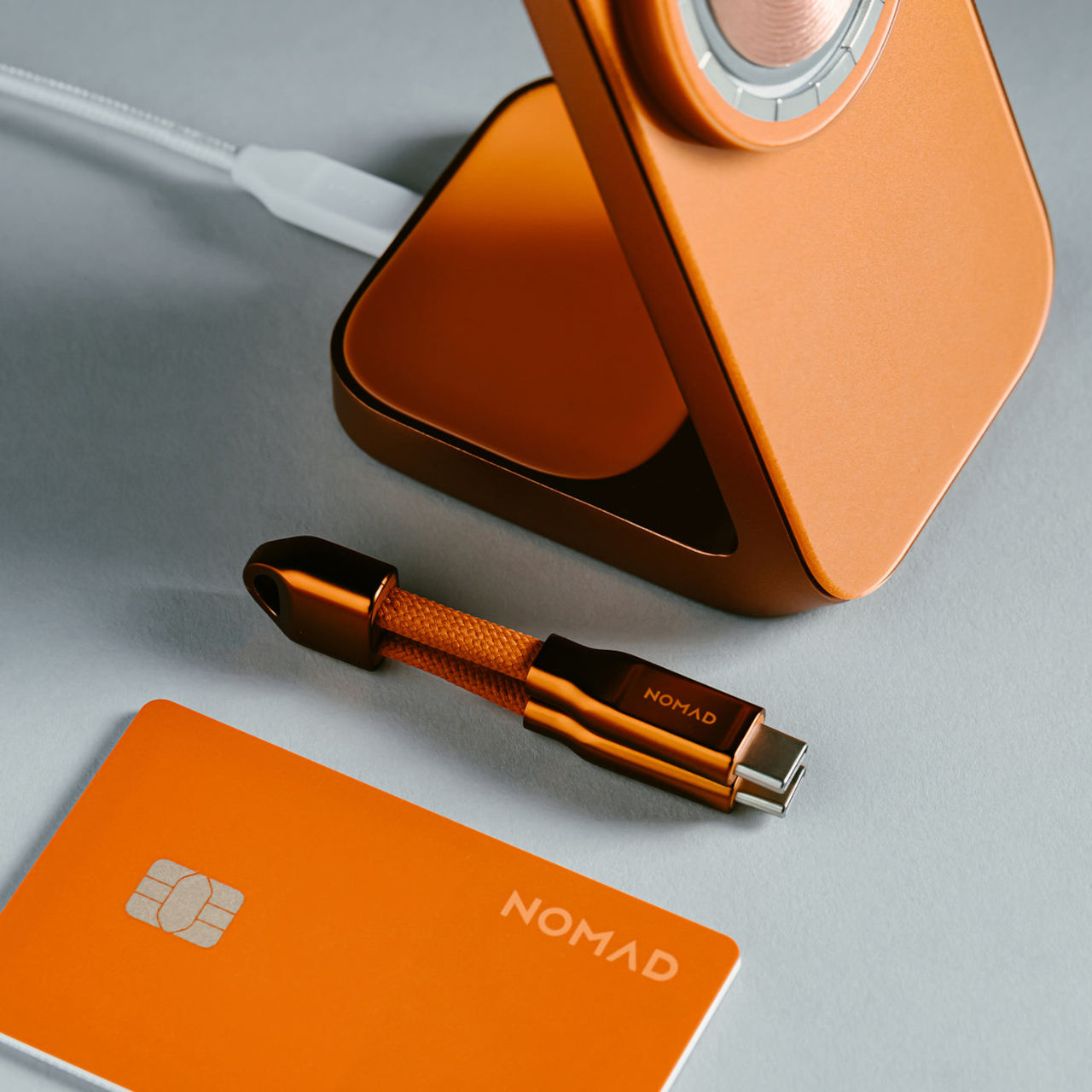
Nomad also launched a $39 Stellar Orange Tracking Card Pro alongside the Stand One, a Find My-compatible card designed to slip into a wallet and match the same orange palette. Together, they suggest an expanding ecosystem built around the Cosmic Orange iPhone 17 Pro, giving owners a way to carry that color decision through the accessories that live alongside the phone every day.

The Stellar Orange colorway doesn’t change what the Stand One does, and it’s fair to ask whether a $135 charger in a specific color justifies the kind of enthusiasm that device launches usually get. But for Cosmic Orange iPhone 17 Pro owners who want a desk setup that feels unified rather than assembled from whatever happened to be available, the Stand One in Stellar Orange makes a reasonable case for paying attention to the color of the cable management.

The post Nomad’s Limited $135 Charger Matches Apple’s Boldest iPhone Color first appeared on Yanko Design.

Xbox Series X25 Limited Edition celebrates brand’s 25 years of nostalgic gaming

Xbox limited edition makes are nothing uncommon, as Microsoft often delves into collaborations for some really interesting themed consoles and controllers. The gaming brand just turned 25 this year, and Microsoft isn’t going to let go of the opportunity to amaze fans.

This is the limited edition Xbox 25th Anniversary Collection specifically designed to celebrate the quarter-century of Microsoft’s gaming brand. The special themed console and controller remember the platform’s historical development right from the time it came to the shelves, and also pays gratitude to its dedicated community of gamers.

Designer: Microsoft

Since we are talking about the highly nostalgic element, the limited-edition creation is draped in the OG Green translucent theme. If you are an avid Xbox fan, that reminds me of the aesthetic worn by the original 2001 Xbox console. The fused hues of the outer shell are absolute dope, both on the console and the controller, while the backplate gets the more traditional black make. Apparently, this is the first time Microsoft has gone for the translucent treatment for the chassis on any current-generation console models. I’m glad they did, because the thing looks so magnetic.


According to Jason Ronald, VP Next Generation, “The XBOX Series X25 Limited Edition respects our history, with the power and performance of the XBOX Series X, including 1TB of storage, and a design that reflects where we’ve been and the community that’s been with us along the way.” Both the console and the controller are etched with the “Xbox 25” anniversary logo on the front. That is complemented by the “X” button that turns green as soon as the console is switched on.

The controller comes with the original ABXY colors for the buttons, and the bumpers on the gamepad are black and white to go with the classic theme of the Duke controller. The translucent goodness flows to the rear, where the back case and the battery panel reveal the Xbox logo. That said, the texture feel and the ergonomic grip are more comparable to the current generation gamepads. Ronald added that there will be some “hidden surprises throughout” to keep things interesting for lucky owners.

Microsoft hasn’t detailed anything about the pricing of the special edition Xbox console, but it’ll be within bounds, I guess. Availability, though, is hinted at for select markets as a special edition collection in November. Those who fail to buy the collection can grab the XBOX Wireless Controller X25 Special Edition standalone as well, but that’s also a limited Edition offering.

The post Xbox Series X25 Limited Edition celebrates brand’s 25 years of nostalgic gaming first appeared on Yanko Design.

ROG Just Made Gaming Peripherals You’d Actually Put on Display

Gaming peripherals have gradually crossed from purely functional tools into design objects that enthusiasts keep, display, and collect alongside their builds. Limited-edition anniversary hardware has become part of that culture, giving manufacturers a chance to honor their history while reminding the community why certain names still carry weight. Making those commemorative pieces feel genuinely worthy of the occasion, however, is always the trickier part.

ROG, short for ASUS’ Republic of Gamers brand, is marking 20 years of gaming innovation with an anniversary lineup centered on a gold-and-black design identity it calls the Edition 20 colorway. Three peripheral additions sit at the heart of it, namely the Azoth Extreme Edition 20 keyboard, the Harpe II Extreme Edition 20 mouse, and the Keycap Mystery Box Edition 20, each making the case that high-performance hardware and collector-worthy design don’t have to live separately.

Designer: ASUS

The Azoth Extreme Edition 20 is a 75% gaming keyboard that wears the anniversary theme without being heavy-handed about it. Translucent keycaps reveal the mechanics below, and a detachable 24K-gold-plated nameplate at the front makes the occasion official without being excessive. The extended silicone wrist rest adds completeness to the package, anchored by a gold-toned aluminum-alloy base that ties everything together without introducing anything out of place.

Beneath that exterior, an adjustable gasket mount toggles between Hard and Soft typing modes, useful for anyone who games and types for long hours in the same session. The custom ROG NX Edition 20 mechanical switches are transparent, factory pre-lubed, and hot-swappable, while an OLED touchscreen with a three-way control knob handles quick adjustments. In 2.4GHz wireless mode, battery life stretches to up to 1,600 hours.

The Harpe II Extreme Edition 20 shares the same design language and makes a natural companion to the keyboard. Built on the pro-tested shape of the Harpe II Ace, it houses a 24K-gold-plated metal interior frame inside a crystal-clear shell, with an RGB light guide plate illuminating the components within. A display case ships with the mouse in the box, which feels entirely appropriate given how it looks at rest.

The ROG AimPoint Pro 65K sensor delivers 65,000 dpi with less than 1% CPI deviation and 8,000Hz wireless polling through ROG SpeedNova technology. At 82g with glass mouse feet already included, it’s ready for competitive play immediately. Battery life holds at up to 90 hours over 2.4GHz RF and 98.5 hours in Bluetooth mode, both measured with the lighting switched off.

For those who aren’t swapping out their entire setup, the Keycap Mystery Box Edition 20 is the most accessible entry into the anniversary series. Each box holds a randomly selected keycap in one of seven designs inspired by iconic ROG peripherals and the ROG Fearless Eye logo, built through casting, high-pressure forming, hand-painted finishing, and structural assembly. The obsidian-inspired base and refined detailing make each piece genuinely display-worthy.

The ROG Claymore design is the one most worth watching for, as it includes two interlocking keycaps that reference the original keyboard’s modular layout. A Special Edition crystal-like ROG Logo keycap is also in the pool. Available as a single unit or a six-piece box with no duplicates, the Mystery Box turns 20 years of ROG hardware history into something you can keep in the palm of your hand.

The post ROG Just Made Gaming Peripherals You’d Actually Put on Display first appeared on Yanko Design.

Rezvani Fortress is a F-150 Raptor on steroids loaded with military-grade security equipment

Rezvani Motors is second to none when it comes to transforming already beastly 4×4 SUVs into armored vehicles fit for an apocalyptic world. The California-based automotive designer has already stamped its authority here at Yanko design with military-inspired vehicles like the Vengeance, Tank, and even the V8-powered Urus. Now, it’s the turn of the mighty Ford F-150 Raptor to get the Rezvani treatment for good.

They call it the 2027 Fortress and for good reason. The Doomsday-proof vehicle is hailed to be the “ultimate tactical off-road super truck,” making any F-150 look underwhelming. By no means is the original F-150 Raptor off-roader incapable of taking on any terrain, but this beast is a hyper-muscular version on steroids. It’s a heavily modified pickup truck inside out with a starting price tag of $285,000 to match the exploits. Like all times, this one too is a Limited-Edition creation restricted to 100 units, and booked for a refundable $500 deposit.

Designer: Rezvani Motors

According to Rezvani, the tactical off-road truck can easily handle city streets and, pretty obviously, the terrain that no other truck will ever dread going on. The beast comes in two options: the standard Raptor R with the twin-turbocharged 3.5-liter V-6 churning out 450 horsepower or the Raptor R’s supercharged 5.2-liter V-8 producing an impressive 850 horsepower. It’s not about traversing the terrain; it’s more about going there with authority as the Fortress gets the Ford’s Fox Live Valve internal bypass shocks, adaptive damping, and long-travel suspension. Just imagine it has a ground clearance of 15 inches, an approach angle of 38 degrees, and a departure angle of 29 degrees, which makes it capable of riding 45 inches of water without much fuss.

It is a top-tier military grade vehicle with reinforced steel bumpers, hood heat extractors, wide body fender extensions, roof-mounted auxiliary lighting and 20inch beadlock capable wheels topped up with oversize 40-inch all-terrain tires. You can go a step further, as the rugged SUV can be optioned with extra military-certified equipment, including electrified door handles, smokescreen, on-board thermal night-vision system, and electromagnetic pulse protection. If that doesn’t impress you much, then getting the full ballistic armor, bullet-resistant glass, blast-resistant underbody protection, run-flat military tires, and reinforced suspension system to manage all this weight is also an option.

Things don’t stop here as the truck can be beefed up with off-grid options like sports solar panels, auxiliary fuel systems, satellite internet connectivity, portable power station, and a dedicated water storage system if the world turns out into a Mad Max-like battleground. Those perks, however, come at an extra cost of around $150,000, which I’m sure a billionaire tycoon won’t mind sparing. On the inside, things get as cozy as they could, cocooning the riders in luxury. The thing is done in full-leather upholstery, with moody ambient lighting and an infotainment system that can be upgraded to Focal speakers paired with a JL subwoofer to make you go crazy.

The post Rezvani Fortress is a F-150 Raptor on steroids loaded with military-grade security equipment first appeared on Yanko Design.

Pixel 10a Just Proved a Smartphone Color Can Actually Mean Something

Smartphone colors have become one of the more formulaic aspects of mobile design. Most brands cycle through the same soft pastels and stone-inspired neutrals, year after year, with names like Moonstone, Fog, and Porcelain doing most of the heavy lifting. It’s a safe approach that generally works, but there’s rarely any real meaning behind these choices. A color is just a color, and that’s often where the story ends.

Google seems to have had the same thought, at least for Japan. The Pixel 10a Isai Blue is a Japan-exclusive model developed in collaboration with Heralbony, a creative company that works with artists with disabilities to produce new forms of cultural expression. It celebrates a decade of Pixel phones, and rather than simply marking the occasion with a new shade, Google made the color itself worth talking about.

Designer: Google x Heralbony

Japan didn’t get the Pixel 10a when it first launched globally in February, which was a bit of an odd omission given how well the A-series has performed there. The country has quietly grown into one of Google’s stronger Pixel markets, so the wait wasn’t really a sign of indifference. Returning to Japanese fans with something made specifically for them says a lot more than a straight regional rollout would.

The name alone sets this apart from anything Google has done before. “Isai” translates to unique and unparalleled individuality, and this is actually the first time a Pixel color has been given a Japanese name. Most Pixel colors borrow from the natural world, but Isai Blue is built around something more conceptual: a deep navy shade tied to Heralbony’s own brand identity and its mission to celebrate human difference.

That philosophy runs all the way through to the software, too. Three Heralbony-contracted artists, Shigaku Mizukami, Midori Kudo, and Kaoru Iga, each contributed original designs that became exclusive wallpapers on the device. Pick one of the nine available artworks, and Material You automatically reshapes the phone’s icon colors and styling to match. It’s the kind of visual cohesion you don’t usually get with a phone at this price.

Of course, the collaboration doesn’t stop at the screen. Every unit comes bundled with an exclusive bumper case designed around the Pixel 10a’s completely flat back, which does away with any camera protrusion and makes the phone far easier to set down. Original stickers are also included, and the box sleeve carries artwork by Midori Kudo, so the whole unboxing feels deliberately curated.

The Isai Blue comes in a single 256GB configuration, priced at ¥94,900 (roughly $594) and available for pre-order in Japan ahead of its May 20 sale date. It’s only available while supplies last, which fits for something that was never really meant to be a mass-market offering. Google took the time to make this feel like a genuine gesture rather than a routine launch, and Japan has every reason to feel appreciated.

The post Pixel 10a Just Proved a Smartphone Color Can Actually Mean Something first appeared on Yanko Design.

This Limited Edition Desk Lamp Has Four Legs and Looks Like It’s Alive

The line between product design and sculpture has been blurring for years, but most objects still declare their purpose plainly. A lamp looks like a lamp. Its form is a familiar enough gesture that it becomes invisible, something you reach for and forget. The more interesting territory is what happens when a designer begins with something alive and works backward into a functional object.

That’s what Hazel Villena did with the Bean Lamp, a limited-edition desk light designed in Brooklyn in 2026 that functions as a light source and a quietly unsettling presence at the same time. Villena started with the creature first and then solved the engineering around it. The legs exist to hold the disc of light. That they read as limbs is entirely deliberate.

Designer: Hazel Villena

The body is cast copper with a chrome finish, sculpted into a low, wide stance on four tapered legs that curve and splay at angles borrowed more from biology than furniture. A polished aluminum ring joint at the center holds the matte polycarbonate diffuser in place, and the integrated LED disc inside throws a soft, contained pool of warm light across the surface beneath it.

At 10.5 inches long and 4.5 inches tall, the Bean Lamp is compact enough to sit on a desk or shelf without dominating the space, though it tends to hold the eye. Proportion was a significant part of the design process, giving an elementary silhouette more gravity than its simple form suggests. The chrome catches light, the matte disc diffuses it, and the four curved legs suggest something caught mid-pause.

There’s also how it comes apart. The Bean Lamp is mechanically assembled rather than bonded, which means it can be fully disassembled when needed. The shade and LED unit can each be replaced or upgraded independently, extending its life beyond any single component. At the end of its life, the copper body and aluminum ring separate cleanly into existing metal recycling streams, a quiet argument for longevity built directly into the object.

The lamp runs on a 12V cord with an in-line switch, keeping the operation uncomplicated. Plug it in, turn it on, and it does what a lamp is supposed to do: lights a small, deliberate area of wherever you’ve put it. What it also does, and what takes longer to resolve, is sit there looking like it might eventually decide to move on its own when nobody’s watching.

It reads differently across the room than it does up close, and differently still once it’s switched on. Villena’s stated goal was an object that sits in a deliberate blur, familiar enough to understand, strange enough to stop you. The Bean Lamp lands there without apology and seems to have no intention of clarifying itself further.

The post This Limited Edition Desk Lamp Has Four Legs and Looks Like It’s Alive first appeared on Yanko Design.

Screw-inspired Stool Numbered Like a Sneaker Drop: Only 150 Made

There’s a certain kind of object that can’t quite decide what it is, and not in a bad way. Furniture has increasingly strayed into collectible territory, and collectibles have crept into living rooms posing as furniture. The result is a growing category of designed objects that live somewhere between a chair and a limited-edition release, serious about craft but refreshingly light about everything else.

Carpet Company, the Baltimore brand known for carving out its own irreverent corner of the design world, leans into that tension with the S-TOOL, its first piece of furniture. The name makes no effort to hide the attitude, and the official list of potential uses runs from stool and ottoman all the way to footrest, ornament, chew toy, and, with admirable candor, trash.

Designer: Carpet Company

The form is remarkably direct. A 12-by-12-by-12-inch cube of 100% fiberglass, cast in a single unbroken gloss color, sits on four chunky legs that taper down to blunt, faceted points. The top surface carries a screw-head relief in each corner, molded flush into the fiberglass in the same color as the piece, which reads immediately as hardware but behaves purely as ornament.

The screw motif carries through to the legs, shaped like Philips screwdrivers that slot into the screw-head relief of another S-TOOL. It’s a small but loaded gesture, nodding to the DIY impulse of the design process without pretending to be handmade. Carpet describes it as hardware that speaks to how things get built, balanced against the glossy, almost candy-like finish to keep the whole concept from becoming too earnest.

The S-TOOL is a limited release, with only 150 units spread across 30 colors, five of each. Every piece carries a metal plaque screwed into the underside, detailing the release and edition, which gives the stool some of the same collectible gravity you’d expect from a numbered print or a signed sneaker. At 15 pounds, it’s substantial enough to feel like something, and that’s rather the point.

The packaging reinforces the whole thing. The box carries the same list of purposes, a column of color-coded screw illustrations previewing the full range, and a cartoon hippo mascot that’s equal parts absurd and charming. Carpet has always been deliberately playful, and the S-TOOL packaging reads like the product brief itself, a small manifesto folded around a cube of brightly colored fiberglass.

What makes the S-TOOL interesting is how much effort went into something that officially disclaims all responsibility. Carpet spent considerable time on proportional analysis to give the elementary form a sense of sophistication it doesn’t advertise, and it shows in how quietly resolved the piece sits. It’s furniture that doesn’t mind being treated as trash, but it’s built carefully enough that you probably won’t.

The post Screw-inspired Stool Numbered Like a Sneaker Drop: Only 150 Made first appeared on Yanko Design.

This Hand-Painted Gundam Camera Looks Like It Escaped the Anime

Film photography isn’t going anywhere, and the disposable camera has quietly become one of the more interesting objects in that revival. What started as a practical format for events and travel has turned into a collectible category, with customized cameras appearing at the intersection of fashion, pop culture, and analog nostalgia. The market for limited-edition film cameras that double as design objects has never been more receptive.

That’s the space the Gundam Camera occupies, a collaboration between artist David C. Wang of Little Road Camera and IUTD Studios that treats a compact film camera as a canvas for the kind of meticulous craft that goes into a proper Gunpla build. Rather than applying a printed wrap or a franchise sticker, the team hand-assembles each unit from scratch, treating the camera body the way a model maker treats a 1/144 scale kit.

Designer: David C. Wang (LittleRoad) x IUTD Studios

The color palette is unmistakably RX-78-2: white and light grey as the base, with iconic blocks of red, blue, and yellow distributed across the body. The blue module on top mirrors the mecha’s head vents, while the red panel carries Japanese lettering that translates to “Main Energy Supply System.” Warning labels and caution markers are applied throughout, giving every surface the texture of actual military hardware.

None of this is printed or mass-produced. Each camera is assembled, painted by hand, and decorated with decals applied one by one, giving every unit a slightly unique character. Panel lines are added individually, and the surface finish is developed to match how serious Gunpla builders approach their kits, not the kind of detail you’d notice from a distance, but the kind that holds up under close inspection.

Of course, it’s also a functioning film camera, which matters. This isn’t a display piece you’d keep behind glass. Take it out on the street or to an event, and the reaction it gets before you’ve even raised it to shoot becomes part of the experience. Gundam fans who’ve never touched a film camera suddenly have a reason to, and film shooters find themselves explaining it to everyone who asks.

The appeal reaches across at least two communities that don’t often overlap. Analog photography has cultivated a following that values the tangible, the finite, and the slow. Gundam has its own equally dedicated community built around craftsmanship, patience, and an appreciation for machines that look like they were actually built by someone. A camera that speaks to both of those things at once is genuinely hard to dismiss.

Units are limited and offered in small batches internationally, which suits a project built entirely around handmade production. There’s no version of this that scales to mass retail, and that’s precisely what makes it interesting as a collector’s object. For anyone who grew up assembling Gunpla kits and now carries a film camera as part of their identity, this occupies a space that feels genuinely earned.

The post This Hand-Painted Gundam Camera Looks Like It Escaped the Anime first appeared on Yanko Design.

PlayStation Moon Legacy Edition TV Stand brings Retro PS1 style to your modern gaming setup

PlayStation turned 30 a couple of years ago, and milestones like this rarely pass quietly in the consumer electronics world. Sony marked the occasion with a special edition PlayStation 5 and accompanying accessories finished in a nostalgic gray tone inspired by the original PS1 console. If you were among the lucky few who managed to get hold of that anniversary edition styled after the classic PlayStation color scheme, there is now an equally themed piece of furniture designed to show it off in the living room.

Designed in collaboration with Danish furniture maker Pedestal, PlayStation Norway has introduced a statement accessory that celebrates gaming culture as much as it serves a functional purpose. The Moon Legacy Edition TV stand arrives in a muted “Legacy Gray” finish that reflects the iconic tone of the original PlayStation console. The visual connection immediately creates a retro aesthetic, making it particularly appealing for collectors who appreciate the history of gaming as much as the hardware itself.

Designer: Pedestal and PlayStation Norway

Beyond the nostalgic color palette, the stand follows Pedestal’s minimalist Scandinavian design philosophy. The frame is constructed from powder-coated steel with a satin finish, giving the structure a sturdy and refined appearance while maintaining a relatively lightweight build. Despite the industrial material choice, the design remains clean and understated, allowing the console and TV setup to remain the visual focus. The stand measures roughly 42 inches high, 31 inches wide, and 21 inches deep, and weighs just under 33 pounds, making it substantial enough for stability without feeling overly bulky. It supports flat-screen televisions between 40 and 70 inches and can handle loads of up to about 110 pounds, which comfortably covers most modern TVs and gaming setups.

The Moon Legacy Edition sits on premium furniture wheels with soft polyurethane coating, allowing the entire entertainment setup to move easily between spaces. For users who rearrange their living room or occasionally shift their gaming setup to different areas, the wheeled base offers flexibility that traditional TV cabinets often lack. The stand also adheres to the widely used VESA mounting standard, meaning it is compatible with most flat-screen television brands currently on the market.

Functionality extends beyond simply holding a TV. The limited-edition package includes a matching Legacy Shelf and a controller stand, giving players a dedicated place to display a controller or store accessories. Additional cable management accessories, such as cable dots and cable ties, are also included to help keep wires organized and out of sight. The shelf adds a subtle display area that can hold game cases, collectibles, or other gaming gear without interrupting the stand’s minimal design language.

The Moon Legacy Edition TV stand is priced significantly higher (approximately $775) than the normal version, which costs $385, reflecting its limited-edition status. The price covers only the stand and included accessories; neither the television nor the PlayStation console is part of the package. As a result, the stand clearly targets dedicated fans and collectors who value the design connection to PlayStation history rather than simply looking for a functional TV stand.

The post PlayStation Moon Legacy Edition TV Stand brings Retro PS1 style to your modern gaming setup first appeared on Yanko Design.