The outlet behind my sofa is exactly where I don’t need it. Reaching it means shifting a cushion, feeling along the wall, and hoping I’ve grabbed the right plug. A power strip makes access easier, but then I’m left finding a place to hide the strip. It’s a small domestic annoyance, yet it says a lot about how we furnish rooms: we plan for the objects we want to see, then work around the electricity that makes them useful.
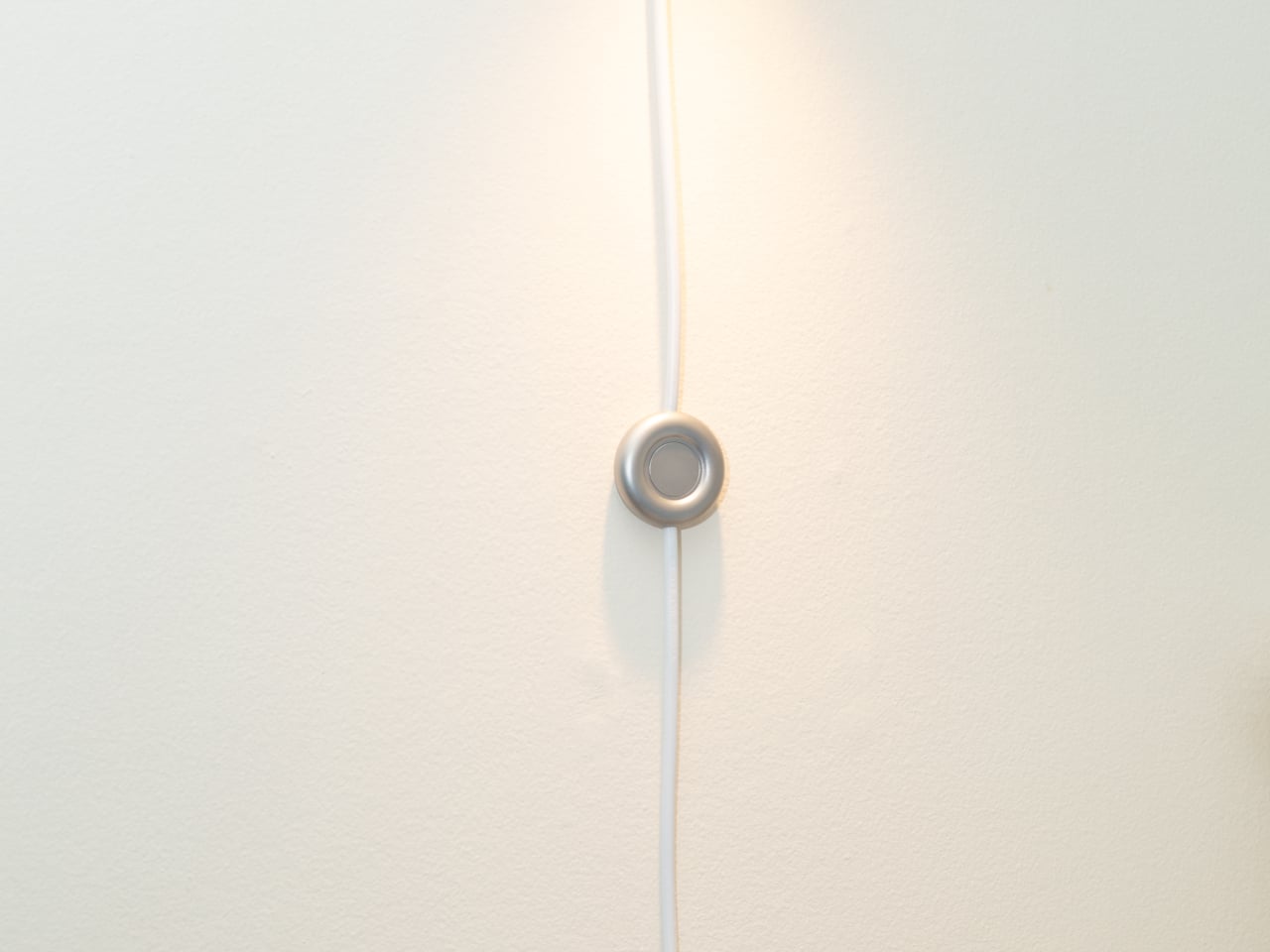
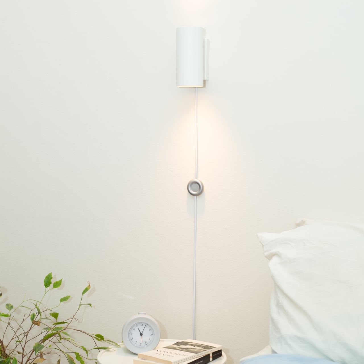
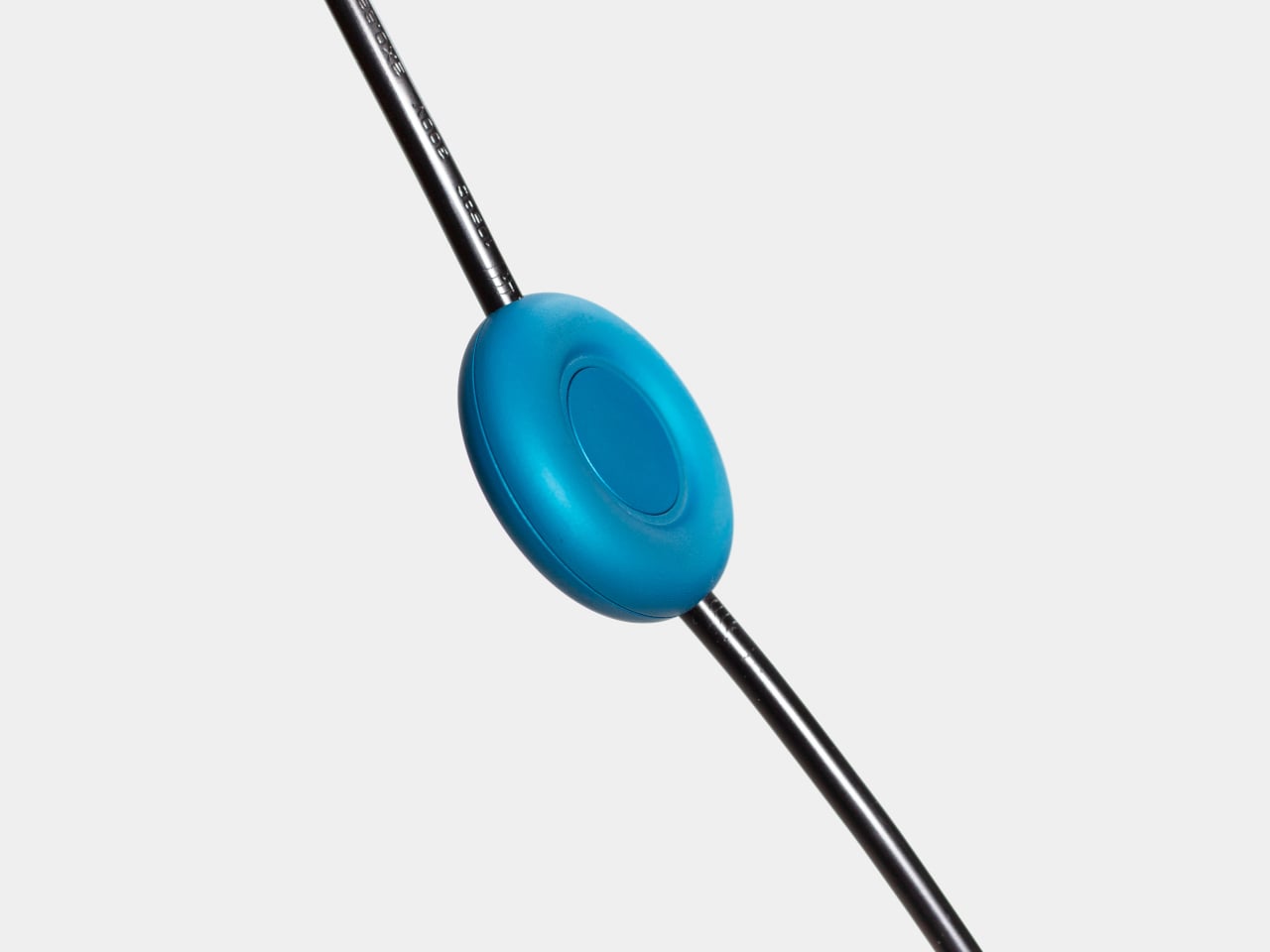
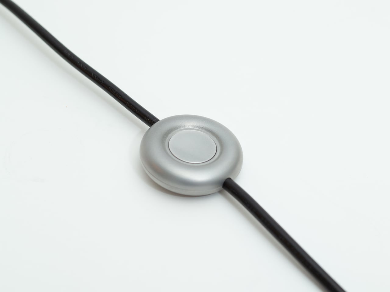
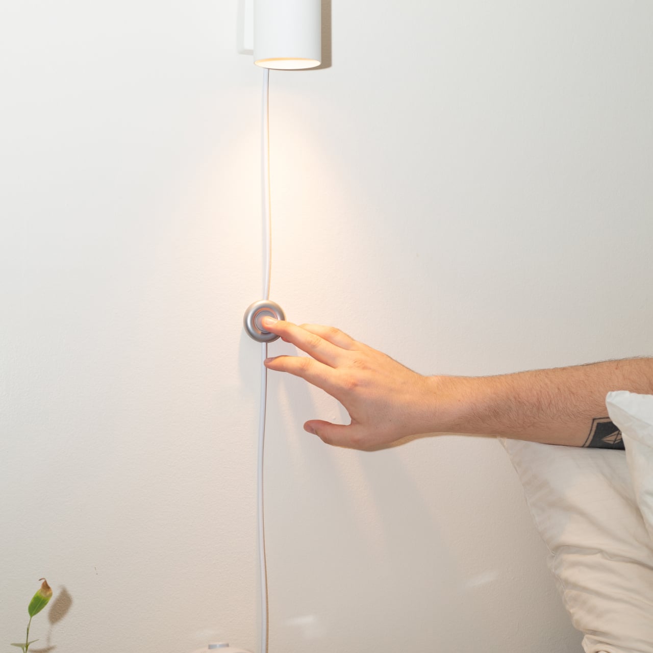
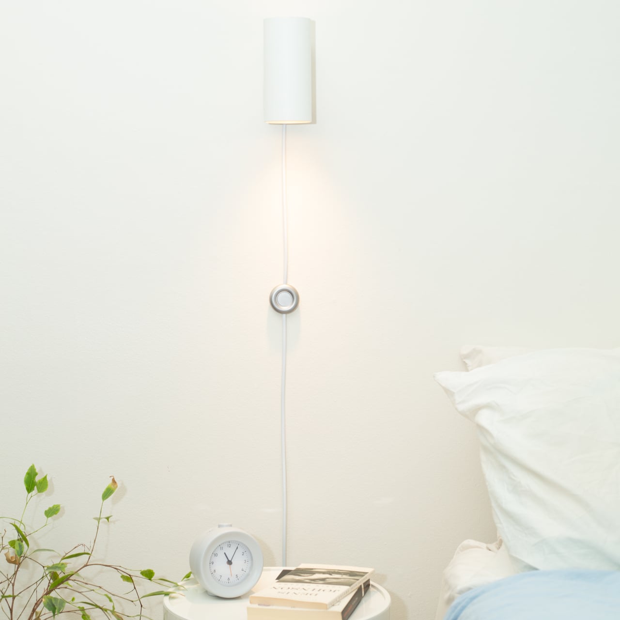
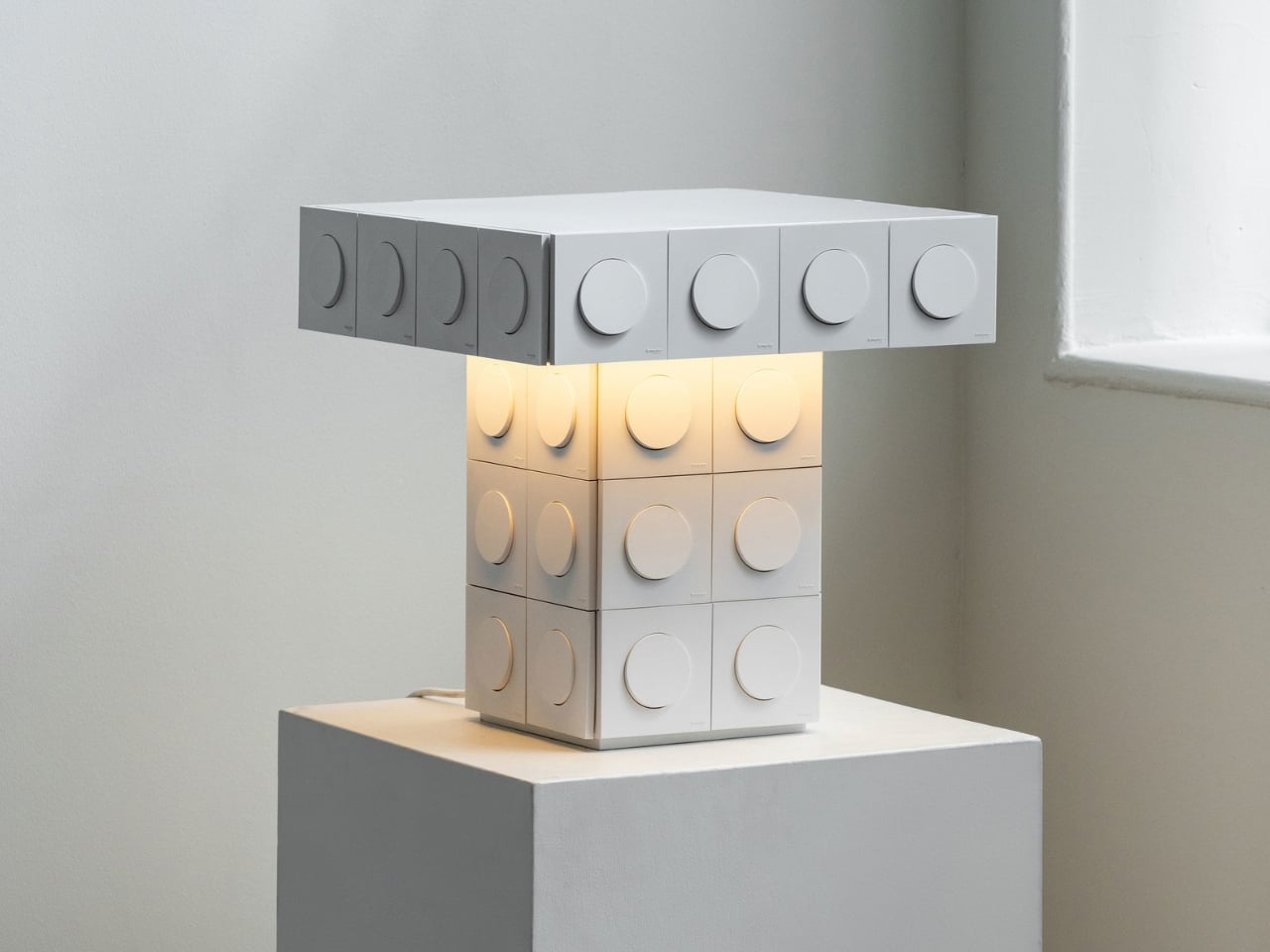
Volt Face offers a more appealing starting point. Designed by Studio 5.5 using Schneider Electric’s Odace sockets and switches, the collection turns those everyday electrical fittings into visible parts of lighting and furniture. It includes a table, a bedside table, a wall light, a pendant light, and other lamps. The sockets and switches still serve their original purpose. They’re simply no longer treated as details to conceal.
Designer: Studio 5.5
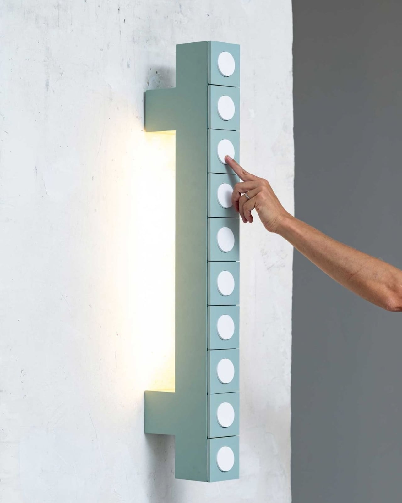
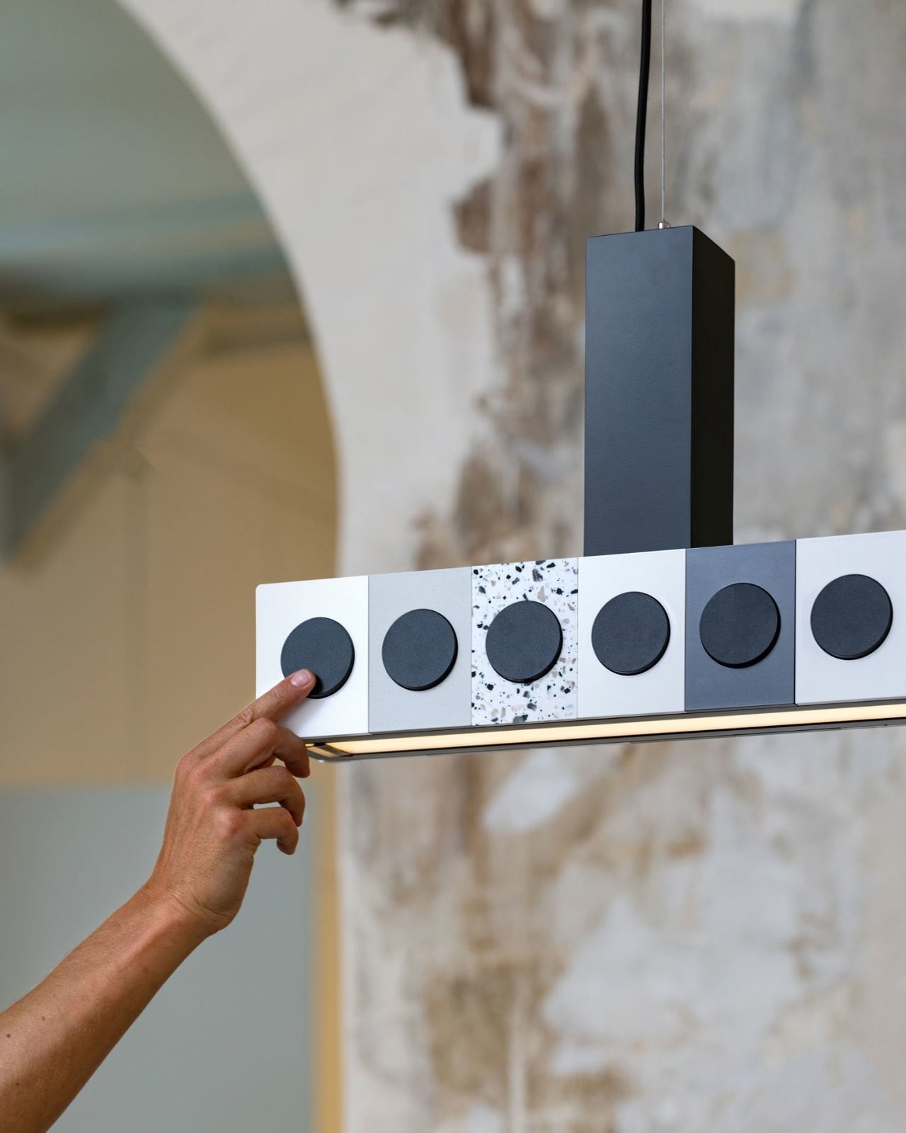
I like the modesty of that idea. Plenty of tech-forward furniture promises a seamless home, but “seamless” can mean a drawer full of mystery cables and a charger you can’t replace without buying a new lamp. Volt Face takes the opposite approach: let people see the controls and connections they use. A switch doesn’t need to disappear to make a room feel considered. Put it where someone can reach it, give it a clear role, and it begins to feel like part of the design.
The project was developed by Vincent Baranger and Anthony Lebossé, whose approach here is to repurpose familiar objects while keeping their functions intact. That distinction matters. Volt Face isn’t asking us to admire an outlet because a designer has declared it art. It asks whether a useful object could become more enjoyable when someone pays attention to its placement and presence. The answer feels less like a grand statement about the future of the home and more like a sensible correction to the way we’ve been arranging one.
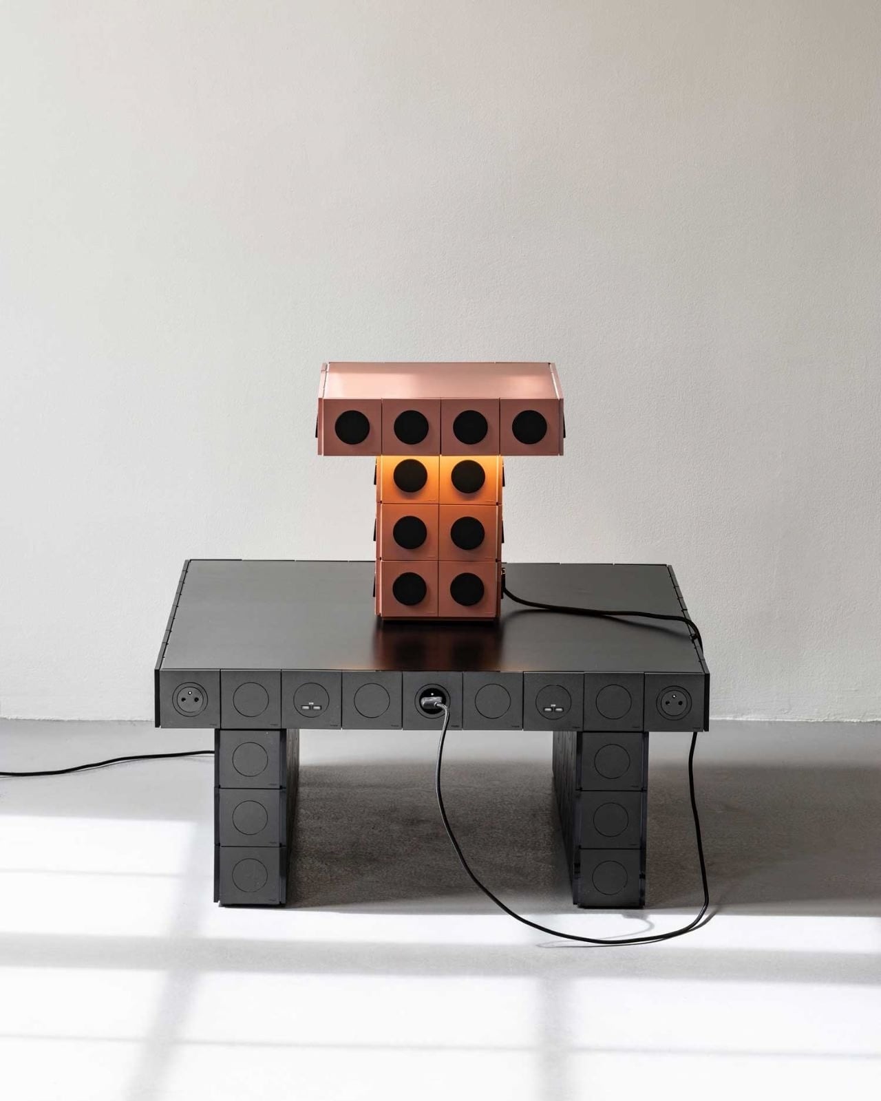
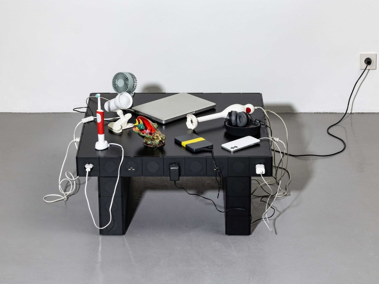
A bedside table makes an especially good case for it. That’s where a lamp, a phone, a book, and a glass of water all compete for space. The outlet is usually just far enough away to make charging your phone awkward. Bringing electrical access into the furniture wouldn’t eliminate the need for a cord, but it could make the nightly routine less fussy. I’d welcome a table that acknowledged what actually ends up on a nightstand instead of pretending it holds only a carefully chosen vase.
The lighting pieces are interesting for a slightly different reason. A lamp already makes electricity visible through what it does, so letting its switch take a more prominent role feels natural. I’d rather have a control I can find without patting around the base in the dark. Studio 5.5’s collection includes both wall and pendant lighting, along with other lamps, giving the idea room to work beyond a single piece of furniture.
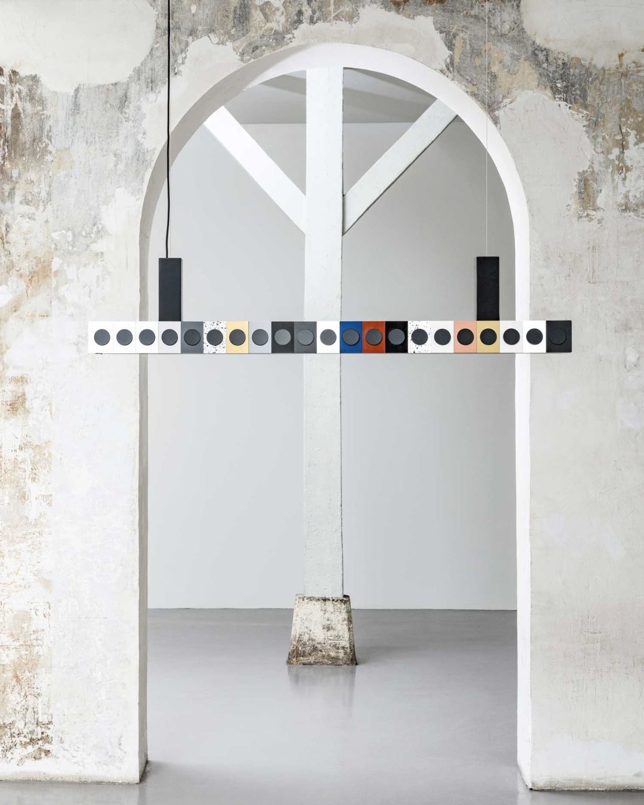
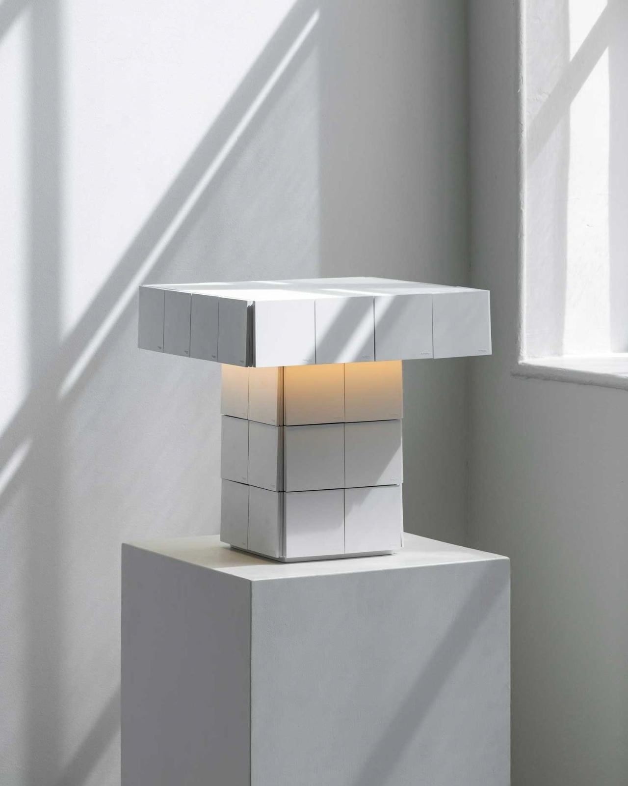
None of this means I’d buy an electrical product on looks alone. Placement, cord management, safety, and compatibility would matter more once a piece entered my home. Volt Face is worth discussing without assuming it’s available for every household or electrical setup. Its strongest contribution right now is a design question: why do so many rooms make access to power feel like an afterthought, especially when we use that access every day?
The appeal is also aesthetic, though not in the usual sense of making technology look invisible. Outlets and switches have recognizable shapes. We know what they’re for, and we notice when they’re inconvenient. Volt Face works with that familiarity. Rather than adding another layer of decoration over a practical problem, it gives the practical part some attention. That feels refreshing at a time when a lot of home products seem determined to disguise their own workings.
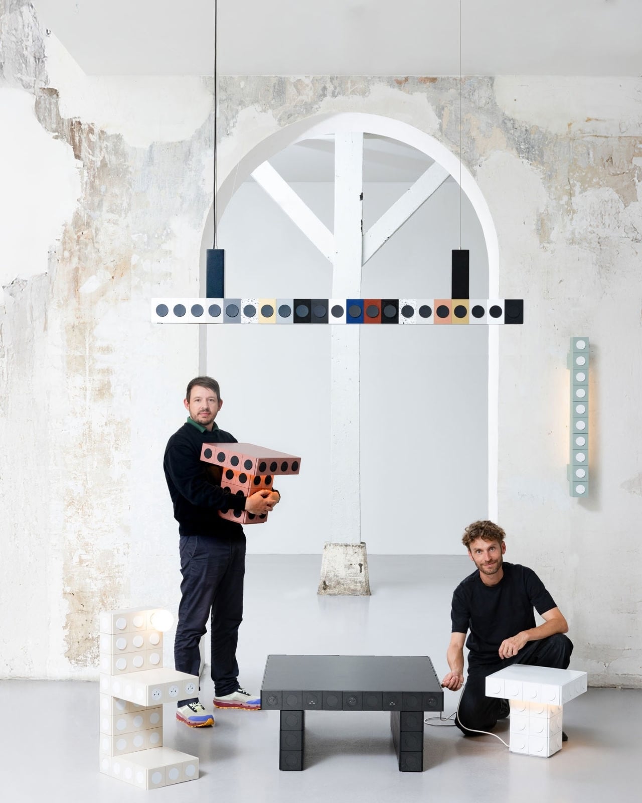
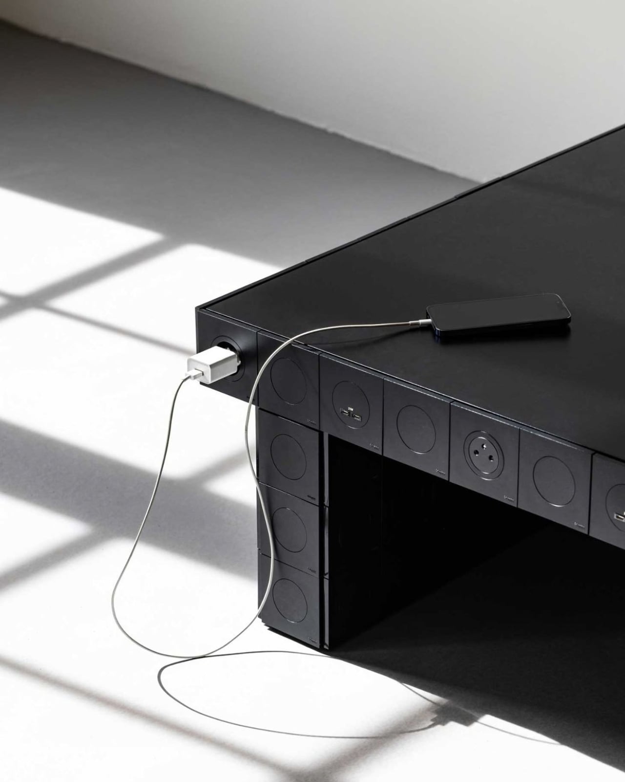
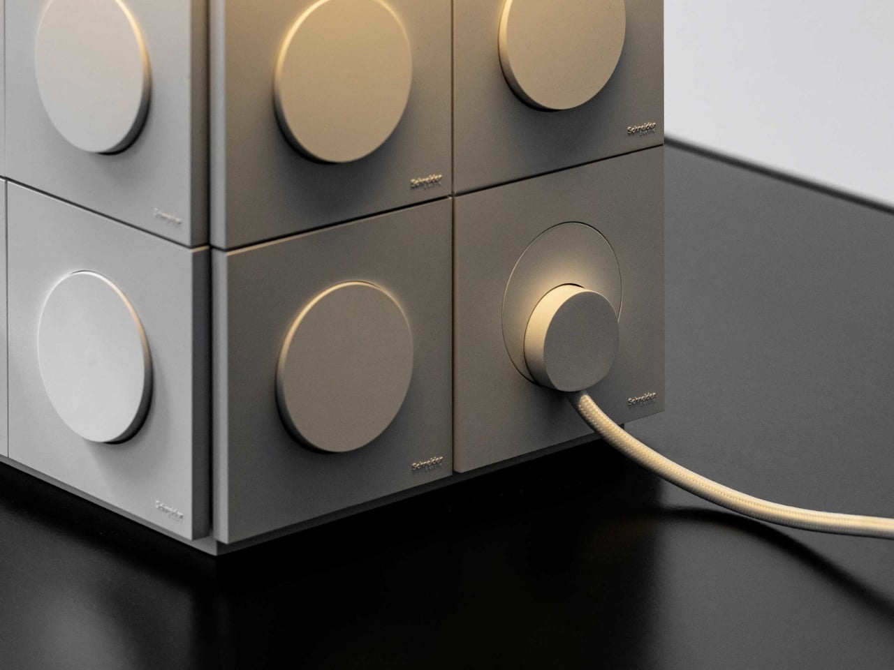
I don’t need every socket in my home turned into a conversation piece. Some can stay quietly on the wall. But the next time I’m reaching behind the sofa for a plug, I’ll think about Volt Face’s simple proposition: furniture could meet us where we actually use power. If that makes a room easier to live in and nicer to look at, the outlet has earned its place in plain sight.
The post The Outlet Nobody Wanted to Look at Is Now the Design Feature first appeared on Yanko Design.