A Designer Curled a Single Sheet of Aluminum Like Paper to Make a Grater That Fits Perfectly in Your Palm

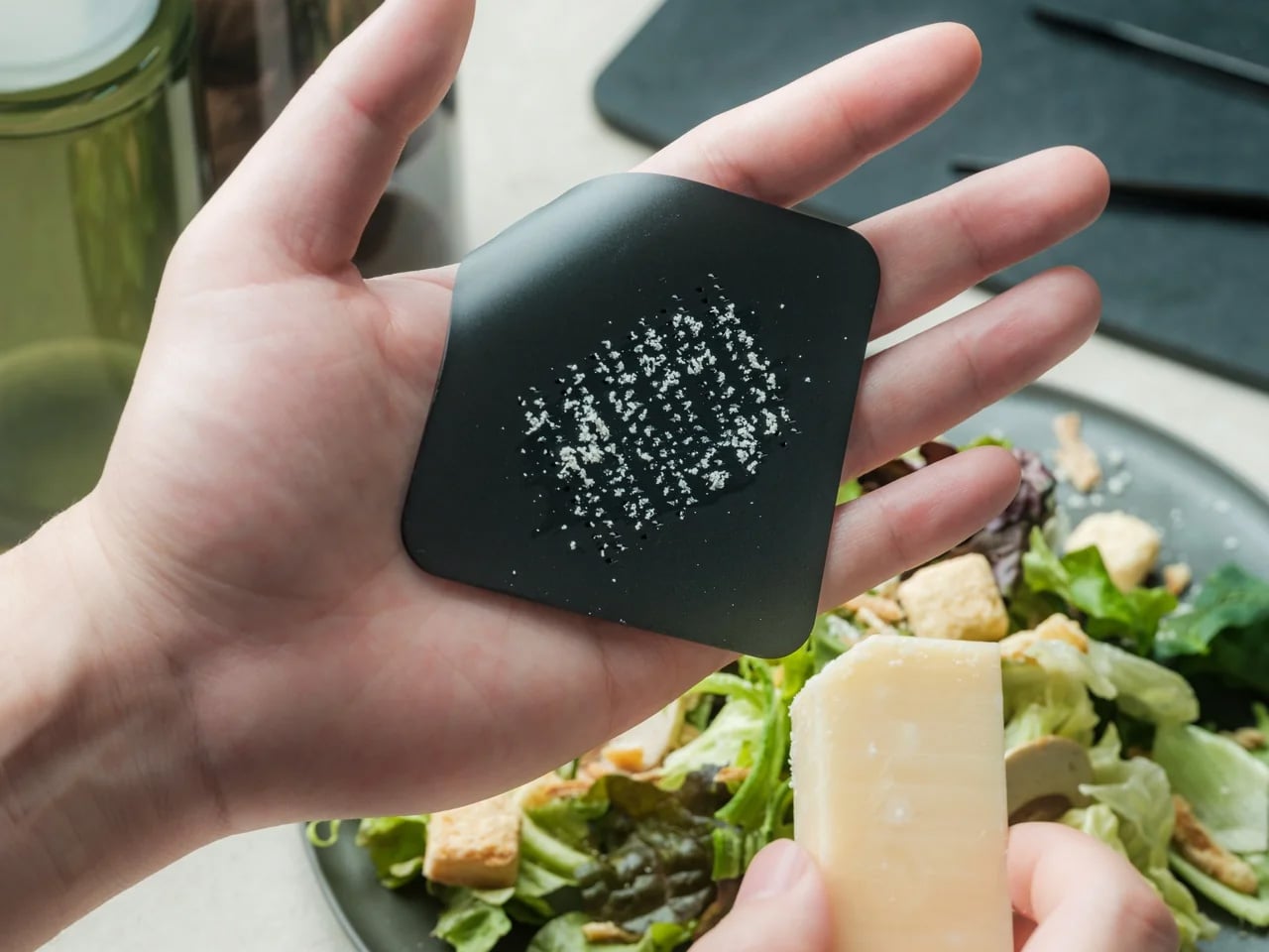
Most graters are a negotiation. The box grater comes out, takes up half the counter, threatens your knuckles on every pass, and goes back in the cabinet the moment you are done. The result is a tool that earns its reputation for being more trouble than it should be. This palm-sized aluminum grater starts from a different premise entirely, one where the object fits the hand that is actually doing the work, rather than the other way around.

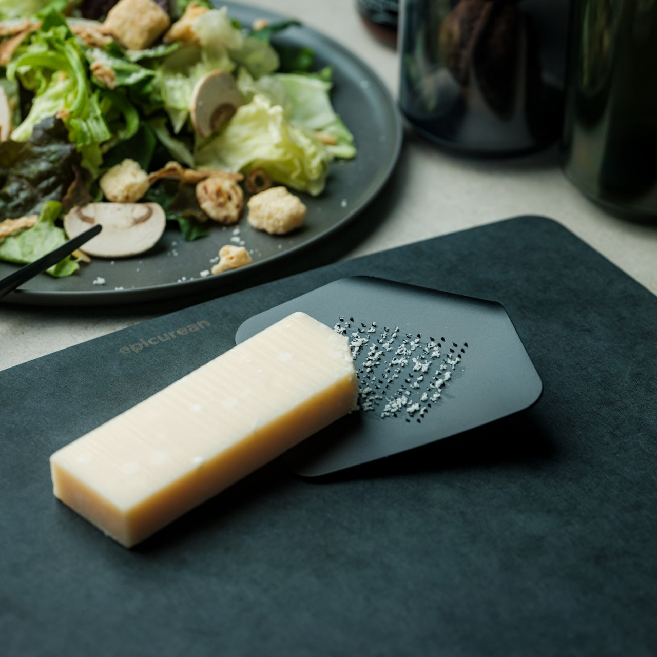
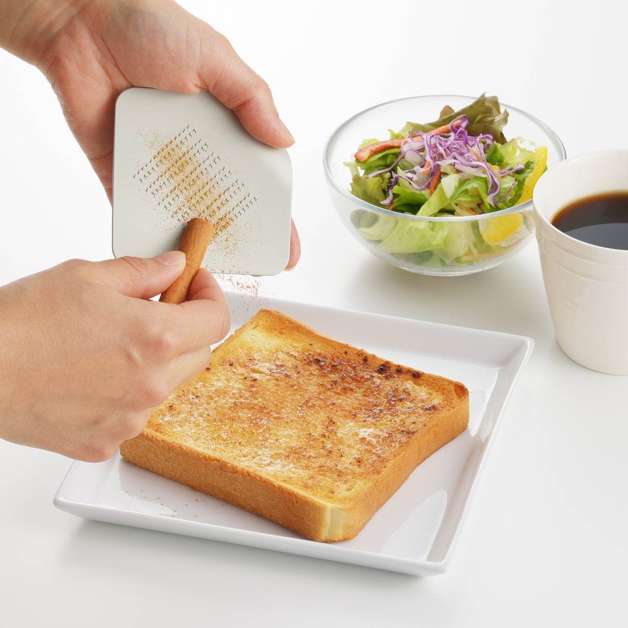
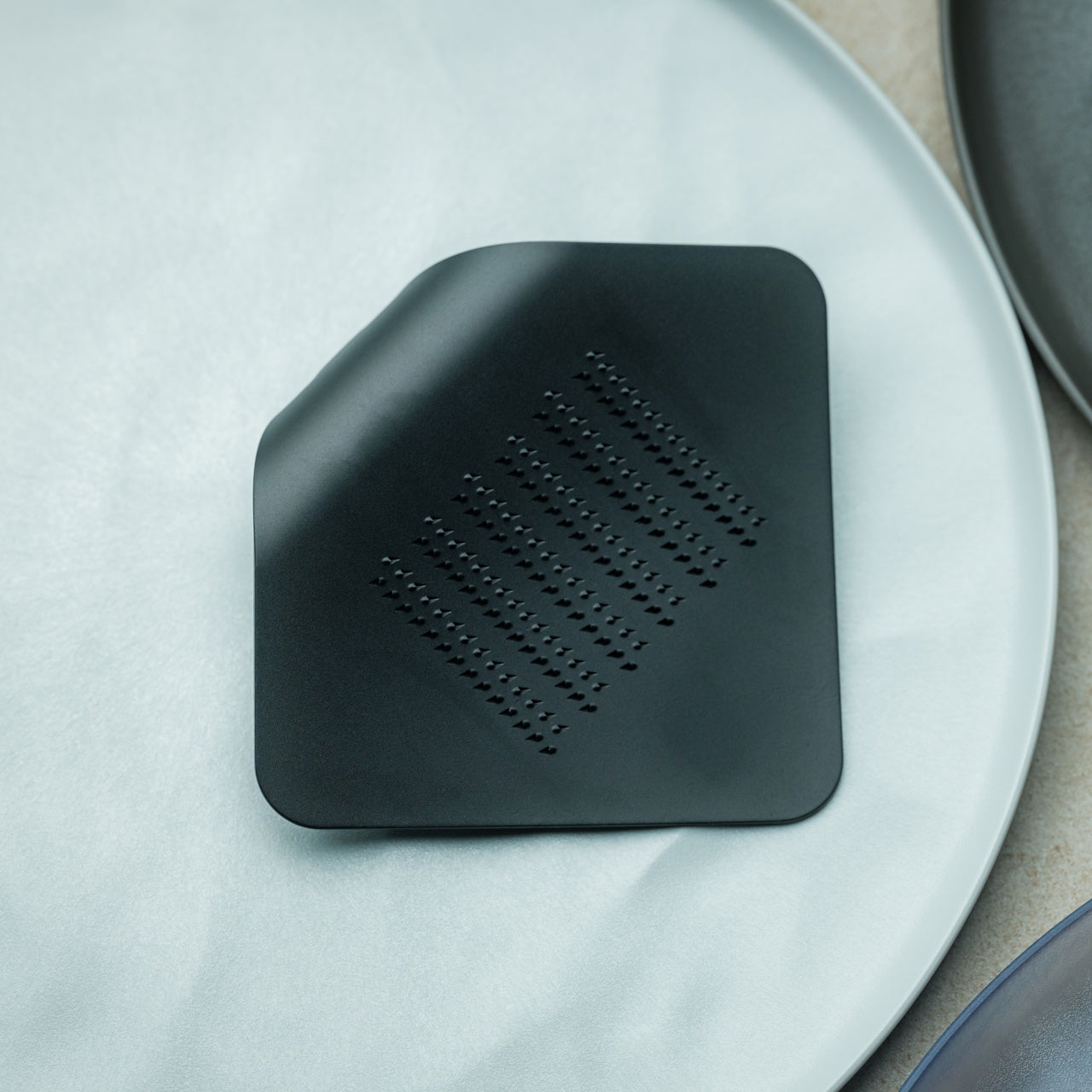
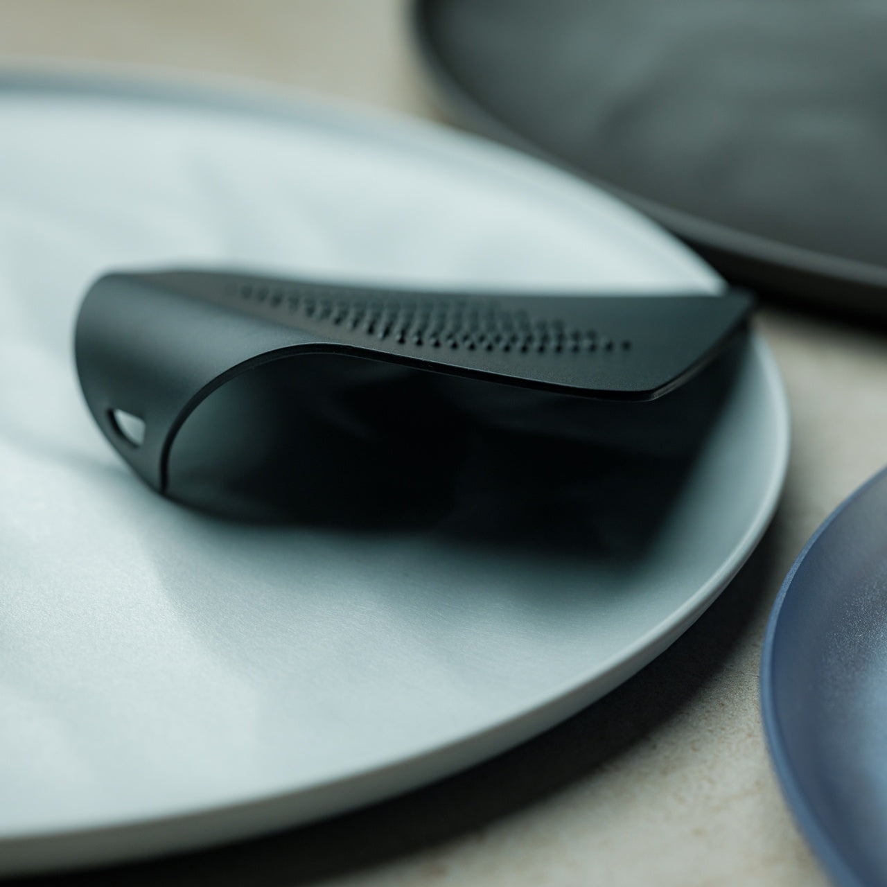
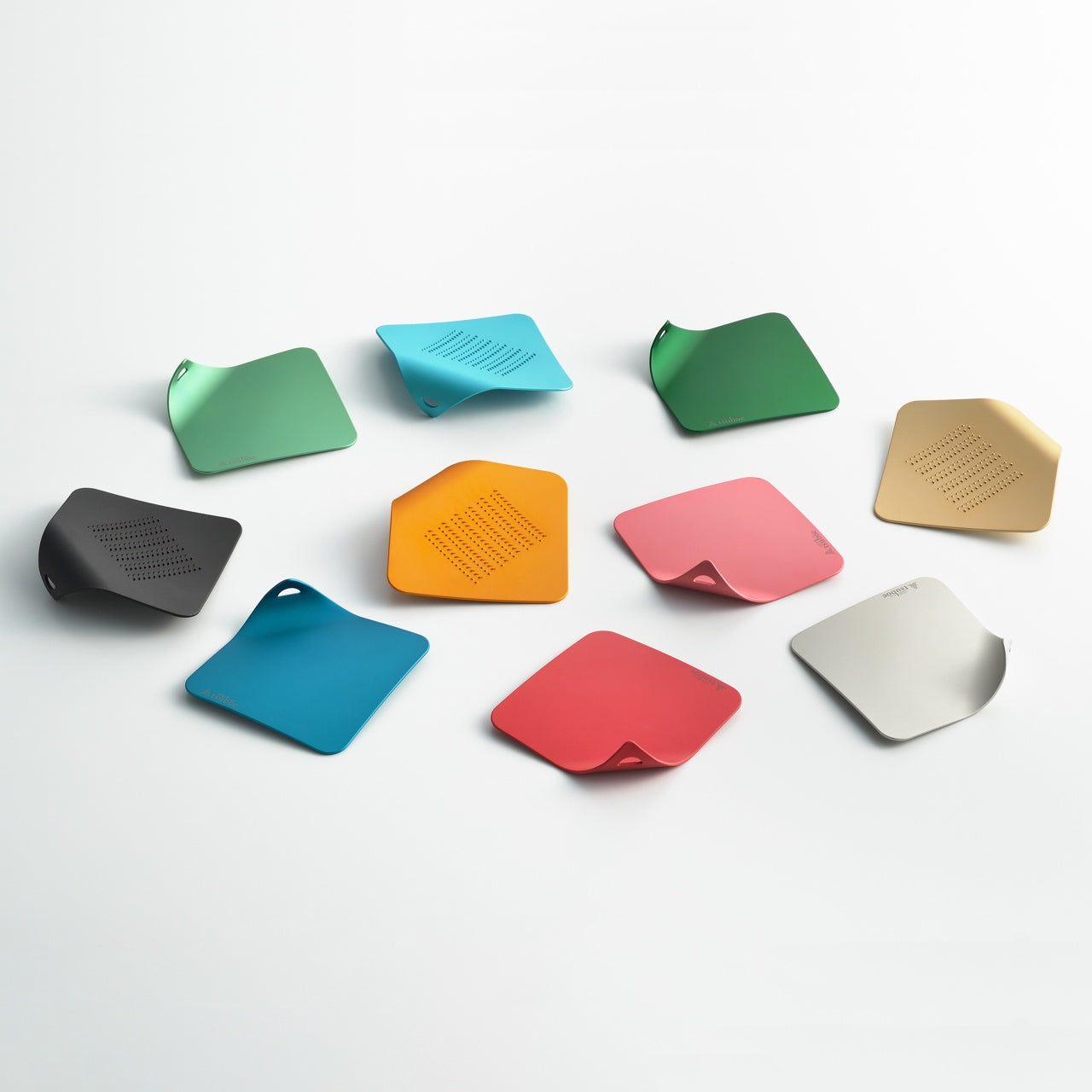
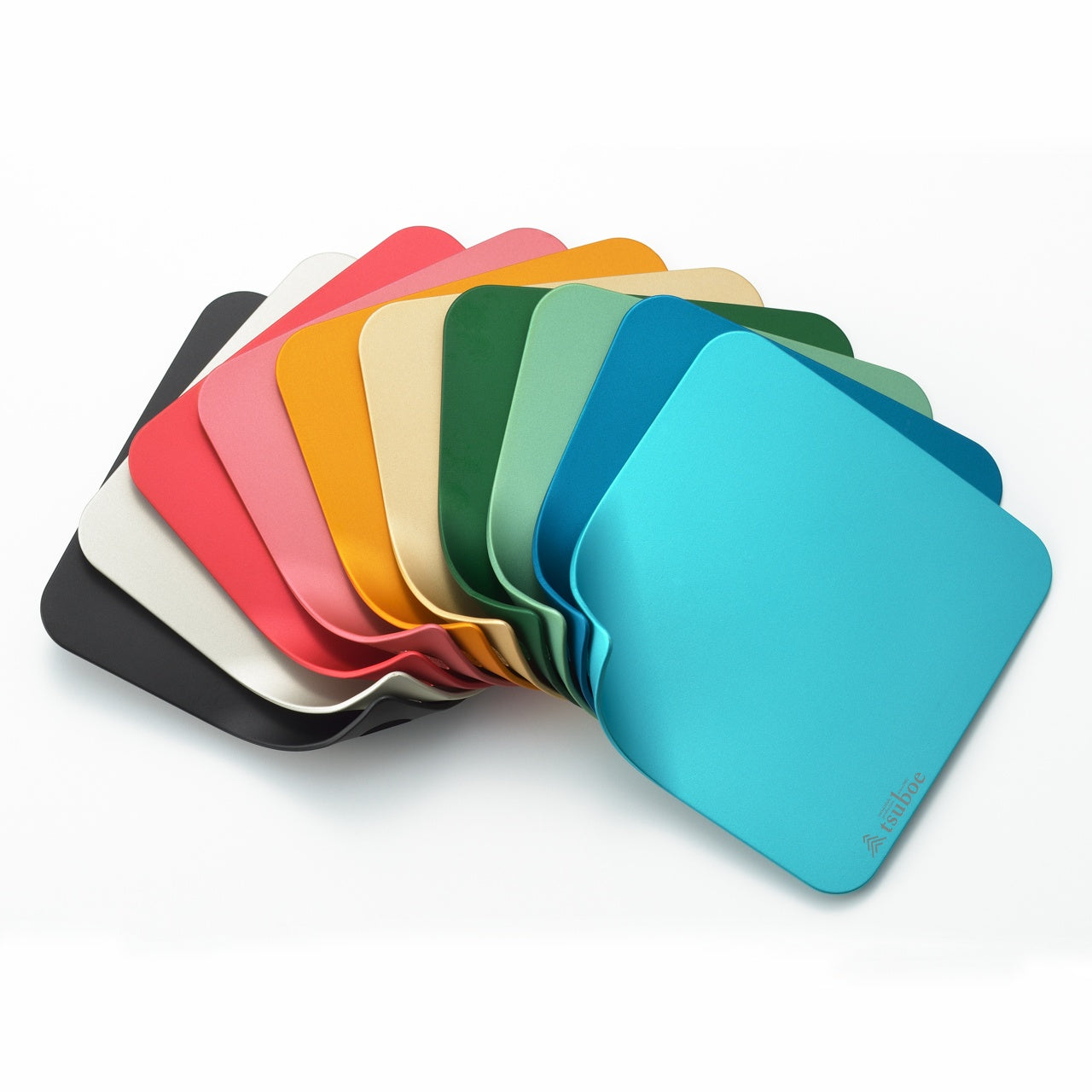
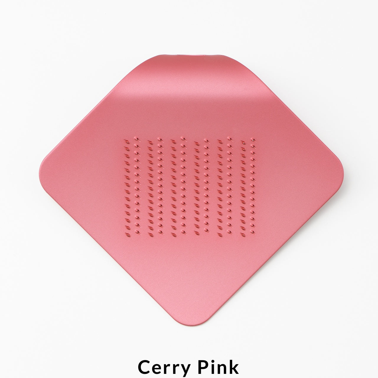
The design takes its form from a piece of paper curling at the corner, and that shape is doing more than looking interesting. Held in the palm, the curve keeps fingers clear of the grating surface, controls the angle naturally without you having to think about it, and makes the whole act of grating something you might actually offer to a guest rather than hide in the back of a drawer. It comes in a range of colors lively enough to leave on the counter without apology.
Click Here to Buy Now: $25.00

A Grater That Fits the Hand It Works With

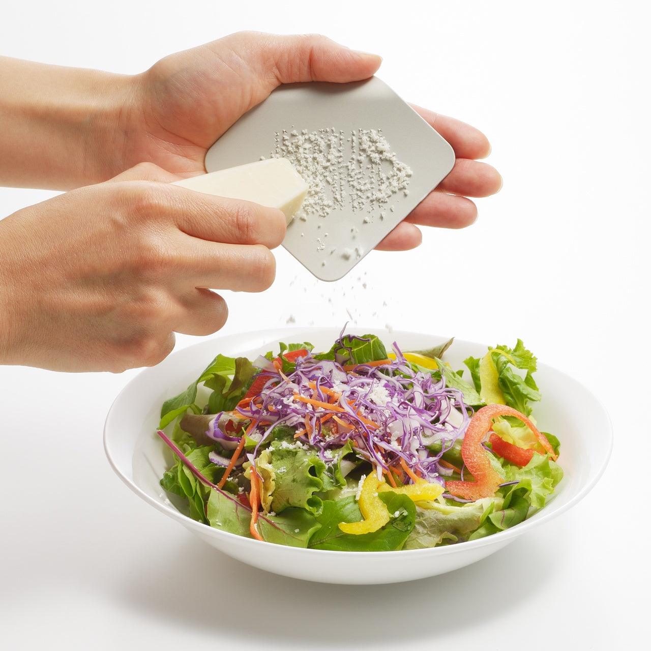
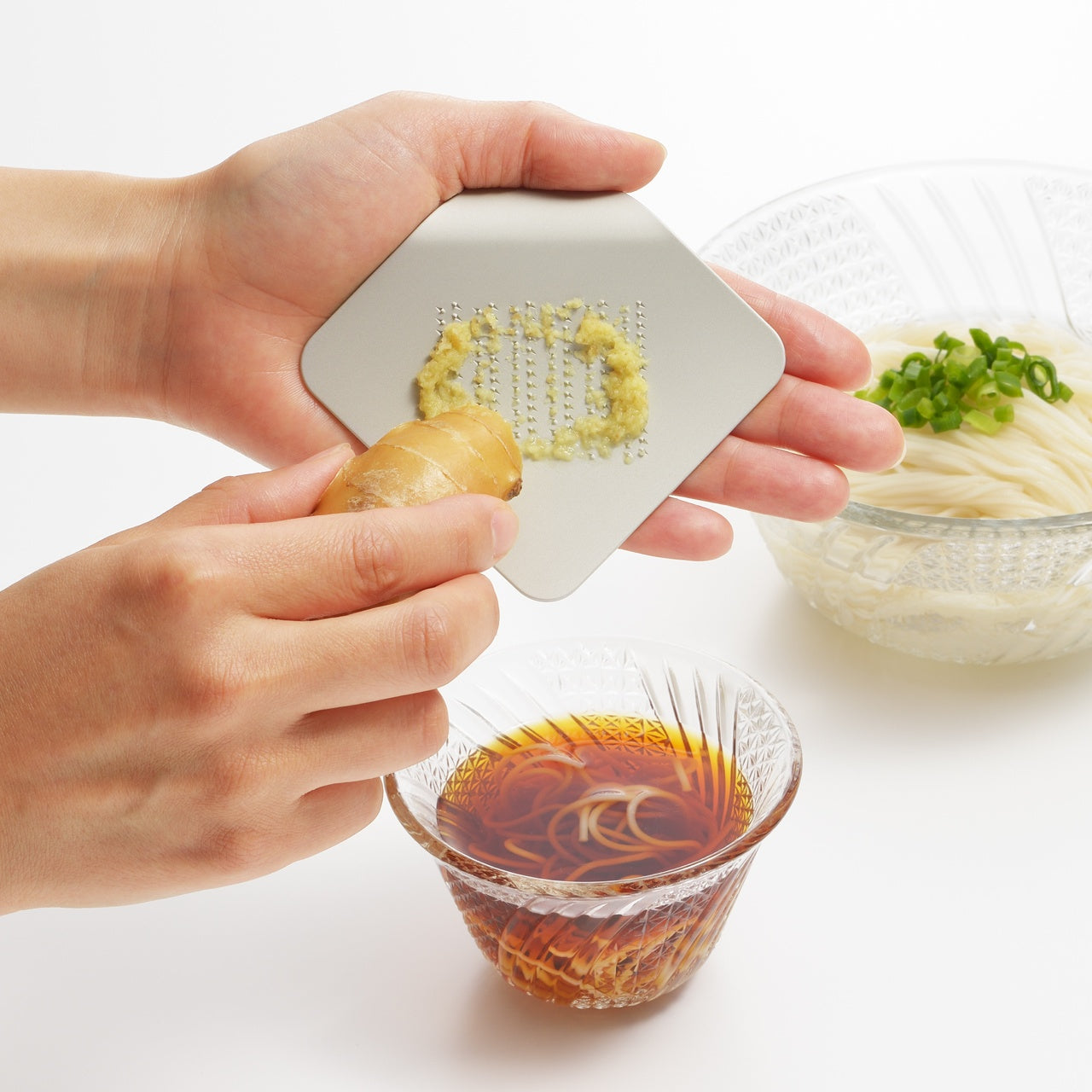
The ergonomics here are not incidental. The curled profile positions the grating surface at an angle the palm controls without adjusting, which means less effort per stroke and more even results across cheese, vegetables, and anything else you run across it. The form also creates a natural guard between fingers and the grating teeth, which removes the usual tension from the process. Grating stops being something you do carefully and becomes something you do quickly, cleanly, and without thinking twice about it.
One Plate. No Assembly.

Stamped from a single aluminum alloy plate, the grater has no joints to loosen, no separate parts to track, and no assembly required before or after use. Rinse it, dry it, put it down. The construction keeps it light enough that it disappears into a bag or a drawer and honest enough that it does not pretend to be more than it is. A single well-made surface that does one thing consistently well is a more useful kitchen object than a multi-function tool that hedges every task.
What We Like

  • Palm-fit ergonomics: the curled form positions the grating surface naturally in the hand, keeps fingers clear of the teeth, and removes the usual caution from the process without any adjustment required
  • Single-piece aluminum construction: no joints, no parts to lose, no reassembly after washing. The simplicity of the build is the point, and it makes the tool genuinely easier to maintain
  • Color range: available in options lively enough that leaving this on the counter is a reasonable choice, which is not something most kitchen graters can claim

What We Dislike

  • Single grating coarseness: one surface means no adjustment between a fine dusting and a coarser grate. Useful for most tasks, but not for a kitchen that needs both regularly
  • Volume ceiling: the palm-sized format is ideal for finishing and garnishing. For grating in quantity, it will take more passes and more time than a larger tool
The Kitchen Object That Earns the Counter

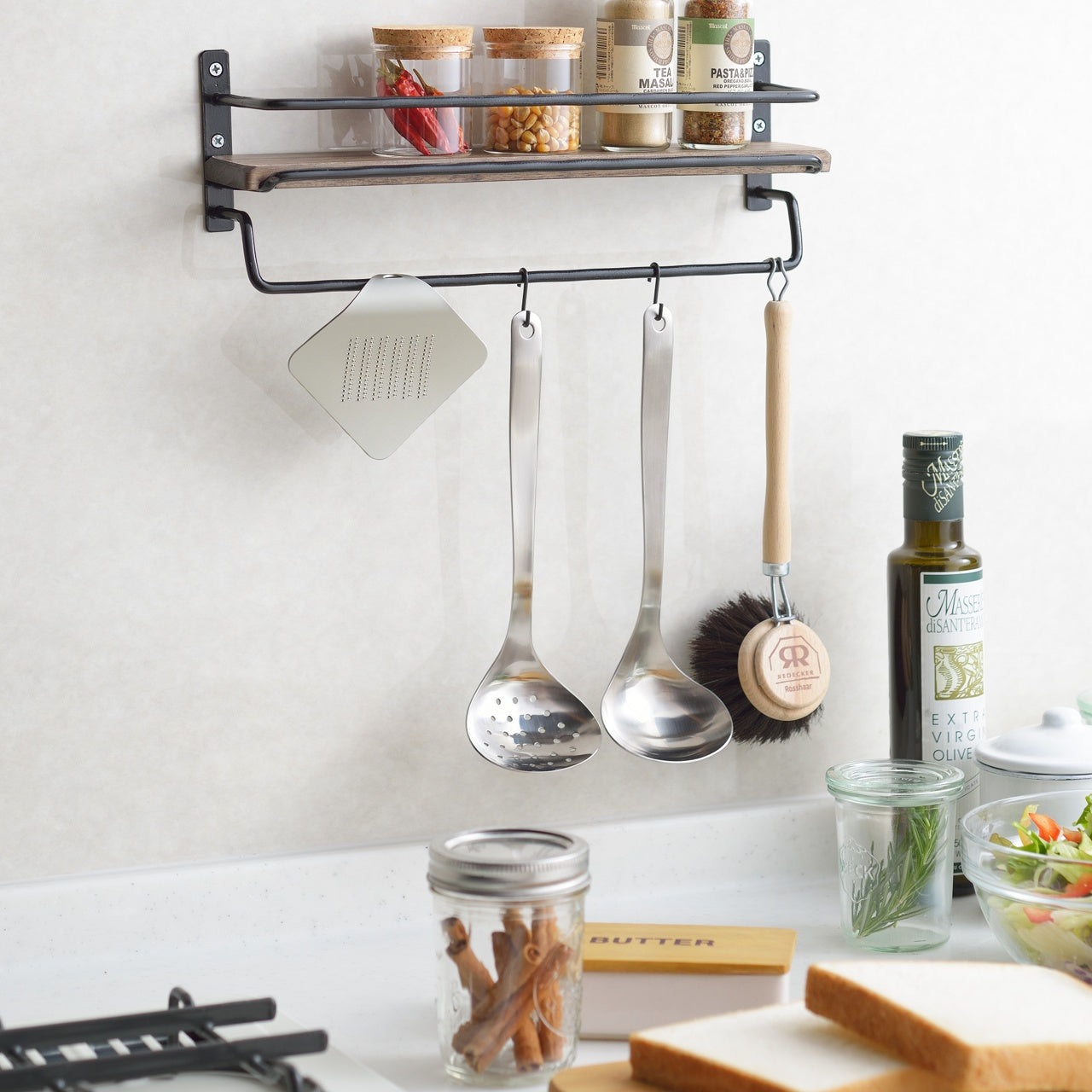
The best kitchen tools are the ones that stay out. Not because there is nowhere to put them, but because putting them away feels like the wrong decision. This grater earns that position through a combination of form, color, and a construction clean enough that it looks as considered as anything else on the counter.

Whether it is finishing a pasta dish, dusting a salad, or handing it to a guest who wants to do the honors themselves, it handles the task without making anything of it. That is exactly the kind of object a well-run kitchen benefits from having within reach.
The post A Designer Curled a Single Sheet of Aluminum Like Paper to Make a Grater That Fits Perfectly in Your Palm first appeared on Yanko Design.

Madkids Empire Is Turning Intimidating Synth Gear Into Pure Play

Most musical instruments communicate one thing very clearly before you even touch them: you have to earn this. The arrangement of knobs, the wall of technical labeling, the thick manual sitting smugly beside the unit. It is an initiation ritual disguised as product design, and for most people, it works exactly as intended. They back away.

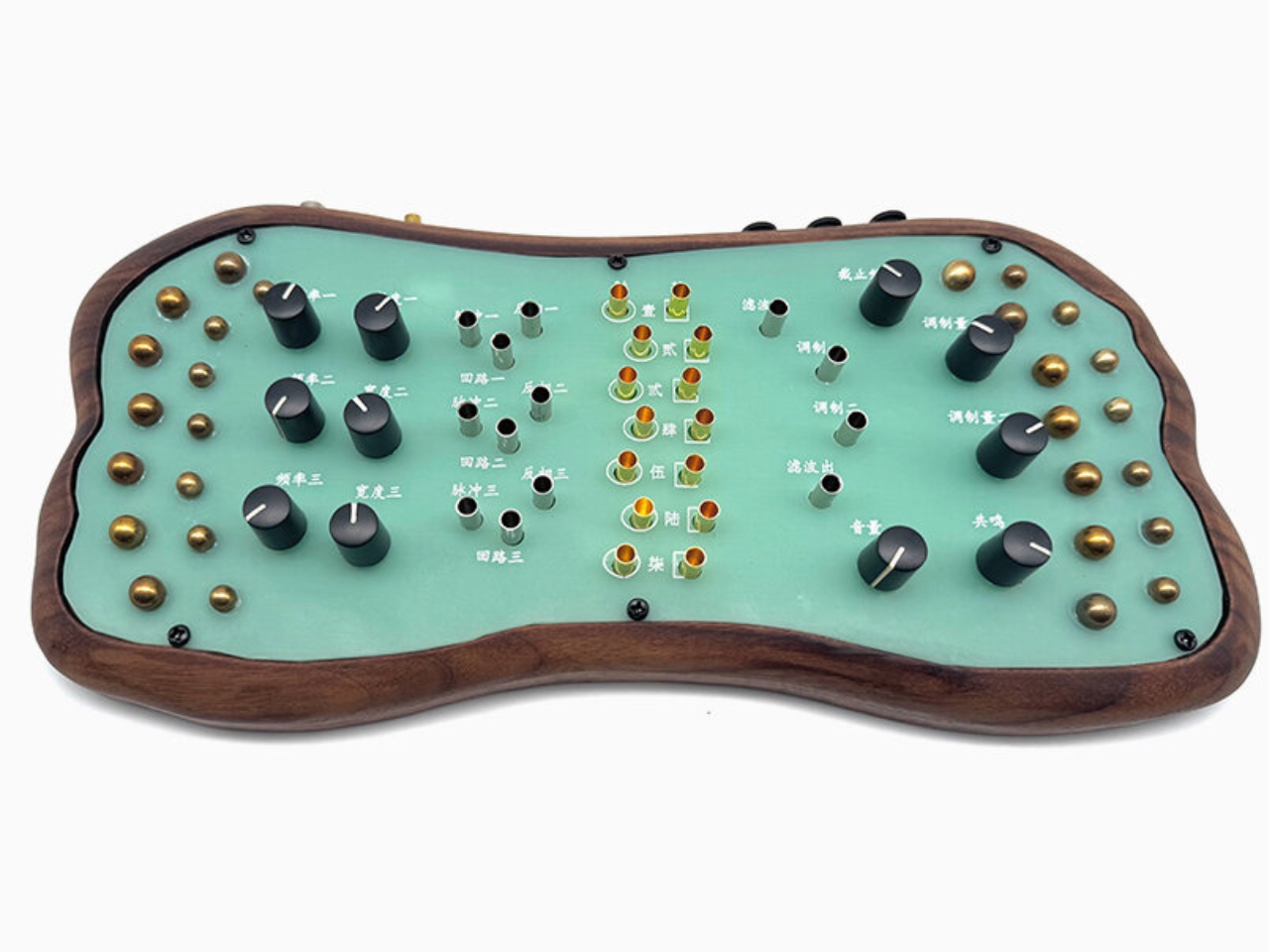
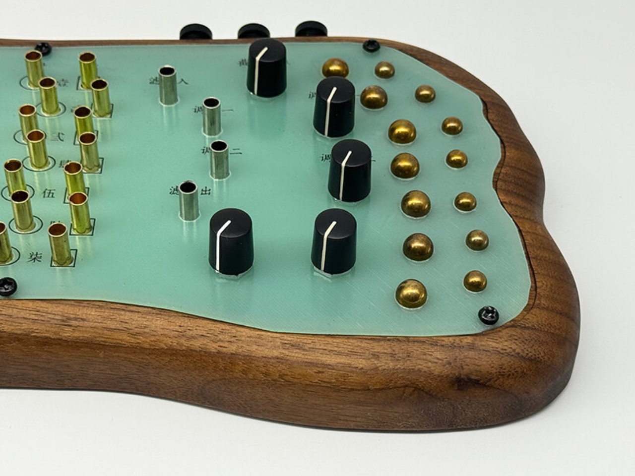
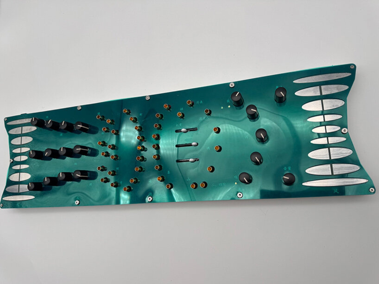
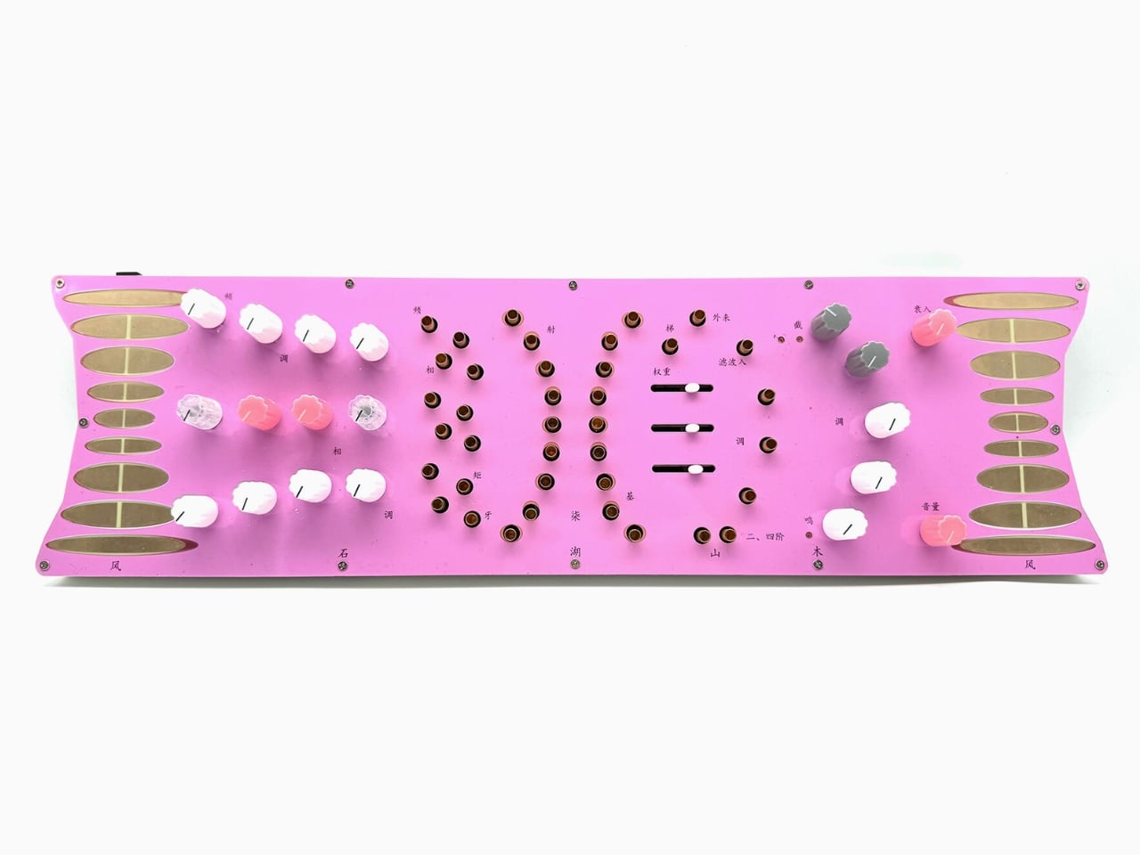
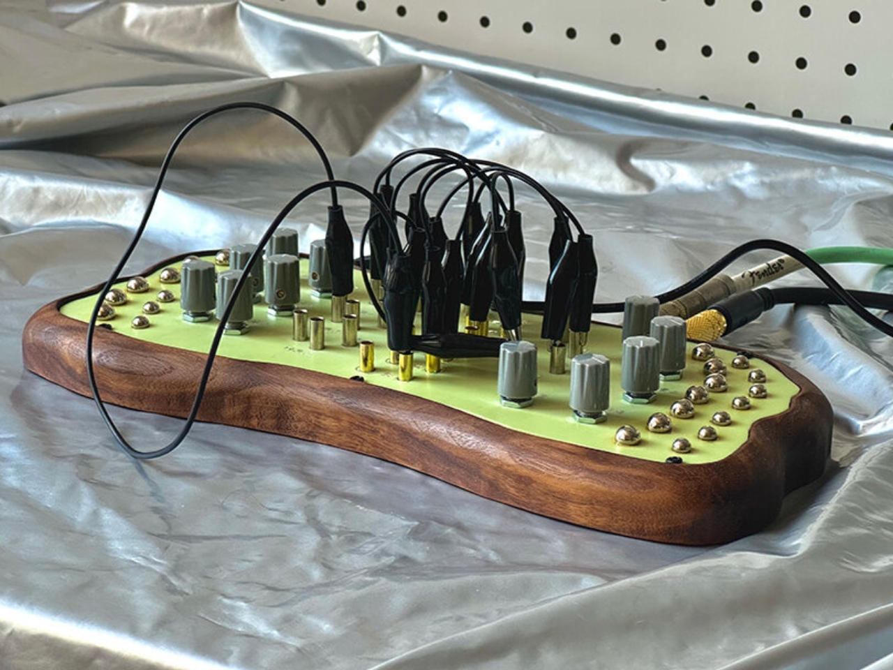
Madkids Empire, a studio founded by a designer named Xam, has built something that works in the opposite direction. Their collection of analog synthesizers is covered in illustrated surfaces, organic silhouettes, and, deliberately, Chinese annotations that describe functions through metaphor rather than engineering terminology. Instead of telling you what a knob controls, the labeling hints at what it feels like. It is the difference between reading a recipe and being handed a fork.

Designer: Madkids Empire

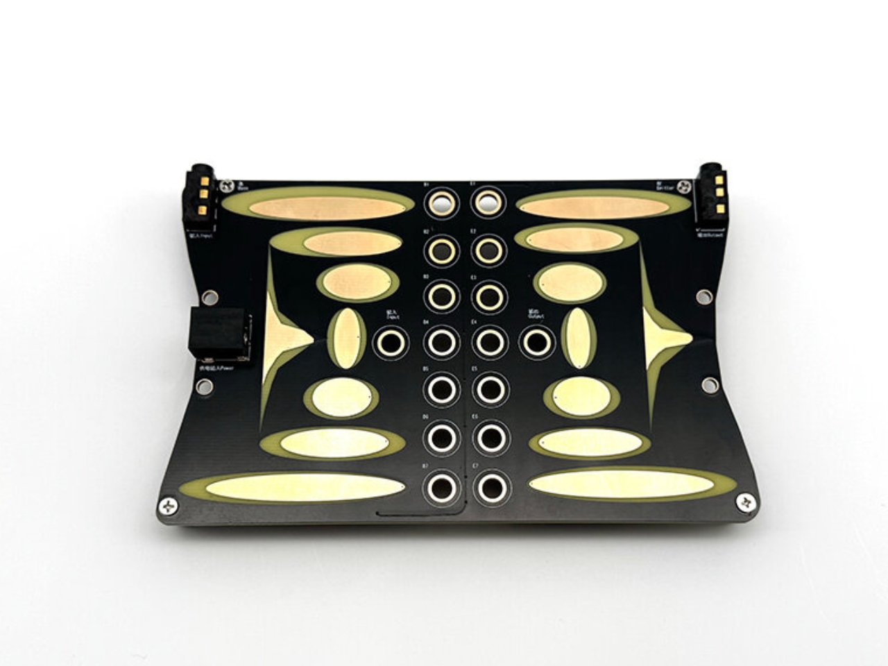
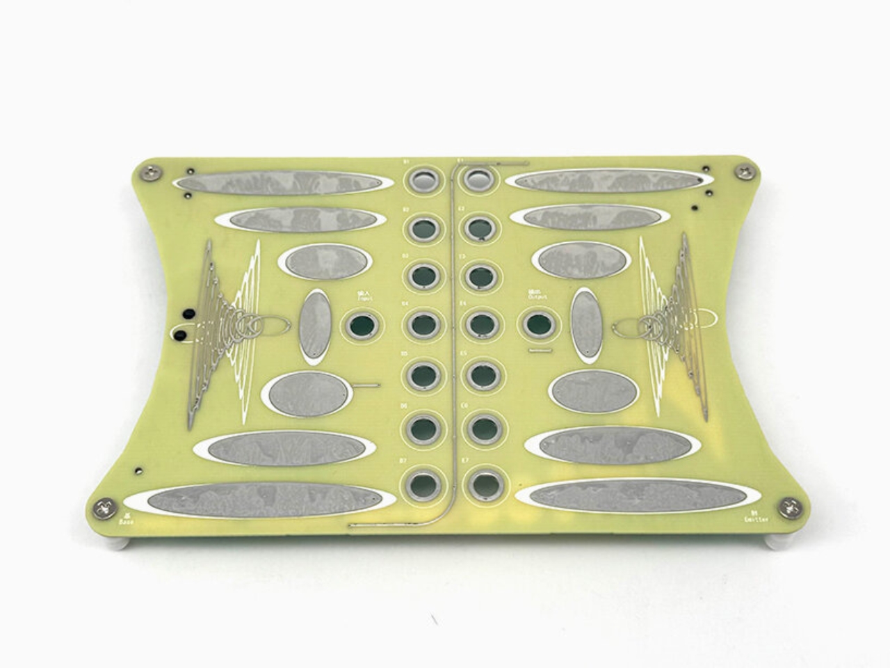
The visual language alone is worth paying attention to. Each instrument looks less like a piece of audio equipment and more like an illustrated landscape you could reach into. Wooden frames and brass details soften what would otherwise read as industrial objects. The shapes curve and flow in ways that suggest something natural rather than manufactured, which is intentional. Xam builds the design around the circuit itself, starting with the technical structure of the sound and then finding a natural concept that mirrors it. A lake. A mountain. A tree. The interaction you have with the synth is meant to feel connected to that concept, so patching a cable or turning a dial carries a kind of environmental logic, even if you could not explain exactly why.

The result is an instrument that looks like you are supposed to explore it, and the collection does not disappoint on that expectation. The flowing silhouettes and playful interfaces do not just look inviting; they function that way too. Xam has said that what they want users to understand is that musical knowledge is not the entry point. Curiosity is. When someone hears a sound they like during experimentation, they have made something entirely their own, something they arrived at through play rather than study. That reframing matters more than it might initially seem.

Most design conversations around synthesizers orbit gear obsession and technical hierarchy. How many oscillators, what filter topology, which vintage unit did it draw from. Madkids Empire does not seem particularly interested in that conversation. The chaos baked into these instruments, and yes, chaos is a deliberate design choice here, provides feedback that evolves with what you are doing. Unlike randomness, which offers no relationship between action and outcome, the unpredictability here responds to you. You become part of the system. It is closer to improvising in a new environment than operating a machine.

That philosophy has a real audience right now. The broader design and tech world has spent years talking about removing barriers and making things accessible, but the actual execution is usually just simpler interfaces with less functionality. Madkids Empire took a different approach: keep the depth, remove the intimidation, and replace the instruction manual with the experience of discovery itself. The instruments are not dumbed down. They are just designed with a different entry point in mind.

The aesthetic choices also position these synths somewhere unusual on the cultural map. They are not vintage recreations chasing the warmth of a classic unit, and they are not sleek minimalist tech objects trying to disappear into a desk setup. They are objects you would notice on a shelf. Objects that invite a question. That sense of presence, the feeling that a thing has a personality before you interact with it, is genuinely rare in hardware design.

Xam has built something that sits at the crossroads of instrument, sculpture, and game. The synthesizer as landscape. The knob as terrain. Whether or not you ever make music with one, the thinking behind Madkids Empire’s work is the kind that deserves to travel beyond the synthesizer community and into a wider conversation about what it means to design something people actually want to touch.

The post Madkids Empire Is Turning Intimidating Synth Gear Into Pure Play first appeared on Yanko Design.
The Pixel 11’s Coolest New Feature Is Actually 10 Years Old

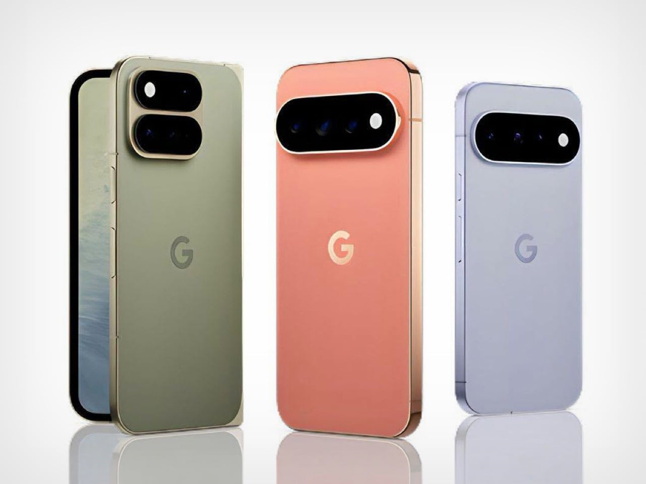
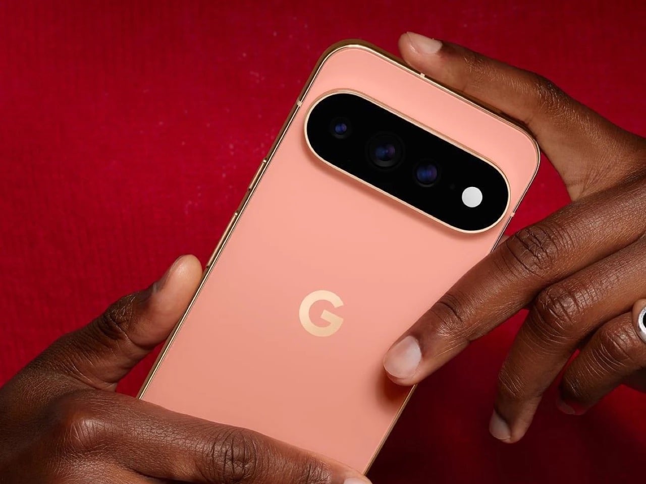
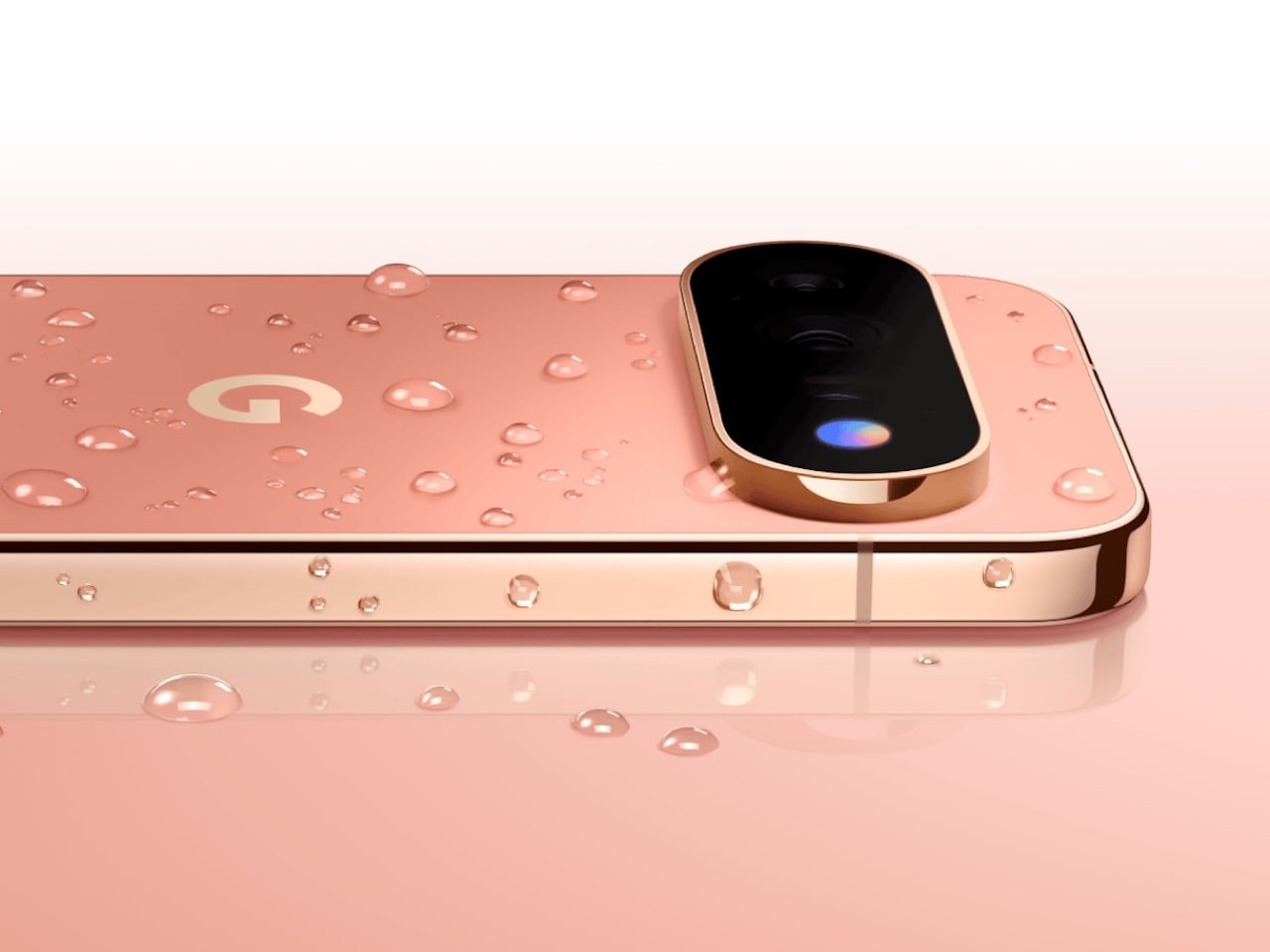
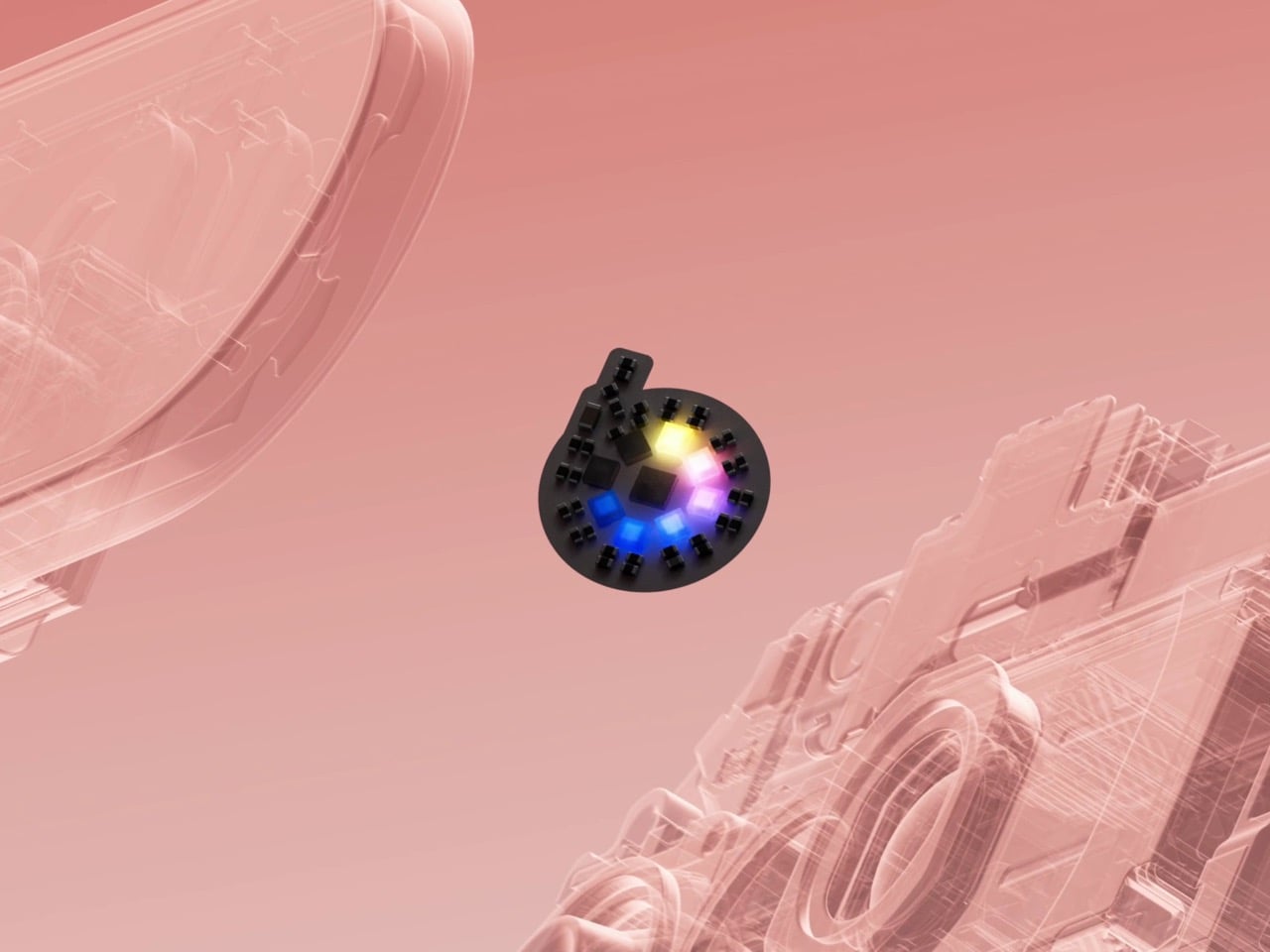
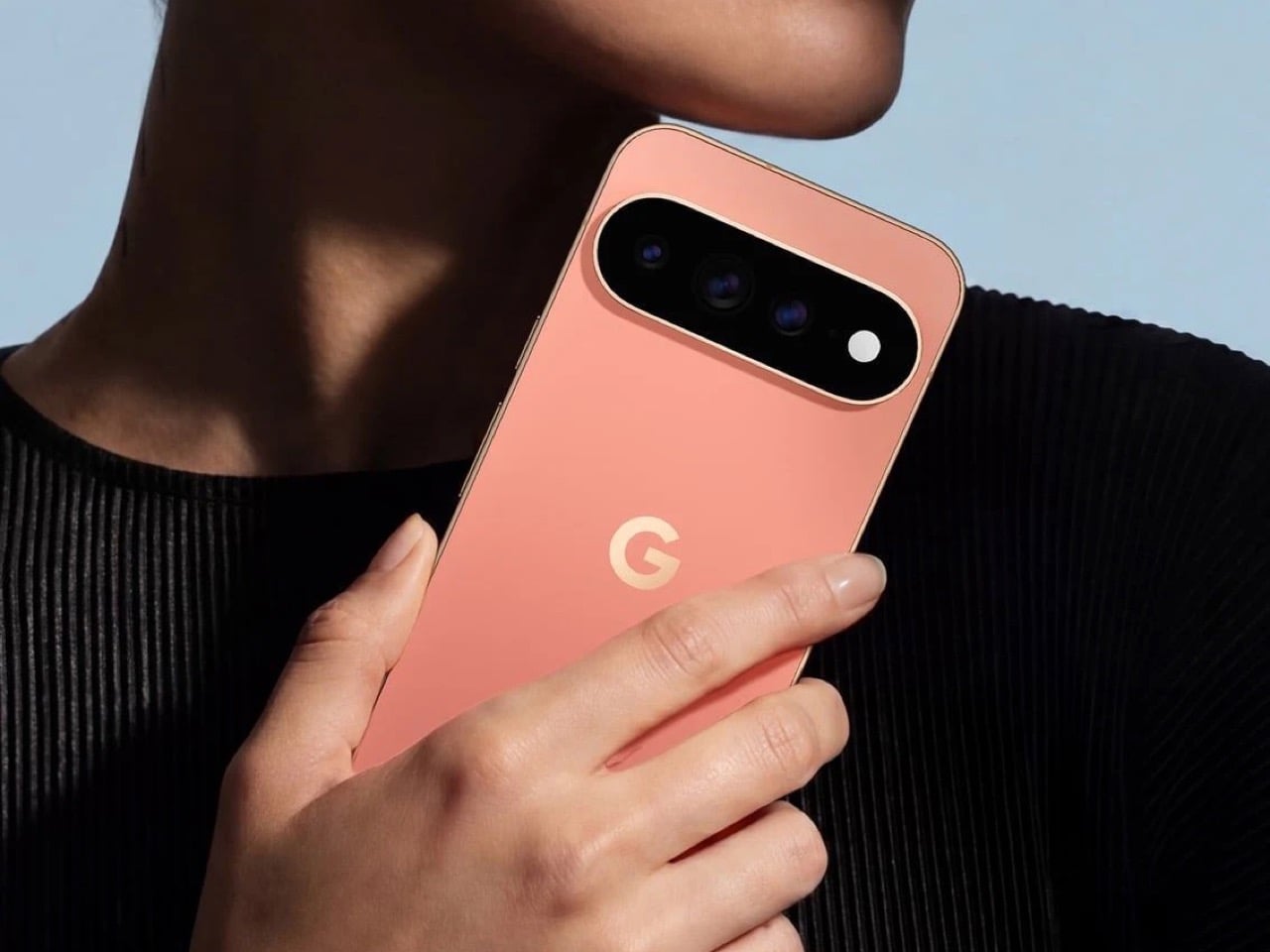
The Pixel 11 lineup arrived this week with a genuinely great redesign. The camera bar is 40 percent thinner, the glass runs edge to edge, and for the first time in a while a Pixel actually looks like it evolved instead of just got a new coat of paint. And then there’s HiLight, the one piece of new hardware Google actually wants you to talk about. A small LED cluster tucked into the corner of that same camera bar, ready to glow when Gemini is thinking or when someone you love is calling.

It is, in essence, Google finally admitting it missed the old Nexus notification LED and bringing it back. Five colors, a glow for Gemini, a glow for your favorite caller, and that’s the whole feature list on day one. Nothing to complain about here, except that Nothing exists. The London phone brand has spent years turning its own version of this idea into an actual playground, mini-games, custom widgets, an SDK anyone can build on. Google clearly has the engineering muscle to do something just as ambitious with HiLight down the line. It just chose not to, at least not yet.

Designer: Google

Before we get into that though, credit where it’s due. Hold a Pixel 11 next to a Pixel 10 and the difference is immediate, not the kind that only shows up in marketing photos. The bar sits almost flush now, and Google’s claim that it’s basically bumpless with a case on actually checks out in person. Under that glass, Tensor G6 lands on a 2nm node, Google’s first, promising 25 percent faster browsing, 15 percent quicker app launches, and on-device AI running up to 3.5 times faster while using less power. The Pixel 11 gets a new 48MP main sensor with 56 percent more light sensitivity and a telephoto stretching to 30x Super Zoom. This is a very complete phone before you even get to the Pro models.

The Pro and Pro XL push further with a 50MP main sensor, a redesigned 48MP telephoto, Portrait Mode at 5x, and 120x Pro Zoom, sitting under a 3,600-nit display that Google claims is twice as scratch resistant as last year’s. Titan M3 adds quantum-safe boot security on top. The Pixel 11 Pro Fold deserves its own mention here too. It shed almost 10 percent of its weight and a millimeter of thickness, down to 10.1mm closed, while Google claims triple the durability thanks to a redesigned gearless hinge. The crease is genuinely harder to spot than last year’s, and the whole thing folds flat enough to stop feeling like a novelty. If you told me a year ago Google would have the most convincing foldable in its own lineup, I would not have believed you.

Now, the part everyone will bring up regardless of how the rest of this goes: RAM. The Pro and Pro XL start at 12GB in their base 256GB configs, down from 16GB last year, and Google is blaming this on a supplier RAM shortage hitting the entire industry. Memory manufacturers have been shifting production capacity toward AI server chips, and consumer RAM and NAND prices have spiked hard enough this year that people are half-jokingly calling it RAMageddon. It is a real problem, and Google is far from the only phone maker feeling it. Storage doubling to 256GB as a base softens the blow a little, but a $100 price bump alongside a RAM cut is still a hard sell. Fair enough on the supply chain excuse. Less fair asking Pro buyers to pay more for less unless they climb a storage tier.

Back to HiLight, because it deserves the real estate. That LED cluster sits right where the temperature sensor used to live on older Pixels, which is a strange trade to make for something this limited. Google’s official pitch is that HiLight keeps you informed without the distraction of staring at a screen, which is a very polished way of saying there weren’t enough ideas to fill the space. Glowing when Gemini talks and flashing a color for favorite callers is a fine start, not an entire feature. Compare that to what’s happening across the pond. Nothing’s Glyph Matrix on the Phone (3) packs 489 individually lit LEDs into what functions as a tiny secondary screen, complete with an open SDK that lets anyone build their own widgets and games. People made a working ball maze. A tilt-controlled Magic 8 Ball. A contact dialer you can use without touching the main display. None of it is essential, but all of it is fun, and fun counts for something when you’re asking someone to pay a premium for a light.

Google clearly has the horsepower for something bigger here. Tensor G6 alone proves the company isn’t short on engineering muscle, and the camera bar redesign shows the industrial design team knows exactly what it’s doing right now. HiLight feels like the output of a team that had a great idea, then stopped one meeting short of making it good. I want to see where this goes in a year or two, because the foundation Google just built, the hardware, the placement, even the name, is genuinely solid. It just needs an actual reason to exist beyond telling you Gemini is thinking.


The post The Pixel 11’s Coolest New Feature Is Actually 10 Years Old first appeared on Yanko Design.
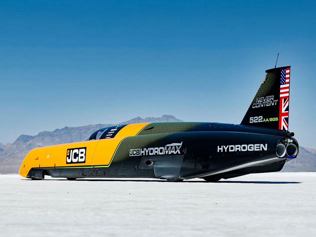
JCB Hydromax sets a new hydrogen land speed record at 406.320 mph

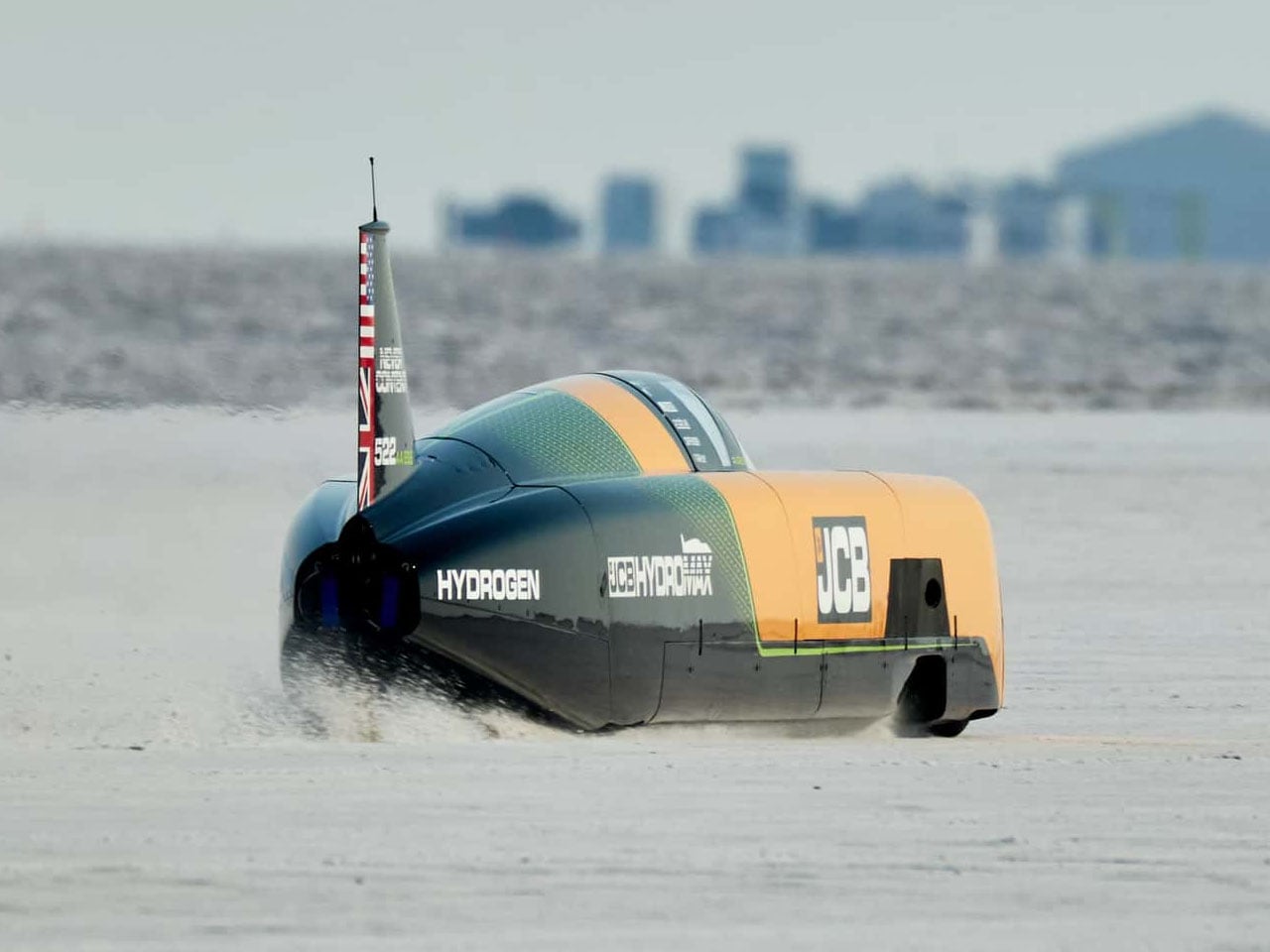
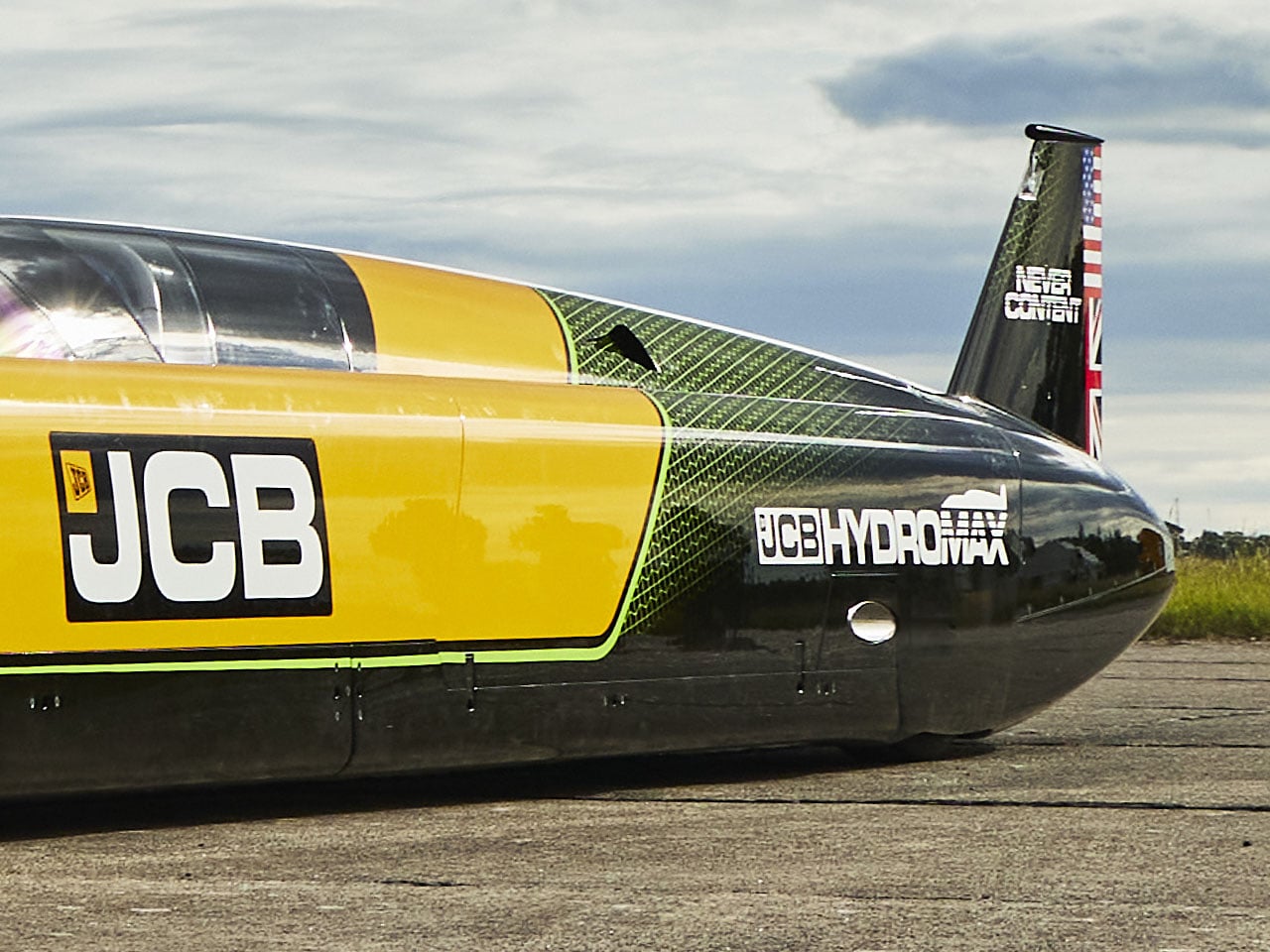
A pair of hydrogen-powered engines developed for construction machinery has just been pushed into territory normally reserved for purpose-built speed machines. JCB’s Hydromax has reached an astonishing 406.320 mph (653.6 km/h) at Utah’s Bonneville Salt Flats, becoming the fastest hydrogen-powered vehicle of any kind and setting a new world land speed record for a hydrogen internal-combustion car.

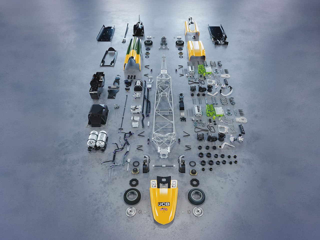
The 32-foot-long streamliner is powered by two production-based JCB hydrogen combustion engines, each tuned to produce 800 horsepower for a combined 1,600 bhp. Rather than using hydrogen in a fuel cell to generate electricity, Hydromax burns hydrogen directly in its internal-combustion engines. The engines are manufactured at JCB’s factory in Foston, Derbyshire, and are based on the same production engines powering JCB machines in the UK.

Designer: JCB

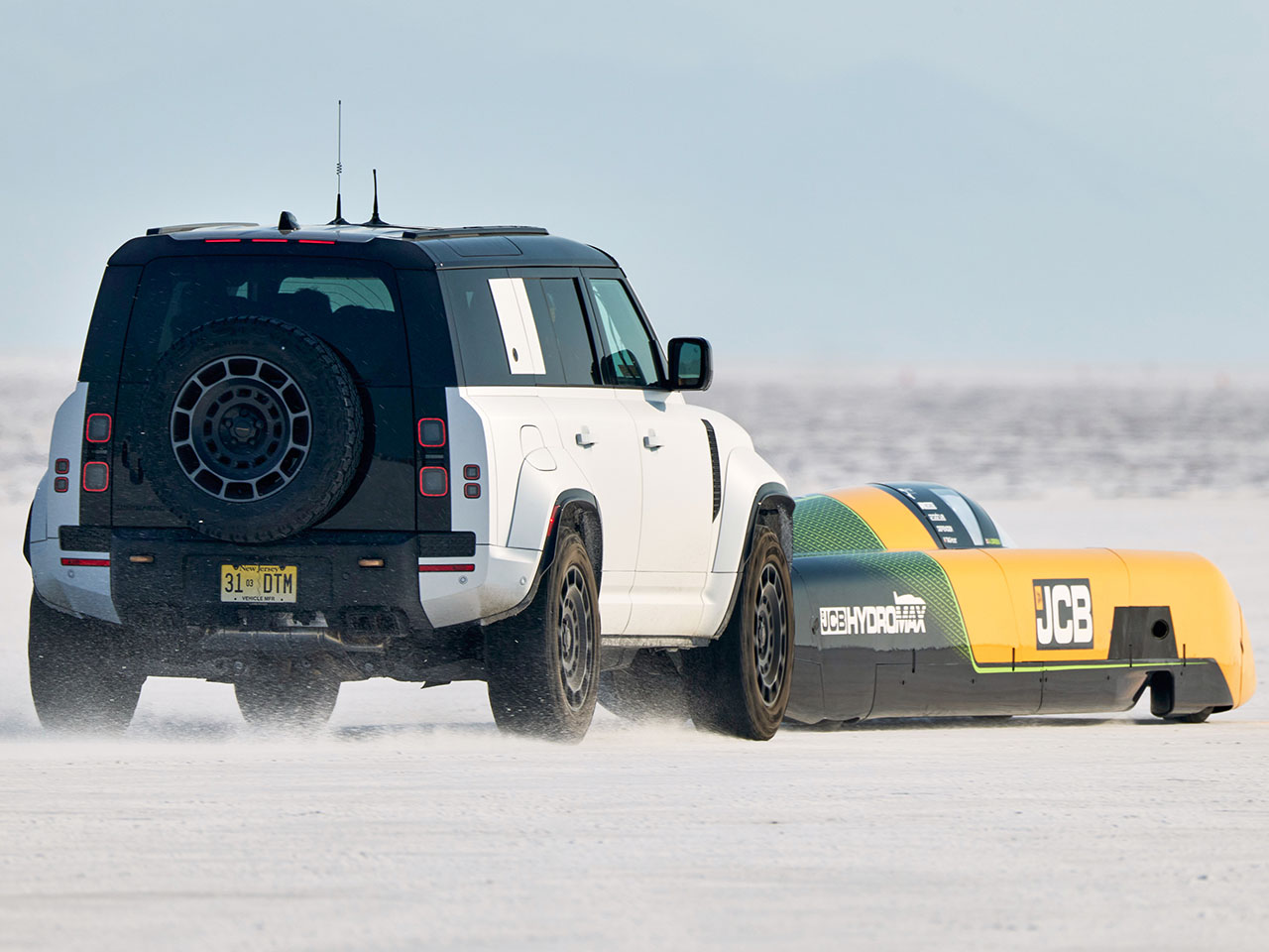
Its record-setting run was completed under FIA rules, requiring two passes in opposite directions within an hour. Driven by Wing Commander Andy Green OBE, Hydromax recorded 400.623 mph on its first run and 412.135 mph on the return, producing the official average of 406.320 mph. The result comfortably surpassed the previous FIA-officiated hydrogen internal-combustion record of 185.5 mph, set by the BMW H2R in 2004. It also moved beyond the 303 mph hydrogen fuel-cell record, making Hydromax the fastest hydrogen-powered vehicle in history. The record remains subject to formal FIA ratification.

According to project lead, JCB Engineering Director Ryan Ballard, “This record belongs to the engineering team which took a hydrogen digger engine and made it the fastest of its kind on earth. This has been an amazing challenge from the outset, with it being set in February last year. We came here fully prepared, and the car delivered.”

The achievement follows an earlier milestone at the 2026 Bonneville Speed Week, where Hydromax averaged 368.347 mph over two runs to establish an SCTA record in the Blown Gas Streamliner class. Its first run reached 367.141 mph, followed by 369.554 mph on the return. That result surpassed the previous 348.342 mph class benchmark, while giving JCB an important test of the car before its FIA attempt.

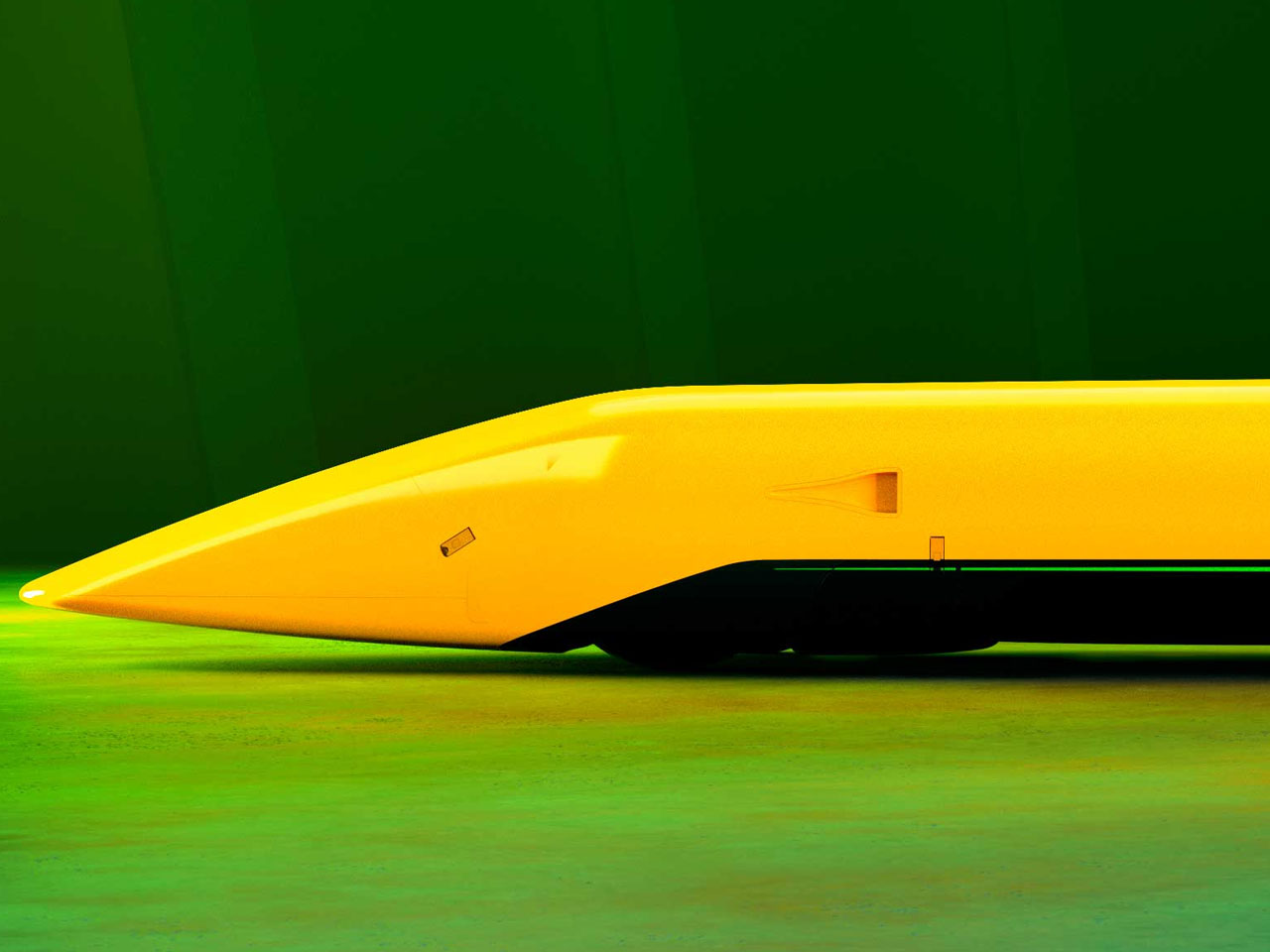
Much of the car’s engineering focuses on making extreme speed controllable. Hydromax drives all four wheels through twin transmissions and clutches, while its body was shaped around aerodynamic efficiency and stability. JCB says the suspension, traction control, aerodynamics and camera placement were all stress- and simulation-tested before the attempt. Prodrive handled the car build, Ricardo worked on engine tuning and Xtrac supplied the transmission expertise.

The record also carries a strong sense of continuity for JCB. Exactly 20 years after Andy Green drove the JCB Dieselmax to a 350.092 mph diesel land speed record at Bonneville, he has returned to the same salt flats to establish an even faster mark using hydrogen. The Hydromax project was conceived in 2025 as a demonstration of JCB’s hydrogen combustion technology, turning engines developed for working machines into a record-breaking powertrain.


The post JCB Hydromax sets a new hydrogen land speed record at 406.320 mph first appeared on Yanko Design.
Google’s Pixel Tag is making the same ‘boring’ design mistake that Apple, Samsung, and Xiaomi made

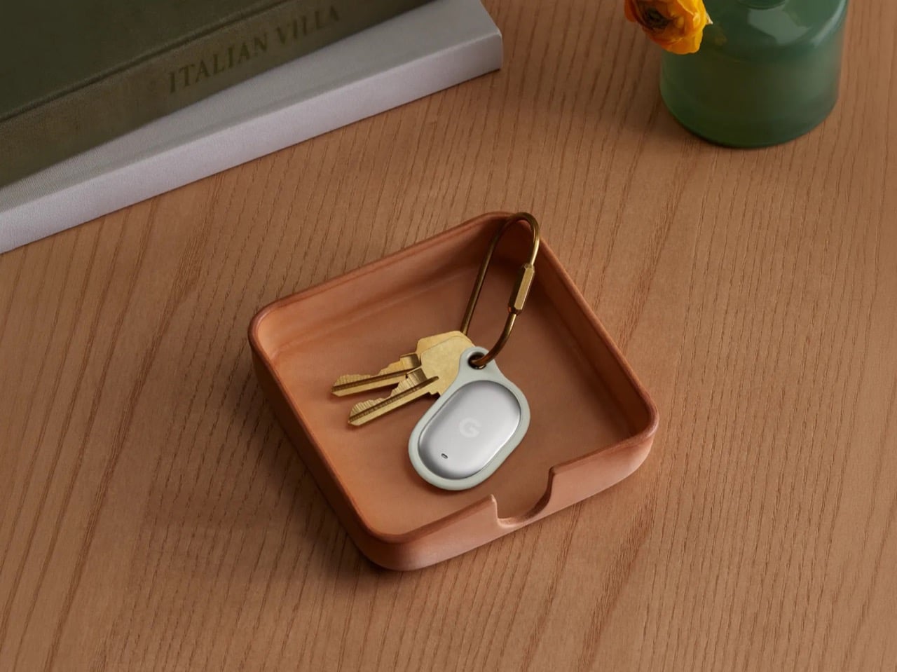
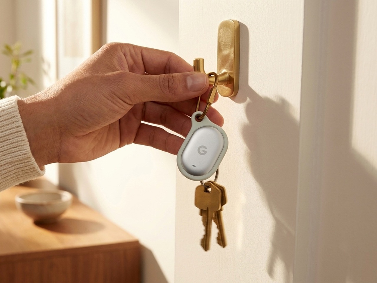
The Pixel Tag comes in exactly one color, a grey green called Fog, wrapped around stainless steel with a G logo stamped right on the front. It’s the same script Apple wrote with the AirTag and Samsung copied with the SmartTag2. A tracker spends its entire life clipped to your keys or your dog’s collar or tucked into a backpack pocket, which makes it one of the most personal objects you own. Google, of all companies, knows how to make hardware feel less like hardware. It just didn’t bother here.


Somebody at DJI figured out that a $60 microphone could come with snap-on decals, because apparently even a tiny accessory deserves a little personality. Motorola figured out something similar with the Moto Tag, which actually ships in sage green and a soft blue instead of the usual black or white default. So it’s not like nobody in tech has thought about this. It’s just that almost nobody applies it to trackers, and now Google has joined the long list of companies that had the chance and passed.

Designer: Google

The excuse I keep hearing, and I use that word deliberately, is durability. Metal survives drops, fabric doesn’t, case closed. Except my phone survives daily abuse inside a woven case, and so does yours, and so does every rugged Kevlar sleeve sold by the millions for devices far more fragile than a coin sized tracker. Nobody worries their phone case is going to disintegrate because it has some texture on it. A tracker being too delicate for color or grip is not a real constraint. It’s a decision that got dressed up as one.

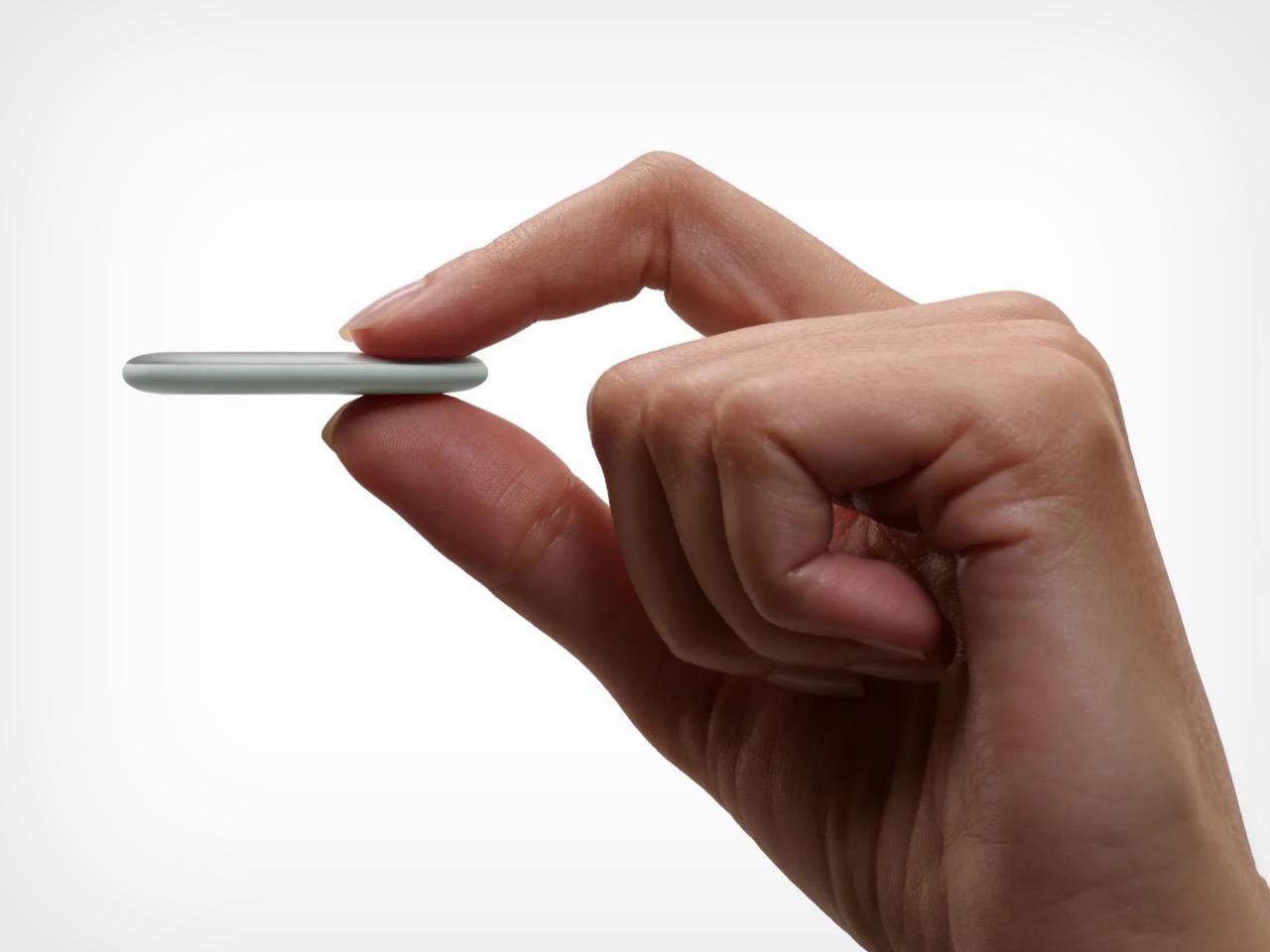
Underneath that decision is genuinely solid engineering, for what it’s worth. The Pixel Tag measures 1.8 by 1.1 inches and just 5.4mm thick, which makes it noticeably slimmer than the AirTag’s 8mm body. It runs on a replaceable CR2032 battery rated for about a year, carries an IP67 rating for dust and water, and pairs instantly over Fast Pair with any Android 9 device or newer. The headline feature is Ultra Wideband combined with Bluetooth Channel Sounding, which gives you a literal on-screen arrow and distance reading instead of a vague “getting warmer” signal, though that trick needs Android 16 and Bluetooth 6.0 to actually work. It taps into Find Hub, Google’s network of over a billion Android phones, so a lost item can get spotted even when it is nowhere near your own devices. You can share access with up to ten people, ring it from a Pixel Watch, or ask Gemini through your Pixel Buds to ring it for you. All of that ships November 11 for $29, or $99 for a four pack.

Google already knows how to wrap good engineering in an object people actually want to look at, because it solved the exact same brief years ago with its speakers. The Nest Mini gets a soft, woven top because Google understood people don’t want to display a hunk of bare plastic on their kitchen counter. The Nest Audio does the same thing, fabric front, rounded edges, an object designed to belong in a room rather than announce itself as a gadget in one. That instinct exists inside the same company that just shipped a keychain accessory in one shade of grey with a logo dead center, like it needed to remind you it’s tech.

A tracker’s entire job is to sit quietly on the stuff you actually care about. It should feel like something you chose, not something you tolerated because the tech underneath happened to be good. Find Hub integration, UWB precision finding, a battery that lasts a year, all of that is genuinely solid work. But solid engineering wrapped in a logo stamped on steel isn’t a finished product. It’s half of one, and Google, weirdly, is the company with the least excuse for stopping there.

The post Google’s Pixel Tag is making the same ‘boring’ design mistake that Apple, Samsung, and Xiaomi made first appeared on Yanko Design.