Pencil Shavings Have Never Looked This Beautiful

Most desk objects get ignored. They sit there doing their one job, collecting dust around the edges, and we never really think about them again. NEST, a conceptual pencil sharpener designed by a team of five students from TUST, UNNC, and CAU, is a direct challenge to that dynamic. It recently took home the winner prize at the 2025 European Product Design Award in the Conceptual Work & Office Product Design category, and the reason it won feels obvious the moment you understand what it actually does.

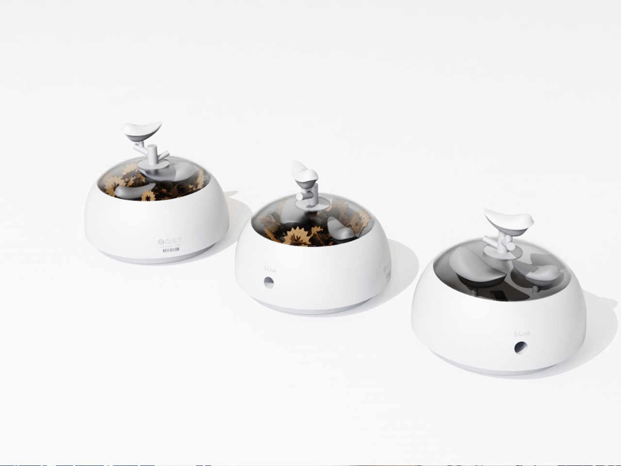
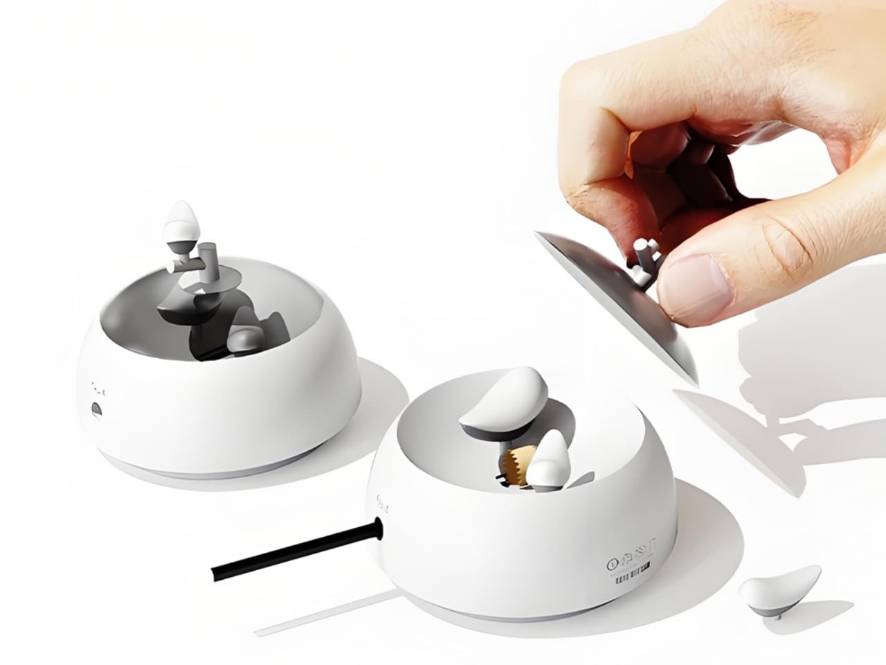
The concept is deceptively simple. A small bird figurine sits inside a rounded, bowl-shaped container. As you sharpen your pencil, the curling wood shavings collect beneath the bird, gradually building up like the gathered material of a real nest. By the time the container needs emptying, the little bird looks as if it has been nesting all along, settled into a soft, spiraling bed of wood ribbons. It is a beautifully accidental image that the design deliberately engineers into being, and once you picture it, it is very hard to unsee.

Designers: Zebin Qiao, Kaishuo Liu, Hongchen Guo, Zicheng Zhao, XiaoTongPan

The real strength of NEST is the intelligence of its metaphor. Lead designer Zebin Qiao and the team didn’t just borrow a visual from nature and paste it onto a product. They found a genuine structural parallel between the act of using the sharpener and the act of nest-building, then made sure the user experiences that parallel in real time. That is not an easy thing to pull off. Most product design that reaches for nature ends up with surface decoration or an illustrative graphic on a box. NEST earns its metaphor because the metaphor lives in the function, not on top of it.
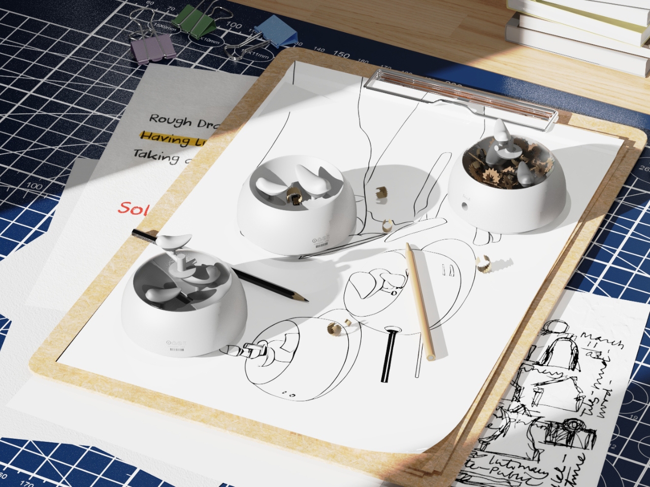
The second layer of the design is the lid. It doubles as a perch, fitted with a minimal branch element. When you are not sharpening, the tiny bird figurine can be lifted out of the interior and placed on the branch, transforming the whole object into a quiet desktop ornament. This dual-state approach means the product shifts personality depending on how you use it. It is a working tool when you need it, and a miniature sculpture the rest of the time. I genuinely appreciate designs that respect both modes of being at a desk, the productive and the contemplative.
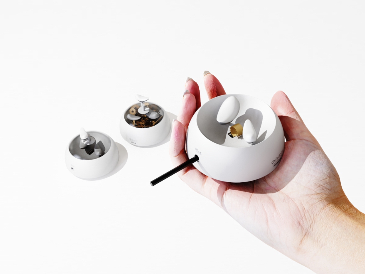
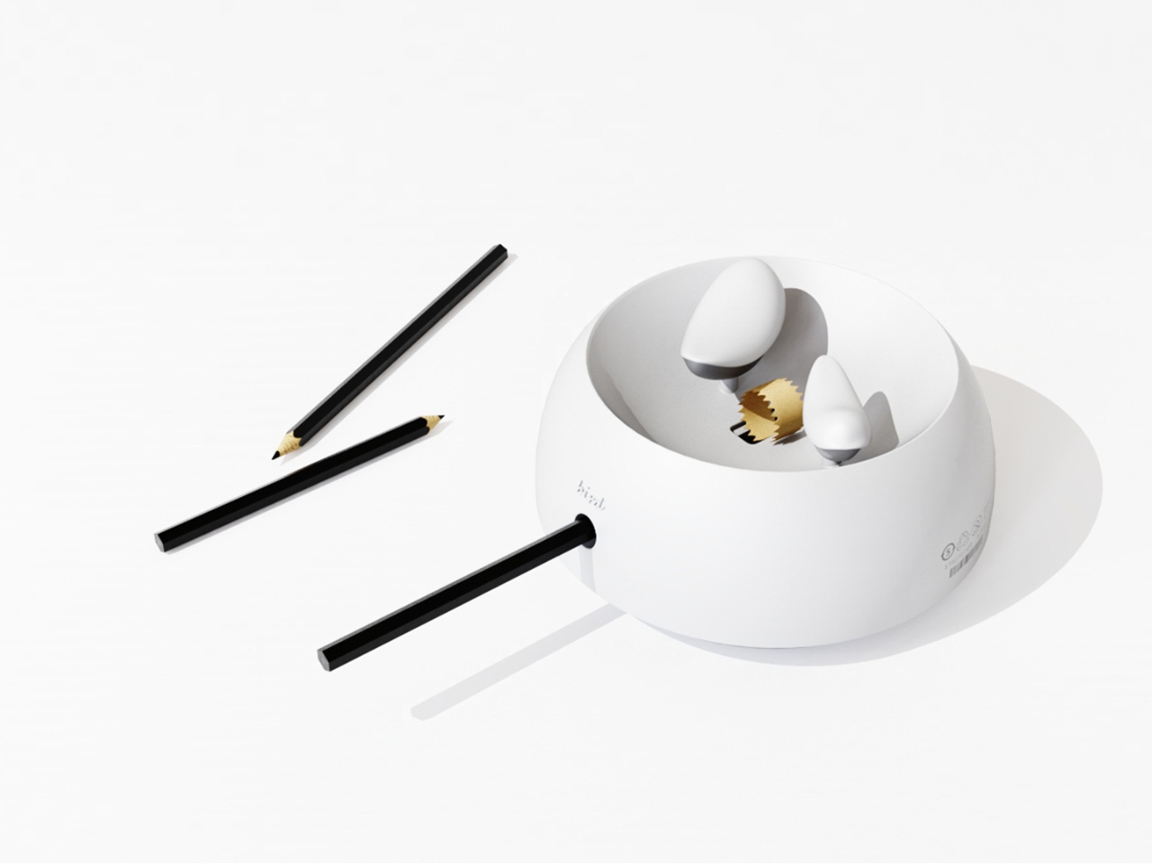
I will admit my first instinct when I encounter “award-winning conceptual product” is mild skepticism. Conceptual work can drift toward spectacle and lose interest in whether the thing would actually function. NEST sidesteps that problem by grounding every design choice in real, physical behavior. The shavings accumulate because that is what shavings do. The bird sits because the container holds it. Nothing is forced or artificially staged. The charm is a byproduct of the function, which is exactly the right way around. It gives the design an integrity that a lot of more expensive, more elaborate objects simply do not have.
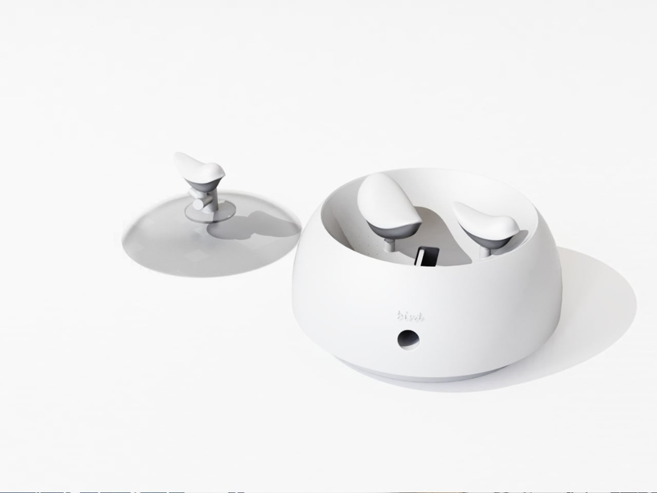
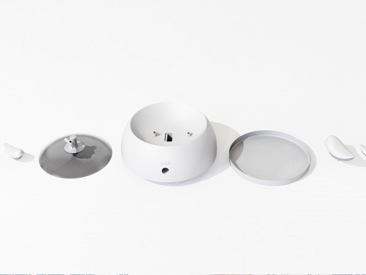
The color variants are worth noting too. The design comes in white, a warm terracotta tone, and a soft powder blue, each with a matching bird. It is a small decision that makes the object feel personal rather than clinical, and it opens the door to something close to a collecting impulse. You are not just buying a sharpener. You are picking a companion for your desk, which is a particular kind of intimacy that few office products ever manage to create.
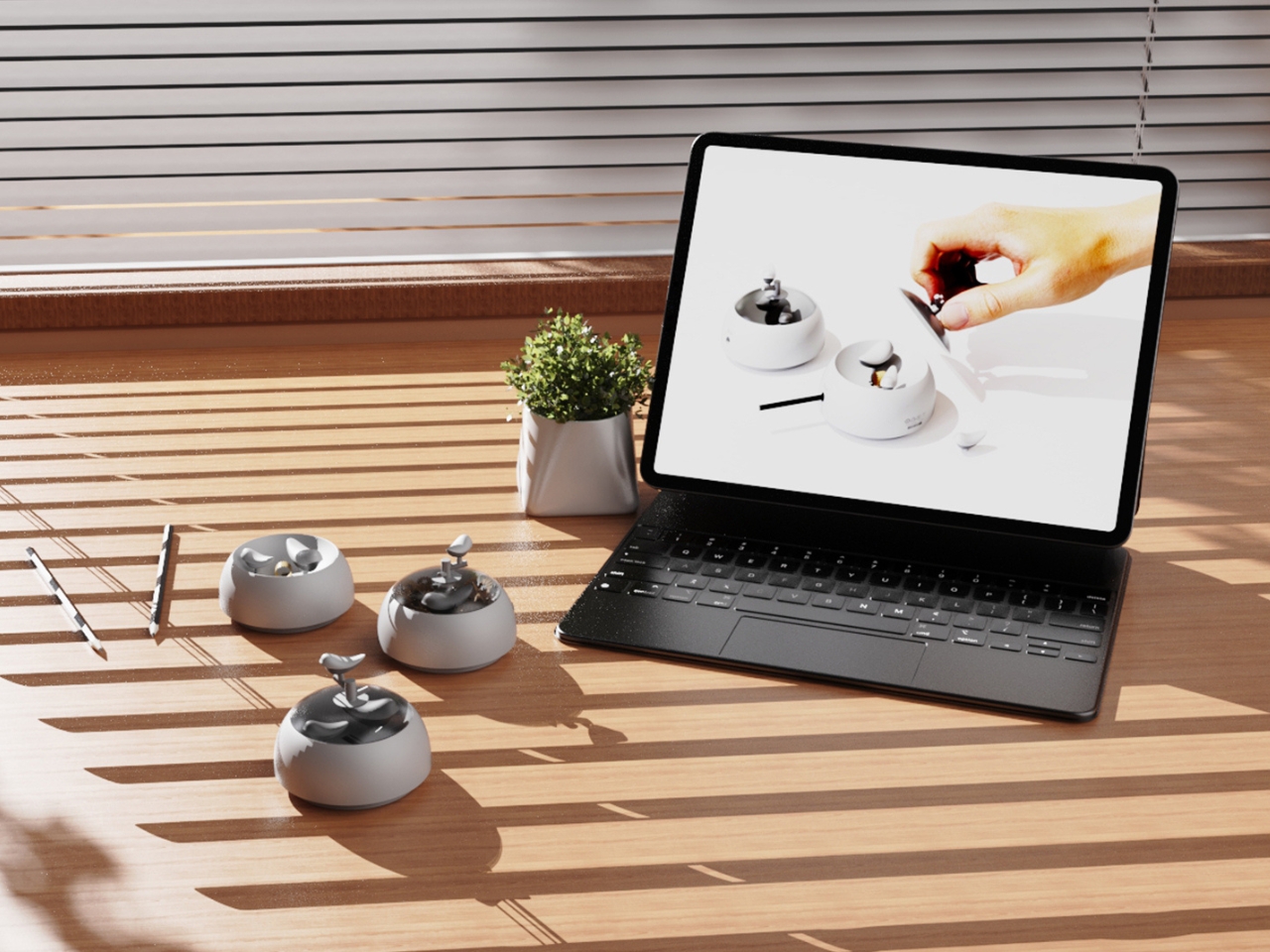
At its core, NEST is making an argument that utility does not have to be neutral. That the objects we interact with daily can carry meaning, invite attention, and reward a small amount of patience. A student design team from three Chinese universities made that argument with a pencil sharpener, and they made it convincingly enough to win a major European award. That is not nothing. If anything, it is the kind of design thinking we need more of, the sort that finds poetry in the ordinary without making you feel like you are trying too hard to appreciate it.

The post Pencil Shavings Have Never Looked This Beautiful first appeared on Yanko Design.
The Projector Concept That’s Almost Too Beautiful to Use

Most concept designs exist to generate buzz, collect awards, and then quietly disappear. The BeoLens Horizon, a projector concept imagined by French industrial designer Baptiste Baumeister, feels different. It feels like a glimpse into a future that Bang & Olufsen should absolutely be building right now.

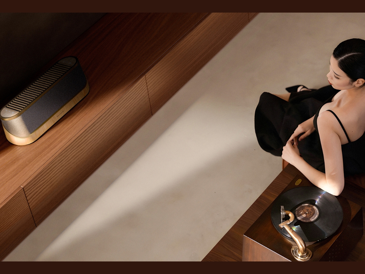
If you’re not familiar with B&O, the short version is this: the Danish audio brand has been setting the benchmark for luxury consumer electronics since 1925. Their products don’t just sound good; they’re designed to be desired as objects. The BeoSound Shape, the BeoVision Harmony, the Beosound Theatre, all of them treat your living room like a gallery wall. Baumeister clearly understands that DNA, and with BeoLens Horizon, he runs with it in a direction that feels genuinely exciting.

Designer: Baptiste Baumeister

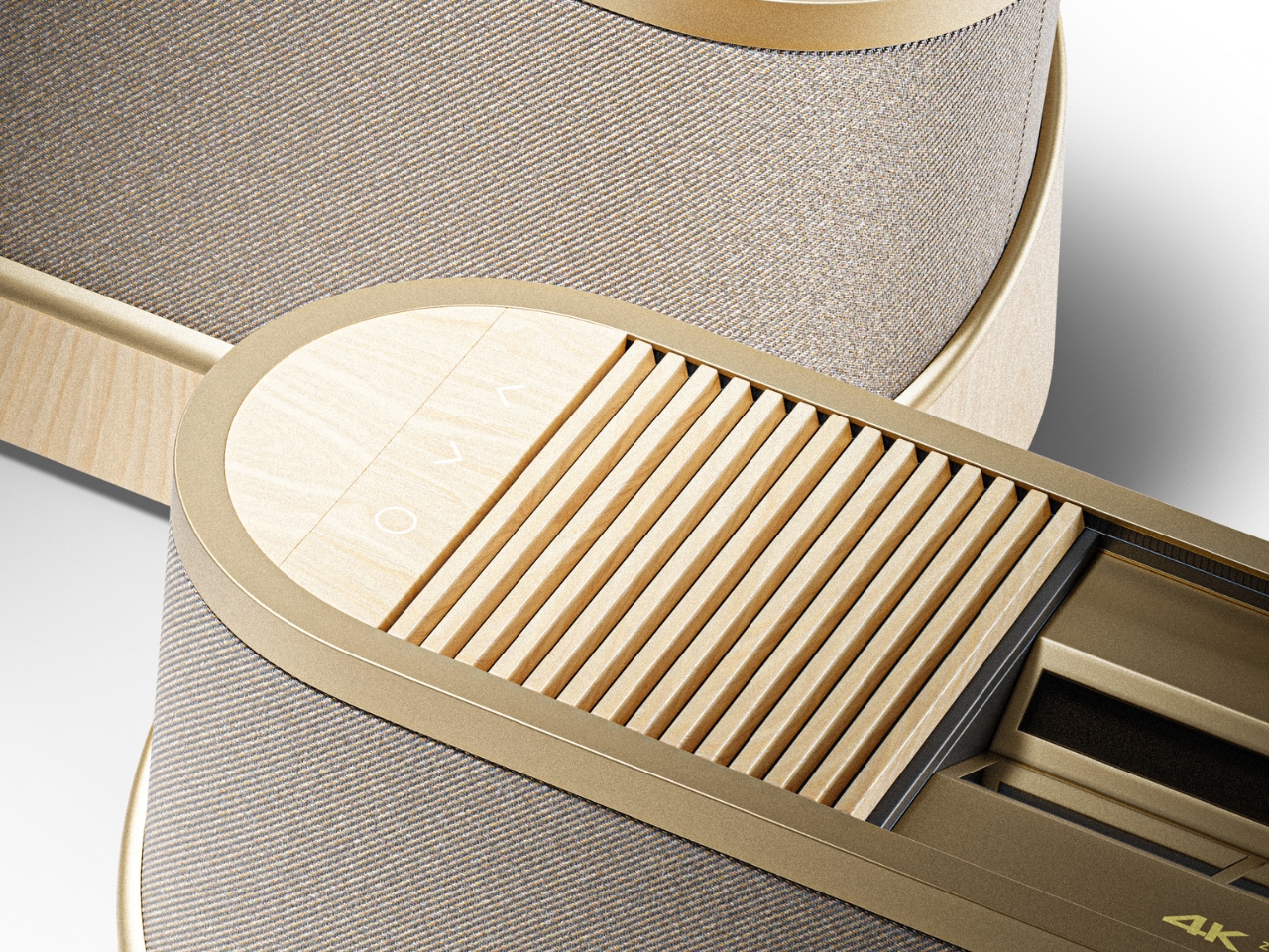
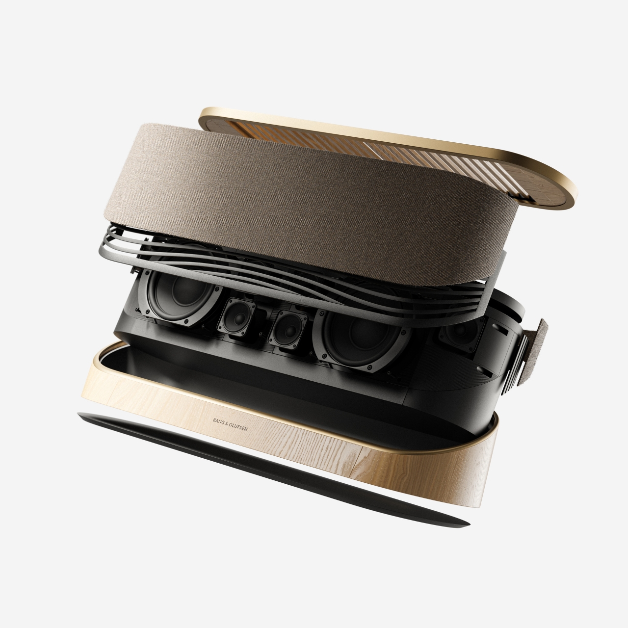
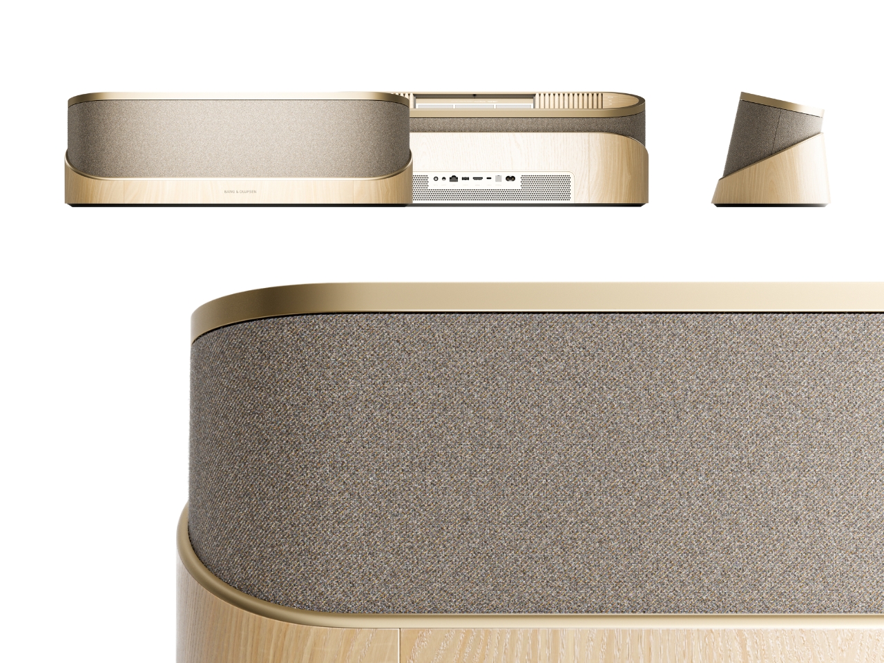
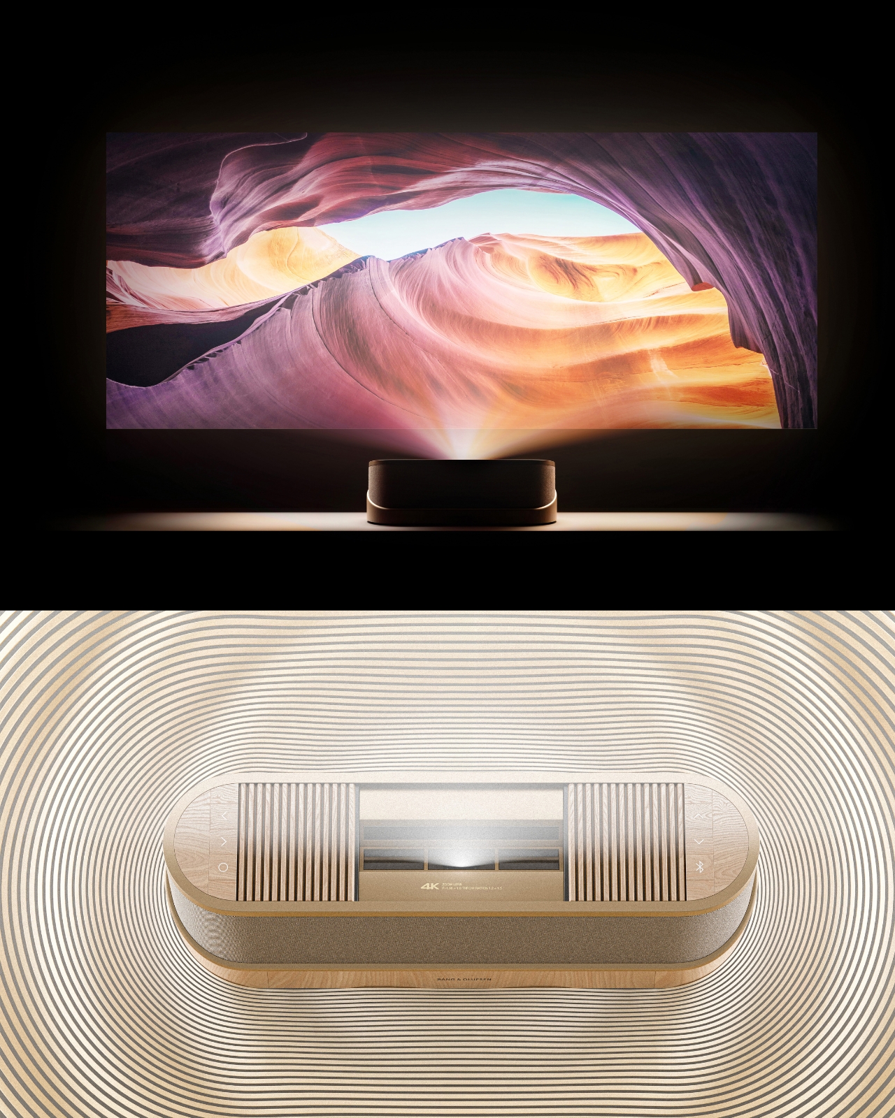
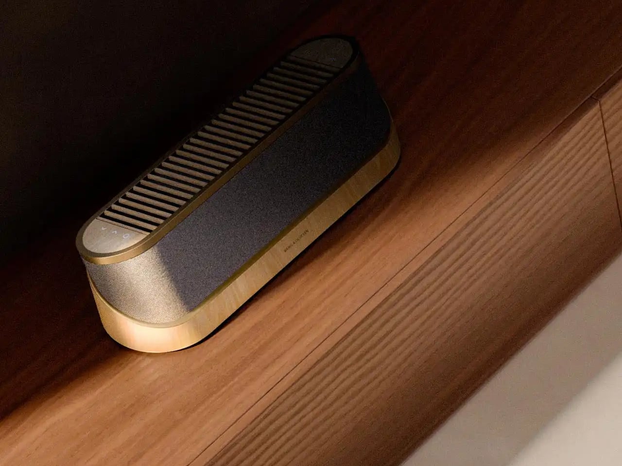
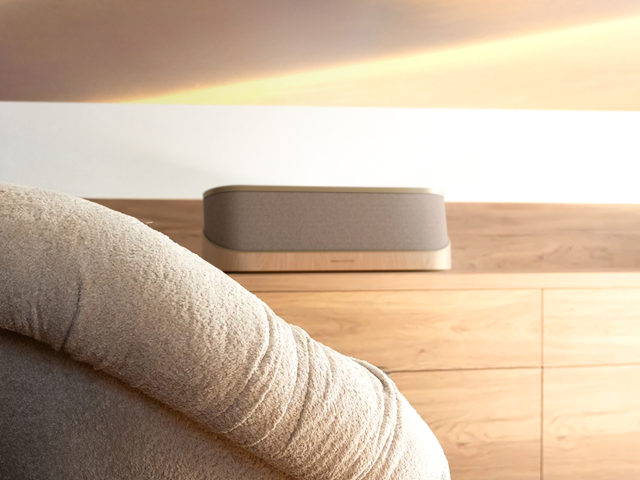
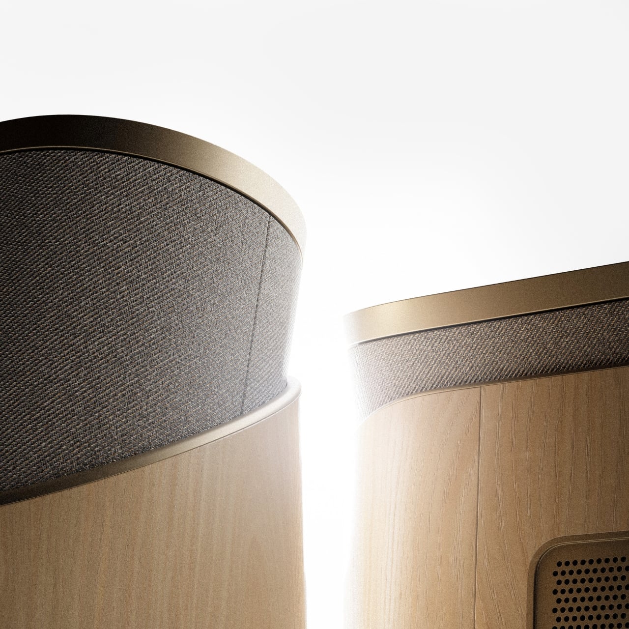
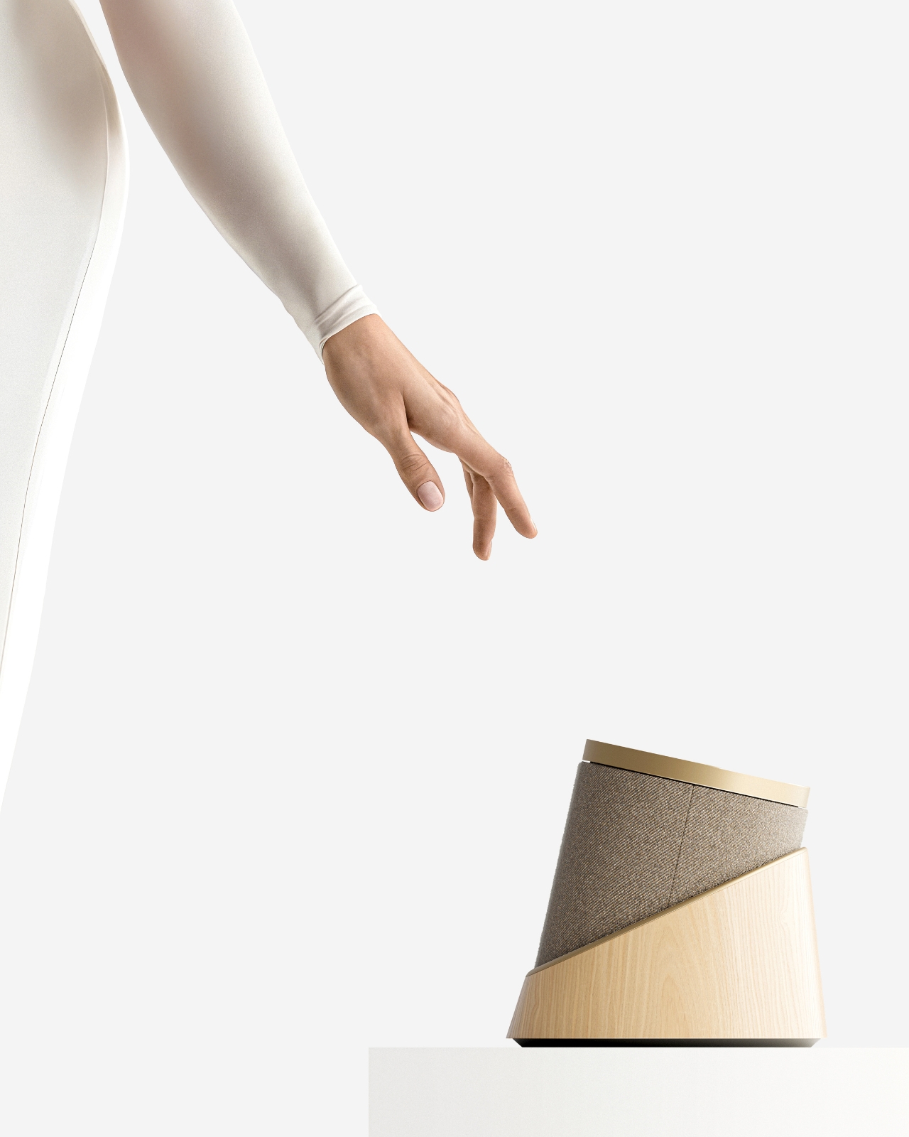
The design comes in two distinct configurations. The first is a horizontal, low-profile unit that sits flat on a surface like a refined soundbar crossed with a Scandinavian jewelry box. The second is a taller, cylindrical form that reads more like a speaker column or a sculptural object you’d place on the floor. Both share the same material vocabulary: light ash wood, brushed gold-toned aluminum, and tightly woven acoustic fabric in warm grey. It’s the kind of material combination that makes you think of an architect’s weekend house rather than a tech showroom.

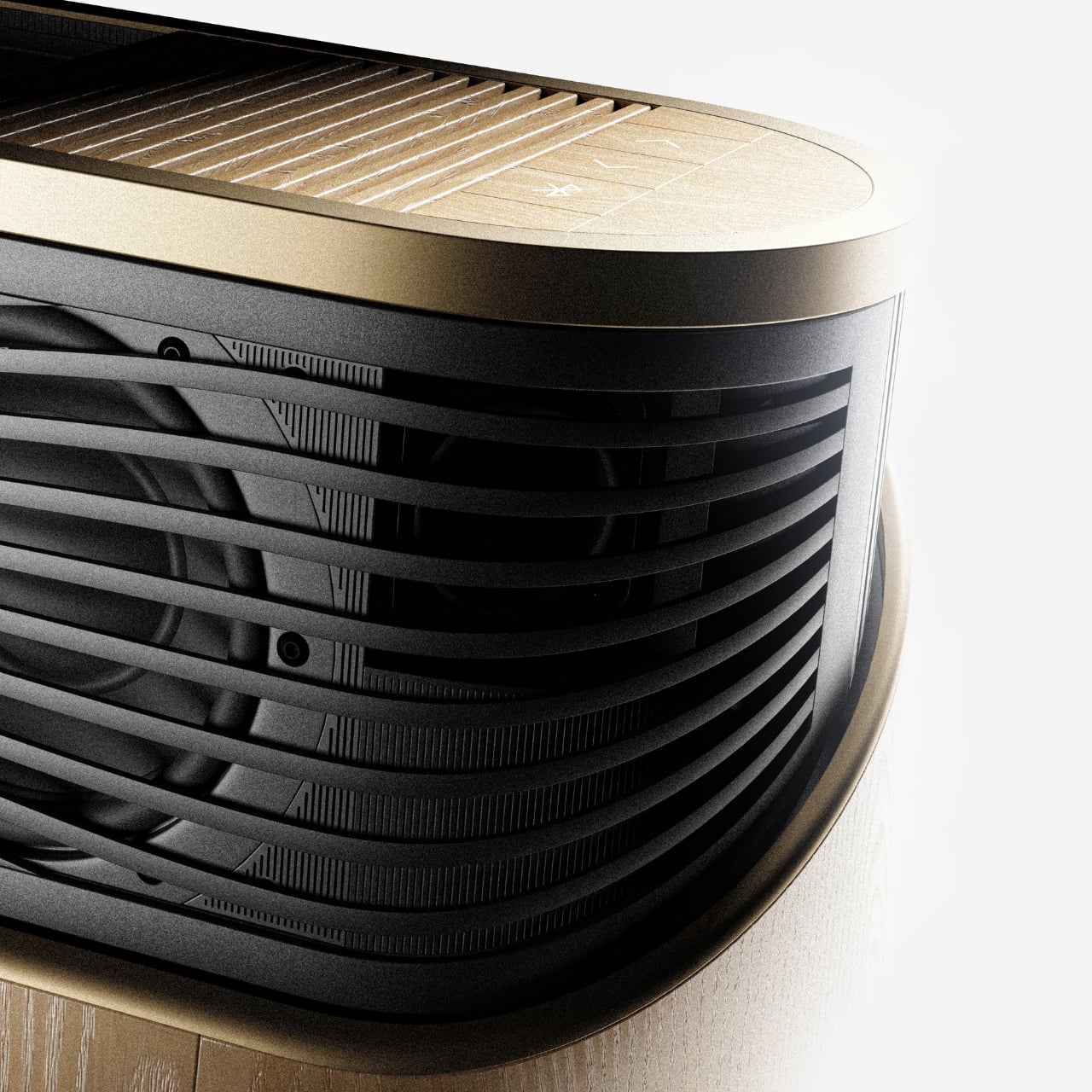
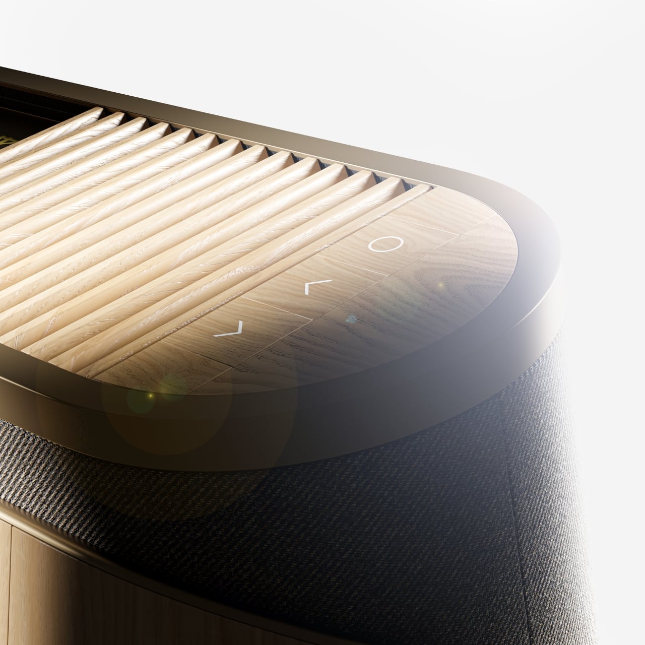
The horizontal unit is particularly interesting because of how it conceals the projector itself. A wooden slat panel sits on top, almost like a miniature version of those slatted screens you see in high-end Japanese interiors, and the lens assembly slides out from beneath it. The 4K projection capability is written right into the design, quietly labeled without fanfare. There are no aggressive vents, no branding that screams for attention, no black plastic anywhere. It’s restrained in a way that feels almost provocative in a market where most projectors try hard to look “cinematic” and end up looking aggressive instead.

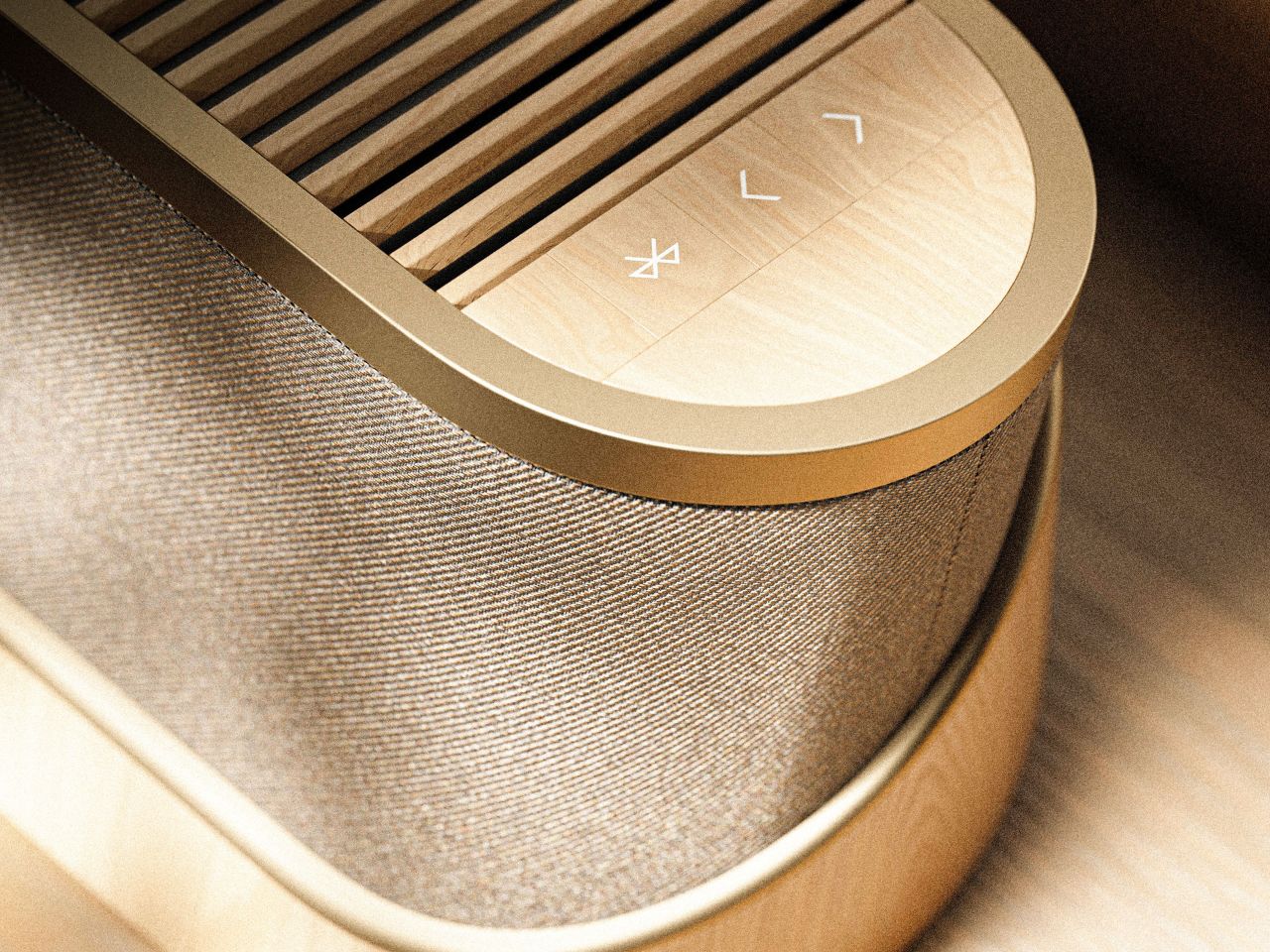
The controls are worth noting too. Rather than a touchscreen or a button cluster, Baumeister places minimal icon-etched controls directly into the wood panel. A Bluetooth symbol, a pair of directional arrows, a power circle. They’re barely visible until you know to look for them, which feels very much in keeping with how B&O has always approached interaction design, treating it as something that should feel intuitive and slightly magical rather than mechanical.

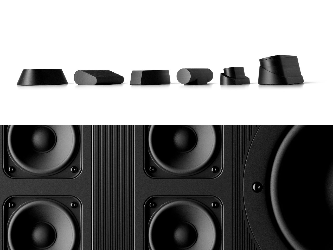
Looking at the exploded view of the horizontal model, you can see just how much thought went into the layering of components. The speaker array sits sandwiched between the wood base and the metal-framed top, with the projector mechanism occupying the central cavity. It’s genuinely elegant engineering, even if this is still a concept. Baumeister also developed a series of small-scale physical prototypes exploring the form from different angles, which you can see in a lineup of matte black study models. That process matters. It tells you this isn’t just a pretty render; it’s a design that was worked through with real hands.

Here’s my honest opinion: the TV industry has been coasting on size for years. Bigger screens, thinner bezels, more pixels. But the BeoLens Horizon asks a more interesting question. What if the device itself was worth looking at even when it was off? What if the experience of owning the hardware was part of the experience of using it? These aren’t new ideas in the B&O world, but a projector built around this philosophy feels like a genuinely fresh proposition, especially as ultra-short-throw technology continues to improve.

Baumeister is a young designer out of Strate, a design school in Lyon, and BeoLens Horizon joins a portfolio that already shows a real feel for the intersection of material craft and technology. Whether Bang & Olufsen ever picks this up or not, the concept makes a compelling case that the future of home cinema doesn’t have to look like a gadget. It can look like something you actually want to live with.

The post The Projector Concept That’s Almost Too Beautiful to Use first appeared on Yanko Design.
Reddit is weighing identity verification methods to combat its bot problem

There could be one more step required before creating an account and posting on Reddit in the future. According to Reddit's CEO, Steve Huffman, the social media platform is exploring different ways to verify a user is human and not a bot. When asked by the TBPN podcast how to confirm that it's a human using Reddit, Huffman responded with several verification methods with varying degrees of heavy-handedness.

"The most lightweight way is with something like Face ID or Touch ID," Huffman said during the interview. "They actually require a human presence, like a human has to touch, or do or look at something, so that actually just proves there's a person there or gets you pretty far."

Besides these passkey methods that use biometrics data, Huffman said there are other options like relying on third-party services that are decentralized or don't require ID. On the other end of the spectrum, Huffman also mentioned more burdensome options, like ID-checking services.

Recent years have brought a rise in bots flooding social media platforms including Reddit, where they've even been used to conduct secret experiments. It doesn't sound like Reddit has landed on how to verify its users' human identity yet, but Huffman did emphasize that the platform still wants to prioritize anonymity for its users. However, verifying humanity through identifiable and personal data could end up as a dealbreaker for Reddit users who value the anonymity of the platform. 

"Part of our promise for our users is we don't know your name but we do want to know you're a person," Huffman said. "It'll be an evolution for us for a while, and probably every platform to find the right middle ground here."

Reddit co-founder and former executive chair, Alexis Ohanian, said on X that Reddit requiring Face ID wasn't something he expected but agreed that something had to be done about the fake content from bots, adding that, "I just don't know how to sell face-scanning to Redditors or even lurkers." We reached out to Reddit's communications team and will update the story when we hear back.

This article originally appeared on Engadget at https://www.engadget.com/social-media/reddit-is-weighing-identity-verification-methods-to-combat-its-bot-problem-195814671.html?src=rss

A $35,000 Swedish Pyramid That Goes Anywhere, Needs Nothing

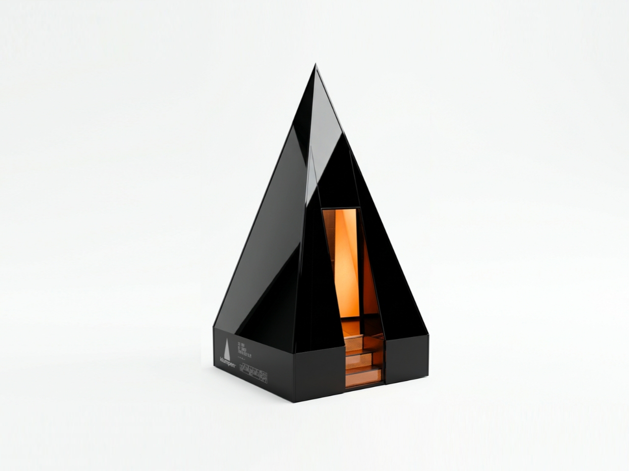
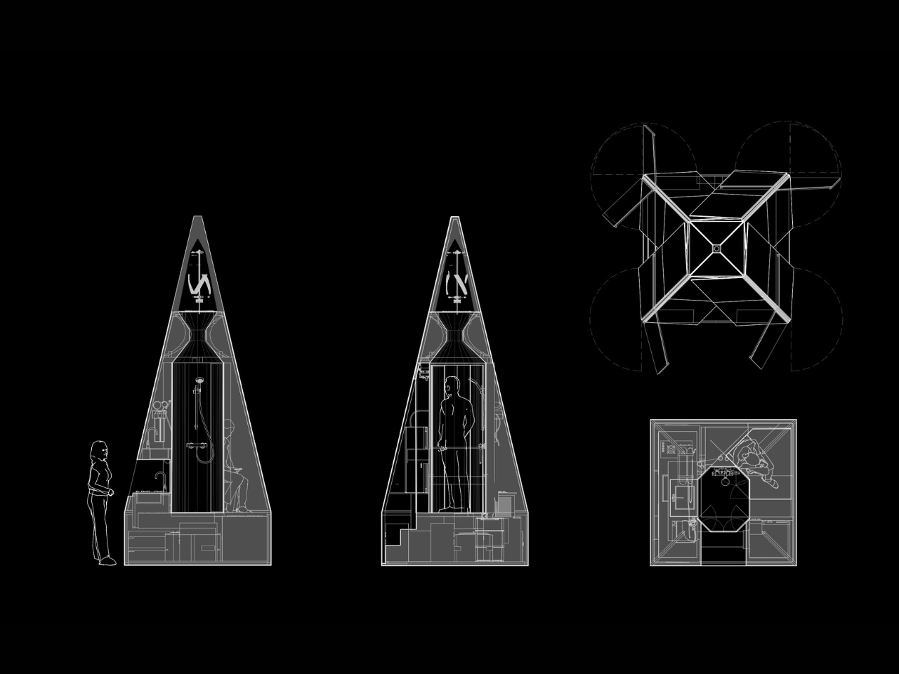
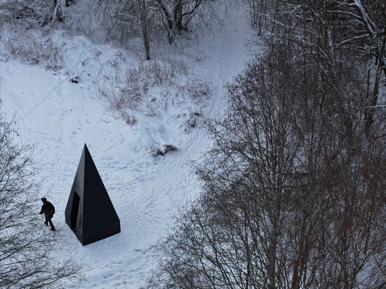
The first time I saw a photo of Klumpen, I thought someone had dropped a monolith into the Arctic tundra. A matte black pyramid, impossibly sharp against the snow, with a sliver of warm amber light cutting through its entrance. It looks like a prop from a science fiction film. But it is very much real, very much functional, and it is arriving very soon.

Klumpen is the work of Himmelsfahrtskommando, a Swedish architectural duo that includes designer Hannah Mazetti, with a studio name that roughly translates to “suicide mission” in German. Whether that is a philosophical statement or a dark joke about building in the Nordic winter, I am genuinely not sure. What I do know is that the thing they have built is one of the more quietly radical design objects I have come across in years. It asks a deceptively simple question: what if you did not need permission to be somewhere?

Designer: Himmelsfahrtskommando

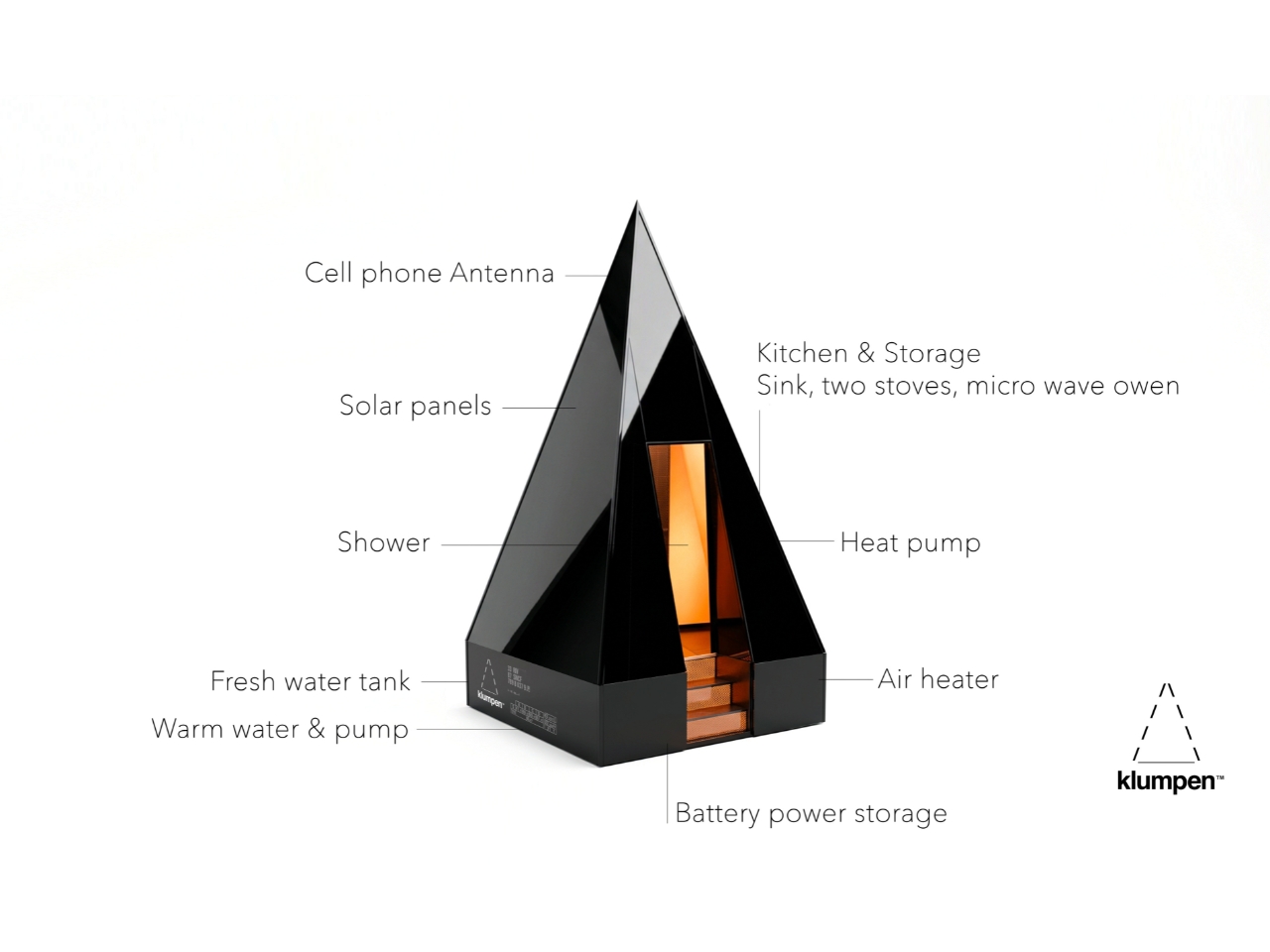
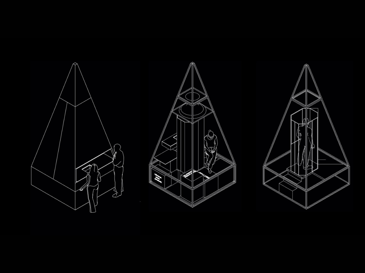
At just 7 square metres, Klumpen is technically a utility structure. But calling it that feels like calling the iPhone a phone. Inside this factory-built pyramid is a complete off-grid living infrastructure: a photovoltaic solar array running at 450 to 600 volts DC, a 7.5 kWh battery for storage, an air-to-water heat pump, a closed-loop greywater recycling system, satellite broadband, a shower, a lavatory, and a kitchen with two stoves, a sink, and a microwave. The pyramid shape, for the record, is not an aesthetic choice. The designers say it is simply the most efficient envelope for the specific stack of systems inside. Form follows function, very literally.

The prototype has already been tested through a real Arctic winter in northern Sweden, which tells you something important about how seriously they are taking this. It is one thing to announce a sleek off-grid concept on a design blog. It is another to actually freeze-test it in the dark of a Scandinavian January. The first production batch ships in September 2026, with a target retail price of $35,000.

That price will draw raised eyebrows, and fair enough. $35,000 is not nothing. But compare it to the cost of running utility lines to a remote plot of land, the legal labyrinth of planning permissions, the months of plumber schedules and contractor delays, and suddenly a plug-and-play pyramid starts to look like a reasonable proposition. You set it down on flat ground. You press ON. No permits. No plumbers. No waiting at the utility company. That is genuinely the promise.

I keep thinking about what that actually means for people. We have become so accustomed to depending on invisible infrastructures that we rarely stop to notice the stranglehold they have on where and how we can live. Want to build a simple structure on a piece of land you own? Prepare for months of negotiations with people who have never seen the land. Klumpen is not a protest against that system, exactly. It is something quieter. An elegant sidestep.

The designers frame this in terms of ownership and autonomy, drawing a line from ancient democracies, where property meant political voice, to a present where most people in the industrialised world either rent or carry mortgages on homes they will spend decades paying off. The argument is a little romantic, but it does not feel wrong. The degree to which we have outsourced control of our most basic needs, from electricity and water to warmth and connectivity, to external systems we cannot touch or meaningfully influence is worth taking seriously.

Is Klumpen going to solve the housing crisis? No. But the most interesting design objects rarely solve the biggest problems outright. What they do is shift the way people think about what is possible. A 7-square-metre pyramid that makes you genuinely independent of the grid, dropped in a meadow or on a hillside or beside a frozen lake in northern Sweden, does exactly that. It reframes a shed as a statement. The first batch launches in September. I would not be surprised if the waitlist fills fast.

The post A $35,000 Swedish Pyramid That Goes Anywhere, Needs Nothing first appeared on Yanko Design.
What to read this weekend: Revisiting Project Hail Mary and The Thing on the Doorstep

Need something new for your reading list? Here are two titles we think are worth checking out. This week, we've got Andy Weir's Project Hail Mary and The Thing on the Doorstep, an H.P. Lovecraft adaptation for Image Comics. 

This article originally appeared on Engadget at https://www.engadget.com/entertainment/what-to-read-this-weekend-revisiting-project-hail-mary-and-the-thing-on-the-doorstep-190000250.html?src=rss

Apple considered buying Halide to upgrade its native Camera app

A legal feud between the co-founders of Lux Optics, the developer behind the Halide camera app, revealed that Apple was close to acquiring the company. As first reported by The Information, Apple held acquisition talks for Lux Optics, which also developed the Kino, Spectre and Orion apps, in the summer of 2025.

According to The Information, the deal eventually fell through in September of that year, but the potential acquisition could've provided Apple with the third-party software to improve its own built-in camera app. Apple is already rumored to be introducing variable aperture to its upcoming iPhone 18 Pro models, so it's not surprising that the iPhone maker was looking for software with advanced features to match its possibly upgraded camera hardware.

Despite Apple's interest, Lux Optics' co-founders, Ben Sandofsky and Sebastiaan de With concluded that future updates to Halide could increase the company's valuation and ended the acquisition talks. According to the lawsuit between the co-founders, Sandofsky started investigating de With for the alleged misuse of company funds shortly after the talks with Apple ended. Afterwards, de With was fired from Lux Optics and later joined Apple's design team. While Halide may remain third-party software for iPhones and iPads, users can still look forward to some software improvements to the built-in camera app, since that's reportedly one of Apple's priorities.

This article originally appeared on Engadget at https://www.engadget.com/apps/apple-considered-buying-halide-to-upgrade-its-native-camera-app-175139818.html?src=rss

A Minecraft theme park will open in London in 2027

The best-selling game of all time is moving from the virtual to the physical. Minecraft World, a permanent Greater London theme park based on the game, is scheduled to open in 2027. The announcement came during Minecraft Live 2026.

It will be a new section in Chessington World of Adventures, a theme park with a built-in zoo. The resort is a 35-minute train ride from London's Waterloo station.

Details are still fairly light on the park. But we know it will include a roller coaster, "interactive adventures" and "epic block-built playscapes." Torfi Frans Ólafsson, the game franchise's creative director, said they're aiming for "an experience that feels immersive, authentic and welcoming." Naturally, that will include welcoming you to open your wallet in Minecraft-themed retail and dining spots.

The park is a collaboration between Mojang Studios and Merlin Entertainments, the world's second-largest theme park builder. (A certain rodent-led empire is first.)

If visiting the full theme park in England isn't your thing, the latest location of the game’s (also real-world) pop-up events will open in May. Minecraft Experience: Moonlight Trail will let visitors in Buenos Aires, Argentina, go on an hour-long outdoor nighttime adventure. As its name suggests, you'll "walk a moonlit trail” through iconic Minecraft biomes. Along the way, you’ll craft gear, mine diamonds, battle mobs and “help restore an ancient beacon." The event opens in May.

Screenshot from Minecraft. A character walks through a village, followed by a gaggle of babies of various species.
The game's next big drop, Tiny Takeover, arrives on Tuesday.
Mojang Studios

Not all of Minecraft Live's announcements were about real-world empire building. Minecraft, the game, is getting some updates, too. Its next big drop, Tiny Takeover, will live up to the billing with a redesigned "cuter" look for baby mobs. The update will also add a golden dandelion, which you can feed to a baby mob to make it stay young forever. (Or, at least until you feed it a second one.) Tiny Takeover arrives on March 24.

Mojang also teased the next drop after that. Later this year, Chaos Cubed will add a sulfur cube that changes properties when absorbing different materials. "There is a lot of variety in what the cube can do," Mojang promises. "Just like there are balls with different 'bounciness' and behavior, the sulfur cube can have different physics."

Finally, the long-rumored Minecraft Dungeons II game is official. We're still extremely light on details about the sequel to the 2020 spinoff, aside from the fact that you can wishlist it on March 21.

This article originally appeared on Engadget at https://www.engadget.com/gaming/a-minecraft-theme-park-will-open-in-london-in-2027-173000917.html?src=rss

This E Ink Foldable Phone Concept Punishes Doomscrolling by Design

Most smartphones are designed to be impossible to put down. The screen faces up on every table, the display lights up for every notification, and the cost of checking it one more time is exactly zero. That’s not an accident. The hardware removes friction from compulsive use because removing friction is what makes these devices feel indispensable. The tinyBook Flip concept asks a different question entirely: what if the phone were designed to get out of the way?

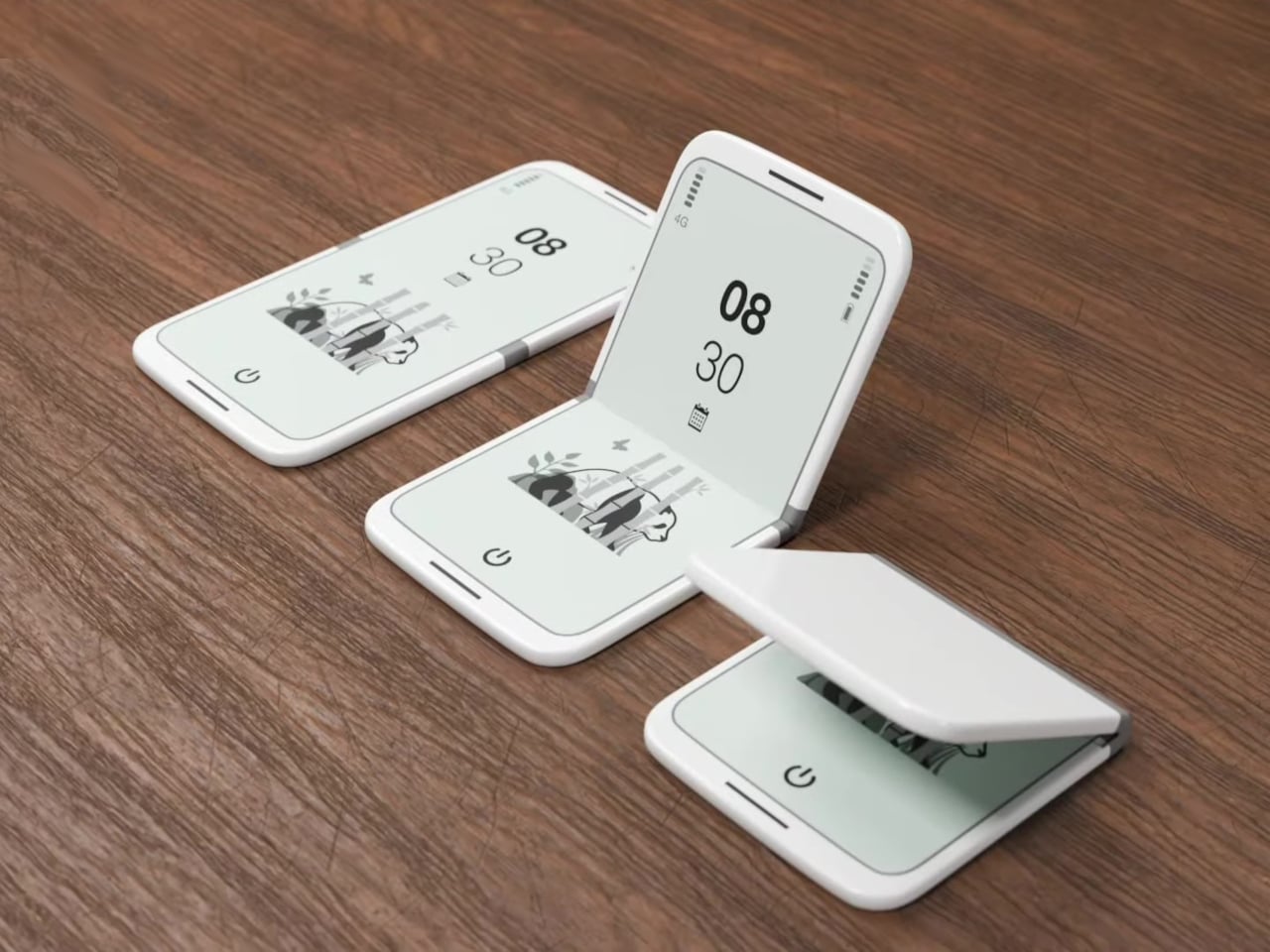
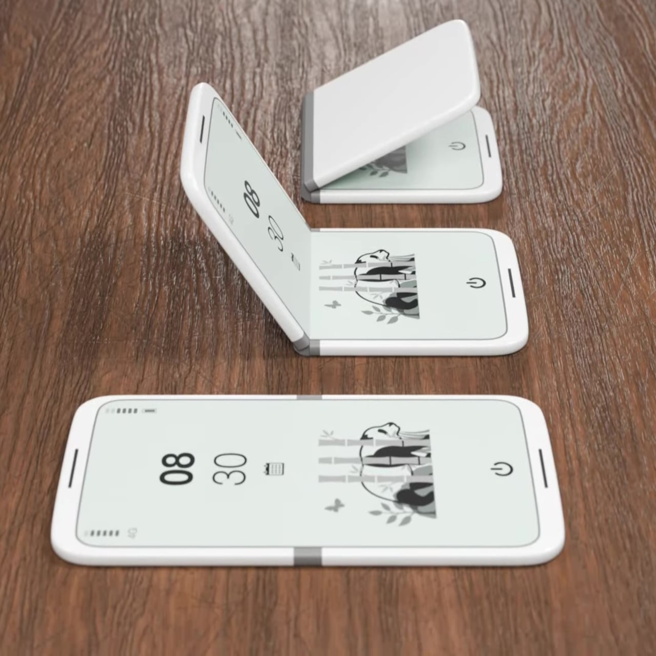
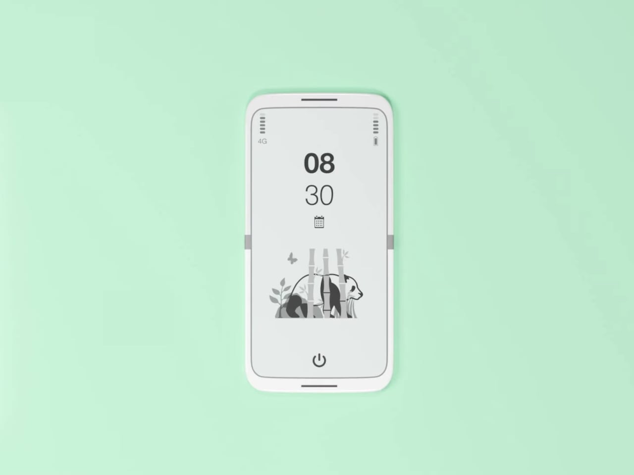
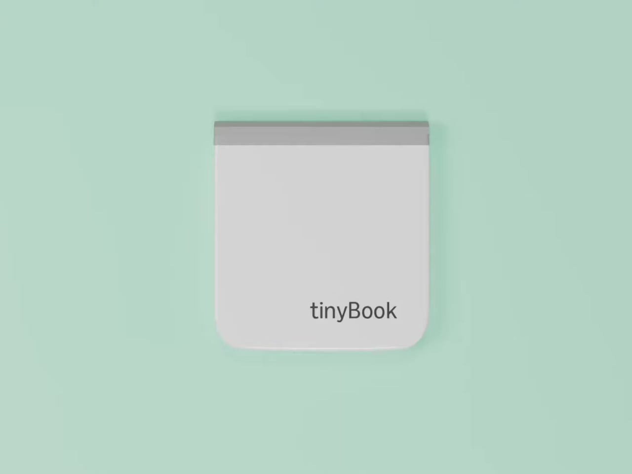
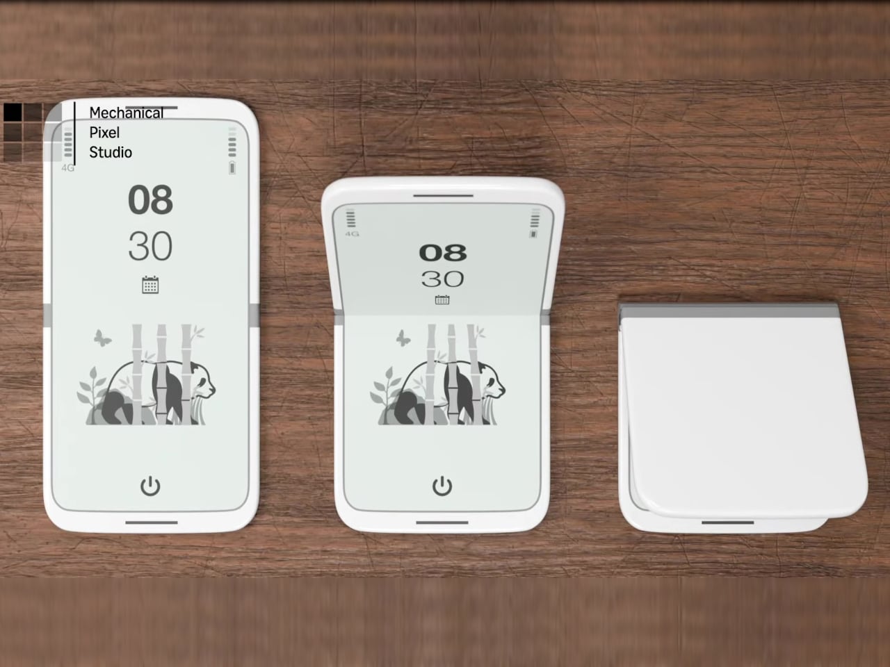
The tinyBook Flip is a vertical foldable phone concept built around a 6.1-inch E Ink display. Closed, it collapses into a compact, near-square form with rounded corners and a matte white finish, something closer in proportion to a folded notecard than a smartphone. The screen disappears entirely when the device is closed shut. No glowing rectangle sitting face-up on the desk, no ambient reminder that there are things to check. Just a small, quiet object.

Designer: Pixel Dynamics

That folded form is doing more work than it might seem. Opening the phone requires a deliberate physical action, and that small added step changes the behavioral math. A reflexive grab becomes a conscious decision. The friction is minimal in absolute terms, maybe two seconds, but two seconds of resistance is often enough to interrupt the loop. The concept treats that interruption as a design feature, which puts it in genuinely different territory from most phones.

The E Ink display adds a second layer of resistance, and this one is less subtle. E ink refreshes slowly, renders in grayscale or muted colors, and handles fast-moving content poorly. Social media feeds become tedious. Short-form video becomes unwatchable. Anything built around color, motion, and rapid visual feedback stops working the way it was designed to. This is precisely the point. The screen’s limitations aren’t engineering compromises left over from an earlier era of display technology; they’re structural properties that make certain behaviors genuinely unpleasant to sustain.

What E Ink handles well is a shorter list, but a coherent one. Text reading, messaging, calendars, and static interfaces are all comfortable at E Ink’s native pace. The renders of the tinyBook Flip show a UI built around exactly these strengths: a large clock face, a calendar widget, and a grayscale illustrated wallpaper. The interface doesn’t reach for capabilities the display can’t support. The phone isn’t trying to do everything; it’s trying to do a narrower set of things without apology.

Foldable E Ink panels aren’t a speculative technology. The hardware exists at the component level and has already appeared in experimental e-readers, though no consumer phone has shipped with one in any meaningful volume. The tinyBook Flip isn’t imagining impossible components; it’s proposing a form factor that manufacturers haven’t yet committed to producing. The distance between those two things is largely commercial, not technical.

There’s also something worth noticing about how the device reads as a physical object in social space. Closed, the tinyBook Flip looks like almost nothing. No visible screen, no status indicators, no glow. A phone that carries no visual weight when it’s not in use sends a different signal than one that’s always broadcasting its presence. Putting it down means it actually disappears from the environment, not just from your hand.

That said, the concept leaves some real friction points unaddressed, and not the intentional kind. E Ink handles camera use, live navigation, video calls, and authentication apps poorly. A foldable hinge adds mechanical complexity and thickness that clean renders tend to obscure. The tinyBook Flip looks resolved in this form, but a production version would have to make tradeoffs that these images don’t show and the concept doesn’t acknowledge.

Still, the more interesting question isn’t whether this specific device could ship. It’s whether a phone that makes itself harder to misuse is a reasonable design goal at all, or whether that’s just a way of describing a phone that most people wouldn’t actually want. The tinyBook Flip lands firmly on one side of that question. Whether the market agrees is a different problem entirely.

The post This E Ink Foldable Phone Concept Punishes Doomscrolling by Design first appeared on Yanko Design.
OpenAI reportedly plans to double its workforce to 8,000 employees

While other tech companies have been laying off employees year after year, OpenAI is doing the opposite. According to a report from the Financial Times, the AI giant is looking to expand its workforce to 8,000 employees by the end of 2026, nearly doubling staff from its current headcount of 4,500.

The FT reported that the new hires will be across several departments, including product development, engineering, research and sales. OpenAI's hiring spree will also include "specialists" for "technical ambassadorship," or employees tasked with helping businesses better utilize its AI tools, according to the report. As the FT noted, OpenAI is likely trying to amp up the competition against Anthropic and its Claude AI chatbot. According to the AI Index from Ramp, a fintech startup that manages corporate expenses, businesses are now 70 percent more likely to go with Anthropic when buying AI services for the first time as opposed to OpenAI.

OpenAI made waves in February when it announced a contract with the Department of Defense to use its AI models, following a public fallout between Anthropic and the federal agency. On top of the government contract, OpenAI is also in "advanced talks" with private equity firms like Brookfield Asset Management to deploy its AI tools across a firms' portfolio of companies, according to Reuters.

This article originally appeared on Engadget at https://www.engadget.com/ai/openai-reportedly-plans-to-double-its-workforce-to-8000-employees-161028377.html?src=rss

Is Apple Planning an AirPods Ultra? New September Leaks Say Yes

Is Apple Planning an AirPods Ultra? New September Leaks Say Yes Side-by-side view comparing AirPods Pro 3 and the rumored Ultra model with notes on price range differences.

Apple is reportedly preparing to launch a premium addition to its AirPods lineup, tentatively referred to as the “AirPods Ultra,” later this year. This upcoming model is expected to feature advanced technologies, including infrared cameras for gesture-based controls and enhanced compatibility with Apple’s ecosystem. The release highlights Apple’s ongoing focus on spatial computing and augmented […]

The post Is Apple Planning an AirPods Ultra? New September Leaks Say Yes appeared first on Geeky Gadgets.

Posted in Uncategorized