The story of Google Glass is a well-worn legend in Silicon Valley. It was a product so far ahead of its time that it became a cultural phenomenon and then a punchline, a symbol of technological overreach and social awkwardness. The project was ultimately shelved, a high-profile monument to a future that arrived too early. It was a public retreat, an admission that the world was not ready for a computer on its face, or perhaps that the computer was not ready for the world.
As that chapter closed, another one was just beginning, thousands of miles away. An executive from Alibaba, inspired by the initial audacity of Google’s idea, decided to take a different approach. Instead of chasing hype, he would chase utility. Instead of prioritizing features, he would prioritize weight and comfort. For twelve years, his company, Rokid, worked to solve the very human problems that Google had overlooked, and in 2026 that long bet looks less like a moonshot and more like a roadmap.
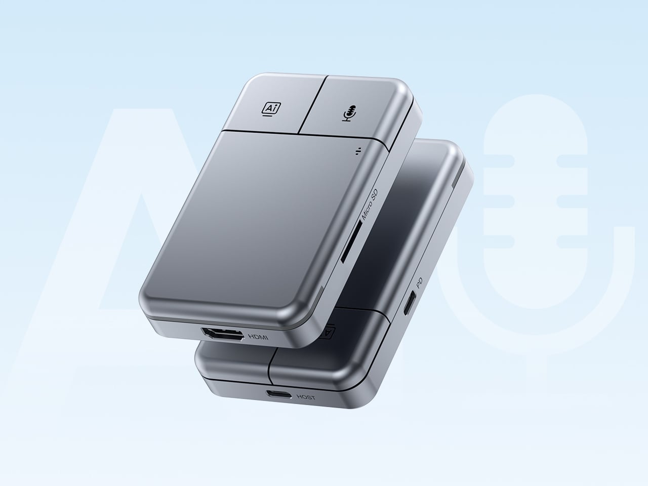
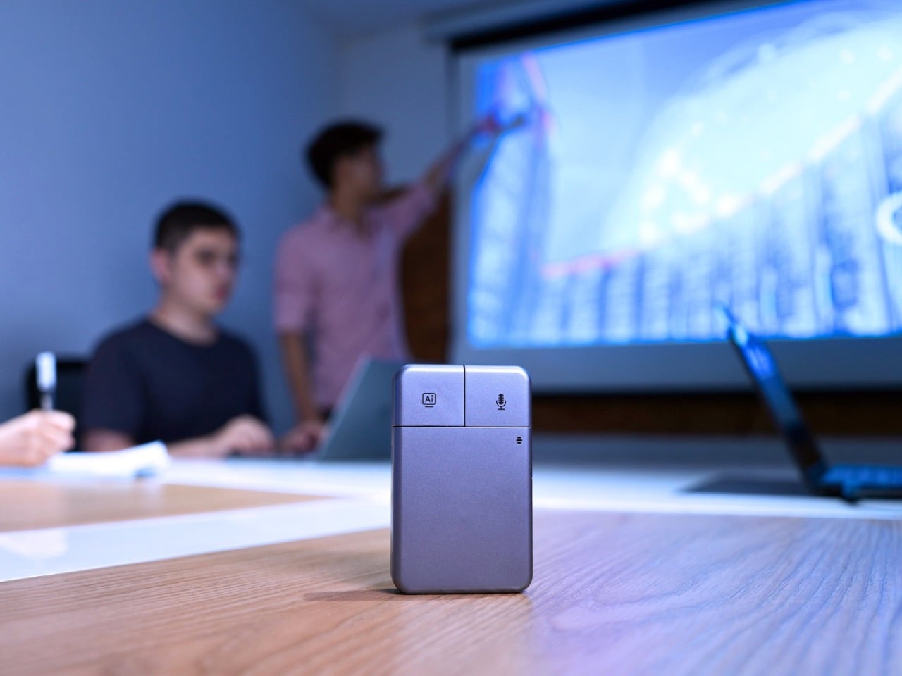
Designer: Rokid
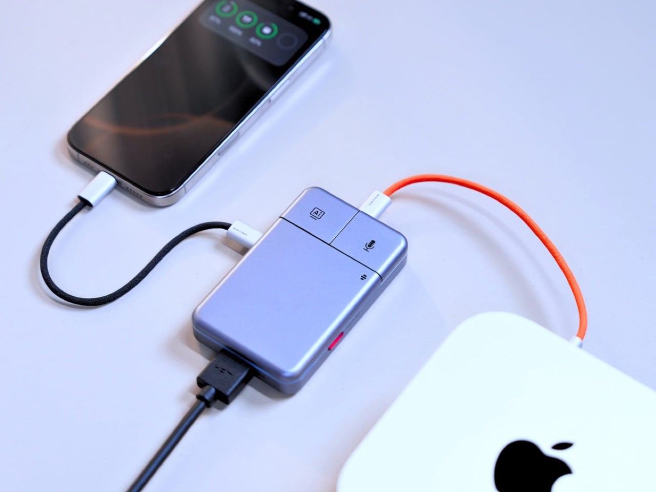
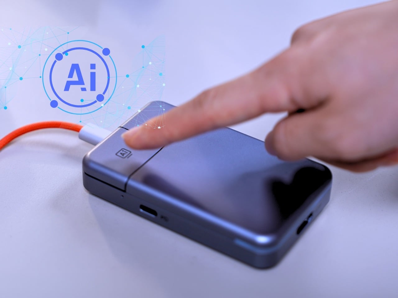
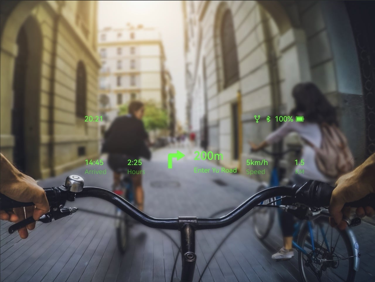
That roadmap now has a new center of gravity. Following Google’s latest Gemini updates at I/O, Rokid says it is bringing Gemini Flash 3.5 to its smart glasses, pushing the company deeper into what it calls agentic AI. The phrase matters because it signals a shift away from voice assistants that answer one question at a time and toward systems that can hold context, respond faster, and handle more layered tasks through simple voice commands. Rokid is framing the glasses as a place where conversational AI can stay present, useful, and continuous rather than trapped inside a phone screen.
That ambition sits on top of an unusually broad AI strategy. Rokid has spent the last year positioning its glasses as an open ecosystem rather than a single-model device, supporting ChatGPT, Qwen, DeepSeek, and Gemini across different products and regions. In Asia, the company has already built an AI Agent Store and says it has received more than 3,000 submissions for agentic workflows, with over 400 approved and published. The international push comes next, and that is where the latest Gemini integration becomes more than a feature update. It becomes a bridge between Rokid’s regional momentum and its global pitch.

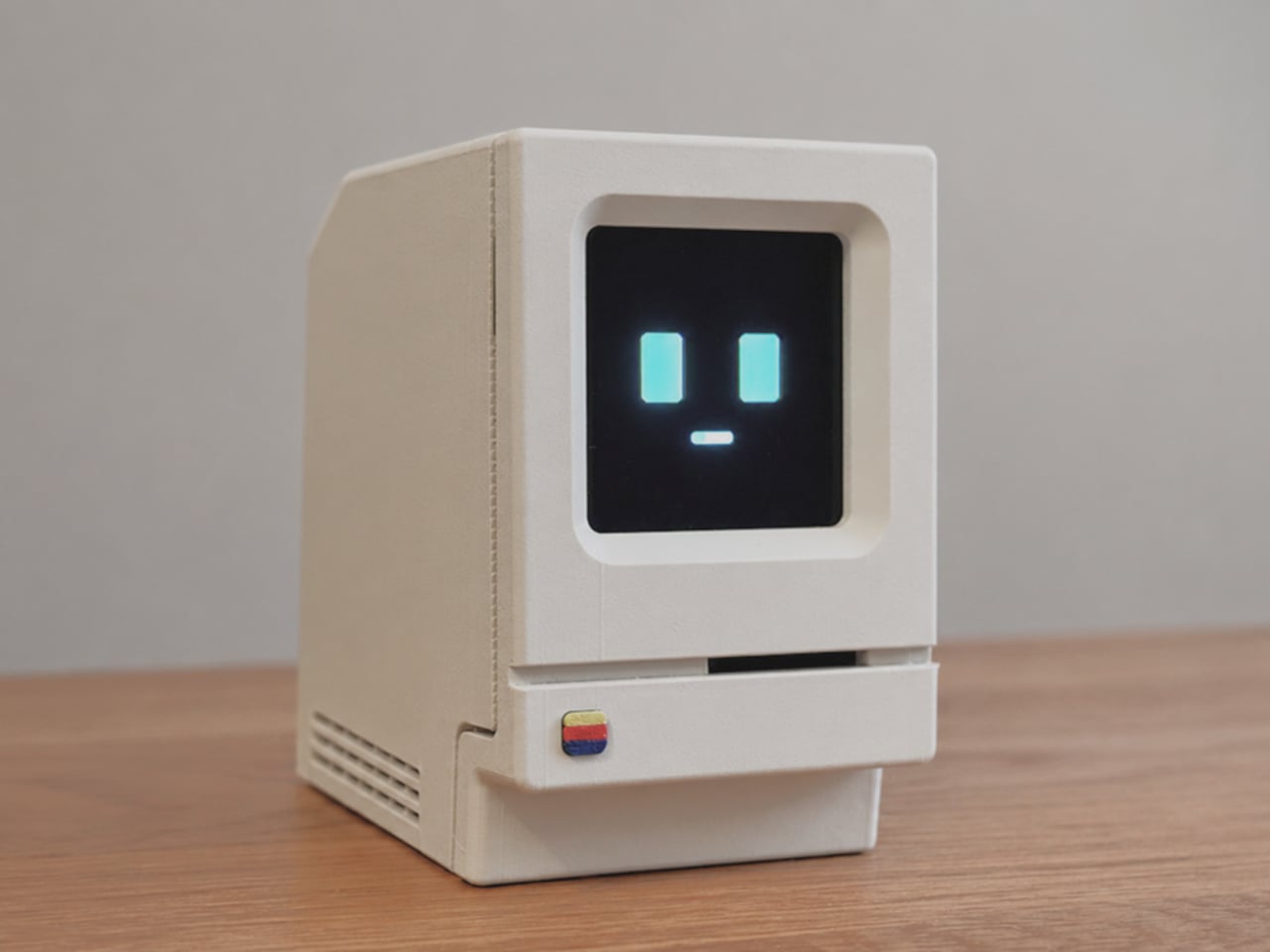
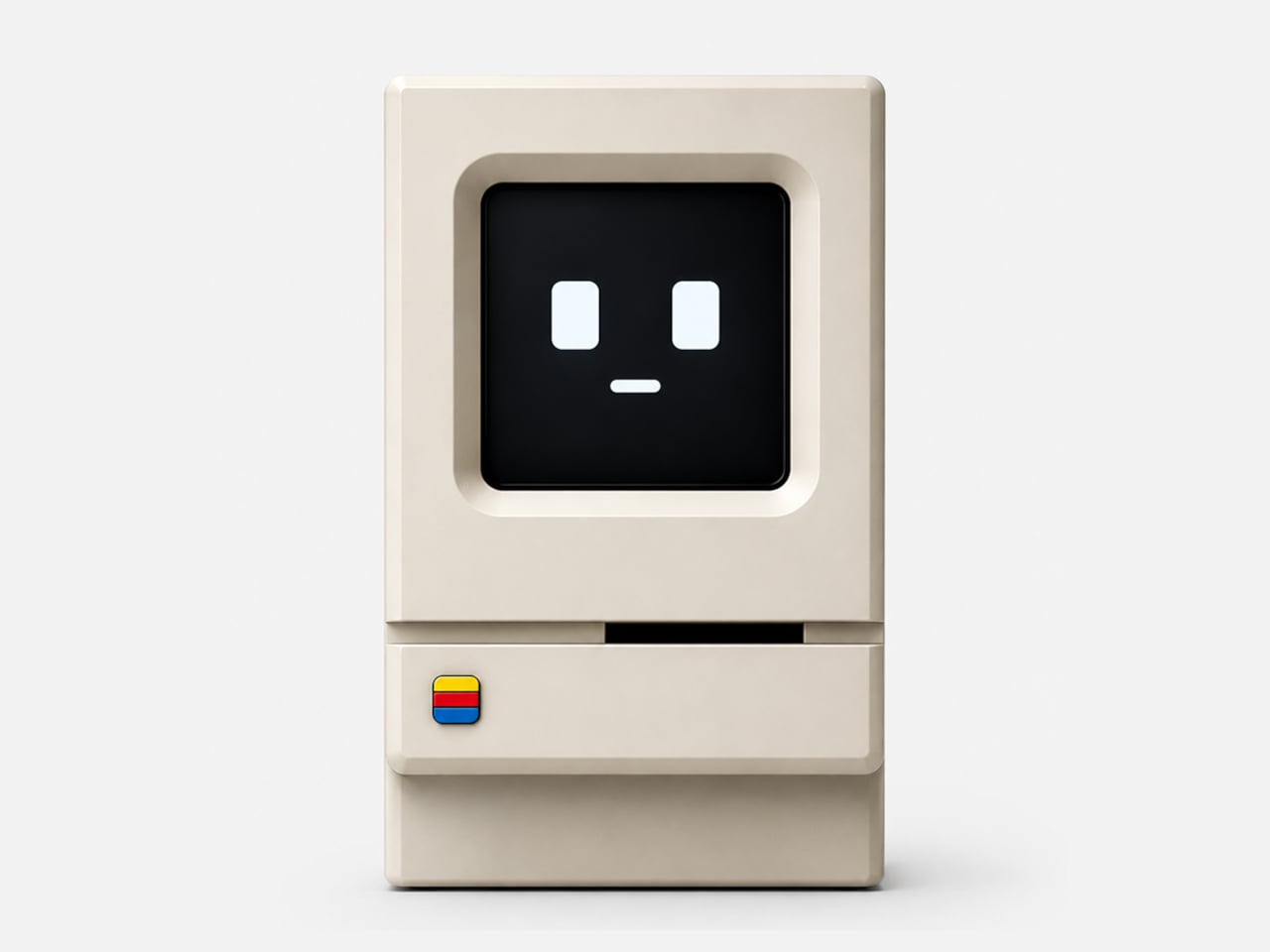
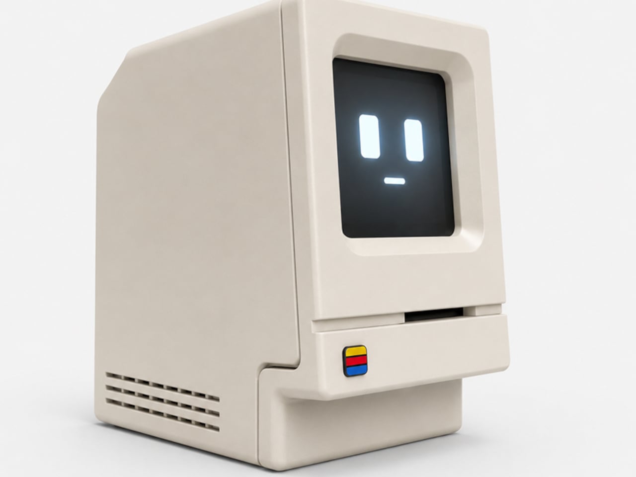
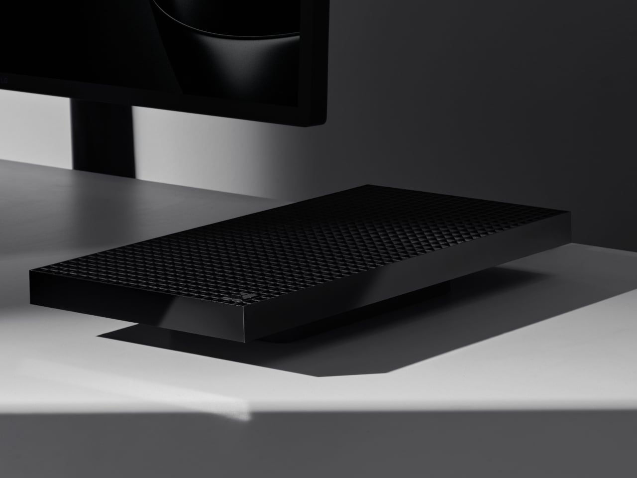
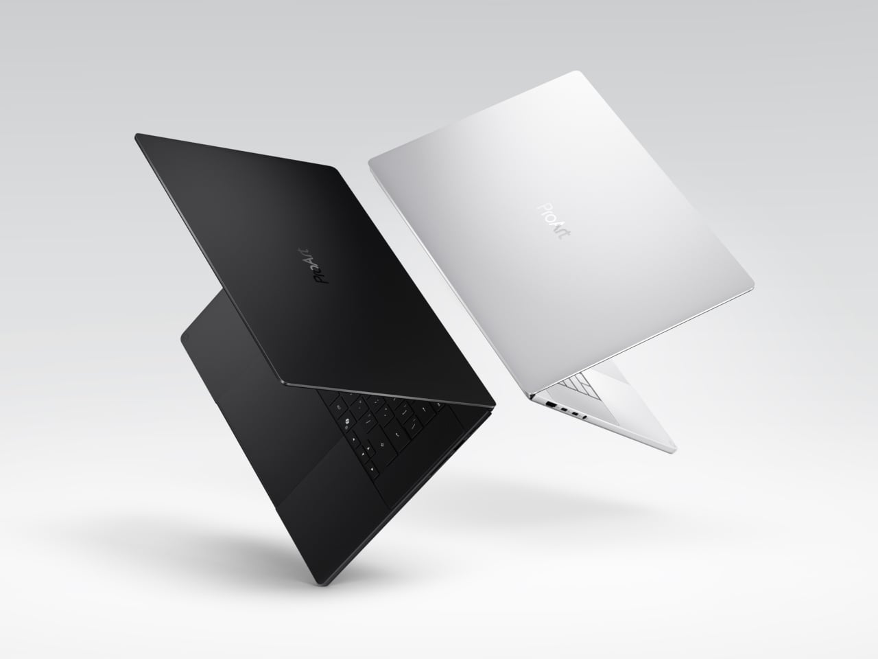
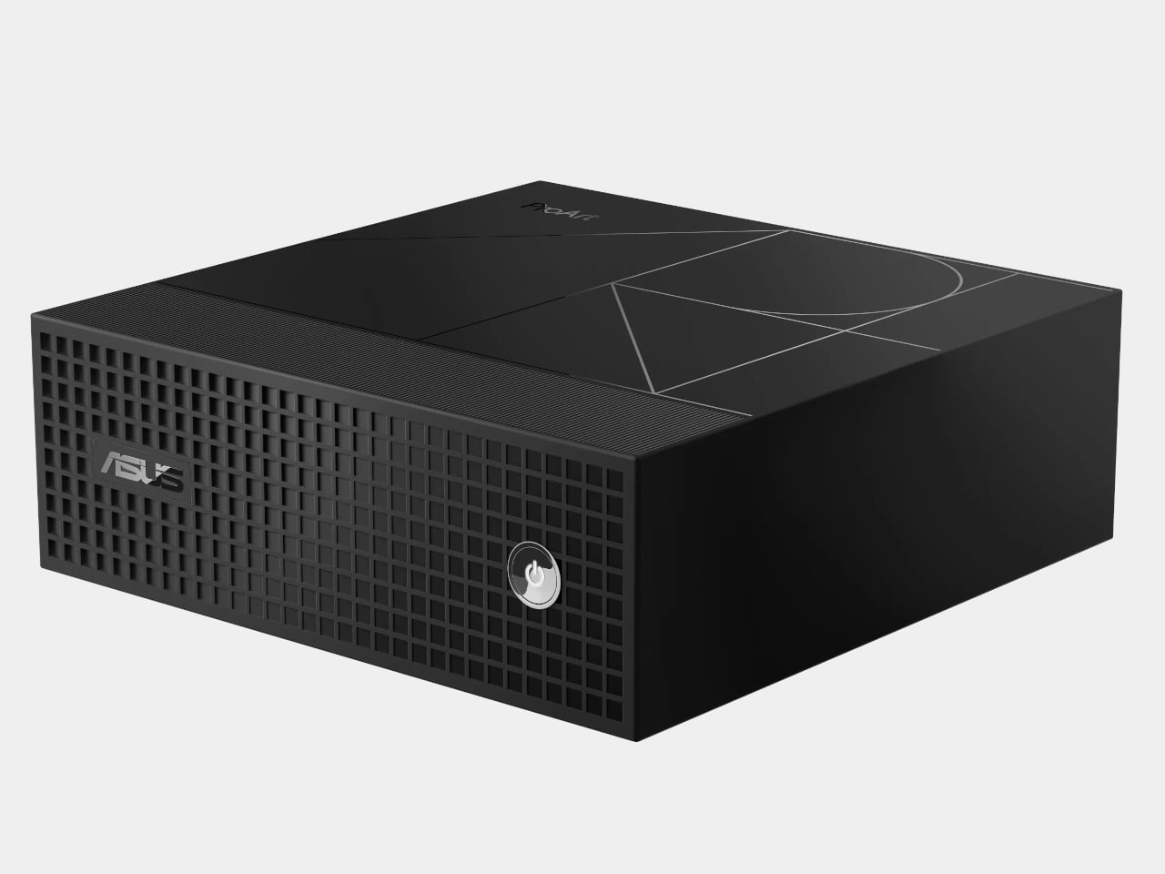
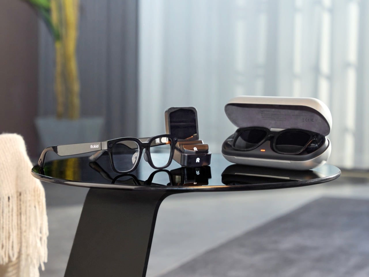
The hardware story still matters because smart glasses live or die by whether people will actually wear them. Rokid’s 2025 display-equipped glasses carried one of the most memorable specs in the category: 49 grams for a full-function AI and AR device with display. That number gave the company a clean answer to the oldest question in wearable tech, which is how much computation can disappear into something that still feels like eyewear. According to Rokid’s own materials, that product also helped it raise more than $6 million and move into global mass production by December, giving the company proof that its ideas could leave the demo stage.
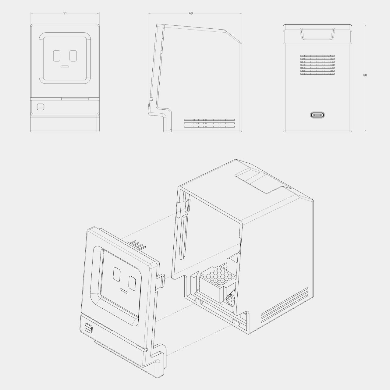
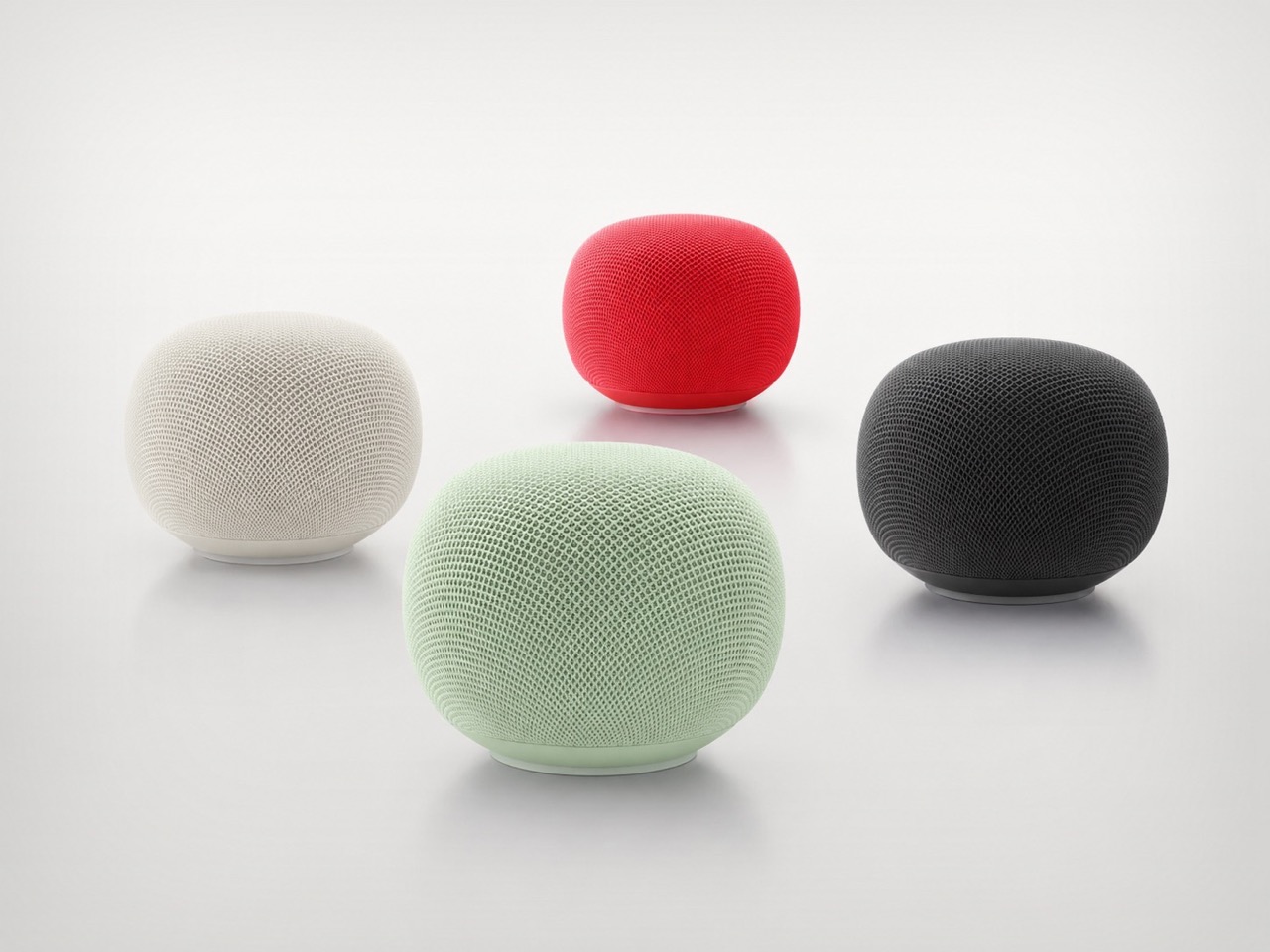
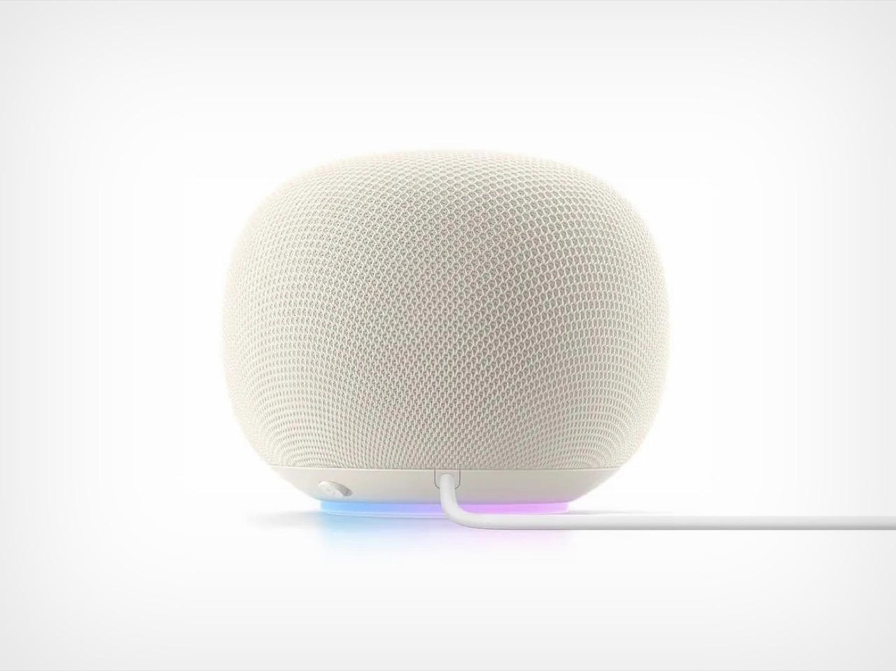
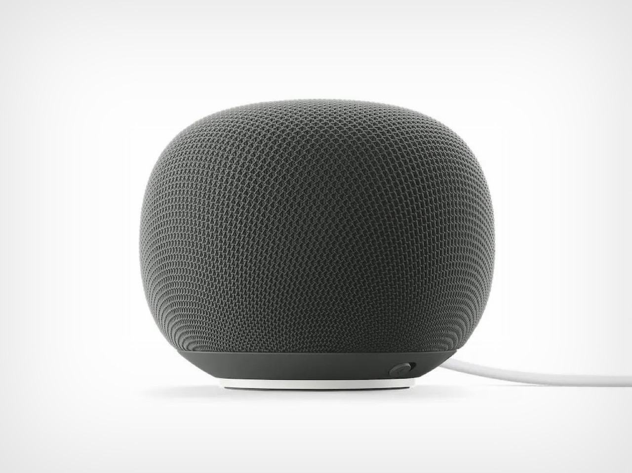
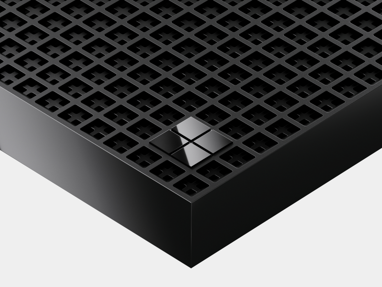
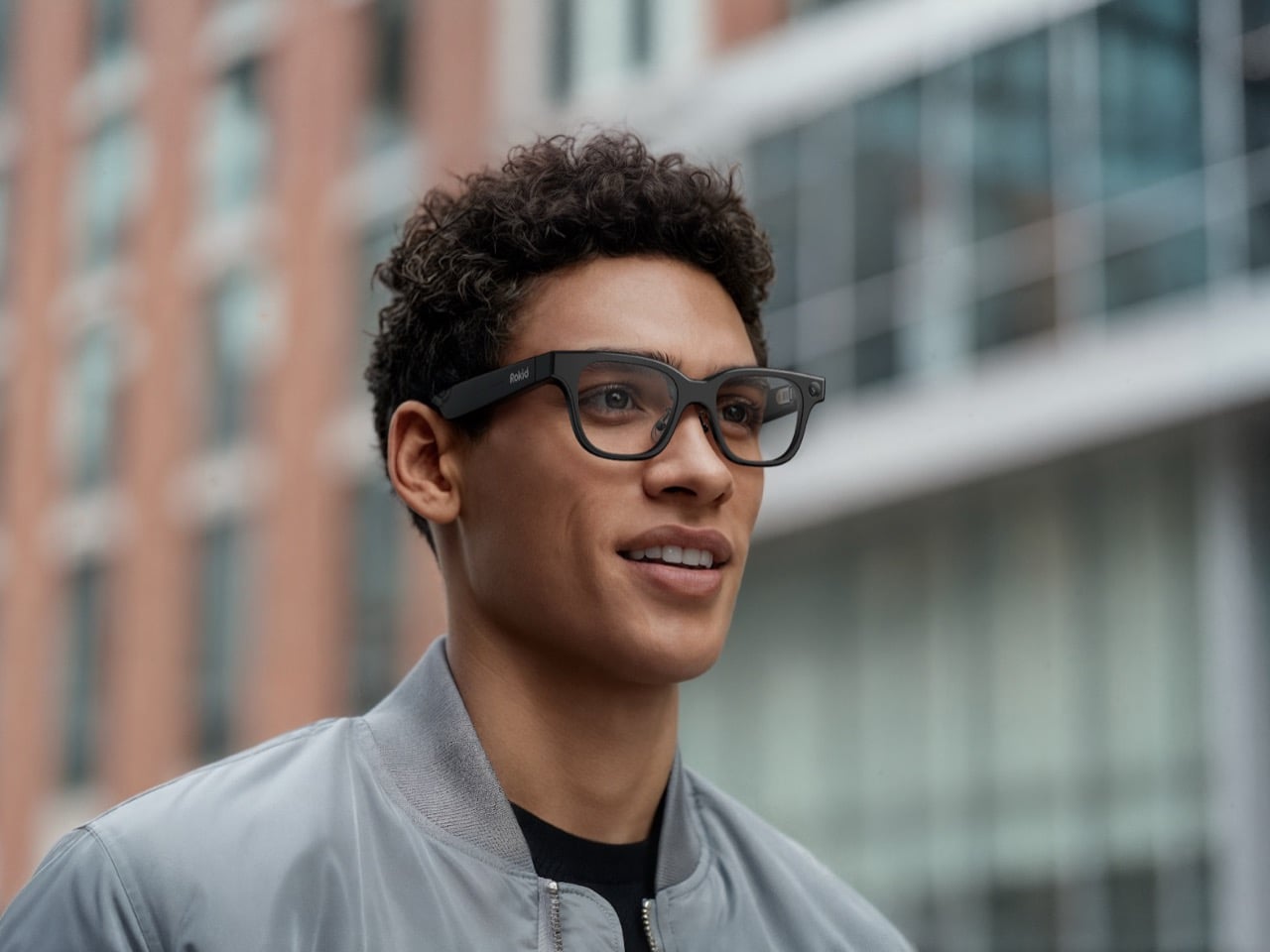
This year’s bigger mainstream play is Rokid AI Glasses Style, a different kind of product aimed at lowering the barriers that have kept smart eyewear niche for so long. Style is display-free, voice-centric, and starts at $299. At 38.5 grams, it is even lighter than the 49-gram model, and Rokid presents that reduction as part of a larger balancing act between comfort, battery life, and functionality. The frame is designed like premium eyewear, with titanium alloy hinges, liquid-silicone nose pads, and a classic D-shaped silhouette. Underneath that familiar form is a dual-chip architecture, with one chip handling low-power always-on tasks and another managing AI and imaging workloads.
Rokid clearly wants to win on openness, but it also wants to win on practicality. One of the strongest parts of the press material is its prescription-first approach, which treats vision correction as core infrastructure rather than a niche add-on. Style supports prescriptions up to ±15.00D, covering myopia, astigmatism, presbyopia, progressives, and functional lens options like photochromic and blue-light filtering. Users can upload prescriptions online and receive custom lenses in about 7 to 10 days. That sounds mundane compared to AI buzzwords, but it may be one of the most important adoption levers in the entire category. Smart glasses cannot become everyday objects if they still behave like specialty gadgets.
The other major throughline is accessibility. Rokid has been consistent here, both in the visit materials and in the press kit. The company is working with Google on accessibility-focused solutions for users with vision and hearing impairments, and its broader messaging keeps returning to a principle it phrases simply: leave nobody behind. For blind and low-vision users, Rokid positions audio-based AI glasses as digital eyes, and it has attached a small subsidy to purchases made for visually impaired users. That choice gives the company a more grounded social purpose than most wearable launches, which often stop at lifestyle language and creator features.
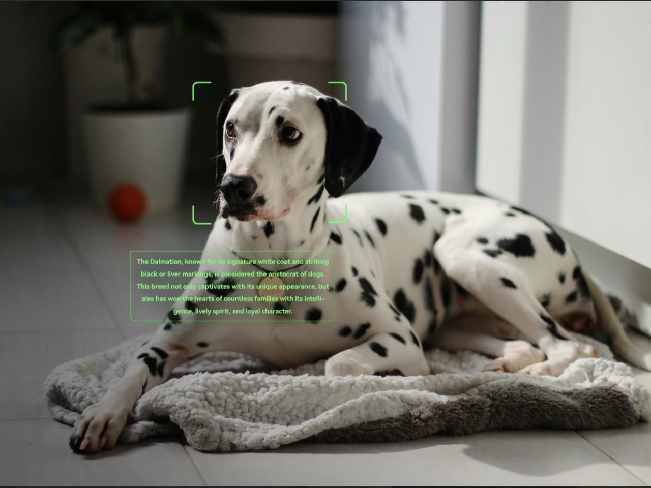
Those creator features are still part of the package. Style includes a 12MP Sony sensor, 4K capture, open-ear audio, and a triple-format imaging system designed for 3:4, 4:3, and 9:16 shooting. Rokid’s pitch is obvious and smart: content should be ready for Instagram, TikTok, or YouTube the moment it is captured, without cropping or post-editing. The glasses also support voice interaction in 12 languages and translation in 89, while adding head gestures and AI shortcuts for hands-free control. Nod to answer a call, shake your head to end it, ask for help in your own language, and keep moving.
All of this adds up to a company trying to define smart glasses less as a futuristic accessory and more as the next natural interface for AI. That is the real continuation of the Google Glass story. Google proved the cultural shock of putting a computer on your face. Rokid is trying to prove the quieter part, that wearability, prescription support, open AI access, and contextual software are what turn a provocative idea into a daily habit. The original dream never disappeared. It just needed lighter frames, better timing, and a company patient enough to spend twelve years building the version people might finally keep on.

The post An Ex-Alibaba Exec Spent 12 Years Building the Smart Glasses that Google Couldn’t first appeared on Yanko Design.