
These drones could cover up to 98 percent of the world’s oceans by 2028
New ocean-sensing drones are being built to withstand the deepest depths of the ocean.

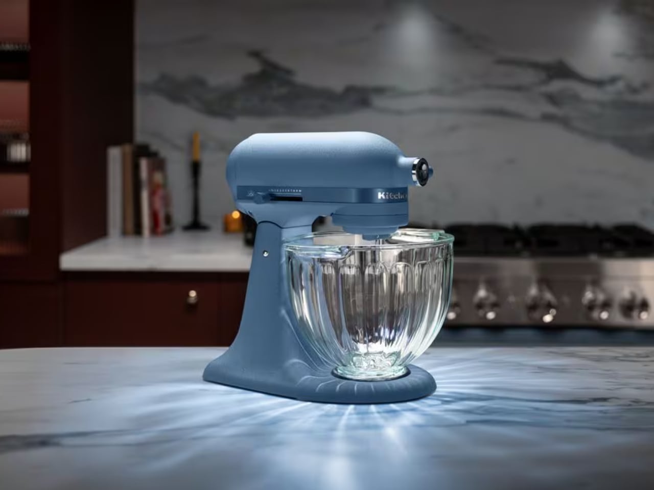
I’ve recently started becoming more serious about cooking. I’m still in the beginner phase, so all I really need right now is a good set of pots and pans and a working stove. But I already have a running wish list of kitchen accessories I’d like to get someday, and a good stand mixer sits right at the top of it. KitchenAid® is a brand that’s always top of mind (if not top of my wallet), and the newest version of their mixer might just be the one that finally talks me into opening it.
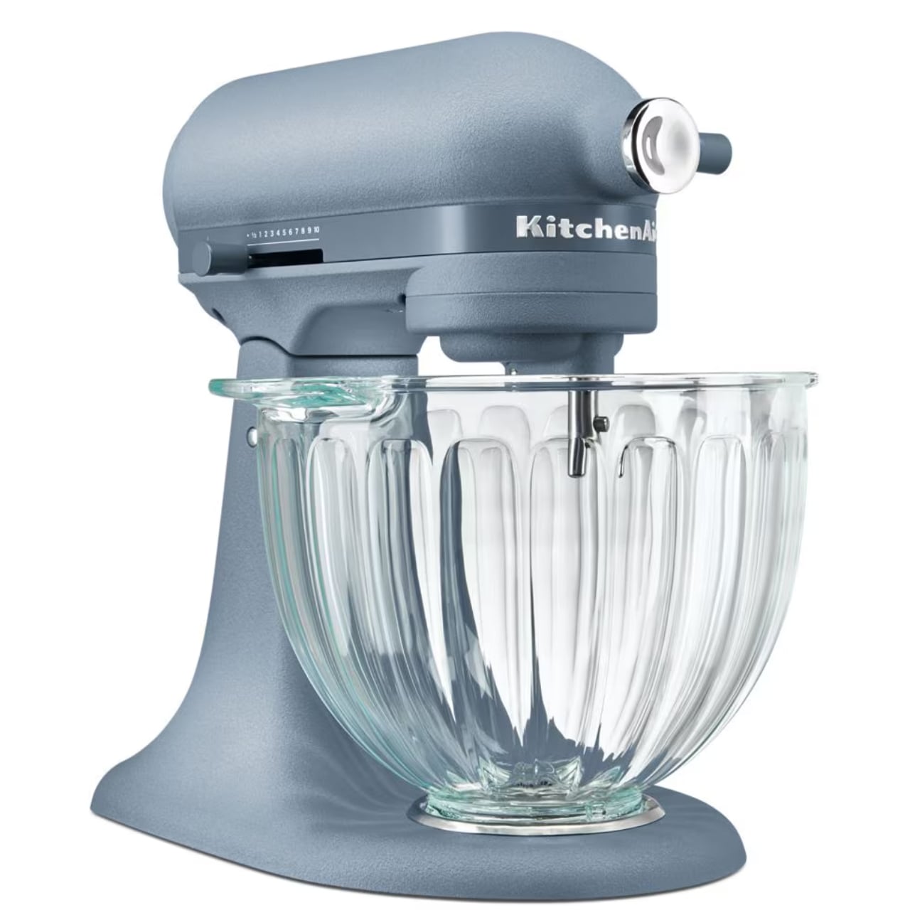
The KitchenAid® Design Series Luminaire is the brand’s newest limited-run stand mixer, and it’s built entirely in-house by KitchenAid’s own design team rather than an outside collaborator. Instead of the classic stainless steel bowl that comes with most mixers, this one has a ridged glass bowl. That lets you actually watch what you’re mixing while also making the whole process look like a “radiant masterpiece” as you prep whatever you’re cooking or baking.
Designer: KitchenAid®
Built into the base of the mixer is an LED light that shines up through the fluted glass, scattering light patterns you can clearly see while the mixer runs. It might sound purely decorative, but the fluting is engineered to catch, bend, and diffuse that light so you get a glowing, jewel-like effect rather than a flat glare. It looks great on a kitchen counter, and probably even better in photos and videos, which is a nice bonus if you’re into cooking or food content creation.
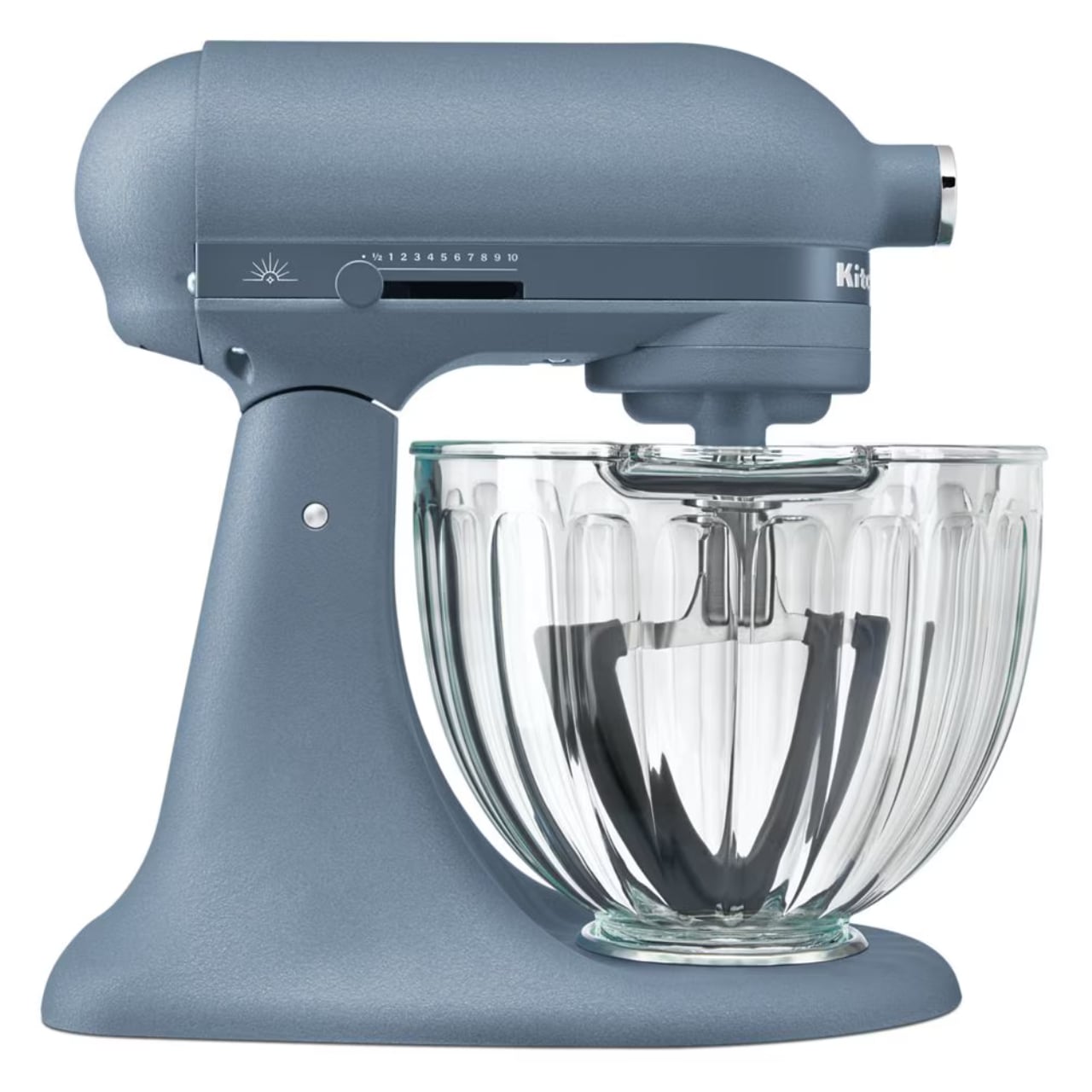

The mixer’s signature color, Blue Peppercorn, is a calming, muted blue finished with a soft, crinkled texture. KitchenAid says the shade was inspired by “the final crack of seasoning, the moment everything comes together,” which is a fitting little origin story for a mixer built around light. A polished chrome hub cover and a color-matched trim band with polished accents contrast nicely against that textured body, giving it a “jewelry on the counter” look instead of just another appliance taking up space.

Underneath all that glow, the Luminaire is built on KitchenAid’s trusted Artisan® Plus platform, so it’s not just a pretty face. It runs on 11 speeds with Precision Speed Control, letting you fine-tune your mix from a gentle fold to a fast whip, and it comes with dishwasher-safe stainless steel attachments (flat beater, wire whip, and dough hook), so cleanup doesn’t cancel out the decor appeal. It’s also compatible with KitchenAid’s full lineup of attachments, meaning the same base can grind meat, roll pasta, or spiralize vegetables if you ever want to go beyond baking.
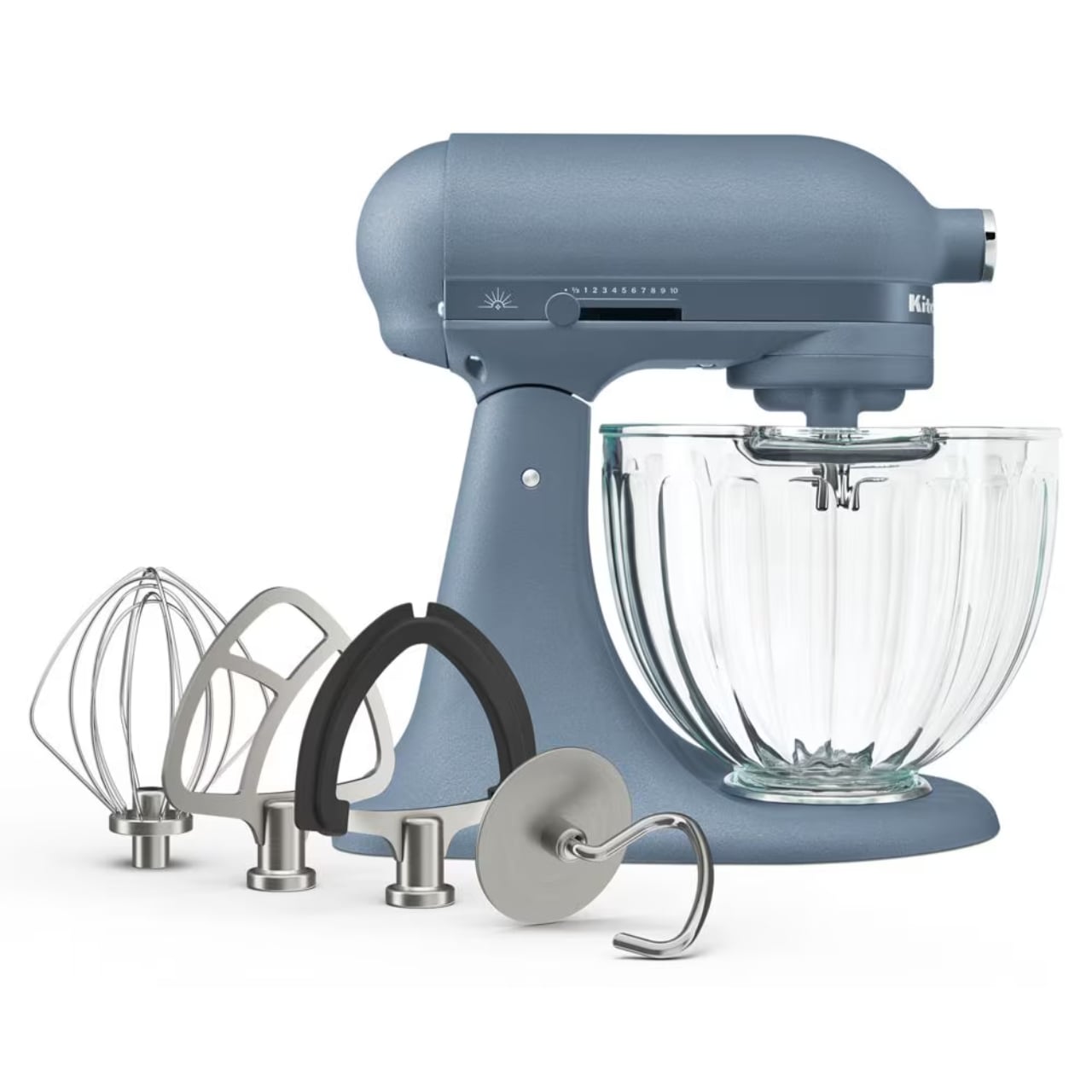
The 5-quart tilt-head model runs $699.99, and it’s actually the third mixer in KitchenAid’s Design Series lineup, following the 2022 Blossom and the viral 2024 Evergreen. This time, the aesthetic even extends beyond the mixer, with a matching Blue Peppercorn cookware line dropping later this fall and a limited-edition 36-inch Blue Peppercorn commercial-style range for anyone renovating an entire kitchen around the color (that one runs a much less beginner-friendly $8,899).

If you’re comparing options, the obvious rival is Smeg’s 50’s Retro Style Stand Mixer, another design-forward pick that’s just as popular for making a kitchen look as good as it cooks. Smeg’s version retails around $599 (often discounted into the $400 to $550 range) and packs a 600-watt motor with 10 speeds and a classic stainless steel bowl, more raw horsepower, in other words, but none of the light-up glass theatrics. Reviewers have noted that Smeg wins on sheer power and vintage styling, but if you want a true all-purpose workhorse with a deeper attachment ecosystem, KitchenAid is usually the recommended alternative. Basically, it comes down to whether you want a mixer that performs like a heavy-duty tool or one that doubles as a glowing centerpiece.
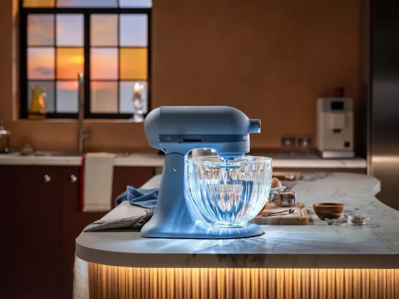
For a beginner like me, is $699.99 justified before I’ve even mastered basic knife skills? Probably not yet. But it’s exactly the kind of splurge that earns a spot on a “someday” list, landing somewhere between a stand mixer and a small sculpture. And unlike a lot of trend-driven kitchen gadgets, this one still does the actual job a stand mixer is supposed to do, it just does it with a little extra glow. If you’d rather try your luck than spend the money outright, KitchenAid is also running a sweepstakes giving away five Luminaire mixers, which might be the more beginner-budget-friendly way in for now.


The post The KitchenAid Luminaire Mixer That Glows On Your Countertop first appeared on Yanko Design.



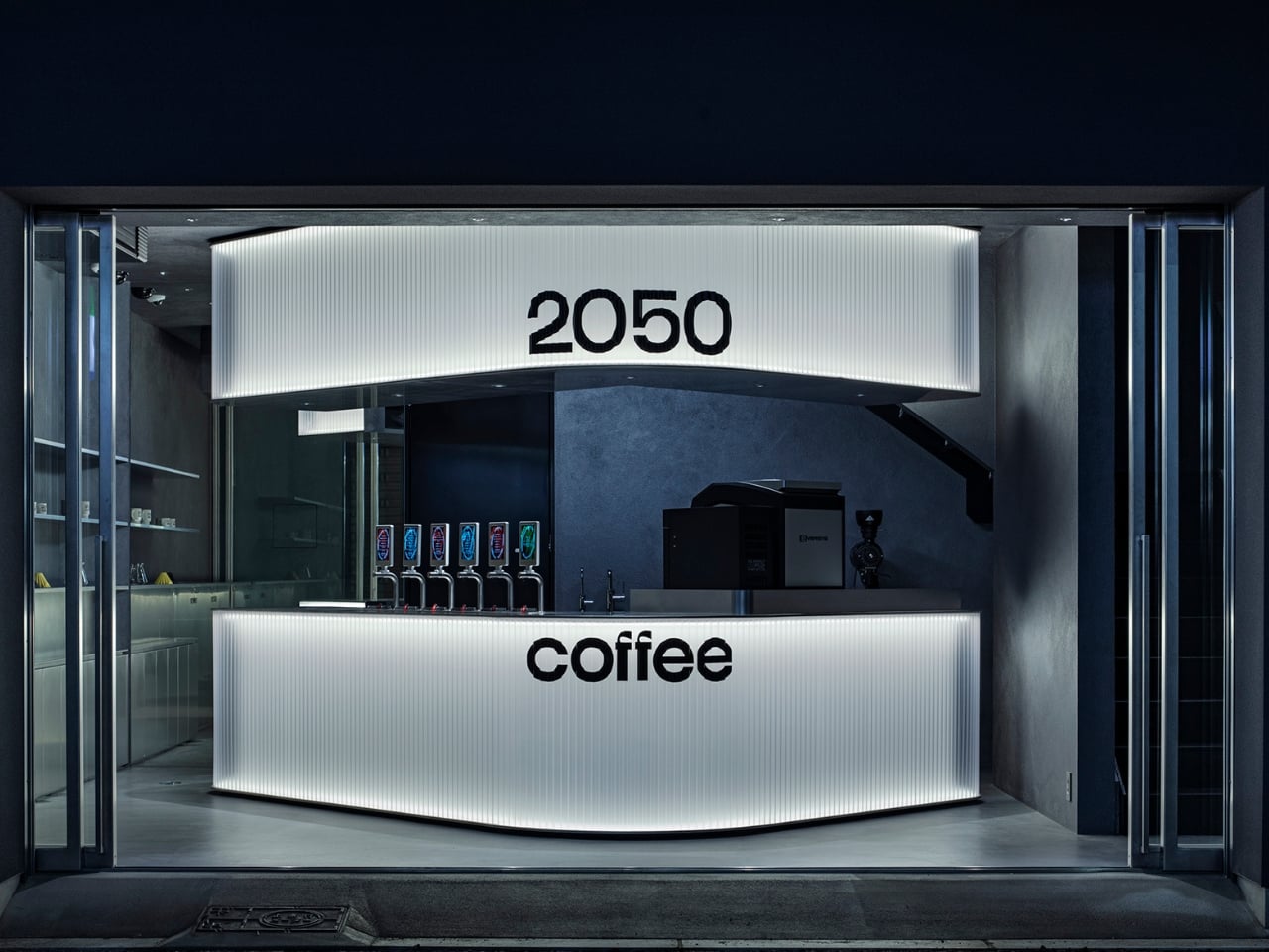
Midosuji doesn’t leave much room for interpretation. Osaka’s most famous boulevard runs dead straight for miles, lined with gingko trees and glass towers that all seem to agree on the same rules of proportion and restraint. It’s a street built on order, and that order is exactly the problem a small coffee shop faces when it tries to plant itself there. How do you get noticed, or even remembered, on an avenue designed to make everything feel uniform and permanent?
TEKI Design answered that question by refusing the grid entirely. The new Osaka branch of 2050 Coffee, tucked into a compact 57.62 square meter footprint along the axis, leans into diagonal walls and angled openings that cut against Midosuji’s rigid north south line. It’s a small architectural rebellion, and it works because it never shouts. The geometry just sits there, off kilter in a city block built on right angles, and lets the contrast do the talking.
Designer: TEKI Design
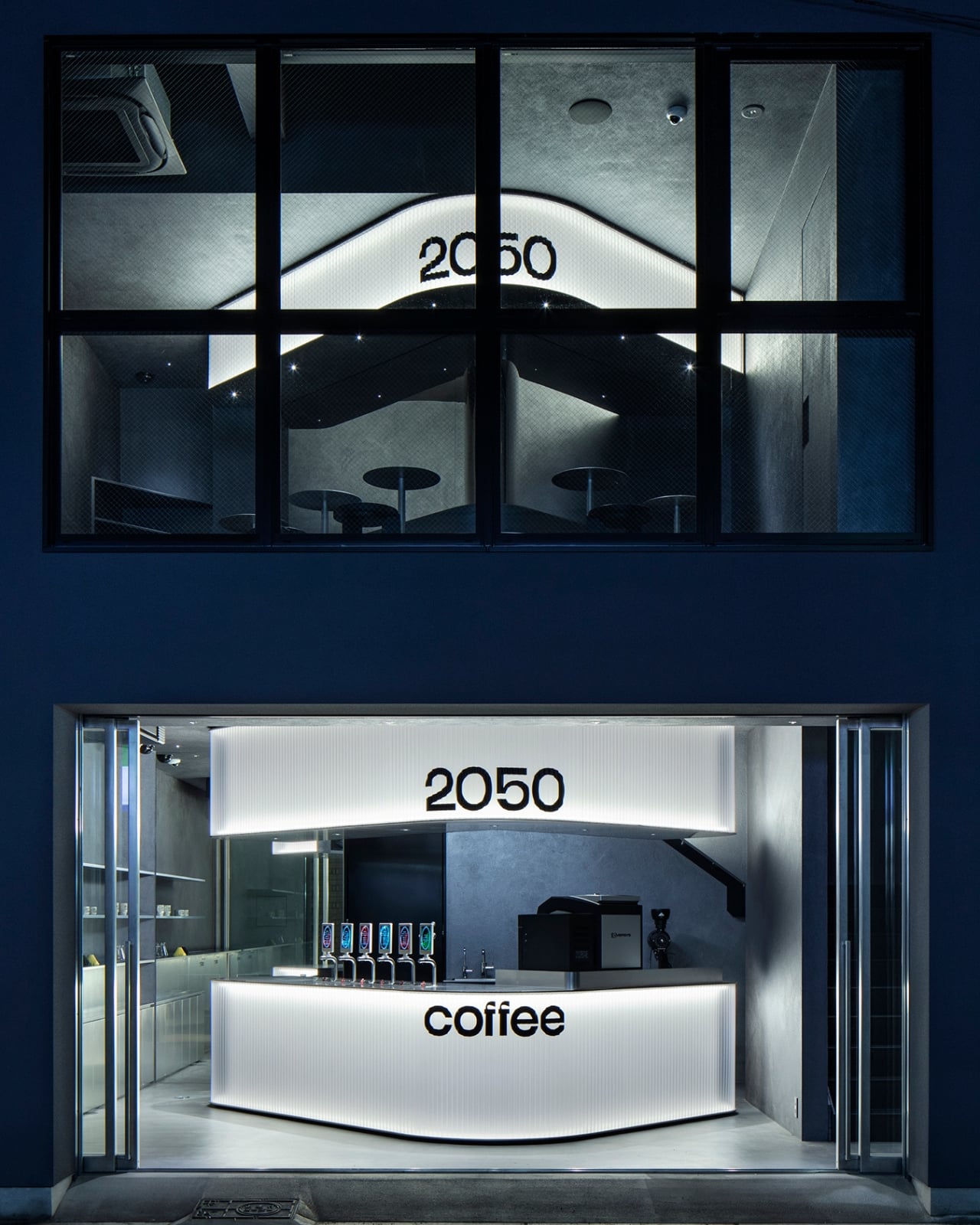
There’s a second problem buried inside this project, one that has nothing to do with real estate and everything to do with coffee itself. The brand takes its name from a genuinely unsettling forecast: that by 2050, climate change could wipe out more than half the land currently suitable for growing coffee. TEKI Design has said the shop isn’t meant to solve that crisis outright, since no single café can, but to model the idea that a future problem this large gets chipped away by small, deliberate actions rather than one grand fix. The diagonal architecture is basically that philosophy rendered in steel and light. Nothing about it pretends to have the whole answer. It just commits to doing its one small thing well.
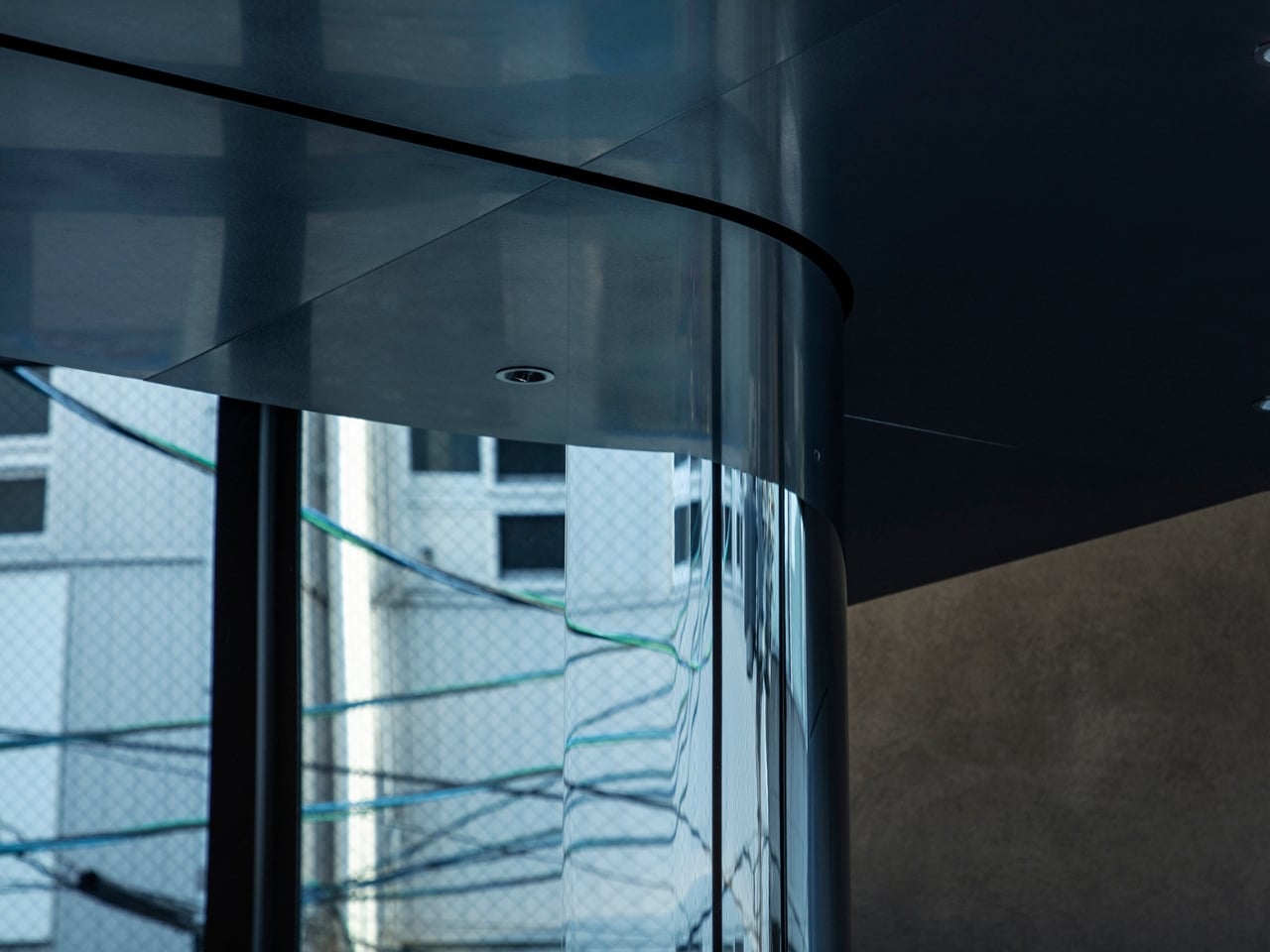
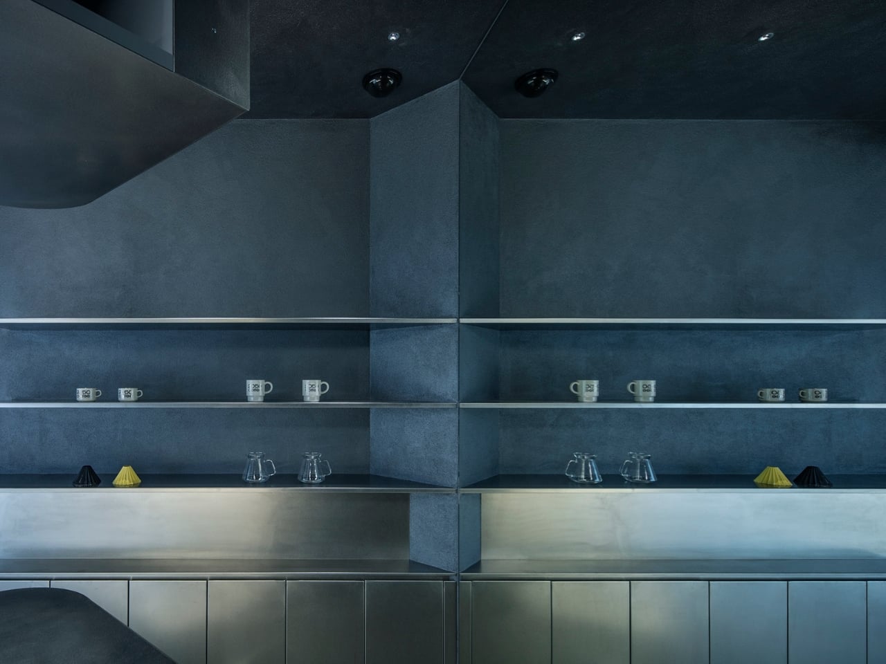
Inside, the café stacks its two floors vertically rather than spreading wide, which makes sense given how little ground it actually occupies. Angled forms pull visitors upward through the space, and the horizontal energy of the boulevard outside gets translated into a vertical sequence once you step through the door. Illuminated curves break up what could have felt like a cramped stairwell experience, and the circulation itself becomes part of the design rather than an afterthought bolted on at the end.
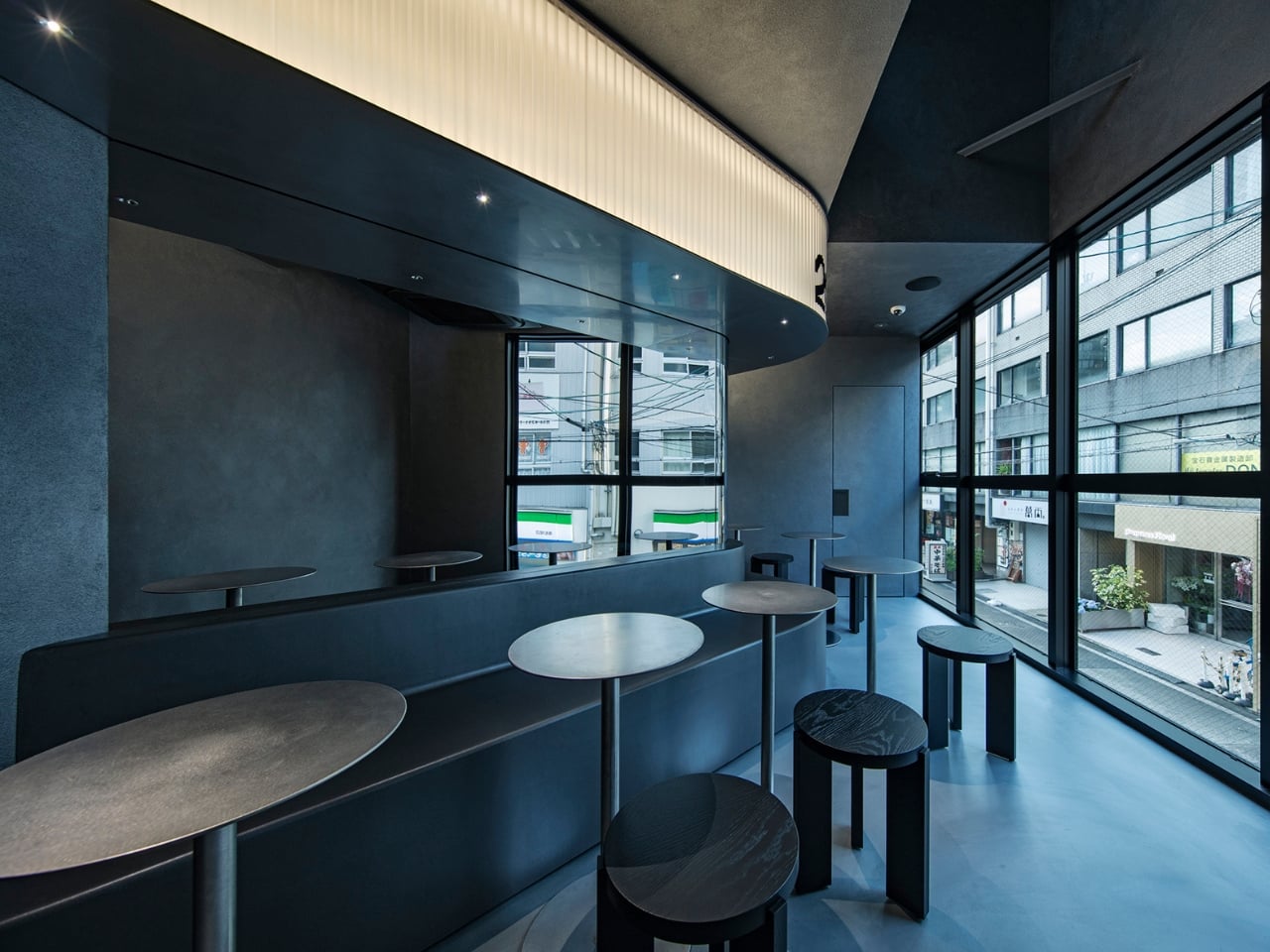
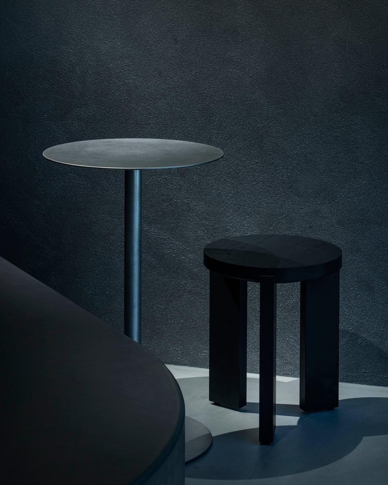
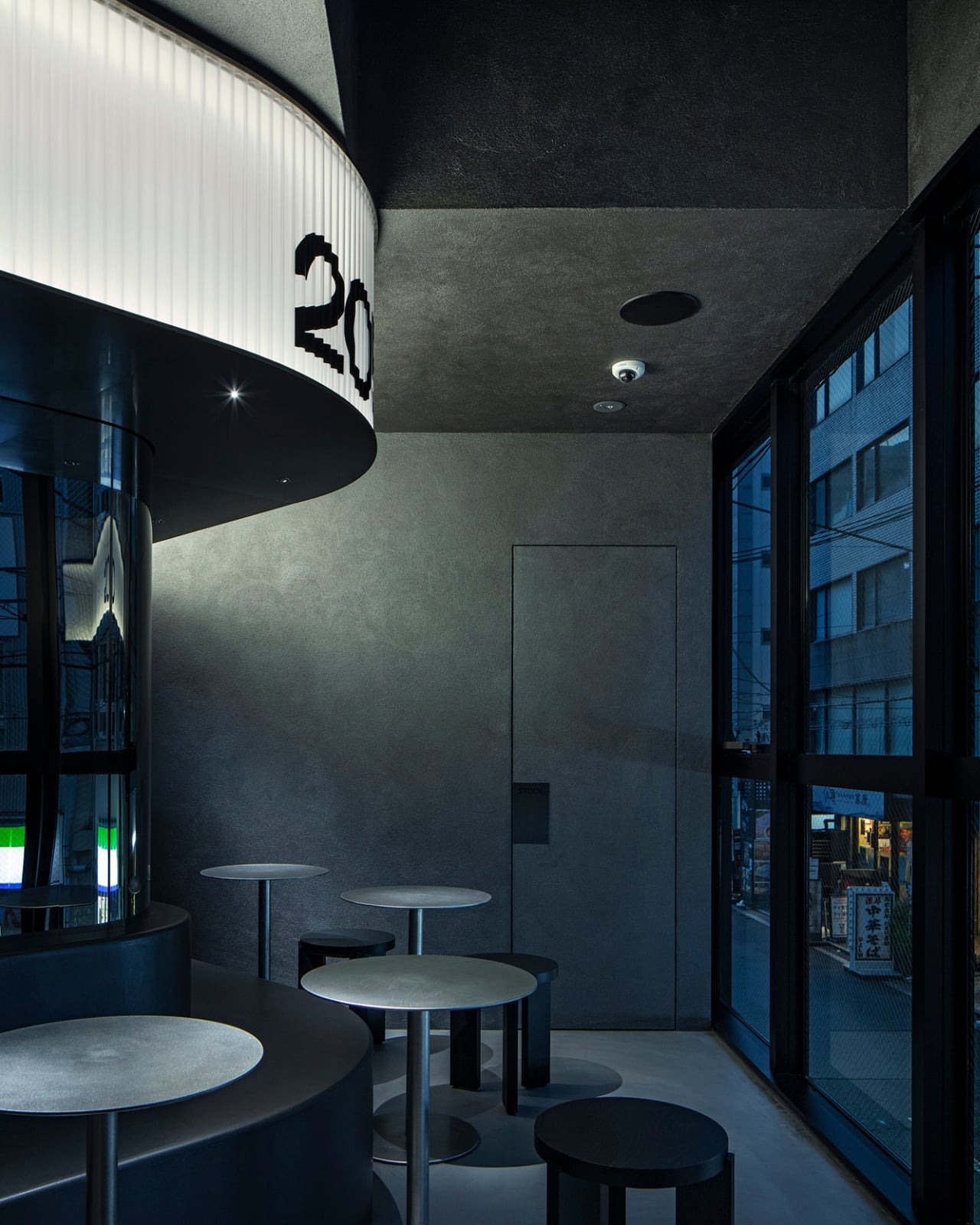
I like that this project treats scarcity as a design tool instead of a limitation to apologize for. A lot of retail architecture in tight urban lots tries to disguise how small the space actually is, adding mirrors and open sightlines to manufacture a sense of grandeur. TEKI Design does the opposite here. The diagonals make the compression feel intentional, almost theatrical, so that moving through the café becomes an experience defined by shifting angles rather than a race to the counter and back out the door.
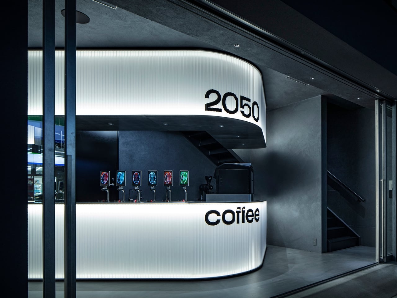
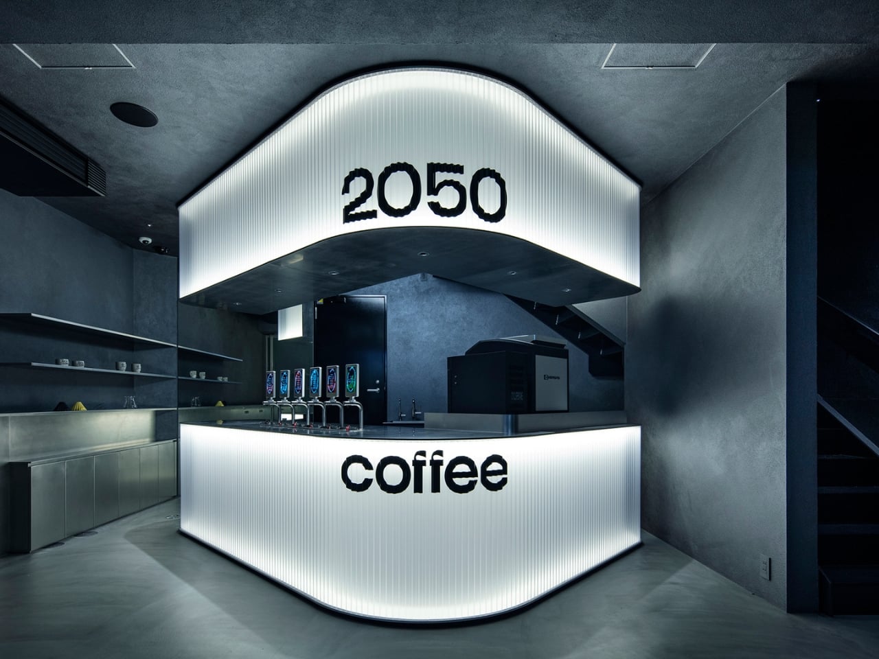
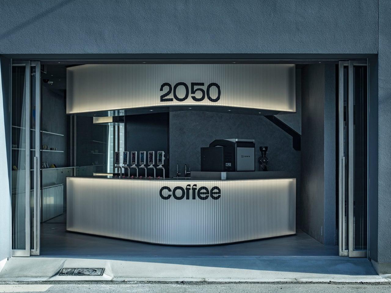
None of this would matter much if the concept behind it felt hollow, and that’s the part worth sitting with. Climate messaging in commercial design tends to lean on materials, reclaimed wood, visible solar panels, the usual signals. This shop skips that vocabulary entirely and instead builds its point of view into the bones of the building. You don’t need a plaque explaining the mission. The architecture itself refuses to blend into a status quo that a warming climate is quietly rendering obsolete.
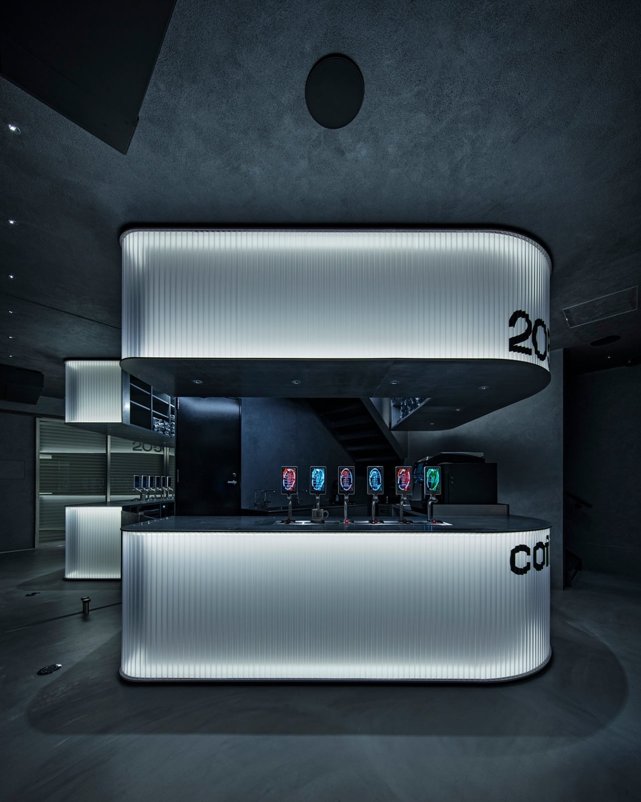
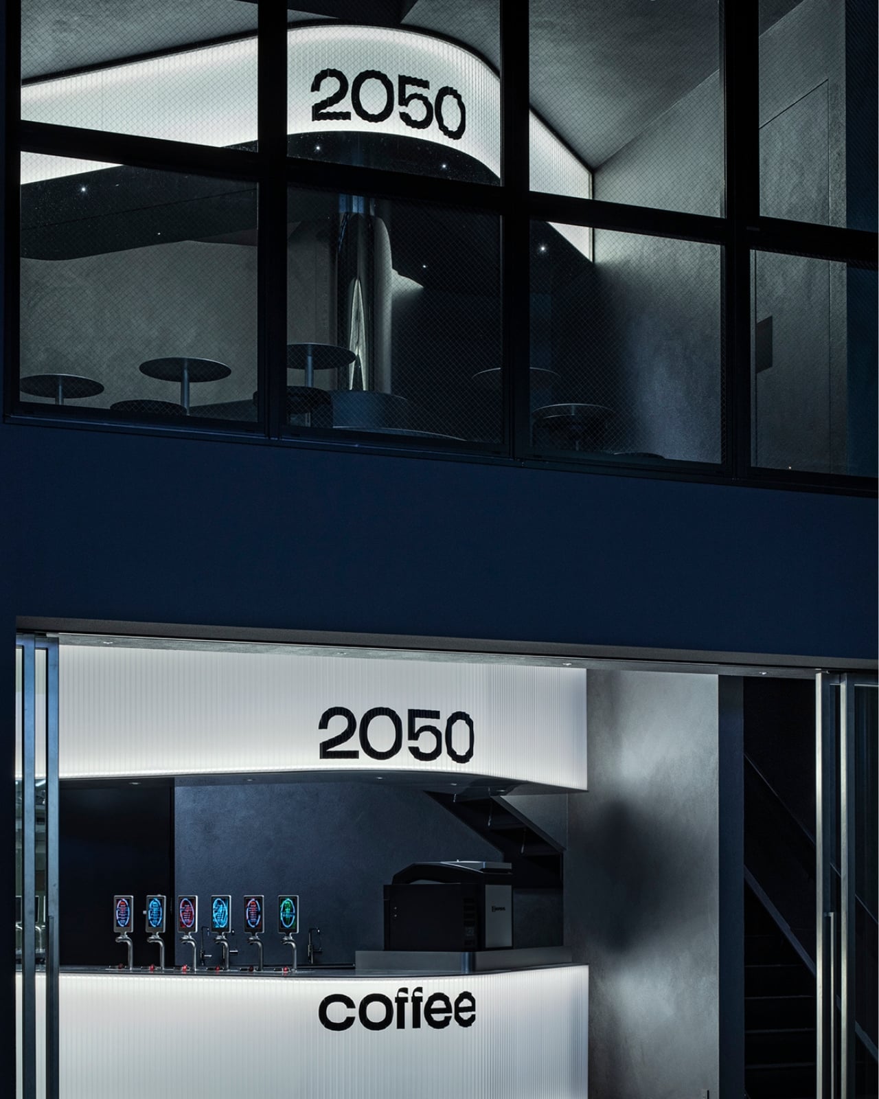
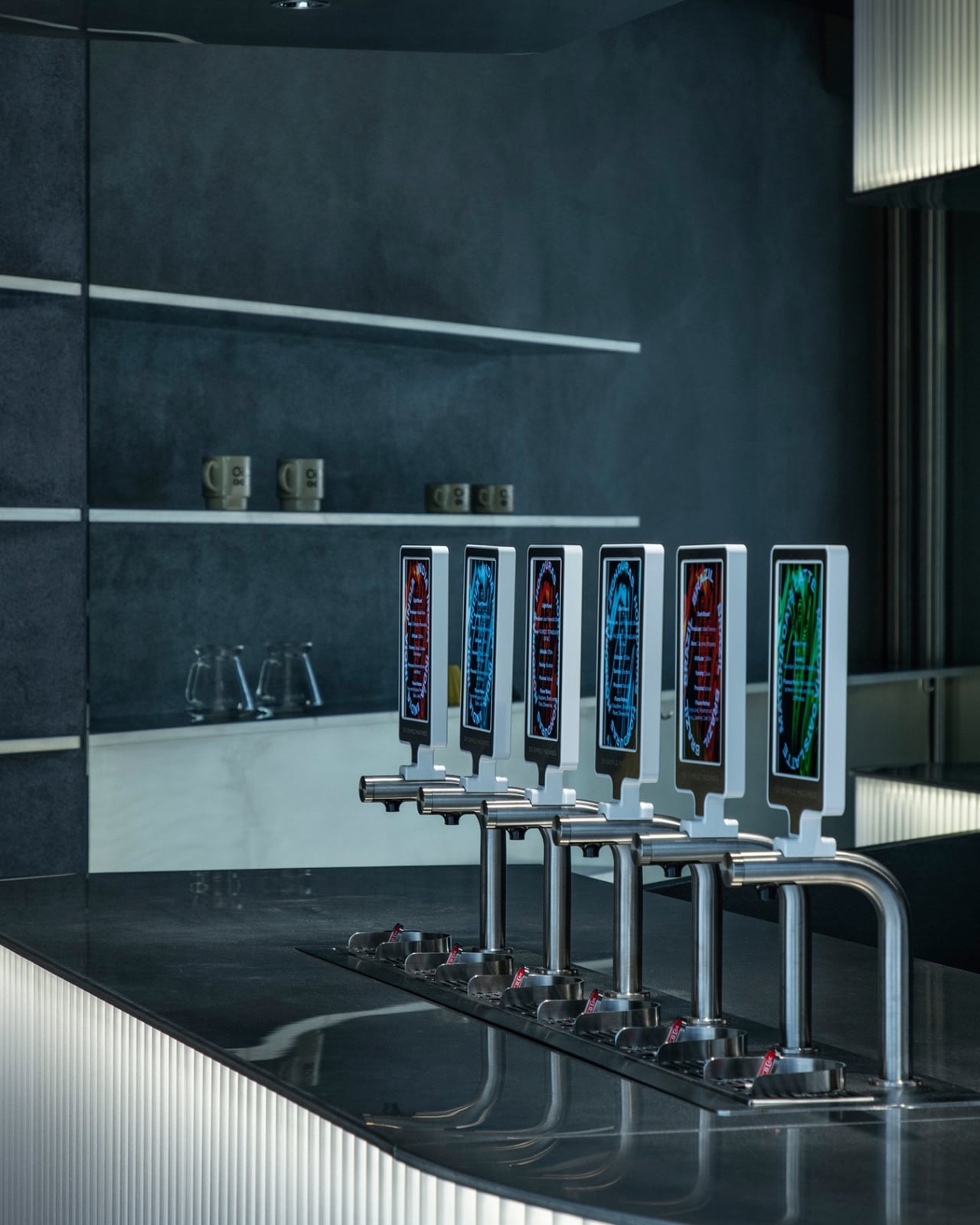
Specialty coffee culture in the U.S. has spent the last decade obsessing over sourcing transparency and bean provenance, so a shop built around admitting coffee’s uncertain future feels like a natural extension of that conversation rather than a foreign import. Whether or not the diagonal walls actually shift how people think about their next latte is impossible to measure. But the attempt itself, small, specific, and honest about its limits, feels more useful than another café dressed up in reclaimed timber and calling it sustainability. Sometimes the most effective statement a building can make is simply choosing not to line up with everything around it.
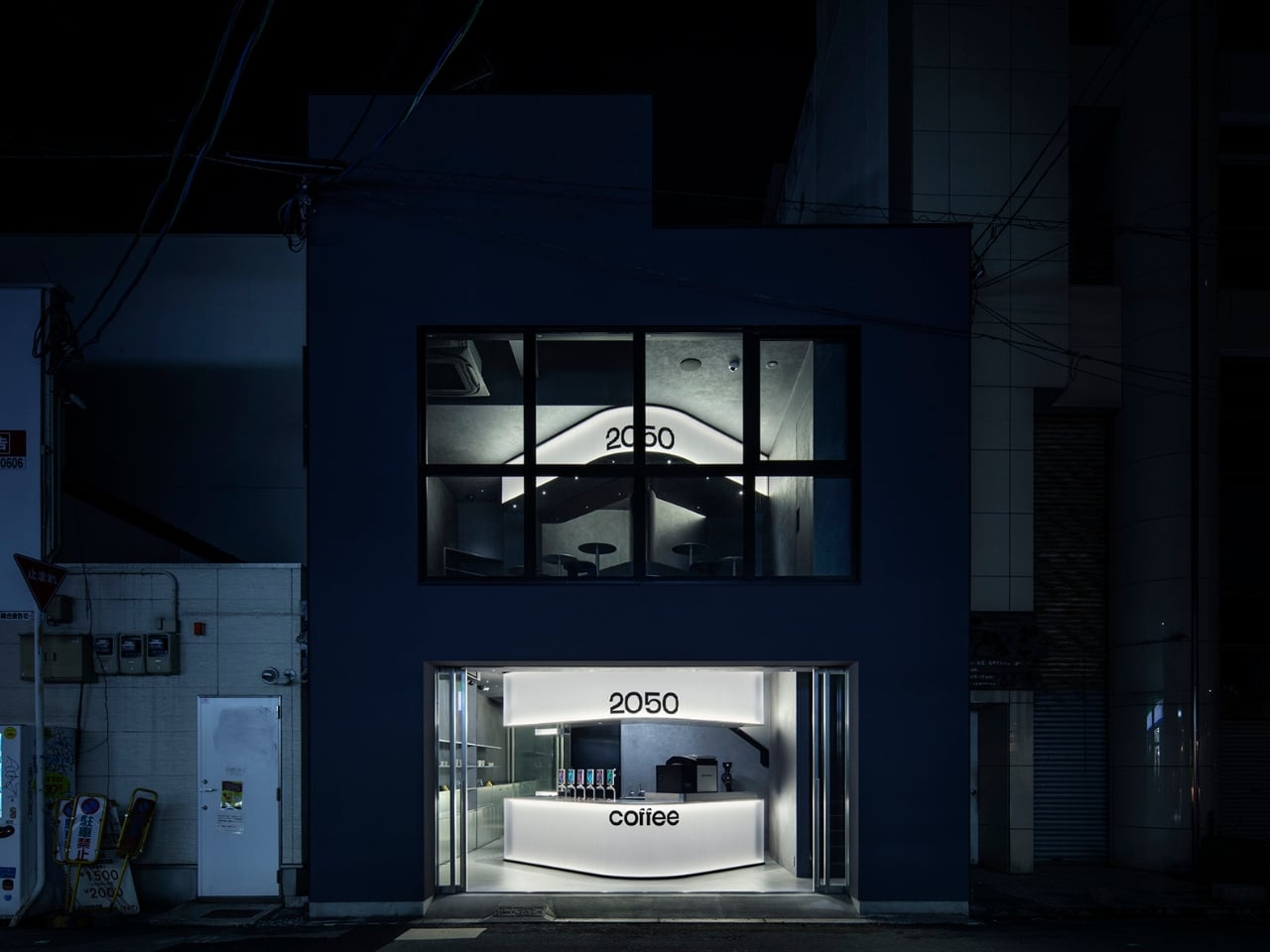
The post A Tiny Osaka Café That Refuses to Line Up With Its Own Street first appeared on Yanko Design.

There is a piece of Spider-Man trivia that has floated around fan forums for years, the kind of claim that gets repeated so often it starts to feel like fact. The story goes that the mask eyepieces worn by Tobey Maguire and Andrew Garfield were built using actual Oakley lens material, sourced by the prop houses that made the suits. I cannot verify that, and neither, as far as I can tell, can anyone who has posted it online. It lives mostly in old Oakley collector threads, secondhand and uncredited, more urban legend than documented history. But myth or not, it is the exact reason a new pair of unofficial Spider-Man sunglasses from designer Ivan Vanacore make immediate, satisfying sense.
Vanacore’s concept takes the raised red webbing off Andrew Garfield’s suit in The Amazing Spider-Man 2 and wraps it around an Oakley silhouette, ellipse logo included at the temple. The web lines run outward from the nose bridge in the exact pattern the mask uses across the face, and the lens shape borrows the exaggerated, teardrop eye cutouts that made that particular suit stand out from Raimi’s earlier, more restrained design. There is no confirmation this is an actual product, a licensed collaboration, or anything beyond a designer’s personal project. Vanacore has not said whether these exist as more than renders, and neither Oakley nor Sony has commented. For now, treat it as a very convincing what if.
Designer: Ivan Vanacore

Vanacore did not default to the Maguire suit or even the more famous Tom Holland suit with the shapeshifting eyes, he went straight for ASM2’s version, the eyes pulled wide at the temples, the webbing raised enough to read as sculptural rather than printed. Garfield’s Spiderman never really got its due, it got swept under the rug while Sony just decided to put enough effort into the series to retain rights, promptly canceling it after 2 movies to focus on a Venom series. It’s only after Garfield made an appearance in No Way Home that people really objectively appreciated how well he embodied the role of Peter Parker.

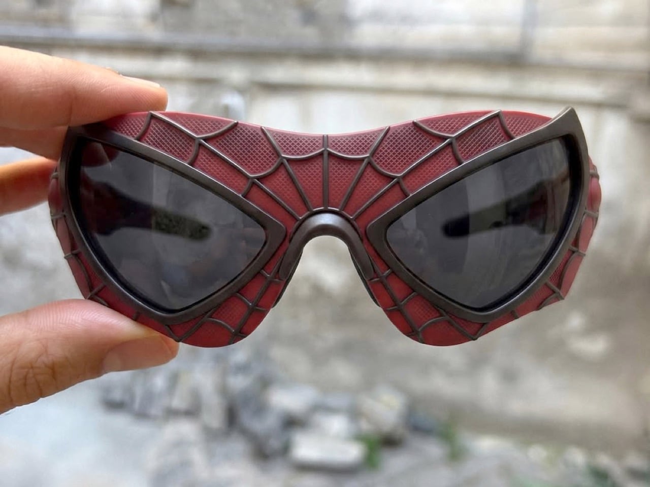
Now the honest part. Would these actually be wearable? Eh. Those narrow lens openings look amazing in a photo and would be a nightmare for peripheral vision the second you tried to drive in them. And all that raised texture is basically a dust and grime trap waiting to happen. Cool concept, rough real life.
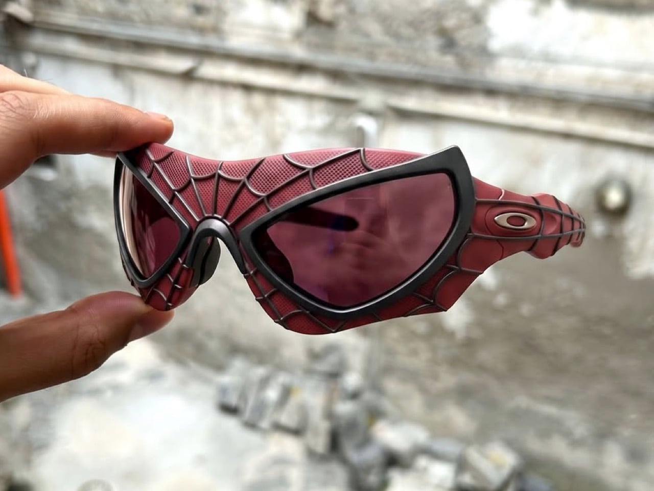
But none of that matters because the internet already wants a pair, and honestly, same. We’ve seen a ton of fan concepts that invent an entire new universe from scratch just to justify existing. This one barely has to try that hard. It just points at two things that already looked like they belonged together and goes “well?”
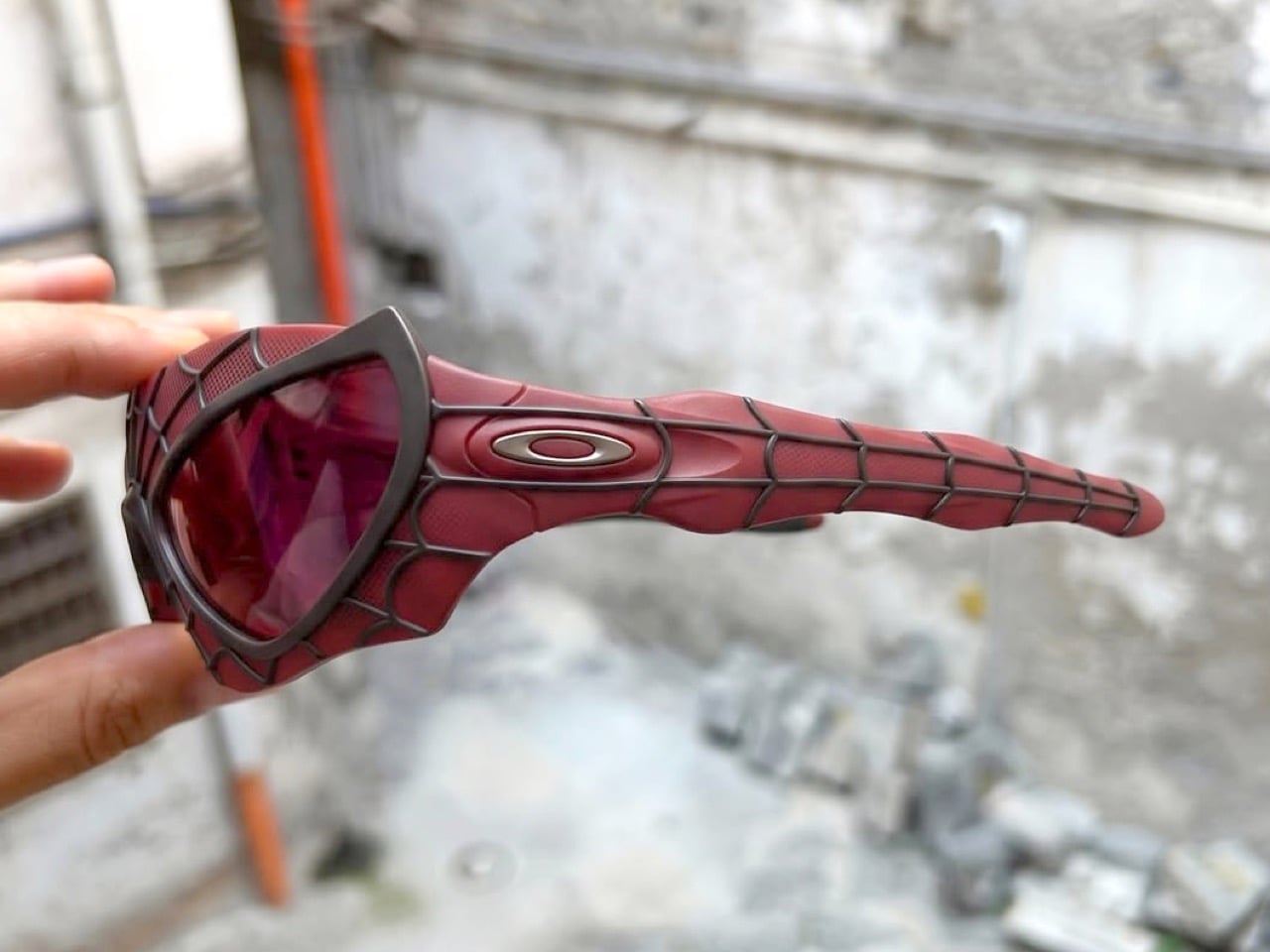
Whether Oakley ever picks this up is anyone’s guess, corporate legal teams have killed way cooler ideas than this and I’m sure Marvel and Oakley’s lawyers are definitely going to butt heads instead of collaborating earnestly to give the fans what they want. Until then it just lives as a really good What If, and somewhere a costume designer from 2014 is getting way more attention than they ever expected for a movie most people forgot.
The post These Oakley x Spiderman unofficial sunglasses are cooler than any smart wearable ever made first appeared on Yanko Design.