Teacup Tiny Homes Built the Same Floor Plan Over and Over — Because It’s That Good

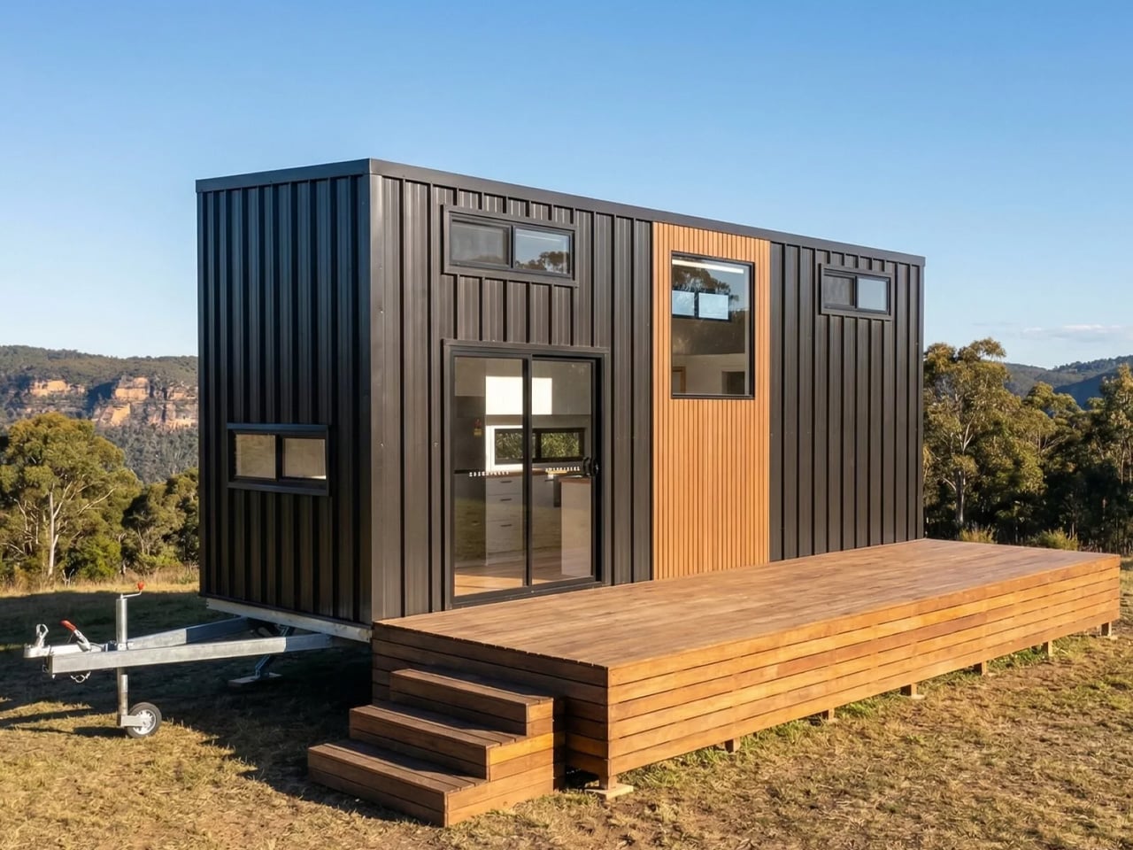
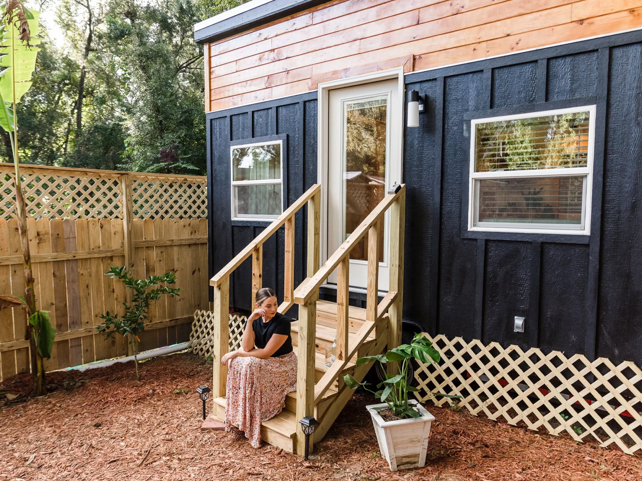
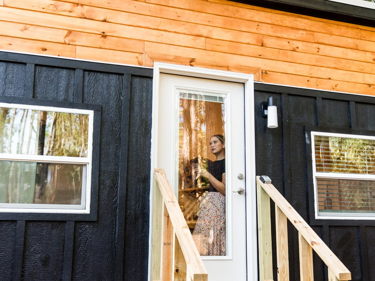
The Ruby is built by Alberta-based Teacup Tiny Homes, a builder quietly making some of the most thoughtful tiny homes in North America since 2016. The Ruby is the plan that started it all and keeps evolving. What began as a custom build designed for a family of five headed to the Vancouver area has since become one of the builder’s most built and most loved floor plans, spawning a growing lineup of variations that have landed everywhere from New Brunswick to the Crowsnest Pass.

Designer: Teacup Tiny Homes

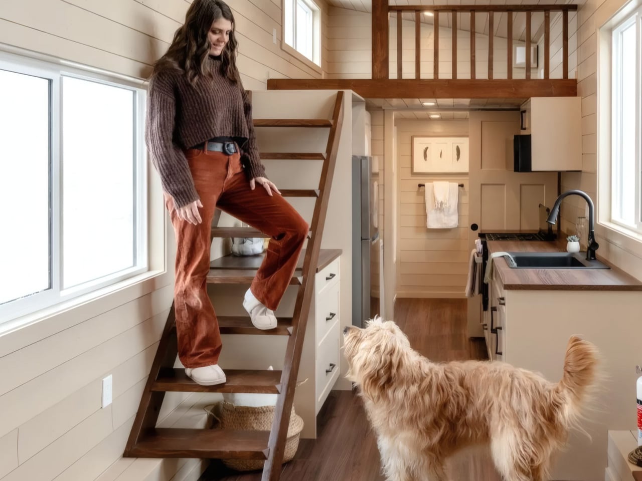
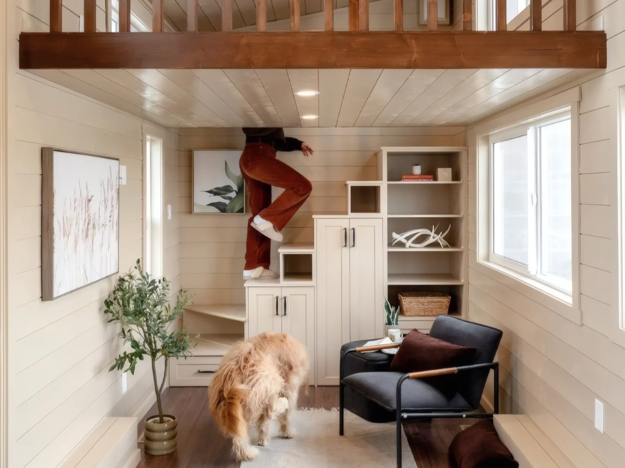
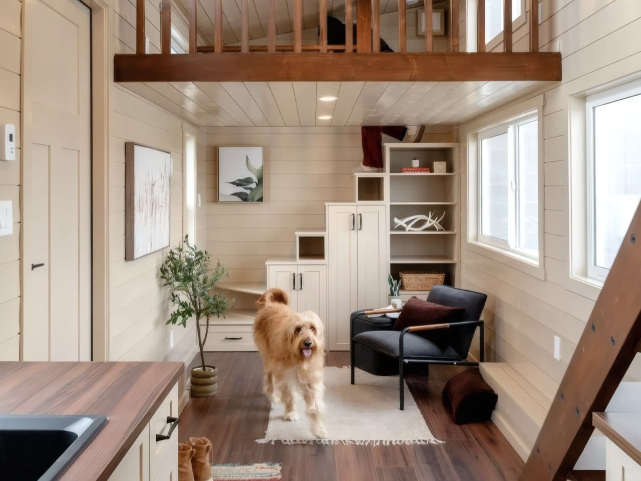
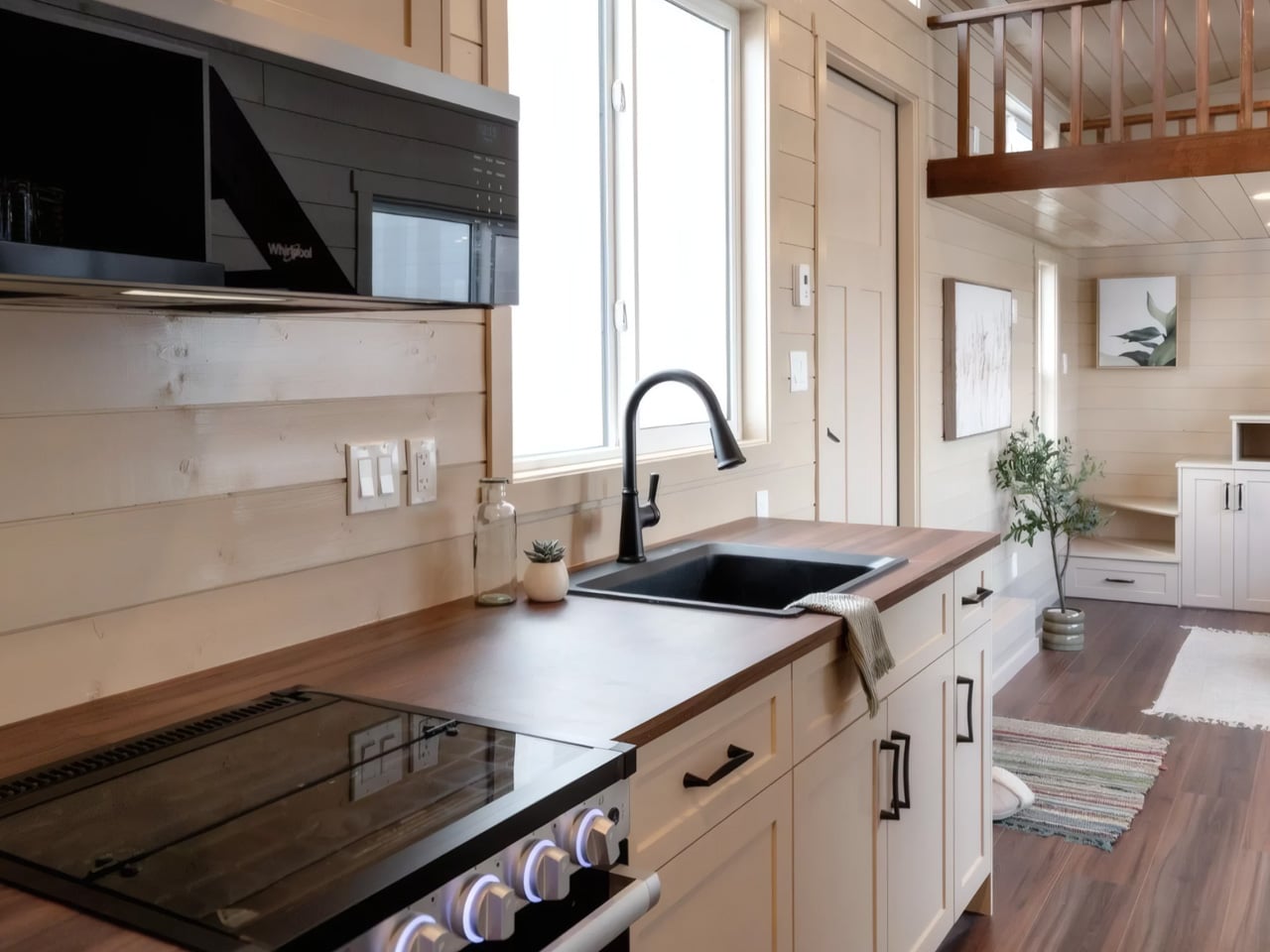
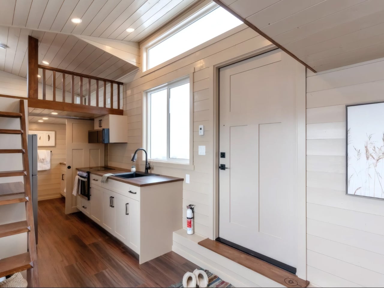
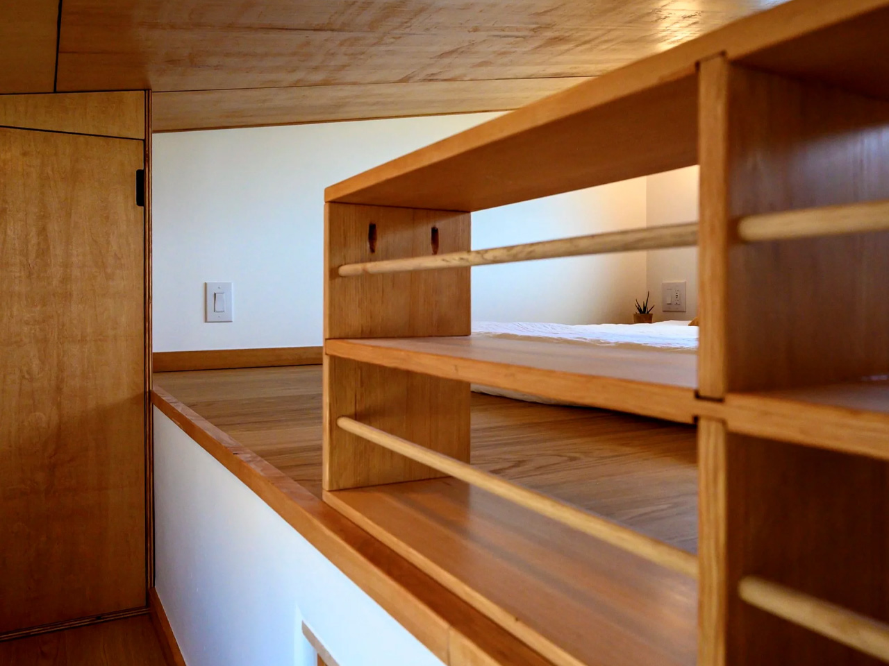
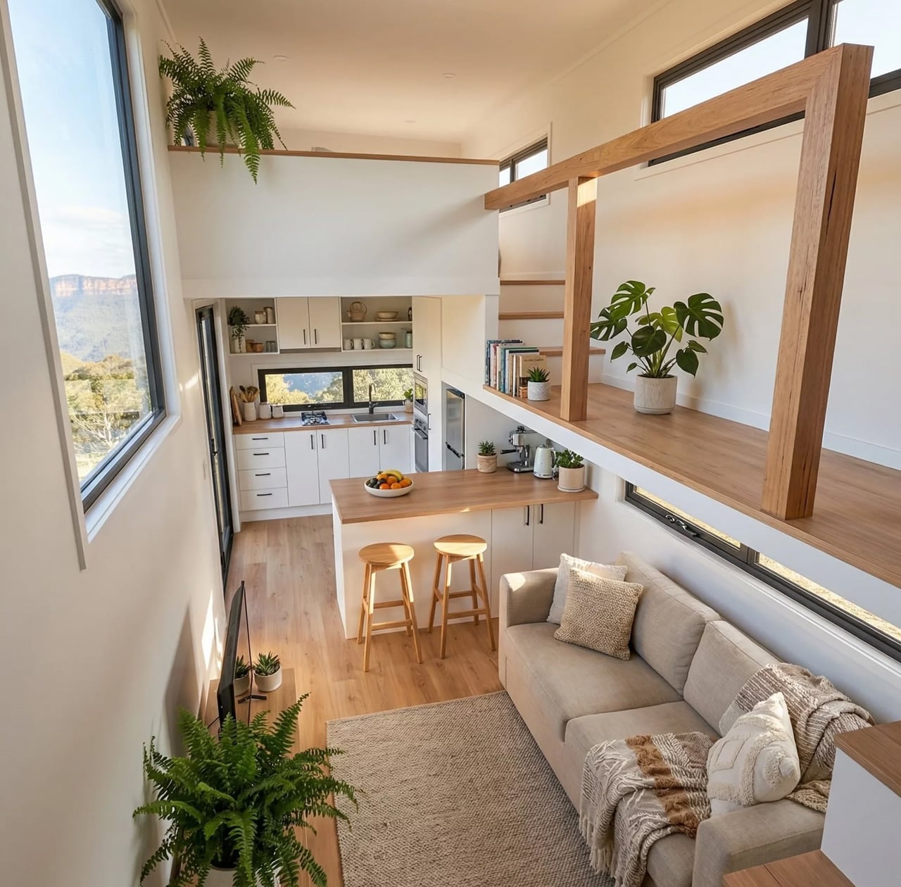
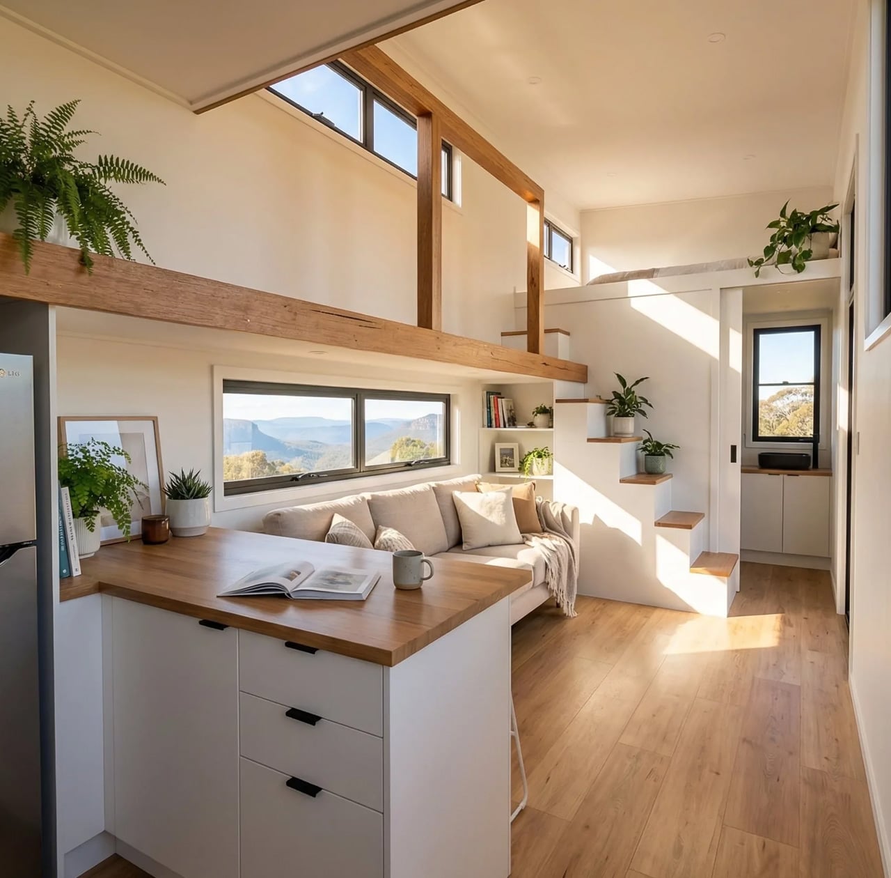
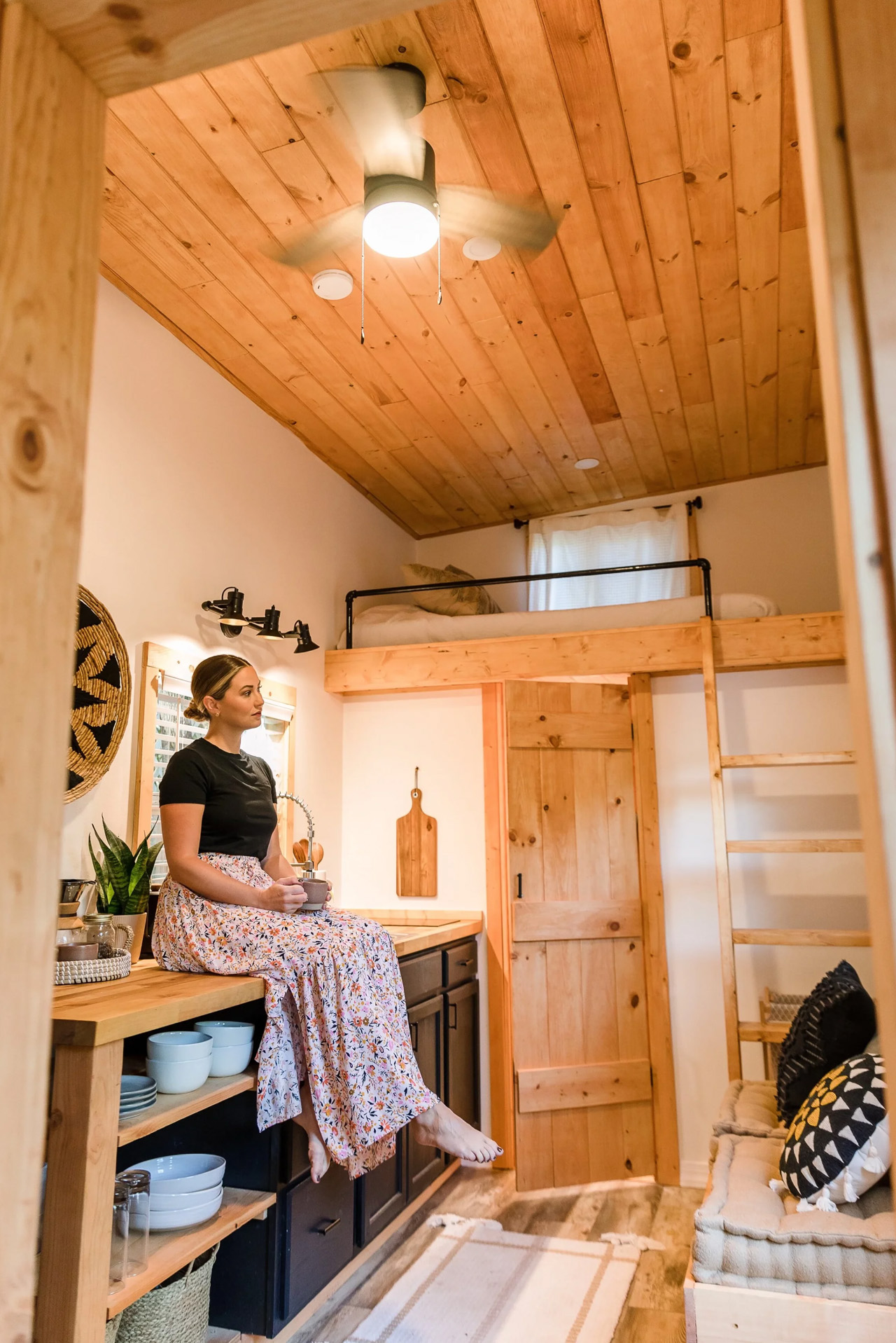
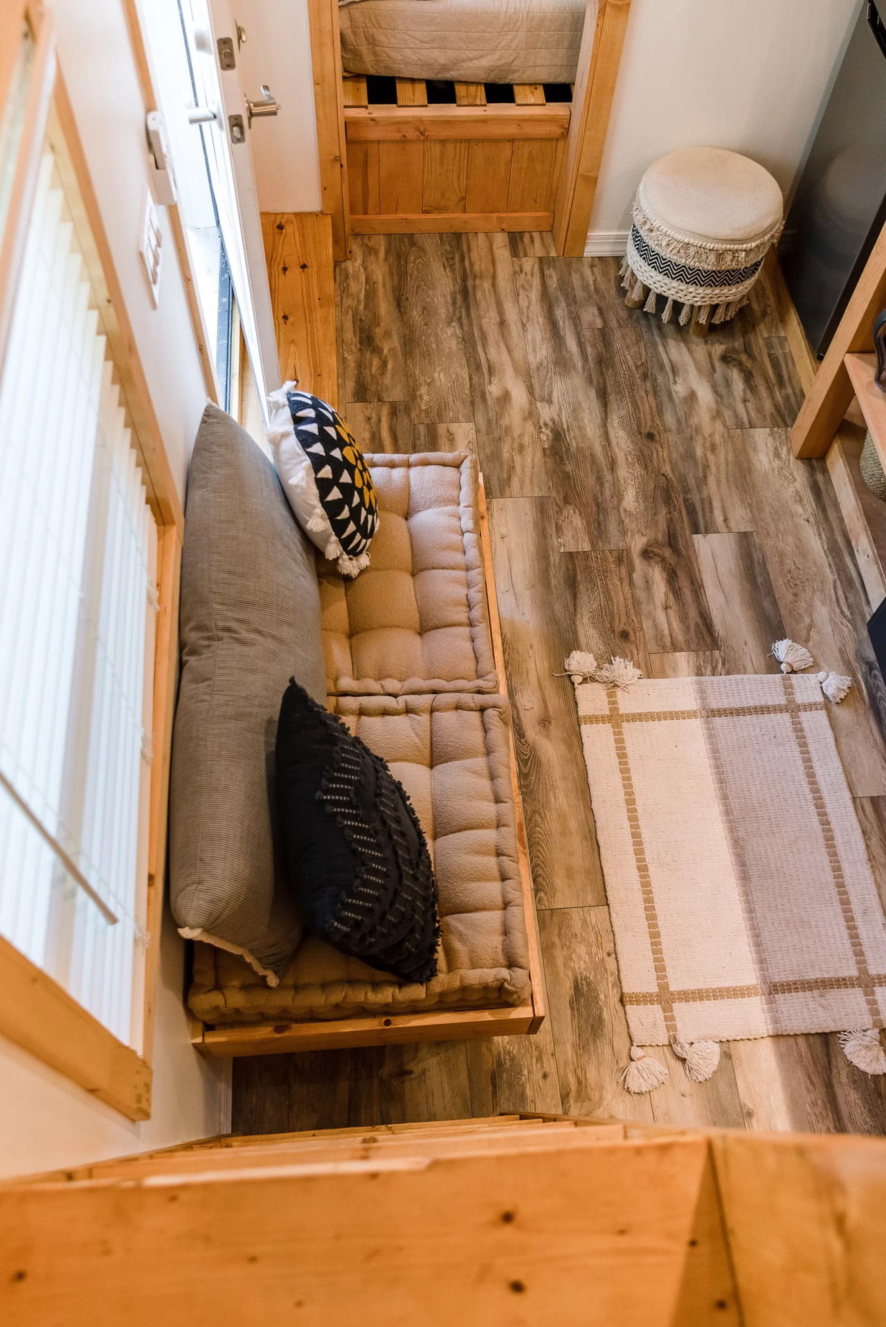
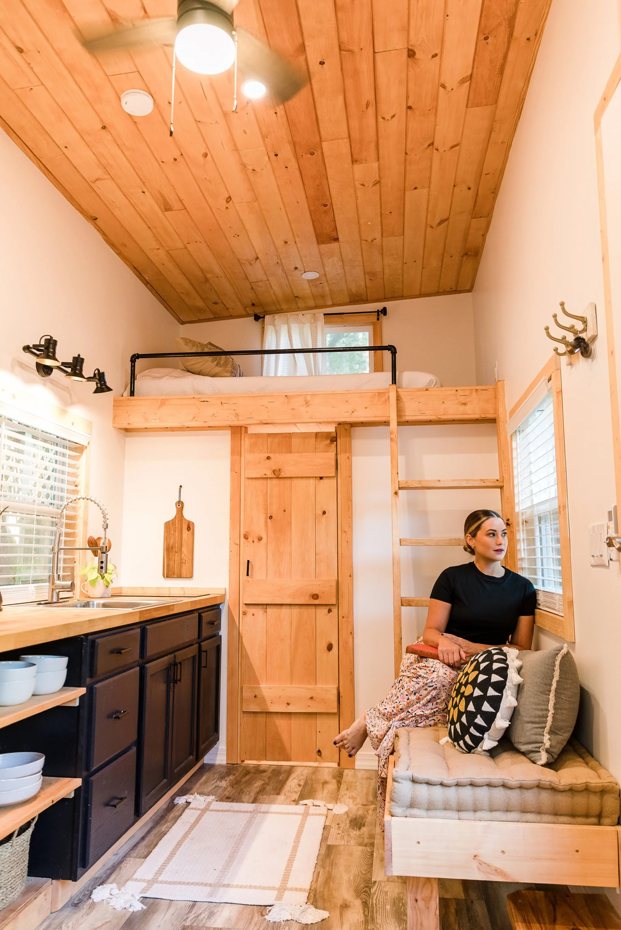
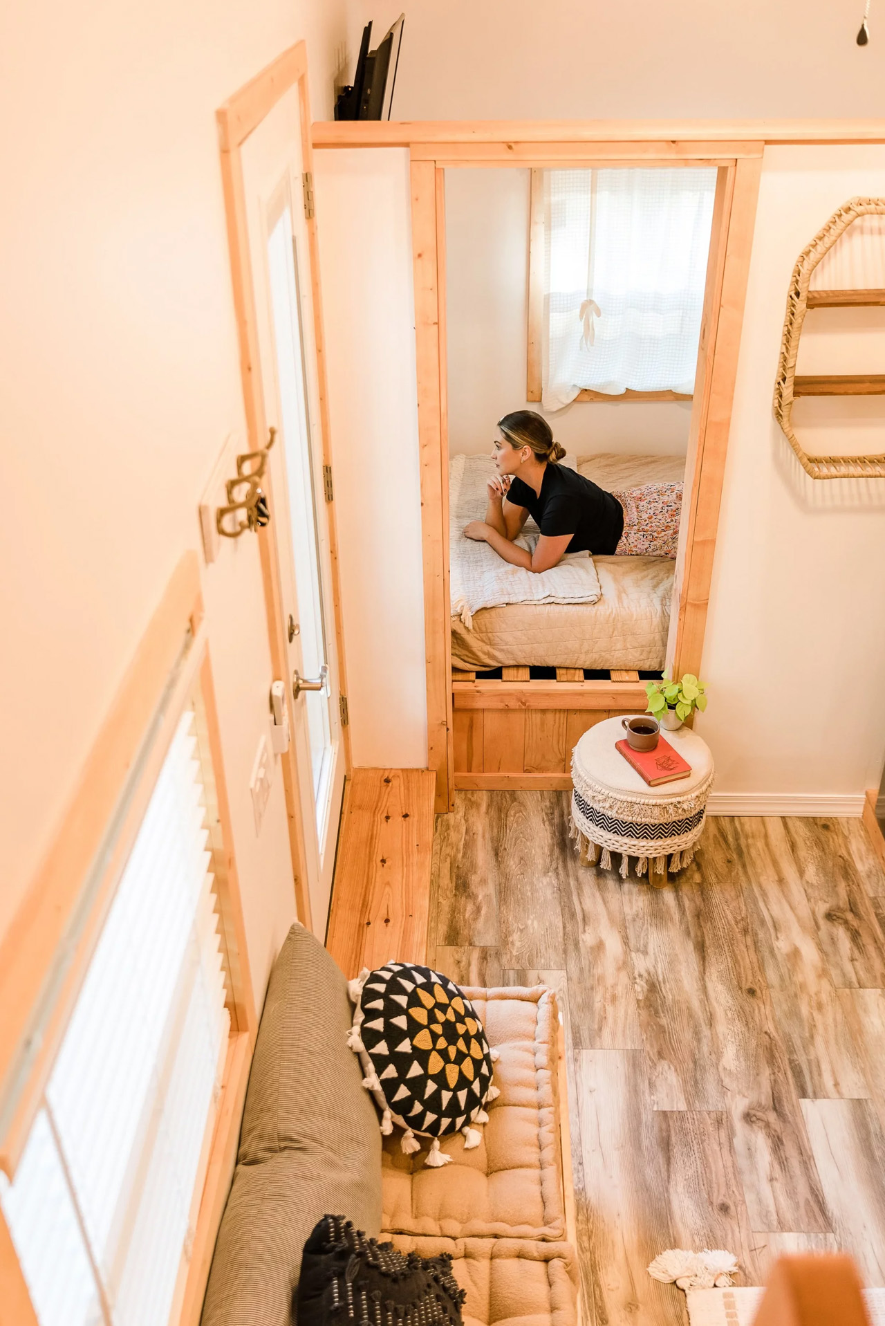
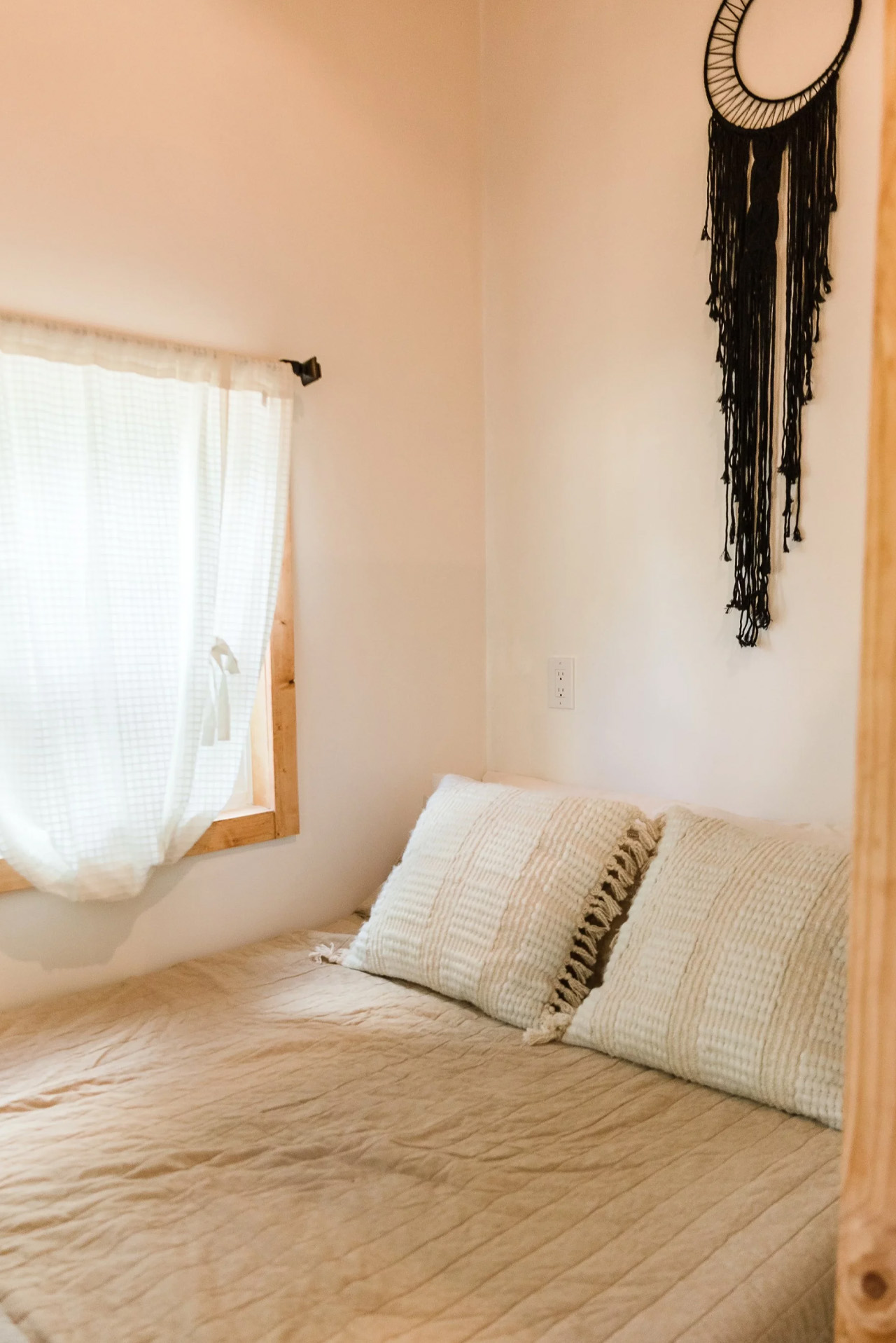
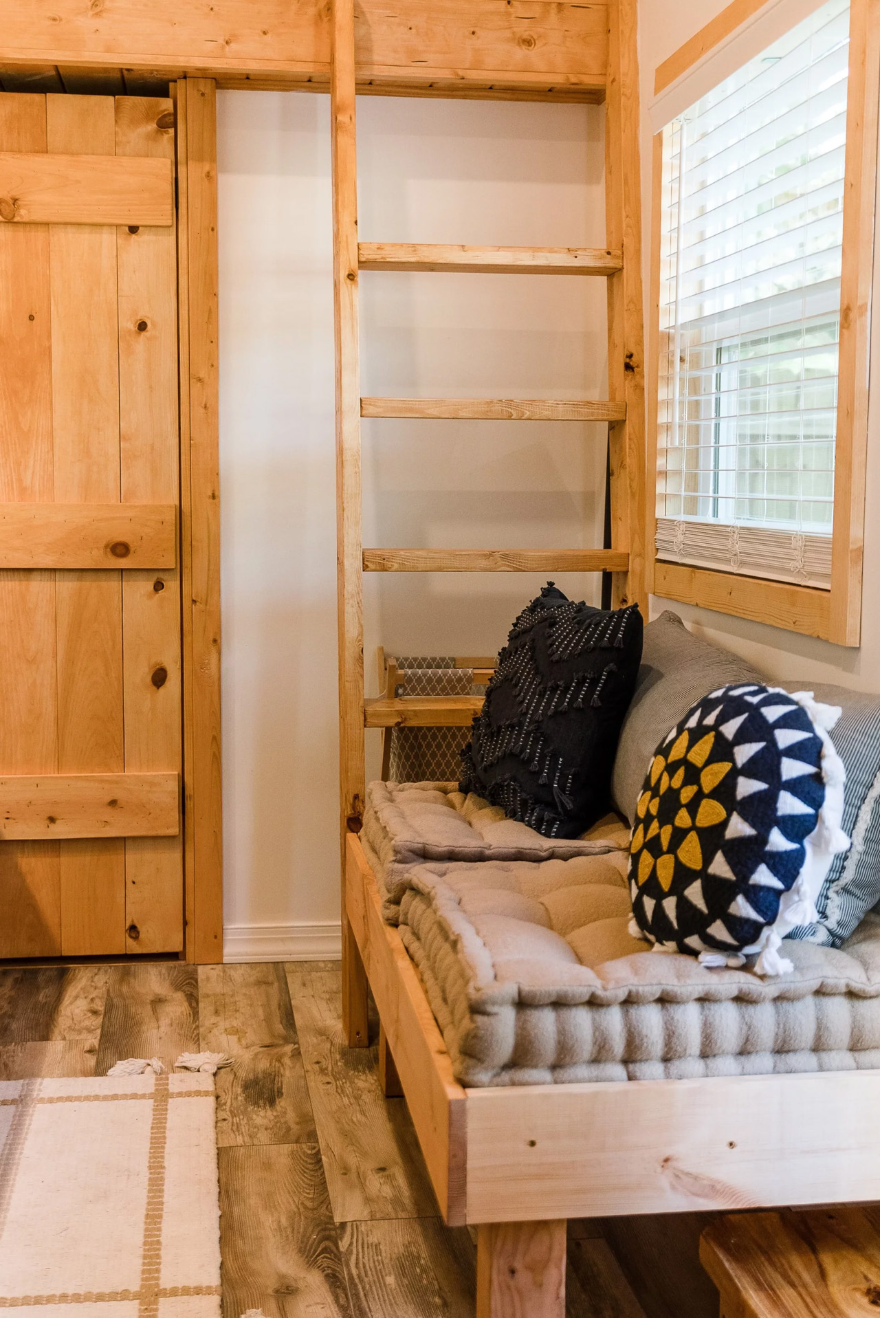
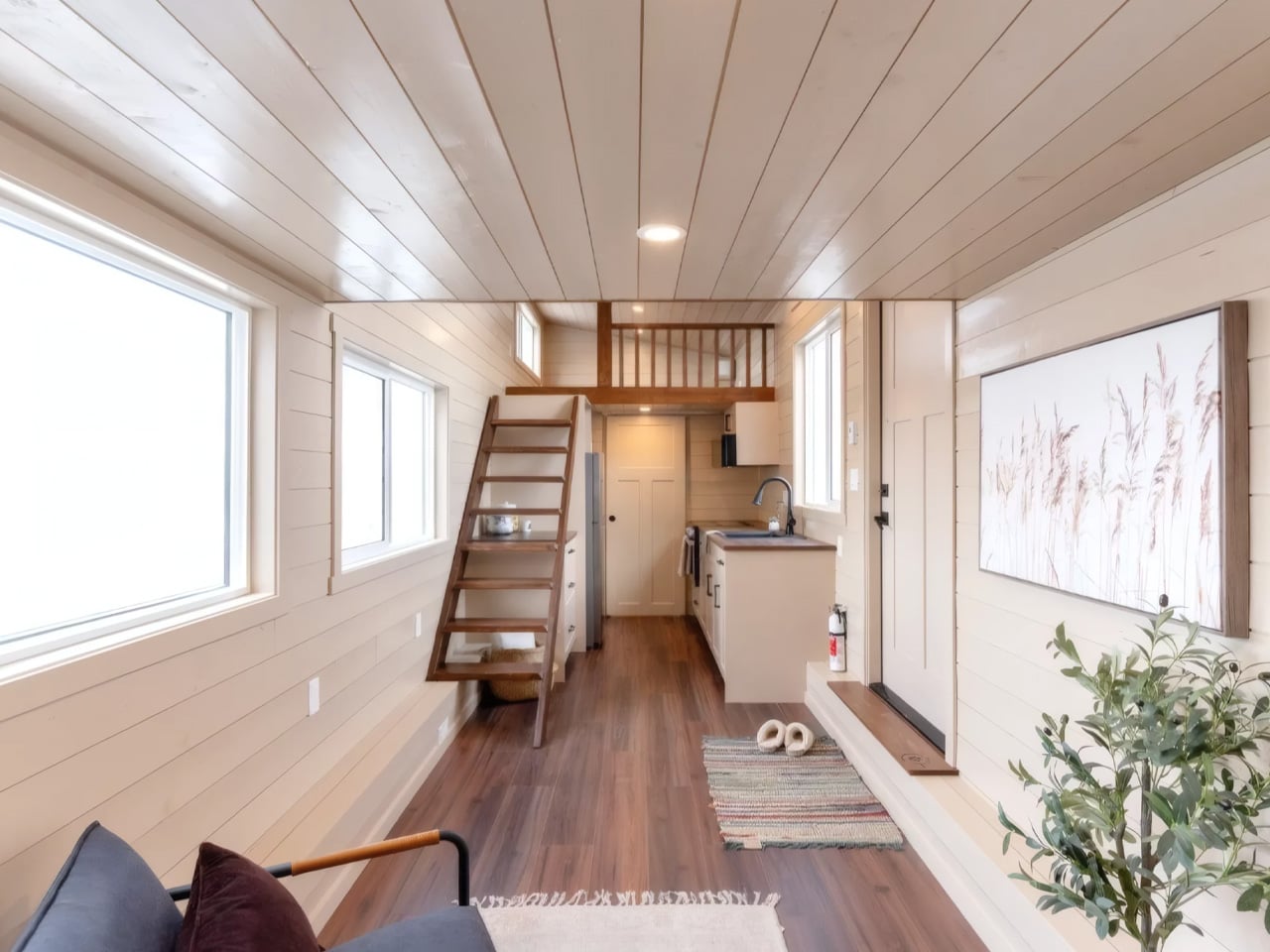
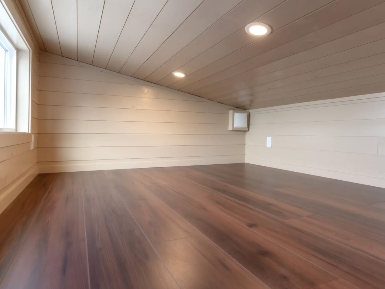
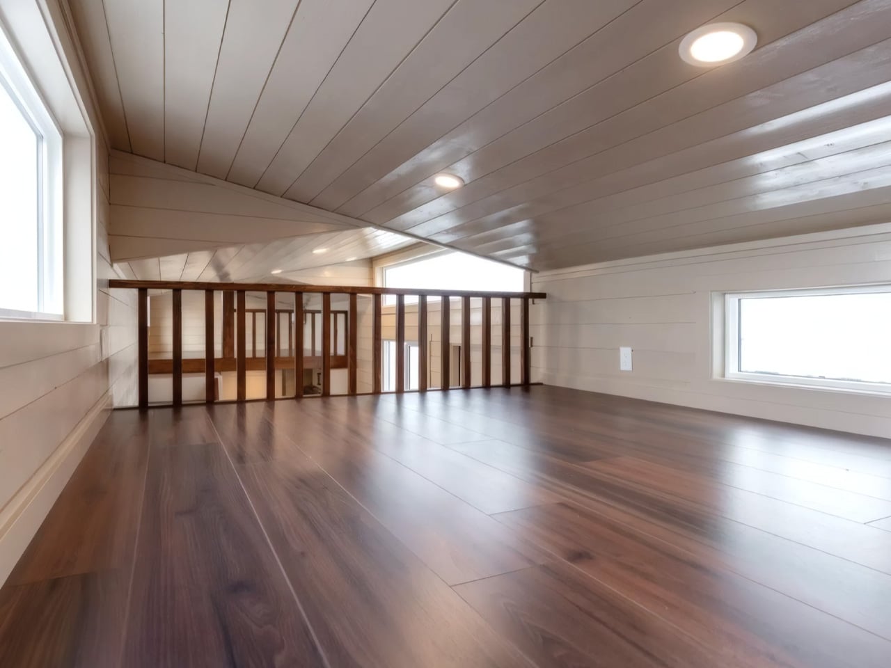
At 30 feet long and 8.5 feet wide, the Ruby lands at 380 square feet, including its two loft bedrooms, a number that doesn’t fully communicate how the interior actually feels. Wood paneling runs through the space, generous glazing pulls in natural light, and the layout gives room for a proper eating nook, a full kitchen, and a living area with space for an optional sofa bed that brings sleeping capacity up to six. The master loft is accessed by a stair at the rear, and the second loft tucks in above, making the Ruby genuinely usable for families without feeling like a compromise on either function or comfort.

The 2026 iteration, dubbed the Bar Harbor Ruby, pushes the design further. A triple shed roof maximizes headroom and adds a sense of depth and dimension that the earlier models didn’t have. Two full staircases replace the single stair setup, and the overall volume feels noticeably more spacious and resolved.

The build comes insulated to R24 in the walls and R35 in the ceiling and floor, with a full-sized bathtub available as an option, along with bay windows and a fireplace. The 2026 model starts at roughly US$127,000 plus GST, budget savvy by Teacup’s own description, which is saying something for a fully custom, towable build at this quality level.

What makes the Ruby resonate beyond its specs is the breadth of people it’s been built for. Couples, families of four, vacation rental operators, and first-time tiny dwellers, the plan adapts without losing its character. Each completed build carries a slightly different personality: the Gaia Ruby is cozy and warm, the S+N Ruby is bright and airy, and the Stella Ruby was tuned for a vacation rental. It’s rare for a single floor plan to hold that kind of range. The Ruby does, and that’s exactly why it keeps getting built.

The post Teacup Tiny Homes Built the Same Floor Plan Over and Over — Because It’s That Good first appeared on Yanko Design.

An Iranian Villa Built Around Architecture’s Oldest Shape

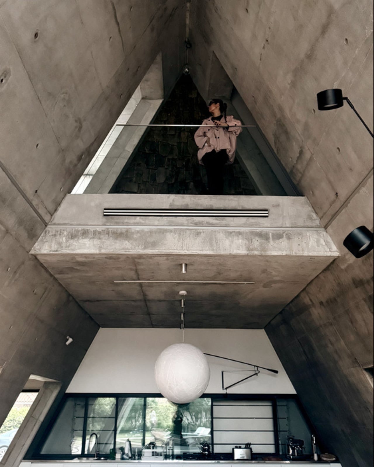
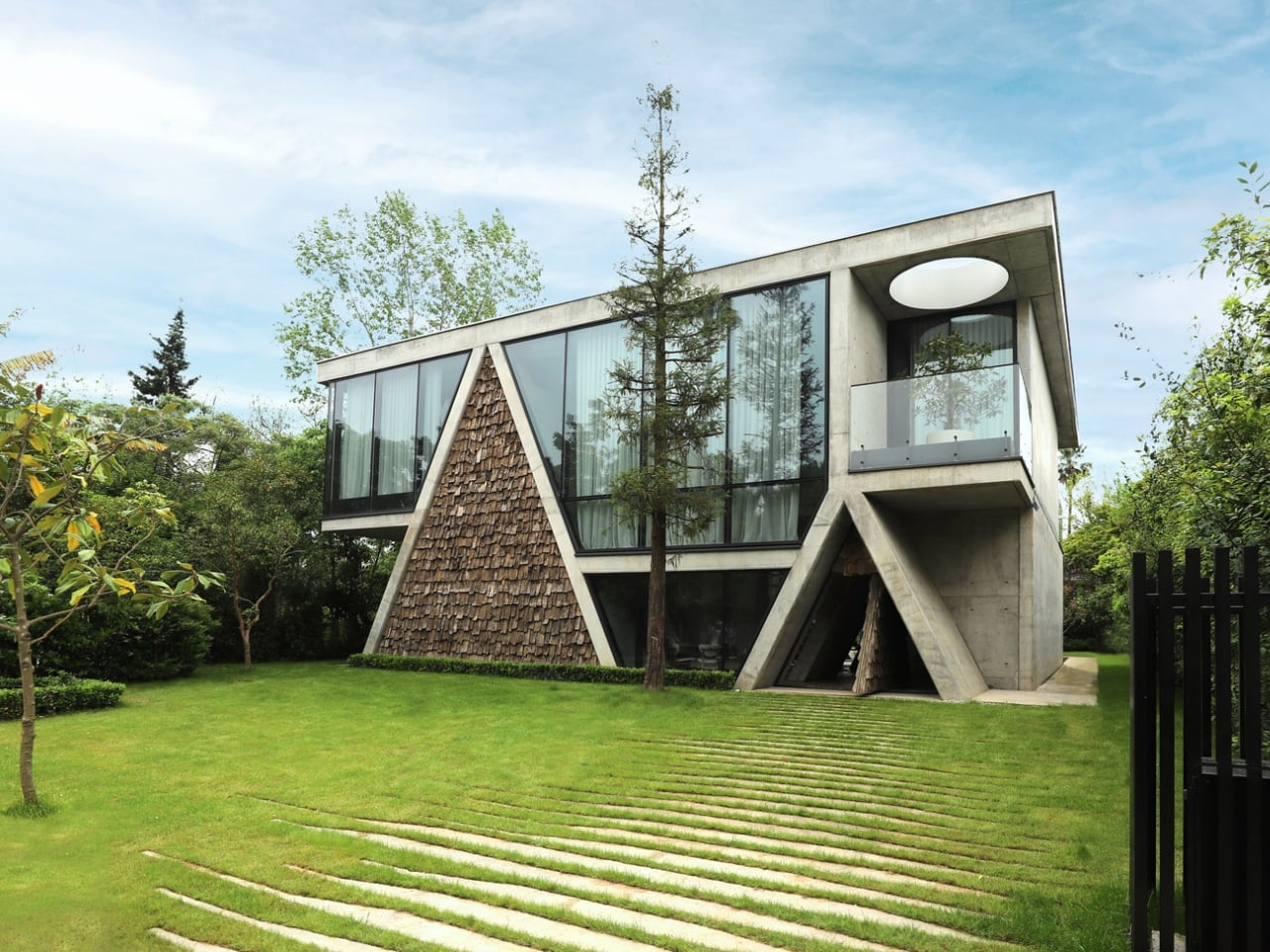
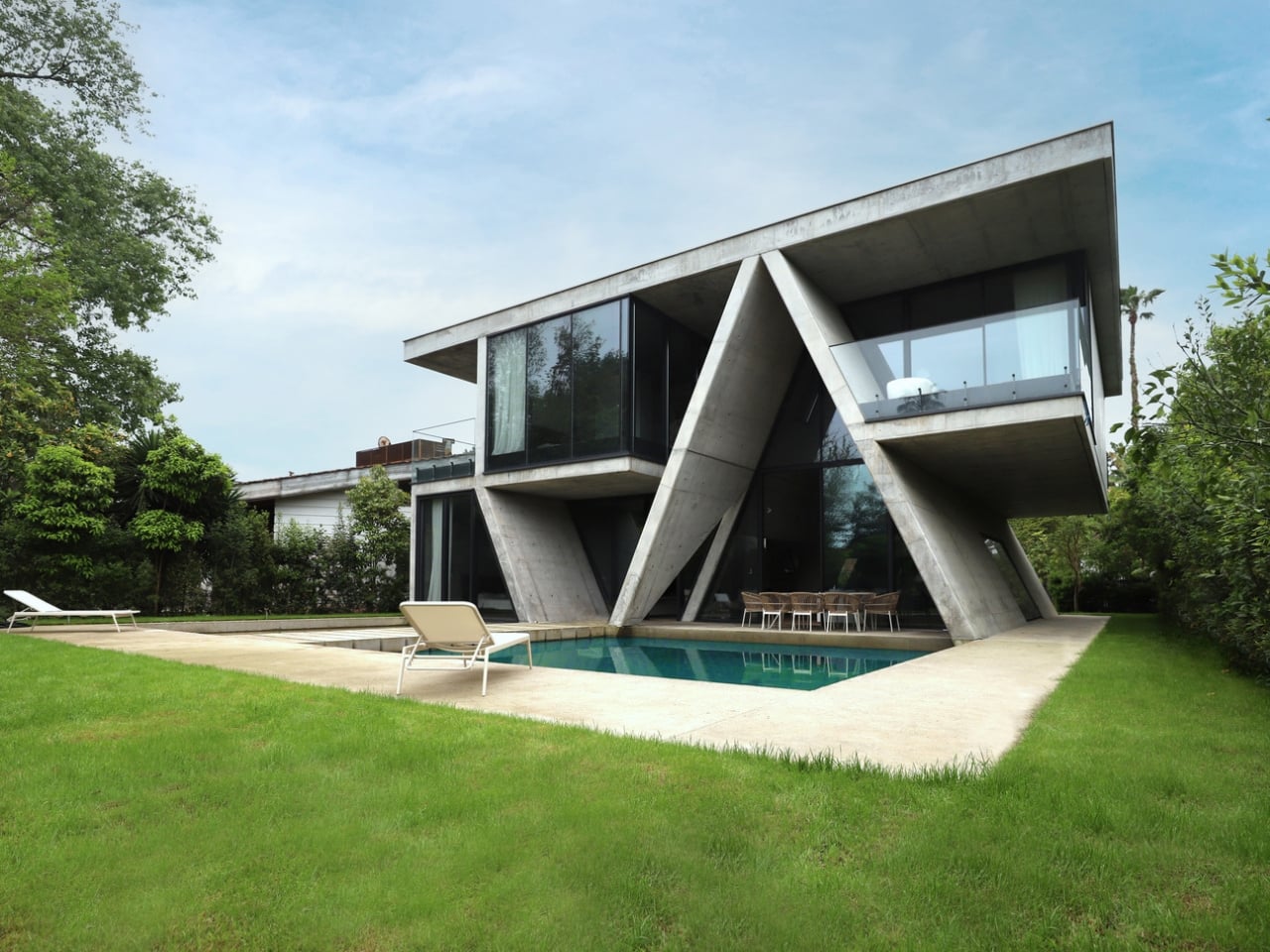
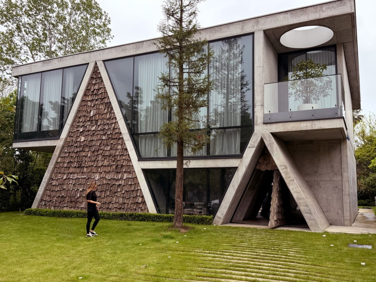
The gabled roof is one of the oldest tricks in architecture’s playbook. Pitched, familiar, and about as dramatic as a grammar school diagram, it’s the shape children draw when they first sketch a house. But Alireza Taghaboni of Tehran-based Next Office has done something rare with it: he made it interesting again.

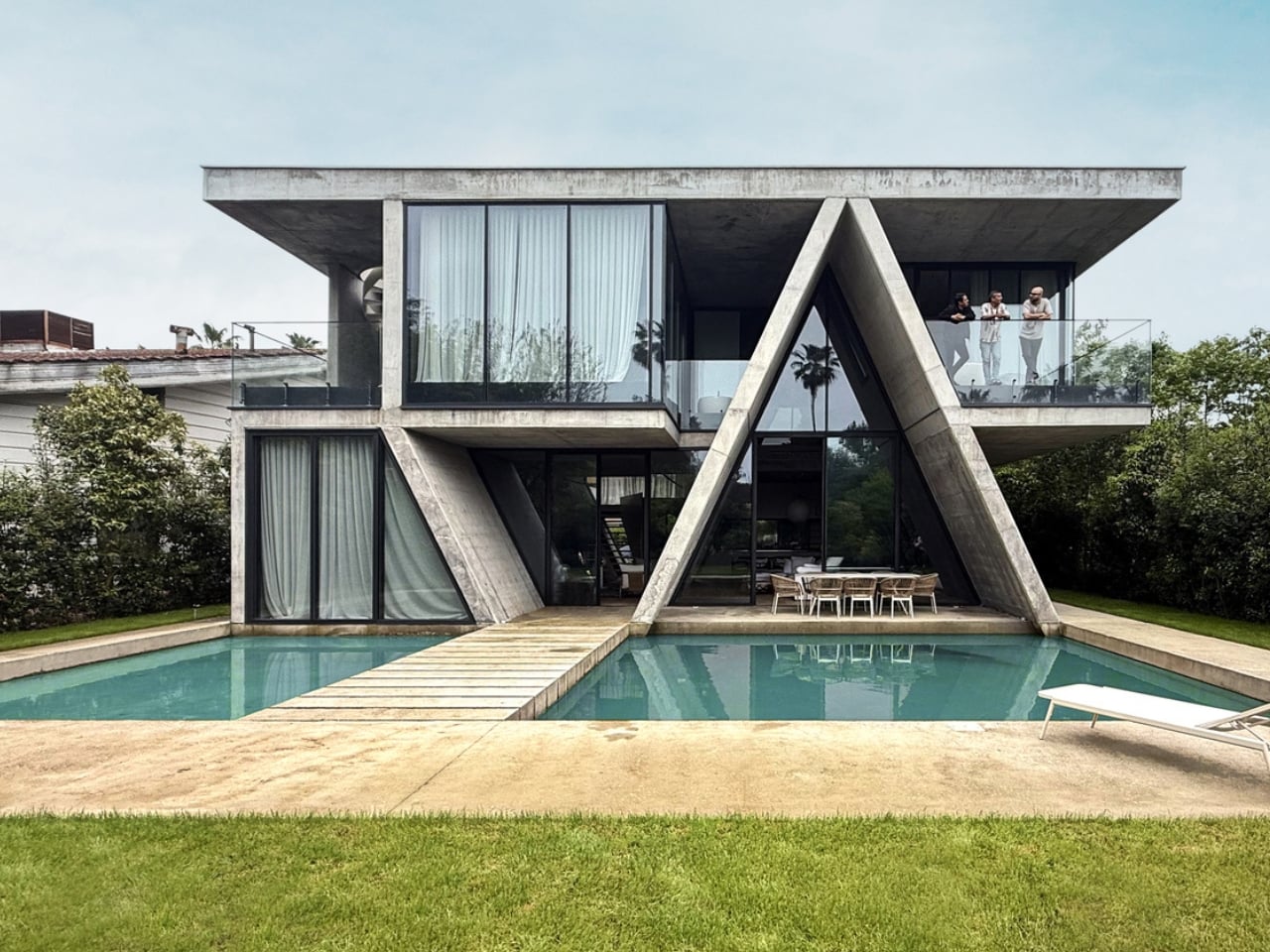
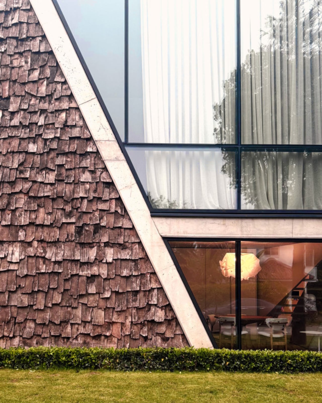
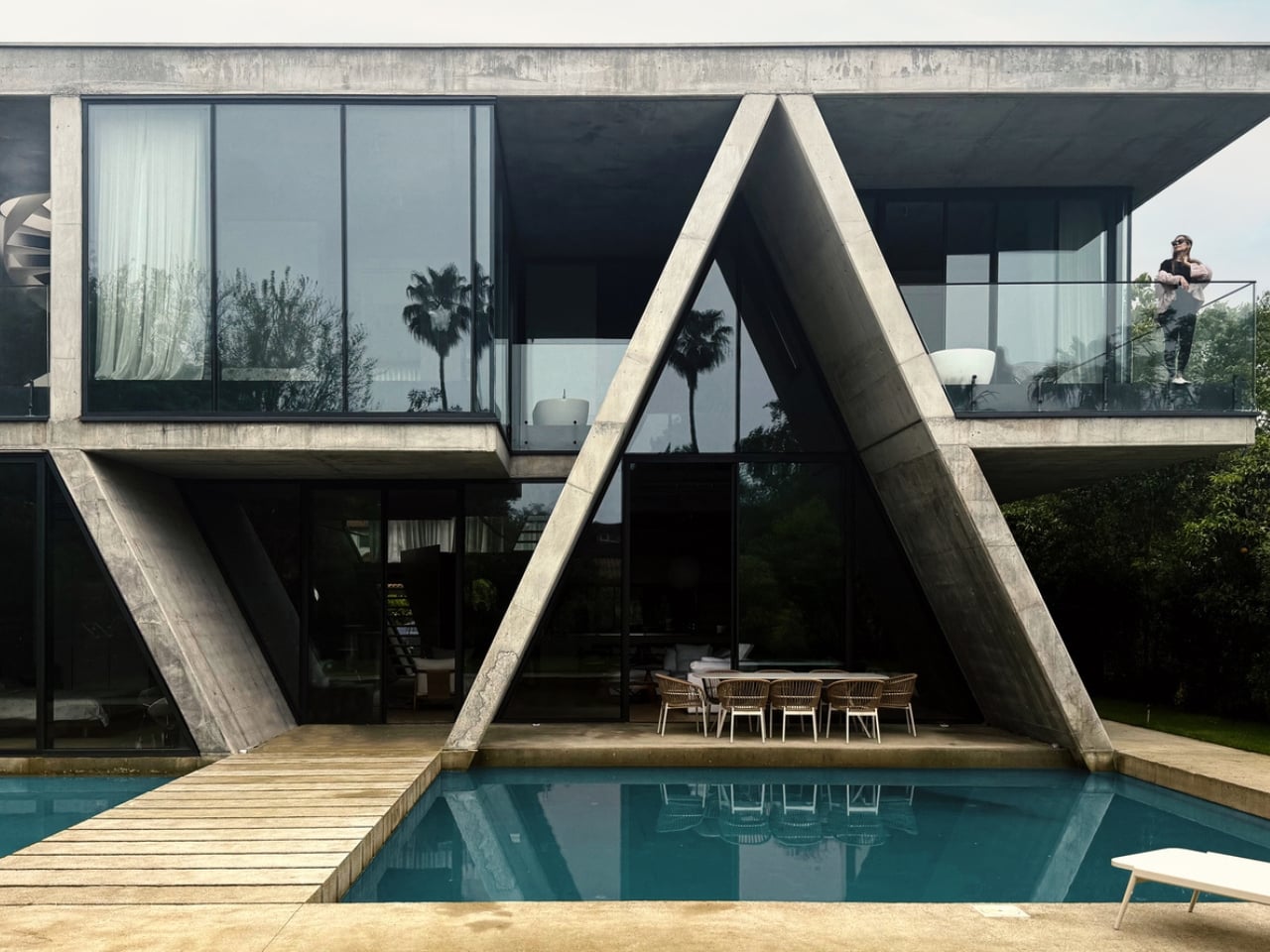
The Gable Villa, completed in 2025 in Royan, a coastal city in northern Iran, is the kind of project that looks obvious at first glance and quietly revelatory the longer you sit with it. Royan sits near the Caspian Sea, and like much of Iran’s northern region, its traditional architecture has always leaned into the pitched roof as a direct response to heavy seasonal rainfall. This isn’t a decorative choice or a nostalgic one. It’s climate-driven, practical, and centuries old. What Taghaboni does is take that deeply familiar slope and push it into conversation with the hard orthogonal language of contemporary architecture, and the result is genuinely compelling.

Designer: Next Office–Alireza Taghaboni (photos by Ehsan Ahani)

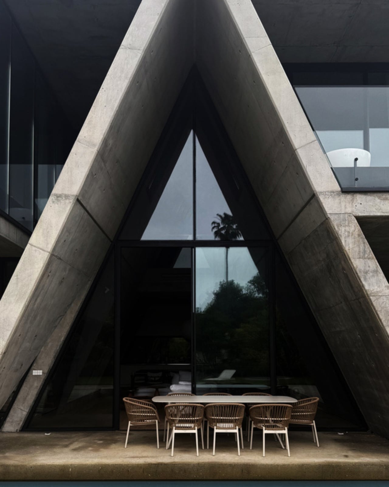
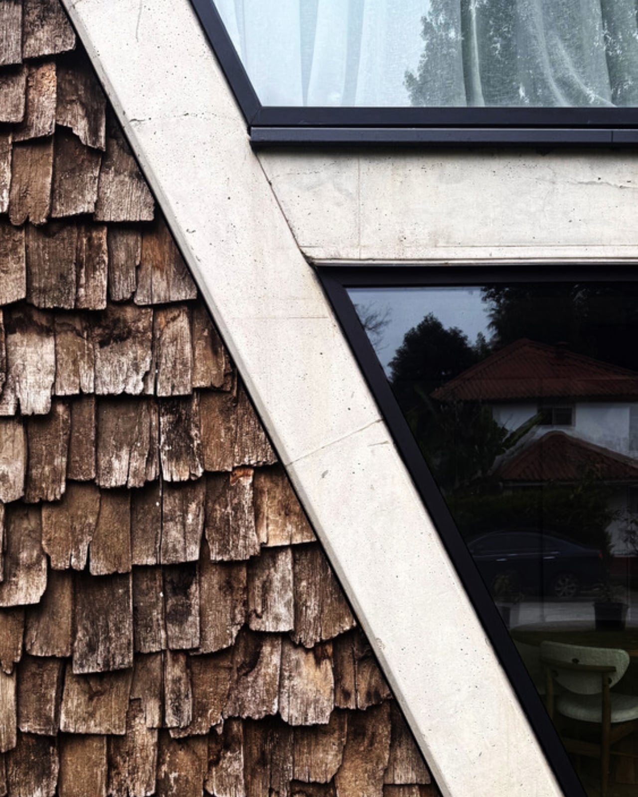
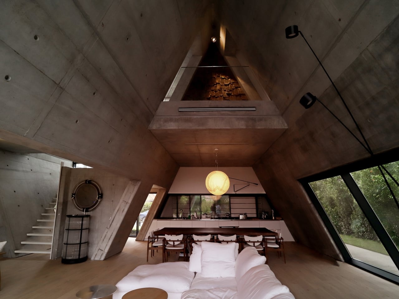
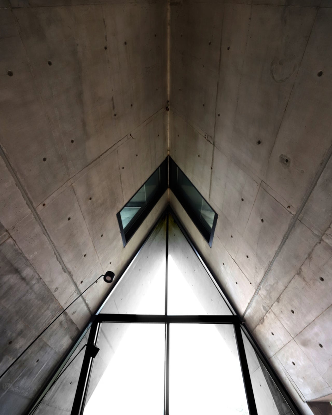
The design concept is built around hybridization: an inclined structure, reminiscent of the region’s vernacular buildings, fused with a right-angled framework. On paper, that might sound like an architectural compromise, the kind of thing that slides into awkward pastiche. It doesn’t. The collision of the two forms creates interior spaces that feel both grounded and unexpected. The inclined volume doesn’t just define the exterior silhouette; it reshapes the interior experience entirely. Rooms feel taller where the ridge runs and more intimate where the slope pulls low, creating a natural hierarchy of space without needing extra walls to do the organizing. The geometry does the emotional heavy lifting.

Next Office, which Taghaboni founded in 2009, has built its reputation on exactly this kind of thinking. The studio’s work consistently returns to one core tension: how do you build something deeply contemporary in a country with one of the most layered architectural traditions on the planet? The Sharifi-ha House, perhaps the firm’s most internationally recognized project, explored flexibility and movement through rotating rooms that could open or close depending on the season. The Gable Villa is quieter than that, less theatrical, but no less considered. It’s a more mature move, one that doesn’t need to show its mechanism to make its point.

What strikes me about the Gable Villa is how unapologetically local it is. At a time when globalized architecture tends to iron out regional character in favor of a universally recognizable aesthetic, this project leans hard into where it is. Royan’s vernacular DNA isn’t applied as surface decoration; it’s baked into the structural logic of the building itself. That’s a meaningful distinction. Taghaboni isn’t borrowing visual language from tradition, he’s inheriting the reasoning behind it and rewriting it in a contemporary register.

The photography by Ehsan Ahani captures the project with a stillness that suits it. The villa simply isn’t competing for attention. It sits in its landscape with a kind of confidence that comes from knowing exactly what it is and what it’s trying to do. The light plays differently across the gabled form than it would over a flat roof, and you feel that in the images even before you fully process why.

For anyone who follows contemporary architecture, the Gable Villa is a reminder of why regional architecture, done with intelligence and rigor, still carries a weight that purely international work sometimes loses. Architecture has spent decades flattening itself into a single global style, and you can feel the cost of that. It’s also a reminder that the most familiar forms, the gable, the pitched roof, the shape of the house your four-year-old self drew with a crayon, still hold enormous untapped potential in the right hands.

Taghaboni and Next Office are clearly worth watching. Not because they’re doing the loudest work, but because they’re doing work that rewards attention. The Gable Villa is exactly that kind of building: patient, purposeful, and quietly smarter than it looks.

The post An Iranian Villa Built Around Architecture’s Oldest Shape first appeared on Yanko Design.

The Robots That Built Seoul’s Robot Museum

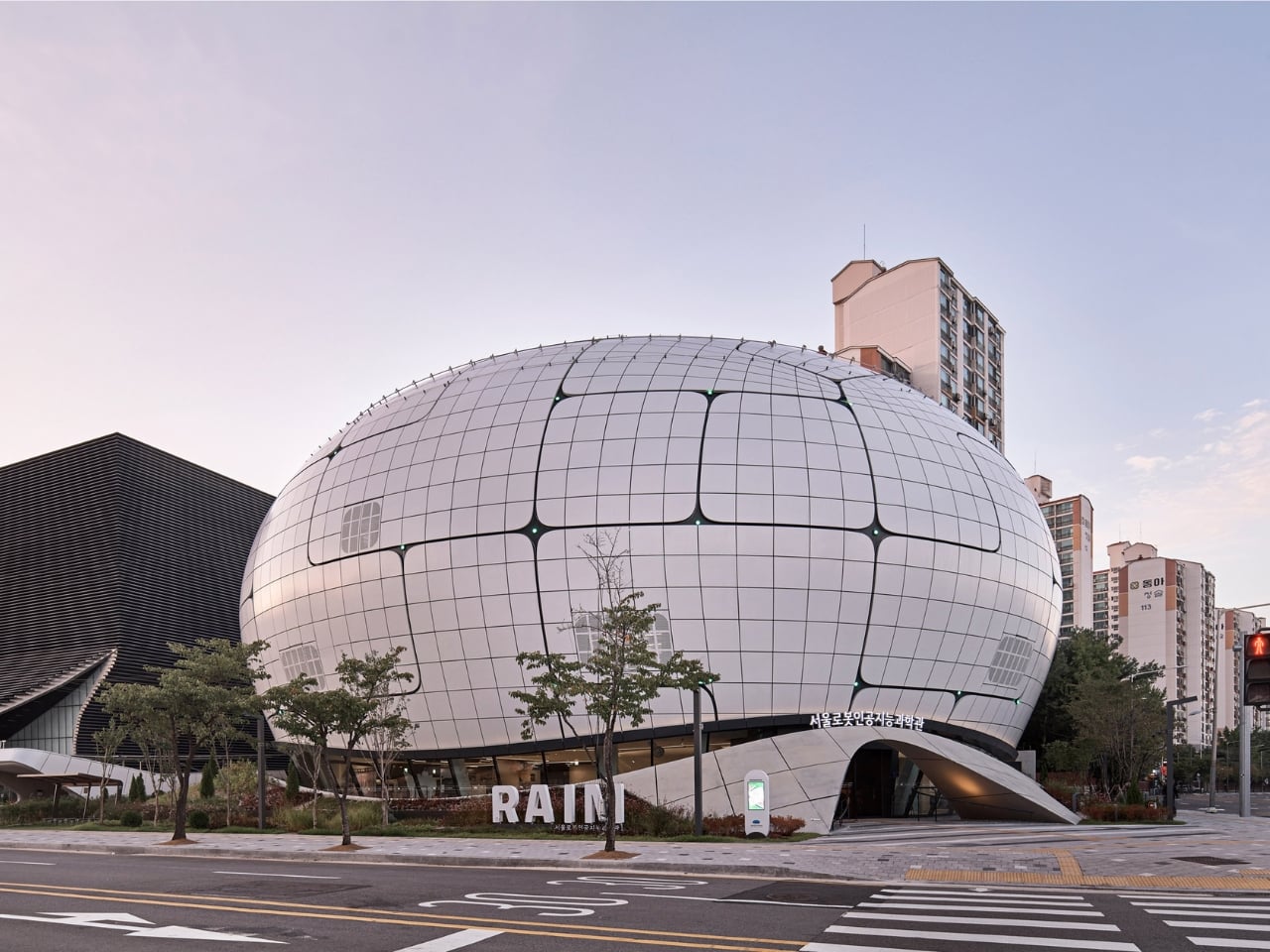
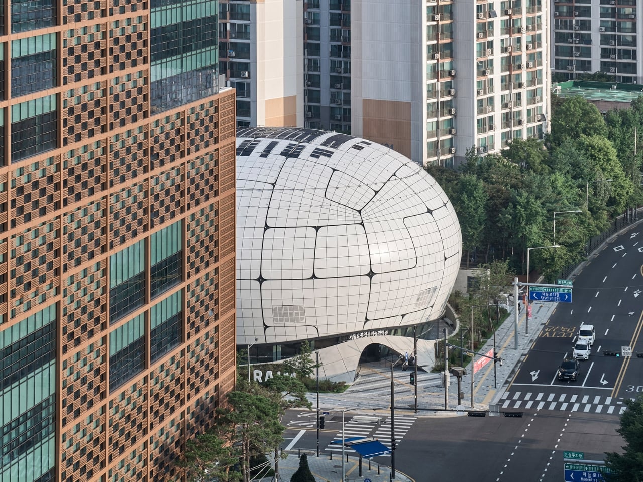
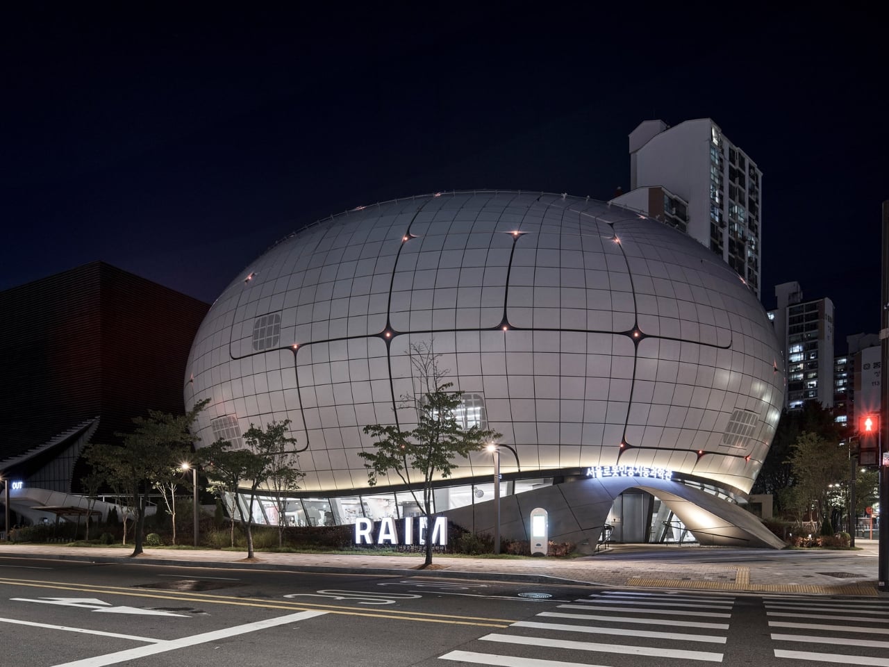
The Seoul Robot & AI Museum is the definitive parametric architecture reference of 2026, and it’s easy to understand why the design world keeps returning to it. Every few years, a building comes along that doesn’t just represent a movement; it is the argument. RAIM is that building right now, and the reason has less to do with how it looks and more to do with how it got made.

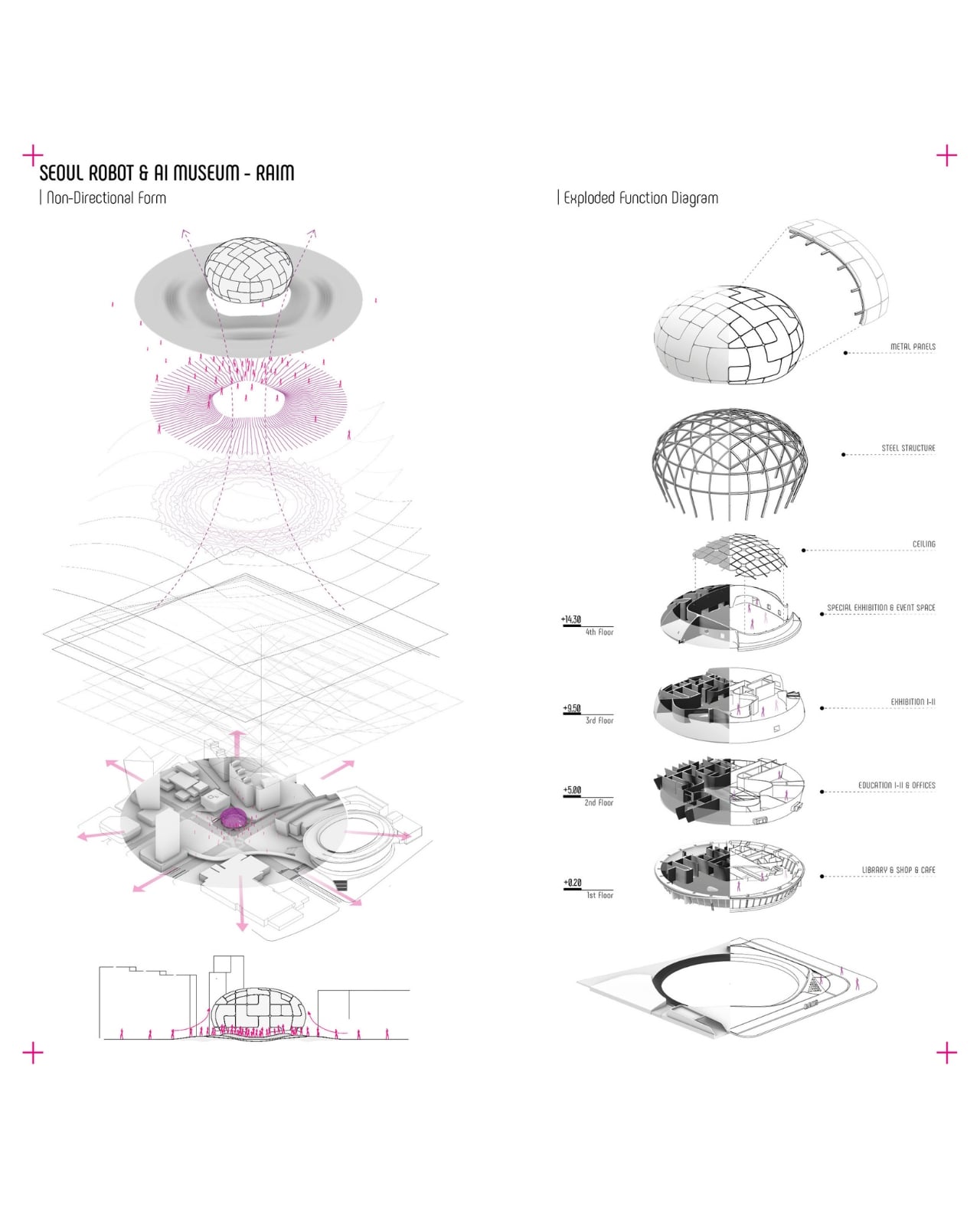
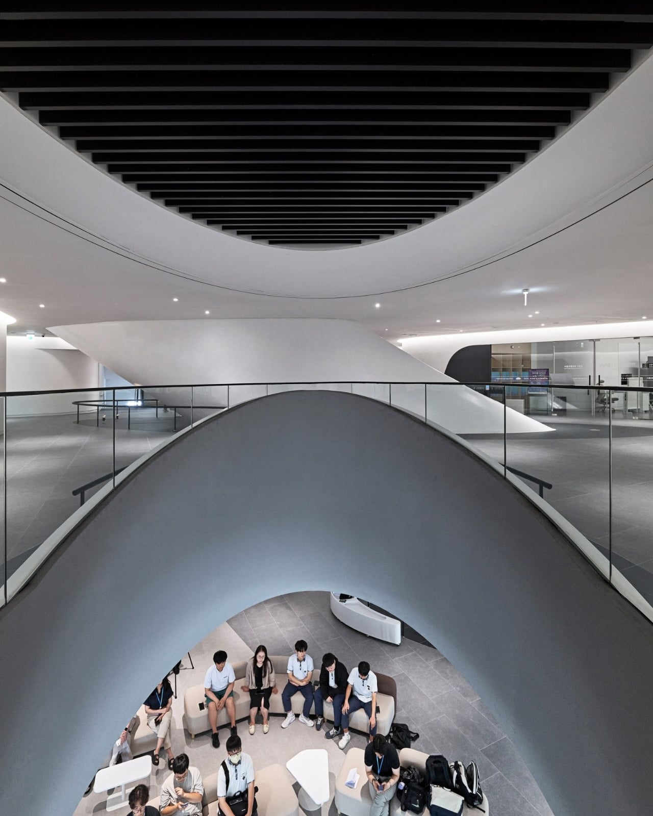
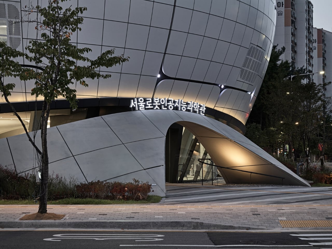
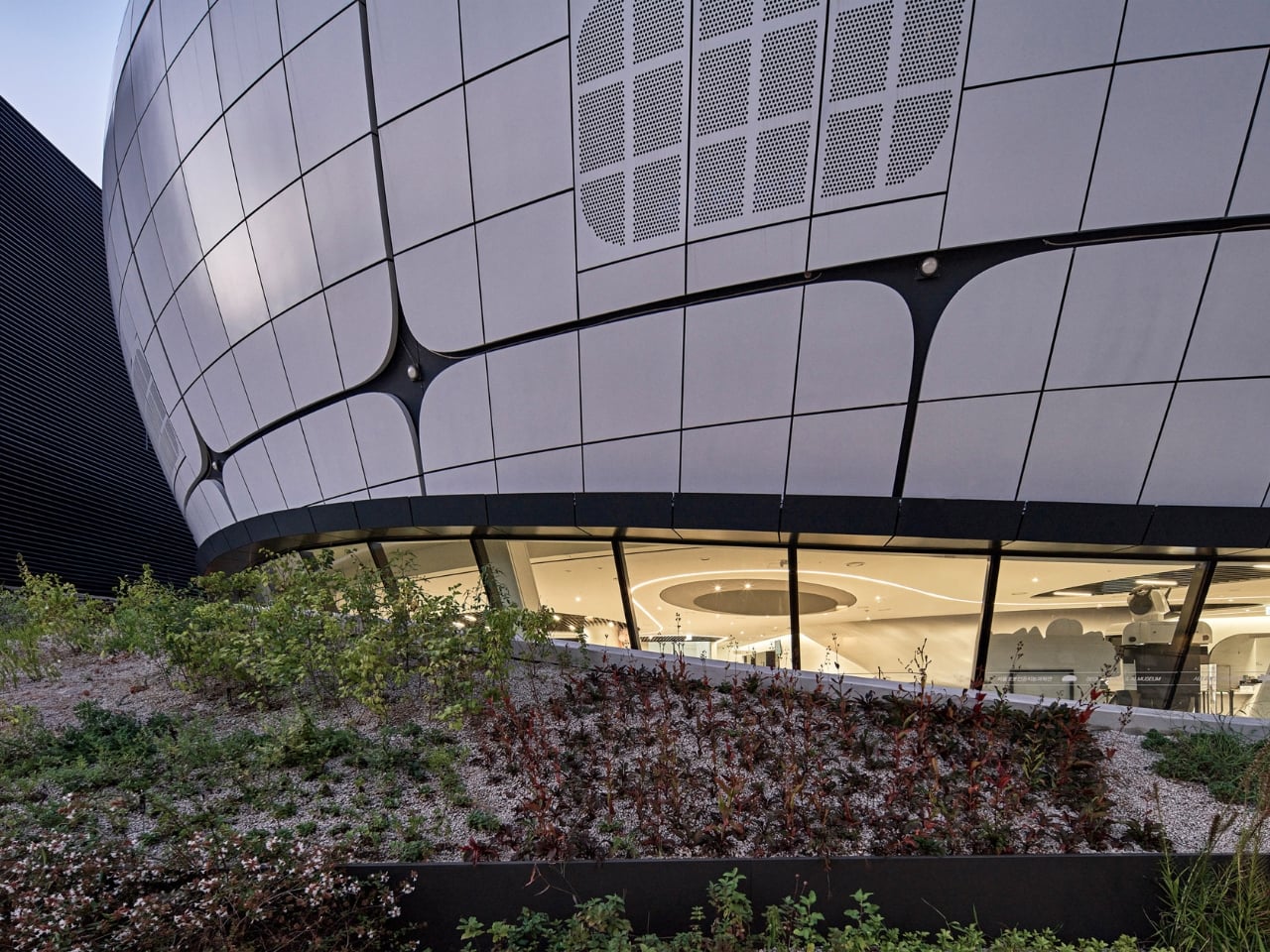
Opened in 2024 in the Chang-dong district of northeast Seoul, the museum was designed by Turkish studio Melike Altınışık Architects. From the street, it reads like something that landed rather than was built: a spherical, mirror-finish shell that catches the sky and refuses to look like any cultural institution you’ve encountered before. The facade is wrapped in 3,422 double-curved metal panels, each one a unique geometry, each one positioned according to a structural logic you can actually read from the outside. The gridded surface pattern isn’t decorative. It follows the structural steel grid concealed behind it, making the building’s skeleton visible through its skin. That level of architectural honesty is rarer than it should be.

Designer: Melike Altınışık Architects

The geometry didn’t come from sketching. Melike Altınışık and her team scripted the form parametrically, then reverse-engineered the entire envelope to make it buildable. That second part is where most parametric ambitions historically die. Double-curved panelization at this scale is the kind of thing that gets value-engineered into something flatter and sadder during construction documentation. But Melike Altınışık Architects designed specifically for fabrication from the start, using a methodology called DFMA (Design for Manufacture and Assembly), which meant the form and the production method evolved together rather than fighting each other.

The fabrication pipeline is where the story gets genuinely interesting. The panels were cut using laser CNC machines and welded using industrial robots. On-site, 3D scanning ensured alignment that human measurement couldn’t consistently achieve at that tolerance. What this unlocks, practically, is that double-curved metal panelization stops being a budget line reserved for landmark commissions and becomes something mid-scale cultural buildings can actually afford. Robot welding doesn’t get tired. It doesn’t accumulate small errors across 3,422 repetitions. The precision holds, and holding precision across a spherical envelope is a very different proposition from getting it right once.

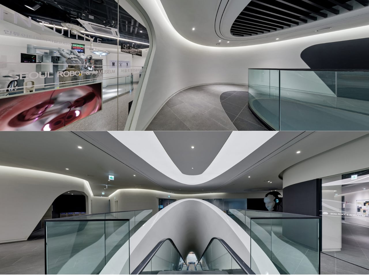
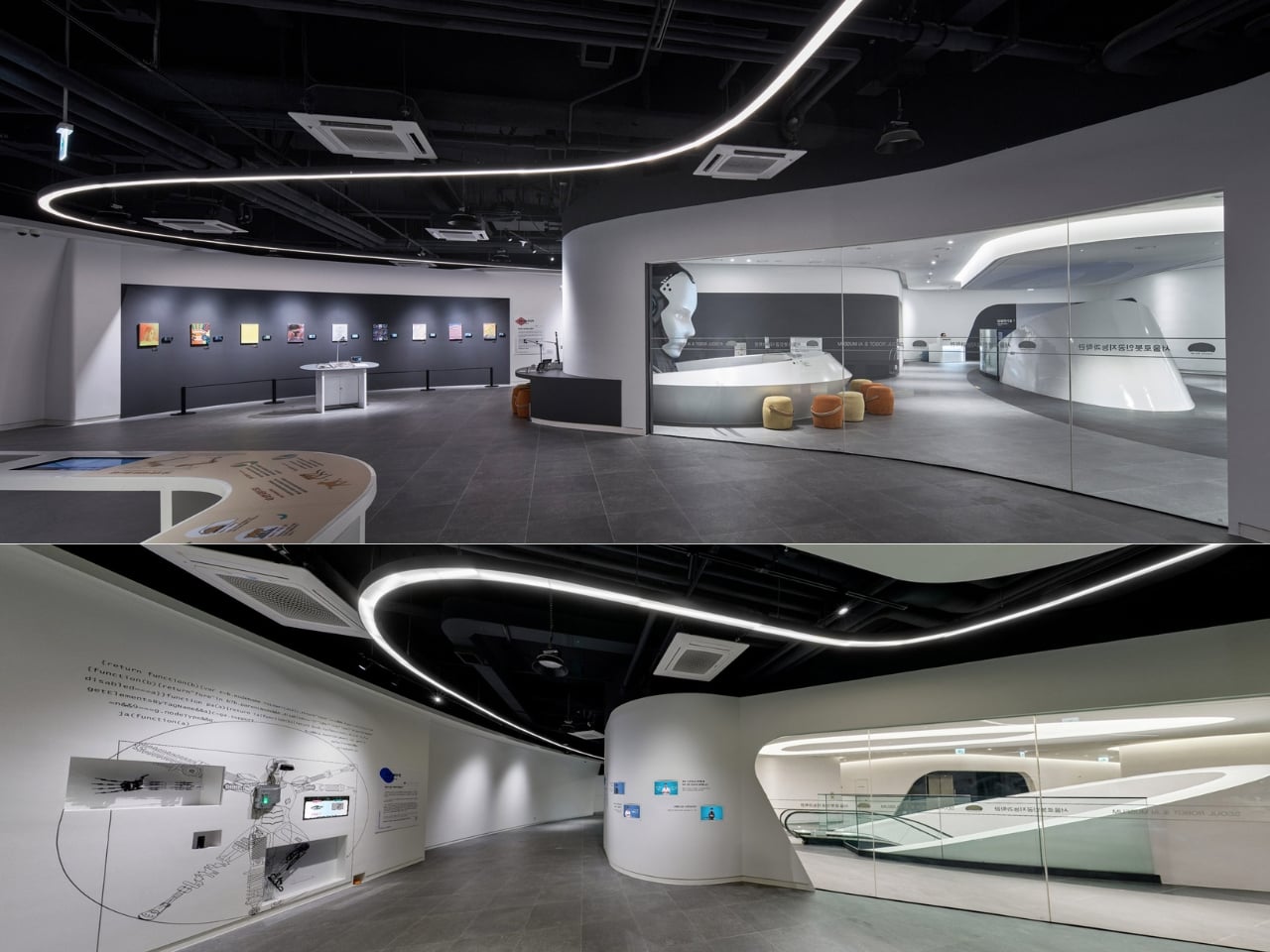
Now layer in the subject matter of the museum itself. RAIM is dedicated to robotics and artificial intelligence. Its permanent exhibitions trace the evolution of AI from predictive fraud detection systems to generative models. Robots greet visitors at the entrance. The interior reads like a spaceship, with a vertical exhibition tunnel at the building’s center blurring the boundary between the physical and the technological. So when you consider that robots also assembled the facade above your head, the recursion is almost too neat. Architect Altınışık framed it clearly: the architecture is “both shelter and pedagogy.” The building doesn’t just house the argument. It makes it.

Parametric facades are having a genuine cultural moment in 2026, and it’s not limited to the usual European flagships. Studios in South Korea and India are pushing computational design into more projects, and the international awards circuit is beginning to reflect that geographic shift. The conversation has moved from “can parametric architecture actually be built?” to “what does it cost, and who controls the pipeline?” RAIM answers both questions at once, which is probably why it’s the reference point of record for this particular moment.

That shift is worth paying attention to. For decades, the most ambitious architectural geometries required either enormous budgets or a willingness to absorb serious construction risk. Robotic fabrication and CNC manufacturing are quietly changing that calculus. In Altınışık’s own words, “the division between design and construction is becoming obsolete. The parametric model becomes not just a design tool but a construction platform.” The next wave of museums and civic buildings won’t choose simpler geometry because they have to. They’ll choose the complex version because their fabricators can deliver it, and because, as RAIM proves, the building becomes a more interesting object for it. Seoul’s robot museum was built by robots. The next one might be anywhere.

The post The Robots That Built Seoul’s Robot Museum first appeared on Yanko Design.

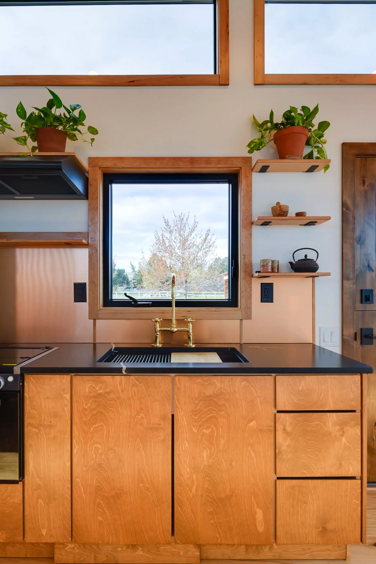
This Oregon Tiny Home Has a Freestanding Bathtub and More Storage Than You’d Ever Expect

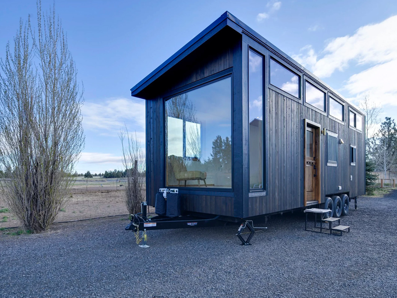
Some tiny homes ask you to settle. Cramped kitchens, awkward layouts, a bathroom you have to apologize for. The Black Butte by Spindrift Homes is not that version. Originally built as a fully custom commission, the design earned enough attention that Oregon-based Spindrift added it to its permanent catalog. The community responded, and it’s easy to see why.

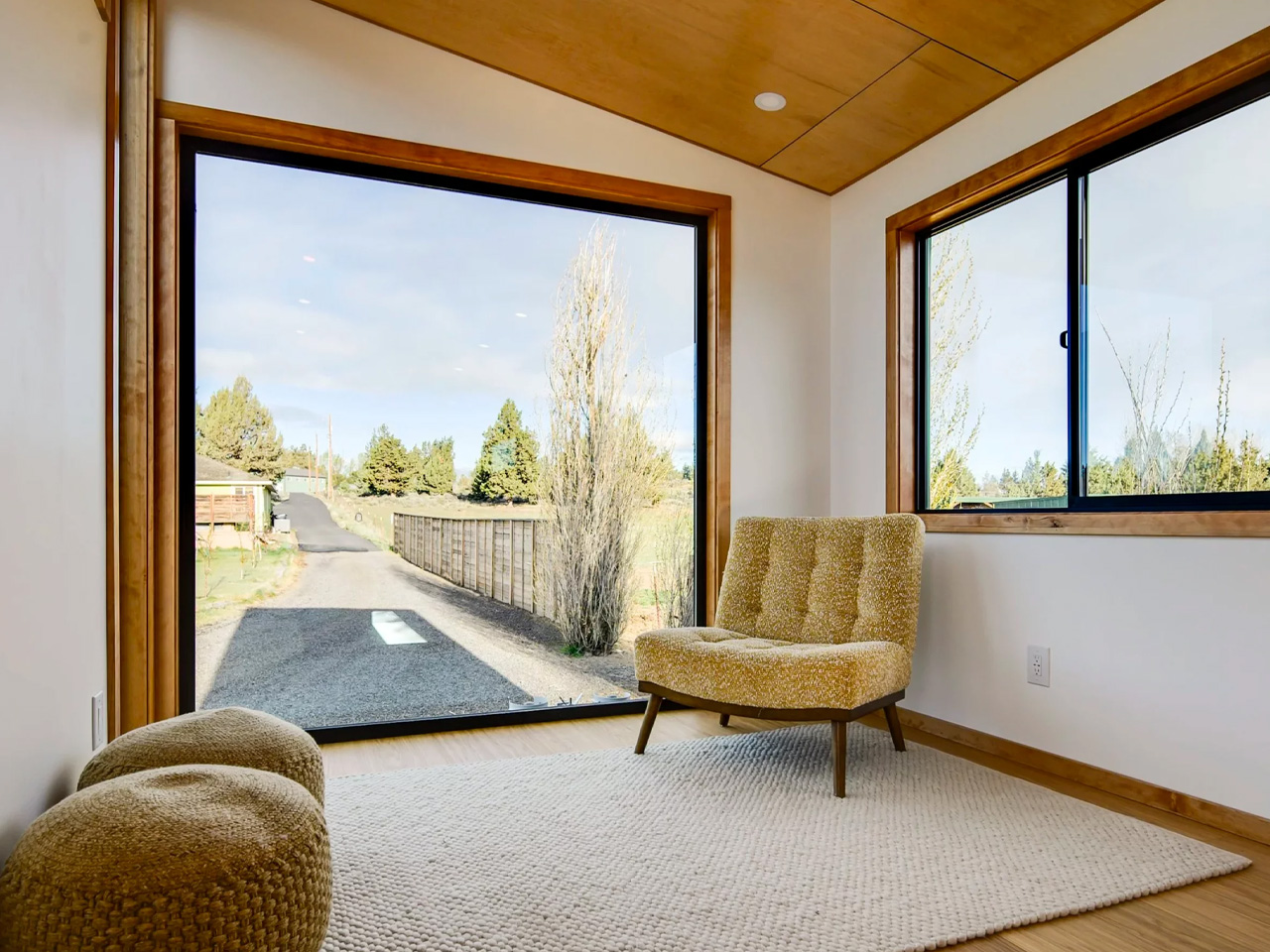
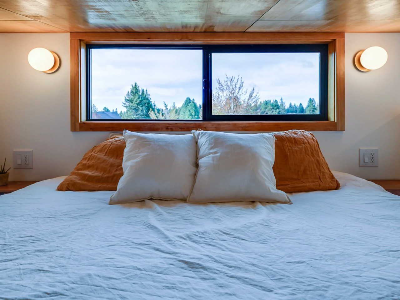
At 30 feet long and 10 feet wide, the Black Butte sits on the broader end of the towable tiny home spectrum. That extra width changes everything. It’s the difference between a space that feels edited and one that actually breathes. Spindrift describes it as “bold, design-forward” and a home that “feels both expansive and grounded,” and for once, the marketing language holds up. The proportions are generous, the light moves well through the interior, and the layout doesn’t fight itself.

Designer: Spindrift Homes

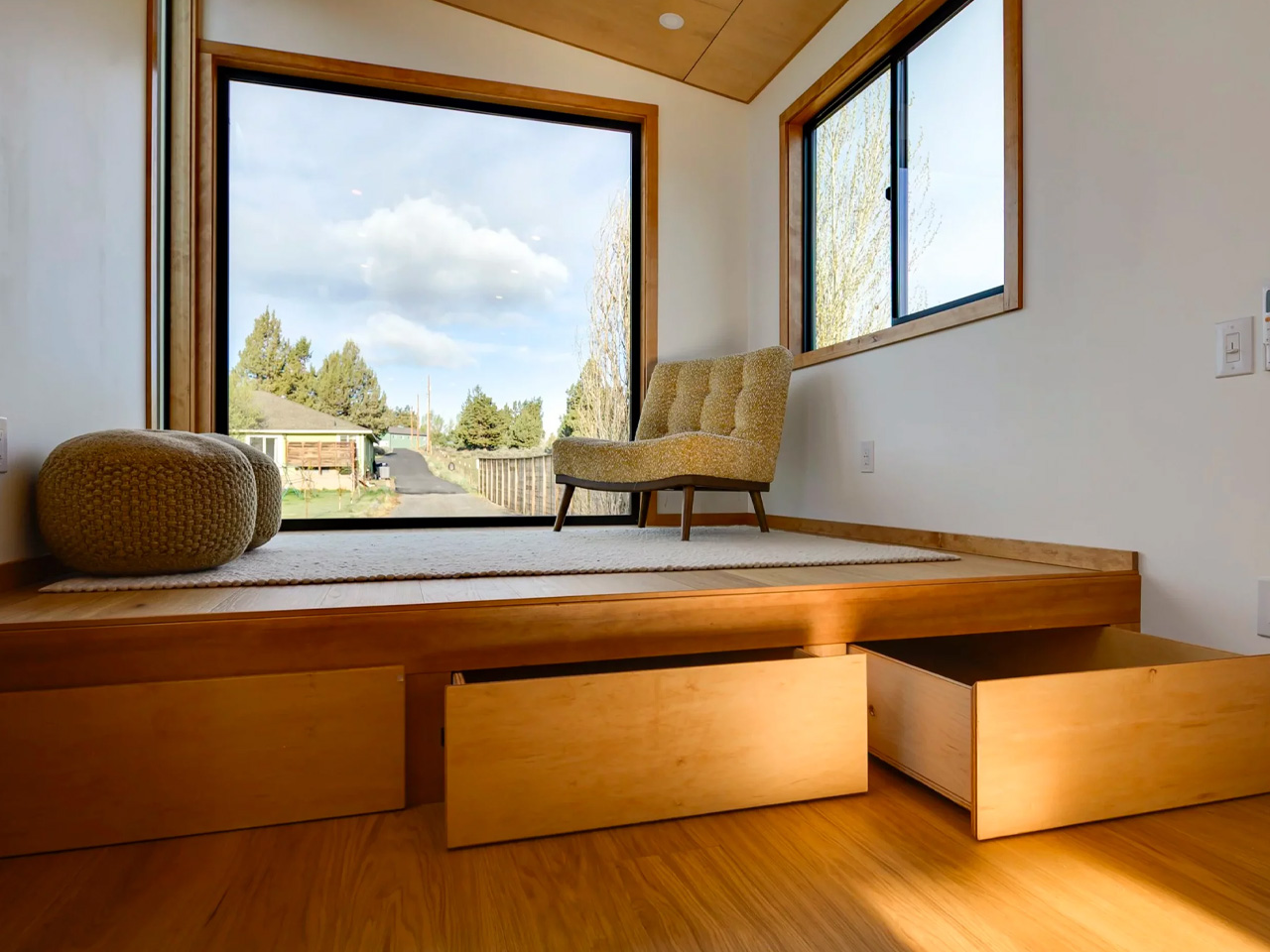
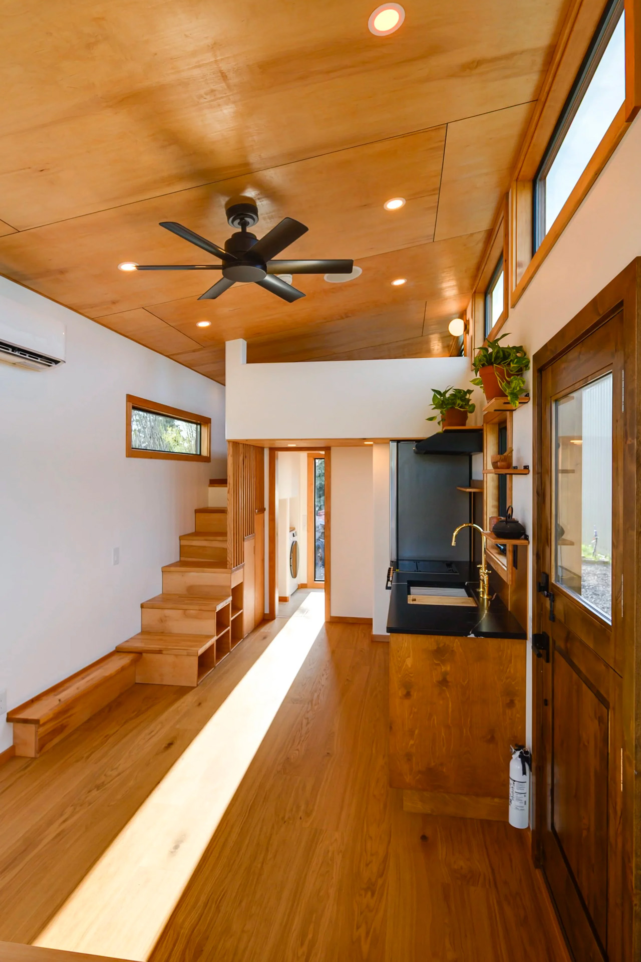
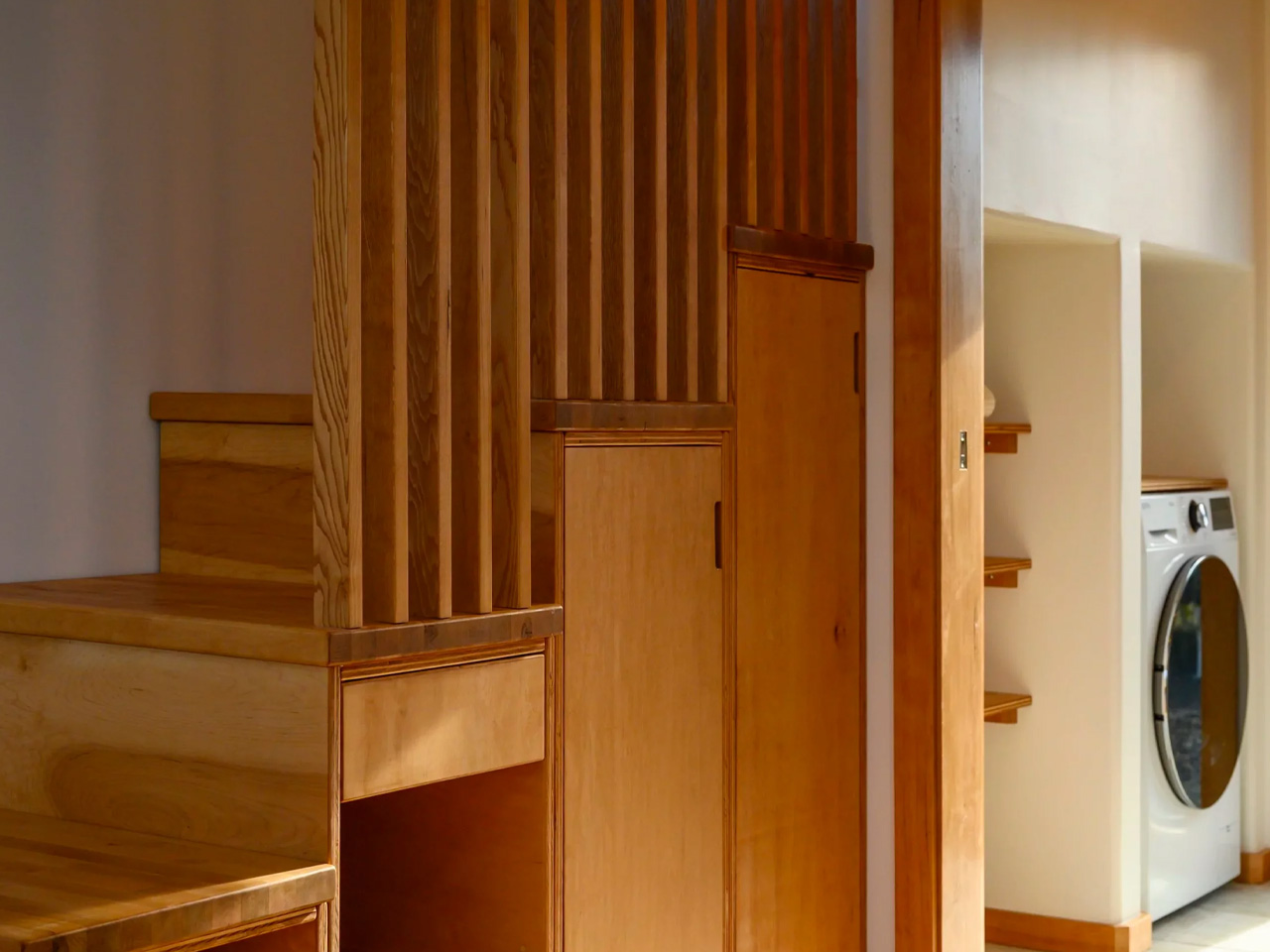
The living room sits on a slightly raised platform, a quiet design move that unlocks a serious amount of hidden storage underneath. It’s the kind of detail you miss on first glance but appreciate every single day. The kitchen holds its own, too, designed for people who actually cook rather than people who just need somewhere to store a microwave. Every inch is considered without feeling precious about it.

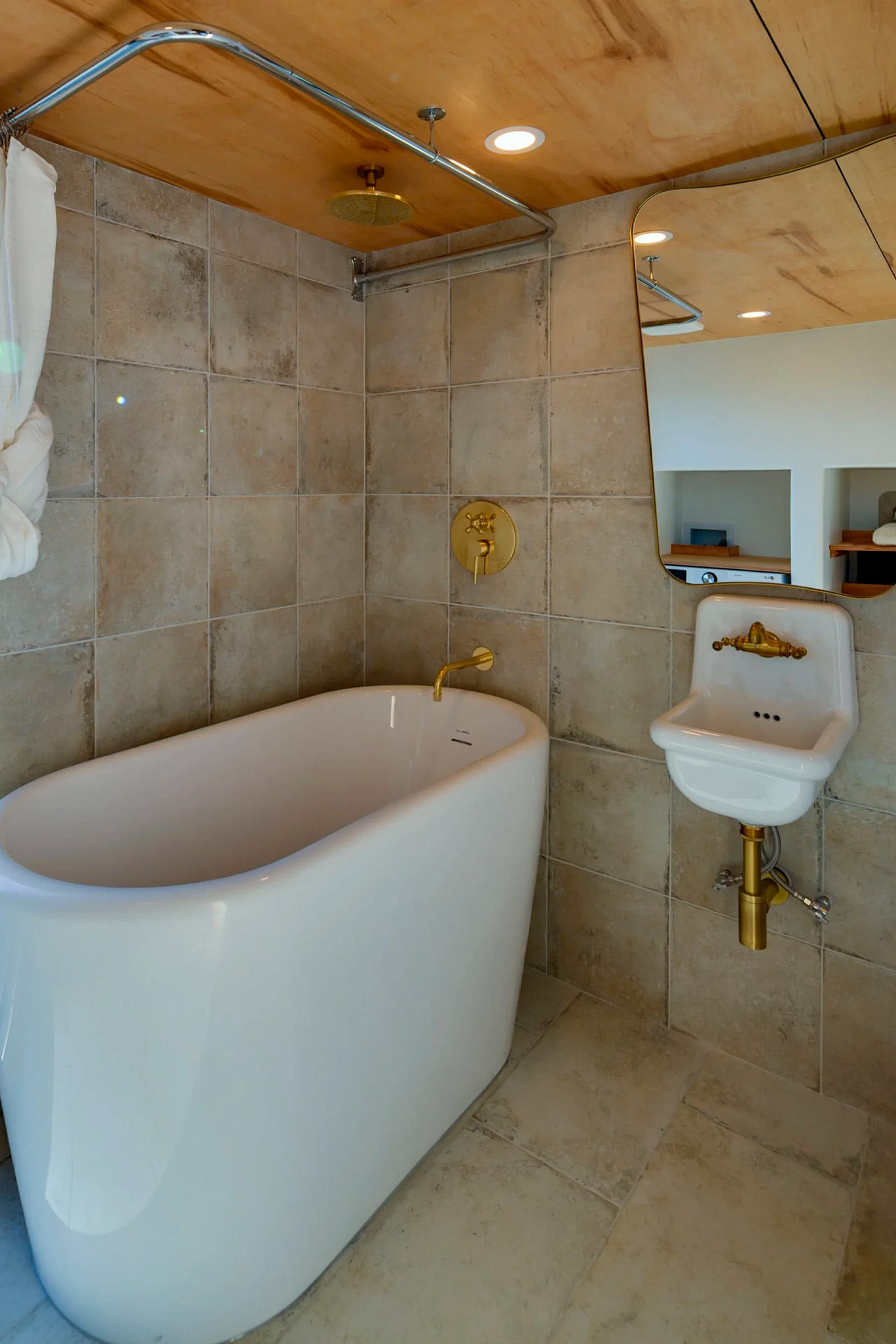
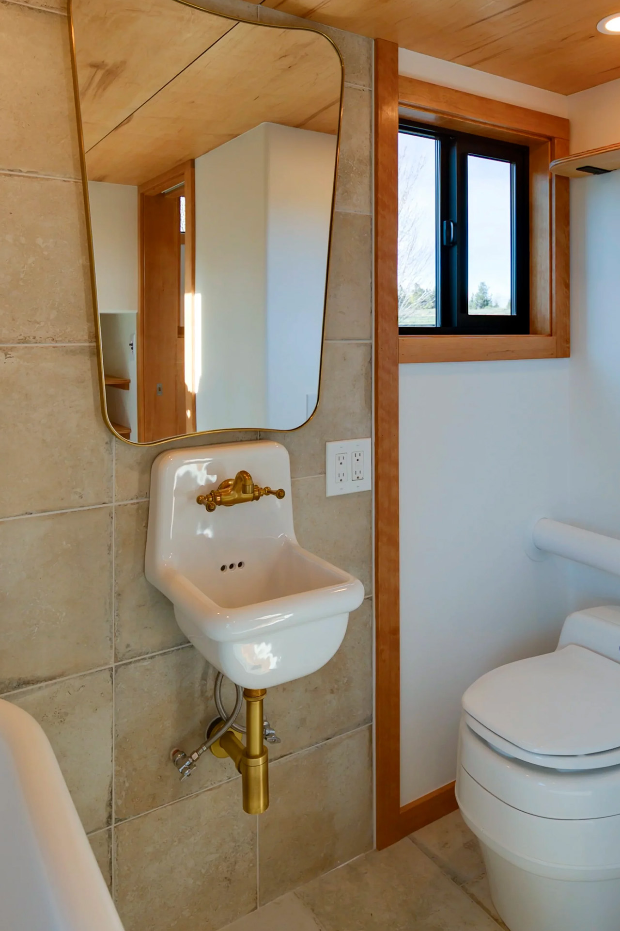
The bathroom is where the Black Butte makes its strongest statement. A freestanding bathtub in a tiny home is not a small decision, and Spindrift leaned into it completely. It reads less like a compact washroom and more like a spa you happen to sleep near. The on-demand water heater and mini-split with heating and cooling round out a home that operates as comfortably as it looks.

Built on a triple-axle custom trailer, the Black Butte is technically mobile, though it’s designed to thrive parked in one place. Think of a permanent base camp rather than a vehicle. Pricing starts at $160,000 before customization, with deliveries scheduled for fall 2026. Buyers can adjust finishes and details while keeping the layout intact, which is exactly how a design this considered should be handled. Tiny living has spent years trying to prove itself. The Black Butte doesn’t try. It just shows up.

The post This Oregon Tiny Home Has a Freestanding Bathtub and More Storage Than You’d Ever Expect first appeared on Yanko Design.

Quito’s New Skyscraper Feels Carved, Planted, and Lived In

Can’t help but notice something quietly interesting about Qapital, the new residential skyscraper designed by Kengo Kuma and Associates for Quito, Ecuador. At first glance, it has all the ingredients of a contemporary urban tower: compact apartments, shared amenities, a dramatic facade, a strong location, and an international architecture name attached to it. But the more interesting story is not that Quito is getting another high-profile tower. It is that Qapital seems to be asking whether micro-living can feel less like shrinking your life and more like living inside a larger, shared landscape.

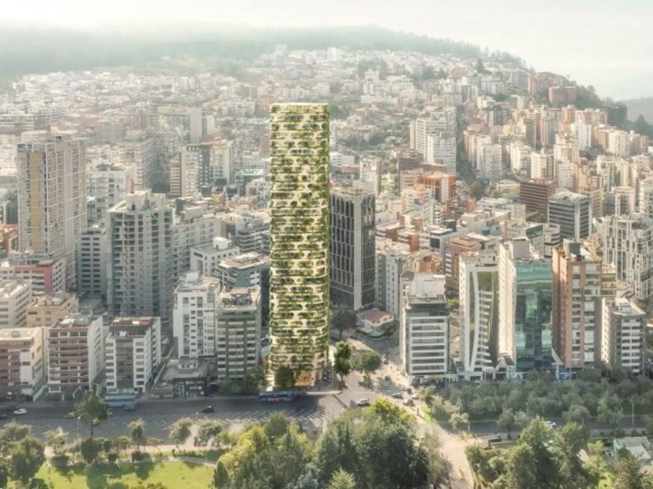
The tower will be Kengo Kuma and Associates’ first project in Quito. Planned at 32 storeys and 420 feet tall, it will sit beside La Carolina Park in the city’s central business district. That placement is important because the building is not being dropped into a neutral skyline. It will stand along one of Quito’s major green edges, joining other internationally designed residential projects by studios such as BIG and Safdie Architects, also developed by Uribe Schwarzkopf. In that context, Qapital becomes part of a bigger architectural shift happening in the city: Quito is increasingly using housing towers not only to add density, but to shape a new image of urban life.

Designer: Kengo Kuma and Associates
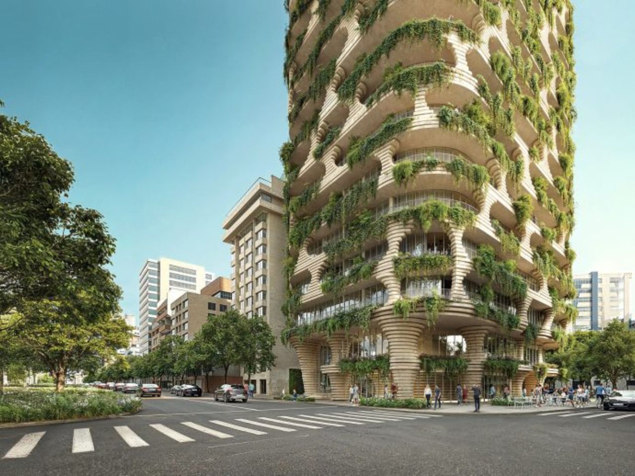
The building will contain 509 micro studio apartments, ranging from 226 to 389 square feet. Those numbers are small, and there is no real way around that. A studio of that size demands discipline from its occupants. Every object has to earn its place. Every surface has to work harder. But the project seems to understand that, which is why the private apartments are only one part of the story. Qapital also includes three commercial floors, a rooftop pool, spa, pet spa, and shared amenity spaces. The pitch is not simply “live in a small apartment.” It is closer to: live compactly, but let the building give you back some of the space your unit cannot hold.

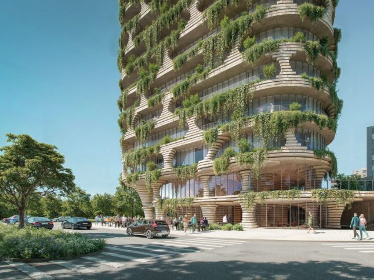
That is where the architecture becomes more compelling. Instead of presenting itself as a sleek glass object, Qapital appears textured, carved, and almost geological. The renders show large openings cut into the facade, with balconies tucked into the building like pockets in a rock face. The exterior is made up of striated stacks of stone, giving it a layered quality that feels much warmer than the usual polished high-rise language. Plants spill out from the balconies, softening the mass of the tower and making it feel less sealed off from the city around it.
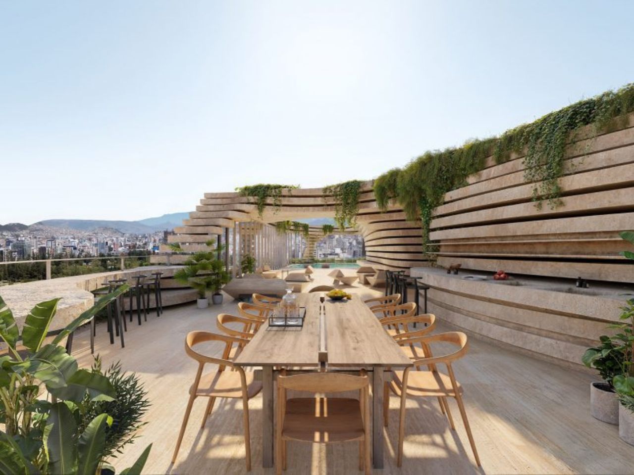
The design draws from the landscape of the Andes, which cradles Quito and gives the city such a specific sense of place. But the reference does not feel overly literal. The tower is not shaped like a mountain in the obvious sense. Instead, it borrows from the way rock holds texture, shadow, cracks, and growth. The balconies feel like crevices where plants might naturally take root. That small shift matters. Greenery on buildings can often feel like decoration, something added to make a render look more alive. Here, the plants feel more integrated into the structure, as though the building has been designed to make room for them from the beginning.

There is also a ceramic quality to the project that feels very much in line with Kuma’s broader sensitivity to material. The facade has the feeling of something pressed, layered, and worked by hand, even though it is operating at the scale of a skyscraper. That contrast is one of the tower’s strongest qualities. It takes a typology that is usually associated with repetition and efficiency, then gives it a tactile, almost earthy presence. It is still a tall residential tower, but it does not seem interested in looking weightless or futuristic. It wants to feel grounded.
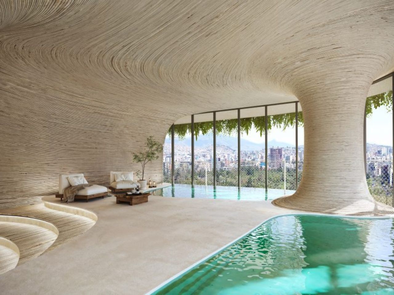
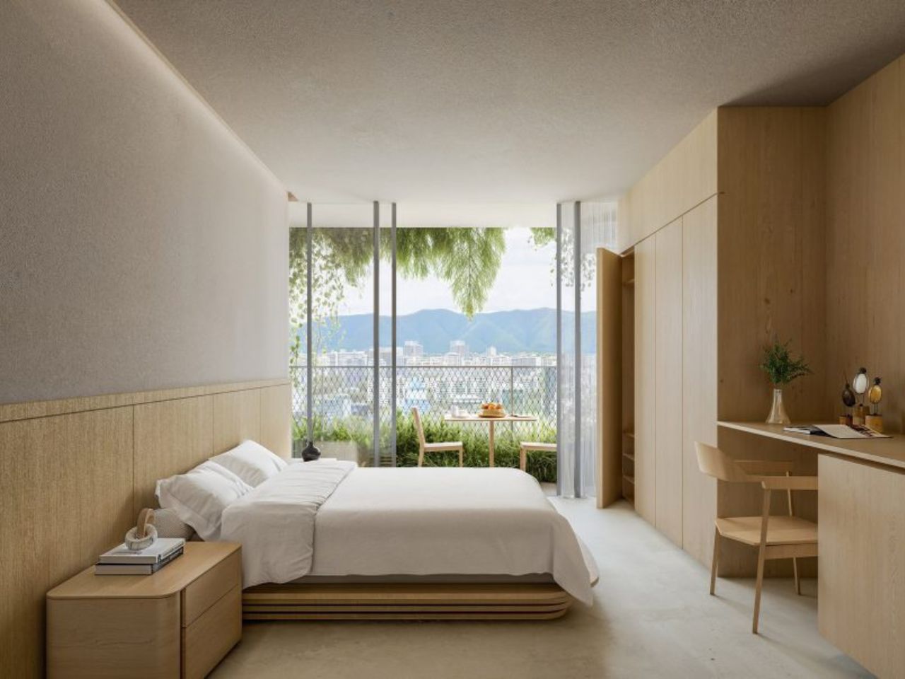
The interiors continue that balance between compactness and atmosphere. The bedroom renderings show small, light wood-lined spaces that feel calm and efficient. The amenity areas, by contrast, are more expansive and organic, with cavernous forms that seem designed to make residents feel like they are stepping out of the compression of the apartment and into something more generous. That contrast could either be the project’s greatest strength or its biggest question mark. If the shared spaces are genuinely useful and accessible, they could make the micro-units feel much more livable. If they become more like visual selling points, the tension between small private space and luxurious shared space will be harder to ignore.

Qapital is also set to include a mosaic by Italian homeware brand Fornasetti, marking the brand’s first work in South America. It adds another layer to the project’s interest in surface, craft, and ornament, all things that feel increasingly refreshing in a world of flat, anonymous towers.
Expected to be completed in 2029, Qapital feels worth watching because it is not just another statement skyscraper. It sits inside a very real urban question: as apartments get smaller and cities grow denser, what can architecture do to make daily life feel richer rather than reduced? The answer here seems to be texture, greenery, shared space, and a stronger relationship to place.

Whether Qapital will fully deliver on that promise will only be clear once it is built and lived in. But as a design idea, it has a strong point of view. It treats the skyscraper less like a machine for stacking apartments and more like a vertical piece of terrain: carved, planted, inhabited, and slowly folded into the city.

The post Quito’s New Skyscraper Feels Carved, Planted, and Lived In first appeared on Yanko Design.
This Australian Tiny Home Has Two Bedrooms, a Picture Window, and Zero Compromises

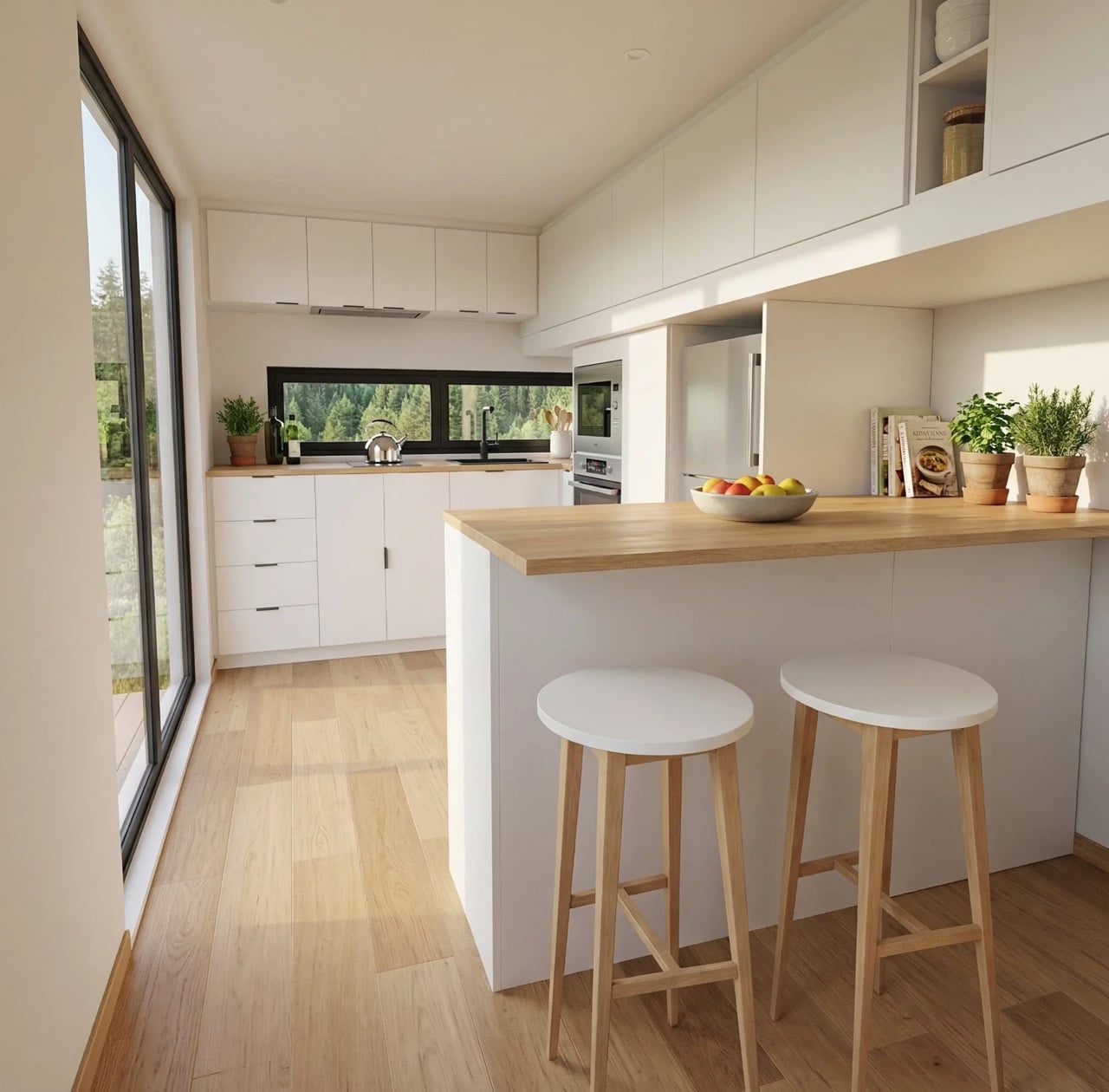
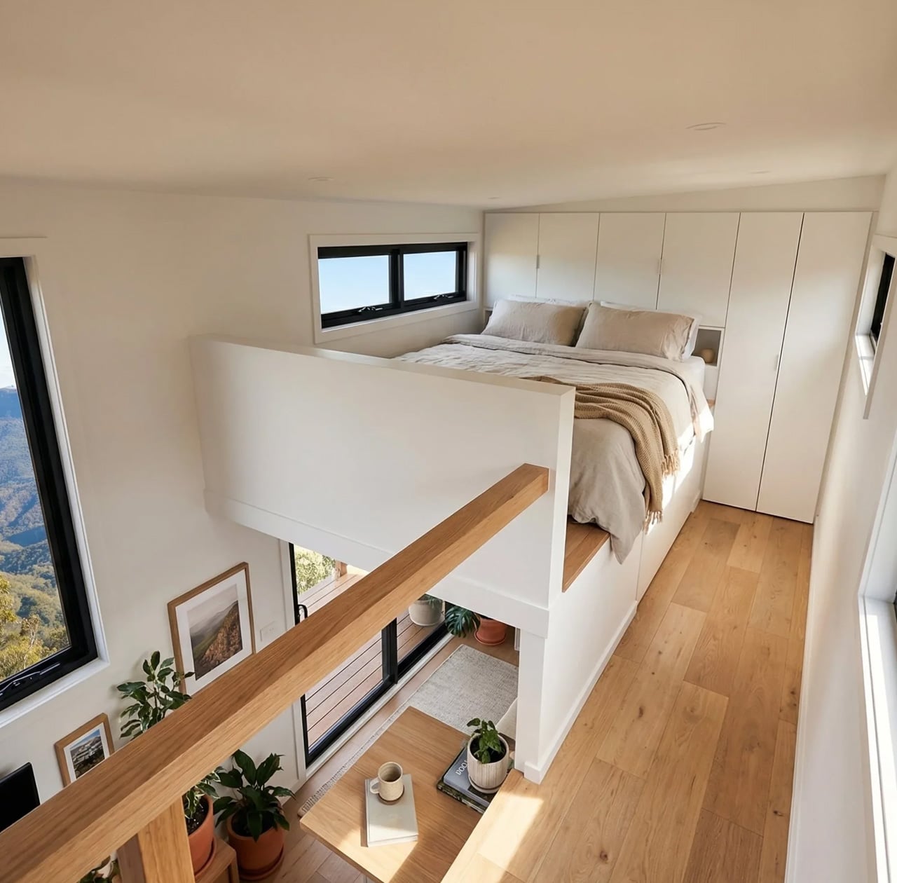
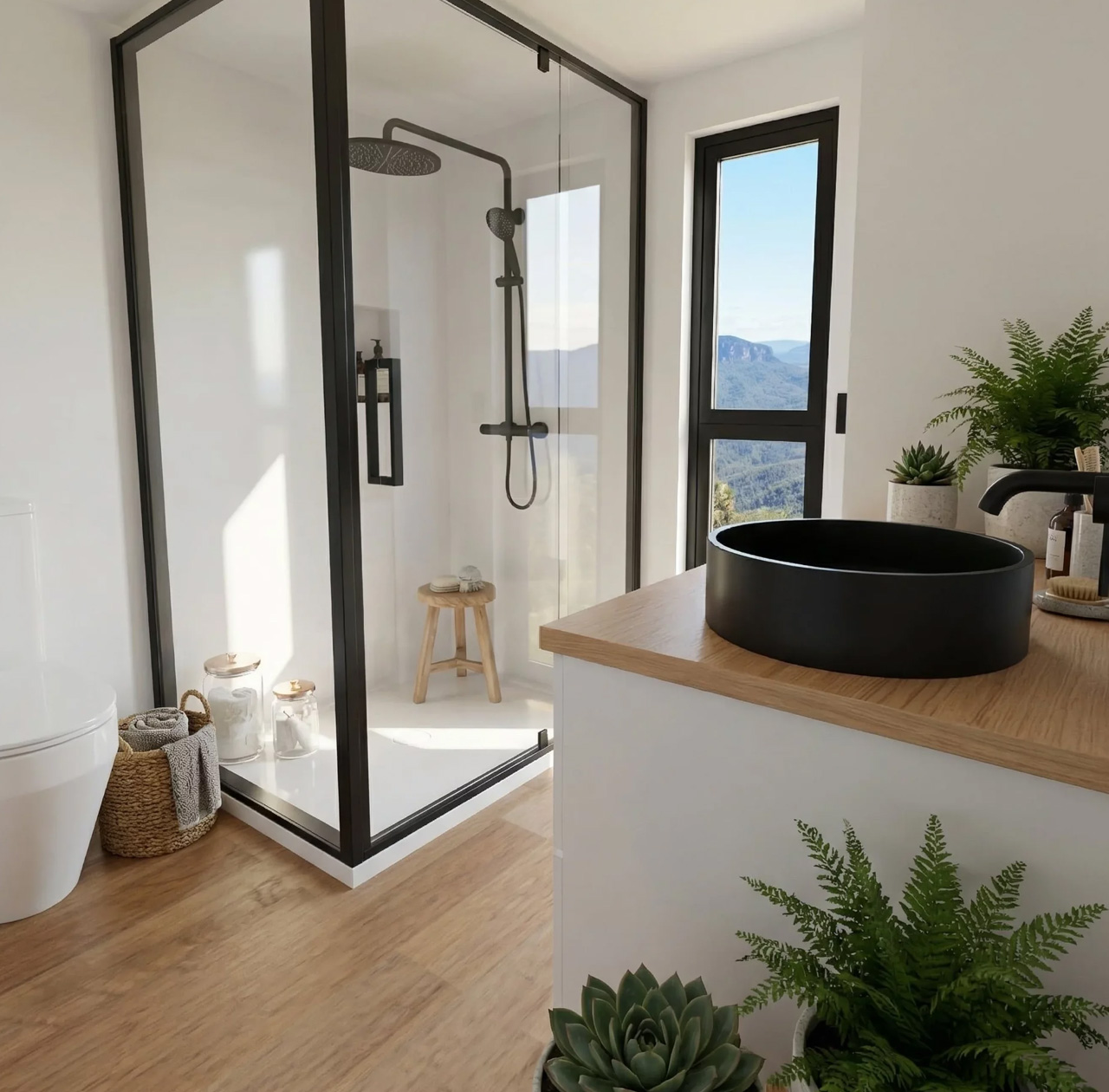
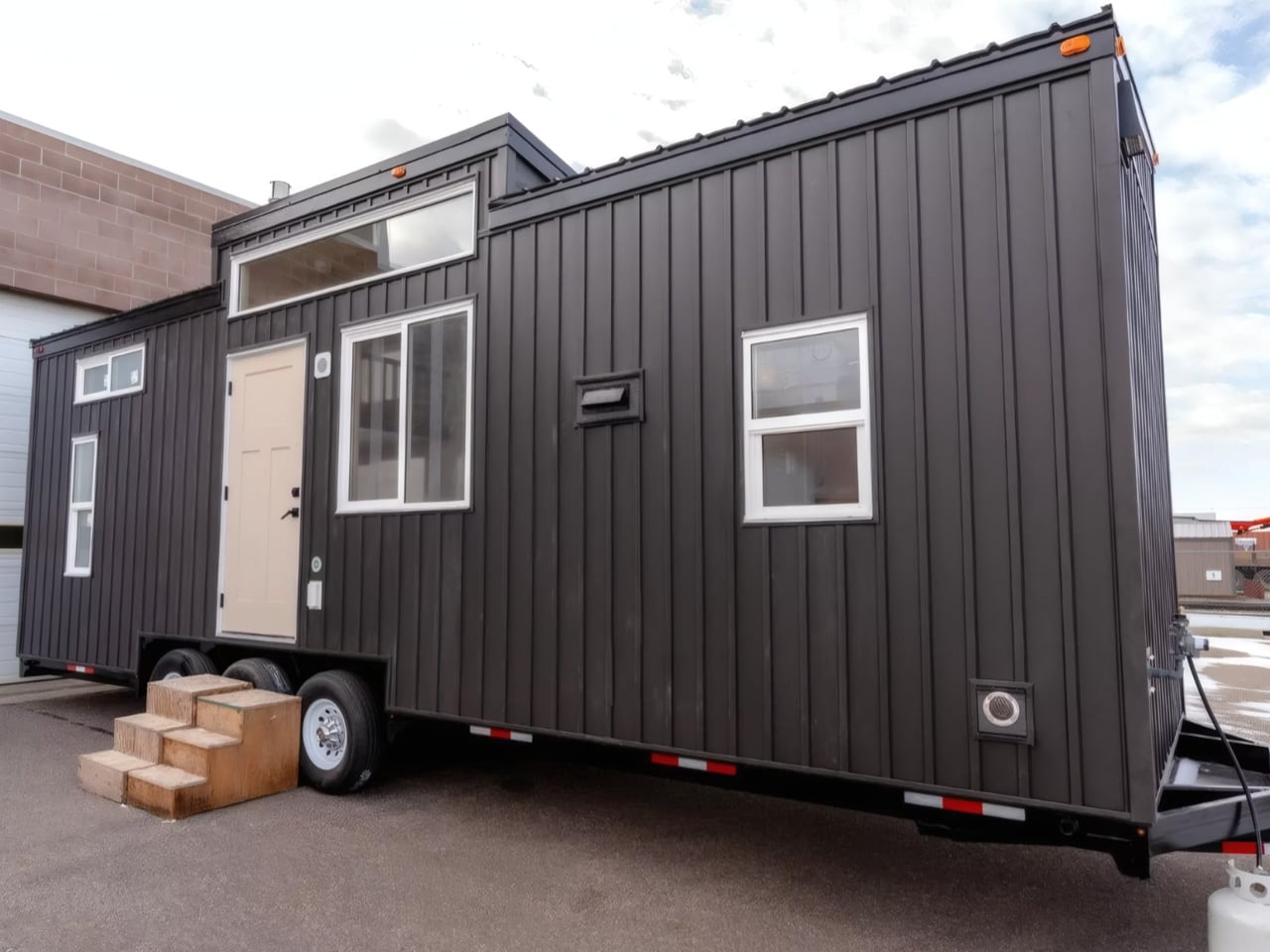
The Byron Bay by Removed Tiny Homes is not that version. Built by the Brisbane-based builder that has quietly become one of Australia’s most talked about names in the tiny home space, this model is as generous as the coastal town it’s named after. It arrives with two loft bedrooms, a full galley kitchen, and a layout that manages to feel more like a considered home than a scaled-down one.

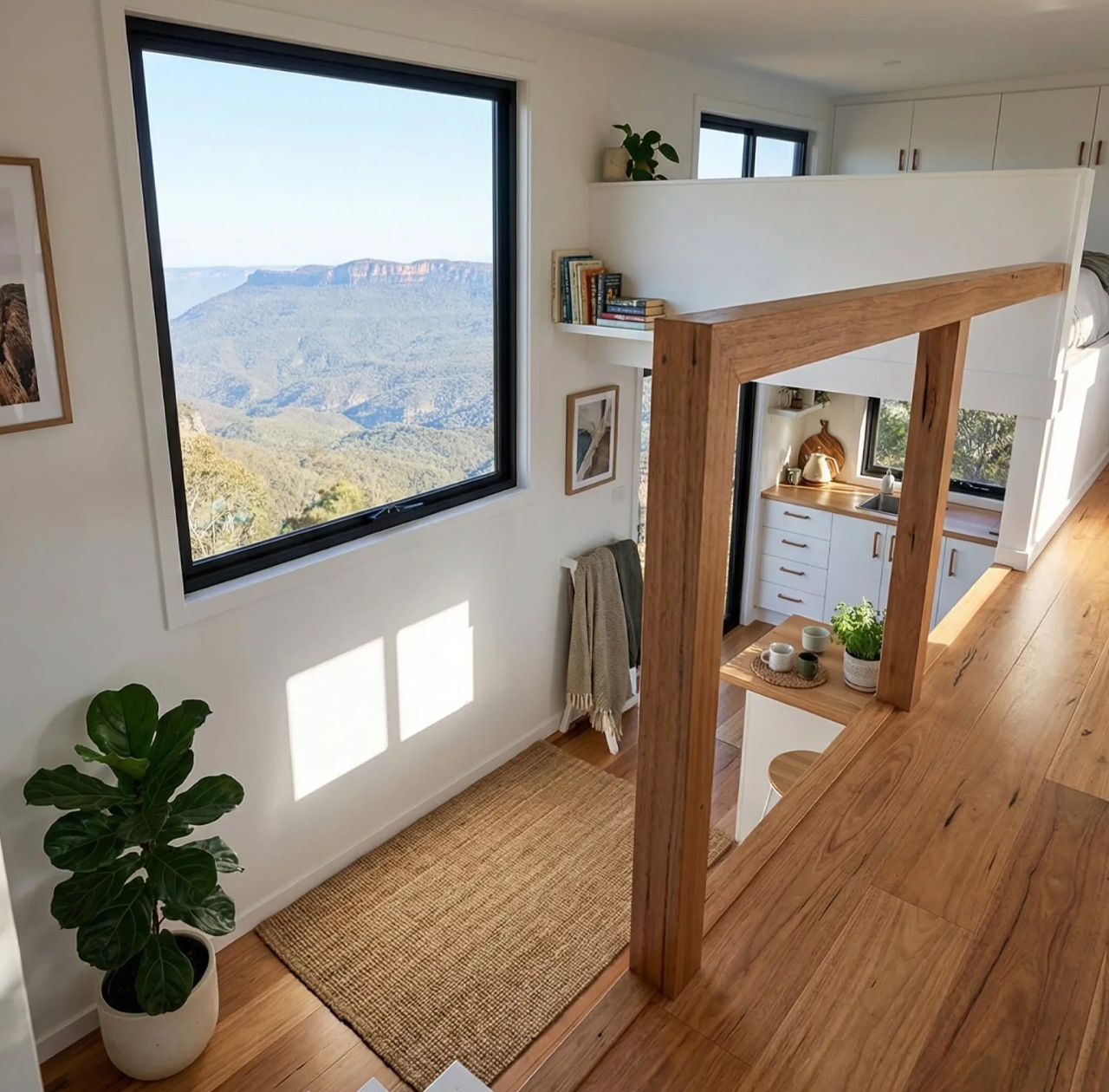
At 8.4 metres long, 2.5 metres wide, and 4.3 metres tall, the Byron Bay sits at the larger end of what road-legal tiny homes can offer. That scale is put to work immediately. The two upstairs lofts are connected by a full standing height walkway, which sounds like a small detail until you realise how much it changes the experience of moving through the space. There is no crawling, no hunching, no reminder that you made a trade-off. The lofts feel like actual bedrooms, not storage shelves with pillows on them.

Designer: Removed Tiny Homes

Downstairs, the open-plan living area is anchored by a large kitchen fitted with a picture window. Light moves through the interior in a way that makes the 33 square metres read closer to double that. The design team at Removed has clearly thought hard about storage, building it into nearly every surface without letting it dominate the aesthetic. The result is a home that feels edited rather than cluttered.

What makes Byron Bay particularly compelling right now is its off-grid capability. Recent builds leaving the Removed factory have been fully off-grid spec, designed for families planting themselves on rural land or lifestyle blocks far from the grid. For a generation priced out of the traditional housing market, that combination of mobility and self-sufficiency is not a novelty. It is a strategy.

Removed Tiny Homes describes Byron Bay as ideal for families, and you can see why it has become one of their most requested models. Two sleeping spaces, serious kitchen infrastructure, and a layout that prioritises flow rather than function alone. Starting from US$104,000, it positions itself as a genuine alternative to a first home, not a weekend experiment.

Byron Bay does not try to convince you that less is more. It just builds the space well enough that you stop counting square metres and start thinking about where to put it.

The post This Australian Tiny Home Has Two Bedrooms, a Picture Window, and Zero Compromises first appeared on Yanko Design.
A Pour-Over Dripper Inspired One of Beijing’s Best Pop-Ups

Pop-ups have become one of the more interesting testing grounds for design ambition. They exist long enough to make a statement but not so long that they have to compromise on boldness. And Atelier L seems to understand that assignment completely.

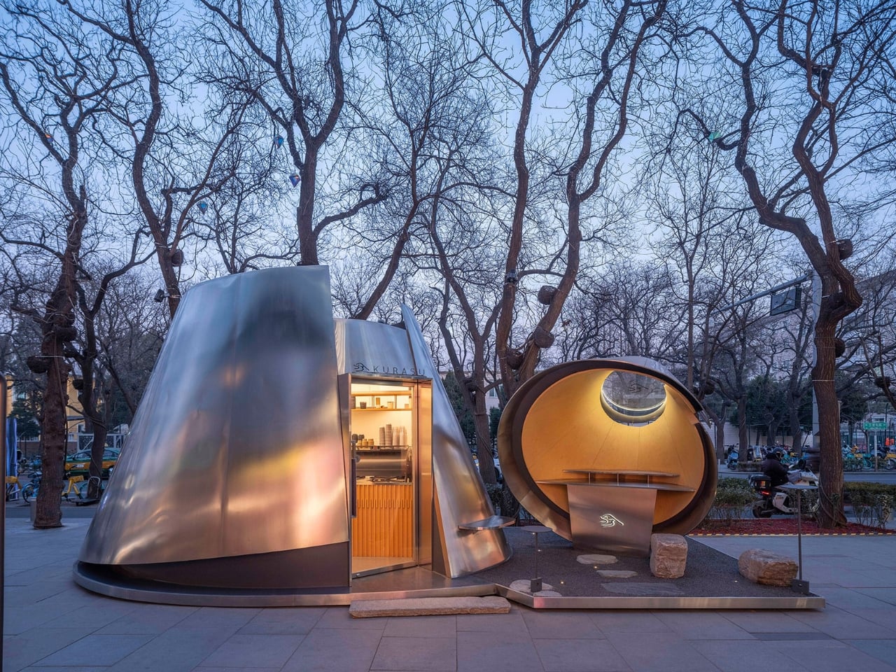
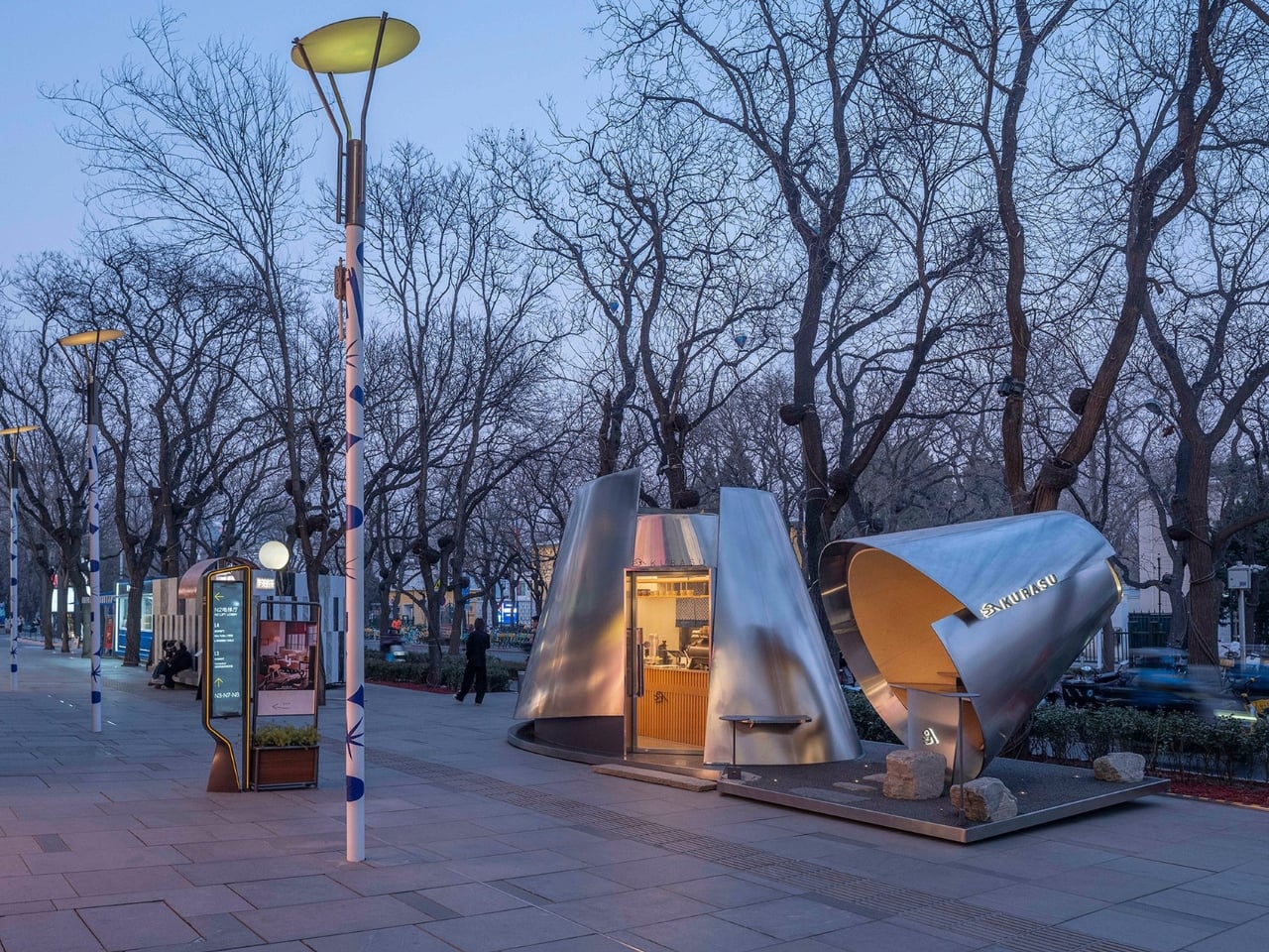
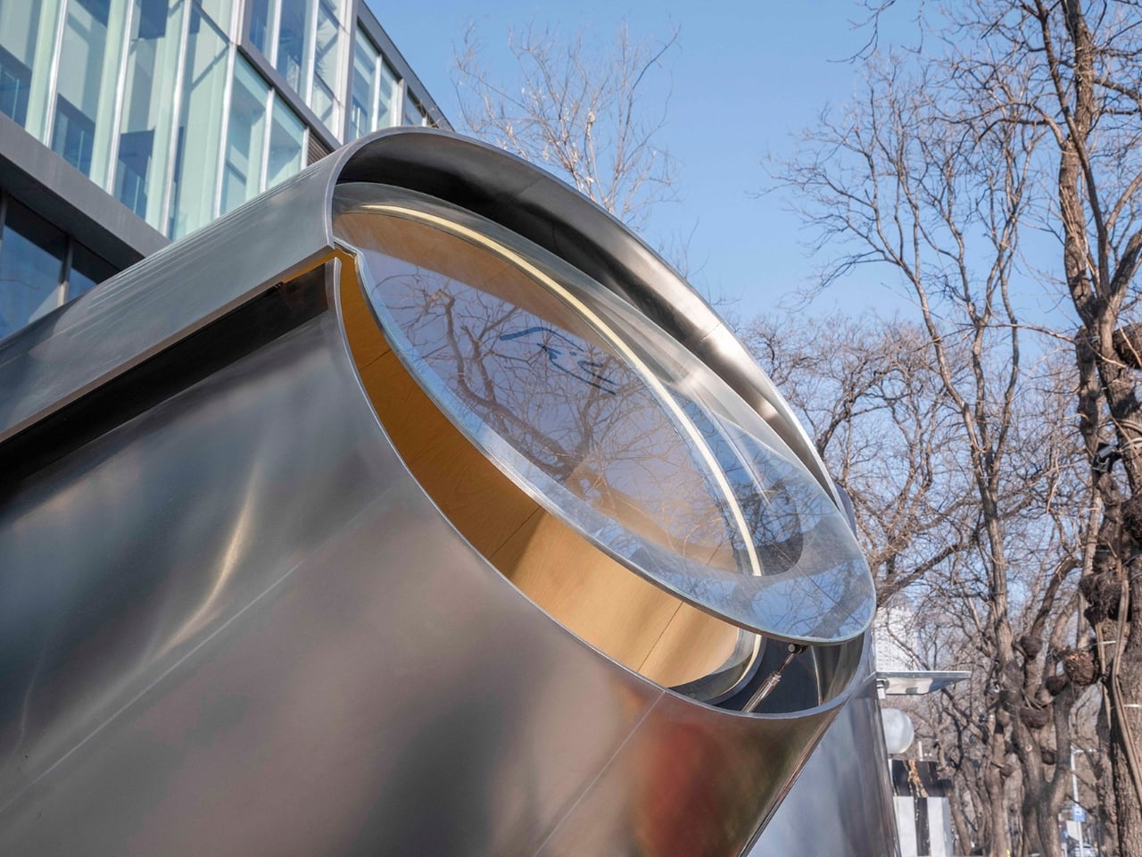
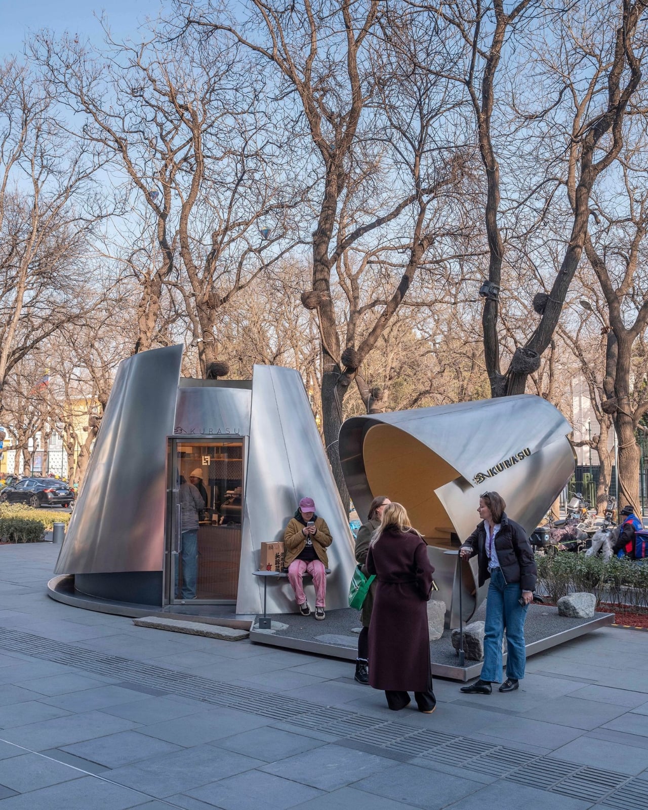
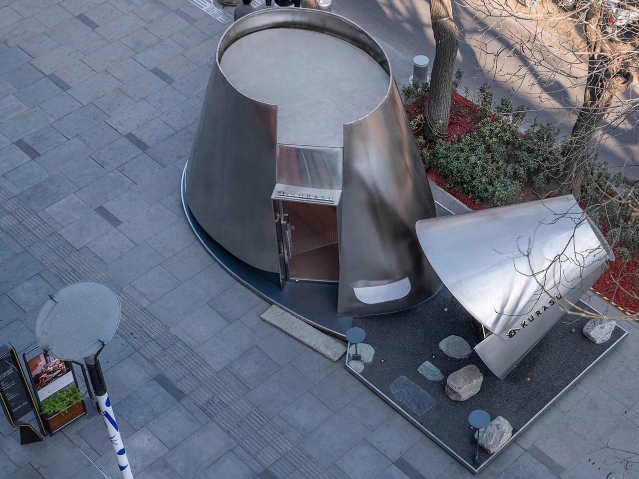
The studio’s latest project is a temporary coffee pavilion for Kurasu, the Kyoto-based specialty coffee brand, installed at Taikoo Li Sanlitun, one of Beijing’s most high-traffic outdoor retail districts. On the surface, it’s a pop-up kiosk. But spend a few seconds looking at it, and you realize it’s a fully considered piece of architecture that draws its entire form from a pour-over coffee dripper.

Designer: Atelier L

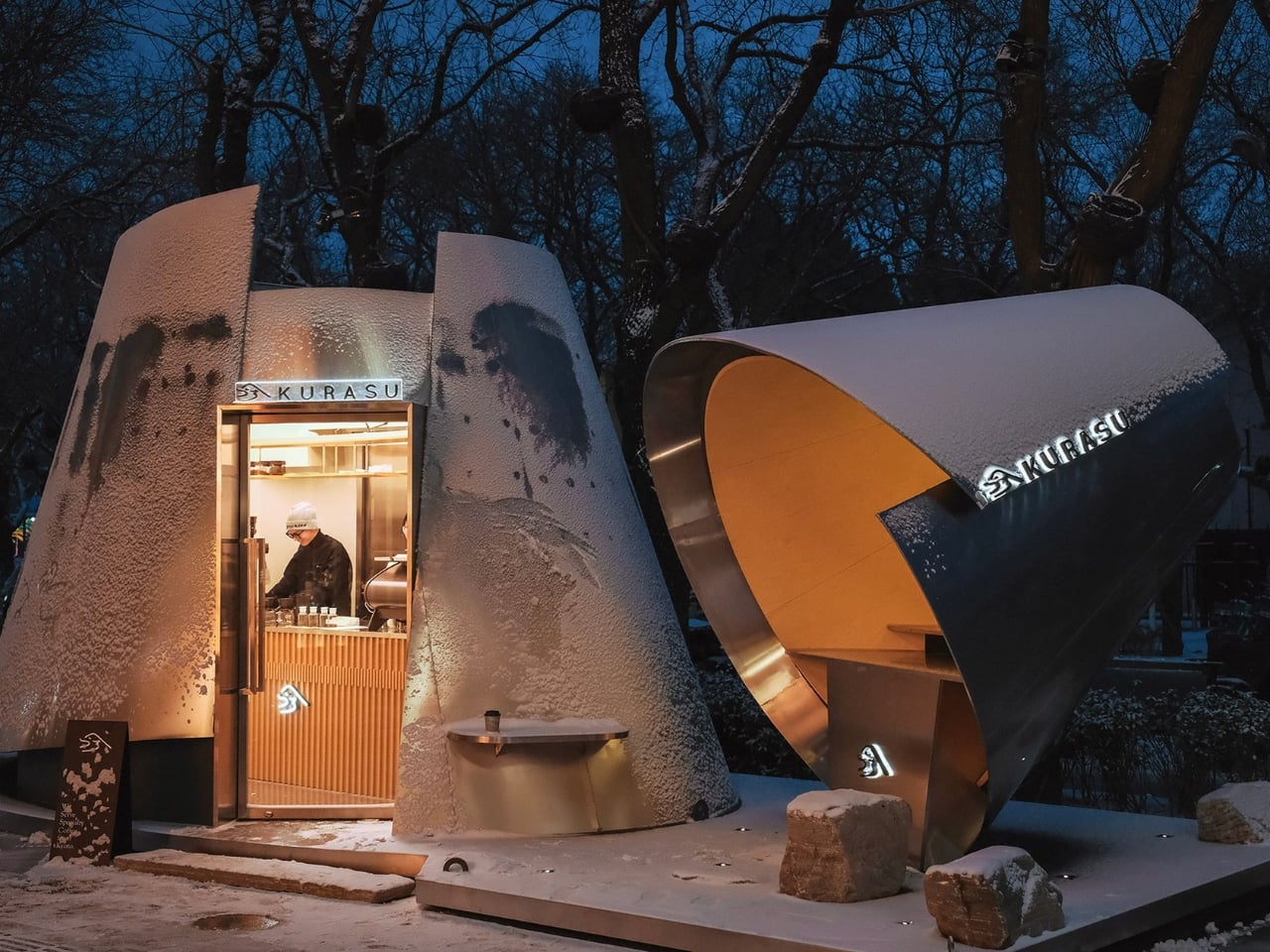
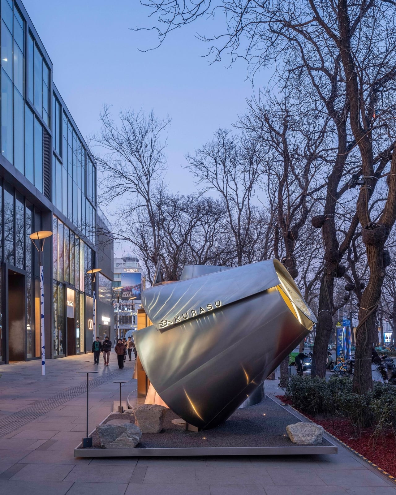
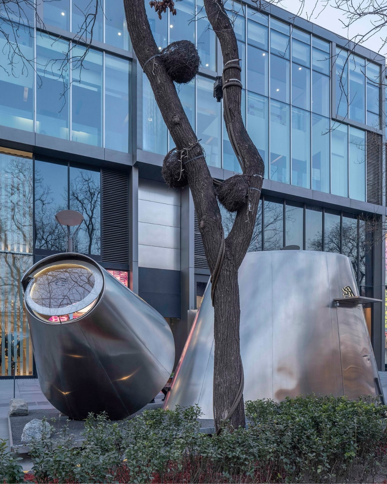
That’s the concept at the core of it: the geometry of a pour-over dripper, translated directly into architectural form. Atelier L scaled up the familiar conical vessel into two interconnected volumes, each clad in reflective stainless steel that mirrors the movement and light of the city around it. The inspiration nods to origami, which tracks visually. The structure reads as almost folded into place, light and precise rather than heavy or monolithic.

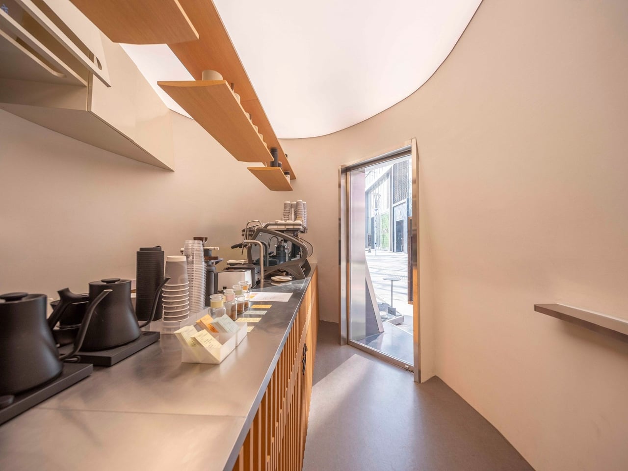
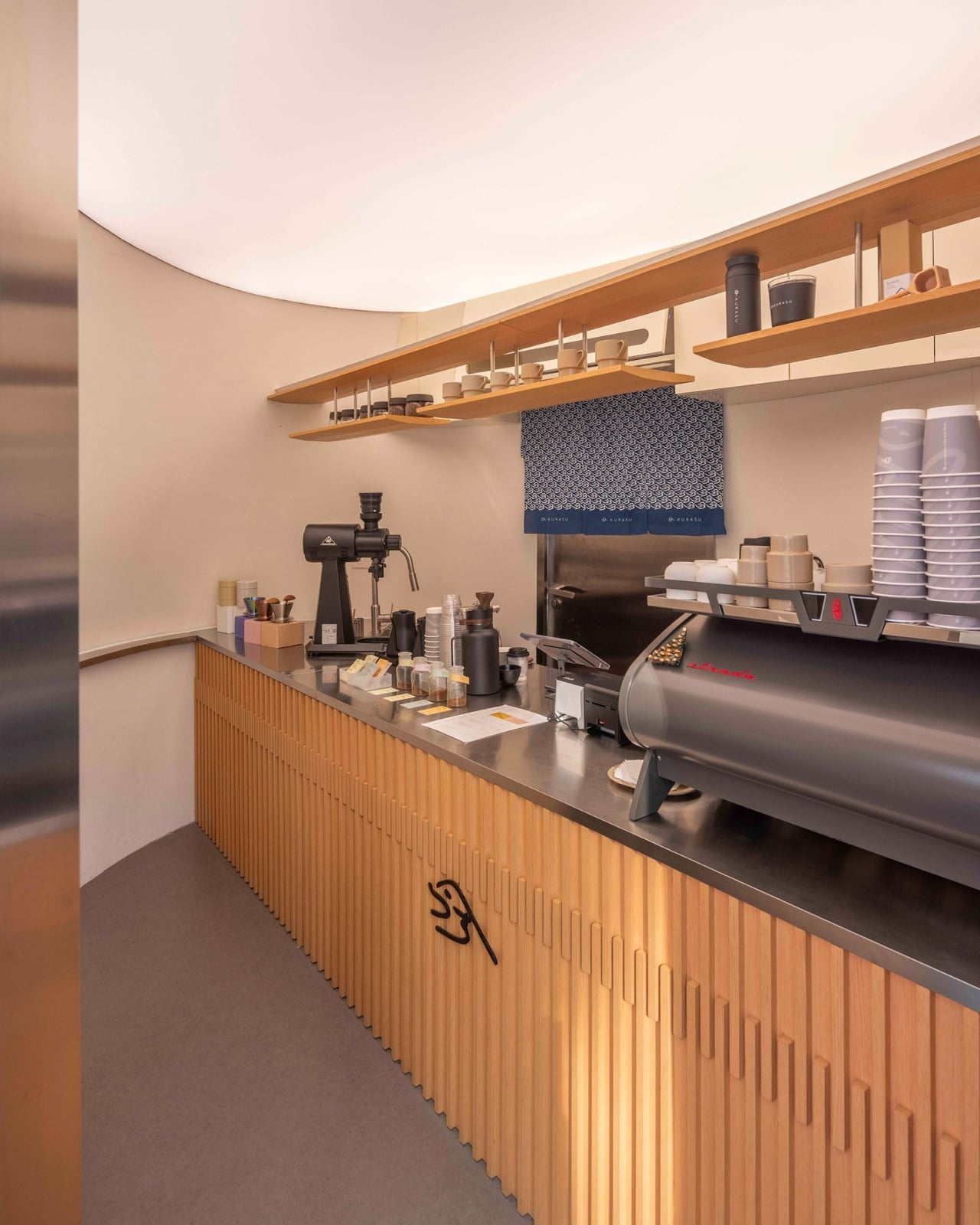
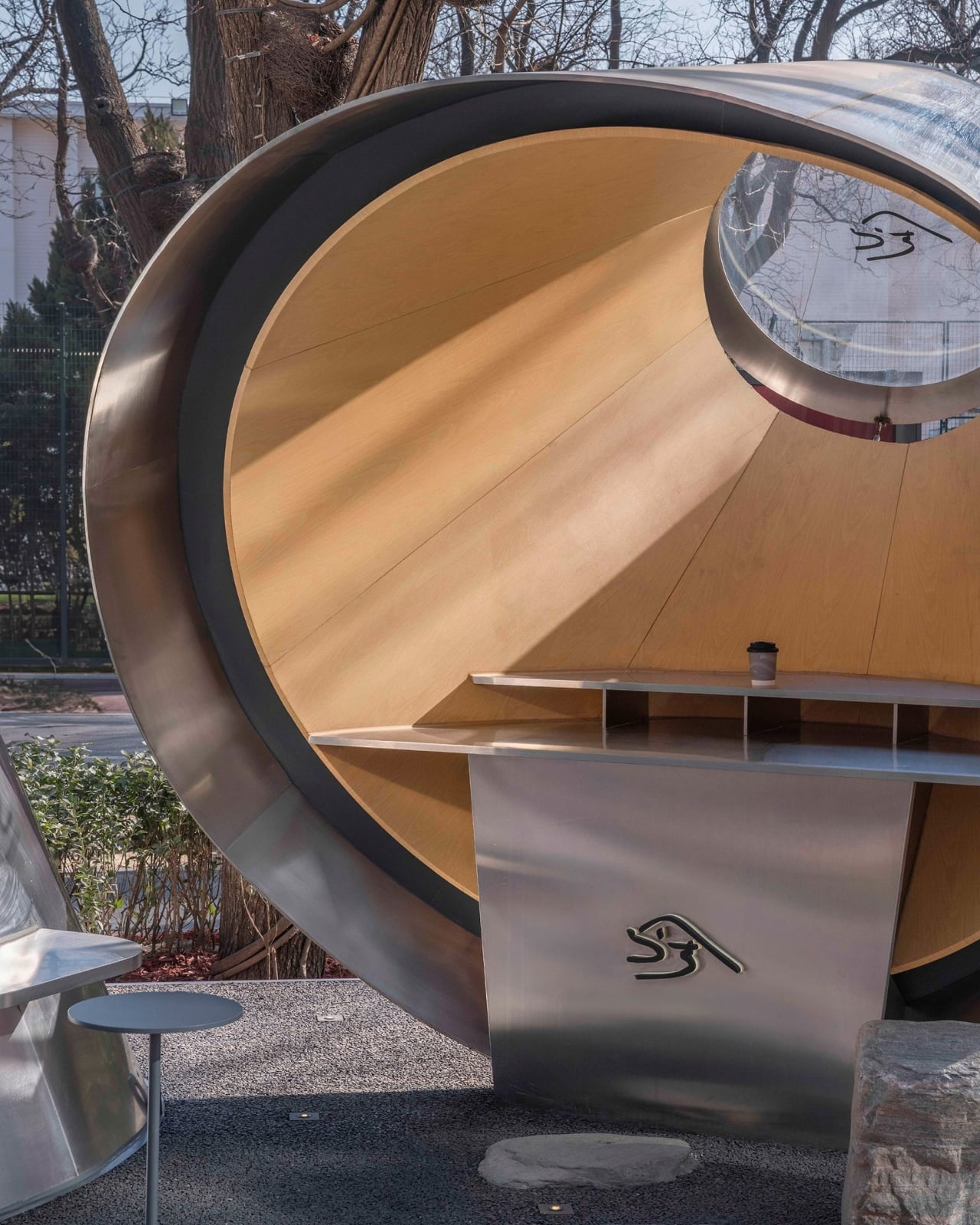
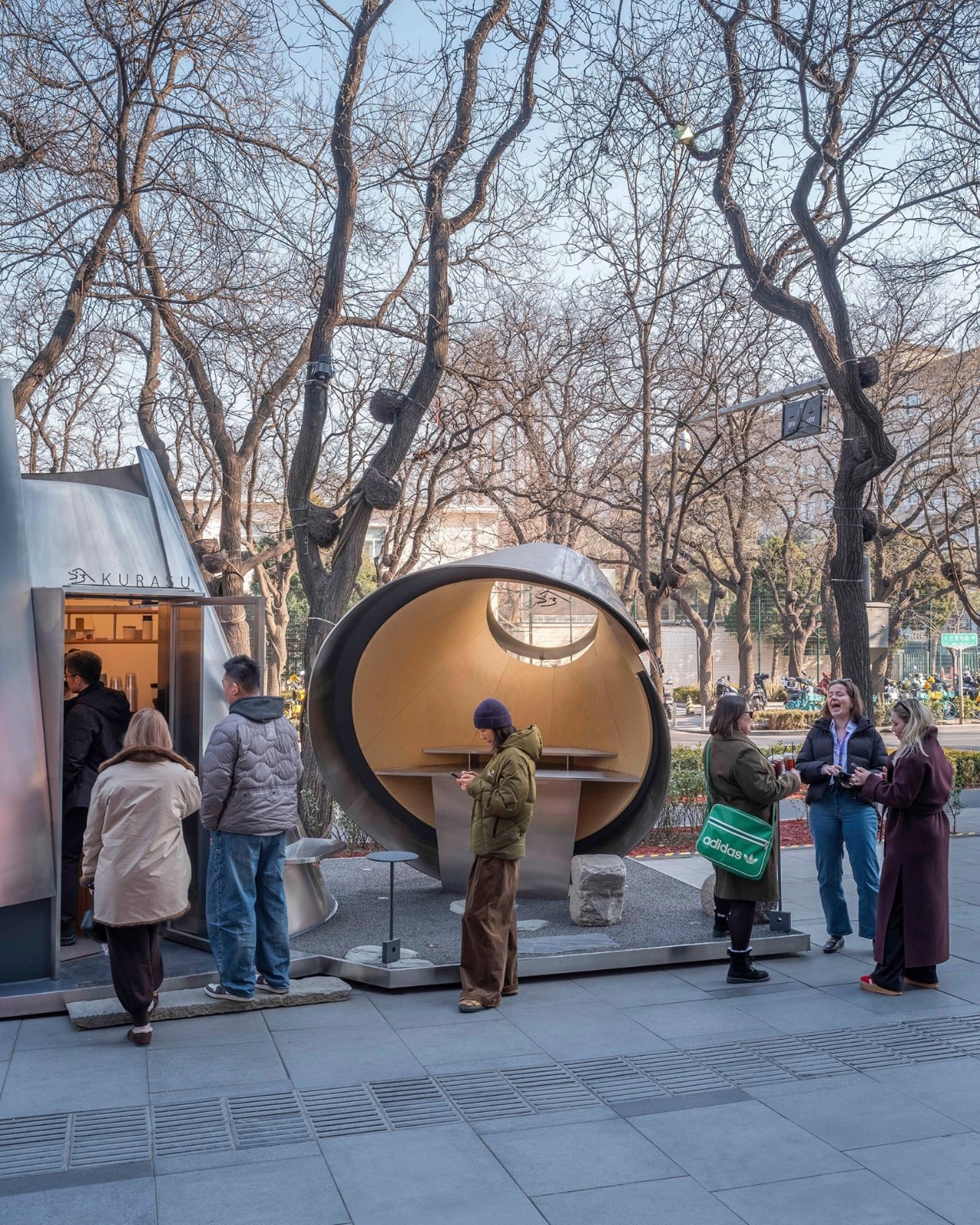
What makes the design smart rather than just clever is how the two volumes work separately but together. The larger one faces inward, creating a contained environment for the coffee ritual itself. A central linear bar clearly divides the space between barista and customer, and the wall inclinations, subtle as they are, actually serve a functional purpose: they create more movement space behind the counter while making the customer-facing side feel more expansive than its actual square footage. That kind of spatial sleight of hand is hard to achieve in a compact footprint, and Atelier L manages it without making you feel like you’ve noticed it.

The smaller volume does something entirely different. It cantilevers outward toward the street and functions as a display structure and micro gallery, which is an elegant answer to the challenge every pop-up faces: how do you engage passers-by without resorting to signage? Here, the architecture itself becomes the invitation.

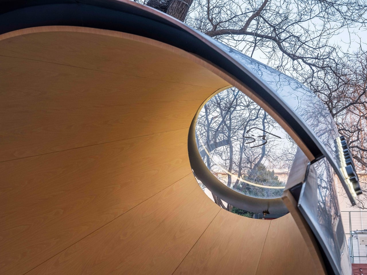
Materials are where my personal preferences become part of the read. The stainless steel exterior is striking without trying too hard. It catches the light, reflects the surrounding winter trees, and at dusk, the entire pavilion takes on the quality of a glowing lantern. But the interior feels more considered to me. Wood-grain aluminum brings warmth into what could easily have been a cold, overly minimal space, and the curved surfaces soften light across the small interior rather than bouncing it. The contrast between the pavilion’s cool, almost industrial exterior and its warmer interior is a deliberate design choice, and it works. The outside sets an expectation; the inside quietly revises it.

A steel base anchors both volumes, with its corners slightly lifted to maintain the illusion of paper-thin lightness. Dark gravel and natural stone slabs compose the ground plane. An operable glass roof keeps the interior connected to the sky, allowing the space to shift with the light and the movement of trees above. Those details matter. They’re what separate a thoughtful installation from a kiosk.

For a brand like Kurasu, whose identity has always been rooted in the quiet rituals of specialty coffee, a pavilion that architecturally embodies the act of brewing makes complete sense. The pour-over method is slow, precise, and intentional. The pavilion mirrors all of that. Whether the alignment between concept and experience was always the plan or sharpened through the process, it reads as completely resolved.

Pop-ups tend to get treated as design’s sketchpad, too temporary to be taken seriously. The Kurasu pavilion in Beijing is a case against that assumption. When the brief is specific and the constraints are real, a temporary structure can be as fully realized as anything permanent. Sometimes more so, because there’s no room to defer decisions or soften edges. You build it, it lands, and people either feel it or they don’t. This one lands.

The post A Pour-Over Dripper Inspired One of Beijing’s Best Pop-Ups first appeared on Yanko Design.
Four Meters by Four Meters: How Tadao Ando Made Constraint Beautiful

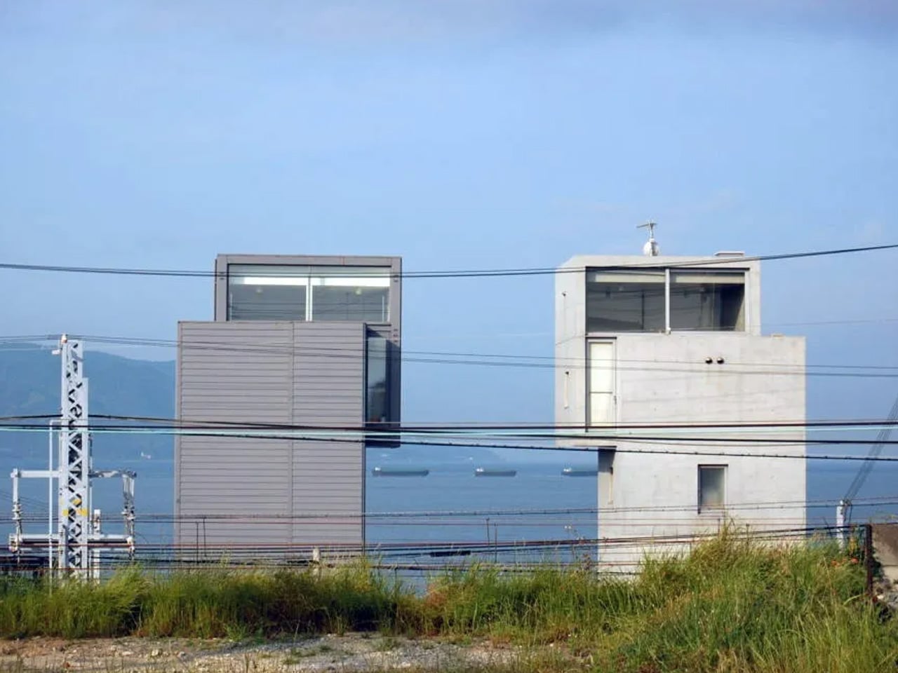
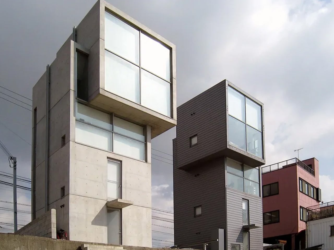
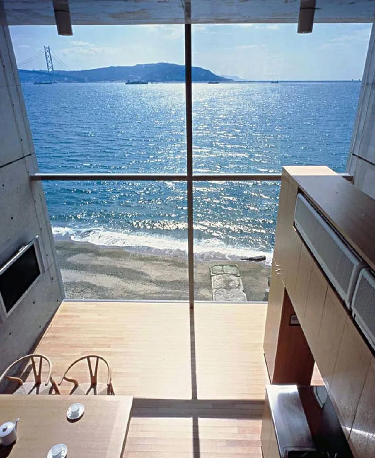
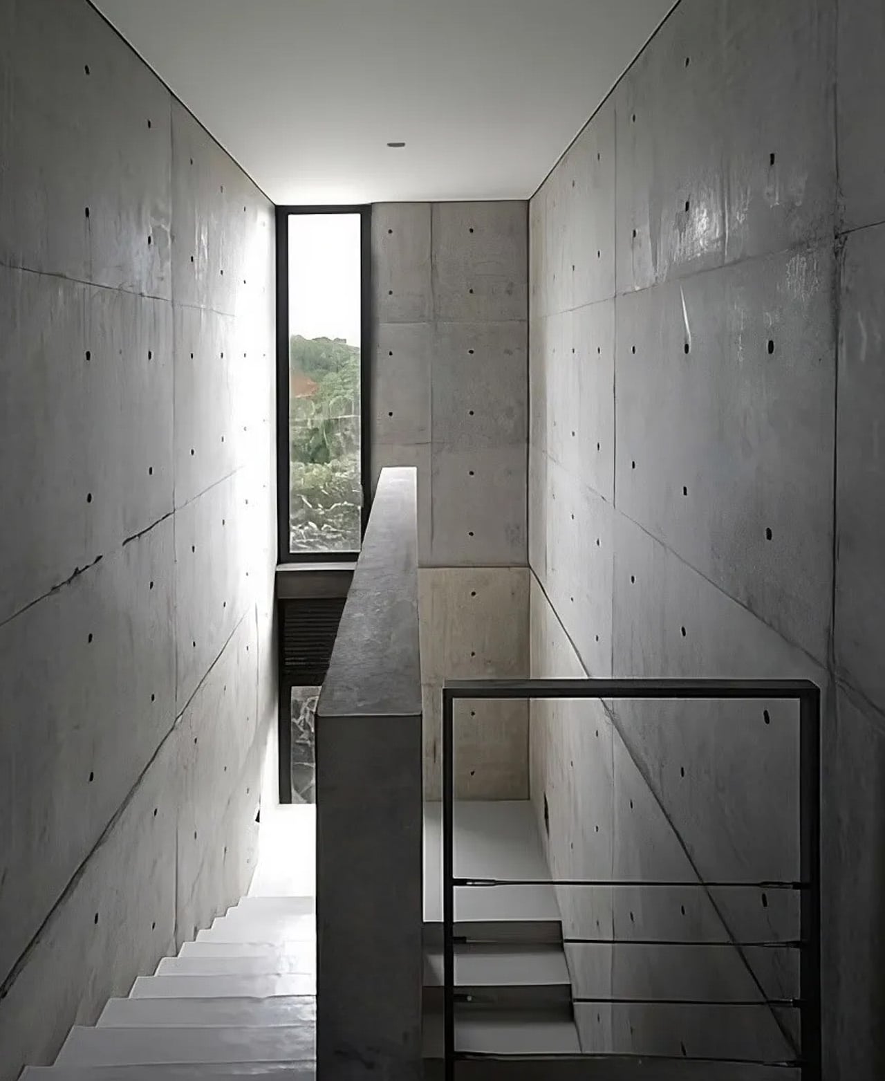
Perched on the coast of the Seto Inland Sea in Tarumi-ku, Kobe, the 4×4 House by Tadao Ando occupies a narrow coastal strip that Japanese authorities had not even considered constructible. That is exactly why Ando built there. Completed in 2003, the house rose in the shadow of the Great Hanshin earthquake, a catastrophe that reshaped the region and the consciousness of everyone who lived through it. Ando’s response was not to build bigger or safer in the conventional sense.

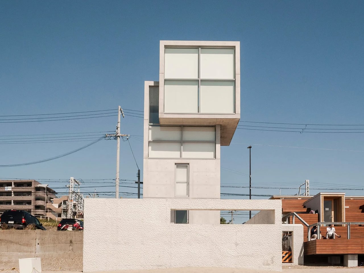
It was to build with precision — a four-story reinforced concrete tower with a footprint of just four meters by four meters. Sixteen square meters of floor area, multiplied upward toward the sky. The name is the blueprint.

Designer: Tadao Ando

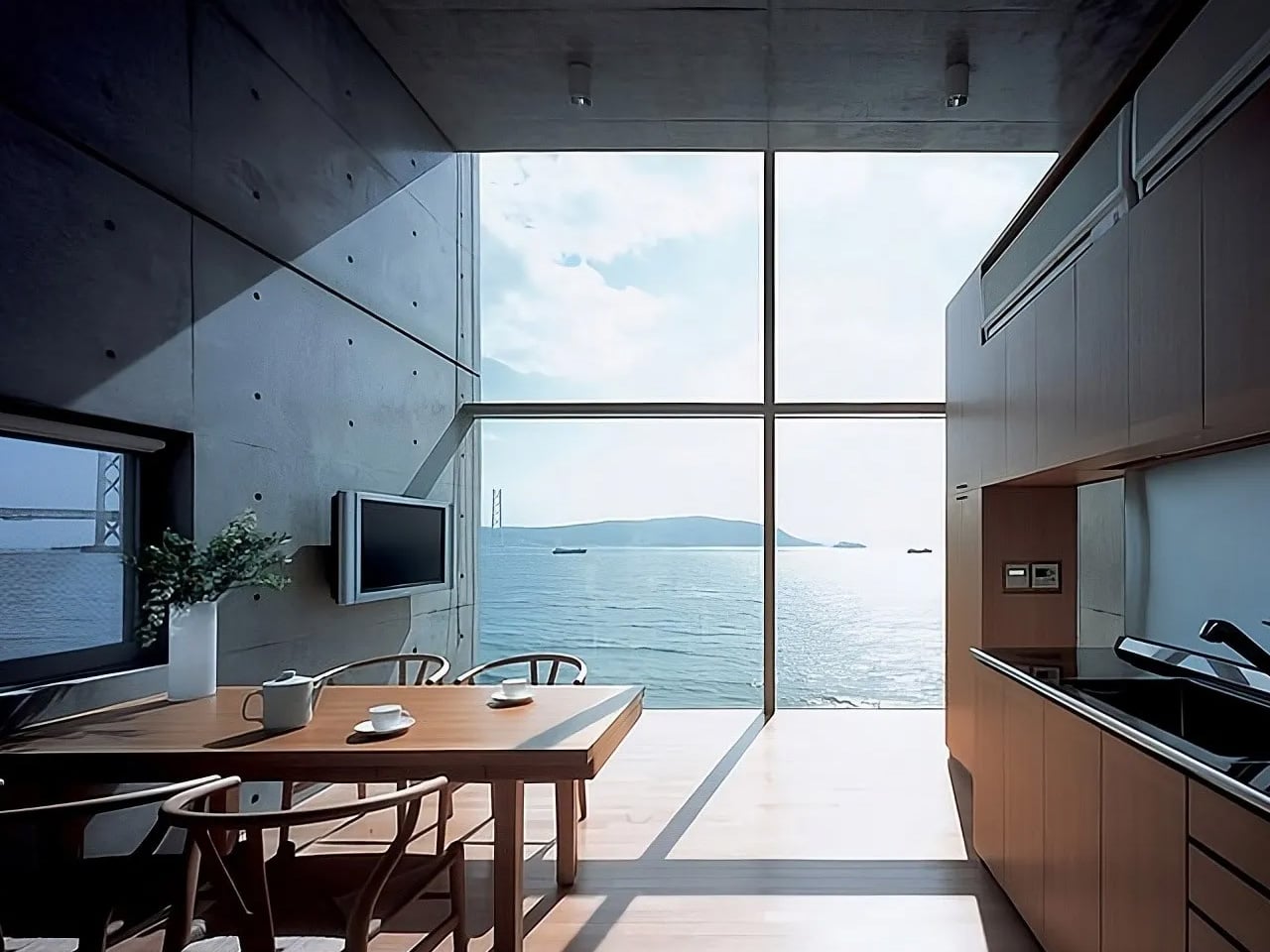
At 13.4 meters tall, the structure reads less like a residence and more like a sentinel. Its silhouette evokes a watchtower — upright, deliberate, scanning the horizon. Ando sank the foundations deep into the ground to resist lateral forces, and at the base, a square concrete patio disappears beneath the waterline when the tide comes in. The boundary between architecture and ocean is intentionally blurred. Living here means accepting the sea as a roommate.

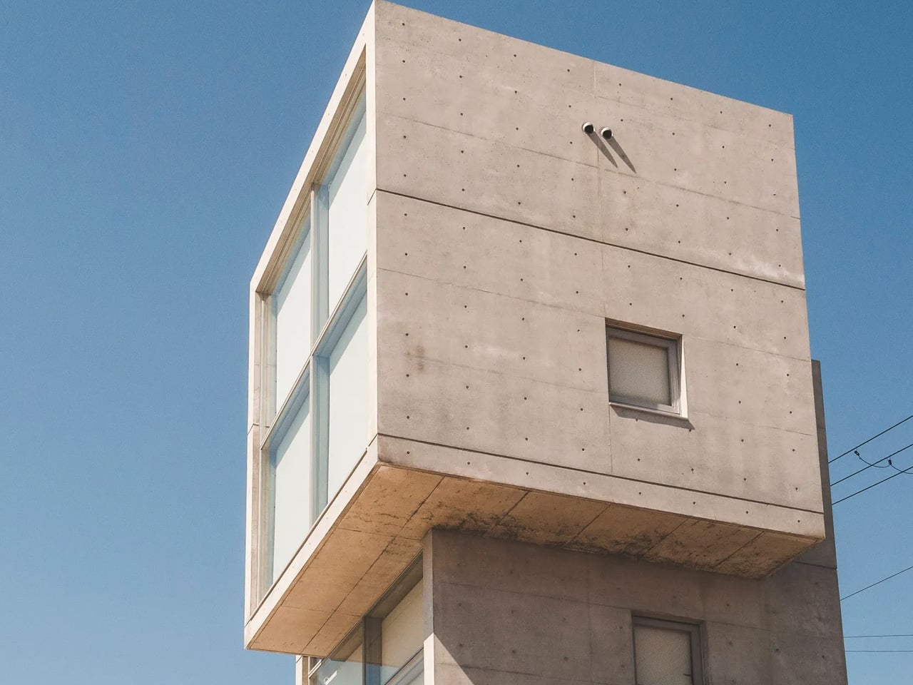
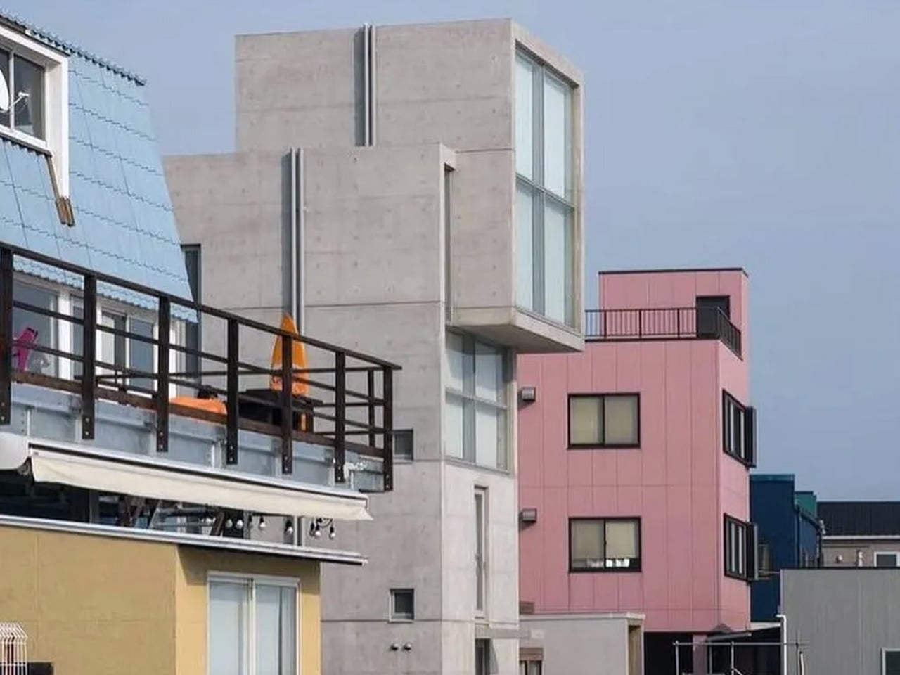
The interior climbs through a vertical sequence of rooms, each floor stacked with the discipline of a column. What makes the composition unusual is the top floor — a cube shifted slightly off-axis from the floors below, a geometric move that feels almost offhand but transforms the entire silhouette. Light enters in controlled bursts. Views are framed like paintings. Nothing is accidental.

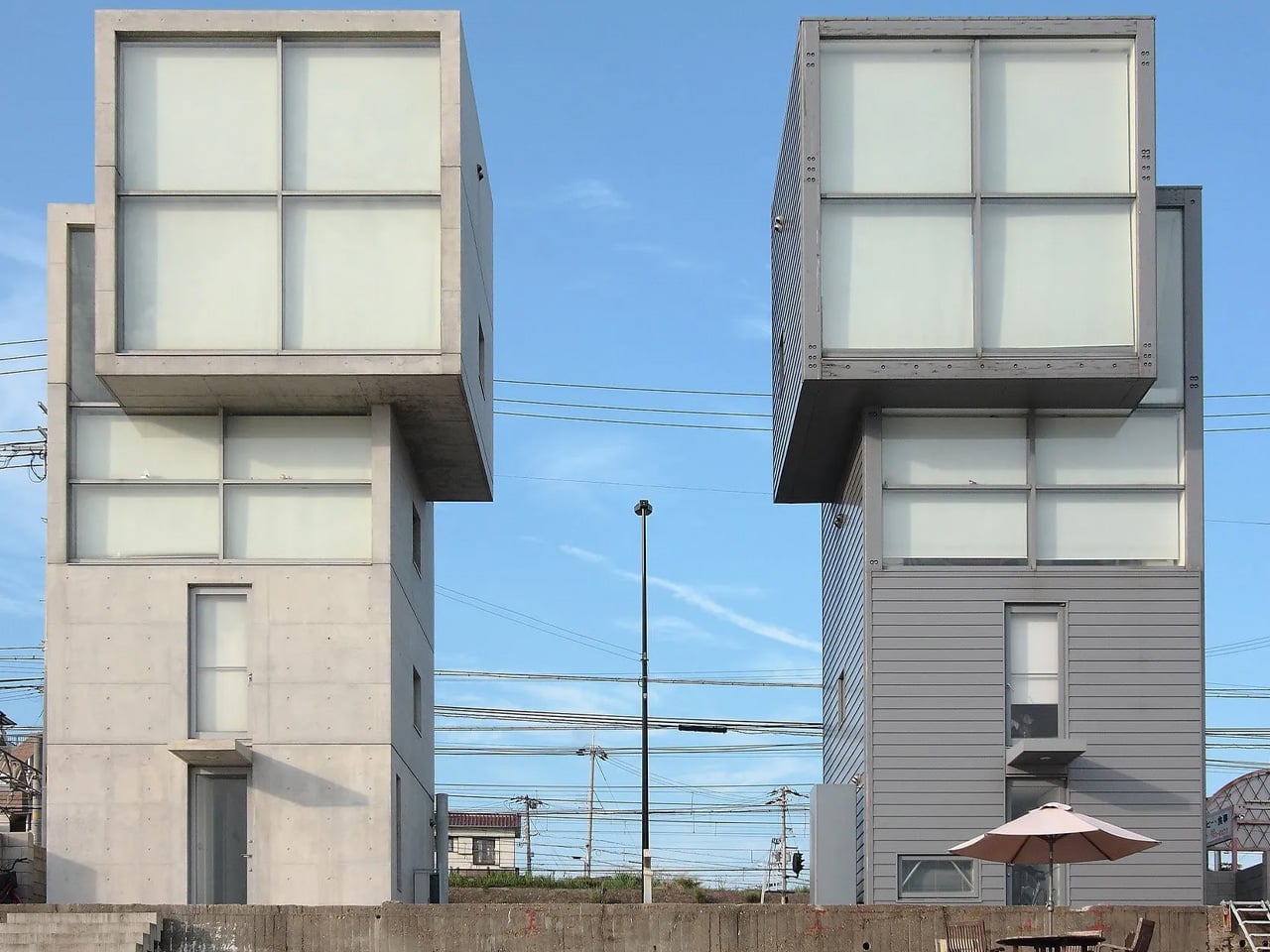
Not long after the first house was finished, a second client commissioned Ando to build an identical tower on the neighboring plot. The result is a pair of concrete twins standing side by side on the coastline, same in form but different in material — a duality Ando had quietly envisioned from the beginning. The two buildings share no physical connection. They stand together, facing the sea, as if in silent conversation.

The 4×4 House is not a comfortable building in the traditional sense. It is a provocation — a proof that constraint, when embraced fully, becomes its own kind of freedom. Ando took a strip of coastline that the city had written off and turned it into one of the most discussed residential structures of the 21st century. Sixteen square meters at a time.

The post Four Meters by Four Meters: How Tadao Ando Made Constraint Beautiful first appeared on Yanko Design.
This Architect Built a 20m² Red Cabin on Her Family’s Greek Vineyard — and It’s the Antidote to Every Concrete Villa on the Island

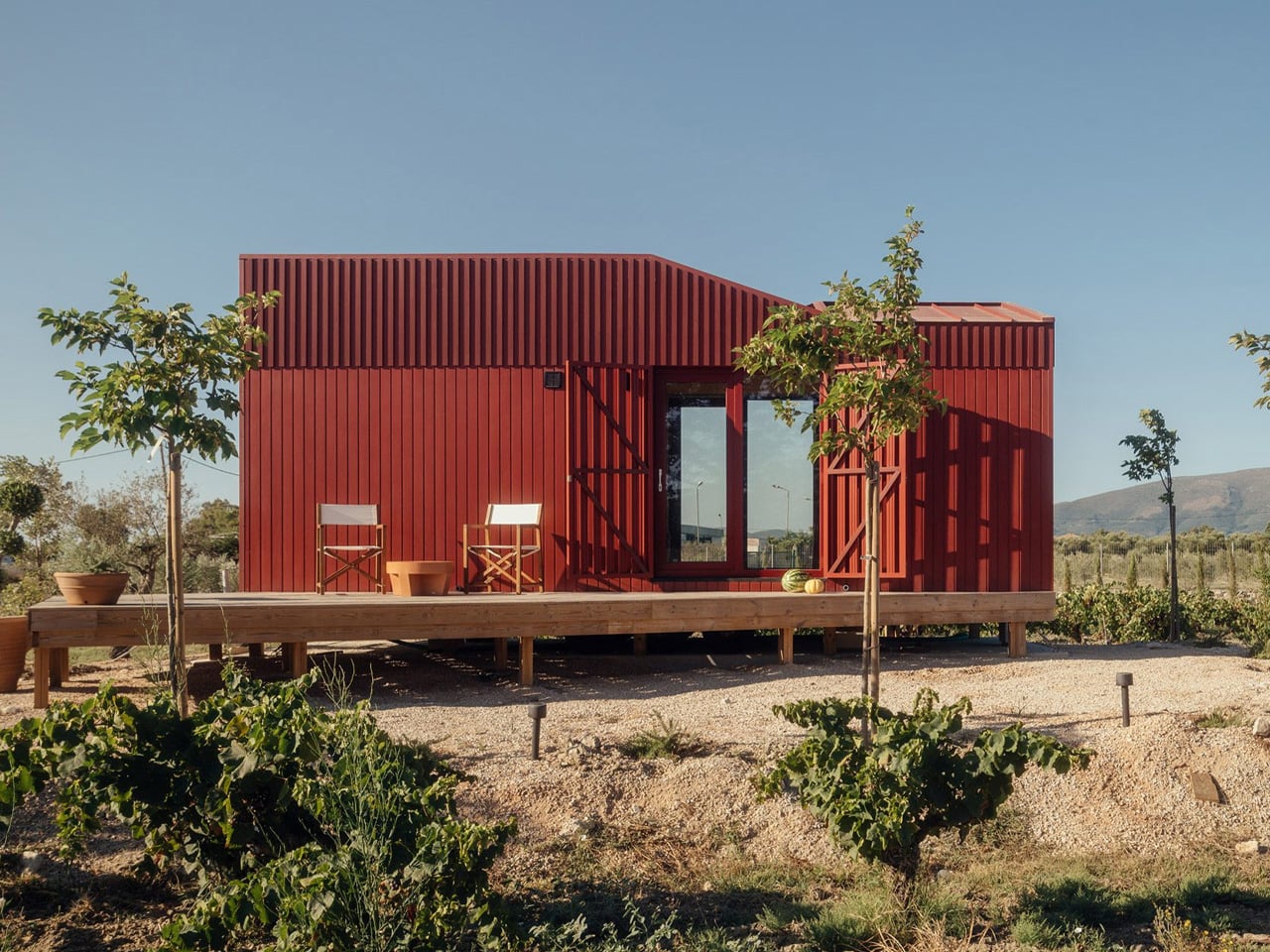
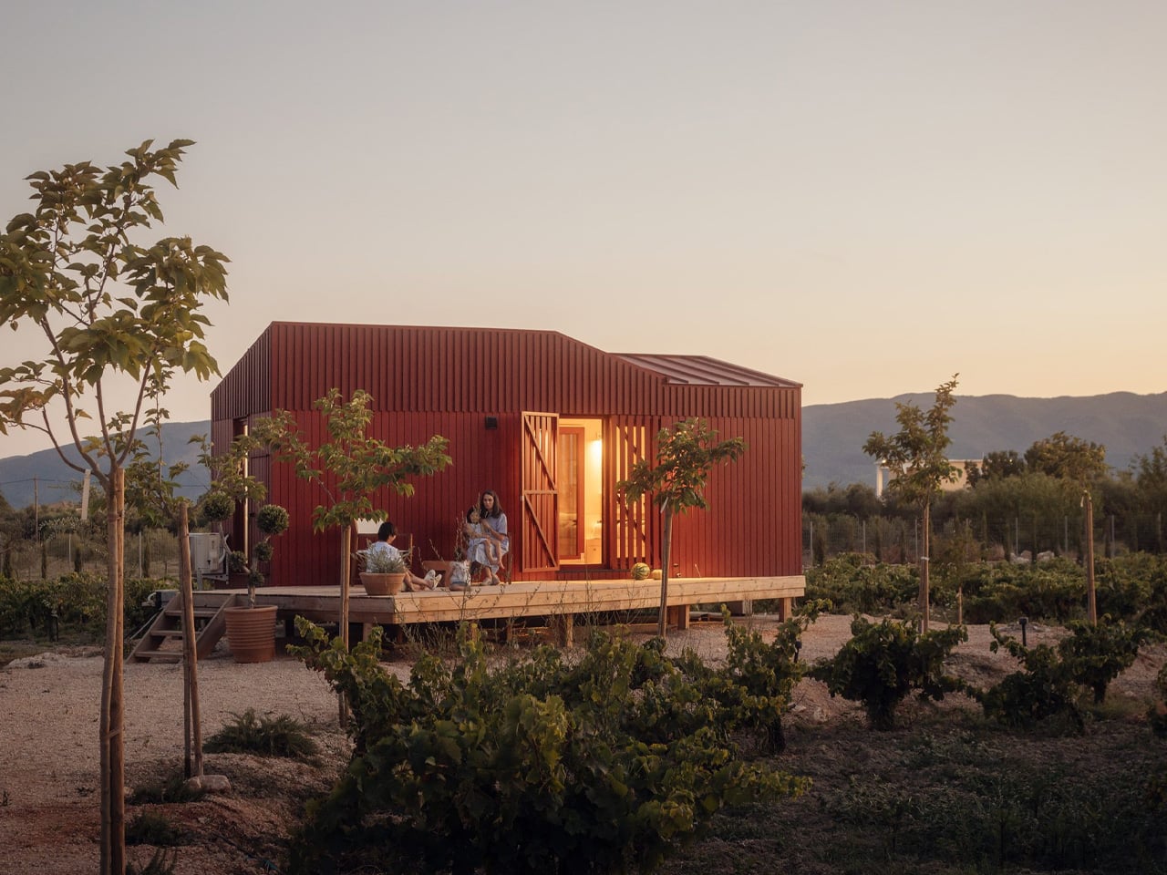
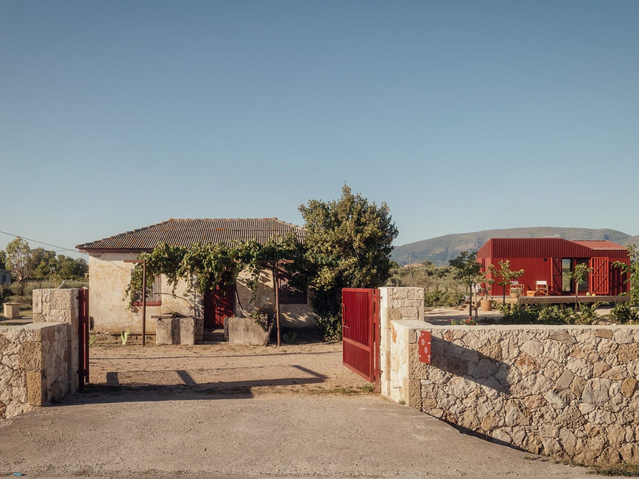
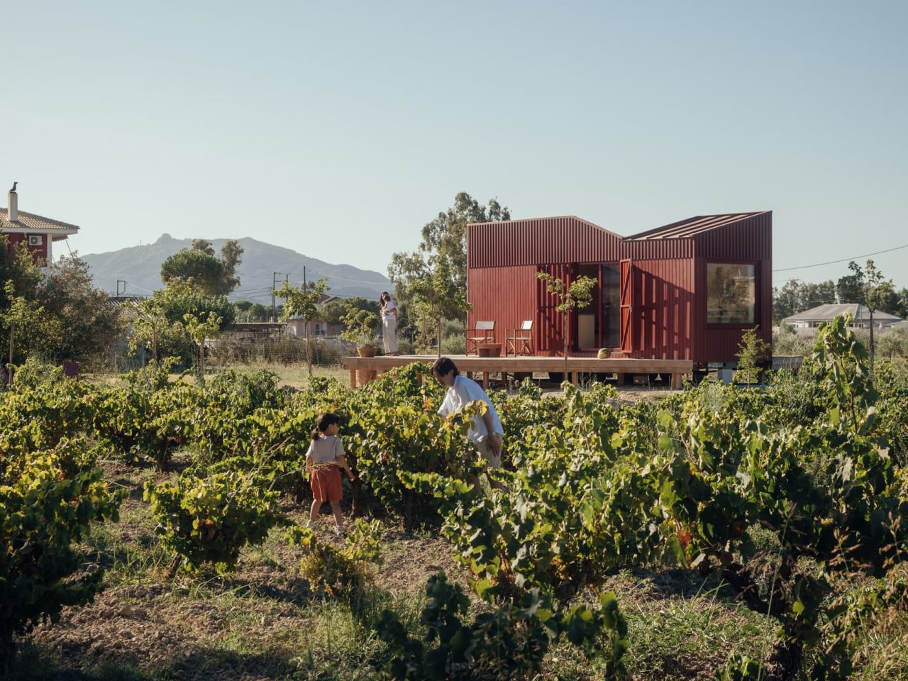
Somewhere between the olive groves and vine rows of Zakynthos, a deep-red timber cabin sits quietly in the Greek countryside, and it’s one of the most considered small structures to come out of Europe this year. The Root Cabin, designed by London-based studio Kasawoo, is a 20-square-metre prefabricated retreat that challenges the very idea of what a holiday home in Greece should look like.

The project is personal. Co-founder Katie Kasabalis owns the land in the village of Vanato, a site that has been in her family for decades and still holds the ruins of her grandmother’s old stone house. Together with co-founder Darius Woo, she set out to build something that felt of the place rather than imposed on it. The result sits at just 2.5 by 8 metres, slipping gently between rows of vines without disrupting the agricultural and historical fabric of the land.

Designer: Kasawoo

Built off-site in Romania and transported to Zakynthos fully prefabricated, the cabin is road-legal and designed to be relocatable, a detail that speaks directly to its low-intervention philosophy. “Nothing is superfluous,” the architects told Dezeen. “The project’s generosity lies in what it refuses to add.” In a part of Greece where sprawling concrete villas are accelerating across the countryside, that kind of restraint is quietly radical.

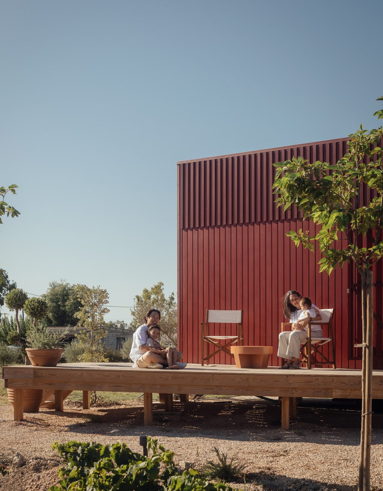
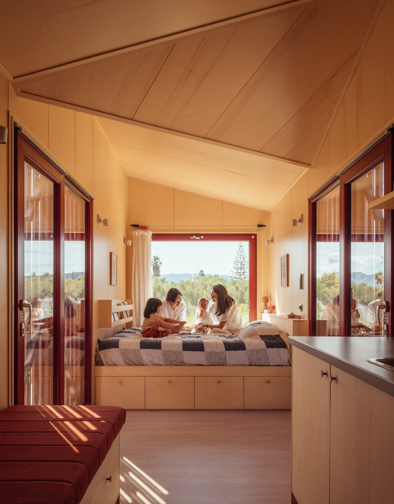
The exterior is wrapped in deep-red timber planks, a shade drawn from the historic villas of Zakynthos, and topped with a gently angled roofline that echoes the island’s mountainous horizon. It’s a structure that has absorbed its context rather than competed with it. Inside, the atmosphere shifts to something warmer and more immediate. Plywood lines the walls, ceilings, and all built-in furniture, creating a near-seamless, cocoon-like interior in which a bed, compact kitchen, sofa, and bookshelves are integrated into the structure.

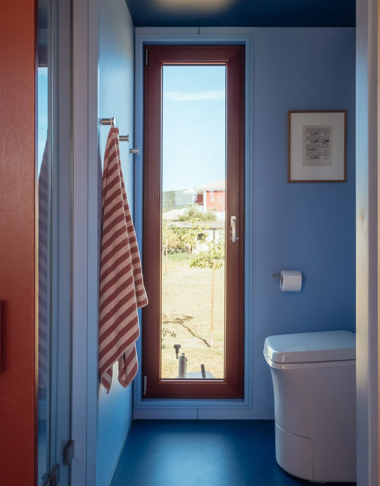
The layout places the bedroom and bathroom at opposite ends, with a central living space defined by large sliding glass doors that open directly onto the landscape. Red details carry through from the exterior, while the bathroom shifts to soft blue tones, a quiet nod to the Ionian Sea nearby. Objects sourced from Greek makers, including ceramics and textiles, add another layer of local grounding to a space that already feels deeply rooted.

Passive ventilation and operable openings allow the cabin to function off-grid, reinforcing what Kasawoo describes as a “different kind of luxury,” one that measures itself not by square footage or spectacle, but by the quality of what’s been left out.

The post This Architect Built a 20m² Red Cabin on Her Family’s Greek Vineyard — and It’s the Antidote to Every Concrete Villa on the Island first appeared on Yanko Design.
This $35,000 Tiny Home Proves You Don’t Need More Than 161 Square Feet to Live Well

At 20 feet long and 8 feet wide, the Tulsi by Simplify Further Tiny Homes doesn’t try to be anything it isn’t. It has everything you need, and nothing you don’t. That restraint is exactly what makes it work. While the tiny home market is crowded with builds that either sacrifice livability for aesthetics or pile on features that inflate the price tag, the Tulsi threads the needle — landing at a starting price of $35,000 for a fully functional, NOAH-certified home on wheels.
The Florida-based builder behind it, Simplify Further, has built a reputation around the idea that quality and simplicity aren’t mutually exclusive. Their motto — “Simple Living, High Thinking” — runs through every design decision in the Tulsi. The build carries a BBB Accredited A+ rating, and its certification as an RV through NOAH means it meets a recognized standard for workmanship and safety.

Designer: Simplify Further Tiny Homes

At 161 square feet, the Tulsi packs in a kitchenette, a full bathroom with a shower stall, a flush toilet, a mini sink, a built-in seating area, a main-level queen-sized bedroom, and a loft. The loft measures 7 by 4 feet with a 36-inch height at the low side, accessible by ladder with black metal railings — tight, but functional. The height under the loft sits at 6 feet 4 inches, which means the main living area never feels like you’re ducking through a crawl space.

What sets the Tulsi apart from its contemporaries is its genuine flexibility. The main level bedroom isn’t a compromise — it’s a feature. For guests who don’t mind the loft, you could designate the loft as the main sleeping area and convert the downstairs bedroom to a living room. That kind of adaptability is rare at this price point. In the kitchen, buyers can opt for open shelving or swap seating for additional cabinet storage — a small but meaningful decision that shapes how the space actually lives day to day.

Simplify Further positions the Tulsi primarily as a guest house or mother-in-law suite — a secondary structure that gives visitors full independence without removing them from the property entirely. But the build has proven versatile enough to serve as a short-term rental, a starter home, or a full-time residence for someone drawn to the economy of small living. The Tulsi by Simplify Further seamlessly blends convenience and comfort, making it a charming addition to any property.

For a 161 square foot box on wheels, the Tulsi has quietly earned its place as one of the more thoughtfully designed entry points into tiny living — and the numbers back it up.

The post This $35,000 Tiny Home Proves You Don’t Need More Than 161 Square Feet to Live Well first appeared on Yanko Design.