The Hangzhou Prism by OMA Is the Mixed-Use Landmark China’s Tech Capital Deserves

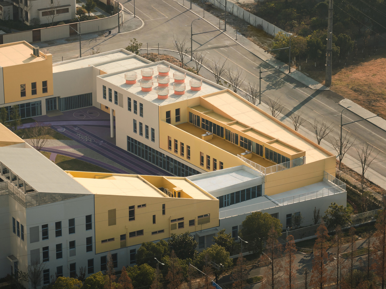
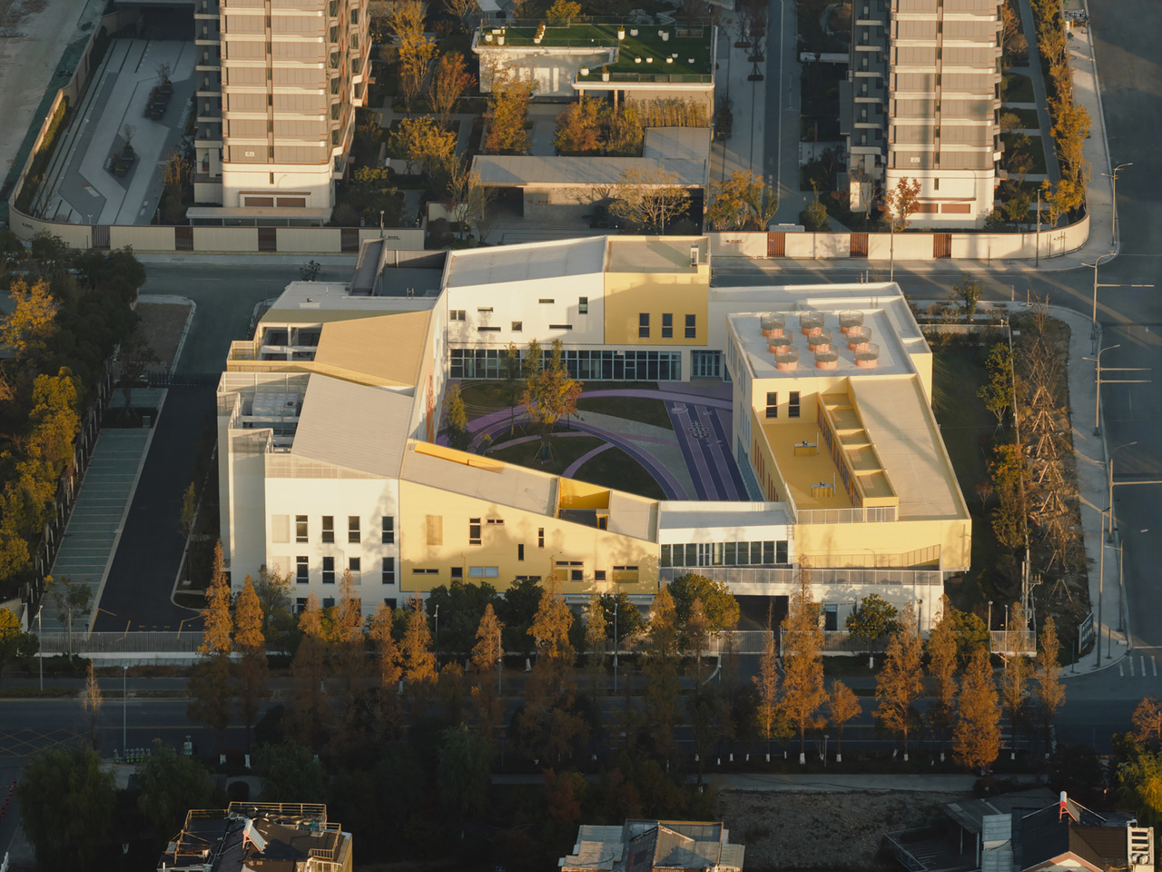
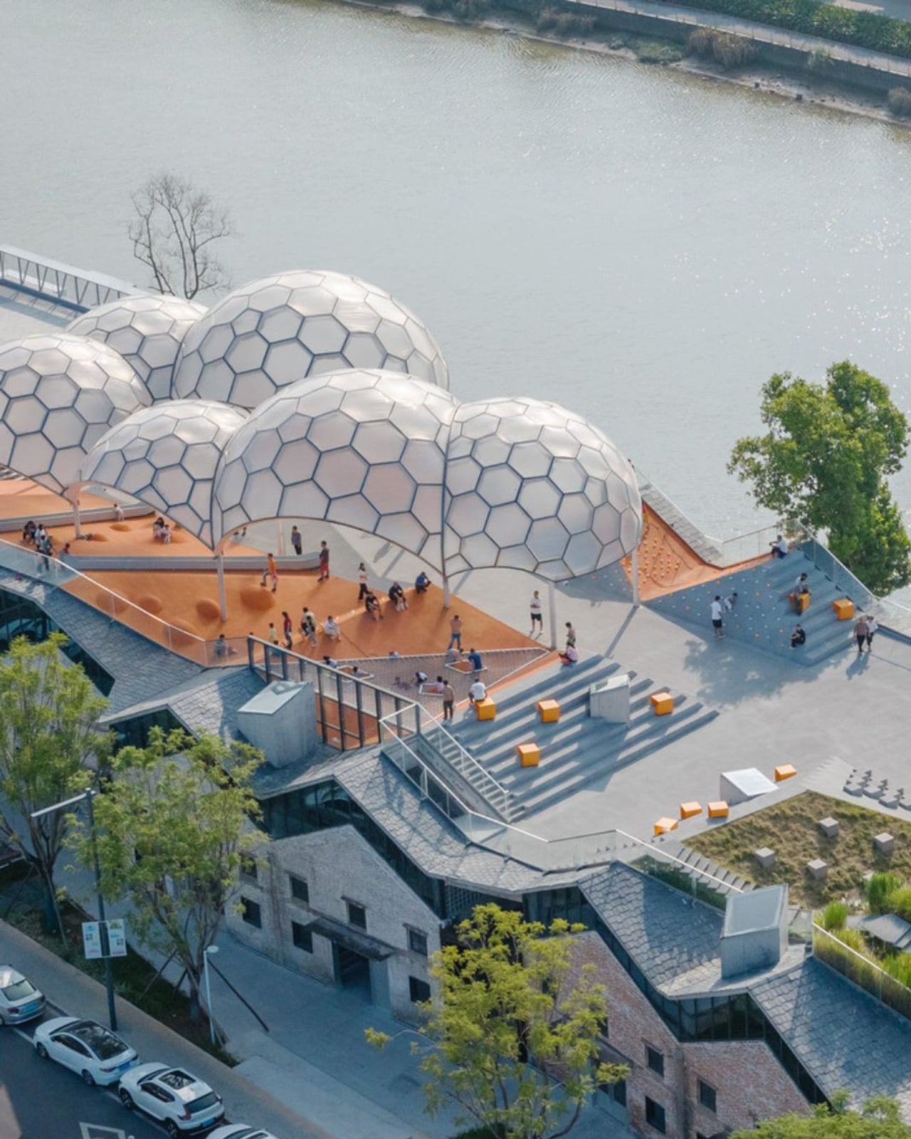
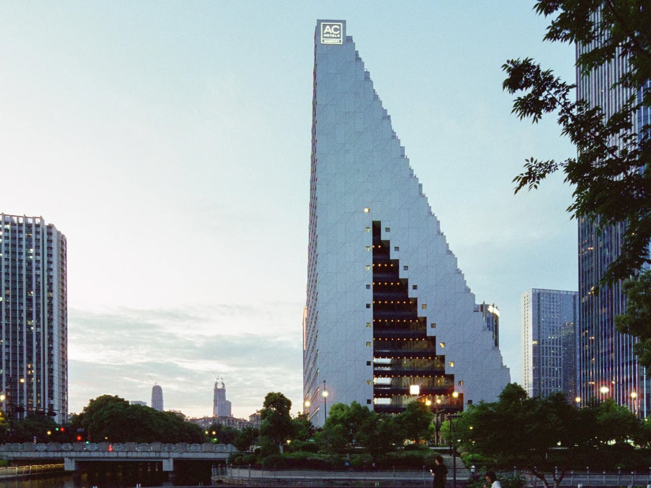
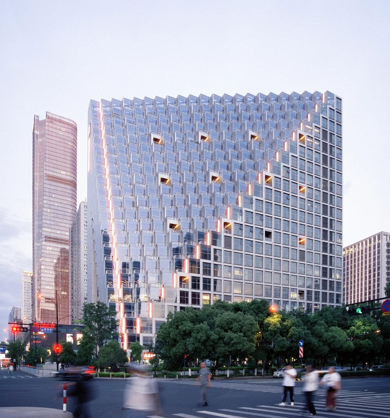
There’s a centuries-old Chinese proverb that goes: ‘above, there is heaven; below, there is Suzhou and Hangzhou.’ OMA’s newly completed Hangzhou Prism doesn’t just reference it — it builds toward it. Peaking at 106.5 metres in the heart of Hangzhou’s Future Tech City district, the Prism has arrived as one of China’s most formally daring mixed-use structures.

The project, led by OMA partner Chris van Duijn and project architect Michael Hadjistyllis, broke ground in 2019 and has been years in the making. Commissioned by Xinhu Real Estate Group, the 43,000-square-metre building departs entirely from the logic of the conventional tower. Rather than stacking a cluster of residential volumes in the usual fashion, OMA collapsed them into a single, porous structure — what van Duijn describes as a “three-dimensional village for young professionals and visitors.”

Designer: OMA

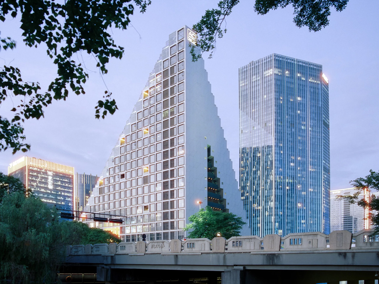
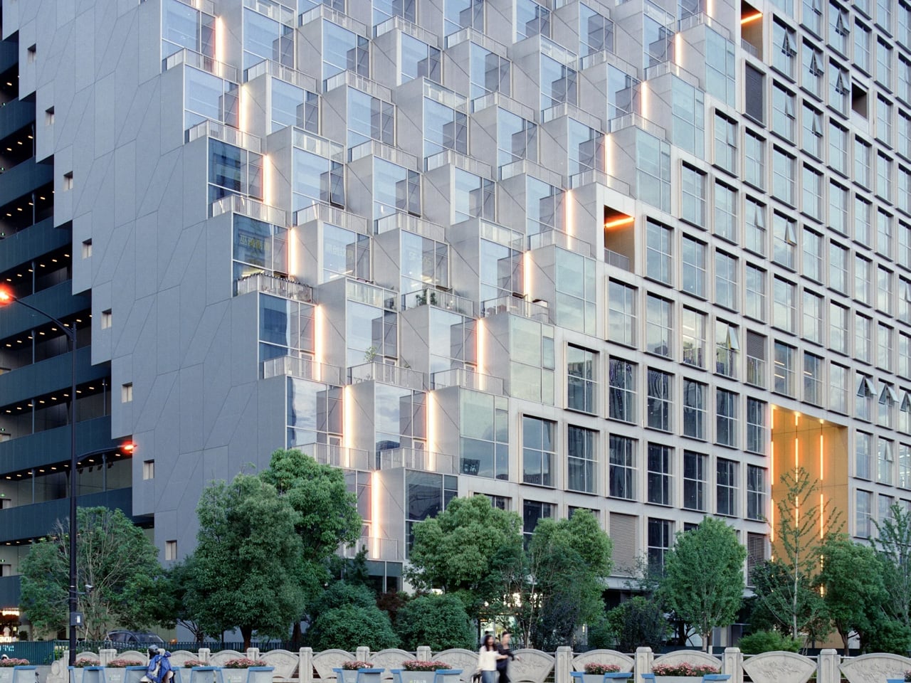
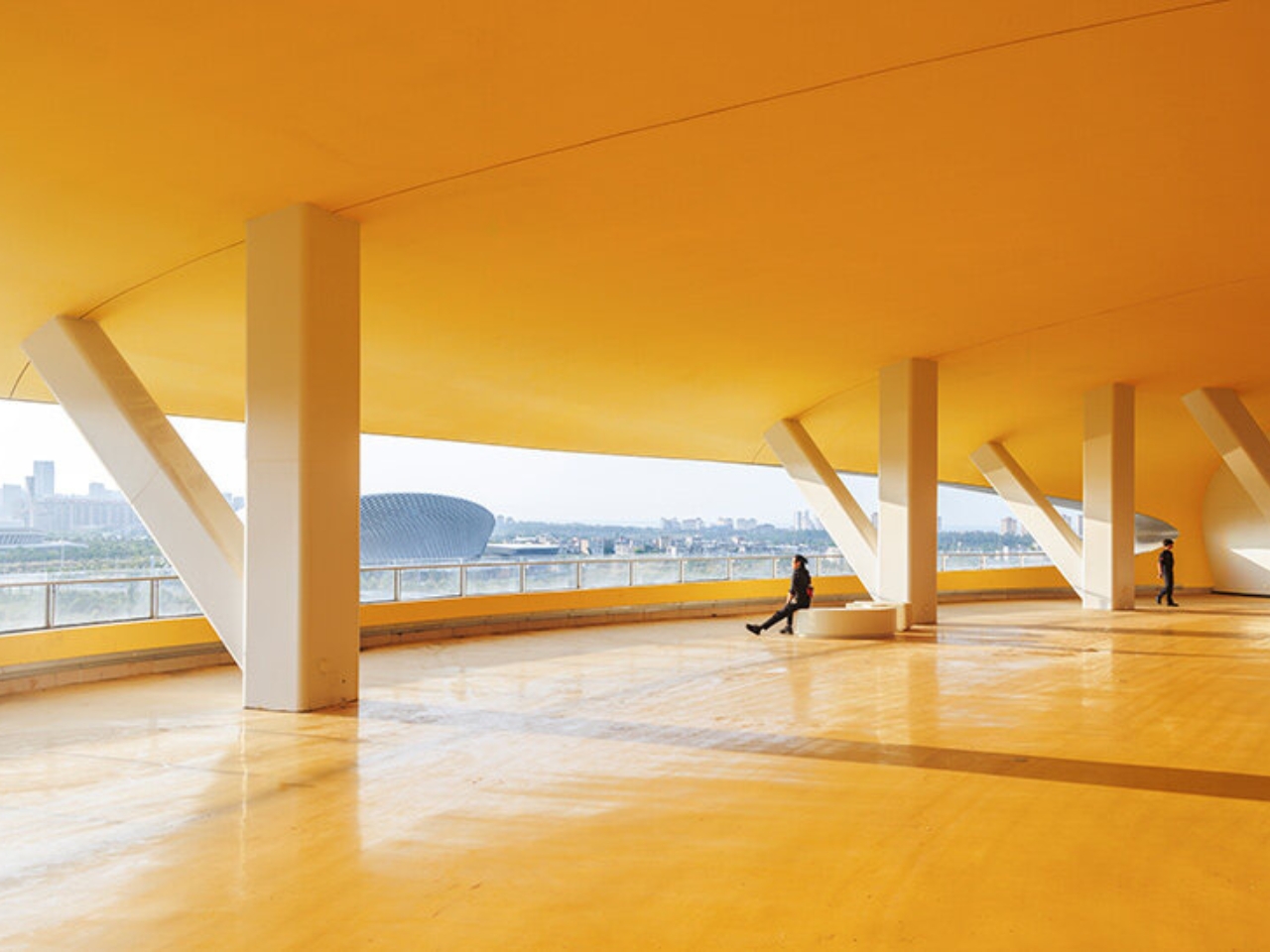
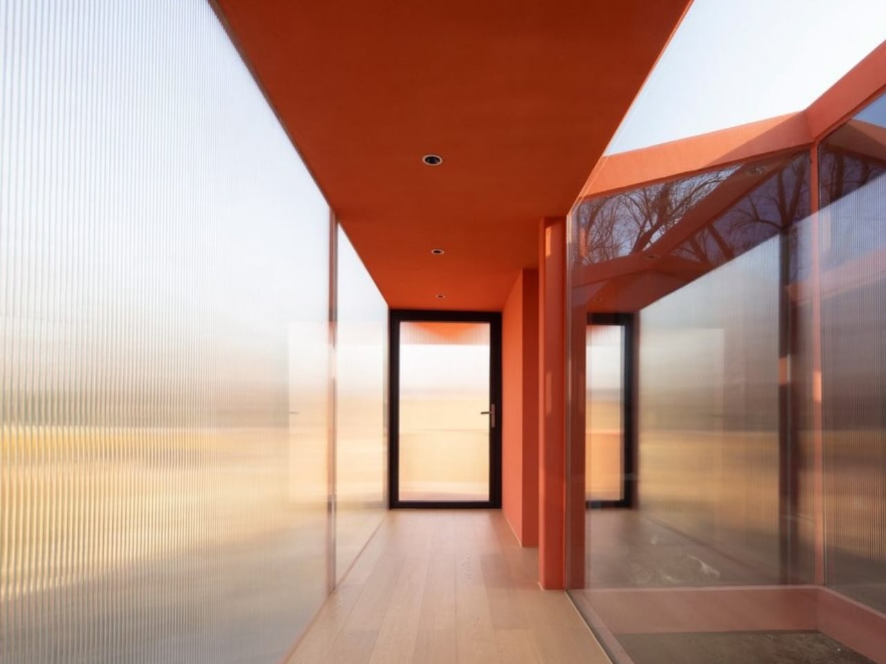
The form is immediately arresting. Two radical oblique cuts slice through the building envelope, giving the Prism its angular, asymmetric silhouette and creating cascading terraced lofts with sweeping views across the city. The projecting cubic balconies that line these oblique facades give the structure texture and depth, so the building reads differently from every angle — less like a static object, more like something mid-transformation.

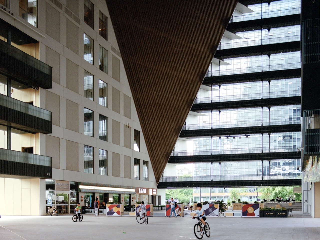
At ground level, the geometry opens up. A large void punctures the flat facades, giving way to a publicly accessible atrium that connects directly to the adjacent park. This base-level square is designed for events, community gatherings, and everyday movement — the kind of activated ground plane that high-rises in China rarely prioritize. It’s a meaningful gesture in a building that could have easily turned inward.

Programmatically, the Prism holds a remarkable amount within its singular form: a 20,000-square-metre hotel, 10,000 square metres of residential units, 5,000 square metres of office space, and 8,000 square metres of retail. The brief is dense, but the architecture handles it without feeling overcrowded. The mixed-use stacking is intuitive, each program finding its natural vertical position within the building’s tapered volume.

Future Tech City is home to companies like Alibaba and NetEase, and Hangzhou is actively positioning itself as one of Asia’s most important innovation corridors. The Prism lands squarely in that ambition — a building that signals civic intent as much as commercial function. Van Duijn put it plainly: “The design of the Prism shares this ambition to innovate.” For OMA, it’s another sharp proof that bold formal moves and genuine public utility don’t have to be in conflict. The Prism earns its skyline position.

The post The Hangzhou Prism by OMA Is the Mixed-Use Landmark China’s Tech Capital Deserves first appeared on Yanko Design.

SoBA Stacks Color-Coded Blocks Into a Castle-Like Kindergarten That Defies Its Urban Surroundings

SoBA — the architecture and landscape practice led by Wang Ruo and Tang Haiyin — has completed Block Kindergarten in Kunshan, Jiangsu Province, a 21-class campus that stacks modular, color-coded volumes into something between a fortress and a LEGO set. Sitting east of Hongqi Road and north of Zhenchuan Road, the 9,012-square-meter campus doesn’t try to disappear into its surroundings. It holds its ground — and for good reason.

The site itself presents a genuinely difficult brief. High-rise residential towers crowd the north, more housing is planned to the east, and the south is lined with a 110kV substation, a waste transfer station, and an emergency medical center — the kind of infrastructure that leaves little room for poetry. SoBA’s response was to stop trying to negotiate with the context and instead build against it. The result is an inward-facing campus that prioritizes a protected inner world for children, using layered transitions between architecture and landscape to slowly introduce them to the city beyond.

Designer: SoBA

The organizational logic is direct: modular classroom volumes are stacked and arranged around a central courtyard that serves as the campus core. That courtyard integrates play, planting, and gathering in one continuous space — less a leftover void and more the beating heart of the whole scheme. Green landscape buffers line the perimeter, softening the transition from the campus edge to the surrounding infrastructure.

Color isn’t decorative here — it functions as spatial language. Children between three and six years old learn primarily through sensory perception, and SoBA leans into that, using variations in brightness and saturation to create gentle but legible spatial layers throughout. The reference point, according to the architects, is Luis Barragán’s concept of emotional architecture — the idea that a building can orchestrate light, color, and scale to evoke memory and feeling. Applied to a kindergarten, that philosophy translates into spaces that feel warm without being saccharine.

Transparency punctuates the massing at key moments. Glazed volumes interrupt the solid facade, letting children glimpse the sky, trees, and the city through carefully framed openings. Ecological thinking extends to the landscape: a planting garden in the southeast corner tracks seasonal growth cycles, while a rain garden in the northeast turns stormwater collection into a daily lesson. Block Kindergarten is a project that takes children seriously — architecturally, sensory-wise, and spatially — and it shows.

The post SoBA Stacks Color-Coded Blocks Into a Castle-Like Kindergarten That Defies Its Urban Surroundings first appeared on Yanko Design.

MAD Just Opened a 46,000 sqm Silver Cloud Museum in China

When we covered the Hainan Science Museum back in 2024, it was still a promise on renderings. The images showed a billowing silver form rising above a tropical wetland, and the honest reaction was: is this actually going to get built? It looked too cinematic, too untethered from the logic of real construction. It’s open now. And it looks almost exactly like the renders promised.

The museum sits on the edge of Wuyuan River National Wetland Park on the west coast of Haikou, in China’s Hainan Province, designed by Ma Yansong and MAD Architects. The shimmering silver exterior is made up of 843 individual pieces of fiberglass-reinforced plastic, fitted together to create a form that ripples and spirals upward like a thermal updraft. That is quite literally the design reference: the movement of warm air rising from the earth’s surface. From a distance, the structure reads as a cloud that materialized above the jungle. Up close, the seams and surface geometry become visible, but it doesn’t break the spell. It deepens it. The material choice matters too. The reflective quality of the panels shifts depending on light and weather, which means the building never quite looks the same twice.

Designer: MAD Architects

The interior is where things get genuinely impressive. The main structure is column-free, which is a structural achievement worth acknowledging on its own. The total building area is approximately 46,528 square meters. Visitors move through the museum via a spiraling ramp that ascends from the central hall across five floors, with the exhibition experience beginning at the top level on a 360-degree viewing platform with open views of both the sea and the city below. A skylight dome floods the central atrium with natural light, and the whole space feels deliberately open and unhurried. That matches MAD’s stated philosophy around what a science museum should actually feel like. As Ma Yansong put it: “A science museum is about education and imagining the future; we want nature to be part of that vision as well.”

That quote is worth sitting with. Science institutions have historically been designed to feel authoritative. Imposing facades, grand columns, marble lobbies. The architecture announces itself as serious and expects visitors to match. MAD is proposing something different: that curiosity and wonder are better triggered by a space that already inspires both. The science content doesn’t need to be communicated through the building itself; the building just needs to make you feel open to receiving it. Whether you fully buy into that idea philosophically, you can’t argue that the Hainan Science Museum fails to create a mood before you’ve even stepped inside.

The building is also elevated off the ground, which allows the wetland landscape to continue flowing underneath it. That relationship between the structure and the site feels considered rather than incidental. It prevents the building from swallowing its environment whole, which matters here given that the natural setting is precisely what the whole project is in conversation with. Standing underneath it, the ground remains soft, green, and alive. For a structure this visually assertive, it sits lightly in a way that isn’t easy to pull off.

This is MAD’s second major public project in Hainan, following the Cloudscape of Haikou, which opened back in 2021. Together, they’re beginning to form a kind of visual language along the Haikou coastline, a series of dreamlike structures that feel more like environmental installations than civic buildings. For a city actively building its identity within China’s free-trade port framework, having work like this on the waterfront is a deliberate cultural statement about where Haikou wants to stand on the global stage.

Design began in 2020. Groundbreaking was in 2021. The main structure wrapped in 2023. Five years from concept to opening doors is a reasonable arc for a project of this ambition and scale. Seeing it finally receive visitors closes a loop that many who followed its construction had been waiting for. Sometimes the renders really do deliver. This is one of those times.

The post MAD Just Opened a 46,000 sqm Silver Cloud Museum in China first appeared on Yanko Design.

Beijing Just Built a Library That Opens and Closes Like a Shell

Most public spaces do one thing: they sit there. They look the same in the morning as they do at noon, and they expect you to adapt to them. That’s just how it’s always been. LUO Studio’s Shell Book Pavilion in Beijing decided to skip that whole arrangement entirely.

Completed in 2026 and tucked into the plaza of Xiangyun Town, a commercial district in Beijing, the pavilion is exactly as remarkable as it sounds: a 43-square-meter structure shaped like a clamshell that physically opens and closes. Not metaphorically. Not just aesthetically. The shell actually lifts and lowers through a vertical opening system, moving through incremental positions that change the entire character of the space as the day goes on. When it’s raised, it becomes a generous canopy. When it’s lowered, it contracts into something quieter and more intimate. The pavilion isn’t static. It breathes.

Designer: LUO Studio

The idea started from a personal place. The architects at LUO Studio describe prior visits to the same plaza with family, noting how the casual, child-friendly energy of the space already had a natural rhythm to it. The Shell Book Pavilion didn’t try to override that. It responded to it. That kind of grounded thinking tends to produce better architecture than designing purely for an image, and you can feel it here. The pavilion doesn’t demand your attention by being loud. It earns it by being genuinely useful.

Built with an aluminum shell structure, the design also makes a point of having no fixed front or back. Walk up to it from any direction and it reads clearly. That might sound like a small detail, but it matters enormously in a shared public plaza where people arrive from every angle and at every hour. A space that only works when you’re standing in the right spot isn’t really a public space. It’s a stage set.

Scattered around the pavilion are movable seating pieces that extend the social footprint beyond the structure’s physical boundary. The pavilion’s influence on the plaza ends up being much larger than its 43 square meters suggest. People don’t just use the space inside the shell. They orbit it. They set up nearby. They stay longer than they planned to. That’s a quiet form of design success that rarely gets enough credit.

The nature metaphor is doing a lot of heavy lifting here, and it earns every bit of it. A clamshell as a form for a library is the kind of concept that could easily tip into gimmick, but LUO Studio kept the execution clean. The aluminum material choice keeps things from feeling too organic or precious. The structure carries a quiet confidence. The shell looks like it belongs in the future and on that plaza at the same time.

Scale versus ambition is the tension that makes the Shell Book Pavilion interesting beyond its novelty. This is a 43-square-meter structure in a commercial district, not a landmark cultural center with a nine-figure budget. It’s small, and deliberately so. The pavilion argues, simply by existing, that you don’t need a lot of square footage to change how people experience a neighborhood. You need a clear idea, executed honestly.

Public reading spaces have had a complicated decade. Libraries as institutions are being redefined, neighborhood bookshops are staging a comeback, and digital reading has both liberated and fragmented the way we engage with books. The Shell Book Pavilion doesn’t wade into any of that debate. It just makes a place for you to sit with a book, opens itself up when it wants company, and closes a little when the day gets quieter. It meets people exactly where they are.

The photographs by Yumeng Zhu capture the pavilion in soft natural light, and they do the project justice. The structure has a presence that reads beautifully even in two dimensions, which is usually a good sign that something is genuinely working in three. Some designs only photograph well. This one looks like it’s actually worth visiting.

The post Beijing Just Built a Library That Opens and Closes Like a Shell first appeared on Yanko Design.

Foshan’s Forgotten Warehouses Got a Rooftop Park Under Floating Domes

Somewhere along the Huadi River in Foshan, China, a cluster of old grain storage warehouses has been turned into one of the most quietly poetic pieces of architecture I’ve seen all year. The Yongping Warehouse Renovation, completed in 2025 by Guangzhou-based Atelier cnS, is exactly the kind of project that makes you stop scrolling and actually look.

The site sits in Dali Town, Nanhai District, a former industrial pocket of the Pearl River Delta that’s been gradually shedding its factory-town skin in favor of something more livable and publicly accessible. These particular warehouses, lined up along the riverfront, were derelict grain storage buildings with no obvious future. Not exactly glamorous source material. But Atelier cnS didn’t flinch, and the result is a project that earns its attention without asking for it loudly.

Designer: Atelier cnS

Because the site has a narrow footprint, the architects pushed the public space upward, placing a landscaped rooftop park above the commercial interiors below. Vertical programming isn’t a new idea, but what makes Yongping feel different is how thoughtfully the transition between levels was handled. The gaps between warehouse blocks weren’t sealed or filled in. Instead, they were preserved and widened into passageways, so as you move through the building, you catch glimpses of the river framed by walls before the whole view opens up at the top. It’s a slow reveal, and it’s deliberate.

And then there are the canopies. A series of translucent, domed structures built from hexagonal frames cluster across the roofline like a quiet gathering of clouds. Atelier cnS actually named the project “A Wisp of Cloud” over Huadi River, and the photos earn that name completely. The domes are light-diffusing, casting shade without blocking river views. They create zones for sitting, moving, and play without ever feeling like they’re closing the space in. They look like they arrived gently, rather than being imposed on the building below them.

The rooftop itself is shaped into slopes, steps, and play surfaces that echo the original pitched forms of the warehouse roofs. It’s one of those details that most visitors probably won’t consciously register, but it’s exactly the kind of architectural memory that makes a renovation feel grounded rather than gratuitous. The old buildings aren’t being pretended out of existence. The new design is in active conversation with what was there before.

I’m genuinely drawn to this project because it gets the balance right in a way that many adaptive reuse projects don’t quite manage. Too often, the renovations that attract the most attention are the ones where the new design overwhelms the original structure, turning the old building into nothing more than a convenient shell. Yongping avoids that trap. The warehouses are still very much present. Their bones dictate the rhythm, the circulation, and some of the visual language of the final result. You can feel the history of the place without having to read about it first.

Atelier cnS has been developing this kind of thinking for years. The studio’s earlier work on elevated public circulation, including a “roof-hopping” design approach explored in their White House Guesthouse project, signals a long-running interest in finding new life in existing structures. Yongping feels like a maturation of that sensibility. More refined, more integrated, and more tuned in to the texture of a neighborhood mid-transition.

The project spans 4,311 square meters, and it’s worth noting what it does beyond the architecture itself. Turning a commercial renovation into a publicly accessible rooftop park, in a district shifting away from its industrial past, is a real act of generosity. A park on a roof could easily read as a private amenity. Here, it reads like a gift to the neighborhood, a place to walk, rest, and look out at the river without needing a reason to be there.

Architecture doesn’t always need to announce itself to be worth paying attention to. The Yongping Warehouse Renovation is understated, purposeful, and lit from above by a cluster of translucent domes that look, from a distance, exactly like a wisp of cloud over the river.

The post Foshan’s Forgotten Warehouses Got a Rooftop Park Under Floating Domes first appeared on Yanko Design.

The Red Cabin Sitting Alone on a 1,000-Year-Old Island in China

The first time I saw images of the Red Bridge Cabin, I spent a good five minutes just staring at them. Not scrolling. Not clicking through. Just staring. A small red structure sitting on a quiet island, reflected in the water around it, surrounded by the stillness of a thousand-year-old heritage park in Zhengzhou, China. It looked like something out of a dream someone had while reading ancient poetry. It makes me want to spend a few hours in it. That’s the kind of thing good architecture can do to you.

Designed by Wiki World and the Advanced Architecture Lab, the Red Bridge Cabin is the 138th entry in Wiki World’s ongoing “Wild Home” series, a collection of experimental small-scale dwellings that push back against conventional ideas about what a home needs to be. At just 79 square meters, the cabin sits within Yuancheng Cultural Park, a free-admission heritage park built around the Yuanling Ancient City Site in the Zhengzhou Airport Economy Zone. The site is a nationally protected cultural landmark that integrates historical preservation, ecological landscapes, and family-friendly leisure all in one place. Parking a bold red wooden cabin in the middle of that requires either tremendous confidence or a very specific kind of audacity. I’d argue it requires both.

Designers: Advanced Architecture Lab, Wiki World (photos by Arch Exist)

The name comes from the bridge. You reach the cabin by crossing a narrow, translucent bridge over the water, which immediately sets the tone. This isn’t a building you stumble into. You approach it, and that approach is already part of the experience. The designers describe it as a place where “comfort and wilderness, engagement and detachment, become indistinct, like longing itself, beautifully blurred.” I know that reads a little poetic for a press release, but I think they actually meant it, and looking at the photographs, it’s hard to argue against it.

Inside, the cabin incorporates two courtyards and a large skylight, which together create what the designers call “a landscape within the living space itself.” That phrase sounds abstract until you see it in practice. Natural light moves through the interior differently at different times of day. Translucent screens blur the surrounding views into soft silhouettes while carefully placed windows frame specific sightlines outward. It’s a small space that feels intentionally porous, as if the boundary between inside and outside was always meant to be negotiable.

The construction method deserves its own moment. The entire structure is built from glued laminated timber, with every irregular component and joint digitally designed and custom-fabricated for full prefabricated assembly. Small metal connectors link the timber elements, and the whole thing can be disassembled and reassembled without permanently altering the site. The designers frame this as a feature, not a workaround, and for a cabin sitting on protected heritage ground, it’s the only approach that makes any sense. The cabin belongs to the landscape without claiming it.

Wiki World has been building this kind of experimental wilderness dwelling for years, and their consistency is a big part of what makes the Red Bridge Cabin feel interesting rather than just pretty. They’re genuinely working through a set of ideas about small-scale living, about what it means to be physically close to materials, about how reducing space can make a person more sensitive to their surroundings. Their phrase, “small brings us closer to the material,” sounds like design philosophy, but it also sounds like something that could apply to how most of us live, if we let it.

The cabin is painted a deep, saturated red, which at first feels like a deliberate provocation against its natural setting. But the more you look at it in those photographs, reflected in still water against muted greens and ancient earth, the more it starts to feel inevitable. Like it was always supposed to be there. Like the landscape had been waiting for something to mark it. I’m not entirely sure if that’s great design or great photography. Probably both. Either way, I keep returning to those images, and that feels like its own kind of answer.

The post The Red Cabin Sitting Alone on a 1,000-Year-Old Island in China first appeared on Yanko Design.

A Restaurant in China Where Wood Behaves Like a Forest

The first thing you notice about the Lakeside Restaurant at Silk Road Friendship Park in Dingzhou, China, is that the building doesn’t announce itself. It doesn’t shout or compete. It simply arrives at the water’s edge like it’s always been there, wooden columns branching upward like trees that never needed permission to grow.

Completed in 2025 by THAD SUP Atelier, the restaurant sits within a cultural park in Hebei Province, a place layered with historical significance tied to Silk Road trade routes. The building spans 2,400 square meters and was designed by principal architects Song Yehao and Chen Xiaojuan. But the numbers don’t explain why this project feels so quietly extraordinary. The design does.

Designer: THAD SUP Atelier (photos by Xiaoqing Guan, Xinxhing Chen)

The central concept is deceptively simple: the building takes its visual language from the forest canopy above and the lake below. Blossoming wooden columns rise from the ground and fan out to meet a flowing roof structure, all designed as one integrated system. The result looks less like constructed architecture and more like something that grew out of the ground and arched over the water because it felt like the right thing to do.

What makes this possible, practically speaking, is the fusion of digital fabrication and traditional woodworking. The team used modern glued laminated timber and relied on digital industrial prefabrication for precise form control, while simultaneously optimizing each wooden component’s dimensions through digital tools to preserve the handcrafted quality you can feel at eye level. The idea that a process this technically demanding could produce something this warm and tactile is one of the better arguments for what design technology can actually do when it’s used thoughtfully rather than just to show off.

Functionally, the layout is equally deliberate. The building slopes gently from south to north along the shoreline. The west facade, facing the main park road, is relatively closed, concealing the kitchen and back-of-house areas from view. But that restraint on the west side is there for a reason: it channels visitors toward a central arch opening on the ground floor. You pass through it, and suddenly you’re standing at the water’s edge. The progression is intentional, moving from arrival to view to lingering, and it works the way good spatial storytelling always does.

Three sides of the building open toward the lake, and the overhanging roof creates layered corridor spaces that shift and change as you move through them. During the day, the wooden structure casts shadows across the glass curtain wall, projecting a forest canopy effect that bleeds into the interior. At night, when the interior lights come on, the boundary between inside and outside softens, and the full curve of the wooden structure becomes luminous. It’s the kind of building that earns a second visit just to see it at different hours.

The choice of wood throughout isn’t arbitrary or just aesthetic. Wood is warm where glass is cold, organic where steel is industrial, and in a restaurant, those qualities matter in ways that aren’t always consciously named. Diners feel the difference even if they can’t articulate it. The building creates an environment that is simultaneously impressive and approachable, which is a difficult balance to strike and one that a lot of high-design spaces fail to achieve.

THAD SUP Atelier has built a reputation for projects that sit thoughtfully within their landscape, and this one continues that thread. The Silk Road Friendship Park is a place carrying weight and cultural meaning. Dropping a flashy, look-at-me building into that context would have been easy. Instead, the team chose restraint, materiality, and sequence. The restaurant doesn’t dominate the park. It listens to it.

Architecture that knows when to stay quiet tends to be the kind that stays with you. This is one of those buildings. Not because it announces itself, but because the moment you move through it toward the lake and look back at the way light plays through those wooden branches, you understand exactly what it was trying to say.

The post A Restaurant in China Where Wood Behaves Like a Forest first appeared on Yanko Design.

This Museum Was Designed for 25,000 Birds, Not Humans

Nestled within the lush landscape of Yunlu Wetland Park in China’s Pearl River Delta, Studio Link-Arc’s latest project redefines what it means to design for wildlife. The Shunde Yunlu Wetland Museum sits quietly behind a row of cedar trees, deliberately concealing itself from view. This isn’t a building seeking attention. It’s architecture that understands its place in an ecosystem where 25,000 egrets take center stage.

The design challenges conventional architectural thinking. Where most museums position themselves as cultural landmarks, this one retreats. The New York-based firm conceived the structure as four concrete tubes stacked vertically, each rotated to frame a different layer of the forest. The first floor gazes at tree roots. The second captures trunks. The third finds the crowns. The fourth reaches the treetops. Each level acts as a rotating lens, offering visitors perspectives that mirror the egrets’ own experience of their habitat.

Designer: Studio Link-Arc

This rotation creates something beyond visual interest. The cantilevered volumes give the building a sense of kinetic energy, as though the structure itself is adjusting to follow the birds’ movements across the water. The stepped form settles into the wetland’s natural density, absorbed by tall vegetation and reflective water surfaces that blur the boundary between built and natural environments. Each tube functions as a box structure, with sidewalls, roofs, and floors working together to support these dramatic projections.

Inside, a triangular atrium slices through all four floors, connecting the scattered perspectives into a single spatial experience. Sunlight filters through high skylights, softened by deep concrete beams before reaching the interior. Standing in this vertical space, visitors can simultaneously look through multiple tubes, each framing a different view of the wetland. The traditional hierarchy of architectural viewpoints dissolves into something more democratic, more aligned with the rhythms of the landscape itself.

The roof carries a lotus pond, adding another water layer to the composition. This gesture proves essential when viewing the building from paths and bridges throughout the park. The rooftop water merges visually with the wetland below, reducing the structure’s vertical impact and allowing it to read as part of the continuous water system rather than an interruption.

The project emerges from decades of conservation efforts. A local resident known as Uncle Bird spent years transforming this site into an urban sanctuary for egrets. The Shunde government later expanded the protected area thirteenfold, partnering with scientists and designers to restore water systems and bamboo forests. Studio Link-Arc’s museum completes this vision, offering a space where human visitors can observe and learn while remaining secondary to the site’s true inhabitants. The building asks a question rarely posed in contemporary architecture: What happens when we design for the birds first?

The post This Museum Was Designed for 25,000 Birds, Not Humans first appeared on Yanko Design.

This Glowing Dome Just Turned Shanghai’s Park Into a Moon

There’s something magical about stumbling upon an unexpected glow in a city park. Shanghai’s Century Park recently hosted one of those rare moments where art, architecture, and cultural tradition converge into something you can actually walk inside and experience. The Osmanthus Moon, a temporary installation by HCCH Studio, turned a semicircular lawn into an enchanted space that reimagined what public art can be.

Picture this: a translucent dome that looks like someone captured the full moon and gently placed it on the grass. It’s not just pretty to look at, though that’s certainly part of the appeal. The structure is actually a sophisticated dance between old and new, tradition and innovation. The framework itself is made of bronze lattice patterned with osmanthus flowers, those tiny blooms that perfume Chinese autumns and carry centuries of cultural meaning. The vines seem to twist and intertwine across the surface, creating shadows and light that shift throughout the day.

Designer: HCCH Studio (Photos by Guowei Liu)

The designers at HCCH Studio stretched a lightweight, elastic fabric across this bronze skeleton, and the result is something that breathes and glows. During daylight hours, natural light filters through, creating this soft, diffused atmosphere inside that feels almost meditative. You enter through irregular openings (because perfect circles would be too predictable), and suddenly you’re cocooned in this luminous space where the outside world feels both close and distant at the same time.

But here’s where it gets really interesting. This wasn’t just about creating something beautiful for Instagram. The installation was commissioned by the Power Station of Art in Shanghai specifically for the Mid-Autumn Festival, that traditional Chinese celebration when families gather to admire the full moon and eat mooncakes. The osmanthus flower isn’t randomly chosen either. In Chinese culture, these tiny golden blooms are practically synonymous with autumn, appearing in everything from tea to poetry to folk tales about moon palaces.

What makes this project stand out is how it connects with folk art heritage. HCCH Studio collaborated with a Zao Hua artist, someone who practices the traditional craft of stove flower painting, which is actually recognized as intangible cultural heritage. The patterns painted on the ground mirror the bronze lattice overhead. It’s like they’re having a conversation across space, each one a reflection of the other, grounding the ethereal structure in literal earth and tradition.

When night falls, though, that’s when the Osmanthus Moon really comes alive. Internal lighting transforms the pavilion into this semi-transparent beacon that seems to float in the darkness. The bronze framework casts shifting shadows across the glowing fabric, creating gradients of light that change as you move around and through the space. It becomes less of a building and more of an experience, something that exists between sculpture and shelter.

The whole thing only lasted twelve days, which feels both generous and tragically brief. That temporariness is part of the point, though. Like the Mid-Autumn Festival itself, like the brief season when osmanthus blooms fill the air with fragrance, this installation was meant to be a moment rather than a monument. At 7.2 meters in diameter and 3.6 meters high, it wasn’t trying to dominate the landscape or make some grand permanent statement. Instead, it created an intimate space for contemplation and celebration.

HCCH Studio, a Shanghai-based practice that’s been gaining recognition for their innovative approach to materials and form, managed to pull off something genuinely special here. They took cultural symbols that could have felt heavy-handed or purely decorative and wove them into a structure that feels contemporary without abandoning its roots. The technical execution, from the fabric tension to the lighting design by ADA Lighting, serves the conceptual vision rather than overshadowing it.

The Osmanthus Moon found that sweet spot where beauty, meaning, and accessibility overlap when public either too obscure or too obvious. It proved that temporary installations can create lasting impressions, and that looking backward to traditional motifs doesn’t mean you can’t move forward in how you bring them to life.

The post This Glowing Dome Just Turned Shanghai’s Park Into a Moon first appeared on Yanko Design.

These Elevated Timber Treehouses Transform A Chinese Forest Into A Living Art Gallery

Deep in Wuhan’s Dongxihu District, there’s a metasequoia forest where migratory birds gather, and something extraordinary has taken root among the ancient trees. Secret Camp isn’t your typical forest retreat. This collaboration between United Investment Merryda Hotel Management Group and Wiki World has created something that feels part accommodation, part art installation, and entirely magical. More than a dozen treehouses rise through the canopy on Cihui Street, each one carefully positioned so that not a single existing tree was harmed in the process.

The whole project sprang from Wiki World’s Wiki Building School initiative, which sounds academic but is really about pushing the boundaries of how we live alongside nature. Each treehouse has its own personality and tells a different story. Time Machine gleams with futuristic silver that catches sunlight through the leaves. Nomadic Land feels like a cozy capsule for temporary wanderers. Playground brings out your inner child with circulation paths that weave playfully around branches. Then there’s Daydream, which uses mirrored cladding to virtually disappear into the forest, and Red Windmill, standing bold and bright as a beacon in the green canopy. Unicorn takes the vertical route with its loft design and silver panels that hint at mythical stories.

Designer: United Investment Merryda Hotel Management Group & Wiki World

What makes this place special isn’t just the whimsical names or striking designs. The creators drew inspiration directly from the forest itself – local birds, scattered seeds, the organic forms that nature creates without any human input. Every structure sits on elevated timber platforms, leaving the forest floor completely untouched. No paved paths, no manicured landscaping, just the raw beauty of the woodland ecosystem doing what it does best. This approach embodies Wiki World’s “Build Small, Dream Big” philosophy, proving that you can live comfortably without dominating your environment.

But Secret Camp goes beyond just providing a place to sleep among the trees. It transforms the entire forest into an open-air gallery where art happens naturally. Throughout the year, temporary installations pop up, workshops gather creative minds, and exhibitions celebrate the relationship between humans and wildlife. The Forest Reception becomes a buzzing hub where visitors make birdhouses, study natural materials, and participate in projects that blur the lines between accommodation and education. There’s even a Sino-French Construction Festival that brings together people passionate about sustainable building and small-scale living.

The technical side reveals just how seriously they take environmental responsibility. Every structure uses glued laminated timber that’s digitally modeled for precision, then prefabricated off-site to minimize forest disruption during construction. The modular design centers around a clever 2-meter-wide concept that allows for variation while keeping efficiency high. Hand-fired carbonized wood panels give each cabin its natural finish and weather resistance, while small metal joints make everything completely reversible – these treehouses could be disassembled and moved without leaving a trace.

This elevated approach means zero ground contact and zero artificial landscaping, letting the forest maintain its natural rhythms while humans get to experience life in the canopy. Secret Camp proves that sustainable tourism doesn’t have to mean roughing it or compromising on creativity. Instead, it shows how thoughtful design can actually enhance natural settings, creating spaces that engage all your senses while treading incredibly lightly on the earth. It’s accommodation that makes you more aware of the environment, not less.

The post These Elevated Timber Treehouses Transform A Chinese Forest Into A Living Art Gallery first appeared on Yanko Design.