Helium, often associated with party balloons, plays a far more critical role in modern technology than most realize. The recent missile strikes on Qatar’s natural gas facilities in March 2026 have brought this into sharp focus, triggering a global helium shortage with far-reaching consequences. Qatar, responsible for nearly one-third of the world’s helium production, has […]
Note apps are frictionless. That is supposed to be their advantage. You open one in two taps, type something forgettable, close it, and lose it somewhere between screenshots and grocery lists. The problem is that “frictionless” and “memorable” are not the same thing. Japanese stationery designers figured this out long ago, which is why they keep building analog tools that feel more considered than anything a software update has ever produced.
Every product here solves a specific friction point you have probably accepted as normal: a pen that vanishes when you need it, a clipboard that fights back when you add a sheet, a tape dispenser that looks like it escaped from a supply closet. These five finds fix all of that without an app store, a subscription, or a settings menu.
1. Inseparable Notebook Pen
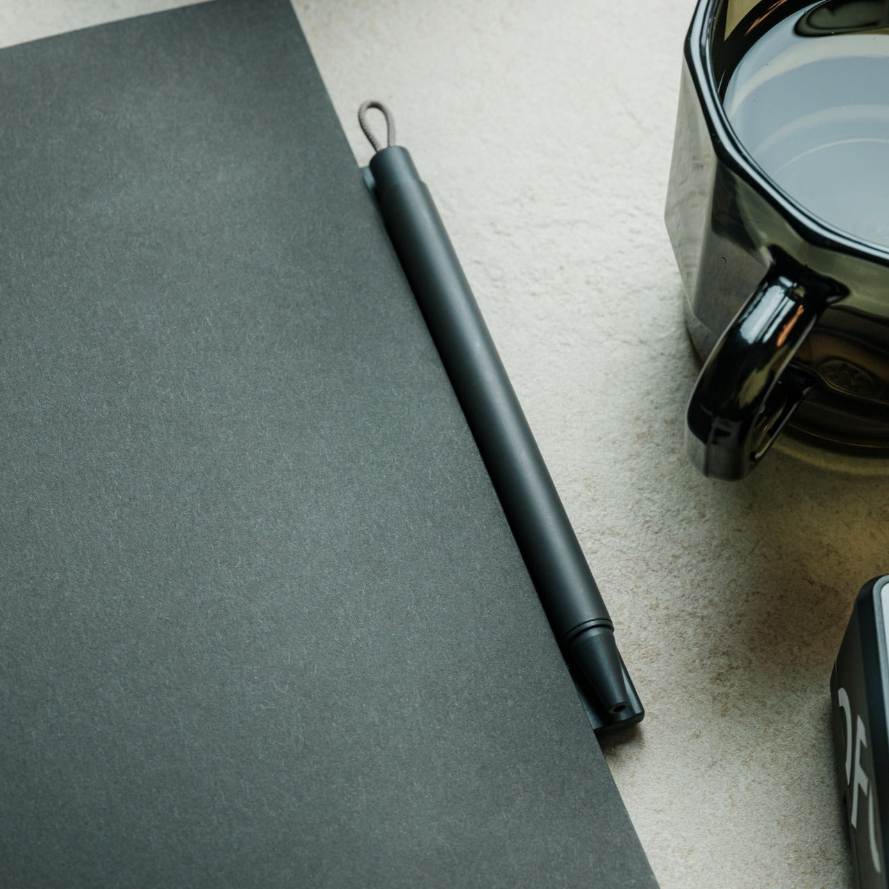
Most pens exist independently of the surface they write on. The Inseparable Notebook Pen rejects that assumption, using a magnetic clip that locks it to your notebook cover every single time. A built-in silencer dampens the attachment so there is no click, no rattle, just a quiet lock into place. The barrel is slim, the gel ink immediate, and the whole system rests on a principle Japan has long understood: the best tools are the ones you eventually stop noticing.
The gap between reaching for a pen and writing is small but real. In a meeting, on a train, mid-thought at a cafe table, that search breaks momentum in a way you feel but rarely name. By attaching itself to the notebook, the Inseparable closes that gap completely. It arrives wherever the notebook goes, leaves when the notebook leaves, and sits almost invisible against the cover. At $19.95, it is a quiet fix for an annoyance most people have long stopped trying to solve.
The magnetic clip holds firm during transit but releases instantly the moment you need it
The built-in silencer makes every attachment feel deliberate rather than mechanical
What we dislike
The slim barrel may feel too narrow for anyone who prefers a wider, more substantial grip
Ink cartridge options are limited, which restricts customization for specific writing preferences
2. Stalogy Editor’s Series 365-Day Notebook (A6)
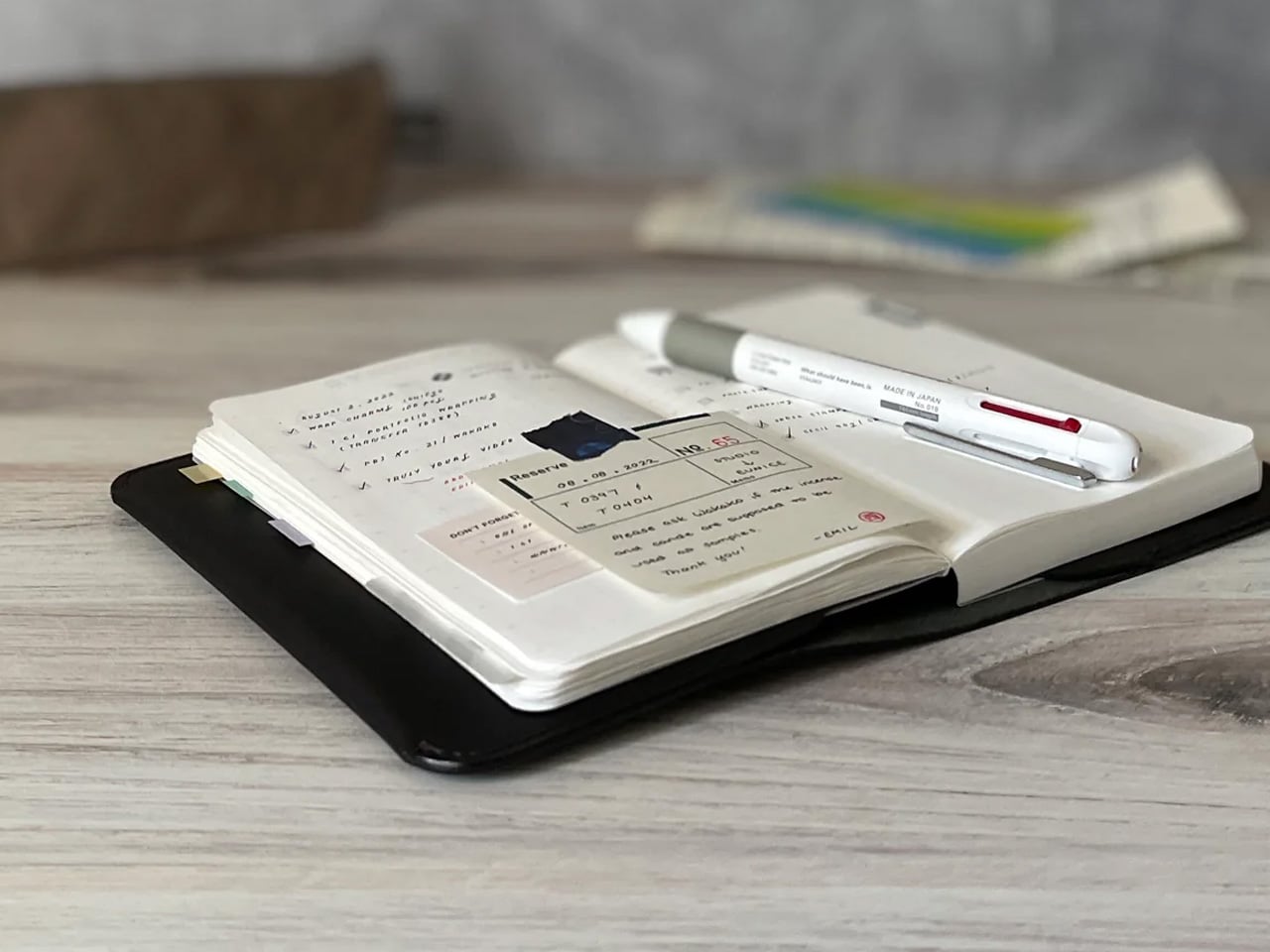
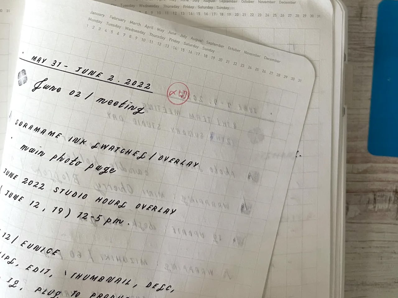
The Stalogy Editor’s Series 365-Day Notebook packs 368 pages into an A6 form factor that still slides into a coat pocket. Each page carries minimal printed detail: faint dates, a light grid, time indicators running along the margin. Use them or ignore them entirely. The paper is ultra-thin but writes with a smooth resistance that makes ink feel like it belongs on the page rather than sitting on top of it. Gel pens, ballpoints, and lighter fountain pen inks all perform cleanly without feathering.
Most planners assume they know how your day should be structured. The Stalogy steps back. The faint markings give you reference points without enforcing a system, which means the same notebook works for bullet journaling, meeting notes, rough sketching, and daily records without ever feeling like you are working against the page. For anyone who has cycled through five different note apps looking for the one that finally fits their brain, this is what that search was actually about.
Thin paper keeps 368 pages from becoming heavy, maintaining genuine pocketability throughout
Minimal page markings suit both rigid planning systems and completely freeform, unstructured use
What we dislike
Heavy fountain pen inks will ghost through the thin paper, limiting compatibility with certain instruments
Date and time markings are printed very small, making them difficult to read comfortably in low light
3. MagBoard Clipboard
Most clipboards run on the same tired mechanism: a spring-loaded lever that crushes paper at the top and leaves the rest of the sheet free to shift around below. The MagBoard replaces all of that with a magnetic and lever system that holds up to 30 sheets securely, without the grip marks. The hardcover backing is stiff enough to write on while standing, and the water-resistant surface means it survives bag life in a way paper-covered clipboards rarely manage.
The real advantage is speed. Adding or removing a sheet from most clipboards requires two hands and patience. The MagBoard lets you slide paper in and out cleanly, which changes how you interact with your notes during a meeting or a site walkthrough. It is the kind of improvement that sounds trivial until the first time you need it in a moment where fumbling costs you. At $45, it earns its place on the desk and equally off it.
The magnetic system holds sheets flat without grip marks or any pressure damage to the paper
The water-resistant hardcover handles bag use and outdoor conditions better than standard clipboards
What we dislike
Bulkier than a standard clipboard, which can be a tight fit inside slimmer bags and sleeves
The magnetic hold may feel less secure with very thick paper stocks or layered sheets of card
4. Classiky Wooden Tape Dispenser
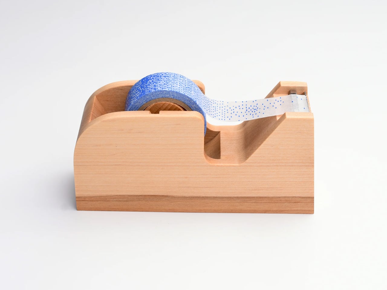
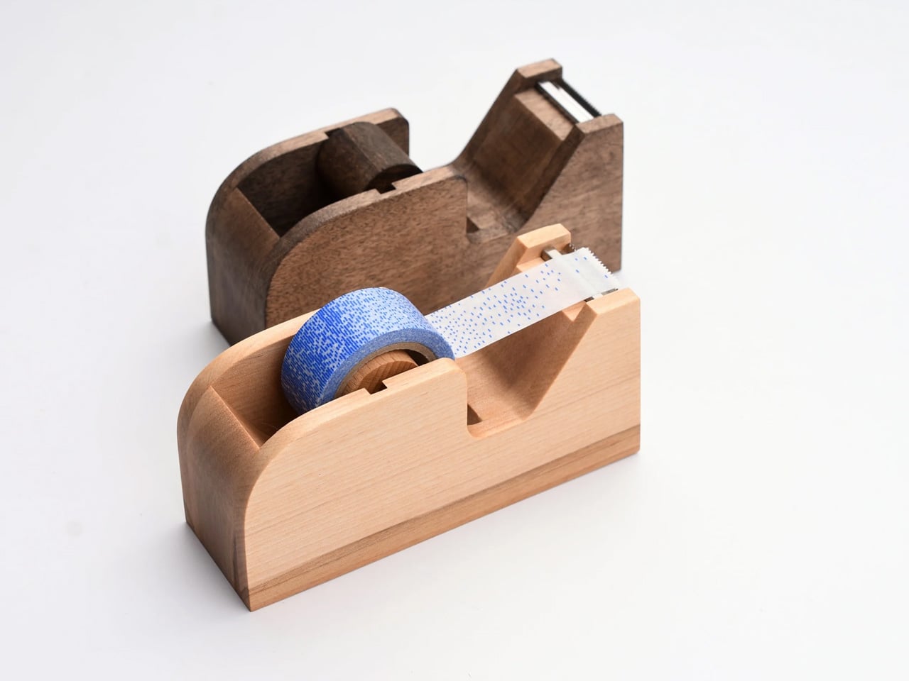
The tape dispenser is the most overlooked object on any desk. It sits in a corner, accumulates dust, and looks like it arrived from a supply closet rather than a considered workspace. Classiky’s version, cut from varnished Japanese wood with rounded, sculpted edges, refuses that role entirely. The grain is warm, the weight satisfying in the hand, and the mechanism precise enough to produce a clean tear every time. It quietly raises the standard for everything else sharing the same surface.
Classiky is a Japanese zakka brand that applies the same material thinking to everyday objects that most designers reserve for furniture. The Wooden Tape Dispenser is that philosophy made literal: a utilitarian desk tool reconsidered from the outside in, built from a material that improves with handling. The varnished wood deepens over time, picking up warmth from the room and the hands that reach for it daily. At $42, it makes every other object on your desk look like it is still waiting to be properly replaced.
The varnished wood looks considered at rest and develops a warmer character with regular handling over time
The mechanism produces a clean, controlled tear that most plastic dispensers never consistently manage
What we dislike
Sized for standard tape rolls, so it will not accommodate wider washi tape or specialty roll sizes
The wood surface will mark with use over time, which reads as earned patina to some and damage to others
5. Sonic Kakusta Portable Pen Stand
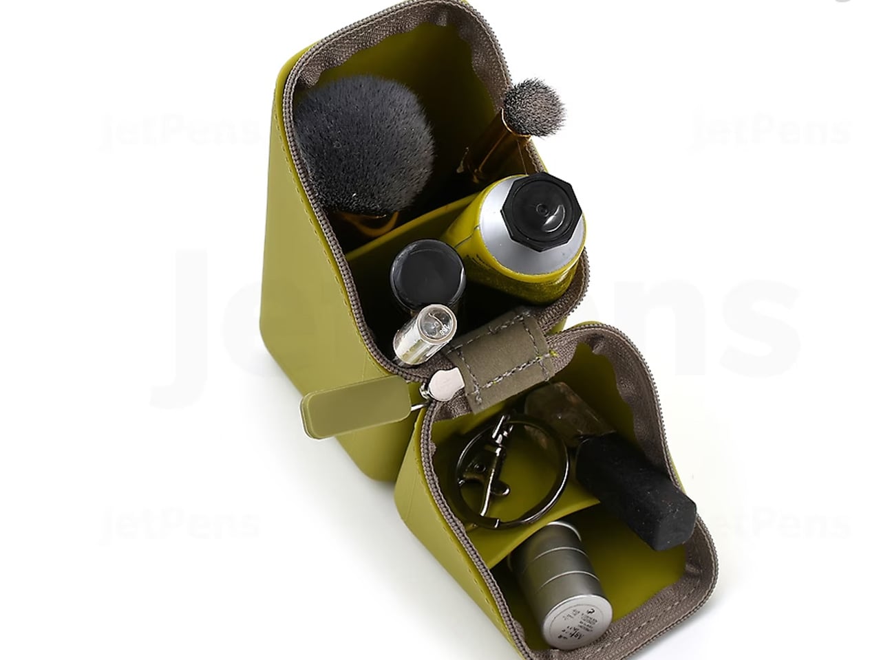
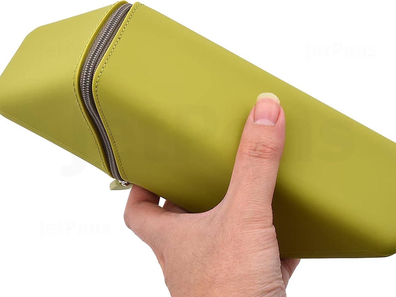
The Sonic Kakusta starts as a flat soft pen case and folds into a triangular desk stand in a single motion. Open, it props pens at a 60-degree angle: steep enough to show pen caps for quick identification, shallow enough that instruments slide out without tipping the whole case over. A built-in divider splits the interior into two sections, and a second divider in the lid creates a small shelf for erasers or sticky notes. Strong magnets hold the stand shape reliably on any flat surface.
For anyone moving between home, office, library, and studio, this is the object that makes carrying stationery feel considered rather than improvised. The case lies flat in a bag without occupying more space than a notebook. On a desk, it becomes a proper display stand, keeping what you need visible rather than buried at the bottom of a pouch. That transition from flat to functional in one fold is precisely the kind of engineering detail that separates Japanese stationery design from everything else in the category.
The magnetic lid holds the stand shape firmly, even on slightly uneven or textured surfaces
The lid divider creates a genuinely usable small shelf, an extra that most pen cases never think to include
What we dislike
The soft material offers limited protection against crushing when a bag is packed tightly around it
The triangular footprint when open takes up noticeably more desk space than a flat case would
The Best Tools Don’t Get Updated. They Get Better.
These five objects share one quality that note apps cannot replicate: they get better the more you use them. The wood deepens. The magnetic mechanism smooths out. Each session leaves a trace in the material that accumulates into something that is unmistakably yours. That is not sentimentality; it is the material logic of objects built to outlast a software cycle. Japanese stationery design at its best does not chase novelty. It makes the ordinary interaction between a person and a tool feel like it was worth designing in the first place.
The note app on your phone is not going anywhere. But after a week with these on your desk, you might find you reach for it less. Not because analog is inherently better, but because the right physical tool makes thinking feel different from typing. Slower, more deliberate, more yours. That is a harder thing to engineer than an app. Japan has been doing it for a long time.
The Xbox Game Showcase and Summer Game Fest 2026 delivered a mix of exciting reveals and unexpected updates, reflecting the evolving landscape of the gaming industry. Among the highlights, Forza Horizon 6 was officially announced, promising a visually stunning and expansive open-world experience for racing fans. Additionally, Maverick Games, a studio formed by former Playground […]
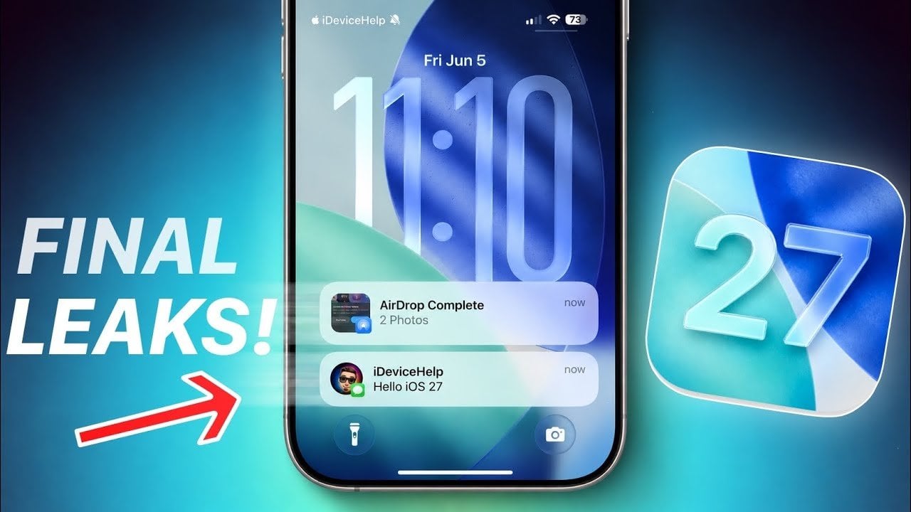
Apple is preparing to roll out iOS 27, a highly anticipated update that introduces a host of new features and thoughtful design enhancements. With improvements ranging from a redesigned Siri interface to AI-driven photo editing tools and a more streamlined notification system, iOS 27 is set to redefine how you interact with your device. Below […]
OpenAI has rolled out updates to ChatGPT, focusing on personalization and improved functionality. A standout addition is the enhanced memory system, which allows the AI to retain user-specific details such as preferences, past conversations and recurring instructions. This feature is particularly useful for maintaining continuity in tasks like managing ongoing projects or refining creative processes. […]
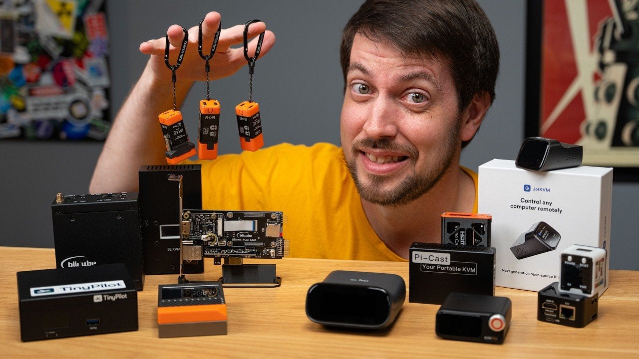
IP KVMs have become a cornerstone of remote system management, offering direct control over computers and servers even when traditional software-based solutions fail. In his comprehensive analysis, Jeff Geerling examines a wide range of IP KVM devices, from open source options like PiKVM to compact alternatives such as NanoKVM. By focusing on real-world scenarios, such […]
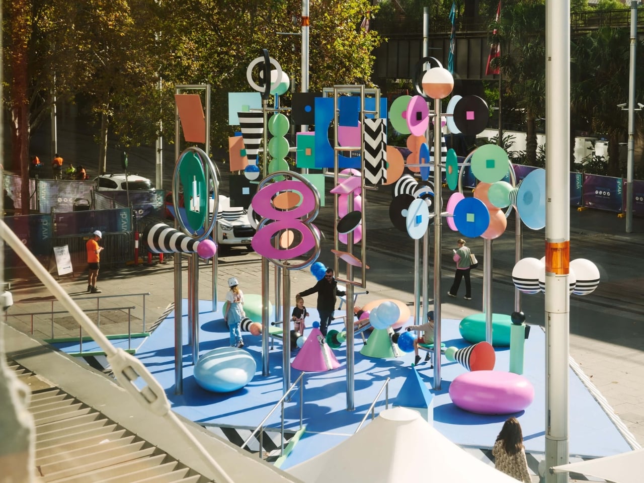
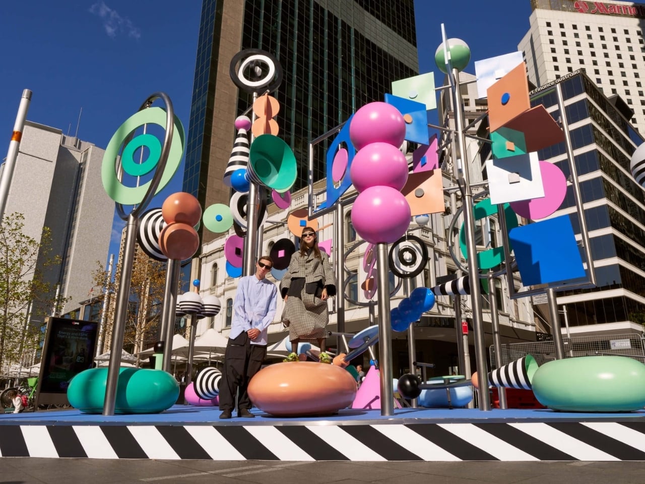
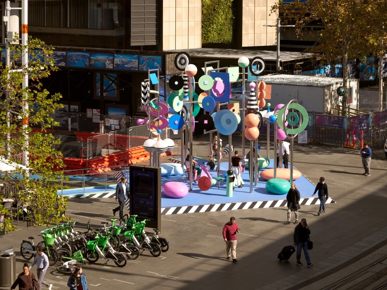
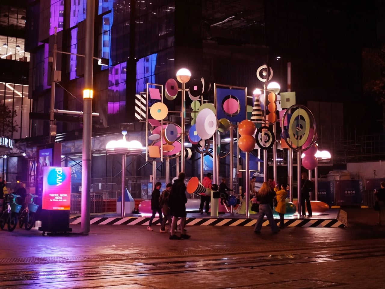
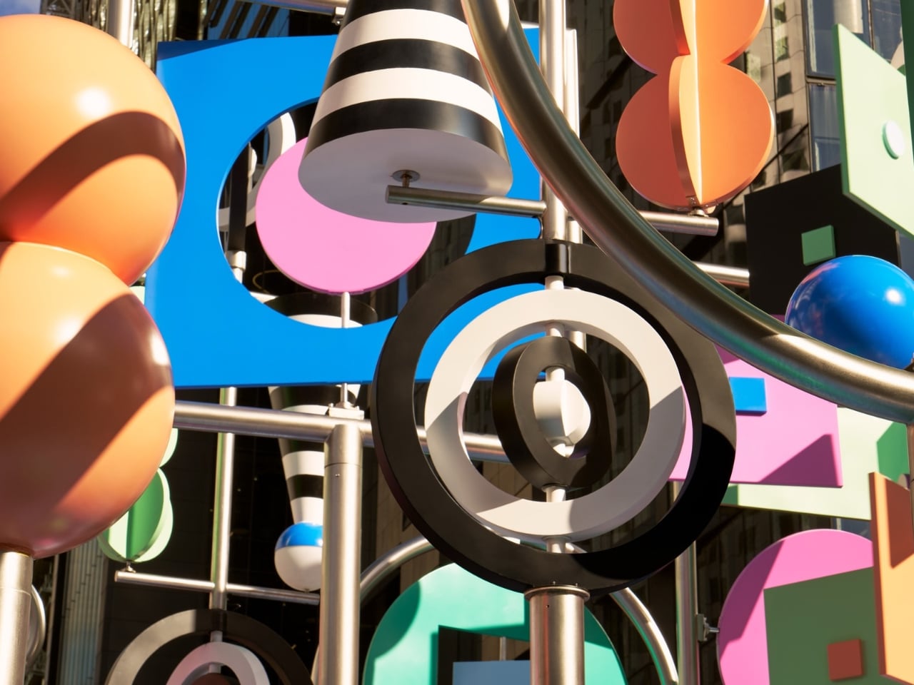
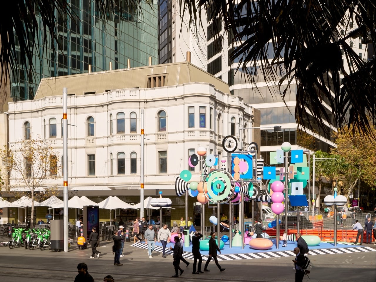
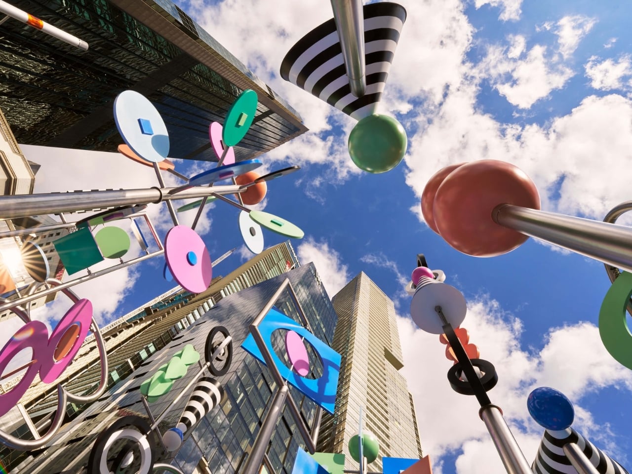
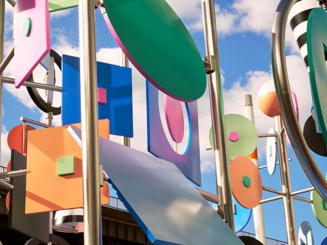
Public art often asks you to stop and stare. There, Now, Here asks you to grab a see-saw and get involved. At 6.5 meters tall, the kinetic installation from Brooklyn-based duo Wade and Leta is currently spinning, twirling, and tottering through Vivid Sydney at Circular Quay. It moves thanks to a combination of wind, motors, and willing passersby who hop on the see-saw built into its structure. The result is a sculpture that is never quite the same twice, always catching new angles of light, always mid-motion, always alive in the truest sense of the word.
That’s the kind of public art I love to see. Not something roped off and reverent, demanding a certain posture of appreciation, but something that genuinely asks the city to participate. When you can physically change the state of a piece of art just by sitting down and pushing off the ground, the line between audience and author starts to blur in the best possible way. Most public installations settle for being looked at. This one wants to be felt. That distinction matters more than it might seem.
The colors don’t just look good. They mean something. Wade and Leta pulled their palette from Dorothea Mackellar’s 1908 poem “My Country,” one of the most celebrated pieces of Australian writing and a poem many Australians know by heart. Mackellar’s famous “sunburnt country” inspired the installation’s muted, washed-out tones and black and white stripes, and the whole effect reads like a love letter to the Australian landscape written in a purely visual language. Two New York designers traveled to the other side of the world, studied a century-old poem, and turned it into spinning kinetic sculpture. That’s not lazy work. That’s genuine creative homework, and it shows.
Then there’s the sound component, designed by Josh Burgess, which takes the concept somewhere even more interesting. It captures the sonic texture of Circular Quay itself: the rush of water on rocks, the ding of the light rail, the chirp of the pedestrian crossing signal. Visitors can manipulate these sounds through accessible controls built into the installation, making the experience as interactive as you want it to be. But the lyrebird is the detail that really lands for me. Wade and Leta describe it as a nod to the “bush doof,” with the lyrebird’s sounds serving as the structural backbone of the whole audio experience. The lyrebird, for anyone unfamiliar, is an Australian bird so extraordinary at mimicry that it can replicate chainsaw sounds, camera shutters, and other birds with unnerving accuracy. Using one to anchor a soundscape about place and memory is not just a quirky design choice. It’s a quietly sharp observation about how culture and environment echo through each other in ways we haven’t always quite put into words.
Wade and Leta, the husband-and-wife creative studio known for large-scale work that balances rigorous design thinking with an almost giddy sense of play, are making their first public debut in Australia with this piece. As debuts go, it’s a confident one. Circular Quay is not a quiet corner of the city. It’s high-traffic, high-stakes public space, the kind of place where installations either disappear into the surrounding noise or assert themselves with real authority. There, Now, Here asserts itself. It doesn’t compete with the harbor for attention. It earns it.
Vivid Sydney has a strong track record of pulling in impressive international talent, but this feels like more than a festival commission. It feels like a genuine conversation between two outsiders and a place they took the time to understand, between movement and stillness, between a Brooklyn studio and the Australian bush. The title says it all in just three words. You don’t have to be from somewhere to make work that genuinely honors it. You just have to pay attention. The installation runs as part of Vivid Sydney’s 2026 program at Circular Quay. If you’re anywhere near it, go ride the see-saw.
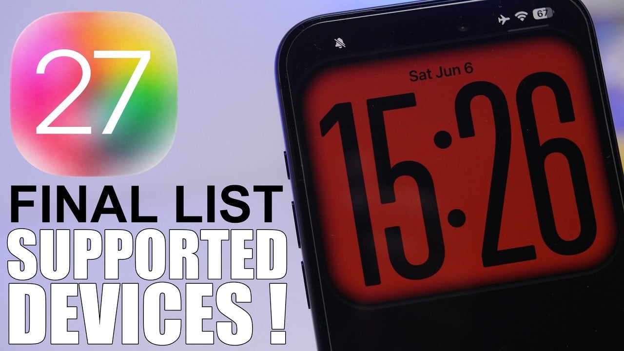
Apple’s highly anticipated iOS 27 update is set to bring a fresh wave of enhancements to the mobile operating system landscape. Scheduled for its first beta release on June 8, 2026, this update introduces a host of new features and performance improvements. However, it also narrows the range of supported devices, signaling a shift in […]
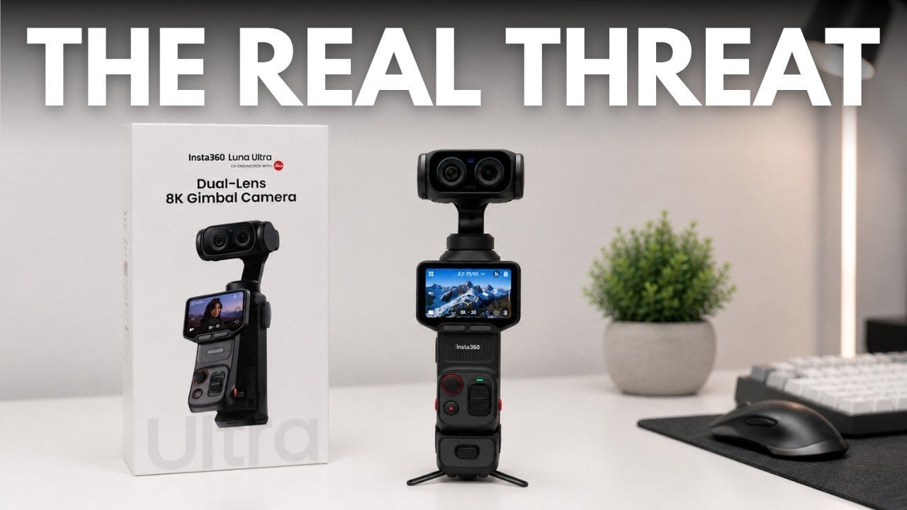
Insta360’s Luna Ultra marks a significant departure from the incremental updates that often define the pocket camera market. As highlighted by Tech Court, this device prioritizes creator-centric features, such as a detachable screen that doubles as a remote monitor and wireless microphone and an optional head tracking accessory for dynamic, hands-free filming. These additions aim […]