A Tiny Cabin in Hungary Is Quietly Rewriting Hospitality

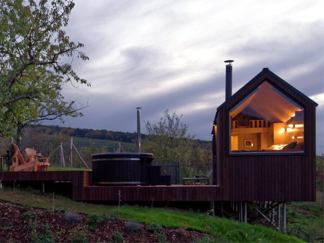
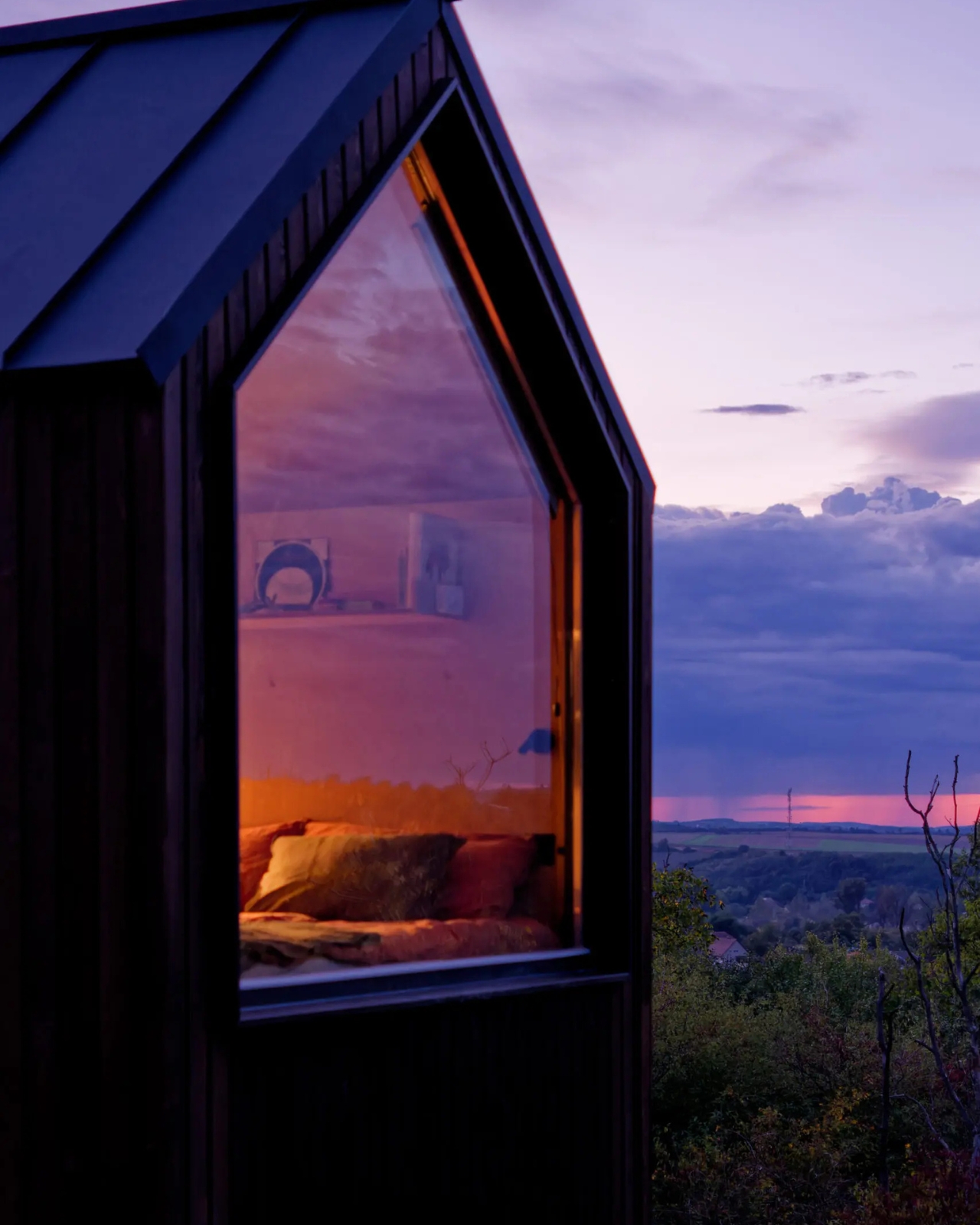
The cabin that keeps showing up in my feed sits in the forested hills of northern Hungary, and once you see it, it is genuinely hard to unsee it. NestOff, designed by architect and interior designer Péter Kotek, is a prefabricated micro-retreat measuring just 20 square meters. On paper, that sounds like a significant compromise. In practice, it reads like a very calm, very confident argument that most of us have been taking up far too much space for far too long.

I have a complicated relationship with the micro-living conversation. It tends to swing between two exhausting extremes: the breathlessly optimistic content creator who insists that 18 square meters is “more than enough space for everything,” and the architecture critic who reminds us, correctly, that small spaces have historically been a symptom of poverty rather than a lifestyle choice. NestOff somehow sidesteps both camps entirely. It is not pretending to be a permanent home, and it is not selling you a fantasy of radical simplicity. It is a retreat. A considered, intelligently designed retreat, tucked between trees in Romhány in northern Hungary, and it wears that identity with genuine confidence.

Designer: Peter Kotek

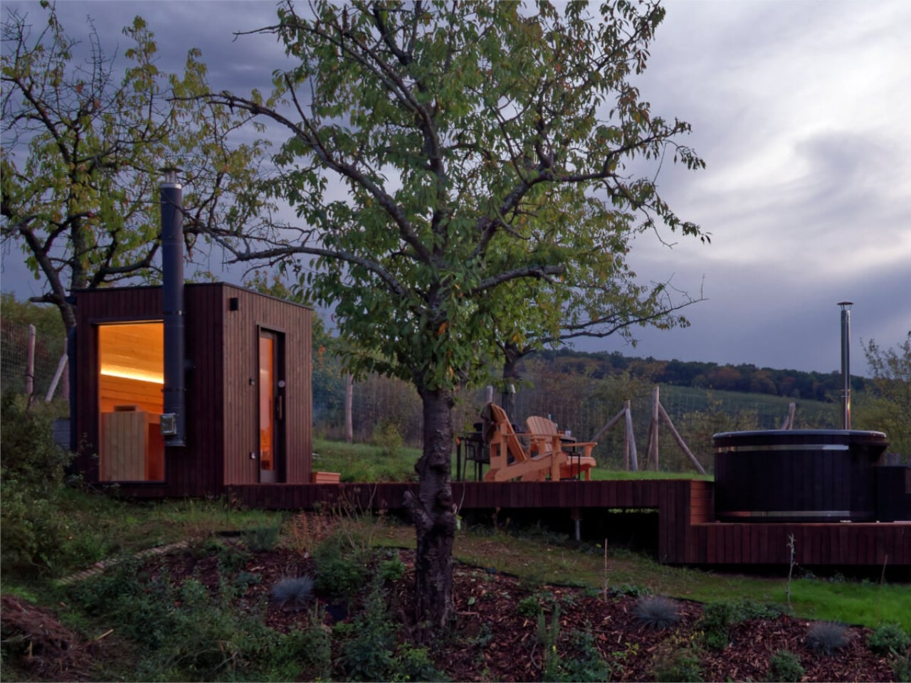
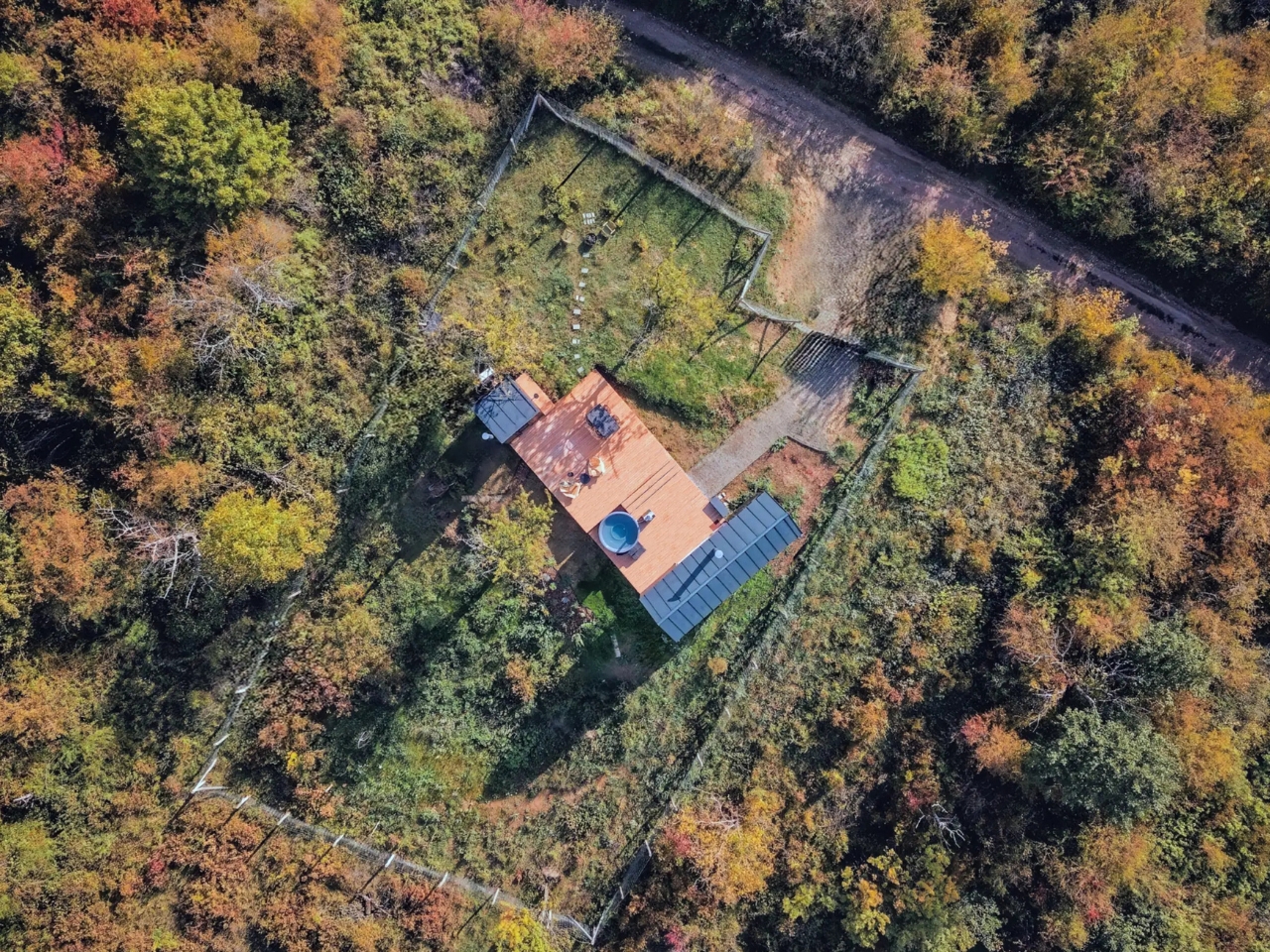
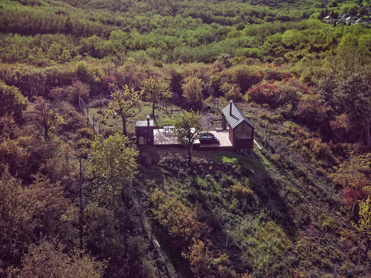
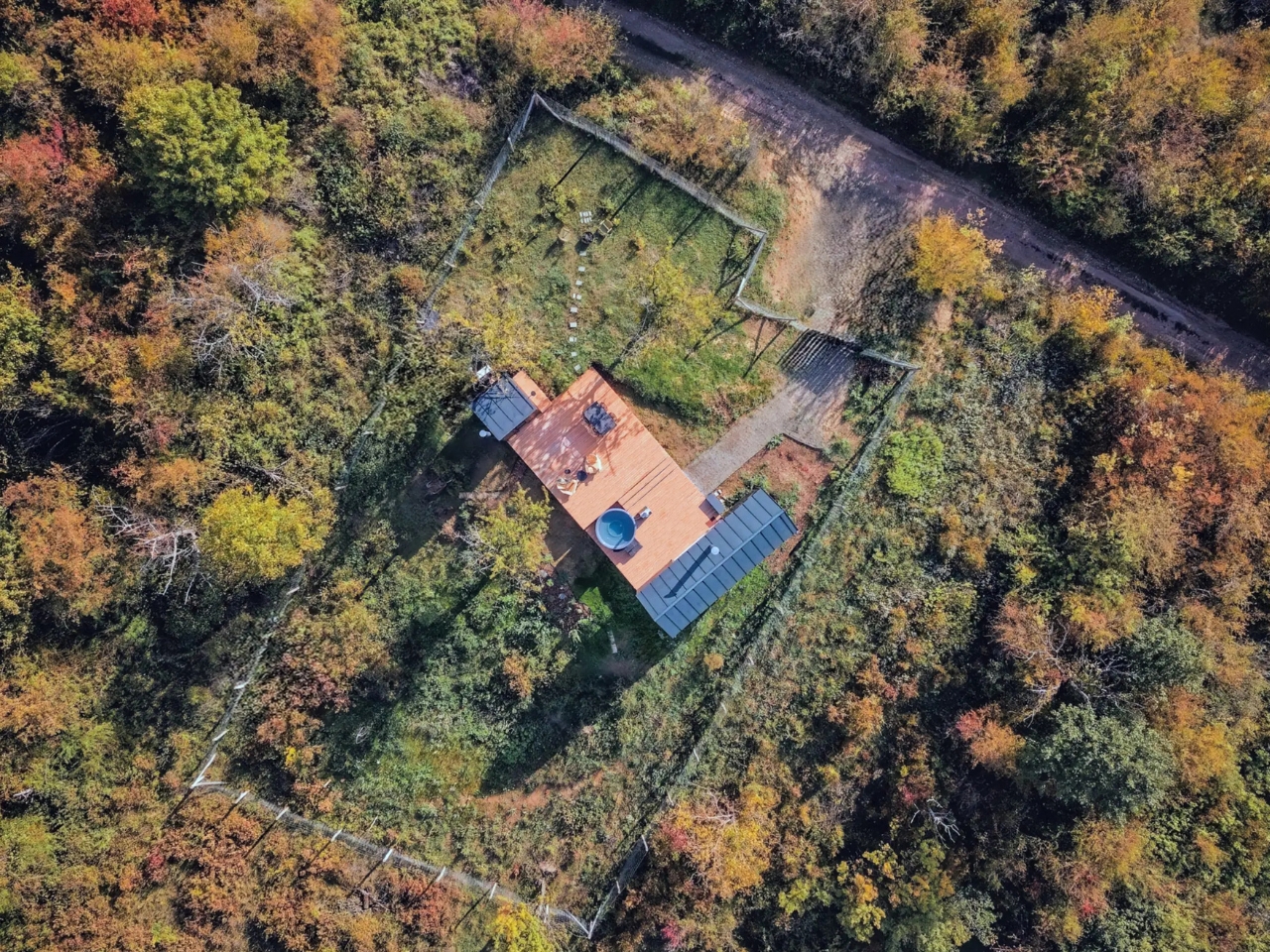
Kotek worked with cabin fabricator Tajga-Depo to partially build the structure off-site, which meant better precision, reduced material waste, and a significantly shorter construction timeline on location. The cabin sits on ground screw foundations rather than poured concrete, and that decision matters more than it might initially seem. It means the structure can eventually be relocated without leaving a scar on the landscape beneath it. In an era when “eco-conscious design” has become something of a branding exercise, NestOff actually follows through on the promise. The land remains largely undisturbed. That is a genuinely rare thing to be able to say.

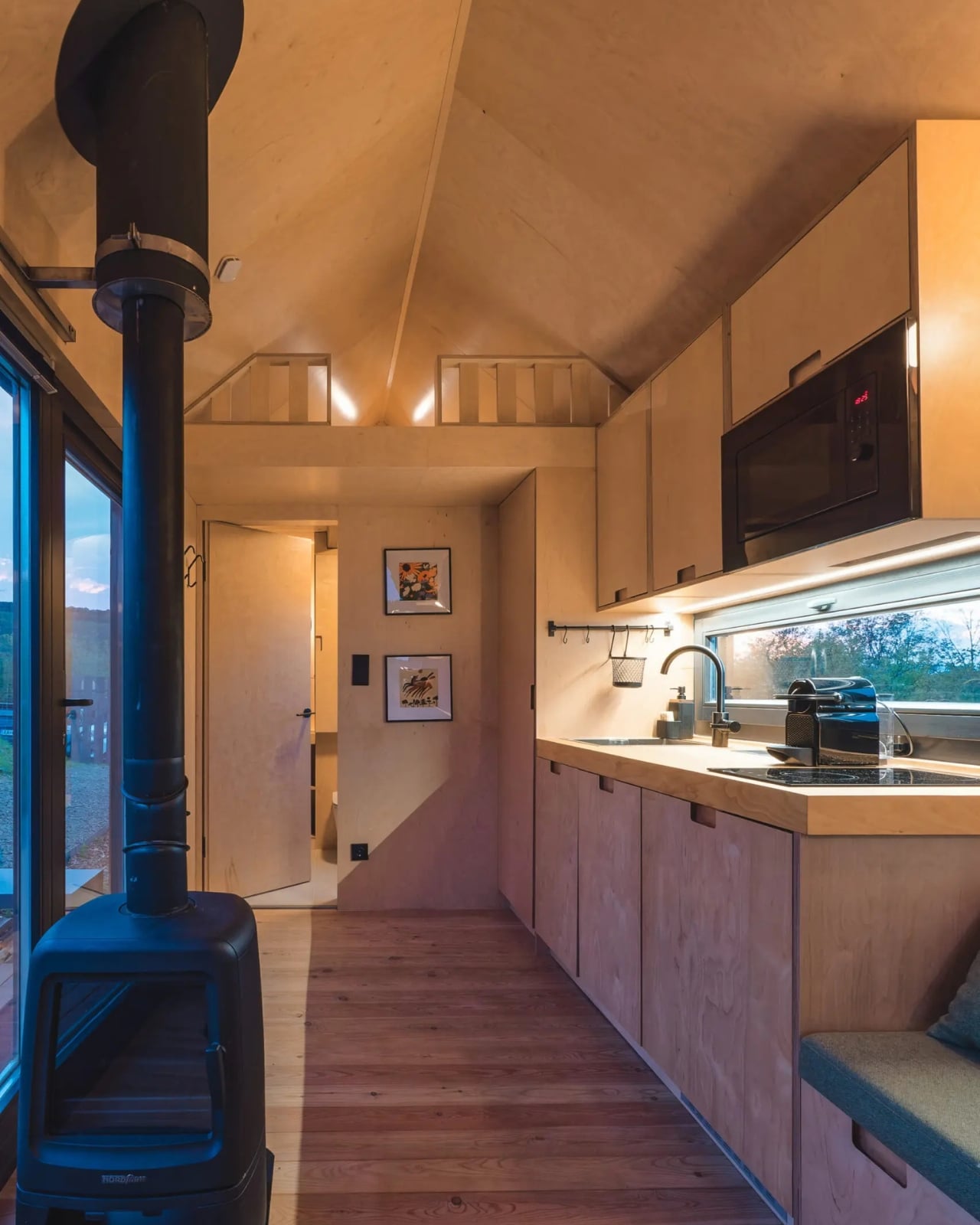
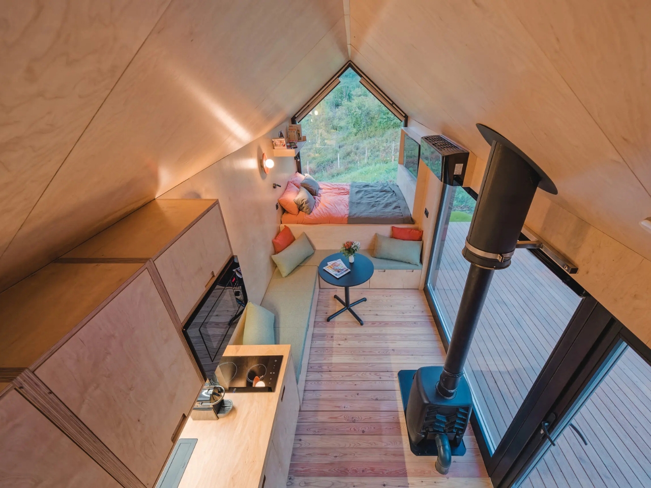
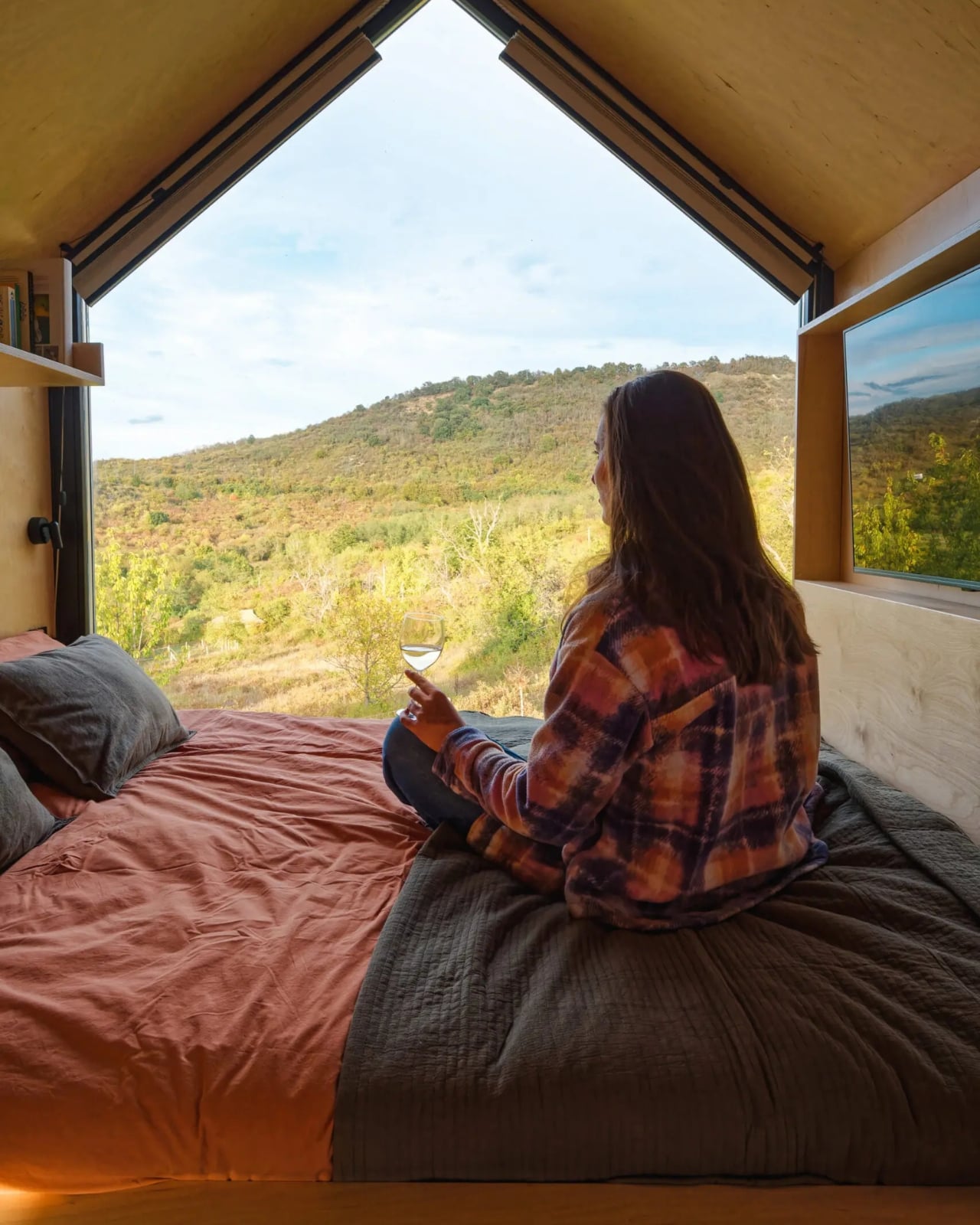
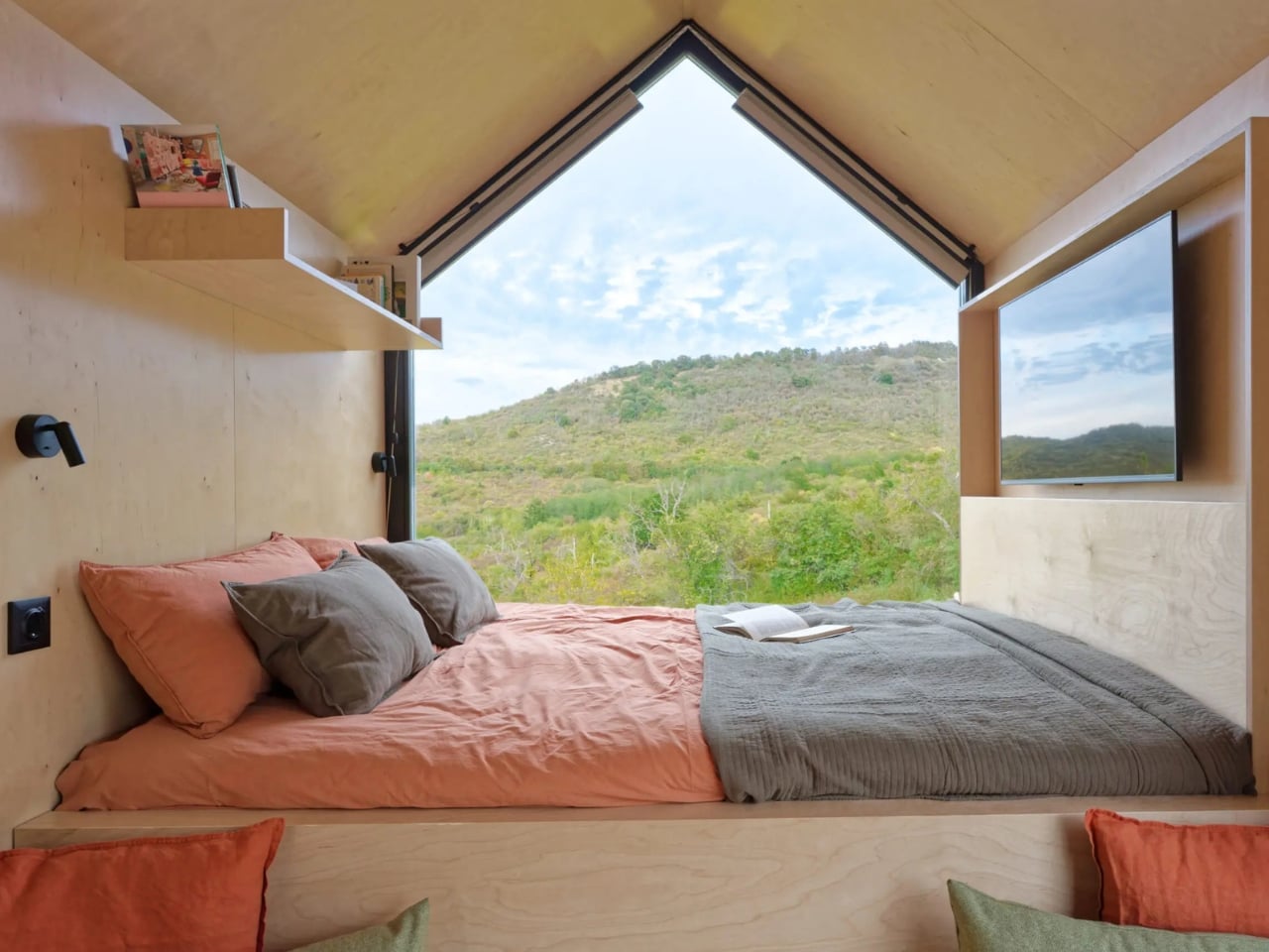
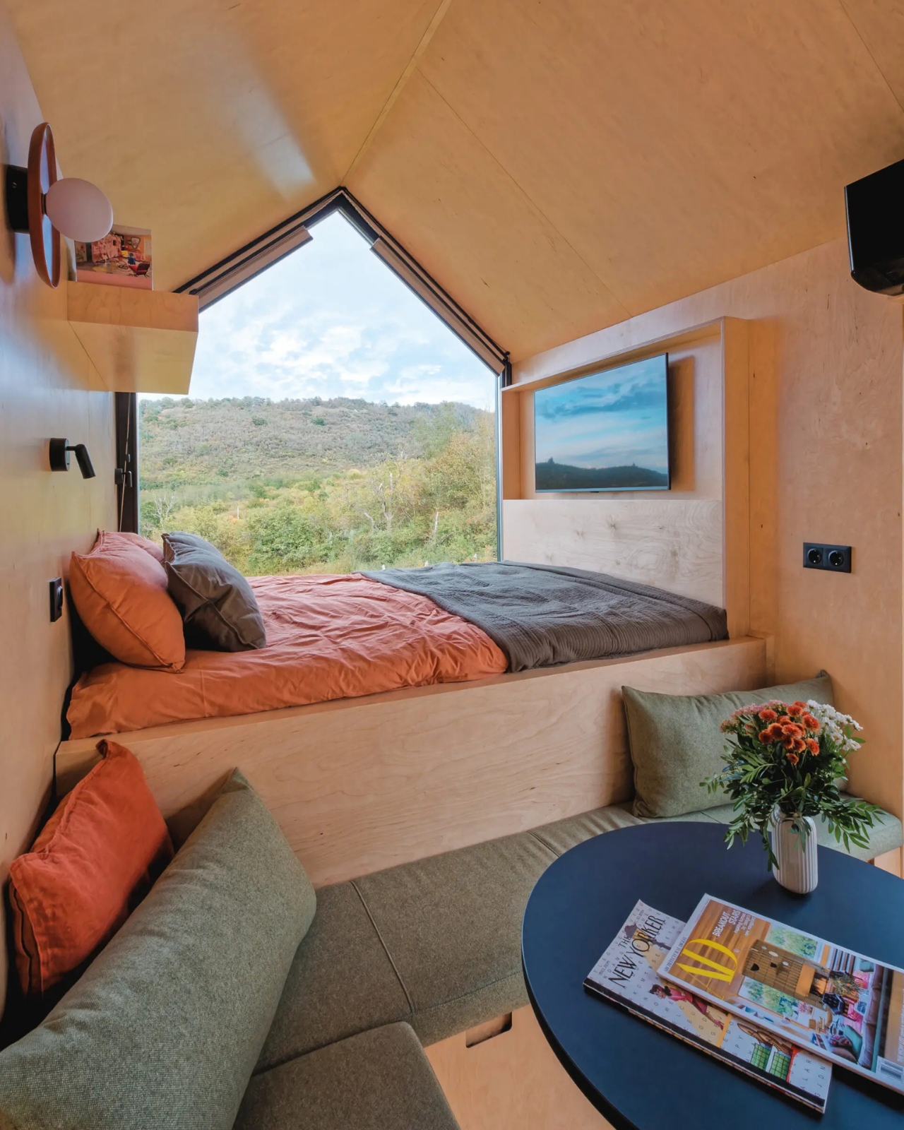
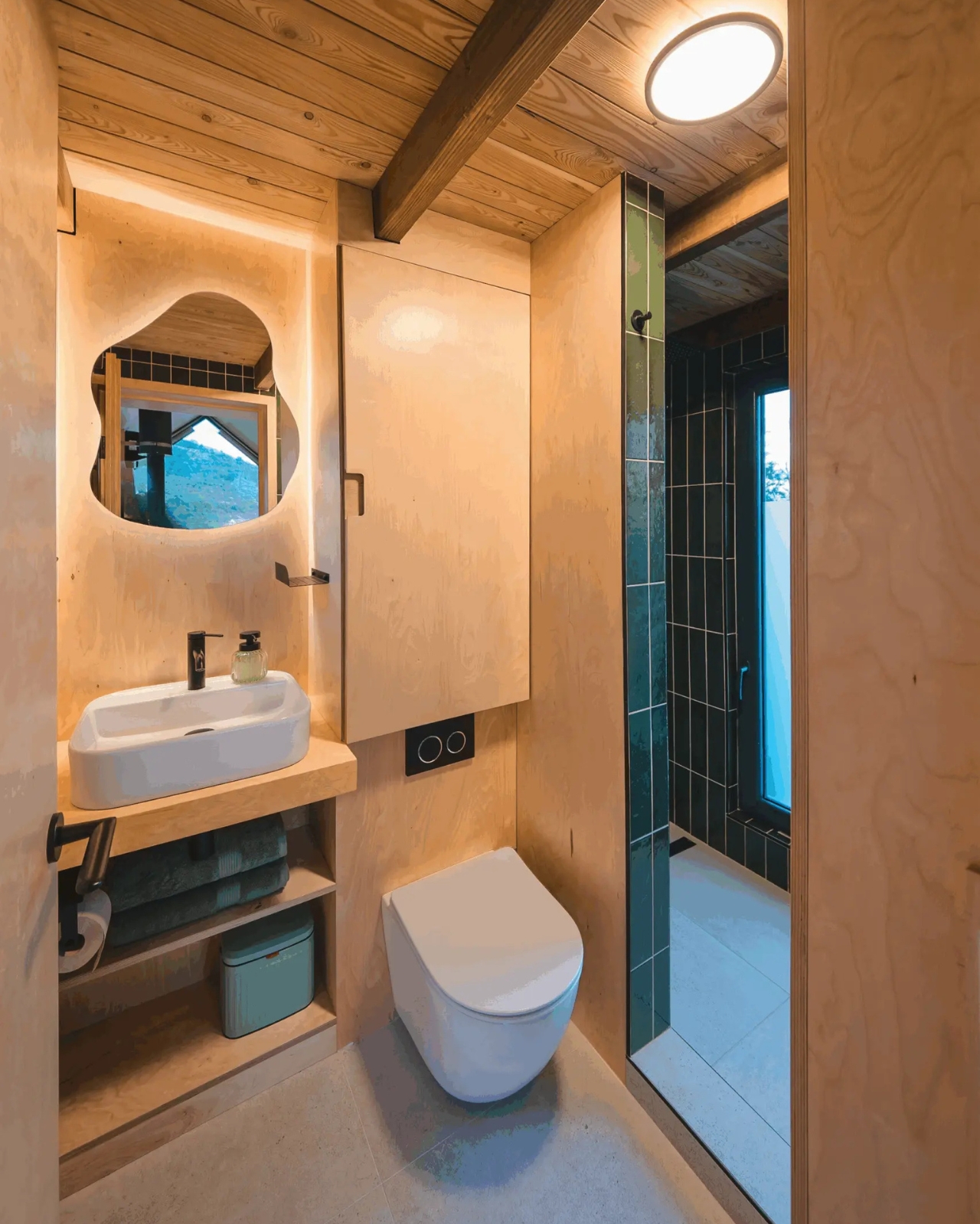
Inside, birch plywood covers the walls, ceilings, and built-in furniture, giving the space a warm and continuous quality that feels more like inhabiting a well-crafted object than occupying a room. The panoramic opening does exactly what a good view should do: it pulls the outside in without letting the outside overwhelm the interior. You are still in an enclosed, protected space, but the valley stretches out in front of you like a second room you never had to build or pay for. Kotek clearly understood that in a cabin this size, the view is not a bonus feature. It is structural.

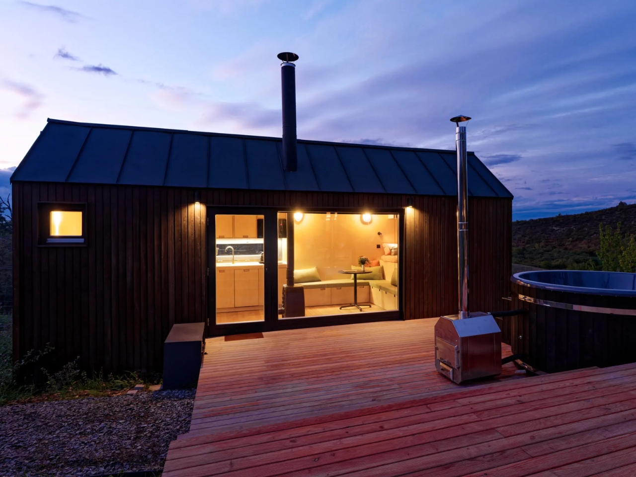
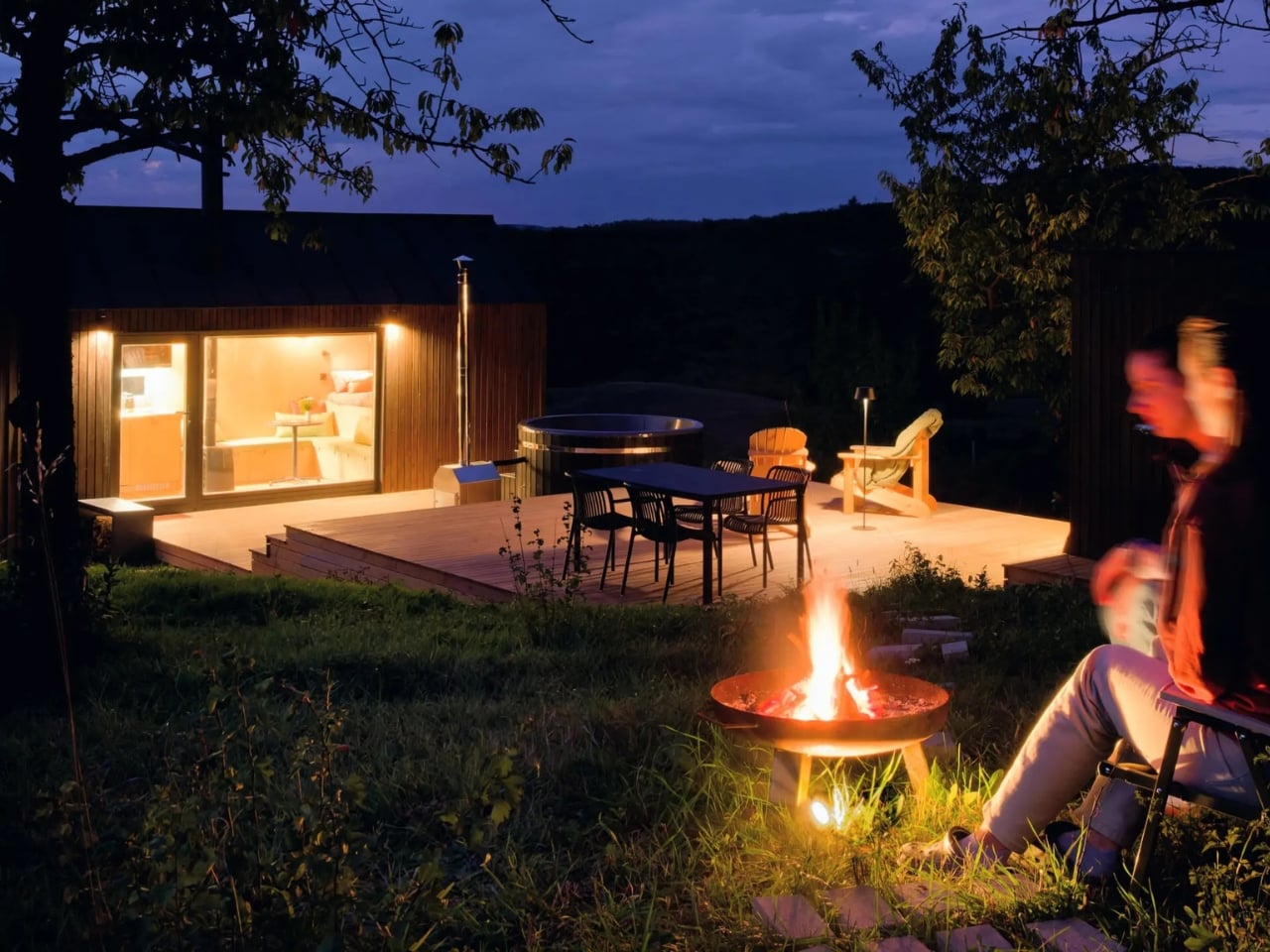
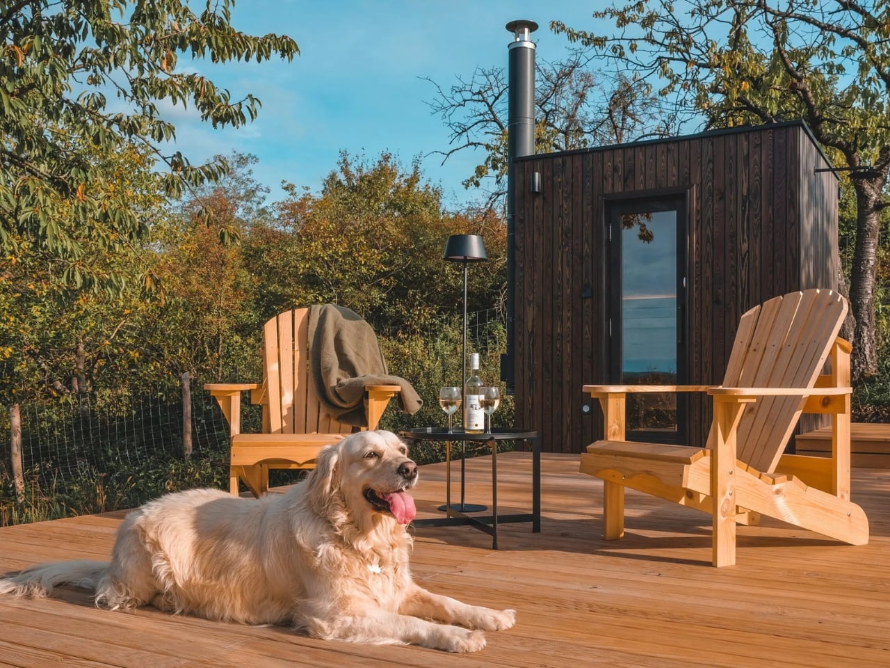
The outdoor program is where NestOff gets particularly interesting. Two black timber vertical board cabins, the main unit and a separate sauna structure, are connected by a tiered larch deck. A hot tub sits alongside it. The sequence of spaces, moving from the interior out to the deck and then to the sauna and back, creates a rhythm of use that feels more deliberate than most full-sized hotels ever manage to achieve. Rest, bathing, sitting outside, going back in. It is not complicated. It is just very well thought out.

I keep returning to the question of what we actually need from a retreat. Not a vacation, which tends to involve airports, itineraries, and the performance of relaxation, but a genuine retreat. My honest answer is: not much. A bed. A meaningful view. Hot water. A reason to put the phone away. NestOff covers all of it within 20 square meters and a larch deck, and it does so without apology. That is not a failure of ambition. That is ambition pointed firmly in the right direction.

The micro-cabin category is crowded right now. Everyone from Scandinavian design studios to Silicon Valley-adjacent startups has something competing in that space. What separates NestOff from the noise is its complete absence of performance. It is not trying to impress you with a feature list or a manifesto. It is trying to give you a few nights in the Hungarian hills with nowhere else to be, and it is quietly very good at that one thing. Sometimes, that really is the whole point.

The post A Tiny Cabin in Hungary Is Quietly Rewriting Hospitality first appeared on Yanko Design.

15 years after ‘Video Games,’ Lana Del Rey has an actual video game song

The James Bond franchise has a long history of getting pop stars to record its theme songs (perhaps most memorably with Live and Let Die), and it looks like that tradition will now extend to video game adaptations about the fictional spy. IO Interactive has announced that Lana Del Rey co-wrote and performed the theme for 007 First Light, the developer's playable James Bond origin story.

"First Light" is written and performed by Lana Del Rey and composer David Arnold, and like the moody and abstract opening credits released alongside the song, could vaguely gesture at the themes of the game. IO Interactive has previously said that its game focuses on a young, inexperienced and more reckless Bond, before he developed his trademark cool. The developer is also integrating the stealth mechanics it perfected in Hitman into the upcoming game.

Del Rey's personal gaming experience may begin and end with her hit "Video Games," which was apparently written about a former boyfriend's love of World of Warcraft, but the artist does know how to write a song with Bond in mind. Lana Del Rey shared in 2024 that her song "24" from the album Honeymoon was originally written for 2017's Spectre, one of several songs that were cast aside in favor of Sam Smith's "Writing's on the Wall."

007 First Light is coming to Xbox Series X/S, PlayStation 5 and PC on May 27, 2026. A Nintendo Switch 2 version of the game is now coming out this summer.

This article originally appeared on Engadget at https://www.engadget.com/gaming/15-years-after-video-games-lana-del-rey-has-an-actual-video-game-song-221925735.html?src=rss

Dórica Just Proved Good Design Belongs on Your Kitchen Counter

Most of us have at least one object in our home we’ve never actually looked at. The napkin holder. The fruit basket. The candle holder that’s been sitting on the same shelf for three years. We use these things daily, sometimes multiple times, and yet they exist in this strange invisible space between functional and forgotten. That’s exactly the space that Sebastián Ángeles decided to design for.

Ángeles is the founder and creative director of Dórica, a Mexico City-based contemporary furniture brand that has spent years building a quiet but increasingly well-regarded reputation for pieces that prioritize longevity over trend. Their chairs, benches, and credenzas have found their way into residential, commercial, and hospitality spaces, and the brand has been recognized as one of the most relevant contemporary furniture names coming out of Mexico. But with Prea, released in February 2026 and recently featured by Wallpaper, Ángeles shifted his focus somewhere more intimate: the objects you reach for without thinking.

Designer: Sebastián Ángeles for Dórica

Prea is labeled “Chapter II” in Dórica’s story, and the brand describes it as their first collection of everyday objects. It’s a small but considered group of pieces, including an egg basket, a fruit basket, a candelabra, and a napkin holder, each designed and produced in Mexico with a clear emphasis on wood and ceramic, clean lines, and what the brand calls “material honesty.” The pieces are not elaborate. They don’t announce themselves when you walk into a room. And that restraint is, I think, the entire point.

Wallpaper described Prea as “a study in restraint,” and that feels right. But I’d push it further. Prea is actually a philosophical statement wrapped in a very practical object. The brand’s own language around the collection is striking: “Design here does not decorate. It holds. It supports. It allows the ordinary to be seen.” That’s not the kind of copy you expect from a brand selling a napkin holder. It’s the kind of thought that makes you pause.

We talk constantly in design circles about the gap between high design and everyday life, between the gallery object and the kitchen counter. Dórica seems genuinely uninterested in that gap existing at all. The premise of Prea is that the objects living alongside our daily rituals, the things we touch without registering that we’re touching them, deserve the same level of intentionality that goes into a statement chair or a sculptural lamp. Not to make them more important than they are, but to acknowledge that they already are important. We just stopped noticing.

There’s a Mexican design perspective embedded in this that feels worth acknowledging. The brand has always positioned itself around craftsmanship and longevity rather than novelty, and Prea continues that ethos into a new category. It’s a move that says something about how Ángeles sees the role of design in everyday life: not as a luxury layer applied to living, but as something woven into the texture of it.

I’ll be honest, when I first looked at the collection, my instinct was that it seemed minimal to the point of simplicity. A fruit basket is a fruit basket. But the more I sat with the images and the thinking behind the work, the more that restraint started to feel like confidence. These pieces don’t need to perform. They just need to be present, well-made, and honest. In a market saturated with objects begging for your attention, that’s a harder thing to pull off than it looks.

Prea is also a smart move for Dórica as a brand. Entering the everyday objects category at this level of intention signals a maturity that not every furniture brand is willing to commit to. It’s easier to scale up into bigger, more visible pieces. Scaling down into the egg basket, and making it mean something, takes a different kind of confidence. If you’re the kind of person who has ever picked up a beautifully made object and held it for just a second longer than you needed to, this collection is worth seeking out.

The post Dórica Just Proved Good Design Belongs on Your Kitchen Counter first appeared on Yanko Design.

The PBS Artemis II documentary is streaming on YouTube

The crew of NASA's Artemis II mission have safely returned to Earth, but if your Moon fever has yet to break, or you're curious to get a big picture view of how the second of a planned five Moon missions was pulled off, PBS has a new documentary you'll want to watch. The hour-long Return to the Moon was produced for PBS' NOVA and aired on TV on April 15, but you can view the episode in its entirety on YouTube right now.

Return to the Moon covers the history of NASA's Artemis program, and specifically the planning and preparation that went into Artemis II. Per the documentary's official description:

Follow the four members of the Artemis II crew as they embark on a perilous 10-day journey to orbit the Moon, venturing beyond Earth orbit for the first time since Apollo and farther into the Solar System than any humans have gone before. And get an inside look at the preparations needed to overcome the extreme engineering challenges of human-crewed spaceflight, all the way from launch to splashdown.

The last Apollo mission was in 1972, so Artemis II getting a group of four astronauts anywhere near the Moon has naturally generated a lot of excitement. The crew flew further away from Earth than anyone has gone so far, captured some stunning photos of both the Moon and our home planet and managed to make everyone feel better about their dislike of Microsoft Outlook. Few Moon missions have been as well-documented or relatable.

This article originally appeared on Engadget at https://www.engadget.com/science/the-pbs-artemis-ii-documentary-is-streaming-on-youtube-210347406.html?src=rss

This iPhone Air 2 Concept Adds Two Cameras and Suddenly the Phone Makes More Sense

Every first-generation Apple product is essentially a beta test with a premium price tag, and the iPhone Air was no exception. The engineering was genuinely remarkable: 5.6mm thin, a large ProMotion display, A19 Pro performance, and battery life that surprised nearly everyone who reviewed it. What wasn’t remarkable were the two omissions that showed up in every single hands-on: one camera and one speaker, on a phone that cost $999. Those two complaints alone handed buyers a perfectly logical reason to spend the same money on a Pro instead. The Air needed a second generation the moment the first one shipped.

Demon’s Tech has imagined exactly what that second generation could look like, and the concept renders suggest Apple already has a clear path to making the Air the phone it should have been from the start. The dual-camera bar is wide and confident across the top of the phone, housing two lenses with room to spare. The rest of the body is pure restraint, a flat back, centered Apple logo, and a color range vivid enough to give the phone a personality that its specs can now actually back up. If the rumored stereo speaker and efficiency-focused N2 chip join that camera upgrade, the Air 2 goes from interesting to genuinely compelling.

Designer: Demon’s Tech

Two 48-megapixel sensors reportedly sit inside the pill-shaped housing, one primary and one ultrawide, which aligns with leaks from Chinese tipster Digital Chat Station suggesting Apple is going for a main-plus-ultrawide configuration rather than a telephoto. That choice makes sense for the Air’s positioning. Telephoto glass demands physical depth that a sub-6mm chassis simply cannot accommodate, and ultrawide coverage is what most non-Pro users actually miss day-to-day. The original Air’s single-lens bar always looked slightly incomplete, like a sentence that trailed off mid-thought, and Demon’s Tech addresses that by stretching the new pill-shaped housing almost the full width of the phone’s upper third, sitting flush and purposeful rather than apologetic. It is a small change on paper that transforms the entire visual logic of the back panel.

Apple shipped the original Air in four relatively restrained options: cloud white, sky blue, light gold, and matte space black. Demon’s Tech blows that palette wide open, running through violet, cobalt, mint green, and vivid red alongside the sandy gold seen in the hero shots, which is closer to what the iPhone 5C attempted in 2013, a phone that led with color as a statement rather than a courtesy. The Air’s lifestyle positioning actually supports this approach in a way the 5C’s budget framing never quite did. A phone you buy partly because it is extraordinarily thin is a phone you buy to be noticed, and being noticed in muted gold is considerably less fun than being noticed in electric blue. The renders make a quiet argument that Apple’s colorway restraint on the original Air was a missed opportunity, not a deliberate choice.

Twelve gigabytes of RAM paired with the A20 Pro keeps the performance story simple: this is a phone that matches the Pro lineup on silicon even if it concedes on optics. The sleeper upgrade is Apple’s rumored N2 efficiency chip, because getting better battery life out of a body that physically has less room for cells requires exactly this kind of architectural work, the same discipline that let the original Air post competitive endurance numbers despite its dimensions. Add stereo sound from a bottom speaker alongside the existing top one, and the two most common complaints about the first Air evaporate inside a single product cycle. That is a more focused corrective than Apple managed with either the Mini or the Plus, both of which spent multiple generations struggling to justify their existence. If Apple lands all of this at the same $999 price point, the value math finally starts working in the Air’s favor.

Apple has confirmed the Air line continues, with the second generation reportedly targeting a spring 2027 release window, landing after the iPhone 18 Pro, Pro Max, and foldable models ship in fall 2026. That later window gives Apple’s engineering teams more time to solve the thermal and battery challenges that come with building capable hardware into an impossibly thin frame, and it gives the Air its own launch moment rather than forcing it to compete for attention against a foldable iPhone. Demon’s Tech’s concept is the best visual argument yet for what that launch moment could look like: a phone that carries its thinness as a given rather than an excuse, and finally has the camera system and audio to back up everything the form factor promises.

The post This iPhone Air 2 Concept Adds Two Cameras and Suddenly the Phone Makes More Sense first appeared on Yanko Design.

A lot of you panic-bought PCs to avoid RAMaggedon 2026

The specter of price hikes caused by the current AI-driven demand for memory and storage appears to have convinced a fair share of people to buy a new computer. According to data analyzed by Counterpoint Research, global PC shipments grew around 3.2 percent year-over-year in Q1 2026, "driven by pre-emptive buying before memory-led price increases hit the retail level" and Microsoft forcing some customers to upgrade by ending support for Windows 10 last year.

Sales hit 63.3 million units during the first quarter, Counterpoint says, and were particularly concentrated in five high-end PC makers: Lenovo, ASUS, Apple, HP and Dell. Of the five, Lenovo commands the most PC market share at 26 percent, but sales increased for almost all of the companies, save for HP, whose year-over-year sales technically declined by 5 percent. Of particular note, Apple's PC sales grew by 11 percent, likely on the strength of the M5 updates it made to the MacBook Pro and MacBook Air, and the introduction of the affordable $600 MacBook Neo. Counterpoint suggests the updates could drive even further sales growth next quarter. 

Even with positive sales, the PC industry as a whole is by no means out of the woods. "The aggressive expansion in AI infrastructure investment is driving up overall component costs, which will likely impact the pricing of CPUs and other key components in [PCs]," Counterpoint Senior Analyst Minsoo Kang says. "Ultimately, the sustained upward pressure on costs and the resulting hike in retail prices are expected to have a significant negative impact on the PC market’s growth in 2026."

A general sense that the worst is yet to come is consistent with what other analysts have warned about the current shortages of RAM and storage. In December 2025, IDC predicted that PC shipments could drop as much as 8.9 percent in 2026 in response to the price of RAM, and later revised its prediction to 11.6 percent this past March. Even if consumers aren't feeling the worst of these price hikes just yet, new announcements of price increases seem to arrive like clockwork every few weeks — for example, this week, Meta raised the price of its Quest headsets — which means if they aren't feeling them now, they will soon.

This article originally appeared on Engadget at https://www.engadget.com/computing/a-lot-of-you-panic-bought-pcs-to-avoid-ramaggedon-2026-200237204.html?src=rss

This 2026 Lamborghini F1 Livery Proves the Raging Bull Belongs on the Grid (Even If It Never Happens)

The 2026 F1 season marks the biggest technical reset the sport has seen in over a decade, with new power unit regulations that push electric deployment even harder and a reshuffled grid that includes Audi’s factory entry and Cadillac arriving as a legitimate constructor. It’s the kind of moment when the paddock genuinely opens up to new possibilities, when manufacturers who’ve been sitting on the sidelines start doing the math on whether an F1 program could actually make sense. Lamborghini will almost certainly remain on those sidelines, because spending nine figures annually to race in a series where your parent company already fields a team (Audi, also owned by Volkswagen Group) would be corporate redundancy at its most wasteful. But that didn’t stop designer Daniel Rodriguez from asking what a Lamborghini livery would look like if Sant’Agata Bolognese decided to crash the party anyway. If it did, it would be the third bull-based team on the track after Red Bull and Racing Bulls!

Rodriguez’s concept wraps a 2026-spec F1 car in Arancio Borealis and gloss black with a geometric lattice pattern that pulls directly from Lamborghini’s current design vocabulary. The hexagonal graphics echo the Revuelto’s taillight treatment and the angular obsession that defines the brand’s styling language, flowing from dense at the cockpit to sparse at the rear wing. Italian flag accents trace the halo and nose cone, sponsor logos for Macron and Eni add commercial credibility, and the raging bull emblem sits on the rear wing endplates where it would photograph beautifully in the pit lane even if TV cameras never caught it. The renders are good enough to pass for official press shots, lit with the kind of moody amber-to-black gradients that Lamborghini’s own marketing team would approve.

Designer: Daniel Rodriguez

What makes this livery work is that Rodriguez doesn’t try to make the F1 car look like a Lamborghini road car, because that’s impossible and also beside the point. An F1 car is a regulatory sculpture shaped by wind tunnel data and the FIA’s technical rulebook, and no amount of vinyl wrap changes that fundamental reality. Instead, the livery translates Lamborghini’s graphic and color vocabulary into a form factor that has nothing to do with mid-engine supercars, and it does so in a way that feels both authentic to the brand and appropriate for the paddock. The Arancio Borealis orange sits somewhere between molten lava and a traffic cone, instantly recognizable as Lamborghini without requiring the car to sprout scissor doors or a V12 exhaust note. The gloss black creates genuine visual tension rather than just contrast, breaking up the body in a way that emphasizes the car’s aerodynamic surfaces instead of fighting them.

The hexagonal lattice pattern running down the sidepods and over the engine cover is the detail that sells the whole concept. Lamborghini has been obsessed with hexagons since the Aventador introduced them as a recurring motif back in 2011, and they’ve since migrated to every surface the brand touches. Taillights, grilles, interior stitching, wheel designs, all of it hexagons. Rodriguez takes that obsession and applies it to the F1 car’s sidepods in a way that creates visual density without cluttering the canvas. The pattern starts tight and geometric at the front, creating a sense of structural integrity, then gradually opens up as it flows rearward, giving the eye a path to follow from cockpit to diffuser. It’s a graphic solution that respects both the brand’s identity and the car’s aerodynamic purpose.

The Italian tricolor is handled with restraint, running as a thin accent stripe that outlines the halo and reappears on the nose cone. It’s subtle enough to avoid looking like a generic tribute to the brand’s Sant’Agata Bolognese heritage, but prominent enough that the car reads as distinctly Italian when parked next to Ferrari’s red. The sponsor integration is equally thoughtful. Macron, the Italian sportswear brand that already kits out Bologna FC and the Italian national rugby team, appears on the sidepods and rear wing. Eni, the Italian energy giant with deep motorsport ties, gets placement on the engine cover. Both partnerships feel plausible rather than fantastical, the kind of commercial relationships Lamborghini could actually secure if they showed up to the grid tomorrow.

Even the mandated wheel covers, which the 2026 regulations require for aerodynamic efficiency and which most teams treat as blank canvases or necessary evils, get the hexagon treatment here. It’s a small detail that maintains visual consistency across every surface, ensuring the car reads as a cohesive design rather than a collection of sponsor panels held together by regulations. The raging bull emblem on the rear wing endplates is rendered in white against black, a detail that would be nearly invisible during race broadcasts but would photograph beautifully in static pit lane shots and pre-race media coverage.

Will Lamborghini actually enter F1 in 2026 or beyond? Almost certainly not. The economics don’t justify it, the brand’s identity doesn’t need F1 validation, and their motorsport budget is better spent on GT3 programs that connect directly to road car sales. But Rodriguez’s concept does something more valuable than predicting the future. It proves that Lamborghini’s design language is strong enough to survive translation into a form factor it was never intended for, and it shows what the 2026 grid would look like with a raging bull parked next to the prancing horse.

The post This 2026 Lamborghini F1 Livery Proves the Raging Bull Belongs on the Grid (Even If It Never Happens) first appeared on Yanko Design.

Sam Altman’s ‘human verification’ company thinks its eye-scanning orbs could solve ticket scalping

Sam Altman's cryptocurrency turned identity verification startup Tools for Humanity is offering a new set of perks to people who scan their eyes at one of the company's orbs. Among them, is a new tool called Concert Kit that could help bands and artists fight back against ticket scalping bots. 

The new feature relies on the revamped World ID, the orb-based verification system that scans users eyeballs and faces to create a "proof of human" signature that lives on users' mobile devices. "It's basically like a little human passport for the internet that lets you prove on apps and websites that you are a real and unique human without revealing anything about yourself," Tools for Humanity Chief Product Officer Tiago Sada tells Engadget. 

Now, as more apps and services are starting to support World ID, that "human passport" can unlock some new abilities. Coupled with Concert Kit, it allows artists to designate a specific pool of tickets for "verified" humans only. The concept is a bit like how pre-sales currently work, with artists (or their teams) setting aside a specific number of tickets for people who have set up a World ID. Those folks can then use their World ID to get ticket codes for Ticketmaster, Eventbrite, AXS or other major ticketing platforms. 

Because World ID is limited to actual, "verified," humans the system won't be susceptible to the same tactics that have enabled bots to ruin the ticket-buying process for so many, Tools for Humanity says. Artists are also in control of what level of verification they want to require from their fans. (The new World ID app will also allow people to set up an account with a selfie check if they don't have ready access to an orb.) 

Just how much of a dent Concert Kit will be able to make in the massive scalping bot problem that plagues the concert industry is less clear. So far, Bruno Mars is slated to use the solution on his upcoming world tour — no word on just how many of his tickets will be reserved for World ID-verified humans, though — and Concert Kit is available to other artists starting today.

Concert Kit is one of several new integrations and updates to World ID that Tools for Humanity announced at an event in San Francisco Friday. Tinder, which earlier this year started testing World ID as an age verification solution in Japan, will be rolling out support worldwide. In the US, Tinder's integration won't be for age verification, though. Instead, it will indicate whether there is an actual "verified" human behind a given profile.

Tinder profiles that verify with World ID will get a badge as an extra signal of authenticity.
Tools for Humanity

On the enterprise side, Zoom and DocuSign are also adding support for World ID to help businesses verify that there is an actual person (and not a deepfake or bot) joining their video calls or signing important documents. Tools for Humanity is also introducing a standalone app for World ID that separates its identity verification tools from its existing crypto wallet app.

The updates are Tools for Humanity's latest attempt to make their orb-based verification system, which has been widely mocked, more mainstream and perhaps a little less dystopian. (Elsewhere, orbs have begun appearing in some new places like a San Francisco Gap.) 

On their part, Tools for Humanity seems aware that a lot of people aren't ready to scan their faces at a bunch of orbs controlled by Altman just to "prove" they are humans. I asked Sada, Tools for Humanity's Chief Product Officer, what he would say to people who think that the company is solving for the wrong problem: that really it should be up to ticketing platforms and dating apps and other services to strengthen their security and bot-fighting tools, rather than rely on their users to "prove" their humanness. 

He said it was a "completely understandable question" and compared it to some people's initial discomfort with things like Apple's TouchID or FaceID. "Not everyone has to do it upfront, and that's important," he said. "It's optional. If you want to have a World ID, you get access to that enhanced experience."

This article originally appeared on Engadget at https://www.engadget.com/ai/sam-altmans-human-verification-company-thinks-its-eye-scanning-orbs-could-solve-ticket-scalping-171500555.html?src=rss

NASA restarts work to support Europe’s uncrewed trip to Mars after years of setbacks

NASA has confirmed the pending launch of the European Space Agency's (ESA) Rosalind Franklin rover, which is being sent to Mars. The current plan is to launch via a SpaceX Falcon Heavy rocket from Kennedy Space Center. The timing is still being worked out, but the space agency says this won't happen until at least 2028.

This is a partnership between NASA and the ESA, with the European agency providing the rover, the spacecraft and the lander. The US will provide braking engines for the lander, heater units for the rover's internal systems and, of course, assistance with the actual launch.

The rover will be outfitted with scientific instruments to look for signs of ancient life on the red planet. These include a state-of-the-art mass spectrometer and an organic molecule analyzer, which will come in handy as the vehicle collects samples at the Oxia Planum landing site.

This is a mission that has suffered years of delays for all kinds of wild reasons. It was actually first conceived all the way back in 2001. The rover mission was originally scheduled for 2009, after NASA came on board. Budget constraints forced NASA to drop out in 2012, so Russia signed on as the ESA's launch partner.

During this period, the mission experienced technical malfunctions which forced additional delays. The ESA suspended its partnership with Russia in 2022 after the country invaded Ukraine. This left the mission in doubt until 2024, when NASA came back into the fold.

However, the setbacks didn't even end there. The Trump administration has repeatedly tried to end NASA's involvement with the project, and many others, via stark budget cuts. The current proposal was made while the Artemis II crew was on their mission around the Moon, according to a report by The Register. Here's hoping the launch actually happens in 2028.

This article originally appeared on Engadget at https://www.engadget.com/science/space/nasa-restarts-work-to-support-europes-uncrewed-trip-to-mars-after-years-of-setbacks-161524488.html?src=rss

Panic says the Playdate Catalog won’t accept games made with generative AI

Panic, the company behind the tiny and excellent Playdate console, is taking a stand on generative AI. The company has published an AI disclosure that says as of this month, the Playdate Catalog “will no longer accept titles that use ‘Generative AI’ for art, audio, music, text, or dialog.” Panic does allow for developers to use AI assistance for coding, but also says that “we will flag any title as such and specify the extent that it was used (for example, “Lua debugging”) so the customer can decide whether to support it or not.”

This comes a day after Panic announced that Playdate season three was happening and would arrive later this year. For those who don’t recall, the Playdate includes a “season” worth of games when you buy it, 24 titles in total with two revealed every week. Season two came out last year with 12 games — but, as Game Developer notes, one of those games used generative AI for writing and coding. On Bluesky, someone asked Panic if it would disclose what games in season three used AI, and the company confirmed that it was a requirement for season three that developers not use AI for art, music, writing or coding.

Specifically, Panic says you can’t use large language models like ChatGPT or Google Gemini, AI image generators like Stable Diffusion or audio generators like MuseNet and Suno. Previously-approved games with generative AI will be allowed to stay on the catalog with a disclosure that indicates what exactly AI was used for. The company says these guidelines are “under constant discussion and is subject to change at any time.”

I recall seeing AI disclosures on games in the Playdate Catalog in the past, but it makes sense to be up-front and clear on exactly what Panic allows and what it will reject. That said, it’s fairly easy to sideload games onto a Playdate, so anyone who wants to use generative AI to make a game isn’t entirely out of luck — though distribution and discovery for Playdate owners will obviously be harder.

This article originally appeared on Engadget at https://www.engadget.com/gaming/panic-says-the-playdate-catalog-wont-accept-games-made-with-generative-ai-160615022.html?src=rss