
You can now bug your WhatsApp group chats with an @all ping
Surely nobody you know will overuse this...

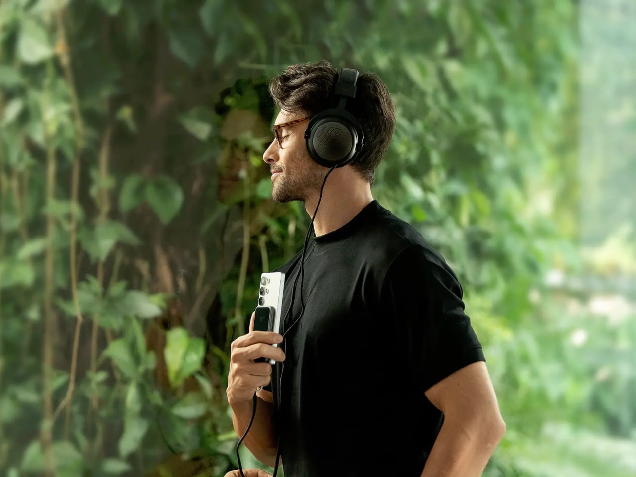
Portable audio has long been a game of compromise. DAC dongles give you a modest step up from your phone’s built-in output, but connect anything more demanding than a pair of featherweight earbuds, and they start to run out of steam. Desktop amplifiers solve the power problem but chain you to a desk, a power outlet, and a bag heavy enough to make you think twice about bringing them anywhere.
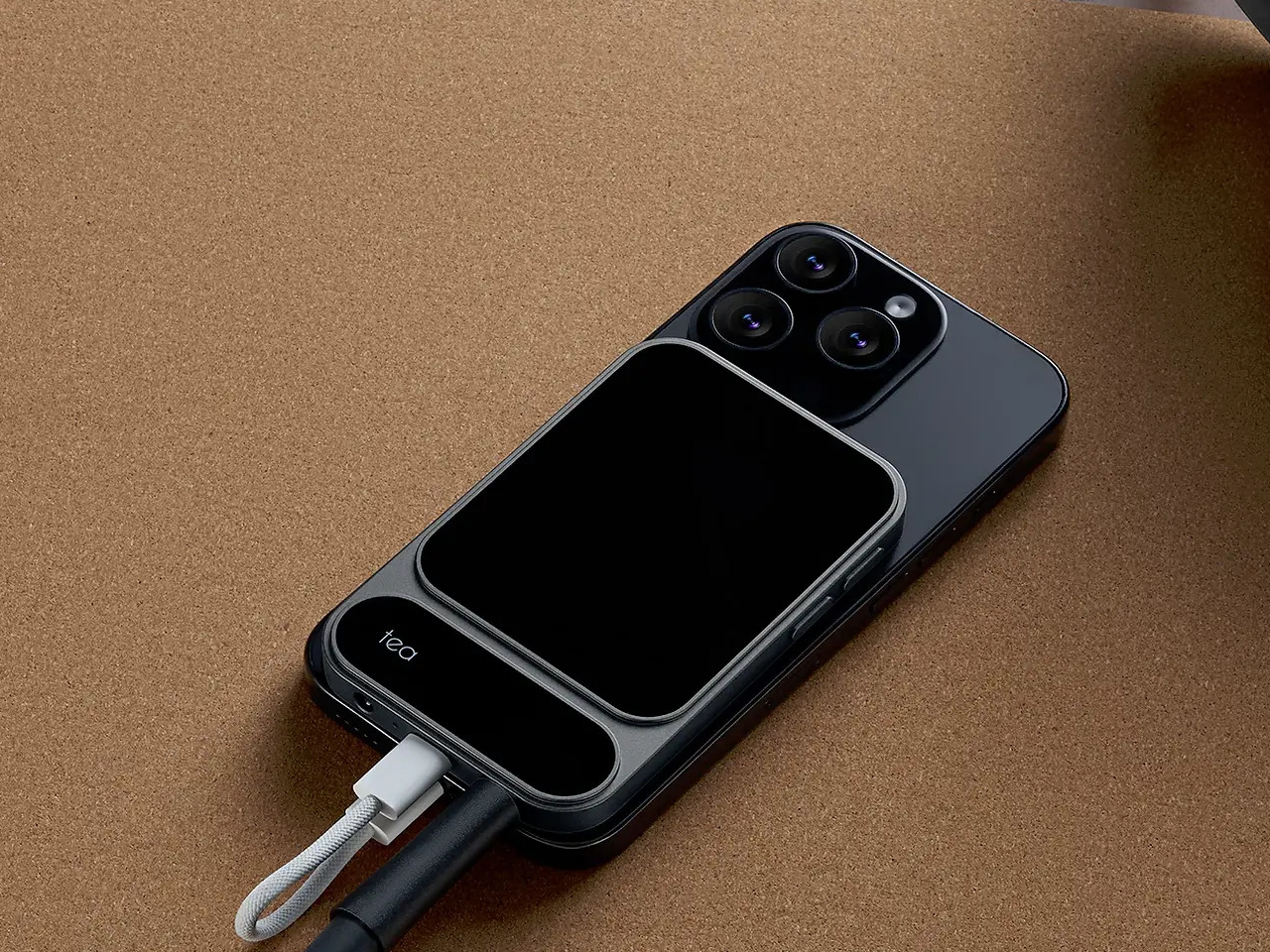
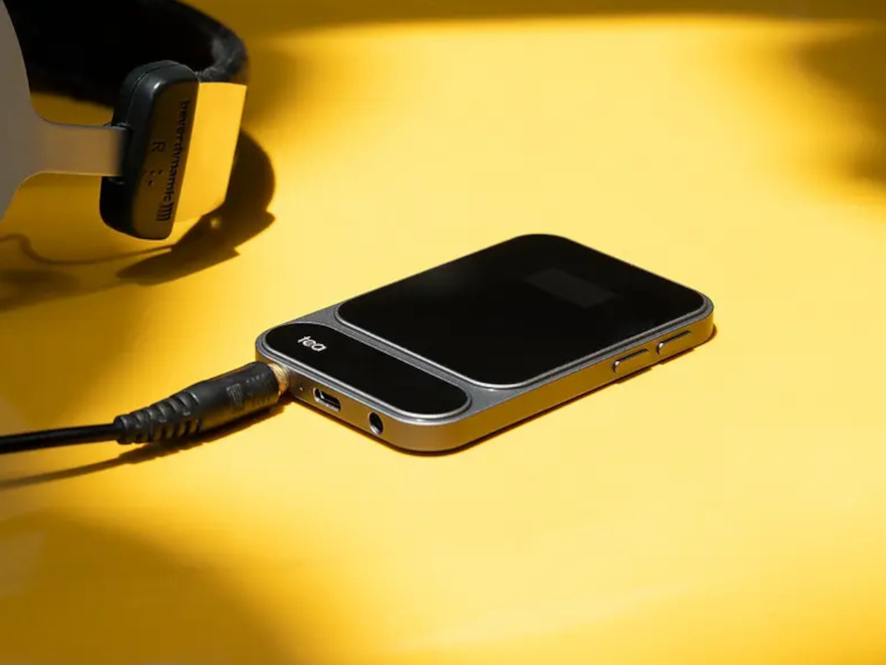
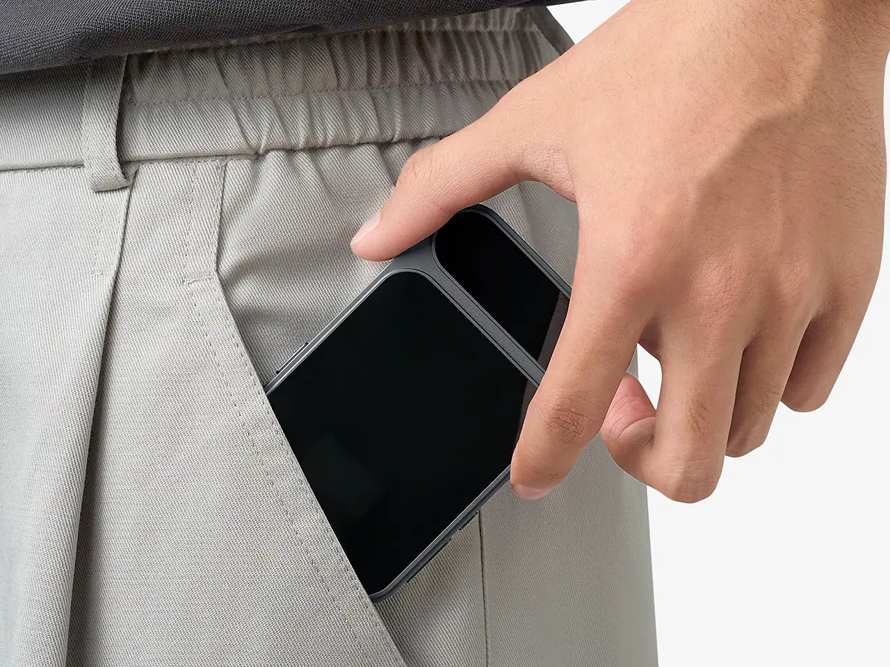
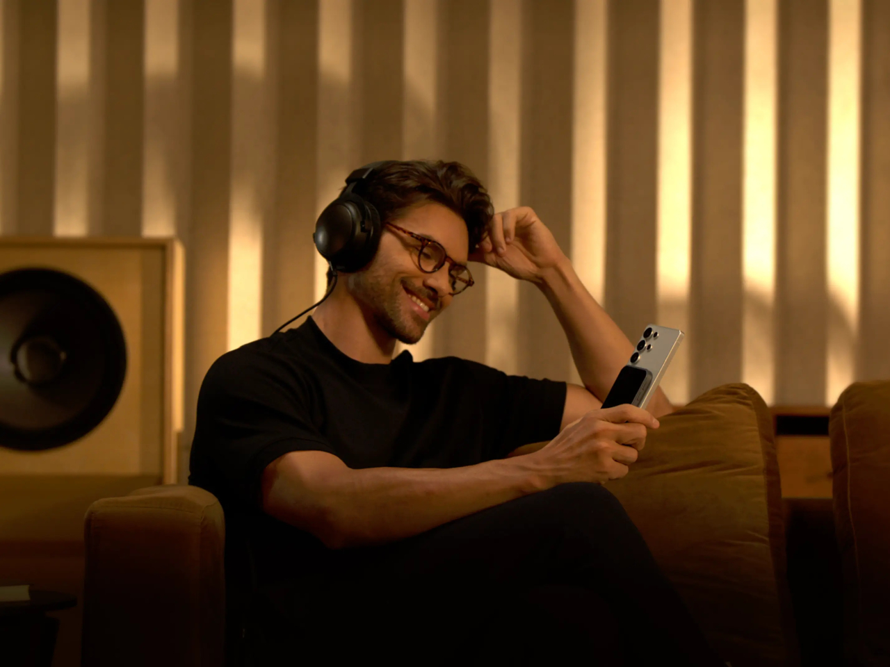
The Khadas Tea Pro sits firmly in the space between those two options, offering enough amplification for serious headphones without the bulk or the cable tangle. At 7.85 mm thin and 96 grams, it genuinely disappears into a pocket, and its magnetic back panel snaps directly onto any iPhone 12 or later, turning your phone and DAC into a single, tidy unit that doesn’t need a pouch of its own.
Designer: Khadas
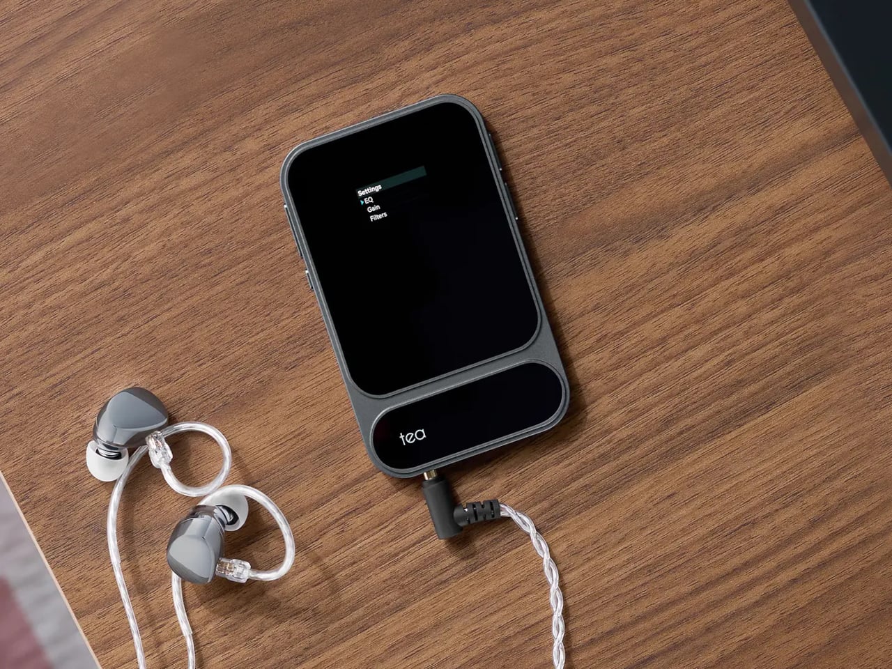
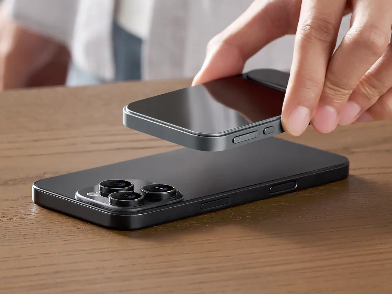
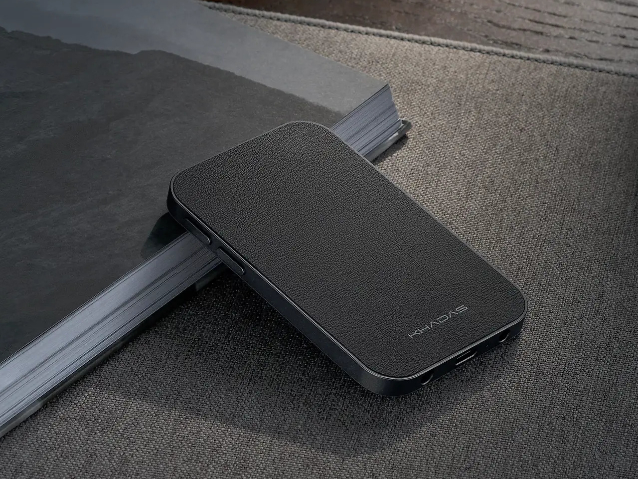
The connection is handled by 19 N56SH magnets, holding the Tea Pro against the back of the phone without straps or brackets. Android users and those with older iPhones can attach a magnetic ring to their case and get the same result. A premium wear-resistant leather panel covers the back, giving the device a tactile quality that’s a step removed from the usual plastic-and-aluminum DAC dongle aesthetic.
Inside, an ESS ES9039Q2M DAC chip works alongside an XMOS XU316 USB bridge for wired playback, delivering PCM up to 768kHz at 32-bit and DSD up to 512 native. The signal chain runs through TI OPA1612 op-amps and Ricore RT6863 amplifier chips, achieving a total harmonic distortion of -118 dB, a specification more at home in a studio rack than a 96-gram device that slips into a shirt pocket.
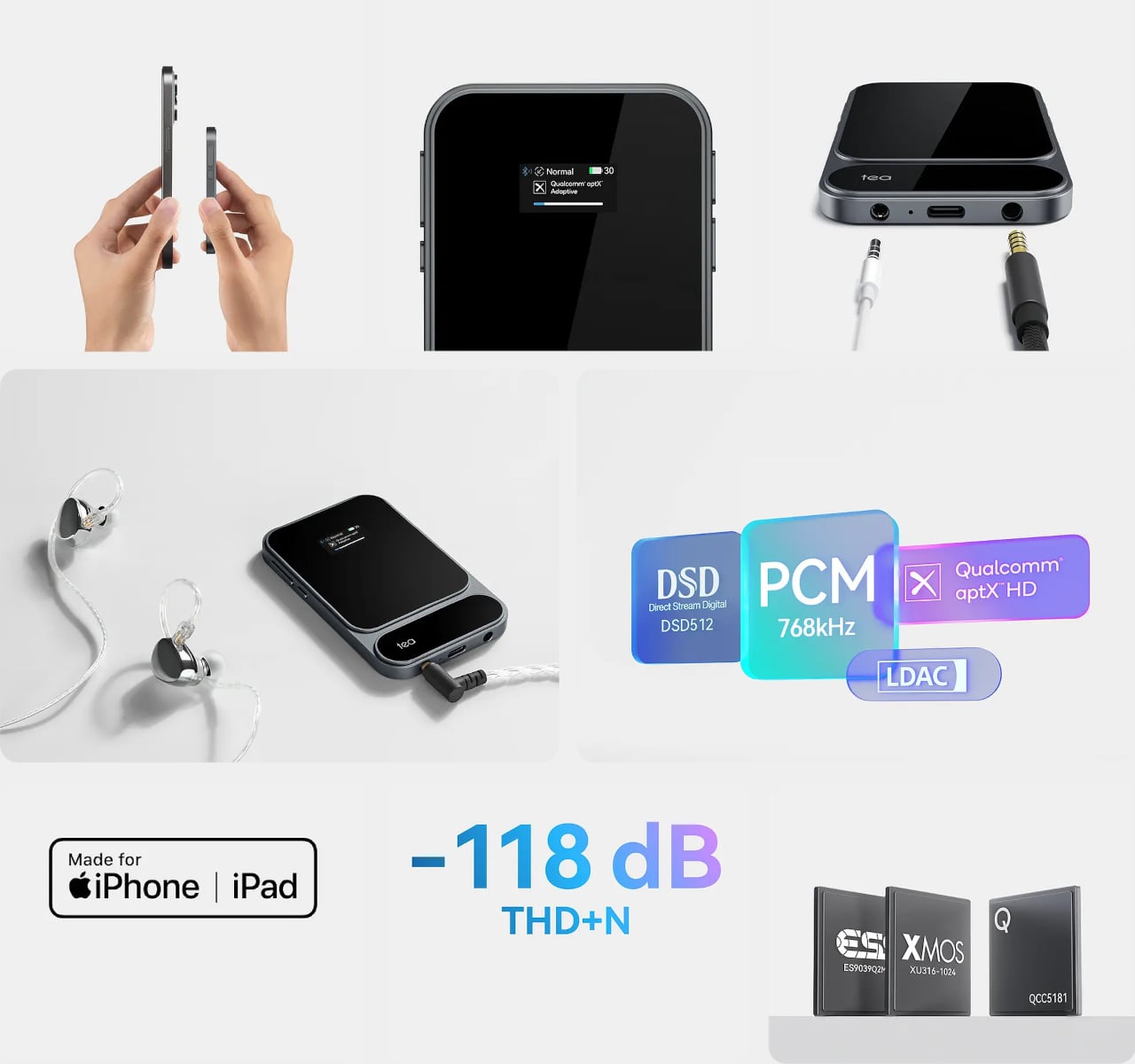
Both a 4.4mm balanced and a 3.5mm unbalanced output are on board, with the balanced jack putting out 165mW into 33 ohms and the unbalanced delivering 120mW. The Tea Pro also manages 41.67mW into 600 ohms, meaning even demanding full-size headphones with high impedance get a fully powered signal rather than an underpowered afterthought by a device that’s trying too hard to be small.

Wireless connectivity comes via a Qualcomm QCC5181 Bluetooth 5.4 chip that covers SBC, AAC, aptX, aptX Adaptive, aptX HD, and LDAC, keeping the Tea Pro compatible with virtually any device. The Khadas app adds a feature-rich equalizer that works over Bluetooth, letting you shape the sound to your taste without touching the hardware. There’s also a built-in microphone, so taking a call doesn’t require unplugging anything.
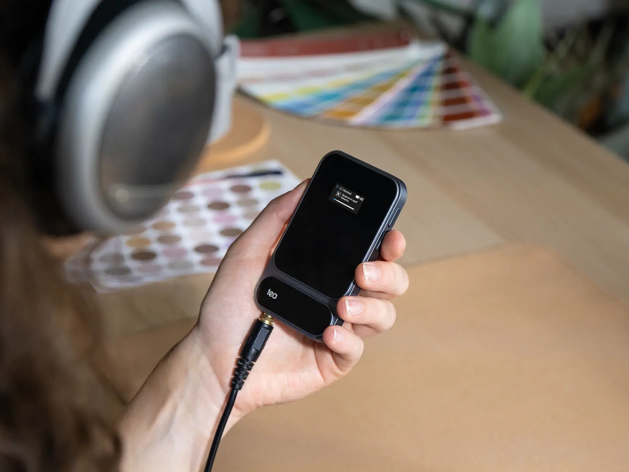
A 2100mAh battery supports up to 11 hours of wireless playback or just over eight hours wired, enough to outlast a full day of commuting without reaching for a charger. A 0.95-inch AMOLED color display on the front keeps output format, volume, and battery status visible at a glance, while independent power management keeps the battery from draining your phone when you aren’t connected to a power source.
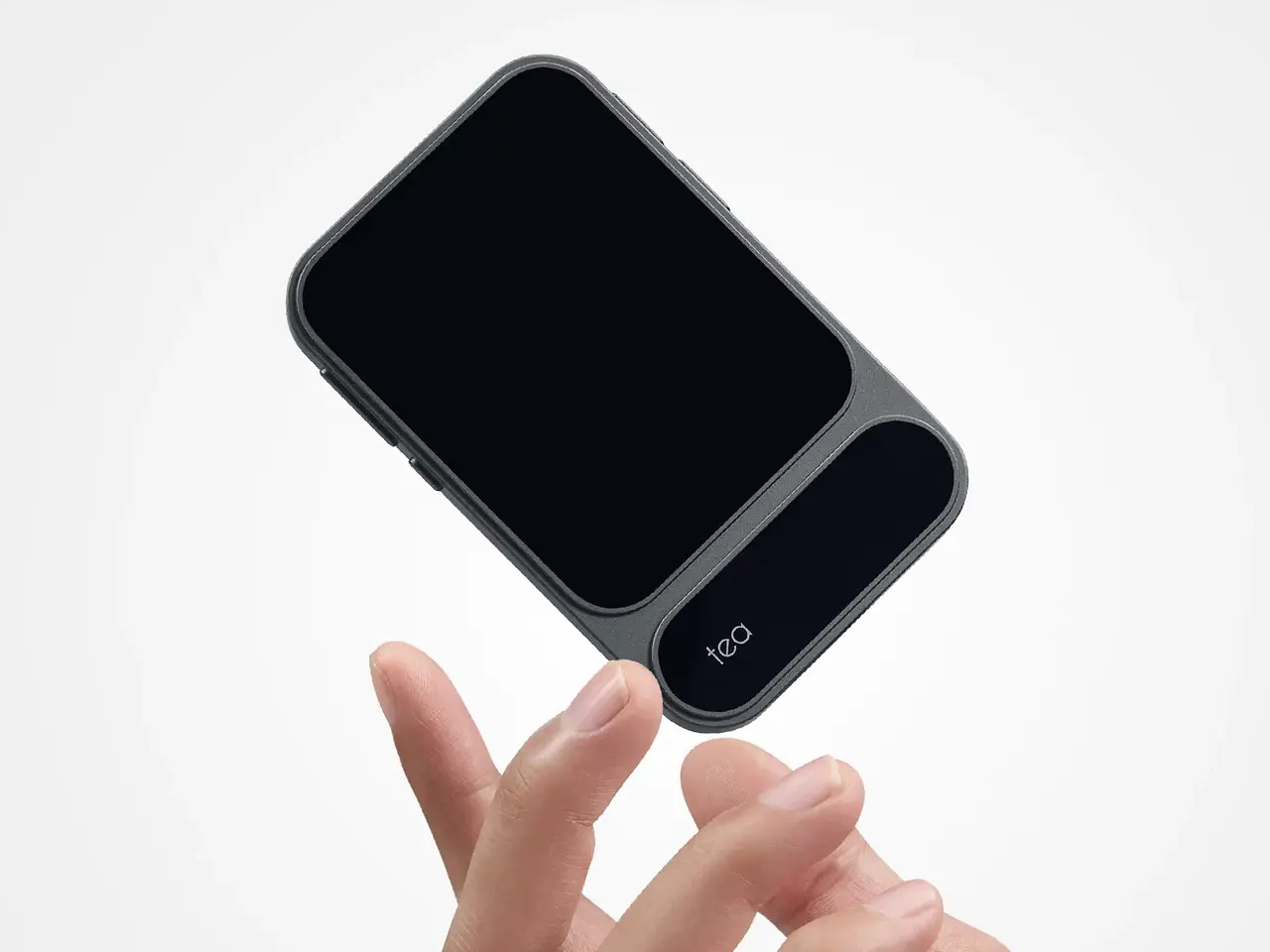

Volume control runs through a dedicated analog chip rather than a software slider, keeping noise out of the signal path. The Tea Pro is priced at $199, which puts it well above the typical dongle but far below a battery-powered desktop DAC/amp that requires its own carrying case. For a device that fits in a jacket pocket and holds itself to the back of your phone, that’s a narrowing of the gap that’s hard to argue with.
The post Khadas Just Made a $199 Amp That Snaps to Your iPhone Like a Wallet first appeared on Yanko Design.

The XREAL xbx a01+ AR glasses combine affordability with practical features, positioning them as a strong option in the budget AR category for 2026. According to TechUtopia, these glasses weigh just 62 grams and include adjustable nose pads and soft temple arms for comfort during extended use. A key feature is their ability to project […]
The post XREAL xbx A01+ 120Hz AR Glasses Excel for $299 Deliver a 147-Inch Virtual Screen appeared first on Geeky Gadgets.
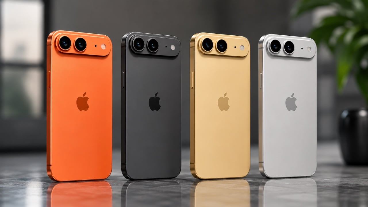
The iPhone Air 2 is shaping up to be a standout addition to Apple’s mid-range smartphone lineup, with leaks pointing to a range of significant improvements. From enhanced photography and processing power to refined connectivity and display design, the device promises to deliver a balanced mix of innovation and practicality. Below is an in-depth look […]
The post Five Major Upgrades Detailed in a New iPhone Air 2 Leak appeared first on Geeky Gadgets.


PlayStation’s plan to phase out physical game discs by 2028 marks a significant step toward a fully digital gaming ecosystem. According to RGT 85, this move is not just about streamlining distribution but also about reshaping the balance of power in the gaming industry. By removing physical copies, PlayStation can cut production costs and exert […]
The post PlayStation May Phase Out All Physical Game Discs By 2028 appeared first on Geeky Gadgets.

AI systems are increasingly relied upon to process and analyze complex datasets, but their outputs are not always as reliable as they seem. As Mo Chen explains, AI-generated results can sometimes appear confident and precise while being fundamentally flawed due to issues like incompatible data structures or misinterpreted metrics. For example, an AI might inaccurately […]
The post AI Data Agents Mask False Causation Errors Behind High Confidence appeared first on Geeky Gadgets.
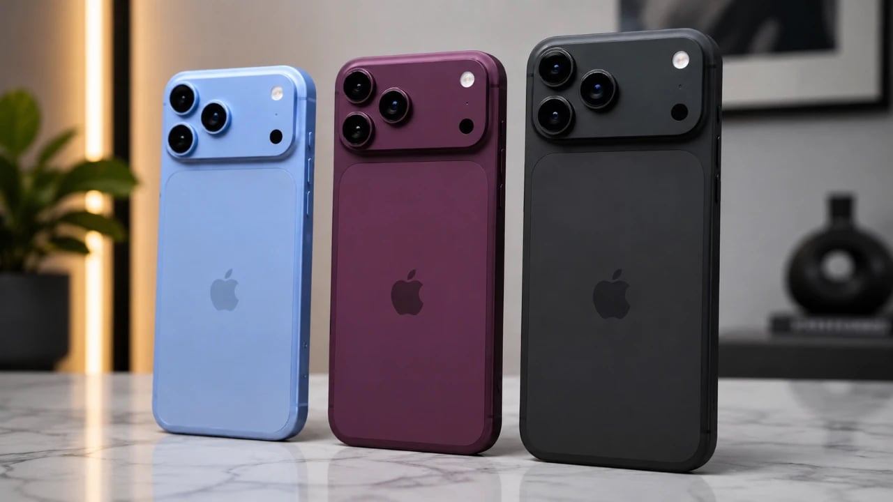
The iPhone 18 Pro and Pro Max have captured widespread attention, with leaks revealing a host of significant updates. From a reimagined design to innovative hardware, Apple is pushing the boundaries of smartphone innovation. However, these advancements come with a notable price increase, and the absence of a base iPhone 18 until 2027 raises […]
The post iPhone 18 Pro Fully Leaked: Game-Changing Features Coming to Apple’s Flagship appeared first on Geeky Gadgets.