Huawei’s 8,000-Nit Display Is a Design Statement Disguised as a Spec Sheet

Smartphones have become spec sheet battlegrounds. Bigger megapixels. Faster charging. Higher refresh rates. The numbers climb while the actual user experience often stays flat.

Designer: Huawei

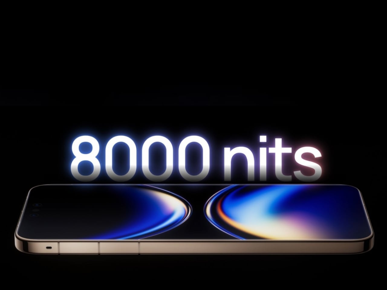
Huawei’s Mate 80 Pro Max arrives with an 8,000-nit peak brightness claim that obliterates every competitor on paper. But peel back the marketing headline and something more interesting emerges: a deliberate design philosophy that treats the display as the phone’s defining character trait, not just another specification to maximize.

When Engineering Becomes Industrial Design

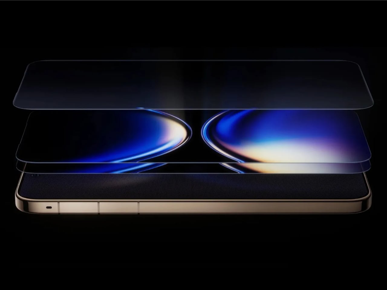
The dual-layer OLED panel represents Huawei’s answer to a fundamental physics problem. Traditional OLED displays push a single emissive layer harder to achieve brightness, generating excess heat and potentially shortening panel lifespan. Huawei’s solution stacks two OLED layers, distributing thermal and electrical load across twice the surface area while hitting brightness numbers that single-layer panels cannot match. The engineering choice has profound visual consequences that extend far beyond the headline specification.

HDR content transforms on a dual-layer panel. Highlights carry genuine intensity while shadows retain depth rather than washing out, creating an almost three-dimensional quality to images that photographers and videographers will immediately recognize. The smartphone has become our primary camera, editor, and viewing screen, and Huawei designed this display to serve all three roles simultaneously.

Eye comfort gets attention too. The 1440Hz PWM dimming rate eliminates the invisible flicker that causes strain during extended low-brightness use, addressing one of OLED technology’s persistent criticisms that cheaper panels still struggle with.

Most users will never consciously notice this detail. Their eyes will thank them anyway.

The “8” That Defines Everything

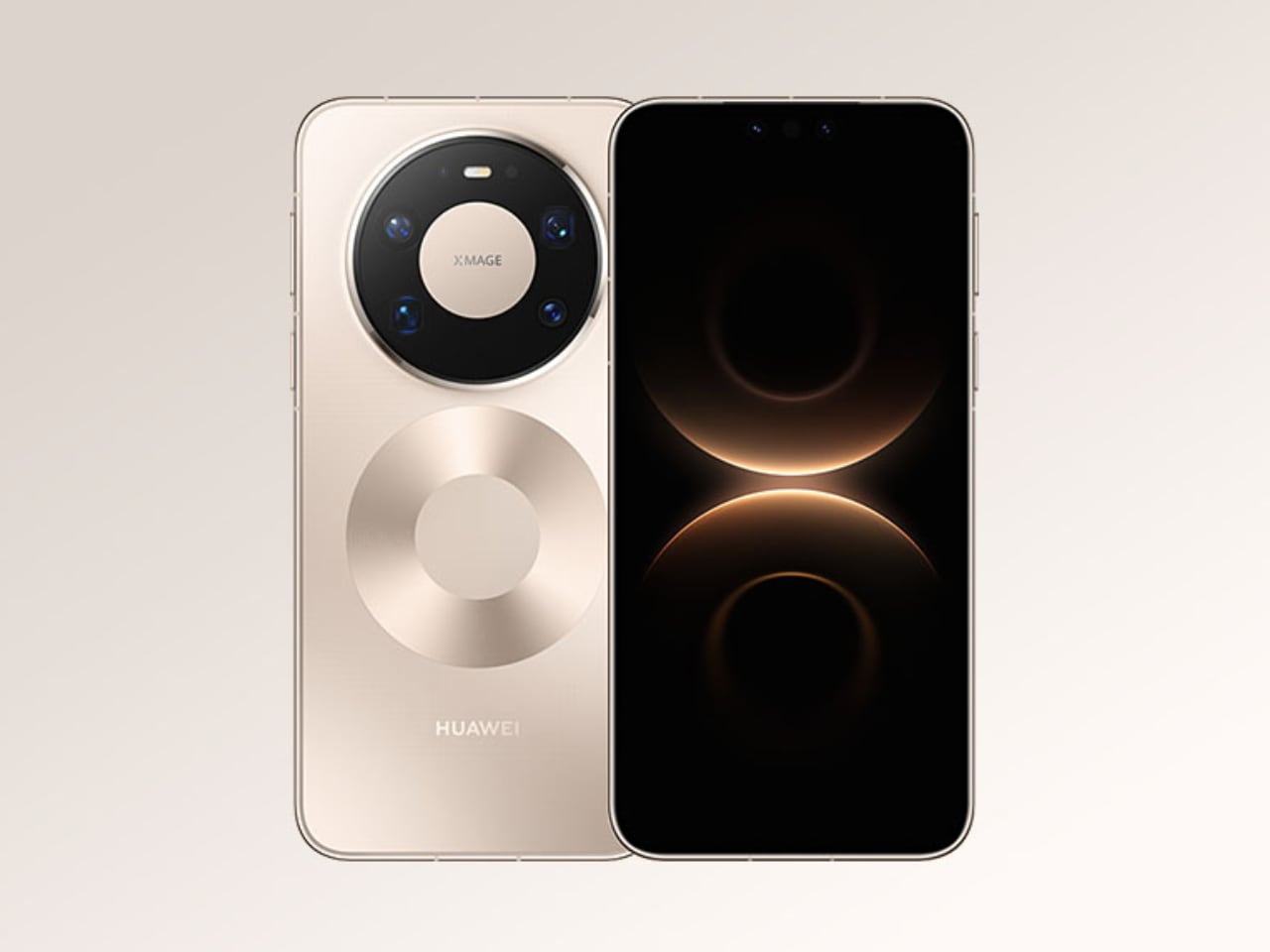
Huawei’s design team turned the model number into a visual identity, and the boldness of that choice deserves recognition in an industry addicted to safe rectangles and generic camera bumps.

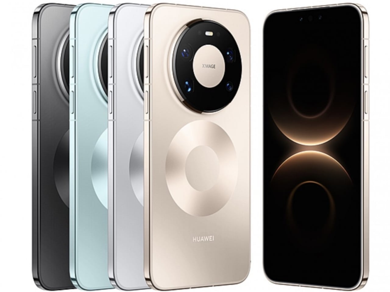
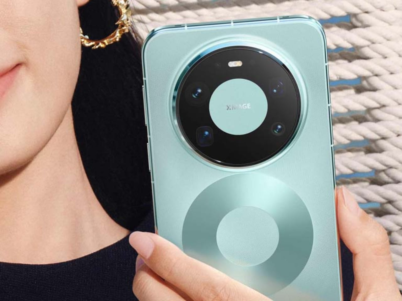
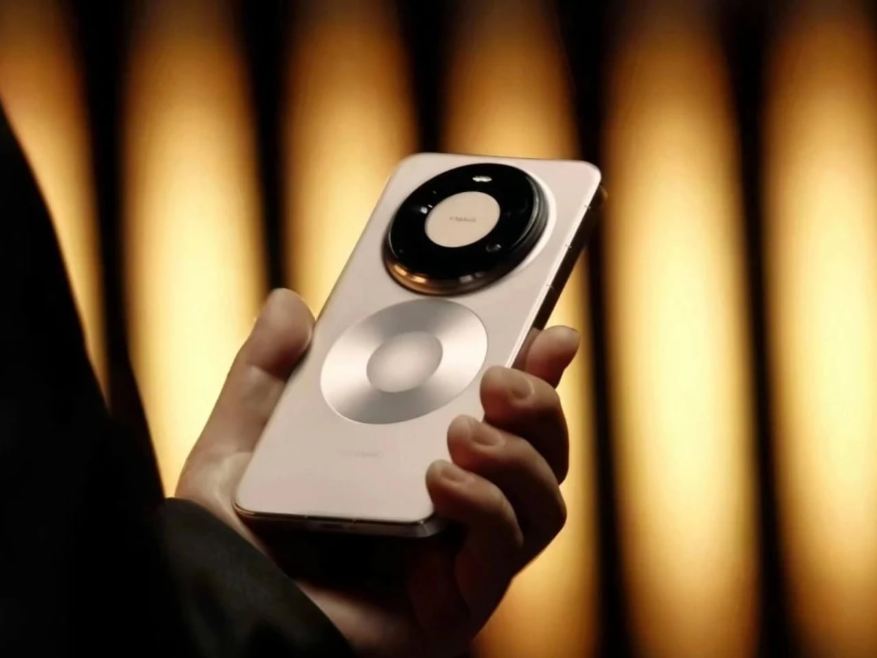
The rear panel features a prominent circle highlighting the wireless charging coils, positioned directly above the circular camera module. Together, these two circles stack vertically to form a figure eight that reads as both functional diagram and brand statement. The phone announces itself at twenty feet. Most manufacturers treat rear panel design as an afterthought, a surface to slap logos onto after engineering finishes the real work. Huawei flipped that relationship entirely, making the wireless charging coils a design feature rather than hiding them under featureless glass.

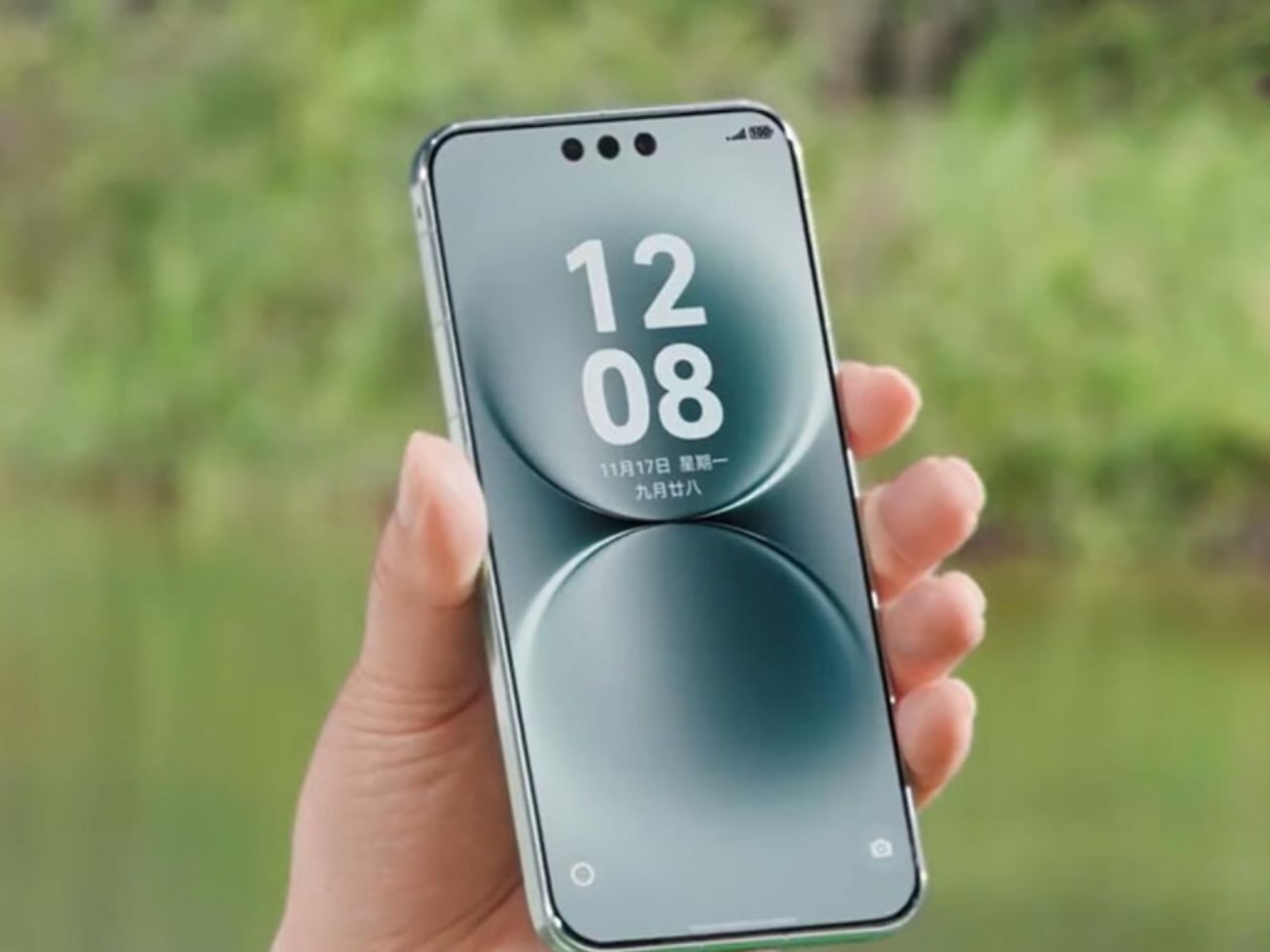
The flat display edges and squared-off sides follow a broader industry shift away from curved screens. Curves looked elegant but created durability problems and made edge interactions imprecise, and Huawei clearly listened to actual user complaints rather than chasing visual trends. The Mate 80 Pro Max prioritizes function over flowing aesthetics, which reads as mature design confidence rather than trend abandonment.

Materials as Message

Kunlun Glass 2 protects the display. Basalt-infused elements reinforce the frame. Polyamide fiber adds structural rigidity. These materials come from aerospace and automotive applications where failure means more than a cracked screen, and Huawei wants you to know it.

The material palette communicates something specific: this phone is built to survive. Whether the exotic composition actually outperforms conventional aluminum and Gorilla Glass remains unproven through real-world abuse testing, but the conceptual intent lands clearly. Huawei wants buyers to feel they’re holding something more substantial than another fragile glass sandwich that shatters on the first drop.

Competitor Philosophies Compared

Apple’s iPhone 17 Pro Max peaks at 3,000 nits outdoors, emphasizing color accuracy, response time, and ProMotion integration instead. Samsung’s Galaxy S25 Ultra settles at 2,600 nits peak, focusing on S Pen ecosystem integration where stylus latency matters more than brightness records.

Realme’s GT 8 Pro pushed to 7,000 nits before Huawei arrived, representing the aggressive spec-chasing that defines much of the Chinese smartphone market where headline numbers drive purchasing decisions more directly than in Western markets. Different priorities produce different design choices, and Huawei one-upped everyone on brightness while wrapping the achievement in more considered industrial design than the pure spec-chasers typically deliver.

Trade-Offs Hidden in Marketing: 8,000 nits requires power.

More power means bigger batteries, shorter runtime, or aggressive throttling when capacity drops. Huawei’s 6,000mAh battery seems modest against Chinese competitors pushing past 7,000mAh, which suggests either extreme confidence in dual-layer efficiency or accepted runtime compromises that won’t appear until real-world testing begins.

Thermal management creates even thornier long-term concerns that no launch event mentions. Excessive heat degrades organic compounds in OLED panels over time, potentially causing permanent brightness loss and color shift in heavily-used screen areas. The dual-layer architecture should help by spreading thermal load across more surface area, but durability implications won’t become clear for years of actual use. And then there’s the practical question: who actually needs 8,000 nits? Screens above 2,000 nits handle direct sunlight adequately for most tasks, and the extreme peak brightness matters primarily for tiny HDR highlights representing blinding light sources like the sun or reflections.

Real value or marketing trophy? Probably both, depending entirely on how you use the device.

What the Brightness Obsession Reveals

The Mate 80 Pro Max embodies a specific philosophy: the display IS the device, and everything else exists to support the viewing experience. The logic tracks, since smartphones evolved into portable screens that occasionally make calls, and optimizing the primary interaction surface makes intuitive sense. But brightness as the defining metric risks missing what actually makes displays pleasant to use: color accuracy, viewing angle consistency, touch response precision, eye comfort across hours of use. A 2,000-nit panel with superior color science might deliver better daily experience than an 8,000-nit screen with mediocre calibration. Huawei historically nails calibration alongside technical specs, so there’s reason for optimism, but the proof requires hands-on time that marketing materials cannot provide.

For Design-Conscious Buyers

The Mate 80 Pro Max succeeds as a design object beyond its brightness claims. The “8” motif creates genuine visual identity. The material choices communicate premium durability. The dual-layer OLED architecture represents meaningful innovation rather than incremental improvement. HarmonyOS remains the elephant in the room for international users, with no Google Play Services meaning no Gmail, no Maps, no YouTube without workarounds, and limited global availability makes the device theoretical for many potential buyers regardless of how compelling the hardware appears.

For those who can access and actually use the Mate 80 Pro Max within its intended market, the display technology offers real advantages for outdoor use, HDR content, and photography demanding accurate highlight reproduction. The design language makes a statement that Apple and Samsung’s safer approaches simply don’t attempt. The brightness arms race continues, and competitors will push toward and beyond Huawei’s record within months.

What matters more than any single number is whether manufacturers use these capabilities to create genuinely better experiences, or simply chase specifications for their own sake. The Mate 80 Pro Max suggests Huawei understands the distinction, even if the marketing still leads with the biggest number.

Display Technology Comparison

Specification Huawei Mate 80 Pro Max iPhone 17 Pro Max Samsung Galaxy S25 Ultra Realme GT 8 Pro
Peak Brightness 8,000 nits 3,000 nits 2,600 nits 7,000 nits
Display Technology Dual-layer OLED Single-layer OLED Single-layer OLED Single-layer AMOLED
PWM Dimming 1440Hz 480Hz Variable 2160Hz
Refresh Rate 1-120Hz LTPO 1-120Hz ProMotion 1-120Hz LTPO 1-120Hz LTPO
Resolution 1320 x 2848 1320 x 2868 1440 x 3120 1264 x 2780
Glass Protection Kunlun Glass 2 Ceramic Shield Gorilla Armor 2 Gorilla Glass Victus 2
Design Philosophy Brightness as identity Color accuracy first Stylus integration Spec leadership

The post Huawei’s 8,000-Nit Display Is a Design Statement Disguised as a Spec Sheet first appeared on Yanko Design.

Hands-On with Nano-Texture Display: Why the M4 Pro Chip Makes the MacBook Pro the Best Laptop Yet

When Apple introduced the nano-texture display option, it revolutionized how creators like me interacted with their most crucial tool. Let’s face it, we look at the display on the laptop 100% of the time we use it, so it needs to be as perfect as humanly possible. Until now, despite countless improvements from Apple and others, no display has truly nailed the combination of resolution, quality, accuracy, and glare reduction. This is the first time it genuinely feels like everything has come together perfectly. As someone who frequently battles glare while simultaneously demanding the ideal combination of portability and power, I wholeheartedly believe that the MacBook Pro 14-inch, equipped with the formidable M4 Pro chip, represents a significant improvement that fully satisfies all my creative demands.

Designer: Apple

The Glare-Killing Game Changer: How Does Nano-Texture Technology Work?

The magic lies in microscopic etchings that break down light waves. Instead of applying a coating that dulls the display, Apple precisely alters the glass surface itself. These nanometer-scale etchings scatter ambient light while attempting to maintain the display’s inherent color accuracy and contrast.

The nano-texture display, a $150 upgrade, felt like a luxury at first—until I used it for the first time today. Working outdoors, on airplanes, in cars, or any bright environment is now effortless. Previously, my 16-inch M1 Max MacBook Pro would glare so much under sunlight that I’d have to squint or move indoors. Now, with the nano-texture display, direct sunlight feels irrelevant. I placed both laptops side-by-side during my testing, and the difference was immediate. The nano-texture display stood out, turning a frustrating glare-filled workspace into a productive one.

Apple’s nano-texture technology effectively reduces glare—it’s the closest thing to a paper-like feel I’ve experienced on a laptop screen, offering a unique viewing experience akin to a printed photograph. The etched surface scatters light evenly, making it comfortable to look at for long hours without that usual agony of dealing with glare. The crisp colors and contrast are still intact, which is crucial for my work. The nano-texture display also gives me a genuine sense of immersiveness, drawing me in without distraction, which is particularly beneficial for long sessions of writing, editing images, and videos. Whether I’m writing or editing images or videos, the screen performs seamlessly, with wide viewing angles and consistent quality, regardless of lighting conditions.

Performance Characteristics and Viewing Experience:

  • Glare Reduction: Exceptional, with near-complete elimination of reflections in diverse lighting conditions.
  • Color Preservation: Slightly reduced color vibrancy compared to glossy displays but maintains remarkable consistency across different environments.
  • It feels like viewing a printed photograph
  • Maintains readability in bright sunlight
  • Provides consistent visual performance from multiple angles

Nano-texture is specifically designed for the following professional use cases:

  • Photographers and visual artists
  • Professionals working in variable lighting environments
  • Creators who prioritize consistent display performance over peak color saturation

Portability Without Performance Compromise

For someone who is always on the move, the weight of my gear matters as much as its performance. The M4 14-inch MacBook Pro is incredibly light at 3.5 pounds compared to the 16-inch, which is heftier at 4.7 pounds and almost on par with the 15-inch MacBook Air M3, which weighs 3.3 pounds. This reduction might not sound significant on paper, but it’s transformative in daily use—especially when carrying other essentials.

The smaller display size could seem limiting, but it works perfectly for my needs in real-world use. As an editor and journalist who runs multiple tasks simultaneously—often including working in tight spaces like cafés or planes—the compact form factor fits seamlessly into my workflow without feeling like a compromise. As a one-bag packer, the smaller M4 MacBook Pro fits easily into my backpack, allowing me to travel light without sacrificing capability.

Performance: Effortless Efficiency

Apple Silicon has spoiled me with its reliability. The M4 Pro chip continues the tradition of handling demanding tasks without hiccups. Whether I’m editing a 4K video, running multiple content creation applications, or using a native AI app to transcribe audio to text, the performance is seamless. Efficiency isn’t just about speed—it’s about working without worrying if my machine can keep up.

What’s most surprising is how quiet it remains, even under heavy loads. I’ve been extremely spoiled by the noiseless MacBook Air, thanks to its fanless architecture, so this is a welcome feature during late-night writing sessions or when working in quieter environments. Nano-Texture: The Heart of the Upgrade

This display technology presents the perfect opportunity to upgrade—at this very moment. The nano-texture screen significantly reduced reflections, transforming how I work in mixed lighting conditions. My work remains vibrant and clear in a sunlit office, where glare usually dominates. At the same time, in dimly lit offices, the contrast and color accuracy stay sharp. It feels like the display adapts to me rather than vice versa.

For those already using an M1 Max MacBook Pro, the move to the M4 Pro might feel incremental on paper. But for me, it’s the culmination of subtle refinements: the nano-texture display, compactness of the 14-inch form factor, and even more efficient performance. These changes align perfectly with all my daily needs. It’s about having reliable tools that enhance my workflow and make my day-to-day tasks more efficient.

The M4 14-inch MacBook Pro is a reliable and essential part of how I create, edit, and collaborate every day. This is just a rough hands-on, and the full review is forthcoming. I have a trip to Japan, China, and then Dubai in the next few weeks back to back, and I can’t wait to put it through real-world tests. Starting at $1,999, with the nano-texture display option adding $150, it’s an investment that feels justified every time I power it on. For anyone who demand the best from their gear, this MacBook Pro delivers an experience worth every dollar.

The post Hands-On with Nano-Texture Display: Why the M4 Pro Chip Makes the MacBook Pro the Best Laptop Yet first appeared on Yanko Design.

NanoBrick’s E-Skin Anycolor is a low-energy color display set to revolutionize electronic paper

Why do e-ink displays have to look the same old boring in grayscale hues? Can’t they come in other monochrome color options? NanoBrick has taken this challenge up and designed the E-Skin Anycolor which is based on their EDP technology. This innovation lets the user have the flexibility to get an E-Paper in any hue with the option of having a customizable size or form factor.

If the thought of a rollable or bendable display came up in your mind, you’re not alone. The next revolutionary piece of display technology destined to end up as a common man’s perk in a few years, could very well have a more budget-friendly option. That’s where the E-Skin Anycolor comes into play, especially in times when people are willing to take up the option of a minimalist phone. This peppy E-Ink display has a very low power consumption and can even work with NFC signals which is a big advantage for power-hungry gadgets.

Designer: NanoBrick

Going minimalistic with your digital world makes sense but if you get frustrated with the grayscale colors of the device it’ll only end up in more anxiety. That’s where the innovative tech comes into play thanks to its flexibility. It is much easier to mass manufacture than e-ink displays with a more complex production process. You can create them for large-scale displays, small gadgets, or high-efficiency minimalistic watches. Maintaining a good brightness level with less glare, even on the sunniest of days is also an advantage.

Nanobrick doesn’t want to stick to contemporary applications and wants the E-Skin Anycolor to turn any surface into a personalized canvas for display. For example, a personalized laptop cover, low-energy signboard, or office walls with live frames. The dynamic color transformation is achieved courtesy of the single nano-particles in the color dyes that are manipulated by applying small currents. The company wants to expand the usage of this new-age electronic paper to other applications as well with the IP-protected ingress.

There’s no word on the first expected consumer electronic or business application that’ll have the E-Skin Anycolor at its helm, but it surely will make similar display technologies obsolete.

The post NanoBrick’s E-Skin Anycolor is a low-energy color display set to revolutionize electronic paper first appeared on Yanko Design.