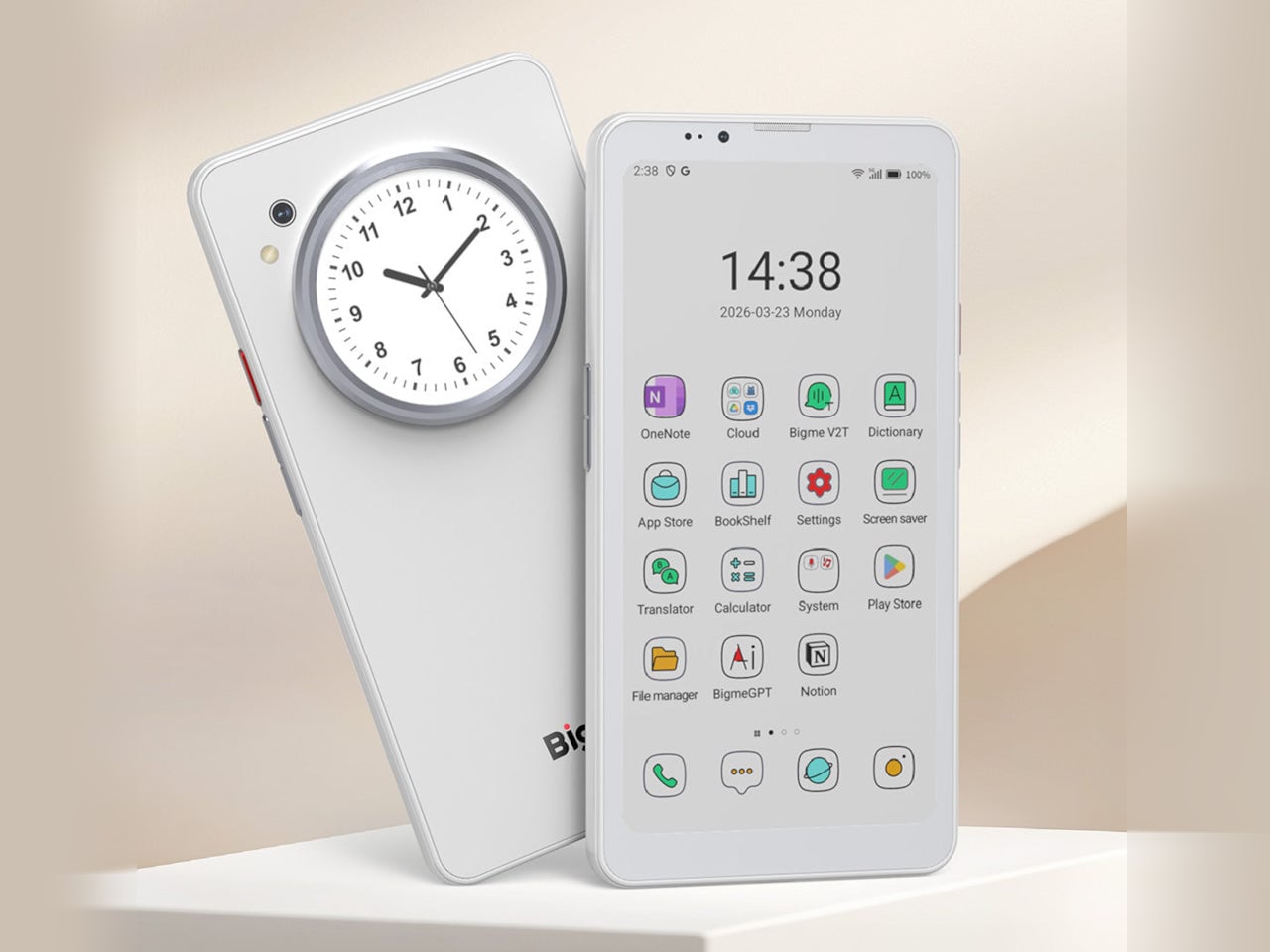
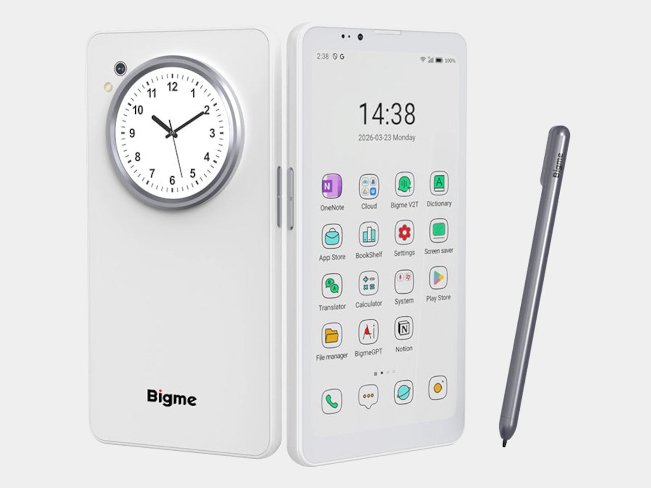
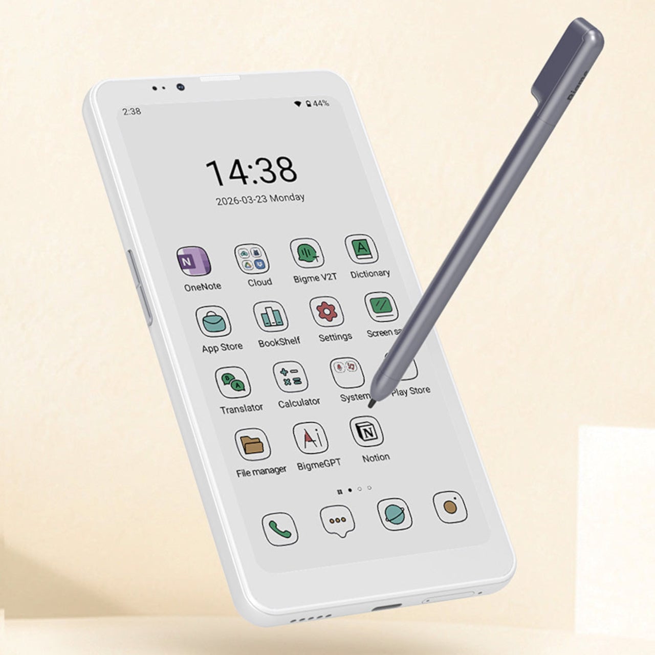
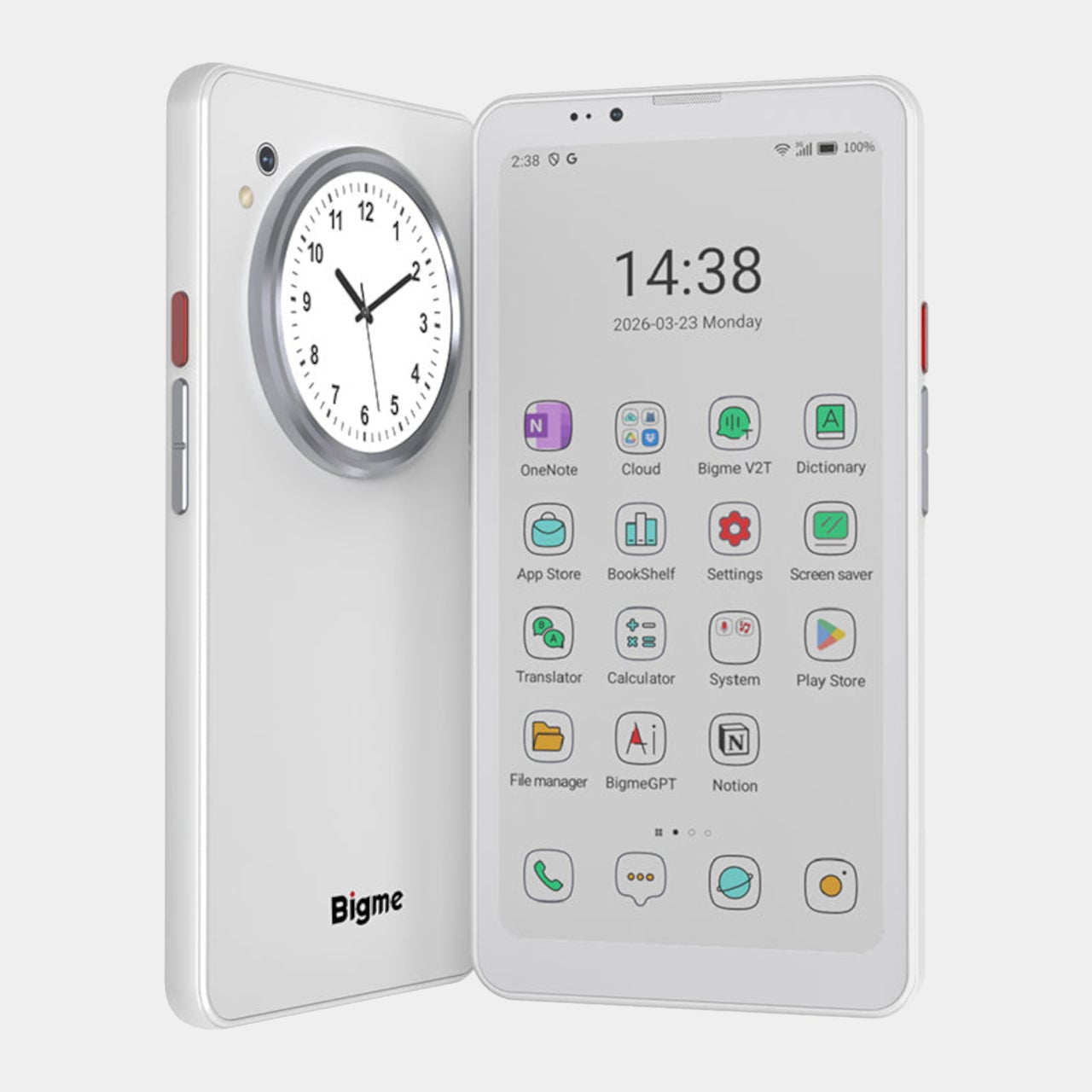
DuRoBo Krono Brings an AI-Powered Pocket ePaper Focus Hub to the US

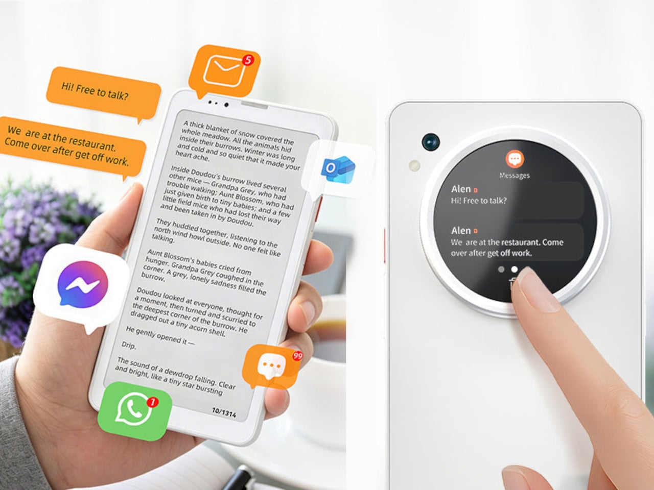
Trying to read or think on a phone never quite works. Notifications interrupt articles halfway through, feeds wait one swipe away from whatever you were concentrating on, and even long reads become just another tab competing for attention. E‑readers tried to solve this, but most stopped at books and stayed locked into one ecosystem. DuRoBo, a Dutch e‑paper specialist, is bringing Krono to CES 2026 in Las Vegas with a different ambition, treating focus, reflection, and idea capture as equally important.

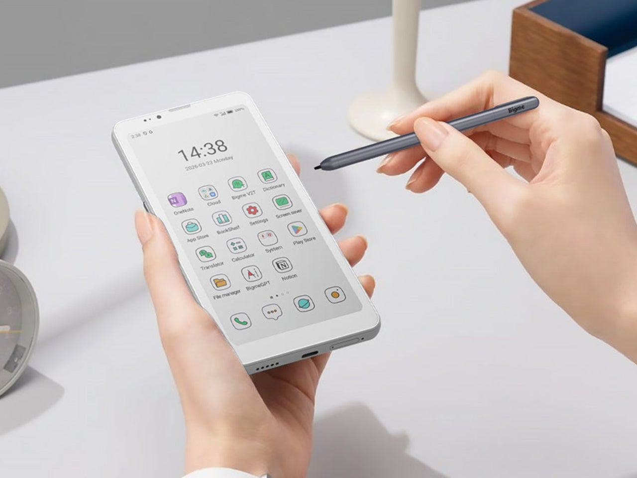
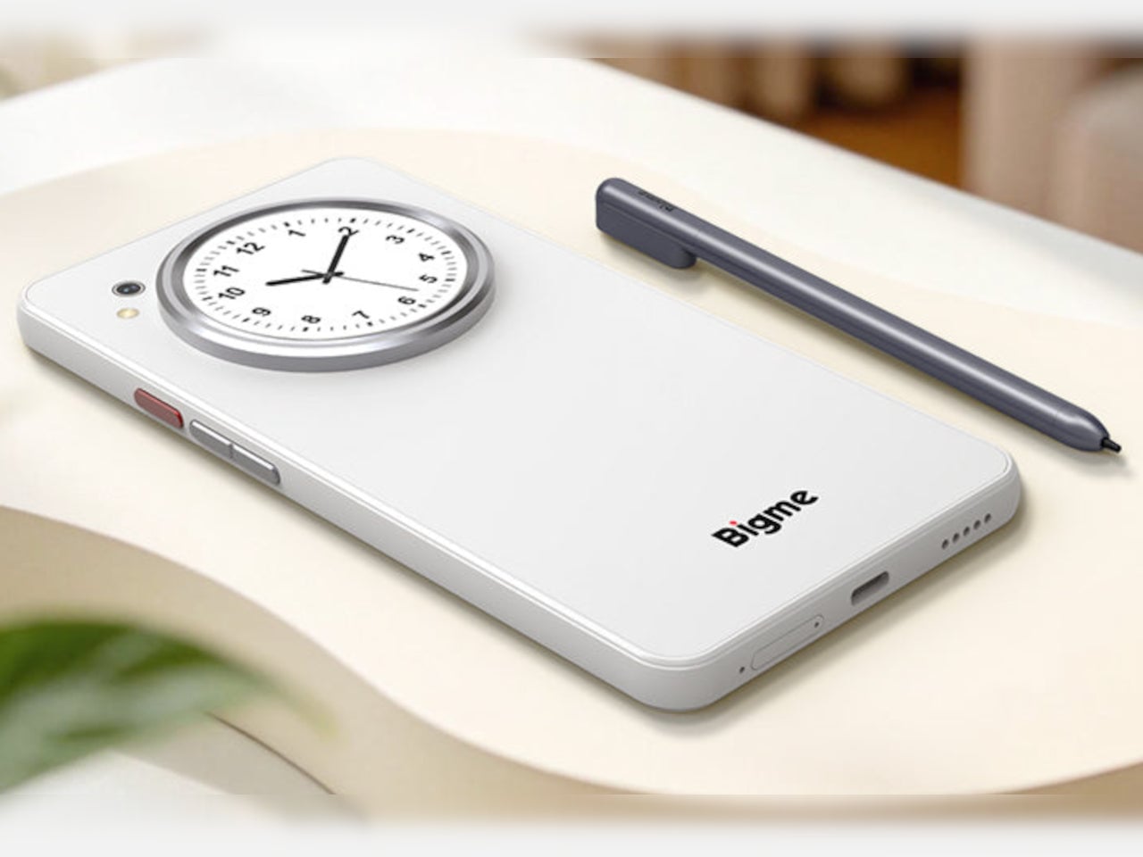
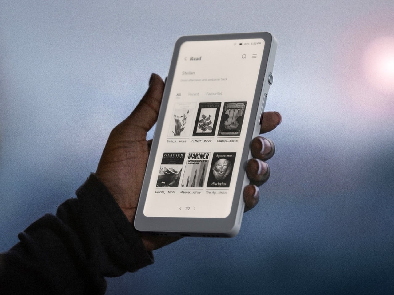
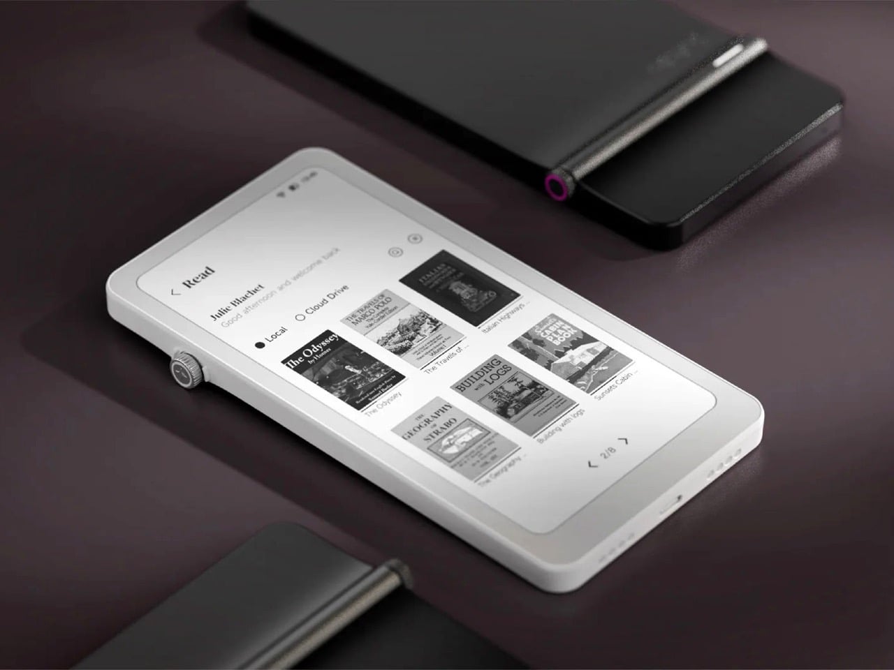
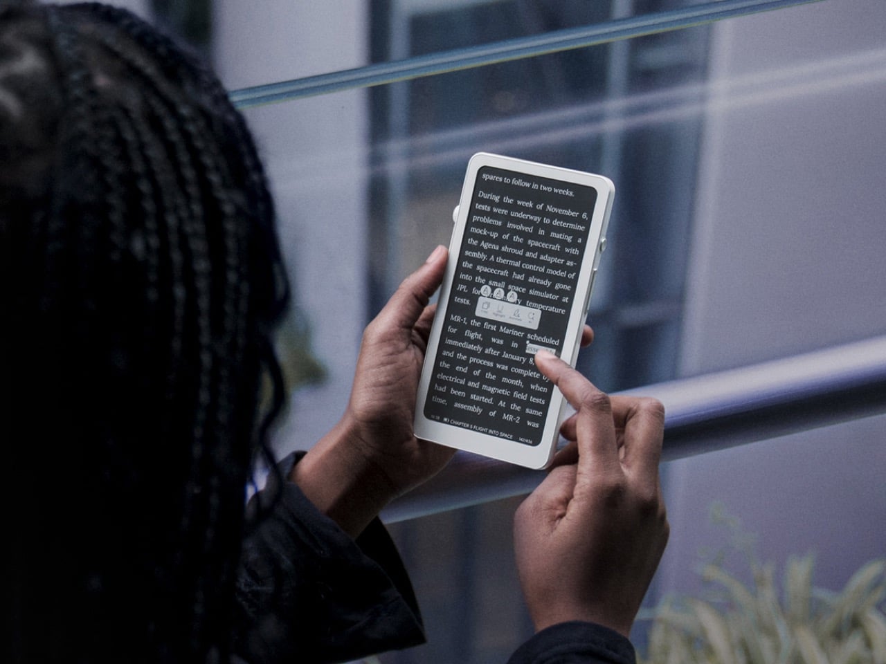
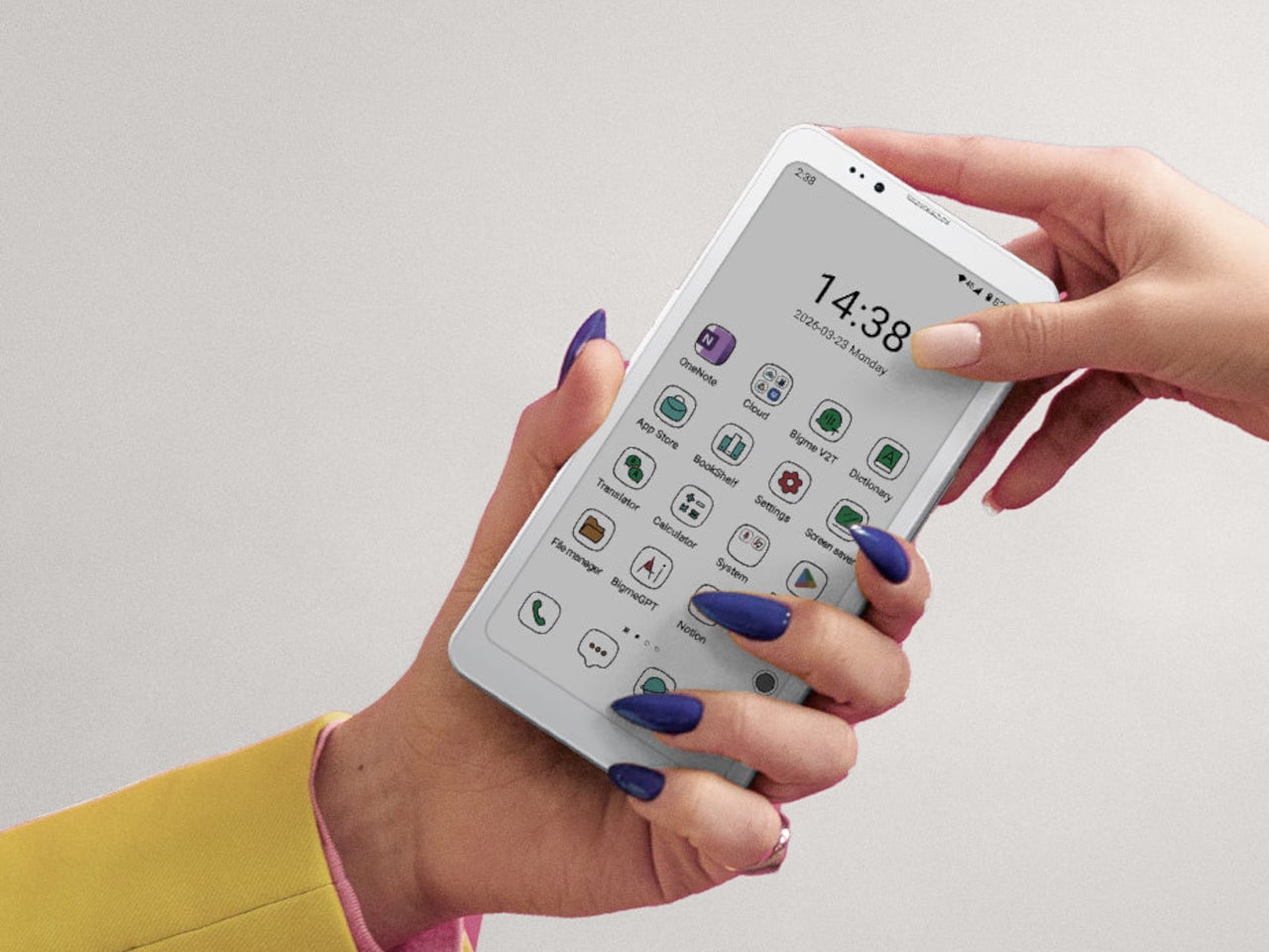
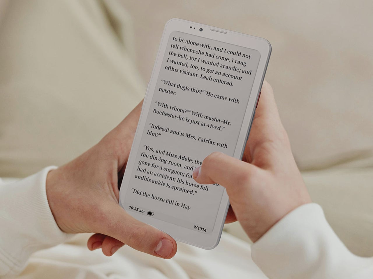
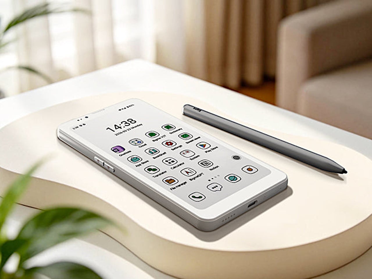
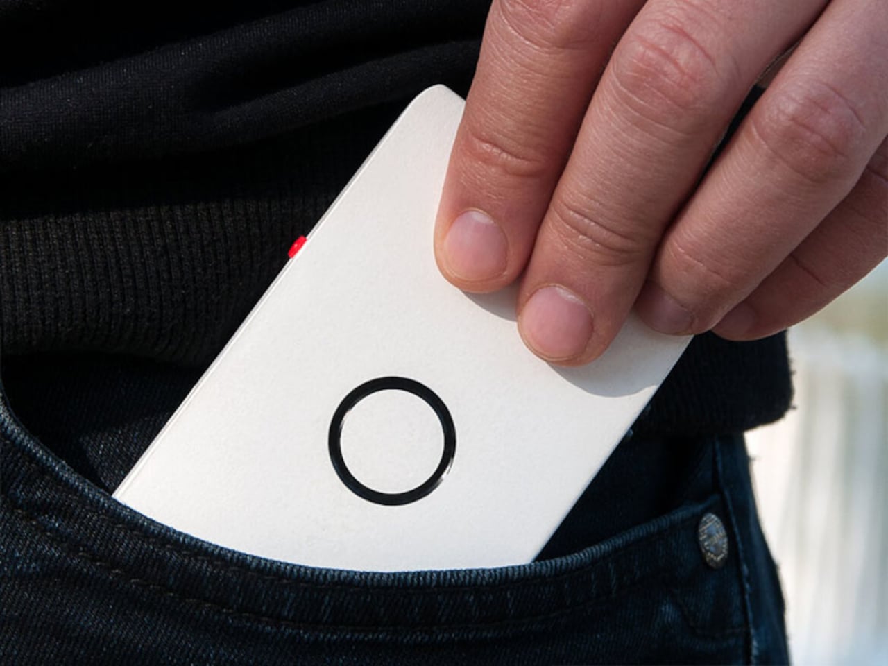
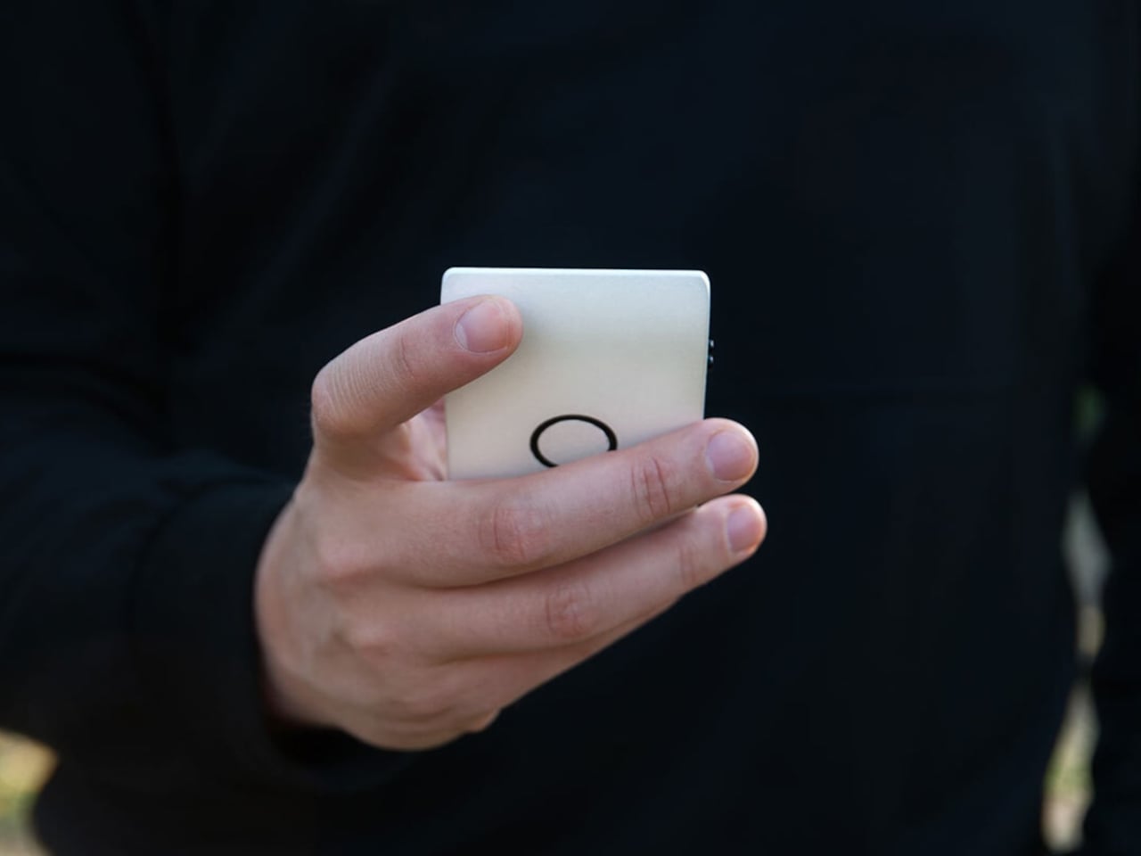
Krono is a pocket‑sized smart ePaper focus hub that has made waves in Europe and is now entering the US market. It wraps a 6.13‑inch E Ink Carta 1200 display with 300 PPI clarity into a minimalist, mechanical‑inspired body that measures 154 × 80 × 9 mm and weighs about 173 g. It is for capturing and shaping thoughts with on‑device AI, ambient audio, and a Smart Dial that feels more tactile than tapping glass.

Designer: DuRoBo

The paper‑like screen, anti‑glare etching, and dual‑tone frontlight make it comfortable for long reads, whether books, saved articles, or PDFs. The compact body feels closer to a large phone than a tablet, which encourages carrying it everywhere as a dedicated space for slower content. The display mimics paper well enough that you can read for hours without the eye strain from backlit screens.

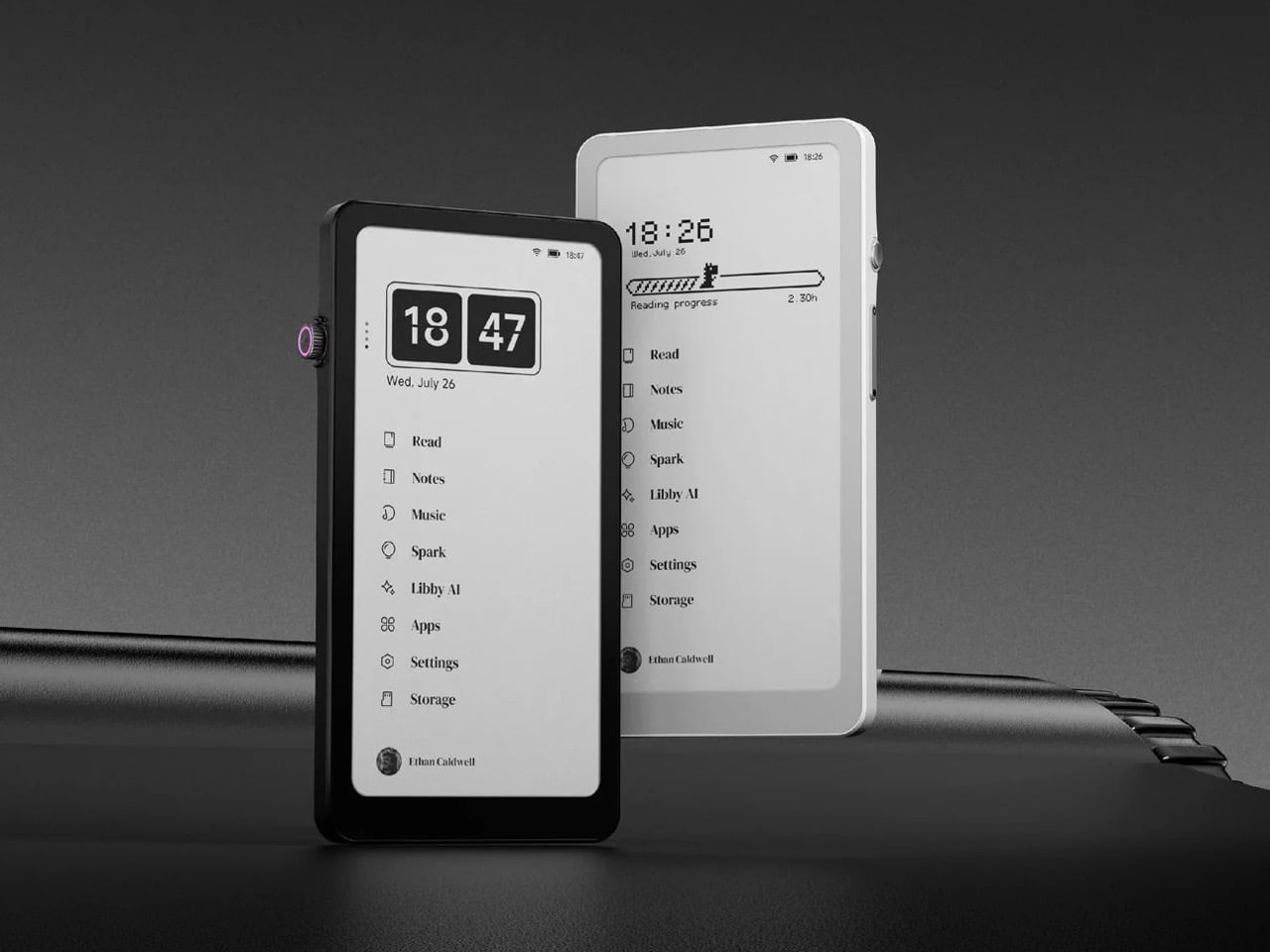
The Smart Dial and Axis bar are the main interaction story. The dial lets you flip pages, adjust brightness or volume, and, with a long‑press, open Spark, Krono’s idea vault. The Axis along the top rear houses eight breathing lights that glow subtly while you read or work, reinforcing the sense of a calm, separate device. The dial and lights give Krono a more analog feel, turning navigation and focus into something you do with your hand.

Spark is where AI enters. Press and hold the dial to dictate a thought, meeting note, or passing idea, and Krono records it, transcribes it with speech‑to‑text, and runs an AI summary that turns it into a structured note. Text Mode lets you refine that note on the e‑paper screen. The whole process happens on‑device, keeping ideas private and the interface calm.

Libby AI is the on‑device assistant that answers prompts and helps with outlines or clarifications without dragging you into a browser. Krono runs Android 15 with full Google Play Store access, powered by an octa‑core processor, 6 GB of RAM, and 128 GB of storage, so it can run Kindle, Notion, or other tools. DuRoBo’s own interface keeps the experience geometric and minimal.

The built‑in speaker and Bluetooth audio are part of the focus story. You can listen to music, podcasts, or audiobooks while reading or writing, turning Krono into a self‑contained environment for commutes or late‑night sessions. The 3,950 mAh battery and tuned refresh algorithms support long stretches of use, not constant app‑hopping, which is what you want from a device that is supposed to be a reprieve from the usual screen.

Krono’s CES 2026 appearance is more than just another e‑reader launch. It is DuRoBo’s attempt to give US readers and thinkers a pocketable device that treats focus, reflection, and idea capture as first‑class design problems. The specs matter, but the real promise is a small, quiet object that can sit between a book and a phone, borrowing the best of both without inheriting their worst habits.

The post DuRoBo Krono Brings an AI-Powered Pocket ePaper Focus Hub to the US first appeared on Yanko Design.

Mudita Minimalist Phone and Alarm Clocks Design a Calmer Day at CES 2026

The day often begins and ends with a smartphone, from checking notifications before getting out of bed to scrolling in the dark when you should be asleep. Even people who care about design and well-being end up with glowing rectangles on every surface, and that constant presence quietly shapes attention, sleep, and mood more than most of us like to admit. The usual fix is another app that promises to help you use your phone less, which is like asking the problem to solve itself.

Mudita has been quietly building devices meant to step in where traditional smartphones can cause the most trouble. At CES 2026, that takes the form of three products: Mudita Kompakt, a minimalist E Ink phone, Mudita Harmony 2, a mindful alarm clock with an E Ink display, and Mudita Bell 2, an analog-style alarm clock with a few carefully chosen digital tricks. Together, they sketch out a different way to move through a day, keeping connections and routines intact while pushing screens out of the moments where you may choose to be “disconnected.”

Designer: Mudita

Mudita Kompakt: A Phone That Does Less on Purpose

Kompakt looks more like a small e-reader than a slab of glass, built around a 4.3-inch E Ink screen that is paper-like, glare-free, and easy on the eyes. It runs MuditaOS K, a de-Googled operating system based on AOSP, with only essential tools on board: calls, SMS, offline maps, calendar, up-to-date weather forecasts, music, notes, a meditation timer, and an e-reader. There is no app store by design, keeping the interface focused on what you planned to do instead of what a feed wants to show you next. But if you do need some very specific functionality, your favorite apps are just a sideload away.

Offline+ Mode physically disconnects the GSM modem and microphones, while also disabling Wi-Fi, Bluetooth, and the camera, turning Kompakt into a sealed, offline device when needed. That hardware-level privacy goes beyond airplane mode, which matters when you want verifiable disconnection. Long battery life, up to six days on a charge, and both USB-C and wireless charging mean it can live on a desk or in a bag without constant topping up.

A dedicated Mudita Center desktop app handles contact syncing, music, and file transfers from a laptop, keeping the phone itself simple and uncluttered, its user experience reflecting its mission. As a primary phone for someone stepping away from feeds, it keeps communication and navigation intact while stripping away most reasons to pick it up mindlessly. As a secondary focus phone for anyone who wants to disconnect from the hustle of a smartphone, it can handle calls and texts without the usual app notifications to help nurture balance and peace of mind.

Mudita Harmony 2: A Bedroom Without a Smartphone Glow

Harmony 2 is an E Ink alarm clock with three physical knobs on top for light, volume, and alarm settings, designed to live where a phone usually sits on a nightstand. The E Ink display is easy to read and uses an adjustable warm backlight that minimizes blue light, so you can check the time at night without a blast of white light or the temptation to swipe through notifications that make it harder to fall back asleep.

The wake-up experience is built around a gradual, ascending alarm that starts softly and increases in volume, paired with a pre-wake-up light that mimics a sunrise by slowly brightening five to fifteen minutes before the main alarm. Harmony 2 offers seventeen melodies, including real nature sounds, and lets you enhance alarms with light or upload custom audio via the Mudita Center app. The goal is to make waking feel less like an interruption and more like a natural transition.

Extra features support a phone-free bedtime, Relaxation mode with customizable sounds and white noise, a Bedtime Reminder to nudge you into a consistent routine, a Meditation Timer with gong sounds, and a Power Nap Mode. With over forty days of battery life and USB-C charging, Harmony 2 can stay on a nightstand without becoming another device you plug in every night, reinforcing the idea that the bedroom can be a low-tech space.

Mudita Bell 2: Analog Mornings with a Few Smart Tricks

Bell 2 is the more analog-leaning sibling, an alarm clock with a clear, minimalist dial and an internal quartz mechanism, but also an E Ink display and a light-enhanced gradual alarm. It offers nine gentle melodies and a pure-tone alarm that starts quietly and grows to a set volume, plus a warm wake-up light that can be activated before the alarm to mimic sunrise, easing you out of sleep without a harsh jolt.

A built-in meditation timer starts and ends sessions with a gong, and the deliberate absence of Wi-Fi or Bluetooth means Bell 2 does not compete for attention or add to the ambient connectivity load in the room. It runs on a 2,600 mAh rechargeable battery that can last up to six months on a full charge, with USB-C for the rare times it needs topping up. It is designed to be set and then mostly forgotten.

Bell 2 has been awarded a Platinum Calm Technology Certification, recognizing products that respect attention and promote well-being. Available in charcoal black and pebble gray, it is meant to blend into different interiors while still feeling like a considered object. In a home shaped by Kompakt and Harmony 2, Bell 2 completes the picture: a simple, focused object that reflects Mudita’s belief that technology can be present without being intrusive.

Mudita at CES 2026: Technology for Mindful Living

Together, Kompakt, Harmony 2, and Bell 2 create intentional, screen-free moments throughout the day; focused time on the go with Kompakt, a calmer evening and wake-up routine with Harmony 2, and a simple, analog-leaning start to the morning with Bell 2. None of these is meant to replace a smartphone entirely. Instead, they offer a considered alternative for the moments when a screen adds little value. This is an approach that stands out at CES, where innovation is often defined by more features, rather than more thoughtful use.

The post Mudita Minimalist Phone and Alarm Clocks Design a Calmer Day at CES 2026 first appeared on Yanko Design.

This Phone Concept Stacks a 3.5-Inch LCD Above a 5.2-Inch E Ink Screen

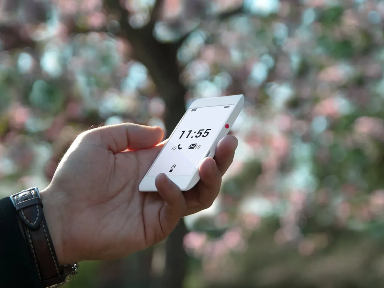
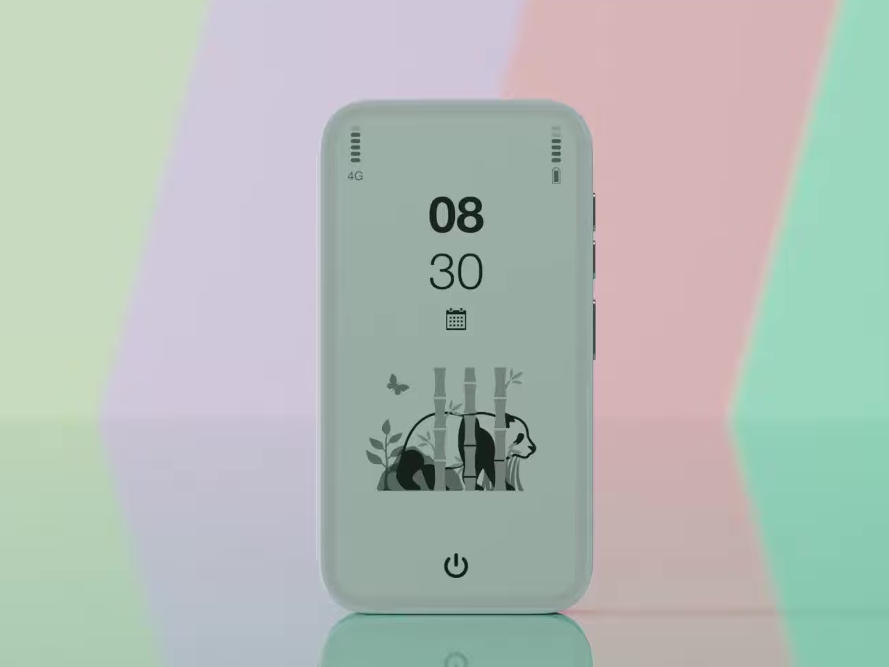
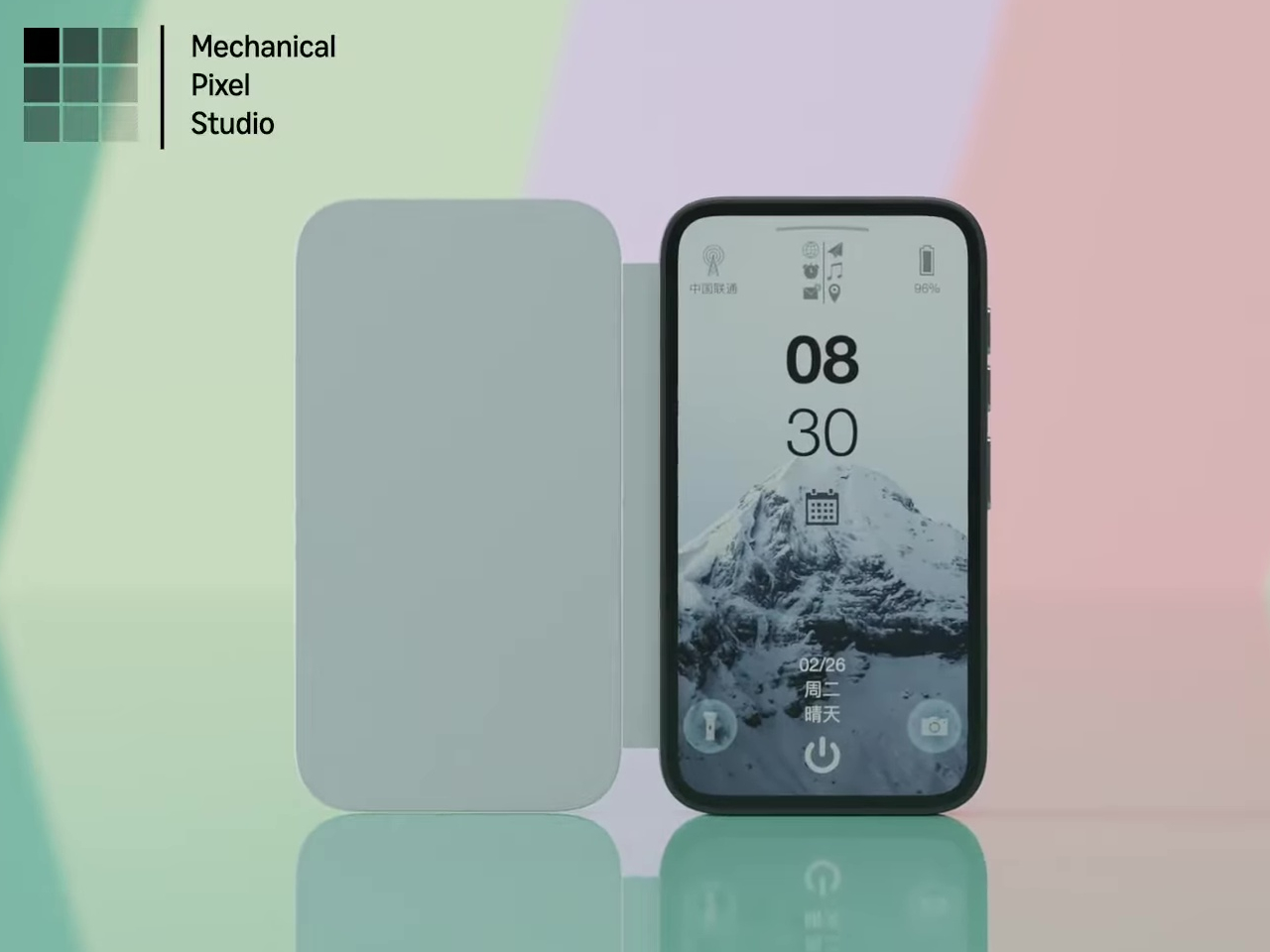
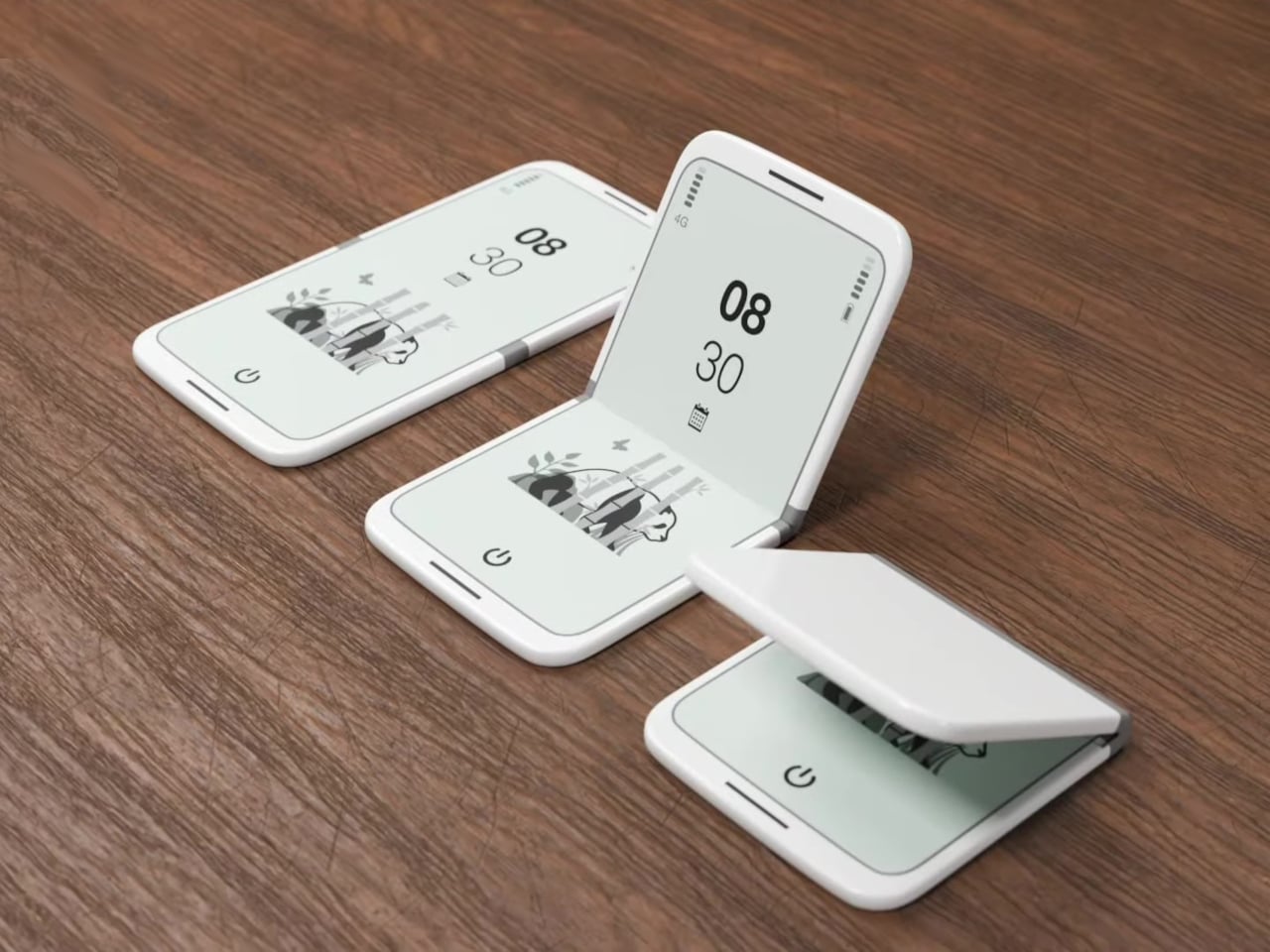
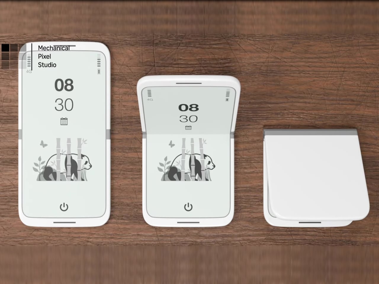
Modern phones have turned into pocket TVs, huge OLED slabs that are great for video and games but terrible for focus. Most E Ink phones go to the opposite extreme, either dropping color screens entirely or putting an E Ink panel on the back while keeping a full-size color display on the front. This dual-screen concept tries a different take, stacking both screens on the same face, with a small color LCD above a larger monochrome E Ink panel.

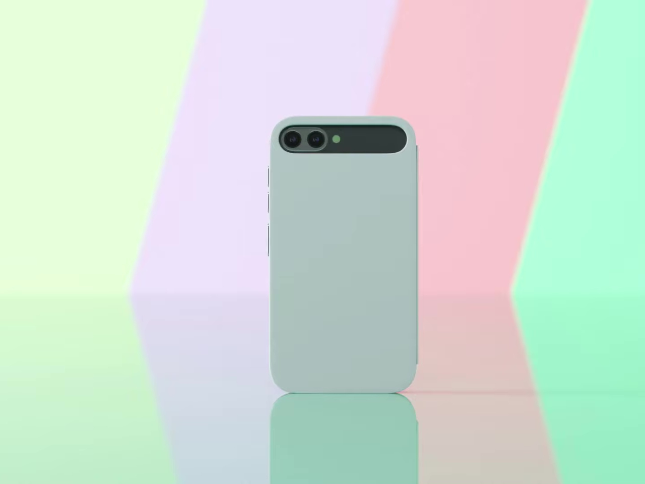
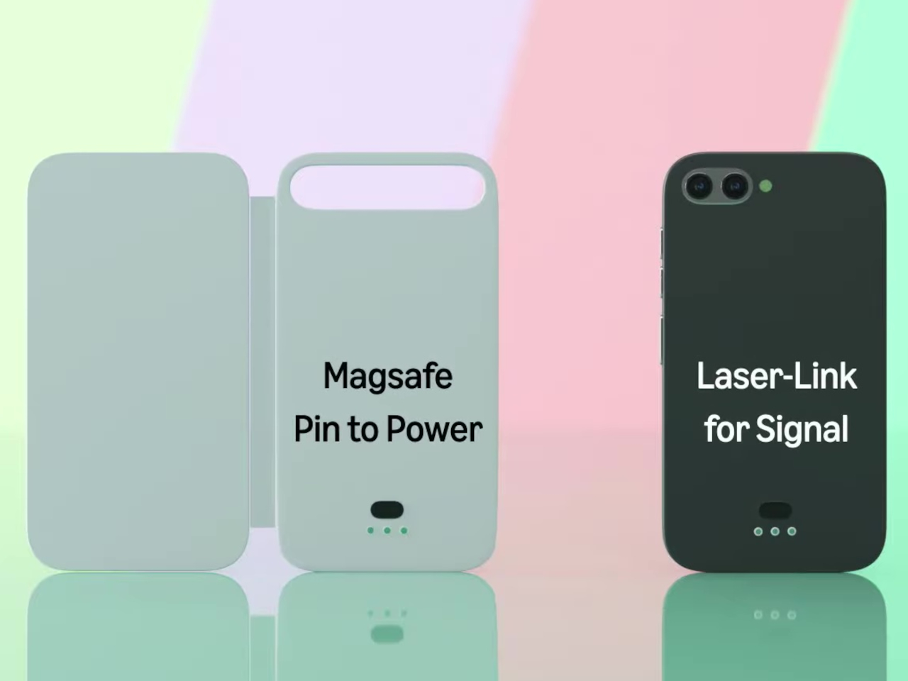
The basic layout is a 3.5-inch IPS LCD at the top and a 5.2-inch E Ink panel below, both on the front. The numbers are 1280 × 800 resolution at 120 Hz for the LCD and 1300 × 838 at 300 ppi for the E Ink. The clear back with a single camera and simple branding quietly signals that this phone is not chasing the usual multi-lens, all-screen spec race, instead treating the front as a composition of two very different surfaces.

Designer: Mechanical Pixel

The smaller LCD becomes the “burst of color” zone for time, notifications, music controls, and quick interactions, while the larger E Ink area is reserved for reading, notes, and simple widgets. This creates a hardware-level hierarchy; the calm, monochrome screen is where you spend most of your time, and you consciously move your attention to the smaller, brighter panel when you really need it, which changes the default state of the device from hyperactive to quiet.

The obvious pros are less visual noise, better eye comfort, and potentially much better battery life. E Ink only draws power when it refreshes, so a reading-first layout means the phone can idle for long stretches without burning through charge. For people who mostly message, read, and check calendars, the big E Ink panel could handle most of the day while the LCD stays off or in a low-duty role, extending runtime significantly.

The trade-offs are nothing to scoff at, though. A 3.5-inch LCD, even at 120 Hz, is not ideal for immersive video, complex productivity apps, or touch-heavy games. UI designers would need to rethink layouts for that smaller window, or accept that some tasks are better on a tablet or laptop. The E Ink panel’s slower refresh also limits it to taps and page turns, which is fine for reading but not for fast, gesture-driven interfaces that rely on immediate visual feedback.

This concept uses hardware to enforce a kind of digital minimalism. Instead of relying on focus modes and grayscale filters, it bakes the idea into the front of the phone, a big, calm screen for reading and a small, hyperactive one for everything else. For people who like the idea of a phone that nudges them toward books and away from endless feeds, that stacked layout feels like a surprisingly sharp design argument, where the very shape of the device encourages a different relationship with what lives on it.

The post This Phone Concept Stacks a 3.5-Inch LCD Above a 5.2-Inch E Ink Screen first appeared on Yanko Design.

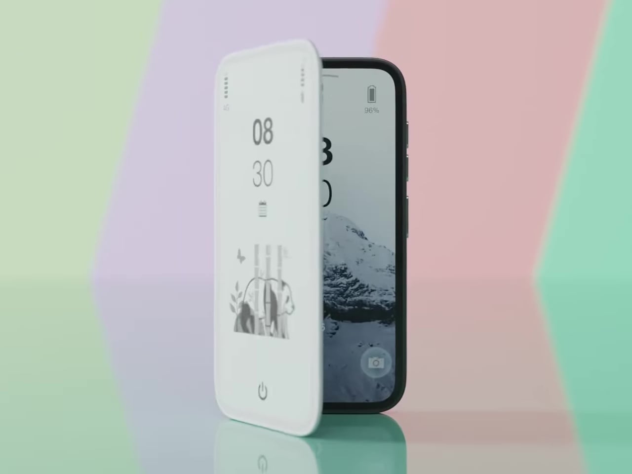
This E‑Ink Phone Case With An AI Recorder Practically Kills Your Notes And Voice Memos Apps

My ideal phone case has always been two different products at once. Part of me wants a permanent E Ink panel for boarding passes, social QR codes, and a to do list that never disappears behind a lock screen. Another part wants an AI notetaker like the Plaud, with its own mic, its own record button, and reliable transcription. Until now, those wants have fought for the same patch of real estate on the back of my phone. Reetle’s SmartInk I feels like someone finally noticed that clash. Instead of asking me to choose, it fuses the two roles into a single shell. The E-Ink side handles the quiet, persistent information, while the hardware in the case listens, records, and hands everything off to the phone for syncing and AI summaries. In practice, that turns the case from decoration into the main interface for how I capture and review my day.

This approach is what makes the SmartInk I compelling. It treats the phone case as active, functional hardware rather than a passive bumper. The core insight is that the back of a phone is wasted space, a blank canvas that could be doing useful work. By integrating an E-Ink screen, Reetle creates a low-power dashboard for glanceable information. The marketing materials show exactly what you would expect: calendars, QR codes, and checklists living on a paper-like display that is always visible in sunlight. This is a familiar concept, but the execution here feels more deliberate. The screen is not just a secondary display; it is the intended output for the case’s other primary function, which is where things get really clever.

Designer: REETLE

Click Here to Buy Now: $119 $199 (40% off) Hurry! Only 9 Days Left.

Input comes from a dedicated, one-press record button built right into the case’s frame. This is a critical piece of the design, as it removes all the friction of modern recording. There is no need to unlock your phone, hunt for an app, and tap a tiny on-screen icon. You just press the side of the case. That single, simple action captures audio and sends it to the companion app over Bluetooth or Wi-Fi for processing. This is the kind of tactile, immediate functionality that is often lost in software-driven devices. It turns the act of recording from a deliberate, multi-step process into a pure reflex, which is exactly what you want when an important idea strikes.

Once the audio is in the app, the system’s AI gets to work. It transcribes the speech, identifies key points, and can even generate structured to-do lists from a rambling conversation. This is where the workflow comes full circle. Those summaries and tasks can be pushed right back to the E-Ink screen, closing the loop between capture and review. A meeting’s action items can appear on the back of your phone moments after the meeting ends. This creates a powerful, self-contained ecosystem where the case captures the input and the case also displays the output, turning your entire phone into a much smarter notepad.

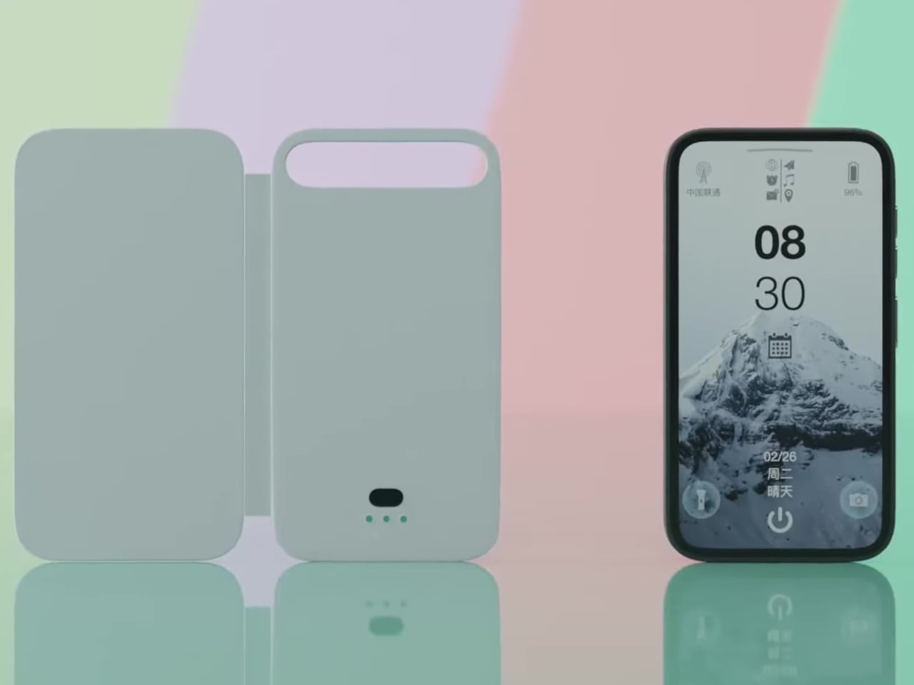
That E-Ink display is the centerpiece of the whole pitch. It covers nearly the entire back of the phone, acting as a persistent, low-power canvas for whatever information matters most at the moment. The use cases are immediately obvious and practical: a boarding pass that will not disappear when your battery is low, a QR code for your portfolio ready at a moment’s notice, or your daily calendar visible without a single tap. Reetle calls it a “Widget Switching Display,” which suggests a dynamic hub where you can cycle through different views, from a simple to-do list to custom artwork. Crucially, this is also where the AI-generated summaries from your recordings are meant to live, turning a static information panel into an active part of your workflow.

The case has its own power source, offering 10 hours of continuous reading or 10 hours of recording, with a standby time of seven days. That is a respectable battery budget for an accessory, and it recharges via MagSafe passthrough, which seems rather fascinating because it implies that power passes through an E-Ink display into the case – which is fairly game-changing if you ask me. I don’t think I’ve seen any device allow charging right through an existing component sitting between two charging coils. That aside, the Reetle also packs a tempered-glass back and a military-grade protective construction that keeps itself as well as your phone secure from accidental drops.

The entire UX is powered by the Reetle mobile app. This app is the command center, connecting to the case via Bluetooth and managing everything from firmware updates to AI processing. It is where you review your full transcriptions, organize your notes, and customize the widgets that appear on the E Ink display. You can choose which calendar to show, which to-do list to sync, and which images or QR codes to display. The connection uses both Bluetooth and Wi-Fi, which provides flexibility for syncing large audio files quickly when a known network is available. The success of the whole experience rests on this software being intuitive, reliable, and deeply integrated into the phone’s operating system.

What is particularly ambitious is the sheer breadth of compatibility Reetle is promising. The product is not just for the latest iPhone 17 Series. The compatibility list extends back to the iPhone 13 series, and even is compatible with the new iPhone Air (although you’re killing the Air’s appeal by mounting a thick E-Ink case on it>) The plan also includes a massive range of Android flagships from Samsung, Google, Sony, Huawei, Vivo, and others. This indicates a vision for the SmartInk I as a platform-agnostic tool, not just another Apple-centric accessory. Producing perfectly fitted cases for so many different chassis designs is a significant manufacturing challenge, but it shows a commitment to serving a much wider market.

The Reetle SmartInk I is currently on Kickstarter, where it has already flown past its initial funding goal. The early-bird price is set at about $119, with a target shipping date of February 2026. For a product category that has been largely defined by aesthetics and materials, the SmartInk I represents a genuine functional leap. It is a thoughtful synthesis of E-Ink, AI, and hardware design that re-imagines what a phone case can be. It is no longer just a protective shell; it is an active partner in managing your information and capturing your ideas. Heck, it’s probably better than any other AI accessory I’ve seen all year!

Click Here to Buy Now: $119 $199 (40% off) Hurry! Only 9 Days Left.

The post This E‑Ink Phone Case With An AI Recorder Practically Kills Your Notes And Voice Memos Apps first appeared on Yanko Design.

Xteink X4 is a wallet-sized eReader That Snaps Onto Your Phone

You buy a Kindle or Kobo, load it with books, then leave it on a nightstand while your phone follows you everywhere. Reading apps on phones compete with notifications and social feeds, so you end up doomscrolling instead of finishing that novel you downloaded. Xteink’s X4 tries to solve that by becoming a tiny, magnetic e‑ink sidekick that literally rides on the back of your phone, going wherever it goes.

The Xteink X4 is an ultra-thin magnetic back eReader with a 4.3-inch e‑ink screen and a footprint closer to a deck of cards than a tablet. At 114 by 69 by 5.9 millimeters and just 74 grams, it snaps onto MagSafe or Qi2 compatible phones, or onto any handset using the included adhesive magnetic ring, turning your phone into a dual-screen reading machine without much extra bulk.

Designer: Xteink

The 220 ppi e‑ink display is not as sharp as a Paperwhite, but it is perfectly fine for text at this size. There is no touchscreen and no frontlight, just physical page turn buttons and a power key, so it behaves more like a tiny paperback than a gadget. You need ambient light to read, but in return, you get a very focused, distraction-free surface that does not glow or buzz at you.

The internals are minimal: an ESP32 processor, 128 megabytes of RAM, and a bundled 32GB microSD card with support up to 512GB. The 650mAh battery lasts up to fourteen days with one to three hours of reading per day. It charges over USB-C and connects via 2.4GHz Wi‑Fi and Bluetooth for file transfers, so you can grab books wirelessly or just swap the microSD card.

The X4 only supports EPUB and TXT for documents, plus JPG and BMP for images, and does not run third-party apps or connect to any bookstore. You sideload everything, either over Wi‑Fi or by copying files to the card. For people tied to Kindle or Google Play, this is a hurdle, but for readers with DRM-free libraries, it feels refreshingly simple and vendor-neutral, just you and your files.

Xteink markets it as “More Than a Reader,” suggesting you use the X4 as a digital business card, a tiny calendar, a film production workflow board, or a reference screen for notes and checklists. Because it displays static images and text, it doubles as a little always-on panel you can stick to a monitor, fridge, or phone, not just a book page. The magnetic back makes those experiments feel natural and reversible.

The X4 is really for minimalists, tinkerers, and people who like the idea of a dedicated reading screen that goes everywhere their phone does. It is quirky, with no light, no touch, and no store, but those constraints are the point. It is a tiny reminder to read instead of scroll, thin enough to forget until you need a page instead of a feed, and cheap enough at $69 that the experiment feels worth trying even if you already own a proper eReader gathering dust at home.

The post Xteink X4 is a wallet-sized eReader That Snaps Onto Your Phone first appeared on Yanko Design.

Badgeware Turns Conference Badges into Wearable Tiny Computers

Conference badges are usually flimsy cardboard, a lanyard, maybe a QR code, and they end up in a drawer once the event wraps up. In the maker world, people already strap LEDs and e‑paper to their jackets for fun, but those tend to be one‑off hacks held together with tape and hope. Pimoroni’s Badgeware line asks a simpler question, what if the badge itself was a tiny, finished computer you actually wanted to keep wearing.

Badgeware is a family of wearable, programmable displays powered by Raspberry Pi’s new RP2350 chip. The trio gets names and personalities, Badger with a 2.7 inch e‑paper screen, Tufty with a 2.8 inch full colour IPS display, and Blinky with a 3.6 inch grid of 872 white LEDs. Translucent polycarbonate shells in teal, orange, and lime glow softly when the rear lighting kicks in, making them look like finished toys instead of bare dev boards.

Designer: Pimoroni

The shared hardware is serious for something pocket sized. An RP2350 running at 200 megahertz with 16 megabytes of flash and 8 megabytes of PSRAM, Wi‑Fi and Bluetooth 5.2, USB C, and a built in 1,000 milliamp hour LiPo with onboard charging. The Qw/ST expansion port on the back lets you plug in sensors and add ons without soldering, while user and system buttons plus four zone rear lighting give each badge its own under glow.

Badger is the quiet one, four shade e‑paper that sips power and holds static content like names, pronouns, and tiny dashboards for days. Tufty is the show off, full colour IPS and smooth animation for mini games, widgets, and scrolling text. Blinky is the extrovert, a dense LED matrix that spells messages and patterns bright enough to read across a room. Together they cover calm, expressive, and loud without changing the basic wearable form factor.

All three come pre loaded with a launcher and a bunch of open source apps, from silly games like Plucky Cluck to utilities like clocks and ISS trackers. Everything runs in MicroPython with Pimoroni’s libraries, and the optional STEM kit adds a multi sensor stick and a gamepad so badges can react to temperature, light, motion, and multiplayer button mashing, turning them into wearable sensors or tiny game consoles.

Double tapping reset drops the badge into disk mode so it shows up as a USB drive, letting you edit Python files directly without juggling tools or serial consoles. The cases have lanyard holes and can free stand on a desk, so they work as both wearable name tags and tiny desk dashboards. The clear shells and rear lighting make the electronics part of the aesthetic instead of something to hide.

Badgeware turns the throwaway conference badge into a reusable platform. Instead of printing your name once and tossing it, you get a little object that evolves from ID tag to art piece to sensor display as your code and curiosity grow. For people who like their gadgets small, expressive, and open ended, Badger, Tufty, and Blinky feel like digital jewellery that actually earns its lanyard space, whether you wear it to a meetup or keep it glowing on your desk.

The post Badgeware Turns Conference Badges into Wearable Tiny Computers first appeared on Yanko Design.

This $3,500 Guitar Changes Colors via Bluetooth, No Repainting Needed

Guitarists obsess over finishes. Sunburst fades, metallic flakes, relic’d nitro that looks like it survived three decades of dive bars, all of it matters until you realize that once you pick a color, you are stuck unless you repaint. Stage rigs and LED walls morph through palettes every night while the guitar stays frozen, a static object carried by musicians who constantly reinvent their sound and visual identity.

Cream Guitars’ DaVinci wraps its entire body in an E Ink Prism 3 panel, turning the surface into a programmable skin that changes colors and patterns over Bluetooth. Instead of a single paint job, the guitar becomes a dynamic canvas. It is the first commercially available product to use Prism 3, which is usually reserved for architectural surfaces and product experiments, not instruments you plug into an amp and carry on tour.

Designer: Cream Guitars

Prism 3 is color changing ePaper, closer to a Kindle page than an LED screen. It does not emit light, just holds pigment using low power electrophoretic particles. DaVinci’s front divides into sixty four segments, each assigned one of seven colors, white, black, yellow, orange, blue, red, or green. That segmentation lets you build stripes, blocks, and faux pickguards, changing the visual structure without touching a spray can.

A guitarist could match the guitar to different projects without owning three instruments. One night, geometric patterns echo album art. Another, a minimalist scheme feels right. The ePaper only draws power when changing, so once set, it sits visible under stage lights without glowing like LEDs or draining the battery between songs or overnight in a case, ready to change again whenever the visual identity shifts.

Under the display sits a Voltage body with roasted maple neck, rosewood fretboard, extra jumbo frets, and Graphtech locking tuners. Fishman Fluence pickups offer three voices, single coil, traditional humbucker, and high output humbucker. The tech wraps around a serious guitar, not a prop with thin pickups that sound disappointing once the visual novelty wears off after the first show or when you need to track a real session.

Traditional refinishing is messy and permanent. Sand, spray, cure, repeat if you change your mind. DaVinci’s ePaper skin reprograms endlessly, with Prism 3’s low power profile positioning it as a more sustainable alternative to LED bodies or constantly changing finishes. The guitar becomes a long term canvas rather than a disposable fashion statement that needs repainting or ends up retired because the color fell out of style after one album cycle.

DaVinci hints at instruments as programmable surfaces that evolve with the player. It feels like a crossover between luthier craft and interface design, where the object in your hands can match your projected identity without needing backup guitars. Whether or not you want one at three thousand five hundred dollars, it is easy to imagine keyboards, drum shells, and amps following the same path, turning stage gear into surfaces that shift as often as setlists do.

The post This $3,500 Guitar Changes Colors via Bluetooth, No Repainting Needed first appeared on Yanko Design.

E-ink Vocabulary Card E2 Fits Language Learning Into a Gum Pack

Most language learning apps live on phones, competing with notifications, social media, and every other distraction fighting for your attention. Opening Duolingo between classes usually turns into five minutes of vocabulary followed by twenty minutes of scrolling through feeds you’ve already checked twice. Designers are starting to build tiny, single-purpose devices that turn fragmented time into focused practice instead of another excuse to stare at your phone screen until your eyes hurt.

The E-ink Vocabulary Card E2 is one of those tools, a chewing-gum-sized e-ink vocabulary device aimed at students but usable by anyone learning a new language. It pairs with a phone via Bluetooth to pull in study materials and memory modes from an app, then lets you review words on a 2.7-inch e-ink screen without opening your phone. It’s small enough to live in a pocket yet designed to feel like a dedicated learning tool.

Designer: DPP .

The form factor is remarkably simple. A slim rectangular bar about the size of a pack of gum, weighing only thirty grams. Rounded corners, soft edges, and a two-tone color scheme in orange, pink, green, or grey make it look friendly and approachable. The main action button is tilted at five degrees, tuned for thumb reach when you hold it in one hand, while the simple layout keeps the interaction logic easy to understand.

The 2.7-inch e-ink touch screen is the real selling point. Low blue light and low radiation make it easier on the eyes than a phone, and the high contrast gives a reading experience close to paper. Because e-ink only draws power when the screen changes, the device can reach around one hundred fifty days of standby time, which means it’s always ready when you pull it out between classes or on a commute.

E2 connects to a mobile app over Bluetooth. The device supports nine built-in languages, and the app lets you import more content and choose different study modes or memory patterns that match your learning style. You can load word lists, practice exercises, and review sessions, then leave the phone in your bag while the card handles the actual on-the-go practice.

The IP68 protection rating makes the card dust-tight and waterproof enough for more adventurous use. The renders show it in a gym, on a train, and even in a futuristic space scene, reinforcing that it’s meant to live in pockets and hands without babying. A matching wrist strap accessory clips into the body, adding security and a bit of personality to the tiny device.

The visual language is intentionally soft and playful. Big icons, rounded rectangles, and cheerful colorways make it feel more like a friendly gadget than test prep gear. The E-ink Vocabulary Card E2 treats vocabulary learning like checking a notification, but without the noise of a full smartphone, turning spare seconds into small, focused steps toward fluency.

The post E-ink Vocabulary Card E2 Fits Language Learning Into a Gum Pack first appeared on Yanko Design.
DIY 3D-Printed Clamshell Turns BOOX Palma Into a Tiny Laptop

Palmtops and UMPCs are experiencing a quiet resurgence among people who want something more focused than a laptop and more tactile than a phone. Compact e-ink devices and tiny Bluetooth keyboards have become affordable building blocks for exactly this kind of project, letting makers combine them into pocketable machines tailored to writing, reading, or just tinkering. The result is a small but growing wave of DIY cyberdecks and writerdecks that feel like modern reinterpretations of classic Psion palmtops.

The Palm(a)top Computer v0 is one of those projects, born on Reddit when user CommonKingfisher decided to pair a BOOX Palma e-ink Android phone with a compact Bluetooth keyboard and a custom 3D-printed clamshell case. The result looks like a cross between a vintage Psion and a modern writerdeck, small enough to slide into a jacket pocket but functional enough to handle real writing and reading sessions on the go.

Designer: CommonKingfisher

The core hardware is straightforward. The BOOX Palma sits in the top half of the shell, while a CACOE Bluetooth mini keyboard occupies the bottom half. The keyboard was originally glued into a PU-leather folio, which the maker carefully peeled off using gentle heat from a hair dryer to expose the bare board. When opened, the two halves form a tiny laptop layout with the e-ink screen above and the keyboard below.

The clamshell itself is 3D-printed in a speckled filament that looks like stone, with two brass hinges along the spine giving it a slightly retro, handcrafted feel. Closed, it resembles a small hardback book with the Palma’s camera cutout visible on the back. Open, the recessed trays hold both the screen and keyboard flush, turning the whole thing into a surprisingly polished handheld computer, considering it’s a first prototype.

The typing experience is functional but not perfect. The maker describes it as “okay to type on once you get used to it,” and thumb typing “kinda works,” though it’s not ideal for either style. You can rest the device on your lap during a train ride and use it vertically like a book, with the Palma displaying an e-book and the keyboard ready for quick notes or annotations.

The build has a few issues that the maker plans to fix in the next version. It’s top-heavy, so it needs to lie flat or gain a kickstand or counterweight under the keyboard, possibly a DIY flat power bank. The hinge currently lacks friction and needs a hard stop around one hundred twenty degrees to keep the screen upright. There are also small cosmetic tweaks, like correcting the display frame width.
Palm(a)top Computer v0 shows how off-the-shelf parts and a 3D printer can turn a niche e-ink phone into a bespoke palmtop tailored to one person’s workflow. Most consumer gadgets arrive as sealed rectangles you can’t modify, but projects like this embrace iteration and imperfection. It’s less about having all the answers and more about building something personal that might inspire the next version.

The post DIY 3D-Printed Clamshell Turns BOOX Palma Into a Tiny Laptop first appeared on Yanko Design.