This Tea Brand Just Turned Packaging Into a Playful Puzzle

There’s something oddly satisfying about counting things. Maybe it’s the same reason people find numbered lists so appealing, or why we instinctively organize our world into sequences. By-Enjoy Design seems to understand this perfectly with their OneToTea packaging for CHASHAN’s white tea pearls, turning what could have been just another tea box into something that feels almost like a playful puzzle.

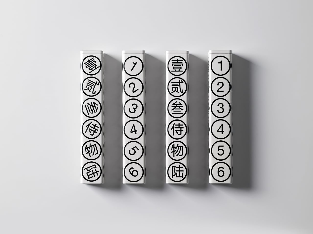
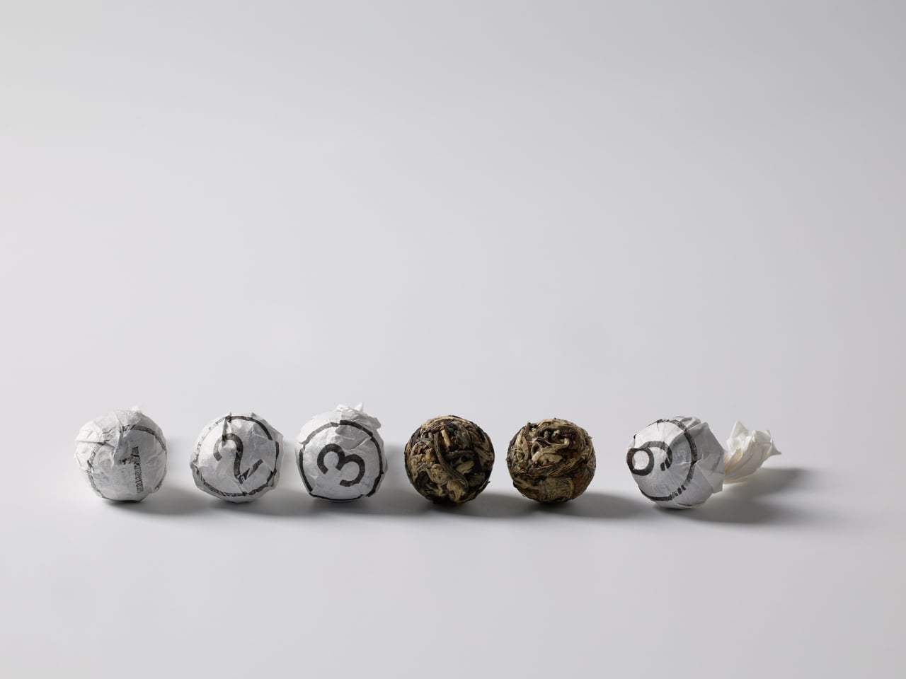
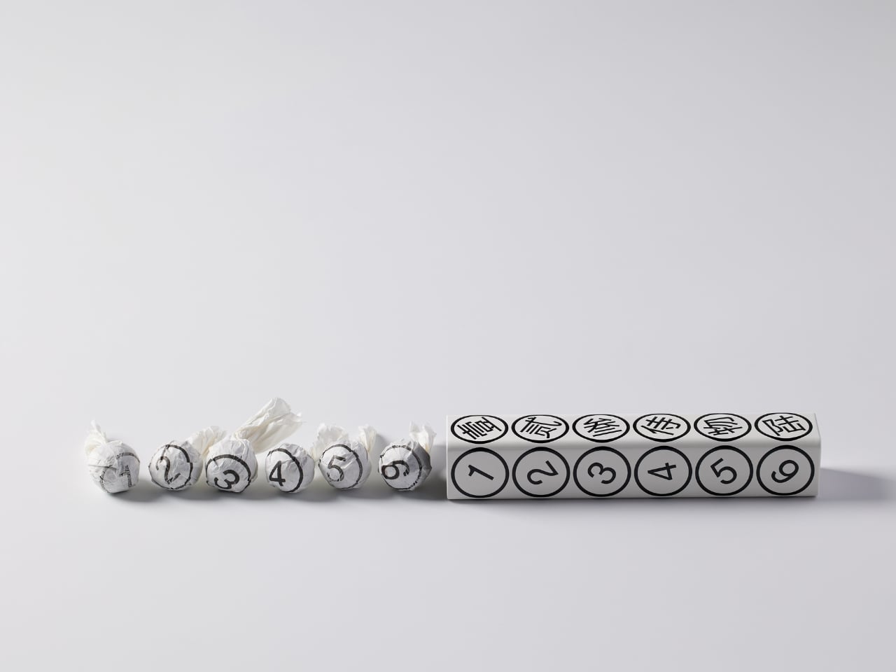
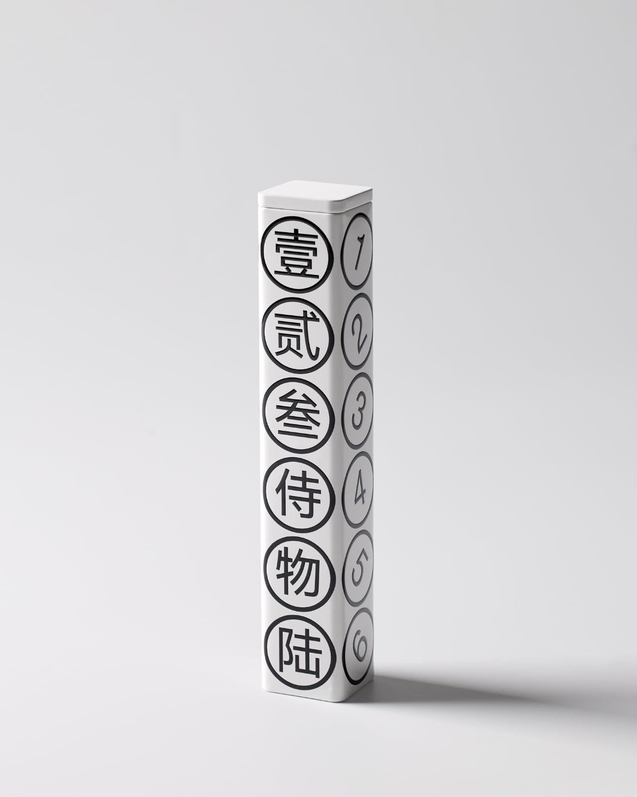
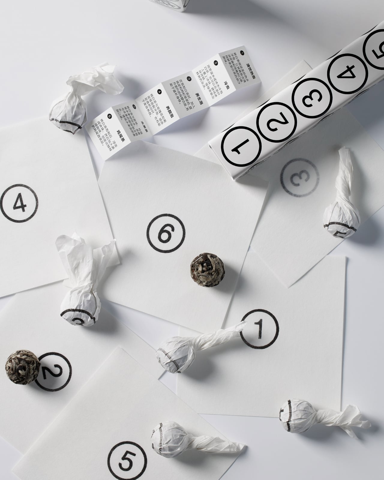
The concept is beautifully simple. Six white tea pearls, six numbers, one hexagonal tube. Each face of the package displays both a Chinese character and its corresponding Arabic numeral, from one through six. It’s the kind of design that makes you wonder why nobody thought of it sooner, which is usually the hallmark of really smart packaging.

Designer: By-Enjoy Design

What strikes me first is the restraint. The color palette is strictly monochrome, with black graphics on a pristine white background. No gradients, no metallic finishes, no desperate attempts to scream luxury through gold foiling or embossing. Instead, the design whispers sophistication through its geometric precision and typographic clarity. The circles containing each number create a rhythmic pattern down the length of the tube, making something as straightforward as counting feel deliberately composed.

But here’s where it gets interesting. The packaging doesn’t just look good sitting on a shelf. According to the designers, a gentle shake brings the whole thing to life, making it playful and dynamic. Imagine holding this tube and feeling those tea pearls shift inside, each one rolling to match its designated number. It transforms a static object into something tactile and interactive, which is pretty rare in the tea world where most packaging is designed to sit pretty and do nothing else.

The bilingual approach serves multiple purposes beyond just translation. The Chinese characters carry cultural weight and authenticity, grounding the product in tea’s traditional origins. The Arabic numerals provide universal accessibility, ensuring anyone can engage with the numbering system regardless of language. This dual identity feels especially relevant for contemporary Asian brands trying to speak to both local and global audiences without losing their cultural identity in the process.

Each tea pearl comes individually wrapped, and naturally, it bears the same number as its spot on the tube. This kind of consistency creates a complete experience rather than just packaging. You’re not randomly grabbing a tea pearl. You’re selecting number three, or saving number six for later. It gamifies the consumption process in a subtle way, adding a layer of intentionality to your tea ritual.

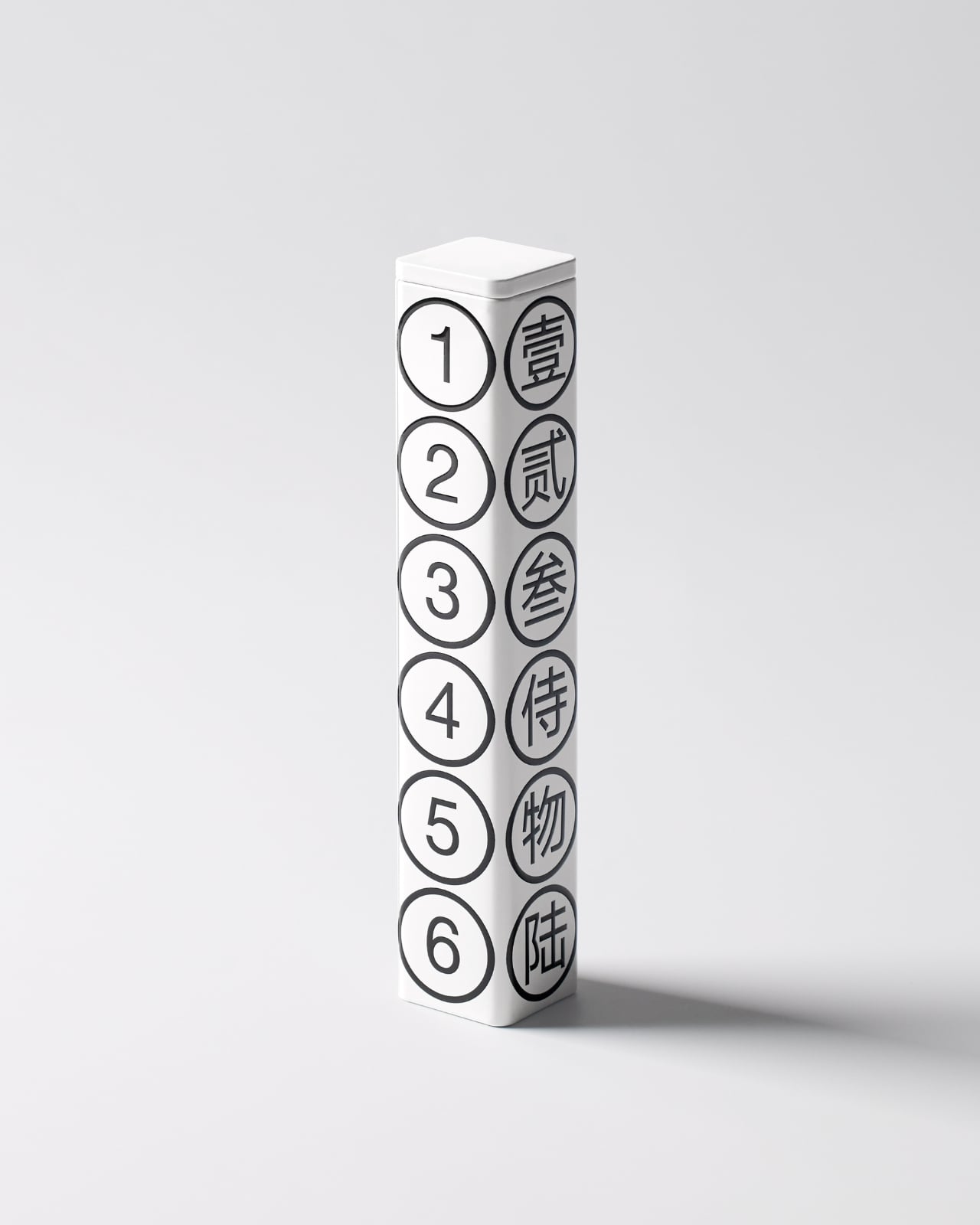
The hexagonal form itself deserves attention. It’s not the easiest shape to manufacture or ship, but it offers six equal faces for that perfect one-to-six display. It also stacks and arranges beautifully, as shown in the images where multiple tubes create their own geometric compositions. From a retail perspective, these tubes photograph incredibly well, which matters immensely in our Instagram-driven market where packaging needs to perform on screens as much as on shelves.

What really works here is how the design manages to be both minimal and maximal at once. Minimal in its aesthetic choices, with that stark black and white palette and clean typography. But maximal in its thoughtfulness, with every element serving both function and form. The numbers aren’t just decorative. They’re an organizational system, a design motif, a playful interaction, and a cultural bridge all at once.

This kind of packaging also taps into something collectors understand well. When design is this cohesive and clever, you don’t want to throw the box away. That tube becomes an object worth keeping, maybe for storing other small treasures or just displaying because it looks that good. It’s the opposite of disposable packaging, and that sustainability angle (even if unintentional) resonates with contemporary values around consumption and waste.

By-Enjoy Design has created something that works on multiple levels. It’s functional enough for everyday use, beautiful enough for gift-giving, clever enough to spark conversation, and simple enough that its brilliance doesn’t require explanation. Sometimes the best design solutions are the ones that make you smile because they just make sense.

The post This Tea Brand Just Turned Packaging Into a Playful Puzzle first appeared on Yanko Design.

This Swedish Designer Just Turned Childhood Puzzles Into Furniture

You know that satisfying click when two puzzle pieces finally snap together? Swedish designer Gustaf Westman has blown that feeling up to furniture-size with his latest creation, the Puzzle Shelf, and honestly, it’s the kind of playful design we didn’t know we needed.

If you’ve been following Westman on Instagram (and you really should be), you’ve probably already fallen for his signature aesthetic: chunky, glossy objects in candy-bright colors that somehow manage to feel both nostalgic and completely modern. Think rounded edges, inflated geometry, and a sense of humor that most furniture seriously lacks. The Puzzle Shelf fits right into this universe while marking something new for the designer. It’s his first venture into modular shelving, and it’s exactly as delightful as you’d expect.

Designer: Gustaf Westman

The concept is brilliantly simple. Westman took inspiration from, well, puzzles. Actual jigsaw puzzles. “I usually get inspired by the most random things, and in this case, puzzles,” he explains in a recent Instagram Reel. Each shelf unit features those familiar protruding tabs and recessed slots that slide and lock together without any visible hardware. No screws, no Allen keys, no confusing instruction manuals with cryptic diagrams. Just pure, friction-based satisfaction.

What makes the Puzzle Shelf so compelling is how it transforms something functional into something sculptural. These aren’t just storage units. They’re bone-shaped, oversized blocks that you can stack, rearrange, and play with to create whatever configuration your space needs. Want a tall tower of shelves? Go for it. Prefer something low and horizontal? That works too. The system is completely flexible, giving you the kind of creative control that makes arranging your space feel more like art than organization.

Westman’s design process is also pretty fascinating. Before committing to full-scale production, he tests everything through 3D printed miniatures that mirror the final product almost exactly. It’s a smart approach that lets him work out all the kinks while keeping that essential puzzle functionality intact. The result is a system that actually works the way it promises to, which in the world of trendy furniture, is refreshingly rare.

And can we talk about how these pieces look? The glossy finish and those signature candy hues make the Puzzle Shelf feel like an oversized toy that somehow grew up without losing its sense of fun. It’s the kind of design that makes you smile when you walk past it, which is exactly what good furniture should do. Plus, the generous spacing between levels means you actually have room for your books, plants, ceramics, or whatever else you want to display.

This latest piece comes on the heels of Westman’s collaboration with IKEA earlier this year, a 12-piece collection that brought his playful aesthetic to a wider audience. That partnership showed how his rounded forms and informal approach to design could translate across different price points and product types. The Puzzle Shelf feels like the next logical step, proving that Westman’s chunky universe has plenty of room to grow.

What’s refreshing about Westman’s work is that it never takes itself too seriously. There’s a lightness to his designs, a sense that furniture doesn’t have to be stuffy or precious. The Puzzle Shelf embodies this philosophy perfectly. It’s functional without being boring, sculptural without being impractical, and playful without being juvenile. It invites you to interact with it, to rearrange it, to make it your own. It isn’t trying to revolutionize how we think about storage. It’s just making the everyday act of organizing your stuff a little more joyful, a little more tactile, and a lot more fun. And isn’t that what good design should do?

The post This Swedish Designer Just Turned Childhood Puzzles Into Furniture first appeared on Yanko Design.

Move over LEGO… These human-shaped bricks plug in together to showcase the power of unity

The idea of LEGO sparked from bricks, the concept of Minecraft sparked from pixels – but the Souper Connect has a much stronger metaphorical background. You see, each individual Souper brick is shaped like a human with a hole in them, and a single human brick can’t stand on its own. However, fill that hole with another human brick and the two can stand together. Build on this concept and you create a self-standing self-sustaining community, reflecting the power of human connectivity and the indomitable spirit of a healthy family or society. The cleverly designed bricks aren’t just great to play with, they’re also an overall lesson that we’re stronger together than we are alone. Quite a brilliant metaphor for what’s essentially just a set of building blocks, right?!

Designer: Peter Minsoub Sim

Click Here to Buy Now: $25 $42 (40% off). Hurry, only 8/35 left!

Created by visionary designer Peter Minsoub Sim, Souper Connect brings a new dimension to building blocks. The bricks are both the characters as well as the individual blocks, making them an incredibly creative toy for children as well as for adults. They’re a great way to stay entertained, learn valuable social and moral lessons, and the fact that all the Souper Connects are different colors just teaches an incredibly powerful aspect of human society – that people are different but they can still come together to build and grow.

Let your mind wander

Find focus at work

Have fun with the family

Take it with you wherever you go!

“These blocks offer a minimal and identifiable form that inspires imaginative play, collaboration, and with enough pieces can bring out the building engineer in any of us,” says Sim, who co-founded Souper Studio – the company behind the Souper Connect blocks. Each block is shaped like an abstract human, with two arms, two legs, a slight stub for a head, and a hole running through the chest. Two ‘humans’ can be connected simply by plugging an arm into the chest hole, bringing them closer together, but also giving you the ability to make complex shapes and forms. The overall gist is no different from LEGO, and you can use Souper humans to make a variety of shapes from towers and bridges to crowns. However, there’s also a unique fidget quality to the human bricks too, and they make rather decorative pendants for necklaces or bracelets.

Each Souper Connect is 1.9 inches tall, 2.4 inches wide, and 0.8 inches thick, making them incredibly safe around younger children too. The human bricks are molded from polypropylene plastic, making them incredibly durable and long-lasting, although there’s the ability to get them in aluminum too, sort of as a more premium toy for collectors. The bricks come in either a single unit as a keychain (or double if you choose the aluminum variant), or in playable sets of 12, 36, and 72, featuring an entire colorful bunch of Souper humans that you can bring together to create the utopia of your dreams! The Souper Connect is available at a special early bird discount on Kickstarter using the link below.

Click Here to Buy Now: $25 $42 (40% off). Hurry, only 8/35 left!

The post Move over LEGO… These human-shaped bricks plug in together to showcase the power of unity first appeared on Yanko Design.